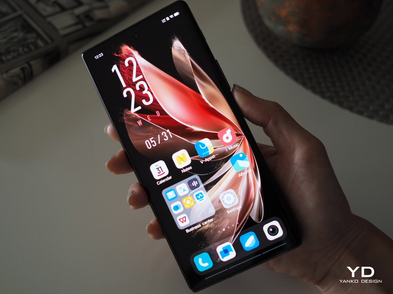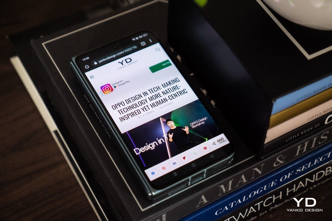
Vivo X Fold 3 Pro Foldable Phone Review: Putting the Competition on Notice

PROS:


  • Elegant, thin, and light design

  • Impressive photography performance

  • Premium specs, including a high-capacity battery

CONS:


  • Lack of dust protection might cause concerns

  • A bit pricey

RATINGS:

AESTHETICS
ERGONOMICS
PERFORMANCE
SUSTAINABILITY / REPAIRABILITY
VALUE FOR MONEY

EDITOR'S QUOTE:

With premium features wrapped in a thin and premium design, the Vivo X Fold 3 Pro is worth its equally premium price tag.
award-icon

The foldable phone market has diversified over the past years, no longer a rat race between two giants. Many brands have jumped into the fray, each adding their own piece to complete the puzzle. Whether it’s imaging or durability, new foldables are addressing the concerns and doubts that consumers have about the viability of this kind of product. One thing that hasn’t exactly changed for the better is the price tag attached to these foldable phones, even years after rumors of cheaper options, at least of the non-clamshell kind. Rather than downgrade the experience to also push down the price, however, it might be more effective to offer a design that makes sense for a four-digit figure. That seems to be the premise behind the “pro-foldable” Vivo X Fold 3 Pro, so we take it for a good spin to see if it’s truly worth its weight in gold.

Designer: Vivo

Aesthetics

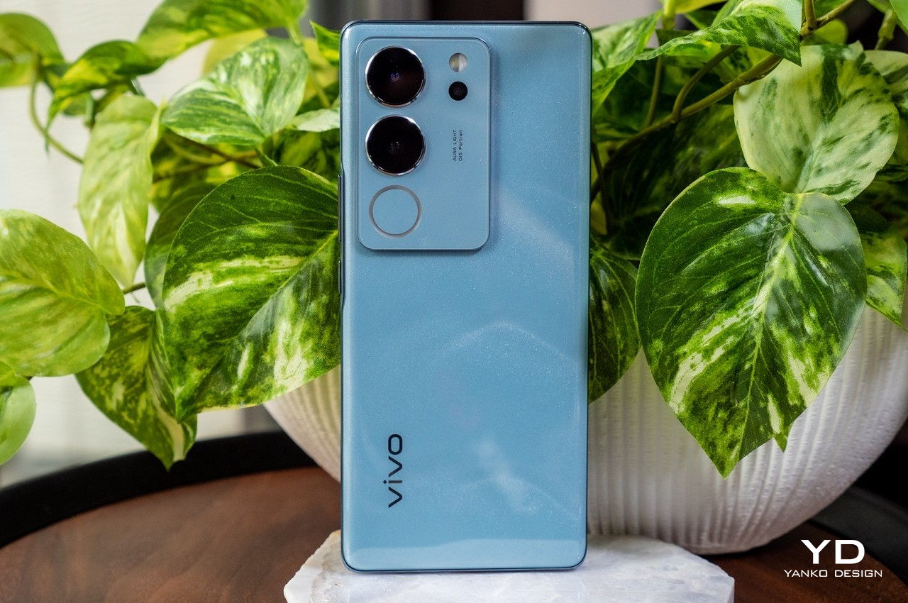
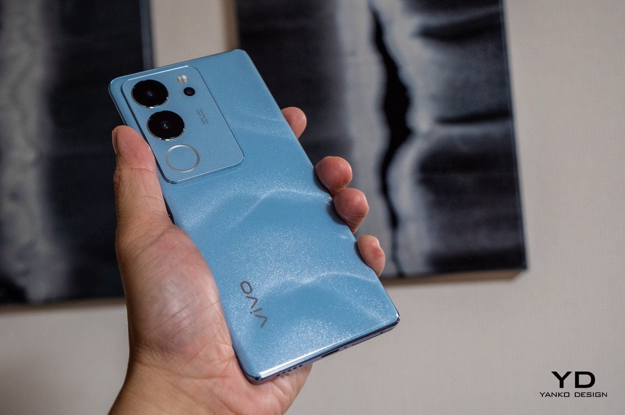
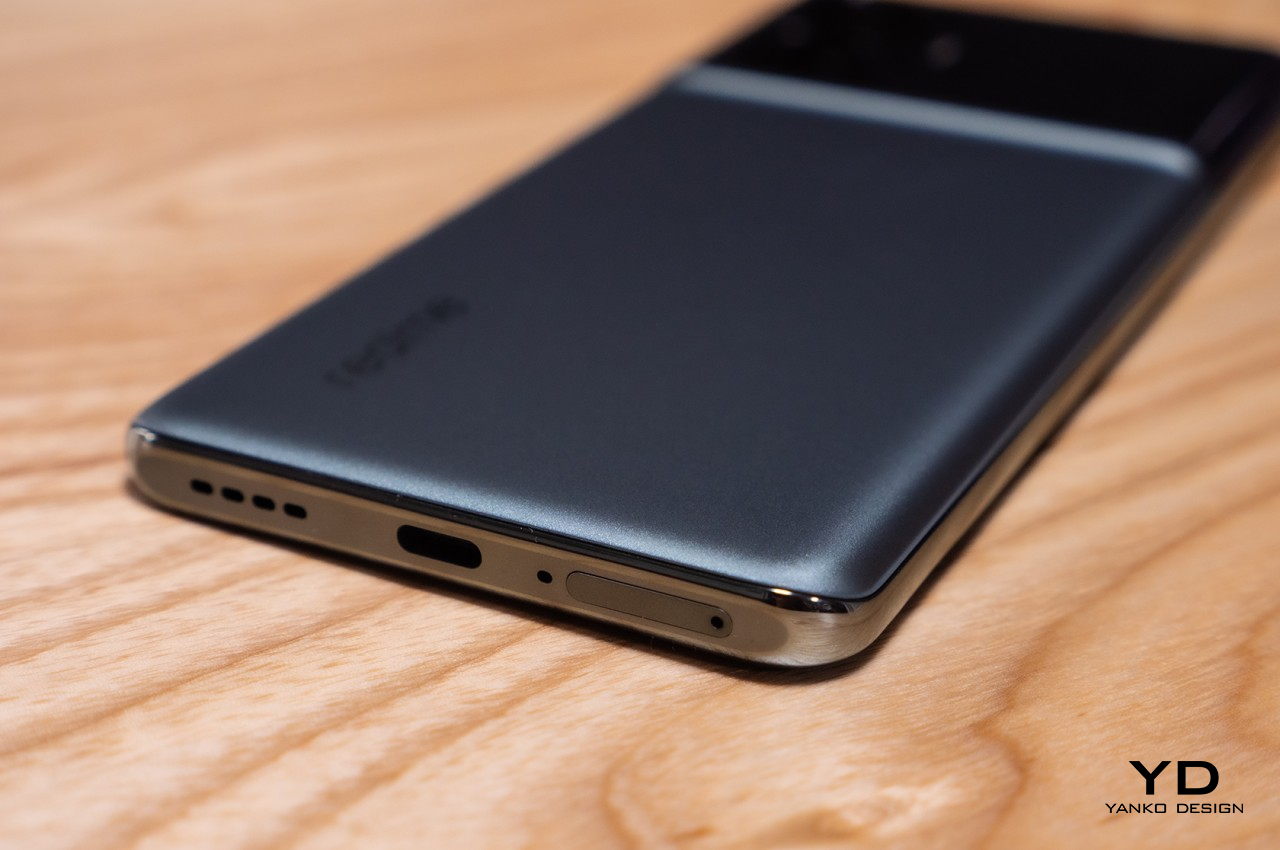
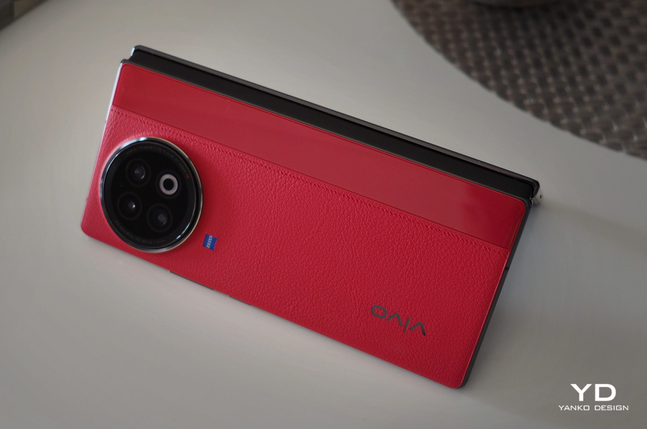
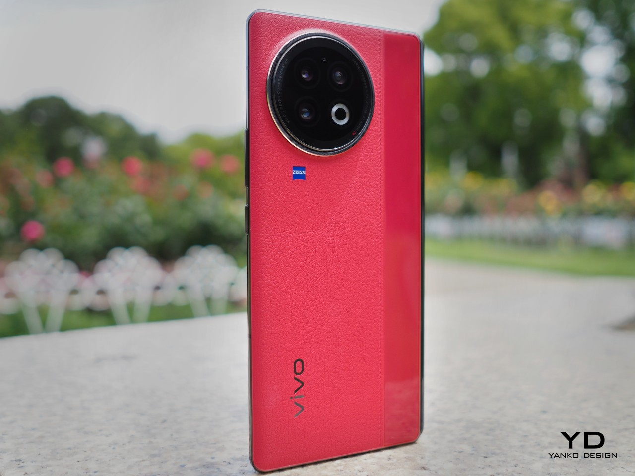
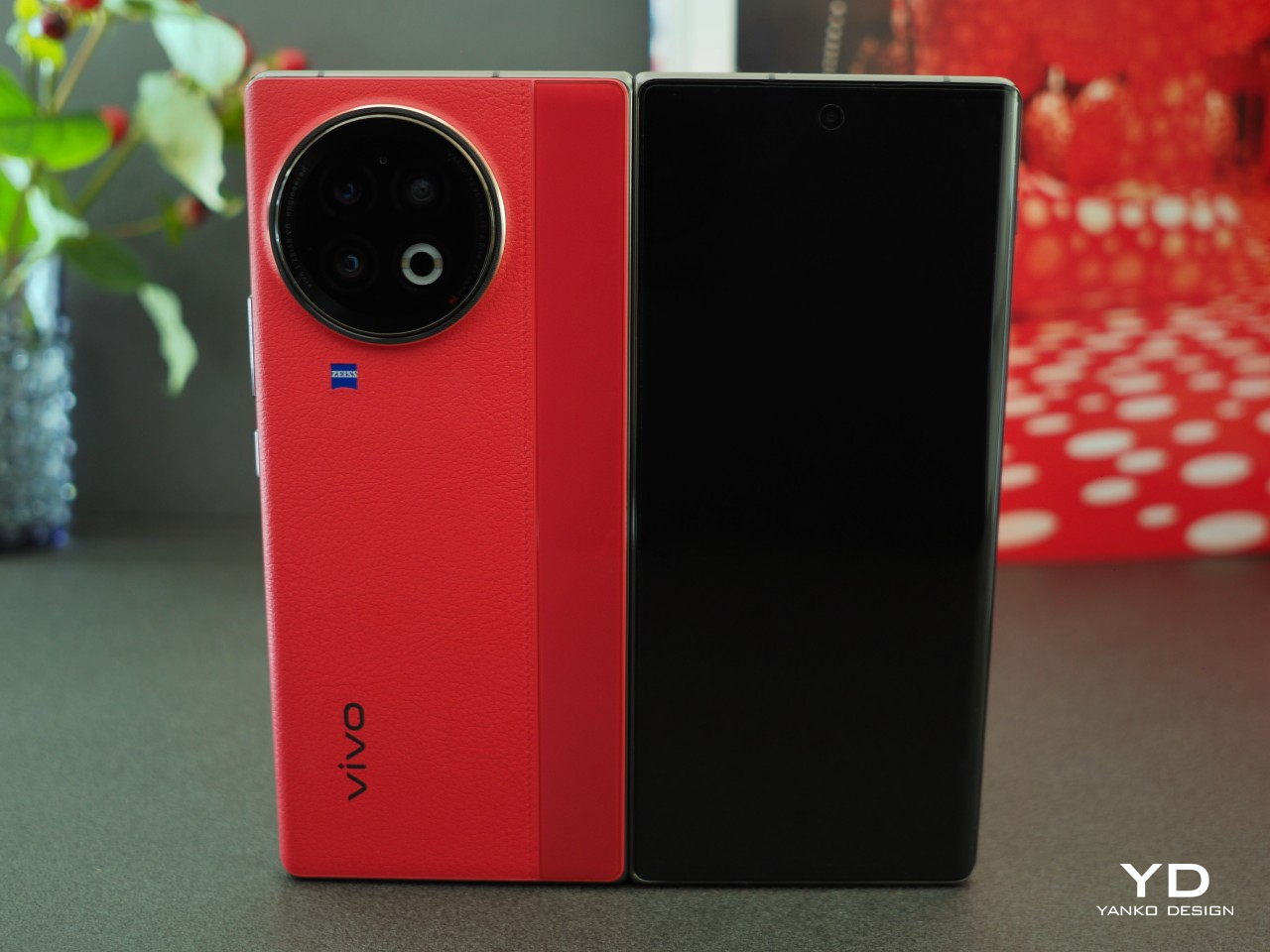
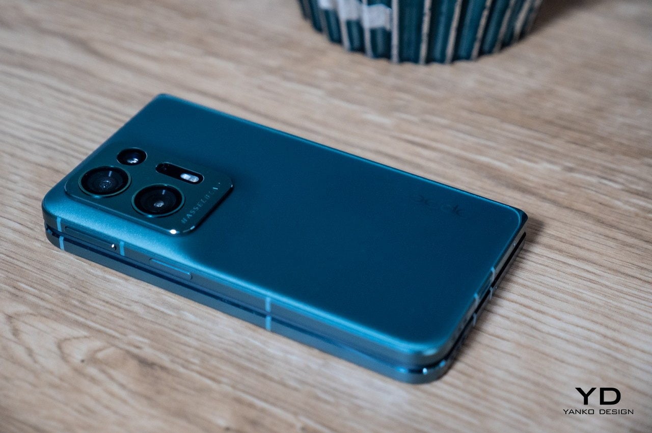
There is a certain elegance to the Vivo X Fold 3 Pro’s simple design. Gone are the extraneous lines and shapes, leaving only the essential elements of a stylish phone. By no means is it boring or plain, especially given the visual texture on the Solar White and Eclipse Black colorways, just that the design doesn’t distract you beyond the first brush nor does it hold your attention hostage.
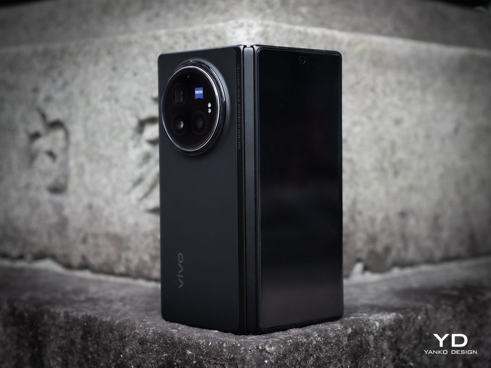
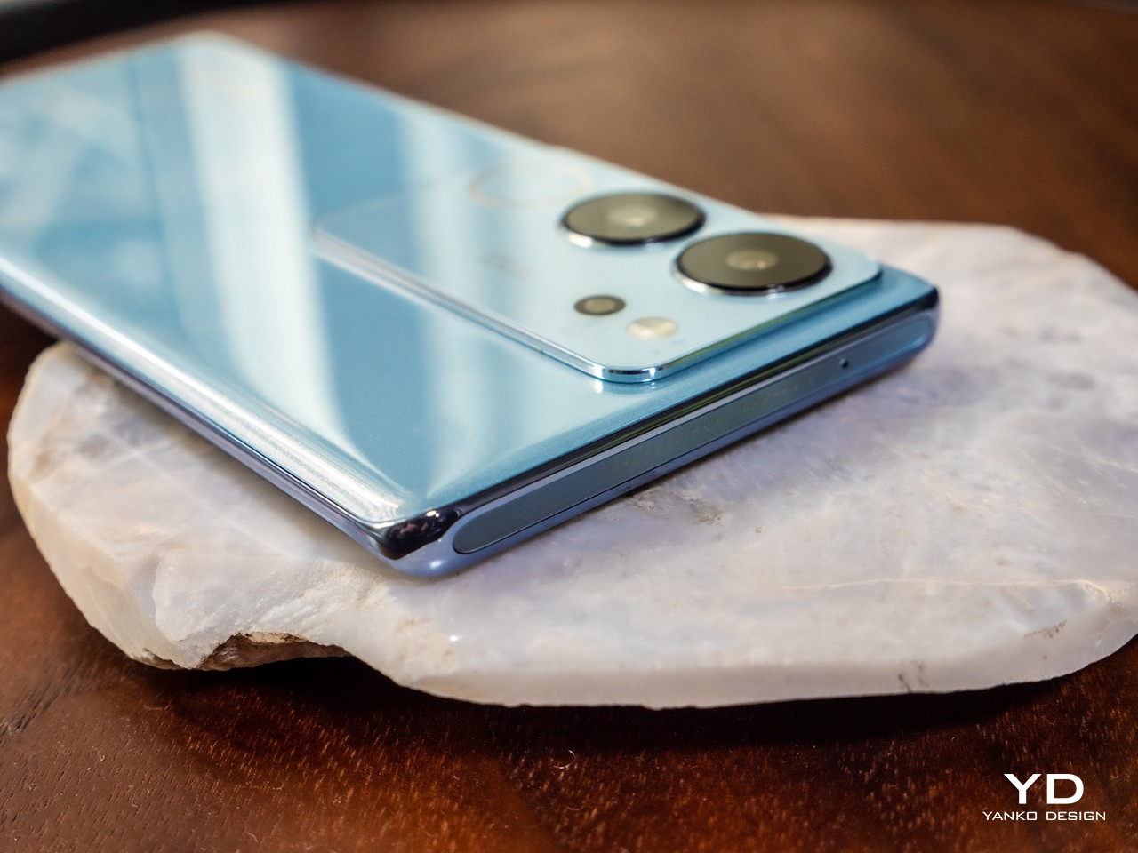
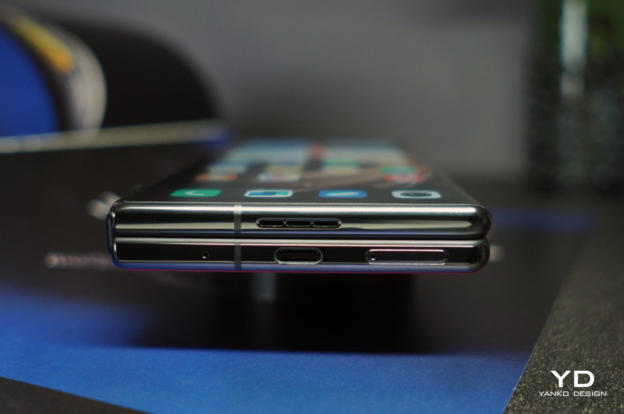
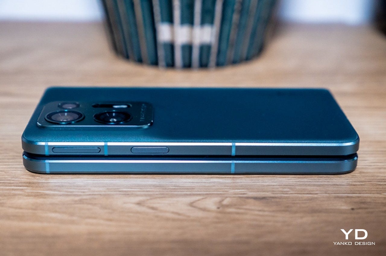
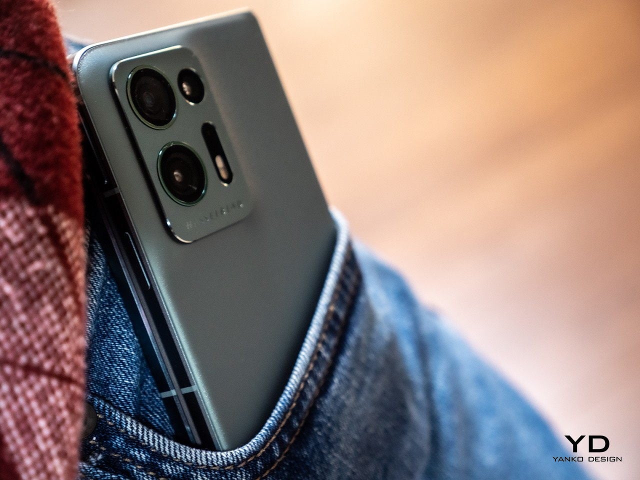
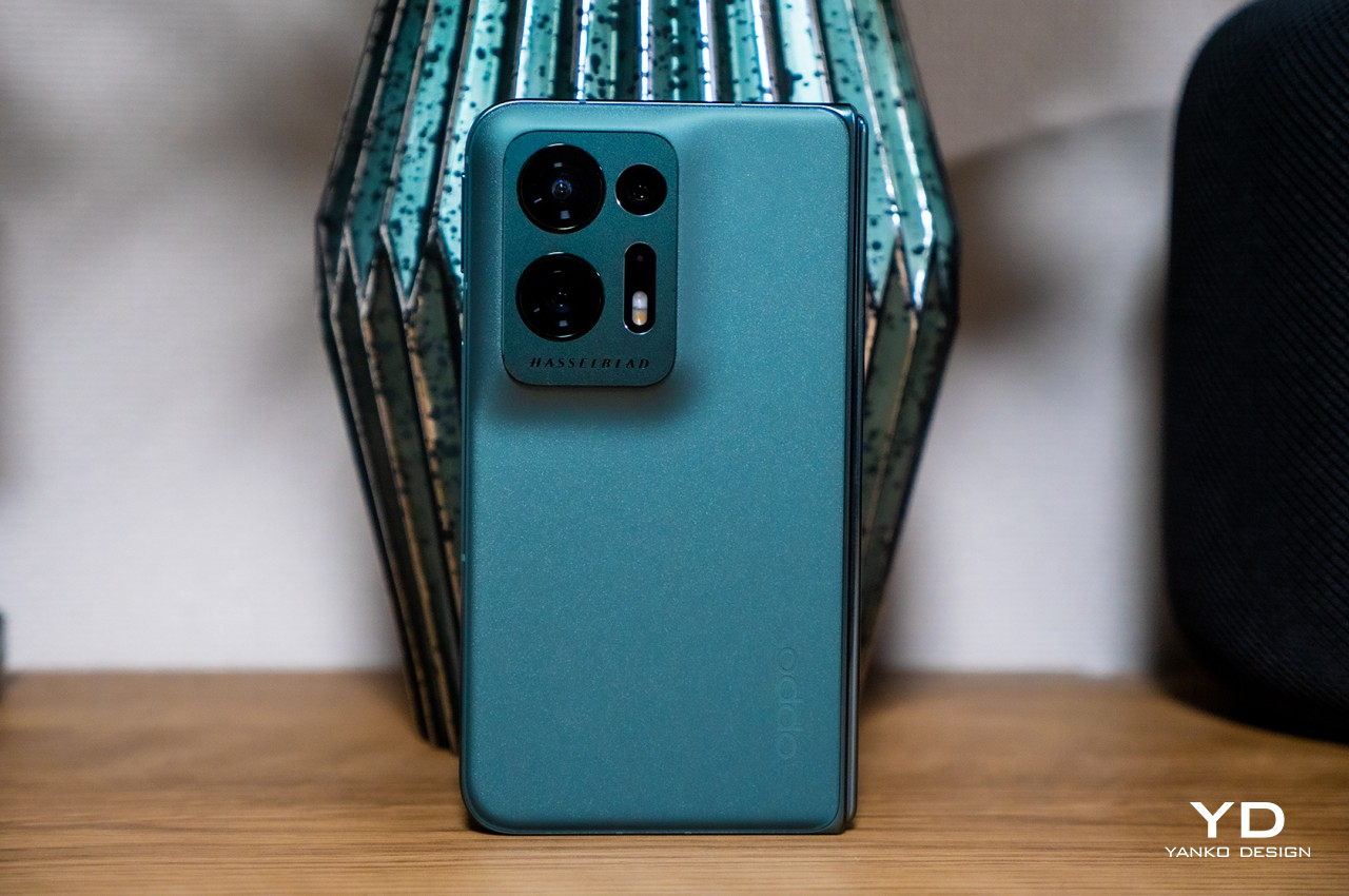
The phone is incredibly thin and, as we’ll see later, light, especially when unfolded flat at only 5.2mm thick, disregarding the equally thick camera bump. When folded, it does reach 11.20mm, though that’s not that far from the dimensions of regular slabs of metal and glass. In other words, you no longer look like you’re hiding two phones in the same pocket.

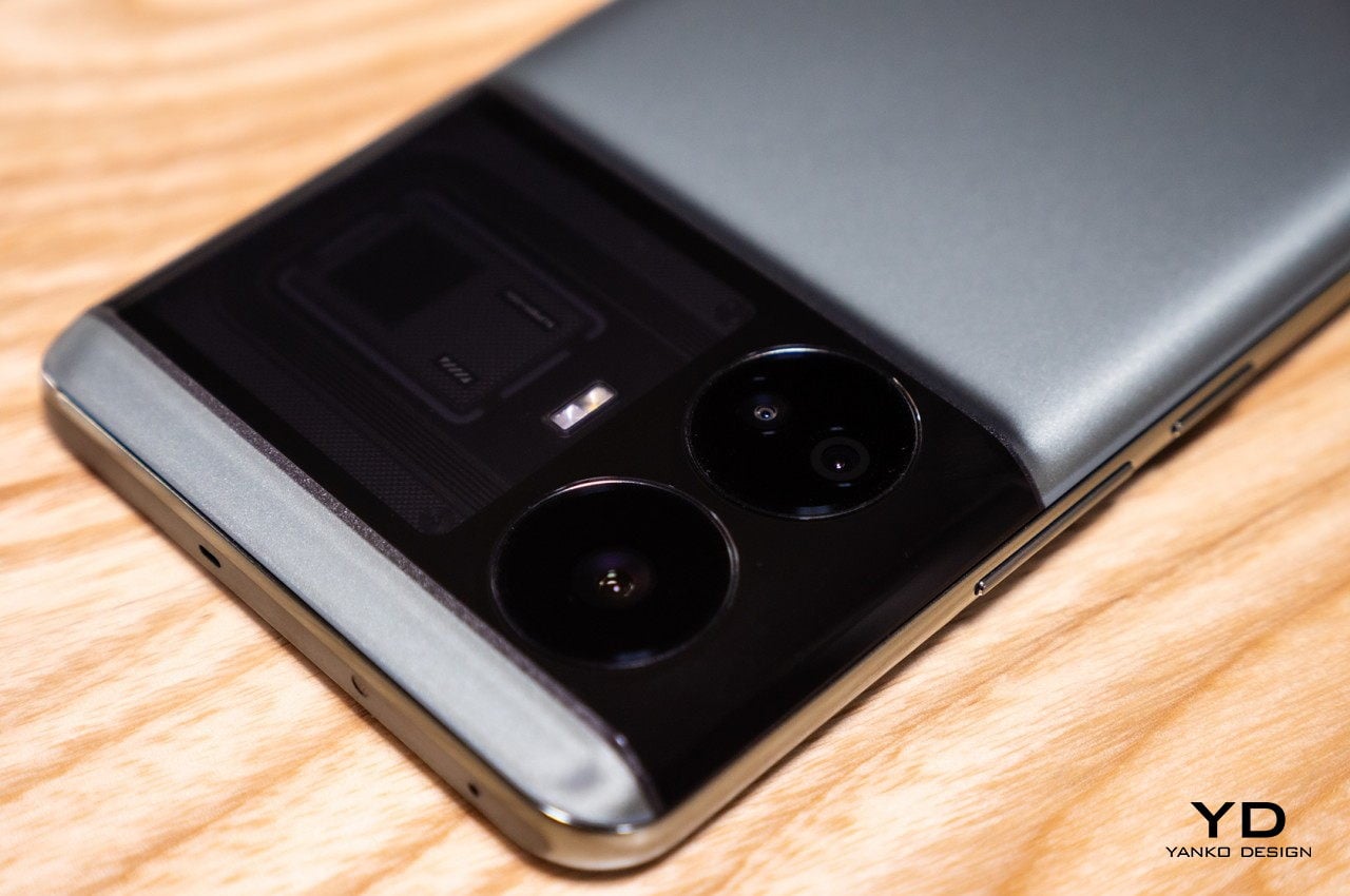
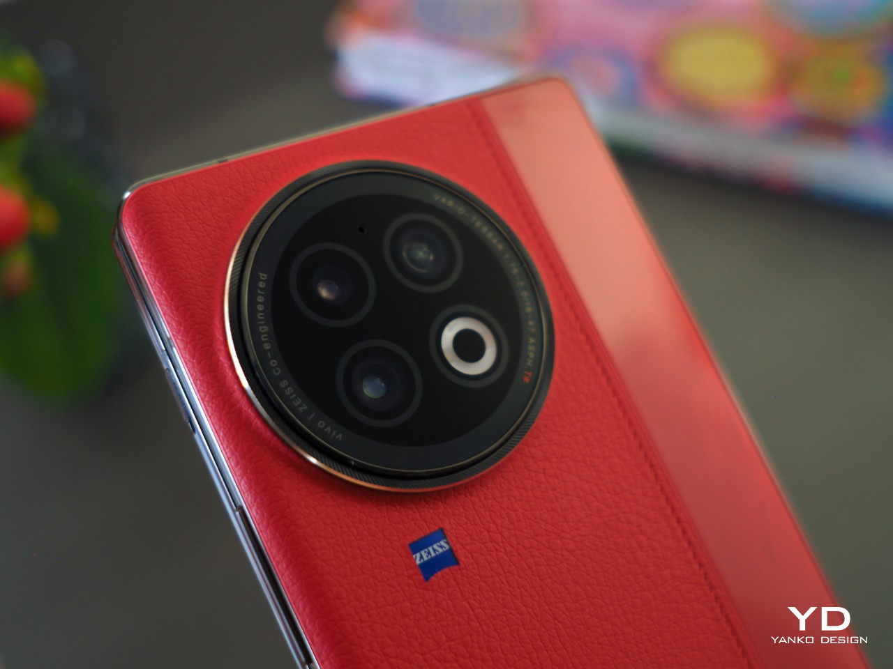
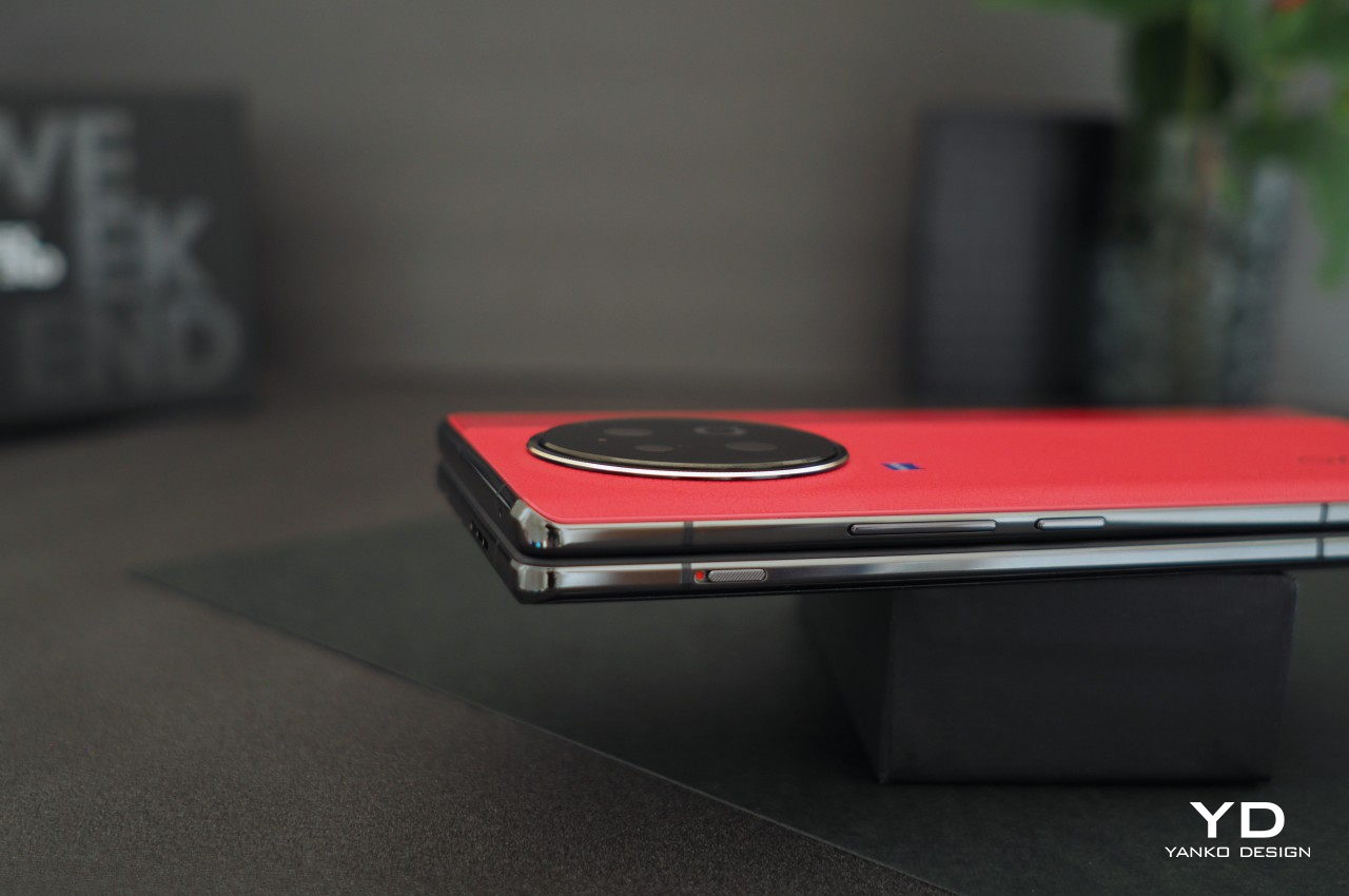
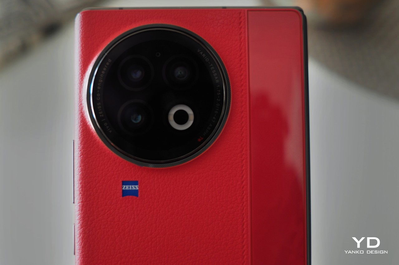
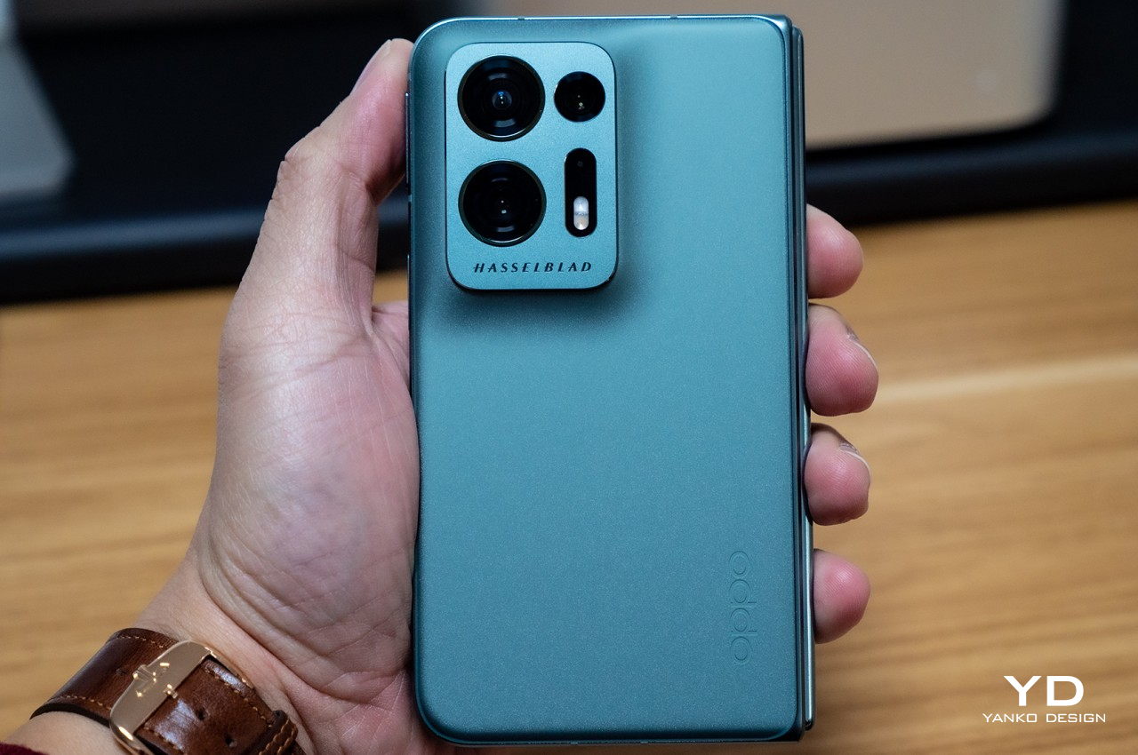
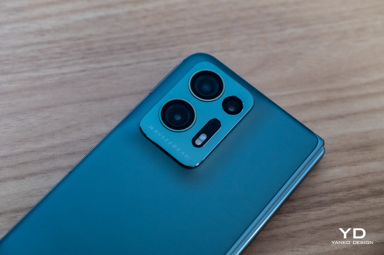
That aforementioned camera design, however, will be a bit divisive. On the one hand, it doesn’t look that awkward with a centrally positioned large circle that seems to mimic the lens of a traditional camera. On the other hand, it is still a very large circle on the back of the phone, which has some repercussions when it comes to handling the phone. Some would also consider such a large design element an eyesore, though it thankfully offers some significant benefit to its unavoidable presence.

Ergonomics

At only 236g light, the Vivo X Fold 3 Pro is pretty much on par with many premium flagships of the non-foldable kind, especially with “ultra,” “pro,” or “max” in their names. That makes this foldable phone feel comfortable to hold, especially when you consider how large their screens are. The external screen, in particular, has a 21:9 aspect ratio, which also puts it closer to regular candy bar designs. It’s still tall and narrow, though not as narrow as Samsung’s notorious design.
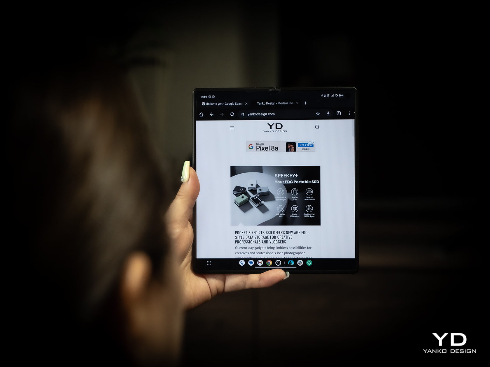
While the weight and shape of the phone lend it well for convenient and comfortable handling, there are a few features that may trip up a few users. Primary is that camera bump that could hinder the movement of your fingers on the back. Conversely, it also creates a protrusion that rests on your finger, helping avoid accidental drops. Either way, expect the phone to wobble on a desk when unfolded and lying flat on it. The alert slider, which gives a quick physical way to mute or unmute the phone, is also placed close to the top, which means you can’t easily reach it using the same hand you’re holding the phone with. They’re not huge deal-breakers, just small nitpicks that, when taken together, could take out the enjoyment of using the phone every day.

Performance

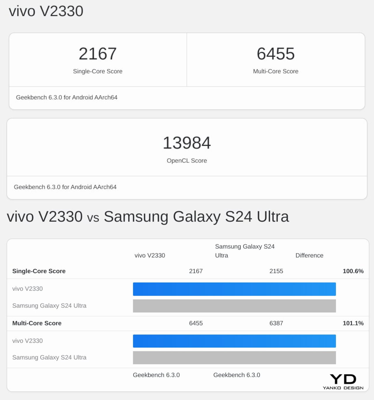
Vivo definitely didn’t pull punches when it came to making sure the Vivo X Fold 3 Pro could match other flagships this year. In some ways, it might even surpass them. Running on the current-gen Qualcomm Snapdragon 8 Gen 3 and paired with a generous 16GB of RAM, it can handle anything you throw at it with aplomb. In synthetic benchmarks, it can stand head-to-head with the Galaxy S24 Ultra, and it might even surpass the upcoming Galaxy Z Fold 6 if Samsung continues to keep memory down to 12GB max.
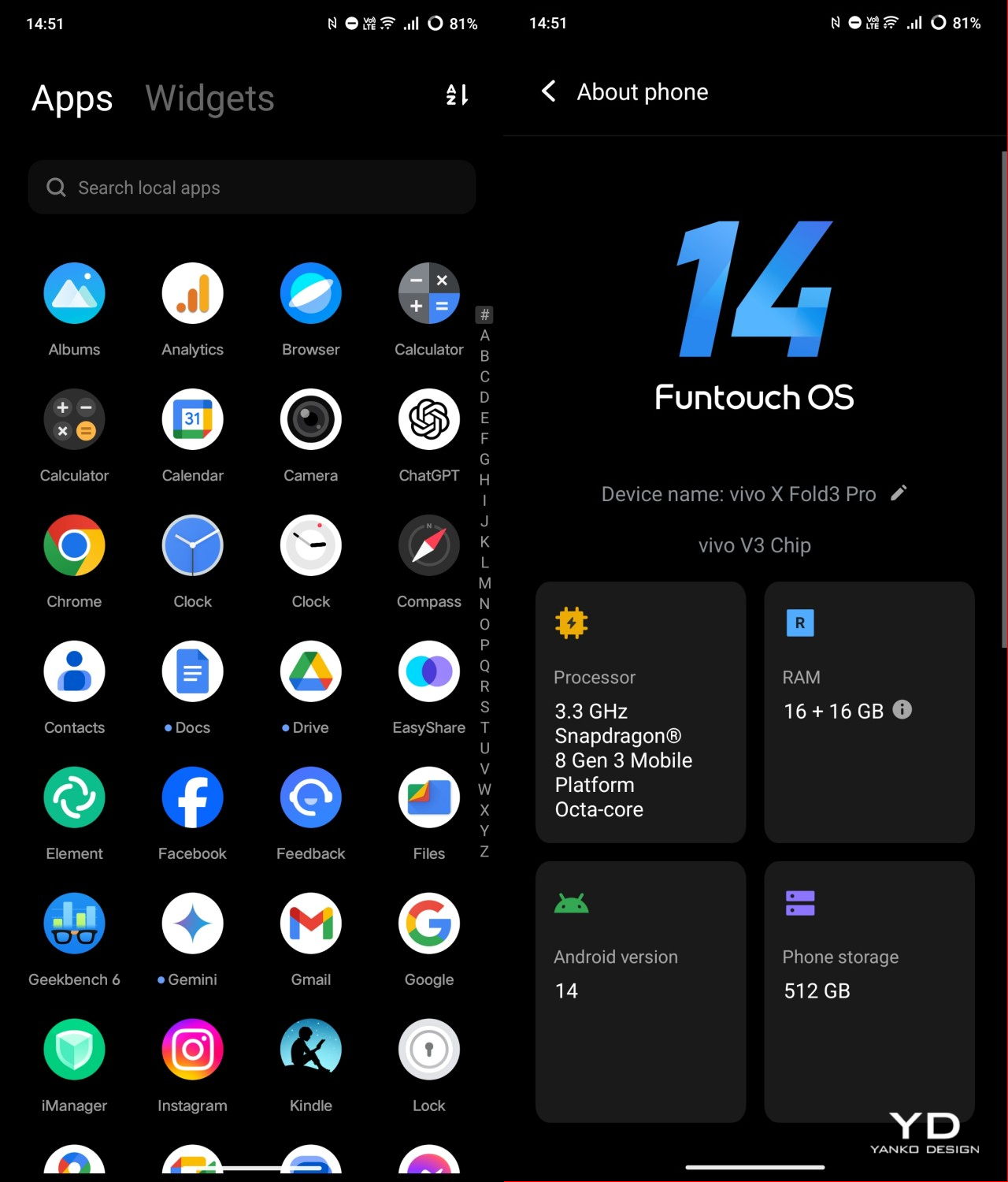
Battery is another department where Vivo is leading the race, cramming an unbelievable 5700mAh capacity inside such a thin and light device. This phone is guaranteed to last half a day, at least on “regular” and mixed usage, and thanks to 100W charging, it will only take an hour to get it back to full. There’s also fast 50W wireless charging, but you’ll need Vivo’s special charger to achieve that speed.
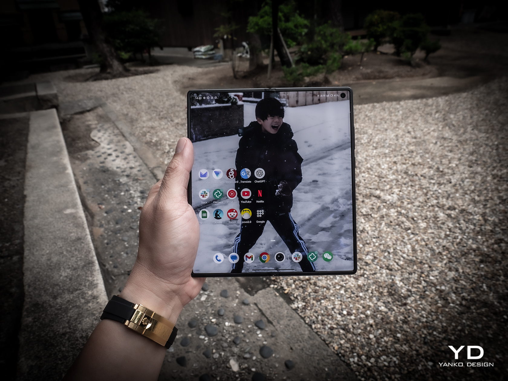

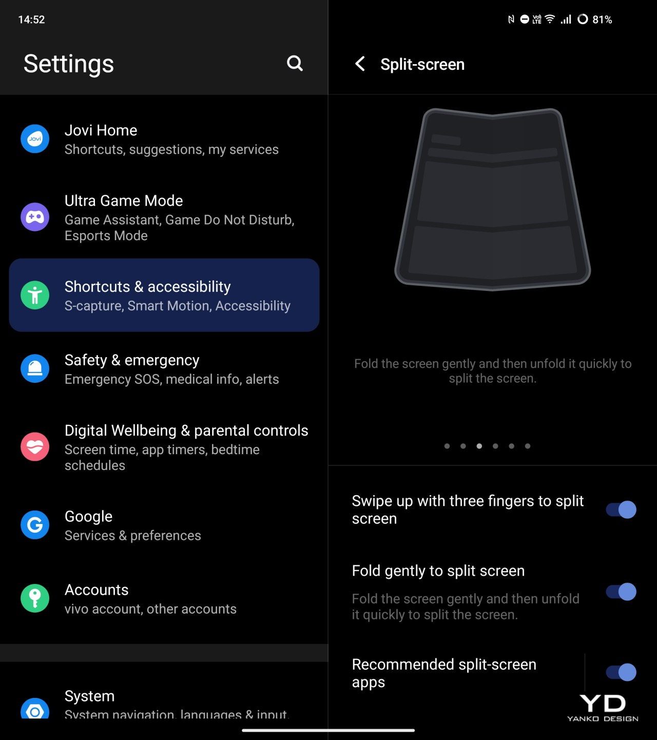
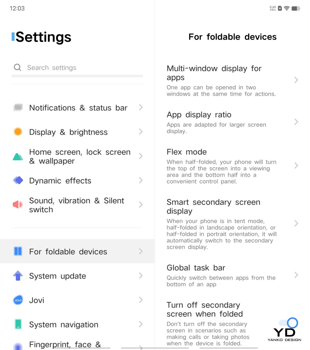
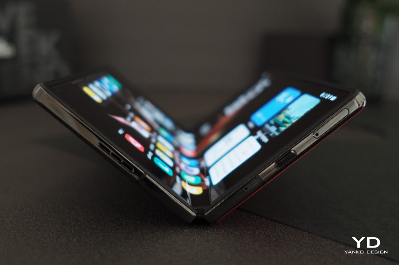
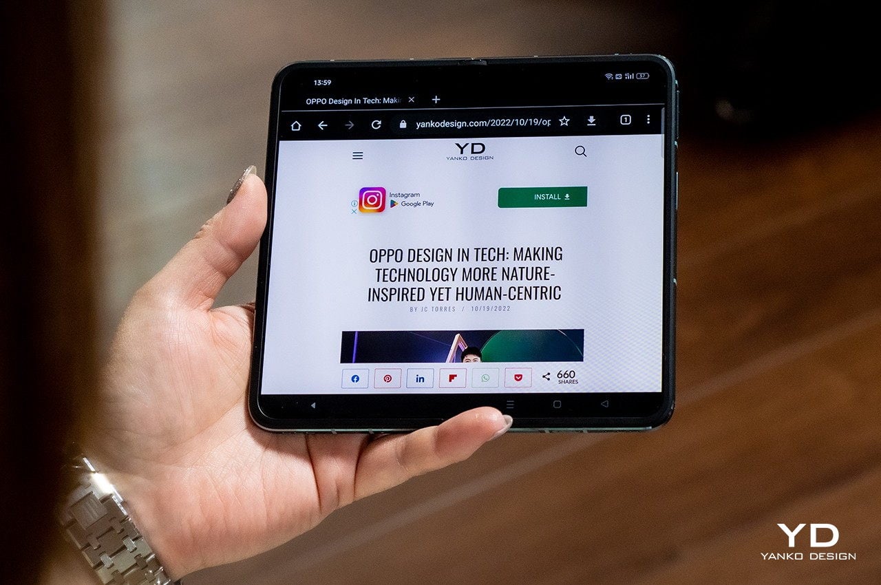
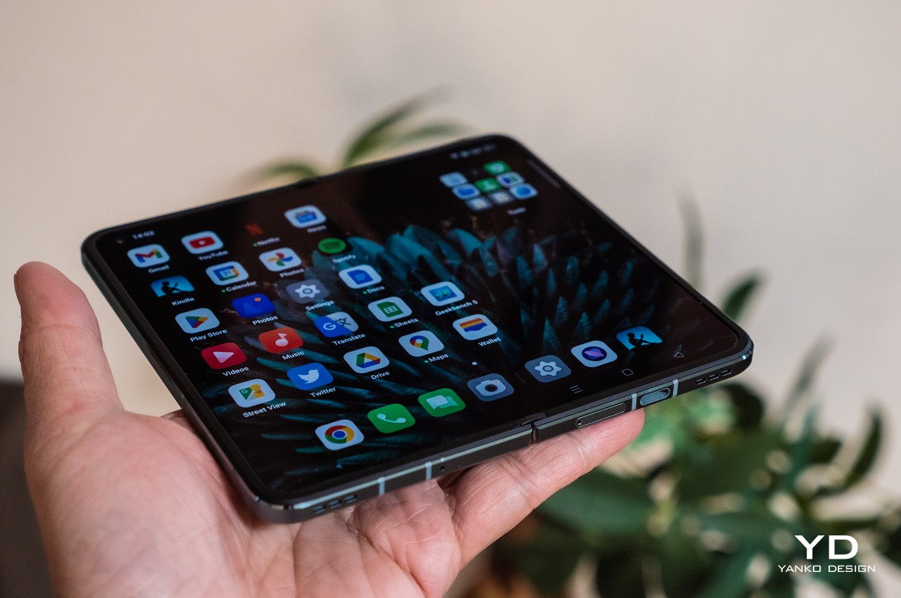
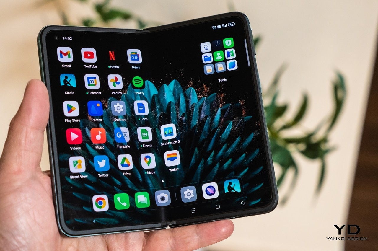
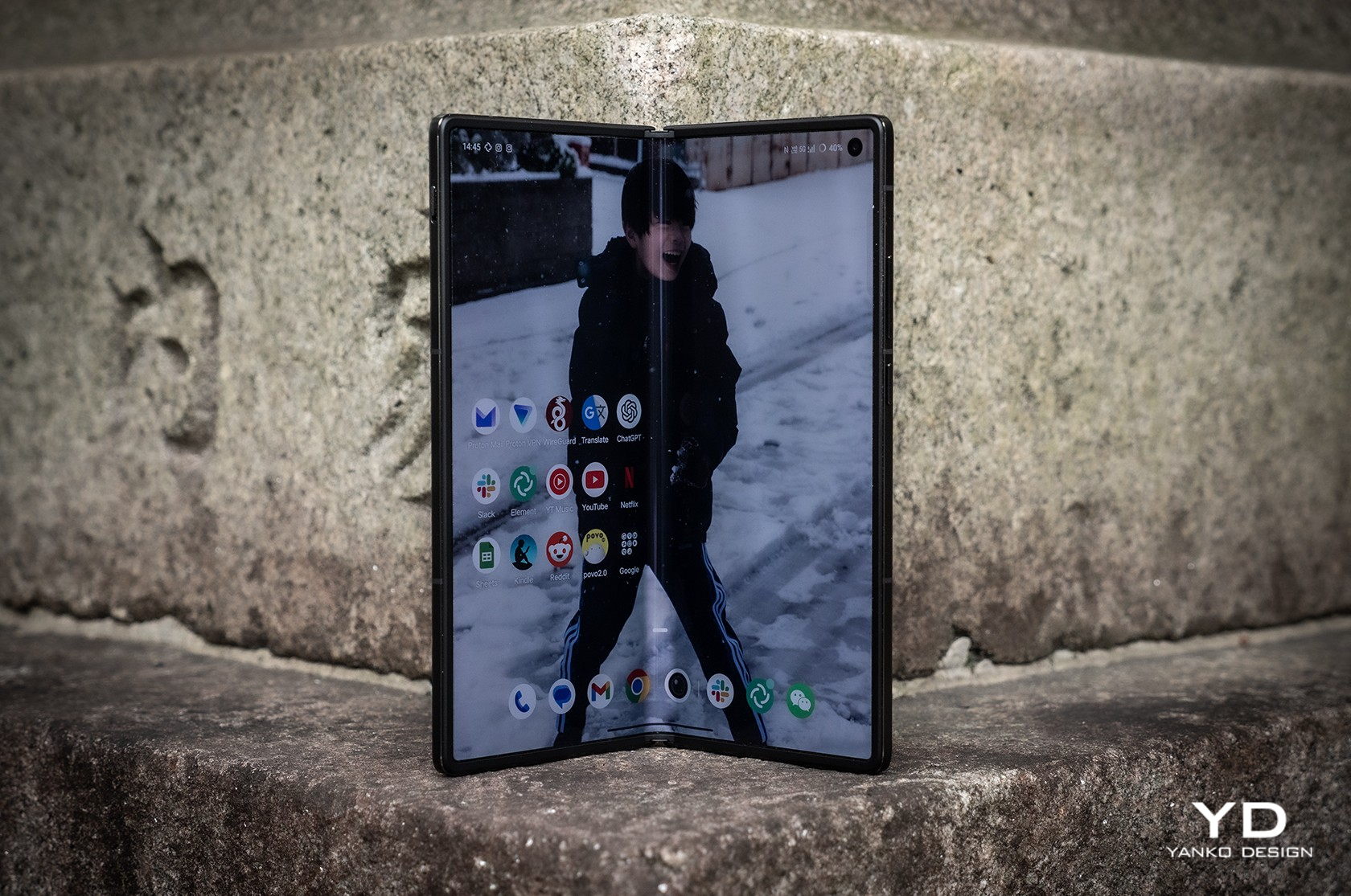
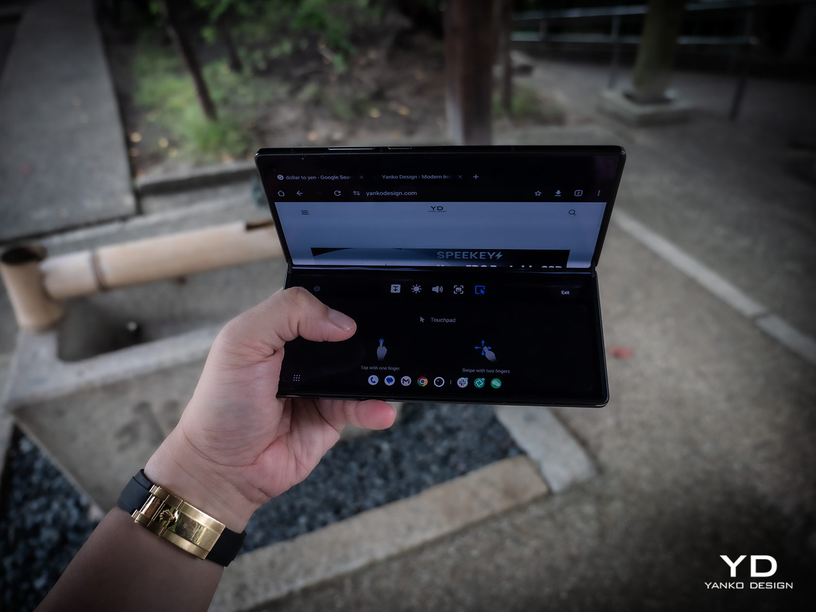
Both the external 6.53-inch 2748×1172 and internal 8.03-inch 2480×2200 screens are at the top of their class, showing vivid colors and exceptional brightness that make the phone a joy to use outdoors on either side of the fold. Thanks to Vivo’s engineering, the crease on the internal foldable display is barely visible. That hinge allows the fold to hover between 60 to 180 degrees without collapsing, creating that tiny laptop-like experience that you may or may not love. Vivo does have a “flex mode” to take advantage of that angle, as well as other features that only make sense for foldable phones. Quickly folding and then unfolding the phone again triggers the split screen feature where you can pick a second app to open side-by-side with the current one. It’s a bit gimmicky and probably won’t make owners feel comfortable about the longevity of that hinge.
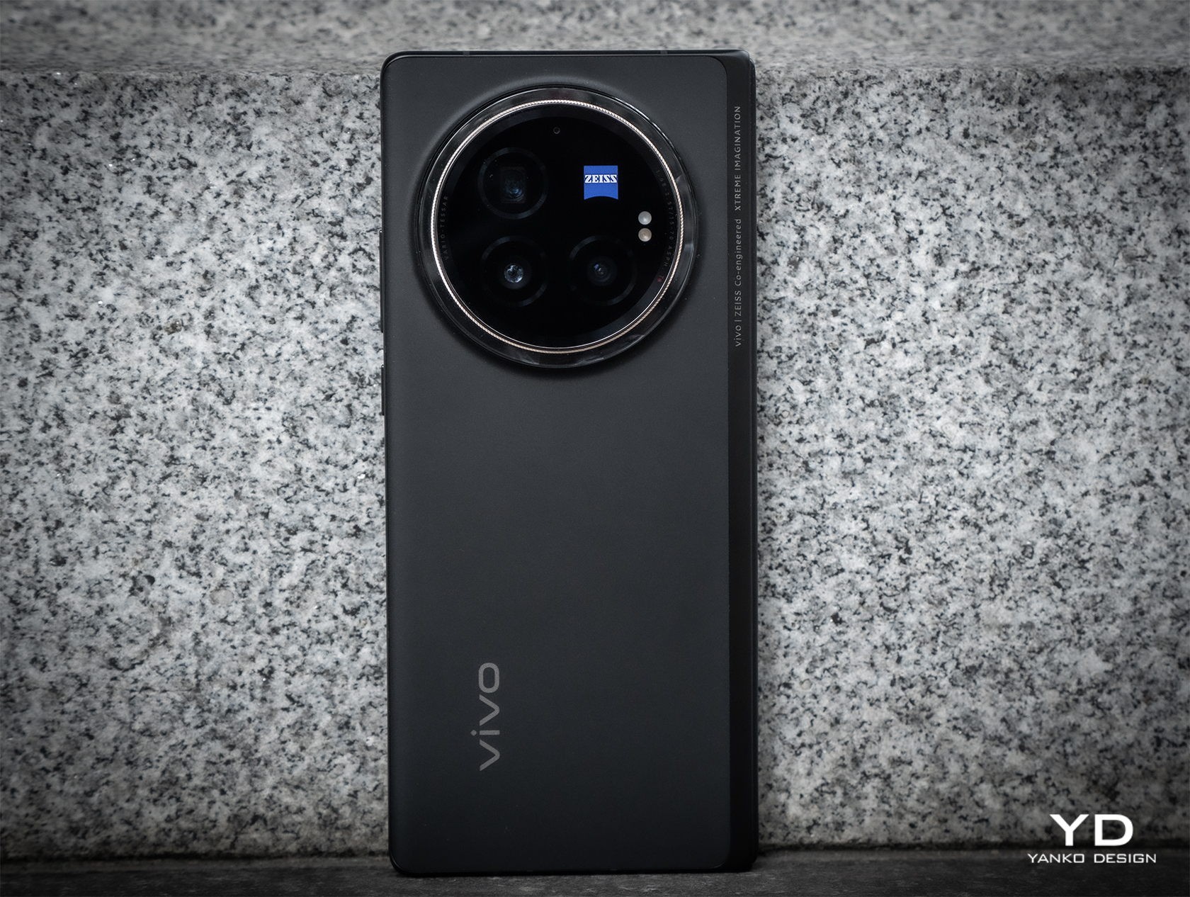
The large bump on the back of the Vivo X Fold 3 is easily justified by the rather beefy sensors it houses there. Leading the pack is a 50MP wide sensor with autofocus and OIS, and it is joined by a 64MP telescope camera with a periscope lens, also with AF and OIS. The 50MP ultra-wide shooter sadly drops the optical image stabilization but still manages to perform well.

All in all, the foldable delivers impressive photos and videos, especially with the Vivo V3 dedicated imaging chip in action. Details are rich and colors are accurate, and you can also pick the mode of vividness that best conveys the message you want the photo to send. The camera system is also co-engineered with ZEISS, which not only means the famed ZEISS T* coating but also different presets that mimic the output of the optics maker’s most famous lenses. It’s definitely great to see foldable phone cameras finally stepping up to the challenge, though the price in design and literal cost will be something people will need to consider before making a purchase decision.

Sustainability

Vivo is one of the few smartphone manufacturers that are taking big steps in going green, though that is sadly not directly seen nor felt on the Vivo X Fold 3 Pro. Instead, we can only look to the company’s wider sustainability efforts, particularly in running its business on green energy and doing its part in replenishing the planet’s greenery.

What it does promise with its newest foldable, however, is that it’s not going to end up in the trash or even recycling centers quickly. Durability has been one of the biggest concerns consumers have with foldables, so it’s not surprising that Vivo spent a lot of resources on ensuring the Vivo X Fold 3 Pro will be as reliable as more traditional smartphones. Those measures include a light yet ultra-durable carbon fiber hinge, protective Armor Glass for the cover display, and glass-like UPE fiber for the back panel. The phone is also rated IPX8, which is great for water protection but not so much for dust, raising worries that these tiny particles could inflict fatal damage on the sensitive internals of the phone.

Value
It’s pretty clear that Vivo spared no effort in equipping the X Fold 3 Pro with the best of the best in smartphone technologies this year. On normal smartphones, that would be a given, but such features on a foldable raise the stakes and the prices higher. At around $1,600 to $1,900, depending on where you get it, it’s not exactly an easily accessible product, especially when you consider it’s not available in some global markets.

The Vivo X Fold 3 doesn’t exist in a vacuum, however, and when you consider that its peers ask for nearly the same figure, you begin to see some of the advantages the foldable phone has. It’s definitely not lacking much, and it cuts quite a striking figure with its slim profile and lightweight body. Suffice it to say, there’s a reason it has “Pro” in its name, and it’s that same reason you’ll need to pay a premium for it.

Verdict

Samsung and Huawei kicked off the foldable phone race, and although almost six years have passed, the prices for these products have barely gone down. What makes matters worse is that in some cases, the prices have remained the same or even increased but have very little to show for it. If you’re going to charge a premium for a product, you should be making sure the product is actually premium.

That’s the kind of promise that the Vivo X Fold 3 Pro offers, cutting almost no corners in the name of delivering the best foldable experience with current industry technologies, not those from two or three years ago. It’s not an easy promise to make, especially when you consider the need to also make the design slimmer and lighter, but Vivo seems to have actually pulled it off. For that feat alone, the Vivo X Fold 3 Pro definitely deserves your consideration, even with that hefty price tag.
The post Vivo X Fold 3 Pro Foldable Phone Review: Putting the Competition on Notice first appeared on Yanko Design.

Lenovo Legion Go Review: Big Steps for Handheld PC Gaming

PROS:


  • Beautiful and spacious 8.8-inch 1600p 144Hz screen

  • Detachable controllers with innovative FPS (vertical mouse) mode

  • Great overall performance

CONS:


  • Large and heavy

  • Bottom USB-C port is unusable when using the kickstand

  • Short battery life

RATINGS:

AESTHETICS
ERGONOMICS
PERFORMANCE
SUSTAINABILITY / REPAIRABILITY
VALUE FOR MONEY

EDITOR'S QUOTE:

The Lenovo Legion Go pushes the envelope of what handheld PCs are capable of, paving the road for future innovation in this space.
award-icon

Although it was hardly the first portable gaming console, the success of the Nintendo Switch really inspired a new class of gaming devices. It pushed the boundaries of what you can accomplish with a handheld, offering a gaming experience that you can enjoy anywhere, including while sitting on a couch in front of a TV or table. Of course, Nintendo’s selection of titles is just a small part of the larger gaming world, and there have been many brands that have tried to bring the magic of the Switch to PCs. The Steam Deck proved that such a product would be popular, but it just stopped there. Lenovo, on the other hand, went all out with what is possibly the closest to a “Switch PC” to date. But is the Lenovo Legion Go just a Switch clone or is it offering a completely new gaming experience? We take this innovative gaming handheld for a few good spins to find out.

Designer: Lenovo

Aesthetics

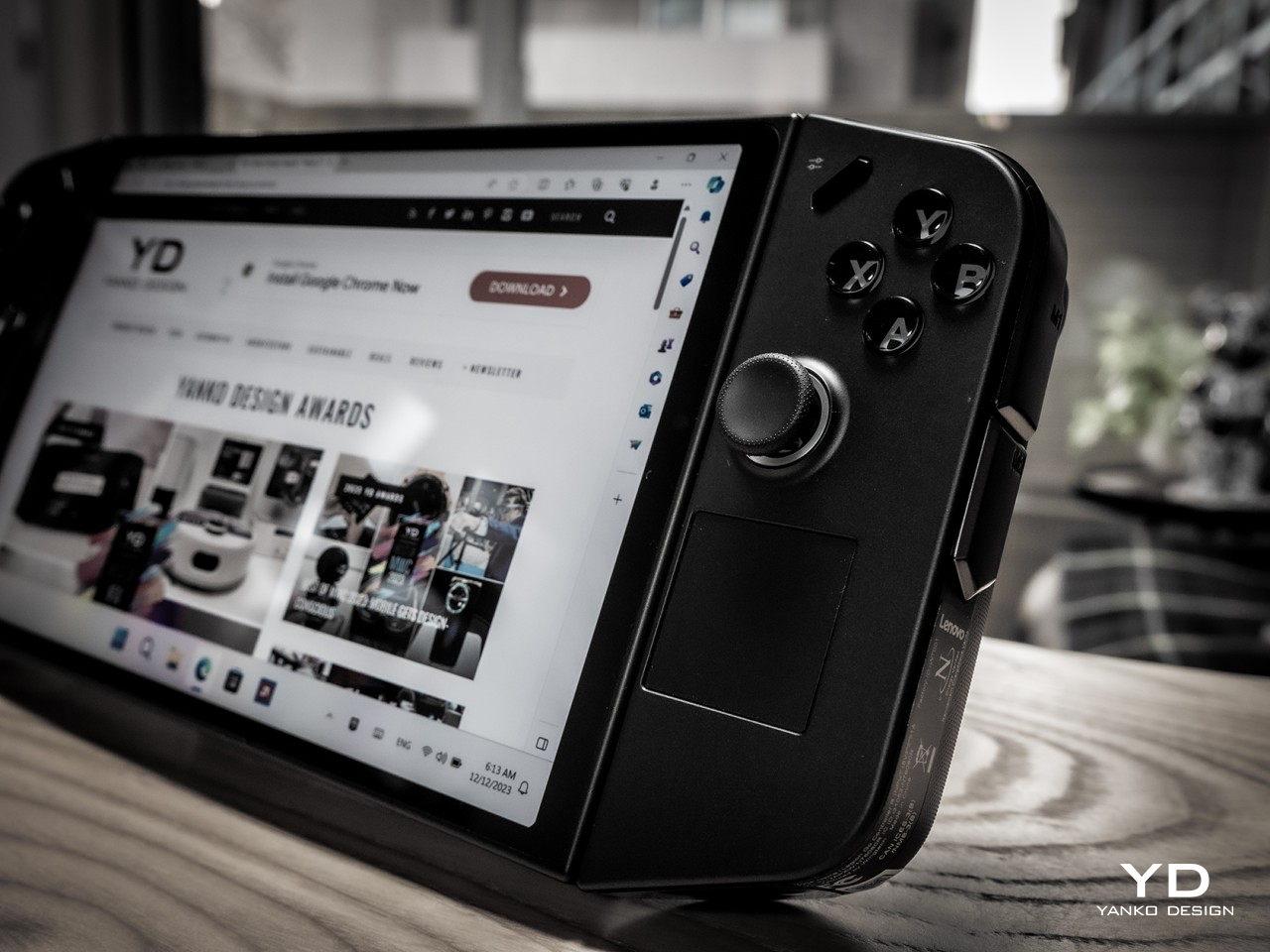
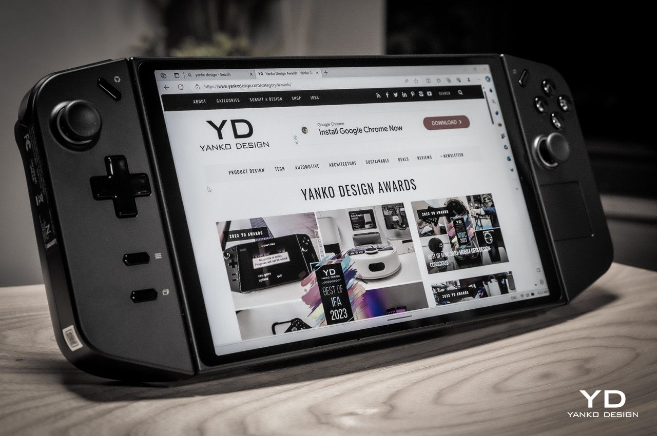
Right off the bat, the first thing you’ll notice about the Lenovo Legion Go is that it’s huge, bigger even than the Steam Deck that’s already considered a giant. It’s slightly thinner than the Deck but only in the middle because the removable controllers almost add an inch to that thickness. It is definitely the larger and heavier of the three major handheld PCs, something that has repercussions for comfort and ergonomics, as we’ll see later.

Fortunately, you might forget the Legion Go’s size the moment your eyes settle on its large 8.8-inch screen, also the largest in this niche market. With a high pixel resolution and bright colors, it easily outclasses the competition, at least in terms of sharpness and visual impact. It doesn’t come without cost, though, but if you value a large, sharp, and fast gaming screen above other specs, this is the one to beat.

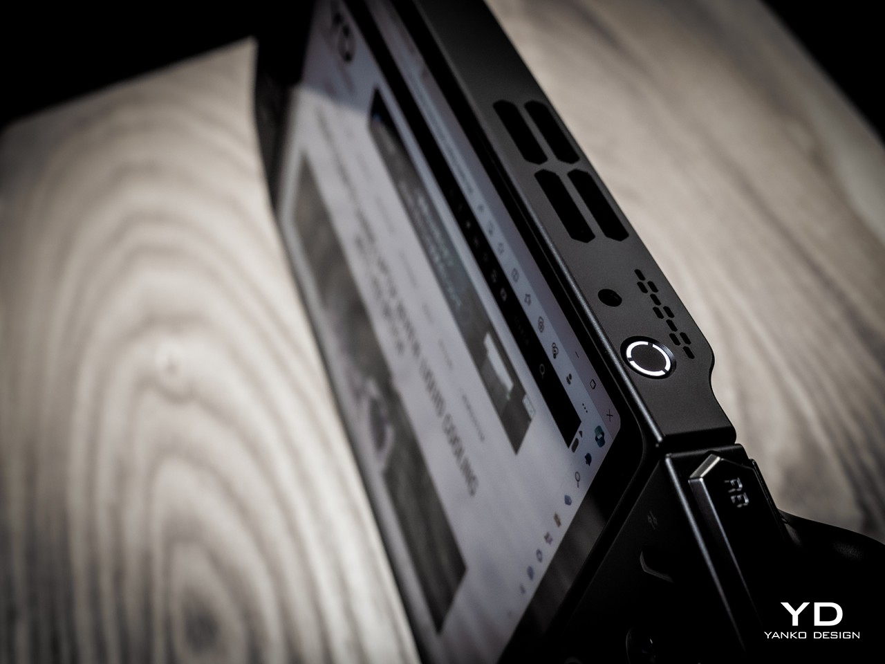
The Legion Go definitely carries itself well compared to its peers in terms of aesthetics. Unlike the more rectangular shapes of the Steam Deck and the ASUS ROG Ally, the Legion Go’s controllers taper a bit, creating a more interesting shape from the front. The back of the device is mostly flat save for the contoured handles of the controllers on each side. That back also features a full-width kickstand that lets you easily prop up the Legion Go on any flat surface for playing games or even for watching videos. The top edge has buttons and ports for controlling the device while the bottom has a lone USB-C Gen 4 port for both charging and data.

All in all, the Lenovo Legion Go presents a solid and distinctive design that doesn’t stray too far from the convention but has enough tweaks to make it stand out from the crowd. Its large screen plays in its favor, though the resulting large size is a bit of a double-edged sword. This niche market is still in its infancy and we’ll surely see more interesting designs in the future, but at least for now, Lenovo has pulled enough tricks to give the Legion Go a memorable character.

Ergonomics

There’s really no going around the fact that the Legion Go is a bulky and heavy device, bigger and heftier than its two closest rivals. For a device that’s primarily meant to be held in your hands, that can be a huge drawback. Even if its battery life lasts for hours (or if you’re playing it while charging), your hands and arms will undoubtedly tire after the first 30 minutes or an hour at most. It might be an artificial way to limit your gaming time, but the great thing about this kind of device is you don’t actually need to hold it up to play. Just like the Switch, you can simply set it down on a table or connect it to a large screen. Either way, you can just continue playing, at least as long as you have enough battery for it.

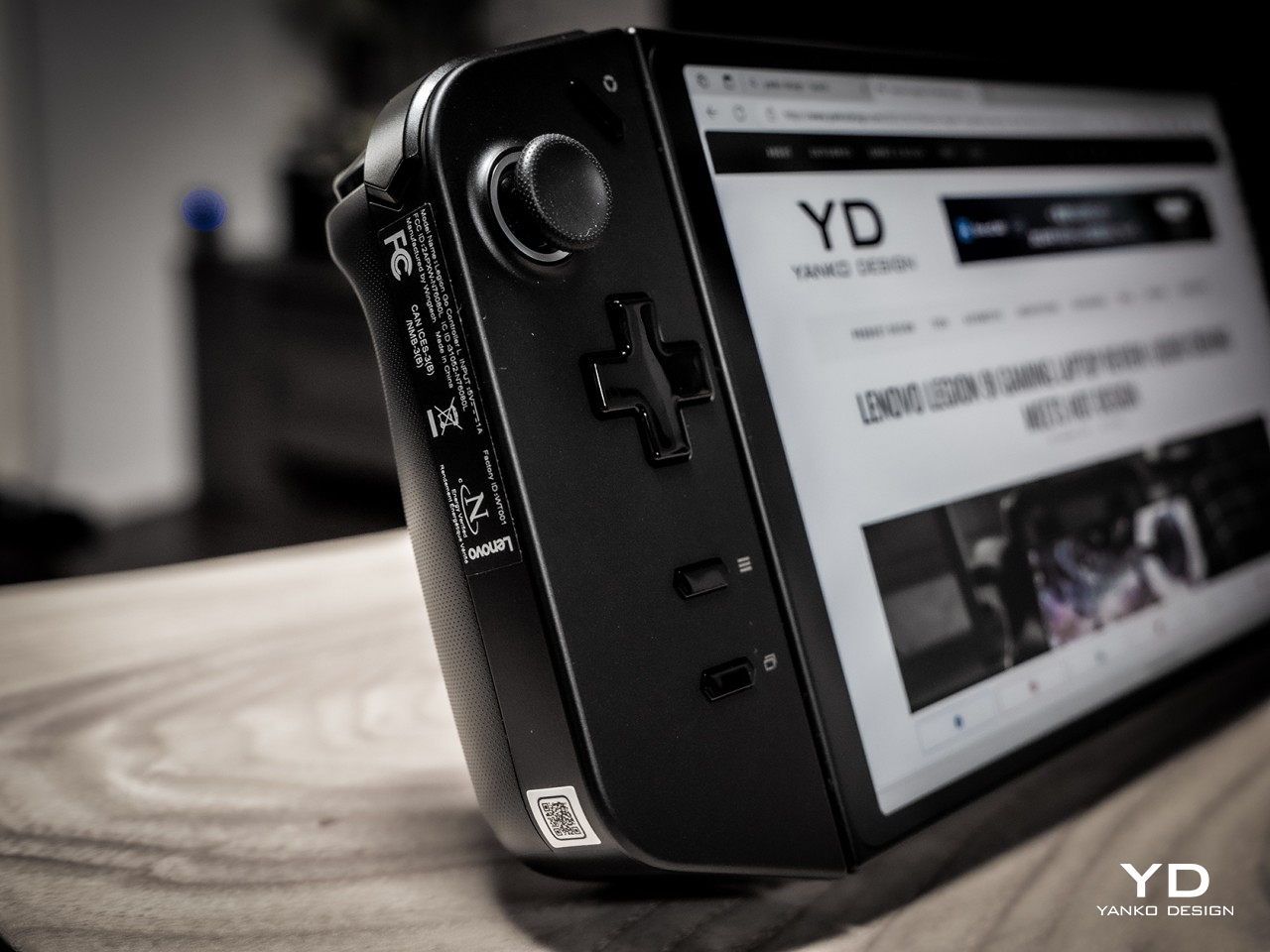
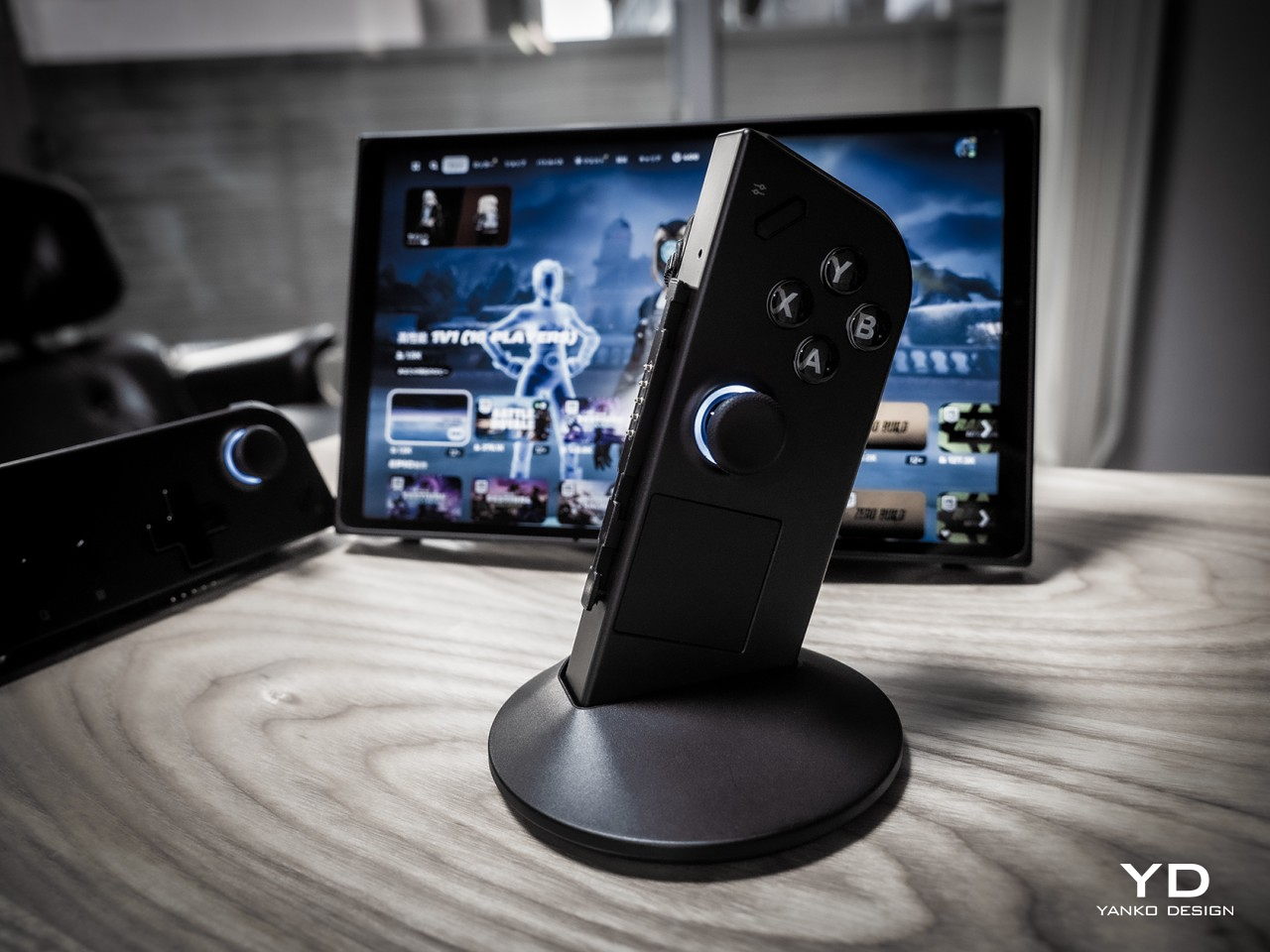
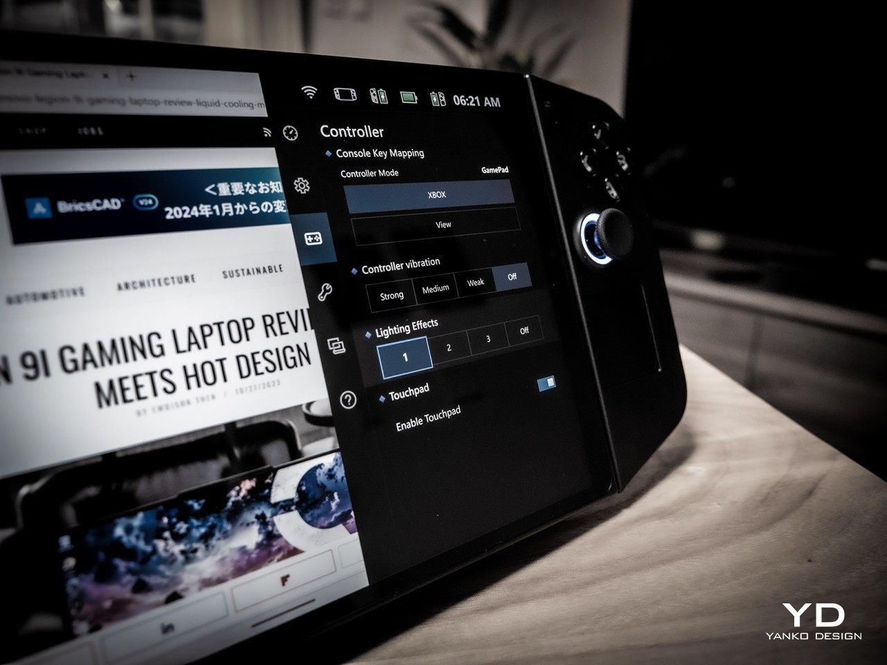
As mentioned earlier, this is as close as we’ve come to a Switch-like PC, and that’s primarily thanks to the detachable controllers. You can slide them off, though downward in the opposite direction compared to the Switch, and use them as normal Bluetooth controllers except split in two. There is, however, a special Lenovo-only mode that changes the narrative a bit. It’s called FPS mode and you stick the right controller into a base that makes it look like a joystick, except it’s a mouse that you drag across the table, not unlike those ergonomic vertical mice. As the name suggests, it’s meant to offer a more precise method of aiming with the right hand in FPS games and more fluid movement with the left controller. It’s definitely an innovative design but one that requires heavy muscle memory training to really get used to.

The Legion Go isn’t just a gaming device, however. It’s a gaming PC that runs a regular version of Windows 11, which means the user experience isn’t optimized for anything but a keyboard and mouse or, at the very least, a touch screen. This makes operating the non-gaming parts of the operating system a bit more tedious, though Lenovo thankfully included a small touchpad on the right-hand controller exactly for this purpose. There’s also a tiny scroll wheel on the back side of the same controller, but its location makes it difficult to reach. Along with the idiosyncrasies of Windows itself, this makes operating the device in handheld mode cumbersome and awkward.

Performance

Lenovo definitely pulled out the stops when it came to the Legion Go’s silicon muscles. Running inside is an AMD Ryzen Z1 Extreme with RDNA Graphics paired with 16GB of RAM and 512GB or 1TB of NVMe SSD storage. It’s not desktop-level hardware, not even a gaming laptop, but at this size, it’s currently the best that’s available for handheld computers. It can definitely handle most PC games at medium settings, and maybe a few at high settings. Of course, cranking up those options will drain the battery quicker, and there’s not a lot in the first place.

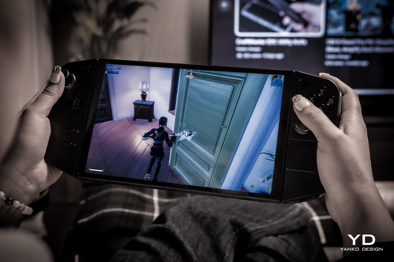
The real star of the show, however, is the impressive 8.8-inch 2560×1600 IPS LCD display with a 144Hz refresh rate. Not only is it the largest among handheld computers, it also has the highest resolution. It’s bright, vibrant, colorful, and sharp. And it’s also quite the battery drain. On paper, a high resolution such as this would be a huge boon for gaming, but only if you have lots of battery and power to spare. At full resolution, the only way you’ll get above 60fps in Fortnite is by setting the setting to medium (67fps) or low (79fps). Then again, 47fps with high settings isn’t so bad either. Dropping the resolution to 1200p made the gameplay experience much better during our test.

The real problem is the battery life, though the Legion Go isn’t alone in this regard. At medium settings, playing Fortnite (with voice chat on) drained the battery in around 79 minutes and at 1200p resolution only. Again, the sharpness of the screen is a huge advantage over the Steam Deck and the ROG Ally, but the price it entails is just too high. Sure, you can set a lower resolution by default, but then you’ll be paying for hardware you’re not able to fully utilize.

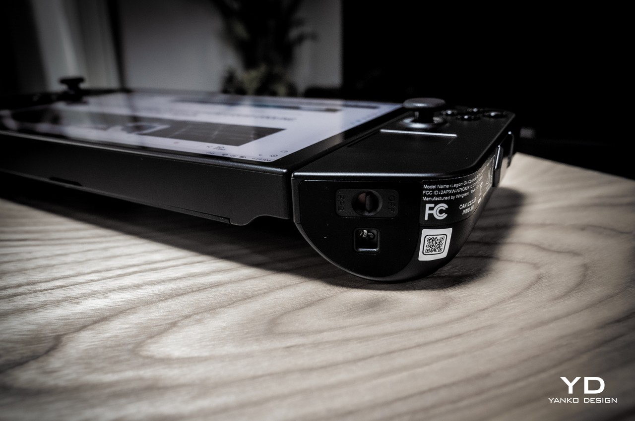
The Lenovo Legion Go has the bare minimum when it comes to hardware connectivity, namely two USB-C 4.0 ports, one at the top and another at the bottom. There’s also a headphone jack for good measure so you can connect your favorite wired headphones for more immersive gaming. Having two USB-C ports is great for connecting peripherals or a hub while still having one port free for charging the device. The catch is that the placement of the bottom port makes it inaccessible when using the built-in kickstand. Sure, you can use the top port for charging, but you still lose the other port for other accessories. To be fair, the Switch has the same problem but is worse by having a single USB port, but you’d hope that designers would have solved this problem by now.

Being able to set the Legion Go down on a table and still play using the controllers is also a Switch-inspired feature, but the actual implementation needs a little bit of work. In addition to the awkward way of pulling out the controllers, you apparently can’t use a different external controller unless you take the pair out and disable them from Windows Device Manager. It might just be a bug or a hidden setting, but the fact that it isn’t as straightforward as on a regular computer (or even the Nintendo Switch) makes it a less favorable experience.

When it comes to performance, the Legion Go spares no expense at using the best possible hardware, but having the most powerful isn’t always the correct solution. Power-hungry specs, especially a hi-res screen, drain the battery faster than it should, and owners are forced to tweak every aspect to squeeze out as much juice as they can from the device. Admittedly, PC gamers are used to tweaking settings left and right, but that’s a little less convenient and less ideal on a handheld form factor.

Sustainability

Impressive as the Legion Go’s design might be, there will definitely be concerns about its long-term viability. First-gen designs in this industry don’t always spark confidence, both in terms of durability as well as customer support down the road. Lenovo is an established brand, of course, so there’s an implicit trust in the products that it makes. This device definitely feels solid, despite its plastic body, so you can be assured that it’s not some flimsy product that will die out on you in the first few months.

Its unique design does bring a few complications, though, particularly with the removable controllers. These can be points for mechanical failure in the feature, or structural weaknesses that could lead to an early death for the device. There are a lot of custom parts used for the Legion Go as well, so repairs will have to be done by authorized Lenovo service providers only. That increases the risk factor in purchasing a device that could meet more accidents in your hands compared to a conventional laptop.

Value

Gaming handhelds are becoming popular again, both from the retro front as well as the PC market. Just looking at the growing number of options outside of major manufacturers shows there’s a sizable market for these devices. Not every PC gamer is a fan, though these would also admit dreaming of being able to play games anywhere, including in situations where they can’t use their bulky gaming laptops. As mentioned, there are plenty of options available now, but the Lenovo Legion Go offers the best-balanced set of benefits and drawbacks in the market today.

It has powerful specs topped by a gorgeous and large display that really makes games pop. The FPS mode might need a bit of getting used to, but the convenience of being able to detach the controllers when needed is a huge boon, though there are some rough edges to smoothen out. Battery life is pretty dismal by default, but that’s on par with other handheld PCs. The biggest clincher is that you’re getting this solid mobile PC gaming experience starting at just $699.99, which means you aren’t cutting corners for that juicy price tag.

Verdict

There was a time when analysts proclaimed the PC market to be dying, but that might only be true for desktops. Laptops flew off the shelves during the pandemic, and now handheld PCs are sparking interest and ushering in a new generation of PC gamers who are living the dream of playing anywhere. There are still only a few players in this market, and Lenovo, the world’s biggest PC maker, is making sure it’s leading here as well.

The Lenovo Legion Go definitely shows the brand’s expertise, combining decades of experience with a bold design and innovative features. It also proves that there is still plenty of room for improvement, whether for refining features or introducing new experiences. At this point, handheld gaming PCs like these are still considered a luxury, but with a tempting $700 price tag, the Legion Go is doing its part to make these devices more approachable and more usable for everyone.

The post Lenovo Legion Go Review: Big Steps for Handheld PC Gaming first appeared on Yanko Design.

Lenovo Legion 9i Gaming Laptop Review: Liquid Cooling meets Hot Design

PROS:


  • Distinctive cover design

  • Effective liquid-cooling system

  • Desktop-grade performance

  • Comes with two power adapters (330W GaN, 140W USB-C)

CONS:


  • Small, cramped trackpad

  • Mediocre battery life

  • A bit pricey

RATINGS:

AESTHETICS
ERGONOMICS
PERFORMANCE
SUSTAINABILITY / REPAIRABILITY
VALUE FOR MONEY

EDITOR'S QUOTE:

With an effective liquid cooling system and impressive performance, the Lenovo Legion 9i delivers a formidable desktop replacement wrapped in a fresh new aesthetic.
award-icon

Laptops have come a long way and are available in a wider range of options. While there are still some designs that prioritize extra slim profiles, others target performance to match or even rival that of a desktop PC. These desktop replacements, mostly in the guise of gaming laptops, have to make a few compromises to strike a balance between portability, performance, and heat management. There’s no perfect mix, at least none that would match almost all the needs of almost all types of laptop users. The Lenovo Legion 9i, though primarily a gaming laptop, promises to come pretty close to that ideal. Better yet, it comes with a unique and memorable design that might even appeal to those outside of gaming circles. Read on for a deeper dive into this visually distinctive laptop to see if it is really able to deliver on those promises.

Designer: Lenovo

Aesthetics

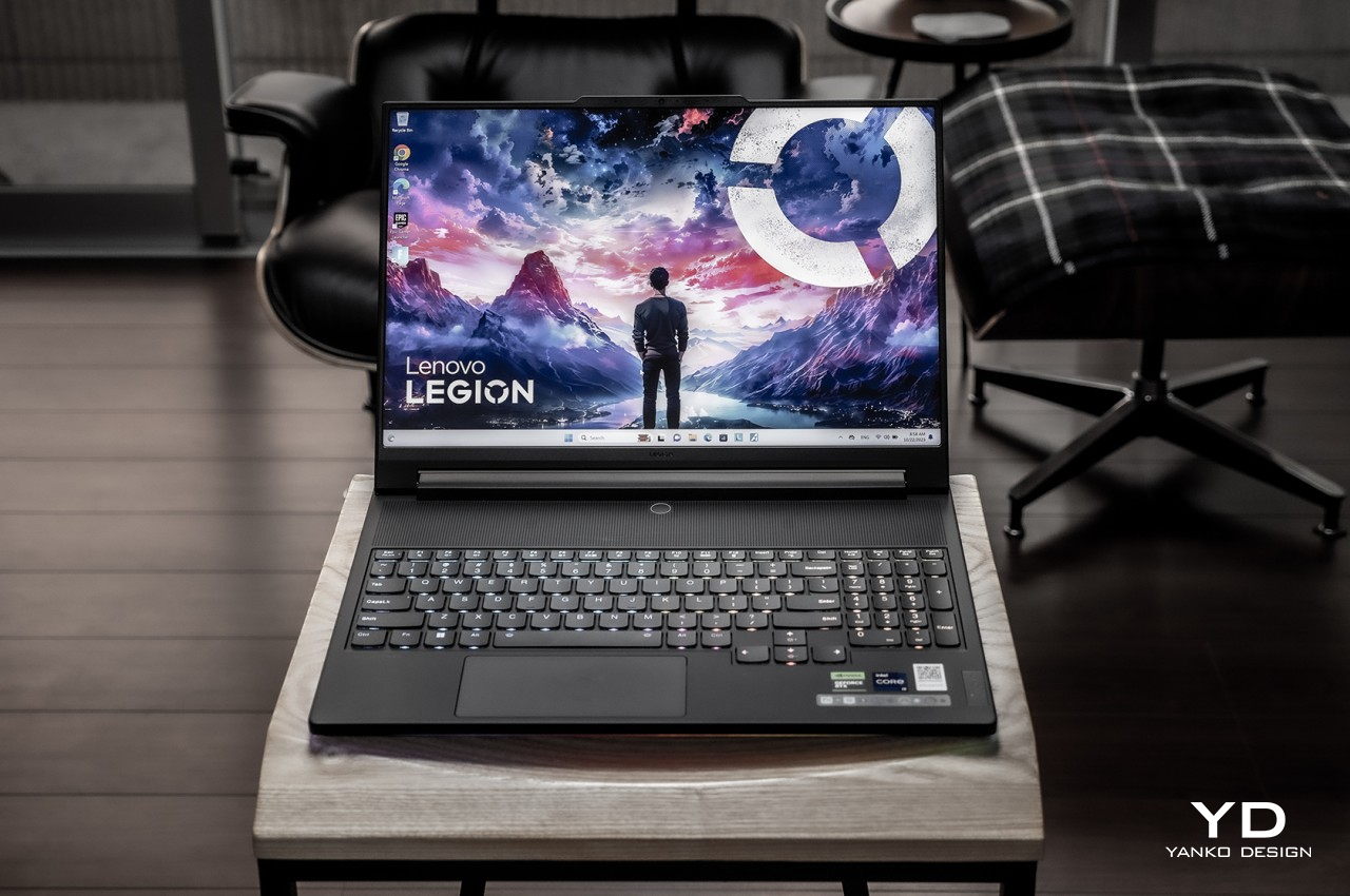
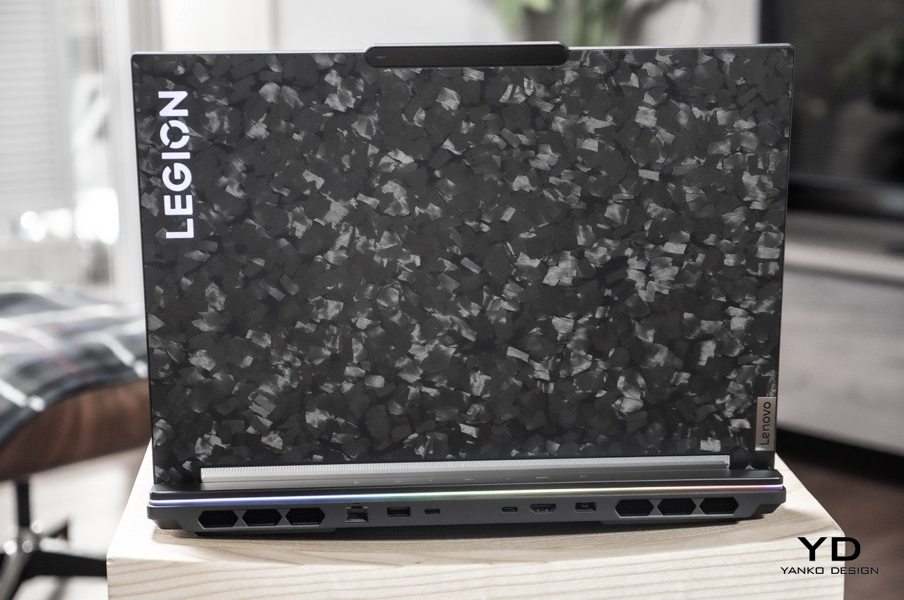
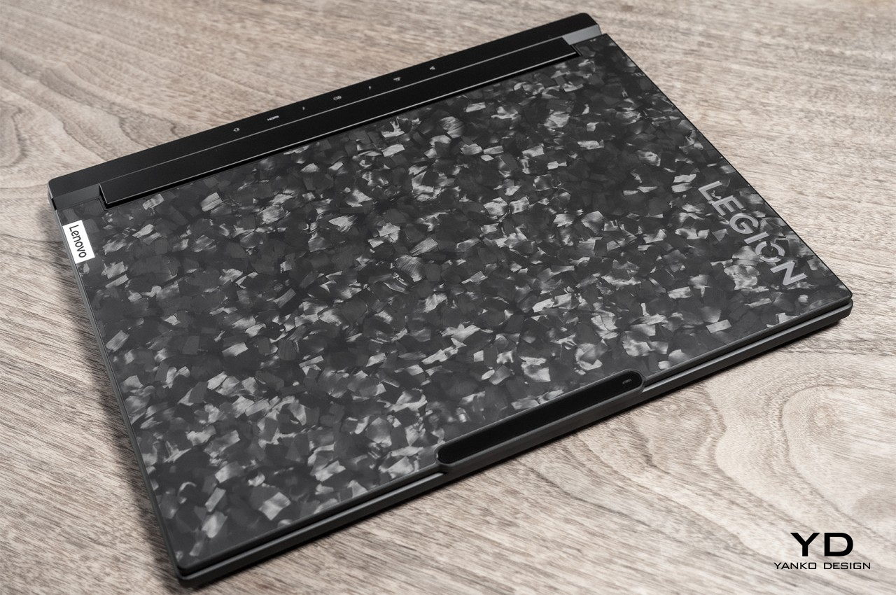
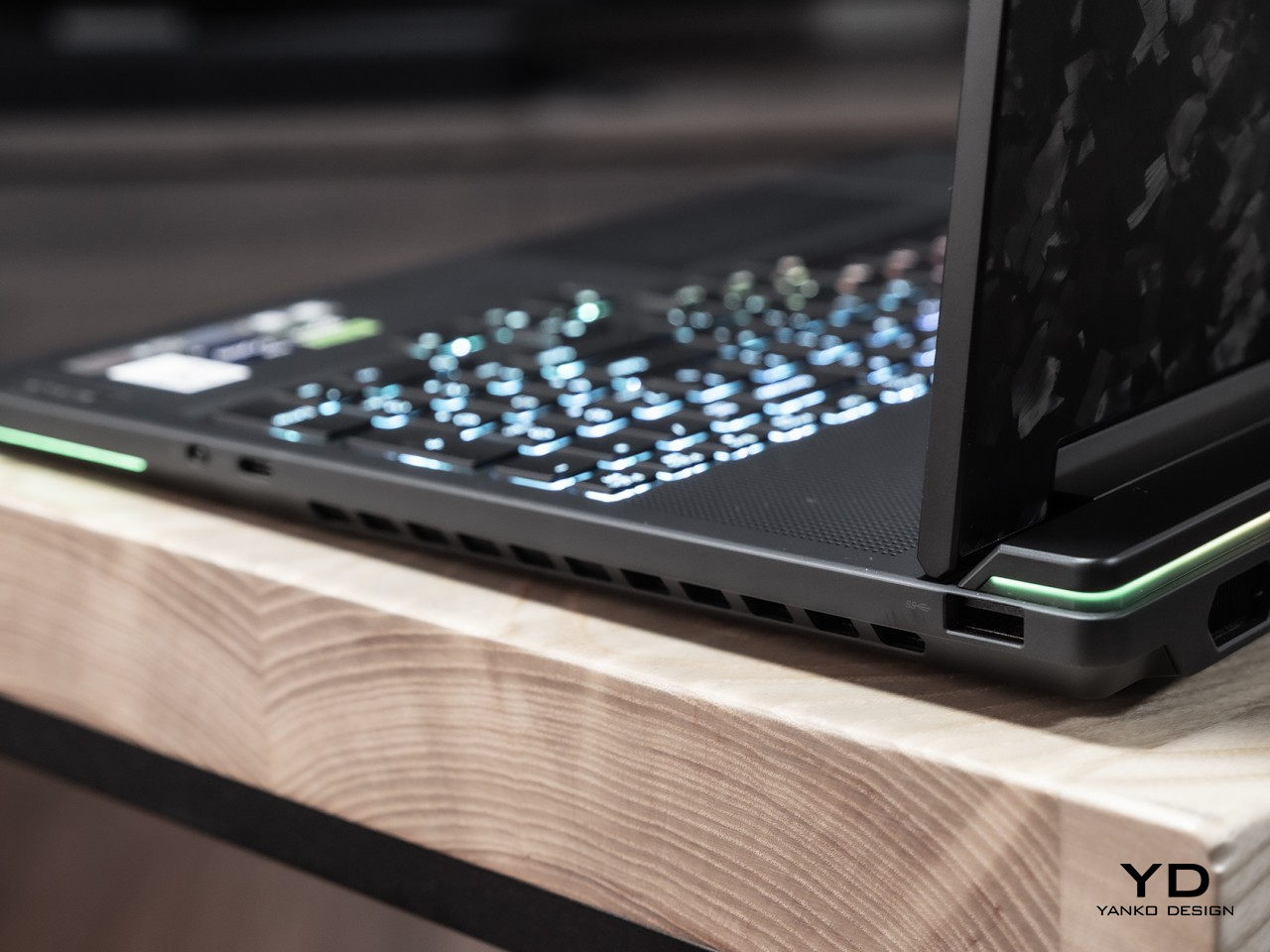
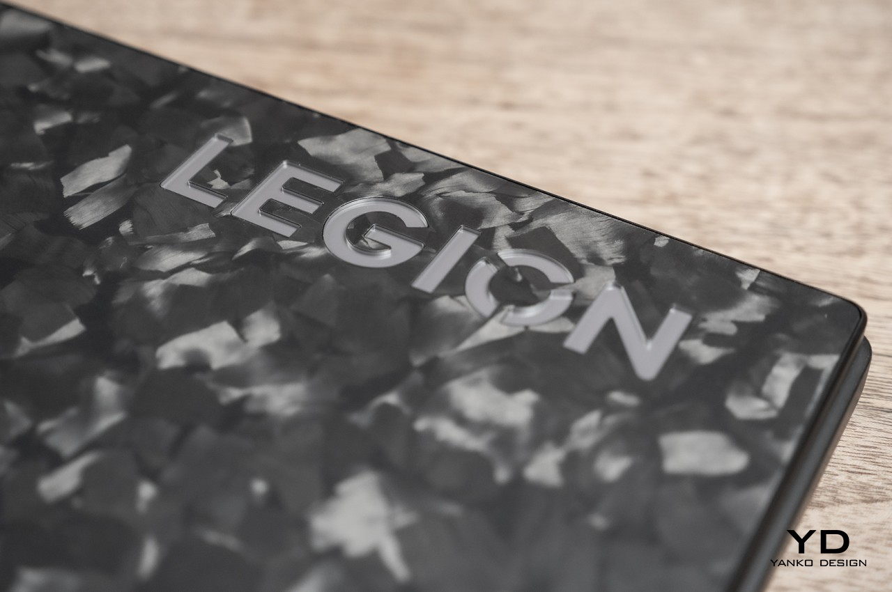
Right off the bat, the Lenovo Legion 9i is clearly not your average laptop, gaming or otherwise. The top cover has this unconventional pattern of polygons in different shades of gray. These are actually forged carbon chips, chosen not just for their unique appearance but also for the material’s lightweight durability. Lenovo says that no two Legion 9i units have the same pattern, so it’s almost like getting an exclusive edition for each purchase. Admittedly, it’s going to be a divisive topic, since the design isn’t something you can turn on or off as you wish, unlike RGB lights. At the same time, it’s like a breath of fresh air, deviating from the standard gaming aesthetic. Suffice it to say, it’s going to be a head-turner, no matter how you look at it.

The rest of the laptop’s chassis eschews the usual plastic affair and is made with 90% recycled magnesium die-cast in a classy Carbon Black finish. Not only does it afford increased durability, it also gives the laptop an interesting sustainability story. The chassis has a matte finish that adds a bit of texture, appealing not only to your sight but also to your sense of touch.

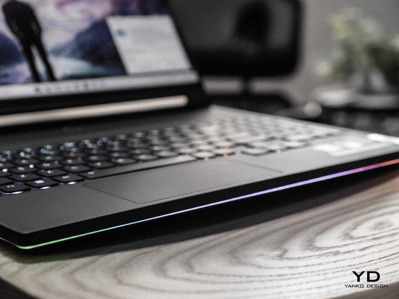
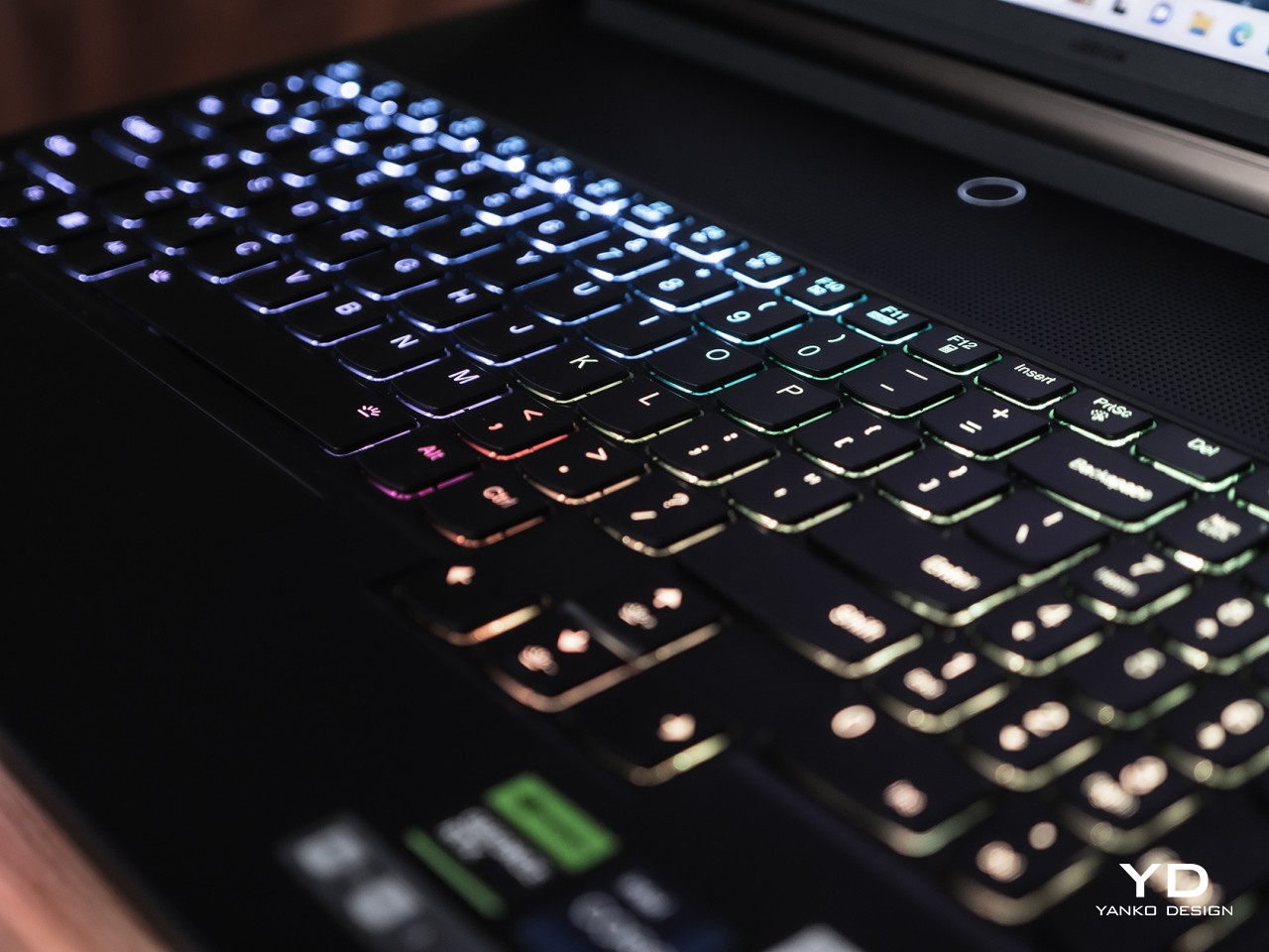
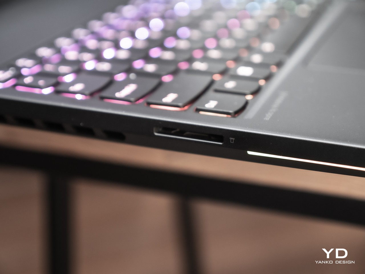
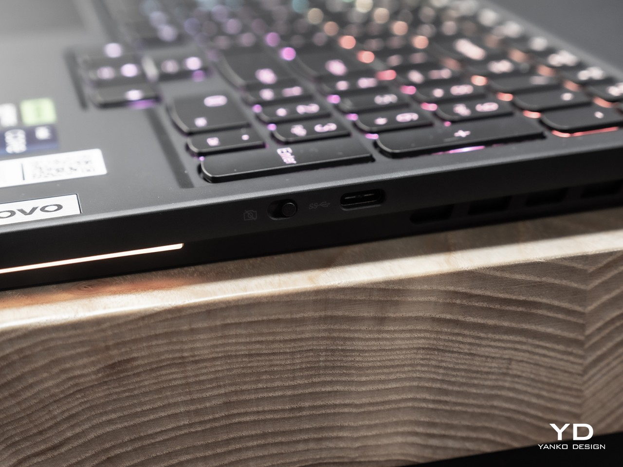
Speaking of those RGB lights, there’s still plenty to go around, though not in the usual places. On the A cover, you’ll only see it behind the large “LEGION” branding in the corner, while they’re pretty much under each key inside. There’s also a strip of light that runs around the edges of the laptop, wrapping it in a somewhat subtle rainbow of colors of your choosing. The ports themselves aren’t illuminated, but indicators for the back connectors do get a bit of light to help guide your hand in the dark. As always, you have full control of these lights, so you can configure them to match your mood or environment.

As a 16-inch laptop, the Lenovo Legion 9i is definitely on the larger end of the size spectrum, and even among its peers is still on the bulkier side. It is by no means excessively big, especially considering everything it’s packing inside, but those expecting MacBook Pro-like profiles are definitely looking at the wrong category of laptops. All in all, this portable desktop replacement strikes a fine balance when it comes to size and features, and it carries a unique visual character wherever you take it.

Ergonomics

As mentioned, the Legion 9i is by no means a thin and lightweight laptop, which can be expected from gaming-focused desktop replacements like it. In fact, it sits somewhere in the middle of other 16-inch laptops like a smaller ASUS ROG Strix G16 and a behemoth Alienware x16 R1. Yes, it is thick, but it could have actually been worse if not for the headlining liquid-cooling feature. It is surprisingly portable compared to other 16-inch gaming laptops, but you’ll still want to prepare your shoulders or hands whenever you have to carry this powerhouse. And regardless of that cooling system, you still wouldn’t want to put it on your lap except in the most dire circumstances.

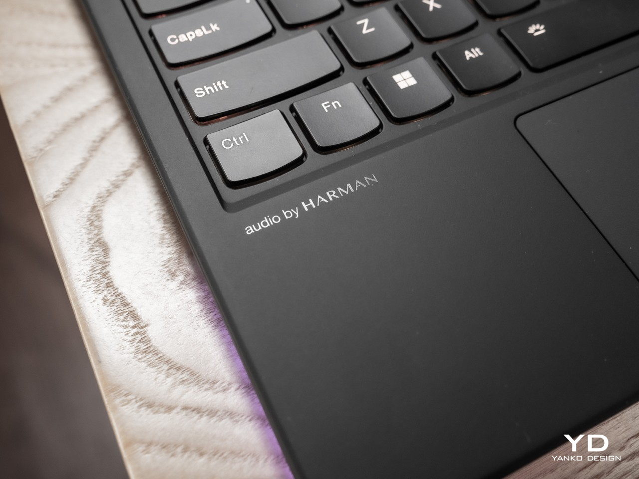
When it comes to laptops, comfort and usability factors focus mostly on the keyboard and the trackpad. Gamers are especially picky about the former, as the performance of keyboards can mean the difference between glorious victory and devastating defeat. The Lenovo Legion 9i’s keyboard is, to put it simply, good enough. It’s not mechanical, of course, but it does have sufficient travel to make it feel snappy and comfortable at the same time, a rare treat for membrane-based keys. The keyboard is pushed further down compared to most laptops, but not because there’s some fancy display or interface at the top. Instead, that area is yielded to the aforementioned cooling system, including the ventilation grilles that sit there on top.

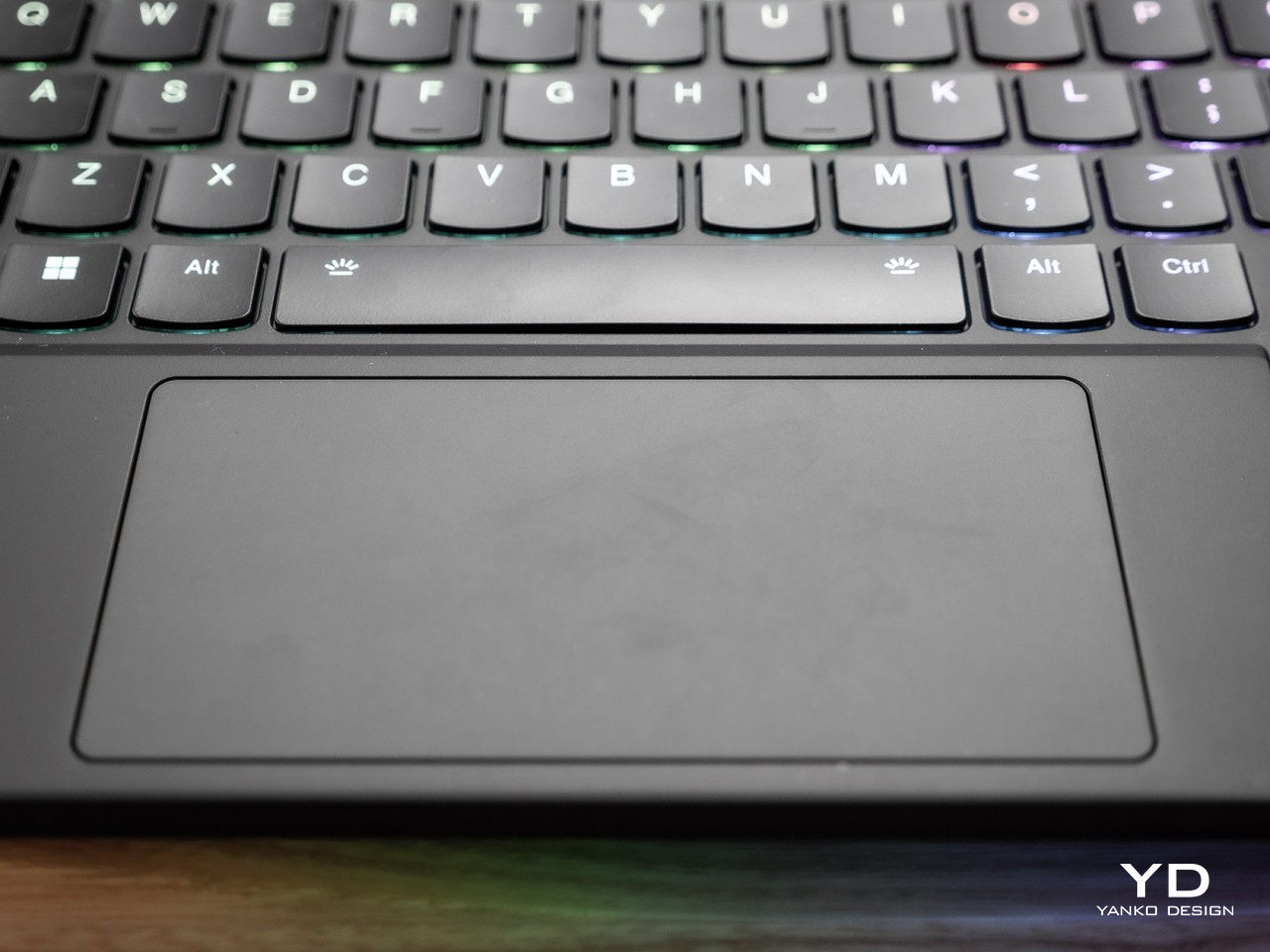
Unfortunately, that shift in position affects the trackpad in a detrimental manner. While the trackpad itself is responsive and smooth, its small size makes it feel cramped and difficult to use, particularly for vertical movement. While most gamers will have their favorite gaming mouse when they’re in the zone, it’s still a disappointing sacrifice that you will definitely feel whenever you have to use that trackpad to do some work quickly.

Performance

Due to the need for speed and power, gaming laptops naturally try to match the performance of their stationary desktop cousins. They are, however, more affected by the laws of physics, particularly when it comes to the heat generated by all that hardware, which in turn causes throttling and performance hits with deadly consequences for gamers. There has been no shortage of cooling innovations in the laptop segment over the years, and Lenovo finally brings one of those to its Legion laptop segment for the first time.

Co-engineered with the famed Cooler Master, the branded Legion ColdFront liquid cooling system runs over the GPU’s VRAM to help keep temperatures down, kicking into gear once the GPU hits the 84°C mark. There are also three fans that help ferry cold air away from those components and out the sides. The liquid cooling system is not a panacea and you’ll still hear the fans spin, though not at an uncomfortable high speed. It is quite effective in keeping performance stable while, at the same time, offering an alternative to bulky cooling solutions that are part of the reason why some gaming laptops are larger than they need to be.

On the opposite side of that distinctive forged carbon A cover is an equally eye-catching 16-inch 3200×2000 mini-LED screen, a display technology that outpaces IPS LCDs in terms of black levels but also surpasses OLEDs in brightness. And the screen is indeed very, very bright, especially when you show HDR content. It has an odd resolution, granted, but it is also higher than some of its rivals in the 16-inch laptop segment. Running games at QHD or QHD+ resolutions gives the most balanced performance, but “3.2K” as Legion calls it is definitely a good option for content that doesn’t require extremely high refresh rates.

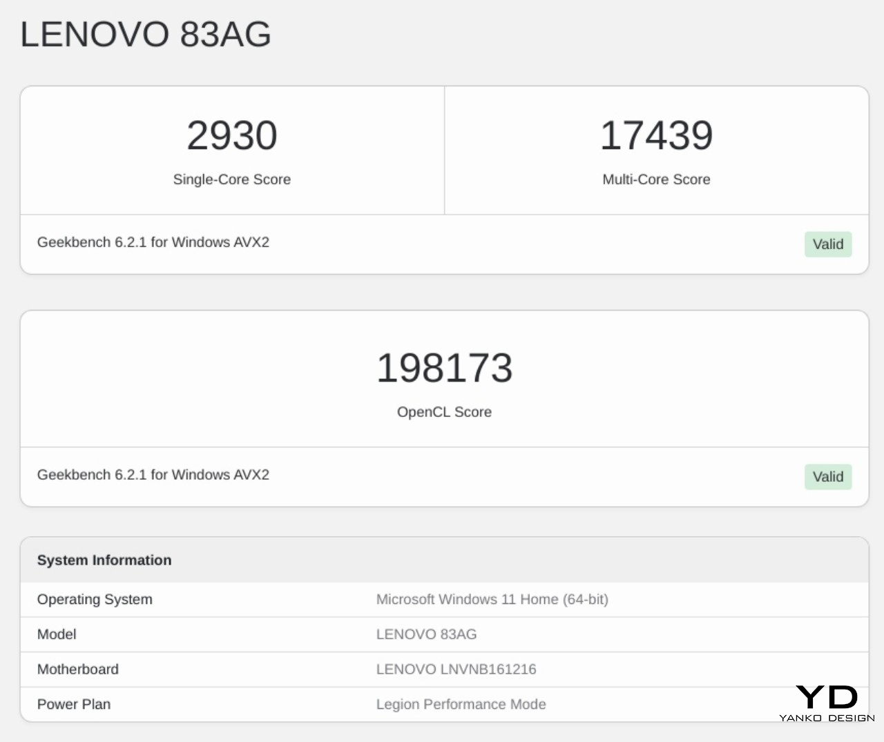
As with any laptop in the market today, there are different configurations to choose from, but the base starts with a 13th-gen Intel Core i9-13980HX, an NVIDIA GeForce RTX 4080, and 32GB of DDR5 memory. Those are pretty mighty specs with matching hefty prices, but they definitely show their worth when it comes to actual use. Synthetic benchmarks don’t tell the whole story, of course, but there is pretty much nothing the Lenovo Legion 9i can’t handle, whether it’s graphics-intensive games or video rendering. Granted, it’s not going to outperform a hulking desktop tower with the latest cooling solutions, but it definitely comes close to providing you with a desktop that you can use and carry anywhere.

Given everything that’s happening inside, it’s probably no surprise that the Legion 9i’s battery life is so-so. With moderate use, you can squeeze out a little over two and a half hours, but you’ll easily see that time cut down to an hour or so on more intensive games. Lenovo tries to make up for it with a super-fast 330W GaN charger, but it isn’t an understatement to call that a brick. Interestingly, Lenovo does something out of the ordinary and ships a second and significantly slimmer 140W PD charger that connects via USB-C. This is the one you’ll probably want to always carry with you, but you’ll also have to remember how it will limit the laptop’s overall throughput.

Sustainability

As the world’s largest PC maker, it is quite encouraging that Lenovo takes its environmental responsibility quite seriously. Especially with gaming laptops that chug plenty of electricity, Lenovo has to look for other areas where it can offset its negative impact on the planet. It’s not 100%, but the use of recycled magnesium on Legion 9i definitely helps cut down reliance on plastic, while giving the laptop both durability and looks.

Laptops have also thankfully become less restricted, at least when it comes to upgrading certain parts. You still can’t easily repair most commercial laptops like these, but upgrading storage and memory can usually be done with ease. For the Lenovo Legion 9i, however, that’s only true for the storage, which is immediately accessible after removing the bottom cover. RAM is unfortunately hidden beneath the motherboard, so you will have to remove other parts before you can double your memory. That means it’s more practical to aim for the configuration with the largest RAM capacity, though that’s easier said than done considering the price.

Value

Considering all the features mentioned above, it shouldn’t come as a shock that the price tag on the Legion 9i starts with a high figure. Depending on sales, it starts at around $3,200 to $3,400 with 32GB of RAM, 1TB of storage, and an NVIDIA RTX 4080. The maximum configuration pushes you back $3,800 to $4,000, again depending on any promos or the current SRP. It’s easily more expensive than the competition, but the good news is that you’re getting exactly what you pay for.

The Lenovo Legion 9i makes very few compromises, except what you can expect in terms of its size and weight. The integrated liquid cooling system, while not mind-blowing, is impressive and effective in keeping both temperatures and thickness down. High-performance hardware makes short work of gaming and content creation tasks, and plenty of connectivity options expand the laptop’s capabilities to desktop levels. And that bright mini-LED makes any type of content a pleasure to see. Plus you get a smart-looking distinctive piece of equipment that’s going to pique the interest of people around you. Taking all those into consideration, that hefty price tag becomes more of an investment on a desktop that empowers you to do anything you need or want anywhere you go.

Verdict

Gaming laptops are traditionally large and bulky because of hardware requirements, but thankfully they don’t need to be unattractive as well. Developments in engineering and design are revealing ways to slim down these portable powerhouses without sacrificing too much performance. It’s still a matter of making compromises, but the Lenovo Legion 9i thankfully makes very few of those.

The unique forged carbon lid and subtle RGB edge lighting immediately draw your attention, while the impressive performance keeps you glued to that beautiful screen. Liquid cooling and AI-tuned fans help keep that performance from fluctuating too much, and two charging options let you go big or pack light, depending on your needs. Yes, the trackpad is uninspiring, the battery life is too short for comfort, and the price tag is a bit tough to swallow, but you are definitely getting your money’s worth for a desktop replacement with a hot look and a cool personality.

The post Lenovo Legion 9i Gaming Laptop Review: Liquid Cooling meets Hot Design first appeared on Yanko Design.

Vivo V29 5G Review: Simplicity and Elegance for the Young and Young at Heart

PROS:


  • Beautiful, distinctive design using 3D magnetic particles

  • IP68 rating for dust and water resistance

  • Sharp and bright high-resolution display

  • Good main and selfie cameras

CONS:


  • OK but unimpressive mid-range performance

  • No zoom or macro camera

  • Single, bottom-firing speaker

RATINGS:

AESTHETICS
ERGONOMICS
PERFORMANCE
SUSTAINABILITY / REPAIRABILITY
VALUE FOR MONEY

EDITOR'S QUOTE:

The Vivo V29 5G rises higher with its elegance and 3D magnetic particle design, but its decent yet unimpressive performance keeps it from taking the lead.

It’s not surprising to see enormous amounts of resources being poured into marketing for big phone brands, almost to the point you might think they’re the only options available. It’s almost too easy to take for granted how you might discover unexpected treasures if you walk off the beaten path, scanning the smartphone landscape with a keen eye for detail and design. There are many brands that try to catch people’s attention with buzzwords and gimmicky aesthetics, but there’s always something to be said about beauty that rises from simple yet elegant designs. That’s the kind of experience that the Vivo V29 and its rather intriguing “3D Magnetic Particles” are aiming for, so we took a deeper look to see if its beauty is just skin deep or if this subtly stylish smartphone has more to offer

Designer: Vivo

Aesthetics

Like any other smartphone manufacturer, Vivo has a few different lines or families targeting different audiences. The Vivo X series, for example, is more focused on camera chops, no pun intended, while the V family to which this Vivo V29 belongs is aimed at a somewhat younger consumer base. This group of people, which admittedly spans a wide range of ages, is characterized by a hunger for new experiences and innovations, as well as designs that are trendy and outstanding yet also simple and unobtrusive.

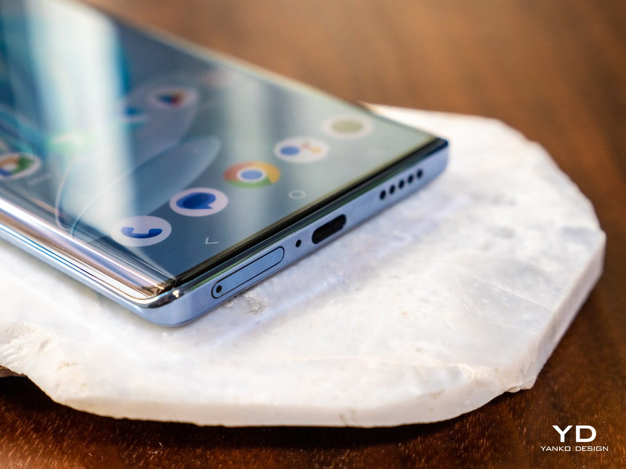
For the Vivo V29, these goals were achieved by using a rather unique method the company is calling “3D Magnetic Particles.” In a nutshell, they got millions of tiny magnetic particles to create natural curving patterns using magnetic forces, resulting in gentle waves of white particles traveling across the phone’s back in a way no design has accomplished before. On the Peak Blue review unit that we got, the waves resembled mountain peaks, while Starry Purple tried to recreate the Milky Way against a night sky. It’s a visual effect that is both seemingly random yet artistically intentional, not unlike when an artist pours paints or colors, creating messy but unique patterns, which is exactly the inspiration behind this revolutionary design technique.

This gives the Vivo V29 a subtle beauty, never garish but also not plain. Even the changing colors of the Velvet Red colorway’s Flourite AG glass give a tasteful touch to what would usually be an ordinary glass back. The Noble Black variant is a bit more subdued, but its etched shimmers give it a bit of personality as well. The phone’s curved edges also give the phone a sophisticated and delicate look, something that seems to have been lost in the move toward sharp corners and flat sides.

Ergonomics

Smartphones are, of course, not just something to look at. To be honest, most of the time you spend with your phone is on the screen and in your hands. That’s why ergonomics and comfort are just as important, and the Vivo V29’s design brings a bit of a mixed bag in that regard. On the one hand, the curved edges of the screen and back have always been regarded to be more comfortable to hold, having no corners to bite into your skin. On the other hand, the phone’s lightweight body and glass back also make it feel precarious and slippery. Fortunately, Vivo does ship with a clear gel case, though that detracts from the phone’s elegant aesthetic a bit.

There’s no clear winner between curved and flat edges in terms of ergonomics, with both camps claiming to offer a better and more secure grip. Vivo, however, opted to use a design that some might say is outdated primarily due to their own customers’ preferences. This market prefers how those curves help make the phone look very slim, and how the lack of bezels gives a more immersive gameplay experience. A bit ironically, that’s one area where the phone falters a bit.

Performance

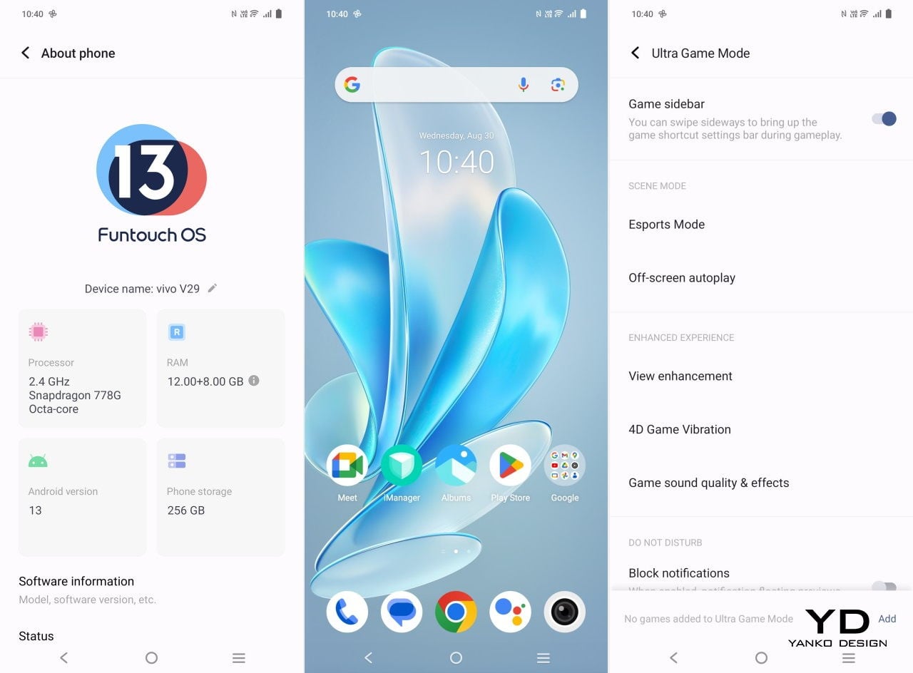
Despite its premium external appearance, the Vivo V29 is, at its core, a mid-tier smartphone. While the boundaries between tiers have been blurring recently, this particular model has its feet firmly planted on the ground. For some odd reason, Vivo opted to go with an older processor, the Qualcomm Snapdragon 778G, rather than something more recent from the same series. To be fair, the performance gap isn’t that huge, and the phone performs admirably for most use cases. The Snapdragon 778G, however, starts to show its age when it comes to more graphics-intensive activity, particularly when it comes to mobile gaming that taxes the chip to the point that it comes a little hot.

This is a bit of disappointment given how beautiful the Vivo V29’s 6.78-inch screen is. With a resolution of 2800×1260 pixels, you get crisp and clear images that are enhanced by the bright AMOLED panel. It’s definitely quite the sight and a pleasure to use, though you’ll also be faced with one of the biggest drawbacks of screens with curved edges. A fraction of the content falls off at the edges, which is fine for most Web content but could be an annoyance for videos and especially games.

Further demoting the phone’s ranking for multimedia is the single bottom-firing speaker. Audio output is passable but nothing noteworthy, and the earpiece at the top doesn’t function as a second speaker. It’s probably not going to be a deal-breaker for some, but it’s small paper cuts like these that keep the Vivo V29 from being at the top of its game.

The Vivo V29 carries a rather middling 4,600mAh battery, a decision made to ensure that the phone remains thin and lightweight. It’s enough to get you around 18 hours of use a day, which means you’ll definitely want to plug it in at night or sometime during the day. Vivo makes up for it by pushing the charging speed to 80W and shipping the phone with the correct charger. In practice, it’s nothing compared to those that boast 100W or higher, but it can still get it from zero to full in around 40 minutes.

Where the phone does somewhat excel is in photography, at least the kind of photography its intended audience cares about. With a 50MP main camera and a 50MP front camera, you get excellent photos and selfies, especially with the right ambient light. Vivo takes photography up a notch with an Aura Light feature on the back of the phone that can add some lighting that automatically changes its temperature based on the ambient environment. Streamers might be familiar with the concept of ring lights, and the Aura light is like a miniature version. It works quite well but, unfortunately, won’t help with selfies. The 8MP ultra-wide camera is decent under good lighting conditions, but it’s definitely nothing to boast about. The 2MP monochrome camera is even more disappointing, given how many of its peers now go with a macro camera at the very least.

Ultrawide

50MP (1x)

50MP (2x)

Sustainability

Sustainability has become an important conversation topic among tech companies these days, and smartphone manufacturers are no different. Unfortunately, with so many of these mobile device makers operating today, only a few can be said to have concrete visions and strategies to help save the planet. Fortunately, Vivo is indeed one of those by taking steps to reduce the negative impact of their operations, manufacturing, and product life cycles on the planet.

Sadly, Vivo still has ways to go, especially when it comes to the actual materials that it uses, like incorporating recycled plastics or aluminum. Vivo’s designers are hoping that their designs and experiences are able to convey their love for nature. The Vivo V29, for example, references mountains and stars, connecting users with the planet in subtle and subconscious ways. Vivo also gives the V29 an IP68 dust and water resistance rating, a rare trait for phones in this tier. Along with its durability, this helps the phone survive the most common accidents that users encounter, helping delay the device’s untimely death and its addition to the world’s growing electronic waste.

Value

The Vivo V29 is, with very little doubt, a beautiful smartphone that earmarks it for a more premium category. It is, however, a true mid-range phone, and while its performance is decent, it isn’t going to blow your mind, nor will it blow the competition out of the water. That competition, unfortunately, is where it might struggle the most, with so many options that nibble at its strengths in different ways.

At around $450, the phone is definitely on the affordable side, but there are also other phones that have some of the same perks at lower prices. These include the Samsung Galaxy A54, the Motorola Edge 40, the Nothing Phone (1), and even the Google Pixel 7a. None of these are perfect, of course, but neither is the Vivo V29. It’s always a matter of balancing the pros and the cons, but when it comes to a striking and memorable design, the Vivo V29 can stand head-to-head with the eccentric Nothing Phone (1).

Verdict

Today’s consumers have become more conscientious of the value that product design brings into their lives. Smartphones are no longer just geeky gadgets but also a reflection of their tastes or even their character. Not everyone wants an exotic design that loses its novelty quickly, nor does everyone need the latest and greatest that will burn a hole through their wallets. An elegant, reliable, and accessible smartphone is sure to win the hearts of buyers, regardless of age, and that’s the experience that the Vivo V29 5G brings to the table.

With an innovative new design technique that treats minuscule 3D magnetic particles like splashes of paint, the Vivo V29 tries to embody the company’s design philosophy of simplicity, elegance, and perfection. At least it manages to achieve the first two with a beauty that is noticeable, memorable, and not overbearing. Unfortunately, perfection is still a bit out of its reach, with some puzzling hardware choices that hold it back from that achievement. But if you’re in the market for a stylish smartphone that feels good in your hand and can keep up with most of your needs, then the Vivo V29 is definitely worth taking a second look.

The post Vivo V29 5G Review: Simplicity and Elegance for the Young and Young at Heart first appeared on Yanko Design.

Realme GT5 240W Review: Insane specs, disappointing design

PROS:


  • Ultra-fast 240W charging

  • Impressive flagship specs and performance

  • Very affordable price tag

CONS:


  • Only available in China for now

  • Unremarkable design

RATINGS:

AESTHETICS
ERGONOMICS
PERFORMANCE
SUSTAINABILITY / REPAIRABILITY
VALUE FOR MONEY

EDITOR'S QUOTE:

With 24GB of RAM and 240W ultra-fast charging, the Realme GT5 240W looks mighty tempting if not for its limited availability and plain appearance.

Smartphones are more than just devices these days, becoming more like lifestyle choices and extensions of ourselves. That said, it’s impossible to separate the specs from the design because even the most beautiful phone will fall flat if it ends up being unusable anyway. In fact, people do buy phones primarily for their features, with aesthetics and ergonomics coming a close second, especially for those who’d slap on a protective or decorative case anyway. Realme’s newest wonder could very well satisfy this kind of user, cramming in the latest and greatest that mobile technology has to offer, so we had to give the Realme GT5 240W a good test run to see if it can truly rice to the challenge despite its rather unremarkable appearance.

Designer: Realme

Aesthetics

It’s hard to ignore a shift in the smartphone market that has made consumers more aware of how design plays an important role in the overall experience of their smartphones. They no longer just want a slab of glass and metal that seemed to be cobbled up in order to house the hardware inside. They want phones that give a positive visual impact, make them stand out, or more closely express their style and interests. Unfortunately, if you’re looking for a stylish smartphone, Realme’s latest flagship might not be to your taste.

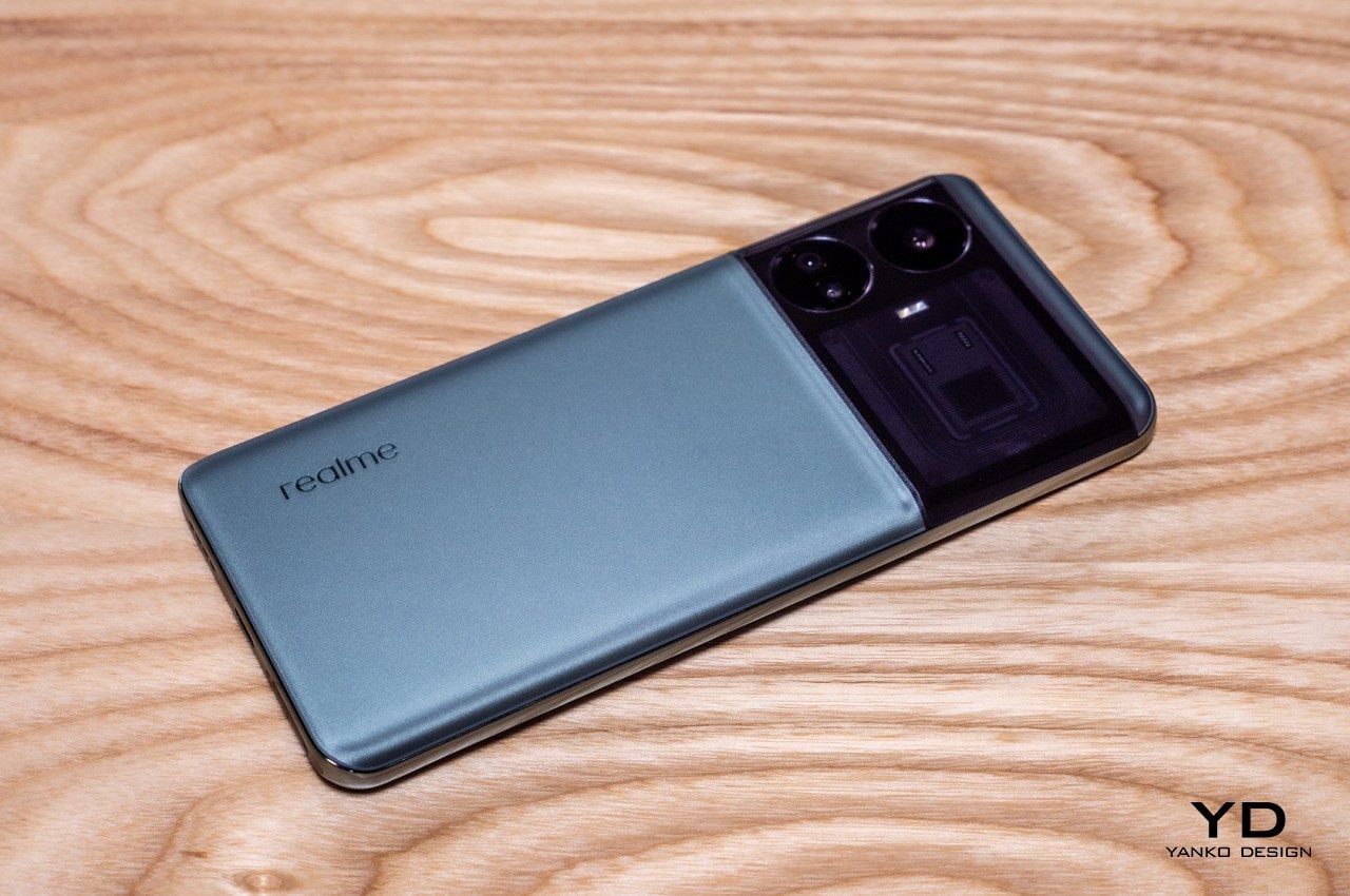
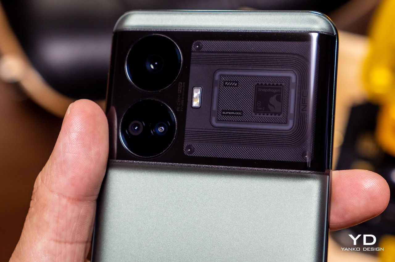
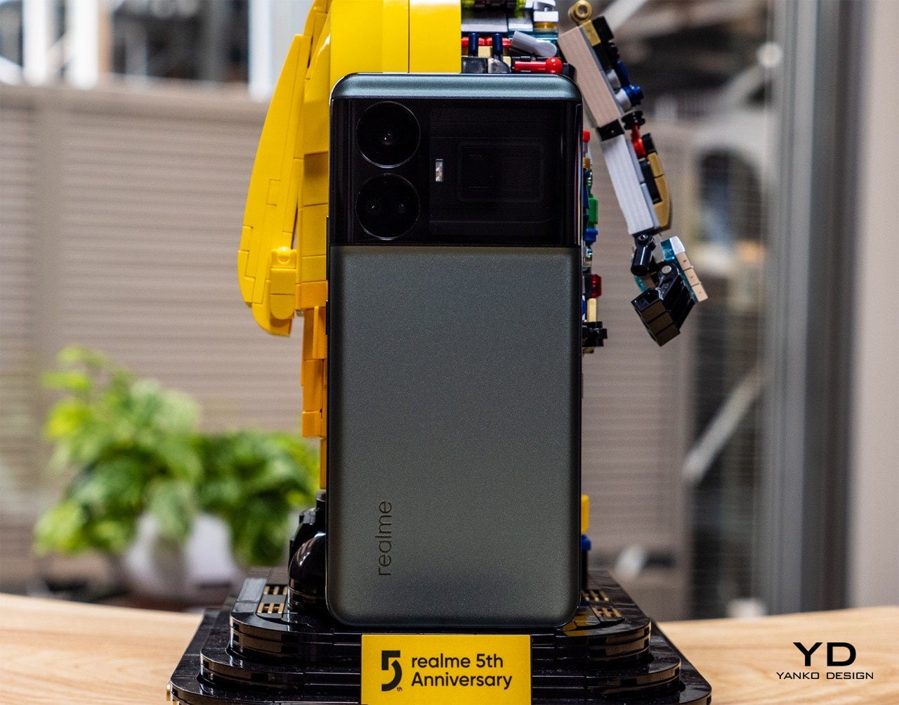
The most distinctive part of smartphones is their backs, and here the Realme GT5 seems to take a page from different smartphones, creating a mishmash of designs that feel a little incongruous. The sandblasted metal texture looks like a blast from the past, while the large camera bump seems to be an overgrown version of the Google Pixel’s “visor” design. Even the fancy “Pulse Interface Design 2.0” LED light that strangely frames a Qualcomm Snapdragon logo is reminiscent of the Nothing Phone’s now iconic Glyph Interface gimmick.

It’s not that the Realme GT5 240W is unattractive. It is admittedly distinctive in how its camera bump spans the entire width of the phone rather than just one side, but it’s an underwhelming design nonetheless. When you consider how Realme has released many beautiful, unique, and creative designs over the past years, you come to expect a bit more from the brand, especially when it involves the flagship GT line. Fortunately, this phone has other things going for it beyond its somewhat plain looks.

Ergonomics

A phone’s design isn’t just about its appearance. Every part and every design element has an impact on both the phone’s performance as well as its usability. Put too many powerful components inside and you risk burdening the hands of your users. Arrange them in the incorrect way and it might also feel a little unbalanced.

The Realme GT5 240W is a little of both. At 205g, it is a bit on the heftier side, though not exactly by much compared to other devices on the same premium tier. It is, however, a bit top-heavy, thanks to the design of the camera bump and the components that are located there. Adding features always comes with a price, especially when they’re a bit more on the inessential and decorative side. This could result in lower confidence when holding the phone, pushing owners to slap on the opaque and unappealing case that Realme ships inside the box.

The one advantage of the phone’s wide camera design is that it will lie balanced on a flat surface like a table, unlike other phones with bumps only on a corner. The phone won’t wobble no matter how hard you tap on the phone when it’s lying on its back. Additionally, you might even be able to use that protrusion to your advantage when holding the phone, letting one of your fingers rest beneath it to prevent the phone from sliding off.

Performance

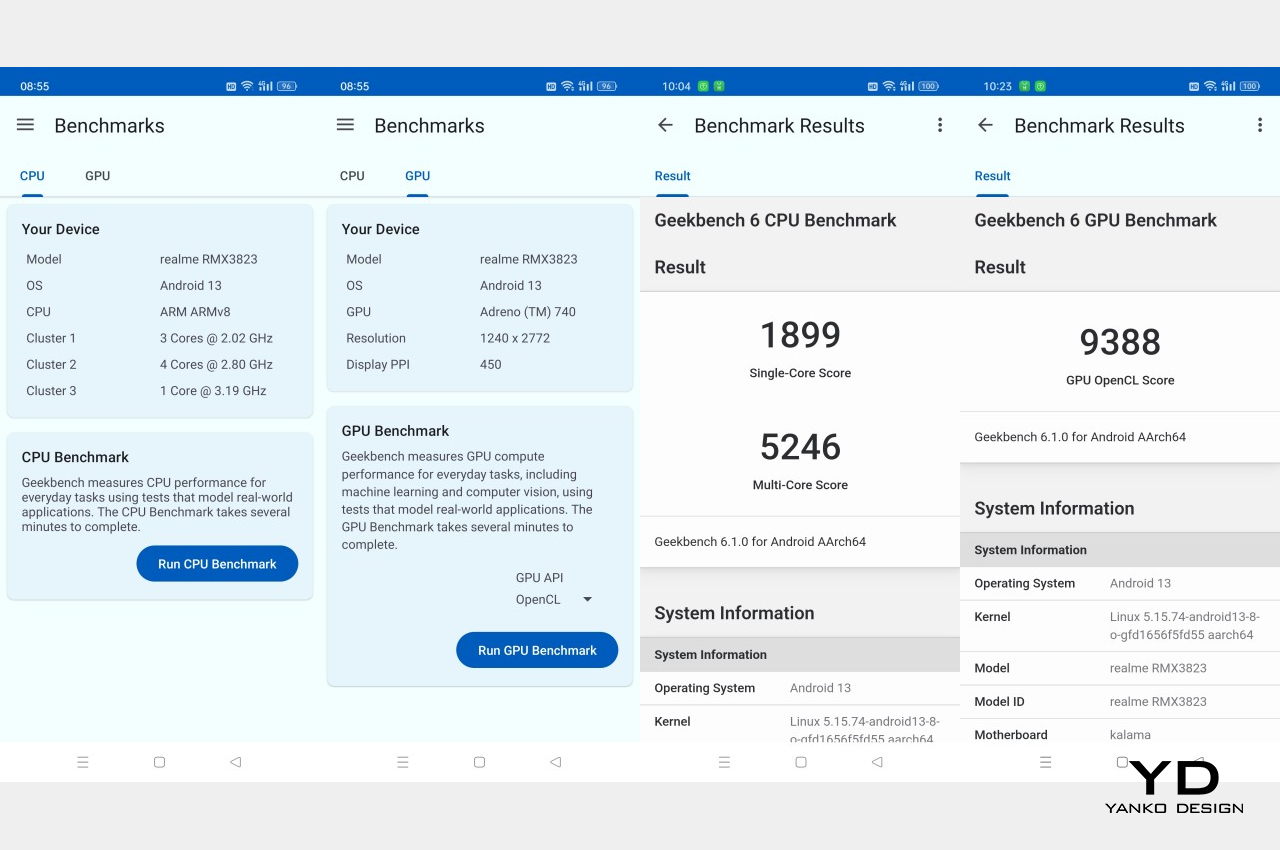
Although the Realme GT5 240W looks unremarkable at first glance, it is one of those things that definitely deserves a deeper look. That’s because, despite its modest appearance, this phone is filled to the brim with high-end features that are easily accessible, at least if you reside in a specific market. The Realme GT5 240W is, at its heart, a premium flagship smartphone and it has the guts to prove it, and the Qualcomm Snapdragon 8 Gen 2 is actually just the tip of the iceberg.

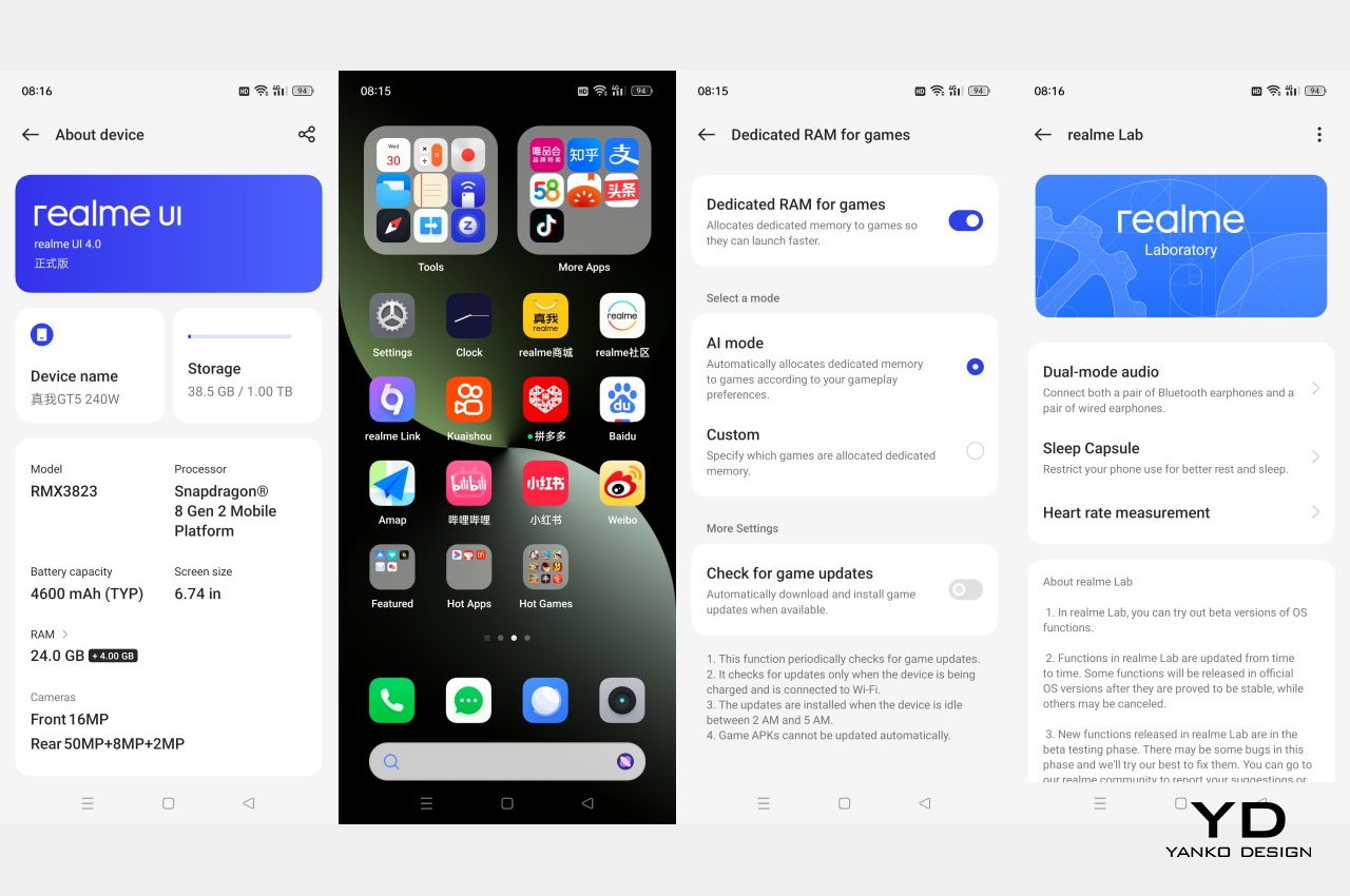
This particular model boasts a whopping 24GB of RAM, a feat that so far only one other smartphone has managed to pull off. It’s no surprise, then, that the phone performs smoothly without any hiccups, deftly taking anything we throw at it. CPU, GPU, and memory all work in harmony to deliver a fluid interface and flawless user experience, even considering how loaded Realme UI can be. As for data storage, there’s an equally astounding 1TB inside which makes any argument about microSD cards moot.

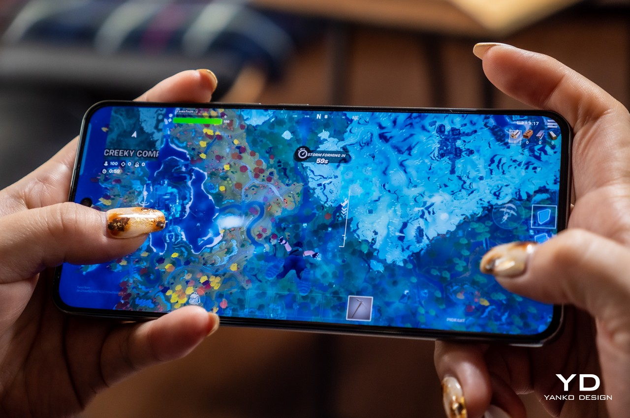
The Realme GT5 240W also has a gorgeous and bright 6.78-inch 2772×1240 AMOLED display capable of 244Hz refresh rates and 2,160Hz high-frequency pulse-width modulation (PWM) dimming. What these figures mean in practice is that, depending on the app or content, the visuals you’ll get will be smooth as butter. With dual speakers with Dolby Atmos, this phone becomes an entertainment powerhouse for videos, music, and especially games. The one catch is that we found the phone to get a little too warm for comfort, and that’s just when playing Fortnite with medium settings at 60Hz. Performance at that level was quite impressive, but you might want to pay more attention to the heat it generates.

This particular phone’s killer feature can be seen from its name. While the regular Realme GT5 already has super-fast 150W charging, this one nearly doubles that to 240W. In just 5 minutes, we got from 60% to 100%, which is one of if not the fastest on the market. Of course, you’ll have to use the large charging brick it comes with to reach that record speed, but it’s going to be worth it if you really need to top up quickly.

Where the Realme GT5 240W shines least is in the one aspect that a lot of smartphone buyers consider to be the next most important thing: the cameras. The trio is led by a 50MP Sony IMX890 sensor, which takes very good shots with plenty of detail when under bright light. The other two, however, are nothing to write home about, with a 112-degree 8MP ultrawide and a 2MP macro camera completing the team. They take OK photos, given the right conditions, but they’re a huge step back from the performance of other flagships in the market.

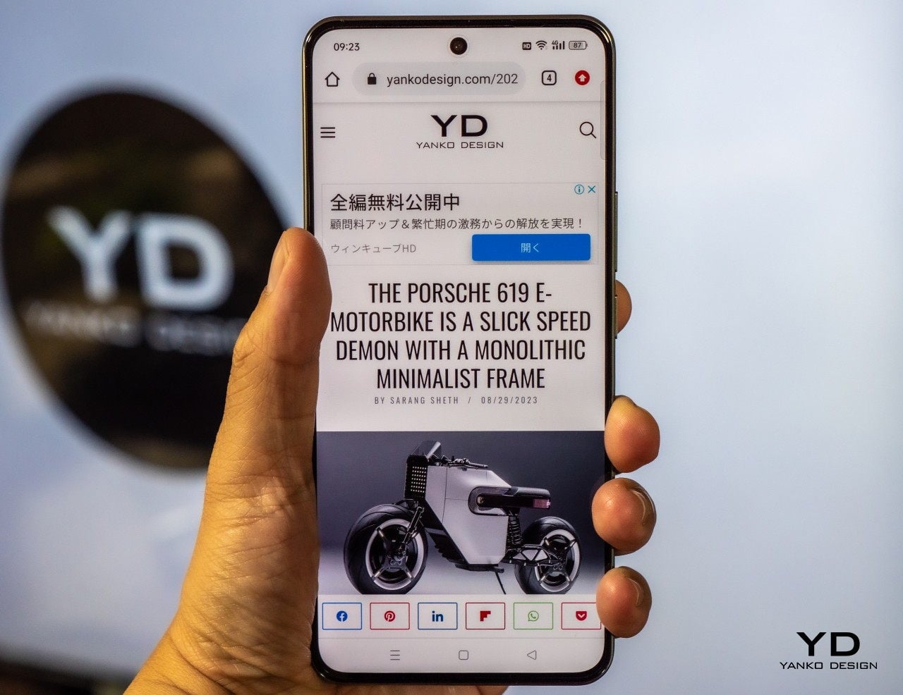
The phone runs realme UI 4.0, the company’s customized experience built on top of the current Android 13 release. It is as you would expect, given the target Chinese market, which means loads of customization options and bloatware. There is no Google Play Store, of course, but users in that region are already used to that situation anyway. The phone will most likely take a different route when or if it launches in global markets, though some aspects, like the presence of pre-installed apps, won’t be changing. The Realme GT5 also features the company’s newest “Pulse Interface Design 2.0,” which is basically a way to have colorful LED light notifications on the back of your phone.

Sustainability

Realme is one of the few smartphone brands that has a laudable stance on sustainability. It has a clear vision and target for becoming a more environmentally conscious company and has taken concrete steps towards that goal. It has even launched phones that made use of more sustainable materials, though those have been limited to a few special editions.

Unfortunately, none of those marks can be seen on the Realme GT5 240W, whether in terms of materials used or even the phone’s durability. There is no formal dust and water resistance rating, so it might not inspire confidence in using the phone everywhere. The packaging is fortunately minimal but, thanks to its ultra-fast charging tech, every box will ship with that large charger. It’s not like Realme is the biggest offender, but it definitely has a lot of opportunity to rise to the challenge and outpace other brands when it comes to establishing a Greener Tomorrow.

Value

The Realme GT5 240W is, without a doubt, a premium smartphone, even if you might have misgivings about its not-so-premium looks. It can definitely walk the talk and more, especially with 24GB of RAM and an insanely fast 240W charging. What makes the phone exceptional isn’t just the specs but the fact that it isn’t demanding for an extremely high amount of money. In fact, it only costs 3,799 RMB for all these features, which is around $520, give or take.

The phone would have almost been perfect if not for the simple fact that it isn’t available anywhere outside of China, at least not at the moment. There’s a chance it could reach some global markets, but major ones like the US are often still out of the question. You might be tempted to import one, but the total cost of ownership, plus the Google-less software, makes it a very poor investment overall.

Verdict

Smartphones have started to become as much fashion accessory as they are tech gadgets. They have started to appeal to the more design-conscious masses while rushing to compete for the next head-turning trending look. The Realme GT5 240W seems to stand out by not standing out, looking rather plain and almost forgettable if not for the features it carries underneath that “ordinary” skin.

Fortunately, the phone is worth a lot more than its looks, carrying some of the greatest hardware available to smartphones today. It’s hardly perfect, especially in the camera department, but with a powerful processor, an overly generous 24GB of RAM, and a blazing 240W charging speed, you will be getting your money’s worth, and it won’t even cost you that much. Presuming, of course, you can get your hands on one.

The post Realme GT5 240W Review: Insane specs, disappointing design first appeared on Yanko Design.

Onyx BOOX Tab Mini C: Color, Productivity, and Fun in a More Convenient Package

PROS:


  • More comfortable and portable size

  • Excellent color E Ink display

  • Google Play Store pre-installed

  • Impressive performance and battery life

CONS:


  • A bit pricey

  • Design looks a little bland

RATINGS:

AESTHETICS
ERGONOMICS
PERFORMANCE
SUSTAINABILITY / REPAIRABILITY
VALUE FOR MONEY

EDITOR'S QUOTE:

The Onyx BOOX Tab Mini C is a coming-of-age for E INK tablets, combining the best features in a more ergonomic and convenient size.

If you thought that eBook readers have gone the way of the dodo because of smartphones and tablets, you probably haven’t been paying attention to the tech market in the past two or so years. As people become more weary of the harmful effects of screens on their eyes and bodies, especially at night, the desire for E Ink devices has started to grow stronger. And just in time, these devices have started growing out of their humble roots, blurring the lines between extremely simple eReaders and powerful tablets. Leading this new wave of innovation is Onyx BOOX, which has been pushing the boundaries of what these devices are capable of in terms of power and size. Its latest BOOX Tab Mini C tries to distill all these new features down to a more manageable size, so we take a deep dive to see whether it successfully pulls off this hat trick or if it cuts too many corners along the way.

Designer: BOOX

Aesthetics

It’s hard not to compare the BOOX Tab Mini C with its older, larger sibling, the BOOX Tab Ultra C. Just by the name alone, you can already tell they’re related and you might easily write off the Tab Mini C as the smaller version and nothing more. There’s some truth to that, of course, but you’d be doing yourself a disservice if you stop there because you could be missing out on a device with a lot of potential. The two E Ink readers do have notable differences and, fortunately, most of them work in the Tab Mini C’s favor. Most, but not all.

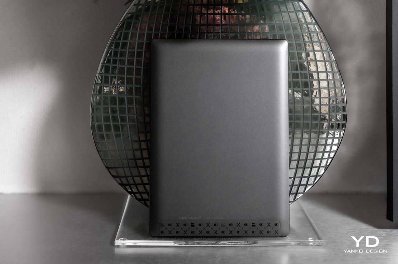
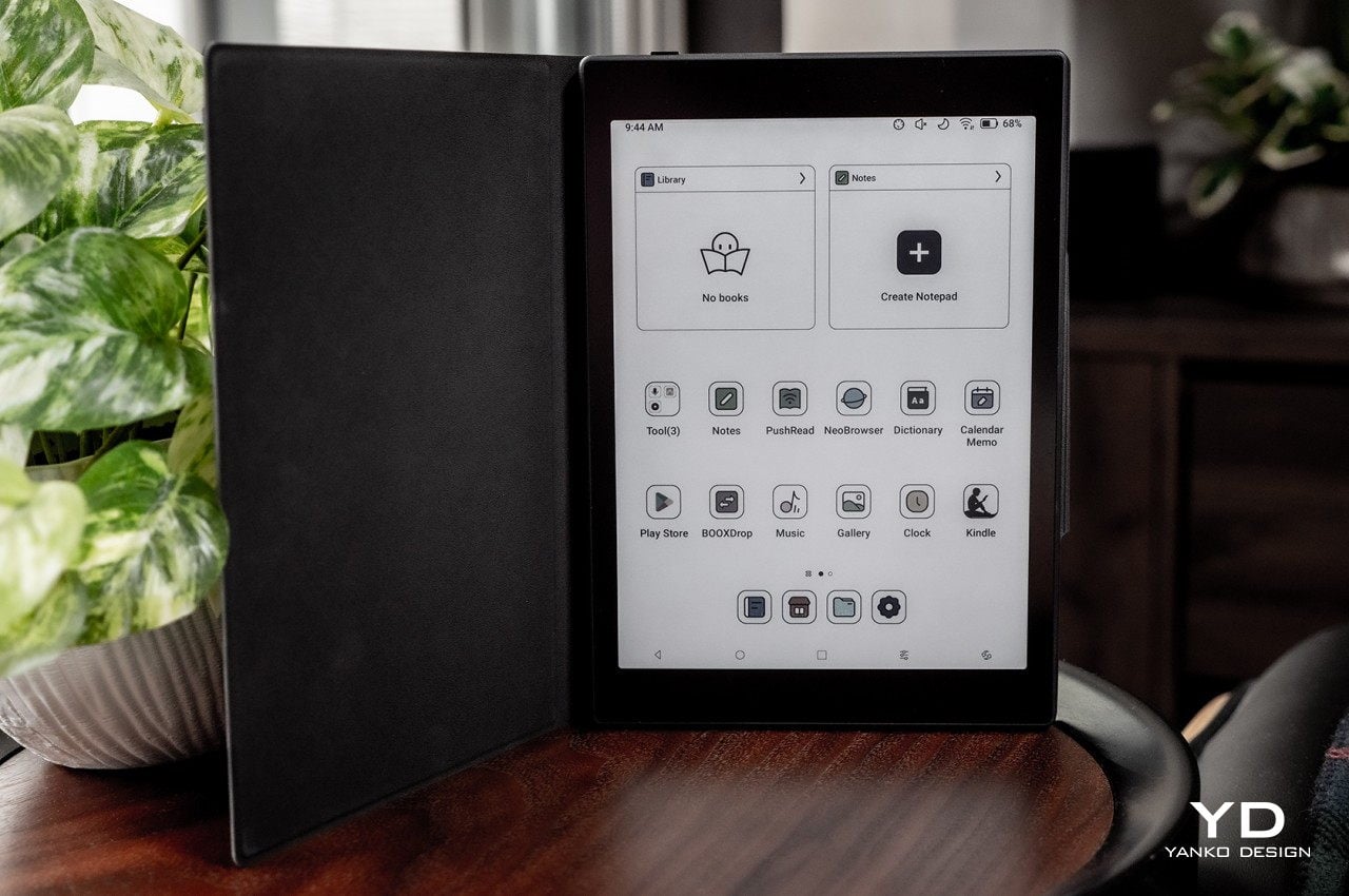
The biggest difference is, of course, the size, with the BOOX Tab Mini C’s 7.8-inch display coming in a more familiar size for eBook readers. Of course, that’s just the display size, because the actual size of the device is a lot larger. That’s thanks to the substantial bezels around the E Ink screen, which sadly makes the device look more like an unappealing blast from the past. The AG glass cover does lie flat across the front, making it look a little modern, but it’s nothing compared to the sleeker look of the BOOX Tab Ultra C or, closer to its size, the new BOOX Page.

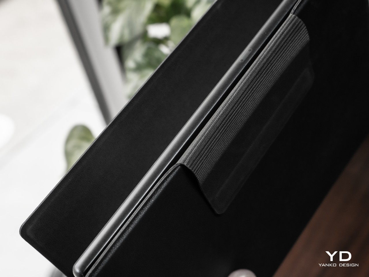
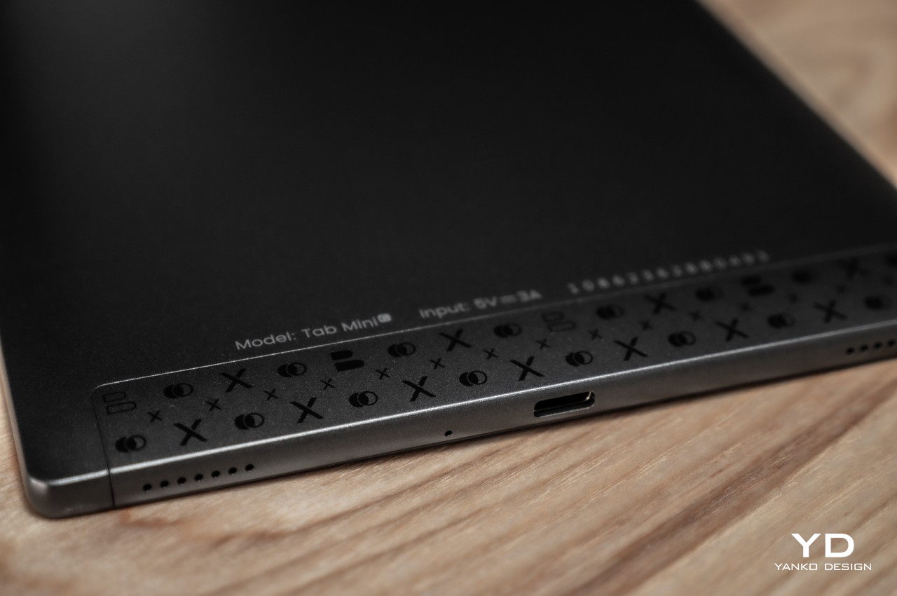
The back of the device is also very different from some of the more current selection of BOOX devices, sporting a somewhat old-school design where the edges are inclined and curved rather than completely flat. This makes the device look and feel thicker, though it also has the benefit of giving your hand a bit more comfort, as we’ll see later. Unfortunately, this along with the wide bezels make the BOOX Tab Mini C look a bit unflattering and uninteresting, if not for the E INK display that, by default, shows its colors even when the device is locked or powered off.

Ergonomics

Size does matter, especially when it comes to portable devices like phones and tablets. It defines what you can and can’t do with the product, at least on a comfortable level, and it dictates how portable and convenient it really is. That’s definitely the case with the BOOX Tab Mini C, which addresses one of the biggest pain points of the BOOX Tab Ultra C, no pun intended.

Weighing only 310g, the BOOX Tab Mini C makes the device easier to hold for longer periods of time, especially with just one hand. It’s a little over the size of an iPad mini, but significantly lighter than its Ultra sibling. The curved edges of the tablet’s back help with that comfort, too, letting it settle into your hand with fewer sharp edges to cut into your skin. In short, this is the ultimate color E Ink reader in terms of comfort and portability, ensuring that you’ll want to have it in your hand all the time.

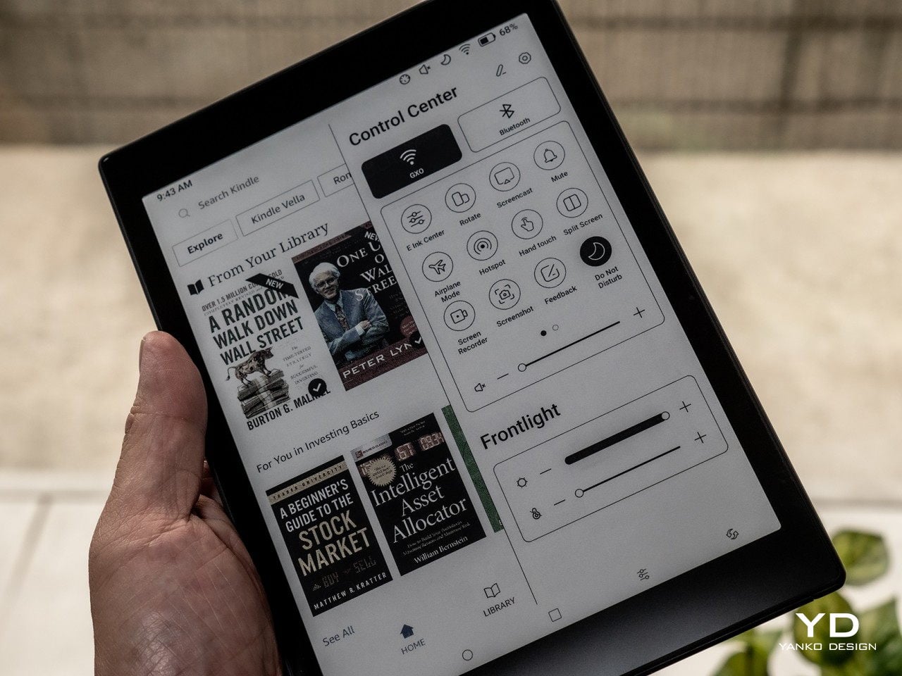
When it comes to comfort, its selling point is, of course, that 7.8-inch Kaleido 3 E ink display. It doesn’t strain the eyes as a regular LCD or OLED screen would because it doesn’t shine light in the direction of your eyes. It doesn’t even have backlighting but instead employs front lights that let you pick not only the brightness but also the temperature warmth, mixing it up to your comfort depending on what you’re reading. And since it supports 4,096 colors rather than shades of gray only, this eye-friendly benefit applies not only to ebooks but to every piece of digital content as well, from comics to PDFs to webpages and, if you’re really up to it, social media. It’s the ultimate reader’s dream, now in a more convenient package.

Performance

What sets Onyx BOOX’s devices apart from the older generation of eBook readers is the fact that they’re really Android devices, both in terms of hardware and software. Nowhere is that more evident than in the BOOX Tab series, including this newest arrival. You could even call them Android tablets with E Ink displays and you wouldn’t be off the mark.

In terms of specs, the BOOX Tab Mini C would be the equivalent of a mid-range Android tablet, powered by an unnamed octa-core Qualcomm Snapdragon processor with 4GB of RAM and 64GB of storage. Interestingly, these are the very same specs as the larger Tab Ultra C, save for half the internal storage capacity. It even has the same dedicated graphics processor that is responsible for the display’s unbelievably fast performance. You do have options of whether to prioritize speed over quality, but the Tab Mini C is able to deliver satisfactory results on every level.

The small eBook reader slash Android tablet houses a large 5,000 mAh battery, which, truth be told, isn’t that significantly lower than the 6,300 mAh on the Ultra model. Battery life is what you’d expect from an E Ink device, lasting for days or weeks rather than hours. The one caveat is that it’s actually shorter than your average eBook reader, depending on how many non-reading apps you use. It’s a powerful device that can run almost any Android app, but that comes at the cost of battery life, especially if you leave some of those running in the background.

Rounding up the specs is Bluetooth 5.0, which you will mostly use for hooking up wireless earbuds, USB-C for charging, and Wi-Fi 802.11b/g/n/ac for Internet connectivity. There’s also a gyro sensor that’s useful for automatically rotating the user interface depending on the device’s orientation. Unlike its larger sibling, there is no rear camera for document scanning. The BOOX Tab Mini C ships with a stylus, though the BOOX Pen Plus is the kind that doesn’t have an eraser on the opposite end of the tip.

The Tab Mini C runs Android 11 with Onyx BOOX’s special skin running on top. It’s not exactly the latest Android release, but that’s not surprising for the brand either. Although Onyx does support devices for about five years with regular updates, they rarely upgrade the Android version during their lifetime. The Onyx BOOX OS, as it is sometimes called, has changed a lot since the early days, and this most recent incarnation brings it closer to being a more familiar Android interface without completely removing the eReader experience. It even comes with Google Play Store already pre-installed, so you’re just a few simple steps away from installing your favorite Android apps. The device comes with Onyx’s own Neoreader, which is quite impressive for its wide support of file formats and a plethora of features. You aren’t limited to that, however, and you can install any kind of eBook app or library you want, including Amazon Kindle, Kobo, Comixology, and more.

The device’s crowning glory is really that color E Ink display, now available in a more convenient size. With a pixel density of 300 ppi for black and white and 150 ppi for color, text always comes out crisp, regardless of their color. Those colors are also vibrant, at least as far as 4,096 colors go, and they’re well-saturated and not washed out. The 7.8-inch size is perfect not just for reading books but also for comics, manga, magazines, and PDFs, hitting the sweet spot between small and large screen sizes. That said, it isn’t an ideal size for A5, much less A4, documents, which is where larger devices like the BOOX Tab Ultra C shines. It’s not that big of a sacrifice, though, especially if you’re getting convenience and comfort in return.

The BOOX Tab Mini C is more than just a reader, though, especially with that stylus it ships with. The BOOX Notes app and Neoreader’s built-in annotation capabilities transform it from a consumption device to a learning tool and more. Writing on the screen is smooth and fluid, and the matte glass surface adds a bit of toothiness and resistance that makes it almost feel like writing on paper. It only supports the most basic colors, of course, but true colors are viewable on regular screens once you export the note as a PDF or image. One important caveat, however, is that the pen’s smooth performance really only applies to BOOX’s first-party apps and a few choice ones like OneNote, Evernote, and the WPS Office Suite. There is a considerable lag when using other apps, which is something that avid note-takers might want to consider.

Sustainability

Although Onyx has been playing the eReader game for a long time, it hasn’t yet jumped on a trend that is gripping big device manufacturers. Given the ubiquity and relative affordability of these kinds of devices, it almost behooves Onyx to also have a strong sustainability commitment in place. Unfortunately, we have yet to see that happen, though it’s also reassuring that it is at least doing some minor steps in that direction, intentionally or otherwise.

Using aluminum-magnesium alloy for its casing, for example, helps reduce the amount of plastic each device uses, and keeping the packaging to a minimum also helps a bit. Onyx doesn’t ship with a charger either, so that’s another point in its favor. Long-term software support helps keep the device running smoothly and securely for years, though eReaders, even Android-based ones, aren’t as high-maintenance as their full tablet counterparts anyway. Unfortunately, it doesn’t have much going for it when it comes to repairing and servicing its products, forcing owners to send in their devices to a few authorized service providers spread in a few countries. We’re still keeping our fingers crossed that Onyx BOOX will step up soon and be a role model in this industry.

Value

The Onyx BOOX Tab Mini C is definitely a smaller version of the Tab Ultra C with very few differences, and you might ask why you would favor it over the “fuller” version at all. That said, the question works the other way around as well, where you might ask why you’d even want a larger and heavier tablet if you can have one that is lighter, more comfortable, and more convenient to carry around. It all boils down to what you’d use an E Ink device for.

The BOOX Tab Ultra C is clearly marketed more as a productivity device, one whose reading capabilities are put at the service of learning and working. It’s best for A5 or even some A4 documents, which is what most academic or scientific papers come in, not to mention magazines and periodicals. The larger screen size is also conducive for having two documents or apps side-by-side, and it supports a decent-sized keyboard for typing out notes, emails, and the like.

While it’s possible to do all those on the BOOX Tab Mini C as well, it isn’t as conducive for these use cases with its smaller display. Split screen, for example, will feel very cramped, and since there’s no official keyboard folio case, you’ll have to arrange for a separate Bluetooth keyboard for your typing needs. The hardware is very much capable of doing almost everything, but the smaller and lighter device feels best for reading and writing on the go rather than working on a desk.

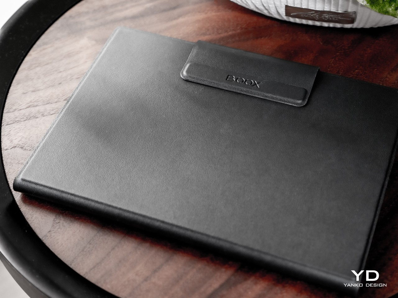
As far as price goes, the Tab Mini C isn’t exactly inexpensive, though that $449.99 price tag, fortunately, includes a magnetic folio case. Compared to other E Ink devices, it’s quite pricey, but it is also in a class of its own. There are very few color E Ink readers that come in this compact size, and the closest competitors are either using older E Ink Kaleido technology or are even more expensive. At the moment, there is pretty much no contest when it comes to a pocket-book size color eReader, making the BOOX Tab Mini C one of a kind.

Verdict

There is thankfully a resurgence in consuming text content that goes beyond scrolling through social media, whether it’s reading ebooks or tons of articles on the Web. This trend, however, has also made people more aware of how common screens wreak havoc on our eyes and our health, especially at night. ePaper Displays are becoming more popular because of this, to the point that there are even computer monitors that use it on the side or in their entirety. For readers of all kinds, however, a portable E Ink device is a better choice and investment.

Of these, the Onyx BOOX Tab Mini C probably represents the culmination of all the innovations available in this segment to date. Its 7.8-inch E Ink Kaleido 3 display brings a splash of color in a more ergonomic and comfortable size, while tablet-like hardware and a Google-enabled Android platform bring all the power and functionality you need on a portable device. Yes, it’s a bit on the pricey side and its design isn’t exactly inspiring, but these thankfully tend to get out of the way once you start immersing yourself in a world of text and colors that bring joy to your life without straining your eyes.

The post Onyx BOOX Tab Mini C: Color, Productivity, and Fun in a More Convenient Package first appeared on Yanko Design.
Vivo X Fold 2 Foldable Phone Review: Beautiful, Big, and Bewildering

PROS:


  • Stylish design with a thin profile

  • In-display fingerprint sensor on both screens

  • Largest screens among foldables

  • High-performance hardware with fast-charging battery

  • Rare mute switch

CONS:


  • Limited market availability

  • Downgrade in camera and USB technology

  • No dust and water resistance rating

RATINGS:

AESTHETICS
ERGONOMICS
PERFORMANCE
SUSTAINABILITY / REPAIRABILITY
VALUE FOR MONEY

EDITOR'S QUOTE:

The Vivo X Fold 2 takes the foldable game up a notch but strangely takes two steps back as well.

As foldable phones start to become a little bit more common, it will also become harder for brands to stand out from the growing crowd. There’s definitely still a lot of room for improvement, of course, but many of the features have started to become more standard these days, especially those surrounding the all-important foldable screen. The challenge is even higher when trying to put out a successor to a successful first attempt, with the stakes now higher and the competition even tighter. That’s the difficult task that Vivo had to face in coming up with a successor to its notable first foldable phone, and so we take the Vivo X Fold 2 for a good run to see if it manages to overcome the odds or if it is a victim of the brand’s own success.

Designer: Vivo

Aesthetics

At first glance, the Vivo X Fold 2 immediately sets itself apart with its distinctive and elegant looks. Circular camera bumps seem to be the new trend, but not all styles are as pleasant to look at. Normally, one that isn’t centered would look a bit awkward and unbalanced, but Vivo manages to pull this one off thanks to a neat visual trick.

The non-screen backside of the phone is made from two materials. There’s a vertical strip on the side of the hinge that’s made of glossy glass, serving as an accent to the rest of the surface, which uses that oh-so-familiar faux leather material. Beyond giving the phone a unique visual, it also gives the illusion that the camera enclosure is sitting in the middle rather than off-center. That said, that camera design is a bit of a mixed bag. Its stepped design and textured ring make it stand out a bit less despite its height, but that small LED flash ring sticks out like a sore thumb and breaks the visual flow of the design, not to mention the necessary ZEISS branding that sits like a blue wart below the camera.

The Vivo X Fold 2 is definitely quite a looker, especially in the eye-catching red unit we were given for this review. Compared to its predecessor, it’s supposed to be thinner and lighter, though you won’t be able to easily tell even if you have both devices at hand. It’s definitely on the thin and light side compared to other foldables, but it’s certainly not the top of the pack in that aspect. What it is, however, is large, and it is possibly one of the largest in the foldable market, especially when it comes to screen size.

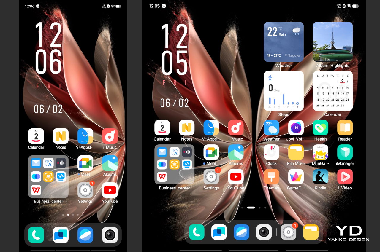
Like many other foldable phones outside of Samsung, Vivo uses a well-known water drop hinge to help make the crease less visible while also allowing the phone to fold shut completely. In both cases, the Vivo X Fold 2 doesn’t disappoint, but it’s not exactly a groundbreaking feat either. It would be more shocking if it actually did worse since it’s a more or less established technology at this point. Fortunately, you really don’t notice the crease that much unless you intentionally look for it, and the bright and large 8.03-inch inner display will be enough to distract you with the way it shows your content in vibrant and crisp colors, even outdoors under the sun.

Ergonomics

Now that the once ridiculed “phablet” has become the standard smartphone size, even for Apple, it is nearly impossible to use smartphones these days with a single hand. That is especially true for foldable phones, which transform into small tablets that you really need two hands for. When folded closed, however, the phone’s doubled thickness makes it even less comfortable to use with a single hand, no matter how large your hands might be.

This is probably truer for the Vivo X Fold 2 simply because it is larger than any other foldable phone. When folded, the 6.53-inch external display makes the surface area even less unwieldy. Fortunately, the phone’s textured back gives it a better grip than others of its kind. If you’re the type to still worry, though, Vivo includes a protective back case in the same color and, amusingly, the same vegan leather material as the phone itself.

The one thing that’s a bit easy to do with one hand is to unlock the phone. Thanks to housing an ultrasonic fingerprint sensor in the middle of the screen, you don’t have to fiddle with power buttons located on just one side of the phone. This is already a rare sight on foldable phones, but even more impressive is the fact that the Vivo X Fold 2 also has a similar in-display sensor on the inner display.

Performance

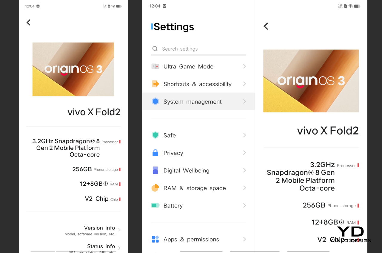
The Vivo X Fold 2 is equipped with top-of-the-line hardware you’d expect from a premium flagship this time of the year. That means a beefy Qualcomm Snapdragon 8 Gen 2, 12GB of RAM, and 256GB or 512GB of storage. What all these figures mean in practice is that it won’t be lacking in power, handling anything you throw at it with aplomb. There is, however, one caveat where the phone gets quite warm when playing graphics-intensive titles. It’s not hot enough to burn your skin, but it might make you want to pause the game a bit, especially since it would eventually affect frame rates.

The phone is equipped with a dual battery that totals 4,800mAh, quite a generous capacity as far as foldables go. Given the power and the two displays, however, you are going to see a shorter uptime compared to normal slabs with the same battery size. Vivo makes up for it with a 120W ultra-fast charging capability that’s one of the fastest in the industry, foldable or otherwise. Unfortunately, that may have come at the price of Vivo downgrading the USB-C port from version 3.2 of its predecessor to an older 2.0 technology. Not only does this mean it has a slower data transfer rate, it also loses the ability to output video through that part. The latter is probably less important to most people compared to faster charging times, but it’s still an unfortunate downgrade nonetheless.

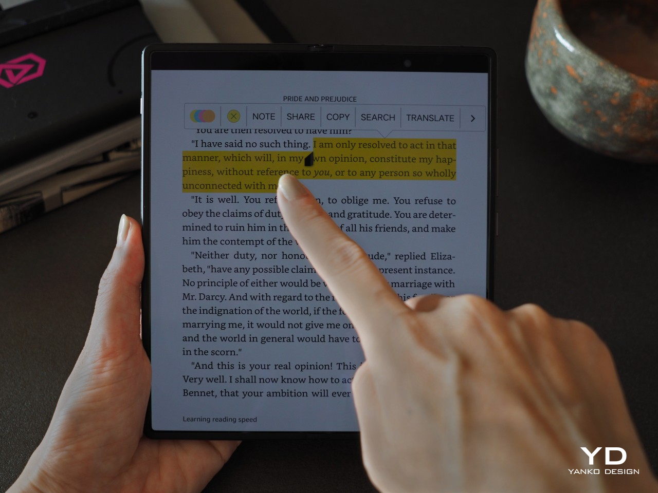
The crowning glory of the Vivo X Fold 2 is, of course, its foldable screen, which is currently the biggest in its category. It has quite an impressive performance, especially when it comes to brightness, but its size does come with a price. It has an overall lower pixel density, and while you won’t be able to make out individual pixels, more discerning eyes might notice the step down in quality compared to other foldables. Fortunately, that doesn’t take away from the enjoyable viewing experience, whether you’re watching videos or reading documents.

Foldable phones haven’t exactly been at the height of mobile photography, mostly because of the sacrifices that have to be made in terms of design and price. Vivo, however, is quite known for its smartphone cameras, especially with its flagship X family, so you’d expect that the X Fold 2 would rise above the rest in this regard as well. Just like the rest of the phone so far, however, it’s a bit of a mixed bag. It definitely takes impressive photos and videos, but they won’t sweep you off your feet, especially when it comes to close-up shots.

The main 50MP camera might not sound like the greatest, but it gets the job done without breaking a sweat. Images have plenty of details, and colors are bright, perhaps even too vibrant for some tastes. Vivo has again partnered with ZEISS for the optics as well as some special camera modes, and those turn out to be more color accurate. The main camera delivers plenty of detail, even in low light, to the point that the dedicated Night Mode might look redundant as long as there is enough illumination from the surroundings.

Left: Regular Shot; Right: ZEISS

Regular (1x)

Night Mode

ZEISS

Unfortunately, the other cameras are less impressive. The 12MP ultra-wide is so-so, and it’s no better nor worse compared to other 12MP ultra-wide cameras you’d find on most smartphones these days. Things take a rather sad turn with the telephoto camera, though. Where there were once two, there is now only one, and Vivo removed the one that was actually more interesting. There is no longer a periscope telephoto camera, leaving only a 12MP shooter in its stead that is capable of doing a measly 2x optical zoom. Many “main” cameras are capable of that much, which makes this camera feel redundant. As for output, it’s decent enough to be usable, but it’s a few steps short of what fans have come to expect from Vivo.

Ultra-Wide

1x

2x (Telephoto)

As for software, the Vivo X Fold 2 comes with Origin OS based on Android 13, which is the China-exclusive flavor that Vivo ships on its phones. This means that there is no Google Play Store pre-installed, though you can definitely install it through other means and get access to your favorite apps. Alas, Origin OS is also filled to the brim with other pre-installed apps, but that, too, is the norm for phones coming from that market. The even bigger concern, however, is how the custom Android experience feels a little rough around the edges as far as support for foldable features is concerned. Given it’s just the company’s second stab at the form factor, it’s a bit understandable, and it will hopefully push out improvements quickly while the phone is still actively supported.

Sustainability

While the Vivo X Fold 2 is able to set itself apart from the others in terms of design, it isn’t that different when it comes to its effects on the environment. The choice of vegan or eco-leather is definitely a good one, but its positive effects are quite minimal compared to the other materials that make up the phone and its packaging. Vivo’s super-fast charging requires a proprietary charger, so it’s unavoidable to ship one in the box.

Sustainability wouldn’t be so bad if the product is made to last, but even then, this foldable might raise some concerns. There is no formal IP dust and water resistance rating, not even a formal assurance of its durability under the most common accidents. Granted, there are few foldable phones aside from Samsung and Huawei that can make such promises, but it is also an opportunity for brands like Vivo to step up their game and prove that they’re no small fry when it comes to providing their customers with peace of mind.

Value

The Vivo X Fold 2 is a bit of a mixed bag. It has a striking design that makes it memorable and attractive, and it also has the power to support all your mobile needs, from browsing to photography to gaming. The larger screens leave plenty of room for your content, or even two of them for the inner foldable screen. There are special features you won’t find in other foldable phones, like an in-display ultrasonic fingerprint scanner and a physical switch to silence notifications, ala the iPhone. We have a few complaints, of course, but nothing so glaring as to make the phone something to avoid.

That said, the biggest deal breaker for this stylish foldable is the fact that only a select number of people will be able to buy one in the first place. Never mind the roughly $1,300 price tag, the Vivo X Fold 2 isn’t even available in markets outside of China. Whether that situation will change, Vivo isn’t saying, but it will definitely need a more polished Funtouch OS experience to improve its reception in international markets.

Verdict

At this point, almost all the major smartphone players except Apple have entered the foldable smartphone market. The competition will soon be just as fierce as it is in the “normal” smartphone arena. With many of them having nearly the same hinges and almost crease-free displays, manufacturers will have to find ways to differentiate their products in other ways that create better value for their customers. That doesn’t always have to be new hardware or gimmicky features. Sometimes, just having a powerful and beautiful device is enough to get people to buy. Just ask Apple!

The Vivo X Fold 2 clearly tries to reach those goalposts. Its elegant design actually makes the off-center circular camera bump work in a simple yet memorable way. In addition to its powerful hardware, the foldable phone offers unique features as well, like larger screens and in-display fingerprint sensors that even industry leaders failed to offer. Unfortunately, Vivo seems to also have cut a few corners in the process, and while they’re not deal-breakers on their own, they make the experience less than ideal altogether. As a successor, the Vivo X Fold 2 definitely rises to the challenge, but Vivo will need to step up its game to really leave a lasting mark in this growing market.

Aki Ukita and JC Torres contributed to this review.

The post Vivo X Fold 2 Foldable Phone Review: Beautiful, Big, and Bewildering first appeared on Yanko Design.
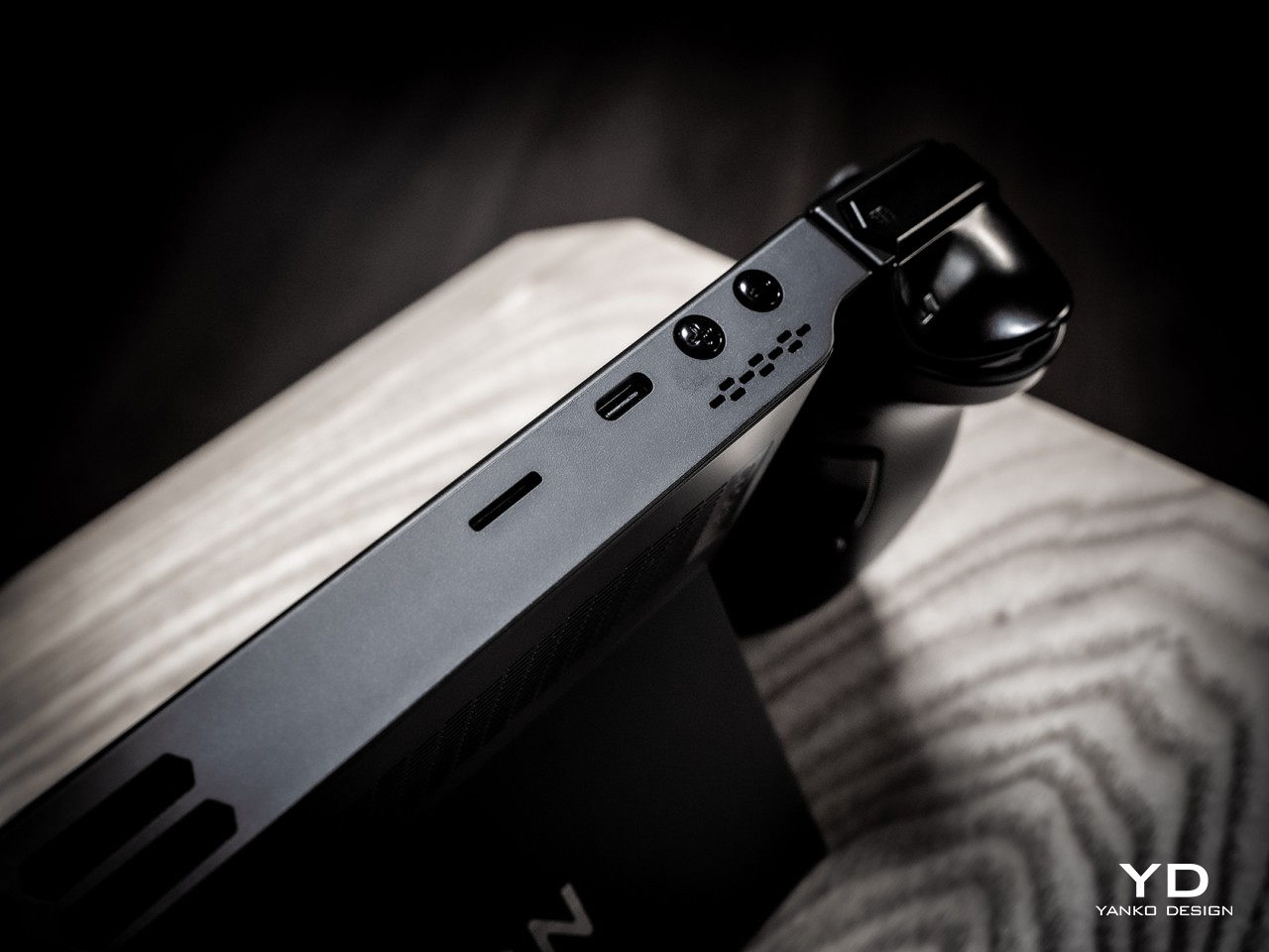
OPPO OHealth H1 is a pebble-shaped device that keeps tabs on your family’s health

Although we should always be aware of our body’s condition, it wasn’t until recently that people became more acutely aware of the need to monitor our health on a regular basis. Regular checkups might not always be feasible, especially if they’re spaced too far apart or too pricey, and that’s one of the major reasons why people put it off until it’s too late. Smartwatches and some fitness trackers have now gained the ability to keep track of some of these health points, but that isn’t really practical when you want to monitor the health of every member of the family. That’s the kind of situation that OPPO designed its first-ever product under its OHealth brand, bringing together the equivalent of six pieces of medical equipment in one beautiful device.

Designer: OPPO

Nothing scares people more than medical and dental equipment, some of which may look more like torture instruments than health tools. The mere sight of these literally clinical objects sometimes causes stress in some people, which is another reason why some stay away from checkups. Bringing these home for personal use is not only impractical but also pointless since many of them require training to use and decipher.

In stark contrast, the OPPO OHealth H1 device looks clean, smooth, and totally harmless. Its design is reminiscent of a pebble, one of OPPO’s favorite natural objects, or a bar of soap. Either way, it’s imagery that inspires calmness and confidence, and it’s not something you might expect to come from a machine that can tell you if you’re in danger of a heart attack or worse.

Despite its unassuming looks, the OHealth H1 is actually packed with health features equivalent to six diagnostic tools. Some, like heart rate monitoring, blood oxygen measurement, sleep monitoring, and body temperature detection, might sound commonplace, considering how some smartwatches already have these functions. OPPO’s device, however, offers better accuracy and performance since it isn’t space-constrained like wearables. In addition, the OHealth H1 is also able to perform functions not available on smartwatches, like proper ECG reading and, more interestingly, cardiopulmonary auscultation. The latter is the medical term used for what doctors listen for when they place a stethoscope on your chest or back.

The OHealth H1 may sound like a portable diagnostic clinic, but it is designed to be approachable and accessible to ordinary people. All you need to do is to either put your finger on a specific area on the bottom of the device or place the device on a person’s forehead, chest, or back. And you don’t have to be a doctor to make sense of all the data because OPPO’s companion mobile app and AI will make the interpretation for you.

The OPPO OHealth H1 will never be able to replace a professional healthcare worker, but it can at least give parents and family members hints on the state of their health, especially for those in charge of other members’ welfare. More importantly, the health monitor’s gentle and almost disarming design removes psychological barriers to keeping tabs on one’s health, which could be a matter of life or death for people who’d never see a doctor otherwise.

The post OPPO OHealth H1 is a pebble-shaped device that keeps tabs on your family’s health first appeared on Yanko Design.
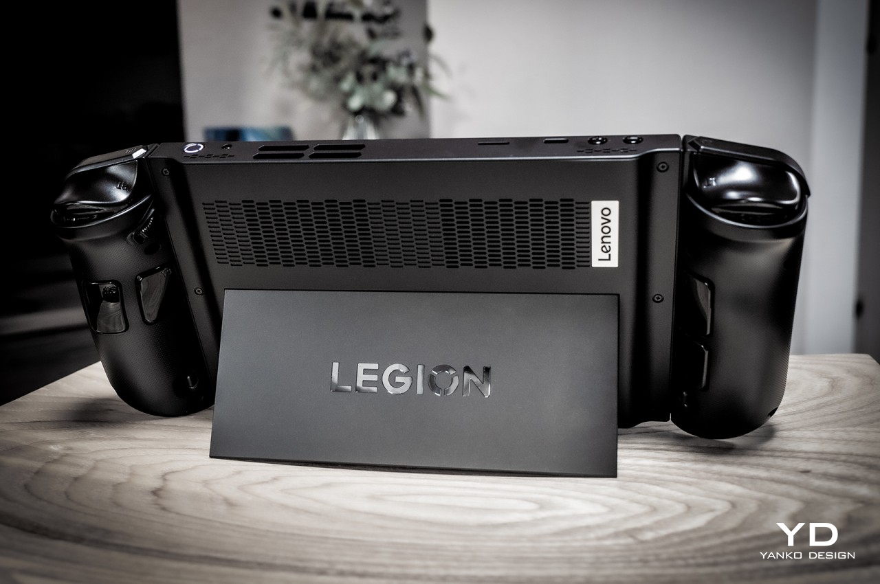
OPPO Find N2 Foldable Phone Review: A Design Marvel You Can Fit in Your Hand

PROS:


  • Lighter, thinner, more ergonomic design

  • Improved Flexion hinge experience

  • Impressive camera output

  • Protective case included in the box

CONS:


  • A few software issues

  • Not available globally

RATINGS:

AESTHETICS
ERGONOMICS
PERFORMANCE
SUSTAINABILITY / REPAIRABILITY
VALUE FOR MONEY

EDITOR'S QUOTE:

Elegant and delightful, the OPPO Find N2 represents a refinement of the foldable phone design that deserves to reach global markets.

Given their marketing strength, you’d think that Samsung and maybe Huawei are the only ones doing foldable phones, with a bit of Motorola on the side. Of course, there are now a few more players in that arena, especially when you turn your attention toward the East. It’s a relatively nascent market compared to the larger smartphone industry, which means there’s plenty of room for improvement but also plenty of temptations to just go with the flow. There are still plenty of unanswered questions regarding foldable phones’ design, from the reliability of its hinge to the very purpose of their existence, but those doubts never stopped companies from attempting to innovate and search for answers. OPPO, for one, seems to have done quite a lot of work for its second-gen “horizontal” foldable, so we take the OPPO Find N2 in our hands to check how much has improved and how much has remained unchanged.

Designer: OPPO

Aesthetics

It’s almost too easy to think that once you have seen one foldable phone, you’ve already seen them all. After all, there are only so many ways you can fold a device, given the limitations of today’s technologies. Right from the start, however, the OPPO Find N bucked the trend to show that there is a slightly different way to design a large, horizontal foldable phone, and the Find N2 iterates over that design almost to perfection.
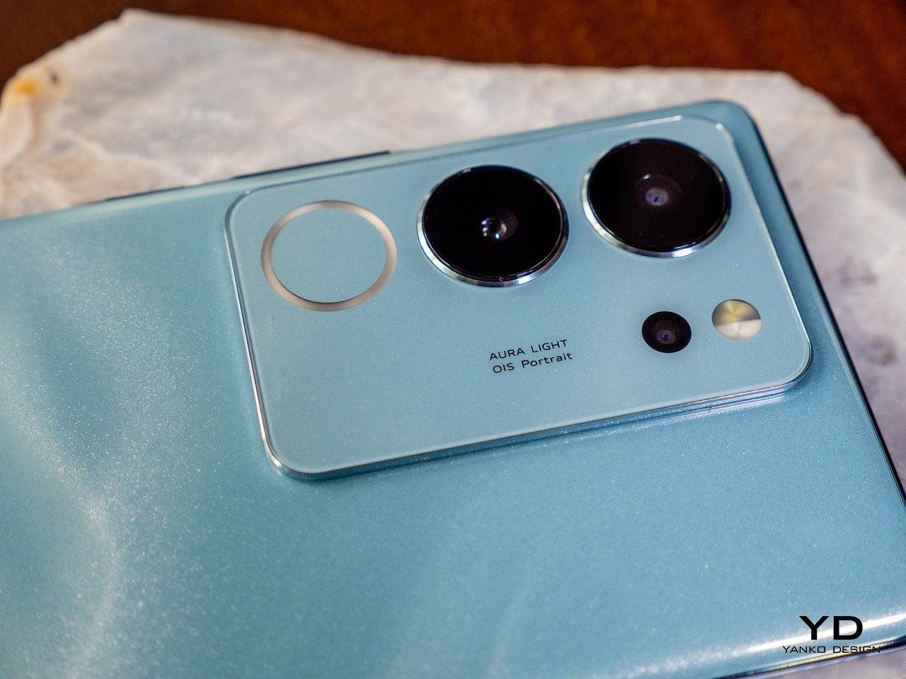
Unlike all the rest from Samsung, Huawei, Xiaomi, Honor, and Vivo, the OPPO Find N2 maintains the more familiar aspect ratios and shapes of phones and tablets. When folded closed, the “phone” isn’t an awkwardly tall and narrow piece of screen real estate that makes it difficult to even peck a few words on it. When opened up, the “tablet” is closer to a landscape or horizontal aspect ratio that’s more typical of these slates. That means you won’t have to constantly rotate the phone after opening it to watch videos properly or take advantage of split-screen functionality.

While that basic form has remained the same, OPPO’s second foldable phone does change things in subtle yet meaningful ways. You might not even notice how thinner it is compared to its predecessor, but it adds up to make the device more manageable in your hand. You will appreciate how light it is, though, which isn’t exactly surprising given how smaller it is compared to most foldables of its kind. OPPO also made important improvements in both the look and feel of the device, starting with the anodized metal frame that tastefully matches and accents the phone’s color. The back material has also been changed from glossy glass to a matte texture that helps a lot with grippy-ness. There’s even a vegan leather model that makes the phone look classy while giving something your fingers will enjoy as well.

The OPPO Find N2 is undoubtedly a beauty to behold from any side or angle, especially thanks to how it folds completely flat and how the crease at the fold is nearly invisible. One design aspect that might be a bit divisive is the camera bump, something that it inherits from the first Find N. A bit like the gorgeous OPPO Find X5 Pro, that bump slopes gently upward. Unlike that award-winning design, however, there is a clear demarcation around the camera island, creating an abrupt stop in eye movement. Admittedly, it’s a minor detail that others might actually find tasteful, especially compared to more obnoxious camera bumps on other phones, foldable or otherwise.

Ergonomics

The driving force behind OPPO’s decision to stay off the beaten foldable design path is the ease of use rather than mere technological demonstration. Its smaller size and more familiar aspect ratios make it easier to hold and use even with a single hand, something that’s rare with regular phones these days. Although it might seem like you’re sacrificing screen size, what you’re really getting is a more practical and ergonomic device that looks great and feels just as great in your hands.
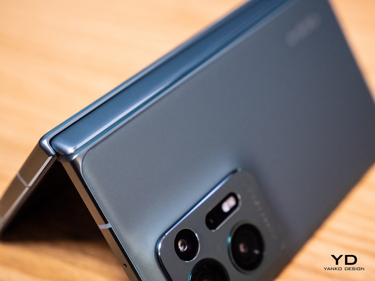
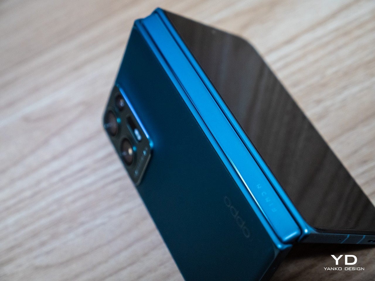
OPPO’s “waterdrop” hinge design has always made it possible to close the phone completely flat, which means it takes up less space and is effectively thinner when folded. The OPPO Find N2 further optimizes this design by making the device thinner and, more importantly, lighter, mostly by improving materials and reducing the number of parts needed in its Flexion Hinge. All of these result in a device that’s comfortable to use and puts less strain on your hands and arms. Given how you’re likely to enjoy using it for hours on end, that’s a rather significant quality of life improvement.

At the same time, OPPO has taken pains to also make sure you’re able to hold on better to the phone to prevent accidents. That switch to matte glass for the back adds a bit of texture that helps your finger grip the device better. But if you still fear your clumsiness, OPPO generously includes a two-piece protective case in the box that matches the phone’s color for added peace of mind. It’s the typical silicone case, though, so it does take away some of the phone’s stylish beauty.

One of the biggest improvements in the OPPO Find N2 is something that you can’t see. The company’s second-generation Flexion Hinge features improved durability thanks to the use of new materials like carbon fiber and high-strength alloy. It also has 38 fewer parts than the previous-gen hinge while delivering improved robustness and reliability. For example, it can now stay open at any angle between 45 to 125 degrees. This is part of the reason why the Find N2 is lighter and more usable, without compromising its functionality.

Performance

The Find N2 is no slouch when it comes to internal components either, though it is a tad late to bear the latest mobile processor. The Qualcomm Snapdragon 8+ Gen 1, however, is very much cable of handling anything you can throw at it, especially when you consider the 12 or 16GB of memory you can utilize. In terms of raw power, there really isn’t much to complain about, and the phone will serve you well whether you’re binging the latest streaming shows, playing your favorite mobile games, or even being productive with work tasks.

Both displays on the OPPO Find N2 are top-notch, and not just because of their aspect ratios. The external 5.54-inch 2120×1080 AMOLED display is bright and vibrant, and its 120Hz refresh rate is decent even for games. The main star is, of course, the internal 7.1-inch 1920×1792 AMOLED LTPO screen that can dial its refresh rate down to 1Hz to preserve the battery. This flexible screen is just as delightful and colorful as any other, but, more importantly, the crease that splits it into two areas is barely visible at any angle. Your finger won’t be able to tell it’s there, either, which is a far cry from the dip that even the Galaxy Z Fold 4 still has at this point.

One problem with most foldable phones is that there isn’t much space to cram large cameras inside them. It’s no surprise, then, that the OPPO Find N2’s set is no match for some of the latest flagships in the market. That being said, it’s actually not bad at all, despite what the specs sheet might suggest. It definitely helps that the famed Hasselblad had a hand in fine-tuning the photography experience, especially through the software and filters. OPPO’s dedicated imaging NPU, the MariSilicon X, also deserves credit for the cameras’ performance, particularly when 4K content is involved.

The 50MP camera on its own produces excellent photos even in low-light situations. The ultra-wide camera gets a decent 48MP sensor, so you’re not actually sacrificing quality by switching to a more panoramic shot, though there are telltale signs of lens distortion at the edges. Just as impressive is the 32MP sensor on the telephoto camera, something that you won’t expect for close-up shots. The 32MP front-facing cameras, both inside and outside, are also good and won’t leave you wanting when it comes to selfies and video calls either.

The Find N2 runs OPPO’s ColorOS 13 version of Android 13, which offers a beautiful and fluid interface as well as plenty of options to customize your experience. What makes this version different are the gestures designed to make it easy to take advantage of the form factor, specifically in “splitting” the screen between two apps. That said, OPPO could only do so much to nudge Android apps to behave well in this context. You’ll find some apps still don’t play nice with foldable phones, but that is a flaw of the platform more than the hardware.

Sustainability

While OPPO is blazing a trail when it comes to innovating on foldable phones, it isn’t making inroads in changing the narrative around sustainability. There are always small steps forward, like the use of recycled paper or the reduction of packaging size, but the phones themselves mostly remain beautiful yet harmful products of human ingenuity and creativity. OPPO has also yet to jump on the slowly growing trend of making its phones more easily repairable by third parties and even owners themselves, but the complexity of a foldable phone makes that a non-starter anyway.

The OPPO Find N2 does at least improve the phone’s reliability a bit so that it won’t find itself in repair shops too soon. The reduction of the number of parts that make up the new hinge also translates to a reduction of the things that could potentially break. Improving the phone’s overall durability might not be a big sustainability gain, but it at least helps prolong the lifetime of a product and delay its arrival in landfills.

One of the three available colors for the Find N2 also uses vegan leather to offer a luxurious aesthetic that doesn’t harm the environment, particularly animals. Vegan leather, however, is also a bit controversial in how it has become somewhat of a marketing buzzword. When implemented properly, however, it’s still a more viable alternative to other non-sustainable materials that make a phone look dashing.

Value

The first foldable OPPO phone challenged the status quo of this niche market with a design that proves there’s still another way to do things. The OPPO Find N2, then, is a refinement of that design that smooths out the rough edges to deliver a product that is almost perfect, at least for what its intended goals are. Stylish and handy, the Find N2 offers a foldable device that feels like a finished product rather than an expensive prototype. Its design is clearly informed by the need to have something comfortable, usable, and aesthetic rather than simply flaunting technical and engineering innovations.

For all its strengths, the OPPO Find N2 has one critical flaw that makes all of the above almost moot and academic. It won’t be available anywhere other than China, at least not in the immediate future. And while you might be able to purchase it through third-party retailers, the software experience might be so different that it detracts from the enjoyment of the device. Fortunately, OPPO hasn’t closed the door on the possibility of a global launch, but it’s taking a wait-and-see approach in order to measure market interest.

Verdict

Many people still doubt that foldable phones, both the larger ones and the clamshell designs, are the future of mobile phones, but it’s hard to deny that they will play a large part in their development. As components become more accessible, more companies will be putting out such devices to the point that they will become commonplace. For now, however, there are only a few that dare dip their toes in that market, and even fewer who dare to be different.

The OPPO Find N2 is clearly a rare breed, not only because of how much smaller it is but also because of its focus. While all phone brands will naturally claim that they are designing for usability, OPPO takes that mission to heart. The result is a foldable device that is elegant, delightful, and practical, able to fit seamlessly into everyday life just like their non-foldable brethren.

The post OPPO Find N2 Foldable Phone Review: A Design Marvel You Can Fit in Your Hand first appeared on Yanko Design.