This innovative 2-in-1 faucet system simplifies showering while enhancing your bathroom’s style

‘Omnibath,’ a combination of “Omni” and “bath,” represents a groundbreaking 2-in-1 faucet system that redefines the bathroom experience. The word “Omni” implies all-encompassing, without limits, while “bath” reflects the cleansing process. Together, Omnibath is designed to be an inclusive, accessible solution for people of all ages and abilities. This innovative product not only addresses common issues with conventional faucets but also offers a more intuitive and efficient bathing experience. With Omnibath, the complexity of managing water flow is replaced by simplicity, comfort, and reliability.

Designer: Jeongwoo SEO
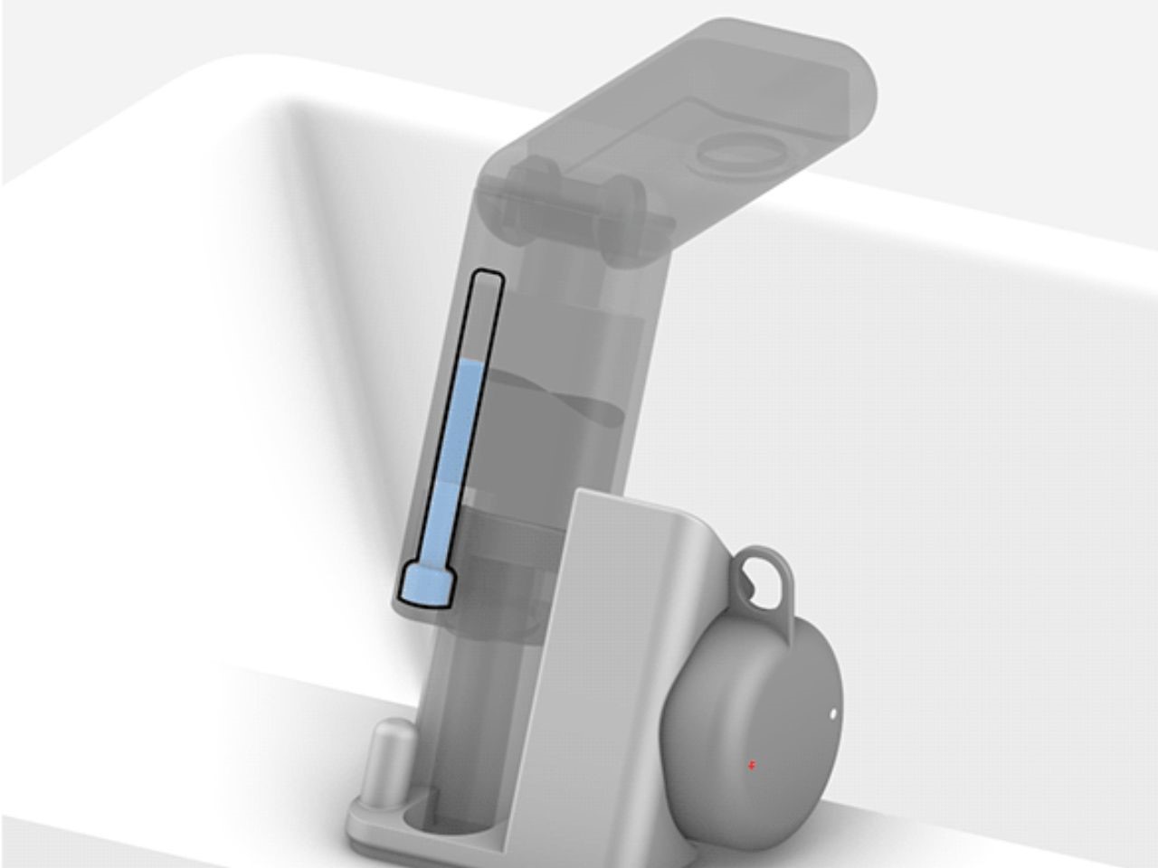
The motivation behind Omnibath stems from persistent issues that plague traditional faucets. One of the key problems is the high risk of malfunction, particularly with complex levers that often fail at inconvenient times. In humid, slippery bathroom environments, operating these levers becomes difficult and frustrating. Furthermore, the design of standard faucets is not user-friendly for those with mobility issues, making simple tasks like turning on the water or adjusting the temperature unnecessarily challenging. Omnibath was created to directly address these challenges, providing a faucet system that eliminates these frustrations and is suitable for a wide range of users.
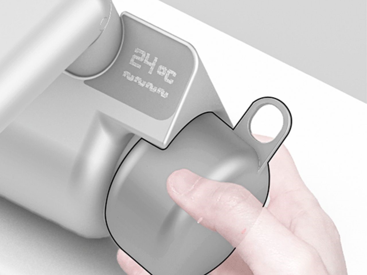
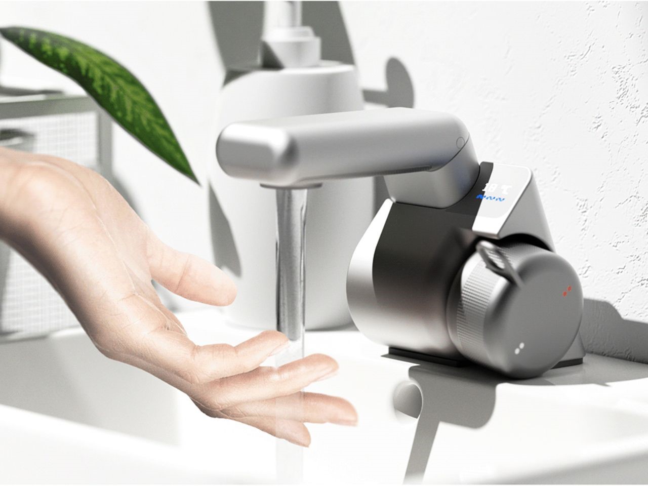
One of Omnibath’s standout features is its intuitive design, making it incredibly user-friendly for everyone. The operation process is streamlined into three easy steps: first, users turn on the water with a simple motion, making it ideal for those who may have difficulty with standard faucets. Next, the pull-and-use mechanism allows users to easily switch between the faucet and shower functions, enhancing convenience. Finally, the jog dial enables precise temperature control, with the temperature visibly displayed for added safety. This design ensures that Omnibath is accessible to people of all abilities, from young children to the elderly.
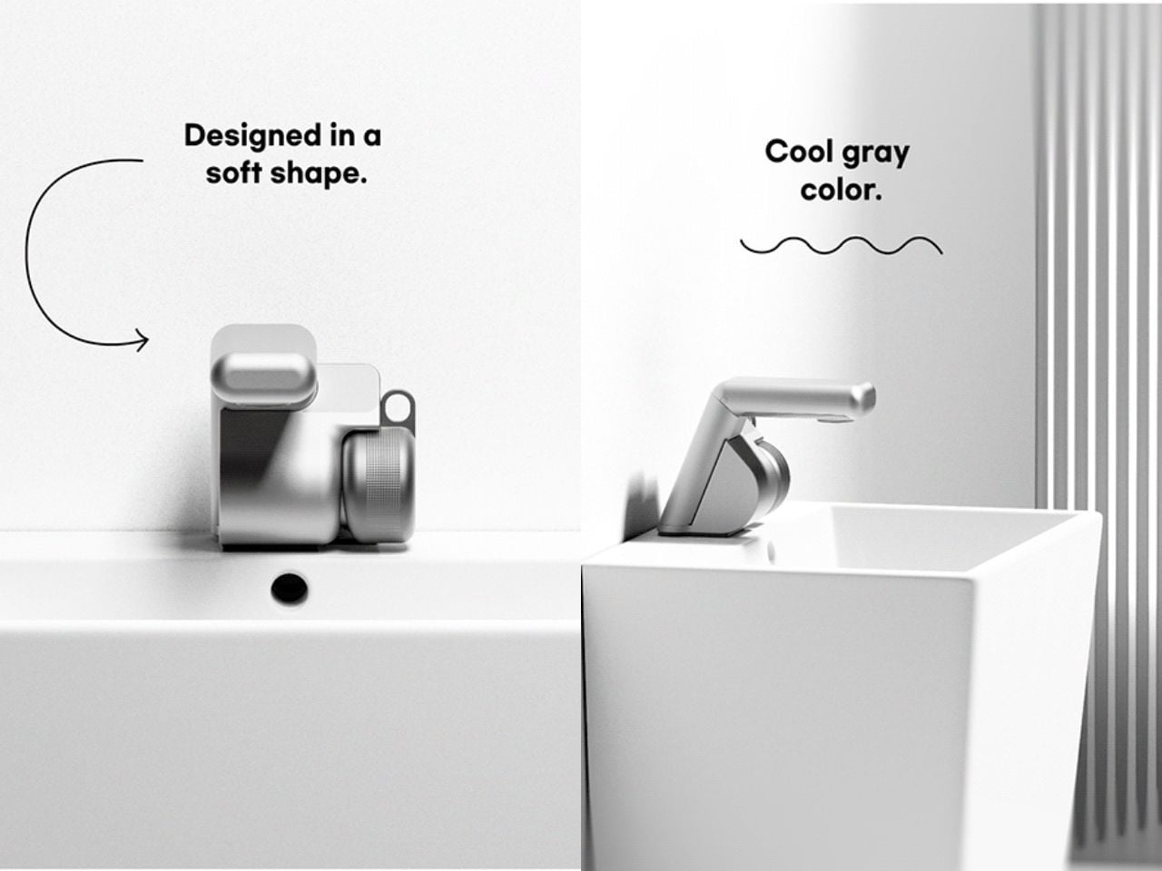
In terms of aesthetics, Omnibath is as much about visual appeal as it is about functionality. The faucet is crafted with a sandblasted metal finish, providing a soft texture that is comfortable to grip even in wet conditions. Its cool gray color is a timeless and versatile choice, easily fitting into most bathroom decor schemes. The faucet’s shape is also thoughtfully designed, with soft, flowing lines that enhance its modern aesthetic while avoiding harsh edges. This creates a sleek, elegant look that complements its user-friendly features.
Even the packaging of Omnibath reflects its focus on practicality and ease of use. Inspired by the utility of a toolbox, the packaging is equipped with a hook on top that doubles as a handle, making it easy to carry. This clever design ensures that from the moment of purchase, users are met with convenience and functionality. The packaging not only protects the faucet but also serves as a nod to the product’s blend of form and function.

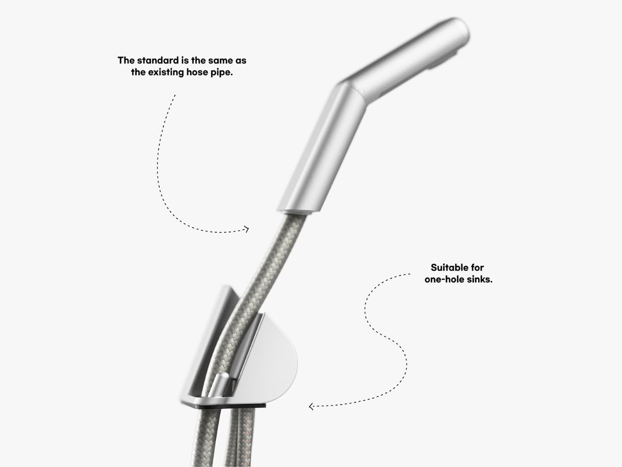
Omnibath is designed for effortless installation. It adheres to the standard dimensions for one-hole sinks, meaning it can easily replace existing faucets without the need for extensive modifications. The handle is easy to operate, further enhancing its accessibility for those with limited mobility or strength. This combination of thoughtful design and straightforward installation makes Omnibath an attractive option for homeowners looking to upgrade their bathroom fixtures with minimal hassle.

Safety is another core feature of Omnibath. The faucet is equipped with a visible water temperature indicator, reducing the risk of scalding and ensuring a safer bathing experience for all users, particularly children and the elderly. This added layer of protection gives users peace of mind, knowing that they can control and monitor the water temperature with precision.
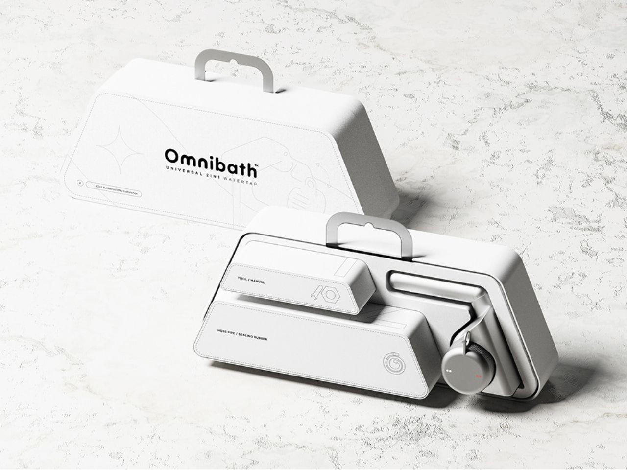
Omnibath is a cutting-edge faucet system that merges style, functionality, and safety. By addressing the flaws of traditional designs, it offers a more intuitive, accessible, and reliable bathing solution. Whether you’re looking to enhance the aesthetic of your bathroom or need a faucet that’s easier and safer to use, Omnibath delivers on all fronts. Its sleek design, user-friendly features, and thoughtful packaging make it a must-have for any modern home.

The post This innovative 2-in-1 faucet system simplifies showering while enhancing your bathroom’s style first appeared on Yanko Design.
Nature-Inspired Lighting with Smart Features and Volcanic Design Aesthetics

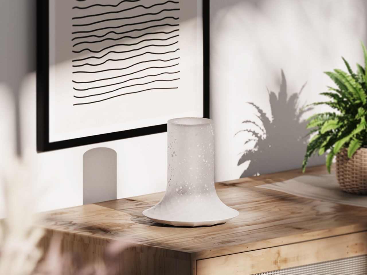
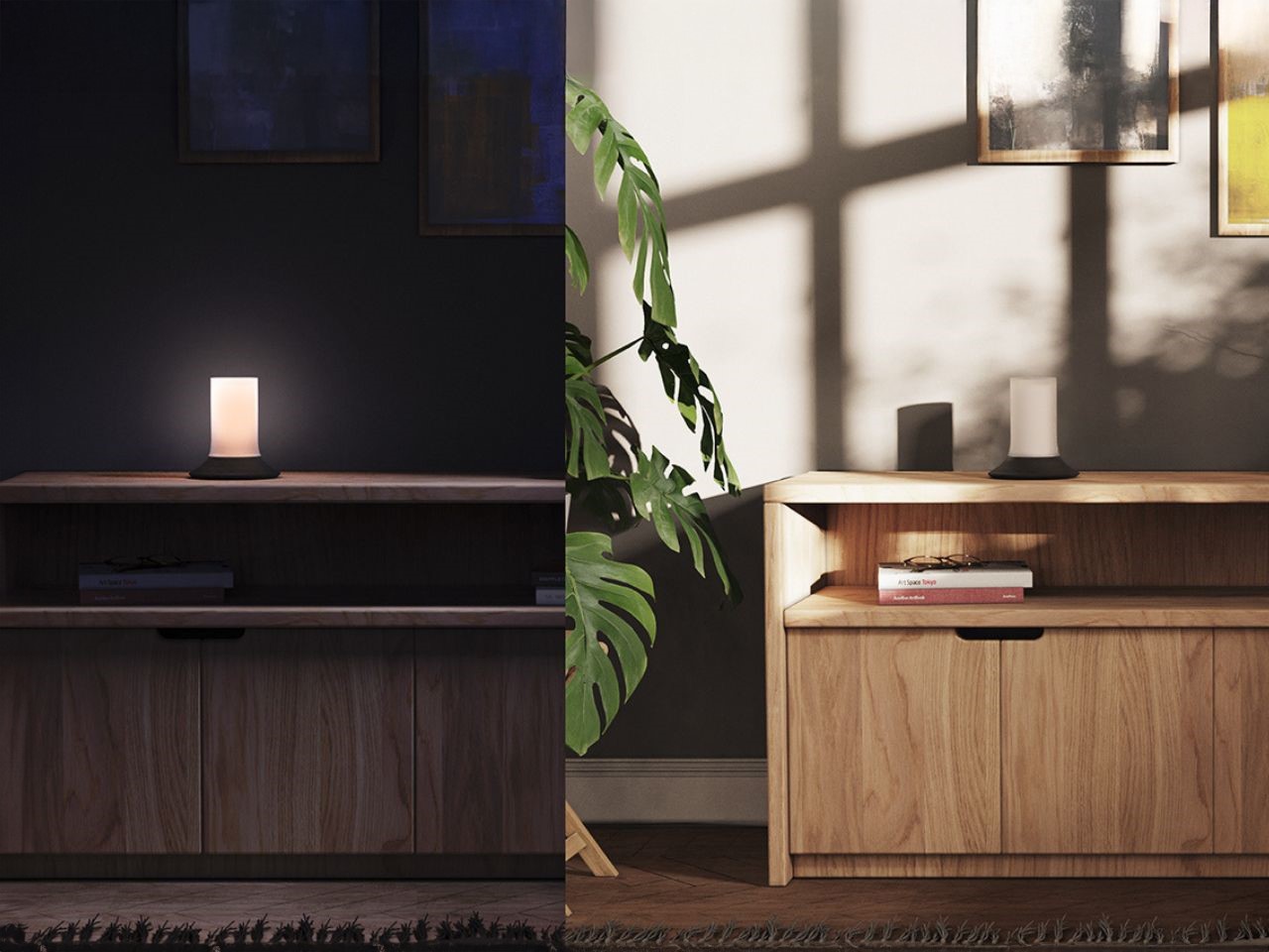
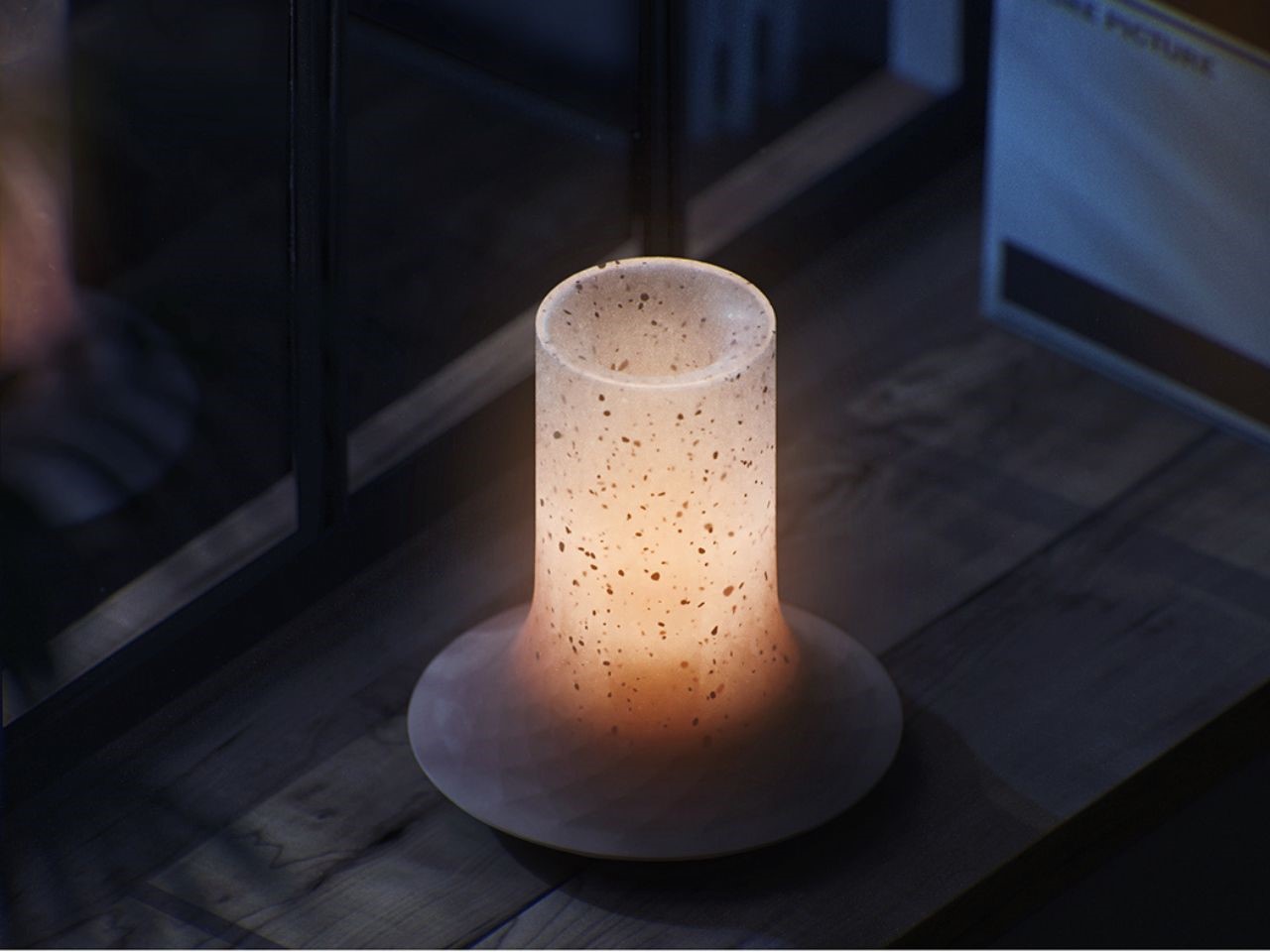
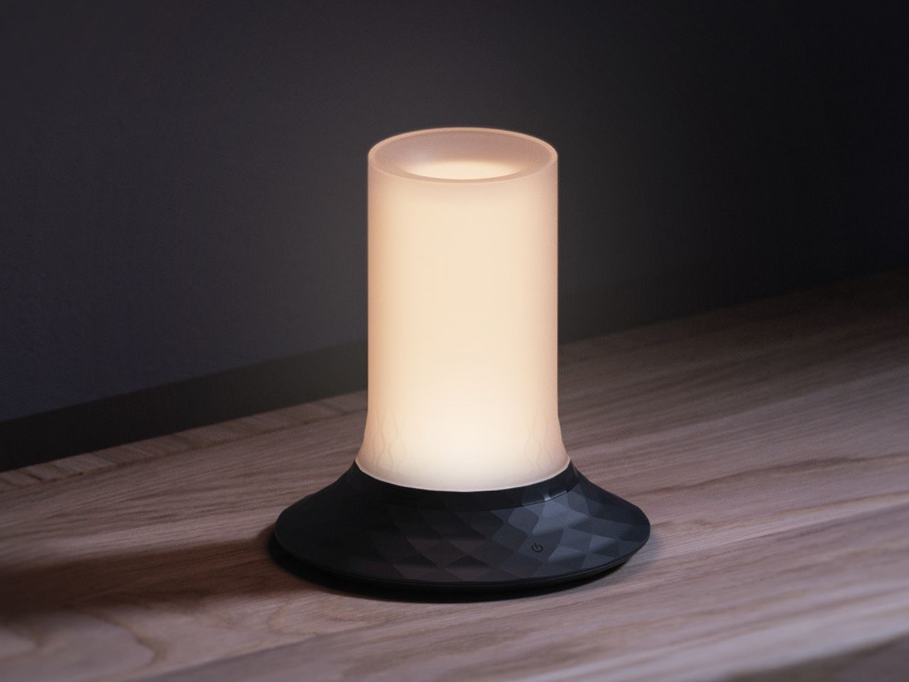
The Magma Ambiance Lamp is a tribute to nature’s raw power, taking inspiration from the magnificent Puu Õõ volcanic cone. With its dynamic yet minimalist design, the lamp encapsulates the essence of an active volcano, allowing users to bring that natural wonder into their homes.

Designer: Zeta ID

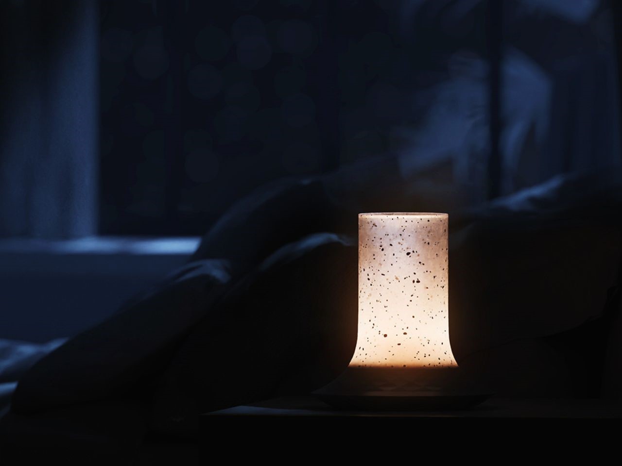
The Magma Lamp draws from the striking image of an erupting volcano, with clean, conical lines that reflect the natural geometry of volcanic cones. Its design focuses on simplicity and fluidity, mimicking the flow of molten lava. The lamp’s adjustable lighting settings further enhance this concept, offering an experience akin to the glow of magma, pulsing and radiating from the center outward.

The design process began with a deep dive into geometric exploration, specifically focusing on conical shapes that evoke the majesty of volcanic formations. The goal was to capture a balance between form and function, ensuring that the lamp’s structure would not only serve its lighting purpose but also stand as an artistic piece in any home. Texture and pattern proposals were equally crucial, with radial patterns expanding from the lamp’s core, visually mirroring lava flowing from a volcanic eruption.

The concept of radial patterns became central to the Magma design. By repeating the pattern outward from the center, the lamp visually simulates the flow of molten rock down a volcanic slope, creating a sense of movement and energy.

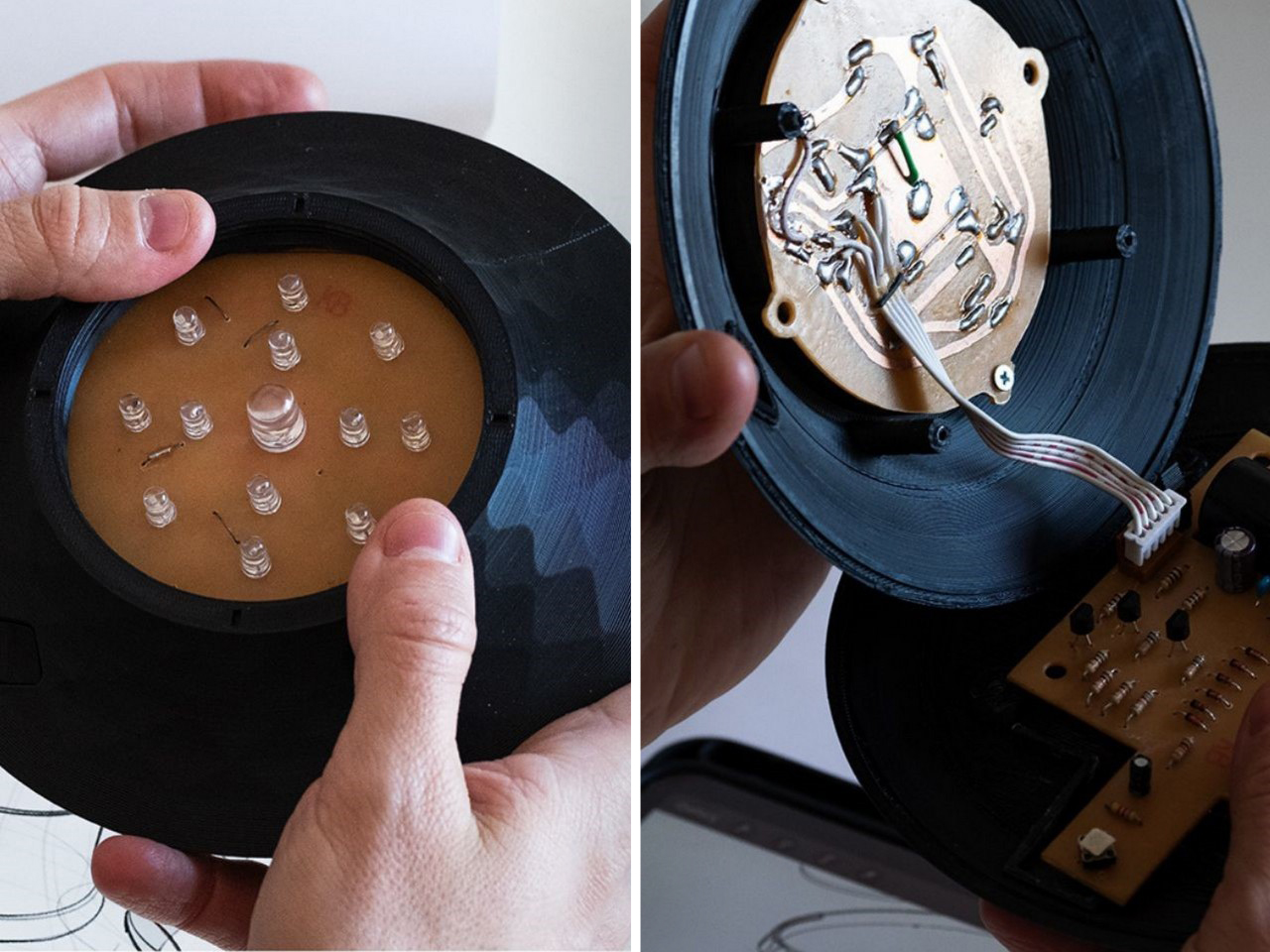
The first prototype was crucial for refining the lamp’s size, developing an in-house PCB, and testing color and light intensity. While the battery lasted an impressive 18 hours at maximum brightness, the team saw room for improvement. The next iteration aimed to extend battery life and introduced remote intensity control, scheduled on/off options, and synchronization with other Magma lamps to create cohesive lighting atmospheres across different areas of the home.

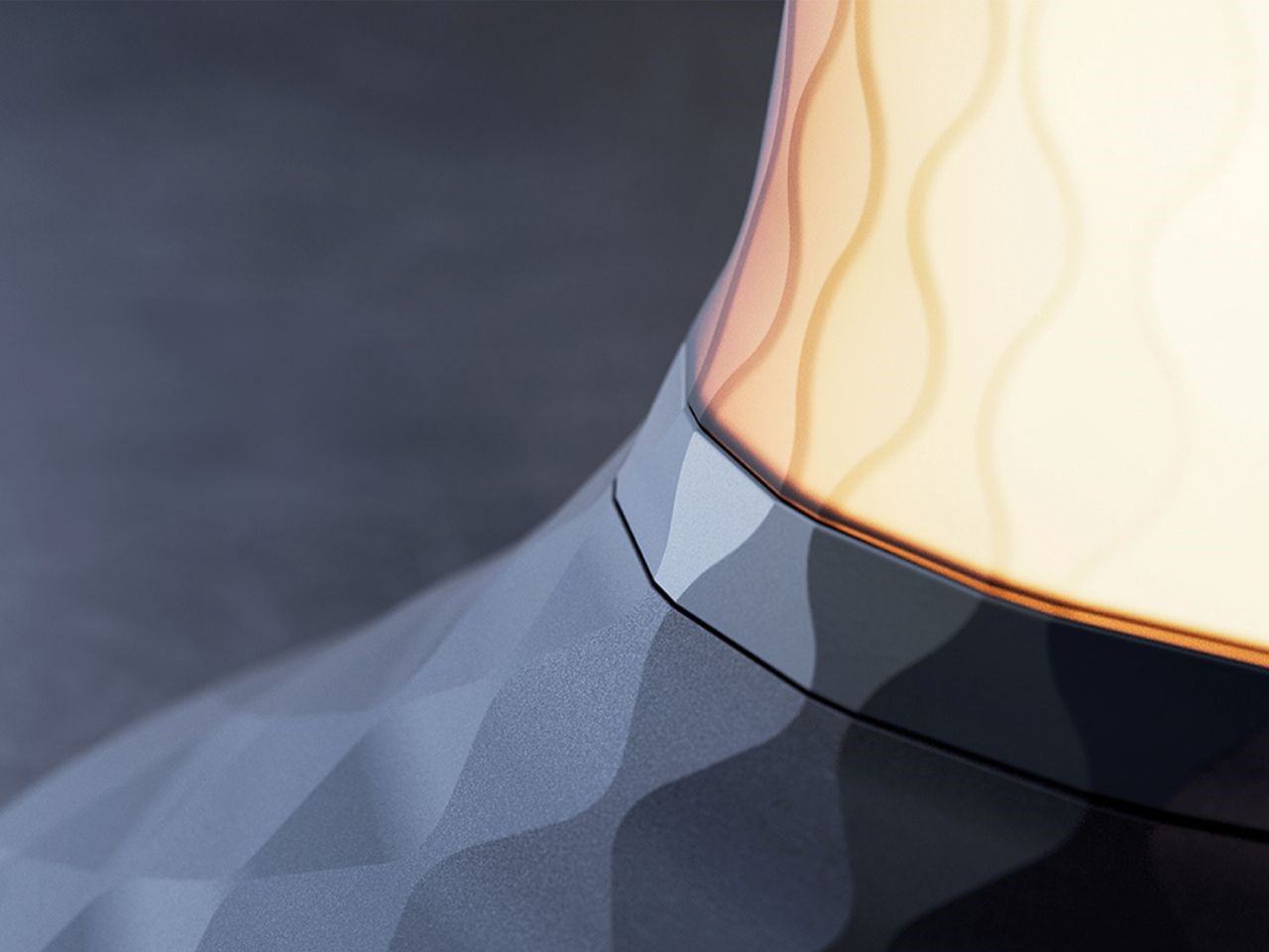
Building upon its initial success, the Magma lamp underwent a design evolution. The latest version embraces a bolder, more contemporary aesthetic while maintaining its connection to volcanic inspiration. New textures applied along the neck of the lamp simulate the appearance of erupting lava particles, while intensified textures at the base add a sense of movement and dynamism. The placement of the brand’s logo was intentionally unconventional, keeping the lamp free from visible text and maintaining the minimalist aesthetic.

To complement various home interiors, neutral and pastel color options were chosen, ensuring that the Magma lamp could seamlessly integrate into a wide range of settings while still making a bold statement.

The next phase of the Magma Lamp development focuses on integrating smart functionality. The design team plans to introduce mobile app connectivity, allowing users to configure automatic on/off schedules, manually adjust light intensity, and synchronize multiple lamps for a unified experience. Additionally, the battery life will be doubled to provide even greater autonomy, ensuring the lamp can light up your home for extended periods without frequent recharging.

Beyond functionality, the assembly process is also being optimized. The goal is to create a visually clean product with no visible screws or fittings, ensuring that every Magma lamp maintains a polished and elegant appearance.

The Magma Ambiance Lamp is a remarkable blend of natural inspiration and cutting-edge design. It brings the captivating energy of a volcanic eruption into the home, with smart features and a design that elevates any interior space. As it evolves, the Magma promises to continue providing not just light, but a transformative ambiance, creating warm and connected atmospheres that reflect the beauty and power of nature.

The post Nature-Inspired Lighting with Smart Features and Volcanic Design Aesthetics first appeared on Yanko Design.
Dopio: The Chair That Fits Into Any Room With Its Simplistic Elegant Charm

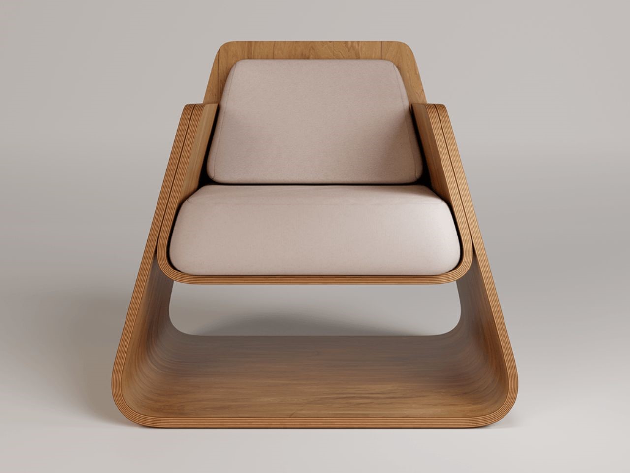
In the world of furniture design, where objects often compete to be the center of attention, the Dopio lounge chair takes a different approach. A product born from a philosophy of understated elegance, Dopio embraces simplicity, allowing it to seamlessly blend into any environment without overwhelming the space. Its minimalistic aesthetic serves as a quiet complement, embodying the beauty of subtlety.

Designer: Thibaud ROLLET

Dopio draws its first breath of inspiration from the Iso-lounge chair by renowned designer Jasper Morrison, echoing his famous motto: “Object should never shout.” This sentiment is at the heart of Dopio’s design. Rather than vying to be the focal point, this lounge chair exists to support and enhance the broader indoor composition. It’s not a statement piece that demands attention but a thoughtfully crafted element that helps tie a room together.

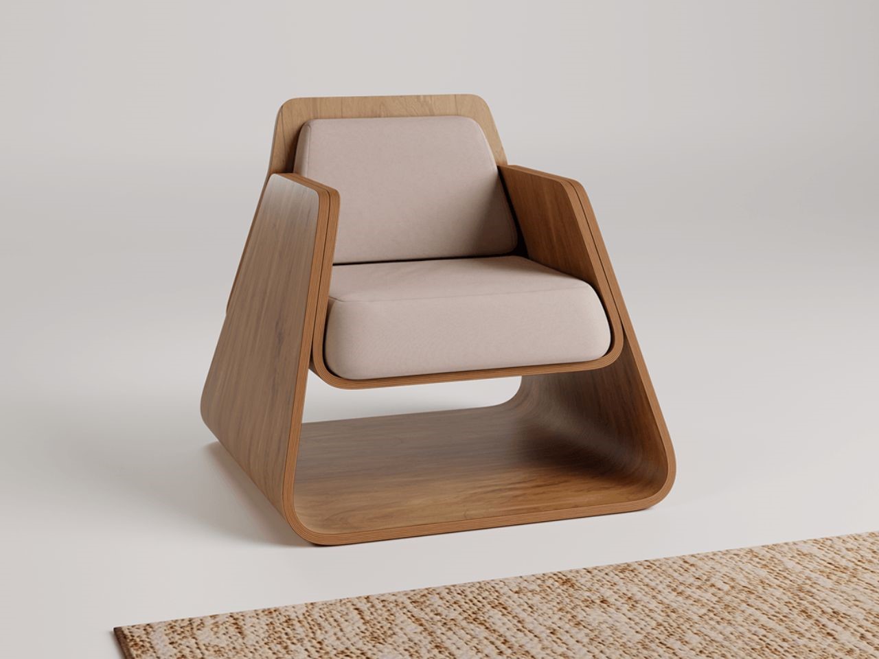
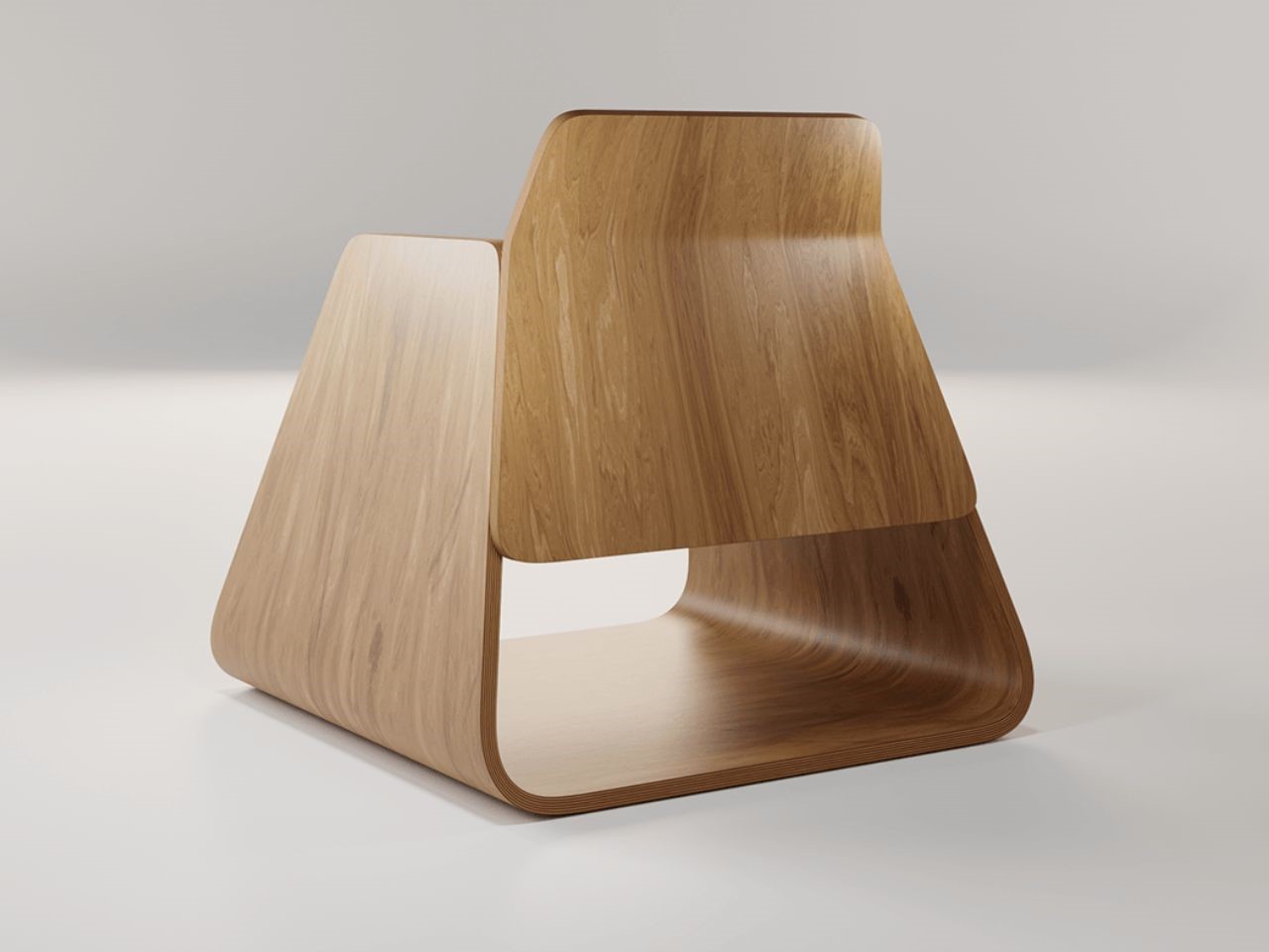
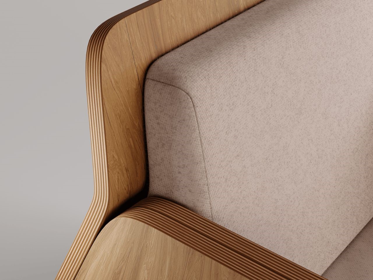
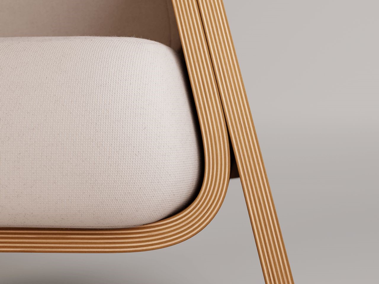
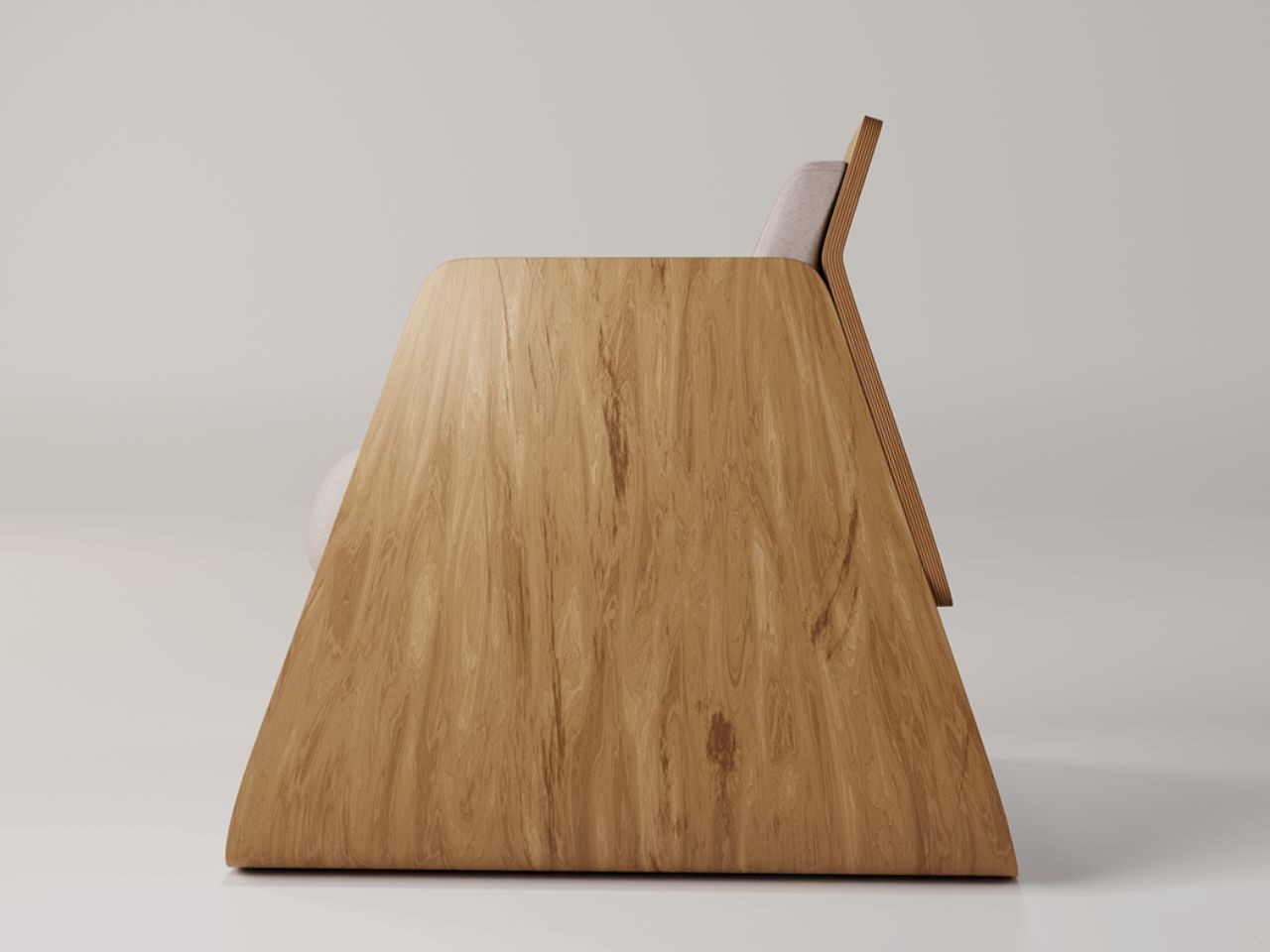
Constructed from just three plywood panels and two cushions, Dopio distills furniture design to its essentials. The use of plywood not only contributes to its minimalist appearance but also offers a tactile warmth that suits a variety of interiors. The simple assembly of these materials underscores the elegance of the chair’s design, where less truly becomes more.

One of the most striking aspects of Dopio is its versatility. Its muted aesthetic allows it to complement virtually any interior style, whether modern, minimalist, or traditional. It’s the kind of chair that feels at home in a variety of spaces, from high-end office receptions and hotel lobbies to restaurants and public areas. At home, Dopio’s discreet elegance makes it an ideal addition to lounges, living rooms, or reading nooks. Its clean lines and neutral tones make it adaptable to various settings, effortlessly blending into the environment while subtly enhancing it.

Dopio also offers a unique feature that appeals to pet lovers. The open space at the bottom of the chair creates a cozy nook that pets are sure to adore, making it a favorite spot for them to curl up and relax. This playful touch adds a layer of warmth to the chair’s otherwise sleek design, making it both functional and inviting.

The post Dopio: The Chair That Fits Into Any Room With Its Simplistic Elegant Charm first appeared on Yanko Design.
Nelumbo Restaurant Caters To Your Moods Throughout The Day With Lasting Serene Experiences

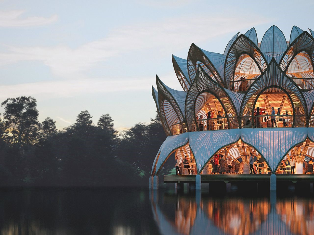
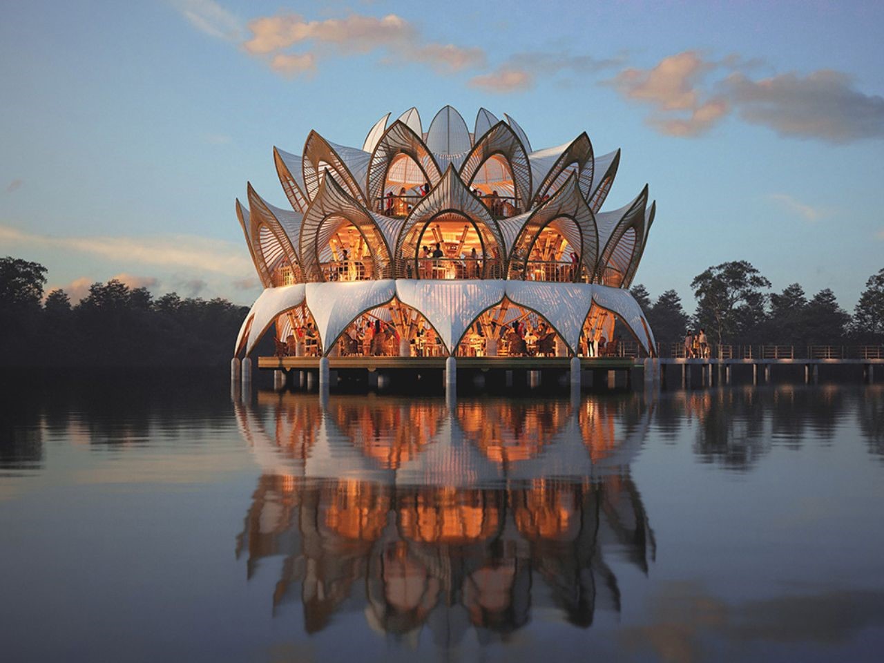
Floating serenely on the water like a lotus in full bloom, Nelumbo is not just an architectural marvel, it’s a poetic fusion of nature and design, inviting guests into a dining experience like no other. This innovative floating restaurant takes inspiration from the grace of the lotus flower, seamlessly blending into its aquatic surroundings while offering a multi-level journey of culinary delights. As you step inside, you’re not merely entering a restaurant; you’re embarking on a serene, immersive experience that unites cutting-edge sustainability with nature’s quiet beauty.

Designer: Thilina Liyanage

The core of Nelumbo’s architectural brilliance lies in its commitment to sustainability. The primary structure is crafted from bamboo, a renewable material that reflects the restaurant’s dedication to environmentally conscious design. Bamboo’s natural strength and flexibility make it a perfect choice for this floating marvel, allowing for both durability and elegance.

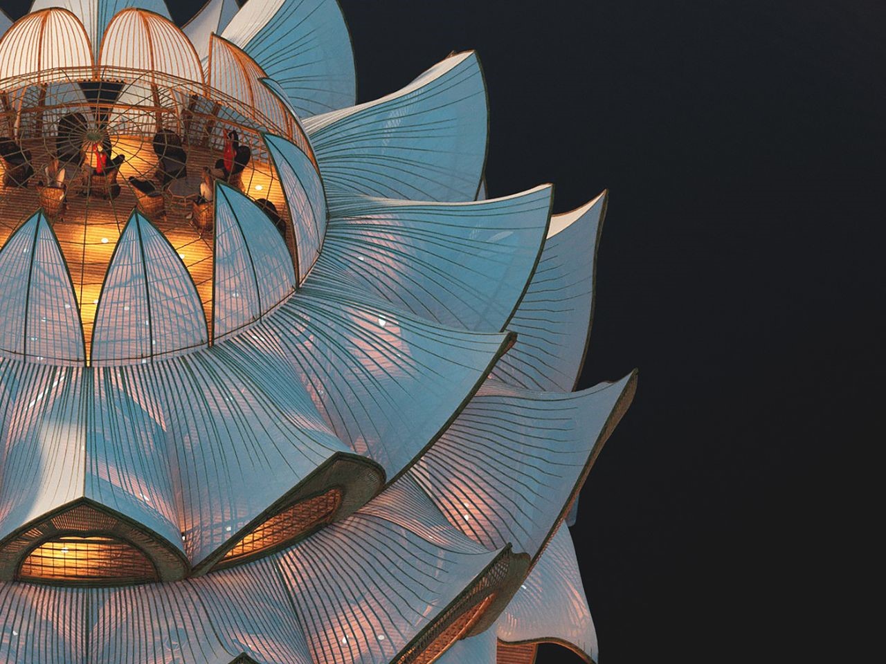
A canvas roof crowns the building, mimicking the petals of a lotus in full bloom. The roof’s lightweight, weather-resistant properties ensure that the structure remains resilient against the elements, while its organic shape enhances the restaurant’s naturalistic aesthetic. At the heart of this unique structure, a glass dome serves as a skylight for the top-level coffee shop, evoking the sensation of dining in an open-air rooftop café. This thoughtful detail not only adds to the aesthetic appeal but also ensures ample natural light during the day, creating a serene and open atmosphere.

Perhaps the most striking aspect of Nelumbo’s design is how it appears to float effortlessly on water. Its reflection creates a stunning visual effect, blurring the lines between reality and illusion. This architectural illusion makes Nelumbo feel like a part of the aquatic environment, a gentle lotus flower resting on the water’s surface, enhancing the feeling of tranquility and connection with nature.

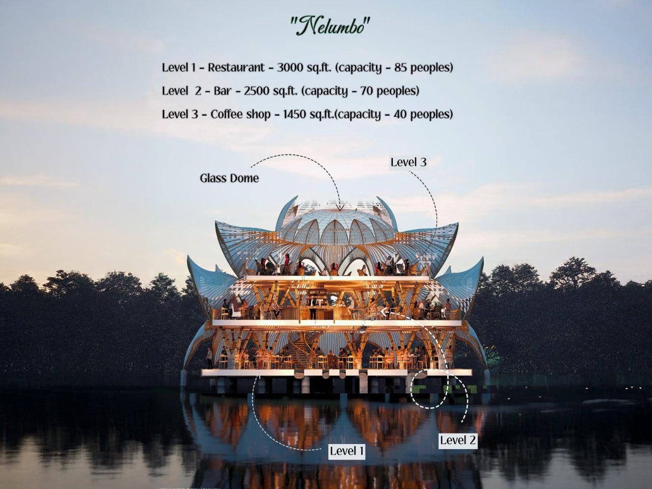
Nelumbo offers a multi-dimensional culinary experience across three distinct levels, each designed to cater to different moods and times of the day.

Level 1: The Main Restaurant (3000 sqft)
The first level is where the full-service dining experience takes place. With a spacious area of 3000 square feet (279 sqm), it comfortably accommodates up to 85 guests. The ambiance here is refined yet relaxed, perfect for everything from family dinners to special occasions. Large openings offer uninterrupted views of the water, allowing guests to dine in an atmosphere of calm and serenity.

Level 2: The Bar (2500 sqft)
As the sun sets, Nelumbo’s second level comes to life. The 2500-square-foot bar area is the perfect spot for evening cocktails, with a lively yet intimate atmosphere. It can host up to 70 people, making it an ideal place for socializing and unwinding. Whether it’s enjoying a classic drink or sampling creative, handcrafted cocktails, the bar is designed to be a hub for nightlife while still maintaining the restaurant’s tranquil ambiance.

Level 3: The Coffee Shop (1450 sqft)
The top level offers a more laid-back experience, ideal for daytime visitors seeking a calm, reflective space. The 1450-square-foot coffee shop, with seating for up to 40 people, provides a serene spot for enjoying freshly brewed coffee while taking in the surrounding beauty. The glass dome skylight overhead adds to the charm, creating the illusion of an open-air rooftop café, with natural light flooding the space.

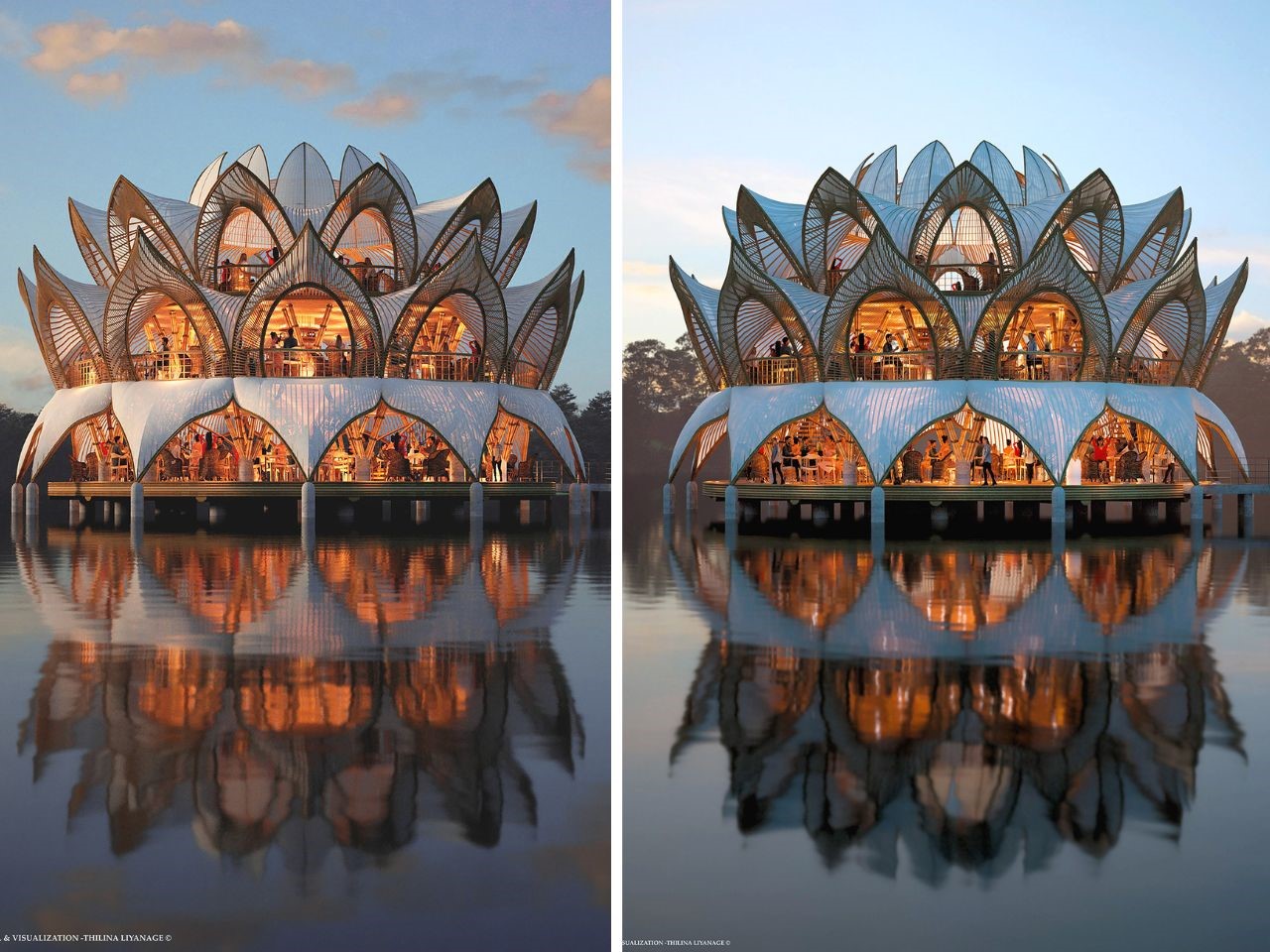
As day turns to night, Nelumbo undergoes a mesmerizing transformation. The interior lighting illuminates the structure from within, casting a warm, inviting glow that reflects off the water’s surface. This glow enhances the lotus-like appearance of the restaurant, making it a luminous beacon in its waterfront setting. It’s particularly breathtaking at dusk, when the soft light contrasts with the deepening colors of the evening sky, creating a magical atmosphere that beckons diners from afar.

The design’s interplay with light and water is perhaps one of its most striking features. It creates a visual harmony that ties together the architecture, the natural surroundings, and the overall dining experience, making Nelumbo not only a place to eat but a destination that invites contemplation and admiration. Ultimately, Nelumbo offers more than just food and drink—it offers an unforgettable journey through nature, architecture, and gastronomy, all within the serene setting of a floating lotus on water.

The post Nelumbo Restaurant Caters To Your Moods Throughout The Day With Lasting Serene Experiences first appeared on Yanko Design.
The Eye-Catching Lighting Installation Is A Dazzling Fusion Of Innovation and Minimalism

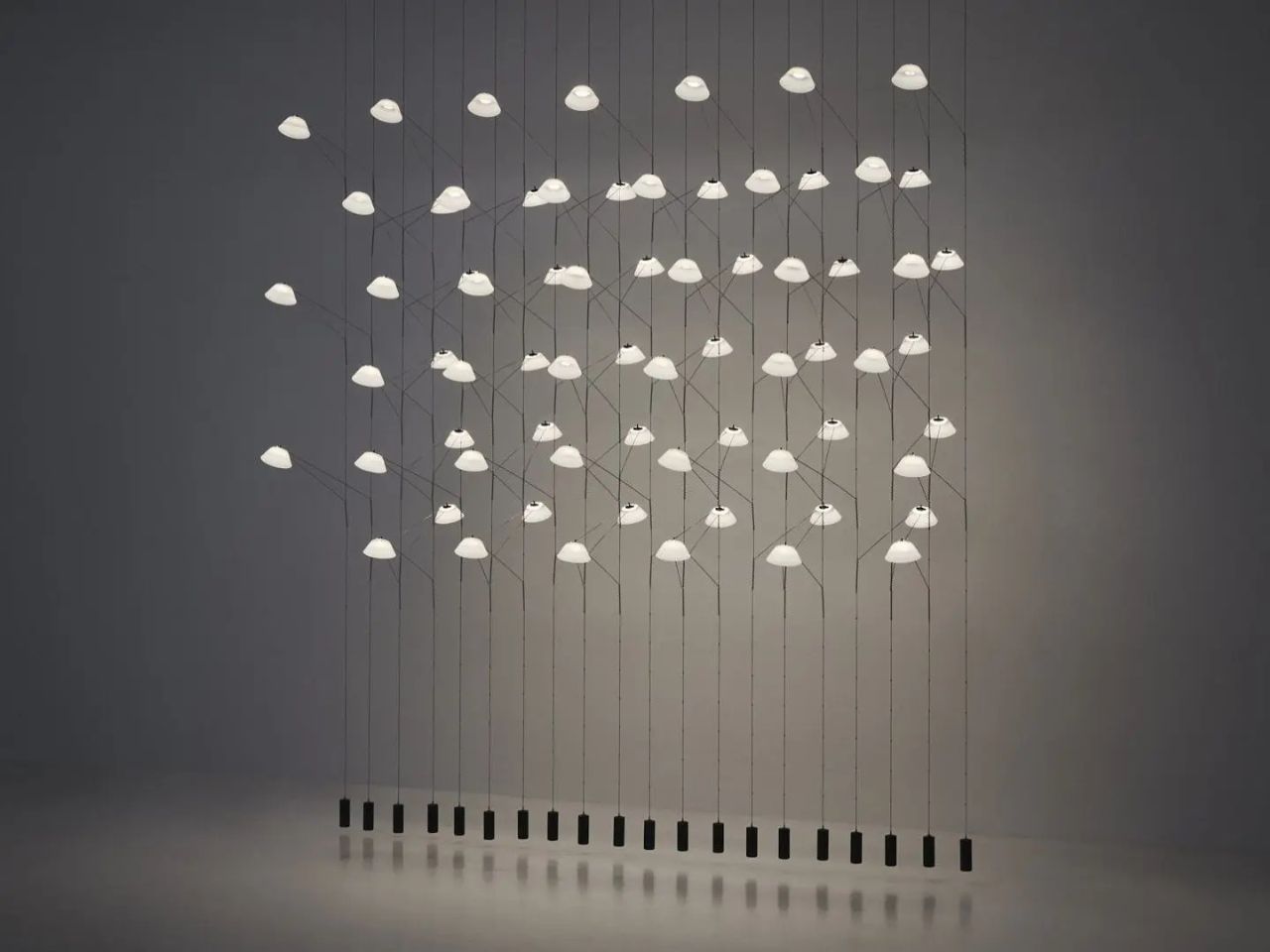
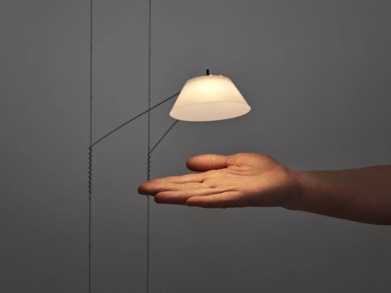
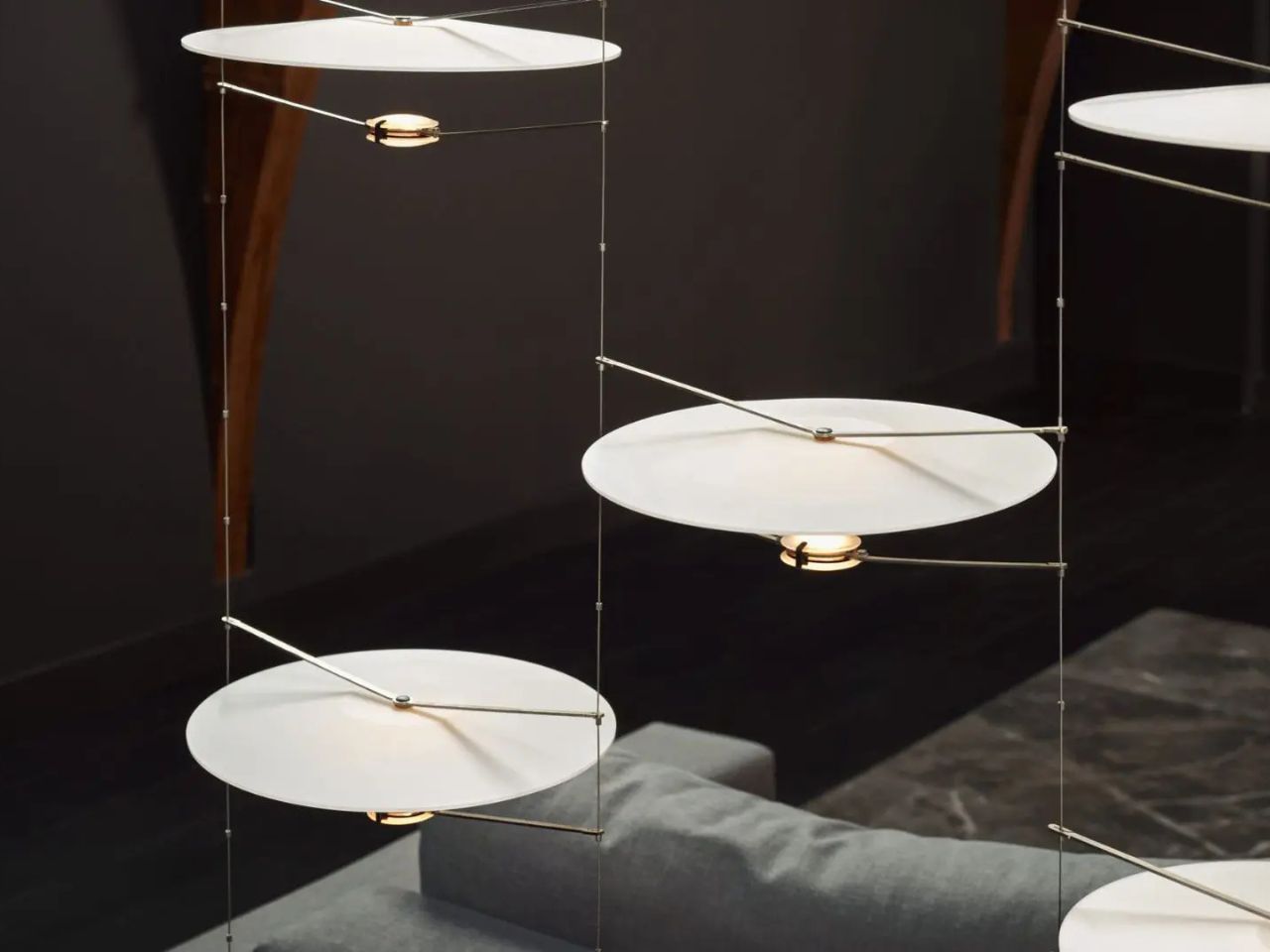
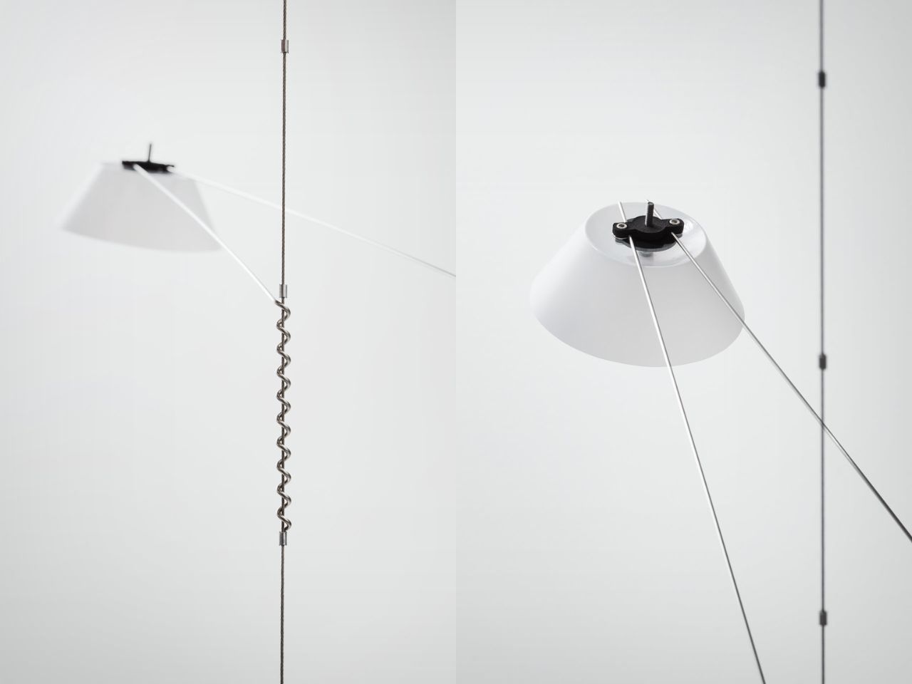
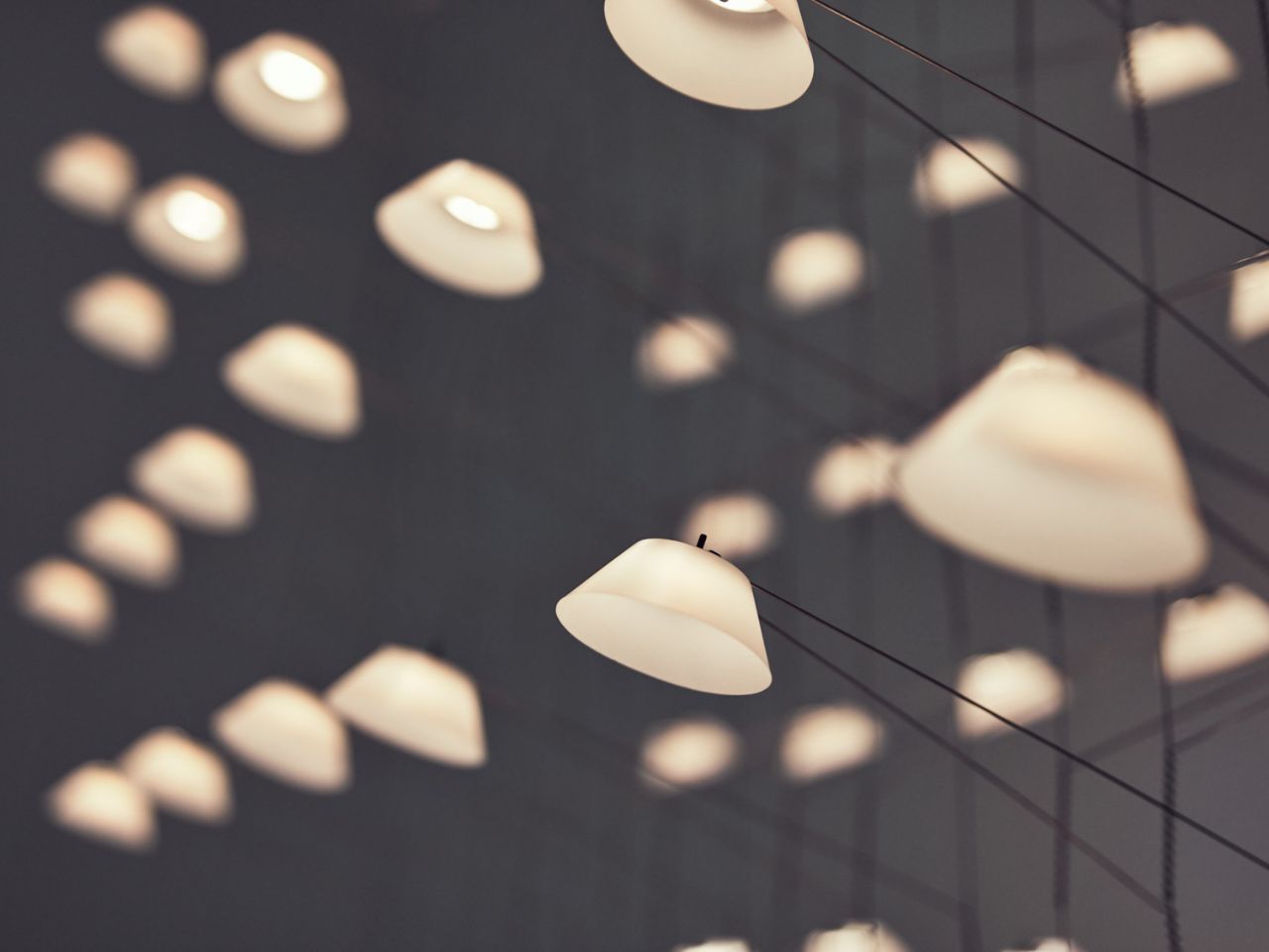
At the last Euroluce show in Milan, the Liiu lamp by Vantot, edited by Luceplan, captured attention for its striking design. Liiu is a suspended structure with thin conductive wires that support small LED lamps. These lamps are held in place by springs that adjust their height, giving the entire piece a clean, minimalist appearance. It has since been recognized as an iconic piece, praised for its distinctive and innovative design.

Designer: Vantot, edited by Luceplan

Creating an iconic lamp is no small feat in the saturated market, and Liiu has managed to achieve this status by balancing aesthetics with functionality. Its design is both decorative and functional, drawing interest with its unique form and construction. The lamp’s instantly recognizable structure, coupled with its innovative use of conductive materials, sets it apart from more traditional lighting designs.

Vantot, known for its boundary-pushing approach to lighting design, avoids conventional methods in favor of more experimental techniques. The studio’s portfolio reflects this innovative spirit, with each lamp designed around the way light behaves and interacts with its environment, rather than merely focusing on creating a beautiful lampshade. The complexity of lighting design goes beyond what is typically considered in other design objects, requiring careful attention to both the construction and the behavior of light.

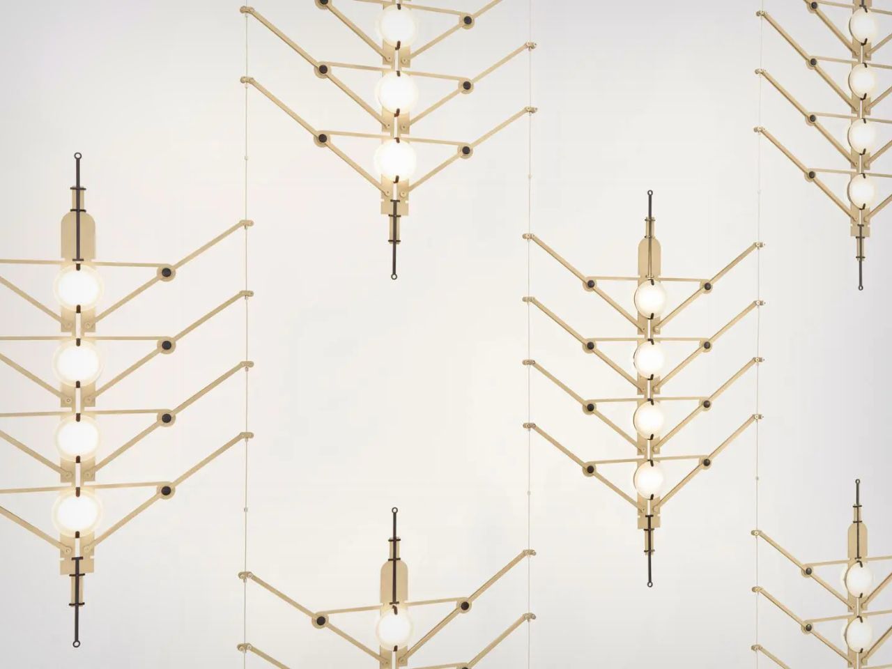
Two of Vantot’s other notable designs, the V-V-V and O-O-O lamps, exemplify the studio’s approach. The V-V-V lamp features a thin metal structure suspended by wires that also conduct electricity. This eliminates the need for traditional power cords, creating a sleek and modern design that serves both decorative and functional purposes. Its fishbone-shaped metal frame holds three LED lights, which diffuse light horizontally, making it an art piece as much as a lighting fixture.

On the other hand, the O-O-O lamp provides a different kind of lighting experience. While it uses similar conductive materials, its design is intended to provide subtle, ambient lighting. The glass lampshade directs light vertically, diffusing it gently throughout the room. The modular construction allows for customization in both the size and frequency of the lighting elements, making it adaptable to various spaces and user preferences.

Both lamps, along with Liiu, illustrate how Vantot explores new possibilities in lighting design, leveraging contemporary LED technology. LEDs operate at much lower voltages than traditional lighting, allowing for more creative flexibility in how electricity is conducted through the structure. This opens up new ways of integrating lighting into interior spaces safely, without the need for bulky or dangerous power cords.

The Liiu lamp, in particular, stands out for its elegant simplicity, combining function and form in a seamless design. Vantot’s attention to detail ensures that every element of the lamp, from its height-adjusting springs to the conductive wires, is carefully considered and tested. The studio’s approach to research and development means that each product undergoes extensive testing and refinement before reaching the market, ensuring that both aesthetics and performance are optimized.

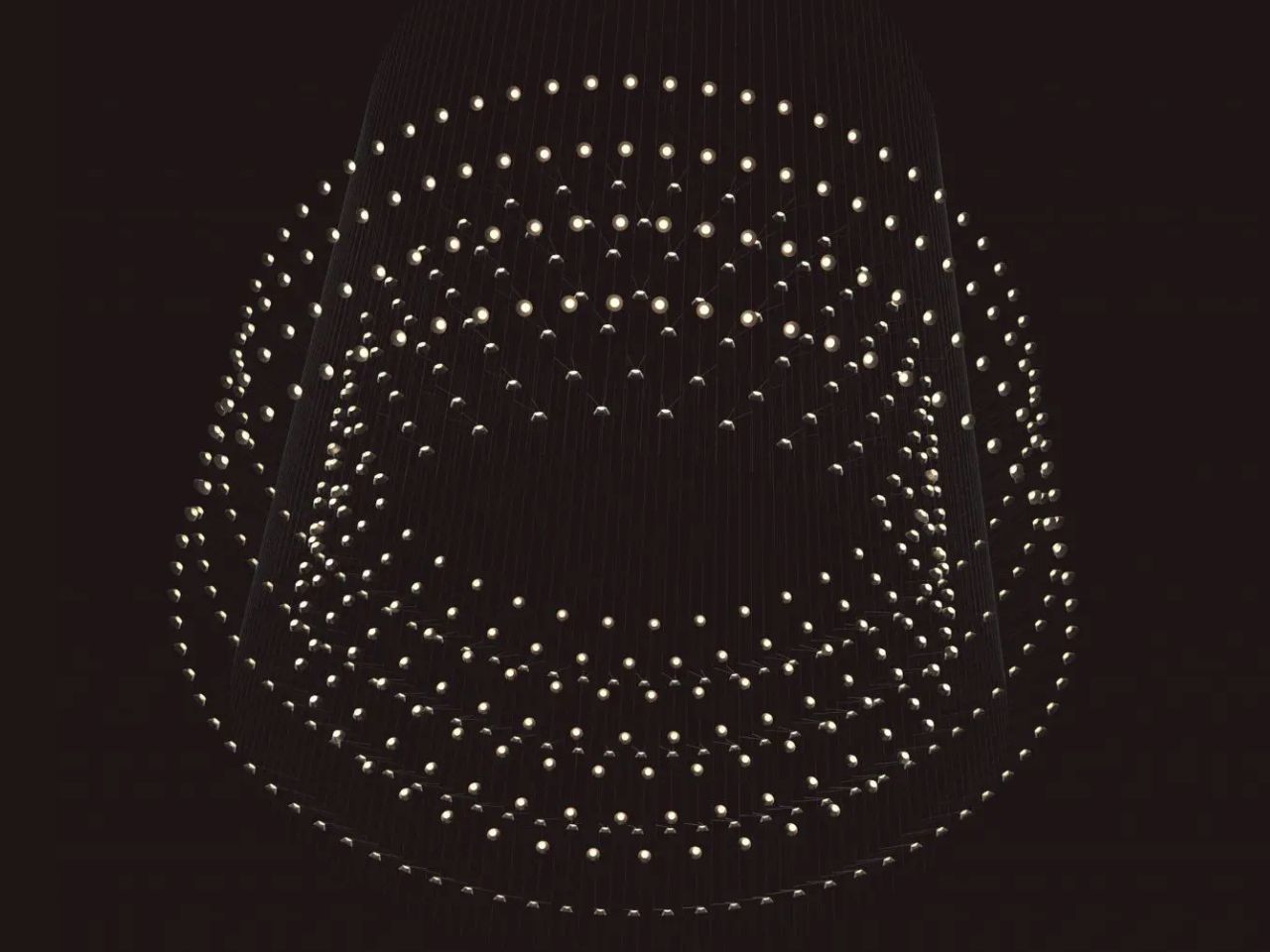
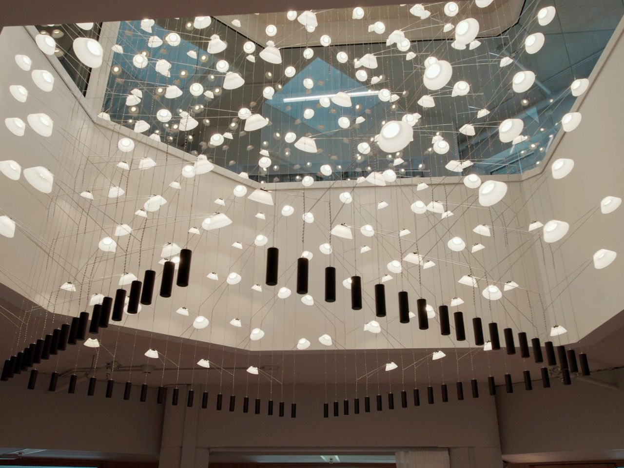
In addition to their individual products, Vantot also creates large-scale lighting installations that showcase the full potential of their designs. These installations are often sculptural in nature, blending art with functional lighting in a way that enhances the surrounding environment. The Liiu lamp itself originated as one such installation before being adapted for commercial production.

Vantot’s work highlights the importance of innovation in lighting design, focusing on how light is emitted and managed rather than simply how the lamp looks. With Liiu, V-V-V, O-O-O, and other designs, the studio demonstrates that lighting can be more than just a source of illumination—it can be an emotional and immersive experience, pushing the boundaries of what is possible in contemporary design.

The post The Eye-Catching Lighting Installation Is A Dazzling Fusion Of Innovation and Minimalism first appeared on Yanko Design.
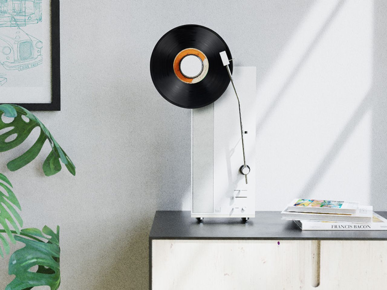
Experience Music in Style with the Hauf Vertical Record Player: A Modern Twist on Vinyl

The vinyl record player, once an iconic symbol of music’s golden age, has evolved into a nostalgic artifact. Yet, in a world where retro trends keep resurfacing, bringing back the record player in an exciting new way would be a perfect blend of past and present. Enter the Hauf Vertical Record Player, a modern twist on this timeless piece of technology that reimagines how we experience both music and design.

Designer: Fatih Demirci

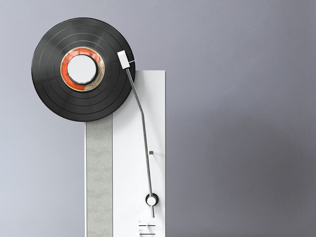
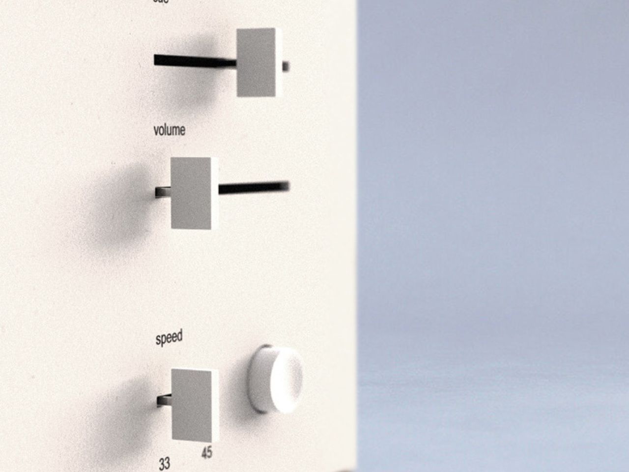
At first glance, the Hauf Vertical Record Player captures attention with its unique vertical orientation. Gone are the days of flat, table-top turntables. Hauf redefines the way we interact with vinyl records by turning this traditional medium into a visual experience. Watching the record spin vertically becomes an engaging spectacle, adding a new dynamic to how we connect with our music. For any audiophile or design enthusiast, it’s a captivating way to merge sound and sight, transforming the act of listening into something both audible and aesthetic.

The design of the Hauf Vertical Record Player is a celebration of vintage charm married with modern minimalism. Its sleek, space-saving form doesn’t just sit in the corner of the room unnoticed. Rather, it becomes a focal point, a piece of functional art. By elevating the record player vertically, Hauf not only maximizes space but also enhances the appeal of vinyl collections, putting them on display like gallery pieces.

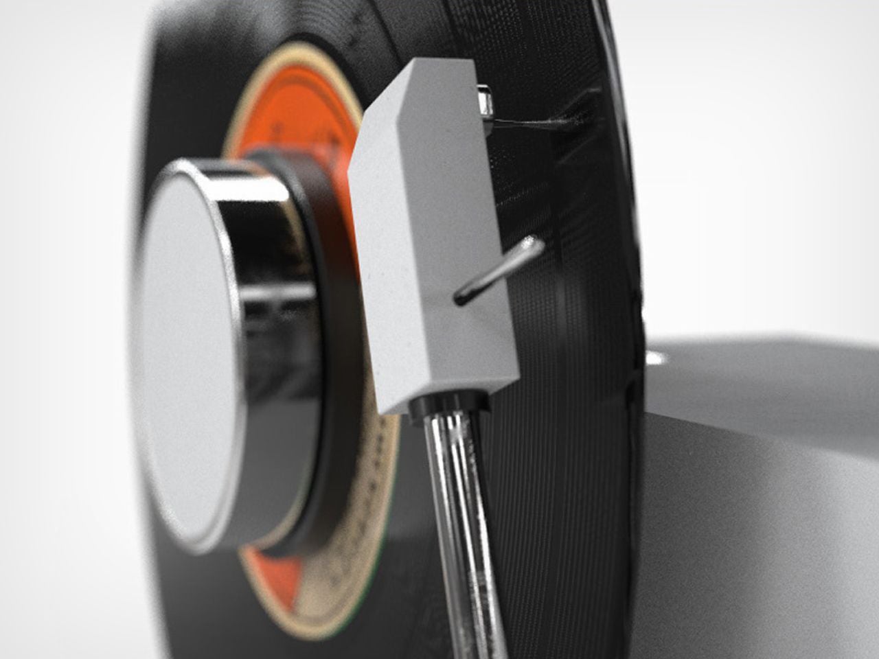
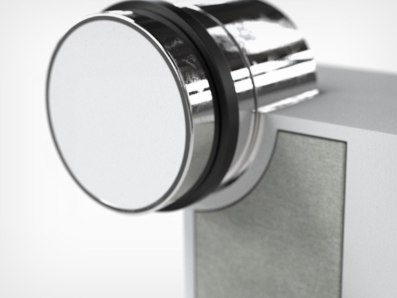
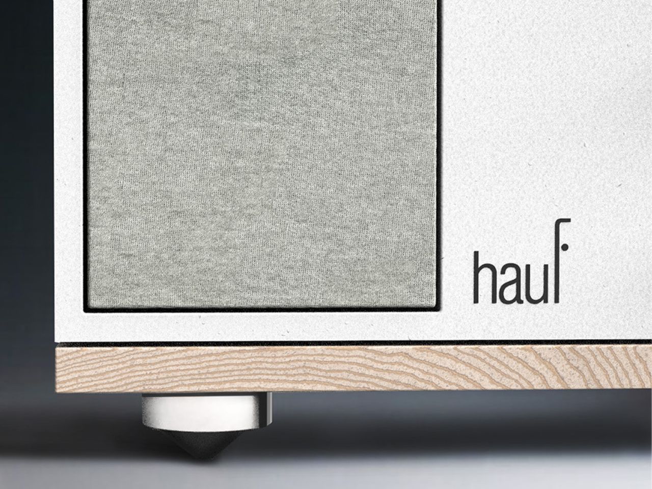
A key element of the player’s design is the clever use of materials that blend strength with elegance. The juxtaposition of industrial steel arms and smooth, white textured plastic creates a striking contrast. The steel arms provide an edgy, robust quality that speaks to durability, while the soft, white textured plastic adds a contemporary, clean look. Together, these materials form a balanced composition that complements modern interiors without sacrificing the vintage charm of vinyl culture.

Hauf’s Vertical Record Player reimagines what a record player can be, offering not only a nod to the past but also a futuristic approach to home audio systems. It embodies a fusion of function and form, a perfect centerpiece for music lovers and design aficionados alike. As vinyl continues to make its resurgence in today’s digital age, the Hauf Vertical Record Player stands as a bold reminder that some things never go out of style, they just evolve.

The post Experience Music in Style with the Hauf Vertical Record Player: A Modern Twist on Vinyl first appeared on Yanko Design.
This Modular Shed Office Merges Sustainability, Creativity, Nature, and Functionality in Vancouver

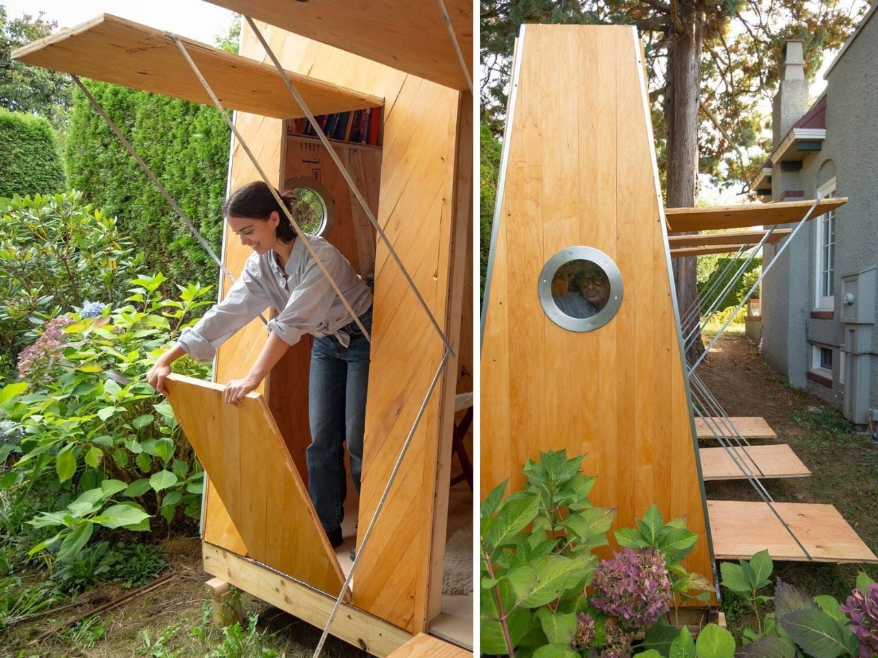
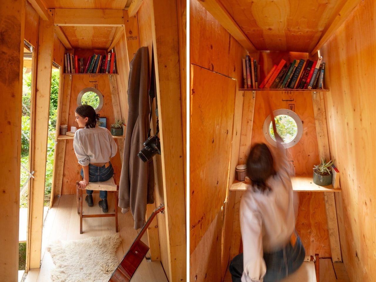
Imagine an office space that’s not only environmentally conscious but also designed to inspire creativity and connect you with nature. That’s what designer Daniil Aron-Mokhov has accomplished with the SCHTAUSS Modular Shed Office. Built from leftover materials from a home renovation and complemented by locally sourced supplies from Vancouver’s small businesses, SCHTAUSS is the perfect marriage of sustainable design and multifunctional beauty.

Designer: Daniil Aron-Mokhov

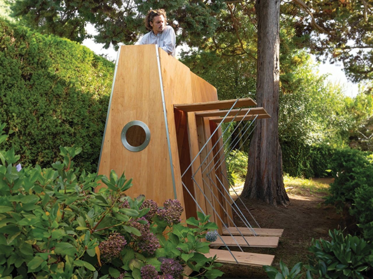
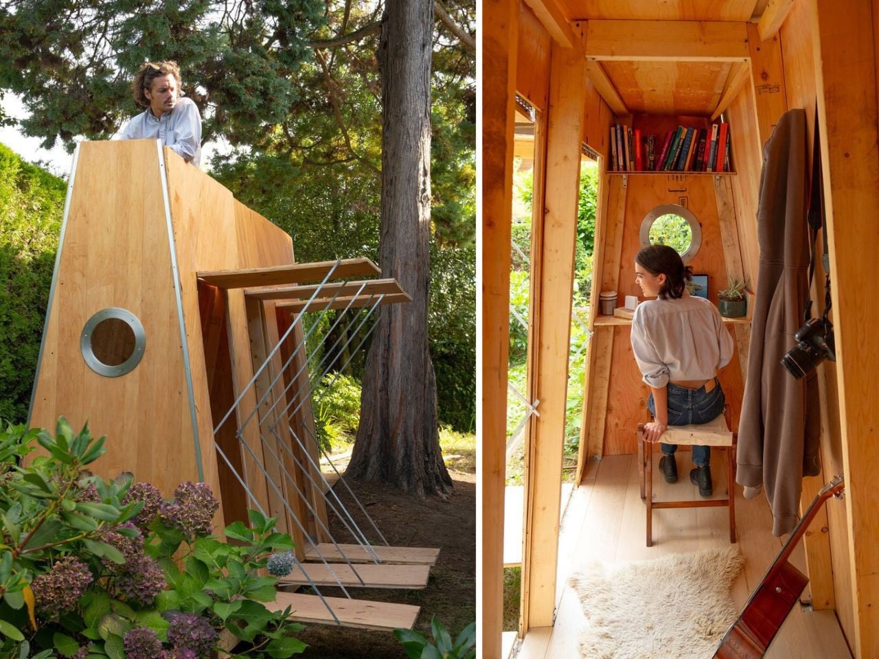
The process behind its creation was a feat of precision and craftsmanship. After four days of laser cutting and fabrication at a local FabLab, SCHTAUSS was installed on-site in just two days. Situated two meters from the main building, it transforms a quiet corner of the property into a space that merges indoor functionality with outdoor enjoyment.

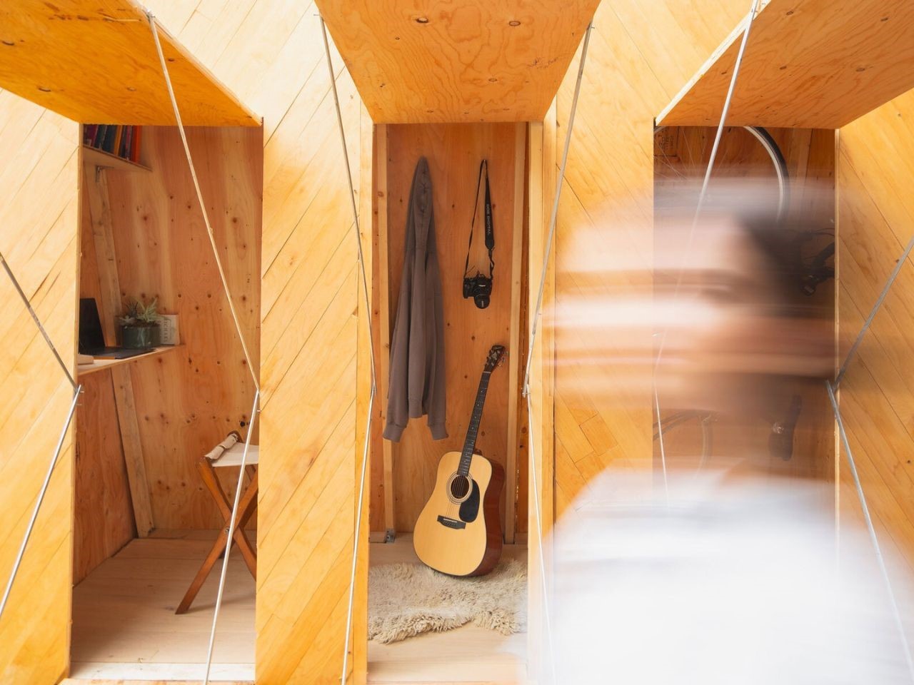
One of the most captivating features of it is the southern facade, which boasts three operable openings. These aren’t your typical windows, each one is designed to bring in fresh air and natural light while doubling as seating patios. Step outside for a moment of relaxation, or work with the doors wide open to let the breeze flow in. These flexible access points create a seamless indoor-outdoor workspace that’s as refreshing as it is functional.

But the surprises don’t stop there. At the back of the structure, a ladder invites you to explore the rooftop patio, a hidden gem that offers breathtaking views of Vancouver’s mountains. Normally concealed by the surrounding 2.5-meter hedges, these stunning vistas transform the rooftop into a serene retreat, a perfect spot to recharge, brainstorm, or even hold a casual meeting under the open sky.

The post This Modular Shed Office Merges Sustainability, Creativity, Nature, and Functionality in Vancouver first appeared on Yanko Design.
Sculptural ORMA Chair Blends Typography and Furniture Design

Ever imagined sitting on a typeface? Or better yet, a single letter? It may sound surreal, but the ORMA Chair turns this whimsical thought into a reality. Inspired by the lowercase letter “a” from the AH Forma typeface, the ORMA Chair merges the worlds of typography and furniture design into a modern and functional masterpiece. Designed for Design Week Mexico 2024, this piece transforms a familiar character into a sculptural and practical form of seating.

Designer:  Andrés Higueros and (ro)drigo méndez sosa

The ORMA Chair showcases how the shapes and proportions of a type family can serve as a base for much more than just text. The AH Forma typeface, known for its versatile use across various contexts, becomes the backbone of this innovative design, transforming the flat, two-dimensional letter into a three-dimensional piece of furniture. This bold experimentation with type reminds us how far design can stretch when creative boundaries are pushed.

The chair’s design uses the rounded portion of the letter “a” as its seat. Depending on how it’s positioned, there are two different ways to experience the chair. In one form, the rounded seat offers comfort, while the terminal of the letter serves as a handrest. Alternatively, when reversed, the terminal transforms into a backrest, providing ergonomic support. It’s fascinating to imagine the comfort it offers, although one might wonder how long one could remain seated given its unconventional structure, making it more of an art piece than a prolonged seating solution.

The ORMA Chair comes in two distinct models: the “Light” and “Regular” versions, each reflecting the characteristics of their respective typeface styles. The “Light” version, known as ORMA Chair Light Condensed, interprets the lightness and elegance of the AH Forma Light style into a sleek dining chair. This version uses the terminal as a backrest and the rounded parts as legs, resembling the minimalist structure of early bicycles. The “Regular” version, aptly named ORMA Chair Regular, translates the balanced and sturdier style of the Regular typeface into a comfortable armchair. The design variation between these two chairs reflects how typography can be adapted to suit different environments while maintaining a shared aesthetic foundation.

The Condensed version of the ORMA Chair is ideal for more refined and contemporary spaces, perfect for dining rooms or stylish corners in elegant homes. On the other hand, the Regular version’s balanced design makes it more suitable for informal settings such as office lobbies or relaxed living spaces. Despite their differences, both chairs uphold a common theme: transforming a typographic symbol into a usable, functional object.

The post Sculptural ORMA Chair Blends Typography and Furniture Design first appeared on Yanko Design.
Sip Sustainably With This Eco-Friendly Paper Pulp Briefcase That Keeps Your Drink Hot Or Cold!

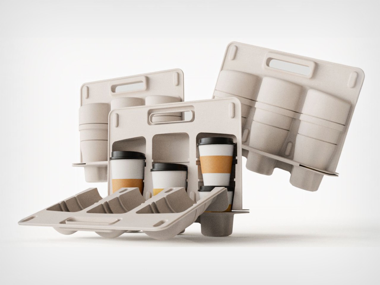
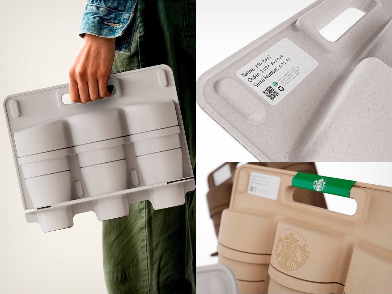
For coffee lovers who savor a steaming hot cup of joe, there’s often a dilemma when it comes to ordering beverages to go. The drinks tend to cool down by the time they arrive, dampening the experience. Fortunately, Nos Design Consultancy has developed a groundbreaking solution with its innovative compostable paper pulp briefcase, a sustainable and practical way to transport hot and cold drinks, keeping them secure and temperature-stable.

Designer: NOS Design consultancy

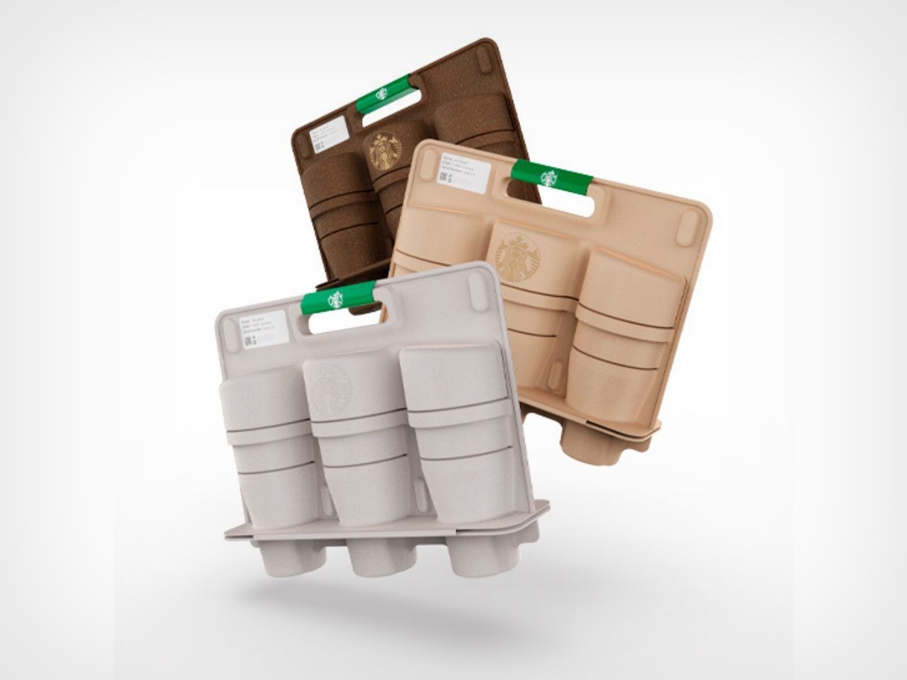
Made from paper pulp, a material with eco-friendly potential due to its recyclability and abundance, the briefcase addresses the growing issue of packaging waste. With the paper industry producing large amounts of byproducts, it could be feasible that this packaging could be created from repurposed paper waste, making it an ideal fit for both sustainability and practical use, however, it’s a great starting point.

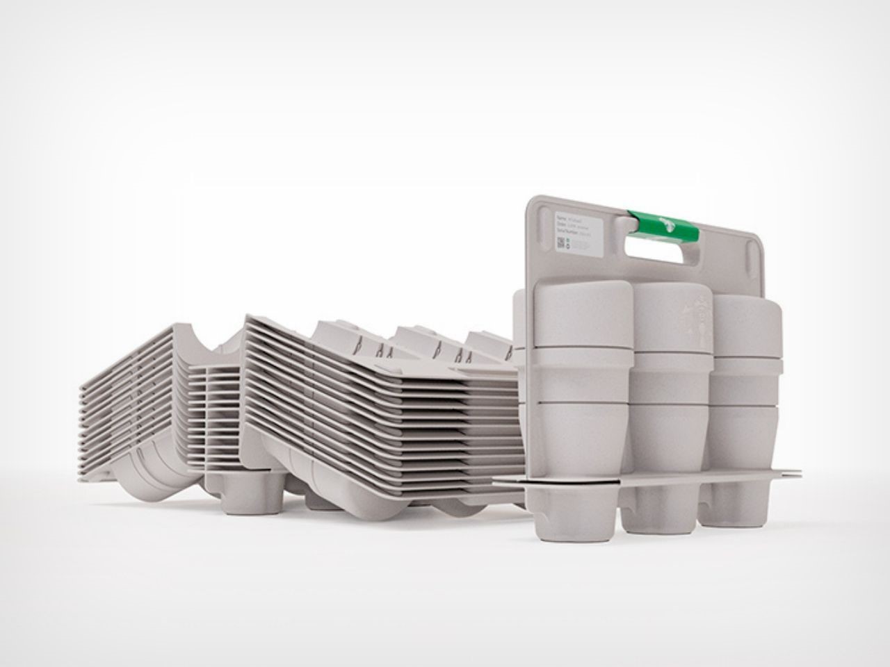
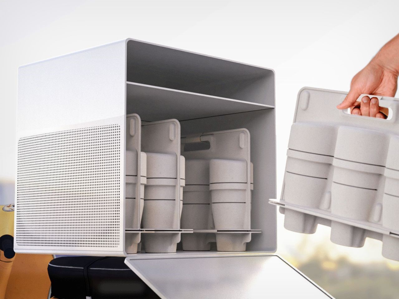
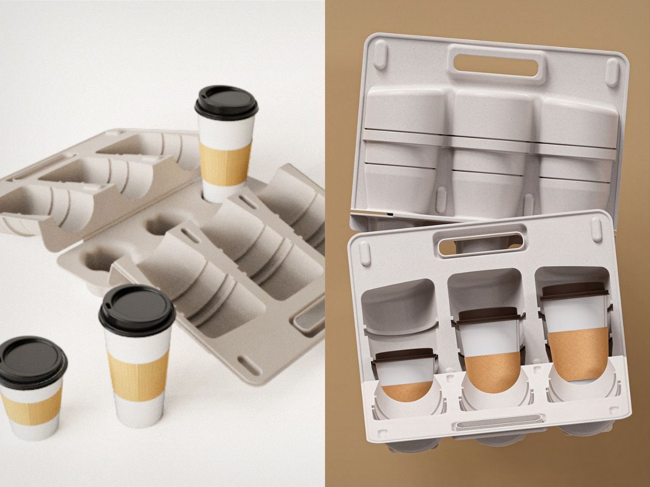
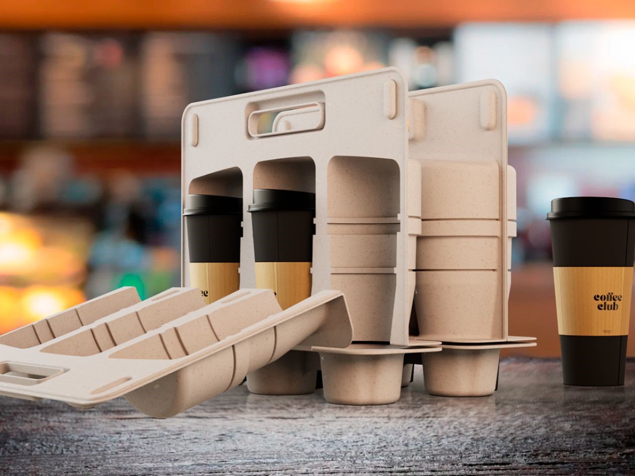
A key feature of the Nos briefcase is its stackable design, which optimizes transportation efficiency. By taking up less space, more items can be transported at once, cutting down on fuel usage and reducing the environmental impact of deliveries. The clamshell structure not only saves space in delivery bags but also ensures drinks are snugly secured to prevent spills, a significant improvement over traditional cup carriers.

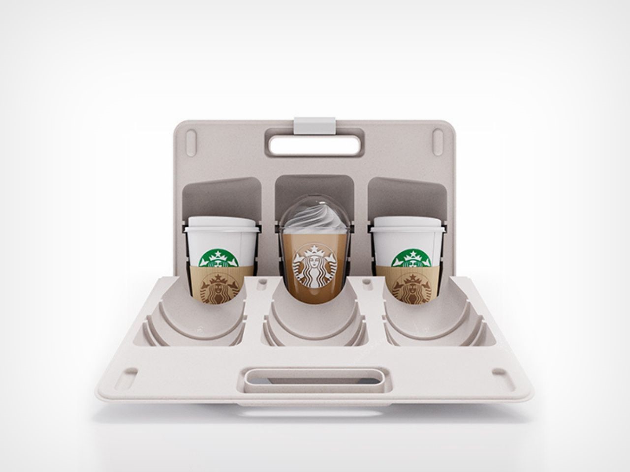
The packaging is designed to accommodate the three standard to-go sizes familiar to most customers, Tall, Grande, and Venti (as per the Starbucks’ language), with grooves that allow lids to slide in and stay in place. This flexibility makes it adaptable to most orders, eliminating concerns over mismatched cup sizes. The interior design hugs each drink, keeping it stable and reducing the risk of spillage during transit.

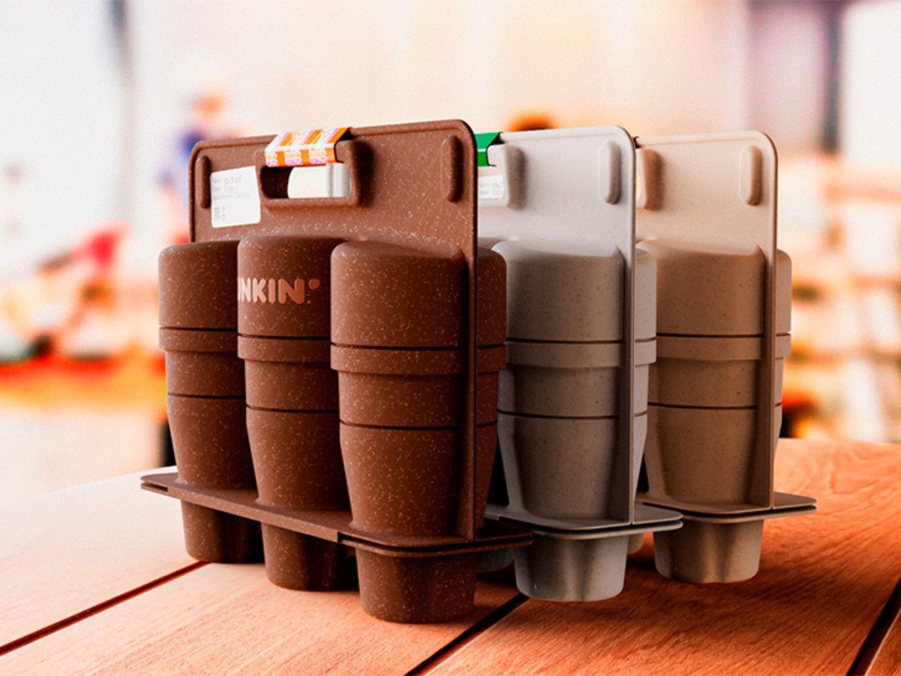
Beyond its stackability and spill-proof features, the briefcase boasts an additional advantage of reusability. This significantly reduces the demand for single-use containers, slashing costs and curbing the environmental toll of short-lived packaging. When its lifespan comes to an end, the briefcase can either be composted or recycled, completing a full circle of eco-conscious use.

Nos Design has clearly recognized the exponential growth in food and beverage deliveries in recent years, along with the accompanying surge in packaging waste. By conducting internal research and exploring sustainable options, they’ve created a packaging solution that’s not only easy to manufacture but also adaptable for global delivery companies. The design stacks perfectly, making it simple for baristas and couriers alike to load up drinks, seal the briefcase, and ship them off with minimal hassle.

With ergonomic handles and spaces for order details and quality seals, the paper pulp briefcase offers a seamless user experience. It’s versatile enough to be tailored to different brands through customizable color options, creating a unique, eco-friendly delivery system for businesses aiming to reduce their carbon footprint.

An added benefit is the material’s natural insulating properties, which help retain the temperature of beverages and food for longer. Whether it’s a piping hot latte or an ice-cold smoothie, the briefcase ensures that customers receive their orders as fresh as possible.

In a world where environmental consciousness is more important than ever, the Nos paper pulp briefcase provides a timely and effective solution. This compact, lightweight packaging represents a leap forward in how we think about delivery, offering a cost-effective, sustainable, and user-friendly option for couriers and businesses alike.

By incorporating eco-friendly materials and innovative design, Nos has not only created a functional product but also positioned itself as a leader in the movement toward more sustainable packaging solutions. For companies looking to attract environmentally conscious customers, this briefcase offers a practical, modern, and responsible way to do so.

The post Sip Sustainably With This Eco-Friendly Paper Pulp Briefcase That Keeps Your Drink Hot Or Cold! first appeared on Yanko Design.
Nike’s Sustainable Dumbbells Turn Footwear Waste into Fitness Gear

In an age where sustainability meets everything, why not fitness? Nike has taken a bold step with the introduction of their Nike Grind Dumbbells, a product that marries functionality with an eco-conscious mindset. These dumbbells are not just a tool for training but a statement in Nike’s ongoing commitment to reduce waste and create a better future for both athletes and the planet.

Designer: Nike

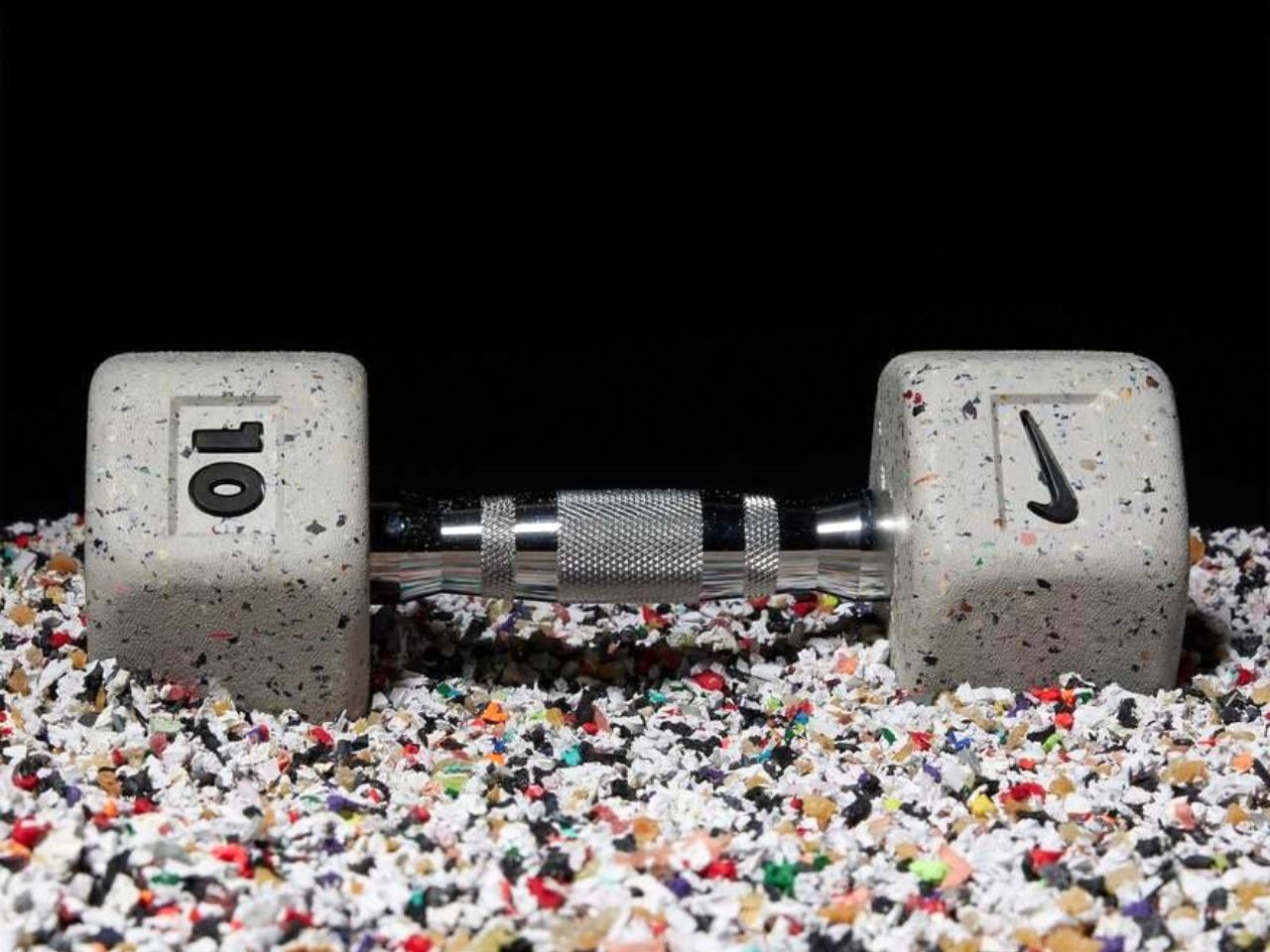
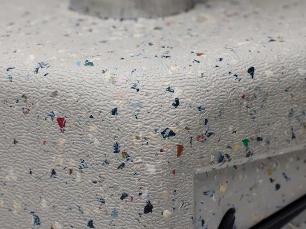
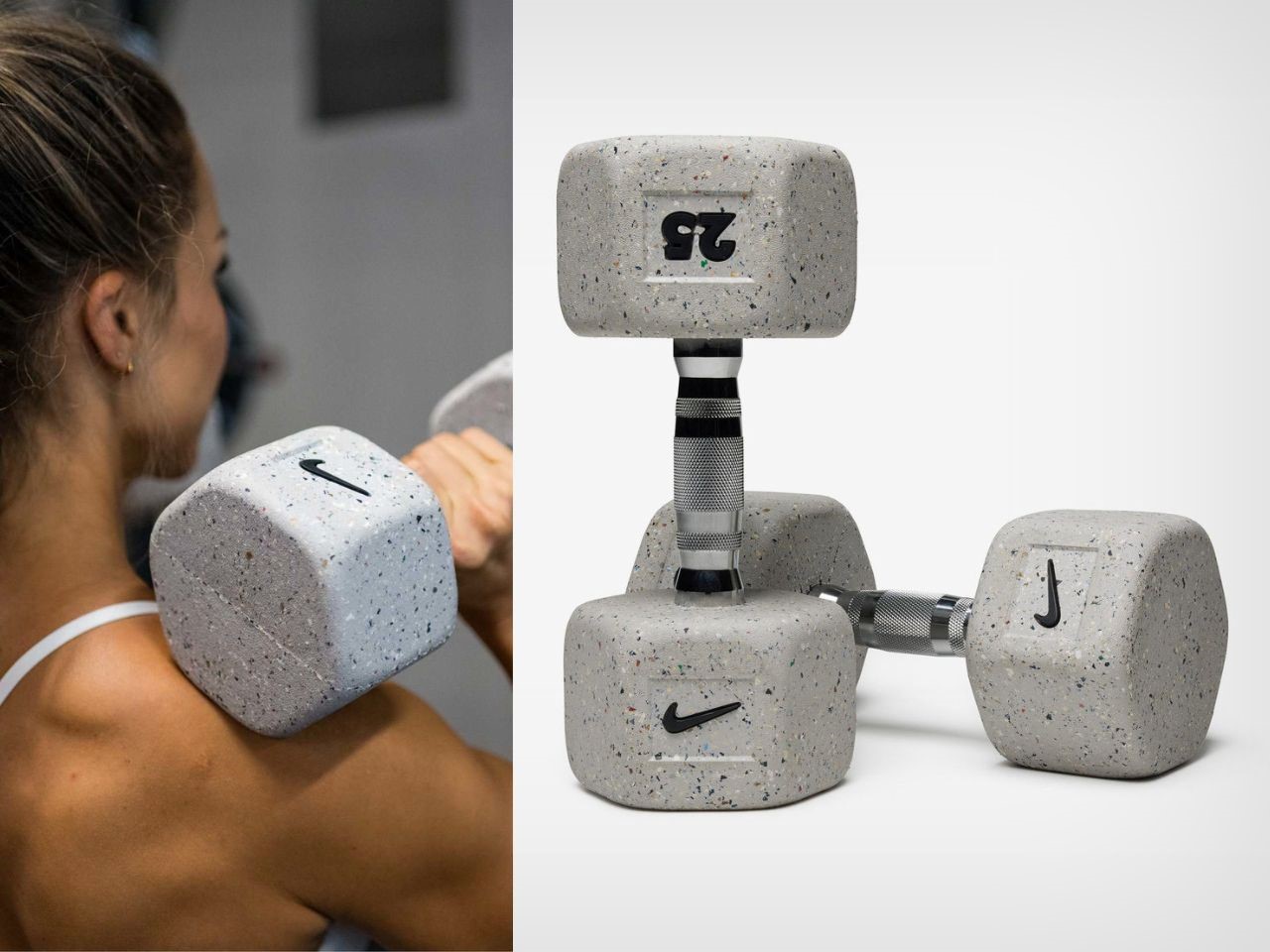
At the heart of this innovation is Nike Grind Rubber, a material made from the waste generated during the footwear manufacturing process. Each Nike Grind Dumbbell contains at least 20% of this recycled rubber by volume, making it a sustainable choice for those looking to reduce their carbon footprint while maintaining a rigorous fitness routine. The incorporation of Nike Grind Rubber gives these dumbbells a unique texture—durable and rubbery, built to withstand the toughest of workouts while maintaining comfort and grip. It’s sort of like the KitKat business model. Just like how damaged KitKats get reused as the wafer inner filling for KitKats, the waste from Nike’s footwear business gets used as raw material for its dumbbells.

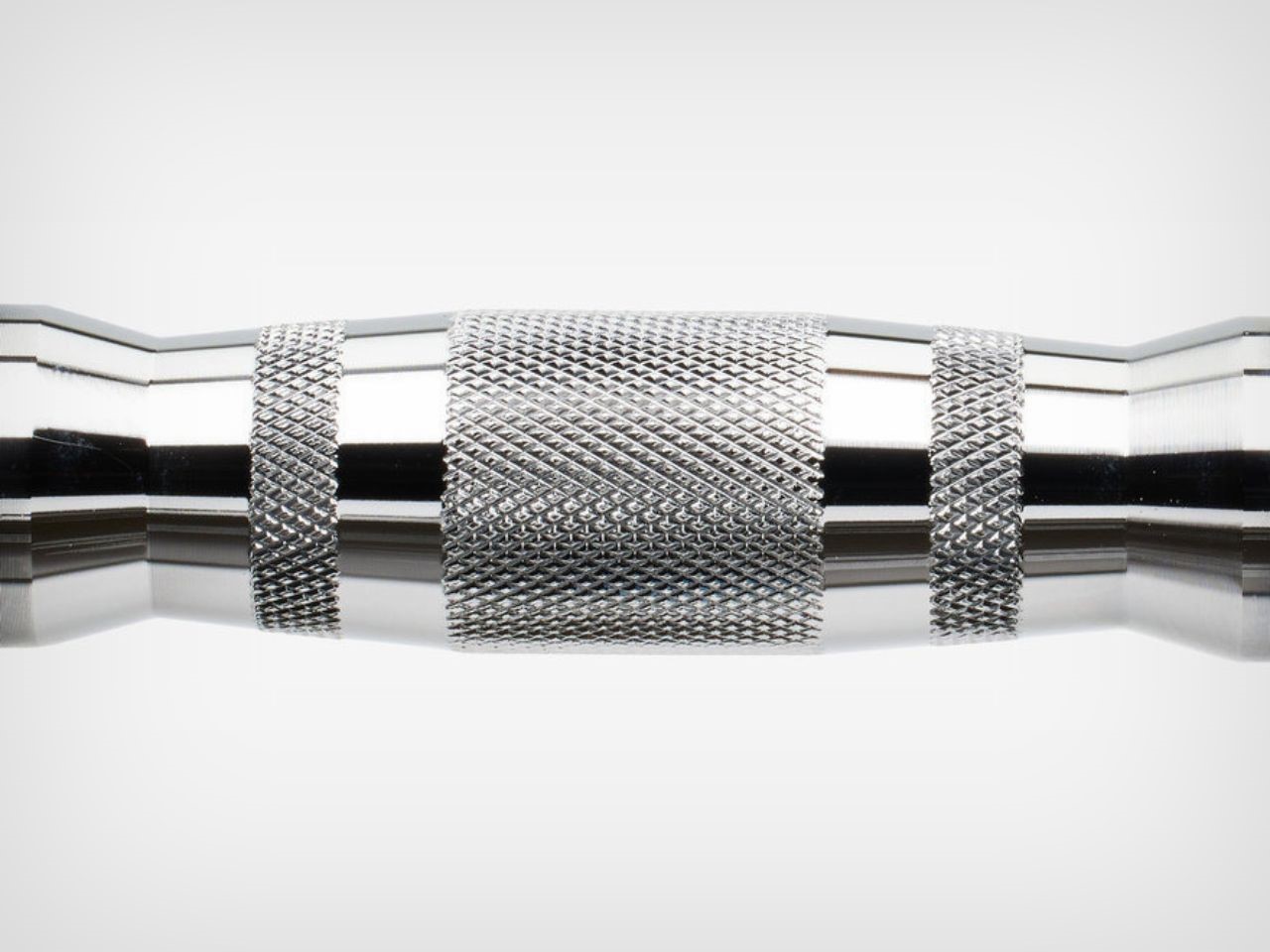
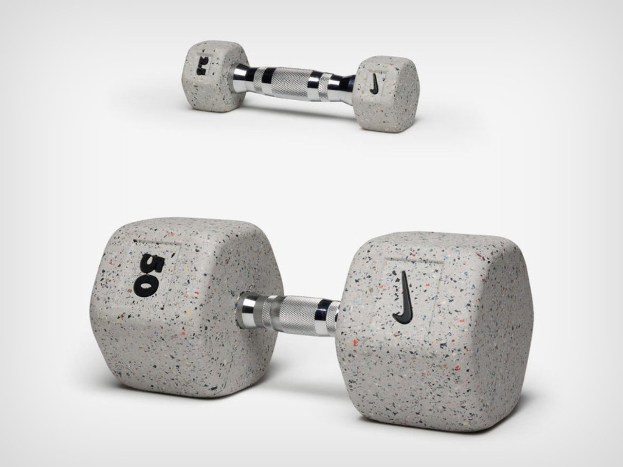
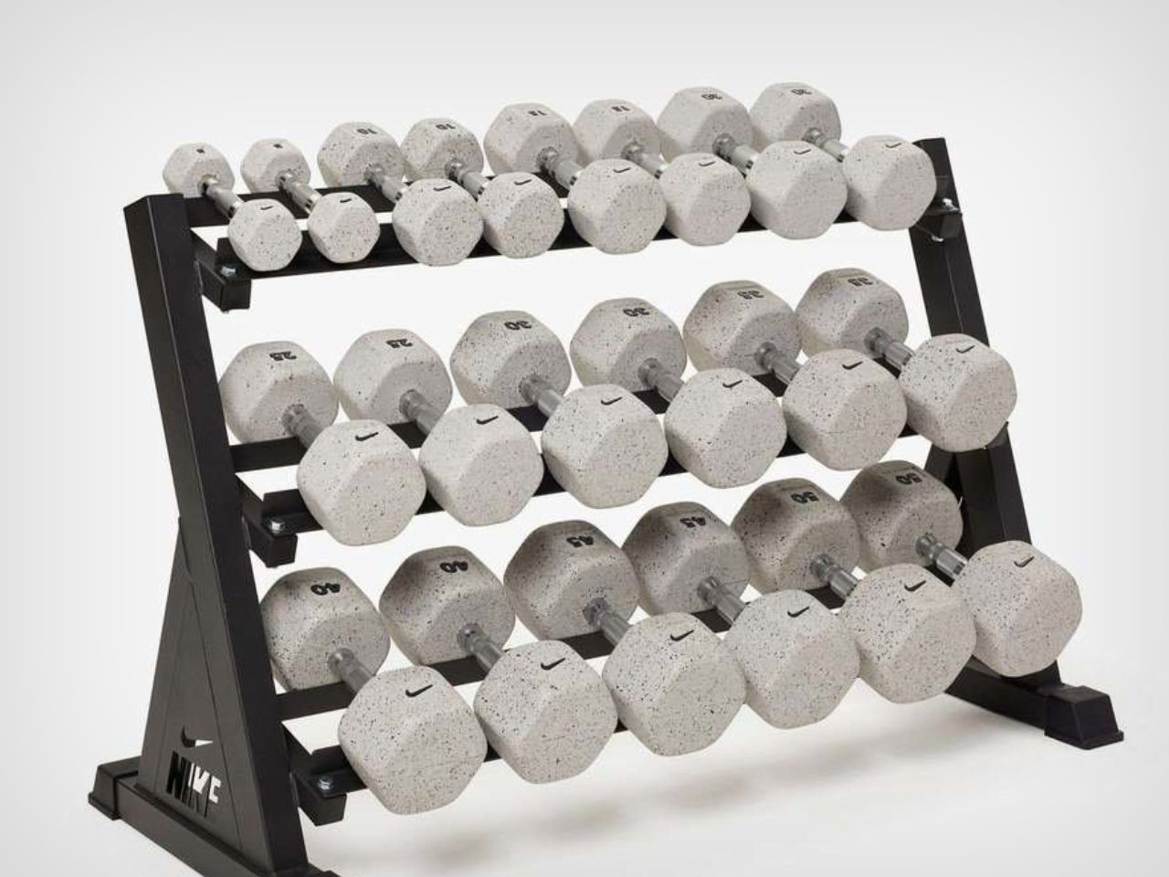
Nike has paid special attention to the design of the dumbbells, ensuring they are not only functional but also comfortable to use. The handles are ergonomically shaped, with their diameter increasing as the weight goes up, providing a secure and tailored grip no matter the load. For lighter weights, starting at 2.5 lbs and going up to 25 lbs in 2.5-lb increments, the thinner handles offer precision and control. As the weights increase to 50 lbs in 5-lb increments, the handles thicken to match the increased demand for strength and stability, ensuring a comfortable grip for every user.

The medium-knurled handle provides just the right balance of friction and control, making these dumbbells ideal for a wide variety of exercises. Whether you’re pushing through an intense HIIT workout or performing slow, controlled movements, the grip offers confidence and security, allowing you to focus fully on your training.

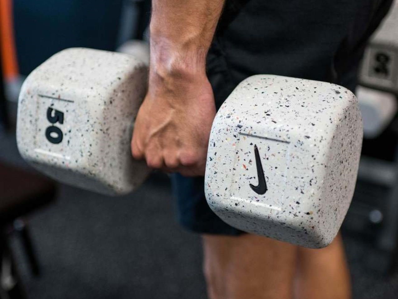
One of the standout features of the Nike Grind Dumbbells is their versatility. Dumbbells are arguably one of the most essential pieces of equipment in any gym, and Nike’s offering is no exception. These weights support countless workout movements, from compound lifts like squats and lunges to isolation exercises like bicep curls and tricep extensions. The hexagonal rubber construction prevents rolling, making them stable and safe to use on various surfaces, while also protecting floors from damage.

In true Nike fashion, the Nike Grind Dumbbells come with a design flair that sets them apart from other gym equipment. Due to the nature of the recycled material, each set features a unique color blend depending on the footwear colorways Nike produces during any given season. While the base color remains a stylish grey, the Nike Grind particles within the dumbbell vary, making each pair truly one-of-a-kind. This limited-edition aspect of the dumbbells adds a sense of exclusivity for those looking to own a unique piece of Nike’s sustainable innovation.

The Nike Grind Dumbbells are sold in pairs, with pricing ranging from $30 for the 2.5-lb set to $210 for the 50-lb set. Given the combination of quality, durability, and sustainable design, these dumbbells offer excellent value for those serious about their fitness and environmental impact.

Nike’s iconic “Just Do It” slogan has always been about pushing boundaries, whether in sports or in life. With the Nike Grind Dumbbells, that ethos extends to sustainability, offering a product that not only supports your physical training but also contributes to reducing waste. This dumbbell is a perfect fit for athletes who want to make a difference both in their workouts and in the world.

The post Nike’s Sustainable Dumbbells Turn Footwear Waste into Fitness Gear first appeared on Yanko Design.