Stylish Pet Retreat: Rawry’s Luxe Cabin Blends Comfort and Minimalist Design

Tired of choosing between your home’s decor and a comfortable space for your pet? The Luxe Cabin from Rawry is here to change that, offering a perfect blend of style and coziness that satisfies both your aesthetic and your pet’s need for comfort. It’s more than just a pet bed—it’s a beautifully designed, handcrafted piece of furniture that enhances any room while providing a serene retreat for your pet.

Designer: Rawry
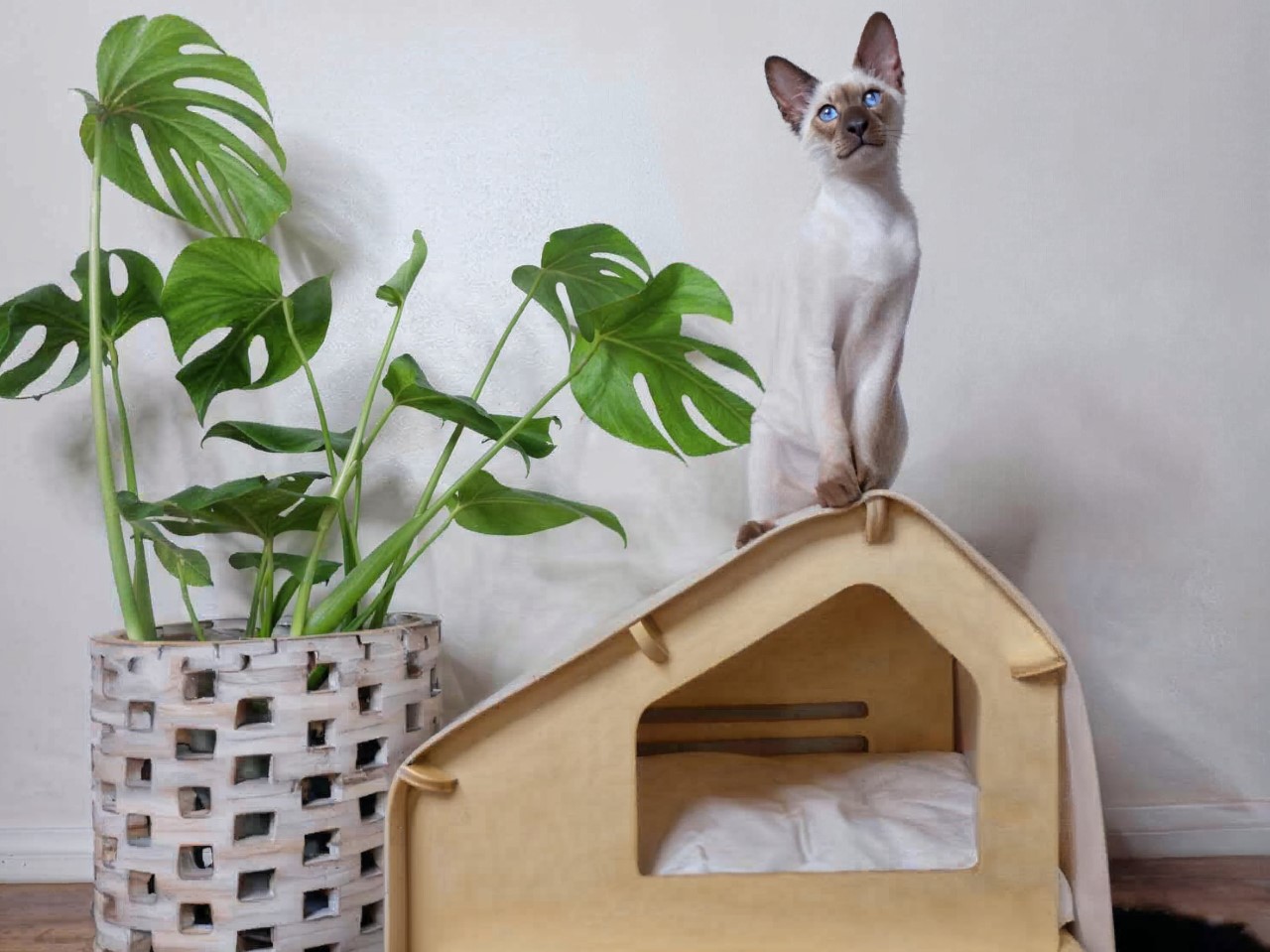
Designed with small dogs and cats in mind, the Luxe Cabin addresses one of the most common challenges pet owners face: anxiety in animals. For pets who are shy, anxious, or particularly picky about their lounging spots, this cabin offers the perfect solution. Its enclosed design provides a secure, calming environment that makes pets feel safe and protected. Whether your furry friend loves hiding away or simply needs a quiet space to unwind, the Luxe Cabin is their new go-to spot.
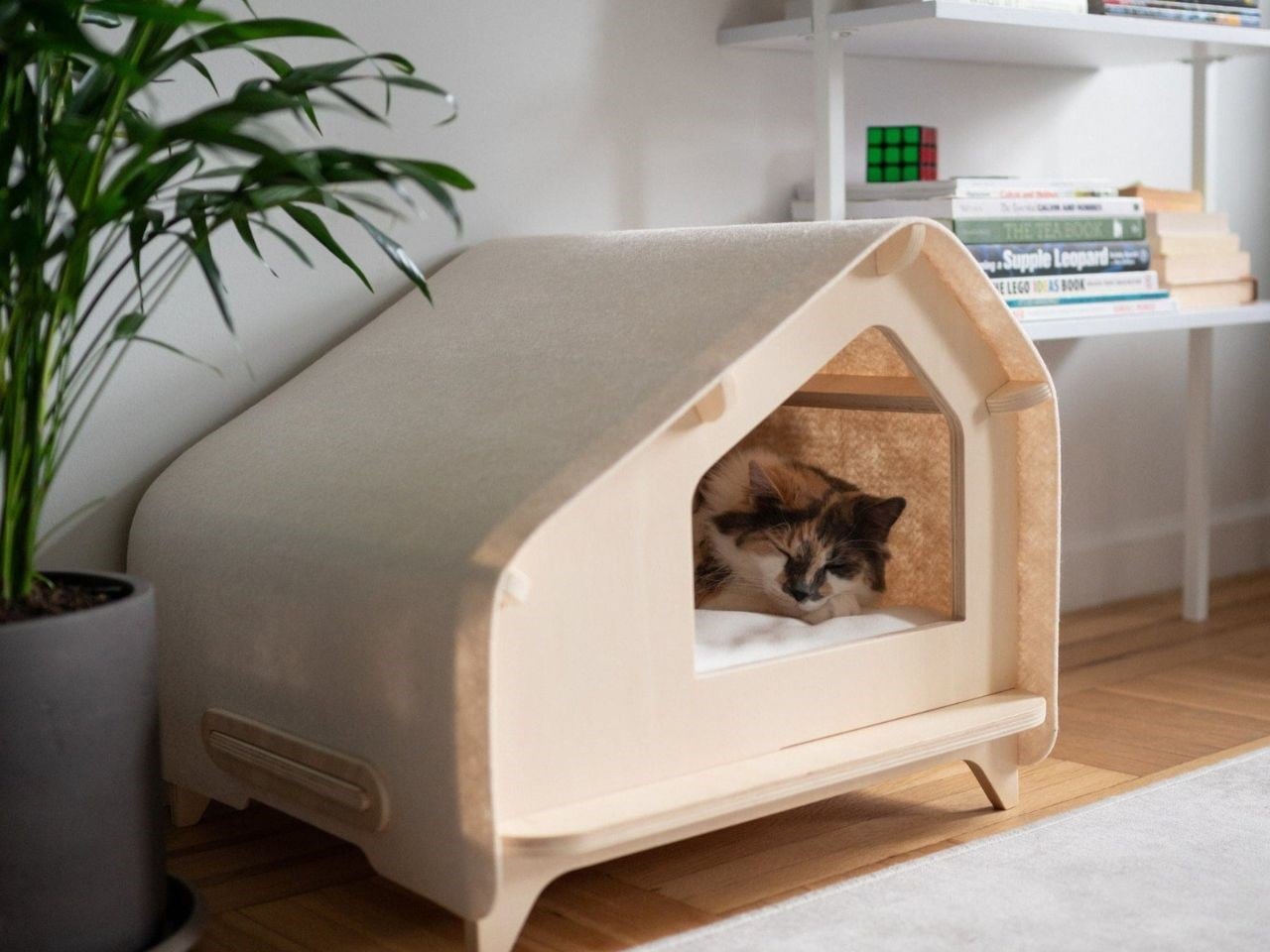
What sets the Luxe Cabin apart from other pet beds is the quality of its craftsmanship. Each piece is handmade in small batches, ensuring attention to detail and durability. Unlike cheap, flimsy cardboard or scatter-board alternatives that wear out quickly, the Luxe Cabin is made from high-quality, AA furniture-grade plywood. The use of natural, water-based stains and a woolen felt roof not only gives it an elegant finish but also makes it a sustainable, environmentally friendly choice. This pet house is built to last a lifetime, offering long-term comfort for your pet while enhancing your home’s interior.
Assembly is a breeze with the Luxe Cabin. Thanks to its interlocking design, no tools or adhesives are needed to set it up. It takes just a few minutes to assemble, and the sturdy construction ensures it stays secure. Maintenance is equally simple: wipe down the plywood with a damp cloth when needed, spot-clean the woolen felt roof, and toss the cotton slip-cover cushion in the washing machine for an easy refresh.
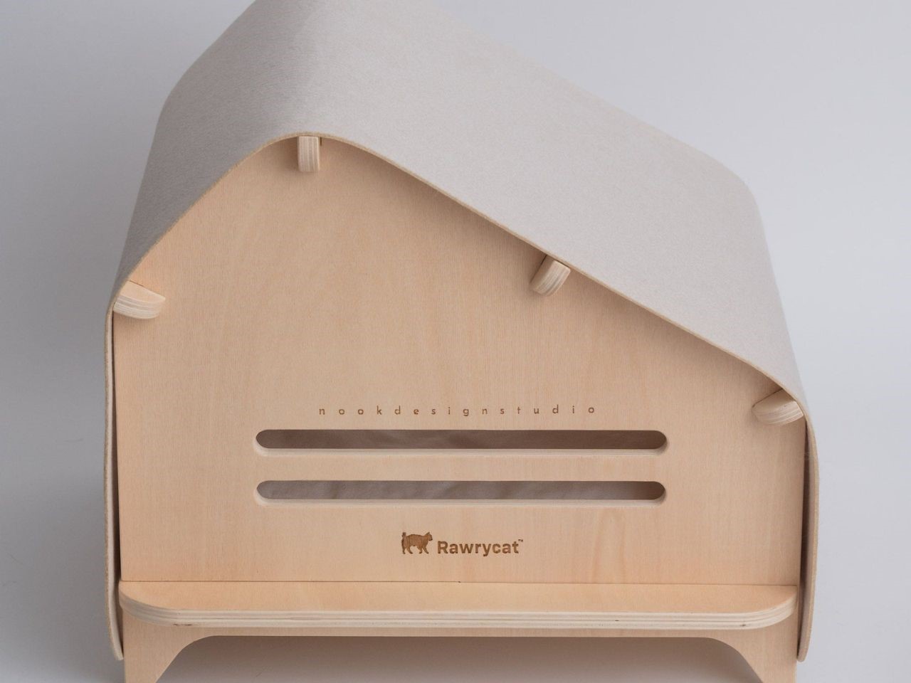
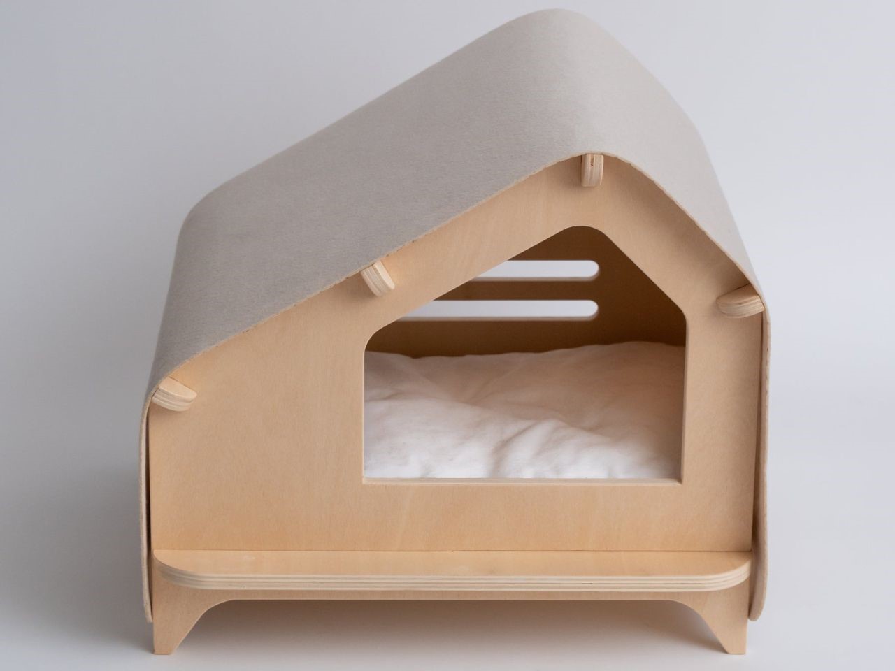
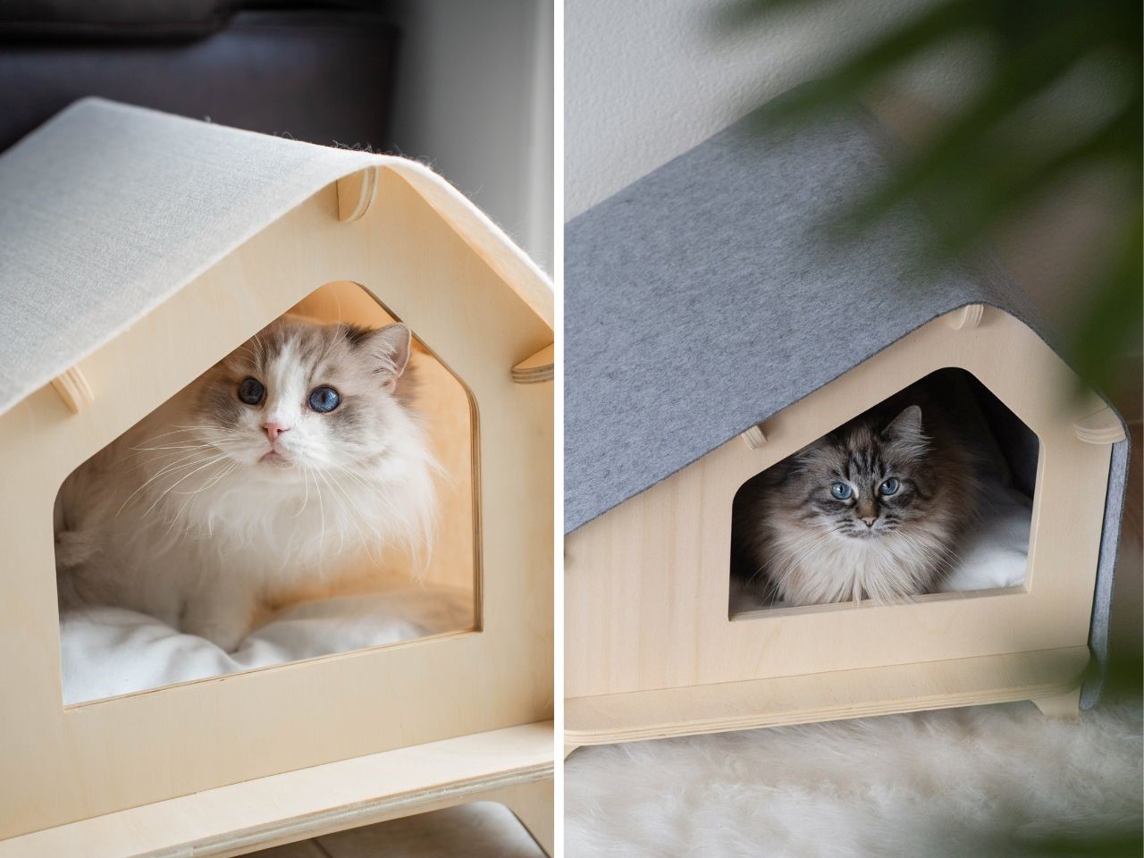
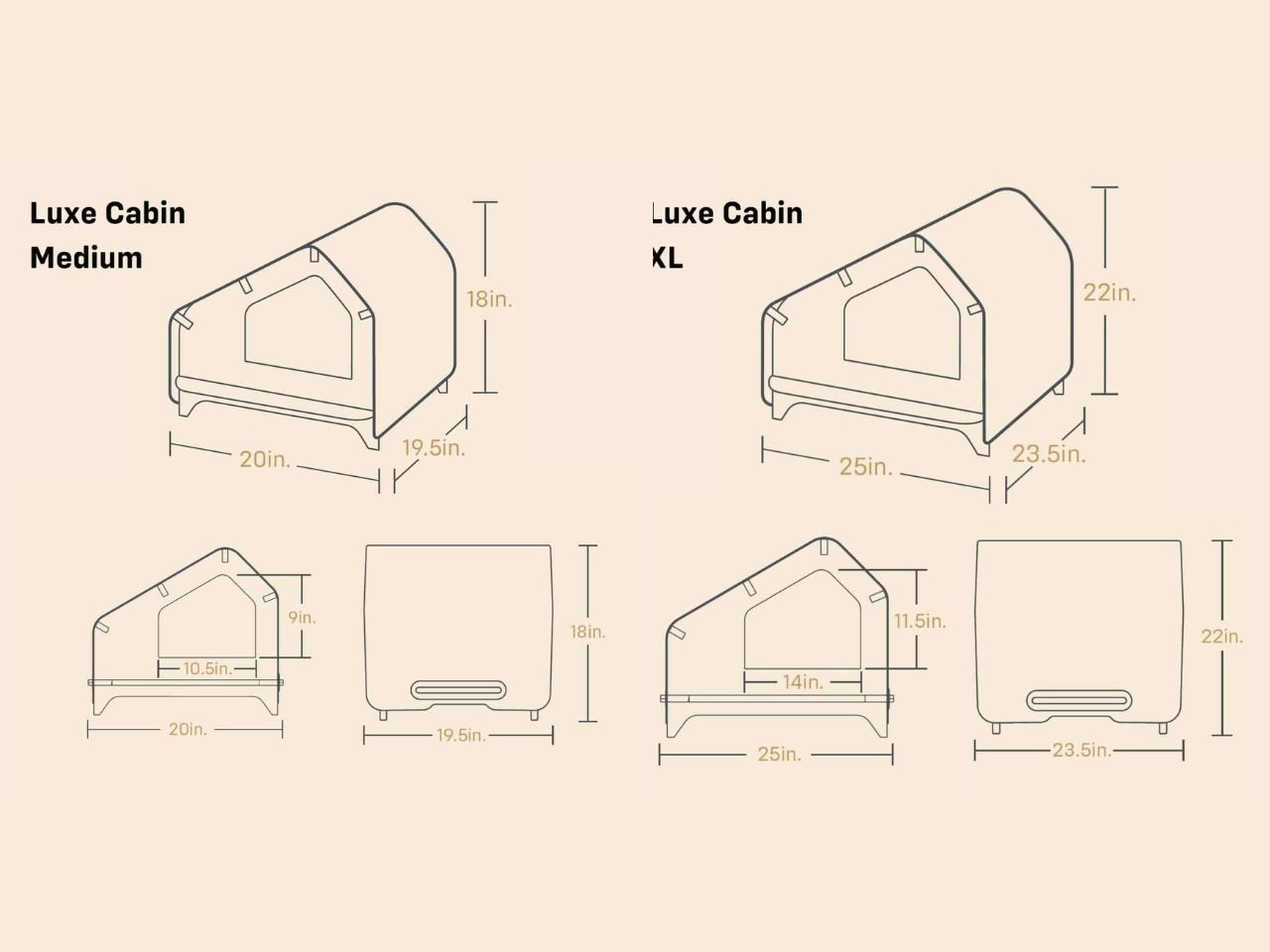
The Luxe Cabin comes in two sizes (medium, and XL), designed to accommodate most cats and small dogs under 20 pounds. With five chic color options (cream, light grey, maroon, delicate blue, and tickled pink) it seamlessly blends into any room, serving as both a functional pet house and a stylish decor accent.
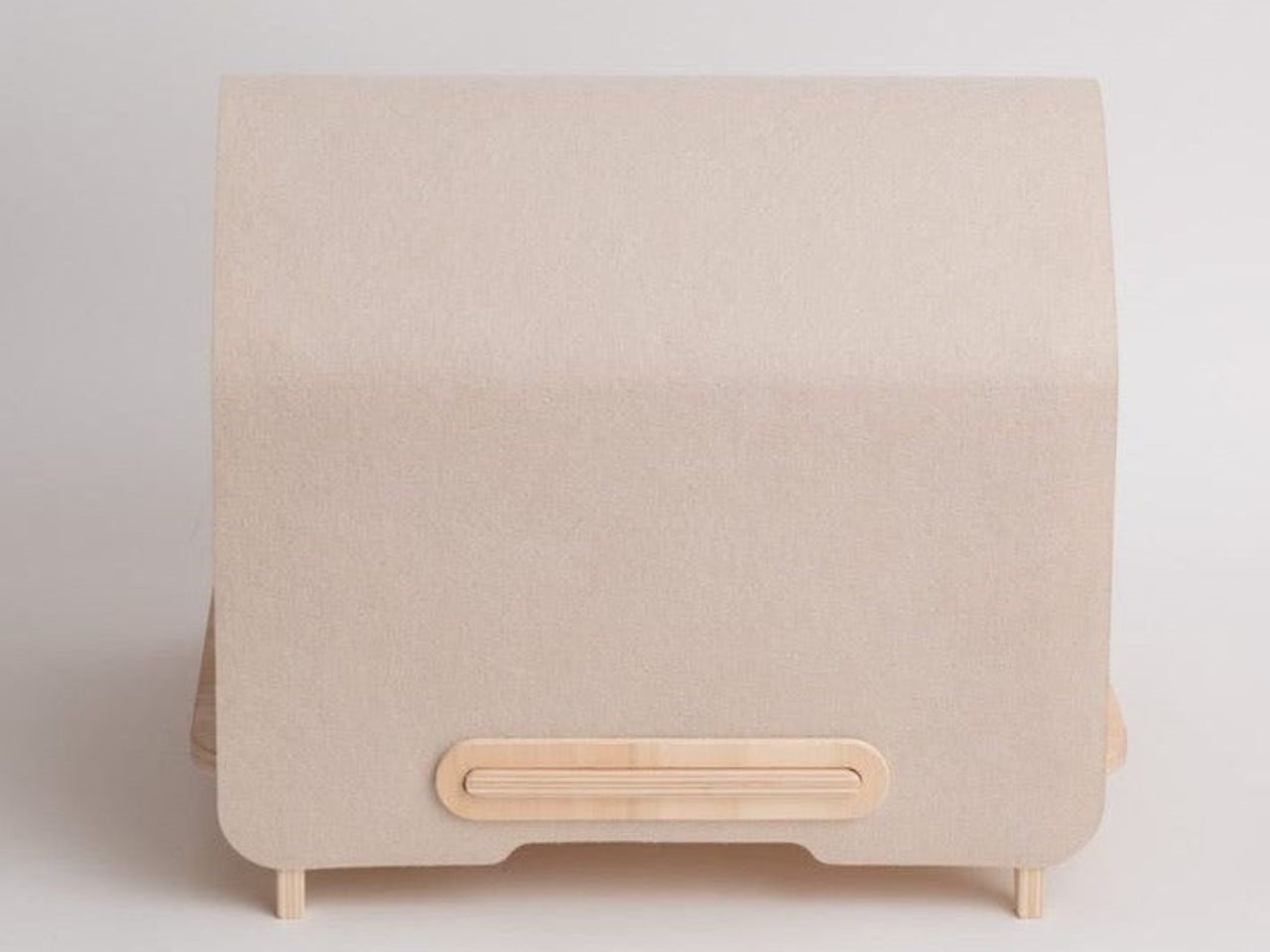
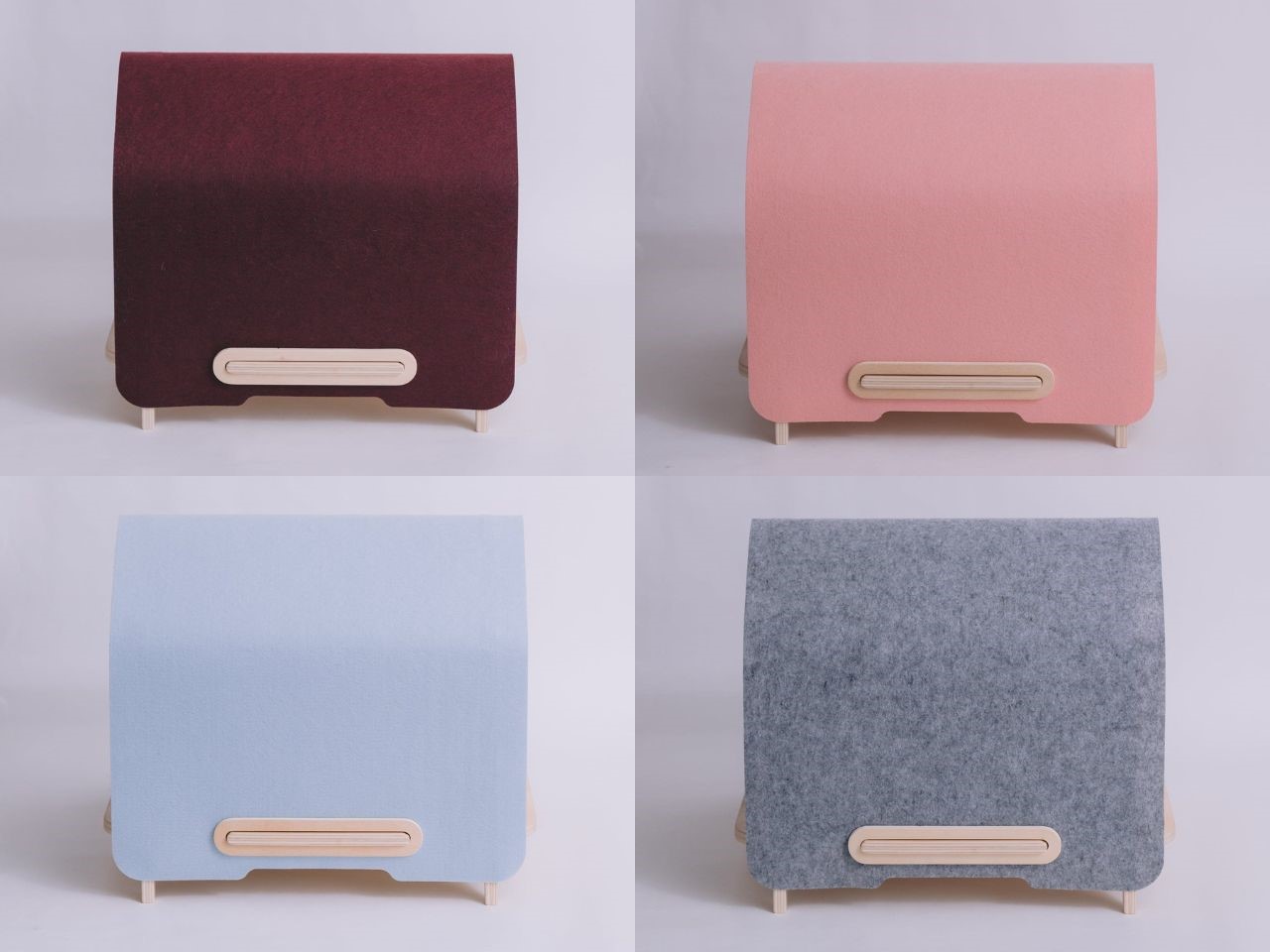
The Luxe Cabin isn’t just another pet bed; it’s a lifestyle choice for pet lovers who value both aesthetics and quality. It’s more than a cozy corner for your pet, it’s an accent piece that elevates the style of any room. So why settle for less? Give your pet the luxurious retreat they deserve with the Luxe Cabin by Rawry.
The post Stylish Pet Retreat: Rawry’s Luxe Cabin Blends Comfort and Minimalist Design first appeared on Yanko Design.
Embrace Your Creepy Side This Halloween With The Crocs’ ‘Wednesday’ Stomp Clogs

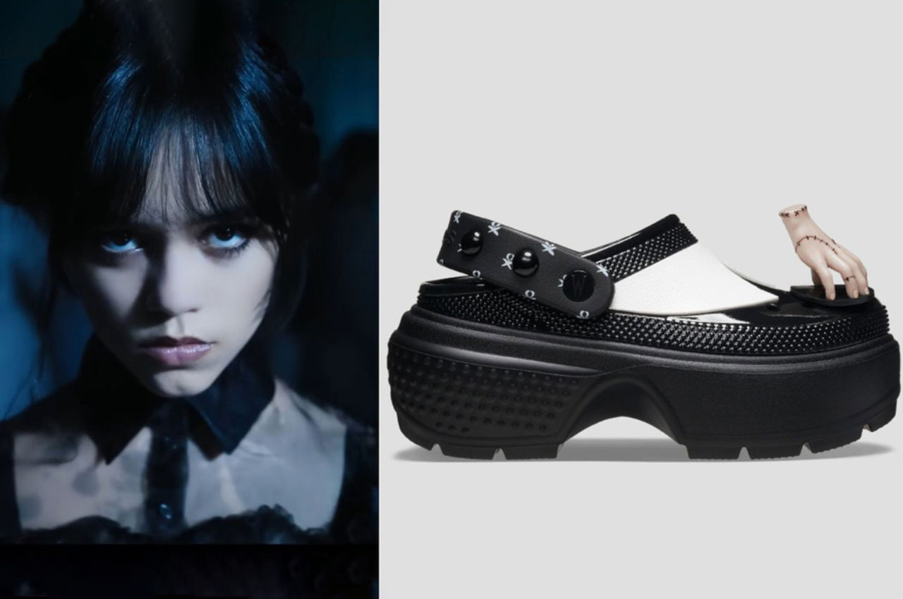
Crocs is stepping into the eerie world of the Addams Family, and their latest collaboration is giving us the chills…in the best way possible. The Wednesday Stomp Clogs, inspired by Tim Burton’s hit Netflix series Wednesday, blend gothic style with the comfort Crocs is known for. This limited-edition release is as creepy as it is chic, offering a fresh, dramatic look that’s perfect for fans of both, the iconic show and spooky fashion.

Designer: Crocs

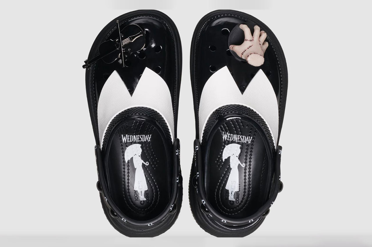
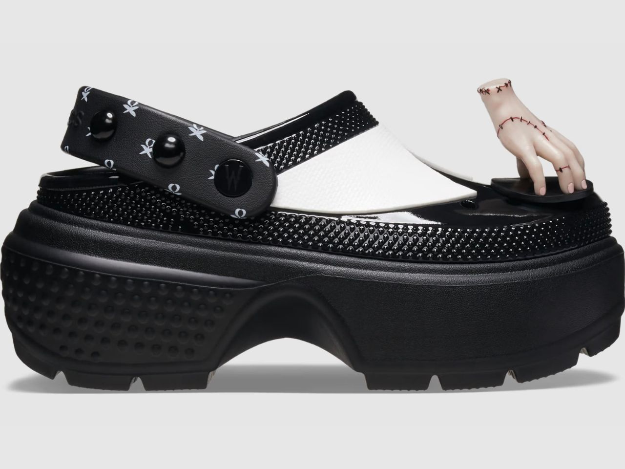
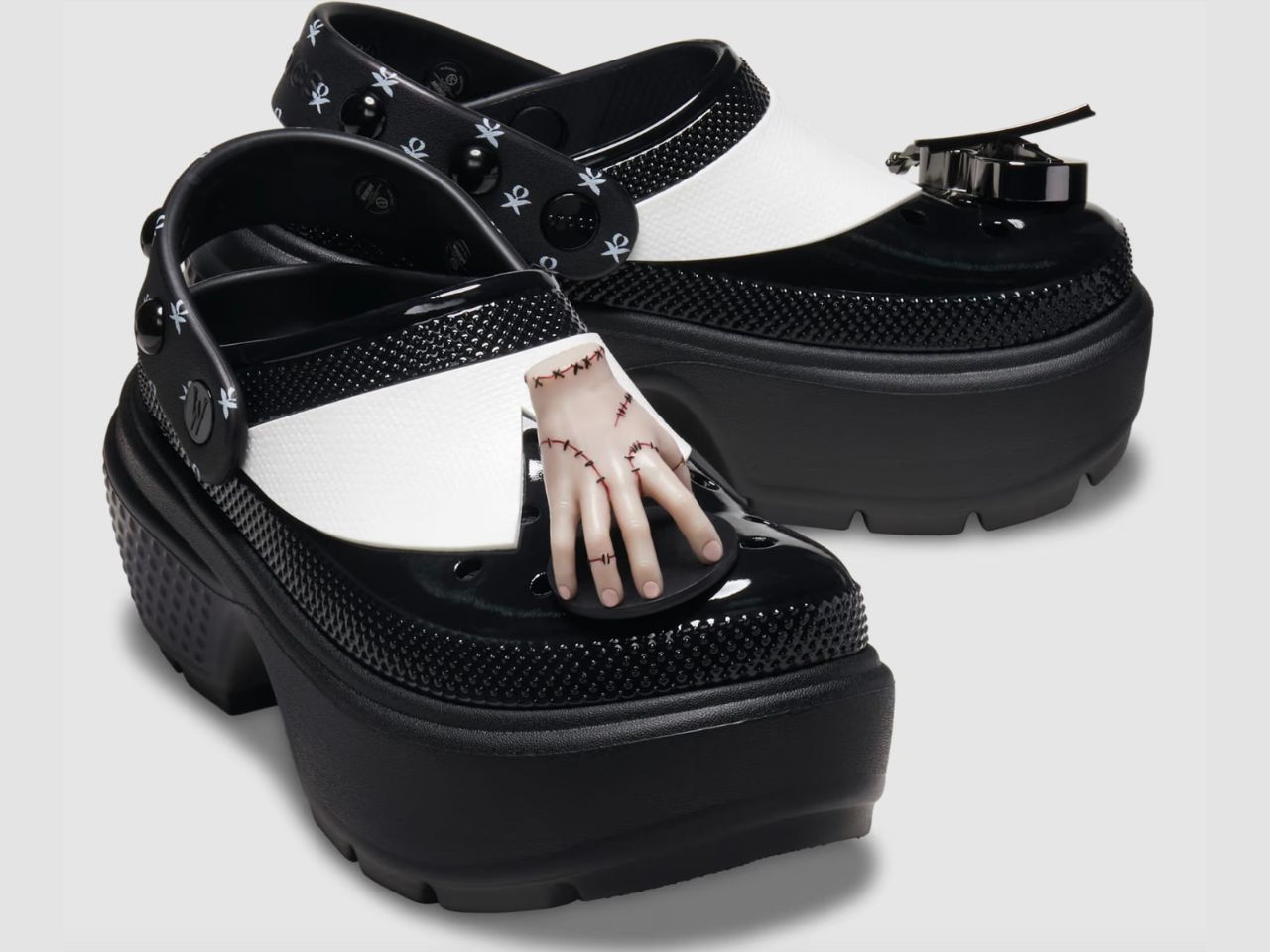
The Wednesday Stomp Clogs are designed with Wednesday’s unmistakable aesthetic in mind, featuring a glossy black upper complete with a white collar detail – a clear nod to her iconic schoolgirl outfit. This subtle design cue ties the shoe to the show without being over the top, making it wearable for casual outings or Halloween events.

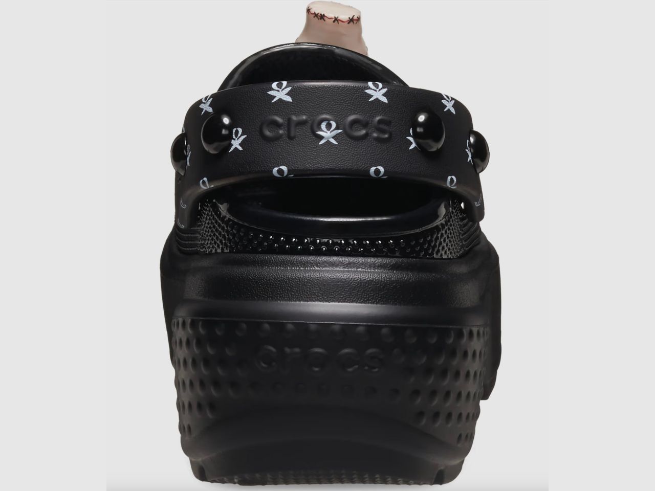
But what really sets these clogs apart is the exaggerated platform sole. Not only does it add height and drama, but it also provides a sturdy, confident step for those looking to channel their inner Addams. The dome-studded ankle strap isn’t just for show; it ensures a snug, secure fit while adding a bit of edgy flair to the overall design. These shoes are built for those who want to stomp through life with confidence, whether on the street or in the graveyard.

No Crocs are complete without their Jibbitz charms, and the Wednesday Stomp Clogs deliver in the spookiest way possible. Exclusive to this release are two new charms: a miniature black cello and Thing, the famous severed hand from the Addams Family. These macabre details add a touch of elegance and fun, perfectly complementing the gothic look of the clogs. It’s a small yet impactful way to personalize your pair and show off your love for all things dark and mysterious.

Though these clogs are bursting with gothic appeal, they don’t sacrifice comfort. Like all Crocs, the Wednesday Stomp Clogs are crafted from their signature Croslite foam, offering lightweight durability and cushioning that fans love. The platform sole may bring the drama, but the clogs’ lightweight construction makes them feel like a feather on your feet. Whether you’re dancing under the moonlight or just running errands, your feet will feel as good as they look, allowing you to move effortlessly while maintaining that spooky edge.

Just in time for Halloween, Crocs is ensuring fans are ready to celebrate in style. The Wednesday Stomp Clogs are the perfect accessory to complete any spooky ensemble, whether you’re dressing up as Wednesday Addams herself or simply looking for a statement piece to match your gothic wardrobe.

And for those who want to take their horror-themed footwear collection even further, Crocs recently released three versions of their Classic Clog inspired by iconic horror villains Freddy Krueger, Jason Voorhees, and Pennywise. It’s clear that Crocs isn’t just about comfort anymore—they’re stepping into a whole new world of style, one that’s perfect for horror fans and fashion-forward individuals alike.

So, if you’re looking for a comfortable, stylish way to celebrate Halloween, the Wednesday x Crocs Stomp Clog should be at the top of your list. These clogs are guaranteed to turn heads, whether you’re at a Halloween party or just stomping your way through life.

The post Embrace Your Creepy Side This Halloween With The Crocs’ ‘Wednesday’ Stomp Clogs first appeared on Yanko Design.
Who Knew A Desk Organiser Could Help Increase Productivity?! The Sustainable Daizo Does!

Sustainability is becoming a crucial part of our daily lives nowadays, and Daizo stands at the forefront of eco-friendly innovation. With their focus on sustainable design and materials, Daizo brings us the Daizo Desk Organizer, a product that not only helps keep your workspace tidy but also supports the planet.

Designer: Mohit Joshi

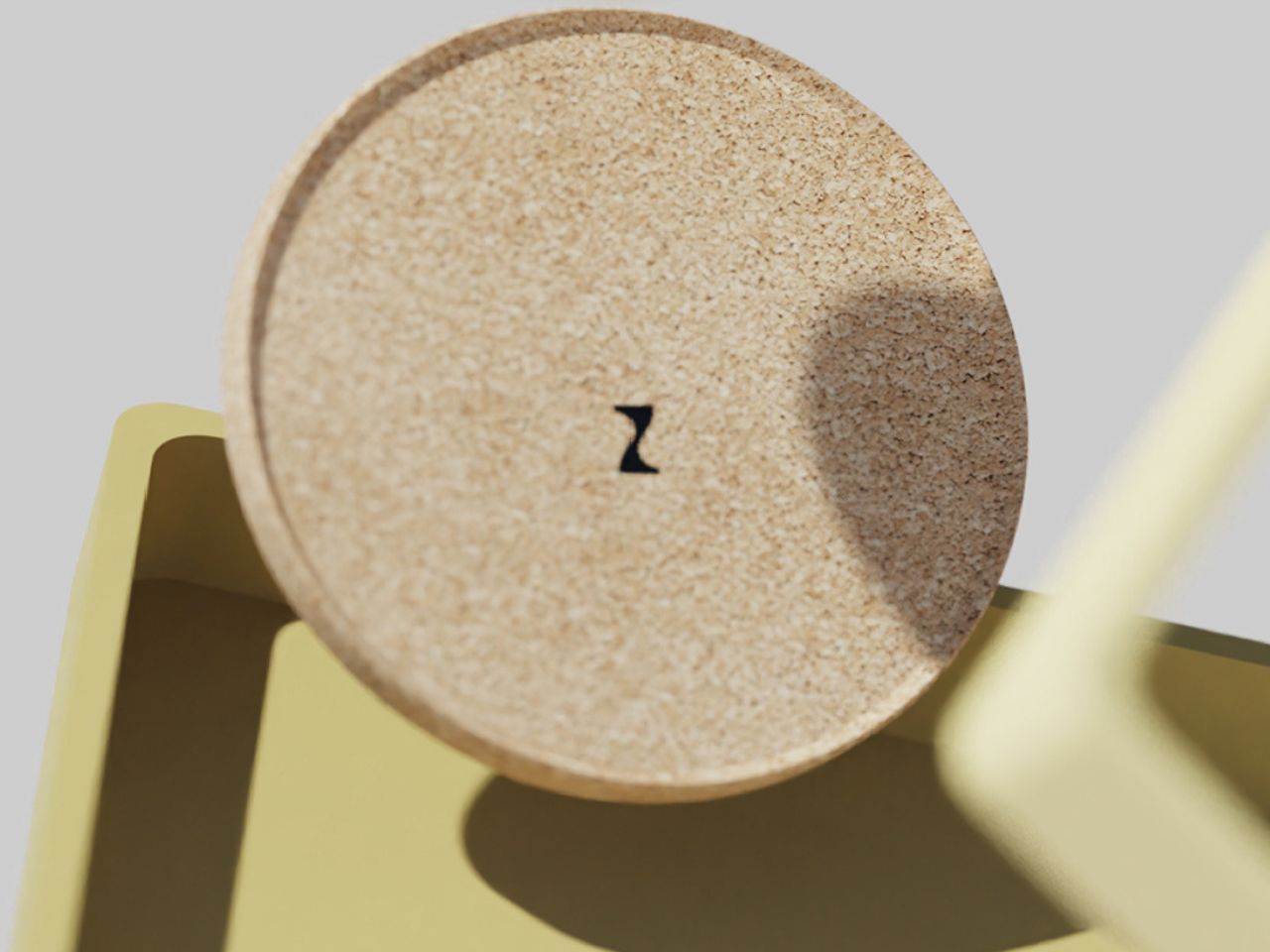
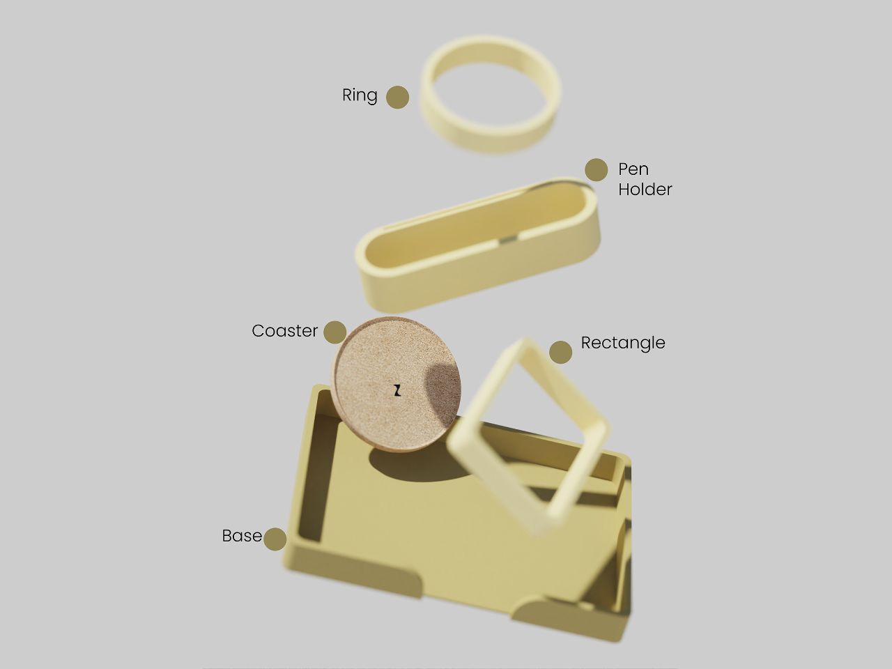
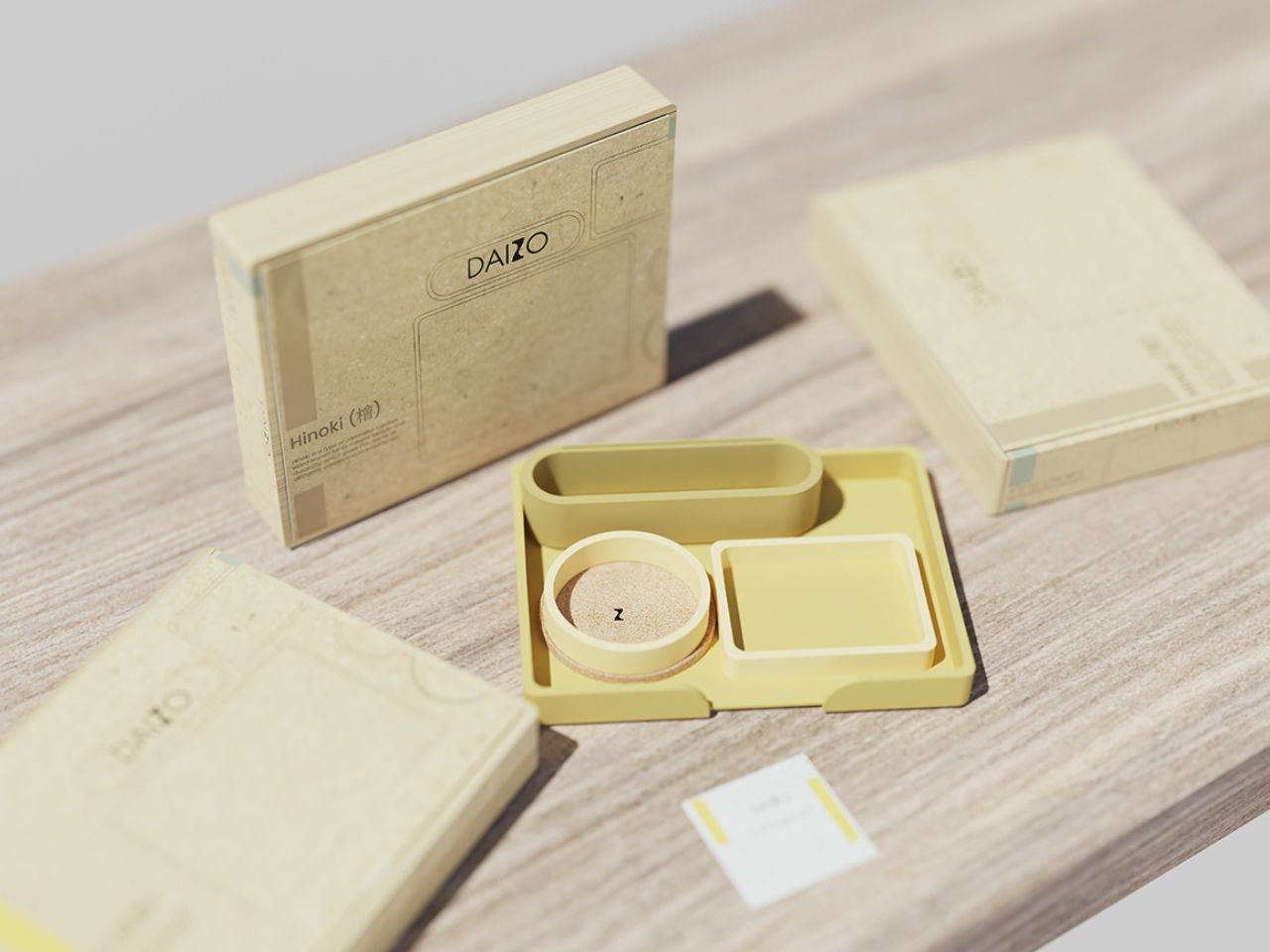
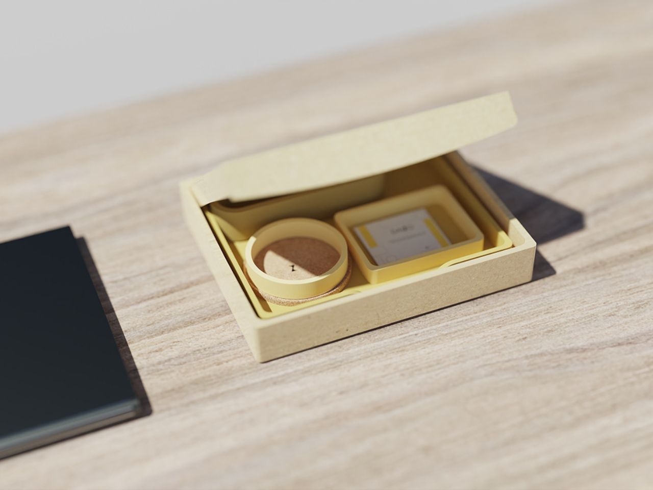
The Daizo Desk Organizer is a shining example of how single products together can shape a sustainable future at large, made from recycled plastic PLA, a biodegradable and renewable resource. By using eco-conscious materials like recycled plastic bottle caps and cork, Daizo ensures that each organizer contributes to reducing landfill waste and minimizing the demand for virgin resources.

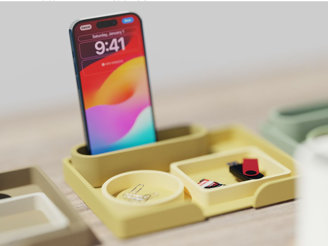
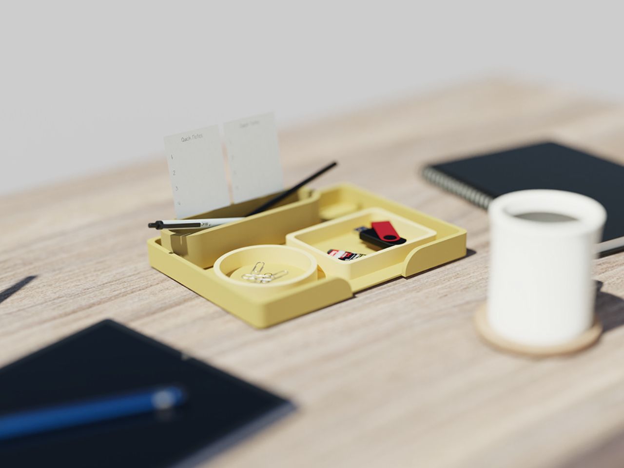
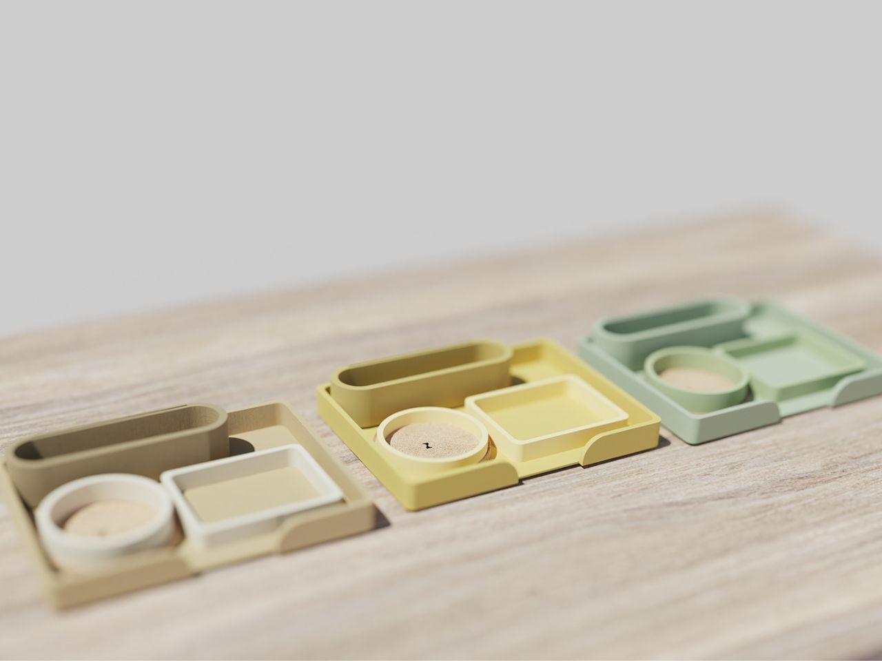
One of the standout features of the organizer is its compact yet highly functional design. Created to optimize small desk spaces, this organizer boasts a unique jigsaw puzzle structure with customizable sections, allowing users to arrange their desk tools in shapes that fit their needs. This flexibility transforms an ordinary desk into a more personalized, clutter-free environment, enhancing both productivity and creativity.

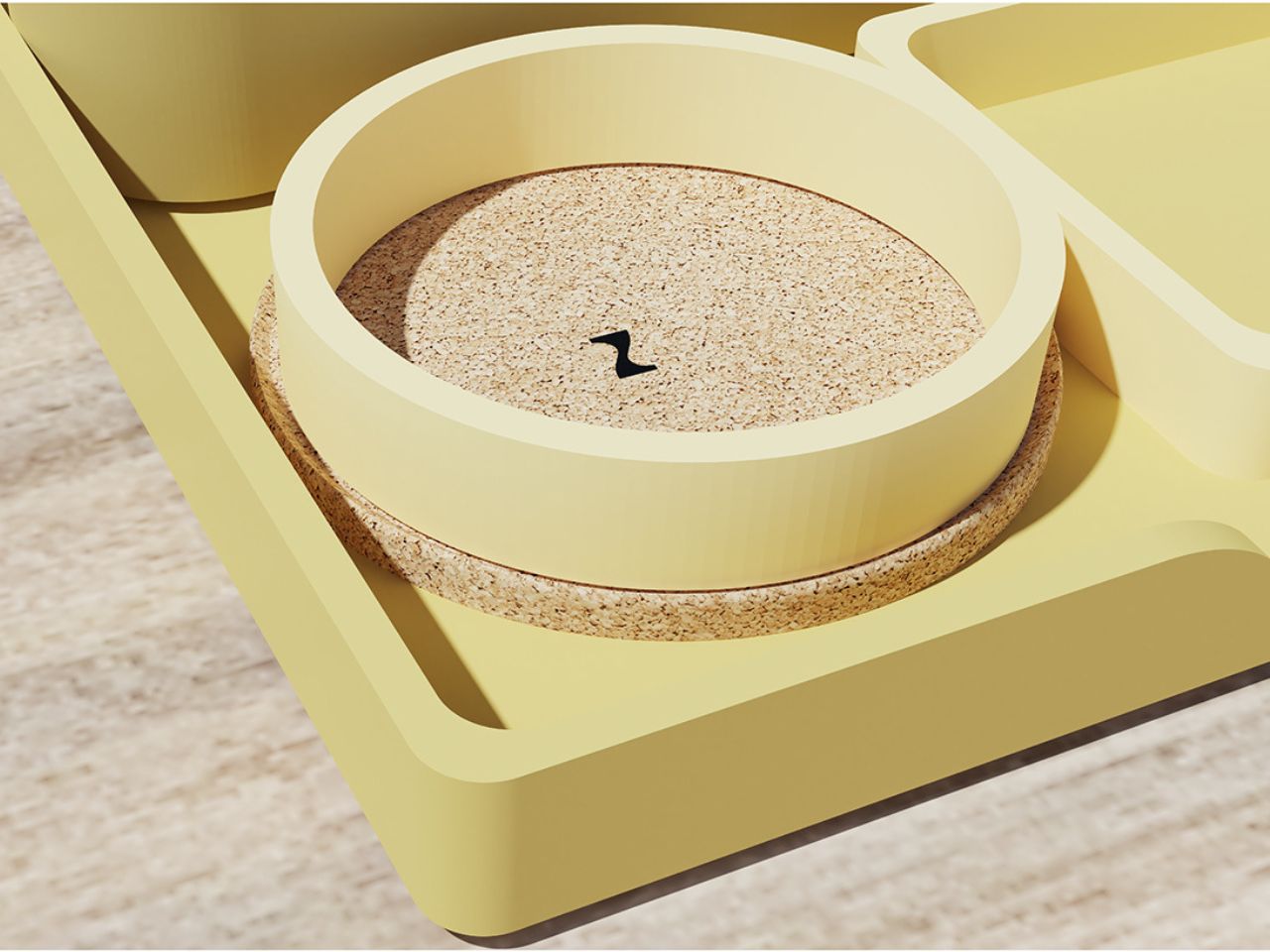
And as every desk warrior knows, coffee is an essential part of a productive workday. Daizo has thoughtfully integrated a built-in coaster, ensuring your coffee or drink has a designated spot while protecting your desk from spills. It’s a small but crucial detail that shows Daizo understands the real-world needs of its users.

Beyond its eco-friendly credentials, the organizer is a powerful tool for boosting productivity. A clean and organized workspace reduces distractions, helping you stay focused on the task at hand. It also promotes creativity, as a clear desk can lead to a clear mind, giving you the freedom to brainstorm and solve problems without feeling overwhelmed by clutter.

Moreover, the Daizo Desk organizer encourages healthy work habits. Maintaining an ergonomic setup and keeping your workspace clean, can prevent common issues like poor posture, eye strain, and general discomfort that often arise from cluttered, disorganized desks.

Many professionals today face challenges in keeping their workspaces organized. Limited desk space, combined with the need to store essential items, often results in clutter that hinders productivity. Daizo addresses this problem head-on with a product that is not only compact but also aesthetically pleasing. Unlike other desk organizers, which often sacrifice functionality or design, Daizo strikes a perfect balance between both.

In addition to keeping your desk in order, the Daizo Desk Organizer makes a positive impact on the environment. By using recycled plastic from bottle caps and crafting it into something both beautiful and practical, Daizo contributes to reducing landfill waste. But sustainability doesn’t end there, at the end of its life, the organizer can be recycled again, supporting the circular economy and further minimizing its carbon footprint. Daizo desk organizer is an investment in a healthier planet and a more organized, productive workspace.

The post Who Knew A Desk Organiser Could Help Increase Productivity?! The Sustainable Daizo Does! first appeared on Yanko Design.
This Eco-Friendly Folding Toothbrush Is a Travel Essential for Minimalist Adventurers

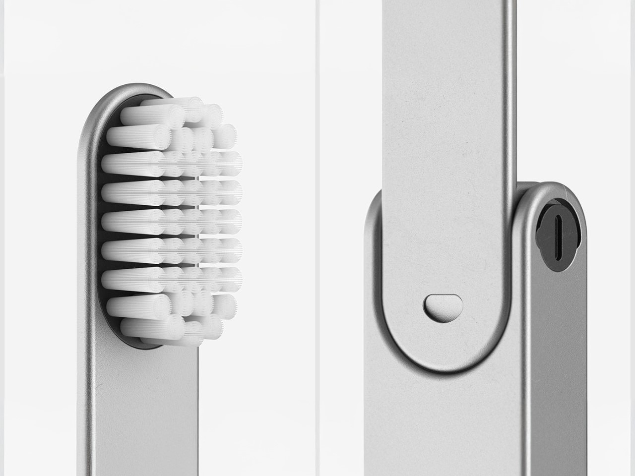
For frequent travelers, outdoor enthusiasts, and ultralight backpackers, keeping up with hygiene while being eco-friendly can feel like a balancing act. It’s no secret that not every hotel or campsite provides disposable toothbrushes, and when they do, it only adds to the mounting issue of plastic waste. This IO Travel Toothbrush is a smart, sleek, and sustainable solution designed for the modern traveler. With a perfect blend of cutting-edge innovation, environmental responsibility, and ultimate convenience, the IO toothbrush is a must-have for those who prioritize both personal health and the planet.

Designer: Uladzislau Patapchyk

For the ultralight traveler, packing only the essentials is key. Whether you’re heading into the wilderness, pitching a tent at your favorite campsite, or just off on a weekend getaway, the IO toothbrush ensures your oral hygiene stays on point without weighing down your pack. Every aspect of its design has been meticulously thought through to meet the needs of minimalists. Unlike typical toothbrushes, the IO toothbrush delivers full functionality while keeping things compact and efficient.

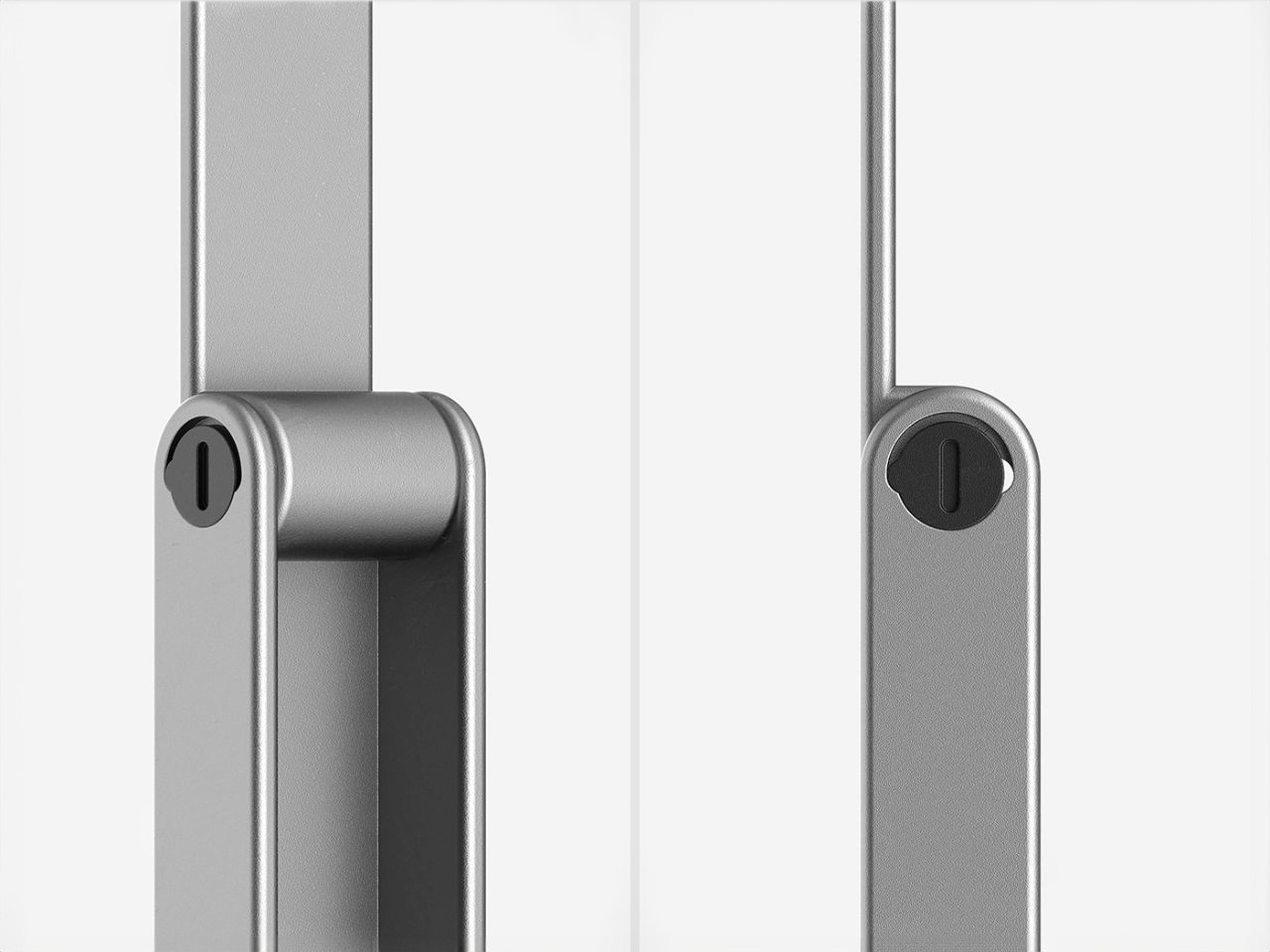
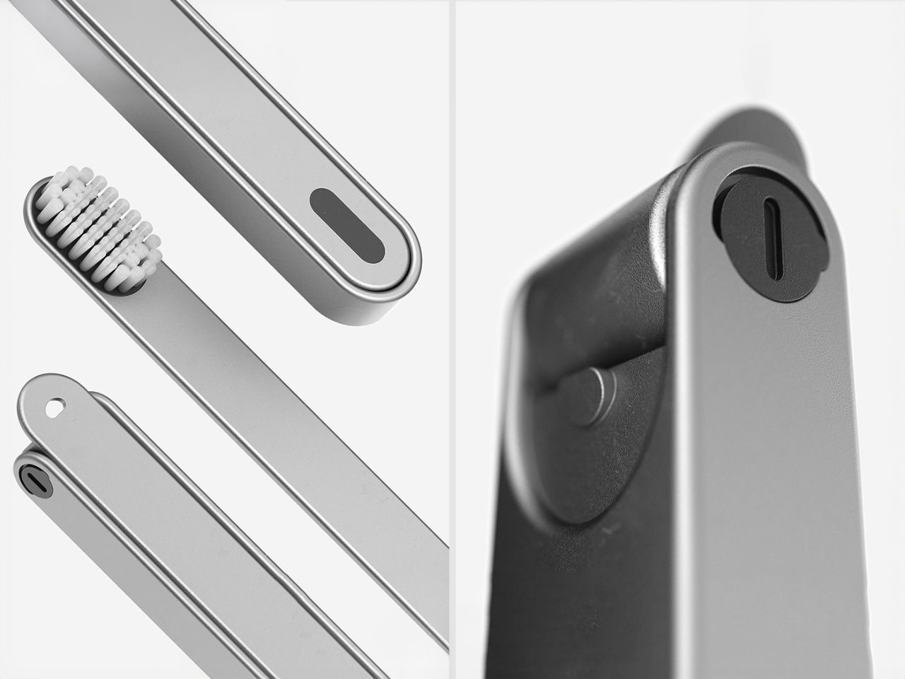
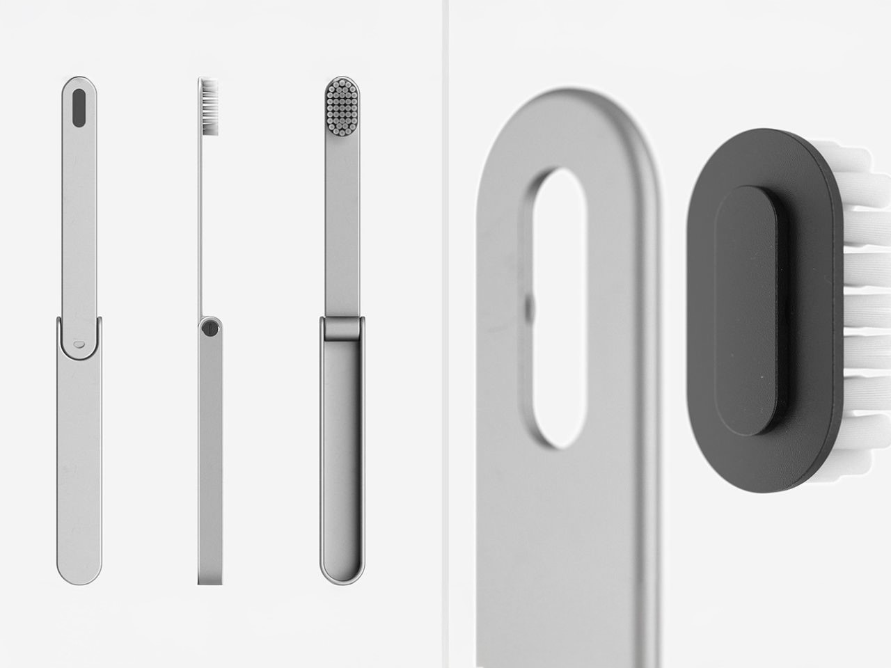
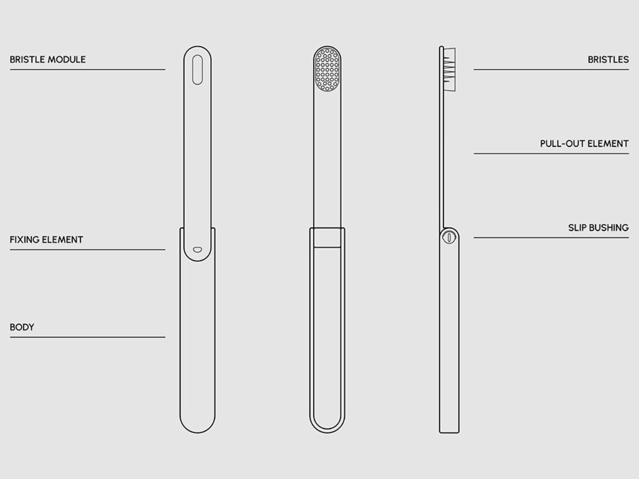
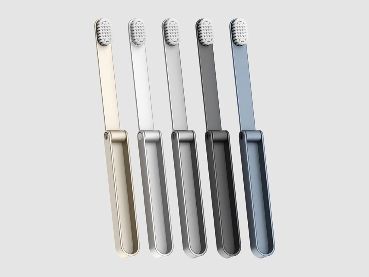
Perhaps the standout feature of the IO toothbrush is its ingenious folding mechanism. When not in use, the toothbrush folds neatly, conserving precious space in your bag. Even better? The folded design shields the bristles from dirt and grime, something that’s crucial when you’re adventuring outdoors. Equipped with a secure locking and sliding system, the toothbrush is not only sturdy but incredibly easy to use, even when you’re in rugged, remote locations. Cleanliness, convenience, and durability are all wrapped into one compact tool, perfect for the demands of outdoor life.

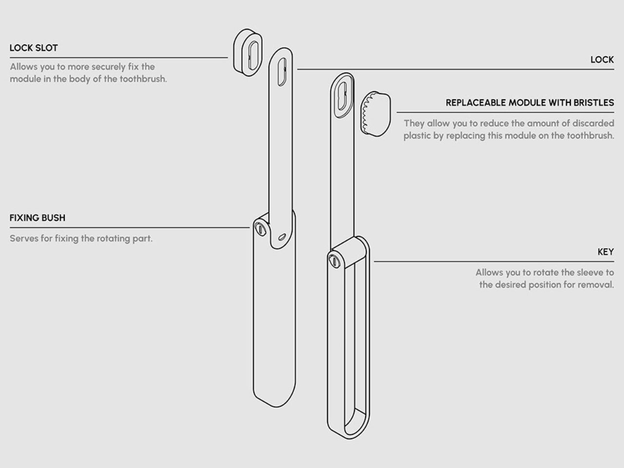
The toothbrush’s modular design is a game-changer. It’s composed of three main components, the body, the fixing element, and the bristle module. What sets it apart is the ability to swap out only the bristle module when it’s time for a refresh. No need to toss the entire toothbrush! This thoughtful feature not only lightens your load but also drastically cuts down on plastic waste. It’s a design that’s so smart and sustainable, it’s something that should be adopted for everyday use, not just travel.

With fixing bushings and lock slots, the IO toothbrush can be quickly disassembled and reassembled, making it perfect for life on the go. Its smooth, edge-free design ensures safety, whether you’re brushing at a campsite or during a quick stop on a hiking trail. Crafted from durable materials like surgical steel, this toothbrush is built to withstand the elements, ensuring it remains a reliable part of your gear for years. Its longevity is another win for sustainability, fewer replacements mean less waste.

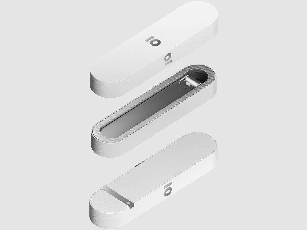
Another innovative aspect of the IO toothbrush is its biodegradable packaging. Made from a composite of seaweed and fish scales, the packaging is designed to completely dissolve in water, leaving zero trace behind. This makes it perfect for outdoor adventures where “leave no trace” is more than a motto, it’s a way of life. It’s not just about brushing your teeth; it’s about contributing to a healthier planet every step of the way.

Understanding that practicality doesn’t have to come at the cost of style, the IO toothbrush is available in five elegant colors. Whether you prefer a sleek, classic look or a pop of color in your gear, you can choose from a range of shades to match your personal style. It’s a thoughtful touch that makes the IO toothbrush not only functional but also a visually appealing addition to your travel essentials.

The post This Eco-Friendly Folding Toothbrush Is a Travel Essential for Minimalist Adventurers first appeared on Yanko Design.
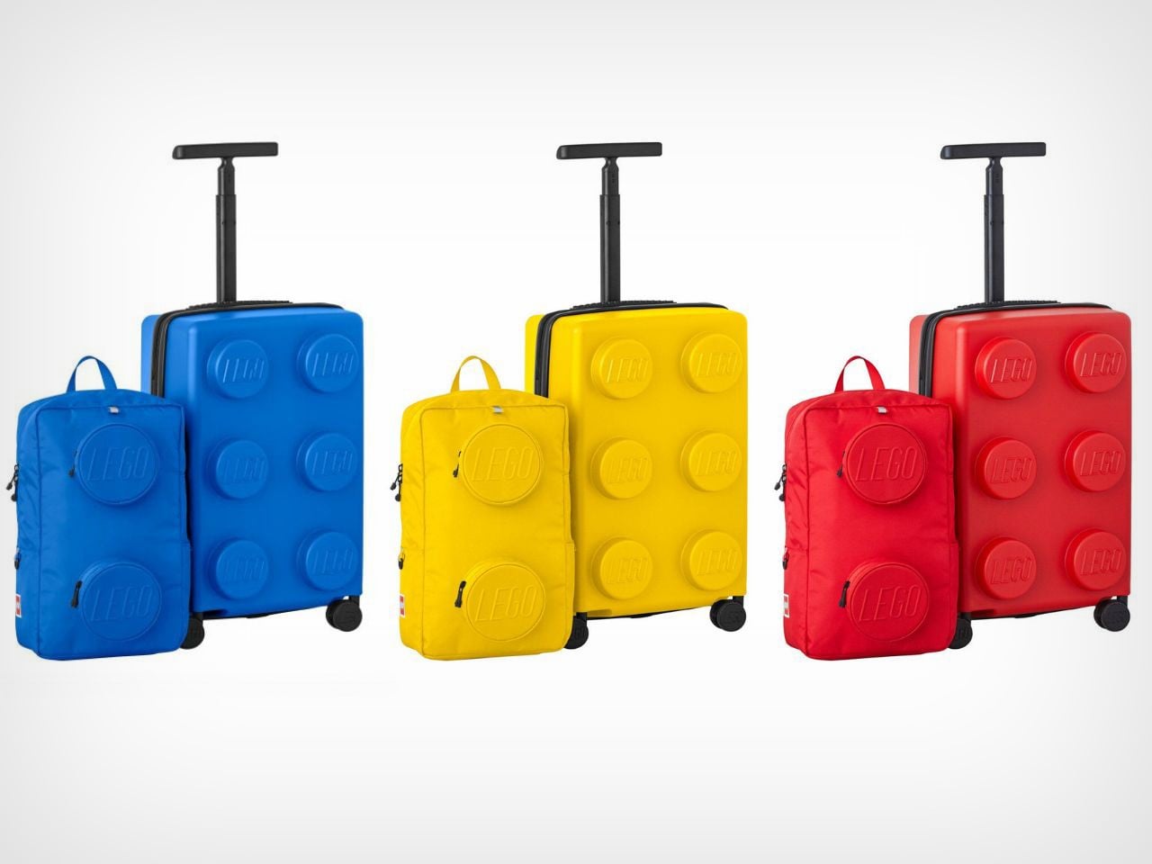
LEGO’s new Trolley and Backpack may not be Modular, but they’re Perfect for Travel!

LEGO enthusiasts and travelers can now experience the joy of their favorite bricks on the go with LEGO’s latest innovation – the LEGO® Brick-Inspired Trolley and Backpack Set. This remarkable set is available at Costco and combines playful design with top-tier functionality, not to mention the fact that it looks so unique there’s no way anyone’s going to accidentally mistake it for their own on the airport luggage belt!

Designer: LEGO

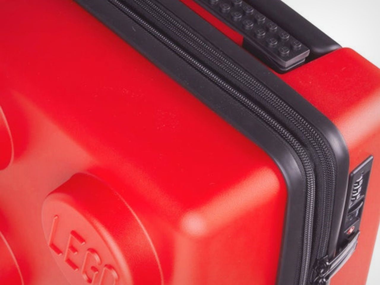
Much like the iconic LEGO bricks that have been loved for generations, this set is built with durability in mind. The carry-on trolley is made from polypropylene, a high-quality material known for its strength and resilience, while the matching backpack is crafted from robust polyester. Together, they offer reinforced corners and secure closures that keep belongings safe, even during the most adventurous of journeys.

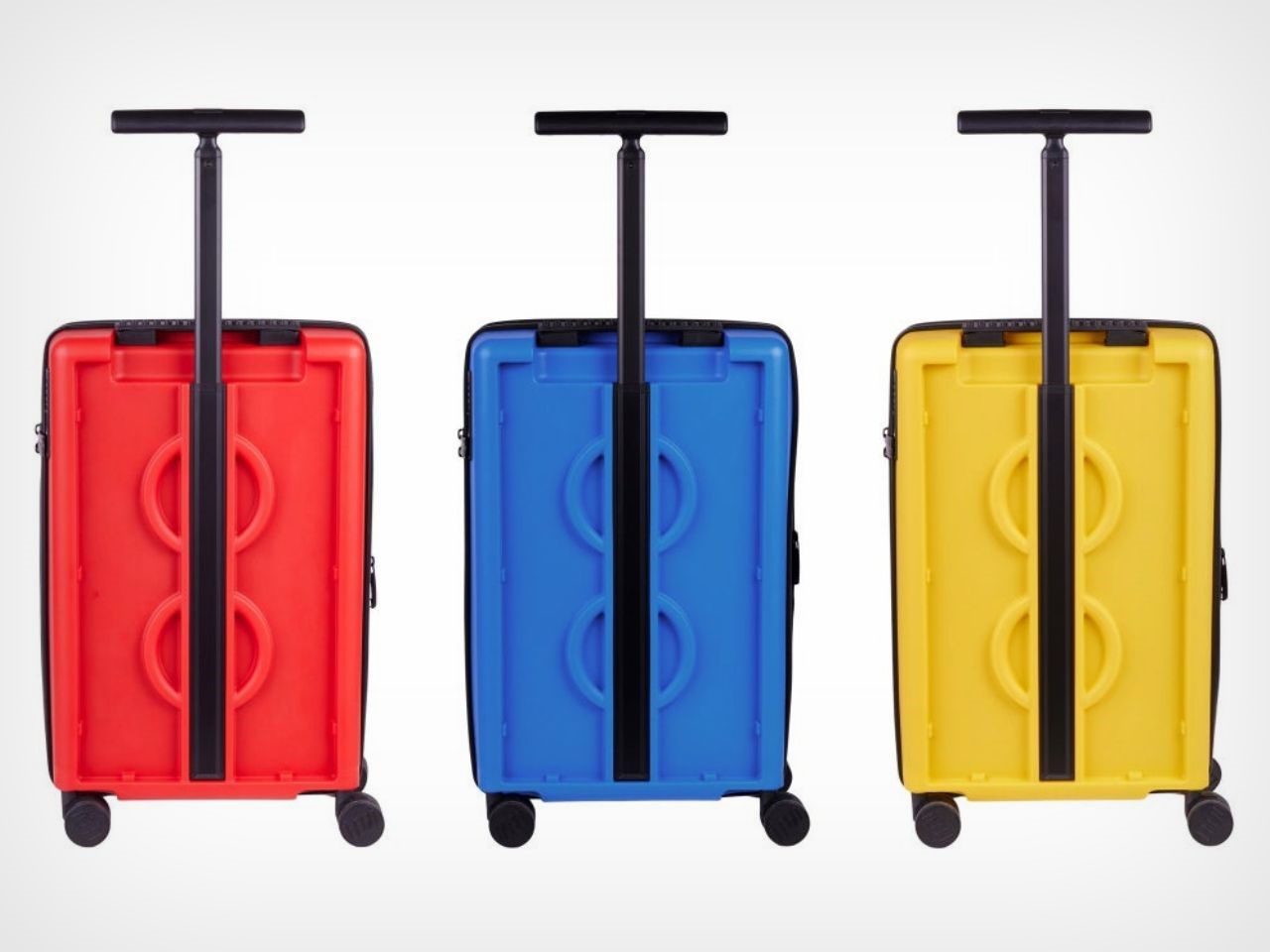
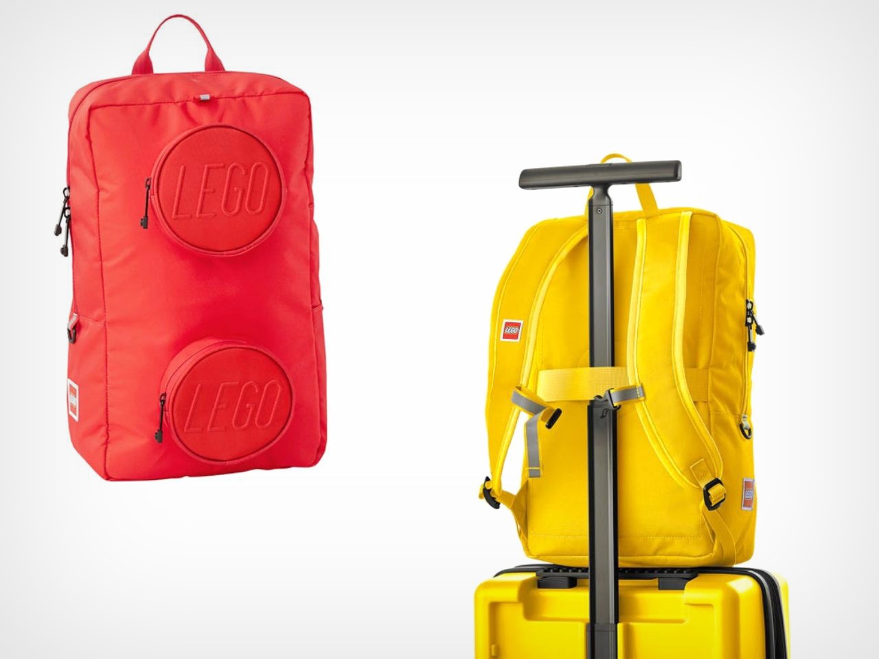
From the moment you see this set, it’s clear that LEGO’s signature creativity is at work. The trolley and backpack are available in bright, vibrant colors – red, blue, and yellow – evoking the playful essence of LEGO bricks. The design is not only visually exciting but also highly functional. The expandable trolley provides additional space for those last-minute outfits, and the backpack, with its handy trolley strap, can easily be attached for smooth rolling through airports or schools.

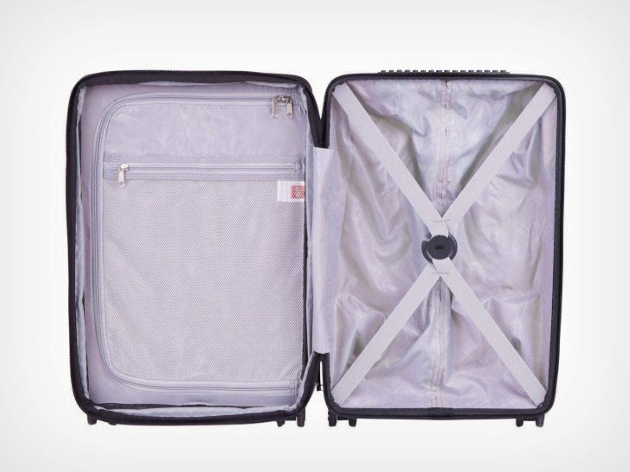
Inside the trolley, you’ll find sleek grey interiors that are not only modern but also practical. A zipped partition ensures that your belongings remain organized and intact, while an additional netted pocket over the partition allows for quick access to frequently needed items like travel documents or snacks.

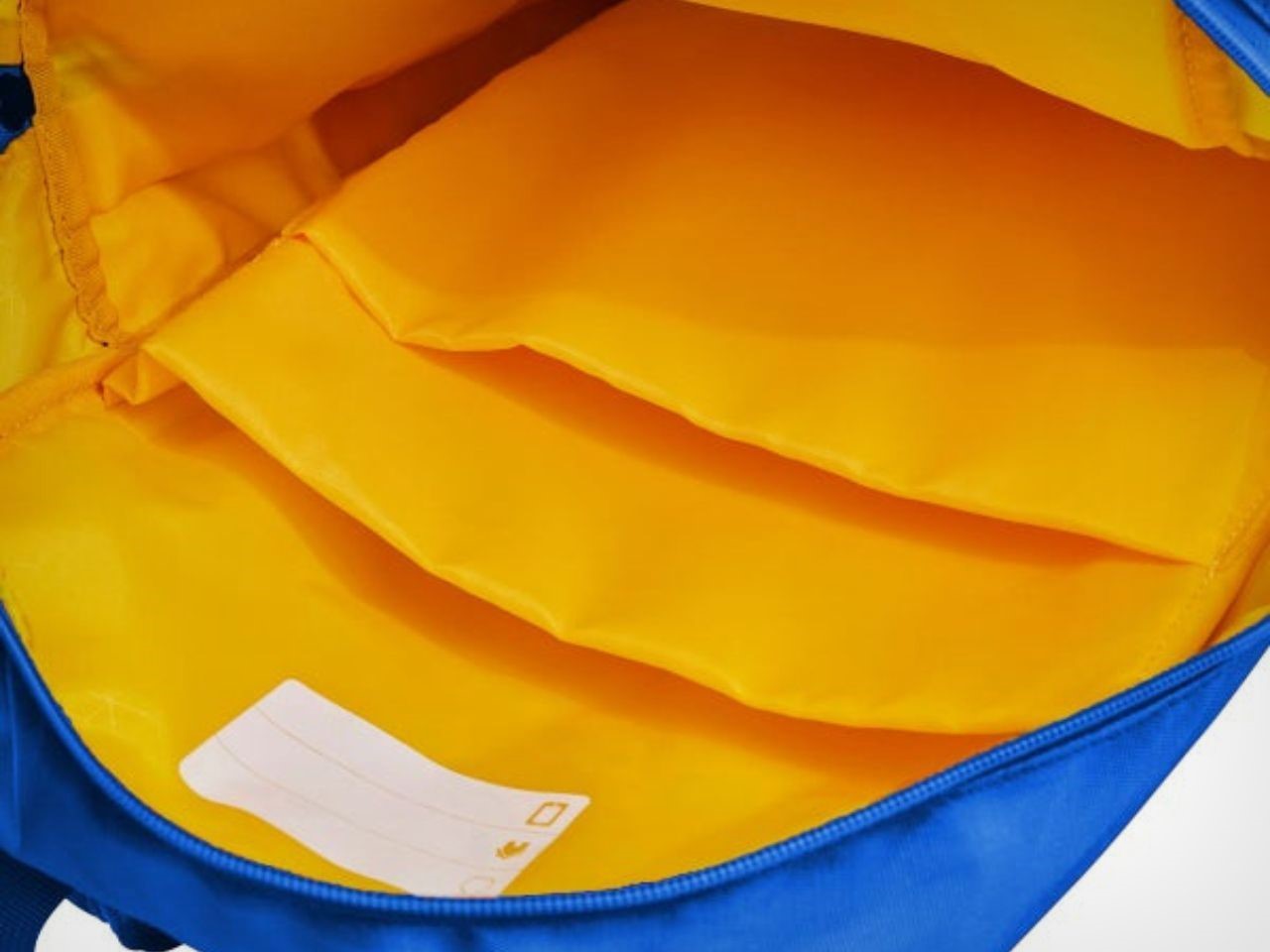
The backpack truly sets itself apart with its unique design, featuring two zipped pockets on the front that resemble the ‘studs’ of a LEGO brick, adding a playful touch to the overall aesthetic. Keeping the brightness alive, the interior boasts vibrant yellow hues and includes two compartments specifically designed for laptops, iPads, and books. Whether for school or work, this backpack ensures your essentials are safely stored and easy to access.

Though initially designed with children in mind, this set is sure to awaken the inner child in any young adult who loves LEGO. The fun design is coupled with practical features such as water resistance and a TSA-approved lock for added security. Whether for a family vacation, school trip, or simply a fun weekend getaway, this set is perfect for every occasion.

For a great price of $149, this LEGO-inspired trolley and backpack set can be purchased at Costco as well as Home Depot. It’s the perfect investment for anyone seeking a mix of style, durability, and playful charm in their travel gear. With a set like this, every trip becomes an adventure, whether you’re young in age or just young at heart.

The post LEGO’s new Trolley and Backpack may not be Modular, but they’re Perfect for Travel! first appeared on Yanko Design.
Award-Winning Sports Complex boasts a Badminton Racquet-inspired Grid Roof with Solar Panels

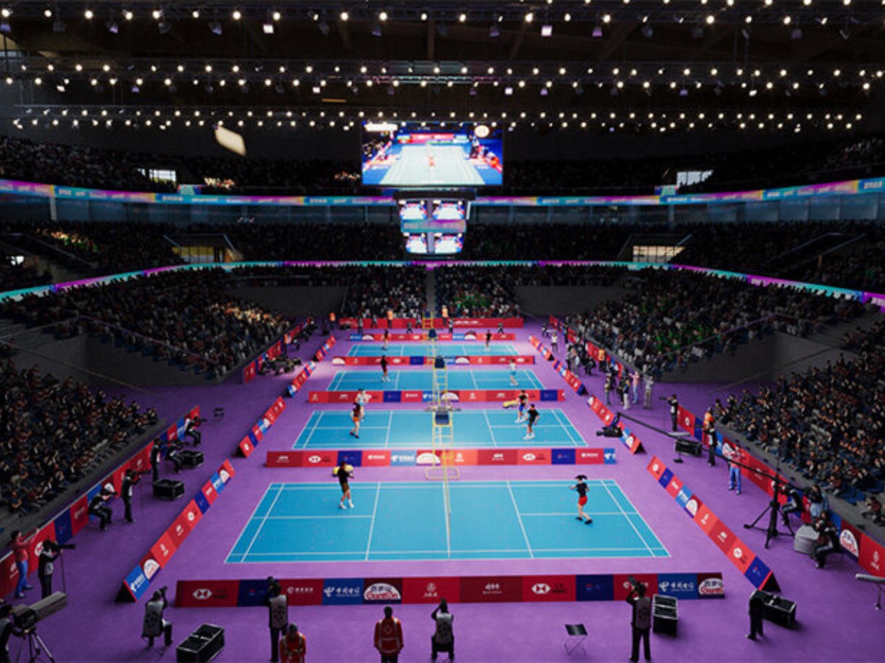
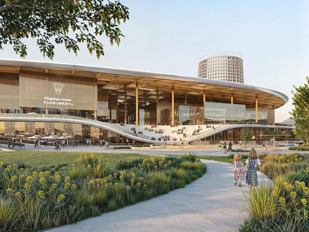
In a stunning fusion of sport, sustainability, and striking design, MVRDV and Huayi Design have won the competition to create The Sweet Spot, a world-class sports complex in Shenzhen’s Pingshan district. Far from your average facility, this vibrant complex will house China’s National Badminton Training Centre, a public fitness hub, and a variety of commercial spaces. With an iconic rooftop shaped like the head of a badminton racket, The Sweet Spot is more than a nod to badminton, it’s a full-blown celebration of the sport and an architectural marvel in its own right.

Designer: MVRDV and Huayi Design

The Sweet Spot makes a bold statement before you even set foot inside. Towering over the complex is a 240-meter-long roof that mirrors the head of a badminton racket, complete with a grid-like structure resembling racket strings. This isn’t just for show: the roof is equipped with solar panels, generating clean energy for the complex. It’s a masterstroke of design that combines sustainability with visual impact, a perfect reflection of MVRDV’s commitment to eco-friendly architecture.

Jacob van Rijs, founding partner at MVRDV, puts it best: “The Sweet Spot isn’t just about creating a space for sport, it’s about celebrating badminton in a way that’s fun, accessible, and environmentally conscious. We’re thrilled to have hit the winning shot with this design!”

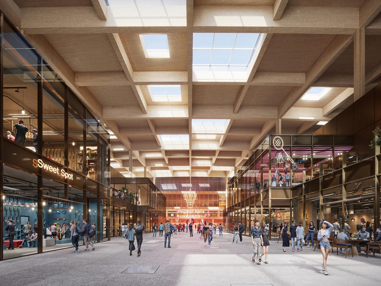
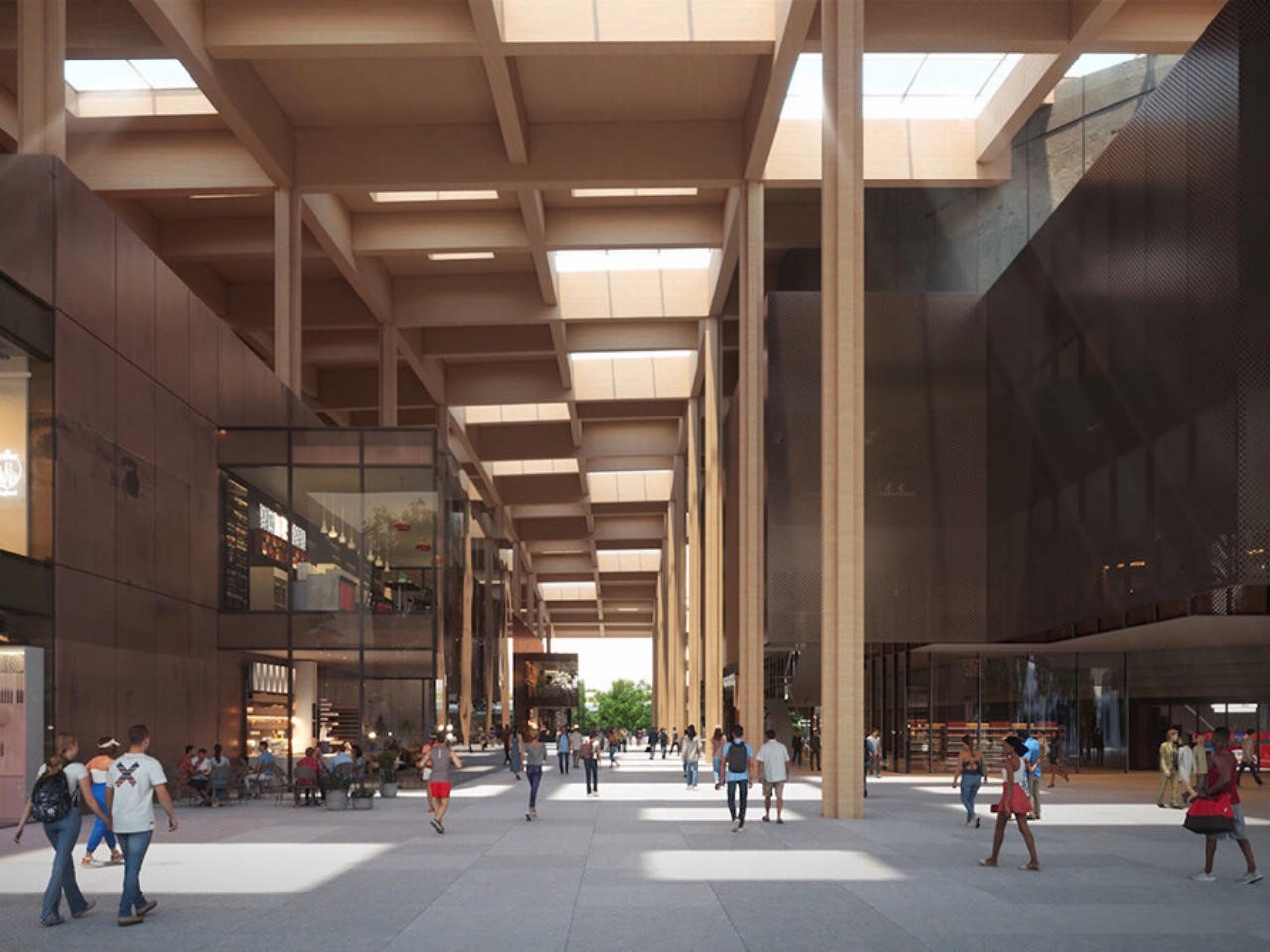
At the heart of the complex is a dynamic space where athletes and the public seamlessly coexist. The main building, which houses a professional arena and training courts, is linked by a T-shaped promenade that invites everyone to explore the facilities. This promenade leads to a central plaza, aptly named the sweet spot, designed to reflect the perfect hitting point on a badminton racket. It’s a playful yet fitting metaphor for the spirit of the project.

For athletes, privacy is a priority. Beneath the public promenade lies a lower ground level that connects the training spaces and arena, allowing athletes to move discreetly without mingling with the public. It’s a clever solution that balances public engagement with the specialized needs of professional sportspeople.

But the badminton-themed surprises don’t stop there. To the south of the arena, a striking 23-story tower tapers like a shuttlecock, housing hotel rooms on the lower levels and short-stay apartments for athletes above. This iconic tower is more than just an architectural statement, it’s designed with athletes’ privacy and convenience in mind, offering direct access to the private lower ground floor.

On the other side of the complex, two smaller commercial buildings echo the racket shape of the main arena, tying the whole design together with visual harmony. These buildings will serve visitors, creating a lively and cohesive atmosphere.

The sweet spot isn’t just a haven for professional athletes, it’s a gift to the people of Shenzhen. The park surrounding the complex features courts for badminton, basketball, and football, open to everyone from casual players to serious competitors. The west side boasts a massive stepped tribune where spectators can watch matches or just take in the surroundings, making the park as much a social hub as a sports venue.

A separate National Fitness Centre offers even more opportunities for exercise, housing additional badminton and tennis courts as well as a swimming center. With so many options, it’s clear that this complex isn’t just about elite athletes, it’s designed to foster a love for sport across the entire community.

One of the most exciting aspects of The Sweet Spot is how it extends beyond its original scope. MVRDV saw potential in the space beneath the nearby Pingyan Expressway flyover, transforming what could have been a forgotten stretch of land into a vibrant green corridor. Complete with a skate park, basketball courts, a running track, and a playground, this extension seamlessly connects The Sweet Spot to the larger Pingshan community, making the complex an even more integral part of the city.

Finally, The Sweet Spot relies on clean energy to operate, pointing at a strong sustainability bid. The solar-powered roof generates much of the energy needed to run the complex, and the design as a whole prioritizes energy efficiency and environmental responsibility. By integrating photovoltaic panels into the design of the badminton-racket-shaped roof, MVRDV has ensured that this isn’t just a sports complex of the present, it’s one being built for the future.

MVRDV and Huayi Design’s The Sweet Spot is an experience. With its playful badminton theme, athlete-first design, community-centered amenities, and a strong commitment to sustainability, this complex redefines what a sports facility can be. It’s a bold, energetic, and forward-thinking project that will leave a lasting impact on Shenzhen and beyond.

The post Award-Winning Sports Complex boasts a Badminton Racquet-inspired Grid Roof with Solar Panels first appeared on Yanko Design.
This Outdoor JBL Speaker is designed to Blend In as well as Stand Out

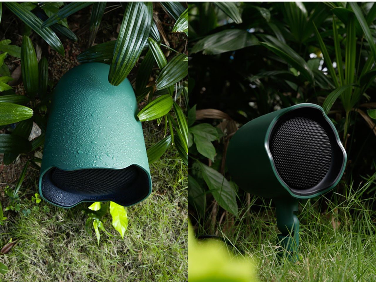
This JBL speaker design stands out in the world of outdoor sound systems with its weather-resistant Garden Series, a line of speakers designed to deliver outstanding audio fidelity while blending seamlessly into various outdoor commercial environments. The series consists of the GSF ground-stake full-range speakers and GSB in-ground subwoofers, both tailored to provide expansive coverage in settings like shopping malls, theme parks, sports venues, and hospitality establishments.

Designers: Hoyean Kim and Huemen Design

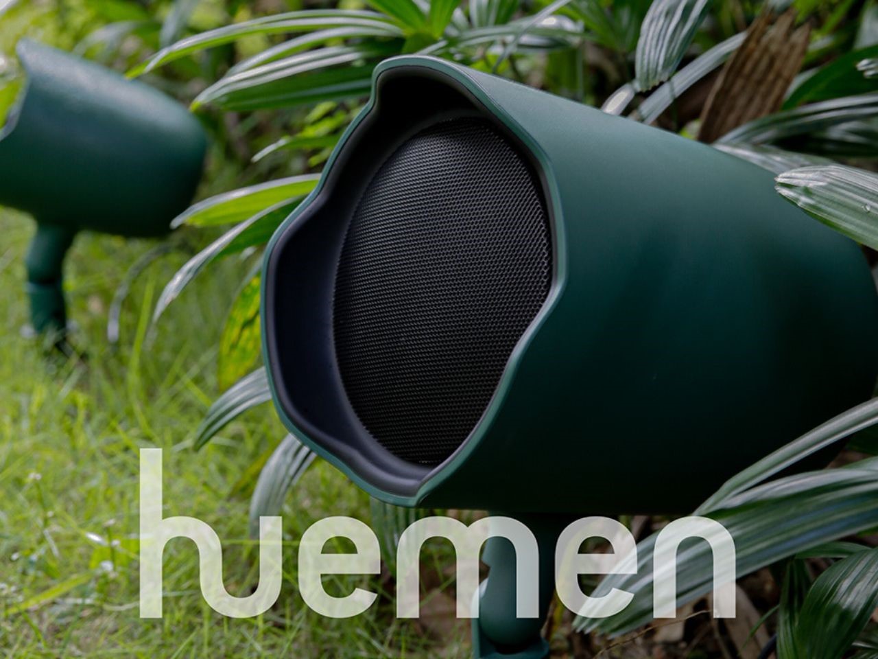
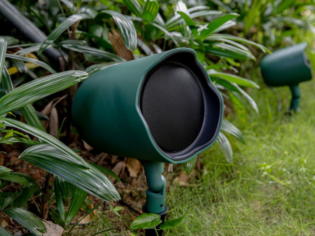
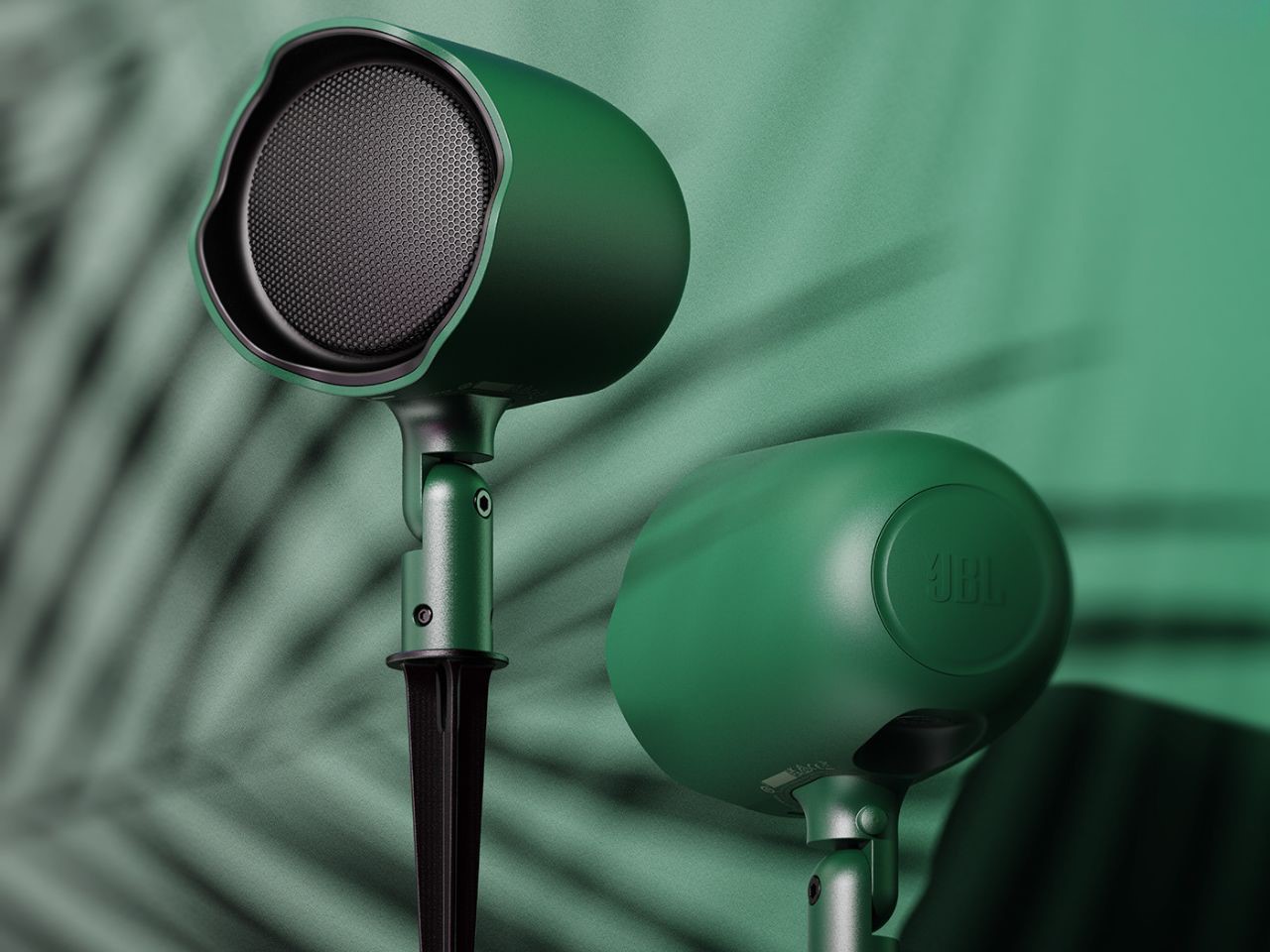
One of the standout features of the JBL Garden Series is its blend of aesthetic appeal and practical durability. Available in subtle hunter-green and tan finishes, these speakers are crafted to harmonize with outdoor landscapes, making them both functional and discreet. Whether nestled in the greenery of a mall garden or set up in a bustling theme park, these speakers offer a stylish solution that withstands the elements while delivering premium sound.

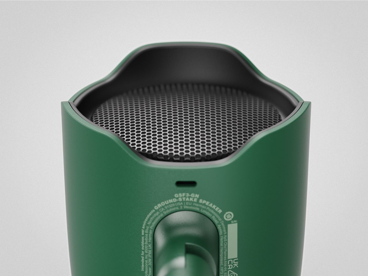
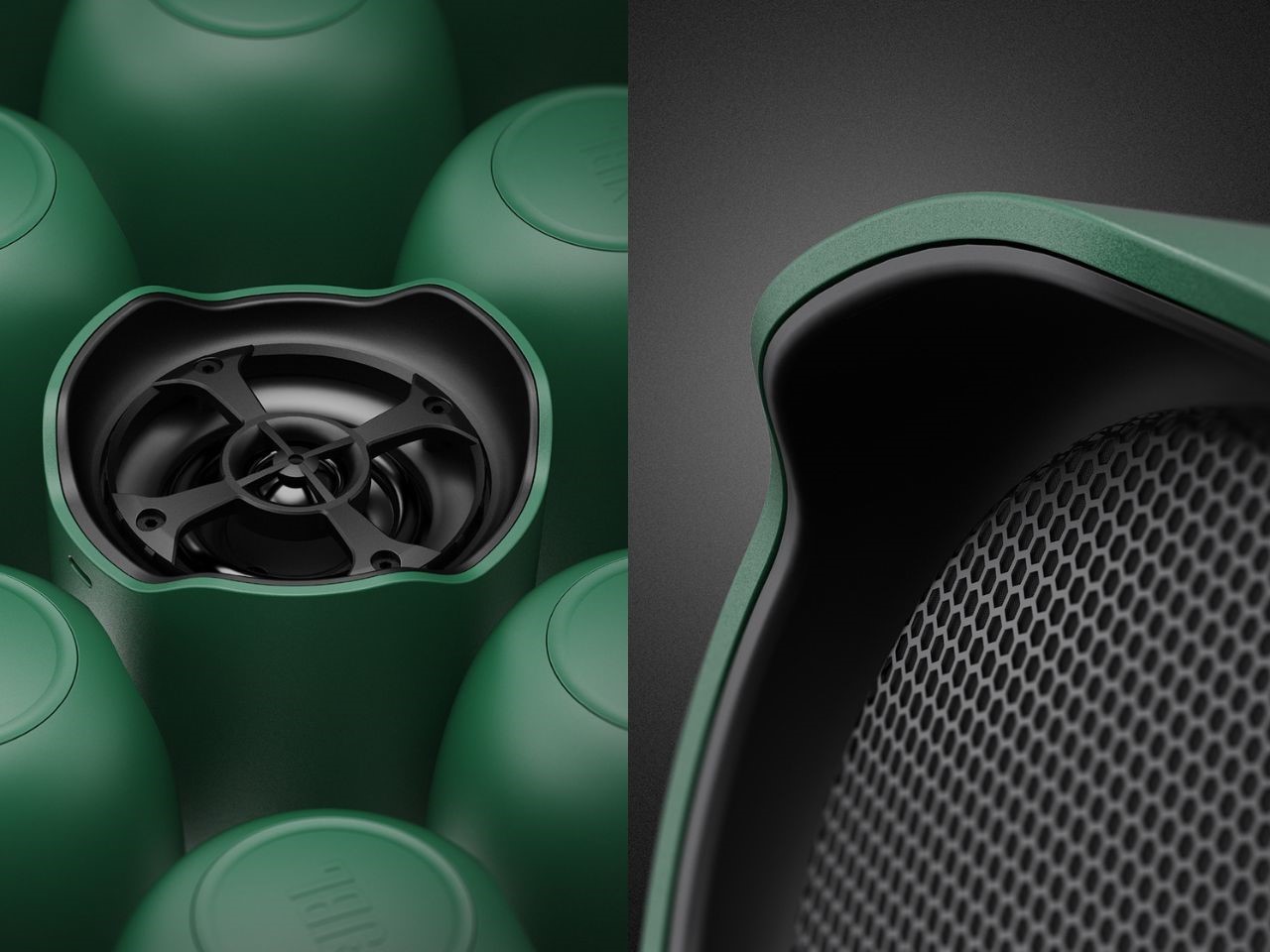
The GSF cabinet’s design takes inspiration from nature, featuring a unique, leaf-like silhouette. This eye-catching design isn’t just for show, it serves a practical purpose, too. The grille extends over the speaker like a protective roof, shielding the system from rain, while an integrated drain hole ensures that water is efficiently channeled away. The result is a system built to thrive in unpredictable outdoor weather conditions without compromising on performance.

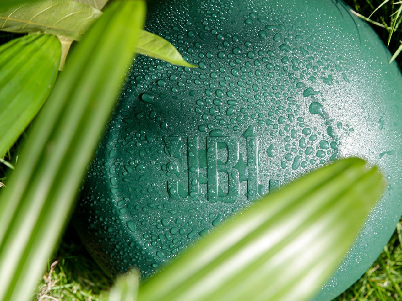
Incorporating branding into the speaker design without disrupting the overall aesthetic is a challenge the designers have expertly tackled with the Garden Series. The prominent JBL logo is subtly embedded at the top of the GSB subwoofer and on the back of the GSF cabinet, blending seamlessly into the speakers’ earthy design while still showcasing the brand’s heritage in audio excellence. This integration allows the speakers to maintain a clean look while also adding a touch of sophistication.

As with any JBL product, performance is at the heart of the Garden Series. The GSF full-range speakers are designed with a tweeter placed directly above an advanced waveguide, which is integrated into the front of the coaxial driver structure. This ensures superior sound distribution. Available in two sizes – 3-inch and 6-inch, these speakers offer flexibility for different sound needs, allowing users to tailor their setup to the specific acoustics of their space.

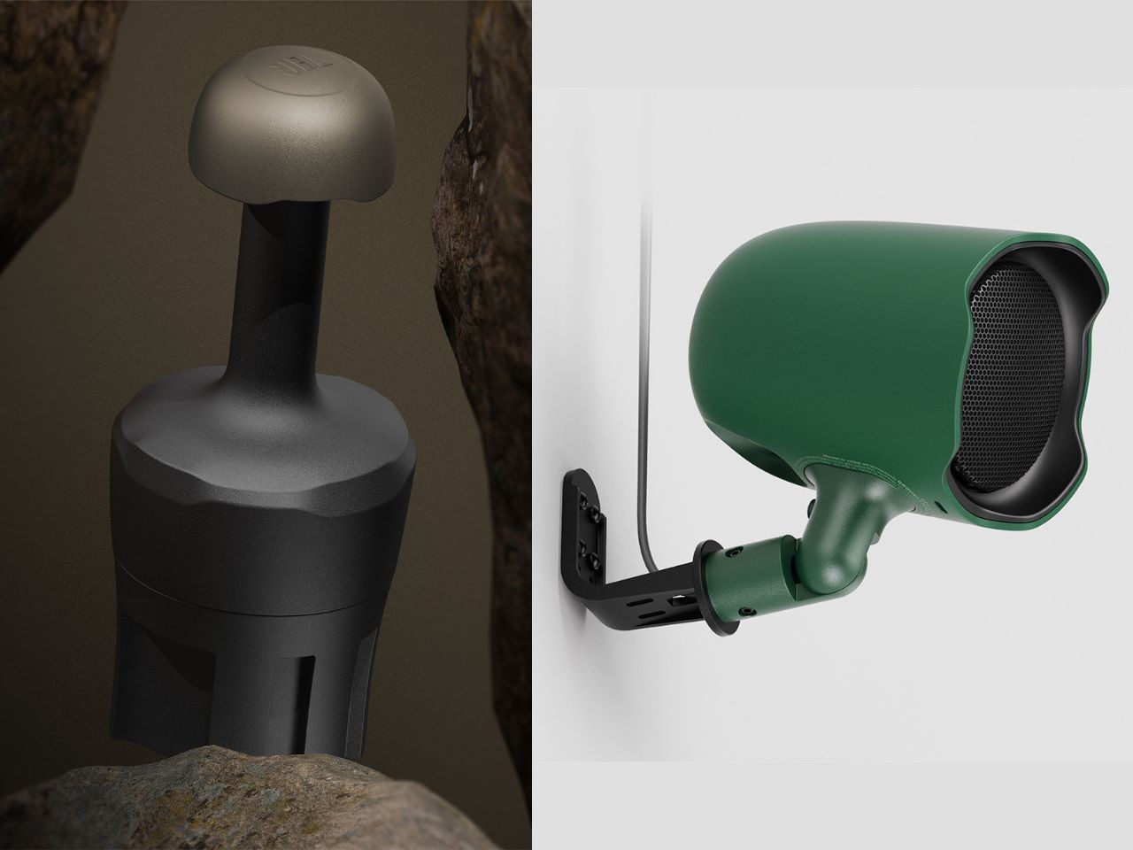
The GSB subwoofer is designed for flexibility in installation, offering both above-ground and buried options to optimize the sound environment. Its vertical form factor is particularly effective in enhancing the transmission of low-frequency sounds, creating a rich, immersive audio experience in any outdoor environment.

The GSF full-range speakers in the JBL Garden Series are designed with versatility in mind. With multiple mounting options, these speakers can be easily installed using a ground stake or mounted on horizontal or vertical surfaces using an L-bracket. This flexibility, combined with the speakers’ low-profile design, ensures they blend into their surroundings, whether they’re placed along pathways or mounted discreetly against a wall. Additionally, the adjustable hinge, equipped with a refined metal gear wheel-shaped groove, allows users to precisely aim the speaker for optimal sound coverage, ensuring no corner of the space is left silent.

The JBL Garden Series represents a perfect balance of form and function, offering a weather-resistant, high-fidelity audio solution for commercial outdoor spaces. With its distinctive design, integrated branding, and flexible installation options, this speaker system is an ideal choice for businesses looking to elevate their outdoor sound experience without sacrificing style. Whether you’re looking to enhance the ambiance of a shopping center, theme park, or sports venue, the JBL Garden Series is the ultimate solution for durable, stylish, and high-quality outdoor audio.

The post This Outdoor JBL Speaker is designed to Blend In as well as Stand Out first appeared on Yanko Design.
Your Chance To Make Your Own Version Of Tokyo’s iconic Nakagin Capsule Tower With This Wooden Block Set

In a unique fusion of play and architectural homage, industrial designer Oscar Diaz has created a wooden block set inspired by Tokyo’s iconic Nakagin Capsule Tower. Designed by renowned Japanese architect Kisho Kurokawa, the Capsule Tower was a landmark in modular architecture, embodying Kurokawa’s vision of adaptability and renewal. Though the building was disassembled in 2022, Diaz brings its spirit back to life with this playful and artistic reinterpretation.

Designer: OSCAR DIAZ

The set comprises 20 stackable wooden blocks and a hexagonal wooden base, encouraging endless combinations that mirror the modular nature of the original structure. Crafted from smooth beech wood and colored with water-based pigments, each block invites users to reimagine the avant-garde design of Kurokawa’s tower. As players stack the blocks, they engage in a delicate balancing act—a direct reflection of the tower’s structural equilibrium.

One of the set’s standout features is the inclusion of two red blocks, symbolizing key elements of the original building’s design. These red blocks must be placed last, adding an extra layer of challenge as they test the stability of the entire structure. The goal is not simply to build, but to maintain balance, simulating the precision and care that went into constructing the actual tower.

Each wooden block represents one of the tower’s capsules, complete with a round window that makes them instantly recognizable. Diaz’s design captures the spirit of Kurokawa’s philosophy, that there is no right or wrong way to stack the blocks, echoing the Japanese concept of renewal and impermanence that informed the Capsule Tower’s original design. The blocks can be configured in countless ways, and the resulting creation serves as a tactile, visual memento of this pioneering work of architecture.

The Nakagin Capsule Tower block set also offers hands-on learning for architects and interior designers to understand the principles of modular architecture. It provides an engaging, physical way to explore design concepts while offering a fun activity for others. Beyond its educational and playful value, the set is also a great piece of art to keep in your home. Its minimal, natural aesthetics seamlessly complement most, if not all, interior themes, allowing you to display your own version of the iconic tower.

Accompanied by a cotton bag for easy storage, the set is both a practical and playful tribute to the Nakagin Capsule Tower. For architecture enthusiasts and casual players alike, Oscar Diaz’s creation offers a hands-on way to explore the principles of modular design and keep alive the legacy of one of Tokyo’s most innovative buildings.

The post Your Chance To Make Your Own Version Of Tokyo’s iconic Nakagin Capsule Tower With This Wooden Block Set first appeared on Yanko Design.
Discover The Fun Of Hands On Learning With Mola Structural Kits For Architects And Engineers

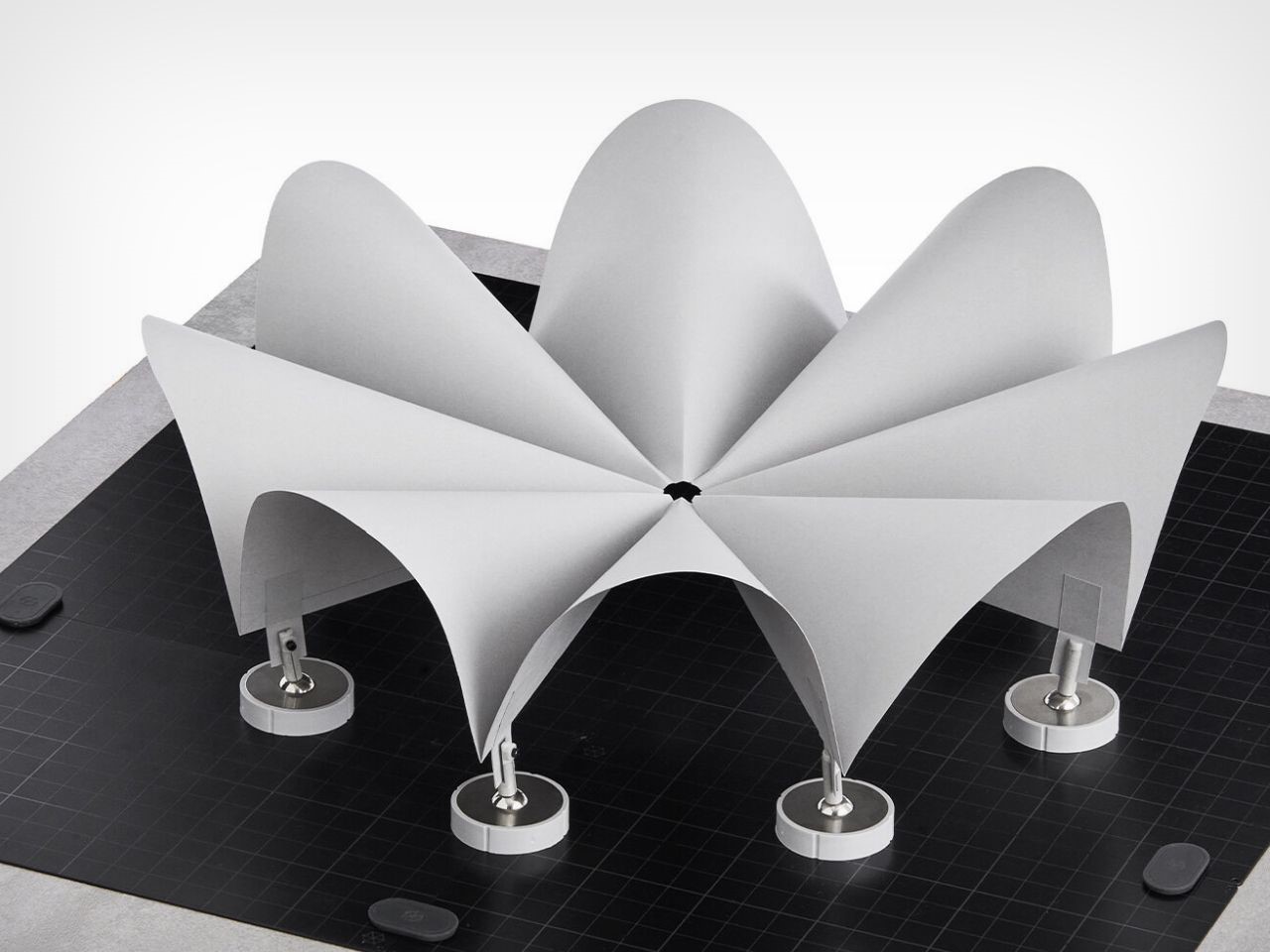
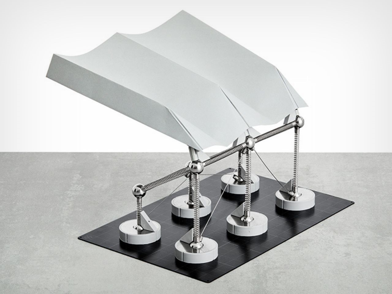
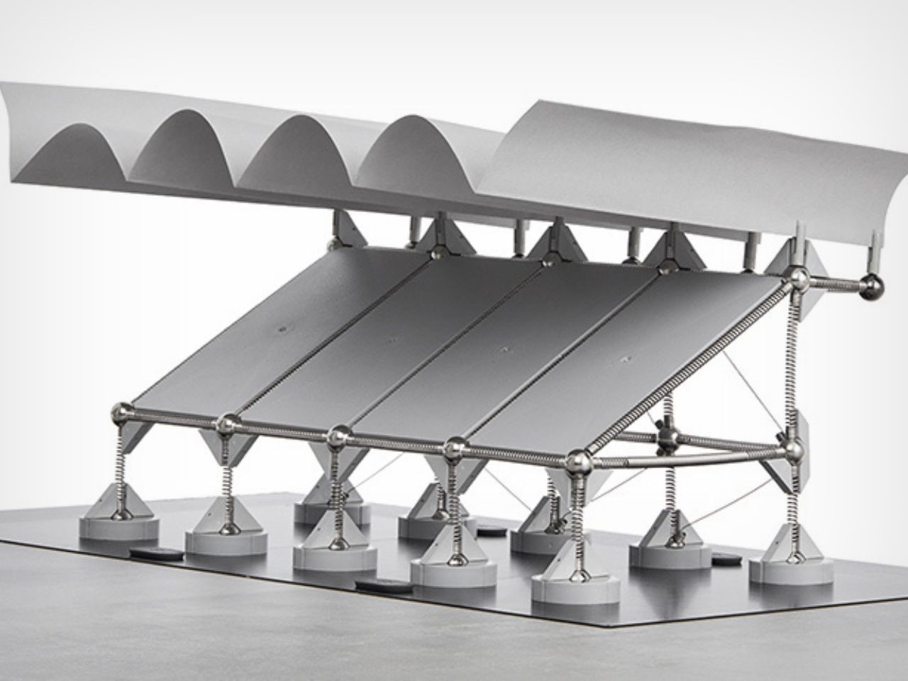
As the tech industry advances and it is appreciated, there is still something special about getting your hands dirty and working with physical materials. The Mola 4 Structural Kit, designed by Brazilian architect Márcio Sequeira de Oliveira, offers exactly that—a hands-on approach to learning that brings creativity, design, and structural engineering to life. By combining principles of structural mechanics with elements inspired by origami and folding techniques, this innovative kit provides aspiring architects, designers, and engineers with an interactive way to explore the relationship between form and function in a very real, tangible way.

Designer: Márcio Sequeira de Oliveira (Mola)

For many students today, the overwhelming presence of technology can feel both empowering and confining. While sophisticated software unlocks endless possibilities, it can also constrain creativity by trapping ideas within the confines of a screen. The Mola 4 Kit fills this gap beautifully. It offers a tactile, hands-on experience, allowing users to experiment with structural forms and principles in the physical world. By literally building with your hands, you learn the why behind structural integrity—why certain forms stand tall while others collapse—a foundational skill for anyone passionate about architecture or engineering.

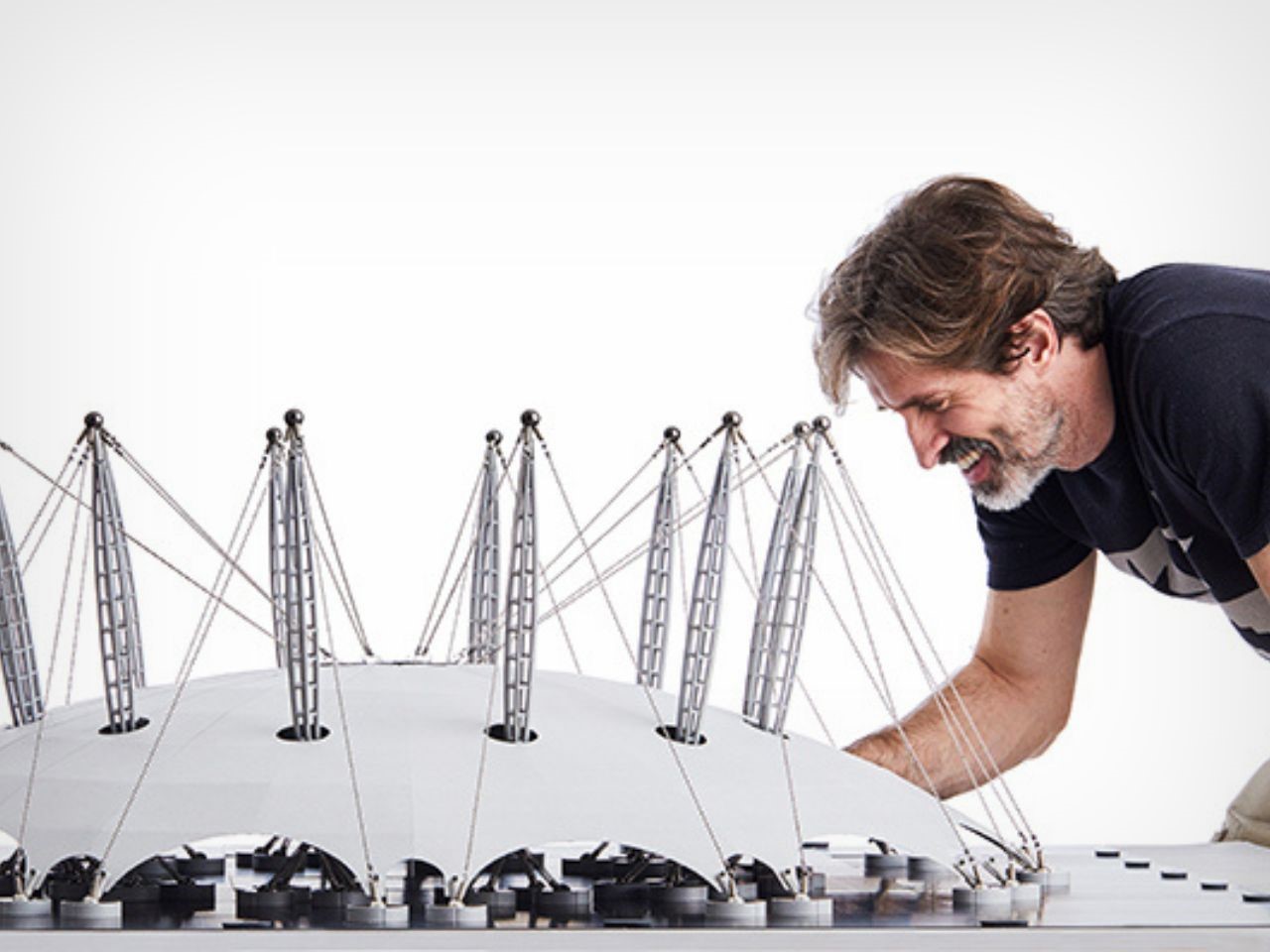
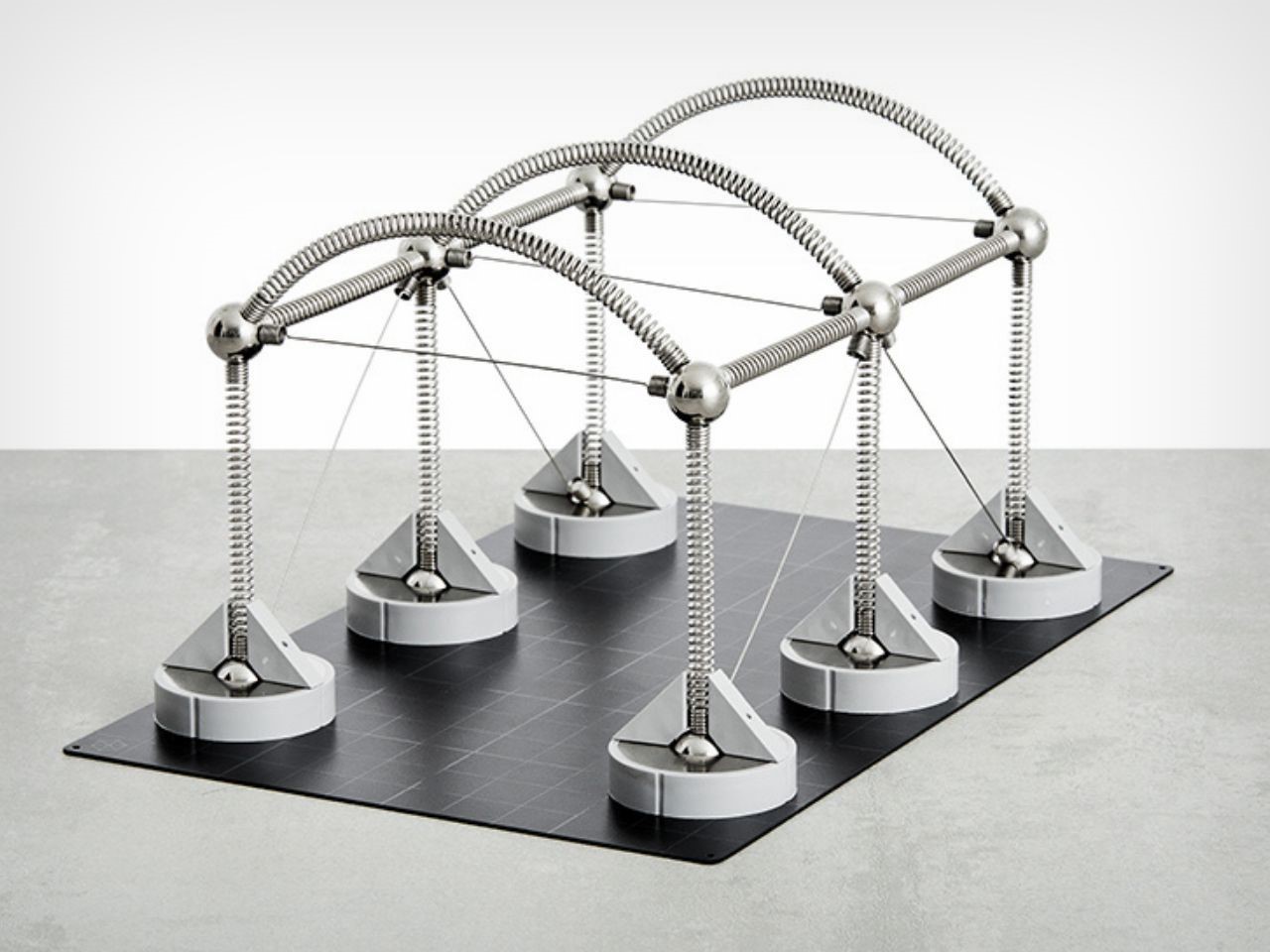
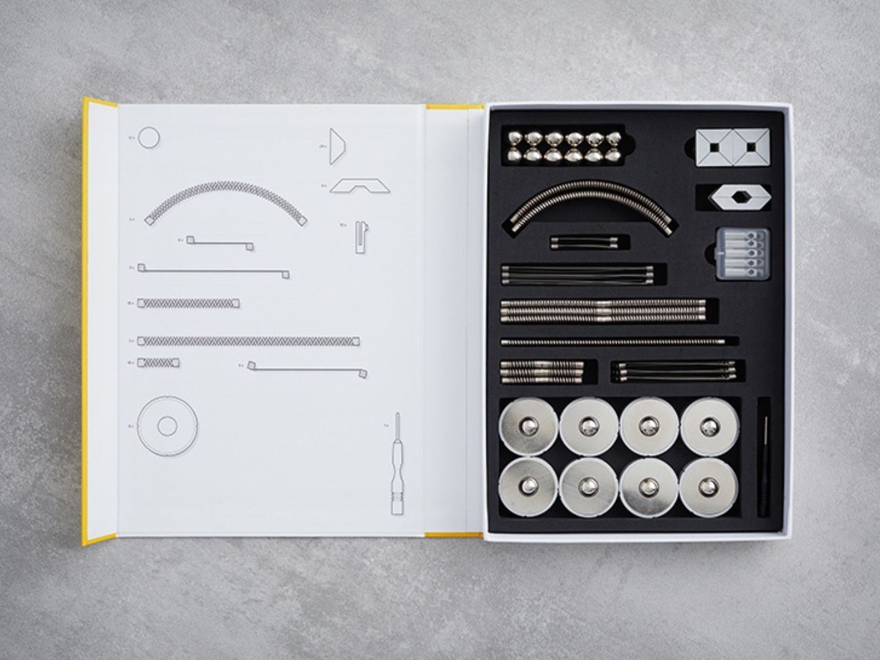
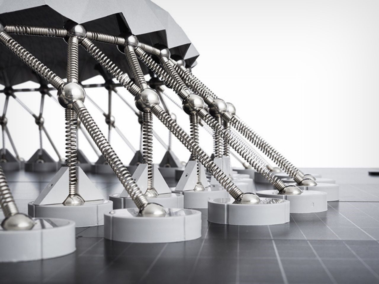
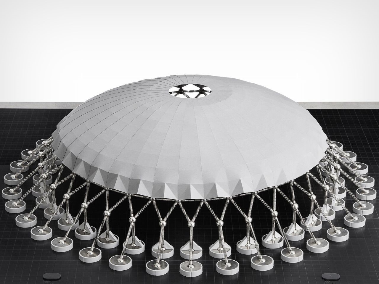
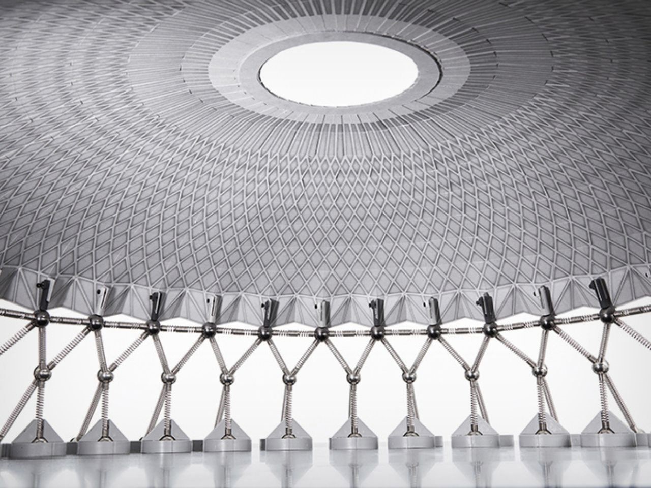
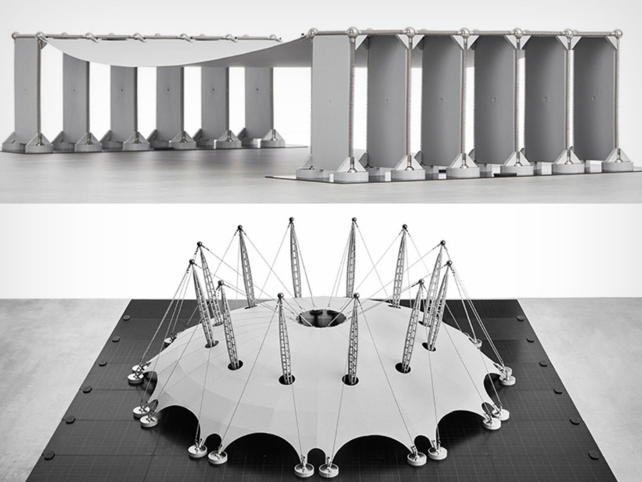
The Mola 4 Kit contains 145 meticulously designed modular parts and a detailed instruction manual to guide users. The components—springs, magnets, and pre-marked sheets—can be customized with materials such as cardboard, EVA, acrylic, or even 3D-printed elements. This versatile system allows users to build intricate, small-scale models of famous architectural marvels, such as Pier Luigi Nervi’s Palazzetto Dello Sport, Félix Candela’s Los Manantiales Restaurant, Álvaro Siza Vieira’s Expo’98 Portuguese National Pavilion, and London’s Millennium Dome. The kit essentially merges LEGO’s playful versatility with Apple’s sleek, user-friendly design, making it engaging and accessible to anyone, regardless of prior technical knowledge.

What truly sets the Mola 4 Kit apart is its capacity for creative exploration. It enables users to design, construct, and customize hundreds of unique architectural forms using modular parts, effectively opening up a world of architectural possibilities. Whether you’re a student or a seasoned professional, the kit transforms abstract theory into hands-on learning, letting users experiment with real-world concepts of structure and stability in a fun, dynamic way.

But don’t be fooled by its playful appearance—Mola 4 is a serious learning tool. It provides a gateway to the complex world of structural engineering, helping to demystify structural behavior and deepen the user’s understanding of both basic and advanced theoretical concepts. This tangible approach is essential for bridging the gap between civil engineering and architectural studies, bringing theory to life in a way that no textbook or software can replicate.

Perhaps the most remarkable aspect of the Mola 4 Kit is its ability to offer a three-dimensional learning experience that digital technology simply cannot match. Engaging with physical components activates both the mind and senses, creating “intuitively playful moments of delight” that digital interfaces often lack. The kit encourages users to step away from their screens and into a world of hands-on experimentation that is as informative as it is enjoyable.

The post Discover The Fun Of Hands On Learning With Mola Structural Kits For Architects And Engineers first appeared on Yanko Design.

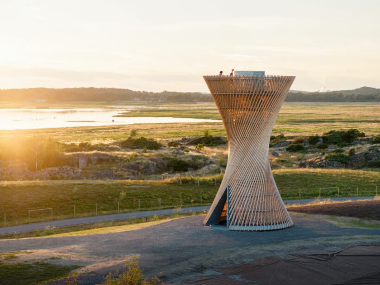
An Hourglass Shaped Observation Tower In Sweden Satisfies The Birdwatcher In You

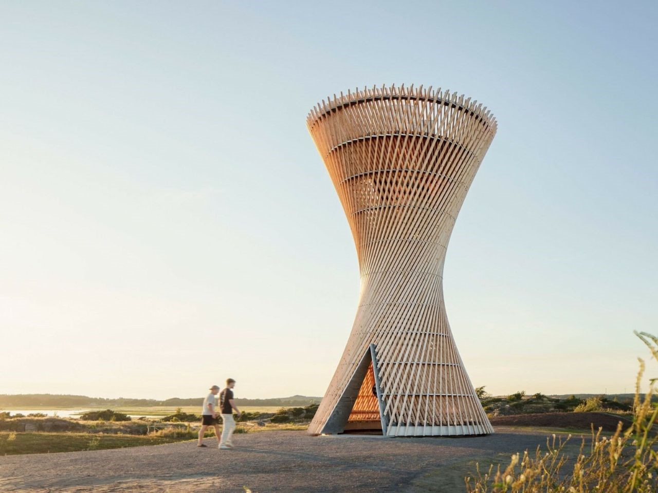
White Arkitekter, the renowned Swedish architecture studio, has recently unveiled its latest creation, the Observation Tower Kärven, in the scenic Getterön nature reserve on Sweden’s west coast. This 12-metre-tall structure, which emerged as the winning entry in an architectural competition organized by the Varberg Municipality, stands as an iconic testament to innovative design and sustainability.

Designer: White Arkitekter

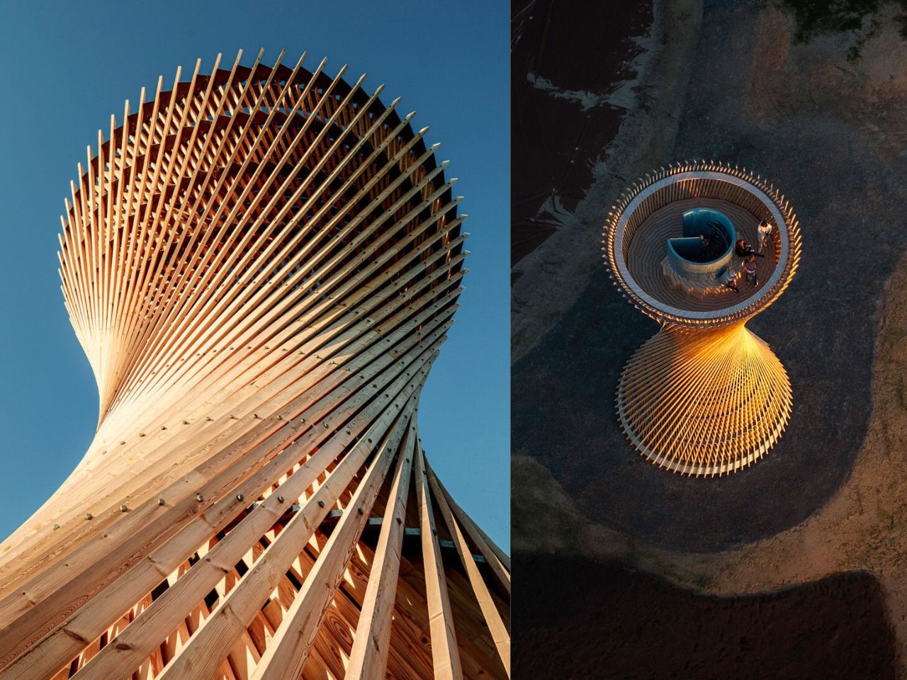
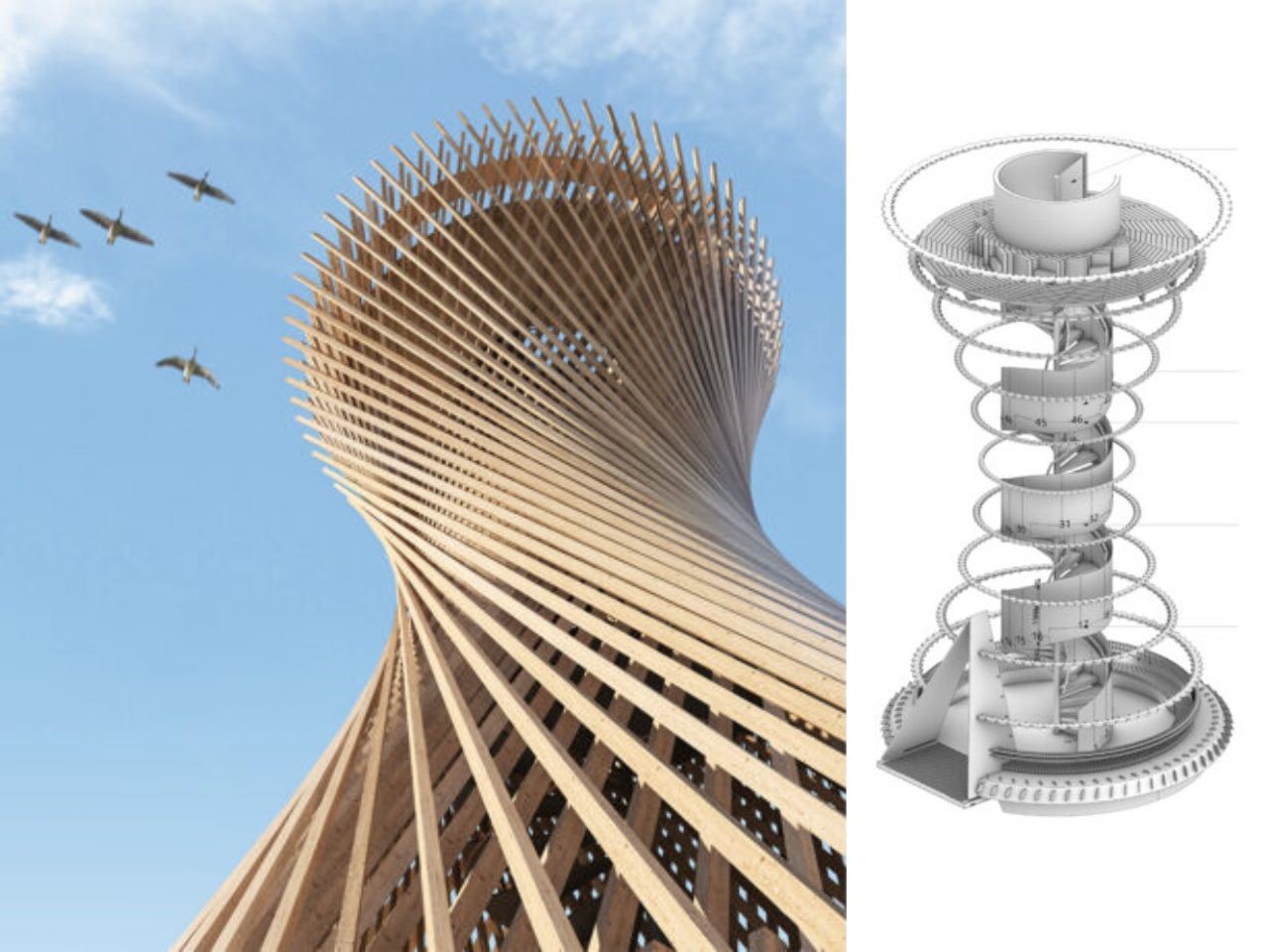
The Kärven tower, which rises like an intricate lattice from the landscape, was described by White Arkitekter as having a “visually striking simplicity, reminiscent of a bundle of twisted straws.” The tower’s construction, composed of 140 timber beams and metal rings, creates a dynamic hyperboloid shape, a complex structure that fuses nature-inspired elegance with structural ingenuity.

This lattice of timber beams, skillfully arranged in a three-dimensional puzzle, gives the tower its distinctive hourglass silhouette. From a distance, the structure appears curved, but closer inspection reveals that the form is actually composed of straight beams, cleverly assembled to create the illusion of curvature.

The Kärven project required seamless collaboration between architects and structural engineers. Lead architect Lukas Nordström emphasized that “the concept required an understanding from both architect and structural engineer of each other’s disciplines.” This interplay of architecture and construction is evident throughout the tower, where the boundaries between design and engineering blur, reflecting the harmony achieved between aesthetics and functionality.

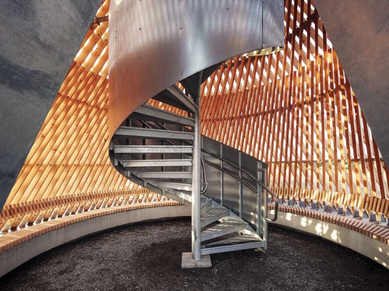
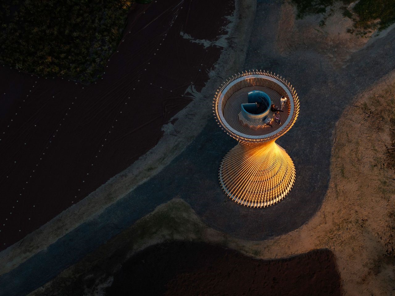
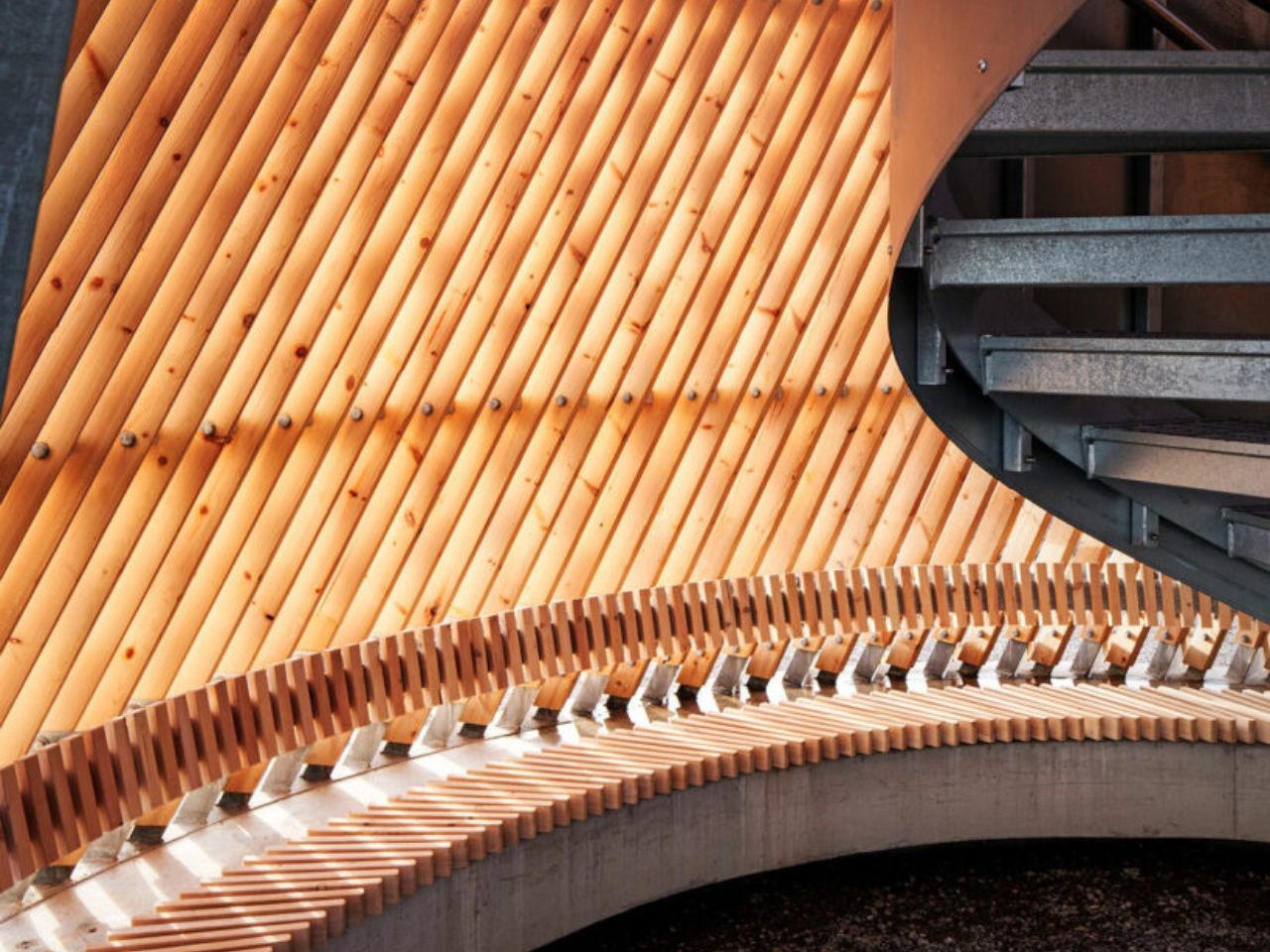
Nestled within the Getterön nature reserve, known for its rich birdlife and picturesque wetlands, the Kärven Observation Tower offers visitors uninterrupted views of the surrounding landscape. Rising from a metal-framed opening at ground level, visitors enter a sheltered space before ascending the tower’s metal spiral staircase. This staircase spirals upward to the open-air observation deck, where visitors are treated to panoramic views of the reserve and beyond.

The deck itself is an architectural marvel, framed by the rising timber beams that also serve as a balustrade, wrapping visitors in the same web-like structure that defines the tower. A geometric bench surrounds the staircase, inviting visitors to pause and reflect while they take in the stunning vistas.

One of the most remarkable aspects of the Kärven tower’s construction was its efficiency. Each of the 140 timber beams was installed on-site in just two minutes, with the entire assembly of beams taking a little over a week. This hybrid structure of timber and metal, combined with the use of parametric modeling and calculation software, allowed for precise planning and execution.
The design process made use of Grasshopper, a parametric design software, which enabled the team to map out the mathematical relationships needed for the intricate structure. This technology was crucial in realizing the tower’s complex geometry while also allowing for sustainable and local construction practices. The assembly, carried out by local contractors using standard timber dimensions, required no special tools, underscoring the tower’s emphasis on simplicity and sustainability.
The Kärven Tower was designed to fulfill the Varberg Municipality’s vision of a landmark that would attract visitors and enhance the area’s natural beauty. White Arkitekter has succeeded in creating a structure that not only serves as a viewing platform but also as a symbol of architectural and environmental harmony. With its three-dimensional woven structure, the Kärven tower not only engages the eye but also enriches the experience of the landscape it inhabits.

The post An Hourglass Shaped Observation Tower In Sweden Satisfies The Birdwatcher In You first appeared on Yanko Design.