This hilariously functional keyboard helps fix the terrible UI/UX of video-calling apps


I recall the unfortunate story of CNN Analyst Jeffrey Toobin, who went viral in October last year for all the wrong reasons. Toobin was caught exposing himself on a Zoom call at work, although he impassionately claimed that he thought his camera was switched off. While we can spend the entire day justifying or condemning Toobin’s actions, the bigger story remains – video-calling UI sucks. There isn’t a standardized UI template for different apps across different operating systems, and the interface changes so drastically between mobile and web-based video-chats that Toobin’s story is just one among thousands of others… of people who accidentally left their video on, or their mic on, or even the opposite – where Snoop Dogg’s Twitch account has been on mute for the last 3 streams and he probably hasn’t figured it out yet. The ChonkerKeys aim at fixing that problem.

Designer: Nigel Choi

Click Here to Buy Now: $59 $75 (20% off). Hurry, only 8/210 left!

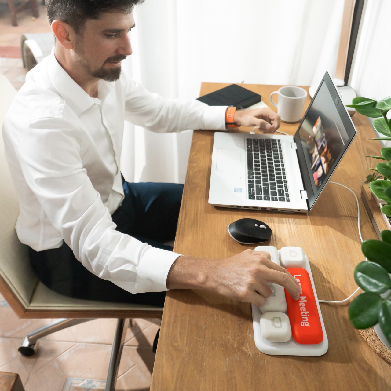
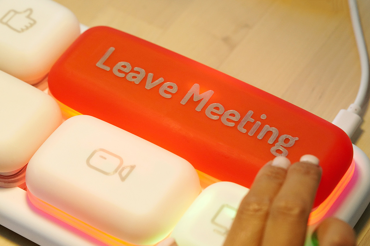
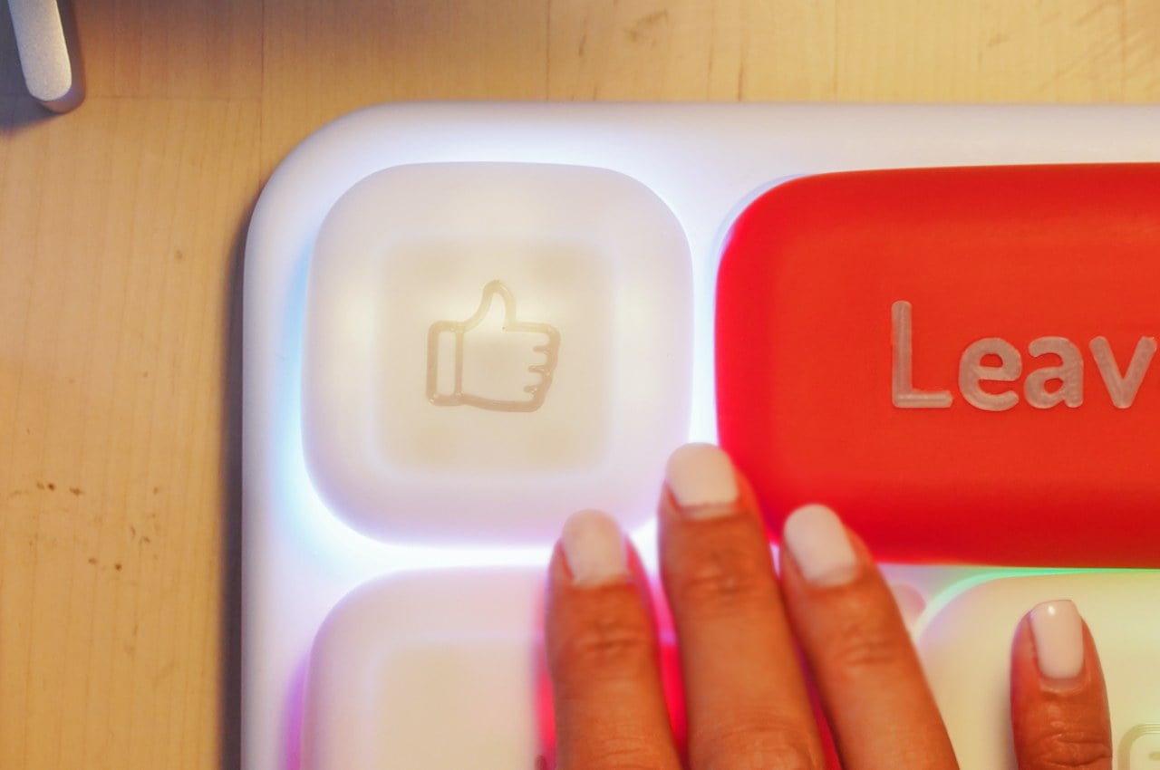
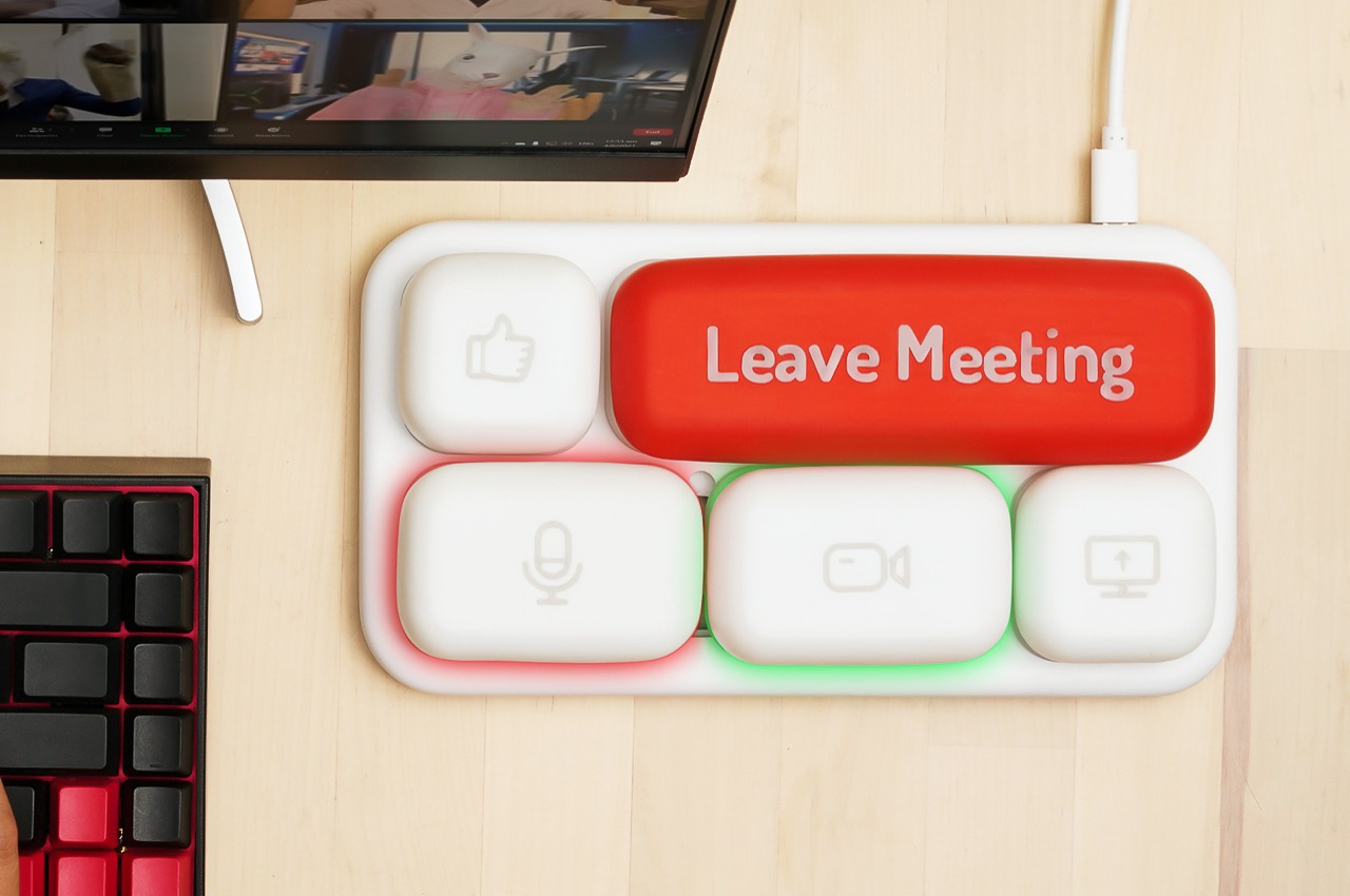
The kind of product to be born out of a meme, the ChonkerKeys are hilarious but they’re also incredibly effective. The keyboard comes with 5 comically oversized keys that let you control your video-calling app’s interface through actual hardware. There are buttons for toggling on and off your camera or your mic, a thumbs-up button, a share-screen button, and a massive Leave Meeting button that lets you make a quick exit without fiddling around on your desktop looking for the right command or control.

The ChonkerKeys is a wired keyboard that’s built to be compatible with video-chatting/presentation apps. At present, the prototype is reported to work with Zoom, Microsoft Teams, Skype, and FaceTime. More apps such as Google Meet, Cisco Webex will be added as ChonkerKeys software development continues. Plugging in via USB-C, the keyboard works on apps across Windows, MacOS, and even iPadOS devices.

Designed to work as incredibly effective (and intuitive) shortcut keys, the ChonkerKeys are large, making them difficult to miss, and even come with a backlight that lights up in red or green, letting you know if your mic/camera is off or on respectively. In short, it provides that tactile and visual feedback that a desktop application sometimes doesn’t, and makes it easy to follow ‘online etiquette’.

Moreover, the keys aren’t arranged in a fixed layout. Designed solely around YOUR convenience, they can be shifted around, letting you customize the layout to suit your needs, and with the ChonkerKeys app, you can even customize what each button does for other programs, allowing the keyboard to play/pause your Netflix shows and YouTube videos.

The massive keyboard layout definitely looks comical, but consider it an effective caricature of exactly what’s wrong with apps today. Screens have multiple controls, and buttons are more often than not extremely tiny and difficult to locate. ChonkerKeys’ large mochi-ball-shaped buttons are incredibly tactile and make for quicker, easier control, providing a perfect solution for professionals, teachers, young students, and even as someone on Reddit commented, people with Parkinson’s.

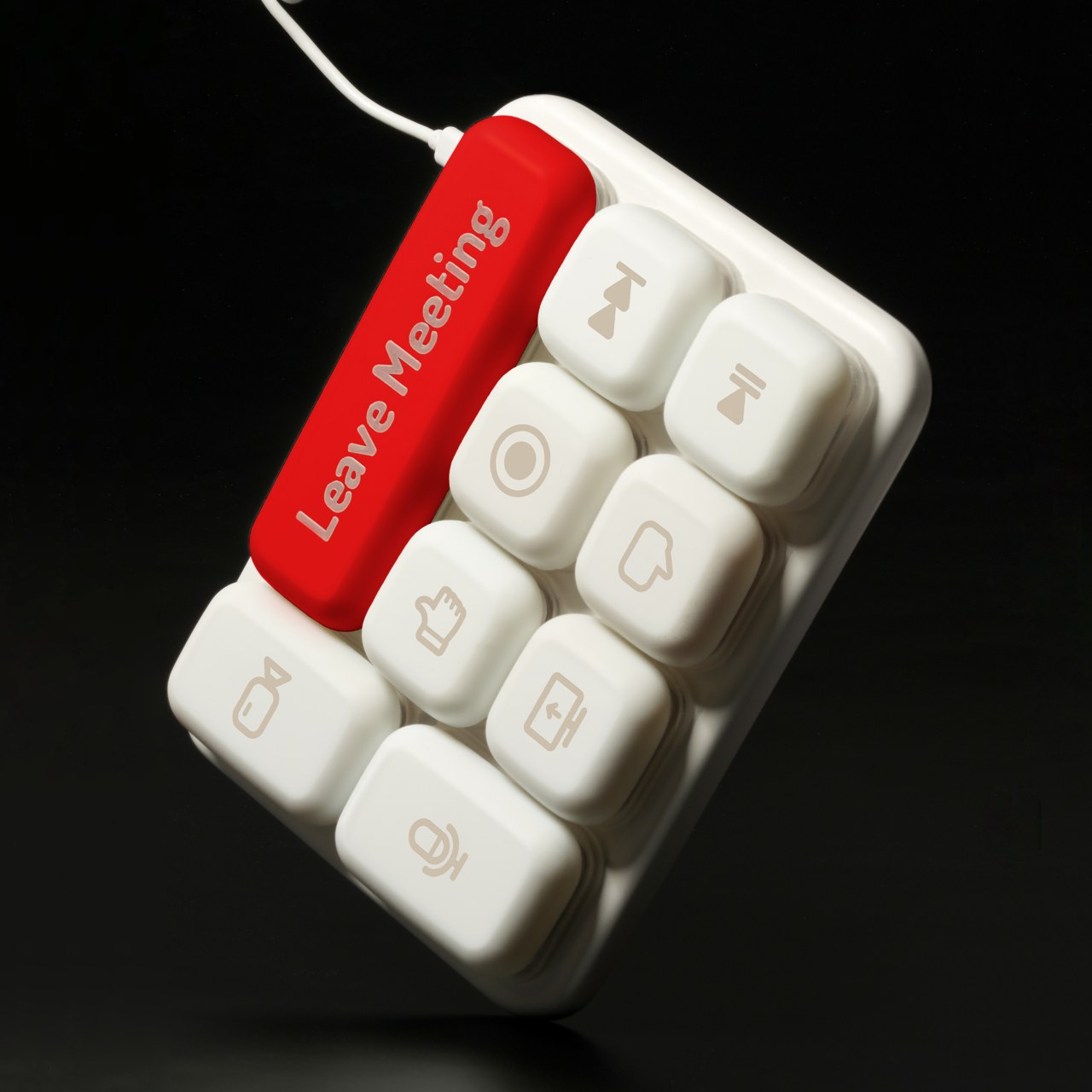
The Max model gives you three extra 1u* keys.

The ChonkerKeys come in two sizes, The Original, with the 5 aforementioned keys, and The Max, with 9 keys (including record, play, pause, etc. for video content creators). The keyboard ships with a coiled USB-C cable to connect it to your devices, a keycap pulling tool to swap out keys, and 3 extra keys that ship along with the Max variant. The ChonkerKeys Original and Max are available for pre-order at $59 and $78 respectively for a limited time and quantity on Kickstarter and come with a standard 1-year warranty that covers any manufacturing and technical issues.

Click Here to Buy Now: $59 $75 (20% off). Hurry, only 8/210 left!
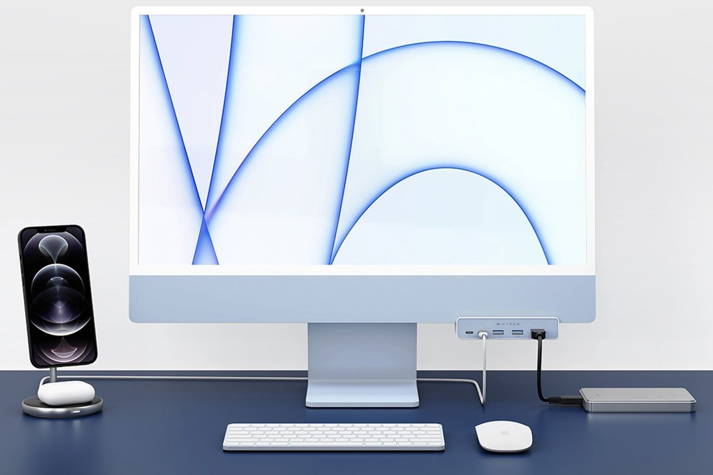
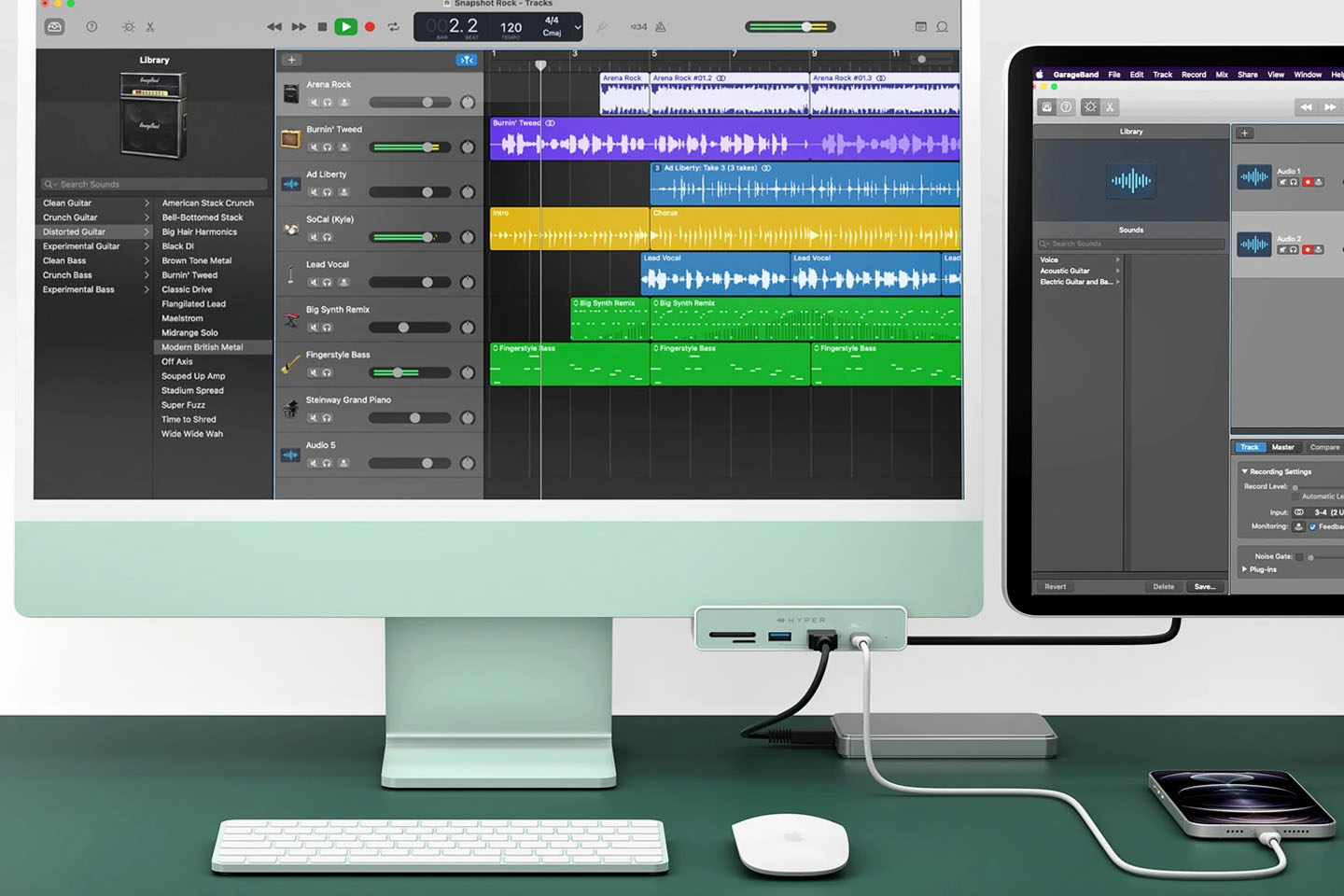
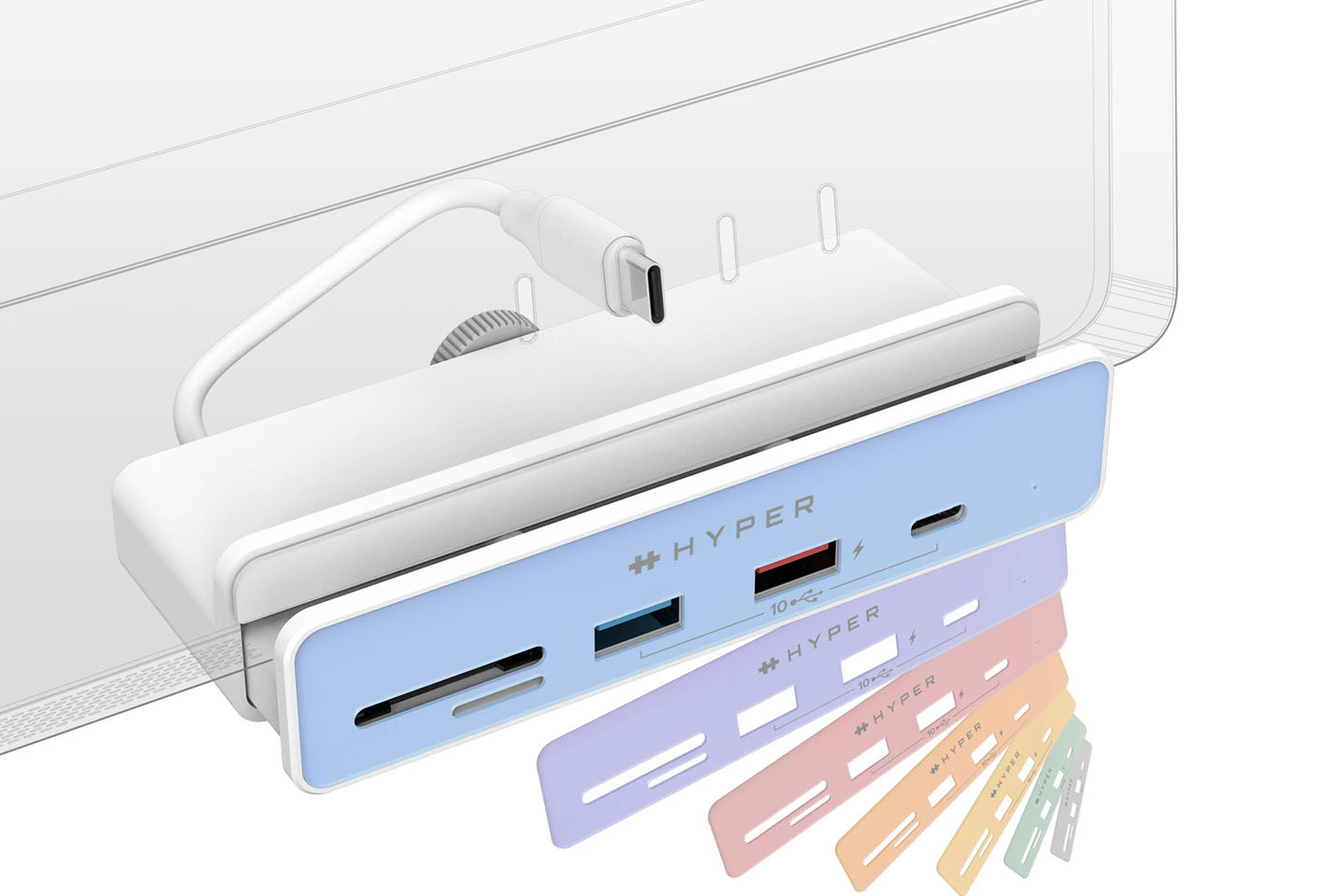
Expand your iMac 24” connectivity with a front-facing USB hub that matches your Apple device color!

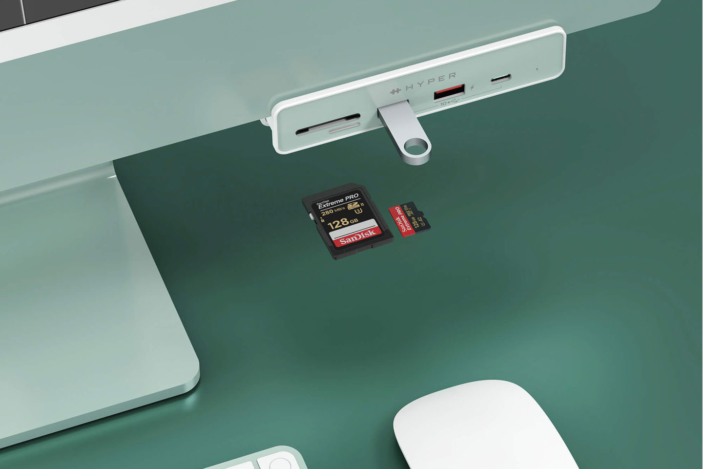
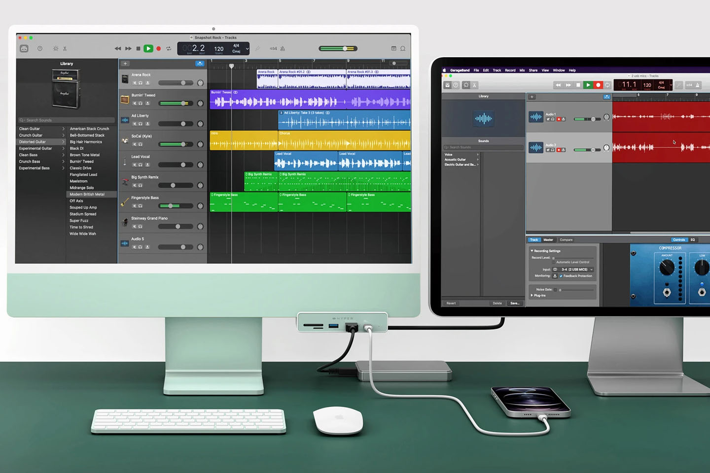
If the iMac 24-inch model has one disadvantage, it has to be the USB ports on the back. the HyperDrive accessory with color correct front-facing module for sure gets over that problem for good.

The sleek, colorful and stylish-looking M1-powered iMac 24-inch model is for the most part great – that is until you are left groping around the back for the USB port to attach an external hard drive, security key or memory card. That paucity of the Apple machine is now fixed with a third-party accessory by Hyper that’s mindfully designed – to say the least. If you happen to own the cheapest model of the iMac 24-inch that has only two Thunderbolt/USB 4 ports, then this makes even more sense.

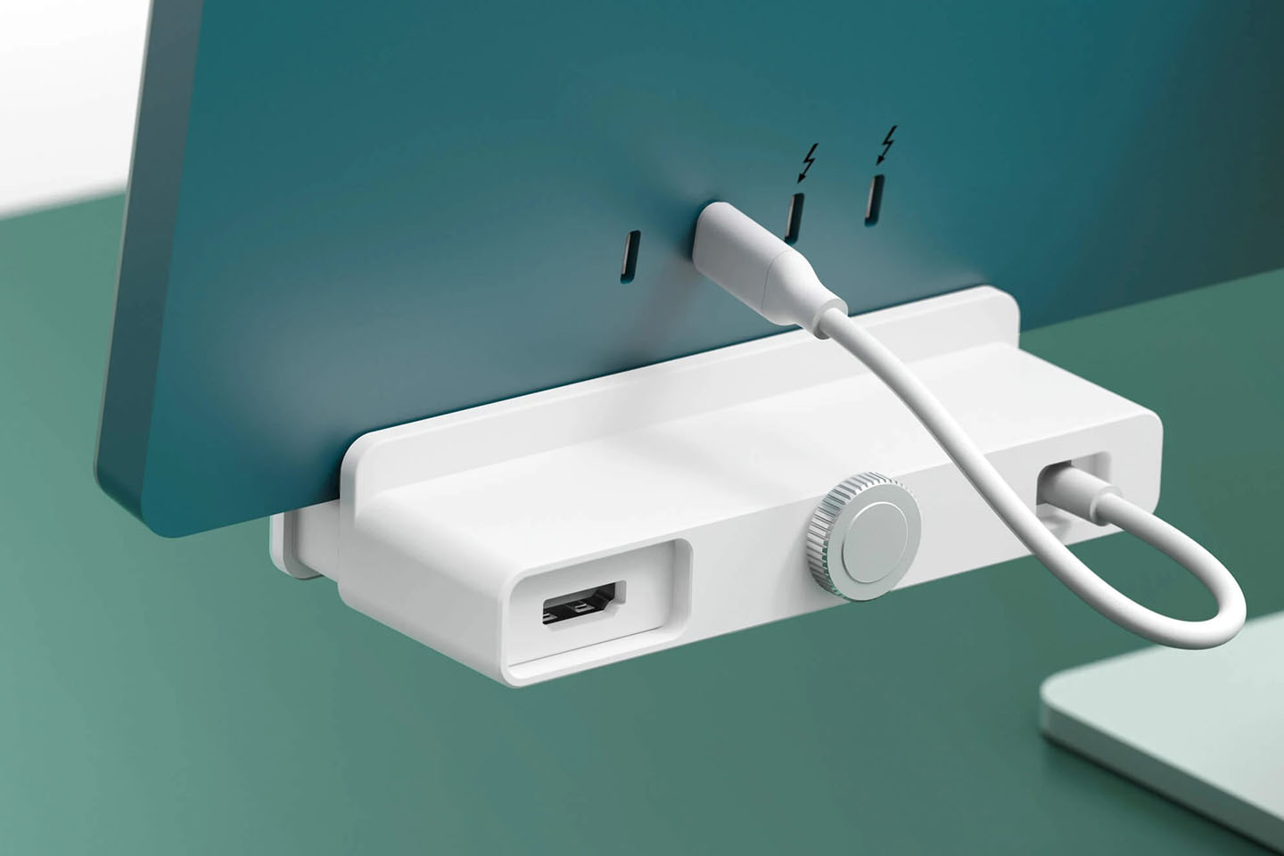
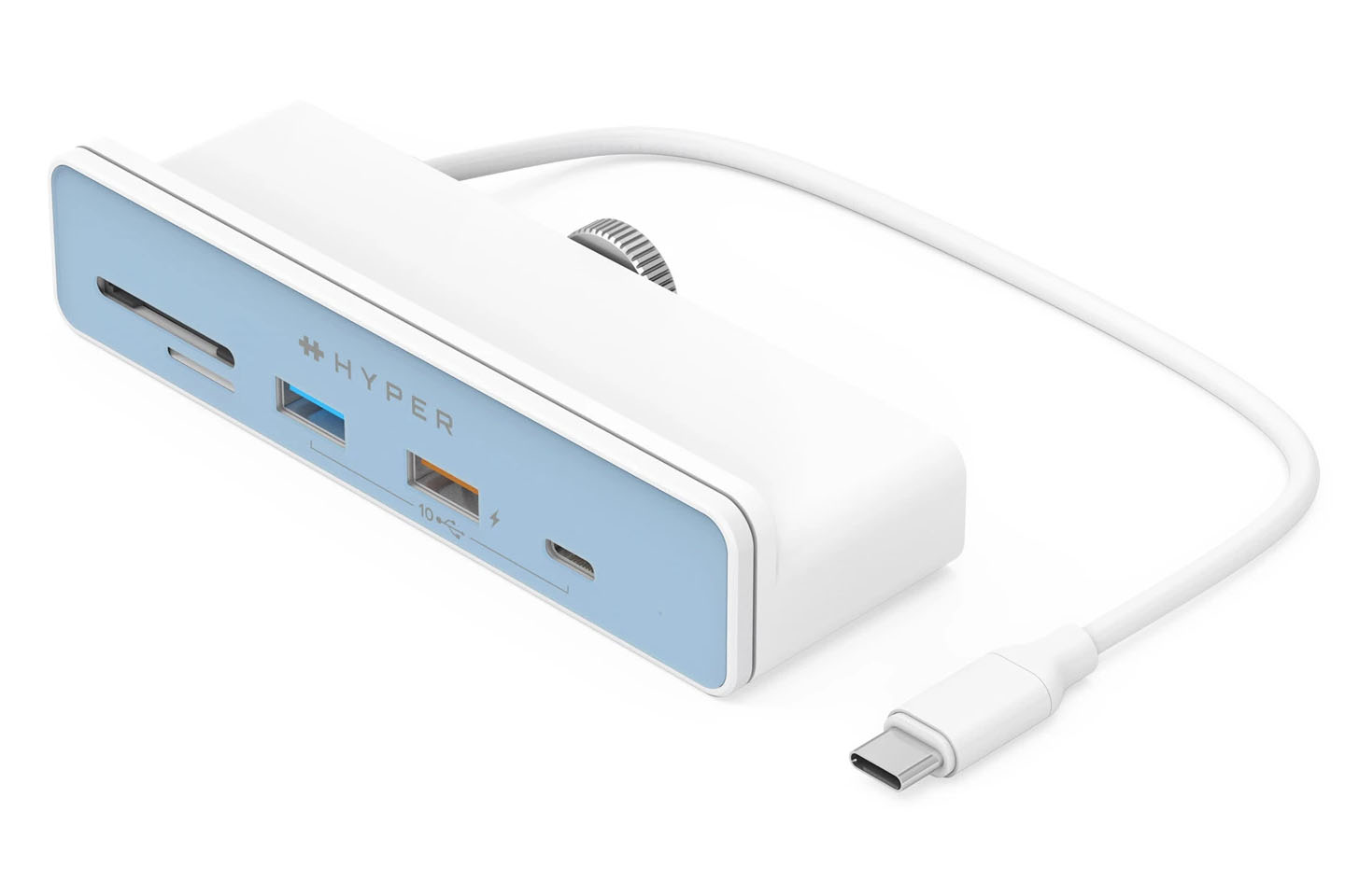
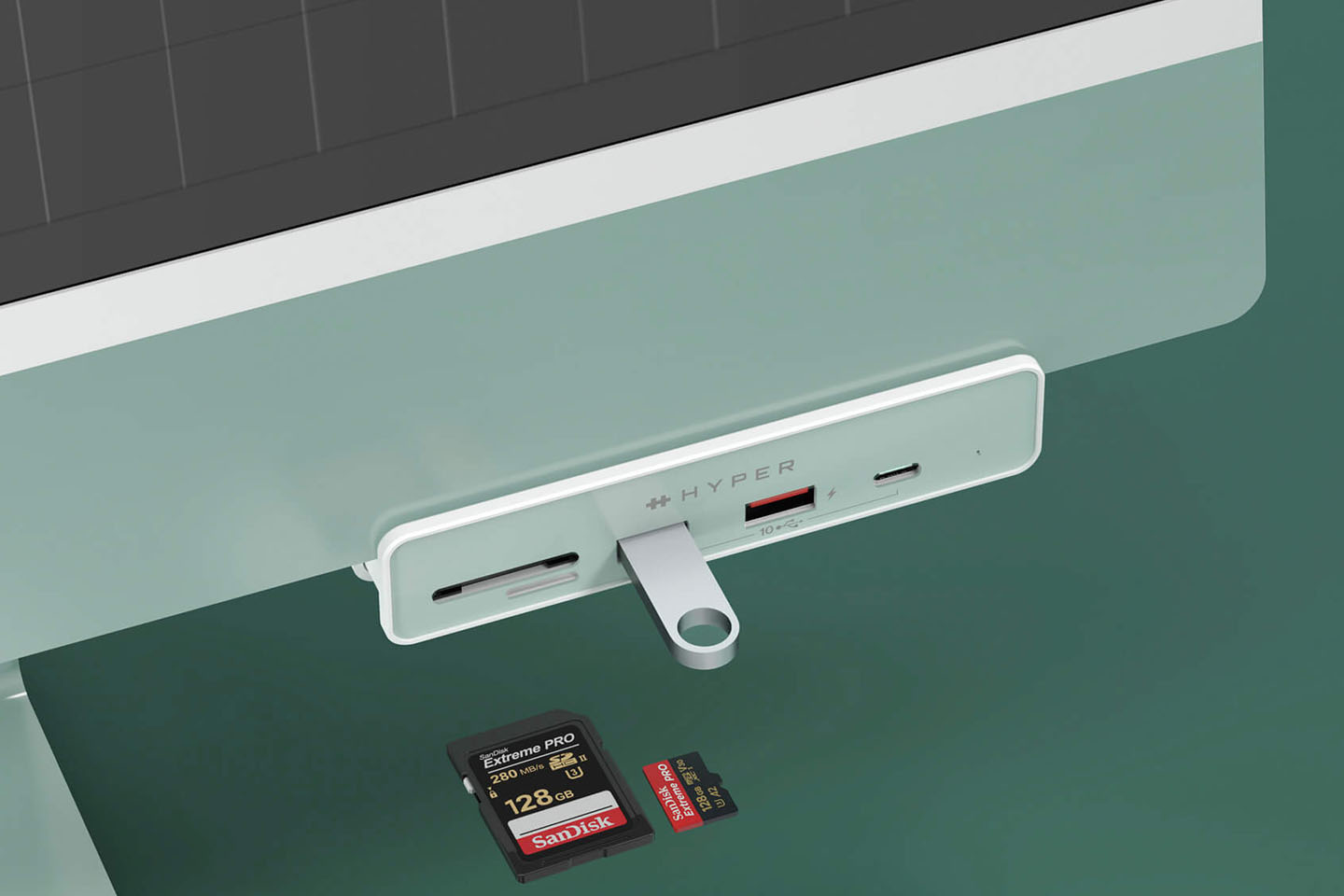
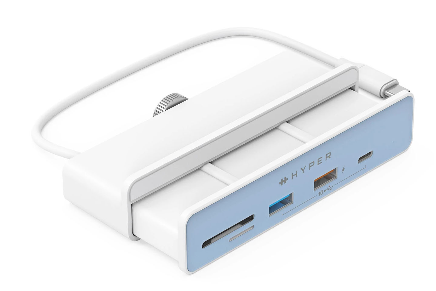
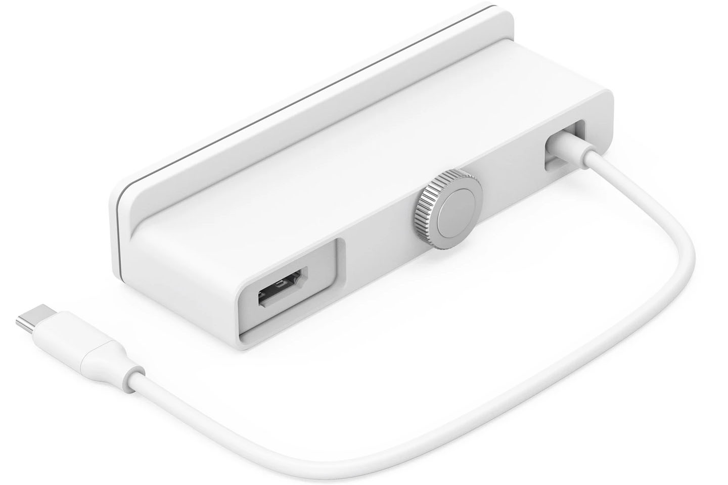
Even though the more expensive configuration models add a pair of USB 3 ports, they still lack an SD card slot for times when you need to use it. HyperDrive 6-in-1 USB-C Hub for iMac 24” is the savior with five front-facing ports for the easiest access to memory cards, USB storage, and charging of gadgets. It even has a 4K monitor compatible HDMI port on the back to keep away the thick cords from view. Mindful design indeed, I must say again!

Keeping up with the modern data transfer requirements the accessory has 3 USB (two USB-C and one USB-A) ports capable of 10Gbps transfer speed. For added advantage, the hub has a universally compatible microSD UHS-I reader and SD UHS-I card slot. Charging your gadgets is also going to be a breeze with 7.5W speed compatibility from the USB-A port.

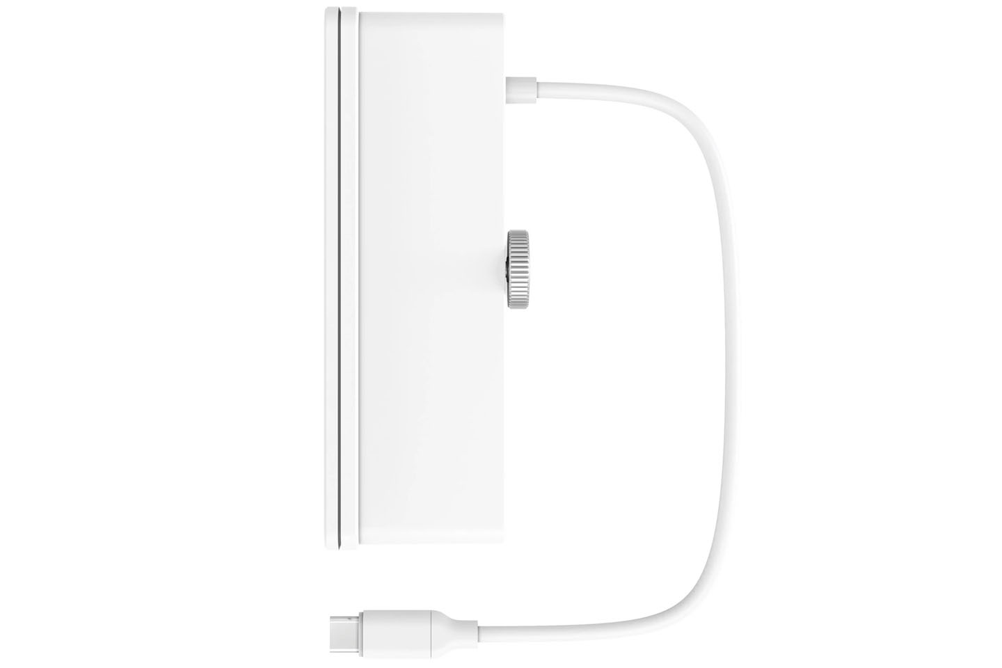
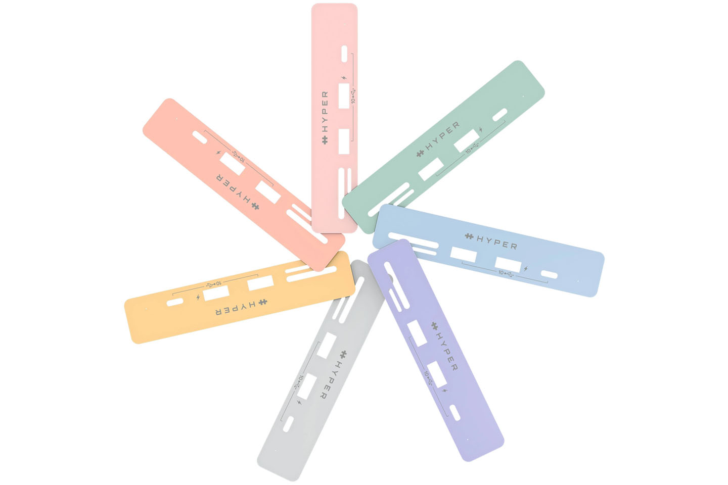
The USP of HyperDrive hub is the way it clamps onto the iMac, seamlessly blending with the footprint of the machine and bringing the practical front-facing usage. The best part I like is the seven faceplates with each hub to match the different colored Apple iMac 24” models. Not only do they look good, but make your digital life smooth without any frustrations of coming short on available ports every now and then. Certainly, the accessory priced at $79.99 is better than any other available on the market.

Designer: Hyper

Click Here to Buy Now!


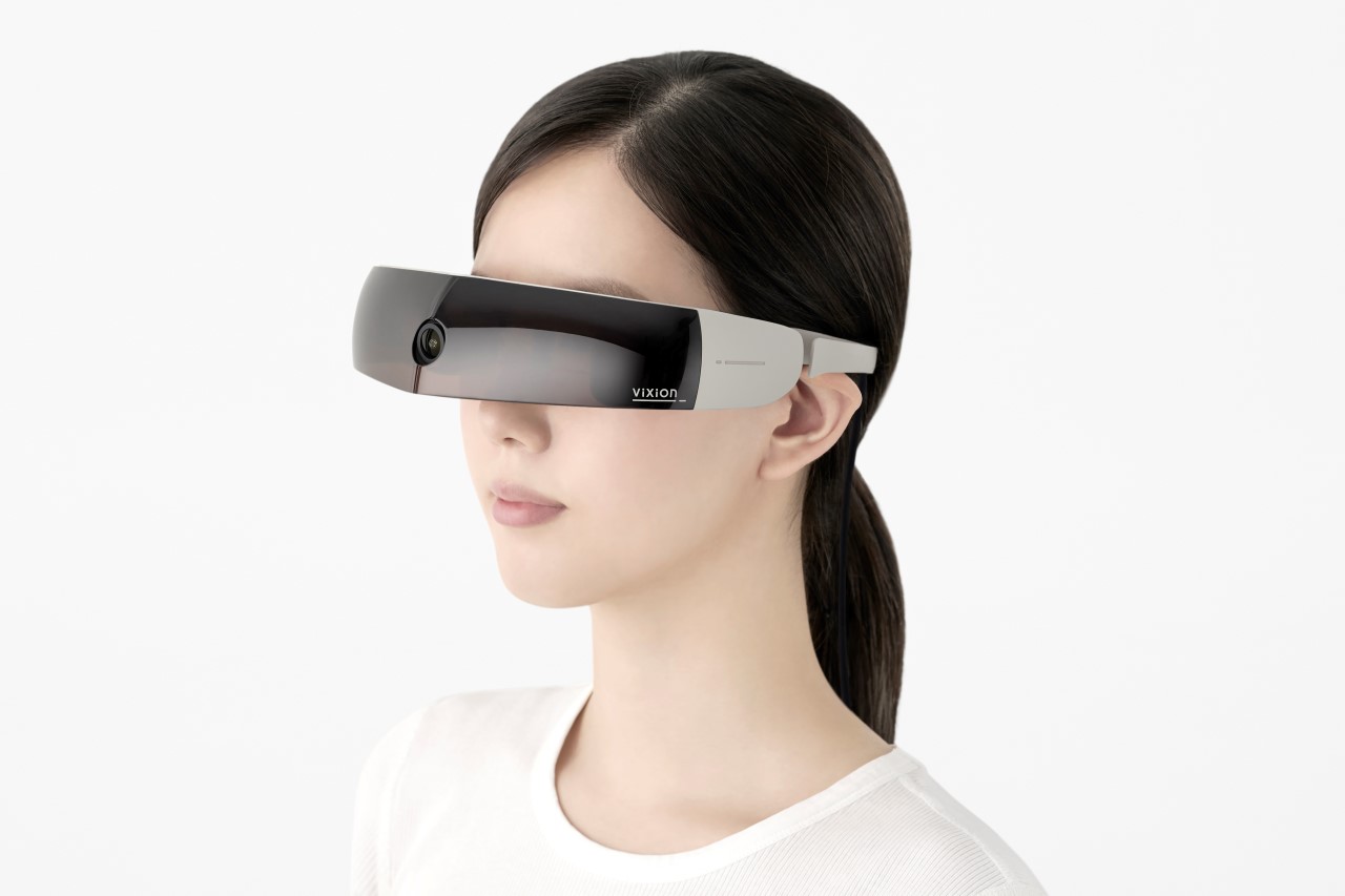
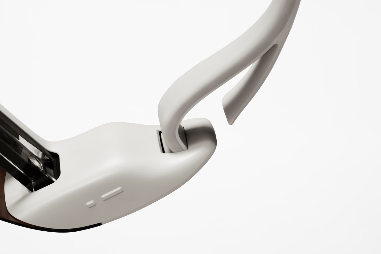
The ViXion is a mixed-reality headset designed specifically for people with low-vision and night-blindness

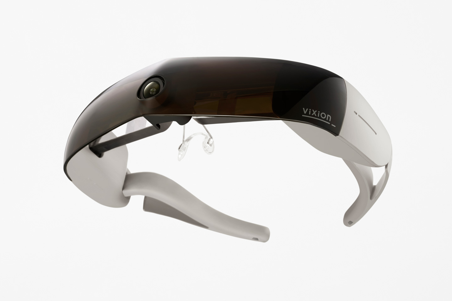
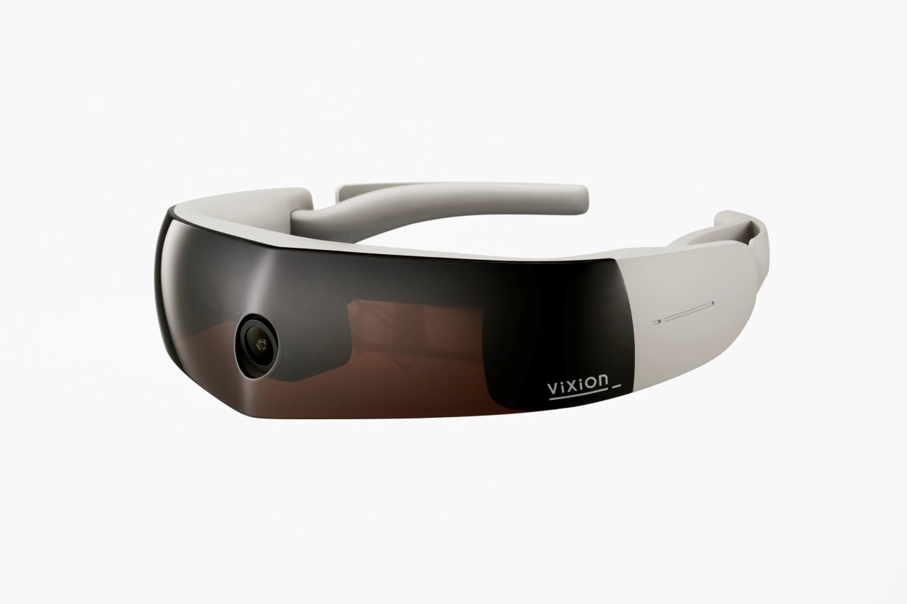
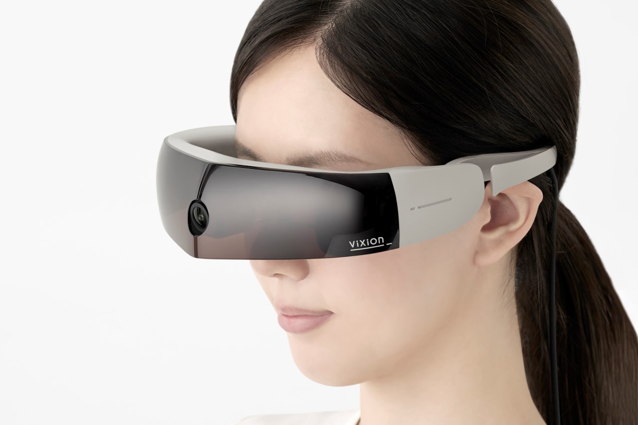
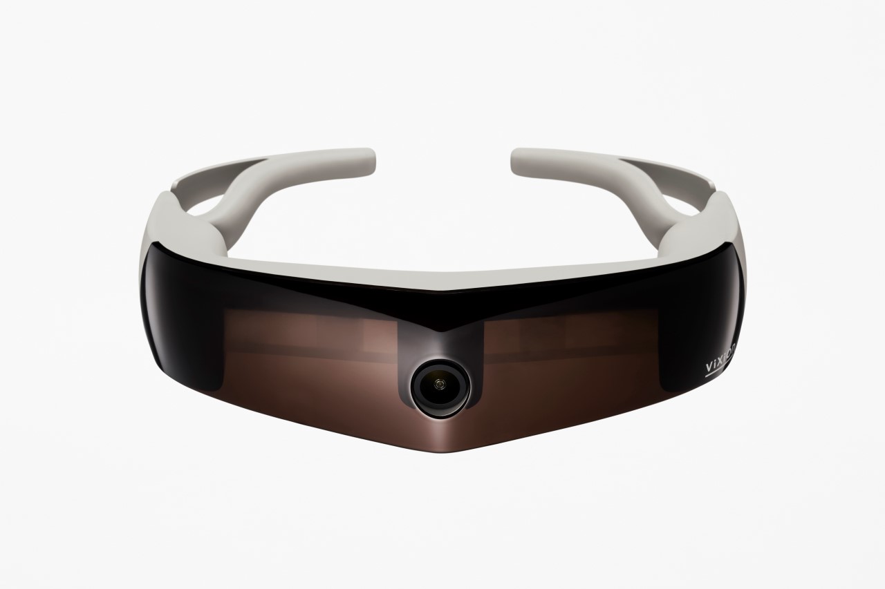
Partnering with Japan-based startup ViXion, Nendo has unveiled an eponymously named mixed-reality headset that’s designed specifically for people with reduced visibility. ViXion is a sleek headset that helps the legally blind (or people suffering from night blindness) see around them. The headset comes with a camera that captures the world ahead of the wearer, while an internal processor increases the visibility of the footage by amping up the brightness and the contrast, and projects the images onto the wearer’s eyes, allowing them to see better.

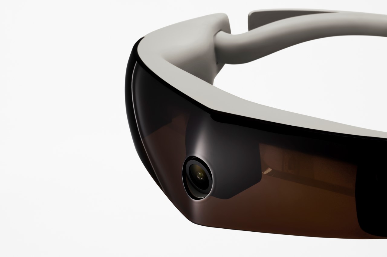
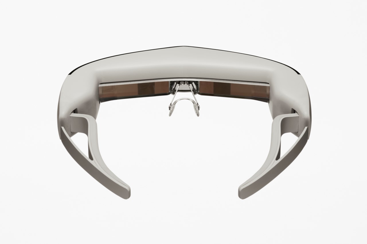
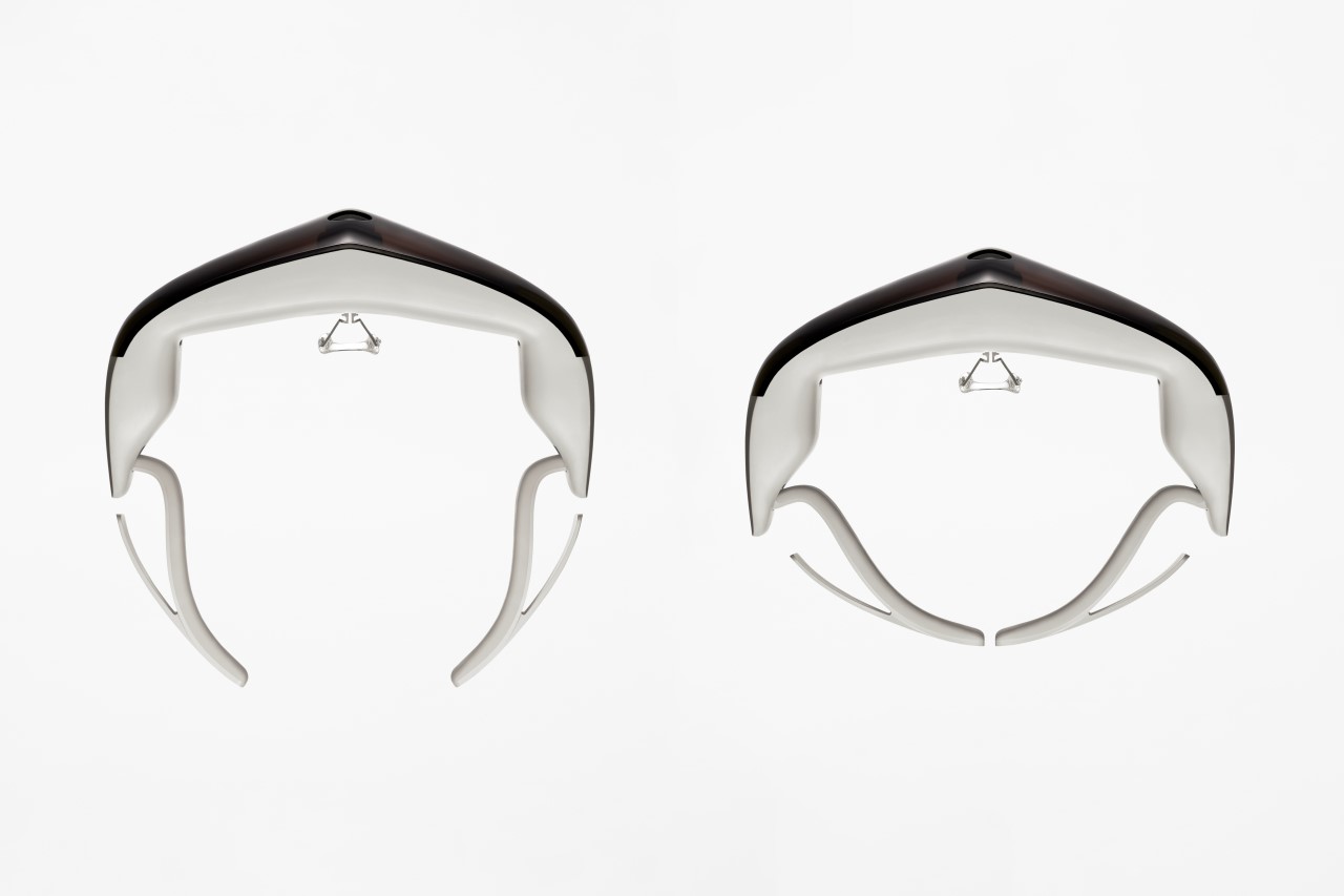
Fundamentally doing exactly the opposite of what sunglasses do, the ViXion is a headset that aids people with low vision, low peripheral vision, or night blindness, by brightening what’s ahead of them. The headset is characterized by a slim visor with a fisheye camera at the center, capturing footage across a wide periphery. The footage is processed to increase its visibility and then projected onto a semitransparent mirror display in front, for the viewer to clearly see. The wearer can also switch between black and white vision, black and white inversion, and high-contrast colors to match their visual needs.

Designer: Nendo

Google delays mandatory return to office until January 2022

Google is once again pushing back its return to in-person work. CEO Sundar Pichai told employees the company is delaying the mandatory return to office until January 2022. The current voluntary scheme will last through January 10th. From then on, Google's offices will make the decisions about when (and if) to make office work mandatory. Staff will be notified 30 days in advance if they're required to show up.

The internet pioneer previously hoped to institute a hybrid work week on October 18th, with staff coming in for three out of five days. That, in turn, was later than the originally planned September return.

The reasoning behind the delay isn't surprising. The COVID-19 pandemic recovery, and thus the return to offices, has been "longer and bumpier than expected," according to Pichai. In other words, factors like the virus' Delta variant, vaccination rates and varying case levels have clouded the situation — what works well in one country could be dangerous in another.

Not that Google will take chances regardless. The company now requires full vaccination for any employee returning to the office, voluntary or otherwise. Google might be eager to have people fill its halls, but it also doesn't want safety issues or skittish employees. It's not alone, either — fellow tech firms like Apple have delayed their own return-to-office plans as the pandemic's realities become clearer.

Google adds shipping and return labels to product listings in search and shopping tool

With the holiday season quickly approaching, Google plans to surface the shipping and return policies of stores that list items on its platforms to help consumers quickly find out if they can get free delivery and returns on their purchases. You’ll see the labels appear across both free and paid listings. “Free delivery by Friday, December 24th,” says one of the example annotations the company shared. Merchants will need to meet a list of requirements before they can add the labels to their listings, so you won’t see them on every product.

Shipping and return annotations won’t dramatically change your shopping experience, but they make you decide to jump on a product you would have otherwise glossed over. Google has spent much of the last year adding these types of features to its shopping hubs. At I/O 2021, for example, it showed off a feature inside of Chrome that displayed shopping carts you abandoned before completing a purchase in a new tab.

LEGO Ideas Motorized Johnny 5 Is Alive!

Short Circuit is one of those classic movies that every self-respecting geek should see at some point in their lives. After all, the star of the show is Number 5, aka Johnny 5, a charming and inquisitive robot who craves input and understanding from the human world. It’s kind of like the pre-cursor to CHAPPiE, with its main character being a killer military robot who ends up finding its human side. If you love Johnny 5 too, you’ll want to vote for this fan-submitted LEGO design based on the movie robot.

This LEGO Johnny 5 model was designed by RJ BrickBuilds and features a motorized drivetrain using LEGO Powered Up motors. In addition, Johnny’s body, arms, head, and laser module can all be controlled using the Powered Up app. You can also pose his eyebrows, though you’ll need to do that manually. Just don’t ever try to disassemble him!

The model consists of 2,711 pieces, measures an impressive 23.2″ tall, and tips the scales at 6.24 pounds. You can show your support for the LEGO Johnny 5 kit by voting on the LEGO Ideas website. Hopefully, he’ll get enough votes to be considered for production by the LEGO powers-that-be.

LinkedIn is shutting down its Stories feature after a year

LinkedIn is ditching Stories. The company will shut down the feature by the end of September, a year after rolling it out. As it turns out, ephemeral posts aren't a perfect fit for every social network. Perhaps with ROI and KPIs in mind, LinkedIn says its users want videos that stay on their profiles permanently, not ones that vanish.

"In developing Stories, we assumed people wouldn’t want informal videos attached to their profile, and that ephemerality would reduce barriers that people feel about posting," Liz Li, LinkedIn's senior director of product wrote. "Turns out, you want to create lasting videos that tell your professional story in a more personal way and that showcase both your personality and expertise."

As such, the company's going back to the whiteboard. It's taking what it learned from Stories (such as users wanting creative tools to liven up videos in a professional way) to create a "reimagined video experience across LinkedIn that’s even richer and more conversational."

Just about every major social network hopped on the Stories bandwagon after the likes of Snapchat and Instagram found huge success with the format. Although the feature has proven a hit on the likes of YouTube and Facebook, Stories haven't taken off on every platform. Twitter recently shut down Fleets, its take on Stories, less than nine months after launching the feature.