This ‘Not So Tiny’ Tiny Home in New Zealand fits an entire living space in just 7 meters

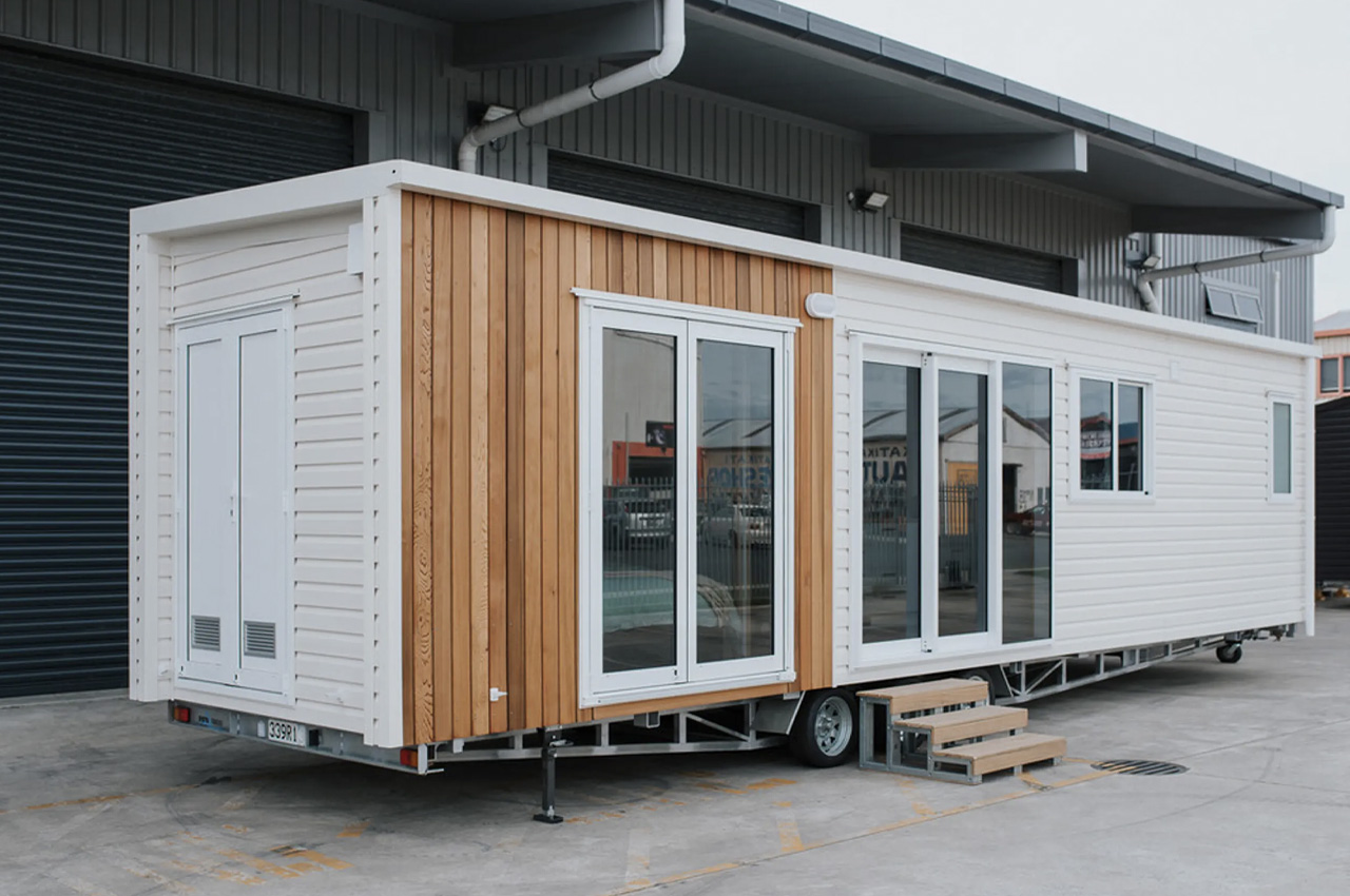
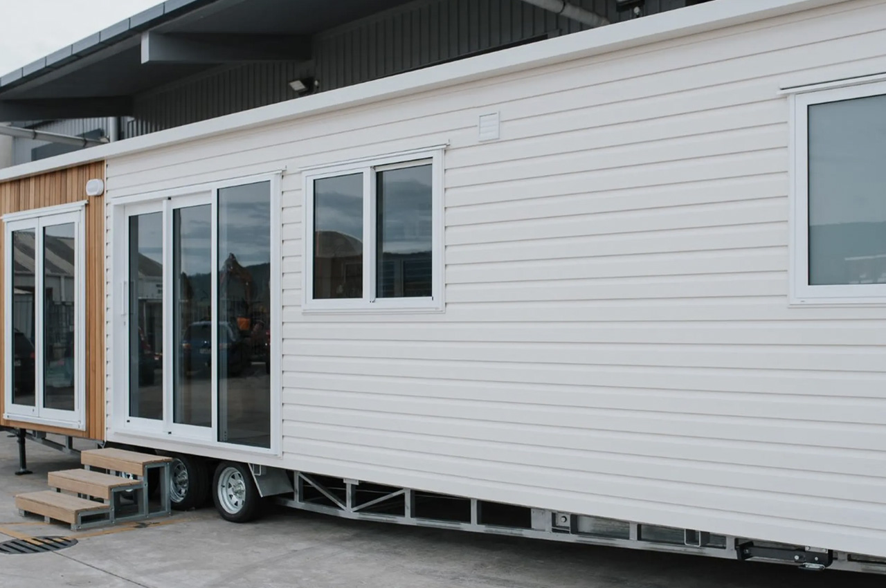
Named the Kōtuku, this quaint tiny home is designed by Build Tiny. It is substantially larger than of Build Tiny’s other models, measuring 10 m in length. Usually, the tiny home makers’ houses measure around 7 m. However, this extra space has been utilized very well, resulting in a spacious and storage-packed interior – all cleverly placed on one level. The name of the home is quite unique and is a subtle reference to New Zealand’s Kōtuku bird. The home is towable and based on a triple-axle trailer. It features a subtle finishing of vinyl, paired with wooden accenting and a steel structural frame.

Designer: Build Tiny

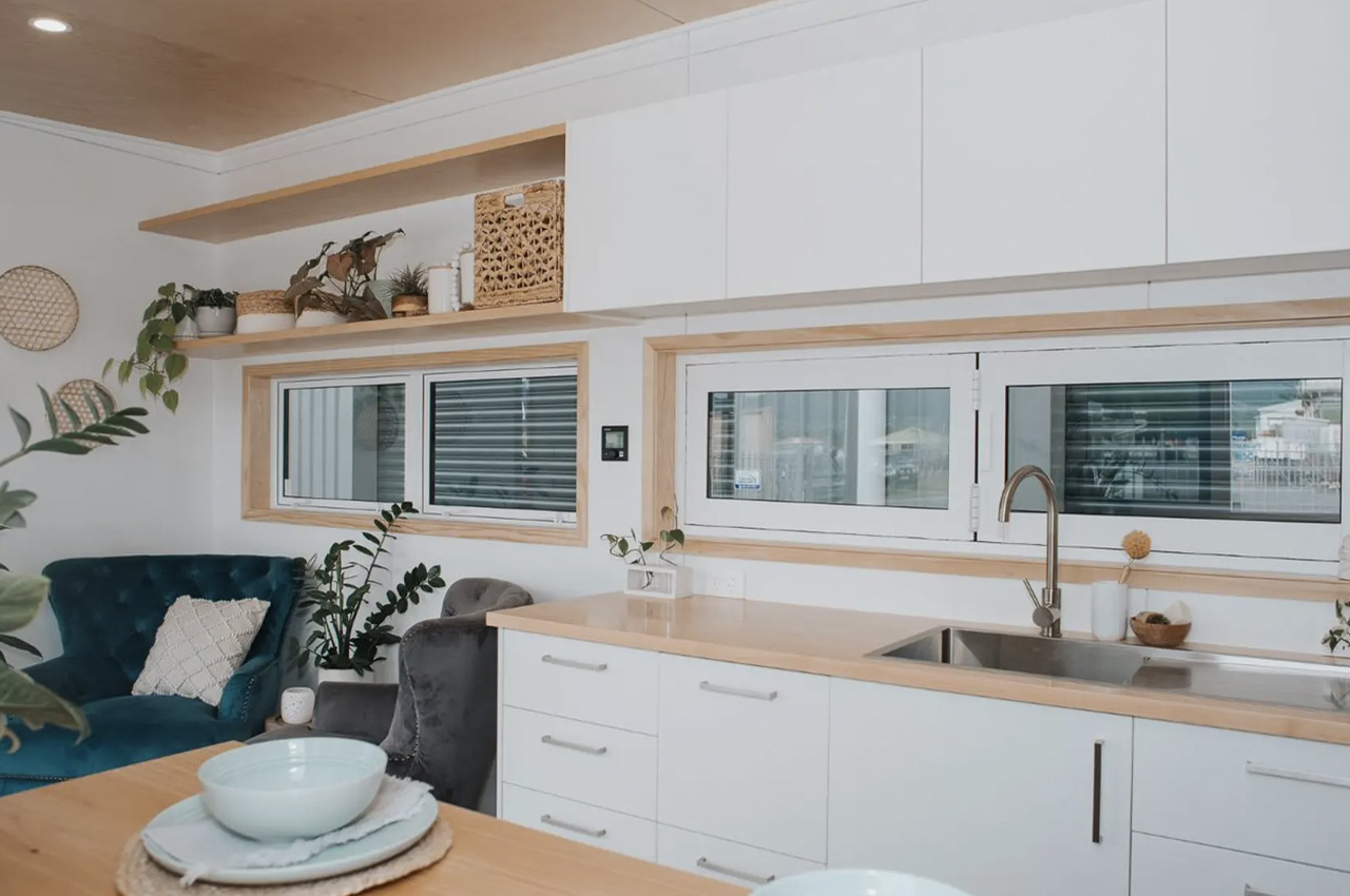
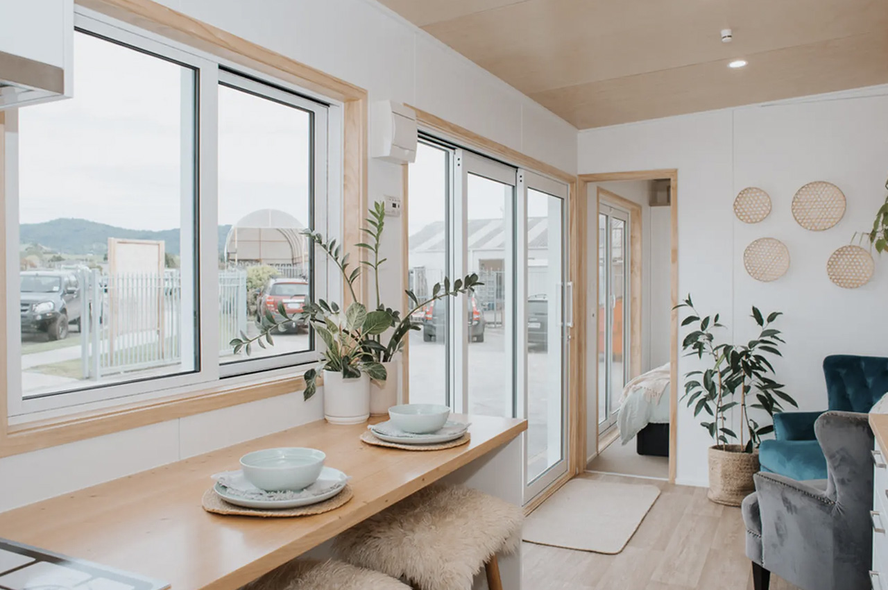
The home has a width of 2.4 m, which is typical for a tiny home. It has a height of 3.2 m and is powered by a standard RV-style hookup. Double glass doors offer access into the home, where you are welcomed by a well-designed interior with balanced proportions. The interiors are finished in light hues, highlighted by poplar plywood and vinyl flooring. The result is a space that feels minimal, and soft, instantly helping you feel at ease. As you enter the living room, you come across some seating, as well as some storage space.

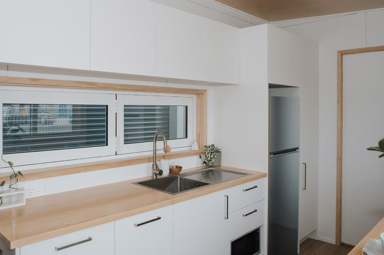
Located close is the kitchen, and it is quite spacious for a New Zealand tiny house. It features a fridge/freezer, microwave, sink, as well as an oven with a four-burner propane-powered stove. The kitchen also includes standard cabinetry, overhead cabinets, a pull-out pantry drawer, as well as a breakfast bar that can accommodate two people. The kitchen and bathroom are connected, and the bathroom is equipped with a composting toilet, vanity sink, shower, and washing machine.

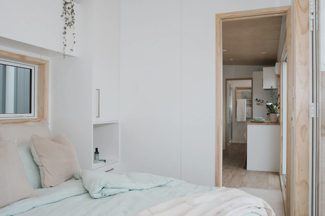
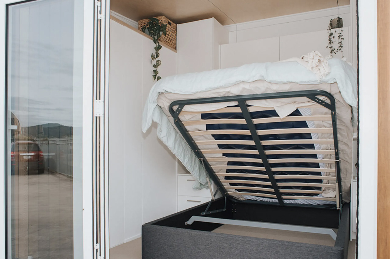
However, the Kōtuku tiny home is only equipped with one bedroom. All the rooms have been placed on the ground floor, so it isn’t the typical loft-style bedroom you see in tiny homes. It has a proper double bed and plenty of space to stand upright. Although subtle factors, these do make quite a difference while living full-time in a tiny home. The bedroom is also blessed with loads of storage space. There is storage above, below, and on both sides of the bed. You can access the outdoors from the bedroom through glass doors. This lovely little home is delivered as a turnkey build, amped with all the furniture.

The post This ‘Not So Tiny’ Tiny Home in New Zealand fits an entire living space in just 7 meters first appeared on Yanko Design.

Airiva: Modular Rotary Turbine Walls Revolutionize Urban Wind Energy

Since introducing the concept for an energy-generating wall in 2021, designer Joe Doucet has been tirelessly working to turn this innovative idea into reality. Now, with the launch of Airiva, a modular rotary wind turbine wall designed for urban installations, this vision is closer than ever to being realized. Airiva promises to revolutionize how cities and infrastructures harness wind energy, bringing sustainable power generation directly to the places where people live and work.

Designer: Joe Daucet

Wind energy has been instrumental in reducing global dependence on fossil fuels. However, the adoption of wind turbines for residential and commercial use has been slow, largely due to their intrusive designs. Airiva addresses this challenge by combining functionality with aesthetic appeal.

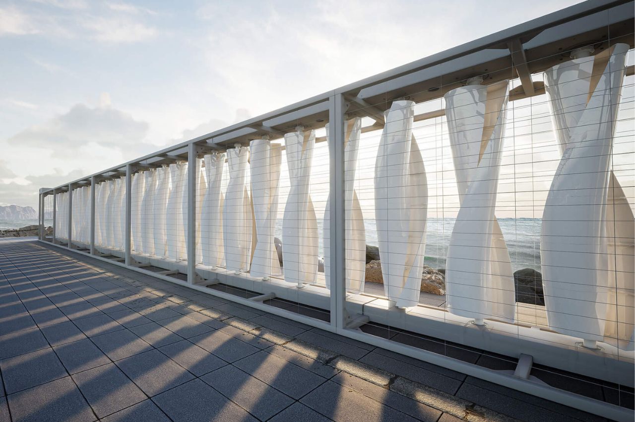
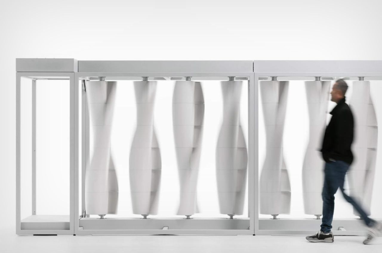
The wind turbine wall is composed of multiple rotary blades that spin independently, driving a generator to produce clean, renewable electricity. This modular and scalable solution is tailored for urban and suburban environments, allowing it to augment or coexist with other power generation methods. The electricity generated can be used on-site, stored, or fed back into the grid. The system is not only efficient but also quiet and safe, making it suitable for a wide range of environments. Potential installation sites include municipal and public facilities, commercial buildings, transportation networks, and coastal areas, among others.

Airiva places a strong emphasis on sustainability. The manufacturing process aims to use at least 80% post-consumer and recycled materials, aligning with circular economy principles and minimizing environmental impact. This commitment to sustainability is a fundamental aspect of Airiva’s design and manufacturing strategy.

One of Airiva’s key strengths is its flexibility. The system’s modular design allows it to be easily transported and scaled to meet specific site requirements. Multiple units can be networked together, creating a flexible, clean energy system that can adapt to various use cases. Additionally, Airiva is designed to complement other distributed energy technologies, providing a versatile alternative that can enhance existing installations.

Airiva’s smart technology enables remote monitoring of system and site information, offering visibility and control over geographically dispersed installations. Each unit consists of two segments, each measuring 2100mm in length and height and 1050mm in depth, along with an end hub unit for controls, communications, and power management. This design facilitates global transport and distribution, ensuring that the system can be deployed wherever it is needed.

The initial idea in 2021 envisioned a wall of 25 vertical-axis turbines with a total peak power output of 10 kilowatts. While the intermittent nature of wind means that actual energy production can vary, the refined Airiva system is expected to produce approximately 2,200 kWh annually per unit. While this may not cover the entire energy needs of an average home, it can significantly reduce energy bills. Larger installations, such as those on commercial campuses or transportation hubs, can harness more power, demonstrating the system’s scalability.

Currently in the prototyping stage, Airiva plans to begin customer pilots in the latter half of this year, with orders expected to open in 2025. Although specific figures have yet to be disclosed, Airiva’s targeted Levelized Cost of Energy (LCOE) aims to be competitive both domestically and internationally against other small-scale distributed energy resources. Upcoming pilots will be crucial in validating these claims and demonstrating the system’s effectiveness in real-world conditions.

The post Airiva: Modular Rotary Turbine Walls Revolutionize Urban Wind Energy first appeared on Yanko Design.

This GoPro concept with Interchangeable Lenses brings DSLR abilities to the Action Camera

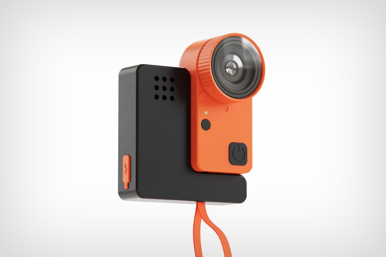
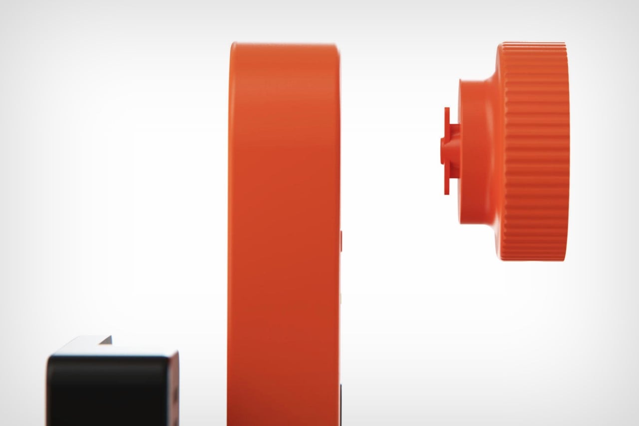
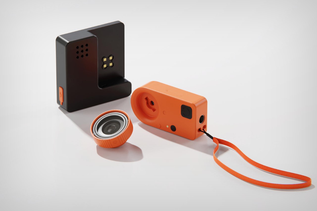
The GoPro is, on paper at least, an incredibly high-resolution camera capable of recording 4K at high speeds of up to 120fps – that’s pretty remarkable for a camera… but no photographer or videographer will ever take a GoPro seriously, because it lacks the one feature that most professionals look for – the ability to change lenses. The GoPro is perpetually stuck with its ultrawide lens, and that doesn’t appeal to most photographers. Designed to bridge this gap, Liam de la Bedoyere designed a GoPro that actually lets you remove and replace lenses, giving you the ability to choose between macro, telephoto, wide-angle, and fisheye shots… all while still retaining the GoPro’s gorgeously compact aesthetic.

Designer: Bored Eye Design

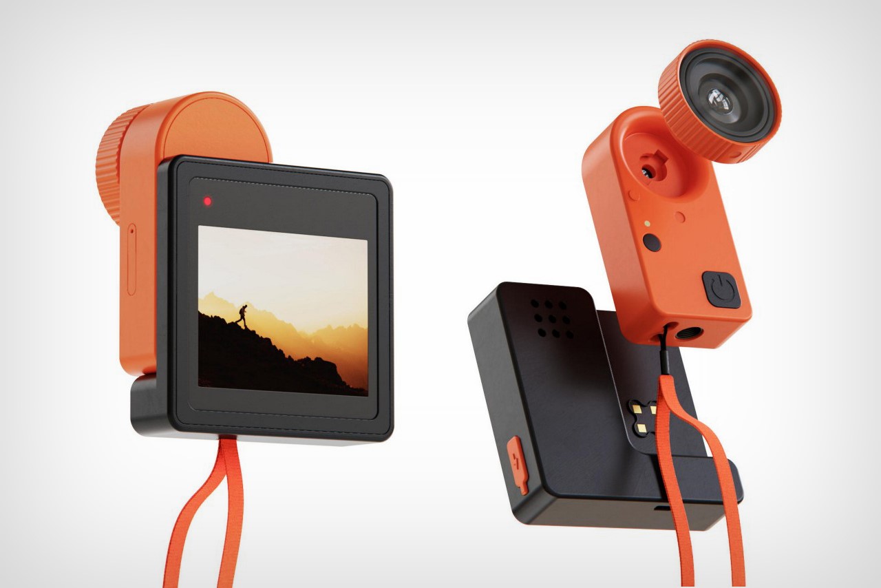
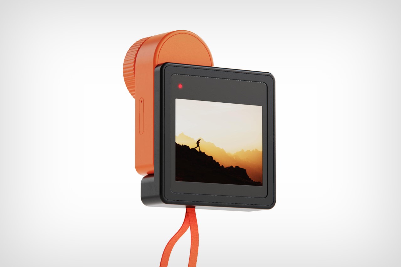
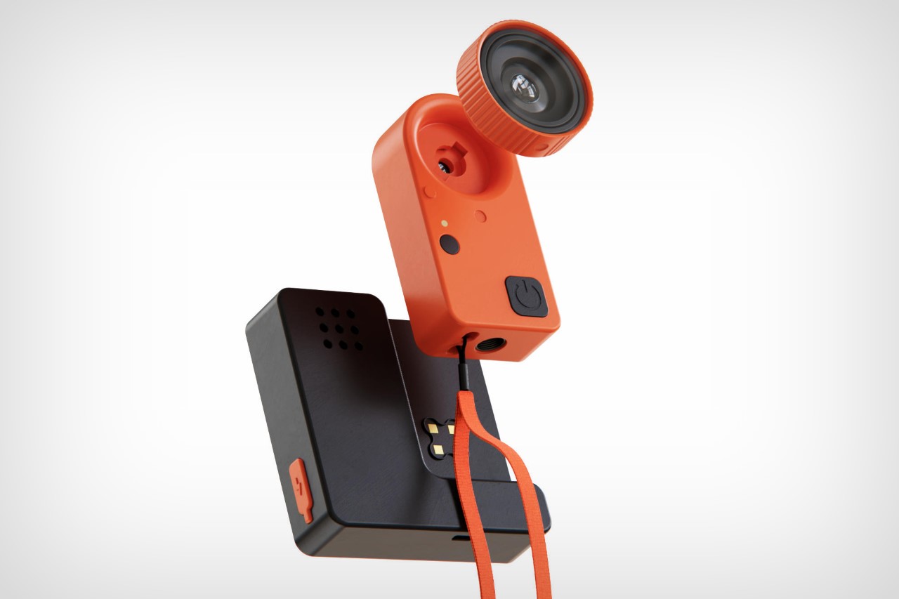
Bedoyere’s (better known by his online moniker Bored Eye Designs) concept isn’t what you’d call a traditional GoPro – its design is quite the overhaul, with a funky orange-meets-black aesthetic that sort of feels reminiscent of Rabbit, but with a more balanced color palette. The design features the GoPro’s main body, with the screen at the back, but also comes with a removable camera module, reminiscent of the recently launched Insta360 Go 3S. This removable module snaps onto the main body when it needs a battery boost, but can be removed and carried separately as a body-worn or handheld tiny cam. It also features those aforementioned removable lenses, allowing you to change your PoV on the fly.

Designed as a part of a Productober sprint (with daily prompts through the month of October), Liam de la Bedoyere created a rough draft of an action camera with the ability to remove and mount different lenses. Although Bedoyere barely made the deadline for the prompt, his concept existed just as a mere sketch. Taking some more time after Productober officially ended, he decided to flesh out the design by making a proper 3D CAD model of what this shapeshifting action cam could look like.

Bedoyere’s vision of a GoPro with interchangeable lenses is something that quite a few videographers have thought of. In fact, Canada-based hardware company Back-Bone also makes a modified version of the GoPro HERO12 with an armature on the front that lets you attach literal DSLR-style lenses on your action camera, with a choice between M12, CS, and C-mount styles!

The post This GoPro concept with Interchangeable Lenses brings DSLR abilities to the Action Camera first appeared on Yanko Design.

Solos AirGo Vision are the world’s first ChatGPT-4o powered smart glasses for interactive input

Smart glasses are the most practical wearables when it comes to your daily style statement. Compared to current generation AR headsets that are bulky, smart glasses are feasible and the buck only stops at how much tech can be fitted inside the compact frames keeping the overall weight down and form factor indistinguishable from a regular pair.

The idea has gone mainstream in the last year or so with Ray-Ban Meta and OPPO coming on board the bandwagon. The latter brought AI-capable Air Glass 3 to the industry in the early half of this year, and Solos has now upped the ante. They’ve revealed a smarter pair of wearables that are the world’s first to have OpenAI’s latest generative AI.

Designer: Solos

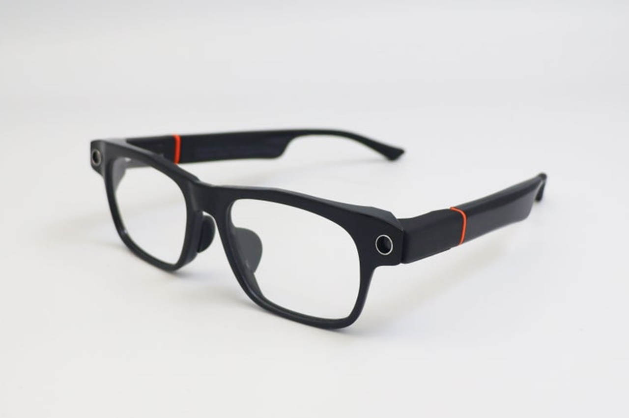
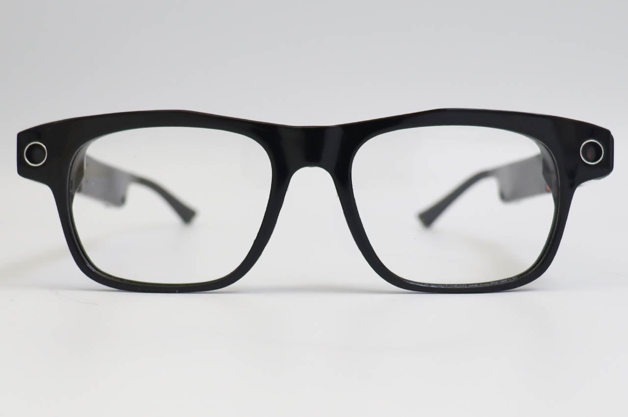
This is the AirGo Vision, the next iteration of the AirGo 3 glasses. Powered by OpenAI’s latest ChatGPT-4o, the wearable is also compatible with Google Gemini and Anthropic Claude models. You can expect hands-free operation aided by voice commands to answer any queries or provide real-time inputs for things like reading foreign language hoardings or getting assistance for city directions. The latter is aided by the latest versions of the GPT-4o and generative AI applications, first for any smart glasses. In essence, the glasses will be a visual extension of search information and bring interactive features to make them wantable.

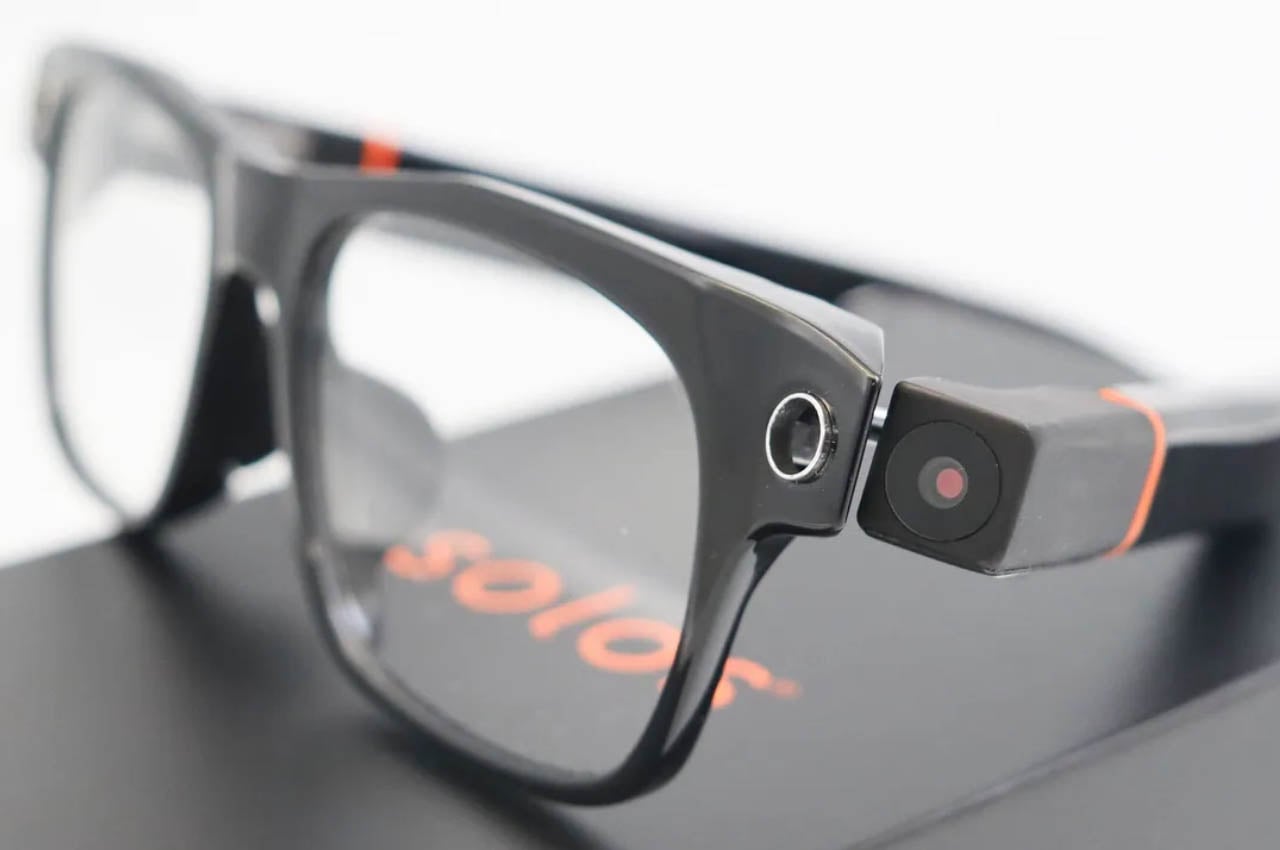
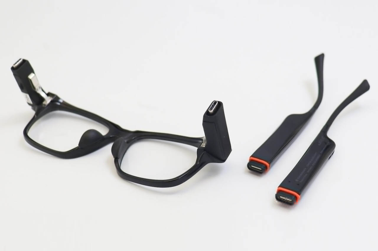
The wearer can capture pictures hands-free and instantly inquire about information. Solos is also giving the option for swapping the main frame with a secondary one that doesn’t have any front camera. Yes, unlike other smart glasses, this one has the camera lens embedded in the arms, instead of the frame. This swap comes in handy for places where a more formal style is acceptable. To keep the wearer aware of any important notifications or calls, there are flashing LED indicators on the frame.

Solos hasn’t yet revealed details about the specific release date or the price, but we can safely assume they’ll cost more than $250.

The post Solos AirGo Vision are the world’s first ChatGPT-4o powered smart glasses for interactive input first appeared on Yanko Design.

From Vibram FiveFingers to Junya Watanabe x New Balance: A History of Minimalist Shoes

My fascination with minimalist footwear has spanned over three decades, starting with the revolutionary concept of shoes that mimic the natural feel of barefoot walking. This journey began with the iconic Vibram FiveFingers, those unique toe shoes with Vibram soles. While they looked quite unconventional, they provided an unmatched experience. I wore them everywhere, from casual outings to more formal settings like church, embracing the natural foot movement they offered.

My FiveFingers: The Original Barefoot Toe Shoes

Designer: Vibram

Back in the day, another minimalist trend I embraced was karate shoes. Over 30 years ago, these martial arts training shoes, also known as kung fu shoes, gained popularity beyond their intended use. Their simple, lightweight design made them a favorite for those seeking a close-to-the-ground feel, similar to what the FiveFingers provided. These shoes were comfortable, flexible, and offered a sense of freedom that traditional footwear couldn’t match.

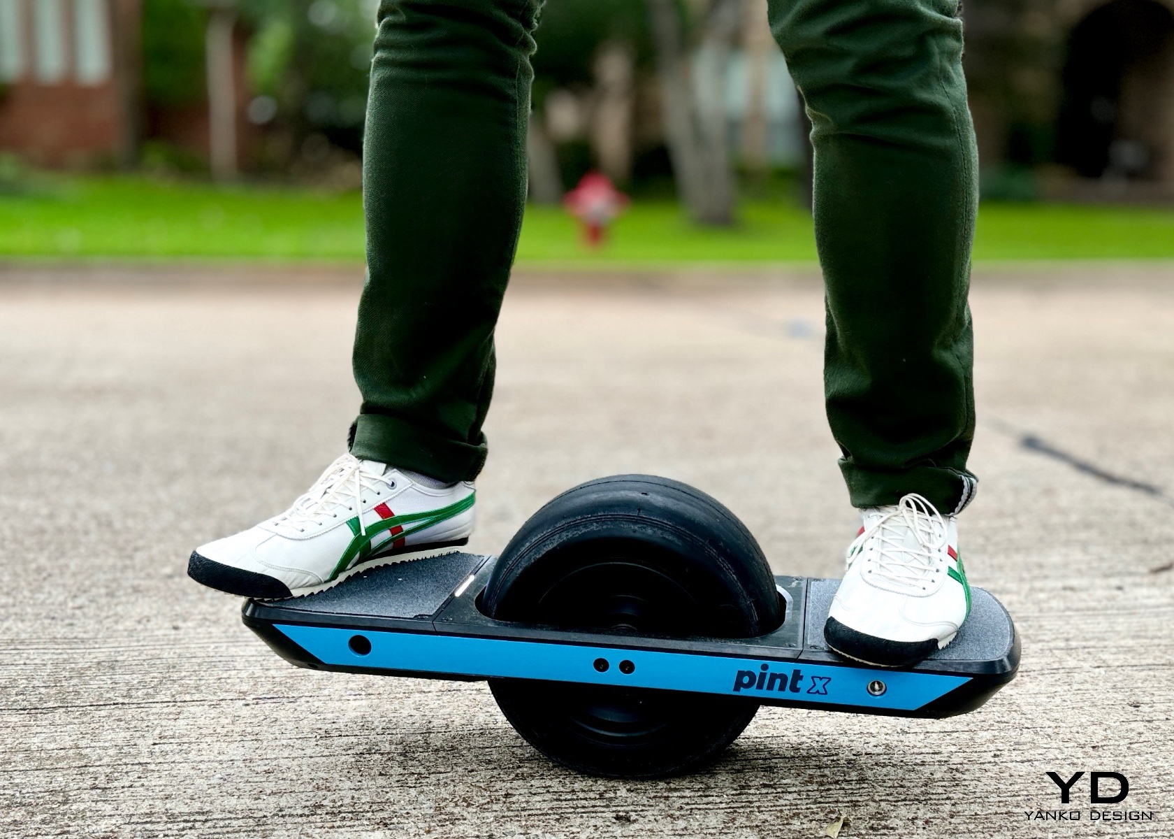
Fast-forward to the present and my love for minimalist footwear has evolved but remains strong. Today, I find myself drawn to modern interpretations of this concept, like the Onitsuka Tiger shoes, which blend minimalist principles with stylish design. But one of the most exciting developments in this space is the collaboration between Junya Watanabe MAN and New Balance.

Designer: Onitsuka

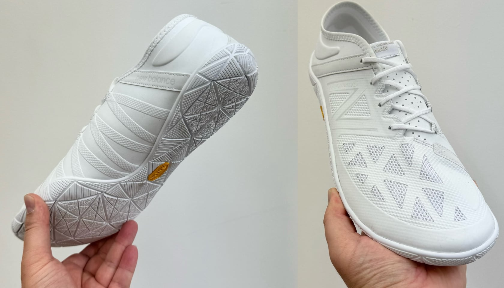
The Junya Watanabe MAN x New Balance Minimus UX200L is part of the Spring & Summer 2025 collection titled “Dress Up Denim.” This collaboration brings together New Balance’s expertise in minimalist footwear with Junya Watanabe’s avant-garde fashion sensibilities, resulting in a shoe that is both functional and stylish. The shoes maintain a streamlined, low-profile design, characteristic of the Minimus line, promoting natural foot movement and a barefoot-like feel. Available in both black and white colorways, they offer versatility and a clean, modern look suitable for various settings.

Via tysikd: Junya Watanabe MAN x New Balance Minimus UX200L

The upper is made of a breathable mesh material with geometric patterns, ensuring ventilation and a lightweight structure. Perforations on the upper and tongue enhance airflow, keeping feet cool and comfortable during wear. Featuring a Vibram outsole, the shoes provide excellent traction and durability. The intricate geometric tread pattern ensures stability and grip on various surfaces. The sole’s flexibility complements the barefoot feel, allowing natural foot movements while providing necessary protection.

Designer: Junya Watanabe MAN and New Balance Minimus UX200L

Via tysikd

The New Balance branding is subtly incorporated into the design, maintaining the minimalist ethos. The Junya Watanabe MAN label is prominently displayed on the tongue, highlighting the collaboration and adding a touch of exclusivity. Designed for both performance and style, these shoes are suitable for activities ranging from trail running to casual everyday wear. They blend practicality with fashion-forward elements, appealing to a wide audience. These shoes represent the best of both worlds, combining the functional benefits of minimalist footwear with the distinctive style of Junya Watanabe’s designs. For someone who has journeyed through various phases of minimalist footwear, from Vibram FiveFingers to karate shoes, this modern interpretation is both a nod to the past and a step forward.

Via tysikd

Minimalist shoes offer several benefits that attract a variety of people. Designed to mimic barefoot walking and running, they allow for a more natural foot movement, which can help strengthen the muscles in the feet and lower legs, often underused in traditional footwear. With less cushioning and support, minimalist shoes can enhance your sense of balance and proprioception, the awareness of your body’s position in space, leading to better coordination and agility. Some advocates believe that minimalist shoes can reduce the risk of certain injuries by encouraging a more natural gait, potentially avoiding issues like heel striking, which can lead to repetitive stress injuries. The thin soles provide greater sensory feedback from the ground, improving reaction time and movement efficiency. Typically lightweight and highly flexible, minimalist shoes are comfortable for various activities and easy to pack for travel.

Via tysikd

People attracted to minimalist shoes often include runners, outdoor enthusiasts, fitness aficionados, and those interested in natural movement and barefoot training. These shoes appeal to individuals seeking a more natural and unencumbered experience, whether for running, hiking or everyday wear.

NEW BALANCE – MENS MINIMUS UX200

NEW BALANCE – MENS MINIMUS UX200

NEW BALANCE – MENS MINIMUS UX200

As a fan of Bad Bunny’s unique style, I find the collaboration between Bad Bunny and Adidas an exciting development in the world of footwear. This partnership combines Bad Bunny’s vibrant and bold fashion sense with Adidas’ renowned expertise in athletic shoe design. Fresh off a restock of their previous collaborations, Bad Bunny and Adidas appear to be making room for the next chapter of their relationship. The new “ballerina” sneaker, teased recently, showcases Bad Bunny’s unique style.

Designer: Bad Bunny and Adidas

Bad Bunny x Adidas

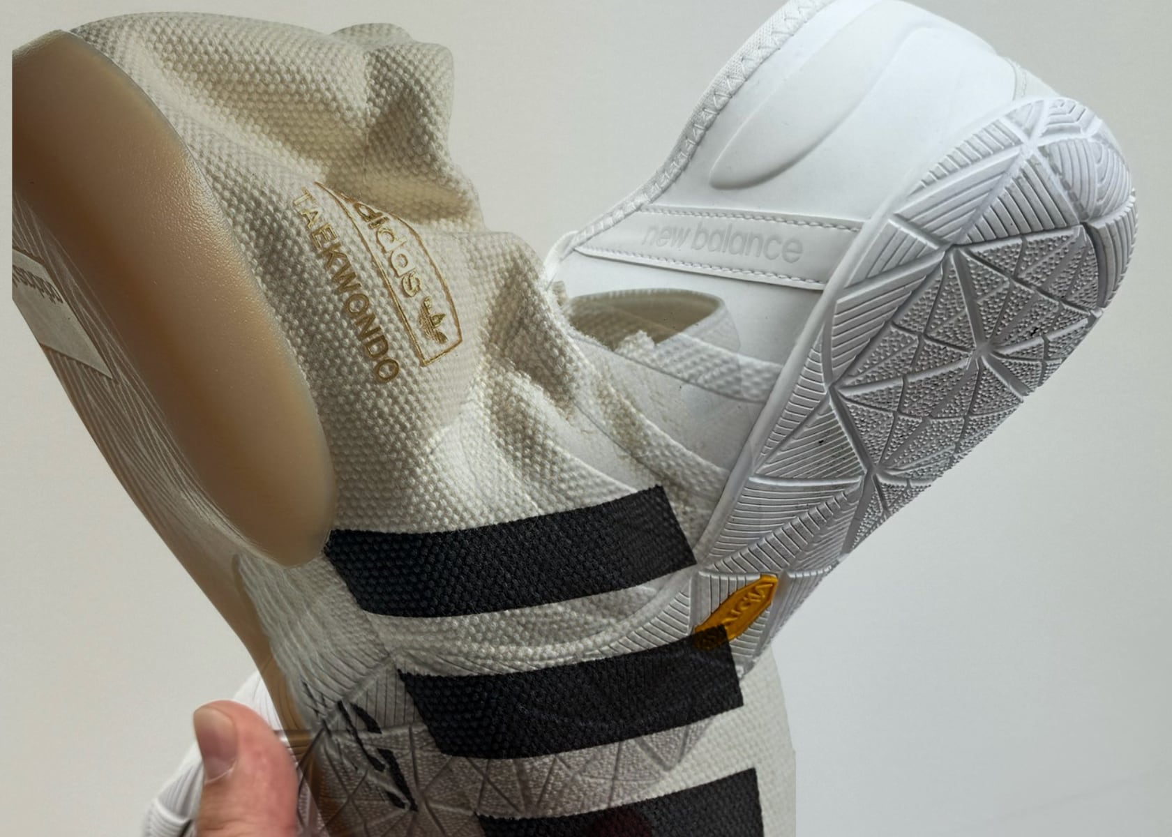
Based on Adidas’ Taekwondo model, these shoes offer superior comfort and support. The sneaker features a snug canvas construction and a normal collar, differing from the elastic detailing of past models. Features like responsive cushioning and durable outsoles ensure that the shoes perform well in various conditions. The collaboration utilizes premium materials to provide durability and a luxurious feel. This ensures that the shoes not only look good but also last long and maintain their quality over time. The sneaker offers convenient adjustable laces for easy on-off ability, blending style with practicality.

The collaboration is marked by exclusive branding elements from both Bad Bunny and Adidas, adding a layer of collectability and uniqueness to the shoes. The iconic Three-Stripes logos are slightly raised, and the shoes are topped off with classic splashes of white and black hues. These Bad Bunny x Adidas “ballerina” shoes are more than just footwear; they make a bold statement with their striking design and unique patterns, embodying Bad Bunny’s signature style. Whether you’re a fan of Bad Bunny, a sneaker enthusiast, or someone who appreciates innovative design, these shoes offer something special.

The post From Vibram FiveFingers to Junya Watanabe x New Balance: A History of Minimalist Shoes first appeared on Yanko Design.

Apple CarPlay Gets a Major Upgrade in iOS 18: Here’s What’s New

Apple CarPlay

Apple CarPlay, the in-car infotainment system that seamlessly integrates your iPhone with your vehicle’s dashboard, has undergone significant updates in iOS 18. These updates bring a host of new features and enhancements designed to elevate your driving experience, improve user interaction, and increase accessibility. Let’s dive into the key changes that iOS 18 brings to […]

The post Apple CarPlay Gets a Major Upgrade in iOS 18: Here’s What’s New appeared first on Geeky Gadgets.

GLEDE M-XTR pocket precision EDC electric screwdriver set $59

EDC electric screwdriver

The M-XTR screwdriver set is here to transform your repair and installation tasks with its 148-in-1 bit functionality. This versatile tool is designed for precision maintenance and ease of use, making it an essential addition to your toolkit. This powerhouse EDC electric screwdriver is designed to tackle a wide range of repair and installation tasks […]

The post GLEDE M-XTR pocket precision EDC electric screwdriver set $59 appeared first on Geeky Gadgets.

Flipper Zero Behind The Scenes: How a group of enthusiasts designed the ‘perfect’ ethical hacking toy

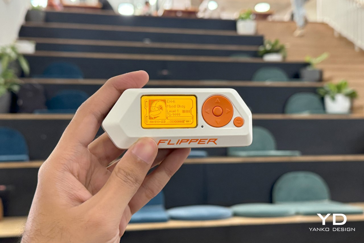
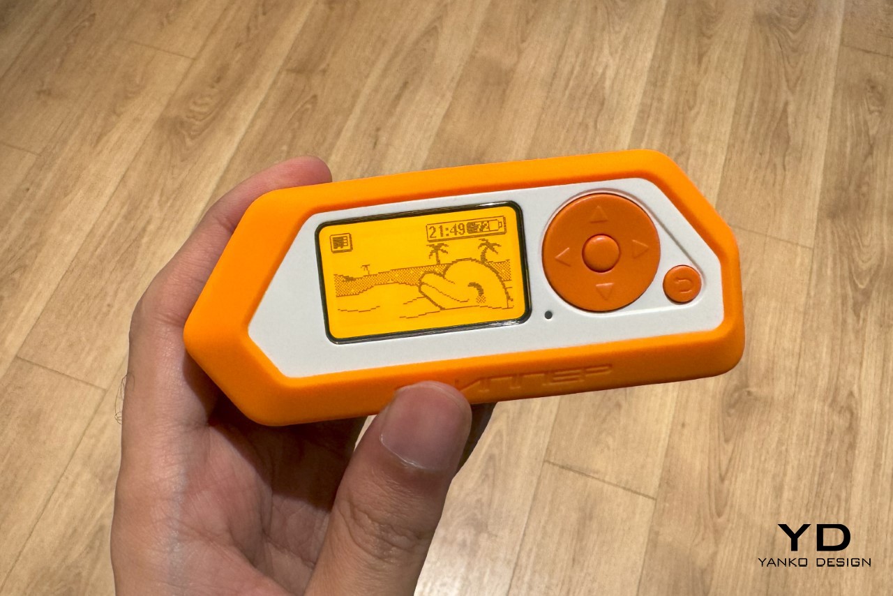
Although announced back in 2020, the Flipper Zero didn’t become a cult object up until 2022 when it gained popularity among the pentesting community for being able to ‘hack’ into various everyday items. Governments and online retailers immediately panicked, attempting to ban or stop the sale of the Flipper Zero – a harmless game-inspired pentesting device… while the community that helped popularize the Flipper Zero had a valid counter-argument. If exposing the digital vulnerability of everyday objects like traffic lights, cars, air conditioners, or smart homes was so easy, is it really the Flipper Zero’s fault for pointing it out?
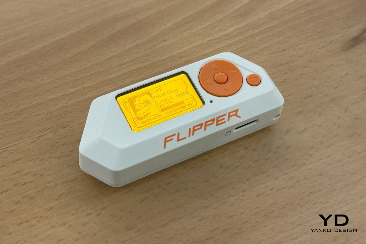
Old mobile phones like the Siemens C55 served as references. The orange color was taken from the Siemens C55 screen because of its nostalgic warmth.

Envisioned as a Tamagotchi that let you explore the world of electronics, the Flipper Zero is a tiny, handheld, versatile device that lets you play games, test electronics, build powerful devices, and even penetration-test gadgets around you. The product gained a cult following in 2022 when videos on TikTok showed how it could be used to clone RFID cards, tap into WiFi networks, and get into all sorts of mischief. That’s similar to having an outcry over hairpins because they open locks… or sellotape because it picks up fingerprints. Needless to say, the Flipper Zero sold out almost immediately, and I spent a good year and a half searching for a device of my own on eBay and Etsy. I finally got my hands on one last month, and even got in touch with the folks who built the Flipper Zero. Beyond asking them the obvious questions that every publication already had, we dove into the Flipper Zero’s approach, its design brief, and most importantly, its design process.
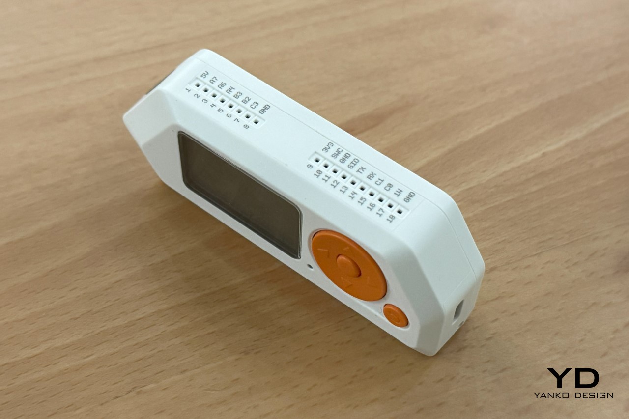
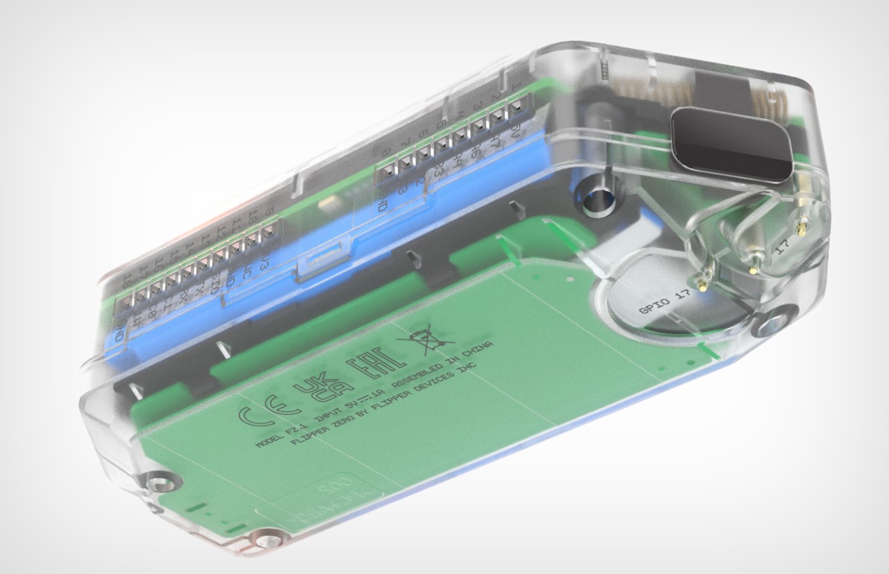
A view of the GPIO pins on the top for attaching newer modules
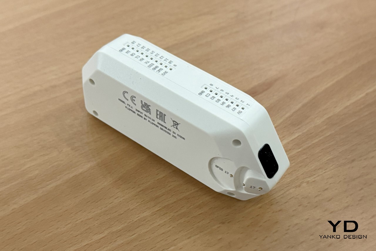
The IR blaster on the side, and the iButton reader/writer

The minute you understand the Flipper Zero’s origin story, its design makes a world of sense. It was envisioned in 2020 to help develop a more common interest in technology, cybersecurity, and electronics. Existing products in this domain were just way too complicated and boring – they had ultra-utilitarian designs, bare-basic aesthetics, wires, soldering, and they looked like something that would come out of an engineer’s workshop. This was in contrast to what sci-fi movies had us believe. Minority Report, Tron, The Matrix, Bladerunner, every movie showed a more concept-art-driven product future, but existing ‘hacker’ devices looked nothing like the ones we were used to seeing in movies. This was a great starting point for the folks at Flipper, who wanted to create a device that A. paid homage to decades of sci-fi films, and B. was the electronic equivalent of an EDC multitool – compact, multifunctional, awesome. “In a Swiss army knife, you have a blade, corkscrew, screwdriver, ruler, scissors, etc., all in one tool. The idea of the Flipper Zero was to combine all the hardware tools you’d need for exploration and development on the go,” the Flipper team told Yanko Design. “Flipper Zero has a 125 kHz or Sub-1 GHz antenna, CC1101 chip, built-in NFC module, Bluetooth Low Energy (BLE) support, 1-Wire connector to read iButton contact keys, infrared transmitter, and a microSD card slot. All in a toy-like body.” Moreover, despite all these features, the Flipper Zero came with GPIO handles on the top that let you explore the device’s open-source nature by adding PCB hardware and exploring even more features and capabilities.
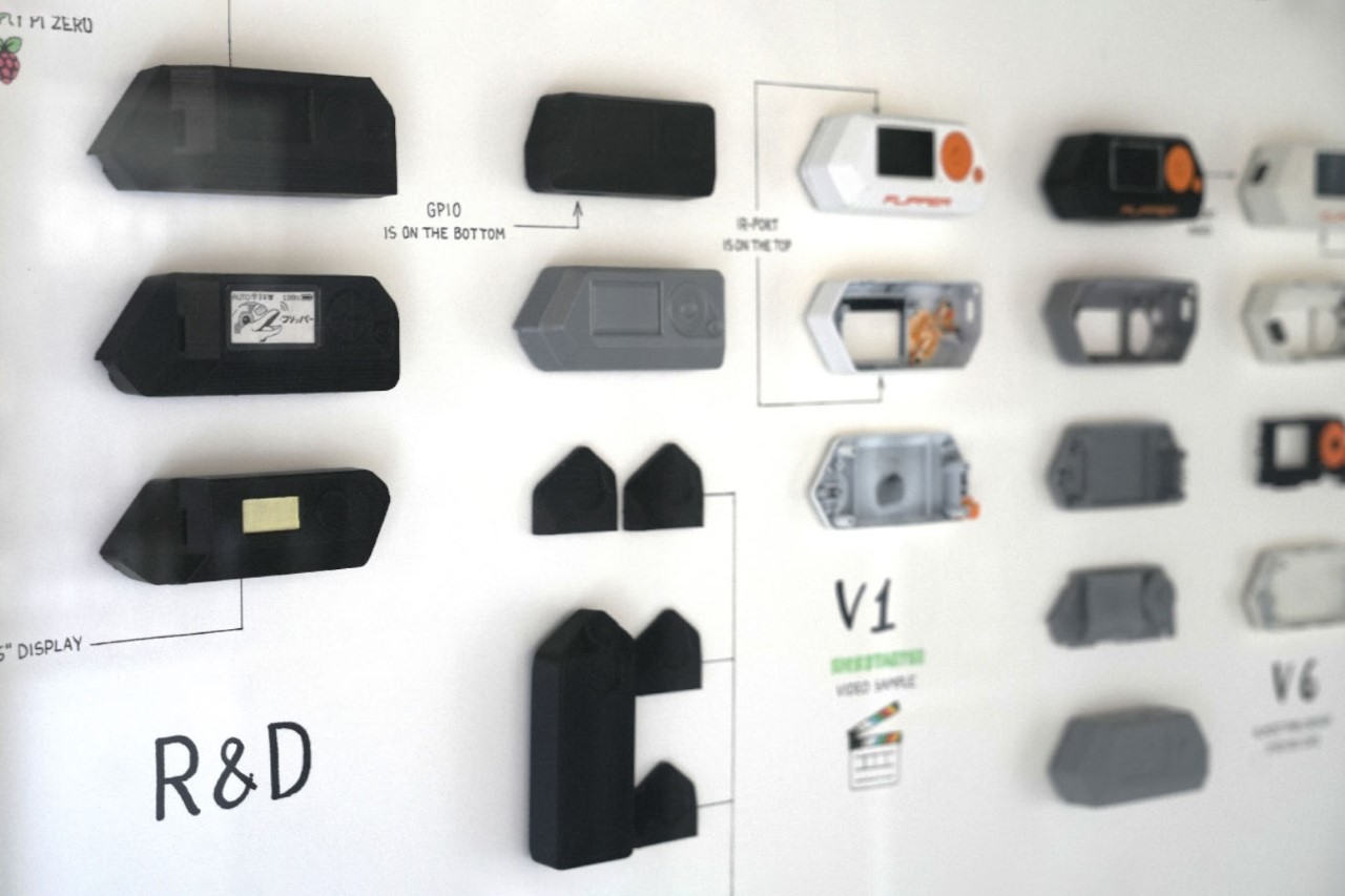
Flipper Zero development process

The Flipper Zero’s design is actually pure genius if you look at how much they’ve managed to squeeze into a product that small. Yes, I did ask them whether they considered making something with a touchscreen, or something phone-like, but the Tamagotchi approach seemed to be the most convenient route – it was uncomplicated, and could be done without expensive OLED displays and other hardware. Ultimately, it did lend to the Flipper Zero’s overall charm, with its monochrome orange screen that was a hat-tip to the Siemens C55. “We went through several design iterations to achieve this functionality and look, constantly overcoming challenges in electronics design, component limitations, and multiple antenna designs,” the Flipper team mentioned. “For example, the first version of the hardware used an off-the-shelf main PCB, but we eventually decided to design our own. This gave us more freedom and flexibility regarding the shape and form of the device while also giving us more control over the supply chain and costs.”
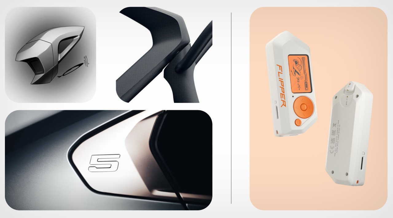
Inspiration moodboard for the Flipper Zero’s Cyberpunk Design

The entire device is nothing without its mascot, the cyberpunk dolphin that forms the essence of the Flipper Zero’s experience. It functions quite literally as a Tamagotchi, growing and being happier and happier the more you explore the device’s features and play with the product. The idea of using the dolphin existed way back in the beginning, and you could think of the product’s shape as somewhat resembling a dolphin’s flipper too, albeit with sharper, cyberpunk-ish edges. The team told us, “The main inspiration was William Gibson’s cyber-dolphin Jones, from Johnny Mnemonic, who had a dark biography and could do very dangerous things. Our dolphin is a quirky, queer, and enthusiastic but simple and nice guy at the same time. We wanted to create a character that you’d want to be friends with.” The dolphin’s persona received a lot of design experimentation as it essentially was to serve as the product’s mascot, guiding you through the features, exploring uncharted electronic territories with you, and forming a codependent bond that allows you to get more and more familiar with and attached to your Flipper Zero. You loved your Game Boy because of all the Pokemon you caught, grew, and evolved on it – the same would apply to the Flipper Zero.
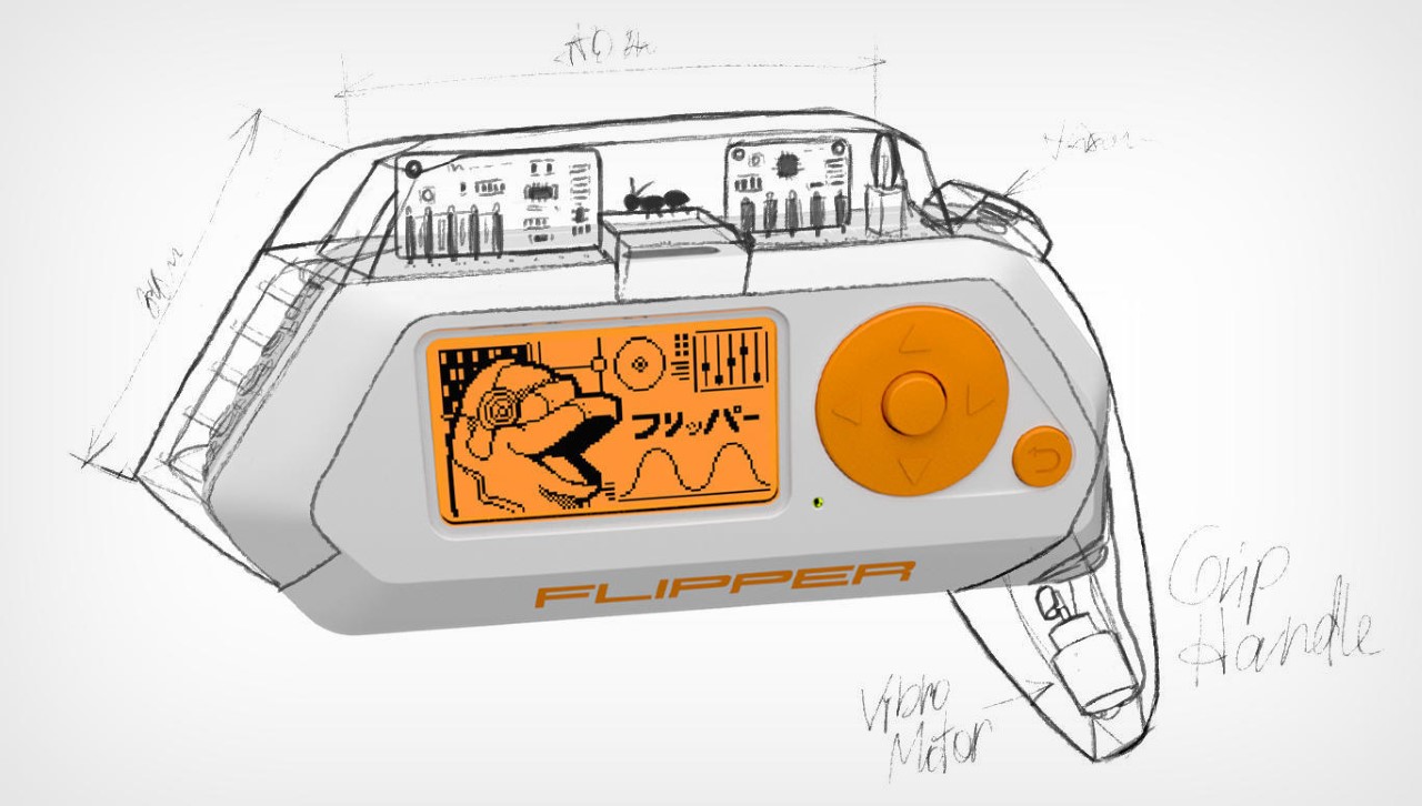
Sketches of in-house modules for the Flipper Zero

However, as a non-hacker myself (and with no coding background), owning a Flipper Zero was still quite an interesting experience. The interface immediately felt familiar to a guy who grew up on Nokia and Sony Ericsson phones, and the internet is FILLED with documentation and tutorials that allow folks like me to figure out how to use the Flipper Zero. For now, I’m proud to say that I managed to clone my buddy’s car key fob and can open her doors remotely. All done with consent, though. The device also allows me to save RFID cards, NFC codes, and even be prankish enough to change channels on televisions or control air conditioners using the infrared function. All these are gradual steps, and the interface makes it exceptionally simple to navigate. You can even play games on the Flipper Zero like Solitaire, Doom, Pong, Snake, and Tetris. Additionally, you can set a Pomodoro timer or metronome, check the nearest weather station, or encrypt a message to your friend using Caesar Cipher or Morse code apps. For anything else, there’s a burgeoning Flipper community that routinely explores everything the Flipper Zero has to offer, discussing new features, writing new lines of code, or creating new apps. After all, with more than half a million devices sold, there’s clearly a massive sub-culture of loyal Flipper Zero users ready to tinker with anything they find, just the way our parents were encouraged to take a screwdriver and pull apart objects so they could learn how to repair them. It’s an art that seems lost on our generation, especially with how complicated devices have gotten, and how ruthless companies are when it comes to creating terms and conditions that prevent us from looking under the hoods of the gadgets we own.
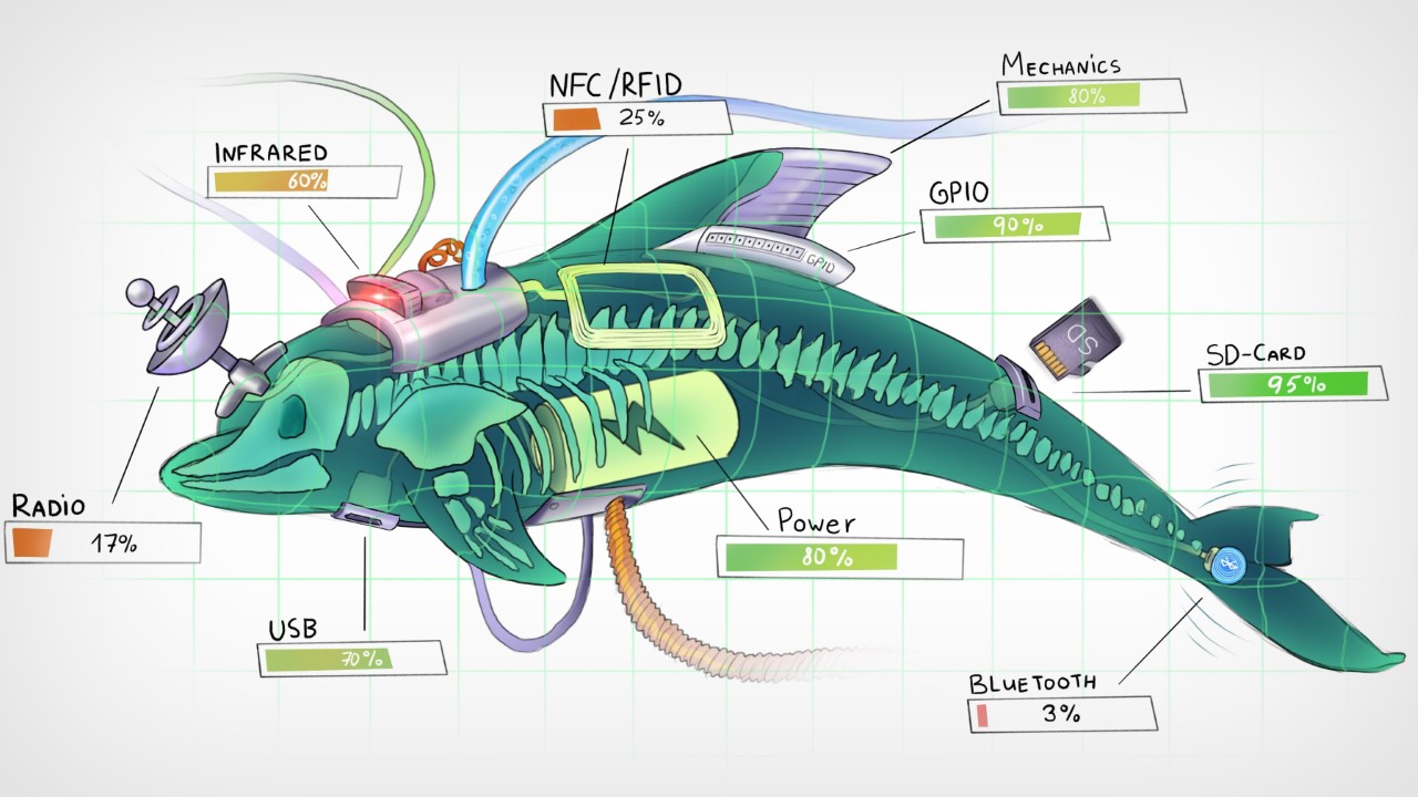
The Flipper Zero is just the beginning, though. Given the movement it stands for, and the resounding success of their flagship device, Flipper’s team is just getting started. They’re continuously working on new modules that can be attached to the Flipper Zero, giving it even more powerful new features… and yes, there’s a Flipper One in the works, although they’re pretty hush-hush about it right now!
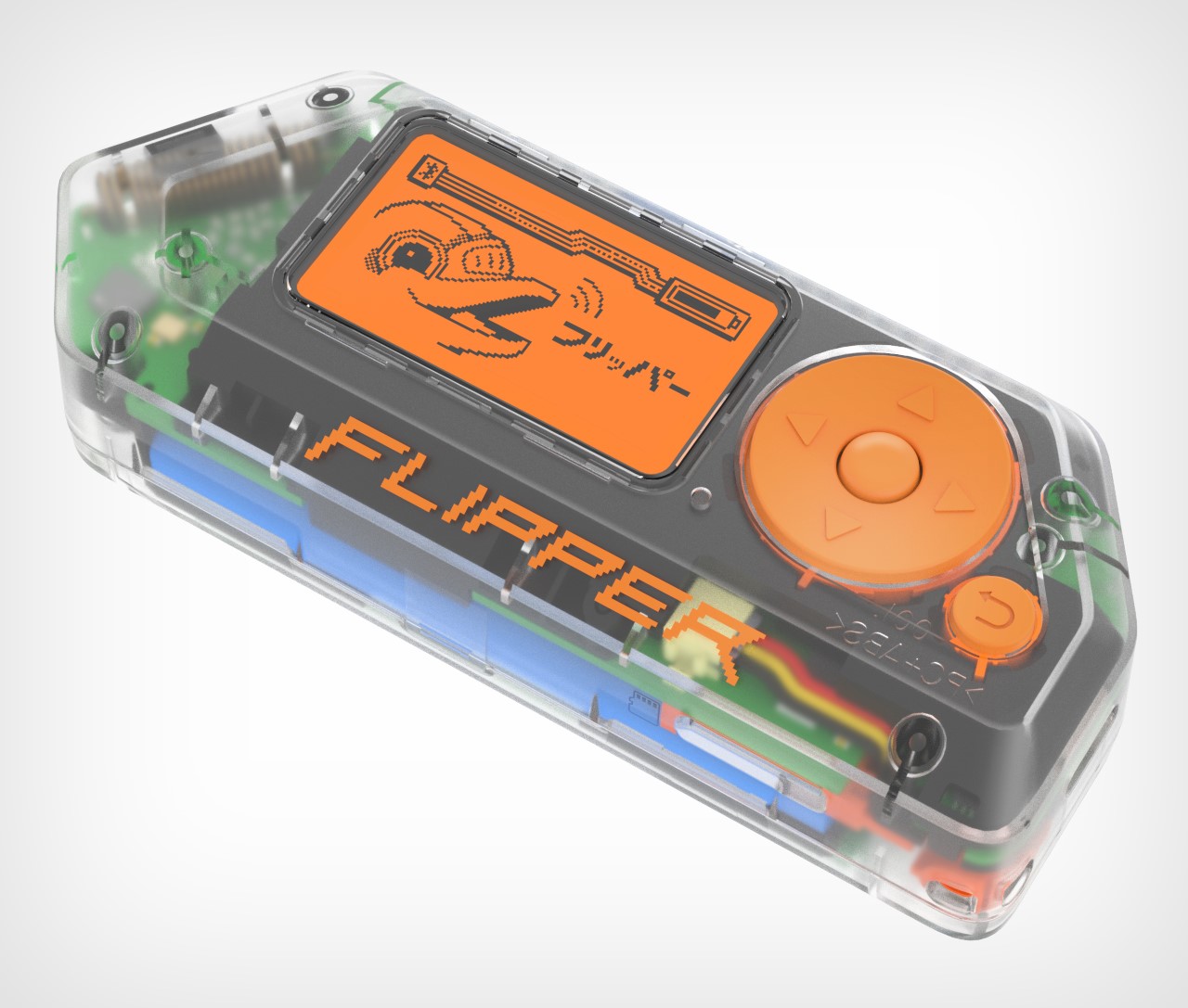
Limited-edition transparent version of the Flipper Zero
The post Flipper Zero Behind The Scenes: How a group of enthusiasts designed the ‘perfect’ ethical hacking toy first appeared on Yanko Design.
How to Master the New Notion Home Page

Notion Home Page

Notion, the popular productivity and collaboration platform, has recently introduced significant updates to its homepage, aiming to enhance user experience and streamline task management. These updates offer a more focused user interface, new database views, and improved integration with existing systems like Life OS templates and second brain setups. Let’s dive into the key features […]

The post How to Master the New Notion Home Page appeared first on Geeky Gadgets.

Posted in Uncategorized | Tagged