PROS:
- Elegant transparent design and Glyph Interface
- Improved performance across the board
- 50MP selfie camera
- Sustainabile design
CONS:
- No telephoto camera
- No wireless charging
- Spotty operator compatibility in the US
RATINGS:
SUSTAINABILITY / REPAIRABILITY
EDITOR'S QUOTE:
The Nothing Phone (2a) Plus delivers on its promise of an optimal and accessible daily driver that builds on the essentials and gets it almost perfect.
It hasn’t been that long since we reviewed Nothing’s latest masterpiece, the Phone (2a) which was designed to offer an “optimal” daily smartphone. It was another way of describing what most would bill as a mid-tier device, though it was definitely one that lived up to its hype in both design and performance. It was far from perfect, of course, but it wasn’t bad either. And yet here we are now with a “Plus” version out of nowhere, not a larger version but one that promises a more premium experience, at least compared to the Phone (2a). Color us intrigued, despite the obvious monochrome motif, so we gave the Nothing Phone (2a) Plus a few spins to see if it really has something to be proud of.
Designer: Nothing

Aesthetics
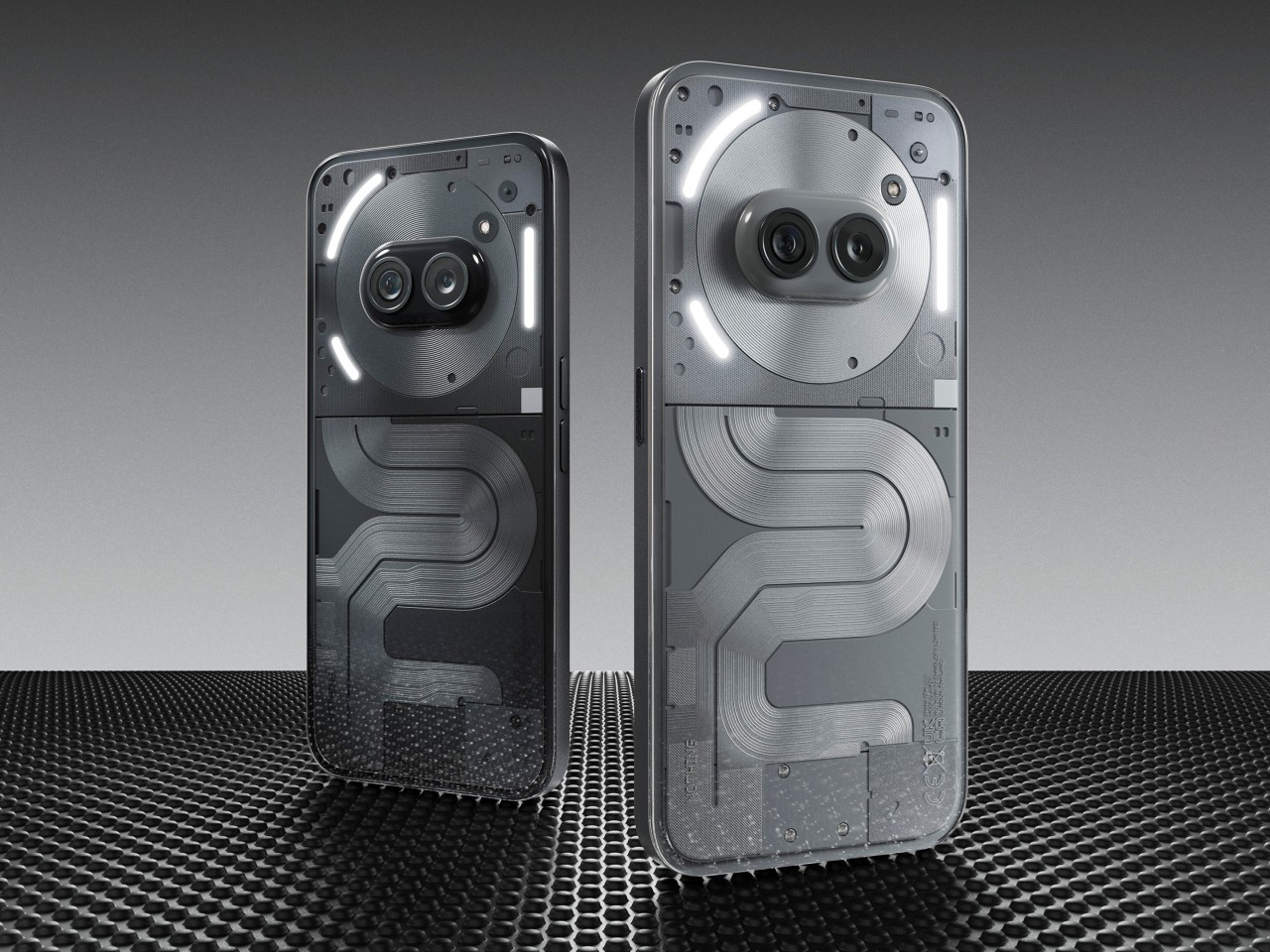
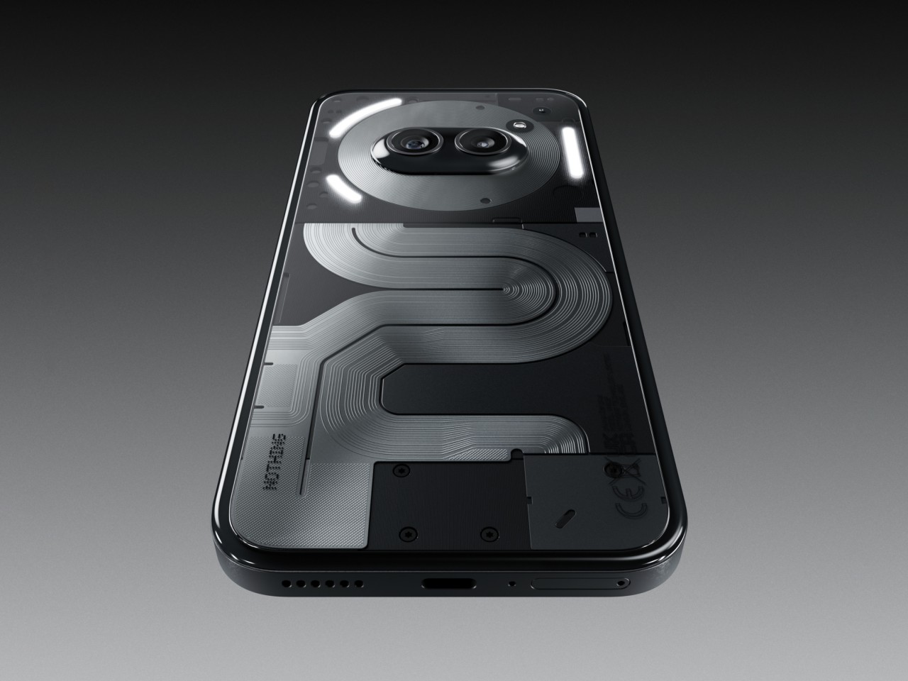
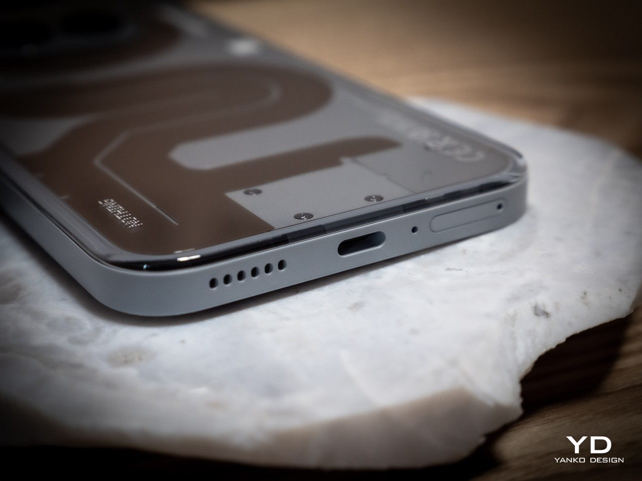
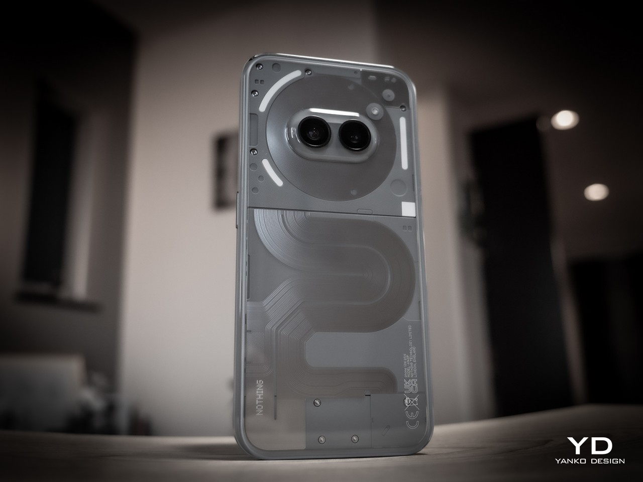
By now, Nothing’s design identity has been well established. It may not be the geeky full transparency many have hoped for, but it definitely managed to strike a beautiful balance between technology and art in its phones. To some extent, that design is even more refined in the Phone (2a) series, with its own unique patterns of opaque lanes snaking down the phone’s back, not unlike roads on a map. It feels like it has a story to tell, not just a composition of shapes, lights, and shadows.

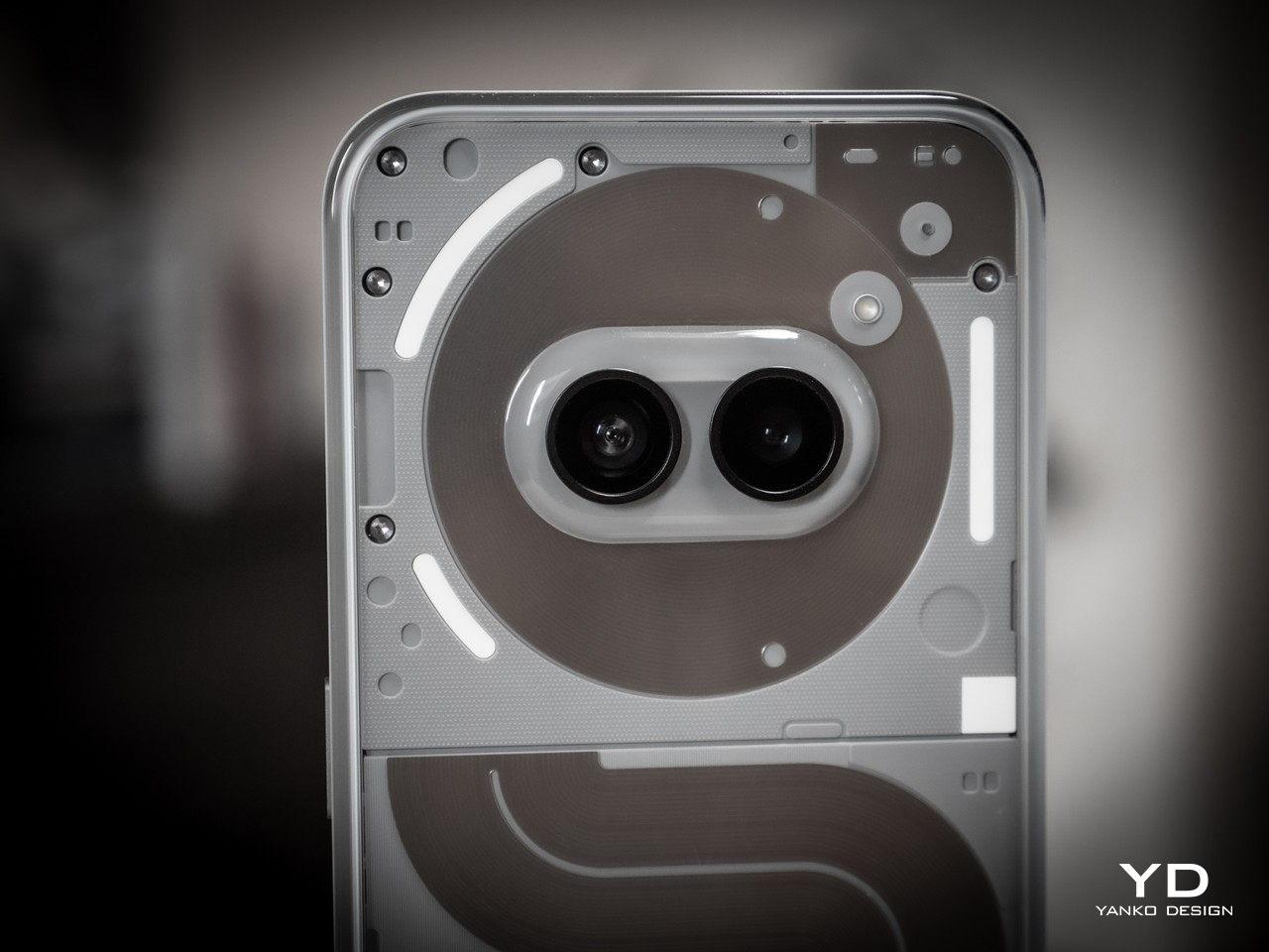
Nothing also embraced that cute little oddity we noticed on the Phone (2a): a face on the back of your phone. The placement of the two cameras in the middle of the NFC coil is no accident, and the company says it gives an anthropomorphic character, almost literally. It’s like having a pair of eyes on a cartoony circular face looking at you, or at least at the person in front of you. It is not by coincidence, either, that the Phone (2a) Plus’s silicon brain actually sits beneath this face as well.
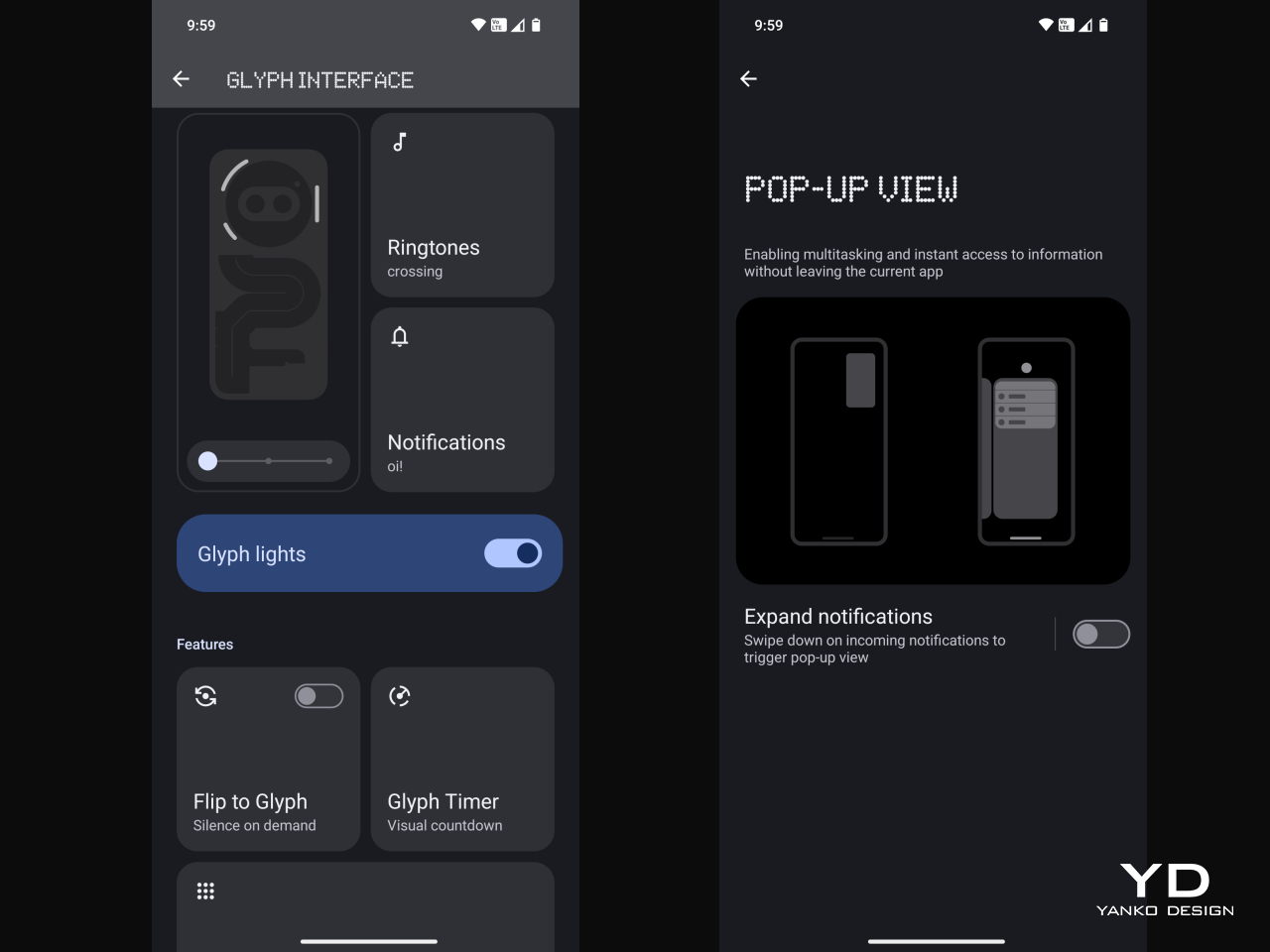
There’s also the Glyph Interface, of course, at least the toned-down version. It might not have the same head-turning effect as the TRON-like Phone (2), but it’s more practical, more efficient, and also longer-lasting. It remains useful and visible even after the novelty has worn off.

Of course, these are design elements that the Phone (2a) also has, but what sets the “Plus” model apart is its more elegant finish. The Phone (2a) Plus has a metallic edge that’s not simply machined and then polished but is actually a product of multiple intricate processes, which is to say it’s quite a laborious and somewhat costly design. It’s well worth it, however, if only for the fact that it gives the Nothing Phone (2a) Plus a more stylish and premium look that raises its profile to the same level as more expensive handsets.
Ergonomics
The Nothing Phone (2a) Plus has a few upgrades inside that we’ll get to in a moment, but despite the internal and material changes, it remains just as lightweight as the Phone (2a), exactly 190g light, in fact. This makes the phone incredibly easy to hold without feeling flimsy or cheap. That’s very important given how large the phone actually is.

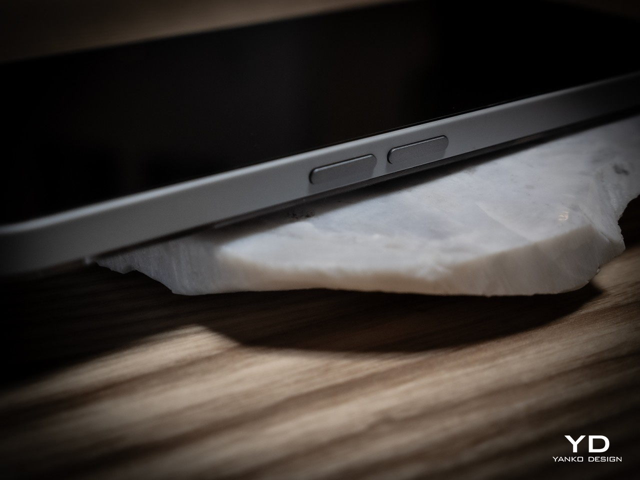
The design of the edges also helps improve that grip. Nothing adheres to that modern flat design school that gives phones more angled edges that lodge themselves into your hand without biting into your skin. It is yet another balancing act that Nothing gets right, allowing users to hold such a big phone with confidence.
Performance
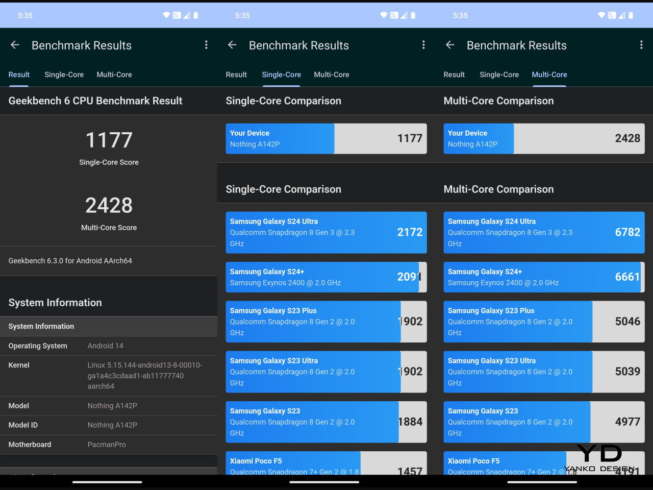
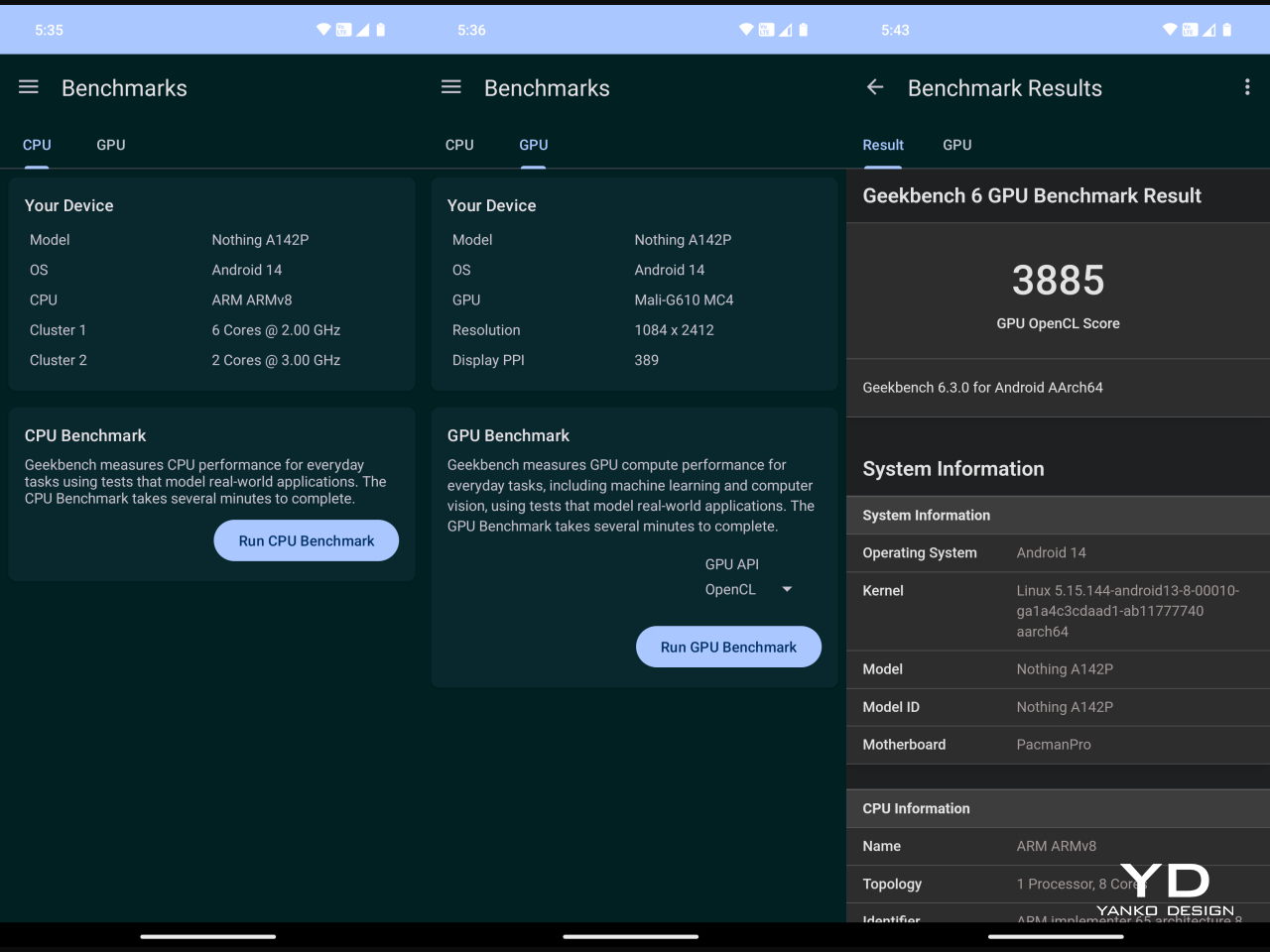
The biggest divide that separates the Phone (2a) and Phone (2a) Plus can be found inside, starting with the new MediaTek Dimensity 7350 Pro 5G that Nothing says was developed exclusively for the brand. It’s definitely a step up from the stock Dimensity 7200 of the Phone (2a), especially by the fact that it can run at 3.0GHz max. It also has a stronger GPU with the Mali-G610 MC4 clocked 30% faster at 1.3GHz. What all these mean in practice is that the phone is even better equipped to handle mobile games, let alone the everyday tasks you throw at it. You’ll still have to dial down the settings, of course, but not to the point that games lose their visual flavor and appeal.


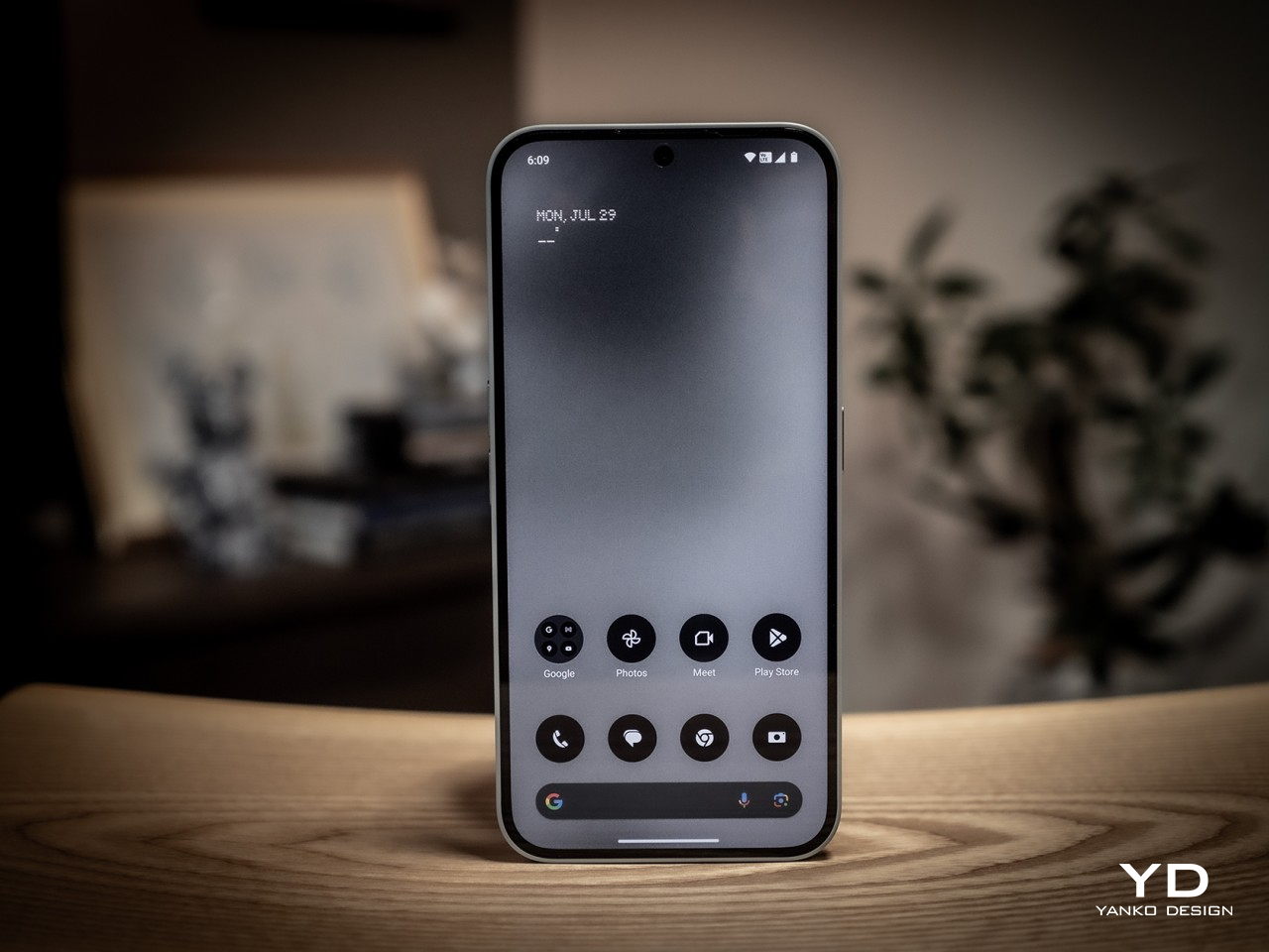
The large 6.7-inch FHD+ AMOLED screen definitely contributes to an enjoyable multimedia experience, especially with its 120Hz refresh rate. The display is vibrant and bright, but not so bright that it will strain your eyes. For that, it supports 2160Hz PWM (Pulse-Width Modulation) dimming, supporting longer screen time use, though it’s still advisable to take regular breaks, regardless.


The other big upgrade that the Phone (2a) Plus boasts of is the triple 50MP camera system. No, there are still only two cameras on the back, and both definitely produce impressive output. The newcomer is the 50MP front-facing camera, up from the already good 32MP shooter from the Phone (2a). This is a Samsung JN1 with an F2.2 aperture lens and a wide 81.2-degree field of view. Suffice it to say, whether you’re taking selfies or food pics, you’ll be treated to clear, crisp, and detailed photos, even at night.


Despite the slightly more powerful hardware, the Nothing Phone (2a) Plus retains the same 5,000 mAh battery. It’s still a large and generous serving by today’s standards, so you shouldn’t be worrying about going empty in the middle of the day. For the Plus model, Nothing upped the charging speed a bit to 50W from 45W. It’s not exactly the fastest on the block, but bigger brands have done worse. Sadly, there’s still no wireless charging here, which is disappointing but not unexpected. In the grand scheme of things, that is probably the least of people’s needs for a phone on this tier.


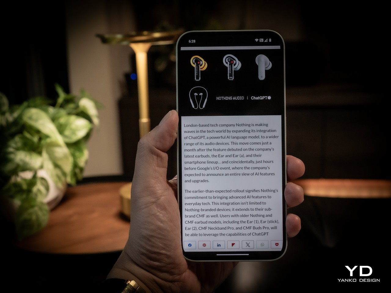
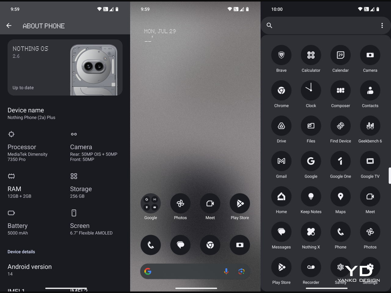
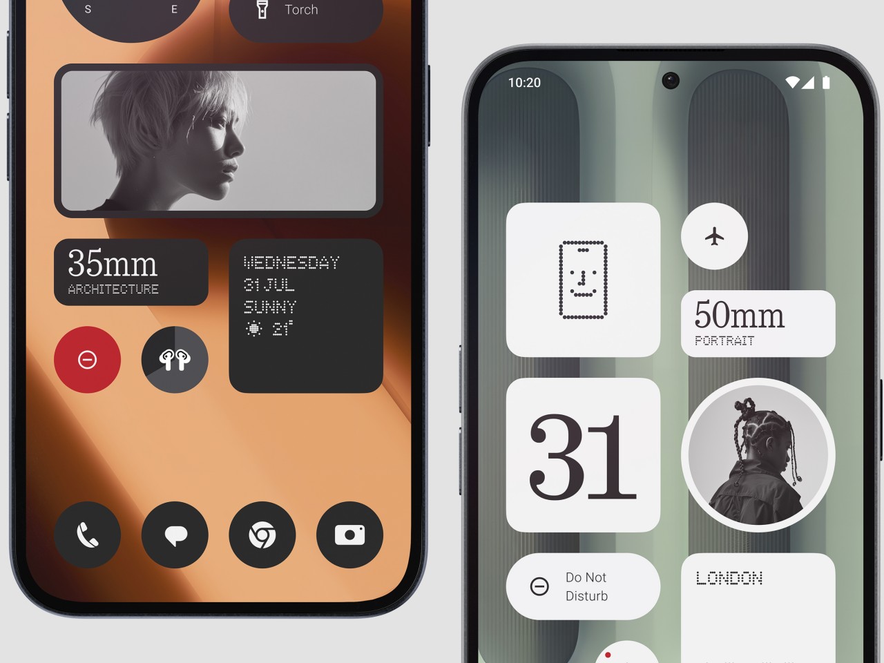
Part of the Nothing Phone’s appeal is its take on the Android experience, and the Phone (2a) Plus definitely has that down to a “T,” including the new AI buzzword. Nothing OS has been famed for its minimalist aesthetic, especially when it comes to home screen widgets. Version 2.6 adds new widgets to that set, and productivity buffs will love the new Date widget for important reminders. There’s also ChatGPT integration for getting the answers you need quickly, though it might be a controversial feature considering some privacy concerns.

Sustainability
Nothing has always positioned itself as a design-conscious company, and designers these days are also conscious of the impact that their designs have on the environment. This is especially true in the smartphone industry where material waste from production and electronic waste from discarded products continue to rise each year as more and more devices are made. That’s why it’s quite encouraging to see Nothing’s efforts in this area, from using 100% recycled aluminum for the midframe to sustainably sourcing over 50% of the Phone (2a) Plus’ plastic parts. It even reuses plastic waste from the production of the Ear (2) buds for this phone.

The Phone (2a) Plus also scores a few points for longevity, particularly with its IP54 dust and water resistance rating. We wish it had a longer software support period, which currently stands at 3 years for Android updates and 4 years for security patches. That can change somewhere down the road, and we hope it does. Where it doesn’t do well is repairability, which isn’t all that surprising considering its uncommon design. Nothing is still young, though, and with the CMF sub-brand, we could see some improvement in that regard as well.
Value
If the Phone (2a) already provided great value for its price, the Phone (2a) Plus takes that a step further. Better performance, a better selfie camera, a slightly faster charging battery, and a great distinctive design all make this handset a great sell. At only $399 for 12GB of RAM and 256GB of storage, it even practically makes the $349 Phone (2a) almost ignorable, strange as that may sound. It is definitely worth considering for your everyday driver, presuming you can get your hands on one.

That is the bit that slightly takes away some of the Phone (2a) Plus’ appeal. You can always import the phone if no local store or carrier offers it, but you will have to do your own research to make sure you can actually use it in your locale. In the US, for example, it doesn’t support AT&T’s 5G network at all and only some of T-Mobile’s 5G bands. Verizon has “limited support,” which means you can use it at your own risk. It’s hardly Nothing’s fault, but it does show some of the disadvantages of being a small fish in such a large pond.
Verdict
The arrival of the Phone (2a) Plus was quite a surprise. Definitely a pleasant one, but a surprise nonetheless. It’s not like the Phone (2a) wasn’t a good phone, but now there might be even fewer reasons for people to want one other than availability and that $50 difference. That’s because the Phone (2a) Plus practically addresses some of the imperfections of its older sibling without taking away any of its charm. It definitely lives up to its promise of a powerful everyday driver, whether you’re scrolling through social media, responding to emails, or even passing the time with games.

The post Nothing Phone (2a) Plus Review: It Keeps Getting Better first appeared on Yanko Design.


