Top 10 Transparent Tech Gear That Truly Showcase The Minimalist Magic Of See-Through Design

Transparent tech designs seem to be taking the world by storm. They make a powerful yet simple statement by combining functionality with a futuristic and aesthetic appeal. These innovative designs offer users an opportunity to observe and appreciate the innards and intricate mechanisms of their favorite devices. Transparent designs unveil their inner workings to users and buyers, creating an atmosphere of openness and honesty. We’ve curated a collection of stunning and super functional transparent tech designs that are a true celebration of minimalism and clarity. From a transparent Gameboy version to a transparent variant of Ray-Ban’s Meta Wayfarer glasses – these products truly showcase the magic of see-through design.

1. Transparent Game Boy

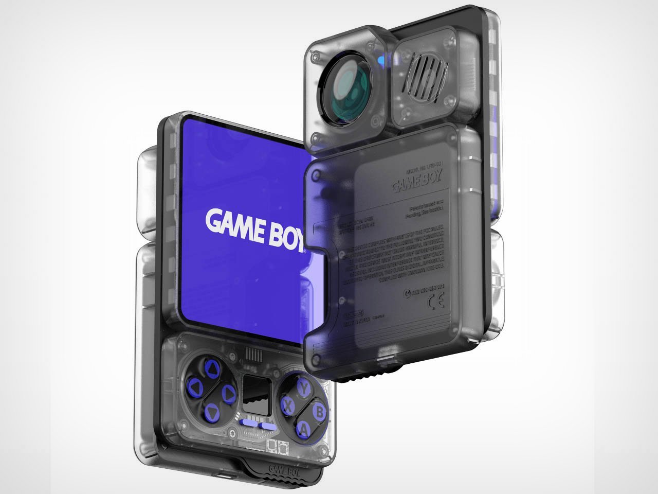
Designed by LFD Official, this conceptual Game Boy design is an ultra-advanced gaming accessory. It is designed to cater to your indoor and outdoor gaming needs, without any restrictions, allowing you to play on the native small screen or a bigger one. And it is transparent It includes an integrated mini projector, which can be removed and placed to project on any room wall, outdoor tent, or more.

2. Ghost Cipher Special Edition Gamepad

The Ghost Cipher Special Edition gamepad features an intriguing transparent outer shell, which exposes all the innards in their real form while showcasing the working dynamics. The see-through aesthetics are contrasted by a silver interior, grey joysticks, and bronze accents on the triggers and D-pad, creating a futuristic and dynamic appeal. The buttons and Xbox logo are white, adding a sophisticated vibe to the design.

3. Meta Ray-Ban Limited Edition Transparent Wayfarer

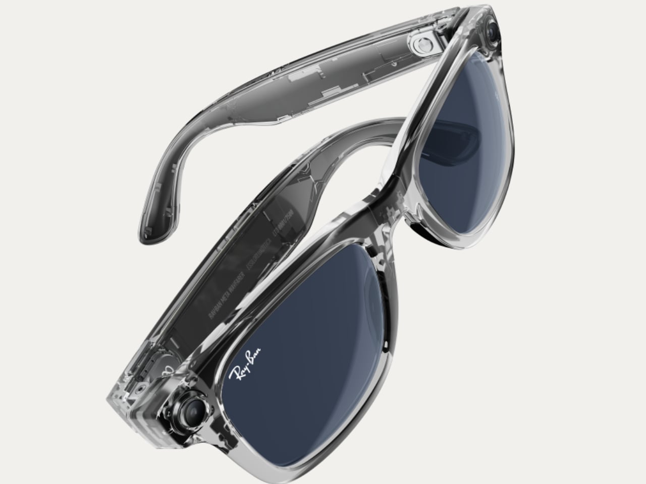
Ray-Ban’s Meta Wayfarer glasses are the ultimate combination of fashion and meet – a classic style is elevated with advanced smart features. Recently Ray-Ban and Meta introduced the new Shiny Transparent Wayfarer, which features exposed innards and Clear to Sapphire Transition lenses. This new and improved model truly tests and pushes the boundaries of what smart glasses can look like.

4. Lenovo ThinkPad Transparent Display Laptop

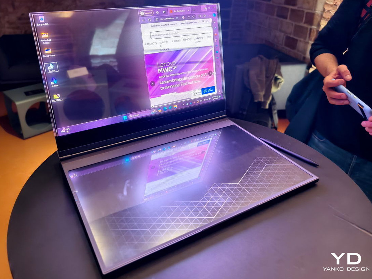
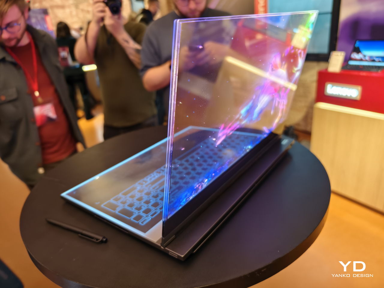
The Lenovo ThinkPad Transparent Display Laptop is the world’s first laptop with a 17.3-inch Micro LED transparent display. It is a concept product that is truly mesmerizing to look at, and you can see the applications windows and their contents very clearly, while still viewing what’s behind the screen. Only some parts of the screen become “opaque” when displaying something, while the rest stays fully transparent!

5. LG SIGNATURE OLED T

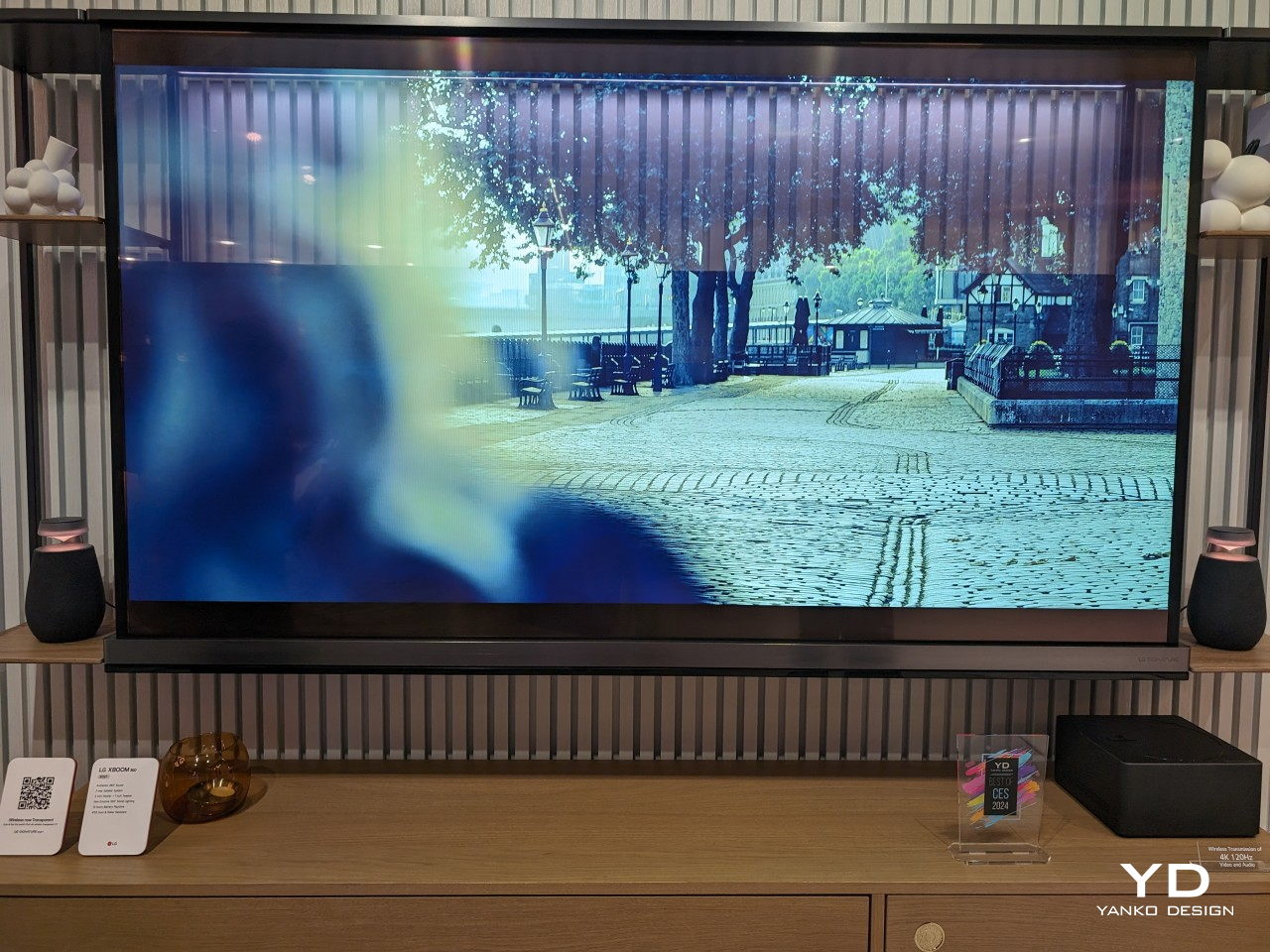
LG’s SIGNATURE OLED T is the world’s first wireless transparent 4K OLED TV. The screen gets entirely covered and lit up with vibrant pictures, fluid animations, and ecstatic images, completely concealing what’s behind those parts, while retaining transparency in the areas without images. The TV blends with the background, once you’re done watching, allowing it to merge with your home.

6. Jetstream Loudspeaker

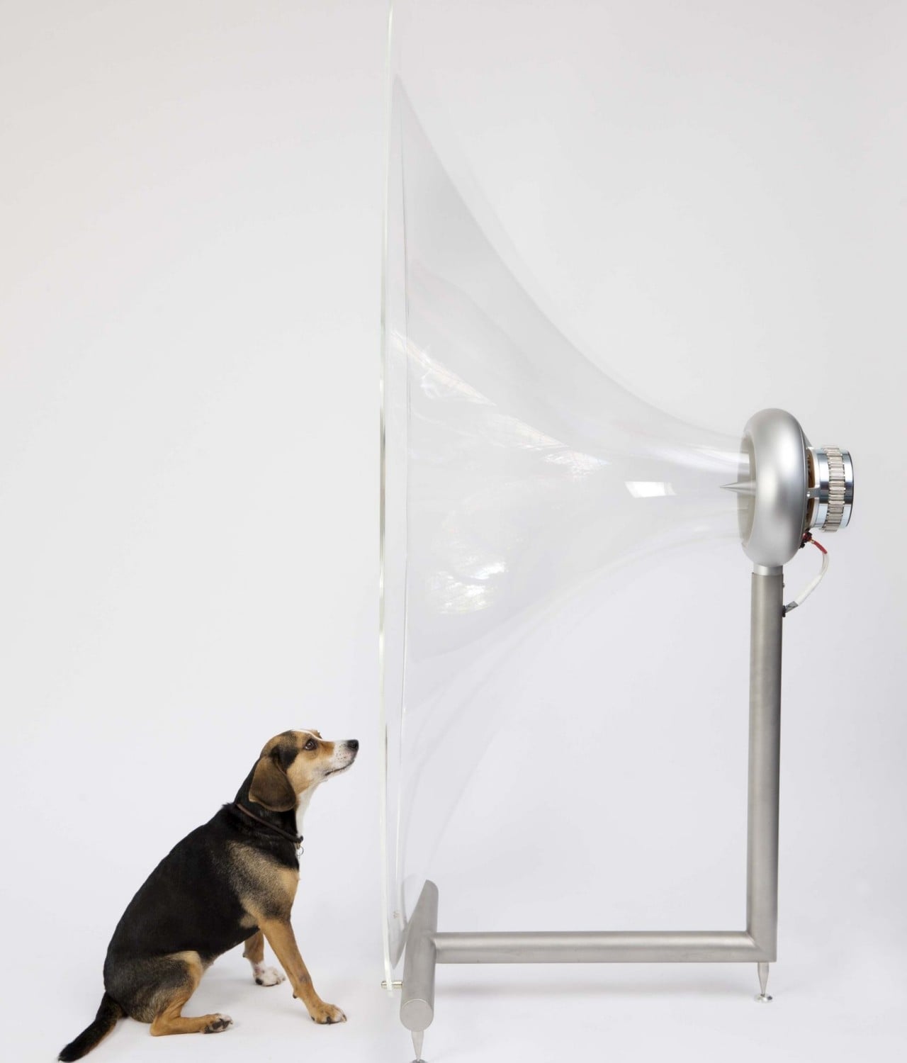
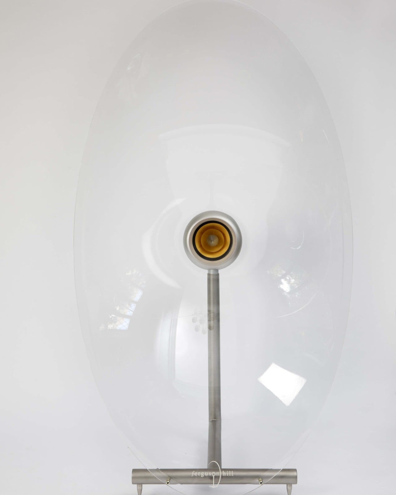
The Jetstream loudspeaker looks more like an art piece than a speaker. It is made using transparent acrylic for the horn, and it is blown up to human-sized proportions. It serves as a distinctive and one-of-a-kind speaker, giving the impression that the drive unit is floating in mid-air. The speaker resembles the sonic boom traces left by a high-speed jet when it is seen from the side, making it a truly unique piece.

7. Harman Kardon Gramophone Mini Speaker Concept

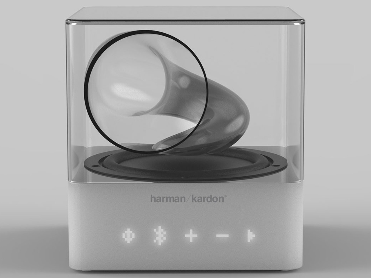
Designed by Wagner Pozebon, this speaker design is the perfect epitome of minimalism, combined with the spirit of the good old gramophone, while also incorporating a modern and contemporary design aesthetic. The versatile wireless speaker features a translucent body that mimics the classic gramophone’s contours. The amplification of the speaker is right on point delivering encapsulating audio from the soundbox.

8. Nothing Bass (1) Speaker

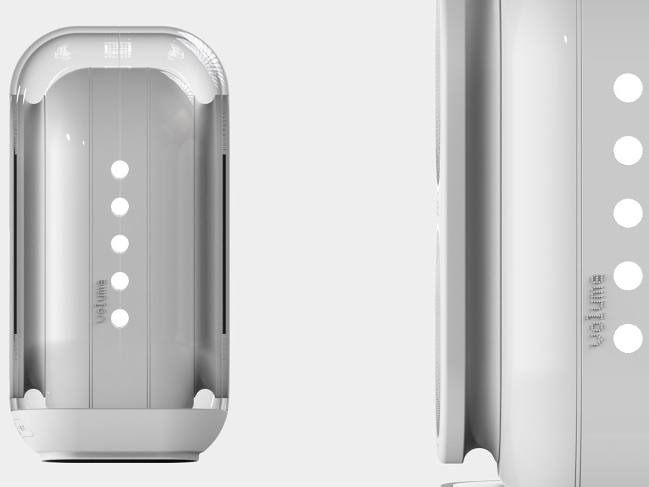
Named the Nothing Bass (1), this portable speaker is designed in Black or White color, making it an excellent conversation starter for a house party. The speaker pairs up with the power of LED lighting, which syncs perfectly to the rhythm of beats, ensuring the device captures everyone’s attention. The speaker’s cone is transparent, protecting the innards from the outside elements. The appeal of the speaker is pretty classy, and it will elevate the vibe of any living room.

9. Apple Clear Series

Named the Apple Clear Series, this concept design recreates popular Apple products with transparent aesthetics, giving them a cool see-through vibe. The AirPods Max Clear are super cool transparent cans with the rear portion of the earcups exposed.  While the AirPods Pro Clear seems to be inspired by Beats, and the Apple Watch Ultra Clear features a transparent shell, and a rubber strap in a see-through material.

10. Transparent Turntable

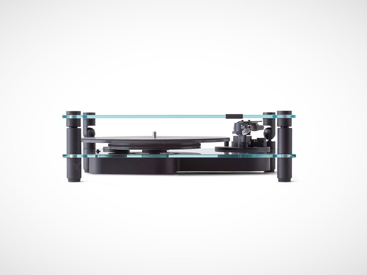
Stockholm-based Transparent has released a turntable, which is truly quite stunning. It features a transparent tempered glass cover on top of an aluminum body, which has been meticulously crafted. It is available in black and white and equipped with a preinstalled Elliptical Diamond Ortofon OM Stylus 5E which delivers rich and top-notch sound quality. You can replace it with a fancier stylus model as well if you prefer.

The post Top 10 Transparent Tech Gear That Truly Showcase The Minimalist Magic Of See-Through Design first appeared on Yanko Design.

Top 10 Transparent Tech Gear That Truly Showcase The Minimalist Magic Of See-Through Design

Transparent tech designs seem to be taking the world by storm. They make a powerful yet simple statement by combining functionality with a futuristic and aesthetic appeal. These innovative designs offer users an opportunity to observe and appreciate the innards and intricate mechanisms of their favorite devices. Transparent designs unveil their inner workings to users and buyers, creating an atmosphere of openness and honesty. We’ve curated a collection of stunning and super functional transparent tech designs that are a true celebration of minimalism and clarity. From a transparent Gameboy version to a transparent variant of Ray-Ban’s Meta Wayfarer glasses – these products truly showcase the magic of see-through design.

1. Transparent Game Boy
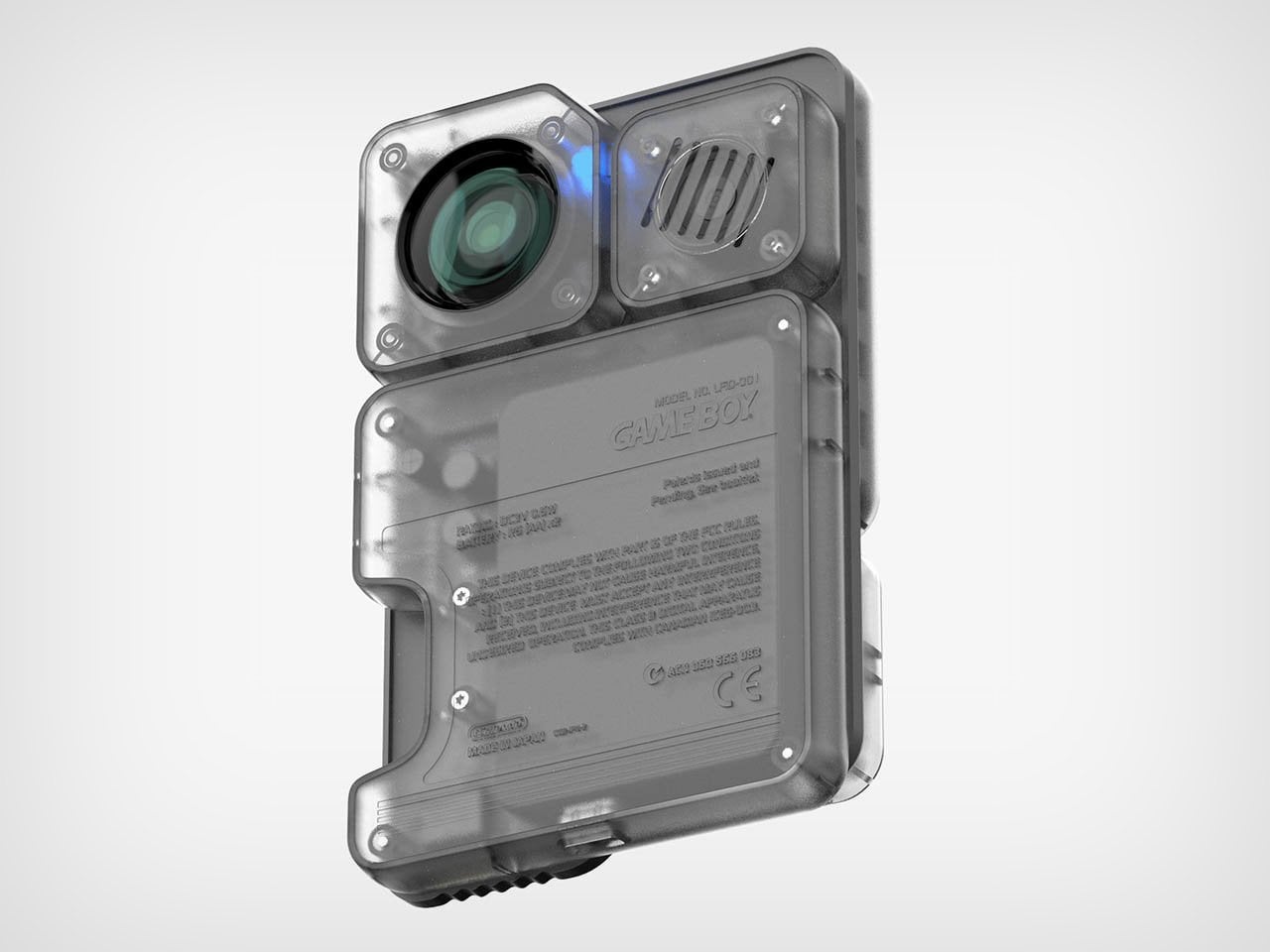
Designed by LFD Official, this conceptual Game Boy design is an ultra-advanced gaming accessory. It is designed to cater to your indoor and outdoor gaming needs, without any restrictions, allowing you to play on the native small screen or a bigger one. And it is transparent It includes an integrated mini projector, which can be removed and placed to project on any room wall, outdoor tent, or more.

2. Ghost Cipher Special Edition Gamepad

The Ghost Cipher Special Edition gamepad features an intriguing transparent outer shell, which exposes all the innards in their real form while showcasing the working dynamics. The see-through aesthetics are contrasted by a silver interior, grey joysticks, and bronze accents on the triggers and D-pad, creating a futuristic and dynamic appeal. The buttons and Xbox logo are white, adding a sophisticated vibe to the design.

3. Meta Ray-Ban Limited Edition Transparent Wayfarer

Ray-Ban’s Meta Wayfarer glasses are the ultimate combination of fashion and meet – a classic style is elevated with advanced smart features. Recently Ray-Ban and Meta introduced the new Shiny Transparent Wayfarer, which features exposed innards and Clear to Sapphire Transition lenses. This new and improved model truly tests and pushes the boundaries of what smart glasses can look like.

4. Lenovo ThinkPad Transparent Display Laptop
The Lenovo ThinkPad Transparent Display Laptop is the world’s first laptop with a 17.3-inch Micro LED transparent display. It is a concept product that is truly mesmerizing to look at, and you can see the applications windows and their contents very clearly, while still viewing what’s behind the screen. Only some parts of the screen become “opaque” when displaying something, while the rest stays fully transparent!
5. LG SIGNATURE OLED T
LG’s SIGNATURE OLED T is the world’s first wireless transparent 4K OLED TV. The screen gets entirely covered and lit up with vibrant pictures, fluid animations, and ecstatic images, completely concealing what’s behind those parts, while retaining transparency in the areas without images. The TV blends with the background, once you’re done watching, allowing it to merge with your home.

6. Jetstream Loudspeaker
The Jetstream loudspeaker looks more like an art piece than a speaker. It is made using transparent acrylic for the horn, and it is blown up to human-sized proportions. It serves as a distinctive and one-of-a-kind speaker, giving the impression that the drive unit is floating in mid-air. The speaker resembles the sonic boom traces left by a high-speed jet when it is seen from the side, making it a truly unique piece.

7. Harman Kardon Gramophone Mini Speaker Concept
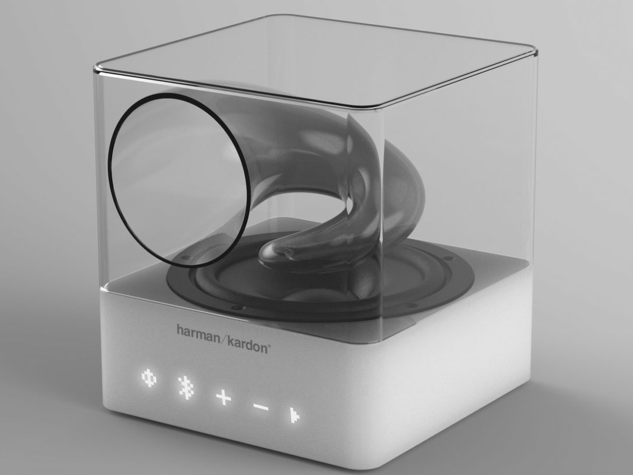
Designed by Wagner Pozebon, this speaker design is the perfect epitome of minimalism, combined with the spirit of the good old gramophone, while also incorporating a modern and contemporary design aesthetic. The versatile wireless speaker features a translucent body that mimics the classic gramophone’s contours. The amplification of the speaker is right on point delivering encapsulating audio from the soundbox.

8. Nothing Bass (1) Speaker
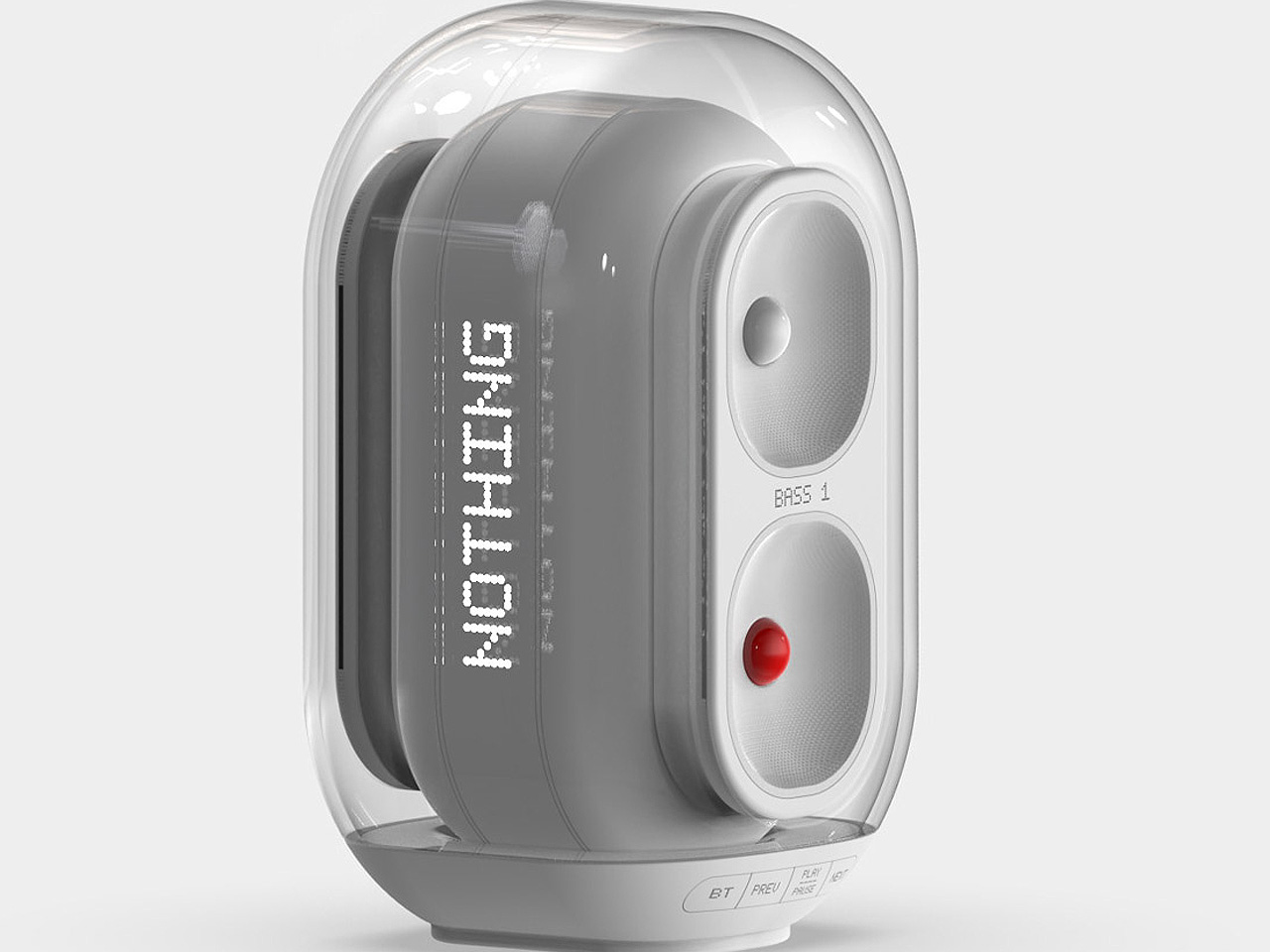
Named the Nothing Bass (1), this portable speaker is designed in Black or White color, making it an excellent conversation starter for a house party. The speaker pairs up with the power of LED lighting, which syncs perfectly to the rhythm of beats, ensuring the device captures everyone’s attention. The speaker’s cone is transparent, protecting the innards from the outside elements. The appeal of the speaker is pretty classy, and it will elevate the vibe of any living room.

9. Apple Clear Series

Named the Apple Clear Series, this concept design recreates popular Apple products with transparent aesthetics, giving them a cool see-through vibe. The AirPods Max Clear are super cool transparent cans with the rear portion of the earcups exposed.  While the AirPods Pro Clear seems to be inspired by Beats, and the Apple Watch Ultra Clear features a transparent shell, and a rubber strap in a see-through material.

10. Transparent Turntable
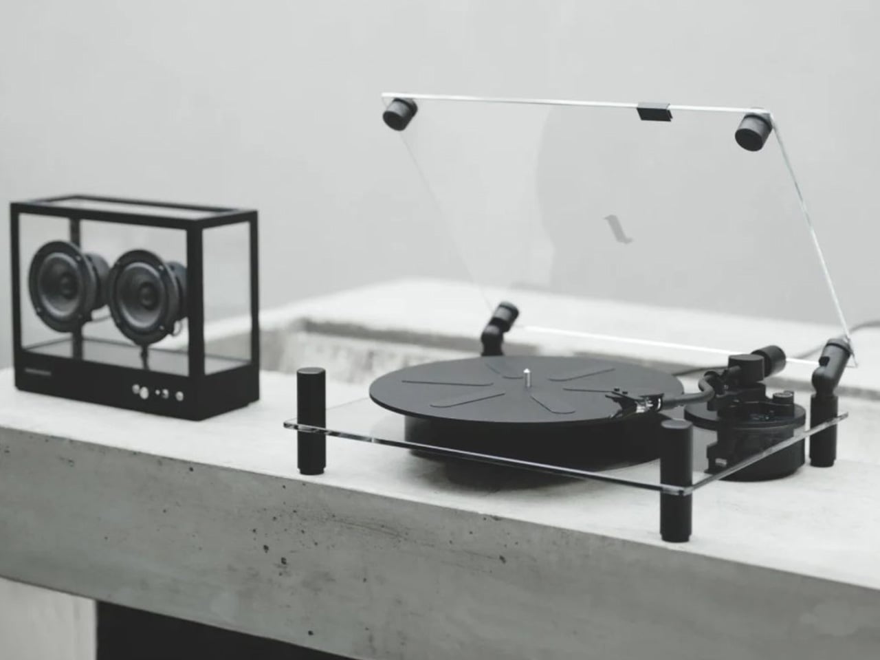
Stockholm-based Transparent has released a turntable, which is truly quite stunning. It features a transparent tempered glass cover on top of an aluminum body, which has been meticulously crafted. It is available in black and white and equipped with a preinstalled Elliptical Diamond Ortofon OM Stylus 5E which delivers rich and top-notch sound quality. You can replace it with a fancier stylus model as well if you prefer.

The post Top 10 Transparent Tech Gear That Truly Showcase The Minimalist Magic Of See-Through Design first appeared on Yanko Design.

Apple’s Smart Home Display: Redefining Design, AI, and Everyday Convenience Powered by homeOS

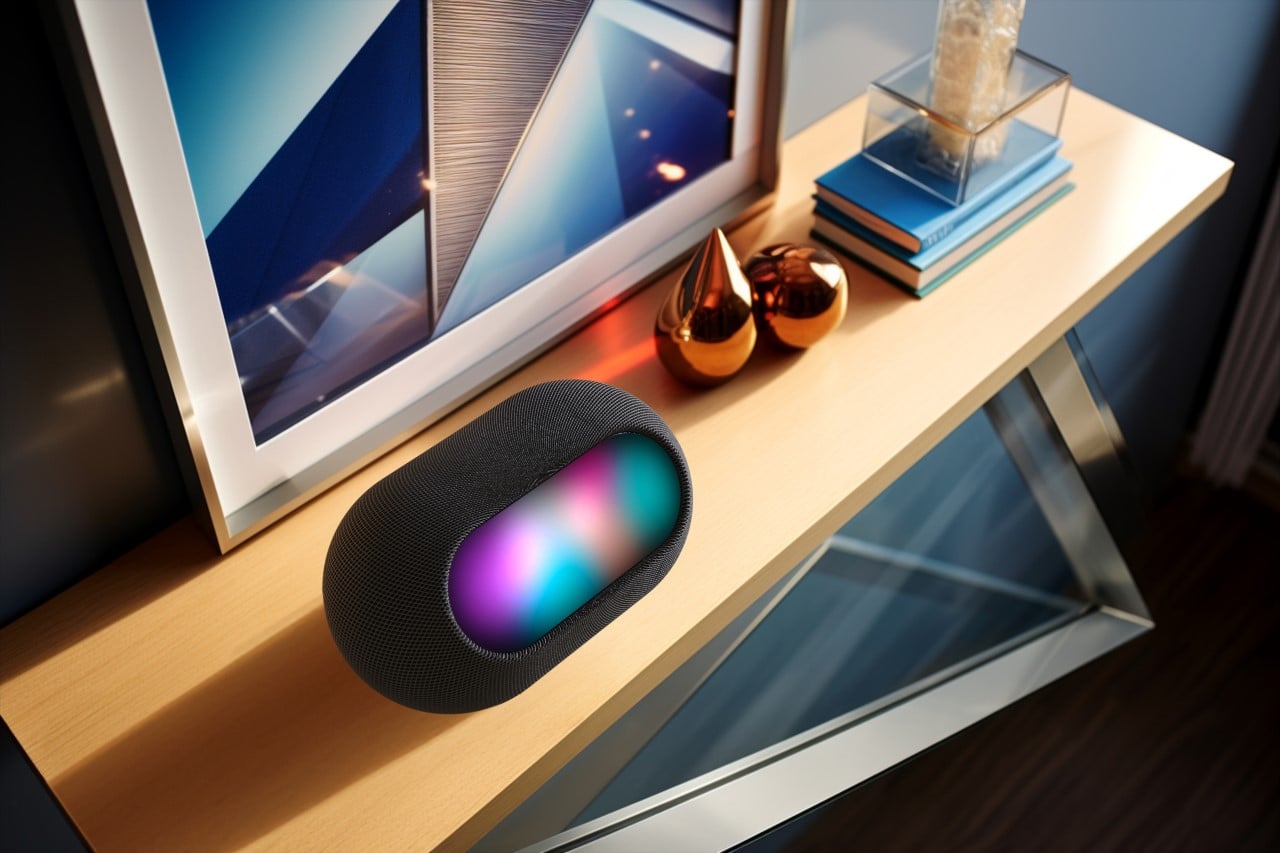
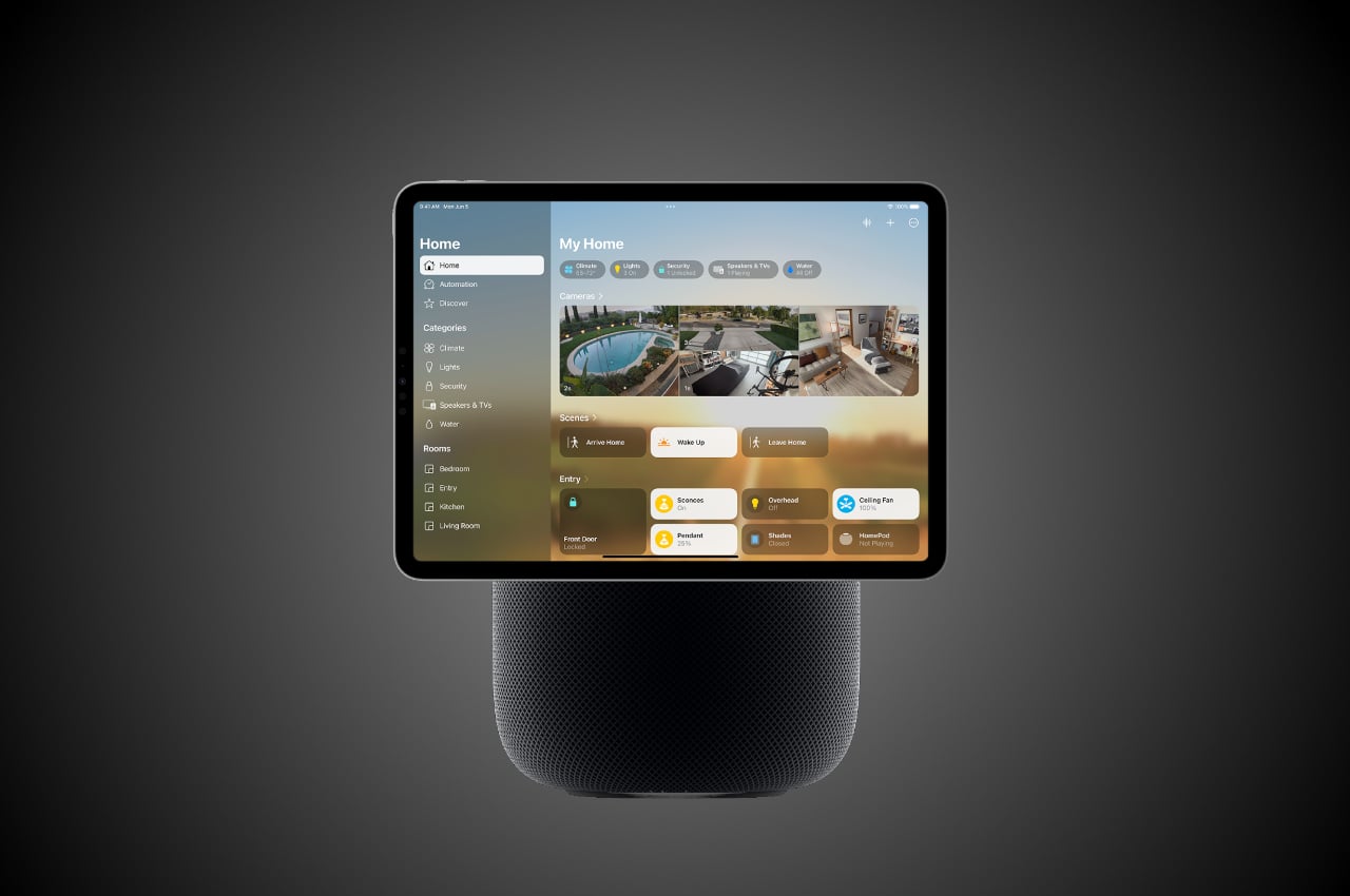
Apple is preparing to introduce a smart home device that blends the capabilities of an iPad, Apple TV, and HomePod. While we’ve seen hints of this over the past year, it’s clear that Apple is aiming to offer something more streamlined and familiar for those looking to automate their homes. These new devices are set to roll out in 2025 and are powered by Apple’s homeOS, an operating system specifically designed to simplify home management.

Designer: Apple

At the heart of these products is Apple’s design philosophy: simplicity, usability, and seamless integration with everyday life. For instance, one of the upcoming models will focus on essential tasks like FaceTime, controlling smart home devices, and using apps. It’s not overcomplicated or cluttered with unnecessary features—it’s practical. The goal is clear: offer consumers a device that fits easily into their routine without feeling like they’re learning a whole new system. The design reflects that, with a clean, intuitive interface that works well for families or anyone who wants to manage their home easily.

For those looking for something a bit more premium, Apple has a model that takes things a step further. This version includes a robotic arm that automatically tilts and adjusts the screen for optimal viewing, creating a hands-free experience. Whether you’re in the middle of a FaceTime call or watching something while moving around the kitchen, the device adapts without needing constant attention. This sort of design choice speaks to Apple’s focus on making technology work around the user, not the other way around. Its functional design is meant to simplify, not complicate.

Apple’s homeOS ties everything together, offering a smarter, more intuitive way to control devices. It’s a natural extension of what Apple already does with products like the iPhone and iPad, but homeOS is explicitly designed to manage smart homes. This isn’t just about setting up timers for lights or adjusting the thermostat—Apple Intelligence learns your habits, automating tasks without you even thinking about it. It adjusts based on your routine, handling everything from lighting to temperature so the home feels like it’s working for you.

Design plays a significant role here, too. For instance, one of the models will have a magnetic mount, making it easy to place wherever you need it, whether on the wall or a table. It’s simple, and that’s precisely the point. You don’t have to redesign your home to fit this device; it adapts to your space. With its adjustable screen, the premium model’s robotic arm offers even more flexibility. It’s a device that can move with you, keeping convenience and usability front and center.

Apple’s approach to smart homes feels different because they’ve always been about creating an ecosystem that works together. This new device is no exception. If you’re already using an iPhone, Mac, or Apple TV, this product will slot right into your life. You won’t need to learn a new platform or jump through hoops—it’s designed to be intuitive for anyone already familiar with Apple’s ecosystem. And for those who aren’t, it’s still easy to use.

As we move toward the 2025 launch, it’s clear that Apple is focusing on making home automation feel more natural. These new devices are not just about throwing in more features but offering a thoughtful design that blends into everyday life. Whether it’s the magnetic mount or the robotic arm, Apple’s design choices always come back to one thing: how can this make the consumer’s life easier? And that’s why their approach makes sense.

The post Apple’s Smart Home Display: Redefining Design, AI, and Everyday Convenience Powered by homeOS first appeared on Yanko Design.

GM’s Cruise fined $1.5 million for omitting details about its gruesome 2023 crash

On Monday, the National Highway Traffic Safety Administration (NHTSA) fined Cruise, GM’s self-driving vehicle division, $1.5 million. The penalty was imposed for omitting key details from an October 2023 accident in which one of the company’s autonomous vehicles struck and dragged a San Francisco pedestrian.

Cruise is being fined for initially submitting several incomplete reports. The NHTSA’s reports require pre-crash, crash and post-crash details, which the company gave to the agency without a critical detail: that the pedestrian was dragged by the vehicle for 20 feet at around 7 MPH, causing severe injuries. Eventually, the company released a 100-page report from a law firm detailing its failures surrounding the accident.

That report states that Cruise executives initially played a video of the accident during October 3 meetings with the San Francisco Mayor's Office, NHTSA, DMV and other officials. However, the video stream was “hampered by internet connectivity issues” that concealed the part where the vehicle dragged the victim. Executives, who the report stated knew about the dragging, also failed to verbally mention that crucial detail in the initial meetings because they wanted to let “the video speak for itself.” 

Investigators finally found out about the dragging after the NHTSA asked the company to submit the full video. The government agency says Cruise also amended four other incomplete crash reports involving its vehicles to add additional details.

The NHTSA's new requirements for Cruise include submitting a corrective action plan, along with others covering its total number of vehicles, their miles traveled and whether they operated without a driver. It also has to summarize software updates that affect operation, report citations and observed violations of traffic laws and let the agency know how it will improve safety. Finally, Cruise will have to meet with the NHTSA quarterly to discuss the state of its operations while reviewing its reports and compliance.

The order lasts at least two years, and the NHTSA can extend it to a third year. Reuters reported on Monday that, despite the fine, the NHTSA’s investigation into whether Cruise is taking proper safety precautions to protect pedestrians is still open. Cruise still faces probes by the Department of Justice and the Securities and Exchange Commission.

To say the incident sparked shakeups at Cruise would be an understatement. The company halted its self-driving operations after the accident. Then, last November, the dominoes began to fall: Its CEO resigned, and GM said it would cut its Cruise investment by “hundreds of millions of dollars” and restructure its leadership. Nine more executives were dismissed in December.

Nonetheless, Cruise is trying to rebound under its new leadership. Vehicles with drivers returned to Arizona and Houston this year, and GM said it’s pouring an additional $850 million into it. Earlier this month, it began operating in California again, also with drivers — which, it’s safe to say, is a good thing.

This article originally appeared on Engadget at https://www.engadget.com/transportation/gms-cruise-fined-15-million-for-omitting-details-about-its-gruesome-2023-crash-210559255.html?src=rss

Custom Balrog and Gandalf Keycaps give your Mechanical Keyboard a LOTR Middle-Age facelift

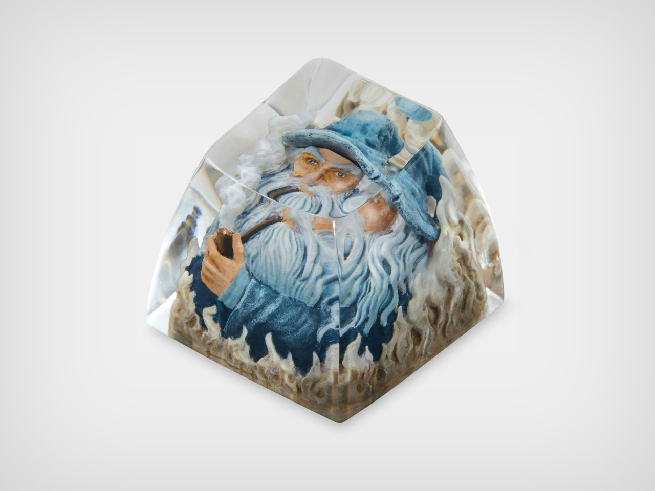
Few moments in fantasy history are as iconic as Gandalf’s showdown with the Balrog on the Bridge of Khazad-dûm. Now, thanks to a collaboration between Drop and The Lord of the Rings, this epic clash has been immortalized in a way that combines fandom with functionality. The Balrog and Mithrandir Artisan Keycap and Spacebar set offers a chance to bring the magic of Middle-earth to your fingertips, and it’s more than just a collector’s item. It’s a fusion of premium craftsmanship, stunning design, and technical precision that adds a touch of the fantastical to your everyday typing experience.

Designer: Dwarf Factory for Drop

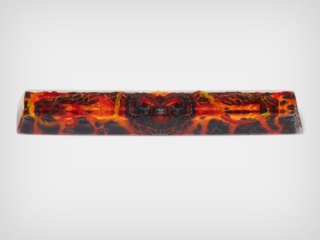
Crafted by Dwarf Factory, each piece is an artisan masterpiece in resin, featuring rich details that evoke the essence of these legendary characters. The Balrog, with its fiery menace and aggressive stance, looks ready to engulf your entire keyboard, while Mithrandir stands resolute, channeling his defiant power just as he did when facing the beast. The level of detail is extraordinary—from the flame-like textures on the Balrog to the serene yet powerful expression of Gandalf, these keycaps are tiny works of art. Available in a 1u size for both characters, and with the Balrog also available as a 6.25u spacebar, these keycaps not only add visual impact but are also fully functional. They integrate smoothly with Cherry MX switches and clones, making them a natural fit for most mechanical keyboards.

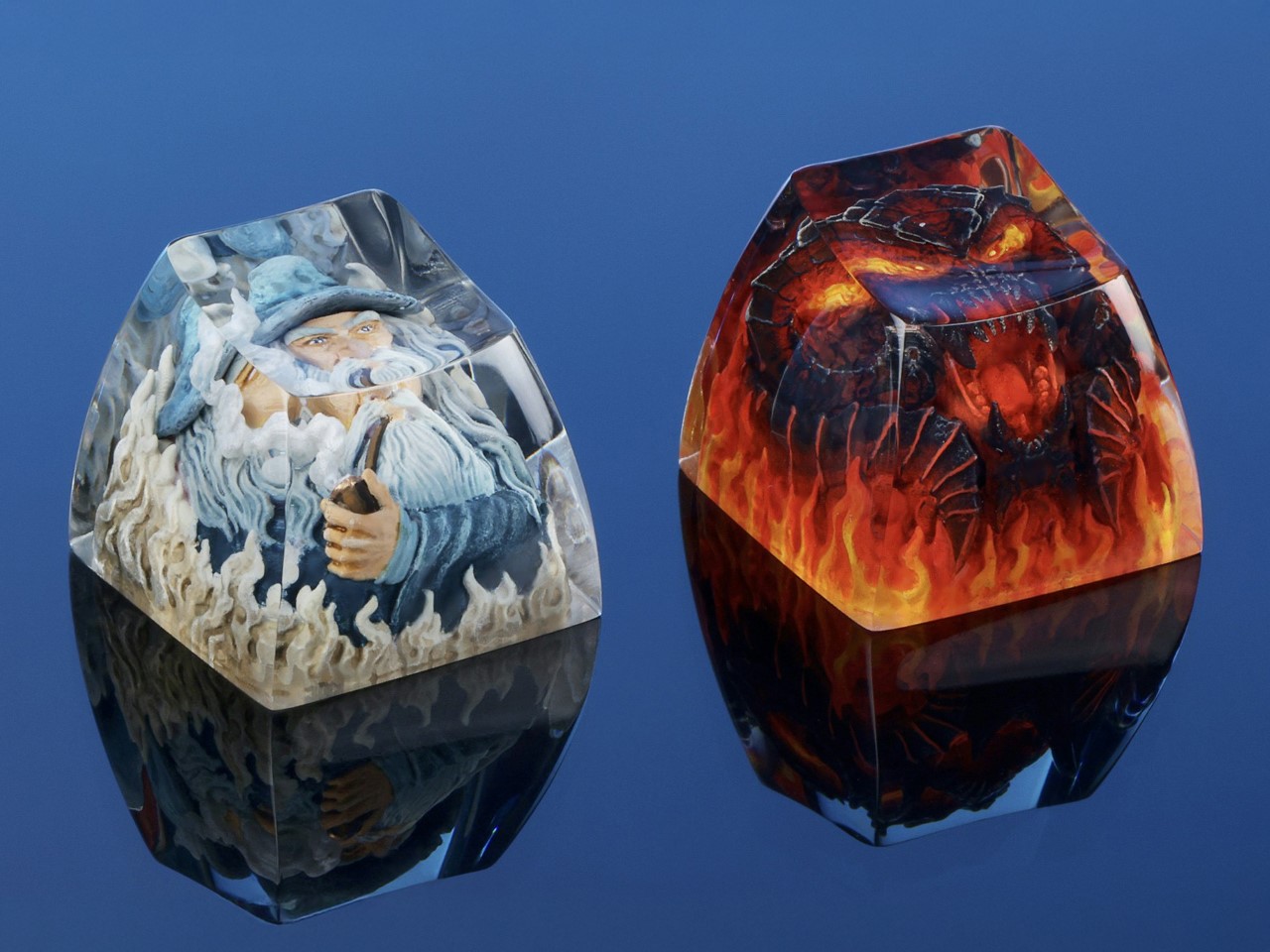
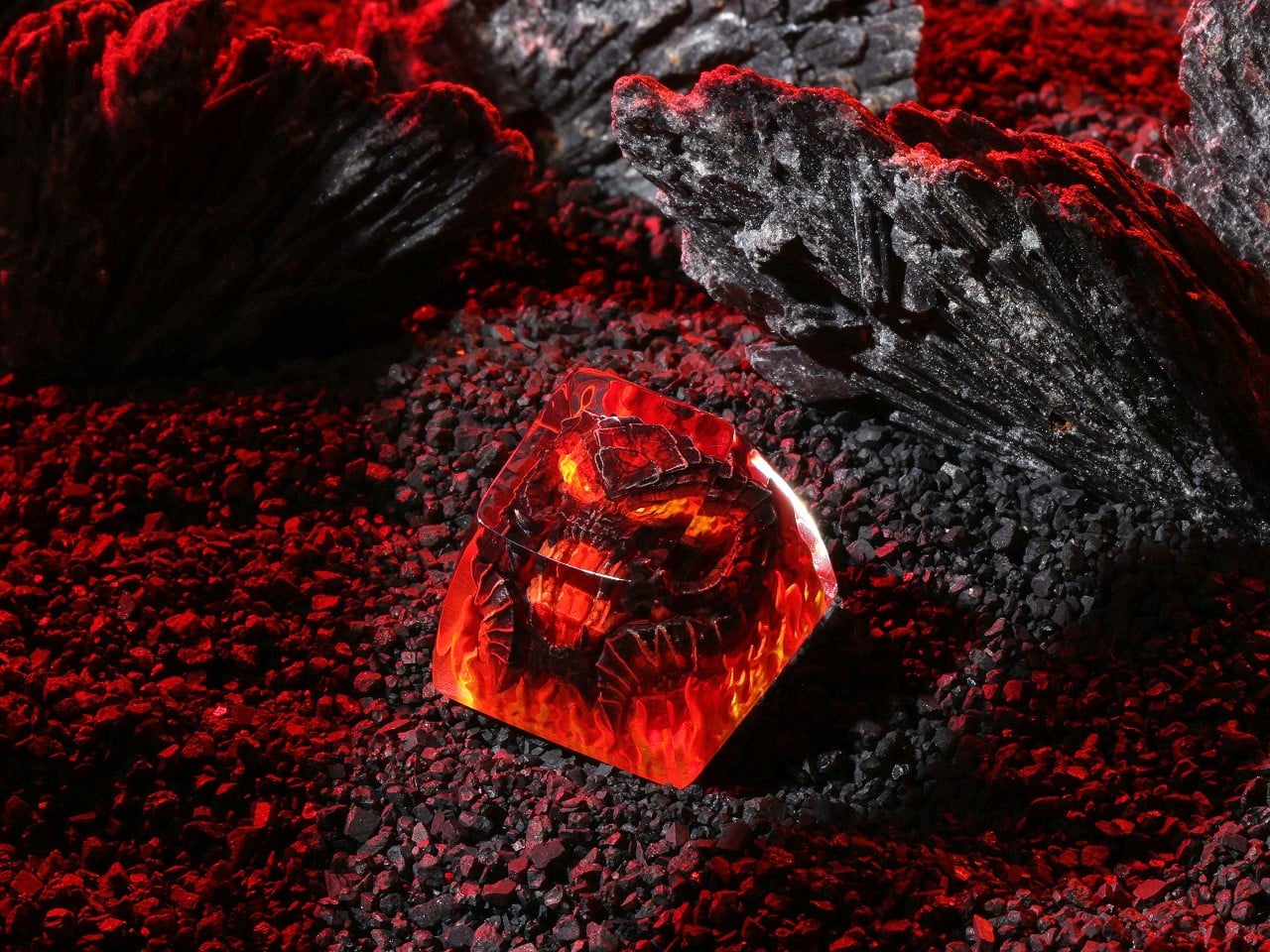
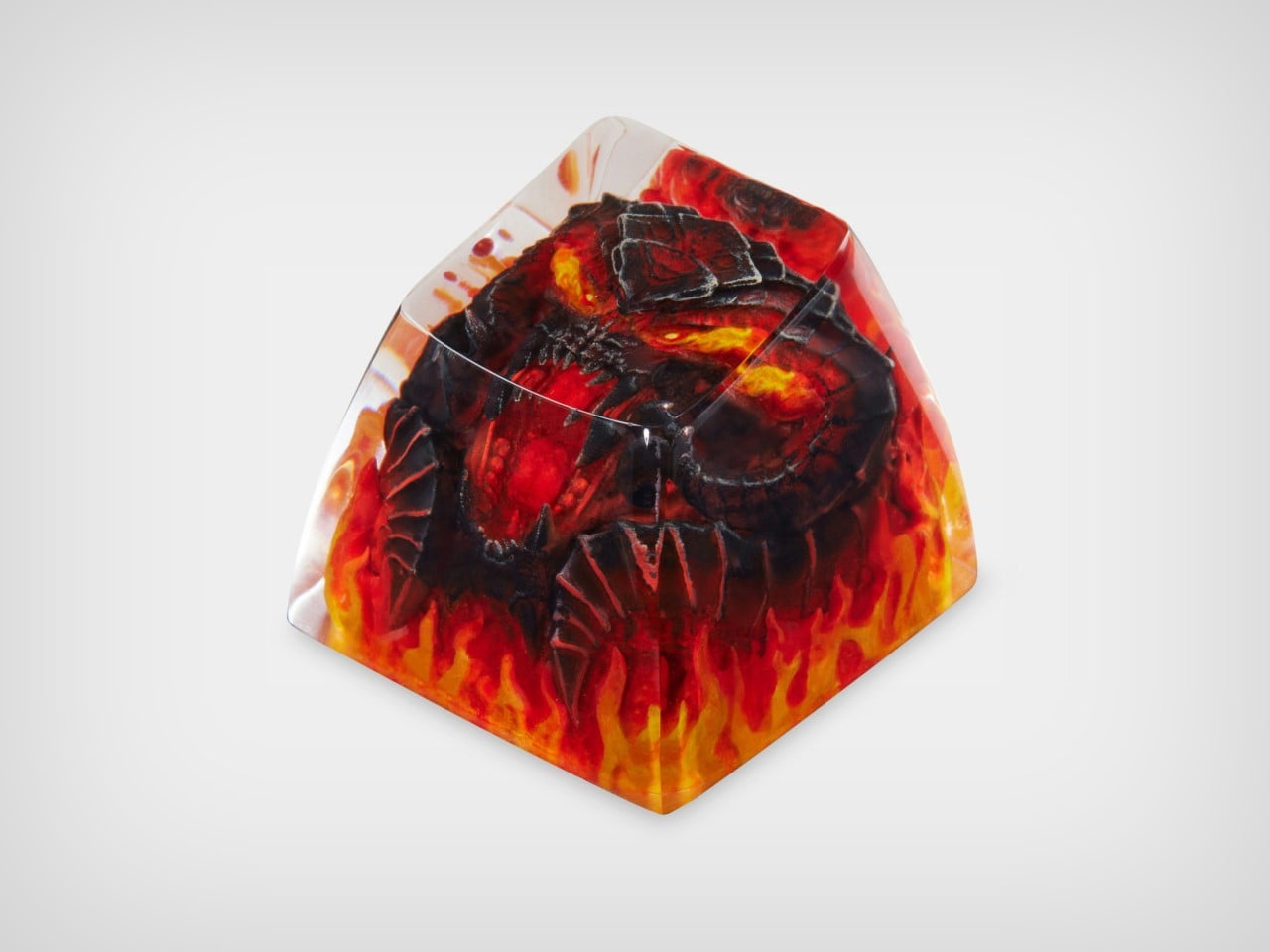
The 1u Balrog keycap is nothing short of a fiery masterpiece. Designed to reflect the raw power and menacing presence of Durin’s Bane, it features intricate detailing that brings the dark, fiery creature to life. With its flame-engulfed body and haunting expression, the keycap feels like it’s radiating heat right off your keyboard. The resin material used for the keycap captures the vivid colors of fire, from the burning red to deep molten black, creating a striking visual contrast that mirrors the Balrog’s destructive force. Every angle of this 1u keycap has been meticulously designed to showcase the Balrog’s fearsome nature, making it a perfect choice for those looking to add an element of danger and mystery to their keyboard setup. It fits comfortably on any Cherry MX switch or clone, ensuring that it’s as functional as it is eye-catching.

Mithrandir, or Gandalf, takes center stage in the second 1u keycap, offering a calm but powerful contrast to the Balrog. In this design, Gandalf is depicted in his role as the Grey Pilgrim, holding his staff and ready to face down the ancient evil with the iconic line, “You shall not pass!” The keycap perfectly captures the quiet strength and wisdom that defines the wizard, with intricate detailing in his robes and an expression of calm determination. Crafted in resin, the Mithrandir keycap offers a more subtle aesthetic compared to the fiery Balrog, but its craftsmanship is no less impressive. The muted grey tones and flowing details create a sense of movement, almost as if Gandalf himself is preparing to strike. This keycap serves as a symbol of resilience and courage, and for fans of The Lord of the Rings, it’s a meaningful reminder of Gandalf’s pivotal role in the story.

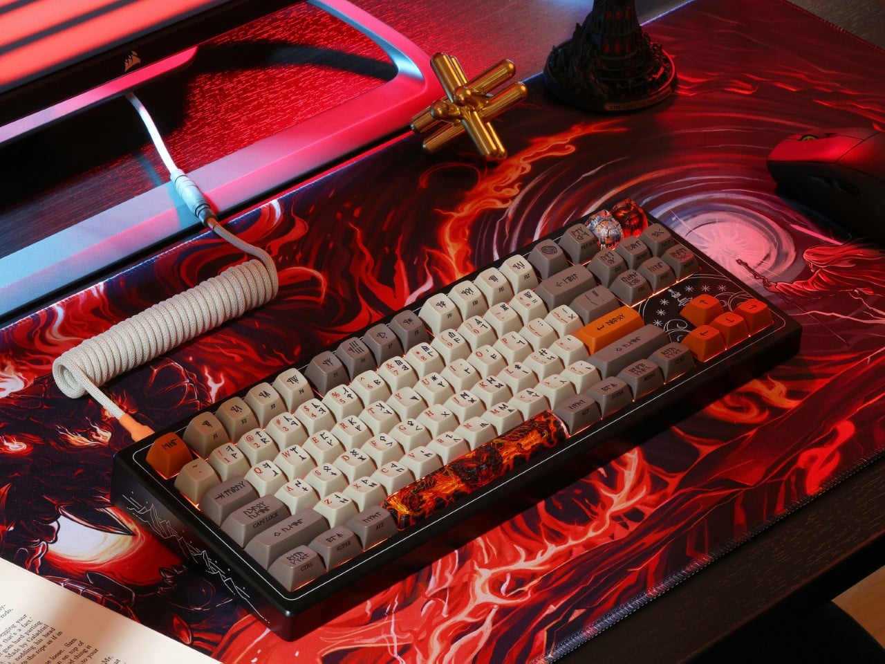
The pièce de résistance, however, is the 6.25u Balrog spacebar. A true showstopper, this spacebar turns your keyboard into a battleground between the Maiar. Unlike the 1u keycap, the spacebar offers a wider canvas, allowing for even more detail in the Balrog’s fiery design. The flames stretch across the length of the spacebar, creating a dramatic scene that feels like it’s pulled straight from the depths of Moria that comes to life with the backlight switched on. The spacebar also features subtle texturing that mimics the rugged look of stone, further emphasizing the destructive force of the Balrog. With its large profile and vivid design, this spacebar commands attention and becomes the focal point of any keyboard. And, like the other keycaps in the set, it’s compatible with Cherry MX switches, ensuring that your epic setup doesn’t sacrifice functionality for style.

The custom-made keycaps are the perfect combination of nostalgia and utility, seamlessly blending a piece of Tolkien’s world into your everyday life. Whether you’re aligning yourself with the fiery might of the Balrog or the steadfast courage of Mithrandir, these keycaps turn your keyboard into a mini piece of Middle-earth. And with their high-quality resin construction, you can trust that they’re built to last, no matter how epic your typing battles become.

Priced at $49, a notable drop from its original $65, the Balrog and Mithrandir Artisan Keycap and Spacebar set is available for pre-order now, with an estimated shipping date of February 10, 2025.

The post Custom Balrog and Gandalf Keycaps give your Mechanical Keyboard a LOTR Middle-Age facelift first appeared on Yanko Design.
Amazon’s Fire HD 10 tablet drops to a record-low price ahead of October Prime Day

If you've been on the lookout for a killer deal on a perfectly decent tablet for streaming videos and catching up on some reading, hunt no more. Just ahead of the October edition of Prime Day, Amazon has slashed the price of the Fire HD 10 tablet to $75, which is a discount of $65. This matches the tablet's lowest price to date, which we saw during Prime Day in July.

The deal is for a model with 32GB of storage and ads on the lockscreen. Expanding the storage is easy enough thanks to the microSD slot, but to get rid of the lockscreen ads you'll need to buy a different version (which, at $90, is also currently $65 off).

You probably won't be doing as much creative work on a Fire HD tablet as you might on an iPad Pro. But for kicking back and catching up on a show or reading a Kindle book, Amazon's tablet certainly does the trick. It has a 10.1-inch Full HD display with a promise of up to 13 hours of battery life. Amazon says it delivers 25 percent faster performance than the previous model and it has 3GB of storage.

You can use the tablet to keep up with family and friends using messaging apps or hop on video calls with the help of the 5MP front-facing camera. You can also use a stylus to sketch in various apps. There's Alexa integration as well, of course — you can use the tablet to control smart compatible home devices and get a live view of connected security cameras.

One thing worth noting is that Amazon has yet to hold its usual fall devices event, so it may be using the October Prime Day sale to get rid of its current inventory of devices on the cheap before announcing upgraded models. Even if Amazon does have new tablets to show off in the coming weeks, though, you'll still have a solid device in hand if you snap this one up.

Follow @EngadgetDeals on Twitter for the latest tech deals and buying advice in the lead up to October Prime Day 2024.

This article originally appeared on Engadget at https://www.engadget.com/deals/amazons-fire-hd-10-tablet-drops-to-a-record-low-price-ahead-of-october-prime-day-202755183.html?src=rss

Verizon says its network is ‘fully restored’ following an hours-long outage

Update, September 30, 7:28PM ET: At 7:18PM ET, the company tweeted that its engineers had resolved the issue. The original story, which was updated twice after publish with statements from Verizon, follows.


Verizon mobile customers reported widespread outages across the US on Monday. Starting at around 9:30AM ET, hundreds of thousands of people flagged issues with their mobile service on Downdetector, which tracks user-submitted outage reports. The volume of reports spiked at almost 105,000 at 11:20AM, but were still reaching almost 59,000 at 12:52PM.

Many folks claimed they were unable to make or receive calls or exchange text messages. Those with an iPhone may be seeing "SOS" instead of the usual connection bars on the top right of their screen. That's a common sight when there's limited service or none at all. However, affected iPhone users can still make emergency calls via other networks.

A Downdetector heatmap suggested that the issue was most prevalent in New York, New Jersey, Georgia and elsewhere on the east coast and midwest. A narrow yellow band of reports was also emerging on the west coast as of 1:10PM ET. along with an intensifying heat spot in Los Angeles.

Verizon confirmed that service was affected for some customers. “Our engineers are engaged and we are working quickly to solve the issue,” the company wrote on X at 11:48AM. The cause of the outage is not yet clear.

As of 3:45PM ET, Verizon had yet to provide an update on the outage via X. User outage reports were still flooding into Downdetector, however, with almost 48,000 of them at 3:10PM.

At 5:04PM ET, the company tweeted that "service has started to be restored," and Downdetector reports of outages had dipped below 30,000. 

At 7:18PM ET, the company tweeted that its engineers had "fully restored today's network disruption." The number of reports of an outage on Downdetector had dropped below 3,500. There has still been no word from the company on what caused the outage.

This article originally appeared on Engadget at https://www.engadget.com/mobile/smartphones/verizon-says-its-network-is-fully-restored-following-an-hours-long-outage-194833420.html?src=rss

Award-Winning Sports Complex boasts a Badminton Racquet-inspired Grid Roof with Solar Panels

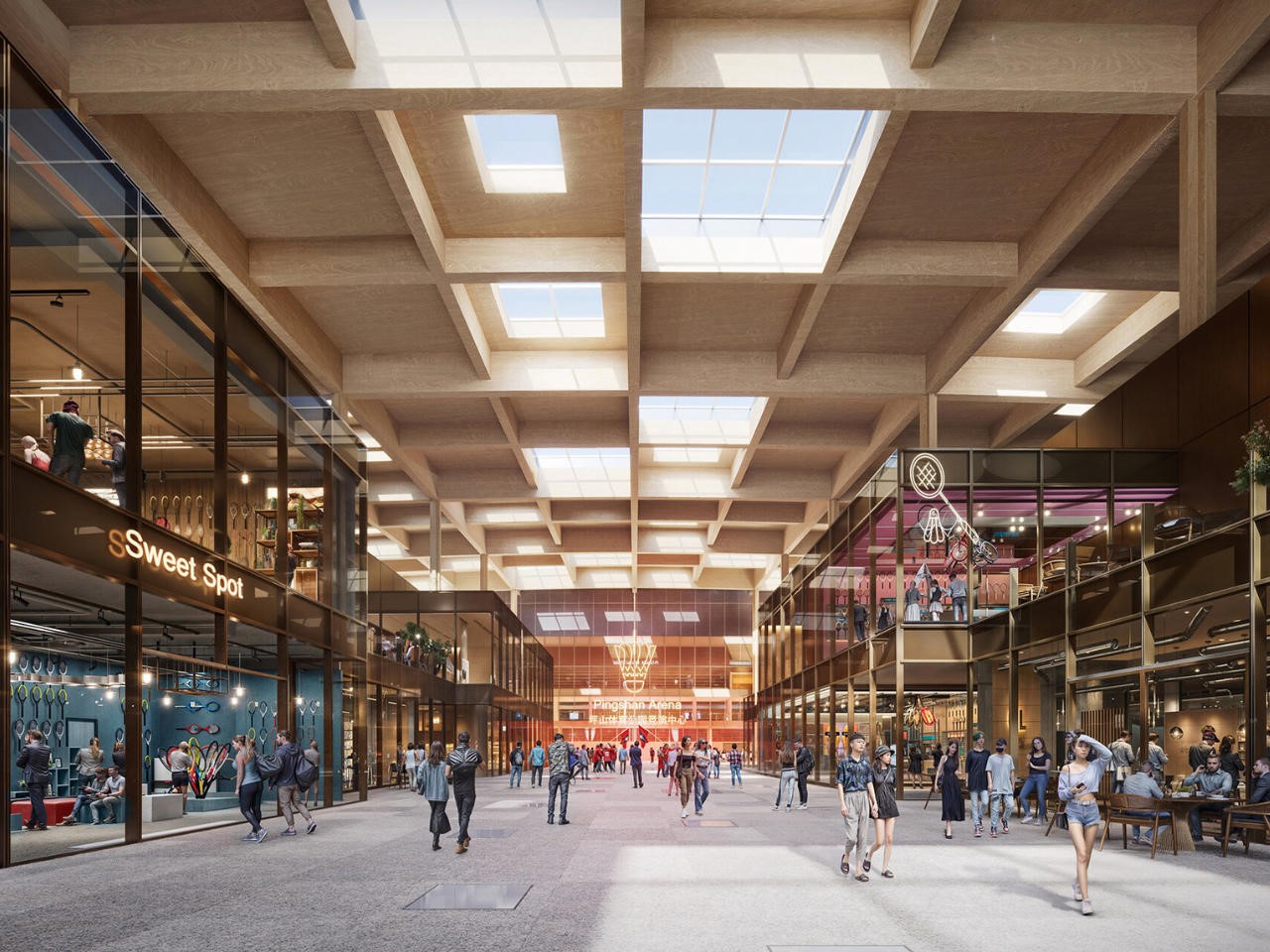
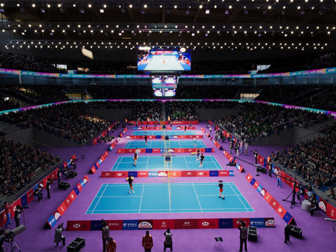
In a stunning fusion of sport, sustainability, and striking design, MVRDV and Huayi Design have won the competition to create The Sweet Spot, a world-class sports complex in Shenzhen’s Pingshan district. Far from your average facility, this vibrant complex will house China’s National Badminton Training Centre, a public fitness hub, and a variety of commercial spaces. With an iconic rooftop shaped like the head of a badminton racket, The Sweet Spot is more than a nod to badminton, it’s a full-blown celebration of the sport and an architectural marvel in its own right.

Designer: MVRDV and Huayi Design

The Sweet Spot makes a bold statement before you even set foot inside. Towering over the complex is a 240-meter-long roof that mirrors the head of a badminton racket, complete with a grid-like structure resembling racket strings. This isn’t just for show: the roof is equipped with solar panels, generating clean energy for the complex. It’s a masterstroke of design that combines sustainability with visual impact, a perfect reflection of MVRDV’s commitment to eco-friendly architecture.

Jacob van Rijs, founding partner at MVRDV, puts it best: “The Sweet Spot isn’t just about creating a space for sport, it’s about celebrating badminton in a way that’s fun, accessible, and environmentally conscious. We’re thrilled to have hit the winning shot with this design!”

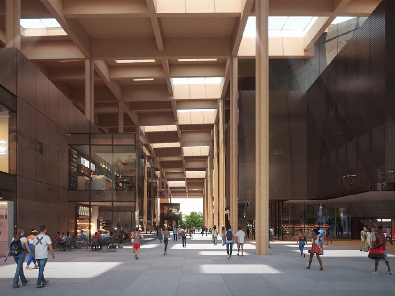
At the heart of the complex is a dynamic space where athletes and the public seamlessly coexist. The main building, which houses a professional arena and training courts, is linked by a T-shaped promenade that invites everyone to explore the facilities. This promenade leads to a central plaza, aptly named the sweet spot, designed to reflect the perfect hitting point on a badminton racket. It’s a playful yet fitting metaphor for the spirit of the project.

For athletes, privacy is a priority. Beneath the public promenade lies a lower ground level that connects the training spaces and arena, allowing athletes to move discreetly without mingling with the public. It’s a clever solution that balances public engagement with the specialized needs of professional sportspeople.

But the badminton-themed surprises don’t stop there. To the south of the arena, a striking 23-story tower tapers like a shuttlecock, housing hotel rooms on the lower levels and short-stay apartments for athletes above. This iconic tower is more than just an architectural statement, it’s designed with athletes’ privacy and convenience in mind, offering direct access to the private lower ground floor.

On the other side of the complex, two smaller commercial buildings echo the racket shape of the main arena, tying the whole design together with visual harmony. These buildings will serve visitors, creating a lively and cohesive atmosphere.

The sweet spot isn’t just a haven for professional athletes, it’s a gift to the people of Shenzhen. The park surrounding the complex features courts for badminton, basketball, and football, open to everyone from casual players to serious competitors. The west side boasts a massive stepped tribune where spectators can watch matches or just take in the surroundings, making the park as much a social hub as a sports venue.

A separate National Fitness Centre offers even more opportunities for exercise, housing additional badminton and tennis courts as well as a swimming center. With so many options, it’s clear that this complex isn’t just about elite athletes, it’s designed to foster a love for sport across the entire community.

One of the most exciting aspects of The Sweet Spot is how it extends beyond its original scope. MVRDV saw potential in the space beneath the nearby Pingyan Expressway flyover, transforming what could have been a forgotten stretch of land into a vibrant green corridor. Complete with a skate park, basketball courts, a running track, and a playground, this extension seamlessly connects The Sweet Spot to the larger Pingshan community, making the complex an even more integral part of the city.

Finally, The Sweet Spot relies on clean energy to operate, pointing at a strong sustainability bid. The solar-powered roof generates much of the energy needed to run the complex, and the design as a whole prioritizes energy efficiency and environmental responsibility. By integrating photovoltaic panels into the design of the badminton-racket-shaped roof, MVRDV has ensured that this isn’t just a sports complex of the present, it’s one being built for the future.

MVRDV and Huayi Design’s The Sweet Spot is an experience. With its playful badminton theme, athlete-first design, community-centered amenities, and a strong commitment to sustainability, this complex redefines what a sports facility can be. It’s a bold, energetic, and forward-thinking project that will leave a lasting impact on Shenzhen and beyond.

The post Award-Winning Sports Complex boasts a Badminton Racquet-inspired Grid Roof with Solar Panels first appeared on Yanko Design.

Reddit policy changes make sitewide protests nearly impossible

Reddit has just changed the rules so moderators of subreddits must get admin approval to switch from public to private, as originally reported by The Verge. This is being seen by many as an attempt to curb sitewide protests, as these requests must be approved by Reddit staffers. There will be no way for multiple subreddits to go private at once without Reddit having its hand on the lever.

The company put a little note on the support page that reads “if you’re changing your community type after community creation, you’ll need to submit a request.” This page doesn't offer any reasoning behind the decision. 

How to issue a request.
Reddit

We reached out to Reddit to inquire about this most recent policy change and the company pointed us to a post on the subreddit r/modnews written by VP of community Laura Nestler. She wrote that “the ability to instantly change Community Type settings has been used to break the platform and violate our rules.” 

So it looks like last year’s protests are absolutely connected to today's changes. Nestler also suggested that this is an issue of personal responsibility, writing that “communities should honor the expectations they set – public communities should remain accessible to all; private communities should remain private.”

On the topic of recent protests, switching from public to private is the exact way in which subreddits expressed dissatisfaction with last year’s API pricing changes. In that case, over 8,000 subreddits went private in tandem. This means that the subreddits became inaccessible to the general public, though they remained active for current members.

The site’s daily traffic suffered as a result. This allegedly had an impact on the functionality of Reddit itself, as there was a major site outage after all of those subreddits went private. The company blamed the protests for this outage, telling Engadget that "a significant number of subreddits shifting to private caused some expected stability issues.”

Not all protests involve switching a subreddit from public to private. Some moderators protest Reddit by labeling a subreddit as NSFW. This disallows advertising on the subreddit and makes it harder to search for. The company also put the kibosh on this move, as that kind of switch also now requires admin approval.

It’s worth noting that last year’s protests didn’t work. Reddit went ahead with those API charges, which forced third-party apps like Apollo to shut down. The company also went in and took complete control of one of the larger subreddits that participated in the protest. Now, there’s today’s change that effectively bans sitewide protests altogether. 

Adding insult to injury, Reddit recently struck gold by licensing its content to train AI models. That deal will reportedly net the company around $60 million per year, but the users who actually created the content that’s being licensed will be getting approximately $0 per year. 

This article originally appeared on Engadget at https://www.engadget.com/big-tech/reddit-policy-changes-make-sitewide-protests-nearly-impossible-183754240.html?src=rss