Tag Archives: Microsoft
The Surface Duo gets a price cut before launching in the UK, Europe and Canada
Volkswagen partners with Microsoft on automated cars
Microsoft Defender now directly warns IT admins about nation-state attacks
‘Forza Horizon 4’ is coming to Steam on March 9
Microsoft launches a cross-platform password autofill feature
What if the PlayStation 5 was designed by Microsoft instead of Sony?
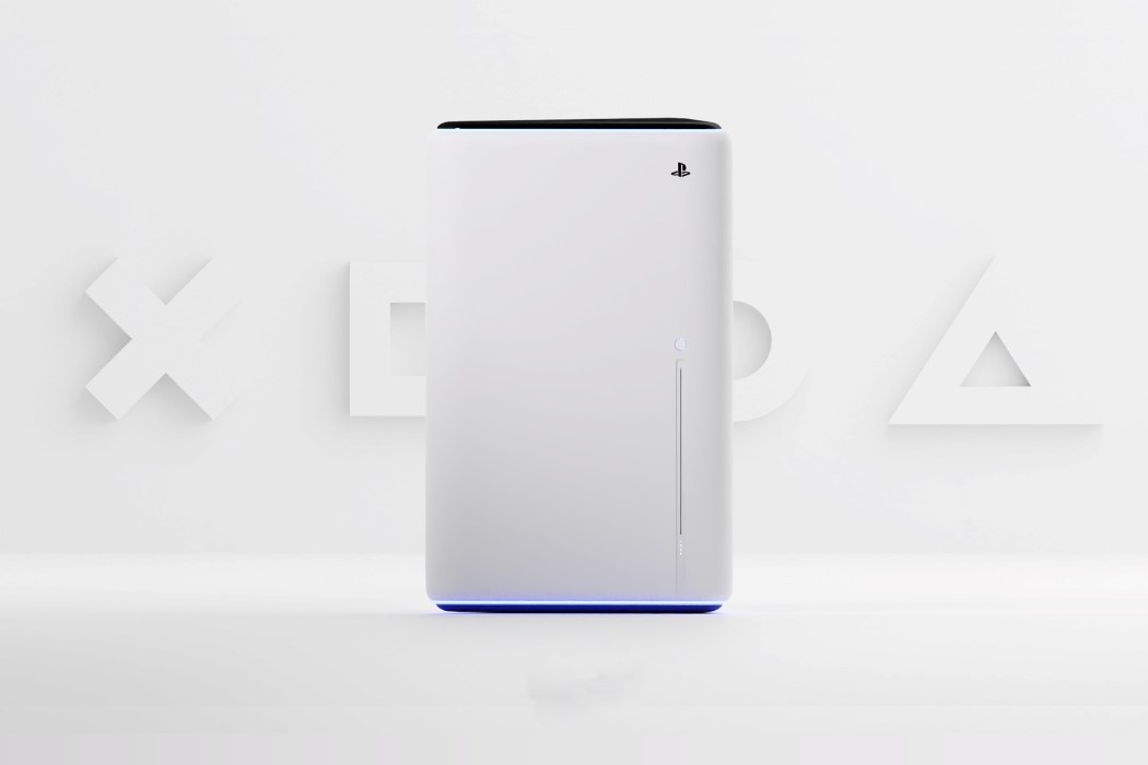
While I’m firmly of the opinion that the PlayStation 5 has a much more alluring design than the Xbox Series X, I can understand why some find the geometric, boxy design of the Xbox more soothing. It’s traditional, bordering on no-nonsense, and the straight lines seem like the logical decision in today’s hyper minimalist world where almost all of our gadgets are rectangular. Although, as boxy and straightforward as the Xbox Series X is, it’s just not a PlayStation… right?
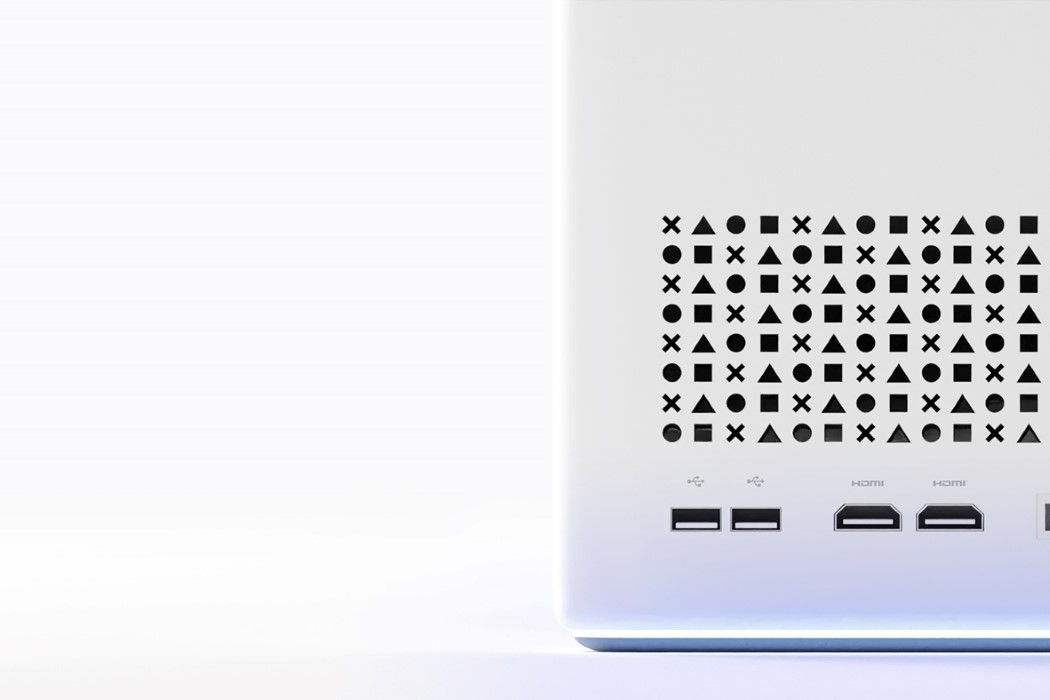
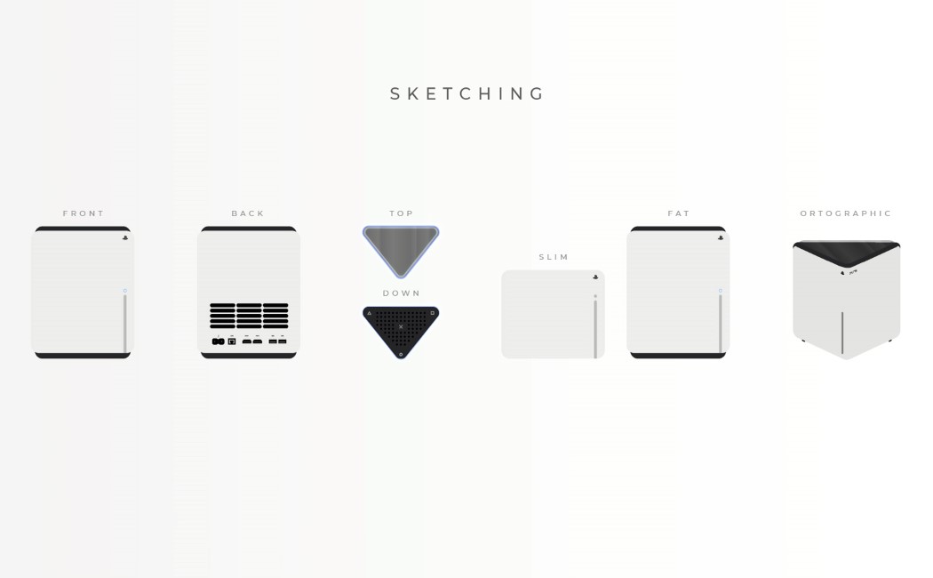
If you’re a PlayStation enthusiast who finds themselves ‘questioning’ the console’s organic design, Ismail Mits has a compromise for you. His PlayStation 5 concept features a geometric design that feels like a well-calibrated blend between the styles of Sony and Microsoft. The conceptual console is shaped like an extruded right-angled triangle. Its dynamic design lets you keep it any-which way on your table, and the triangular top plays in well with the triangular icon often used in the PlayStation visual assets. The ports are located on the wider face, while a neatly positioned slit on the front acts as the disc drive. The ‘boxy-yet-not-boxy’ PS5 concept sticks to the same Stormtrooper color palette of the original design, and even features the same blue lighting, albeit at the base of the device, allowing it to give the floor or your TV cabinet a nice wash of azure blue when the console powers on!
Designer: Ismail Mits



Microsoft will uninstall its old Edge browser from Windows PCs on April 13th
Microsoft’s new tools help you adapt to the realities of remote work
This Microsoft self-driving car concept takes aim at the ambitious Apple Project Titan
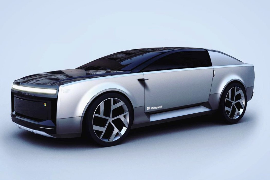
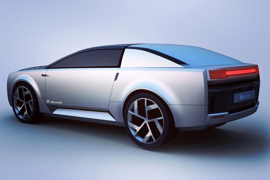
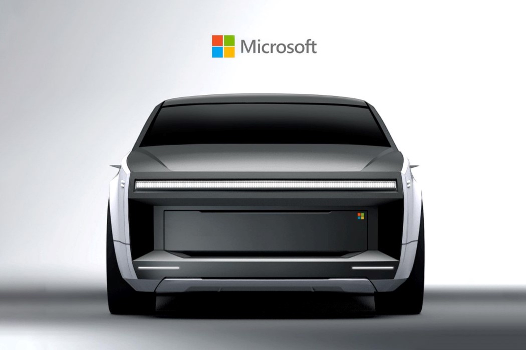
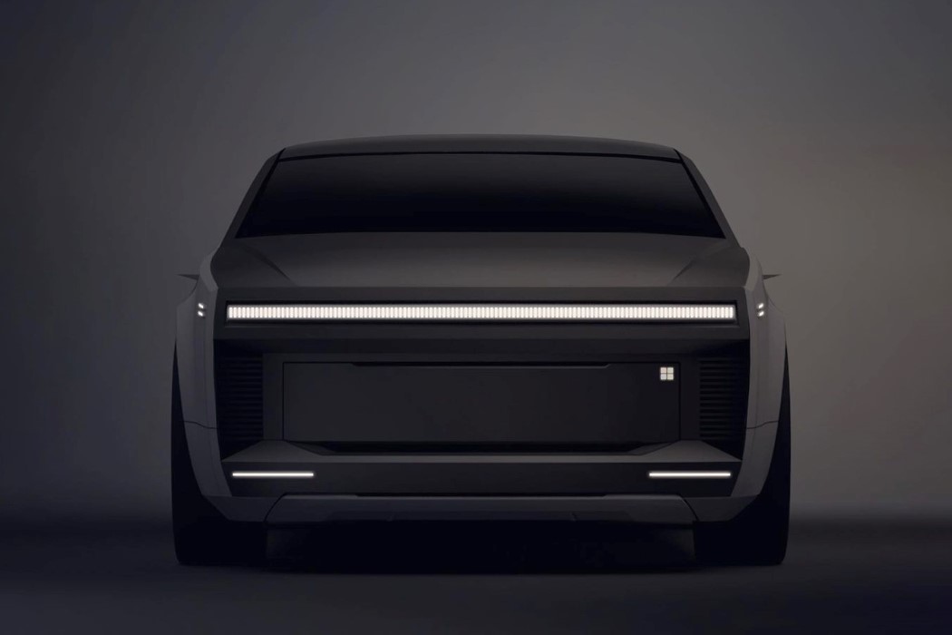
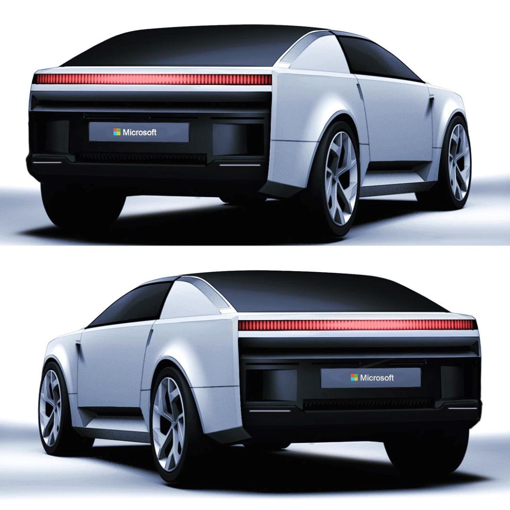
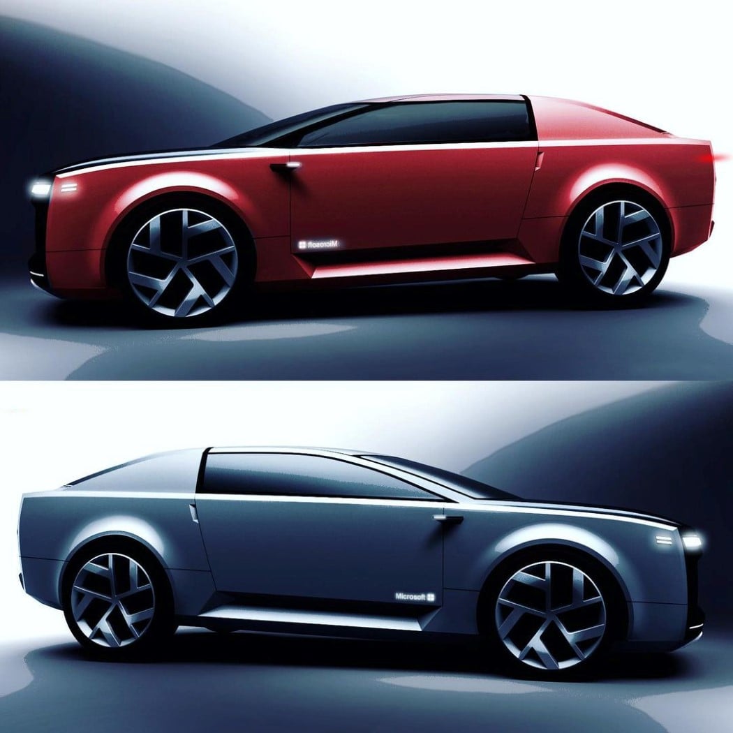
People have been arguing over ‘Windows vs Macintosh’ for decades, but the extent of that ideological battle has only been as far as computers are concerned. With the Microsoft Surface car concept, that feud extends into the world of transportation too!
Meet the Microsoft Surface Car, an automobile that beautifully channels the sleek aesthetic of Microsoft’s Surface laptops into its automotive design. Visualized by Yang Gu-rum, an automotive designer based out of Korea, the Surface car concept shows how design details from tech products can seamlessly be carried forward into car-design. The Surface Car comes with a relatively boxy yet sleek design, dominated by flat surfaces and straight lines. Channeling the same visual language of the Surface tablets and laptops, the car sports a satin-finish silver body, with black accents and tinted glass. The absence of a radiator grill indicates that the concept is powered by an electrical drivetrain, and it wouldn’t be too risky to assume that the car also has some form of a self-driving AI built in. There are no renders of what the interiors of the car looks like, but judging from its design, it seats two people. The vehicle sports camera-based rear-view mirrors, and remarkably streamlined LED strips on the front and the back, serving as headlights and taillights… not to mention that Microsoft logo that shows up on the top right corner of the front of the car, as well as on both doors.
Although there isn’t any indication that Microsoft is working on an in-house production car (and that this car over here is just a fan-made design exercise), the Surface Car does definitely look fascinating. Not to mention the fact that it would definitely make the Apple vs Microsoft rivalry a whole lot more interesting too! I just hope the car doesn’t come bundled with Cortana…
Designer: Yang Gu-Rum
