YD’s Top 15 A’ Design Award Winners for 2017-18 Are…

adesign_winners_for_2018_layout

Determined to be more than just a trophy and a name, the A’ Design Award and Competition wants to be the international standard for good design and innovative and creative work. Judging thousands of entries over a wide variety of categories, the A’ Design Award 2018 saw a jury of 212 members of the international design community get together to award design projects across a myriad of categories for their exemplary work, and that’s not all. The A’ Design Awards and Competition, as I’ve said before, not only recognizes good design, but gives it the good exposure it needs and deserves. Their mission statement has always been to provide growth and support to not just the designer, but to the design itself too.

We’ve hand-picked fifteen of our favorites from this year’s list of winners spanning categories such as Product Design, Lighting Design, Architecture, Furniture, Medical, and Social Design. Scroll down below to have a look at what’s making the waves this year in the design circuit! And don’t forget to register below to participate in the Competition next year to kickstart your design journey!

REGISTER for 2019 NOW!

YD Handpicks: 15 Winning Designs from A’ Design Awards 2017-18

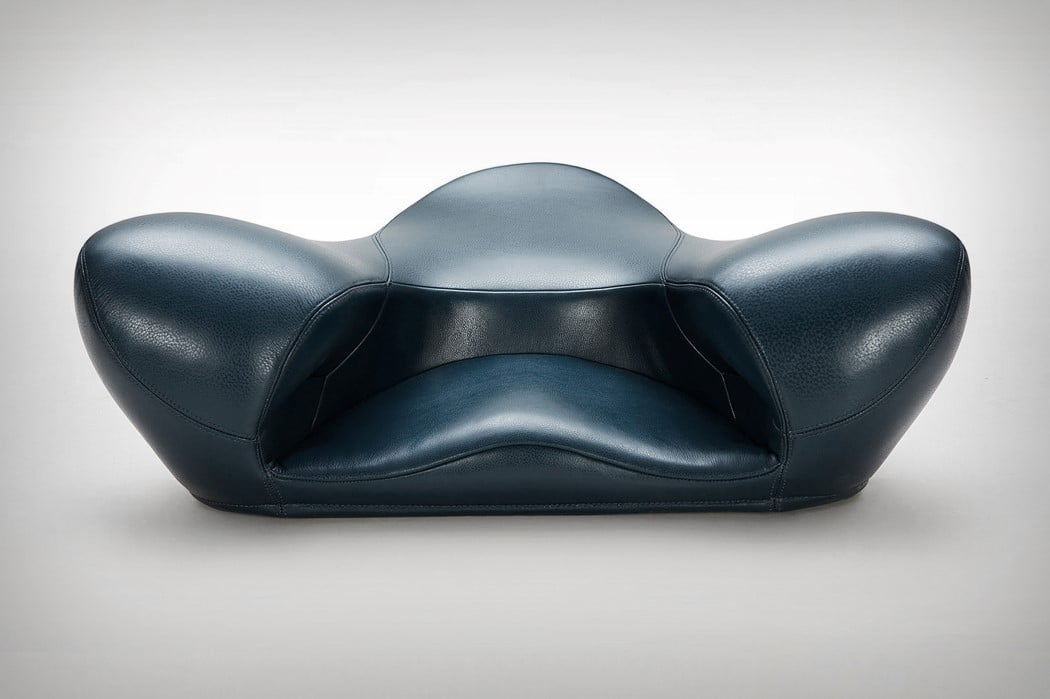
01. Meditation Seat by Gao Fenglin
meditation_seat_6
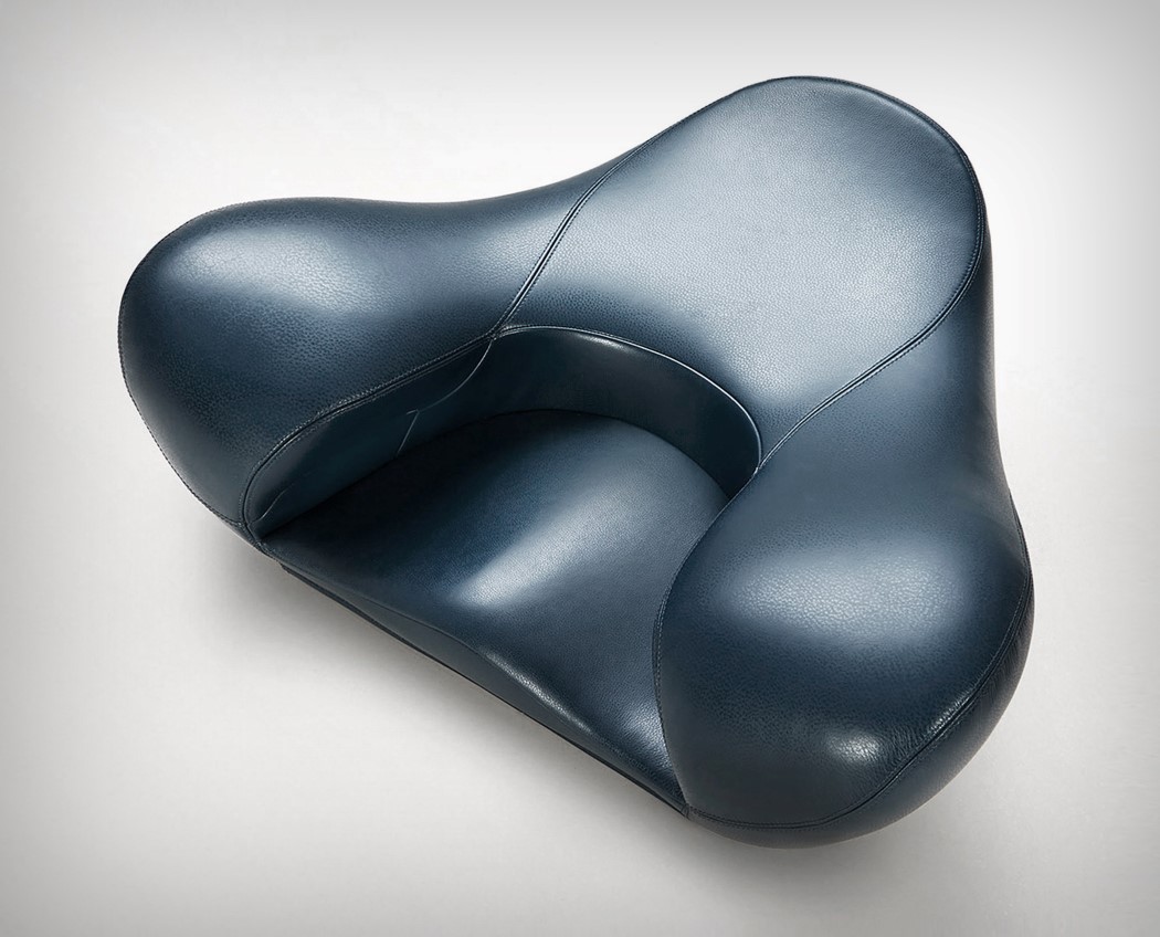
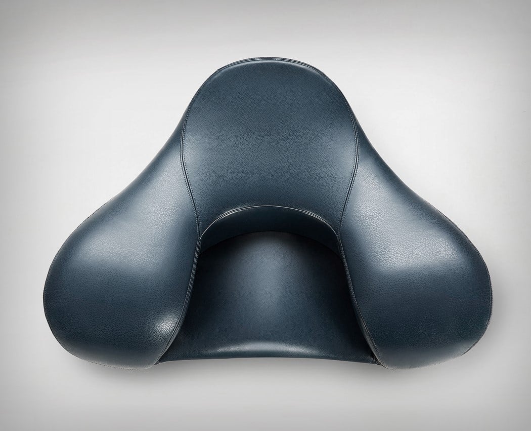
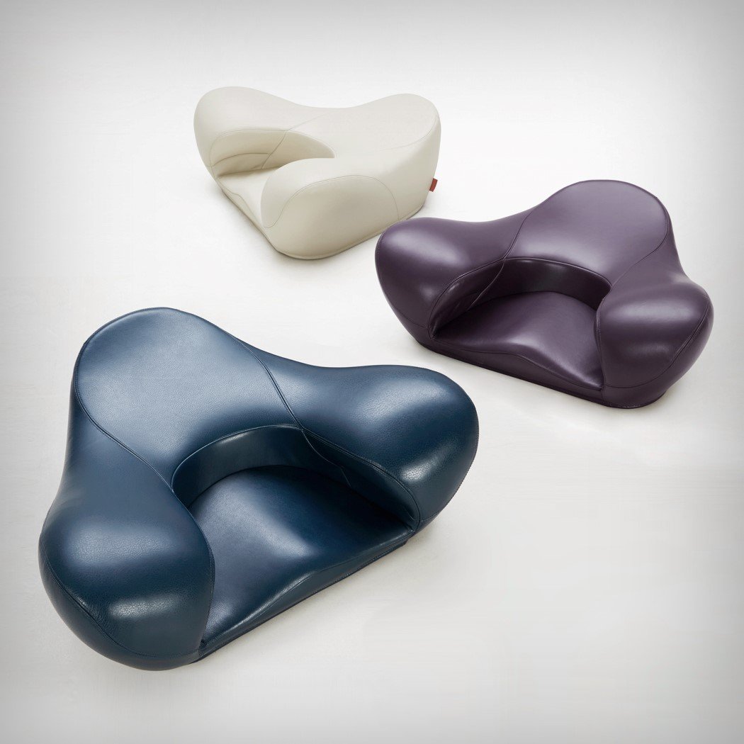
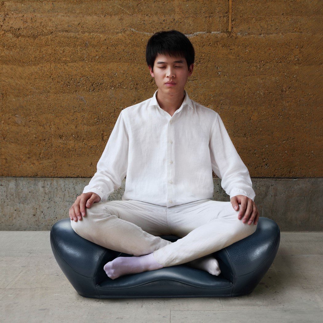
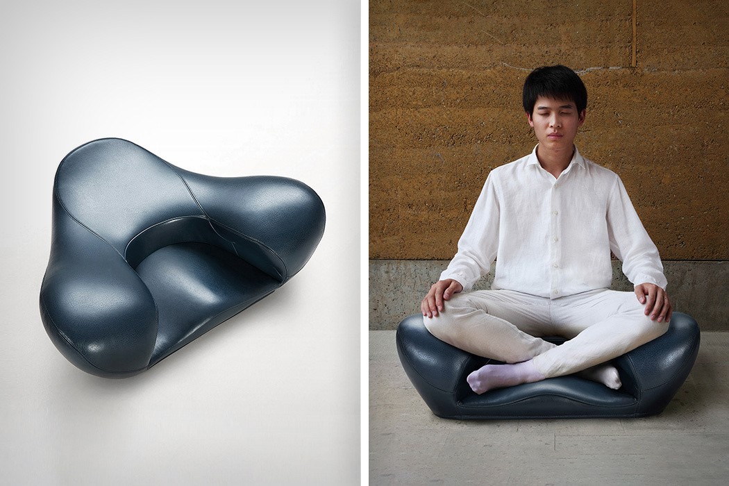
Gao Fenglin’s Meditation Seat can only be sat on in a certain way, directing the user’s behavior and encouraging a seating position that keeps your back upright, and your legs folded inward. Designed to promote physical and mental fitness, the Meditation Seat actually makes sitting healthier!

02. Minimbike by ozestudi
minimbike
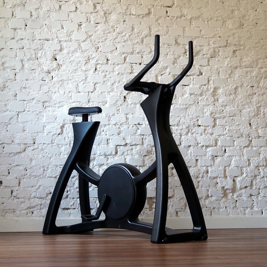
Minimbike’s sculpted organic balanced design stems from the need to be aesthetic and not overtly functional. Not weighed down by concerns like shock absorption or aerodynamics, the stationary bike’s form is just purely desirable, inviting you to come and use it!

03. Dab ECG Holter Patch by Adam Miklosi
dab_ecg_1
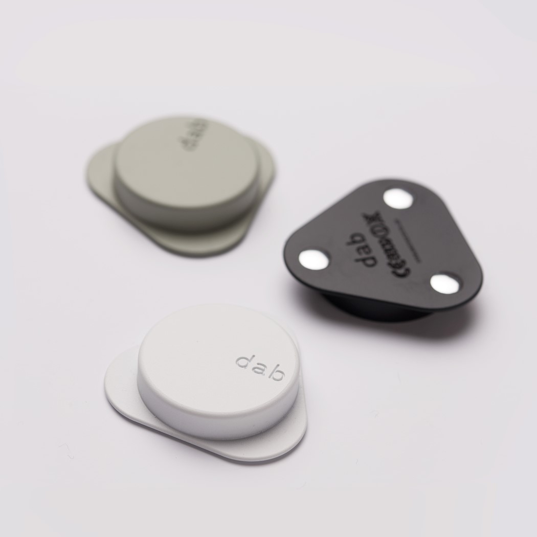
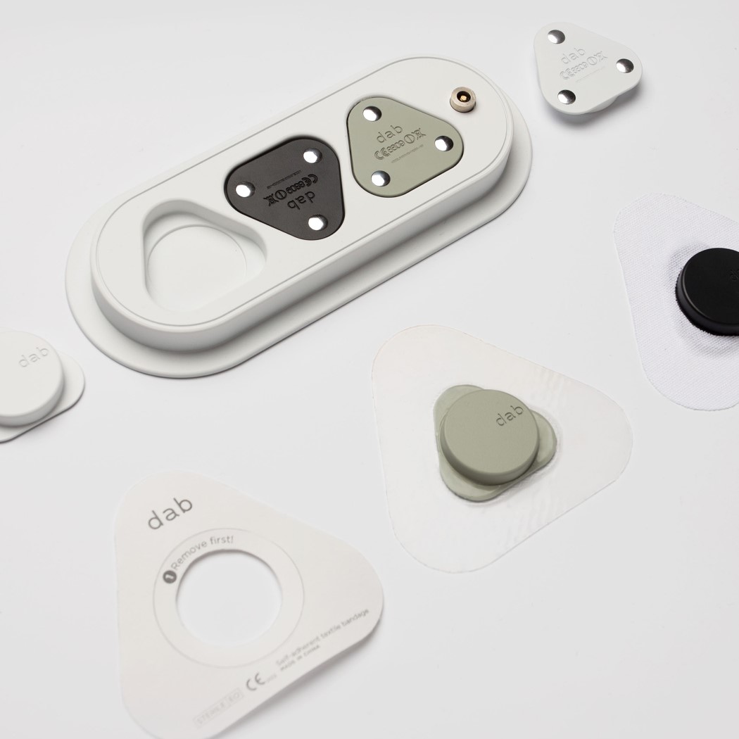
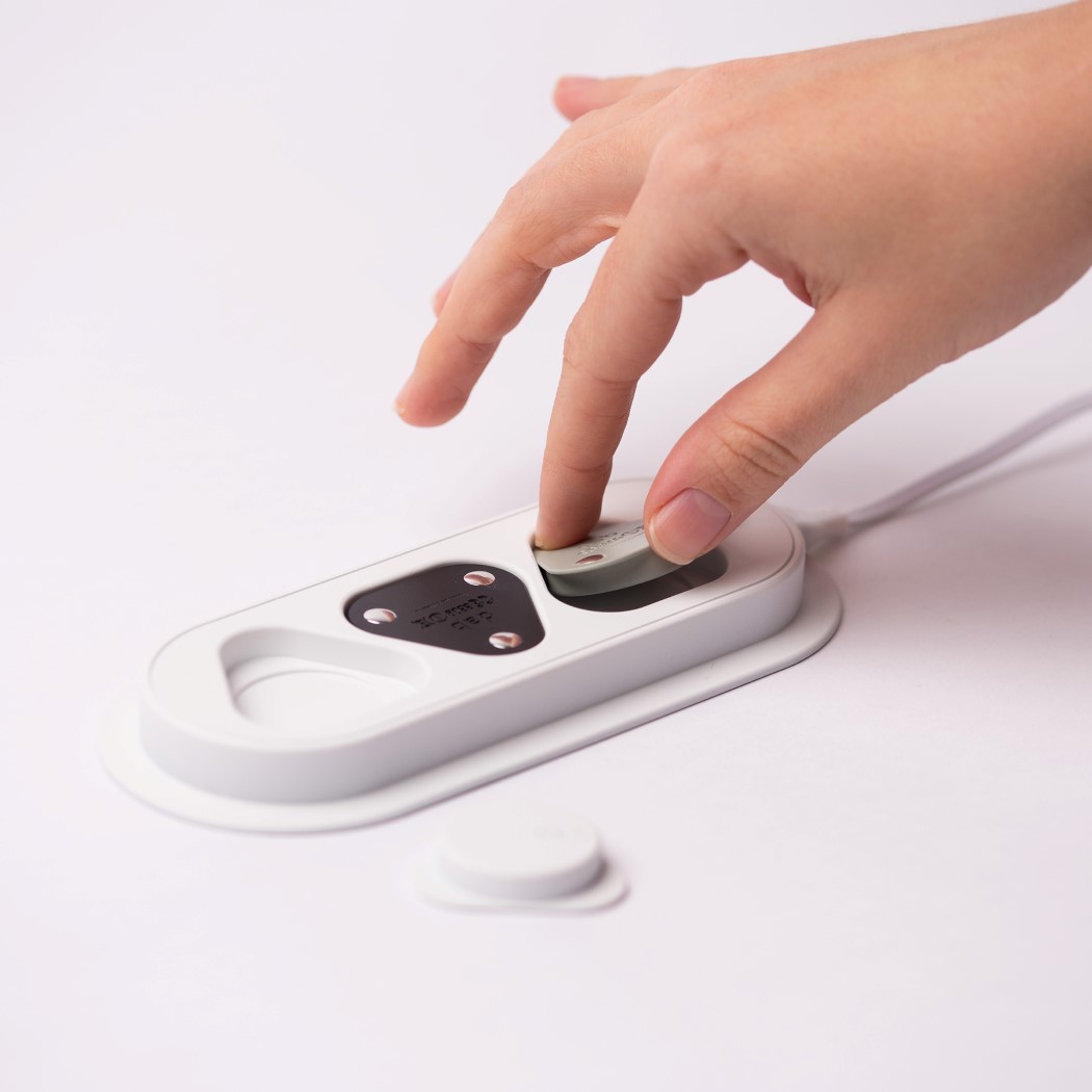
Small but effective, the Dab ECG holter patch sits on your chest, constantly monitoring and recording your heart activity, while truly being as invisible and distraction-free as any good medical wearable must be. Sitting on the skin via a gel patch, the Dab is reusable, unlike most disposable ECGs and charges separately in its own wireless charging dock. A perfect embodiment of Rams’s design advice that good design should be as little design as possible.

04. Croz D.I.Y Digital Camera by Calvin Sio
croz_diy_camera_4
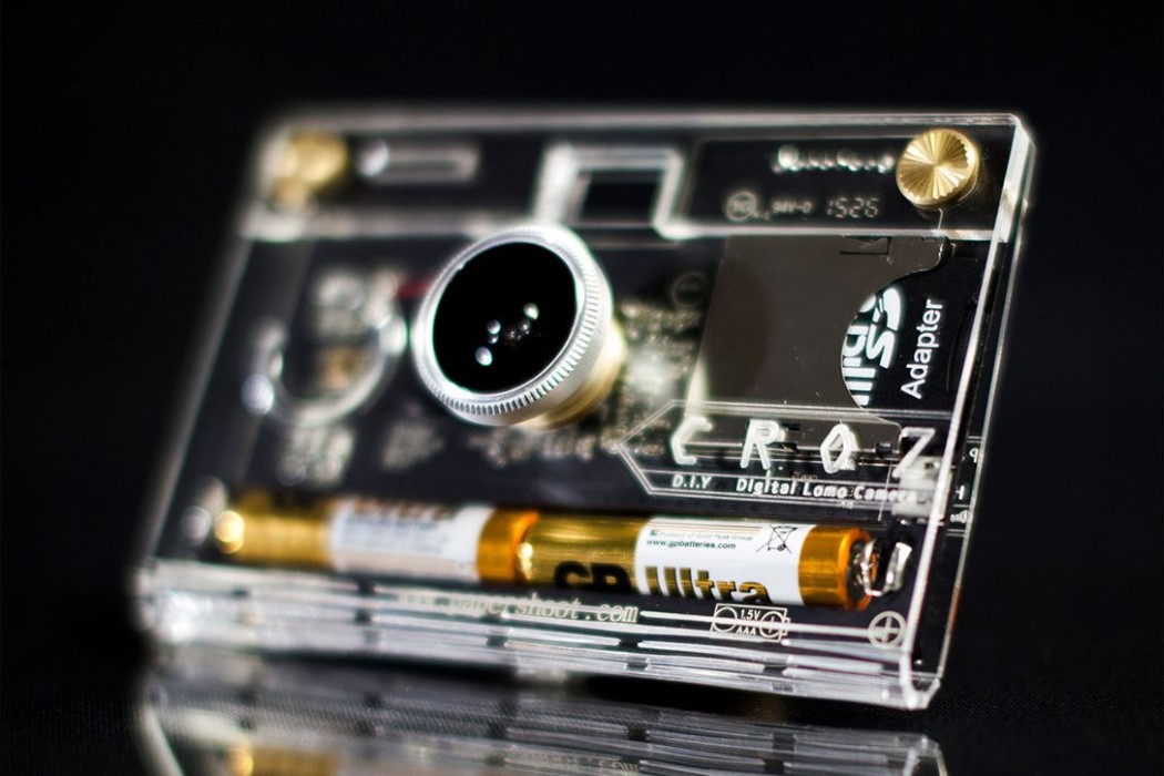
The Croz camera helps bring a do-it-yourself quality to consumer electronics, something we see little of nowadays. It comes with a bare-bones aesthetic that’s the result of stripping away everything unnecessary (even a fully molded outer casing) in exchange for the lens module, a circuit board, battery, viewfinder, and a cleverly designed laser-cut piece of acrylic bent into shape to form a transparent cover that lets you peer right into your camera’s innards, bringing a sense of curiosity and involvement in the photography process.

05. Joseph Felt Chair Seating by Lothar Windels
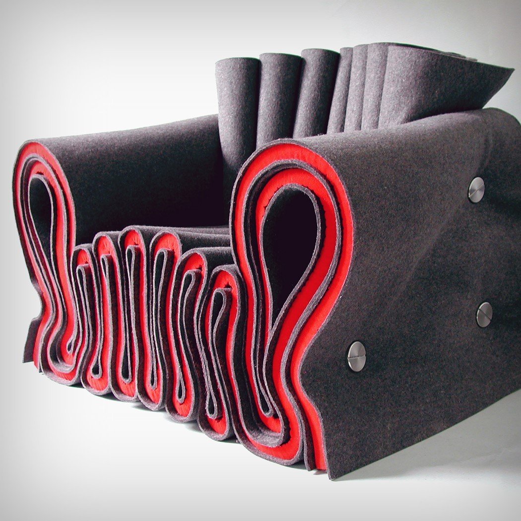
joseph_felt_chair
Quirky, clever, and wrinkly enough to project a semblance of comfortability, the Joseph Felt Chair is entirely made from sheets of felt layered together and folded before being fastened together with stainless steel fasteners. The chair looks playful, has an intriguing appeal where you can literally see the folds forming the chair, and definitely looks inviting to both adults and children!

06. Solar Egg Public Sauna by Futurniture and Bigert & Bergström
solar_egg
A symbol of youth, nourishment, and vitalization, the egg was perhaps the most perfect form for the Solar Egg Public Sauna. With stainless golden mirror sheeting on the outside, and a faceted form, the sauna mirrors the serene landscape around it, but looks as golden as the sun does (a fitting metaphor, because it’s so hot on the inside). The inside has a wooden construction with a heart-shaped sauna stove at the center, radiating heat, and making for a fitting design detail for something that looks like an egg on the outside!

07. PIXIO Magnetic Сonstruction Set by Ivan Khalus and Oleh Berezovskyi
pixio_1
Designed to be used like pixel-based play dough, the Pixio are magnetic pixels that snap together, creating complex shapes and figures like Lego, but without the hassle of plugging and unplugging pieces, or the pain of inevitably stepping on a loose lego piece sometime later in the day. With an appeal that can only be described as Minecraft in real life, and an absolutely delicious set of available colors, the Pixio is a perfect tool to let your mind roam free!

08. Cocoon Lounge Chair by Tim Kwok
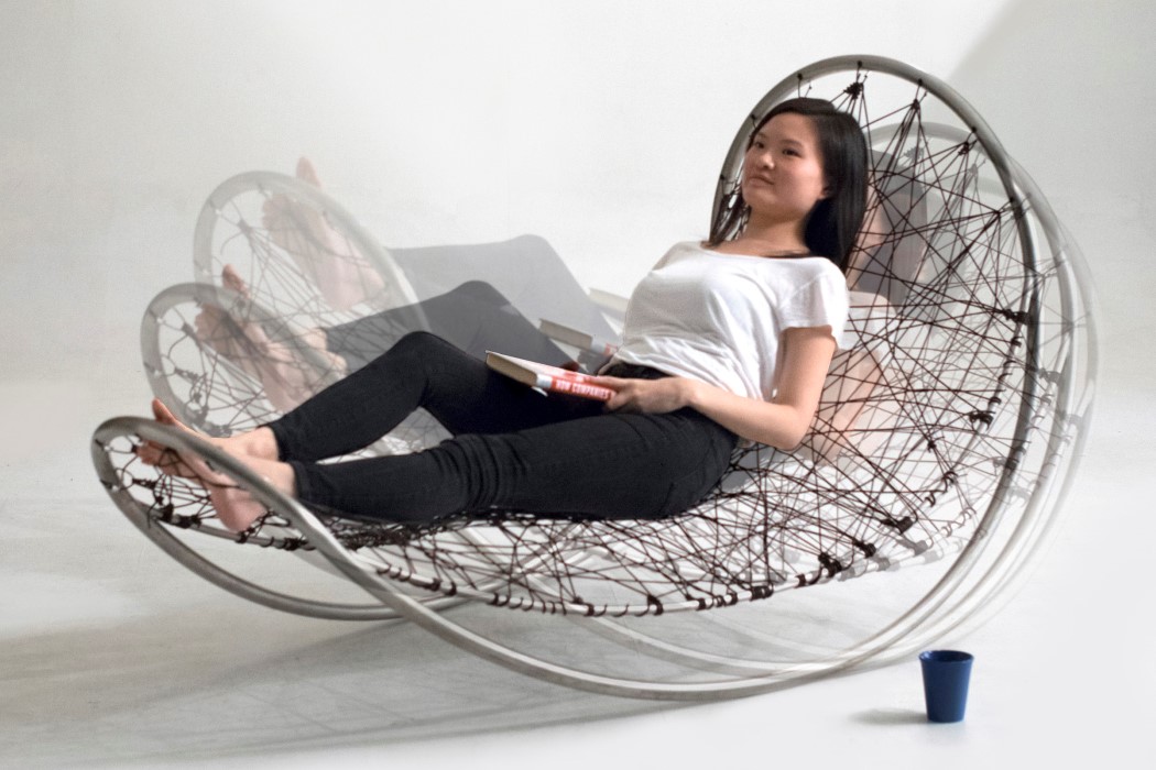
cocoon_chair_1
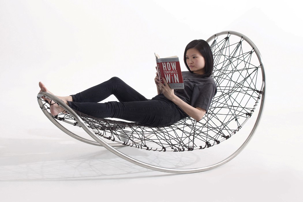
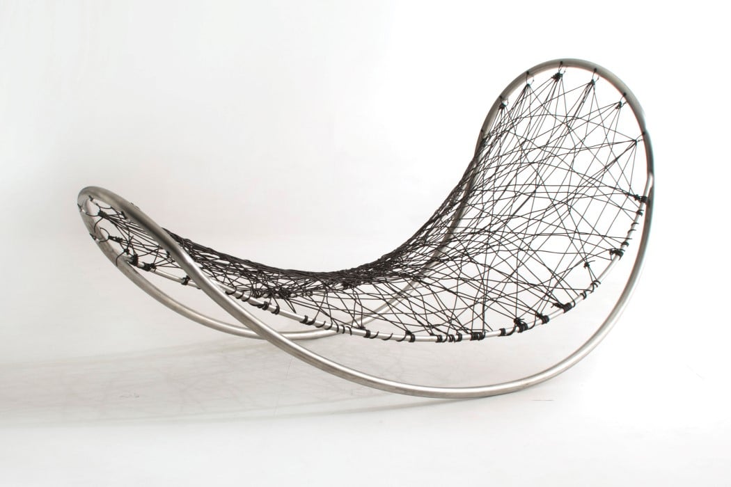
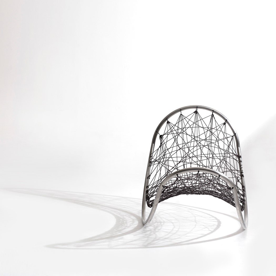
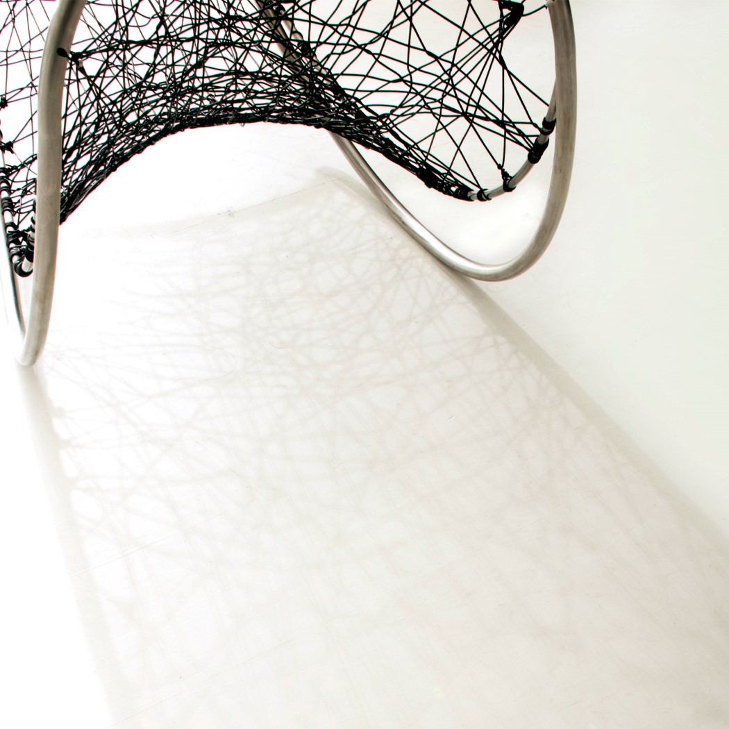
Part recliner, part rocking chair, part hammock, the Cocoon must be an absolute stress-busting treat to lie on! Comfortable, thanks to its netted base, the Cocoon slowly rocks to and fro, giving you the relaxed posture of a recliner/hammock, with the meditative rocking of a rocking chair. A guaranteed 11/10 would want to sit on this.

09. Tab4 Home Assistant by Lenovo Design Group
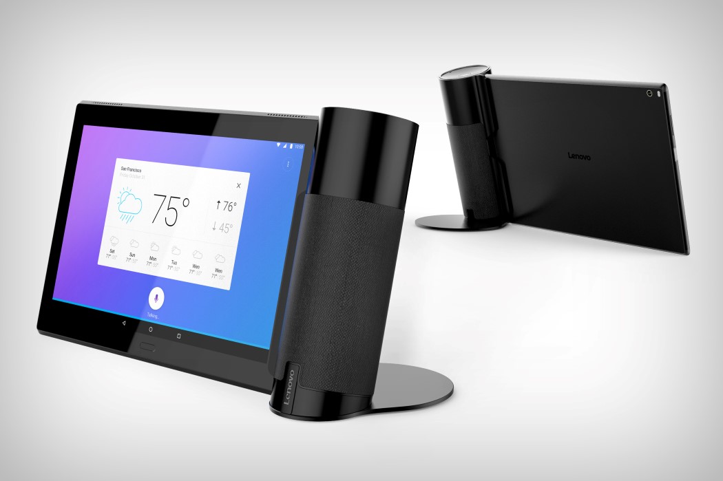
tab4_1
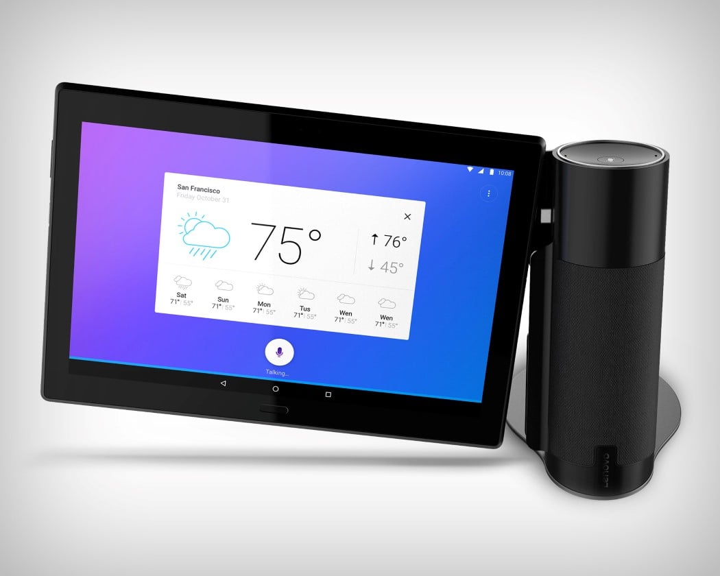
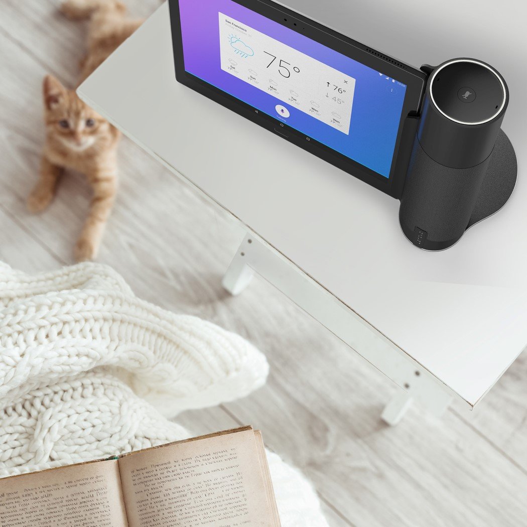
Our love for the Tab4 stems from its clever design strategy. Using one product (stone) to hit two proverbial birds, the Tab4 is a smart speaker and a tablet, designed to be used together or even independently. Given the rise of smart speakers in homes today, Lenovo’s smart speaker is a sure-shot hit, since it comes with a free screen/tablet too. And it’s a hit for Lenovo, because it means being able to bolster tablet sales in what I can only describe as an Android tablet sale slump. Clever, eh!?

10. Kulms Stackable Chair by Daisuke Nagatomo and Minnie Jan
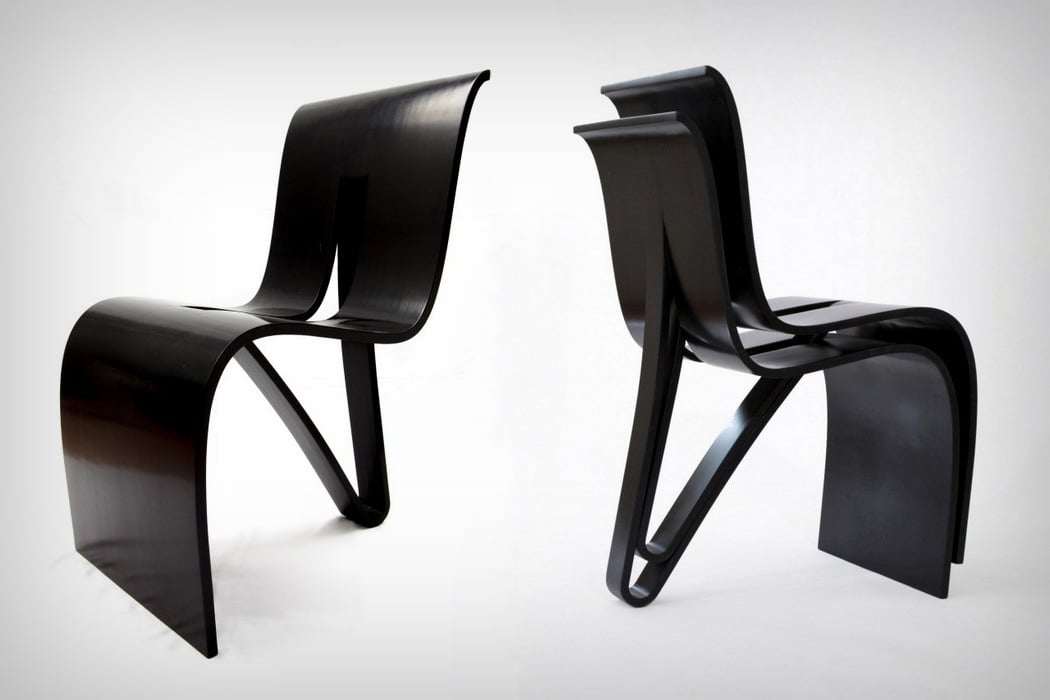
kulms_chair
The chair’s clever two dimensional design remains stable, thanks to the fact that it rests on three points, remains easy to produce, because you can easily shape wooden ply into 2D curves, and is made to be stackable, allowing it to do something most plastic chairs consider an advantage over their wooden counterparts. Useful, easy to produce, aesthetically simple, yet with loads of character, the Kulms chair could be easily spotted from the opposite end of a room.

11. Jal Lamp by Mos
jal_just_another_lamp_layout
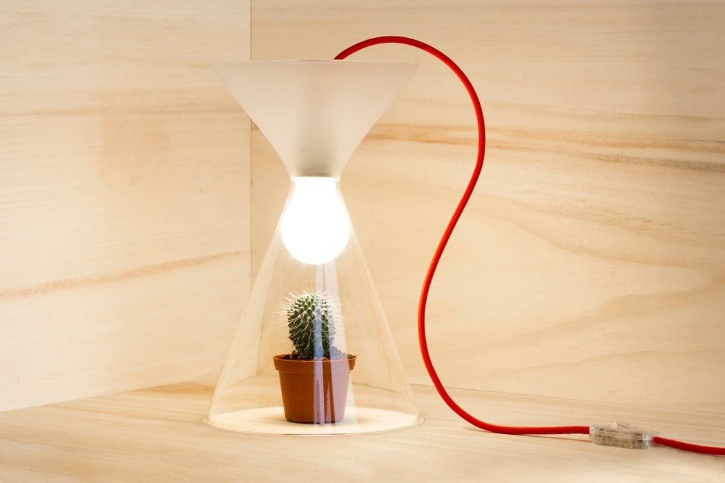
Designed to look like a martini-esque hourglass with an ambient lightbulb in it, the JAL Lamp’s beauty arises from its simplicity and its ability to be whatever you want it to be. The glass comprises two conical containers in the hourglass shape, that can be used to store anything, making the lamp a rather versatile piece of decor (rather than ‘just another lamp’!). The bulb can be oriented either way, allowing you to use the lamp in any orientation that you’d like. A nice combination of simplicity, elegance, and a minimal beauty that one would associate with Scandinavian or Japanese design.

12. Print to Build Furniture Joint by Gellert Olle
print_to_build
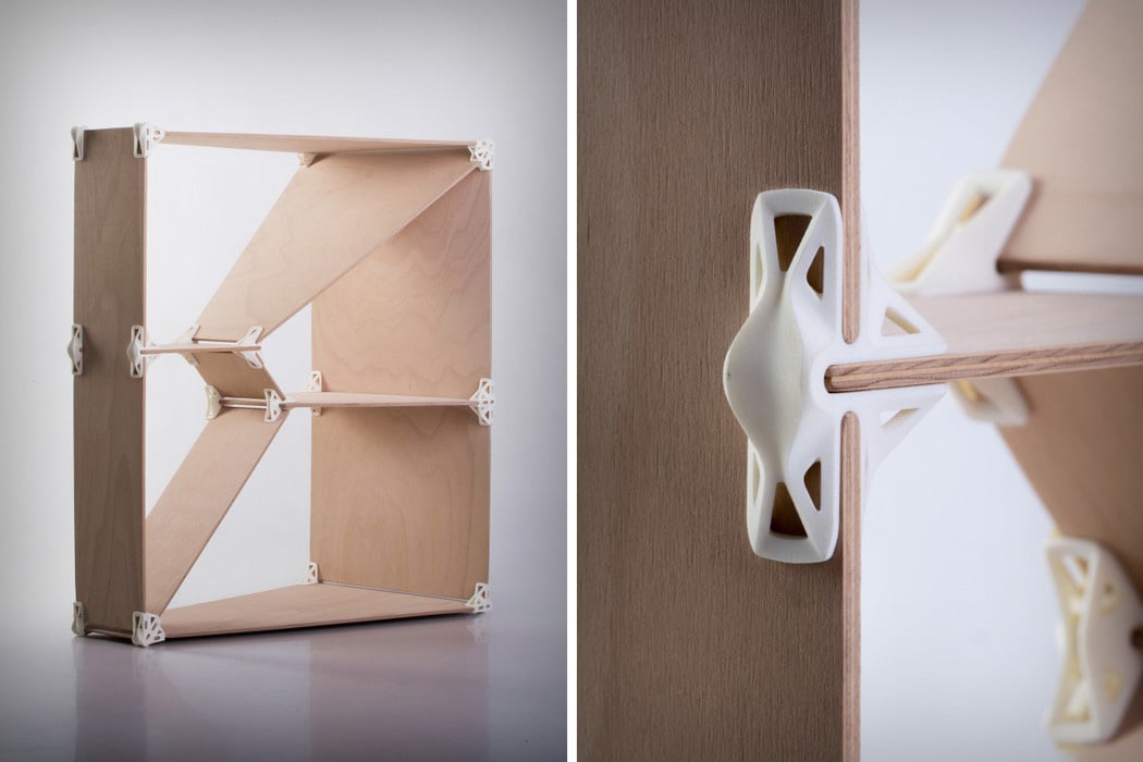
Putting his desktop 3D printer to good use, Gellert Olle designed the Print To Build, a joinery set that could be used to fasten two pieces of plywood together in a variety of orientations, creating furniture that comprised literally two types of components. Just wood and plastic. The resultant furniture is basic, but clean looking, and flat-packs so efficiently, it would probably occupy less than 10% of its space when assembled.

13. EXEO Gaming Controller by Sushant Vohra
exeo_2_1
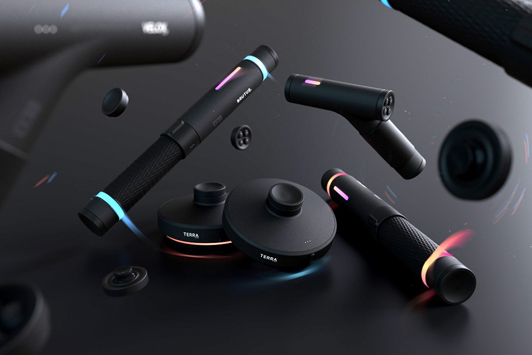
The EXEO’s a personal favorite for bringing modularity to games in a way that completes experiences, allowing you to play multiple types of games and build the motion-sensing controllers you need for it, rather than simply play with that boring old Joypad. Designed around three components, a gun, a baton, and a puck, users can create much more complex weapons/instruments, from steering wheels to archery equipment, allowing for a gameplay experience that’s MUCH more authentic than a standard joypad or remote.

14. Karekla Chair by Phebos Xenakis
karekla_chair_layout
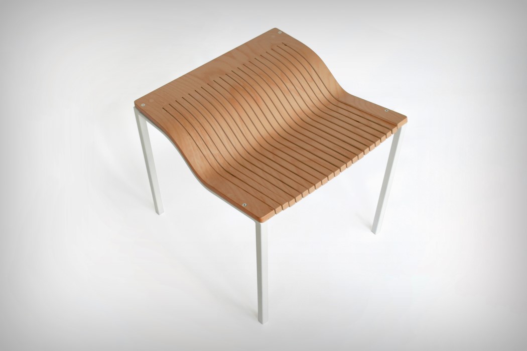
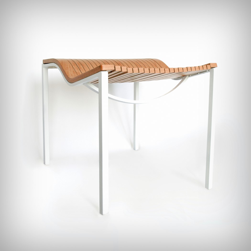
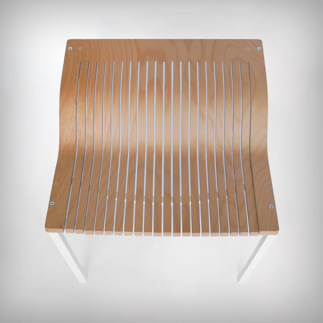
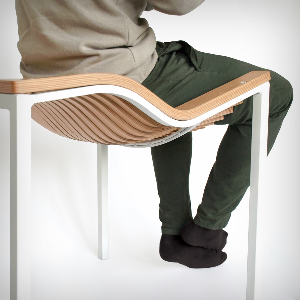
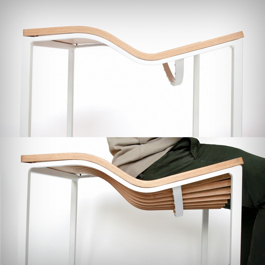
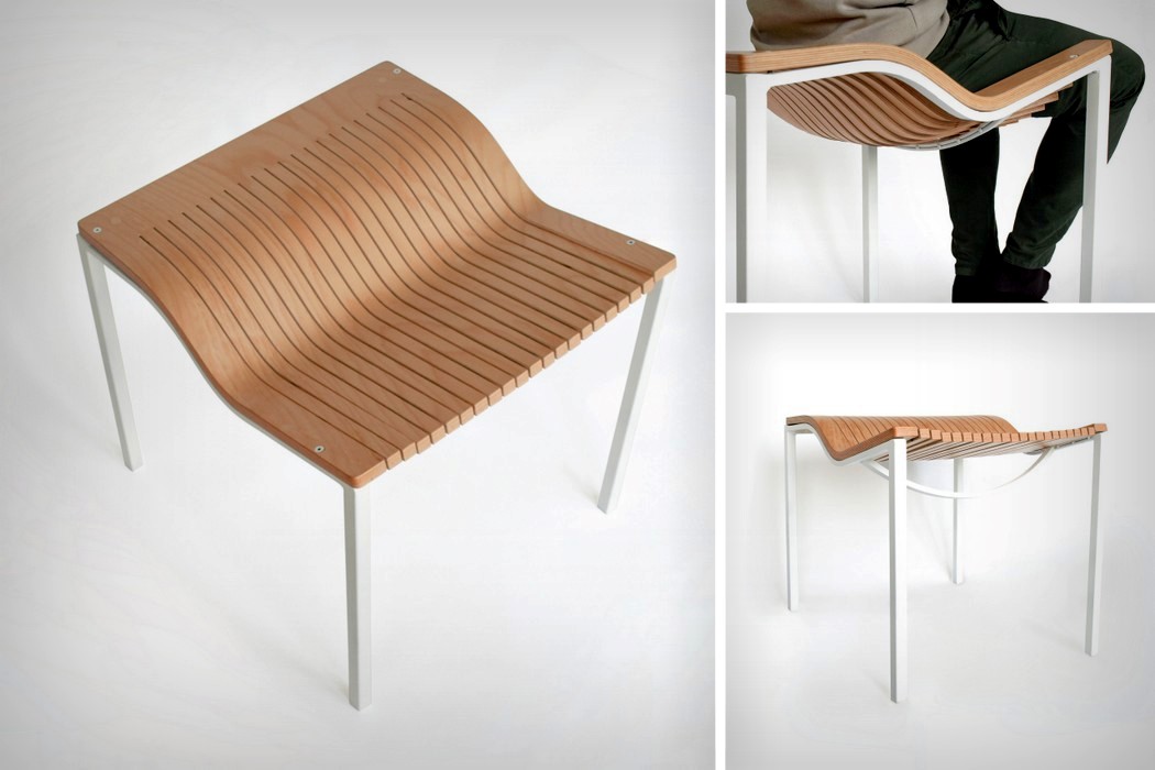
Made out of hard plywood, but designed to be ‘comfortable’, the Karekla Chair comprises a seat made from plywood with vertical cuts in them. Sit on the seat and the plywood members bend to your weight to assume the curvature of your body, feeling less like a hard wooden surface and more flexible and comfortable like wickerwork. A curved metal rod sits underneath the vertically cut plywood seat to provide a support for it, preventing it from bending more than the desired amount. Get off the seat and it returns to its flat position again!

15. Braille Ebook Reader by Brian studio
braille_book_reader
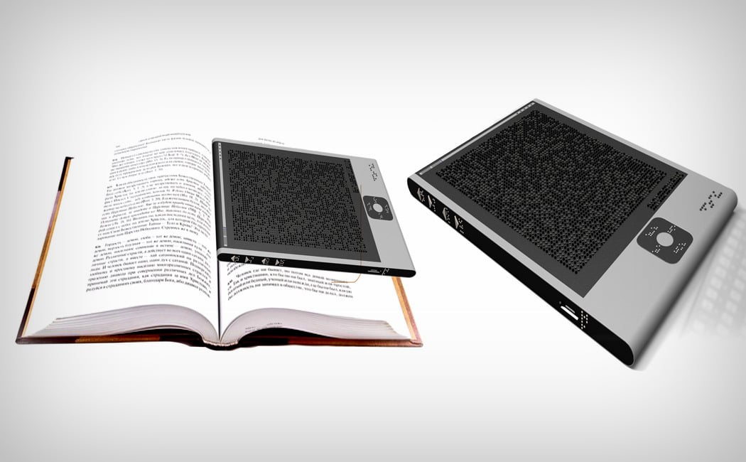
With the ability to turn text to braille in real-time, the Braille Ebook Reader is truly the Kindle for the visually impaired. Sporting a large dot-matrix panel with individual dots dynamically raising to form braille patterns, a scanner on the back that actually scans book pages, and controls that enable the visually impaired to configure and fine-tune their reading experience, the Braille Ebook Reader scans and saves bodies of text from newspapers, books, and magazines, allowing the blind to read from readily available printed material. What’s more, it even connects to the internet to access and download ebooks for reading too!

Inspired?? Register for the A’ Design Award and Competition today!
The chair that makes plywood feel comfortable

karekla_chair_1

The Karekla (greek for Chair) employs a neat trick to make plywood literally bend to your demands. With a series of vertical cuts and a support at the base, the Karekla looks flat before you sit on it, and when you do, takes the shape of your backside as it bends with your weight. Designed using waste wooden plywood pieces, the Karelka chair looks straightforward but “succumbs to the weight of the user and create a comfortable seating”. The minute you stand up, the wooden ply reverts to its original shape, bringing a nifty shape-memory feature to plywood, making the seat not only long-lasting, but comfortable too. So as to make sure the plywood doesn’t bend too much, a curved support at the base acts as a rest for individual vertical plywood members.

The Karekla is a winner of the A’ Design Award for the year 2018.

Designer: Phebos Xenakis

karekla_chair_2

karekla_chair_3

karekla_chair_4

karekla_chair_5

Bridging the gap between medical appliance and innovative wearable

dab_ecg_1

Literally the size of a quarter, the Dab is an unobtrusive Holter ECG/EKG that rests comfortably on your chest, constantly reading your heart’s movements. Designed to be minimal, non-invasive, and simple, the Dab tries to bridge the gap between medical appliances and wearables. Its tiny yet classy design sits on your chest via a gel patch, while the electrodes capture your heart activity. The Dab’s dry-electrodes allow it to be used and reused, unlike disposable electrodes that lead to large amounts of medical waste. They constantly measure one’s heart activity (requiring periodic charging via their wireless charging hub), and keep logs of accurate readings, quietly sitting on your chest while you absolutely forget that they’re even there in the first place!

The Dab is a winner of the A’ Design Award and the Asia Design Prize for the year 2018.

Designer: Adam Miklosi

dab_ecg_2

dab_ecg_3

dab_ecg_4

dab_ecg_5

Magnetic pixels that bring Minecraft to life

pixio_1

A little less painstaking than plugging Lego blocks together, the Pixio are much more natural to use, allowing you to build in the real world the way you would on Minecraft. Individual pixels snap to one another, creating low-resolution artworks, while giving you the freedom to build whatever it is you want. Coming in a set of 800 individual blocks divided across 16 colors (50 blocks per color), the Pixio presents itself as an absolutely delicious looking cuboid of hues and shades, just waiting to be pulled apart and put together in a variety of ways. With colors and freedom (to use them how you see fit) you would expect from play dough, and a simple snap to fix system that refines the Lego experience, the Pixio is a deserving winner of the A’ Design Award (for the year 2018)!

Designers: Ivan Khalus & Oleh Berezovskyi.

pixio_2

pixio_3

pixio_4

pixio_5

A seat designed to make you healthier!

meditation_seat_1

Wanting to design a seat that guides you into sitting cross-legged, Gao Fenglin’s Meditation Seat can only be sat on in a certain way, directing the user’s behavior and encouraging a seating position that keeps your back upright, and your legs folded inward. The cross-legged position finds itself dating thousands of years back in Oriental and Indian cultures. Used often for meditation as well as for eating, the posture is said to increase blood circulation and joint flexibility, while strengthening bones, and keeping your back upright. It also aids digestion.

The seat’s design is quite different from the kind you normally see. Looking like a saddle, with a strange concavity in the middle, you sit on the upper level of the seat with your legs folded inwards, and your feet occupying the lower area. Unusual for sure, the seat may not be particularly indicative (you might need someone to show you how to sit on it the first time), but it sure encourages a good and healthy practice of sitting in a way that’s good for you both physically, and if you’re into meditation, mentally too!

The Meditation Seat is a winner of the A’ Design Award for the year 2018.

Designer: Gao Fenglin

meditation_seat_2

meditation_seat_3

meditation_seat_4

meditation_seat_5

Lenovo wants to literally merge the tablet and smart-speaker

tab4_1

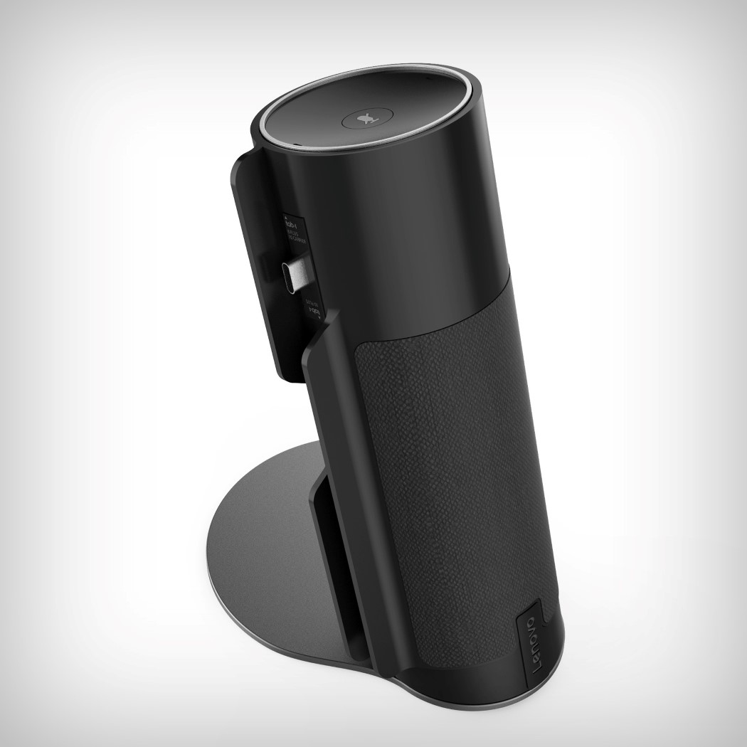
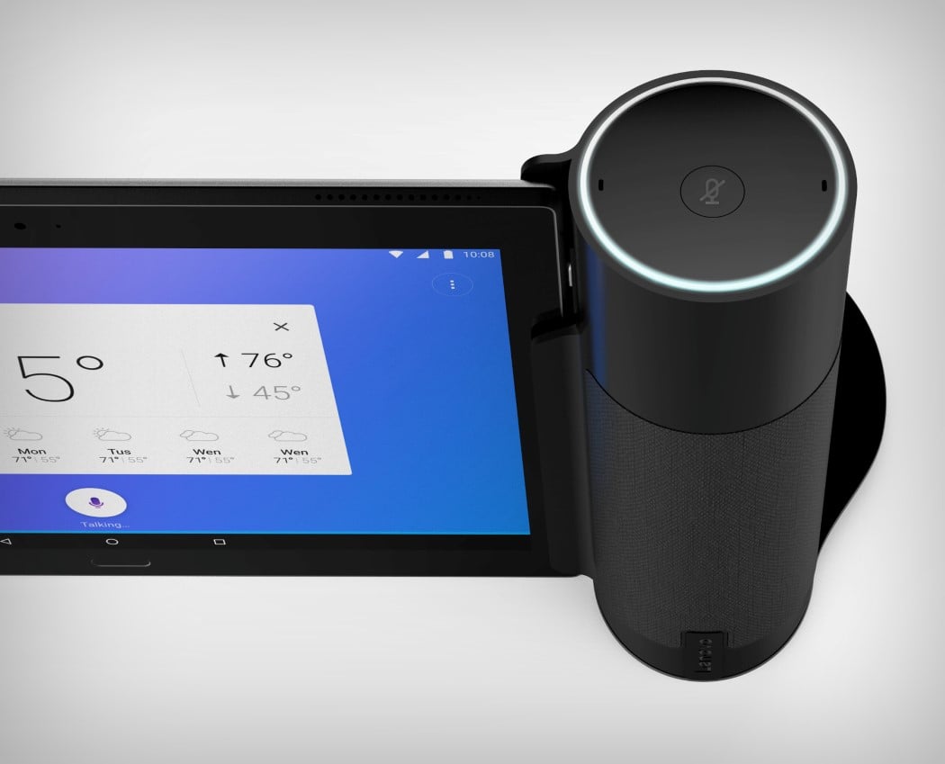
Looking like the Echo got friendly with a tablet PC, Lenovo’s Tab4 wants to combine the best of technologies to give you something that just simply works. The Tab4 is part tablet, part smart-speaker. The clever bit? They dock together when you want to use them as an individual unit, and separate out when you need to roam around your house, working as two separate yet connected entities.

It’s clever that Lenovo is combining the tablet and the smart speaker like this. Not only does it allow Lenovo to join the smart-home race, it also lets it quietly and surely push its tablet forward. The Tab4 docks within the speaker unit, working together with it and charging when docked. It also allows you to have a much more visual user experience with your smart speaker, which is normally operated only vocally. Working much like the Echo Show, the tablet and speaker deliver a seamless experience when paired, and when used independently, work just the way you would expect a tablet and a smart speaker to work. I’m quite liking this two-for-one approach, and if that means boosted sales for Lenovo tablets, that’s just a stroke of genius!

The Tab4 is a winner of the A’ Design Award for the year 2018.

Designer: Lenovo Design Group

tab4_2

tab4_3

tab4_4

tab4_5

Check out this low-poly high-entertainment chess set!

chess_drama_1

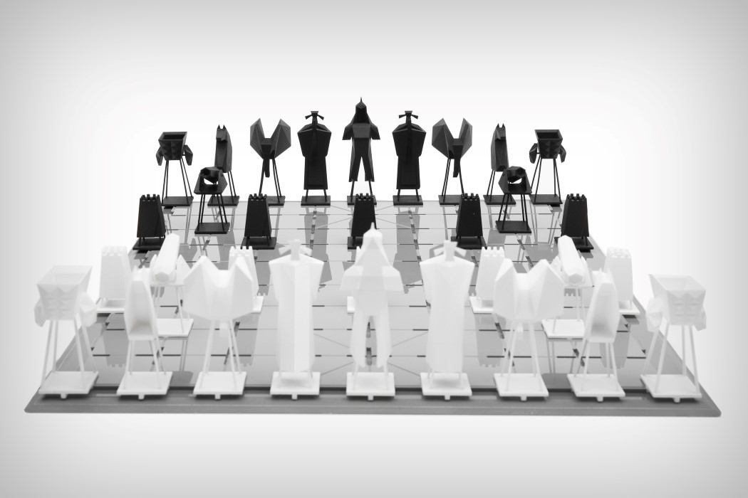
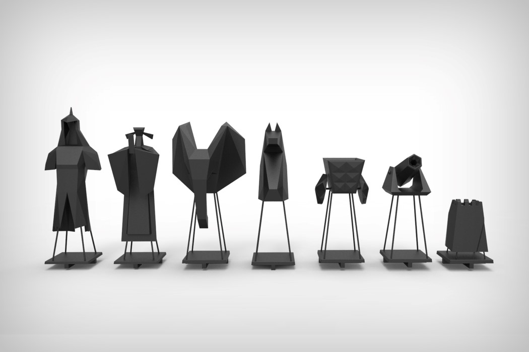
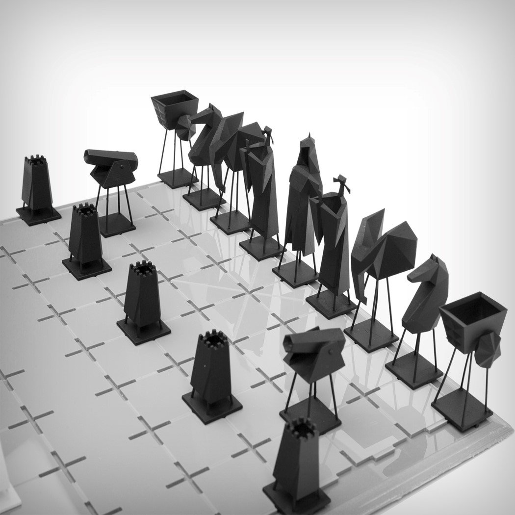
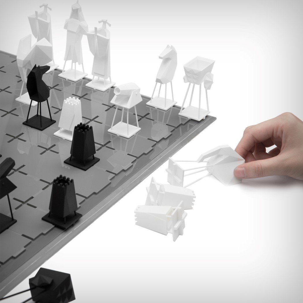
Built on the design of the realistic chess set however with a low-poly style, the Drama Chess Set feels a lot like the chess version of the Game of Thrones title sequence with its toyish charm. Built to make Chinese Chess popular among the youth again, Lingfang tries to up the style quotient of the board and the playing pieces with his minimalistic style. While the pieces aren’t the same as those on a regular chess board, the Drama Chess Set looks quite relatable, creating a mixture of human and object pieces that sit in engraved crosses on the board, rather than inside squares. This gives the board its checkered effect, without really creating any checkered pattern. it also allows pieces to dock firmly into the board instead of sliding around. I don’t know about the Chinese, but I sure would like a go at this game!

The Drama Chess set is a winner of the A’ Design Award for the year 2018.

Designer: Lingfang Shen

chess_drama_2

chess_drama_3

chess_drama_4

chess_drama_5

Turning one of the most iconic album artwork into furniture

darkside_stool_1

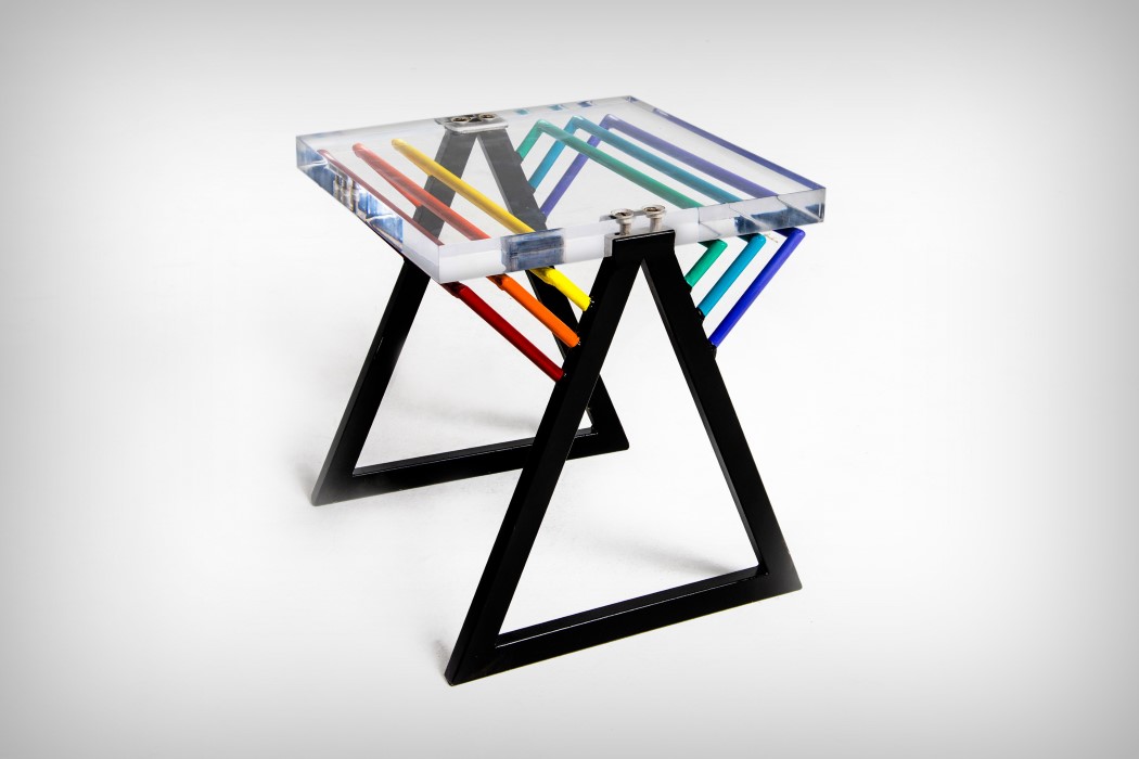
Looking at the Darkside Stool/Side-Table, it isn’t particularly challenging trying to figure out where they took their inspiration from.

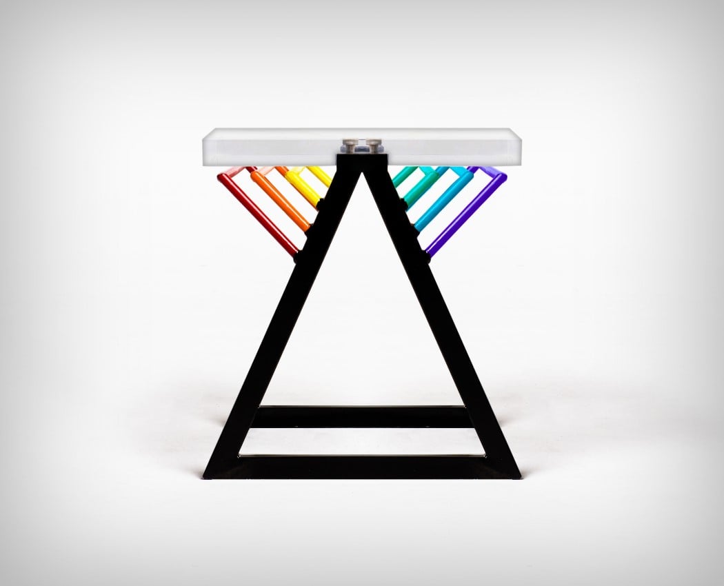
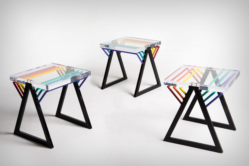
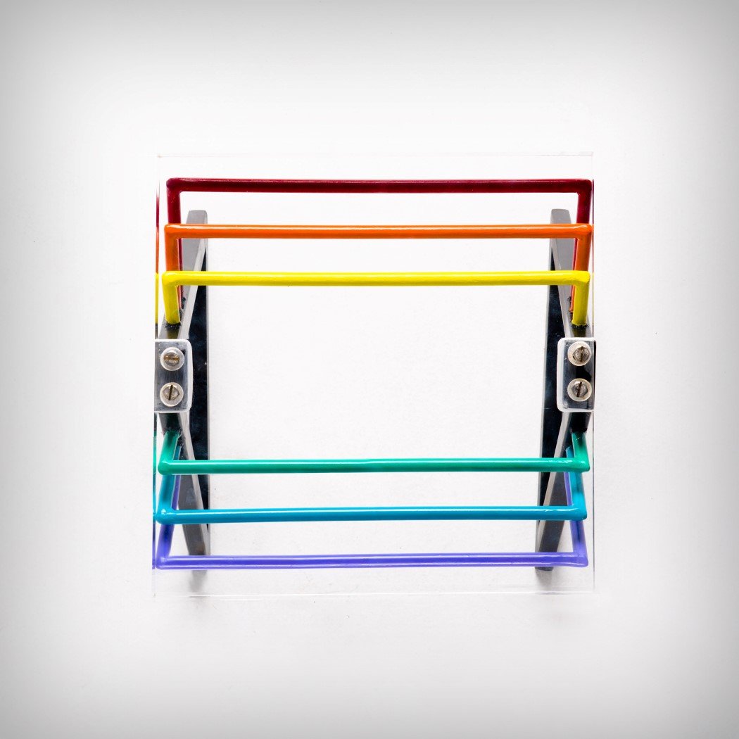
Designed clearly by fans of Pink Floyd, the Darkside pays tribute to easily the most influential album of its time, The Dark Side of the Moon. The Darkside Stool aims at deconstructing it, taking the elements apart, and rearranging them in a manner that seems like an aesthetic remembrance of an album that was “totally rock and roll”. Made from Stainless Steel and Acrylic, the stool has all the visual elements from the background. The triangular prism finds itself at the base of the stool, made of stainless steel and colored black, while the prismatic material forms the acrylic seat on top. Lastly, the seven colors of the spectrum form supports for the acrylic seat (although there are only six here, to give the seating bilateral symmetry). The fact that, without mentioning the music album, the stool makes such a strong and singular statement seems beautiful… and frankly, worth the A’ Design Award it managed to win!

The Darkside Stool is a winner of the A’ Design Award for the year 2018.

Designer: Romulo Teixeira & Cintia Miyahira.

darkside_stool_2

darkside_stool_3

darkside_stool_4

darkside_stool_5

When the brief says “design a recliner/rocking chair/hammock”

cocoon_chair_1

Sitting on the Cocoon is a strangely comforting yet new experience. It looks a little revolutionary, no doubt… but sitting on it gives you an experience that’s difficult to actualize in words. Rest your body against it, and it feels like a hammock, with its woven fabric. However, it doesn’t consume you, like a hammock would. Lie down in a hammock, and the fabric gives in to the shape of your body… lie in the Cocoon, and it feels like you’ve still got some lumbar support. It feels more like a recliner than a hammock. And then there’s experience number three. Designed with a curved frame, the Cocoon swings to and fro, unlike a hammock that swings side by side. The Cocoon somehow manages to combine rocking, lounging, and relaxing all into one beautiful seating device perfect for a lazy afternoon with a cup of hot cocoa… as shown above!

The Cocoon is a winner of the A’ Design Award for the year 2018.

Designer: Timmy Kwok

cocoon_chair_2

cocoon_chair_3

cocoon_chair_4

cocoon_chair_5