Modern architecture designs from the A’ Design Award that’ll make your jaw drop

Goethe’s words “I call architecture frozen music” couldn’t ring more true for these 20 structural marvels. If architecture truly is frozen music, this article is a mixtape of 2019’s greatest songs.

A part of A’ Design Award and Competition‘s winner list, these buildings are awarded for the uniqueness of the project, social impacts, environment friendliness, energy utilization, and other project-specific criteria. Ranging from conceptual designs to residential units, to spas, offices, museums, and retail spaces, the A’ Design Award covers architecture in its entirety, aside from a wide roster of other categories. Not only does winning an A’ Design Award look great on an architect’s resume, it also brings a lot of repute and focus to the work, uplifting its value!

Architecture remains the most popular category at the A’ Design Awards, receiving entries by the thousands each year. Here are a few favorites that we wish we had enough money to afford!

The A’ Design Award is currently accepting entries for the 2021 edition of the award program, so go ahead and give your work and career the push it deserves!

If you’re an architect or spatial designer looking to participate in the A’ Design Awards this year, click here to register. Hurry! The regular deadline ends on September 30th, 2020.
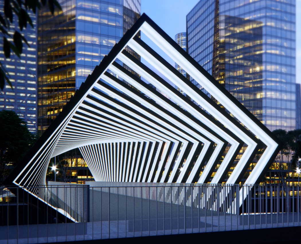

01. Solar Skywalks by Peter Kuczia

A beautiful combination of aesthetics and functionality, the Solar Skywalks don’t just provide a pretty footbridge for people to walk through, they help generate electricity too! The skywalk’s continuous facade is, in fact, made from power generating photovoltaic modules (or solar panels) on the outside, and lighting panels on the inside that illuminate at night. The skywalk’s design features a continuous series of polygons that look like a rotating wormhole from the inside. Once the lights switch on, the wormhole comes to life with a hypnotic series of light-spirals that absolutely catch the eye!
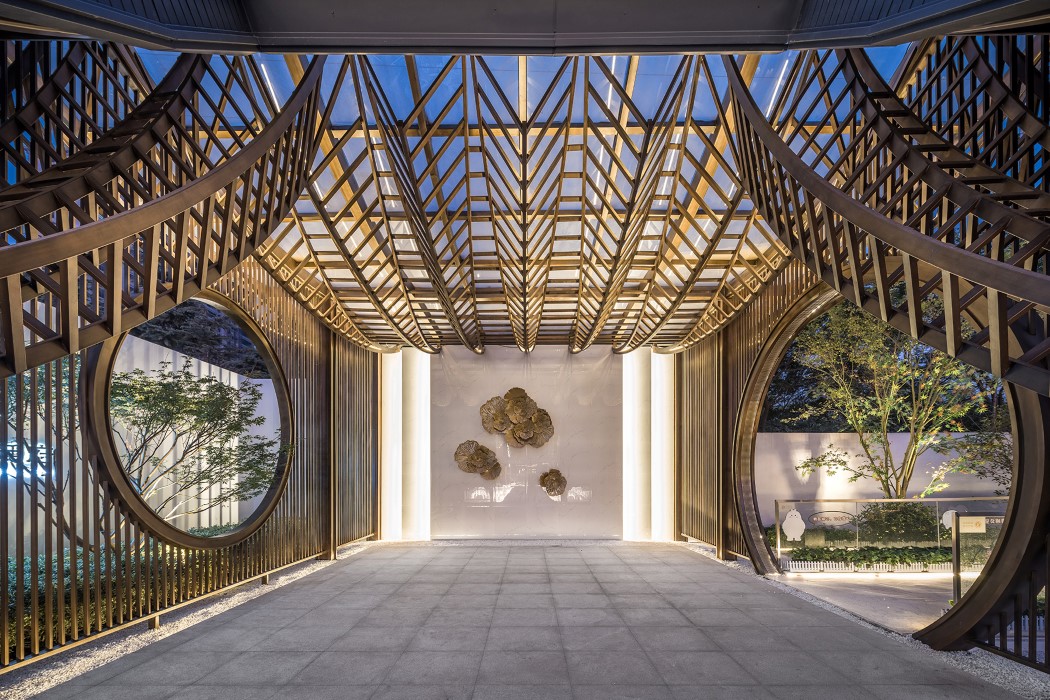
02. Yuzhou Langting Mansion by Tengyuan Design

Inspired by oriental deptions of mountains as well as running streams, the Yuzhou Langting Mansion is an exhibition center that hopes to redefine traditional Chinese architecture by modernizing it. Metal slats and columns replace the use of traditional materials like wood and bamboo, adding a contemporary touch to it while giving it a geometric beauty that’s difficult to look away from. Its beauty is only multiplied once you introduce backlighting to it, giving the entire structure a series of halos.
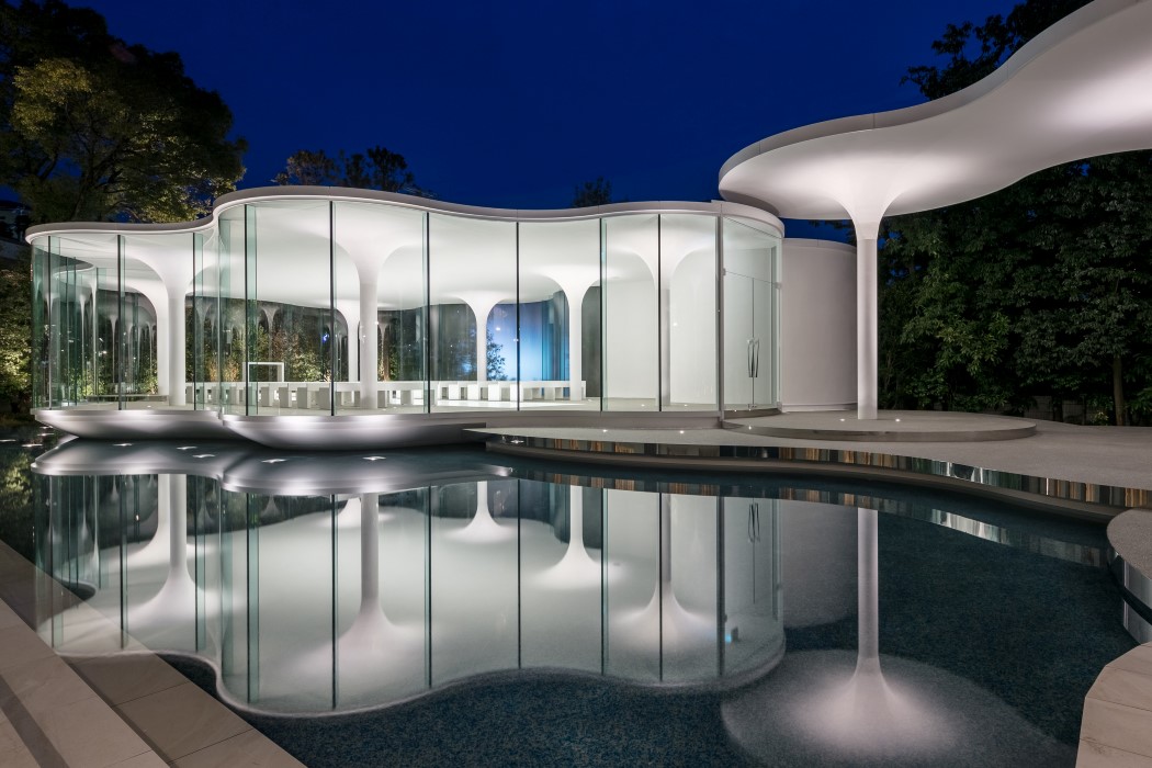
03. Cloud of Luster Wedding Chapel by Tetsuya Matsumoto

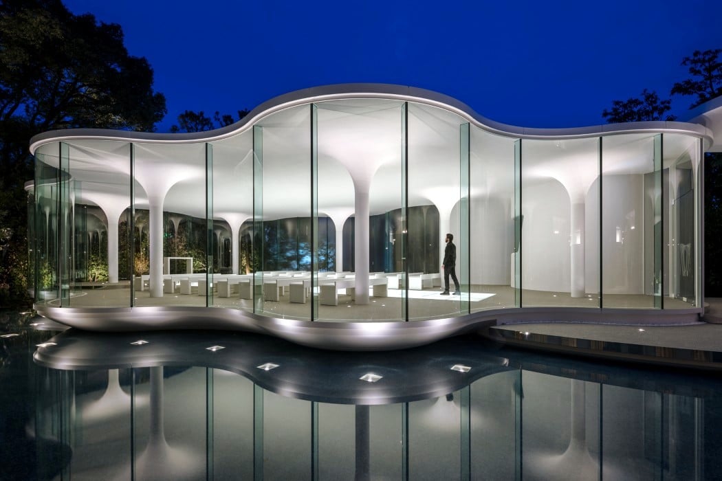
This wedding chapel’s unusual amoeboid shape gives one the appearance of being inside a cloud… a fitting metaphor for people who literally feel like they’re on the top of the world when they get married! The Cloud of Luster’s white ceiling gives it a certain austerity that’s hard to ignore, and those gently descending pillars make the architecture look unconventionally light. Couple that with the fact that the entire chapel floats on a man-made pond and you get some dazzling reflections of the space on the water below. Truly a magical sight for people wanting to celebrate their magical moment, if you ask me!
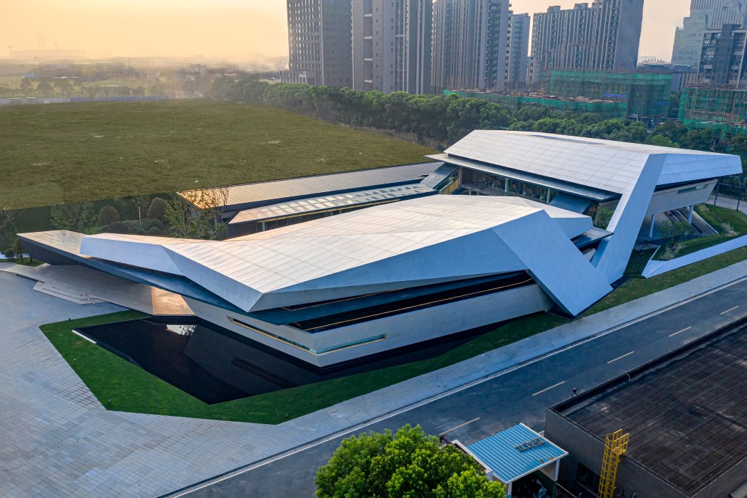
04. Flying Exhibition Center by Kris Lin

Located in Jiangyin city, at the center of the Yangtze River Delta, the Fly Exhibition Center looks like an abstraction of a bird in flight. Its edgy aesthetic gives it the appearance of a folded origami bird, taking off over the banks of the Yangtze river and acting as a metaphor of ascension and success. “It is hoped that it will represent the development and take off of the city in the Yangtze River basin. Therefore, it is named as the Flying”, says designer Kris Lin
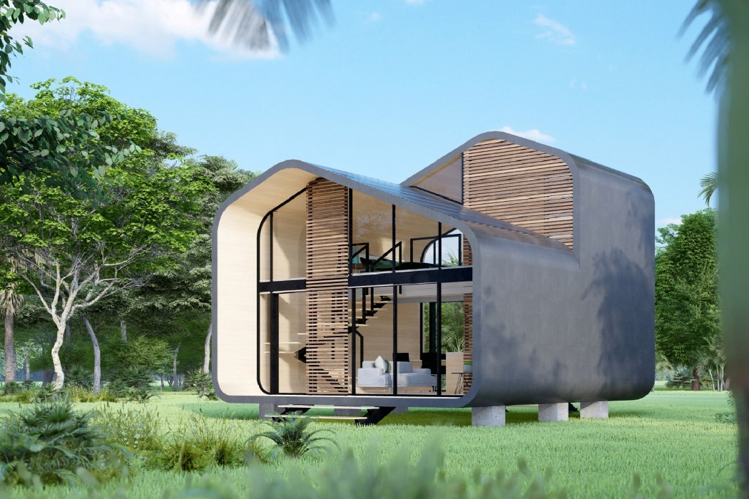
05. Zen Mood House by Francisco Eduardo Sa and Felipe Savassi

The Zen Mood House’s front view resembles the silhouette of the quintessential cottage, with its cozy roofed design and the chimney popping out the side. In reality though, while the Zen Mood House is just as quaint, it’s also a contemporary take on housing, with its minimalist appeal. The house is quite literally an outline, with glass on the front and the back, offering shelter along with a cascading panoramic view of the greenery around you. Moreover, the house’s design is modular too, and can be shipped entirely within one truck and assembled in a day.
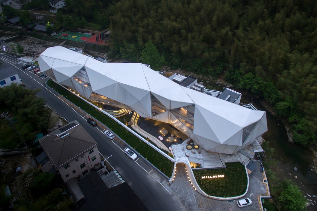
06. Hill Wind Hotel and Resort by Huafang Wang

Acting as an abstract representation of the landscape around it, the Hill Wind Hotel and Resort boasts of a design that uses the hilly terrain as inspiration, but in a way that allows the building to stand out amidst the green hillocks on the outskirts of Anji, a city in the Hebei province. The edgy low-poly facade surrounds the entire building, almost making it look like a massive cloud among the hills.
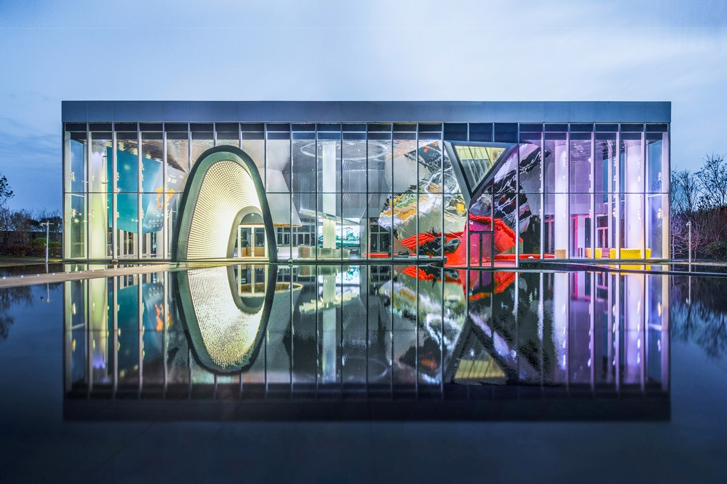
07. Courtyard NO.1 by Qun Wen

Courtyard NO.1’s appeal lies majorly in the way it uses the water below it to complete its form. The sales office building comes with a design that gets mirrored by the water it sits above, giving it the appearance of floating in the skies. It all comes alive especially at night, when the building lights up, looking like a floating jewel.
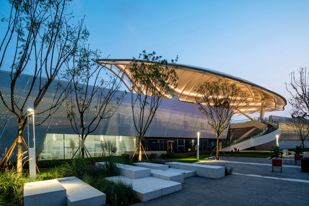
08. Starry Town of Fuxian Lake by MadeMake Architects

Located on the edge of the Fuxian Lake, Starry Town is an exhibition center that celebrates the diversity of the area while also being a visual representation of the flora of the surrounding area. The exhibition center is spread across two buildings, connected by a large roof that resembles a leaf, making for a very interesting birds-eye view.
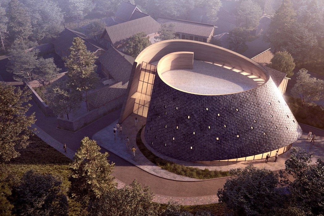
09. Wenjiang Shouan Flower Exhibition Center by Yun Lu – MUDA Architects

Yet another exhibition center, the Wenjiang Shouan Flower showcases the traditional roofing style of the Sichuan people, even using the same materials to echo authenticity. The fluid brick wall is punctuated by glass facades that not only give the building an interesting exterior, but also help illuminate the interiors during the day. The building will serve as a natural ecological exhibition space, a flower planting exhibition center, a business conference center, and a township training center.
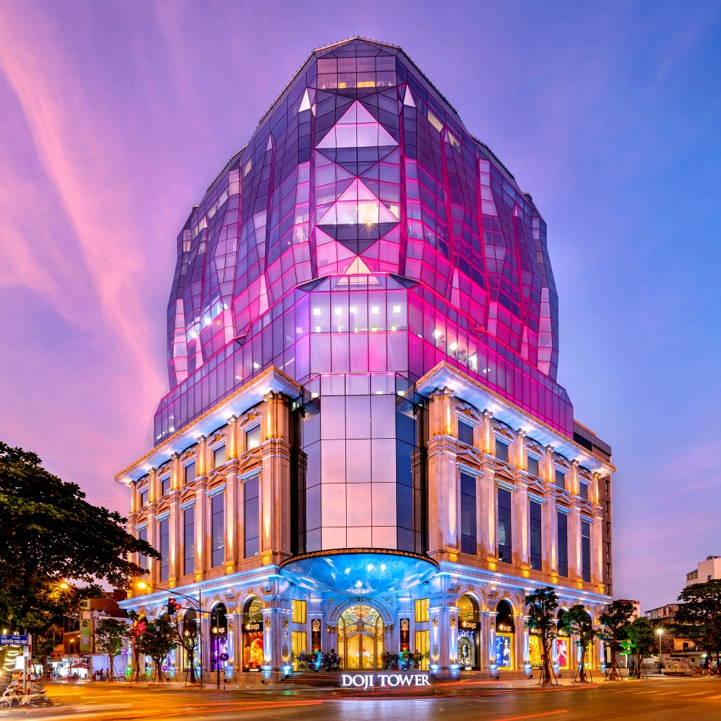
10. Hanoi Doji Tower by Do Minh Phu and NKB Archi Vietnam

If the Hanoi Doji Tower reminds you of a diamond, it’s purely intentional. The design brief for this building was to resemble a shining gem, symbolic of the fact that the building serves as a gold and gemstone trading center. The lower floors of the building are made from a combination of glass and marble, while the upper floors come with pristine glass paneling that literally looks like a well-cut gemstone. The building was first opened in a monumental and impressive inauguration ceremony on September 6, 2019. Doji Tower is situated in a location of historic importance, acting as a standing symbol of progress and prosperity. Now that’s sure to become a landmark!

Register to participate in the A’ Design Awards now. Hurry! The regular deadline ends on September 30th, 2020.

This slip-on shoe is custom made for your foot, with a single wrap-around surface

The Walk Of Mind shoes are centered around a technology that allows users to get custom shoes made based on scans of their feet. Its slip-on design comes with a unique visual and tactile experience, appearing as well as feeling lightweight. The shoe’s light appearance can be attributed to the fact it looks quite like a feather or leaf wrapped around your foot, and the absence of the traditional thick sole found in shoes and sneakers makes it look/feel sleek and lightweight.

The slip-on is a combination of multiple materials, including the leather wraparound and an SLS 3D printed nylon sole that fits into it. The sole, designed specifically for each foot, comes with a bespoke pebbled surface that applies pressure on specific areas of the foot to relieve pressure, provide support, and give you a comfortable walking experience without the fatigue. What’s really unique about the Walk Of Mind footwear is the fact that its monosurface design and transitions seamlessly from sole to foot-cover. This means the shoe could essentially be flat-packed for more efficient shipping, or even have one shoe nested within another to create a much smaller package than with traditional footwear. Would be fun to see a video of a working prototype!

The Walk Of Mind shoes are a winner of the A’ Design Award for the year 2020.

Designer: Hadar Slassi

The Voronoi mesh on this bike helmet allows it to absorb maximum impact with minimal material

A perfect example of how generative design can be used to create products that serve their purpose incredibly well, the Voronoi Bike Helmet comes with an unusual mesh on its outer surface. The mesh, created using parametric modeling, helps maximize shock absorption while minimizing material used, creating a helmet that’s effective but also lightweight. Sitting right under the flexible mesh is its underlying hard-hat, made from carbon-fiber.

The helmets unusual design helps it do its job incredibly well. The outer layer cushions impact, while the underlying hard layer protects your skull. Both parts of the helmet use materials and modeling techniques that help them fulfill their requirements while being extremely lightweight, so you never really even feel like you’ve got a helmet on your head!

The Voronoi Bicycle Helmet is a winner of the A’ Design Award for the year 2020.

Designers: Zhecheng Xu and Yuefeng Zhou

Furniture designs from the A’ Design Award that are so good, they’re impossible to resist!

Let’s take a minute to just soak in the creativity that’s filled in this roundup of award-winning furniture designs from last year’s A’ Design Award and Competition. Now the purpose of this roundup is twofold. If you’re a fan of furniture design (either as a design lover, or as a furniture designer yourself), go ahead and bookmark this page for inspiration, or add these images to your Pinterest by clicking the Pin button at the top left of any image. The second purpose is to spark your imagination and get those creative juices flowing so that one day, you too could design something worthy of a design award.

Now if you DO have a design that’s relatively new or just sitting patiently in your portfolio, leveraging its creative appeal to win a design award can actually do wonders for your career. You’re ]in time to send your work over to the A’ Design Awards, with the standard entry period ending on the 30th of September. The multidisciplinary design award program spans a whole variety of categories, ranging from the traditional design disciplines like furniture, interiors, architecture, lighting, consumer tech, to more niche areas like social design, differently-abled design, education design, and even jewelry design. The international award program is hosted every year, with a grand interdisciplinary jury of 218 experts from different fields for its current 2020-2021 edition! So if you’ve got yourself a great design with a whole lot of potential, go ahead and let it boost your career and brand. If not, don’t worry! This showcase should provide enough creative fodder to motivate and inspire you!

Register to participate in the A’ Design Awards now. Hurry! The regular deadline ends on September, 30th.

01. Cloud Chair by Shota Urasaki

Capturing perhaps every child’s dream, the Cloud Chair gives you the feeling of sitting on a floating cloud. Unlike traditional chairs with 3-4 legs, the Cloud Chair is elevated using multiple metal rods, not only giving the cloud its perceived lightness and airy-ness, but also resembling steady drops of rain falling from the cloud’s underbelly. The inspiration for the chair came to Shota Urasaki after she saw a moving cloud raining over a distant coastline. Inspiration immediately struck and the Cloud Chair was born. The seat comes made from clusters of polyester fibers pierce-fitted into a block of polyurethane foam to give the visual as well as the tactile appeal of a puffy cloud. The seat rests on multiple stainless steel supports, with a mirror at its base to give the rain an illusion of continuity. Clever, eh??

02. Fllipping Hanger by Marco Guariglia and Jui-Ju Lin

Isn’t it adorable how these coat hangers resemble the leaves of a Monstera plant?? Designed to cleverly add function with a touch of greenery to your interior space, these hangers let you suspend clothes, sports equipment, umbrellas, raincoats, and hats on the various hooking points on the leaves, and they look great while they’re bare too! Two birds, one stone.

03. Lift Portable and Adaptable Shelf by Shiva Pouryousef Khameneh

The Lift shelf’s entire objective is to be accommodating. Designed to work without needing to be mounted on any wall the Lift rests with its back against a wall, becoming a tall bookshelf that you can easily place wherever you need. Its light design comes with two zigzag columns and multiple wood and copper dowels that attach in between. Powder-coated steel plates help form flat surfaces for resting items on the shelf, and can easily be moved around to create the composition you’re looking for. You could, alternatively, keep portions of the shelf empty too, adding a bit of negative space to the composition to make it look more visually appealing.

04. Acorn Leisure Chair by Wei Jingye, Chen Yufan and Wang Ruilin

Designed to be a resting area both for you as well as your pet, the Acorn Leisure Chair turns the space underneath the seat into an enclosure for small animals. The chair’s organic curves come inspired from its namesake, the acorn, and its base heavy design provides the perfect resting space for your pet, while allowing you to easily (and comfortably) sit on top. The wooden parts of the chair are CNC-machined to perfection, while the wrought-iron pipes on the base give the chair its sturdiness, while allowing your pets to see your legs as they sit inside their safe-space, providing a unique connection between both occupants! Alternatively, you could use the space under the seat to store books and pillows too.

05. 37 Degrees Music Coffee Table by 37 Degree Smart Home Ltd.

This coffee table lets you rest your hot coffee-cup while it serves up some hot beats to match! The 37 Degree Music Coffee Table comes with a 360° Bluetooth speaker built into its vertical pillar. The table’s overall wooden design does more than adding a nice visual touch to your house. The wooden enclosure also provides a great resonating chamber for the audio, allowing your sound to be as rich and creamy as the coffee you’re drinking! Besides, the vertical channel helps scatter audio in all directions, filling your entire room with high-fidelity audio. Don’t worry, listening to bass-heavy music won’t spill your coffee!

06. Butterfly Hanger by Lu Li

Elegance, thy name is the Butterfly Hanger. With a beautifully minimal design that evokes the delicate form of a butterfly, this clothes hanger is as functional as it’s aesthetic. Built out of just three components, the Butterfly Hanger requires no fasteners, glue, or screws. Just slide the wooden column into the diamond-shaped slot in both the metal frames and voila! You’ve got yourself a hanger that’s stable, durable, and beautifully minimal!

07. Poufs With 1000 Arrangements by Marco Guariglia and Jui Ju Lin

These Poufs aren’t really furniture, but are more like building blocks to make the furniture you need. Designed as plush yet sturdy quarter-circular velvet cushions, these Poufs can be arranged in a variety of styles, going from the regular Ottoman stool to wave-shaped seating, or even a lining around a planter or against the corner of a room. The possibilities are as endless as the use-cases, because designers Marco Guariglia and Jui Ju Lin believe that furniture should cater to the room’s needs, not the other way around. Each Pouf is made of a piece of 3D machine cut polystyrene, reinforced with plywood, and covered with foam + fleece.

08. Arc Guitar Stand by Hung Yuan Chang

The Arc Guitar Stand has an incredible sculptural quality to it, which is unusual for a product that’s usually designed to be really functional. A guitar stand is usually quite an unassuming product that fundamentally exists as a background element to the guitar, which sits atop it. With the Arc, the stand has an aesthetic appeal that makes it look beautiful even when there isn’t a guitar resting on it. Besides, its design does a pretty good job of propping up the instrument too!

09. Haleiwa Chair by Melissa Mae Tan

Legacy meets contemporary. Grace meets strength. Sweeping curves seamlessly merge with striking lines. Rattan, a pliant material commonly used in indigenous Philippine furniture, gets a modern upgrade when paired with a solid metal frame. The Haleiwa is a traditionally rich, handcrafted answer to the iconic elegance of the Panton Chair. Looks remarkable, doesn’t it?

10. Motichair by Koma Yang, Yuxiao Dong and Jiaxin Liang

The Motichair isn’t a conventional-looking chair, because it isn’t designed for conventional spaces. Made to be placed in an area that’s often rich with decor, flashing lights, deep basslines, and good conversations, the Motichair is designed to somehow stand out against its chaotic background. Yep, the Motichair is a barstool, and its design borders on being an art installation. With a ‘matte-meets-chrome’ carbon-fiber and metal construction, the Motichair is light yet durable, and comes with a unique metallic halo that surrounds you like rings around a planet. I guess you could say this chair is ‘out of this world’!

Register to participate in the A’ Design Awards now. Hurry! The regular deadline ends on September 30th!

This award-winning portable camp-stove opens up with a single push

The Herbet Portable Stove’s interlocking tripod design HAS to be one of the most interesting takes on stoves I’ve seen in a while. All it takes to deploy the stovetop is to push the opposite ends together and watch the two tripods expand, creating a stable base as well as a stable stovetop to rest utensils. Made from laser-cut and sheet-folded stainless steel, the Herbet is all about championing portability, with a compact and lightweight design.

At just 40mm in diameter, the Herbet’s cylindrical closed-design is absolutely perfect for carrying along in your backpack (you could slide it into your bottle-holder too, if you wanted). Once you’re at the site, just push down on the two ends of the stove and it expands sideways (sort of like a car-jack but in 3 dimensions), making it ready to use. A pipe outlet at the base lets you connect the stove to any fuel source, while the stable tripod design lets you rest any sort of utensil above the Herbet. Once you’re done, wait for the Herbet to cool off (it’s made of metal, after all) before pulling on the two ends to make the stove’s legs collapse back into a compact, long cylinder that slides right back into your backpack or car’s glove box for another day!

The Herbet Portable Stove is a winner of the A’ Design Award for the year 2019.

Designer: Idan Herbet

This geometric cat-shelter looks like a minimalist cat-head!

Talk about purrfect design execution! The Catzz kitty-bed is inspired directly by its feline occupant. Designed to be flat-packed, the Catzz is an icosahedral shelter for cats that comes with multiple triangular panels that come together to form the enclosed shelter. The clever bit, however, is the fact that the Catzz bed actually looks like a minimalist cat head, complete with two pointy ears!

Made from individual felt panels, the flat-packed bed can easily be assembled in minutes. When put together, it forms the perfect haven for your kitten, being a combination of robust and sturdy yet fuzzy and comfortable. The Catzz bed even comes with a dangling toy that you can suspend from the bed’s ear (for the cat to periodically play with), and when the bed does get dirty, it can easily be disassembled and machine-washed. Paw-sitively delightful, isn’t it?!

The Catzz Cat Bed is a winner of the A’ Design Award for the year 2020.

Designer: Mirko Vujicic

This swirling orb of ice helps make your drinks look amazing and cool faster too!

This could be the mildly delusional me speaking but oh, what I’d give to be in a crowded bar, not being able to hear myself think while sipping on an Old Fashioned and admiring the swirling orb of ice in it. As perfect as that orb does tend to look with the orange peel above it and the alcohol around it, it seems like it could be perfected, be engineered to look better, and perform better.

It isn’t often that something as mundane as an ice-mold wins a design award, but it seems like the Icy Galaxy deserves recognition. Designed to look like a beautiful wavy orb of ice, the Icy Galaxy sphere does two things – It creates an interesting interaction with the liquid it’s immersed in, especially when the liquid slides into the orb’s multiple crevasses, but at the same time, it also helps rapidly cool drinks down by increasing the icy orb’s surface area (similar to how motorcycle engines come with fins that increase their surface area allowing wind to cool them more effectively). The orbs are crafted using silicone+plastic molds that create two spheres at a time, and the resulting ice spheres look absolutely mesmerizing when suspended in colorful liquids… sort of like galaxies within your glass!

The Icy Galaxy Ice Mold is a winner of the A’ Design Award for the year 2020.

Designers: Ladan Zadfar and Mohammad Farshad

Post Covid-19 air travel: Redesigned flight seating that makes traveling safe and luxurious

Seats on a business class ticket are dramatically safer than those in economy class. That isn’t because they were designed to be safer, it’s because they were designed around the idea of spacious luxury. James Lee’s butterfly seats explore that very idea to make flight seats safer. By isolating seats, creating partitions, and providing facilities that align with the concept of premium value addition, the Butterfly seats instantly offer a much more safe travel experience by creating dedicated spaces for passengers with lesser chances of spreading germs through interaction.

The seats come in pairs of two and are slightly offset, rather than being side by side. This immediately means you don’t have someone directly beside you, which decreases the chances of socialization. Seats even have adjustable partitions between them to separate passengers, and even have dedicated armrests so you’re never accidentally resting your arm on someone else’s place. Seats come with all the fittings needed to allow you to store your belongings and even work while flying. A dedicated laptop desk ensures you can work while flying, and there are even slots to store magazines and your own pair of in-flight headphones. For parents traveling with little children, the seats fold down to turn into a makeshift bed for youngsters, and if you’re traveling solo with nobody beside you, both the seats can be folded down and covered with a zigzag mattress so you can sleep comfortably – a feature that’s useful for people who are unwell on the journey or for red-eye flights.

It’s simple tactics like this that will help make flying safer and less fearful at the same time. With solutions like the Janus Seat, you end up creating a functioning solution, but run the risk of still dealing with an entrenched sense of fear in the passengers (besides, sitting in that middle seat becomes even less desirable). The Butterfly, however, retains the status quo, with seats that aren’t dramatically different and visors/partitions that don’t look like partitions. By masking the idea of safety using luxury as a design solution, the Butterfly makes traveling safe again while also allowing the experience to be a relaxing, valuable, and comfortable one!

The Butterfly Aircraft Seat is a winner of the A’ Design Award for the year 2020.

Designer: James Lee

The solution to making flying safer and less scary post-COVID is to integrate safety with luxury

Seats on a business class ticket are dramatically safer than those in economy class. That isn’t because they were designed to be safer, it’s because they were designed around the idea of spacious luxury. James Lee’s butterfly seats explore that very idea to make flight seats safer. By isolating seats, creating partitions, and providing facilities that align with the concept of premium value addition, the Butterfly seats instantly offer a much more safe travel experience by creating dedicated spaces for passengers with lesser chances of spreading germs through interaction.

The seats come in pairs of two and are slightly offset, rather than being side by side. This immediately means you don’t have someone directly beside you, which decreases the chances of socialization. Seats even have adjustable partitions between them to separate passengers, and even have dedicated armrests so you’re never accidentally resting your arm on someone else’s place. Seats come with all the fittings needed to allow you to store your belongings and even work while flying. A dedicated laptop desk ensures you can work while flying, and there are even slots to store magazines and your own pair of in-flight headphones. For parents traveling with little children, the seats fold down to turn into a makeshift bed for youngsters, and if you’re traveling solo with nobody beside you, both the seats can be folded down and covered with a zigzag mattress so you can sleep comfortably – a feature that’s useful for people who are unwell on the journey or for red-eye flights.

It’s simple tactics like this that will help make flying safer and less fearful at the same time. With solutions like the Janus Seat, you end up creating a functioning solution, but run the risk of still dealing with an entrenched sense of fear in the passengers (besides, sitting in that middle seat becomes even less desirable). The Butterfly, however, retains the status quo, with seats that aren’t dramatically different and visors/partitions that don’t look like partitions. By masking the idea of safety using luxury as a design solution, the Butterfly makes traveling safe again while also allowing the experience to be a relaxing, valuable, and comfortable one!

The Butterfly Aircraft Seat is a winner of the A’ Design Award for the year 2020.

Designer: James Lee

This award-winning speaker also acts as a phone-stand and pen-stand!

The Waving Multifunctional Speaker is a perfect example of how form and function can help redefine a product’s design. The speaker isn’t just designed to act as an audio-playing device. It’s mindful of the objects and spaces associated with it. Given that wireless speakers are almost always used with smartphones, the Waving Multifunctional Speaker even doubles as a dock/stand for your mobile, allowing you to watch videos on it while the three mid-range audio drivers on the front pump sound out.

The Waving Multifunctional Speaker even comes with a distinct wave-texture on its top which serves as a nifty area to rest stationery. Aware of the fact that most speakers find themselves placed on workdesks, the Waving Multifunctional Speaker integrates clever and convenient solution, allowing you to rest your pens and pencils on it while you work. Pretty clever, eh?

The Waving Multifunctional Speaker is a winner of the A’ Design Award for the year 2020.

Designer: RuiWang Xiang