Low Wall turns a simple side table into a bookshelf

For a book lover, and let’s face it, hoarder like me, almost every space in my house is filled with books. I have a main bookshelf, shelves on my work table, bedside tables, movable storage, and yes, even the floor is littered with books. I don’t live in a big space and so I have to make the most out of my existing furniture and the floor. So if I see concept designs that will give me more ideas on where to place more of my books, it immediately catches my eye.

Designer: Leemok Studio
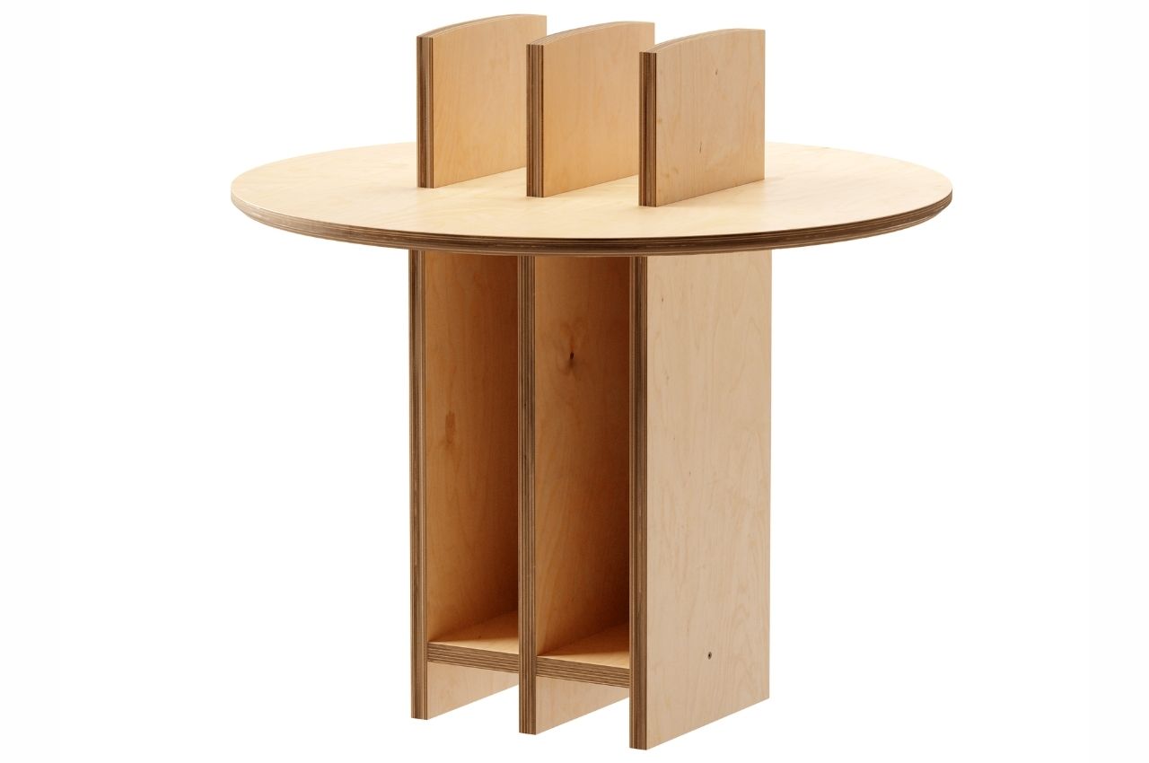
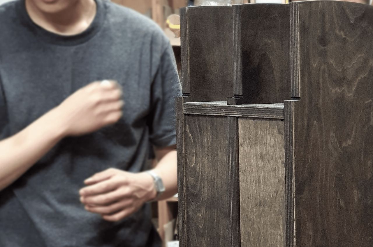
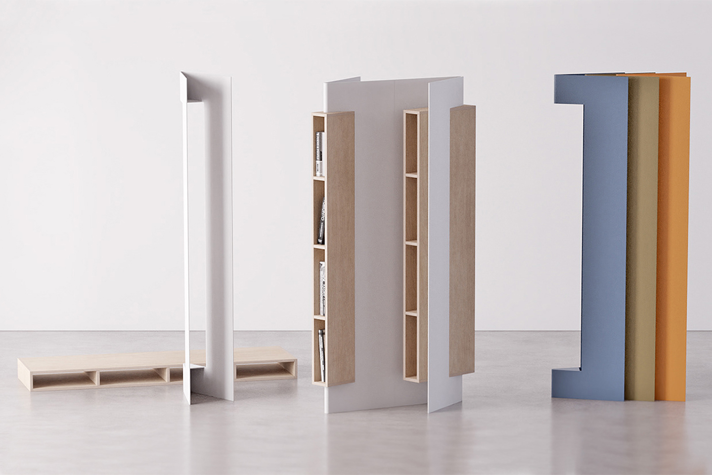
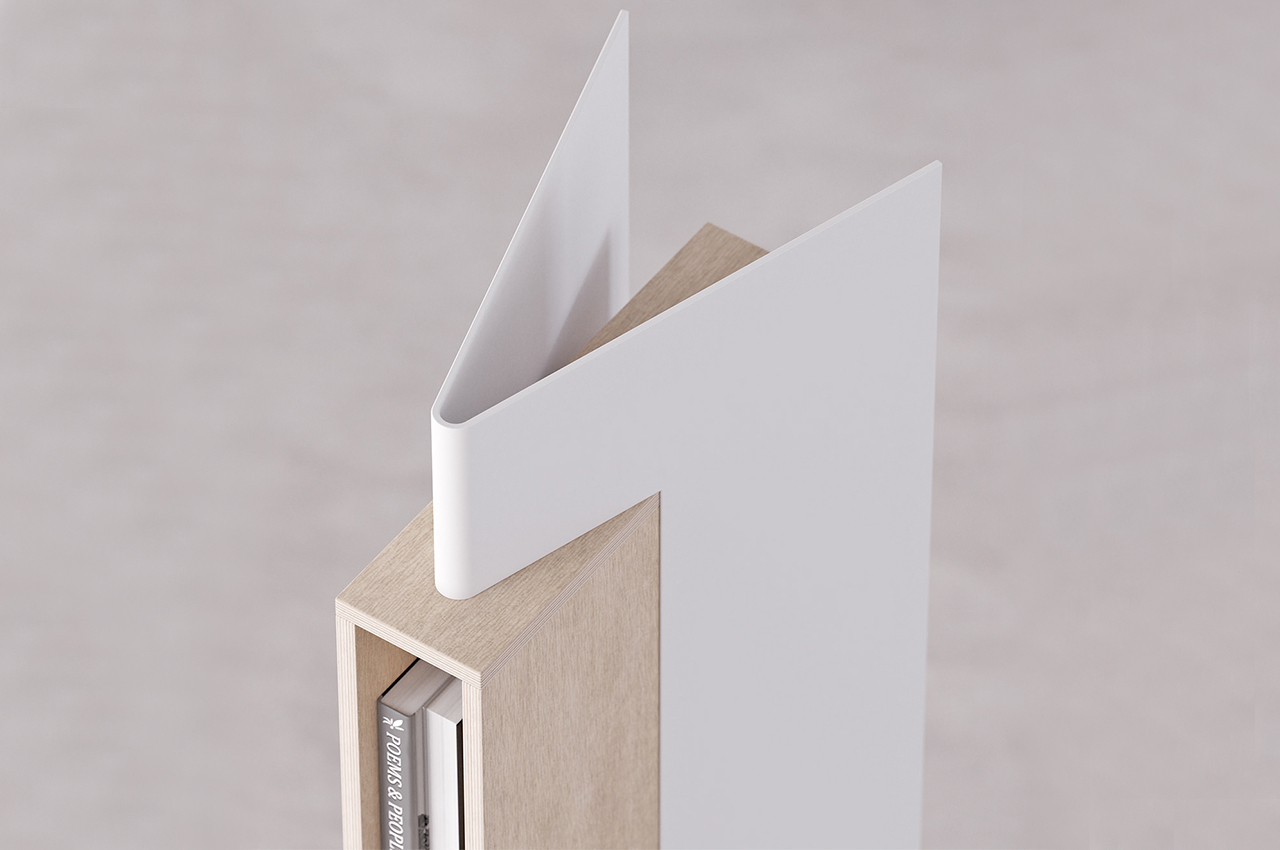
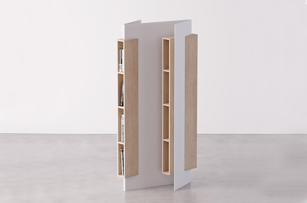
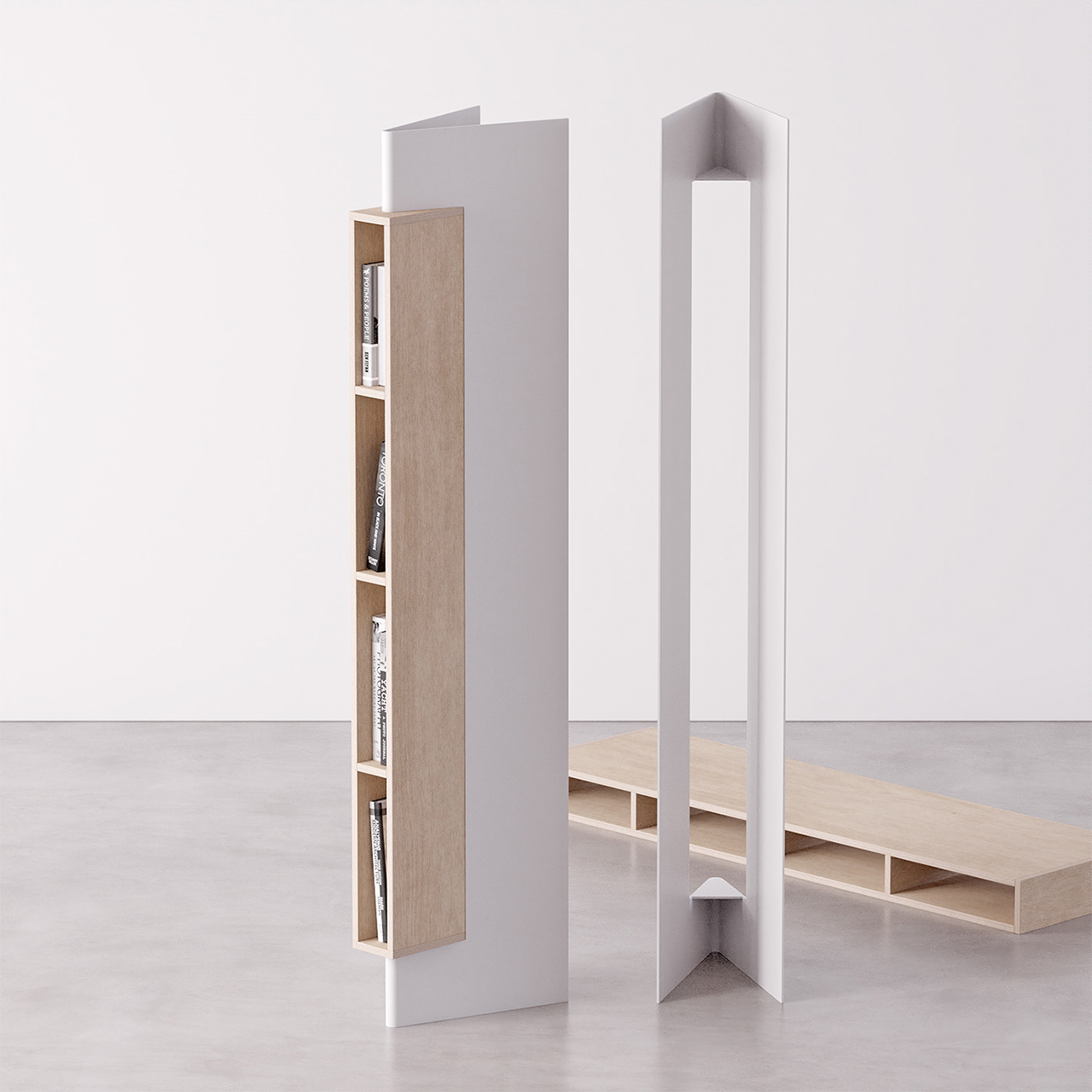
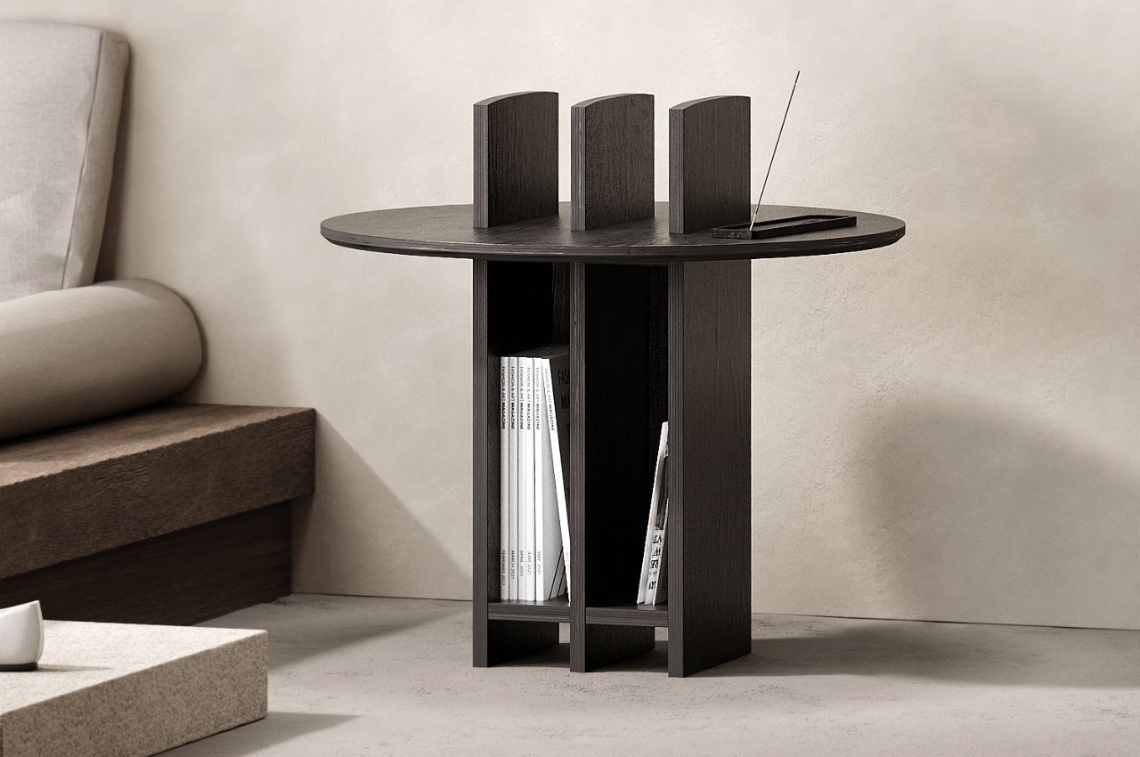
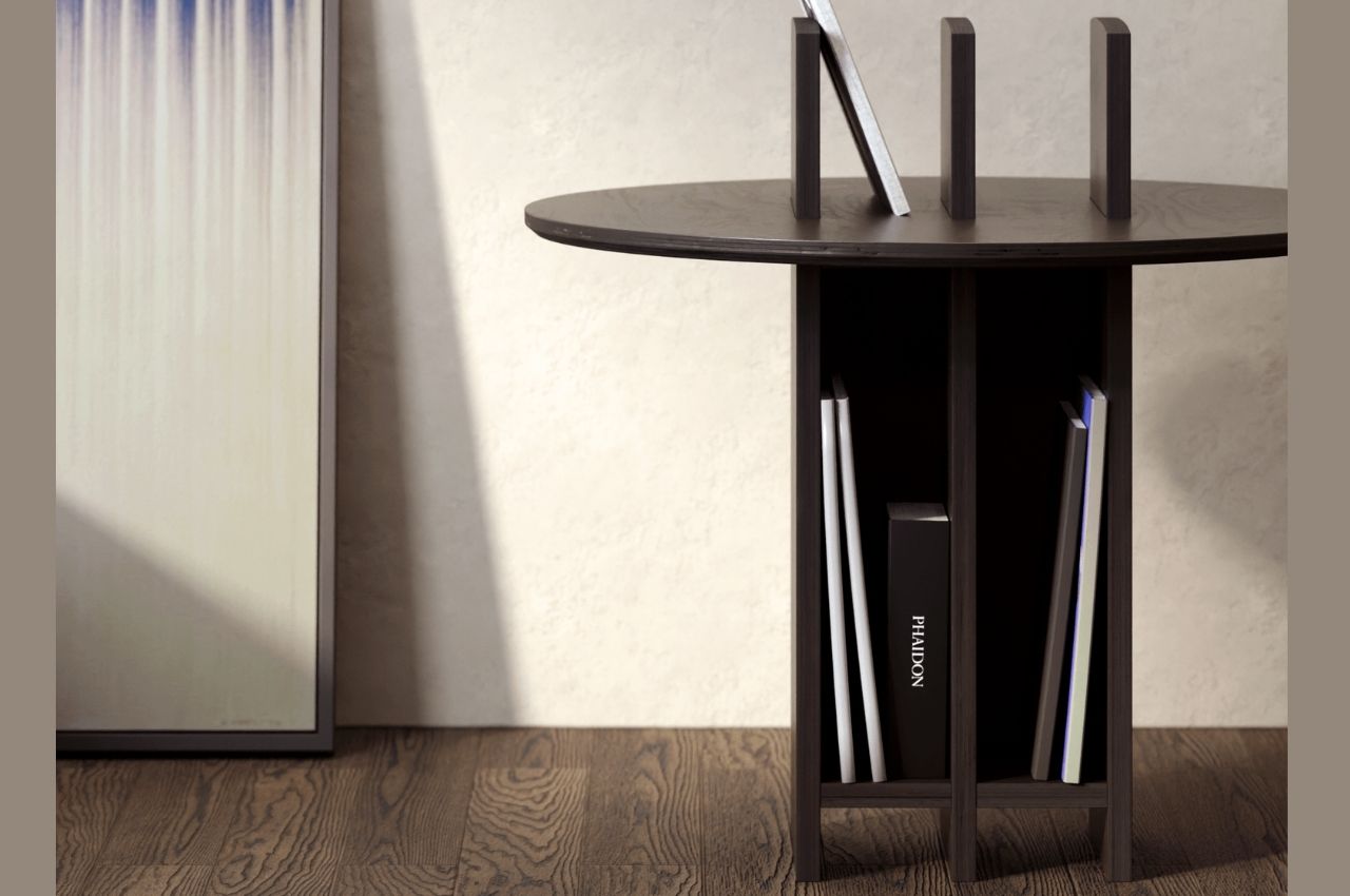
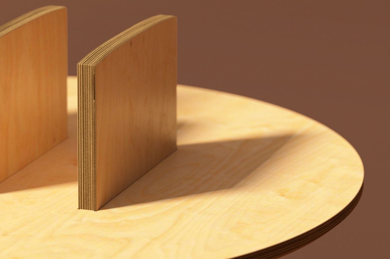
Low Wall is a concept for a side table that can also function as a small bookshelf for those that only have a few books to display or those like me who need all the help I can get. The table’s legs are actually pillars that go through the top and so instead of just having furniture on the side of your sofa to put trinkets, drinks, and other small stuff on, this becomes a tiny bookshelf to house magazines, books, and other stuff you need to place on the side.
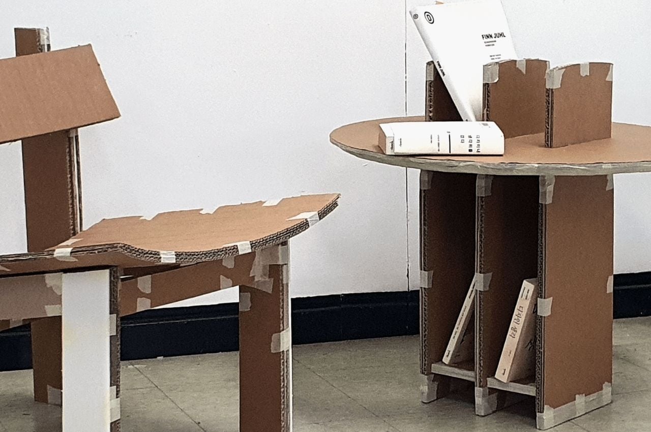
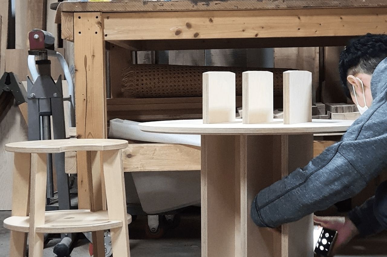
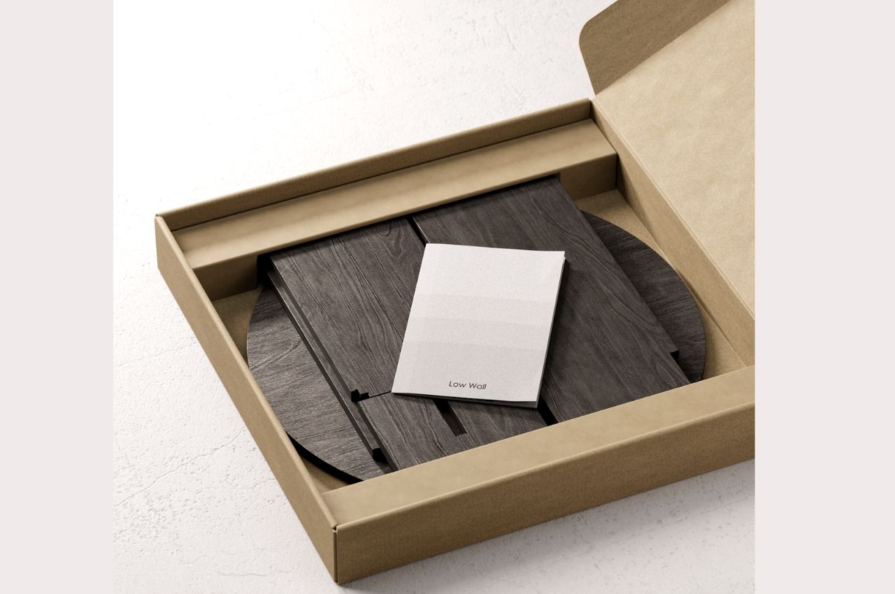
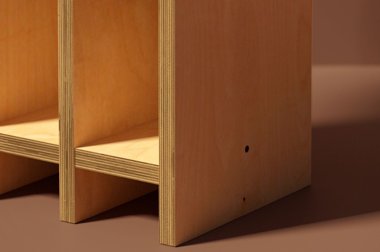
The design for the side table/bookshelf is pretty simple but durable. The renders show that it can fit into a flat box, with the pillars separate from the circular tabletop. You will then assemble it by putting the “legs” through the top with the slats to fit them and create “low hills” or shelves not just on top but also at the bottom with the legs. The lower part has taller shelves so you can place your bigger coffee table-type books there while the top is shorter but can still fit the books you want at easy rich.
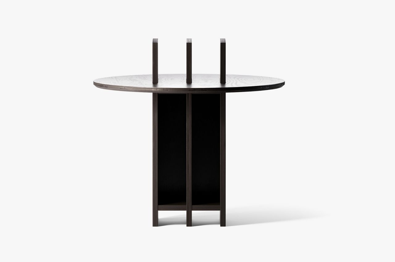
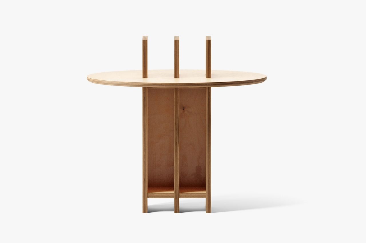
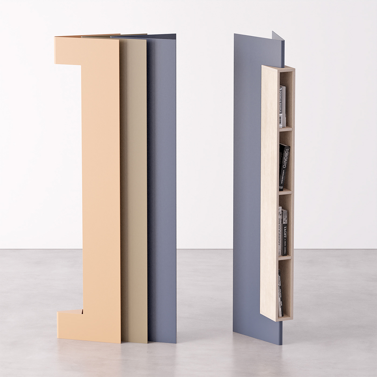
The designer didn’t specify what kind of wood is used for the concept design but there seems to be different shades and types of wooden finishes for the renders. It would be nice if there are options since you would want your side table to fit in with the aesthetics of your living room or bedroom. My books that are currently “unhoused” and lying on my floor and sofa would definitely welcome this kind of storage eventually.
The post Low Wall turns a simple side table into a bookshelf first appeared on Yanko Design.

This multifunctional WFH unit combines a library with integrated desks to feed our curiosity while we work

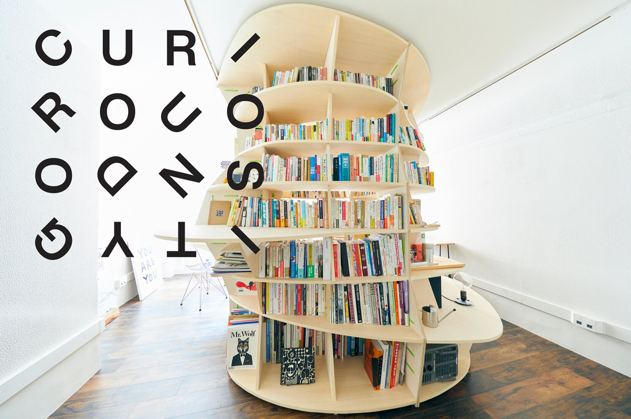
Curiosity-Go-Round is a cylindrical, miniature library that also functions as a workspace with integrated desks and tables.

As we adjust our routines to fit our work-from-home lifestyles, the furniture that gets us through the workday adjusts alongside us. Since WFH orders were first put in place, designers have found versatility in making integrative and modular home furniture.

Designer: Creative Project Base x Keigo Kobayashi

Taking the multifunctional and immersive spirit of WFH furniture to its maximalist end, architect Keigo Kobayashi was called on by the Creative Project Base team to create a bookcase that combines elements of a traditional workspace with integrated storage units to form a bookworm’s private working oasis called Curiosity-Go-Round. Before Curiosity-Go-Round reached completion, Japan-based company Creative Project Base told Kobayashi, “I want you to make a bookshelf that can hold all the books you have now…I want to make it a place where you can come up with ideas by yourself.”

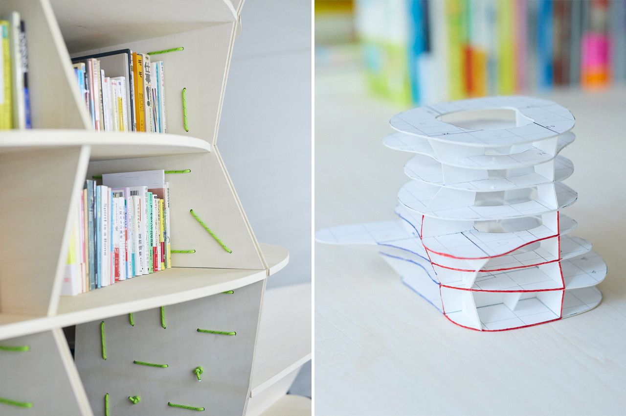
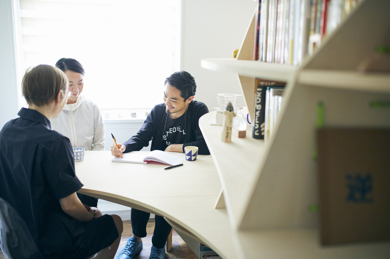
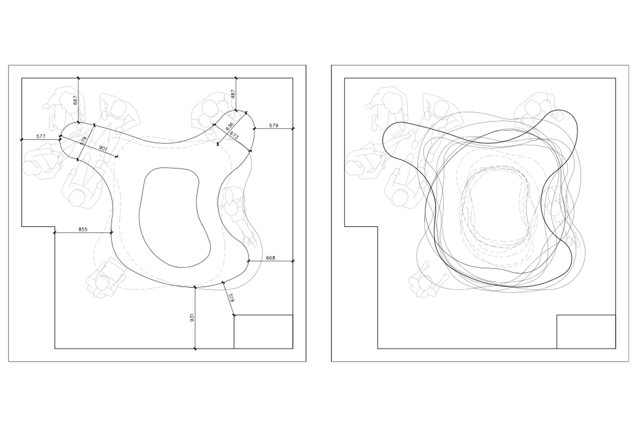
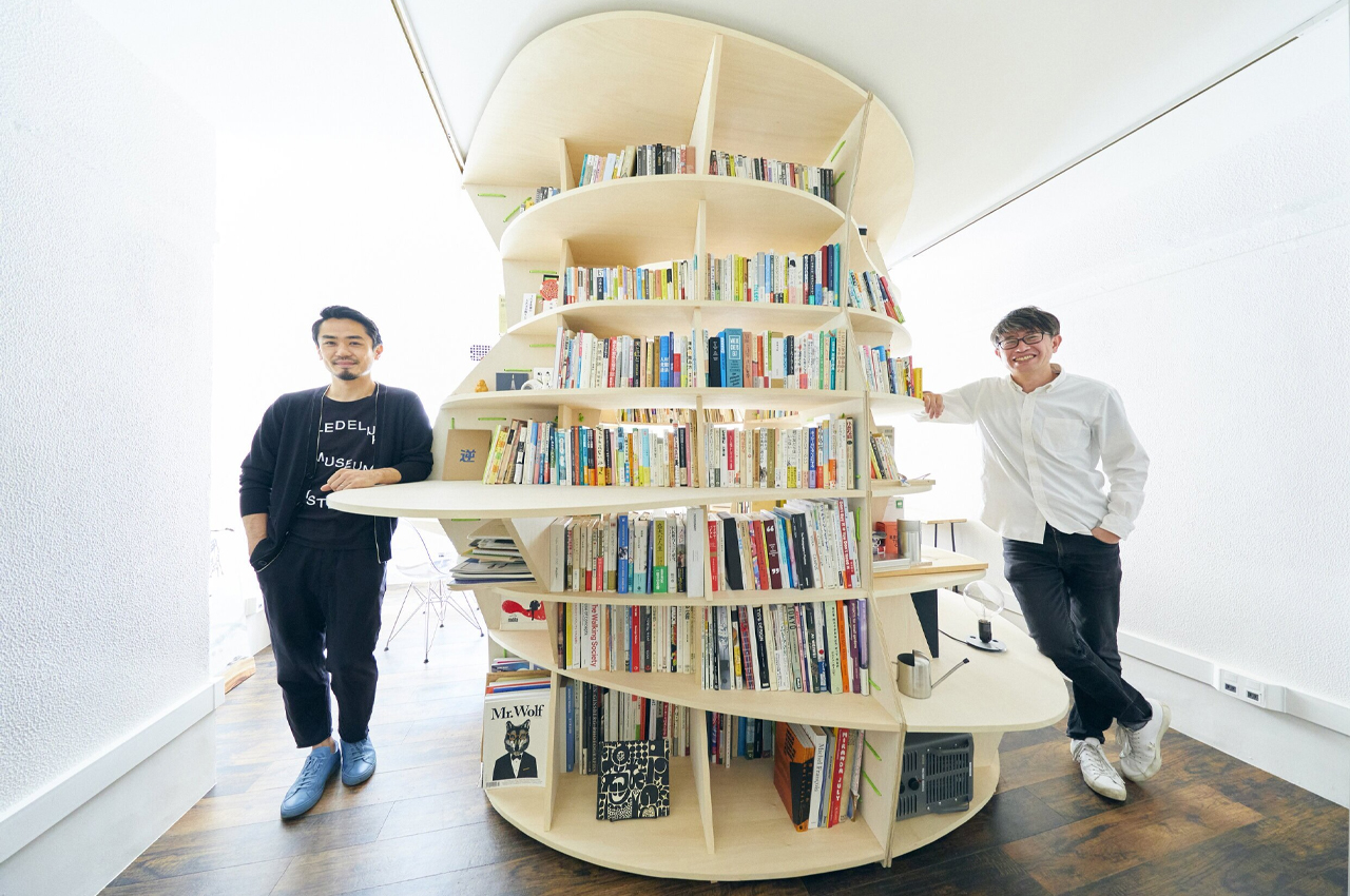
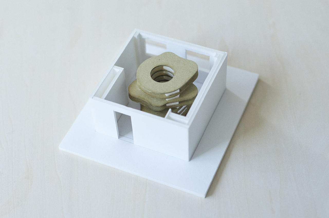
The unconventional, miniature library stands alone as its own unit with embedded desks that engross workers in the shelves of books, as well as a central cavity that functions as a private retreat from the demands of the workday. Working amidst shelves of books can bring some calm so workers can focus and lose track of time for a moment. On different ends of Curiosity-Go-Round, the convex shelves curve to provide spacious tables for collaborative or solo work. The overall unit rises like a wonky cylinder with an open internal center that leaves room to explore the unit’s bookshelves.

By transforming the traditional office space into a zany bookworm’s retreat, work begins to feel more creative, collaborative, and manageable. Once Curiosity-Go-Round was completed, Creative Project Base describes, “After completion, many people visited, picked up books, read, talked, came up with ideas, and many creative [undertakings] became more [dynamic]. Everyone goes around, goes inside, [and] tickles their curiosity to the fullest…”

Primarily functioning as a standalone library, the internal volume is left open for people to enter and explore the bookshelves. 

Curiosity-Go-Round is designed to flow freely between the floor and ceiling. 

Integrated desks jut from the central volume to provide table space for working. 

The post This multifunctional WFH unit combines a library with integrated desks to feed our curiosity while we work first appeared on Yanko Design.
Stormtrooper Bookends: Hopefully Better at Holding Books Than Aiming

Because if they can’t hit the broad side of a barn with their blasters, they should at least be good at something; these are the Stormtrooper Bookends made by Nemesis Now and available on Amazon (affiliate link). Congratulations, you two; based on your inability to hit even a single rebel on Endor, you’re on book detail from now on. Try not to screw this up too, or it’s the garbage compactor for you.

The officially licensed bookends are cast in resin, hand-painted, and stand approximately 7.5″ tall. They feature the likeness of two stormtroopers trying their hardest to keep your books upright and avoid the inevitable Force choke from Vader if they fail. That’s a lot of pressure.

I think these stormtroopers will compliment your existing AT-AT bookends nicely. And you do already own a set of those, right? Who doesn’t? Granted, I don’t own any books and use them as napkin holders, but I’ve always been more of an eater than a reader.

[via DudeIWantThat]

This slim shelf’s minimal design looks like an open book to encourage you to read!

Imagine instead of having a self-care app send you a notification that reminds you to read (especially if that is your resolution for the new year), the furniture itself can be a reminder! That is what Slice essentially is, a minimal, compact, elegant bookshelf that looks like an open book so that it can nudge you to read without having any more screens or digital stimulation.

“In amazingly digital era books aren’t easily opened, having this in mind ‘Slice’ is a bookshelf that intends to motivate individuals to read more often,” says Portuguese designer Joao-Teixeira who is known to always understand the assignment and delivers every single time with unique pieces like this.

Slice connects the environment, the activity, and the user very seamlessly through its form and function. Besides its emotional character, the bookshelf also takes on an aesthetic approach based on minimalistic and sleek shapes. Its elegantly formal look allows the product to become modular, enabling dynamic configurations as a means to highlight its presence and therefore its use.

You can access books from both sides (front or back) easily and the shelf was deliberately created with a slim profile to better fit in smaller spaces. It is horizontally stackable if you want to add more colors or create a piece for your home library, but Slice is certainly a slice of heavenly furniture for every book lover out there with big dreams and little floor space!

Designer: João Teixeira

The post This slim shelf’s minimal design looks like an open book to encourage you to read! first appeared on Yanko Design.
Cactus Bookcase: Prick a Book, Any Book

Reading: it’s fundamental. Cactuses? Not so much, unless maybe you’re a desert. But combining these two unlikely companions is the Babyletto Cactus Bookcase from West Elm. It’s a bookcase that looks like cactus. Obviously, if you don’t fill the entire thing with western novels about cowboys, you’ve done it all wrong.

The powder-coated steel bookcase is finished in sage green and measures 48″ tall, 31″ wide, and 8″ deep, with eight individual cubbies for storing books and toys. Or, in my case, snacks. As I always say, even a great book without a snack is hardly worth reading.

Don’t already have a western-themed library? What better way to get it started? Personally, I’ve always wanted an old west-inspired reading room and was finally making my dream a reality when my wife caught me trying to lead the horses inside and put an end to that plan real quick. Like even faster than the fastest gunslinger quick.

This #IKEAhack reimagines the BILLY bookshelf, giving it boho-chic vibes using rattan doors

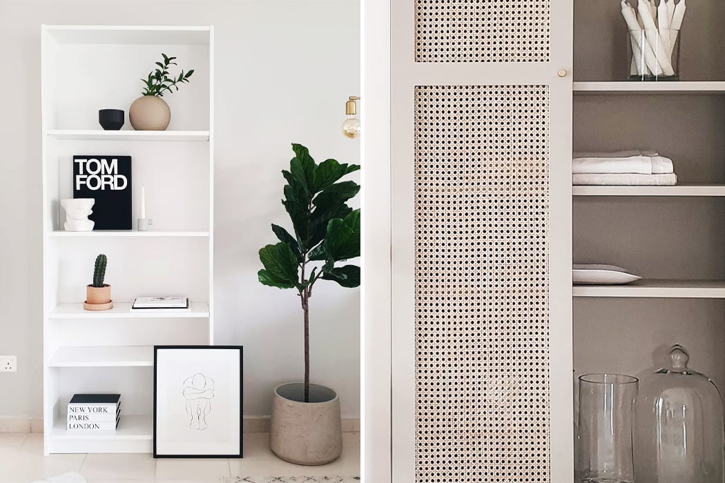
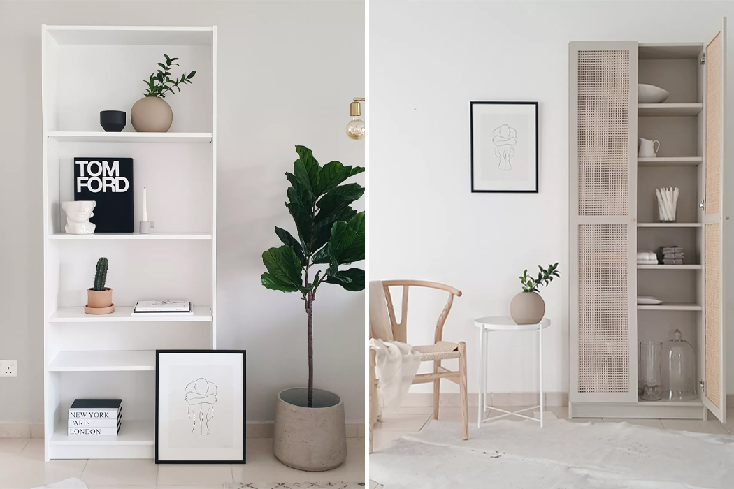
People know IKEA for names like BILLY, POÄNG, and MALM. IKEA furniture has graced the halls and living rooms of most of the homes I’ve visited, punctuating exits with a simple, but endlessly convenient entryway table or organizing offices using no-frills bookcases with shelves as deep as IKEA’s pot of Swedish meatballs. Revamping her BILLY bookshelf to give it a new use, Dubai-based interior designer Kathryn Hawkes latched some cane-webbed cabinet doors onto both sides of her BILLY bookshelf, giving it a Boho twist.

The iconic Swedish brand, IKEA is famous for its easy-to-assemble, Scandinavian-inspired furniture and its minimalist approach to design. Pieces of IKEA furniture are like blank canvases ready to be reinterpreted for each individual’s home. Fronteriors, an interior design business built by Kathryn Hawkes and fellow interior designer Linda Dekkers, constructs a unique and stylish collection of doors, tops, and sides to fit IKEA furniture frames. The business was born from Dekkers and Hawkes’ shared love for what they call “#ikeahacking” – a way of reinventing classic IKEA furniture like the BILLY bookshelf to give it a whole new look and function. Hawkes’ bookcase initially started as a blank white canvas filled with deep pockets of shelves that could cradle items much heavier, and larger than mere books.
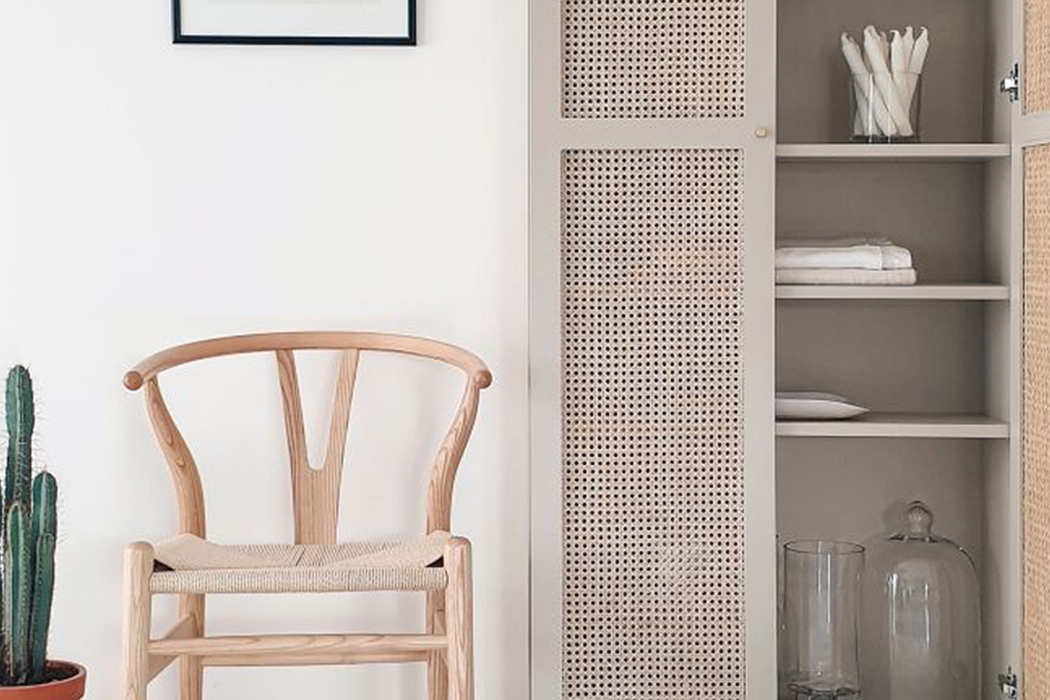
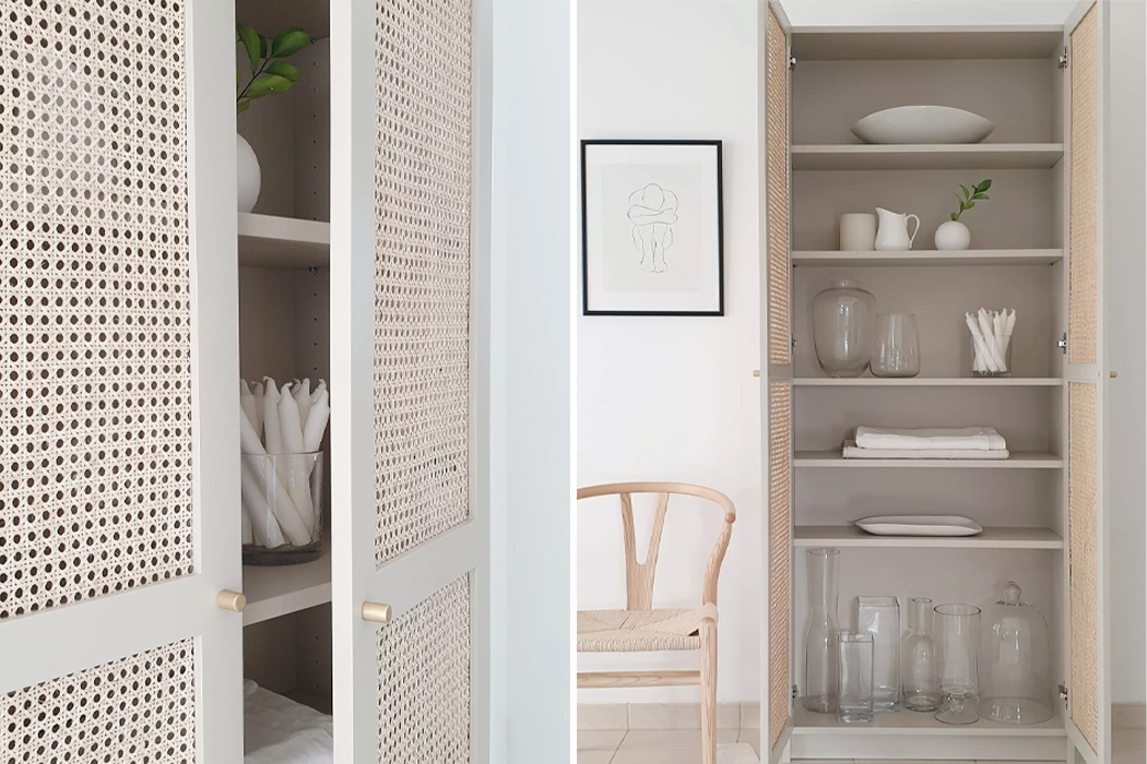
Upon connecting with a carpenter to build the cane-weaved rattan doors, Hawkes painted the BILLY bookcase a shade of beige to match the new doors. The rattan cabinet doors on Hawkes’ redesigned BILLY bookcase open up to reveal ample storage room where Hawkes decided to keep her linens and tableware instead of books. The subtle differences between what was previously IKEA’s BILLY bookshelf and Hawkes’ reimagined storage cabinet make the piece of furniture look hardly recognizable after the redesign. With an entirely new paint job and boho-chic rattan doors, this BILLY bookshelf was successfully #ikeahacked.
Designer: Kathryn Hawkes and Linda Dekkers

Attaching cane webbing to door frames fit for the BILLY bookshelf, Kathryn Hawkes gave the iconic piece of IKEA furniture a whole new personality.

Hawkes also coated BILLY in a different shade of beige to match the new rattan doors and warm it up from its previous shad of optic white.

The Shining Jack Torrance Head Bookend: Here’s Johnny!

Looking for the perfect bookend to display alongside your Stephen King horror novel collection? Well, look no further than this Jack Torrance ‘Here’s Johnny!’ bookend handcrafted by Etsy seller KomenzaSculpture. I’ll be honest though, I wouldn’t want to wake up in the middle of the night and see ol’ Jack here staring back at me with that unhinged look of his.

Available for $246, the psychological horror heads are made from clay, ceramic gypsum, and resin. They measure approximately 12″ x 8″ x 8″, making them slightly larger than a real human head. Except for mine. I have a monster of a noggin. I say that’s because it’s filled with a lot of brains, but my wife argues it’s actually rocks and cobwebs.

I’ve never read The Shining, but I have watched the movie multiple times, and every time I do I have nightmares for a few nights. Between the Grady twins, the corpse woman in room 237, and Jack’s descent into madness, I sleep with the lights on and hold it till morning no matter how badly I have to go to the bathroom.

[via The Green Head]

An innovative wooden hinge easily folds this multifunctional bookshelf in half!

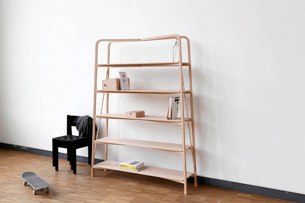
Interior design relies on changing styles to keep things interesting. New trends and color schemes have a way of dictating the trajectory of new products. Then, there are interior design products that stand the test of time and changing trends. These are the pieces of furniture that move with us from apartment to apartment. Student designers Rasmus Palmgren and Hanna Höglund gave their own remix of the traditional bookshelf, designing a foldable bookshelf that consists of shelves, a cabinet, and a drawer.

Timeless pieces of furniture like bookshelves and armoires seem to be most functional when they’re stripped down and designed to accommodate their most essential use. At first, Palmgren’s and Höglund’s bookshelf appears as an ordinary, minimal bookshelf, but a closer look reveals the intricate cabinetry work that went into the ‘Fold Shelf’s’ design. The folding mechanisms that fill out Fold Shelf also allow the unit to shrink down to nearly half its size compared to when it’s fully opened and ready for use. The designers say that Fold Shelf was designed as a Swedish cabinetmaker’s, or journeyman’s piece, requiring the incorporation of a pull-out drawer, hinges, veneered surfaces, and joints.
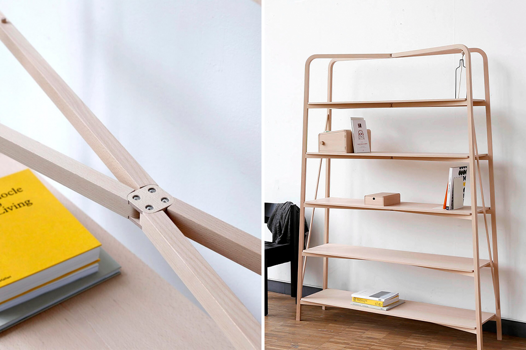
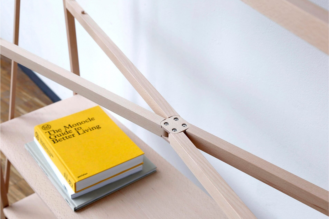
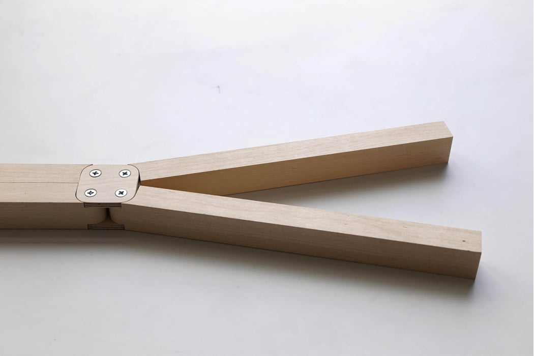
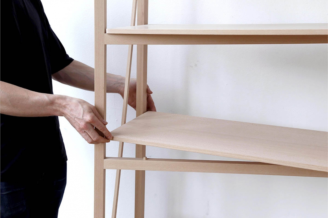
In building Fold Shelf, Palmgren and Höglund hoped to create a piece of furniture for flexible living, allowing owners to bring the bookshelf with them as they move to different places. Fold Shelf is filled out with wooden hinges that comprise a folding system, allowing the shelf unit to be dismantled and reassembled without the use of tools or additional hardware. Each individual shelf is connected to the unit’s frame and forms an X via wooden beams that merge at a wooden hinge.

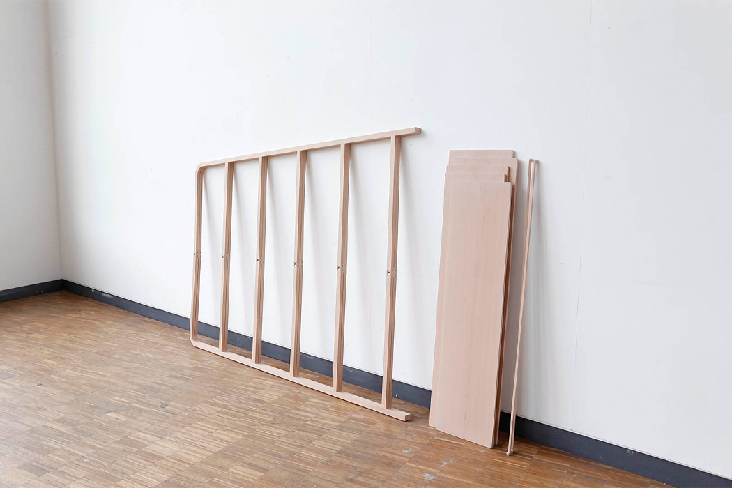
The shelf’s wooden hinge allows the beams to fold onto one another, shrinking the bookshelf down to its ladder frame, which could alternatively be used as a rack for hanging. However Fold Shelf is used, the thoughtful combination of minimal cabinetry work with an adaptive design gives Fold Shelf an air of modern sophistication, while not compromising its simple assembly.

Designers: Rasmus Palmgren and Hanna Höglund

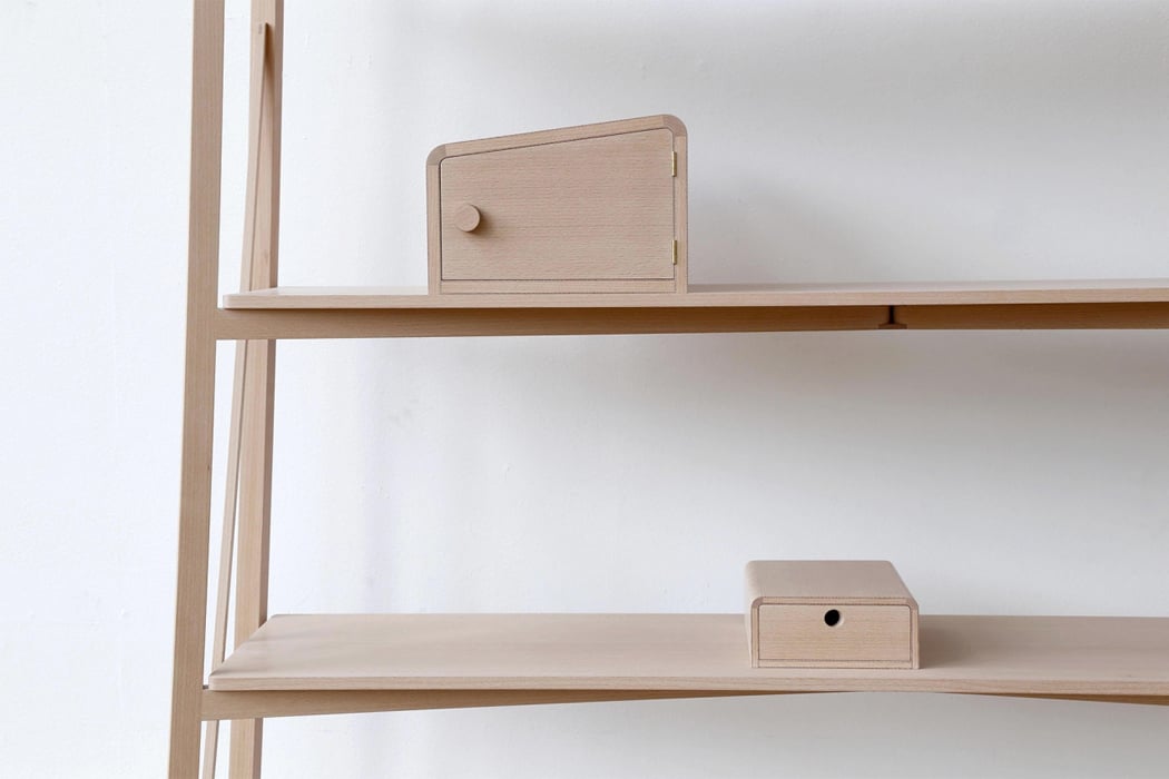
Fold Shelf is outfitted with a wooden hinge system which gives it a foldable structure.

To use the shelf, the wooden beams connected to the shelf’s hinge need to be fixed apart.

In addition to the product’s foldable design, Fold Shelf features a cabinet and a pull-out drawer to double as bookends.

When fully opened, Fold Shelf is a minimal bookshelf with a Scandinavian design.
Top shelves made from wooden boards rest on top of the shelves’ hinges, locking into place with a peg-and-socket.

When disassembled, Fold Shelf shrinks down to nearly half its size.

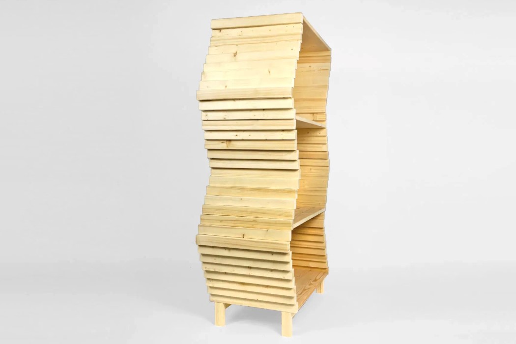
The Wave Bookshelf’s shape-shifting design looks like TikTok’s Time Warp Scan filter brought to life!


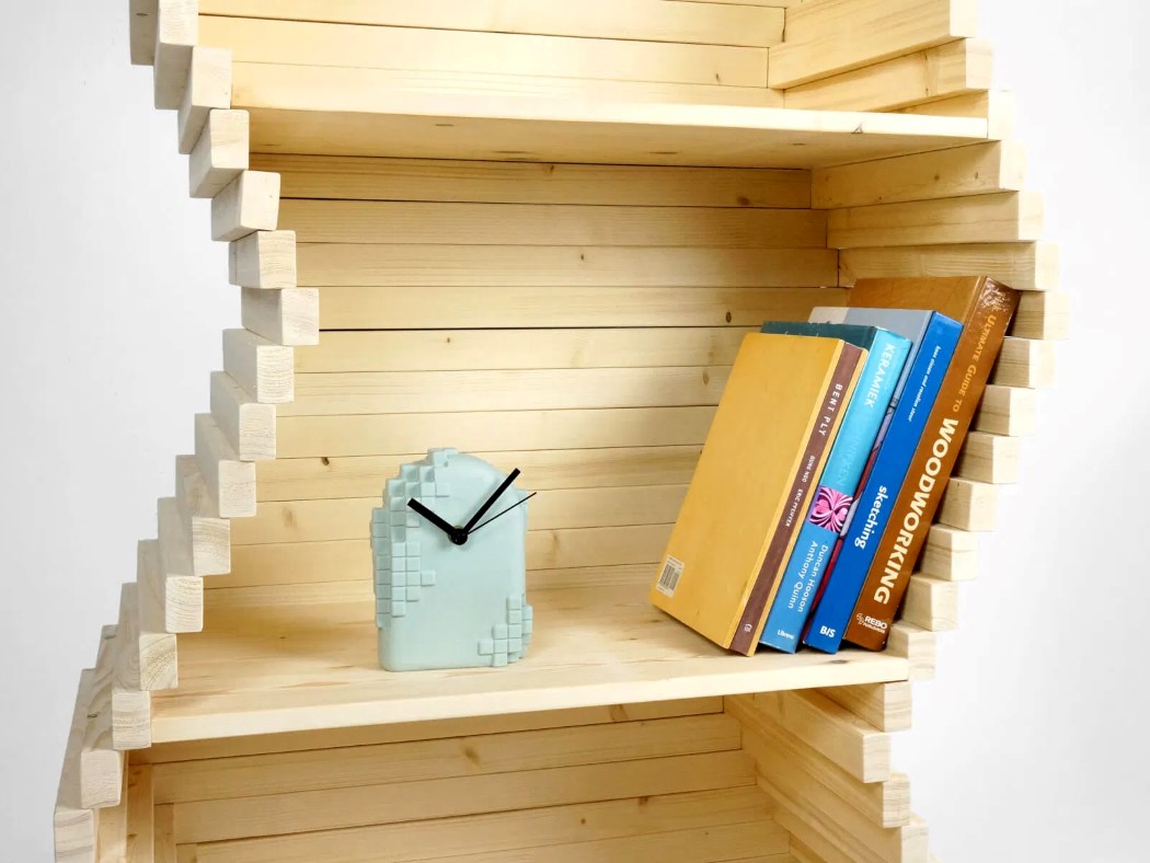
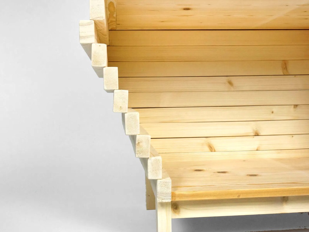
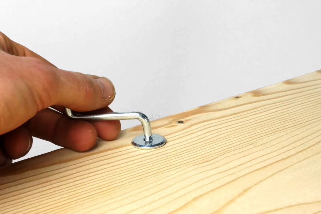
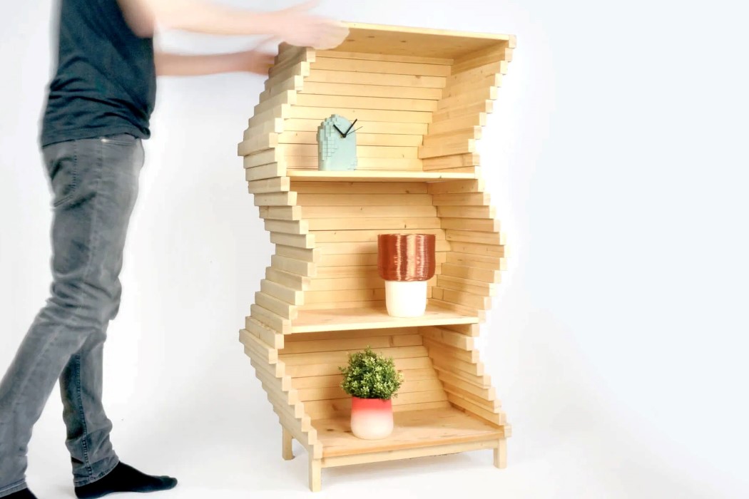
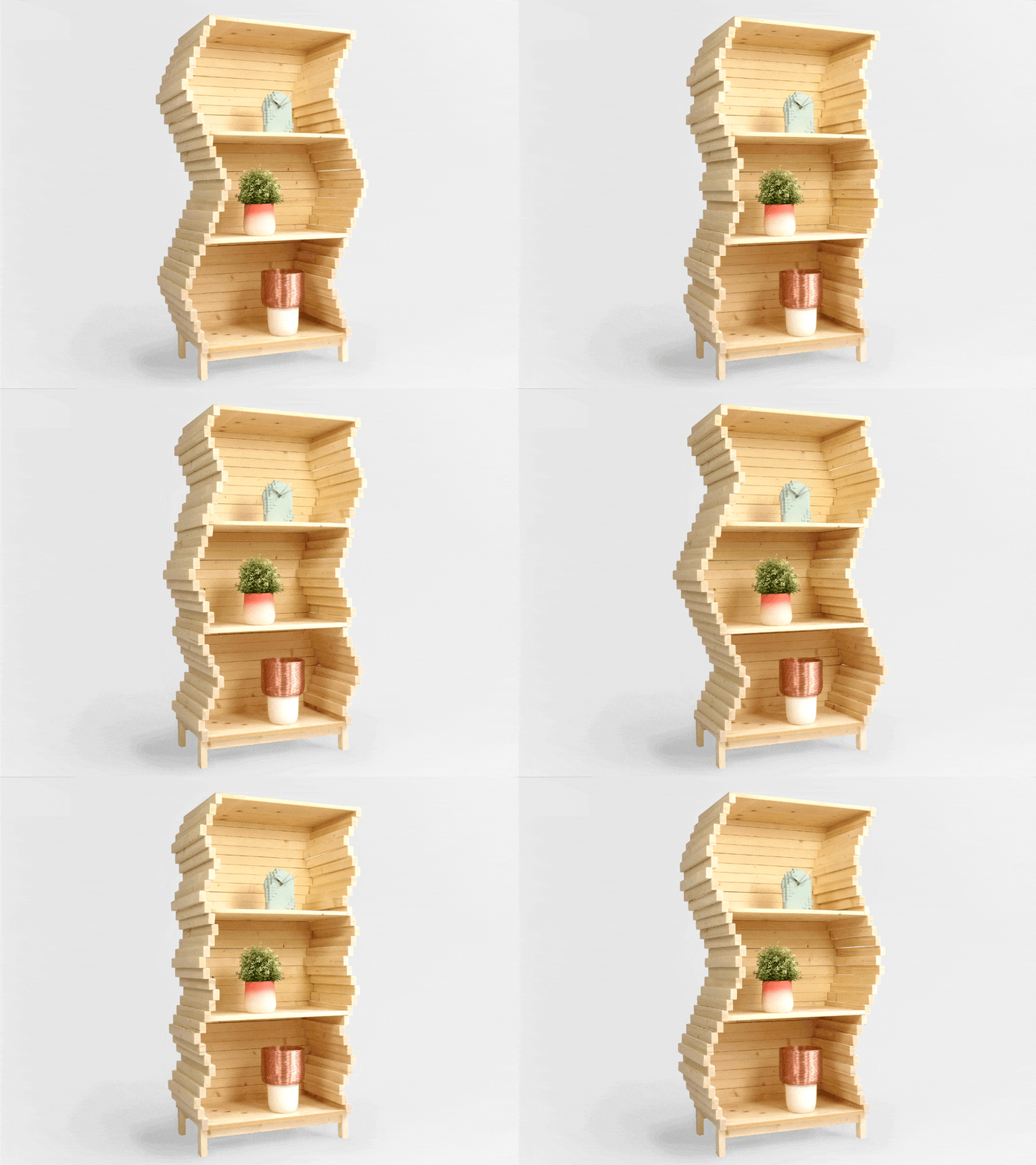
You wouldn’t expect wood to have a fluid appearance, but with a few clever design tricks, Studio Lorier’s Wave Bookshelf manages to make something as stiff and rigid as wood look completely flexible! The secret lies in the bookshelf’s stepped construction and a joinery detail that allows each step to slide side by side. You can easily manipulate the bookshelf’s shape with your hands, creating a variety of shapes, before locking the bookshelf’s position using a single screw detail.

The Wave is made of individual pine wood elements that can be stacked together (or removed) to create a shelf that’s as high or as low as you want. With its ability to shapeshift, the Wave transcends furniture and becomes something more eye-catching and engaging. Its dynamism turns it into a piece of interactive art, allowing you as the user to also play a role in determining the shelf’s end-result! Perfect for adding a quirky touch to a boring space, or just placing in a space with odd/deviant dimensions.

Designer: Studio Lorier

Click Here to Buy Now

Click Here to Buy Now

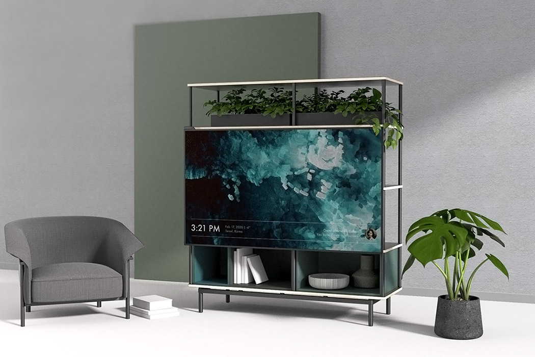
This design solves 3 TV watching issues by combining an OLED screen with modular furniture!

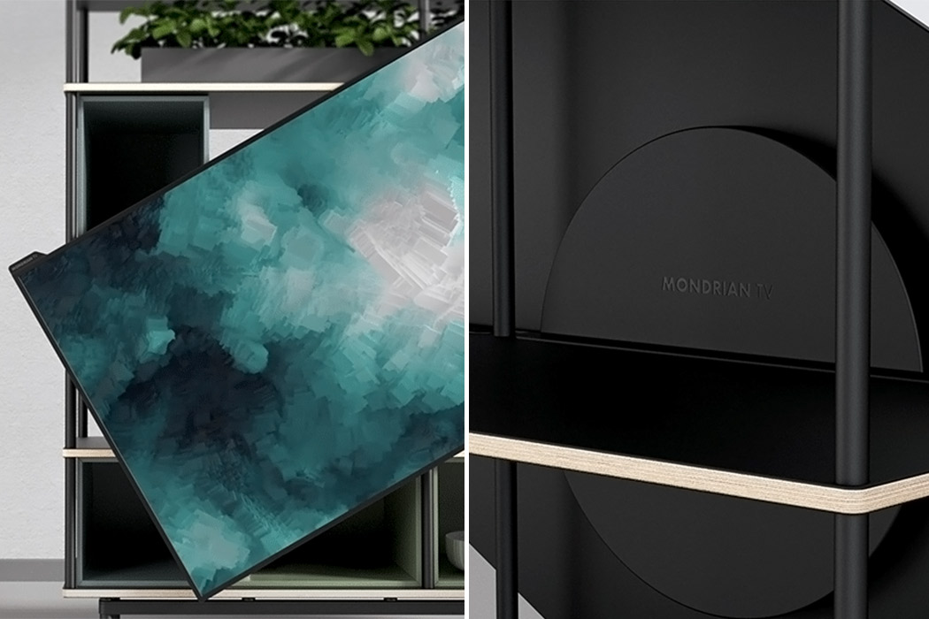
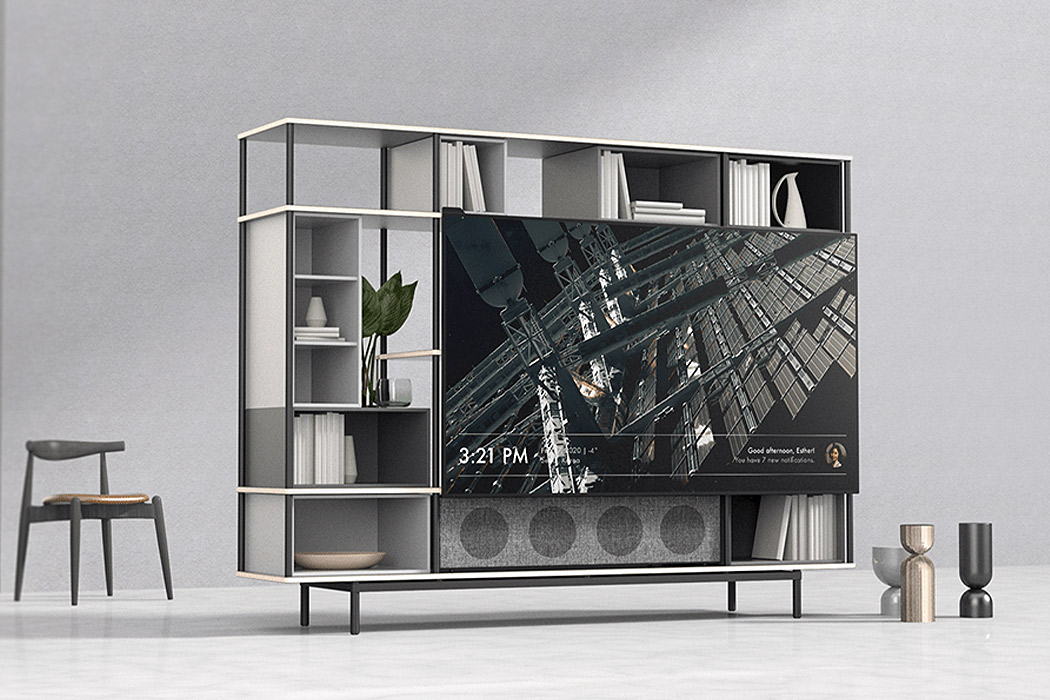
This pandemic saw popular streaming platforms skyrocket even higher as we all spent more time indoors. Research firm The NPD Group reported sales of TVs that were 65 inches were up 53% (in units) over the first half of 2020 and TVs bigger than 65 inches were up 77% in April-June compared to a year ago. Not every space is made to accommodate large TVs but everyone deserves a good Netflix binge session to get through this year and that is why we want to encourage TV designs like the Mondrian – a conceptual OLED screen that works in harmony with a modular furniture setup!

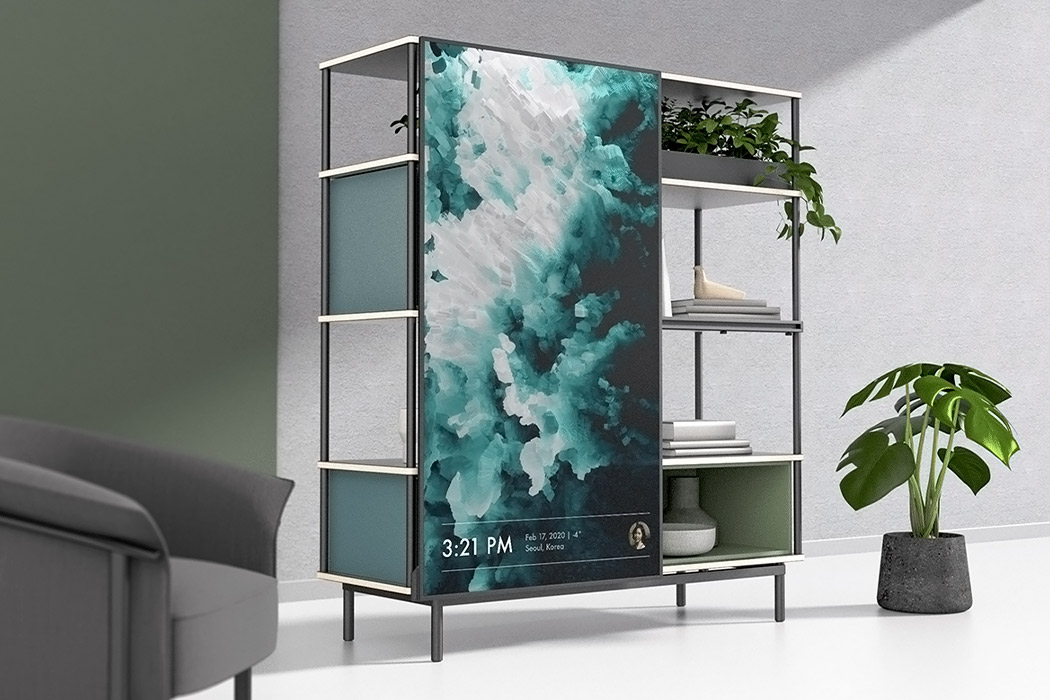
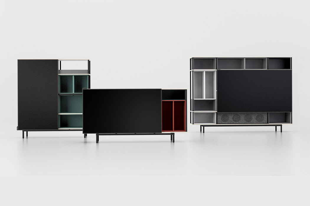
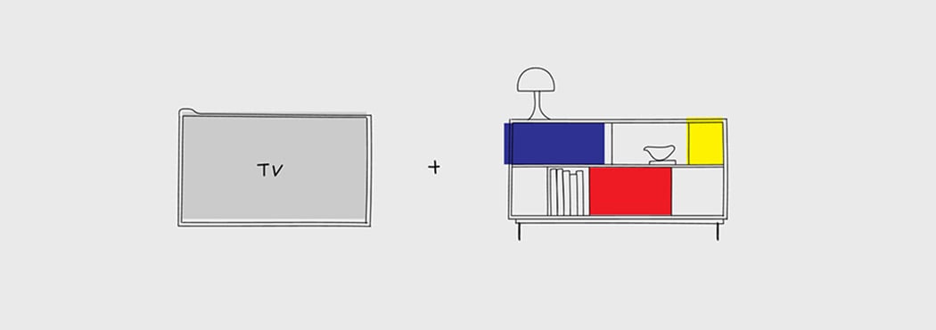
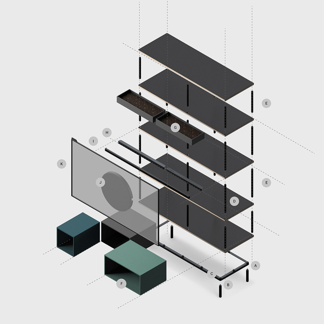
Inspired by the Dutch painter Piet Mondrian’s composition of form and color, the Mondrian setup was made to allow a wide range of applications and blend into any interior setting. The aim was to solve three issues we experience with watching TV as we currently do – taking up space, not matching with the aesthetics, and lack of expandability. Urban apartments and single-person households need to maximize their space and should not have to choose between a large appliance and furniture when they can have both. Talking about interior aesthetics, TVs are now increasingly slimmer while furniture remains warm and cozy – this causes a visual mismatch when the two are put together. Mondrian’s design serves both purposes with one seamless structure. TVs are now being used in many ways and need to be able to adapt to the different content it supports, not just static pre-made products.

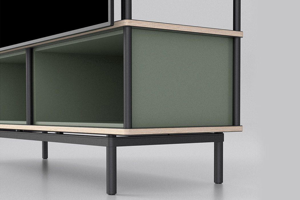
The contemporary piece of furniture is highly customizable and perfect for a flexible lifestyle. Piet Mondrian himself didn’t just focus on the objects itself, but rather on the relationships formed once you connect two or more together and that is the philosophy followed by Mondrian’s design team who said, “The final form should not exist in nuts and bolts, but somewhere in between.” This is also why it was created with a DIY spirit so you can build your own custom combination using the hardened steel pedestal, bottom-up grid, mounting solutions and the OLED screen. Choose your size,  stack up the rows and columns, screw in the legs and the nodes, add shelfs and lastly add the rotating mount for your screen. It gives you complete freedom of how the modules will come to life in your space.
Designers: Harry Dohyun Kim, Weichih Chen and Fuhua Wang