This coffee table with multicolored and oscillating legs was inspired by orbits found in outer space

I personally think a good coffee table can really light up a room. It instantly draws attention and sets the theme for the entire living room. Once a stunning coffee table has been set, you can start building the rest of the space around it – a comfy sofa, cute side tables, exquisite lighting, and elegant decorative pieces, are all brought together by the right coffee table. And one such coffee table I recently came across is the ‘Orbit’ coffee table.

Designer: Deniz Aktay
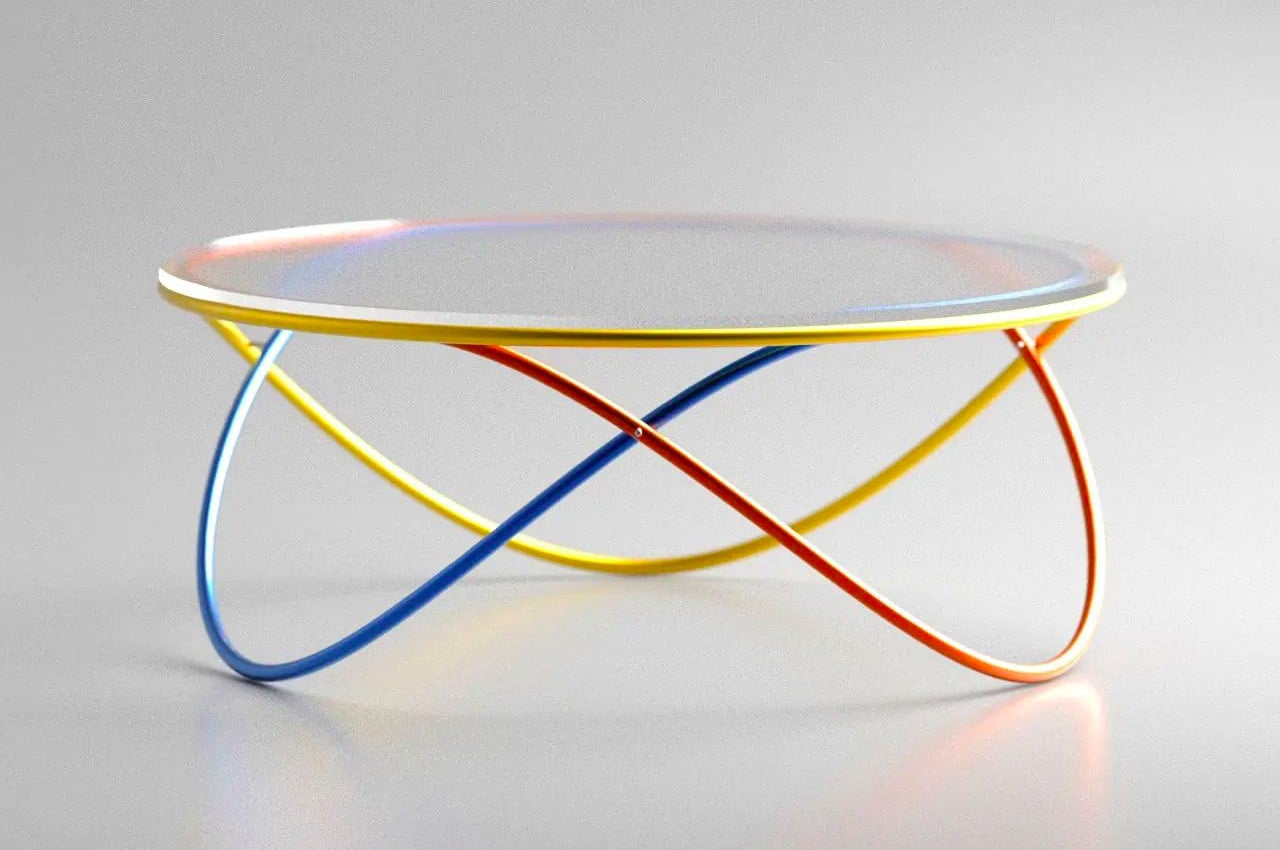
Designed by Deniz Aktay, whose prolific designs have enigmatically taken over the online design world, this coffee table is distinguished by its multicolored and interloping legs. Aktay drew inspiration for the table legs from the orbits you find in outer space. According to NASA, “An orbit is a regular, repeating path that one object in space takes around another one. Now compare the coffee table to the images we’ve seen in our school textbooks of planets orbiting the sun – pretty similar, no?
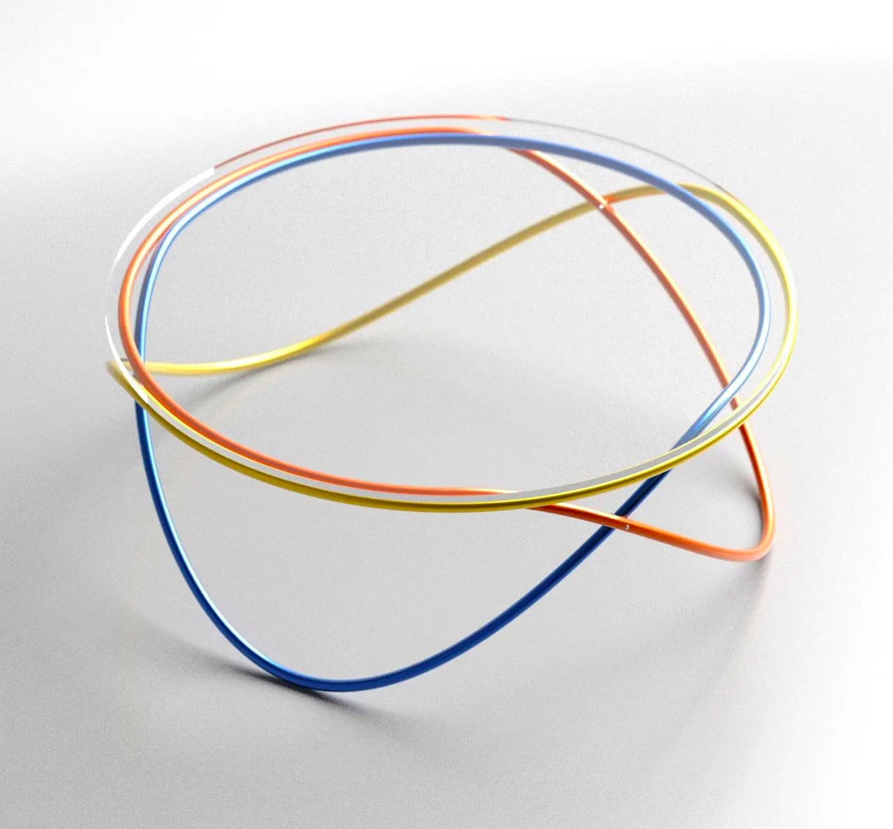
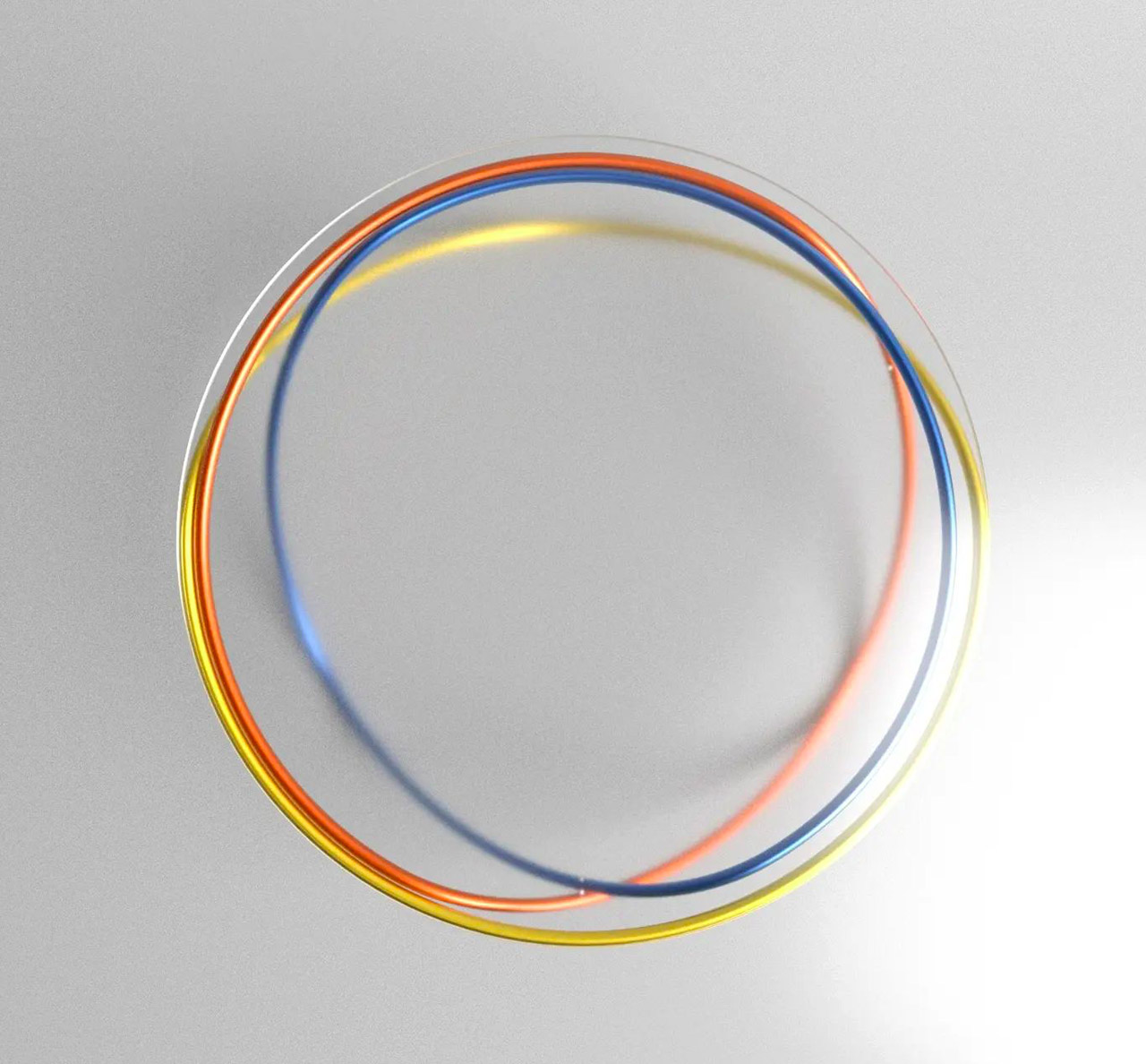
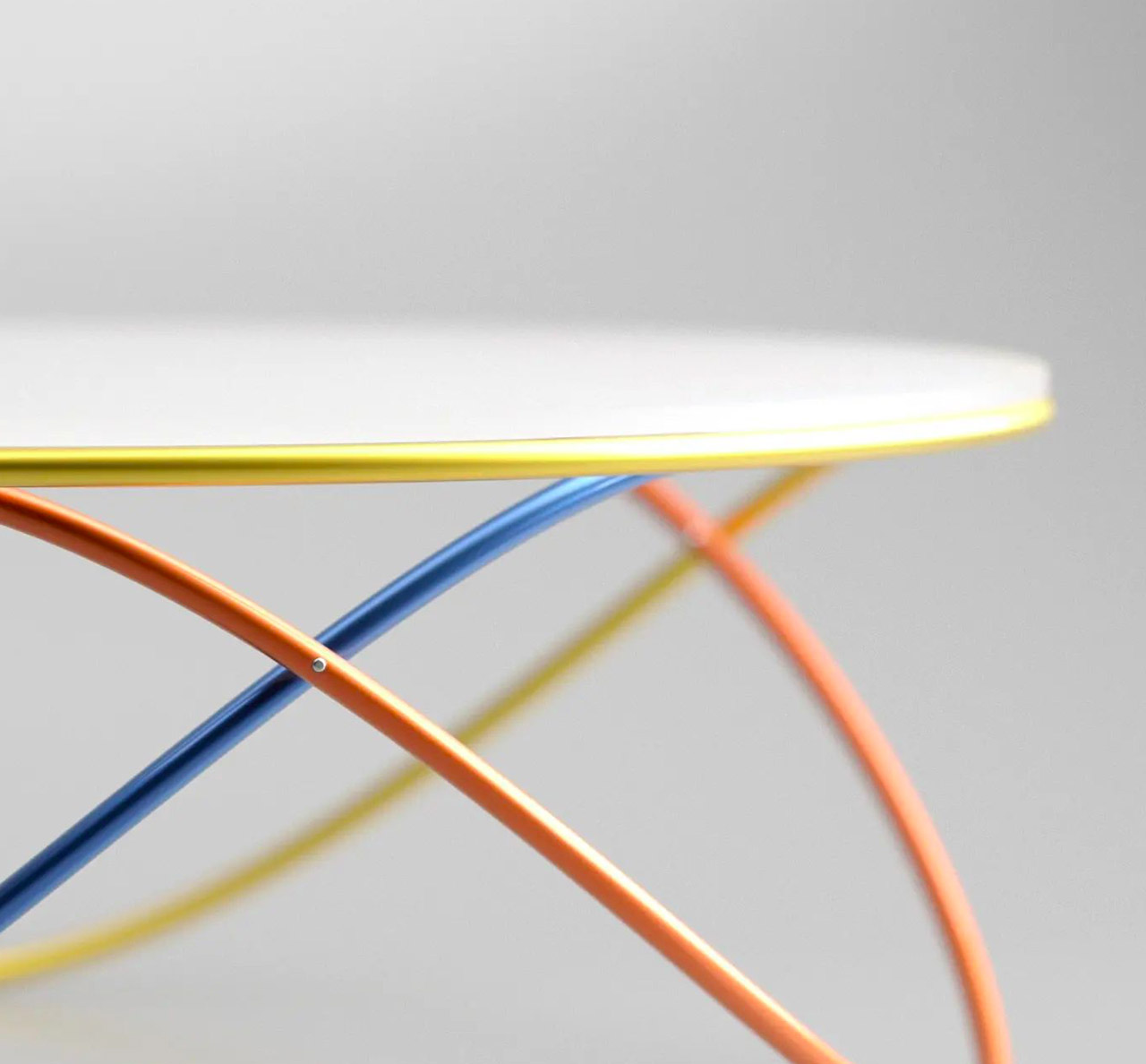
The coffee table features a round glass tabletop that is supported by three oscillating metal tubes. The tubes are interestingly intertwined, creating an intriguing visual mesh, which is further enhanced by giving each of them a different color. Aktay gave the tubes separate colors, to provide each element with a sense of individuality, and to help segregate them distinctly. This ensures that we notice and appreciate the unique construction of the table thoroughly.
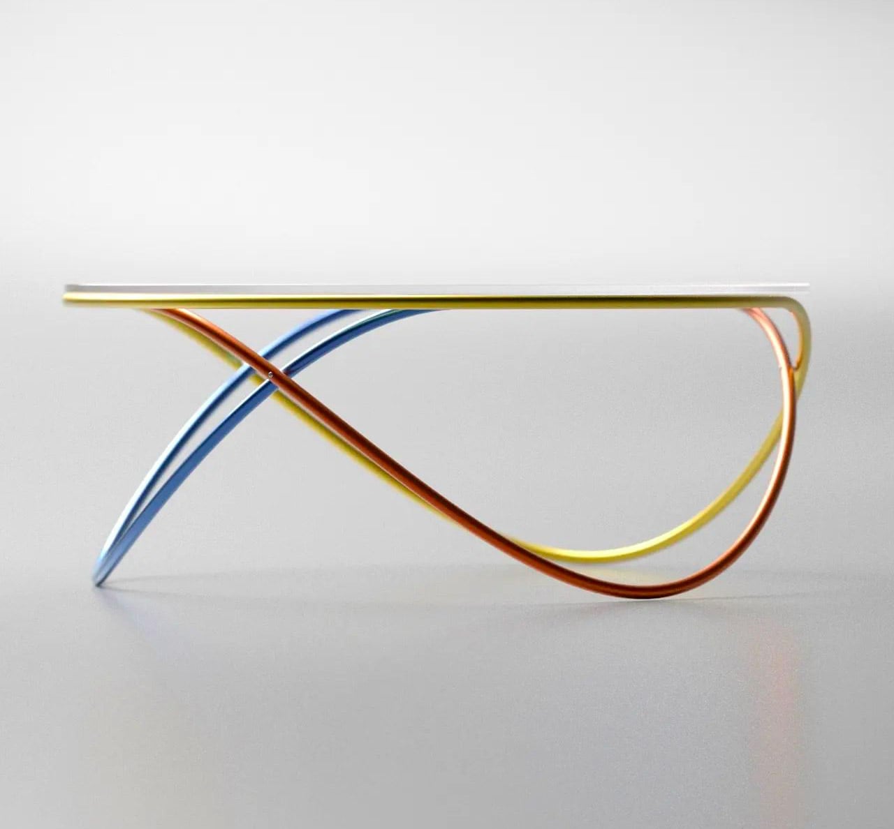
In a time, when coffee tables are usually paid less heed to, if not ignored, Aktay’s Orbit coffee table instantly commands attention. It’s the kind of innovative design we all need as a centerpiece in our home, especially since the coffee tables found nowadays tend to be boring wooden rectangles. It’s a fascinating change, and I would love to see this concept as a tangible reality very soon.
The post This coffee table with multicolored and oscillating legs was inspired by orbits found in outer space first appeared on Yanko Design.
Mobius-shaped continuous coffee table takes inspiration from the Google Drive logo!

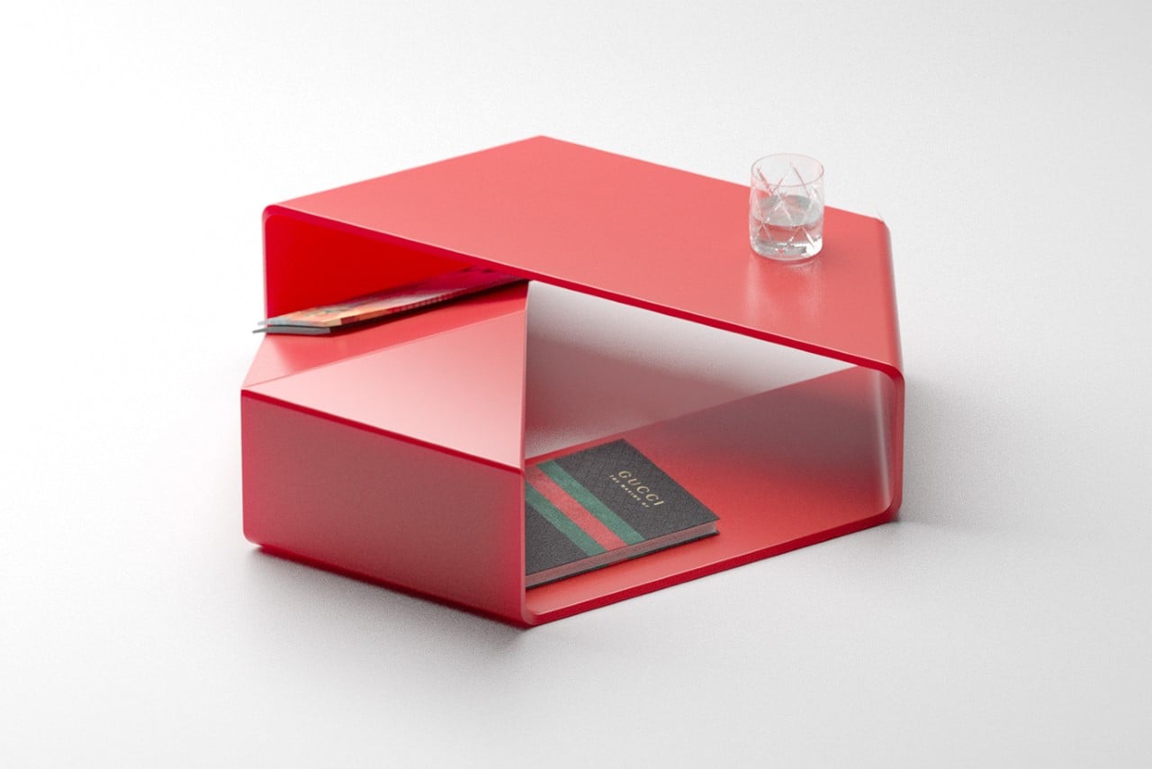
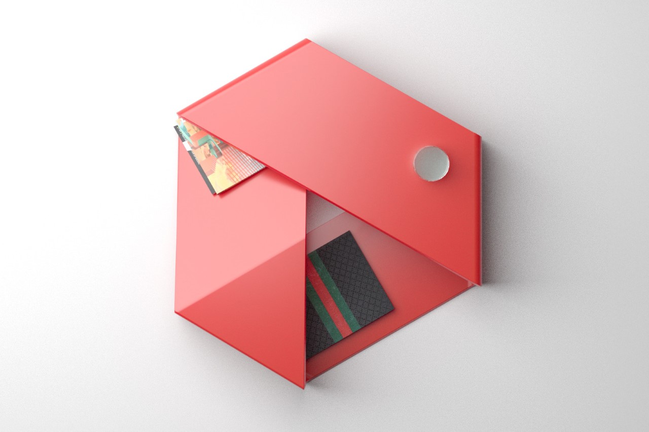
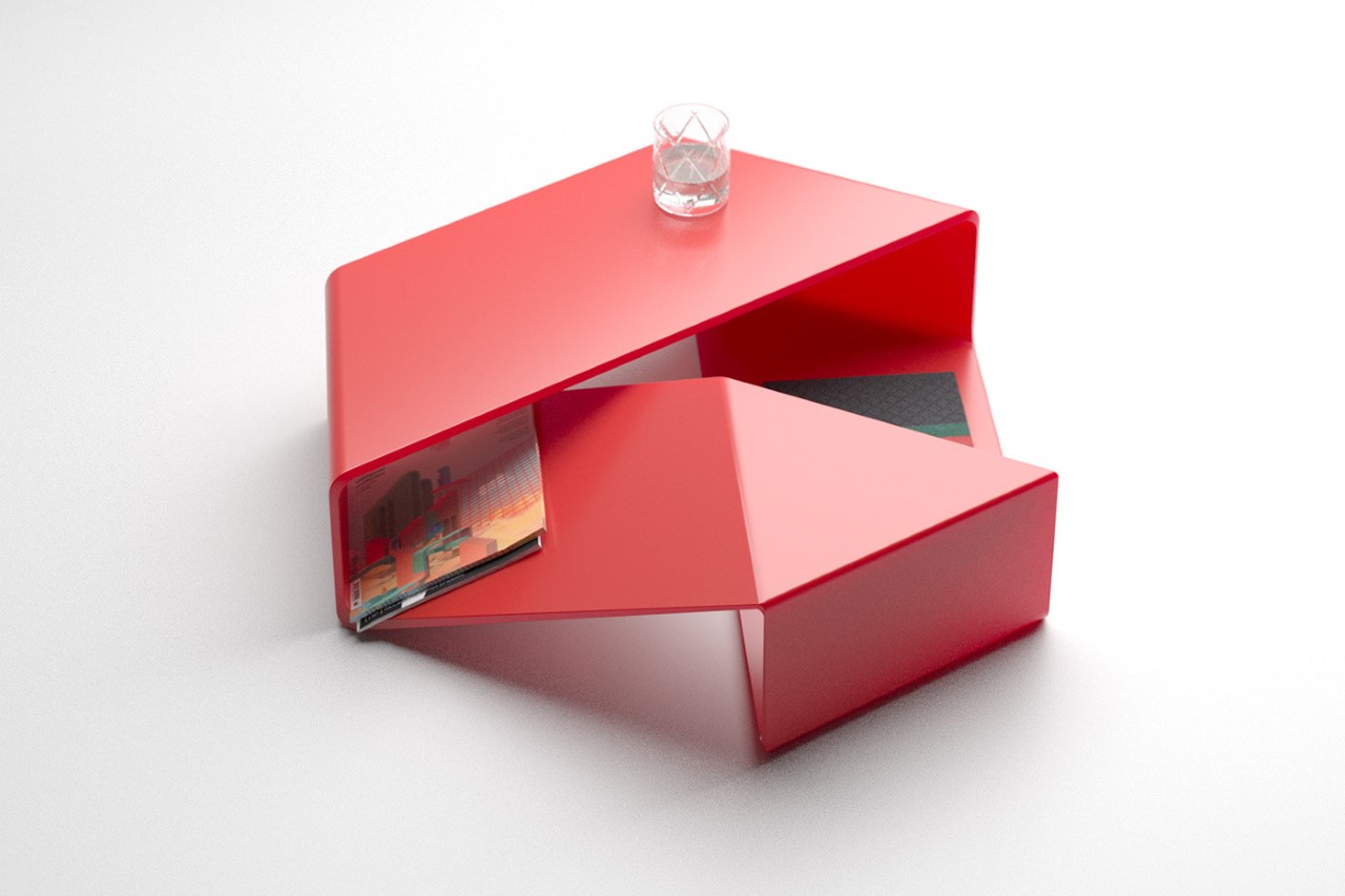
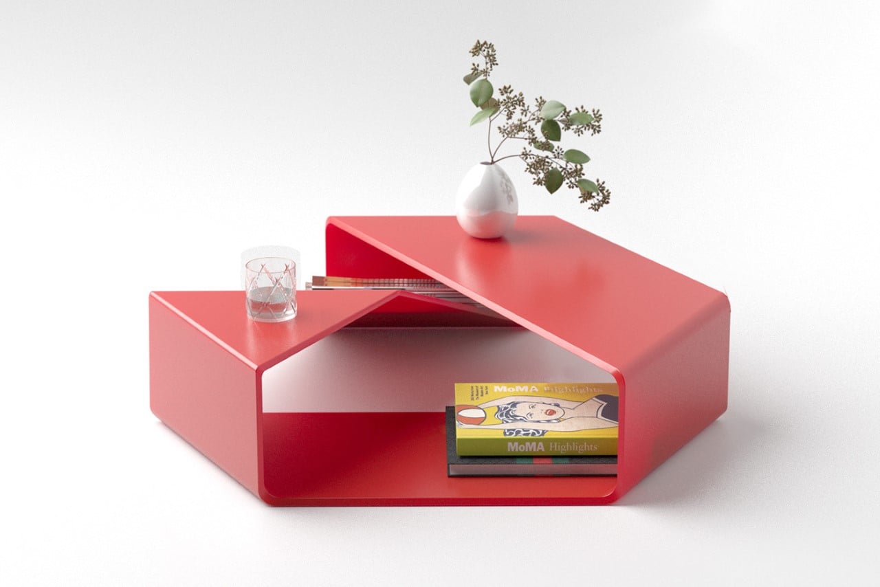
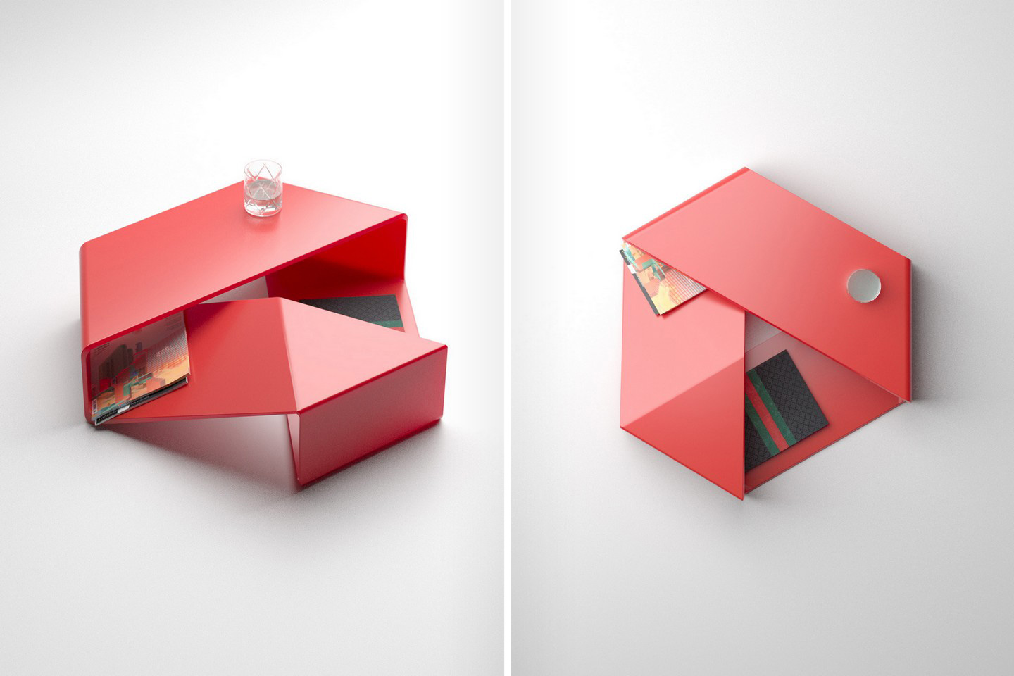
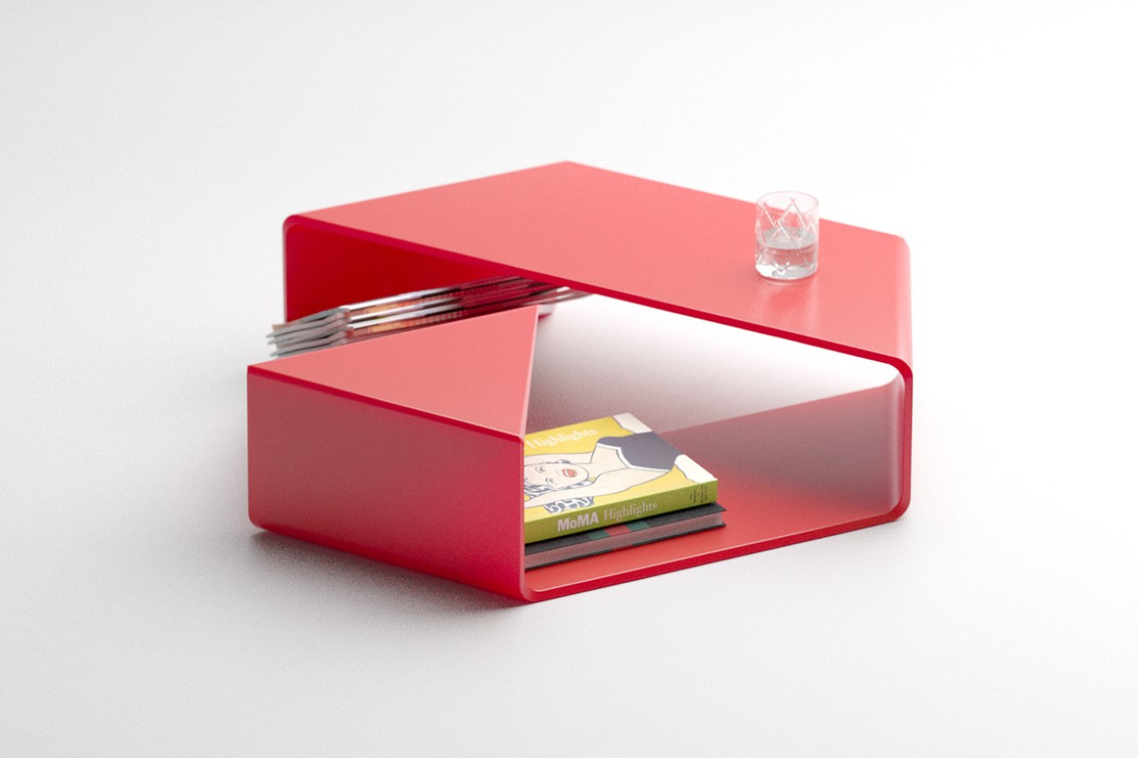
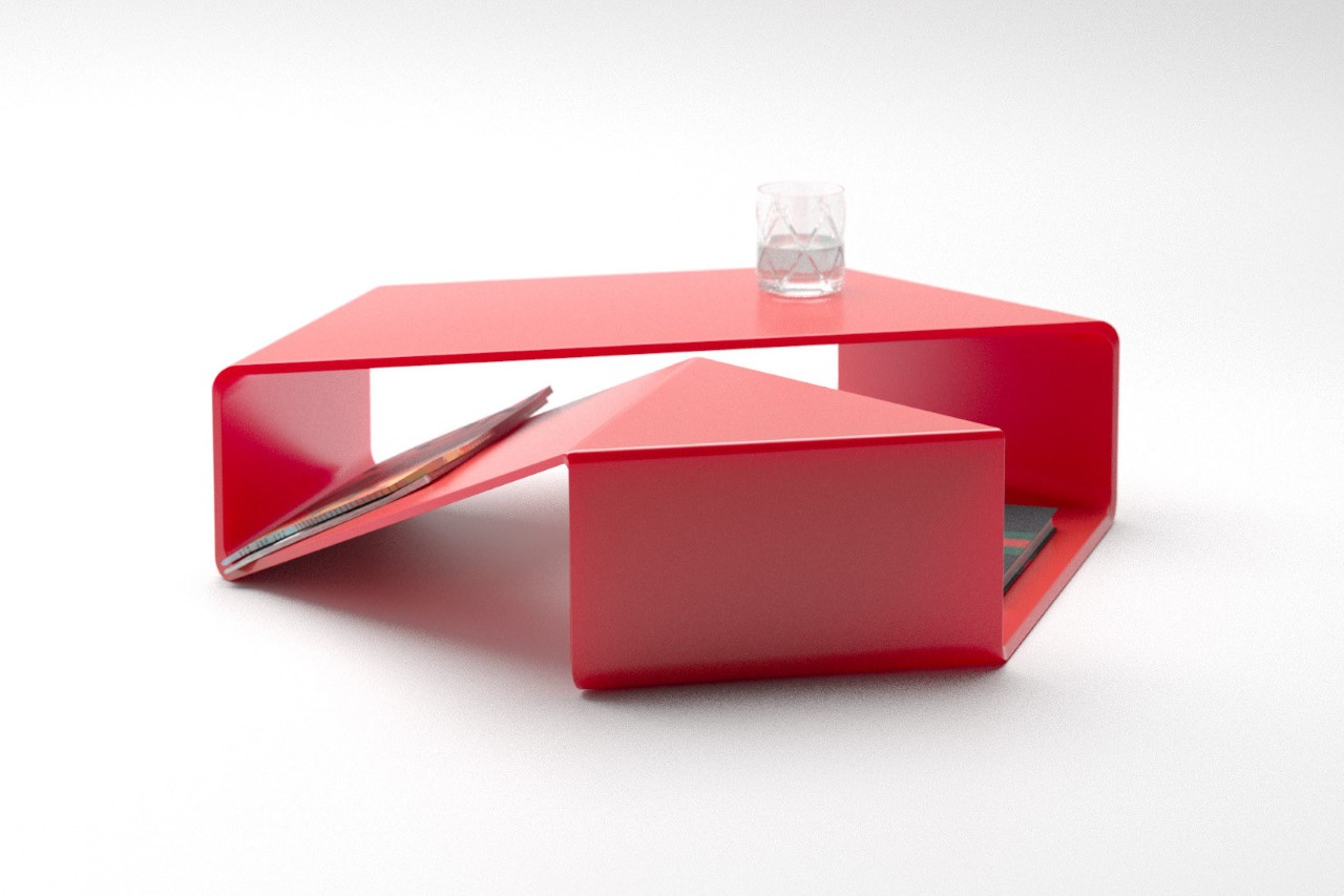
Is it a coffee table? Is it a glorified logo? Is it an edgy conversation piece? Is it a demonstration of a geometric illusion? How about all the above! Meet the Möbelius, a rather simple-looking coffee table that has a lot happening under its benign avatar. Inspired by the möbius strip, the table too boasts of a single continuous surface running along the table’s form. If you were to trace a line from one point and move in the direction of the Möbelius table’s path, it would wrap around the inside and the outside, finally meeting up right where you began. Coincidentally, the coffee table also takes the shape of a broad-ish triangle, looking simultaneously like Google Drive and The Verge’s unique logos!

Designer: Deniz Aktay

Designed by Deniz Aktay, who’s known for his unique expressive yet minimalist style, the Möbelius is a coffee table that comes with multiple layers and surfaces to place glasses, store magazines, and display collectibles. The low-standing table comes with a broad hexagon silhouette that fits perfectly into Scandinavian-inspired minimalist living spaces, and the red colorway adds a beautiful vibrant pop to any interior.

What’s rather interesting is the geometric phenomenon that the Möbelius coffee table takes inspiration from. It comes with a singular surface that flips over just once before connecting with itself. This makes the Möbelius have a continuous surface that blurs the lines between 2D and 3D. Obviously the table is 3D, but the fact that it’s made from a single continuous 2D surface tends to become a pretty fun optical illusion!

The post Mobius-shaped continuous coffee table takes inspiration from the Google Drive logo! first appeared on Yanko Design.

This minimal wooden sideboard features bright orange legs that can store your favorite books

I believe the true essence of a home is held in its furniture. Furniture has the power to make or break a home, set the mood and tone of a space, and capture and express the soul of that particular house. A great furniture design not only feels like a piece of art but also touches your heart. The minute you settle down on it, place your favorite book upon it, or simply brush past it, you need to instantly feel “Ah, I’m home!” And it’s those intricated furniture designs with hidden little details that are the most fun to add to our homes! One such example is the Spacing Sideboard by Deniz Aktay.

Designer: Deniz Aktay

You’ve probably come across Deniz Aktay and his prolific designs during one of your mindless Instagram scrolling sessions. His designs, on the other hand, are completely mindful. His designs vary from a unique bookshelf that functions as a side table to a coffee table design with intriguing layers. They are designed with immense attention to detail, an innate respect for the material in hand, and a desire to provide maximum functionality in a minimal form. And the Spacing Sideboard is a true embodiment of all these characteristics.

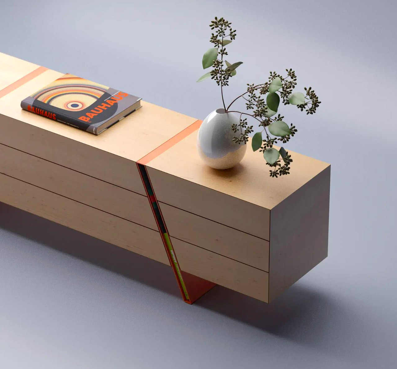
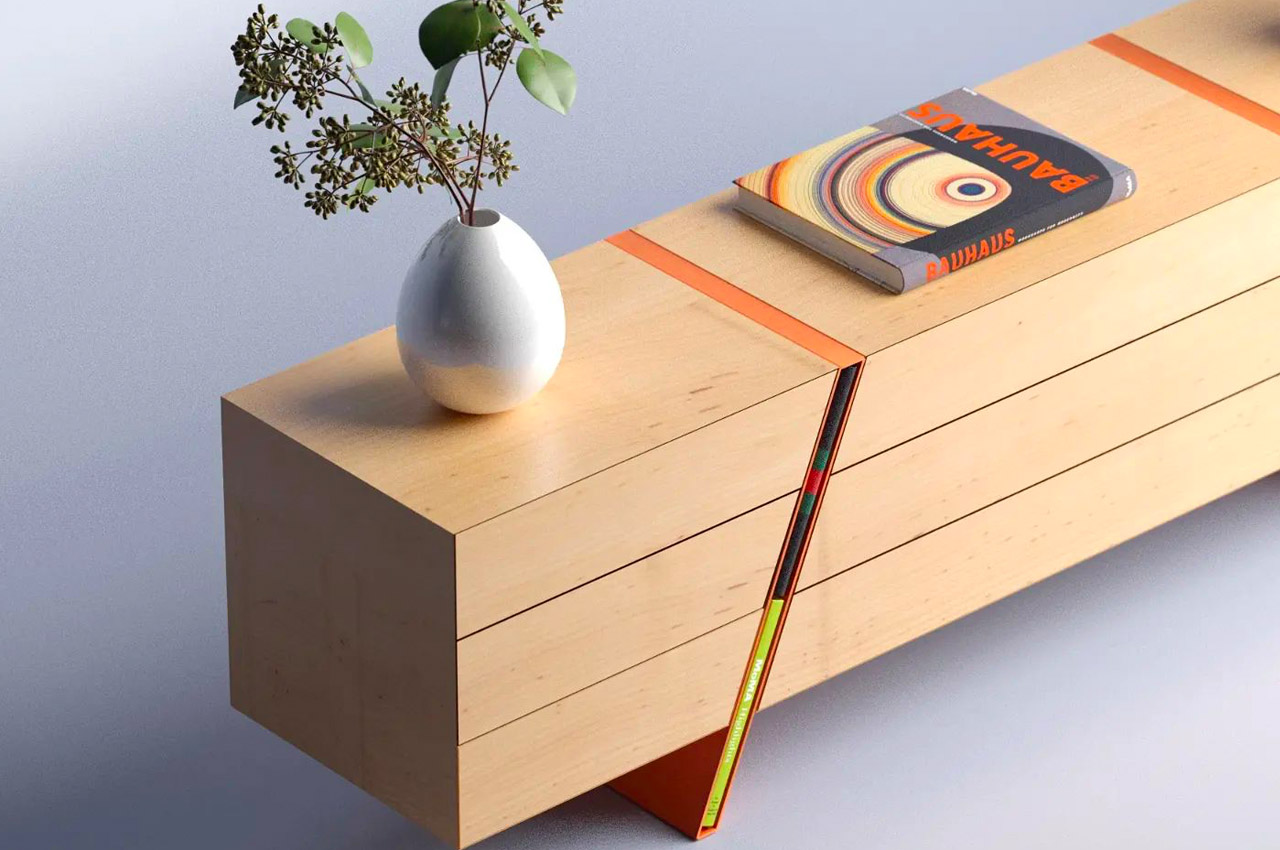
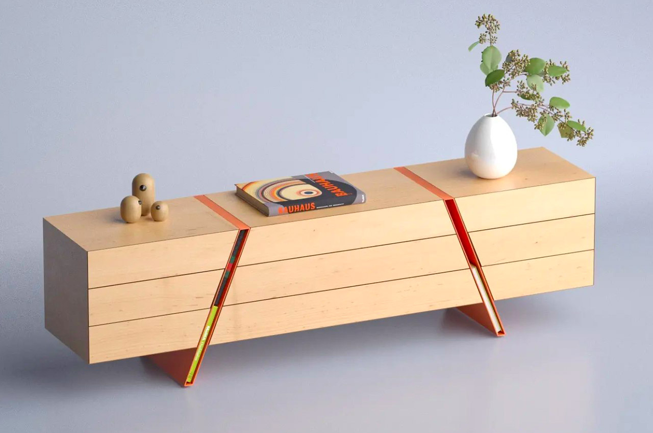
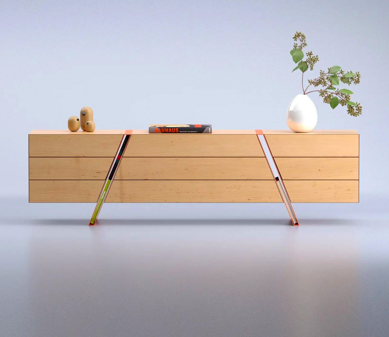
The Spacing Sideboard is a simple wooden piece of furniture that is marked by two bright orange legs. These colorful legs are the star attraction of the sideboard! Because here’s the interesting part, Deniz has integrated the legs into the center of the sideboard, and also carefully left them hollow. The hollowness of the diagonal legs allows them to function as storage spaces! The amount of space is ideal to fit a book or two into it. Yes, you can’t place bigger items, such as say your laptop or even a really fat book in it, but it’s a genius storage solution to display a few of your favorite (normal-sized) books!

The rest of the sideboard features a uniform rectangular form and is quite simple, which provides an interesting contrast to the playful legs. The sideboard also features push-to-open drawers that emphasize the length of the sideboard. All in all, the Spacing Sideboard is a smart storage solution with quirky aesthetics that can add an element of joy to your home, while providing great functionality.

The post This minimal wooden sideboard features bright orange legs that can store your favorite books first appeared on Yanko Design.

The Winding side table doubles up as a stool and features an interesting ‘nose’

If you’ve ever even remotely spent time in the design world on Instagram, then you’ve for sure come across Deniz Aktay. His simple, minimal, yet genius furniture pieces have slowly but surely taken the IG world by storm. The success of his designs lies in the fact that they’re oh so simple, elegant, and yet packed with massive functionality. The simplicity will almost make you wonder ‘Why didn’t I think of this?’, but unfortunately for us and luckily for Aktay, no one else can conjure these designs up except him. He’s created wonders – from a unique bookshelf that functions as a side table to a coffee table design with intriguing layers. And, we’re currently drooling over the Winding side table.

Designer: Deniz Aktay

There’s just something about a multifunctional piece of furniture that ticks all the checkboxes for me! Imagine a product that’s been designed to work as a clothing rack and a treadmill. Or a side table that transforms into a chair. Space-saving goals much? That’s the magic of a multifunctional furniture design. It looks like a single product, but functions as more than one! They’re a smart option for our modern urban homes, which tend to be pretty cramped, hence adding multiple bulky and cumbersome furniture designs to them isn’t really an option. But multifunctional pieces that serve a variety of purposes, and solve a bunch of unique problems can be a lifesaver in such situations. And the Winding side table is one such brilliant design.

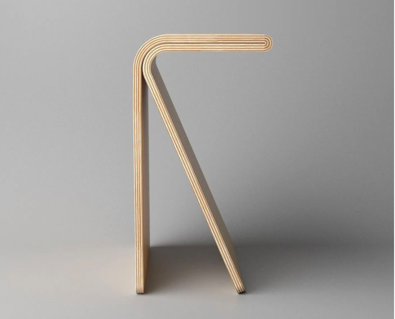
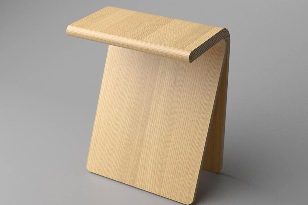
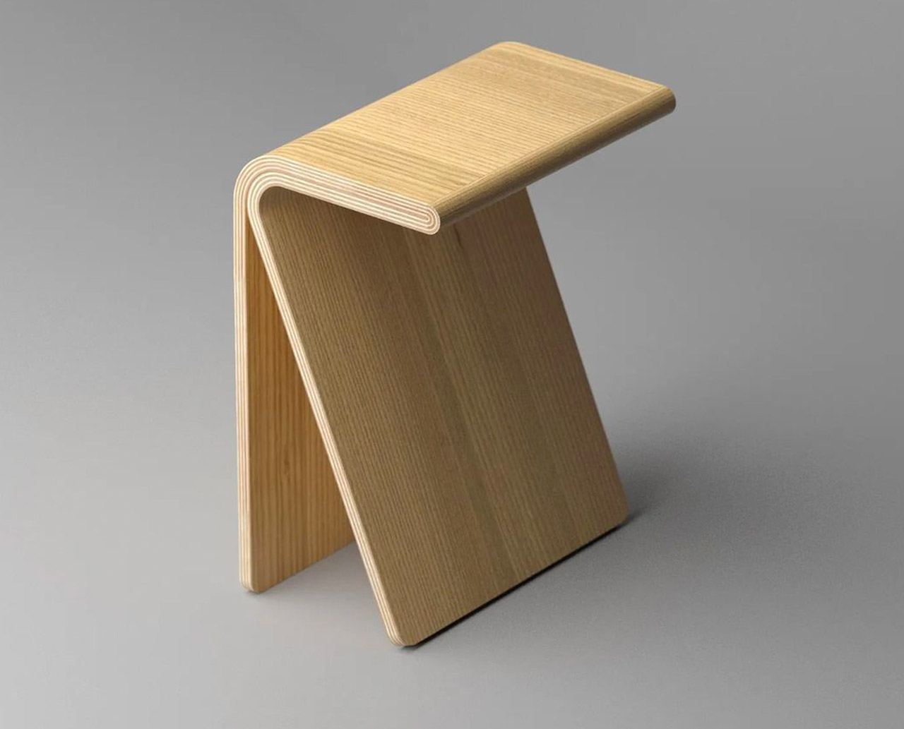
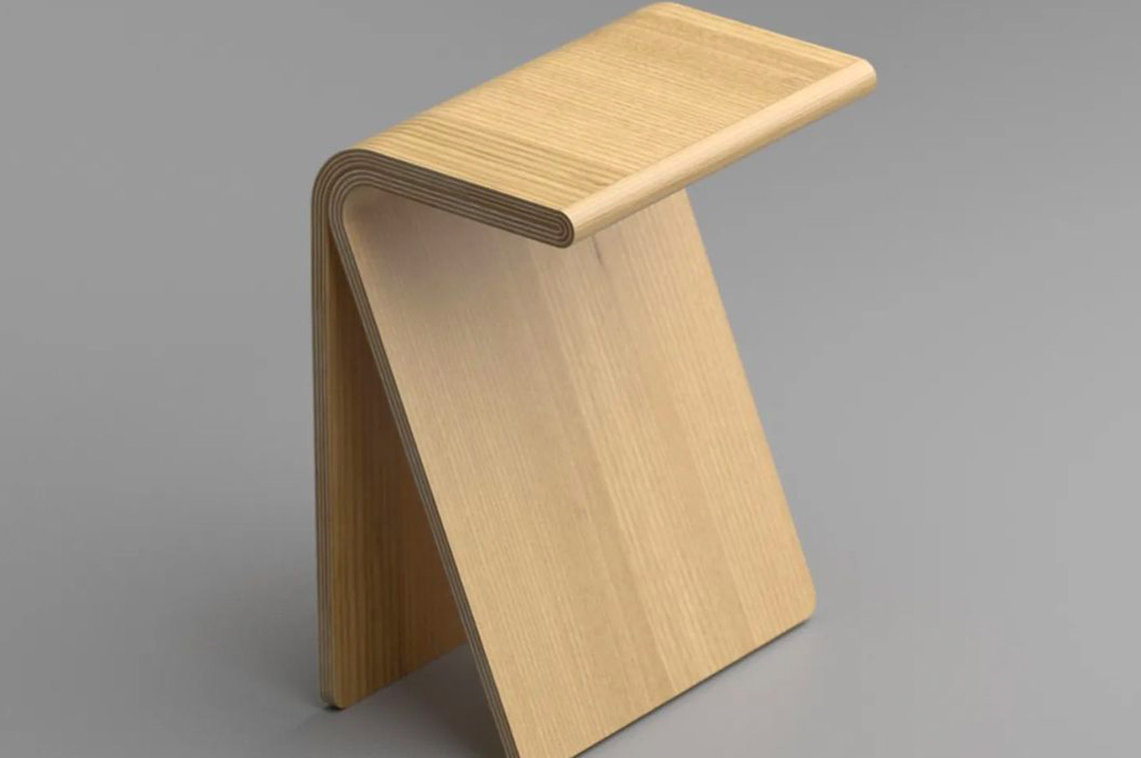
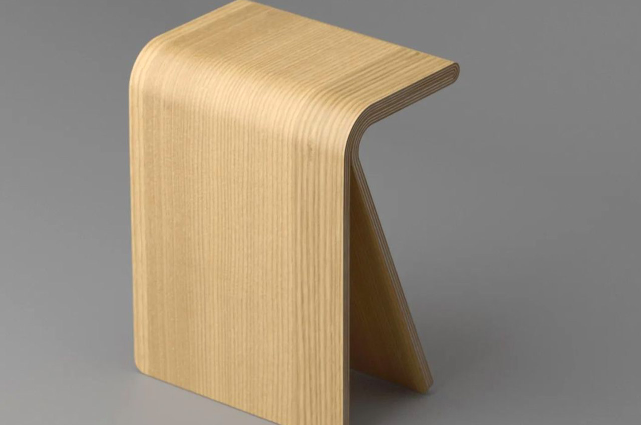
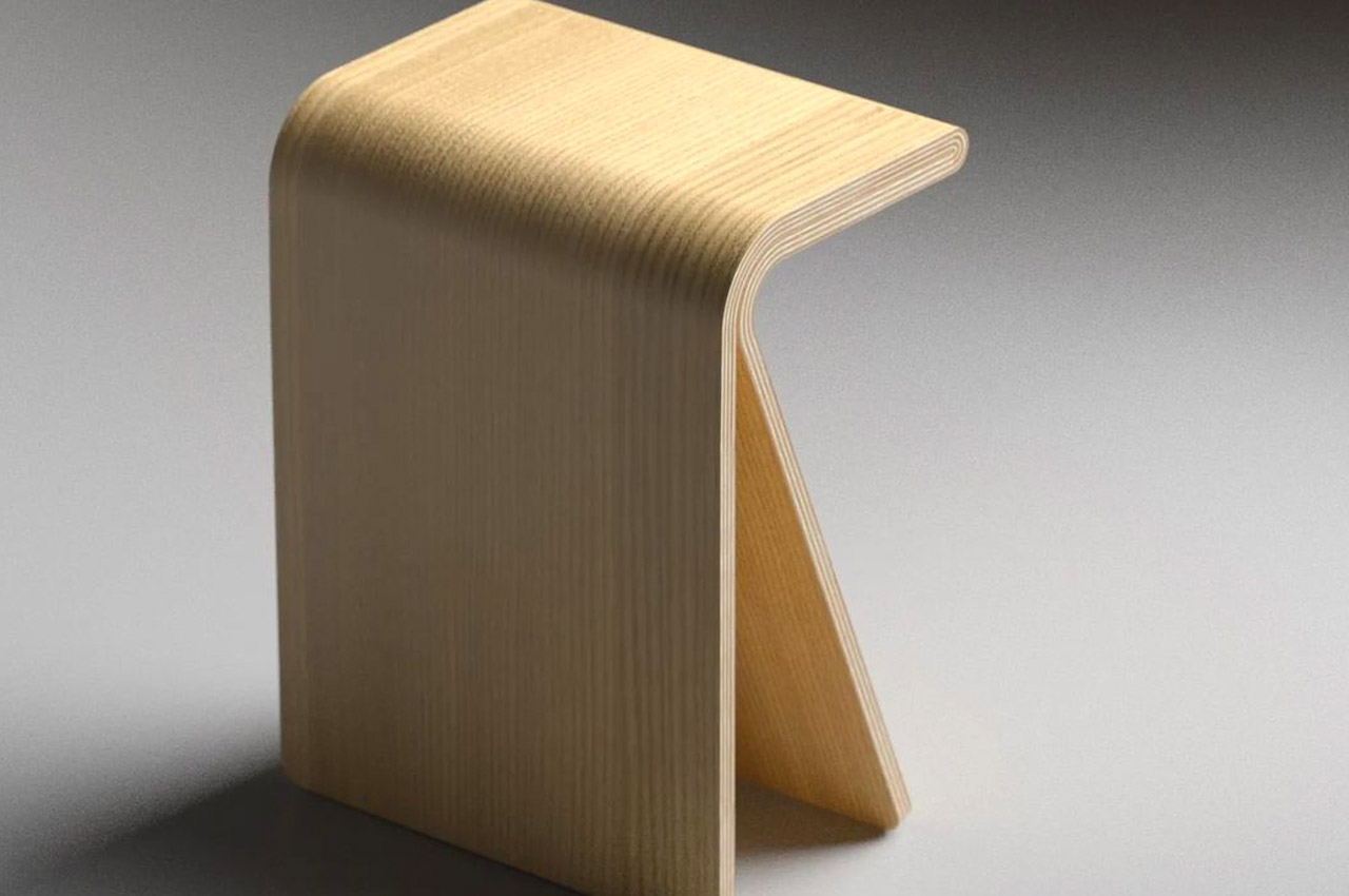
This minimalistic and warm side table also doubles up as a stool. Aktay’s designs are infamous for doubling up as something or the other and doing so extremely subtly and smartly. The furniture piece is like a continuous piece of plywood folded and bent into varying angles. It artfully curves at the top to create a thick platform that functions either as a side table or a stool, depending upon your mood – whether you want to place your favorite vase or your bum on it.

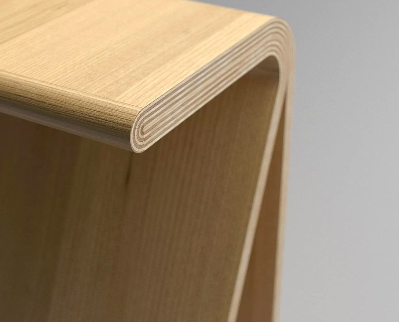
The curve which is formed to build the main platform of the design is its most stark highlight. You can compare it to a ‘nose’, or you could in fact call it the ‘nose’ of the furniture design. The nose is made using multiple plywood shims to give the impression of a singular piece of plywood that although bent, still maintains a continuous and harmonious form.

The Winding side table has a compact size, which makes it ideal for our modern-day cramped homes, or even the ever-popular tiny homes. You can deftly slide the table/stool into any corner of your home, and it would seamlessly merge with its surroundings owing to its neutral and soothing aesthetics.

The post The Winding side table doubles up as a stool and features an interesting ‘nose’ first appeared on Yanko Design.

Cowboy Side Table doubles as a bookmark

Cowboy Side Table Designer Deniz Aktay

It seems we can never escape Deniz Aktay and his designs. This German furniture designer has become prolific when it comes to creating concept furniture pieces, especially tables. Every table he designs gives us something to think about.

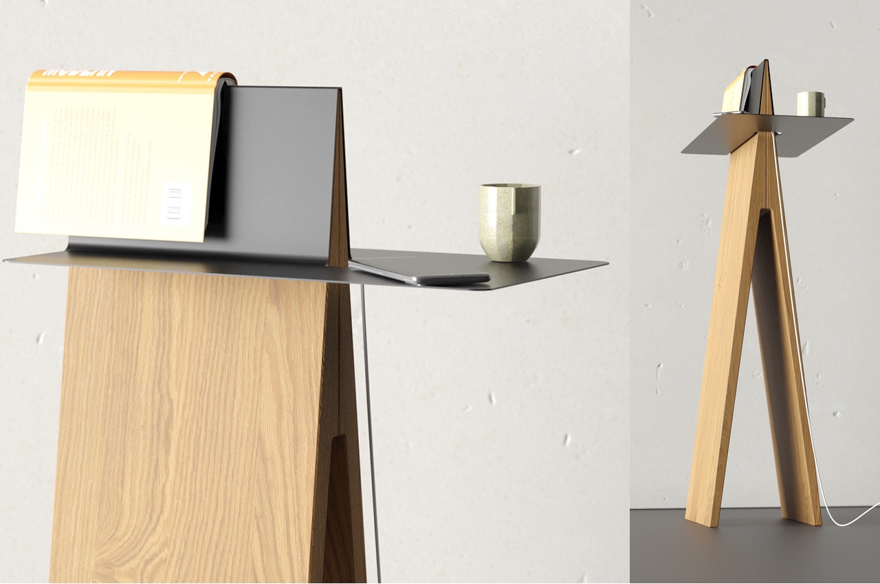
The latest creation is the Cowboy Sidetable Bookmark. It’s a side table and a bookmark in one that lets you keep things organized. If you’re a bookworm, you will want to have one and have your latest book to rest on such a table.

Designer: Deniz Aktay

Cowboy Side Table

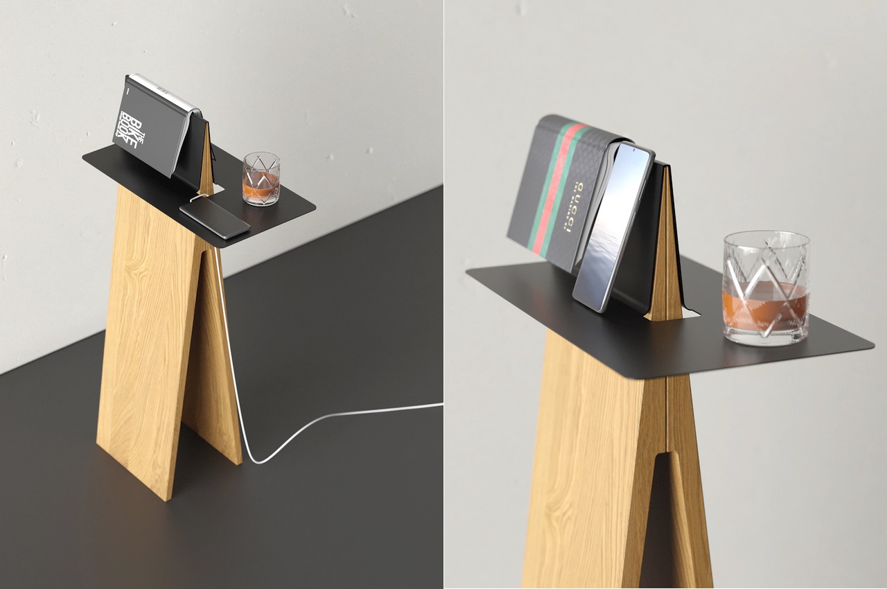
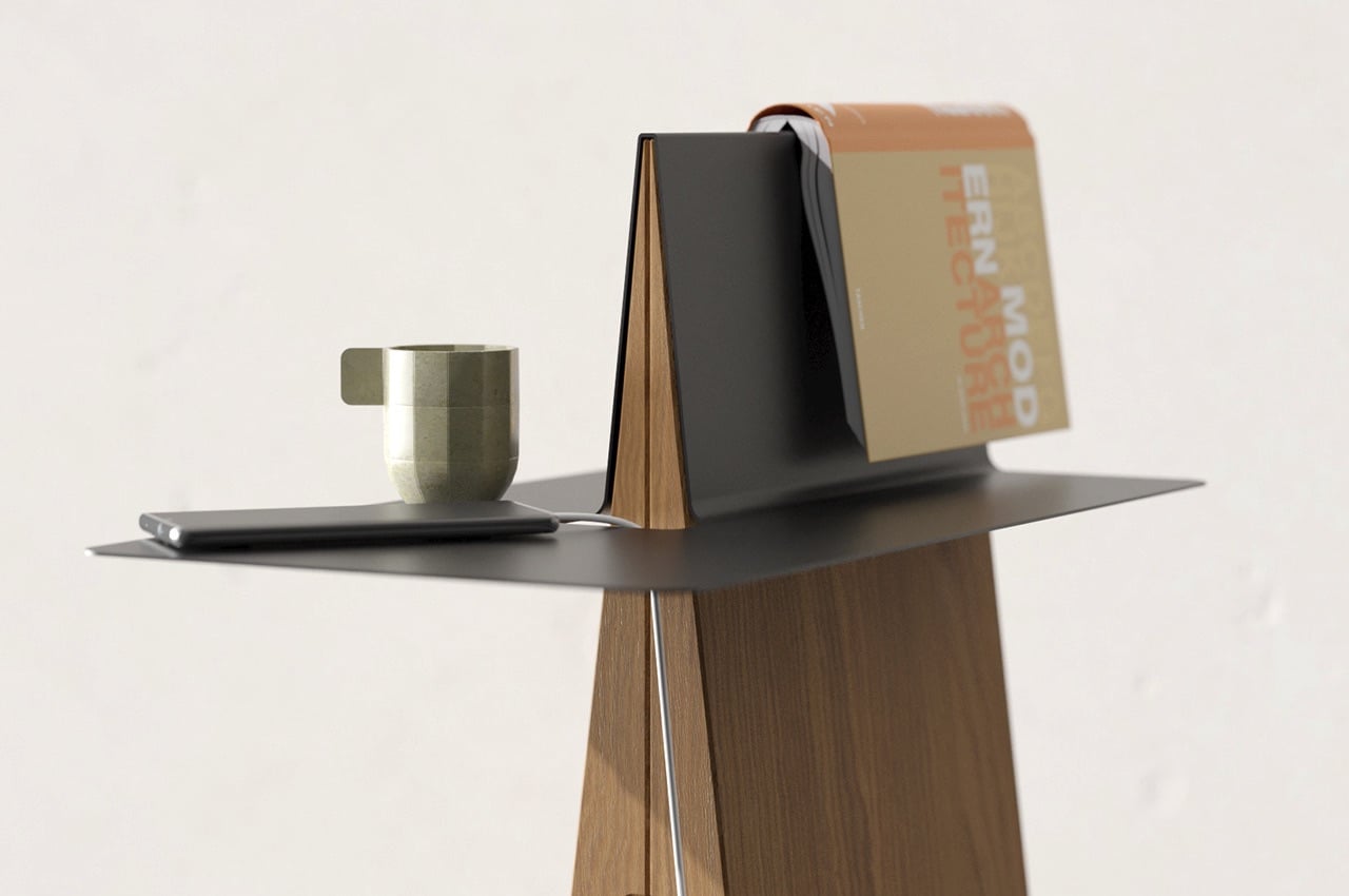
The side table allows things to be at an easy reach. Usually situated beside a sofa or your favorite armchair, you can place your drink on the table for when you want a nightcap. Leave your smartphone on the tabletop, so you don’t miss any important call or message. And when you need to take a break from reading a book, just put the last page face down on the book rest.

Cowboy Sidetable

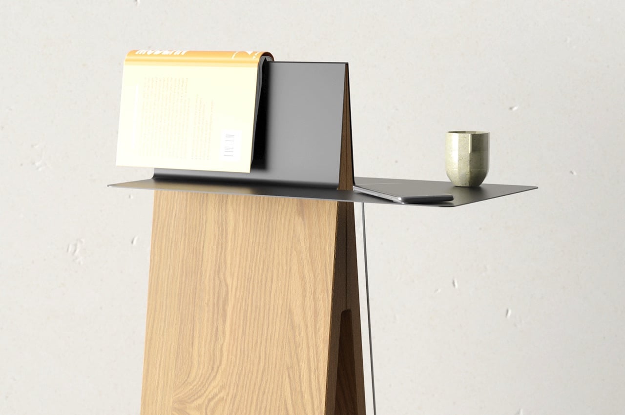
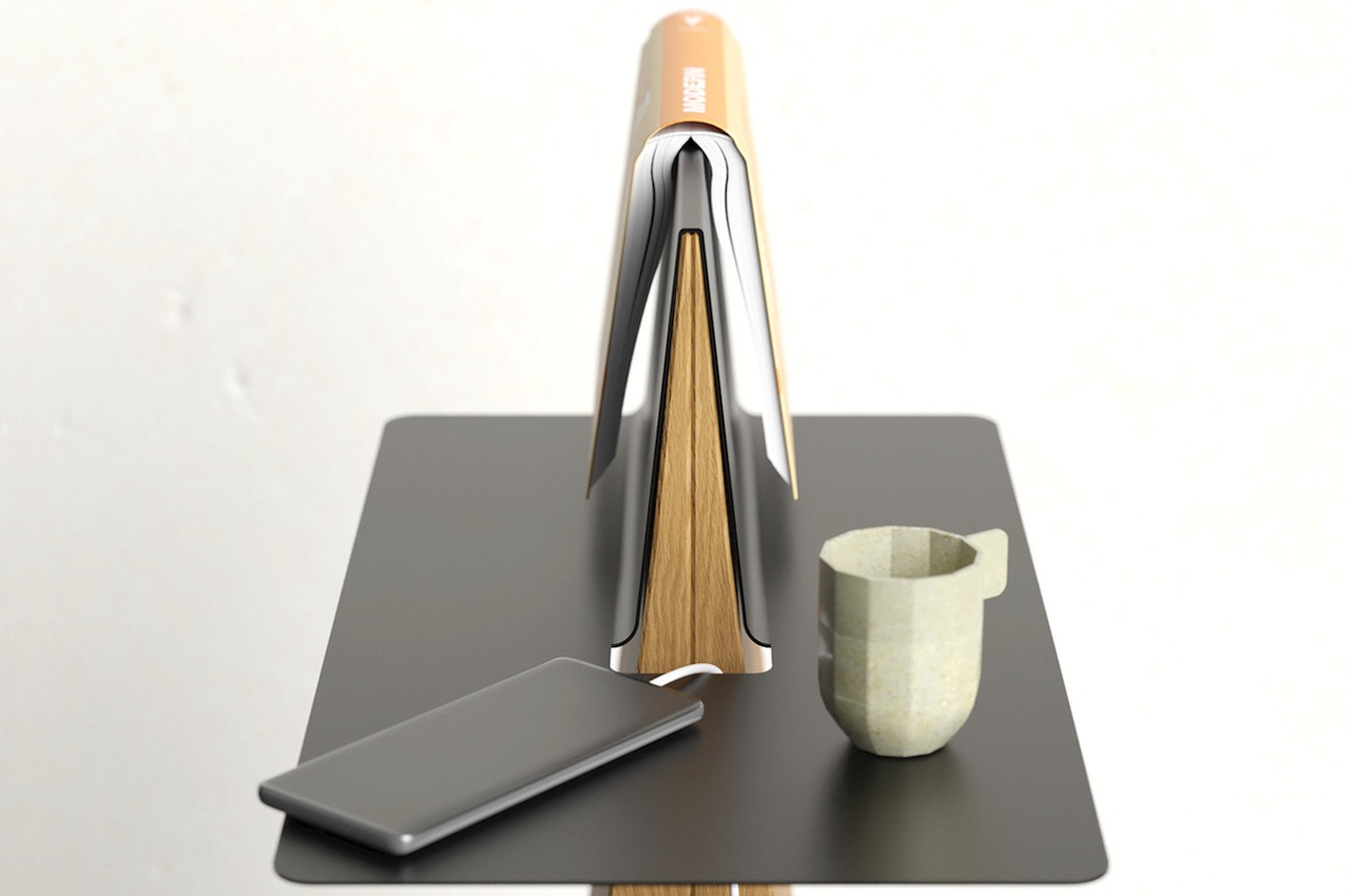
The Cowboy Sidetable is called such because the tip that protrudes appears like a saddle, especially when there is a book on top. The tabletop has an opening in the middle where cables can go through so the surface won’t look too cluttered. The wooden part that looks like an A supports the metal tabletop. The wooden portion is actually two separate pieces joined near the tip.

We see the surface with brushed metal finish enclosing the two wooden tips. The black and wood combination offers a casual look and feel, perfect for those into minimalist aesthetics. Deniz Aktay’s passion for designing furniture makes his creations ideal for those looking for simplicity and originality. His works often combine proper elements and detailing, making every piece challenging to create yet resulting in an exciting product.

Cowboy Side Table

Deniz Aktay has become a recent favorite here with all his unique designs. The Tie Stool is an oddly satisfying stool design that uses three interlocking strips of wood. The Unstable Table makes use of the center-of-gravity trick. That Wavelet Table’s curled side works as a handle similar to the Grab Side Table that lives up to the grab-and-go expectation.

That Tadashi Table comes with a stomach that may be perfect for storage or for your cat. The Plot Twist Bookshelf still carries the intrigue of your favorite mystery books. The bookshelf can complement the newly designed Cowboy Sidetable as it can serve as a bookmark for that title you’re currently reading. Definitely, the designer won’t stop with this creation so expect more will be introduced.

Cowboy Side Table Concept Design

Cowboy Side Table Design Details

The post Cowboy Side Table doubles as a bookmark first appeared on Yanko Design.

Tadashi Side Table comes with a stomach for extra storage

Tadashi Side Table

There is no stopping creative designers from coming up with new side tables. There are plenty of choices now compared to before as the design world is moving towards innovative and aesthetically pleasing furniture items.

There seems to be a theme among Deniz Aktay’s designs. He has already designed a slew of side tables with some bending action on the tabletops. This time around, the tabletop bends on one side, turning into a transport handle. Like his other designs, the Wavelet and the Rool, the Tadashi shows corners that bend. There is no curve, but the lines and edges offer different surfaces.

Designer: Deniz Aktay

Tadashi Side Table

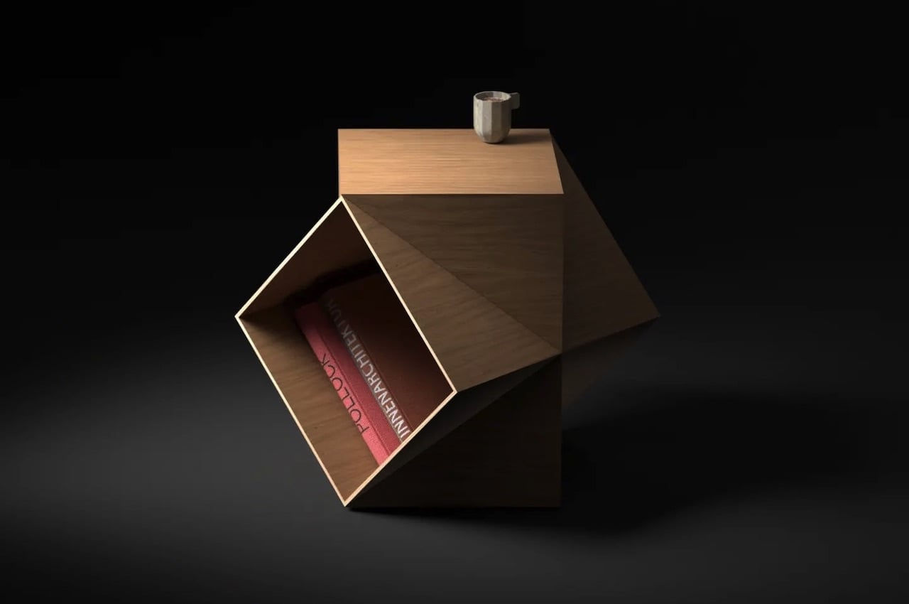
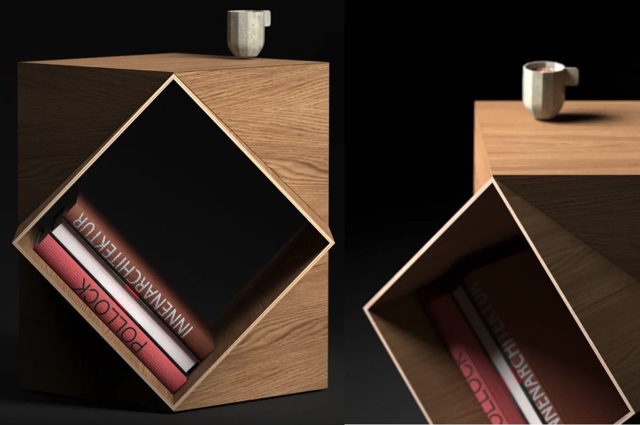
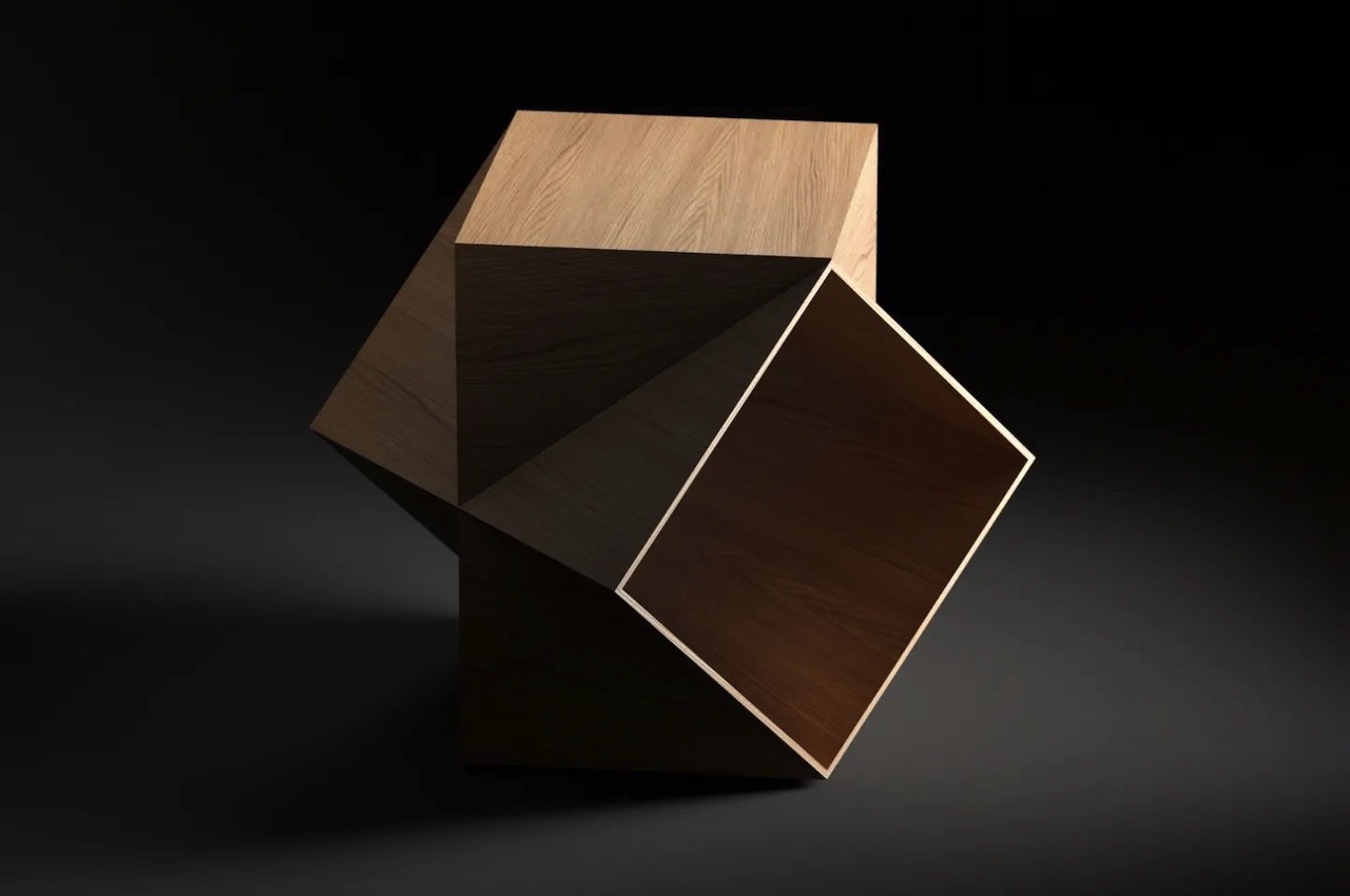
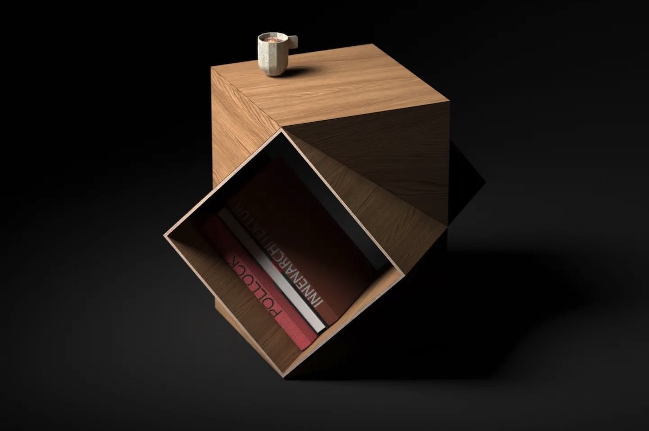
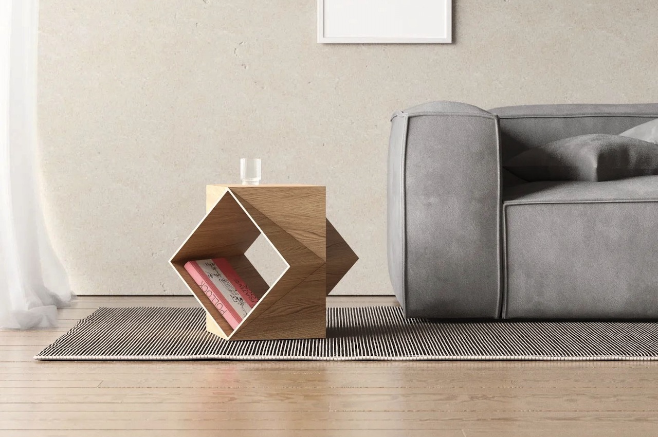
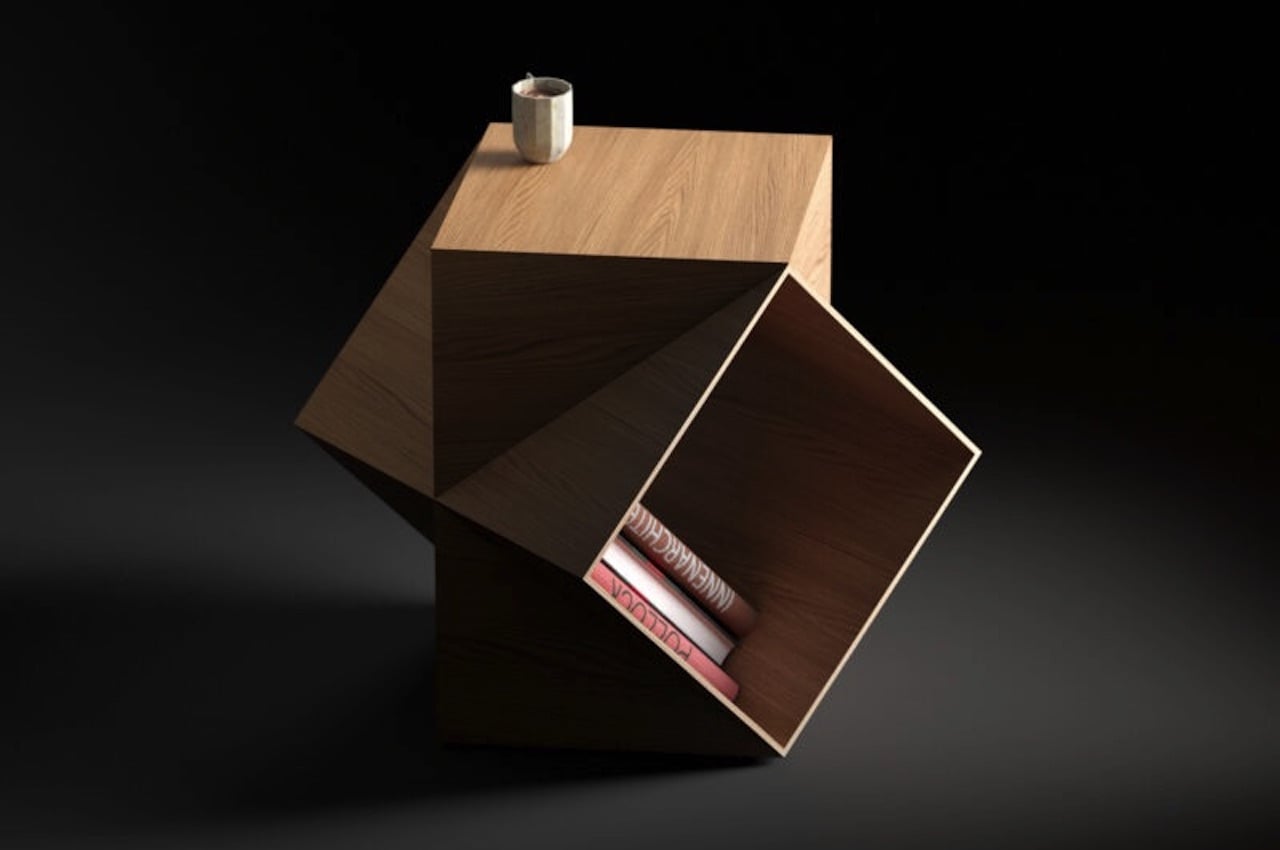
The side table appears to be two hallow cubes intersecting. The effect is a space underneath for storage. The area can be used for your books or other knickknacks. It can also be a space for your pet cat or dog where they can just lounge or sleep. It can also be used to store cushions, pillows, and blankets.

The space is like a stomach which can be used to store anything. You can leave it empty for a truly decluttered look. The wood finish offers a natural warmth, so it can fit most interiors.

Tadashi Side Table

Tadashi Side Table

In some ways, this Tadashi Side Table, reminds us of the Plot Twist Bookshelf. You can place it anywhere—the living room, the doorway, or the children’s bedroom. It can work as a side table or a stool where you can tie your shoelace before going out. It can be a toy storage, but the edges may not be safe for younger children.

The side table’s form makes it appear like a sculpture or art piece that can be another conversation starter. You see, the side table doesn’t have to be boring. It’s a furniture piece that can bring life to any room. It can serve as both a table and as a decor. The more unique the design is, the more attractive a table can be.

Tadashi Side Table

The German furniture designer Deniz Aktay is really serious about design. He doesn’t just show off something that looks nice or unique. He makes things that are really useful and innovative. He creates timeless pieces that people of different ages will love.

Aktay is becoming a recent favorite here as his works are really interesting. We’ve seen the Plot Twist Bookshelf and the Pet Table. The Triforce side cabinet is exquisite and we also can’t forget The Levels Table.

Tadashi Side Table

The post Tadashi Side Table comes with a stomach for extra storage first appeared on Yanko Design.
GRAB Side Table lives up to the grab-and-go expectation

GRAB Side Table Designer

The design of this concept side table is straight to the point. The GRAB Side Table is named as such because the design of this furniture piece allows you to just grab it and go.

This is mainly a concept design and we have already seen something similar. However, it’s not really a surprise since its designer Deniz Aktay is the same guy who created the Wavelet Side Table. The latter made waves recently with its curled side tabletop that doubles as a handle.

Designer: Deniz Aktay

GRAB Side Table Design

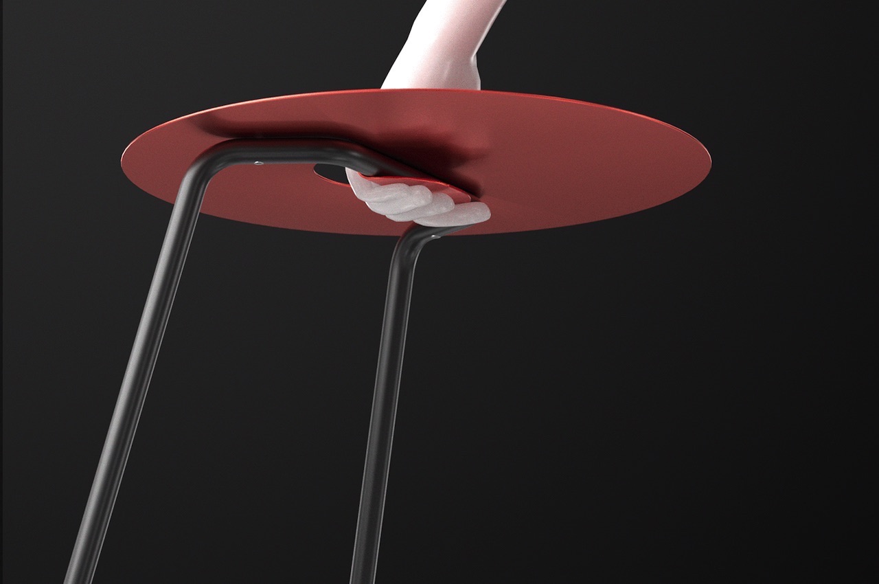
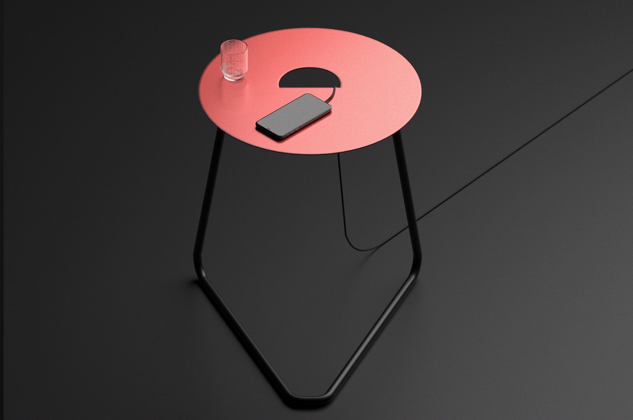
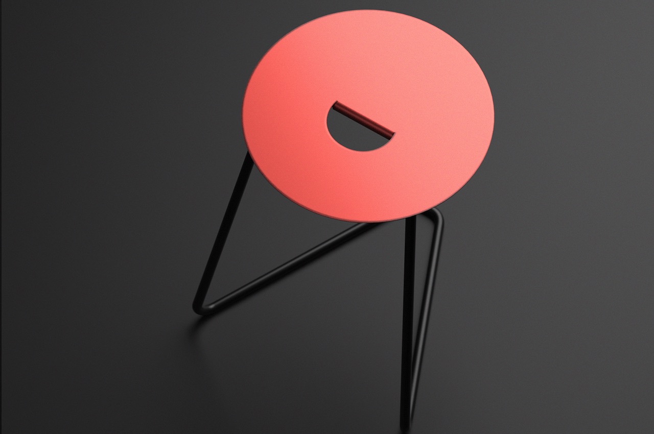
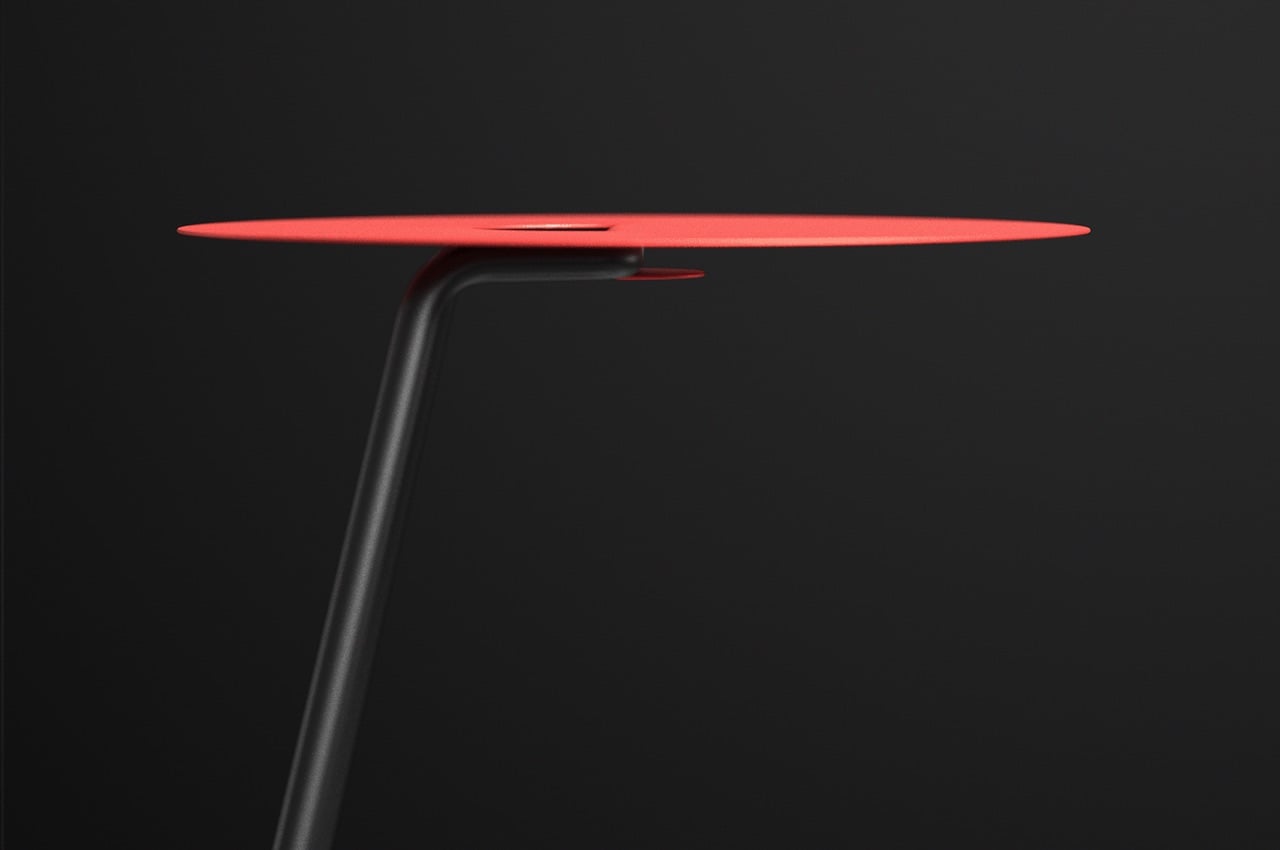
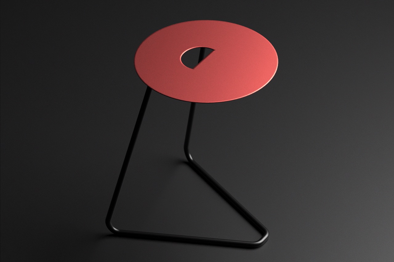
The round tabletop’s vibrant red and matte finish makes the piece more attractive. In addition, it has an opening in the middle, shaped like a semi-circle, that also works as a handle. This design allows easier transport when you want to move the table and redecorate the home.

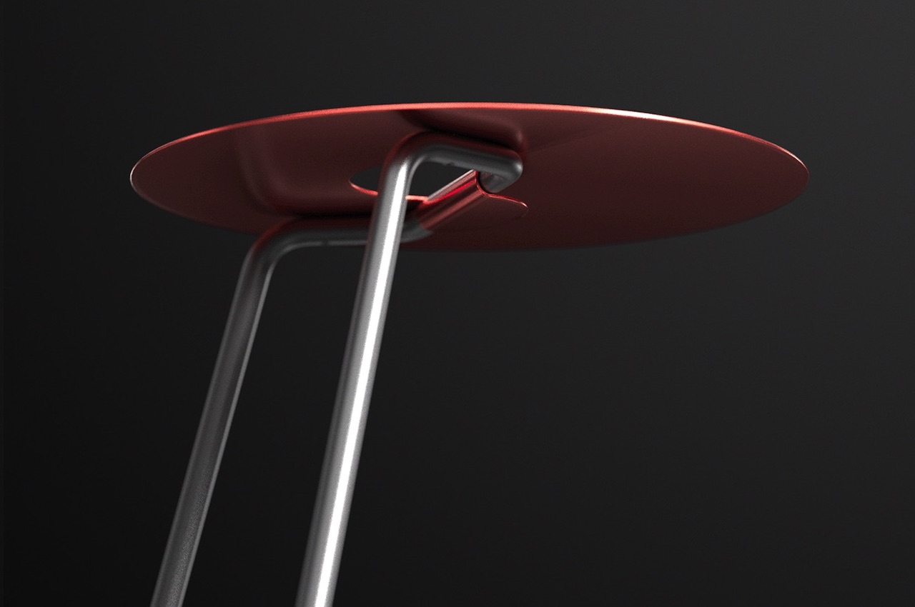
The metal legs of the side table appear to be one piece. It is bent in different places to give support to the tabletop. It is painted in black with a smooth finish, looks neat, and is the perfect match for the red table. Underneath, we see screws that attach the leg part to the top.

GRAB Side Table

The legs of the table provide balance and stability. But, don’t be deceived by how it looks as there are three points (legs), enough to support the weight of the table. Deniz Aktay definitely knows table design and table anatomy. The Wavelet also has three legs, just like his Tie Stool. We are also reminded of The Pet Table with its stability despite its interesting shape. It is sturdy and balanced as the center of gravity within the product base is as low as possible.

The GRAB Side Table is another exciting design from the German furniture designer. His knowledge of architecture and urban planning can be seen in his other creations. This Grab concept is something we see furniture makers like IKEA may carry.

GRAB Side Table Details

The Grab Side Tablet can be a winner with minimalist yet functional and eye-catching aesthetics. If you have one in your home, expect this to be a conversation starter when you have guests over. It is only a side table, but we’re thinking the design can also be applied as a stool. The designer can make a stool version with just a few adjustments on the size and maybe the material or strength of the legs. The stool version should be more durable and sturdier.

GRAB Side Table Concept Design Details

GRAB Side Table Concept

The post GRAB Side Table lives up to the grab-and-go expectation first appeared on Yanko Design.
This ‘Unstable’ Table uses a nifty center-of-gravity trick to make it an attention-seeking accent furniture piece!

Talk about putting the Table in Unstable, eh?

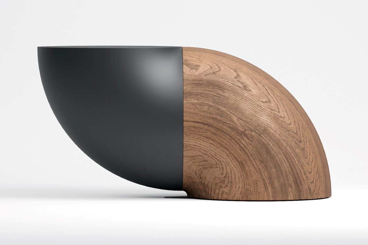
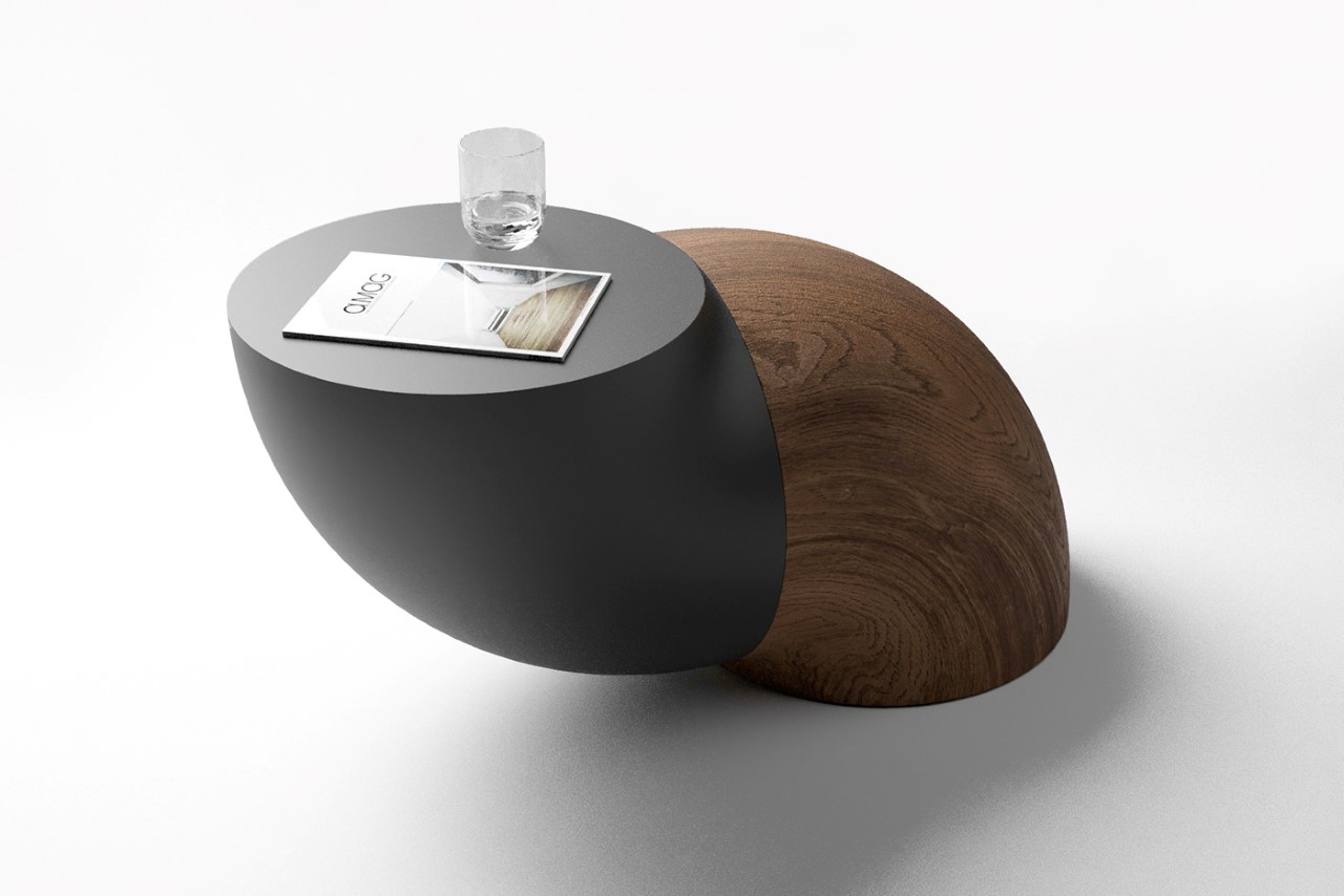
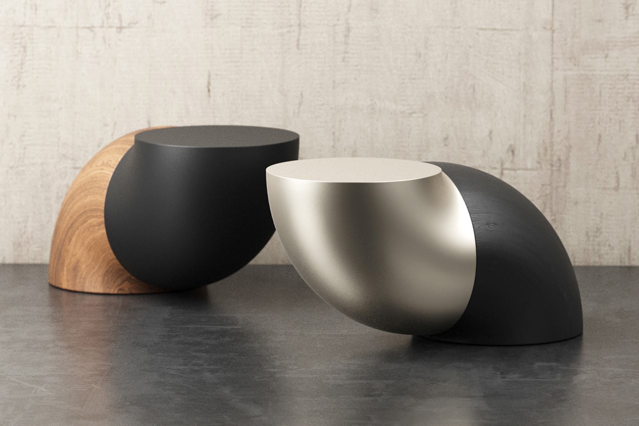
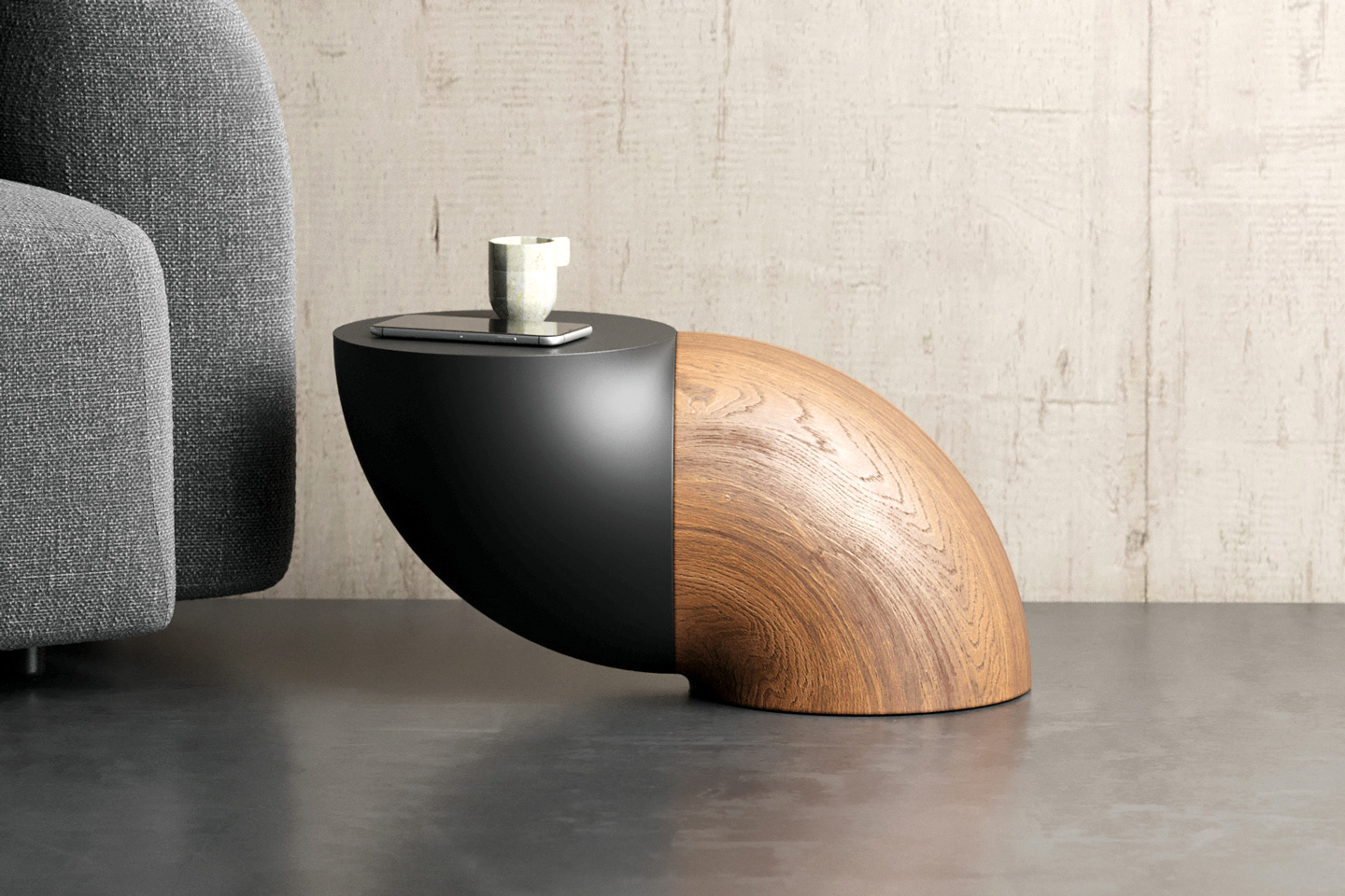
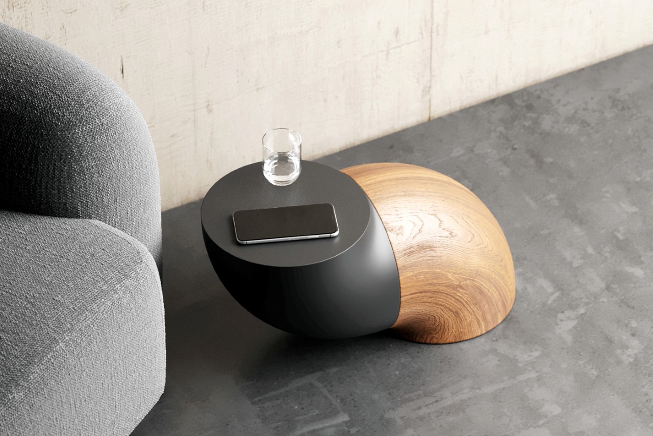
The Pet Table, named for its odd, almost pet-like stance (it does look like an abstract dog sitting with that curved back, no?) relies on a neat optical illusion to appear as visually interesting as it does. You see, most tables come with the standard 3 or 4 legs, or a flat, wide base that makes them look like they’ve got enough stability to not tip over. The Pet Table, on the other hand, has a wide base, but also has a tabletop surface that rests outside the base’s vertical footprint. If you’ve studied basic physics in school, the one rule to stability is to have your product’s center of gravity as low as possible, and within the product’s base. The Pet Table, however, visually seems like it disobeys that cardinal rule. Just looking at the image above makes me wonder if it’s going to tip over the minute I rest my cup of tea on it. It’s that visual trickery and tension that makes the Pet Table so interesting.

The reality, however, is that the Pet Table’s visual trickery is just that… visual trickery.

The Pet Table has two tricks up its sleeve – form, and color. The product’s unstable form comes from the fact that it comprises two identical elements oriented in a way that gives the table one flat base and another unstable curved base. The fact that the curved form has a darker or more dominating color than the earthy wooden form tricks your eyes even more. However, its stability lies within the way it’s constructed. The element with the curved base and flat tabletop surface is, in fact, hollow on the inside, while the other form is made from solid wood. This firmly puts the table’s CG (center of gravity) well within the limits of equilibrium… and aside from actually sitting on top of the Pet Table, nothing should really topple it over. Especially given the fact that the tabletop is a rather small circular surface that’s big enough for a few books, a phone, and maybe a vase or a mug of coffee/tea.

The Pet Table’s visual trickery is fun, but from a purely utilitarian perspective, it doesn’t really contribute to the table’s design. That seemingly unstable form is just artistic, and truth be told, creates a few small limitations. For starters, the table needs to be exceptionally heavy to actually be very stable, which makes it difficult to carry or shift around. Considering its relatively large form factor, it also has a really small tabletop surface – imagine a ‘normal’ rectangular coffee table the same size and you’d immediately double the countertop space. However, design isn’t just about function, it’s about expression too, and the Pet Table scores big points in the latter department!

Designer: Deniz Aktay

The post This ‘Unstable’ Table uses a nifty center-of-gravity trick to make it an attention-seeking accent furniture piece! first appeared on Yanko Design.
Oddly satisfying stool design uses just three interlocking strips of wood

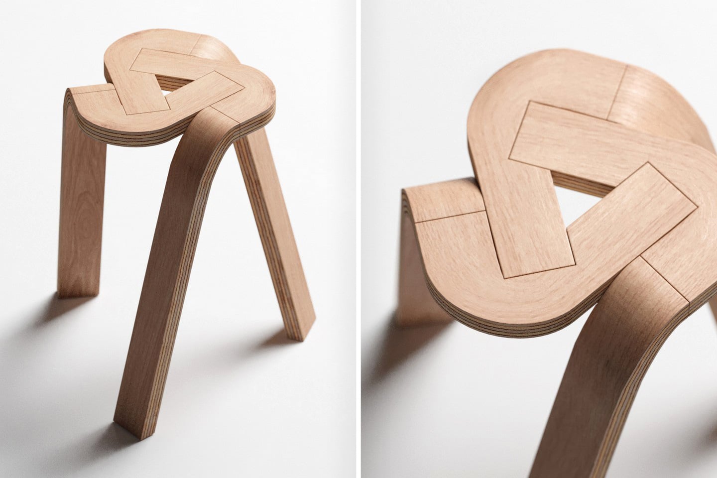
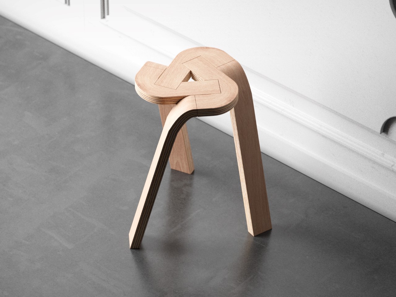
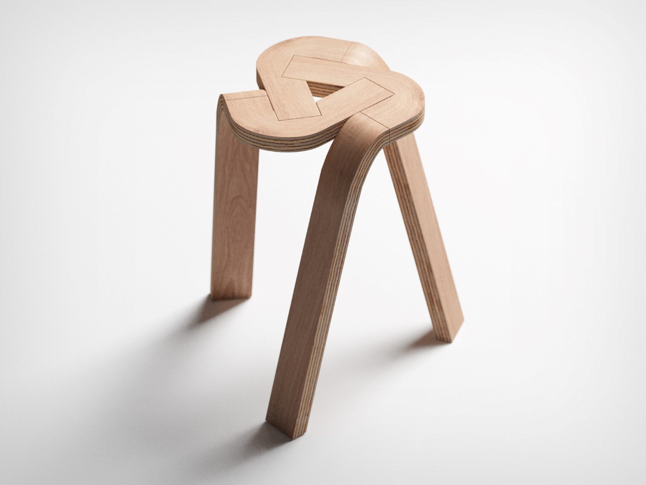
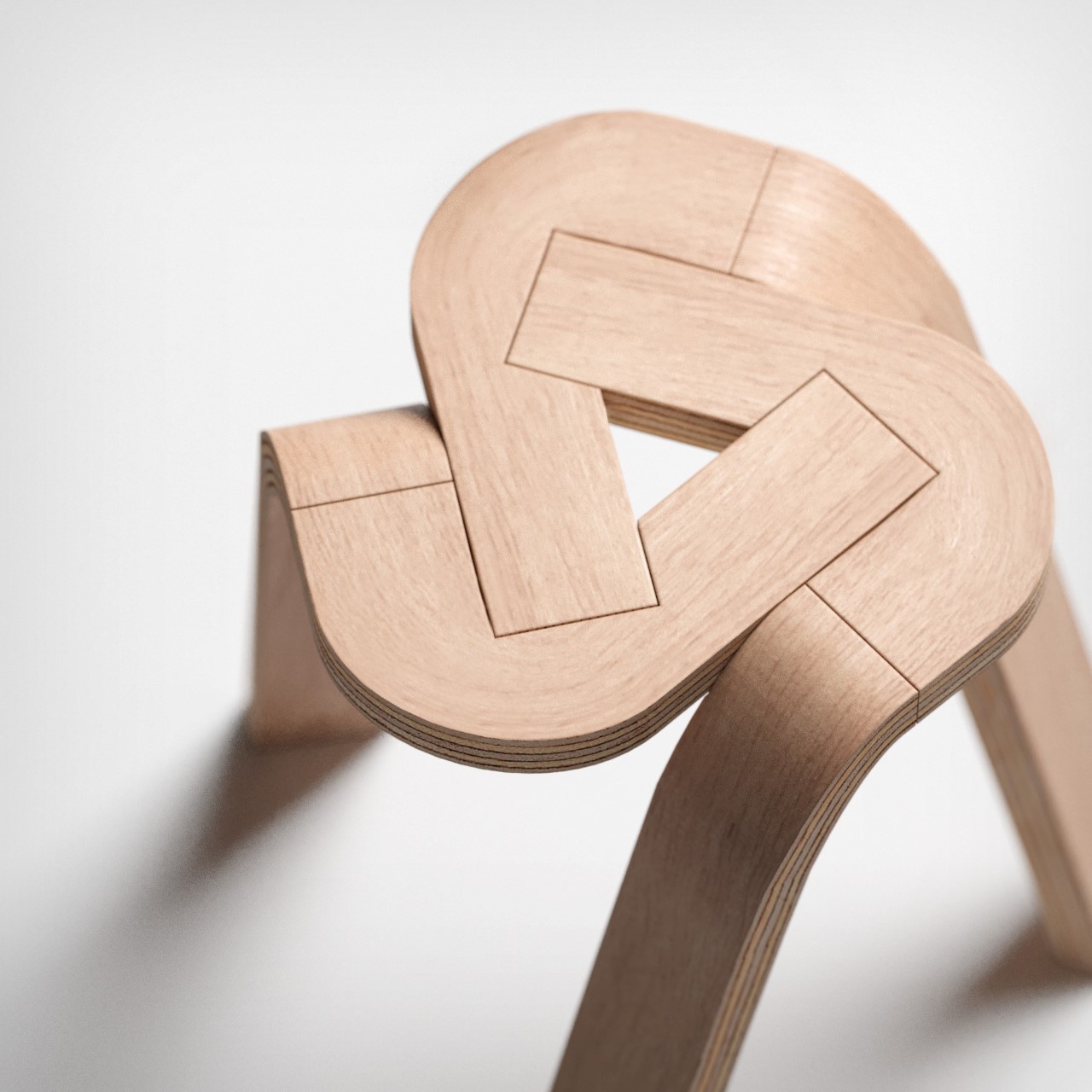
The Tie Stool’s beauty lies in its sheer simplicity – of not just design but also materials. The stool comprises three bent plywood strips that conveniently lock into each other, creating a tripod form that you can easily sit on. The design could easily expand to accommodate more strips to create a 4-legged (or even 5-legged) stool, but the dynamic nature of having a tripod format really gives the Tie Stool its appeal. I don’t know about you, but I can’t unsee the Google Drive logo in the stool’s design!
Designer: Deniz Aktay

Fabricating the Tie Stool would require a few simple steps. The three plywood strips can, in fact, be split into 6 total parts (you can see the parting lines). The individual parts are formed using high pressure and temperatures that cause the plywood to bend and retain its shape, and cutting/finishing processes are performed on the parts to make them interlock into one another. The entire stool can potentially be flat-packed and shipped to customers, who would simply have to plug the pieces together to get a stool that’s as beautiful as it’s simple… and hey, it’s stackable too!

The post Oddly satisfying stool design uses just three interlocking strips of wood first appeared on Yanko Design.