Samsung’s Galaxy Smartwatch has competition… from Samsung!

Now I’m usually the kind of guy to be excited by new tech, but this conceptual design literally has me scratching my head. Why, Samsung? Why have another device when you’ve already got so many! There’s the Galaxy S series, the Galaxy Note series, the Galaxy Smartwatch series, the newly launched Galaxy Fold, and now this. What would you even call this tech-filled friendship bracelet?! The Galaxy Bend? Sounds too much like the Galaxy Fold. The Galaxy Band? That sounds like people would confuse it with the smartwatch.

This is a conceptual Samsung smart-wristband. Created by LetsGoDigital using patents that Samsung filed just a week back, this device is clearly Samsung’s way of flooding the market with flexible displays. It’s essentially a smartphone-esque device that also doubles up as a wristband (similar to a concept that Lenovo displayed in 2016). Samsung’s modus operandi has always been “Build it and they will come”, and this gadget is no different, although if Lenovo’s test-case was any indication, this concept could be used by people with physical disabilities who have trouble holding a phone. The smartphone conveniently wraps around your wrist, allowing the phone to hold onto you, rather than needing you to hold onto the phone. The phone/band even comes with dual-lens cameras and an ultrasonic in-screen fingerprint reader.

For now, this concept exists as just a patent, and like most patents, it’s likely that Samsung just wanted to own the IP regarding a folding display mechanism, rather than build a device. A lot of companies patent ideas that look like they could potentially hold value, and those patented concepts usually never see the light of day. Let’s wait and see what Samsung’s plans for the future are!

Designer/Visualizer: LetsGoDigital

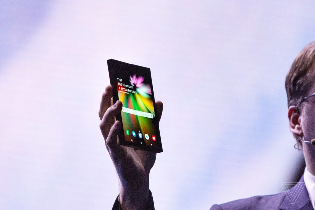
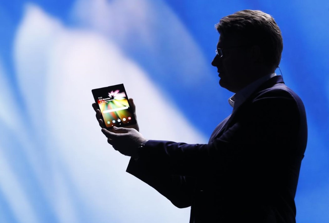
Samsung couldn’t kill the bezel so it made a folding phone

Samsung’s latest phone shows that it’s quit one rat race to join, or rather lead another. While companies around the world try hard to erase every ounce of bezel they can find, Samsung’s decided that the best way to make screens feel more expansive is by quite literally making bigger screens.

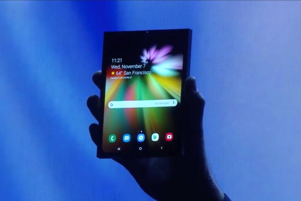
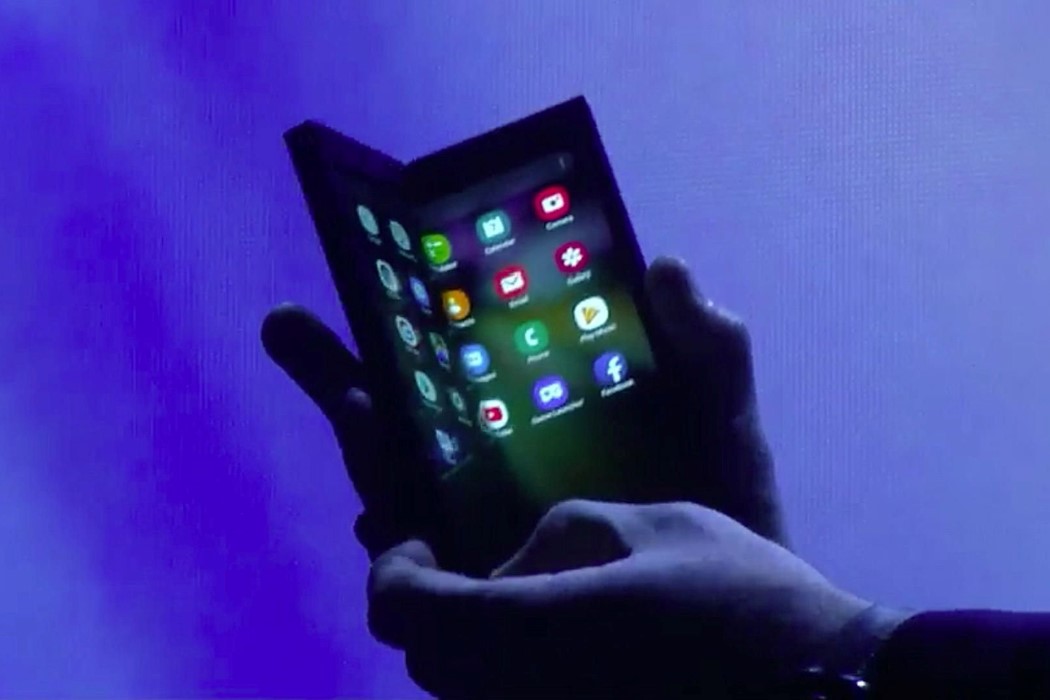
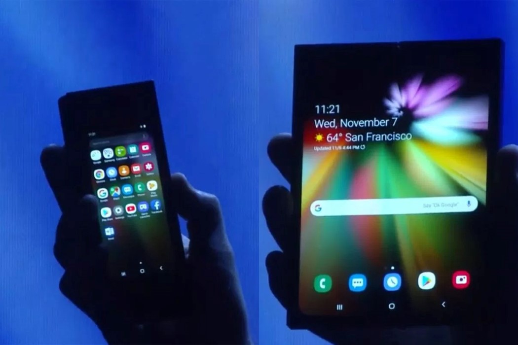
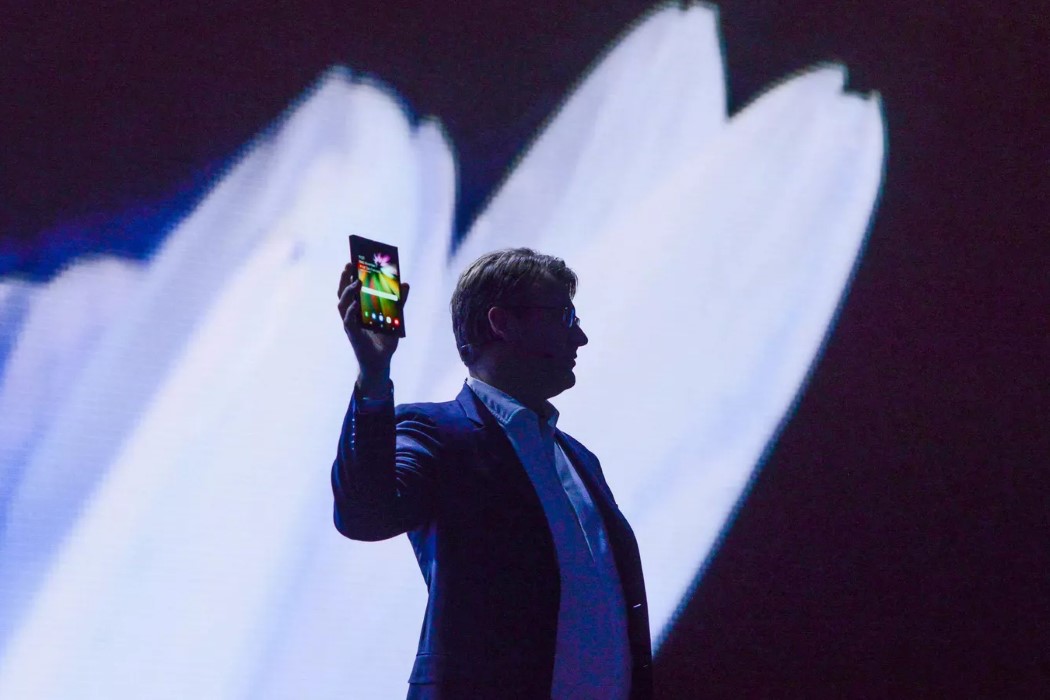
Under an extremely controlled environment at their annual conference, far from the crowds, and with lights so dim you could barely see the device (all one could see was the screen), Samsung announced its intention to launch a folding smartphone in just a matter of months, and debuted their folding screen technology, the Infinity Flex Display. The phone, let’s just called the Galaxy Infinity Flex (this isn’t the official name, but it sure sounds like it!), comes with two screens, a main foldable screen that folds inwards and a demo screen on the outside. Joining companies like Royole, Lenovo, and even Microsoft by putting its bets on the foldable display future, Samsung’s begun moving towards creating the most anticipated range of phones in quite some time (the bezel-killing spree can wait). The folding technology will essentially mean you can have a larger screen in your pocket, which is ultimately what everyone wants, right?

The foldable display also gives Android a new direction to work in. Developing an OS that supports flexible screens and that can adapt to folding displays by conveniently folding the UI along with it, Google is working hard along with Samsung to make the current iteration of Android work seamlessly with flexible displays. Samsung’s even encouraging developers to write apps for the nascent technology, and developed its own interface, called the One UI, in a bid to be the leader in folding displays. It’ll now be interesting to see two things. The consumer’s acceptance of a folding phone, and how this technology forces other companies (eyes on Apple) to make phones based on what consumers feel about #PurposefulBendgate!

Designer: Samsung

samsung_infinity_flex_1

samsung_infinity_flex_2

samsung_infinity_flex_3

samsung_infinity_flex_4

samsung_infinity_flex_5

samsung_infinity_flex_6

A California start-up beat Microsoft and Samsung to the foldable tablet/phone

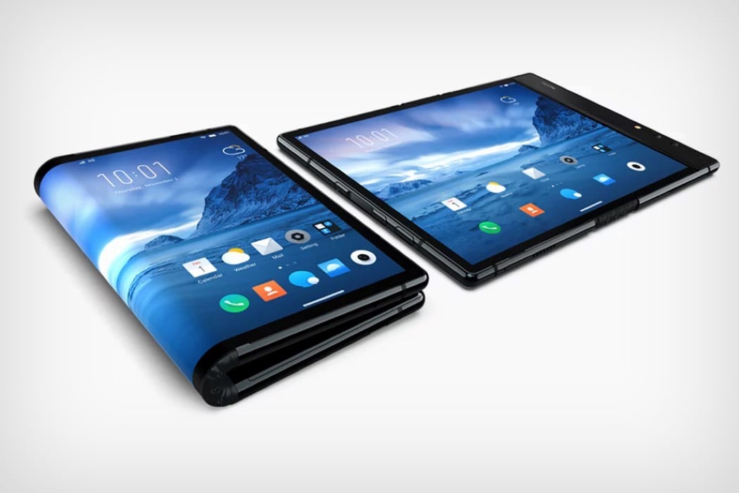
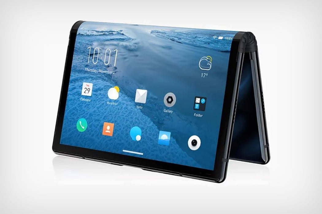
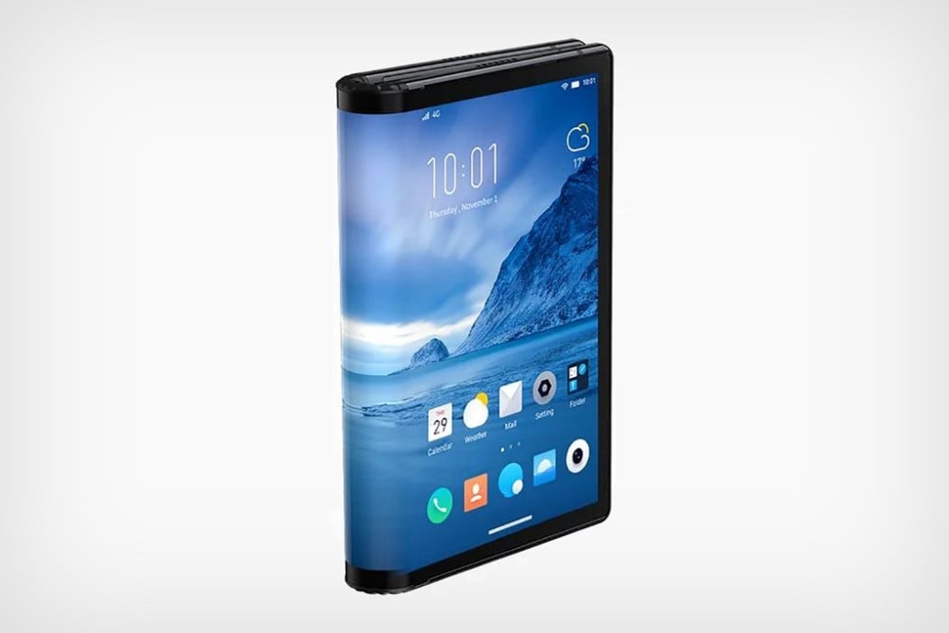
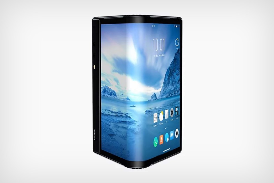
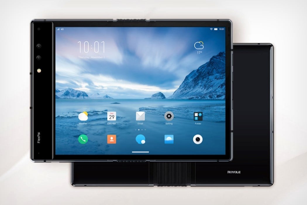
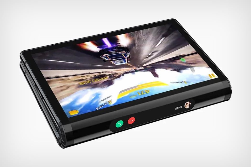
You’re not looking at the Microsoft Andromeda, or the flexible phone Samsung has been rumoredly working on, or Logitech’s flexible phone. You’re looking at the Flexpai, a flexible phone/tablet from California-based Royole. The most interesting thing about the Flexpai is that it isn’t a proof-of-concept. The tablet/phone is literally available for pre-order.

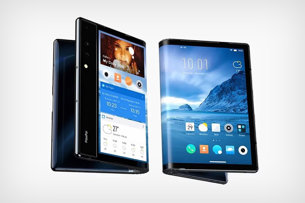
The Flexpai comes with a foldable body and a display that sits on the outside when folded (rather than Microsoft’s Andromeda, where the screen folds inwards). What this means is that the Flexpai goes from single-screen mode to a dual-screen format when folded, with the spine acting as a notification area. You can run simultaneous apps on both screens, with touch working on literally both sides of the display, courtesy Flexpai’s WaterOS.

The screen comes as a large 4:3 7.8-inch display that folds to two 18:9 screens when divided in half. There’s also a 21:6 edge-screen for important notifications like incoming calls. The screen is designed to fold as much as 20,000 times without any damage (which should cover as much as 3 years of use if you fold and unfold the phone 20 times a day, every day). You’ve also got dual-cameras and fast-charging built in too, so there’s no cutting corners with the Flexpai, except maybe for the massive bezel on its one side.

The Flexpai is currently available only in China and costs roughly around $1,571 for the 128GB variant, which seems a little on the expensive side, but that’s the price you pay to be an early adopter of some very revolutionary tech. My advice? Hold off on it till the flexible display market becomes a little larger and more democratized. If you look at the GIF below of a hands-on, you’ll notice that the screen tends to warp a little bit around the spine, and that the transition from single to dual-screen is a little choppy. It’s still extremely impressive though, especially considering big players like Samsung and Microsoft are still trying to perfect the technology!

Designer: Royole


royole_flexpai_1

royole_flexpai_2

royole_flexpai_3

royole_flexpai_4

royole_flexpai_5

royole_flexpai_6

royole_flexpai_7

The world’s next breakthrough product may just come from Microsoft

microsoft_andromeda_1

Keeping secrets in the tech biz is growing increasingly difficult. With new products being leaked (even sold!) days or months before releases, oftentimes an avid consumer knows pretty much all there is to know about a product well before their launch. Something of a similar nature happened with Microsoft’s keynote last week… except they never launched the product.

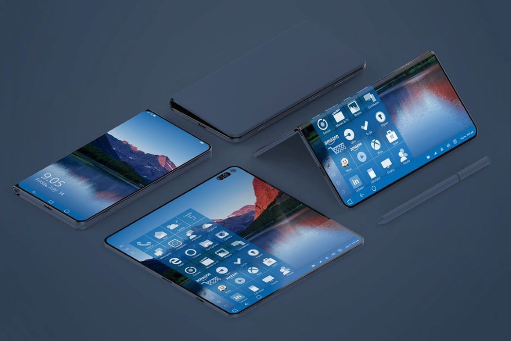
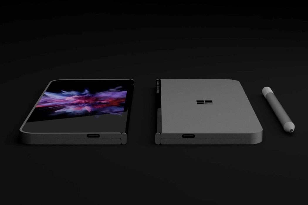
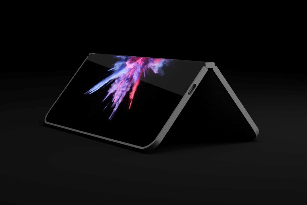
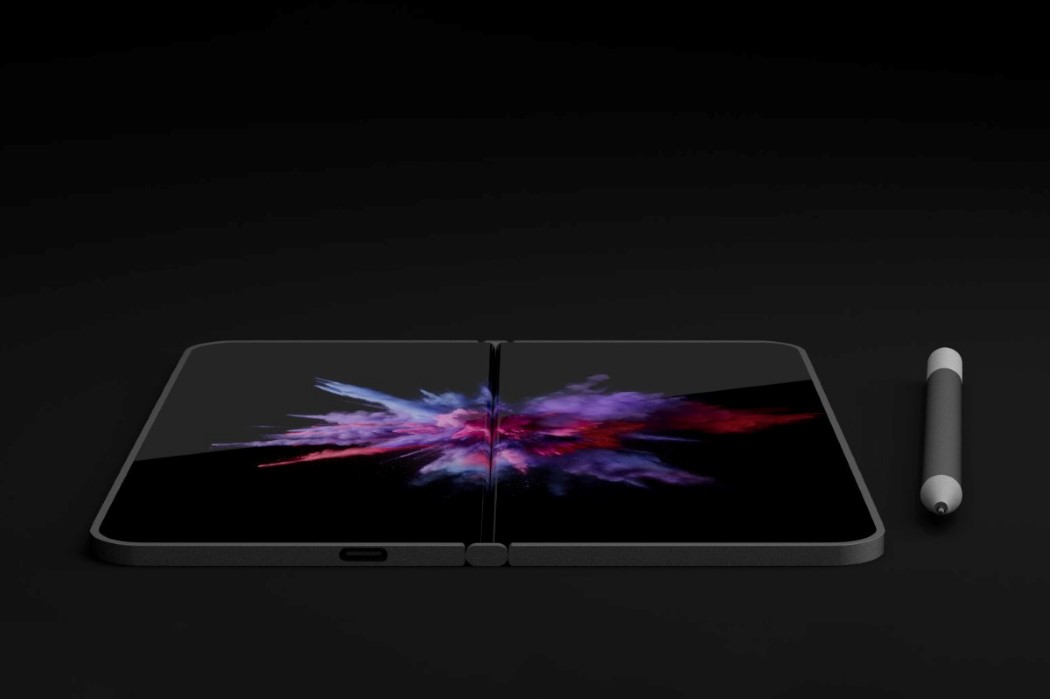
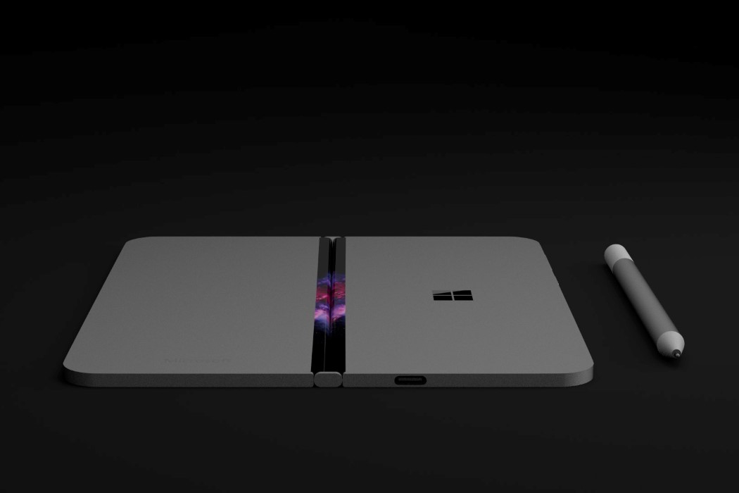
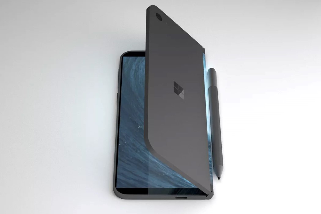
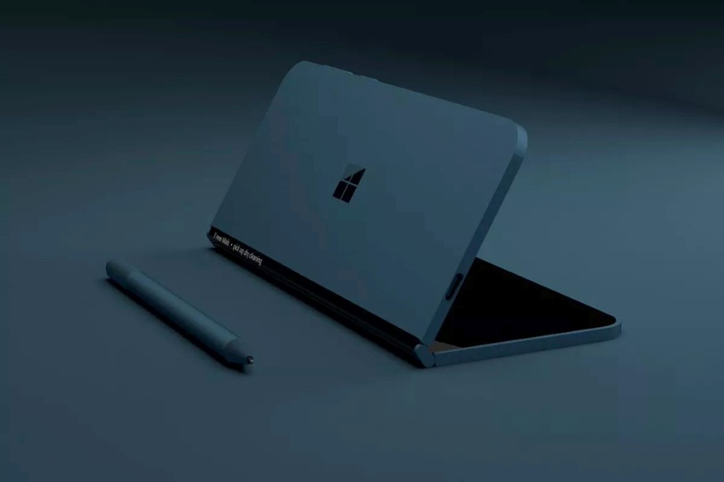
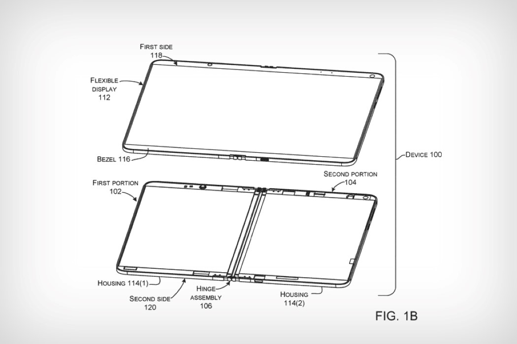
Project Andromeda, as it’s codenamed, is one of Microsoft’s best-kept secrets, and is all set to revolutionize our smart-devices as well as put Microsoft back in the limelight as an innovator. Rumor has it that the device was supposed to launch at this year’s keynote, but wasn’t completely ready for a public reveal. A little digging around at the patent office, however, brought to attention some diagrams that gives us a rough idea of what exactly this Project Andromeda is about. The product, as per the patent diagram and the renders created to support it, explores a one-of-a-kind dual display device that folds down to a pocket-worthy size, and when opened, creates a large squarish screen.

Designed to cater to the people who want big screens as well as the people who want small phones, Project Andromeda is quite literally the best of both worlds. Rather than killing bezels to make phone displays marginally bigger, the Project Andromeda finds a workaround by adding two screens on a clamshell device that fold inwards at the hinge, so you don’t get a bezel at the edge where the two screens meet. How Microsoft intends on pulling this off (even from a marketing standpoint), and whether a square shaped device is something a consumer would want is quite frankly still unknown, but let’s see what the future holds for us! Can I say that I’m just happy that this thing doesn’t have a notch?

Designer: Microsoft

microsoft_andromeda_2

microsoft_andromeda_3

microsoft_andromeda_4

microsoft_andromeda_5

microsoft_andromeda_6

microsoft_andromeda_7

microsoft_andromeda_8

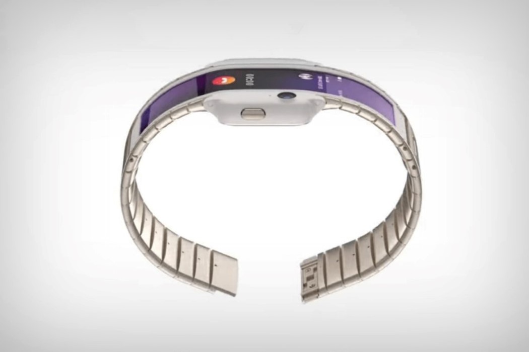
Nubia’s Alpha is a completely new direction for smartwatches

With Samsung promising flexible screen phones as early as November this year, it only begs to wonder if fancy folding gadgets will become mainstream in the next couple of years. Nubia wants to be one of the first companies to ride that wave, and the Alpha smartwatch gives us a taste of what that future will look like.

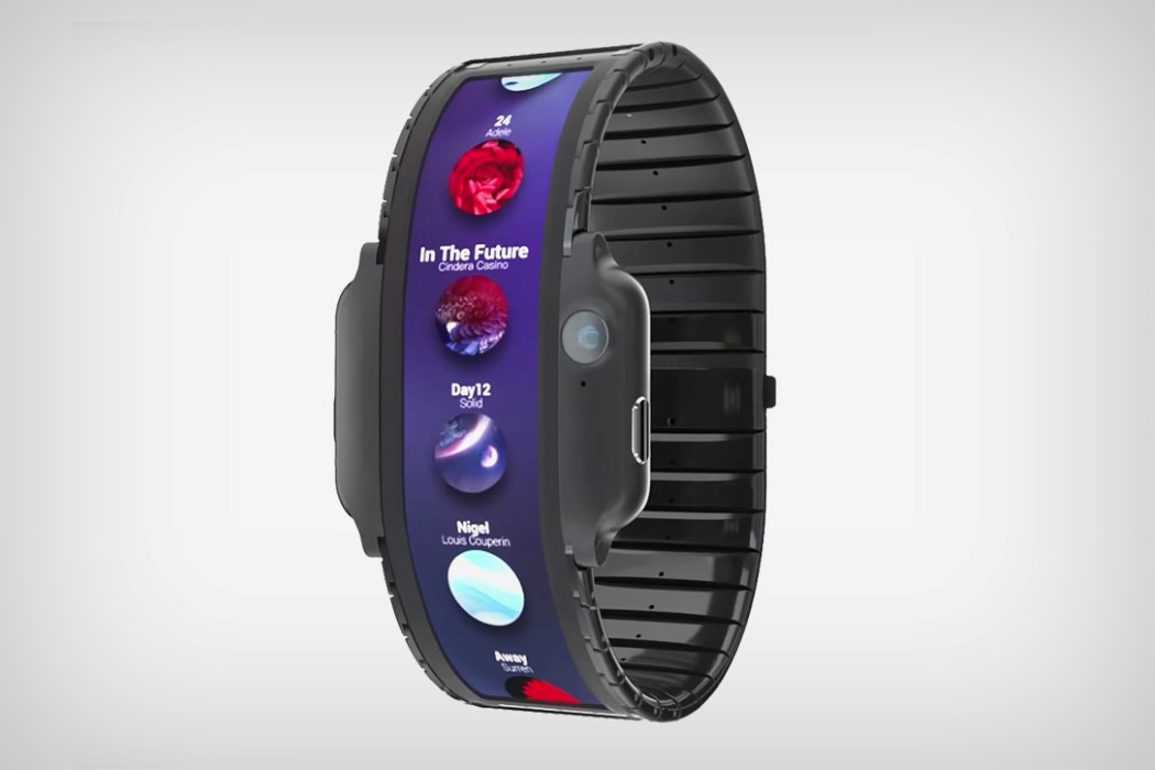
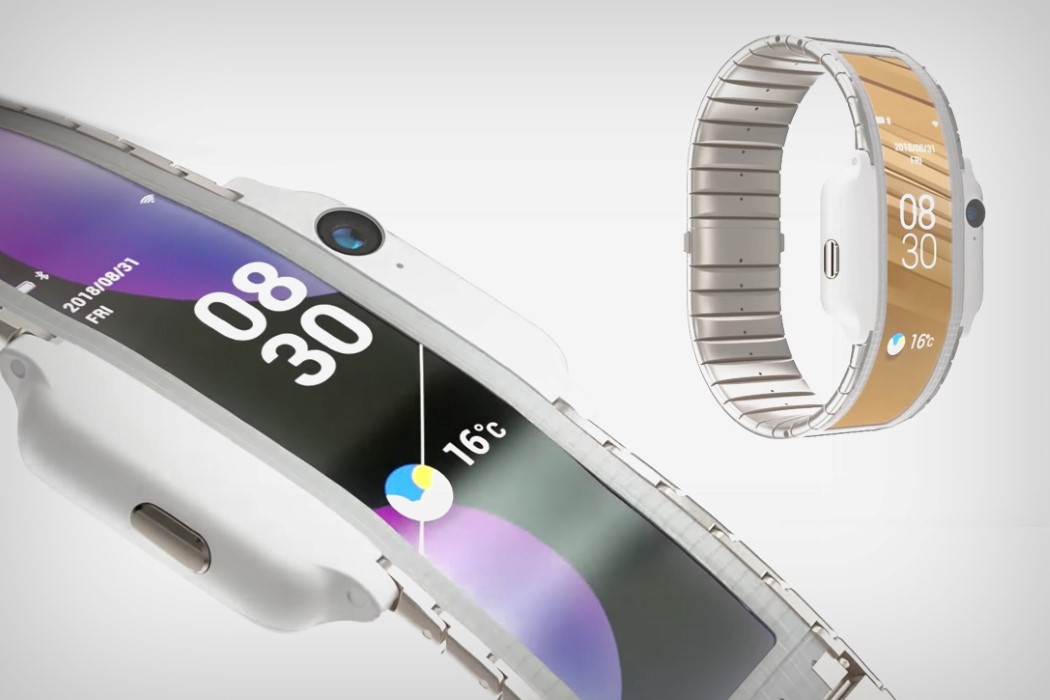
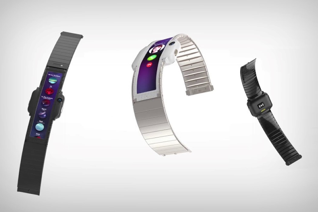
The Alpha is absolutely radically different. Built with the silhouette of an Apple Watch, the Alpha actually features a flexible OLED screen that follows the curvature of the wrist, rather than opting for the traditional square or circular display. The main body of the Alpha acts as the bezels of a smartphone, giving way for a charging port, and interestingly enough, a front-facing camera that would work as a dedicated conference cam. The bulges also indicate what would be the ‘front’ of the smartwatch, giving you control over its extremely linear screen. The linear screen looks impressive no doubt, but what’s even more interesting is the way the Android OS is tweaked to behave completely differently, thanks to its extremely non-traditional construction. The OS orients everything vertically, while following Android’s Material Design philosophy. Whether new smartwatches will follow suit or not, it’s pretty bold on Nubia’s part to push out something so brazen, so beautiful!

Designer: Nubia

nubia_alpha_1

nubia_alpha_2

nubia_alpha_3

nubia_alpha_4

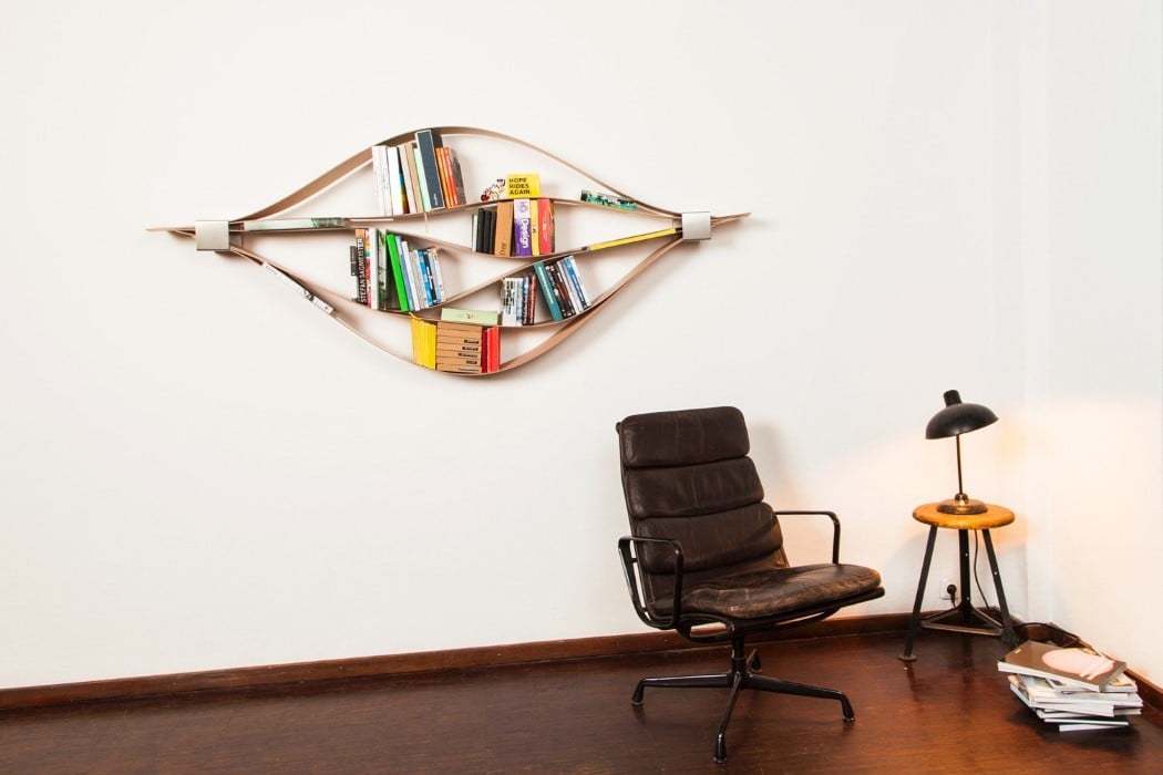
The Chuck bookshelf is unique, simple, dynamic, and an artpiece in itself

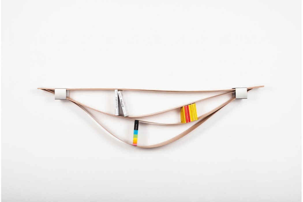
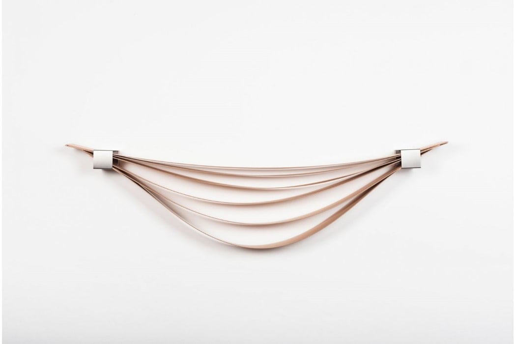
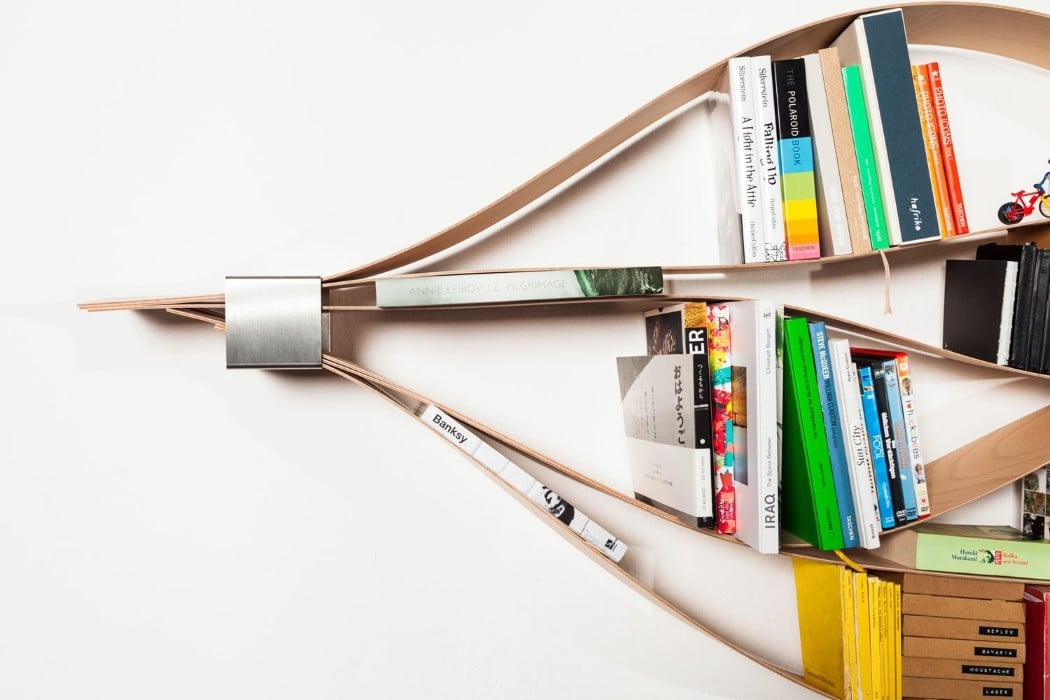
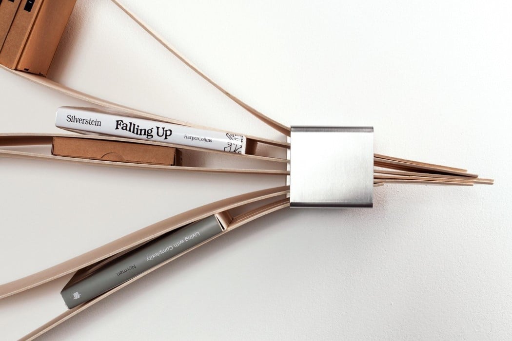
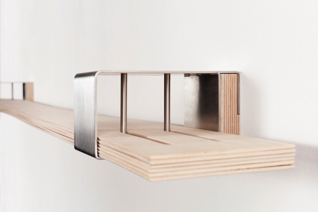
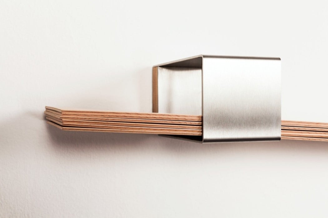
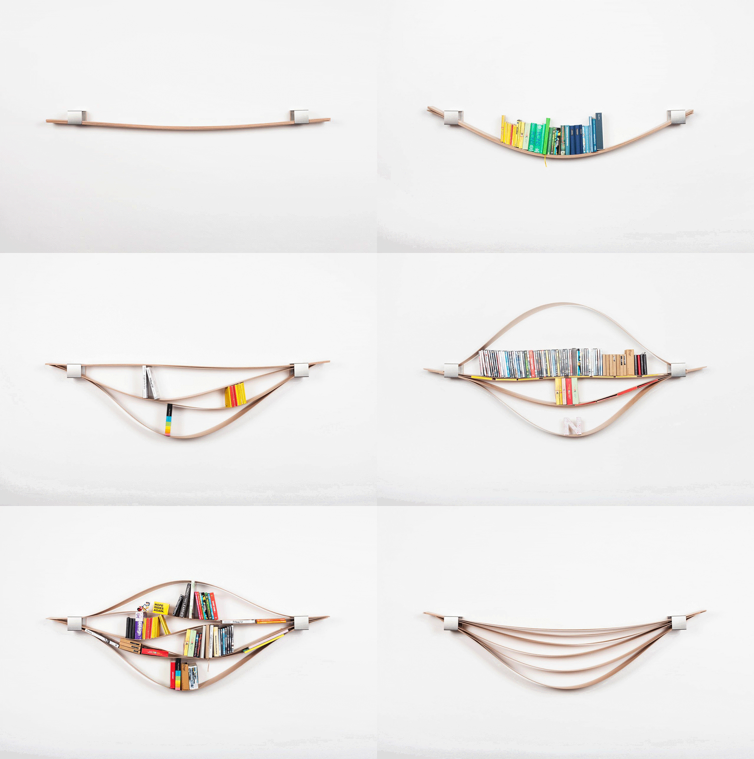
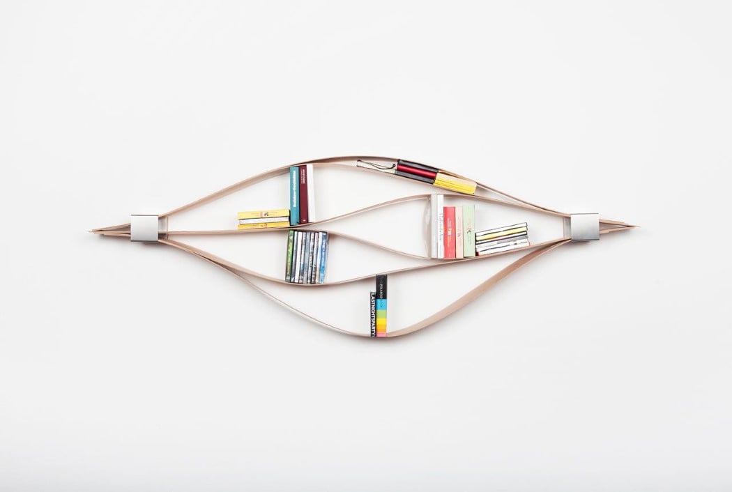
The Chuck, a Red Dot winning bookshelf, ticks all my boxes for innovation and design. It’s simple in its construction, easy to use, fun to interact with, can store books/media of different types and sizes, has the capacity to look strikingly different every time you make a change to it, and is very capable of being the most interesting piece of furniture in your room. With two metal members on either side holding together six strips of wooden veneer, the Chuck bends and flexes as you place books on/between the veneer sheets, creating undulating waves of wood that store your books, CDs, plaques, and objets d’art.
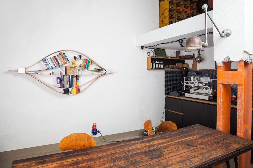
The way these items are placed on the wooden slats affects the overall form of the bookshelf, literally turning it into an installation that transcends traditional furniture, and that’s unique to your arrangement style. Items can be placed vertically, or horizontally, or sometimes even diagonally on Chuck, giving you the freedom to express yourself not only with your book collection, but also with the way you arrange them. The Chuck also has no defined constraints for how big or small the books need to be, giving you more freedom and flexibility (literally too) to use the storage it provides, and in doing so, create a piece of art from a humble piece of furniture!
Designer: Natascha Harra-Frischkorn

Click Here to Buy Now

chuck_bookshelf_2

chuck_bookshelf_3

chuck_bookshelf_44

chuck_bookshelf_5

chuck_bookshelf_6

chuck_bookshelf_7

chuck_bookshelf_8

chuck_bookshelf_9

chuck_bookshelf_10

chuck_bookshelf_11

Click Here to Buy Now