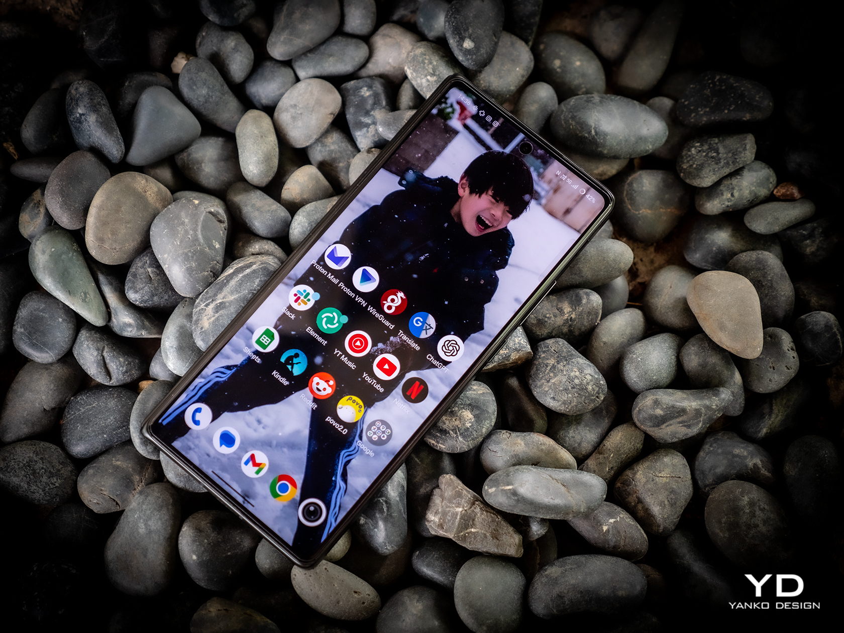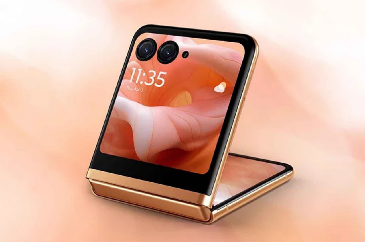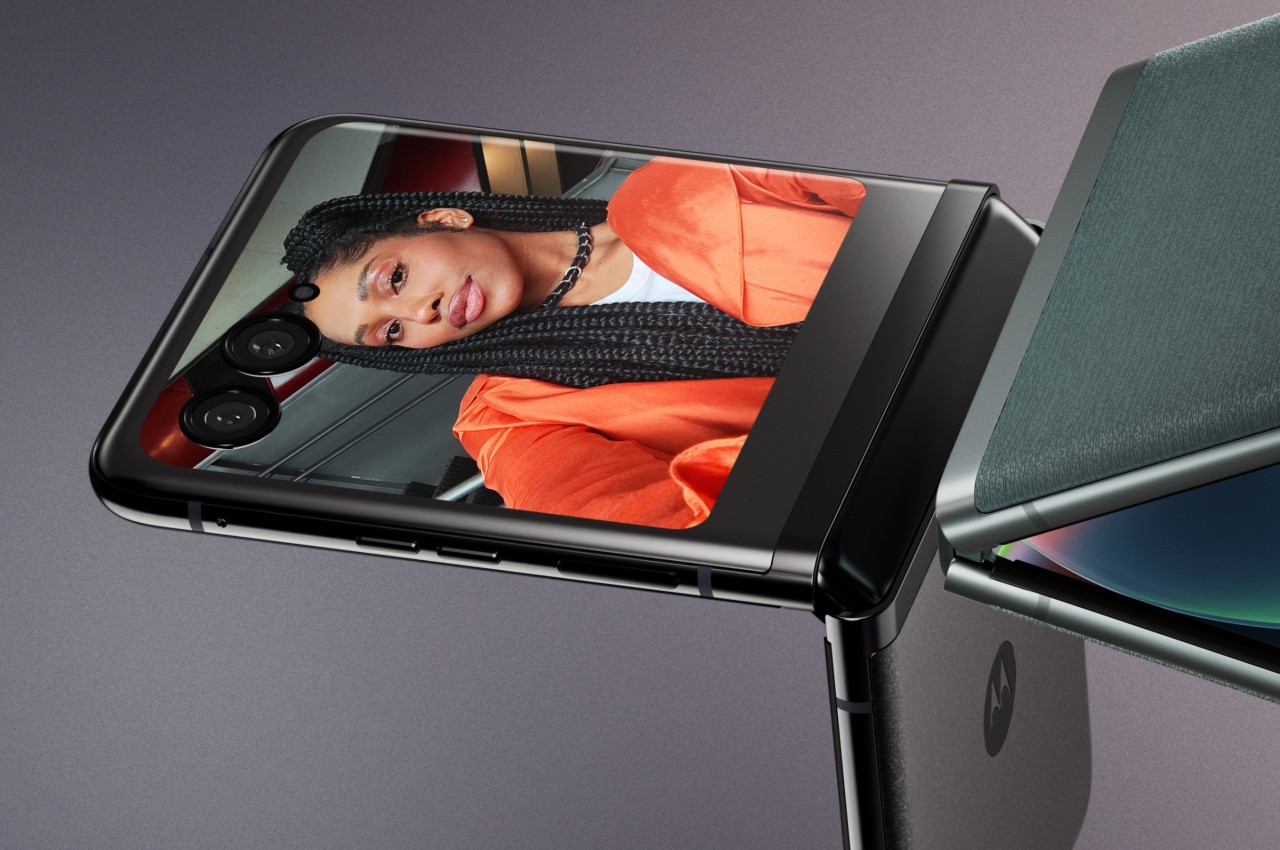
Tecno’s Foldable Journey: The Evolution in Design from Phantom V Fold 5G to V Fold 2, and V Flip 5G to V Flip 2

Tecno’s entry into the foldable smartphone market began with the Phantom V Fold 5G and the V Flip 5G. These devices introduced a fresh take on smartphone design, offering the flexibility of foldable screens and compact form factors. With the launch of the Phantom V Fold 2 and V Flip 2, Tecno has made notable improvements, focusing on design, functionality, and user experience. This article explores the changes between these first and second generations, showing how Tecno has refined its approach to meet modern needs.

Phantom V Fold 5G vs. V Fold 2: A Thoughtful Redesign
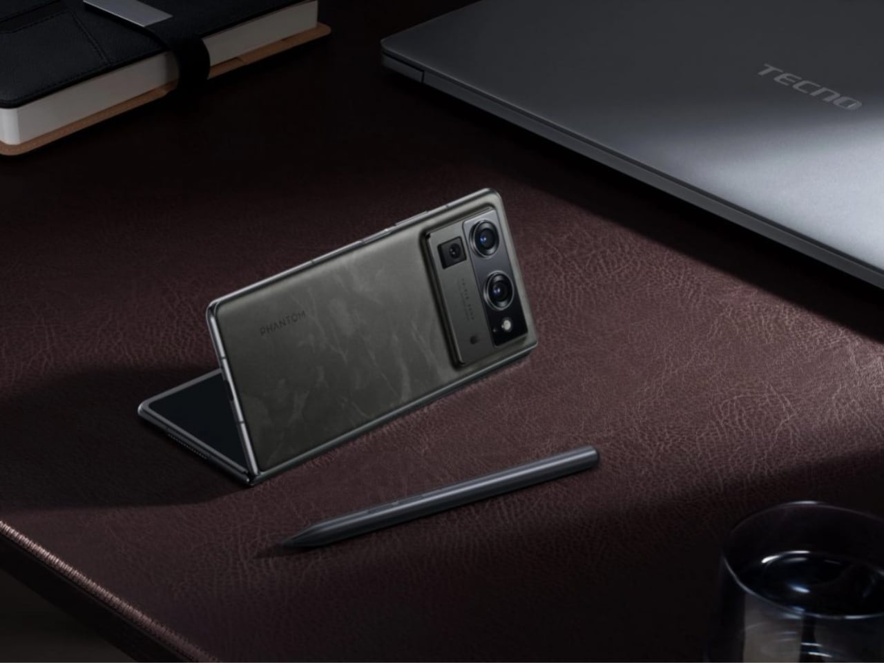
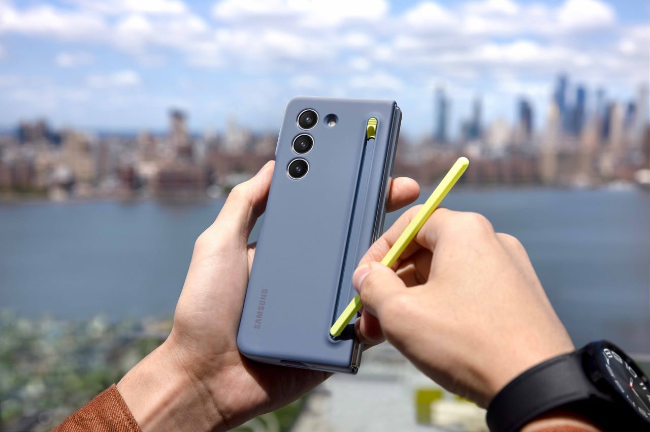
Tecno Phantom V Fold 2 with new stylus

Design and Build Quality

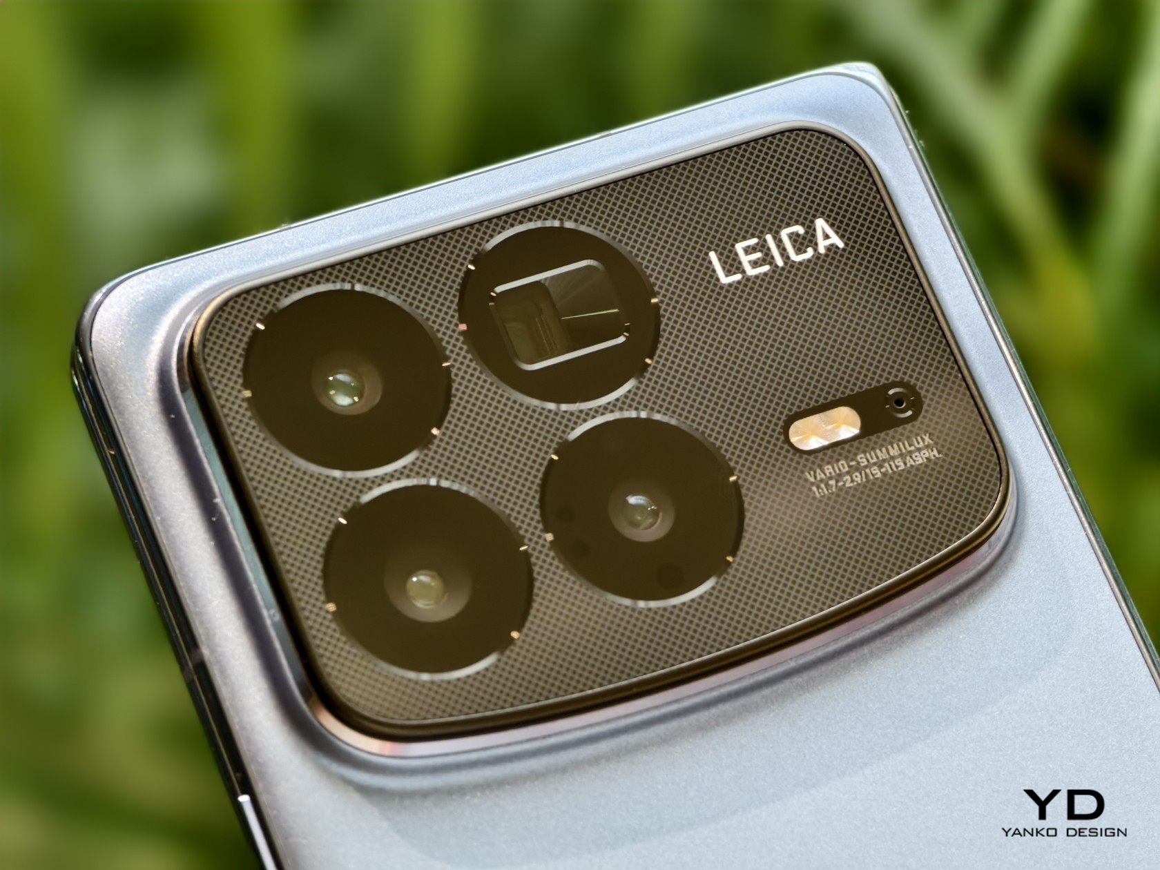
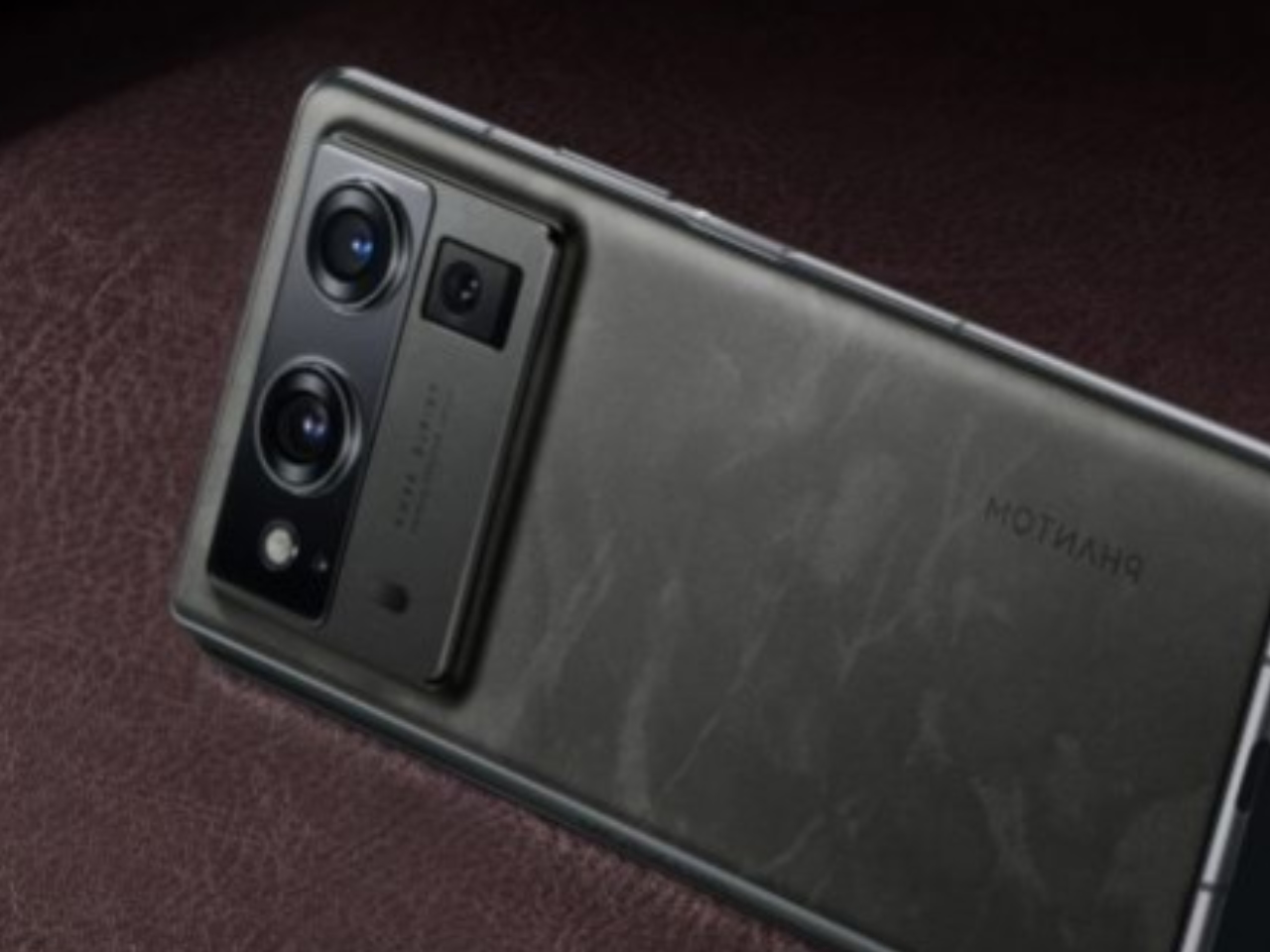
The Phantom V Fold 5G featured a bold design with a large, circular camera bump that stood out on the back of the phone. This prominent feature added thickness, making the phone feel bulkier. While it made a statement, the design wasn’t for everyone. Some found it too pronounced, disrupting the phone’s overall balance.
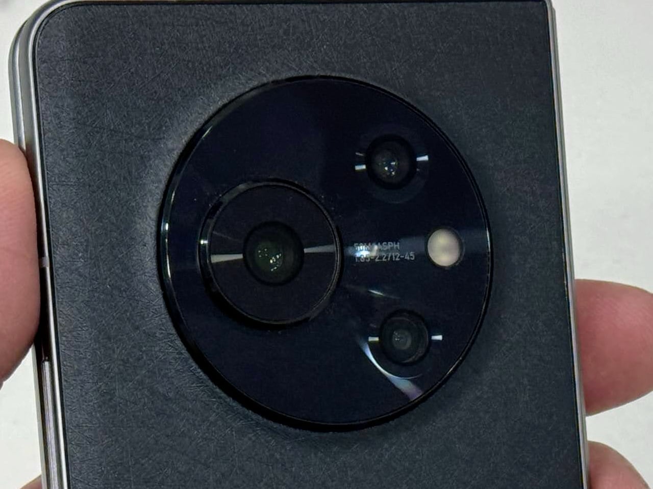
Tecno Phantom V Fold 5G rear-facing camera setup
Tecno Phantom V Fold 5G

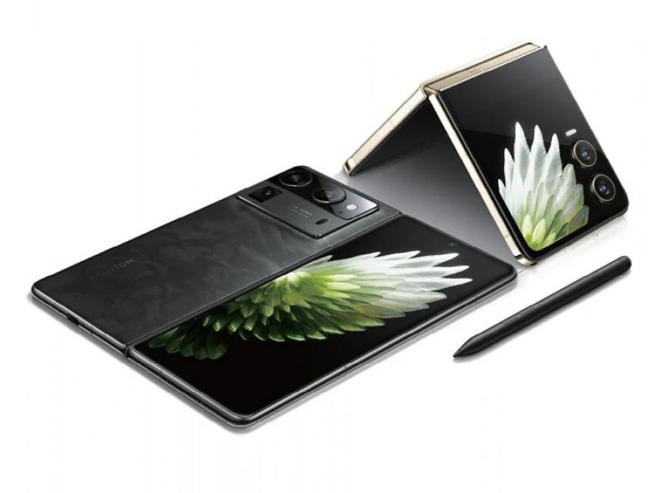
Looking at the V Fold 2, Tecno appears to have taken a different approach, opting for a more streamlined and integrated camera module. The redesigned camera bump blends into the back of the phone, offering a cleaner look. This likely results in a phone that feels less bulky in hand, improving comfort during use. Adding a stylus is smart and appealing to users who want to take notes, sketch, or work on the go. This shift makes the V Fold 2 a versatile tool for personal and professional tasks.
Tecno Phantom V Fold 2

Display Improvements

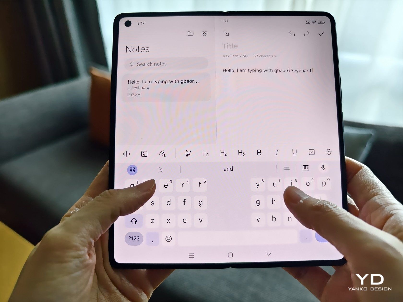
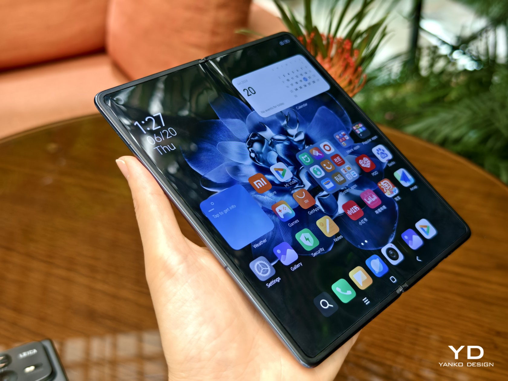
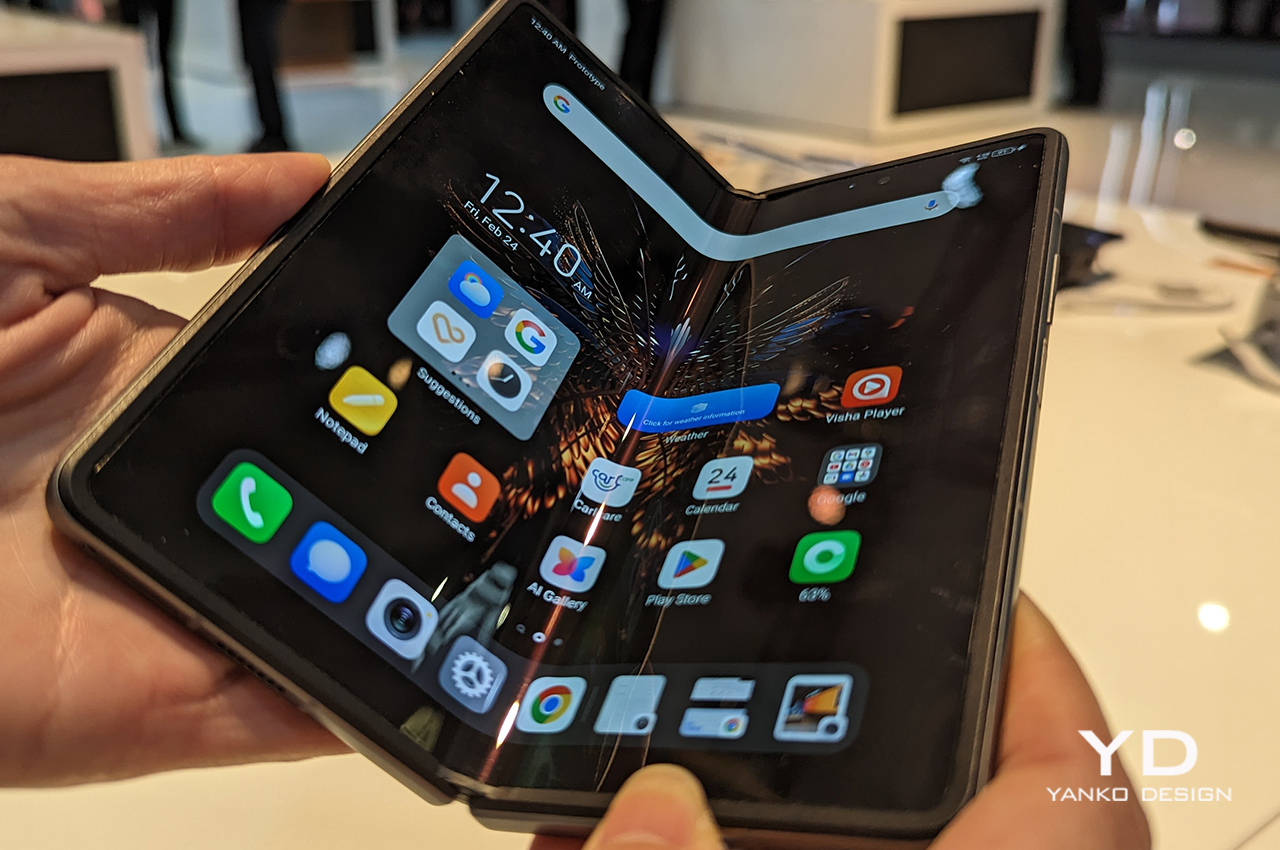
The display on the V Fold 2 seems to show clear advancements over the first model. The V Fold had a decent screen with a 120Hz refresh rate, which provided a smooth experience, but users often noticed the crease in the screen, which detracted from the overall experience.
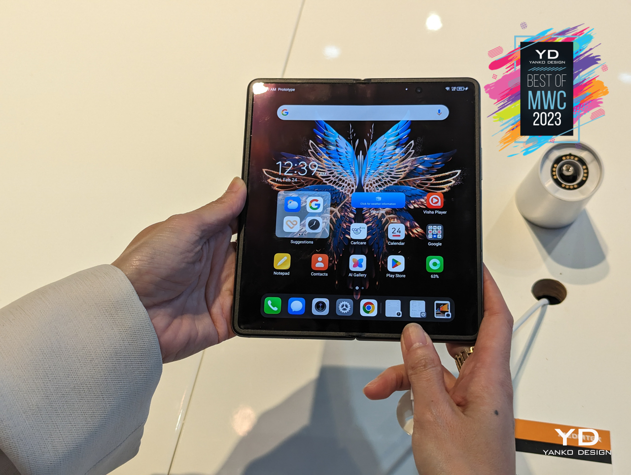
Tecno Phantom V Fold 5G

With the V Fold 2, Tecno likely addressed these issues. The new model looks like it offers better brightness, more accurate colors, and perhaps improved crease management, making the internal screen more durable and enjoyable to use. The cover display also appears to have seen improvements in size and usability, allowing users to interact with the phone more easily when it’s closed.

V Flip vs. V Flip 2: Embracing Trends with Functional Upgrades

Design and Usability
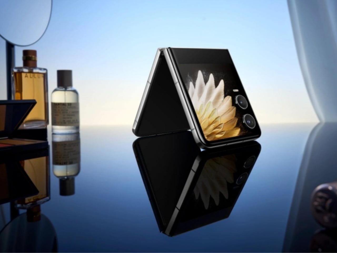
Tecno Phantom V Flip 2

The Tecno V Flip introduced users to a new form factor with its flip-style design, but it was clear that there was room for refinement. The V Flip’s design was characterized by a large, circular camera bump that dominated the front of the device when closed, along with a smaller cover display embedded within this bump. While this design choice was unique, it limited the functionality of the cover display, making it less practical for everyday use.
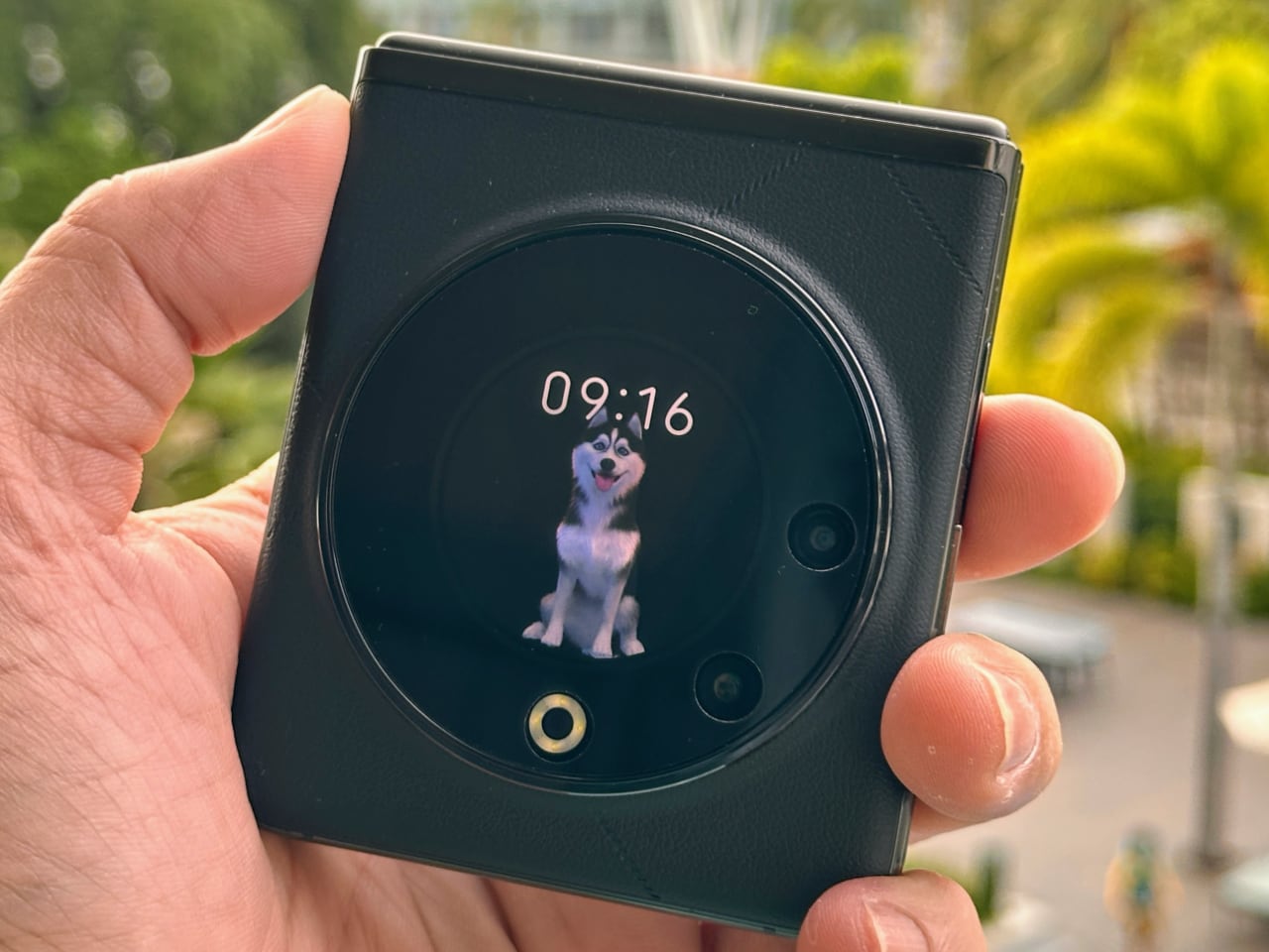
Tecno Phantom V Flip 5G Camera Setup

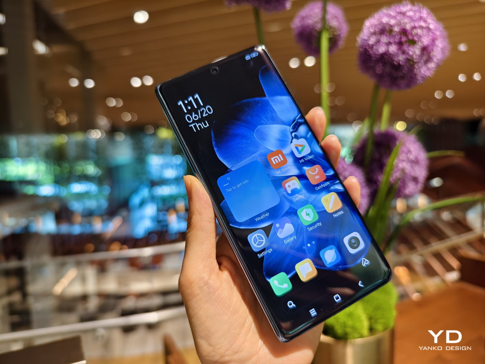
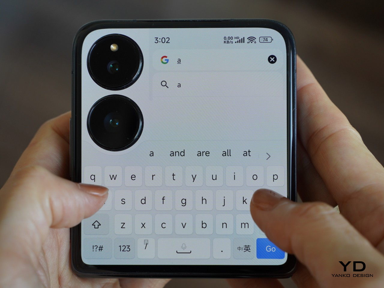
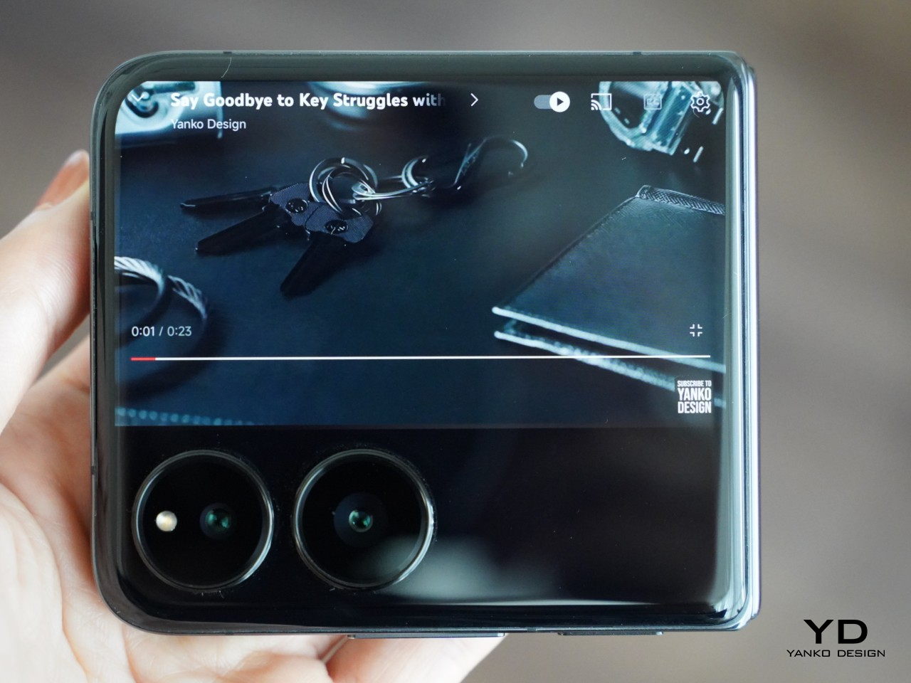
The V Flip 2, on the other hand, embraces the industry trend toward larger cover displays, significantly enhancing its usability. The cover display on the V Flip 2 looks larger and more functional, offering more screen real estate for interactions, notifications, and even quick replies without the need to open the device. This is a clear improvement over the V Flip, where the smaller cover display was often seen as a compromise.

Camera Bump Evolution

The camera bump on the V Flip 2 also appears to have undergone a redesign, moving away from the bold, circular module of the V Flip to a more integrated dual-camera setup. This change reflects a broader trend in smartphone design toward more streamlined, less intrusive camera modules. The V Flip 2’s camera bump will likely be smaller and more seamlessly integrated into the back panel, contributing to a more cohesive and modern design.
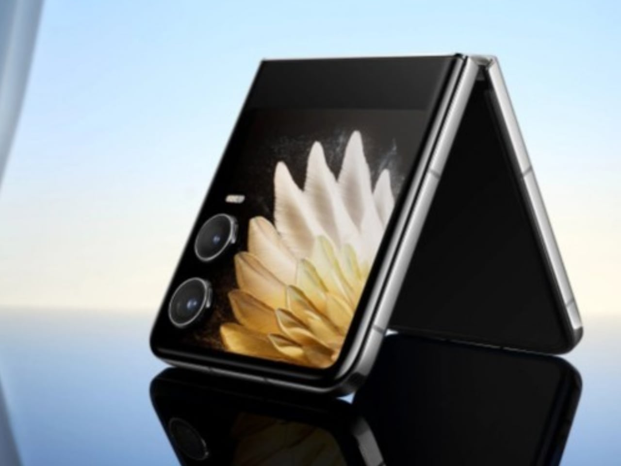
Tecno Phantom V Flip 2 cover display and camera setup

This evolution in design enhances the V Flip 2’s aesthetic appeal while making it more practical. The reduction in bulk around the camera area suggests that the device is easier to handle and fits more comfortably in pockets or bags.

Performance and Features

The V Flip 2 is expected to feature performance upgrades similar to those in the V Fold 2, including a newer chipset that supports faster processing speeds and better multitasking capabilities. The original V Flip was functional but not groundbreaking in terms of performance, so these improvements should be well-received by users looking for a more responsive device.

Battery life and charging are also areas where the V Flip 2 could see significant enhancements. A larger battery and faster charging technology would make the V Flip 2 more convenient for users constantly on the go, reducing the need for frequent recharging.

A Promising Step Forward

The transition from the Phantom V Fold to the V Fold 2 and from the V Flip to the V Flip 2 represents a promising step forward for Tecno. The brand seems to have addressed many of the shortcomings of its first-generation foldable devices, embracing design trends and enhancing functionality to appeal to a broader audience. Whether it’s the sleeker, more integrated camera designs, the improved displays, or the inclusion of a stylus for productivity, Tecno’s latest offerings appear ready to compete more aggressively in the foldable smartphone market. However, it remains to be seen how these changes will resonate with users once the devices are widely used.

For those who value a balance between cutting-edge technology, practical everyday usability, and thoughtful design, the V Fold 2 and V Flip 2 offer compelling choices. Additionally, price and value will play crucial roles in determining the success of these models as Tecno positions itself in the competitive foldable market.

The post Tecno’s Foldable Journey: The Evolution in Design from Phantom V Fold 5G to V Fold 2, and V Flip 5G to V Flip 2 first appeared on Yanko Design.
Huawei’s latest Tri-Fold Smartphone Concept creates an IMPOSSIBLE Task for Phone Case Makers…

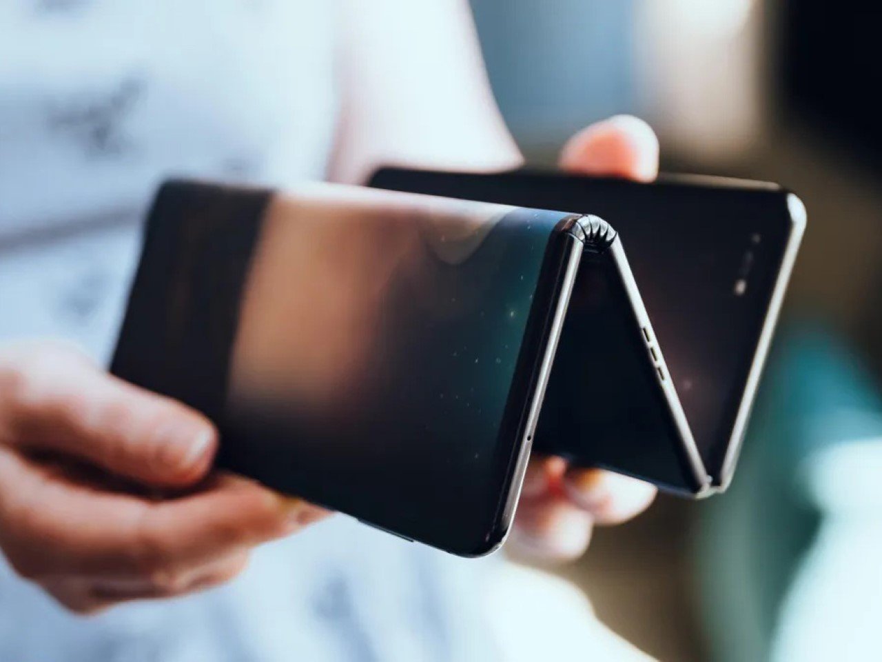
A photo of TCL’s tri-fold smartphone concept

Spotted in the wild in the hands of Huawei CEO, it seems like the Tri-Fold smartphone may just end up becoming a reality. Whether we need one is an entirely separate question (has that truly ever stopped tech companies?), so let’s ask ourselves something more relevant – How would you design a protective case for this new breed of smartphone?

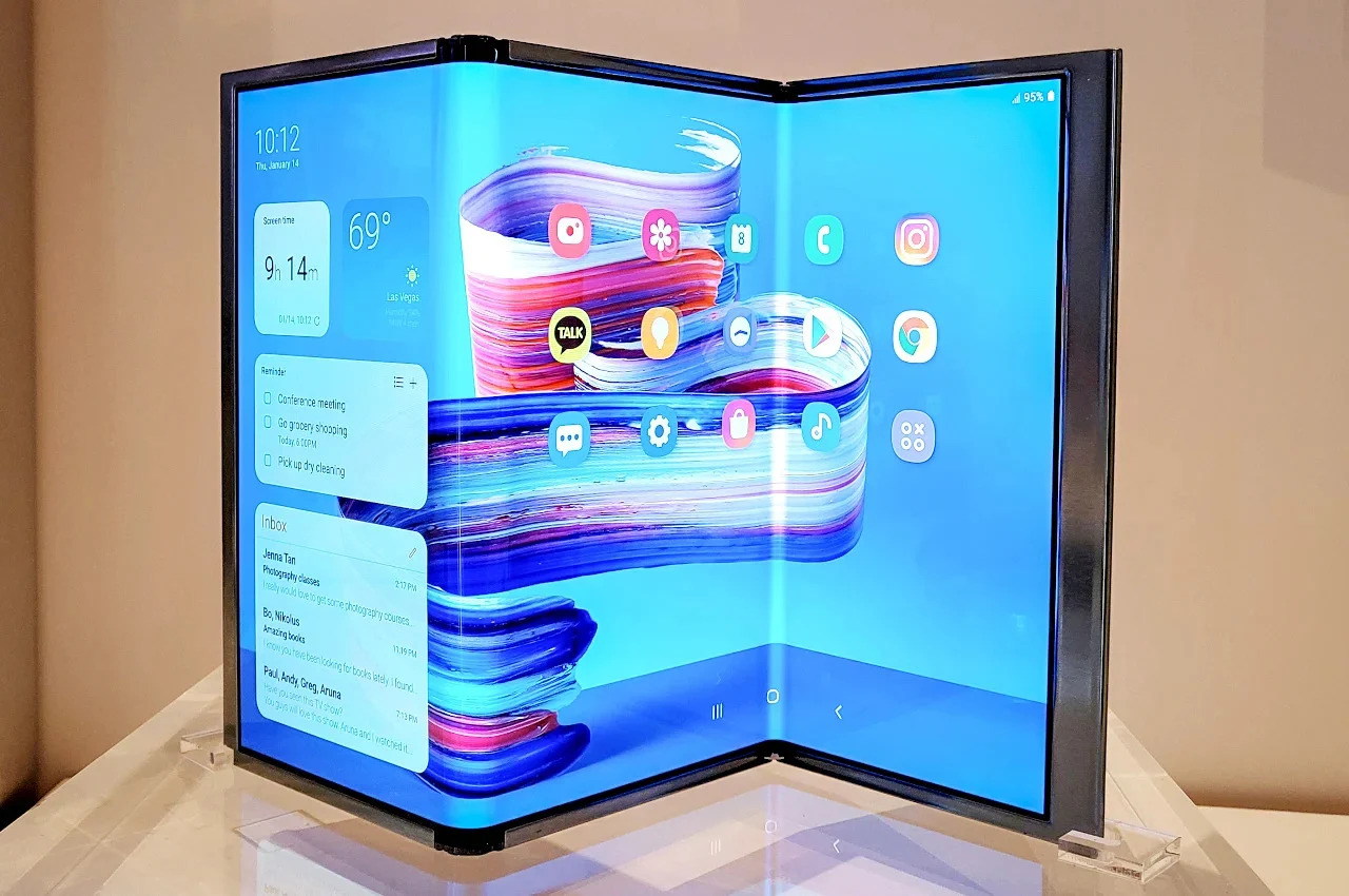
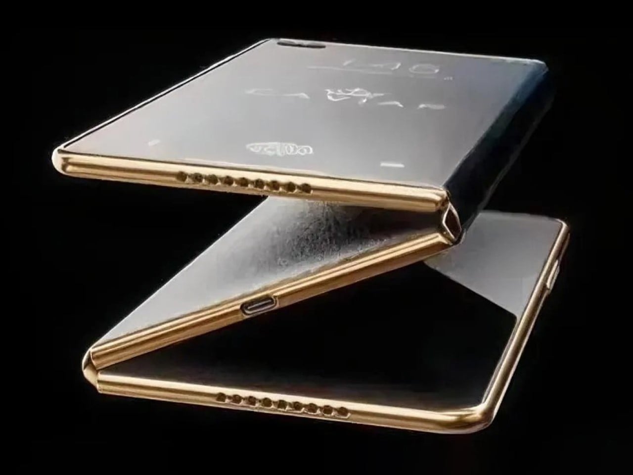
A brief recap on the phone itself – photos of Richard Yu, CEO of Huawei, emerged last week holding a strange smartphone. It was a foldable, but unlike conventional flip or fold phones, this one had three panels with two hinges (sort of like this wild Samsung concept from 2020). Dubbed the tri-fold, this phone managed to get quite a bit of coverage on the internet, with people speculating tech specs, launch dates, and even one Twitter (or X) user wagering a price of $4000 USD. Nevertheless, when I saw the phone, I had three distinct thoughts in this exact order.

A. Wow, that’s an impressively thin tri-fold phone.
B. Is there really a market for this?
C. There’s absolutely no way you can make a case or screen guard for this phone.

I’ve made an illustration below of what the phone would look like if you went about designing a case for it (and why the case wouldn’t work), and I’ve also taken the liberty of designing what I believe is the only possible case style you can make for such a phone.

With regular foldables, the obvious way to make a case is to design a two-part case that protects the bumper around the front, and the entire back. Regular smartphones have two displays, one front-facing one, and another folding one, and it’s important to remember that the case should never obstruct the display. With Huawei’s Tri-Fold, however, you’ve actually got one single display zigzagging from the front to the inside. Look at the image above and you’ll understand what I mean. Designing any sort of case (with as many parts as possible) complicates the phone’s usage rather than protecting it. Think of the obvious 3-part case that snaps onto all three panels and you’re faced with two massive problems – firstly, the case obstructs the screen when you look at how it fits on the middle panel. Secondly, shutting the case would mean having it sandwiched within the phone’s panels and probably press/damage the display… sort of like shutting your laptop screen with a charging cable, USB drive, or even your keys kept on the keyboard.

An impossible case design shown in red, and the only plausible case design shown in green.

The only real way you can make ANY sort of protective case for the Tri-Fold is to design one single part that fits only on the rear of the back panel. This means the first two panels don’t get any form of protection (because they can’t, really), leaving more than 60% of your phone vulnerable to drops, etc. The most you can really do is add a bumper protector to the front that only covers the edges, but that still leaves the middle panel (the most crucial panel in my opinion) to damage. It’s safe to say that screen protectors are out of the question too – something that still wasn’t a problem for regular two-fold smartphones, because you can still shield the front-facing screen with a plastic or tempered glass protector.

Huawei CEO Richard Yu pictured holding a prototype of Huawei’s alleged tri-fold smartphone

That basically puts a lot of pressure on Huawei to make sure this phone is rock-solid… which is already a pretty big challenge considering they also need to make the phone slim, and ensure that those hinges work with 100% reliability. The hinges are a separate issue too, given that so much depends on both hinges working flawlessly every time to ensure you have a flat screen when you open your phone completely. The one standout positive with this phone is that at least it gives you a more palatable aspect ratio when opened completely, as compared to the current foldables that give you a weird square display that doesn’t really work well with landscape OR portrait media. For now, details on the Huawei Tri-Fold are incredibly scant, although PhoneArena does a pretty good job speculating and gathering as many rumors to paint a full picture of this absolutely wild device. Whether it’s a good idea to make a dual-hinge tri-fold phone with an alleged $4000 price tag is still an entirely different debate.

The post Huawei’s latest Tri-Fold Smartphone Concept creates an IMPOSSIBLE Task for Phone Case Makers… first appeared on Yanko Design.
Xiaomi MIX Flip Review: Best Flip Phone for 2024?

PROS:


  • Large and highly functional outer screen

  • Great camera performance

  • Big battery and fast charge

    CONS:


    • No IP rating

    • No wireless charging capability

    • Device tends to get hot during extended camera use

    RATINGS:

    AESTHETICS
    ERGONOMICS
    PERFORMANCE
    SUSTAINABILITY / REPAIRABILITY
    VALUE FOR MONEY

    EDITOR'S QUOTE:

    The Xiaomi Mix Flip is a well-round flip phone that combines sleek design, premium build, top-notch performance, and great mobile imaging capabilities.

    The smartphone market, once dominated by monolithic slabs of glass, is undergoing a captivating transformation. Foldable devices, both bookstyle foldable and clamshell flip phones, have emerged as a compelling alternative. Samsung has been at the forefront of this transformation with its Galaxy Z Flip series. Motorola has also left a significant mark with its Razr series, boasting a large and practical outer screen that enhances usability. Now, Xiaomi has made a bold entrance into the foldable arena with its first foldable, the Xiaomi MIX Flip.

    Designer: Xiaomi

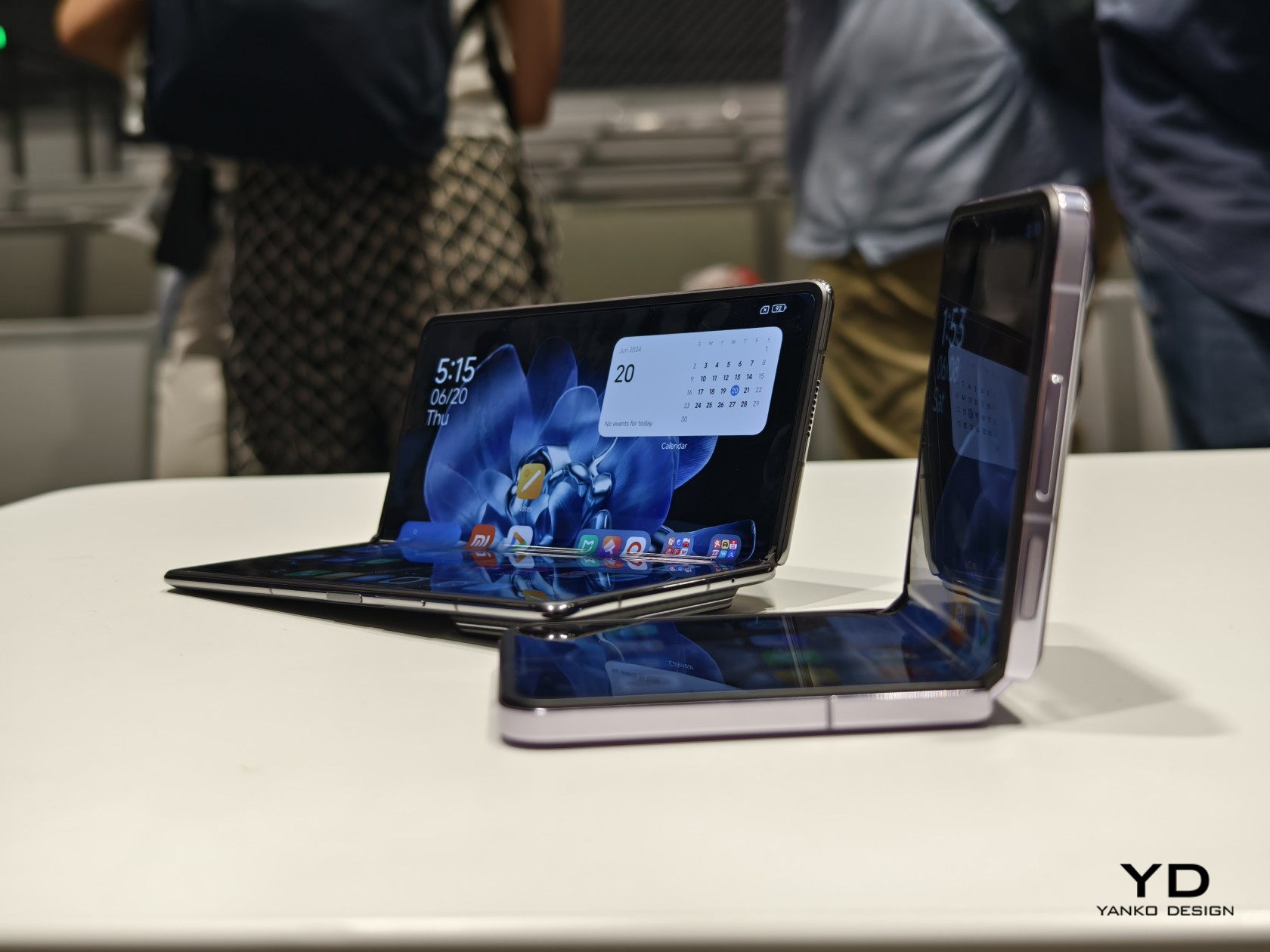
    At a highly anticipated annual speech event in Beijing last month, Xiaomi CEO Lei Jun unveiled the MIX Flip along with its 4th generation of foldable phones, emphasizing the strategic timing behind the company’s foray into the flip phone market. Reflecting on past perceptions, Lei acknowledged a previous skepticism toward flip phones, once dismissing them as merely “pretty for nothing.” In those earlier iterations, compactness often came at the cost of performance and functionality. However, Xiaomi now believes it has cracked the code, poised to deliver a flip phone that is “pretty for everything”. Let’s delve into the details to see if the MIX Flip truly lives up to the hype.

    Aesthetics

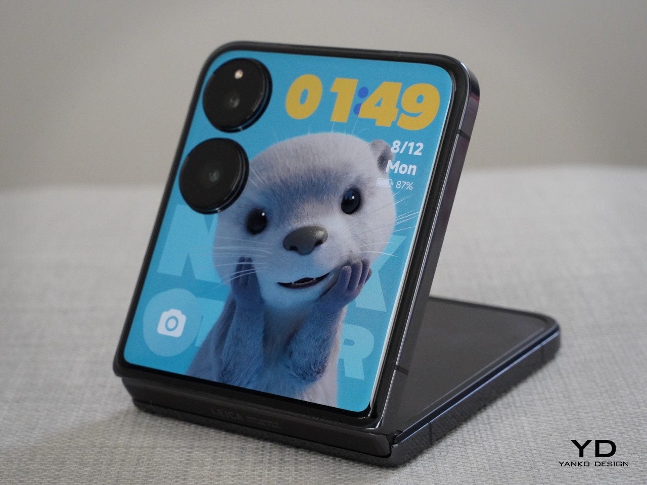
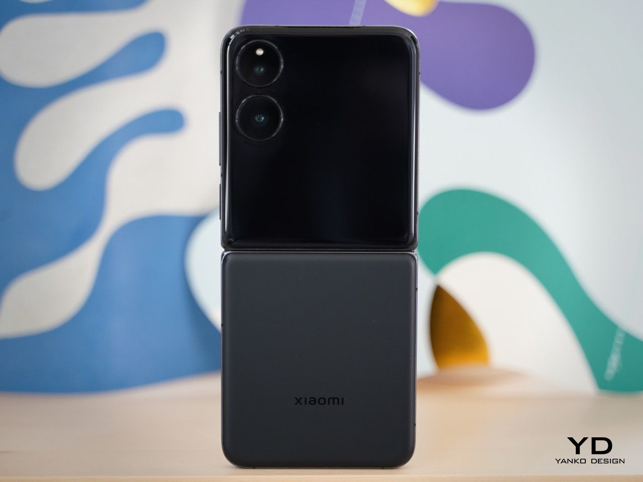
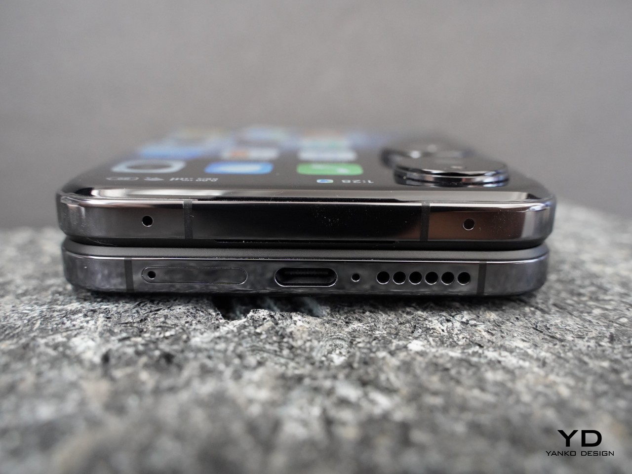
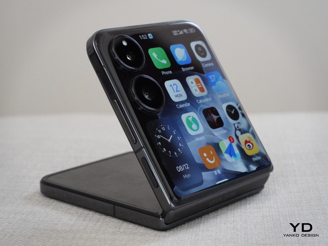
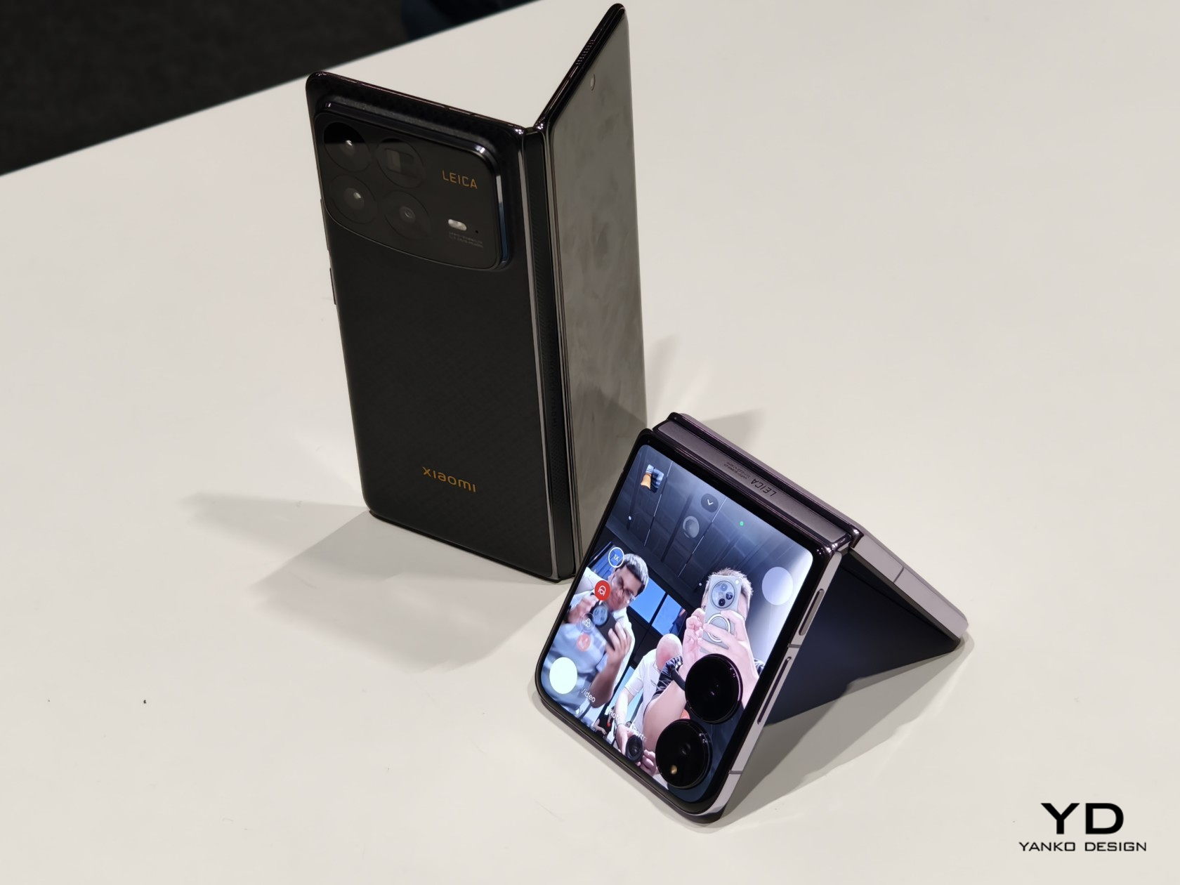
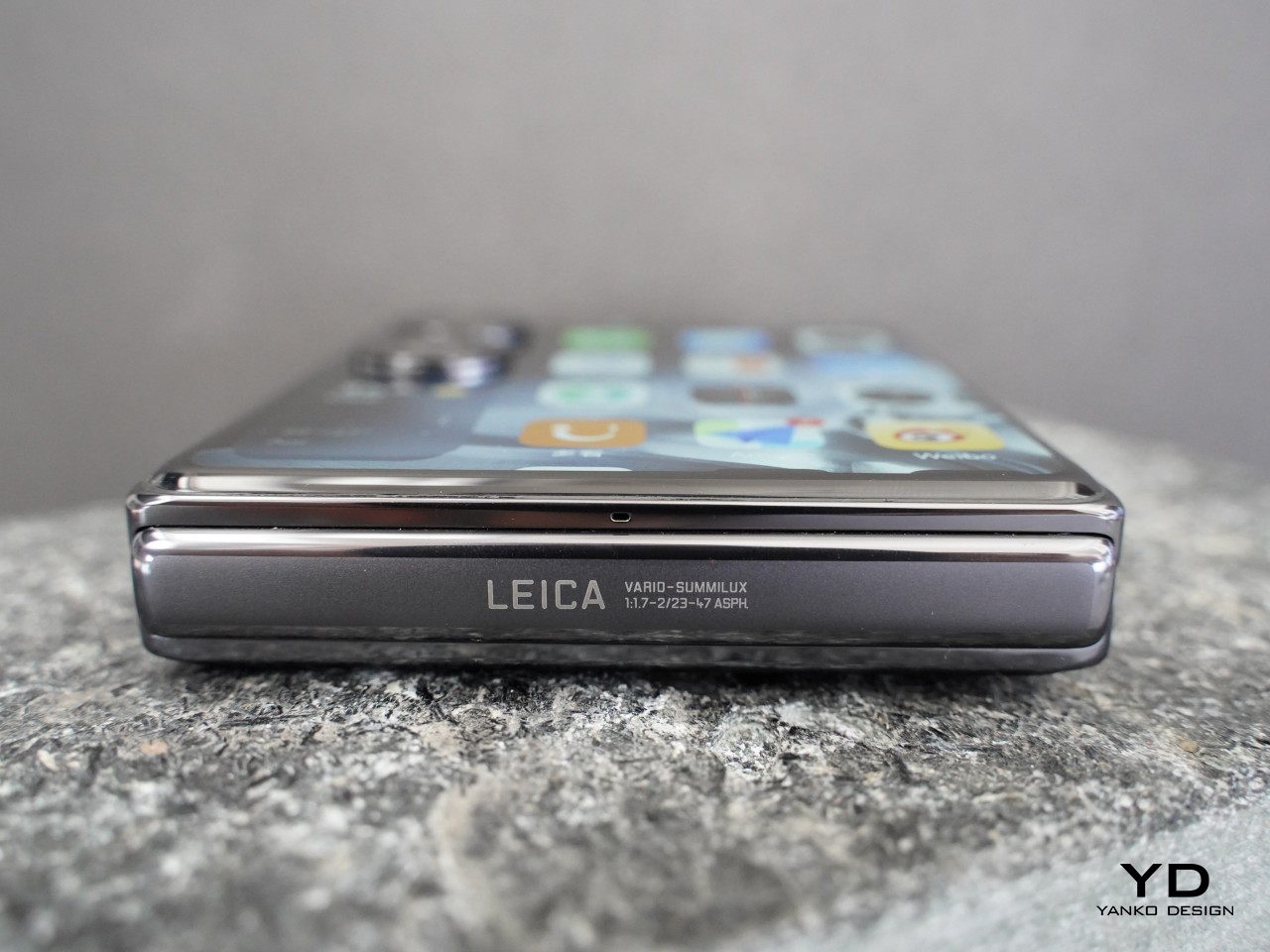
    The stunning 4.01-inch outer screen commands immediate attention, and rightfully so. It houses two individual rear cameras positioned vertically nestled at the top left corner with minimal protrusion. The shiny outer screen and the matt glass back panel create an interesting contrast, while discreet black Xiaomi logo seamlessly blends into the back panel. Upon closing the device, reveals Leica logo and text on its matte hinge.

    The Xiaomi MIX Flip comes in four variants: White, Black, Purple, and Xiaomi nylon fiber edition. The White, Black, and Purple variants share the same matte finish. In contrast, the Xiaomi Nylon Fiber edition features a distinctive woven nylon back panel, adding a unique texture to the device’s aesthetic. Overall, the MIX Flip offers a minimal and clean design.

    Ergonomics

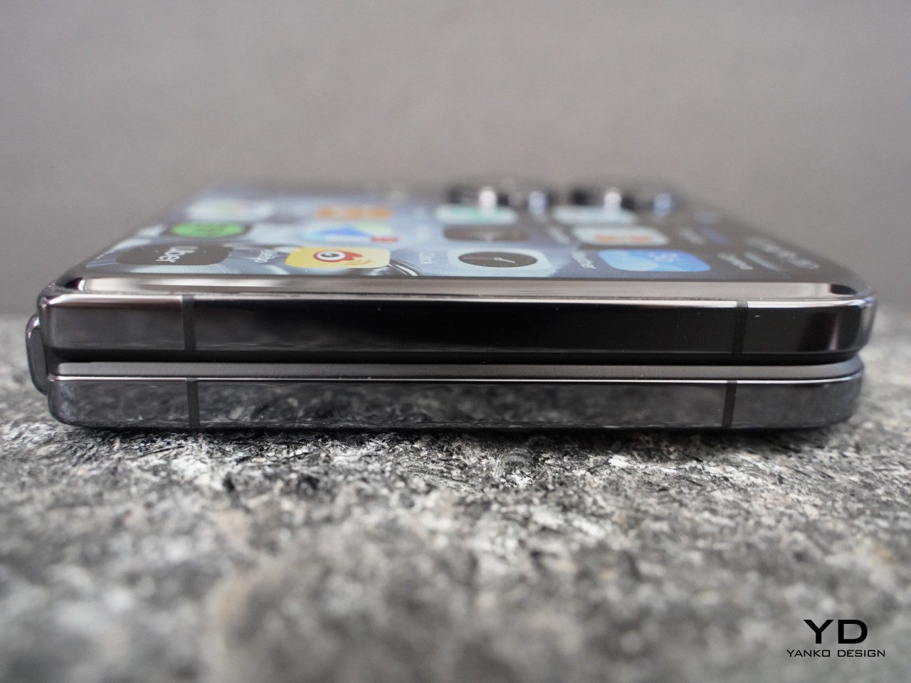
    The Xiaomi Mix Flip boasts a sleek and highly portable form factor. Unfolded, it measures 167.5 x 74.02 x 7.8 mm, with a folded thickness of 15.99 mm, and weighs 192 g. While it’s not the slimmest or lightest flip phone available on the market, its compact size makes it easy to hold and slip into your pocket.

    It feels premium in your hand, featuring an “All-around Liquid Quad-Curved Display” for a smooth feel. The robust hinge allows the phone to be positioned at various angles ranging from approximately 45 to 120 degrees, fulfilling its advertised flexibility. Opening and closing the phone feels smooth and satisfying.

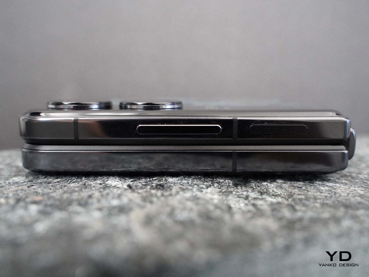
    The fingerprint scanner on the right side of the device works great, and the matte back panel resists fingerprints and smudges, ensuring a clean appearance. The glossy aluminum alloy frame tends to attract fingerprints, though this is a minor inconvenience.

    Performance

    The outer screen of the MIX Flip not only captivates with its stunning visuals but also offers exceptional functionality. Sporting a 4.01-inch screen, it boasts a resolution of 1,392 x 1,208 pixels (1.5K resolution), HDR support, and a pixel density of 460ppi. It achieves a peak brightness of 3,000 nits and maintains an overall brightness of 1,600 nits, ensuring clarity even in bright conditions.

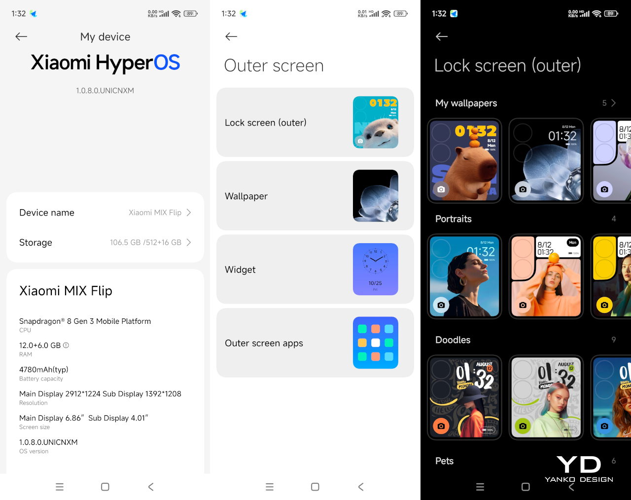
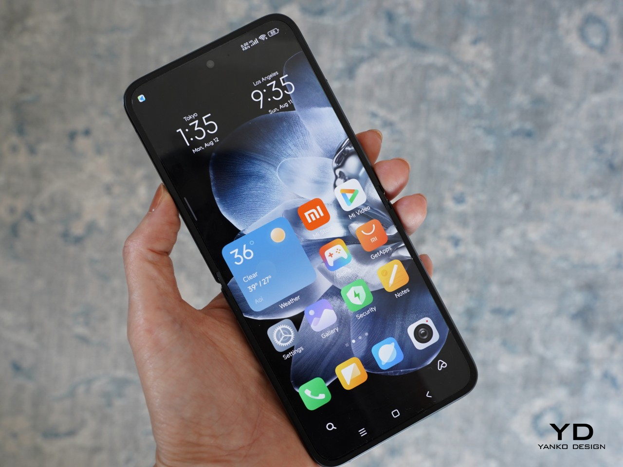
    The MIX Flip harnesses the full potential of its impressive outer screen. The large area of the outer screen (3.5-inch to be exact), with a 16:9 aspect ratio, accommodates various apps. Xiaomi enhances usability further by integrating widgets on the left side of the 4.01-inch display, positioned above the camera module. You can customize this area with up to 5 widgets such as Weather, Clock, Calendar, Health, Music Player, and Recent Apps, and you can cycle through widgets by swiping up and down.

    Out of the box, the outer screen comes pre-loaded with essential apps like Phone, Browser, Camera, Calendar, Calculator, Weather, Music, Recorder, Clock, alongside a couple of other Chinese apps. According to Xiaomi, over 200 of the most popular Chinese apps are optimized for the outer screen. Since the review unit is the Chinese version, it’s expected that not all apps I downloaded are available on the outer screen. For instance, apps such as Slack, Netflix, Google Calendar, and Kindle are not currently supported on the outer screen. Other popular apps like YouTube, Instagram, X, WhatsApp, Google Chrome, Google Maps, Uber, and Spotify can run on the outer screen. Users can enjoy watching YouTube clips horizontally, leveraging the display’s capabilities fully.

    The outer screen is swift and responsive, with notable interactivity. It supports a full keyboard that extends from edge to edge when the phone is oriented with the camera module in the upper left corner, enhancing typing comfort. Additionally, the screen supports handwriting input. While this feature is currently limited to Chinese characters, it adds a useful dimension to the typing experience. You can access quick settings and notifications on the outer screen, though they are not customizable.

    On the other hand, the inner display measures 6.86 inches with a 2,912 x 1,224 resolution and 1-120Hz LTPO, featuring 460 ppi and a peak brightness of 3,000 nits, mirroring the outer screen’s brightness and vibrancy, with the crease being barely noticeable. It’s less exciting compared to the outer screen, but it gets the job done with minimum fuss.

    Xiaomi’s ongoing collaboration with Leica continues on to its flip phone. MIX Flip features a 50MP Leica main camera with a 1/1.55” sensor, an f/1.7 aperture, and OIS. The other camera on its back is a 50MP Leica floating telephoto camera with a 1/.88” sensor, and an f/2.0 aperture. It supports macro photography where you can get up close to the subject with a minimal distance of 9cm (or about 3.5 inches). You can choose between the “Leica Vibrant” and “Leica Authentic” modes in the camera app to tailor the look to your liking.

    The main camera consistently delivers impressive results across a variety of shooting conditions. Images exhibit excellent sharpness, detail, and accurate color reproduction. The camera generally handles dynamic range well. However, some highlight details are blown out without HDR enabled. Activating HDR significantly improves dynamic range, preserving details in both shadows and highlights.

    The telephoto camera performs well in daylight or at closer tele zoom levels in low-light conditions, with nice preservation of details. The portrait mode offers a range of focal lengths (23mm, 35mm, 50mm, and 75mm). The skin tone is accurate and subject isolation is great with creamy bokeh. There is a 32MP front-facing camera with a 1/3.14” sensor and an f/2.0 aperture, but taking advantage of the outer screen, you are less likely to open up the front-facing camera for any selfies.

    The Xiaomi MIX Flip shines in capturing daylight videos. All three cameras (main, telephoto, and selfie) can record up to 4K resolution at 60 fps with ESI, with the main camera pushing the limits further at 8K 24 fps. Video footage is smooth, well-exposed, and has good detail. While the Mix Flip’s image stabilization performs admirably in low-light conditions, the dynamic range can be somewhat limited.

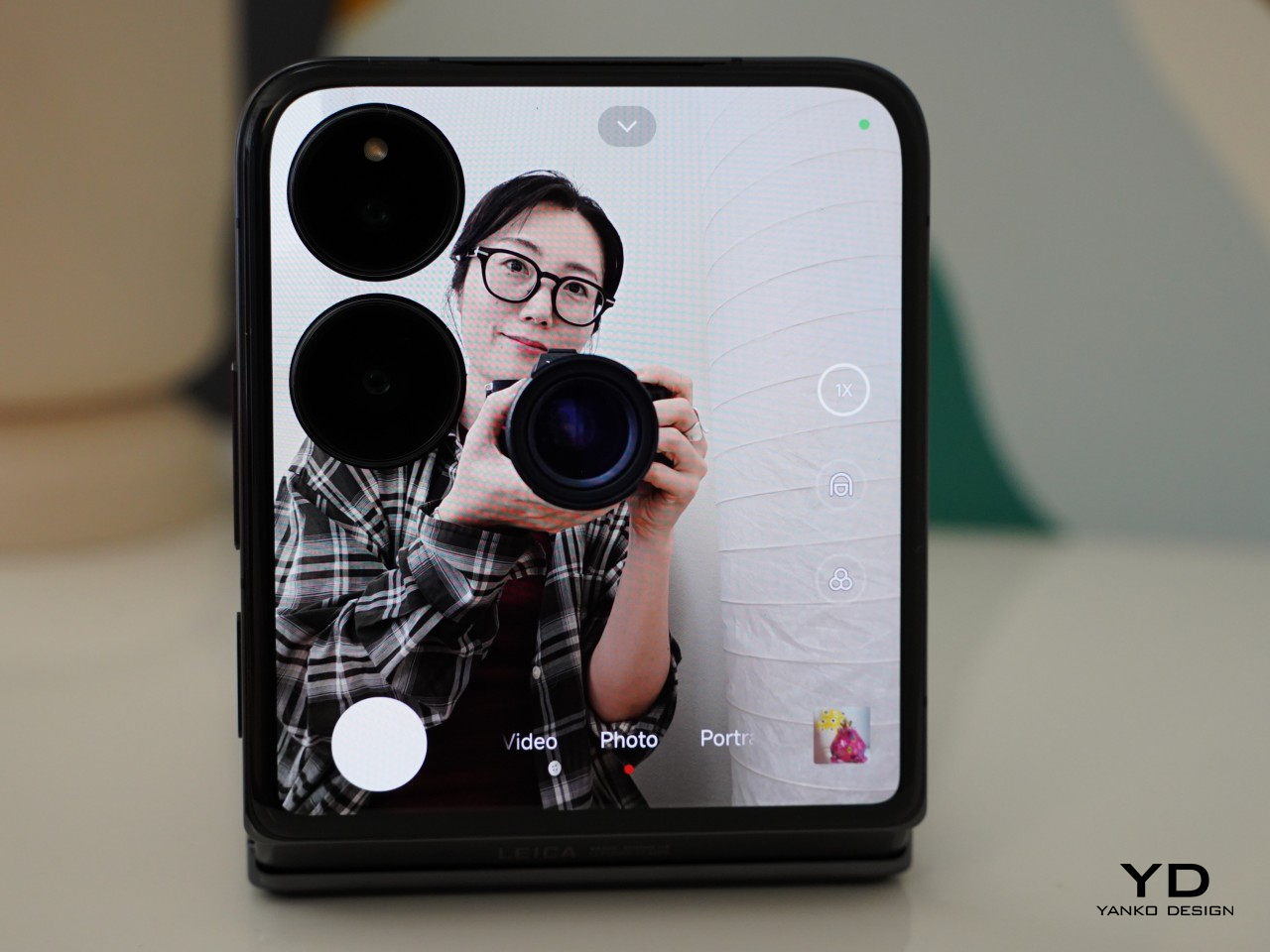
    One advantage of the flip phone is the ability to preview and capture photos and videos on the outer screen. It supports up to 2x zoom for taking photos and videos from the outer screen, though portrait mode is limited to 1x zoom. If you switch back to taking photos from the inner screen, it automatically switches to the front-facing camera, which I find a bit annoying.

    Under the hood, the MIX Flip is powered by the latest Snapdragon 8 Gen 3 paired with 12GB or 16GB of LPDDRX RAM and storage of options of 256GB, 512GB, or 1TB of UFS 4.0, with virtually expandable RAM. For reference, our review unit was 12GB RAM/512GB storage. It runs HyperOS based on Android 14. Both benchmark results and real-world use performance are great, handling any task with ease. The Xiaomi MIX Flip is equipped with a 3500mm² VC area, but the device tends to get hot during extended photo and video use.

    Compact form factors often compromise on battery size, but Xiaomi has impressively fit a 4,780mAh battery into the MIX Flip. It supports 68W wired charging, although it does not include wireless charging capabilities. Addressing another common issue with flip phones, the MIX Flip allows you to make and receive calls without opening the device. Additionally, it supports WiFi 7 for enhanced connectivity.

    Sustainability

    While flip phones offer certain advantages, durability is a key area where they can face challenges. The device incorporates Xiaomi’s Shield Glass on the outer screen, promising ten times greater drop resistance than conventional glass. Moreover, the phone has undergone rigorous testing, enduring 500,000 folds without compromising its structural integrity. The battery is another highlight, maintaining at least 80% capacity after 16,000 charging cycles. While the absence of an IP rating might be a concern for some, these features collectively contribute to a device that’s built to last.

    Value

    As the competition in the foldable market heats up, Xiaomi’s entry promises to shake things up, driving further innovation and consumer choice in the smartphone landscape. Priced competitively at 5,999 yuan (approximately $825 USD) for the base 12GB RAM and 256GB storage model, the Mix Flip undercuts the Samsung Galaxy Z Flip 6 by a significant margin. The 12GB RAM and 512GB variant is also more affordable than the Motorola Razr 50 Ultra.

    While Xiaomi Bulgaria Country Manager, Nikolay Nankov, revealed that Mix Flip would be available in Bulgaria for 2,600 Bulgarian lev (about $1,450 USD), notably higher than its price in China, the company has yet to officially confirm global availability. Nevertheless, the device’s competitive pricing (at least for the Chinese domestic market), overall performance, and potential for wider release could disrupt the market and intensify competition in the flip phone segment.

    Verdict

    Xiaomi Mix Flip is a well-rounded flip phone that combines sleek design, premium build, top-notch performance, and great mobile imaging capabilities. It features a large, functional outer screen (though its full potential is yet to be tested due to the review unit being China version), the latest Snapdragon 8 Gen 3 processor, and two 50 MP Leica cameras, with competitive pricing (at least in China). While global availability details remain pending, Mix Flip stands as a serious contender, poised to shake things up and accelerate innovation in the foldable phone space.

    The post Xiaomi MIX Flip Review: Best Flip Phone for 2024? first appeared on Yanko Design.
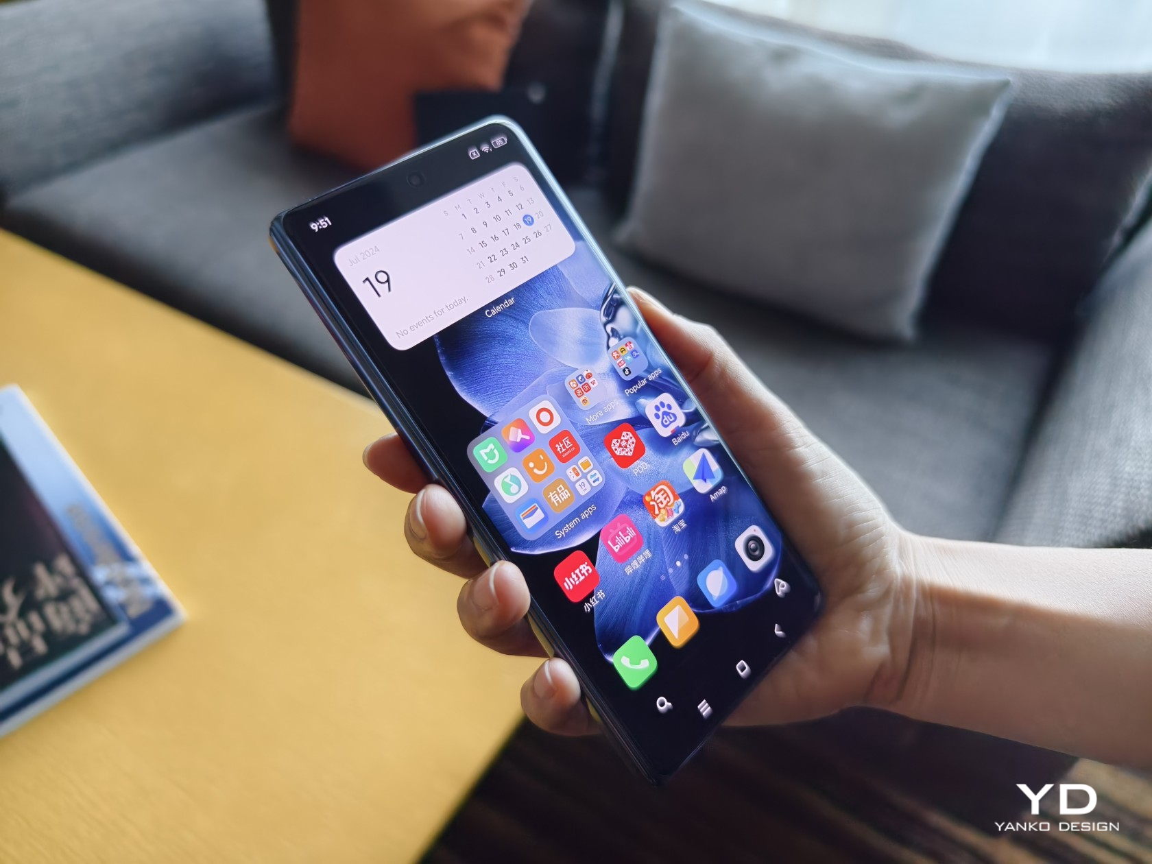
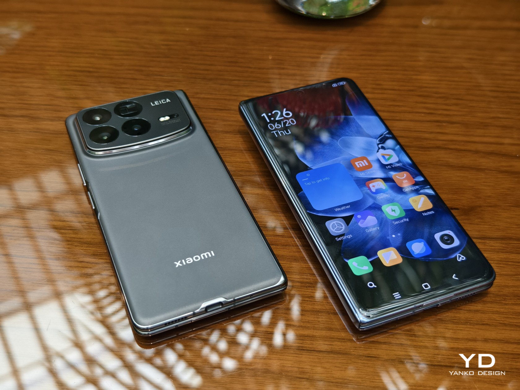
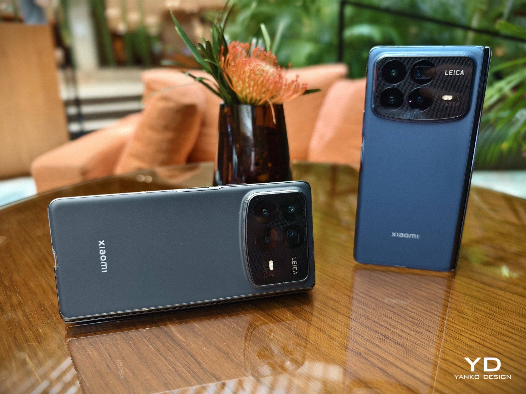
    Xiaomi MIX Fold 4 Hands-on Review: Thin in Size, Big in Everything Else

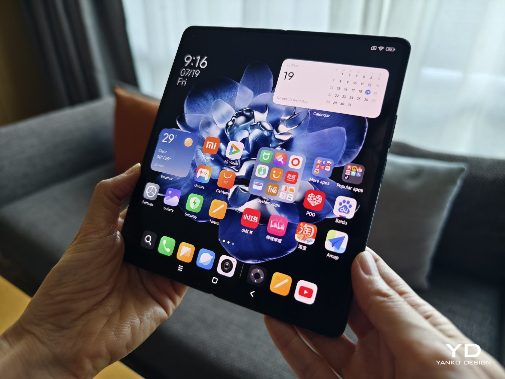
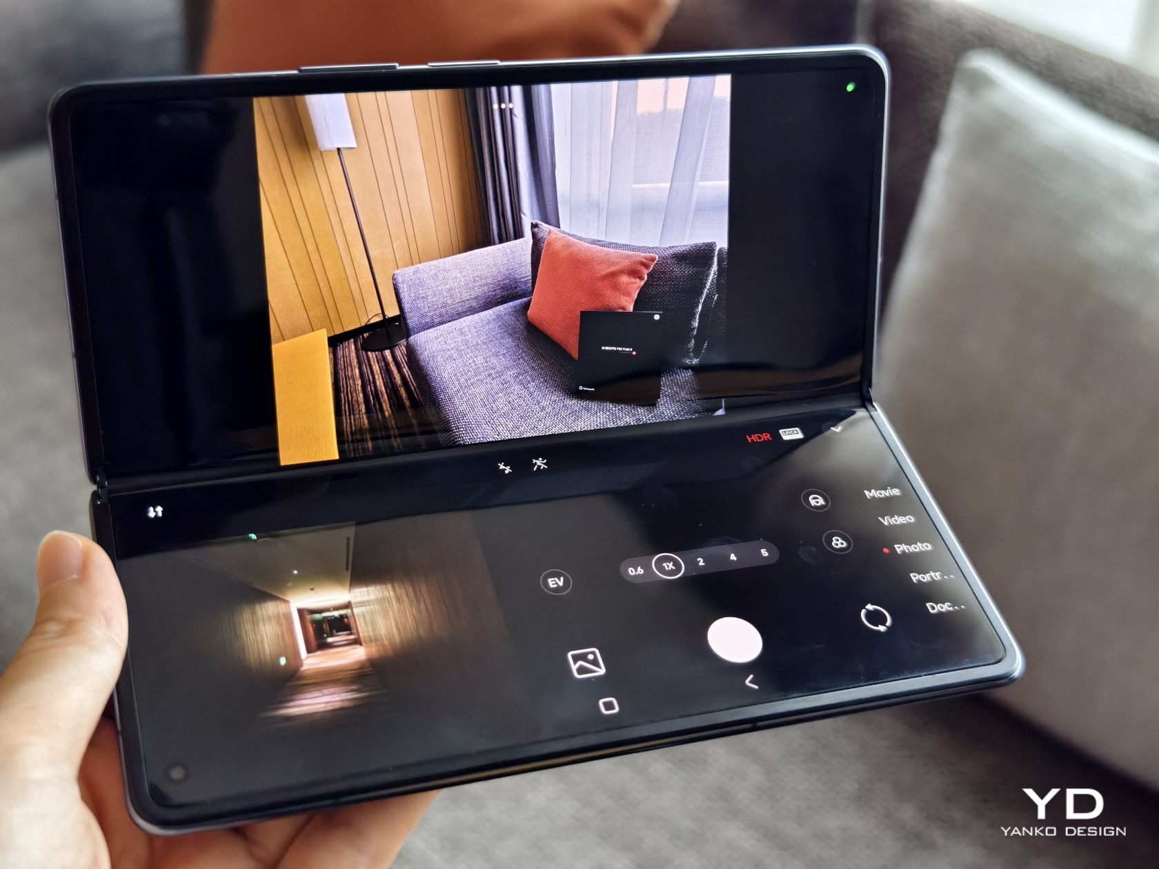
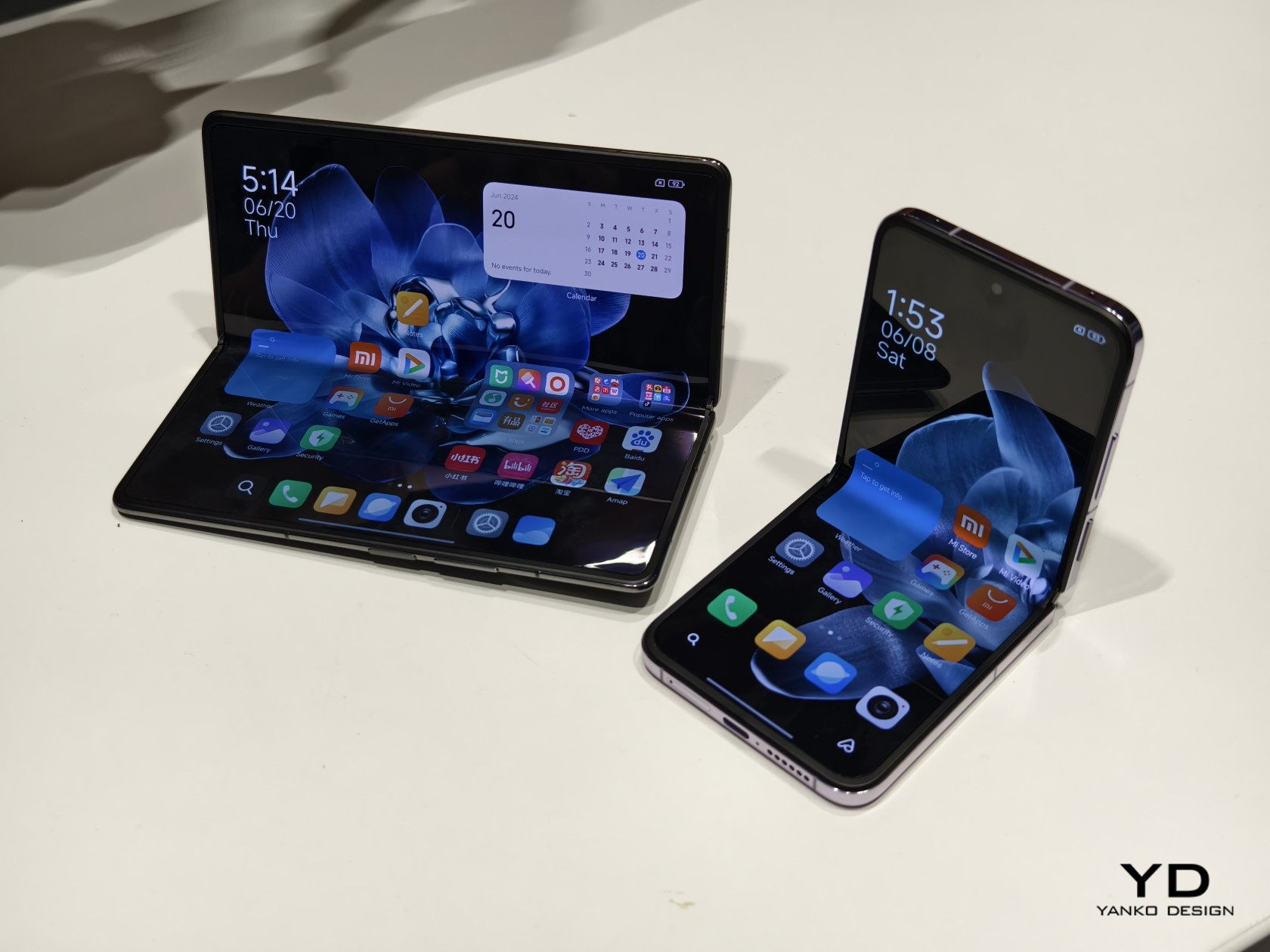
    Despite what naysayers claim, there foldable phone market is showing no signs of disappearing or even slowing down. After all, we’ve barely scratched the surface of what these form-changing devices can truly become, especially when it comes to design. The book-style large foldable has been around for years, yet every generation still has some improvement to offer, whether it’s in durability, performance, or size. “Thin” is a description not often associated with this kind of smartphone, a kind that once felt like two phone slabs placed on top of each other. The Xiaomi MIX Fold 4 is challenging that preconceived notion with what is one of the thinnest foldables in the market, and we were able to get a hands-on experience to see what the fuss is all about.

    Designer: Xiaomi

    Blurring the lines between Foldables and Ordinary Phones

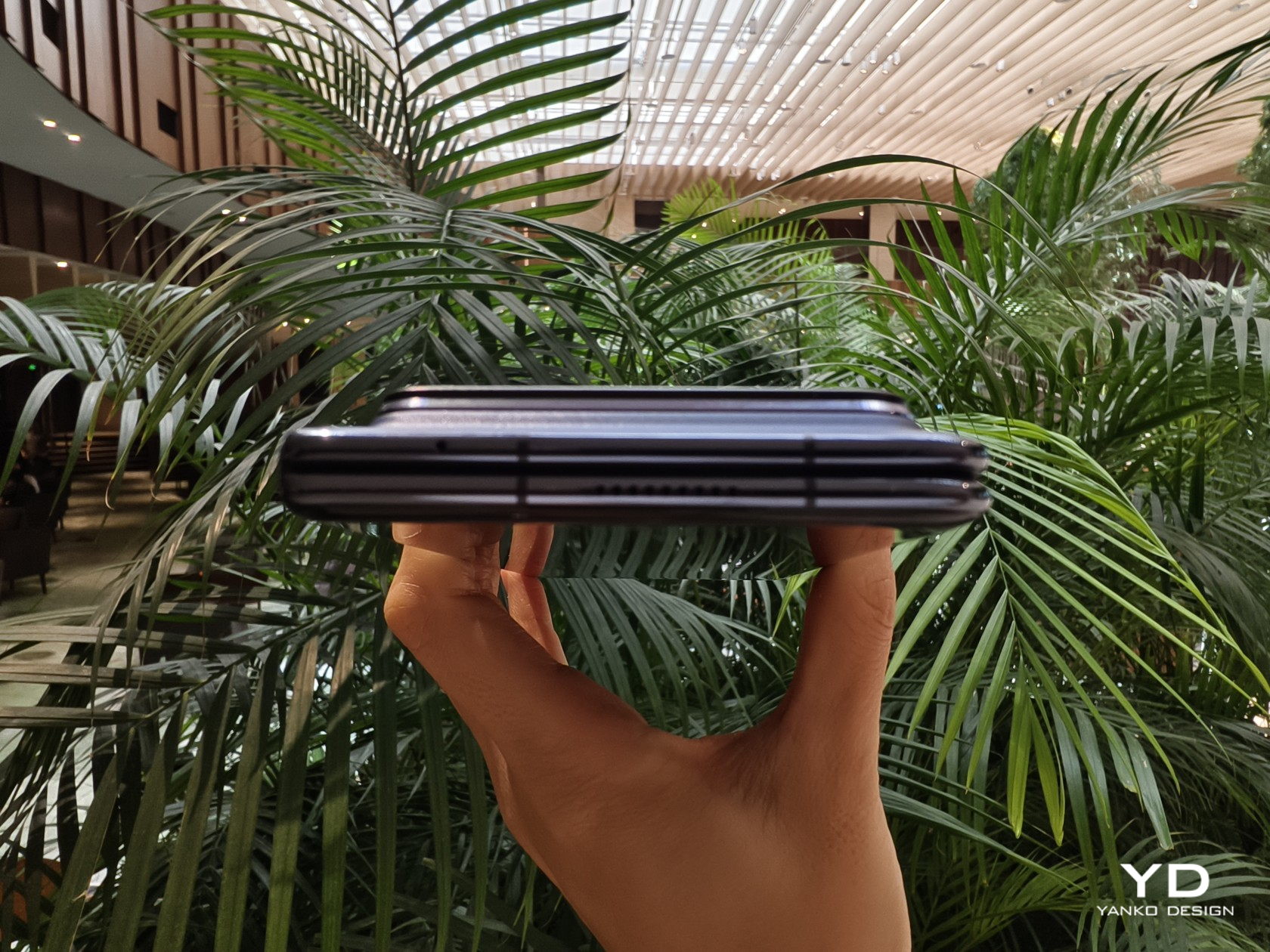
    Next to the price tag and durability, one major concern that people have with foldable phones is their sizes. Admittedly, the earliest design iterations didn’t have the benefit of hindsight, but they were rather bulky and heavy when folded, a far cry from the regular phones we carry in our pockets. On its fourth generation, Xiaomi is really pushing the limits of foldables with a design that is getting really close to what people have become used to with non-foldable phones.

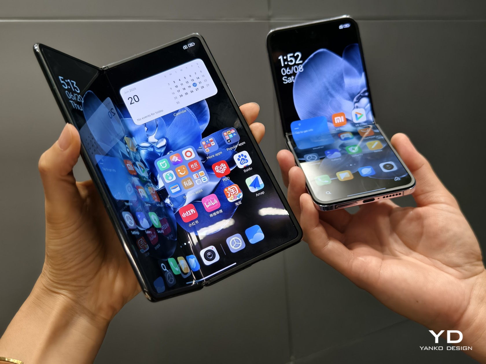
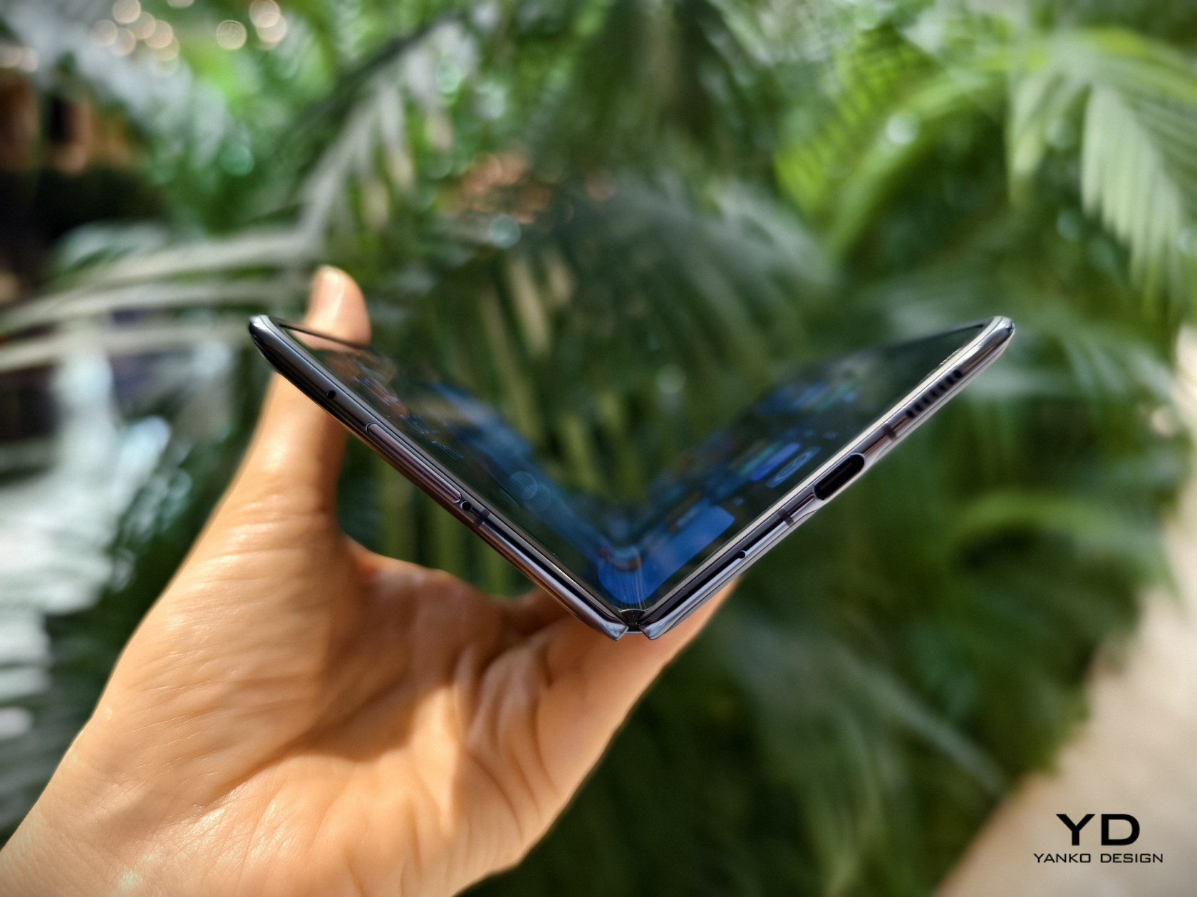
    The Xiaomi MIX Fold 4 is crazy thin when laid open flat at 4.59mm, and with a 9.47mm thickness when folded close, it’s just 1mm shy of traditional phones. It’s also only 226g light, which is slowly getting closer to our definition of “normal.” Xiaomi credits no less than three technologies for this feat, like using lightweight yet durable carbon fiber materials in a few key parts. That said, the cover screen’s 21:9 aspect ratio still falls under the “tall and narrow” shape that has made many foldables like this a bit awkward to use. Aside from that, however, it’s really refreshing and delightful to hold such a thin and lightweight device.

    More (Power) for Less (Space)

    There are several consequences to shrinking the space inside a phone, from having less room for the battery or constricting airflow and affecting cooling. That’s even more problematic for foldable phones that have split their components, especially the battery, on two sides. You’d expect that a thinner foldable would have fewer features, but Xiaomi managed to surprise us yet again.

    It’s already expected that the MIX Fold 4 will have the latest Snapdragon 8 Gen 3 processor and high-end memory, but getting a 5,100mAh battery that’s larger than its thicker predecessor is pretty impressive. Xiaomi didn’t skimp on the screens either, both with nearly identical capabilities, save for their sizes and aspect ratio. Unfortunately, our brief experience with the large foldable did disappoint us with a visible crease, a design flaw that’s already being squeezed out of other foldables. To be fair, though, you get used both to the appearance and even the feel of the crease so your mind begins to filter out its presence.

    Big in Photography

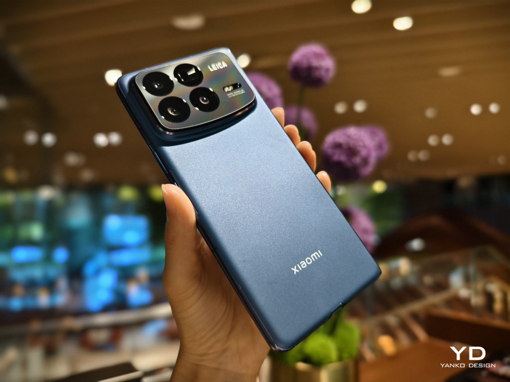
    Whatever improvements Xiaomi made when it came to making the MIX Fold 4 extra-thin goes out the window when you see how thick the camera bump is, almost as thick as the (unfolded) phone itself. The raised box has a somewhat asymmetrical design where the lower edge curves down ever so slightly. There’s a grid pattern on the glass surrounding the cameras, and it’s actually a texture that you can feel with your finger. It’s a nice touch, but one that seems a bit out of the left field.

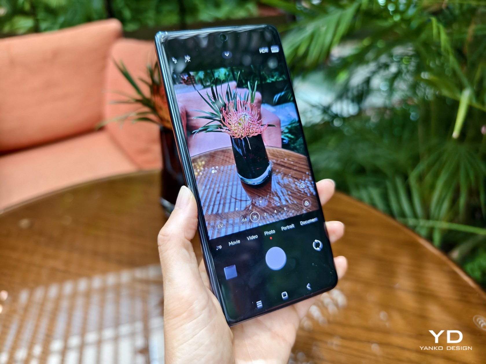
    You will, however, forgive that slight design oddity when you witness the results of the four cameras on the MIX Fold 4’s back. There’s a 50MP main shooter with all the bells and whistles you’d expect, and it’s joined by not one but two 50MP telephoto cameras, one with a floating-style lens used for portrait and macro photography, the other with a periscope-style lens with 5x optical zoom. The ultra-wide camera has a 12MP sensor that’s admittedly just a small step higher than the typical measly 8MP. It still needs rigorous testing for verification, but what we’ve seen so far is enough to consider that large camera bump well worth the sacrifice.

    Final Thoughts

    Almost everyone (except Apple, of course) is making a foldable phone these days, and the competition is heating up as more players join the race. It’s no longer enough to just have the latest specs or a durable hinge, you also need to push the envelope of design and performance to catch up with non-foldable flagships. With one of the thinnest and lightest designs in this segment and a quad-camera system that could be on par with the latest and greatest, the Xiaomi MIX Fold 4 is inching closer to that ideal where there will be very little reason to opt for a non-foldable phone.

    While we had to part ways with the MIX Fold 4, be sure to be on the lookout for our review of the Xiaomi MIX Flip, the brand’s first foray into the land of compact clamshell foldables.

    The post Xiaomi MIX Fold 4 Hands-on Review: Thin in Size, Big in Everything Else first appeared on Yanko Design.
    Vivo X Fold 3 Pro Foldable Phone Review: Putting the Competition on Notice

    PROS:


    • Elegant, thin, and light design

    • Impressive photography performance

    • Premium specs, including a high-capacity battery

    CONS:


    • Lack of dust protection might cause concerns

    • A bit pricey

    RATINGS:

    AESTHETICS
    ERGONOMICS
    PERFORMANCE
    SUSTAINABILITY / REPAIRABILITY
    VALUE FOR MONEY

    EDITOR'S QUOTE:

    With premium features wrapped in a thin and premium design, the Vivo X Fold 3 Pro is worth its equally premium price tag.
    award-icon

    The foldable phone market has diversified over the past years, no longer a rat race between two giants. Many brands have jumped into the fray, each adding their own piece to complete the puzzle. Whether it’s imaging or durability, new foldables are addressing the concerns and doubts that consumers have about the viability of this kind of product. One thing that hasn’t exactly changed for the better is the price tag attached to these foldable phones, even years after rumors of cheaper options, at least of the non-clamshell kind. Rather than downgrade the experience to also push down the price, however, it might be more effective to offer a design that makes sense for a four-digit figure. That seems to be the premise behind the “pro-foldable” Vivo X Fold 3 Pro, so we take it for a good spin to see if it’s truly worth its weight in gold.

    Designer: Vivo

    Aesthetics

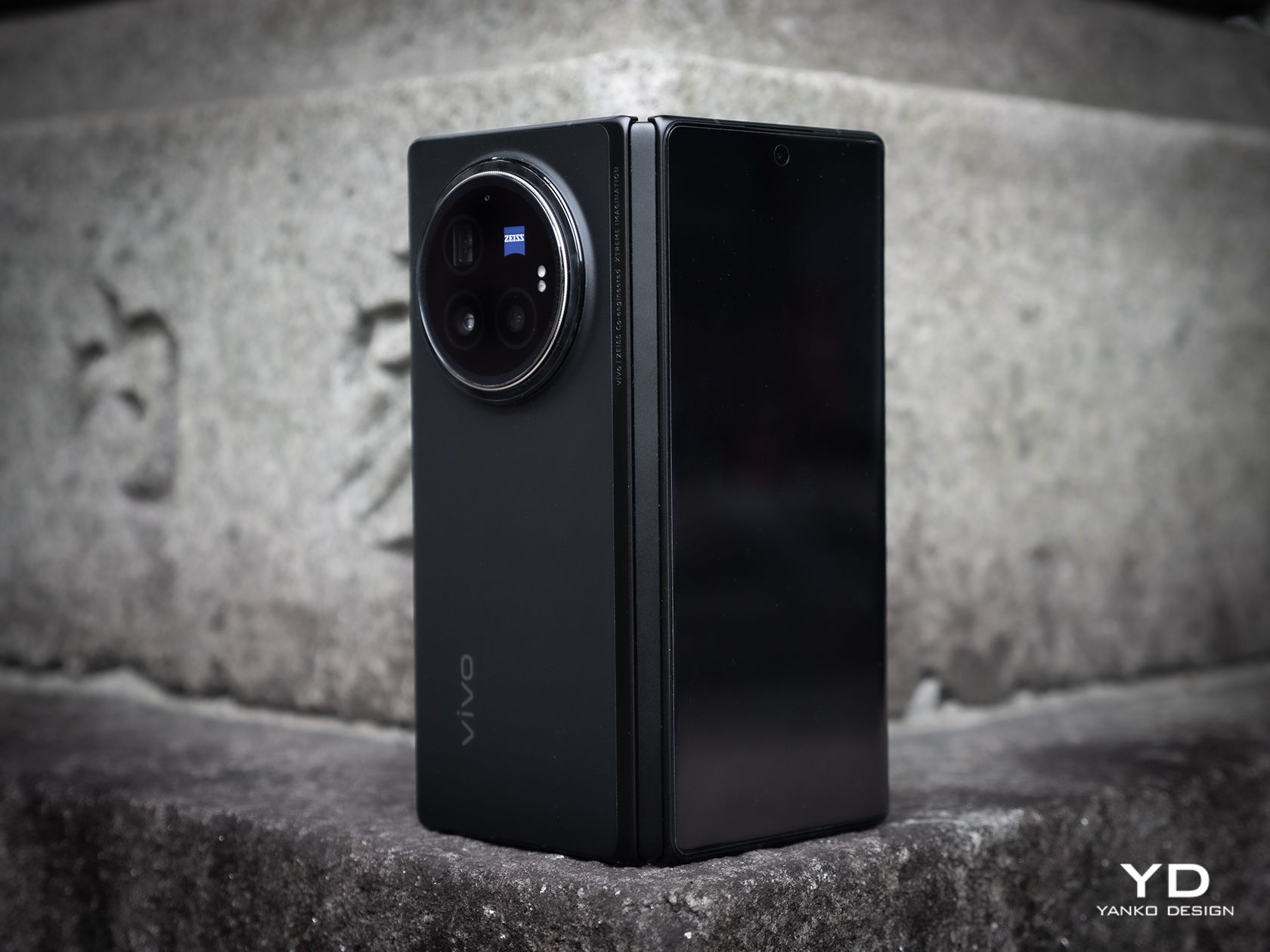
    There is a certain elegance to the Vivo X Fold 3 Pro’s simple design. Gone are the extraneous lines and shapes, leaving only the essential elements of a stylish phone. By no means is it boring or plain, especially given the visual texture on the Solar White and Eclipse Black colorways, just that the design doesn’t distract you beyond the first brush nor does it hold your attention hostage.

    The phone is incredibly thin and, as we’ll see later, light, especially when unfolded flat at only 5.2mm thick, disregarding the equally thick camera bump. When folded, it does reach 11.20mm, though that’s not that far from the dimensions of regular slabs of metal and glass. In other words, you no longer look like you’re hiding two phones in the same pocket.

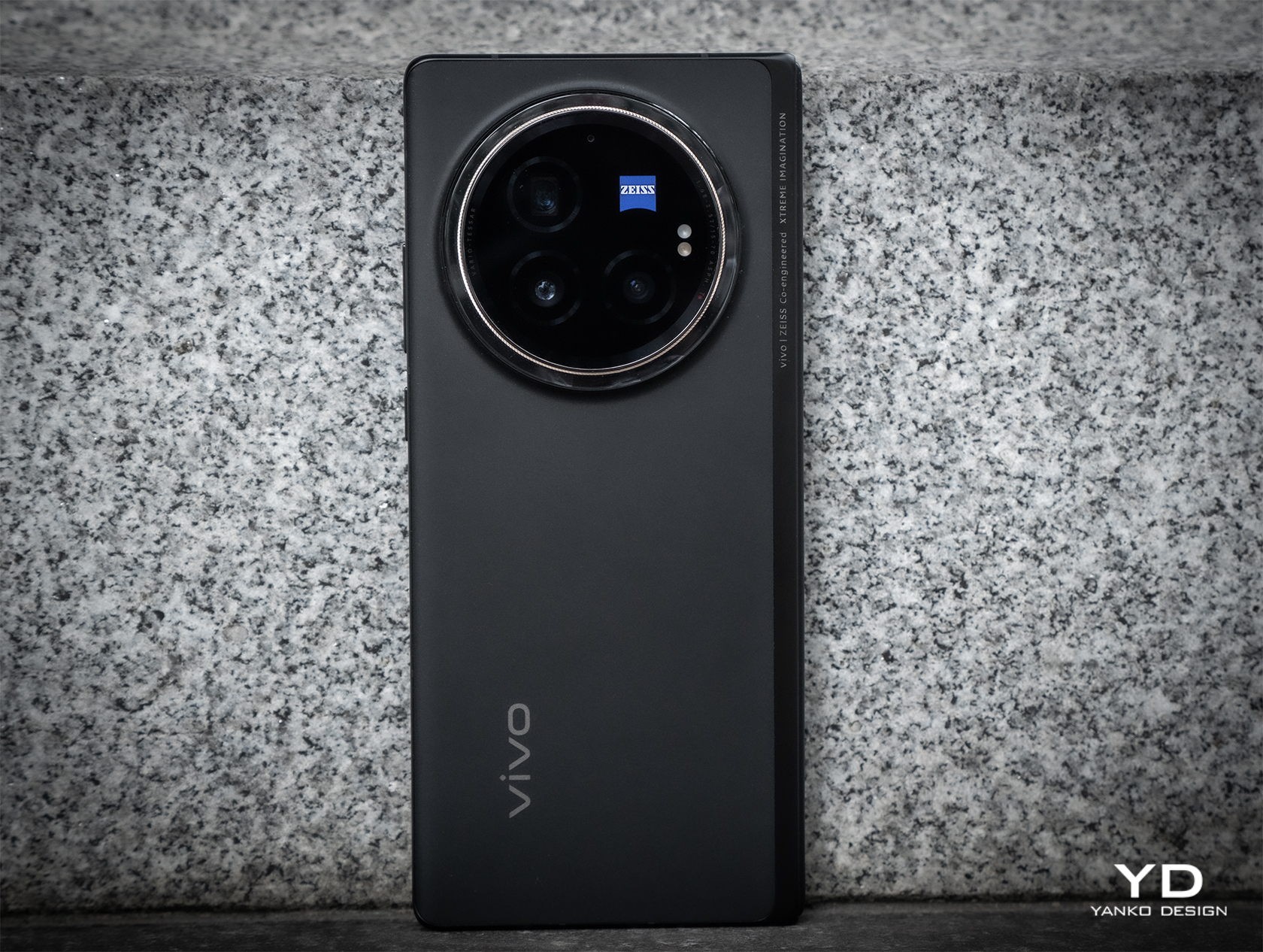
    That aforementioned camera design, however, will be a bit divisive. On the one hand, it doesn’t look that awkward with a centrally positioned large circle that seems to mimic the lens of a traditional camera. On the other hand, it is still a very large circle on the back of the phone, which has some repercussions when it comes to handling the phone. Some would also consider such a large design element an eyesore, though it thankfully offers some significant benefit to its unavoidable presence.

    Ergonomics

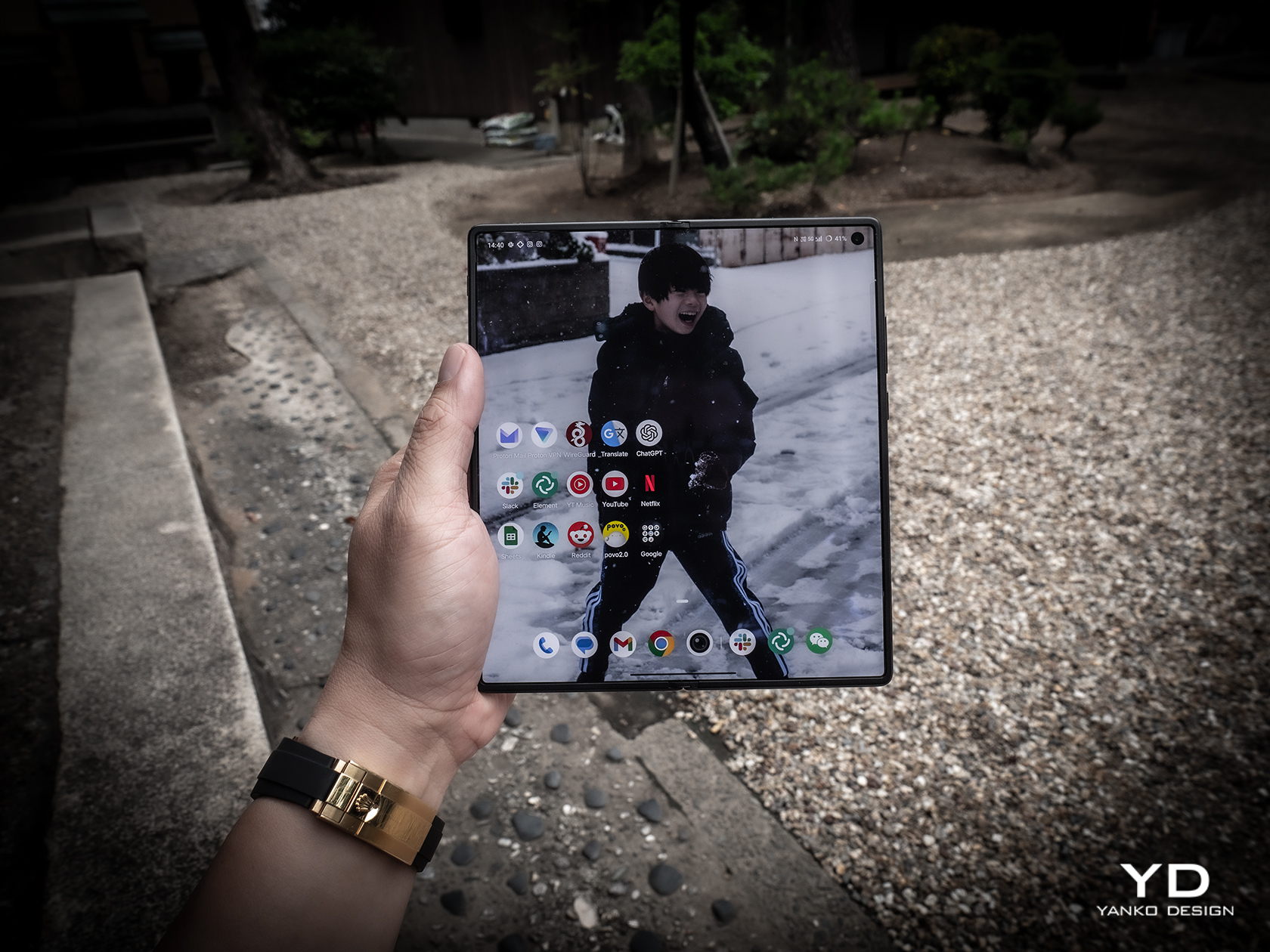
    At only 236g light, the Vivo X Fold 3 Pro is pretty much on par with many premium flagships of the non-foldable kind, especially with “ultra,” “pro,” or “max” in their names. That makes this foldable phone feel comfortable to hold, especially when you consider how large their screens are. The external screen, in particular, has a 21:9 aspect ratio, which also puts it closer to regular candy bar designs. It’s still tall and narrow, though not as narrow as Samsung’s notorious design.

    While the weight and shape of the phone lend it well for convenient and comfortable handling, there are a few features that may trip up a few users. Primary is that camera bump that could hinder the movement of your fingers on the back. Conversely, it also creates a protrusion that rests on your finger, helping avoid accidental drops. Either way, expect the phone to wobble on a desk when unfolded and lying flat on it. The alert slider, which gives a quick physical way to mute or unmute the phone, is also placed close to the top, which means you can’t easily reach it using the same hand you’re holding the phone with. They’re not huge deal-breakers, just small nitpicks that, when taken together, could take out the enjoyment of using the phone every day.

    Performance

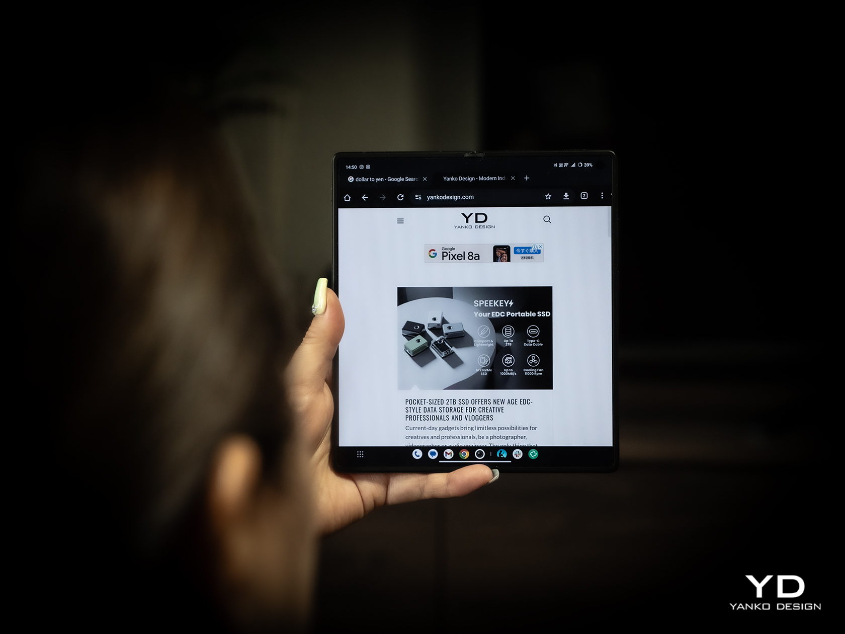
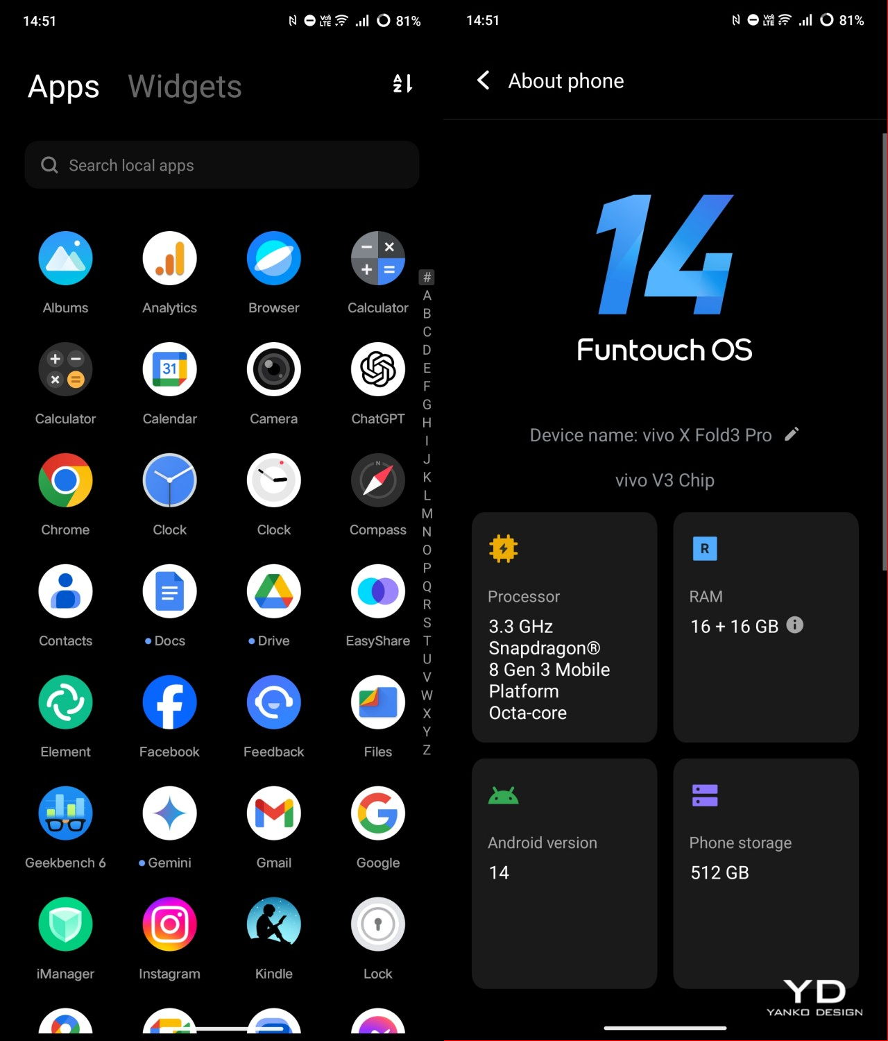
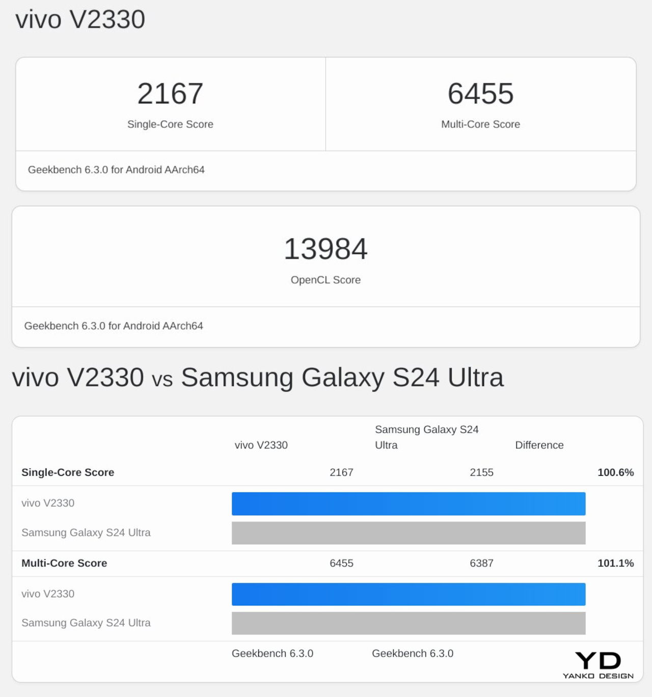
    Vivo definitely didn’t pull punches when it came to making sure the Vivo X Fold 3 Pro could match other flagships this year. In some ways, it might even surpass them. Running on the current-gen Qualcomm Snapdragon 8 Gen 3 and paired with a generous 16GB of RAM, it can handle anything you throw at it with aplomb. In synthetic benchmarks, it can stand head-to-head with the Galaxy S24 Ultra, and it might even surpass the upcoming Galaxy Z Fold 6 if Samsung continues to keep memory down to 12GB max.

    Battery is another department where Vivo is leading the race, cramming an unbelievable 5700mAh capacity inside such a thin and light device. This phone is guaranteed to last half a day, at least on “regular” and mixed usage, and thanks to 100W charging, it will only take an hour to get it back to full. There’s also fast 50W wireless charging, but you’ll need Vivo’s special charger to achieve that speed.

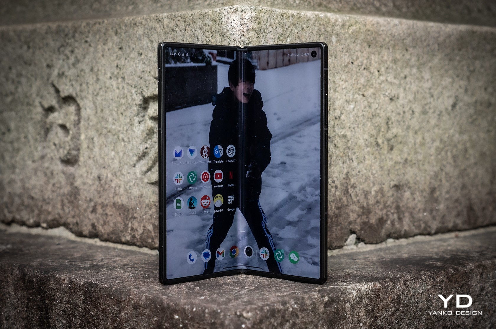
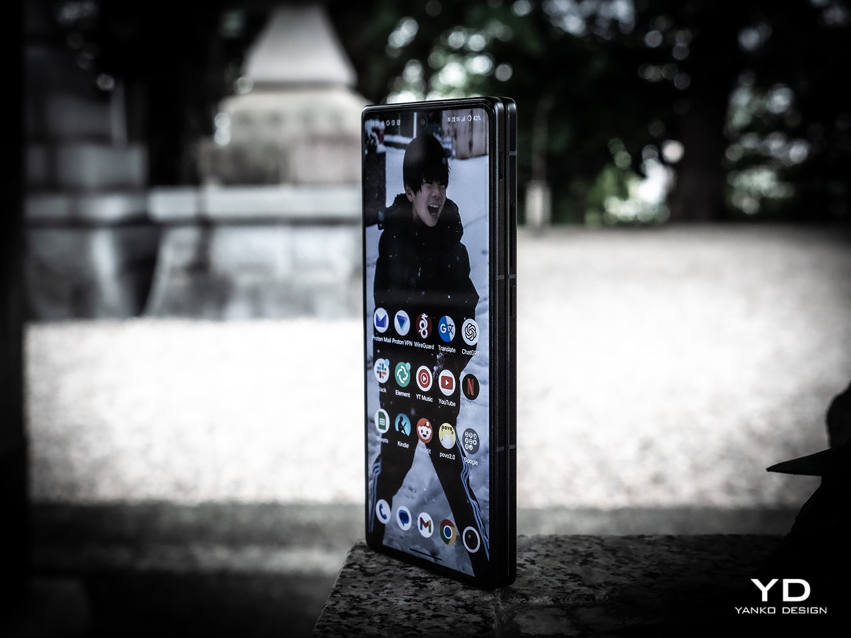
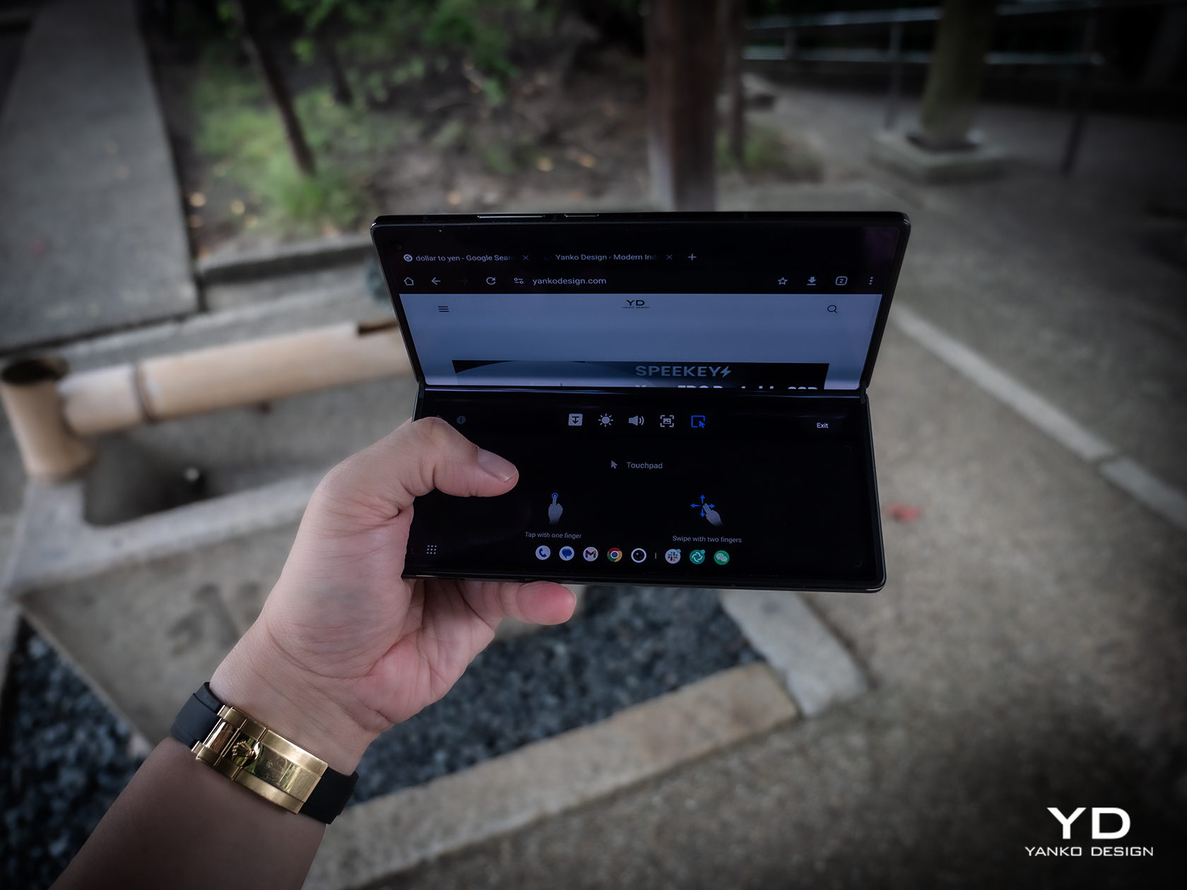
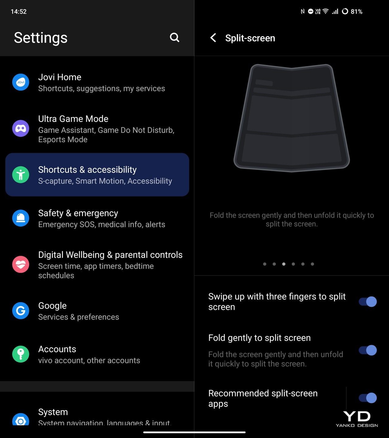
    Both the external 6.53-inch 2748×1172 and internal 8.03-inch 2480×2200 screens are at the top of their class, showing vivid colors and exceptional brightness that make the phone a joy to use outdoors on either side of the fold. Thanks to Vivo’s engineering, the crease on the internal foldable display is barely visible. That hinge allows the fold to hover between 60 to 180 degrees without collapsing, creating that tiny laptop-like experience that you may or may not love. Vivo does have a “flex mode” to take advantage of that angle, as well as other features that only make sense for foldable phones. Quickly folding and then unfolding the phone again triggers the split screen feature where you can pick a second app to open side-by-side with the current one. It’s a bit gimmicky and probably won’t make owners feel comfortable about the longevity of that hinge.

    The large bump on the back of the Vivo X Fold 3 is easily justified by the rather beefy sensors it houses there. Leading the pack is a 50MP wide sensor with autofocus and OIS, and it is joined by a 64MP telescope camera with a periscope lens, also with AF and OIS. The 50MP ultra-wide shooter sadly drops the optical image stabilization but still manages to perform well.

    All in all, the foldable delivers impressive photos and videos, especially with the Vivo V3 dedicated imaging chip in action. Details are rich and colors are accurate, and you can also pick the mode of vividness that best conveys the message you want the photo to send. The camera system is also co-engineered with ZEISS, which not only means the famed ZEISS T* coating but also different presets that mimic the output of the optics maker’s most famous lenses. It’s definitely great to see foldable phone cameras finally stepping up to the challenge, though the price in design and literal cost will be something people will need to consider before making a purchase decision.

    Sustainability

    Vivo is one of the few smartphone manufacturers that are taking big steps in going green, though that is sadly not directly seen nor felt on the Vivo X Fold 3 Pro. Instead, we can only look to the company’s wider sustainability efforts, particularly in running its business on green energy and doing its part in replenishing the planet’s greenery.

    What it does promise with its newest foldable, however, is that it’s not going to end up in the trash or even recycling centers quickly. Durability has been one of the biggest concerns consumers have with foldables, so it’s not surprising that Vivo spent a lot of resources on ensuring the Vivo X Fold 3 Pro will be as reliable as more traditional smartphones. Those measures include a light yet ultra-durable carbon fiber hinge, protective Armor Glass for the cover display, and glass-like UPE fiber for the back panel. The phone is also rated IPX8, which is great for water protection but not so much for dust, raising worries that these tiny particles could inflict fatal damage on the sensitive internals of the phone.

    Value

    It’s pretty clear that Vivo spared no effort in equipping the X Fold 3 Pro with the best of the best in smartphone technologies this year. On normal smartphones, that would be a given, but such features on a foldable raise the stakes and the prices higher. At around $1,600 to $1,900, depending on where you get it, it’s not exactly an easily accessible product, especially when you consider it’s not available in some global markets.

    The Vivo X Fold 3 doesn’t exist in a vacuum, however, and when you consider that its peers ask for nearly the same figure, you begin to see some of the advantages the foldable phone has. It’s definitely not lacking much, and it cuts quite a striking figure with its slim profile and lightweight body. Suffice it to say, there’s a reason it has “Pro” in its name, and it’s that same reason you’ll need to pay a premium for it.

    Verdict

    Samsung and Huawei kicked off the foldable phone race, and although almost six years have passed, the prices for these products have barely gone down. What makes matters worse is that in some cases, the prices have remained the same or even increased but have very little to show for it. If you’re going to charge a premium for a product, you should be making sure the product is actually premium.

    That’s the kind of promise that the Vivo X Fold 3 Pro offers, cutting almost no corners in the name of delivering the best foldable experience with current industry technologies, not those from two or three years ago. It’s not an easy promise to make, especially when you consider the need to also make the design slimmer and lighter, but Vivo seems to have actually pulled it off. For that feat alone, the Vivo X Fold 3 Pro definitely deserves your consideration, even with that hefty price tag.

    The post Vivo X Fold 3 Pro Foldable Phone Review: Putting the Competition on Notice first appeared on Yanko Design.
    Motorola Razr+ 2024 foldable phone: News, Rumors, Price, and Release Date

    Google I/O 2024 has come and gone, and despite rumors and expectations, a new foldable phone was nowhere in sight. Of course, the Google Pixel Fold is hardly the only game in town, nor is it the only one that’s expected to debut really soon. Perhaps beating both Google and Samsung to the punch, Motorola’s next-gen foldable could be hitting shelves as early as June, though it will still be competing with the likes of the Samsung Galaxy Z Flip rather than the OnePlus Open and other larger foldables. Unofficial information about the device is quite thin, but the ones we’ve already heard are quite substantial and paint an interesting picture, one that could make the Motorola Razr+ 2024 or Motorola Razr 50 Ultra the clamshell foldable to beat this year.

    Designer: Motorola

    Motorola Razr+ 2024: Design

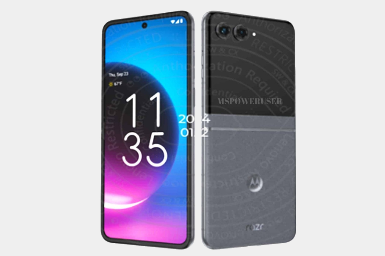
    According to sources, this year’s Motorola foldable would look exactly like last year’s Motorola foldable, save for some changes in screen size. That means the Motorola Razr+ 2024’s external screen will still cover the entire surface of the upper half of the phone’s back, leaving only room for the camera lenses themselves. It might sound like a letdown and a sign of lack of innovation over at Motorola, but sticking to a design that works is also a sign of maturity, especially since the design is only a year old.

    Image courtesy of: MSPoweruser

    Motorola’s design for its Cover Screen is admittedly divisive. On the one hand, it’s the only foldable of its kind that utilizes the whole area, while others make do with tiny rectangles, even tinier circles, or a square with an uneven cutout to make way for cameras. On the other hand, this also makes for a weird arrangement that actually cuts out part of the display anyway, making the image or text in that area inaccessible.

    Motorola is also the only brand that allows normal apps to run on that external screen, which is both an advantage and a disadvantage. Regardless, it seems to be sticking to its guns for one more year, offering an experience that, while faithful to the design spirit of the original RAZR, isn’t afraid to go beyond to offer something new and useful.

    Motorola Razr+ 2024: Specs and Software

    While the Moto Razr+ 2024, or Moto Razr 50 Ultra, won’t look any different on the outside, it will be a very different beast on the inside. Of course, there’s the new Qualcomm Snapdragon 8s Gen 3 leading the changes, and there will supposedly be a larger external screen at 3.9 inches up from last year’s 3.6-inch Cover Screen. There will also be 12GB of RAM paired with 256GB of storage, while the battery has been expanded from 3,800mAh to 4,000mAh.

    Given the expected launch windows, the 2024 Razr will be running Android 14 out of the box, and while it might sound like Motorola would upgrade it once Android 15 comes out, there’s not really any certainty. After all, the Motorola Razr+ 2023, which launched with Android 13, still received Android 14 half a year later. Despite being once owned by Google (now under Lenovo’s stewardship), Motorola’s track record for Android updates sadly isn’t that impressive.

    Motorola Razr+ 2024: Cameras

    Part of the big upgrades coming to the Motorola Razr+ 2024 according to those rumors is an upgrade to the camera system. It will now have not one but two 50MP cameras, one of which has a wide lens while the other is capable of 2x telephoto zoom. Given how Motorola advertises its foldable phone as a sort of mini camcorder, more capable cameras are definitely in order. The 32MP selfie camera, on the other, might remain the same as last year.

    Motorola Razr+ 2024: Price and Release Date

    There has been no word on the exact date when the Motorola Razr+ 2024 will be launched, which might go by the name of Motorola Razr 50 Ultra in other markets, but all signs point to yet another June release. In fact, the device was spotted making its way through a certification process, suggesting that its debut is close at hand. The leak also confirms what we’ve heard about the design, that it would be a dead knocker for last year’s model.

    Image courtesy of: 91mobiles

    That leak also “revealed” the color options for the Razr+ 2024, which include Blue, Orange, and Green instead of last year’s Black, Magenta, and Peach. But the more interesting detail about the phone is its starting price of $999 for the base model with 12GB of RAM and 256GB of storage. That’s the same price for half the capacity last year, so it will definitely make the Motorola Razr+ 2024 the cheapest flagship foldable in the market.

    Motorola Razr+ 2024: Final Thoughts

    Although they are younger than the larger foldables like the Galaxy Z Fold, clamshell-style foldables have become better accepted and sought after. They’re usually more affordable and look more stylish, bringing to mind the flip phones of old. They’re pocketability makes a bit more sense to most people who don’t need a phone that turns into a tablet, and their accessible price tag makes them feel more like regular flagships rather than overpriced novelties.

    Of the many foldable flip phones in the market right now, the Motorola Razr+ 2024 seems to offer a more reasonable balance of features and price, especially one from a reputable brand. It looks like this year will show a significant upgrade, at least internally, while still keeping the design that has won fans. That said, Motorola’s Android updates don’t inspire confidence, and we’ve yet to see it make any improvements in that regard.

    The post Motorola Razr+ 2024 foldable phone: News, Rumors, Price, and Release Date first appeared on Yanko Design.
    Top 5 Quirky Phone Designs That Actually Make Sense

    Smartphones today seem to look very similar, varying only in the shape of the camera bump and the color of their backs. Sometimes, the materials might be different, too, but the same large-sized “candy bar” form factor has become the standard for all the smartphones currently in the market. There was a time, however, when companies were a bit more daring, experimenting with phone designs and features in an attempt to stand out from the crowd. That did lead to some rather eccentric and sometimes even ridiculous designs that make us question the sanity of the minds behind them. But there are times when those odd designs of the past actually have important relevance today. Here are five such phone design oddities that we wished existed or still exist, and some alternatives in case you may have been smitten by their quirky appearance.

    Designer: Google, Motorola

    Undying Handset: Project Ara

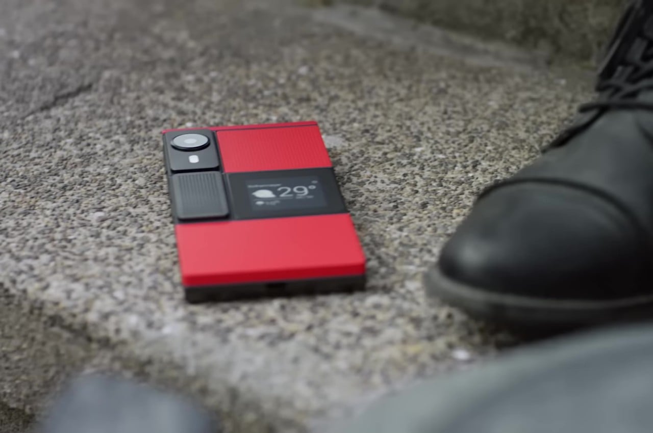
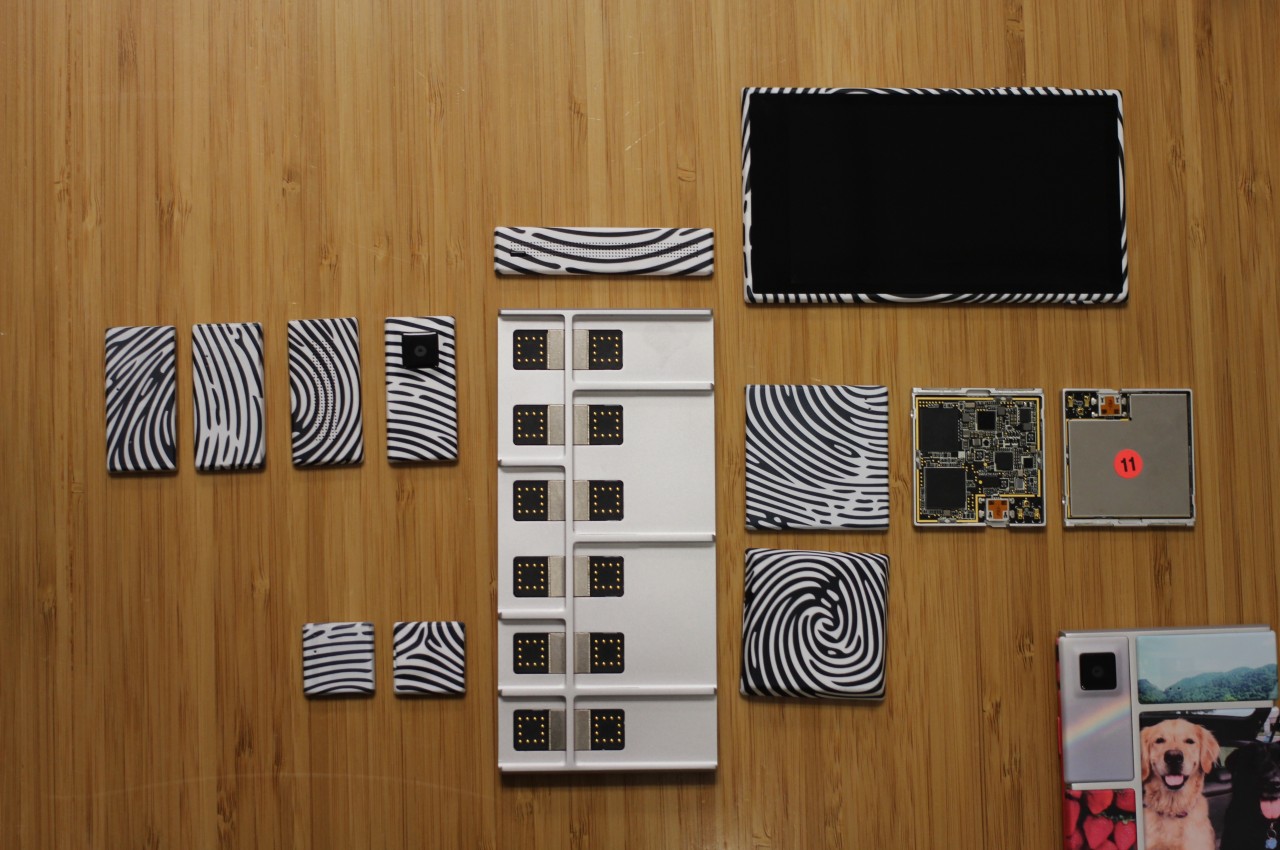
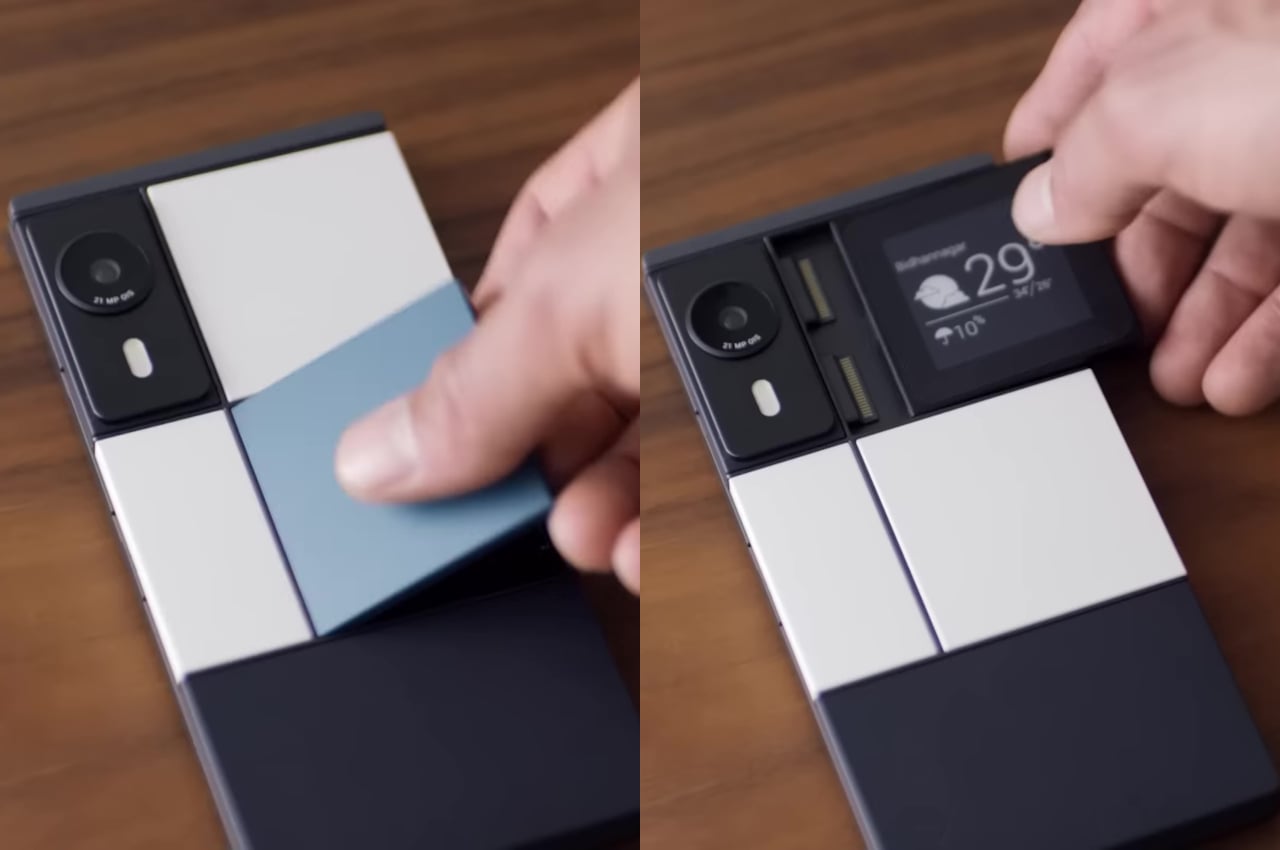
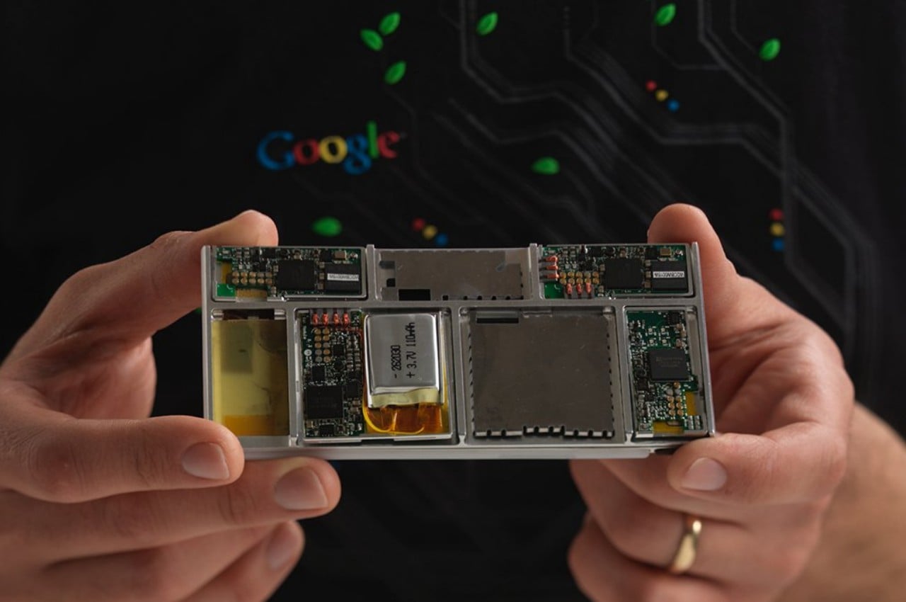
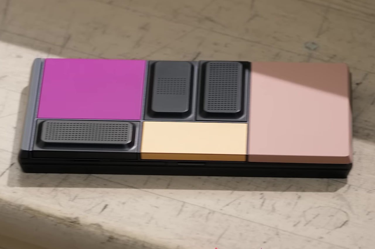
    Google’s Project Ara inspired the idea of a modular smartphone whose components you can easily swap to upgrade or repair parts. In theory, this would make the phone last forever, or at least as long as the base is intact and parts continue to be manufactured for it. In practice, it was a very ambitious endeavor that could neither meet expectations nor present a viable business model that wouldn’t bankrupt manufacturers. In the end, that sustainable and immortal smartphone remained just a dream, at least in that idealistic and perfect form.

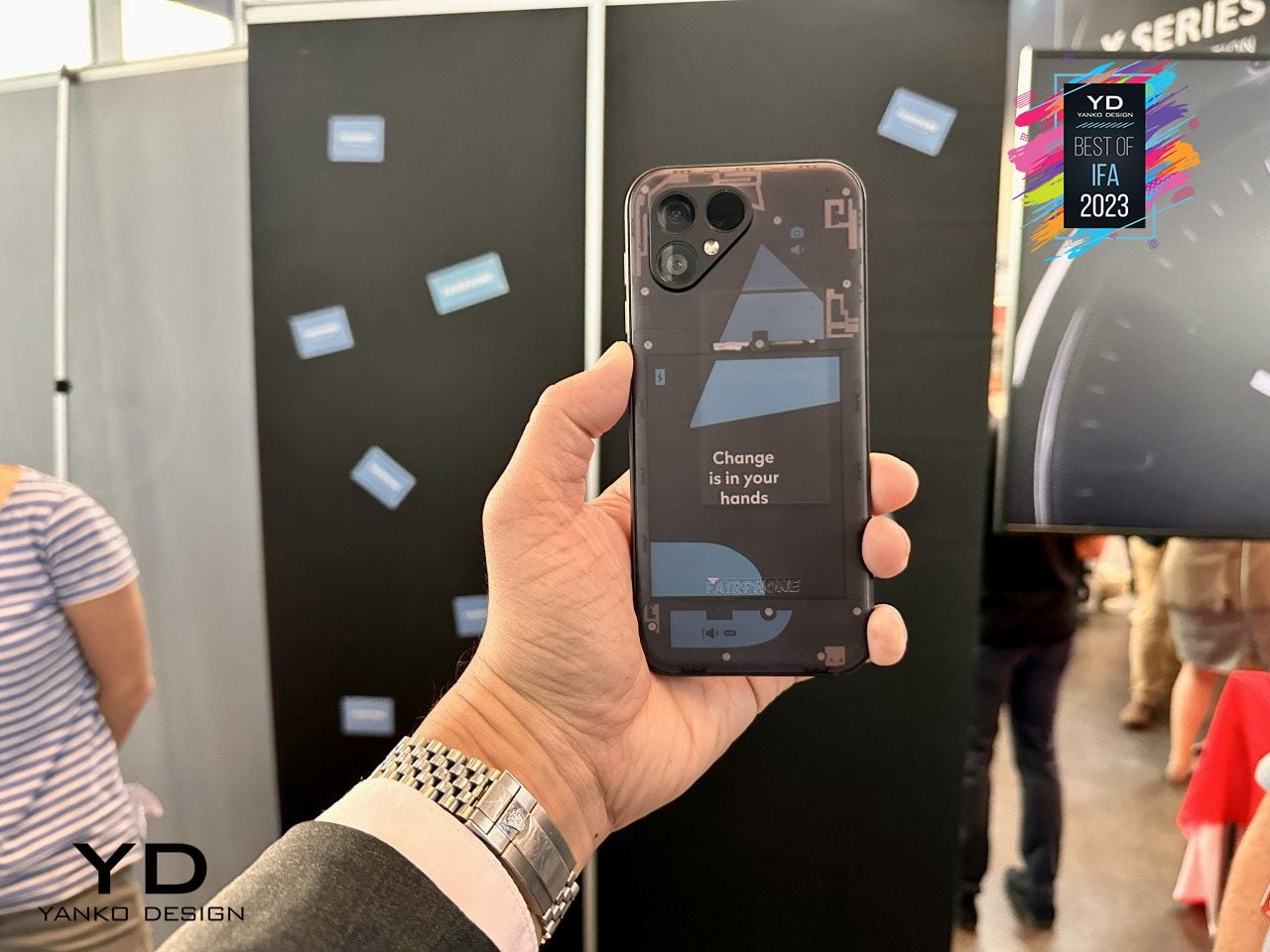
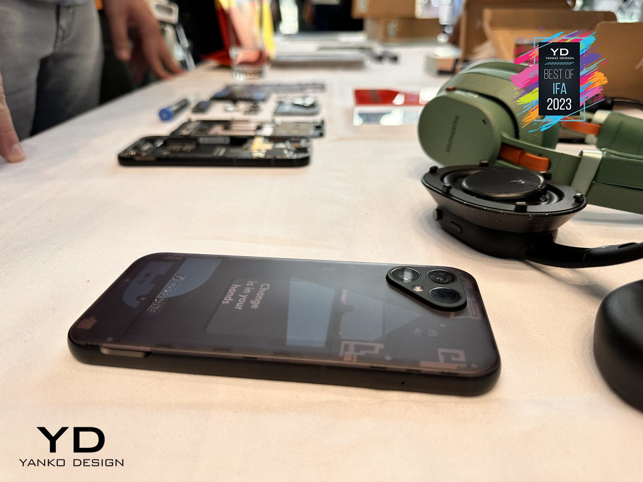
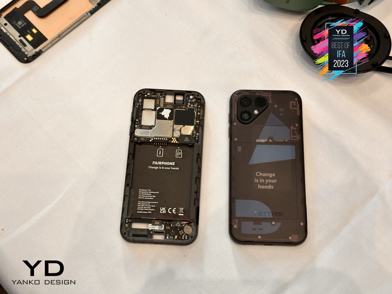
    Alternative: Fairphone 5

    Designer: Fairphone

    Fortunately, a part of that dream is actually possible and even sustainable in more ways than one. Although you can’t hot swap components on the fly, the Fairphone 5 at least offers a way for owners to change important parts of the phone, like batteries or even cameras, to keep them running almost forever. There are some limitations, of course, but if all you want is a phone that will last you for almost a decade instead of just two years, this self-repairable design pretty much has that in the bag.

    Mobile Shutterbug: Nokia N90

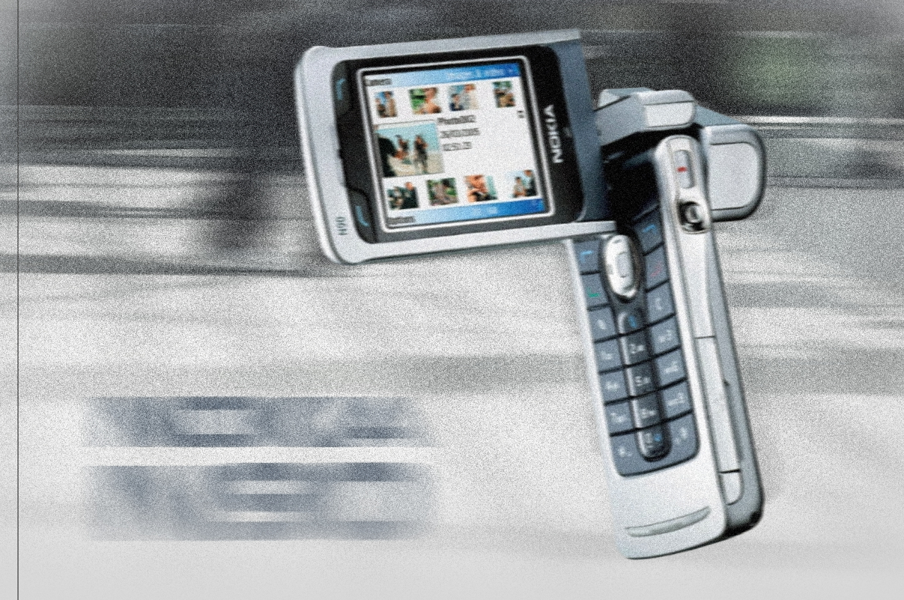
    One of the biggest uses for smartphones today next to social media is taking photos and videos. In the days even before the term “smartphone” was coined, even the most advanced handsets from the likes of Nokia could barely hold a candle to point-and-click cameras. That’s why the quirky Nokia N90 was prophetic and way ahead of its time, envisioning a day when smartphones would be used like camcorders, though with a bit more awkwardness due to their inflexible designs.

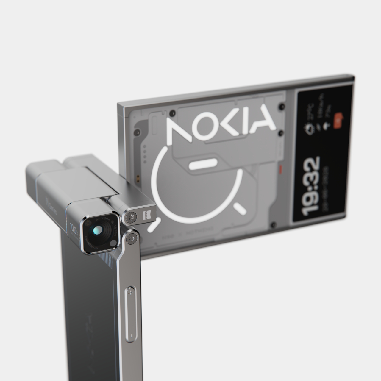
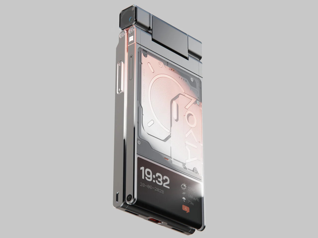
    Alternative: Nokia x Nothing Concept

    Designer: Viet Doan Duc

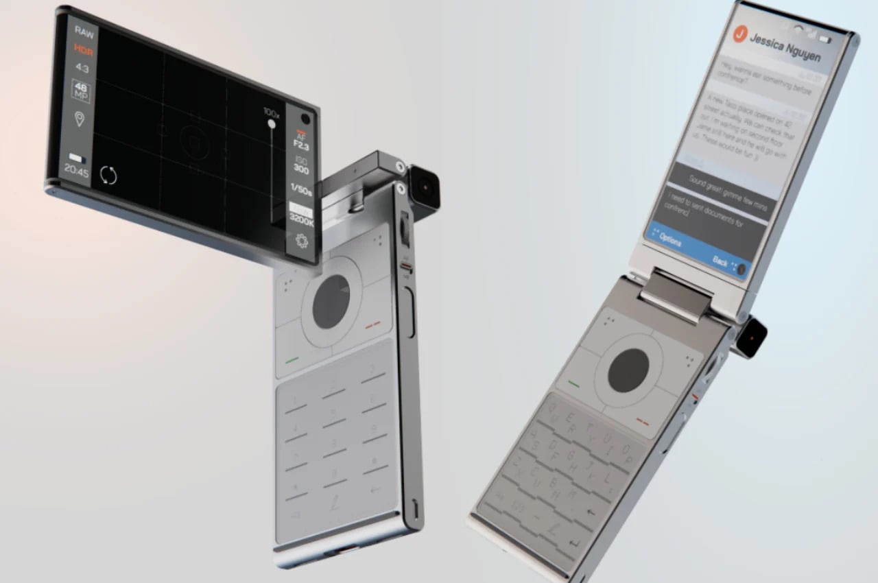
    While clamshell phones are back in season thanks to foldable screens, the folding and twisting design of the original Nokia N90 remains a distant memory. This concept tries to answer the question of “what if?” and mixes two famed brands’ design languages to craft what could be the perfect camera phone. It makes you feel like a pro photographer or cinematographer, holding up your phone not with shame but with pride, capturing not only the moment but also people’s attention in a good way.

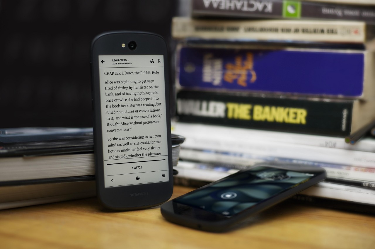
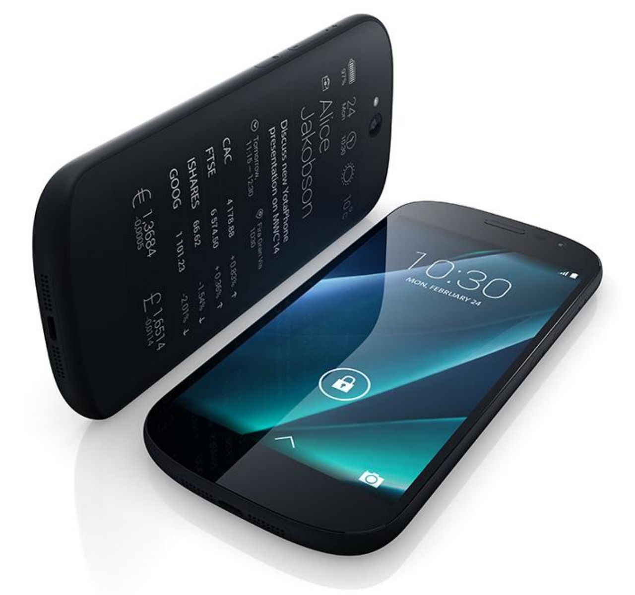
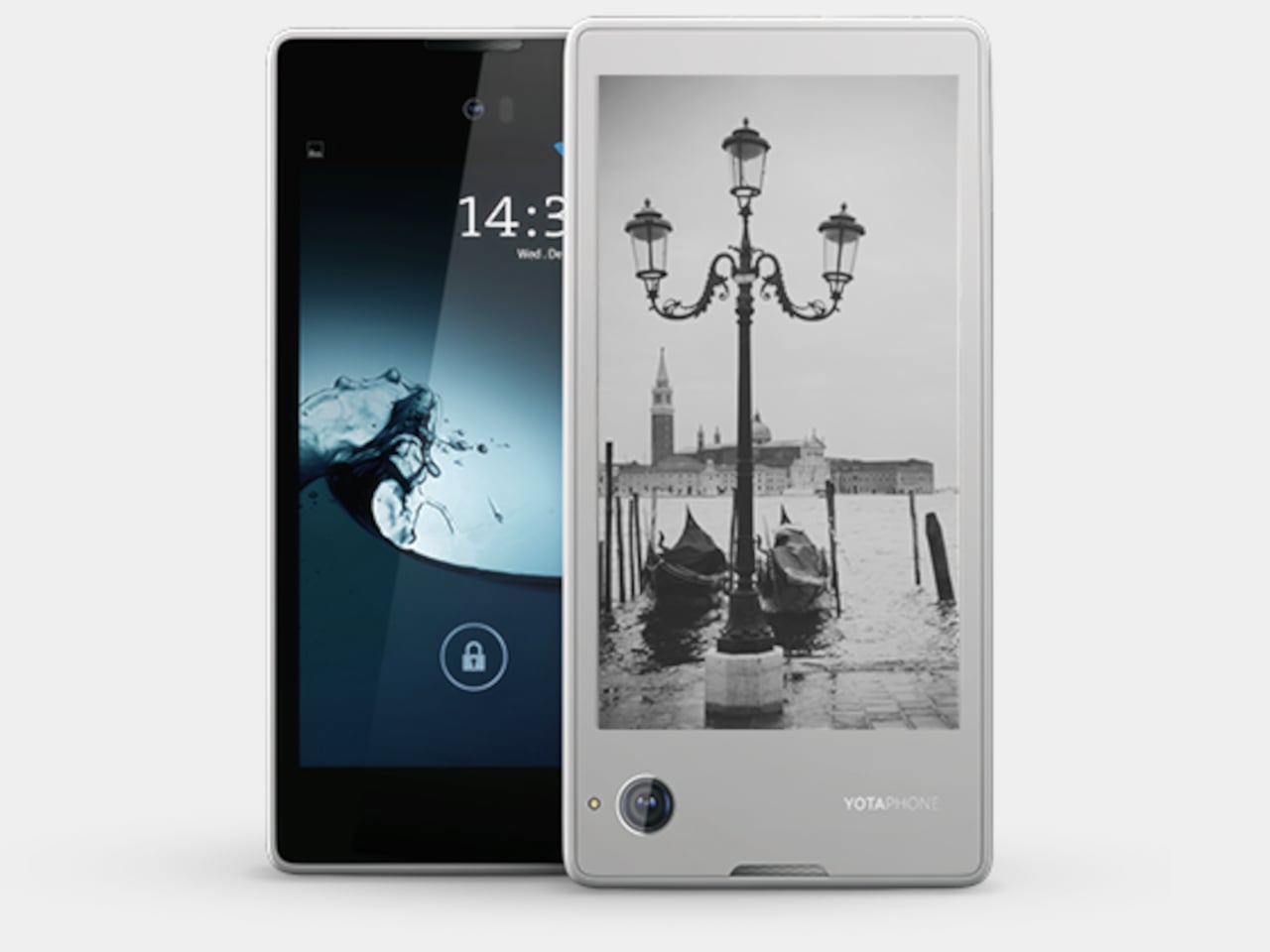
    Pocket Book: YotaPhone Dual-Screen Phone

    Designer: YotaDevices

    E Ink devices are becoming more popular these days, especially after the addition of features like stylus support and color. These displays are easy on the eyes and the battery, allowing the screen to show the same thing for days without requiring a recharge. A few years back, a small company tried to bring those benefits to the smartphone in the oddest way, by putting an E Ink screen on its back. Although it can be used for reading e-books on the go, its main purpose was to have a battery-saving always-on display that is a bit more dynamic and useful than typical AOD implementations.

    Alternative: Onyx BOOX Palma

    Designer: BOOX

    That said, a phone-sized Android device with an E Ink display might be an even more efficient design, which is what the Onyx BOOX Palma is offering. Technically, it’s an e-book reader that’s the size of a regular phone and actually runs Android, which is the standard for BOOX’s devices. This means it has access to the same apps you have on your regular phone, but without color. You also don’t have cellular connectivity via a SIM card, which might be a deal-breaker for a phone but a great deal for distraction-free reading and mobility.

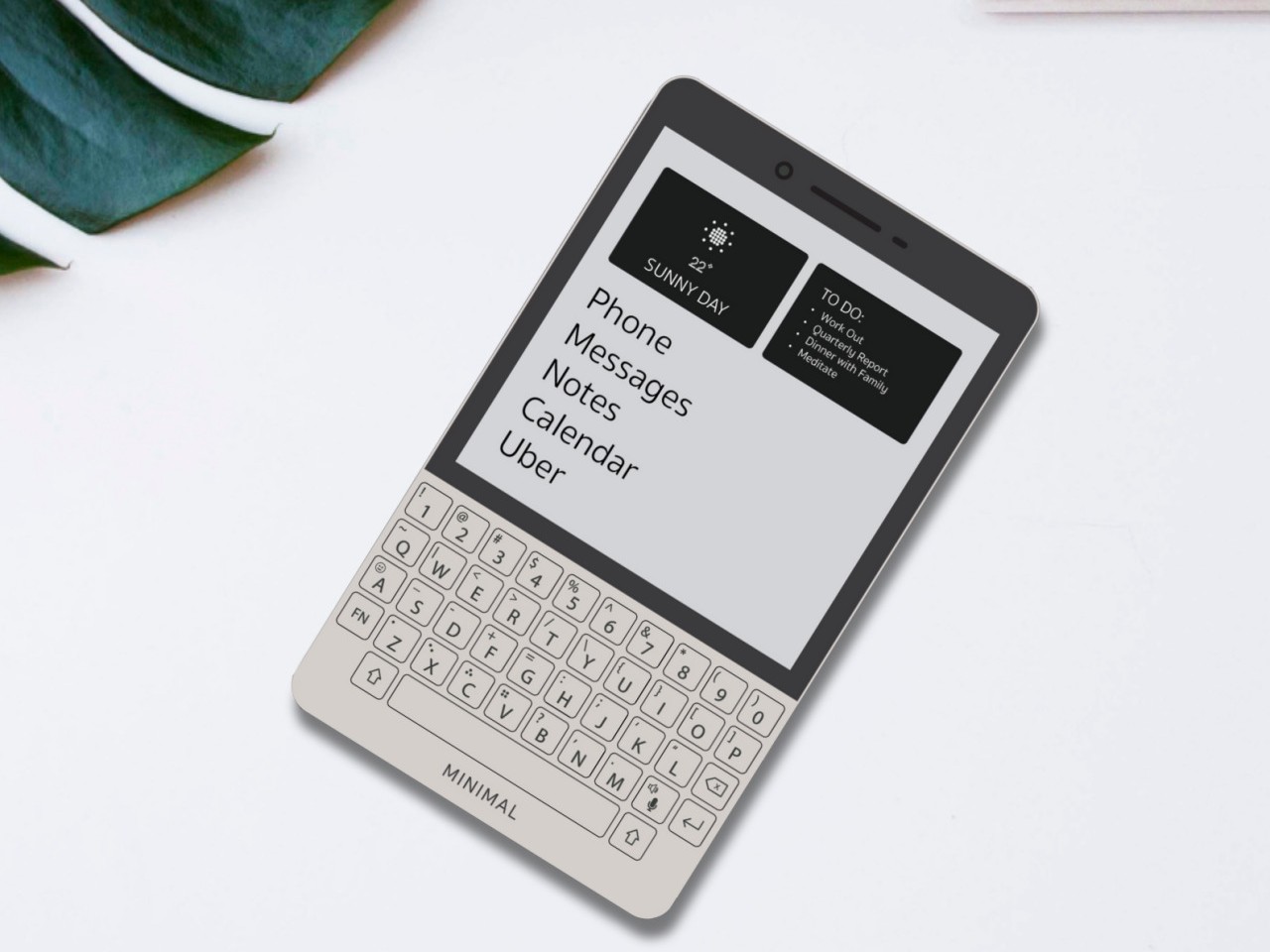
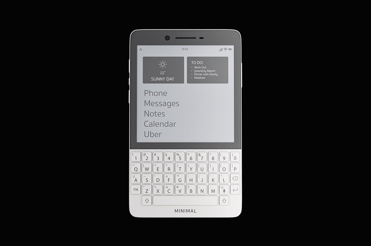
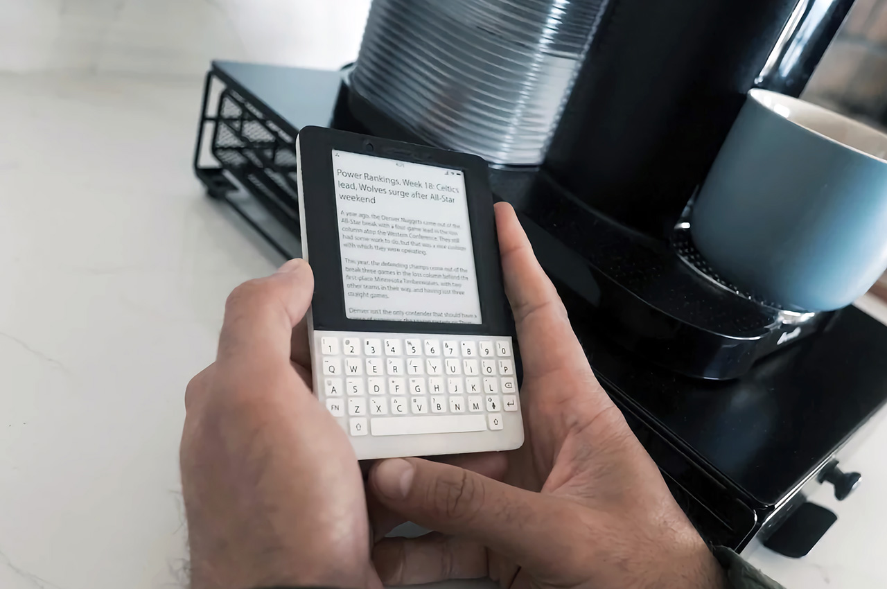
    Productive Minimalism: Minimal Phone

    Designer: The Minimal Company

    BlackBerry might have joined the likes of Nokia and LG as just parts of the annals of mobile history, but its squarish shape and QWERTY keyboard are forever etched in the consciousness of even the least tech-savvy person on the planet. Many have tried to recreate that magic, but this rather elegant yet odd phone puts a twist to it. It combines the iconic BlackBerry design with an E Ink screen and a minimalist aesthetic, promising distraction-free productivity by actually limiting what you can do on the device. It can even make it easier to actually reply to or post on social media, though the drab grayscale screen is probably going to make that a little less enjoyable anyway.

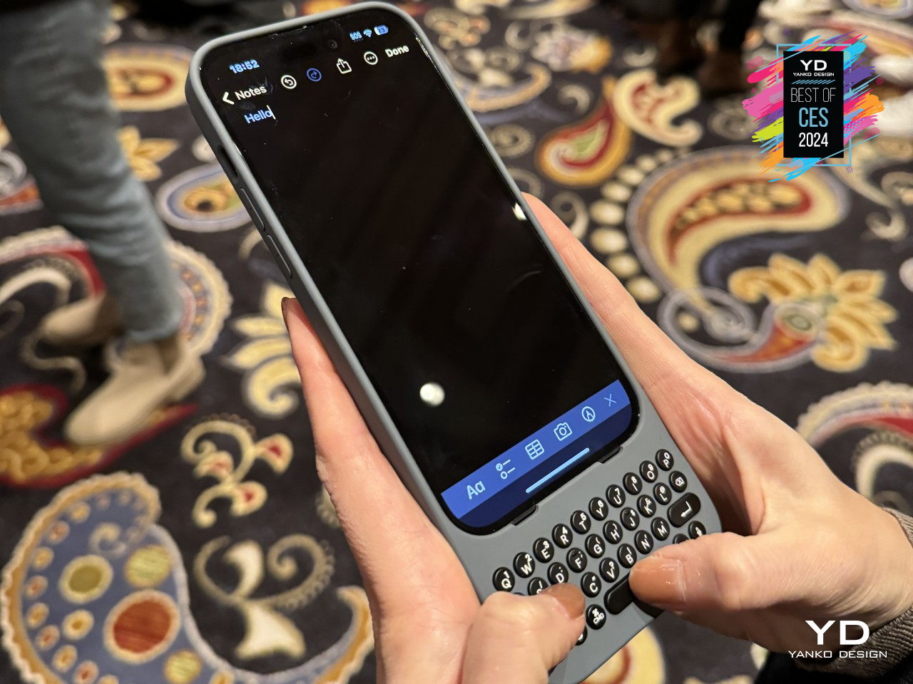
    Alternative: Clicks QWERTY Case

    Designer: Clicks

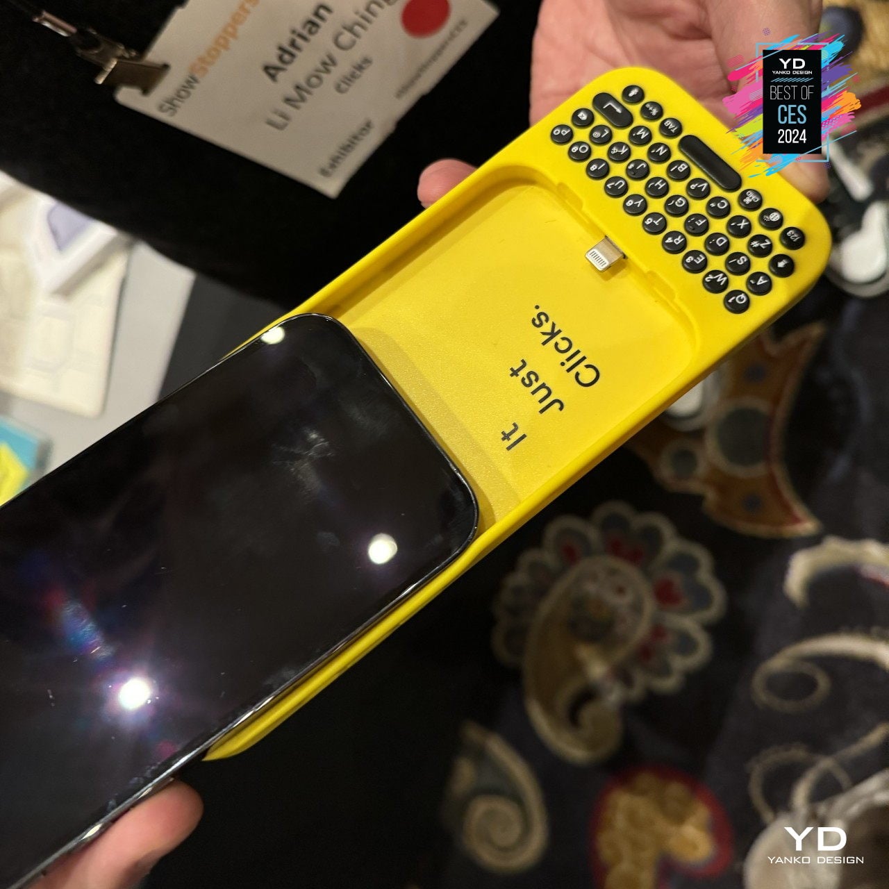
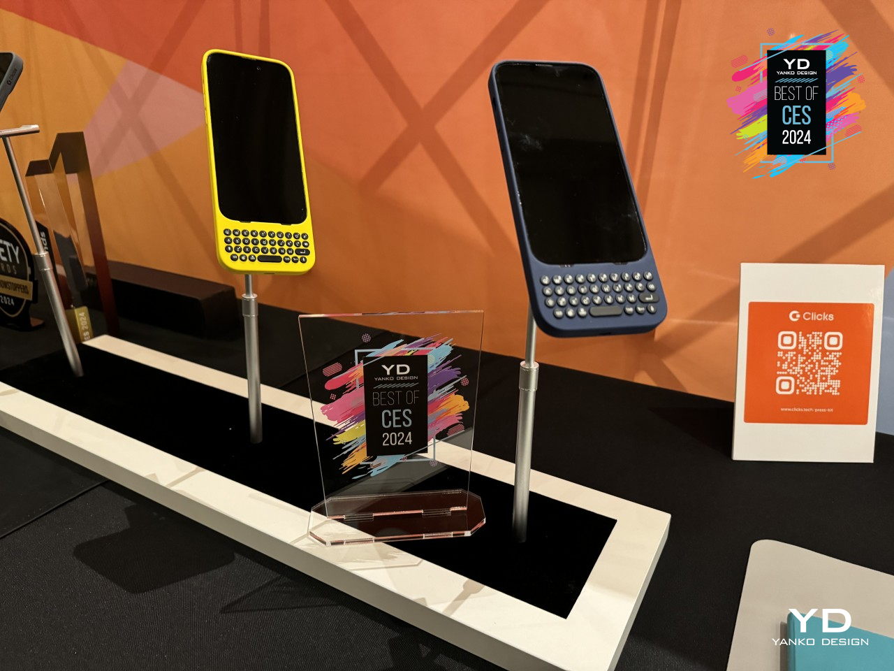
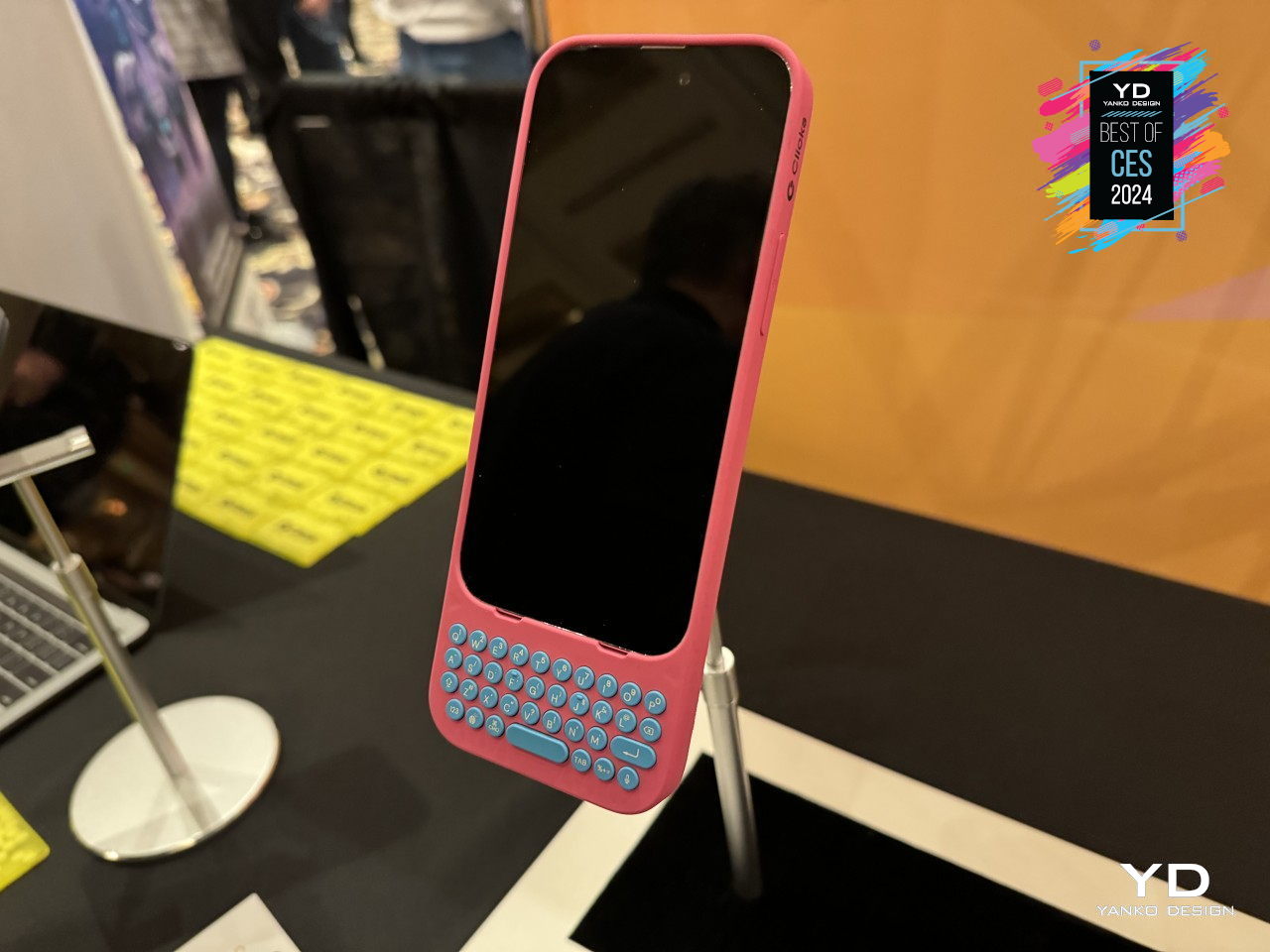
    The idea of a BlackBerry-like experience might tickle the fancy of smartphone users, but none of them will be willing to ditch their powerful, colorful, and highly functional smartphones. Clicks is a case that tries to bring the best of both worlds, and it’s practically just a case that slides onto an iPhone to provide that tactile typing experience. You won’t have to give up your favorite apps, especially the ones you need to actually be productive, but the burden of being disciplined and ignoring distractions is now on you instead.

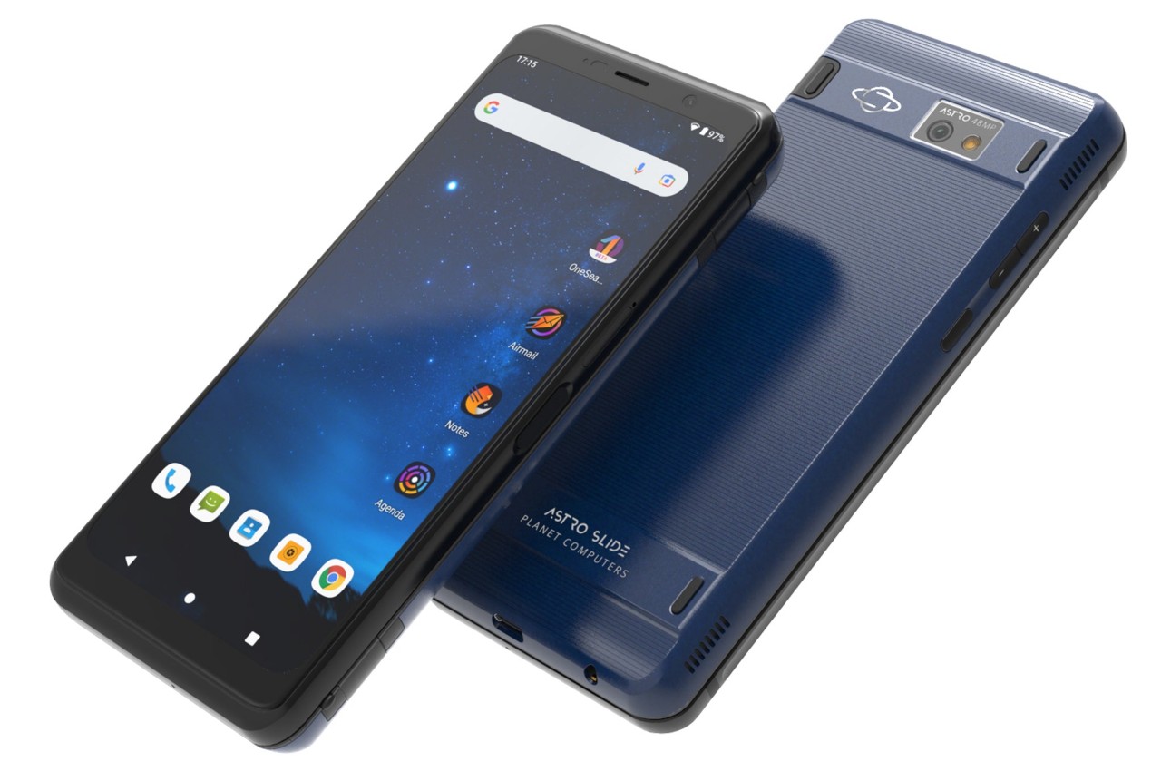
    Shapeshifting Multitasker: Astro Slide 5G

    Designer: Planet Computers

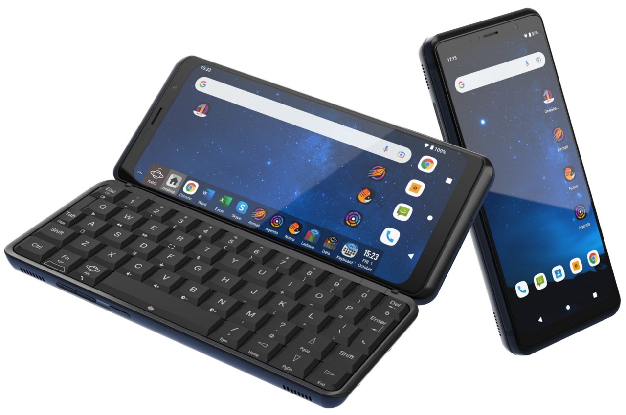
    A phone that opens like a mini typewriter has actually been around since the days of the Nokia Communicator and its kin, but that design proved to be more complicated than they’re worth. After playing with that same design, PlanetComputing shifted to a slider that still provides that typing experience while retaining the exact same functions as a phone. Unfortunately, such a mechanism proved to be just as clunky and unreliable, and the software platform didn’t exactly lend itself well to a landscape screen.

    Alternative: Any Foldable Phone

    Designer: OPPO

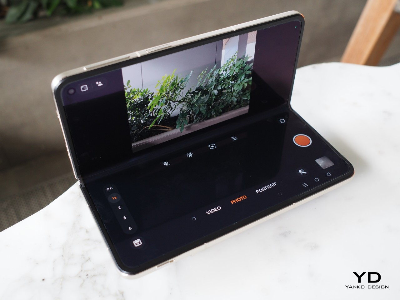
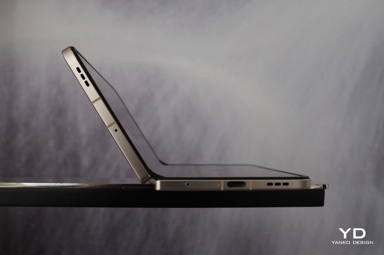
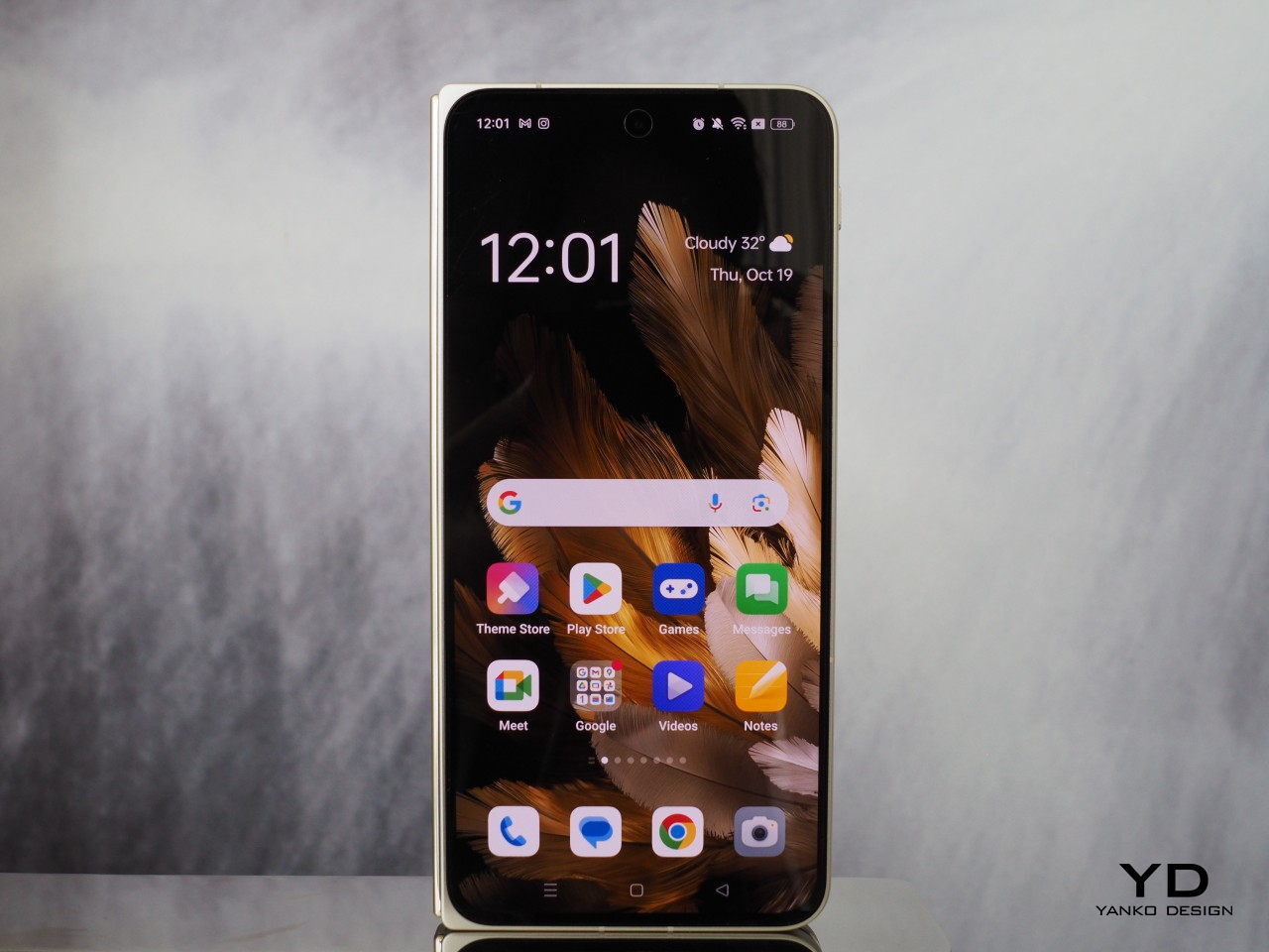
    These days, you don’t have to rely on a physical qwerty keyboard to have that same mini laptop experience. With foldable phones now more common, you can tap away on a more flexible on-screen keyboard when the device is only half-folded. At the same time, however, you have both phone and tablet functionality in your hands. Admittedly, the design is far from perfect, and we’re still waiting for more affordable foldables coming in the very near future.

    The post Top 5 Quirky Phone Designs That Actually Make Sense first appeared on Yanko Design.
    Foldable iPhone Needs to Happen: 5 Reasons Why Foldable Phones are Here to Stay

    Apple just announced what might be the biggest upgrade to the iPad line since the iPad Pro was introduced in 2015. In addition to switching to an OLED panel, with all the benefits that it entails, as well as gaining a new Apple Pencil Pro, the new iPad Pro is possibly one of if not the thinnest tablets in the market, especially for its 13-inch size. But while Apple’s new tablets are definitely worthy of attention, the company’s fans are still holding their breath for a foldable iPhone. Rumors claim that could be coming in two years, but it could also be canned at the last minute, just like the AirPower wireless charging mat if the design and performance don’t meet the meticulous company’s standards. Then again, some probably consider foldable devices as a passing fad, but that couldn’t be farther from the truth. Apple should launch a foldable phone sooner rather than later because these devices aren’t going away, and here are the reasons why.

    Designer: Semin Jun

    1. Content is Still King

    Chances are, you’re using your phone less for calls and more for content, which does include activities like instant messaging and chatting. The screen is the most important part of the device because it is the part that we see and use the most. Content is the primary reason for having a smartphone, whether it’s for consuming content or sometimes even creating it, so any technology that lets people enjoy more content or gives them more ways to enjoy content is always a winner. Is it any wonder, then, why phablets or phones with large screens are now the norm, despite how much Apple ridiculed its size at first?

    Foldable devices solve this in two ways. Large foldable phones in the style of the Google Pixel Fold offer an experience similar to a mini iPad mini that you can still shove in your pocket and use as a regular phone to some extent. In theory, it delivers the best of both worlds, with a screen that can contain as much content as possible while still in a portable format.

    Conversely, clamshell-style foldables like the Samsung Galaxy Z Flip series strike the problem from the opposite end. It provides a screen experience that’s exactly like a normal large phone but lets you conveniently cram the device in very small purses and pockets. It still prizes the role of content but delivers it in a design that doesn’t get in your way because of its size.

    2. Falling Prices

    One of the reasons why people avoid foldable phones and why they see them as luxurious fads is because of their rather mind-blowing prices. Yes, it’s expected that novel technologies and designs would cost more at the start, but foldable phones have been around for almost half a decade now, and yet most still cost a premium flagship and a half. Fortunately, things are changing for the better, even if slowly.

    Designer: nubia

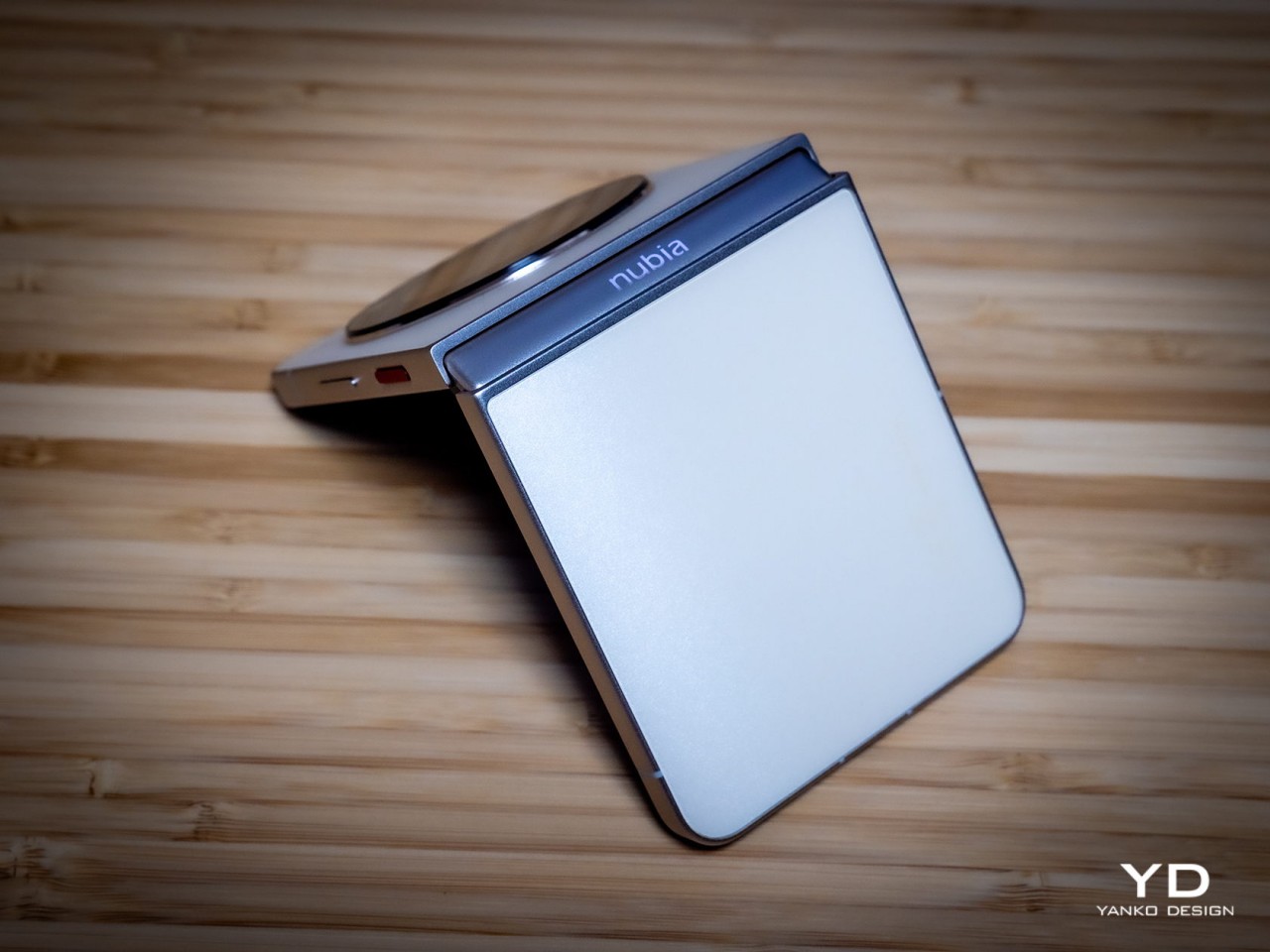
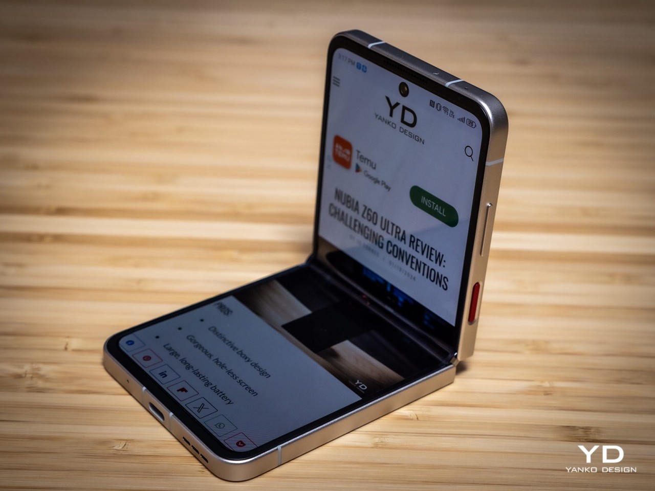
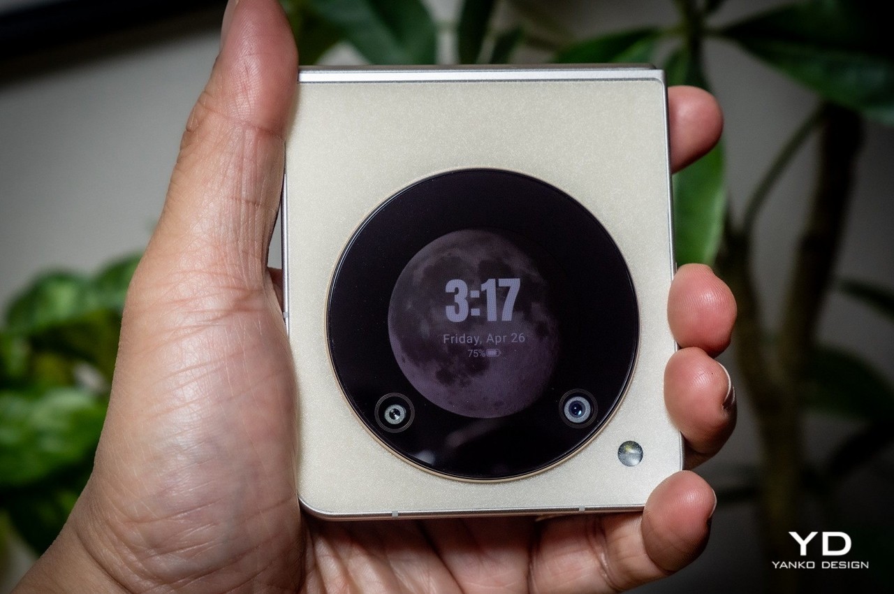
    As the technologies and components become more common, the cost of their production will start to decrease as well. Given that there’s still plenty of room for newer designs that will involve more costs, high-end foldable phones won’t be going away any time soon. At the same time, however, that still leaves the door wide open for options on the lower rung of the price ladder. The new nubia Flip 5G, for example, is currently the most affordable among the relatively cheaper clamshell foldables. Sure, it does cut corners in a few aspects, but that is also proof that you can have “mid-tier” foldable phones in this market.

    There’s definitely a great deal of interest in a cheaper book-style foldable, and that might be coming this year if not from Samsung then from its growing number of rivals. Admittedly, it might take another year before more affordable foldables become more common, but it’s something that will happen sooner rather than later.

    3. Design Refinement

    Even after five years, the foldable phone design is still relatively young. Given how it strays so far from normal phones, it’s not surprising that perfection still feels so far away. In other words, there’s still much to be done, and smartphone makers continue to push the boundaries, refusing to settle for the status quo. In a way, it’s a matter of pride for these brands, as well as refusing to admit defeat after investing so heavily in foldable designs.

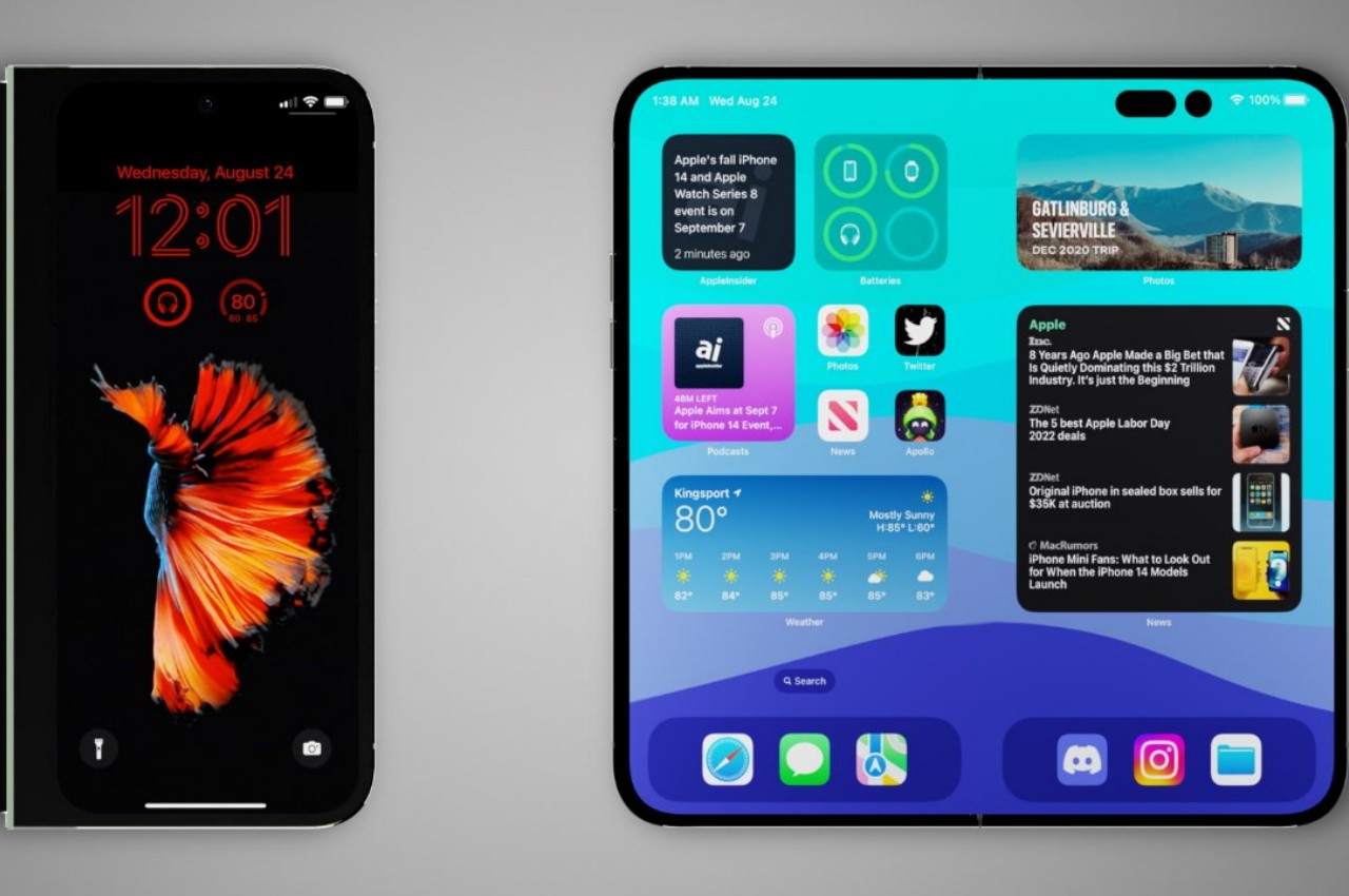
    Images courtesy of AppleInsider

    Foldable phones are getting thinner to the point that a folded phone no longer feels like you have two regular phones stacked together. At the same time, others are cramming more powerful and larger cameras into these ultra-thin devices, trying to get them on the same playing field as any other flagship model. While standard smartphone designs seem to have settled down after many tumultuous years, things are just heating up for foldables. There’s still a lot to be explored, and we’re far from reaching the peak.

    4. Stylish Trendsetters

    Smartphones have graduated from being technological products that only tech-savvy people can truly appreciate to lifestyle items that reflect the owner’s design tastes and personal preferences. Smartphone expressiveness is becoming an important factor in how people choose devices these days, from the design of the cameras to the overall style of the phone itself. That’s part of the reason why “flip” foldable phones are reported to be outselling their larger cousins, precisely because they bring back that classy image of flip phones from decades ago.

    Designer: Honor

    Yes, you can dress up your regular phone slab as much as you want, but the way you open and close a foldable phone is going to be fashionable for quite a while. And you can also dress them up as much as you want, and may even offer more customization options and creativity with the styles of cases and accessories used. Everything you can do on standard phones, you can also do with foldables but with more pizzazz and a “wow!” factor.

    There’s also the aspect of offering more customization options inside as well. The foldable screen is a bigger canvas you can play on, and some external Cover Screens can get creative with their designs as well. It’s a new playground for designers and creative users who want to truly make their smartphones an extension of themselves.

    5. Innovation Has Just Begun

    Foldable phones are just the start, however, because they are the most accessible and easiest to comprehend. Once the idea of foldable screens has become cemented in people’s minds, it will be easier to introduce newer designs that can provide even better solutions. The current foldable designs are far from perfect, but they’re paving the way for future foldable devices.

    Designer: Samsung

    We’re already seeing that in the PC market with the introduction of foldable laptops, but we don’t need to go that far for proof. Samsung has already shown off working prototypes of tri-fold devices that turn the phone into a larger, and more conventional tablet design. We’ll see other foldable technologies unfold (no pun intended) in the future as well, including a phone that folds both ways. And don’t forget those rollable screens that offer an alternative answer to the same screen size problem.

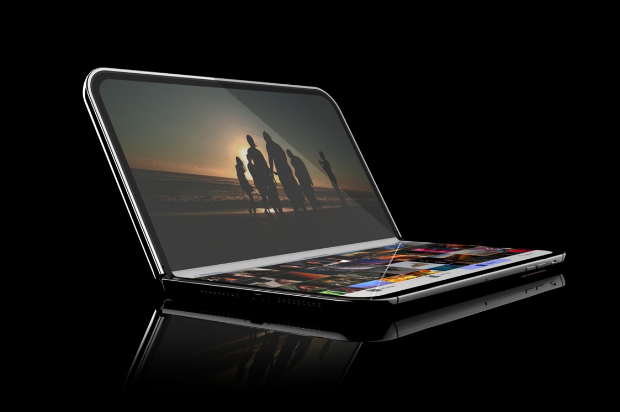
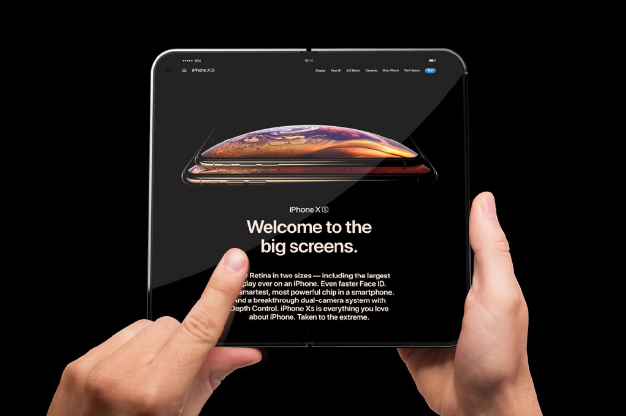
    Apple is rumored to unveil a foldable laptop next year, with a foldable iPhone following in 2026. Honestly, the order should probably be reversed, given how MacBook owners are more meticulous about how new designs affect functionality, sometimes negatively. Either way, Apple really needs to jump on this train soon, not just because it’s trending but because it can have a significant impact in driving innovation in this space forward by leaps and bounds.

    The post Foldable iPhone Needs to Happen: 5 Reasons Why Foldable Phones are Here to Stay first appeared on Yanko Design.

    Google Pixel Fold 2: News, Rumors, Price, and Release Date

    Despite developing an operating system that’s used on a variety of devices and computers, Google has practically snubbed anything other than a smartphone. It’s notorious for having a love-hate relationship with tablets, for example, so it was a bit of a surprise that Google would launch its own foldable device. Perhaps even more surprising is how it might actually release a second-gen foldable phone. Given its pedigree, the next Google foldable is definitely going to pique people’s curiosity, whether it will be called the Pixel Fold 2 or the Pixel 9 Pro Fold. Judging from what we’ve been hearing so far, this foldable phone will be undergoing several significant changes, though not all of them might appeal to Pixel fans and onlookers alike.

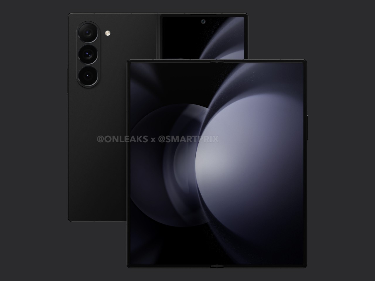
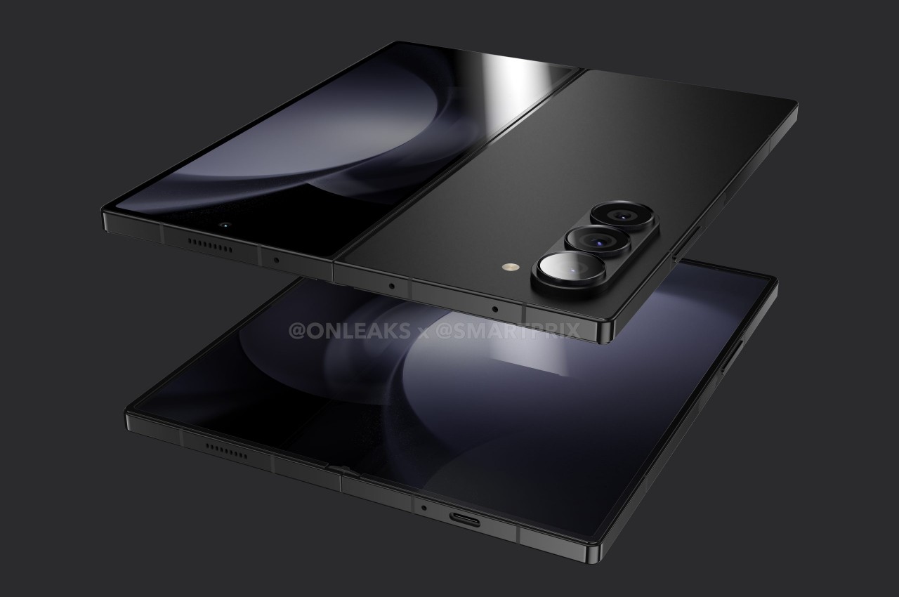
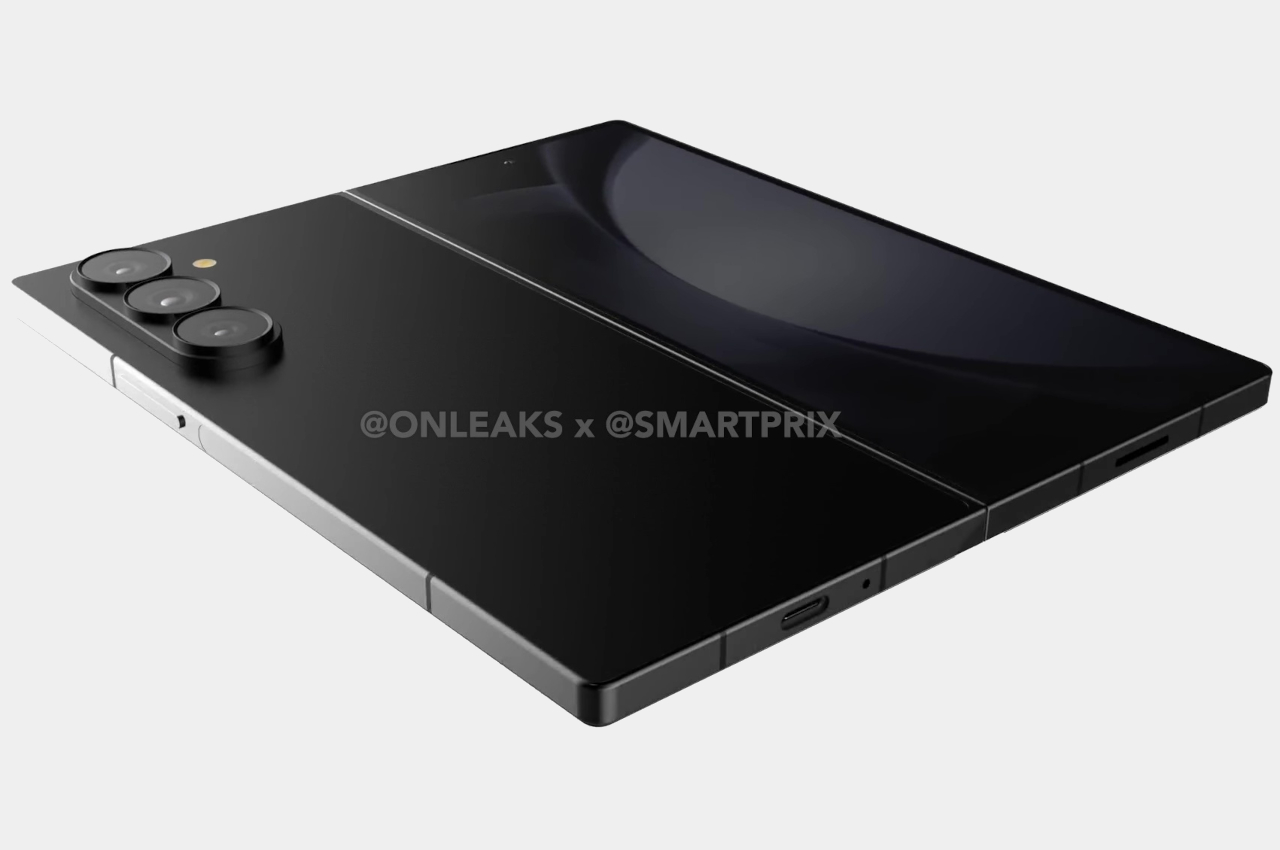
    Designer: Google (renders courtesy of Smartprix, @OnLeaks)

    Google Pixel Fold 2: Design

    For three generations since the Pixel 6 in 2021, Google seemed to have settled on a signature design that, unusual as it may have been, gave its phones a unique personality. It seems, however, that Google has gotten tired of that look and will be moving to a different design for the Pixel 9 series. For better or for worse, that change is apparently happening to the foldable version of the Pixel as well, but not in the same way as leaks and renders would have it.

    The camera bump, which was a horizontal bar across the width of the Pixel Fold’s “back,” has now been reduced to a more conventional rectangle. But unlike the ones you’d see on other smartphones, Google opted for an odd horizontal layout, with black pill-shaped markings that hold the actual camera lenses. It’s definitely an unusual design, but unlike the current “visor” shape, many might find it visually unappealing.

    Fortunately, there will be even more important design changes in store for the Pixel Fold 2 (or Pixel 9 Pro Fold), though they might be a bit more subtle. According to rumors and at least one leaked prototype, the next Google foldable will have an outer screen that is taller than its predecessor, yielding an unfolded shape that is more square than the first Pixel Fold as well. Whereas the Pixel Fold had a rectangular shape that resembled a small notebook, the Pixel Fold 2 could be more like a minuscule iPad mini.

    This change in screen aspect ratios isn’t just cosmetic and will have important usability implications. It won’t be as tall and narrow as the Samsung Galaxy Z Fold 5, which is notorious for being almost unusable as a regular phone, but it could make it a bit more awkward to use the Pixel Fold 2 in folded form, at least with a single hand. Those who loved the current wider design of the Pixel Fold might be disappointed, but those who missed using a 16:9 phone will welcome this change.

    Samsung Galaxy Z Fold 2

    Samsung Galaxy Z Fold 2

    Samsung Galaxy Z Fold 2

    Google Pixel Fold 2: Specs and Software

    With the change in screen aspect ratios come changes in screen sizes as well, and everyone will probably love what’s rumored so far. The Pixel Fold 2/Pixel 9 Pro Fold is expected to have bigger screens on both sides, though there is some agreement on the exact sizes. Some claim that the external Cover Screen will be 6.4 inches and the main foldable screen will be 7.9 inches, while another source uses 6.29 inches and 8.02 inches for those same screens, respectively. Either way, it will still be a significant size boost compared to the current Pixel Fold’s 5.8-inch exterior and 7.6-inch interior displays.

    As far as the hardware is concerned, Google might debut a new Tensor G4 on the Pixel Fold 2, a very big leap from the Tensor G2 on the OG Pixel Fold. Details on this new processor are still extremely slim at this point, but you can expect significant performance improvements, especially on Google’s favorite AI features. Uncharacteristically, Google might also be extra generous and give the Pixel Fold 2 as much as 16GB of RAM, something that even the Galaxy Z Fold 6 isn’t expected to have.

    There seems to be some disagreement on which version of Android the Pixel Fold 2 will ship with, but that mostly depends on when the foldable device will actually launch. It could go with Android 14, which is the current version in circulation, or it could delay it to coincide with the release of Android 15. Pushing the Pixel 9 Pro Fold’s launch to the end of the year might sound unreasonable, but there might be one very good reason for doing so. Android 15 betas have revealed that Google implemented improvements to the behavior of apps on foldable phones, something that its Pixel Fold badly needed.

    Google Pixel Fold 2: Cameras

    It’s a bit surprising that there hasn’t been any news on the kind of cameras that the Pixel Fold 2 will bear. The new camera design on the back may look like Google was making room for an additional camera, but the lack of news in that department suggests otherwise. In short, the new Pixel Fold may still be using the exact same three sensors as the current model, with some additional lenses for focusing or maybe a thermal sensor for taking temperatures. It wouldn’t be unheard of for Google, since it prefers to rely on software solutions to improve image quality.

    Another big camera design change will be the internal selfie camera which used to sit on the Pixel Fold’s ugly thick bezels. According to leaks and renders, the Pixel Fold 2 will do away with those atrocities, which means there’s a need to move the camera to a different place. The consensus is that it will take the form of an under-display camera similar to the Galaxy Z Fold, but it’s also possible Google will opt for a simpler solution that has a traditional punch-hole cutout for the camera.

    Google Pixel Fold 2: Price and Release Date

    Although the Pixel Fold 2, or Pixel 9 Pro Fold, will be advertised as an upgrade, it doesn’t seem like a huge generational leap if not for the difference in design and the new Tensor G4 processor. As such, it’s probably only reasonable to expect that the price tag won’t go higher than the $1,800 that the first Pixel Fold launched with. At the same time, it’s also not expected to go lower than that either.

    As for its launch date, that could depend on whether Google wants to delay it to sync with Android 15’s release. If it’s fine with having it run Android 14 out of the box, it could follow the same schedule last year that saw the Pixel Fold hit shelves in June. Otherwise, we might be looking at an October date after Android 15 goes gold. Either way, we’ll definitely find out more next month when Google reveals the real deal at I/O 2024.

    Google Pixel Fold 2: Final Thoughts

    The first Pixel Fold was definitely a surprise for Google fans. It managed to carry some of the personality of the Pixel design language to a foldable phone, along with Google’s blessed flavor of the Android user experience. At the same time, however, it really failed to stand up to other options in the market, and its very thick bezels were a big turn-off for more design-conscious consumers.

    Fortunately, the Pixel Fold 2 will be improving on those pain points, but it raises the question of whether it’s actually enough or if they’re the right changes to make. The screens will be larger and have thinner bezels, but Google is also moving away from an aspect ratio that was praised by some reviewers as one of its winning traits. The camera design will definitely be divisive, especially if it doesn’t bring significant improvements to the camera system anyway. While the Pixel Fold 2, or Pixel 9 Pro Fold, will catch the attention of Pixel fans and market watchers, it might not end up being the big hit that Google wants it to be, creating a self-fulfilling prophecy of low sales that will lead to the early demise of Google’s foldable phone line.

    The post Google Pixel Fold 2: News, Rumors, Price, and Release Date first appeared on Yanko Design.

    Samsung Galaxy Z Fold 6: News, Rumors, Price, and Dates

    Foldable phones aren’t going anywhere, at least not yet. They might not be generating much hype nowadays, but they still stir up a flurry whenever a new model launches. There’s definitely plenty of room for improvement not just in specs but also in design, and we indeed see some brands playing around with those elements a bit. Although there are now more foldable phones available, Samsung is still the undisputed leader even if by virtue of its industry clout only. Of course, its dominance is being challenged by competitors whose designs are addressing many of the flaws and limitations of the Galaxy Z Fold, which is why all eyes are on how Samsung will respond in kind this year. We might be just three months away from the launch of the Galaxy Z Fold 6, so we’ve gathered in one place all the details we know so far to paint a more complete picture of what to expect from one of the pioneers of this still niche market.

    Designer: Samsung (renders courtesy of Smartprix and Steve Hemmerstoffer/@OnLeaks)

    Galaxy Z Fold 6: Design

    The way a foldable phone works sounds almost so easy, but the reality is that it’s a hellish design to implement given the delicate balancing act that designers and engineers have to make. How do you design a smartphone that can be as big as a small tablet yet still be comfortable to use as a regular phone? To be perfectly blunt, Samsung failed to hit the mark with its first generation of foldables, but it seems to be inching closer to a better solution with each iteration.

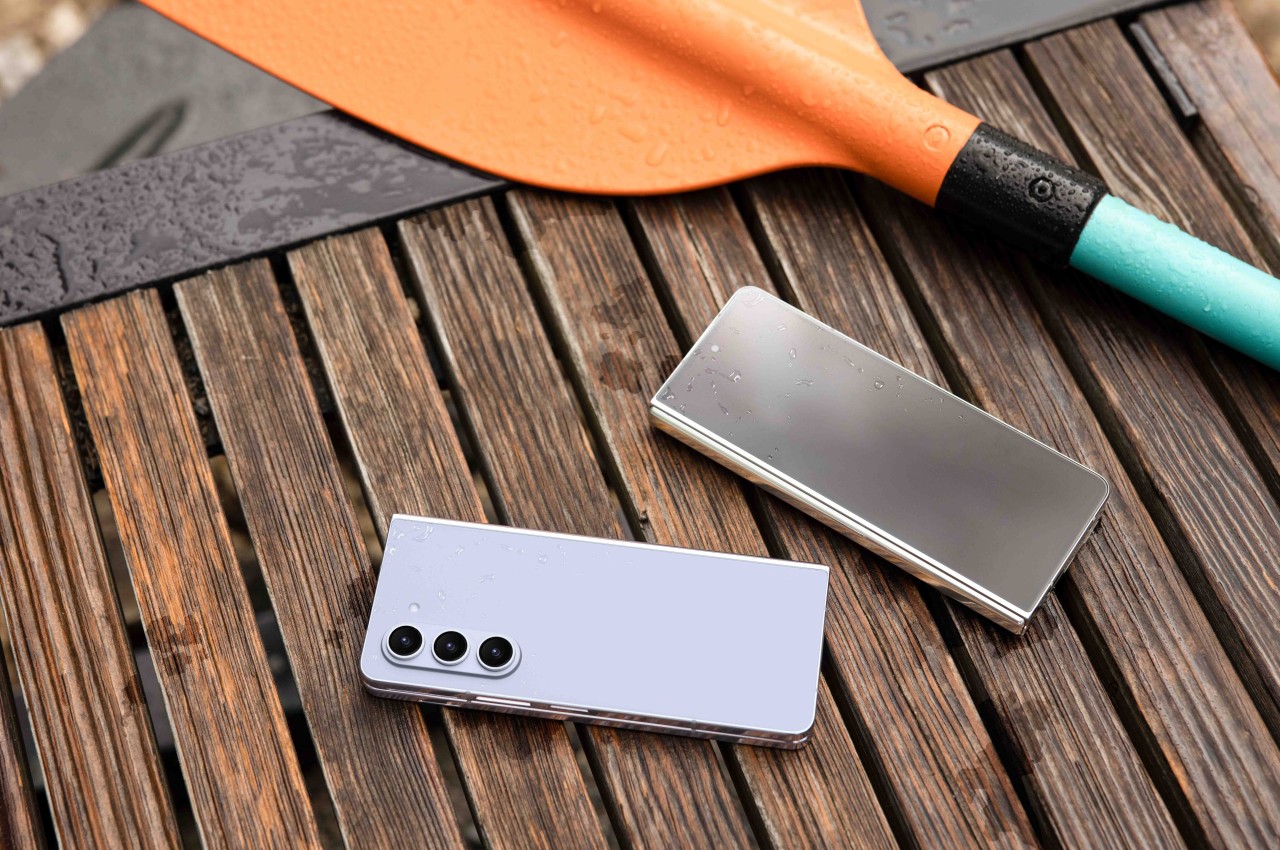
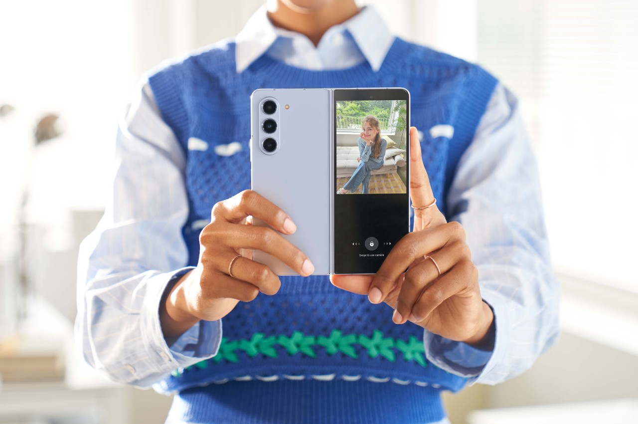
    Samsung Galaxy Z Fold 5

    Samsung Galaxy Z Fold 5

    Designer: Samsung

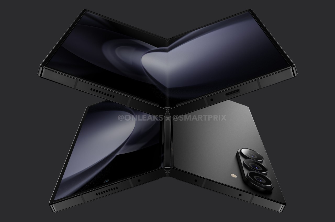
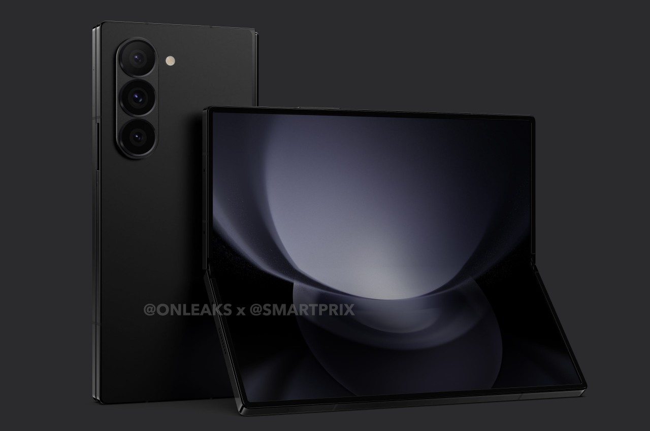
    According to the accumulated leaks and rumors, the Galaxy Z Fold 6 will be making some rather small but significant changes to the formula. There are some disagreements on exact figures, but the consensus is that Samsung’s 2024 large foldable will have a wider external Cover Screen, a thinner and lighter frame, flatter edges, and sharper corners. These minuscule changes all add up to make the Galaxy Z Fold 6 resemble its Galaxy S cousin more.

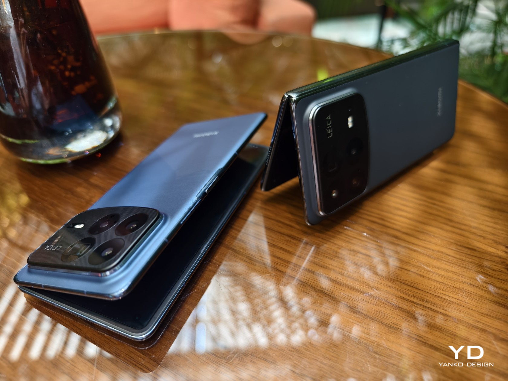
    The wider outer display will have a big impact on usability, even if the screen size itself doesn’t change. The new aspect ratio would make the phone less awkward to use as a regular phone when folded, one of the biggest and still present criticisms of Samsung’s foldable design. This does mean that the unfolded shape will be more square this time, resembling the form that other foldable phones have taken. That said, based on some of the leaked measurements, it will still not be as wide as the Google Pixel Fold or OnePlus Open which are considered to have the better design on this aspect.
    Google Pixel Fold

    Google Pixel Fold

    Google Pixel Fold

    Designer: Google

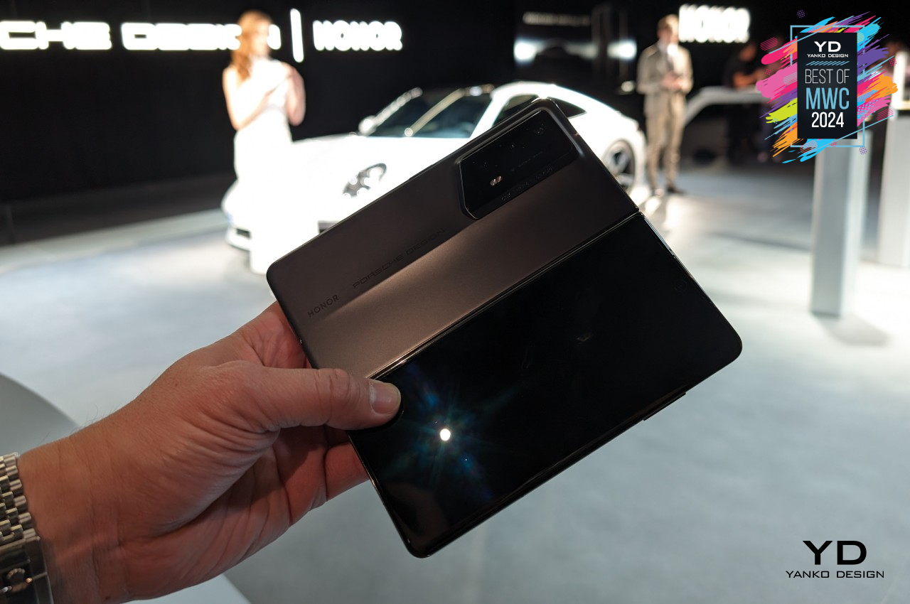
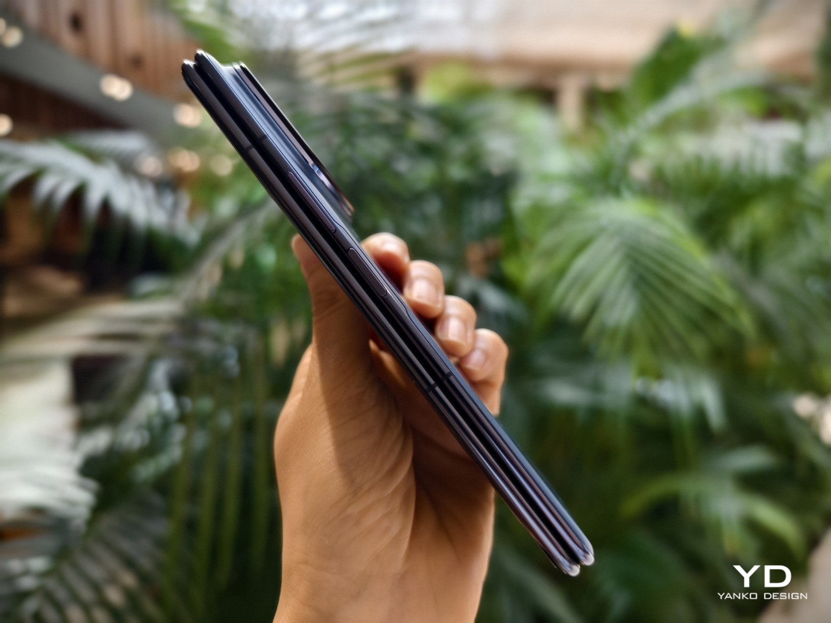
    The Galaxy Z Fold 6 is also expected to be thinner (5.6mm folded, 12.1mm unfolded) and lighter (239g) than any of its predecessors. This improvement is, again, based on the design of the Galaxy Z Fold before it (6.1mm folded, 13.4mm unfolded, 253g weight), but not against other brands. The recently launched Honor Magic V2 probably holds the title of thinnest and lightest foldable, but its limited availability makes that pointless for some markets. One side effect of a thinner body, however, is that there will still be no room for an integrated S Pen, something Samsung loyals have been wishing for since the Galaxy Z Fold 3.

    Honor Magic V2 RSR Porsche Design

    Honor Magic V2 RSR Porsche Design

    Honor Magic V2 RSR Porsche Design

    Designer: Honor

    There are rumors of an “ultra” model for the Galaxy Z Fold 6 where Samsung will pull out most of the stops. If true, this could be a titanium-clad model, in line with the Galaxy S24 Ultra and the general trend in the industry. Of course, this would also raise prices higher, especially if the so-called Galaxy Z Fold 6 Ultra will include other upgrades as well.

    Samsung Galaxy Z Fold 5

    Galaxy Z Fold 6: Specs and Software

    Samsung always gives its flagship products the best specs available in the market, and the Galaxy Z Fold 6 won’t be any different. The question, however, is whether Samsung’s idea of “best” matches the expectations of buyers. This year, we’ll be looking at another iterative upgrade, and some consumers might not be that amused.

    The latest Qualcomm Snapdragon 8 Gen 3 is a no-brainer for a 2024 flagship, and we haven’t heard any whispers of a special version custom-made for Samsung or the foldable. What might not see a big jump, however, is the memory that comes with the phone. RAM will be capped at 12GB yet again, with storage coming in 256GB and 512GB capacities. It’s probably high time that we get a 16GB RAM, 1TB storage Galaxy Z Fold, but that might not be on the table unless those “Ultra” model rumors pan out.

    The battery is yet another aspect that is unlikely to see any changes. Although a 4,600mAh battery was earlier rumored, a thinner and lighter design would probably make more sense if Samsung sticks to the same 4,400mAh pack. Unfortunately, charging technologies aren’t expected to change either and new owners will be stuck with the same 25W wired and 15W wireless charging speeds.

    Given the expected timing of the launch, the Galaxy Z Fold 6 will be launching with the latest One UI 6.1 version that will still be based on the current Android 14 release. It will mostly be the same user experience on the Galaxy S24, just with some foldable-specific features mixed in. Do expect that Samsung will heavily advertise AI features as well, especially those that it wasn’t able to focus on earlier this year.

    Galaxy Z Fold 6: Cameras

    While the incremental upgrades to specs can be forgiven, the biggest Achilles’ heel of this year’s Samsung foldable will be its cameras. Contrary to expectations and wishes, the Galaxy Z Fold 6 is now believed to use the exact same set of cameras that came with the Galaxy Z Fold 5 last year. That means a 50MP main camera, a 10MP 3x zoom telephoto, and a 12MP ultra-wide. The under-display camera under the foldable screen is expected to see performance improvements but still have the same 4MP sensor.

    While it’s true that you can squeeze out impressive images from such sensors using software and algorithms, you can only go so far with relatively weaker hardware. The bigger question is why Samsung is unable to use better cameras when almost all its competitors can. Thickness is definitely not an issue and it’s not like Samsung’s foldables are less expensive than other foldables, so one can only wonder about the company’s reasons.

    OPPO Find N3

    OPPO Find N3

    OPPO Find N3

    Designer: OPPO

    That said, it could be setting the stage for the rumored Galaxy Z Fold 6 Ultra that’s said to resemble the Galaxy S24 Ultra in some ways. In addition to a titanium frame, this Ultra foldable might borrow the 200MP camera of Samsung’s early 2024 flagship. That, however, might mean changing the foldable phone’s dimensions, particularly its thickness, so there’s a very slim chance that will be the case.

    Galaxy Z Fold 6: Price and Launch Date

    Samsung seems to be holding its second Galaxy Unboxed event earlier each year, especially now that it has retired the Galaxy Note line. The Galaxy Z Fold 5 was announced in late July last year, with the actual shipments starting around August. This year might follow the same pattern with the announcement happening around the second week of July. This earlier date might also be due to Samsung trying to avoid clashing with the 2024 Summer Olympics, where it could be a major sponsor and advertise the Galaxy Z Fold 6 heavily during the event.

    We’re not expecting any price changes this year at least, especially since there aren’t any big changes happening. The past few foldable flagships launched at $1,800, and that could still be the same starting price for a 12GB RAM, 256GB storage configuration. That said, if there is an Ultra model, the pricing scheme could shift a bit and be a bit more complicated. The base Galaxy Z Fold 6 could start at $1,700 instead, while the Ultra model with its titanium design and higher specs might hit $2,000.

    Galaxy Z Fold 6: Final Thoughts

    It looks like Samsung fans will be facing another iterative cycle this year as far as the Galaxy Z Fold 6 is concerned. While there will be marked improvements in terms of performance and design, some of the pain points current owners have remained unaddressed. Hopefully, the wider Cover Screen aspect ratio will indeed improve the phone’s overall usability, the change might be a bit too subtle to matter. Photography is where the Galaxy Z Fold 6 will hurt the most, and Samsung has to prove that it can pull out a rabbit from its hat using these aging camera sensors.

    Although Samsung leads the smartphone industry because of its wide reach and prestige, it is risking that advantage by sitting on its laurels for too long in the foldable market. Although some of its competitors aren’t available in major markets where Samsung plays, they do drive home the flaws in Samsung’s design. If these brands can achieve something that a giant like Samsung can’t, then people will start losing confidence in the brand’s products, creating a self-fulfilling prophecy of weaker sales for the Galaxy Z Fold line.
    The post Samsung Galaxy Z Fold 6: News, Rumors, Price, and Dates first appeared on Yanko Design.