Odd planter concept lets you enjoy observing your plants grow in a fun way

Different people tried to cope with the pandemic quarantine in different and sometimes creative ways. While some were content to catch up with their TV shows and games, others took up new hobbies to while away the time. One of the more popular ones seems to have been growing plants indoors, which is not totally new but also not something adopted by the masses. Even here, there’s a variety of goals and purposes to indoor gardening, though a majority seems to have been focused on the more aesthetic benefits of having lush, green living things inside the home. Ironically, these people seldom go out of their way to grow those plants in equally aesthetic pots, something that this design concept tries to solve right from the start.

Designer: Adrian Min
You can’t just use any container to serve as a plant pot, of course, regardless of how pretty that container might be. There are a few factors to consider to allow a plant to thrive and survive, which is often what informs the design of a planter. These more functional planters, however, aren’t what you’d always call presentable, definitely nothing you’d proudly display on your table or shelf. That doesn’t have to be that way, though, and this “Odd Pot” concept marries form and function in a way that looks not only appealing but also playful.
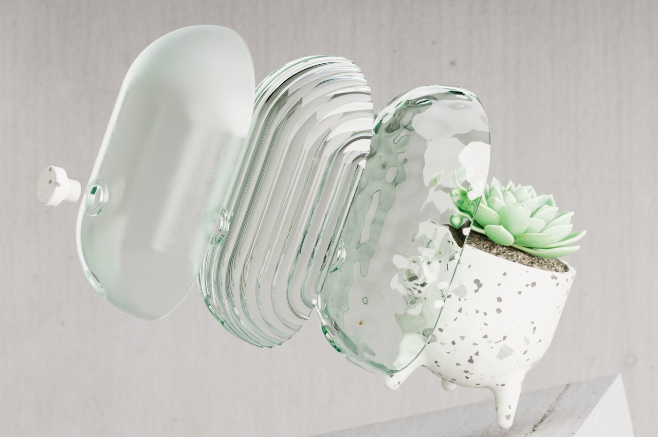
It’s definitely an odd one for a pot, though mostly because of its unconventional shape. It comes as a tall bowl that stands on three short tapered legs. Instead of a typical brown clay, the pot seems to be made from some terrazzo material, probably ceramic. A removable disc knob juts out from the pot’s back and is the primary mechanism for its highlight feature.

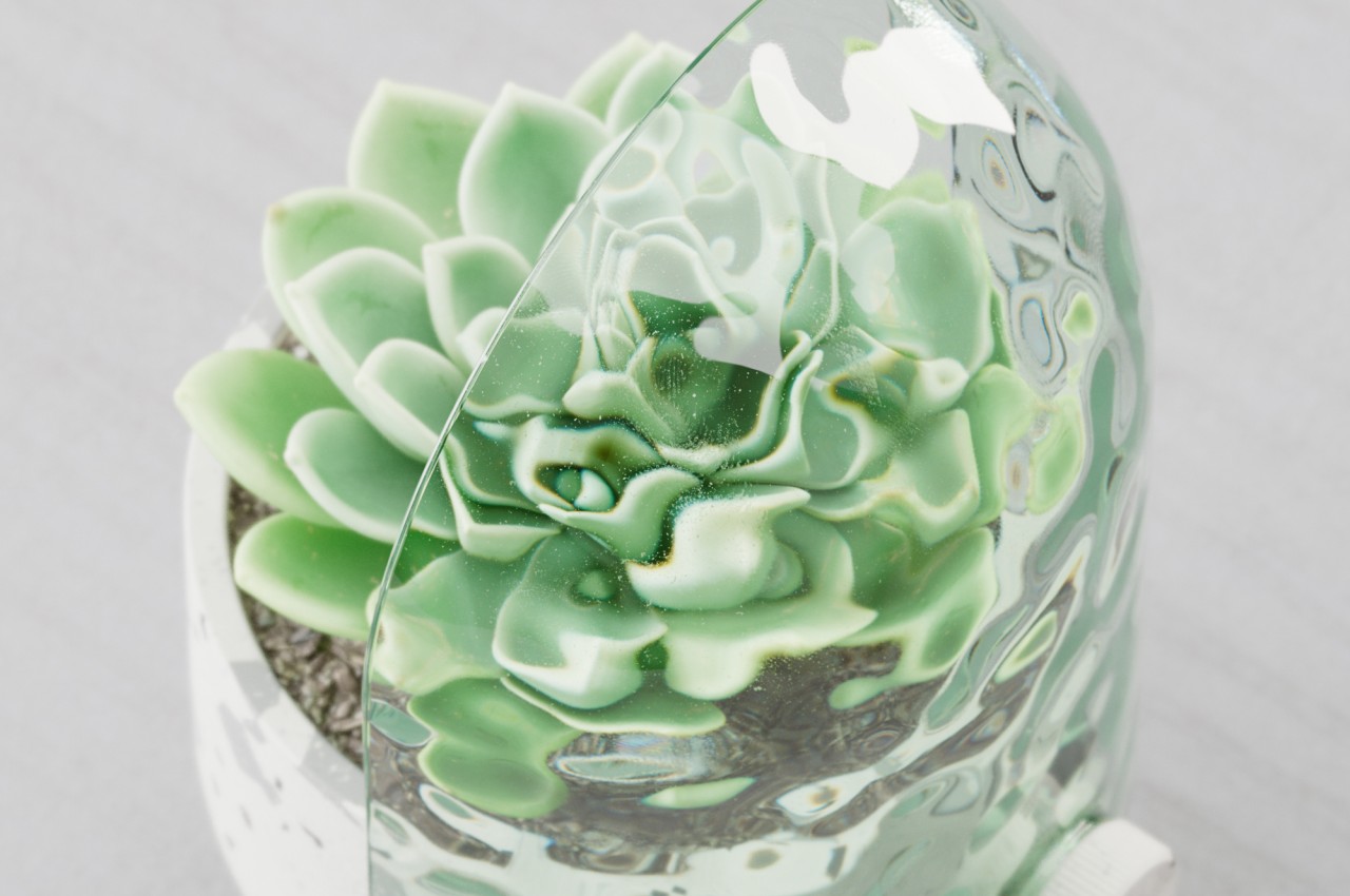
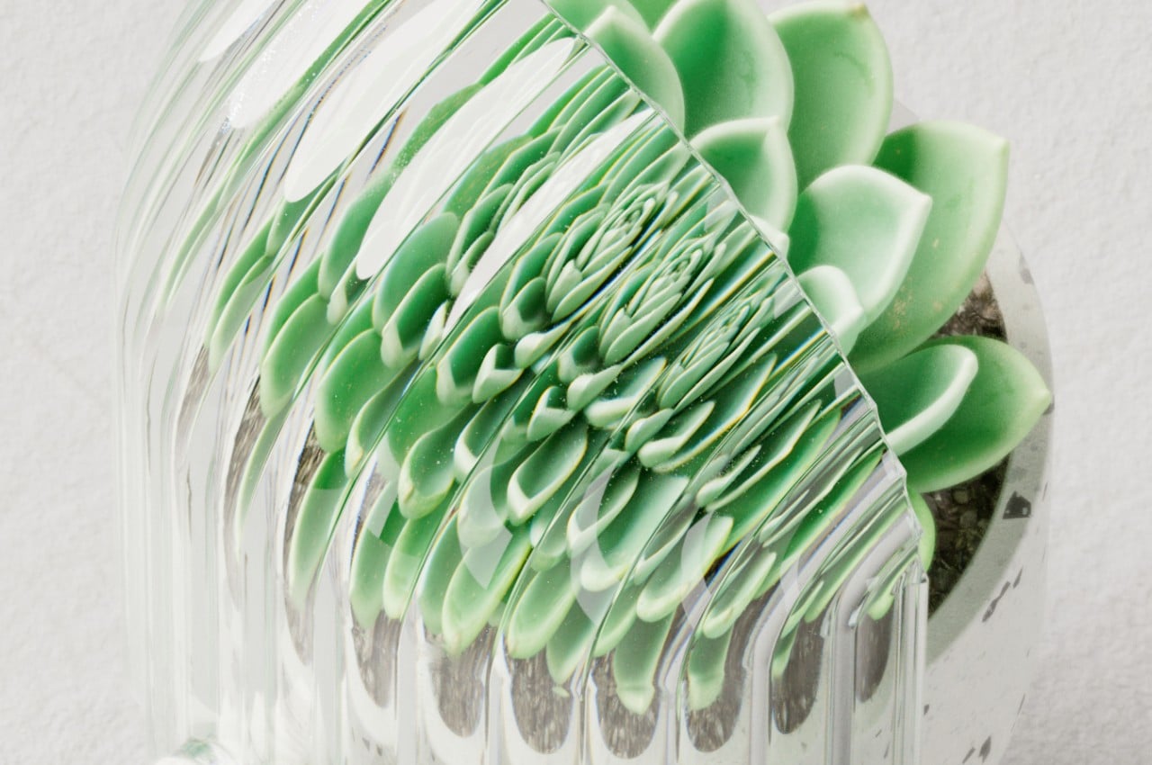
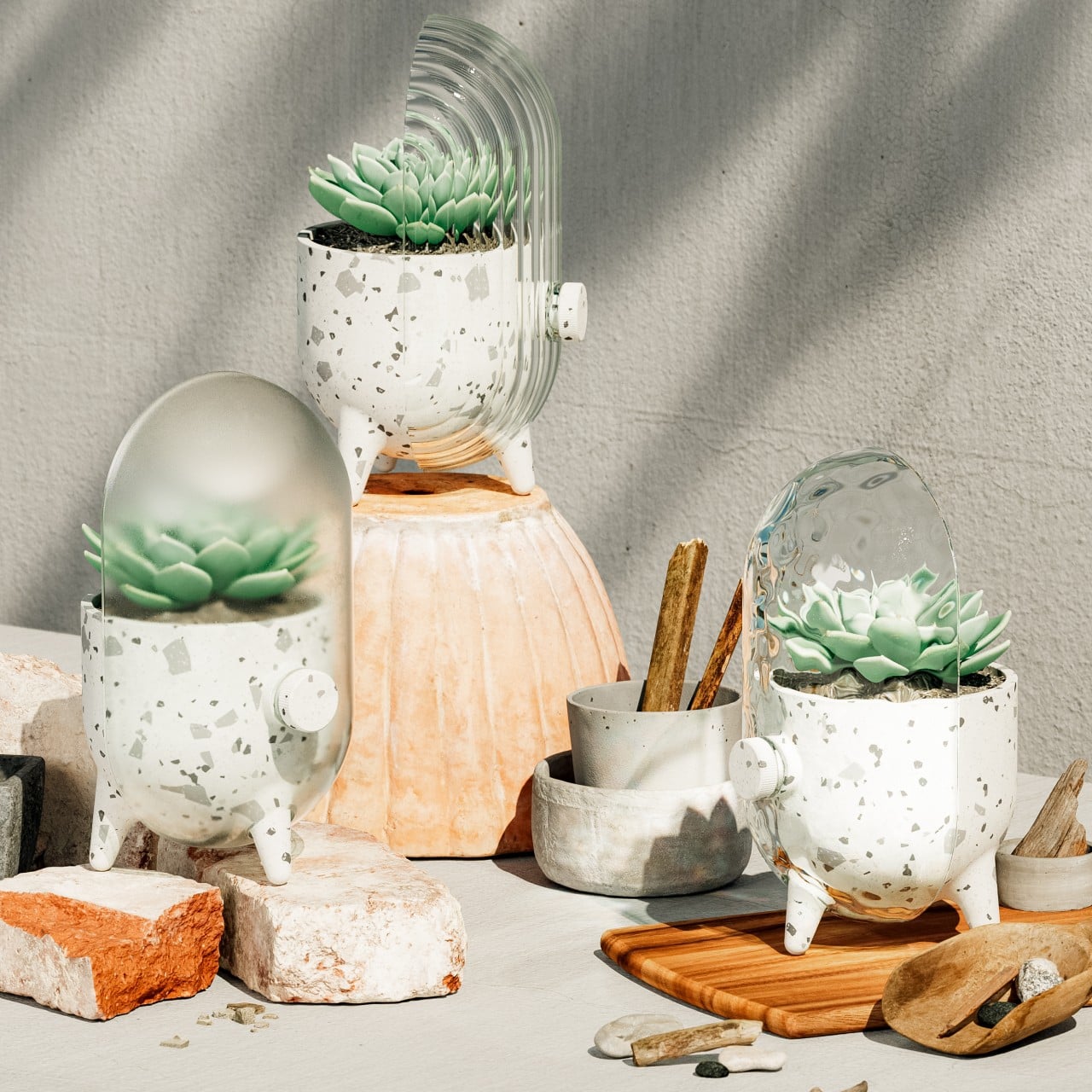
This feature comes in the form of a half capsule that adds something interesting to the presentation while also giving the viewer a different way to look at the plant in the pot. This “cover” is made from glass but has different textures as well as transparencies. One is completely smooth and transparent, while another is smooth yet frosted. Perhaps the curious one is the ribbed clear glass that adds an interesting play of light with its reflections and refraction.
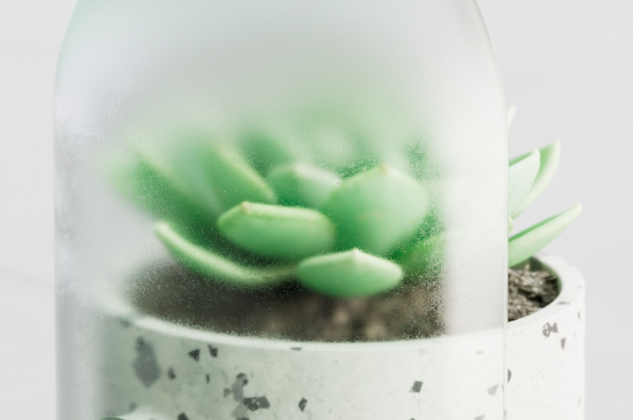
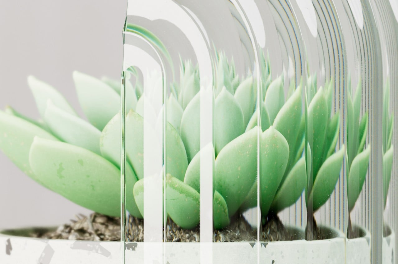
While the Odd Pot retains pretty much the exact same function of a regular planter, its form takes the presentation to the next level. With its stumps for legs and an “arm” that extends from its body, it almost looks like an anthropomorphic version of a planter. It might even remind some of the “sus” characters from a popular game from the past year or two. Granted, the pot’s design isn’t going to be conducive to all kinds of plants, particularly the ones that grow tall or wide. But for most succulents, it will do just fine and will even add a bit of character to your plant decoration.
The post Odd planter concept lets you enjoy observing your plants grow in a fun way first appeared on Yanko Design.
The most beautiful wireless mouse ever made has the allure and appeal of a luxury perfume bottle

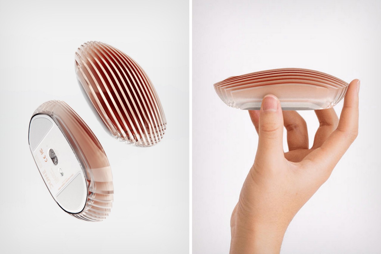
Composed of multiple slats of carved acrylic stacked together, the Dune mouse is incredibly eye-catching… but is it ergonomic?

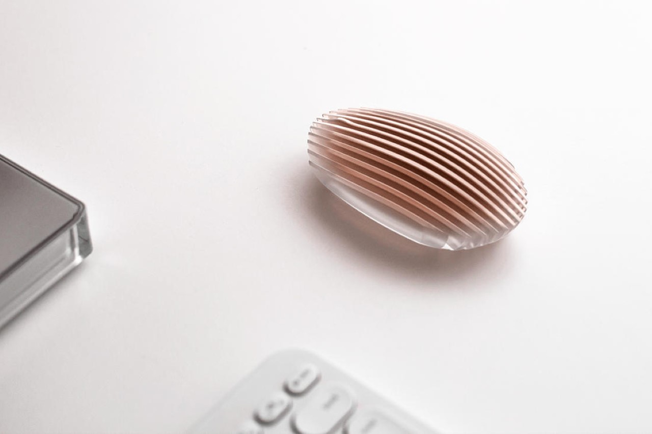
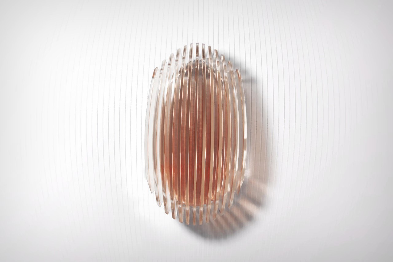
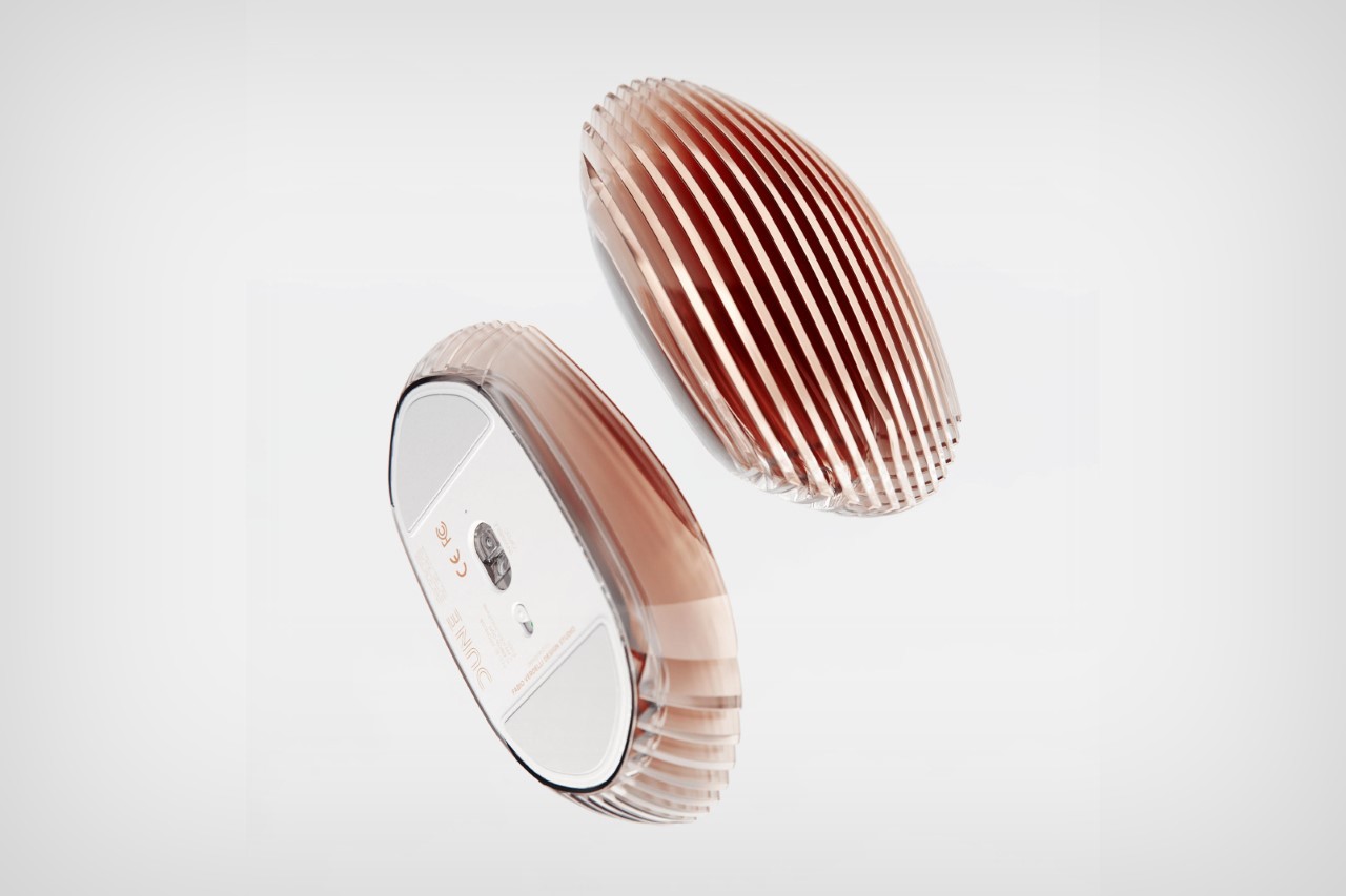
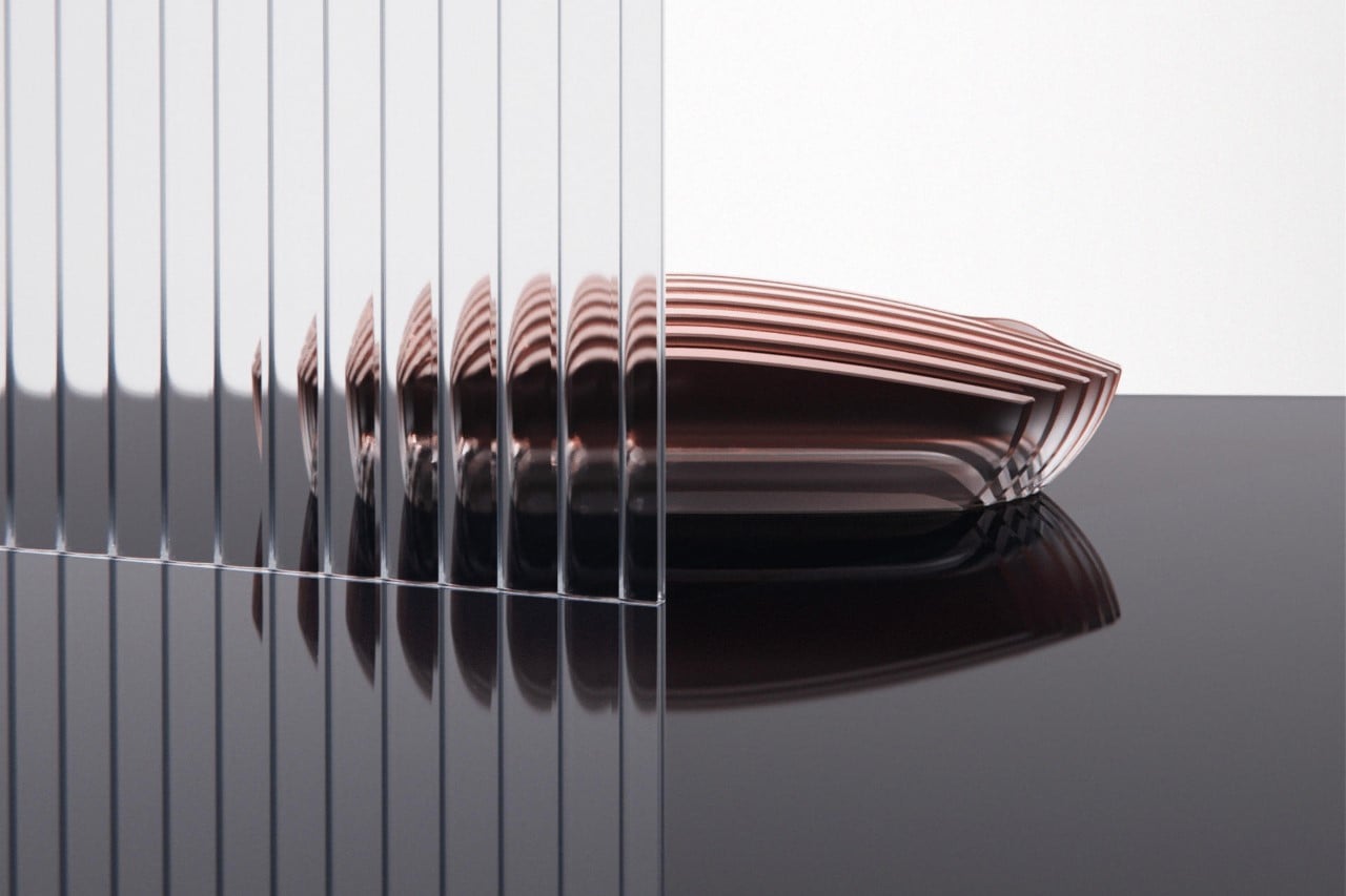
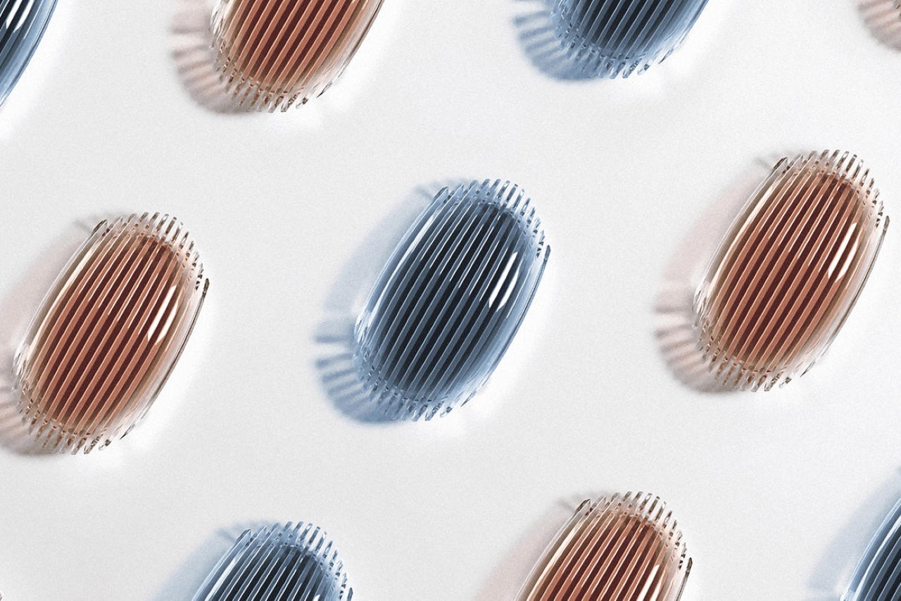
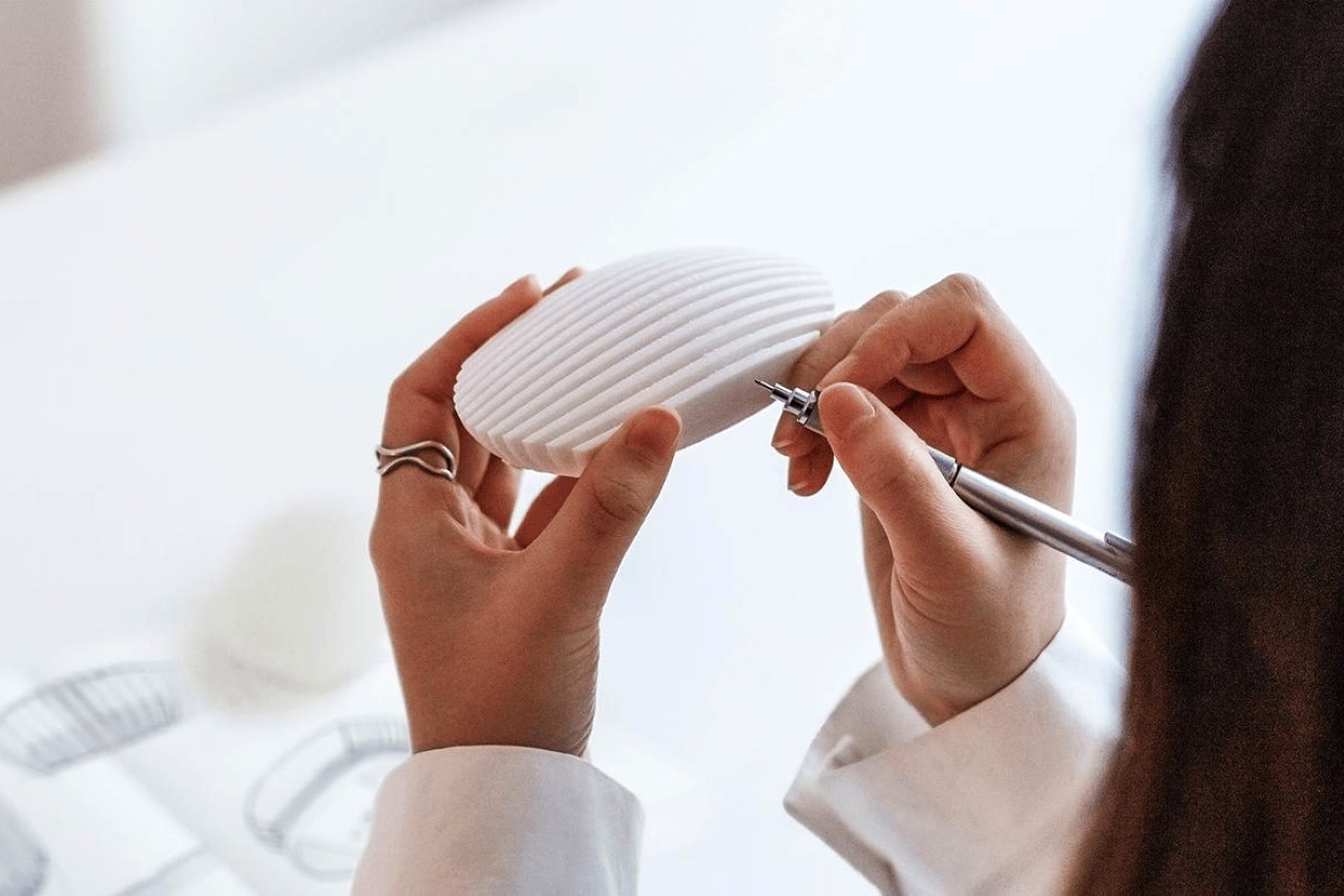
Designed by the Fabio Verdelli | Design Studio, the Dune wireless mouse takes its inspiration from the dunes that form on the sands of majestic deserts. Wind pushes the sand into ripples that stretch for miles, creating perfectly spaced lines that make the sand look like water. The Dune mouse mimics that too, with a set of laser-cut acrylic sheets connected together but spaced apart, creating the Gestalt of continuity that makes it look like a wireless mouse.

Designer: Fabio Verdelli | Design Studio

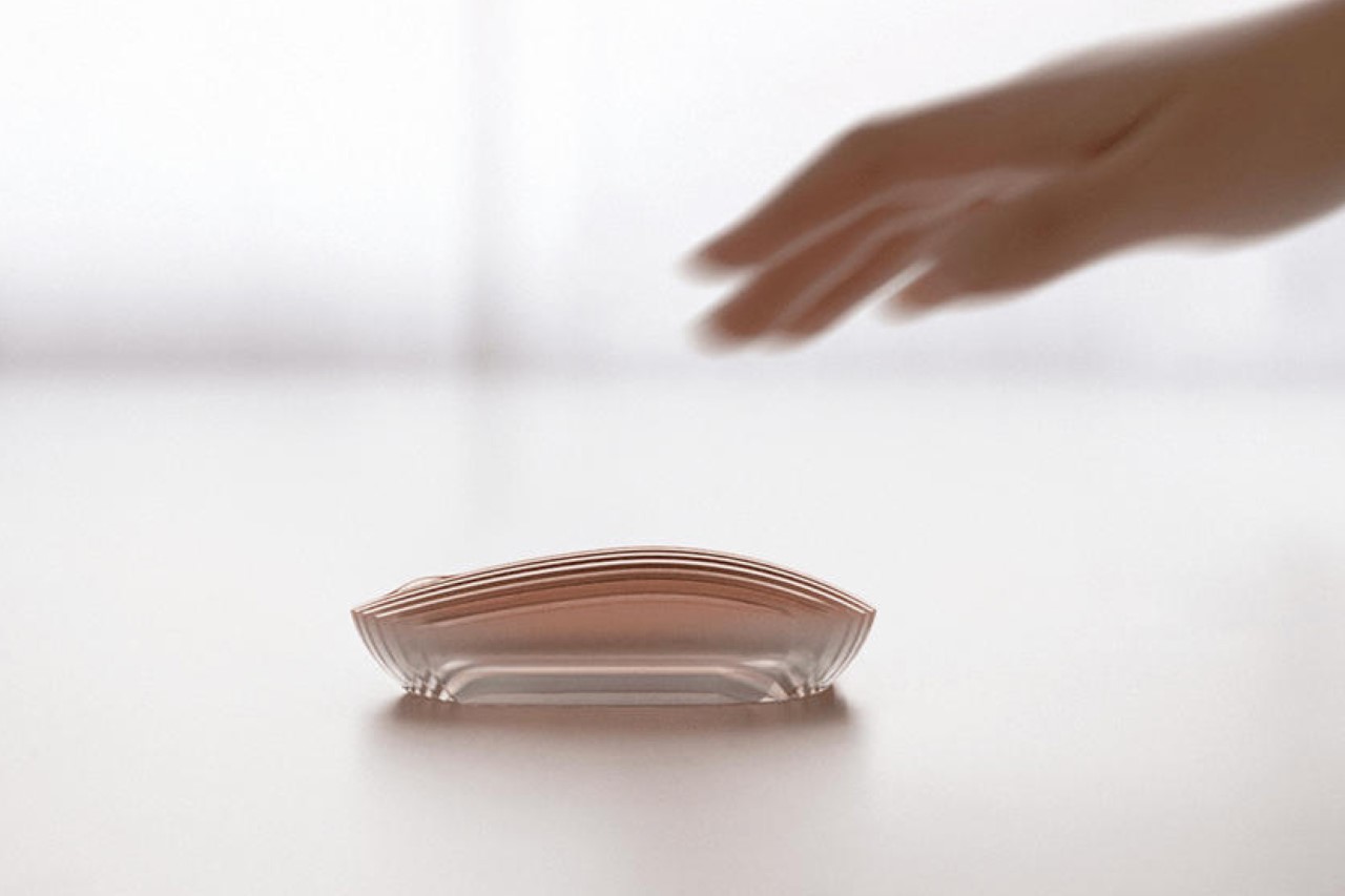
With an aesthetic that feels bordering on jewelry, the Dune mouse rejects convention with its luxurious design. The mouse is fairly monolithic, and doesn’t feature buttons or scroll wheels. Instead, it relies on touch-sensitive functionality, allowing you to both tap or scroll on the mouse’s slatted surface. There is, however, the gentlest bump where you’d expect a scroll wheel. This area intuitively has your finger scrolling on it, with the touch feature translating that into scrolls.

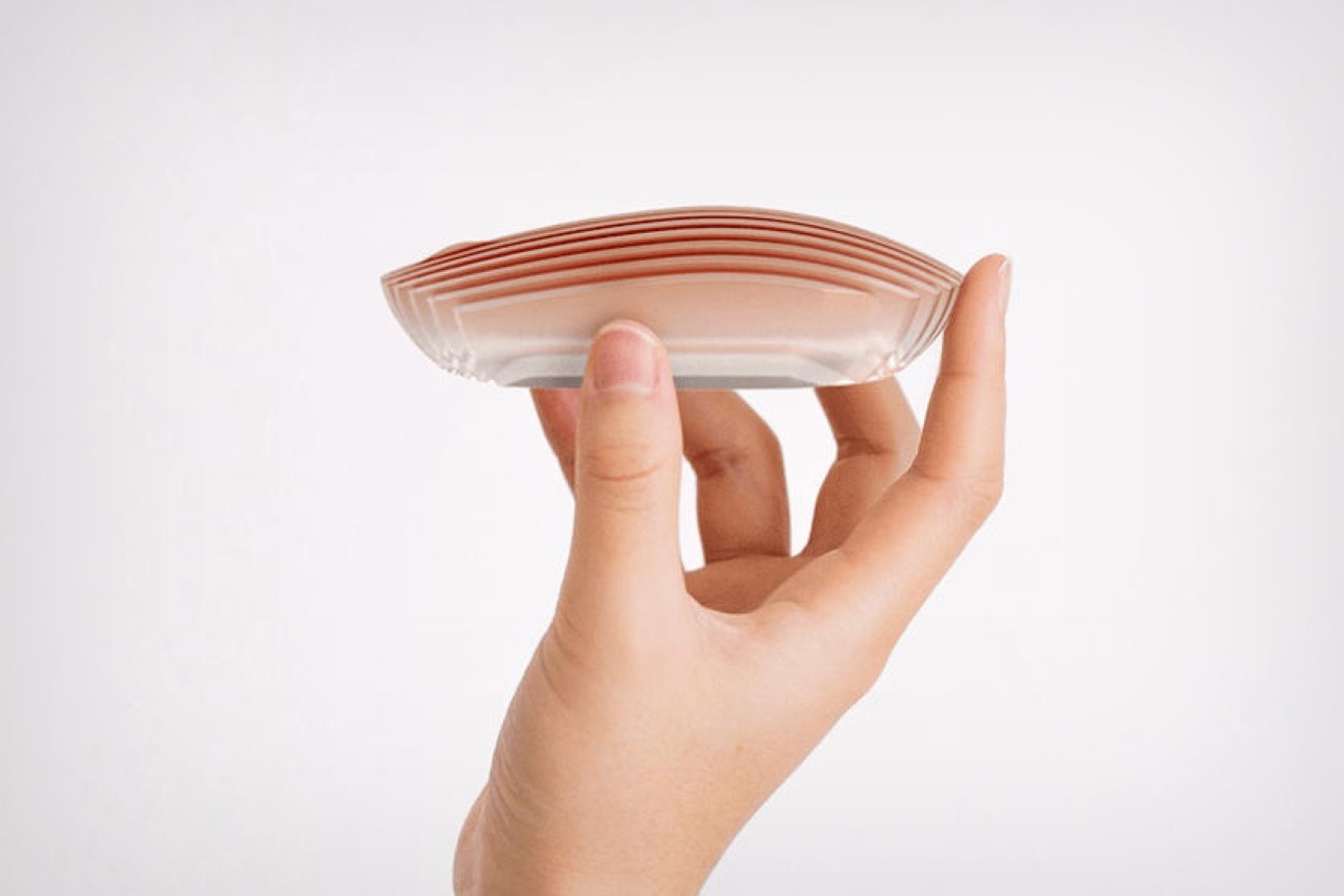
Visually, the Dune looks absolutely stunning. It’s designed to create visual drama with its frosted acrylic strips that are just ever so gently tinted with rose gold. The upper part of the mouse is fairly opaque, but it begins showing translucency at the edges and the base, creating an almost gemstone or perfume bottle-like effect.

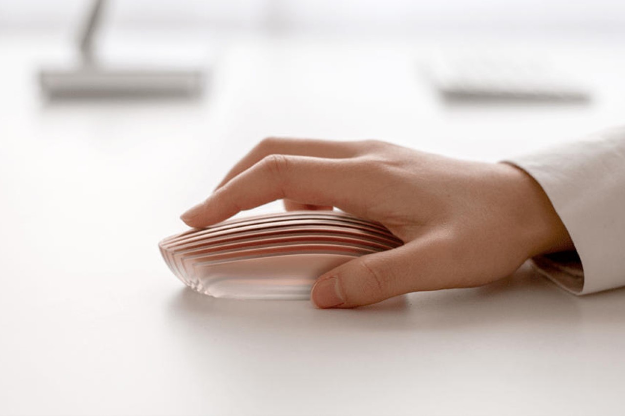
Is the Dune as ergonomic as a more conventionally-designed ergonomic mouse? Well, instinctively, it feels like it isn’t, but then again, it’s possible that our hands could grow to love that slatted texture instead of being repulsed by it. The overall form still has curves in the right places, although the edges on the sides seem a little sharp, sort of like the way the Magic Mouse has cliffs around the edges.

There’s no soft surface on the mouse, which leads one to believe that prolonged use will have you struggling. There’s also no feedback in terms of clickable buttons or actual physical scroll wheels. One could easily make the point that the Magic Mouse doesn’t have those too (at least the clicking function isn’t as intuitive as actual left and right clickers), but the Magic Mouse makes up for it with a flat surface that you can perform gestures on – the Dune has no such functionality.

Where the Dune wireless mouse really shines is in its aesthetic department… however, everything else about the mouse feels like a bit of a drawback. The mouse doesn’t look too light, which means it requires a little more effort to move it around. It doesn’t feature soft grips or proper ergonomic surfaces, which puts it behind your average $20 ergonomic Logitech mouse. It doesn’t have buttons or scroll wheels too, nor does it have macro keys, or support for gestures, making it difficult to recommend to a graphic designer, gamer, or someone who needs a highly-functional precision machine. Most importantly, its transparent design makes it look fragile, and while most mice don’t really go through rough abusive use, there’s a tendency to think that this mouse is prone to cracking, snapping, or shattering – which isn’t a good look.

The mouse, however, is a wonderful vanity device. The kind that could easily sit on the executive’s desk, becoming almost one with the decor around it. It has a jewel/trophy-like quality that really allows it to stand out, and combined with that bronze-gold or blue colorway (shown above), the Dune really has the potential to completely uplift your desktop’s allure. For extra effect, pair it with lofree’s transparent mechanical keyboard!

The post The most beautiful wireless mouse ever made has the allure and appeal of a luxury perfume bottle first appeared on Yanko Design.

This delicate glass lamp invites you to touch and move it to actually use it

When faced with something fine and intricate, our initial and natural reaction would be to stay at a safe distance to look but not touch. Almost like snowflakes, these things of beauty risk being destroyed if not handled properly, which probably applies to the majority of us. There are, however, some rather seemingly fragile objects that do urge you to touch them, maybe even risk moving them, to fully enjoy and appreciate their design or even utilize their features. That is definitely the case with this rather creative and elegant glass lamp that is both beautiful to behold as well as to touch. In fact, you need to move it around if you actually want to dim or brighten the lamp.

Designer: kaschkasch

1

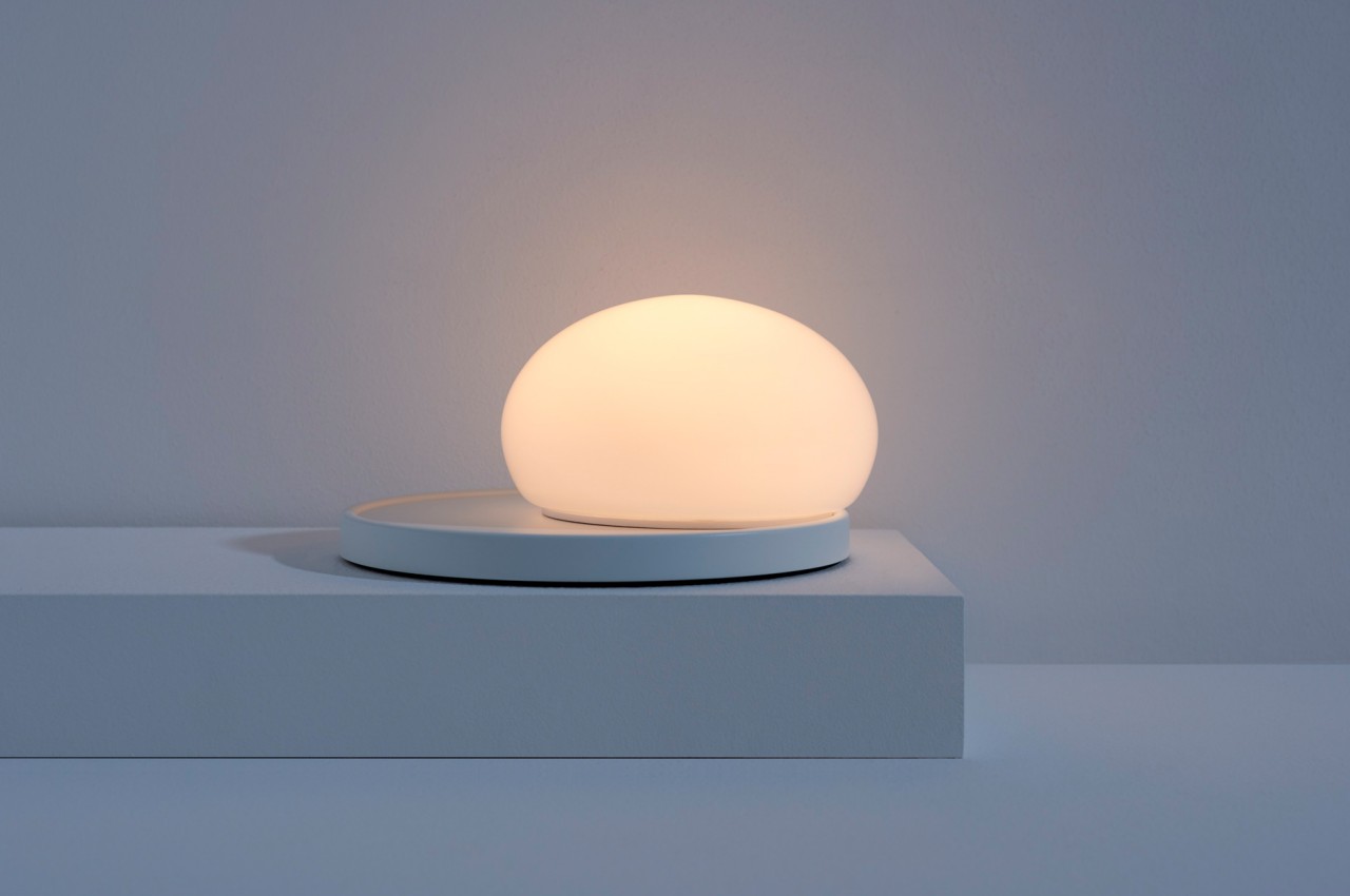
Glass is a material that has attractive visual and tactile properties, usually depending on what it’s mixed with. It can be clear, opaque, smooth, or textured, all of which give it a rather sophisticated character. While there are more durable forms of glass that don’t shatter at the slightest drop, glass normally has this air of fragility and delicacy that would probably scare off most people from even coming close to it. In sharp contrast, Bolita makes forming a tactile relationship necessary to using this table lamp, encouraging an almost playful approach to using it.

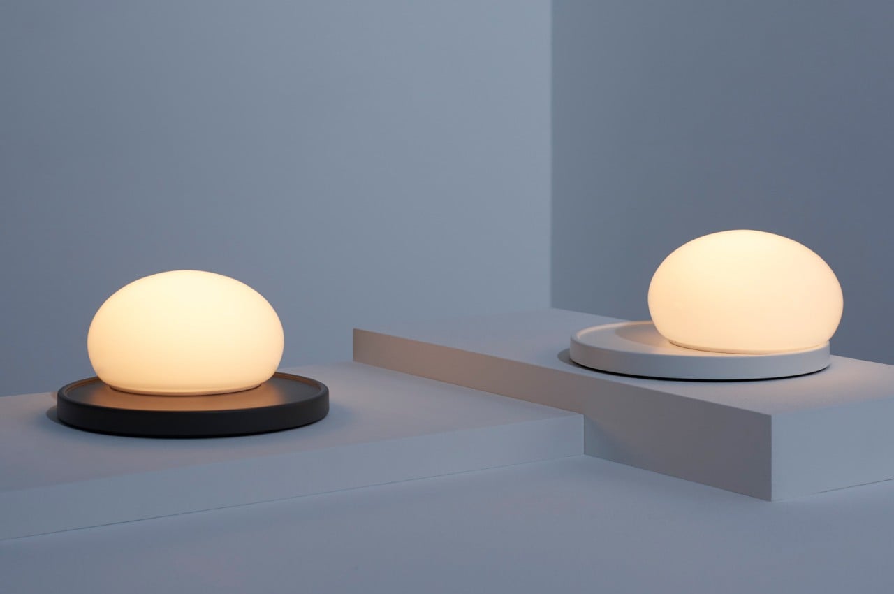
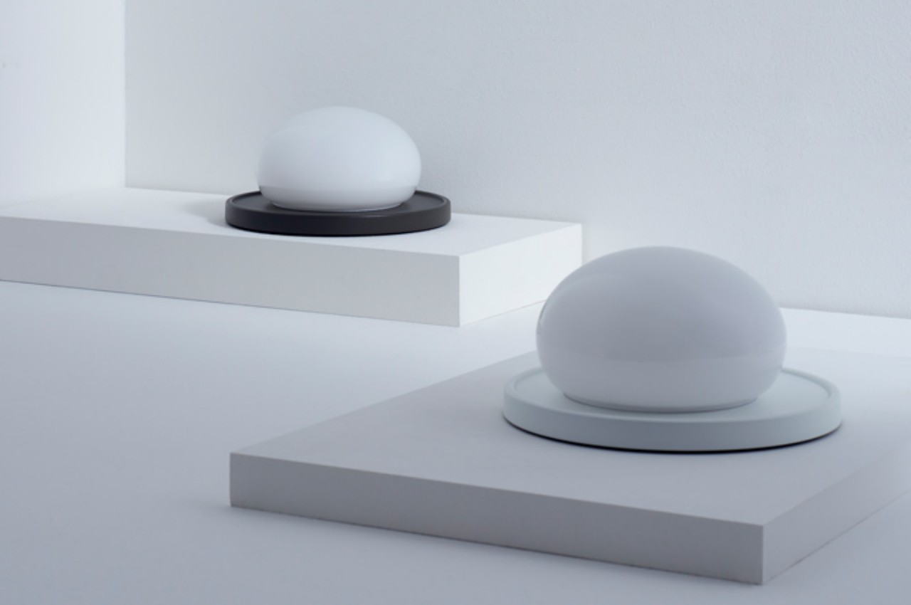
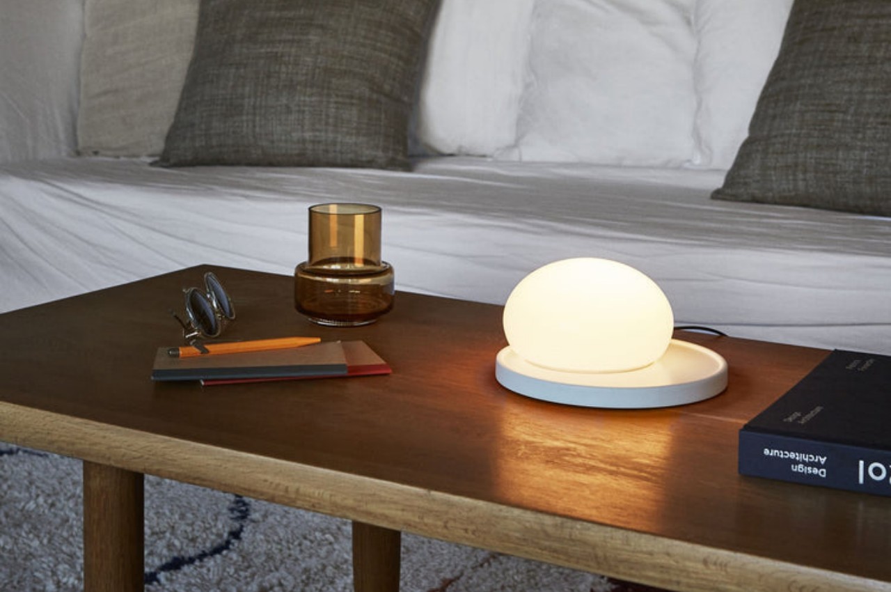
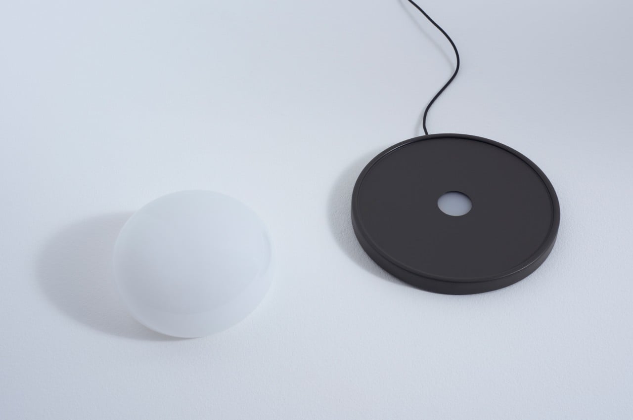
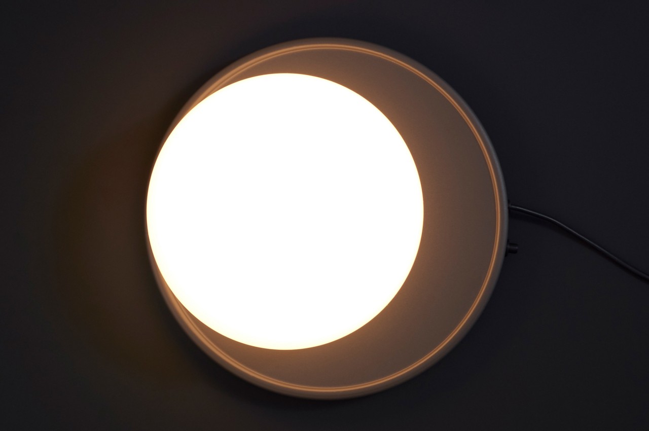
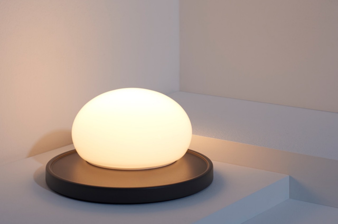
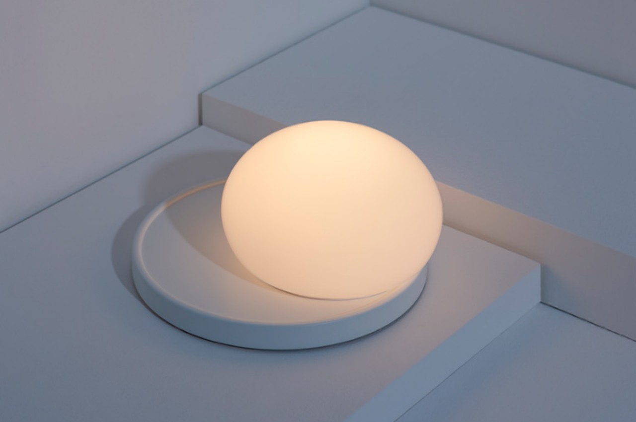
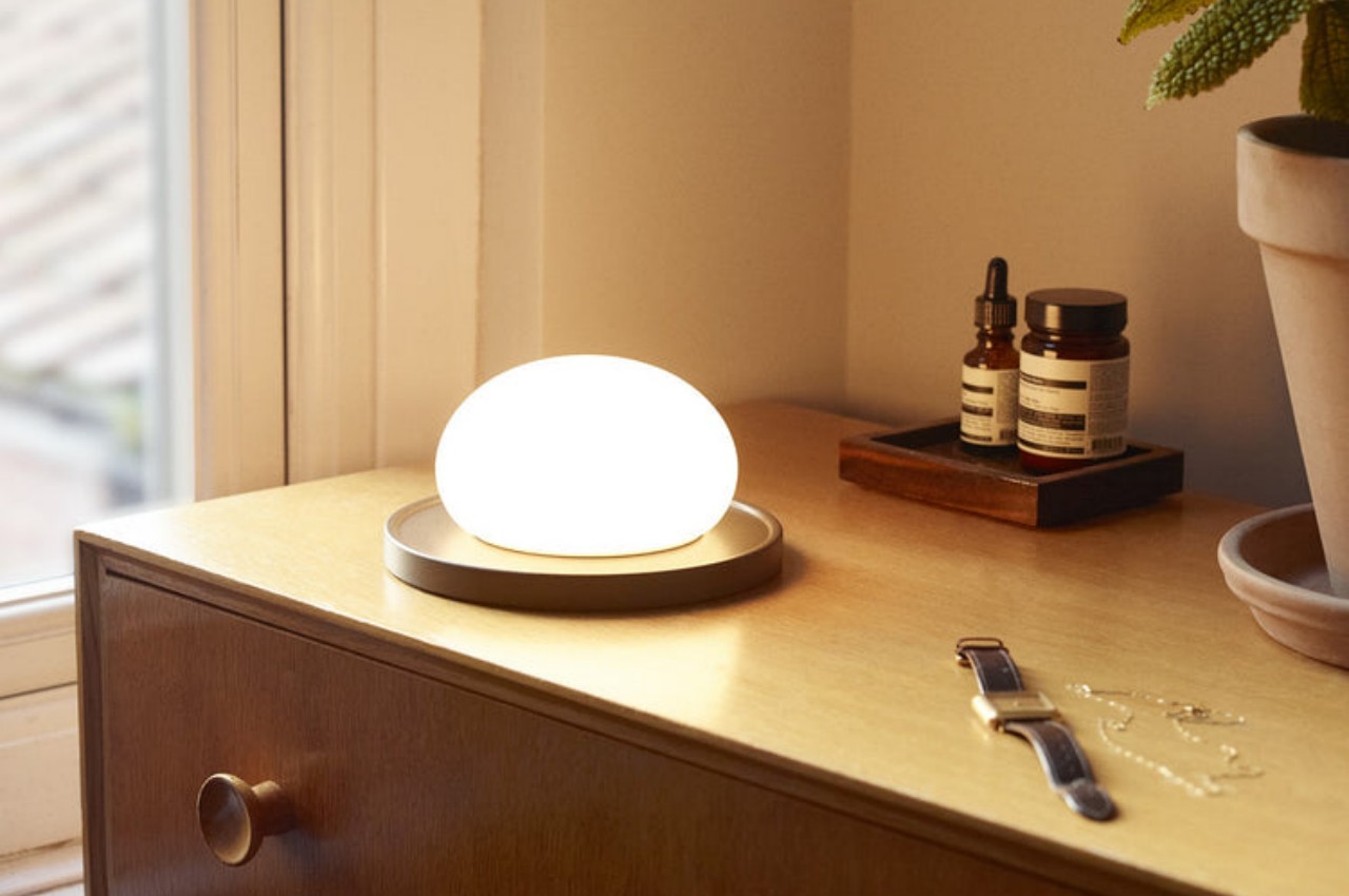
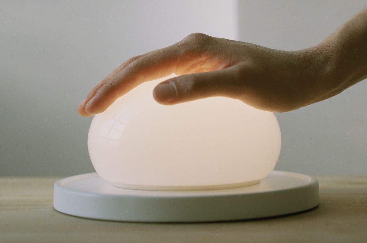
Bolita is comprised of two equally striking minimalist pieces. The actual lamp itself is a disc with a hole in the middle where the LED light shines through. The more conspicuous of the duo, though, is the glass sphere that sits on top, diffusing the light going into it and acting as the kinetic interface to the table lamp. Even when turned off, the lamp is already an attractive decor for your coffee table or drawer. The real magical experience, however, happens when you start moving that glass sphere.

The lamp has no knob or slider to adjust the lamp’s intensity. Instead, you slide the glass sphere around the disc, rather carefully perhaps, to do that. The closer it is to the edges, the dimmer the light gets. Put it at the exact center, and you’ll get the brightest setting. In a way, the sphere acts like a cover, where the light aperture gets eclipsed by the glass’s body as it moves around.

Bolita’s unique interface is rather ingenious, not only in its technical implementation but also in its intention. It puts the light on the sense of touch, something that is often neglected and taken for granted in a visual-centric world. Rather than warning people to stay away, it invites a playful attitude that gets rewarded with the ability to set the light to your desired level.

The post This delicate glass lamp invites you to touch and move it to actually use it first appeared on Yanko Design.

Orbital is an expanding dining table that shows off its beautiful complexity

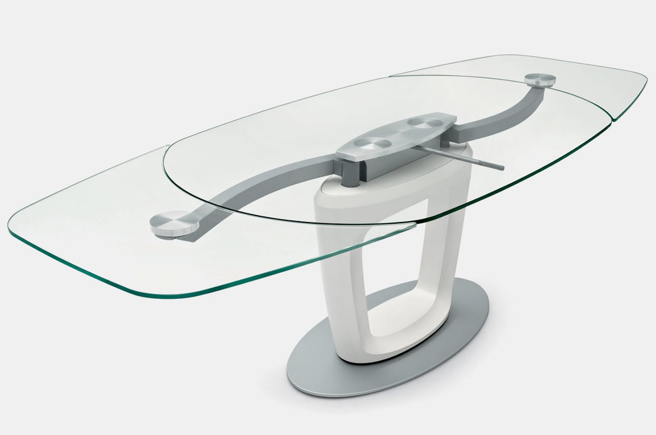
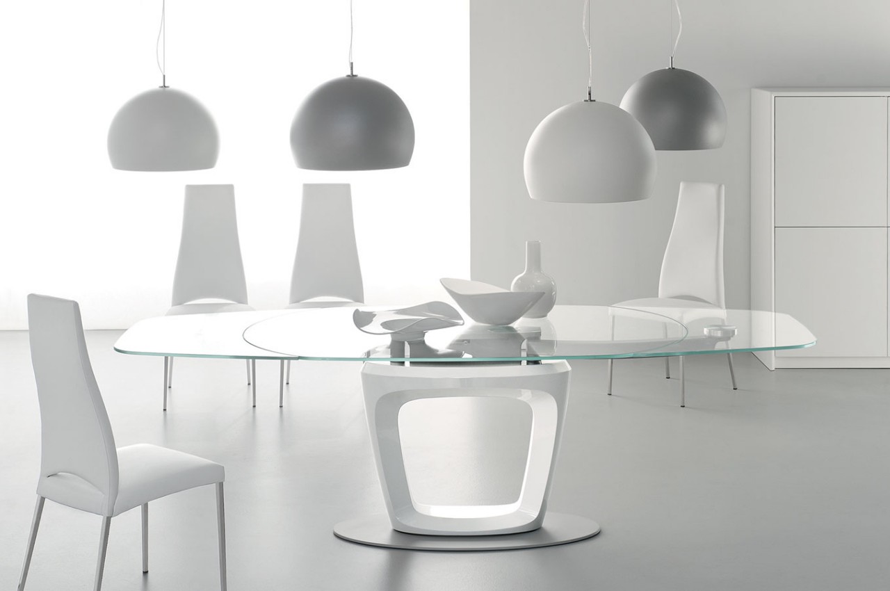
When we buy dining tables, we often take into account how many people there are in the household, plus two more people just in case. That said, while we have more control over the size of our own family, we can’t always predict how many people might be coming over for a meal or a party. Expanding dining tables are pretty much the only flexible solution for that problem, but most designs for this kind of table are either cumbersome or unattractive. This elegant dining table, in contrast, is already beautiful on its own, especially with its class transparent tabletop. It also uses a seemingly smooth yet nontrivial mechanism to expand itself, and it’s not ashamed to put that on display, especially since it only adds to its appeal.

Designer: Pininfarina

Most expanding tables, whether for dining or for work, are made of wood, probably because it’s a material that lends itself well to moving parts. The most common designs involve either flap on one or both ends that can be raised to expand the available surface or sliding panels that may or may not involve moving the table’s legs as well. Either way, these tables require a bit of effort to expand or contract, making them inconvenient and discouraging to set up unless absolutely necessary.

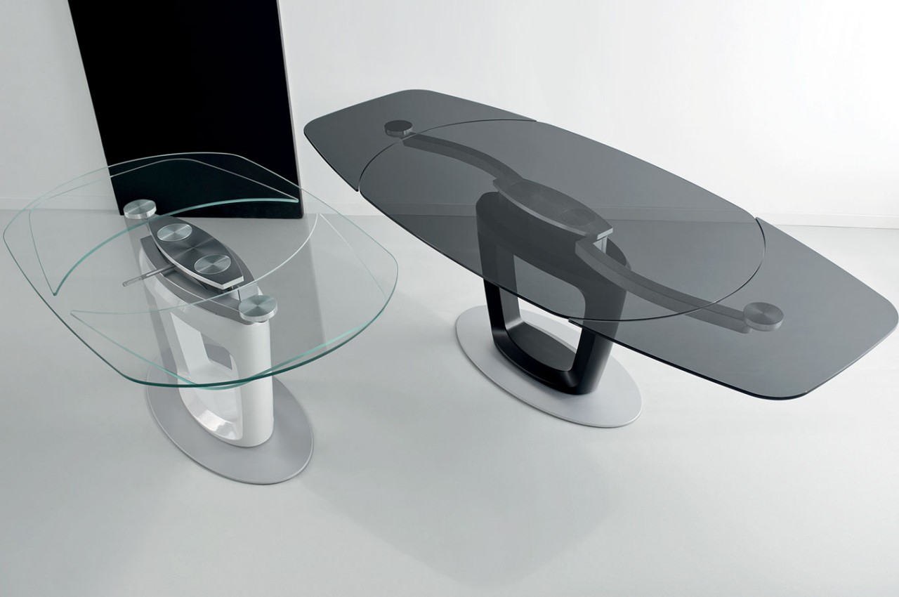
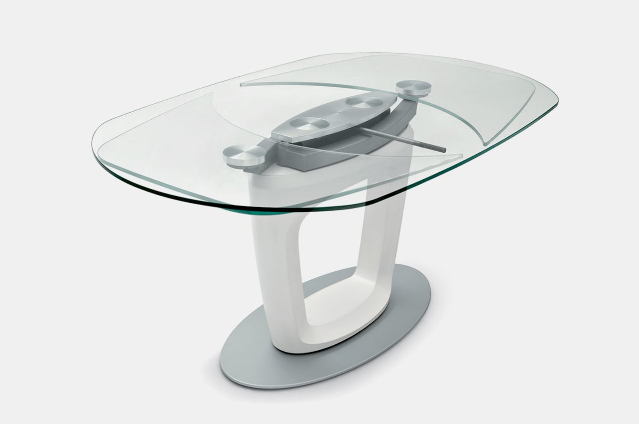
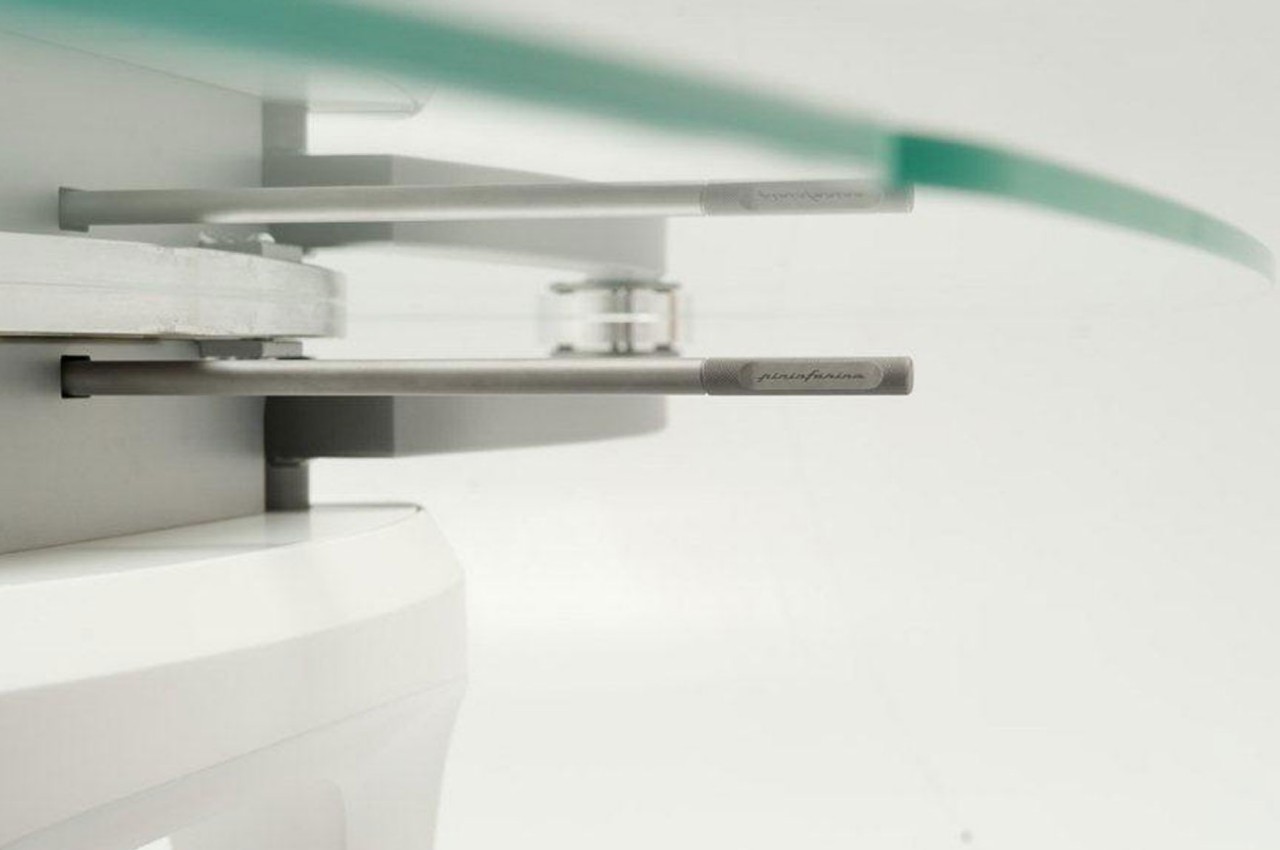
The Orbital dining table makes that process effortless and even has some level of finesse that matches the table’s appearance. The tabletop and its extensions are made from clear tempered glass, which makes the aforementioned mechanisms impossible to use. Instead, the table has an automatic mechanism that moves the extensions from under the table using a smooth, circular movement. You don’t have to worry about lifting or pushing fragile glass since the complex mechanism takes care of that for you.

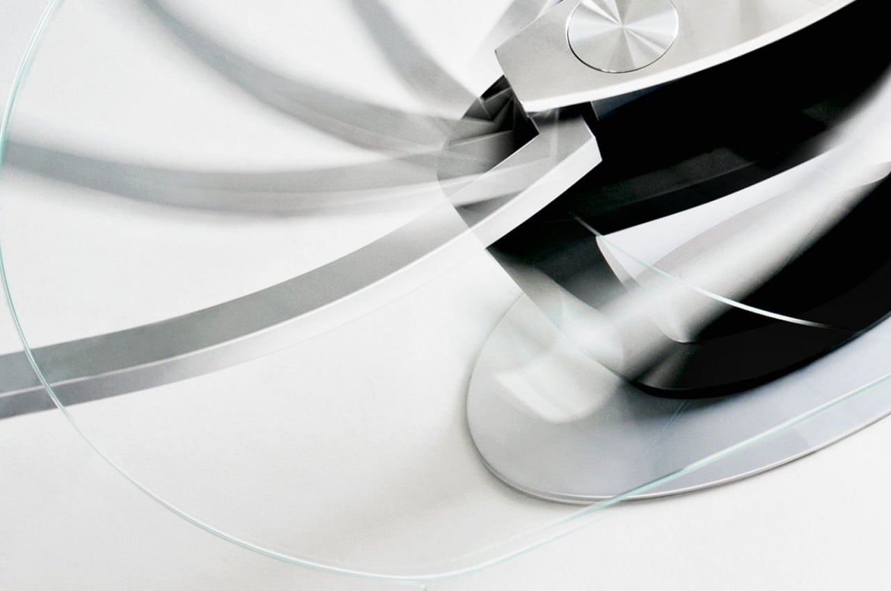
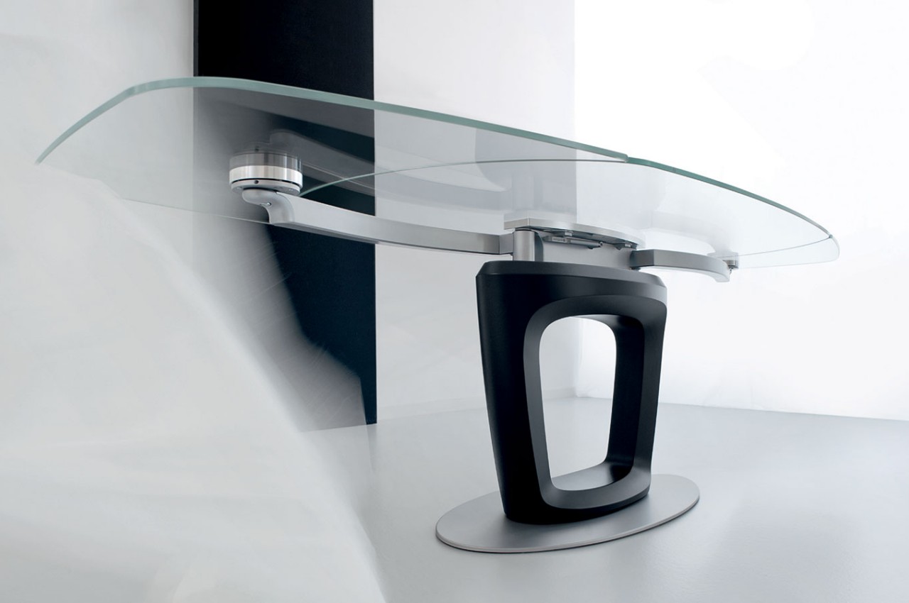
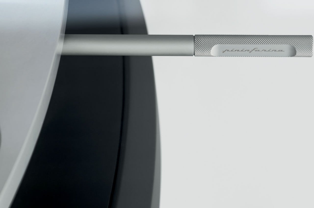
Better yet, the table makes this mechanism the visual centerpiece of the design as well; its metallic body and arms can be clearly seen from the top as well as the sides. It doesn’t hurt that this part of the table is as well-made as the rest, making it as much a work of art as a product of engineering. It definitely adds to the table’s charm, making it a great conversation starter for guests and friends alike.

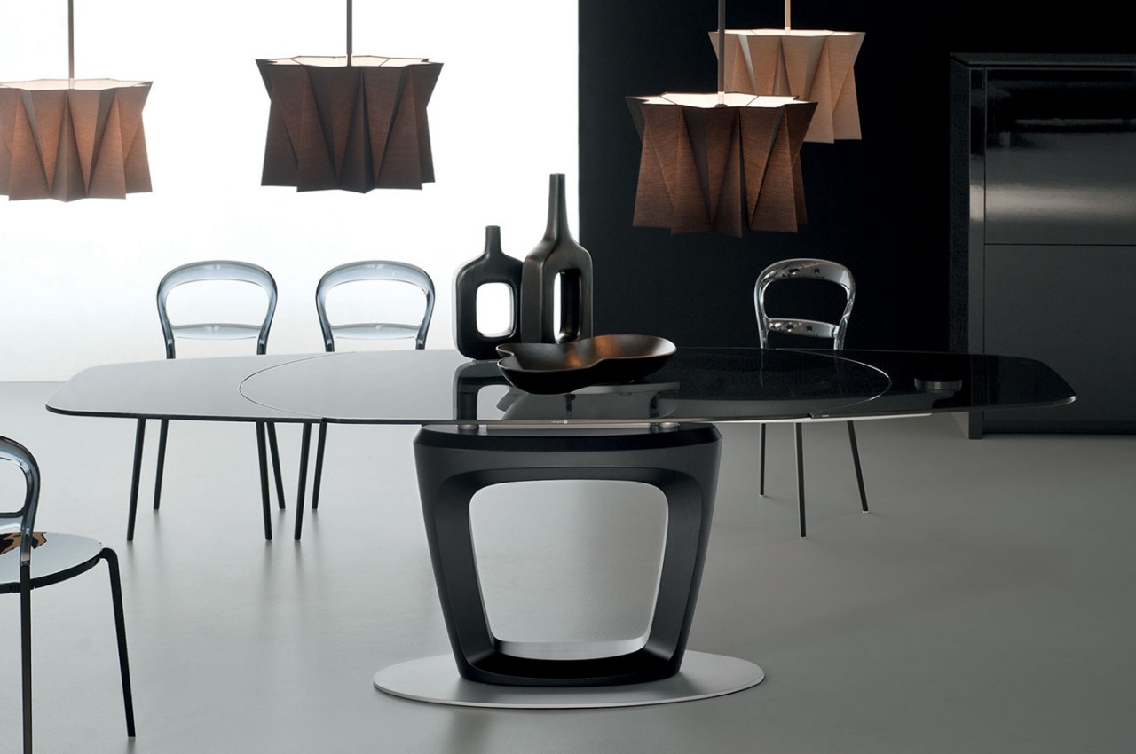
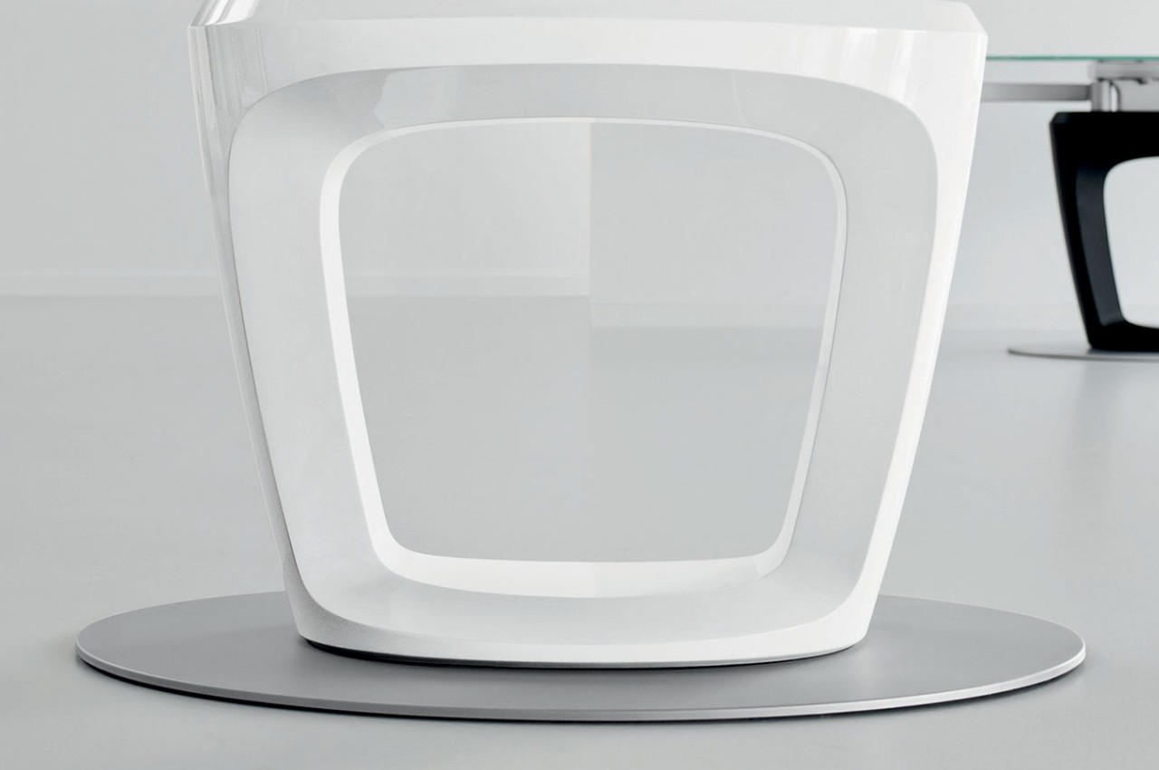
The tabletop and mechanism are supported by a rigid polyurethane column that has a large central opening that makes it feel like the table is defying physics. It helps emphasize the Orbital’s character of transparency, both in the way it works as well as the way it looks. It is a minimalist design that belies the sophisticated mechanism that makes it work, yet at the same time, is unabashed in revealing its guts, albeit in a very classy way.

The post Orbital is an expanding dining table that shows off its beautiful complexity first appeared on Yanko Design.
This gorgeous desk will dominate any room with its mid-century design

Minimalism never meant small, though many products that espouse that design philosophy do tend to minimize the space they occupy. When it comes to desks and work tables, there has also been a trend to lean more towards space efficiency, especially since offices and homes often have limited space for large furniture. There are instances, however, when a desk does need to be the focal point of a room, especially in offices that are designed around a single person’s work or presence. If you have enough space for it, this wood and glass protractor desk will definitely be an eye-catching piece thanks to its clean, minimalist design that makes the desk seem to be magically floating on air.

Designer: Kardiel

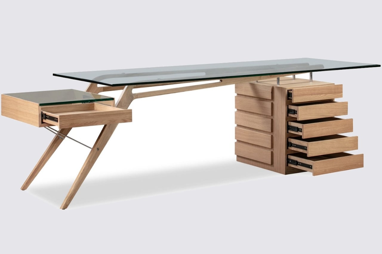
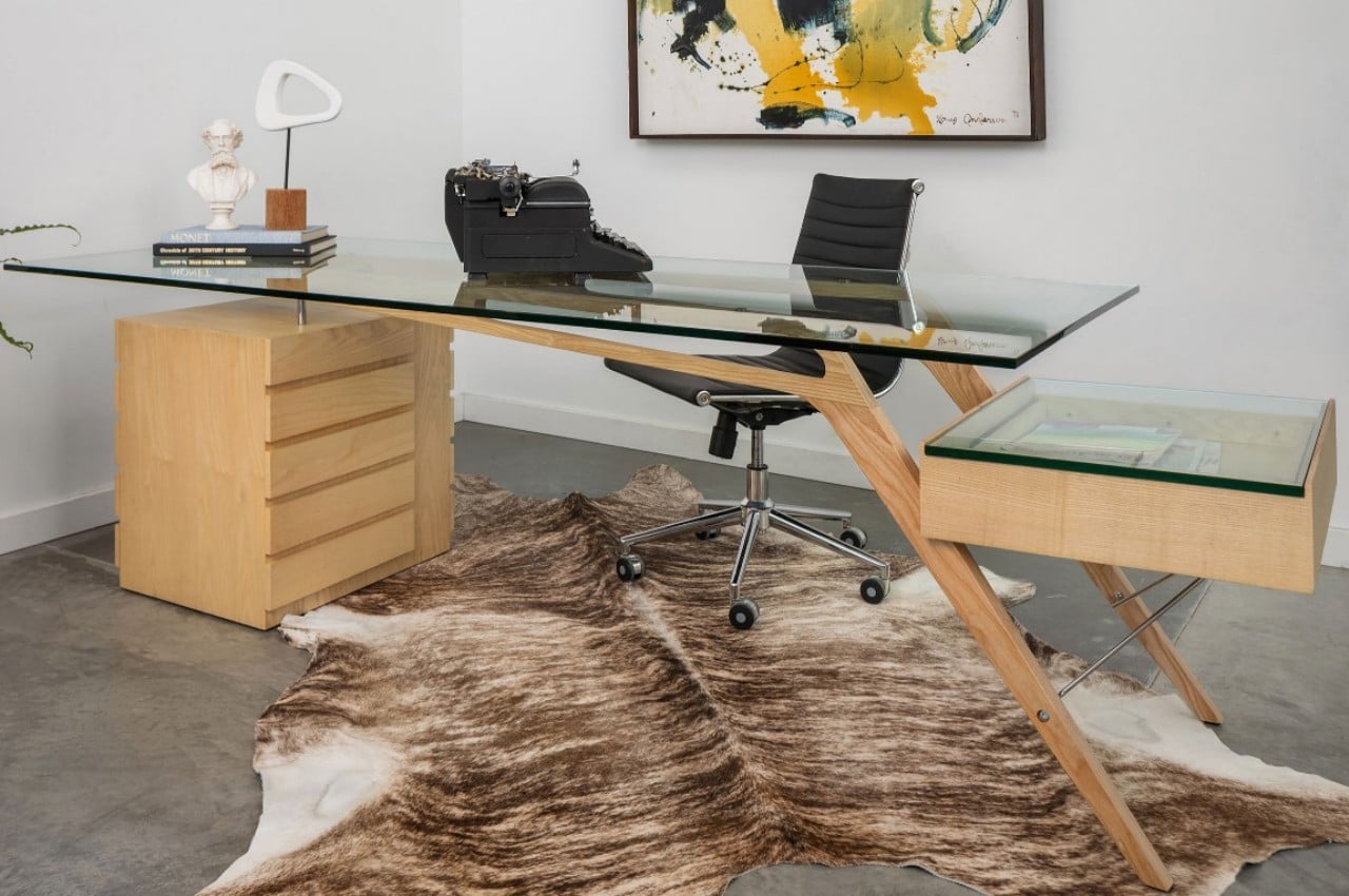
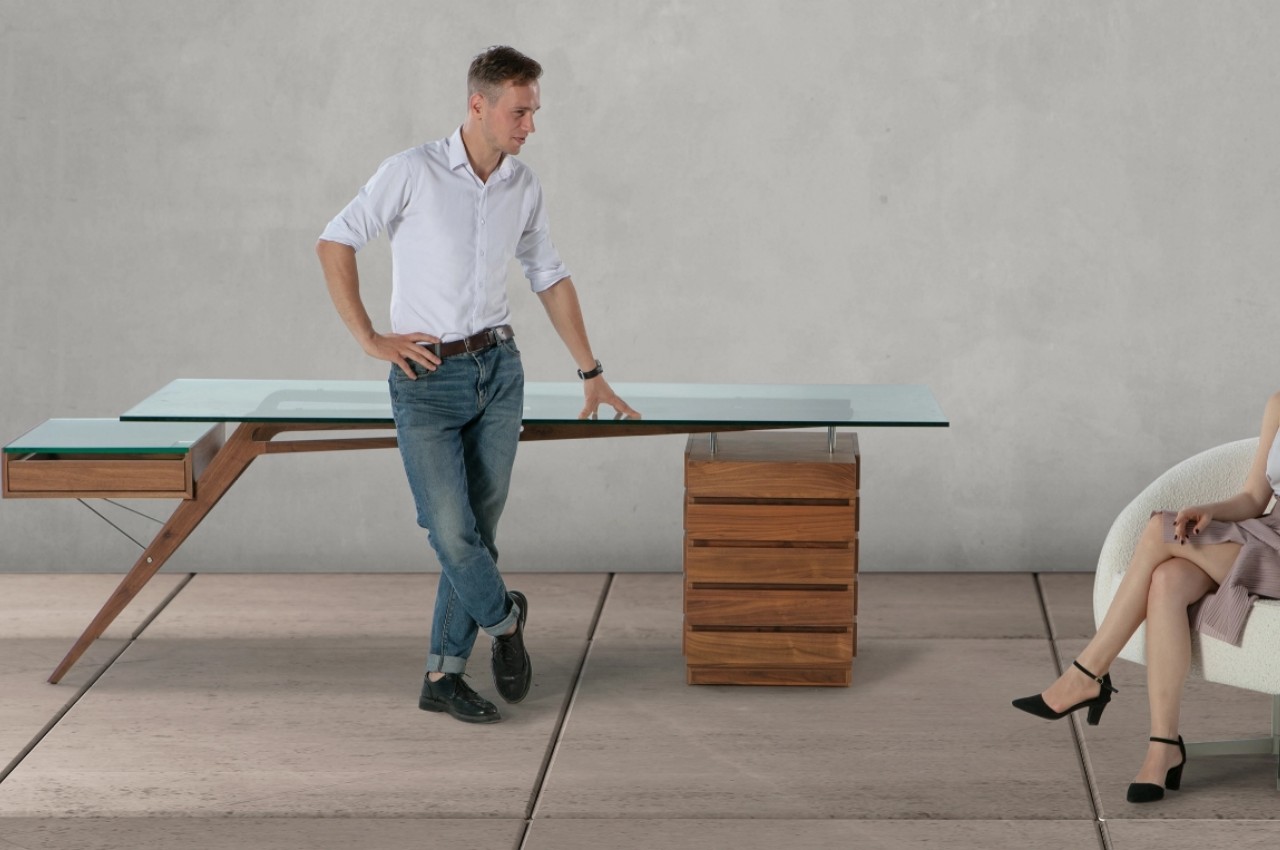
Based on the original by Italian architect and designer Carlo Mollino, the 1949 Protractor Desk combines a mid-century aesthetic with modern design techniques to create a piece of architectural art worthy of becoming the centerpiece of any office or room. It uses very simple forms yet has an air of sophistication to it through its use of fine materials and organic lines.

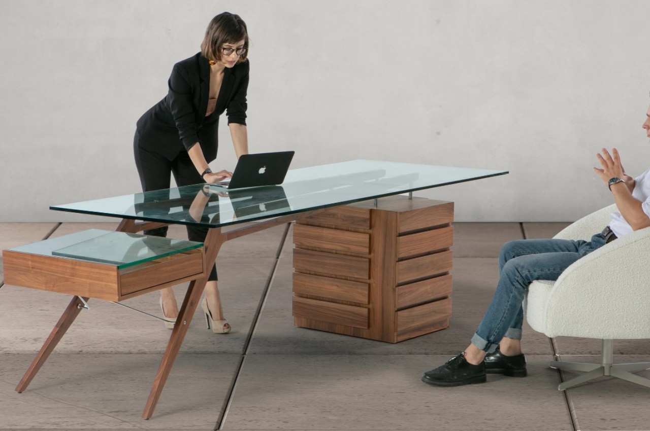
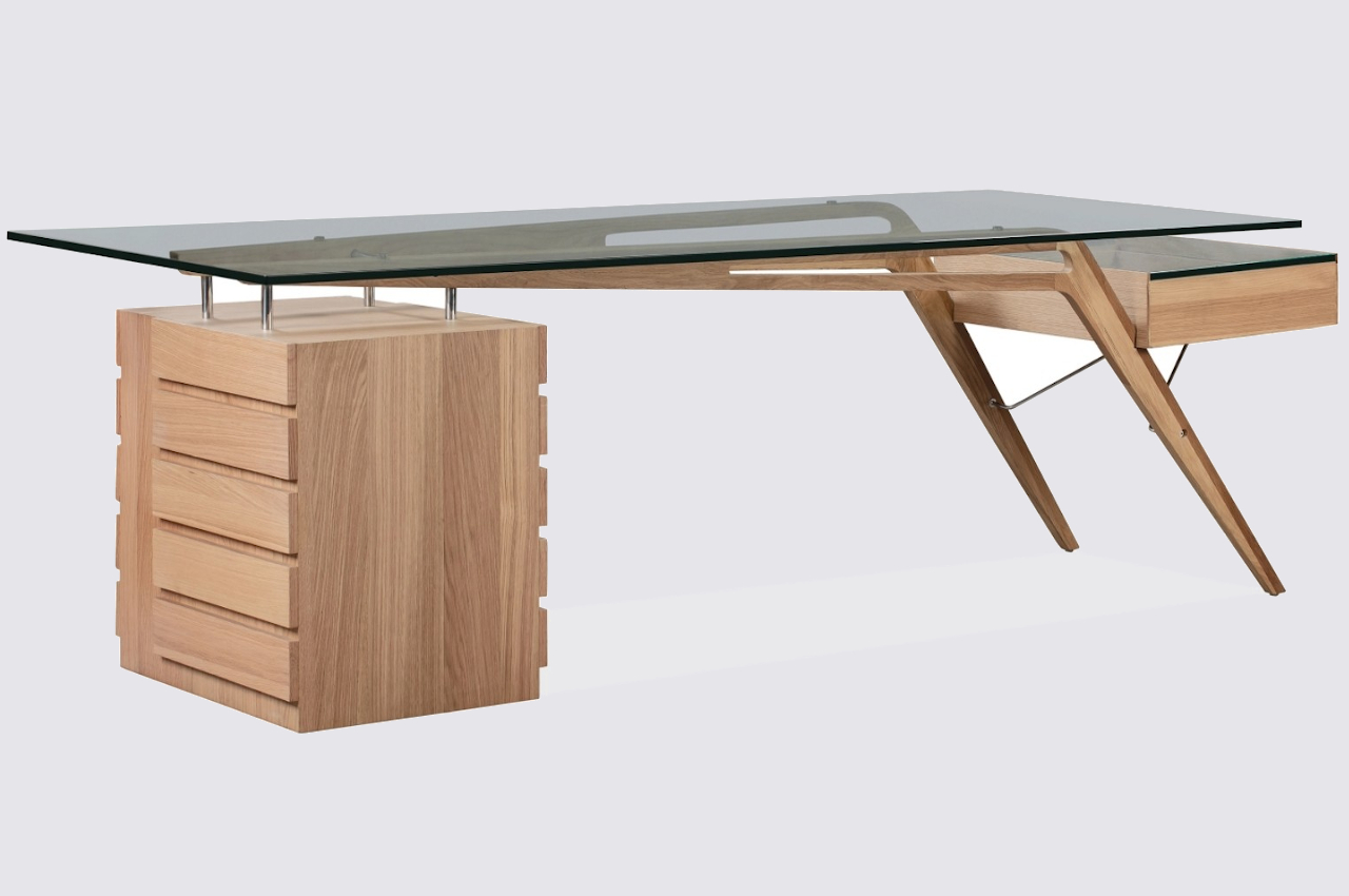
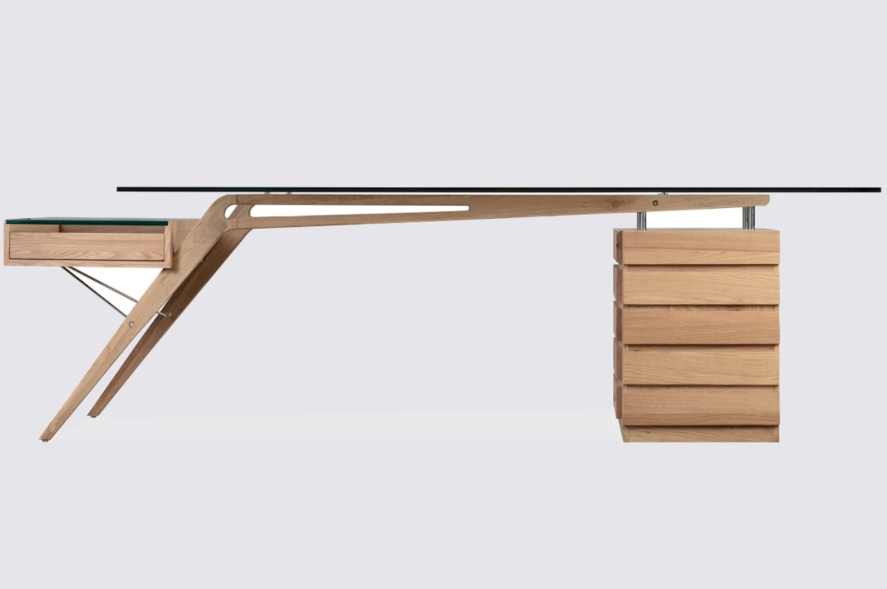
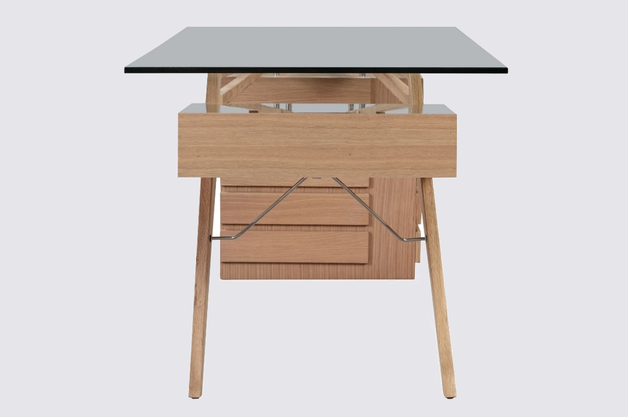
Although it is literally the most minimal part of the piece, the mid-century Protractor Desk’s unbelievably thin legs immediately catch your attention, puzzling the mind on how it is able to hold the glass tabletop aloft at all. Shaped like a boomerang or an opened compass, the wooden beams form intersecting and contrasting lines that give the table a dynamic character. The horizontal beam has oblong cutouts that give the illusion of an invisible frame. There is very little to obscure your view beneath the desk, leaving ample room for a chair to slide into.

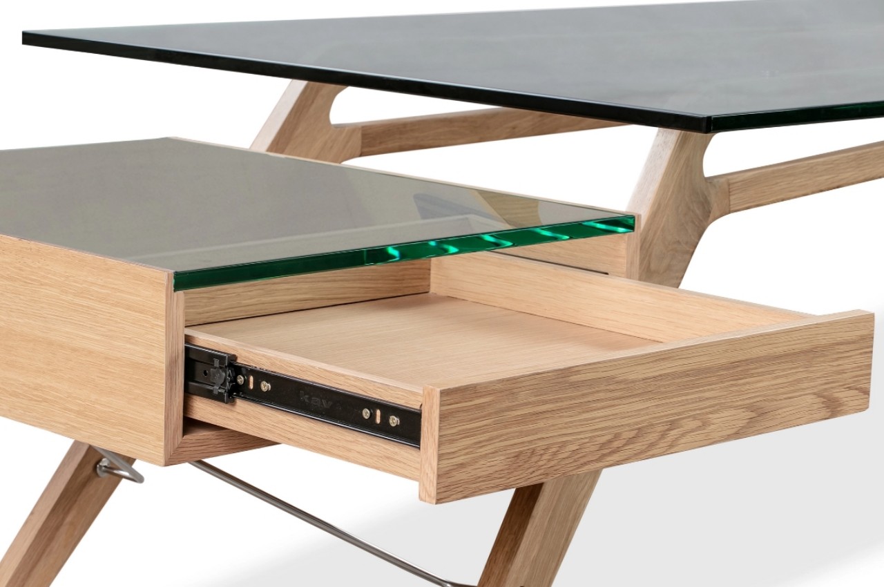
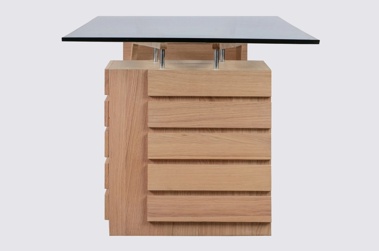
Of course, its airy appearance is just an illusion, and the desk’s fine legs on one side are balanced by a slatted wooden cube that is home to five drawers. Four stainless steel bolts connect the box to the end of the wooden beam. Its solid and simpler form provides a sharp contrast to the thin legs on the opposite side, providing both visual and structural balance to the desk. Opposite the box is an open-faced single pull-out drawer that seemingly floats in the air, supported only by two steel rods. This reinforces the table’s almost ethereal design, which complements and contrasts the earthy tones of its wooden body.

The 1949 Protractor Desk is definitely long by regular desk measures, about 98.4 inches long to be precise. You’ll need to reserve a lot of space for this piece of furniture, but given its dominating presence and eye-catching design, it’s one that you’ll want to really stand out anyway.

The post This gorgeous desk will dominate any room with its mid-century design first appeared on Yanko Design.
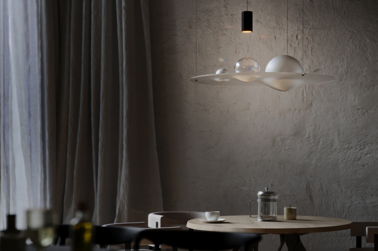
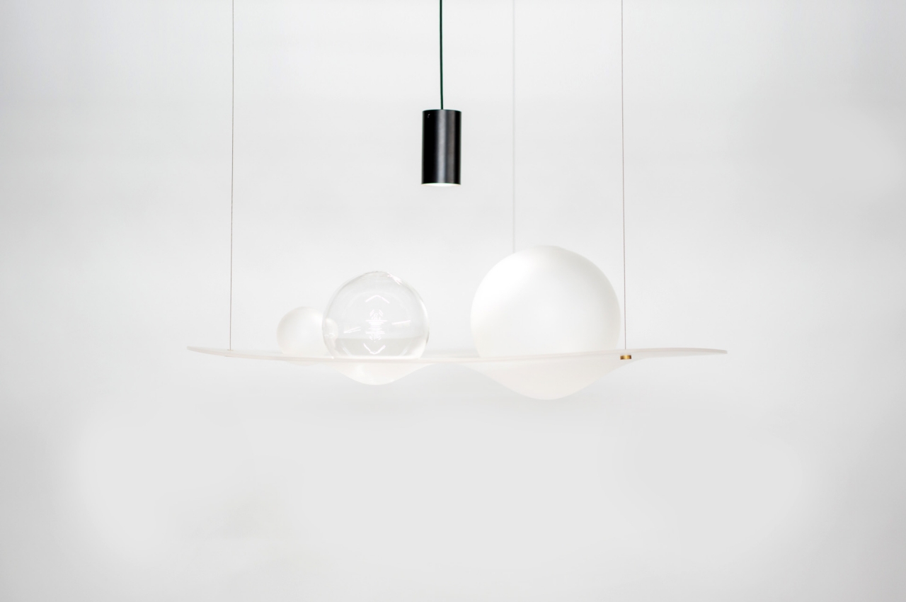
Gravity Well transforms invisible science into an ethereal cosmic chandelier

Science is all around us, whether we see it or not, from the simple chemistry that turns carbon dioxide into oxygen to the invisible forces that push and pull to keep everything from falling apart. We can only imagine these forces at work, or at best, visualize them in diagrams and 3D models, but they will always remain alien to us and, to some extent, unimportant. Just like natural elements and phenomena can inspire magnificent works of art and designs, these invisible forces, too, can become wellsprings of inspiration in their own right. This chandelier, for example, offers a stunning representation of one of the most powerful forces in the universe that keeps planets and stars from flying away and bumping into each other.

Designer: Richard Clarkson

Unlike other forces like magnetism that can sometimes be visualized through magnetic fields, gravity isn’t easily represented other than through arrows and lines. Most of us probably think of graving as something like a string that pulls heavenly bodies toward another, depending on their mass. It’s an oversimplification of Newtonian gravity, of course, but it isn’t the only way to think about gravity.

The genius that was Albert Einstein describes gravity as a sort of distortion instead, specifically a warping not just of space but also of time. This “gravity well” moves along with a mass, and if it’s a large mass, it pulls smaller masses along the curves or distortions it creates, causing that same gravitational effect described earlier. This more dynamic representation of gravity is what this chandelier tries to make real, freezing the pull of planets in time and turning it into a lighting fixture that is easily a sculptural piece of art as well.

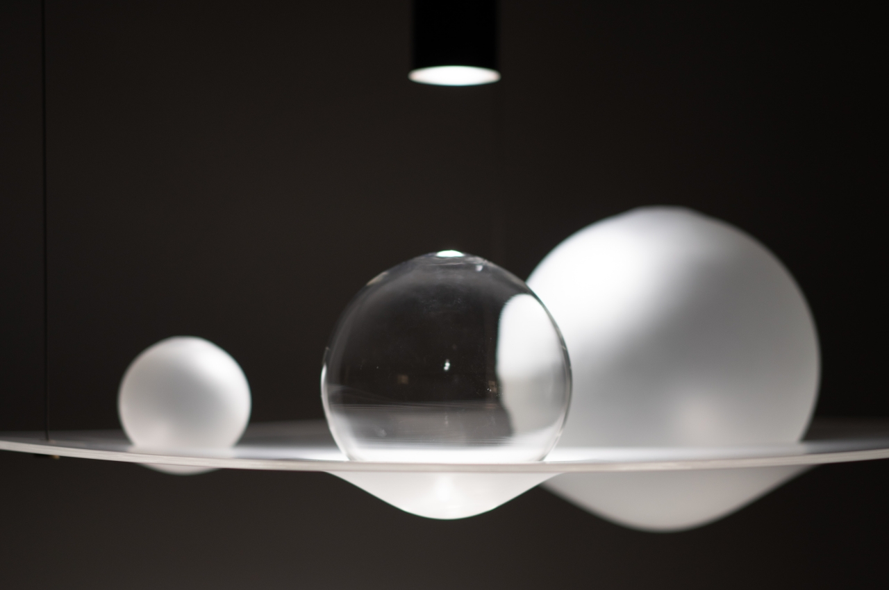
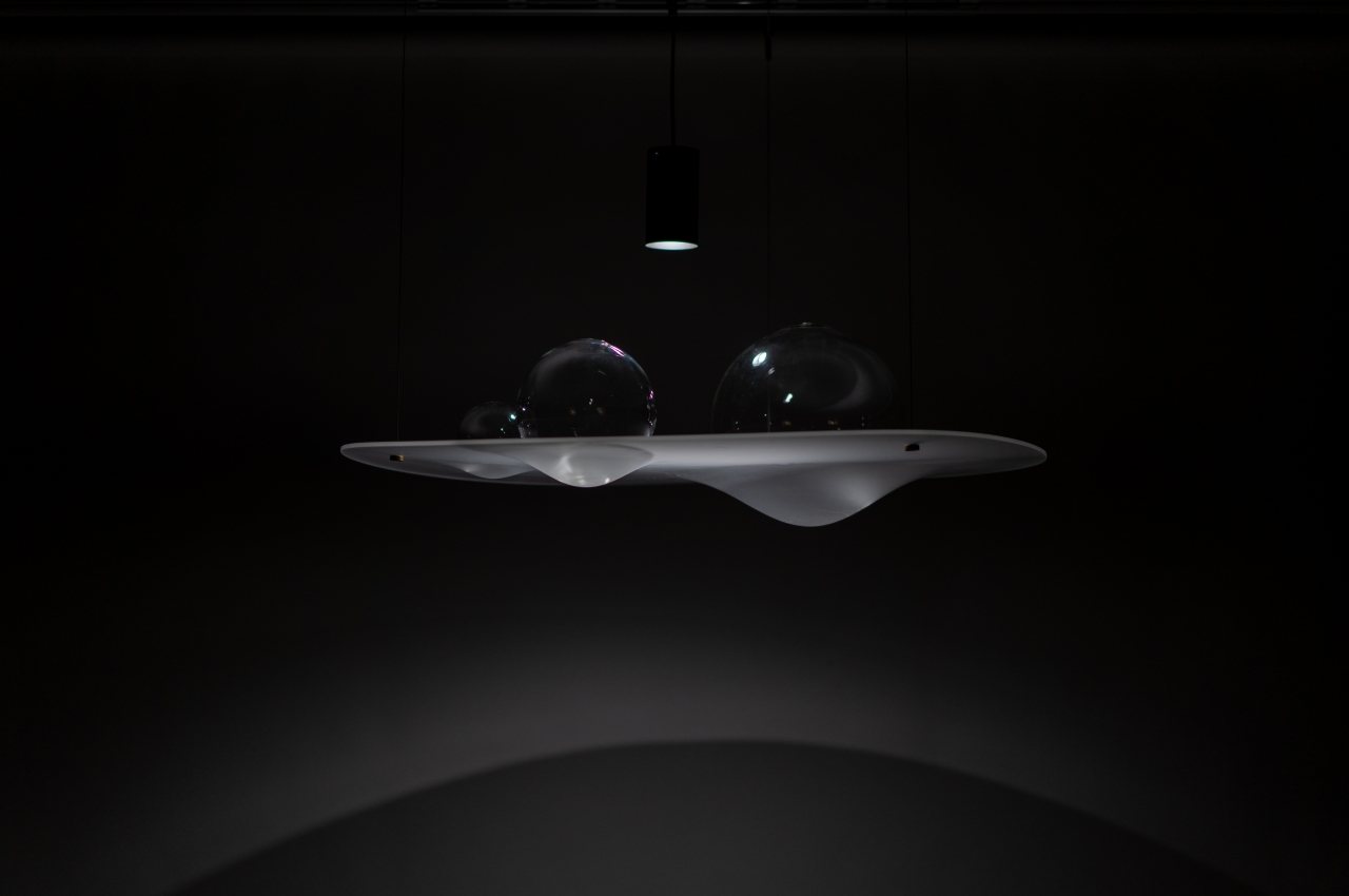
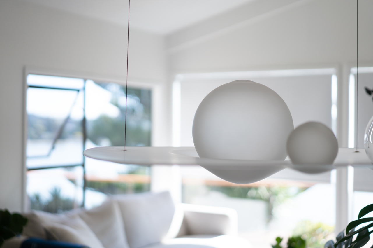
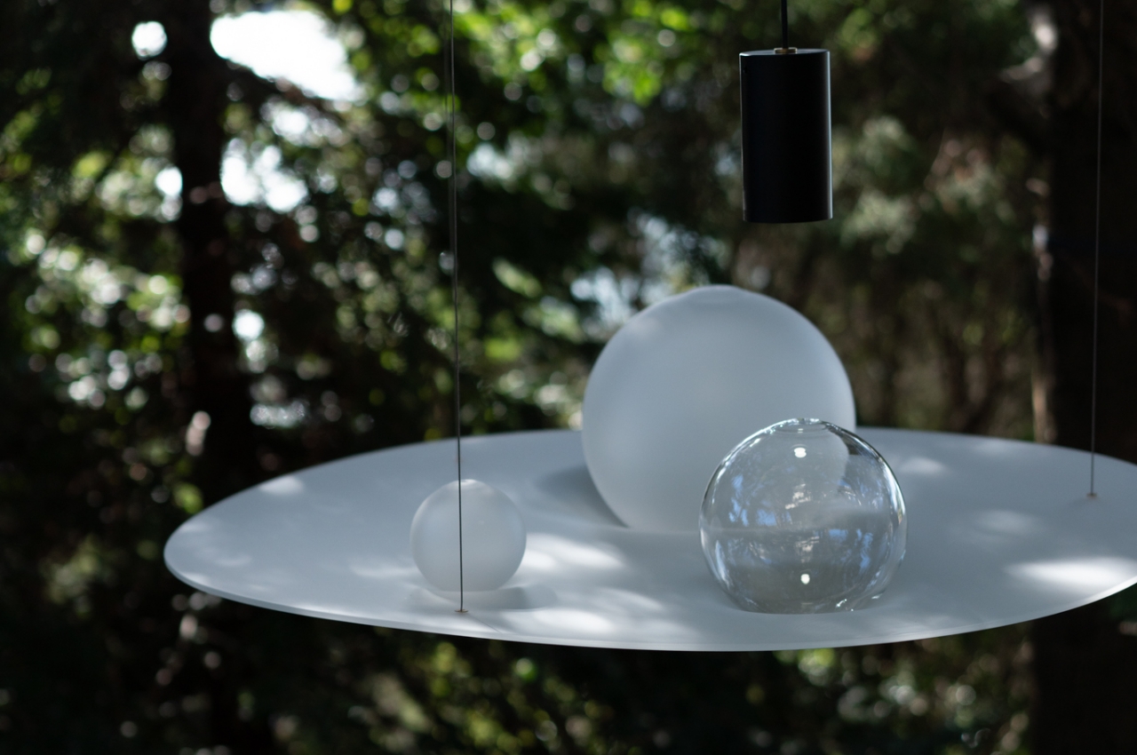
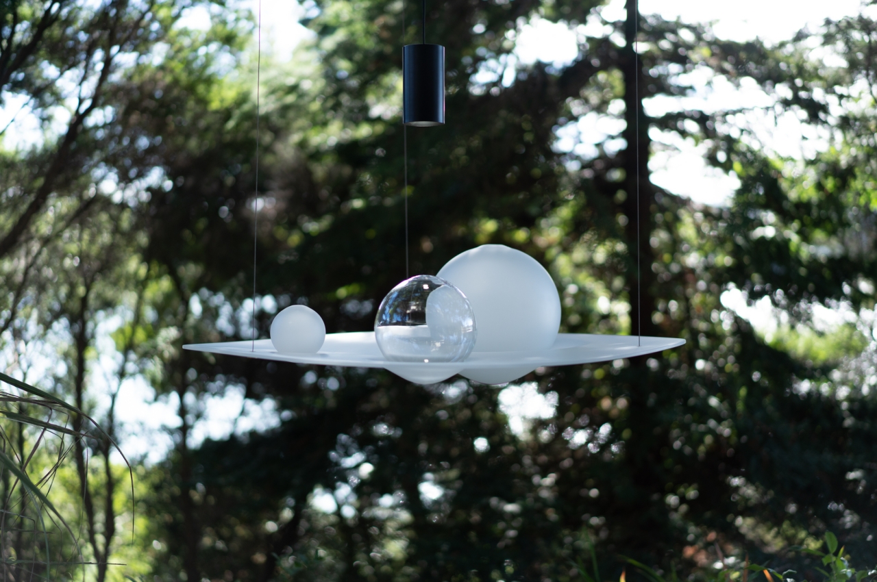
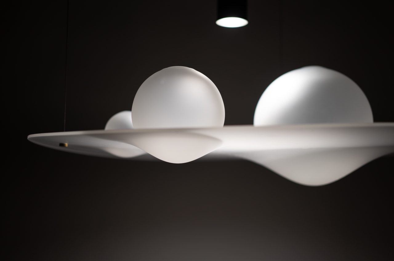
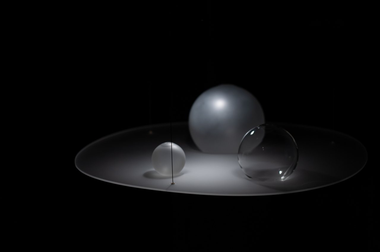
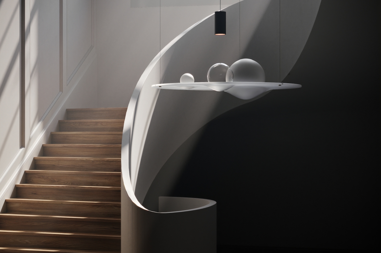
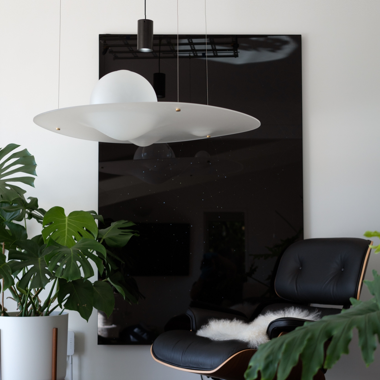
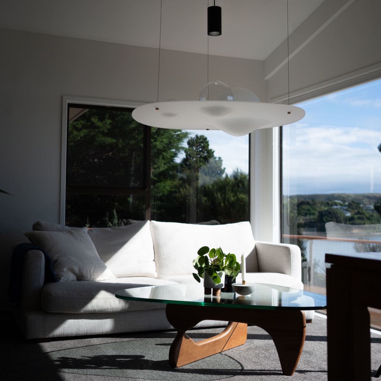
Three handblown glass spheres of different sizes represent planets and other heavenly bodies that cause the deformation of time-space. Made from borosilicate glass, the spheres are made to be resistant to thermal shock, a fitting analogy to the weathered planets they represent. And just like different planets have different compositions, these spheres can be any combination of clear or frosted glass, complementing each other with their contrasting transparencies.

A frosted acrylic disc serves as the sphere’s resting place, with grooves to hold the glass balls in place. This makes it look like the disc is being deformed by the mass of these objects, creating a visual representation of Einstein’s gravitational well. A single light source, which works with any standard E26-compatible bulb, can be placed anywhere above. Depending on its position, the chandelier can reflect, refract, or diffuse the light, creating an almost eerie yet mystical glow, also like the gentle lights of celestial bodies in the night sky.

The Gravity Well Chandelier offers a stunning visualization of abstract scientific theories that can accentuate any space. It’s a conversation starter for anyone, whether they’re immersed in modern physics, art, or anything in between. It’s almost like a science lesson wrapped in a beautiful lighting fixture, standing as a statement to the beauty of science and the natural world that remain untapped even today.

The post Gravity Well transforms invisible science into an ethereal cosmic chandelier first appeared on Yanko Design.
These elegant colored glass pieces are actually dyed using crushed stones

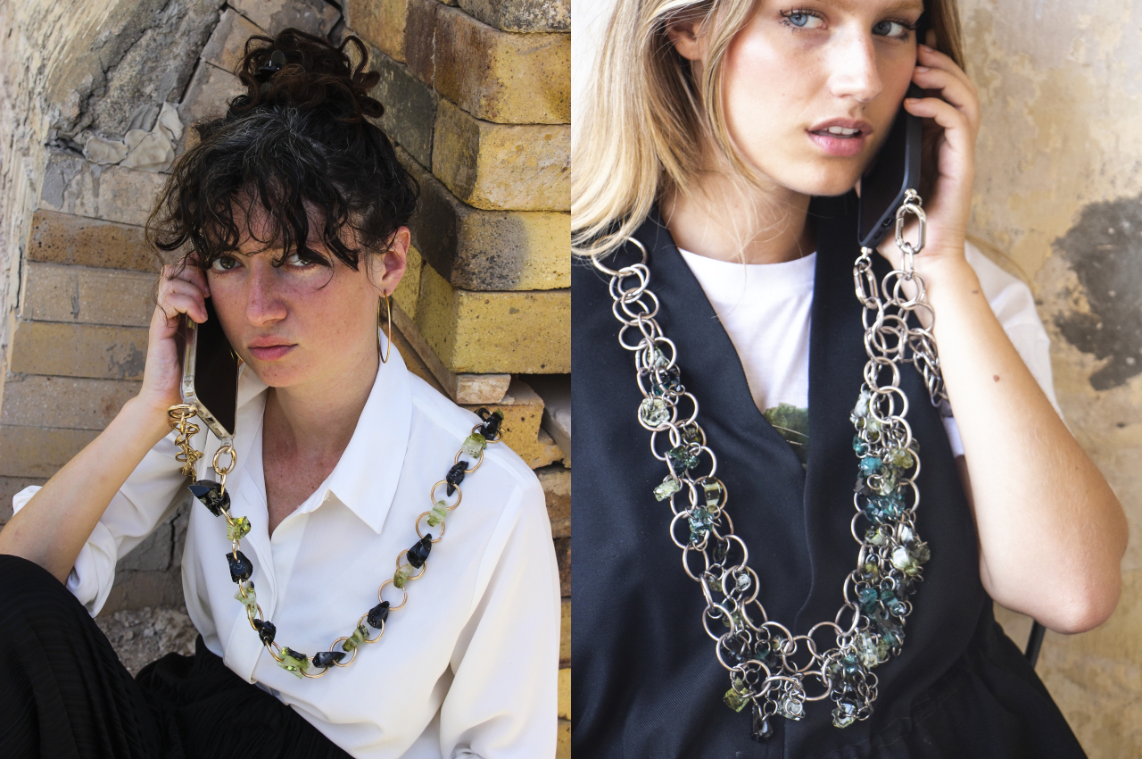
Just like with clothing, it’s also too easy to take for granted how glass-based products can actually be harmful to the environment in the long run. While glass itself is made from sustainable resources, the dyes used to give them vibrant colors are toxic to the environment. Even worse, colored glass can’t easily be recycled because of that mixture and because it’s nearly impossible to bring the material back to its natural transparent state. To make decorative glass truly sustainable, a new method of coloring glass needs to be developed, and one designer embarked on a journey of two years and hundreds of miles to come up with a solution that matches Haute Joaillerie in elegance but surpasses it in sustainability.

Designer: Salome Maarek

Glass is beautiful and useful in so many ways. It is used in furniture as functional parts of tables and shelves, and it is used in decorative pieces that require reflective or transparent surfaces and faceted forms. It can even be used in place of precious stones, and, of course, stained glass has been in use for centuries. As beautiful as it may be, colored glass apparently has a dirty secret. They are, unfortunately, toxic to the environment both in their production and disposal.

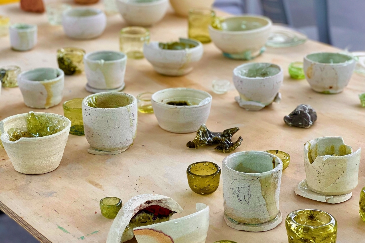
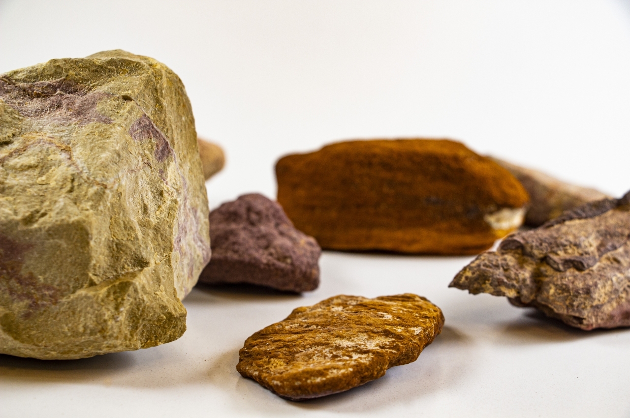
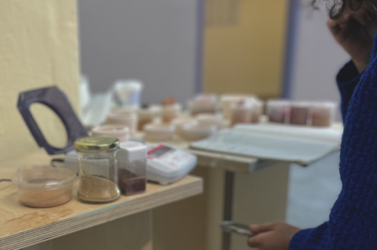
In searching for a better way to make beautiful glass, Jerusalem-based Salome Maarek looked to natural stones for the answer. The designer initially considered dyes from fruits and plants but realized that they had their own negative environmental impact as well. Stones, on the other hand, are in abundance, but Maarek didn’t just grab any stone. The stones are locally sourced, that is, they come from different regions in Israel. And to make the process environment-friendly from start to finish, the stones were gathered while journeying on foot or by bus.

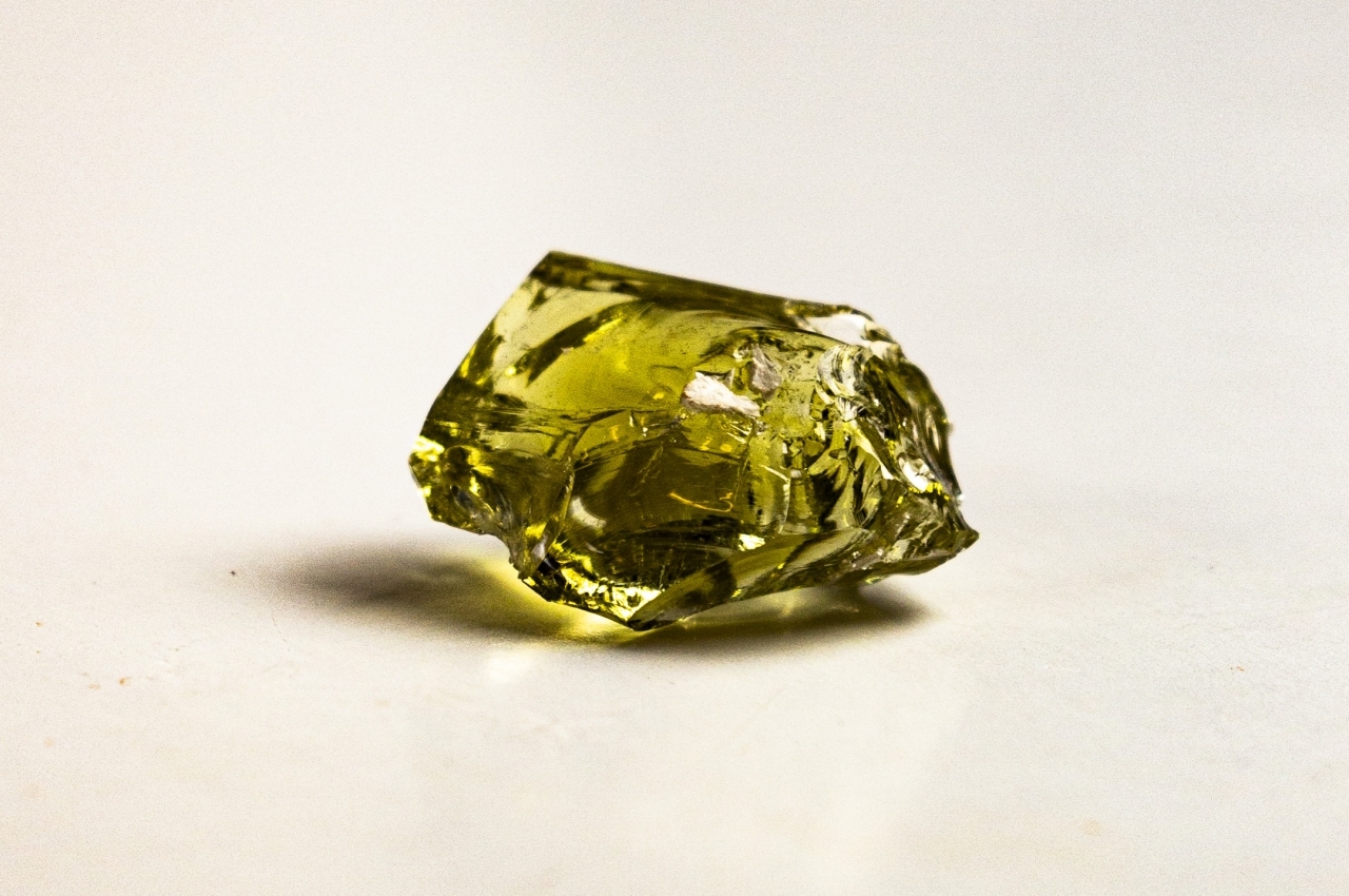
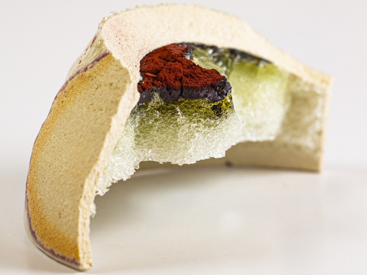
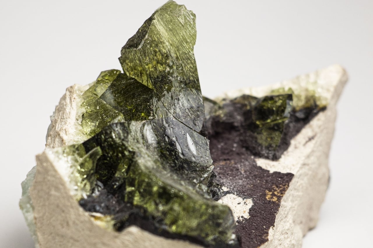
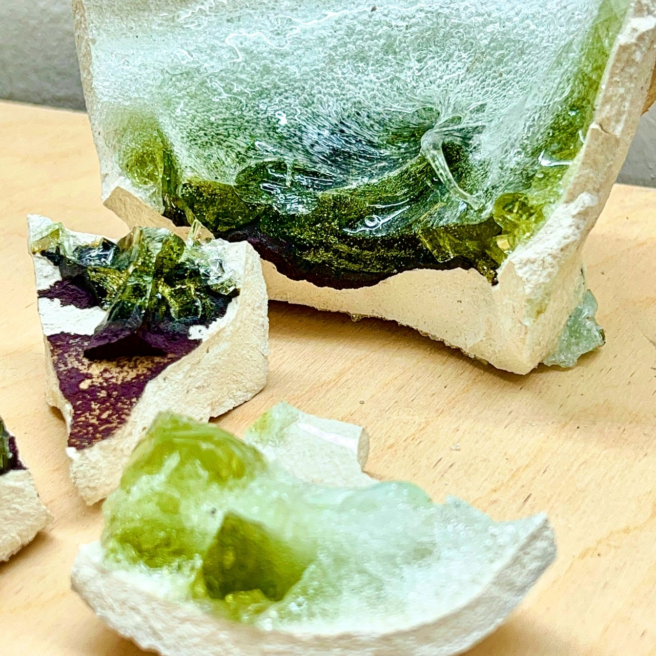
The glass itself is made from typical ingredients like silica, sodium bicarbonate, dolomite, and the like, while crushed stone powder is mixed in to act as natural dye. The stones themselves come in various forms like potash, copper, sand, and clay, and this variety has resulted in different colors and textures. So far, the process has yielded colors such as moldavite green, turquoise blue, indigolite, amber-orange, and tourmaline yellow, all without the use of harmful chemicals and materials.

There are some considerations that make this sustainable way of making colored glass a bit more difficult than normal, harmful colored glass. For example, the glass was melted at only 1,200C for hours, which is a lower but more sustainable temperature. This meant that the glass had to be mold-blown rather than using a more common hand-blowing technique.

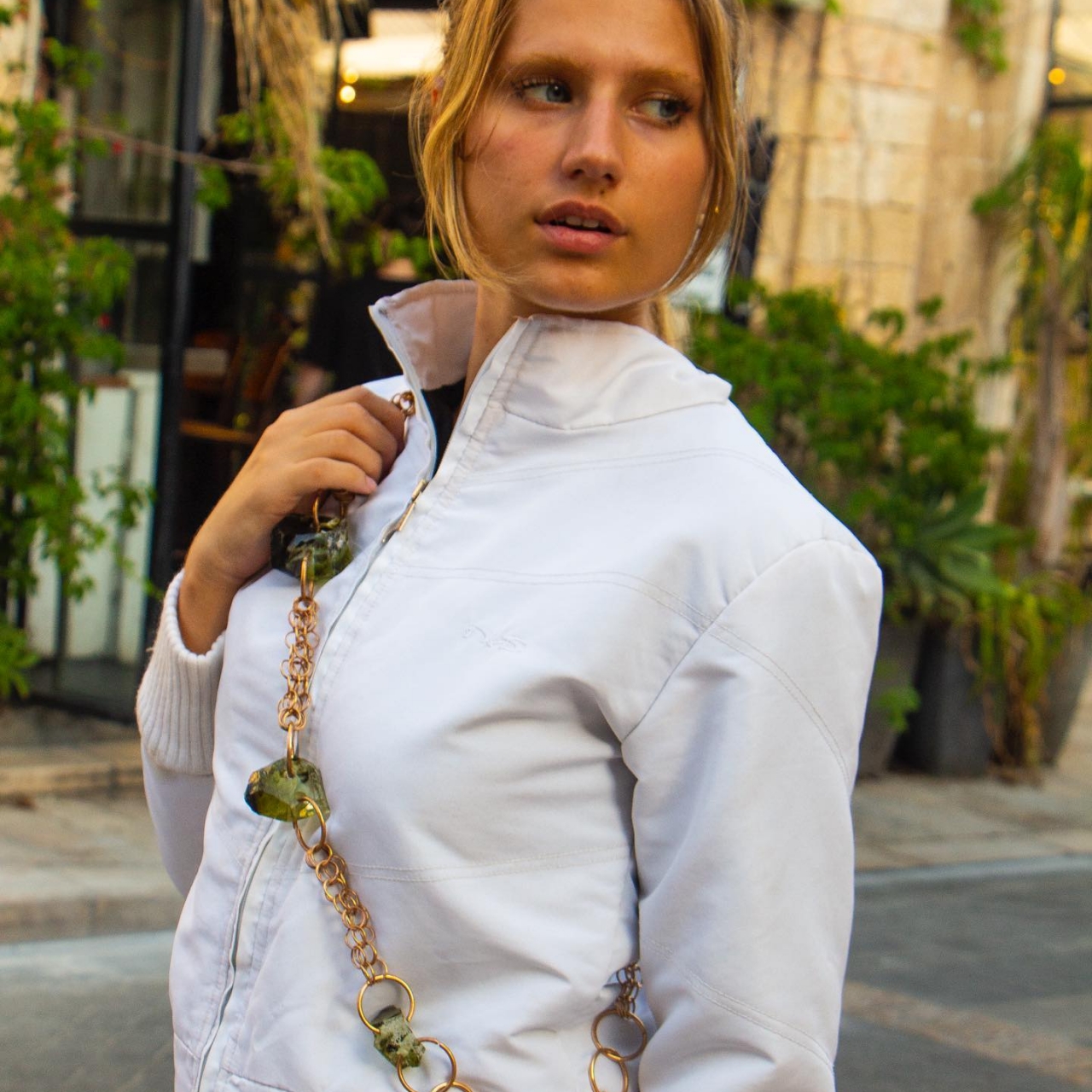
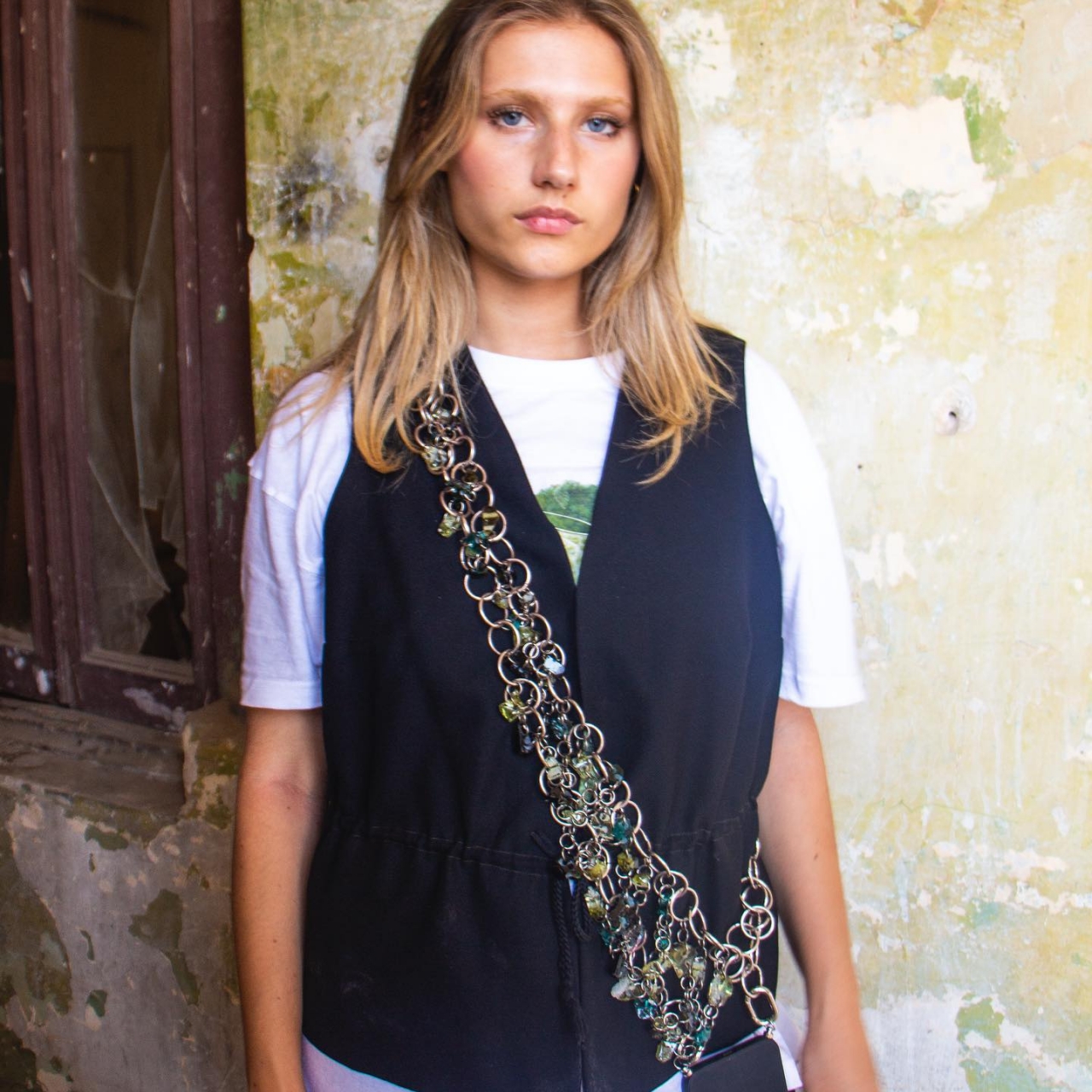
The result, however, is definitely worth all that work, with a beautiful piece of colored glass that can withstand pressure up to 5 tons. It can also survive temperature changes without cracking, unlike regular colored glass. And even if made with unconventional materials and methods, the result is glass that can be used as a more durable alternative to Haute Joaillerie, offering gorgeous pieces of gem-like glass that don’t show a single clue that they were colored using ordinary stone.

The post These elegant colored glass pieces are actually dyed using crushed stones first appeared on Yanko Design.
Air-Shape is a lamp design idea that will give any room a dreamlike atmosphere

Not all lamps have to conform to basic shapes or even reality.

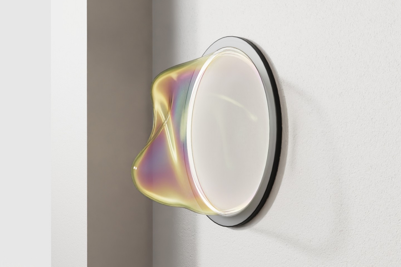
Lamps bring light to houses and rooms, but that’s not the only thing they can offer. With their own design and personality, they can change the tone of a room as effectively as their lights. They can convey a sense of serenity or calculating precision, warmth or cold, minimalism or extravagance. Lamps can take many forms and take inspiration from many sources, showcasing nature’s innate beauty or mankind’s acquired artistry. They can also become messengers of whimsy, playfulness, and even dreams, like a pendant and wall lamp that almost keeps you on the edge of your seat, waiting for the delicate bubble to pop and scatter in the wind.

Designer: Sunriu

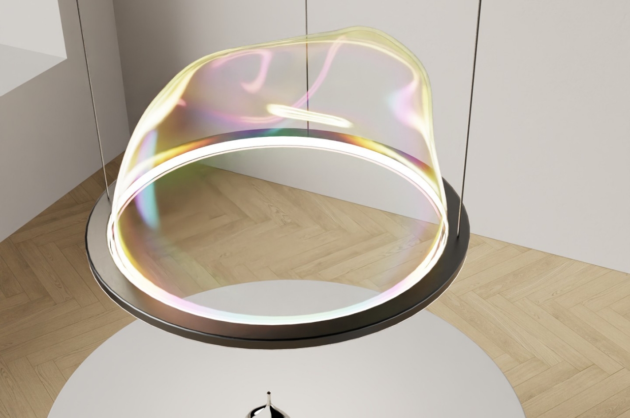
It’s not difficult to deduce the inspiration for this work of art that’s also meant to be a design for an actual lamp. Many of us would have had fond memories of blowing bubbles through circular devices, sometimes screaming in glee as each ephemeral sphere floated and then popped. There is something otherworldly about bubbles as they display the different colors of the rainbow on their translucent surfaces. Our hazy childhood memories of these playful times even add to the fanciful imagery of bubbles.

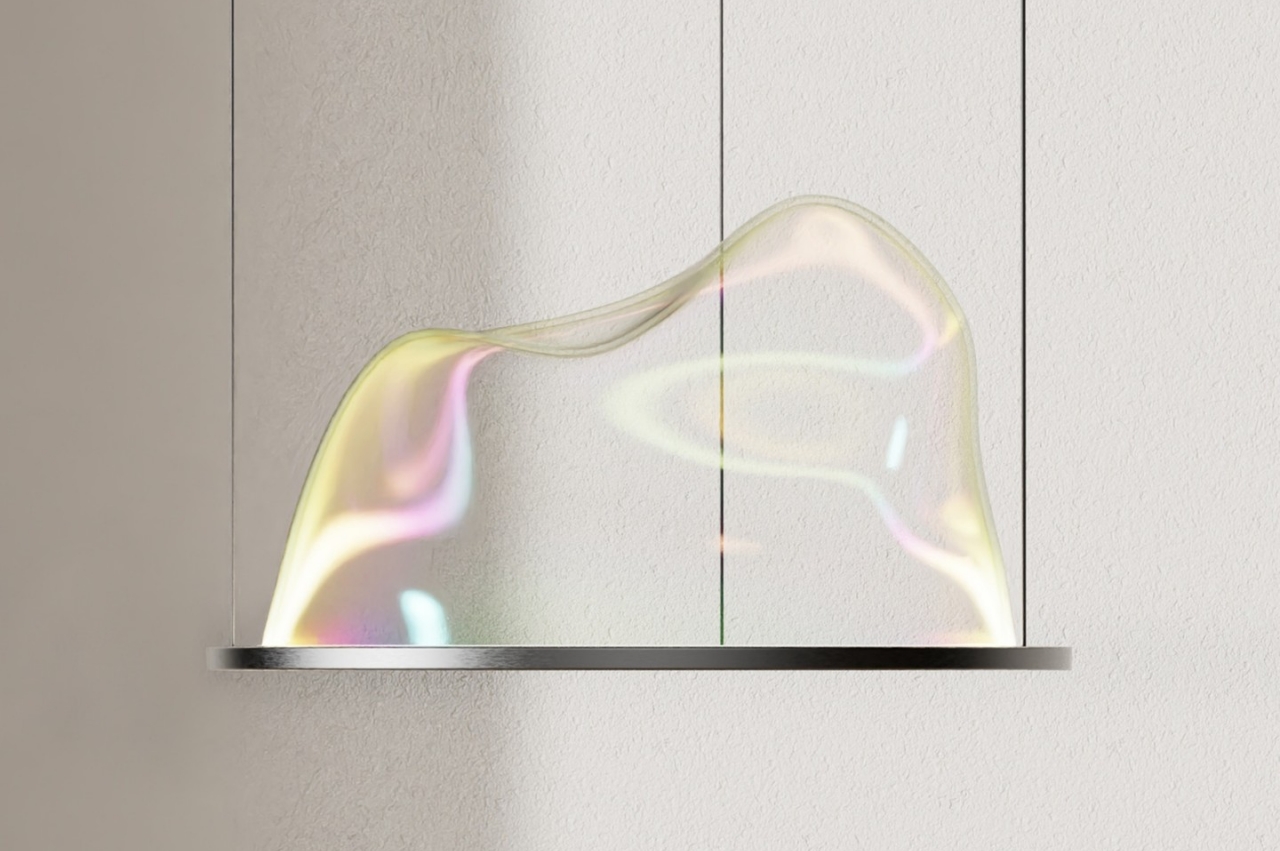
It is that emotion that the Air-Shape concept design tries to capture in an almost ethereal manner. It’s as if the bubble is frozen in time, stuck at the moment of its birth when it wavers and trembles against gentle winds until it takes its final spherical shape. Its form has an element of uncertainty and fragility that also sends a message of potential and birthing. A bubble doesn’t simply come out perfectly formed from a flat, soapy surface, after all.

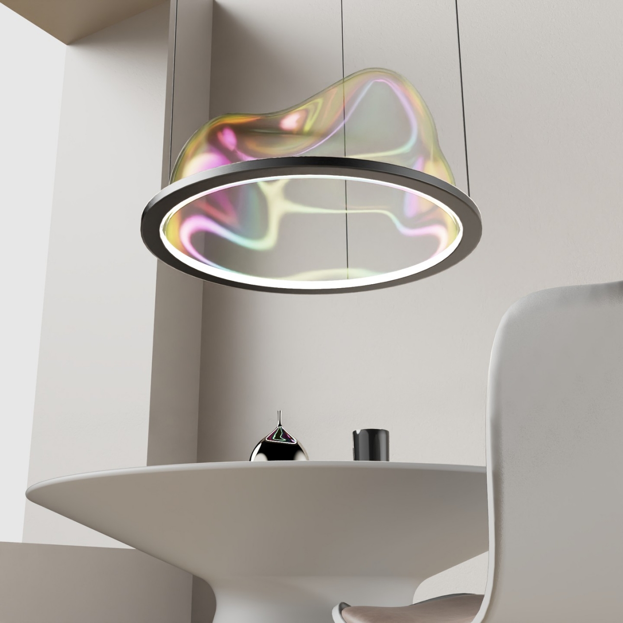
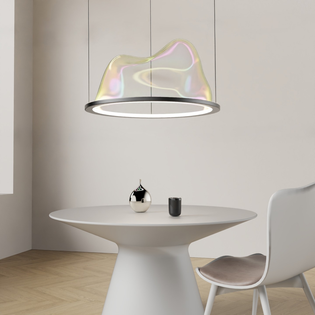
Naturally, glass would be the perfect material to bring this idea to life. Iridescent glass, in particular, captures the prismatic qualities of the bubble’s surface, while traditional glass blowing methods could help create the random yet gentle bumps of the Air-Shape’s bubble-inspired form. The metal ring not only serves as the visual portal from which the delicate shape rises but also houses the actual lighting that sets the mood for this fixture.

The Air-Shape lamp can be hung in different ways. It can turn any wall into a magical surface that is seemingly capable of generating dreams and flights of fancy. Hanging above tables or heads, the lamp creates a light and fun atmosphere that reflects its own whimsical design. Whichever way you place it, the lighting is sure to change the room’s tone the moment light starts to dance on its glass surface.

Air-Shape is definitely a striking concept for a pendant lamp or a wall lamp, one that could prove tricky to pull off in reality. It is almost as if the very lamp itself is too delicate to bring into the real world, blessed and cursed to remain as a figment of our imagination. It is the stuff that dreams are made of, just like rainbows and bubbles.

The post Air-Shape is a lamp design idea that will give any room a dreamlike atmosphere first appeared on Yanko Design.
Mussel shell waste is a sustainable alternative to traditional glass making techniques

With people becoming more conscious about consumption, waste, and other things related to the environment, there are a lot of designers always on the lookout for more eco-friendly materials. We’re seeing a lot of experimentation and research into looking for waste and other things that can be recycled and upcycled into sustainable materials for building other things. Glassmaking is one of those industries that use a lot of highly processed and sometimes unsustainable materials so finding an alternative to all of this is a priority for some.

Designer: Bureau de Change and Lulu Harrison

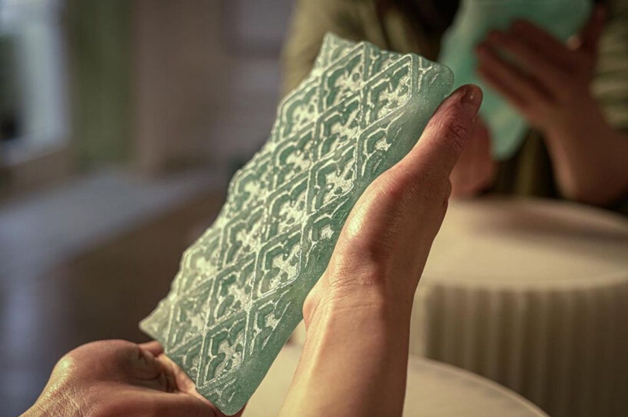
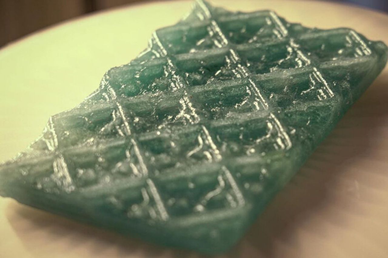
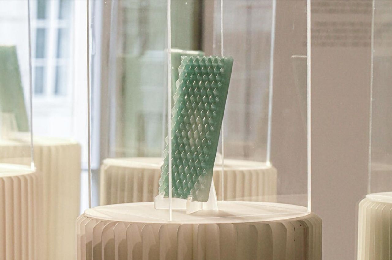
A group of architects based in London and a design student looked into finding such an alternative to be used in the glassmaking industry. They discovered that the quagga mussel, a species of freshwater mussels, can actually be used as an ingredient in creating glass tiles. By mixing the quagga mussel shell waste with local sands and waste wood ash, they were able to create a “unique glass recipe” which can theoretically be used in building designs in the future.

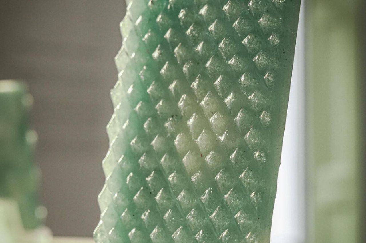
This new bio-material is named Thames Glass and the initial output using this material are some 3D printed molds with decorative patterns. The design is inspired by the terracotta chimney pots of Royal Doulton, a ceramics manufacturer. Not only are they looking at using these tiles for building designs, but they also want to use them to design carafes and tumblers. With people now more conscious about bringing their own water instead of buying bottled water, this can become another way to bring this full circle.

Quagga mussel shells are usually found clogging up the water pipes, a problem that has been a thorn on the side of Thames Water, a private company that supplies most of the water in the greater London area. They’ve spent millions of pounds every year just to remove these shells and sometimes ineffectively. But if you can turn this annoying waste into something useful, then not only do you solve the clogging problem but you also create an eco-friendly solution.

The post Mussel shell waste is a sustainable alternative to traditional glass making techniques first appeared on Yanko Design.

Glass Chicken Wine and Whiskey Decanter Set: Cock-A-Doodle-Drink

Because what better way to let guests know you take Thanksgiving far more seriously than anyone ever should, The Wine Savant has crafted the Rooster Glass Decanter Set. Available on Amazon (affiliate link), the set features a headless rooster decanter, along with two tasting glasses. Obviously, it’s perfect for sipping turkey gravy at the dinner table while your family watches in horror.

The cock-a-doodle-decanter holds 500ml of your favorite wine or spirit and has received 5 out of 5 stars according to nine reviews on Amazon. Clearly, there’s something I’m missing here. Per one verified buyer: “This cock will be proudly displayed for every party we have moving forward.” Well, the thing I’m missing definitely isn’t maturity.
Personally, I don’t drink anything that warrants decanting, but that’s just me, and I’m old-fashioned. And by old fashioned, I mean drink cheap domestic beer out of a beer helmet. My wife hates it, especially when I insist on wearing it at the fancy dinner parties her friends throw.

[via Sad and Useless]