Actual prototype unit confirms exactly what the upcoming Google Pixel Fold will look like

YouTuber Dave2D got his hands on a dummy unit of the alleged Pixel Fold and here’s everything we know… and feel.

First off, this isn’t even scandalous anymore, given that Google has perhaps the worst track record when it comes to keeping upcoming smartphones a secret. Last year, the company prematurely revealed what the Pixel 7 would look like just for kicks, months before the phone actually launched… so when I see a YouTuber talking about ‘credible leaks’ of Google’s next product, my best bet is that they’re as credible as it comes! Anyway, earlier last year Jon Prosser debuted renders of the highly-anticipated Pixel Fold device, and it seems like Dave2D’s latest video confirms everything we know. Google IS indeed working on a folding Pixel smartphone with an inward-facing foldable display. Although just a 3D-printed dummy unit, Dave2D’s prototype is surprisingly slim, and has a shorter, stouter form factor, similar to Oppo’s Find N2 device.

Designer: Google

The dummy unit doesn’t really reveal much apart from the bare-bones design of the phone, but it’s enough to piece together a fair bit of information. When placed alongside the Pixel 7 Pro, the Pixel Fold is relatively shorter, making it easier to hold and operate with a single hand. When compared to the Samsung Galaxy Z Fold4, the Pixel Fold is MUCH more ergonomic, letting your thumb reach parts of the screen that you couldn’t with Samsung’s foldable. The device also has a new camera bump design, going for something more pronounced like the iPhone’s camera bump, unlike the Pixel’s curved bumper design. All indications show that the Pixel Fold will have the same 3-lens camera unit like the 7 Pro, although the flashlight seems to have migrated to the left of the lenses for some odd reason.

Perhaps the most interesting detail here is the screen, which Dave2D mocked up in post-production to reveal what the Pixel Fold’s actual screen sizes and resolutions will most likely be. The outer screen is expected to have a hole-punch camera, while the insides reveal thicker bezels on the top and bottom, and a camera built right into the upper bezel.

Closeup of the internal single-lens camera setup

Dave2D also speculates that aside from mimicking the Oppo Find N2’s smaller form factor, the Google Pixel Fold will have a similar hinge detail too, that causes the screen to recede inwards when folded shut, causing it to assume a more natural water-drop shape that gives it a longer life while minimizing the crease that tends to form with foldable displays.

A USB-C port on the bottom comes as no surprise, although there isn’t any word on wireless charging capabilities

Although there’s no official word from Google, we could expect the Pixel Fold as early as this year, alongside the Pixel 8 launch, or probably even sooner when Google officially announces the Pixel 7A. The Pixel Fold is also expected to cost an eye-watering $1700, although I’d probably hold my wallet if I were you. Given the company’s track record with axing products and services, we don’t want another Stadia on our hands, do we now?

The post Actual prototype unit confirms exactly what the upcoming Google Pixel Fold will look like first appeared on Yanko Design.
Leaked iPhone 14 Pro dummy prototype shows a much larger camera bump, and no more notch

2022 seems to be the year that the iPhone finally breaks up with the notch.

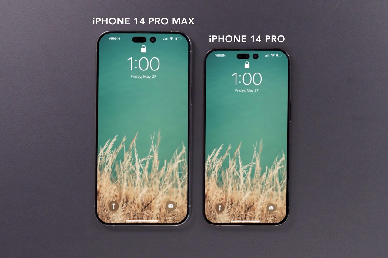
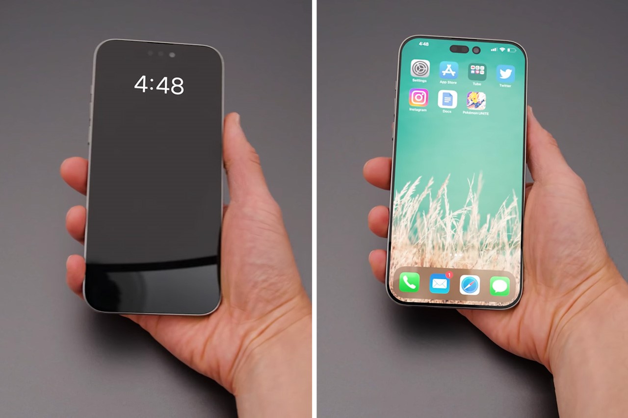
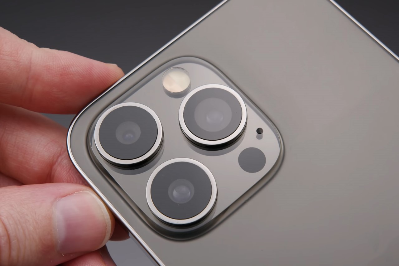
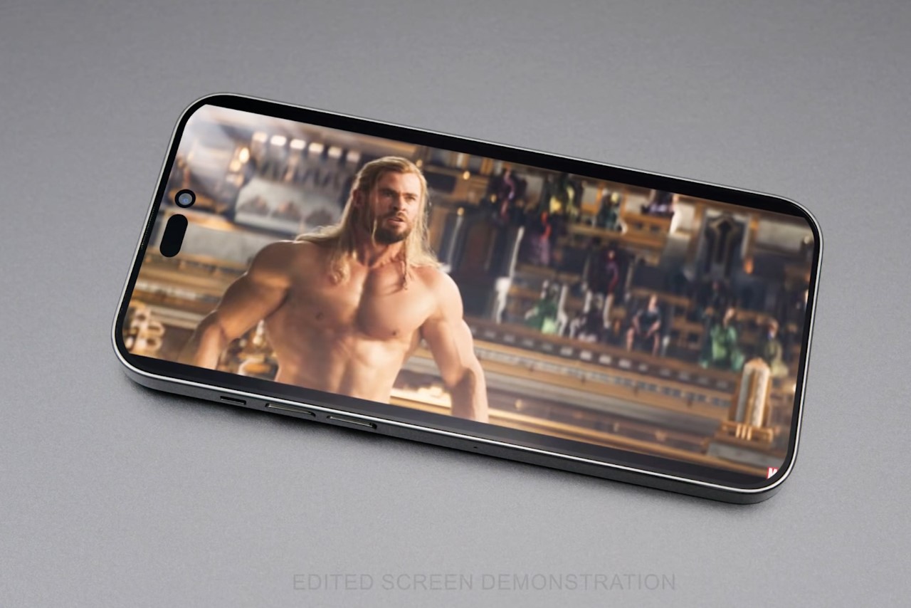
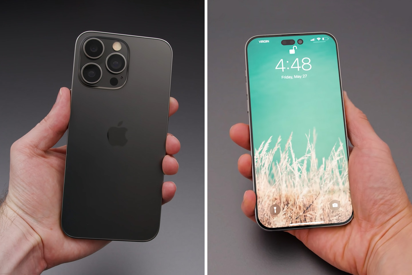
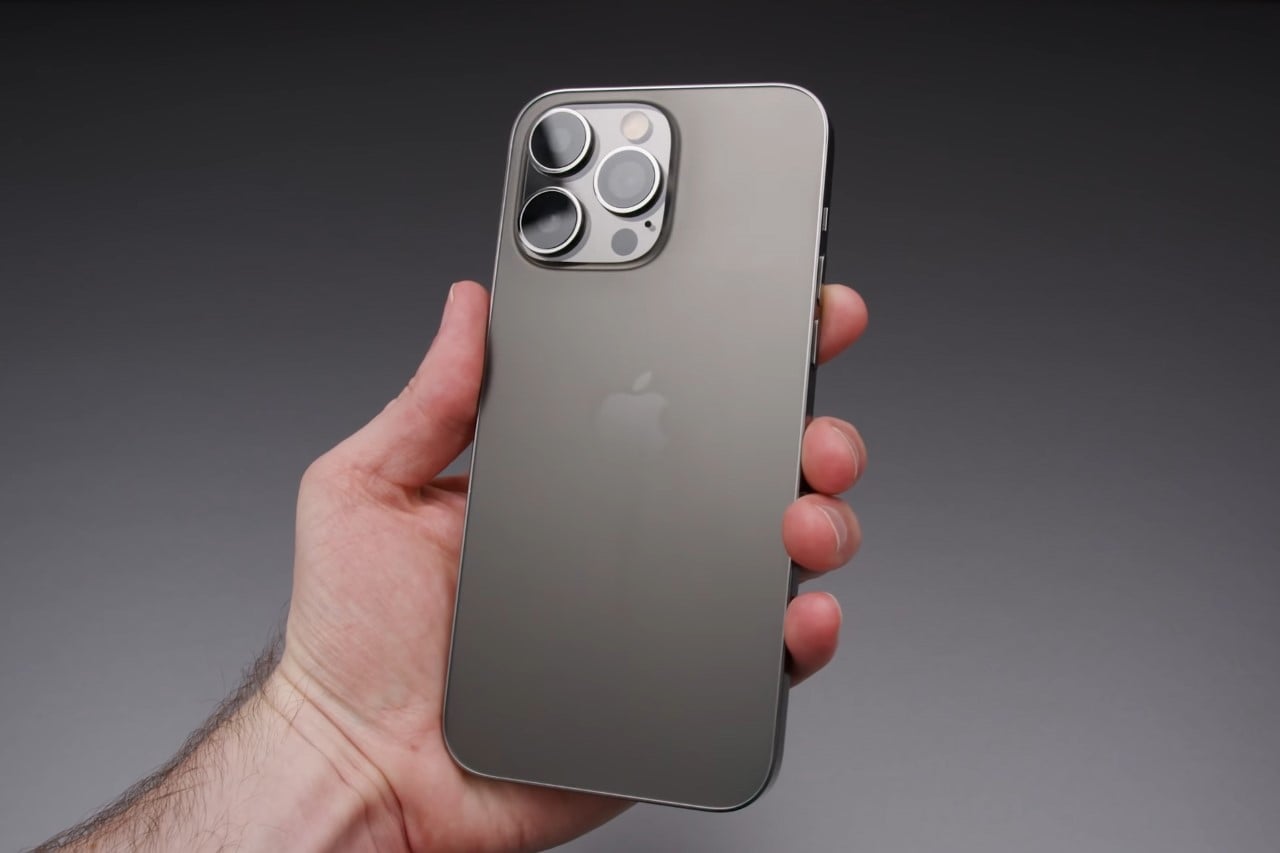
Whoever Dave2D‘s sources are, they certainly must be pretty important people. The YouTuber managed to get his hands on a pretty realistic-looking iPhone 14 Pro dummy unit – the kind Apple hands out to case/accessory designers beforehand to help them manufacture and launch upgraded accessories as soon as the phone drops. It’s rumored that Apple will be dropping just 4 iPhones this fall (the company is discontinuing the Mini), and while the 14 and 14 Max look relatively unchanged, the higher-end 14 Pro and 14 Pro Max have some significant design upgrades – notably the absence of the camera notch for something much more discreet.

Apple debuted the notch in 2018 – nearly 4 years ago. Since then, almost every company’s moved on to bigger and better things, but the iPhone-maker couldn’t seem to shake off the intrusive design detail. In fact, in a year where even MUCH smaller companies were making phones with tighter bezels and camera cutouts, Apple was faithfully committed to giving their iPhones an ugly, obtrusive forehead like a parent getting their children bad haircuts. It’s funny that Apple even figured out 5G before they figured out notch-less displays.

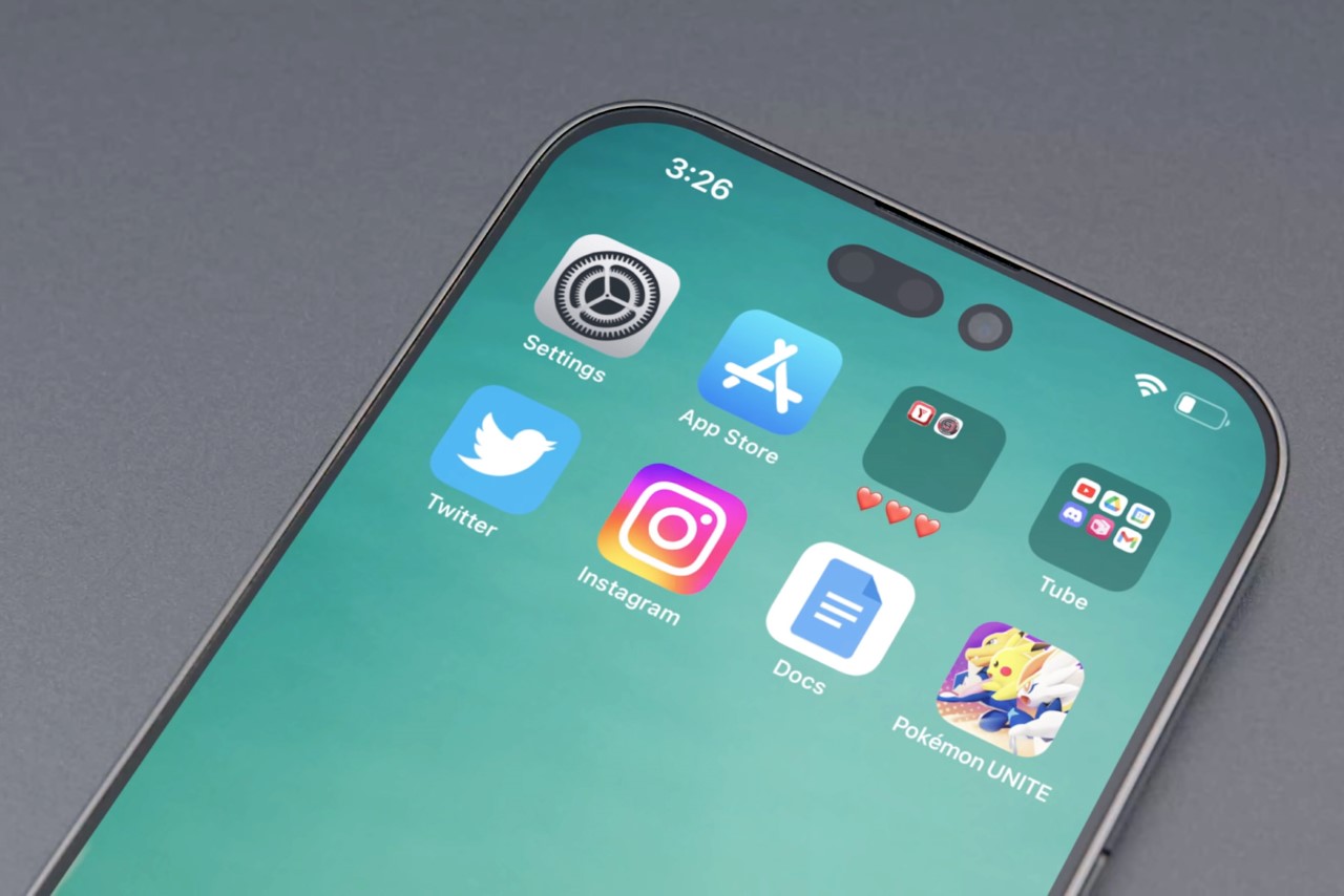
However, if Dave2D’s secret source is to be believed, Apple’s finally figured out a workaround, with a rather fitting ‘i’ shaped camera cutout on the iPhone 14 Pro and Pro Max. This creates the iPhone X moment for the Pro range, with a design that people can now instantly distinguish as a different, more premium model (the same way the notched iPhone X actually distinguished itself from the iPhone 8). For someone who’s used Android all his life, this doesn’t feel too different, but if you’re a serial iOS-head, this new camera cutout will instantly be the first thing your eye immediately travels to… because for the first time, you have hardware that is actually ‘inside’ the screen’s real estate.

It’s not entirely certain why Apple chose this unique cutout (the company should have figured out under-display FaceID by now, right?) but some speculate that this is the best the company could do given the dire circumstances and timelines. Apple ditched their Chinese front-facing camera manufacturer for a South Korean maker at the very last minute due to quality and developmental issues. Rumor has it that this new camera system turned out to be thrice as expensive as the regular notch, but given the fact that the company is running on a tight deadline with their iPhone event just 4-ish months away, it was the best they could do. Maybe the iPhone 15 will look better, right?

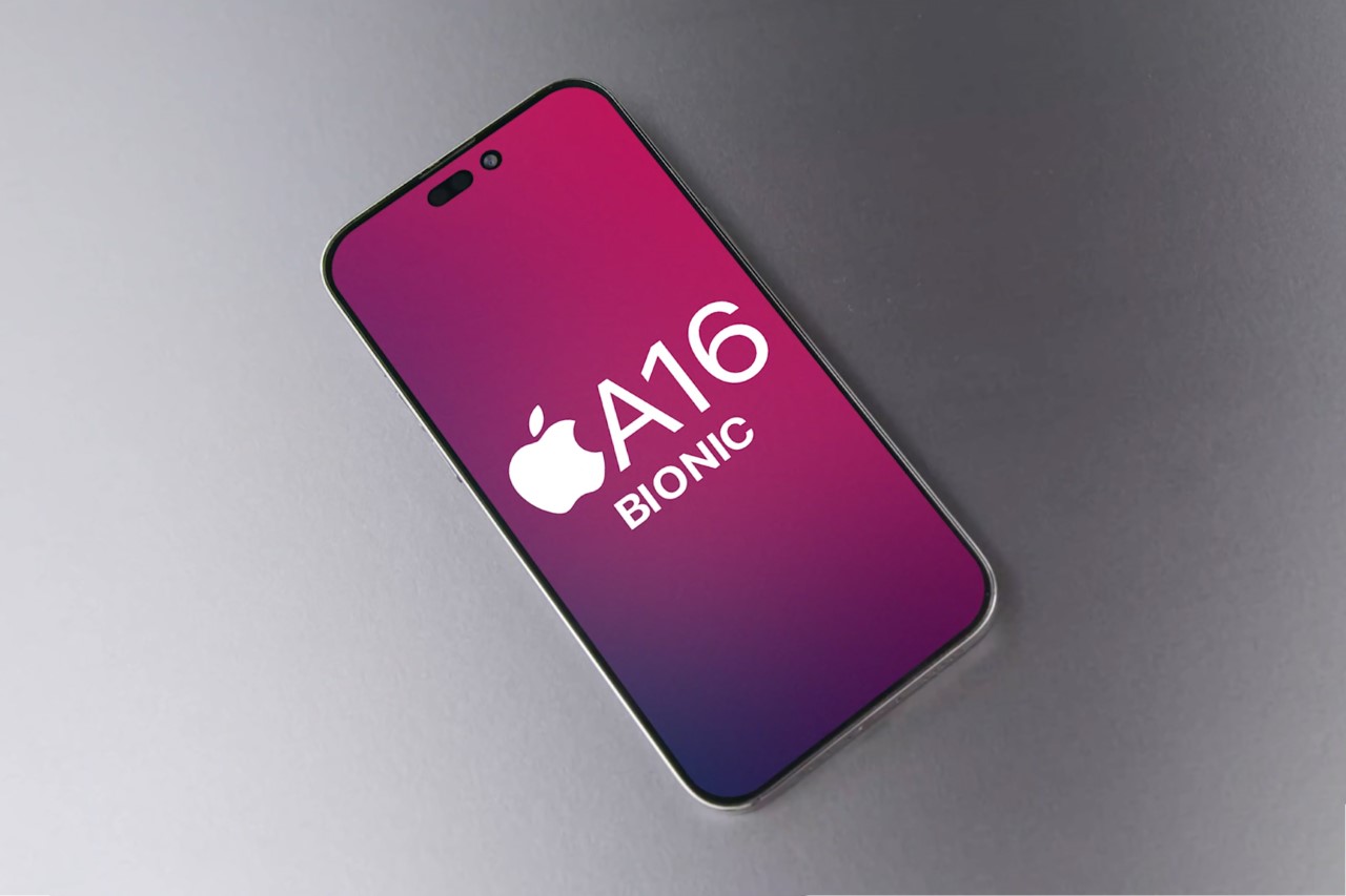
Front-facing camera aside, the iPhone 14 Pro and Pro Max are rumored to have Apple’s latest A16 Bionic chip. The specs of this chip are the kind of details that nobody will really know up until Tim Cook or Phil Schiller actually gives us the whole story.

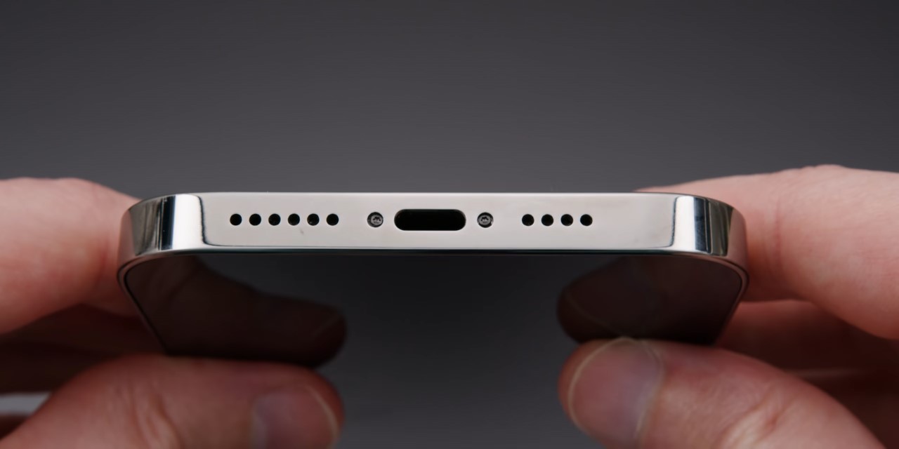
Other notable details include a similar but slightly larger camera bump. Apple seems to be pushing the envelope with just making their iPhone cameras bigger so they have larger sensors, and the iPhone 14 Pro seems to be no exception. Another feature that comes as no surprise? Lightning connector on the base. Apple has until 2024-25 to adopt the USB-C format before the folks at the EU get pissed, so chances are this might be the last, if not second-last iPhone with Apple’s proprietary lightning connector. Makes sense, considering the company also sells iPhone accessories like the AirPods and the MagSafe battery pack that use the same cable/port.

Apple is scheduled to announce the iPhone 14 this September or October. While this prototype here seems to paint a pretty reliable picture of what to expect, there are still a few more details that need mentioning, like the colors, price, and the new killer feature that sets this iPhone apart from others. (It was the Cinematic Mode last year)

The post Leaked iPhone 14 Pro dummy prototype shows a much larger camera bump, and no more notch first appeared on Yanko Design.
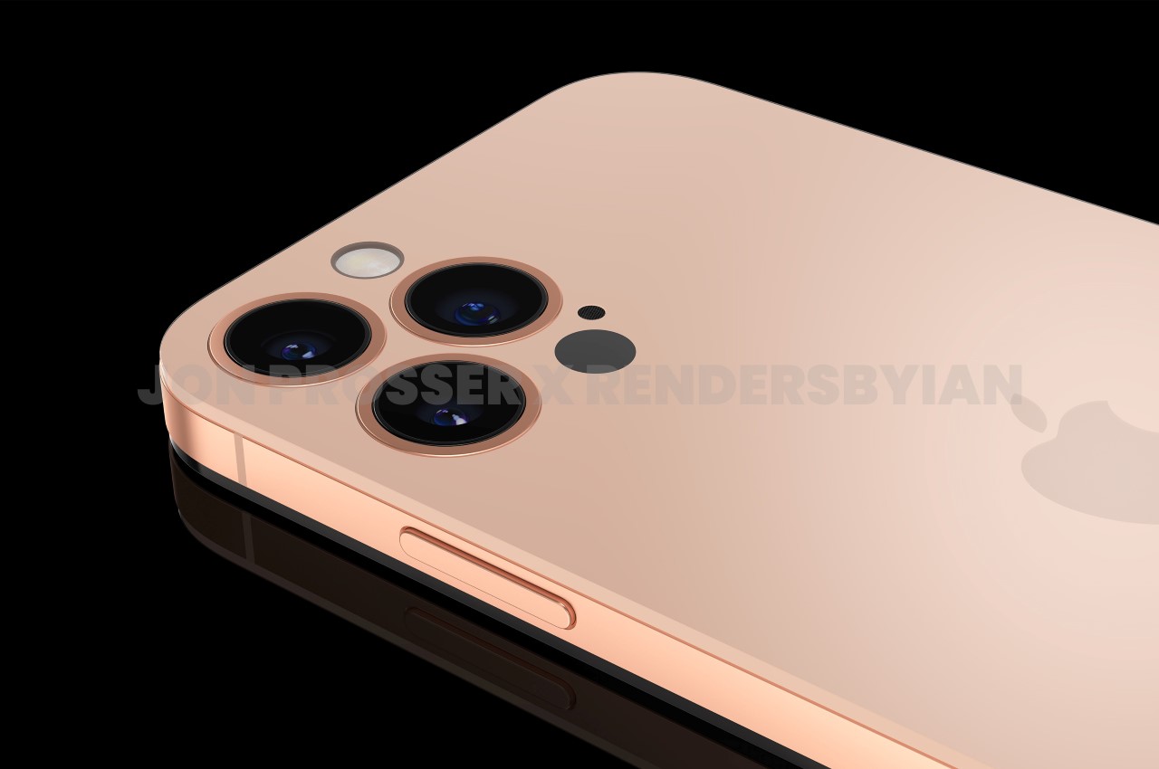
The Apple iPhone 14’s design has already leaked online, a full year in advance… with a flattened camera bump and no notch


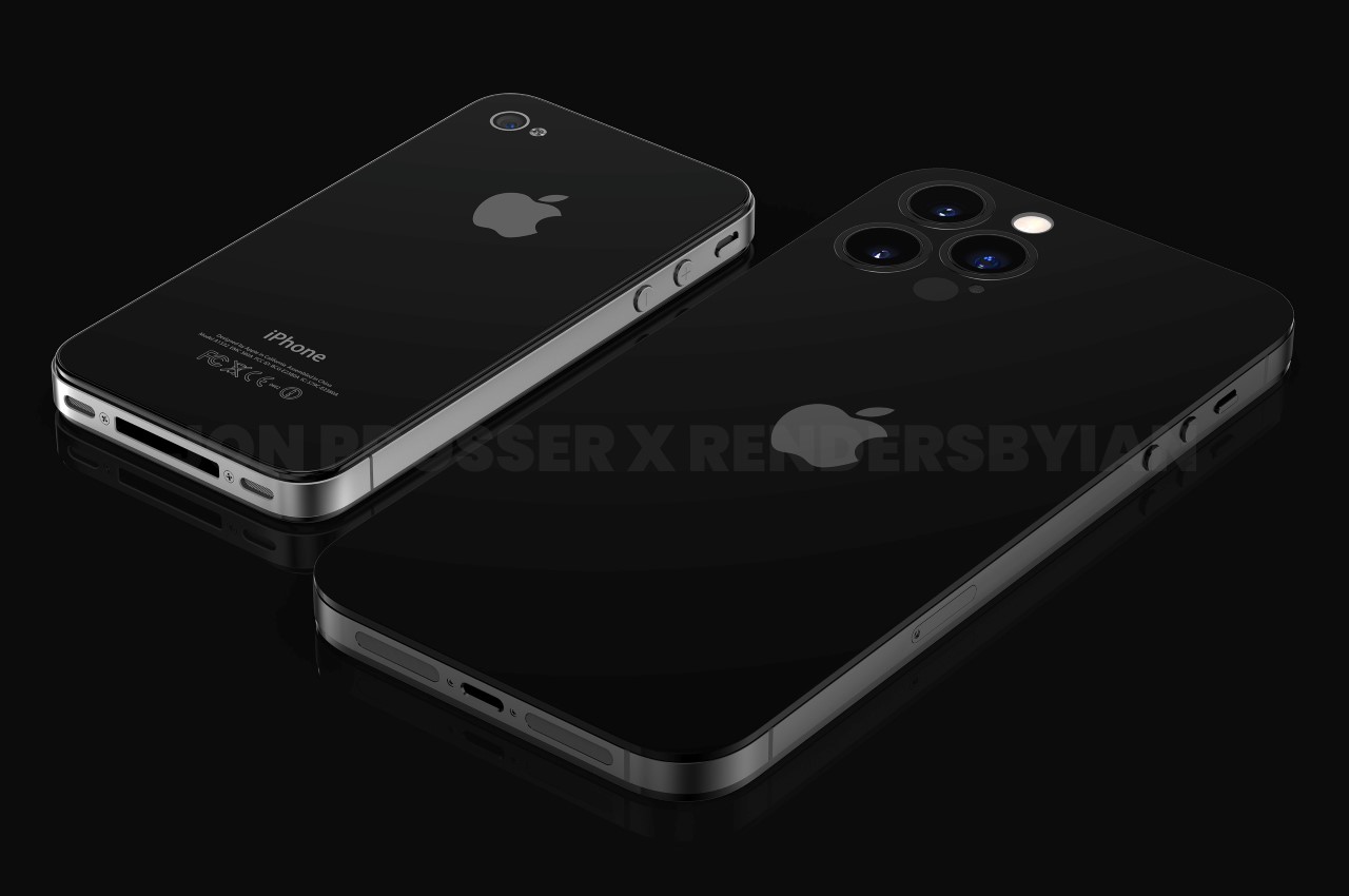
No camera module, no notch, and a design that feels like the spiritual successor to the iPhone 4 which would complete its 11th year anniversary on the day. That’s what the upcoming iPhone 14 will look like, proclaims YouTuber and Apple’s worst nightmare Jon Prosser.

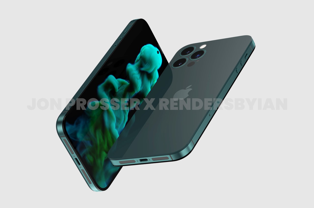
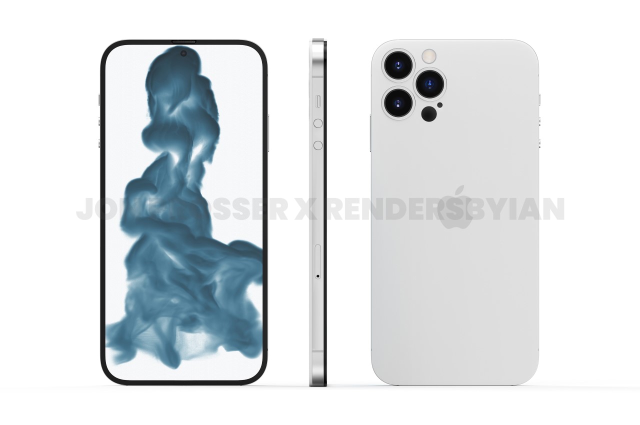
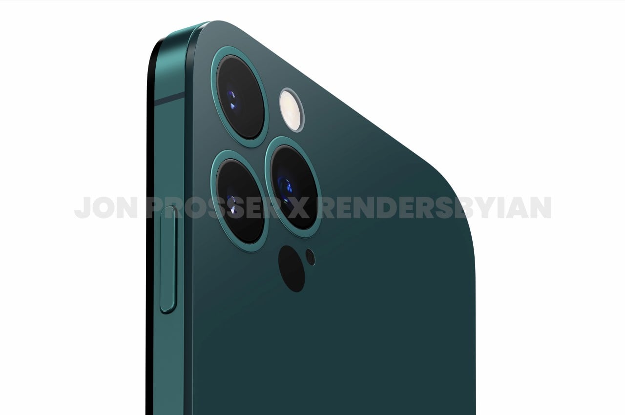
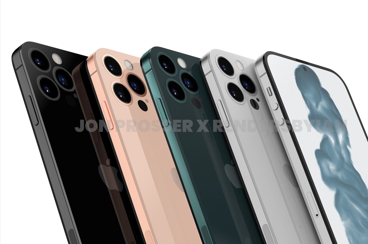
Amidst the chaos of the September 14th invite to Apple‘s launch for the iPhone 13, Prosser decided to drop a pretty big bombshell. His leak, he reiterates, isn’t of the iPhone 13… but rather, of the iPhone 14, which isn’t due till 2022. Prosser says he’s been in touch with supply chain workers who have shared images of the new phone with him and has then used those images to create renders that fully do justice to the design. The design in question, celebrates the 10th anniversary of the popular iPhone 4, with a similar flat-edge design, a flat camera module underneath a glass back, and a metal rim running along the sides. A noteworthy upgrade, however, is the presence of 3 rear camera lenses, and the disappearance of the divisive notch, which has plagued the iPhone’s design for nearly 5 years if you count the notched iPhone 13 that drops next week.

Apple iPhone 14 Jon Prosser Rendersbyian

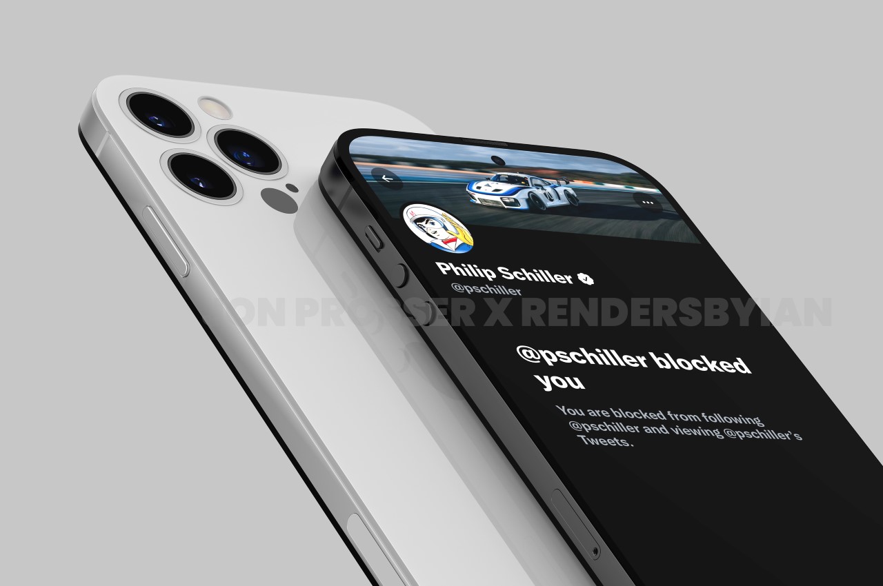
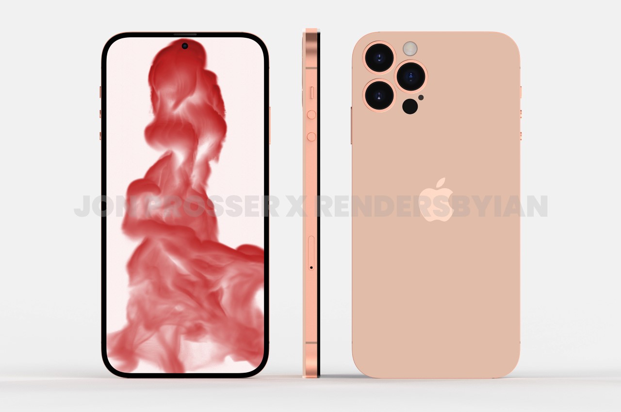
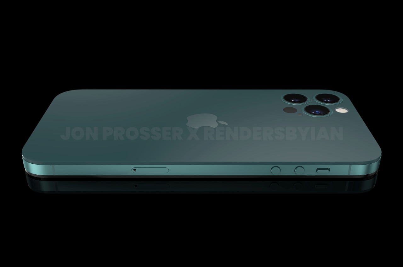
Prosser teamed up with long-time collaborator RendersByIan to help visualize the phone. Look past that incredibly tongue-in-cheek Twitter screenshot of Prosser being blocked by Apple Executive Phil Schiller, and you’ll see a design that seems new yet familiar. Apple’s cultivated a reputation of incremental progress and upgrades (with a few absolute refreshes every decade or so), and the iPhone 14 is no different. It looks remarkably like the iPhone 4, with how flush the cameras sit on the back, the circular buttons against the metal rim on the side, and a silhouette that is just as bit iconic as it was back in 2011.

Apple iPhone 14 Jon Prosser Rendersbyian

Apple iPhone 14 Jon Prosser Rendersbyian

Apple iPhone 14 Jon Prosser Rendersbyian

Flip the phone over on its front and you’ll notice perhaps its biggest visual change yet. The screen on the front does away with the infamous notch, finally adopting the hole-punch camera design that’s been around on Android phones for a while now. The disappearance of the notch was even briefly foreshadowed on an episode of Ted Lasso where fans managed to catch a fleeting glimpse of a smartphone with a hole-punch camera. Now, this could easily be Apple just trying to elaborately fool us, but the most logical solution is that the company’s finally come up with a replacement for FaceID and therefore doesn’t need that massive unibrow on the top of the phone. Some speculate an in-screen fingerprint while others say the fingerprint scanner could be merged within the power button.

Apple iPhone 14 Jon Prosser Rendersbyian

Apple iPhone 14 Jon Prosser Rendersbyian

Prosser’s video also deep-dives into possible color options and materials, which feels a little speculative at this point but it’s literally the only information we’ve got. He claims the images he saw were of the iPhone 14 Pro Max, so it isn’t immediately clear which other variants Apple aims at releasing and if there’s an iPhone 14 Mini too. Prosser also speculates that the phone will finally do away with the aluminum chassis and offer a new titanium variant which sounds incredibly interesting. The removal of the camera bump ties in with yet another online rumor from Ming-Chi Kuo that the iPhone 14 will be portless, which would mean the smartphone would need to rely solely on wireless communication and wireless charging, putting the phone’s MagSafe feature front and center. A flatter back panel (sans the camera bump) would go a great distance in helping the phone rest on flat chargers and wireless communication devices too. However, it’s too soon to really get into the details of a smartphone that isn’t due for approximately another 13 months. That being said, all we can really hope and pray for is that we get past the massive chip shortage we’re currently facing, so the next iPhone launch is nothing but smooth sailing!

Image Credits: Jon Prosser and Ian Zelbo (FRONT PAGE TECH)

Apple iPhone 14 Jon Prosser Rendersbyian

Apple iPhone 14 Jon Prosser Rendersbyian

Apple iPhone 14 Jon Prosser Rendersbyian

Apple iPhone 14 Jon Prosser Rendersbyian

Apple iPhone 14 Jon Prosser Rendersbyian

The post The Apple iPhone 14’s design has already leaked online, a full year in advance… with a flattened camera bump and no notch first appeared on Yanko Design.
Apple patent reveals a new type of Pencil with replaceable nibs for different creative applications

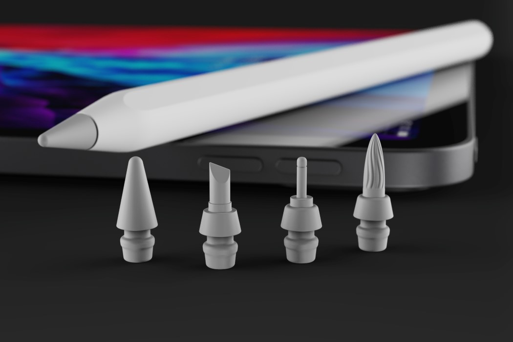
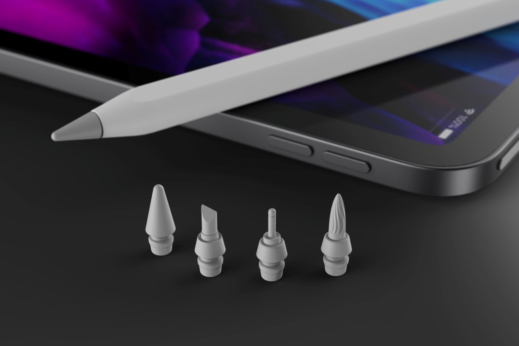
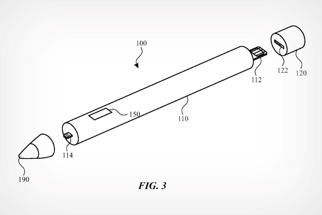
Watch out, Wacom and Adobe! In a new patent granted to Apple by the US Patent and Trademark Office, the company is reportedly looking at a next-generation Apple Pencil with swappable nib modules. While the patent doesn’t exclusively outline what these nibs would look like or be used for, it focuses more on the underlying technology, which would allow nibs to connect to the pencil handle via a special lightning-style connector.

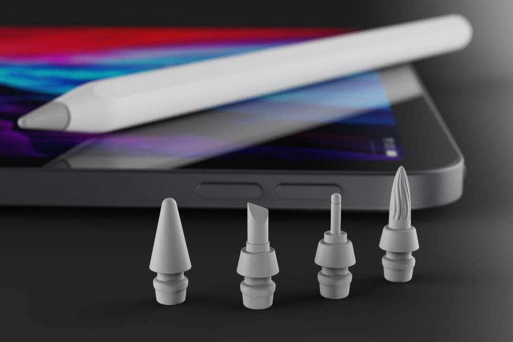
The Apple Pencil is arguably the iPad Pro‘s secret sauce. Along with the Pencil, the iPad Pro becomes the ultimate creator’s setup (for both 2D as well as 3D creation). It would therefore make sense to explore how the Pencil could further become a ‘power-user’ tool, allowing creators to unlock new potentials. Yanko Design has imagined what these new nibs could look like, with explorations for more niche 2D uses. The interchangeable nibs include a fine-tip nib, a chisel nib, and a flexible brush-pen nib. Other nib styles could unlock 3D modeling features like being able to sculpt on the iPad.

While the current Apple Pencil has features like tilt recognition and pressure sensitivity, allowing it to function as any sort of drawing tool, the presence of a specialized nib helps seamlessly replicate the tactile experience of, say, drawing with a brush pen or a chisel marker. Moreover, the ability to replace nibs essentially increases the lifespan of the Pencil by allowing you to replace nibs when they wear down after constant use. “The filing suggests the nib could contain several different sensors for varying purposes. The component list includes tactile sensors, contact sensors, capacitive and touch sensors, a camera, a piezoelectric sensor, a pressure sensor, or a photodiode”, reports Apple Insider.

Designer/Visualizer: Sarang Sheth

Patent via: USPTO