Ro room divider uses geometric shapes and warm tones to give character to any space

A room can tell a lot about its owner just by the things you find in the space and how they come together. Sometimes rooms are neat and minimalist, while other times they can be busy but expressive. Whether by conscious decision or subconscious inclination, almost anything we put in a space has a story to tell, whether about the person living in that space or the object itself. People have become more acutely aware of their living spaces lately, especially after having spent months stuck indoors, and have come to be more discerning in the furniture and decor they buy, especially when it comes to the message that each piece tries to convey. A room divider, for example, might visually and functionally split a space, but it can also bring a comforting atmosphere thanks to its design.

Designer: Mia Cullin
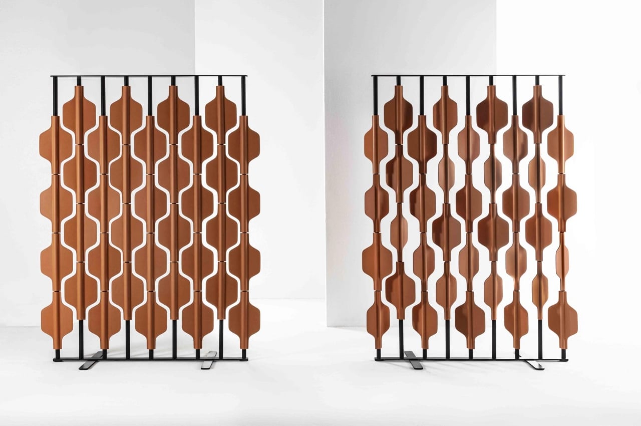
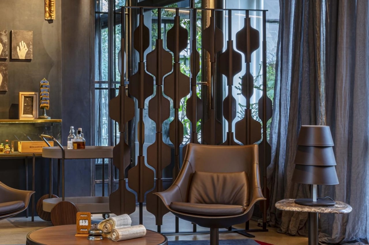
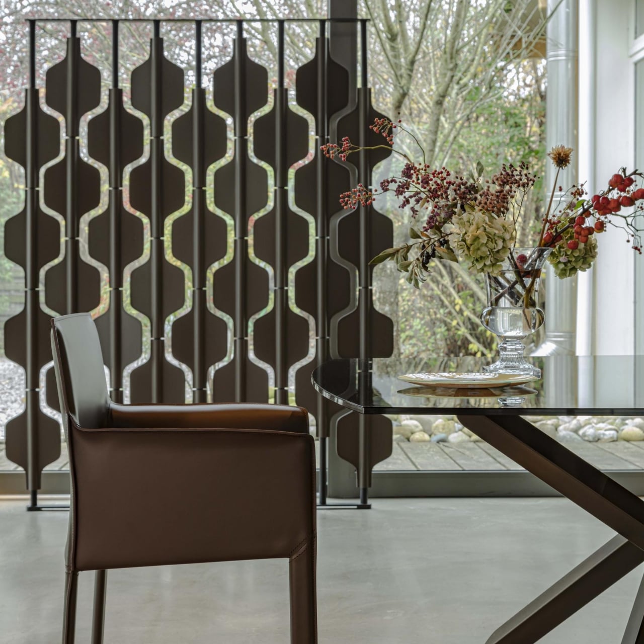
Room dividers don’t have to be fancy. In fact, it is probably best that they don’t call attention to themselves since they’re supposed to blend into the background to make it seem like the space is really divided into distinct sections. At the same time, however, they also don’t have to be plain and boring, and they can affect the overall atmosphere of an area. An extravagant divider could make a room look posh or busy, while a nondescript sheet of wood could make it look clean or drab. Ro takes somewhat of a middle ground, espousing minimalism while still embracing warm tones and natural materials that give a distinct personality and atmosphere to any space.
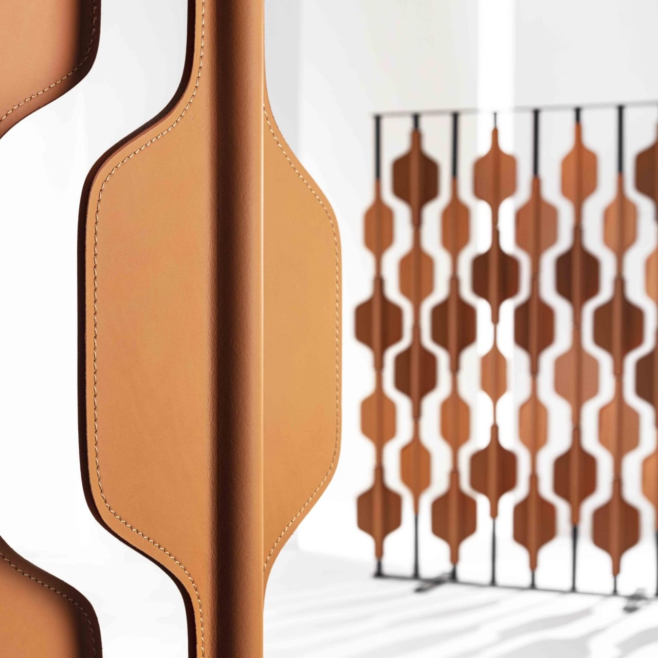
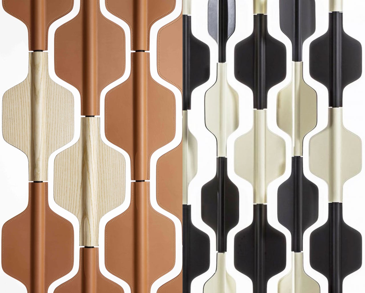
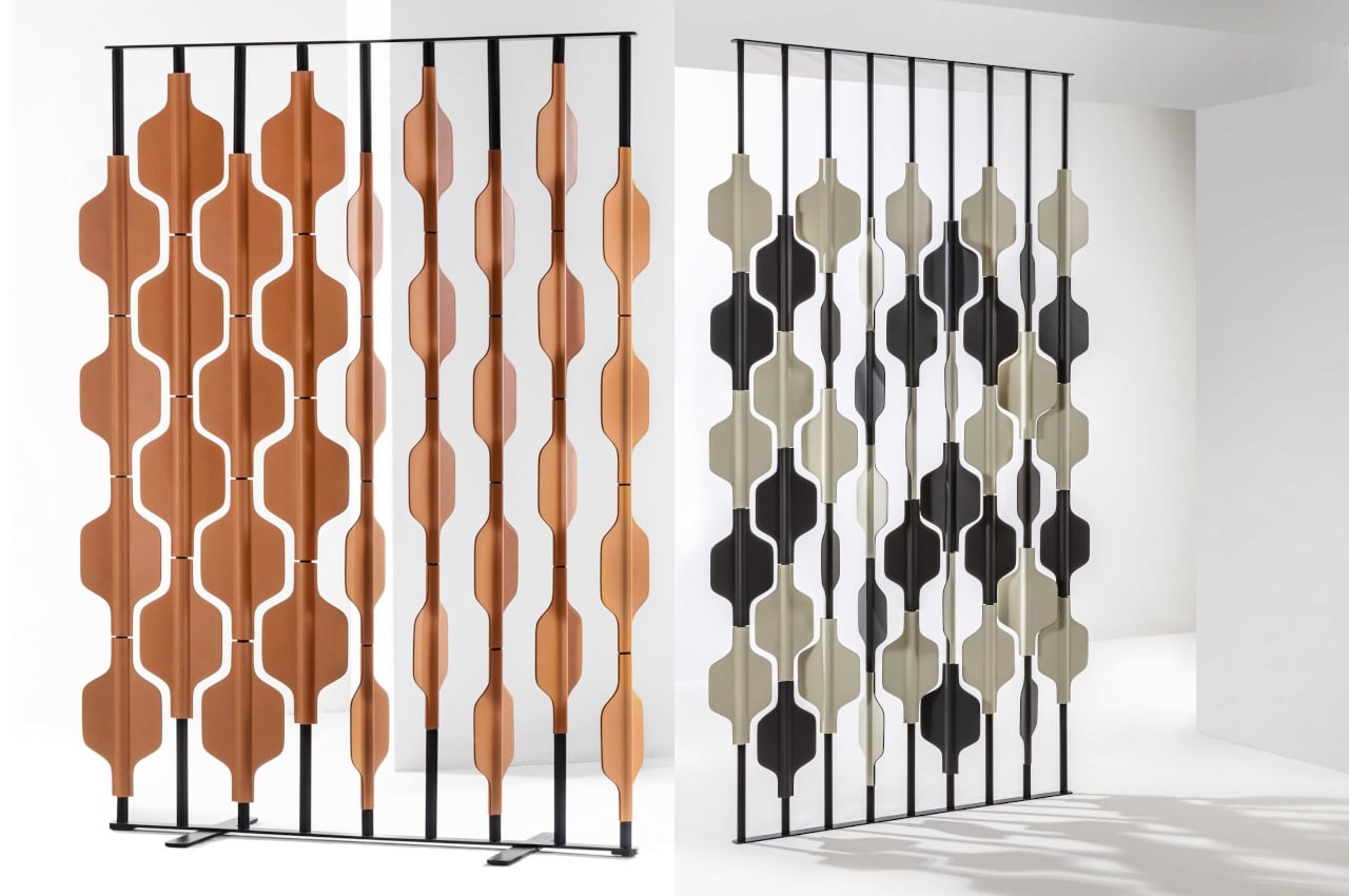
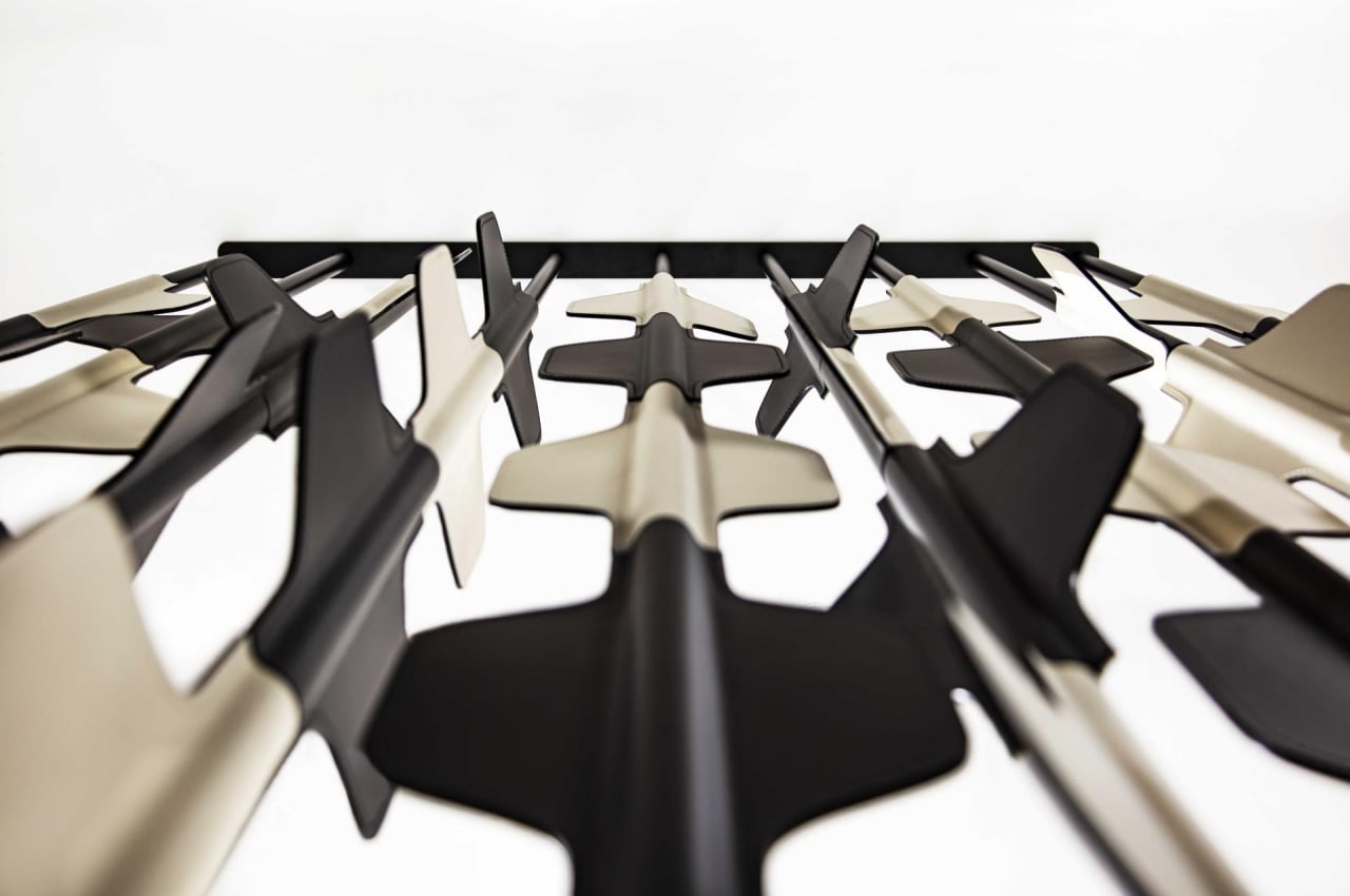
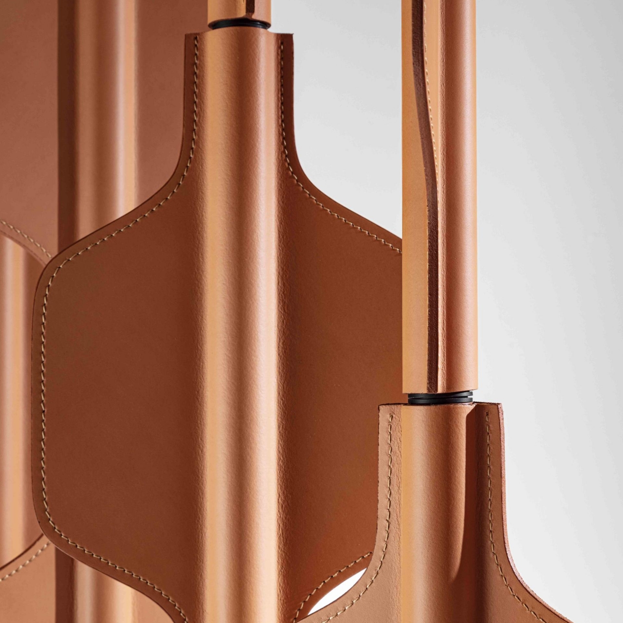
Structurally, the Ro room divider looks like a honeycomb with columns of alternating hexagons attached to painted aluminum poles. Each column can rotate independently of others, allowing the owner to create different patterns that become a visual point of interest in the room. More importantly, however, it gives owners the freedom to close or open a space just by changing the orientation of the panels.
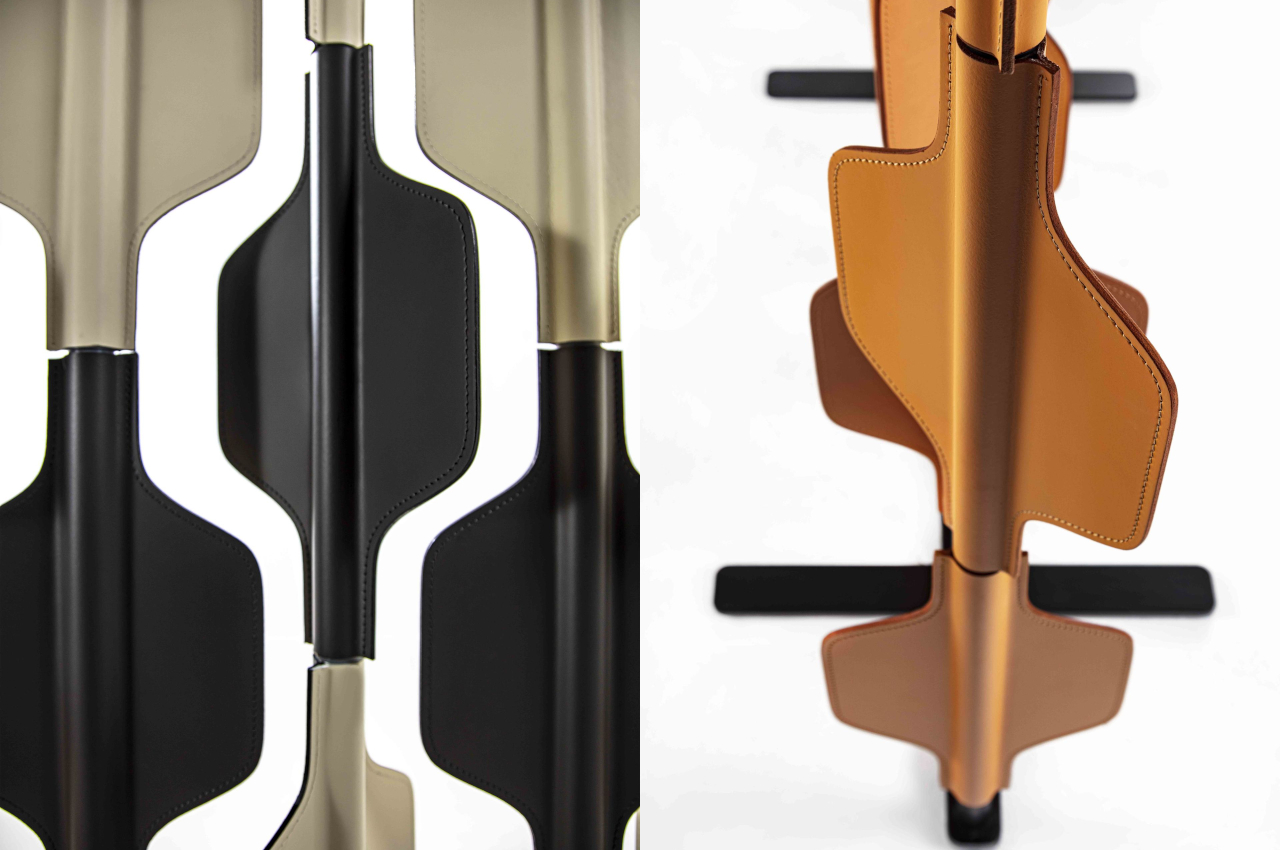
Each piece or module of the panel can be covered in either leather or wood, with different finishes and colors. Whichever style is chosen, the subdued and muted tones give the divider a warm appearance that provides a calming visual. The natural materials themselves also exude a certain image of luxury you’d come to expect from products made with full grain leather and fine wood. Despite its eye-catching and beautiful appearance, the Ro’s minimalist aesthetics prevents it from being too flashy or gaudy. It is simply there, marrying visual appeal and functionality in a simple package.
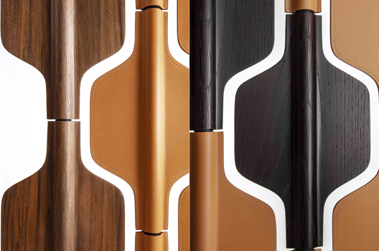

The Ro room divider is a fine example of furniture that brings character without forcing its presence in the room. With choices of wood and leather, it will be at home in any setting, whether in a living room, a hotel, or even an office. It’s a perfect example of how a design doesn’t need to be too sophisticated, too complex, or even too functional to be attractive and useful. With the right choice of materials, colors, and shapes, one can imbue any room with feelings of warmth and comfort to help people relax or, at the very least, reduce their stress.
The post Ro room divider uses geometric shapes and warm tones to give character to any space first appeared on Yanko Design.

This portable wireless charger is a handsome example of form and function in harmony

Portable chargers or power banks are a dime a dozen these days, including the new breed that sports wireless charging capabilities. They might come in all shapes and sizes, but one thing that most have in common is that they look no better than plastic bricks inside your bag. Some even weigh like bricks, too. Granted, some people couldn’t care less about how their portable batteries look, but that is a frame of thinking that takes for granted the importance of a well-designed and well-made product. It also presumes that you can’t have both functionality and aesthetics in the same thing, which couldn’t be farther from the truth. That is what makes the NOA Daytripper stand out, not just for its dashing good looks but also for being a witness in the marriage of beauty and technology.

Designers: Martin Boehnel, Arvin Bayat & Christel Hadiwibawa of NOA

Click Here to Buy Now: $86 $128 (30% off). Hurry, less than 72 hours left!

A lot of people don’t give a second thought to the tools that they use. Some might even scoff at those who fuss over beautiful stationery or stunning apparel. Sadly, this betrays a mindset that equates design with superficial qualities or even vanity, that something that looks good is immediately less functional compared to plain-looking tools. Worse, it also views tools and products as short-lived objects that you simply throw away without a second thought, adding to the world’s growing landfill and pollution problem.

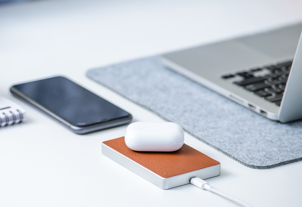
The Daytripper stands in defiance of that way of thinking by delivering a portable wireless charger that will make you feel good about owning such a stylish accessory. The 5,000 mAh battery inside is, of course, critical to its function, but it almost plays second fiddle to the overall design of the power bank. Make no mistake, it will get the job done without breaking a sweat, whether you need to charge a phone wirelessly or with a cable. You can even do both at the same time or charge both the power bank and your phone with one cable if you’re pressed for time.

Charging Configurations – Charge however you like. Base to base, perpendicular, or on an angle.

Universal Compatibility – Compatible with all Qi-enabled devices.

Charge 2 Devices at the Same Time – 2-way USB-C port can be used to charge another device.

Charge while Recharging – Simply plug Daytripper in and place your phone or device on top, and both will be ready to go for the next day.

It’s hard to deny that the portable wireless charger’s appearance is also an important part of its appeal, but its beauty isn’t only skin deep. The Daytripper doesn’t just use materials that look good and feel good in your hand; its creators also chose those materials for their longevity and sustainability. In a small way, it is yet another example of how function and form go hand in hand.

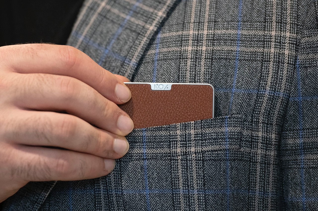
The body, for example, is made from a single block of aluminum, reducing waste and providing durability to the power bank. The genuine leather that serves as the charging pad not only protects our device from scratches but also develops a unique patina over time to add to the charger’s timeless beauty. Even the ABS core structure underneath the leather that provides the rigidity it needs can be separated from the rest of the body to be recycled when its end of life finally does arrive.

Versatile, functional, and beautiful, the NOA Daytripper portable wireless charger embodies what a well-designed piece of technology can be like. Its durable and natural materials encourage you to develop a personal attachment to the product, giving it more attention and more care than you would a regular power bank. And because it is designed to last and to be kept for far longer than its peers, it won’t be finding its way to a landfill any time soon.

Click Here to Buy Now: $86 $128 (30% off). Hurry, less than 72 hours left!

The post This portable wireless charger is a handsome example of form and function in harmony first appeared on Yanko Design.

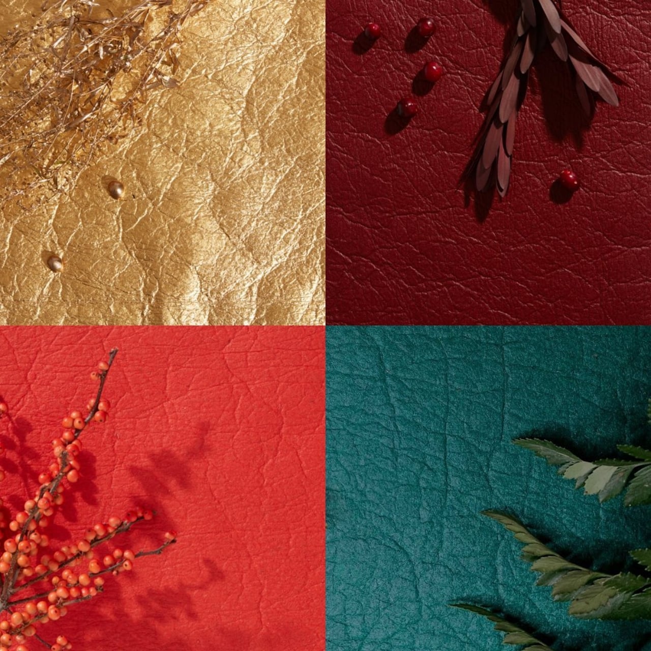
Pineapple leaves become a convincing leather alternative using a sustainable process

We often take textiles for granted because they seem to be less harmful to the environment compared to plastics, but even that industry has some dark secrets. Chemicals used to create dyes that give life to clothes are harmful both to the planet as well as to the humans who handle them. Leather is a favorite among designers but is even more controversial because of its sources and the processes involved in tanning the material. There have been numerous attempts to create leather alternatives, some of them involving problematic components and resources as well. One new option, however, tries to use leaves that would have been thrown away or, worse, burned anyway and turns them into a leather-like textile that you would easily mistake for the real thing.

Designer: Carmen Hijosa (Ananas Anam)

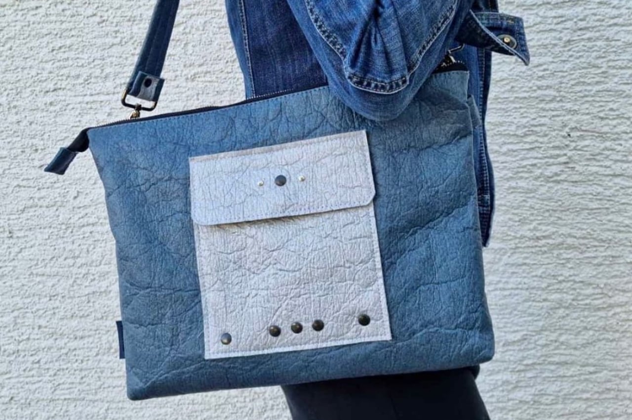
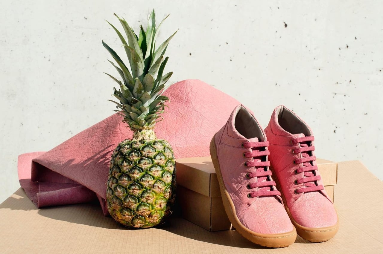
Common synthetic leather alternatives don’t really solve the overall problem with leather. While they do mean that fewer animals are killed in the process, the chemicals and processes involved in making them are just as harmful to the planet as traditional leather tanning. That is why many designers and some companies have turned their eyes toward Nature’s natural fibers for inspiration, but using plant-based materials isn’t as easy as it sounds. That’s what makes Piñatex quite the innovation, providing a leather alternative that’s close to the original in quality while also supporting a truly circular economy.

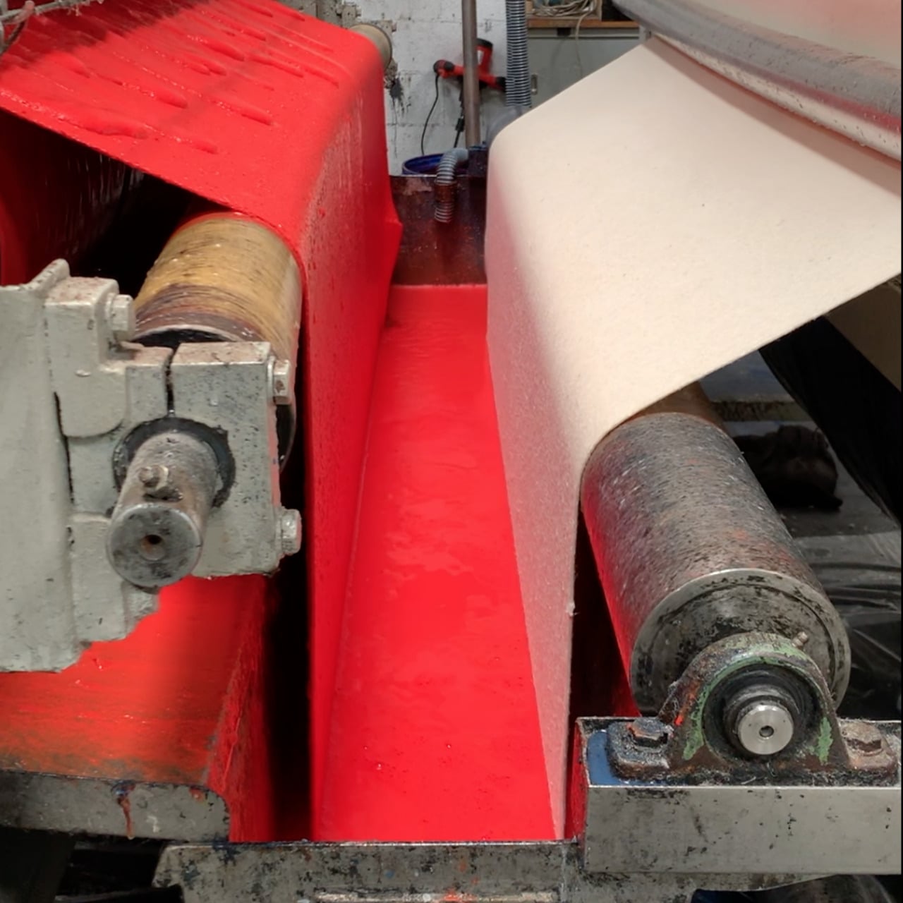
Pineapple leaves are the natural byproducts of harvesting these tropical fruits, but there is very little use for them. This waste is simply gathered and left to decompose, though most farms actually just burn them. Unsurprisingly, that action results in the release of large volumes of carbon dioxide into the atmosphere, worsening the greenhouse effect on the planet. Piñatex uses the ignored potential of pineapple leaves to produce something that you probably would have never thought came from discarded leaves.

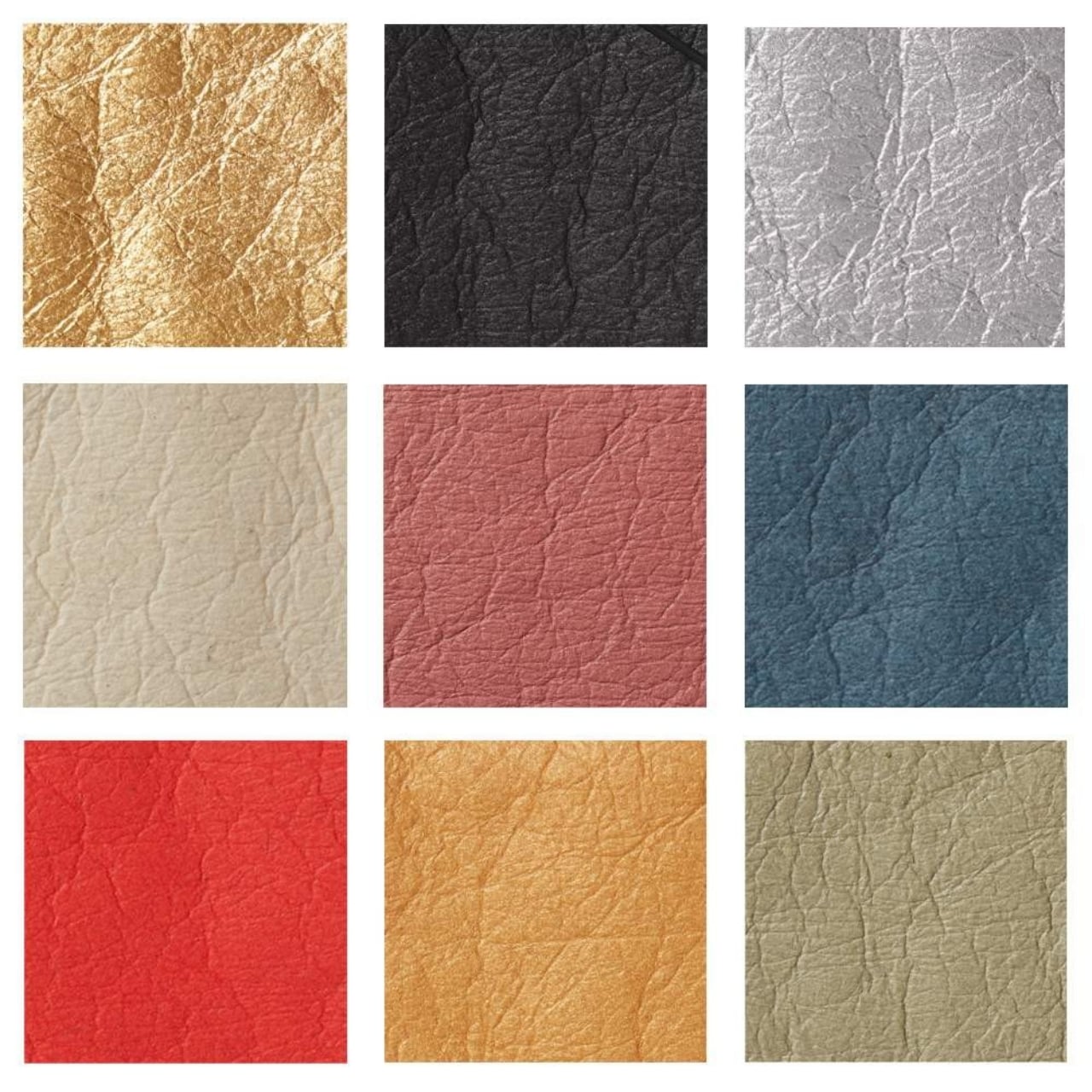
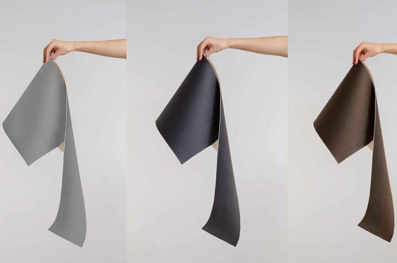
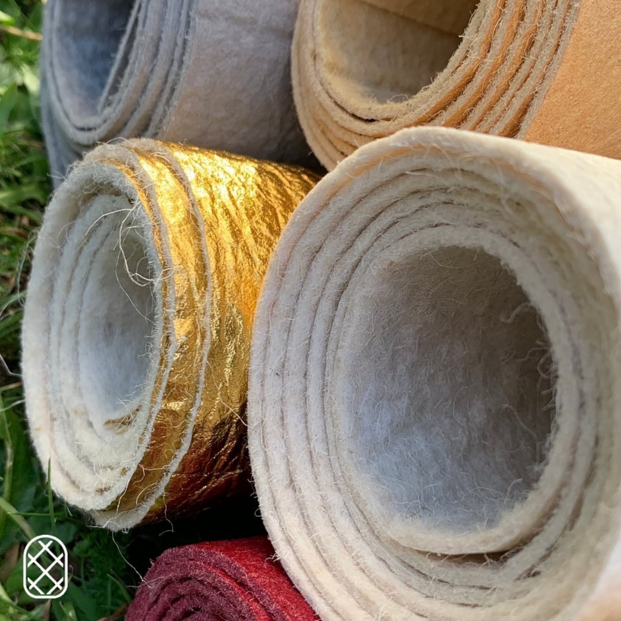
Piñatex pretty much serves the same purpose as conventional leather but can even be more versatile than the original. It’s easier to produce more colors, for one, using GOTS-certified pigments. A water-based PU resin coating is applied on top to add durability and water resistance, making it a good fit for almost anything that would normally use leather. And unlike most plant-based textiles, Piñatex is non-woven in order to provide that same texture as leather.

What makes the material even better is how it pushes for a “cradle to cradle” ecosystem, where the materials are not only biodegradable but also helps pineapple farmer tap an additional source of income. The process of turning pineapple leaves into leather-like textiles also uses fewer natural resources and no chemicals. And whatever is left of the leaves can be used as fertilizer for the next generation of pineapples or biofuel for the machines that harvest them or make Piñatex.

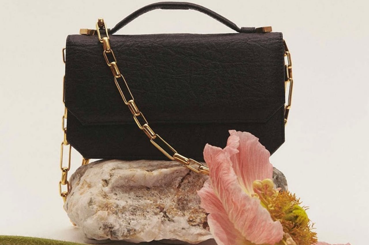
It is definitely encouraging to see more sustainable alternatives growing in the textile and fashion industry, considering how clothes and accessories are mass-produced by the millions. Plastics may be the biggest problem the planet faces today, but almost every facet of our modern life deserves re-examination and redesign. And organic or plant-based alternatives don’t have to mean lower quality materials, as the list of heavyweight Piñatex customers can testify.

The post Pineapple leaves become a convincing leather alternative using a sustainable process first appeared on Yanko Design.

This evolved glasses case pulls double duty as a power bank for your phone

Some things have remained unchanged for decades, but that doesn’t mean there’s no more room for improvement.

The number of items we put inside our bags seems to be growing every year to the point that some people are looking for ways to either get rid of some of them or at least combine them. Some things, however, are just indispensable, like the charging case for your earbuds, your emergency power bank for your gadgets, and, if you wear glasses, a protective case for your spectacles. Along with paper notebooks that might also be found inside those bags, those glasses cases haven’t exactly seen any significant improvement in both design and purpose. In fact, most of them are designed to break easily and be thrown away just as easily. One designer, however, realized it’s high time to give this protective accessory an upgrade by merging it with one of the most essential accessories people need these days.

Designer: Khaled Mohamed

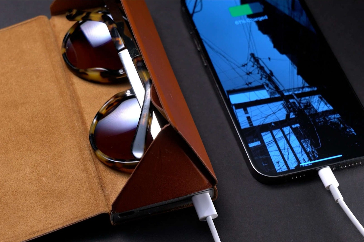
Some ideas come like a flash of lightning, while others take a long time to percolate. Still, others tend to take detours, as in the case of this mashup of two important things inside many people’s bags. The first attempt to modernize the glasses case ended up putting an external SSD aimed at workers on the go. It turned out, however, that there was more demand for a more common mobile accessory that could be useful to almost anyone, which is how the Glasses Case Battery Bank plan was finally put into motion.

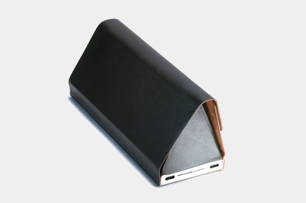
As the name so clearly states, this product combines a case for glasses with a battery bank. That is indeed more useful for almost everyone because everyone has a phone these days. And while you might not have prescription glasses, there might always be a time when you have to bring sunglasses with you, even the rather expensive kind. Sadly, almost all but the most expensive eyewear have cases that are designed with quality and longevity in mind.

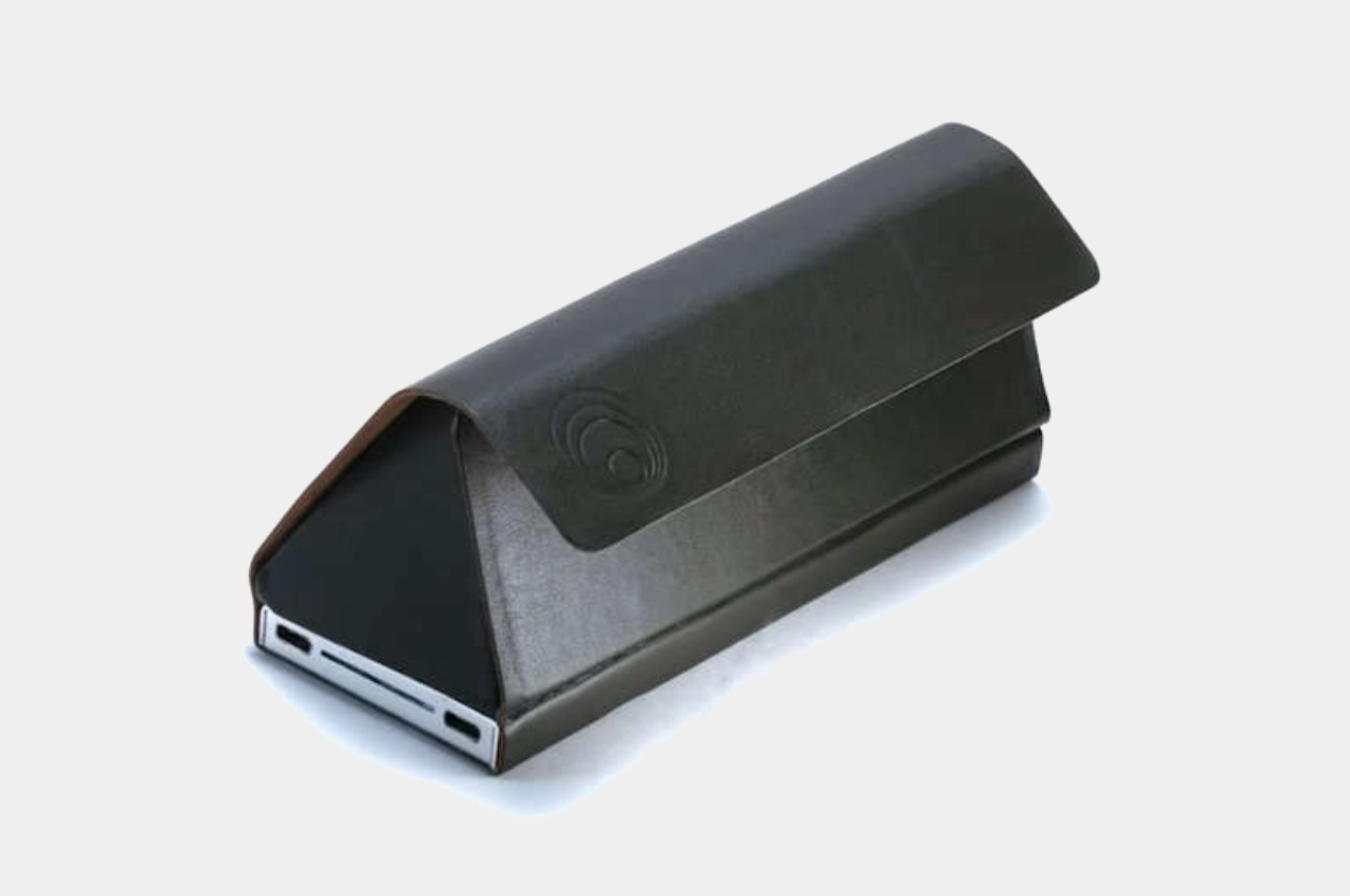
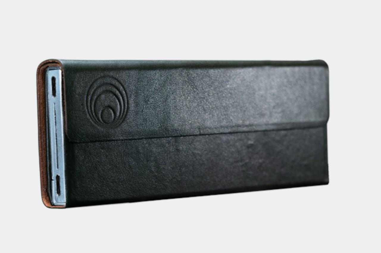
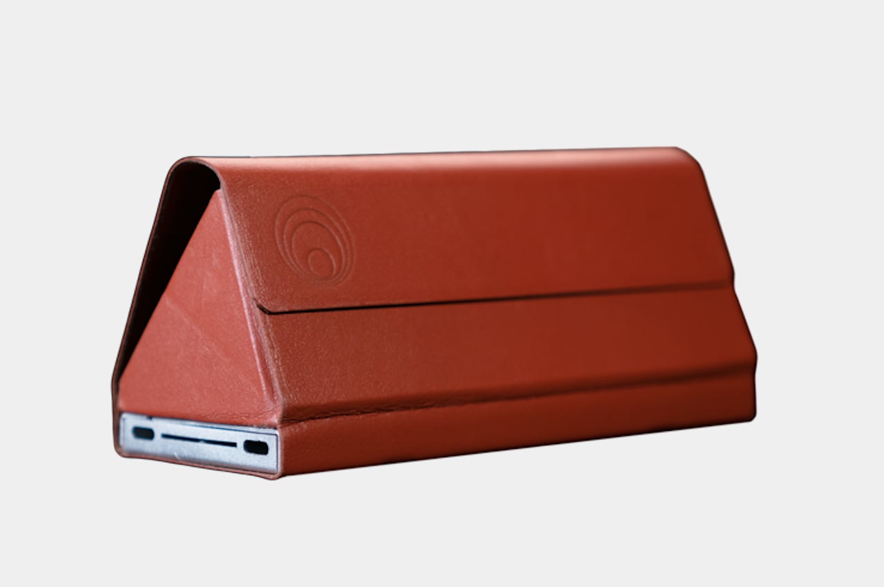
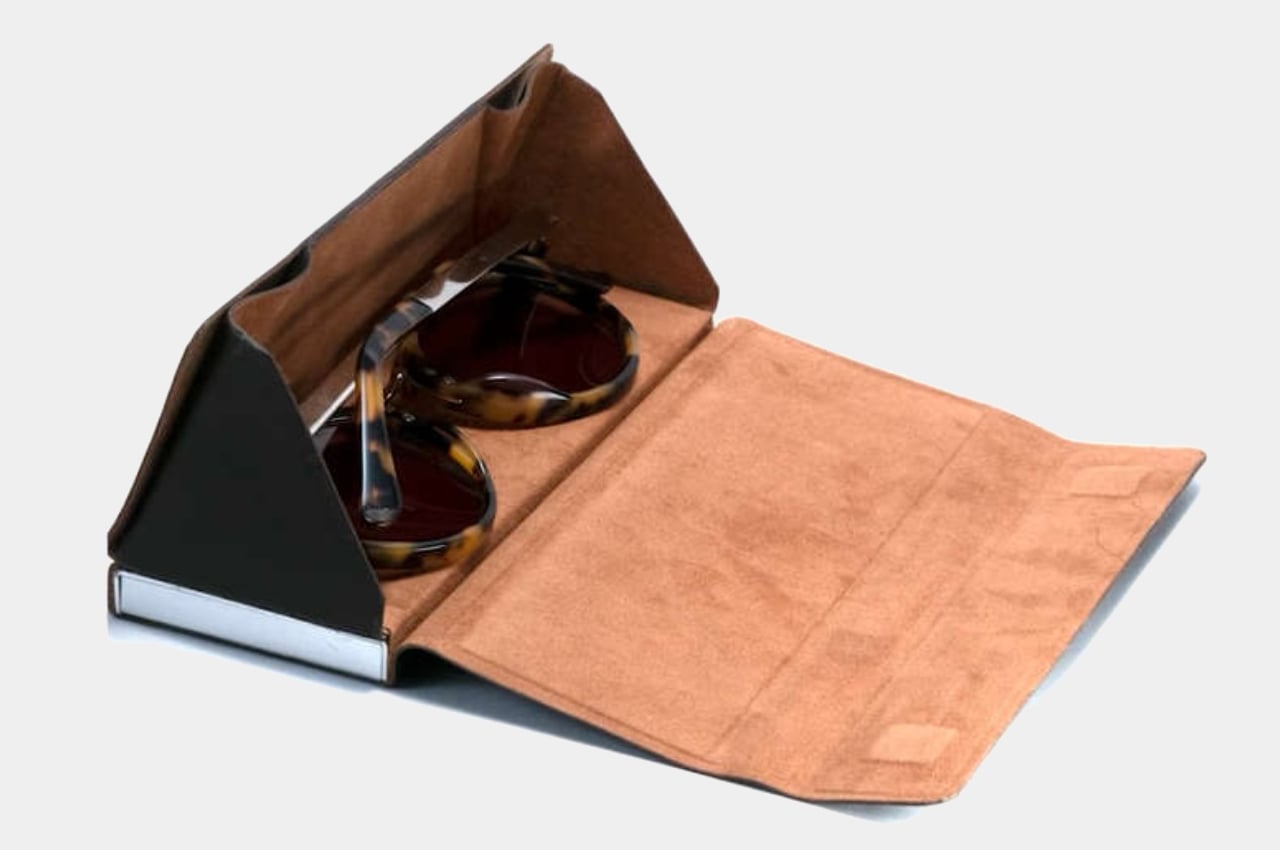
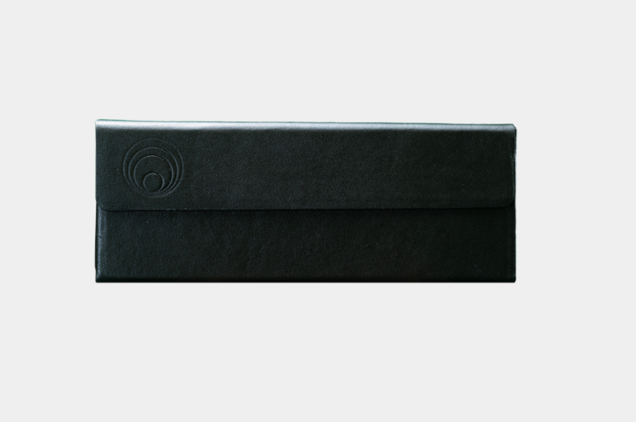
In contrast, this combo aims for both with an added touch of modern convenience. The case will be covered by Italian calfskin leather, prized for its durability and its softness. On the inside, Japanese Ultrasuede will keep your glasses safe and clean while also protecting the power bank with a soft interior. As for that battery pack, it is planned to bear a 4,000 mAh capacity, enough to juice up most phones these days at least once.

If you think that combining a glasses case and a battery bank will create a rather bulky structure, then you’re half right. The design of this accessory seems to be partly inspired by origami, the Japanese art of paper folding. When acting as a glasses case, it takes the form of a prism with the battery bank serving as the solid base. Without the glasses, however, the sides of the case can unfold and wrap around the power bank, creating a more compact form.

The Glasses Case Battery Bank doesn’t exist yet in a form you can buy, though. It will be hitting crowdfunding soon and lures a tempting $99 price tag for early believers of that vision. The product will also be manufactured in the US and Canada, which should at least help reduce the carbon footprint and costs when shipping to backers in North America.

The post This evolved glasses case pulls double duty as a power bank for your phone first appeared on Yanko Design.
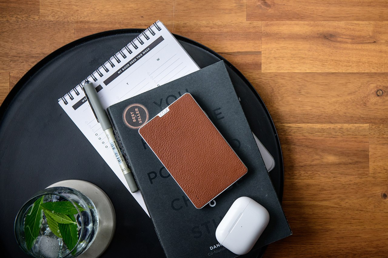
Bellroy Slim Sleeve wallet embraces a new kind of plant-based leather

Designers of all kinds just love leather, whether in theory or in practice. Genuine leather is naturally warm and soft to the touch, generating pleasant sensations on our skins and in our brains. It also ages gracefully, developing scuffs and patina that are unique to each product and largely depend on how it has been used. For all these desirable traits, leather is still controversial because of its source, and current alternatives aren’t completely free from sin either. That’s where Bellroy’s latest eco-friendly wallet comes in, making a rather bold statement that tries to push plant-based leather into a completely sustainable and circular future.

Designer: Bellroy

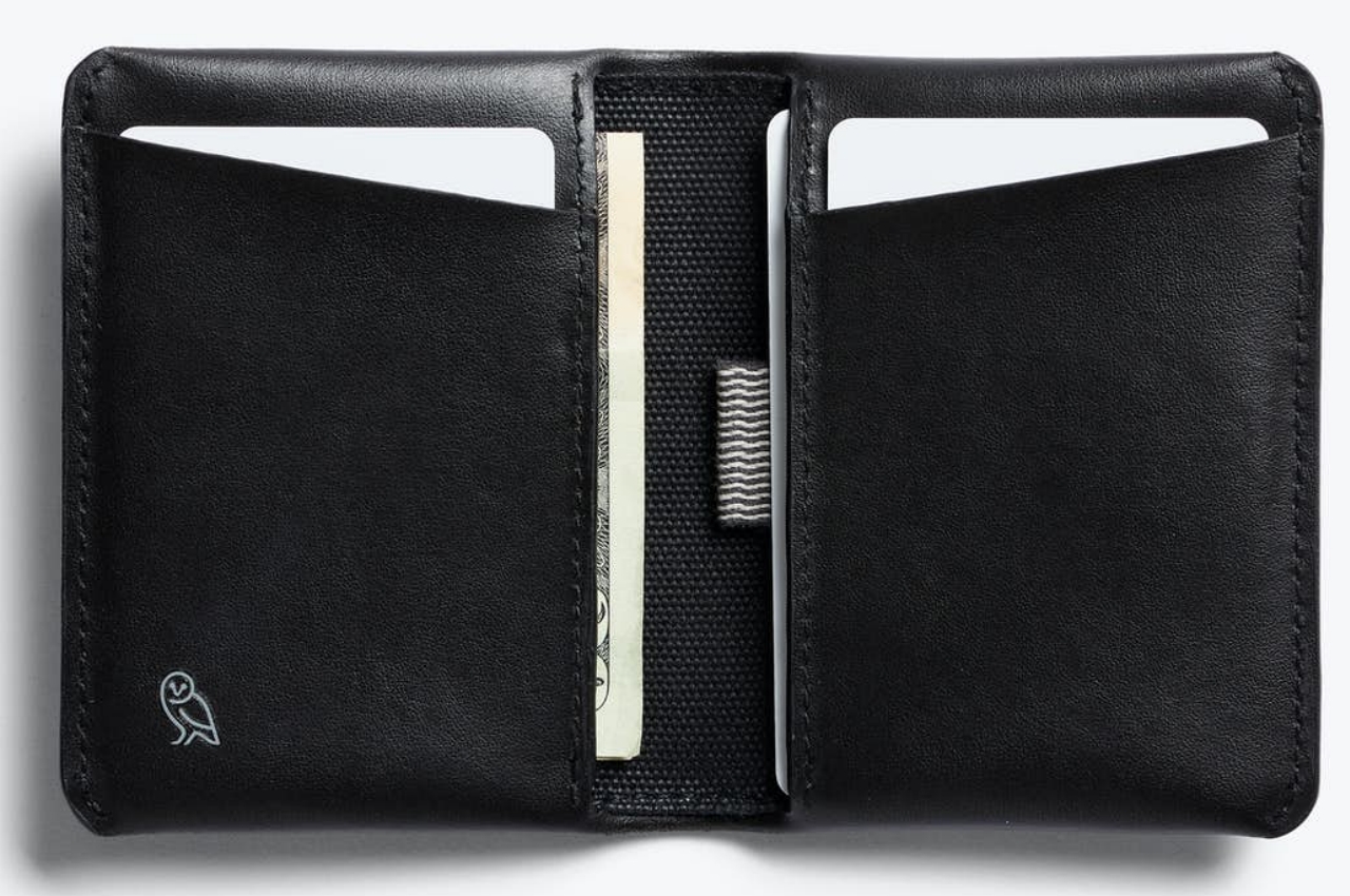
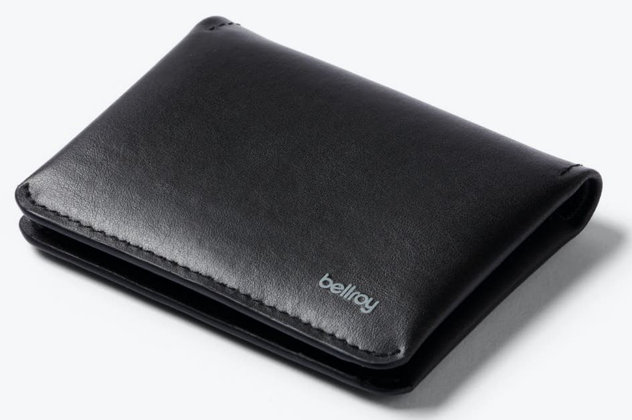
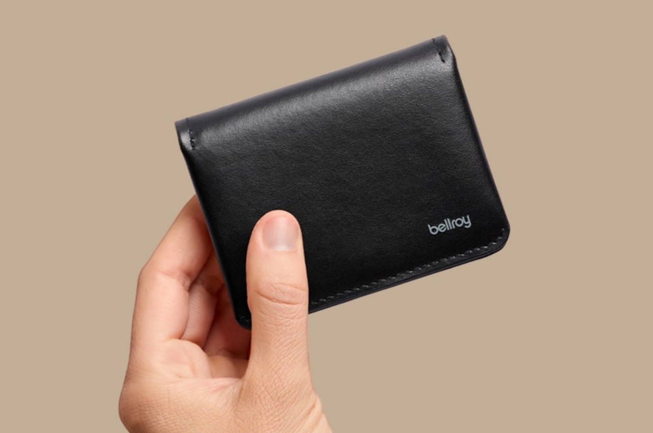
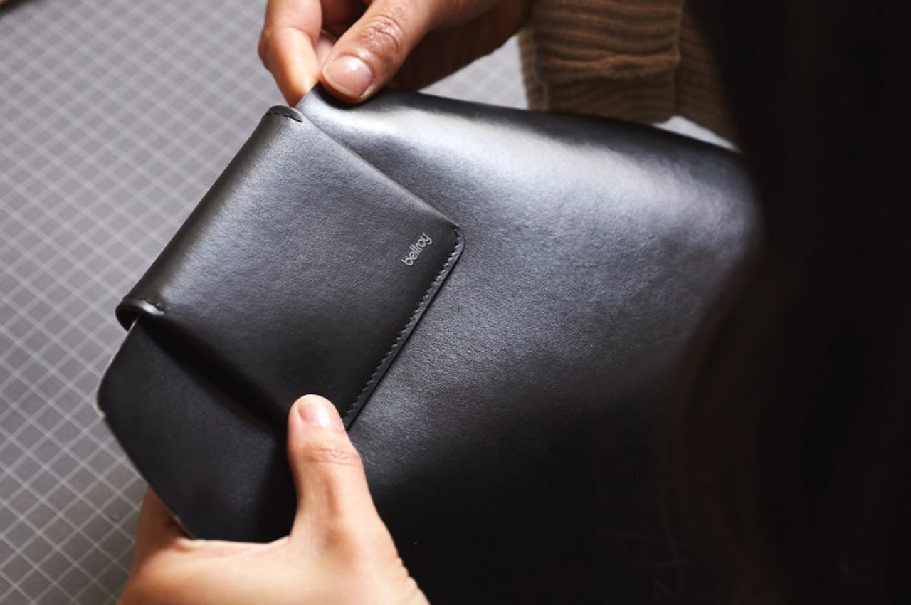
Simply looking at the new Bellroy Slim Sleeve “MIRUM Edition” wouldn’t clue you in that it isn’t using genuine leather. It looks and presumably feels like the real thing, especially considering the brand has built its name and its business around high-quality leather. To deviate from this path is almost heresy for Bellroy, but it admits that it also has a bigger responsibility to ensure the longevity of the planet while not compromising the quality of its products.

The problem is that the current stock of “vegan leather” carries an almost deceptive image. While it is true that it doesn’t source the material from animal skin, it actually also does damage to the environment in the long run. Most of these “pleather” materials do use some amount of plant materials, but they’re always mixed with plastics, often polyurethane (PU) or polyvinyl chloride (vinyl or PVC), which are derived from petroleum. Even the very processes used to manufacture these leather alternatives can cause harm to the environment.

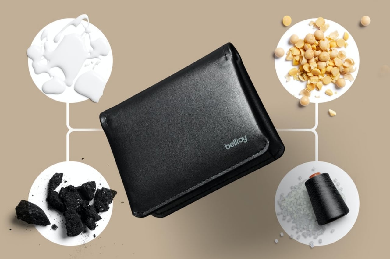
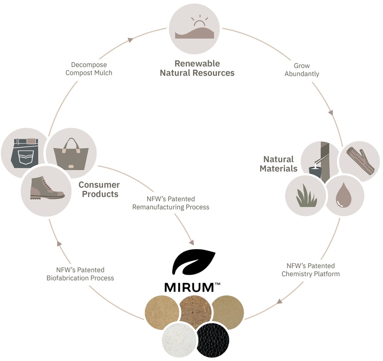
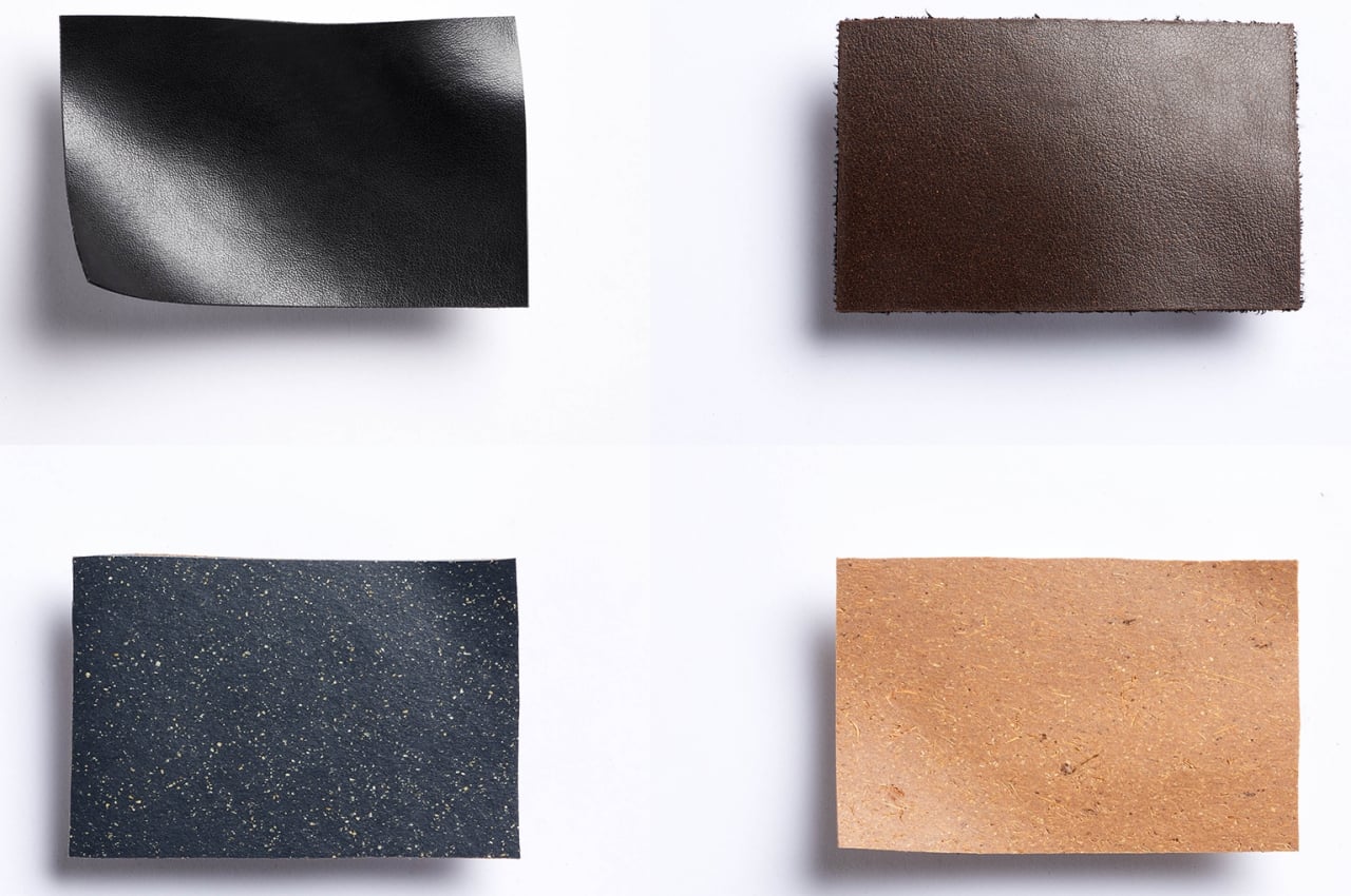
It’s because of this that Bellroy partnered with Natural Fiber Welding to utilize its new MIRUM material, which is 100% made from natural inputs, with no plastics or toxic chemicals involved. It utilizes the natural chemistry of these natural substances to create a material that is a dead knocker for genuine leather. Even better, the material doesn’t become plastic pollution and can be recycled or decomposed into something that will feed the plants that, in turn, will become future MIRUM leather.

The problem with many alternative leathers, including those vegan leathers, is that they are unable to faithfully recreate the look, feel, and unique traits of genuine leather. Bellroy’s use of MIRUM is pretty much a big stamp of approval for the material as enough to pass up as the real deal. The accessory brand is so confident in it that it is even offering its typical three-year warranty for a plant-based leather that might still sound experimental for many designers.

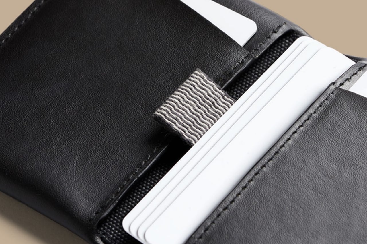
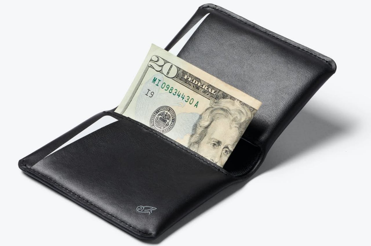
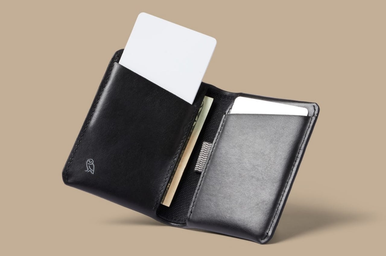
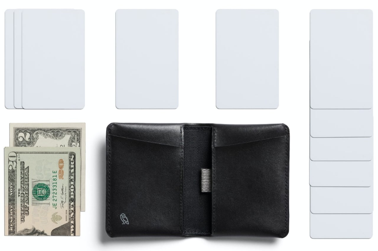
As for the wallet itself, the Bellroy Slim Sleeve MIRUM Edition includes cotton lining to protect cards and is stitched with cotton threads. There’s room for easy access to two cards, but there’s also a pull tab that reveals infrequently used plastics. The slim and small profile makes it convenient to quickly slip in and out of pockets, which you might find yourself often doing just to enjoy the feel of this guilt-free material.

The post Bellroy Slim Sleeve wallet embraces a new kind of plant-based leather first appeared on Yanko Design.
Grovemade gives the classic mouse pad a well-deserved update

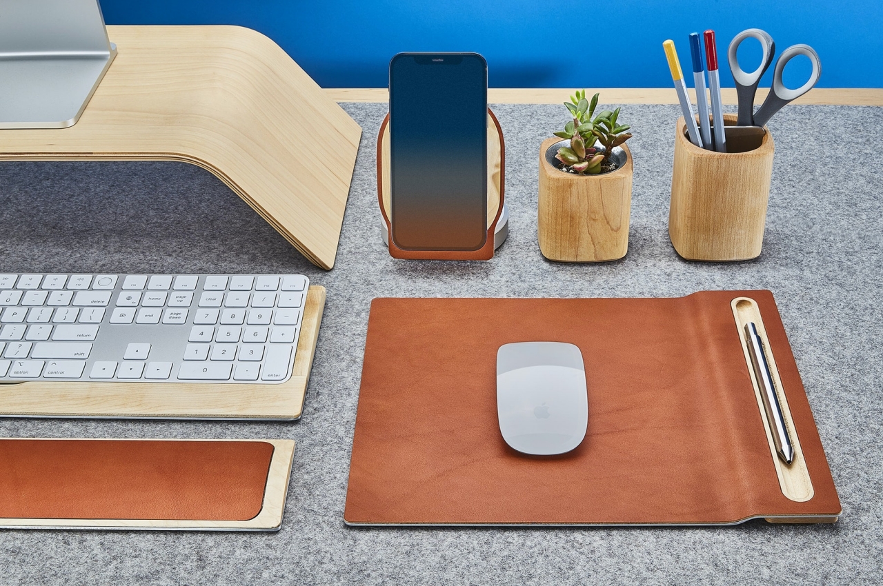
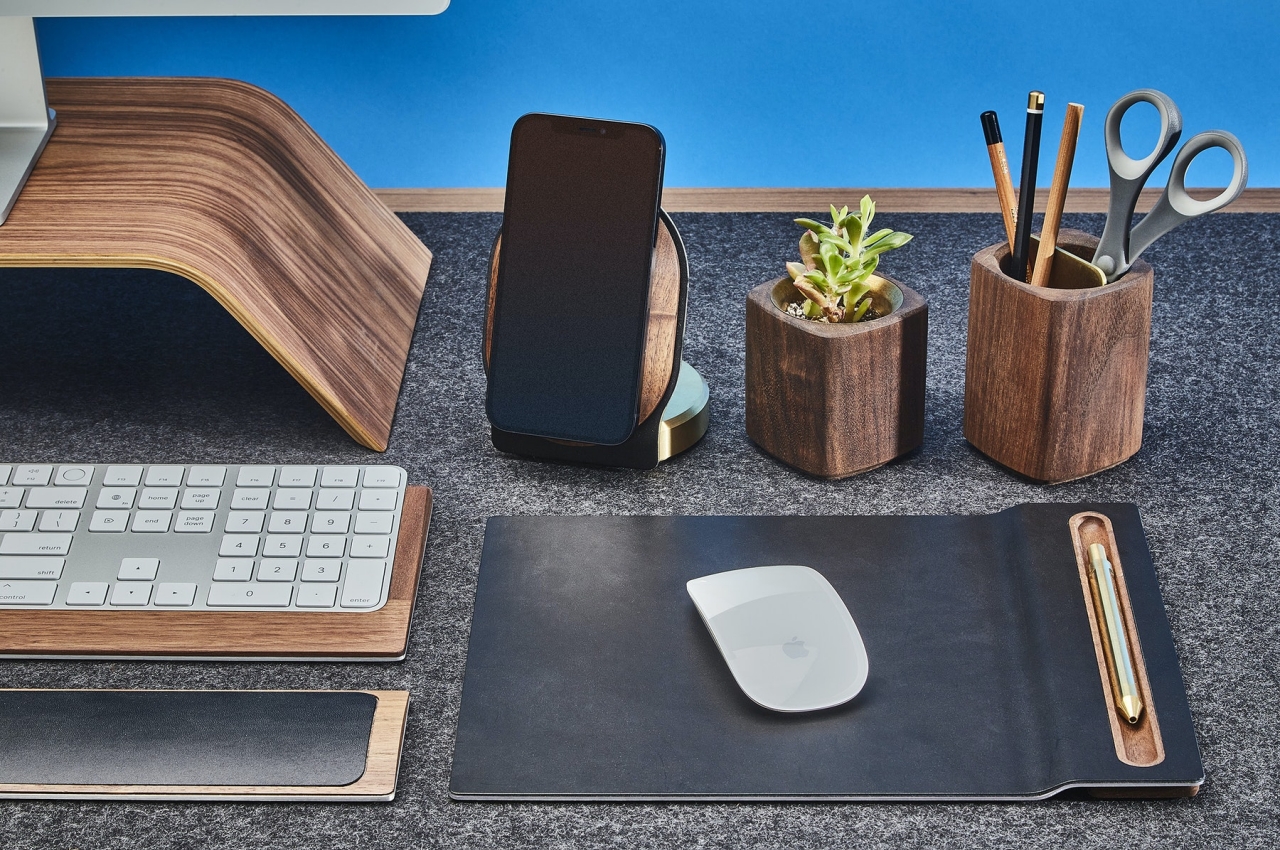
Now you can have an elegant mouse pad that will age gracefully with you and might even have a place for your favorite pen as well.

Not every computer user needs a mouse pad, especially those that have grown used to even less ergonomic touchpads. Those that do need a mouse pad, sometimes because their mouse won’t work on glossy surfaces, are often at a loss looking for the perfect mouse pad that will last them for years rather than months. Even worse, the choices for mouse pads that will match whatever minimalist design you have going on your desk are even slimmer. Fortunately, there are some boutiques that make it their mission to create exactly those kinds of desk and computer accessories, and this newest leather-toting mouse pad is the latest to come our way, offering a mouse pad that will probably age better than the mouse you’ll be using it with.

Designer: Grovemade

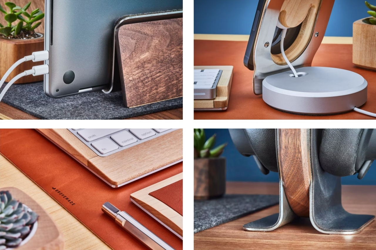
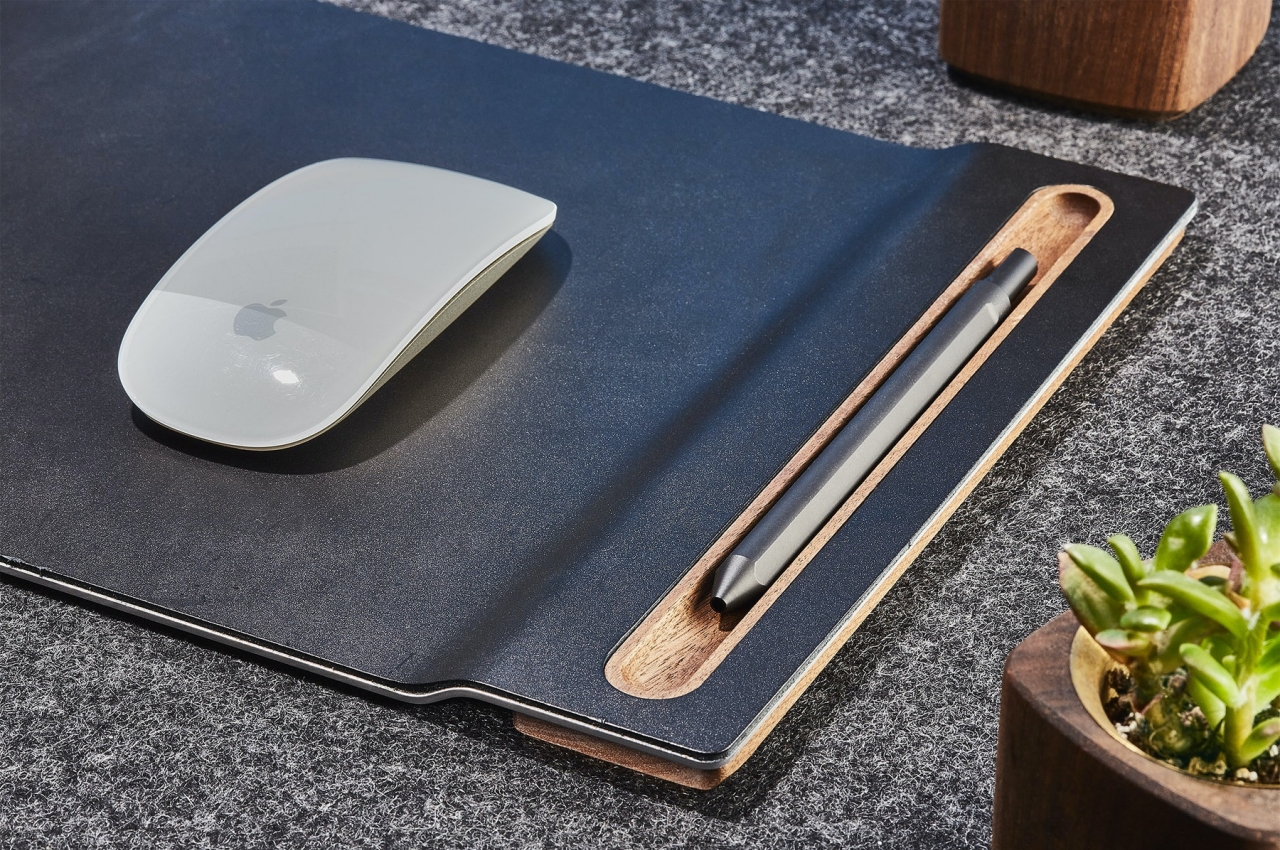
This leather mouse pad is actually a redesign of the brand’s earlier design, a much-needed and overdue update considering how the rest of its desk collection already got their facelift by now. The designers were particularly concerned that the 2014 mouse pad didn’t stand the test of time and the elements, a major disappointment for something like leather that’s supposed to last for ages. Fortunately, the studio now knows better and is now able to make use of a material that they didn’t consider years ago.

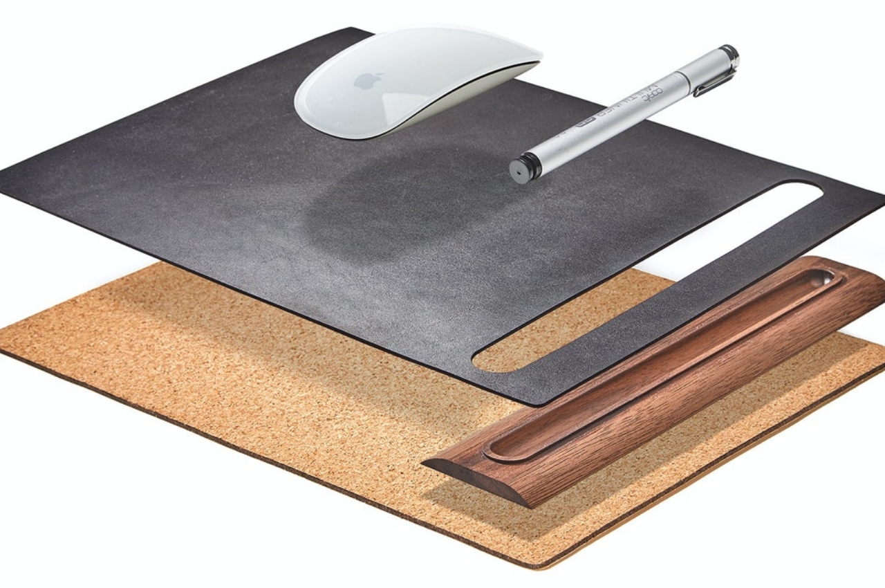
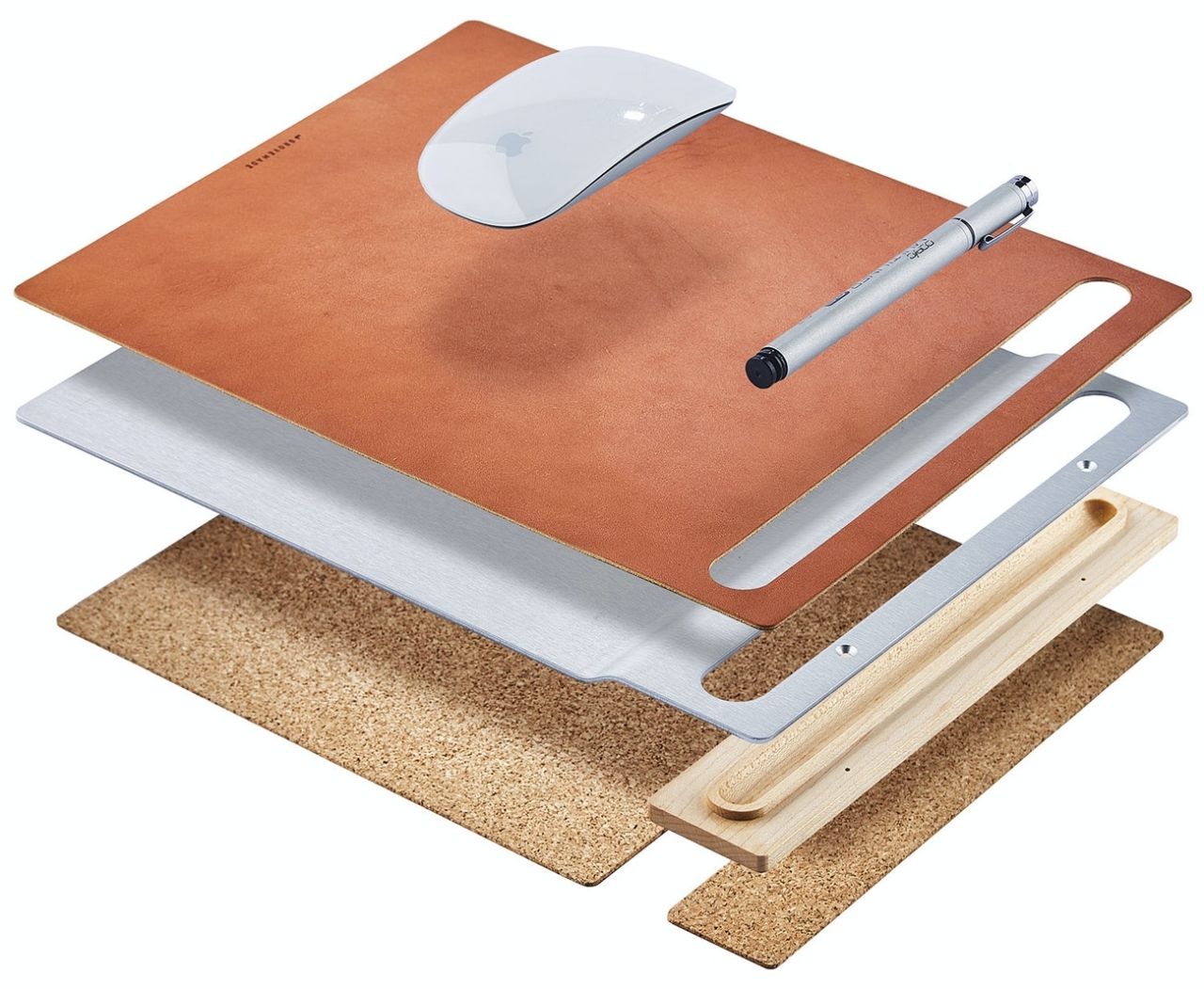
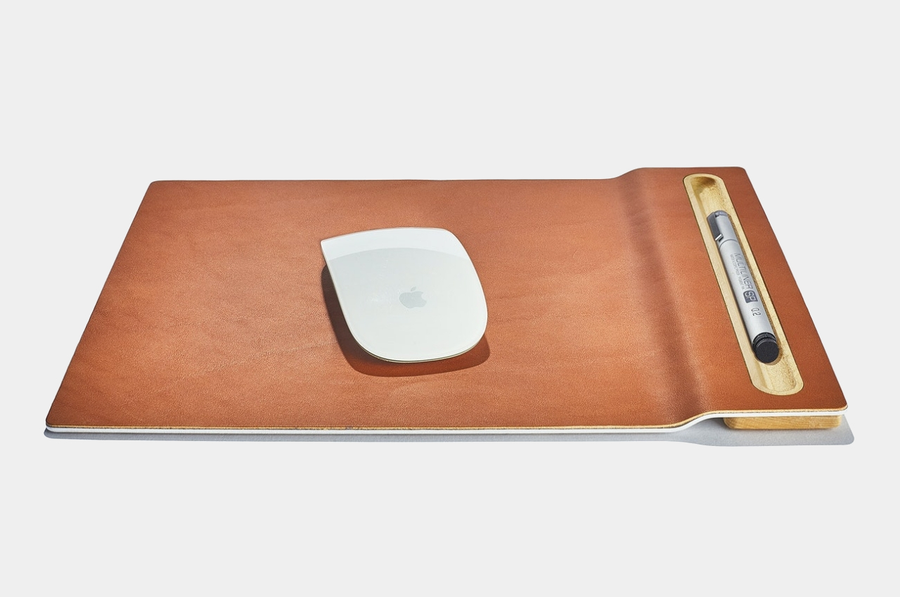
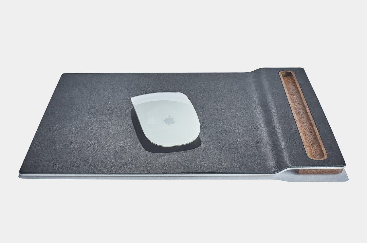
Aluminum had properties that made it favorable as a part of the mouse pad, particularly because of its ability to maintain its form despite weather changes and years of use. It turns out that some people actually look for glass or metal mouse pads, so rigidity wouldn’t be a problem. Despite that hard metal chassis, Grovemade’s mouse pad still looked and felt soft, thanks to the cork foot at the bottom and the vegetable-tanned leather on top.

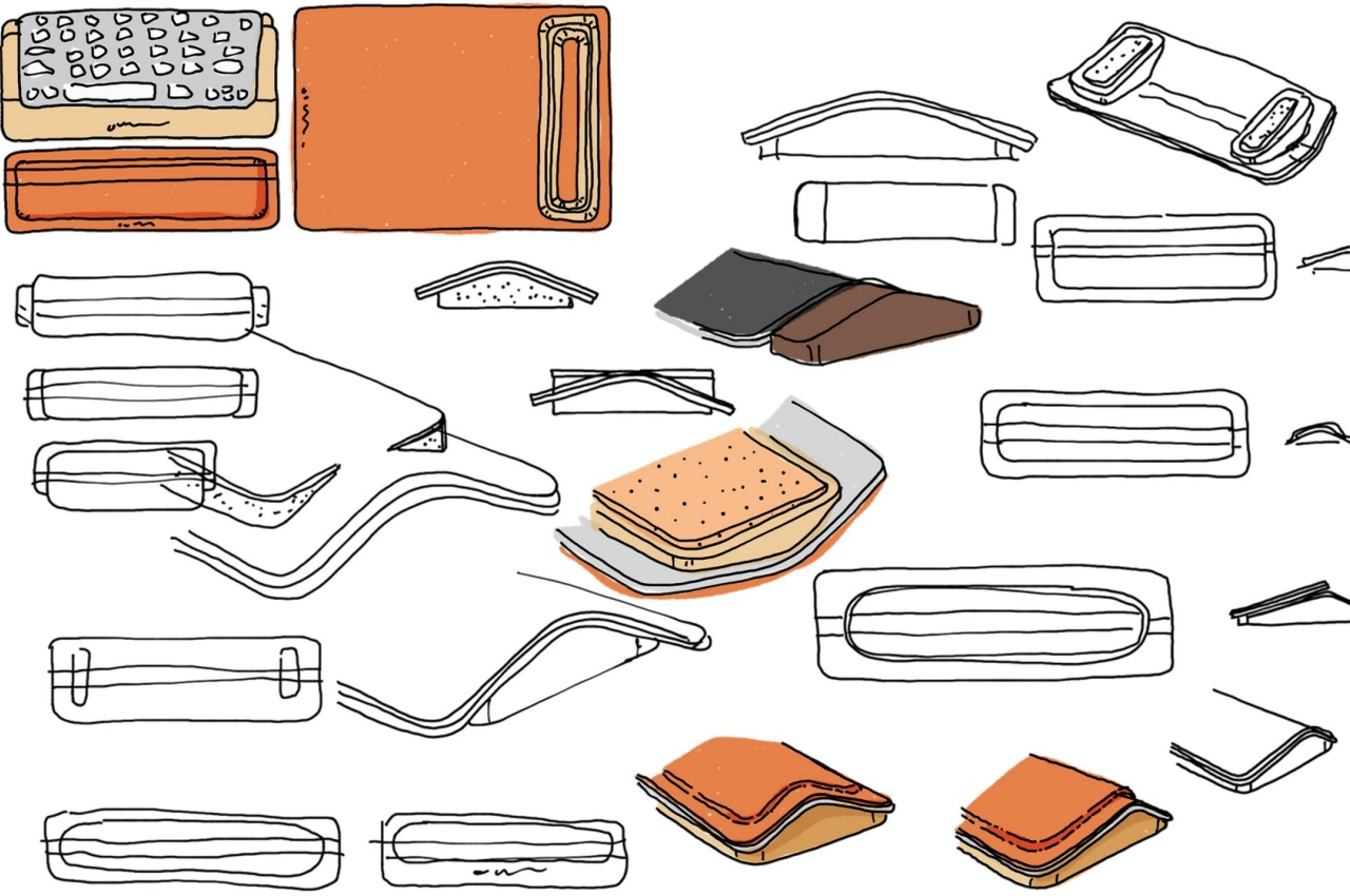
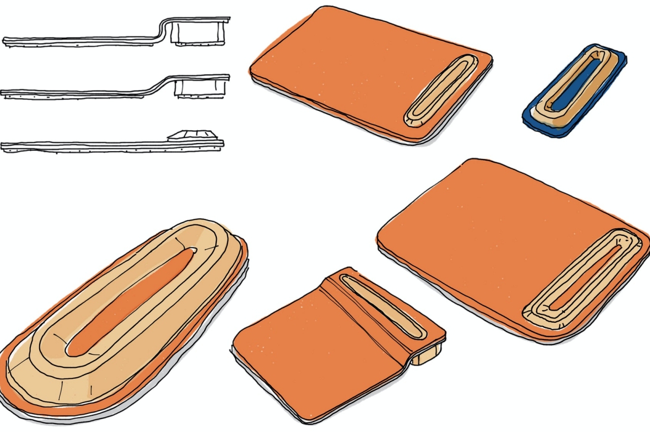
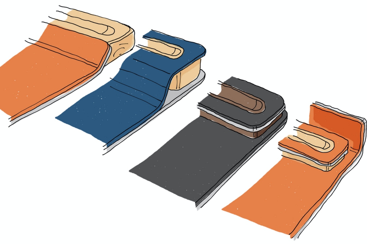
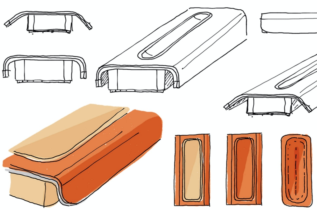
Another major part of the redesign can be in the pen tray, an optional but popular feature of these leather mouse pads. The designers went through various iterations of ideas in order to better match the “floating” theme of the rest of the redesigned desk collection, leaving behind the “hump” of the 2014 original. The best answer turned out to be the simplest, using a gentle slope elevating the pen wooden pen tray, with the nook sitting flush against its leather surroundings. The mouse pad’s edges overshoot the tray and the cork foot just by a bit, further giving it that floating illusion.

The end result is a mouse pad that is both simple and handsome, making it a proud addition to any minimalist workspace. The genuine leather will, of course, develop scuffs and patina over time, which is actually a much sought-after trait. Along with slight variations in color and wood grain, this makes each Grovemade leather mouse pad unique and special. And thanks to that aluminum interior, it’s going to last a lot longer, too.

The post Grovemade gives the classic mouse pad a well-deserved update first appeared on Yanko Design.

Camera Bug is a small but smart solution to a big but common camera problem

Sometimes, the best solutions are the simplest ones, like an ingenious grip that makes you wonder why no one thought about it until now.

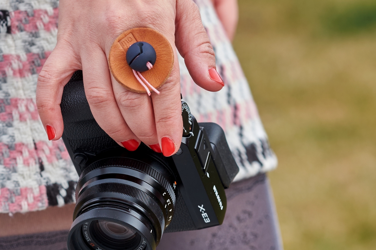
Smartphones have become the go-to solution for many shutterbugs when it comes to capturing memories at a moment’s notice. It’s not exactly because they surpass dedicated cameras, but mostly because it’s almost always with you and convenient to use compared to a bulky DSLR, for example. More dedicated photographers, however, will almost always have their cameras at hand, and this simple yet beautiful grip will make it more convenient to catch the camera bug as well.

Designer: Kevin Champion

There are definitely many ways to carry a big camera, but the most common one happens to also be the least convenient. A neck strap doesn’t exactly lend itself to quickly snapping a photo and then quickly moving on to the next target. Even a wrist strap isn’t as ergonomic, straining your wrists while keeping your fingers away from their most convenient positions.

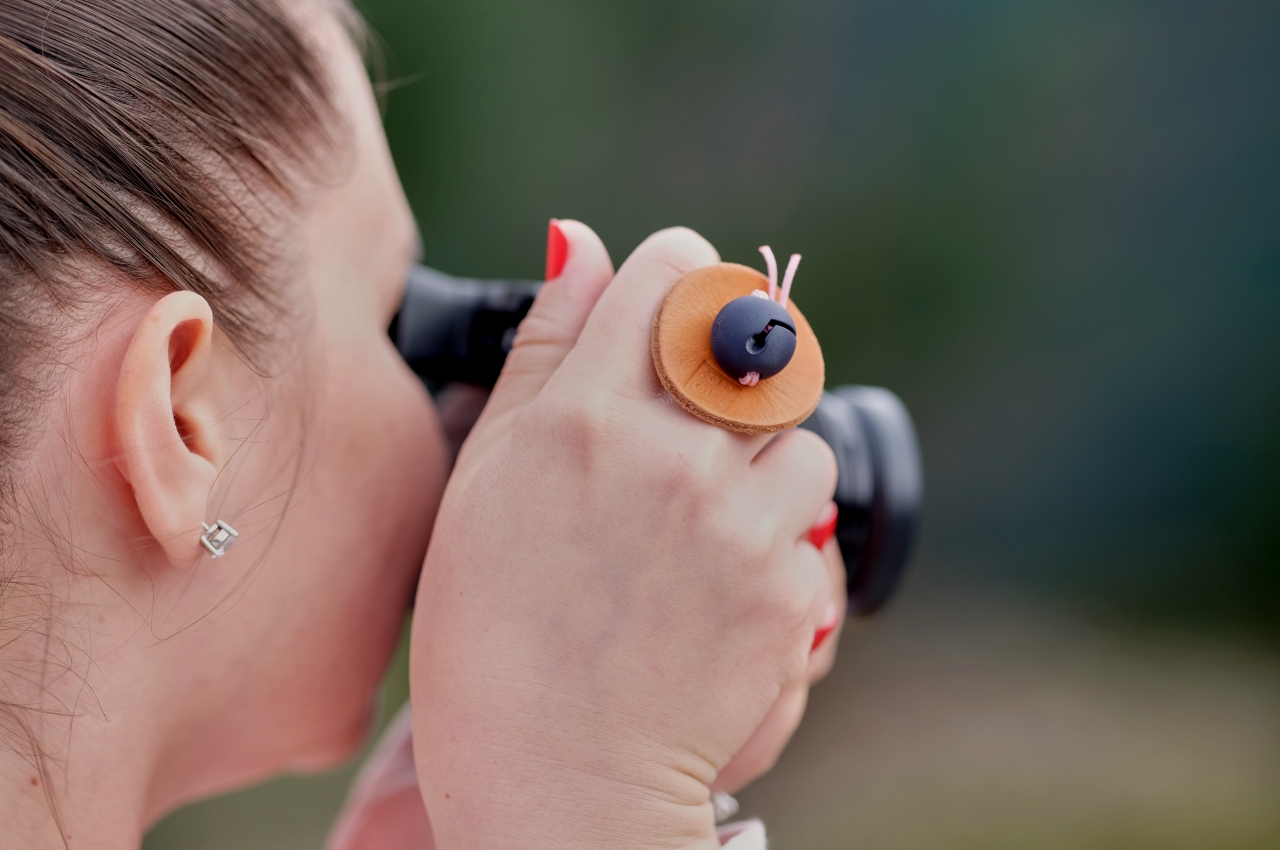
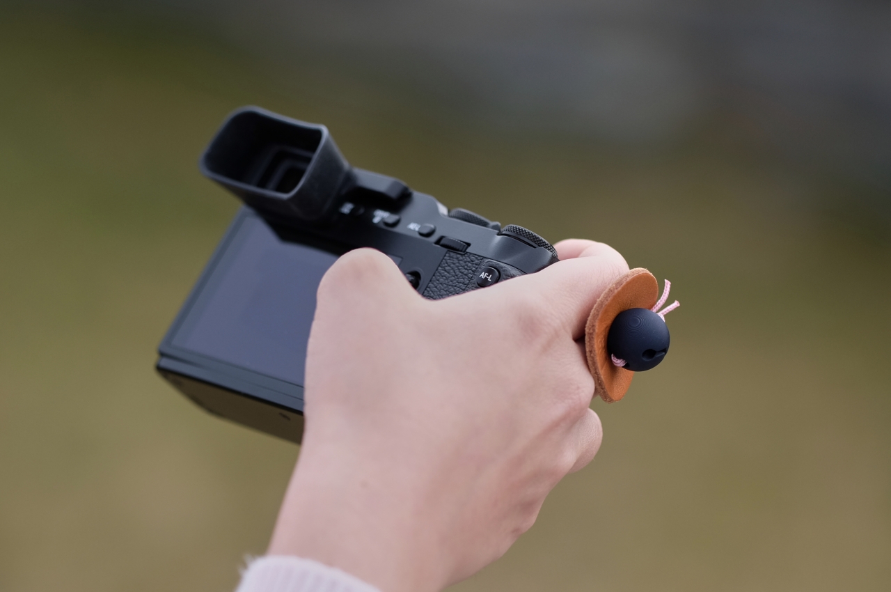
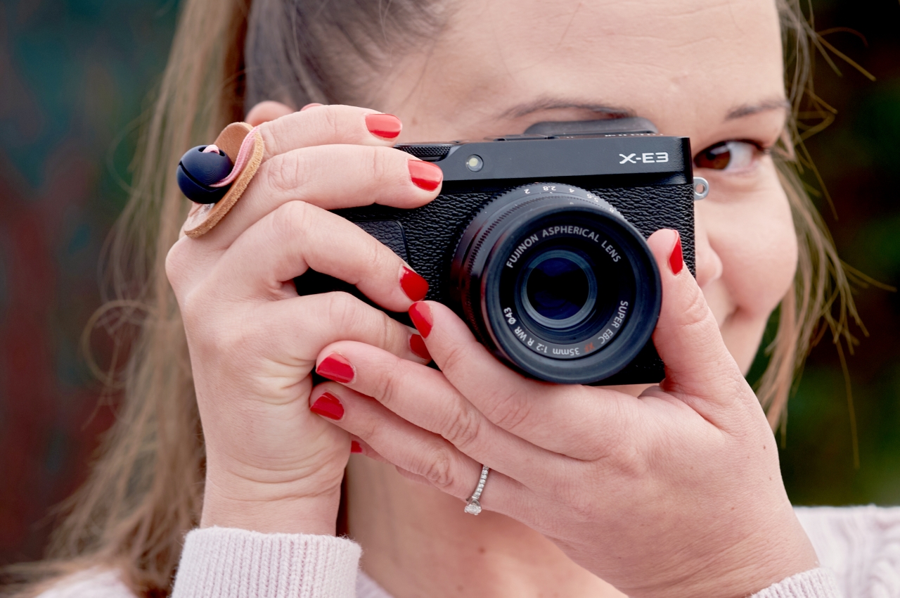
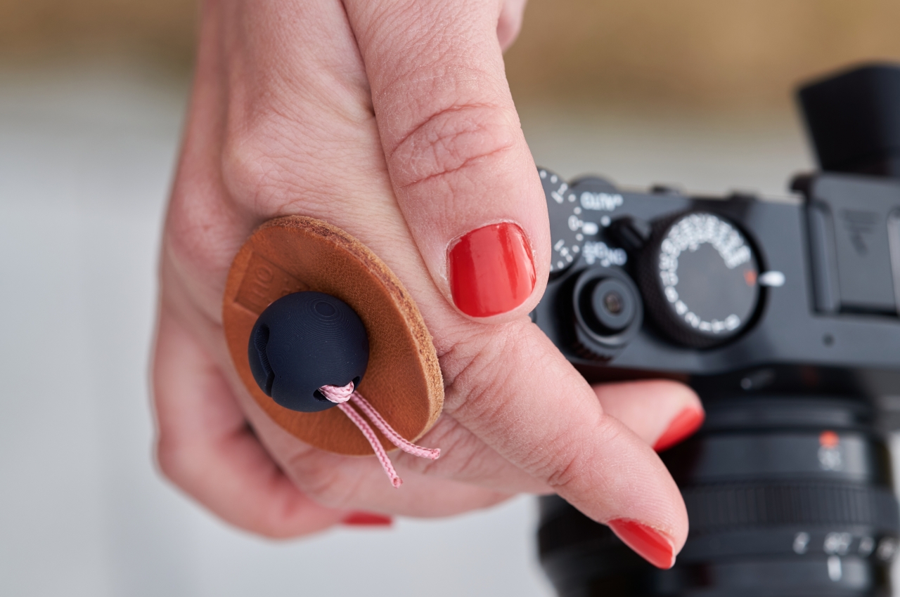
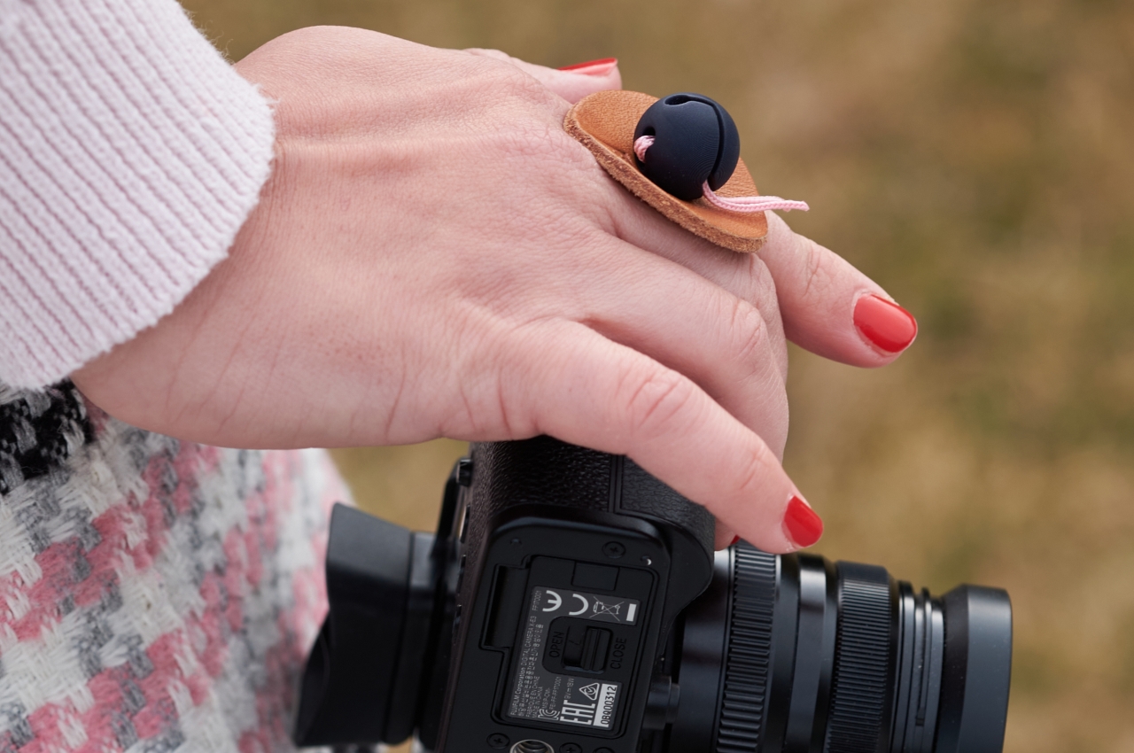
The Camera Bug, in contrast, is designed so that your hand and finger are always where they should be, right over the grip and on top of the buttons. Even when simply holding the camera off to the side in your hand, the camera doesn’t dangle precariously or swing from side to side. Whether you’re resting your camera hand or already in the zone, the grip is designed to feel natural and look natural as well.

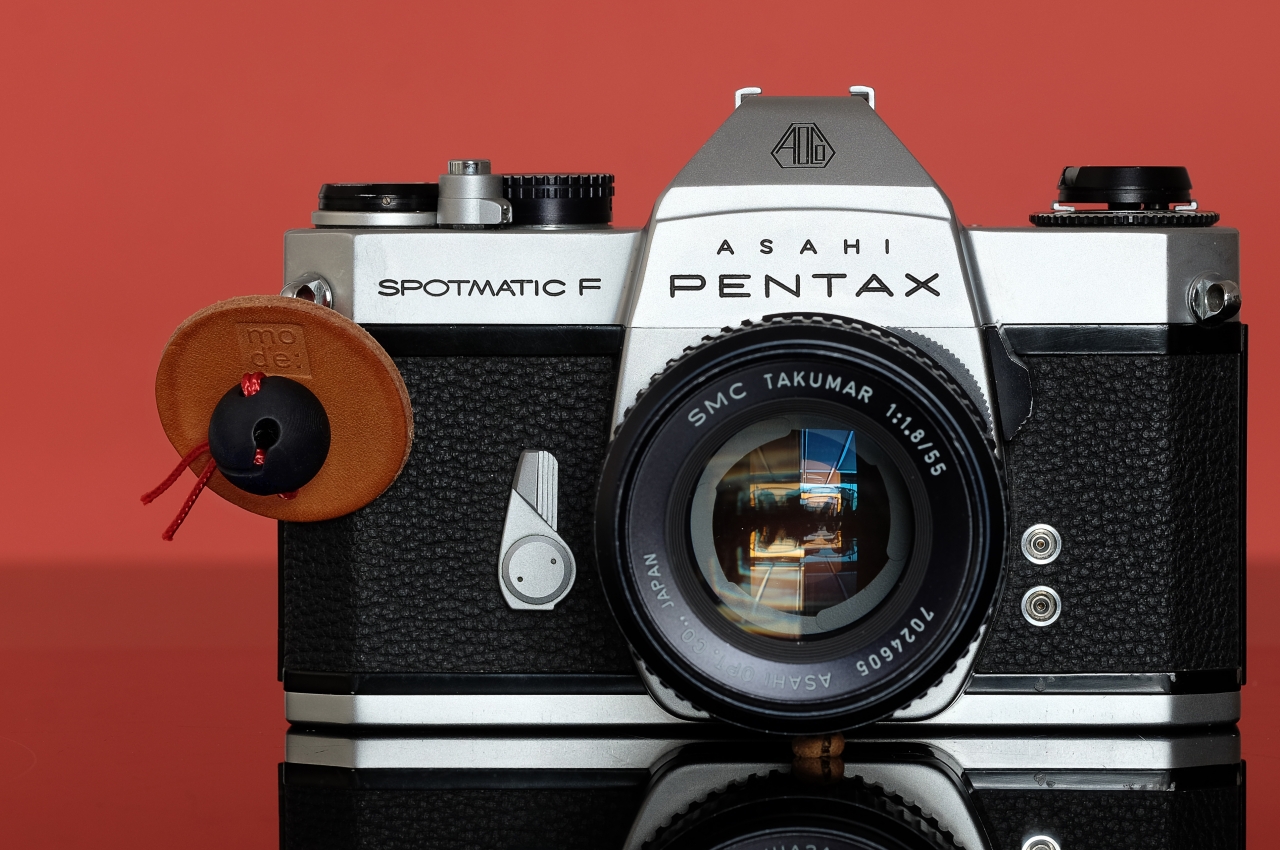
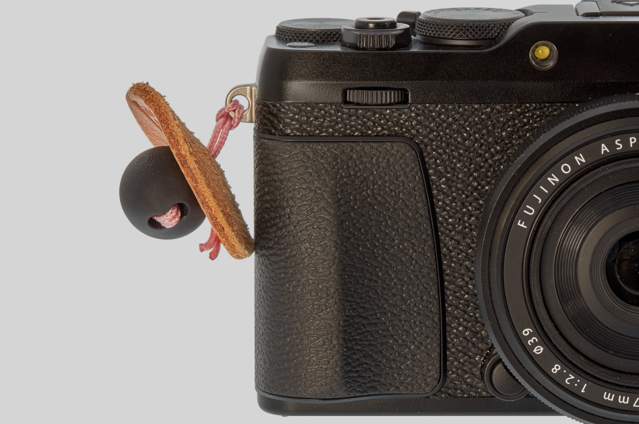
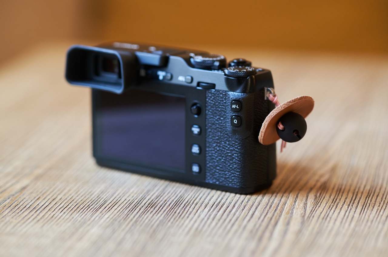
Despite the simple design, the Camera Bug is actually made of three parts, each carefully designed and engineered with meticulous attention to detail. The finger pad uses premium Italian vegetable tanned leather that gives the grip a visual personality that will be unique to each owner. Leather ages beautifully and in almost random ways, and it will also mold itself over time to the unique shape of your fingers.

Flanking the finger pad is the US-made Paracord 550 that ties it all together and a new LockBall that was specifically engineered to provide confidence in securing the whole ensemble. It might look like a trivial product that you may have seen in similar accessories like smartphone rings, but it is the mark of good product design when the theory blends invisibly with a good user experience and a beautiful appearance.

The post Camera Bug is a small but smart solution to a big but common camera problem first appeared on Yanko Design.
Fieldbar Drinks Box keeps your drinks cool and the Earth healthy at the same time

It’s almost too easy to take for granted how even the small things can have big effects, so this cooler box demonstrates how thoughtful design can help make the world a better place for everyone.

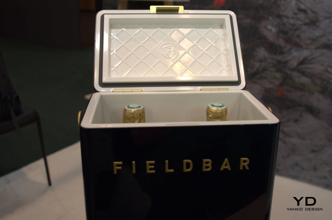
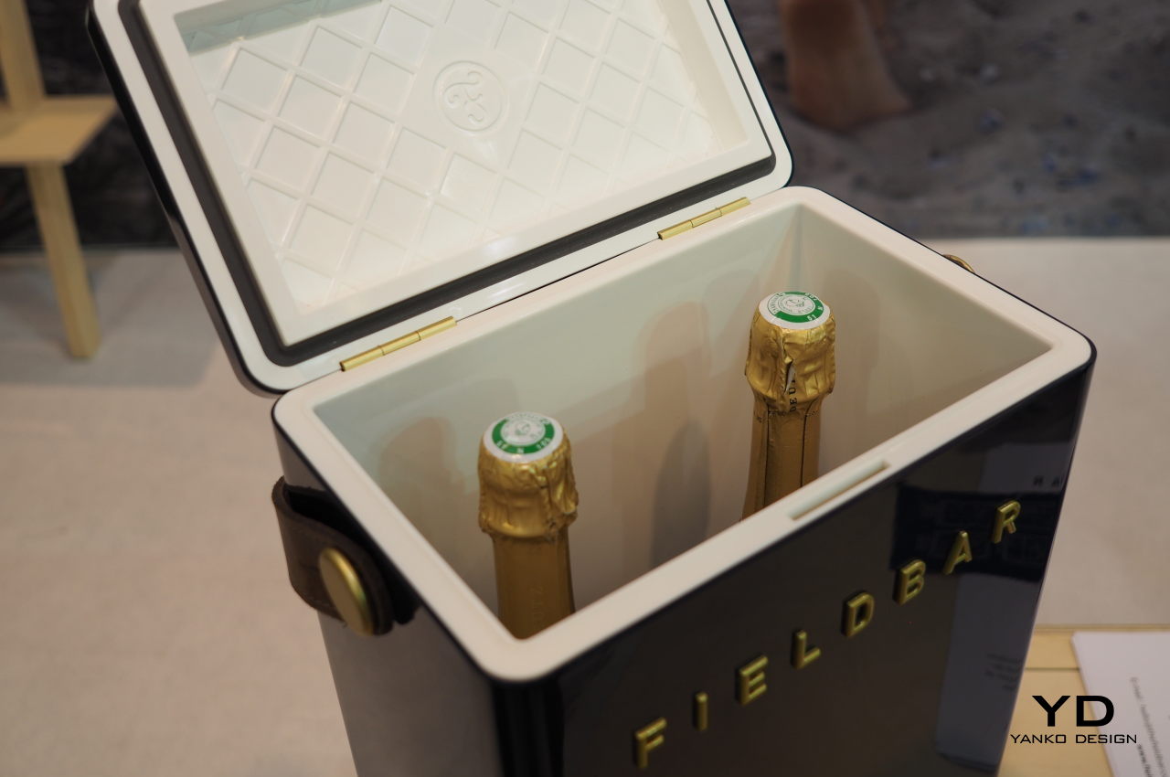
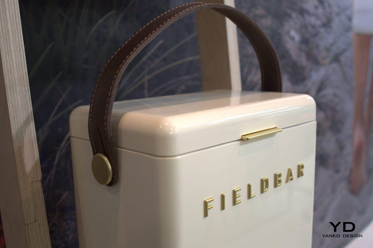
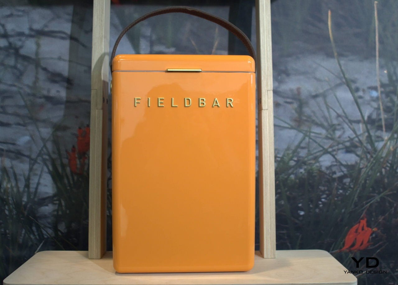
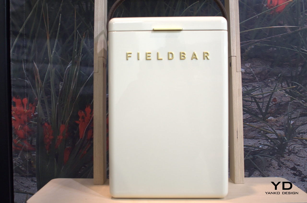
For decades, humans have enjoyed conveniences without much thought to their costs. Today’s generation and the future, however, are now reaping what our ancestors have sown, and not all of them have born good fruit. Fortunately, people are becoming more aware of the impact that modern products have on the environment and are taking steps to minimize and eventually eliminate those adverse side effects. Case in point is the handcrafted cooler boxes from Fieldbar that look exquisite and are built to last. Oh, and yes, they keep your wines chilled, too.

Designer: Corban Warrington

Sustainable design can have different meanings for different people and companies, but Fieldbar settles for “immortality.” With each of the 58 different parts designed to be removed, repaired, and replaced so that the drinks box will last forever, or at least until there are replacement parts available. That said, it doesn’t speak well of a product’s design if it breaks easily, so the Fieldbar boxes are designed to be tough and even carry a three-year warranty for good measure.

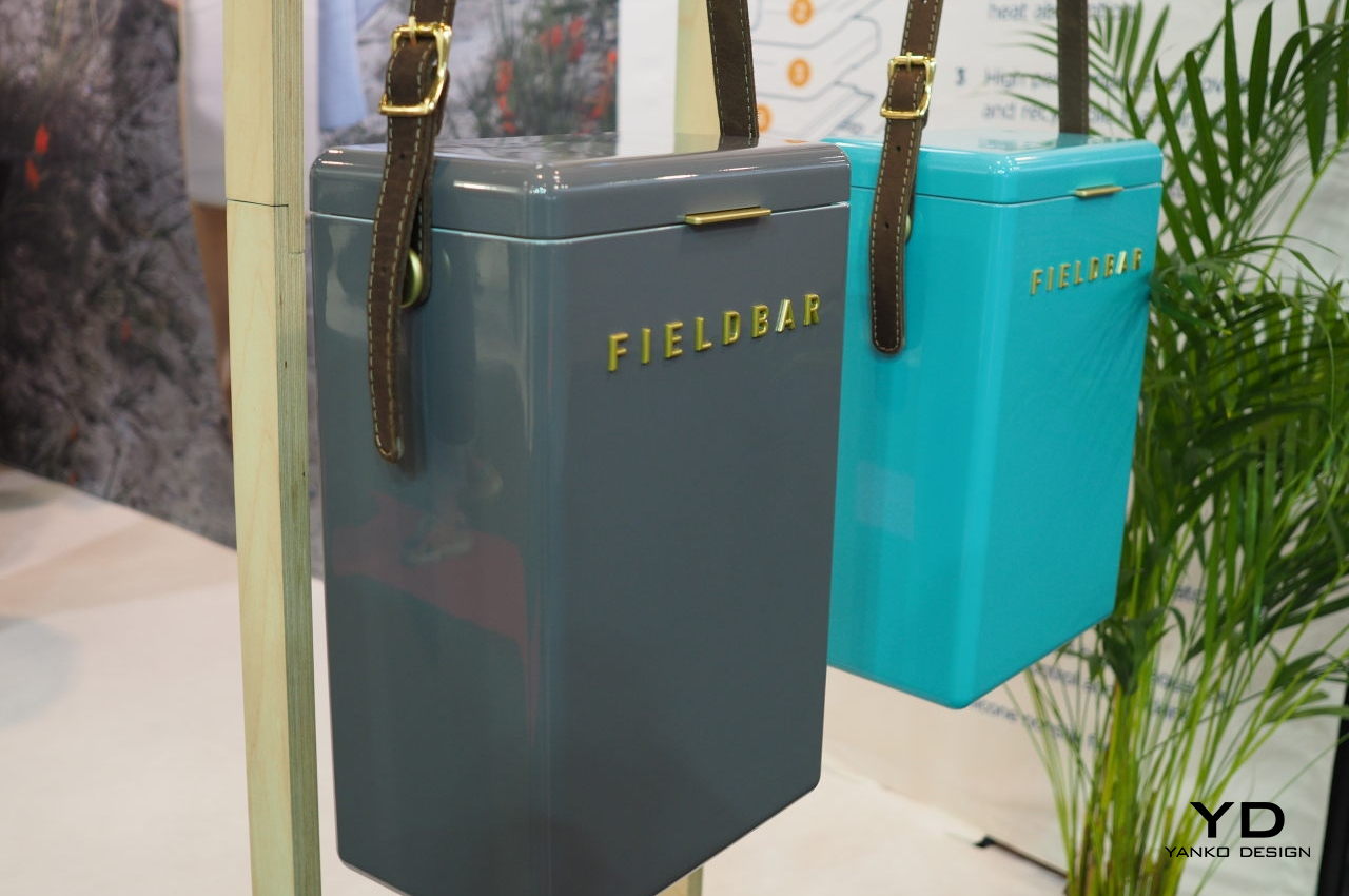
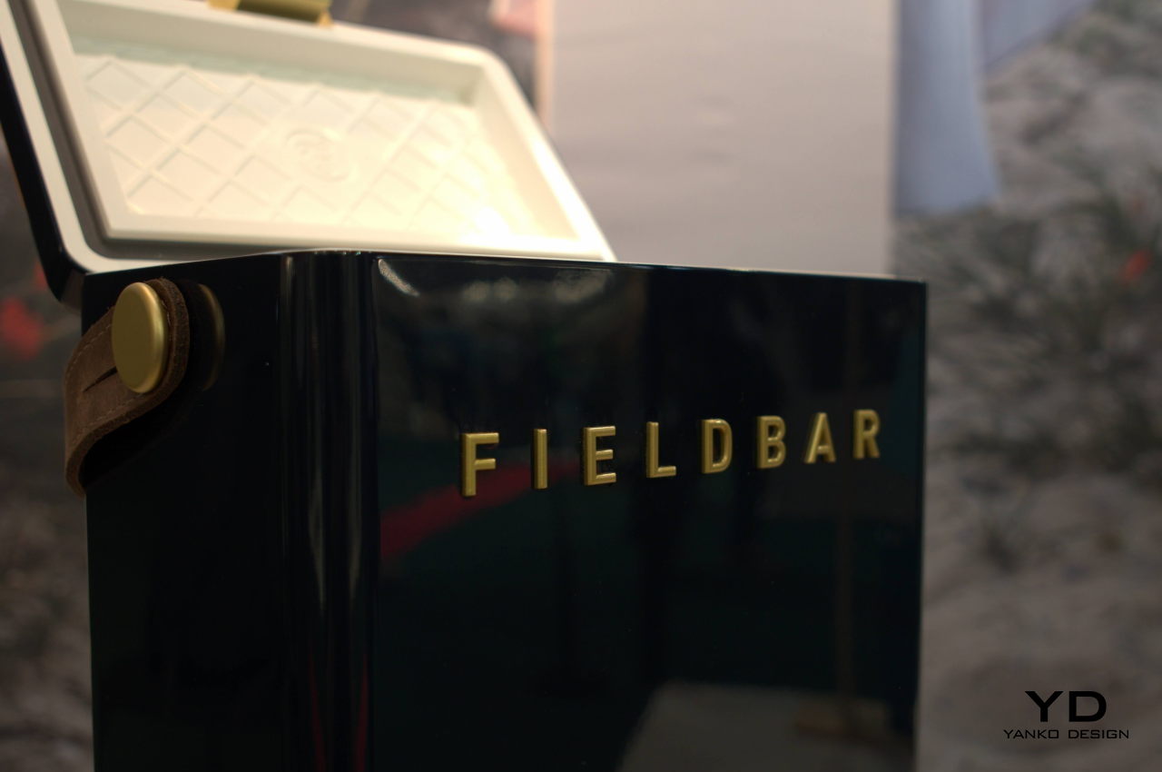
Although it sounds like it’s built like a tank, the Fieldbar looks like it was designed to blend inside the cabin of a luxury yacht or stand out on top of the sands of an exclusive beach resort. Suffice it to say, the cooler box has class, and you won’t be surprised if it held bottles of fine wine inside instead of cheap beer cans. That said, the materials it uses aren’t just for show. The extra comfy leather handles are made off-cut materials, for example, while the reflective paint gives the box a luxurious sheen while also reducing heat absorption.

The Fieldbar cooler has a distinct old-fashioned appearance that hints at the craftsmanship behind the boxes. Although it uses modern materials, the outfit makes each box with as much care and dedication as artisans did more than half a century ago. Rather than a mass-produced consumer product, each Fieldbar is handcrafted in small batches to give proper attention to every single box. The Fielbar is made to last forever, so its designers and creators put as much effort and love into a product they hope owners will cherish just as much.

It’s easy to downplay the value of such a drinks cooler box, but it is actually a fine example of thoughtful and sustainable design. Beautifully handcrafted to last the test of time, the Fieldbar demonstrates how a product that cares for nature as much as its owners can very well be worth its price, especially if it pays for that cost in years rather than just months.

The post Fieldbar Drinks Box keeps your drinks cool and the Earth healthy at the same time first appeared on Yanko Design.
Fish Leather from salmon skins is yet another sustainable innovation

Felsie Fish Leather

They say the best leather are those from animals but you know, there are plenty of conversations about the topic. There is now a campaign to find more sustainable leather, and we have seen a few, like the leather made from grape skins and other fruit waste.

Sustainable fashion may be a challenge, but it can be done with efforts like this fish leather. This is the first time we’re hearing about this new kind of leather that can be used for different accessories. No, this isn’t exactly fishy, but Felsie knows what it is doing.

Designer: Antonia Gillett (Felsie)

Felsie Fish Leather

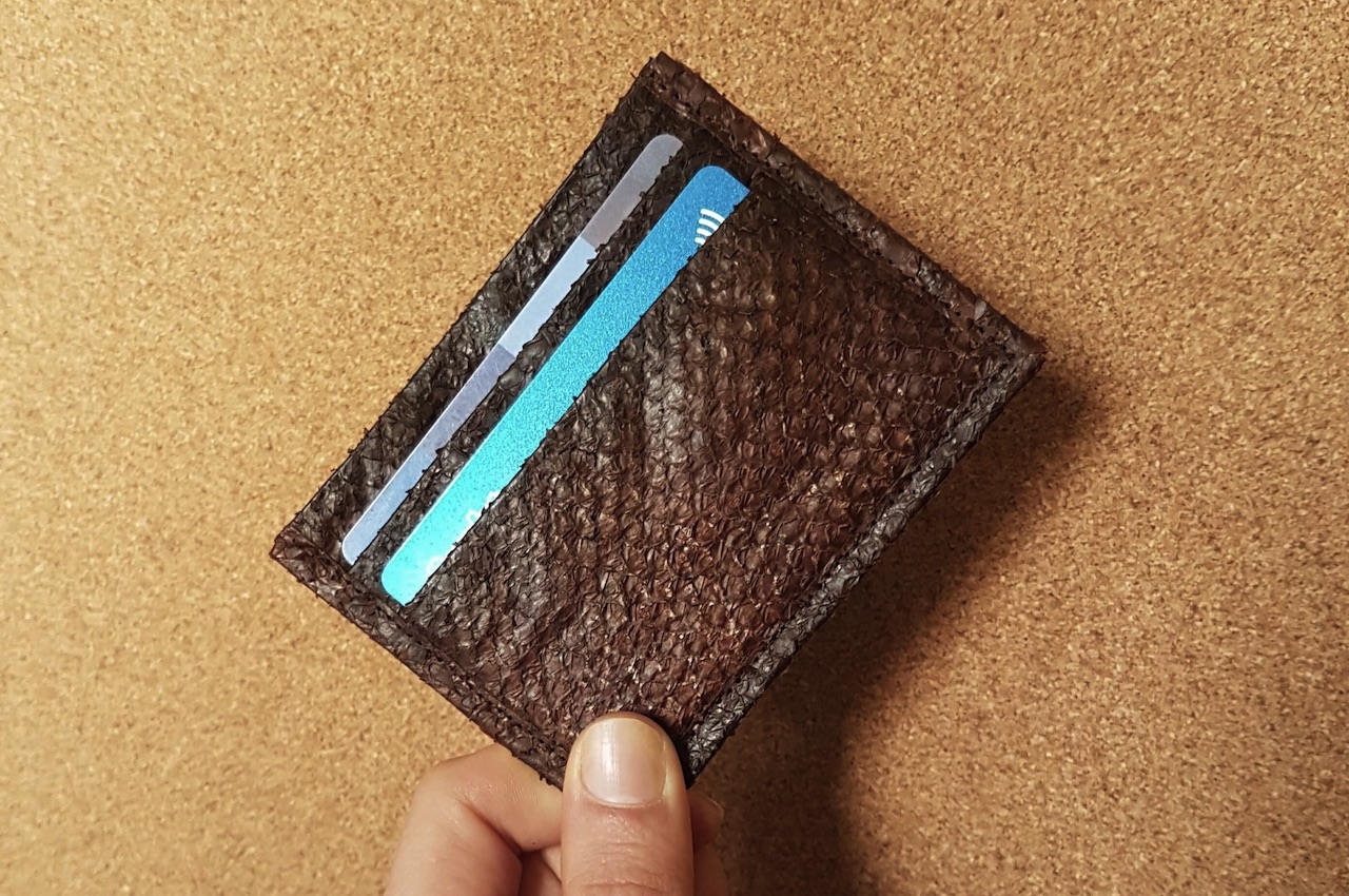
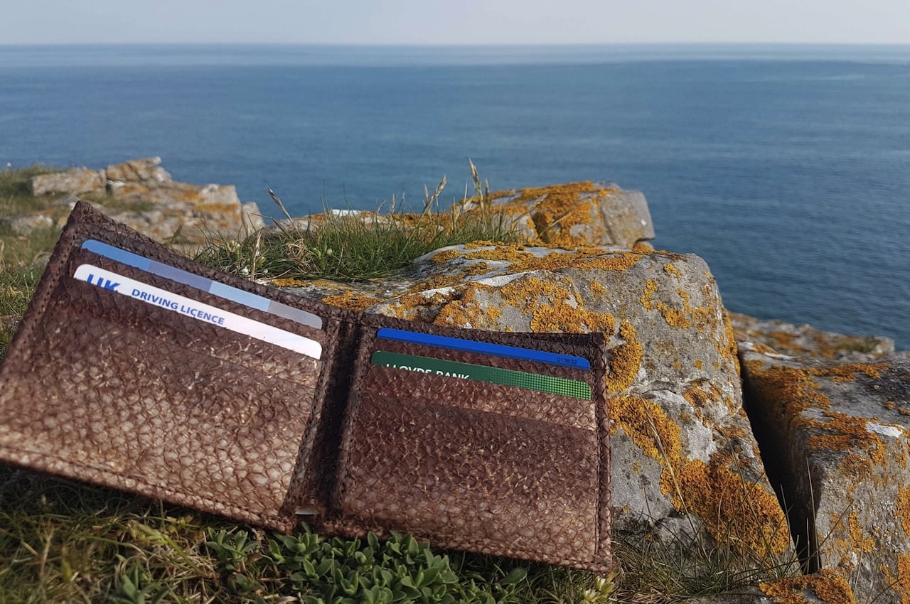
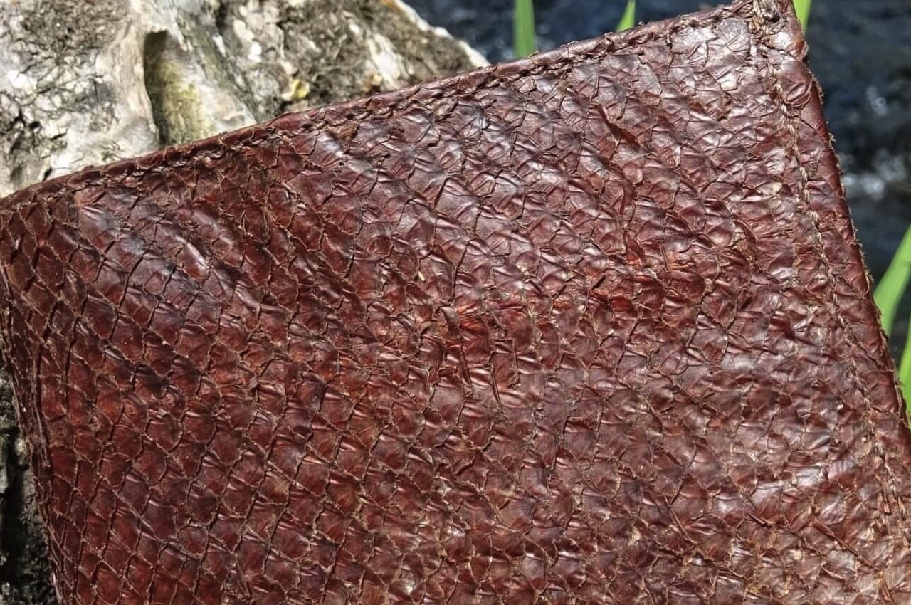
The fish leather tannery and studio use bark tanning on rescued fish skins. These are those about to be thrown into the trash can but are instead transformed into fish leather. The processed fish leather is then used to make different accessories like a wallet or a cardholder.

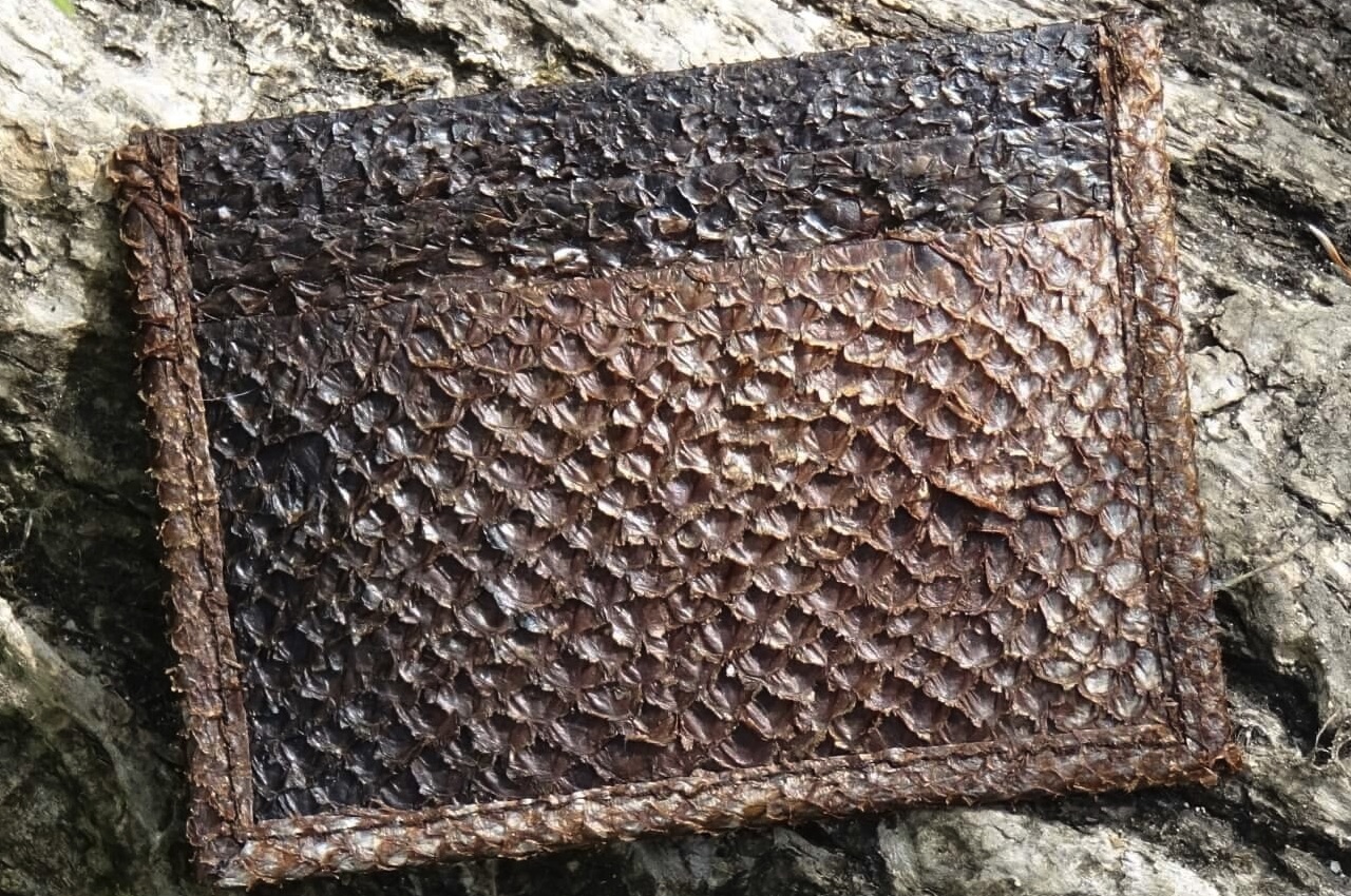
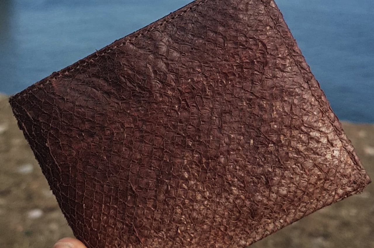
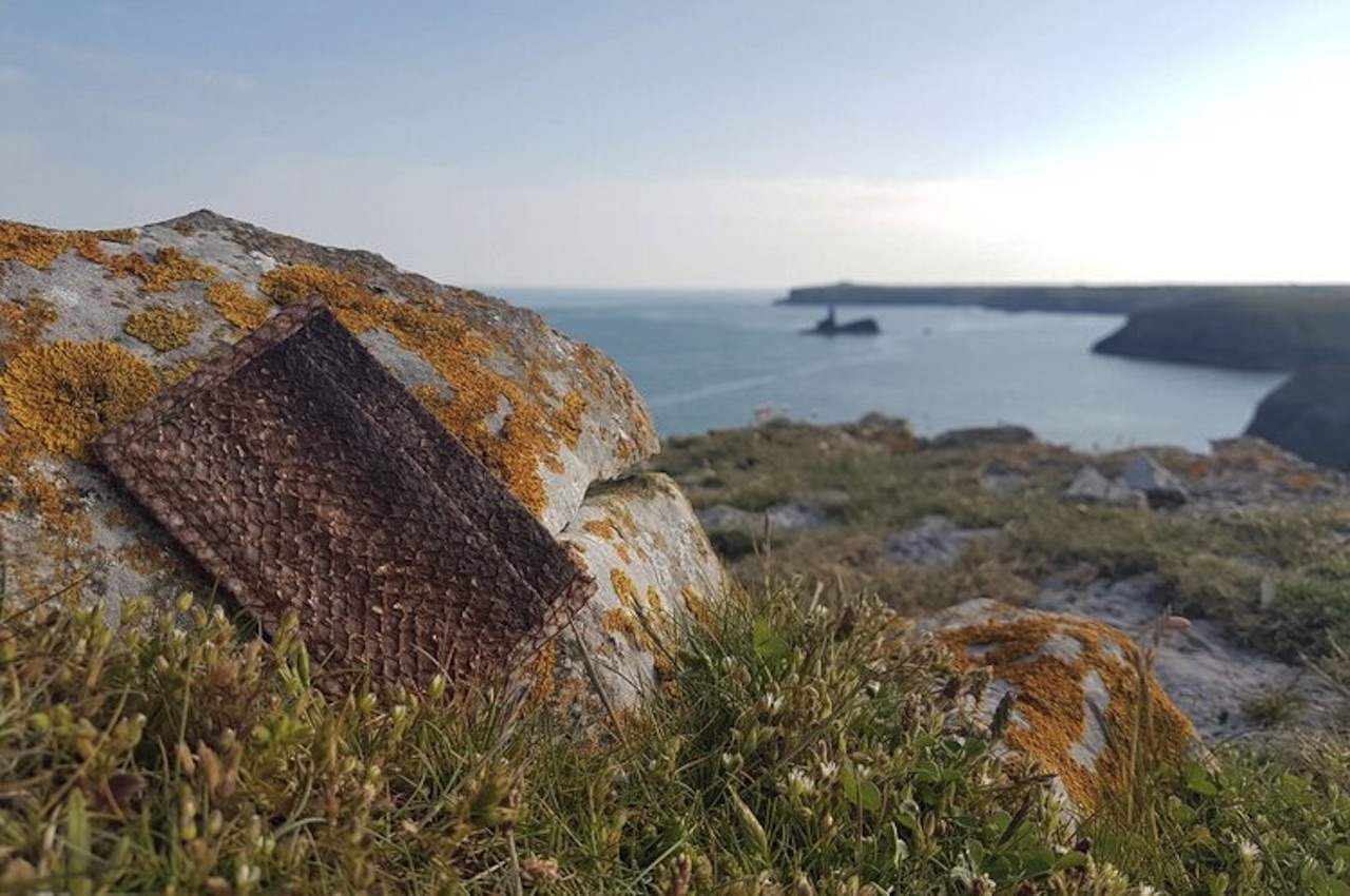
The Felsie Fish Leather is long-lasting and may even remind you of snakeskin leather at first glance. Many people are asking if it smells like fish. It doesn’t smell fishy but smells like any other genuine leather. The texture isn’t exactly smooth but will be over time as the patina is developed.

Felsie Fish Leather

When it comes to durability, fish leather is even stronger than cow leather. It’s thick because the fibers form a crosshatch pattern. It’s made from fish, but it’s not exactly waterproof. Felsie doesn’t want to use chemical coating, so it’s best if you maintain the dryness of the orange-brown leather.

Felsie uses salmon skins from the Dunkeld Smokehouse in Scotland. The leather starts with sustainably farmed Scottish fish sold as smoked salmon. The Salmon skins are then saved for tanning with willow bark using traditional and natural bark tanning methods. Even the process of sourcing the willow trees is sustainable. Tannins in the tree bark enter the skin and change the makeup of the fish skin.

Felsie Fish Leather

Felsie is all about sustainability. It was actually “built with the concept of a circular economy. “ Fish leather is a material like no other and we imagine more products will be available soon. Right now, we know there are wallets and card cases in the works. However, we want to see bags and luggage someday and more leather goods like shoes, belts, coin purses, bottle holders, laptop bags, and journals. The future of fish leather is bright, so it’s high time we support this sustainable effort.

Felsie Fish Leather

Felsie Fish Leather 6

The post Fish Leather from salmon skins is yet another sustainable innovation first appeared on Yanko Design.
Giant Boxing Gloves Sectional Sofa Delivers a Knock Out toYour Wallet

Are you a professional boxer? Or maybe you’re the world’s biggest boxing fan. If you’re one of the two, then this vintage Boxing Glove Sectional sofa may be for you. If you’re not, it probably isn’t. Produced by Swiss design house De Sede in 1978, the sofa is available through 1stDibs for the knock-out price of $31,500. I don’t know about you, but I’ve tapped out already.
Constructed with an all-leather exterior complete with glove tie accents, you can also separate the sofa into two individual lounge chairs in the event you can’t watch television with your roommate without arguing and eventually throwing punches. I know exactly what that’s like. We have to wear mouthguards just to get through an episode of The Book of Boba Fett.

So, for the price of a new car, you can be the proud owner of a boxing glove sectional sofa. Alternatively, you could spend a tiny fraction of that cost to pay me to knock some sense into you. Just FYI, if you want me to wear gloves, though, it will cost you extra.

[via DudeIWantThat]