LAYER x Deutsche Telekom show how to hide tech in stylish home decor

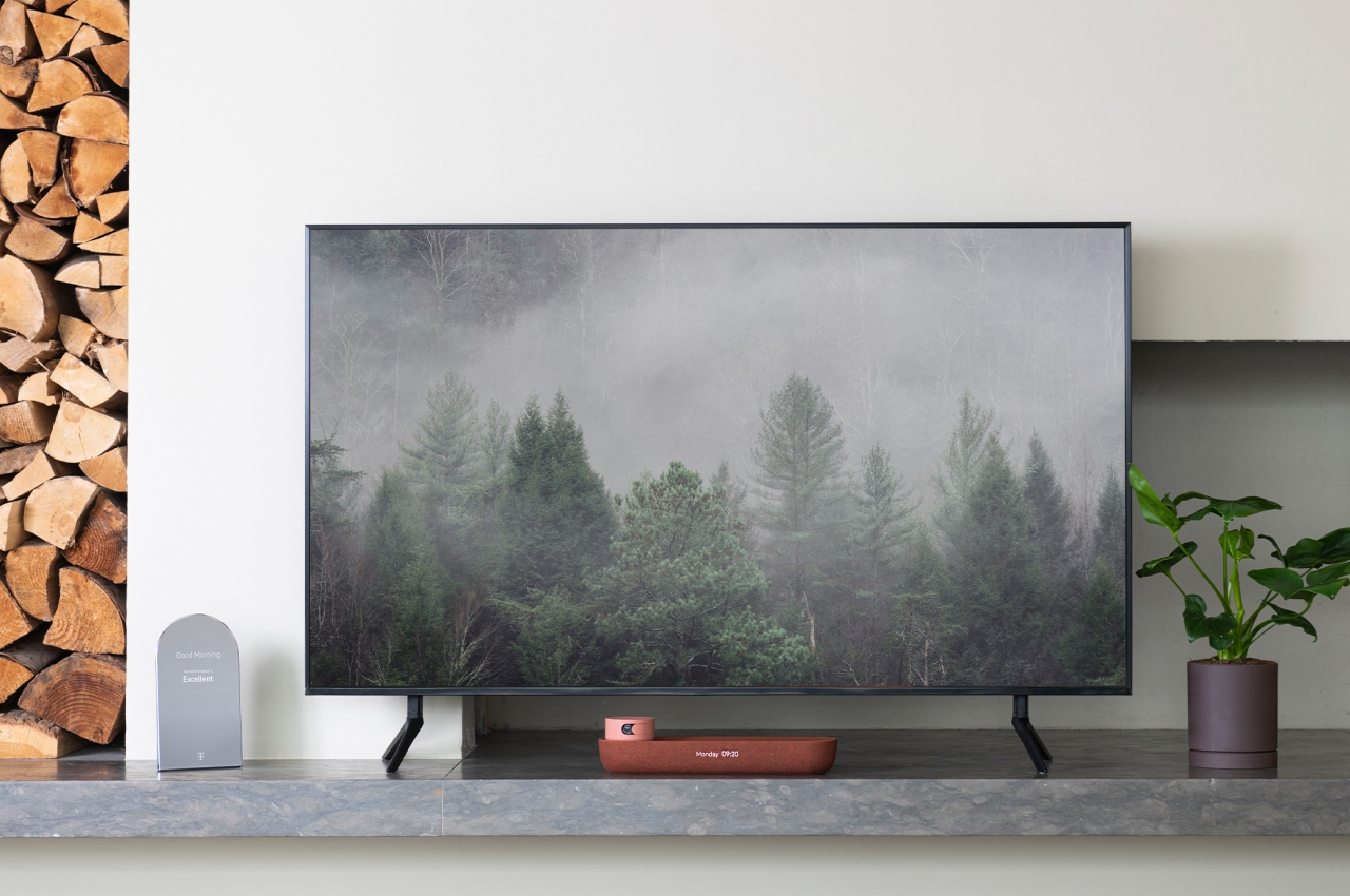
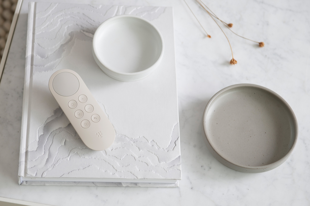
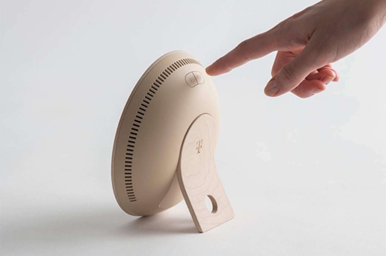
Homes are getting more and more connected these days, mostly thanks to the new breed of Internet-connected devices scattered across the property. Many of these try to disguise themselves as part of your room’s interior design, like smart speakers that try to grab our visual and aural attention, but most of these devices are unapologetic in looking the part of a technical object. That doesn’t have to be the case, of course, and there are many ways to better integrate these devices into what look like everyday household objects and accessories. That’s exactly the proposal that Deutsche Telekom Design is making through LAYER, making interior design an integral part of the product’s design rather than an afterthought.

Designer: Benjamin Hubert (LAYER Design)
It’s not that difficult to spot devices and “smart appliances” inside a room. Even the smart speakers that try to be stylish and eye-catching don’t always blend well with their surroundings. And then there are devices that don’t even try to hide their presence and advertise their true nature. Routers and network meshes are the biggest culprits here, looking like alien structures inside an otherwise cozy abode, but set-top boxes and wireless speakers are sometimes just as bad.

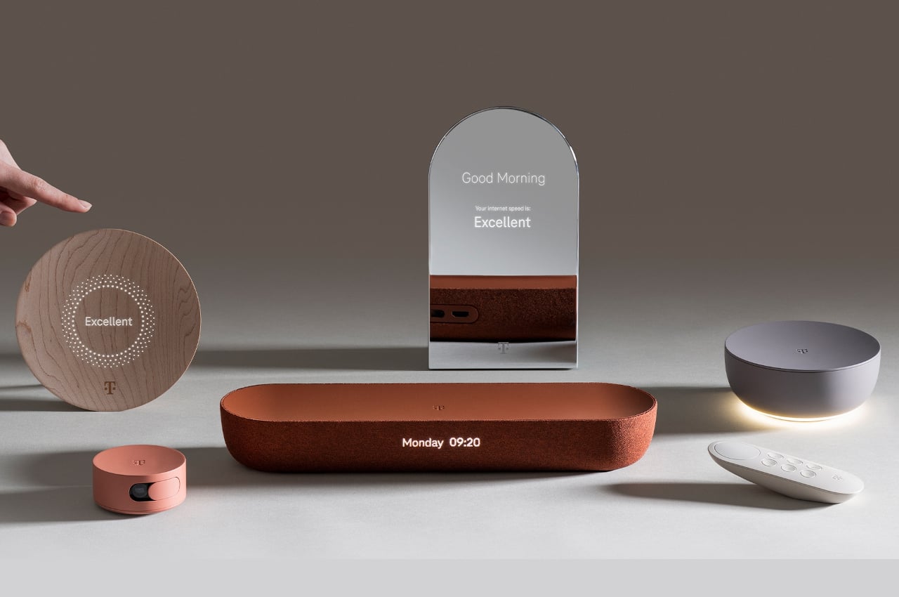
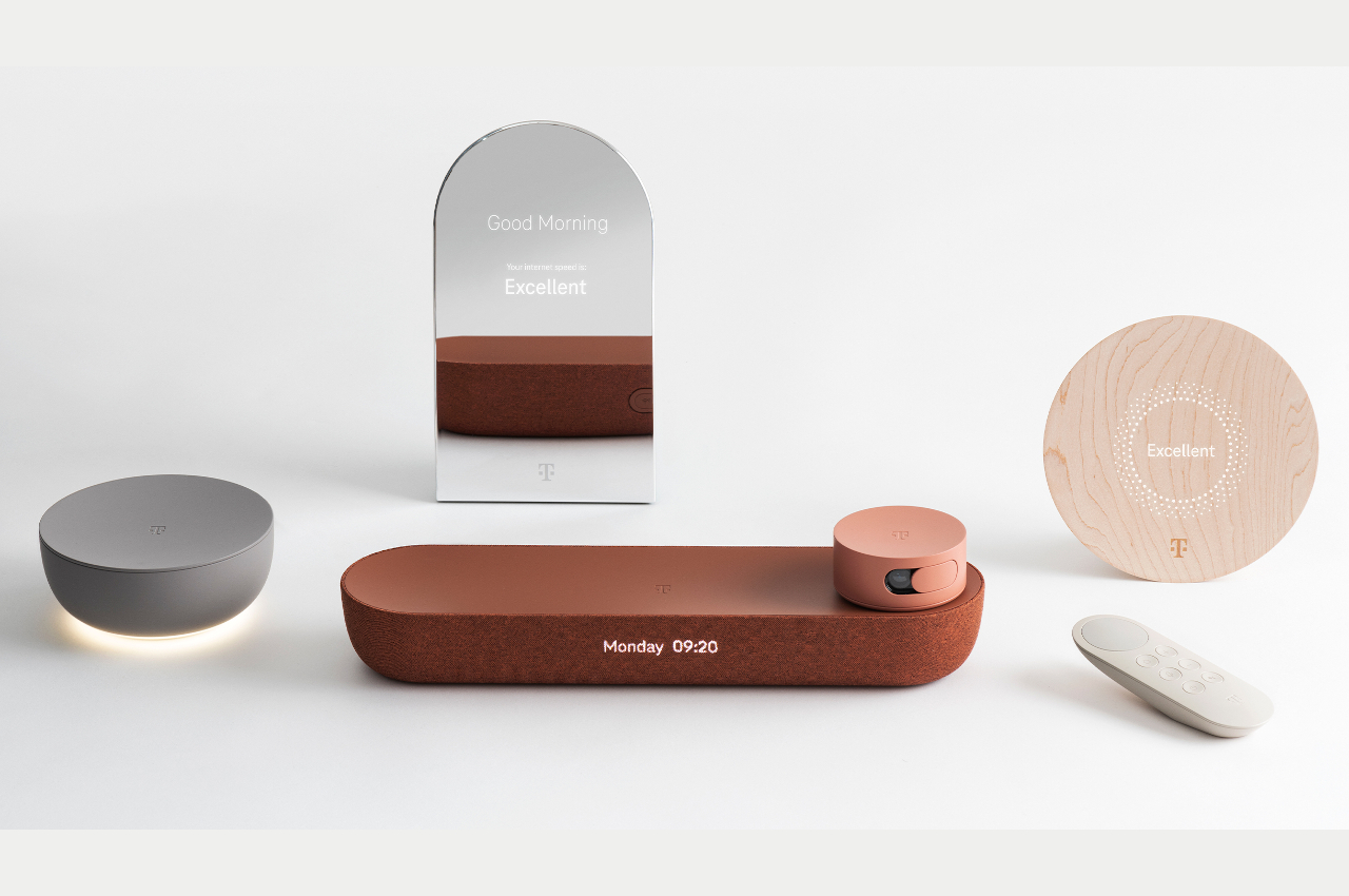
This visual and design inconsistency is no small matter when it comes to creating a conducive atmosphere for your home. There are psychological consequences to visual clutter as well as the nagging feeling of not everything matching your desired aesthetics. Fortunately, that doesn’t have to be the case, especially with today’s technologies, materials, and manufacturing processes. That’s the kind of smart home that Deutsche Telekom is trying to present with this “eclectic family” of connected devices that look more like decor than tech products.
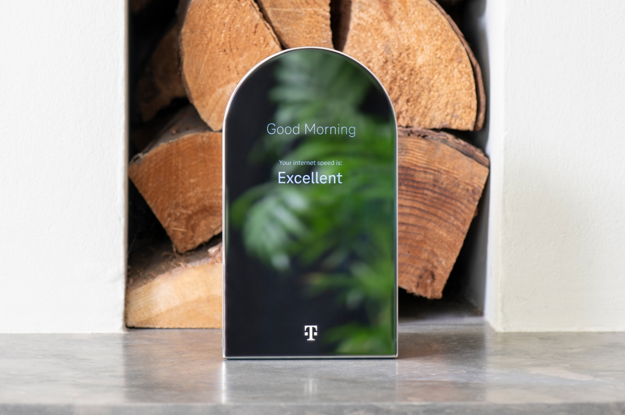
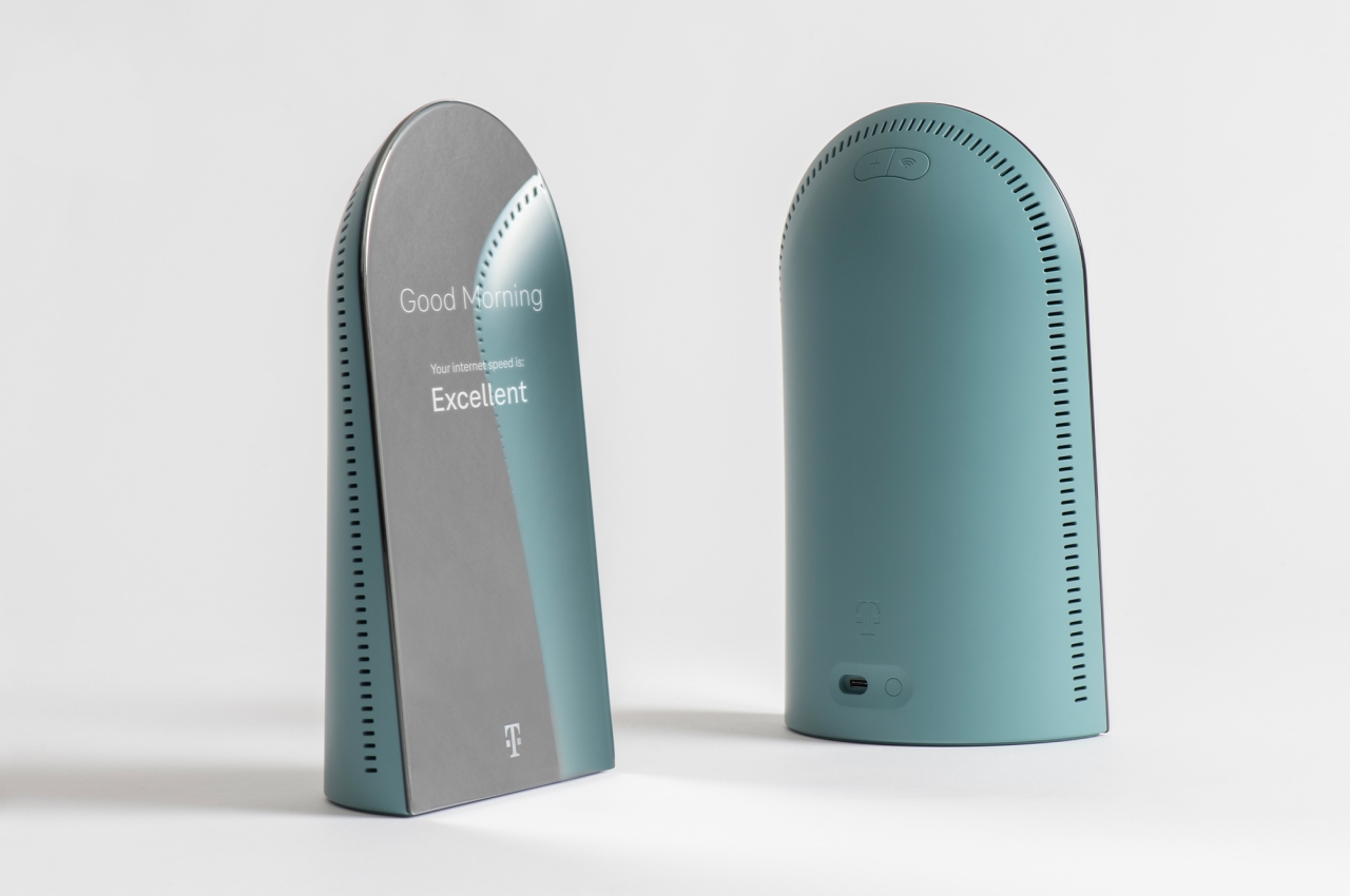
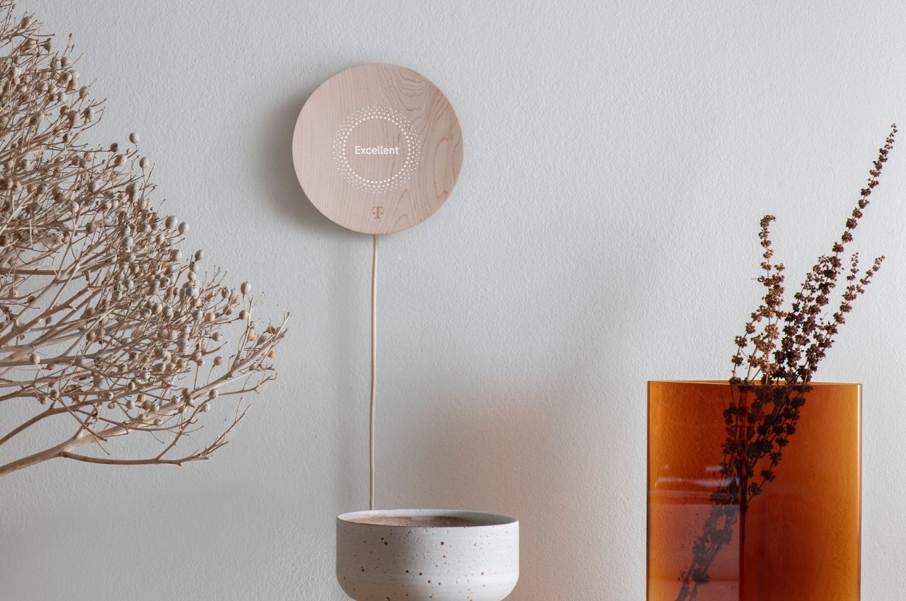
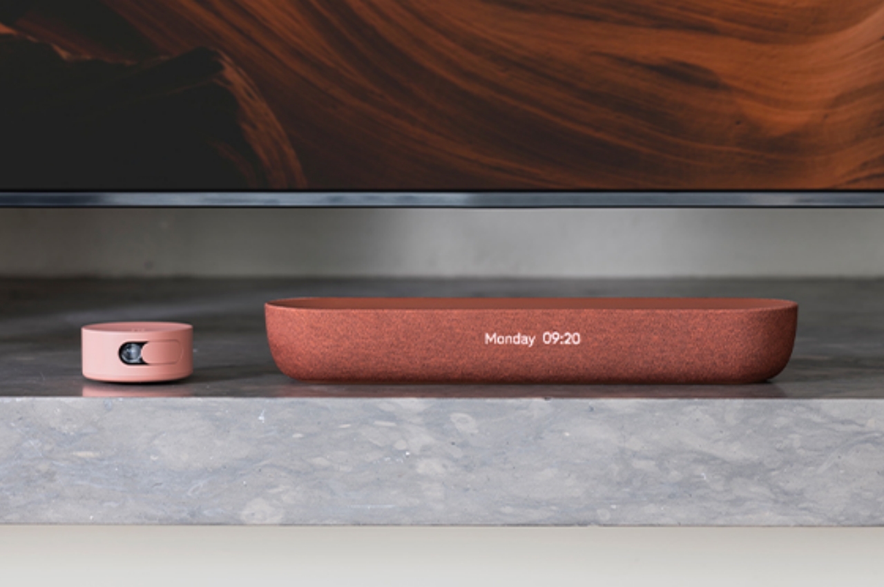
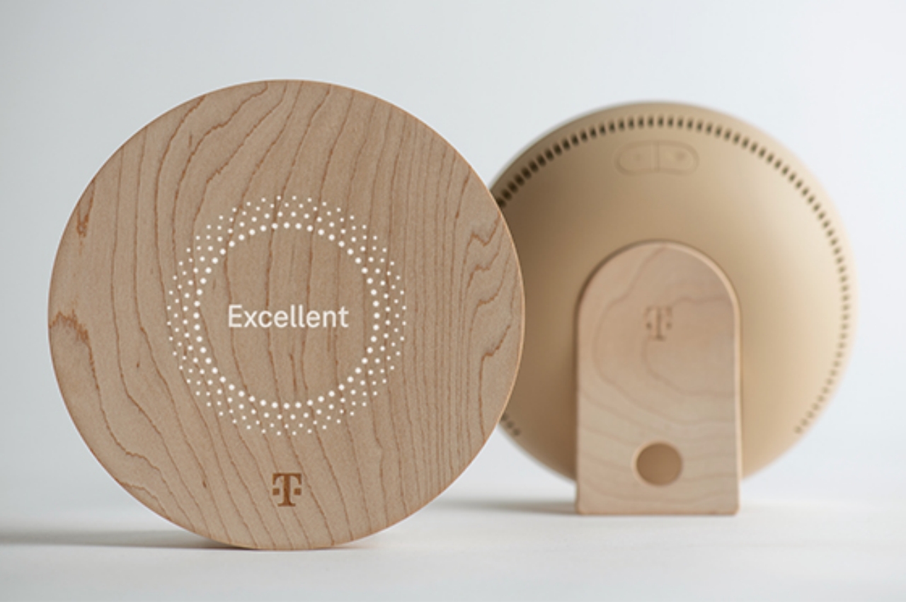
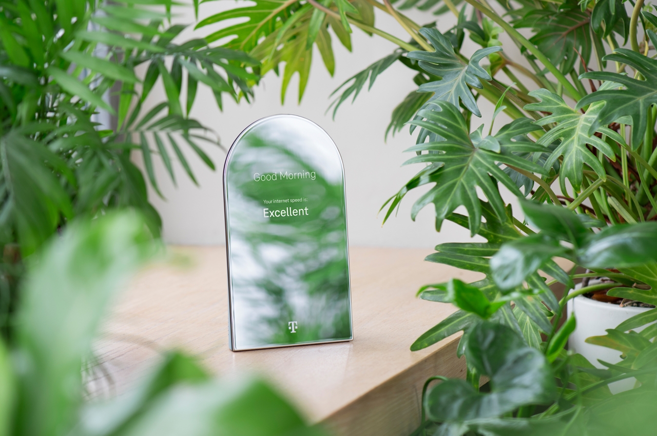
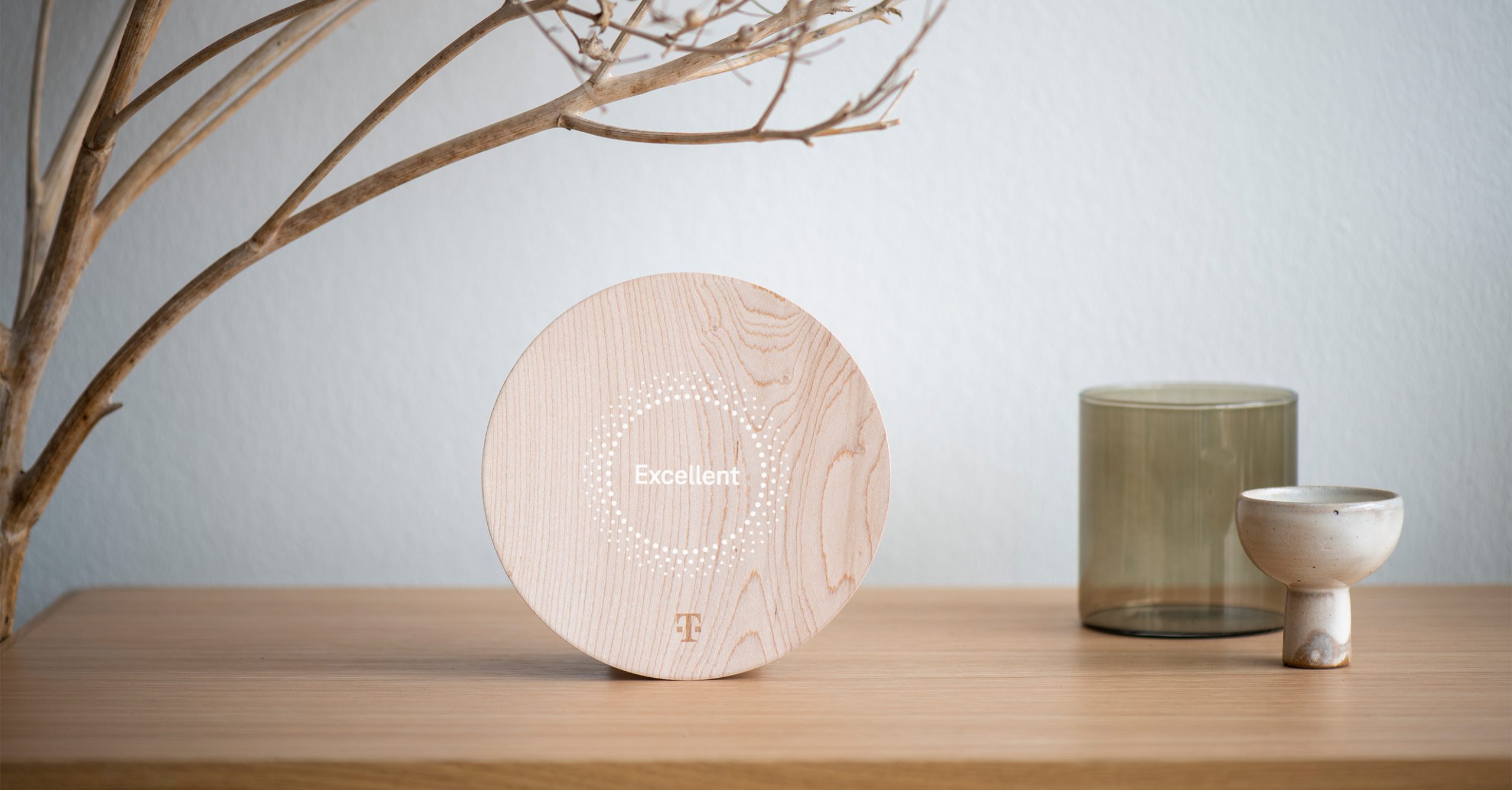
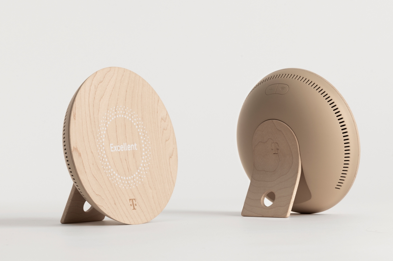
At the very top of that list is the router, which actually looks more like a desk mirror. In fact, it does function as one when the router’s display isn’t active. Even then, it only displays text rather than icons and images, making it a very minimalist piece of tech equipment. Joining it is a mesh repeater that masquerades as an upright wooden bowl decoration. They might even resemble some smart thermostats when hung on a wall, except without extraneous details and interfaces.
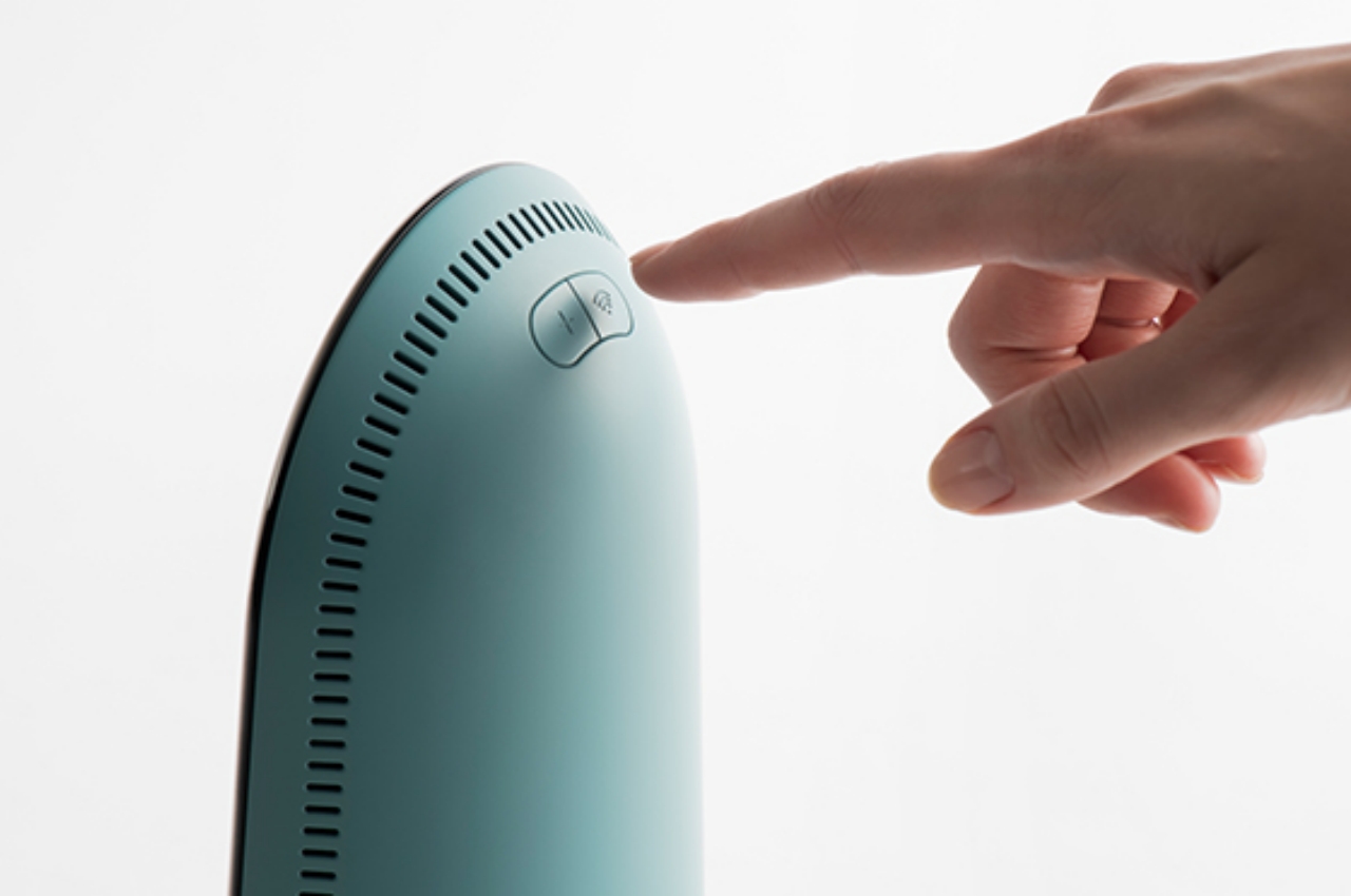
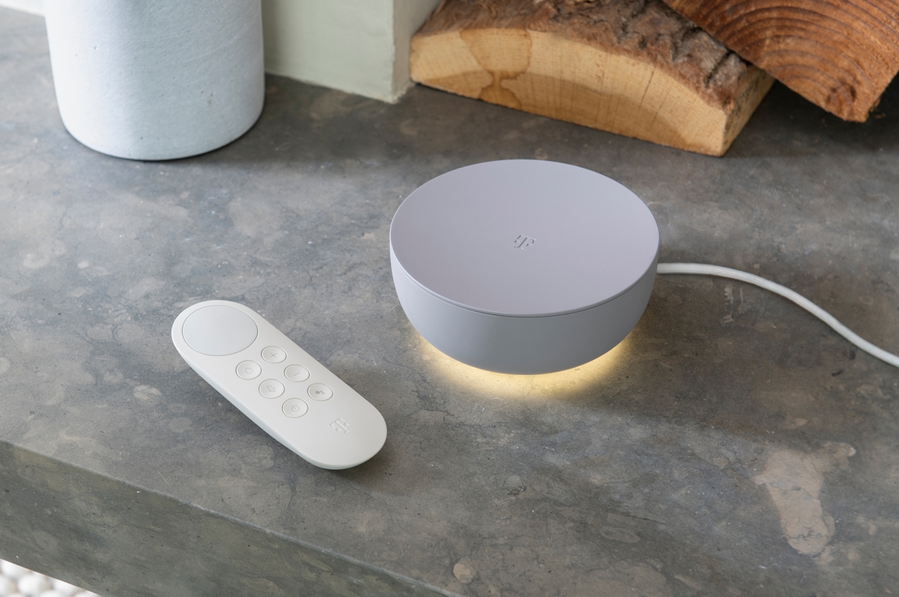
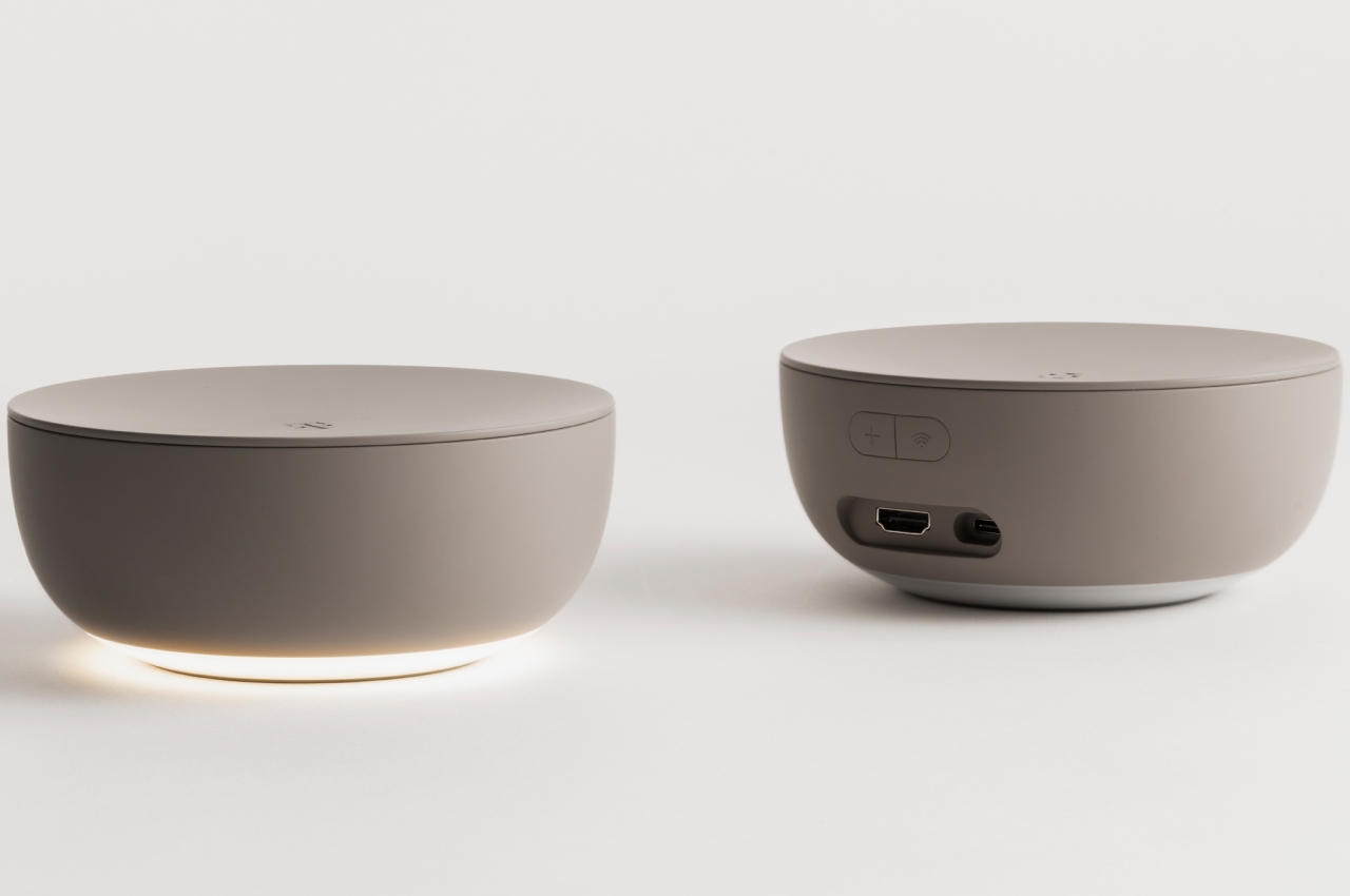
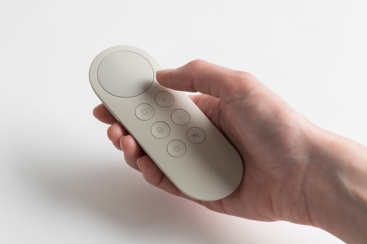
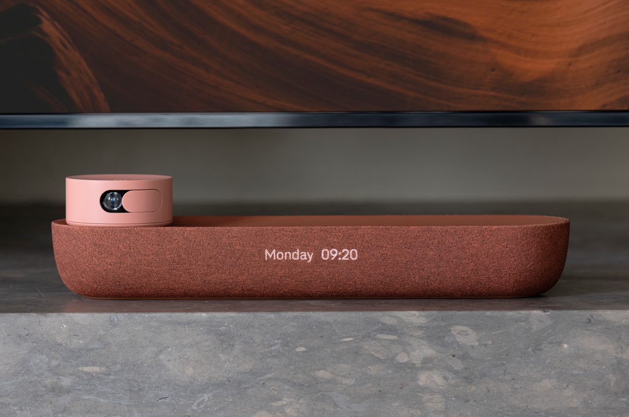
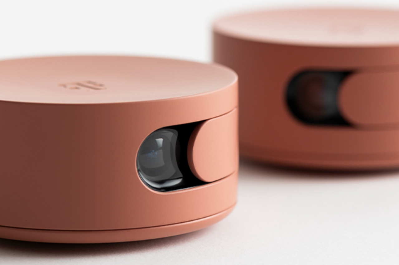
The set-top box/speaker does have telltale signs of an audio device, mostly due to the typical fabric-like surface that marks almost all speakers. Its minimalist design and text-based display, however, still make it a good candidate for interior design accessories. An interesting part of the product, however, is an accompanying webcam that’s no bigger than a can of tuna. There’s also a more typical set-top box that isn’t shaped like a box at all. Instead, it looks like a ceramic bowl that would be carefully put on display in the living room.
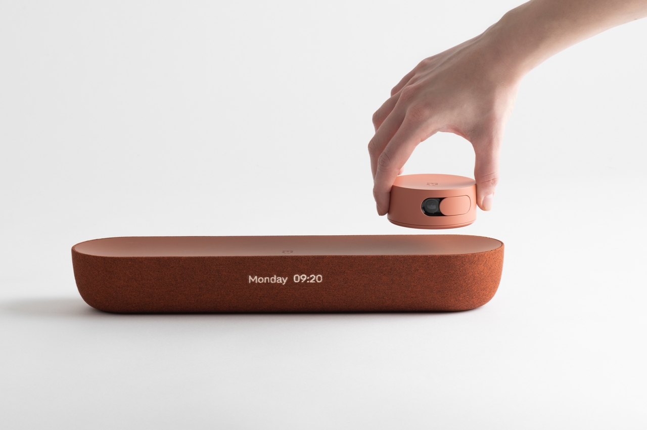
In addition to the designs themselves, this Home Harmony connectivity concept also tries to steer the ship towards more sustainable shores. Electronics are often made using plastics and unfriendly substances, but the use of wood, ceramic, and alternative materials will help make these objects not only blend in visually but also become a better part of people’s lives at home.
The post LAYER x Deutsche Telekom show how to hide tech in stylish home decor first appeared on Yanko Design.
This circular router tries to be an island of calm and privacy in your room

Home routers are often depicted as alien or futuristic objects in the room, but this privacy-focused design goes in the opposite direction to bring a sense of serenity instead.

Home networks have changed a lot in the past few years. The number of Internet-connected devices in our houses has multiplied, and that’s just counting the phones, tablets, and computers that connect to a single access point. Smart home devices often need to also connect to that same network, sometimes all of the time, often only occasionally. The more complex requirements of home networks have seen a rise in routers that try to spread the wireless waves across small spaces. Most of these routers are designed to look technical, geeky, and sometimes downright overwhelming. That doesn’t exactly help reduce mental and visual stress at home, which is why this router is designed to look like no other in an attempt to soothe people’s eyes and assuage their privacy fears.

Designer: Kritzer Design Studio

The minimalist and more human aesthetic that has started to grip computer accessories seems to have stayed clear of routers and modems. This class of devices has long passed a point where they could be conveniently hidden in a corner or on a shelf, especially considering how that could affect Wi-Fi network quality. Modern routers, especially the most advanced ones, seem to be designed to call attention to themselves by being more conspicuous. Often that’s through their sharp lines, multiple antennas, and dark, brooding colors.

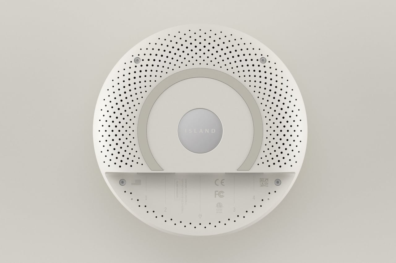
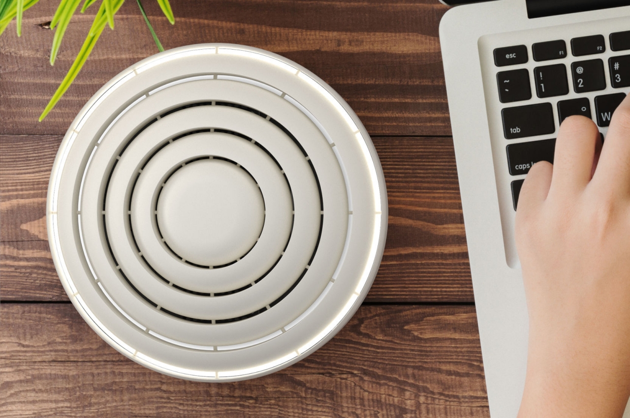
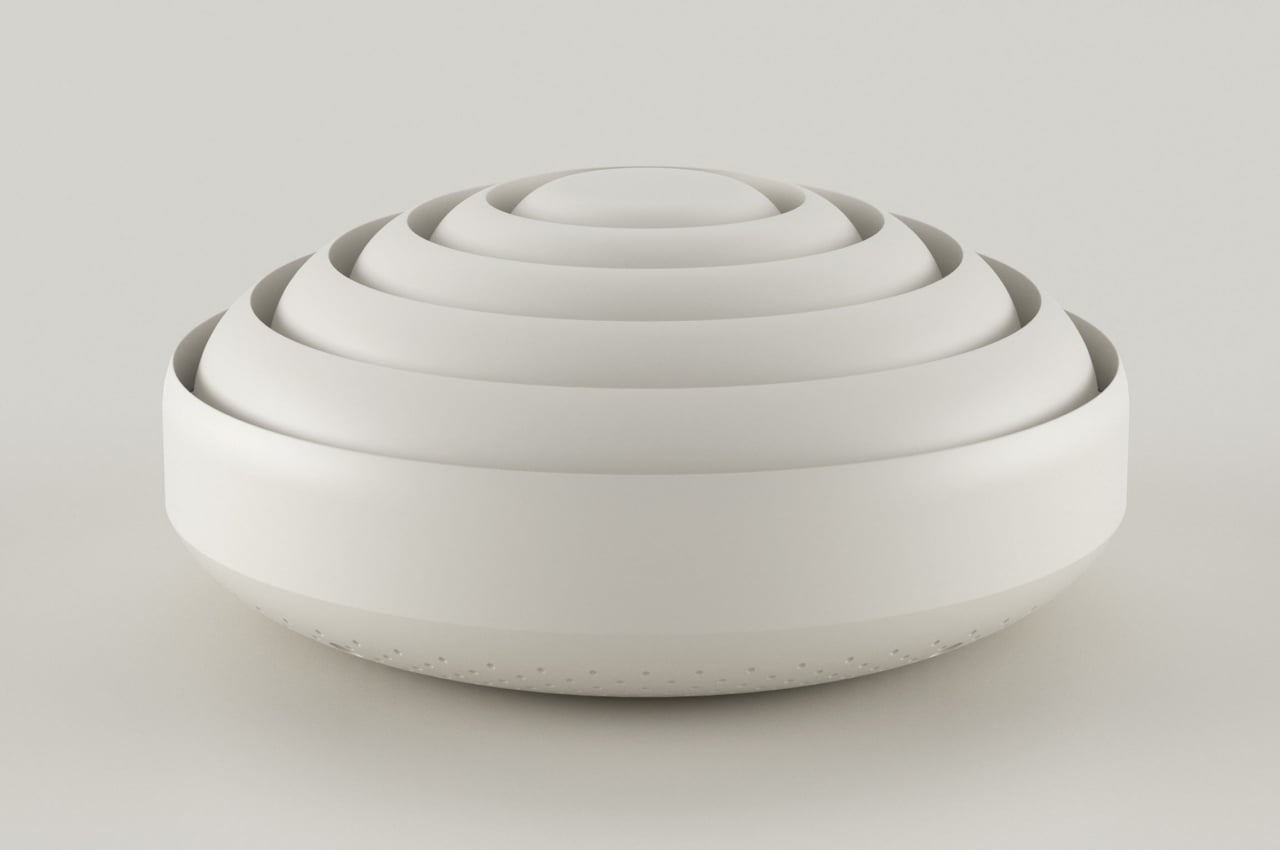
The Island stands in sharp contrast to this conventional design by being round and white. There is probably no shape that is more calming than circles, so this router has five concentric circles that seem to ripple out of a central sphere. These circles also rise ever so slightly, creating the appearance of a low mountain on top of that island metaphor.

While the Island router is already visually calming, its features are also intended to relieve people’s stress, especially over their privacy on the Internet. The router offers a built-in VPN service that can hide you from malicious actors that try to snoop into your browsing activities and eventually steal your information. Ideally, this VPN is already configured out of the box, so no software or app is needed to get it working, another source of stress for some less tech-savvy users.

The Island smart router is an example of how form can still follow function, even for something as technical as a router. Playing on the metaphor of a resort island that is guarded against unwelcome intruders, the Island tries to invoke feelings of peace and calm that have become critical in today’s workplace and home offices. It doesn’t even need foreboding antennas to transmit its signals, much like many mesh routers today that have eschewed the stereotypical router design. Its minimalist design and more generic form also make it a decorative piece that you can set on your desk or even stick to your wall.

The post This circular router tries to be an island of calm and privacy in your room first appeared on Yanko Design.
OPPO 5G CPE T2 Hub offers fast network speed and a sustainable design

The power and potential of 5G haven’t really been achieved, but we can expect that in the coming years, more companies and tech giants will work together to make it happen. There are now dozens of 5G smartphones available in the market. 5G tablets are slowly joining the bandwagon. We’re hoping more 5G notebooks will also be ready in the near future.

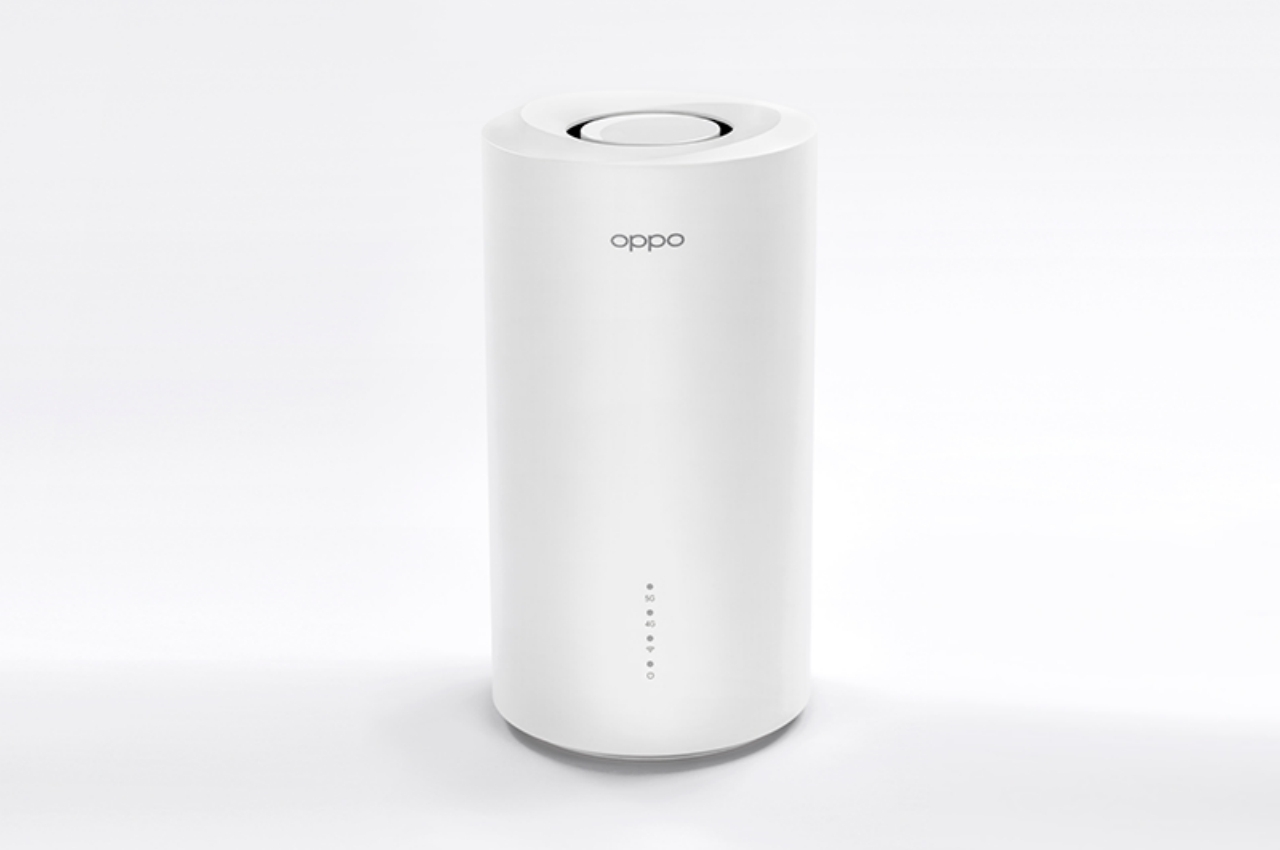
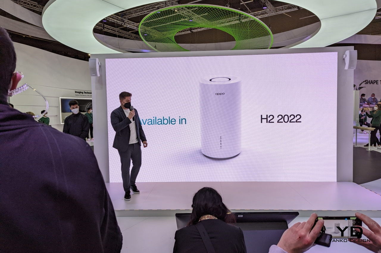
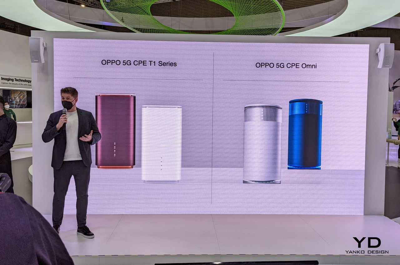
Alongside these 5G devices, the 5G technology must also be checked, if not improved. This is happening; That is why we are also seeing other 5G gadgets, including this 5G Hub by OPPO. At this week’s Mobile World Congress in Barcelona (MWC 2022), OPPO has launched a number of new products. The OPPO 5G CPE T2 is built for the Internet experience. This 5G CPE device is not the first from the Chinese OEM. It’s a follow-up to the Omni and the OPPO 5G CPE T1.

Designer: OPPO

OPPO 5G CPE T2 Features

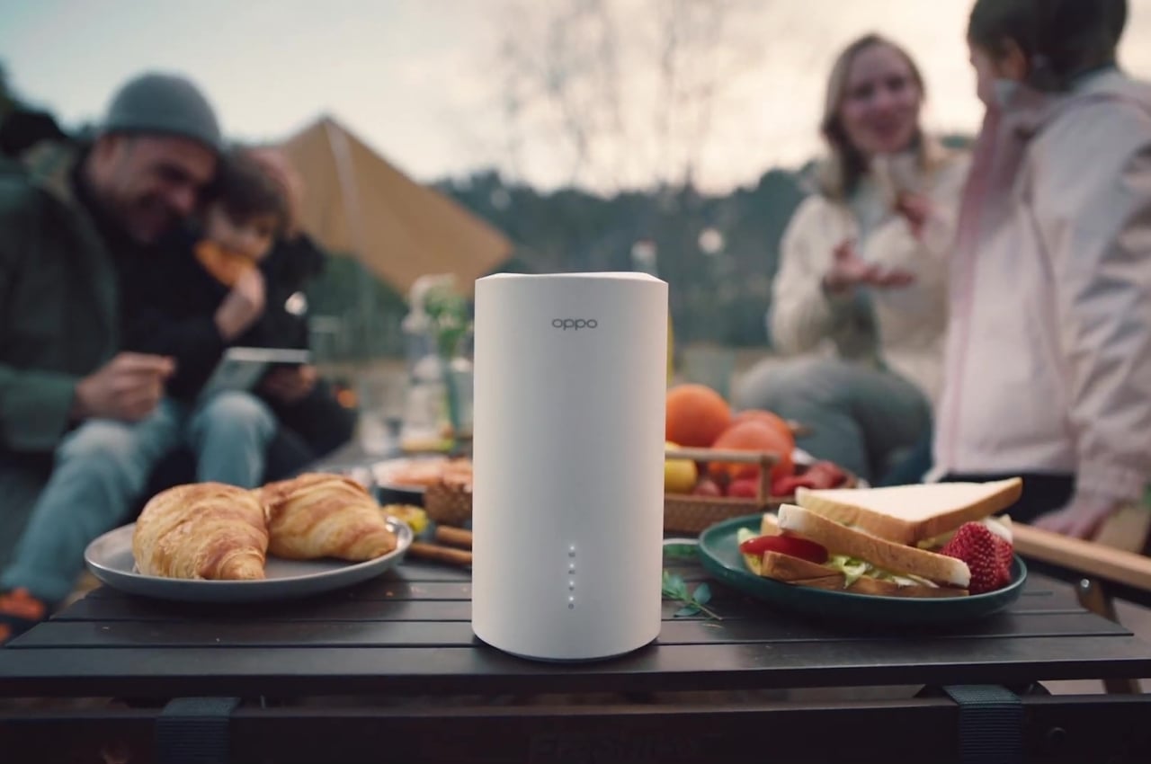
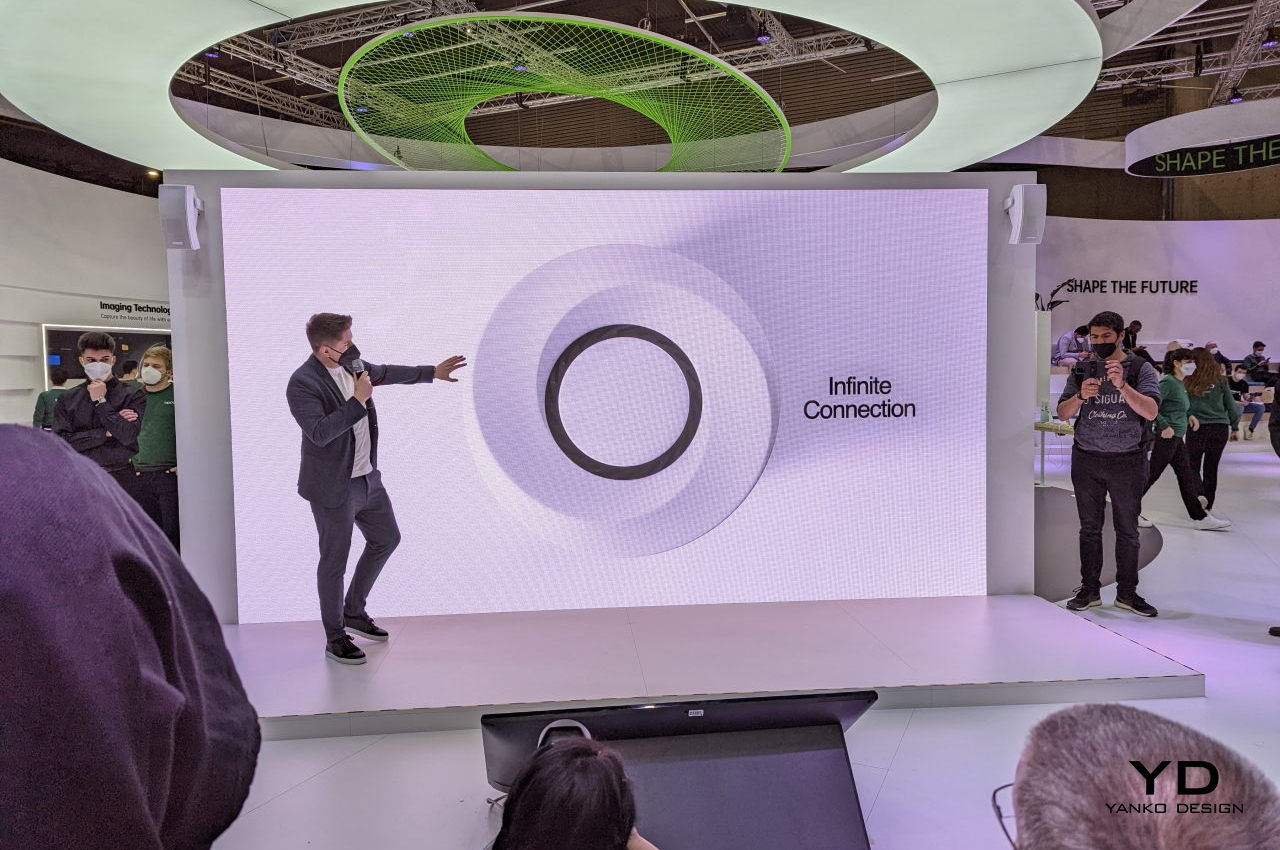
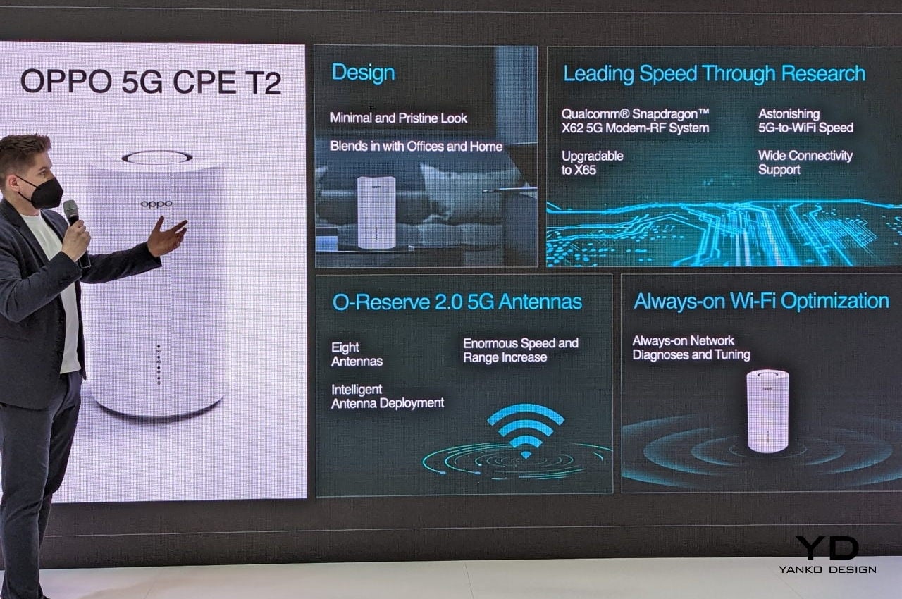
What makes this more interesting apart from the improved speed and other system enhancements is the fact that the company used recycled materials for the body. It also boasts an all-new design because, from a rectangular box, the new OPPO 5G hub is now a cylinder. The T2 also takes advantage of OPPO’s recent innovations, including the O-Reserve 2.0 smart antenna technology.

OPPO 5G CPE T2 MWC 2022

OPPO 5G CPE T2 Pricing

OPPO teamed up with Qualcomm to work on optimizations. The new 5G hub is poised to offer more stable and fast 5G connectivity. It’s mainly for home and office use, so you can now enjoy a 5G network as it is definitely more convenient and speedy compared to other Wi-Fi networks. It works well by converting the 5G signals into Wi-Fi or LAN connections. This way, multiple devices can connect.

OPPO 5G CPE T2 Featured Image

The 5G hub shares the 5G connection to more phones, tablets, and laptops at home or in other establishments. There may be areas that don’t have broadband but with 5G internet available. You can opt for the 5G network and just share connectivity with everyone.

This thing runs on Qualcomm’s Snapdragon X62 5G Modem-RF system. OPPO did some optimizations to it, so data transfer speeds are faster. Compared to the platform’s baseline speed, the T2 is 20% faster. With additional research and collaboration with Qualcomm, OPPO can offer ultimate connectivity. The Snapdragon modem used enables the hub to work with numerous devices operating in different networks and markets.

The new antenna used by OPPO here is the O-Reserve 2.0 smart antenna technology. It’s able to keep high antenna gain in all directions, thanks to the eight antennas receiving signals. Only four antennas are actually used at once, depending on the signal strength and quality. The result is a super-fast downlink speed.

To compare, OPPO tested the speed when the O-reserve 2.0 is turned on/off. When enabled, download speed is faster by ten percent. OPPO also has the Wi-Fi Channel Selection Technology working and monitoring network channels in real-time. The goal is to always select the channels offering the fastest connection; that is why the hub is always at work.

OPPO’s latest 5G hub offers an innovative design and a sustainable build. It is easy-to-use and is very reliable if you’re really demanding a fast Internet connection. Its form makes it an artistic conversation starter, whether indoor or outdoor. It seems smart hubs and devices like the OPPO T2 are going for the minimalist look, and this one is a perfect example.

The cylindrical body in pure white color is a testament to the brand’s minimal design philosophy. The device comes with a textured surface which makes it stain-resistant and dust-proof. The hub’s simple form makes it an elegant gadget that can fit any interior. It definitely won’t be an eyesore with its simple but beautiful design.

OPPO 5G CPE T2 Where to Buy

The OPPO T2’s shape isn’t just for aesthetics. It serves a purpose as there is a central ring suction ventilator inside that helps dissipate the heat. When it comes to such a device, heat dissipation is important because long hours of non-stop usage can make it really warm. Gadgets heat up, but there are now effective cooling systems that can be implemented. If device components are working properly and are not heating up, the antenna and system performance will work as intended.

OPPO 5G CPE T2 Release

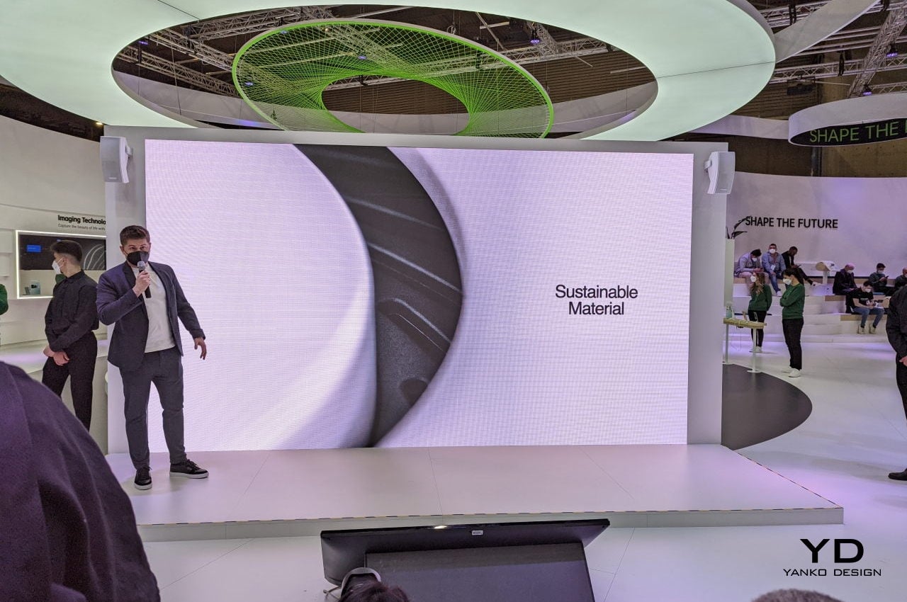
OPPO is starting to become friendlier with the environment. The materials used on the T2 are Post-Consumer Recycled Plastic, at least, on the body. This means OPPO is doing its part by supporting sustainability initiatives and helping to reduce carbon emissions. It’s about time these big OEMs help Mother Nature by working more on sustainability. Sustainable design is possible now without the quality being compromised, so we’re all in for this campaign.

OPPO 5G CPE T2 Availability

The post OPPO 5G CPE T2 Hub offers fast network speed and a sustainable design first appeared on Yanko Design.
Linksys reveals a WiFi 6E mesh system starting at $450

We're starting to see more WiFi 6E routers and Linksys is getting in on the action with its latest mesh system. The Linksys AXE8400 has full access to all three frequency bands — 2.4GHz, 5GHz and the newly opened 6GHz. Linksys says each node can cove...

Netgear’s first WiFi 6E router offers plenty of bandwidth for streaming

The past year has put a lot of strain on our connections at home, meaning that better wireless tech like WiFi 6E can’t come soon enough. That’s right, not just WiFi 6, which began its rollout in 2019, but WiFi 6E, which adds in the 6GHz band as well...

Law bars ISPs from charging rental fees for a modem you own

Has your internet provider ever charged rental fees for a modem even after you bought one? You won’t have that pushback any longer. As Ars Technica notes, the Television Viewer Protection Act taking effect December 20th will ban ISPs and TV providers...

Qualcomm’s next-gen mesh network tech supports palm-sized routers

The shift to remote schooling and working from home amid the COVID-19 pandemic hasn't been without its challenges. If your home WiFi network has been feeling the strain in recent months with multiple household members streaming video and hopping into...

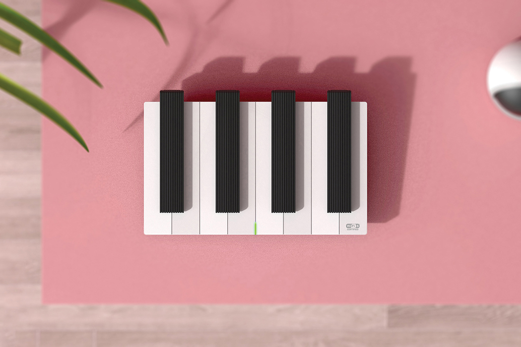
This piano-inspired wifi router is like music for your eyes!

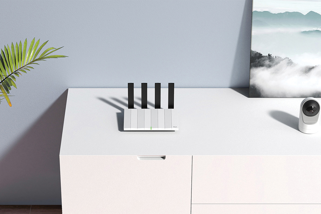
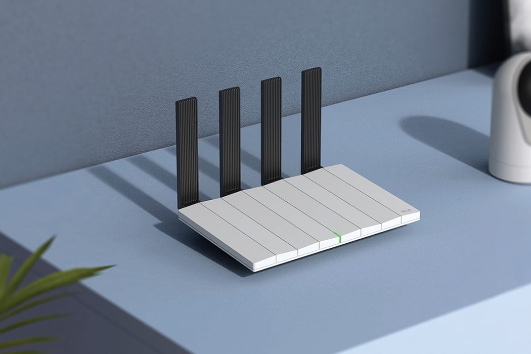
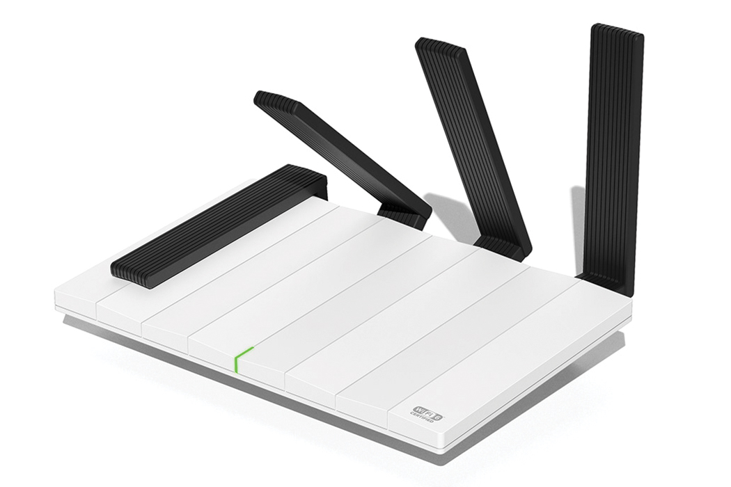
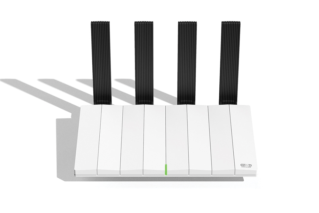
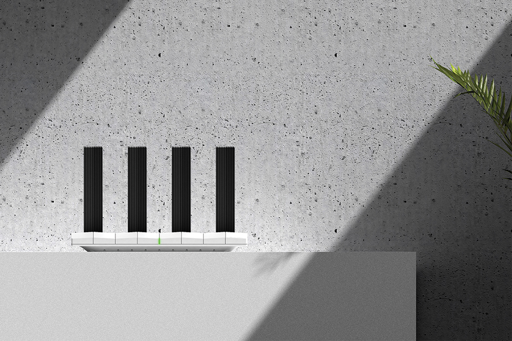
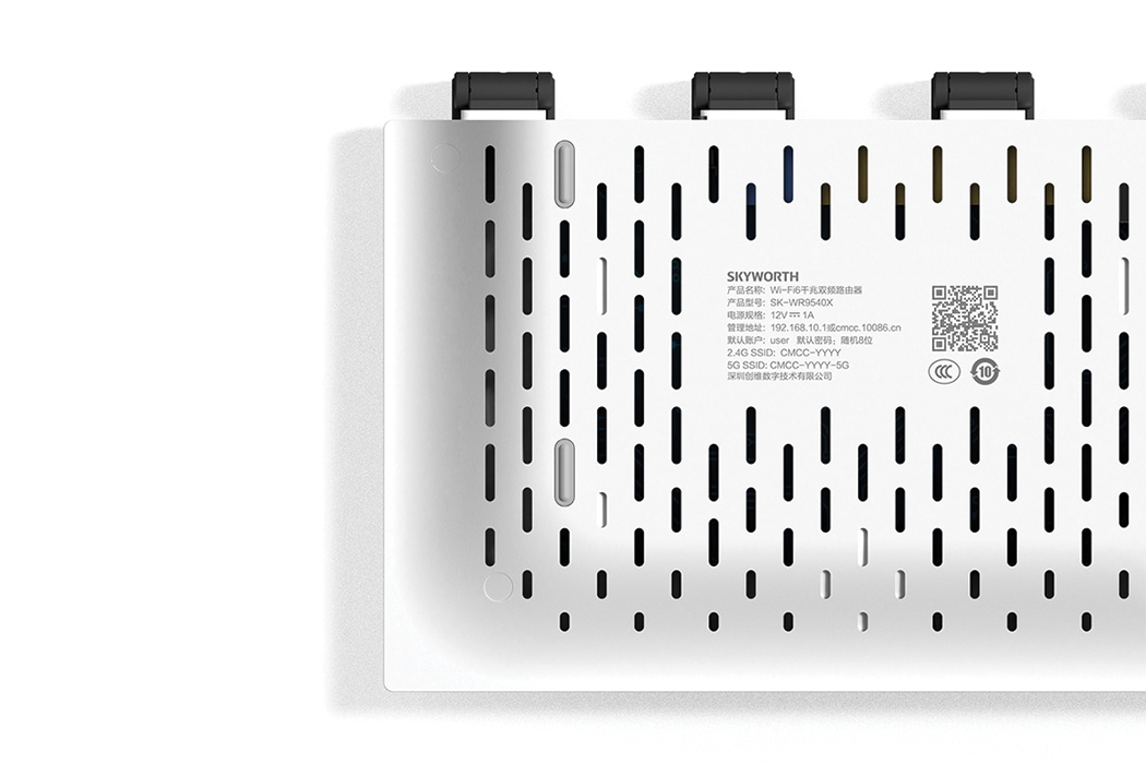
The same way a skyscraper doesn’t fit in amongst brownstones, the classic WiFi router is an eyesore in any room. Typically, they’re clunky, blockish, and wire-twisted. They always get in the way and seem to epitomize user-unfriendliness, with indistinguishable blinking signals and difficult, hard-to-reach dimensions. Thankfully, designer Lee Haupenn has come up with a solution: his new Piano WiFi 6 router that resembles a chord’s worth of piano keys, designed to appear less obtrusive and more as it belongs.

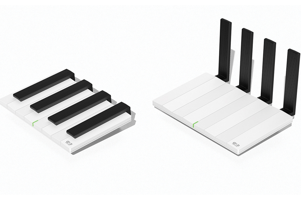
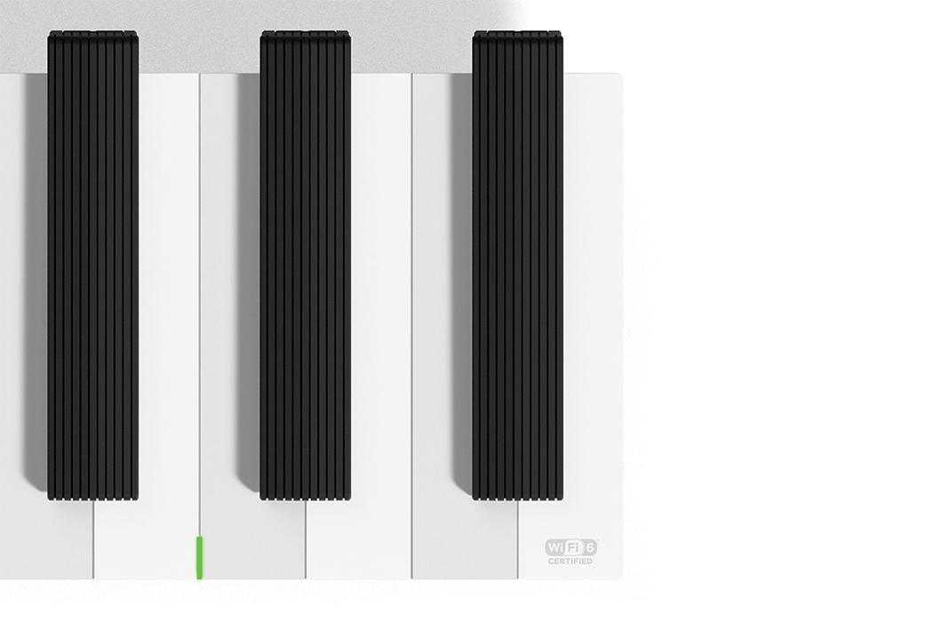
The fully realized WiFi 6 router is emotive in its appearance and, with its sleek body, allows you to enjoy any room for what it’s meant, without any black, plastic network boxes to distract you. The black ‘keys’ lift up to reveal the router’s antennae and the indented base diminishes some of the visual thickness that’s commonly expected from routers. Certain to improve user-friendliness, the L-shaped indicator light provides comprehensible insight regarding signals and product operation. Familiarity was a vital aspect of the router’s conceptual stages as Lee Haupenn incorporated the image of the piano, emoting a feeling of cohesion to any room. The classic white and black color scheme provides the router with another chameleon-like feature: interior adaptability for all spaces, that of which bulky, wire-heavy routers do not have. That seamless bridging between the world of technology and our intimate home spaces is the true essence of this design.

Red Dot issued 2020’s Best of the Best award to the Shenzhen-based design team for their cleverly tasteful reimagination of the classic router. Offering the latest generation of wireless capabilities, this router is as charming as it is operative, bridging the power of technology with the comfort of home. Collectively, it seems that we’re retreating further and further into the cyber world, which means that the demand for efficient wireless technology and network is high. However, the designers at Lee Haupenn seem to understand that when it comes to routers, as demand increases, creativity in design seems to fall by the wayside. Due to this imbalance, routers look cold, even unapproachable, just the tangles of wires look too complicated. With such a necessary product of the times, Lee Haupenn gave the antiquated router a much-needed fine-tuning. Even though this piano can’t really be played, it is visual poetry for your eyes!

Designers: Lee Haupenn