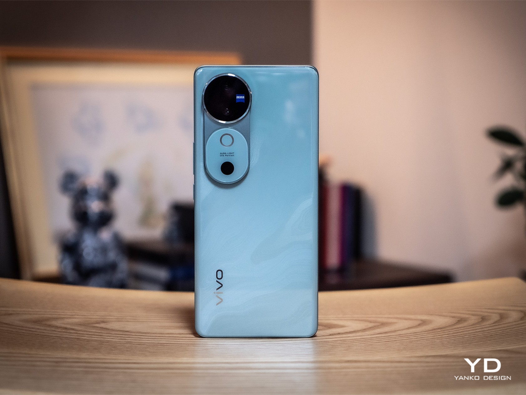
Vivo V40 Review: Keeping Things Simple and Sweet

PROS:


  • Stylish and slim design

  • Large 5,500mAh battery

  • Impressive triple 50MP camera system

  • IP68 dust and water resistance rating

CONS:


  • Same specs as the Vivo V30 from early 2024

  • No dedicated telephoto camera

RATINGS:

AESTHETICS
ERGONOMICS
PERFORMANCE
SUSTAINABILITY / REPAIRABILITY
VALUE FOR MONEY

EDITOR'S QUOTE:

The Vivo V40 puts a new chic style on a proven no-nonsense phone that delivers a solid experience at an accessible price point.

The smartphone market is a very congested and crowded place, not just with multiple competing brands but with each brand putting out multiple models per generation on multiple tiers. You’d think these companies want to just put their best foot forward, but instead, they try to target different audiences and budgets. Of course, there will have to be certain compromises for devices that aim for a lower market tier, but the question is just how much can you sacrifice before all you’re left with is an unusable, unappealing slab of metal, glass, and plastic. That’s the question that the Vivo V40 has to face in light of its well-received Pro sibling, and we give it a good try to see just how well it can perform under certain constraints.

Designer: Vivo

Aesthetics

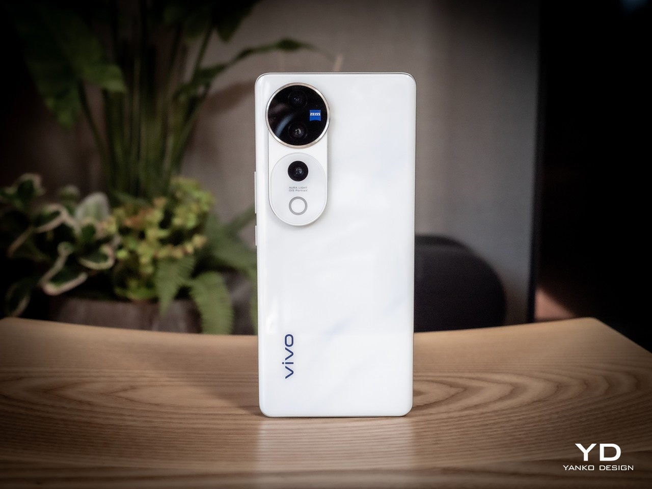
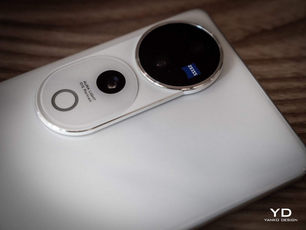
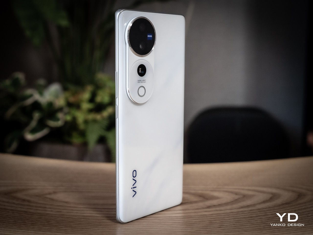
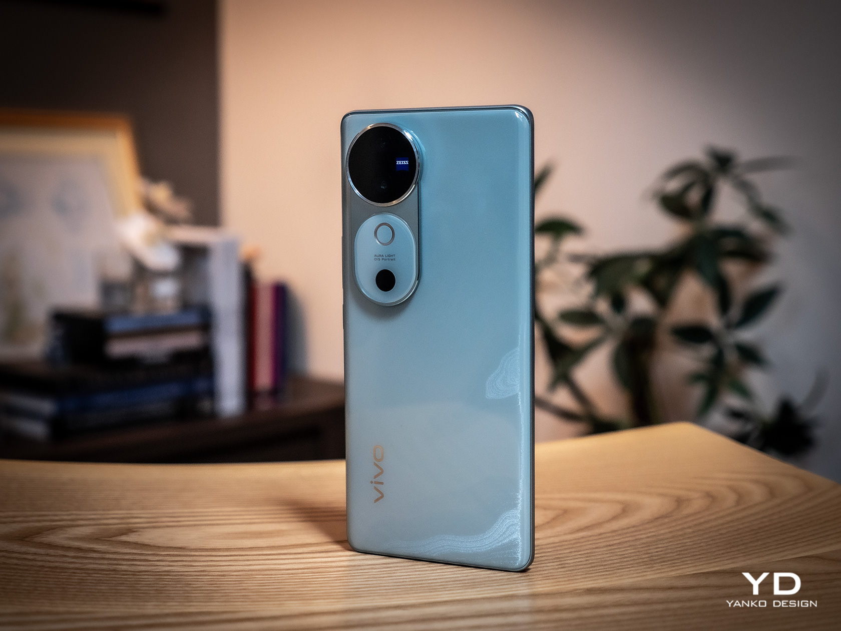
With so many smartphones now sporting more powerful and bigger cameras, it’s no surprise how many are scrambling to fit them in an elegant design and how some are failing to succeed. Given the two 50MP cameras on its back, it’s actually quite a pleasant surprise that Vivo managed to hit the nail on the head with its V40 series. There’s still a noticeable and technically thick bump on the rear, but it is presented in such an elegant way that you probably wouldn’t mind at all.
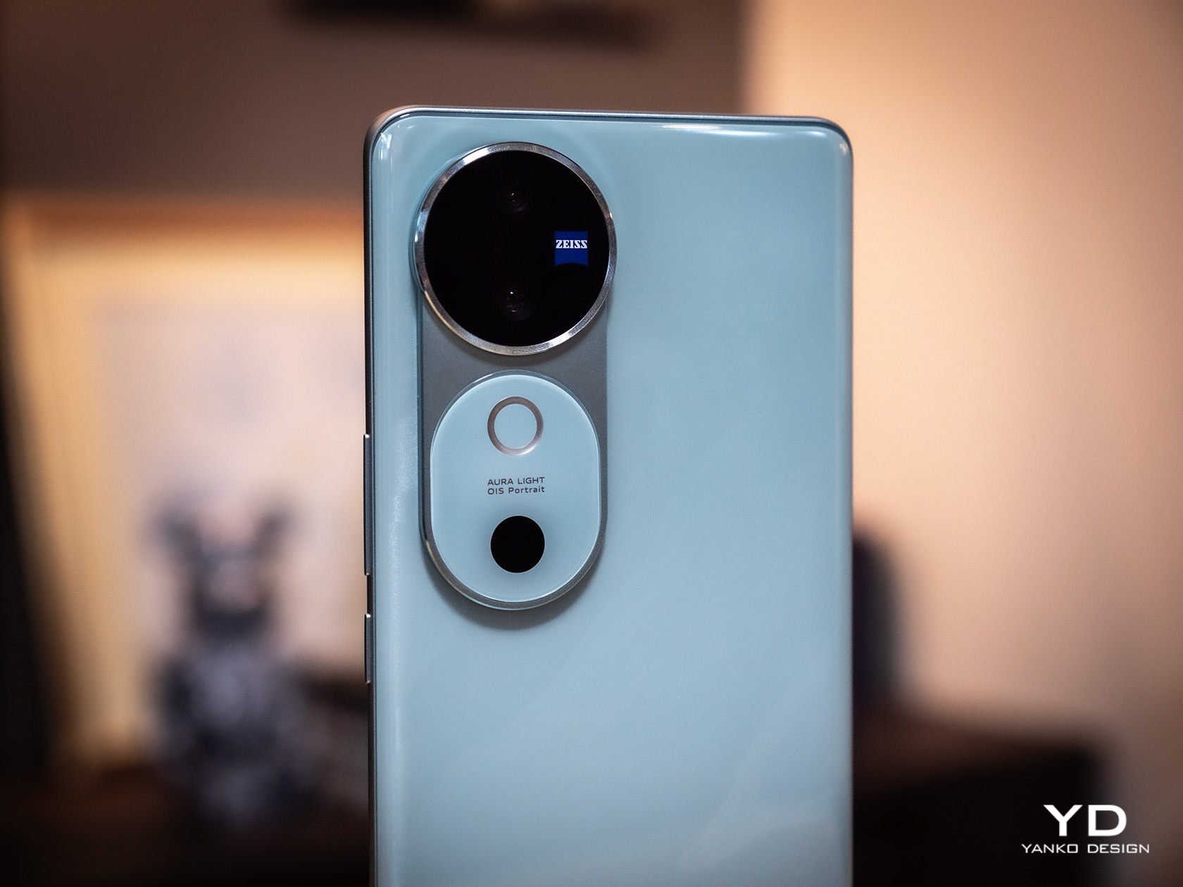
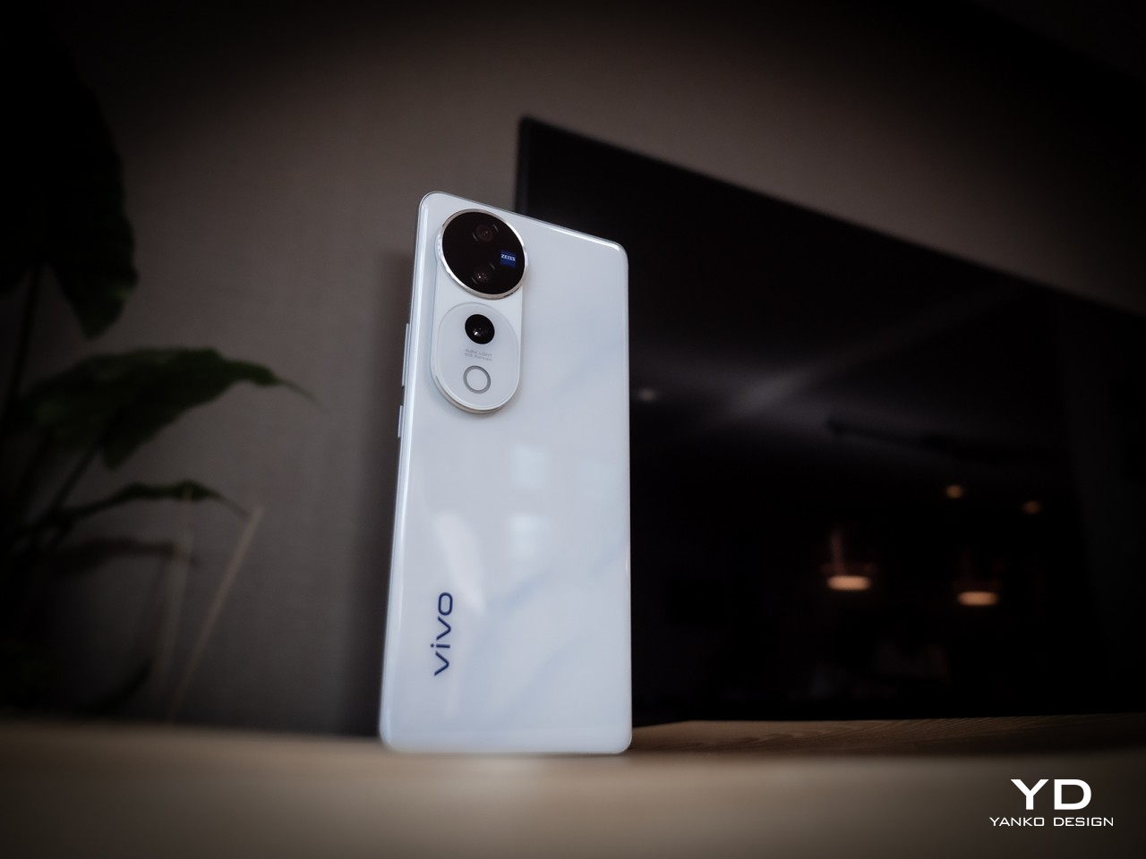
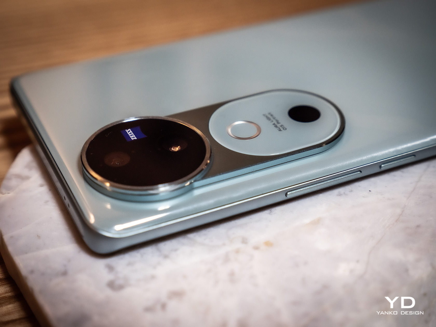
The key to this design is what Vivo dubbed the Gemini Ring, inspired by the constellation of the same name. It pairs two smaller circles in a bigger circle, playing on the “twin” theme. Technically speaking, the lower “ring” with the Aura Light is a bit taller and connects to the ring that houses the actual cameras, resulting in a shape that resembles a sleek keyhole. It’s an interesting visual element that grabs your attention but doesn’t scream at you.

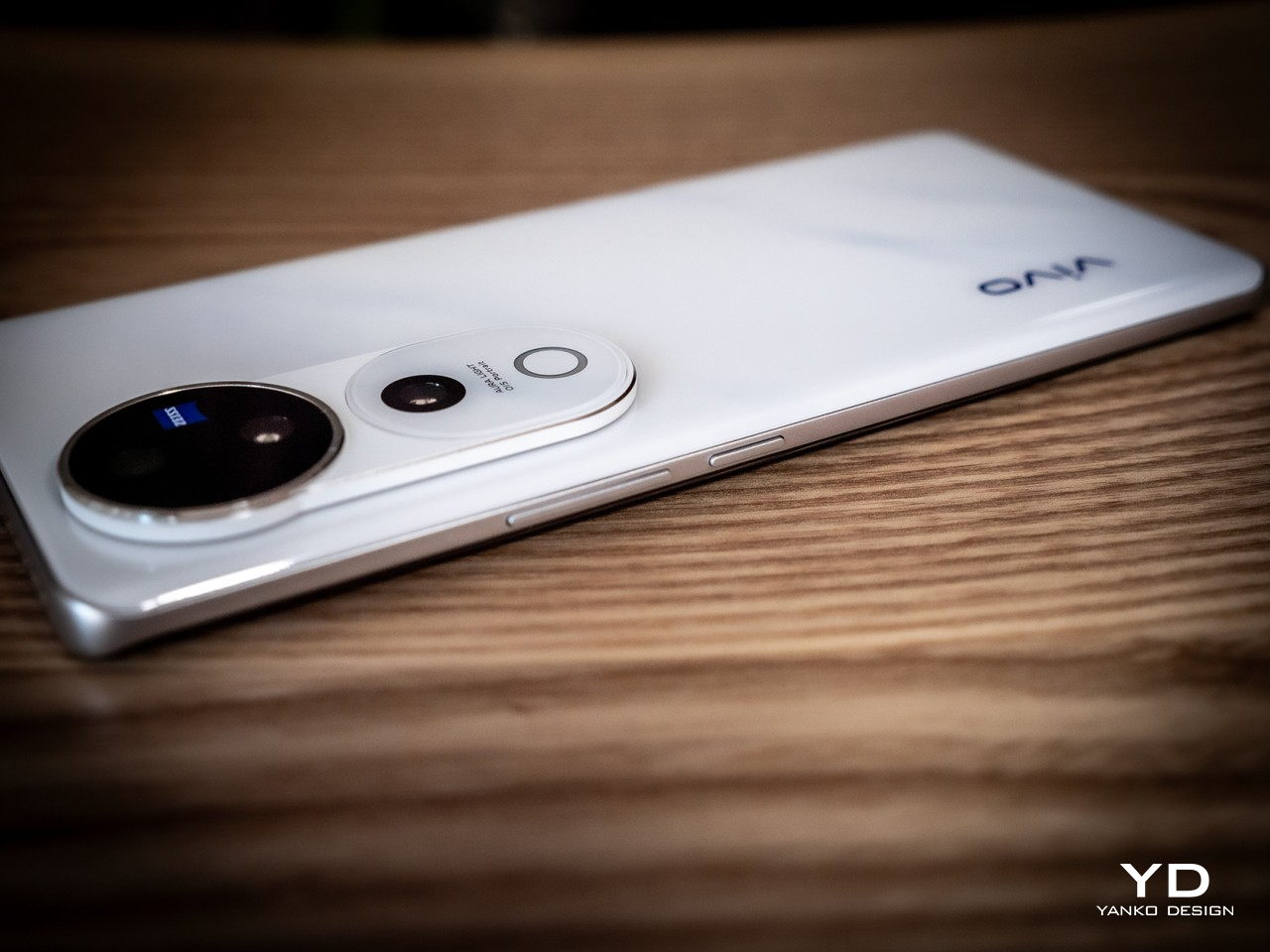
The rest of the Vivo V40’s back is just as elegant as that camera design, with a variety of colors that add an artistic character to the phone. Our review unit, for example, is the Moonlight White which has a few patches of blue that resemble the surface of the moon at night. The back has a very glossy finish which, as you might have guessed, is a fingerprint magnet, though the color of the design at least makes those smudges harder to see.
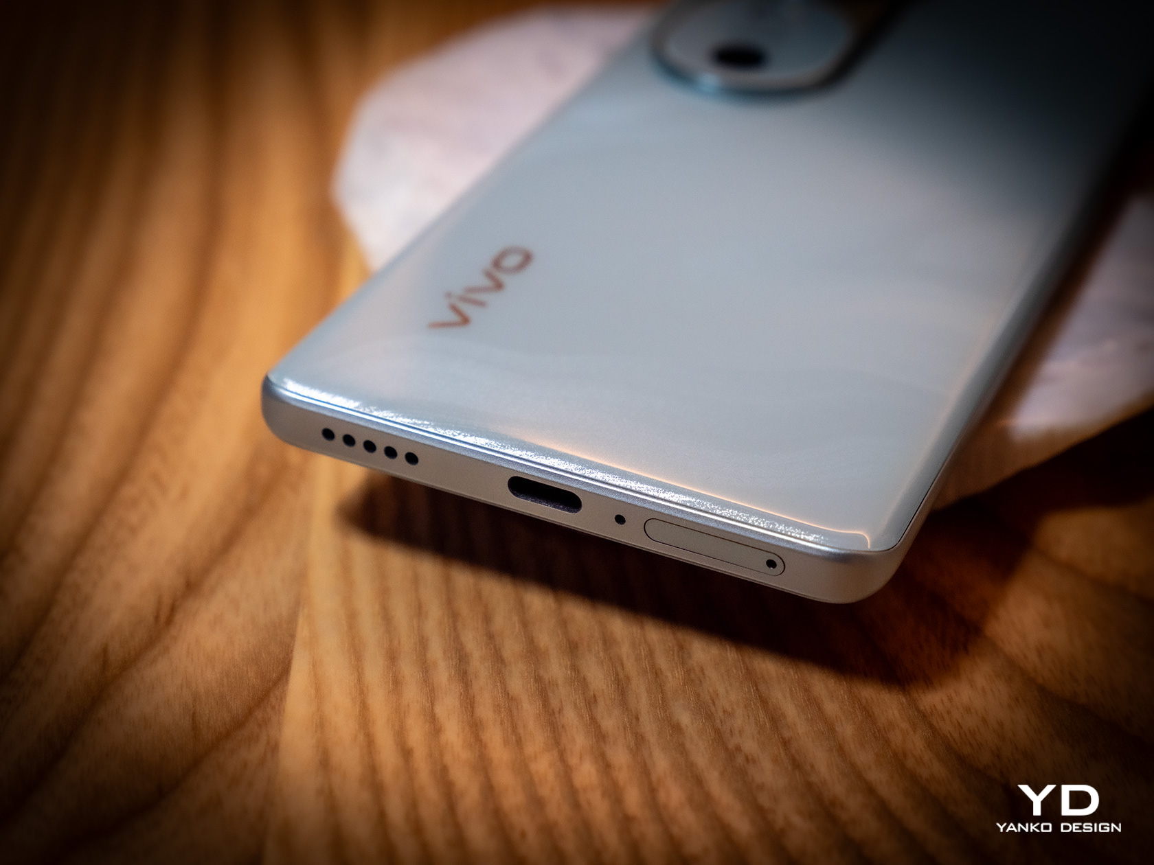
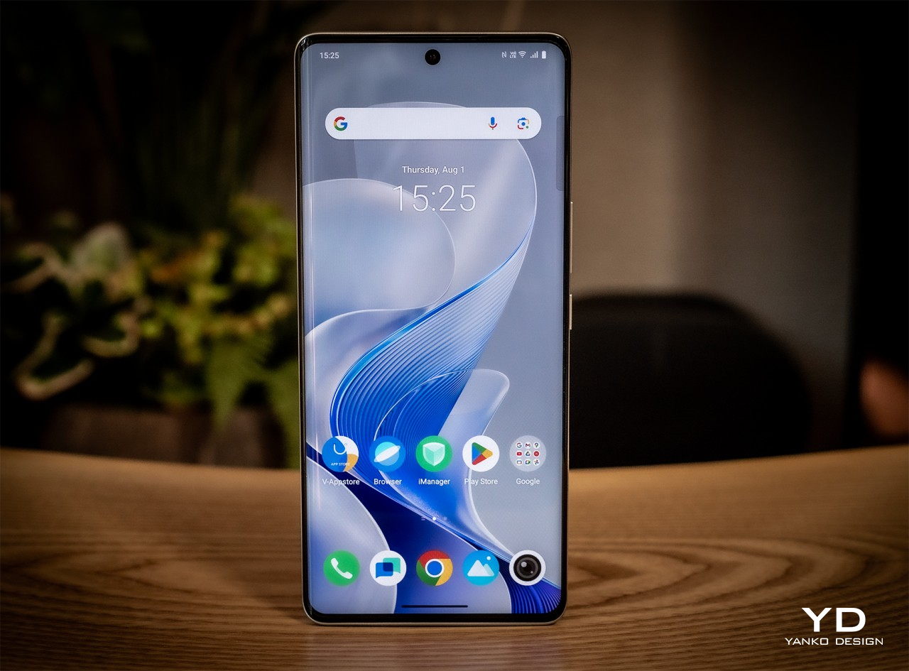
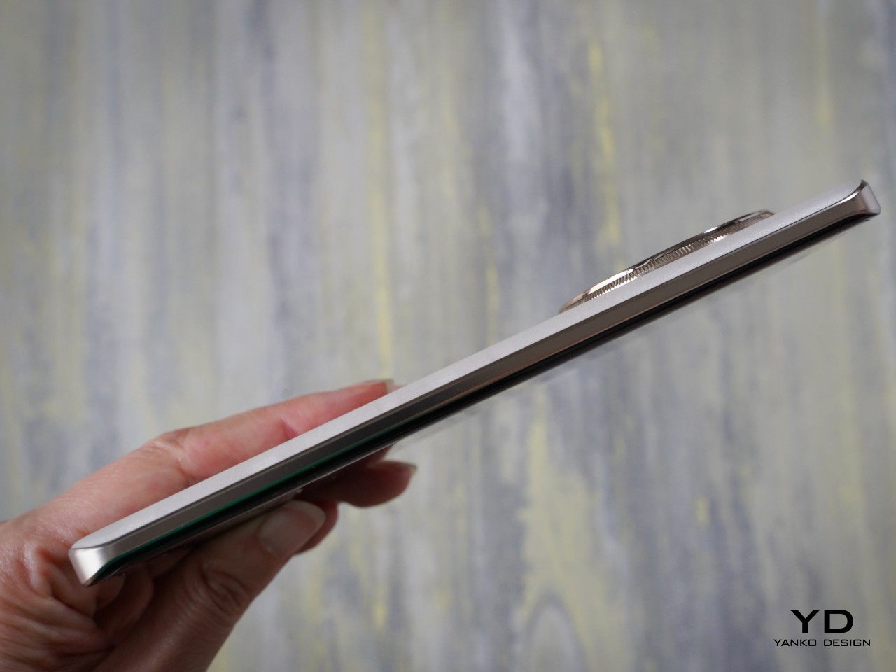
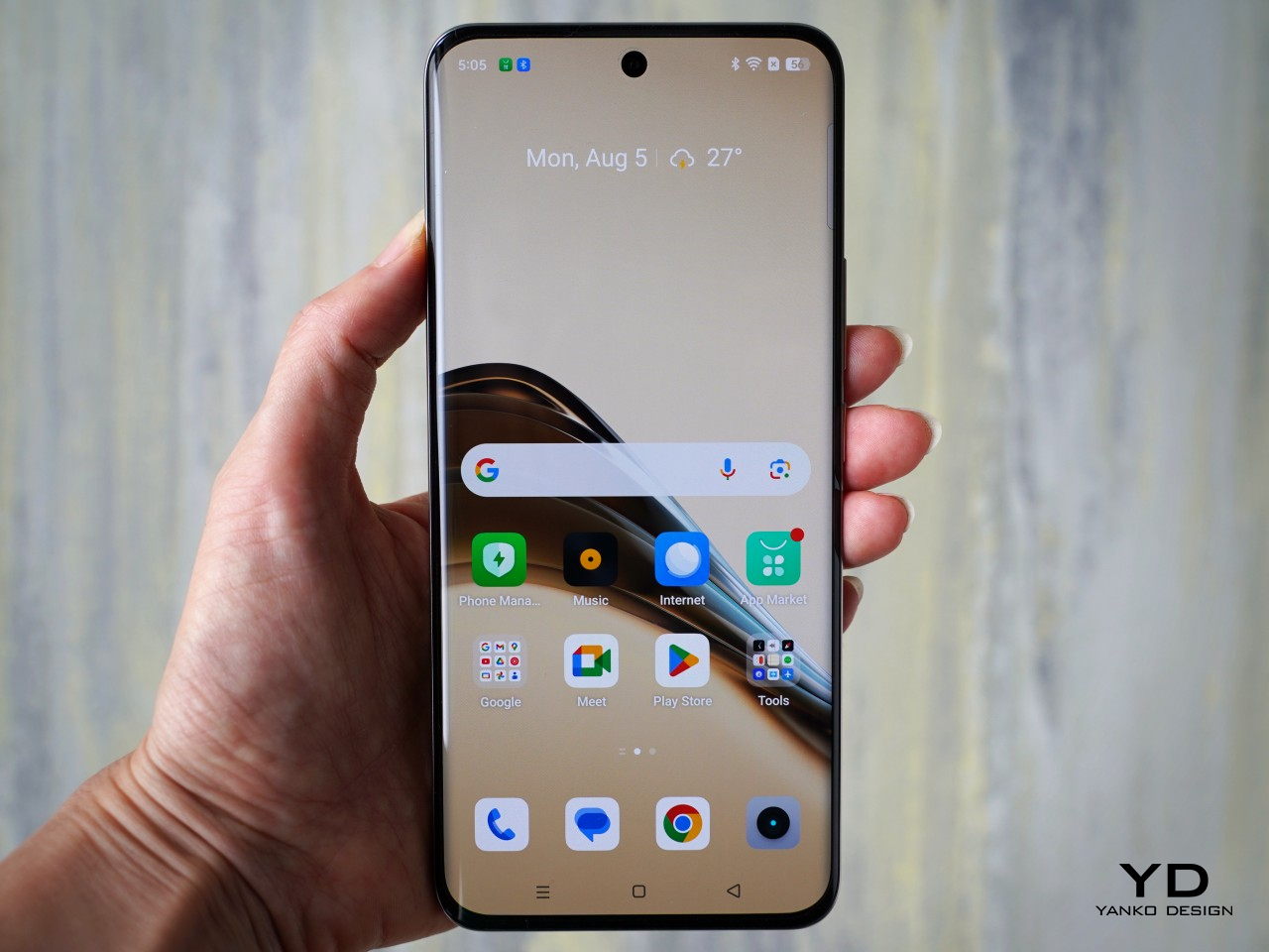
The Vivo V40’s large screen curves to the side, giving it the illusion of a thin profile. We seem to live in an age of flat screens and flat edges, so this “classic” design might offer some relief to fans. It does come with some usability consequences, though, depending on how you hold it, and not everyone finds this aesthetic that appealing these days.

Ergonomics

At only 7.58mm thick and weighing only 190g (0.42 lbs), the Vivo V40 is incredibly thin and light, especially when you consider the extra-large battery it packs inside. It won’t strain your hand when holding the phone for a long time, but due to its size, you’re more likely to hold it with two hands unless you’re just idly scrolling away.
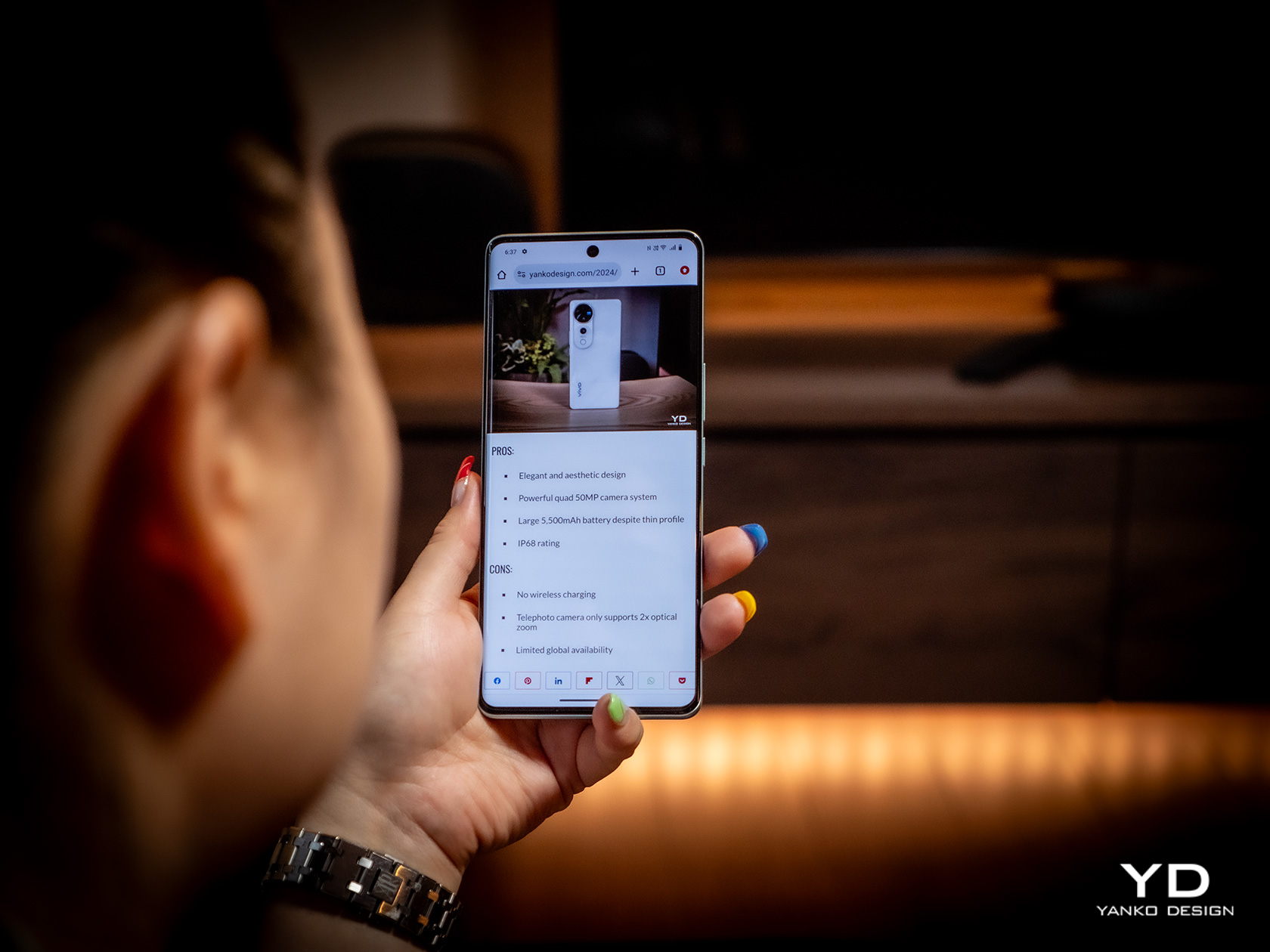
The curved edges of the screen are probably a bit more divisive. More than just a cosmetic design, it means that there will be parts of the screen at the edges that are not always visible, depending on the viewing angle, or might be accidentally triggered by parts of your palm or fingers. It doesn’t happen all the time, otherwise, this kind of design wouldn’t have lasted a year, but it might be something to consider when you notice “ghost” touches from time to time.

Performance

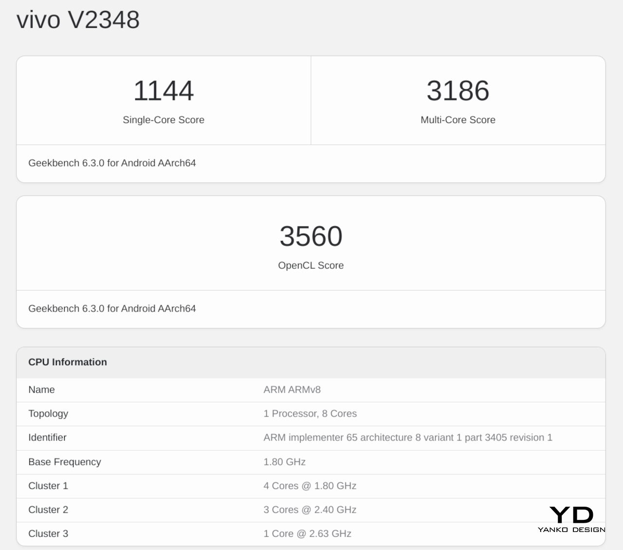
Underneath the sleek exterior of the Vivo V40 lies a rather sneaky secret. In many aspects, this is pretty much the Vivo V30 from early 2024, just with a few minor upgrades. It has the same Snapdragon 7 Gen 3 processor and the same basic memory and storage configuration. There are other similarities as well that we’ll get to later, but the bottom line is that, in terms of performance, you aren’t going to see a distinct generational upgrade.
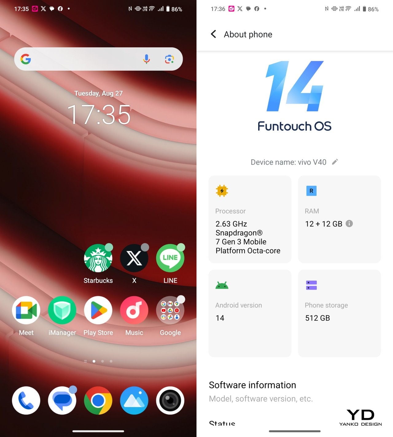
That means that what was true for the Vivo V30 is true for the Vivo V40, which thankfully means you do get a solid mid-range performer. With enough RAM allocation, which is 12GB plus another 12GB taken from the 512GB storage of our review unit, you have plenty of silicon muscle to get apps moving smoothly and fluidly. You’ll have to turn down the settings for games, but you’ll still be able to enjoy the latest action-packed titles. That said, there is a Snapdragon 7+ Gen 3 at this point, so it’s rather disappointing that Vivo didn’t push for that extra punch.
The screen is almost the same, a 6.78-inch 2800×1260 120Hz AMOLED display that’s quite vibrant and crisp. This year’s model, however, upgrades the brightness by a considerable margin, which makes the phone even more usable outdoors. It supports HDR10+ but oddly leaves out Dolby Vision, something that might be of concern to video aficionados.
The biggest difference between the two generations is the 5,500mAh battery inside the Vivo V40, a whopping 500mAh increase from its predecessor. It does make the phone heavier and thicker than the V30, but not by much. The battery life gains pretty much make up for that anyway, with an uptime of almost 20 hours, depending on usage. It charges fast, too, at 80W, though not exactly record-breaking. The plot twist here is that Vivo doesn’t include a charger in the box, so you’ll have to find an 80W charger or higher on your own.

The cameras are where it’s all at, of course, and here the Vivo V40 doesn’t disappoint except in one aspect. Again, it’s the same combination of a 50MP f/1.9 main camera with OIS and a 50MP f/2.0 119-degree ultra-wide shooter. The front also gets a 50MP front-facing camera capable of shooting in 4K 30fps, which should probably make you a star in video meetings.

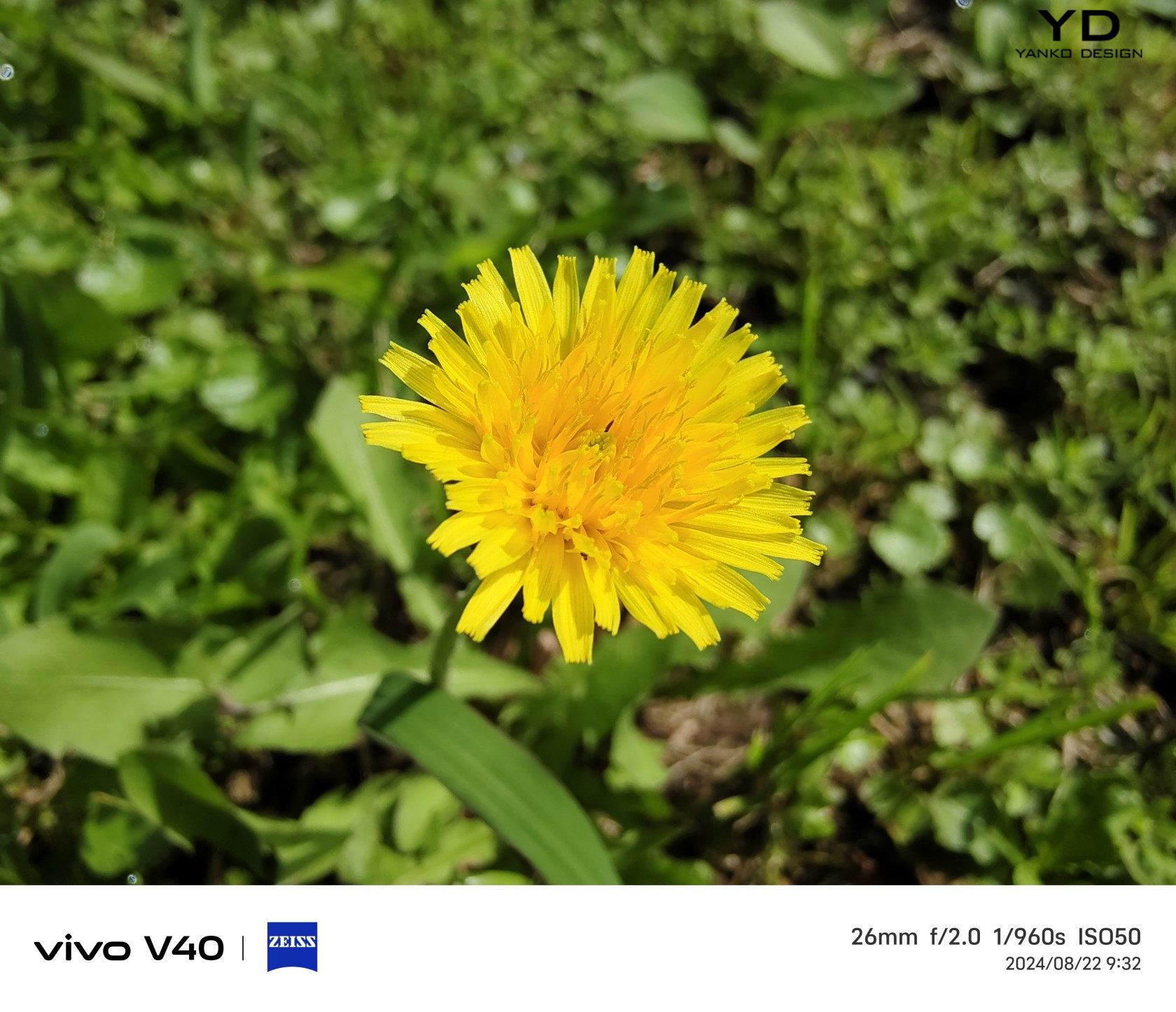
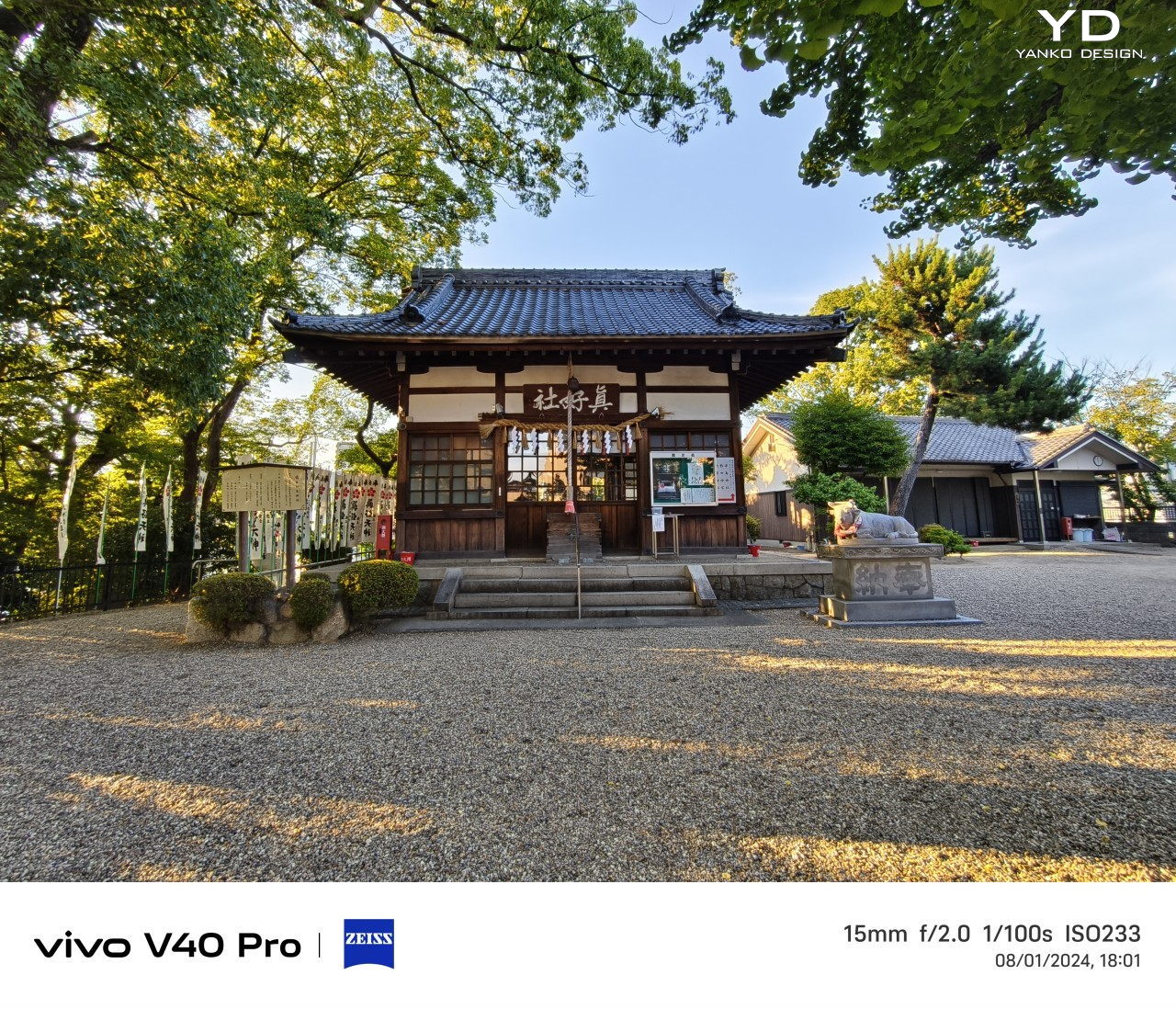
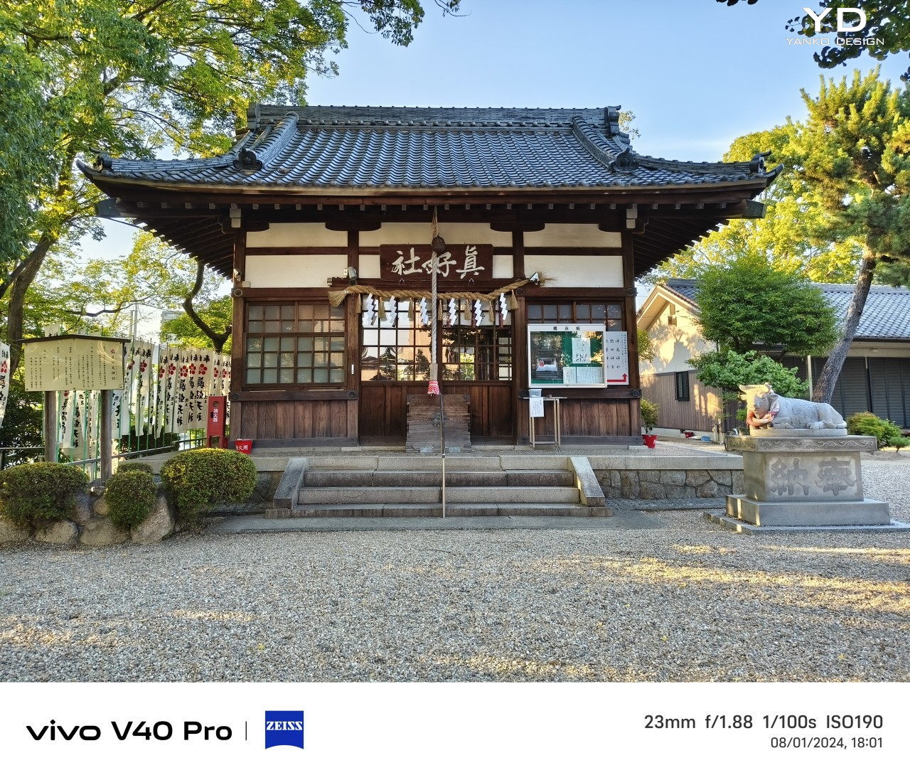
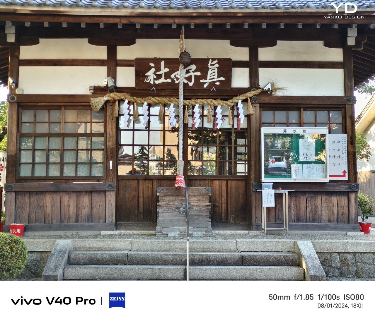
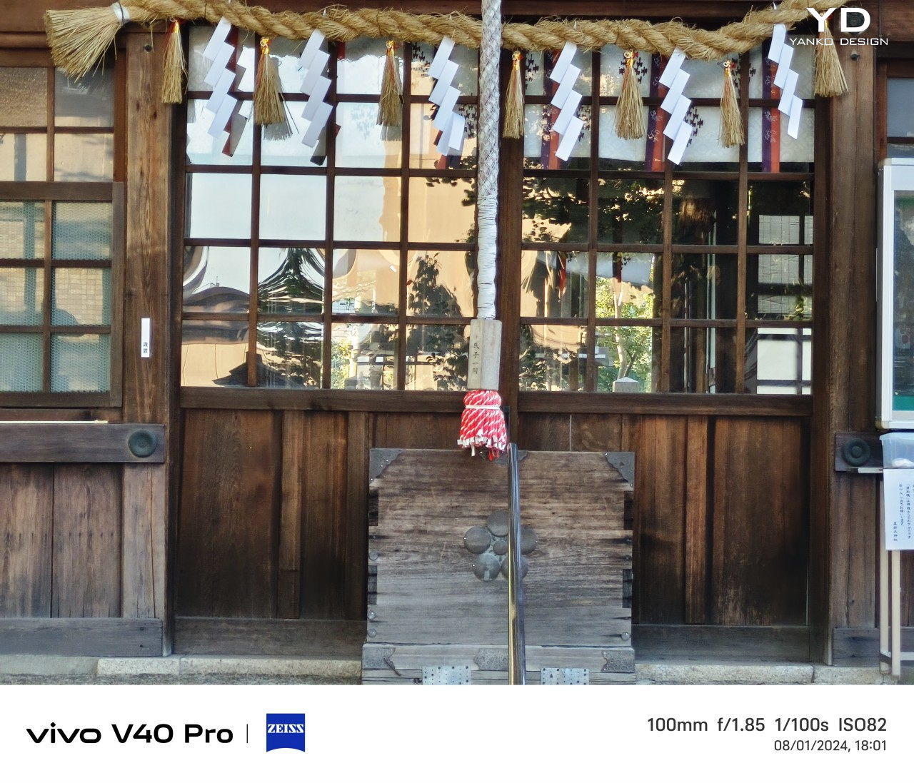
In practice, these ZEISS-tuned cameras deliver as promised, producing detailed and clear shots with natural colors and good exposure. That’s true both in broad daylight as well as low-light or nighttime shots, though the latter sometimes tend to get a little bit overexposed to the point of looking unnatural. Bokeh is pleasant and the separation of foreground and background is quite accurate. The Studio-quality Aura Light ring offers more flexibility with light temperature and intensity, creating more natural-looking lighting when needed. This stellar performance stops when you try to zoom in, though, even at just 2x. At that point, quality starts to degrade, which is to be expected from a camera system without a dedicated telephoto lens.

Sustainability

Vivo has been making big steps in improving its commitment to a greener future, and every little bit counts toward that goal. It might not be using recycled metals and plastics yet, but it might be slowly but surely getting on with the times. The Vivo V40, for example, doesn’t ship with a charger, helping decrease the potential e-waste from owning multiple chargers that do the same thing. Yes, you might have to buy a compatible charger if you still don’t have one, but that’s an investment that you will be able to use for other devices as well.

Perhaps the bigger step forward is taking this mid-range V series phone’s durability to the next level. From a measly IP54, the Vivo V40 now boasts an IP68 rating, putting it on the same level as more expensive flagship smartphones. What this means is that your phone won’t die on you so easily, prolonging its longevity and delaying its inevitable fate in the trash heap or recycling plant.
Value

To be painfully blunt, the Vivo V40 doesn’t exactly have a standout feature. Yes, the 50MP ZEISS cameras perform well, but other mid-range phones can match its output and even have a telephoto shooter in the gang. Its hardware isn’t exactly fresh or notable, but it does get the job done. The slim and sleek design is definitely eye-catching, but they always say that beauty is in the eye of the beholder.

Instead, it’s actually the sum of its parts that give the Vivo V40 its value. It’s a solid performer with dependable cameras wrapped in a premium-looking design, delivering long battery life and durability on par with high-end rivals. And when you slap on the $430 price tag, you basically get a mobile partner that you can rely on, as long as you don’t make too many demands.

Verdict

It is getting harder to stand out in a very crowded smartphone market, and some vendors have started making gimmicks, adopting exaggerated designs, or adding over-the-top features just to differentiate themselves. Sometimes it works, but most of the time you end up with an outlandish design that costs more than it’s worth. In contrast, the Vivo V40 opts for a simple yet solid design, delivering a well-rounded experience with a camera system that you can be proud of and a large battery that won’t let you down.
The post Vivo V40 Review: Keeping Things Simple and Sweet first appeared on Yanko Design.
Caviar Galaxy Z Flip 6 Elegance Edition Rides on the Latest Tennis Fashion Trend

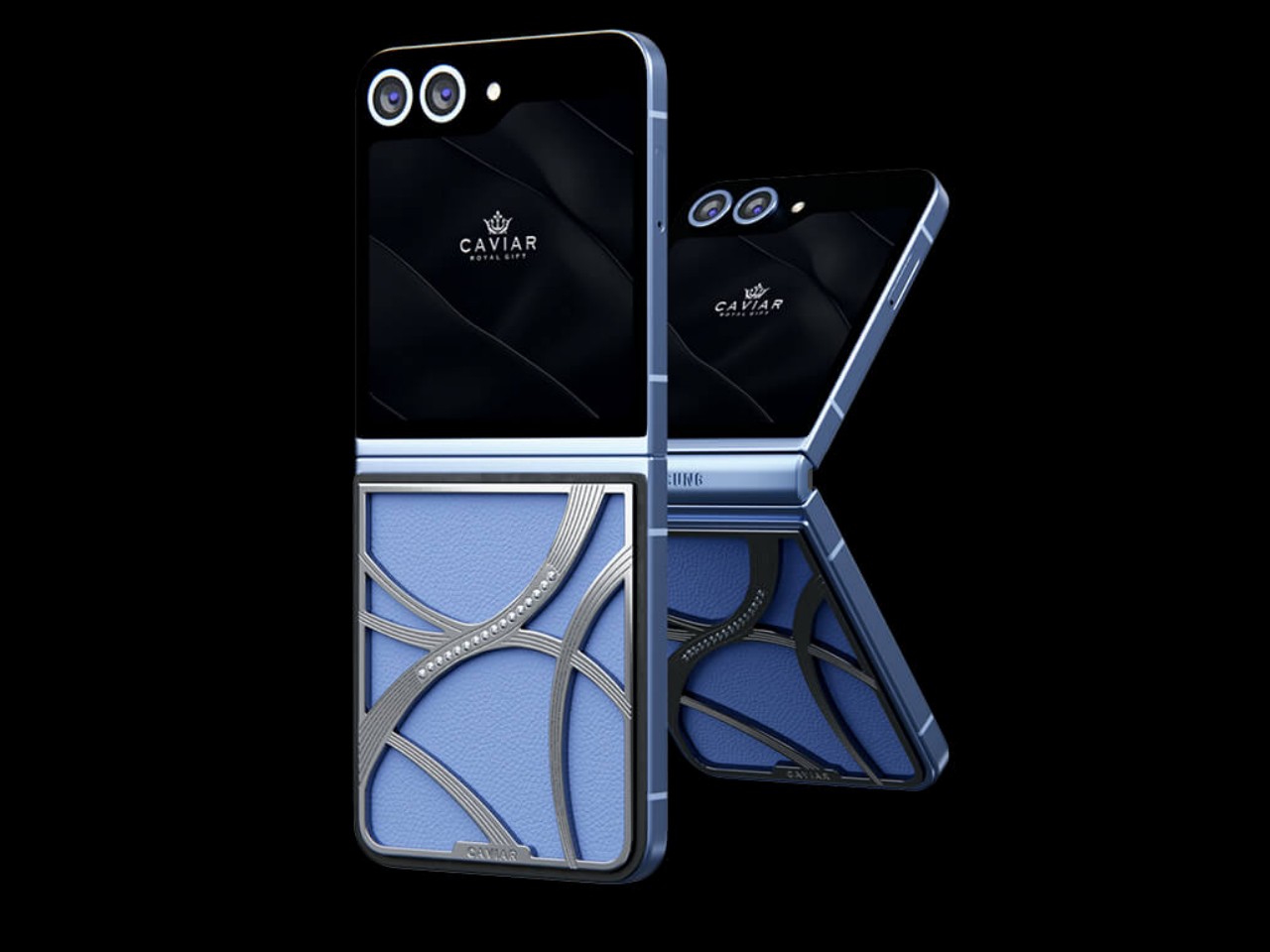
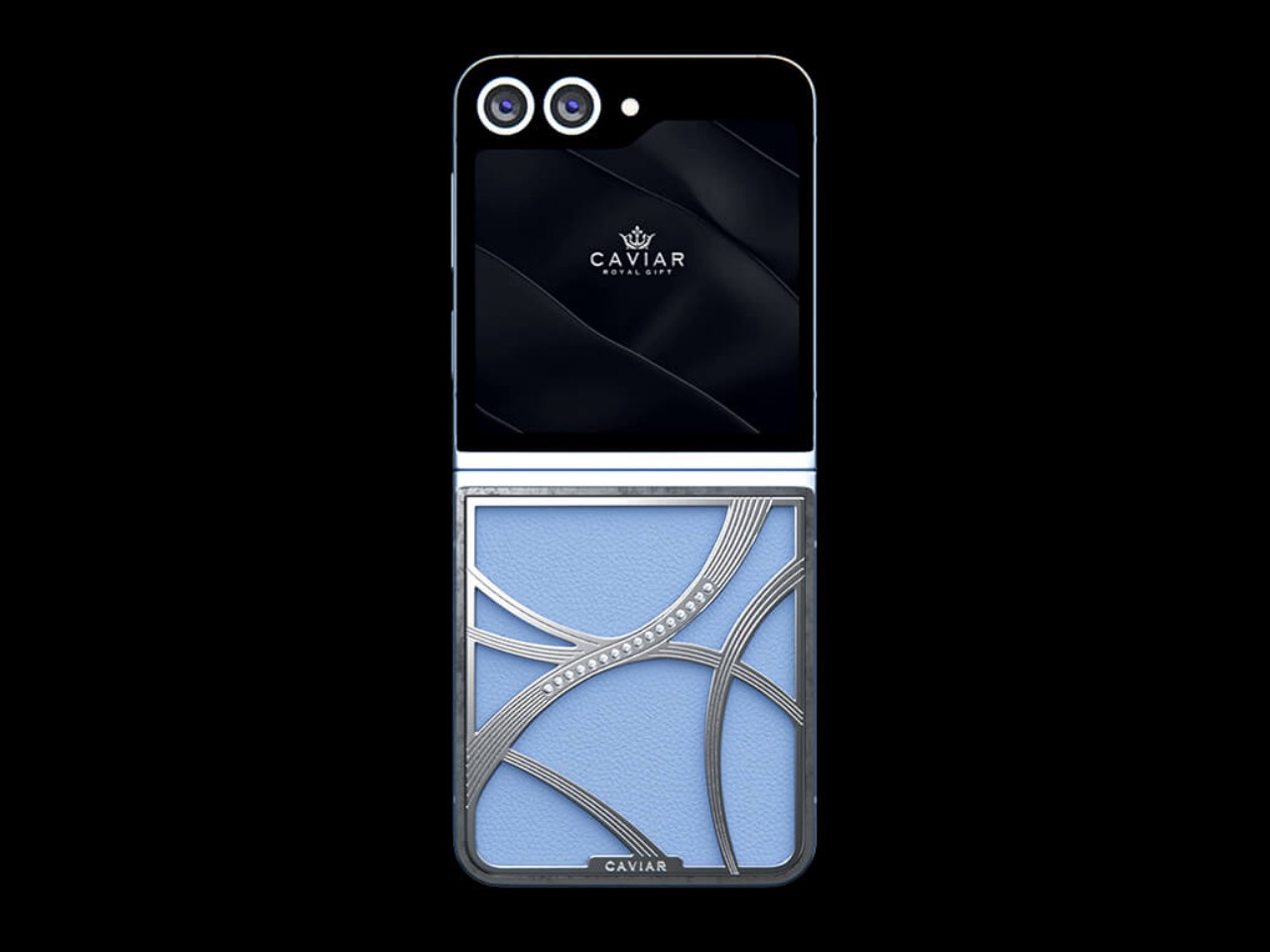
There’s a reason why many people find fashion to be inscrutable, and not just the haute couture variety you see on runways. Fashion trends come and go, and sometimes they take inspiration from the most unexpected sources. One of the newest, for example, was spurred by the combination of the 2024 Paris Olympics, the film “Challengers” starring Zandaya, and the ongoing US Open tournament. Yes, this is the so-called “tennis core” fashion trend, and custom luxury phone maker Caviar is only too happy to jump on that bandwagon with extremely limited editions of the Galaxy Z Flip 6 that’s designed to show off your sports affinity, fashion tastes, and, of course, your affluence.

Designer: Caviar

Tennis core is simple to grasp yet hard to execute. As it revolves around the aesthetics of clothes worn in tennis matches, it has to strike a balance between being sporty and being casual. For Caviar, however, the trend is easy enough to interpret and implement, focusing on the visuals and forms most easily associated with the sport: the tennis ball.

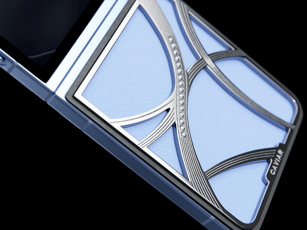
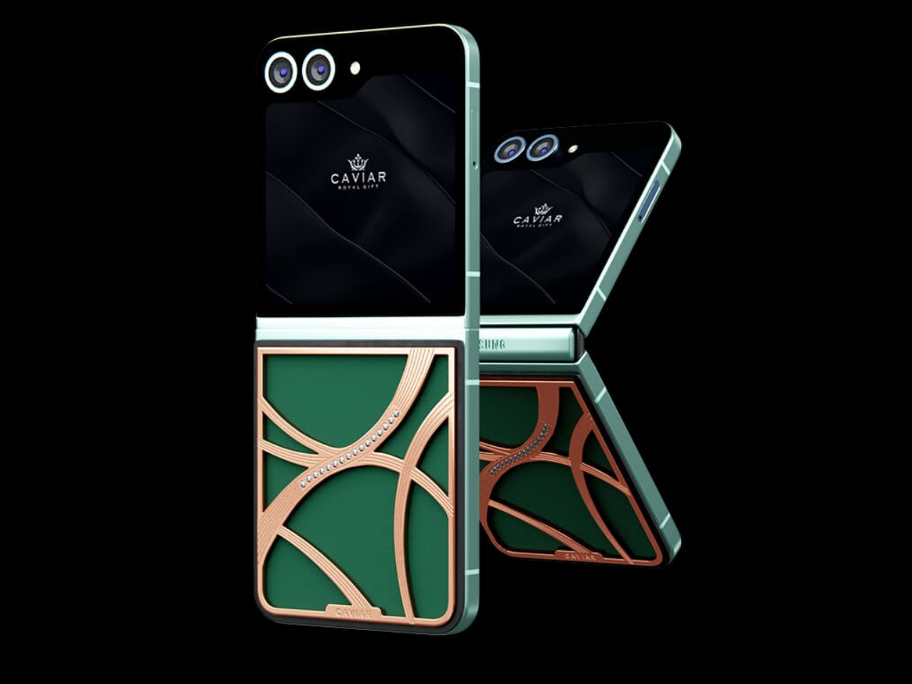
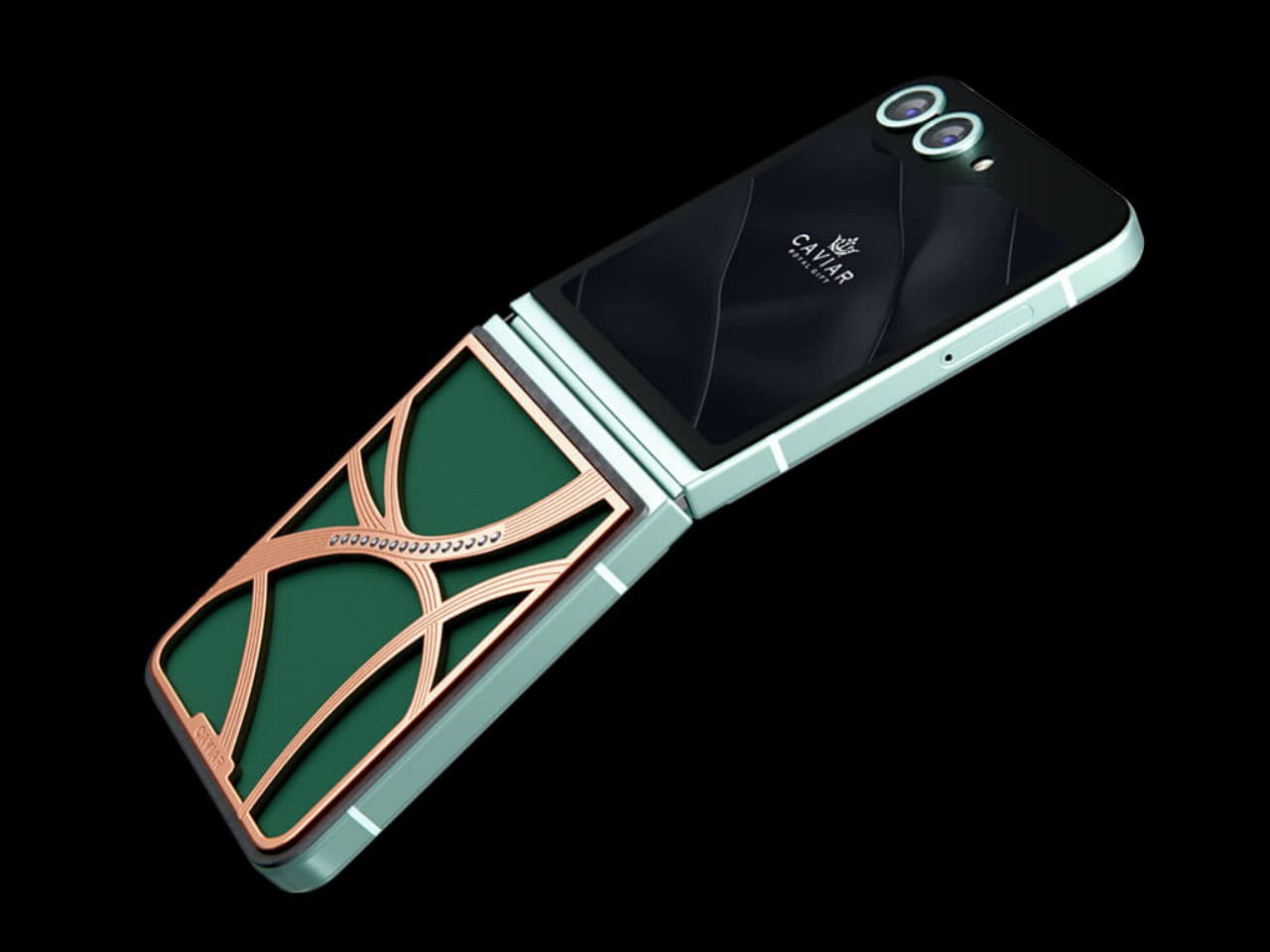
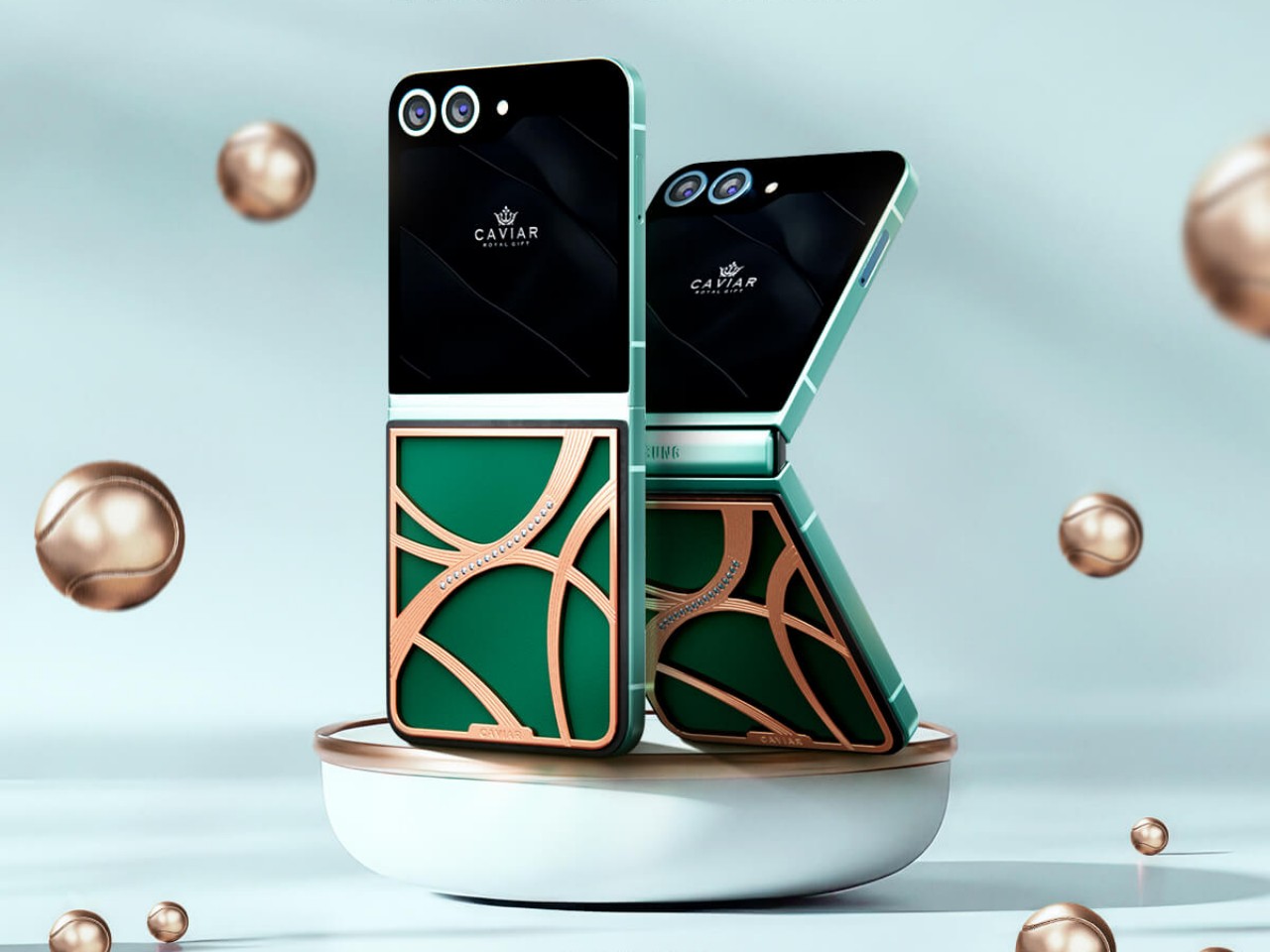
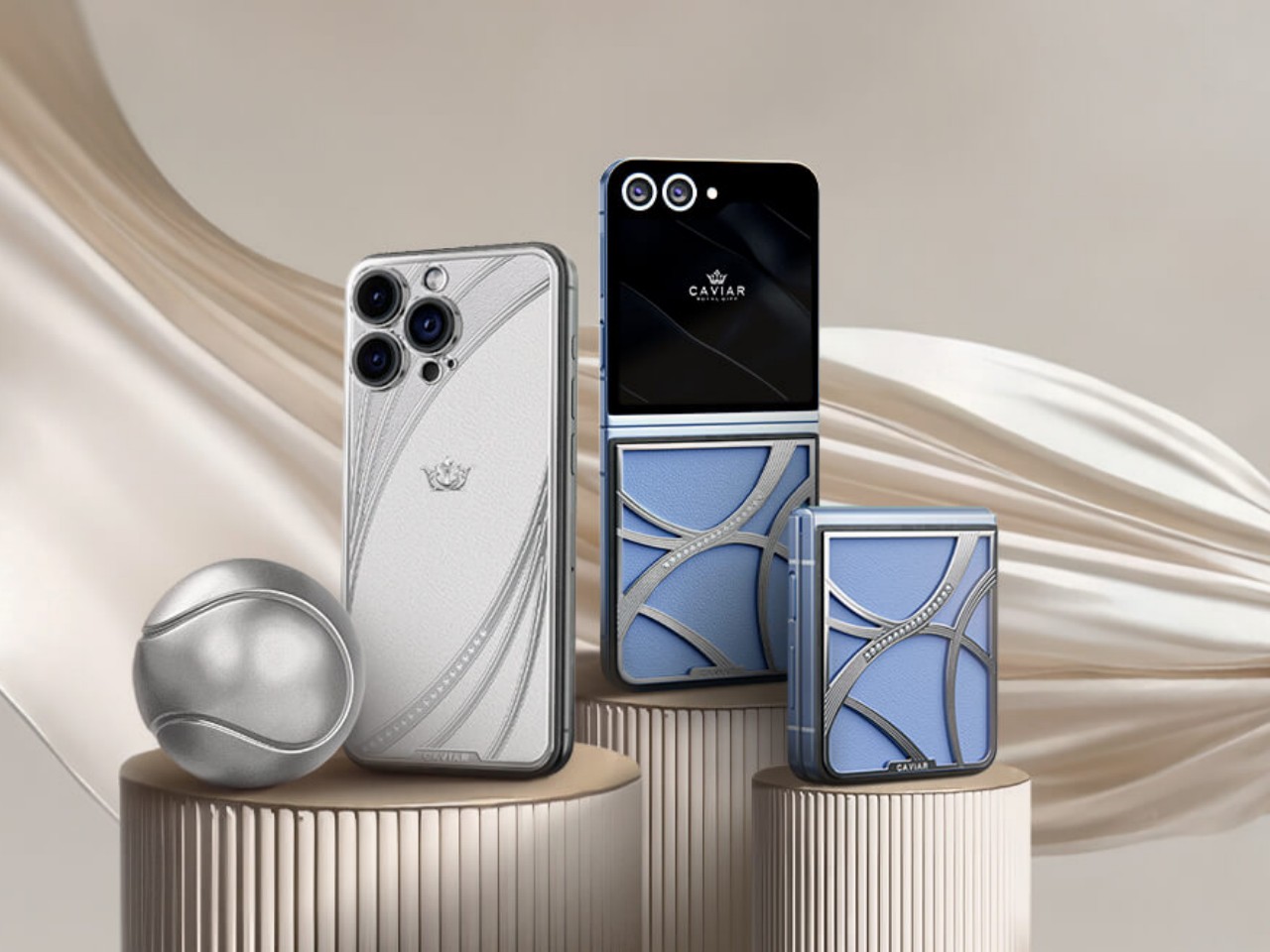
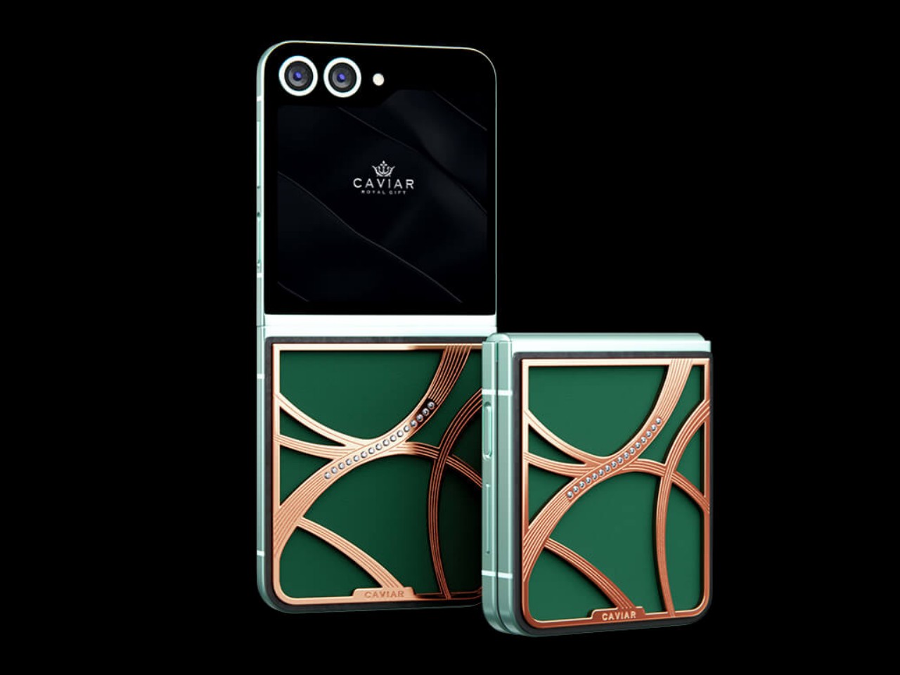
The Samsung Galaxy Z Flip 6 that’s part of this “Elegance” tennis core collection bears curved accents on its back that resemble the lines of a tennis ball, at least if you actually knew beforehand what the design is meant to represent. Depending on the color of the model, the accents can be covered in either pure 24-carat rose gold or 22-carat silver. Regardless of the color, however, both designs flaunt 16 22mm-diameter Swarovski crystals, because this wouldn’t be a Caviar phone if it didn’t have any.

The phones have colorways that are reminiscent of some of the popular colors for tennis courts. Emerald is probably the most familiar hue, with deep and rich greens that are not unlike the grassy type of some courts. Sapphire is perhaps a little less common but blue is used to give better contrast, especially considering a tennis ball is traditionally light green in color. Both models use premium Chevre leather, the very same kind used by luxury brand Hermes for its products.

It might not be as outlandish as Caviar’s other custom designs, but the Galaxy Z Flip 6 Elegance edition still fetches an extremely steep price starting at $8,777 for the 256GB Emerald model and $9,770 for the 256GB Sapphire variant. And in typical Caviar fashion, these phones will be made in a very limited run, only 99 pieces each, making sure that owning one earns you a spot not only among fashionistas but as a true tennis aficionado as well.

The post Caviar Galaxy Z Flip 6 Elegance Edition Rides on the Latest Tennis Fashion Trend first appeared on Yanko Design.

Nokia Infinity Pro concept phone brings a pill-shaped design and a few questions

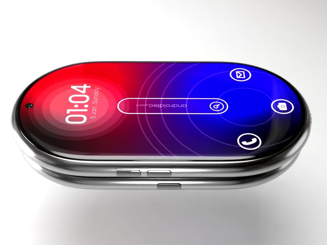
You might criticize Nokia for flooding the mobile market with dozens of hard-to-remember devices, but you can’t deny that the Finnish giant also brought bold new designs that were far too ahead of their time, from the gaming-centric N-Gage to the cinematic N93 to the fashion-conscious 7380 “lipstick.” In contrast, today’s smartphones mostly play it safe due to usability and sales concerns, but that’s not to say that an odd design won’t sell either. There’s definitely room for novelty and plenty of space for creative ideas. This curiously shaped phone, for example, changes the design formula significantly, and while it does look like a futuristic device, it also raises a few important usability questions.

Designer: AndroidLeo

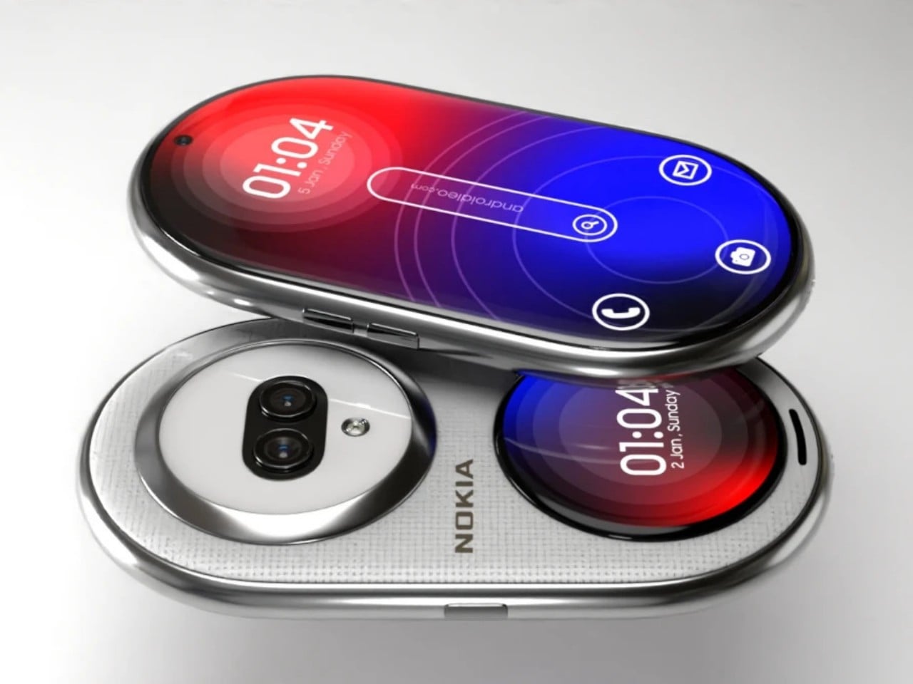
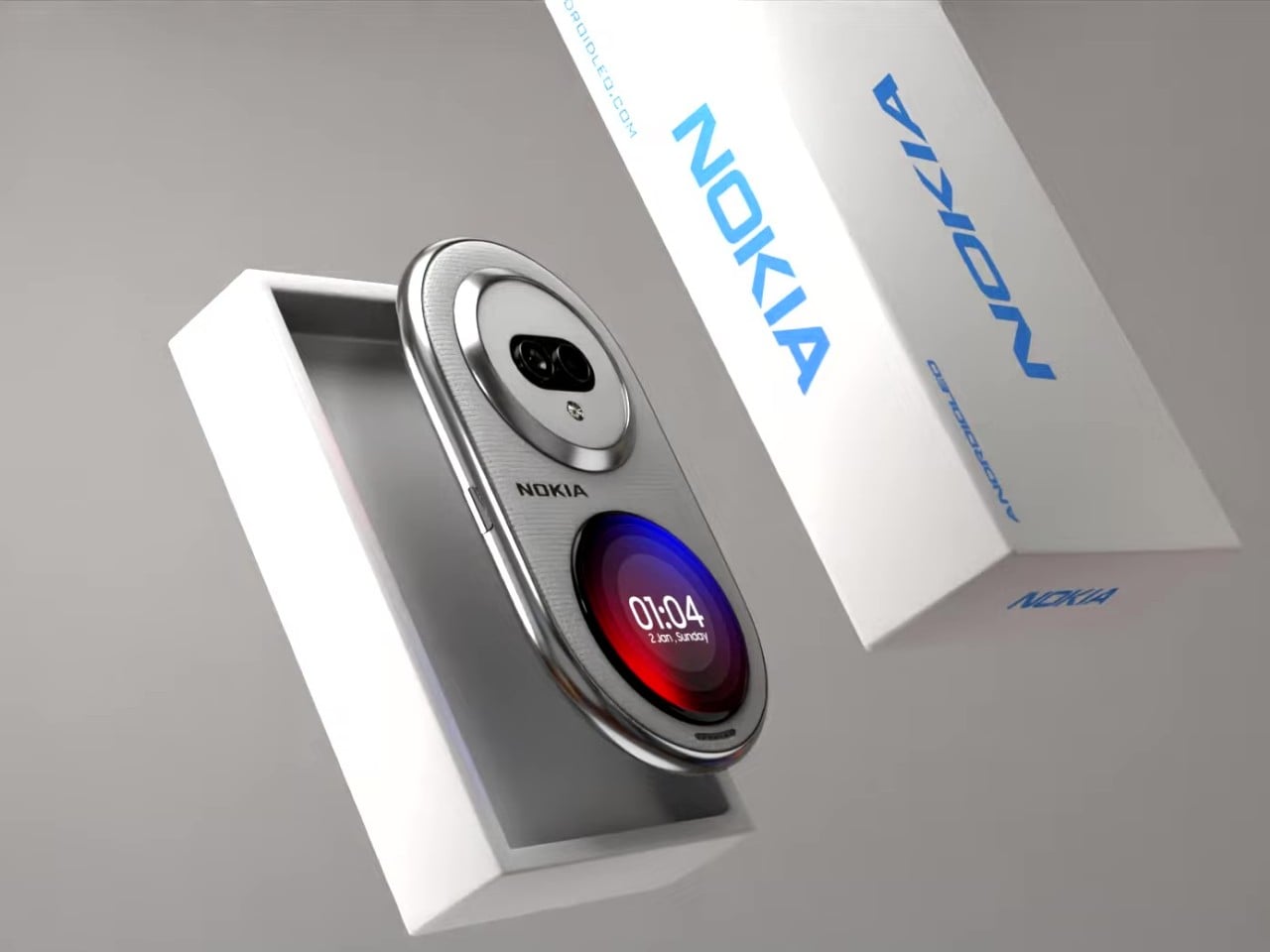
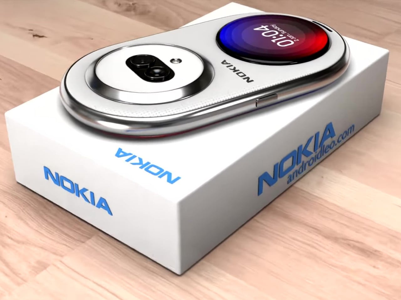
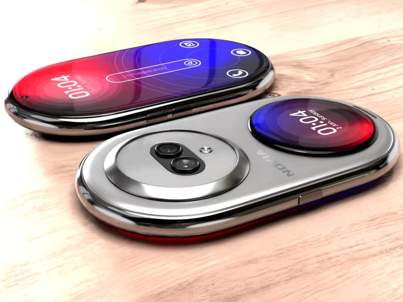
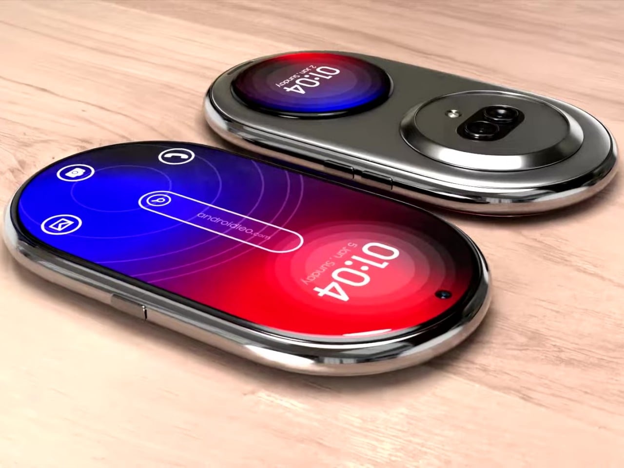
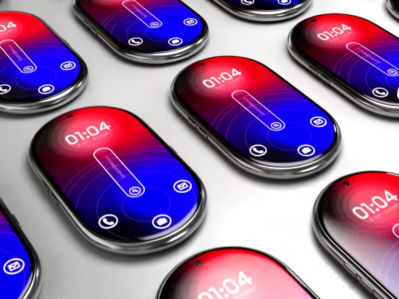
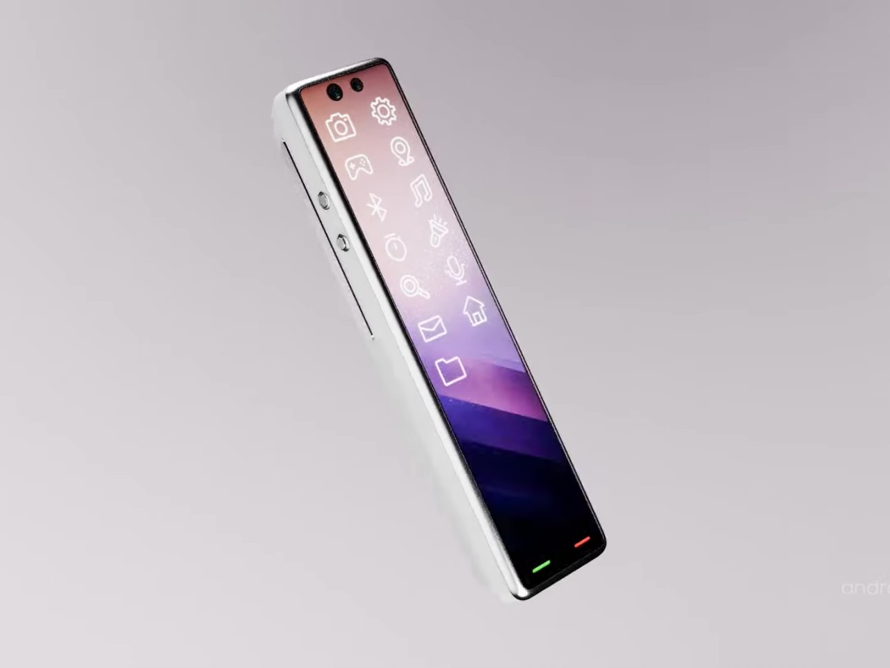
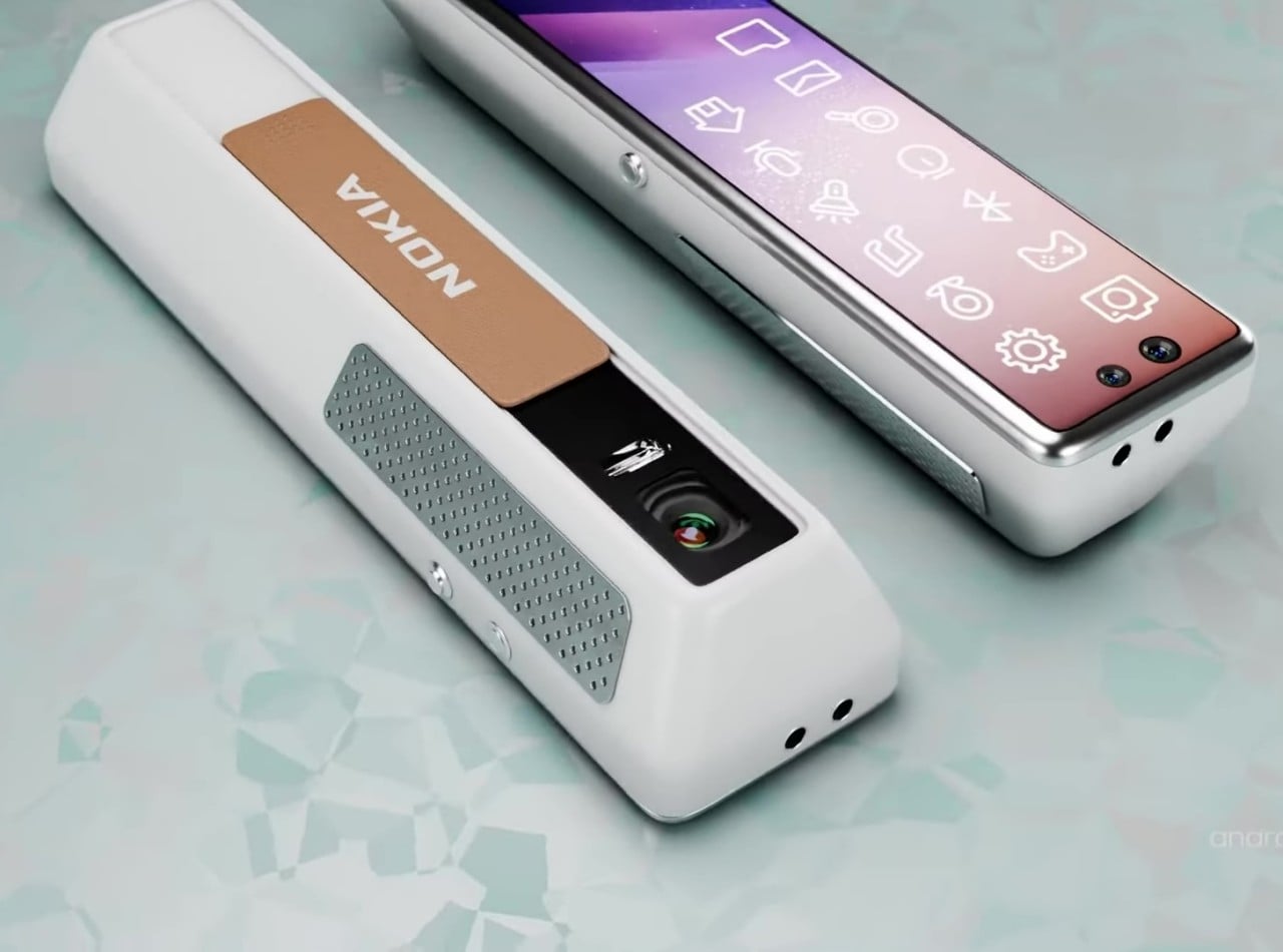
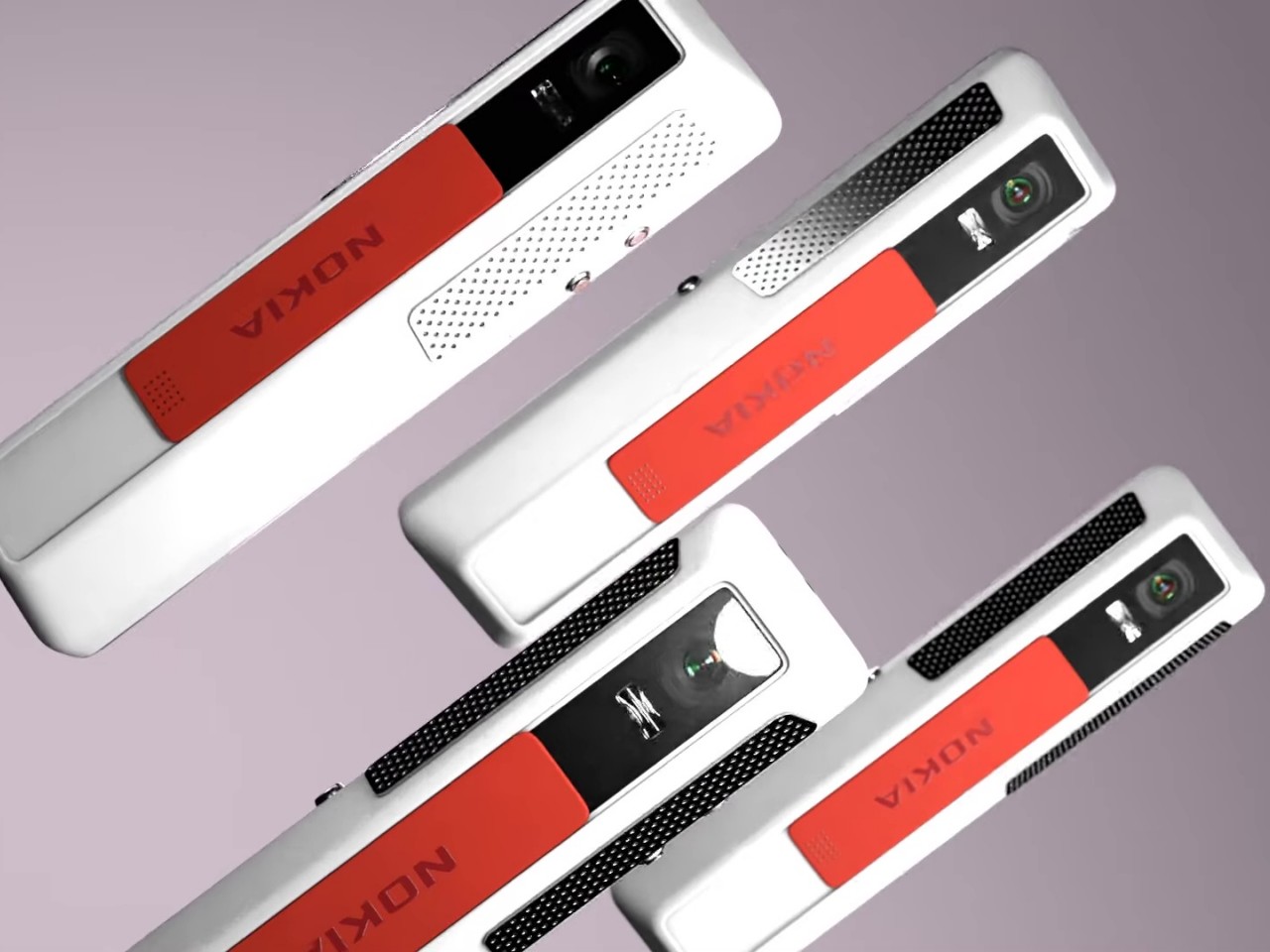
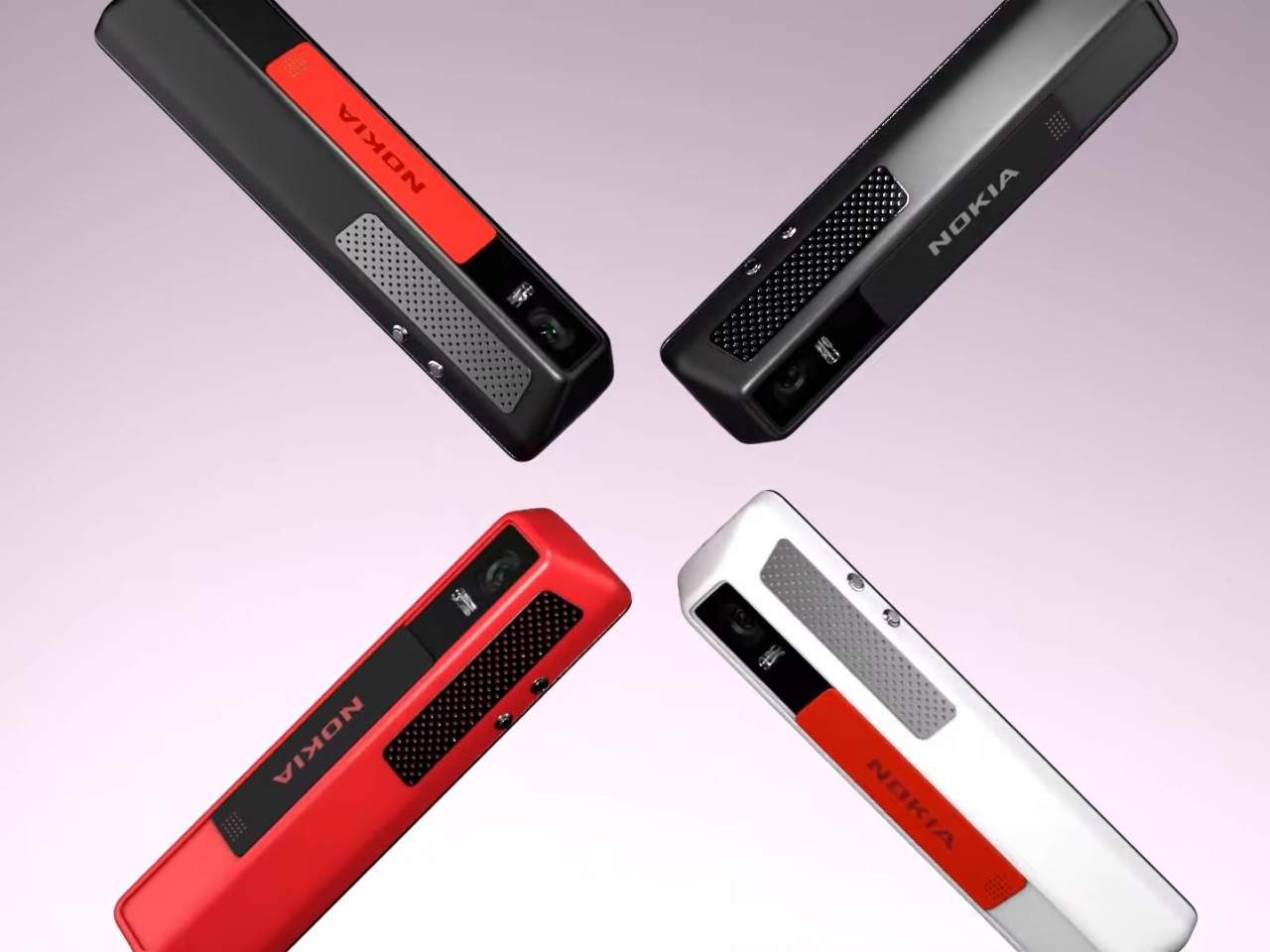
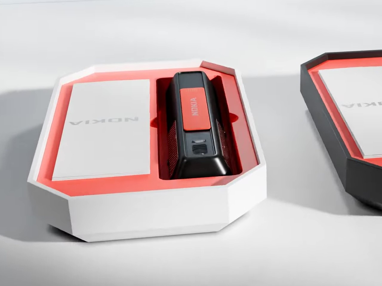
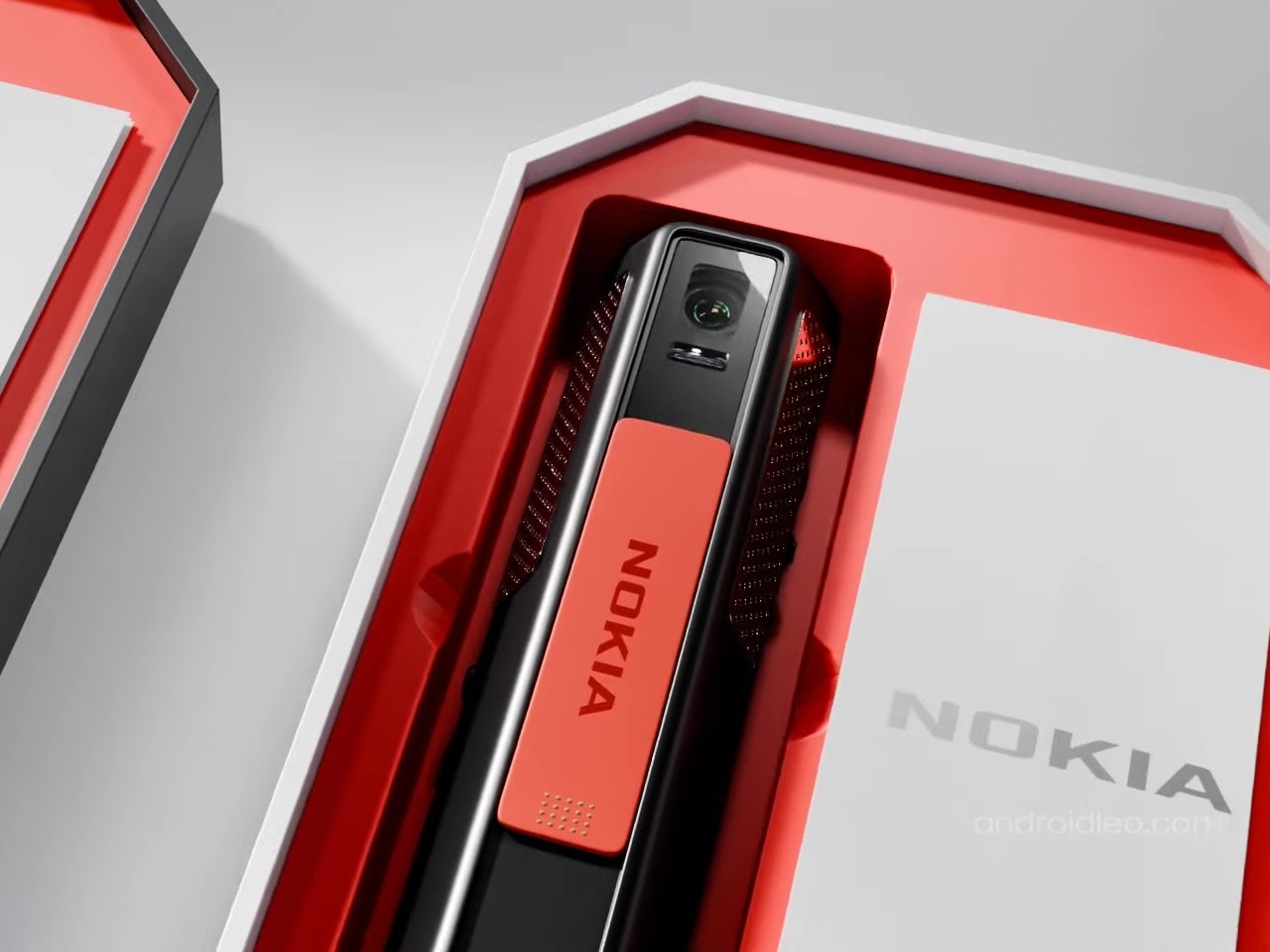
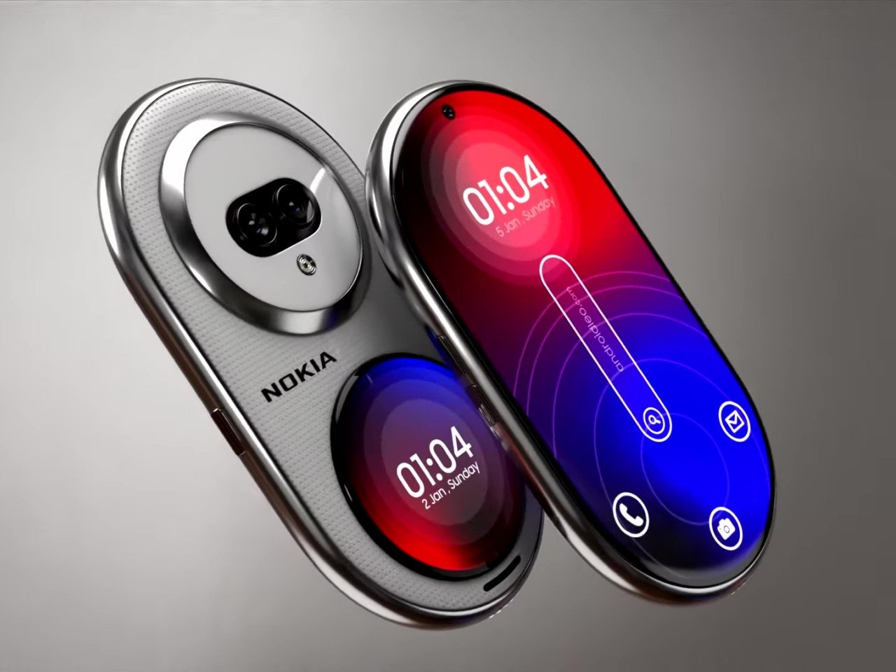
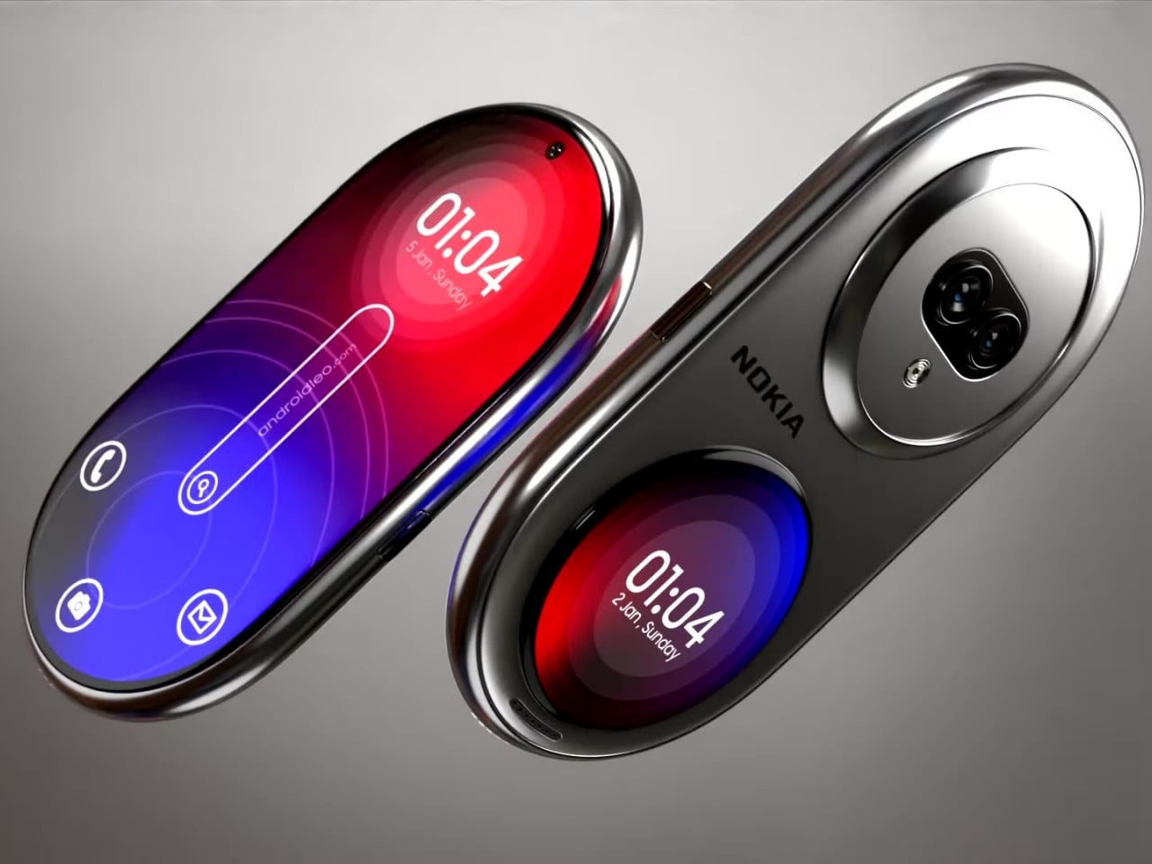
The “candy bar” form factor has emerged as the one true smartphone shape because of its handy and compact design. That doesn’t mean it isn’t the only possible form, though, especially when you consider that the top and bottom of these devices don’t need to be perfectly flat. It’s not like you’ll be standing it up or squeezing it alongside other flat and rectangular objects. This “Nokia Infinity Pro” concept challenges that status quo with a thin pill-shaped design that seems like a cross between a foldable clamshell and a smartwatch all rolled into one.

The more curvaceous shape of this concept phone supposedly rests more comfortably in your hand with no corners to cut into your skin. There might be some doubts about whether that would also make it too slippery to hold, but that’s not always a uniform experience. This Nokia Infinity Pro wouldn’t be the first to try out this design either, as the likes of the short-lived “open source” phones like the OpenMoko and Neo Freerunner sported similar shapes.

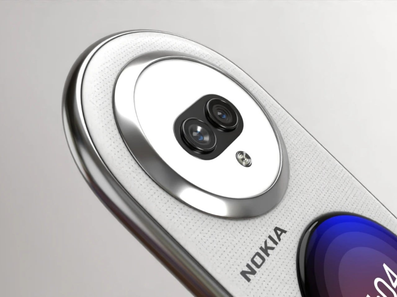
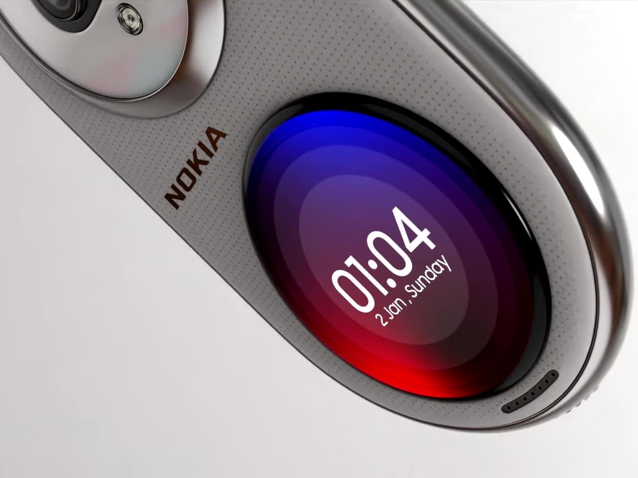
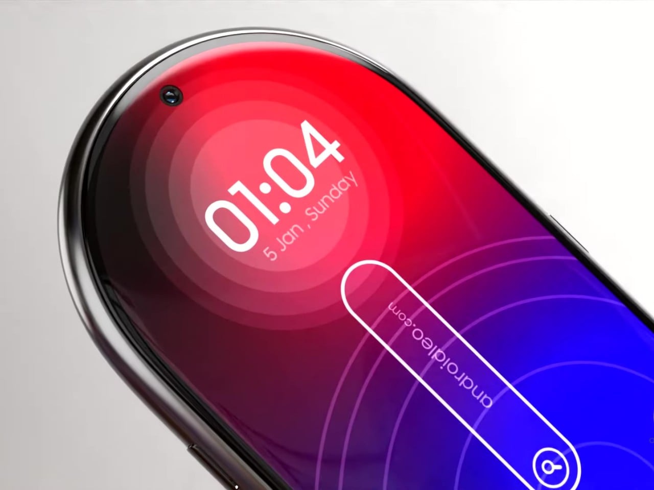
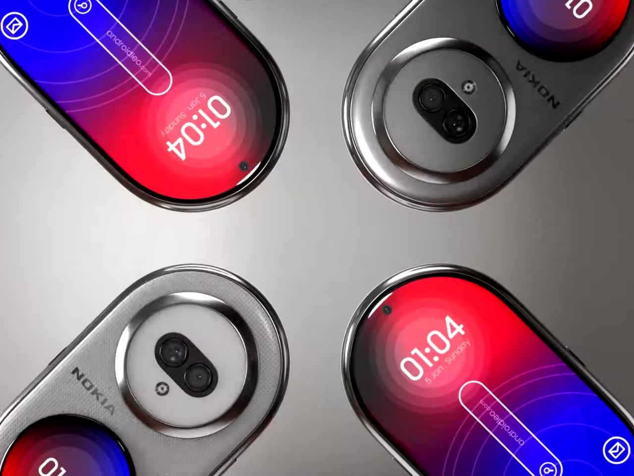
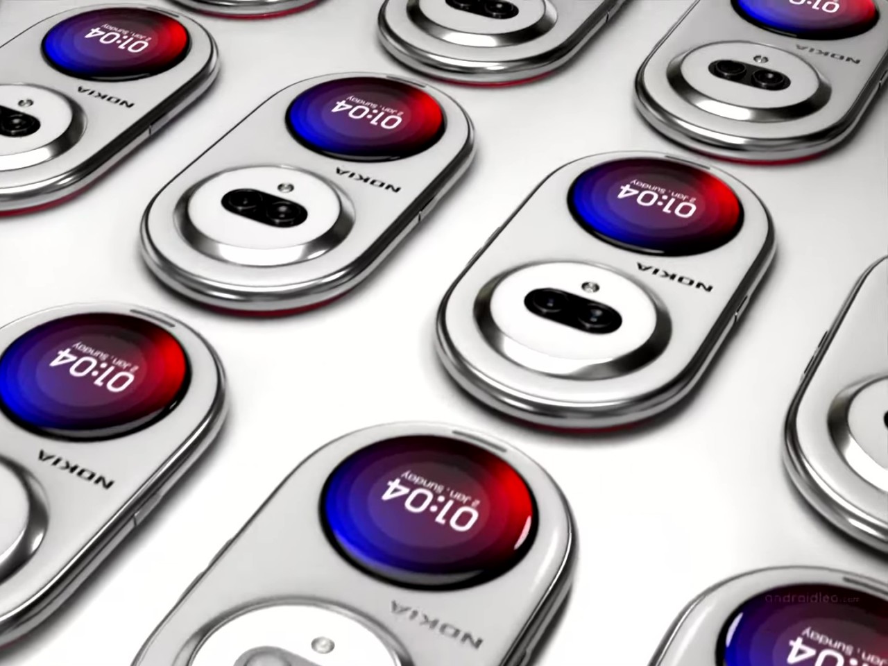
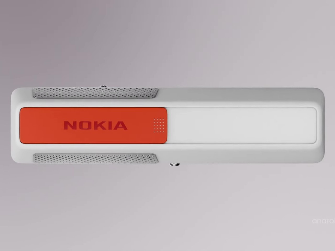
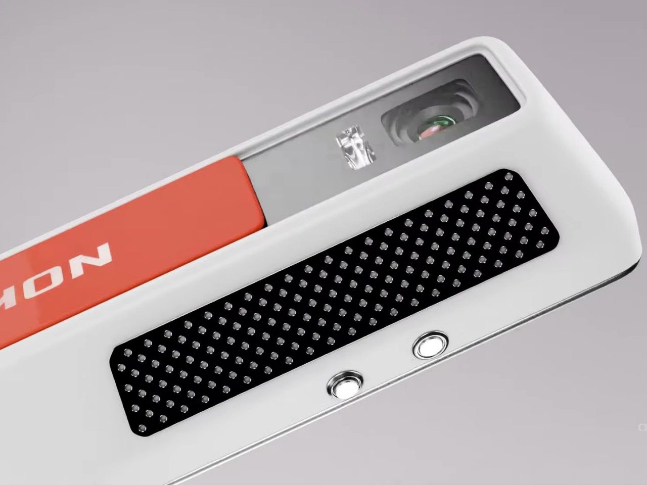
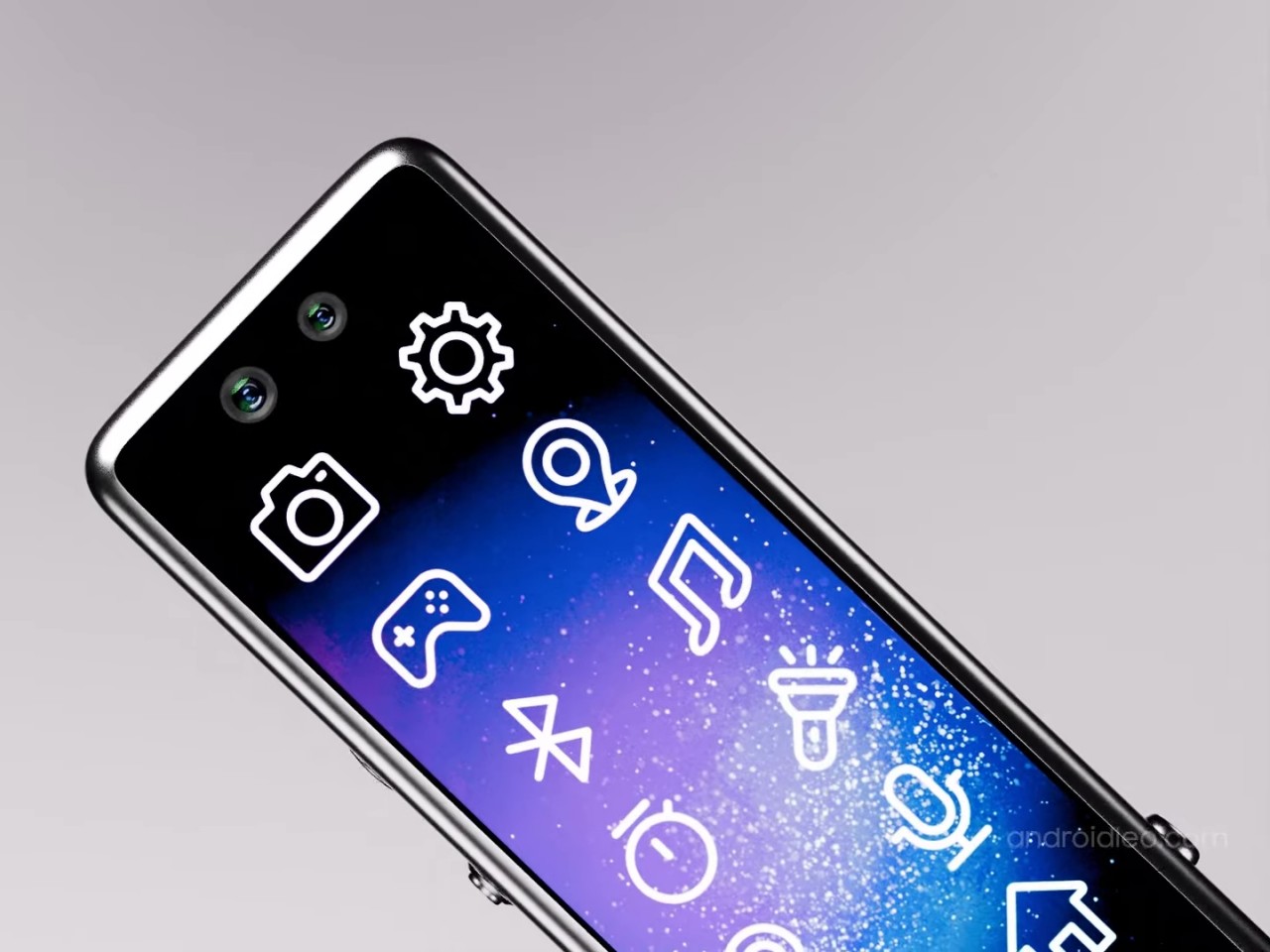
What makes this idea different, however, is that the screen covers the whole surface of the phone’s front, not just a rectangular section. Such a screen is now more possible to pull off, even if it’s still not that easy. The back of the phone also has two circular mounds opposite each other. One is a dual-camera system and another is a circular display not unlike those on smartwatches or some foldable phones’ “cover screen.” The idea is that you can place the phone face down on a table but still have access to important notifications and controls without distractions.

As interesting as it might look, however, there are some practical issues with such a design. For one, putting the phone face down always risks scratching the screen. At the same time, the circular outer screen will be covered by your palm and smudges whenever you have to hold up the phone. And then there’s the matter of what UI elements can be used at the top and bottom of the display since most platforms and content are created for rectangular screens. Maybe someday, we will have more adaptable software, and that will be the time for the Nokia Infinity Pro to truly shine.

The post Nokia Infinity Pro concept phone brings a pill-shaped design and a few questions first appeared on Yanko Design.

Xiaomi MIX Flip Review: Best Flip Phone for 2024?

PROS:


  • Large and highly functional outer screen

  • Great camera performance

  • Big battery and fast charge

    CONS:


    • No IP rating

    • No wireless charging capability

    • Device tends to get hot during extended camera use

    RATINGS:

    AESTHETICS
    ERGONOMICS
    PERFORMANCE
    SUSTAINABILITY / REPAIRABILITY
    VALUE FOR MONEY

    EDITOR'S QUOTE:

    The Xiaomi Mix Flip is a well-round flip phone that combines sleek design, premium build, top-notch performance, and great mobile imaging capabilities.

    The smartphone market, once dominated by monolithic slabs of glass, is undergoing a captivating transformation. Foldable devices, both bookstyle foldable and clamshell flip phones, have emerged as a compelling alternative. Samsung has been at the forefront of this transformation with its Galaxy Z Flip series. Motorola has also left a significant mark with its Razr series, boasting a large and practical outer screen that enhances usability. Now, Xiaomi has made a bold entrance into the foldable arena with its first foldable, the Xiaomi MIX Flip.

    Designer: Xiaomi

    At a highly anticipated annual speech event in Beijing last month, Xiaomi CEO Lei Jun unveiled the MIX Flip along with its 4th generation of foldable phones, emphasizing the strategic timing behind the company’s foray into the flip phone market. Reflecting on past perceptions, Lei acknowledged a previous skepticism toward flip phones, once dismissing them as merely “pretty for nothing.” In those earlier iterations, compactness often came at the cost of performance and functionality. However, Xiaomi now believes it has cracked the code, poised to deliver a flip phone that is “pretty for everything”. Let’s delve into the details to see if the MIX Flip truly lives up to the hype.

    Aesthetics

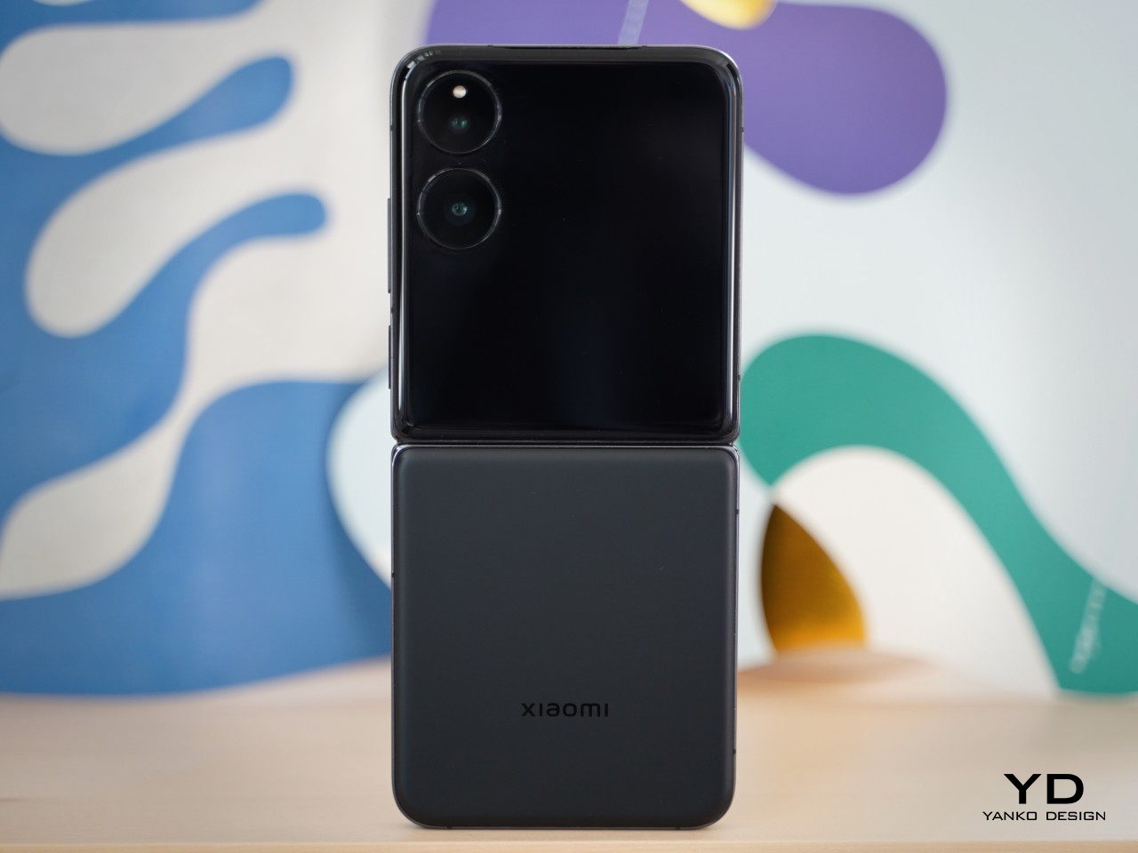
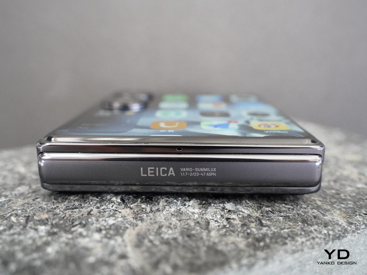
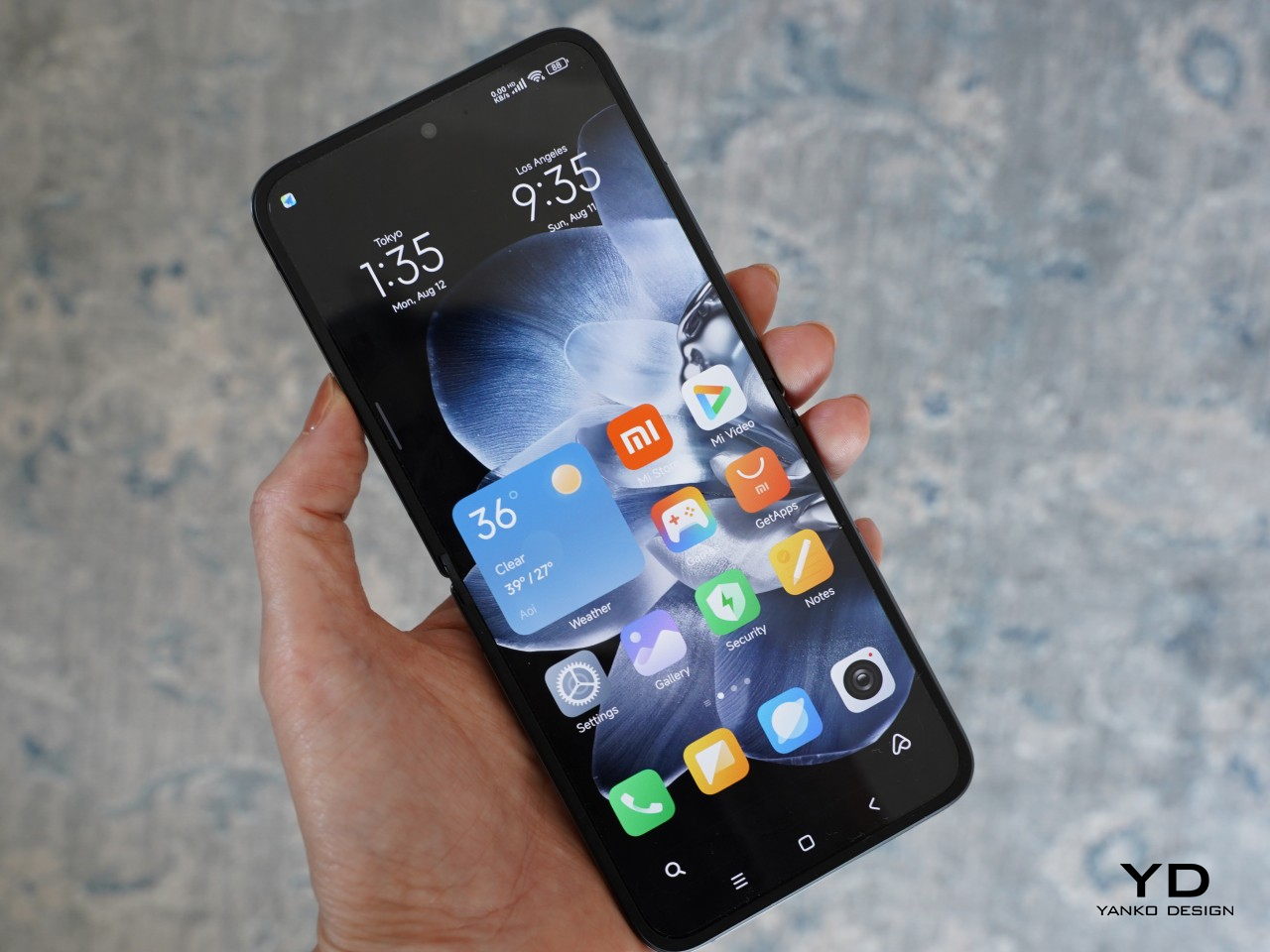
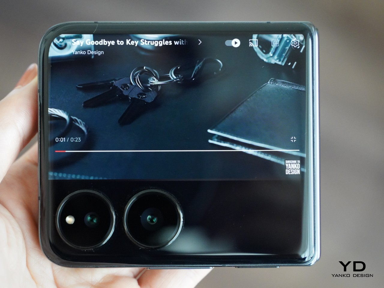
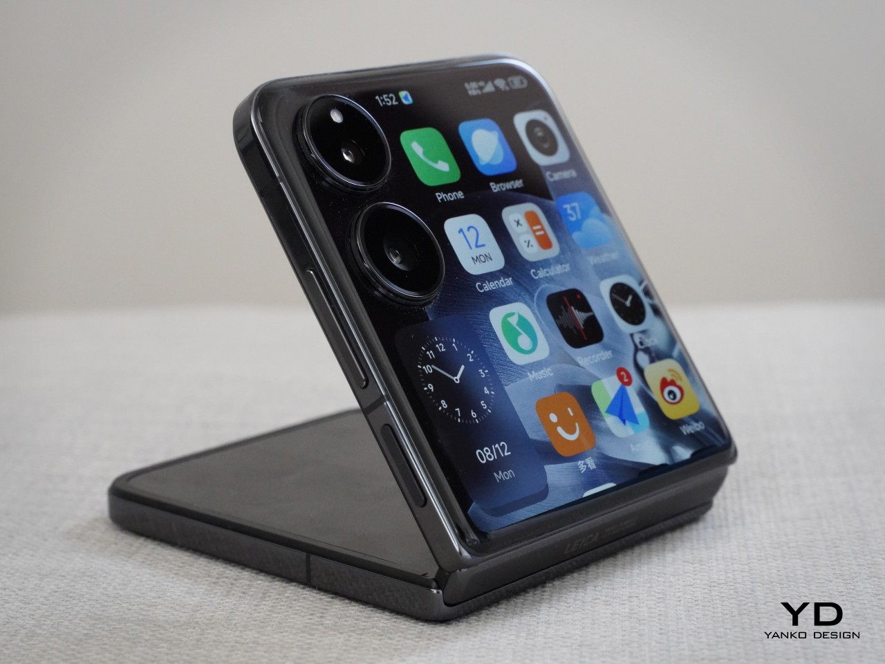
    The stunning 4.01-inch outer screen commands immediate attention, and rightfully so. It houses two individual rear cameras positioned vertically nestled at the top left corner with minimal protrusion. The shiny outer screen and the matt glass back panel create an interesting contrast, while discreet black Xiaomi logo seamlessly blends into the back panel. Upon closing the device, reveals Leica logo and text on its matte hinge.

    The Xiaomi MIX Flip comes in four variants: White, Black, Purple, and Xiaomi nylon fiber edition. The White, Black, and Purple variants share the same matte finish. In contrast, the Xiaomi Nylon Fiber edition features a distinctive woven nylon back panel, adding a unique texture to the device’s aesthetic. Overall, the MIX Flip offers a minimal and clean design.

    Ergonomics

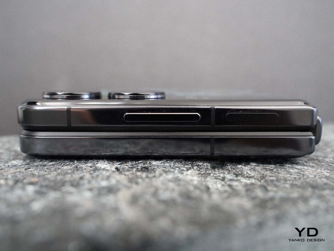
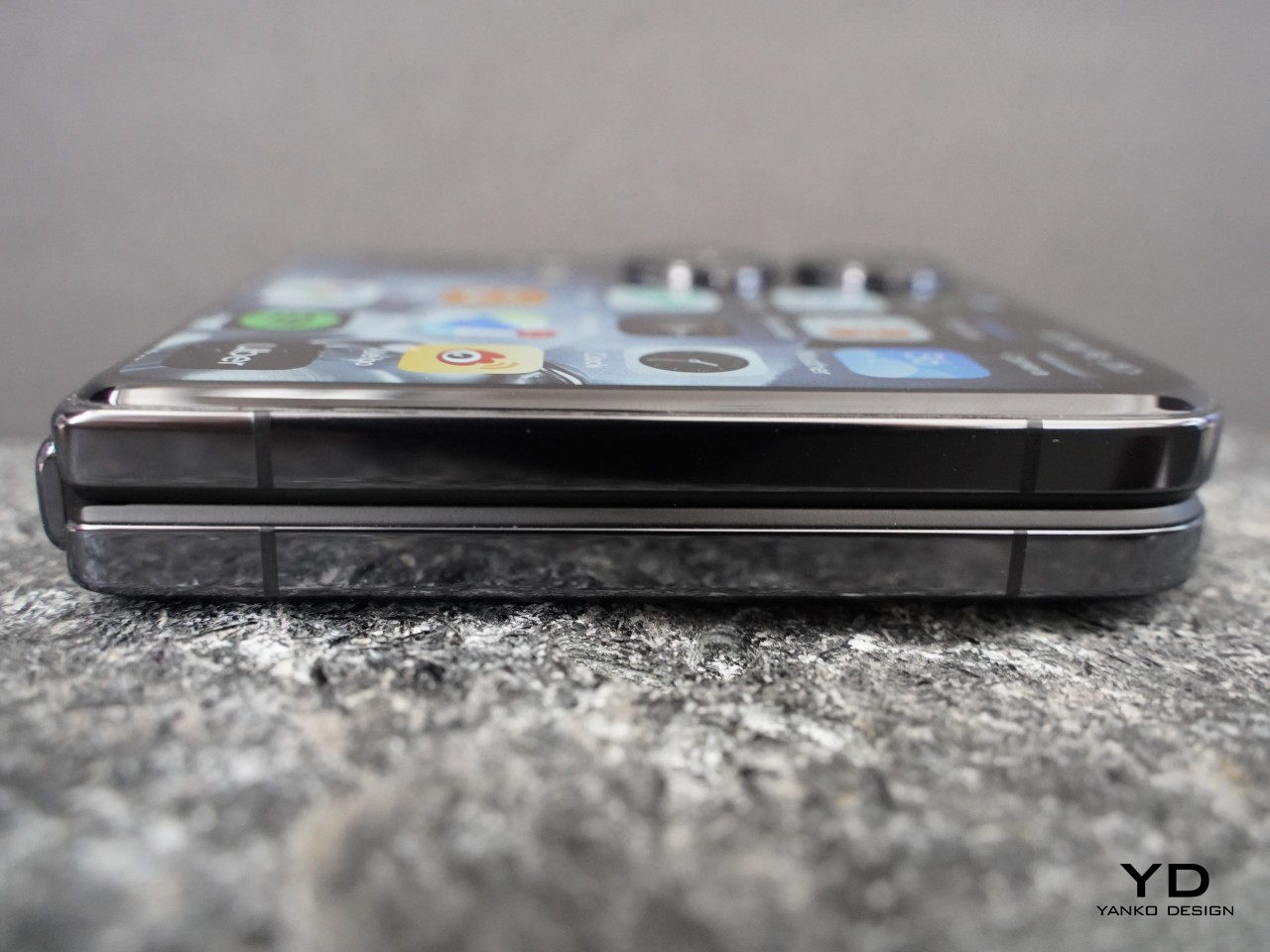
    The Xiaomi Mix Flip boasts a sleek and highly portable form factor. Unfolded, it measures 167.5 x 74.02 x 7.8 mm, with a folded thickness of 15.99 mm, and weighs 192 g. While it’s not the slimmest or lightest flip phone available on the market, its compact size makes it easy to hold and slip into your pocket.

    It feels premium in your hand, featuring an “All-around Liquid Quad-Curved Display” for a smooth feel. The robust hinge allows the phone to be positioned at various angles ranging from approximately 45 to 120 degrees, fulfilling its advertised flexibility. Opening and closing the phone feels smooth and satisfying.

    The fingerprint scanner on the right side of the device works great, and the matte back panel resists fingerprints and smudges, ensuring a clean appearance. The glossy aluminum alloy frame tends to attract fingerprints, though this is a minor inconvenience.

    Performance

    The outer screen of the MIX Flip not only captivates with its stunning visuals but also offers exceptional functionality. Sporting a 4.01-inch screen, it boasts a resolution of 1,392 x 1,208 pixels (1.5K resolution), HDR support, and a pixel density of 460ppi. It achieves a peak brightness of 3,000 nits and maintains an overall brightness of 1,600 nits, ensuring clarity even in bright conditions.

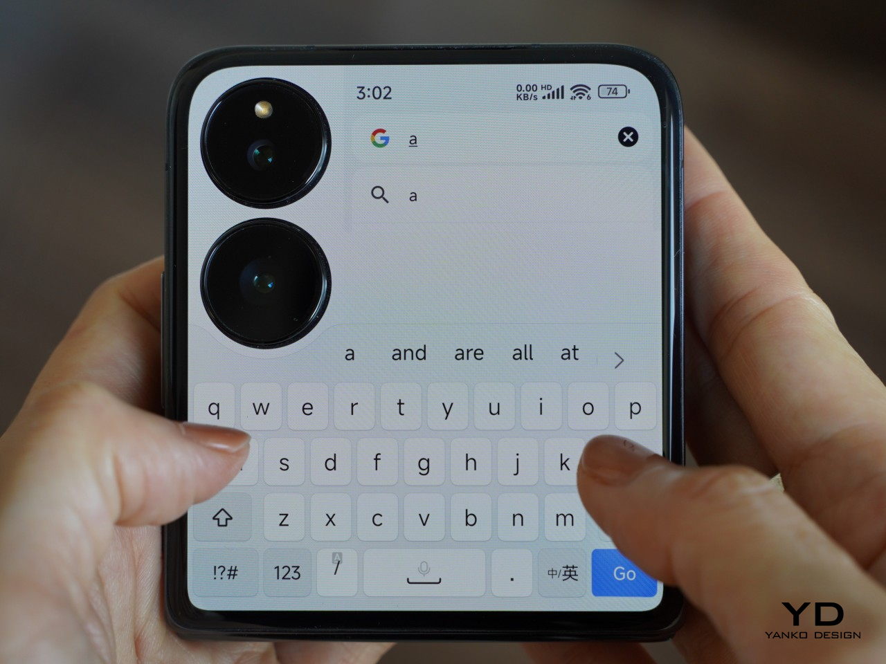
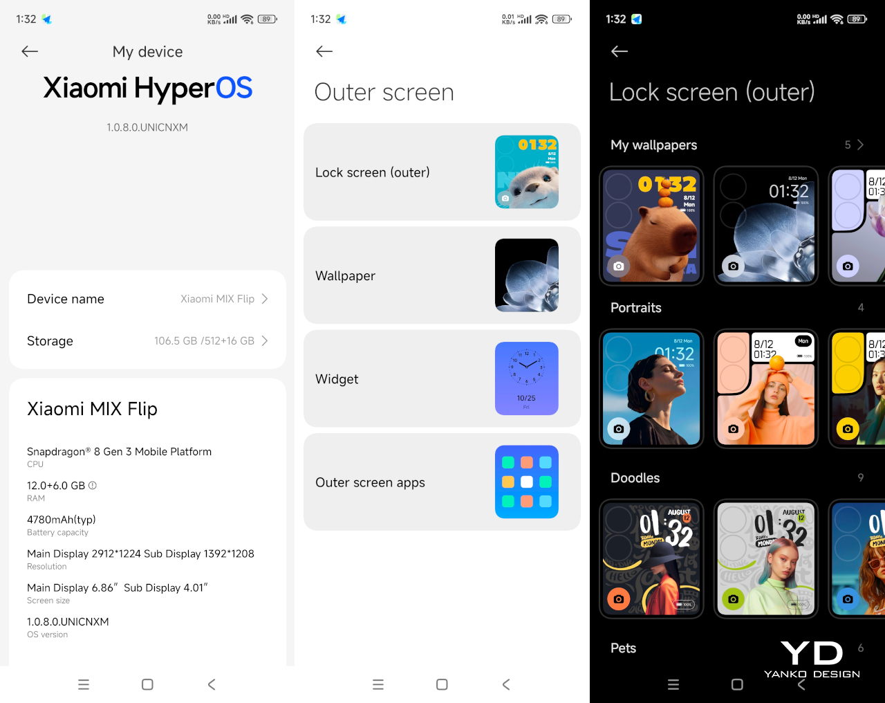
    The MIX Flip harnesses the full potential of its impressive outer screen. The large area of the outer screen (3.5-inch to be exact), with a 16:9 aspect ratio, accommodates various apps. Xiaomi enhances usability further by integrating widgets on the left side of the 4.01-inch display, positioned above the camera module. You can customize this area with up to 5 widgets such as Weather, Clock, Calendar, Health, Music Player, and Recent Apps, and you can cycle through widgets by swiping up and down.

    Out of the box, the outer screen comes pre-loaded with essential apps like Phone, Browser, Camera, Calendar, Calculator, Weather, Music, Recorder, Clock, alongside a couple of other Chinese apps. According to Xiaomi, over 200 of the most popular Chinese apps are optimized for the outer screen. Since the review unit is the Chinese version, it’s expected that not all apps I downloaded are available on the outer screen. For instance, apps such as Slack, Netflix, Google Calendar, and Kindle are not currently supported on the outer screen. Other popular apps like YouTube, Instagram, X, WhatsApp, Google Chrome, Google Maps, Uber, and Spotify can run on the outer screen. Users can enjoy watching YouTube clips horizontally, leveraging the display’s capabilities fully.

    The outer screen is swift and responsive, with notable interactivity. It supports a full keyboard that extends from edge to edge when the phone is oriented with the camera module in the upper left corner, enhancing typing comfort. Additionally, the screen supports handwriting input. While this feature is currently limited to Chinese characters, it adds a useful dimension to the typing experience. You can access quick settings and notifications on the outer screen, though they are not customizable.

    On the other hand, the inner display measures 6.86 inches with a 2,912 x 1,224 resolution and 1-120Hz LTPO, featuring 460 ppi and a peak brightness of 3,000 nits, mirroring the outer screen’s brightness and vibrancy, with the crease being barely noticeable. It’s less exciting compared to the outer screen, but it gets the job done with minimum fuss.

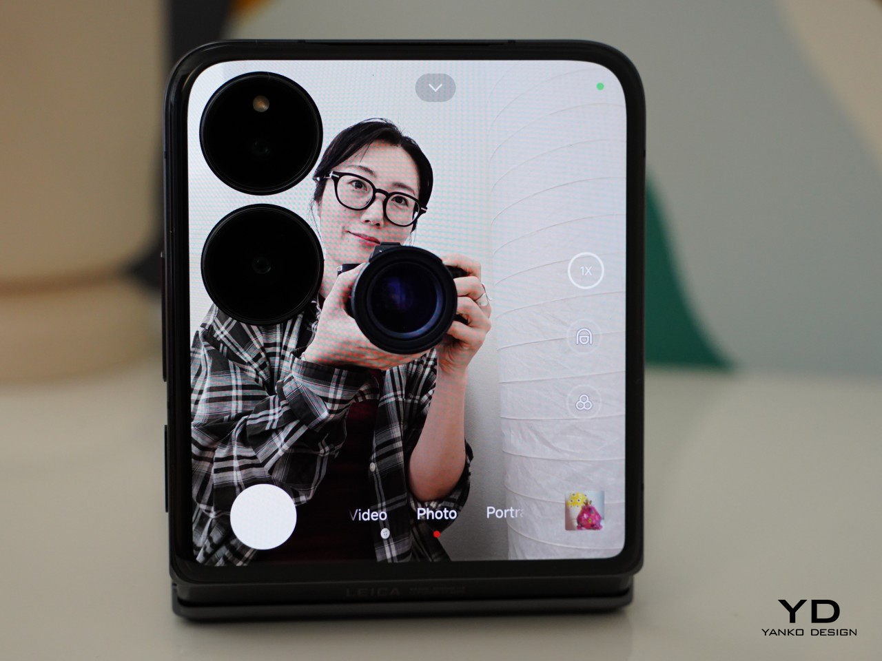
    Xiaomi’s ongoing collaboration with Leica continues on to its flip phone. MIX Flip features a 50MP Leica main camera with a 1/1.55” sensor, an f/1.7 aperture, and OIS. The other camera on its back is a 50MP Leica floating telephoto camera with a 1/.88” sensor, and an f/2.0 aperture. It supports macro photography where you can get up close to the subject with a minimal distance of 9cm (or about 3.5 inches). You can choose between the “Leica Vibrant” and “Leica Authentic” modes in the camera app to tailor the look to your liking.

    The main camera consistently delivers impressive results across a variety of shooting conditions. Images exhibit excellent sharpness, detail, and accurate color reproduction. The camera generally handles dynamic range well. However, some highlight details are blown out without HDR enabled. Activating HDR significantly improves dynamic range, preserving details in both shadows and highlights.

    The telephoto camera performs well in daylight or at closer tele zoom levels in low-light conditions, with nice preservation of details. The portrait mode offers a range of focal lengths (23mm, 35mm, 50mm, and 75mm). The skin tone is accurate and subject isolation is great with creamy bokeh. There is a 32MP front-facing camera with a 1/3.14” sensor and an f/2.0 aperture, but taking advantage of the outer screen, you are less likely to open up the front-facing camera for any selfies.

    The Xiaomi MIX Flip shines in capturing daylight videos. All three cameras (main, telephoto, and selfie) can record up to 4K resolution at 60 fps with ESI, with the main camera pushing the limits further at 8K 24 fps. Video footage is smooth, well-exposed, and has good detail. While the Mix Flip’s image stabilization performs admirably in low-light conditions, the dynamic range can be somewhat limited.

    One advantage of the flip phone is the ability to preview and capture photos and videos on the outer screen. It supports up to 2x zoom for taking photos and videos from the outer screen, though portrait mode is limited to 1x zoom. If you switch back to taking photos from the inner screen, it automatically switches to the front-facing camera, which I find a bit annoying.

    Under the hood, the MIX Flip is powered by the latest Snapdragon 8 Gen 3 paired with 12GB or 16GB of LPDDRX RAM and storage of options of 256GB, 512GB, or 1TB of UFS 4.0, with virtually expandable RAM. For reference, our review unit was 12GB RAM/512GB storage. It runs HyperOS based on Android 14. Both benchmark results and real-world use performance are great, handling any task with ease. The Xiaomi MIX Flip is equipped with a 3500mm² VC area, but the device tends to get hot during extended photo and video use.

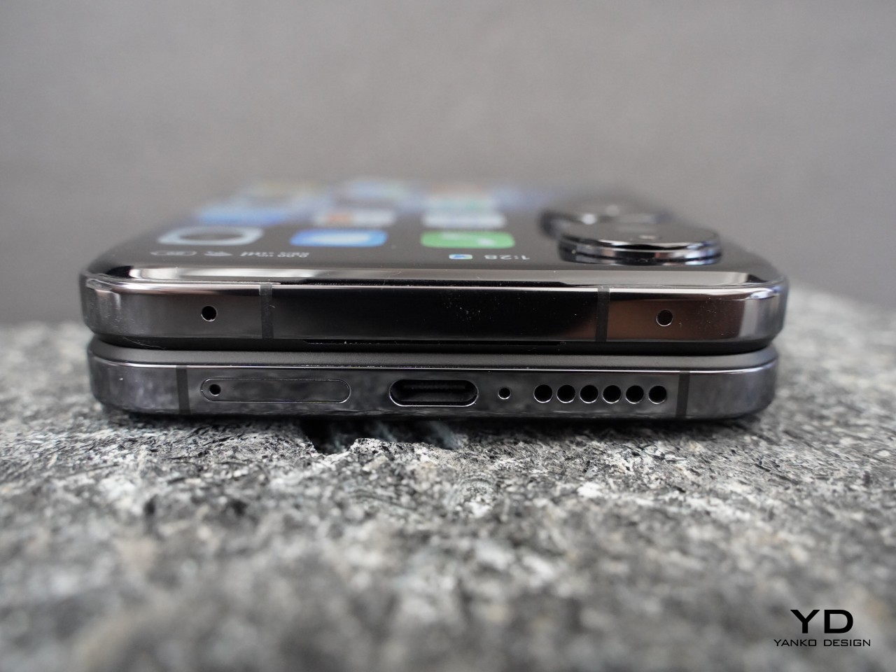
    Compact form factors often compromise on battery size, but Xiaomi has impressively fit a 4,780mAh battery into the MIX Flip. It supports 68W wired charging, although it does not include wireless charging capabilities. Addressing another common issue with flip phones, the MIX Flip allows you to make and receive calls without opening the device. Additionally, it supports WiFi 7 for enhanced connectivity.

    Sustainability

    While flip phones offer certain advantages, durability is a key area where they can face challenges. The device incorporates Xiaomi’s Shield Glass on the outer screen, promising ten times greater drop resistance than conventional glass. Moreover, the phone has undergone rigorous testing, enduring 500,000 folds without compromising its structural integrity. The battery is another highlight, maintaining at least 80% capacity after 16,000 charging cycles. While the absence of an IP rating might be a concern for some, these features collectively contribute to a device that’s built to last.

    Value

    As the competition in the foldable market heats up, Xiaomi’s entry promises to shake things up, driving further innovation and consumer choice in the smartphone landscape. Priced competitively at 5,999 yuan (approximately $825 USD) for the base 12GB RAM and 256GB storage model, the Mix Flip undercuts the Samsung Galaxy Z Flip 6 by a significant margin. The 12GB RAM and 512GB variant is also more affordable than the Motorola Razr 50 Ultra.

    While Xiaomi Bulgaria Country Manager, Nikolay Nankov, revealed that Mix Flip would be available in Bulgaria for 2,600 Bulgarian lev (about $1,450 USD), notably higher than its price in China, the company has yet to officially confirm global availability. Nevertheless, the device’s competitive pricing (at least for the Chinese domestic market), overall performance, and potential for wider release could disrupt the market and intensify competition in the flip phone segment.

    Verdict

    Xiaomi Mix Flip is a well-rounded flip phone that combines sleek design, premium build, top-notch performance, and great mobile imaging capabilities. It features a large, functional outer screen (though its full potential is yet to be tested due to the review unit being China version), the latest Snapdragon 8 Gen 3 processor, and two 50 MP Leica cameras, with competitive pricing (at least in China). While global availability details remain pending, Mix Flip stands as a serious contender, poised to shake things up and accelerate innovation in the foldable phone space.

    The post Xiaomi MIX Flip Review: Best Flip Phone for 2024? first appeared on Yanko Design.

    nubia Z60 Ultra Leading Version Review: A True Camera in Your Pocket

    PROS:


    • Distinctive, quirky design

    • True fullscreen design with invisible under-display camera

    • Unbeatable price tag for performance and battery size

    • Outstanding camera output

    CONS:


    • Creamy selfies

    • Bulky and hefty chassis

    • No wireless charging

    RATINGS:

    AESTHETICS
    ERGONOMICS
    PERFORMANCE
    SUSTAINABILITY / REPAIRABILITY
    VALUE FOR MONEY

    EDITOR'S QUOTE:

    The nubia Z60 Ultra Leading Version will delight smartphone shutterbugs with a powerful smartphone with a design that clearly marks its photography lineage.

    It’s pretty obvious by now, but it probably still bears noting. Cameras have become one of the most important factors people consider when buying a smartphone. Even those who primarily use a phone for social media want great cameras that can show off their attempts at becoming Insta-famous. But more seasoned photographers look for things that go beyond things like AI retouching or dramatic filters, details that are often lost on most users. Back in late 2023, nubia launched the Z60 Ultra to scratch a very specific mobile photography itch, and less than a year later, it is launching a slightly beefed-up variant with an odd name, the nubia Z60 Ultra Leading Version. Can this model, based on a late 2023 smartphone, keep up with the latest roster of flagships, or has it fallen by the wayside? We put this quirky-looking phone through the wringer to bring you that answer.

    Designer: nubia

    Aesthetics

    We’ve seen plenty of phone designs over the years, and some have left us scratching our heads. Some have, in an effort to look distinctive and unique, adopted designs that leave a lasting impression in a rather unfavorable way. Fortunately, the nubia Z60 Ultra Leading Version isn’t of that variety, and while it might look odd when viewed from its back, it has enough playfulness, charm, and balance that actually makes the composition look interesting.

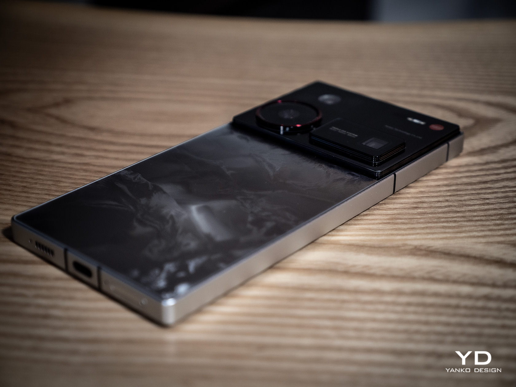
    The phone is a very blocky device that is almost like a throwback to the early days of the Sony Xperia. Flat edges and sharp corners are making a comeback anyway, so the nubia Z60 Ultra isn’t exactly an outlier. It is, however, chunkier and boxier than today’s phones, which does have usability consequences that we’ll get to in a bit. It gives the phone a handsome and sharp appearance, but it’s also an acquired taste.

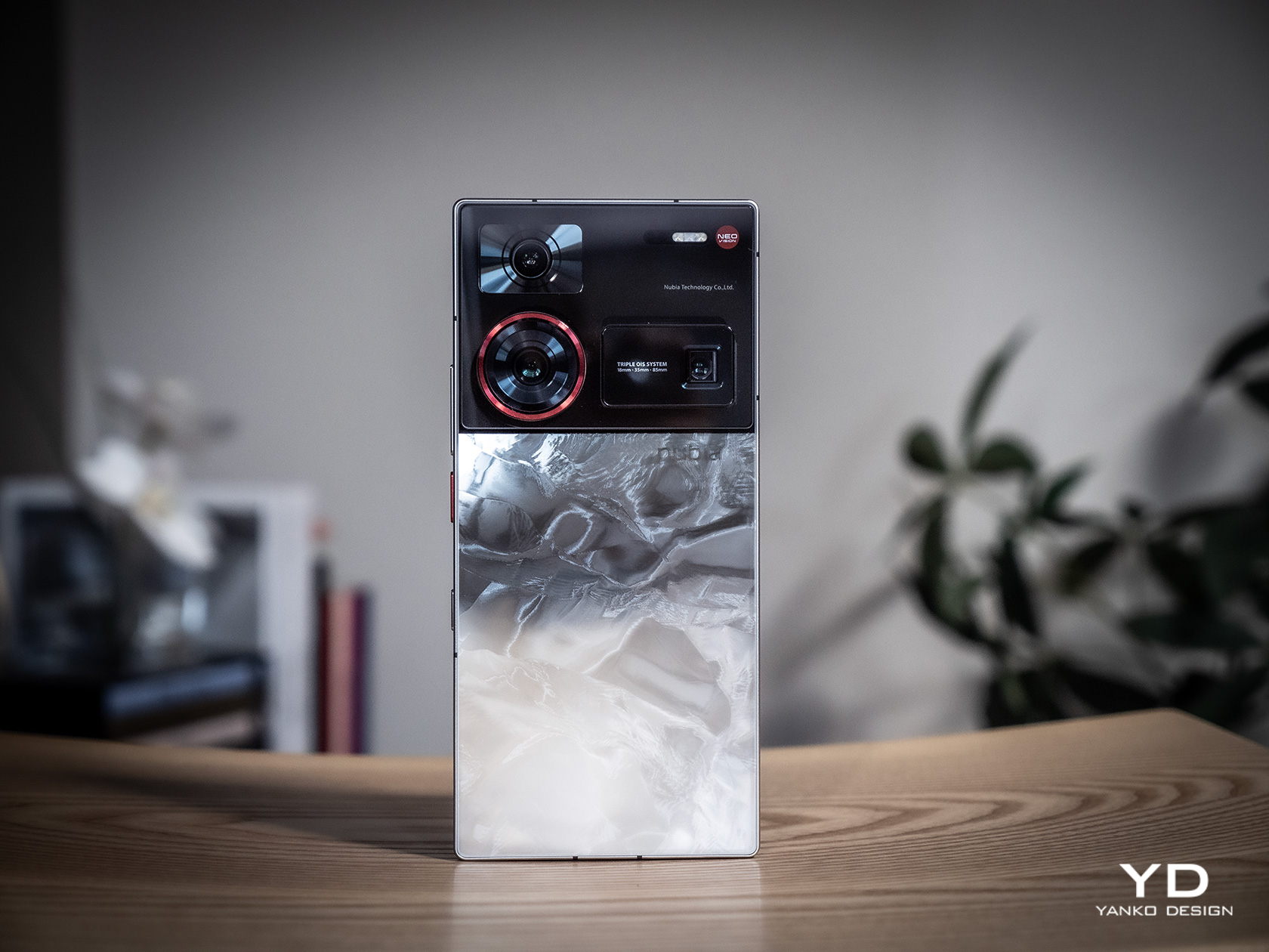
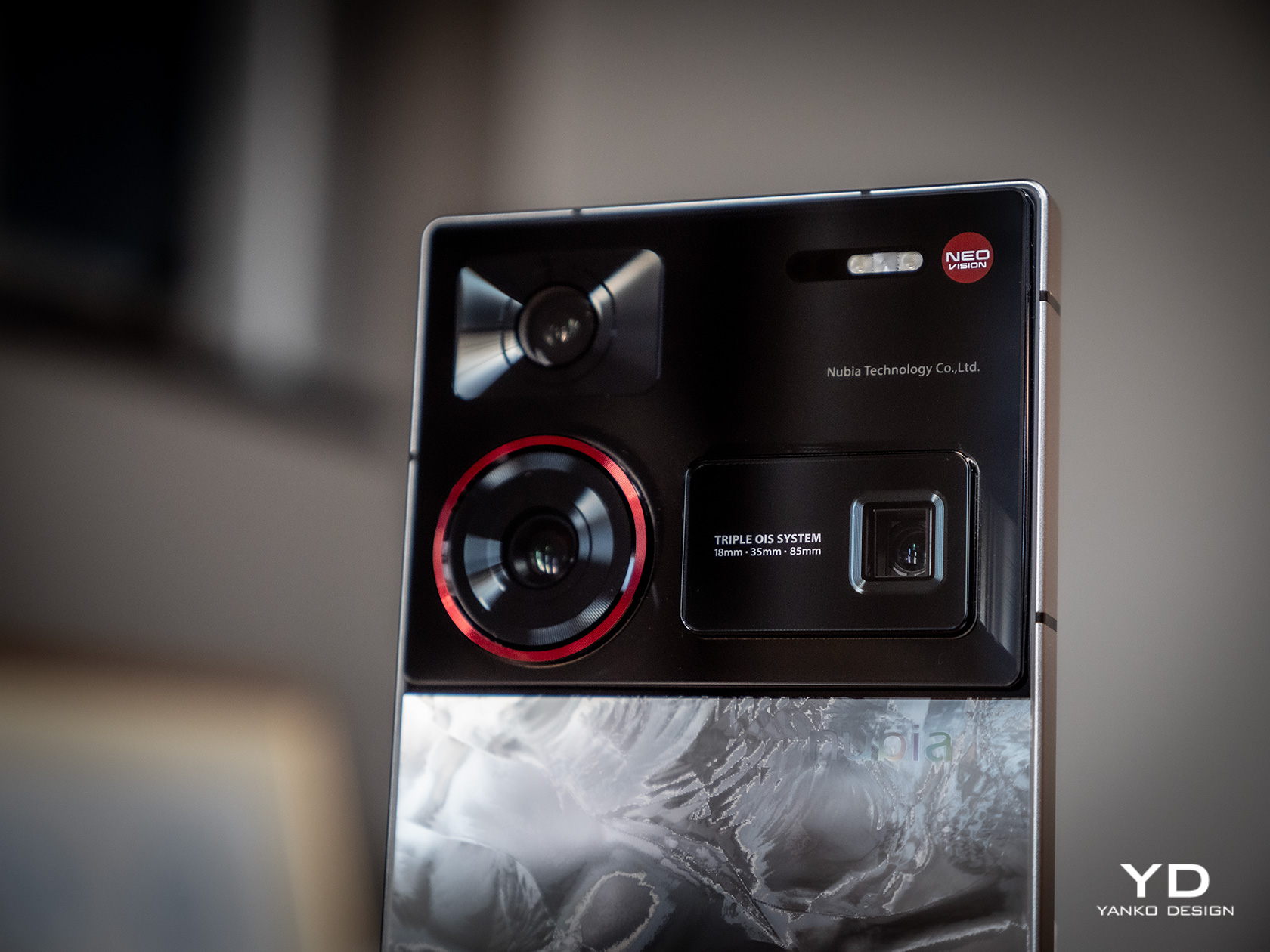
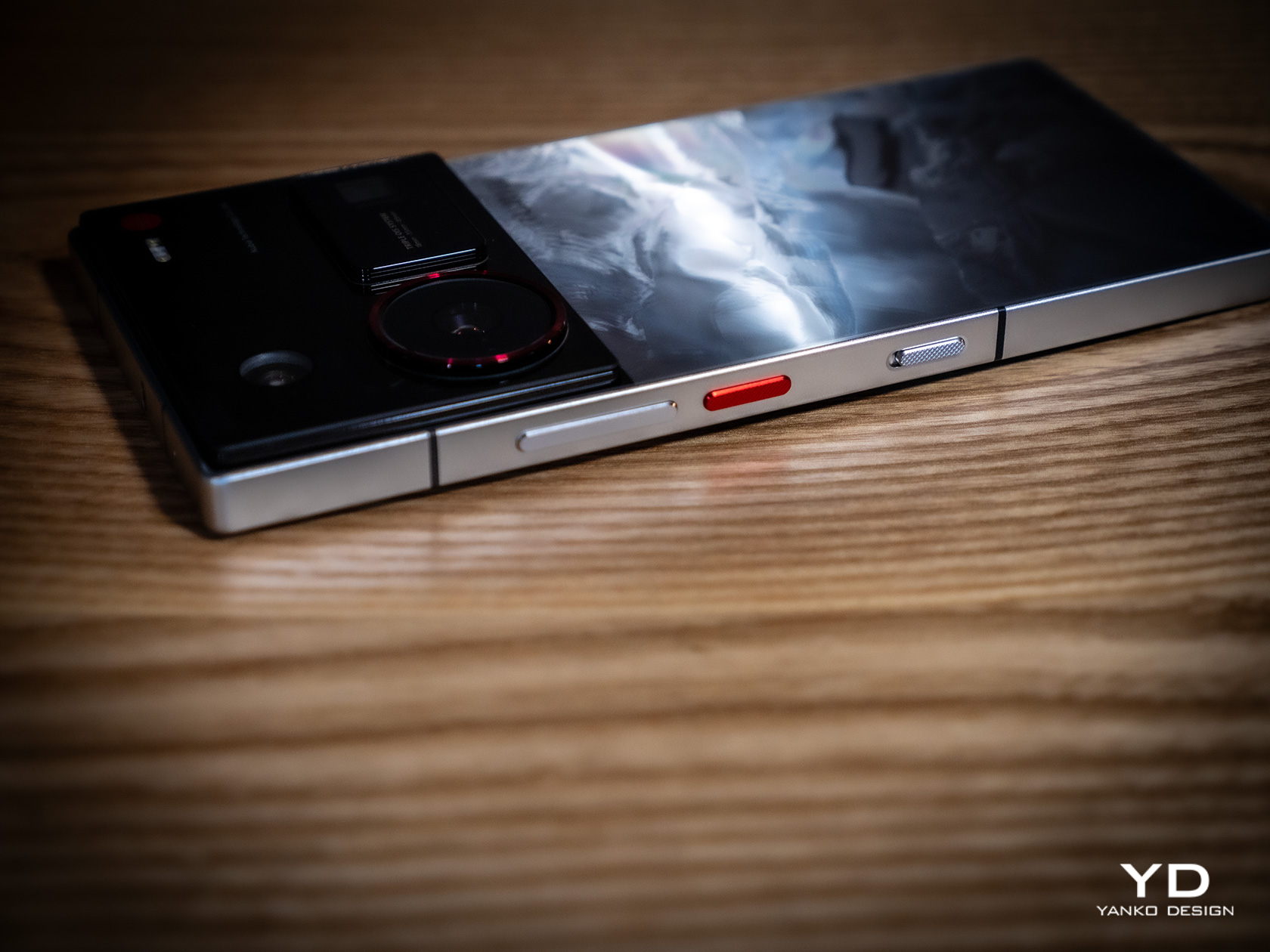
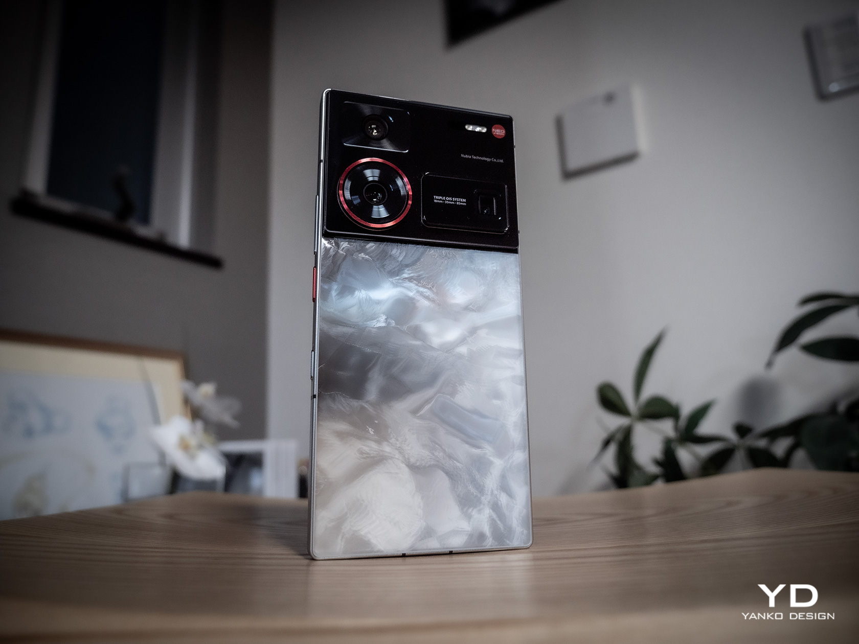
    The most notable aspect of its design, however, is the three cameras on its back. Where most manufacturers do their best to lump the cameras together, nubia actually gives each of them their own distinct design. The result? It’s almost as if each of the three cameras represents a different professional camera design, from DSLRs to point-and-shoot cameras. It’s like the whole ensemble, which takes up a good third of the phone’s back, is a wall that pays homage to the camera industry’s greatest designs, perhaps also symbolizing its aspiration to be part of that set.

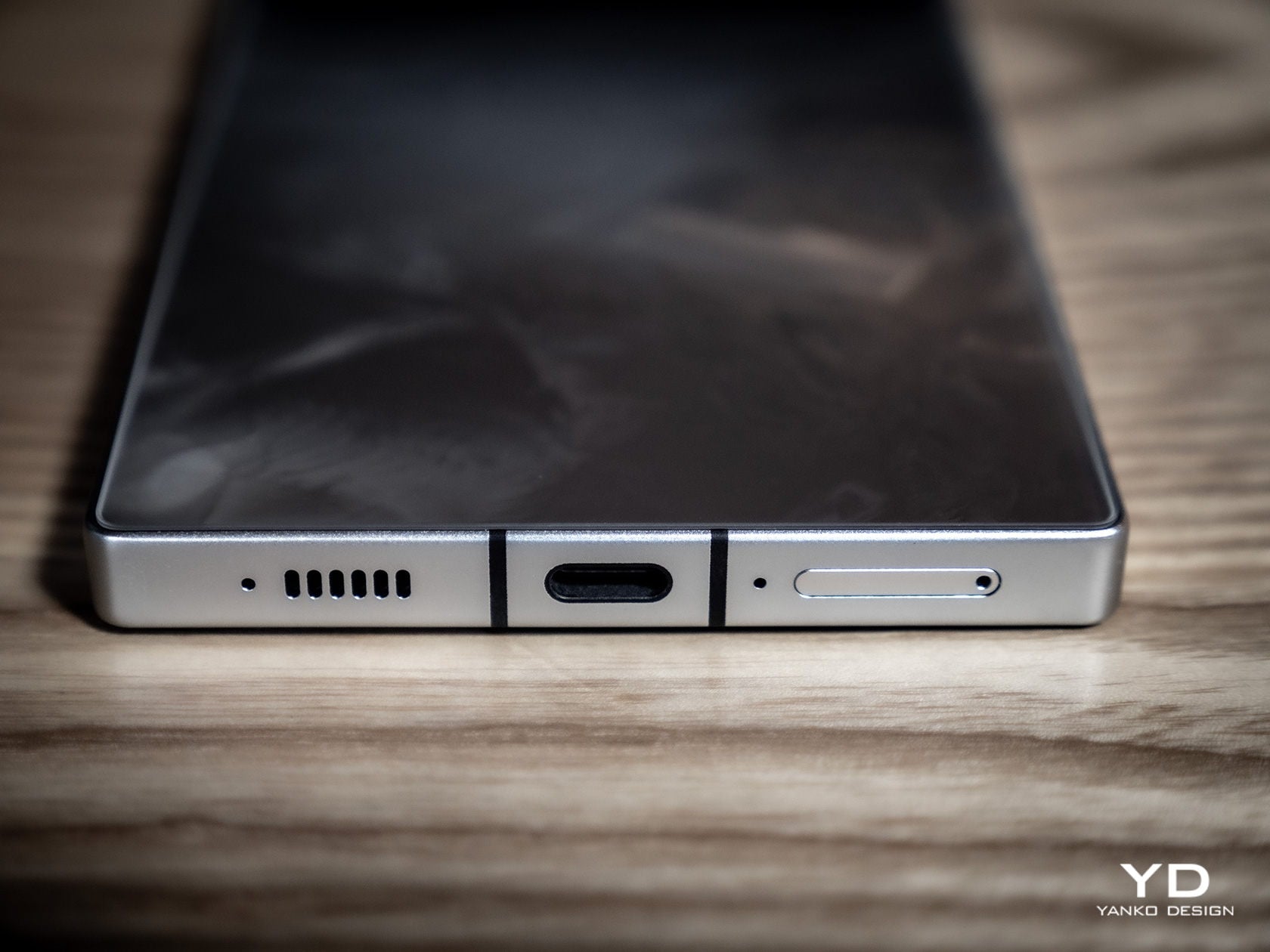
    The Leading Version comes in only two color options, each with its own distinct design. The Black model looks like it has a ribbed surface, but it’s purely an optical illusion. The back is still glass, just like on our Silver review unit which gives the impression of liquid silver rippling and swirling underneath. It effectively hides fingerprint smudges, though the smooth surface of the glass means very few leave their mark anyway.

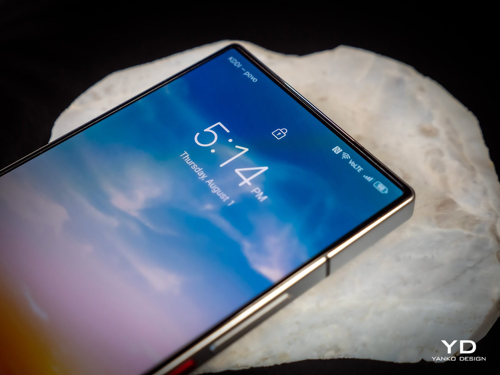
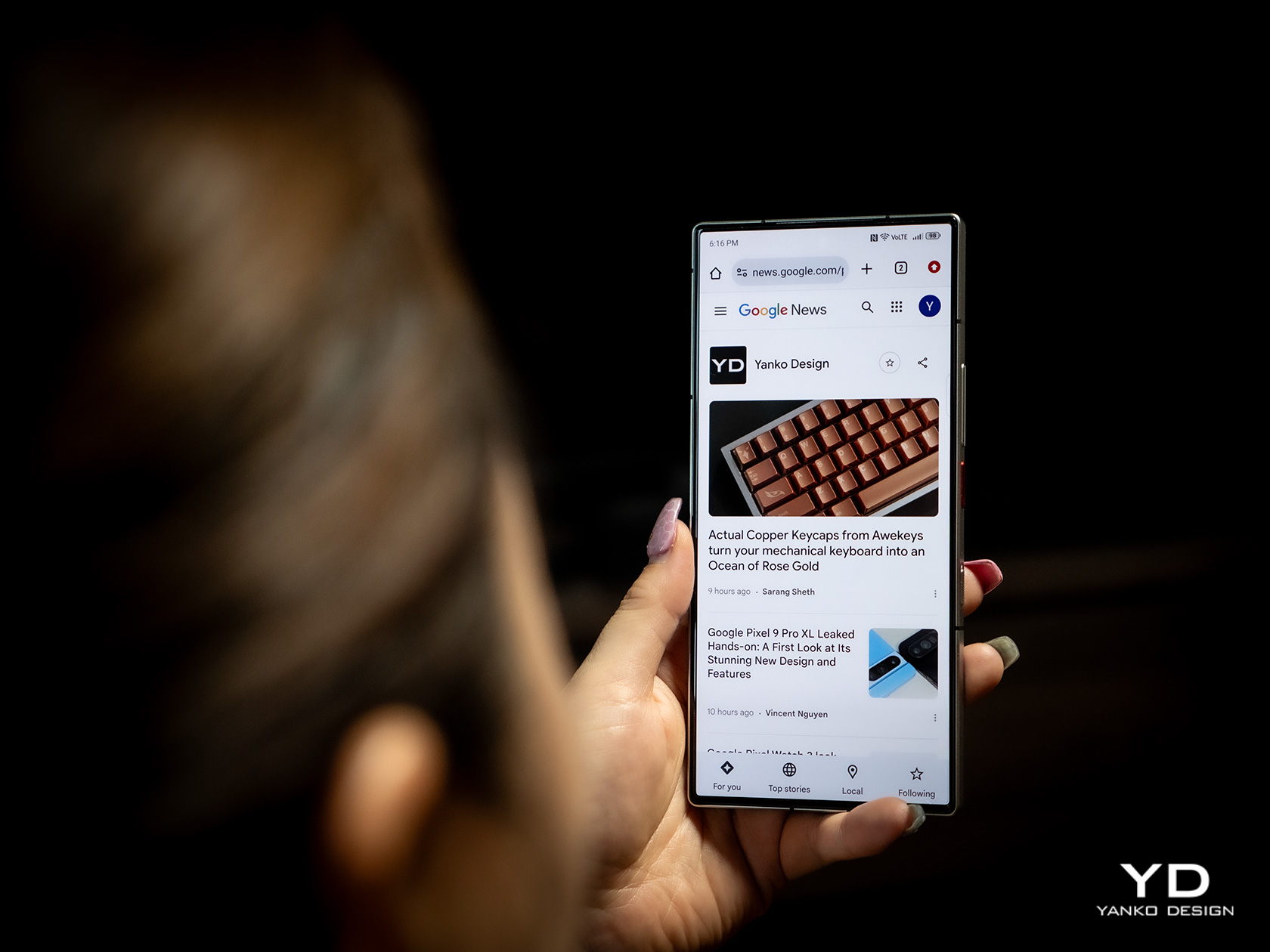
    We usually leave notes about the display in the hardware section of our reviews, but this screen is different. With an under-display camera, it delivers a true edge-to-edge full-screen visual that blows the mind. The bezels are thin enough to be negligible and the area that hides the camera on its forehead is nowhere to be seen. Because of its very boxy and flat design, the nubia Z60 Ultra Leading Edition almost looks like a miniature flat-screen TV, and it definitely looks great at showing videos, pictures, and games.

    Ergonomics

    The nubia Z60 Ultra Leading Edition is a chunky box of metal and glass, and there’s no getting around that fact. It does pack quite a lot of hardware, including one of the largest battery capacities for a smartphone, but that doesn’t come without its costs. At 8.8mm thick and weighing 246g, it is definitely one of the heftiest and bulkiest handsets in recent years. To some extent, that might not be that big of an issue for its intended audience of mobile photographers who won’t be holding the phone up in the same position for long periods of time, at least not without a tripod or a gimbal.

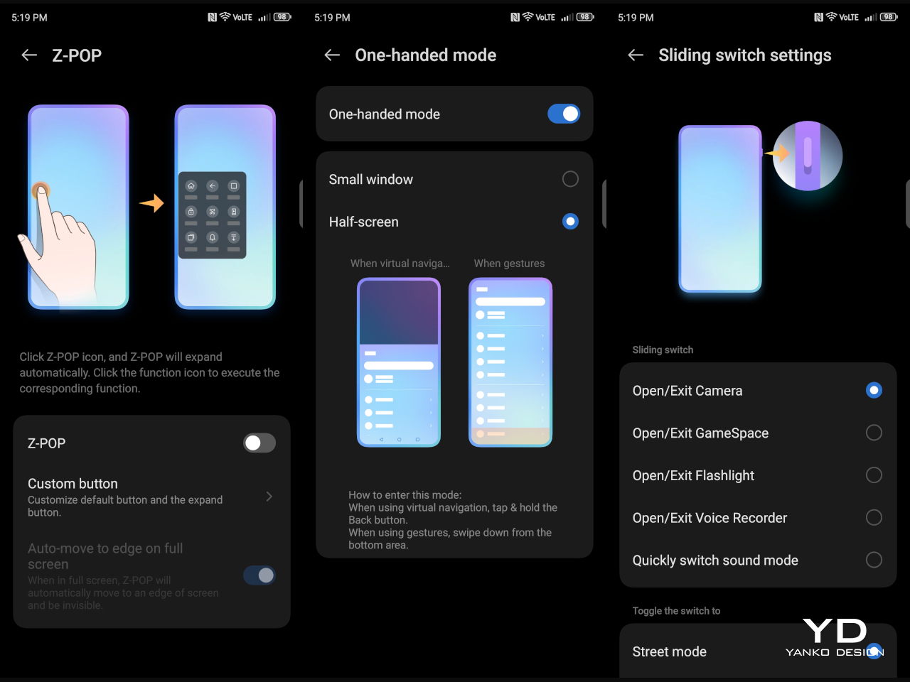
    It does have a few things that help improve its usability, though. The fingerprint scanner underneath the screen is placed a little bit higher where your thumb would naturally rest so you avoid having to readjust your grip and precariously hold it near the bottom edge. The power button and the action toggle also have textured surfaces that make them easier to feel and use without having to look at their location. All in all, the Z60 Ultra Leading Version isn’t the most comfortable thing to hold for a long time, but it’s not without its merits as well.

    Performance

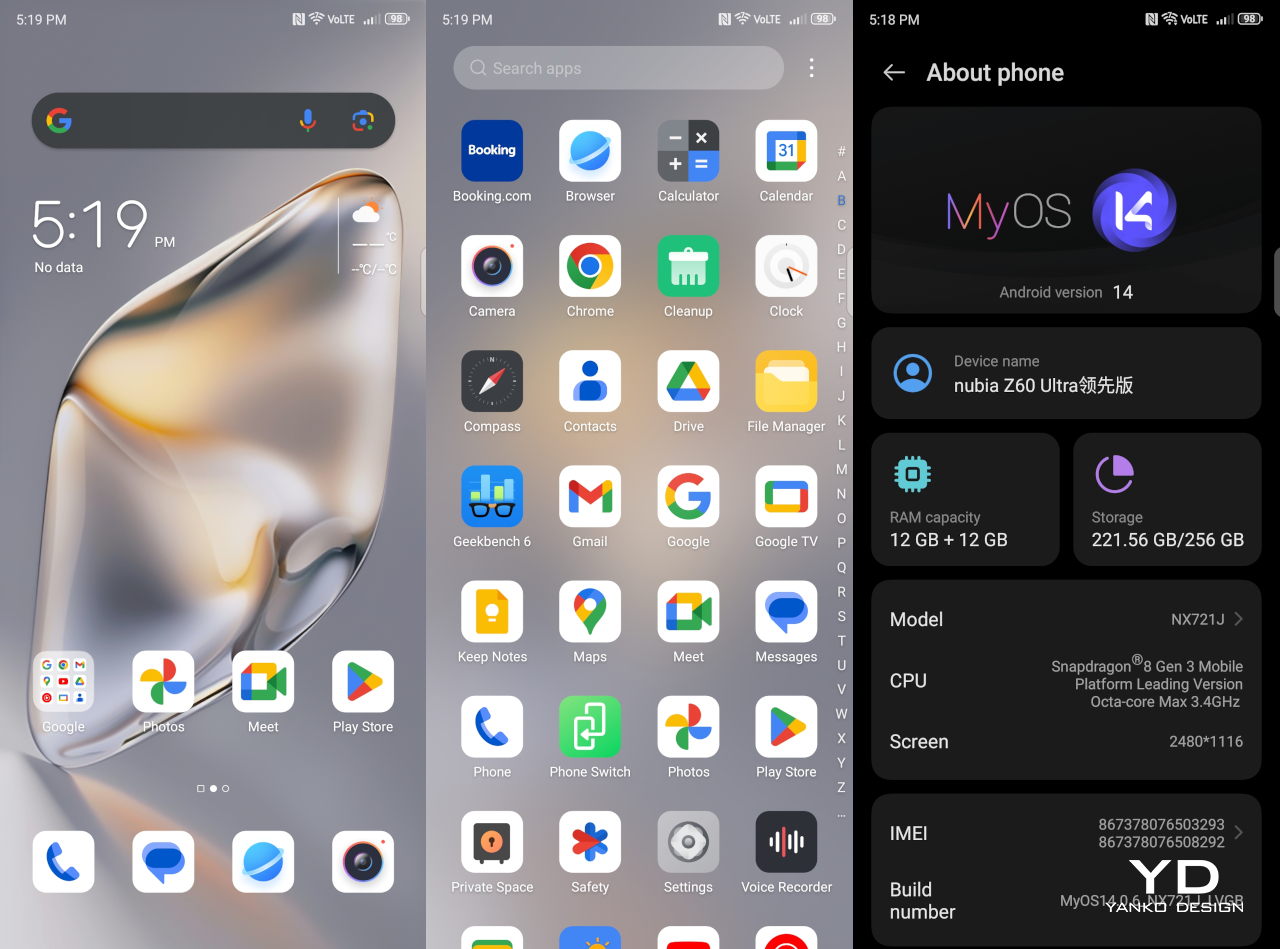
    The phone’s odd name actually comes from the only real difference it has from the original nubia Z60 Ultra. That’s the Qualcomm Snapdragon 8 Gen 3 Leading Version, an overclocked variant of the flagship chip that everyone else is using. In a way, this is nubia’s response to Samsung’s own “for Galaxy” variant, which makes the same proposition. In other words, it takes an already powerful chipset and dials it up to 11, giving most tasks a boost, especially gaming.

    It’s no wonder then that the nubia Z60 Ultra Leading Version would have some impressive numbers in benchmark tests, sometimes even scoring the highest. It can handle any task you through at it with aplomb, making short work of mobile games. That also means it won’t even break a sweat when handling image and video processing in real-time. However, your hands might sweat a bit as the phone did get a little too warm with graphics-intensive tasks like gaming.

    One of the biggest reasons for the Z60 Ultra’s heft is also one of its biggest strengths, its 6,000 mAh battery. That is definitely one of the largest we’ve seen of late, discounting the 7-inch “phablets” of old. The long battery life will be critical for photographers who don’t want to miss a moment just because their battery died. The 80W charging speed also means you’ll only be away from the action for as long as 40 or so minutes, presuming you didn’t bring a power bank with you. Unfortunately, the phone doesn’t have wireless charging capabilities, which should already be a staple for an “ultra” phone like this.

    Despite its Leading Version chip, the real centerpiece of the Z60 Ultra is its camera system, led by a 50MP Sony IMX906 1/1.56-inch sensor with OIS. That might not actually be that uncommon, but its most distinctive feature is the 35mm equivalent focal length. It’s a rare trait in smartphone cameras but is one of the most favored in traditional photography. In a way, nubia is positioning the phone as a camera lover’s choice, allowing budding photographers to level up their craft to more professional standards.

    It doesn’t stop there either, because nubia pulls off something that still very few manufacturers dare to do: high-quality cameras all around. The ultra-wide shooter with an 18mm focal length carries a large 50MP 1/1.55-inch sensor with OIS, while the 80mm periscope telephoto gets an equally impressive 64MP sensor with 3.3x zoom, also with OIS. Yes, all three have optical image stabilization, and all three are capable of 4K video recording, though only the main camera can do 8K.

    Suffice it to say, the images and videos that these cameras deliver are clear, sharp, vibrant, and detailed, no matter the lighting situation. There are a few hiccups here and there, but the overall performance is quite impressive. Unfortunately, the same can’t be said of the 12MP front-facing under-display camera, which unsurprisingly comes out with pasty and washed-out images. Despite the advancements nubia achieved in making the camera invisible, it still needs work on matching the quality of regular “notch” cameras.

    Sustainability

    When talking about smartphone makers that have strong or concrete sustainability endeavors, nubia is often left unmentioned. It’s not an old player in this market, nor is it a small one, so it’s rather disappointing not to see more action coming from it on this front. Even the use of sustainable materials for the back cover isn’t one of its strong points, but we’re hoping the brand takes a turn for the better in the years ahead.

    The nubia Z60 Ultra Leading Version is at least IP68-rated, which speaks well for its survivability and longevity. The same can’t be said for nubia’s guaranteed software support, though, which is just three years. That’s just one year over the old two-year standard, one that is becoming a liability to the brand rather than an asset.

    Value

    If it wasn’t clear yet, the nubia Z60 Ultra Leading Version is a premium flagship with a processor that runs circles around its rivals and a camera system designed to appeal to photographers at heart. And yet for all that it offers, it only asks for $649 for 8GB of RAM and 256GB of storage. Yes, that’s $50 more than the starting price for the non-Leading Z60 Ultra, and some might question if the souped-up Snapdragon 8 Gen 3 is actually worth that much. In the grand scheme of things, however, it’s still a very accessible price tag, especially when it offers just as much or even more than $1,000 devices.

    Unfortunately, it won’t be easy to get your hands on one, because nubia’s global distribution channels aren’t that many. And even if you manage to import one, you still have to worry about carrier network support. There’s also that nagging question about the $50 increase for a Leading Version chip, which, truth be told, isn’t exactly a mind-blowing difference overall. That said, if you’re a mobile photographer that has access to nubia’s products and have the extra $50 to spare, you should definitely have this in your crosshair.

    Verdict

    It’s extremely tricky to balance power and design in smartphones because of the limited space you’re allowed. You can’t have a super-slim device and expect to have a large battery and powerful cameras at the same time. nubia’s solution is bold and creative: why bother with those limitations at all? Yes, the nubia Z60 Ultra Leading Edition is thick and heavy, but it still manages to balance performance and a distinctive design. It’s a smartphone that is unabashedly walking in the footsteps of traditional cameras, and it definitely has the chops to prove it.

    The post nubia Z60 Ultra Leading Version Review: A True Camera in Your Pocket first appeared on Yanko Design.
    Become a Samsung Olympic Games Pin Master and get a Galaxy Z Flip6

    Aside from the actual sports events and the Olympians themselves, another popular activity in Paris during the Olympics is pin trading. You see the athletes and fans trying to get as many pins as they can, a practice that actually goes back to the 1924 Paris Olympics where it was a sign of international friendship. One of the games’ major sponsors, Samsung, is bringing a new spin to this tradition, and bringing prizes into the mix.

    Designer: Samsung

    The Samsung Olympic Games Pin Masters Challenge lets visitors in Paris get the chance to collect 16 specially created pins by playing different Galaxy AI-powered challenges at the Olympic™ rendezvous @ Samsung pop-up experiences all over the city. You can even get the chance to get the extremely rare Golden Pin in order to become an official Samsung Olympic Games Pin Master. If ever you’re in Paris, you have until September 8 to play this challenge.

    The 16 pins were designed by French illustrator Jean André and they are actually made from recycled aluminum from old Galaxy smartphones. Eleven of these pins represent Olympic sports like breaking, skateboarding, sport climbing, and surfing, and four Paralympic sports – blind football, para athletics, wheelchair basketball, and wheelchair tennis. There are also four Special Pins that feature three-dimensional landmarks of the city. And then, there is that rare and elusive Golden Pin.

    If you’re able to collect all 16 pins, you’ll get a new Galaxy Z Flip6 and a raffle entry to win a round-trip package for two to attend the 2026 Milano Cortina Olympics. Several have already become Pin Masters, and it looks like most of them are kids. They’re the ones who probably enjoyed playing the challenges to get the pins. If I was there in Paris, I would probably be all over this challenge, even just for the pins.

    The post Become a Samsung Olympic Games Pin Master and get a Galaxy Z Flip6 first appeared on Yanko Design.
    Vivo V40 Pro Review: Prime Mobile Photography Arrives in a Sleek Package

    PROS:


    • Elegant and aesthetic design

    • Powerful quad 50MP camera system

    • Large 5,500mAh battery despite thin profile

    • IP68 rating

    CONS:


    • No wireless charging

    • Telephoto camera only supports 2x optical zoom

    • Limited global availability

    RATINGS:

    AESTHETICS
    ERGONOMICS
    PERFORMANCE
    SUSTAINABILITY / REPAIRABILITY
    VALUE FOR MONEY

    EDITOR'S QUOTE:

    The Vivo V40 Pro builds on the brand's outstanding photography performance to deliver an even more powerful experience in a stylish design.

    Cameras have become one of if not the most important aspects of a smartphone these days. Of course, the display is functionally the most critical component, but other than being large and crisp, people tend to gravitate to the best smartphone camera their money can buy. Unfortunately, the best ones are often reserved for the most expensive handsets as well, leaving the majority of consumers, especially the younger generation, dreaming of better days. Vivo’s V series of smartphones has always aimed to make smartphone photography more accessible, and last year’s Vivo V30 Pro definitely put more expensive devices on notice. Can the Vivo V40 Pro top that or has the brand already reached its peak? We take Vivo’s latest and greatest V series phone for a spin to find out.

    Designer: Vivo

    Aesthetics

    Right off the bat, we can already say that Vivo has outdone itself with the design of the Vivo V40 Pro. Last year’s flagship was already a looker, but it suddenly feels a bit lacking compared to its younger sibling. You still have a sleek appearance, smooth curves, and a thin profile, but the real winner here is the camera design. That Vivo was able to fit three 50MP cameras in such a compact space is already a marvel, but the way it managed to make the design look appealing is a rare feat these days.

    Vivo calls it a “Gemini Ring Design,” which is a fancy term for what looks like a curvy keyhole. Two of the three cameras are enclosed in a circle that sits on top of a pill-shaped elevation. Inside that is another oblong enclosure housing the third camera and the Aura Ring flash. There is a subtle beauty to the play of balance and asymmetry in this design, and it definitely gives the Vivo V40 Pro a unique visual character.

    The company didn’t pull punches in the different colors and materials available for both the Vivo V40 and the V40 Pro, and all of them are beautiful in their own way. The Sunglow Peach colorway with its warm hues and dynamic magnetic ink is quite an eye-catcher, and our review unit’s Moonlight White with its pale blue streaks has a soothing and calming effect. Other than the camera bump and the small vivo branding at the bottom, there are no distractions on the back of the phone, allowing you to appreciate the beauty of these designs.

    At only 7.58mm, the Vivo V40 Pro is already thin, and the curved edges of both the screen and the back panel make it look even thinner. This could be a divisive decision in 2024, though, with many seeing curved edges as a thing of the past. It definitely still has appeal and it perfectly matches the smoothness of the rest of the phone.

    Ergonomics

    The Vivo V40 Pro is not a small phone by any means so that thin profile helps offset the size of the device. It’s incredibly light as well at only 192g, especially considering what it packs inside, like a very generous battery. All in all, it’s difficult to hold it up for long periods of time, though the glass material on its back could prove to be slippery for some hands.

    The debate around flat versus curved edges continues here as well. With part of the screen curving off to the sides, there’s always the possibility of accidental touches in those areas. There isn’t much surface area or sharp corners for your hand to grip either, and you might find yourself straining a bit just to hold the phone tight. It’s partly personal preference and partly the shape of your hand, but thankfully Vivo ships a protective case with the phone just in case.

    Performance

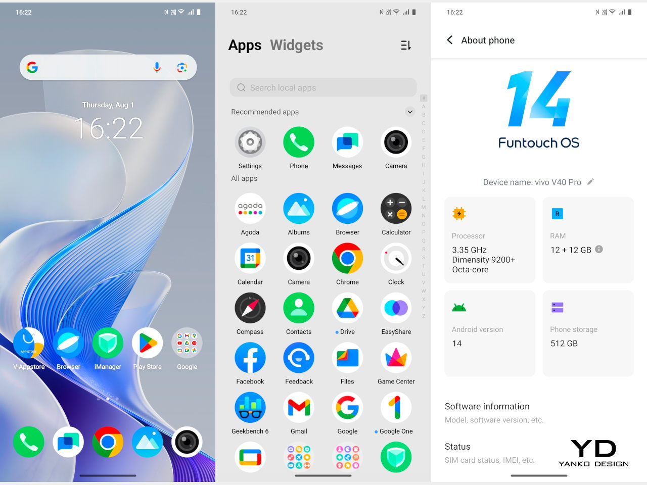
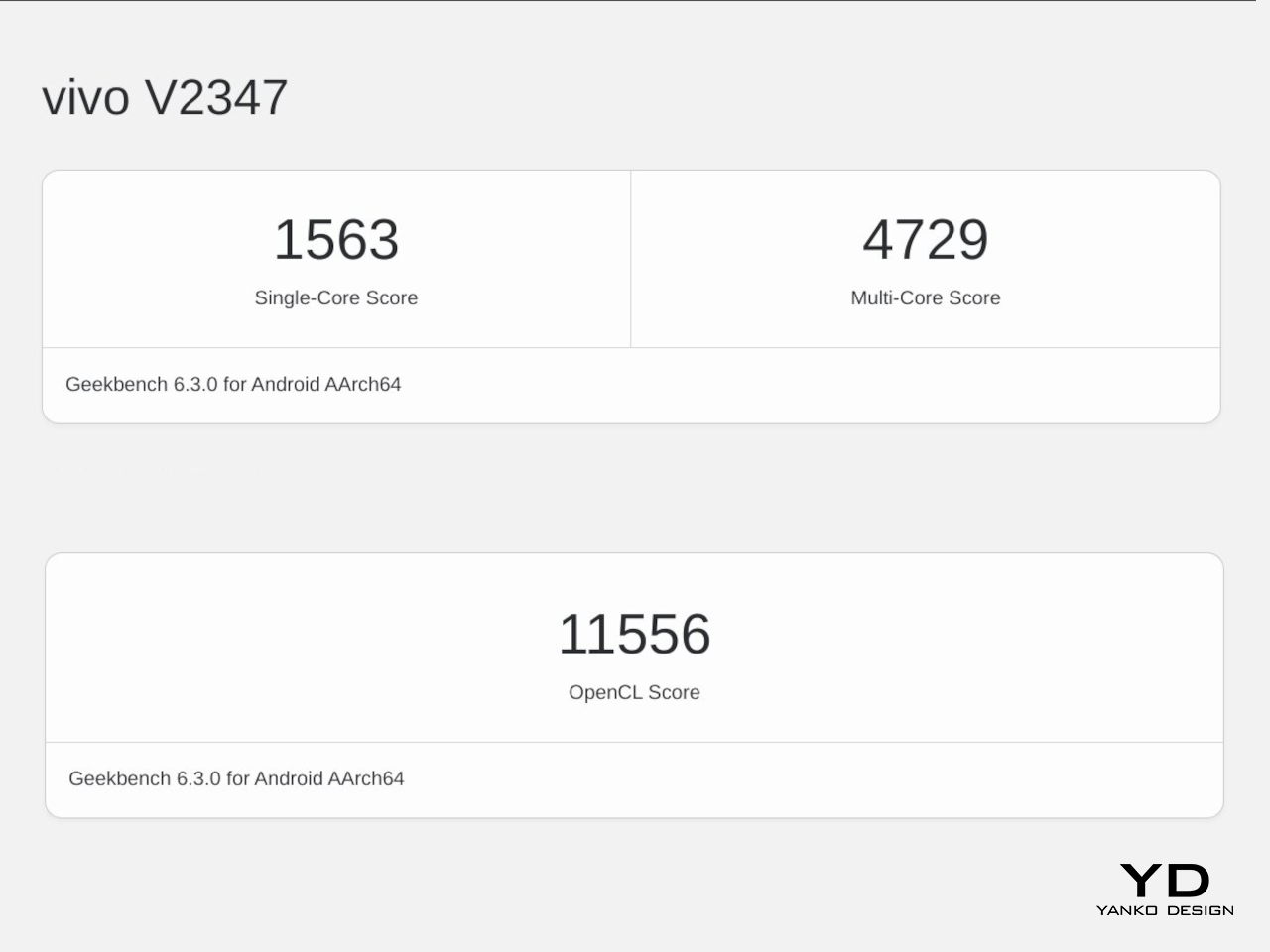
    It might not be part of Vivo’s top-tier X series, but the Vivo V40 Pro definitely packs quite a punch, starting with the MediaTek Dimensity 9200+, the chipmaker’s flagship silicon. It’s paired with up to 12GB of RAM, as was the case in our review unit, which can be boosted with another 12GB. That said, it takes some of that from the 512GB internal storage, which isn’t expandable like many phones these days. All in all, the Vivo V40 Pro performs like a champ for any use case, whether it’s social media, watching videos, or playing games. The latter is helped by an Ultra-Large VC Cooling System that keeps the phone running at a stable pace without throttling.

    More impressive, however, is the 5,500mAh battery the phone crams inside its thin and light body. It’s definitely one of the largest capacities available in a phone that’s barely 7.6mm thick, allowing it to easily support all your shutterbug adventures. With an 80W charging speed, you can quickly top up to full in around 30 minutes, at least with the right charging brick. Unfortunately, Vivo hasn’t yet decided to put wireless charging on its V series phones, but maybe that will change next year.

    The real stars of the show, however, are the cameras, all of them with 50MP sensors. Yes, that includes the selfie camera with a Samsung ISOCELL JN1 sensor and a wide 92-degree field of view for those “wefies” or “groufies.” If that sounds familiar, then you might have heard of the Vivo V30 Pro last year. In fact, in almost all but one case, it’s nearly the exact same set of 50MP cameras, like the 50MP Sony IMX816 telephoto shooter and the 50MP Samsung JN1 119-degree ultra-wide camera.

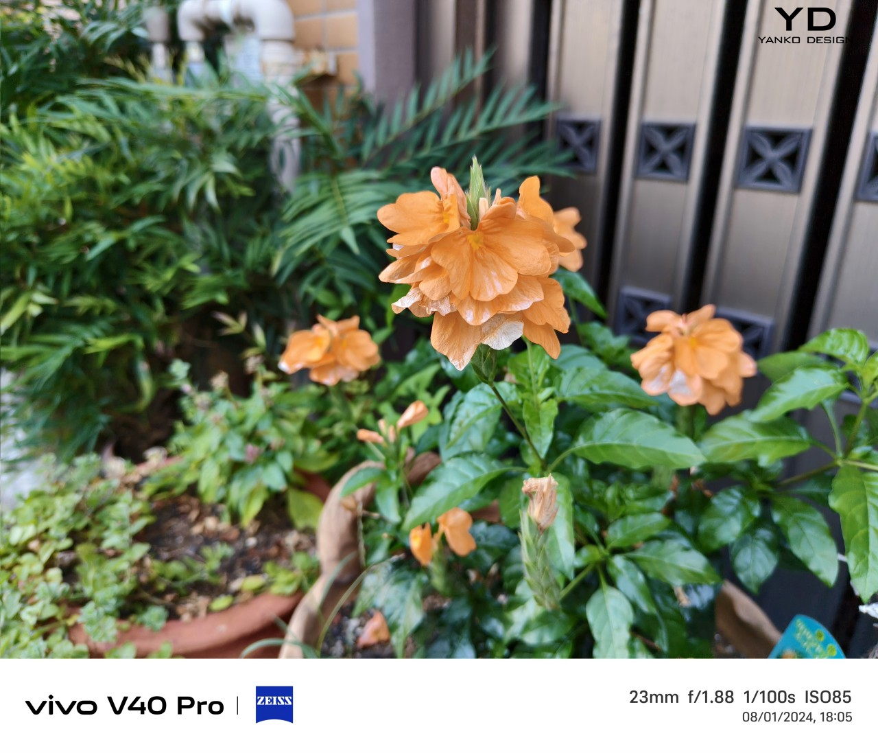
    What’s different this year is the new 50MP Sony IMX921 with a larger 1/1.56-inch sensor. That means it is able to take in more light information even in darker environments, improving its overall quality. In fact, the entire ensemble is actually commendable in their output, delivering super images bolstered by AI and computational photography. Of course, these cameras have optics tuned by ZEISS, so there’s little surprise there. And one can’t forget Vivo’s signature Aura Light that takes the regular flash and turns it into a mini ring light for softer and more natural lighting. Its most recent incarnation includes Electronic Control Technology that lets you adjust the brightness of the light depending on the distance of the subject.

    In essence, the Vivo V40 Pro builds on the success of its predecessor and adds some extra value with upgraded specs and improved software. Unfortunately, it also carries over the flaws, most notably the short optical zoom range of the telephoto camera. It only goes as far as 2x zoom, but Vivo is heavily advertising what it calls “50x ZEISS Ultra HD Zoom,” which is a mouthful that really means software-assisted digital zoom.

    Sustainability

    Just like the Vivo V30 Pro last year, the brand is sadly silent on any of its efforts in using even a fraction of sustainable materials for this year’s V series flagship. It also hasn’t stopped shipping chargers in its boxes, which is unsurprising since it wants to make sure that its phones use the right 80W charger for the fastest speed they can support. We’re still holding out hope that Vivo will take the lead in this area soon.

    That said, it does have some good news when it comes to keeping the Vivo V40 Pro away from the trash for as long as possible. It’s the first in the V series to reach an IP68 rating, ensuring that it’s protected from dust and water which can mean the end for many smartphones. It also advertises a “50-Month Smooth Experience” guarantee that basically says the phone can run for over four years without losing its fluidity and performance. Unfortunately, it doesn’t translate to having four years of updates, and Vivo has made no promises on that matter.

    Value

    It’s perfectly clear from our time with the Vivo V40 Pro that it delivers everything it promises on paper. The Quad 50MP Camera System it carries over from last year continues the tradition of excellent mobile photography, but this time with a larger 5,500mAh battery that better supports all those photo and video content creation. Even better, the phone comes in a sleek, slim, and light design that makes you feel like you’re holding an art object rather than a cold piece of technology.

    In other words, the Vivo V40 Pro would have been perfect if not for the fact that some people might not even be able to get their hands on it. The $560 price tag it carries (converted from Indian figures) isn’t that heavy, but global availability is still undisclosed at the moment. Hopefully, it will fare better than the Vivo V30 Pro which didn’t get a wider distribution that would have spread the word of its amazing camera chops.

    Verdict

    Smartphones are getting more powerful and so are their cameras. But with this increase in technical performance, designers are often forced to make many compromises to fit all of them inside a product that should still fit our pockets. In that regard, the Vivo V40 Pro is quite a feat, cramming not only four 50MP cameras but a large 5,500mAh battery inside a body that’s as thin and as light as it can be. It’s a beautiful phone with impressive performance and an accessible price point, and it deserves to be made available to more markets this time.

    The post Vivo V40 Pro Review: Prime Mobile Photography Arrives in a Sleek Package first appeared on Yanko Design.

    Nokia 7380 5G concept reimagines one of the quirkiest phones in history

    At this point in time, the design of smartphones is pretty much set in stone, at least disregarding novel designs like foldables and rollables. The “candy bar” form factor emerged as the standard, displacing even the fashionable clamshell “flip phones” that are making a comeback through small foldables, mostly because they are practical, handy, and efficient. There was a time, however, when phone form factors were all over the map, with brands like Nokia boldly experimenting with different designs that were functional but also a bit unconventional. The Nokia 7280 and 7380 “lipstick” phones were two of the phone manufacturer’s oddest creations, and one creator is bringing that past design to the present, giving it a modern touch to fit today’s aesthetics.

    Designer: AndroidLeo

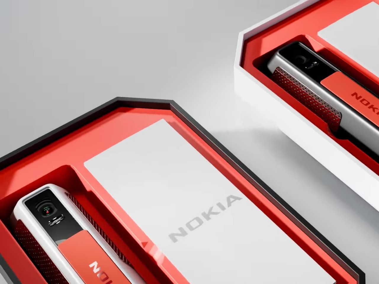
    The Nokia 7380 was, strangely enough, part of the company’s “Fashion Phone” line back in the early 2000s. At a time when people actually used mobile phones for phone calls more than anything else, it could easily get away with its stick-like design and tiny mirror-like screen. You can’t do much else with it, other than listen to music and take photos that were already high-quality during that era, which sounds like the perfect recipe for a distraction-free, minimalist phone today.

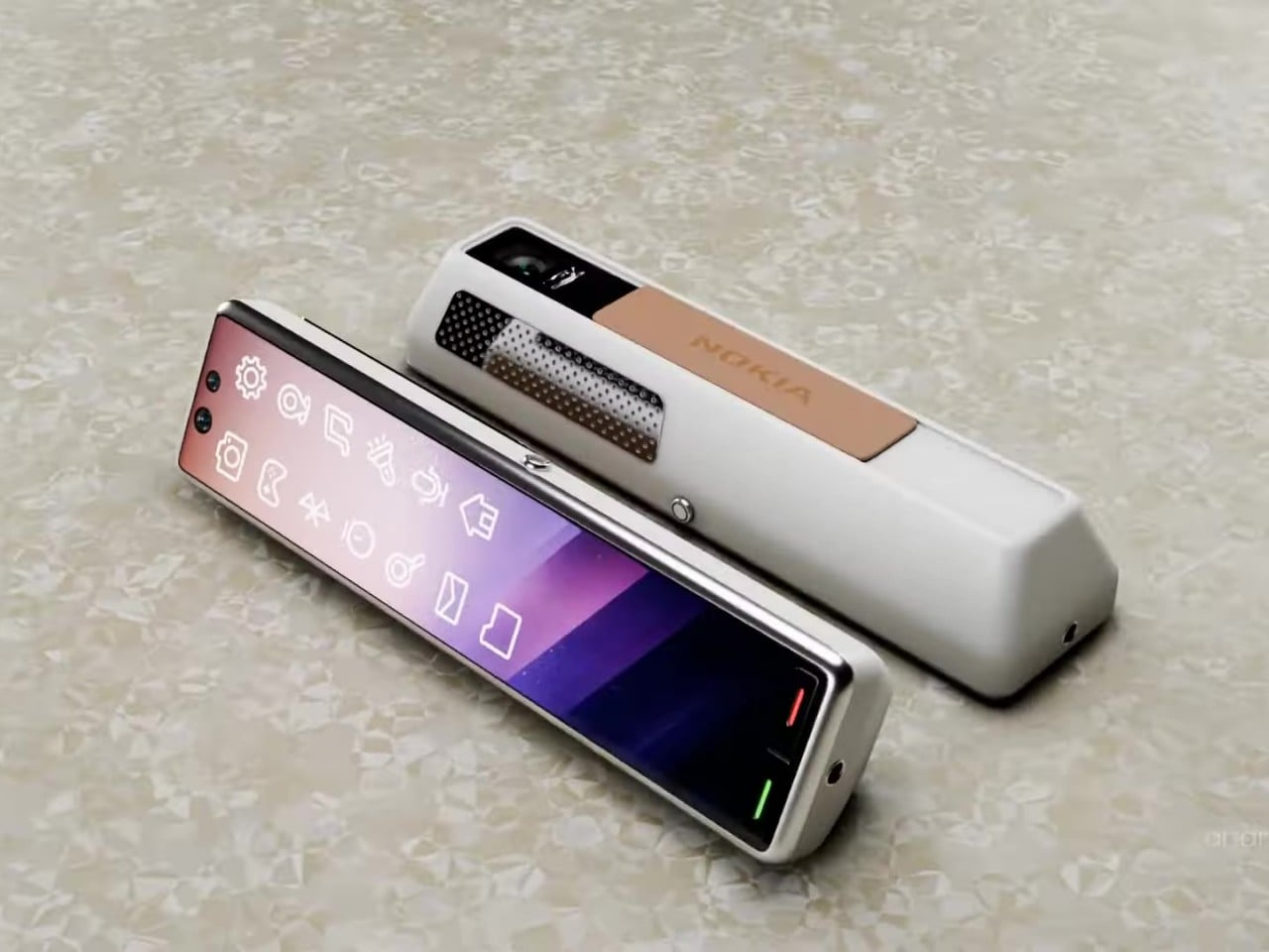
    In that regard, the Nokia 7380 5G concept doesn’t sound that outlandish after all. The design updates the aesthetics to modern standards, making use of interesting geometric shapes like a trapezoidal prism instead of a rectangular box, and puts a slightly taller screen that covers the whole surface this time around. It will still be too small to do anything productive like texting or even browsing the web, so it will mostly be for controlling the phone and launching apps that have to be custom-designed for that screen aspect ratio.

    There’s also a camera on the narrow side of the prism, hidden behind a sliding mechanism. Given today’s technologies and the fact that this phone won’t have much in the way of other components, there should be enough space for a 50MP or higher camera. The concept design, which is based on rumors, also puts a dual camera setup on the “front,” or rather where the screen is. It’s not clear what the use case would be for having two cameras there, though.

    In a nutshell, this smartphone stick could be marketed as a device that’s oriented towards music and photos, at least taking photos. There are two headphone jacks on one end, perfect for sharing your music with a friend, and the handy shape of the device makes it easy to take photos and selfies. It’s like a fashionable action cam that can play music and make phone calls as well, though it also raises the question of who would want to buy such a curious but less usable smartphone in the first place.

    The post Nokia 7380 5G concept reimagines one of the quirkiest phones in history first appeared on Yanko Design.
    Realme 13 Pro+ Review: AI-Powered Photography Masterpiece or Miss?

    PROS:


    • Strong main and telephoto performance

    • Plenty of AI features

    • Big battery

    • Elegant design

    CONS:


    • Same processor its predecessor

    • No wireless charging

    RATINGS:

    AESTHETICS
    ERGONOMICS
    PERFORMANCE
    SUSTAINABILITY / REPAIRABILITY
    VALUE FOR MONEY

    EDITOR'S QUOTE:

    Realme's approach with the Realme 13 Pro+ underscores its commitment to staying at the forefront of innovation in the mobile industry.

    In 2024, AI has become an indispensable component of modern smartphones. From revolutionizing photography and enhancing device efficiency to providing intelligent personal assistance, AI-powered features are no longer luxuries but necessities. Realme has positioned the Realme 13 Pro+ as an ‘Ultra Clear Camera with AI,’ featuring a dual 50MP Sony AI camera system and the company’s proprietary HYPERIMAGE+ AI photography architecture. This combination aims to deliver advanced image processing capabilities and exceptional photo quality.

    Realme recently hosted a press event in Bangkok to showcase the capabilities of the HYPERIMAGE+ system. Attendees had the opportunity to experience the camera’s features firsthand, exploring its potential in various scenarios. Now, we have thoroughly tested the Realme 13 Pro+ to provide you with an in-depth review of its performance and capabilities.

    Designer: Realme

    Aesthetics

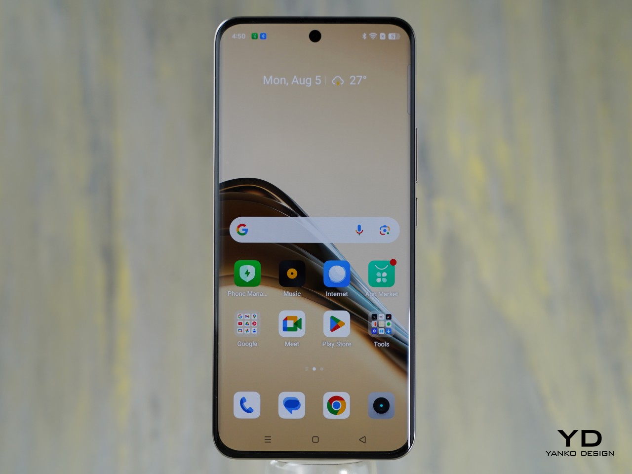
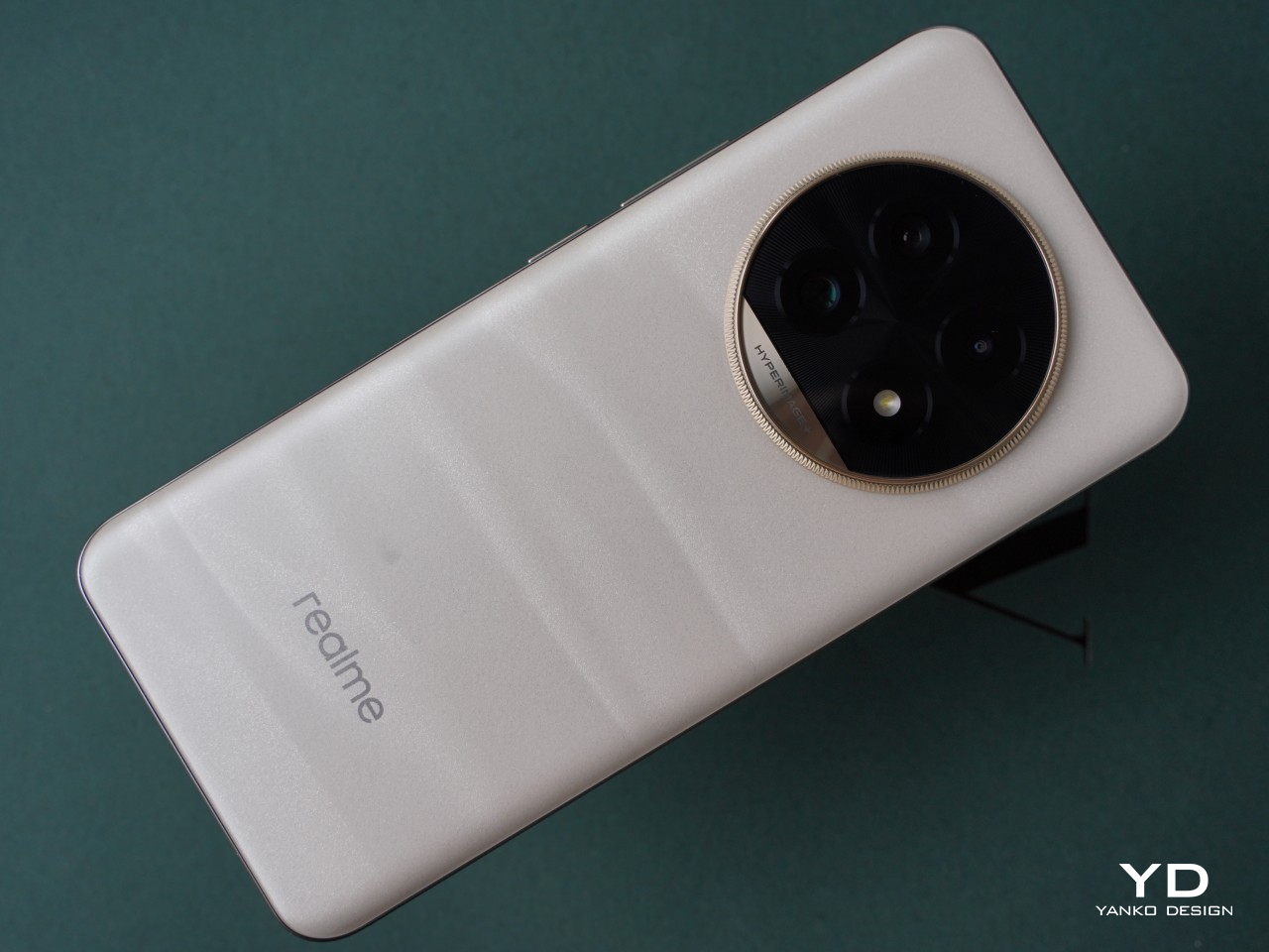
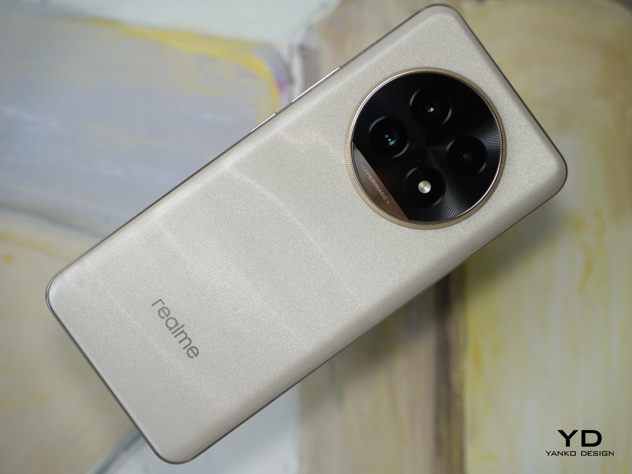
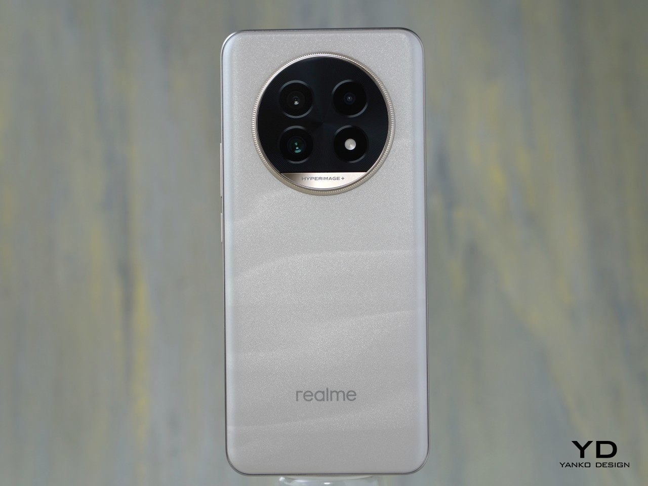
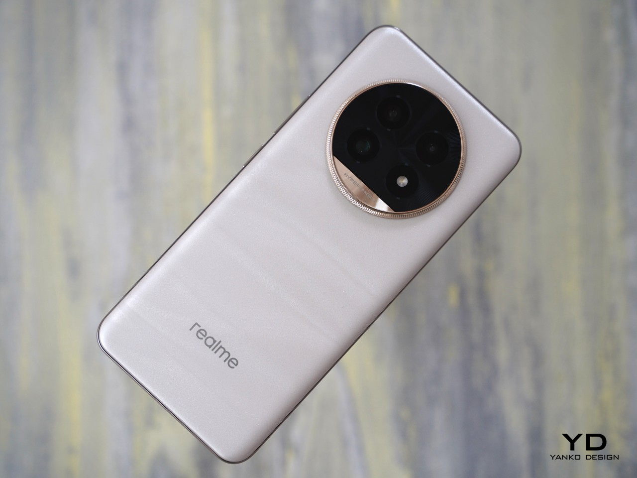
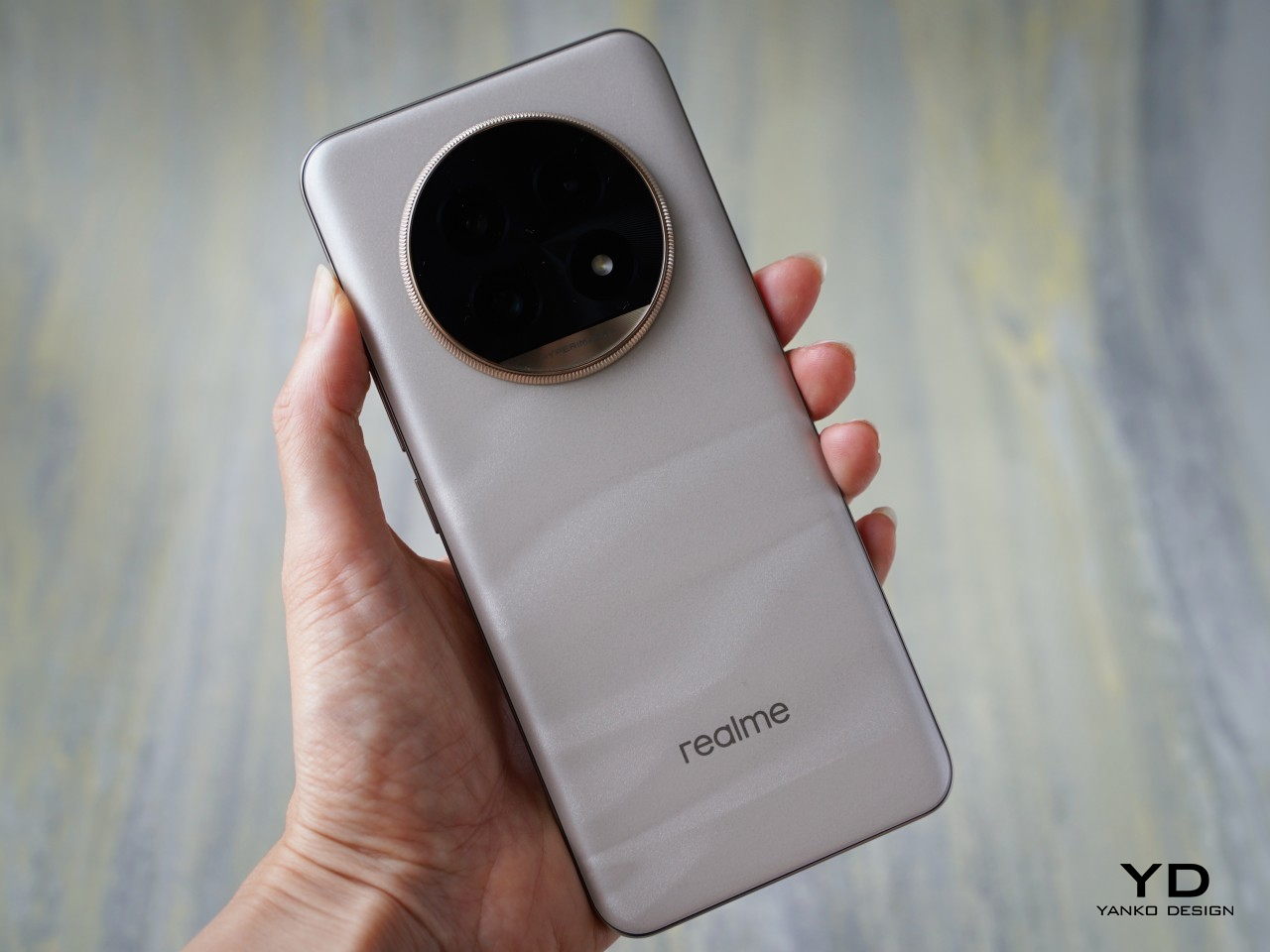
    Building upon the design language of the Realme 12 series, the Realme 13 Pro+ smartphone embodies an aesthetic journey inspired by Claude Monet’s renowned painting, Grainstack (Sunset). Gone is the shiny gold vertical line that flowed across the center, replaced by a refined circular camera module with a luxury watch-inspired ring on the back panel.

    The Realme 13 Pro+ comes in two colorways: Monet Gold and Emerald Green. The review unit we received is the Monet Gold, featuring a frosted glass material that showcases Monet’s brush-inspired pattern on the back panel. The Emerald Green variant, on the other hand, features vegan leather. Whether opting for the shimmering effects of Monet Gold or the luxurious feel of Emerald Green, the Realme 13 Pro+ offers a choice that reflects individual style while honoring Monet’s influence on contemporary design.

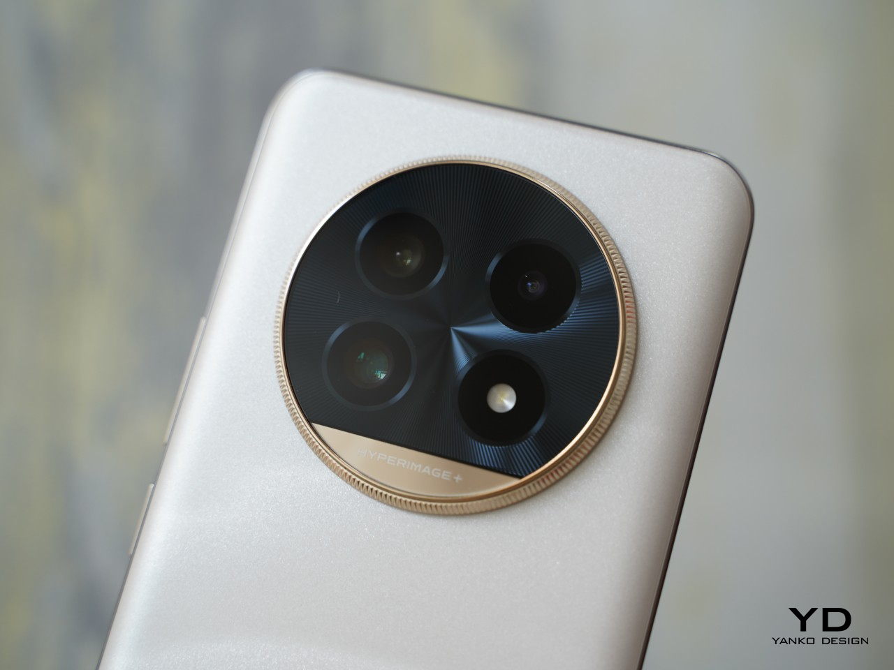
    The circular camera module with the gold ring around the edge houses a triple-camera setup and an LED flash. Realme has improved upon the 12 series design by eliminating the fake camera placements and replacing them with the LED flash, resulting in a neater and more practical camera module. The module now features “HYPERIMAGE+” inscribed near the bottom against the gold background, while the Realme branding is subtly placed toward the bottom of the device. Overall, the phone presents a clean and sleek aesthetic, with the camera module serving as the focal point.

    Ergonomics

    The Monet Gold variant measures 161.34mm x 73.91mm x 8.23mm and weighs 190g, while the Emerald Green variant is slightly thicker at 8.41mm but weighs marginally less at 185.5g. It balances well in hand, and the curved and rounded edges ensure a comfortable grip. The Monet Gold features a frosted glass finish that provides a velvety texture, ensuring a secure and comfortable grip without feeling slippery. The Emerald Green variant, with its vegan leather back panel, should offer a similarly high level of grip, if not more tactile and reassuring.

    Performance

    As a camera-focused device, the Realme 13 Pro+ boasts two world-first Sony sensors, showcasing Realme’s strengthened partnership with Sony. The first is a 50MP main sensor with the Sony LYT-701, featuring a 1/1.56” sensor, f/1.88 aperture, and optical image stabilization (OIS). The second is a 50MP telephoto sensor with the Sony LYT-600, featuring a 1/1.96” sensor and f/2.65 aperture. Completing the triple-camera setup is an 8MP ultrawide lens with an f/2.2 aperture. On the front, the 32MP selfie camera with an f/2.45 aperture is centered at the top of the display.

    The Realme 13 Pro+ is equipped with Realme’s Hyperimage+ camera system, which enhances photos using both on-device AI algorithms and cloud-based AI image editing. The Realme AI HyperRAW Algorithm boosts image clarity and dynamic range, while features like the AI Portrait Algorithm improve subject isolation, bokeh effects, and skin tone. Additionally, the Group Photo Enhance feature sharpens each person’s face, regardless of their position in the group photo.

    In optimal lighting, the main camera captures sharp, vibrant photos with rich detail. In low-light conditions, it maintains good performance and handles exposure well. The 3x zoom photos taken with the telephoto camera are excellent in most scenarios, offering strong dynamic range and detail in both daylight and nighttime. The telephoto lens supports up to 120x zoom, though image quality begins to deteriorate beyond 6x zoom, especially in low-light conditions. The ultrawide camera delivers satisfactory results but isn’t particularly remarkable, and the same applies to the front-facing camera.

    ultrawide

    1x

    2x

    3x

    10x

    20x

    120x

    The AI Ultra Clarity feature, even though it’s still in beta, performs well by naturally unblurring blurred images and salvaging otherwise unusable photos. However, it cannot handle motion blur. The phone also boasts the AI Smart Removal feature, which was first introduced in the GT6 series.

    Oplus_131072

    For video recording, the device can capture up to 4K footage at 30 fps or 1080p at 60 fps with the main and telephoto cameras. The ultrawide camera is capped at 1080p resolution at 30 fps. The front-facing camera can record video in 4K at 30 fps but does not support 60 fps. The footage from both the main and telephoto cameras is great, though there is no stabilization available in 4K.

    Portrait 1x

    Portrait 3x

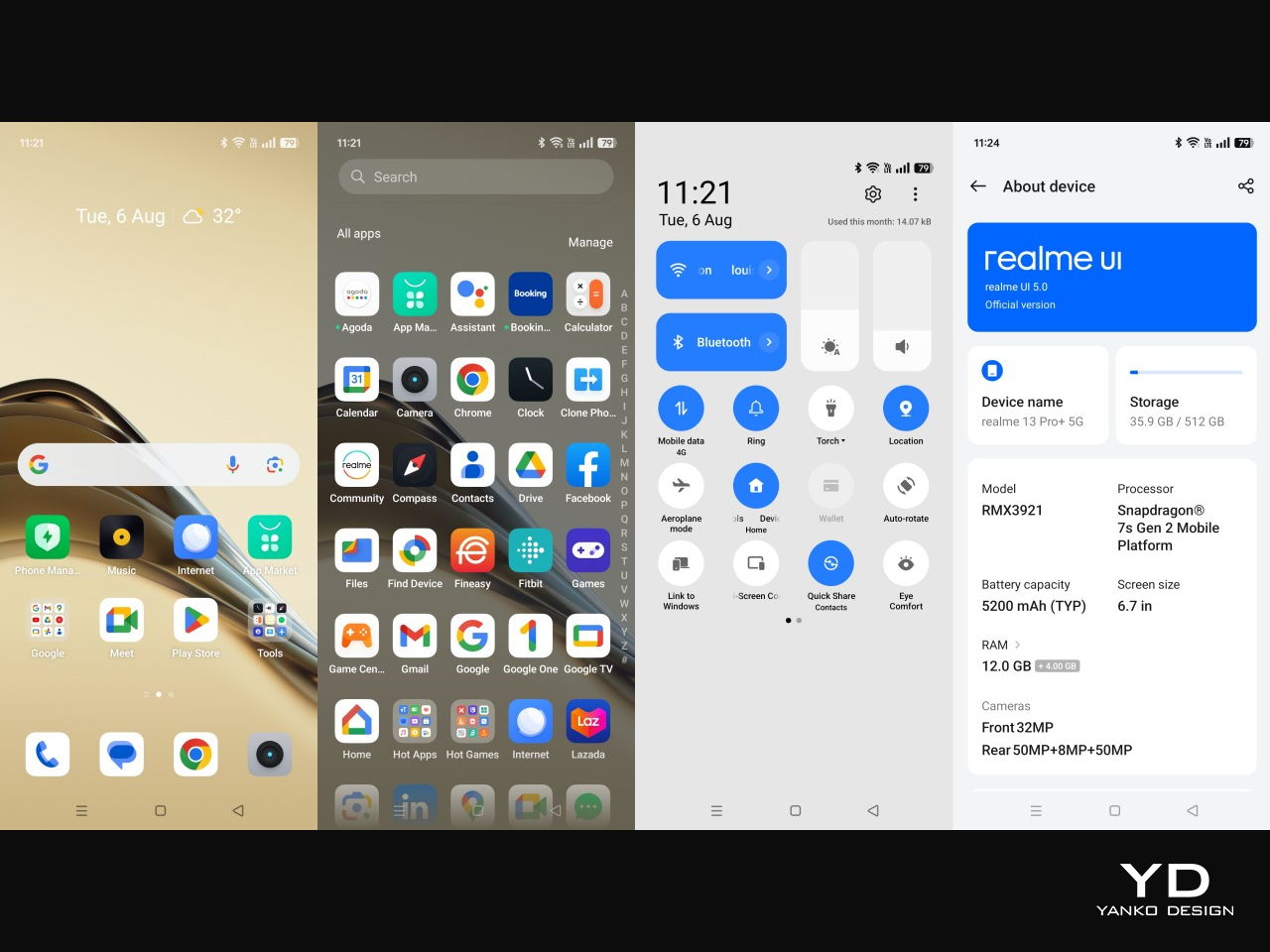
    The phone is equipped with the Snapdragon 7s Gen 2, the same as its predecessor, coupled with 12 GB of RAM (expandable by 4 GB) and 512 GB of storage. It handles everyday tasks with many apps open in the background without issue. However, you may need to settle for medium settings in graphic-intensive games. For mobile gamers, the Realme 13 Pro might be a better choice for its 3D VC Cooling system that keeps the phone running at peak performance without getting too hot.

    The phone features a 6.7-inch AMOLED FHD+ display with a resolution of 1,080 x 2,412 pixels and a 120Hz refresh rate. The screen boasts an impressive peak brightness of 2,000 nits, ensuring excellent visibility even in direct sunlight. It also features 2,160Hz PWM dimming and an AI Eye Protection function, designed to reduce eye strain and enhance visual comfort during prolonged use.

    Powering the device is a robust 5,200 mAh battery, which comfortably lasts through a full day of typical usage. For charging, the Realme 13 Pro+ supports 80W SUPERVOOC technology, allowing for rapid recharge times and minimal downtime. Realme claims that the battery maintains over 80% of its original health even after 1,600 charging cycles, highlighting its durability and longevity.

    Sustainability

    While Realme has not specified the use of recycled materials in the construction of the Realme 13 Pro+, the device is designed with sustainability and durability in mind. Its display is protected by Corning Gorilla Glass 7i, which is known for its robust protection against scratches and drops. Additionally, the Emerald Green variant holds a Swiss SGS 5-Star certification for drop resistance, boasting 160% improved drop resistance and 100% scratch resistance. This design allows you to handle the phone with confidence, even if you’re prone to occasional drops or mishaps.

    The phone is also rated IP65, providing effective protection against dust and water ingress, which further extends its longevity and usability in various conditions. Furthermore, Realme’s battery technology contributes to the device’s sustainability by ensuring that the battery maintains over 80% of its original health after 1,600 charging cycles. This longevity not only enhances the device’s overall lifespan but also supports environmental efforts by reducing the frequency of battery replacements and electronic waste.

    Value

    The Realme 13 Pro+ is now available in India, starting at ₹32,999 (approximately $400 USD) for the base model. Realme has also announced that the phone will soon be launched in other global markets. With its compelling blend of features and impressive main and telephoto camera capabilities, the Realme 13 Pro+ offers notable value for money.

    In the competitive mid-to-high range segment where the Realme 13 Pro+ operates, several strong contenders are vying for attention. For instance, the OnePlus Nord 4, which we reviewed last month, stands out with its excellent battery life and sleek metal unibody design. The Nothing Phone (2a) distinguishes itself with a unique aesthetic and robust performance. Additionally, the Infinix NOTE 40 Pro+ presents a cost advantage at roughly $50 USD less, offering magnetic wireless charging and including a magnetic wireless charger in the box. Each of these alternatives has its strengths, making the choice between them a matter of personal preference and priorities.

    Verdict

    The integration of AI into smartphones reflects a broader trend toward leveraging advanced technologies to redefine user experiences. Realme’s approach with the Realme 13 Pro+ underscores its commitment to staying at the forefront of innovation in the mobile industry, particularly in enhancing photography capabilities through AI-driven solutions. With its strong value proposition, the Realme 13 Pro+ offers a compelling option for those seeking a balance of technology, design, and practicality in their smartphone.

    The post Realme 13 Pro+ Review: AI-Powered Photography Masterpiece or Miss? first appeared on Yanko Design.
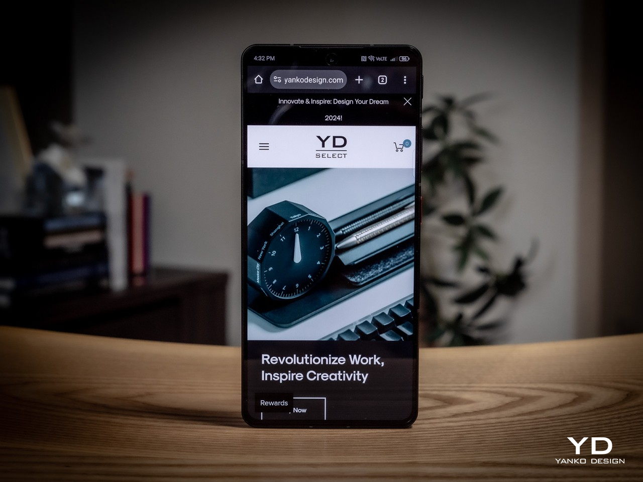
    nubia Z60S Pro Smartphone Review: AI to Empower Your Creativity

    PROS:


    • Eye-catching "Cosmic Ring" Camera design

    • Dedicated camera slider

    • Decent flagship performance

    CONS:


    • Thick, heavy, and slippery

    • Last year's Snapdragon flagship

    RATINGS:

    AESTHETICS
    ERGONOMICS
    PERFORMANCE
    SUSTAINABILITY / REPAIRABILITY
    VALUE FOR MONEY

    EDITOR'S QUOTE:

    The nubia Z60S Pro delivers AI-powered photography in an accessible package with a distinctive design

    AI is undoubtedly the buzzword that’s taking by storm any industry related to computers. It’s not just the generative AI that’s making up essays and artwork, much to creators’ chagrin, or the prying eyes that watch over your social interactions online. AI has actually been in our phones a bit longer than those, using imaging magic to enhance photos and videos in ways that were unknown to us until recently. Now, almost every new phone has some AI feature in its bullet points, and nubia is not one to be left behind. With the nubia Z60S Pro, it is entering into this new arena, so we take the brand’s newest flagship for a spin to see if it is able to stand out from the growing throng of AI-enhanced smartphones.

    Designer: nubia

    Aesthetics

    Smartphone cameras are getting more powerful and larger as the years go by, and these are putting the skills of designers to the test. It’s no longer a question of how to cram those sensors and lenses but how to make them look less conspicuous and less atrocious. It’s no surprise that not all manufacturers get it right, so it’s quite a relief to see nubia pull it off somehow.

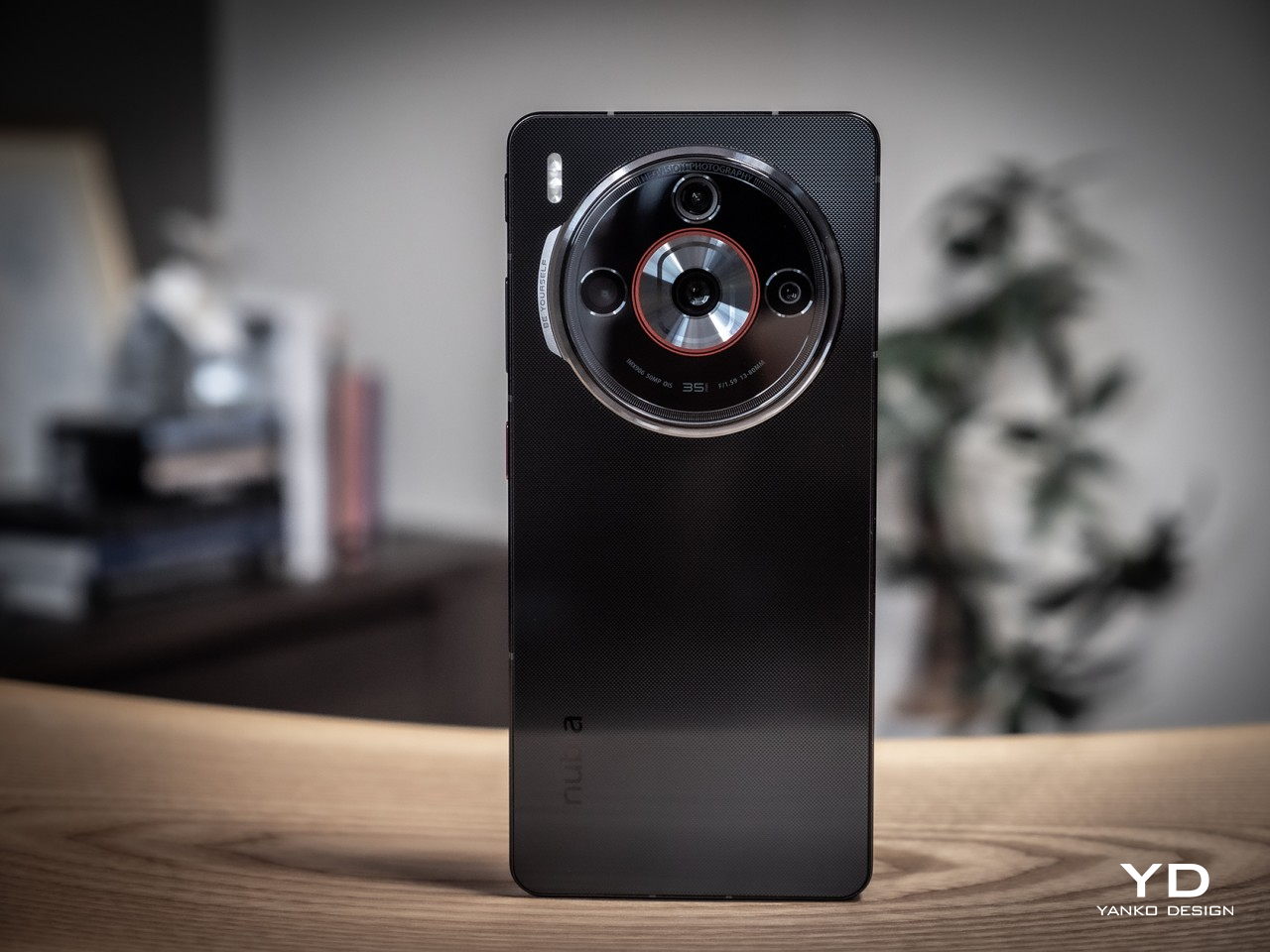
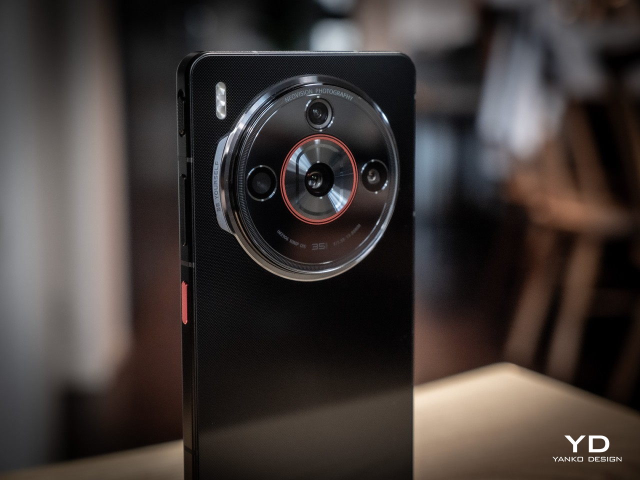
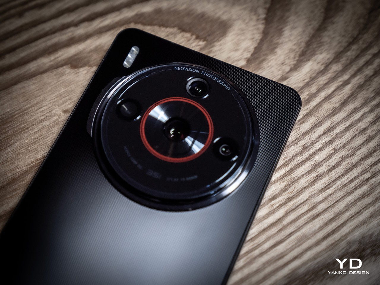
    nubia calls it a “Cosmic Ring Design” and it takes inspiration from our solar system. Three small circles surround a larger one in a symmetrical pattern, calling to mind how the planets revolve around the sun. A “coronet” extrudes from the left side with the words “Be yourself” engraved on it, sending the brand’s exhortation to everyone to take a closer look. It’s a well-balanced and pleasing composition, unlike the sometimes messy and skewed designs of other phones. The red ring around the central lens is a nice touch, giving the phone a more camera-like appearance, especially on our black review unit.

    There are three color options for the nubia Z60S Pro, with both Black and Aqua sporting a single solid swatch of color. White has a bit more flair, with cloudy formations of gray that give it some visual texture. Of course, all three have a glass panel covering their rears, so it’s really only an illusion. All sides of the phone are devoid of curves, except for the four corners, of course. This aligns with the design trends these days, like it or not, so it carries a modern touch in its simplicity.

    The Z60S Pro carries a moderately minimalist design, with only that large circle as the center of distraction. We’ve definitely seen worse, but we’ve also seen more interesting designs, so it doesn’t stand out that much unless you really take a closer look and take a moment to appreciate the design.

    Ergonomics

    The nubia Z60S Pro is quite a large phone, not unusual for a flagship these days, and that doesn’t come without consequences. Although it’s the de facto standard, of course, the design previously derided as “phablets” are not the easiest to hold securely and use with one hand, which is especially true with a thick and substantial device like this. Granted, it’s not alone in that category, with the likes of the Samsung Galaxy S24 Ultra leading the way. That doesn’t mean, however, that it is ideal or one that phone designers should aspire to.

    It’s especially problematic if the back of the phone is prone to slipping from your grasp due to its extra smooth texture. It’s rather curious that even after years, phone makers still haven’t perfected the design of anti-slip glass. Some do have a matte texture, but those still fail to stick to your palm. The one thing going in the Z60S Pro’s favor are, ironically, those flat edges and sharp corners that help your skin get a better grip. You can also put the included frosted protective case on the phone, but that also mars its pristine beauty.

    Performance

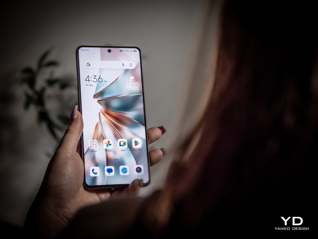
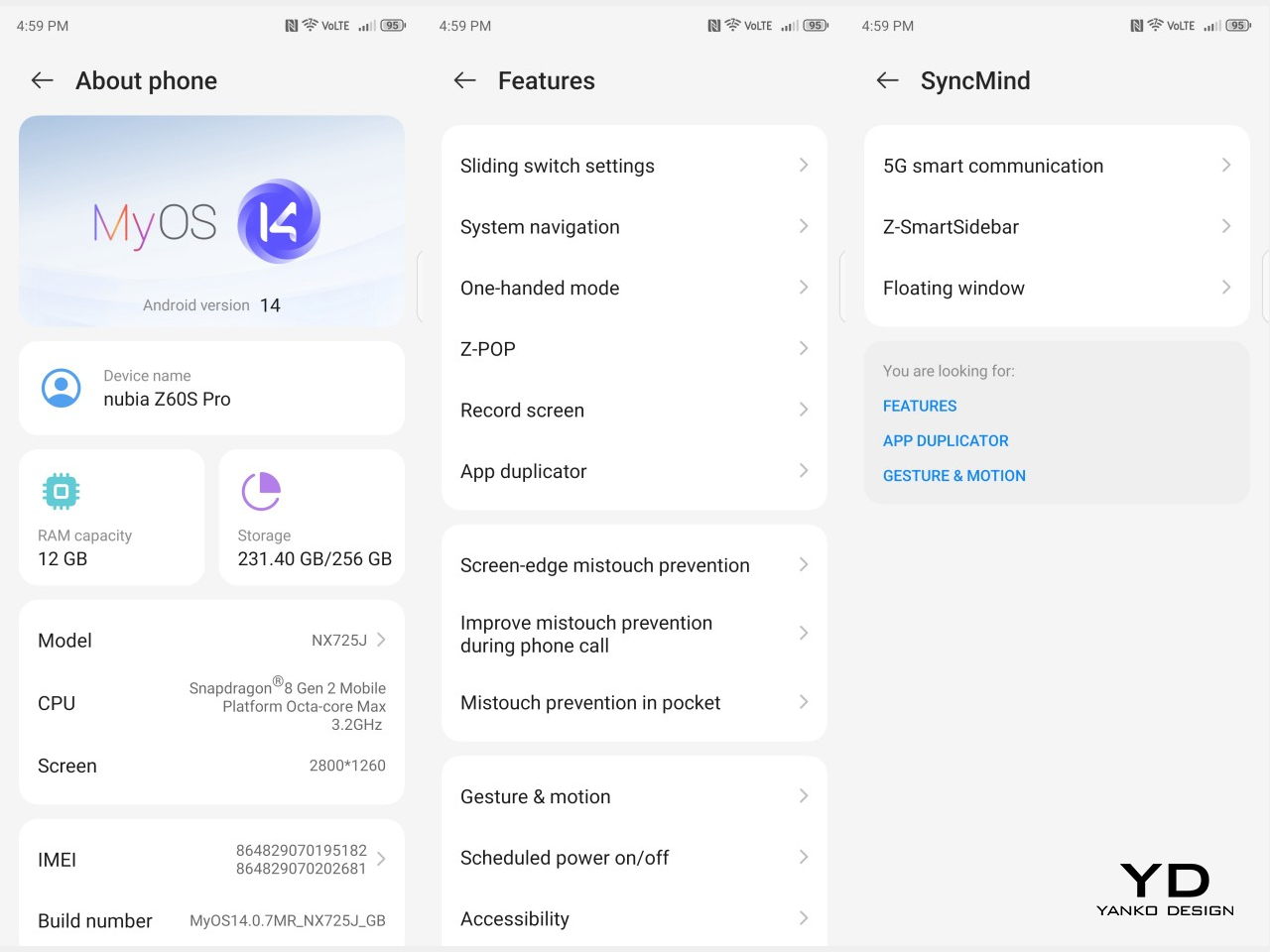
    As a premium flagship, you’d expect the nubia Z60S Pro to have the latest specs to boost its performance, and that is true for the most part. The 6.7-inch “1.5K” screen definitely meets expectations with a vibrant, color-rich, and fast display that is great for videos and games. There’s also 12GB of RAM and 256GB of storage, which could be higher depending on your configuration. The one odd duck is the processor, which is last year’s Qualcomm Snapdragon 8 Gen 2. In practice, there isn’t such a wide gap between the current Snapdragon flagship, but when you’re trying to advertise on-device AI functionality, you’ll want to squeeze every drop of performance from the silicon.

    Fortunately, there isn’t a bottleneck in performance, both from synthetic benchmarks and real-world use. This is critical considering how much nubia is banking on AI to sell the Z60S Pro. From system-level optimization to photography image processing, the phone is able to keep up with the demands of features as well as users. The large 5,100mAh battery, one of the reasons for the phone’s heft, also delivers a commendable all-day performance. 80W for charging is a bit disappointing when we’re always hearing about 100W or higher rates, but it’s not slow either. Just make sure to use the included power brick to maximize the charging time.

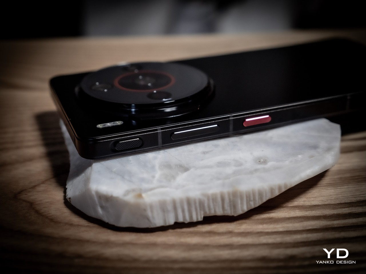
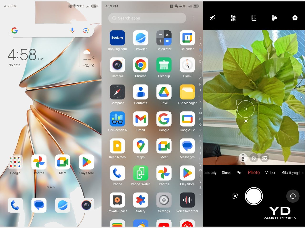
    The real focus of the phone’s AI chops is, of course, the camera system. It even has a slider button that, by default, is used to launch the camera app. The trio of cameras is led by a 50MP 1/1.56-inch Sony IMX906 sensor that aims for more natural-looking photos with its 35mm equivalent lens, a popular format for cameras because of how it more closely matches our eyesight. It is joined by another 50MP camera, this time with a 13mm focal length and 125-degree field of view for ultra-wide shots. There’s a dedicated telephoto camera but it only has a measly 8MP sensor. It’s not a bad set unless you love doing macro and zoom shots.

    The natural output of the cameras is pretty decent, but AI really takes it up a notch, especially for difficult scenes like zooming into the shot and nighttime photography. It’s actually quite impressive how much the Z60S Pro can accomplish with hardware that’s not exactly at the top of benchmarks, and you’d be hard-pressed to find the noise in those images unless you really examine them closely. As a phone designed to bring AI-powered photography to the masses who might not have advanced photography know-how, the nubia Z60S Pro definitely makes the cut. It empowers many to pull off breathtaking shots, artistic photography, and unforgettable moments just with a single tap of the camera button.

    Sustainability

    nubia is no newcomer to the smartphone arena and has its roots deep in this market. That’s why it’s a bit disappointing that it hasn’t yet left strong marks when it comes to ensuring the longevity of its products and of the planet at large. The Z60S Pro is your typical assortment of glass, metal, and plastic, and, at least officially, the company has made no statement on the use of recycled materials either in the phone itself or its packaging.
    And then there’s the matter of repairability and software updates, especially with the latter issue. The nubia Z60S Pro comes at a rather odd time when there will be new hardware coming out, and the company isn’t exactly well-known for pushing timely and frequent updates. It will definitely help improve its reputation if nubia becomes a bit more explicit in its upgrade strategy, allowing it to lead its peers by example instead of playing catch-up with trends.
    Value

    On its own, the nubia Z60S Pro is a pretty competitive modern smartphone. With the exception of the CPU, it has the current technologies the market has to offer and is able to keep up well with benchmarks, actual real-world performance, and camera output. And with a starting price of $569, it’s not a bad deal for its price, especially when you consider how those other AI-toting flagships are nearly double the price.

    But even with its rather distinctive camera design, the Z60S Pro sadly fails to stand out from the crowd as well. There are simply too many choices in that price range and just as many that offer nearly the same features for a lower price tag. What makes the situation a bit worse is that those competitors come from nubia’s other Z60 models as well. What the nubia has going for it will mostly be the brand loyalty, but those fans might also just grab the company’s more powerful and more exciting designs instead.

    Verdict

    We might be reaching that point in time again when the smartphone market is just over-saturated with choices. AI is becoming the differentiating factor, but almost all have similar features by now. Things get a bit more complicated when brands try to throw everything they can at a wall to see which ones stick, ending up with consumer confusion and missed opportunities. The nubia Z60S Pro could very well be one of these casualties. Offering decent performance and AI-enhanced photography at an affordable price, the smartphone gives everyone the opportunity to become a content creator, but it is sadly easily overshadowed not only by rival brands but even by its own siblings.

    The post nubia Z60S Pro Smartphone Review: AI to Empower Your Creativity first appeared on Yanko Design.