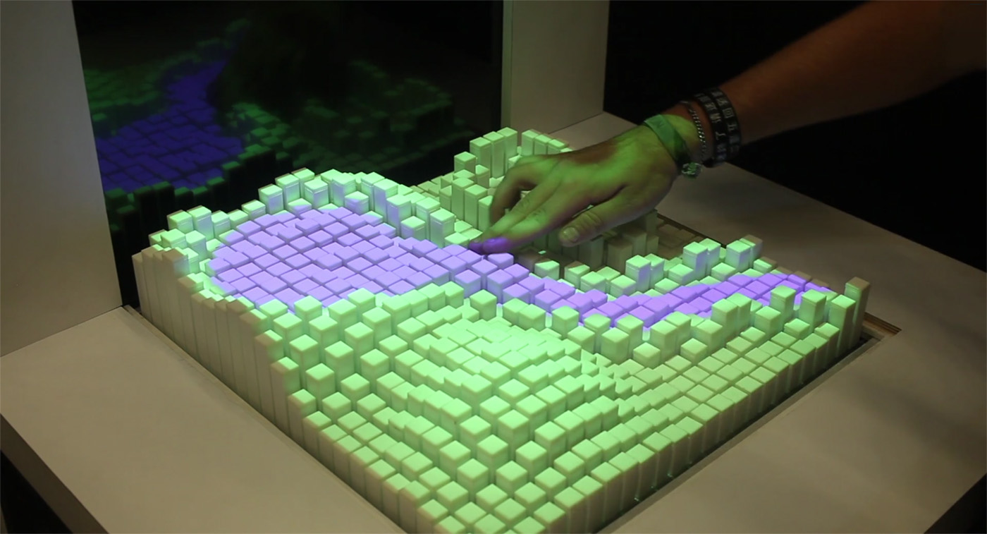
Shape-shifting interface lets you touch computer simulations

Researchers want us to better interact with machines via screens and VR, but let's face it, we humans like to touch real objects. MIT's Tangible Media Group has been playing with that idea for awhile now with projects like InForm, an uncanny telepres...

BBC teams up with British universities to research new TV interfaces and systems

BBC teams up with British universities to research new TV interfaces and systems

When the BBC asked "Where next?" most of us assumed that online-only programming and all-HD channels would be the extent of the broadcaster's ambition. Not so, now that the corporation has signed a deal with six British universities to research new ways that TV can be created, distributed and navigated. Buzzwords like "content" and "audience focused innovation" seem to mask an initiative to develop a new IP broadcasting system, work on user interfaces beyond gestures and research into how elderly, young and disabled viewers can get around 999-channel TV guides. The project will initially last for four years, by which time we're hoping that the BBC can just beam episodes of Doctor Who straight into our brains -- that's not too much to ask, is it?

Filed under: , , ,

Comments

Source: BBC

Eyes-on: MIT Media Lab’s Smarter Objects can map a user interface onto… anything (video)

Eyeson MIT Media Lab's Smarter Objects can map a user interface onto anything video

While patrolling the halls of the CHI 2013 Human Factors in Computing conference in Paris, we spied a research project from MIT's Media Lab called "Smarter Objects" that turns Minority Report tech on its head. The researchers figured out a way to map software functionality onto tangible objects like a radio, light switch or door lock through an iPad interface and a simple processor / WiFi transceiver in the object. Researcher Valentin Huen explains that "graphical user interfaces are perfect for modifying systems," but operating them on a day-to-day basis is much easier using tangible objects.

To that end, the team developed an iPad app that uses motion tracking technology to "map" a user interface onto different parts of an object. The example we saw was a simple radio with a a pair of dials and a speaker, and when the iPad's camera was pointed at it, a circular interface along with a menu system popped up that cannily tracked the radio. From there, Huen mapped various songs onto different positions of the knob, allowing him to control his playlist by moving it -- a simple, manual interface for selecting music. He was even able to activate a second speaker by drawing a line to it, then "cutting" the line to shut it off. We're not sure when, or if, this kind of tech will ever make it into your house, but the demo we saw (see the pair of videos after the break) seemed impressively ready to go.

Filed under: ,

Comments

Sony flaunts portable, social aspects of PS4 with high-res screenshots

Sony flaunts portable, social aspects of PS4 with highres screenshots

To keep the buzz going from its recent PlayStation 4 announcement event in New York, Sony's just released some high-res screenshots from the upcoming console's user interface. While we already saw many of them at the big event, there's a few intriguing images showing how the tablet or smartphone interface might look, along with shots of the social and video editing aspects of the UI. Other screens show the home, sharing, game streaming, user profile and friend feed pages, so hopefully the gallery below will whet your appetite until we can all actually see, you know, the console.

Filed under: ,

Comments

Via: Edge Online

Microsoft trots out Windows 8 mockups circa 2010, details the OS design process (video)

Microsoft trots out Windows 8 mockups circa 2010, details the OS design process (video)

Microsoft's Jensen Harris, who wears the hat of Director of Program Management for the Windows User Experience team, showed off some Windows 8 mockups minted in early 2010 during a talk at last summer's UX Week 2012. Now, a video of the presentation has been posted online, giving us a look at the reference designs. Despite roughly two years separating mockup creation and the launch of Windows 8, the OS remained remarkably true to its conceptual roots. During the hour-long talk, Jensen covers the birth of Windows 8, its driving principles and even mentions some distaste for the faux leather aesthetics in some iOS apps, calling them "cheesy visual effects." Hit the adjacent gallery to catch a peek of the early Start screen, on-screen keyboard, Charms Bar and lock screen. For a video of the hour-long talk covering the story of how Redmond's operating system came to be, head past the jump.

Continue reading Microsoft trots out Windows 8 mockups circa 2010, details the OS design process (video)

Filed under: , , , ,

Comments

Via: The Verge, istartedsomething

Source: UX Week

Autodesk researchers develop ‘magic finger’ that reads gestures from any surface (video)

DNP Autodesk magic finger

By combining a camera that detects surfaces with one that perceives motion, Canadian university researchers and Autodesk have made a sensor that reads finger gestures based on which part of your body you swipe. The first camera can detect pre-programmed materials like clothing, which would allow finger movements made across your pants or or shirt to activate commands that call specific people or compose an email, for instance. Autodesk sees this type of input as a possible compliment to smartphones or Google Glasses (which lack a useful input device), though it says the motion detection camera isn't accurate enough yet to replace a mouse. Anyway, if you wanted that kind of device for your digits, it already exists -- in spades.

Continue reading Autodesk researchers develop 'magic finger' that reads gestures from any surface (video)

Filed under: ,

Autodesk researchers develop 'magic finger' that reads gestures from any surface (video) originally appeared on Engadget on Mon, 22 Oct 2012 08:49:00 EDT. Please see our terms for use of feeds.

Permalink Tom's Hardware  |  sourceAutodesk  | Email this | Comments

MediaPortal posts new beta with new look and CableCARD, teases bigger sequel (video)

MediaPortal posts new beta with new interface and CableCARD, teases bigger sequel video

MediaPortal is a rare veteran spinoff of XBMC -- a testament to its fan base, but also a sign that it needs a fresh coat of paint. A new 1.3 beta might offer just what home theater PC users have been looking for to keep the front end relevant, at least in the short term. It carries a much more contemporary (and less Windows Media Center-like) skin with minor tweaks to the layout and overall interface. CableCARD support also makes its overdue appearance, although the lack of official CableLabs approval keeps the software from recognizing any copy-protected shows. Don't fret if those additions aren't enough, however -- we've been given a hint as to what the long-in-development MediaPortal 2 will offer through a pair of videos. The clips are largely top-level overviews, but they allude to mobile tie-ins, events, extensions, more skin support, video backgrounds and news. With an Autumn Build of MP2 available "right around the corner" for viewers, it might not be long before we learn what those new additions are like through first-hand experience.

Continue reading MediaPortal posts new beta with new look and CableCARD, teases bigger sequel (video)

Filed under: , ,

MediaPortal posts new beta with new look and CableCARD, teases bigger sequel (video) originally appeared on Engadget on Thu, 18 Oct 2012 23:17:00 EDT. Please see our terms for use of feeds.

Permalink Missing Remote  |  sourceMediaPortal  | Email this | Comments

PlayStation Store update hitting PAL regions on October 17th, North America on October 23rd

PlayStation Store update hitting PAL regions on October 17th, North America on October 23rd

If you feel the current design of the PlayStation Store leaves a lot to be desired, then you'll probably be glad to hear it's being totally revamped. A new UI should do a better job of pushing fresh content at you, and its appearance will be consistent regardless of whether you're outputting in standard or high def. Searching has been improved to handle abbreviations and misspellings, and a dynamic list of suggestions will try to work out what you're looking for as you type. Also, Vita and PSP content will be separated, new filters will be available and content hubs will offer everything linked to a certain title, à la the Xbox 360 Marketplace. Sound good? Well, there's not long to wait - it'll be launching in PAL regions (Europe, Asia, Australia and others) on October 17th, while North Americans will receive it almost a week later, on October 23rd.

Filed under: , ,

PlayStation Store update hitting PAL regions on October 17th, North America on October 23rd originally appeared on Engadget on Thu, 11 Oct 2012 11:03:00 EDT. Please see our terms for use of feeds.

Permalink Joystiq  |  sourceVG247, Sony PlayStation Blog  | Email this | Comments