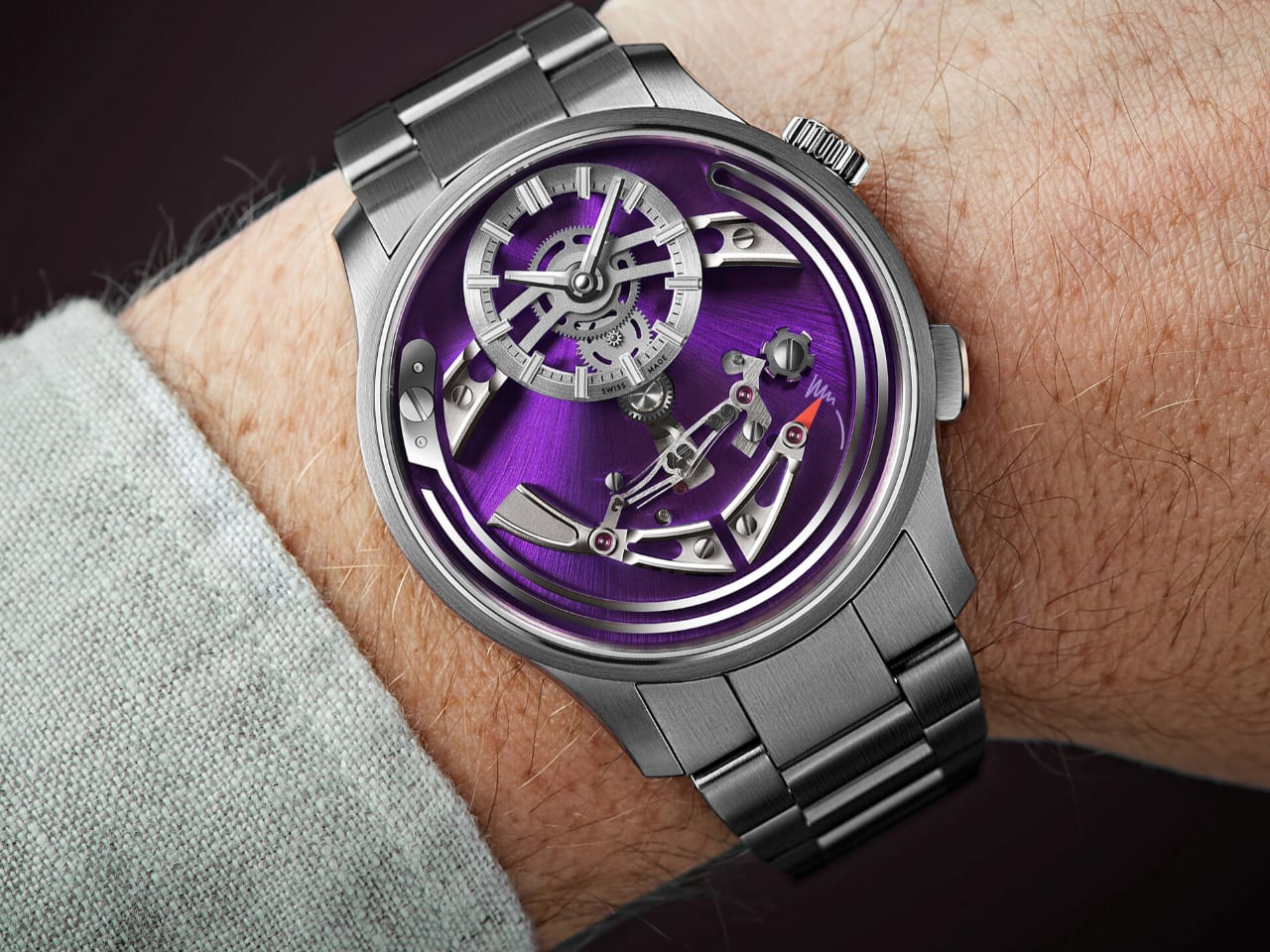
Chime & Charm: The Christopher Ward Bel Canto Hour-Chiming Wonder

It’s Wristwatch Wednesday, and I’m bringing you something a little different today. I asked for submissions from our readers, and Scott was kind enough to send me his take on the Christopher Ward Bel Canto—a watch that’s simply gorgeous. Inspired by his perspective, I’ve decided to dive deeper into what makes the Bel Canto an impressive piece of horology, and it simply stands out as a genuinely unique piece.

Designer: Christopher Ward

For anyone familiar with the watch enthusiast community or the active forums dedicated to timekeeping, Christopher Ward needs no introduction. The British brand has become a darling of watch enthusiasts by delivering Swiss-level craftsmanship at accessible prices, a feat that’s difficult to overlook in an industry where exclusivity often dictates value.

High Horology Without the Hype

Christopher Ward is best known for embracing a design philosophy that draws inspiration from some of the industry’s most iconic watches—we’re talking Genta-inspired integrated bracelets and pieces that might remind you of Omega’s Aqua Terra. With the Bel Canto, Christopher Ward ventured into new territory, focusing on creating something distinctive and genuine: an hour-chiming masterpiece that stands apart from its previous offerings.
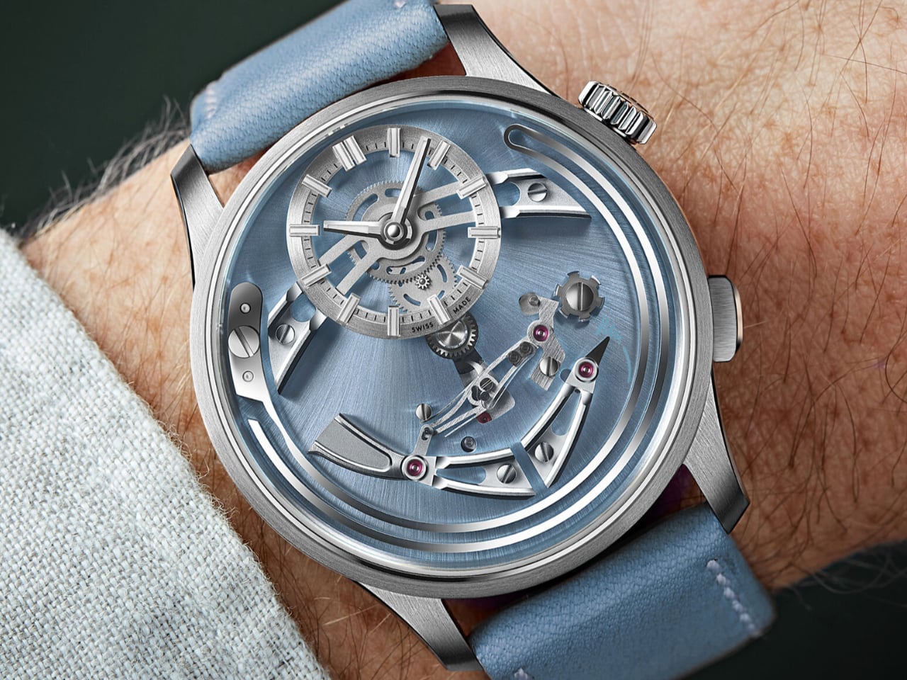
Scott accurately described it as a ‘Sonnerie au Passage’—an hour chimer—delivered at a price far below what this complication usually commands. Typically reserved for high-end brands, Christopher Ward managed to offer this experience for just under $4,210 on the steel bracelet. The Bel Canto has become a gateway to high horology for those who’ve always dreamed of hearing their wrist sing but couldn’t quite stomach the entry fee.

Ringing In the Hours—Literally

One of the most endearing aspects of the Bel Canto is its ability to mark each hour with a resonant chime. As Scott eloquently wrote, “There is something vintage and grounding about recognizing the arrival of a new hour.” He’s right—in a time when everything moves quickly, it’s refreshing to mark time in a way that’s both old-school and audibly charming. The chime from the Bel Canto is a distinctive feature that brings genuine joy to the wearer, creating an experience that feels nostalgic and engaging.
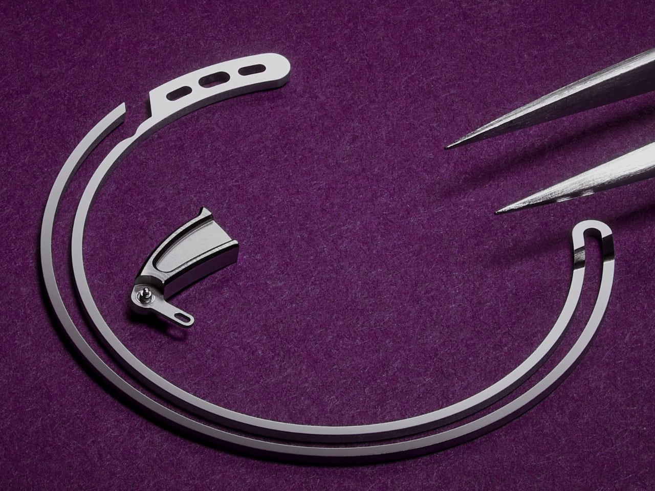
Photo: Christopher Ward

The mechanism is both simple and captivating. The watch’s chime is powered by a steel spring placed around the edge of the dial. This spring has been finely tuned to produce a sound that is pleasing to the ear while being loud enough to be heard from the wrist. The hammer, designed to look like a bird’s tail feathers, strikes a curved metal gong within the titanium case, creating a resonant tone that fills the room without being disruptive. The chime adds a sense of occasion to each passing hour, making it a delightful part of everyday wear.
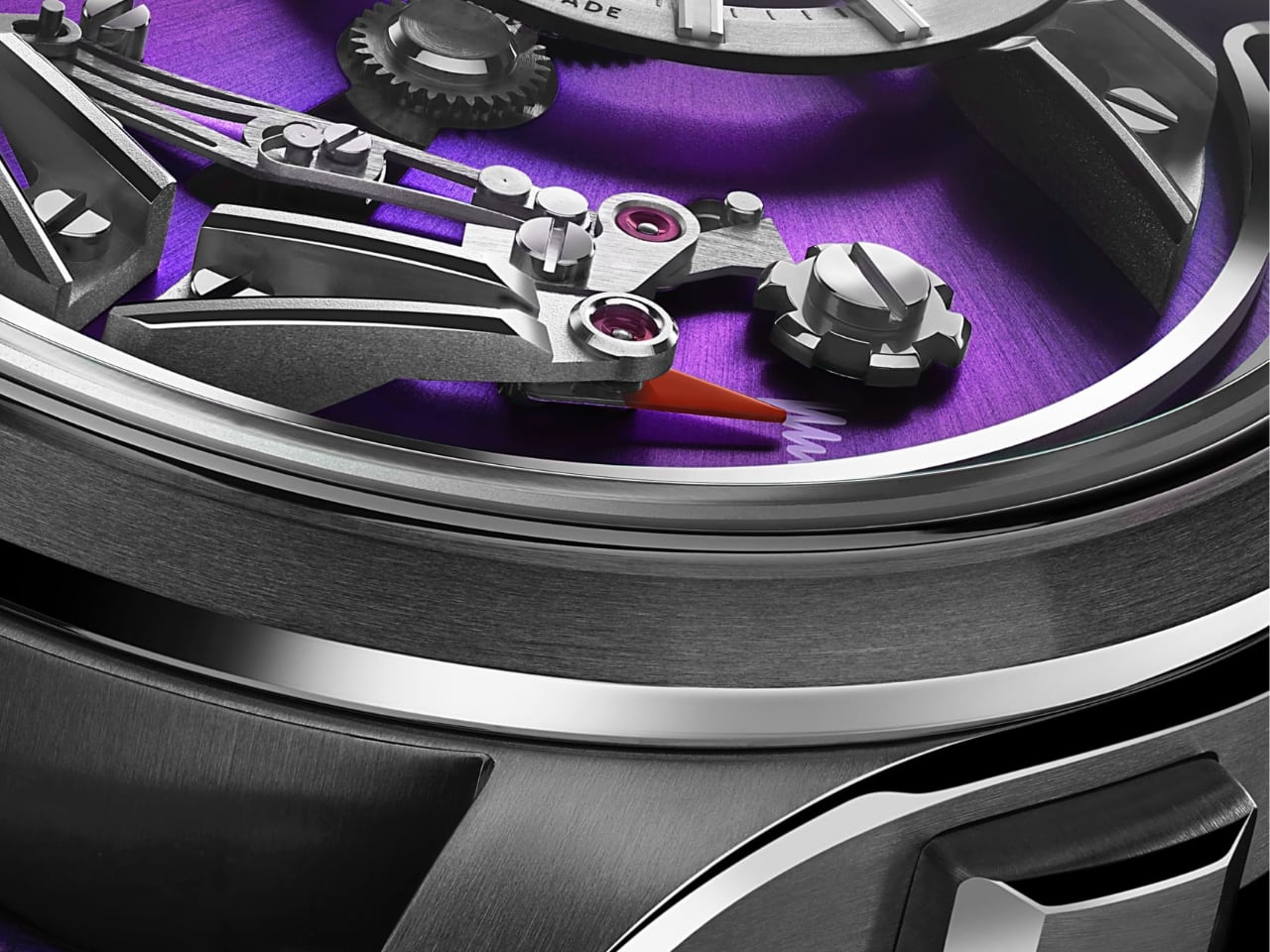
Photo: Christopher Ward

Photo: Christopher Ward

A Face That Demands Attention

It’s an hour-chiming timepiece that reflects the true dedication to watchmaking artistry. Its aesthetics are meticulously crafted and thoughtfully executed. Scott mentions, “The challenge is looking away from it. ” He’s absolutely right. Christopher Ward has flipped the watchmaking playbook by placing much of the movement—the bits and gears we typically only see through a case back—right on the dial.
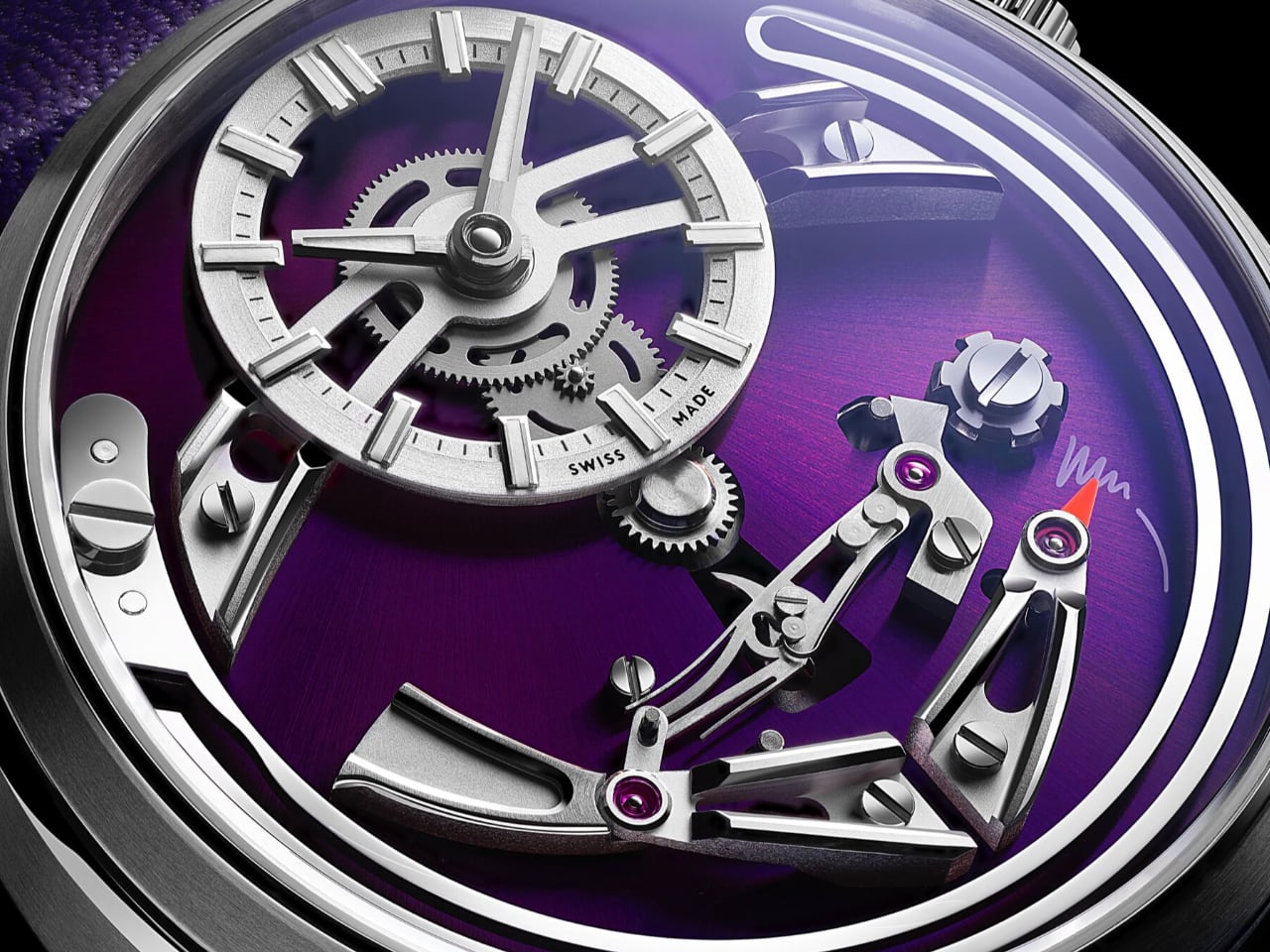
Photo: Christopher Ward

The result? A visual playground where every glance reveals intricate details layered one upon another. The time-telling subdial seems to ‘float’ over the sunray-finished Viola dial, giving a remarkable sense of depth. The hands and indexes, filled with Super-LumiNova®, ensure visibility even after dark. Time itself is relegated to a smaller dial at 12 o’clock, adding to the charm. It’s a watch that makes you want to get lost in its face, its moving gears, and the craftsmanship evident in every polished surface and carefully shaped component. The Bel Canto illustrates a ‘horological art installation,’ forcing you to pause and admire the mechanical ballet taking place on your wrist.

FS01 Chiming Movement and the Art of Sound

The FS01 movement was developed by Christopher Ward’s technical director, Frank Stelzer. It’s a clever adaptation of their ‘jumping hour’ mechanism, repurposed to deliver a chime at each hour. Over 60 new components were added to create the striking module, which sits atop a reliable Sellita SW200-1 base and offers a 38-hour power reserve. The result is a movement that carries the brand’s identity in every detail, blending innovation with classic watchmaking elements.

Photo: Christopher Ward

The Bel Canto’s chime comes from a carefully tuned steel spring positioned around the edge of the dial. It’s engineered to be clear and pleasant—audible enough to catch your attention without feeling disruptive. This harmonious tone is essential to Bel Canto’s unique charm, making each hour a subtle yet delightful event.

Colorways That Pop—Or Not

If there’s one thing Christopher Ward has mastered, it’s color options. As Scott said, CW might as well stand for “colorways.” The brand offers the Bel Canto in various hues, from the bold Viola (purple) to the classic Nero (black). The blue version, dubbed Cielo, practically dances in the sunlight, giving an iridescent sheen that’s hard to capture in words alone.
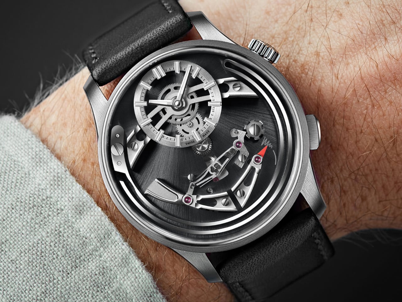
Photo: Christopher Ward

The bold colorways are polarizing, but therein lies their allure. For the wearer looking to make a statement, there’s no beating the Viola or the Cielo. The Nero is a solid choice for those who prefer something more understated, proving that even the quietest options can still have plenty of character. Scott prefers the black, recognizing its versatility, but also acknowledges the appeal of the bolder Viola and Cielo colorways that reflect the watch’s unique character.
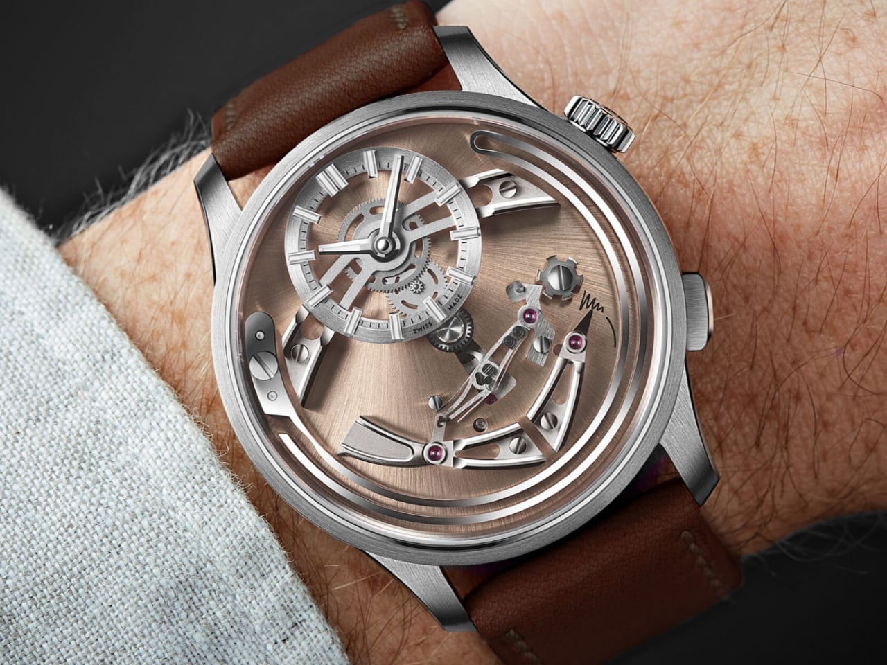
Photo: Christopher Ward

Perfect? Not Quite—But Close

No watch is perfect, and Scott points out a few areas where the Bel Canto falls short. There’s some “play in the crown,” as he says, and the leather strap could be more refined for a watch that carries itself as a dress piece. Christopher Ward has acknowledged feedback regarding the Bel Canto. The company has proactively addressed customer service issues that arose after the watch’s launch. The success of the Bel Canto led to a significant increase in inquiries, which initially overwhelmed their customer service capacity. In response, Christopher Ward has hired additional staff and improved their customer service processes to better handle the increased customer demand and feedback.
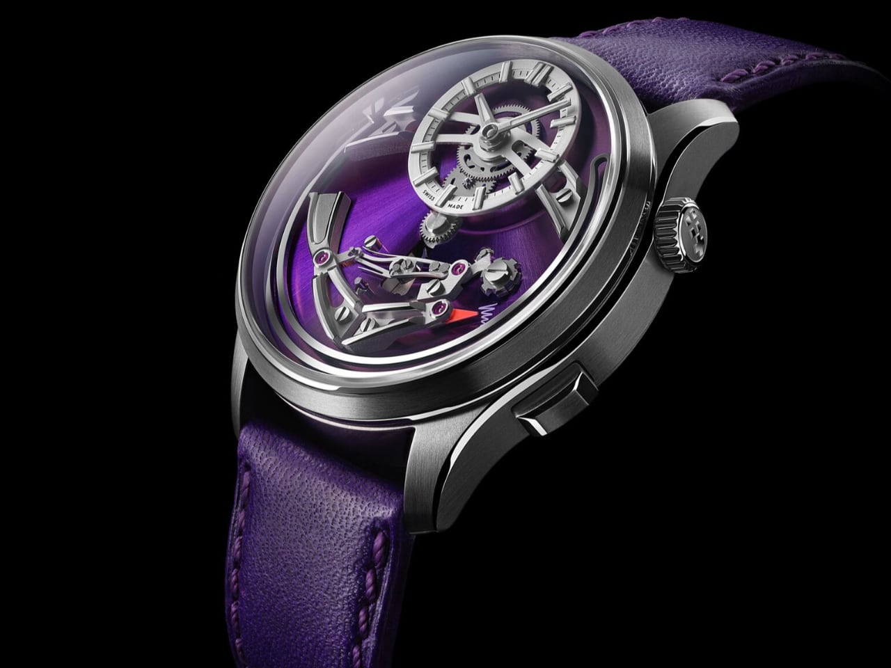
Photo: Christopher Ward

Additionally, they are known for closely monitoring forums and customer feedback to improve their products and services continuously. The model is called the “C1 Bel Canto,” opening the door for potential future versions. Given Christopher Ward’s attention to customer input, future iterations may well reflect the refinements enthusiasts ask for.

One of our additions to Scott’s notes would be the choice of case material. Christopher Ward opted for grade-5 titanium, and while it’s a solid choice for acoustics and wearability, the watch’s lightness can make it feel slightly less substantial to those accustomed to the heft of a stainless steel case. Still, once you’ve spent some time with it, the lightweight nature becomes more of an asset, making this a watch you can comfortably wear all day without fatigue.

Why the Bel Canto Matters

Scott noted that the Bel Canto stands apart because of its purely mechanical nature, a refreshing contrast to the digital-heavy smartwatch market. In a market filled with smartwatches that can track your sleep and tell you how many calories you burned at lunch, the Bel Canto does one thing and does it exceptionally well: it keeps time and lets you experience time meaningfully. It’s a throwback but also a challenge to the modern conception of what a watch should be.
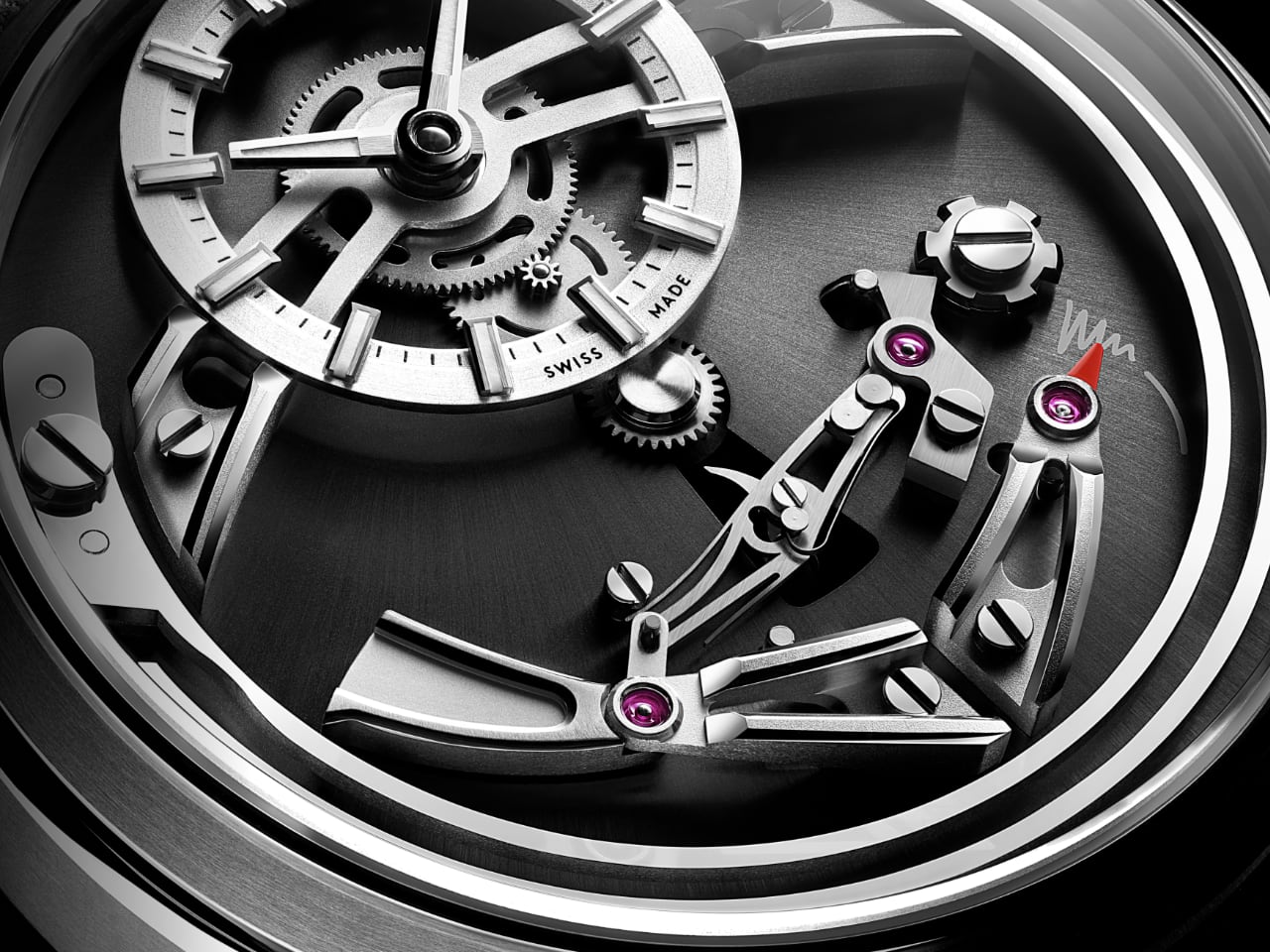
Photo: Christopher Ward

There’s a lot of talk about the future of the watch industry, especially in the context of microbrands and independents like Christopher Ward. Are these brands here to stay, or are they part of a trend that will disappear as quickly as it arrives? The Bel Canto showcases Christopher Ward’s mechanical craftsmanship. It stands as a reminder of the value of traditional watchmaking, even amidst the rise of smartwatches.

The Christopher Ward C1 Bel Canto is $3,795 on a leather strap and $4,210 on the titanium bracelet. At $4,210, the Bel Canto isn’t cheap, but it’s also not outrageously priced when you consider what you’re getting—an independent brand’s take on a complication that usually requires a far larger investment. Scott concluded by emphasizing that the Bel Canto demonstrates Christopher Ward’s capability to create desirable, well-crafted timepieces, signaling their strength as a brand poised to endure in the competitive watch industry.

As enthusiasts, we often get caught up in the comparison game—what’s better, what’s more iconic, what’s worth the investment. The Bel Canto sidesteps all of that by simply existing as a passion project brought to life. It doesn’t beg to be compared, which might be its greatest achievement. It’s a timepiece that’s self-assured, audacious, and delightfully musical—just what you need for a wrist that’s ready to sing.

So, if you find yourself drawn to the Bel Canto, don’t hesitate. With limited runs and colors that disappear faster than a magician’s assistant, it’s the kind of watch that could be here today, gone tomorrow. And when it’s gone, you’ll want to have been one of the lucky few who heard it ring in the hour, every hour.

Typically, we like to conclude with our own thoughts, but today, we’ll let our special guess do the honor.

Scott’s take: ‘The chime is absolutely lovely. It is loud enough to be audible across the room, but so musically pleasing that it’s never an intrusion.’

3 Things Scott Loves About the Christopher Ward C1 Bel Canto:

  • The Chime: ‘The chime is absolutely lovely. It is loud enough to be audible across the room, but so musically pleasing that it’s never an intrusion.’
  • The Movement on Display: Scott loves how much of the movement is visible right on the face of the watch. ‘The challenge is looking away from it,’ he mentions, highlighting the visual complexity that keeps the watch interesting every time you glance at it.
  • Color Options: Scott appreciates the range of colorways, particularly the Viola and Cielo, which add a bold character to the watch. However, he ultimately prefers the classic Nero for its versatility.

3 Things Scott Thinks Could Improve the Christopher Ward C1 Bel Canto:

  • Crown Play: Scott pointed out that there’s some ‘play in the crown,’ which affects the feeling of precision when setting the time. Tightening this would enhance the overall experience.
  • Leather Strap Quality: Scott mentioned that the leather strap, while of good quality, could be more refined for a watch that positions itself as a dress piece. He believes a higher-end strap option would align better with the watch’s unique features.
  • Weight Perception: The use of grade-5 titanium makes the watch notably lightweight, which some might feel lacks the heft of traditional stainless steel. Scott suggests perhaps offering an alternative in stainless steel for those who prefer more substantial weight.

The post Chime & Charm: The Christopher Ward Bel Canto Hour-Chiming Wonder first appeared on Yanko Design.

7 Reasons Why the Omega Speedmaster Calibre 321 in Canopus Gold Is the Ultimate Collector’s Dream

Welcome to Speedy Tuesday, where we share our favorite Speedmaster models. This week, we’re spotlighting this special edition, which pays tribute to the original 1957 Speedmaster. The Omega Speedmaster Calibre 321 in Canopus Gold combines tradition and modern style, capturing the essence of Omega’s rich heritage while showcasing the height of contemporary watchmaking. It embodies the spirit of exploration and innovation that has defined the Speedmaster series for decades. This luxurious timepiece draws attention with its rich history, exquisite craftsmanship, and advanced materials.

Designer: Omega

Omega has long been revered for its role in space exploration, with the Speedmaster famously accompanying astronauts on their lunar missions. The reintroduction of the Calibre 321 movement in this model pays homage to that legacy, offering enthusiasts a piece of history encased in a functional and beautiful watch. The Canopus Gold edition enhances this legacy with its unique elegance and durability, making it a coveted addition for collectors and enthusiasts.

6 Features That Make the Speedmaster Calibre 321’s Dial Unique

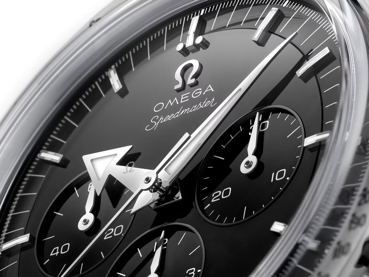
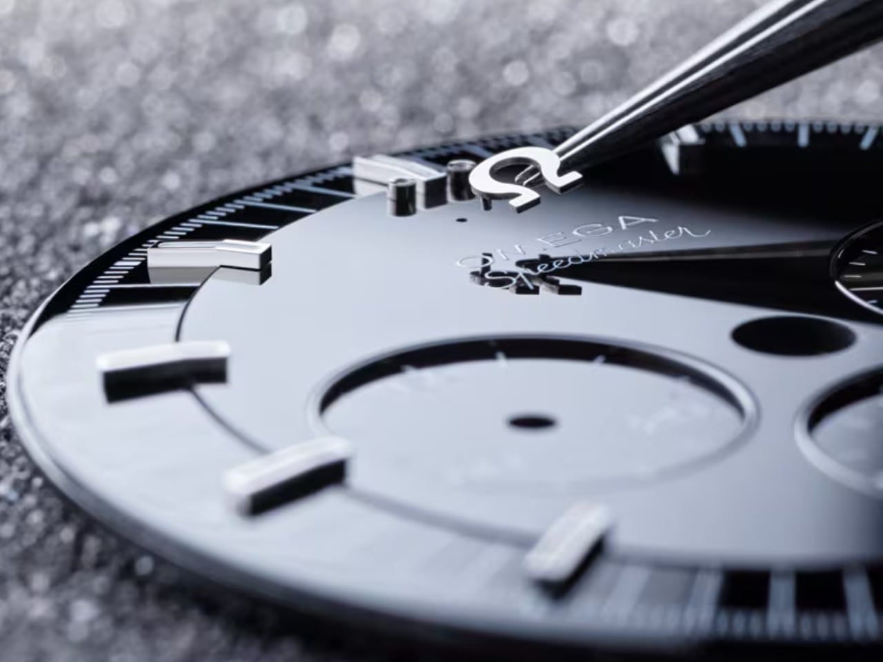
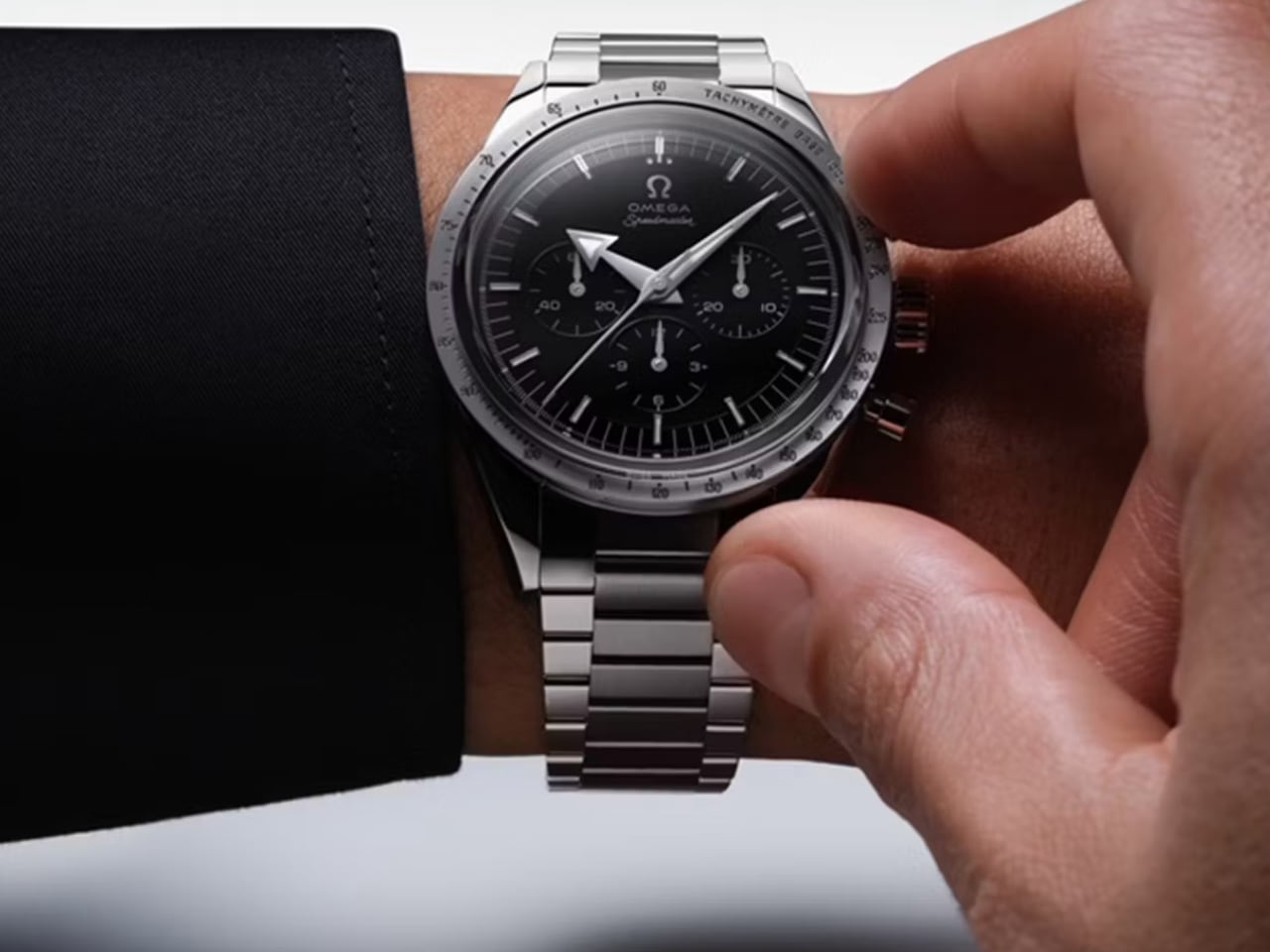
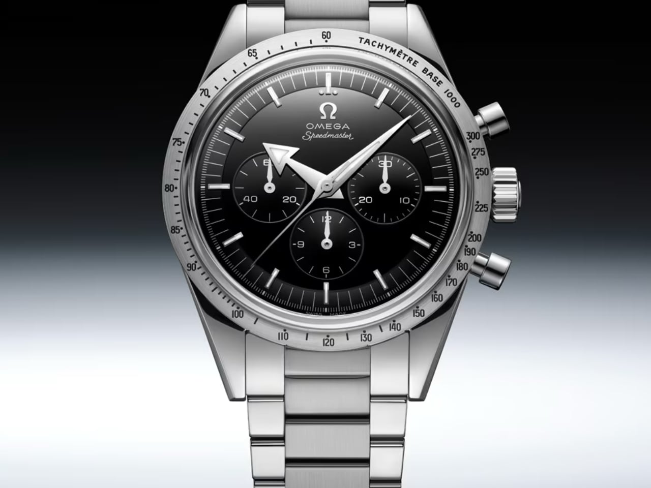
The Speedmaster Calibre 321 dial in Canopus Gold embodies Omega’s dedication to thoughtful design and refined quality, making a powerful statement. Crafted from black onyx, the dial offers a bold contrast to the watch’s white gold elements, creating a visual harmony that is both elegant and distinctive. The deep black of the onyx is complemented by the luminous sheen of the 18K white gold hands and indexes, which are further enhanced by a Canopus Gold PVD treatment.

One of the dial’s most captivating features is the applied vintage Omega logo, complete with the historical oval “O.” This subtle detail honors the brand’s storied past while seamlessly integrating with the watch’s modern aesthetic. The dial also features three subdials, meticulously arranged to display small seconds, 30-minute, and 12-hour counters. These subdials enhance the watch’s functionality and visual appeal, offering a balanced and harmonious layout.

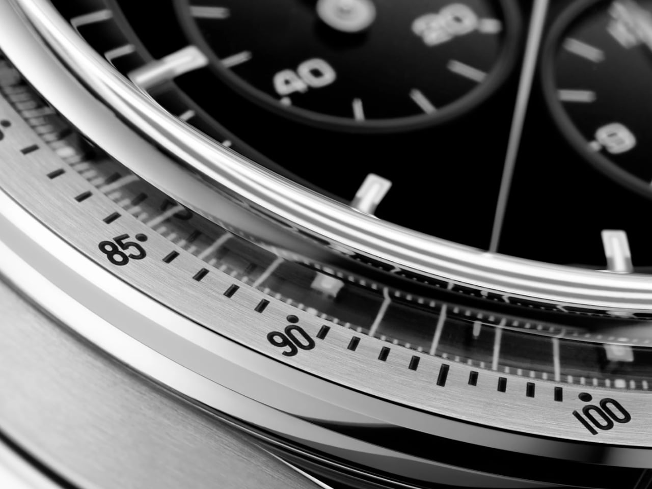
The bezel is equally impressive, incorporating a tachymeter scale filled with black Grand Feu enamel. This technique involves firing the enamel at high temperatures to achieve a durable and vibrant finish. The bezel includes vintage-inspired details such as the “dot over ninety” (DON) and a dotted diagonal to seventy, which are subtle nods to the Speedmaster’s rich history. These elements create a visually stunning dial deeply rooted in Omega’s legacy.

The attention to detail extends to the watch’s overall aesthetic, with the Canopus Gold alloy providing a luxurious backdrop for the dial’s intricate features. This proprietary alloy enhances the watch’s brilliance and longevity, ensuring that the Speedmaster Calibre 321 in Canopus Gold is a beautiful and durable timepiece.

History of the Calibre 321 Movement

The Calibre 321 movement holds a special place in watchmaking history, celebrated for its precision and robust construction. Introduced in the late 1940s, it quickly earned a reputation for reliability and intricate design, becoming an iconic part of Omega’s lineup. Its most significant role came during NASA’s Apollo missions in the 1960s when it powered the first watch worn on the moon.

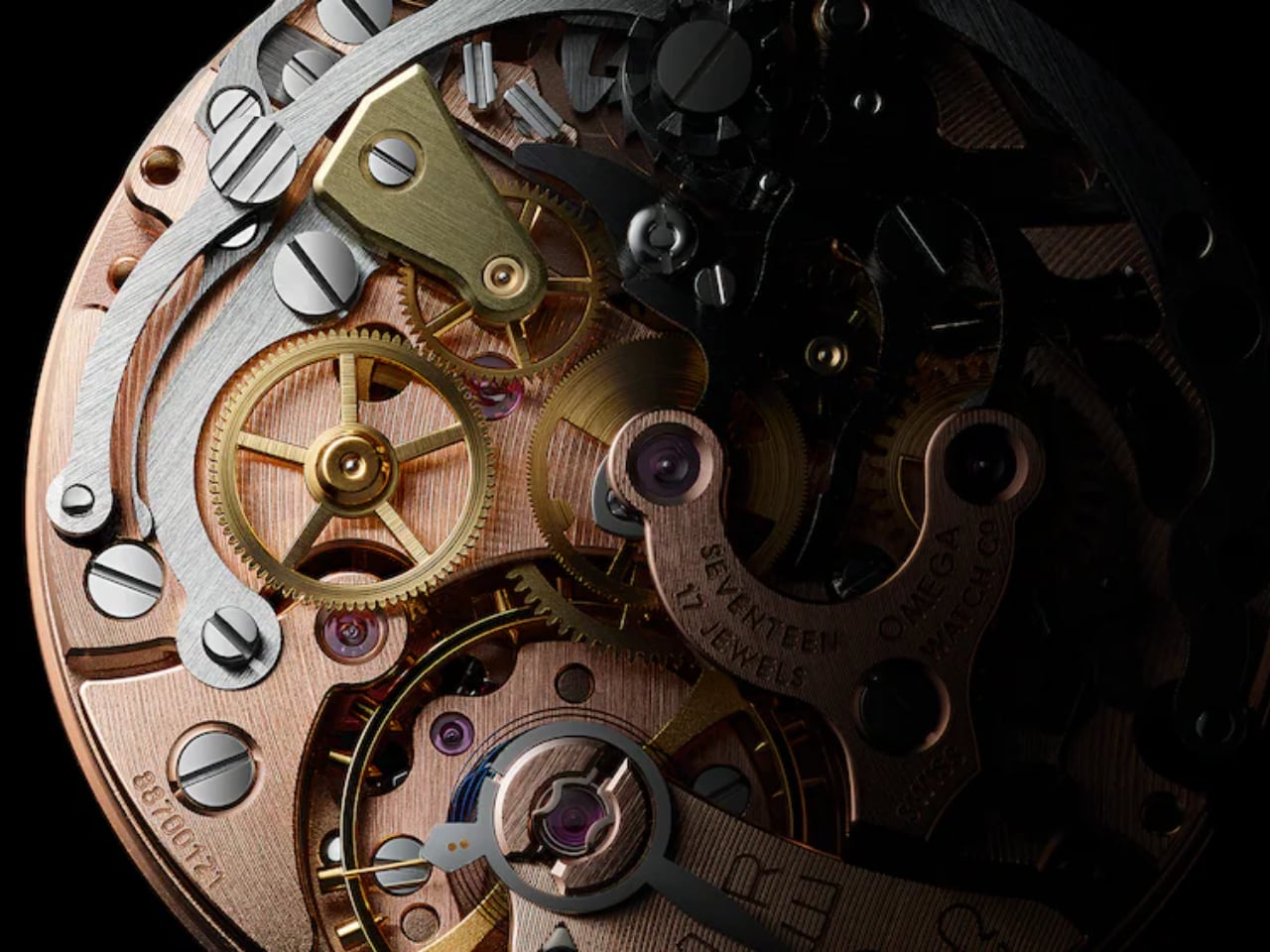
This manual-winding movement operates at a frequency of 18,000 vibrations per hour (vph), providing smooth, dependable performance with a 55-hour power reserve that keeps it functional even during extended periods of non-use. Its column-wheel chronograph mechanism exemplifies traditional craftsmanship, offering precise control and smooth operation, which made it a favorite among watch enthusiasts and purists. The revival of the Calibre 321 movement in modern Speedmasters reflects Omega’s commitment to honoring its heritage and celebrating the artistry of vintage watchmaking.

One of the key features of the Calibre 321 is its column-wheel chronograph mechanism, which is prized for its accuracy and smooth operation. The column-wheel design allows precise control over the chronograph functions, making it a favorite among watch enthusiasts who value traditional craftsmanship. This movement is a technical wonder and a piece of history, as it was the exact mechanism that powered the original Speedmaster watches worn during the Apollo moon missions.

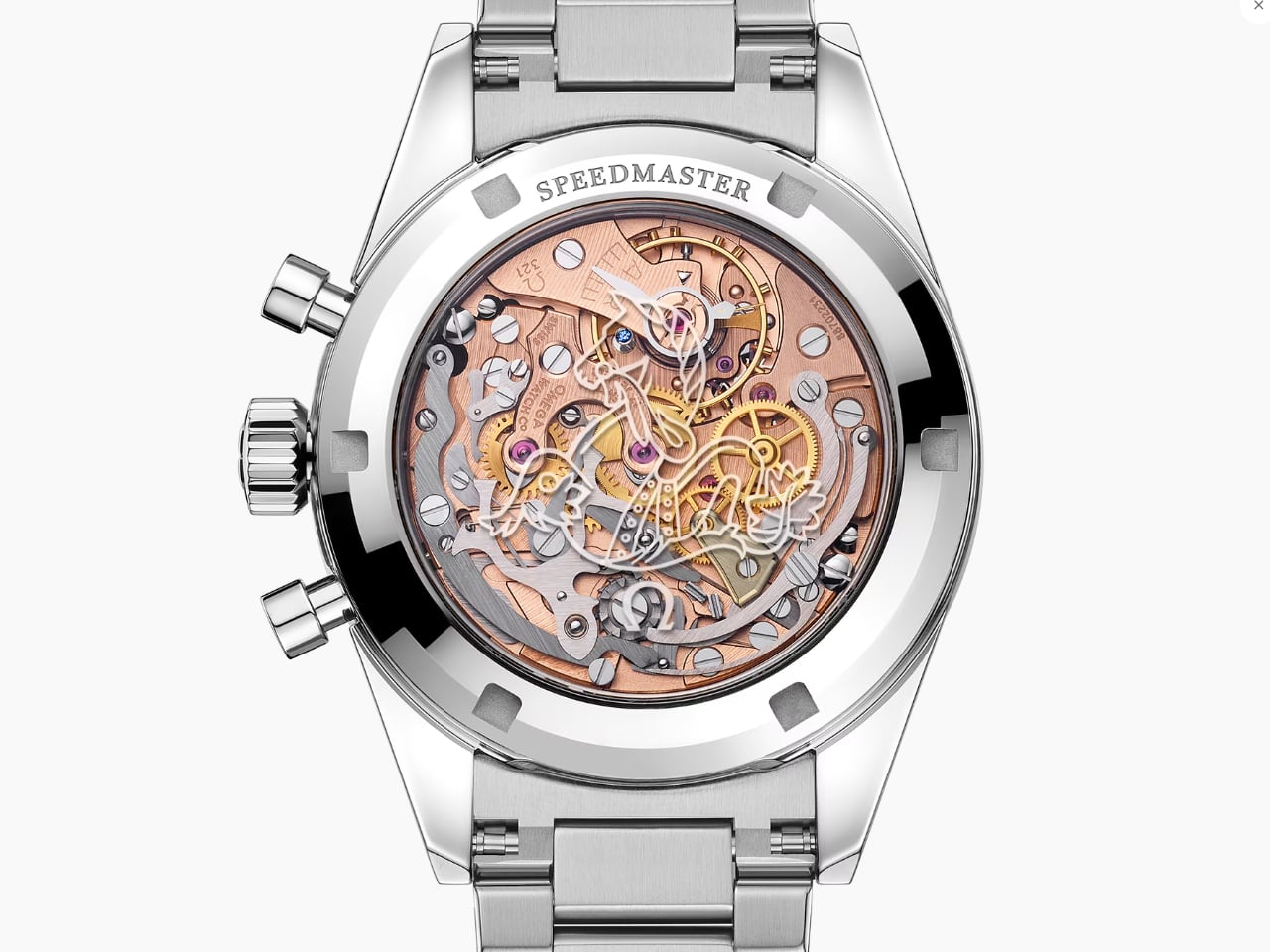
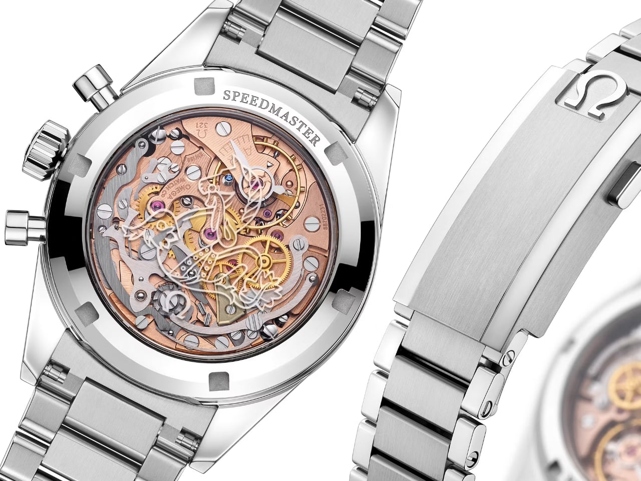
The movement is beautifully displayed through a sapphire crystal caseback, allowing wearers to appreciate its creation’s intricate engineering and artistry. The caseback is engraved with the Omega Seahorse logo, symbolizing the brand’s enduring legacy and commitment to excellence. Additionally, the blue sapphire eye in the caseback engraving marks the Speedmaster’s 65th anniversary, adding a touch of elegance and celebration to the watch.

Each Calibre 321 movement is assembled by a single watchmaker, ensuring every component is meticulously crafted and inspected for quality. This level of attention to detail sets the Speedmaster Calibre 321 apart, offering a timepiece that is as much a work of art as a functional watch. Omega’s dedication to preserving the authenticity and craftsmanship of the original movement is evident in every aspect of the Calibre 321, making it a prized possession for collectors and enthusiasts.

A Closer Look at the Stunning Case Design of the Speedmaster Calibre 321

The Omega Speedmaster Calibre 321 case in Canopus Gold beautifully captures Omega’s signature blend of luxury, innovation, and respect for its rich history. Crafted from Omega’s proprietary Canopus Gold, an 18K white gold alloy, the case offers a unique combination of elegance and durability. This alloy is enhanced with elements like platinum, rhodium, and palladium, contributing to its brilliant luster and resilience over time.

Dimensions and Proportions

The case’s diameter is 38.6mm, which provides a refined and understated presence on the wrist. This size is slightly smaller than some other variants in the Speedmaster series, offering a more classic and elegant look that appeals to those who appreciate subtlety in their luxury timepieces. The thickness and overall proportions are carefully balanced to ensure comfort and wearability, making it suitable for both formal occasions and everyday wear.

Bezel and Engravings

The Canopus Gold edition bezel features a tachymeter scale filled with black Grand Feu enamel, a traditional technique that ensures durability and a vibrant finish. The bezel also showcases vintage-inspired details like the ‘dot over ninety’ (DON) and a dotted diagonal to seventy, which honor the Speedmaster’s rich history and attract collectors who appreciate these subtle nods to the past.

Case Back and Movement

The case back is another area where Omega’s craftsmanship shines. It features a transparent sapphire crystal, allowing an inside view of the meticulously crafted Calibre 321 movement. This movement is a reissue of the original used in the Speedmasters of the 1960s, celebrated for its precision and role in space exploration. The transparency of the case back not only highlights the movement’s intricate details but adds a modern touch to the watch’s classic design.

Finishing and Details

The case’s finishing is executed with great attention to detail, showcasing a combination of polished and brushed surfaces that enhance the watch’s visual appeal. The polished areas reflect light beautifully, while the brushed sections add a subtle texture that highlights the case’s contours. This interplay of finishes contributes to the watch’s overall elegance and sophistication.

Crown and Pushers

The crown and chronograph pushers are also crafted from Canopus Gold, maintaining the watch’s cohesive aesthetic. The crown is engraved with the Omega logo, a mark of authenticity and heritage. The pushers are designed for ease of use, providing a satisfying tactile response when operating the chronograph functions.

Key specifications:

  • Case Material: Made from Omega’s proprietary Canopus Gold (18K white gold alloy), this case offers enhanced brilliance and longevity. The alloy’s unique composition includes platinum, rhodium, and palladium.
  • Case Diameter: At 38.6mm, it is slightly smaller, offering a more understated elegance.
  • Bezel: The Canopus Gold bezel with black Grand Feu enamel tachymeter scale combines luxury with traditional craftsmanship.
  • Dial: The black onyx dial with Canopus Gold PVD-treated markers provides a striking contrast and a modern touch.
  • Bracelet/Strap: The Canopus Gold bracelet adds to the watch’s cohesive luxury, ensuring a seamless look.
  • Price: Priced at approximately $81,000, this variant is for those who appreciate top-tier luxury and innovative materials.

The Omega Speedmaster Calibre 321 in Canopus Gold combines classic design with modern touches, creating a beautiful and historically significant timepiece. This watch celebrates Omega’s rich history and craftsmanship and features a stunning dial, iconic movement, and high-quality materials. It’s an excellent choice for collectors and enthusiasts who appreciate true artistry in luxury watches.

The post 7 Reasons Why the Omega Speedmaster Calibre 321 in Canopus Gold Is the Ultimate Collector’s Dream first appeared on Yanko Design.

Why the Leonardo 1519 Watch Runs Backwards: A Col&MacArthur Tribute to da Vinci

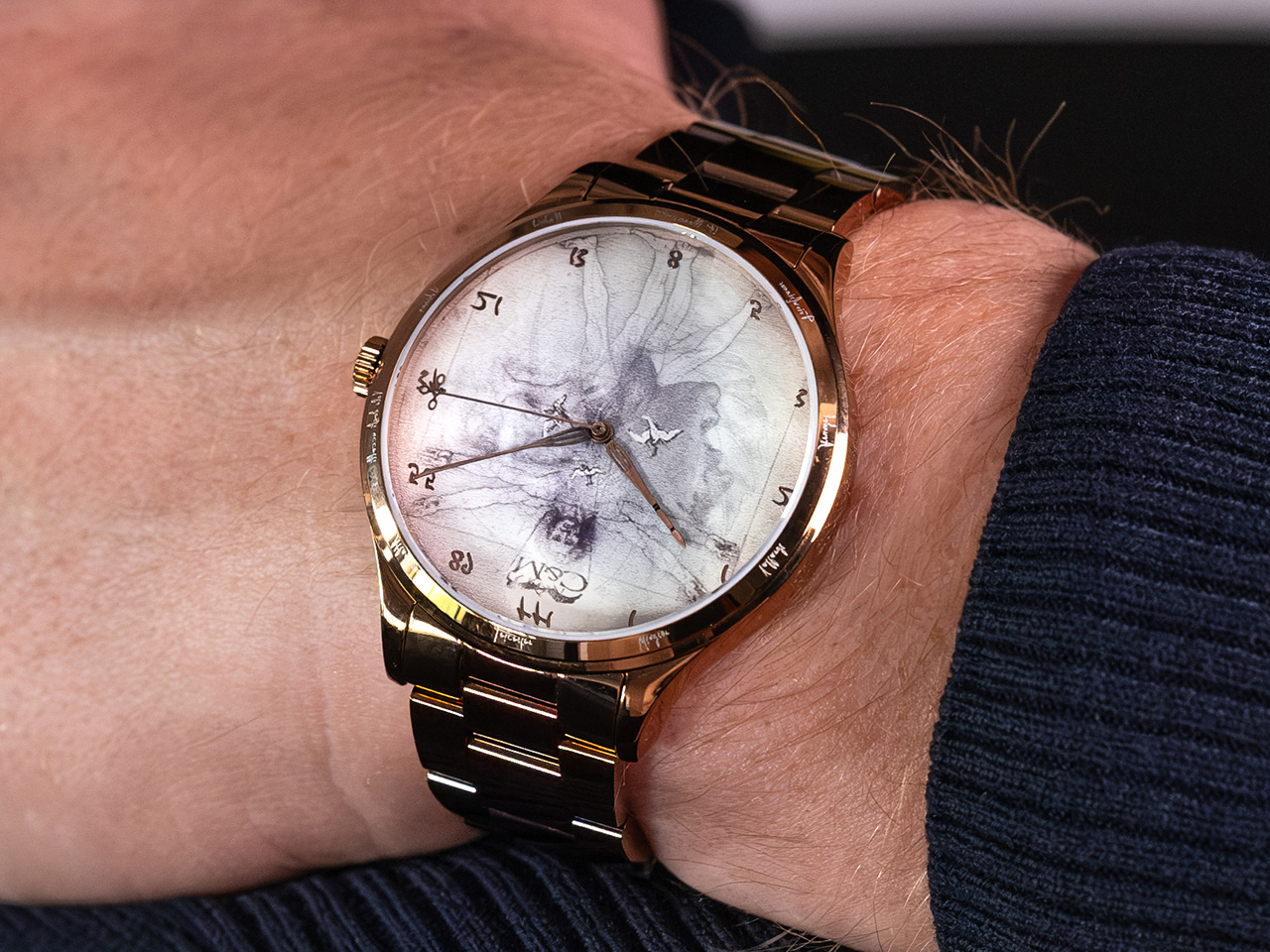
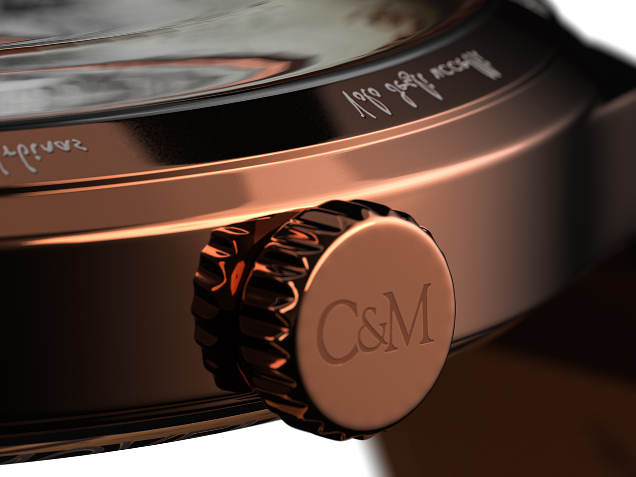
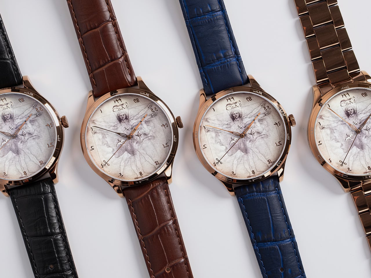
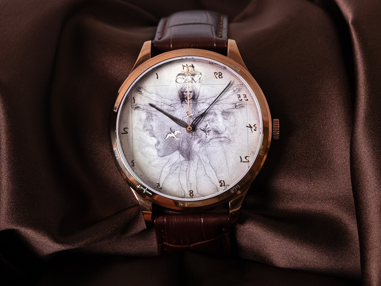
Inspired by the genius of Leonardo da Vinci, who could draw/write with both hands and also write in reverse, the folks at Col&MacArthur designed the Leonardo 1519 – a watch that, just like da Vinci’s writing, runs in reverse. An incredibly intriguing watch that pays tribute to the greatest genius of the Rennaissance, the Leonardo 1519 quite literally runs anti-clockwise, with the hands running ‘backward’ and the numbers on the watch oriented in reverse. The watch sports a few other key details that celebrate the Italian artist and creator’s life, from his artworks like the Vitruvian Man and the Battle of Anghiari, as well as concepts like the Fibonacci sequence, which da Vinci’s believed to have used heavily in his art and architecture.

Have you ever thought of why clocks move ‘clockwise’? The reason’s pretty simple if you work backward to the ancestor of the modern clock – the sundial. Invented in the northern hemisphere, sundials relied on the shadow of the sun to tell time, and as a result, the sun cast its shadow in a way that caused the dial to move ‘clockwise’. So naturally, when clocks were first engineered, they were made to mimic the movement of the shadow on the sundial. If sundials were first made in the southern hemisphere, clocks would rotate the absolute opposite of how they do today. With the Leonardo 1519, the watchmakers at Col&MacArthur are simply exploring this unique ‘reverse’ timekeeping trend while celebrating the most notable genius of the 15th century.

Designer: Col&MacArthur

Click Here to Buy Now: $325 $540 (40% off). Hurry, 10/15 left!

The name “Leonardo 1519” holds particular significance—it marks the year of da Vinci’s death. In choosing this date, the collection honors not just the man, but his enduring influence on art, science, and innovation. The year 1519 represents a turning point when the world lost a visionary, but his ideas continued to shape generations of thinkers and creators. This watch isn’t just about looking back; it’s about carrying da Vinci’s spirit of discovery into the future, making his genius relevant to today’s world.

At first glance, the reverse movement catches you off guard. It’s a direct nod to da Vinci’s mirror writing, a technique he often used in his notebooks. This unusual feature may seem like a simple design choice, but it transforms the experience of checking the time into a reflection on da Vinci’s constant challenge of conventions. The watch comes with a choice between mechanical and automatic movements – codenamed Codex and Mecanicca. You can get a variant of the watch that tells the time clockwise – just in case you’d like a time-telling tribute to da Vinci that isn’t difficult to read. However, if you want an absolute conversation starter, the Codex Reversed feels like living in the mirror dimension. The Codex Reversed model runs on a quartz Ronda movement that ticks in reverse. Reading the time definitely is a bit of  learning curve, but the watch makes up for it with clear numerals on the dial, and in just a few days it comes naturally to you. Moreover, it’s a perfect visual metaphor for people who believe in doing things differently!

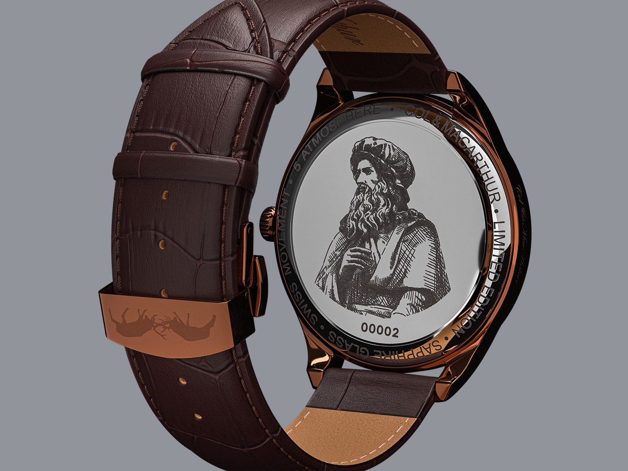
For those who prefer their time to move in a more traditional direction, the Codex Classic offers the same impeccable craftsmanship with a clockwise movement. Both Codex models are encased in stainless steel, topped with sapphire glass, and backed by a two-year warranty. The collection’s flagship model, the Meccanica Classic, elevates the experience with an automatic Japanese Miyota movement, visible through an exhibition case back. Limited to 1,519 pieces, this model commemorates the year of da Vinci’s passing and makes it a rare collector’s item. Its embossed “elevato” dial design, which plays with light and shadow, adds a layer of visual complexity, reminiscent of da Vinci’s own studies on light and form.

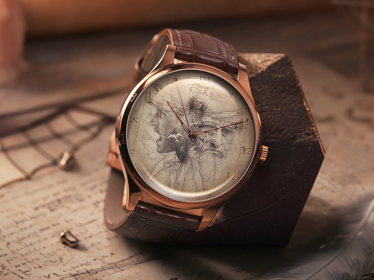
Every detail in the Leonardo 1519 collection is steeped in symbolism. The Vitruvian Man, da Vinci’s famous drawing exploring the harmony of human proportions, is intricately etched into the watch’s dial, a reminder of the perfect balance between art and science that da Vinci so masterfully embodied. The dial also has a close-up of the soldier from da Vinci’s sketch of the Battle of Anghiari, along with his self-portrait, all masterfully blended into a collage that celebrates the man. Other features include birds depicted in flight, a tribute to da Vinci’s groundbreaking studies on aerodynamics and his Codex on Flight. The Fibonacci sequence, symbolizing nature’s mathematical harmony, is also subtly embedded, reflecting da Vinci’s fascination with the intersection of mathematics and the natural world. While the Codex models don’t come with an exhibition back, they do have an artistic depiction of the da Vinci sculpture by Marino Marini.

Col&MacArthur’s watches are museums in their own right. Previous timepieces from the brand have featured parts of the Berlin Wall, fragments of Moon dust and Mars dust, and even honored legends like Napoleon and historical events like Dunkirk. The Leonardo 1519 is just the next chapter in this series, celebrating historic times through something as befitting as time itself!

Click Here to Buy Now: $325 $540 (40% off). Hurry, 10/15 left!

The post Why the Leonardo 1519 Watch Runs Backwards: A Col&MacArthur Tribute to da Vinci first appeared on Yanko Design.
LEGO Meets Luxury: Are Rolex, AP, and Cartier Ready to Create the Ultimate Brick-Built Timepieces?

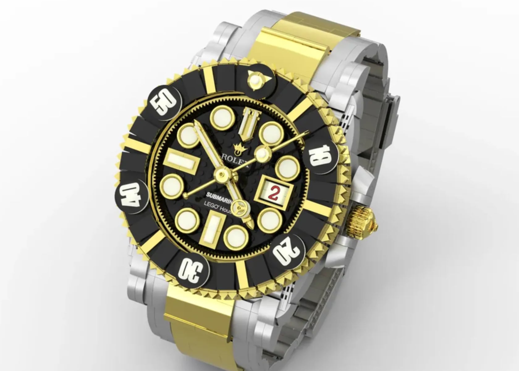
It’s Wristwatch Wednesday on Yanko Design again, and today, I’m digging into a playful yet intriguing topic: LEGO luxury watches. Yes, you read that right. Imagine the iconic Rolex Submariner or Audemars Piguet Royal Oak in LEGO form. The world of fine timepieces meets the playful, nostalgic charm of LEGO blocks, resulting in creations as captivating as they are creative. It’s a topic that merges two worlds with a surprisingly big crossover—watch collectors and LEGO enthusiasts. Today, I’m taking you on a journey through these brick-built renditions and their real-life counterparts, showing what sets each apart and why they resonate deeply with LEGO enthusiasts and watch collectors.

The Art of LEGO and Horology: Why They Come Together So Well

There’s something surprisingly satisfying about seeing a luxury watch replicated in LEGO form. A luxury timepiece’s inherent precision and design complexity seem like an impossible fit with LEGO’s chunky, colorful blocks. Yet, that’s precisely what makes these LEGO versions so compelling. The real challenge is capturing the essence of luxury craftsmanship with plastic bricks that were never intended to mirror the intricate details of watchmaking. This playful paradox is why I, along with other fans of both LEGO and watches, find this concept so exciting.

Building miniature versions of real-life objects has always been a key appeal for LEGO enthusiasts. From cars to skyscrapers, the challenge lies in translating smooth, complicated forms into brick-like constructions. On the other hand, watch collectors appreciate the fine details—down to the way light catches the beveled edges of a Rolex or how an Audemars Piguet Royal Oak bracelet wraps around the wrist with a certain fluidity. So, how do these two seemingly different audiences come together here? For me, it’s the shared passion for craftsmanship—whether through the intricate mechanics of haute horology or the creative joy of a child’s building toy. Personally, I love seeing how both worlds strive for perfection in their own unique ways.

The LEGO Rolex Submariner vs. The Real Rolex Submariner

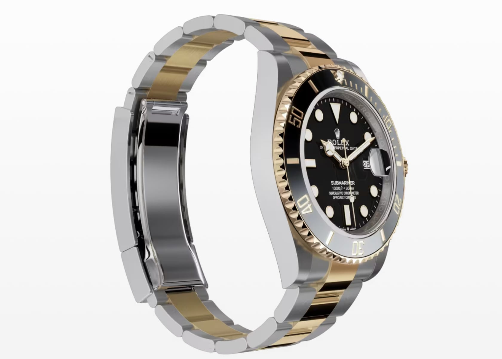
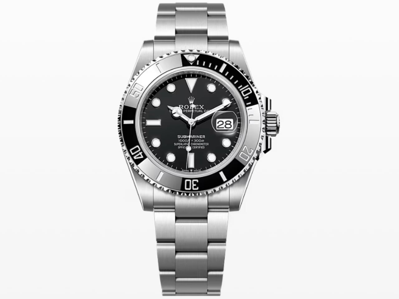
Let’s start with one of the most iconic watches: the Rolex Submariner. The real Submariner is famous for its black dial, rotating bezel, and robustness as a dive watch. It’s the timepiece you could wear while exploring underwater wrecks or dressed up for a night out. Crafted with surgical-grade steel, the real Submariner exudes quality, with precision engineering that ensures it’s waterproof to a depth of 300 meters.

AI-Generated LEGO x Rolex Submariner

Now compare this to its LEGO version. The LEGO Submariner isn’t going anywhere near water—its construction relies on plastic pieces snapping together, and no LEGO piece in the world is waterproof to 300 meters! But that’s not really the point, is it? What makes the LEGO version so charming is how it captures the silhouette, the bezel’s ridges, and even the dial layout—albeit in a chunky, exaggerated way. It’s a caricature, a playful homage to a watch that has come to define what a dive watch should be.

Rolex Submariner Date Oystersteel 41 mm

The authentic Rolex Submariner feels weighty and precise on the wrist, with decades of refinement packed into its Oyster case. The LEGO version, meanwhile, is like a desktop conversation piece. If you’re thinking functionality, forget it; it’s about capturing the spirit of an icon in a different, more approachable way. Whether you’re an experienced diver or someone who’s never set foot near a dive tank, there’s something whimsical about seeing this watch, renowned for its utility, transformed into a plastic brick sculpture.

LEGO Daytona vs. Real Rolex Daytona: Revving Up in Different Ways

Next is the Rolex Daytona, a watch synonymous with racing, speed, and precision. The genuine Daytona emphasizes chronograph functionality, tachymeter bezels, and its deep connection with the fast-paced world of motorsports—famously tied to Paul Newman and the thrilling 24 Hours of Le Mans. It’s a timepiece that measures milliseconds with ease, and the quality of its movement, the Caliber 4130, sets it apart as one of the best chronographs in the market.

AI-Generated LEGO x Rolex Daytona – Oystersteel

So what happens when you translate this into LEGO? The LEGO Daytona doesn’t have an automatic movement or sub-dials that actually work, of course. What it does have is a beautiful attention to aesthetics—each button, the ridged bezel, and even the tachymeter markers are cleverly depicted in plastic bricks. It’s not functional in the horological sense, but its form still captures the essence of the Daytona—a nod to its role as a tool for timing races, now transformed into a playful, stationary model.

In comparing the two, the genuine Daytona is like a precision tool—built for racing and made to the highest standards. The LEGO version is like a trophy for the shelf of someone who adores both motorsports and creative LEGO projects. It’s a piece for those who are in on the joke and who appreciate the paradox of recreating a serious, high-precision device with something as low-tech as LEGO.

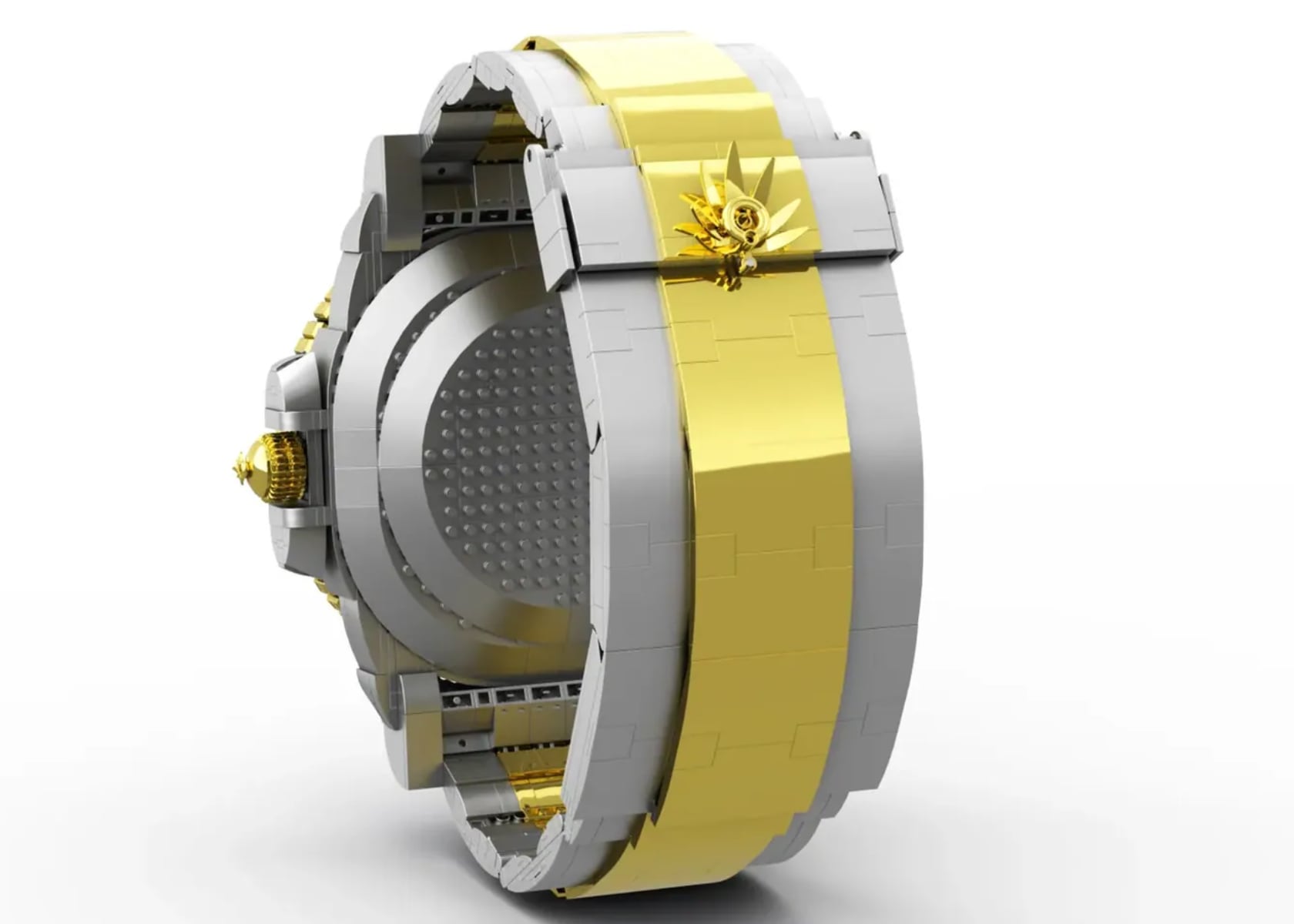
Day-Date in Gold: LEGO vs. The Real Presidential Timepiece

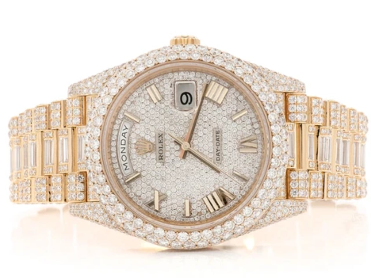
The Rolex Day-Date, often referred to by enthusiasts as the ‘President,’ earned this nickname because numerous world leaders, including U.S. Presidents like Lyndon B. Johnson, have famously worn it. However, it’s important to note that Rolex officially calls it the Day-Date, while the ‘President’ specifically refers to the style of the bracelet. Introduced in 1956, it was the first wristwatch to display the day and the date in windows on the dial. It is a watch that exudes luxury. Its gold finish, complete with diamond-studded dials and a fluted bezel, is the kind of thing that screams sophistication. The real Day-Date is often the timepiece of choice for world leaders and celebrities—a statement of power, elegance, and success. Imagine the President of the United States sporting a Rolex Day-Date Presidential watch made from LEGO—it’s a whimsical image that perfectly captures the playful spirit of these brick-built renditions.

AI-Generated LEGO x Rolex Day-Date

Now imagine that luxury recreated in LEGO bricks. The LEGO version retains the gold—at least visually. It captures the blingy bezel, the iconic President bracelet, and even the day and date windows. Of course, it’s not solid gold; it’s just carefully chosen yellow and white bricks snapped together. But somehow, it captures the essence—the LEGO Day-Date feels playful yet fancy, almost as if it’s poking fun at its own luxury. It’s for the person who loves the Day-Date’s symbolism and has the sense of humor to appreciate it in LEGO form.

Image: Icebox, ROLEX DAY DATE 40MM 18K YELLOW GOLD (228238) – 19.50CTW FULLY ICED OUT

The Audemars Piguet Royal Oak: A Blocky Tribute

Few watches are as iconic as the Audemars Piguet Royal Oak, with its octagonal bezel and exposed screws. The actual Royal Oak is famous for its industrial elegance—designed by Gérald Genta, it’s a game-changer that brought the luxury sports watch category to life. Crafted from stainless steel, it highlights the juxtaposition of polished and brushed surfaces, giving it a distinctive look that’s rugged and refined.

AI-Generated LEGO x Audemars Piguet Royal Oak

The LEGO Royal Oak, on the other hand, trades brushed steel for grey bricks. It still maintains the unmistakable octagonal bezel and the integrated bracelet, but the intricacy is reduced to geometric simplicity. The Tapisserie pattern on the dial, which usually involves meticulous craftsmanship, is represented with flat studs—it’s rudimentary, but that’s the beauty of it. Instead of the weighty presence of stainless steel, you get the lightweight, almost comical feel of stacked plastic. The LEGO Royal Oak pays tribute in the best way it can, with a bit of playful irreverence.

Royal Oak Perpetual Calendar “John Mayer” Limited Edition

Cartier Santos in LEGO Form: Squaring Elegance with Fun

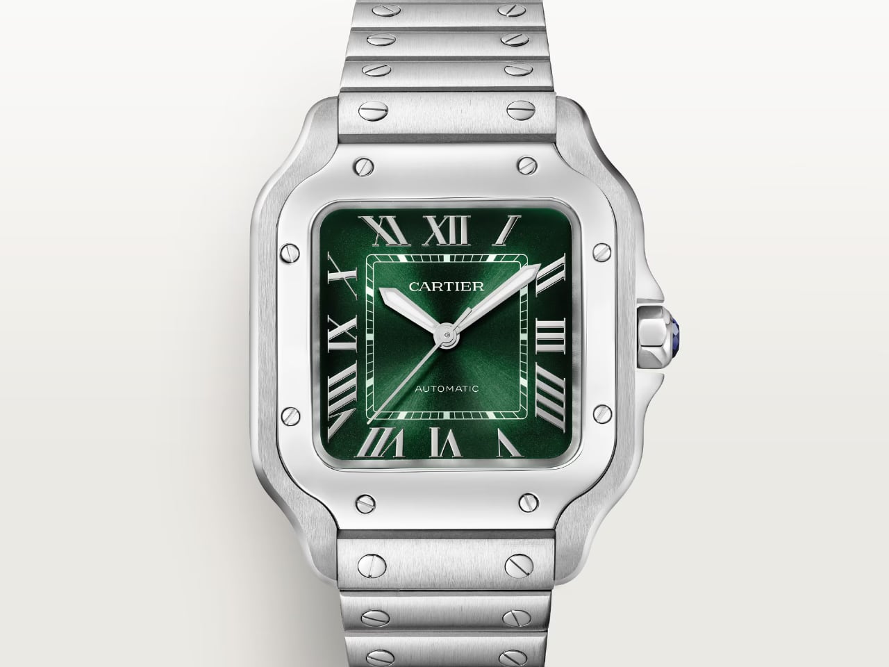
The Cartier Santos is another classic—a watch designed for aviation pioneer Alberto Santos-Dumont. Its square face and exposed screws make it instantly recognizable. The real Cartier Santos epitomizes refined French elegance, with Roman numerals and a heritage that goes back over a century.

AI-Generated LEGO x Cartier Santos

The LEGO version plays with these elements, keeping the shape, the exposed screws, and the Roman numerals but doing so with bright plastic that is anything but elegant in the traditional sense. It’s a tongue-in-cheek recreation, one that delights in its blocky squareness, almost as if Cartier’s first wristwatch were reimagined for a child’s toybox. It takes something meant to be worn as a marker of luxury and turns it into a fun, decorative piece—a way for fans of both brands to connect in a quirky, unexpected way.

SANTOS DE CARTIER WATCH

Why LEGO and Luxury Watches Work So Well Together

So why does this concept work? What makes these LEGO versions resonate with both watch collectors and LEGO fans? The answer lies in the intersection of craftsmanship and creativity. Authentic watches like the Submariner or the Daytona are meticulously crafted, precision-engineered, and timeless in their design. Conversely, LEGO thrives on creativity, turning complex real-life objects into simple yet evocative forms.

For watch collectors, seeing a LEGO version of a favorite timepiece is like viewing it from a fresh perspective—celebrating its form rather than its function. There’s also an undeniable element of nostalgia; many collectors grew up with LEGO, and these models bring a sense of childlike wonder while respecting the original design. For LEGO fans, the challenge of recreating an intricate watch demonstrates the versatility of LEGO bricks, proving that simple blocks can capture something incredibly sophisticated.

This crossover appeal transforms these watches from wearable precision instruments into decorative conversation starters. The actual versions are meant to be worn and experienced for their craftsmanship and mechanical precision. The LEGO versions, however, are displayed as celebrations of design, transforming a high-end object into an accessible, humorous, and charming representation. They bring the luxury and accuracy of timepieces into a more playful light, making them resonate deeply with both communities.

A Challenge to Watch Brands: LEGO Sets the Bar

Don’t get me wrong, the LEGO versions of these watches aren’t replacements for the real thing—far from it. They don’t have the sapphire crystals, the precise movements, or the finely engineered components that make luxury watches so remarkable. But what if they did? Imagine a collaboration between LEGO and the finest watchmakers in the world. If brands like Bugatti, McLaren, and even Formula 1 teams can create real machines with LEGO, why can’t luxury timepiece brands do the same? This is a challenge to the watch industry—bring the craftsmanship, the detail, and the imagination together. Let’s see a working luxury watch created in partnership with LEGO—a true celebration of both worlds.

For LEGO fans and watch collectors alike, these models celebrate design—both the intricate, sophisticated design of the original timepieces and the imaginative, blocky reinterpretations in LEGO form. It’s a concept that brings people together, transcending the boundaries between childhood nostalgia and adult appreciation for craftsmanship. And at the end of the day, isn’t that what great design—whether in LEGO or luxury watches—is all about?

The post LEGO Meets Luxury: Are Rolex, AP, and Cartier Ready to Create the Ultimate Brick-Built Timepieces? first appeared on Yanko Design.
Absolutely exclusive SpaceOne x Perpétuel Edition Green Titanium Jumping Hour Watch is now extremely rare

Some watches are designed for simplicity, others for complexity, then there is this third breed – a prerogative largely of the likes of MB&F and Urwerk – which is designed for those, ready for lift-off to live amid the extraterrestrial. As the headline reads, it’s not the obvious creators, rather a collaboration between SpaceOne and Perpétuel Gallery which reimagines this jumping hour watch in an exemplary blend of futurism and contemporary horology.

The resulting SpaceOne x Perpetuel Edition in special green color is an enduring haute horology piece resembling a space-ready watch even the aliens would envy. Under the shadow of this overstatement is a watch that’s anything but traditional. What’s in it, let’s check out in detail below.

Designer: SpaceOne x Perpétuel

Ready for lift-off!

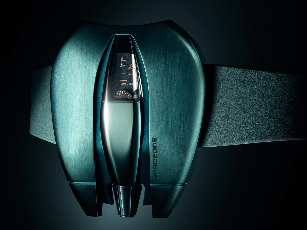
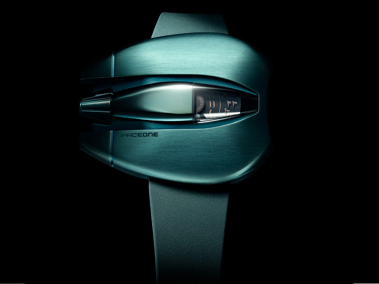
The SpaceOne x Perpetuel Gallery Jump Hour is provided in a robust grade-5 titanium casing featuring the striking Perpétuel Green color. It comes paired with a matching DELUGS rubber strap and features orange Eastern Arabic digits printed on pair of plain black discs that allow minutes and hours to leap into the sapphire cockpit on the dial.

With a distinct, UFO-like shape and crown resembling a rocket nozzle, the watch is befitting a wrist ready to take off on a shuttle flight. Recently in haute horology, there has been a persistent rise in watches with unorthodox layouts: space-inspired complications have become really common and this one is another entrant.

The design in beyond

Despite the form factor, the SpaceOne x Perpetuel Edition is pretty sleek yet formidable. It is a limited edition release, which has gone out faster than candies on the shelf. In its construction and functionality, ‘the watch is as tough as a spaceship.’ It measures 42 mm x 51.67 mm and is only 12 mm thick.

The SpaceOne x Perpetuel Edition is powered by Soprod P024 automatic movement which one can gawk at through the visible caseback. The movement provides 38 hours of power reserve and beats at 28,800 vibrations per hour.

A lost race

This watch that wins over with its unique shape has received an overwhelming response. It was Limited to only 25 examples at launch and thanks to the Perpetuel makeover of this SpaceOne watch, it is already sold out in under five days from its release on October 10.

If you’re reading this and thought you were in the race, you probably have lost your chance to get hands on a SpaceOne x Perpetuel Edition until maybe some collector, who has recently purchased the AED 13,000 (approximately $3,500) watch, is willing to part with it-of course at a premium!

The post Absolutely exclusive SpaceOne x Perpétuel Edition Green Titanium Jumping Hour Watch is now extremely rare first appeared on Yanko Design.
Patek Philippe’s Radical Design: Visionary or Misstep? The Controversial Cubitus

While still awaiting the official announcement from Patek Philippe, it’s important to consider whether this new shape signals a significant shift in their long-term strategy. Unlike Audemars Piguet’s approach with the Royal Oak, Patek seems intent on avoiding a singular ‘hero’ model that defines the brand. Instead, the new Cubitus Collection marks a bold move to diversify their offering and redefine what an iconic Patek Philippe watch can be. The Cubitus presents a striking divergence from the brand’s traditionally round silhouettes, embracing a distinct octagonal case that demands attention. Despite this fresh design direction, the Cubitus remains true to Patek’s reputation for refined elegance while also exploring new design frontiers.

Designer: Patek Philippe

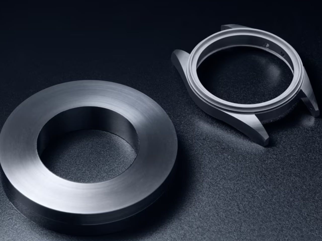
The watch’s octagonal form gives a sense of geometry and balance, subtly echoing architectural elements. Its brushed metal finish on the case edges contrasts effectively with the polished flat surfaces, adding depth while maintaining a streamlined and sophisticated profile. The careful craftsmanship allows light to dance across the watch’s varied surfaces, adding an elegant interplay of reflections that subtly enhances its visual appeal.

Dial Design and Complexity

The dial showcases a subtle complexity. It features a deep blue guilloché texture with horizontal wave-like lines, a finish that adds visual interest and conveys a sense of luxury and depth. The indices are applied markers that appear to float over the dial, contributing to a visual clarity that Patek Philippe watches are renowned for.

The day-night indicator is located at the lower half of the dial, adding a celestial element to the otherwise highly practical layout. The integration of a moon phase complication further highlights the watch’s duality—utilitarian in its functionality but romantic in its conception. The oversized double window date, positioned prominently below 12 o’clock, ensures easy readability, blending practicality and sophistication.

Case and Crown

The Cubitus case itself appears crafted in a premium brushed metal, likely white gold or platinum, which gives it an imposing presence while remaining tasteful. The case features intricate facets and architectural lines that enhance the overall visual complexity, demonstrating meticulous craftsmanship and adding a sense of bold sophistication.

Compared to iconic Patek Philippe models like the Nautilus or the Calatrava, the Cubitus takes a different path with its unique shape. The Calatrava is known for its classic round elegance, and the Nautilus for its seamless bracelet design. In contrast, the Cubitus goes for a bold, angular look that suggests Patek wants to expand its image and explore a more adventurous side of its design legacy.

The crown’s design complements the rest of the case, with serrations for a firm grip and a subtle integration into the case body. Its understated design follows Patek’s approach of less is more, ensuring no distractions from the watch’s other carefully chosen features.

Strap and Buckle

The strap, likely a textured alligator leather or high-quality rubber, is a deep shade of blue that seamlessly matches the dial, maintaining visual unity throughout. The integration of the strap into the case appears flawless, which enhances both the comfort on the wrist and the aesthetic cohesiveness of the design. Although the buckle or clasp isn’t visible yet, it can be assumed that Patek will ensure it provides security and comfort without compromising on the luxury feel.

A New Era for Patek Philippe?

As we await the official announcement from Patek Philippe, it’s interesting to consider if this new shape is part of a broader strategy. Unlike Audemars Piguet, which has leaned heavily on the Royal Oak as its flagship model, Patek seems to be moving in a direction that resists the notion of a single iconic watch. The Cubitus could be Patek’s way of adding diversity to their lineup, offering a fresh perspective on what makes a Patek Philippe watch stand out.

The slogan, “You never actually own a Patek Philippe. You merely take care of it for the next generation,” has become synonymous with the brand’s identity. This slogan reflects Patek Philippe’s dedication to quality, heritage, and timeless value. This message highlights the brand’s aim to create timepieces that represent wealth and status while also serving as heirlooms meant to be passed down through generations.

The choice of language here reflects Patek’s emphasis on craftsmanship and heritage over fleeting trends. It aims to appeal to individuals who value permanence and legacy—those who see a Patek Philippe watch as a lasting investment, both in terms of material value and in emotional and familial significance. The Cubitus Collection, with its carefully considered design, embodies this idea perfectly; it’s an heirloom piece meant to be cherished and appreciated not just in the present but also by future generations.

The Patek Philippe Cubitus Collection stands out by blending avant-garde design cues with the brand’s signature sophistication. Its octagonal case, moonphase, and blue guilloché dial push the boundaries of what is expected from Patek Philippe, yet every detail feels deliberate and rooted in the brand’s values of elegance and quality. While still awaiting the official announcement from Patek Philippe, it’s worth questioning whether this new shape is part of their long-term strategy. Some believe Patek is purposefully avoiding a single ‘hero’ watch, unlike Audemars Piguet with the Royal Oak. This timepiece is not merely a watch; it’s an apprec

The post Patek Philippe’s Radical Design: Visionary or Misstep? The Controversial Cubitus first appeared on Yanko Design.
RM 65-01 McLaren W1 Split-Seconds Chronograph is a true racing machine for the wrist

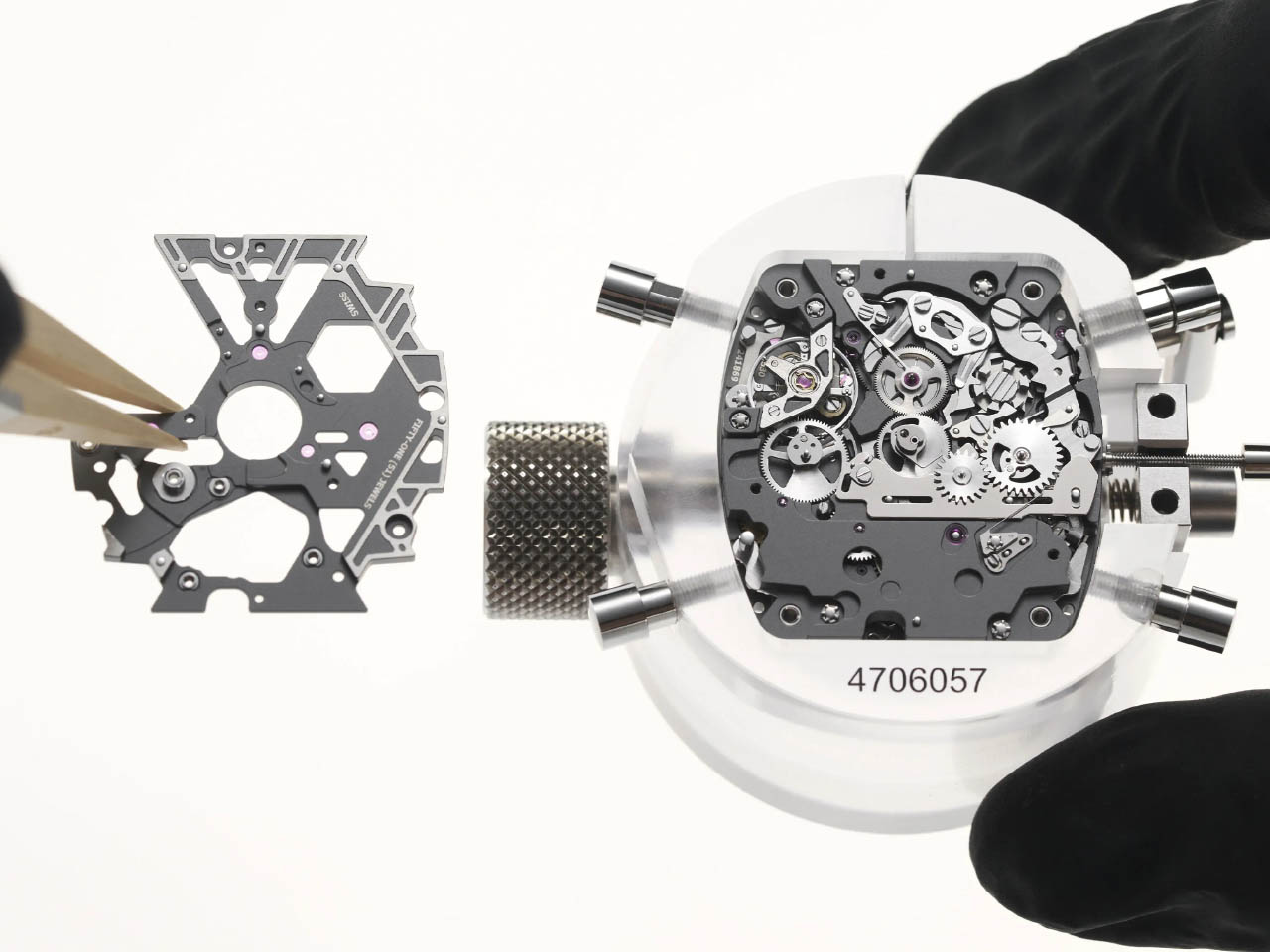
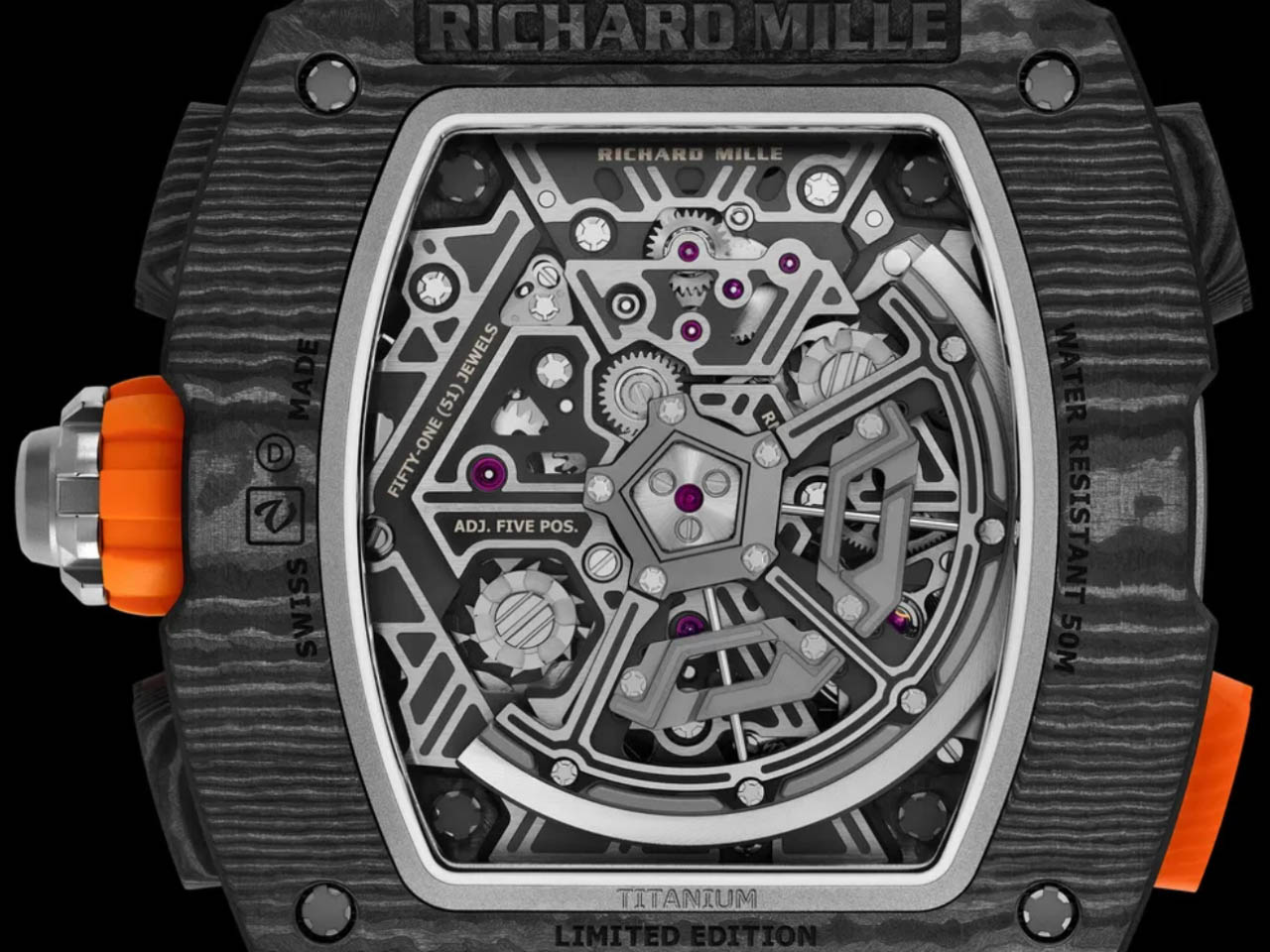
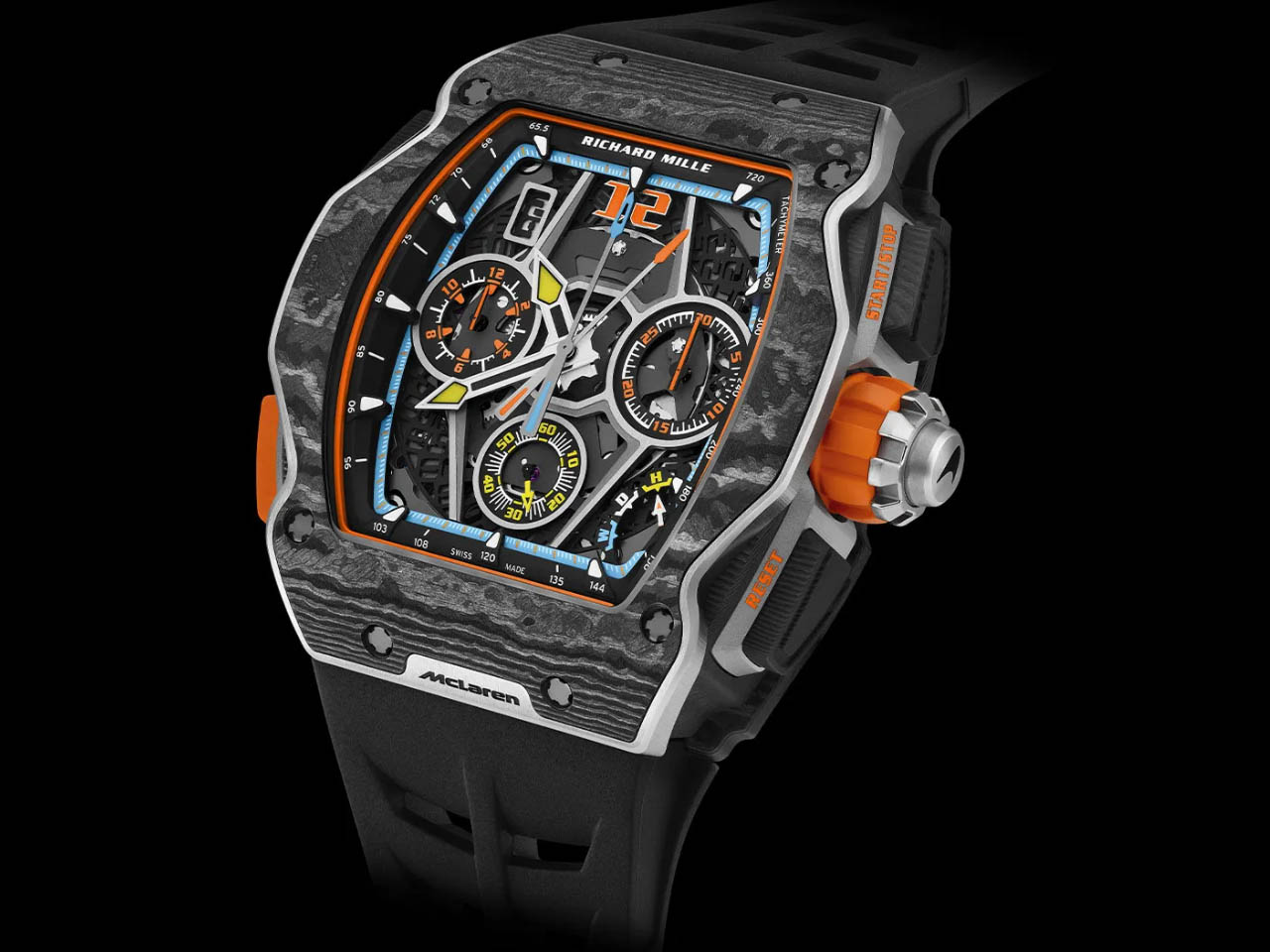
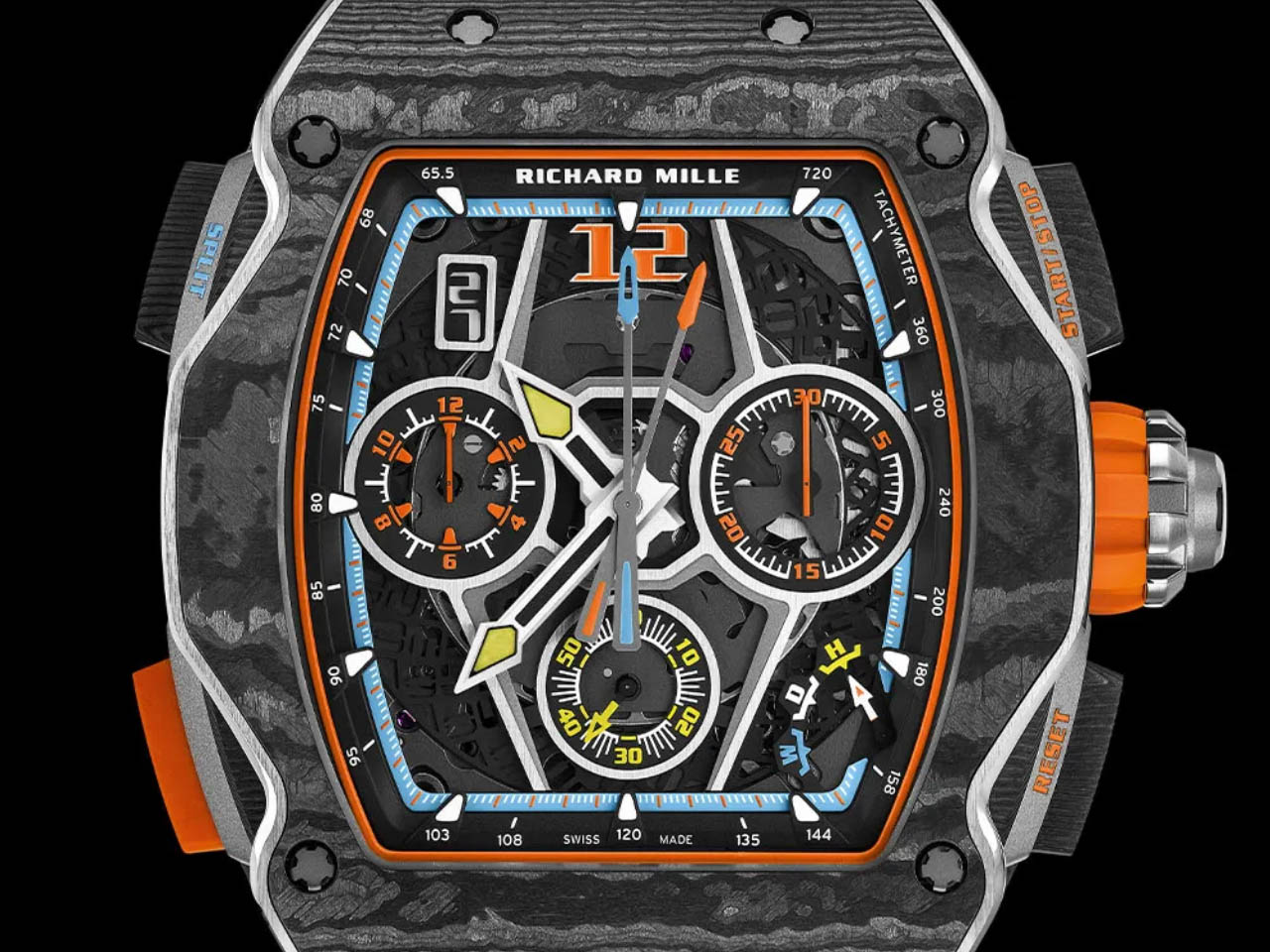
Richard Mille and McLaren both have in common the fire to strive for the pinnacle of innovation. Now the two brands have fused this ambition into an exquisite timepiece that signifies performance and aesthetic beauty. Meet the RM 65-01 McLaren W1 Split-Seconds Chronograph that carries both these attributes with a flair that’s worthy of a millionaire watch winder collection.

The watch is inspired by McLaren’s latest supercar, the W1 and it is the fourth timepiece created by the duo. The first one came in 2016, and the idea still seems as fresh as a teenager’s love affair. The RM 65-01 is not just about the premium feel of sporting it on your wrist, since it carries advanced features, a horologist will be proud of.

Designer: Richard Mille and McLaren

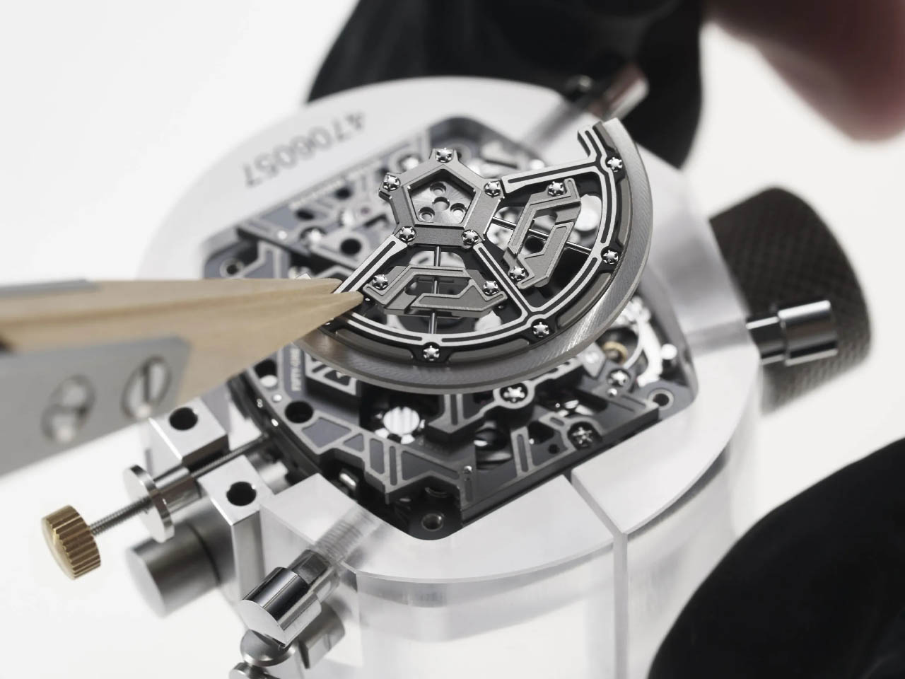
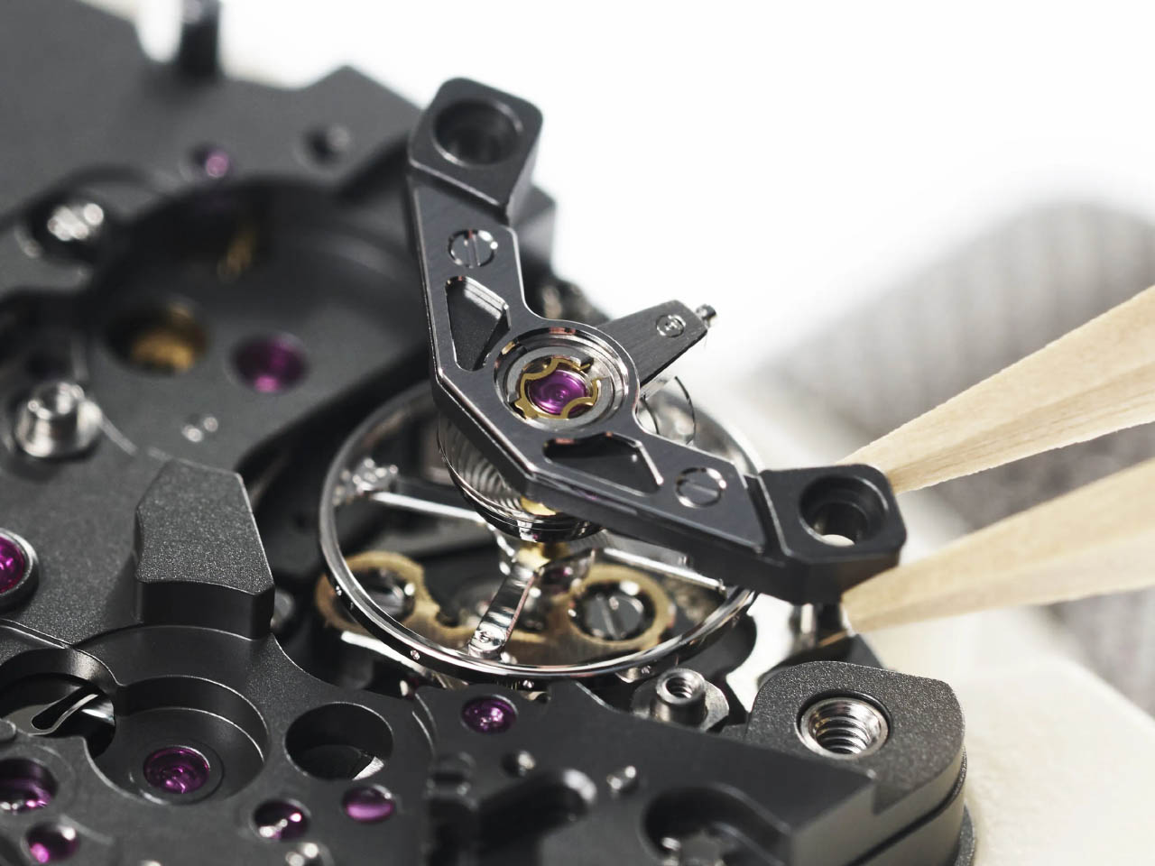
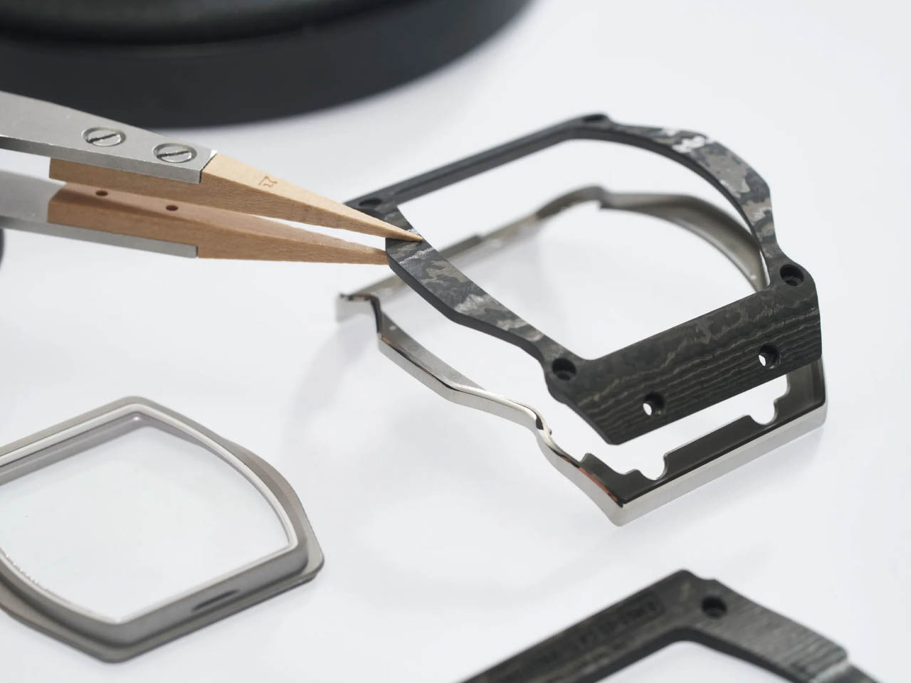
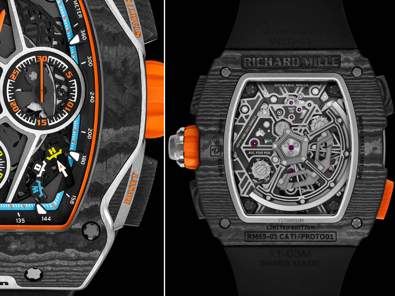
Richard Mille’s automatic winding chronograph gets the highest speed oscillation movement of 36,000 times per hour, and the ability to record the elapsed time down to one-tenth of a second. They’ve included the rapid winding system for a power reserve of 60 hours. RM 65-01 comes encased in a polished grade 5 titanium carbon case which emulates the bodywork details of the supercar such as the high waistline and anhedral doors. You will notice them at first instance, and instantly know that there is a McLaren story in there.

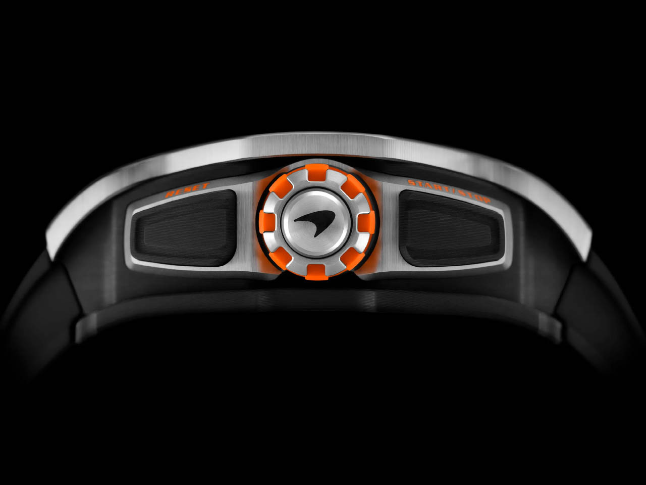
Going into the intricate details, the watch has an upper bezel measuring five-tenths of a millimeter thick, which technically makes it the thinnest ever from the Swiss brand. The similarities with the McLaren’s latest show stopper don’t end there as the skeletonized titanium dial and the crown are inspired by its wheel rims. Of course, the UK-based automotive company takes a lot of pride in its papaya shades, so we can see the subtle use of the hue on the watch face and the rubber strap. According to Richard Mille’s technical director for casing, this fourth watch in the series “left us with the feeling that Richard Mille and McLaren are perfectly in-tune” and we second that view.

Richard Mille is only going to sell a limited edition of 500 RM 65-01 timepieces each one having a mind-numbing price of approximately $274,000. Whether it’s a day at the track or a usual day at the office, this chronograph is the perfect match for your supercar.

The post RM 65-01 McLaren W1 Split-Seconds Chronograph is a true racing machine for the wrist first appeared on Yanko Design.

The Nothing Watch (Ultra) may not have a Glyph Interface, but it makes up with a minimal Glyph OS

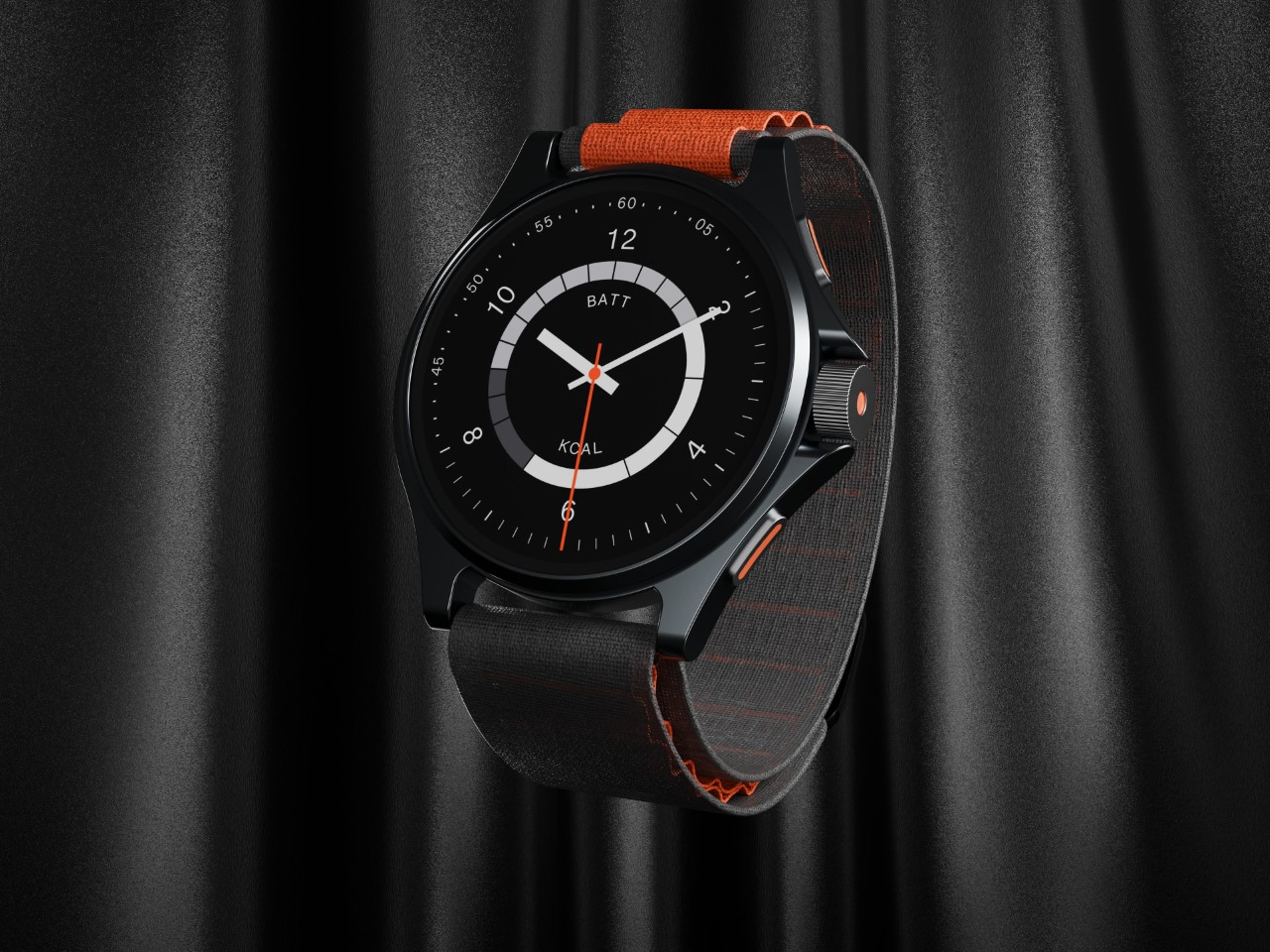
While Nothing doesn’t have a smartwatch in its portfolio, it certainly could add one – considering CMF’s Watch Pro already set the perfect foundation. Meet the Nothing Watch (Ultra) concept – a watch that brings the company’s minimalism-meets-fun approach to the world of smartwatches.

Designed by Abdelrahman Shaapan, the Watch (Ultra) takes the smartwatch to its logical next level, with a design that bridges digital experiences with a fairly analog-inspired design. The watch face is a mirror of the phone’s analog Glyph Interface, while the watch itself comes not with one button but three (including the crown of course).

Designer: Abdelrahman Shaapan

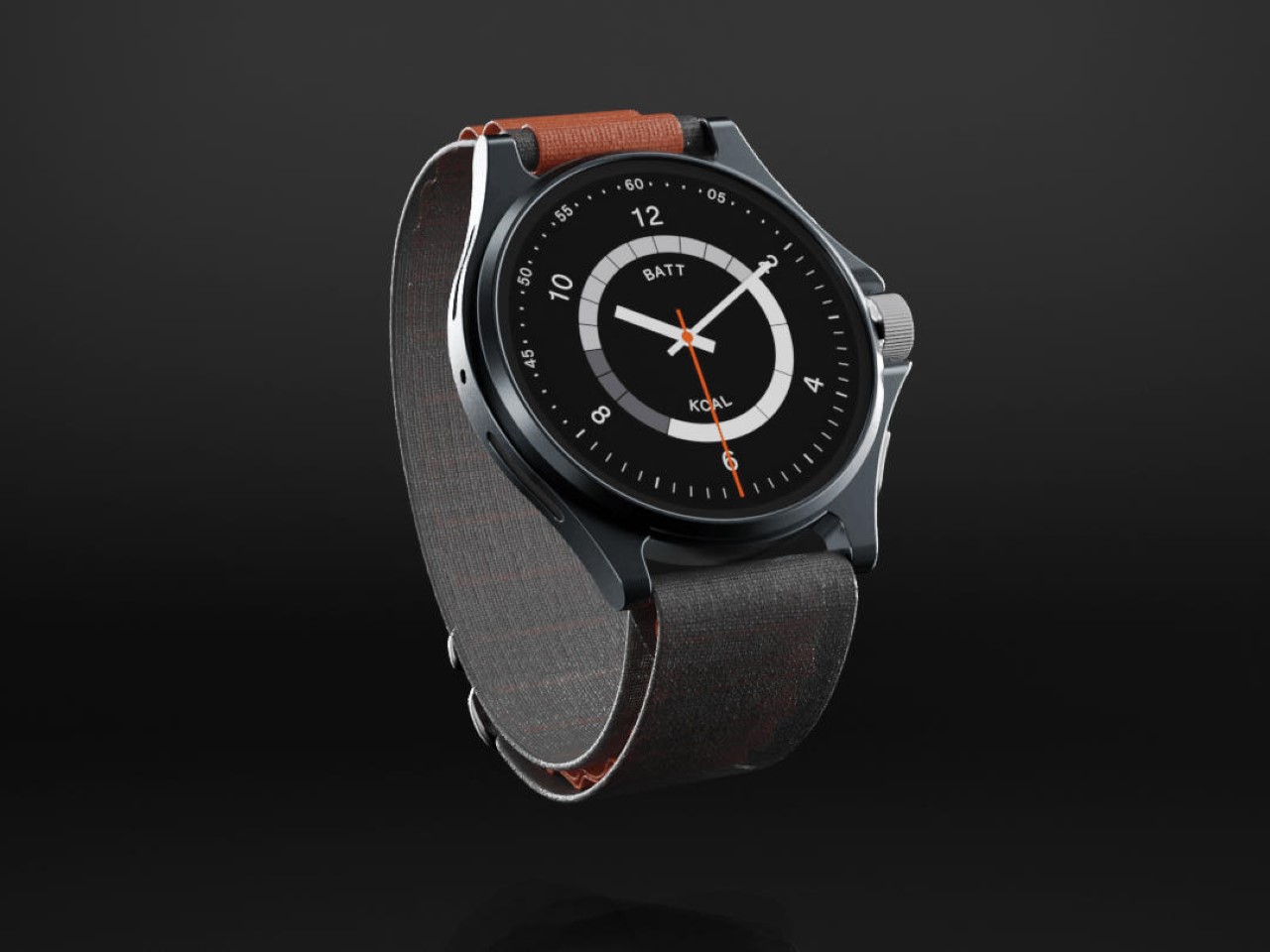
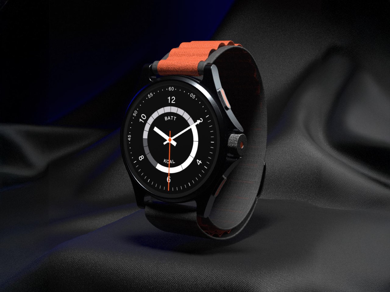
The Nothing Watch (Ultra) blurs the lines between Nothing and CMF, with a design that combines black and orange. Sure, with a watch this minimal, you really can’t do much with transparency, which is why the Watch (Ultra) ditches transparency entirely. It comes with a solid metal frame, supported by an Alpine Loop-inspired band that secures the watch around your wrist.

The Glyph goes missing too, but it manifests itself in the form of a Glyph OS – using white bars an strips to turn timekeeping into a Nothing-powered meaningful experience. The digital display has a minimal clock face, and a Glyph ring around the center that tells you both your battery level as well as the kilocalories burnt during the day. Sort of like activity rings on the Apple Watch, but interpreted differently.

The Watch (Ultra) concept leaves a lot to be desired – especially in the form of context and detail. The designer added a fair bit of detail in the form of a watch body with pushers and a crown on one side, and side-firing speakers on the other – but the OS still only shows just one screen. Maybe a little more detail in terms of a more comprehensive Glyph OS experience could really seal the deal – and although it might be too much to ask, I could DEFINITELY use one transparent variant!

The post The Nothing Watch (Ultra) may not have a Glyph Interface, but it makes up with a minimal Glyph OS first appeared on Yanko Design.
Casio’s A158 Watch Now a Retro Desk Clock You Need

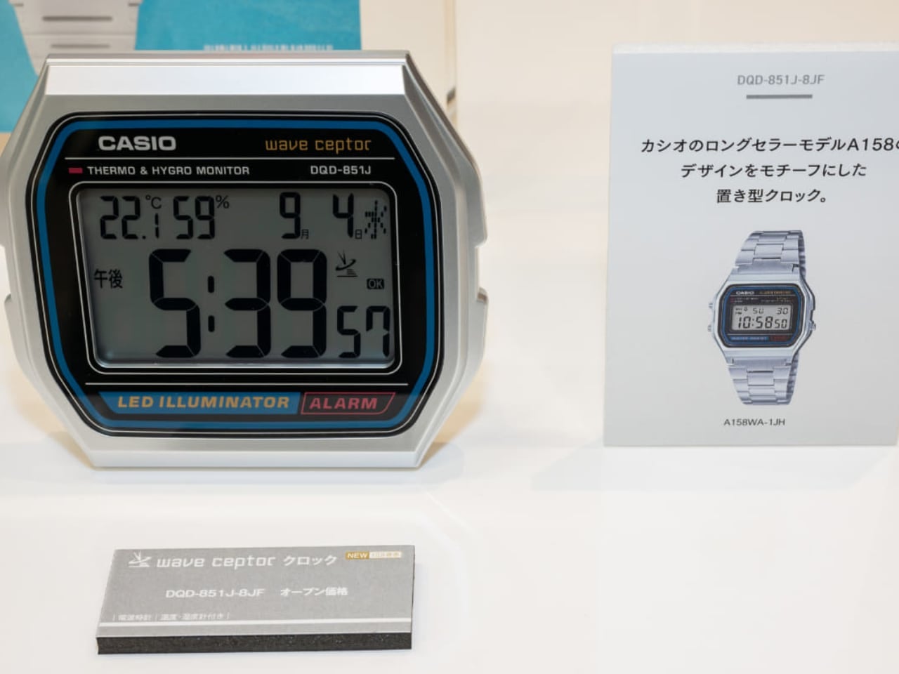
Casio’s A158W digital wristwatch has remained relevant for decades with its simple design and reliability. Now, Casio brings that design from your wrist to your desk with the DQD-851J-8JF desk clock. Scheduled for release on October 25 in Japan, this desk clock channels the aesthetics of the A158 with modern updates.

Designer: Casio

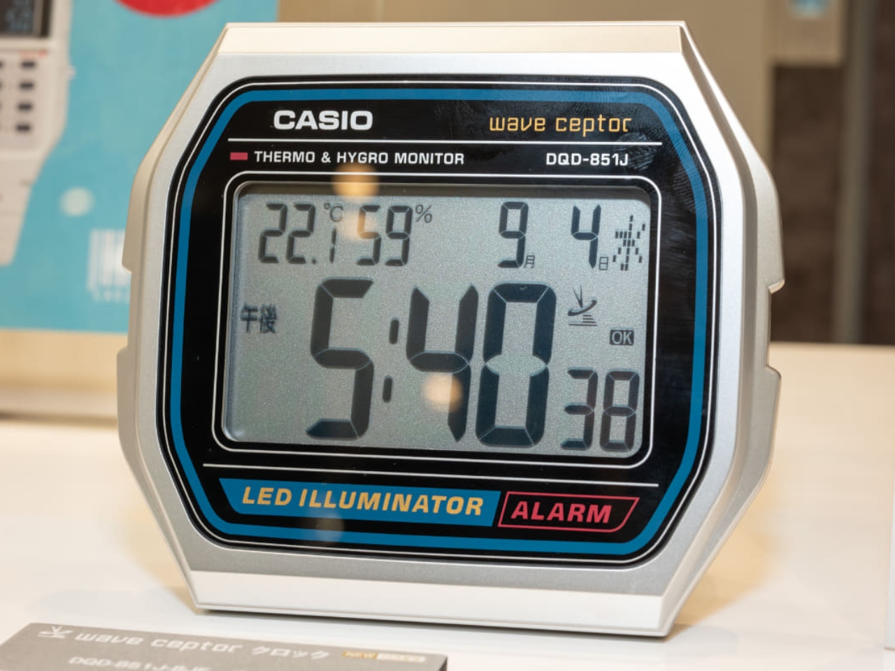
The DQD-851J-8JF borrows design elements from the A158W, including the silver-toned casing and familiar digital display. The clock’s body echoes the classic curves and rectangular silhouette of the A158 watch, giving it a nostalgic appeal reminiscent of the 1980s.

Introduced in the 1980s, the Casio A158W became popular for its utility, affordability, and retro aesthetic. It offered a digital display, LED backlight, and water resistance, making it versatile for all lifestyles. Even today, it remains a favorite among minimalists and retro watch enthusiasts.

The DQD-851J-8JF desk clock pays homage to the A158W while incorporating modern features. One key addition is Wave Ceptor automatic time adjustment, which synchronizes the clock to the Japan Standard Time radio signal (JJY) broadcasted from transmitters within Japan. Note that this feature is exclusive to Japan, and it will not function with radio signals in other regions. The clock also includes a thermometer and hygrometer, providing insight into indoor comfort. Additional features include a snooze alarm, 12/24-hour format, full auto-calendar, and an amber LED backlight.

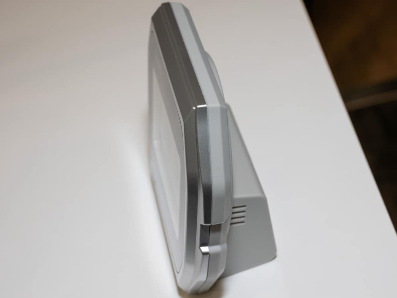
The desk clock captures the iconic look of the A158W. From the rectangular digital screen framed by the brushed silver-tone bezel to the tactile buttons, every detail evokes a retro vibe. The clock features a larger, easy-to-read LCD screen with bold black digits for readability. It is compact yet stable, measuring 102 x 117 x 48 millimeters and weighing 185 grams.

The amber LED backlight offers a warm glow, reminiscent of the original wristwatch’s light. The buttons for adjusting settings are placed intuitively, similar to the wristwatch, for easy interaction. The brushed finish of the casing and slightly raised bezel add to its retro charm.

The DQD-851J-8JF is powered by two AA batteries, offering about one year of battery life—convenient and low-maintenance, much like the original A158W.

Casio’s decision to create a desk clock inspired by the A158W honors the enduring appeal of a product that has outlasted tech trends. The A158W’s straightforward nature makes it timeless. With the DQD-851J-8JF, that appeal now lives in a new form factor, ideal for any desk or nightstand.

For those who cherish the A158, the DQD-851J-8JF brings that classic vibe into other parts of life. Whether you’re a longtime fan or discovering Casio’s digital nostalgia for the first time, this desk clock is an excellent way to celebrate a design that has stood the test of time. Pre-orders are available in Japan.

The post Casio’s A158 Watch Now a Retro Desk Clock You Need first appeared on Yanko Design.
TAG Heuer Carrera Chronograph Tourbillon x Porsche Panamericana: A Bold Nod to Racing Heritage

The TAG Heuer Carrera Chronograph Tourbillon x Porsche Panamericana is a special creation that embodies the spirit of both brands. It’s a celebration of one of the most iconic partnerships in motorsport history—TAG Heuer and Porsche—brought to life through an exquisite design that pays homage to the legendary Carrera Panamericana race. Limited to only 255 pieces, this 42mm watch is a tribute to the boldness and adventurous spirit that have defined these two brands for decades.

Designer: TAG Heuer x Porsche

Image: Porsche

Taking inspiration from the Porsche 550 Spyder, a car that left its mark on the 1954 Carrera Panamericana, this new timepiece seamlessly reflects the character of TAG Heuer’s watchmaking mastery and Porsche’s racing heritage. The skeletonized dial draws inspiration from the 550 Spyder’s iconic wheels, while the silver-tone nods to the base color of the victorious 1954 racer. Accents in bold yellow, alongside deep black subdials, recall the ’55’ number that adorned the car, enhanced by the striking livery images showcasing the number ’55’ throughout this timepiece, reinforcing the link to the original race’s winning details.

Image: TAG Heuer

The dial offers more than a tribute—it’s an immersive experience. The shimmering effect and grained textures resemble the metallic bodywork of the Spyder and the rugged texture of asphalt, making the Carrera a stunning reflection of automotive and watchmaking craftsmanship. Encased within a steel 42mm framework and highlighted by a domed Glassbox sapphire crystal, the elements shine in a way that demands attention.
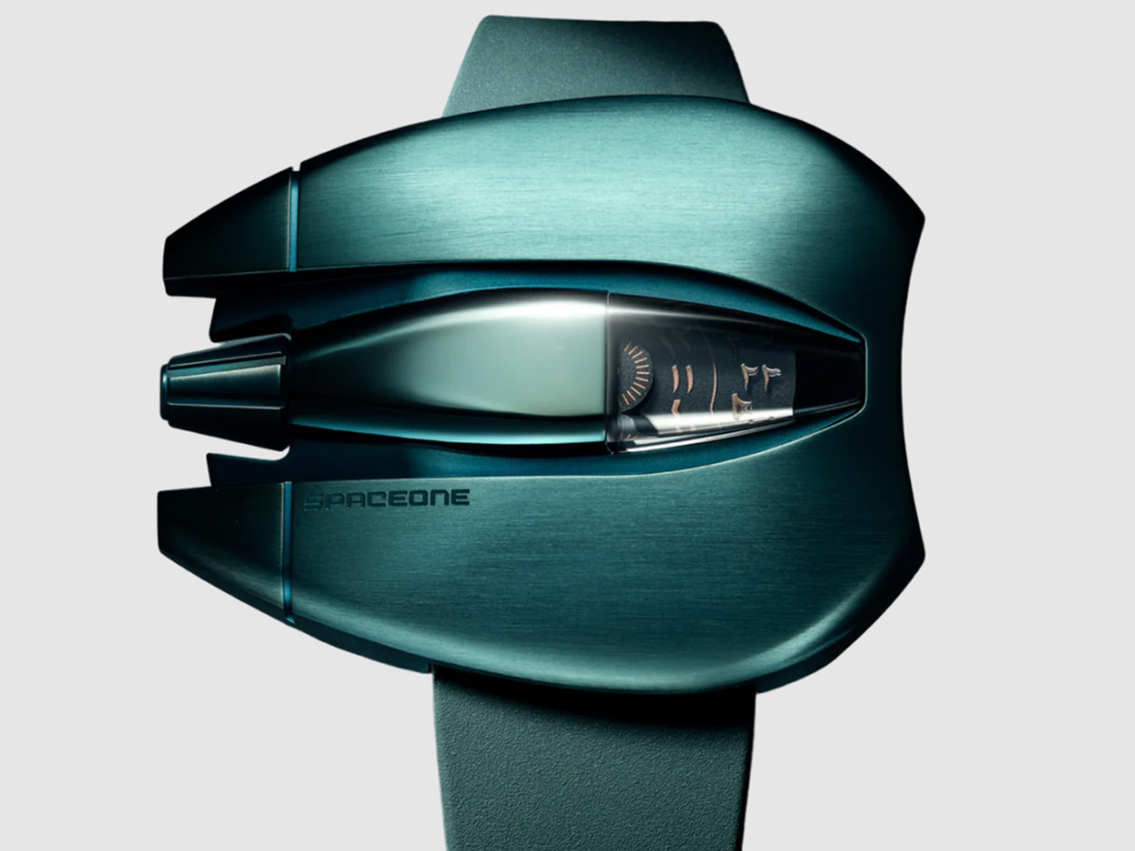
Image: Porsche

Design Breakdown: Dial, Case, Movement, and Strap

The TAG Heuer Carrera Chronograph Tourbillon x Porsche Panamericana radiates a design philosophy that merges functionality with the storytelling power of motorsport history. The skeletonized dial is the first striking feature—it’s a visual delight and a tribute to the engineering brilliance of the Porsche 550 Spyder. The rim-inspired architecture that frames the dial pays homage to the 550 Spyder’s wheels, bridging a crucial element of motorsport directly onto your wrist. The openwork dial design draws the eye toward the intricate chronograph and the tourbillon mechanism, demonstrating TAG Heuer’s refined watchmaking skills.
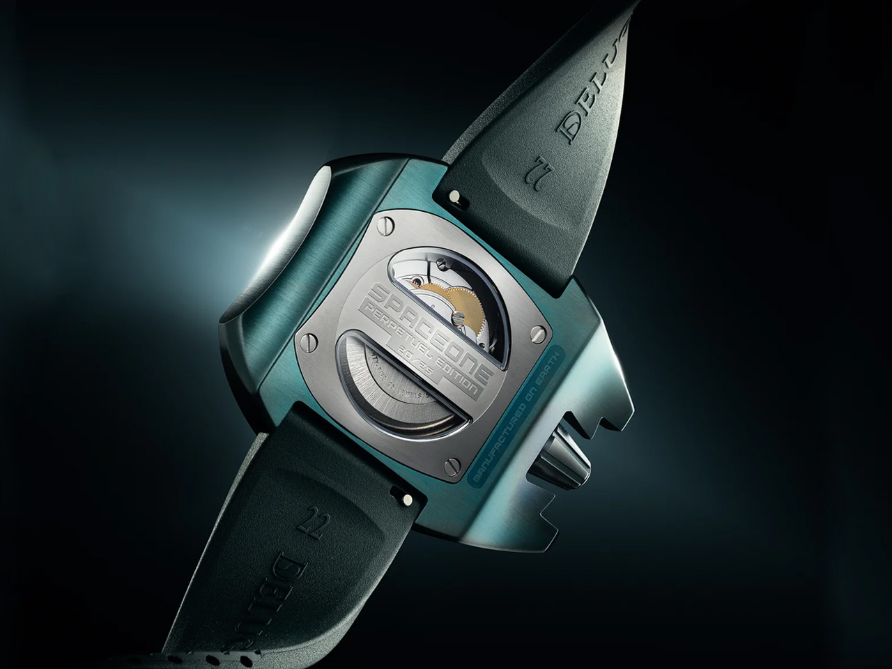
Image: TAG Heuer

The contrast between the shiny surfaces and the textured grains enhances the beauty of this Carrera. The shimmering effects seem to change dynamically with the lighting—much like how sunlight interacts with a car’s bodywork, an intentional design nod that mimics the chrome accents of classic Porsche sports cars. The dial’s silver, black, and yellow contrast is evocative of the bold ’55’ number on the original 1954 Spyder, with the yellow chronograph hands capturing a sense of movement and vibrancy. It’s not just about color, but the strategic use of shades and textures to convey speed and precision.

Image: TAG Heuer

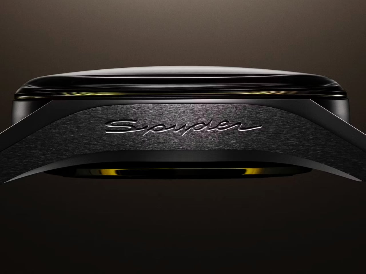
The caseback provides an intimate view of the in-house calibre TH20-09, a reminder that TAG Heuer’s expertise is just as much about what’s beneath the surface as what’s on display. The intricate engraving, ‘Swiss Made Since 1860’, adds a layer of heritage, while the Spyder engraving on the profile of the case is a subtle nod to Porsche’s legacy. The TH20-09 calibre features an automatic column-wheel chronograph mechanism along with a tourbillon, highlighting TAG Heuer’s mastery of complex horology. The oscillating weight, crafted to resemble a Porsche steering wheel, ties the watch’s inspiration back to Porsche’s racing heritage.

Image: In-house calibre TH20-09

The domed Glassbox sapphire crystal crowns the dial and provides a broad visual experience without distortion. It almost feels like it amplifies every detail underneath, giving the watch an added depth. It resembles the clear windshield of a racing car, providing an unobstructed view of all the dial’s activities. This wide-angle crystal reinforces the sense of openness, enabling a full appreciation of the Carrera’s mechanical intricacies.

Turning to the strap, the perforated calfskin leather in black with a vibrant yellow lining embodies that classic rally aesthetic while offering a distinctly contemporary twist. The stitching is clearly inspired by historical rally straps, but the updated contrast elements add a sophisticated touch that is more attuned to today’s design language. It’s not merely functional—it’s integral to how the watch carries the Panamericana’s spirit. The yellow detailing along the edges mirrors the vibrant accents on the dial, providing a balanced, visually pleasing symmetry.

Final Thoughts

With a price of CHF 35,000 (~$40,000) and availability starting in October 2024, the TAG Heuer Carrera Chronograph Tourbillon x Porsche Panamericana offers exclusivity and an exquisite nod to both brands’ storied partnership.

Image: TAG Heuer

The TAG Heuer Carrera Chronograph Tourbillon x Porsche Panamericana brings the thrill of motorsport to the wrist. From the skeletonized dial that evokes the look of Spyder rims to the black and yellow accents reminiscent of the victorious 550 Spyder, every detail of this watch speaks to the shared history between TAG Heuer and Porsche. It’s about how these two iconic brands capture the essence of performance, precision, and passion in a design that tells a powerful story. The Spyder engraving on the case profile, the nods to historical rally straps, and the meticulously crafted TH20-09 movement all combine to create a timepiece that’s undeniably bold, rooted in heritage, yet crafted with a vision that extends beyond nostalgia.

The post TAG Heuer Carrera Chronograph Tourbillon x Porsche Panamericana: A Bold Nod to Racing Heritage first appeared on Yanko Design.