This observation tower features a coffee bar that hovers above the clouds for a rare view of Da Lat!

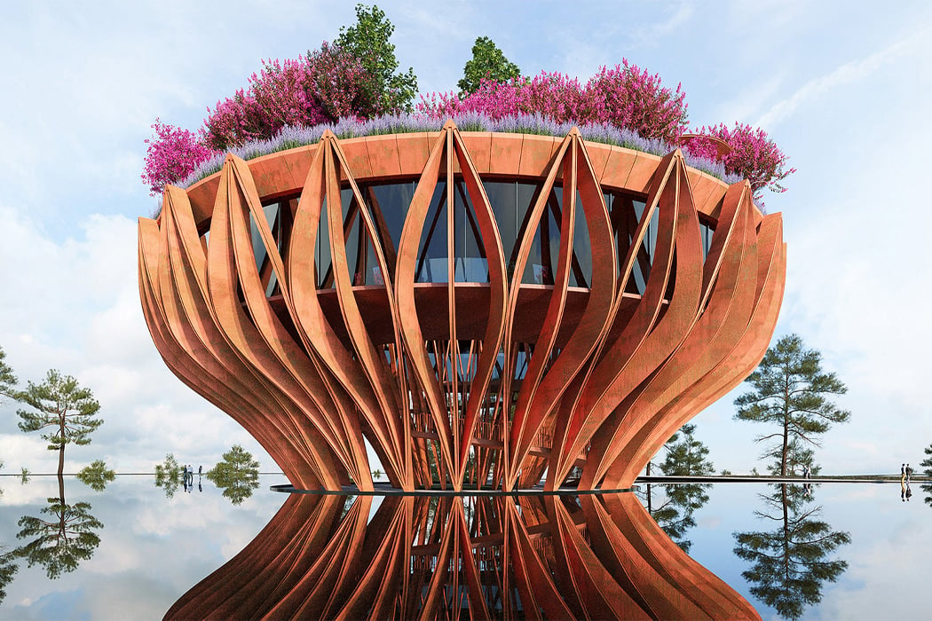
Sweeping the city in a sea of clouds, Da Lat is considered one of Vietnam’s most romantic cities and named to suggest, “City of Eternal Spring.” Year-round, clouds cover the majority of Da Lat’s landscape and enhance the city’s elusive charm, giving rise to unique, quirky, and statement architectural structures. Conceived and built by VHA Architects, Flowers of Clouds or The Tower Flower is one such observation tower and garden space that blossoms above the city bringing travelers and residents to the top of the clouds for a bird’s eye view of the city below.

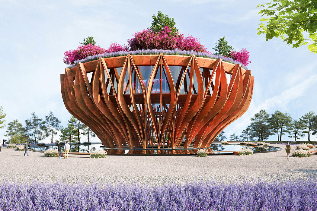
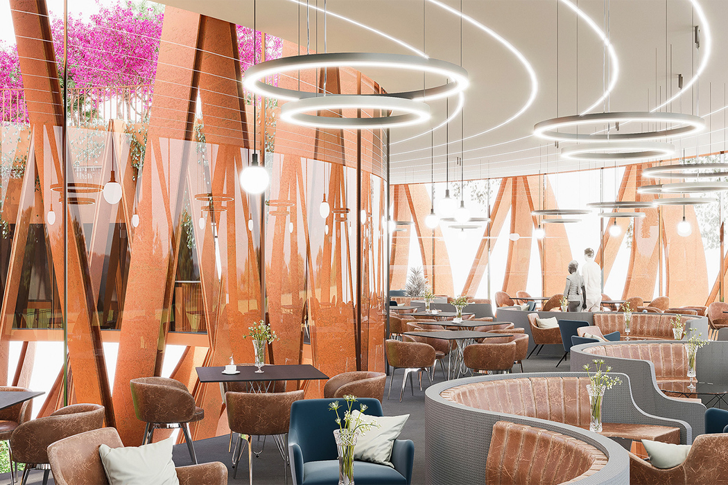
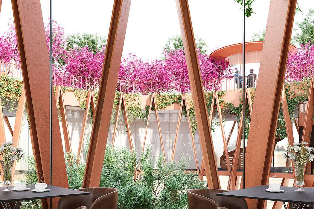
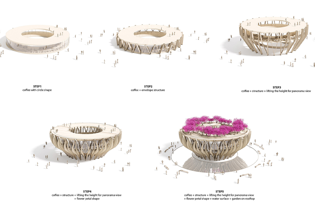
Characterized by its rolling hills coated with pine trees, marigold, and mimosa flowers, Da Lat’s distinct beauty is singular. The Tower Flower, an observation tower molded into the shape of a flower in the early stages of blooming, sings an ode to those rolling hills of Da Lat with terrace gardens and biophilic design principles. Designed to be a coffee boutique bar as part of a larger resort complex, The Tower Flower’s spherical frame features facades that mimic flowers blooming with rich orange corten steel modules that form the structure’s large petals.

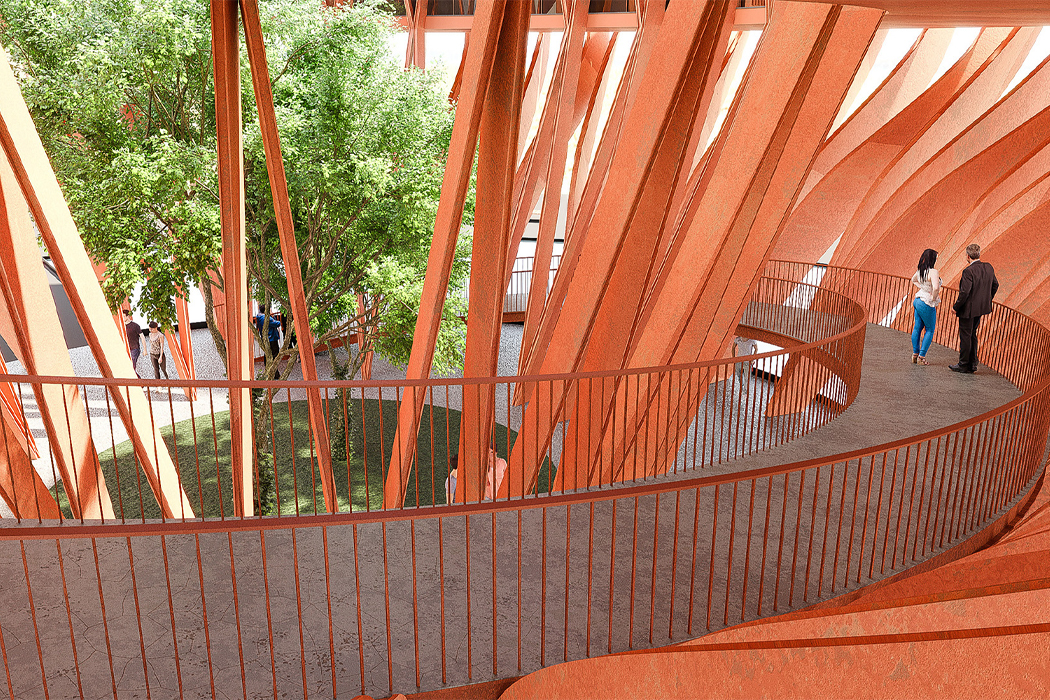
Twisting throughout the building’s interior, a winding ramp emulates the flow and curve of a river to allow the surrounding landscape and interior garden to gradually appear to each guest and visitor. Inside the coffee boutique bar, visitors and residents can enjoy views of the surrounding landscape as well as the structure’s interior garden that pays tribute to the Lotus flower, the symbol for pure beauty in Buddhism.

The Tower Flower is supported by a steel frame structure and reinforced concrete to ensure the structure’s stability and longevity. Perched atop the clouds at a height of 600m2, The Tower Flower’s roof terrace also features a flourishing garden that overflows from the roof. Hanging over the structure’s rim and merging with the clouds, the thriving garden creates a striking colorful display against the city’s optic white moat of clouds.

Designer: VHA Architects

Swept over in clouds, Da Lat’s foggy landscape lends itself beautifully to unique architectural structures that pay tribute to the land.

Stationed atop a surrounding water moat, The Tower Flower blossoms as a lotus flower would on a still pond.

Inside the building’s coffee boutique bar, guests can enjoy views of the surrounding landscape and interior garden.

A winding ramp gradually leads guests through the botanical structure’s interior, emulating the flow of a river and slowly opening up to the terrace garden.

Corten steel frames stylized into the shape of petals mimic the structure of a lotus flower, the symbol of pure beauty in Buddhism.

Enveloped with inverted V-structures, the building is stabilized with varying steel frames.

Perched above the clouds of Da Lat, The Tower Flower offers a bird-eye view of the city below.

This multi-level cat tower balances the joy of a McDonald’s PlayPlace with interior-friendly aesthetics!

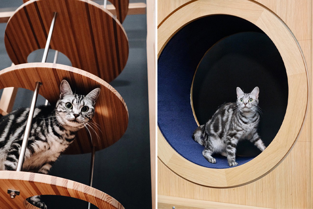
Cat towers have given cats reign over their homes for as long as they’ve been around. Whether they’re draped in plush carpeting or stripped down to a minimal hardwood design, cat towers provide a place for cats to relax and nap the day away or run and play until they’re ready for a nap. Designed by Hitomi Otake, the Neko Goten Cat Tower combines the labyrinth nature of a Mcdonald’s PlayPlace with the artful craftsmanship of a handmade piece of wooden furniture.

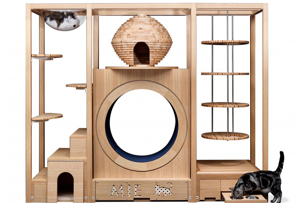
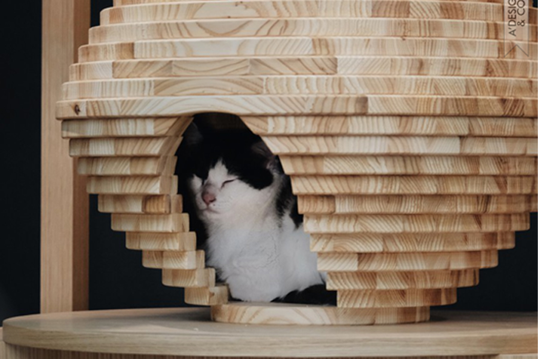
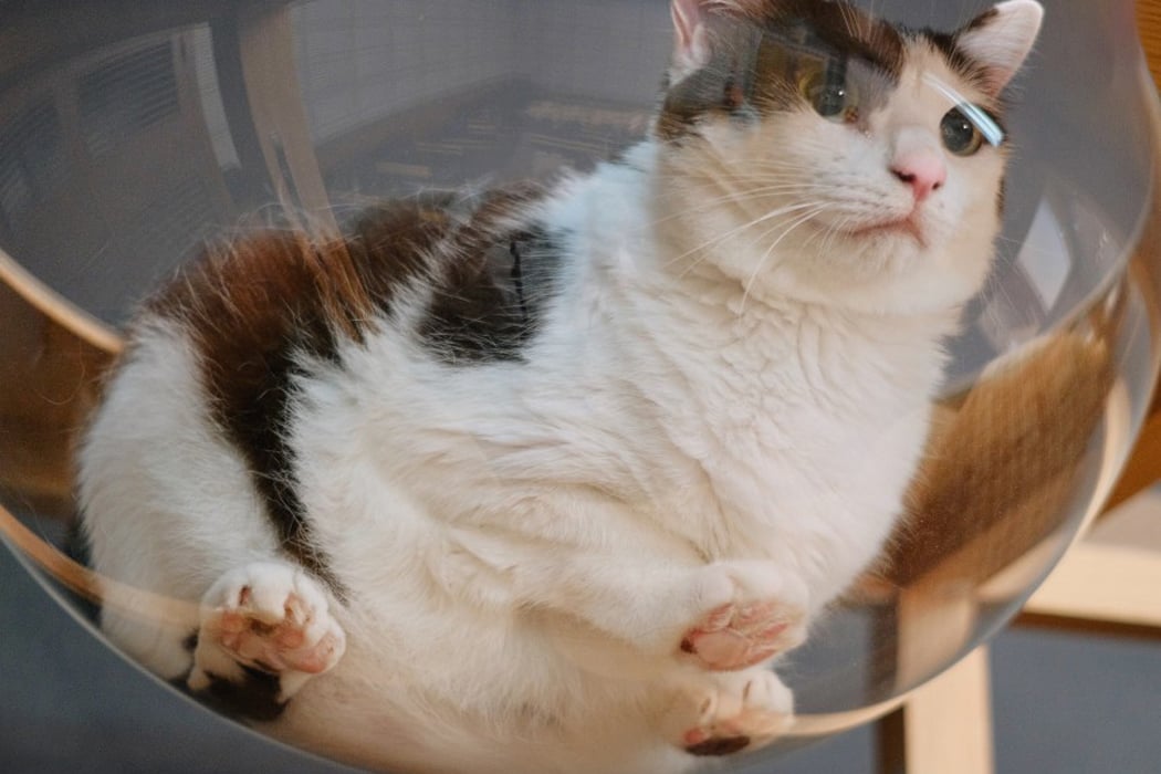
Featuring concealed storage areas and tucked-away hideouts, Neko Goten was designed on the basis of understanding the behavior of cats with acute attention to what makes them really purr. On the left side, Neko Goten’s staircase brings cats to alternating jumping perches where cats can leapfrog before heading up to the tower’s plastic hemisphere that hovers above the entire play area. Below the staircase, a hideout offers a covert place for cats to rest without bother. Then, the center section of Neko Goten features a hive-like resting area that’s stationed atop a hollowed-out carpeted ring reminiscent of a hamster wheel, where cats can either rest, scratch, or knead until a cat nap’s in order. Finally, the right side suspends a four-tier platform chain ladder for cats to climb up and down, resting periodically on one of its round bases to perch and observe the goings-on of their home territory.

Constructed with the skills of furniture craftsmen, Neko Goten was built with wood coming from Japan’s Fukui Prefecture. Developed primarily for use in Japan’s rental homes, Neko Goten’s handcrafted design of oakwood and cedarwood fits into public spaces and private homes alike. Once Neko Goten’s large stature wiggles its way into the living room, cats won’t hesitate before clawing away and climbing to the top.

Designer: Hitomi Otake

The cat tower’s center resting place was handcrafted to echo the look and feel of a beehive.

Suspended from the tower’s right-side wing, a four-tier chain ladder allows cats to climb and slink their way up or down, while a carpeted hollowed-out ring provides a scratching post for cats.

Hovering above the entire play area, a plastic, transparent hemisphere provides the coziest resting area for cats to perch and keep a watchful eye over the tower.

Quirky-looking furniture uses a virus-inspired pronged design to stack and stick to one another!

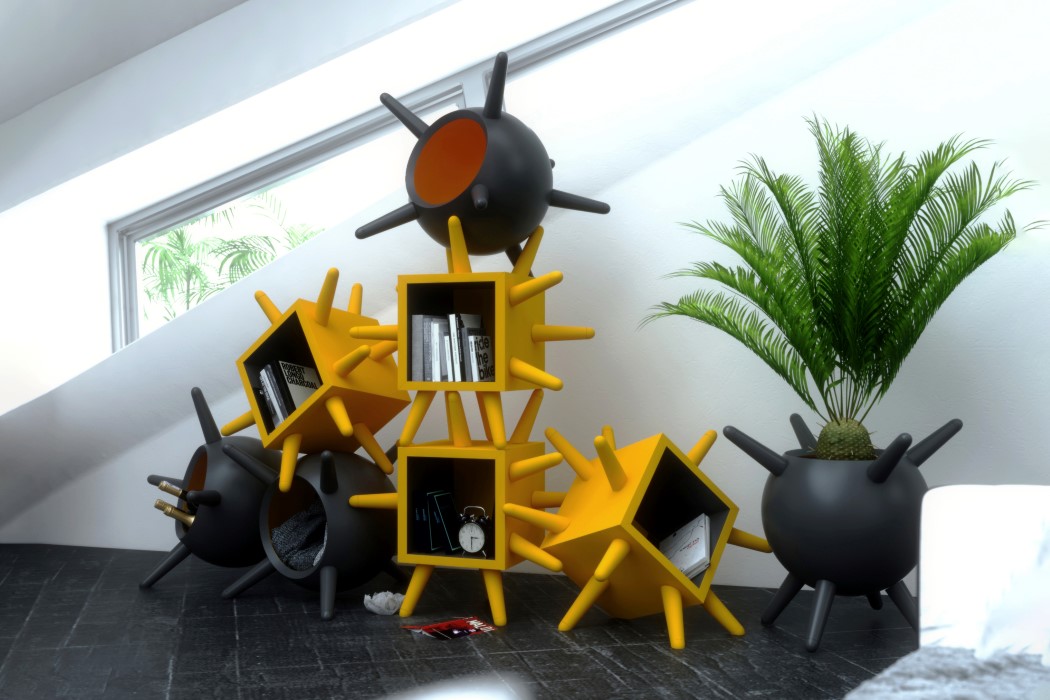
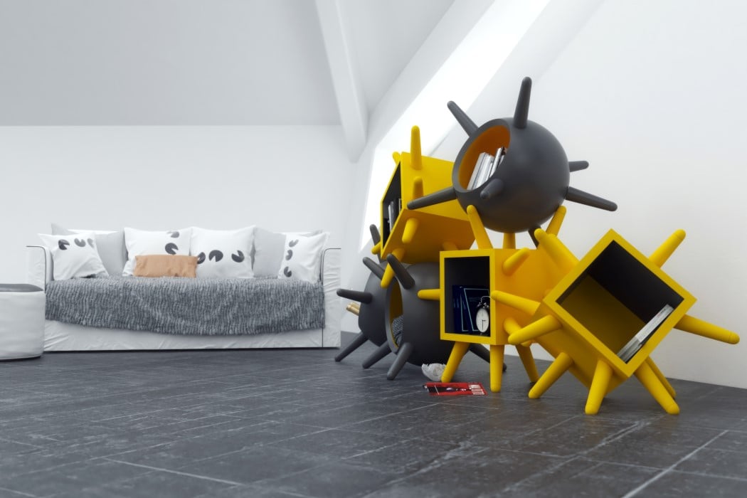
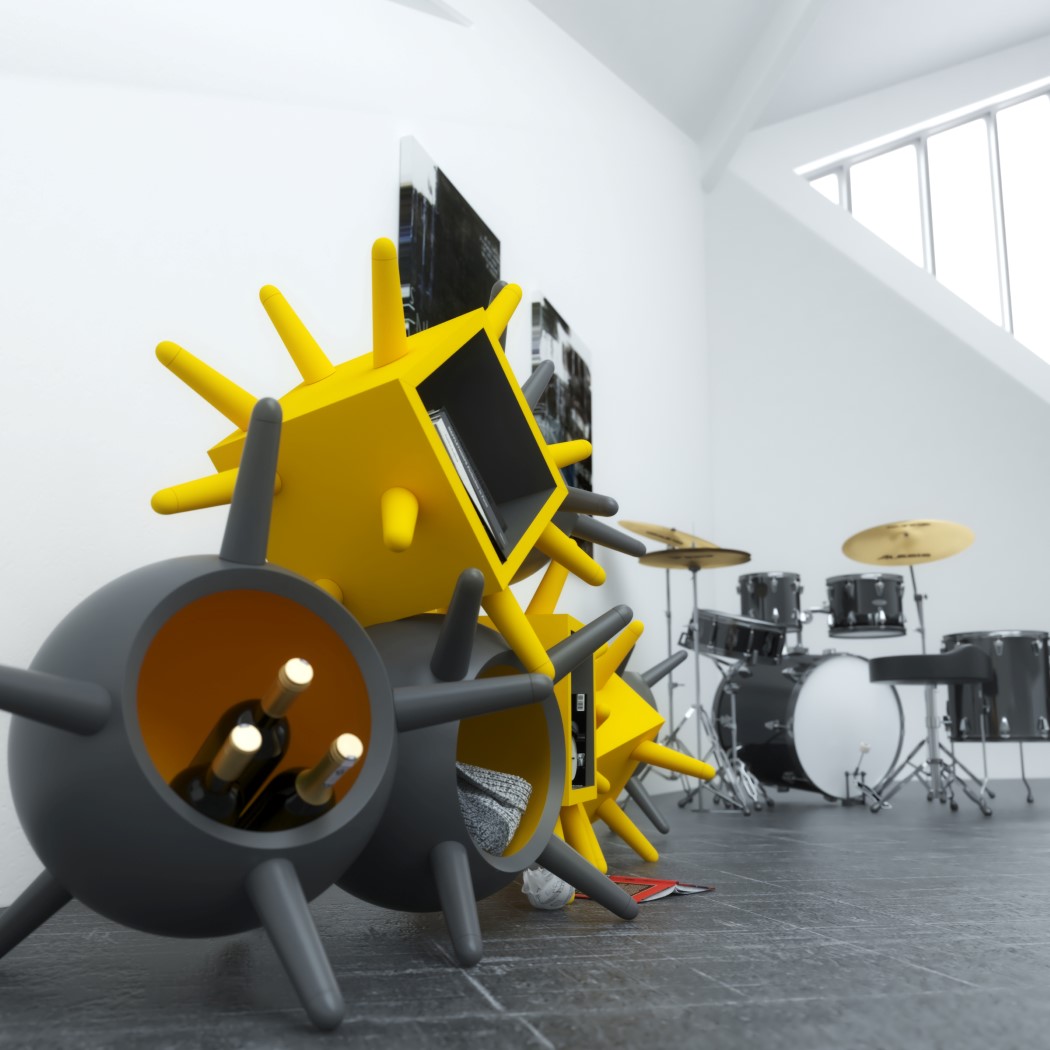
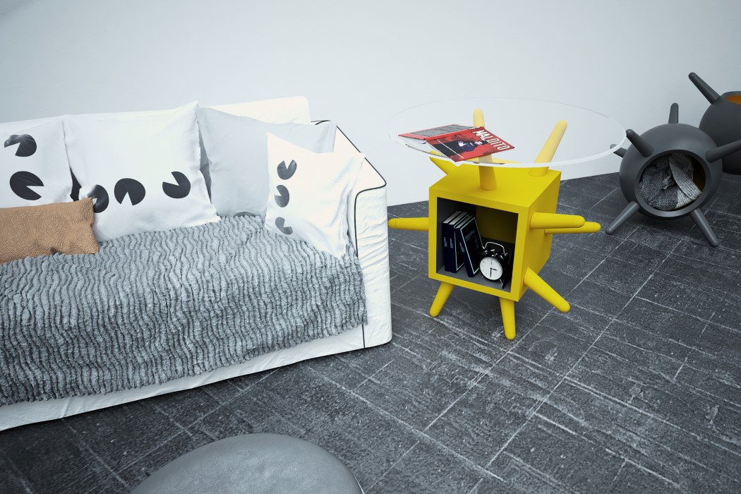
I’ll admit, the word ‘virus’ probably gives you a bit of anxiety. It definitely isn’t associated with any pleasant experiences, although designer Andrea Cingoli is trying to make the word virus sound less scary and more harmless. In an attempt to have us get over our fear of microorganisms, Cingoli’s furniture borrows from the very design of the virus. Meet Oleg, a series of multifunctional furniture with ‘spike proteins’ that allow them to be stacked in multiple ways!

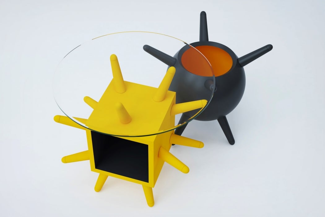
Oleg aims at rebuilding our association and relationship with viruses. Rather than associating its shape with something bad, Oleg showcases how the almost naval-mine-like furniture can be used and arranged in multiple ways. The spiky exterior of the furniture looks unapproachable, but that’s also negated by the Oleg’s use of a playful yellow along with the black to create a colorful furniture arrangement. The spiked exterior allows the Oleg to be oriented in many ways. Individual modules can be placed on the floor as the spikes work as a pair of legs, or they can even be stacked one on top of the other, allowing the spikes to interlock into each other to create fun and quirky cabinet arrangements! It looks eye-catching no matter how you orient it, although you may want to be careful if you’ve got a pet (especially a cat) in the house!

Oleg is a Silver Winner of the A’ Design Award for the year 2021.

Designer: Andrea Cingoli

This multipurpose shelf holds any object in place using its clothes-peg inspired design detail

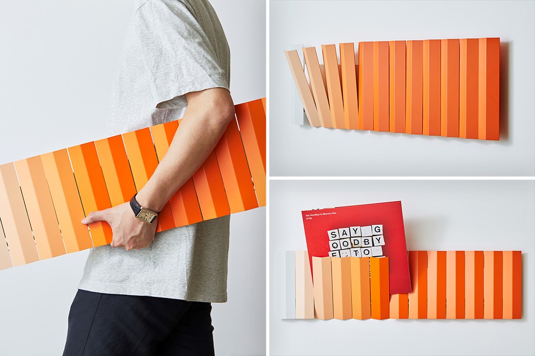
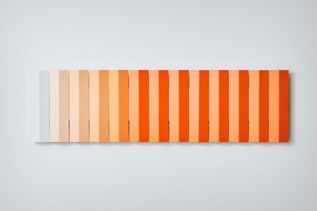
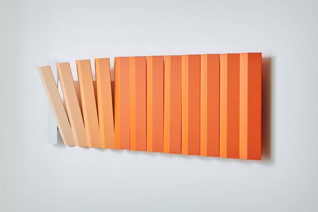
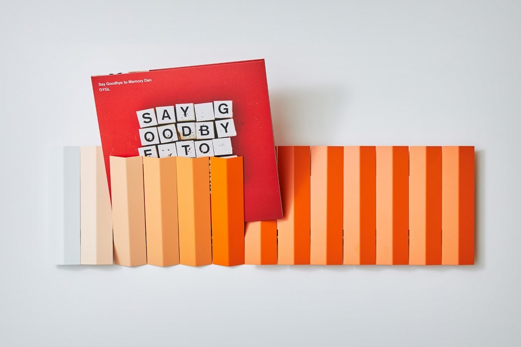
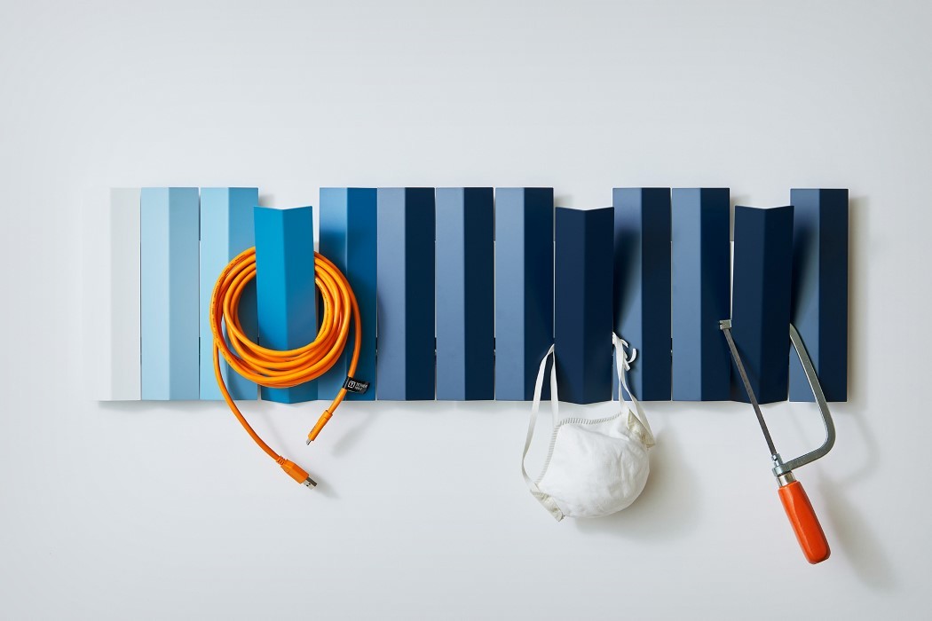
The idea for the Parachute Wall Shelf came to designer Yusuke Watanabe, funnily enough, as he was listening to Coldplay’s first album titled “Parachutes”. Derived from the Italian word “parare” (to protect) and the French “chute” (to fall), this award-winning universal shelf holds anything in place! Its clever design is influenced by how clothes-pegs secure objects on a clothesline by clipping onto them. The multiple pegs or planks on the Parachute Wall Shelf hold your objects in place by gently ‘clipping’ them to the wall.

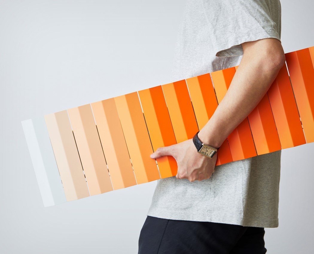
Made from colored sheet-metal stripes that almost look like a parachute’s cloth with their wavy design, the Parachute Wall Shelf looks like abstract art when not in use. It sits flat against the wall (unlike most shelves with cantilever forwards), looking like framed art until you tip one of the ‘pegs’ forward and use it to store objects or to even hang items of clothing like your coat, scarf, or hat.

The Parachute Wall Shelf is a Gold Winner of the A’ Design Award for the year 2021.

Designer: Yusuke Watanabe

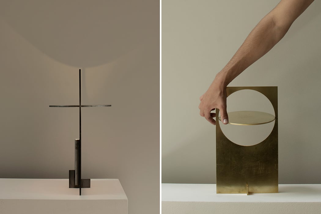
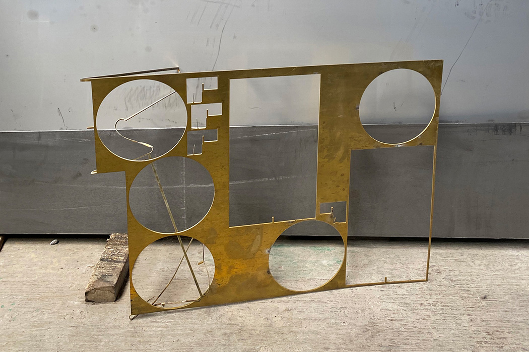
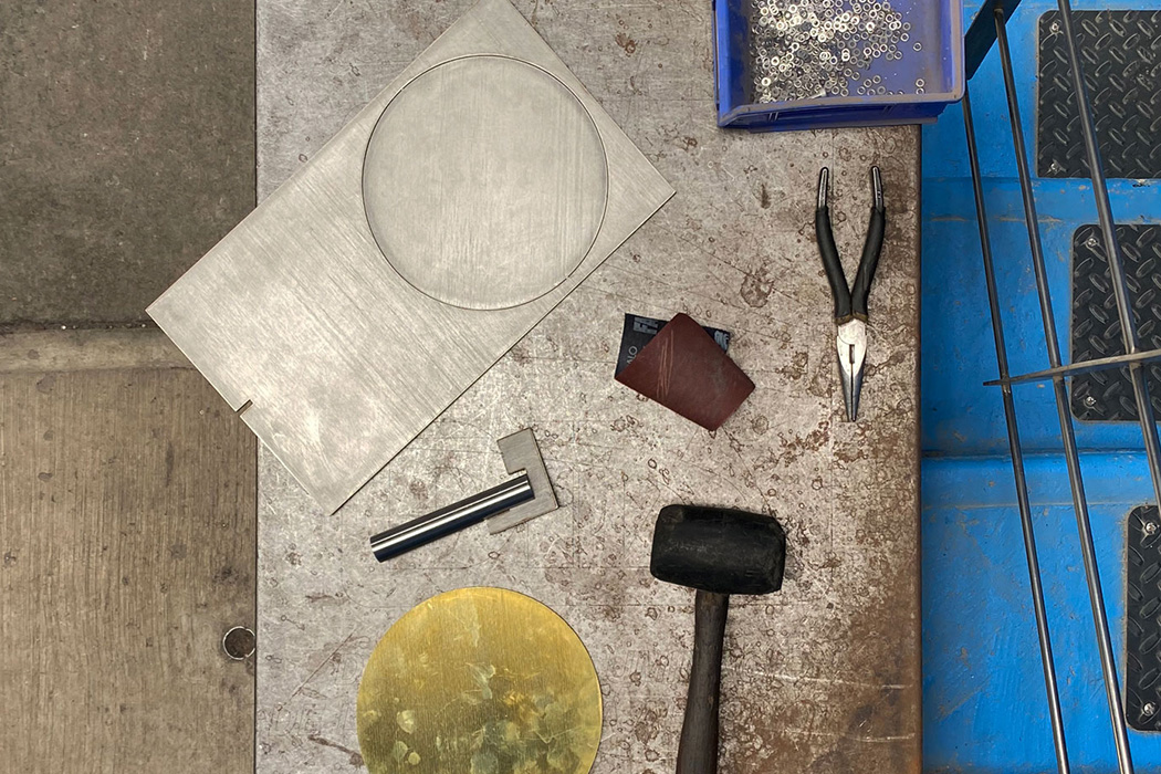
A single metal sheet and laser cutting helped one designer create a lamp during the pandemic

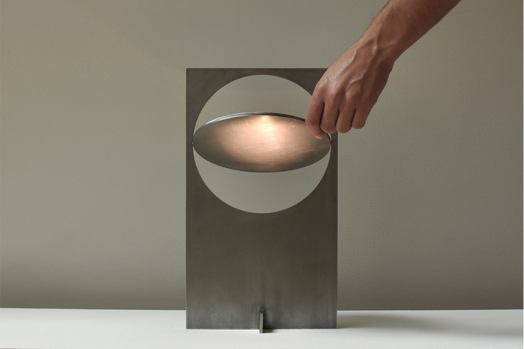
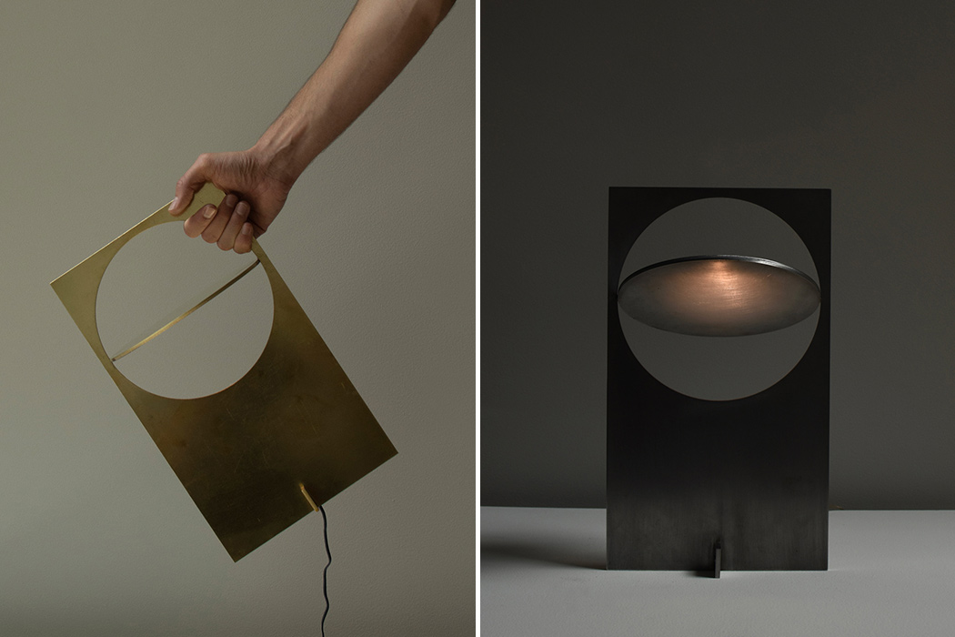
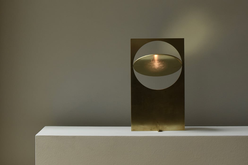
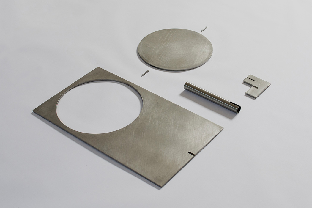
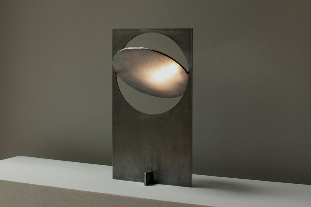
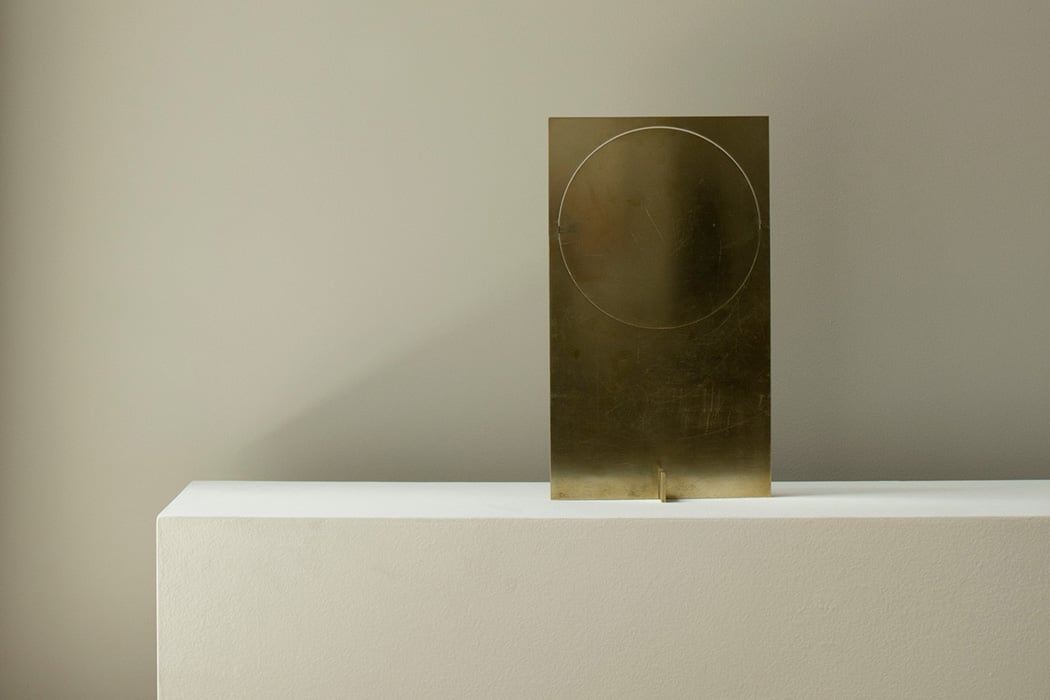
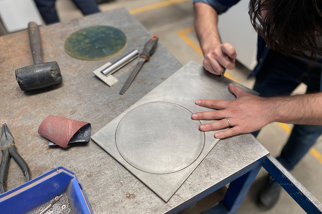
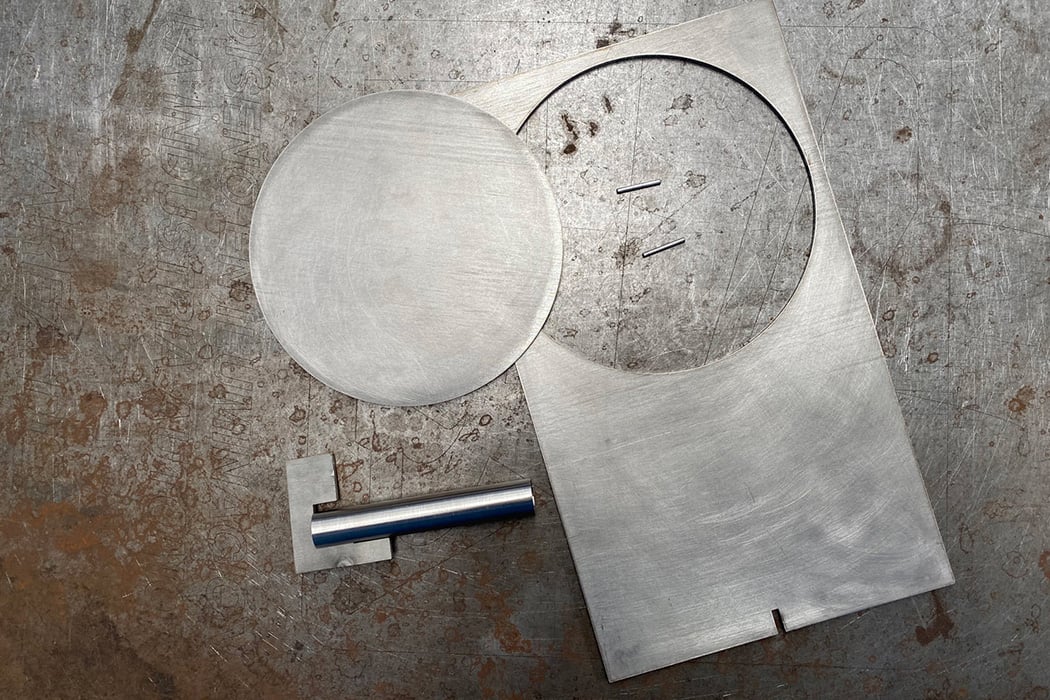
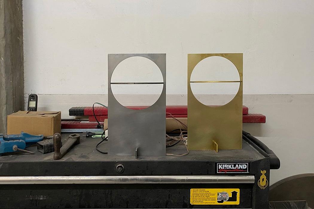
The pandemic forced us all to take a deeper look at ourselves and get creative in our creations. While that sounds easier said than done (all the banana bread and Dalgona coffee viral trends speak of our need to create!), designer Manu Bano went through the same creative process as we did and came up with an innovative design – the OBJ-01 lamp! The process of going from paper sketches to production is a daunting one, but what do you do without access to any production workshops? You simplify! The OBJ-01 is a raw sheet of metal – be it steel, stainless steel, or brass that is laser cut, assembled by hand, and needs no welding.

Don’t let OBJ-01’s simplicity fool you, the lamp does not sacrifice functionality. The circular dish adds an interactive element that acts as an adjustable lampshade, taking your light from 0 to 100 at the flick of your wrist. As Manu explains, “On this occasion, there was practically no research, the design process was an exercise of intuition. I decided to reuse the cardboard from online purchases I made during the pandemic and use it as material for mockups. I started working with this cardboard and a knife cutter, making different cuts and folds to the cardboard to transform a 2D sheet into a 3D object with different uses. My intention from the beginning was to achieve a small object that I could send flat packed all over the world, so starting the process from a flat sheet was important.” The lamp comes with an integrated custom touch dimmer, with the conductivity of the metal allowing it to work as a switch. Just tap the metal plate to turn the light on/off, and multiple taps let you adjust the brightness.

Manu’s experimentation showcases the ingenuity we can discover in times of need – reinforcing the fact that you can create with what you have as long as you are determined. The minimal, flatpack approach of the design lets you keep this on your bedside without any extra switches cluttering your tablespace with its touch conductive surface. Simple, smart, efficient, and DIY is one of the most efficient product designs I have ever seen!

Designer: MANU BAÑÓ

This ‘lipstick card’ makes it so much it easier to carry and apply make-up

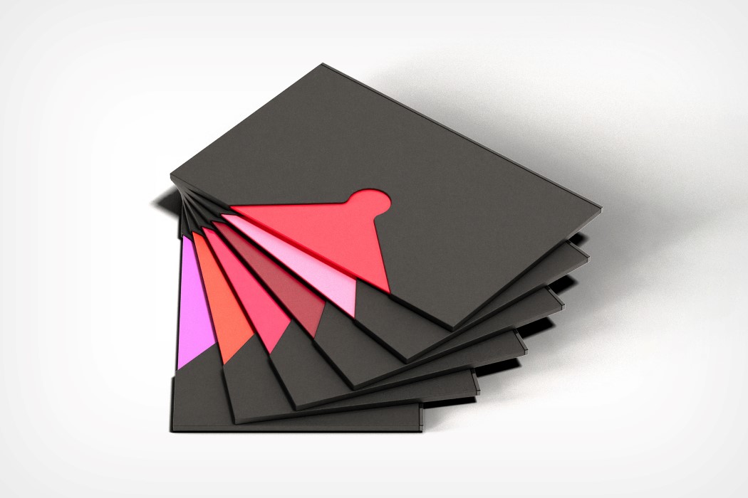
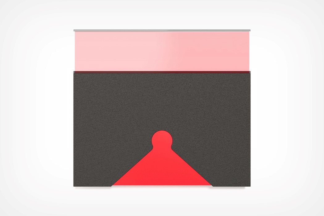
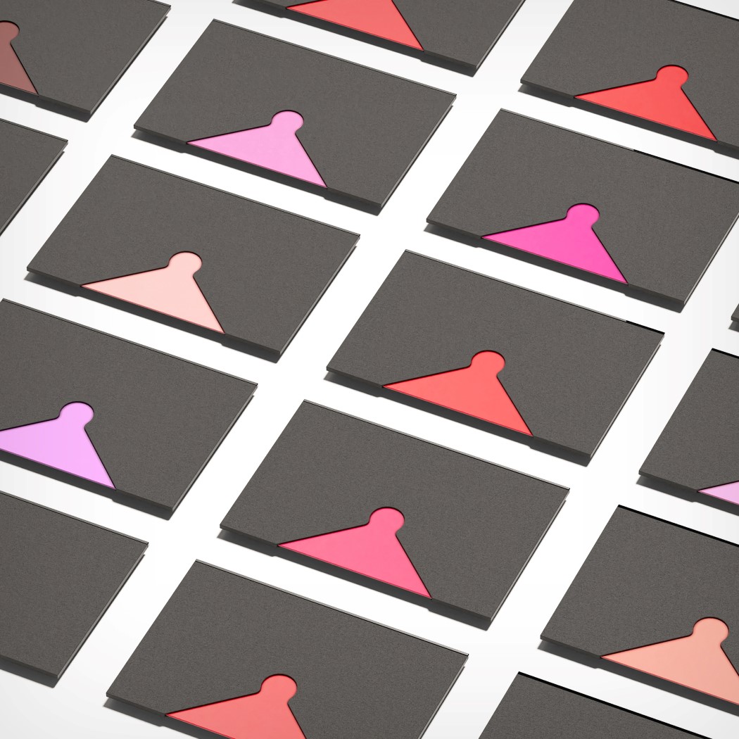
I’m by no means an expert on lipstick… I can’t tell the difference between a Maroon and a Burgundy, but I know enough to be able to say that the Yanzhi Lipstick Card is an incredibly clever idea. Packaged in a neat, card-sized device, the Yanzhi Lipstick’s easy to spot, store, carry, and apply. It’s one of those sensible ideas that make you wonder lipsticks are shaped the way they are, and why they haven’t changed in literally centuries.

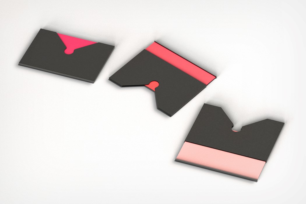
The Yanzhi Lipstick’s card-shaped design makes it easy to carry in your pocket, purse, or even wallet (it’s 2021 and anyone can wear lipstick). The card detail is great for branding purposes, and allows you to easily see the color on a much larger swatch than on the top of a cylindrical lipstick container. The most important part about Yanzhi’s experience is in how you apply it. Designed to be used sort of the way you’d use a tissue or blotting paper to absorb excess lip-gloss, all you do is eject the lipstick from the card and place it between both lips and move them around almost as if you were picking meat off a pair of BBQ ribs. Once you’re done, slide the lipstick back into its card-cover, and voila! You don’t need a mirror, and thanks to the protective wall on the edge of the lipstick card, you won’t have a red line running across your teeth either!

The Yanzhi Lipstick is a winner of the A’ Design Award for the year 2021.

Designer: Yuru Zhang

This 3-in-1 kitchen appliance with voice assistance is the butler you need!

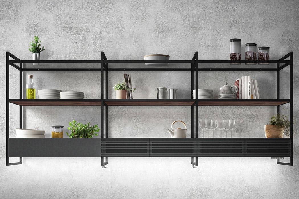
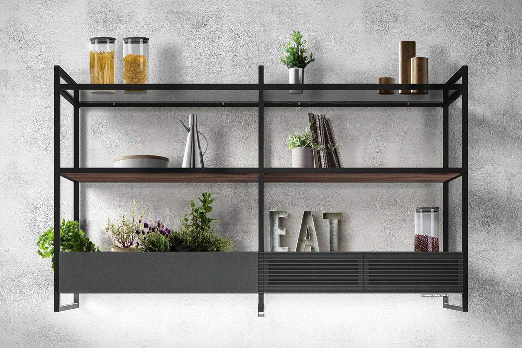
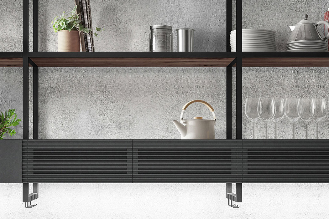
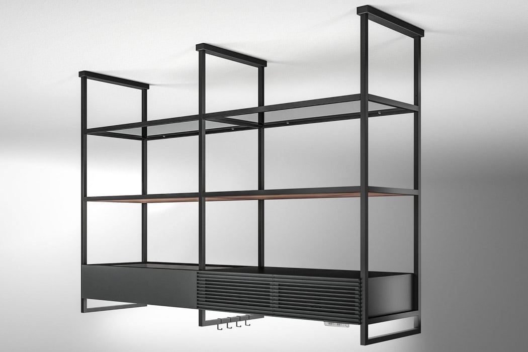
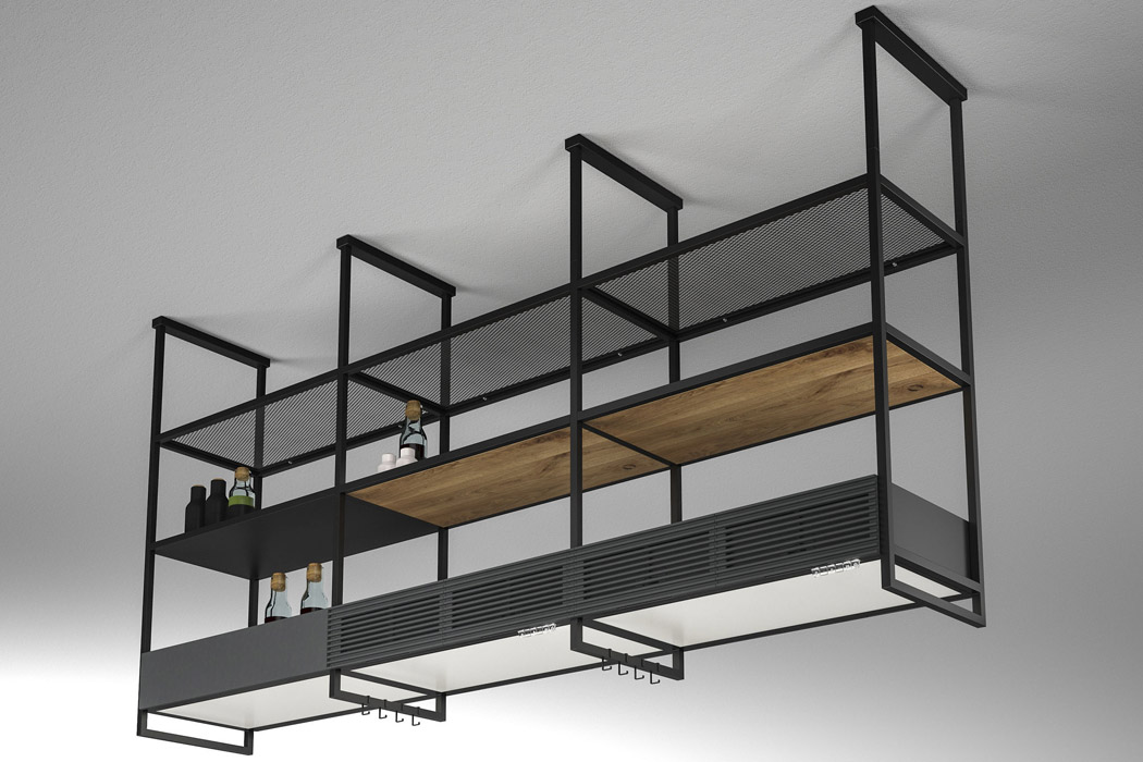
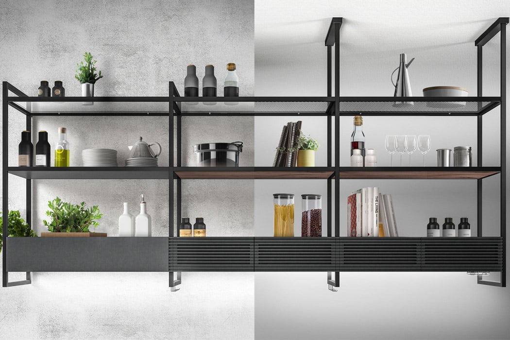
The kitchen is one of the most important sections of any home, and for me, growing up in a small house, the kitchen was almost sacred. It’s the first place in the day where everyone began their mornings, and in every big family gathering, everyone would eventually end up chatting in the kitchen. This A’ Design winner lets you upgrade your existing kitchen without the requirement of an expansive space or the limitation of existing elements in your kitchen. The Open Suite Cooker Hood by Fabrizio Crisa for Elica is designed to keep in mind modern styling requirements and, most of all, modularity to bring out the most in everyday practical usage.

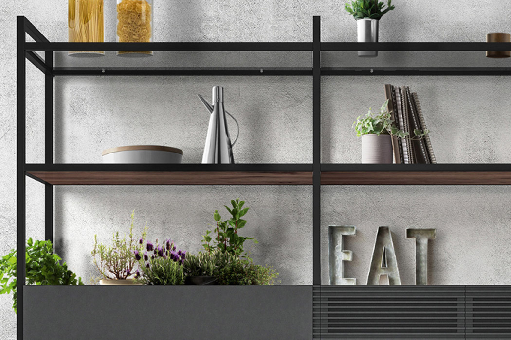
The Open Suite merges a hood, a large LED light panel, modular shelving units along with a voice assistant integration that provides feedback on filter maintenance and overall system management. The unit is tailored for all your modern needs – the modular structure of the hood brings flexibility in how you actually want to set up the function and complement it with the visual appeal. This freedom comes courtesy of the 80 cm/160 cm modules that join in endless configurations depending on the user’s requirements and personal taste. The lower front section of the hob houses a large LED light panel (with color toggle and intensity adjustment) for illuminating the area while cooking. So, whatever the mood you’re in, Open Suite can create the right ambient environment for enjoyable cooking sessions. The designer explains, “A monolithic structure, in which the functions of air and light become complementary: in the lower front side of the hob there is, in fact, a large LED light panel. The panel acts as a strategic light point during food preparation, to be also used as ambient light for the most convivial moments. You can adapt the intensity and color of the LEDs, from cold white to warmer tones, to create the perfect atmosphere. Thanks to the double suction unit and the special Long Life filters (which can be regenerated in the oven for 3 years), Open Suite has been designed to guarantee maximum performance in the filter version and maximum freedom of movement in the kitchen.”

All the functions for interaction with the cooker hood come in ergonomic controls on the front. For those who are used to voice assistants, the kitchen appliance comes with Alexa, Google Home, and the in-built Elica app support. For easy filter maintenance, the appliance comes with the convenience of automated tips to keep the hood at its best for years to come – just like a butler who takes care of the smaller things in life to keep the kitchen running smoothly! The intuitive design to bring modular kitchen shelves and cooker hood into one is worth appreciating and something that budding home chefs will want to own right away!

Designer: Fabrizio Crisa for Elica

Here are the hottest winning-designs from the A’ Design Award 2021

While we slowly put this pandemic in our rear-view mirror, here’s something to look forward to – the A’ Design Award and Competition 2021 just announced their annual winners. Spanning literally a hundred categories, the A’ Design Awards look at creating a holistic list of the best designs internationally, across all disciplines. While the Coronavirus has definitely put a damper on awards who are looking to conduct exhibitions and gala nights for their winners, that hasn’t stopped the A’ Design Award from making sure their winners get their share of the international limelight!

The A’ Design Award and Competition is much more than just your average awards program. It actively seeks good design, markets it, brings value to the project as well as the designer in the form of a wide range of value-added services like a dedicated PR Campaign, an online exhibition, and even a platform to sell your design on… and these perks aren’t just limited to the design, they extend to the designers and creators too. Your participation entitles you to a proof-of-creation document, inclusion in A’ Design’s Business Network, and the Design Fee Calculator service that lets you accurately price your design services for future clients, allowing you to set up your design practice.

Judged by a grand jury of 211 elite designers and educators, here are a select few of A’ Design Award and Competition 2021’s winners. We’ve hand-picked some of our favorites from this year’s list of winners spanning categories such as Product Design, Social Design, Tech, Furniture, Medical, and Transportation Design. Scroll down below to have a look at what’s making the waves this year in the design circuit! And don’t forget to register below to participate in the competition for 2021-22 to make sure your work as well as you get the recognition you deserve!

Grab an Early-bird Registration for A’ Design Awards 2021 by clicking here!


YD Handpicks: Winning Designs from A’ Design Awards 2018-19
CanguRo Mobility Robot by Shunji Yamanaka – fuRo

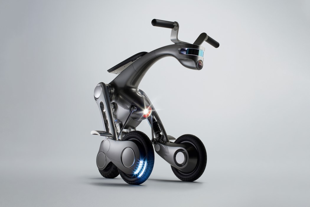
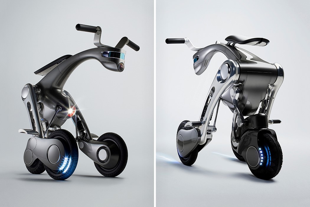
The CanguRo Mobility Robot is a classic example of building the future by looking at the past. For centuries (if not millennia), humans have rode on horses as transport. The horse, unlike a car or motorcycle, forms a relationship with the rider over time, following, responding to commands, and remaining subservient to its owner. The CanguRo Mobility Robot provides a similar experience with a three-wheeled robot that the user can ride, summon via their smartphone, and even walk ahead of as the robot follows them along. The three-wheeled mobility bot is autonomous, which gives the rider a certain degree of freedom. It can be summoned from the parking lot by simply tapping a button, and can even follow you around as you walk. However, when you want to ride it, straddle yourself in its seat and the three wheels spread apart, providing you with a comfortable, controlled, and stable driving experience!
Standly Bao Folding Chair by Ming Hsiu Lee and Hu Jui Chung

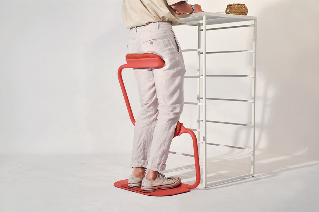
We all need to take a break from being in one single posture all day long, whether that’s sitting in a home-office chair, or lazing with a laptop in bed. To make things easier and healthier for those spending all day on their feet, Designer Ming Shiu Lee created Standly Bao – an assistive device for workers that keeps them in a healthy standing posture and mental state while still having mobility. The Standly Bao is a slightly tilted structure designed to support three different pressure points – the hip, knees, and feet. The aim is to provide support to these points and reduce the pressure on lower limbs thus keeping workers from becoming habituated to a wrong standing posture which can result in long-term health problems. When using Standly Bao, the user rests in a position between standing and sitting. The stand can be folded up and is able to fit in narrow spaces without obstructing anything. The stand helps to correct your posture and alleviate headache, shoulder pain, neck stiffness, lower back pain, and more.
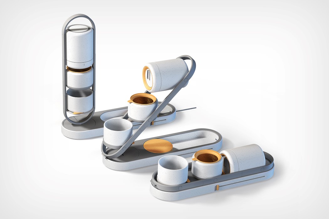
Eli Functional Pour-over Coffee Maker by Chenchen Fan

Although there are a whole bunch of travel coffee makers out there in the world, none of them are like the Eli. The capsule-shaped coffee maker turns the brewing, steeping, and pouring experience into one singular movement, making the coffee-making experience much more convenient. It all starts with the Eli’s design, which consists of the brewing chamber and two cups, all connected to a single lever that allows you to lift to brew, tilt to pour, and push down to close the brewer. Lift the lever up in its vertical position and you have your conventional pour-over style coffee maker. Once the coffee’s ready, tilt the lever diagonally and tip the brewing chamber over and coffee pours right into the cup directly below it. By controlling the position of the lever, you control which cup you’re pouring coffee into… and when you’re done, just push the lever right down and the Eli goes from being a vertical brewer to a flat little appliance you can stash anywhere in your kitchen.

Poetry – Wireless Charger + Lamp by Yong Zhang and Lei Wang

Poetry isn’t your average wireless charging appliance. It’s an expressive little gadget that lights up your space while charging up your phone. Styled to look like an abstract bonsai tree for your table, Poetry provides a space to dock your phone while also providing a wash of ambient light to your workspace. What’s more is that the Poetry even comes with its own detachable power-bank that you can remove and use independently anywhere you go. When you’re back at your desk, just pop the power-bank back in its place and it begins recharging too!
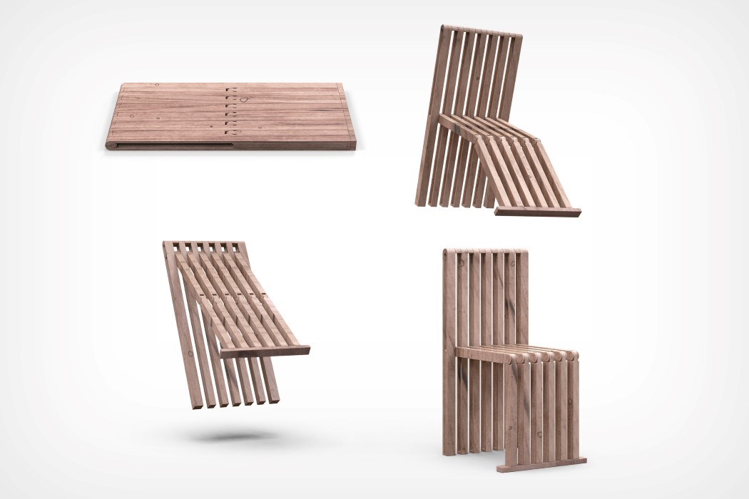
Pad Chair by Shaohan Yang

The Pad Chair transforms from a benign wooden mat into a neat chair with a backrest! Made from multiple wooden strips joined together in a rather unique way, the Pad Chair possesses the ability to transform from a flat, 2D shape into a neat, comfortable 3D chair. I’m sure there’s a locking system in place that allows the chair to lock in either closed or open positions, but for now, the Pad Chair provides a radical alternative to those ugly metal foldable chairs (the kind you’d see on wrestling shows). What the Pad Chair offers as an alternative looks incredibly classy, in both its closed as well as open versions!

Medapti Oral Medicine Syringe Adapter by Dorota Dyk

Perhaps one of the most clever ways to get a baby to take their medicine, the Medapti lulls the baby into a sense of comfort and calm, while allowing parents to cleverly feed their children food or medicine. The Medapti is designed to be a soother that allows you to attach a feeding syringe on the other end. Just pop the Medapti in the child’s mouth and use the syringe to inject food and medicine right in. Sure, it may seem like a cheap little trick to your toddler, but it’s an equally effective solution for parents!
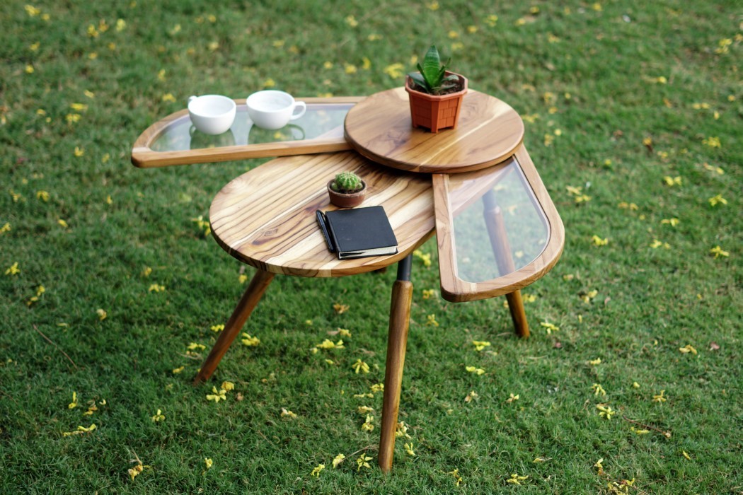
Elytra Space Saver Coffee Table by Radhika Dhumal

In an unusually beautiful case of nature-inspired design, the Elytra table by Radhika Dhumal expands in size by ‘spreading its wings’! The table comes inspired by beetles and the way their wings nest perfectly around their body. The table itself comes with perfectly natural bug-like proportions that fit in well as garden decor, and uses two ‘wings’ to expand in surface, much like the beetle. Elytra’s design is dominated by rounded forms that give it a friendly, pet-like demeanor and its four legs are positioned in a way that gives the Elytra its unique, animal-like stance. The table’s surfaces are split into four broad parts, including a wooden ‘head’ and ‘body’ as well as two glass-inlay wings that can be opened out to expand the table’s surface to store an extra few cups of tea, a planter or two, and perhaps a notebook to doodle your ideas on!
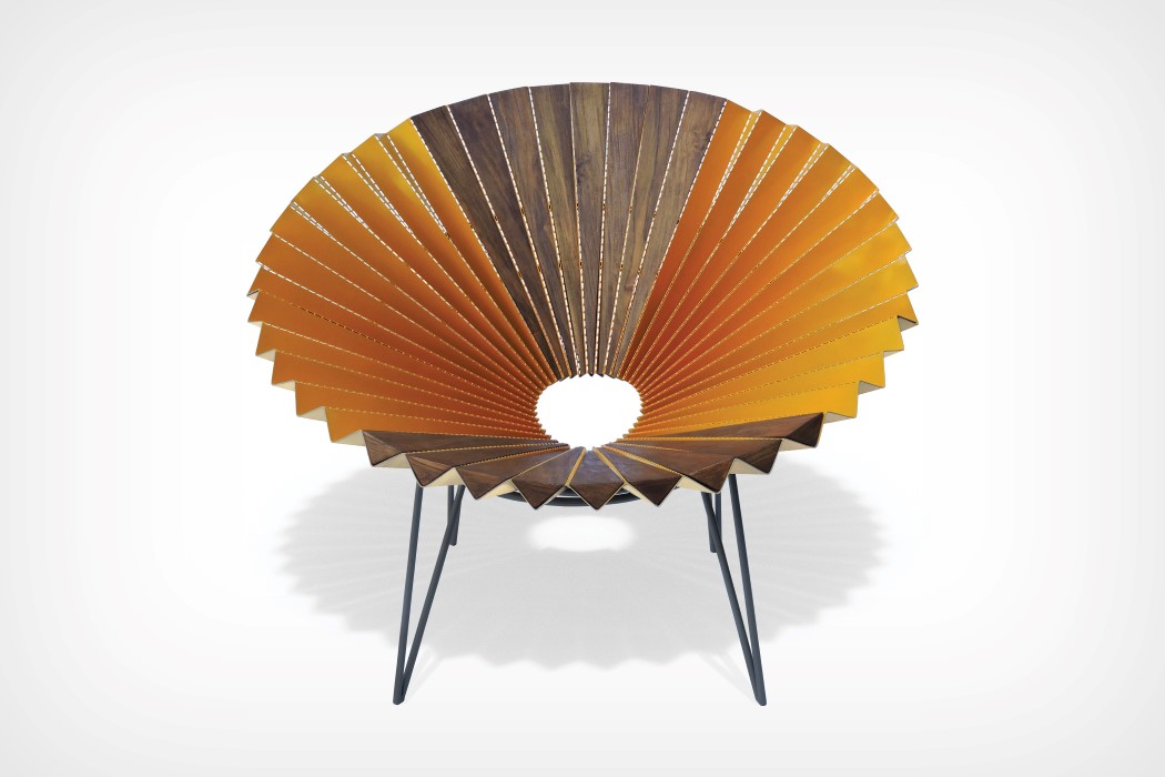
Ori Accent Chair by Manish Maheshwari

It’s unfair to brand the Ori as a chair when it clearly is a throne! Designed to give the person sitting on it a grand halo, the Ori chair makes a clever use of folded metal to create its signature design. Inspired by (and even named after) origami, the chair uses sheet metal with perforated fold-lines in its design. The perforations allow the metal to easily bend along a desired path, giving the chair its signature pleated design. However, in the interest of comfort, the seating area along with the backrest of the chair come with triangular wooden pieces put into the metal’s folds, creating a flat surface to sit on and lean against. Wonderful, isn’t it??
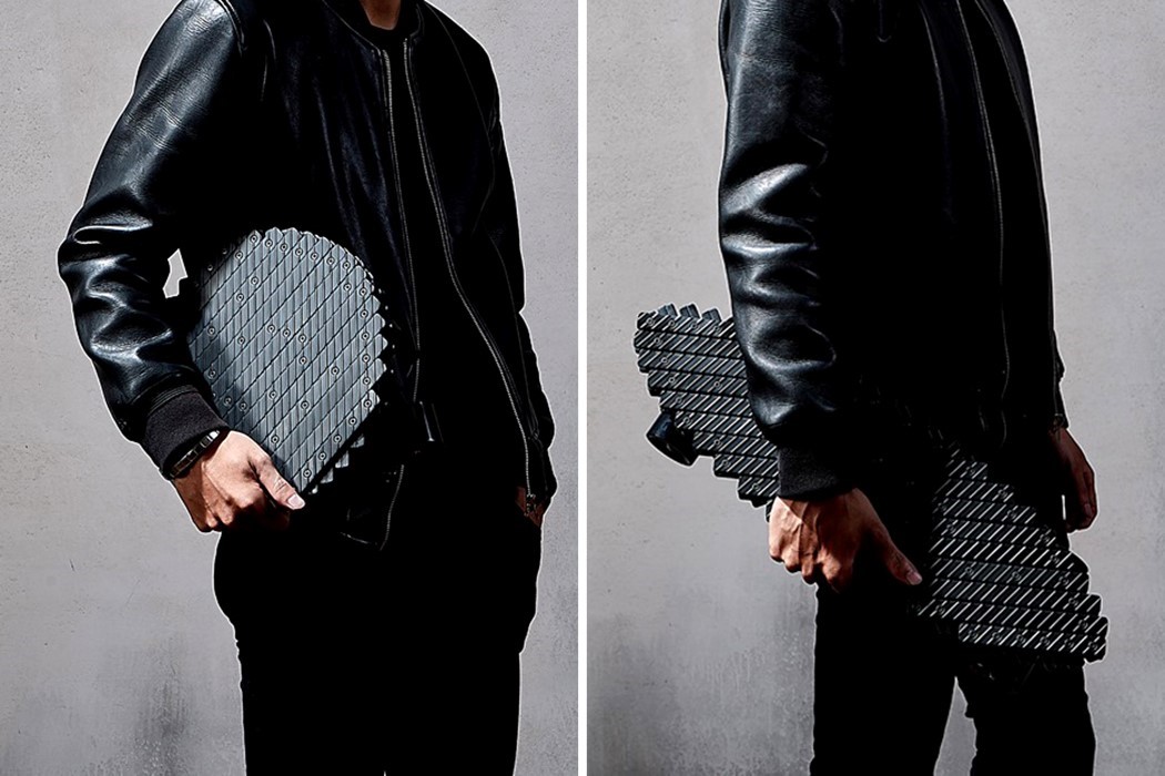
The Board Skateboard by Chia-Wei Chen

The Board is an award-winning collapsible skateboard that is inspired by the same mechanical linkage system seen in collapsing gates, in scissors, and in those expandable grabber toys you’re probably familiar with. It’s hard to think of how skateboards and gates have any design-process overlap, but The Board makes it clear that a detail found in one product can easily and effectively be ported onto another product with stunning results. The Board uses this collapsible linkage system to make itself more portable. Machined metal components are arranged, sandwiched, and connected to each other with multiple pivot points to make The Board’s body. These linkages allow The Board to expand and collapse just by pulling or pushing it, taking it from a long, skateboard shape to a much more compact and carryable circular shape that easily fits right into backpacks. The metal construction gives The Board its signature strength (so the pieces don’t bend or flex when you stand on the skateboard), while also imparting a unique appearance to it, whether open or closed!
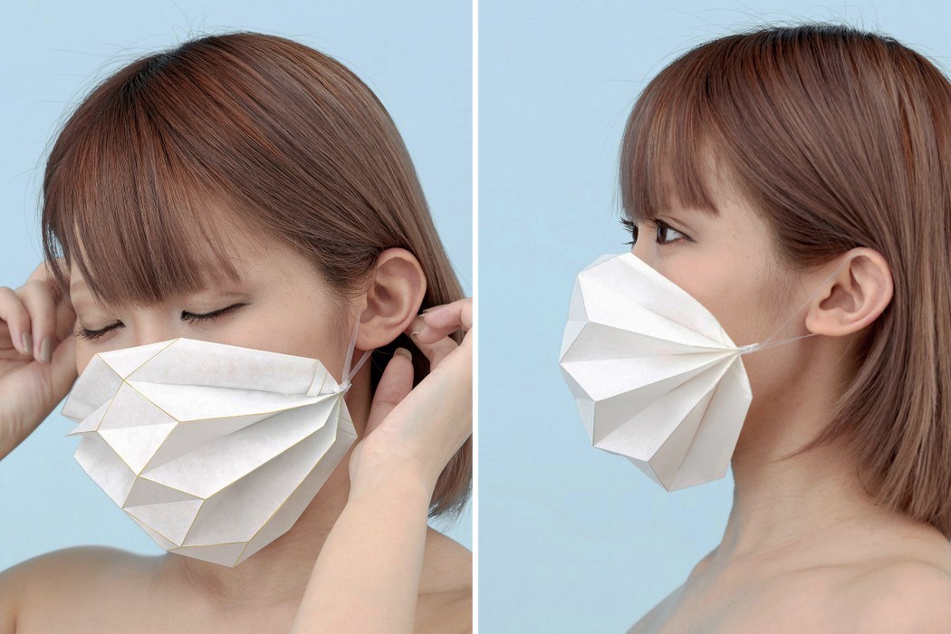
Origami Fashion Mask by Yuriko Wada

There’s something very charming about the Origami Fashion Mask that clearly sets it apart from the clinical aesthetic of your signature blue surgical face mask. Its unique pleated design allows it to naturally curve around your face, going from side to side without leaving any visible air gaps. The mask comes made from a non-woven breathable fabric filter-cloth, and the folded edges are painted with a thin gold line, giving the mask a decorative appeal. Designed to be worn at functions and celebrations, the Origami Fashion Mask folds flat into a bookmark-shaped sleeve and can be mailed along with invitation cards. That way, all your guests get the invitation and are also aware of the mask-wearing protocol at the event. Plus, it almost becomes a part of a grand costume/trend to see all the guests wearing the same style of mask!

Grab an Early-bird Registration for A’ Design Awards 2021 by clicking here!

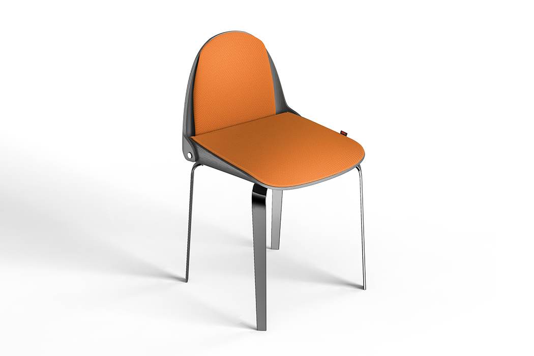
This truly foldable chair folds into the size of a backpack!

Folding furniture has been the norm in my home – living in a tiny home as I did. While there is a certain ease of usage and modularity that comes with having foldable furniture – going from a living room to an open floor plan in minutes, Edoardo’s design gives it a twist that’ll make it easier for you to actually carry the chair on your back without sacrificing on the material used (I’m talking about you, fabric camping chairs!)

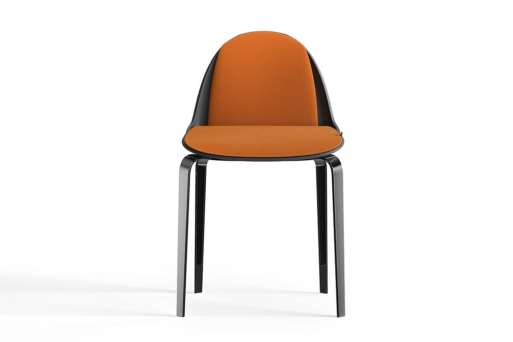
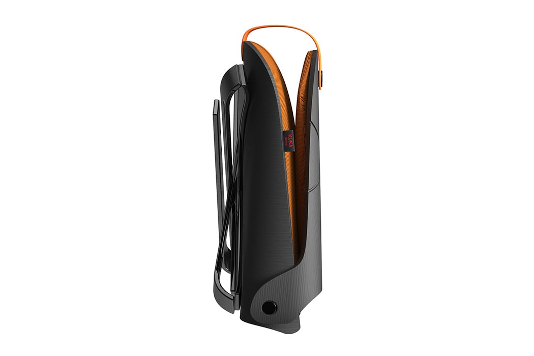
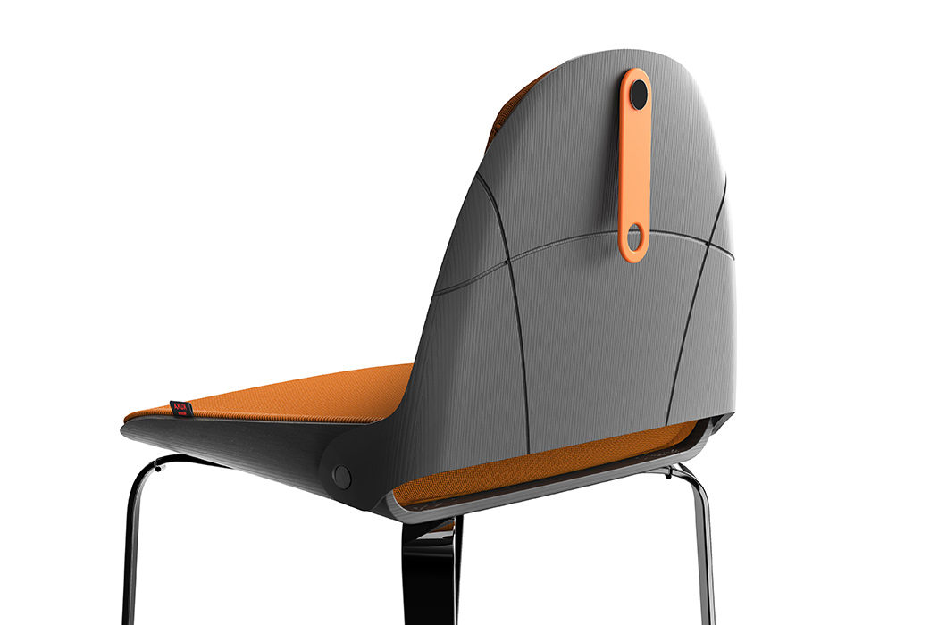
The Lu chair gives this simple and popular idea a modern makeover, make furniture foldable and transportable easily. And this is the best foldable chair I have seen so far! The Lu chair folds without effort and can be carried around very easily. A lot of designs we see are foldable but even after folding not easy to carry around or takes too much time to fold. Made up of plastic, this makes the mechanism work perfectly. As Lu explains, “Many times we find ourselves having to put away objects, perhaps to make room, perhaps to clean the house and sometimes even to take them with us, but above all for furniture of a certain level it is always very difficult. This is where “Lu chair” was born, a dining chair suitable for different types of target, from the most elegant and sophisticated with an eye to detail but also to a younger, fashion-conscious audience. The design is innovative and elegant at the same time and the name “Lu” derives precisely from “luggage” because of its ease of being resealable and transportable wherever you want.”

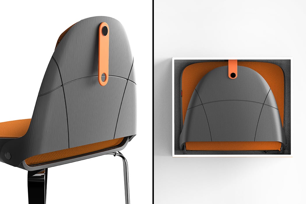
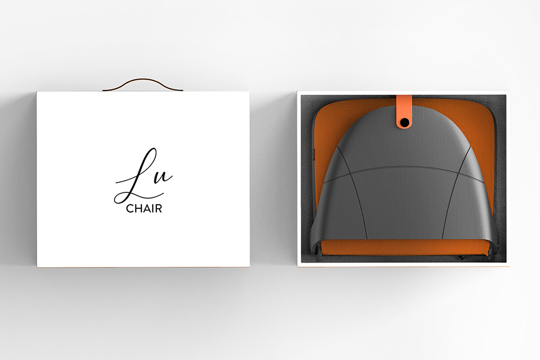
Speaking of folding, it folds up like a backpack or into a small size that fits into a box! The backrest and the legs fold and join/closed with a rubber strap that also doubles as a handle. In that sense, this is a truly foldable chair.

Designer: Edoardo Accordi

This desk was designed to maximize productivity while minimizing your screen time!
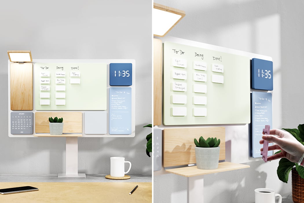
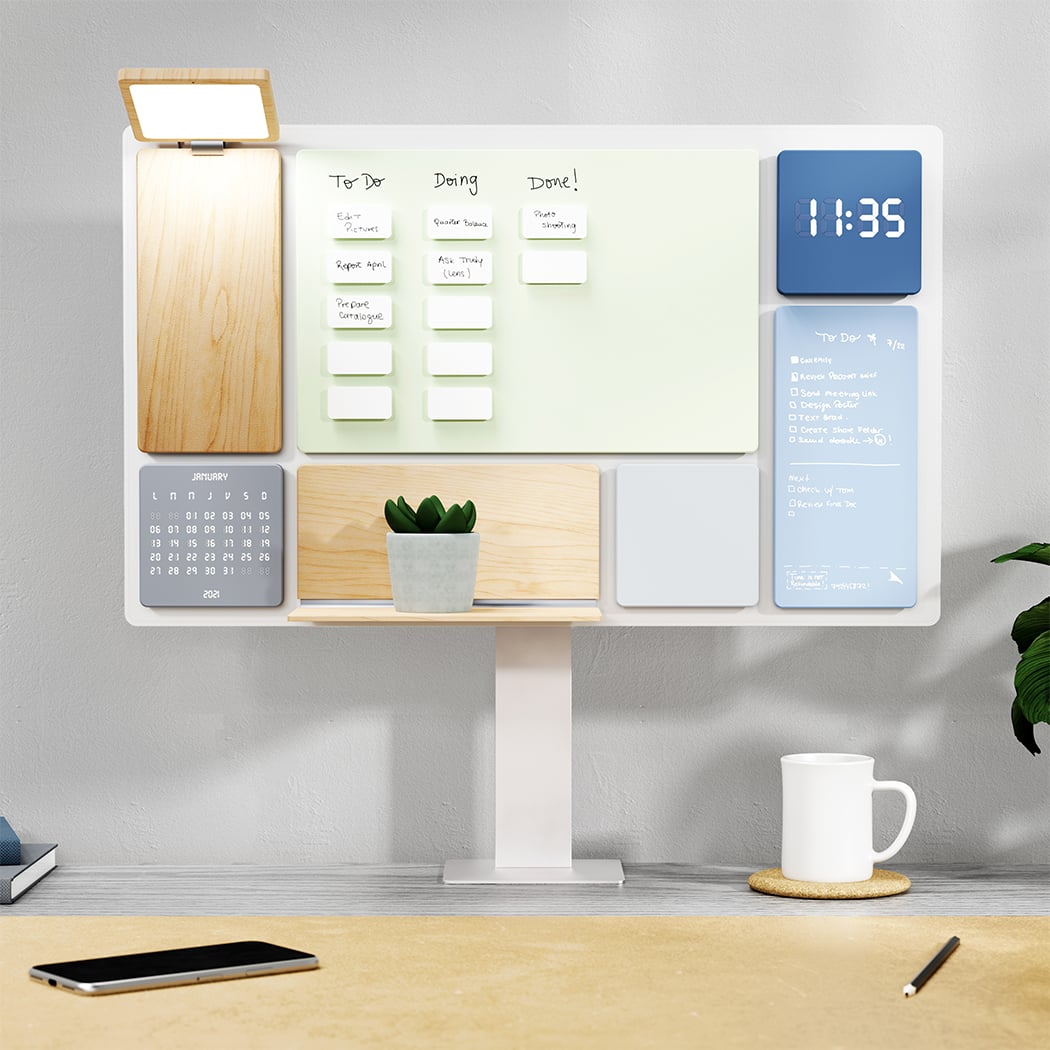
Working from home has made us all realize the importance of having a desk and one that actually makes being productive easy! Balance is a desk that was designed for helping you ‘balance’ your everyday life with work. Balance means to keep or bring equilibrium and this design does exactly that by encouraging time away from your screens and creating a more physical connection with your surroundings.
The team wanted to inspire young people to work hard and play hard – a desk that encouraged finding a balance between digital and analog environments. “The idea behind Balance product is to use digital interfaces as inspiration to create a new hybrid experience for the user. The form and modular qualities of the design evoke the digital touchscreen interfaces we use every day but with a tridimensional layer that creates a tactile and tangible experience. This new approach brings builds a bridge between the connectivity and structure of the digital environment and the visual and physical experience of products,” explains the designer duo.

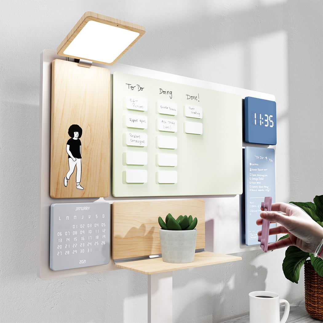
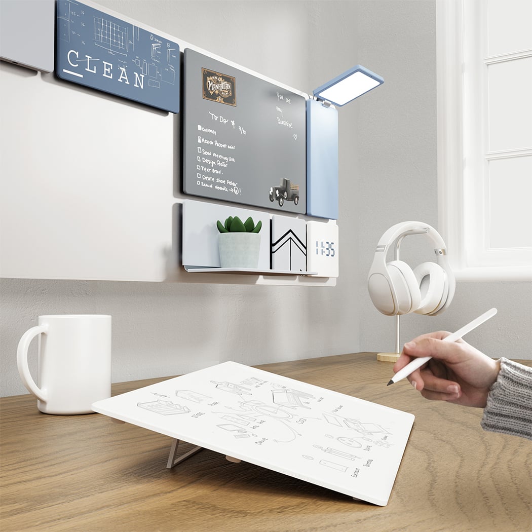
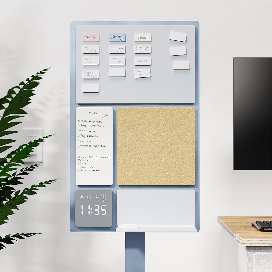
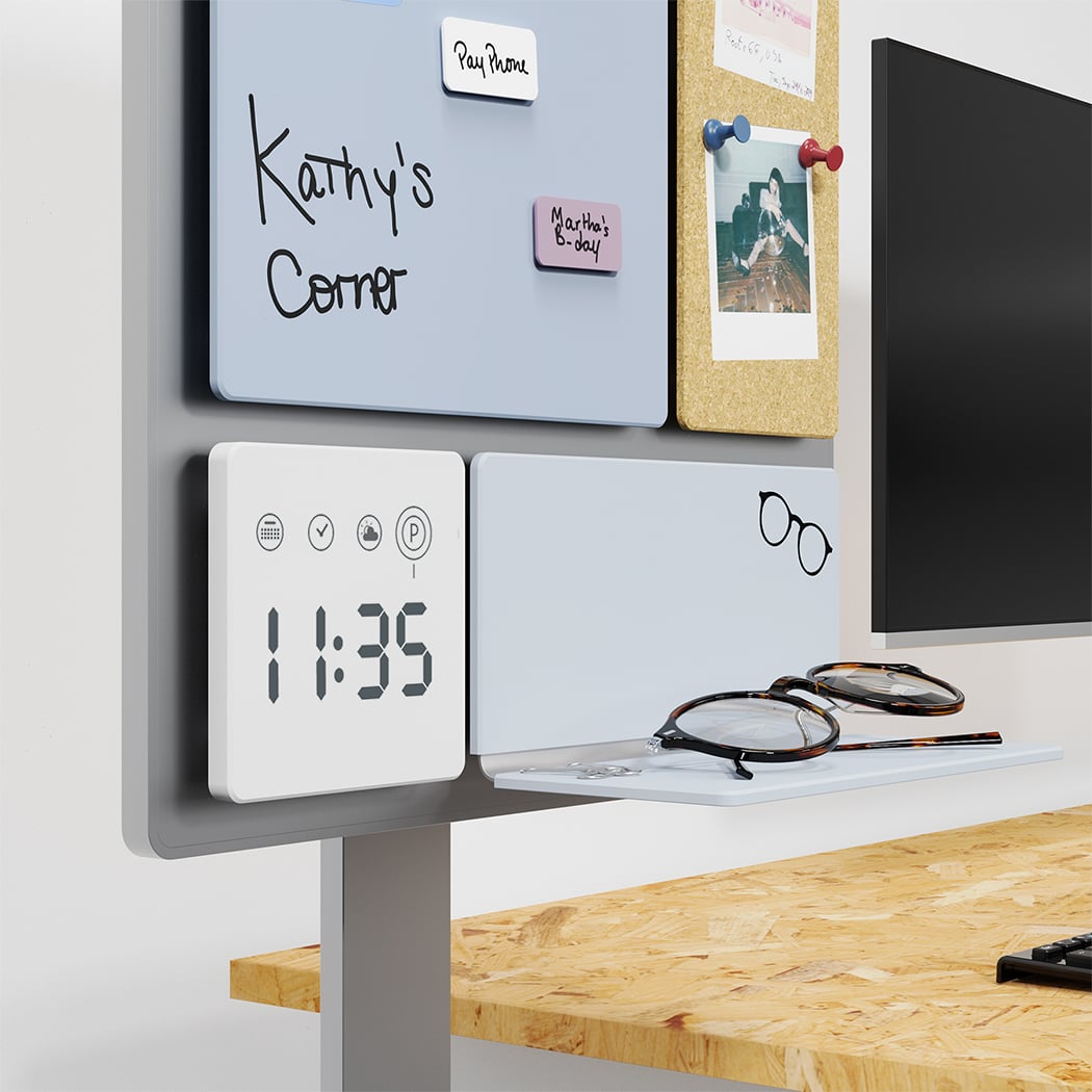
Balance is a multi-functional desk that an creates organized, personalized, and productive work experience. It features a canvas and six types of modules (Surface, White Board, Cork, Kanban, Time, and Shelf) that are magnetically attatched to the canvas. You can pick and choose the modules that work best for your needs, work style, and aesthetics preference while also combining them to be integrated with productivity techniques like Kanban and Pomodoro. Assemble the canvas to the arm by adjusting four screws through the standard VESA monitor connection. A C-shaped clamp connects the arm to the desk. Each module has strong neodymium magnets that connect them to the canvas. Furthermore, the whiteboard comes with an adjustable stand so you can use it on the desk surface for a more natural and ergonomic position to draw/write. Even the light angle can be adjusted by simply moving the module up and down.

Th desk’s canvas is made from high-impact polystyrene and powder-coated steel for a rigid, magnetic, and durable surface to hold the modules. The modules are made from injection-molded HDPE giving them adequate rigidity for the structure, softness to the touch, and satin finish. Balance also lets you customize the finishes/accents with a choice of walnut, oak, and cork. Some finishes use special magnetic paint for a marker-friendly writing surface.

There was a lot of research that went into Balance’s design – the personality, work environments, and workflows of various people in their respective jobs as well as a variety of productivity and work management techniques were studied. The team also analyzed different physical and digital interfaces to understand what products were more effective, easy to use, and popular among people. This final outcome resulted in a product that is flexible, organized, modular, easy to use, and personalized!

Balance Desk and Work Manager by Hernan Gregorio and Julia Stabio is Winner in Office Furniture Design Category, 2020 – 2021.

Designers: Hernan Gregorio and Julia Stabio