The odd contours on this smartphone case design are meant to make you feel calmer


Smartphones are meant to be placed in our hands, but this concept design creates a totally different tactile experience that could help you stay in control even during an emotionally stressful day.

Some smartphone makers and software developers boast about their product’s accessible design, but the majority of those stop at the most common physical disabilities. Of course, those don’t cover all the kinds of hurdles that may prevent people from enjoying a product, especially those with emotional or psychological issues that may pop up from time to time or are with them since birth. Even accessibility features don’t have provisions for those, but a new kind of smartphone case attempts to do just that, at least for those on the autism spectrum.

Designer: Chloe Leigh-Smith
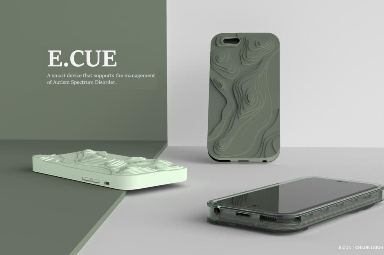
Autism is probably one of the most misunderstood and, at the same time, stereotyped developmental disabilities, partly because of how varied the symptoms and manifestations might be. One of the most common triggers or expressions, however, is a severe emotional change that sometimes requires help from someone else. That external assistance might not always be available, so this E.Cue case tries to help those with ASD to self-regulate using the power of touch.

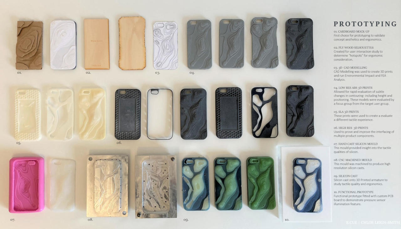
As far as a smartphone case goes, the E.Cue is definitely an oddity, even for cases that have textured surfaces or beads and stickers stuck to them. The almost random contours and bumps across the case’s back might remind some people of topographical maps, and that’s not by accident. It turns out, those are the exact things that can relieve stress and soothe emotions.
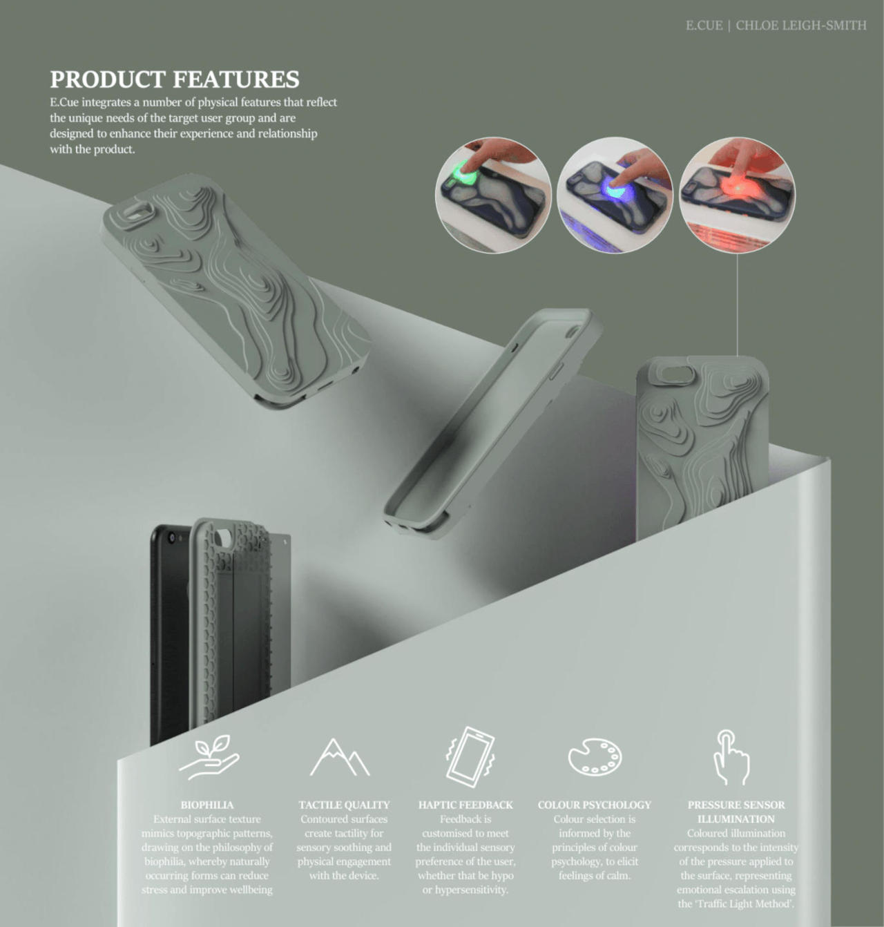
Everything about the E.Cue is designed to be calming, from the topographical patterns to the choice of colors. Designer Leigh-Smith cites “biophilia” as the design philosophy for the case’s unique structure. Naturally recurring forms and contours provide a tactile experience that is designed to reduce stress and induce calm. At the same time, the case hides some actual piece of technology inside, with pressure sensors that use colors to provide feedback on hard someone is pressing their finger on the case, which, in turn, could represent their emotional state.

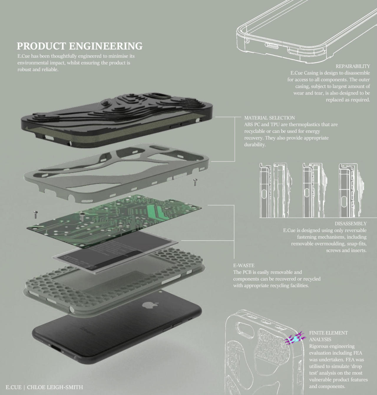
Although the user of such a phone case might not be aware of it, the E.Cue is also designed to be sustainable, repairable, and, when the time comes, recyclable. Thermoplastics are chosen not just for durability but also for their environment-friendly properties, while the electronic components and the battery are designed to be easy to remove and replace.
Although it’s unlikely that we’ll see the E.Cue become a mainstream product, it’s still encouraging to see concepts that try to make critical objects like smartphones more accessible. The great thing about accessibility is that these features can also benefit those outside of its intended audience, making it truly for everyone. You may not be on the autism spectrum, but no one will deny having a fit of rage or a panic attack every now and then, and the E.Cue could help you calm down before you decide to throw your phone across the room.
The post The odd contours on this smartphone case design are meant to make you feel calmer first appeared on Yanko Design.
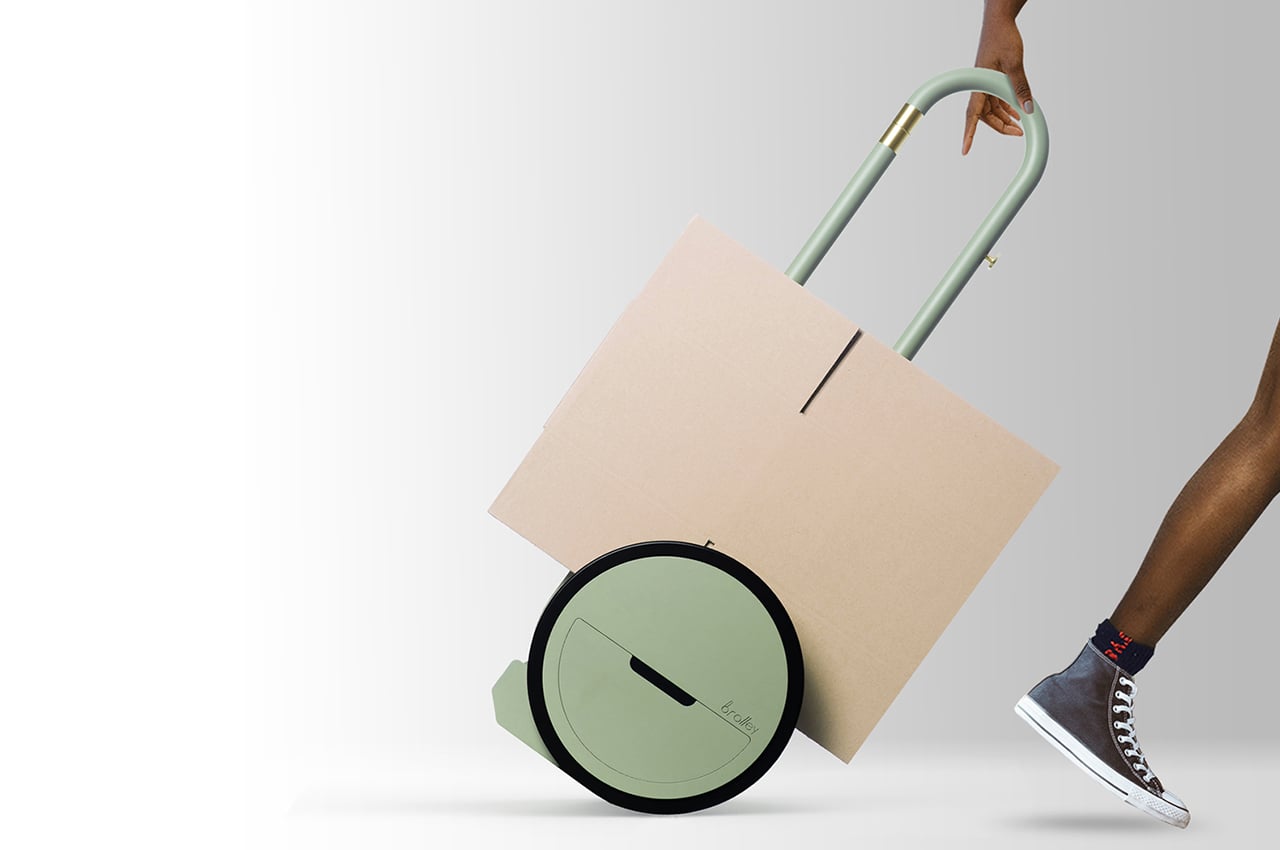
This trash-collecting design is a hand-operated multifunctional trolley that helps sort your recycling!

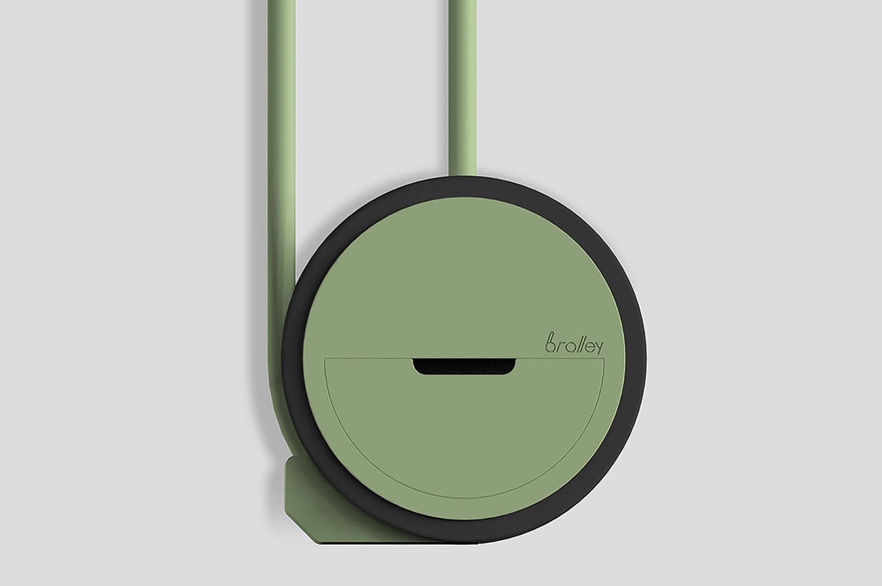
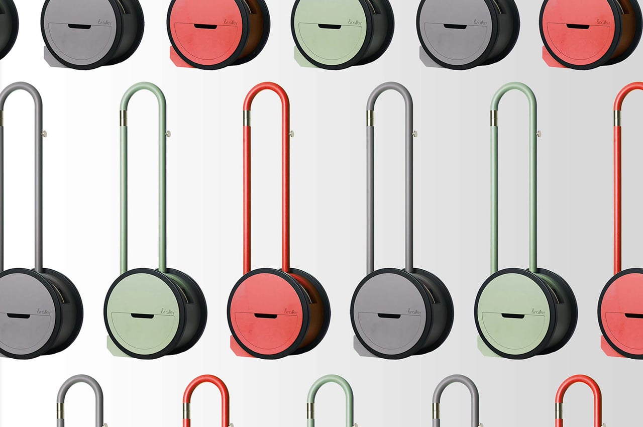
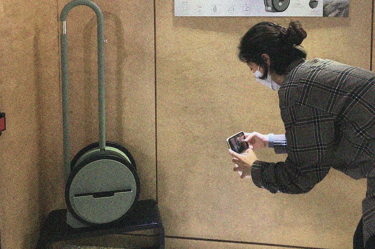
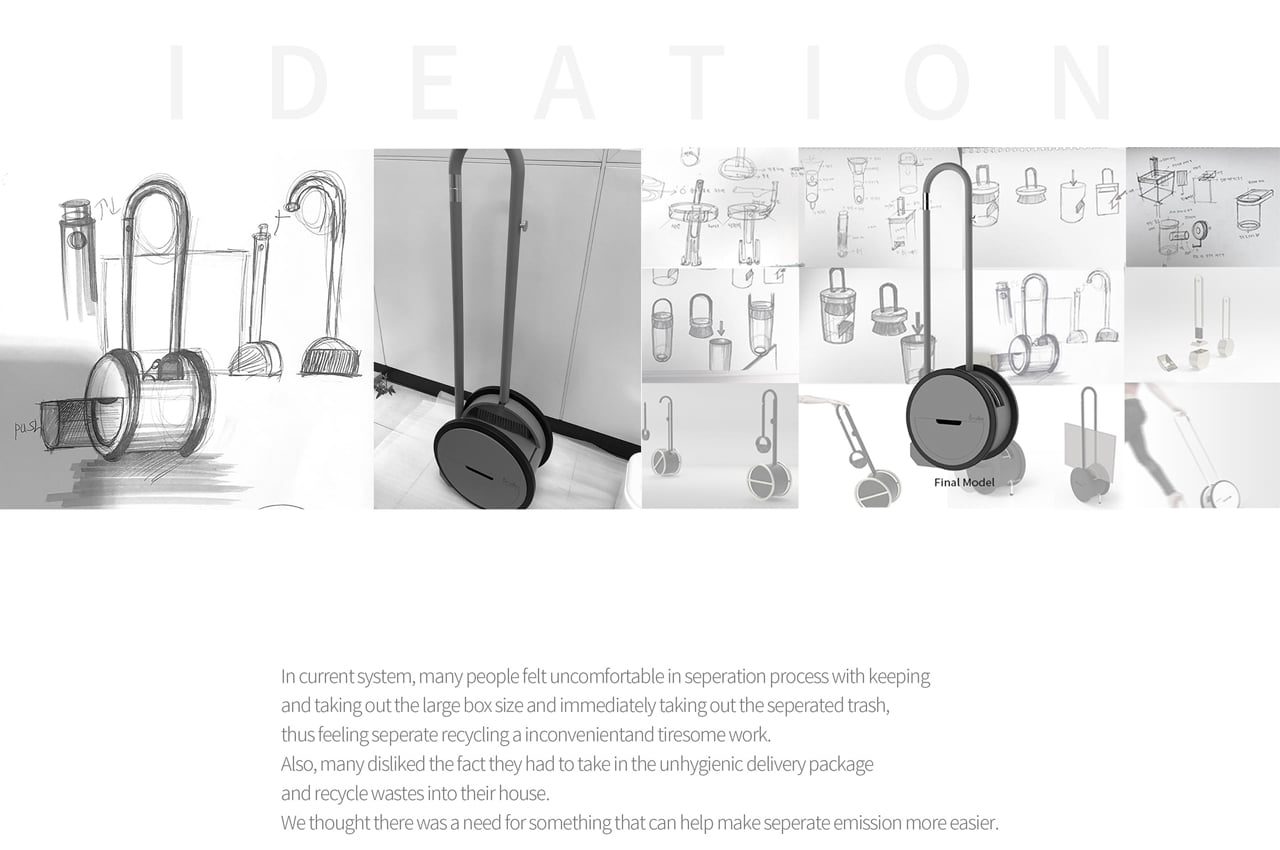
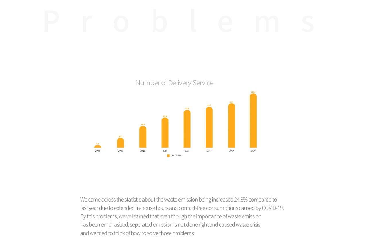
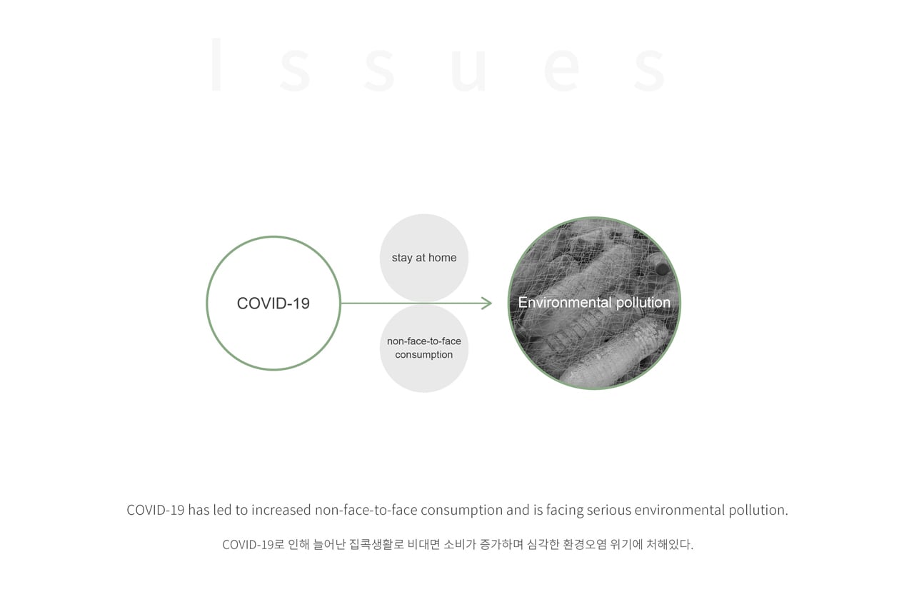
Brolley is a hand-operated trolley that was designed to aid in waste management practices, which have increased following shipping demands brought on by the COVID-19 pandemic.

Transportation appliances like wheelbarrows and dolly carts were first designed to streamline manual labor tasks. Transporting heavy boxes from Point A to Point B becomes a lot more manageable when something is carrying the load for you.

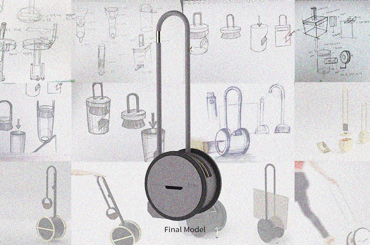
Since their initial prototypes were put to use, hand-operated transportation trolleys have seen many forms and iterations. Today, Dosam Choi launched Brolley, a modern take on the handheld trolley cart that specifically aids in recycling delivery waste such as cardboard boxes and styrofoam peanuts.

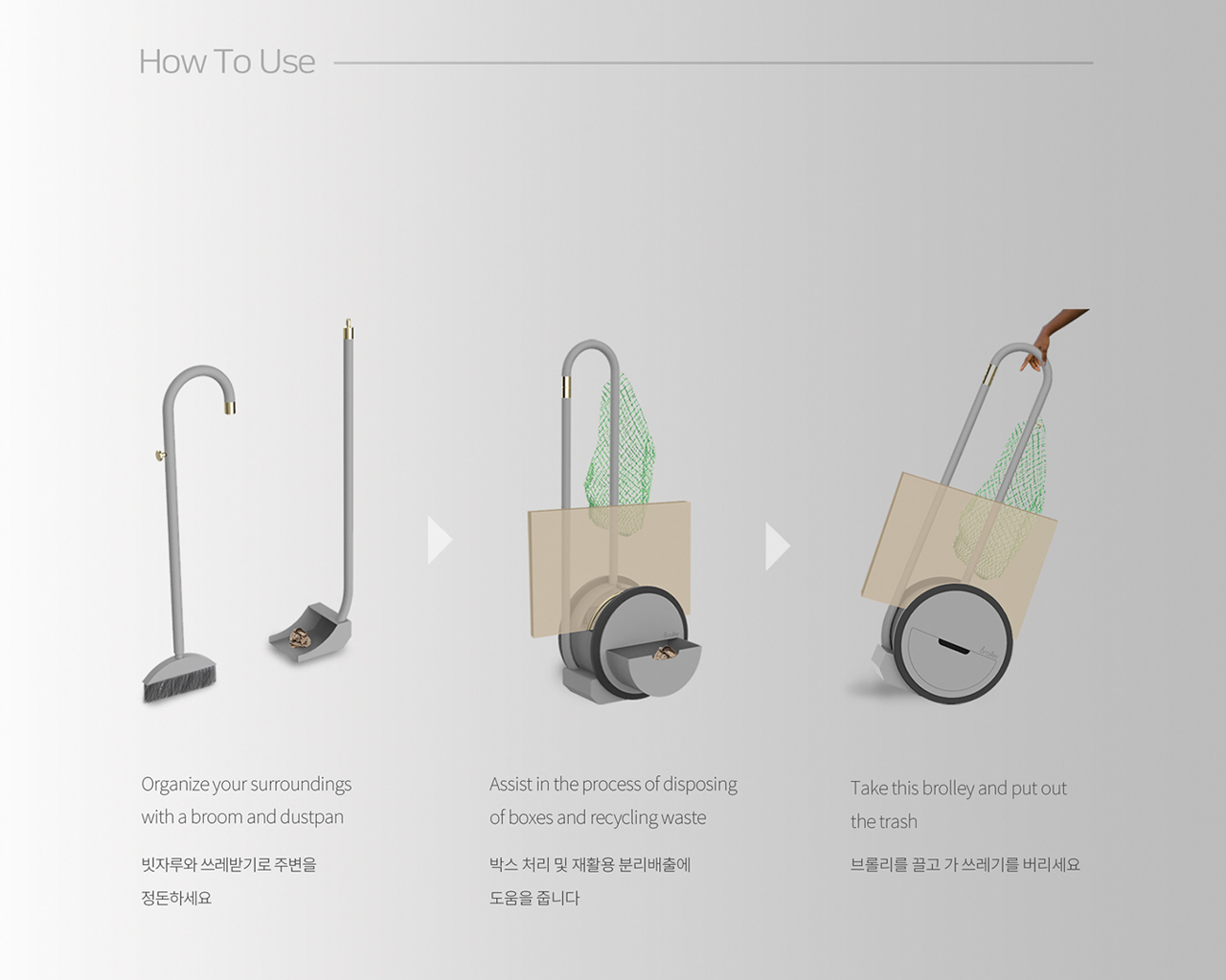
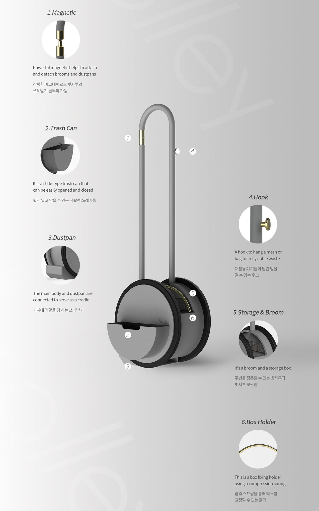
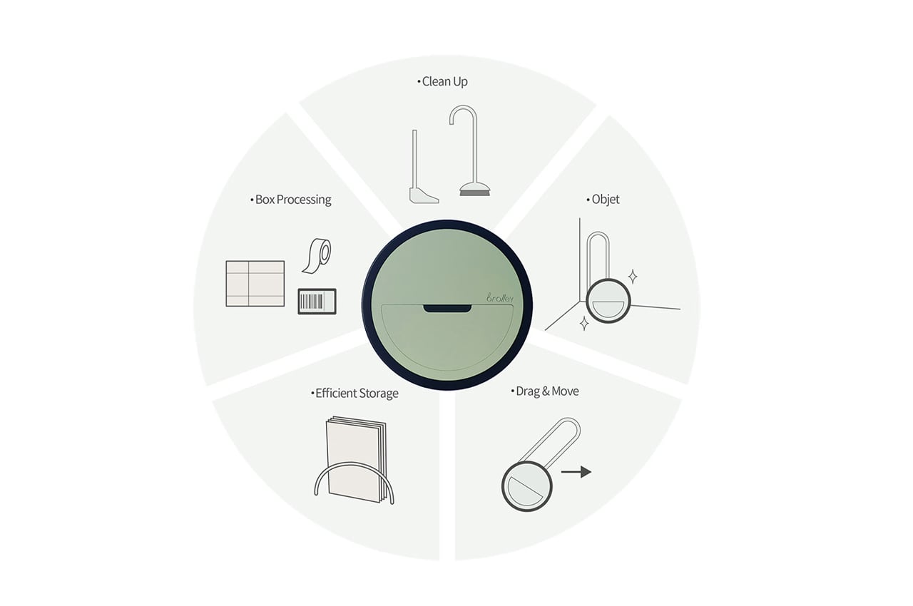
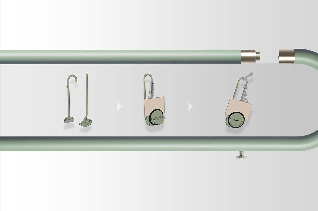
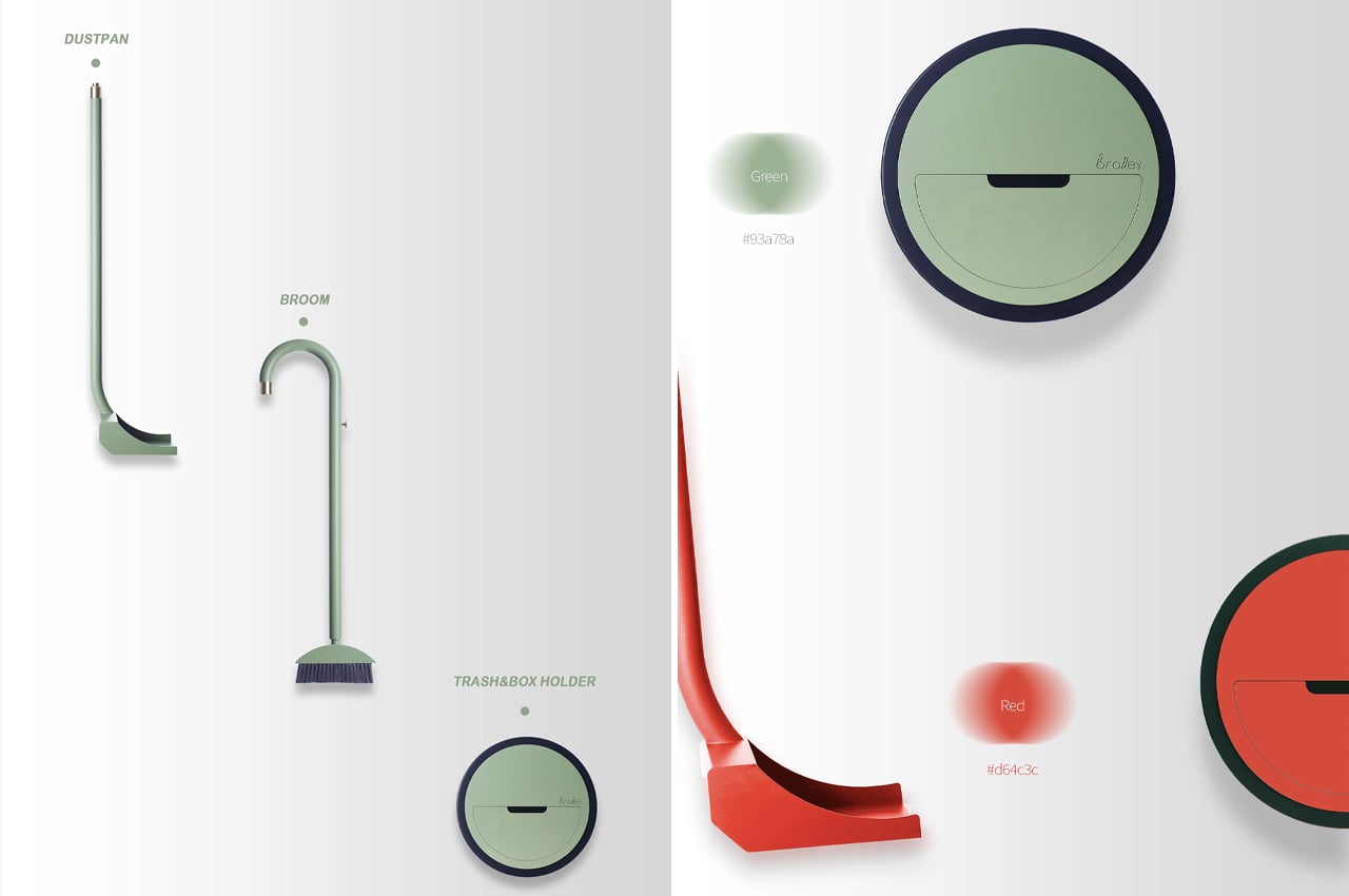
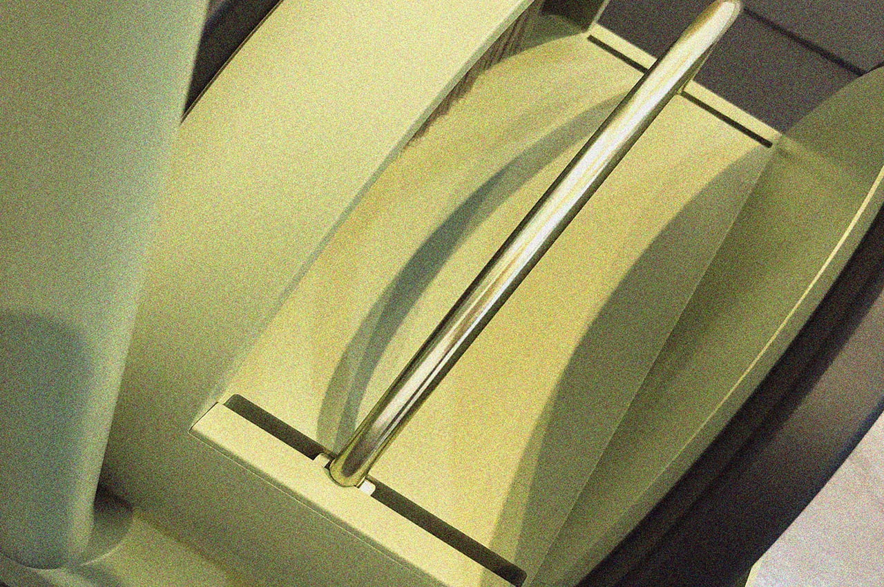
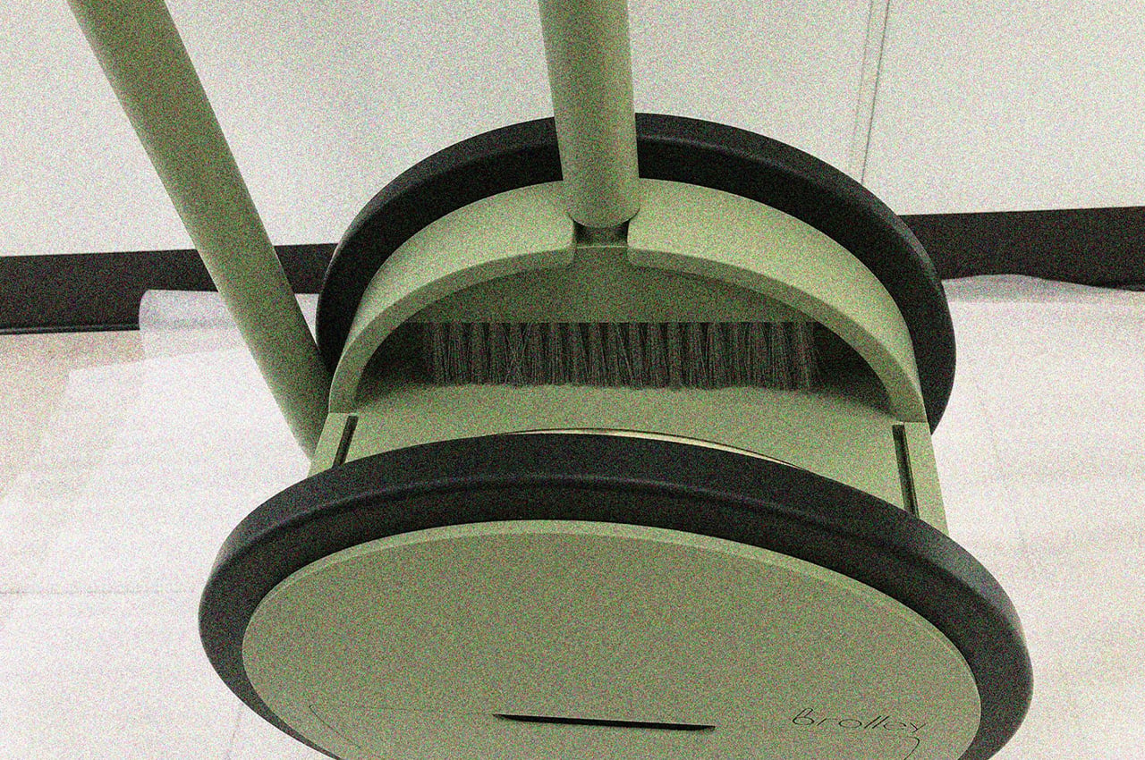
Consolidated into a single product, Brolley consists of six elements: a broom, dustpan, trash compartment, storage area, box holder, and hook. Modular by design, Brolley disassembles piece by piece depending on each user’s need.

Held together by powerful magnetic strips, the broom detaches from the whole of Brolley to provide a means for sweeping residue from packaged goods into the product’s integrated dustpan. From there, users can store the swept-up waste in the trash compartment located on the outside of Brolley’s round base.

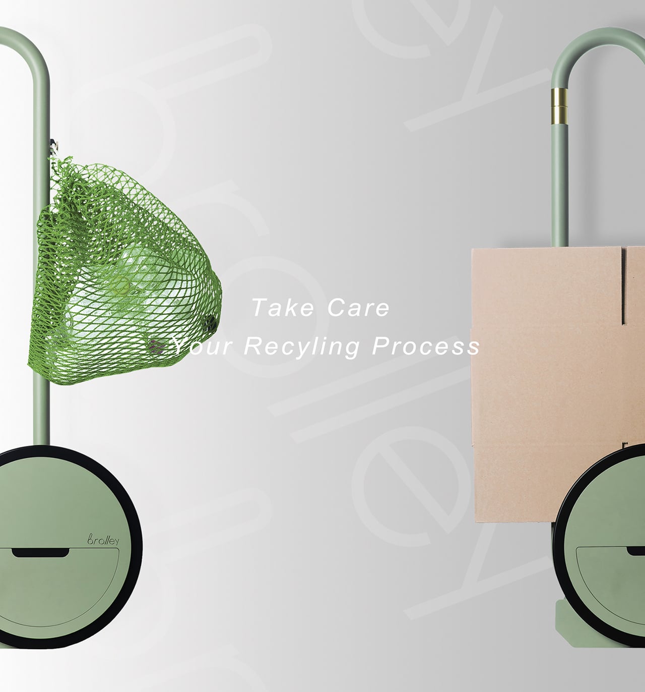
Once the user opens their delivered goods and is left with empty cardboard boxes, a handy storage area provides just the right amount of space for the folded boxes to nestle inside on the way to the steel trash cart.

Stray residue, like netted or cloth bags, can hang from Brolley’s built-in hook or be stuffed inside the compartment with the trash collected in the dustpan. Conceptualized in an array of different colors, Choi saw that Brolley would fit into any modern home.

Designer: Dosam Choi

The post This trash-collecting design is a hand-operated multifunctional trolley that helps sort your recycling! first appeared on Yanko Design.
This Apple-inspired mini AirPods concept shrinks the classic earbuds down to the size of a bean!

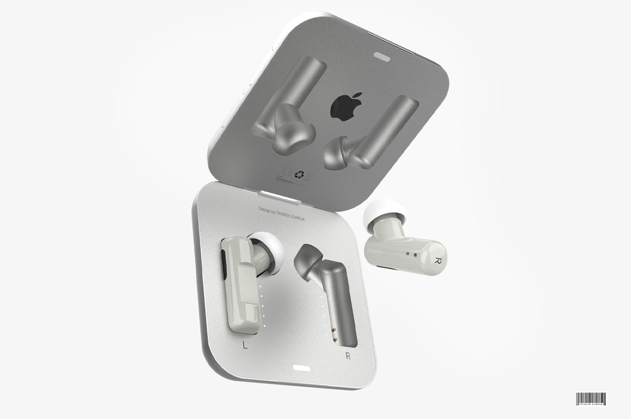
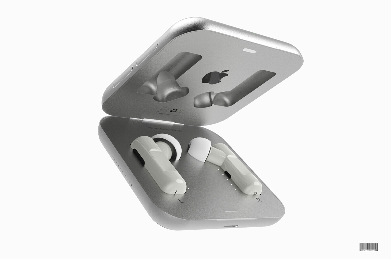
Zarruck Taiseer’s mini AirPods Pro concept shrinks the classic AirPods to the size of two beans and the width of the charging case to the size of a pocket mirror.

AirPods are touchy creatures. While touch sensors are literally integrated into the design and construction of AirPods, the earbuds are also temperamental. Depending on the shape and size of your ear, users wear AirPods differently and give it some time, and each user knows the exact positioning that gets the best sound out of their AirPods.

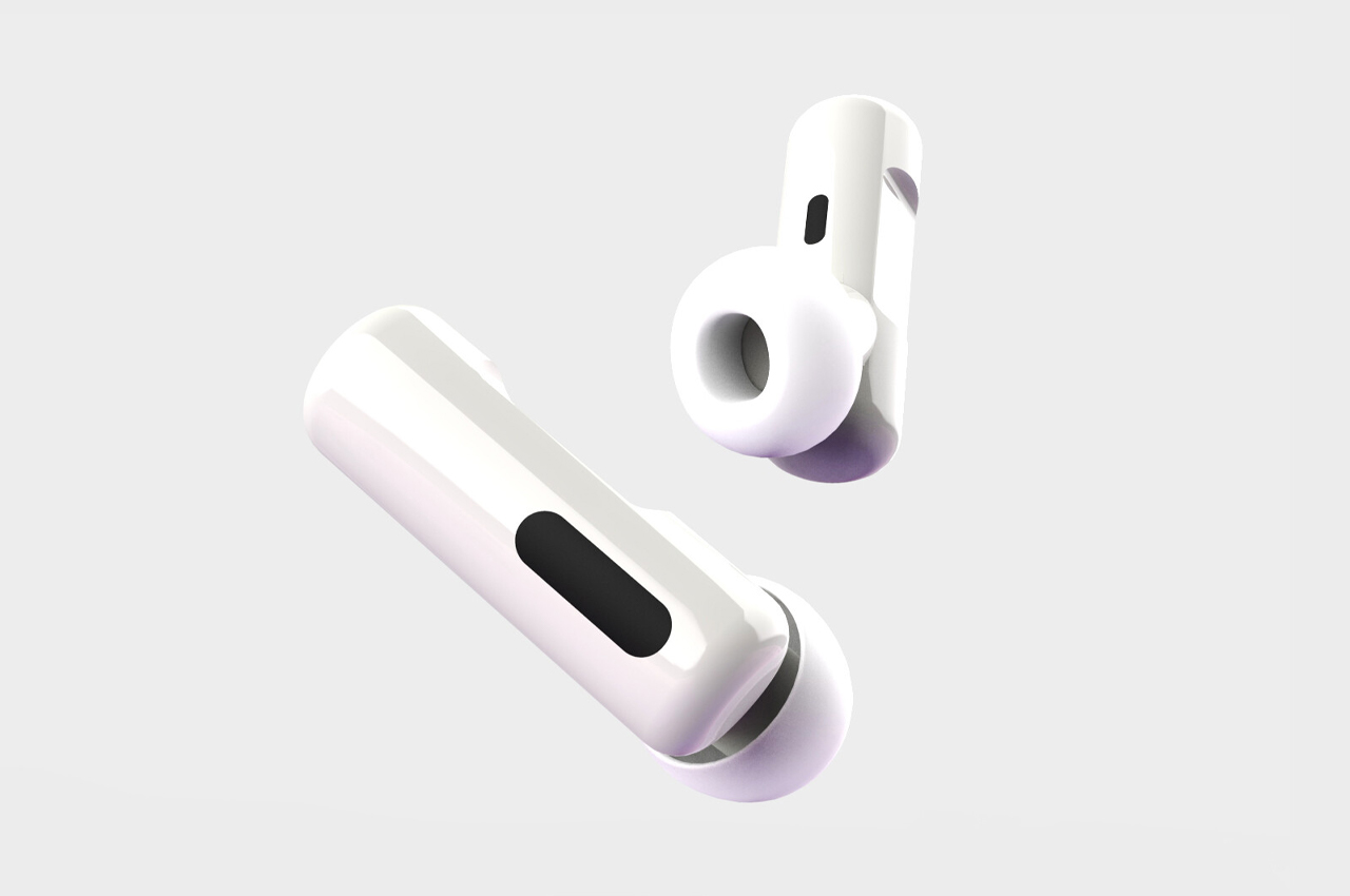
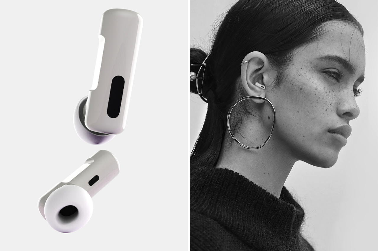
Inspired by the iconic design language of Apple, 3D artist, and graphic designer Zarruck Taiseer conceptualized a pair of AirPods Pro that scale down the current model to the size of a bean. From its charging case to its silicone earbud covers, everything about Taiseer’s mini AirPods Pro concept is sleek in stainless steel and Polly Pocket-sized. One problem this concept does fix about the current model of AirPods on the market is the bulkiness of its charging case.

While the AirPods’s current charging case takes up no more room in your pocket than a small rock might, the girth and length of the charging case make up more bulk in our pockets than we might like. Taiseer’s mini AirPods Pro concept slims down the charging case to match the side of a half-finished stack of mini Post-Its. The narrow width of Taiseer’s charging case would fit snugly in the same pocket where you keep your wallet.

Wireless earbuds have come a long way since their conception in the 60s. Even today, we’re still pumping out endless iterations of the classic earbud because even the smallest of details matter during operation. While we seem to be downsizing our luxury items across industries, Taiseer’s Apple concept might benefit from a slightly larger build and more secure grips to ensure the smaller size of the AirPods doesn’t affect their hold inside our ears.

Designer: Zarruck Taiseer

The post This Apple-inspired mini AirPods concept shrinks the classic earbuds down to the size of a bean! first appeared on Yanko Design.
These robot rangers are designed to help efficiently restore and rehabilitate forests!


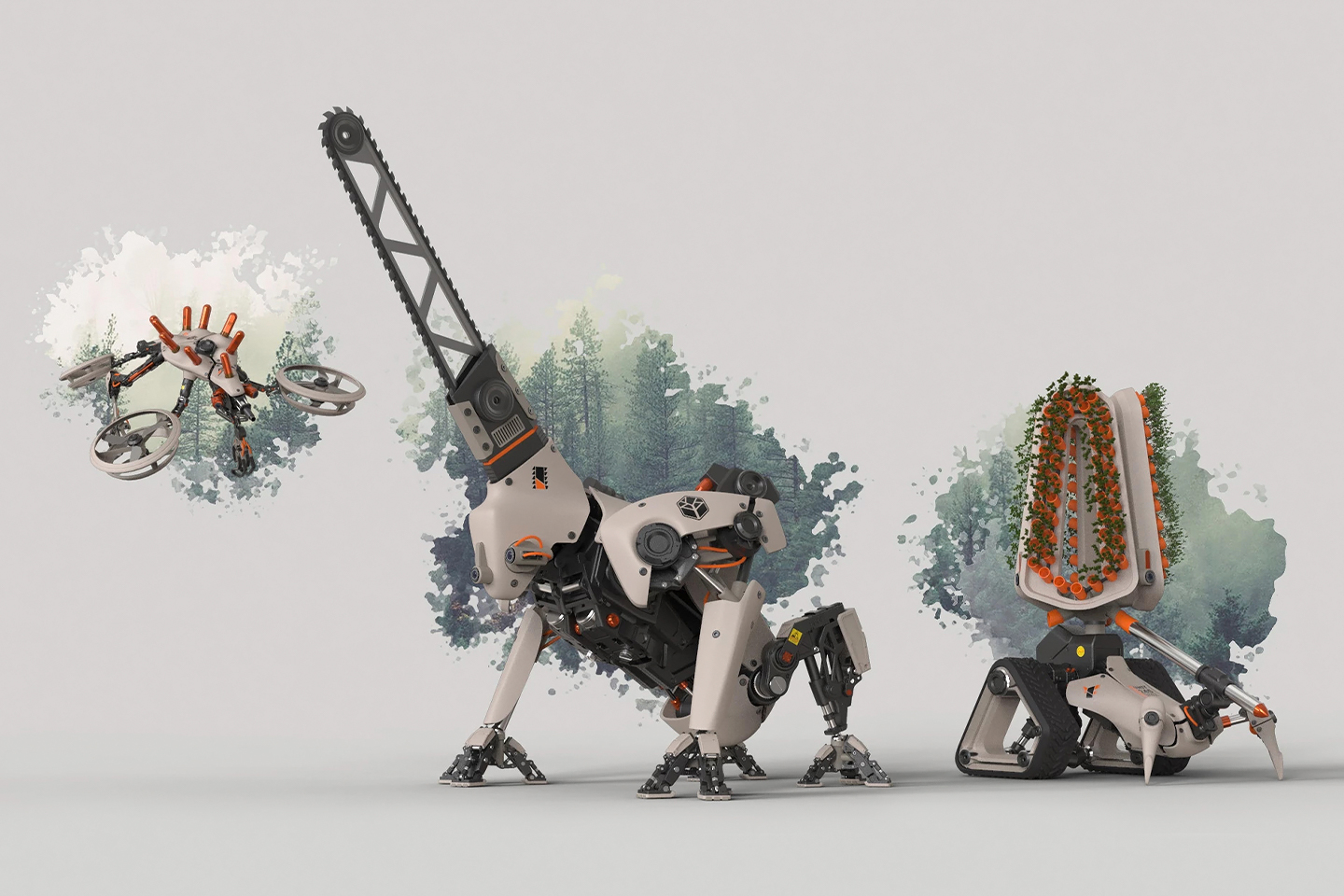
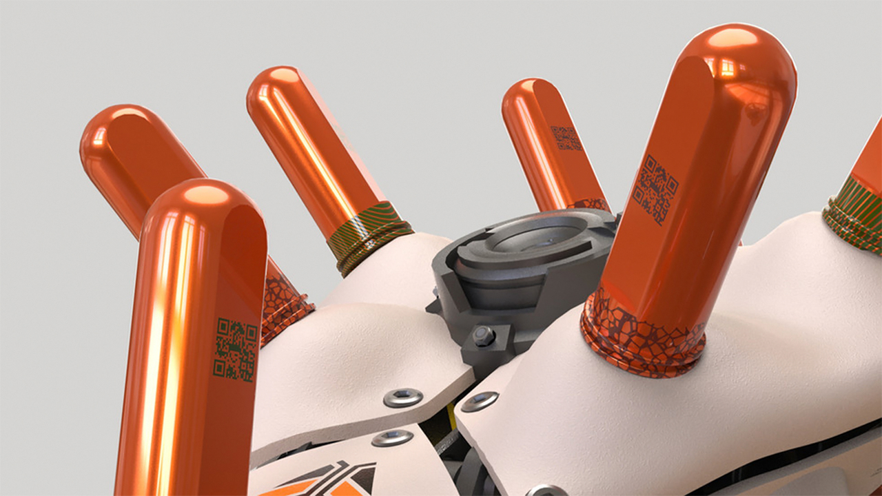
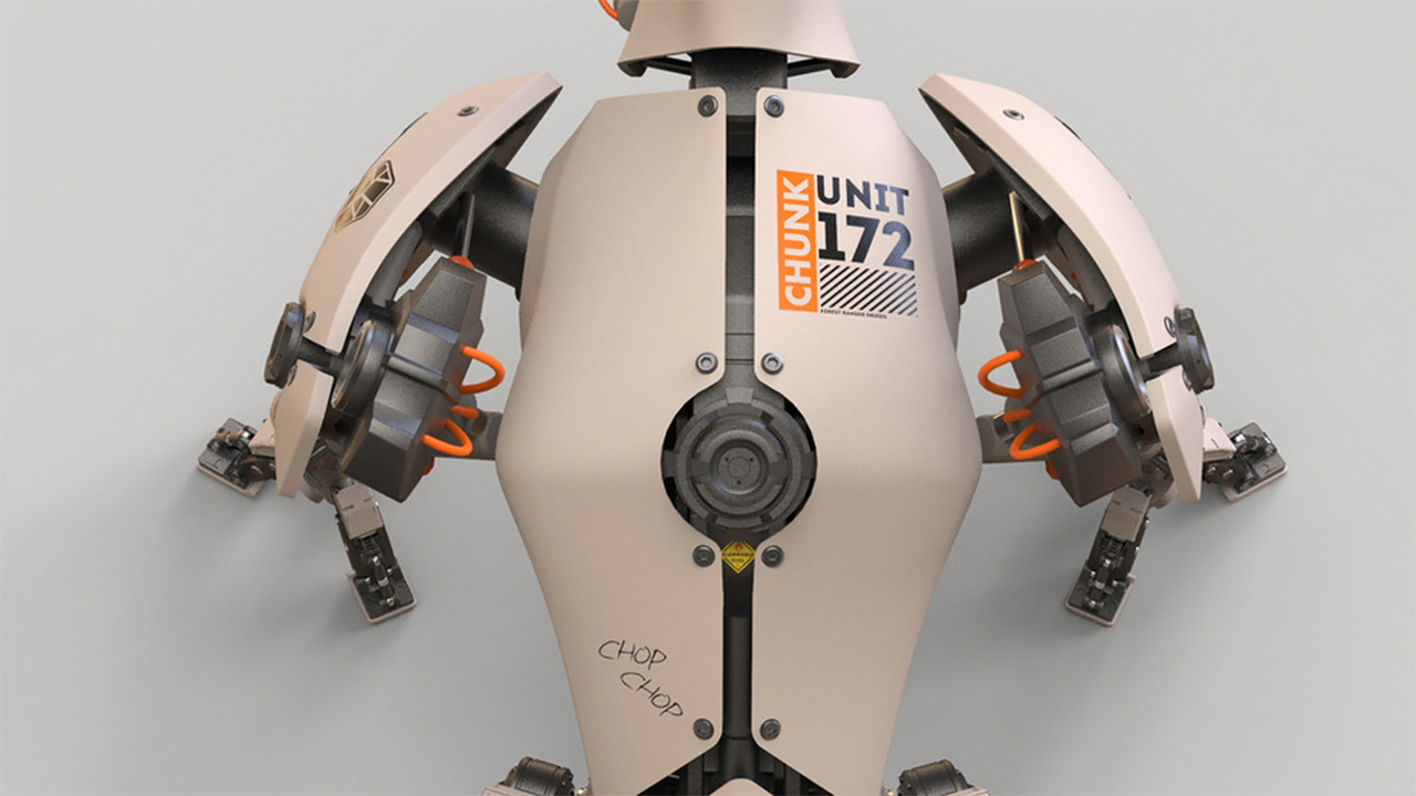
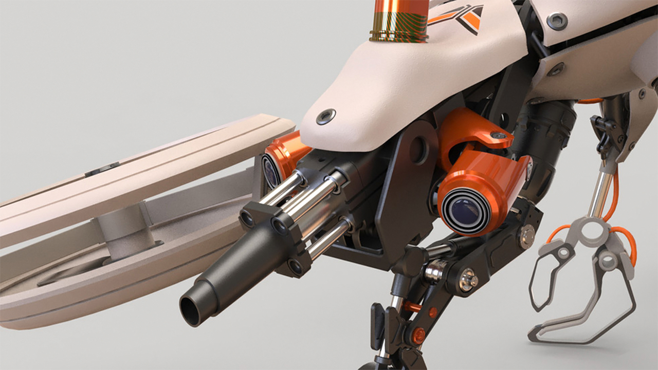
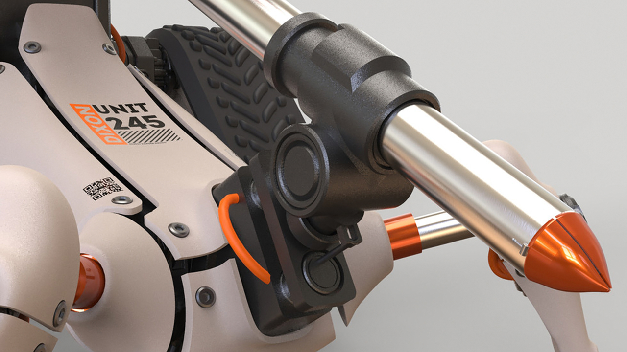
With climate change moving at warp speed, we have to come up with solutions to repair the after-effects just as much as the solutions to slow it down in the first place. Floods and forest fires have been more rampant this year than ever before, restoring these natural habitats is crucial to help the surviving animals as well as to bring balance back to the ecosystem. Industrial design student Segev Kaspi designed a conceptual crew of robotic forest druids that will each play a role in rehabilitating forests through seed planting, data analysis, and more.

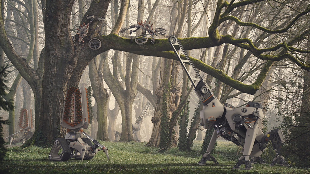
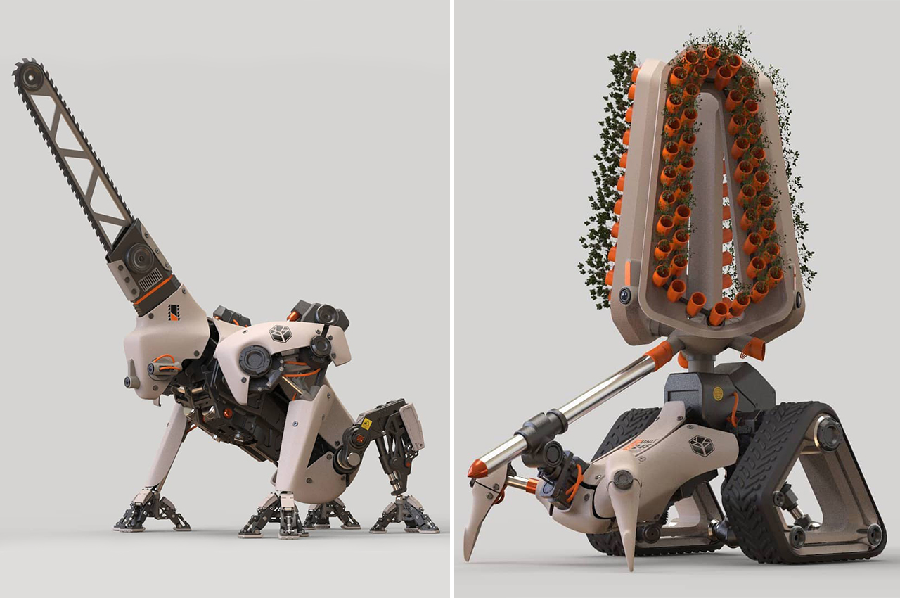
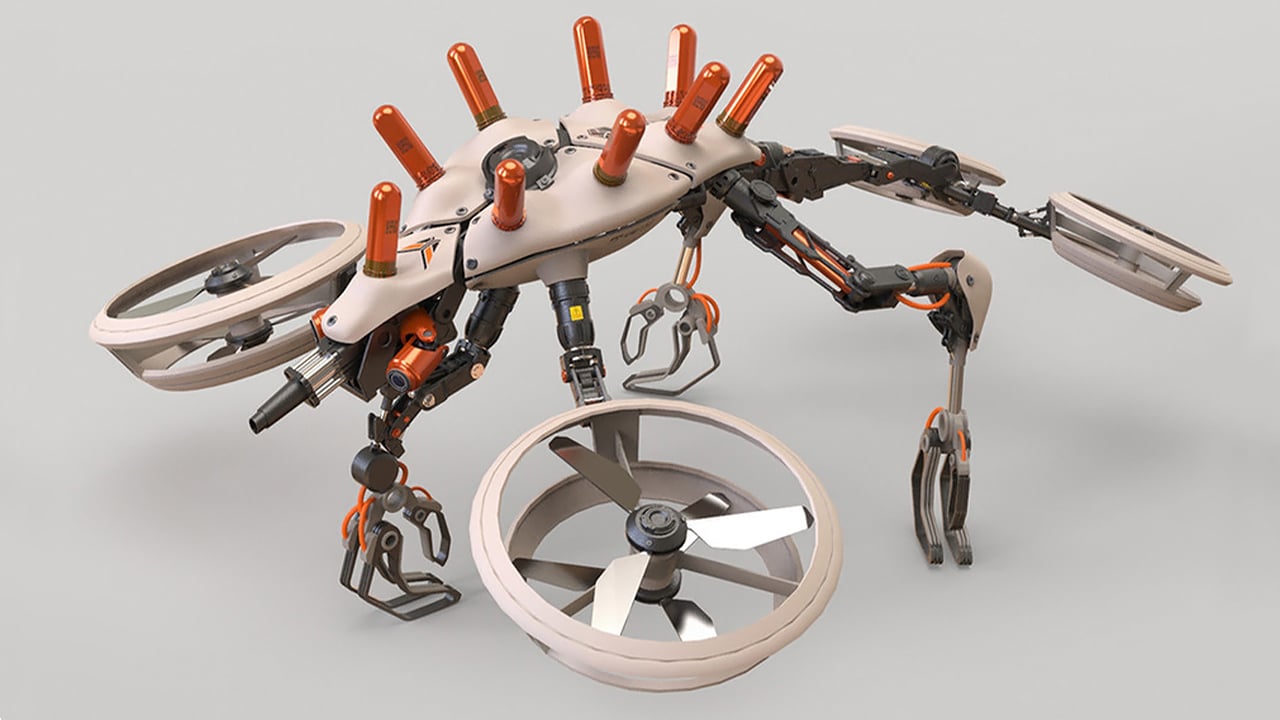
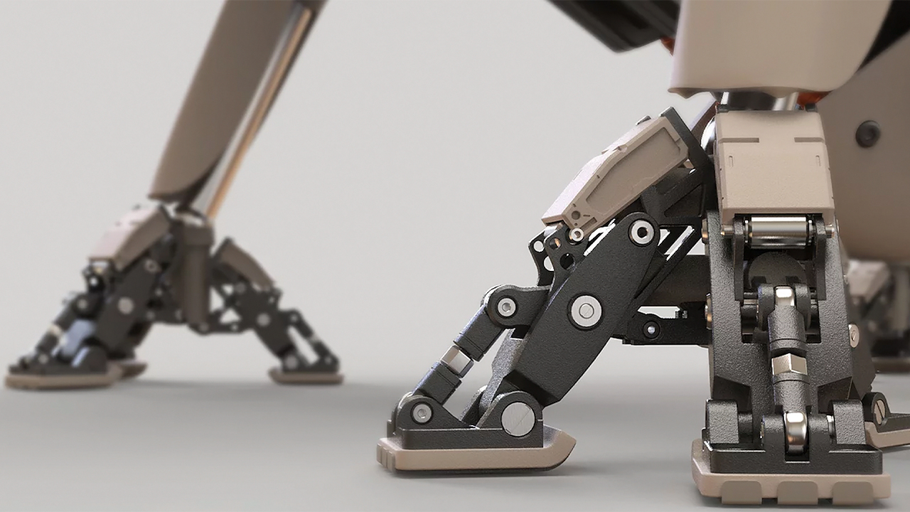
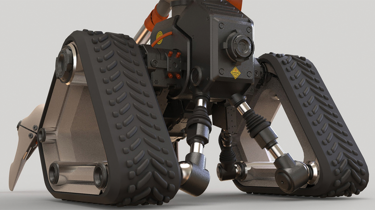
The futuristic and almost intimidating-looking robots are a team of three designed to support reforestation efforts and sustainable forest management. Called Rikko, Dixon, and Chunk, they will each have a specific role to play to make the process efficient.

The robotic foresters operate in systems that change in accordance with the forest’s needs and can work either individually or in groups. Each robot is assigned a defined role in managing and preserving the forest. Their roles and design language reflect a long process of studying the work of rangers in an attempt to gain an in-depth understanding of this important job.

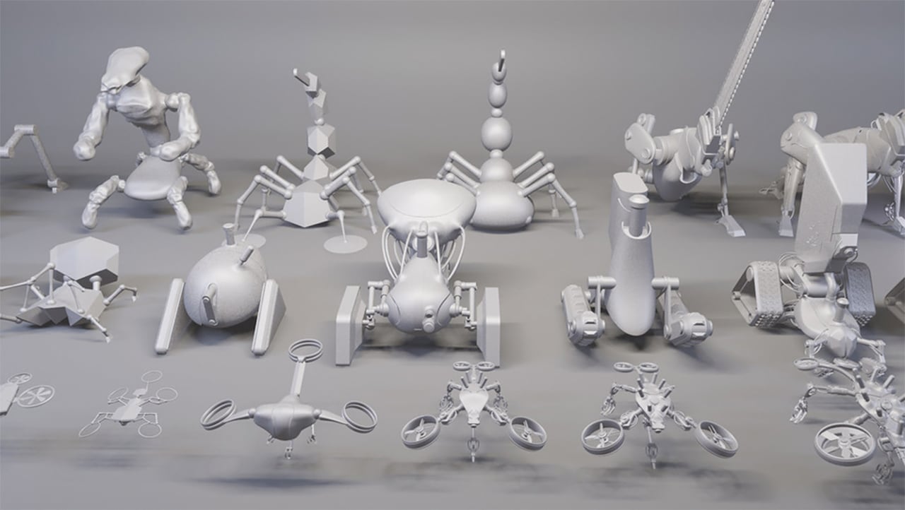
The first robot is ‘chunk’, who is responsible for sawing, pruning and mowing. Then there’s ‘dixon’ who takes care of planting and reforestation of seedlings and cuttings. Last but not least is ‘rikko’, who gathers, monitors and analyzes data from the forest. Kaspi has brought the three conceptual robots to life through drawings, computer renderings and physical models.

Kapsi brings together two opposing worlds – nature and technology – to stimulate conversation on rising atmospheric CO2 and the importance of rehabilitating our forests, all the while proposing a possible solution to the problem.

Designer: Segev Kaspi

This food storage concept features an intuitive control design so we can always keep our leftovers!

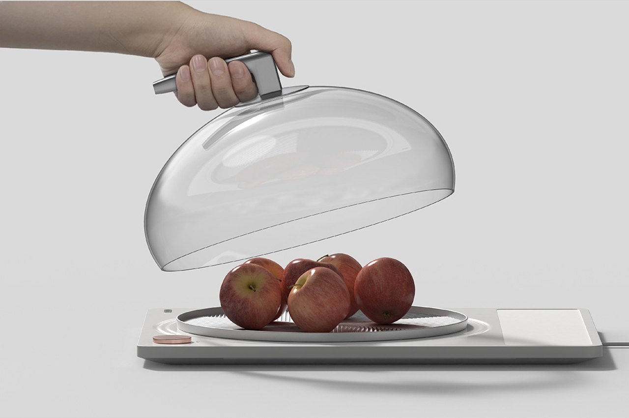
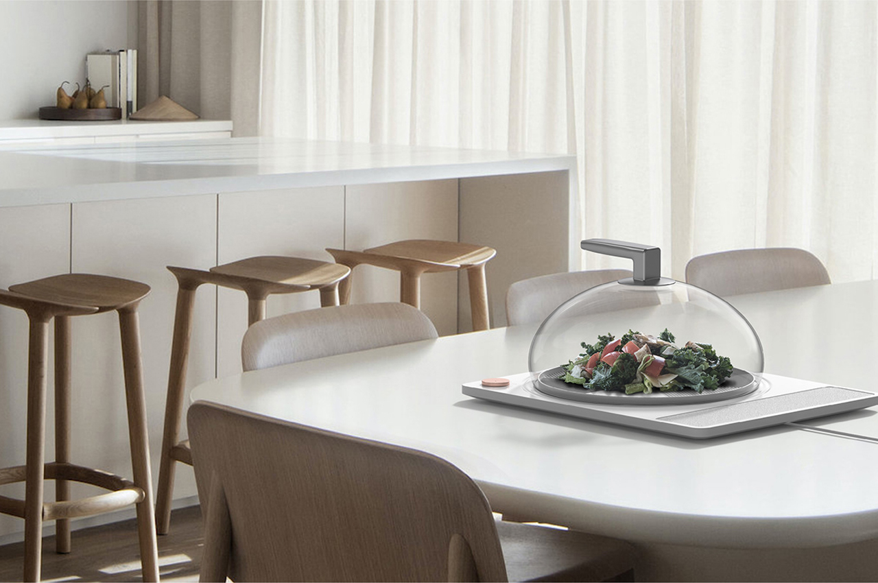
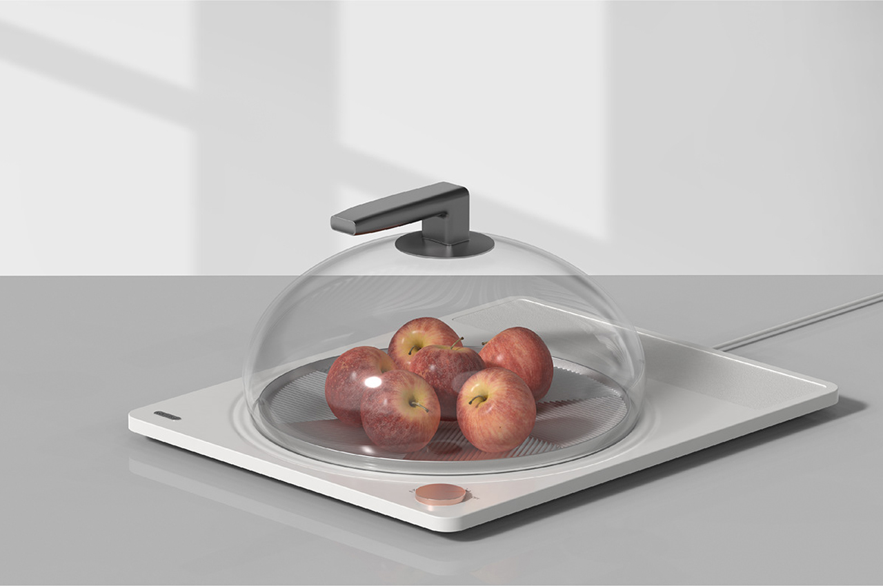
ODNY.BOX is a food storage concept with an intuitive control dial and a minimal aesthetic for users to store any type of leftover, from hot baked cookies to cold Greek yogurt.

What would life be like without leftovers? There’d be no post-Thanksgiving triple-decker sandwiches, no cold pizza, sadly baked ziti for breakfast would have to go too, and no more half-soggy, half-crunchy nachos. In a few words, life would be a slow death without leftovers.

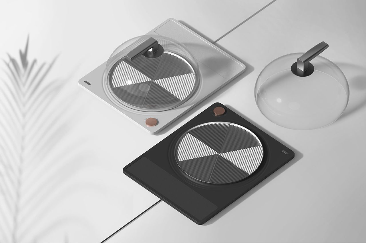
Okay maybe not, but I’d need a second to bounce back. Outfitted with an intuitive layout and glossy aesthetic, ODNY.BOX is a food storage concept from Yoonji Park designed so we’ll never have to consider what life would be like without leftovers.

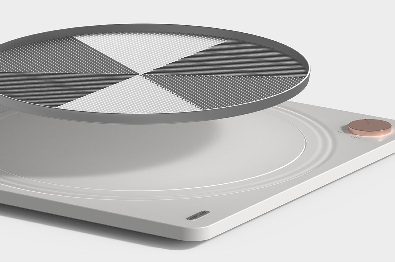
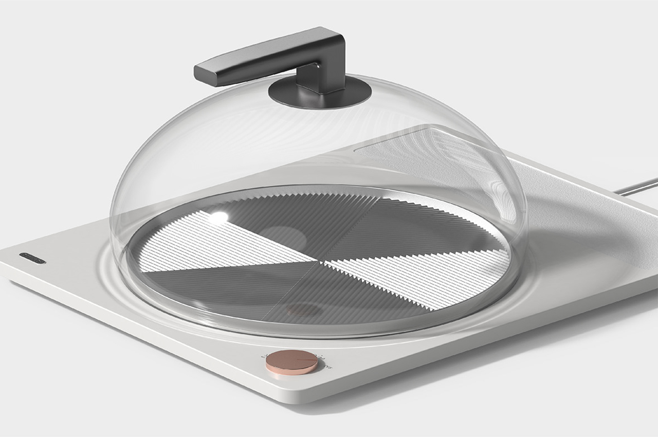
Inspired by the bulbous shape that water makes when it drops on flat surfaces, the glass lid of ODNY.BOX comes together as half of a globe and almost curls under the platform where food is kept to ensure sealed storage. The seasons have an effect not only on the food we eat but also on how that food is kept for tomorrow. During the winter months, the hot food we order or cook at home is subject to cold temperatures, while during the warmer months, perishables like produce are the first to go bad.

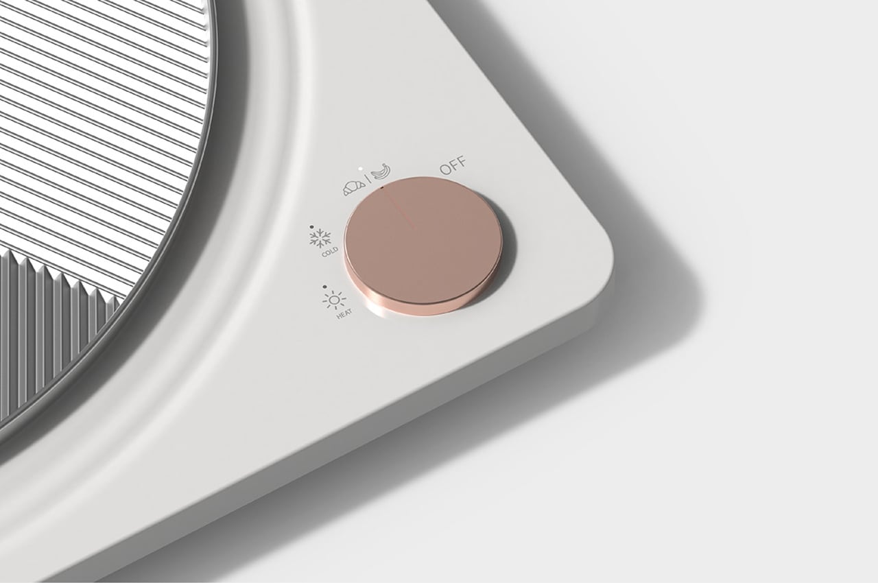
Park aimed to build ODNY.BOX with an intuitive control panel so that a plate of lasagna could be just as easily stored as a bowl of fresh fruit. Comprising just one single dial, the control on ODNY.BOX gives you three options for storage: room temperature, cool, and warm. When users would like to store food items like bananas or breakfast croissants, turning the dial to its room temperature setting would suffice. Then, when a bowl of ice cream or a side of french fries needs some storage, users can adjust the dial to its cold or hot settings, respectively.

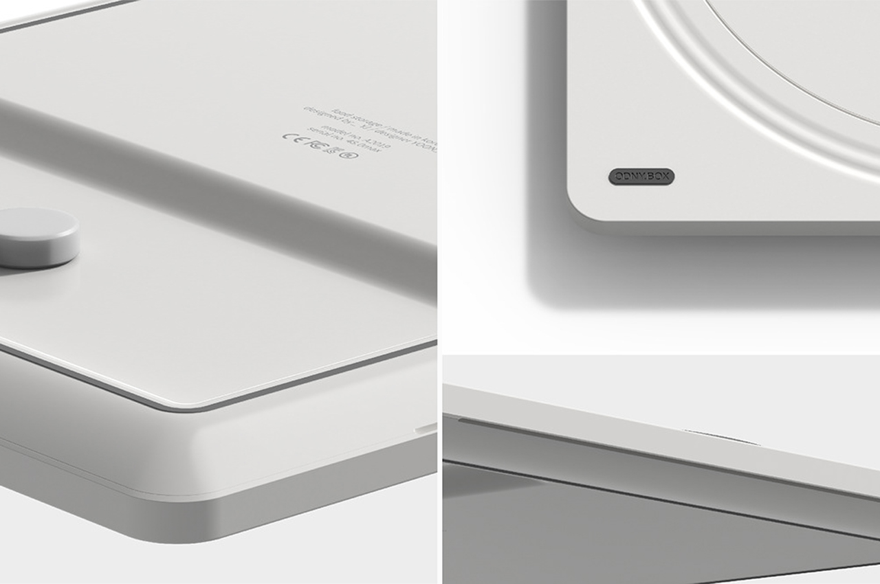
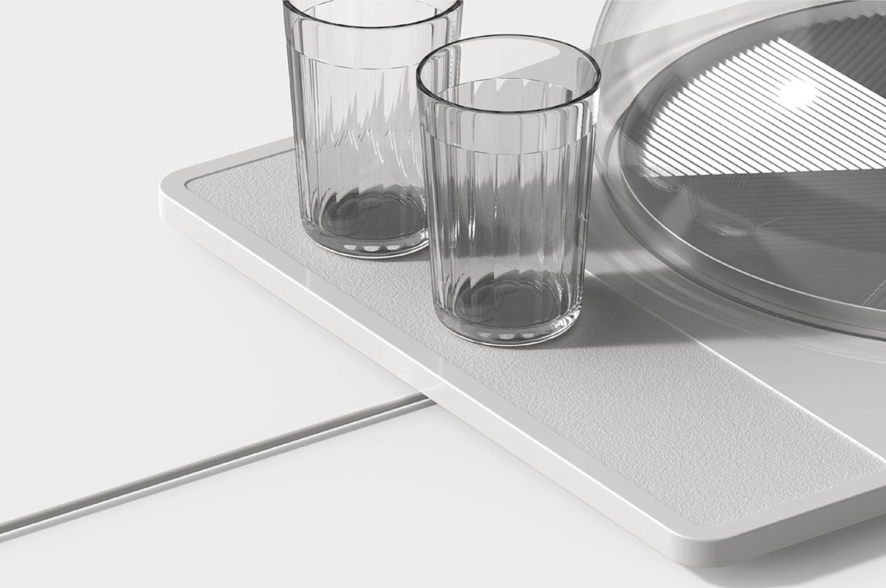
The inner platform where food is stored also detaches from the base to function as a free tray for transporting plates of food or just keeping dishes steady on a flat surface. The overall design of ODNY.BOX is clean and minimal, considering even a micro organizer for the product’s wire to tuck into and stay out of the way.

Designer: Yoonji Park

This multifunctional product has been designed to work as a clothing rack and a treadmill!

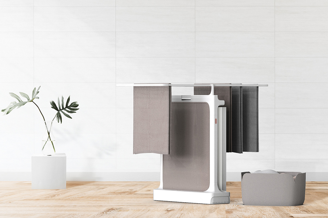
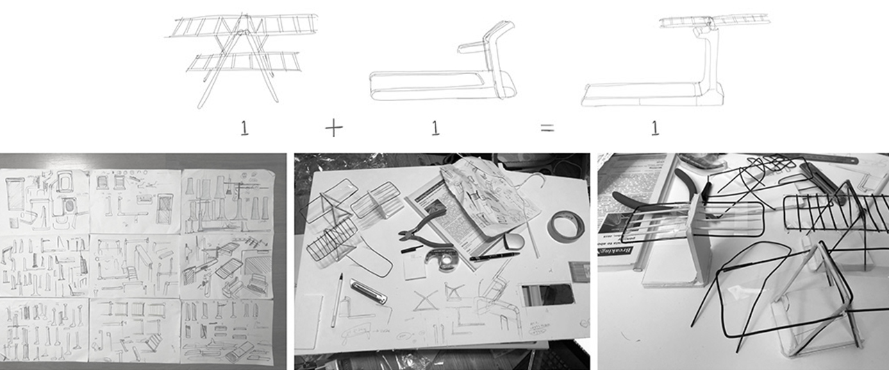
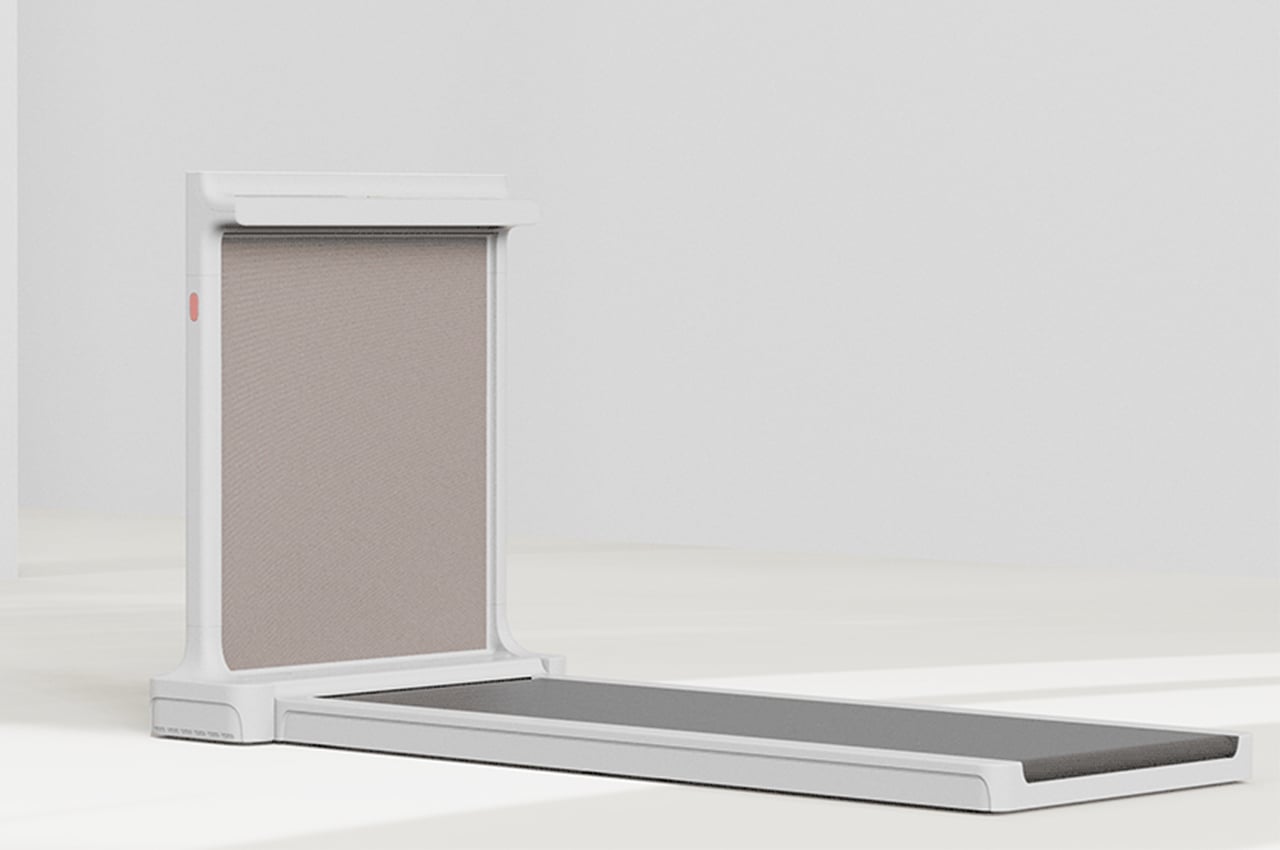
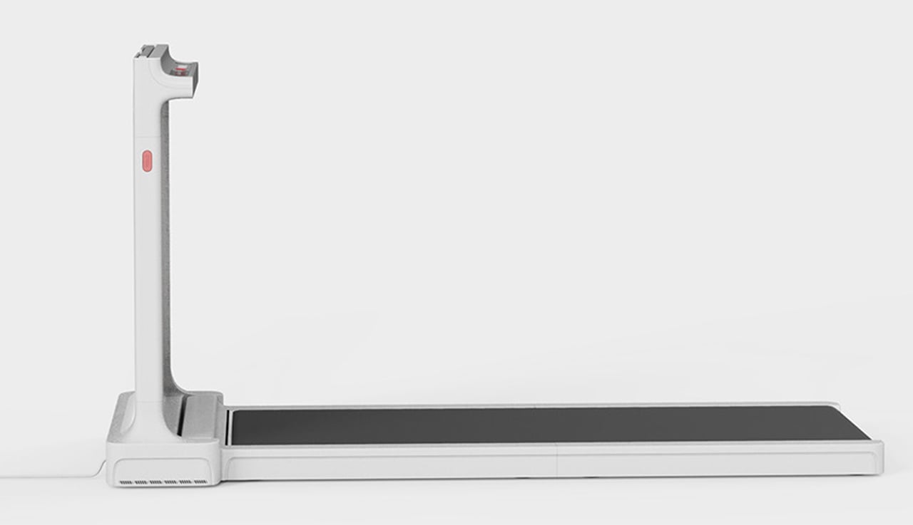
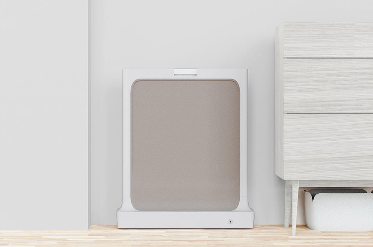
We love multifunctional product designs here but I have to admit, I have never thought of a treadmill and a clothing rack in one! But then again, we use our office chairs as an “open closet” so this concept isn’t entirely alien. ‘Walk and Hang’ is a project that functions as a basic treadmill as well as a clothing rack in one sleek design.
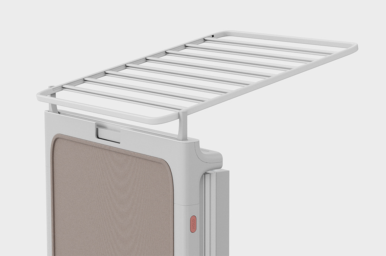
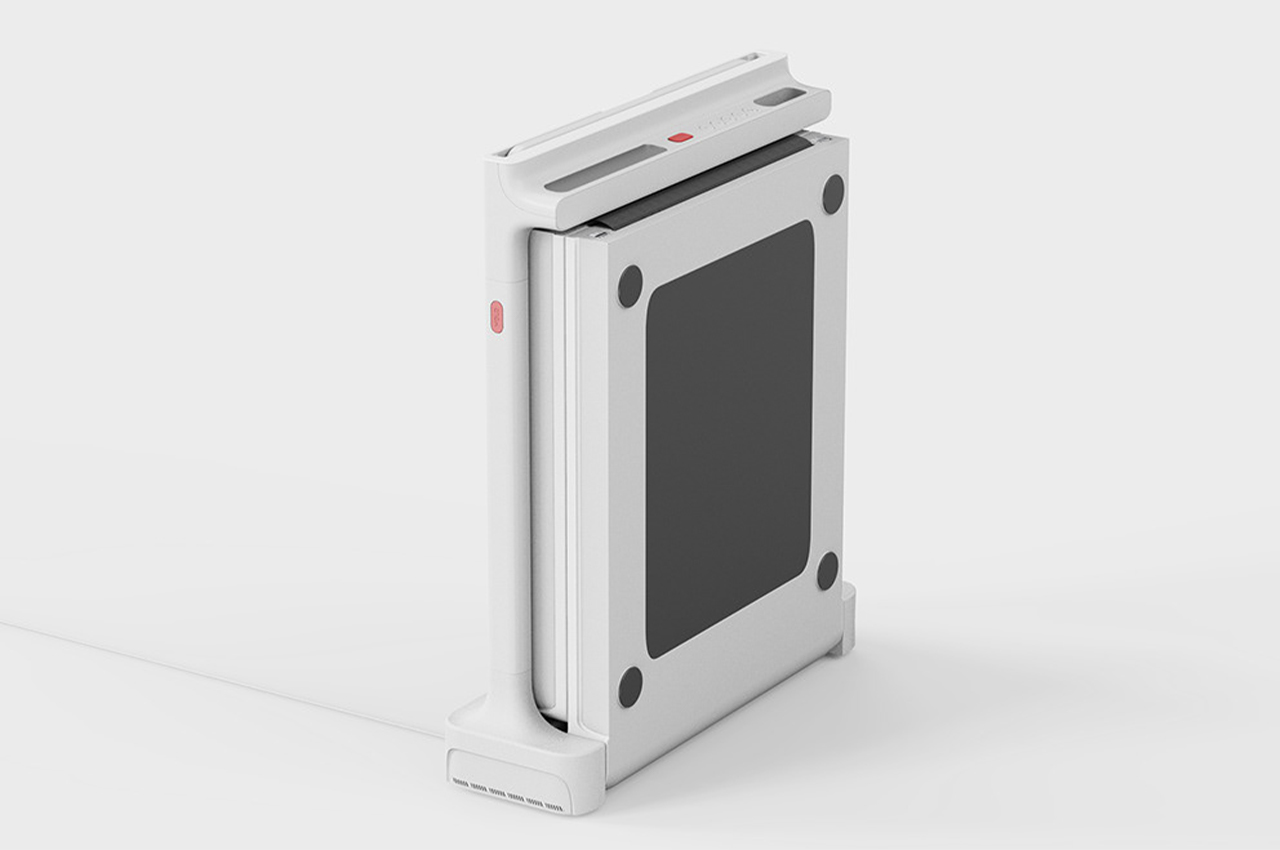
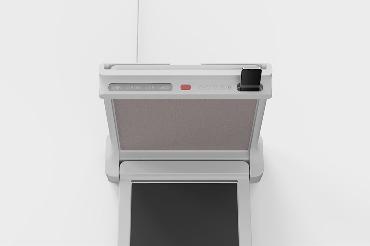
Both clothing racks and treadmills are usually an eyesore in any home because they look out of place and are super bulky. One of the key aspects of ‘Walk and Hang’ is its aesthetically pleasing form that looks neither like a treadmill nor like a clothing rack. In fact, it looks like a minimal standing table if I ever saw one inside someone’s house and had to take a wild guess. It rests in a folding table-like form and can be opened fully into a treadmill or only partly at the top for the racks. It saves a lot of floor area indoors, especially if it’s a shared space and even more so after the pandemic where you need more room for a work-from-home setup.

“I tried to satisfy everything of the product’s original function and user’s habits, and solved space problems and considered usability by combining the two products together,” says designer Jinyoung Noh. Since this is a concept, I will let my imagination run wild – clothing racks are often placed where sunlight hits the hardest so clothes dry fast, I would love to see this treadmill be turned into a solar-powered one by capitalizing on that same sunlight. ‘Walk and Hang’ is a slim treadmill and definitely the most beautiful clothing rack I’ve ever seen!

Designer: Jinyoung Noh

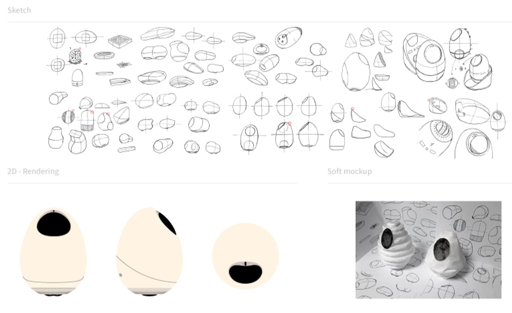
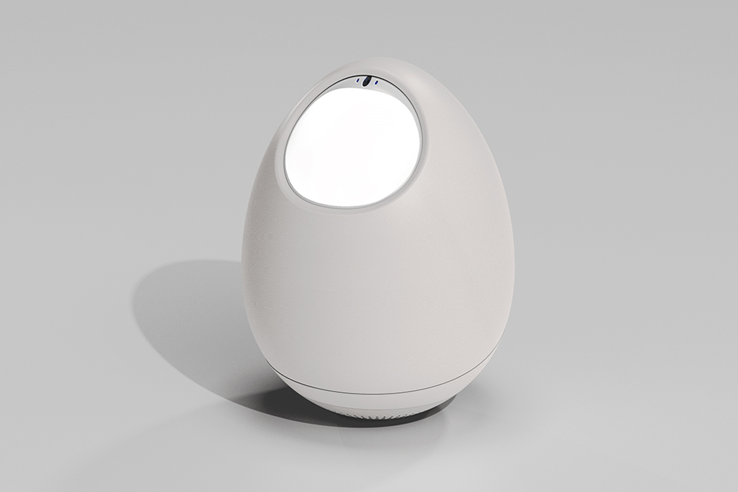
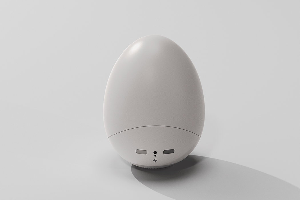
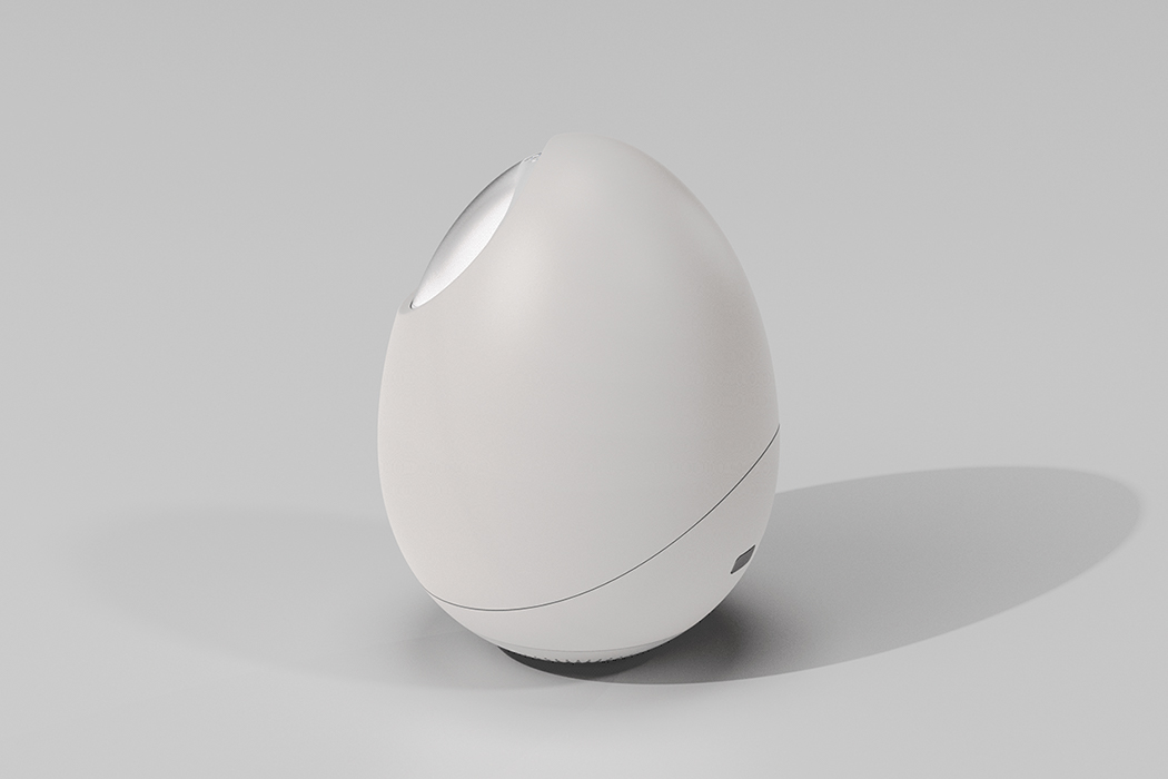
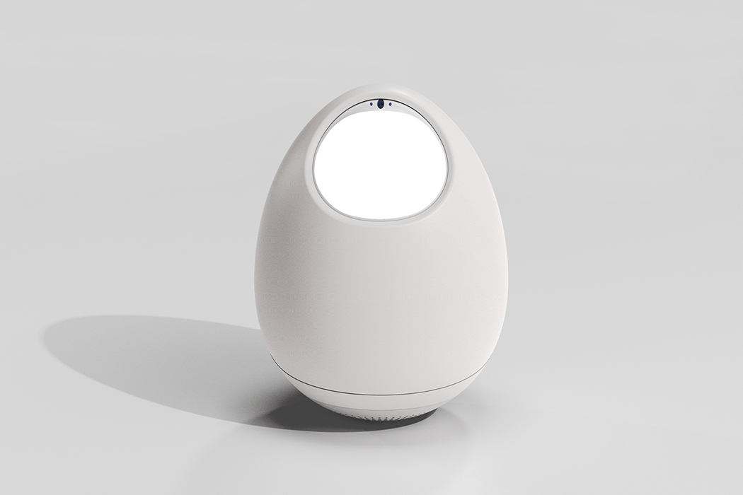
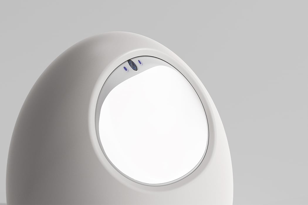
This smart robot is a playful egg designed to simulate the experience of raising actual pets!

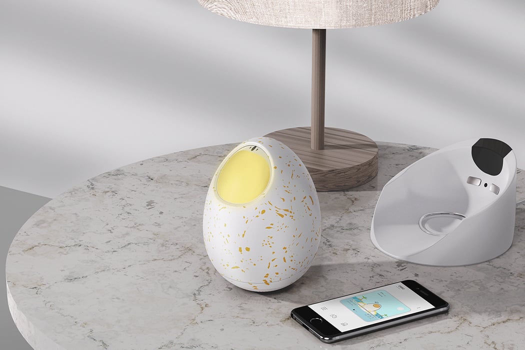
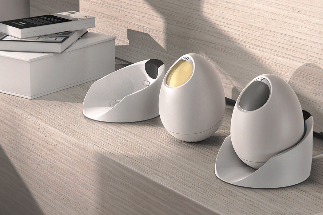
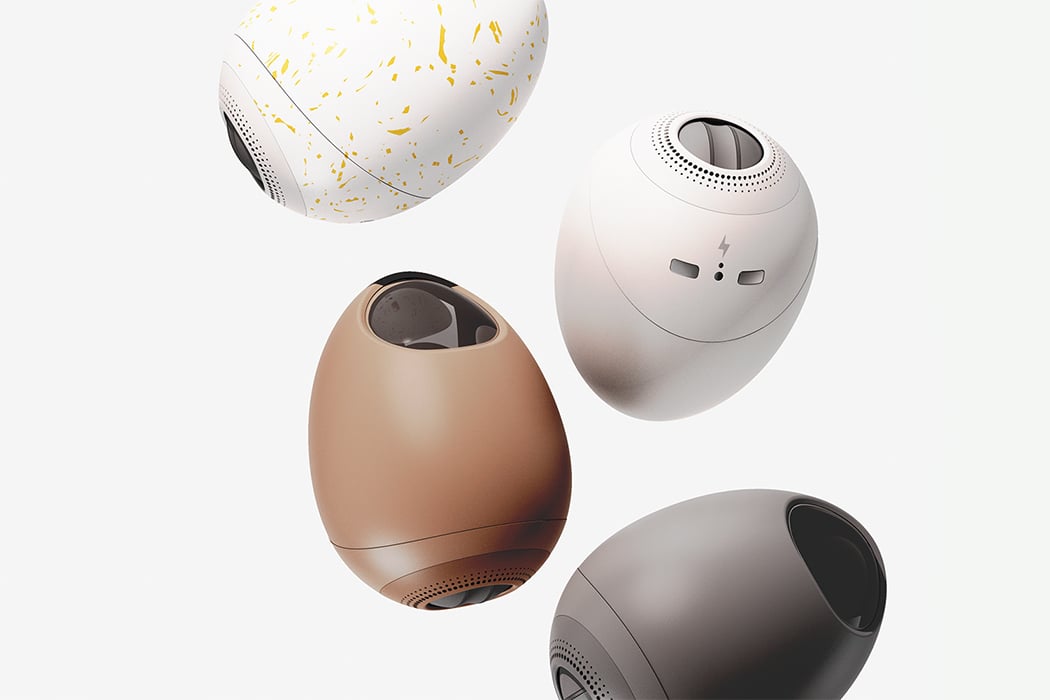
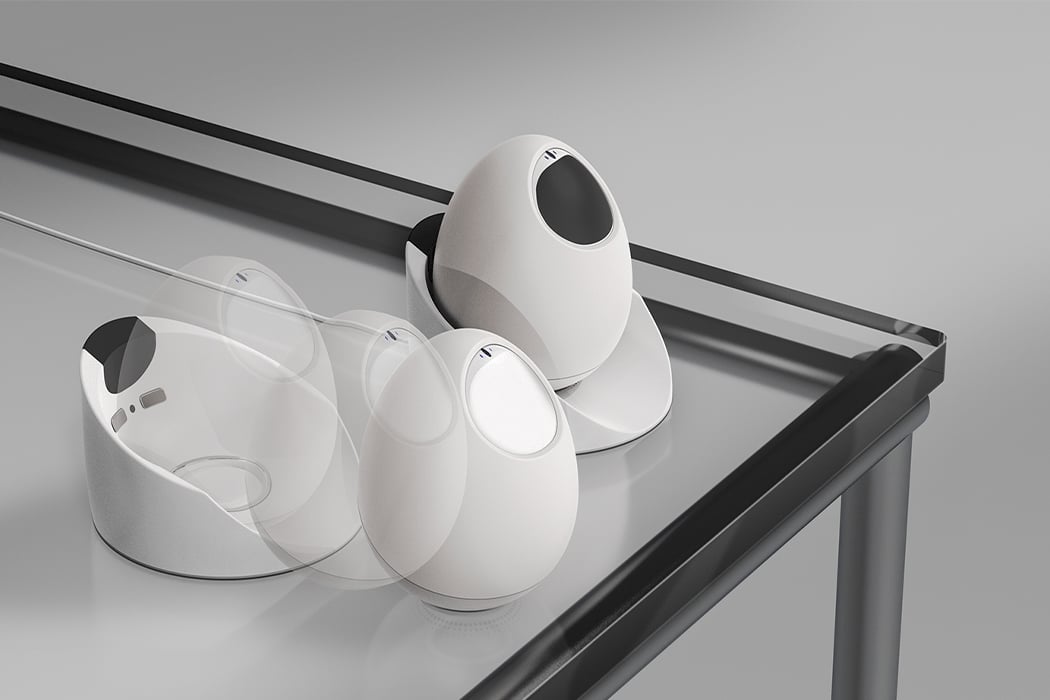
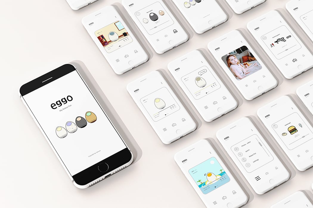
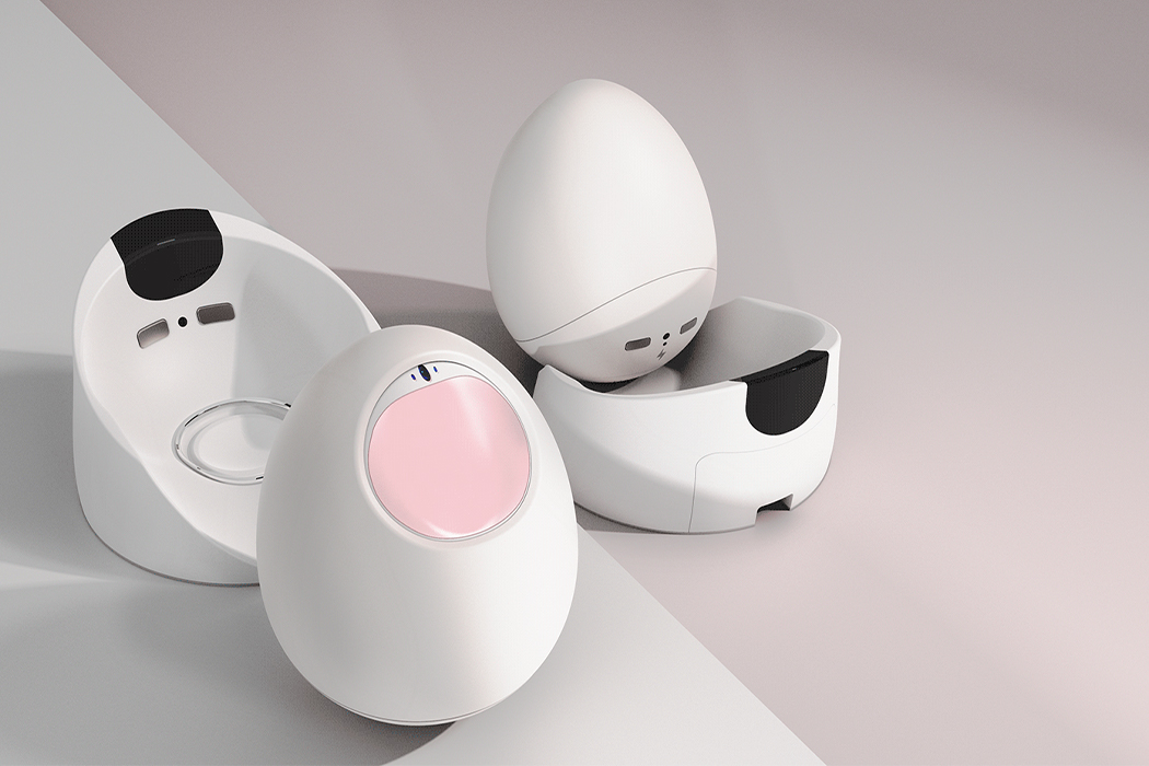
Every time we think of robots it is a scary visual. When we think of pet robots it’s usually a faceless dog. But what if I tell you that this good egg is actually a pet robot? Well, it is a concept but a very realistic one at that. As we advance in the world of robotics, designs like Eggo remind us that not all robots are bad and some can actually be cute like Eggo!

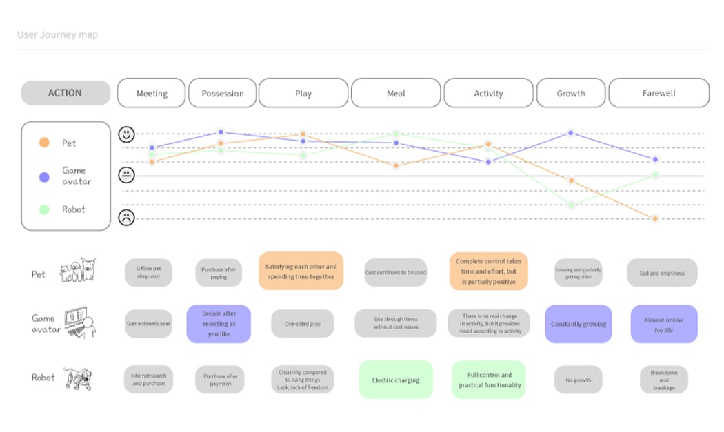
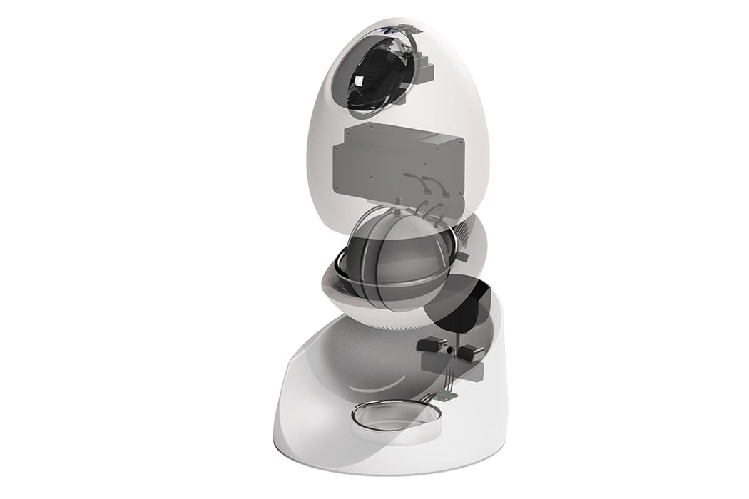
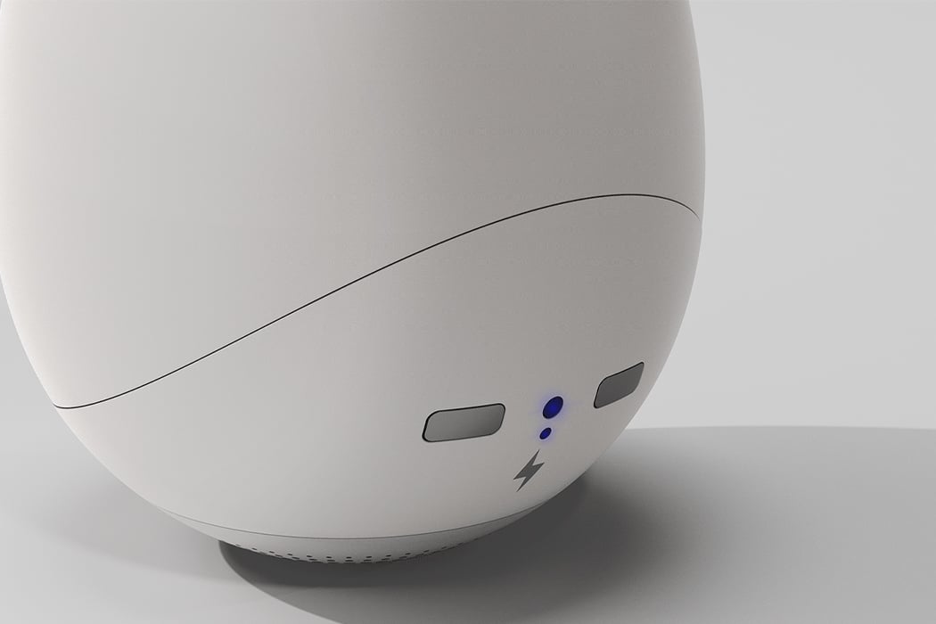
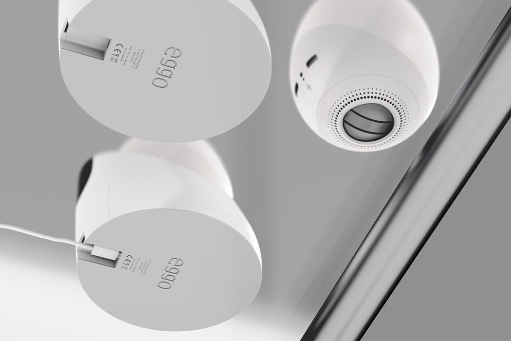
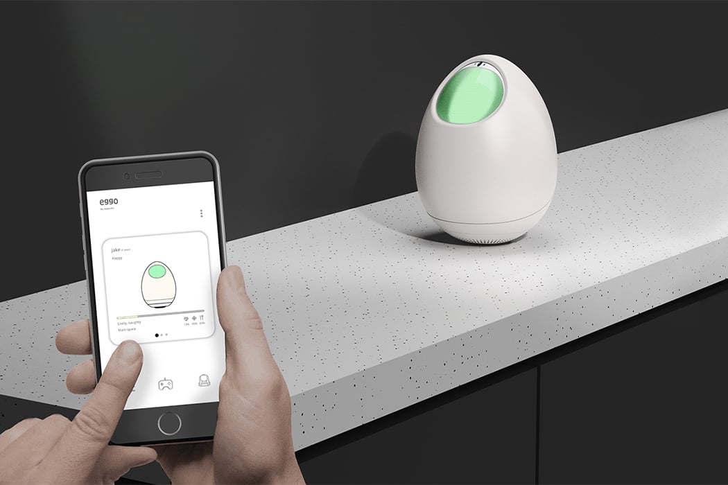
Eggo’s mission is simple – to give you a robot pet that is always by your side and provides a positive experience to you. This egg-shaped companion lets you raise a pet online or offline without taking away from the experience. It has a simple design, minimal interface, and an organic shape that invites interaction. Eggo moves autonomously by grasping the terrain through a camera. The smart pet also automatically goes to charge itself when the battery is low and I honestly wish my phone did the same thing. Even though it is a robot, designer Hyunjae Tak made sure to include an emotional side so Eggo can express how it is ‘feeling’ through the LED colors which are extremely important when interacting with children. It uses the inner wheel to move on its own and actually forms a unique personality according to how you take care of it just as you would with a real-life pet!

You don’t have to always be online to interact with or raise Eggo, it retains everything offline as well and that helps you build a realistic connection with the product as a pet as opposed to an ‘online game’ feeling (remember Neopets?). Eggo comes with its own smart app and with the various integrations, you can communicate deeper with it.

Designer: Hyunjae Tak

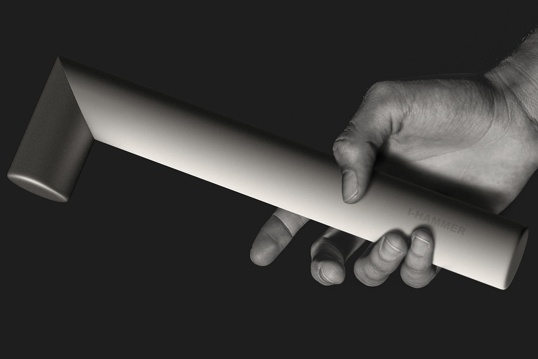
This minimal hammer takes inspiration from Apple’s aesthetics and twists to become a rod!

The first historical reference of hammer dates back to 3.3 million years ago – a time when hammer stone was used to break-up smaller stones to craft tools. Now in the 21st century, the hammer has got countless versions, but the purpose still stays the same. To pound nails or any other thing into a surface or wooden objects. You would shun the argument for a modern hammer design, and say – after all a hammer is a hammer, what’s the big deal?

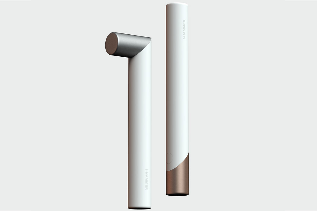
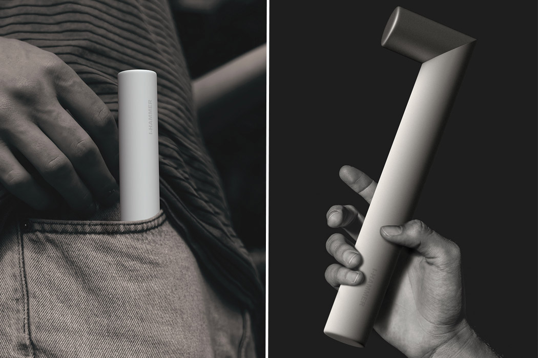
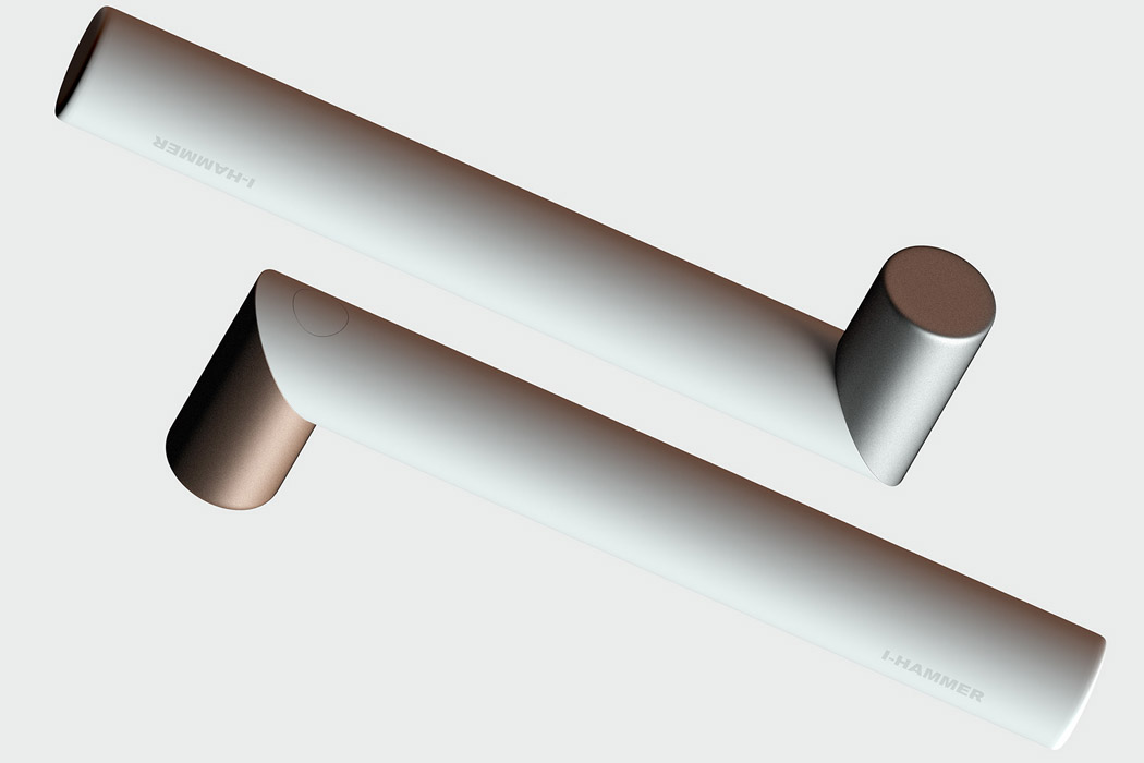
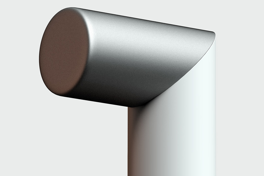
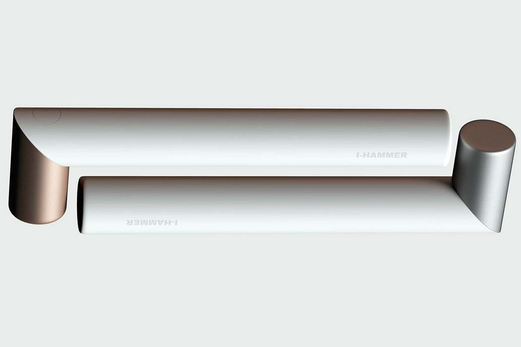
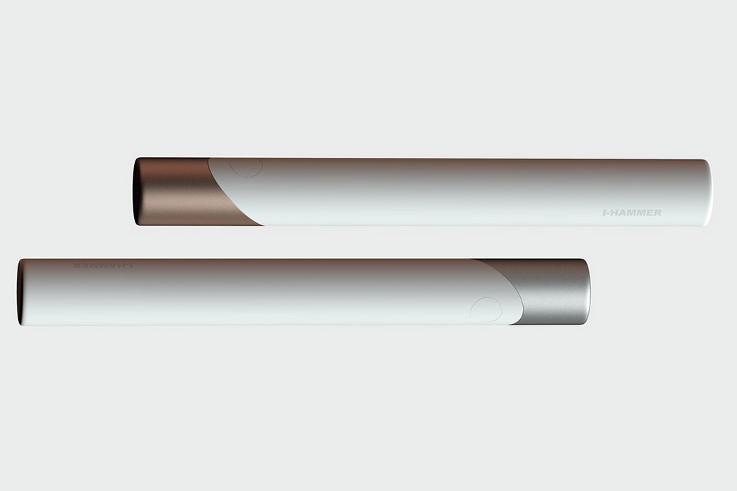
The I-Hammer by industrial designer ZJ-DDG has a “hammering” statement courtesy of its clever design which makes it more than any other handyman’s tool. First, the looks are all tailored for a modern world setup – modern home interiors to be precise. The use of white and metal cutting highlights the fact. Secondly, the unique functionality of hiding away the hammer end of the luxurious product all goes well with the urban crowd. After all, compactness supporting portability is the name of the game.

The unique steering mechanism of the I-Hammer transforms it from a hammer to a stick with the push of a button. The instant benefit – it is easier to carry and store. The beauty of it lies in the simple form factor which serves the purpose while being aesthetically attractive enough to carry in your backpack or even brag around with your friends while on a camping trip. Who says hammers can’t be pretty to look at while being highly functional. I-Hammer proves them all wrong!

Designer: ZJ-DDG

This slideout induction kitchen cooktop showcases portability modern cooks will appreciate

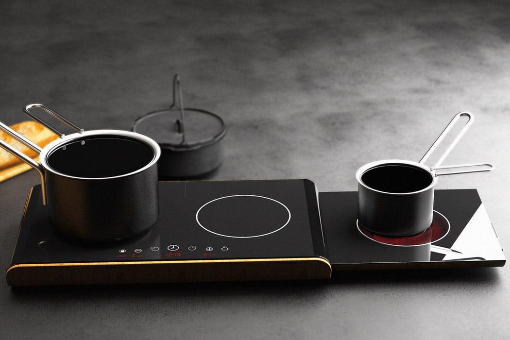
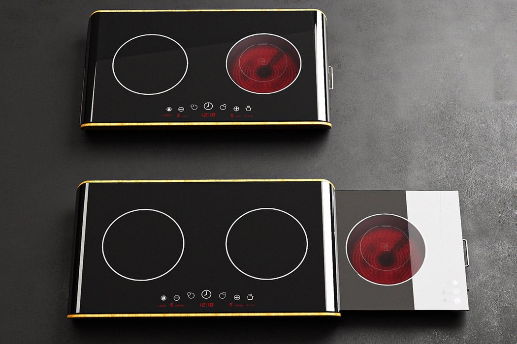
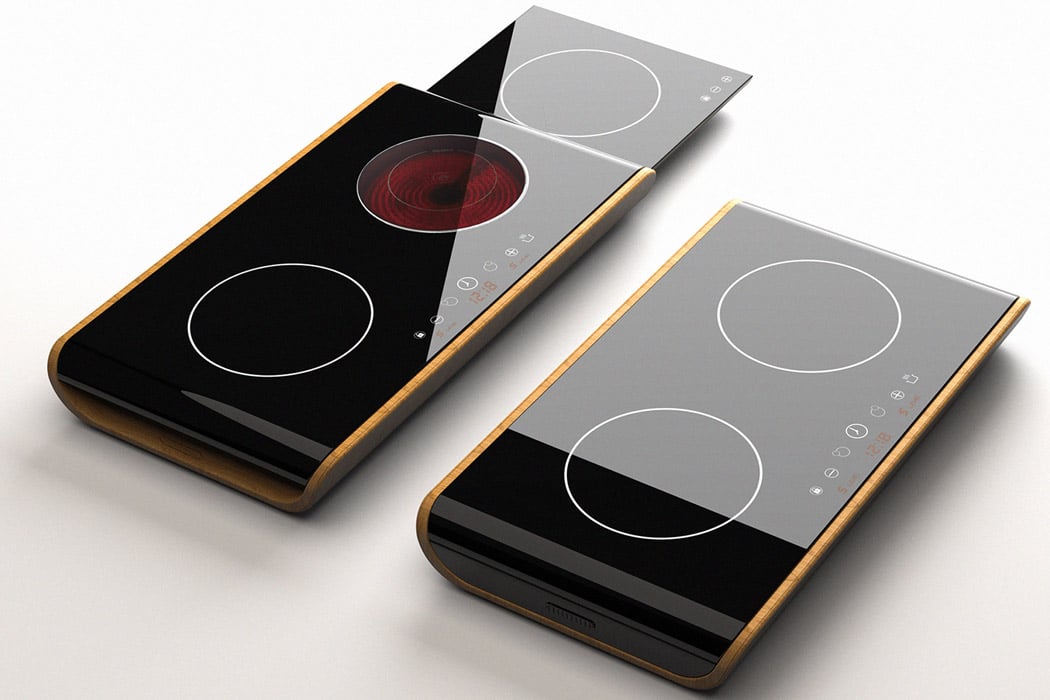
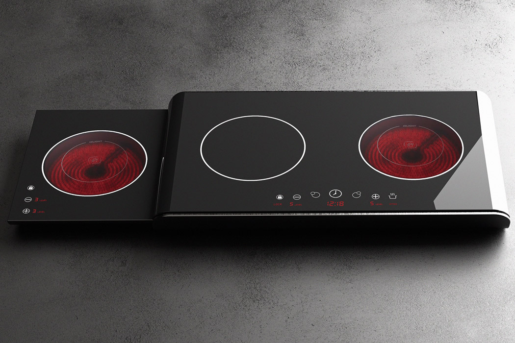
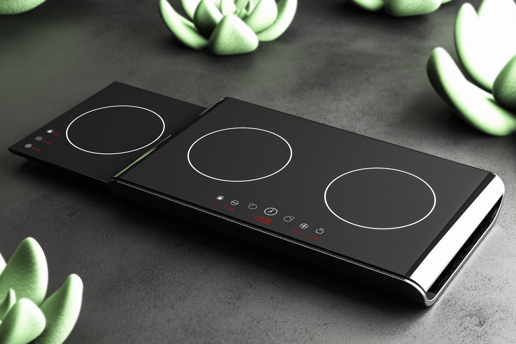
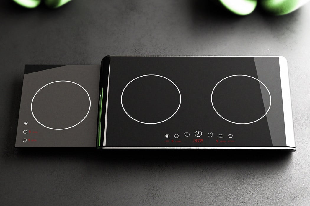
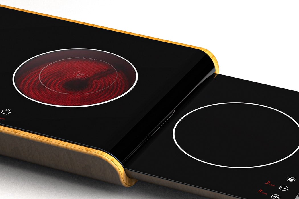
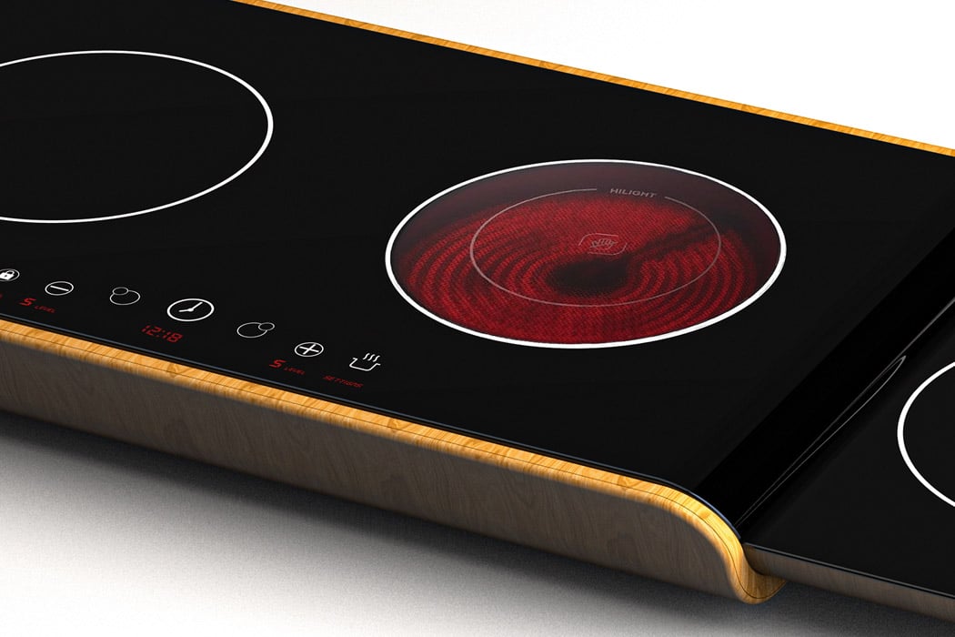
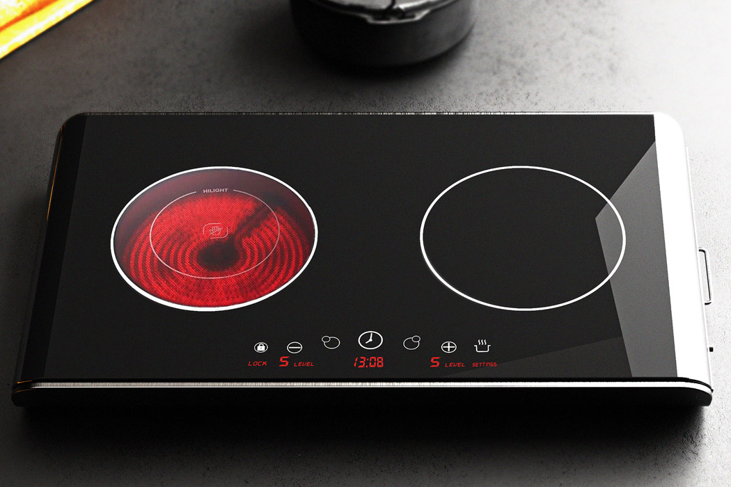
The more space you can save in your kitchen, the better it is for freeing up a workable area for cooking activities. Normally induction cooktops take up quite a chunk of the kitchen island, and their portability isn’t much to talk about. To set this notion right, Gökçe Nafak has reimagined the induction cooktop as a portable appliance with a third slideout cooktop for masterchefs who believe in culinary delight – anytime, anywhere! This saves space while giving you the freedom of using three cooktops at once. If only two or one of them is required, the third sliding one hides from plain sight.

Gökçe calls it the Fortido Induction Cooker – portraying it as a practical solution for quick tasty meals. The lower-level cooktop slides out like a drawer for convenience and the flexibility of daily usage. Not something your current cooktop can boast of. The design of the radical induction cooker makes it perfect for modern homes that are getting a smaller footprint, as real estate spaces shrink – especially in cities. For people who have to constantly keep changing their apartments, Fortido is a great option, thanks to its ultra-portable design.
All the cooking settings are placed optimally for quick operation – perfectly matching the cooktop’s minimal theme. Gökçe’s concept design should prompt appliance makers to create a similar commercially available product. An induction cooker that does more while being less in its footprint!
Designer: Gökçe Nafak


This floating yacht-inspired resort is the future of luxurious architecture and getaways!

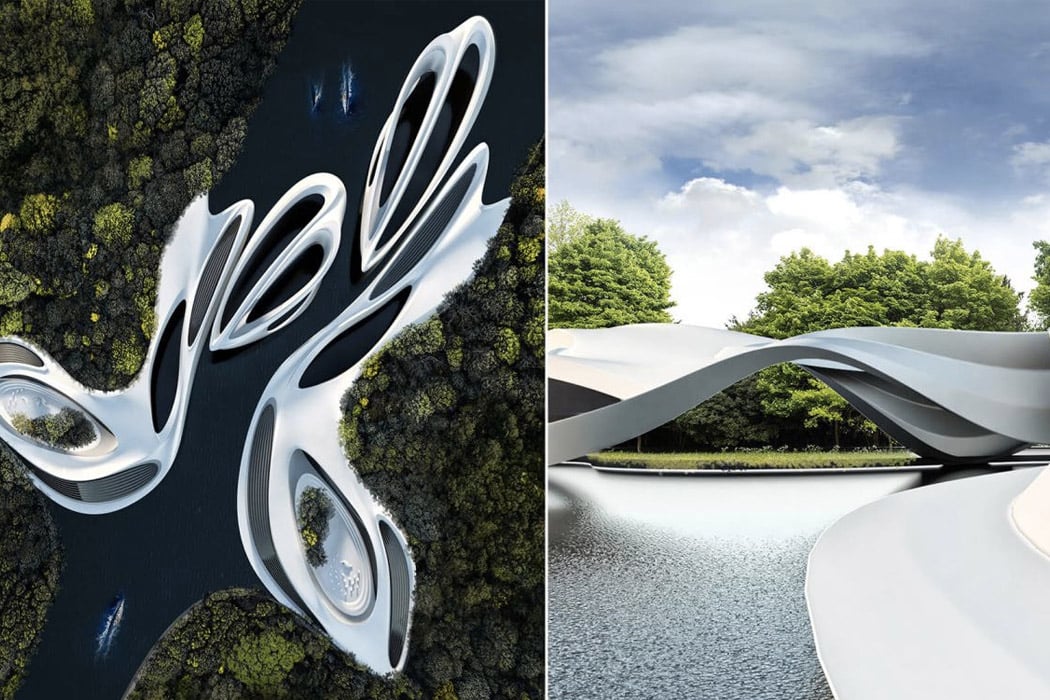
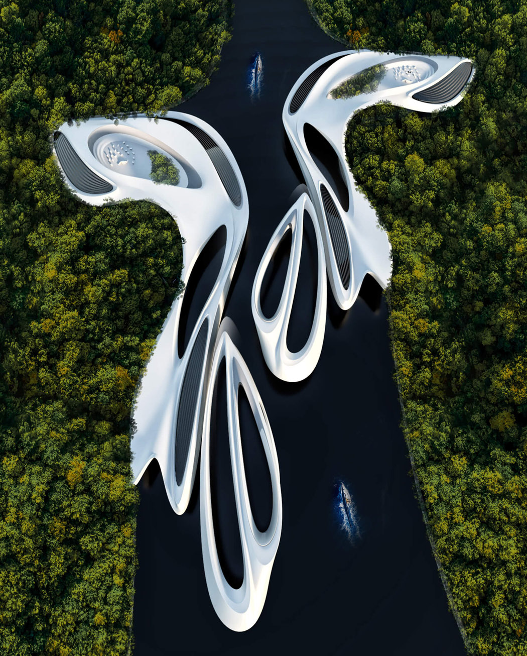
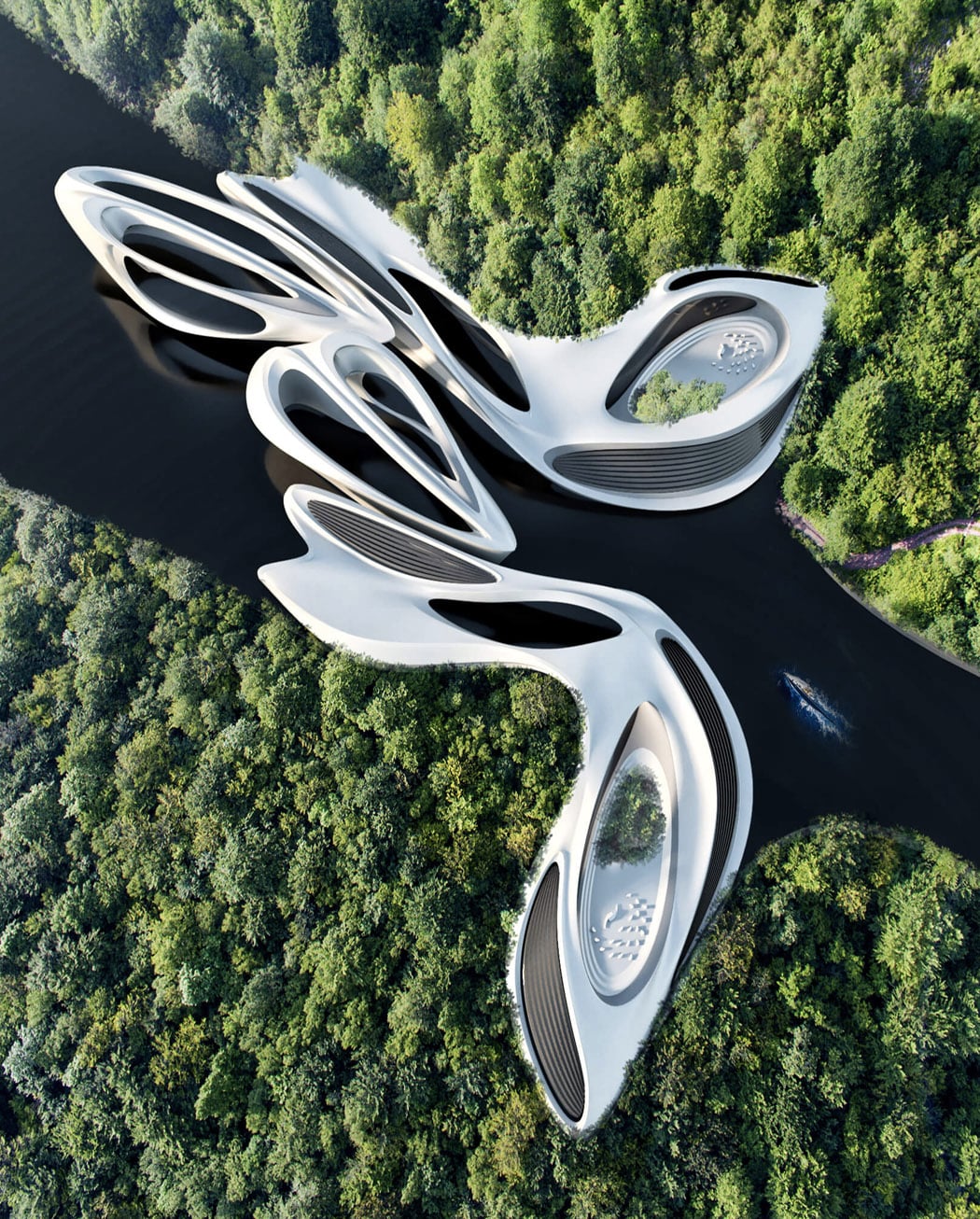
I often find myself scrolling through the internet looking for plausible vacation destinations I can fly off to once this pandemic comes to an end. Though physically I am sitting in my home, mentally I am halfway across the world, lounging on a beach resort in the Caribbeans! I love this newfound pastime of mine, it fills up any free time I may have throughout the day, and oh how wonderfully it fills it up! During one of my getaway hunts, I came across Miroslav Naskov’s ‘Yacht Hub’, though this exquisite resort is still a concept at the moment, I couldn’t help but go completely gaga over it!

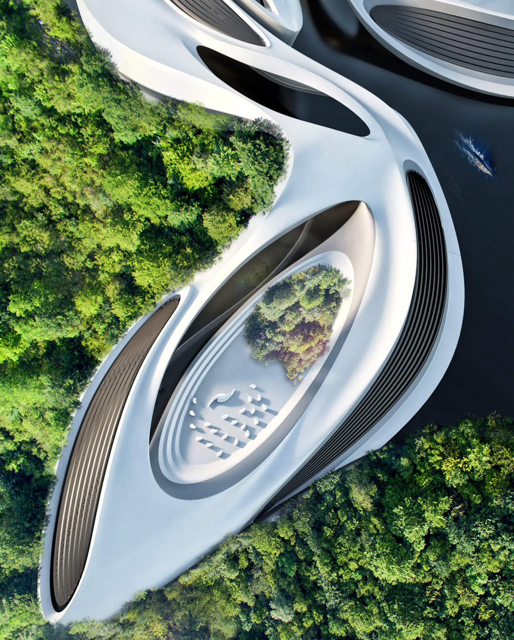
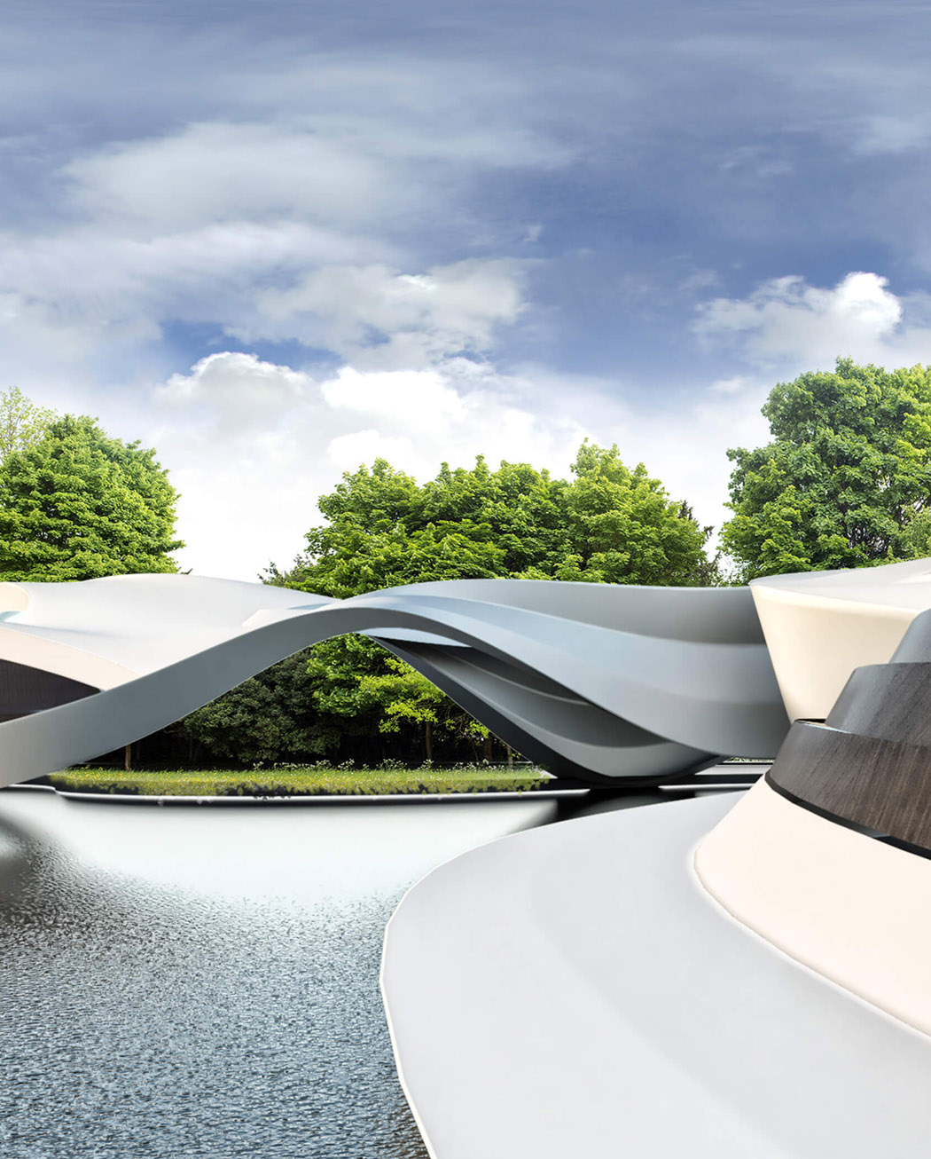
Naskov intends for Yacht Hub to be a hospitality resort, floating on an artificially planted forest canal! Tucked amongst lush greenery, and casually placed upon a serene waterbody, the resort is inspired by the form of a Yacht! Aerial images of the structure display how similar it is to a yacht – from its sleek curves to the white sheen of its body. The resort will feature a yacht station, wherein the yachts that take you to the resort can dock. Though the main area of the resort, where the guests will stay, is placed upon the banks of the waterbody, the guests can walk and stroll around on the floating platforms. It’s as close to the water you can get, without actually dipping into it. The vast variety of plants and greenery add on to the tranquil and peaceful environment of the resort.

Naskov’s Yacht Hub is the ultimate getaway from this modern and hectic world! The waterbody and the surrounding forest area will be artificially created, which will in turn build a completely private space for the resort. Far away from the outside world, this sleek and futuristic resort is a luxurious haven, and I would love to see it become a reality someday!

Designer: Miroslav Naskov of Mind Design