Nintendo Switch 2 Console Renders Hint At Smaller Bezels and Redesigned Joy-Cons

Even when the folks at Nintendo don’t say anything, they say a lot! The rumor mill has been ABUZZ with speculation about the Nintendo Switch 2, which many people close to the matter say should arrive in 2024. While Nintendo has been extremely tight-lipped about the release of its highly-anticipated next-generation handheld console, it’s rumored that multiple studios have gotten access to the developer kit, confirming that the Switch 2 is, in fact, coming. This would be big for Nintendo too, as they’ve never released a ‘2nd edition’ of any of their consoles – the name has always changed ever so slightly, but the number 2 hasn’t featured in this new name. Take the Wii and WiiU for example, or the Nintendo DS and 3DS, or the Game Boy and Game Boy Advance if you want to look even further back.

The Switch 2’s reputation precedes it, following a 1st gen console so infamous, it remained sold out through multiple production runs and still is the most popular handheld console today, even though it was first unveiled six years ago. This Switch 2 concept, designed and envisioned by Salvo Lo Cascio and Riccardo Cambò Breccia, embodies everything we fans expect from Nintendo, peppered with a few healthy leaks and rumors. Let’s dive in!

Designers: Salvo Lo Cascio & Riccardo Cambò Breccia
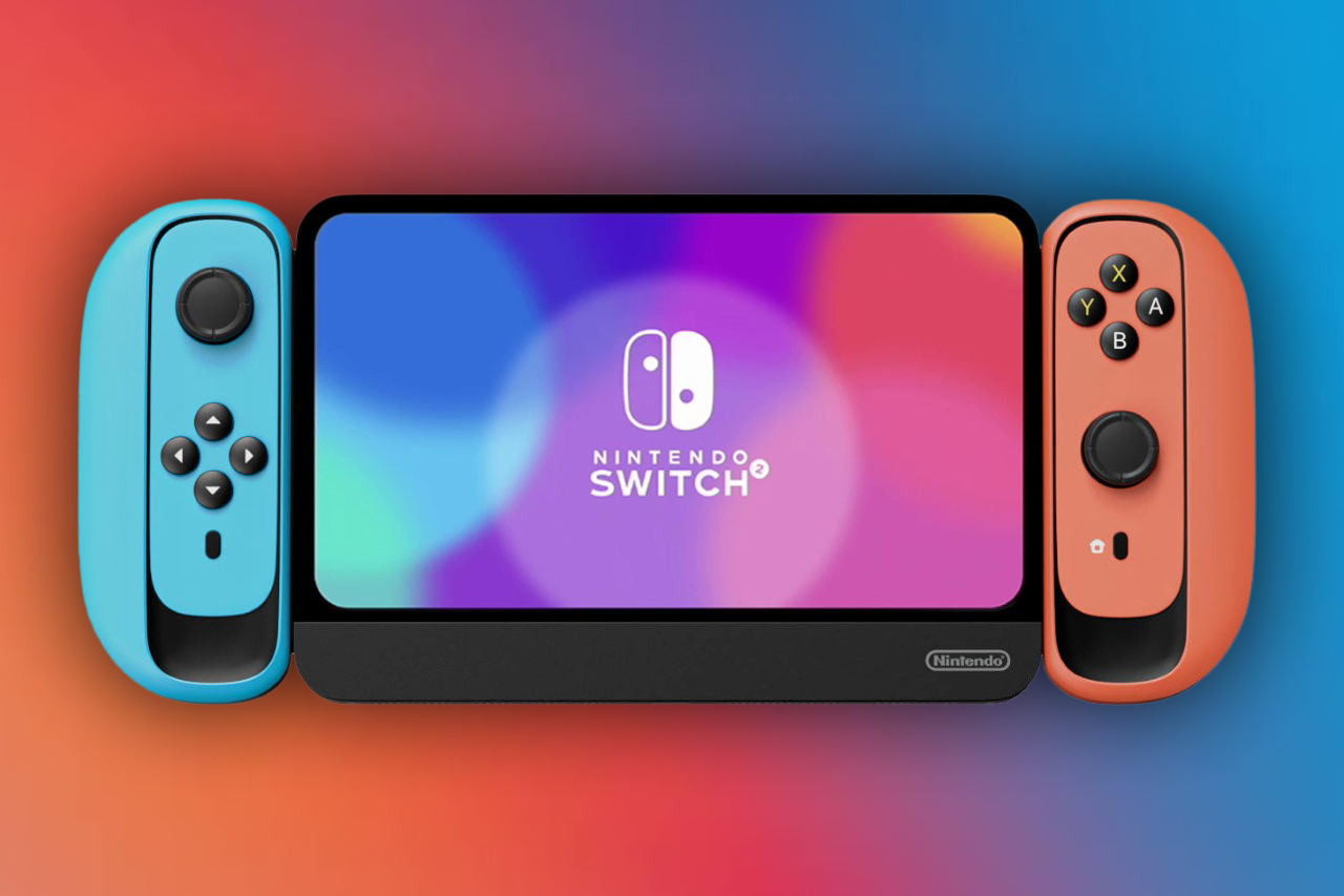
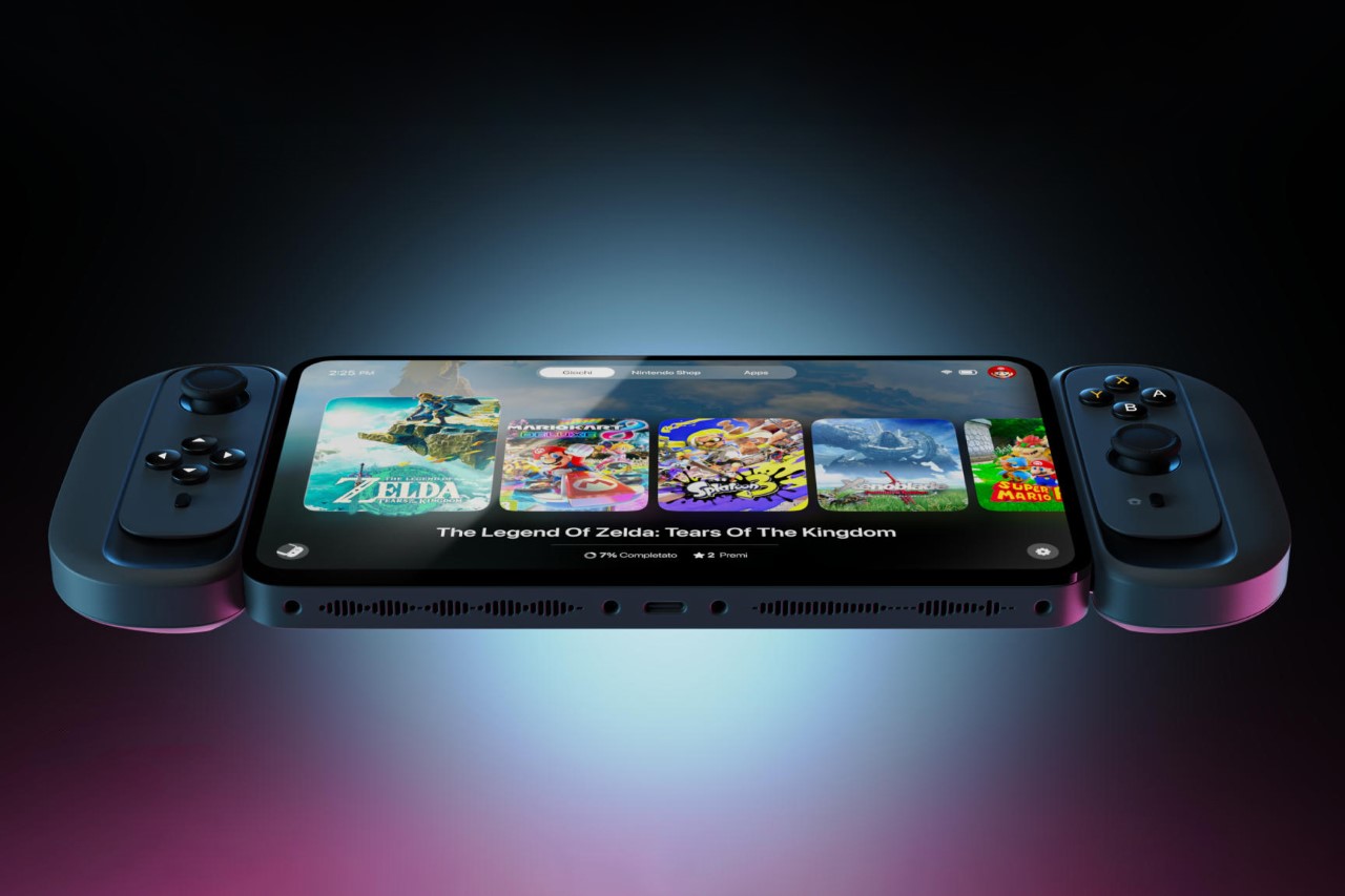
Outwardly, the Nintendo Switch 2 concept embraces and really highlights its predecessor’s black, red, and blue color scheme. The format remains entirely the same too, with a few pretty visible tweaks, but all in all, it’s as unabashedly Nintendo as it gets.
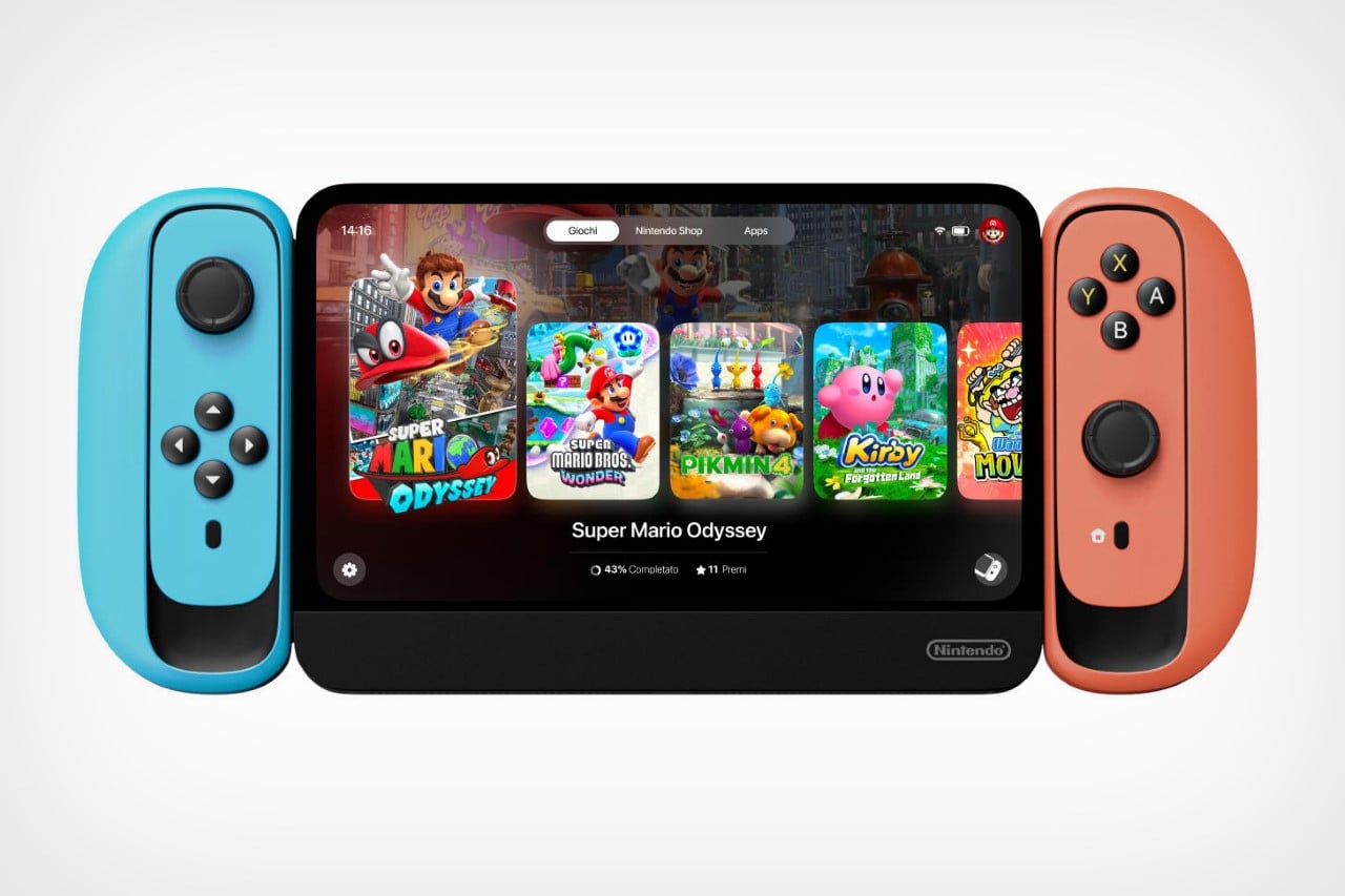
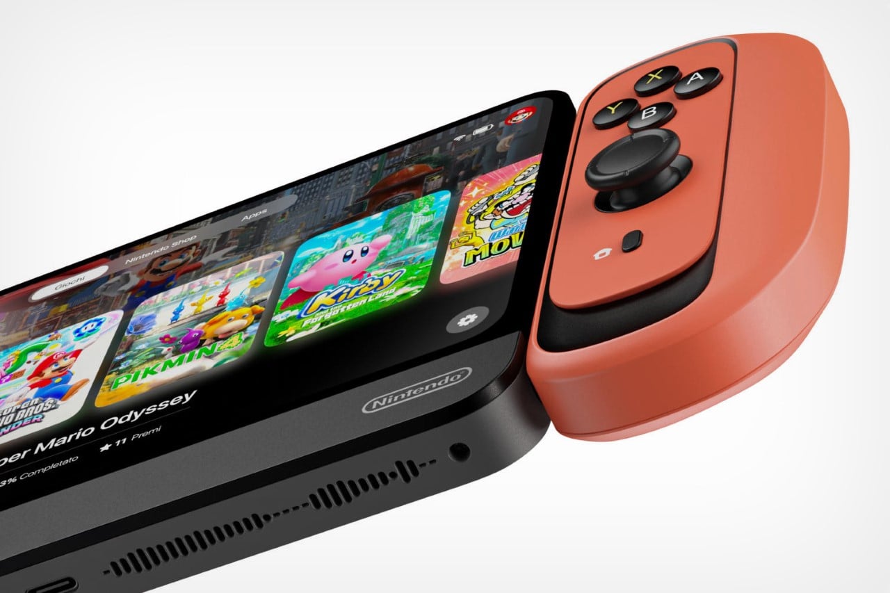
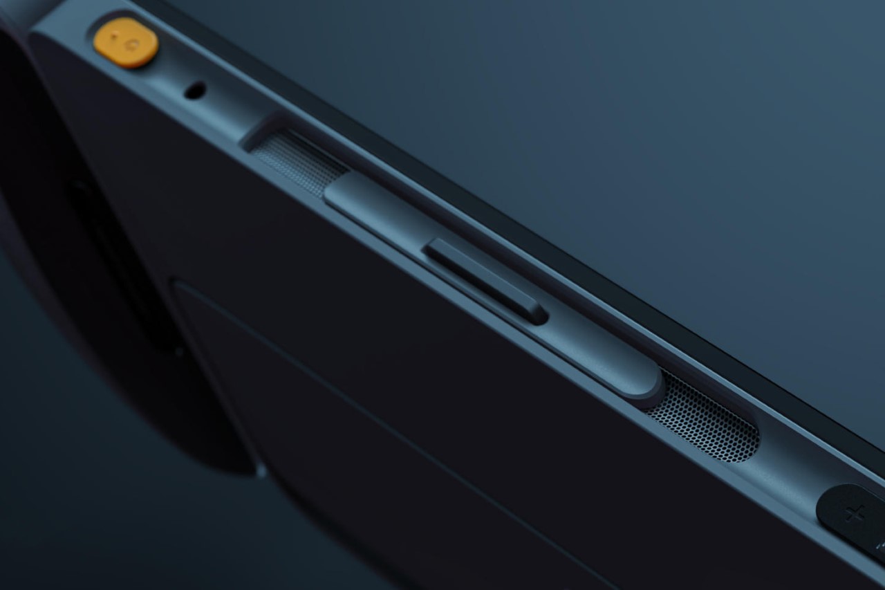
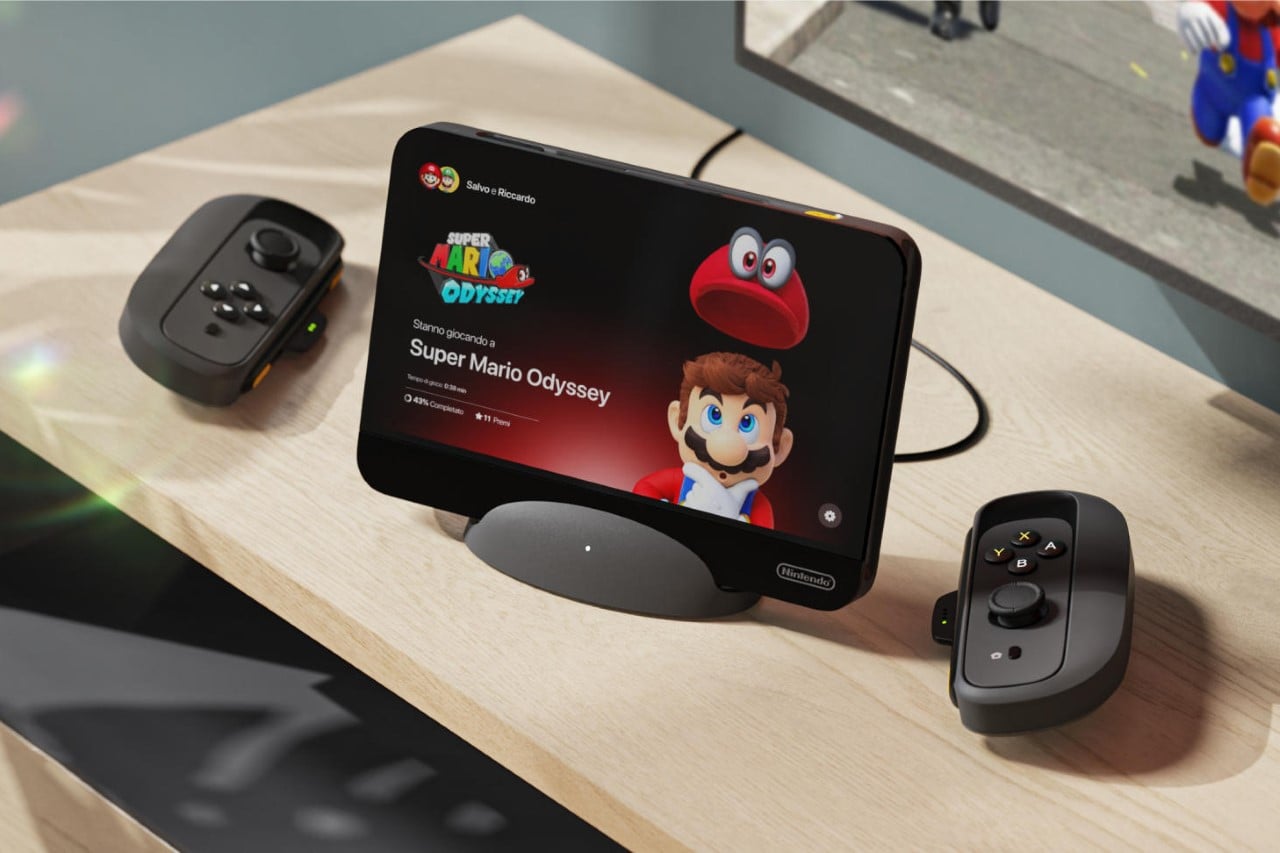
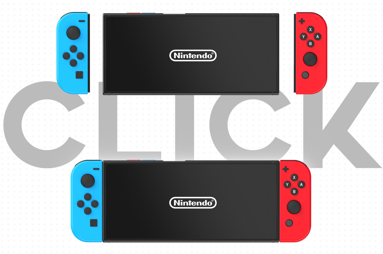
We start with the Joy-Cons, which now sport a slightly chunkier, more rounded design that has a playful appeal to it. The controllers are a pleasure to hold as a part of the console as well as independent units, and come with a sliding panel built into its design – but more on that later. The main unit, on the other hand, is significantly different too, with drastically slimmer bezels than on the original Nintendo Switch. Rounded corners give the display unit a cutting-edge tablet appeal, although the only thing missing to make it a tablet is the presence of cameras!
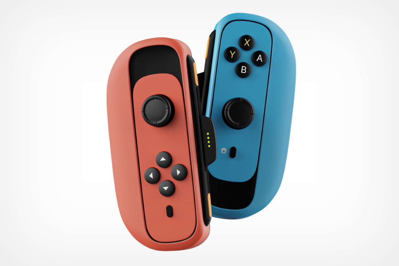
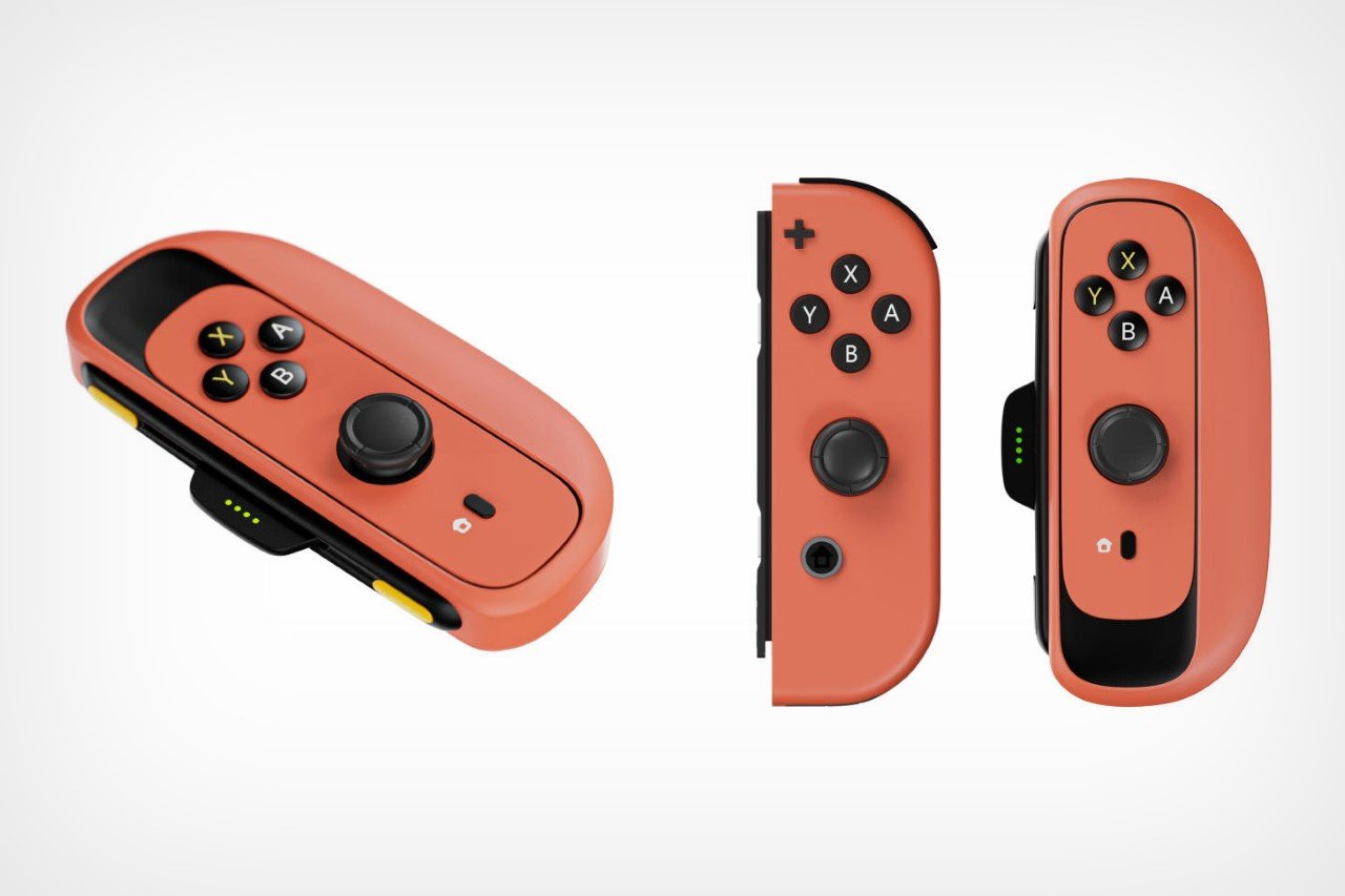
A comparison between the old and new Joy-Con design
The new Joy-Cons’ strange sliding panel has an incredibly clever utility to it. Although designed to be used as a standalone unit, the Switch originally boasted of being able to handle two-person gaming too. All you needed to do was pop the Joy-Cons out and they would transform into dedicated handheld controllers. The problem was that these controllers weren’t designed to be symmetrical when held horizontally. Salvo and Riccardo’s clever design workaround fixes that problem entirely, creating a set of handheld controllers that feel ergonomic and comfortable to use even when held on their own. The GIF below explains how this works.

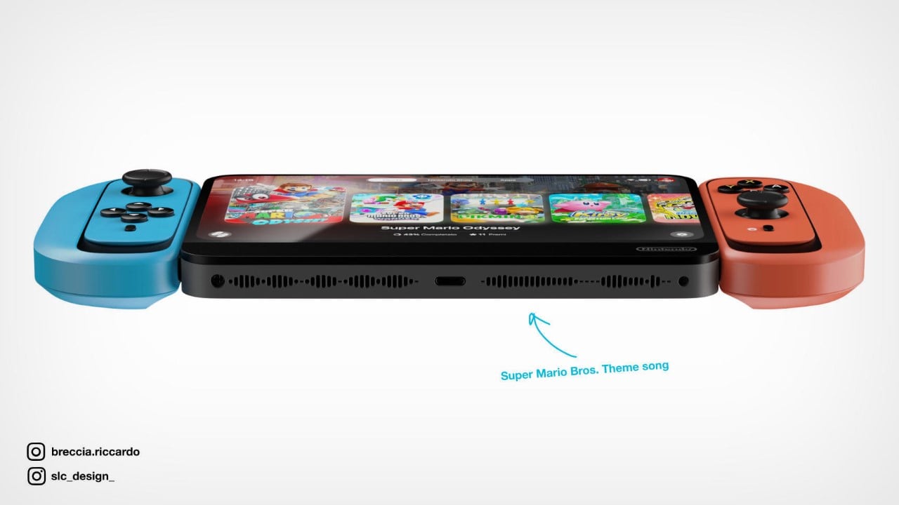
The designers also hid an easter egg in the Nintendo Switch 2’s speaker grill by shaping it into the waveform of the iconic Super Mario Bros. theme!

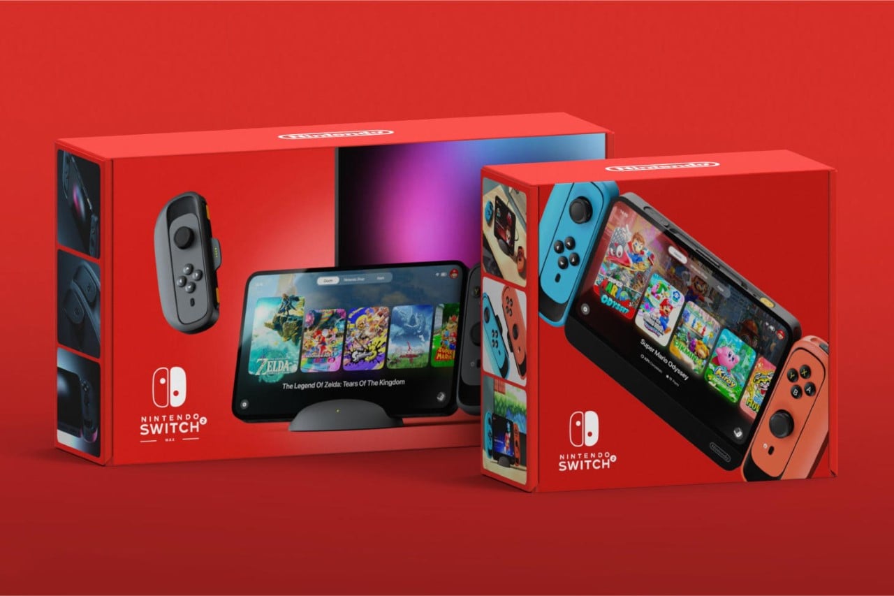
The rumor mill has been going on and on about Nintendo probably launching two Switch 2 models together. The second, according to Bobby Kotick (CEO of Activision) is suspected to be as powerful as a PS4, shattering through all benchmarks to make this new Switch model Nintendo’s most capable one yet. Dubbed the Nintendo Switch 2 MAX, Salvo and Riccardo gave this a significantly upgraded design too, in the form of an all-black colorway, and a larger screen sans the lower chin seen in the Switch 2. According to Kotick, the developer kit of the Switch 2 MAX was allegedly powerful enough to handle Triple-A games without breaking a sweat. Most Switch users have complained that the console’s graphics are its biggest limitation, and the Switch 2 MAX may just be exactly what they need.
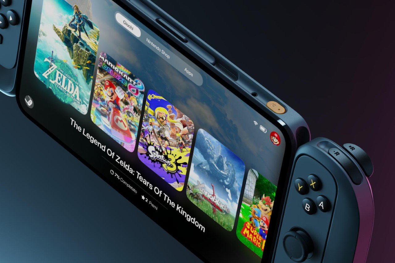
The Nintendo Switch 2 MAX has a much larger, edge-to-edge display
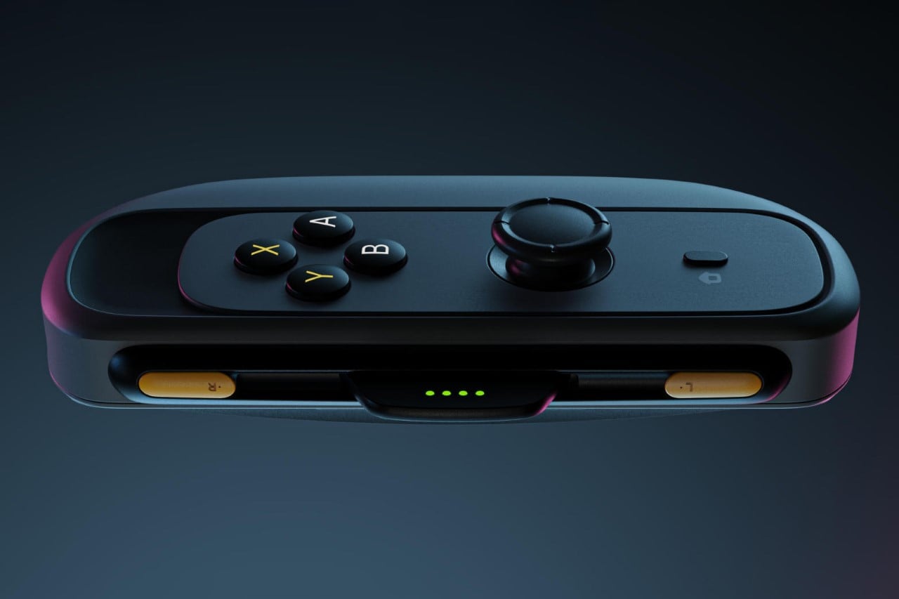
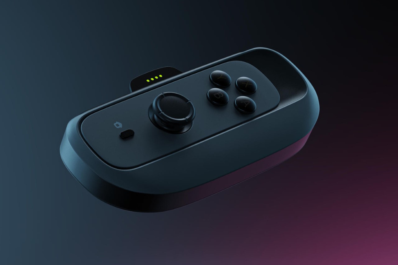
The all-black controller on the Switch 2 MAX is a deviation from Nintendo’s Blue and Red color-way, but after all, a beast needs its camouflage! The Switch 2 MAX controller also has backlit XYAB keys, allowing for low-light high-octane gaming.
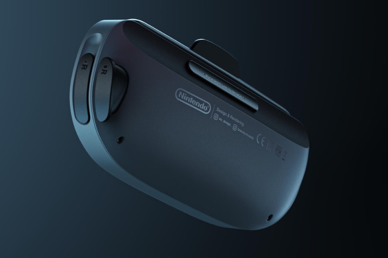
The last part of the Nintendo Switch 2 to receive a redesign is the hub, which docks the screen. Designed to both charge as well as work as an HDMI pass-through for the console, this new dock has an almost smart-home-like quality to it. Its design is soft and pebble-like, and accepts the Switch 2’s screen with absolute ease, mirroring its display onto a larger screen like a television, monitor, or projector.
Salvo and Riccardo’s design couldn’t come at a better time, with gaming technology in a bit of a lull given the uncertain future of E3 (Electronic Entertainment Expo), the biggest exhibition in gaming. Although the actual device isn’t due till next year, this concept feels like a perfect culmination of fan requests and legitimate rumors. Let’s hope Salvo and Riccardo’s design is on the money, because if the Switch 2 looks anything like this, it’s sure to be a winner!
The post Nintendo Switch 2 Console Renders Hint At Smaller Bezels and Redesigned Joy-Cons first appeared on Yanko Design.
Ferrari Nintendo steering wheel for intense racing action on and off the circuit

Playing racing games on the Nintendo Switch is total fun when a Joy-Con Wheel is used. Giving you a tactical edge in gaming titles like Mario Kart, Star Wars Racer or FAST RMX. You just slot your Joy-Cons into the 5-inch diameter of the wheel, eventually making the game much easier to play. Third-party steering wheels of the standard size can also be connected, but they can sometimes have a glitchy experience.

Reason enough for Nintendo to graduate to the big boys club with a racing wheel that can give the likes of Logitech G29, Thrustmaster T300RS or Fanatec CSL Elite a good run for their money.

Designer: Braz de Pina

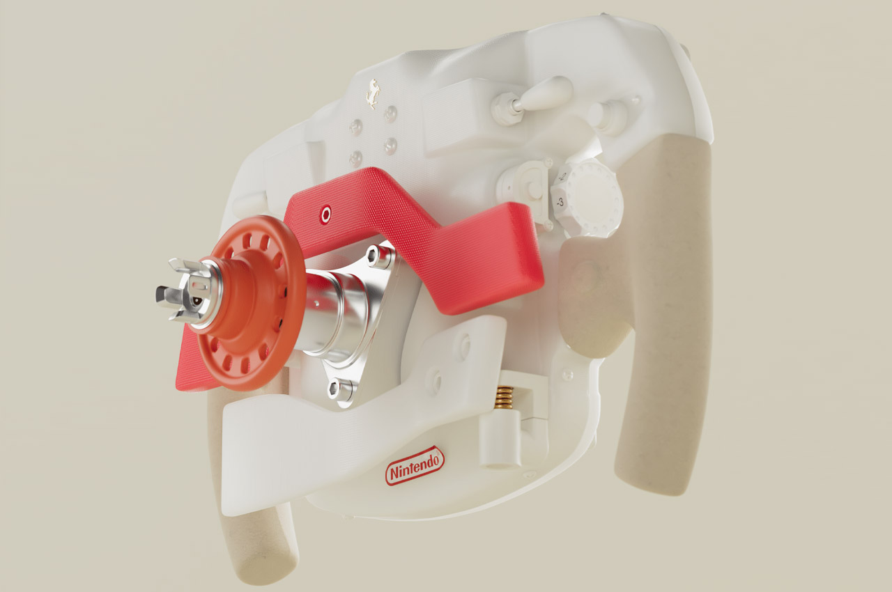
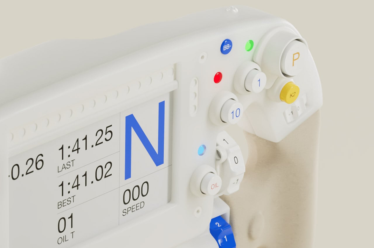
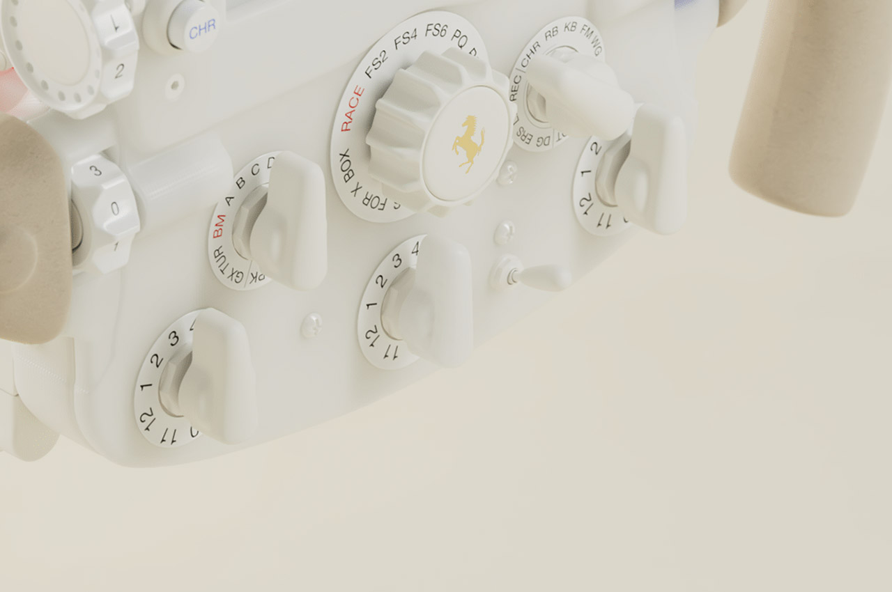
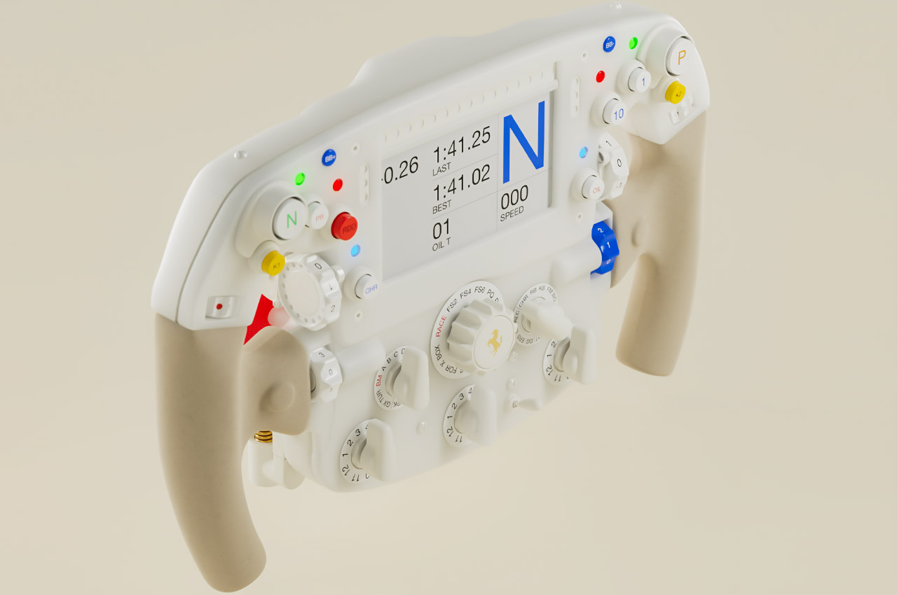
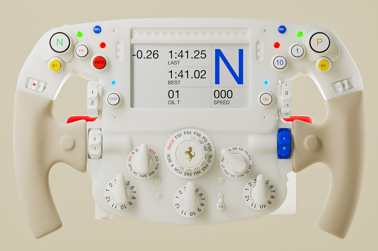
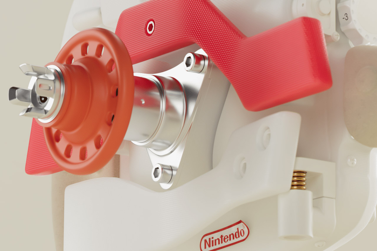
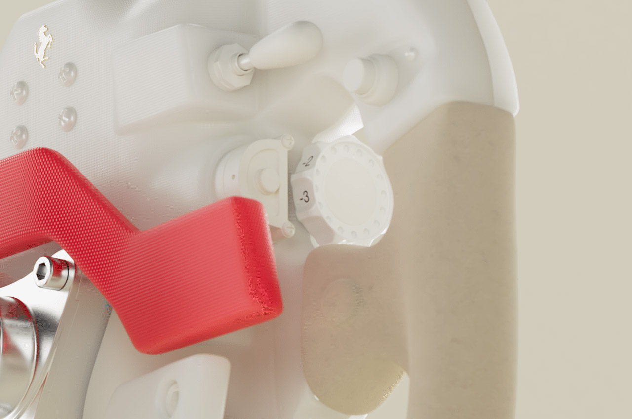
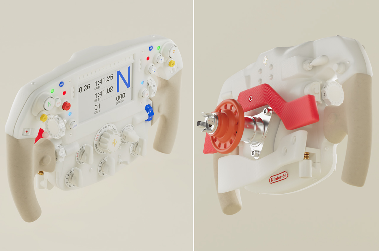
Carrying a discrete vibe compared to any other real-life gaming steering wheel, or even a concept creation, this Ferrari Nintendo racing wheel boasts an arcade-styled theme. The best-suited matching accessory for speeding past opponents or drifting in Mario Kart skirmishes. But a closer look reveals this is a steering wheel designed for a nerdy supercar fan who loves to keep a Nintendo Switch handy. One in a million chance of this combination!

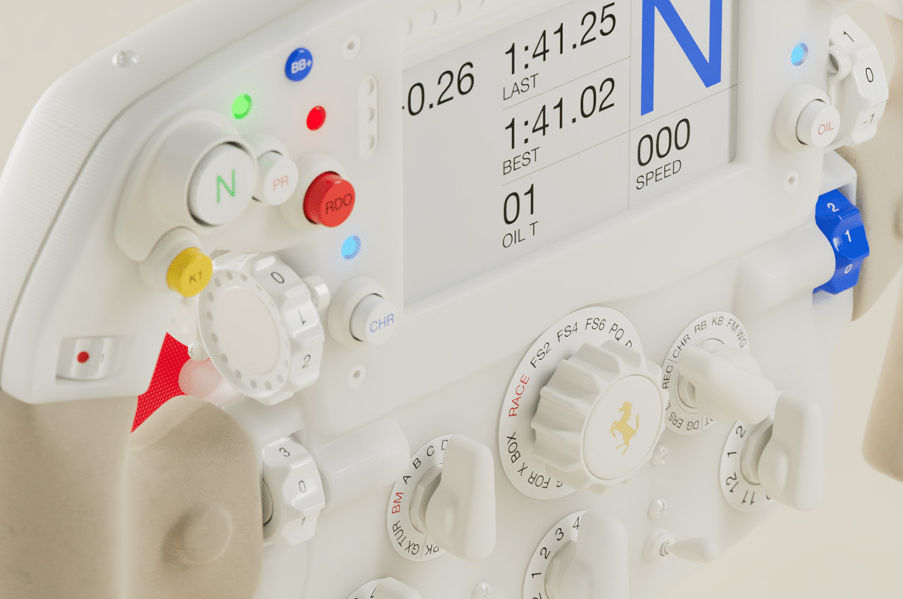
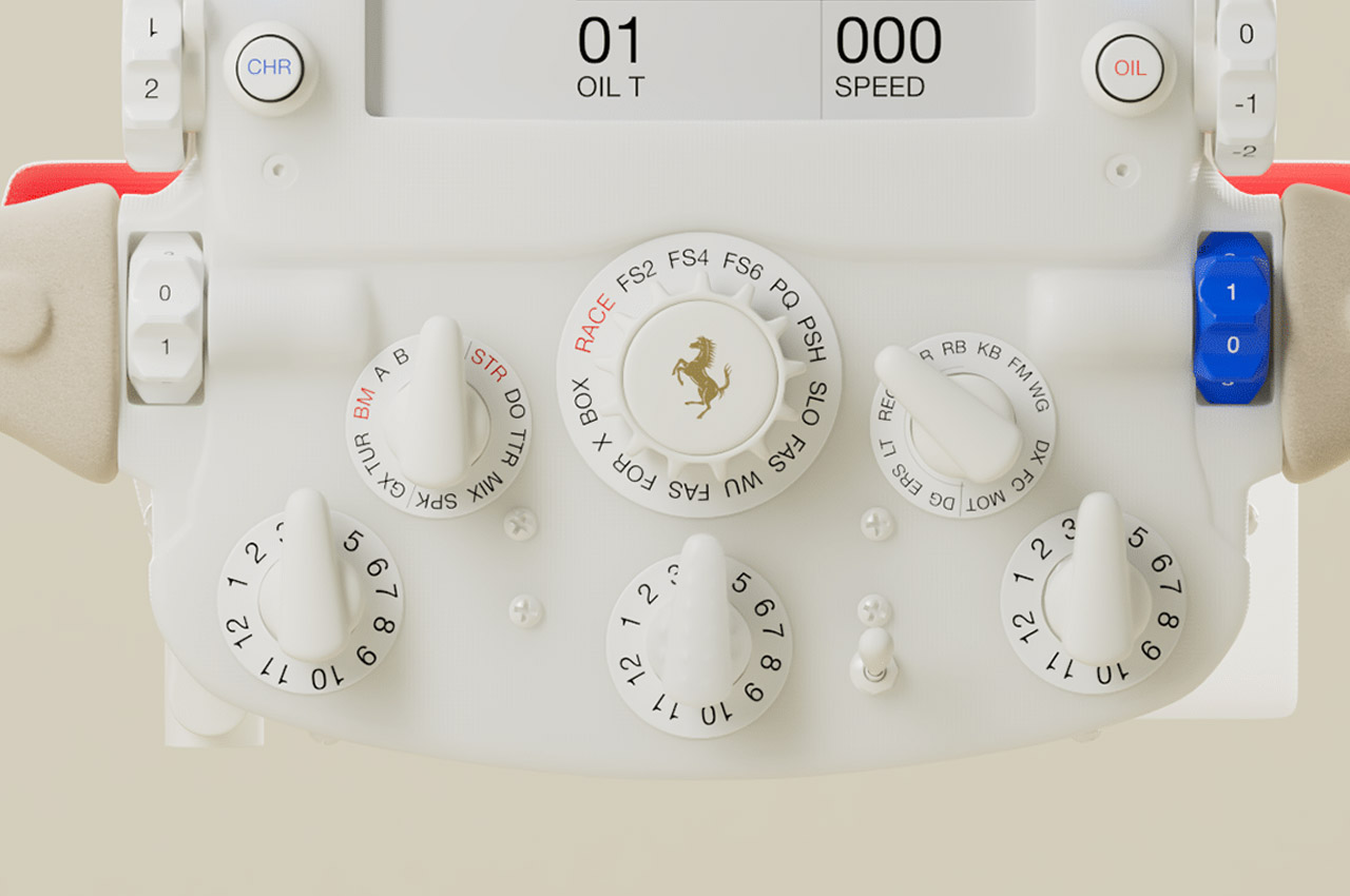
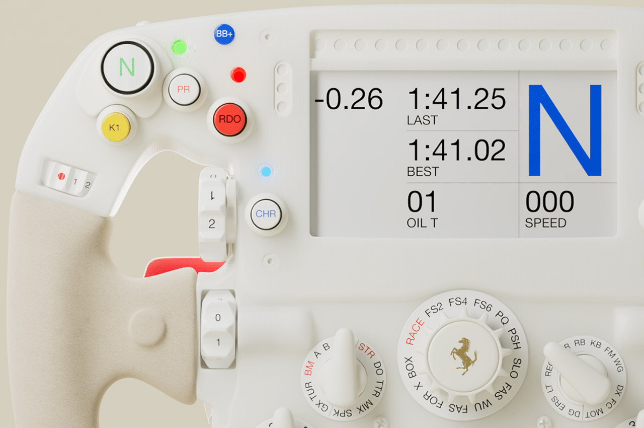
The button layout is so comprehensive it could just make the cut inside the Ferrari 2023 SF-23 F1 dashboard. Well, that’s an even bigger hypothetical stretch of imagination… but what’s stopping me. Alright, back to reality, the concept racing wheel will piquet the interest of F1 and supercar fans, since such advanced steering wheels are only made for circuit racing machines. Things like the pit lane speed limiter, current and best lap times, driving mode, or KERS battery charging status.

The use of light color shades of white and light brown matched with the signature blue, red and green of the Nintendo lends this concept a distinct appeal. Not only Switch titles but this Ferrari gaming controller would be fit for racing sims like Test Drive Unlimited, Forza Motorsport, or The Crew Motorfest.

The post Ferrari Nintendo steering wheel for intense racing action on and off the circuit first appeared on Yanko Design.
Nintendo Unveils OLED Model of the Switch, Bundled with Exclusive Zelda Content

Nintendo is set to launch its new OLED model of the popular Nintendo Switch gaming console on April 28. The new model will feature a larger OLED screen, improved audio quality, and a sleek new design. Additionally, it will be bundled with a special edition of The Legend of Zelda: Breath of the Wild game, titled The Legend of Zelda – Tears of the Kingdom Edition. The OLED screen is a significant improvement over the current LCD screen, offering higher contrast and more vibrant colors. The improved audio quality will be a welcome addition for players who value immersive sound…

The post Nintendo Unveils OLED Model of the Switch, Bundled with Exclusive Zelda Content first appeared on Trendy Gadget.

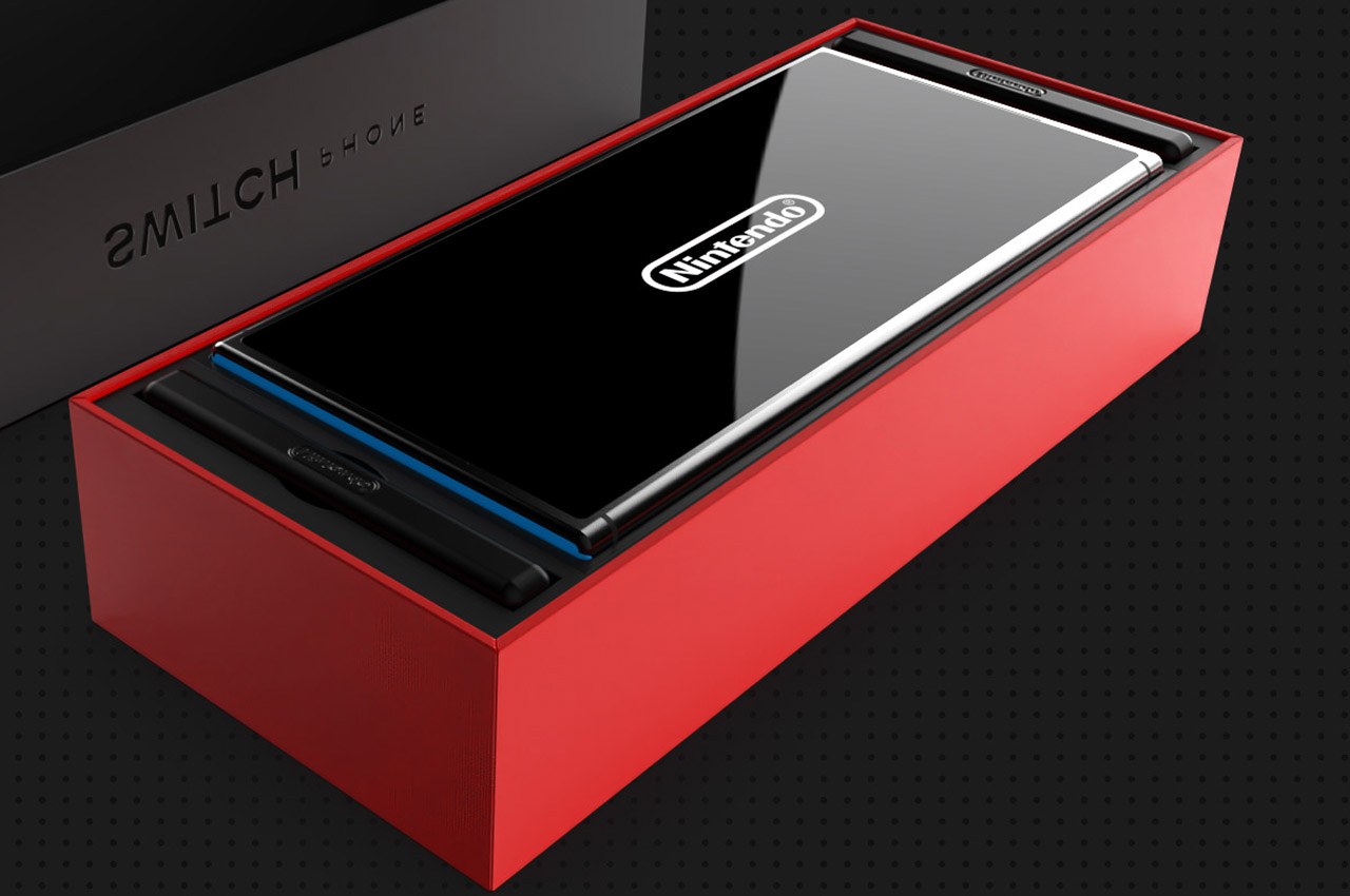
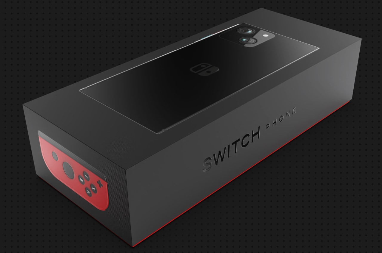
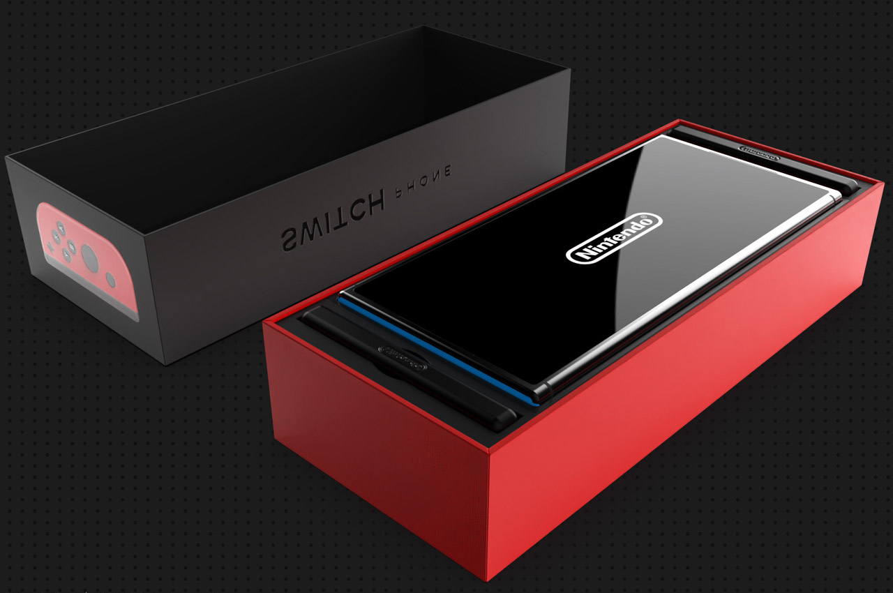
Nintendo Switch Phone is a capable gaming device and reliable daily driver fused into one

It’s been more than five years since Nintendo made a comeback with its hybrid gaming console dubbed Switch. Little did they know that gaming phones would mildly jeopardize their dominance in the space.

Even though factual arguments would shun the idea of any current gaming smartphone snatching the lion’s share from Nintendo, a capable mobile device could be a real threat in the coming years. So, why shouldn’t Nintendo annihilate any threat before it becomes a major irk?

Designer: Ivan Llaneza

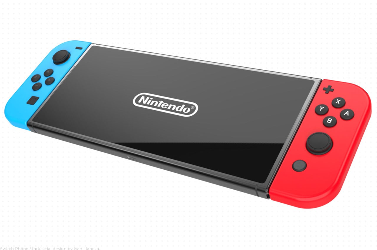
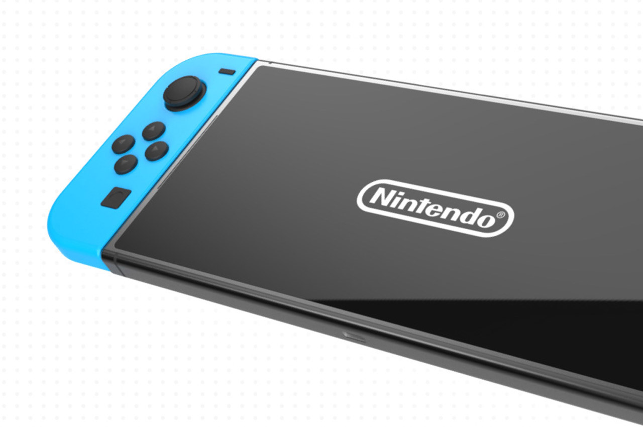
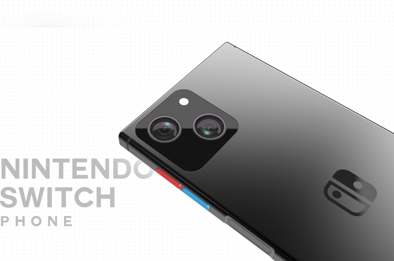
The Nintendo Switch Phone is an idea culminating from the need of having a portable gaming device that doubles as a smartphone when not playing games. For someone like me who appreciates the kind of titles available for mobile gamers, but still craves the next big leap to a Switch, this concept has reasons enough to meet fruition someday.

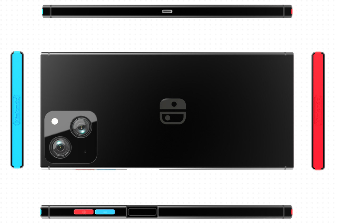
The IP68-rated device sporting a 7.1-inch OLED display (120Hz LTPO panel) is capable of playing Nintendo’s best titles courtesy the Qualcomm’s latest and greatest Snapdragon 8 Gen 2 processor. That big display and the graphics-intensive titles require a capable power source, hence, the 7000mAh battery paired with a 60-watt fast charger makes complete sense.

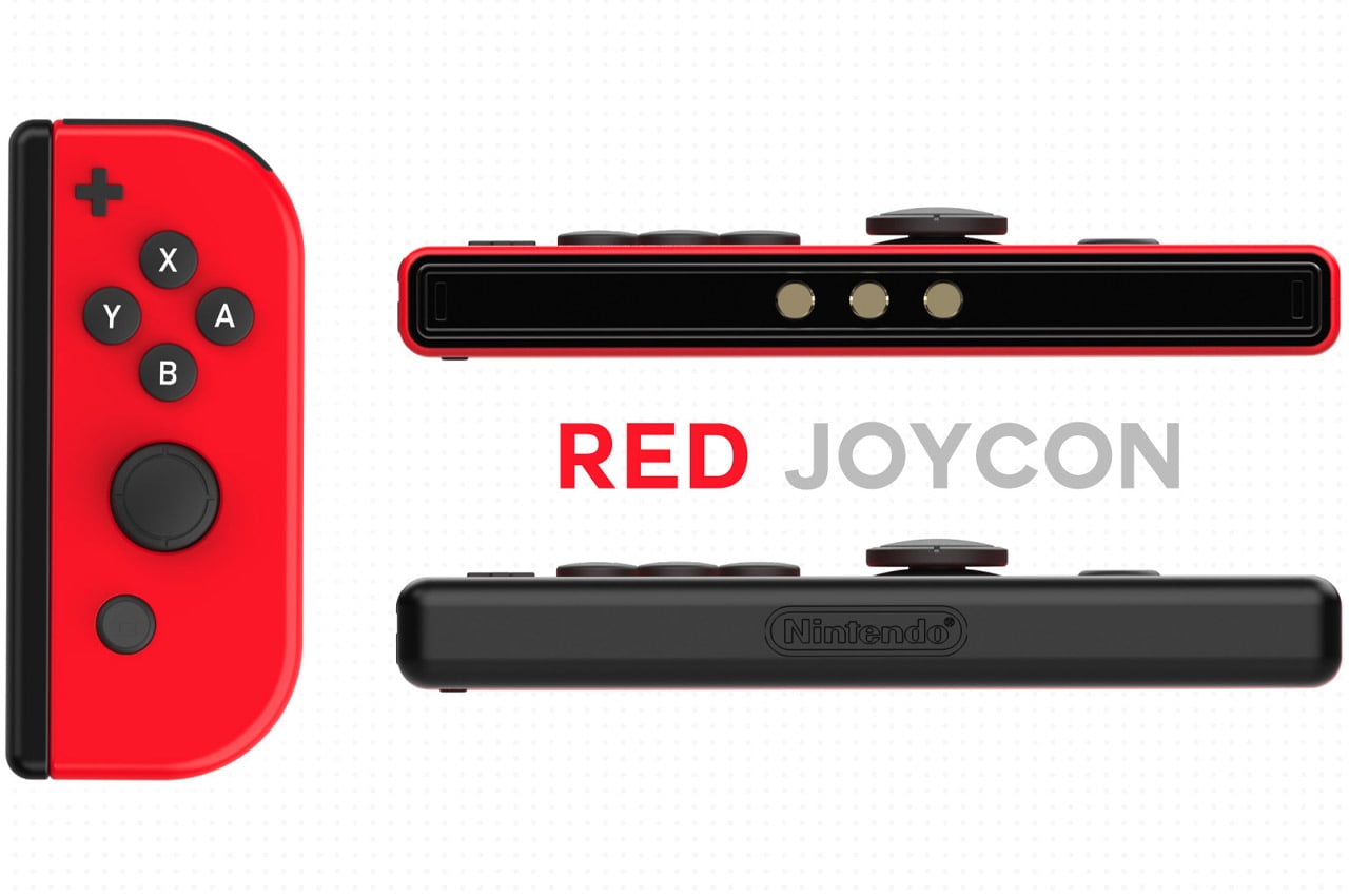
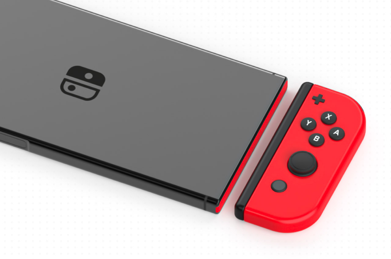
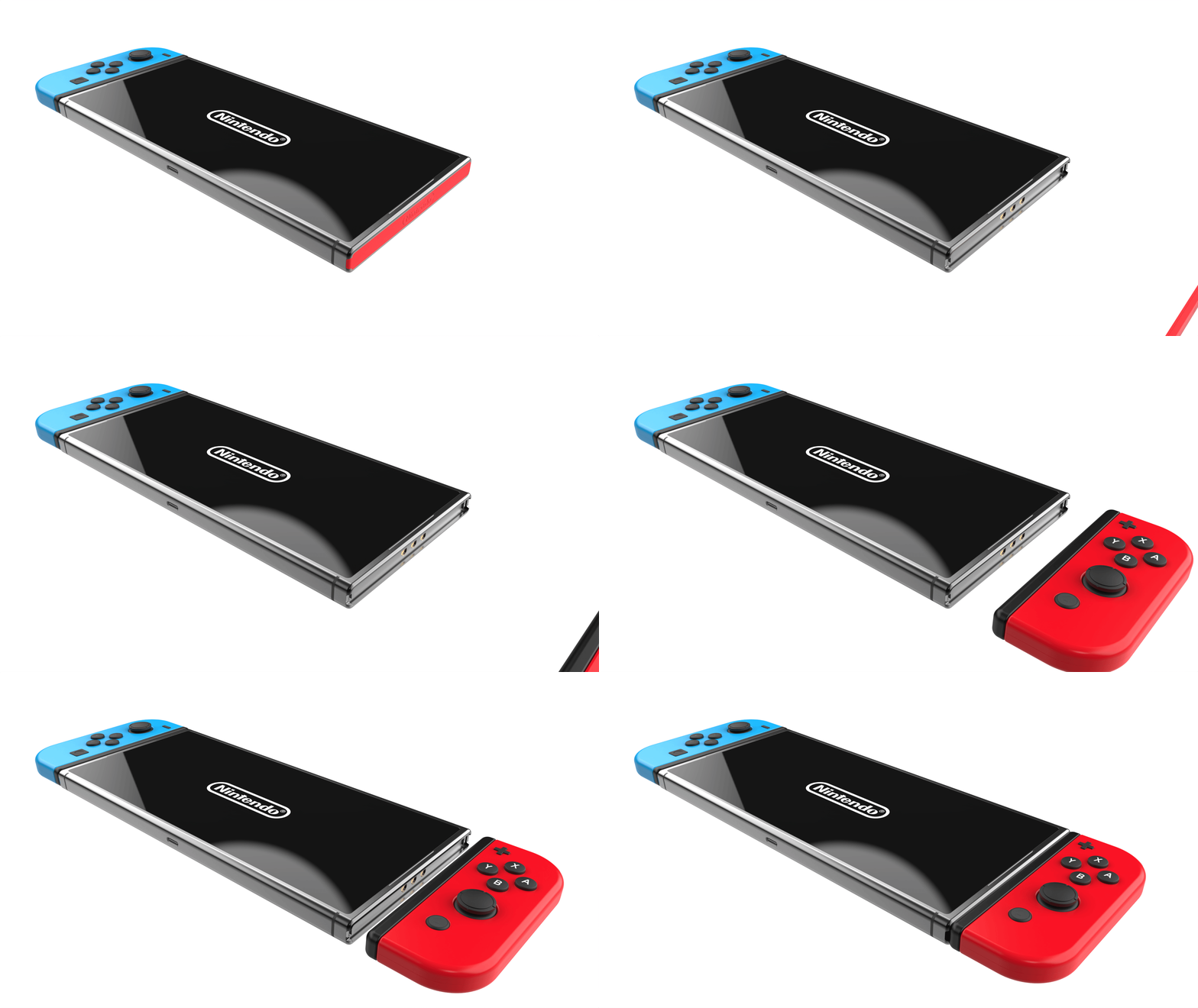
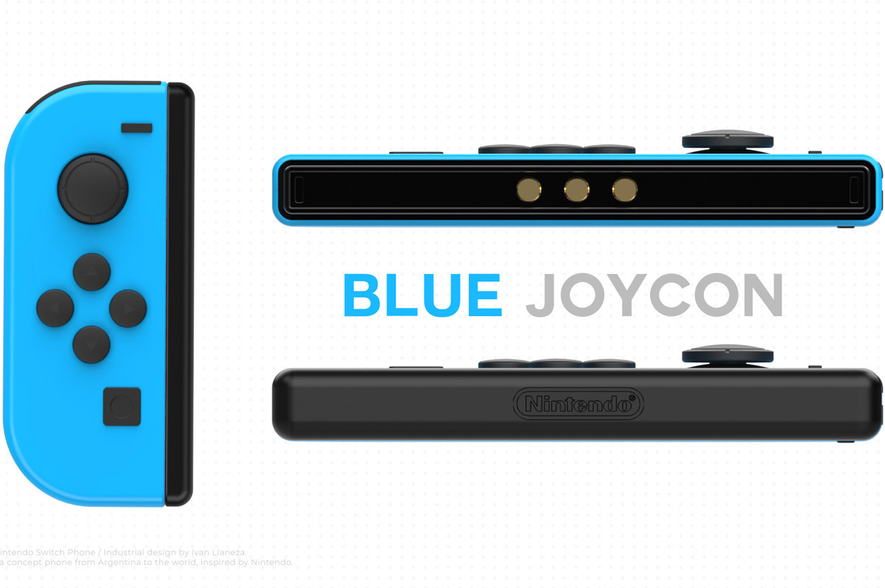
While all these above-mentioned specifications might seem normal to a gaming freak, those magnetic Joy-Cons will gravitate interest. When you’re in the mood for gaming, the attachments seamlessly hook onto the phone and instantly turn it into a portable gaming device. The gadget is far better than a gaming phone or modern mobile gaming controllers for powerful smartphones. Both the blue and red Joy-Cons have a system lock at the back to keep the whole unit in one piece as gaming action intensifies. When using the mobile device as a daily driver, the lids conceal the exposed magnetic tethers.

Both aesthetically and functionality-wise, the Nintendo Switch Phone makes complete sense in a world crowded with similar-looking phones, gadgets and the accompanying accessories. While we may never see such a phone released by Nintendo, still it lets us cling to the idea of this concept design!

The post Nintendo Switch Phone is a capable gaming device and reliable daily driver fused into one first appeared on Yanko Design.
Android gaming handheld is a throwback to the venerable Nintendo DS

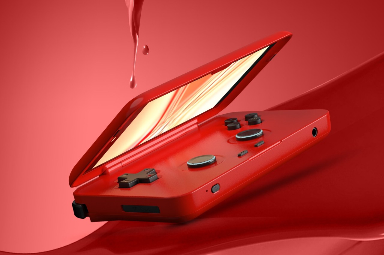
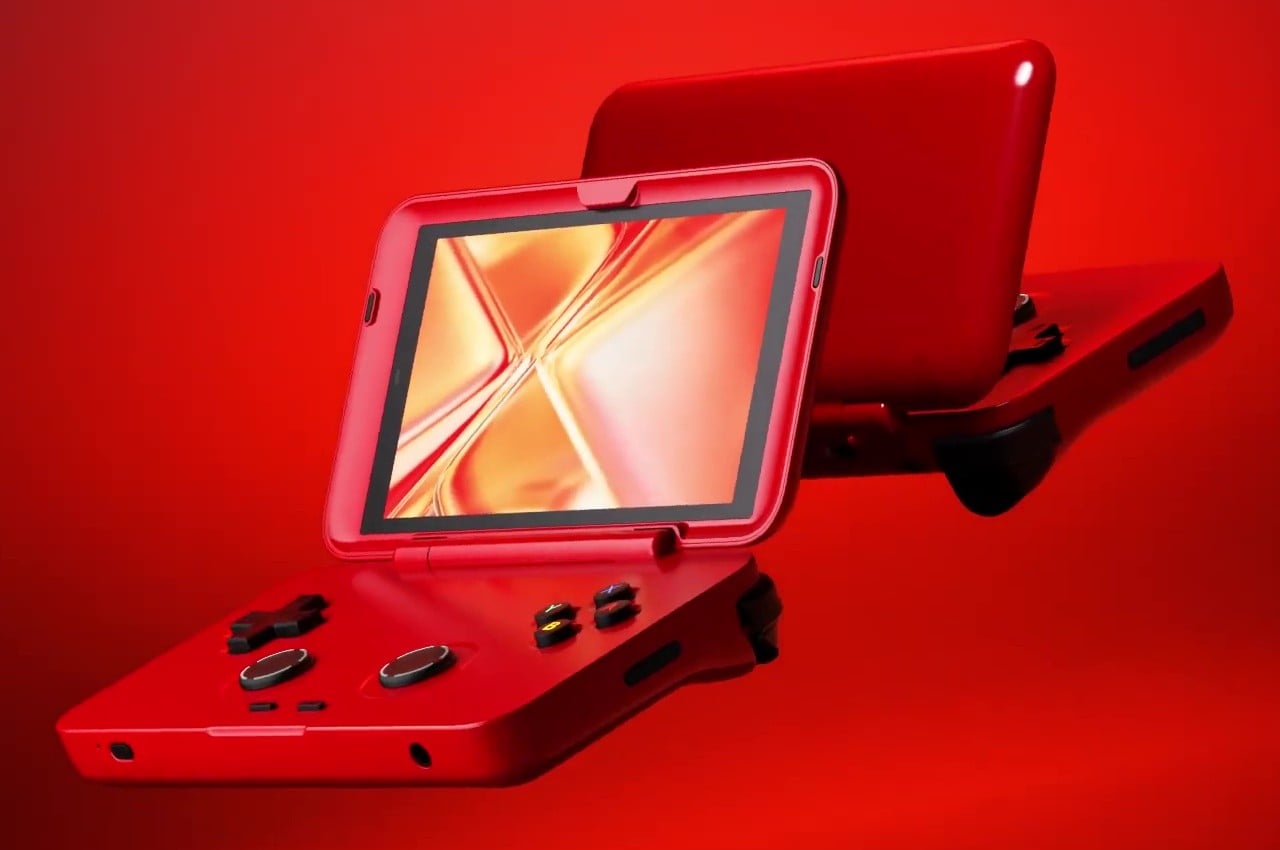
It seems to be the age of gaming handhelds once again. With the continued success of the Nintendo Switch, all sorts of portable gaming devices have popped up, ranging from PCs like the Steam Deck to dedicated Android gaming devices like the Logitech G Cloud and the new Razer Edge. Although they have actually been around far longer than these, more obscure handhelds have become more prominent because of this industry trend. Some require you to do the work of cobbling up the pieces together, while others sell a more finished product instead. The latter is the case for the latest device to hit the market, one that eschews the trending Switch form factor for something that gives a nod to Nintendo’s previous top-selling portable.

Designer: Retroid Pocket

The Nintendo DS had a very good run in the gaming market, replacing the iconic Game Boy with a portable machine that got on with the times. It featured a revolutionary (for that time) dual-screen clamshell design that truly felt like a new breed rather than a Game Boy just folded in half. Almost two decades later, that design has become antiquated, but it’s exactly that nostalgia that this look-alike is aiming for.

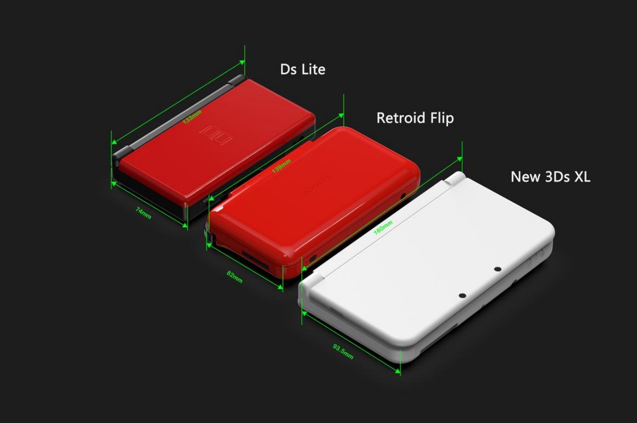
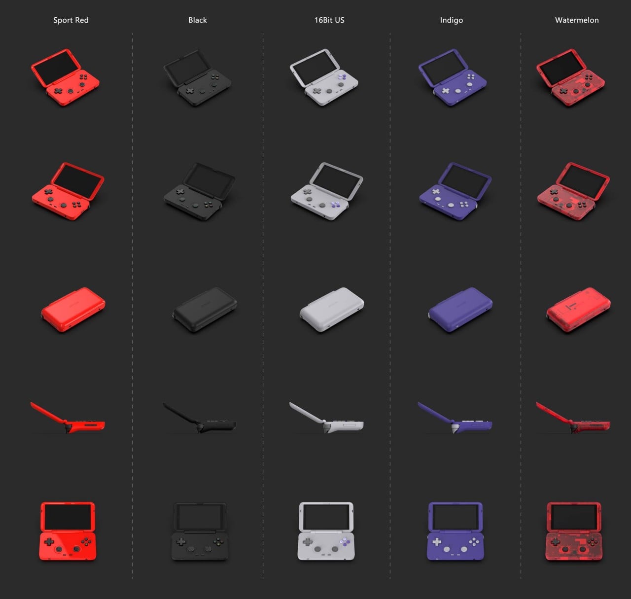
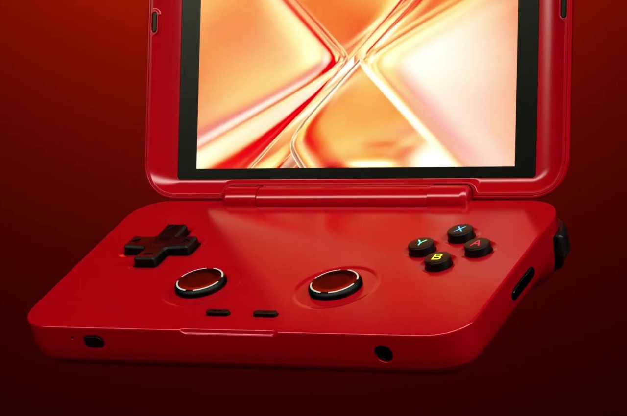
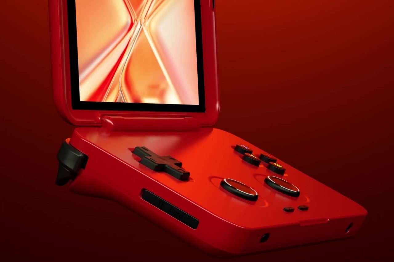
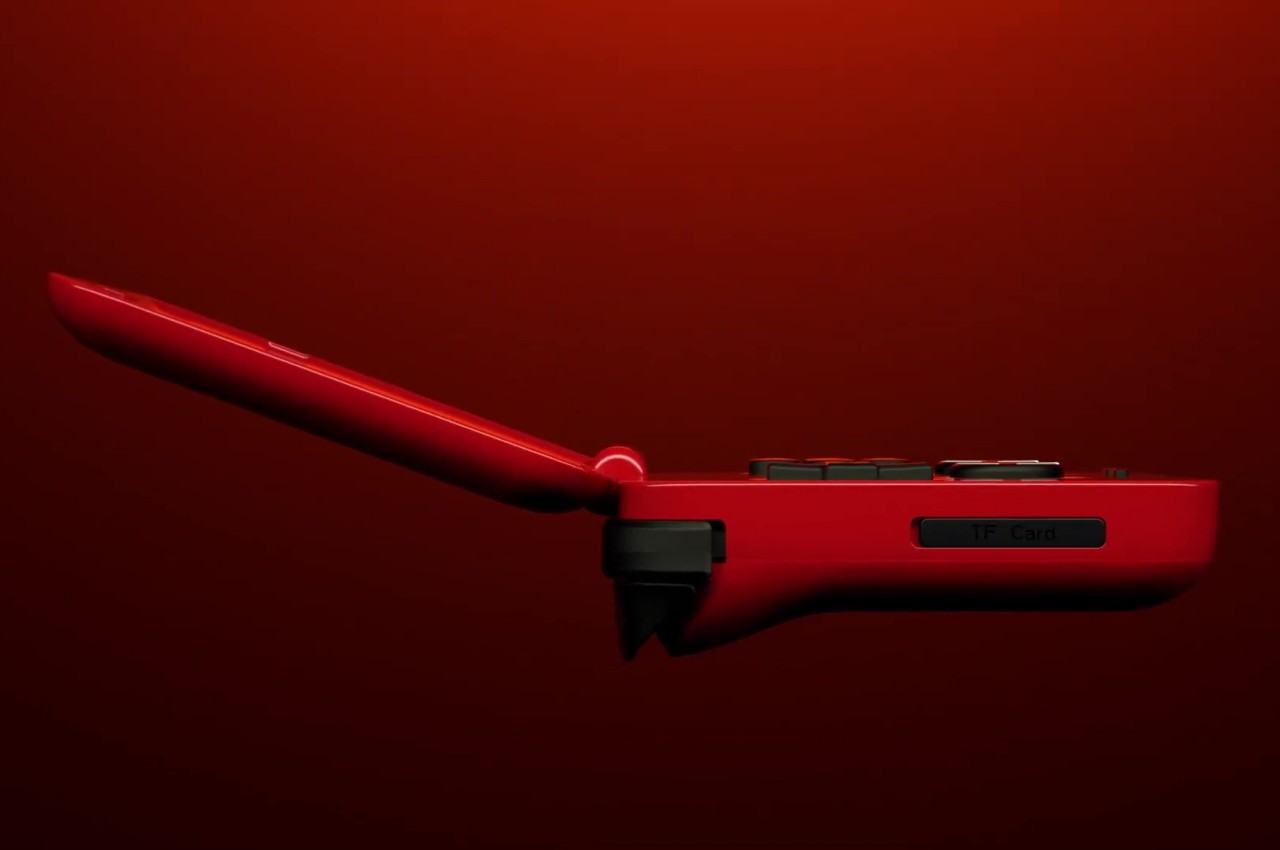
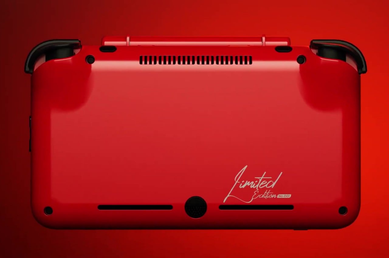
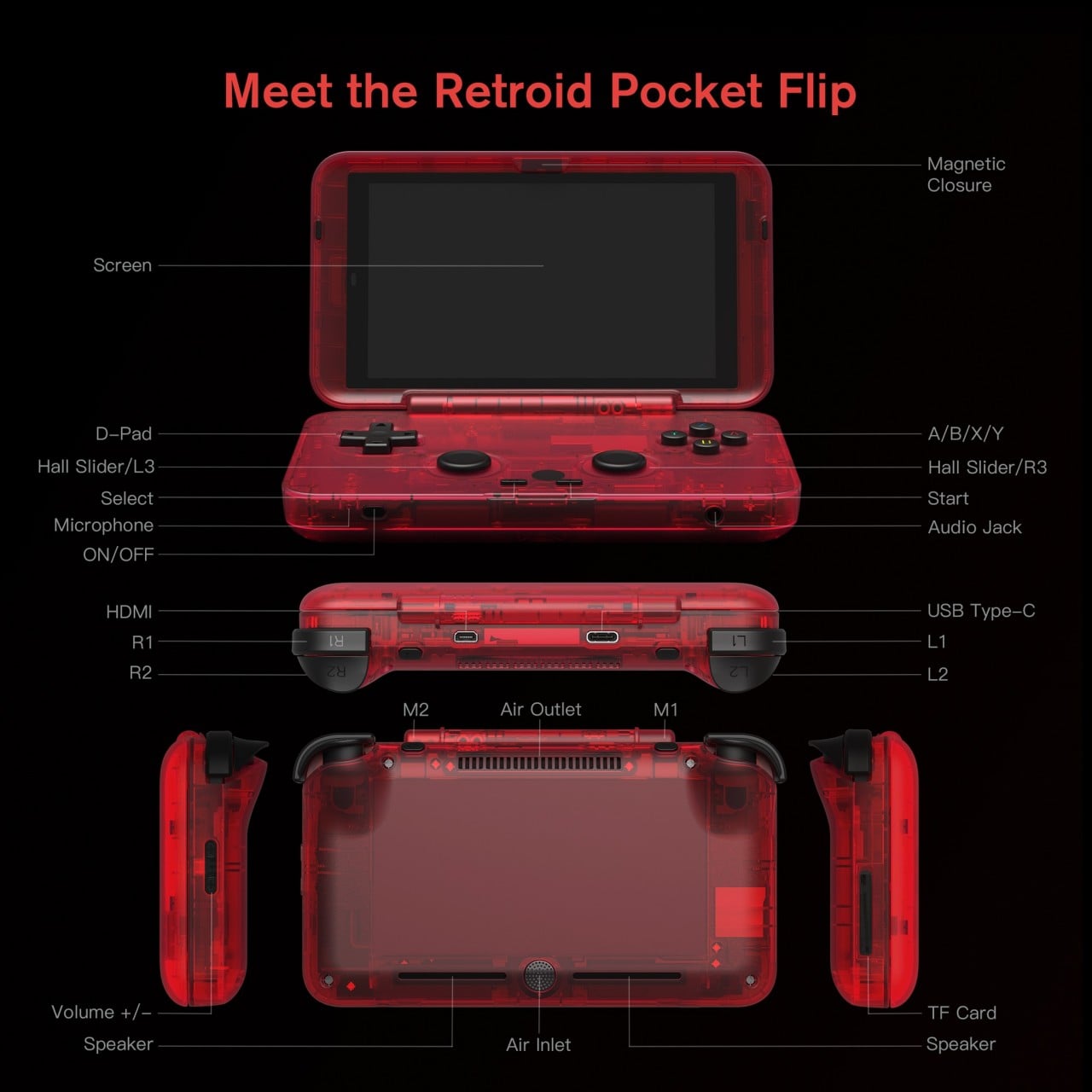
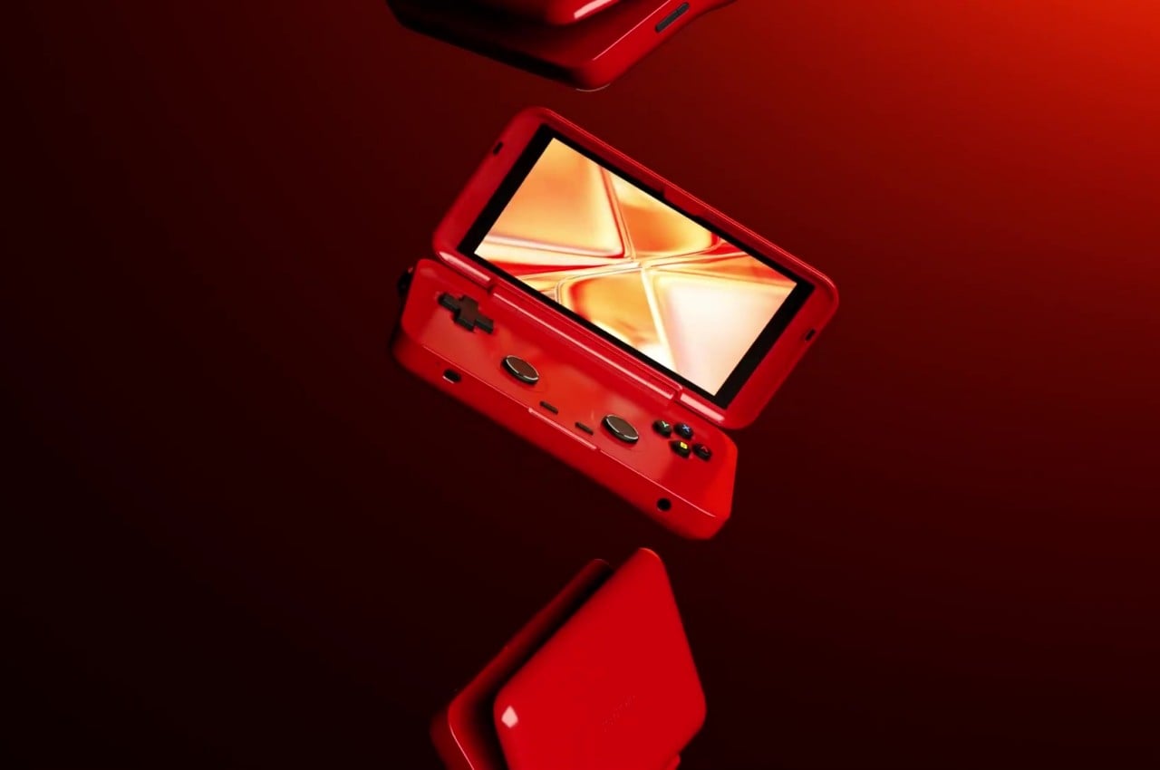
Granted, the Retroid Pocket Flip is more like a cross between the DS and the GBA SP, having a single screen only and with a more horizontal clamshell design. It almost has the best of both worlds, with a more conventional and more comfortable form factor and a wide screen that is more common with games today. Despite its old-fashioned looks, it does stick to modern gaming features, including the basic set of controls, such as both bumper and trigger buttons.

One advantage that a clamshell design has over something like the Nintendo Switch is that you can set the angle of the screen independently of your hands. You also automatically have a protective case for the device and don’t have to worry about the screen getting scratched and the controls snagging in your bag. The design also tends to be more compact, though it does get thicker compared to a flat handheld device.

That said, the Retroid Pocket Flip is pretty much an Android device, so you might have to debate whether having a dedicated gaming device separate from your phone is worth the cost. Not all Android games are also controller-friendly, and using the touch screen, in this case, is ironically more cumbersome. Still, if you’re an avid Android gamer that uses a controller most of the time, this charming throwback could be something worth adding to your collection.

The post Android gaming handheld is a throwback to the venerable Nintendo DS first appeared on Yanko Design.
This ergonomic Nintendo Switch concept was inspired by a classic video game baddie

Although it was hardly the first portable gaming console, the Nintendo Switch undeniably re-ignited a gaming market that was ready for something novel and mobile. In terms of raw power, it couldn’t stand up against its Xbox and PlayStation contemporaries, but its portability and flexibility quickly endeared it to the current generation of gamers and their more itinerant lifestyles. Over the years, however, the design flaws of the Switch’s form surfaced, particularly when it came to the comfort and ergonomics of the handheld device. Since Nintendo itself doesn’t seem keen on addressing those pain points, third-party manufacturers and designers have taken upon themselves the task of coming up with solutions, some more unconventional than others. This concept, for example, retains the basic Switch design but puts a unique twist that also ends up making it look a little bit more interesting.

Designer: Duncan Crosse

The innovation that the Nintendo Switch brought to the gaming world was its ability to be a handheld gaming device as well as a home console in one. The secret sauce is, of course, the removable Joy-con controllers that opened a whole new world of use cases, including a pair of exercise equipment. For all the advantages that they brought, the Joy-cons lacked that final polish when it came to ergonomics. It wasn’t exactly terrible, but gamers could definitely feel the strain after a few hours.

Third-party accessory makers started pushing out Joy-con alternatives, some with Nintendo’s blessing even, that tried to improve that aspect of usability. The designs vary slightly, but the basic concept remains the same. By changing the shape of the Joy-cons to match the shape of typical game controllers, the Switch’s comfort can be improved significantly. This concept design, however, challenges that assumption by changing not the shape of the Joy-con but only its vertical position.

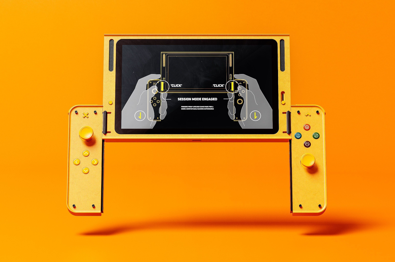
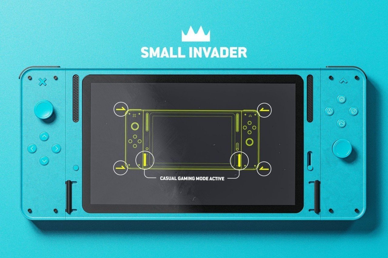
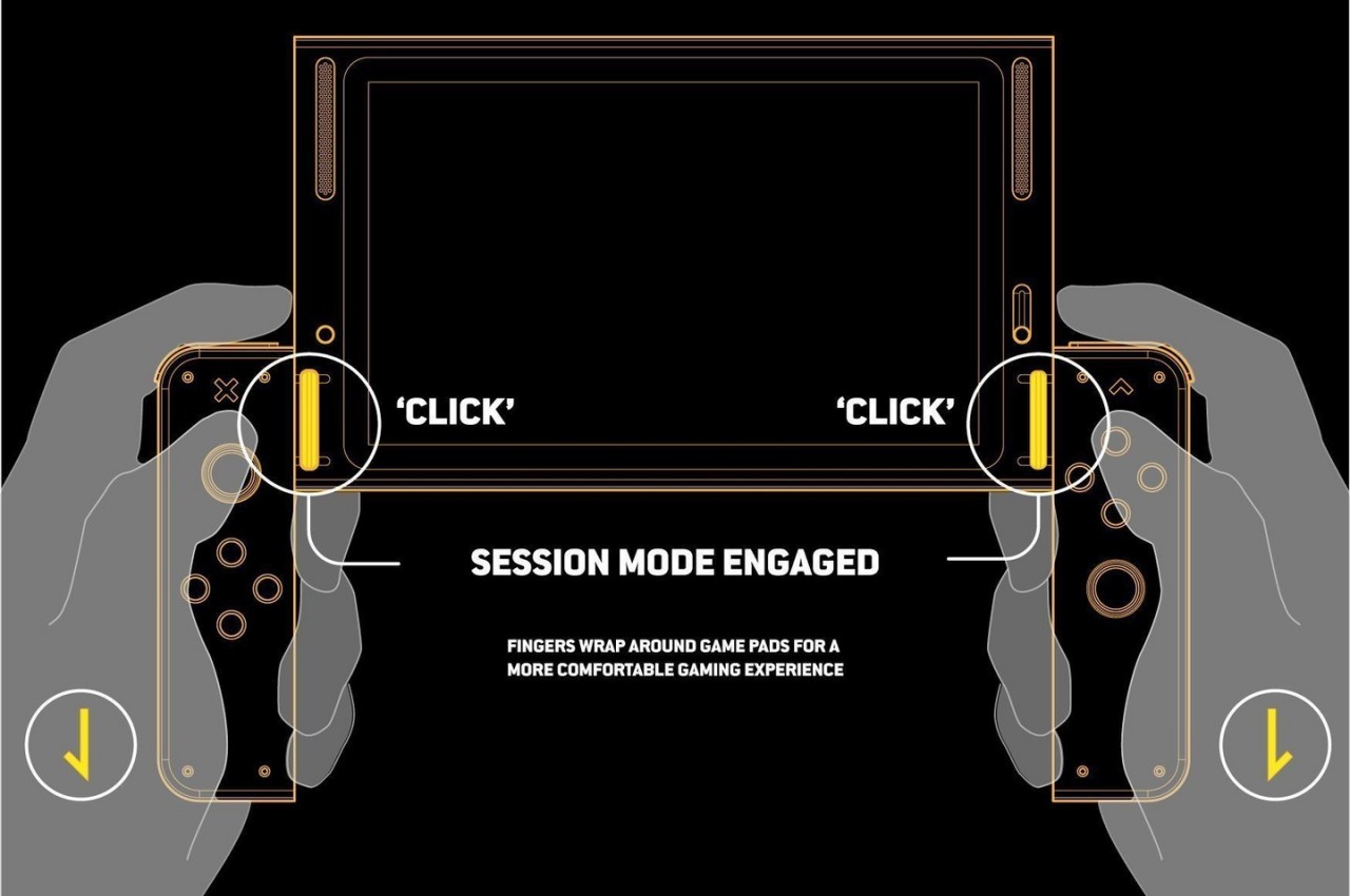
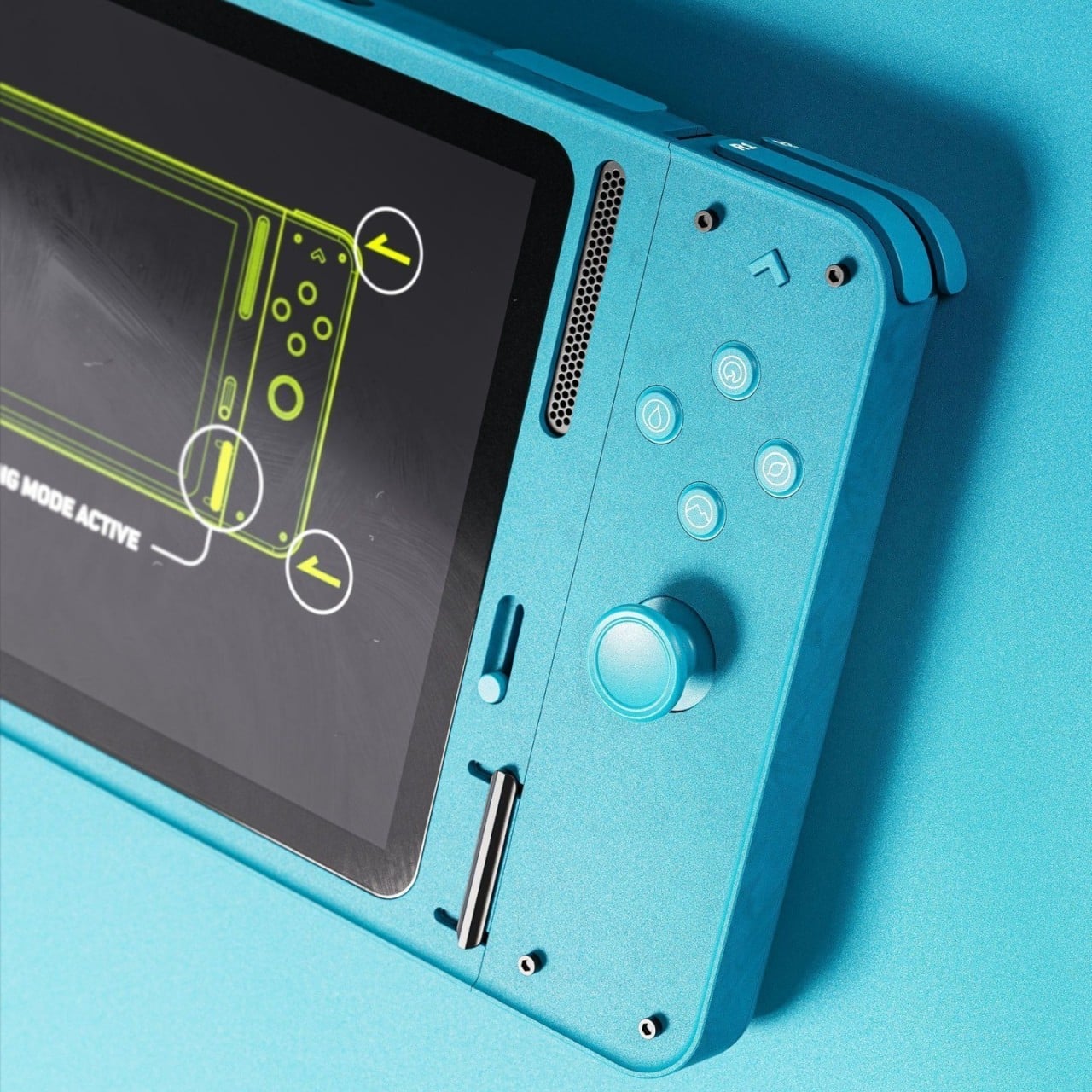
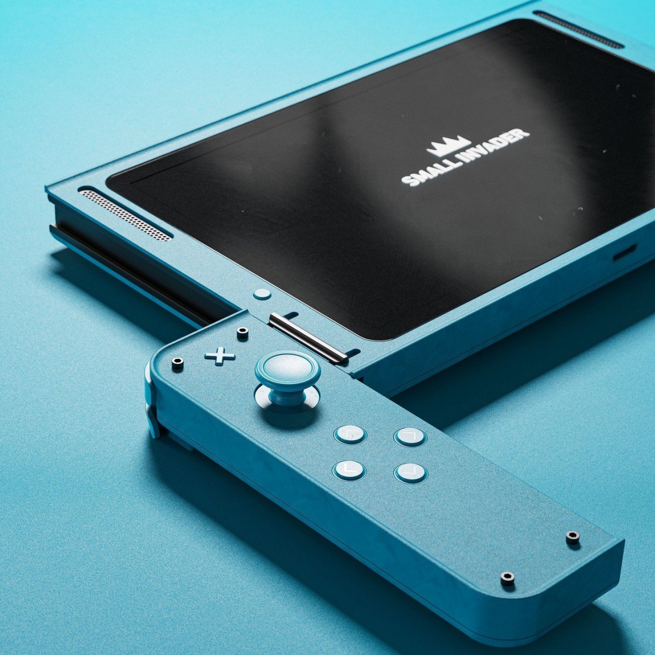
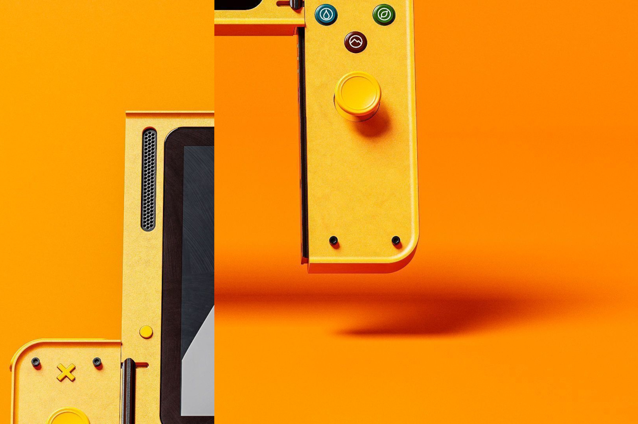
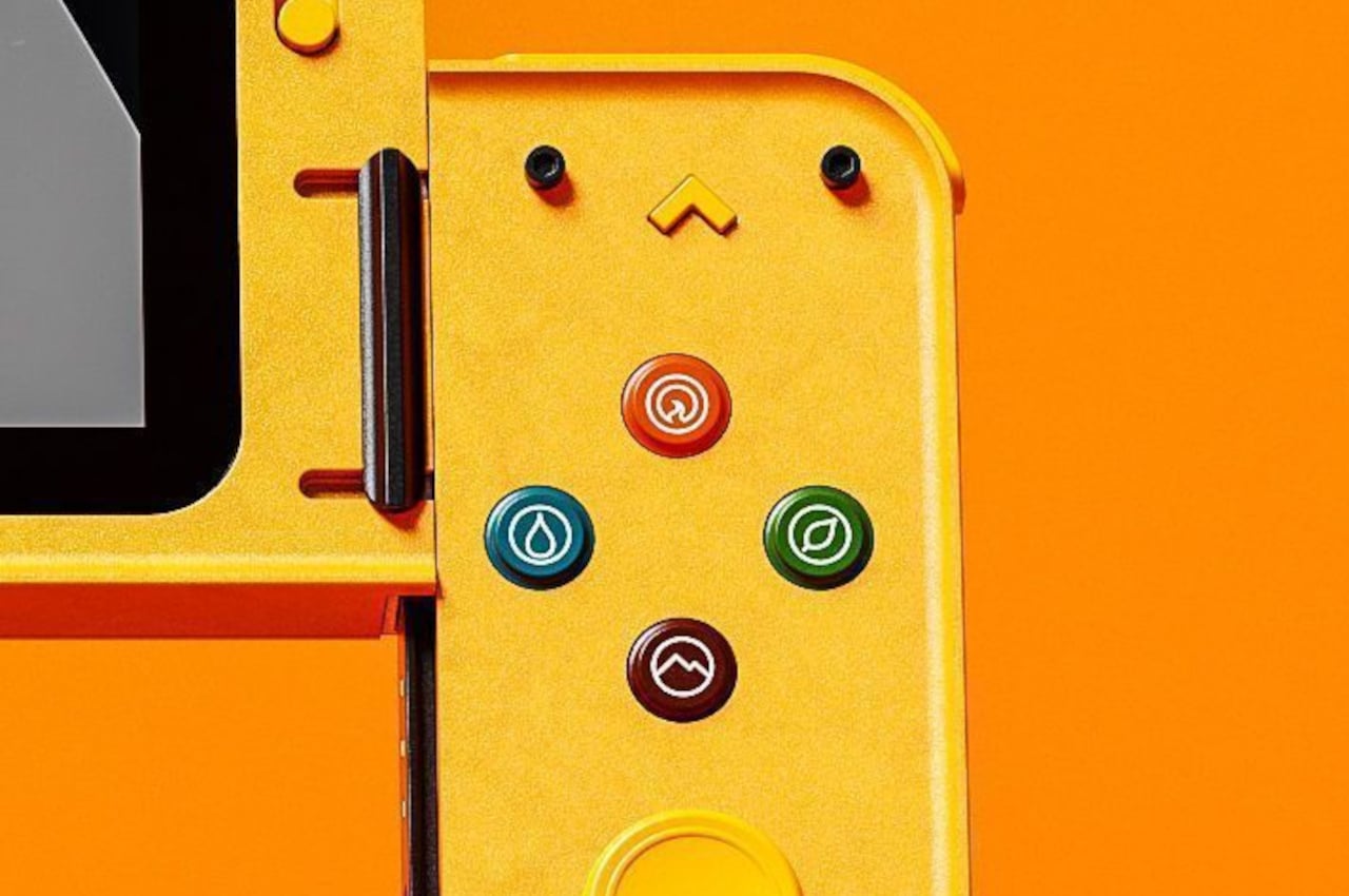
Named after one of the enemies of the iconic Invaders computer game, the Small Invaders design concept only makes a single adjustment to the Switch’s structural design. It adds an additional “Session” mode where the Joy-cons can sit lower down the side rails of the main Switch body. This creates a way for the player’s fingers to wrap around the Joy-cons, similar to how they would wrap around the bulges of conventional gamepads. That said, the device could still be used normally in a “Casual” mode where all three parts are aligned perfectly. The design also throws in small details that will delight Nintendo fans, like the use of element icons for the buttons, a nod to Pokemon’s four basic types.

With this concept, there is no need to change the somewhat flat design language of the Nintendo Switch. In fact, the Small Invader design takes that even further by applying some design cues inspired by Teenage Engineering, particularly with the use of clean geometric shapes. Of course, Small Invader would require a re-engineering of how the Joy-cons physically connect to the Switch, so it’s never going to happen. Still, it’s a worthwhile thought exercise that actually resulted in an interesting and fun design that we do wish would become a reality.

The post This ergonomic Nintendo Switch concept was inspired by a classic video game baddie first appeared on Yanko Design.
NinDoio is a fun-looking device for leveling up your productivity game

Every year, more people have to sit in front of computers for work or sometimes even for leisure. While some jobs might be simple enough to get by with the basics of word processing or spreadsheets, a lot require more complex processes and multiple steps, not to mention the use of a variety of software to get the job. That’s even more true for those involved in digital content creation, whether they be designers, programmers, writers, or even streamers. The number of actions they need to take can be overwhelming, especially when you have to navigate around the computer screen to get to those. It would definitely be a great deal if you could press just one or a few keys to get things done, which is what this device tries to do in a way that almost makes it feel like you’re playing a game.

Designer: Megalodon

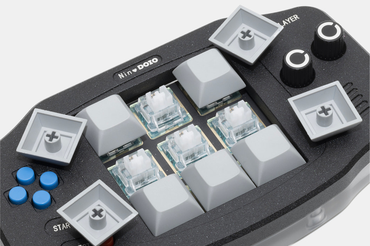
There are about a hundred keys on a computer keyboard, more or less depending on the layout and the device. That gives you a variety of ways and nearly endless possible combinations to trigger actions like launching an application, undoing an edit, or rendering an animation. That flexibility, however, also comes at the cost of complexity, especially when it comes to remembering which key combinations do which actions on which applications. There are a variety of tools today that try to simplify that task, but Megalodon’s NinDoio adds an element of fun to what is really serious business.

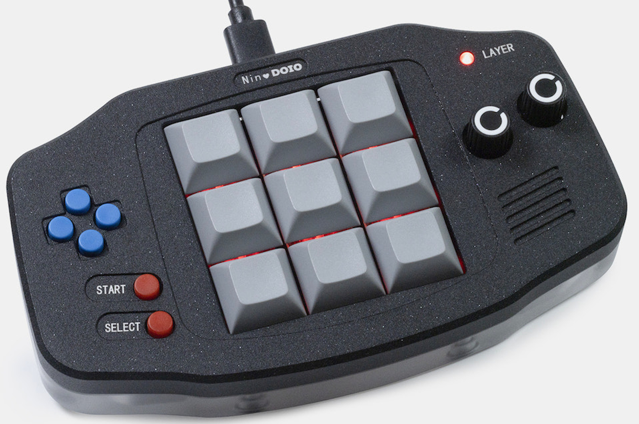
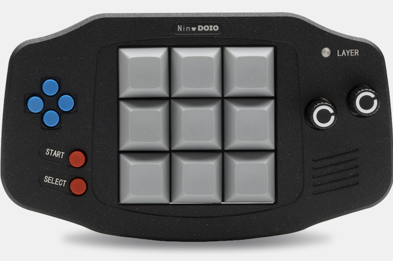
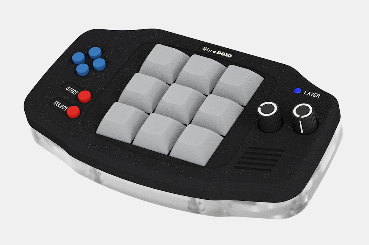
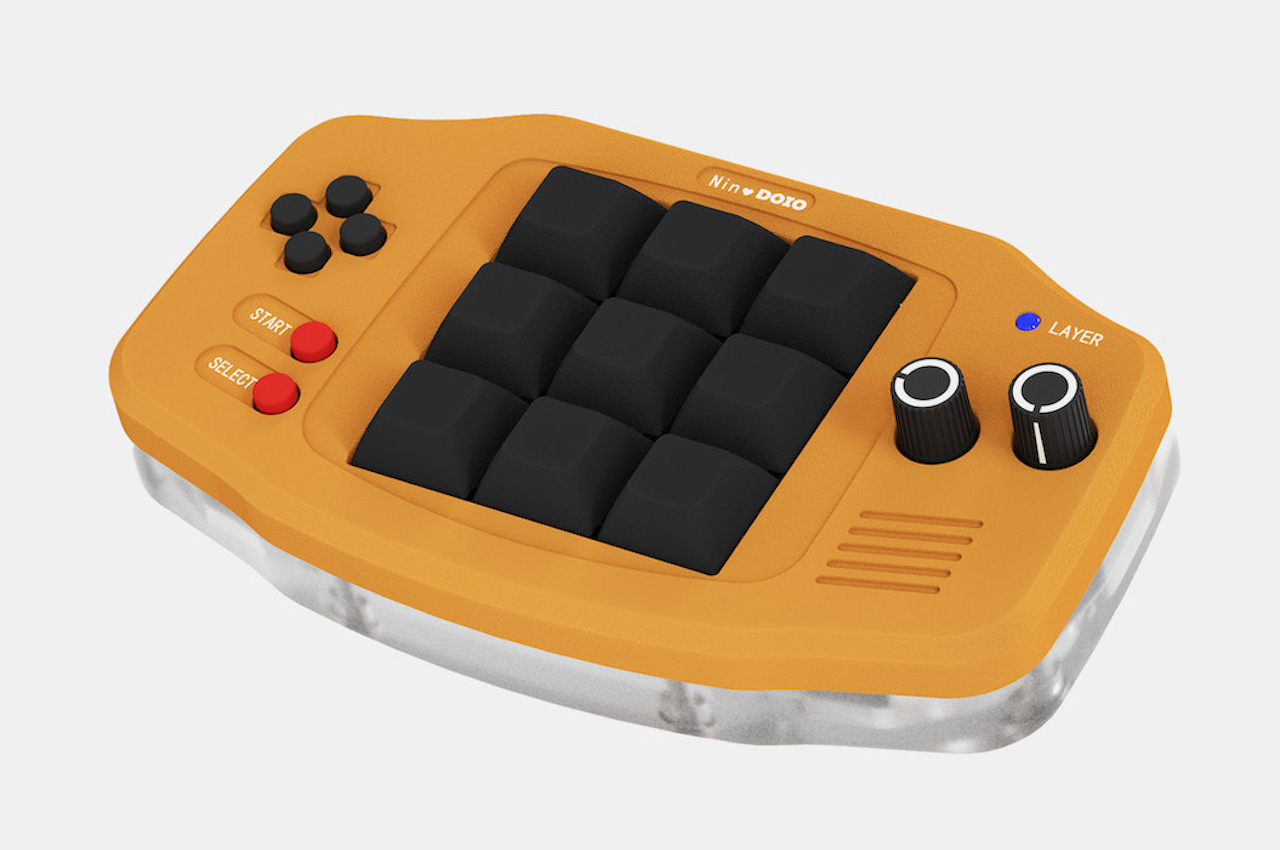
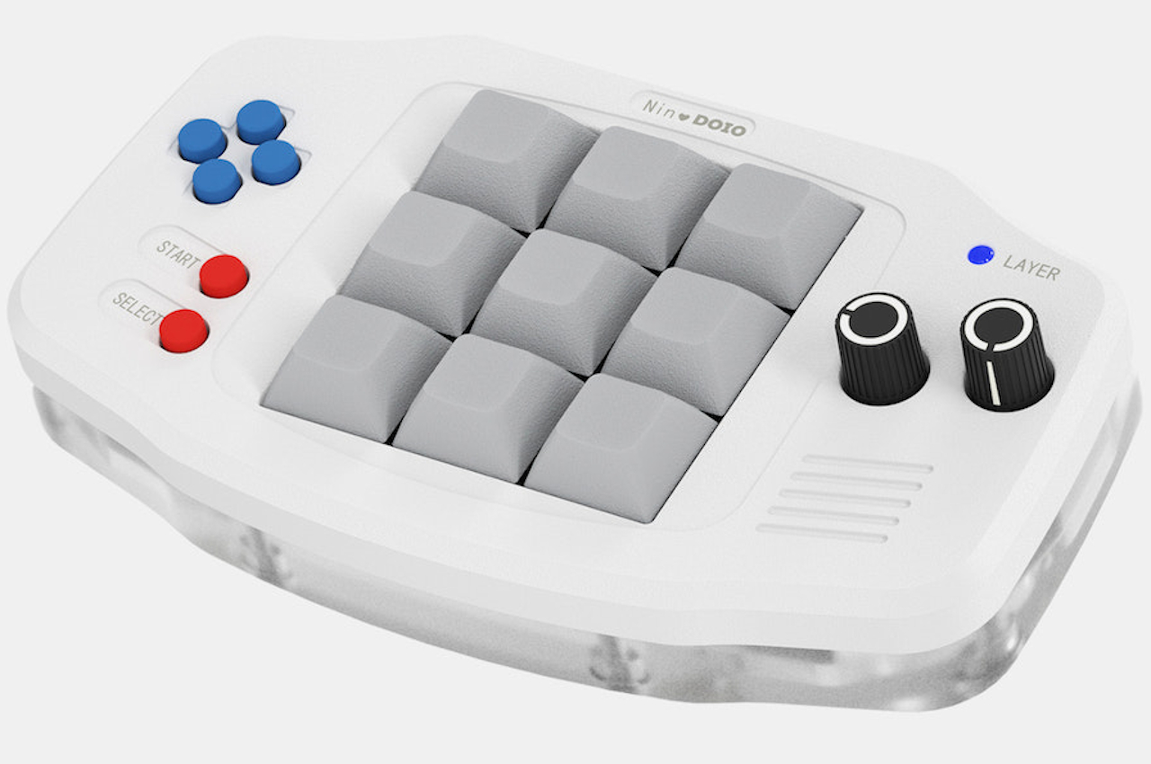
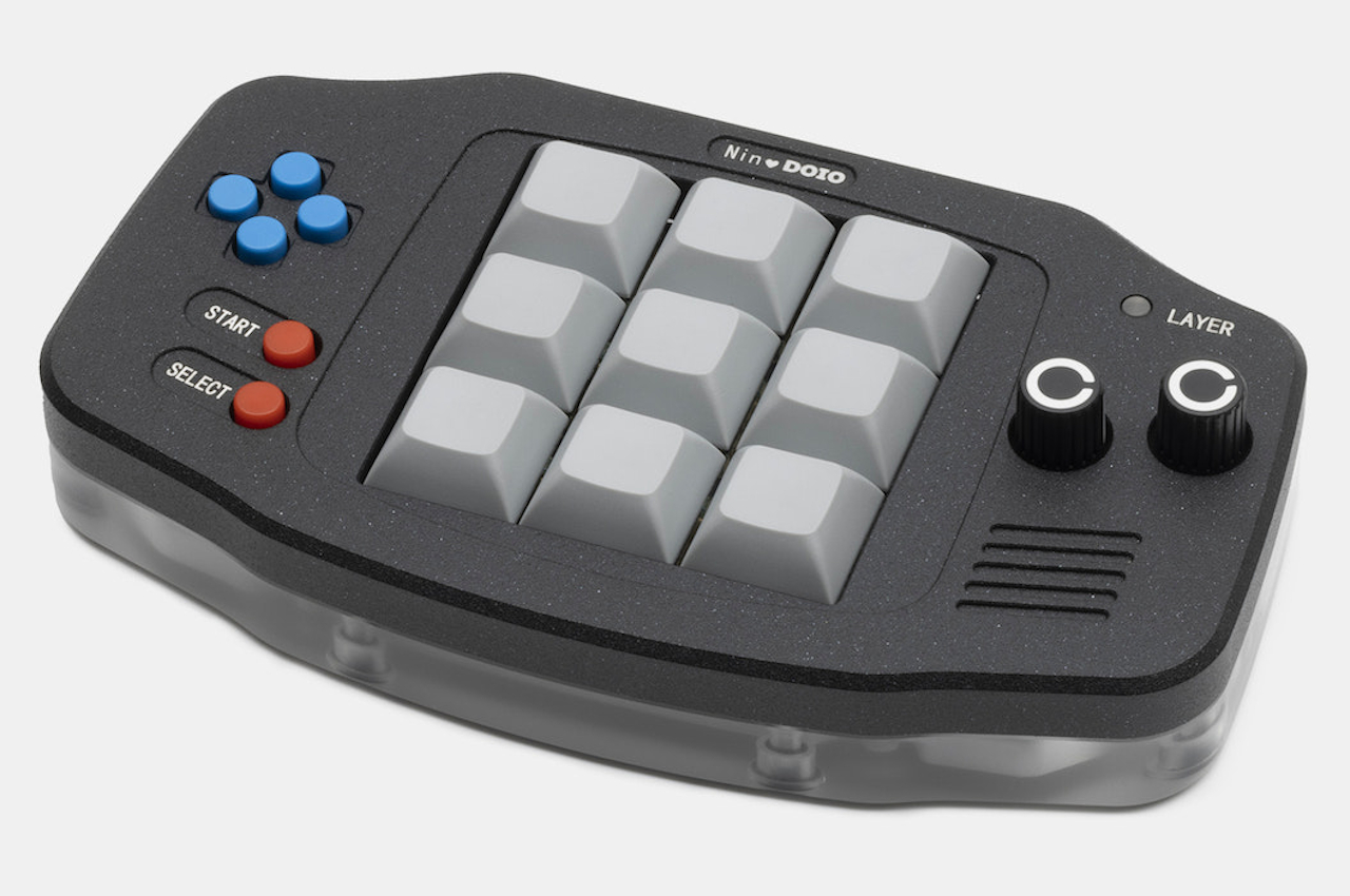
What makes the NinDoio different from many “macro pads,” as they are called, is that it looks more like a toy rather than a productivity tool. In fact, it looks very much like a Nintendo Game Boy Advance, which is definitely the inspiration for its design as well as its moniker. Regardless of the name and shape, it still delivers the same power as any macro pad does, which is to map a single button or key to an action. For example, you won’t have to memorize the combination for “undo” when you can just press a single button that you’ve committed to muscle memory.

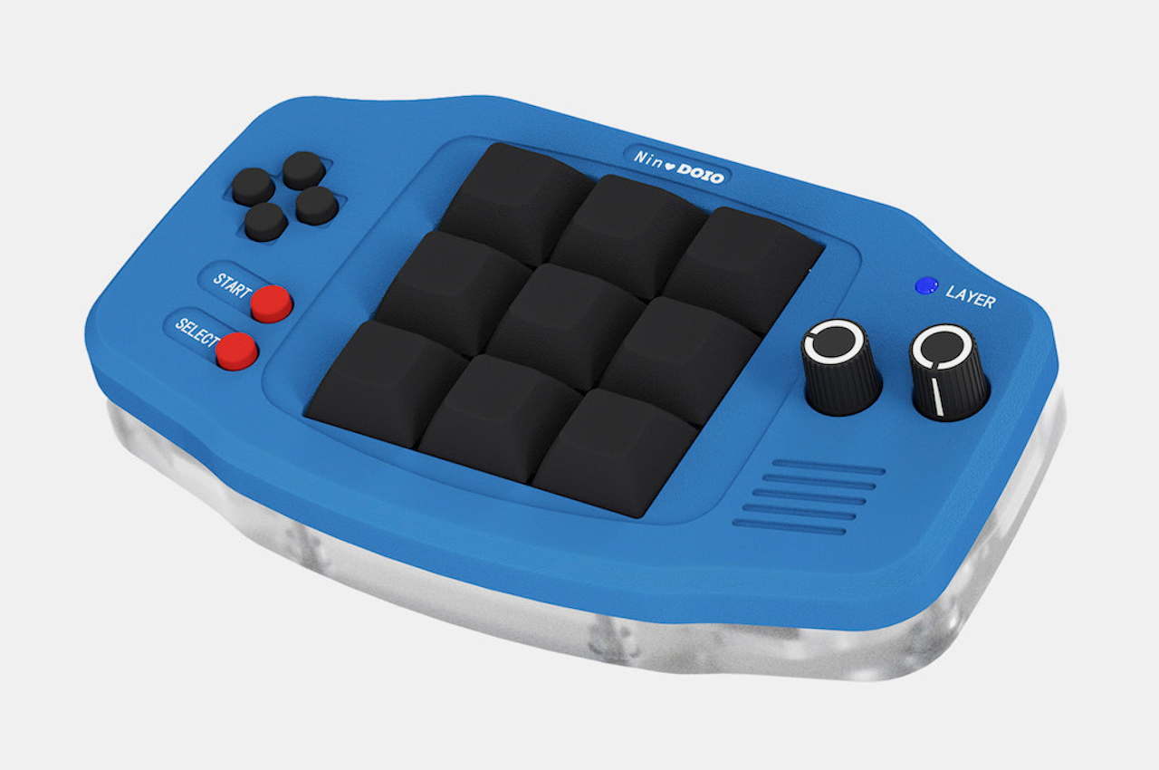
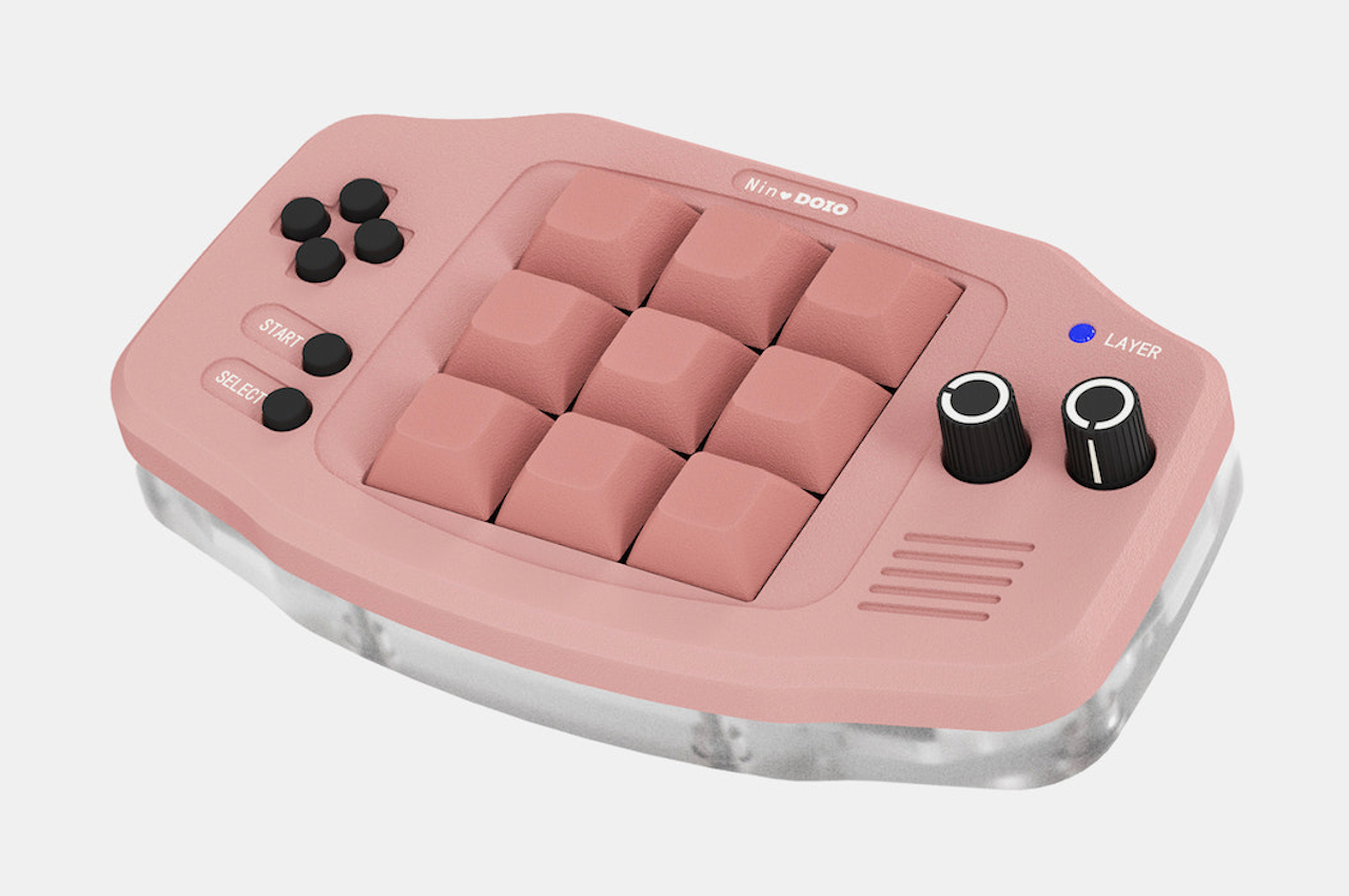
Unlike a simple grid of keys, the NinDoio adds a few controls you’d associate with gaming devices and controllers. Four of the buttons, for example, are arranged in a cross like a D-pad, while two are labeled Start and Select, even if they can be assigned to unrelated actions. The two knobs on the right can be mapped to actions like scrolling a page or changing the size of a brush. They can also be pushed like regular buttons, though, which adds another layer of functionality to them.

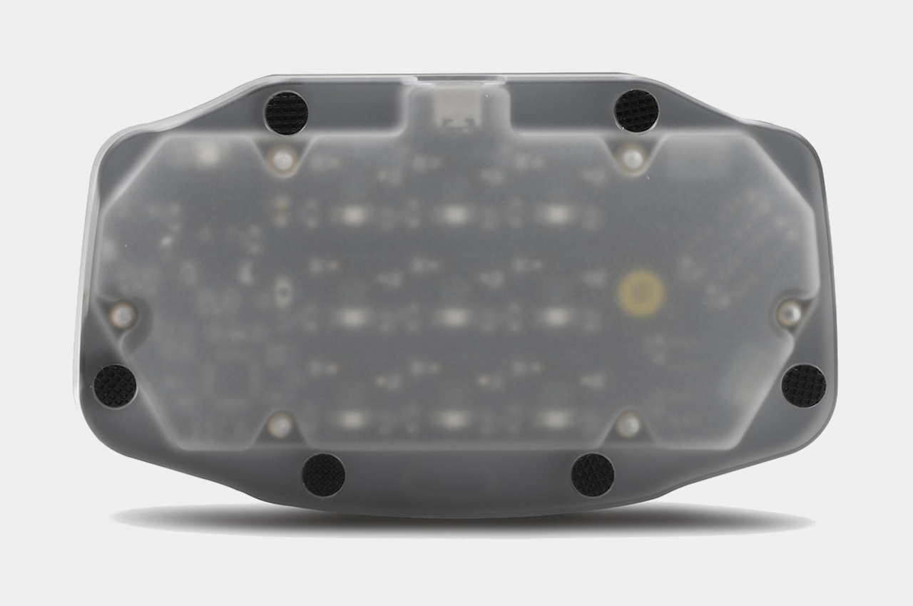
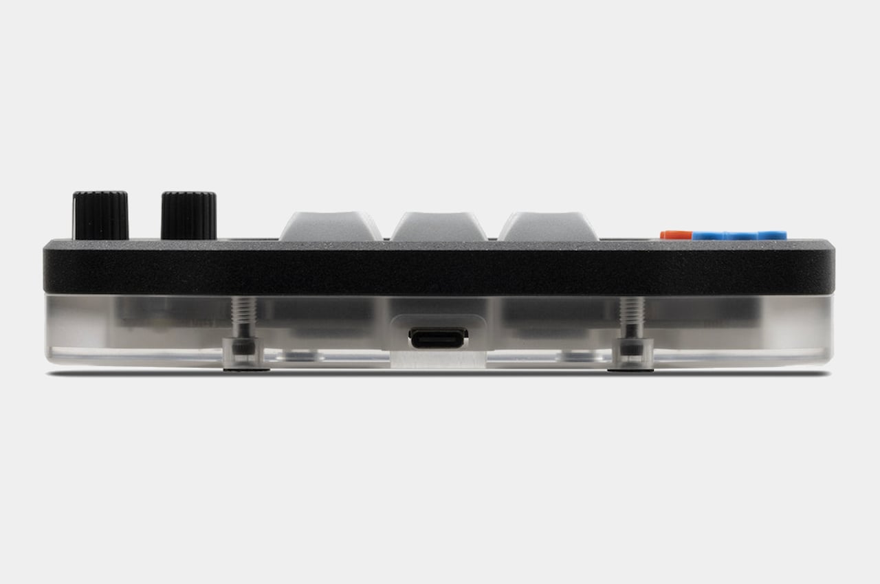
The very appearance of the macro pad is playful, with a translucent acrylic base that lets you take a peek at the electronics inside. Different color options for the aluminum top are available to add a bit of life to an already quirky device. Overall, the NinDoio’s appearance makes it a bit more approachable and a little less clinical, even if it performs the same functions as any of Megalodon’s other macro pads, which might just be what the doctor prescribed to make tedious work feel a bit more enjoyable like a game.

The post NinDoio is a fun-looking device for leveling up your productivity game first appeared on Yanko Design.
This shapeshifting Game Boy console has the soul of a Nintendo Switch

It’s a Game Boy, it’s a Switch, it’s… both?!

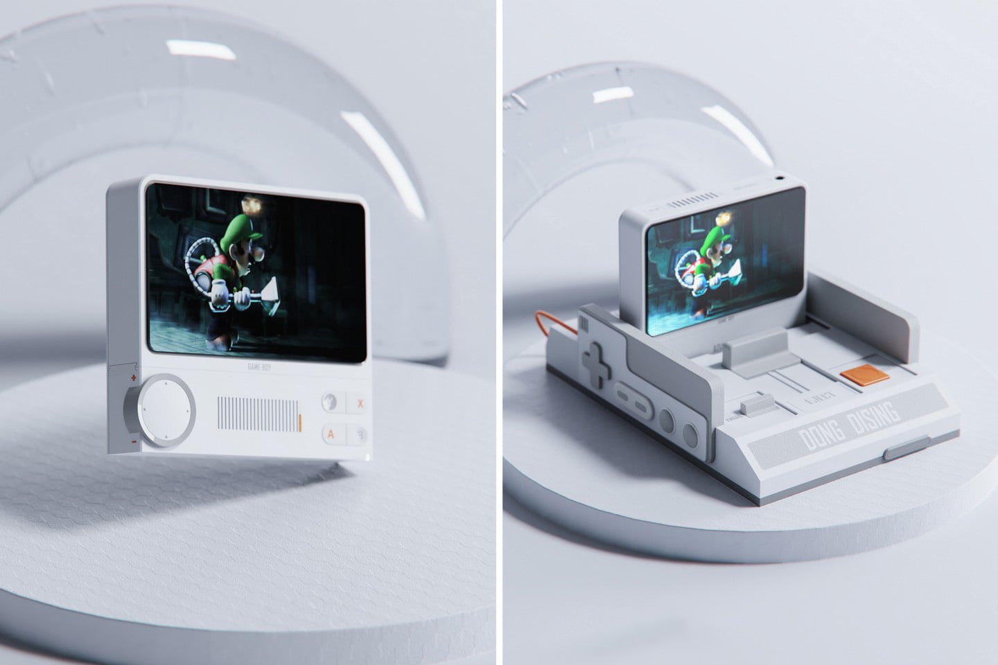
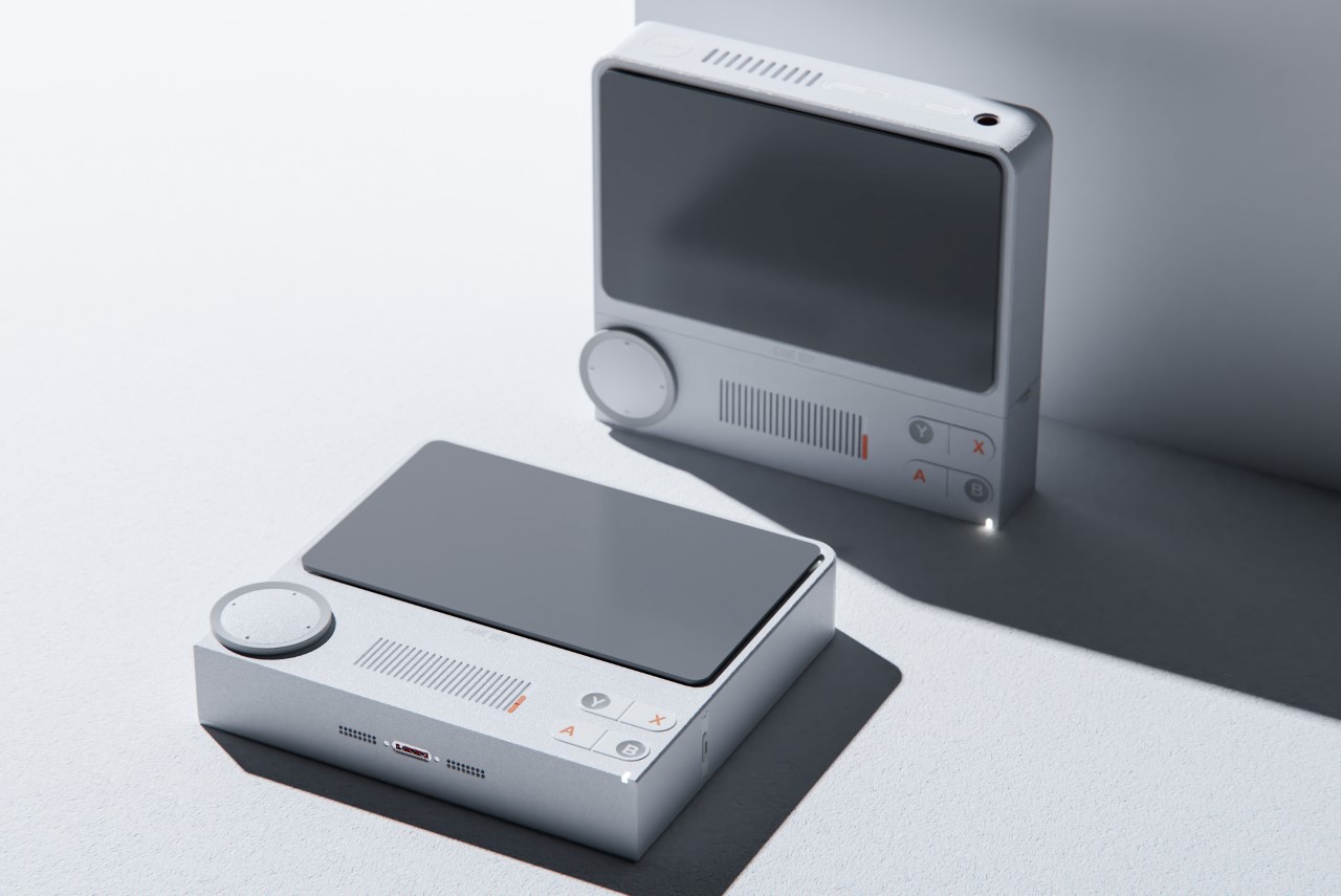
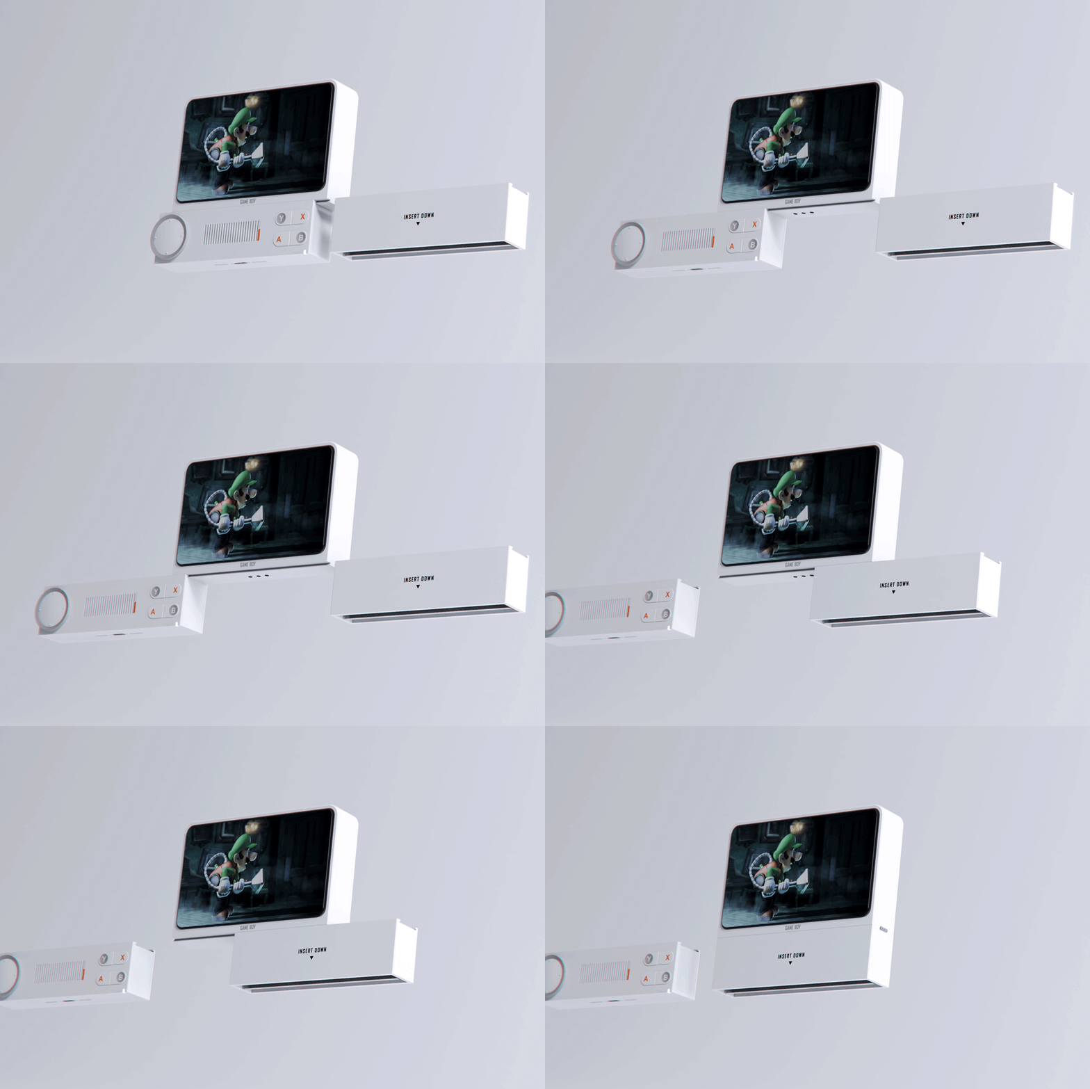
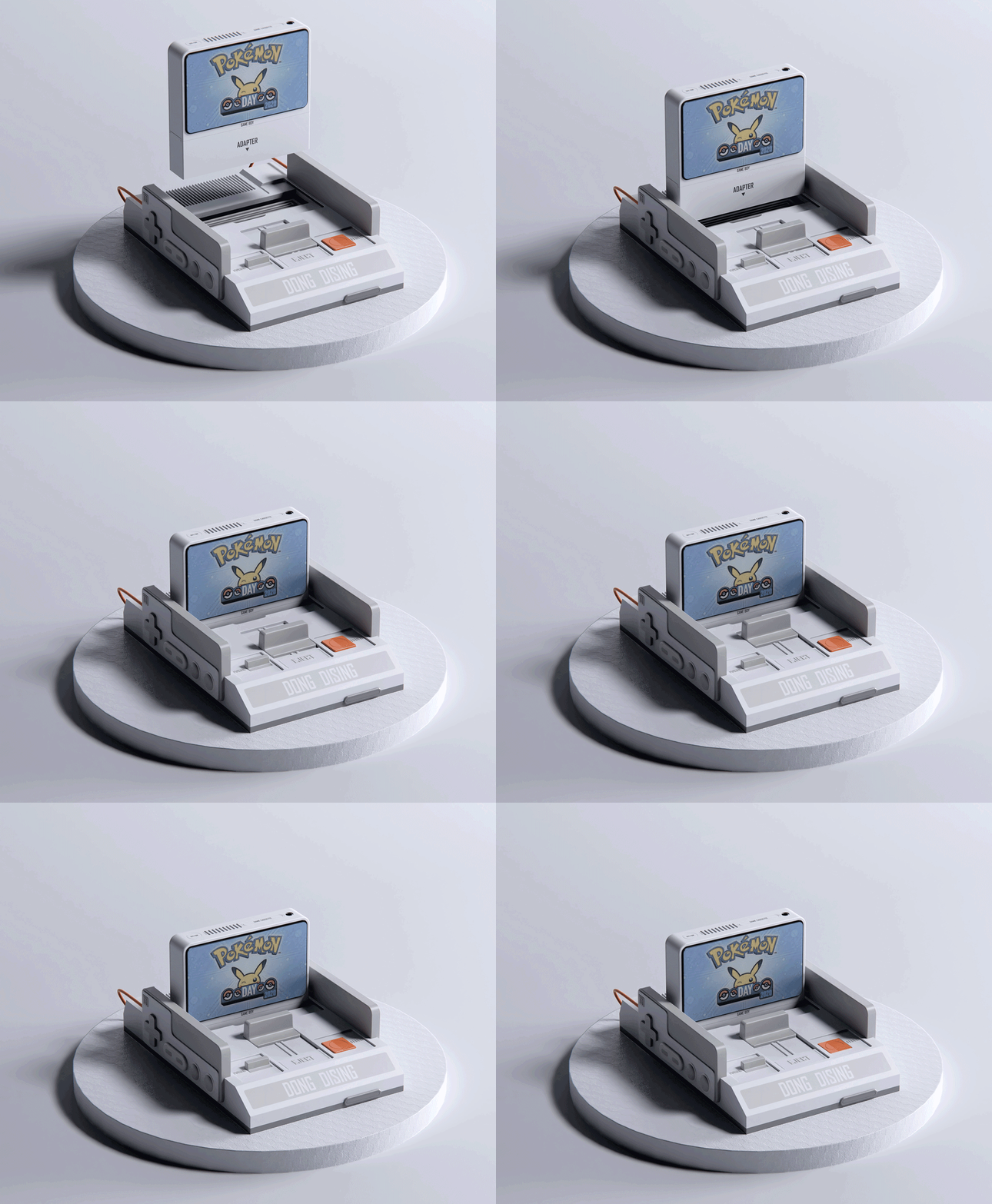
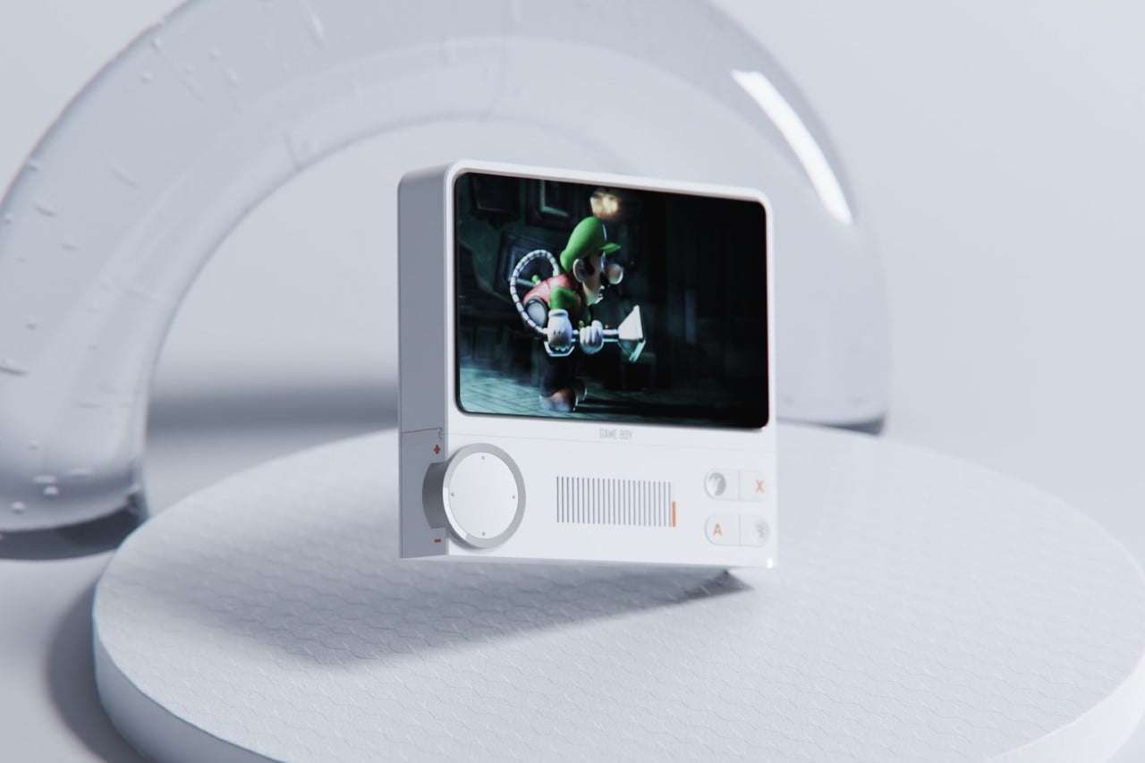
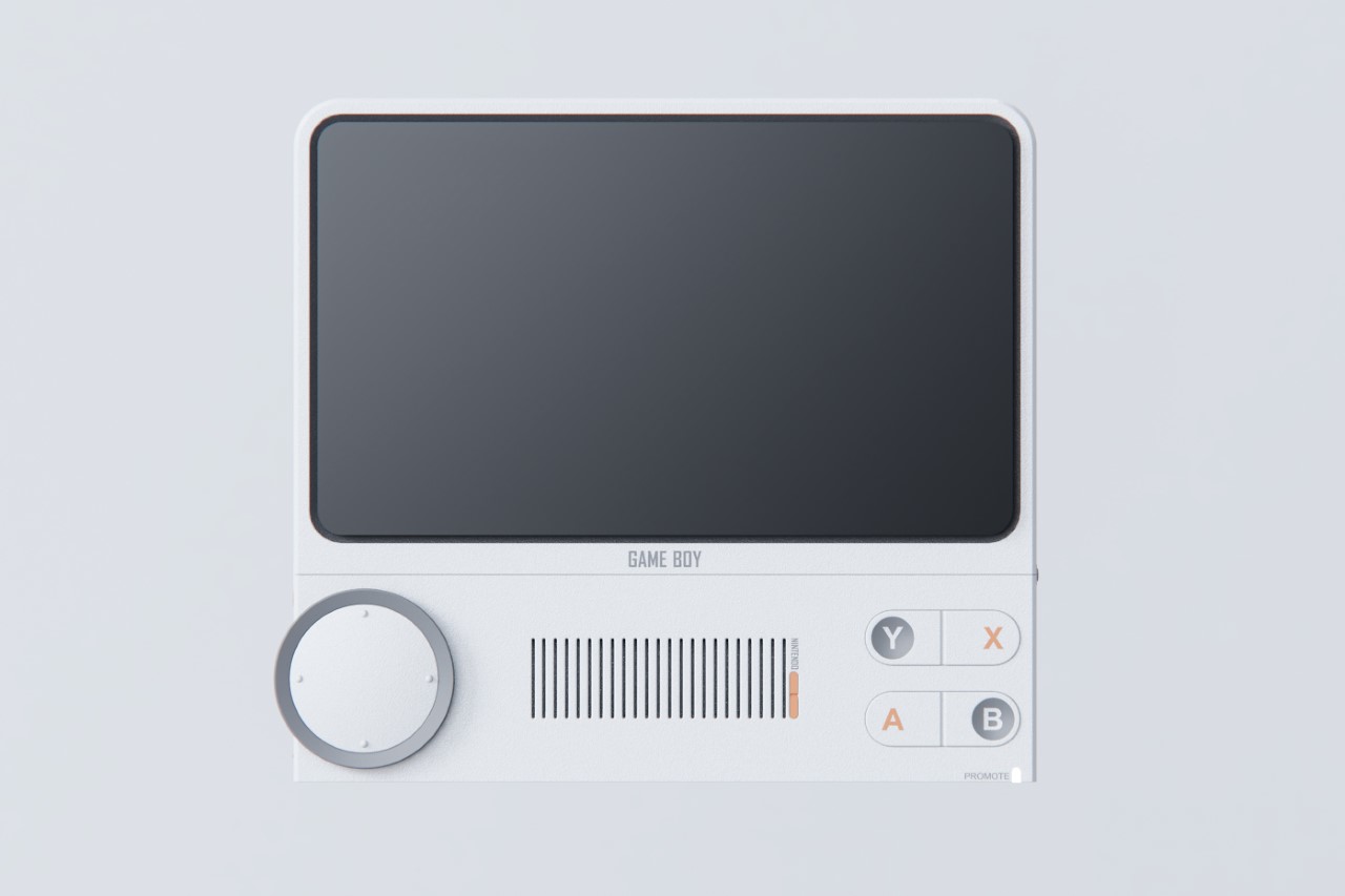
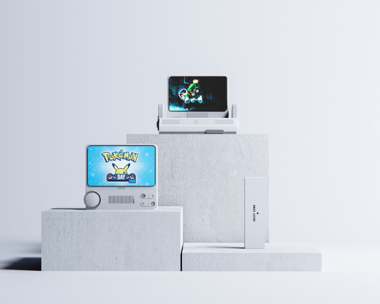
Meet the Game Boy Famicom, a conceptual gaming console that pays tribute to the handheld console, the modern-day modular Nintendo Switch, and most importantly, the consoles that came before it – namely the cassette-based consoles like the SNES, SEGA Genesis, etc. It’s handheld, but features a modular design that lets you simply plug the screen into a dock the way you would a cassette (or even the Switch) for a more console-style gaming experience. The Famicom offers a landscape style gaming experience, but in a device that’s portrait in its orientation. This breaks away from the Switch’s elongated profile, giving you a console that’s more compact and easier to carry around with you. One could argue that it’s cooler too?!

Designer: Dopamine Design

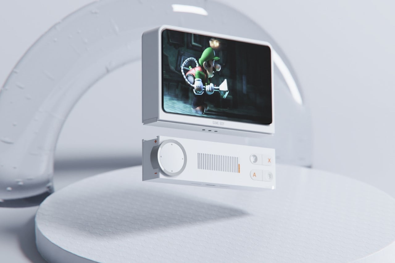
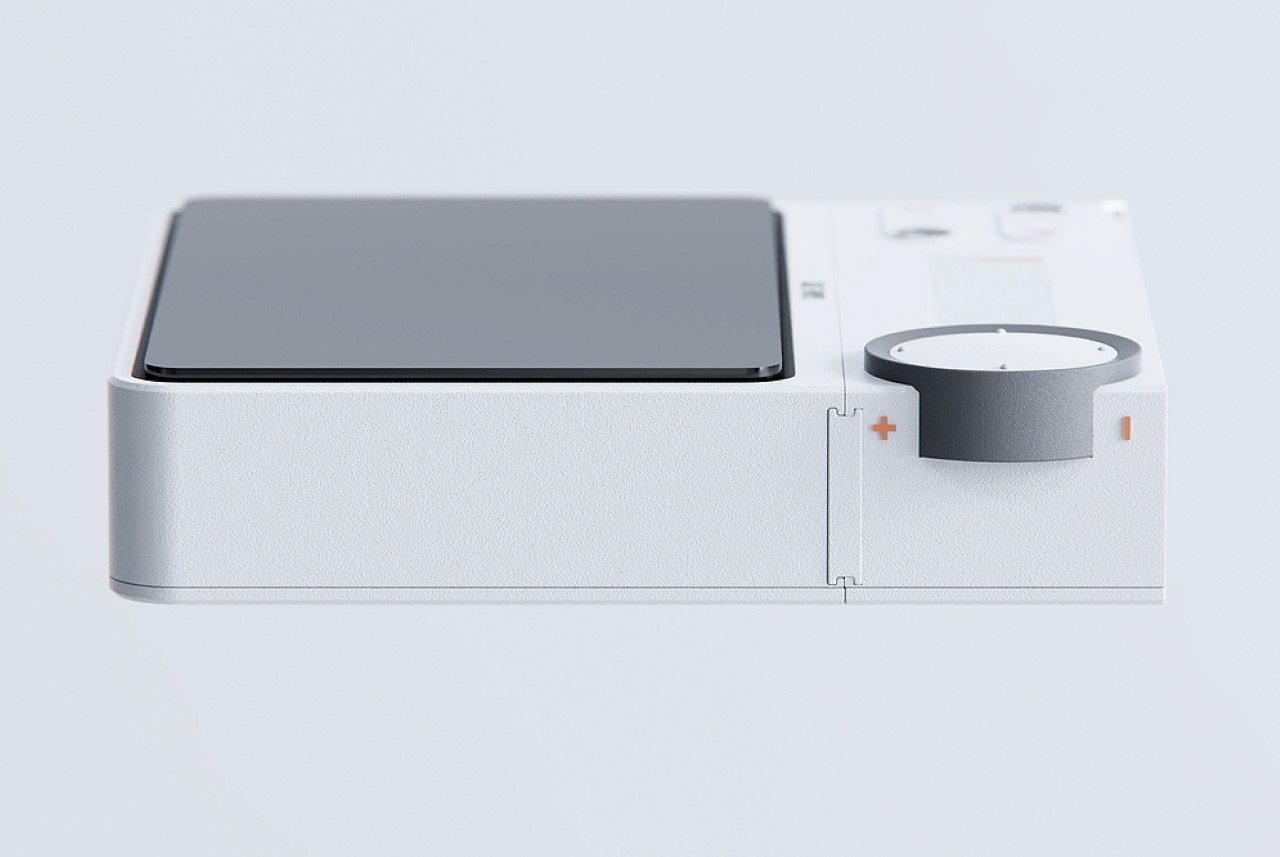
The Game Boy Famicom is basically a tablet gaming device with a modular base. You can either use it with its plug-and-play controls, or swap the controls out for an adapter that lets you plug the Famicom into a rather retro-inspired dock that lets you beam your game to a larger screen like a TV or projector. It’s a conceptual successor to the Nintendo Switch, or rather, feels more like a Nintendo Switch from an alternate timeline in which the Nintendo DS and Sony PSP didn’t exist!

I just love the Game Boy Famicom’s overall vibe. It’s understated yet expressive. Minimalist yet functional and non-compromising. There’s nothing about it that makes it feel ‘lesser’ than the Switch, just because the Famicom’s design pretty much dots all I’s and crosses all T’s. Its controls are minimalistic yet detailed. You’ve got a D-pad on the left, XYAB controls on the right, and a speaker in between. A ring around the D-pad also doubles as a volume knob, letting you crank the volume on high or mute gameplay depending on where you are.

The dock is a retro icon too. The white and grey color scheme with accents of orange gives the Game Boy Famicom a major Teenage Engineering appeal that elevates the concept to another level entirely. Sigh… if only this existed!

The post This shapeshifting Game Boy console has the soul of a Nintendo Switch first appeared on Yanko Design.
Nintendo Radio completely encapsulates the nostalgic Game Boy spirit

It’s a shame that Big N doesn’t have a radio on the market yet. If that’s how you think as a Nintendo fan, Aditya Pandharpure has a surprising entrant: the Nintendo Radio!

Nintendo has been quenching our thirst for gaming ever since I can remember. The video gaming company has been at the helm of entertainment and happiness for generations of families, fans and gamers – not essentially in the same order – worldwide. Right from the Game Boy to the Nintendo Switch, the journey has been impeccable with little to deviate the company from the underline agenda of transforming the gaming industry.

Designer: Aditya Pandharpure

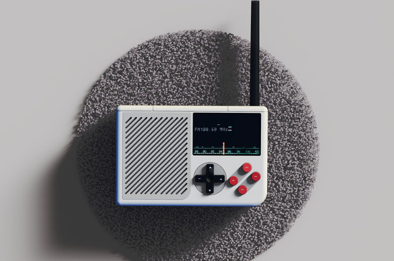
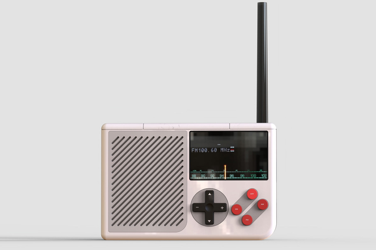
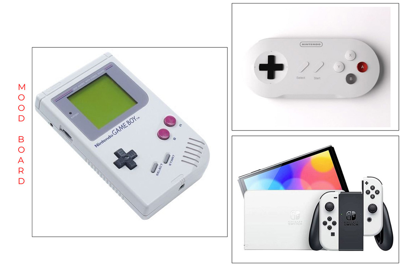
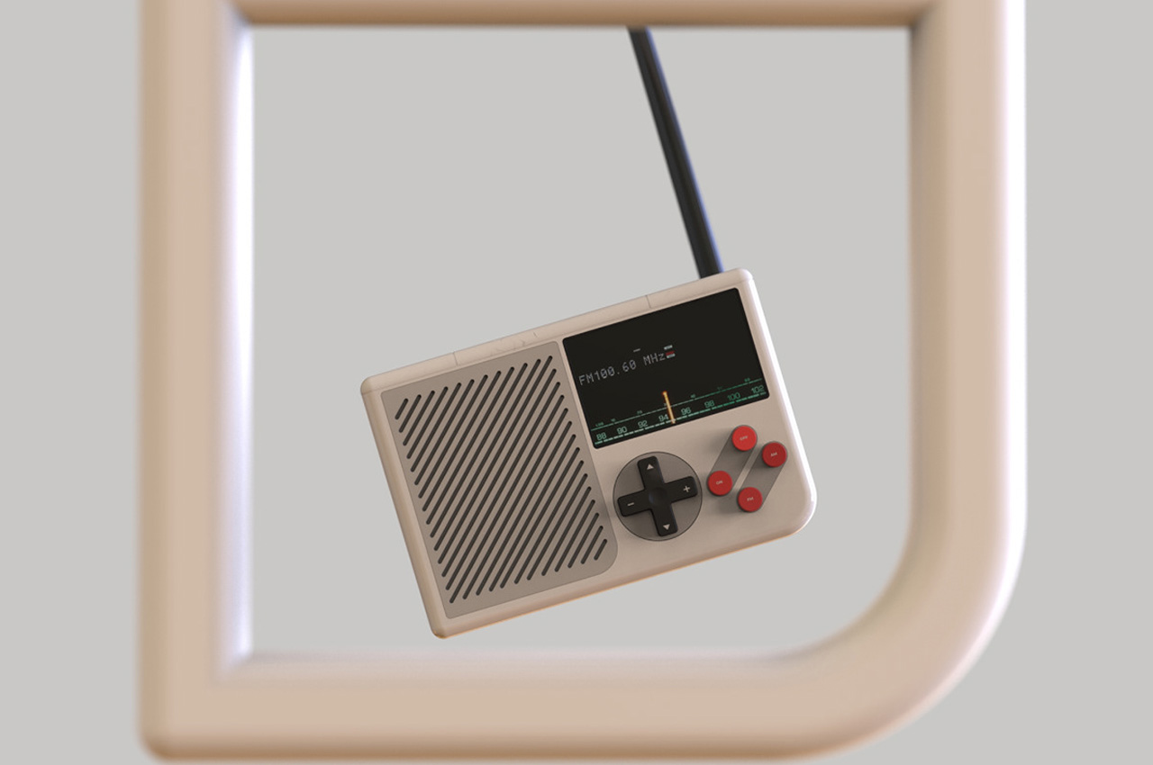
Now, if big N was to take a leap of faith into the retro classic category, perhaps, Aditya’s idea would be a feasible aspect to tap the growing fandom. A Nintendo Radio, which has little too much resemblance to the classic Game Boy. What else would the Nintendo Radio look like? Fittingly, the toggle buttons create an instant nostalgia, while the overall shape of the radio and the color schemes leaves no surprises.

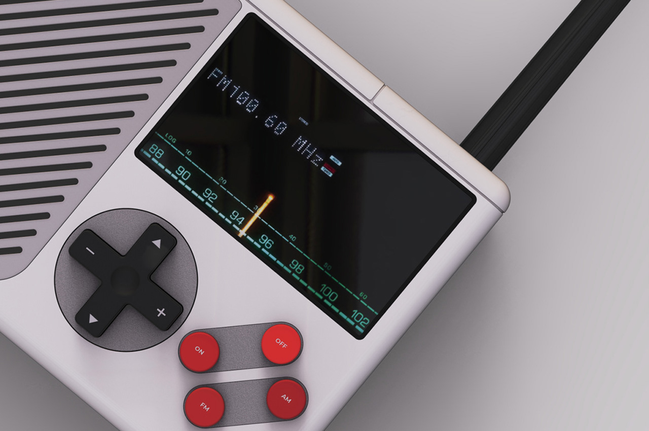
So, we can instantly recognize one half of the rectangular device, which has the half coved by a grayed speaker grill. The aforementioned half is further divided into two equal portions: top for the analog/digital display, showing the tuned-in station and the frequency, while the bottom half here features the good old red and black themed buttons.

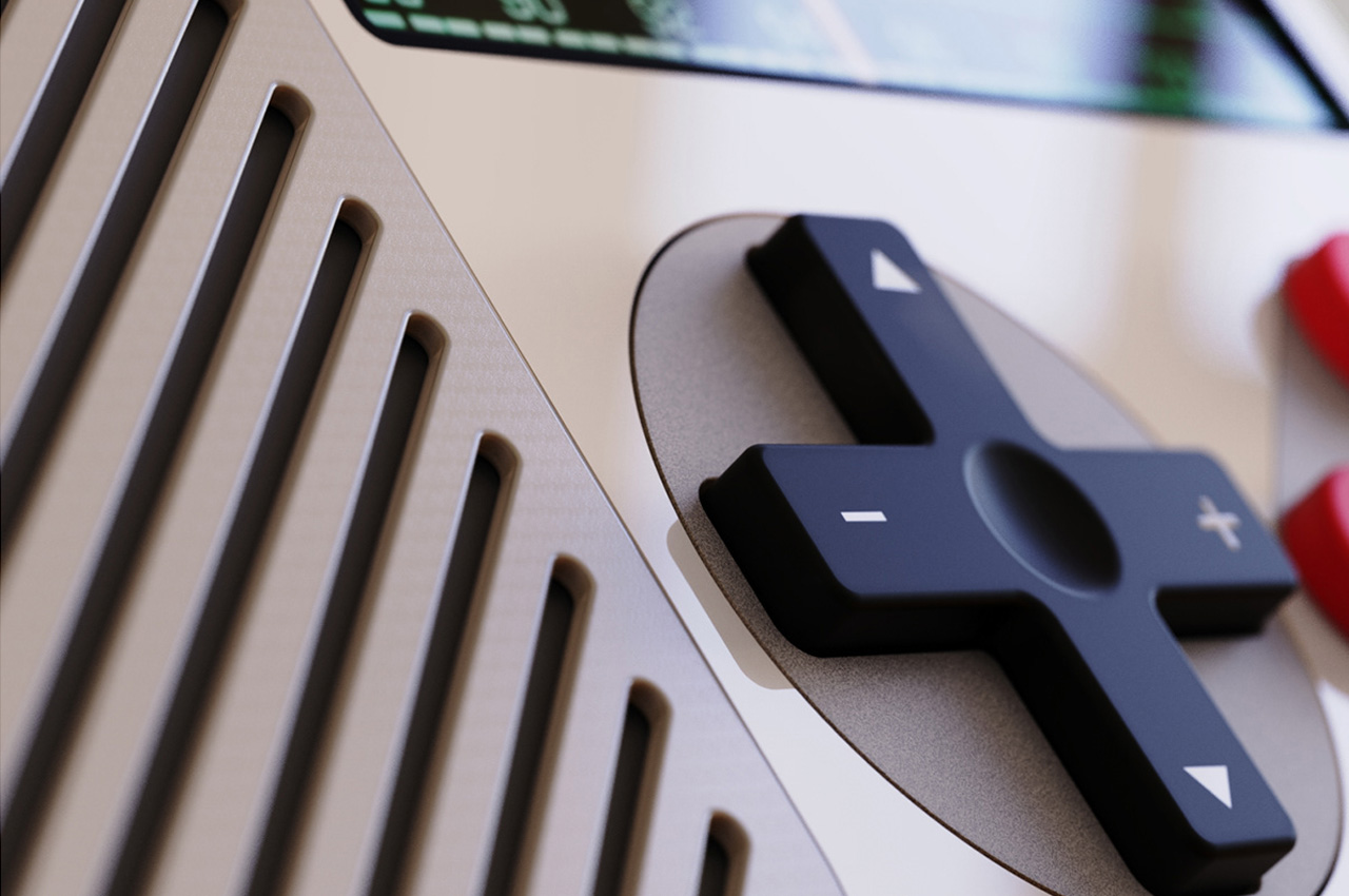
The four red circles comprising on/off and AM/AM bands are aligned alongside the black direction pad, with the volume rocker on the horizontal plane and shuffle on the vertical. The retro-futurism of the very enticing Nintendo Radio is topped by the plasticky antenna, which presumably rests flat along the top of the device.

The post Nintendo Radio completely encapsulates the nostalgic Game Boy spirit first appeared on Yanko Design.

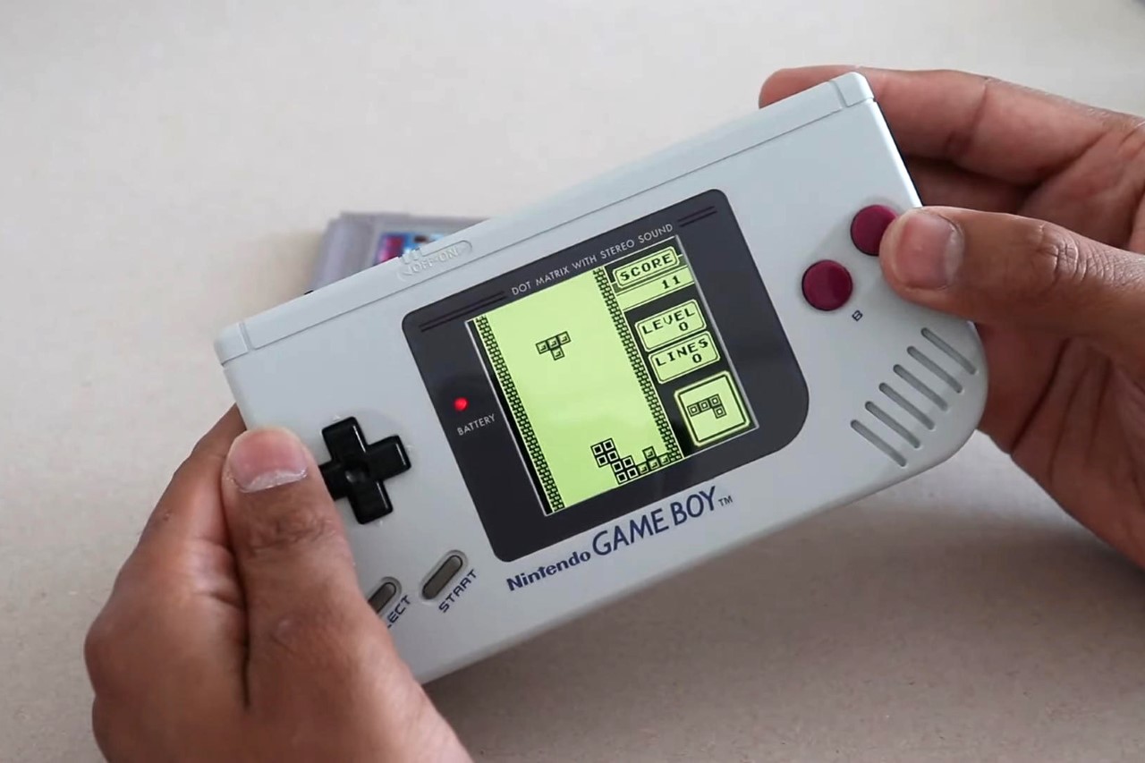
This parallel-universe ‘landscape’ Game Boy Classic feels like the Nintendo Switch’s earliest ancestor

A YouTuber named Obirux finally made it happen, giving the Game Boy Classic its ‘Advance’ moment.

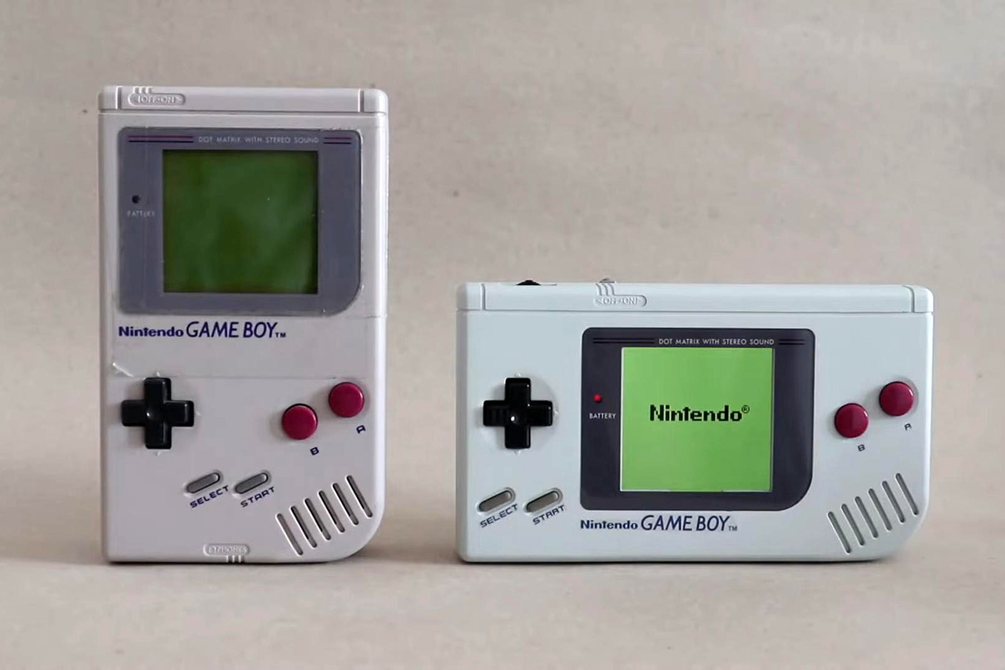
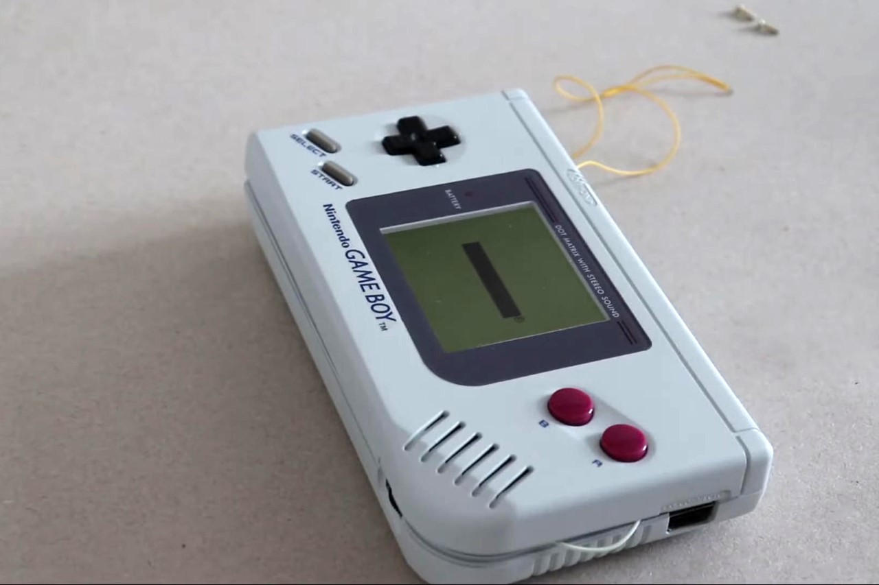
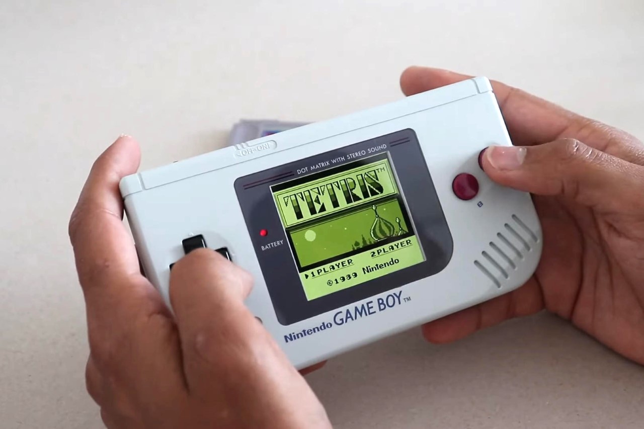
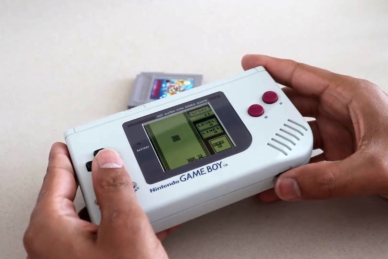
You know that TikTok trend where you give kids VHS tapes and ask them what it is and they have no clue? Or if you gave them a floppy disk and they’d think it was a 3D-printed ‘Save’ icon? Well, chances are that if you give them a Game Boy, they’d just call it an old Nintendo Switch. However, the classic Game Boy wasn’t a landscape gaming device until the GBA. YouTuber Obirux, however, decided to just hack a landscape Game Boy Classic into existence. By pulling apart an existing Game Boy and repurposing the hardware into a new kit, Obirux managed to make a fun landscape-oriented console based on the original, which launched all the way back in 1989.

Designer: Obirux

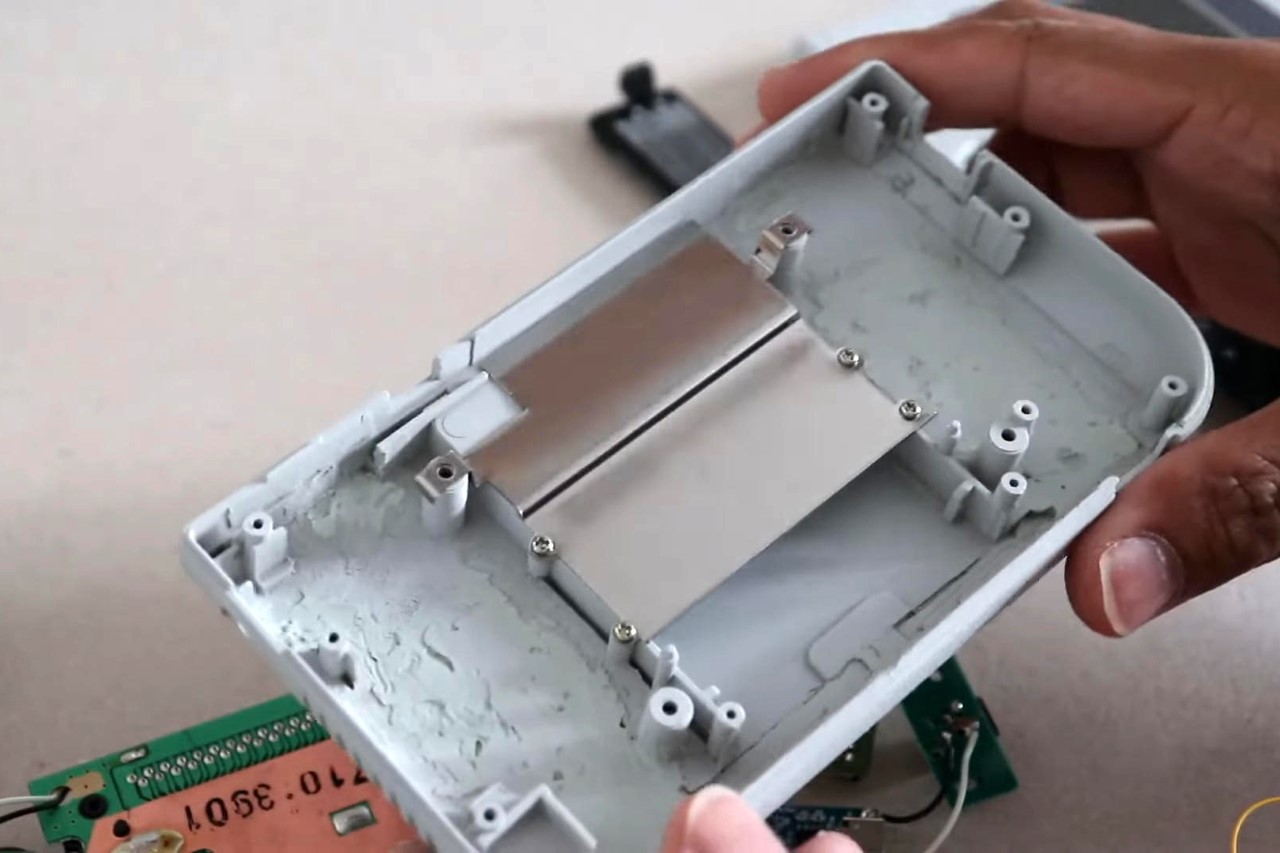
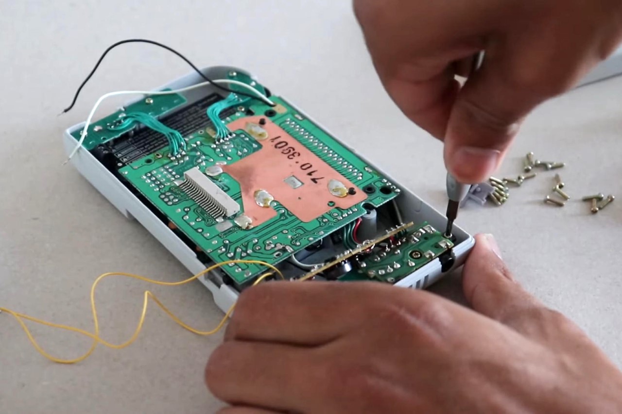
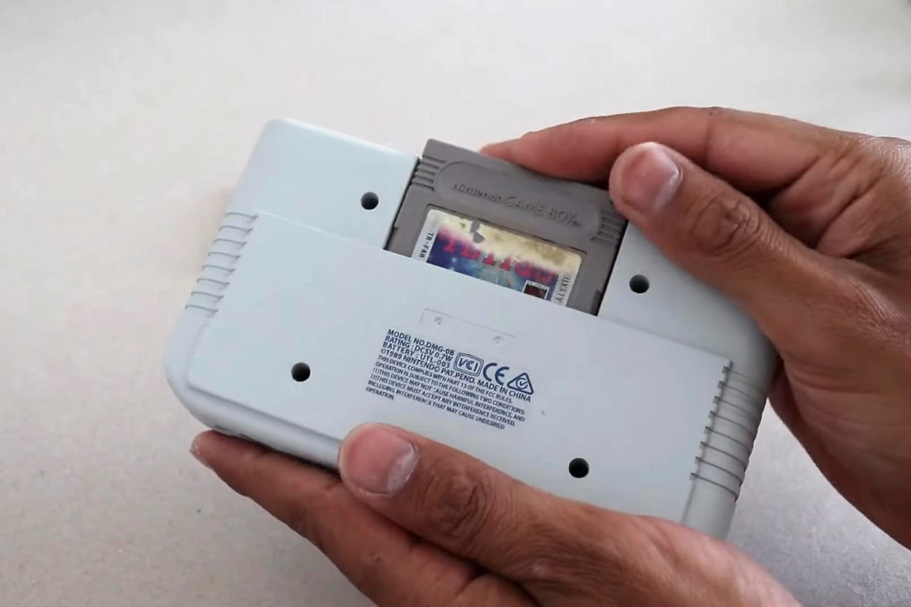
Notably, Obirux’s build doesn’t use a 3D-printed enclosure. Instead, he pulled apart two Game Boys and used their plastic shells to make a new landscape outer body. In fact, in the image below, you can see bits of plastic or putty on the inside, holding the shell together. The new build doesn’t use the same screen as the original either. Instead, Obirux swapped it out for a newer display with a modified PCB and a backlight (that can change colors too!) He even ditched the AA batteries for Lithium-ion ones, which end up lasting much longer.

The new build retains the original’s essence but in a fresh, landscape orientation. Although not shown in the video, it’s remarkable how Obirux used the plastic outer body pieces and simply re-joined them to make the Game Boy orient differently. The controls are the same too, except for a new button on the top to toggle the backlight… and the new Game Boy uses the same cartridge system on the back, completing the experience!
Obirux decided to name his prototype the Game Boy DMG-0B, a homage to the original model number of the Game Boy DMG-01, where DMG stands for Dot Matrix Game. The Game Boy DMG-0B, like all of Obirux’s builds, was listed on his website for sale. His site features other unique works, including a bunch of Game Boy Advance modifications. Sadly though, everything listed on his site’s already sold out!

The post This parallel-universe ‘landscape’ Game Boy Classic feels like the Nintendo Switch’s earliest ancestor first appeared on Yanko Design.