You’ve got to admit, whether you like or dislike the Mac Pro 2019, there’s no ignoring it. Especially if you’re from the design community. As a designer (turned writer) myself, here’s a couple of things I’ve learnt the hard way. There’s a general air of designers “knowing what they’re doing”. I’m just as complicit, when I defend my design to a client, or to a marketing team. Sometimes criticism, even if its constructive, can often deliver a slight blow to our ego, which comes from the philosophy that designers make the world a better place. Another very strong behavior that I’ve tried hard to unlearn is the fact that designers tend to look at everything through the lens of a designer… which means everything is a potential redesign project. With my negative feedback of the Mac Pro’s “disgusting” grille, I, for a second, became that person. I still think that Jony could do better (or different), but hey, he operates in a world of unlimited potential, zero constraints, and zero answerability (a part of me is jealous too, yes). My appreciation (or the lack of appreciation) has zero bearing on Ive’s strangely secretive design process. That being said, feedback for the Mac Pro has been extremely divisive, and Hasan Kaymak’s put together a design that he believes captures everything good about the Mac Pro’s 2006 and 2013 editions.
Hasan’s Mac Pro 2020 doesn’t deviate from the silhouette of the 2019 Mac Pro. In fact it embraces it, and comes in the 2013 Mac Pro’s black color, giving us the best of both worlds. The most noticeable change is the absence of the dual-side CNC machined grille detail, which Hasan replaced with a much more traditional slot and mesh. While the revised design detail isn’t particularly eye-catching, it plays it safe… and considering the grille never really faces the user, a relatively normal design detail seems like a fairly logical way to go. Besides, playing it safe would also bring down the relative cost of the Mac Pro by a couple of hundred bucks (given that you don’t have to have a complex CNC machining task), making it slightly less of a pocket pincher. On the opposite side of the grille, Hasan’s added 8 USB-C ports, for connecting all sorts of devices, from hubs, to the iPad Pro, to any other compatible devices you may have. Two audio jacks also sit right above the ports for good measure.
Another design detail change is the vault-lock mechanism on the top of the Mac Pro, which seems absent in Hasan’s concept. Rather than corrupting a clean surface with a fairly large clamp and handle, Hasan goes for something much more discreet, allowing you to simply remove the upper body by pressing down on the stainless steel rods on the top.
The redesign touches upon a common public sentiment, that the Mac Pro doesn’t need to be outright revolutionary. Unlike the iMac or any of the laptops, Mac Pros usually either sit behind monitors, or under tables, or even in render farms. As a device, the Mac Pro has always aimed to look beautiful, but its intent has always been to be functional first… especially given that people are shelling out large sums of money not for looks, but for raw computing power. It doesn’t need to be made using a complex, thick, two-way machined aluminum grille. But hey, who am I to express distaste? I’m just a guy who uses WordPress on a Windows laptop.
Designer: Hasan Kaymak


 The cleaner and faster desktop interface Facebook promised last year has started making its way to users, according to CNET. Facebook is reportedly giving a small percentage of people the chance to test the interface -- lucky users will see a pop-up...
 The cleaner and faster desktop interface Facebook promised last year has started making its way to users, according to CNET. Facebook is reportedly giving a small percentage of people the chance to test the interface -- lucky users will see a pop-up...
 Pandora started rolling out its redesigned and more personalized mobile experience in October beginning with a select few, and it's now available for all the service's users across various tiers. The redesigned app, which came out shortly after a red...
 It's not uncommon for users to skip reading an app's privacy policy because it's too long and jumbled. Apparently, Apple wants to change that. Today, it released a new privacy page that makes its privacy policy easier to read and understand. The new...
 A change coming in iOS 13 could force Facebook to change Messenger and WhatsApp. As The Information reports, Apple will no longer allow these apps to run Voice Over Internet Protocol (VOIP) in the background when it's not in use. At the moment, apps...
 Spin, the e-scooter startup acquired by Ford, is rolling out its redesigned electric scooters and bringing them to more cities across the US. The new scooters have a larger frame with a wider and longer platform. They come with bigger, tubeless tires...
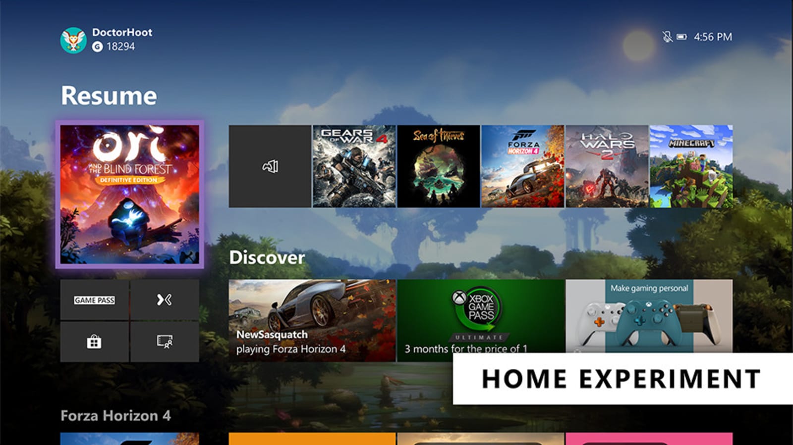
 Microsoft is rolling out a couple of tests that could change the look of Xbox One's Home section as well as how you control the console via Cortana. Xbox Insiders should be able to check out the updates in the next few days.
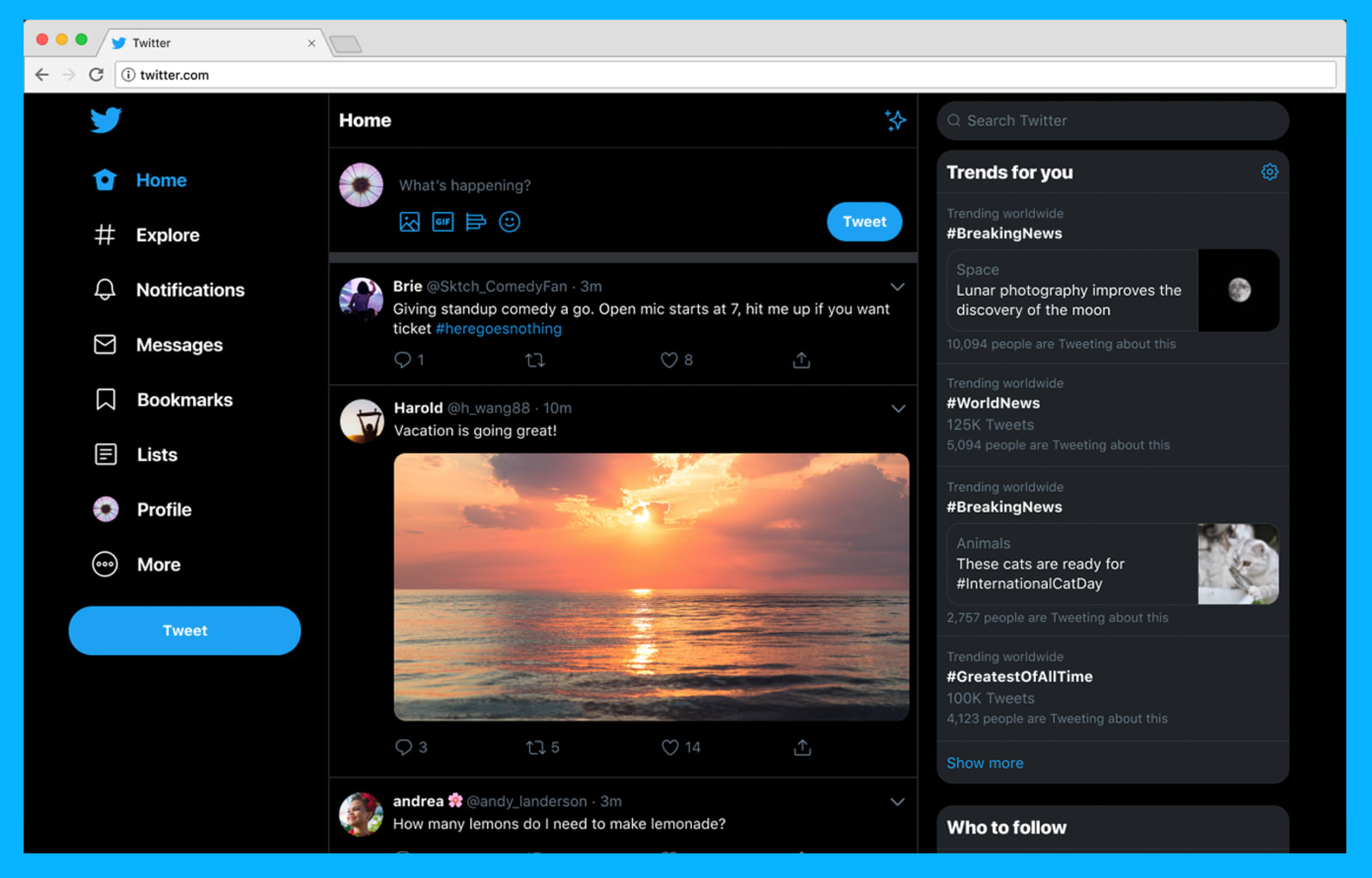
 It took quite some time, but the new Twitter.com is finally here. Months after teasing parts of it, Twitter has announced that it is now rolling out its redesigned site globally, which will bring people a web experience that's faster, easier to brows...
 Still waiting for Samsung's first foldable phone? Bloomberg cites anonymous sources saying that Samsung has completed a redesign of the Galaxy Fold in just two months. The protective film now covers the entire screen and stretches into the bezel so p...


 Google is bringing a new Search layout to mobile, and it's rolling out the changes beginning today. Now, when you search on your mobile device, you'll see a website name and logo at the top of each results card. If Google has a "useful ad" to show yo...