Top 10 ultimate storage solutions to de-clutter your contemporary home

One problem that never seems to leave us, especially if you’re living in a major city – is the lack of space! If you’re an independent millennial who recently moved out of their family home and into their own, then a major issue that you may be dealing with almost every day…is space constraints in your own home. Our modern millennial homes have many virtues, but one thing they lack is space! Space constraint is something most of us end up dealing with every day. Smart storage solutions can be lifesavers in such tricky and compact situations. And to make your lives easier, we’ve curated a whole collection of storage solutions that come in the form of furniture designs that, to be honest, are going to completely organize your home. Not only do these products comfortably store your belongings, but they’re also perfect for displaying those special items that you don’t feel like shutting away in a dusty cabinet. From a Wolf stool concept to shelves that look like abstract art of faces gazing at you – these innovative storage and display solutions are the additions your home needs!

1. The Nook Desk
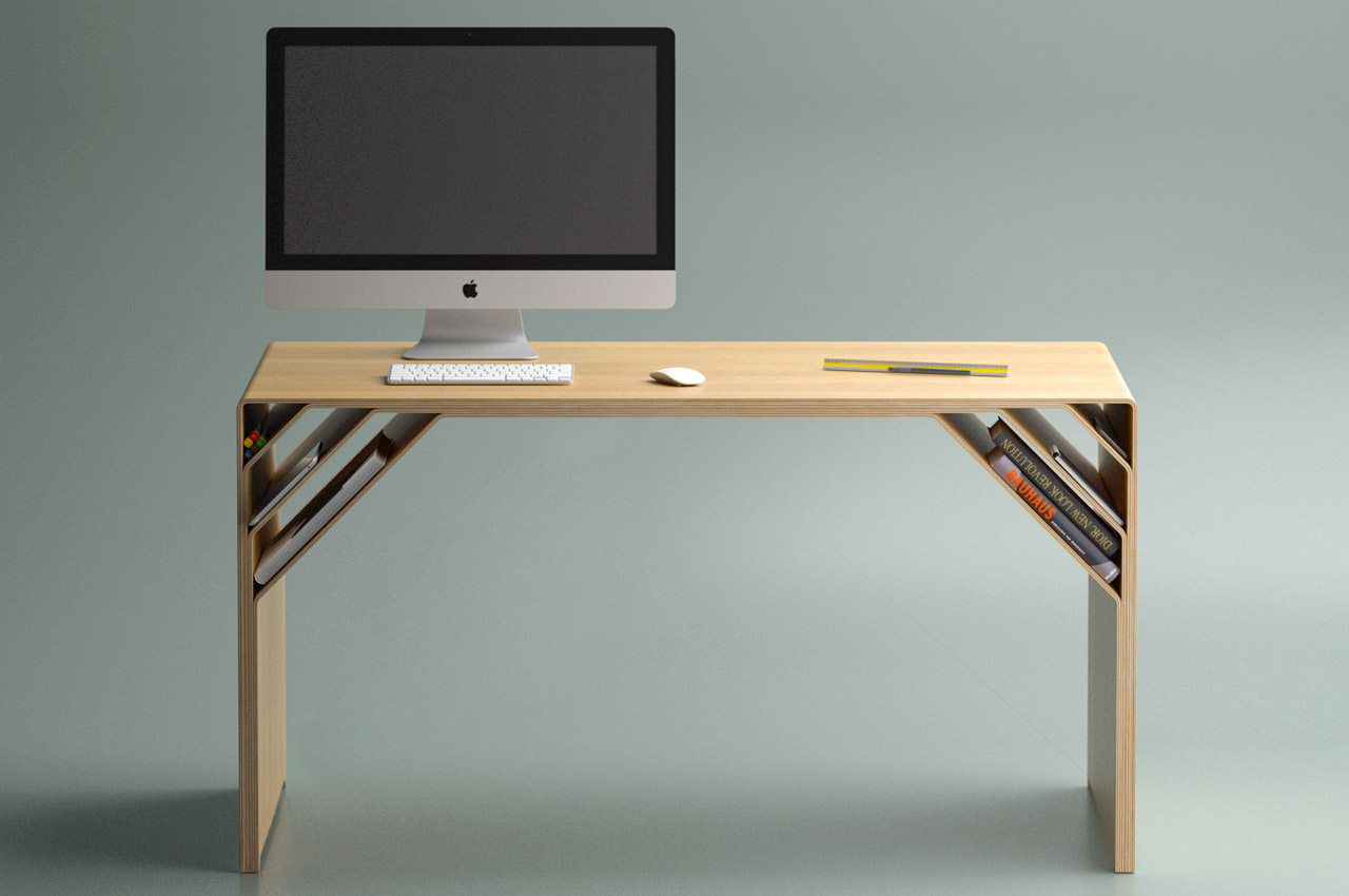
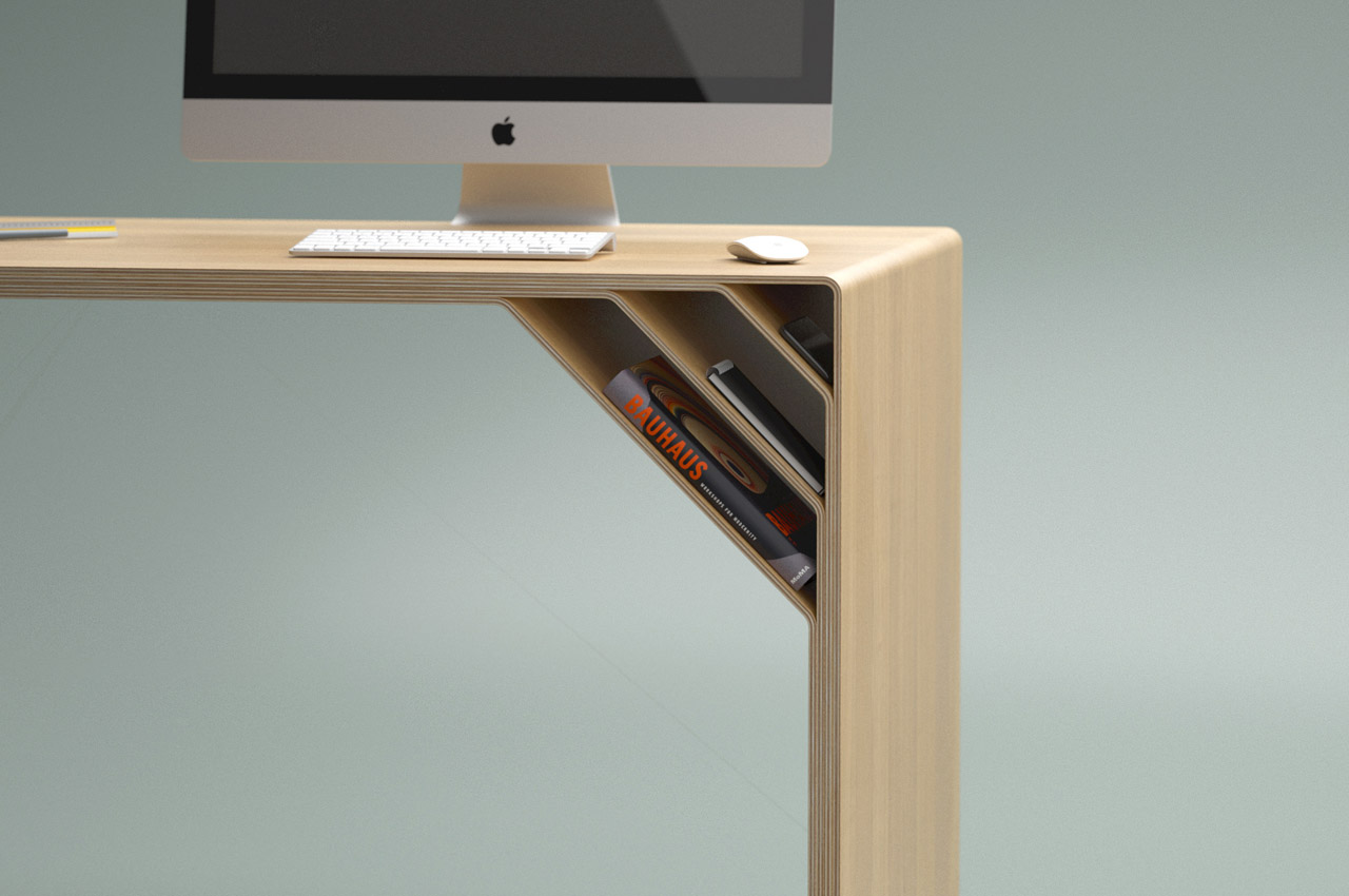
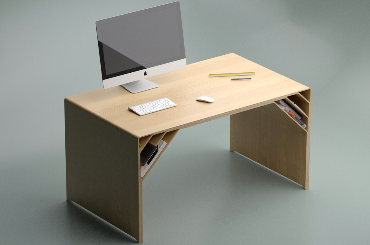
The Nook desk right from its appearance and thereafter has a story of material molding, matte finish, and a simple idea that’s still more than an ordinary desk. The Nook desk surface, and nifty selves at the edges, hold key to the table’s idea of maximizing productivity with minimalistic use of material.

Why is it noteworthy?

New desks surfacing on our computer screens day in and day out are generally drenched heavily in the wave of maximizing gadgetry on the tabletop courtesy of cable organizers, built-in wireless chargers et al. Atkay keeps it simple and undistracting. His idea of a desk will therefore not revibrate with most hybrid/work-from-home taskforce. However, if you’re someone like me who loves a desk clear of clutter and only wants a book or two in close proximity; this is where the search can end.

What we like

  • Nook desk’s personalized design aesthetics shall help you have most of your reading/writing material well within your reach
  • The personalized design is achieved by separating multiple layers of plywood at the edges of the table, creating storage layers on the bottom of the tabletop

What we dislike

  • No complaints!

2. The Boomerang Bed

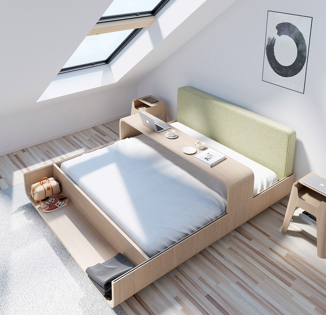
The Boomerang bed attempts to be more than just a bed. Teixeira transformed a simple bed into a little living area of its own with the help of an integrated table.

Why is it noteworthy?

The integrated table can be considered the star of this furniture piece. Just like its name, this handy table “comes and goes”. By simply shifting the table or changing its placement, the adjustable table can adopt various roles and perform multiple functions. You can slide the table from one end of the bed to the other. If you position it at the edge of the table, it can function as a regular desk for you to place your laptop on and work from home.

What we like

  • The headboard is upholstered, so it’s pretty cozy to rest against while eating your meals or working on your laptop
  • Works well for smaller and compact homes

What we dislike

  • No complaints!

3. The PLOGA Rack

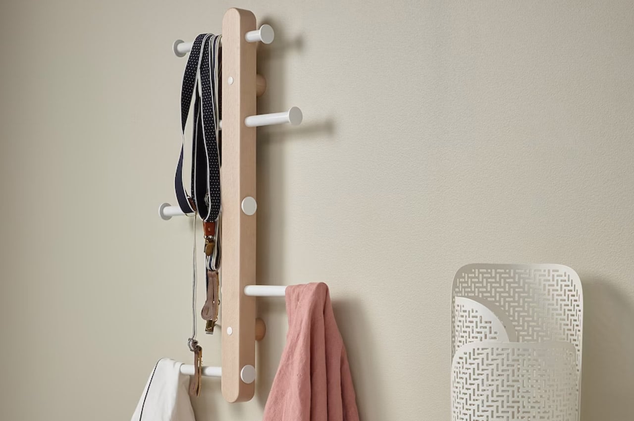
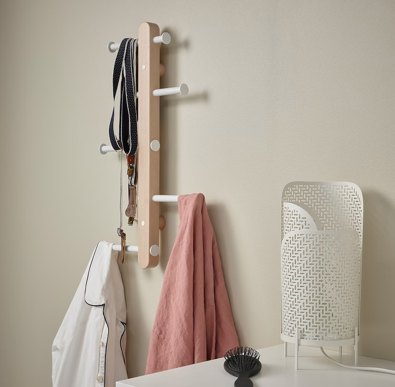
Functioning as a coat rack, the PLOGA rack is a great option for your entryway, if you’re facing the woe of space constraints. What makes the wall-mounted coat rack quite intriguing is the fact that it features vertical hooks!

Why is it noteworthy?

The hooks are adjustable and placed vertically on the rack. You can slide them from left to right, creating a flexible form that can be changed whenever. This provides more space to store your items, ensuring that they aren’t layered on top of one another.

What we like

  • Can be placed in any room of your home
  • Can be used to store a variety of items

What we dislike

  • No complaints!

4. The Hanging Desk Organizer Set
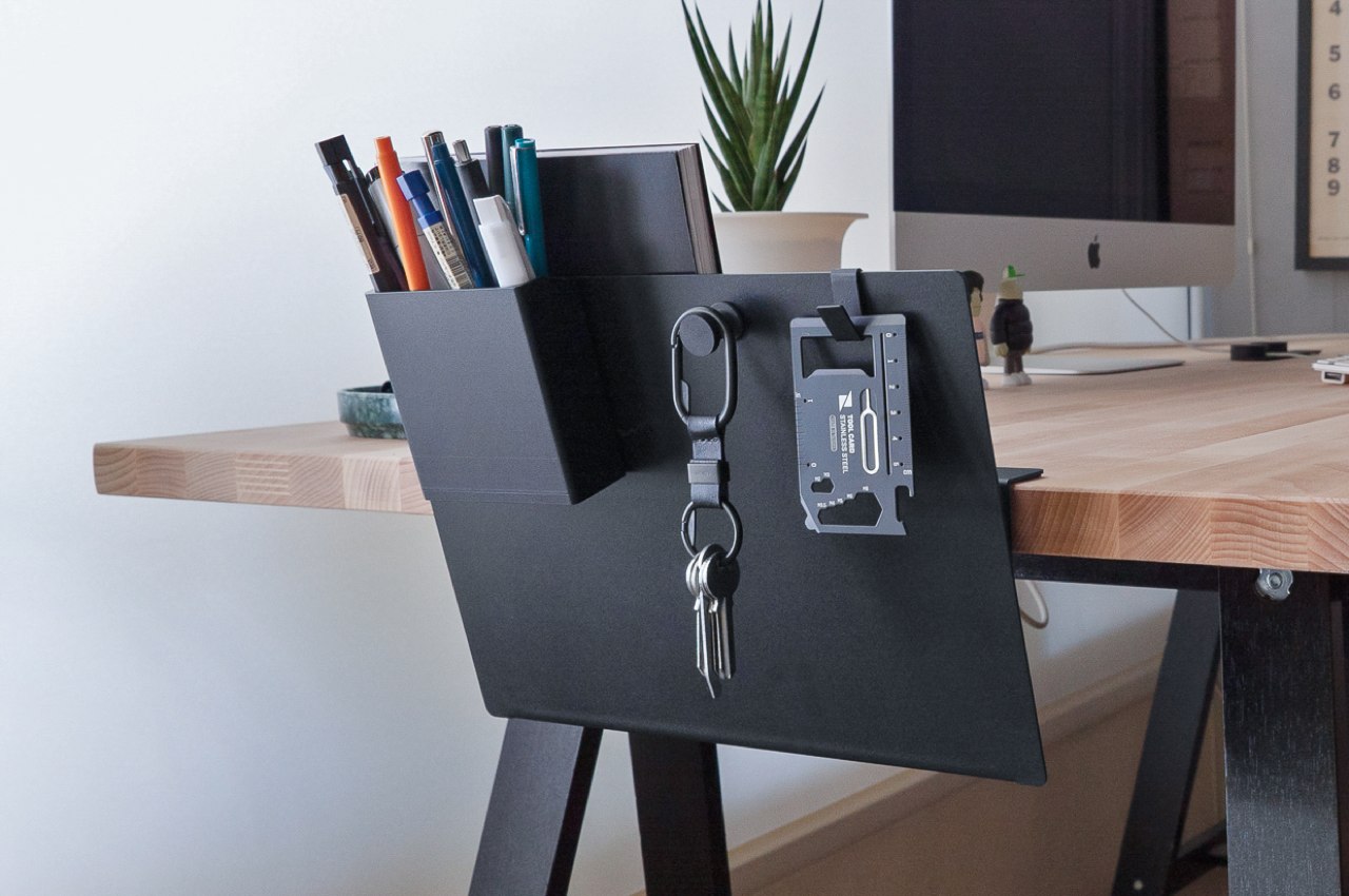
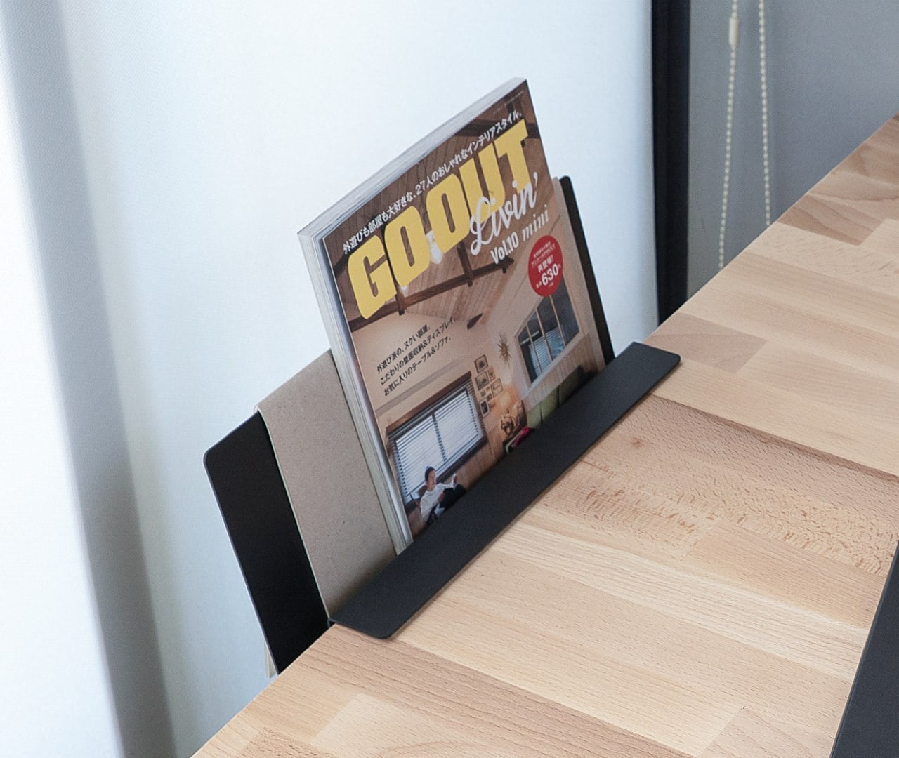
Many productivity gurus advocate having a proper place on your desk, even for more “transient” objects that come and go. Some have a tray, a literal inbox, or even a basket, but those often take up precious space that could be used for more permanent things. They’re also a “one size fits all” kind of thing, so you can’t really use them for anything else or even arrange their parts unless you opted for a modular bin. The Hanging Desk Organizer Set solves all those problems by hanging over the edge of your desk and giving you the freedom to rearrange it to suit your needs.

Why is it noteworthy?

As with many seemingly magical modular systems, the secret to the rack’s trick is magnets, very strong magnets. The rack itself is made from sturdy steel and doesn’t actually have any distinct markings on its own. It looks like a square root or radical symbol, where its short flap sticks to the edge of your desk without screws or magnets. The V-shaped space is where you can place things like magazines, letters, files and folders, and more.

What we like

  • You can even hang your book over the highest edge as a makeshift bookmark in case you need to quickly pause what you were reading

What we dislike

  • No complaints!

5. Three-Six Desk

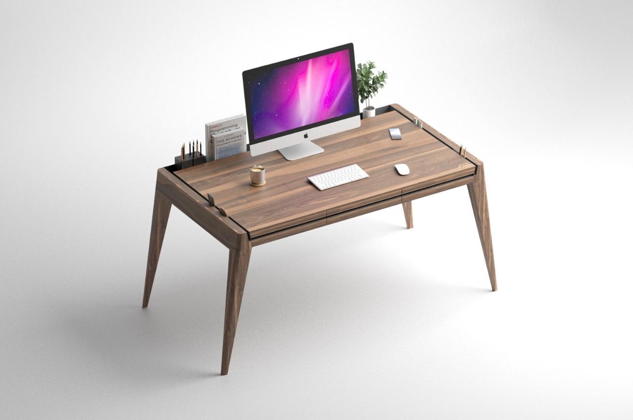
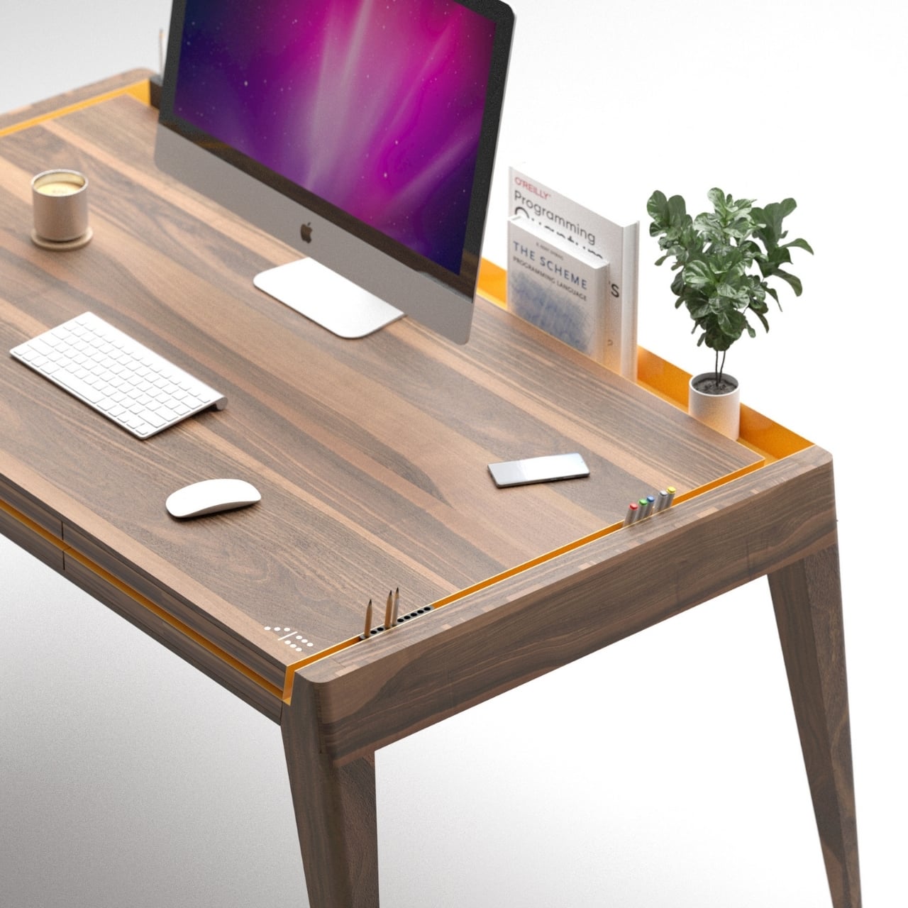
This concept desk was specially designed for someone’s birthday and is both functional and also eye-catching. The body itself is your usual walnut desk but what makes it different is the orange metal inlay surrounding it. It’s not just there for aesthetic purposes although the orange metal surrounding the wood does make a striking design. But the purpose of this inlay is to let you place stuff around your desk without them actually taking up space on your desk.

Why is it noteworthy?

The front inlay is actually part of the drawers and is used to open them. The sides are angular so you could put office accessories like scissors, staplers, pens, etc. You can also place your mobile phone, tablet, and other media devices so that you can reach them easily but they won’t be on the desk exactly. The back inlay is wider than the sides so you can put bigger items there like books, plants, pen holders, and other decorative things.

What we like

  • The inlays can also be used to add additional storage accessories in case you need it

What we dislike

  • No complaints!

6. Spectator

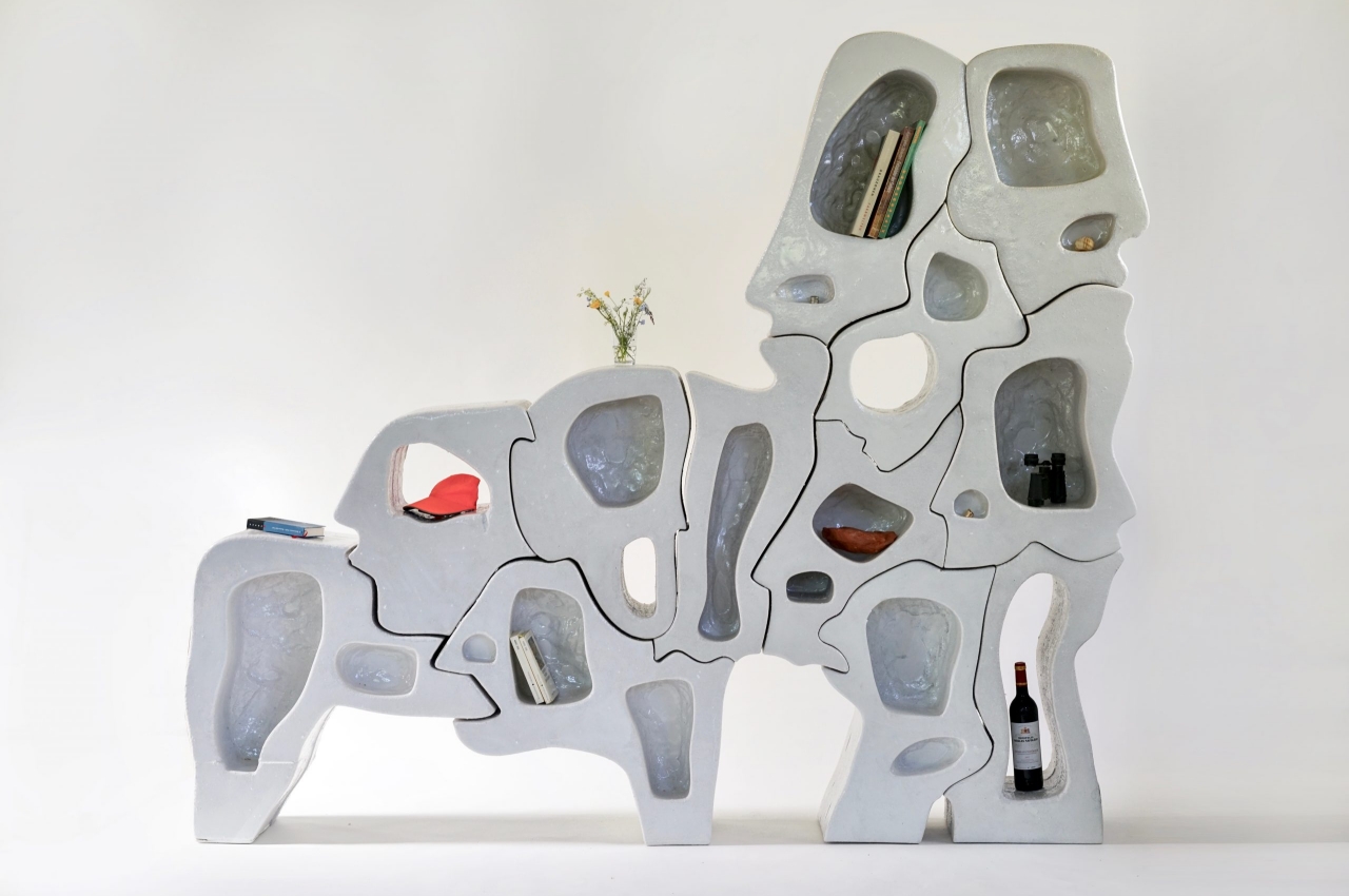
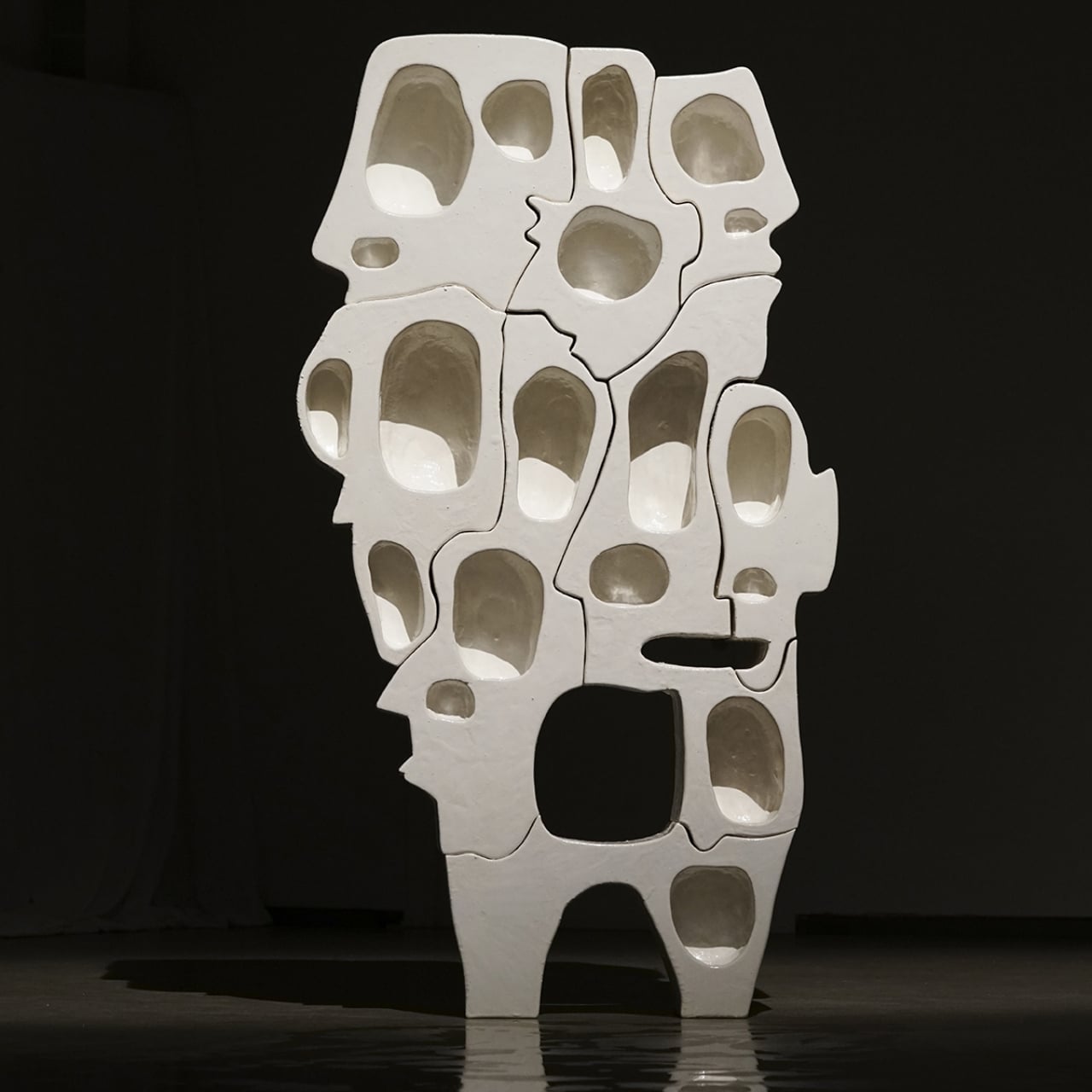
Named ‘Spectator’, this intriguing bookshelf definitely looks as if it’s staring right back at you! It seems to be made of interlocking jigsaw puzzle pieces, and each piece looks like a distorted human face!

Why is it noteworthy?

The Spectator Series of shelves is as much a psychological art piece as it is a piece of furniture. In its small way, it demonstrates the wonder of our brains that try to fill in the gaps to complete forms and ideas, like how it is able to see faces in shapes that are so far removed from human heads. With so many faces hiding in plain sight, the roles of observer and observed are also reversed, at least in our mind’s eye again.

What we like

  • The shelf adheres to minimalist design principles despite the odd shapes of its pieces

What we dislike

  • Not everybody would like the aesthetics of this piece

7. The Plot Twist Bookshelf
PLOT TWIST Bookshelves

PLOT TWIST Bookshelf Details

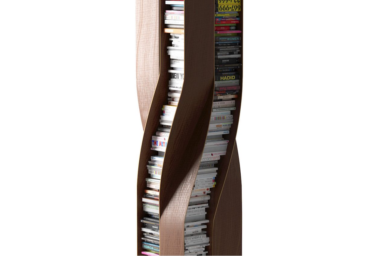
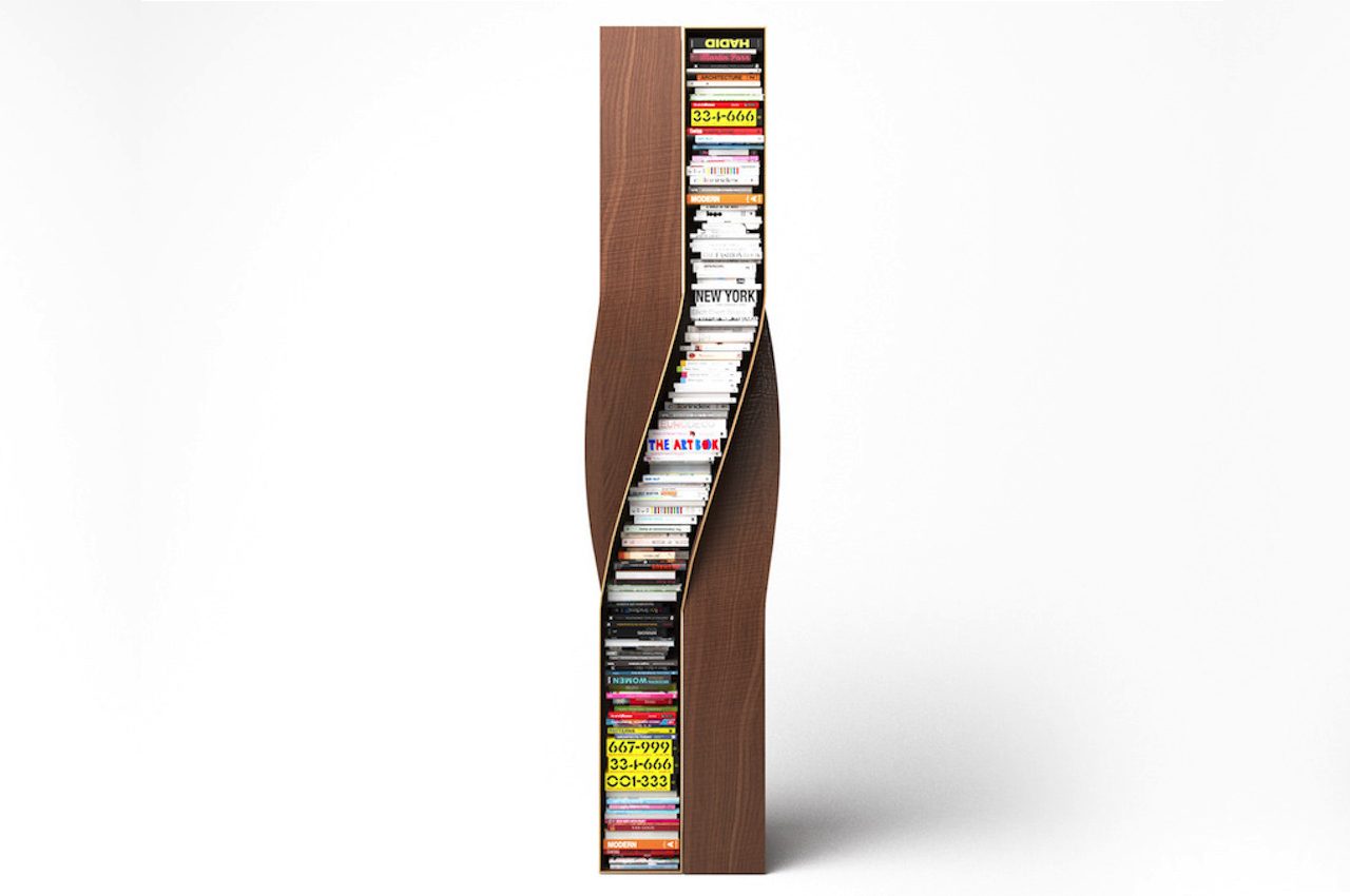
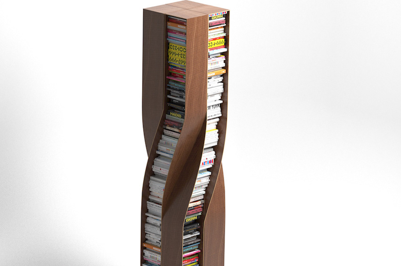
Prolific German furniture designer Deniz Aktay has recently introduced the Plot Twist Bookshelf. It’s a piece of furniture that features four separate twisted wooden elements. They are connected to each other, shaping and creating a stable form.

Why is it noteworthy?

The bookshelf’s design allows it to be accessed from every side. As with most of Deniz Aktay’s product designs, this bookshelf is oddly satisfying. The curves are present as with the designer’s other projects. In addition, most of Aktay’s works have undergone some bending or twisting, as with the Wavelet, the Tie Stool, and The Pet Table.

What we like

  • The shelves can accommodate similarly sized books for a clutter-free look
  • The bookshelf is stable and stands on its own

What we dislike

  • Space consuming design

8. Wolf

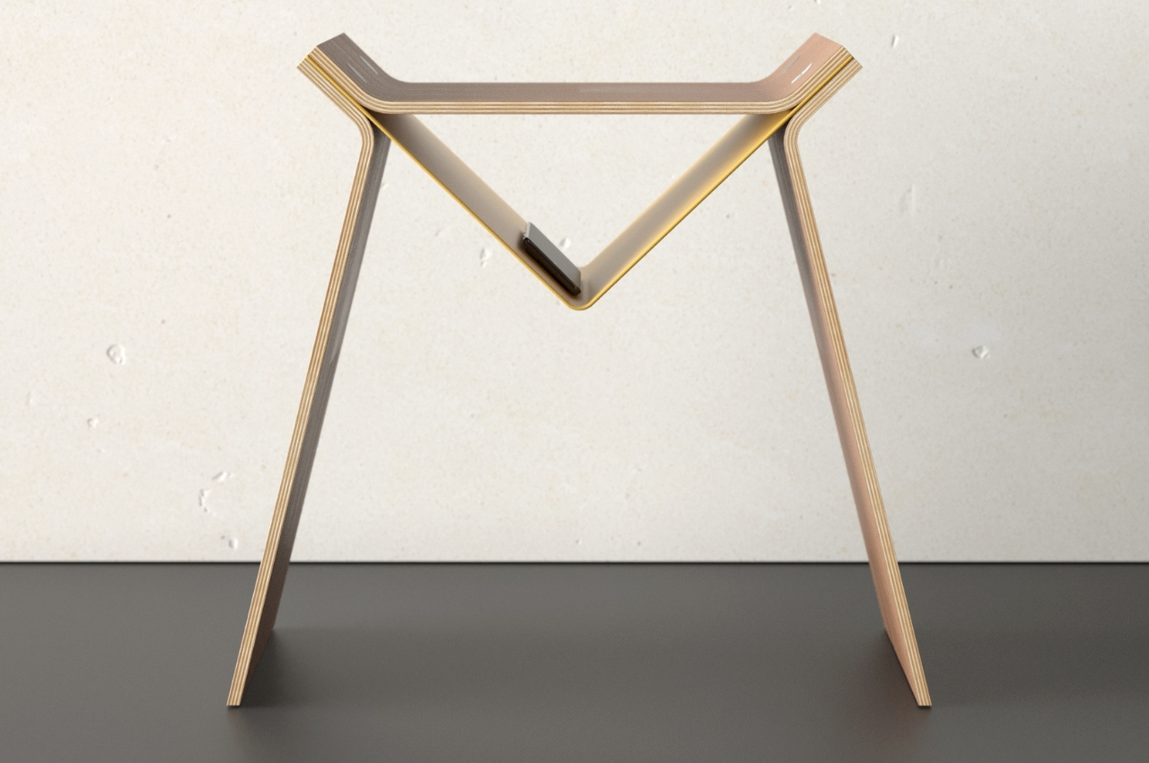
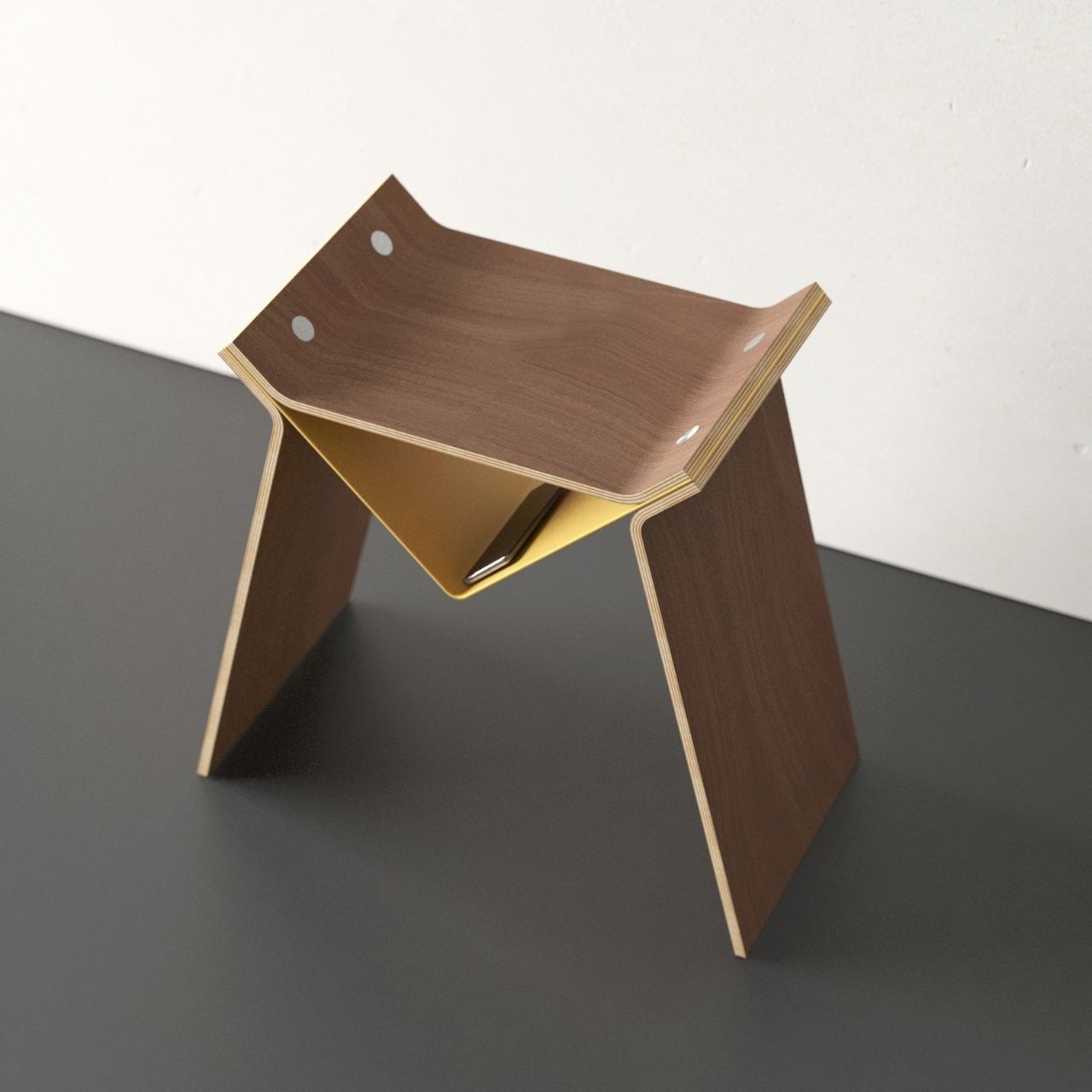
Are you the kind of person who would look at clouds and try to see what shapes or creatures you can see there? If yes then you’re probably a pretty creative person who can see all sorts of things in different figures and structures even without hearing the name of the product concept. So even though there’s no description or explanation, you probably understand why this new product concept for a stool is called Wolf.

Why is it noteworthy?

The German-based designer is making a name for himself with his unique takes on simple furniture like bookshelves, lamps, and chairs. This new concept for a stool is called Wolf and if you let your imagination run a little wild, you’ll be able to see a wolf in the shape of this minimalist piece of furniture. In fact, the shape of the stool looks like a logo for a new video game or a brand that gives off a scary, wolf vibe.

What we like

  • The triangular middle part can actually be turned into a small storage area

What we dislike

  • Doesn’t seem like a very cozy seating space

9. Wallganize
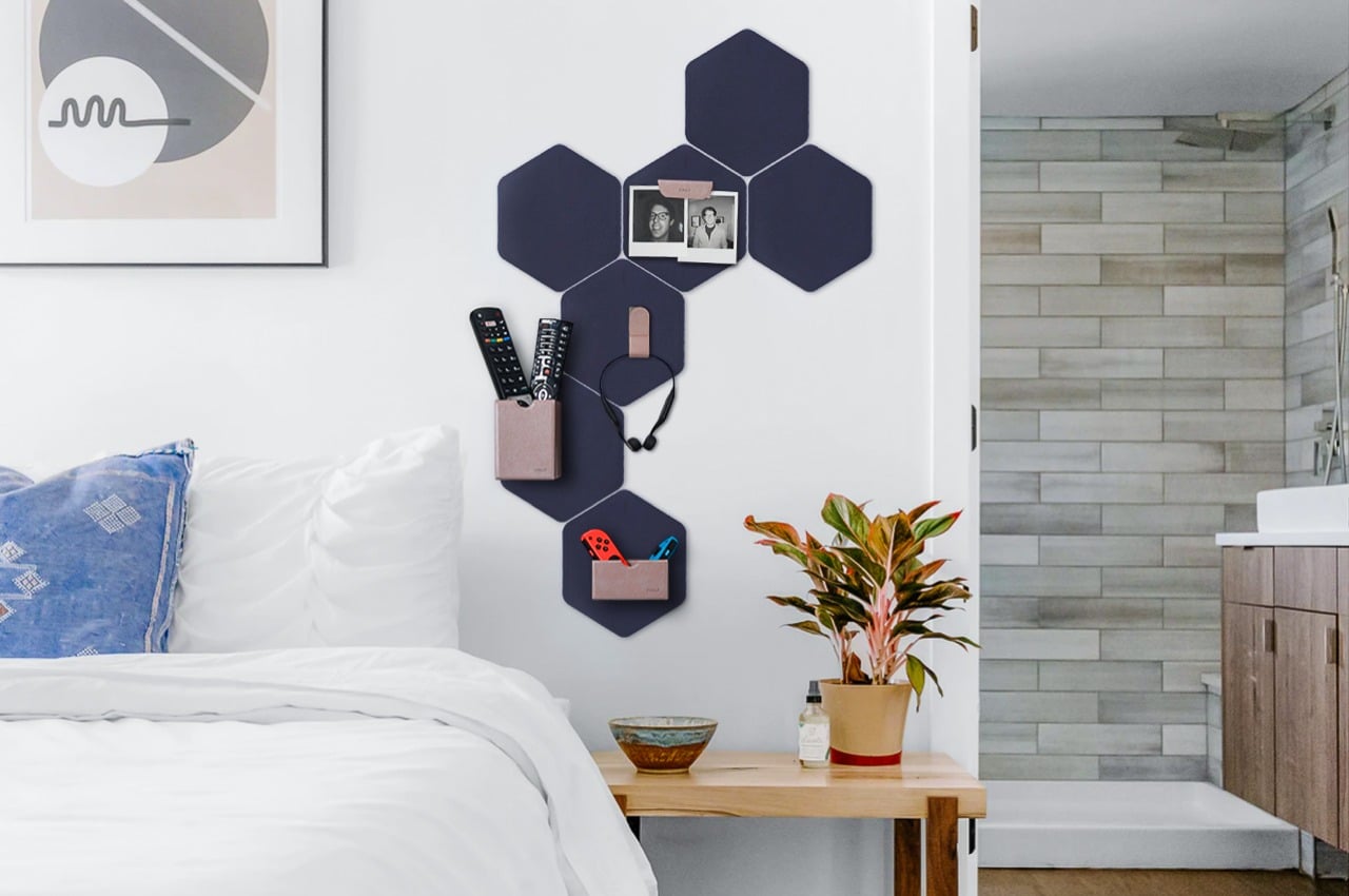
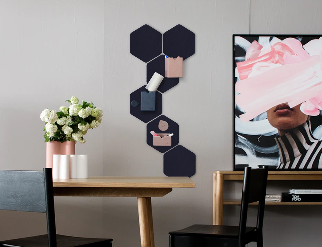
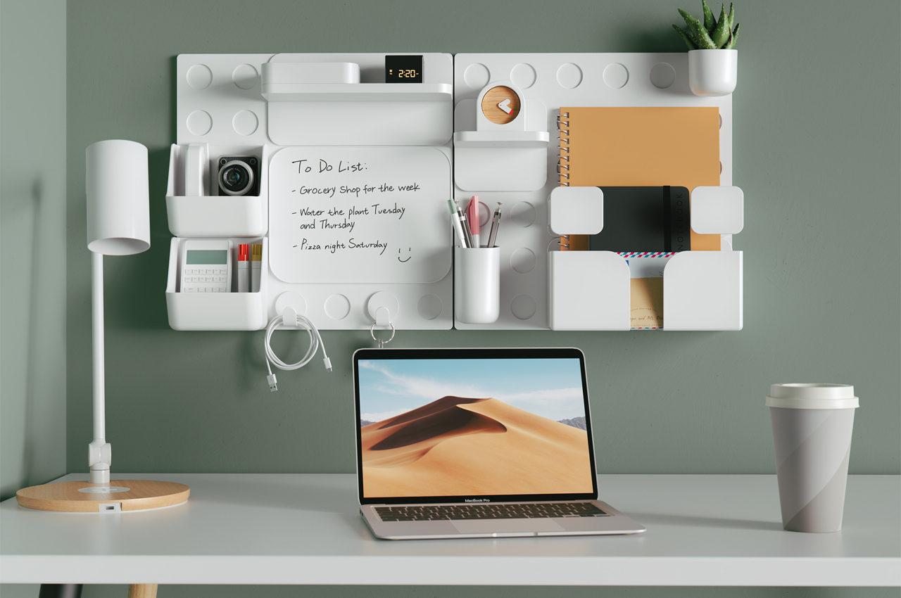
Organizers and containers that stick to walls aren’t exactly new, but Wallganize adds a touch of magic to them. It isn’t simply a collection of boxes, clips, and rings that you stick on a wall. It is, instead, a system that offers both a platform and a set of modules that firmly attach to those platforms using strong magnets, letting you mix and match as you need and please.

Why is it noteworthy?

Wallganize has three platforms or bases that you “stick” your containers on. The BlankStatic is your most basic, rectangular sheet of magnet where you can attach boxes or whatnot willy-nilly. There’s also an “Attachnote” platform, which is practically a magnetic notebook organizer for those times when you can’t take your wall with you.

What we like

  • You can create your own pattern of hexagons to liven up your wall while still helping you keep your life uncluttered
  • You can simply rearrange the boxes or even relocate the platforms to another part of the wall

What we dislike

  • No complaints!

10. June

June Storage and Display Tray Design

June Storage and Display Trays Colors

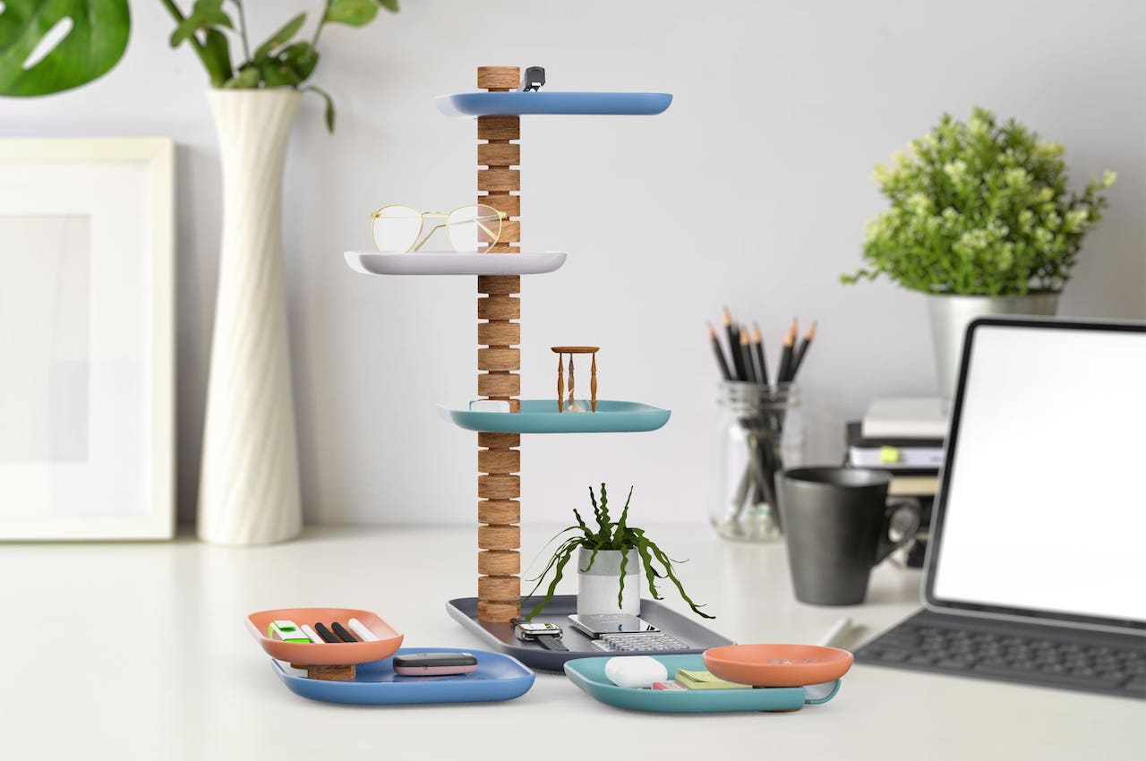
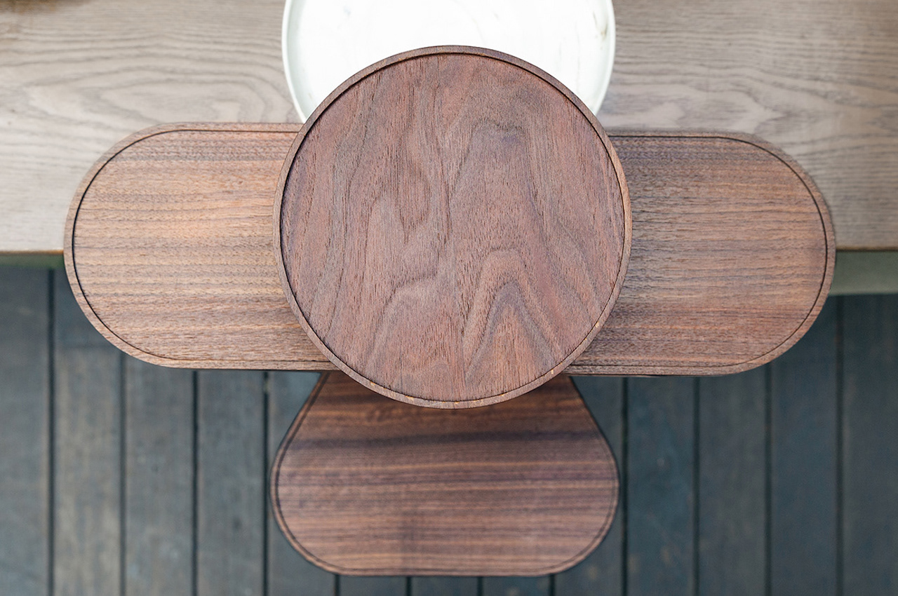
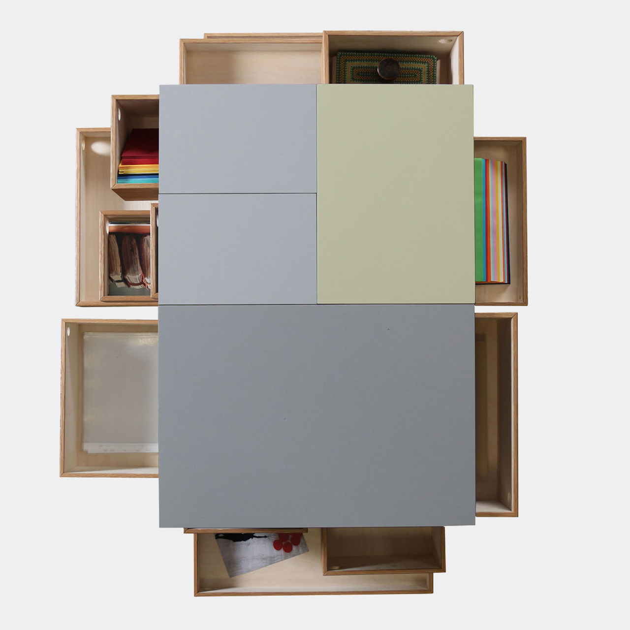
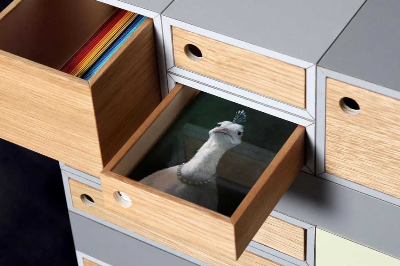
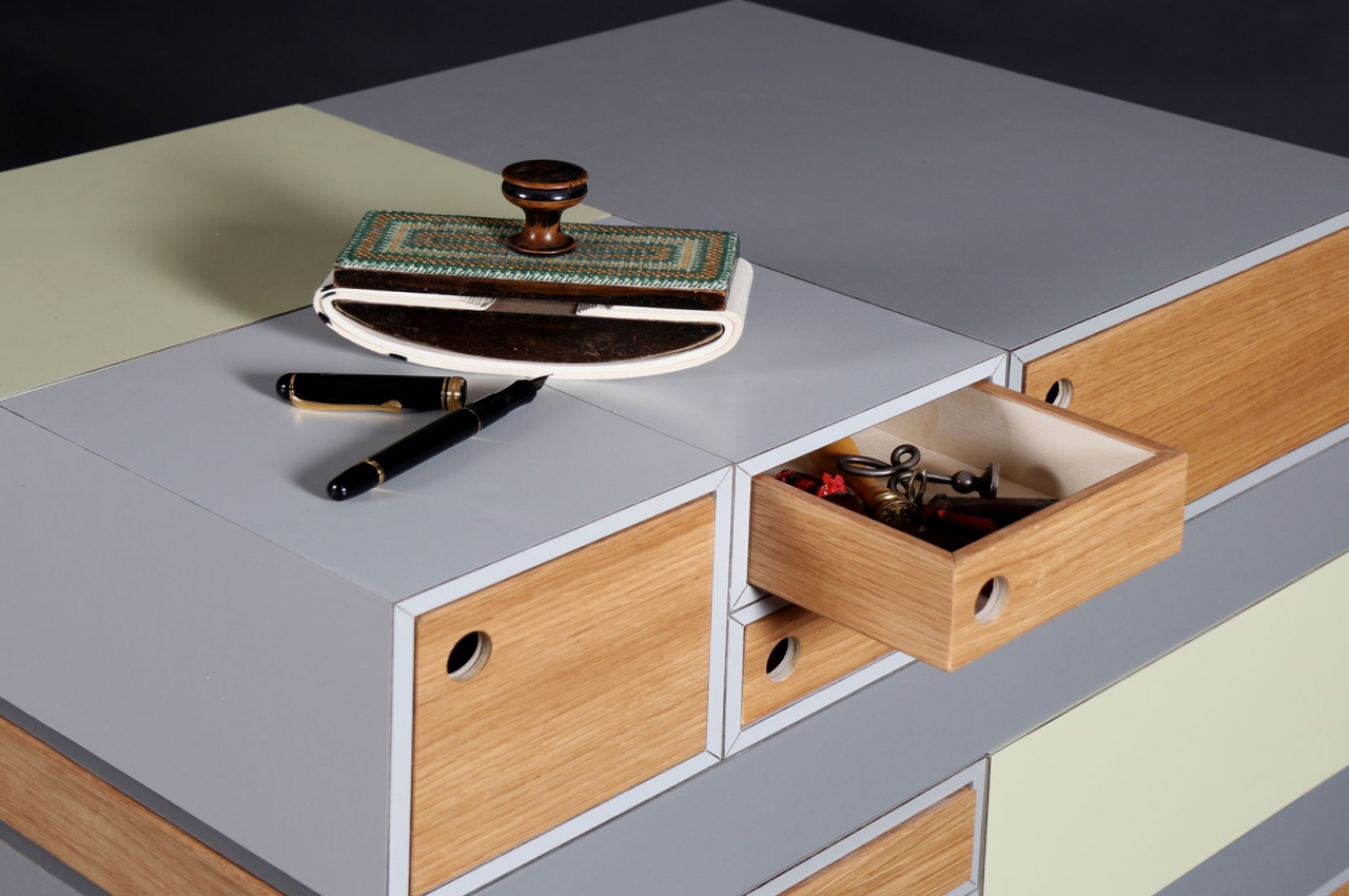
June is a new system or storage and display trays that may be helpful to those who want to Marie Kondo their stuff. No, this won’t really carry all your things, but it looks like a fun and stylish way to keep things clean and tidy. Of course, having a clean and clutter-free desk is necessary, especially if you want to get work done quickly and smartly.

Why is it noteworthy?

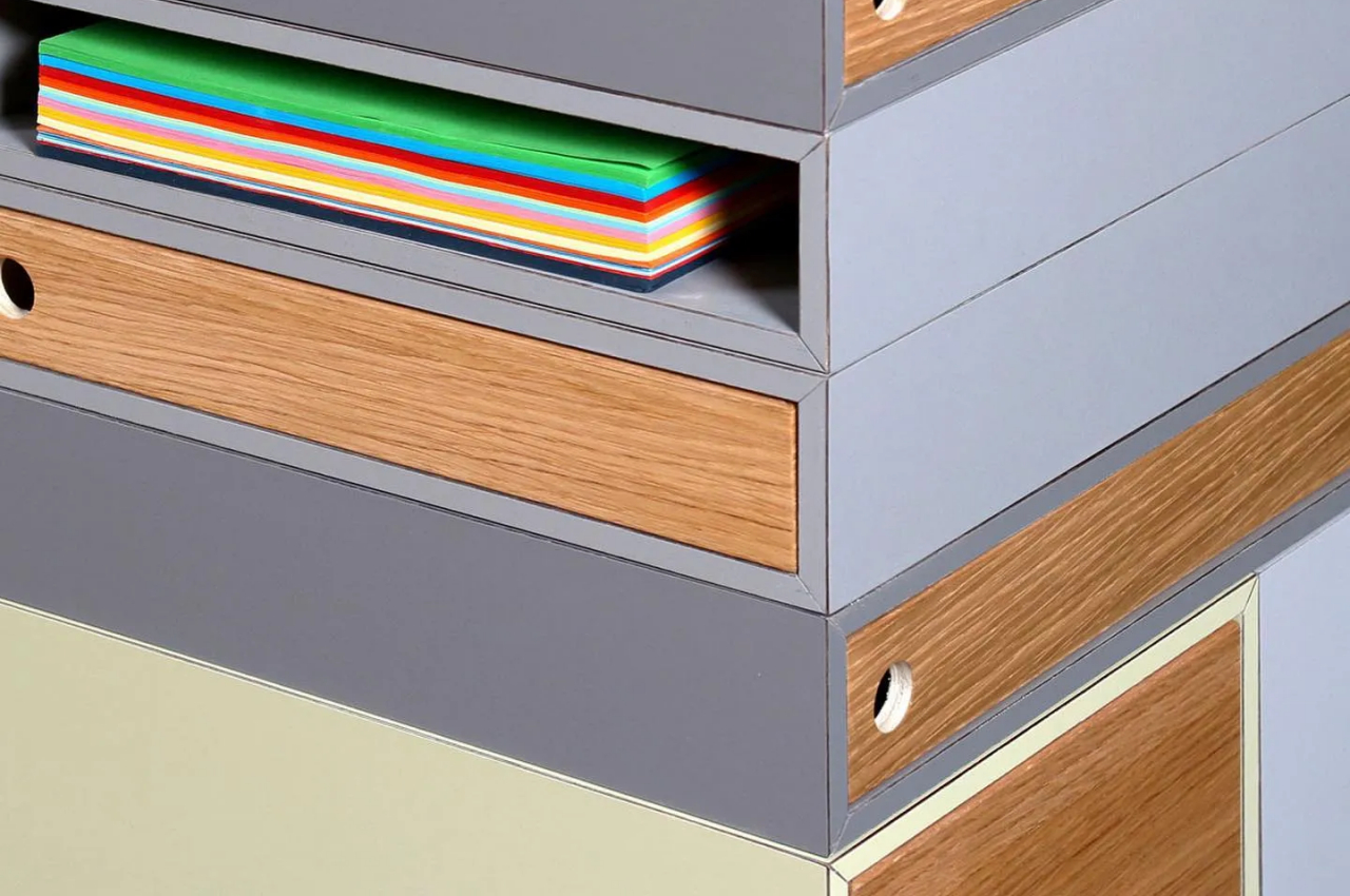
June is designed as a versatile system of storage and display trays. This desk accessory is very functional and practical for anyone with a work desk. This modern organizing system is based on the idea that storing things vertically can be more efficient. Such vertical solutions save up desk or counter space.

What we like

  • The aesthetics of June is modern with a hint of mid-century
  • You can use it in your office, bedroom, dining room, or kitchen

What we dislike

  • No complaints!

The post Top 10 ultimate storage solutions to de-clutter your contemporary home first appeared on Yanko Design.
This asymmetrical wooden storage doubles as a beautiful side table

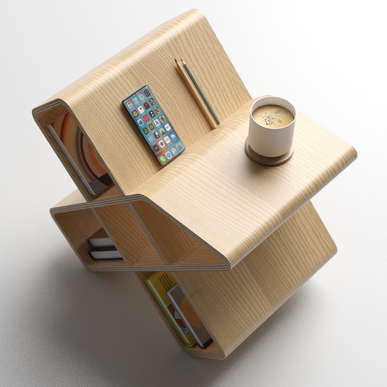
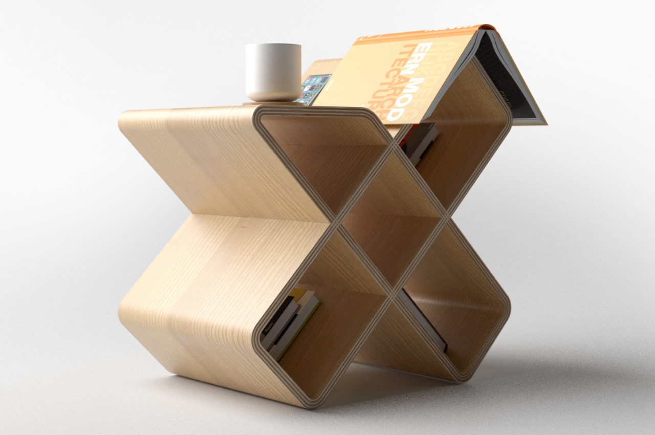
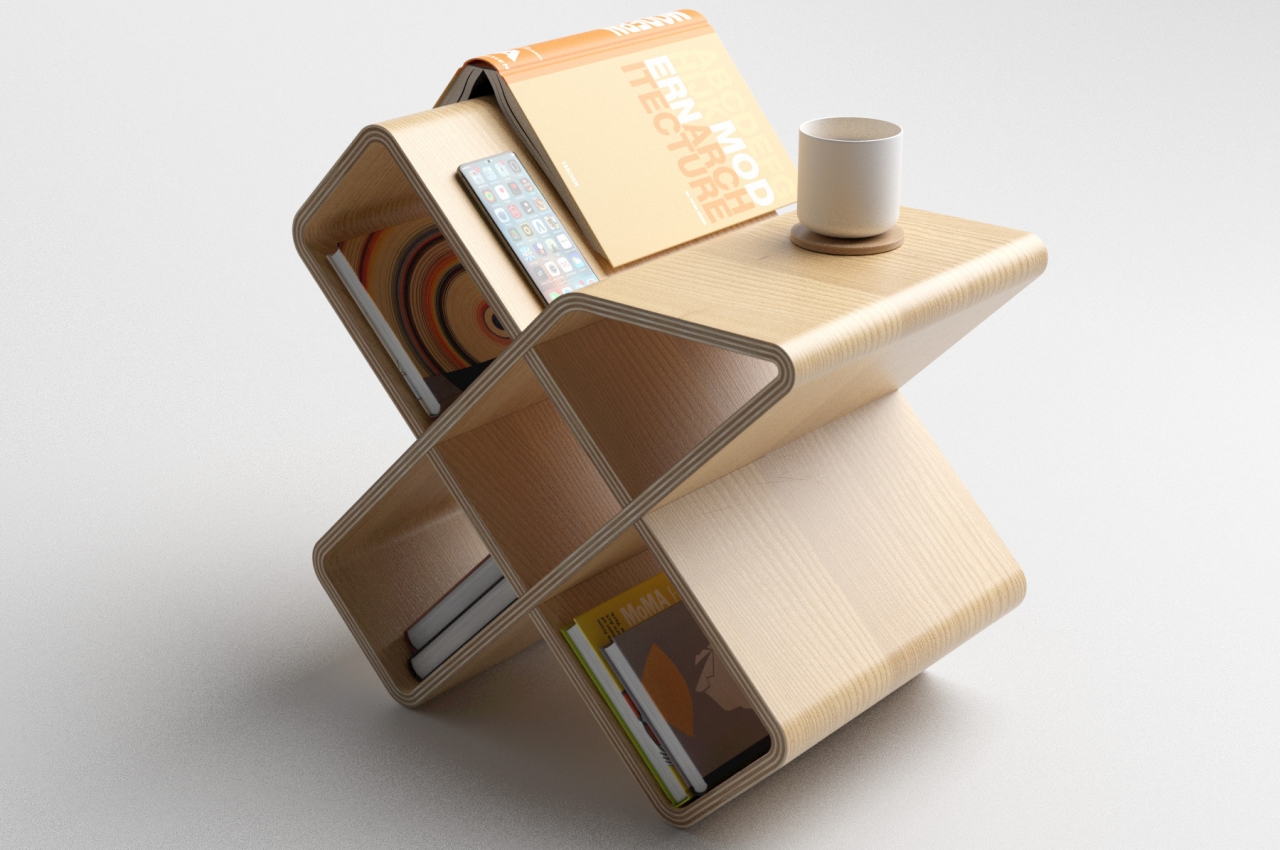
Space isn’t infinite, at least not the ones inside our houses and our rooms. Every piece of furniture you add means less room for anything else. Given the premium on living spaces these days, people have been forced to be smarter about their purchasing choices, particularly when it comes to chairs, tables, and shelves. Sometimes people buy modular products they can shrink and grow as needed or storage they can shove in some unusual location like stairs. Most of the time, however, people pick designs that can serve two purposes at the same time, like this small shelf and storage space that can also be used as a low side table, even if it looks like it might tip over.

Designer: Deniz Aktay

Shelves are excellent for storing things and also displaying them at the same time. Depending on how you arranged those things, it might also be easy to retrieve them at a moment’s notice. Most shelves, however, take up a lot of space, can rarely be moved, and can’t be used for anything else. Having something that can serve multiple functions at once is definitely better, and that’s what Crossbred tries to offer on a slightly smaller scale.

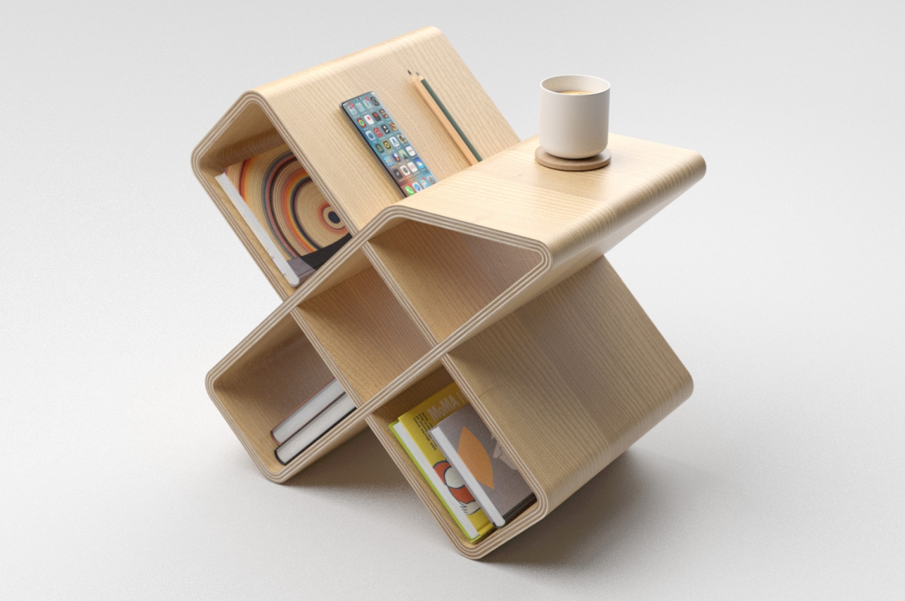
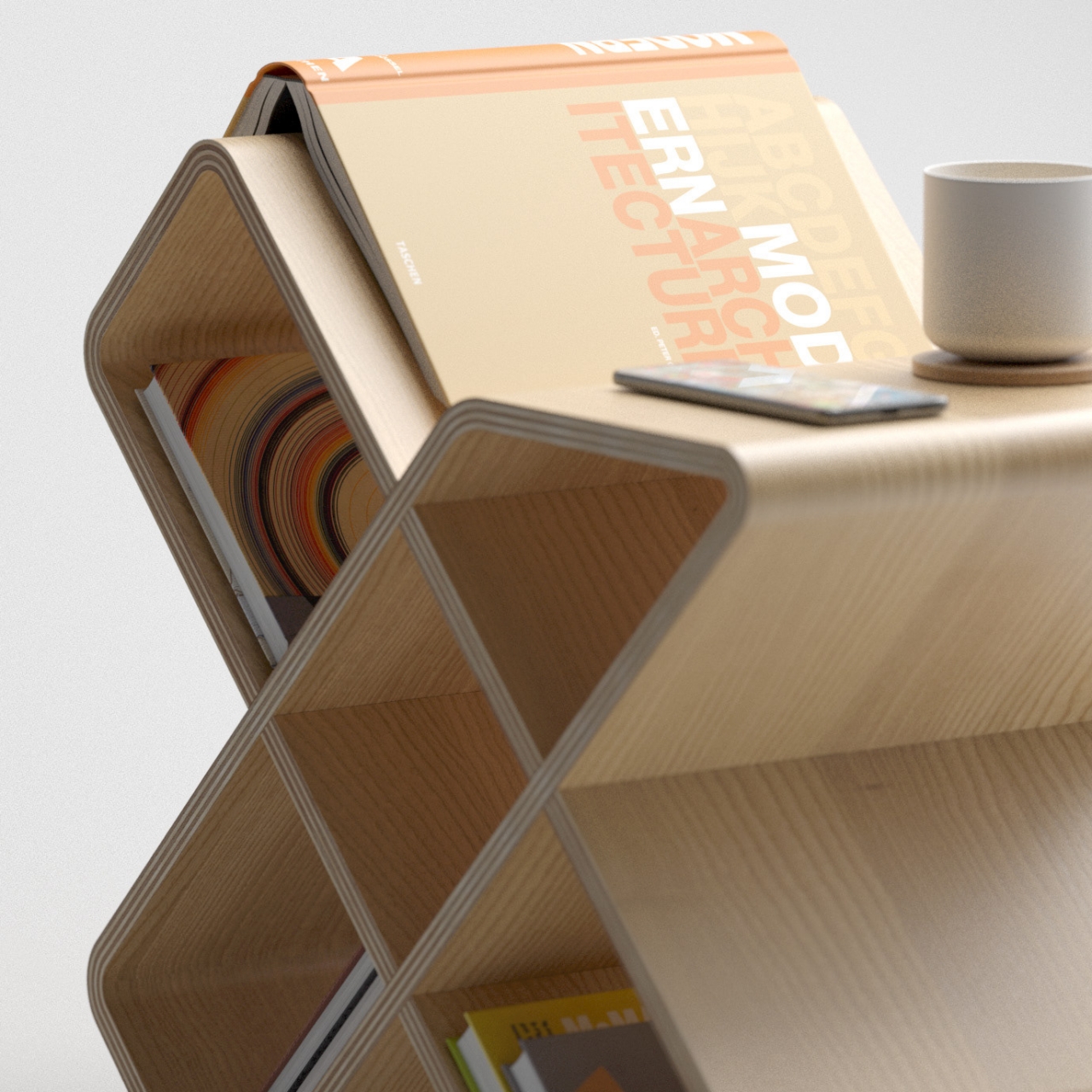
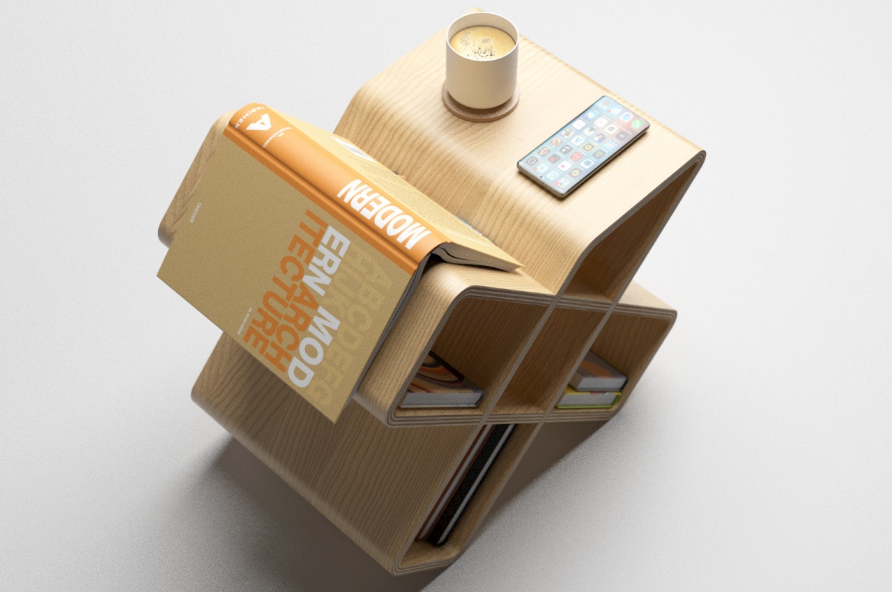
The furniture’s name speaks to both its form as well as its function. It looks like an “X” or a cross, as some might call it, standing steadily on the tip of its two legs. It’s a hollow cross through and through, and all five spaces can be used to store anything from books to knickknacks. That said, given their inclined surfaces, it obviously isn’t a good idea to put something that requires a perfectly horizontal plane, like some fragile decor or even a picture frame.

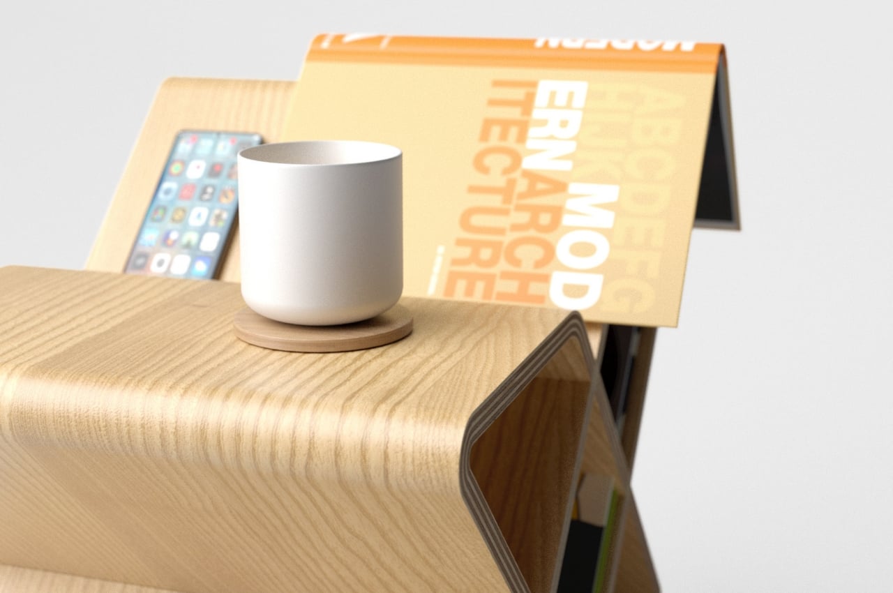
One part of Crossbred, however, might be good for that. One of the cross’ top arms is chopped off, leaving a flat horizontal surface. This can be used for those objects, or it can be used as a table for a quick sip of coffee. Of course, it can be used for both, even at the same time. It’s that kind of flexibility that makes the design a more viable solution than a separate shelf and side table. Almost every nook and cranny of the storage can be used for something, like a marker for books or a holder for phones and stationery. Despite its unorthodox design, there is almost no wasted space here.

There is also a certain charm to the Crossbred’s design. Despite being made from wood that gives off a sense of warmth and familiarity, its cross shape and especially its truncated arm also give it a pinch of dynamism and whimsy. It definitely has an understated beauty to it, one that doesn’t scream to get attention. Most importantly, it is multi-functional and a perfect fit in today’s world and lifestyles, where change is constant, and people’s needs and tastes change just as much.

The post This asymmetrical wooden storage doubles as a beautiful side table first appeared on Yanko Design.

Electrolux GRO kitchen concept offers a fresh take on sustainable eating

It’s no longer enough to just eat healthy. One also needs to make sure our healthy eating is also healthy for the planet.

There has been a great deal of interest and attention given to diets in the past years, especially as people were forced to fend for themselves at home. Diet fads come and go, but the ingredients we use have mostly remained the same, and the demand for meat-based products has only gone higher, not lower. Our food system isn’t just broken, but so is our mindset and expectations of an unlimited supply of materials to feed the planet at the expense of the planet itself. That definitely has to change, and a holistic kitchen system imagines how tomorrow’s diets won’t only be plant-forward but also planet-friendly.

Designer: Electrolux

Eating healthier has almost become an obsession of many people these days, evidenced by the number of new diet styles and trends that pop up every year. But while people have become generally conscious of the food they eat, they often turn a blind eye to the long-term effects of our food supply systems on the Earth’s ecosystem. Feeding the planet doesn’t have to come at the expense of the planet itself, nor do plant-forward diets have to be the same old stuff you see on the Internet and YouTube.

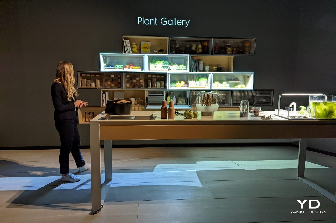
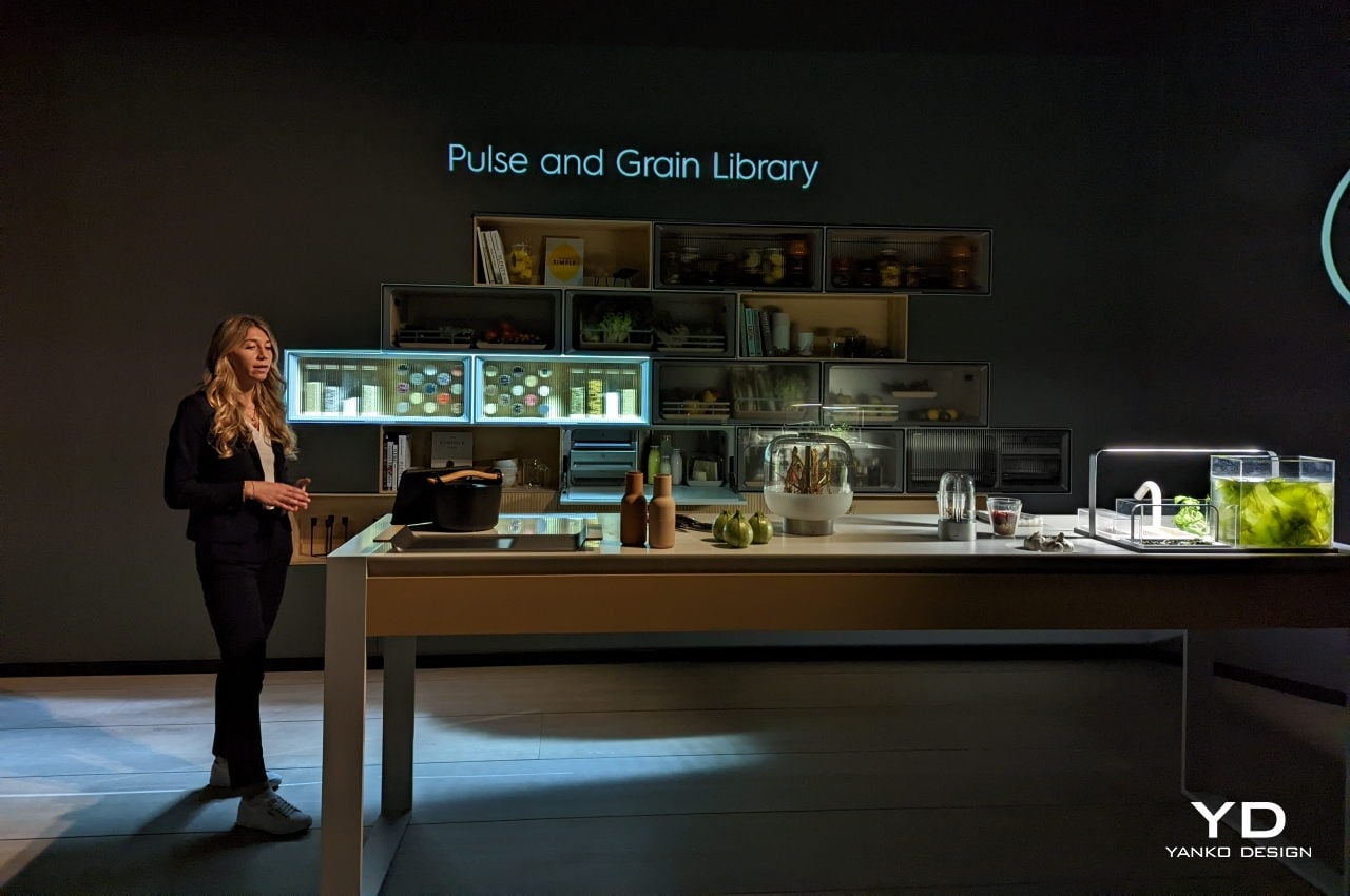
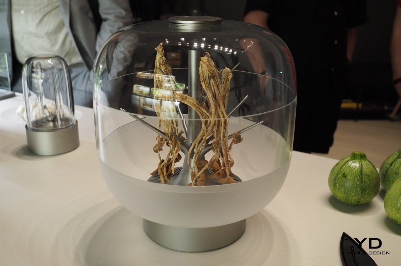
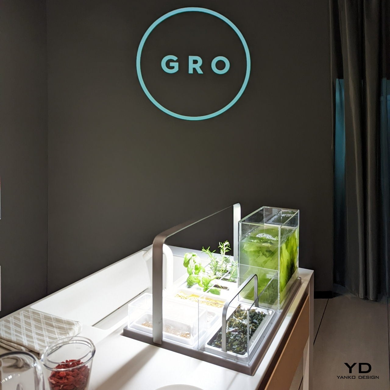
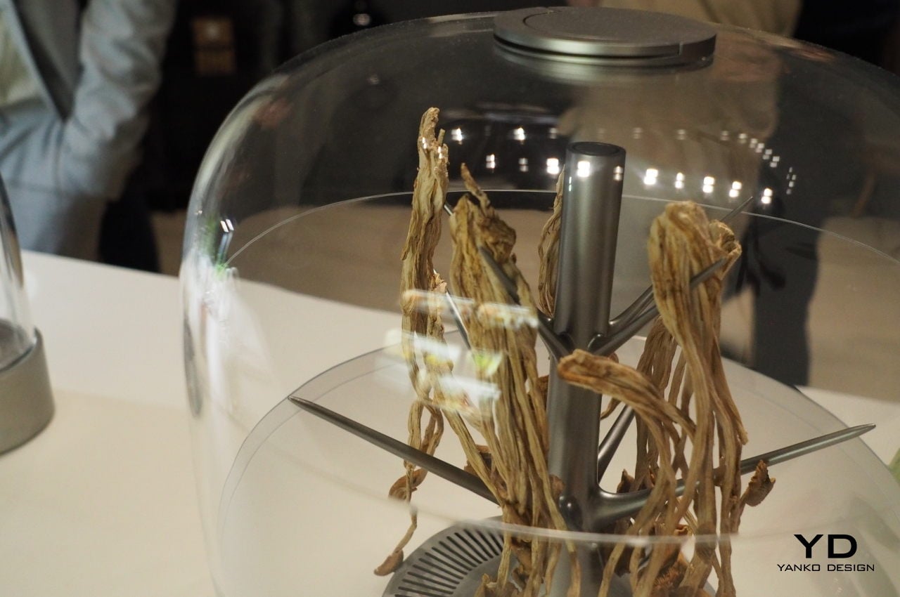
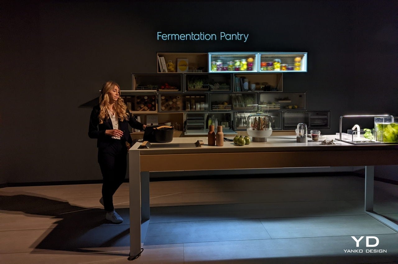
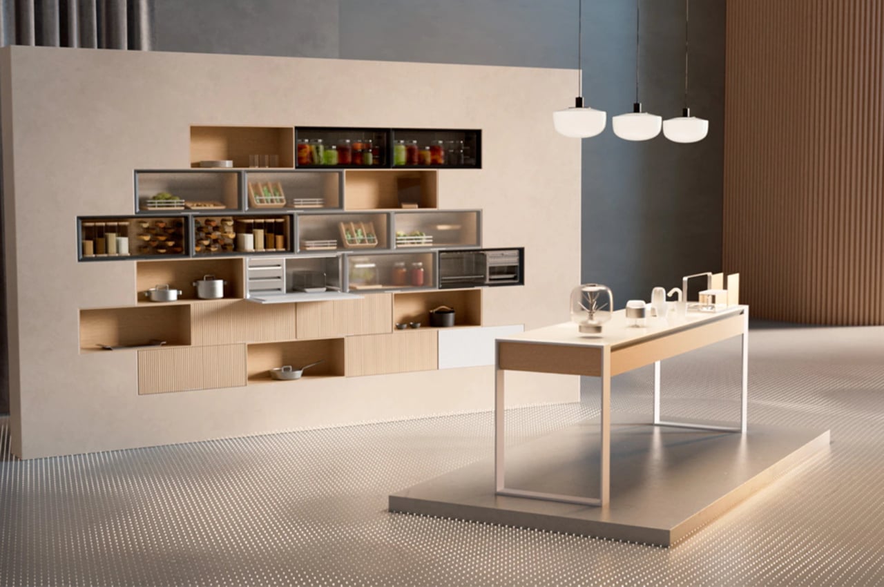
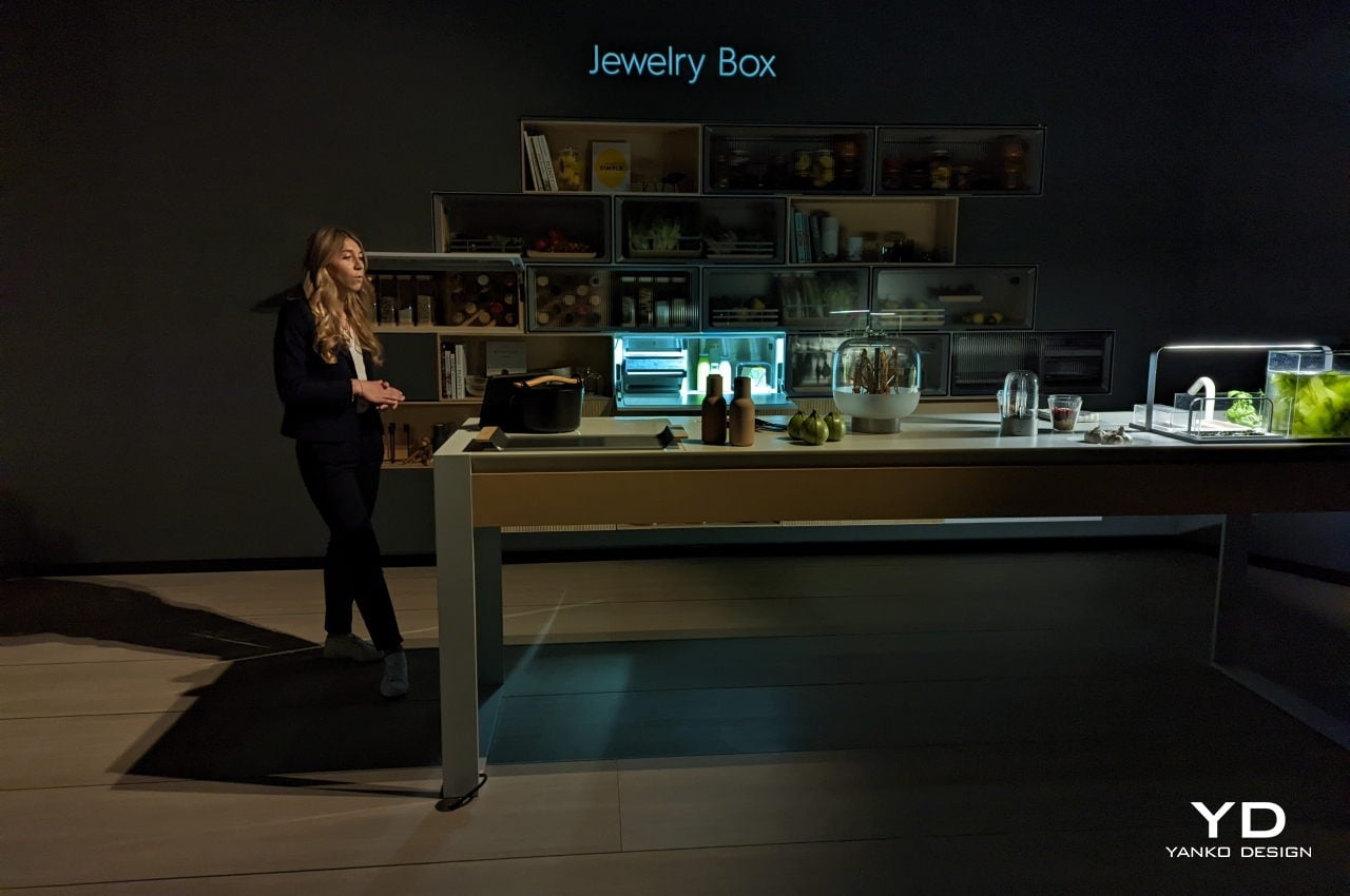
GRO, from the Swedish word for “to sprout,” reimagines and reinvents a kitchen designed for sustainable eating. While that largely revolves around transitioning to a more plant-forward diet, it also acknowledges the fact that meat will still be a part of people’s lives. Instead, GRO provides solutions to nudge people to become smarter about their food choices, like a “jewelry box” storage that encourages eating less but better quality meat.

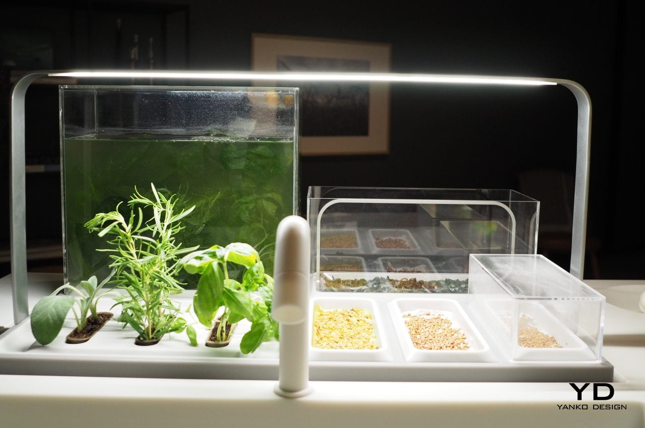
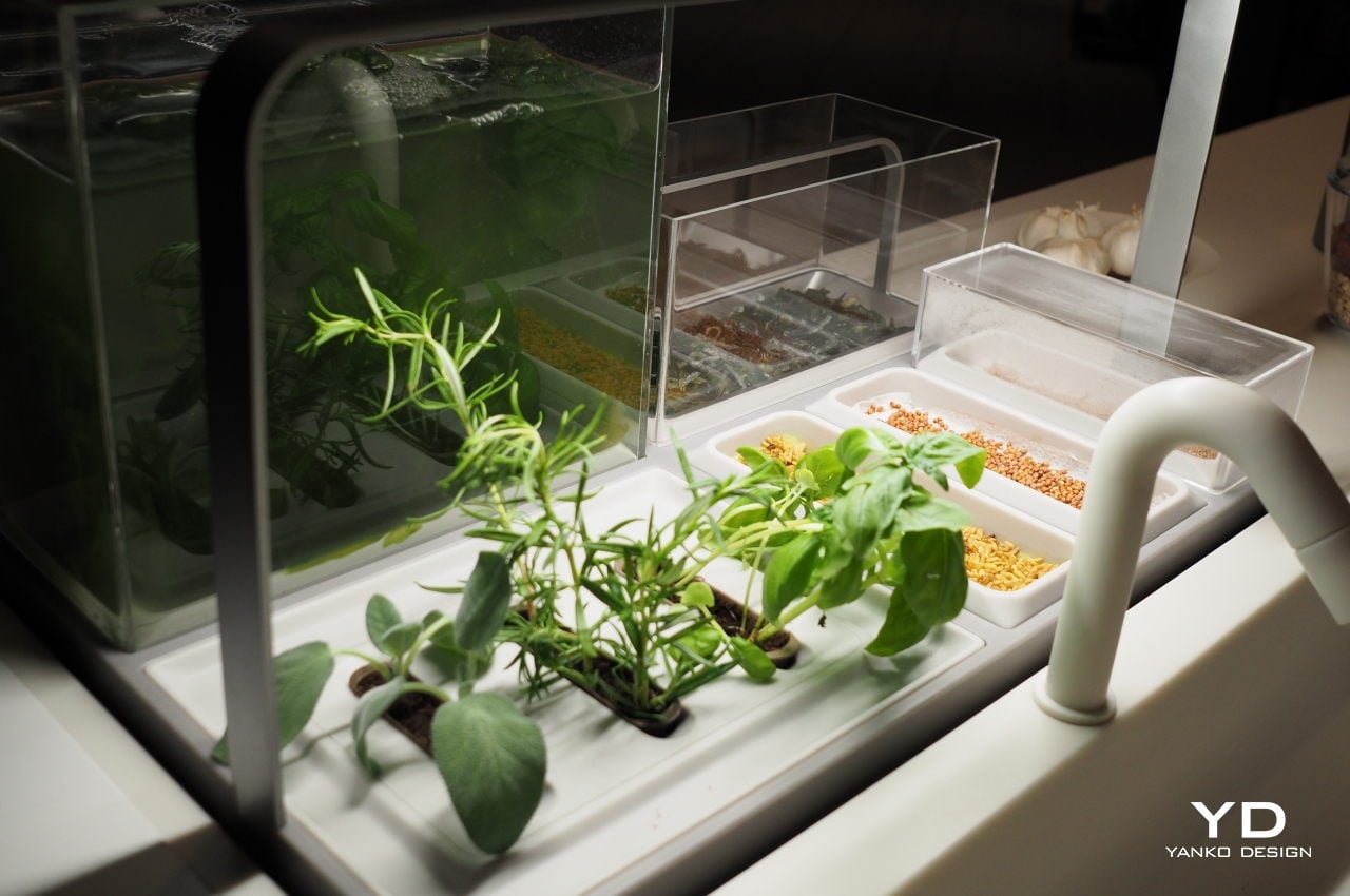
GRO includes a modular compartment system that you can combine like LEGO bricks, depending on your dietary needs and kitchen space. Each compartment is designed not only to preserve ingredients but also to showcase their diversity and beauty. A Plant Gallery, for example, provides optimal conditions for storing fruits and vegetables while also letting you enjoy their fresh appearance behind textured glass.

The system also defies stereotypes of plant-forward diets as bland or unexciting, especially to taste buds. In fact, GRO encourages exploration and experimentation, like the Grain and Pulse Library, which lets you try out alternative sources of protein from grains and pulses. Included in the collection is the Nordic Smoker, which lets homeowners smoke their food indoors and infuse new flavors into their recipes. And if all those starts to sound a bit overwhelming, the GRO Coach digital food companion will help you make the right sustainable choices based on your habits and needs.

GRO is part of Electrolux’s Better Living Initiative to promote better eating and better living inside more sustainable homes. The company sent out a survey last year aimed at young people between 15 and 20 to share their thoughts on the future of sustainable living. They are, after all, the biggest stakeholders in the planet’s future, and Electrolux’s kitchen concept wants to make sure that there will still be such a future that will be able to sustain life on the planet for generations to come.

The post Electrolux GRO kitchen concept offers a fresh take on sustainable eating first appeared on Yanko Design.

Steward Smart Space Series solves the problem of a cluttered table

Others quickly think about outer space when people say space, where planets and heavenly bodies abound. But there is another space that we sometimes feel is elusive, especially in highly urbanized cities.

There are plenty of solutions if the problem is space. First, of course, ample storage is a must, but such is not always easy to achieve. Getting proper organizers for other establishments like a restaurant or an office may do the trick. The Steward Smart Space Series can be a worthy investment as a set can accommodate a lot of stuff.

Designer: NextOfKin Creatives

Steward Smart Space Series

Steward Smart Space Series Collection

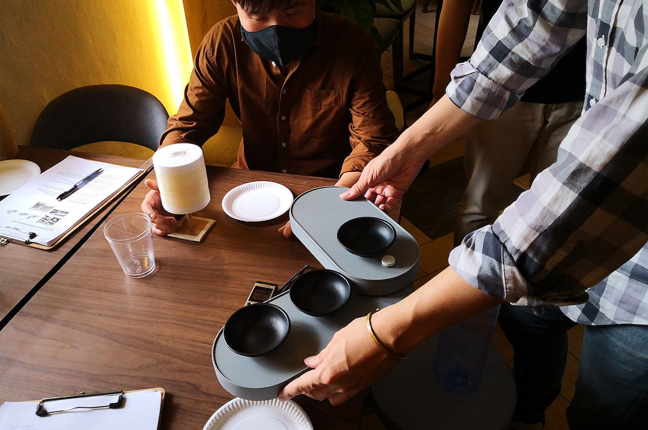
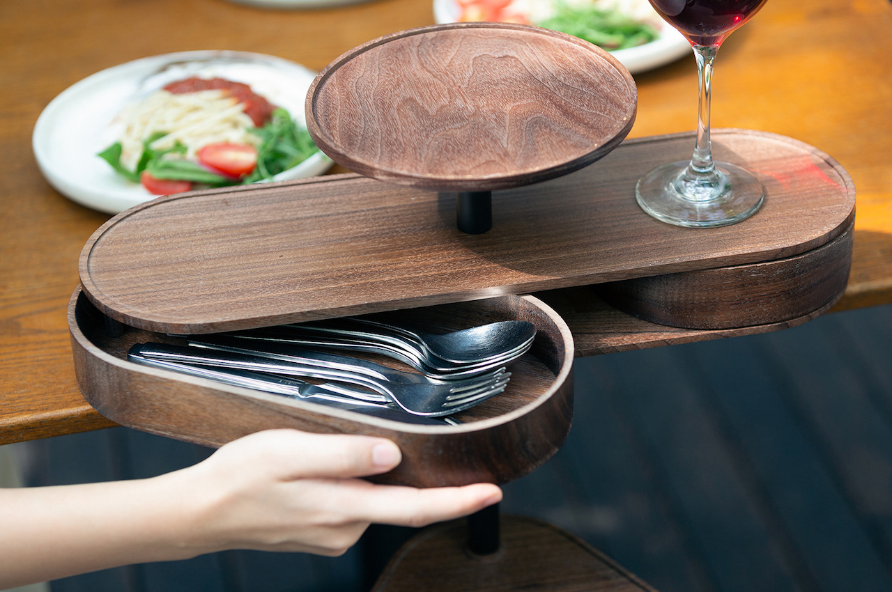
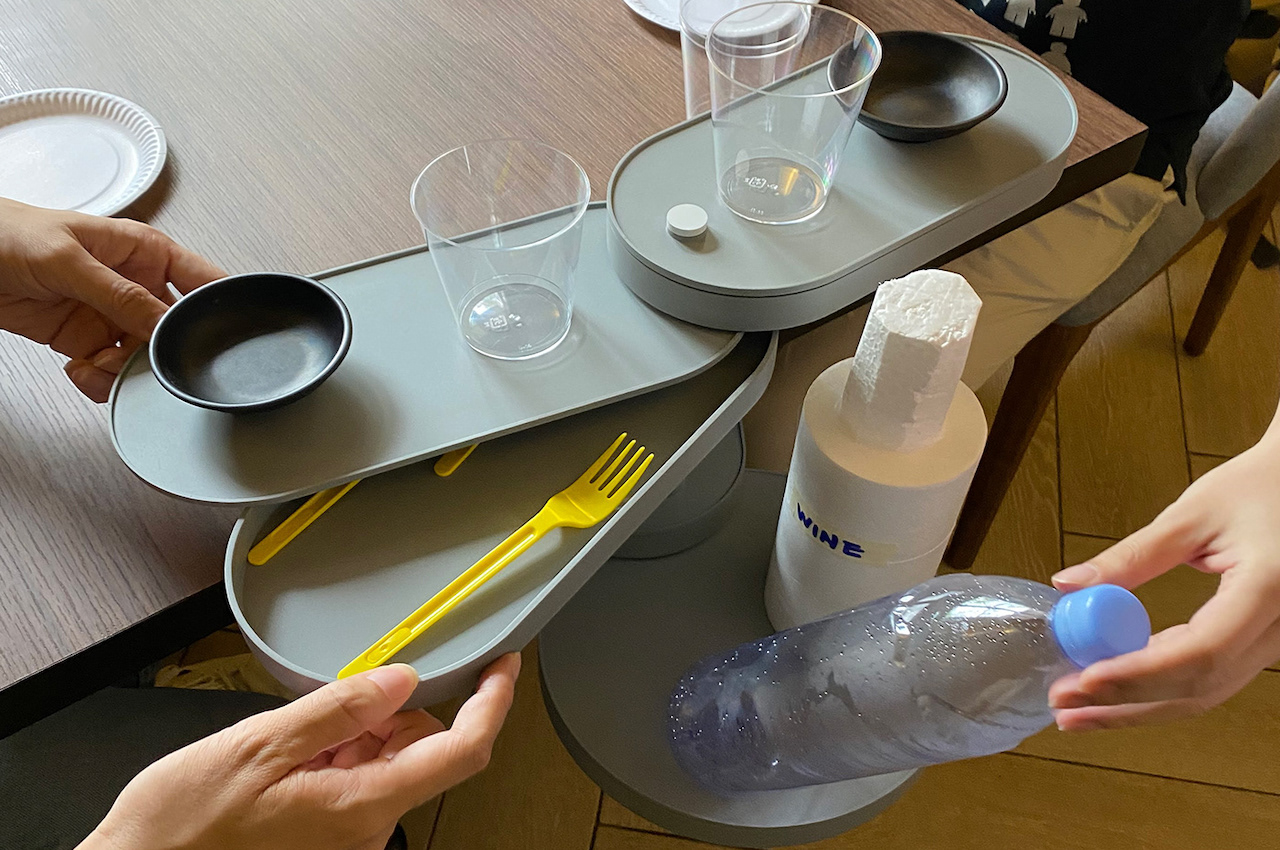
The Steward Smart Space Series products include add-on systems that can help with the clutter on tables in restaurants. A set keeps a table more organized, even if small. If a table is more organized and everything is set, service requests would be lessened. This state is beneficial to both the waiter and the diners.

Steward Smart Space Series smart furniture accessories offer space-saving solutions. It’s an innovative way to take advantage of the unused space on the table. The team’s design process was systematic, allowing the team to identify the common problems and then get suggestions.

Steward Smart Space Series

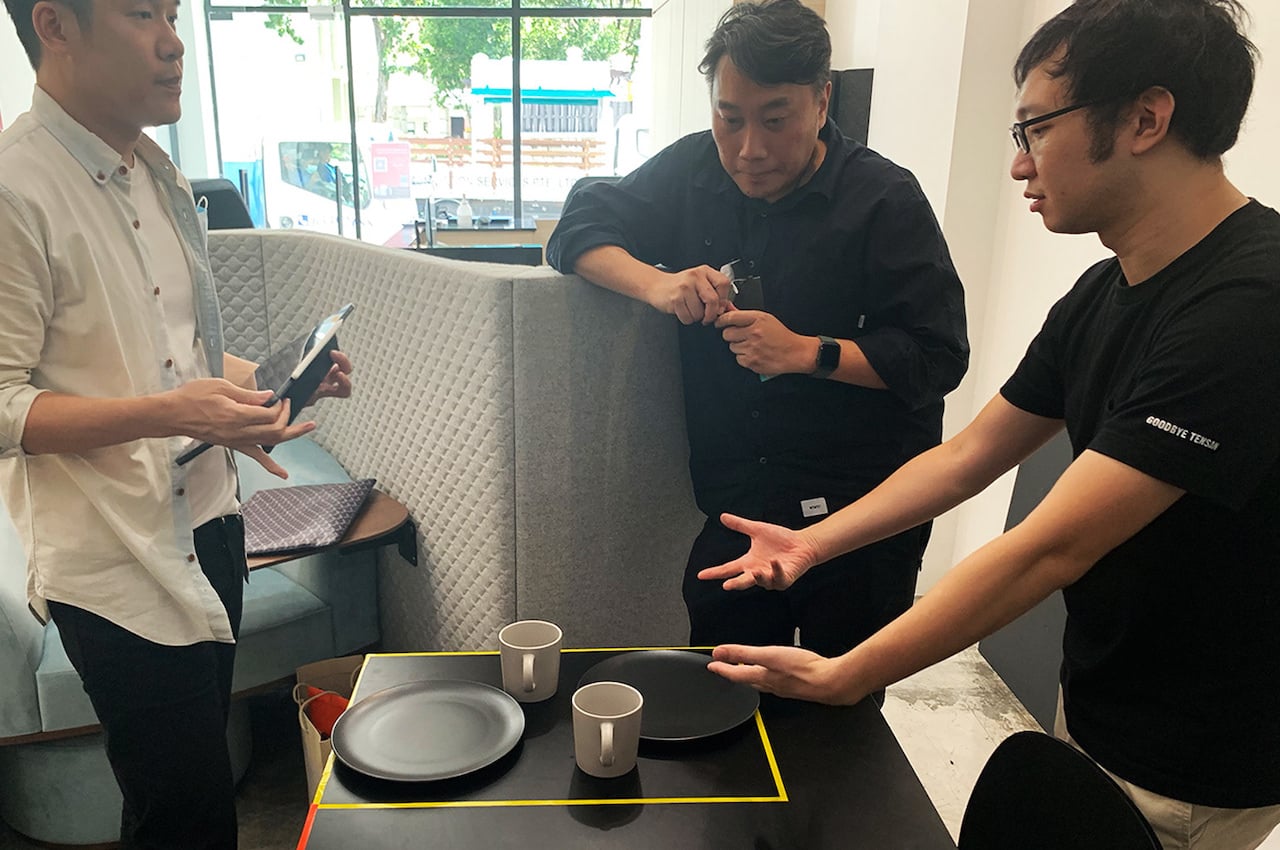
The problem of space and clutter will always be there. However, thanks to endless solutions and innovative ideas, it will be resolved but will surface again if people forget to keep their commitment to keeping things organized. The design team worked on several versions, from CAD to prototypes to actual testing. Numerous tests have been made, and insights have been gathered to know where there can be improvements. Once feedback is heard, the team can then work on the refinements.

Steward Smart Space Series Details

Steward Smart Space Series Set

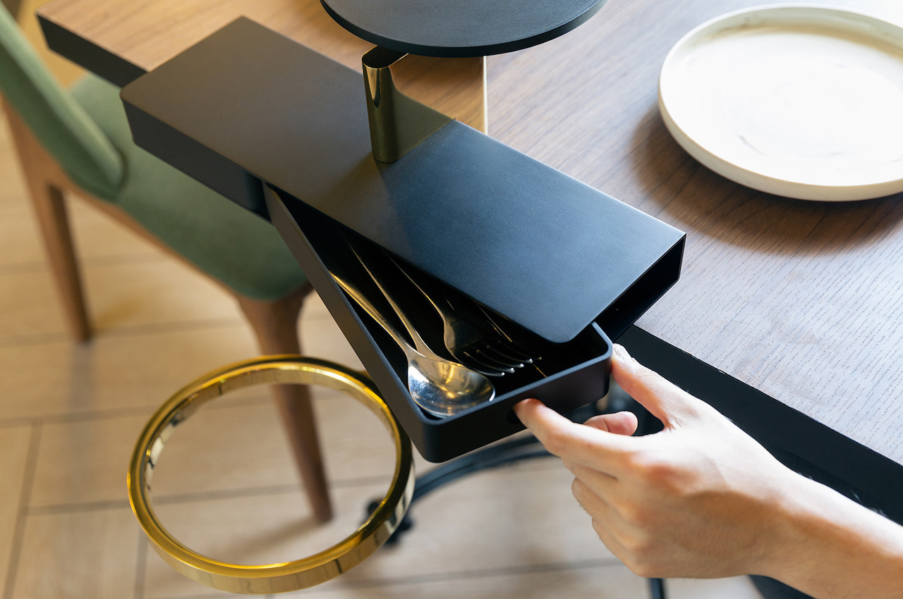
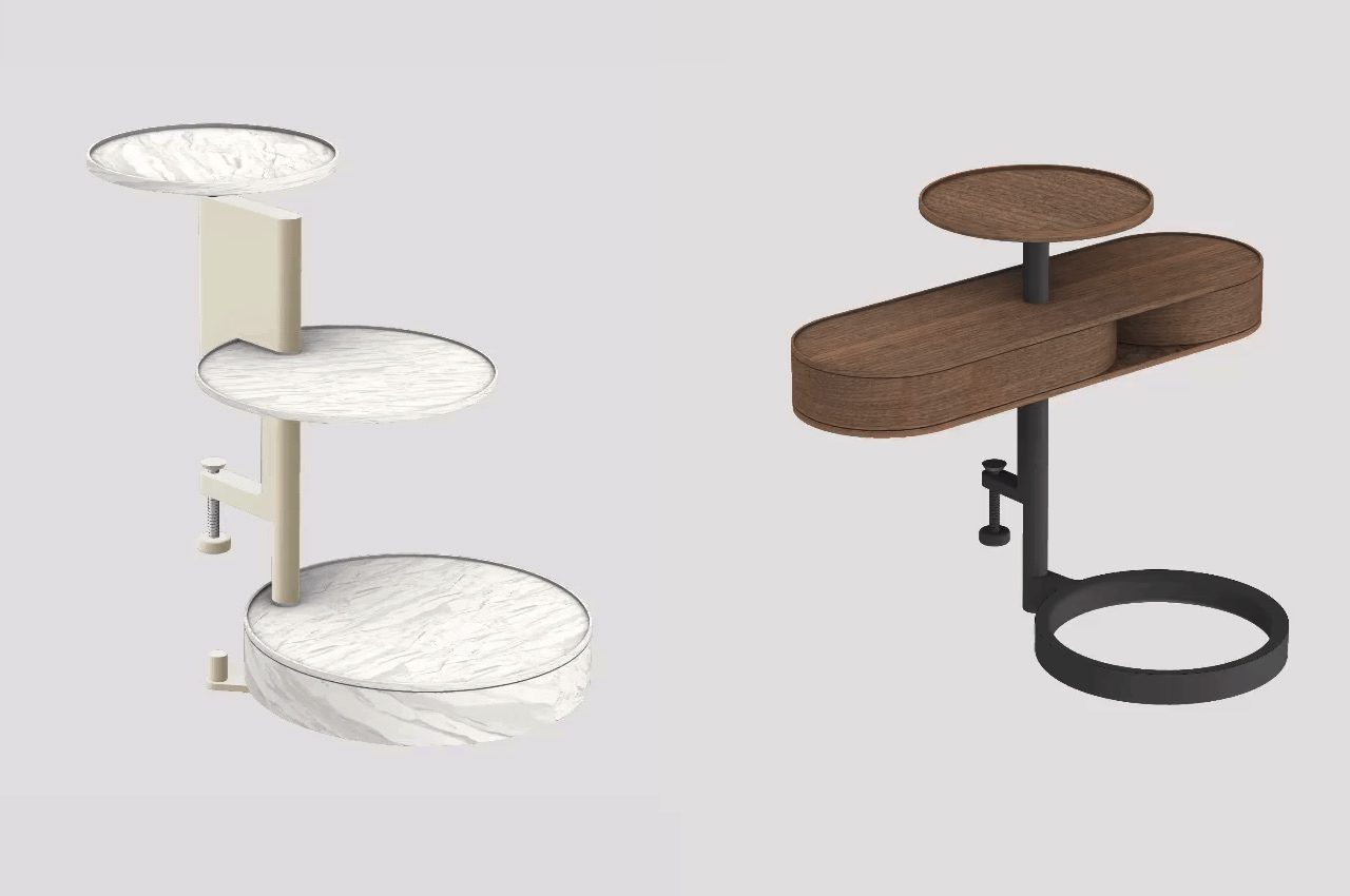
The Steward Smart Space Series comes in different designs. There is the Table+ Collection that maximizes the vertical and horizontal space for storage of dining ware. It is inspired by architecture, so expect designers will find this smart. It also has the potential to be iconic with its contemporary design.

Steward Smart Space Series

Steward Smart Space Series Features

The Chair+ Collection features different modules, including a strap, a side clip, and a top hook. These things let you mount the system and adjust to different types of seats. Meanwhile, the slim and sleek Clamp+ Collection can be ideal for any space. It offers more storage and lets you enjoy more freedom. If you’re looking for a more modern and practical solution, then this is it. Last but not least is the Standalone+ Collection. It can be used on different platforms as the possibilities are endless with this system.

Steward Smart Space Series Smart Tray

Steward Smart Space Series Designers

Steward Smart Space Series

Steward Smart Space Series

Steward Smart Space Series Designer

The post Steward Smart Space Series solves the problem of a cluttered table first appeared on Yanko Design.

Top 10 storage solutions to de-clutter your modern millennial home

PLOT TWIST Bookshelves

If you’re an independent millennial who recently moved out of their family home and into their own, then a major issue that you may be dealing with almost every day…is space constraint! Our modern millennial homes have many virtues, but one thing they lack is space! Space constraint is something most of us end up dealing with every day. Smart storage solutions can be lifesavers in such tricky and compact situations. And to make your lives easier, we’ve curated a whole collection of storage solutions that come in the form of furniture designs that, to be honest, are going to completely organize your home! Not only do these products comfortably store your belongings, but they’re also perfect for displaying those special items that you don’t feel like shutting away in a dusty cabinet. From a crafty bed with an overhead storage space to a bookshelf with a plot twist – this innovative storage and display solutions are the additions your home needs!

1. The Plot Twist Bookshelf

PLOT TWIST Bookshelf Concept

PLOT TWIST Bookshelf Details

Prolific German furniture designer Deniz Aktay has recently introduced the Plot Twist Bookshelf. It’s a piece of furniture that features four separate twisted wooden elements. They are connected to each other, shaping and creating a stable form.

Why is it noteworthy?

The bookshelf’s design allows it to be accessed from every side. As with most of Deniz Aktay’s product designs, this bookshelf is oddly satisfying. The curves are present as with the designer’s other projects. In addition, most of Aktay’s works have undergone some bending or twisting, as with the Wavelet, the Tie Stool, and The Pet Table.

What we like

  • The shelves can accommodate similarly sized books for a clutter-free look
  • The bookshelf is stable and stands on its own

What we dislike

  • Space consuming design

2. Wallganize

Organizers and containers that stick to walls aren’t exactly new, but Wallganize adds a touch of magic to them. It isn’t simply a collection of boxes, clips, and rings that you stick on a wall. It is, instead, a system that offers both a platform and a set of modules that firmly attach to those platforms using strong magnets, letting you mix and match as you need and please.

Why is it noteworthy?

Wallganize has three platforms or bases that you “stick” your containers on. The BlankStatic is your most basic, rectangular sheet of magnet where you can attach boxes or whatnot willy-nilly. There’s also an “Attachnote” platform, which is practically a magnetic notebook organizer for those times when you can’t take your wall with you.

What we like

  • You can create your own pattern of hexagons to liven up your wall while still helping you keep your life uncluttered
  • You can simply rearrange the boxes or even relocate the platforms to another part of the wall

What we dislike

  • No complaints!

3. Kosumi’s Wall Organizer and Mess-Free Planter

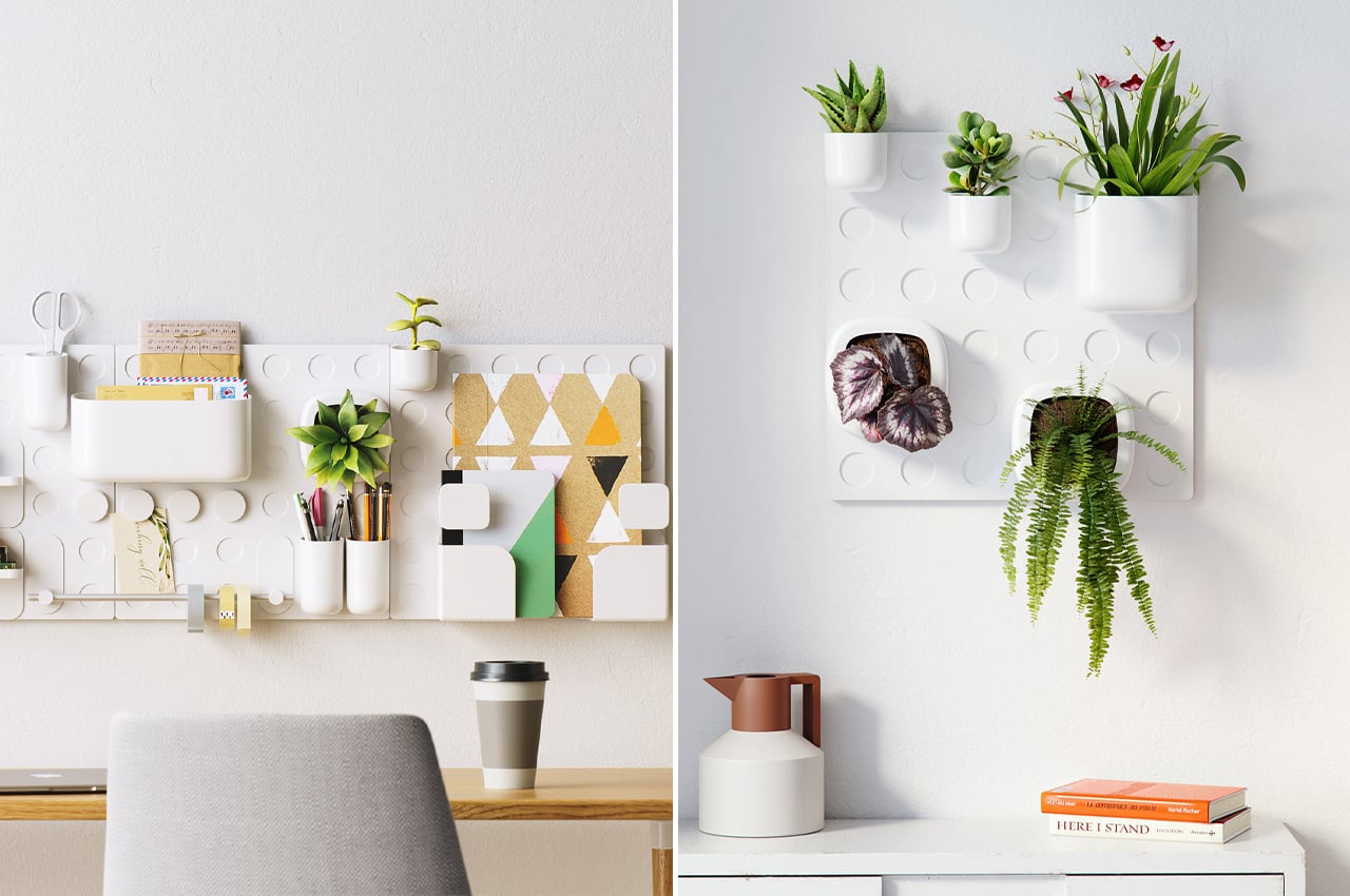
Defined by an assembly system close to LEGO building blocks, Kosumi’s Wall Organizer and Mess-Free Planter come with base grids that attach to walls with 3M strips, requiring no hardware or tools in the process. Once users form their base grid on their chosen vertical surface, the fun begins. Stocked with over 20 different modules, Kosumi’s Wall Organizer and Mess-Free Planter come with hangers, magnetic clips, transparent storage containers, planters, and cubbies.

Why is it noteworthy?

No matter the size of your living space, multi-use furniture helps to keep both the floor and our minds free from clutter. Adding his own multi-functional, organizational WFH design to the mix, Fahredin Kosumi created a Wall Organizer and Mess-Free Planter to form a magnetic, modular garden to mount on any vertical surface.

What we like

  • Works like LEGO building blocks
  • Impressive storage space
  • Entirely recyclable

What we dislike

  • We’re not too sure how long the plants would last in such an ecosystem

4. The Shelf x Shelf x Self table

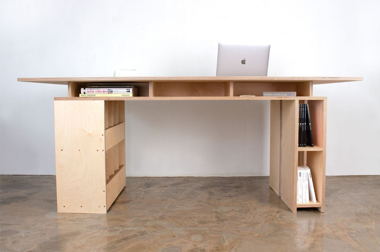
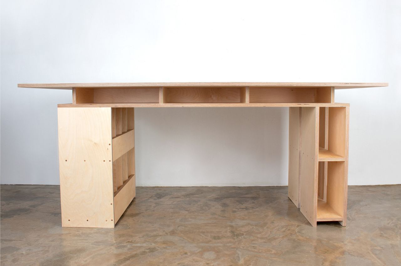
The Shelf x Shelf x Self table is both a table to work on and storage furniture as it was designed to have plenty of shelves. Underneath the table surface are tiny shelves where you can put your work supplies so they’re within easy reach. And if you place it in the middle of the room or not propped against the wall, you’ll be able to use all sides of the table to store your supplies, stationery items, devices, and other items you may need as you work.

Why is it noteworthy?

The legs of the table are also designed to be shelves so there’s more room for storage. Here you can put things like books, decorative items, funko pops, vinyl albums, flowers, even food that won’t spoil. It really depends on you what you want to put in there, whether you want the shelves to be design-focused or if you want them to be more functional and have items near you without having to get up every once in a while while you’re working.

What we like

  • Ample storage space
  • And if you place it in the middle of the room or not propped against the wall, you’ll be able to use all sides of the table to store your stuff

What we dislike

  • No complaints!

5. The Propr Office Containr Slim Rolling Pedestal

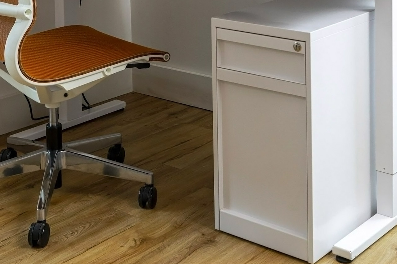
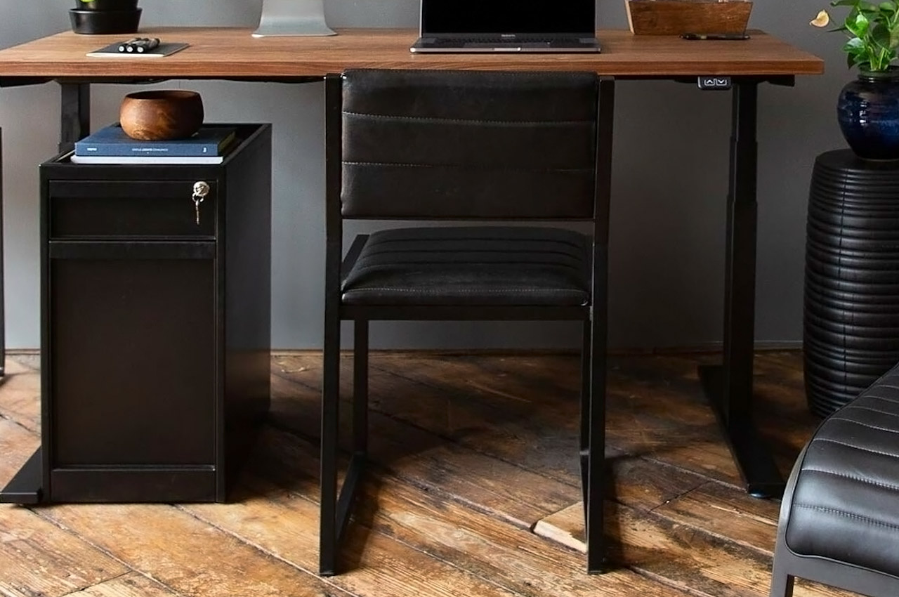
The Propr Office Containr Slim Rolling Pedestal is perfect for organizing + decluttering your workspace! The minimal furniture design features two drawers. The top drawer is equipped to hold smaller items, while the bottom drawer stores larger items.

Why is it noteworthy?

The furniture piece stores your office supplies in a handy manner, ensuring you don’t have to go around looking for them at all times. In fact, the bottom drawer even features an anti-tip mechanism to support and stabilize the product. It has four hidden wheels, which makes it super easy to move from one corner of the office to another.

What we like

  • Hides neatly under your desk
  • Portable form

What we dislike

  • No complaints

6. The Office Table

THE TABLE Singular Office Table

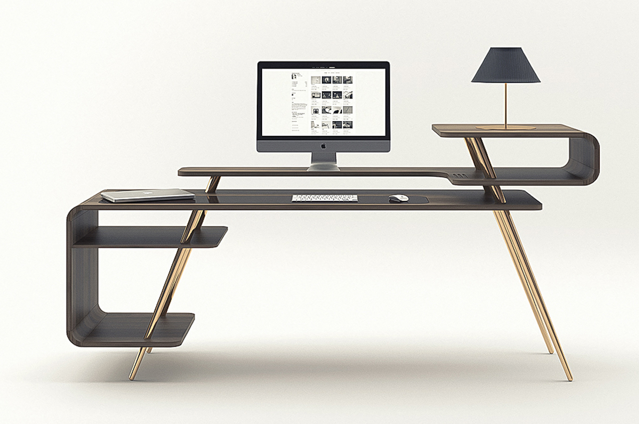
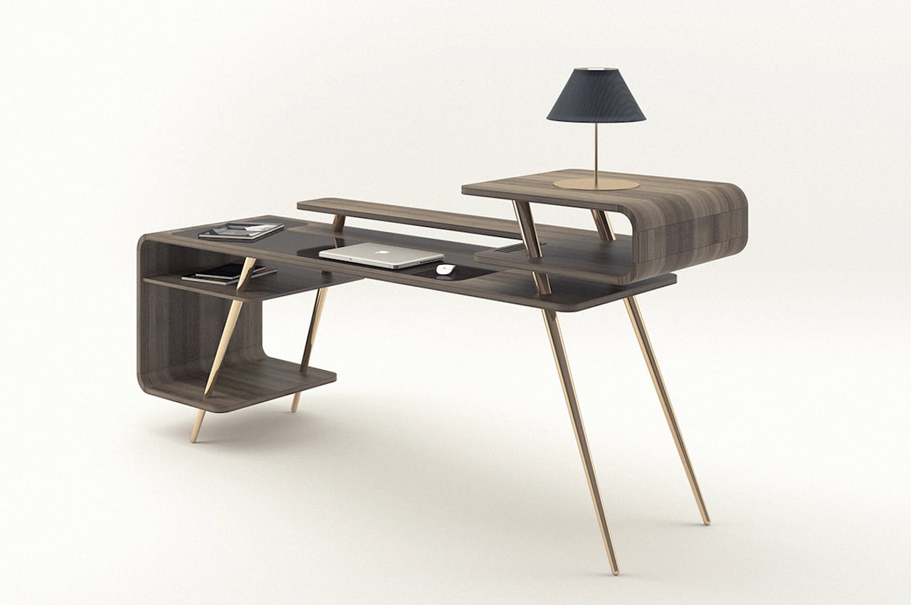
The Office Table designed by Pedro de Sousa can be THE office table for you. It’s an old design, but we like how it is timeless and modern at the same time. The table comes with different levels and surfaces that can be anything for the user.

Why is it noteworthy?

The main tabletop is where you place your laptop and monitor, keyboard, and mouse. There is ample space for your other stuff for the day, like documents you need to sign, your notebook, or reference books. On the right, there are additional levels for other objects. The longer one that extends to the right could function as a monitor stand. It could also be a place for more books. You could see more space on the right with another level where a lamp may be placed.

What we like

  • The table is made of wood that is curved around the edges, so there are no sharp points
  • It’s a mix of natural elements and colors that result from the smart choice of materials

What we dislike

  • No complaints!

7. Non Square

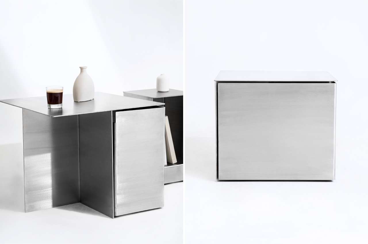
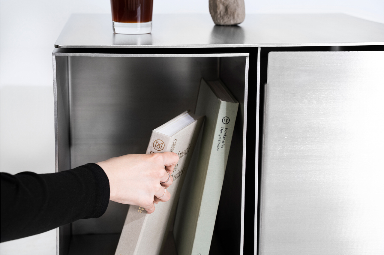
Introducing Non Square, the team of designers explains that, “It [pursues] the beauty of irregularity within, as opposed to regularity on the outside.” From the outside, Non Square sports a minimalist, stainless steel appearance that seems like a nondescript side table dressed as a cube. A closer look and Non Square’s larger purpose is revealed.

Why is it noteworthy?

Functionality typically stems from a product with a long shelf life and the ability to execute its primary purpose. Adding their design to the mix, Hyunjun Yu, Soojin Jung, Kyoungseo Park conceptualized Non Square, a furniture set that integrates side tables and stools within a stainless steel hexahedron structure.

What we like

  • Hidden storage compartments
  • Modular design

What we dislike

  • The product’s bulky + metallic aesthetics may complement only certain living spaces

8. Acrobat

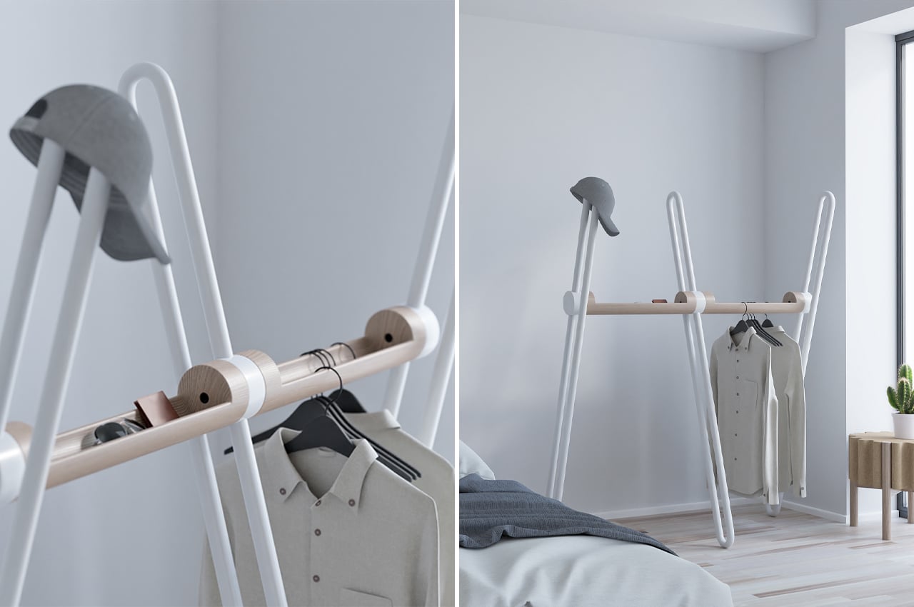
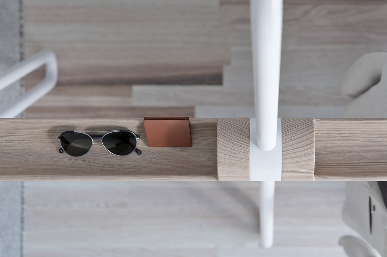
Acrobat is a multifunctional storage piece that combines the safekeeping components of an entryway table with the hanging function of a coatrack.

Why is it noteworthy?

As we continue to downsize our living spaces, the more multifunctional our furniture is, the better. Smaller spaces don’t necessarily have to mean less living space. Multifunctional furniture helps make more room for living while taking care of a lot of our household tasks. We usually have our own system of arranging EDC items like key rings, wallets, and phones. Entryway tables and coat racks usually take the brunt of those organizational needs, so finding multifunctionality in their design is key to keeping our homes decluttered. Acrobat, a multifunctional coat rack designed by João Teixeira, combines the storage components of an entryway table with those of a coat rack.

What we like

  • The metal tube tops can also be used to hang clothes or hats without the need for a hanger
  • The wooden hull that interlinks the beams offers a safe space to store EDC items like wallets, phones, and keyrings

What we dislike

  • Can occupy a substantial amount of space

9. The COBBO Bed

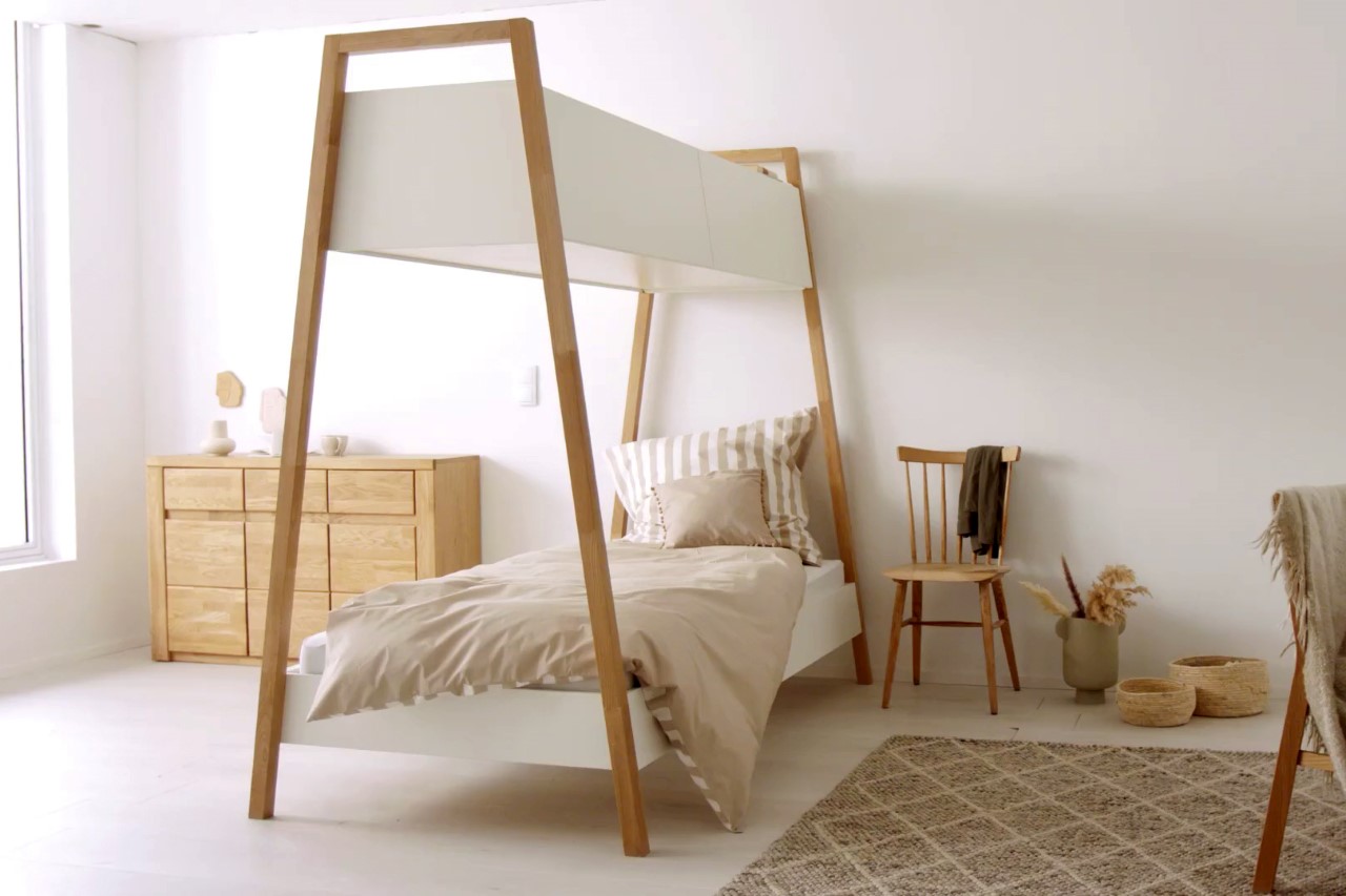
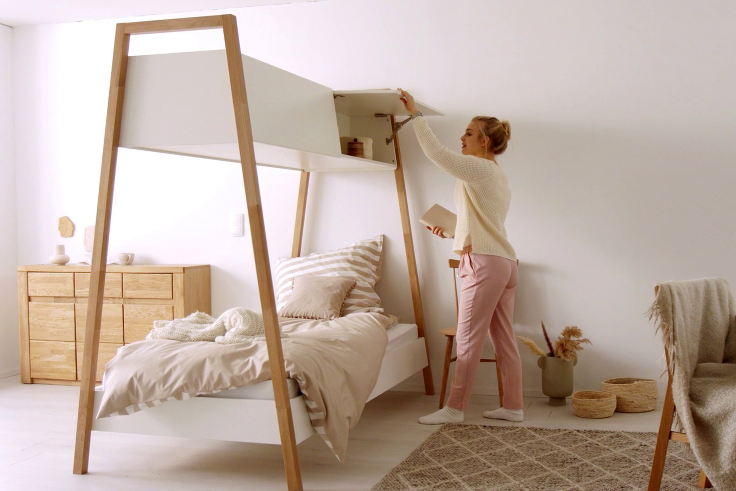
Perhaps the most ingenious inspirational overlap I’ve seen in a while, the COBBO bed gives beds a rather clever little upgrade! The COBBO bed uses the empty space between the mattress to put a nifty cabinet, reminiscent of the overhead storage you get on airplanes… so you can live out your wanderlust airplane fantasies while sitting at home!

Why is it noteworthy?

The COBBO bed, designed for furniture manufacturer OTTO, comes with a simple Nordic-inspired design with solid oak legs and white storage cabinets that are located above the sleeping area. The bed’s slightly tapered design serves two purposes, it gives the piece of furniture both visual and physical lightness, since the cabinet above the bed is significantly slimmer than the bed itself. This allowed Hilgers to use slim wooden pillars instead of metal ones, since the cabinet above the bed wouldn’t end up being overly heavy.

What we like

  • Nordic-inspired design
  • It’s a clever way to provide storage without cluttering the floor

What we dislike

  • No complaints!

10. The Program

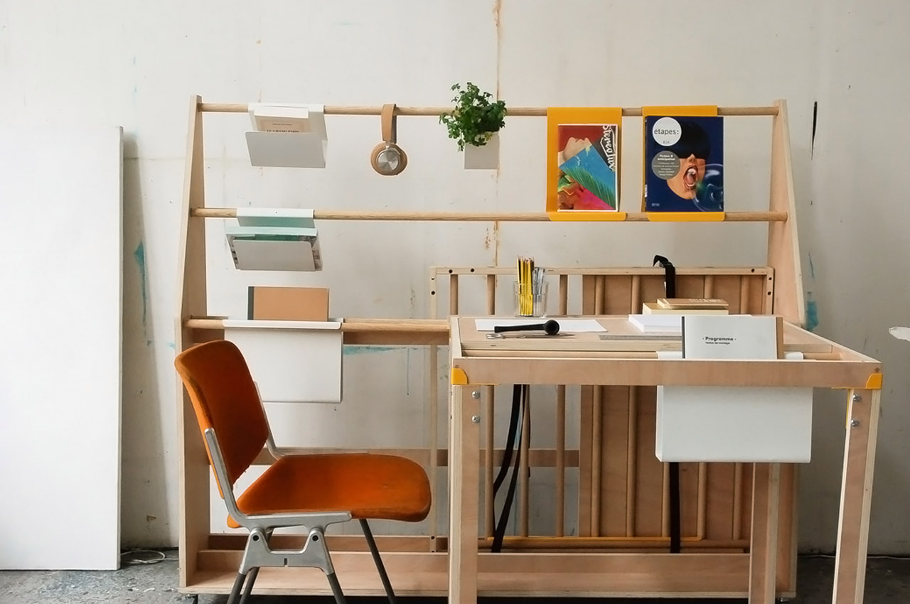
Named the “Program” this modular desk is ideal for creative individuals who love the freedom of organizing their desk as per their needs. Depending on the task at hand or the kind of tools required, the desk comes equipped with various cubbyholes and hanging spaces for you to get creative, literally!

Why is it noteworthy?

The different storage modules can be suitable for storing files, documents, or even your favorite magazines or sketches. In addition, the desk has a large storage box and a two-part table to further extend the modularity aspect. I find the design an eclectic mix of structure yet chaos – it has enough options to create an organized workspace or to embrace the chaos – it gives you the freedom to make your desk setup work for you.

What we like

  • Multiple and innovative storage modules
  • We can collapse the Program’s desk section and make it a display for all your hanged memorabilia

What we dislike

  • Limited to only creative individuals

The post Top 10 storage solutions to de-clutter your modern millennial home first appeared on Yanko Design.
This modular storage on wheels can cover all of your drawer needs

If you ever thought that you could never have enough drawers, this wooden cabinet might have you rethinking your position.

The number of objects in our lives and in our houses is never a constant figure. It constantly fluctuates, growing and shrinking with the changes in our work, hobbies, passions, and families. That’s why we need to be smarter about the storage solutions that we buy these days, taking into account these ever-changing situations rather than simply buying one and wastefully throwing it out when they no longer meet our needs. That is what makes modular furniture quite the fad among designers and homeowners these days, but this particular modular solution takes storage to the extreme by having drawers that can open on every side.

Designer: Theresa von Bodelschwingh

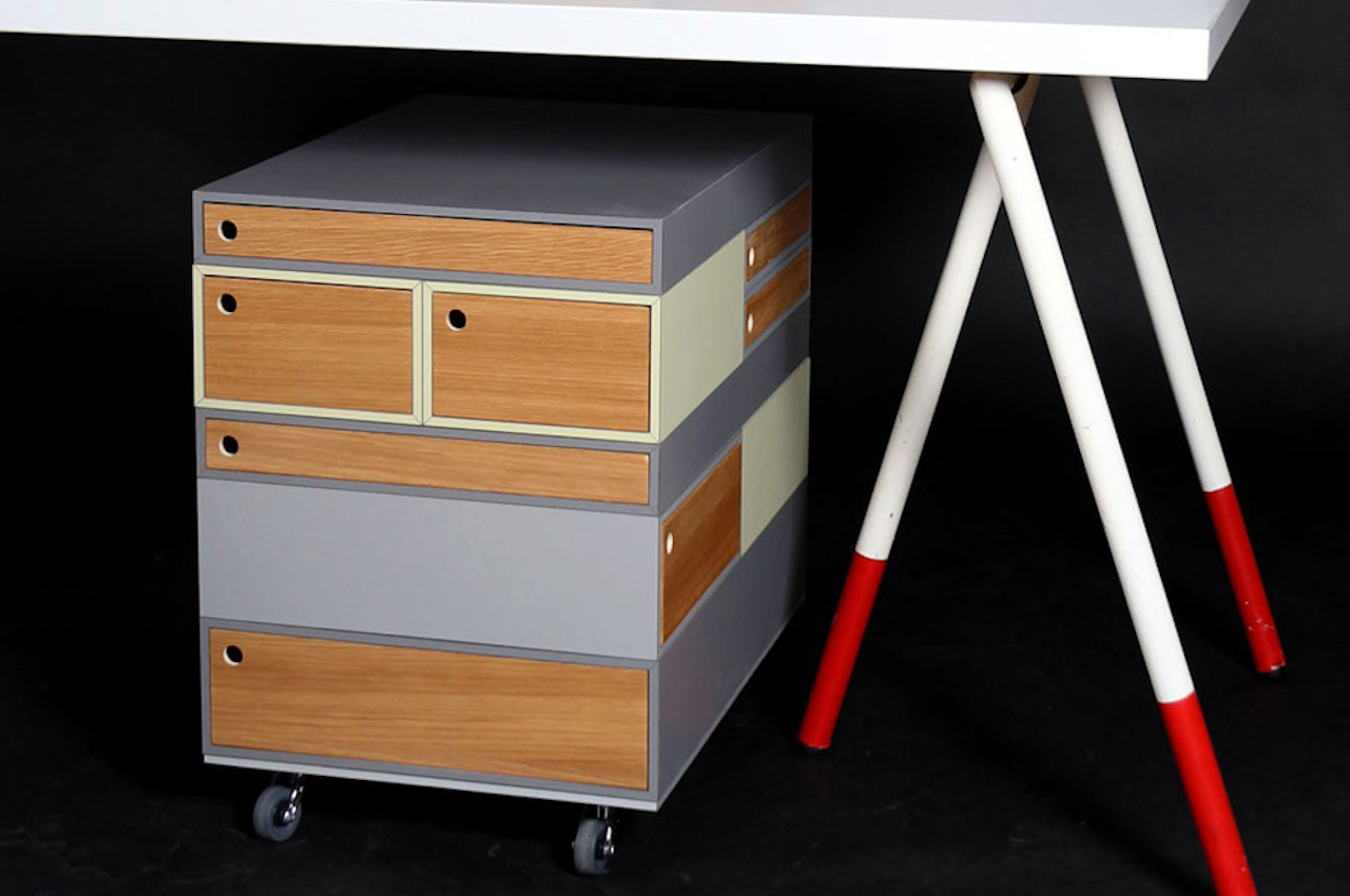
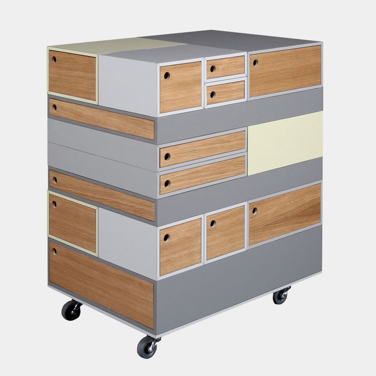
“Sesame” is almost a fitting name for this rolling container because of the way it opens up a magical world of space for your stuff. Every side, every face, and every level of this rectangular box can have a drawer to stash your tools, papers, work, and everything in between. And if you feel those weren’t enough, you can add even more drawers. But when the time comes that you feel those are too much, you can simply remove the ones you want.

The secret to this modular system is magnets embedded in the top and bottom panels of these wooden drawers. That allows the easy addition and removal of panels, letting you place them in whatever position or orientation you want. The containers can be opened in both directions, so you aren’t restricted in how you arrange these puzzle pieces.

Indeed, the Sesame system is like a block puzzle because each piece isn’t a single uniform size. The boxes follow standard paper sizes, specifically DIN A3, A4, A5, and A6. Given how these paper sizes are designed to fit into each other, you will be able to mix and match sizes, knowing that you’ll always end up with an even number. Presuming that’s how you want to roll, of course. You can simply stack boxes on one side like a pyramid, turning the storage solution into a room decoration at the same time.

The Sesame Rolling Container checks almost all the boxes of mobility, modularity, and even sustainability. Its unique size system makes it trivial to store any kind of document, including large A3 blueprints and drawings. The container itself is already an organization system, where you can devote one side to work and another to personal stuff. Its size and mobility make it perfect for smaller spaces like home offices or studios. And best of all, you wouldn’t be stuck with what you have at the moment since it can grow with you and shrink to your changing requirements. It opens a whole new world of organization and storage, a world that someone will hopefully make a reality that you can buy soon.

The post This modular storage on wheels can cover all of your drawer needs first appeared on Yanko Design.
This modern refrigerator optimizes storage and organization with smart technology

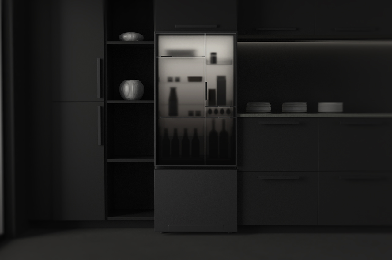
The Aura refrigerator is a modern home appliance equipped with smart technology to optimize storage and use.

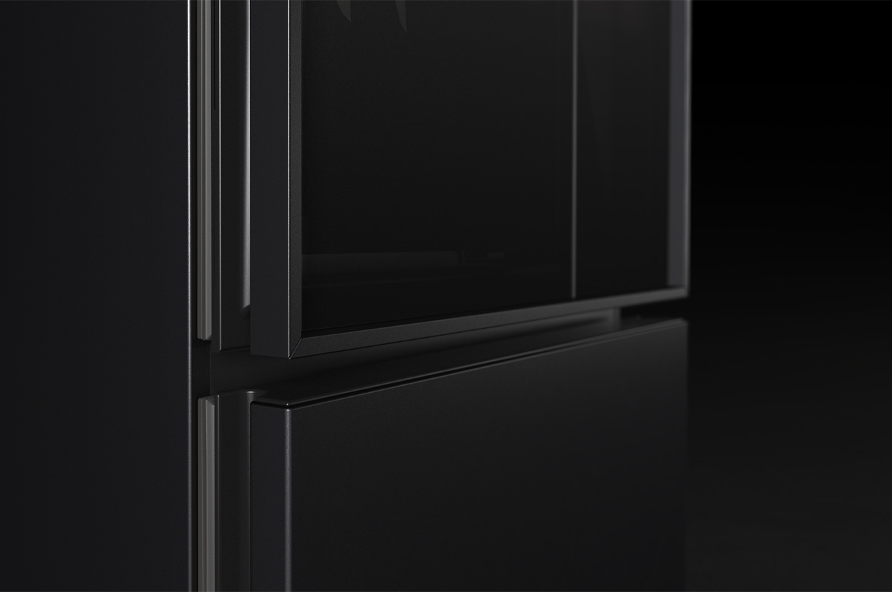
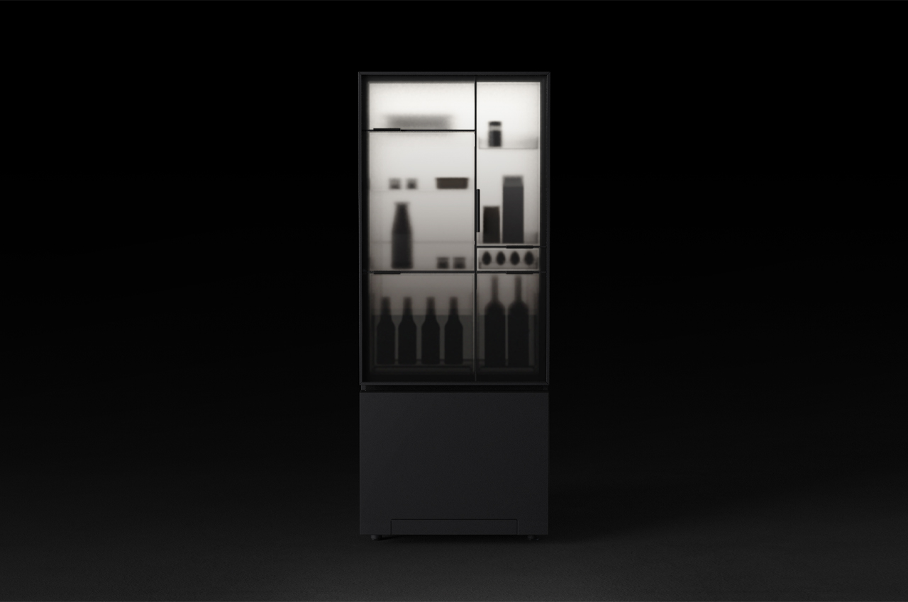
As we sink deeper into the world of technology, so do our homes and home appliances. Smart technology dictates most of the controls behind modern kitchen appliances like refrigerators and dishwashers, but their overall look has largely stayed in the past. Hoping to bring the refrigerator into the modern era by reshaping its structure and technical fittings to accommodate today’s smart technology and environmental needs, Aura is a new type of refrigerator. Designed by FUHUA Design Studio, the Aura refrigerator breaks down the conventional fridge into smaller compartments to allocate the energy used and minimize its impact.

Designer: FUHUA Design

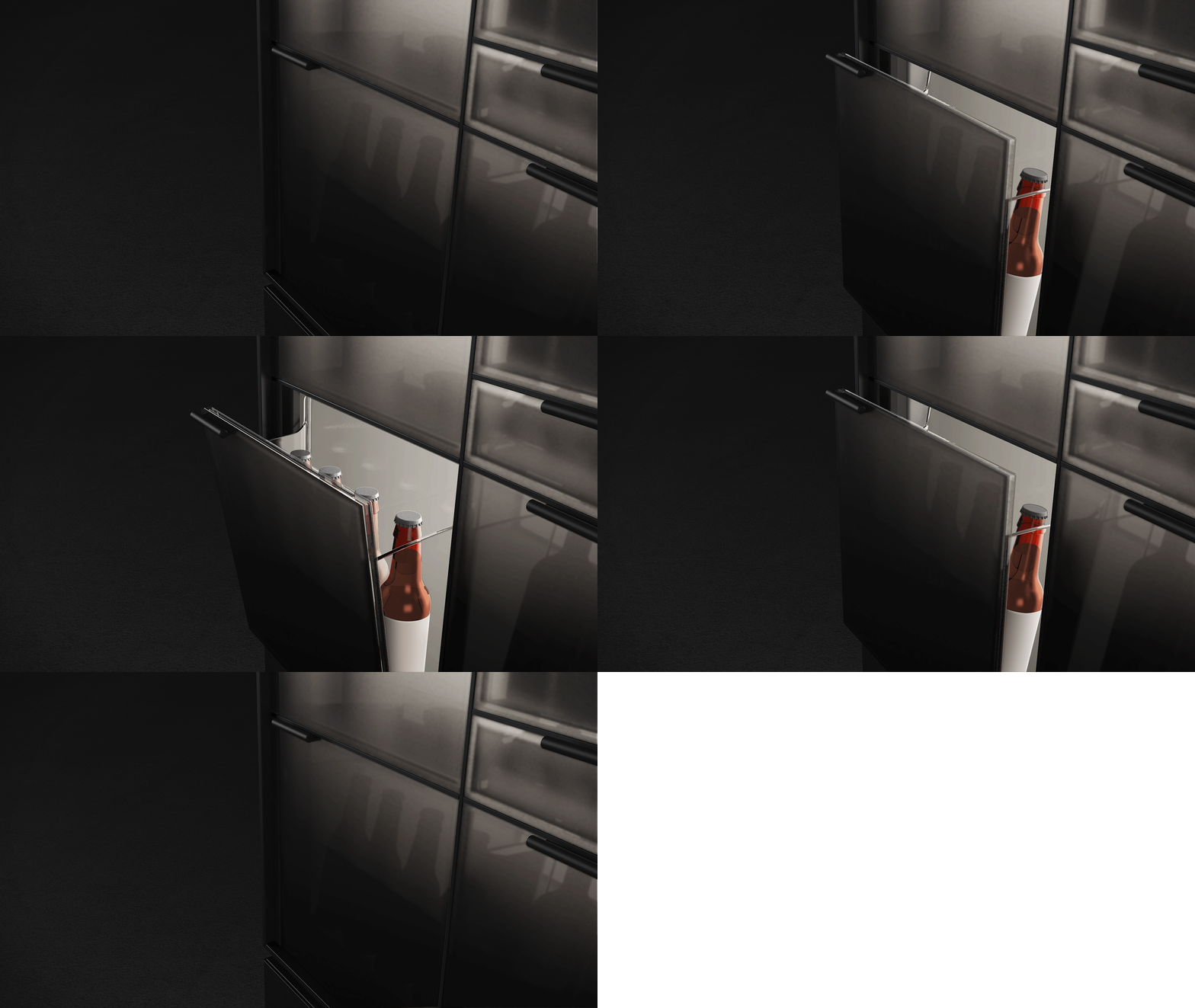
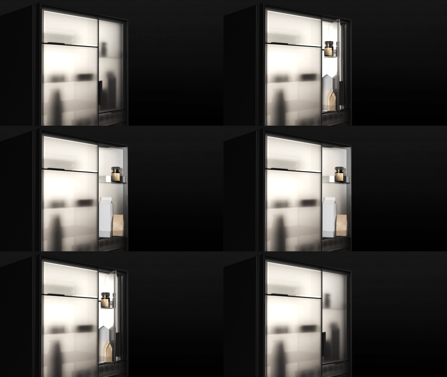
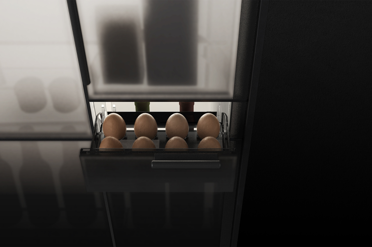
The eggs and additional breakfast-ready food items can be found in one slide-out drawer, while the beers and other late-night beverages are reserved for a unique pull-out caddy. Describing the design choice behind breaking down the fridge into small compartments, FUHUA explains, “Dividing the door into smaller compartments allows users to have quick access to the frequently used items, thus reducing the energy waste by optimizing user behavior.”

Additionally, the refrigerator automatically turns its lights off when users aren’t around. Then, once someone enters the kitchen, Aura gradually illuminates its internal lighting to invite the users for something to drink and a bite to eat. Appearing like a genial cabinet, Aura is designed for optimal organization, allowing users to easily pull out food and drink items according to their designated compartment.

Without having to open the door, users will be able to see what’s inside the fridge thanks to the integrated backlight, “When approached by the user, the brightness increases as if AURA warmly greets them. At the same time, the soft back-light creates elegant silhouettes of the items inside on the translucent glass door, to remind the users what they have in the fridge without having to open the door.”

The post This modern refrigerator optimizes storage and organization with smart technology first appeared on Yanko Design.
Conceptualized for designers, this multifunctional desk adapts to meet your work tasks

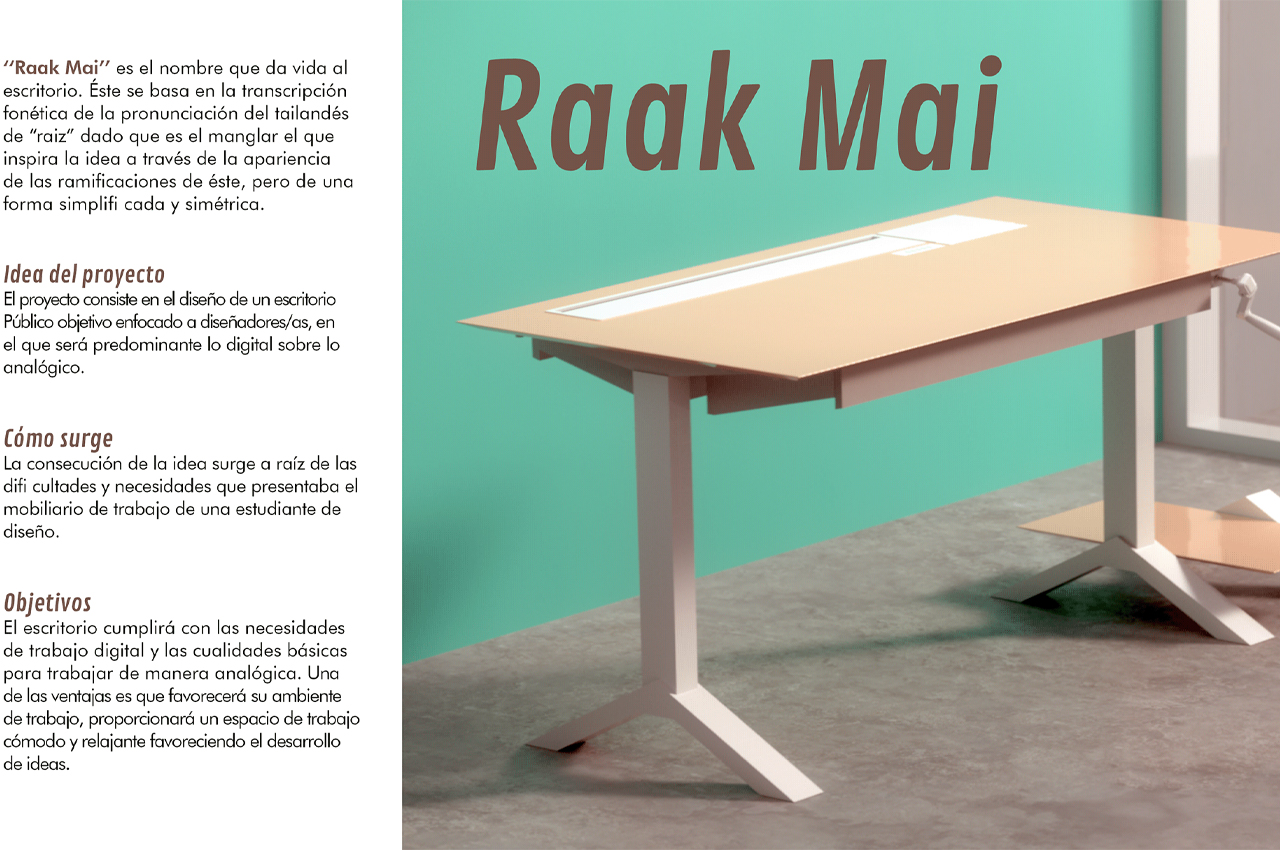
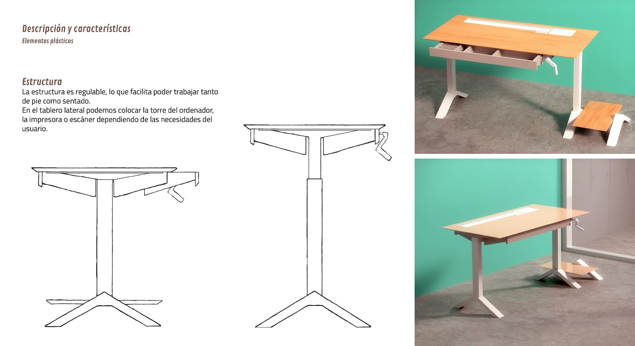
The Raak Mai desk is a multifunctional, versatile desk conceptualized for designers.

Finding the right desk to meet our working and creative needs is essential to stay productive. When it comes to our work, our desks must rise to the occasion, sometimes literally. Standing desks tend to help our posture when working from our computers all day.

Angled desks find the ideal tilt for sketching and drawing up plans. Then, different desks carry unique storage options, keeping all of our tools within arm’s reach at all times. The Raak Mai desk from industrial designer Laura Rodríguez combines all of the above to provide a multifunctional, versatile desk for all working needs.

Designer: Laura Rodríguez

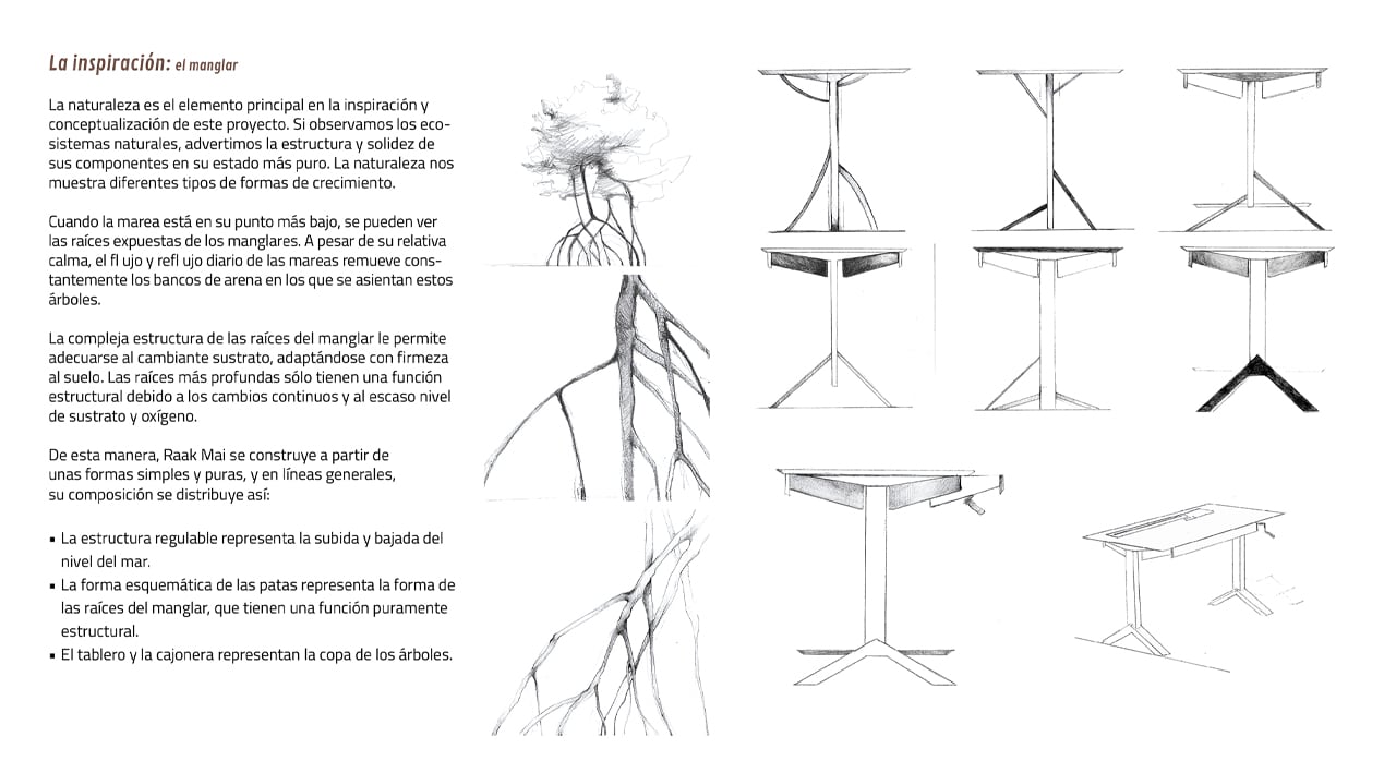
Preliminary inspired by the needs of designers, Rodríguez hoped to incorporate analog mechanisms that work to take care of digital tasks. While many of the elements of the Raak Mai desk can be adjusted manually, the overall structure of the desk was fitted to ensure the digital needs of modern technology could be met.

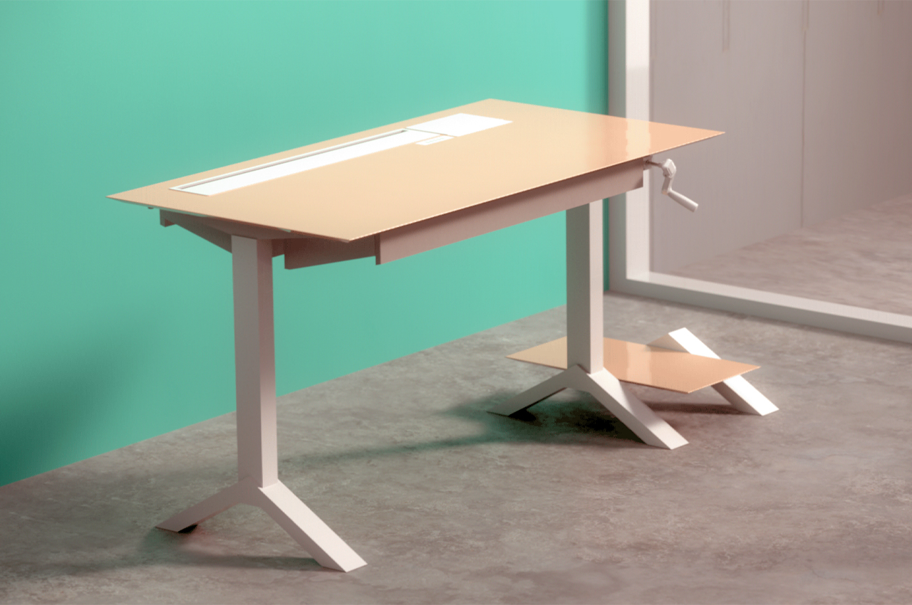
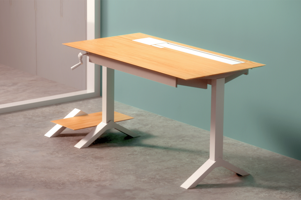
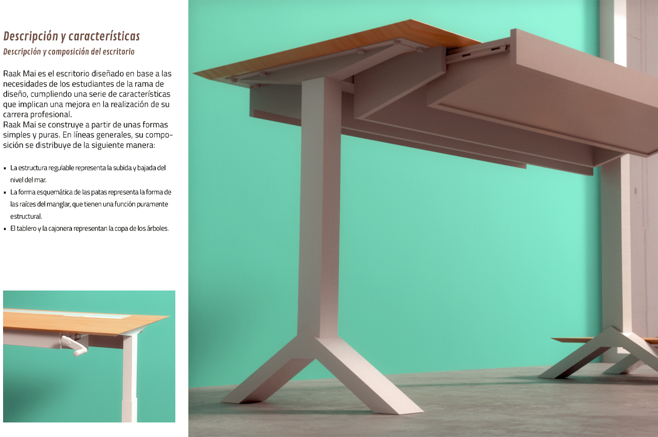
The Raak Mai desk hosts an array of different modes, allowing users to adjust the desk’s height, tilt, and storage capabilities according to their working needs. When designing or sketching, users can angle the desk to their desired tilt for accurate drawing sessions. An integrated winch allows users to manually adjust the desk to a standing height.

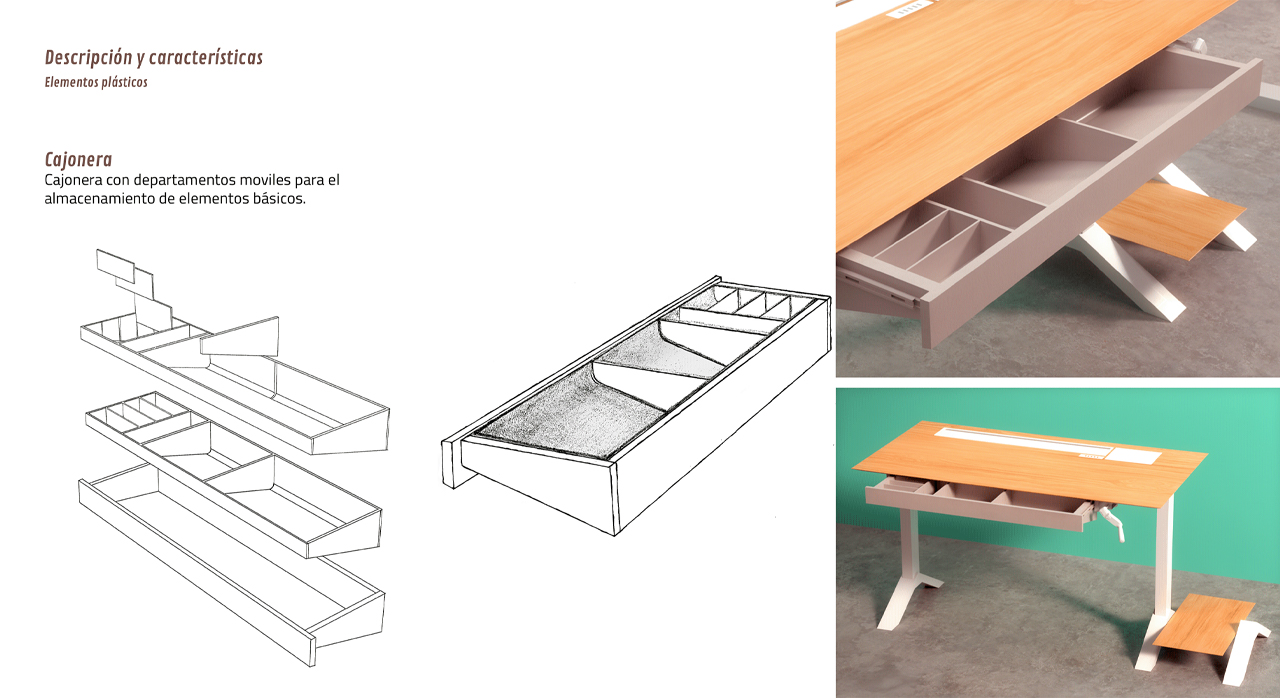
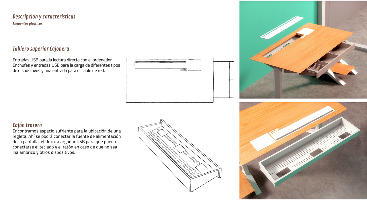
Several USB ports let users charge their electrical appliances throughout the workday. Storage drawers can be found throughout the desk’s build, allowing users to organize their stationery as needed. Then, a footrest provides space for users to prop their feet while working.

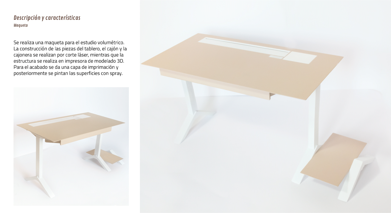
Propped up on two steel legs, the desk’s table is defined by its wooden build. Relying on modern construction methods like 3D printing and laser cutting, Rodríguez employed precision-based technologies to ensure seamless joinery and connections.

The drawers, chest, and main tabletop would be built using laser cutting technology into individual modules that would connect to the rest of the Raak Mai desk. Then, 3D printing would be used for constructing the desk’s overall frame. Finally, Rodríguez envisions the Raak Mai desk finished with a glossy layer of primer.

The post Conceptualized for designers, this multifunctional desk adapts to meet your work tasks first appeared on Yanko Design.
Peugeot uses innovative 3D-printing technology to produce flexible storage inserts

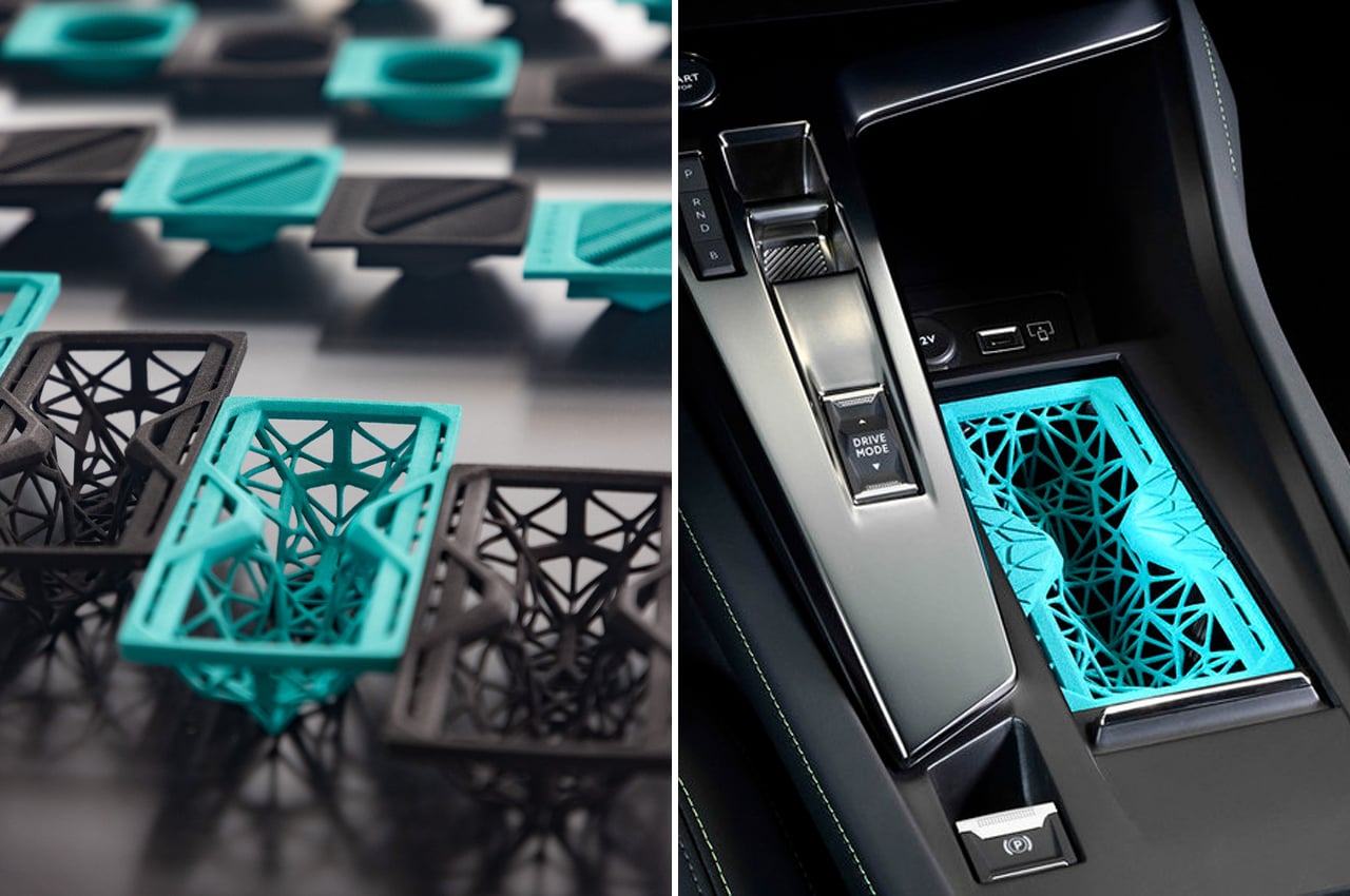
Peugeot has developed storage inserts for their new 308 models that are 3D-printed from a flexible filament using innovative 3D-printing technology.

French automobile brand Peugeot is known for its catalog of unique, well-made cars. The new 308 model from Peugeot is an update on the brand’s 3008 SUV, the team of designers gave the new generation a smaller and sportier look.

Designer: Peugeot

The automobile brand is known for practicality and function, so it’s no surprise that the new 308 model delivers on storage compartments and integrated assistive features. Upping the ante, Peugeot’s Design, Product and Research & Development teams designed and constructed 3D-printed car accessories specifically for the new 308 models.

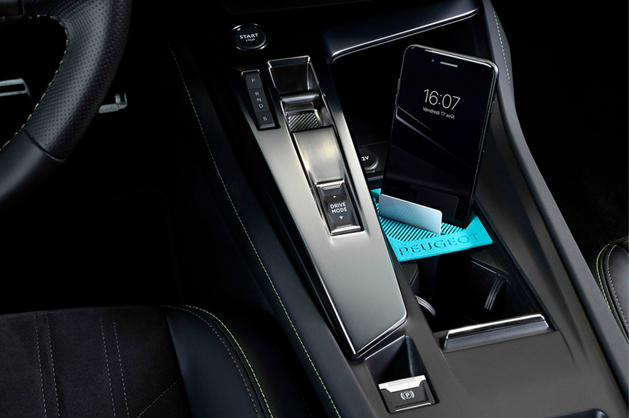
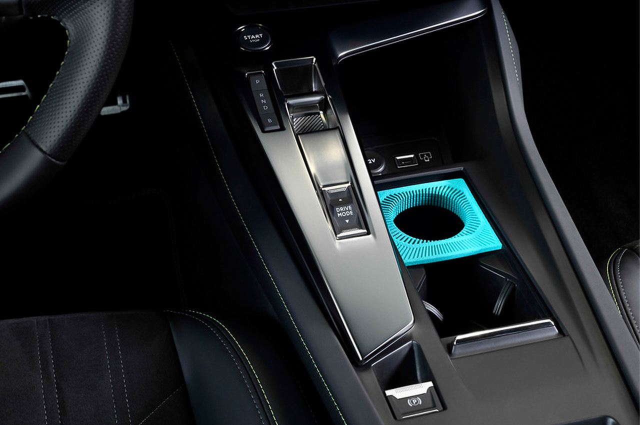
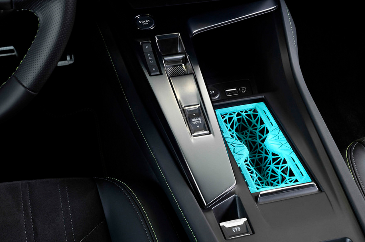
Starting with a new flexible polymer, Peugeot uses innovative 3D-printing technology to create sunglasses holders, cup holders, and phone/cardholders to fit into the 308’s center console. In collaboration with HP Inc., Mäder, and ERPRO, the Peugeot team used the new HP Multi Jet Fusion (MJF) 3D printing technology to format and produce their line of accessories.

Before designing the new line of accessories, the team set out to “make accessories more visible and attractive by innovating and using modern materials,” according to a press release written by Stellantis, Peugeot’s mother company. To achieve this, the 3D-printed accessories are constructed from Ultrasint TPU, or Thermoplastic Polyurethane, a type of filament with elastic properties like rubber, yet durable like plastic.

In the same press release, Stellantis notes, “The flexible material used is Ultrasint thermoplastic polyurethane (TPU), the fruit of a partnership between HP Inc. and BASF. This material offers durable, strong, and flexible parts. It is a perfect material for impact-absorbing parts that require high elasticity and for flexible mesh-like structures. The material can be used to produce parts with high surface quality and a very high level of detail.”

The flexible filament gives the storage insert a durable, yet squishy feel. 

The custom-fitted storage inserts carry an array of different functions, from a phone holder to a sunglasses case. 

The post Peugeot uses innovative 3D-printing technology to produce flexible storage inserts first appeared on Yanko Design.
This sustainable shelving unit is held together by a system of cable ties

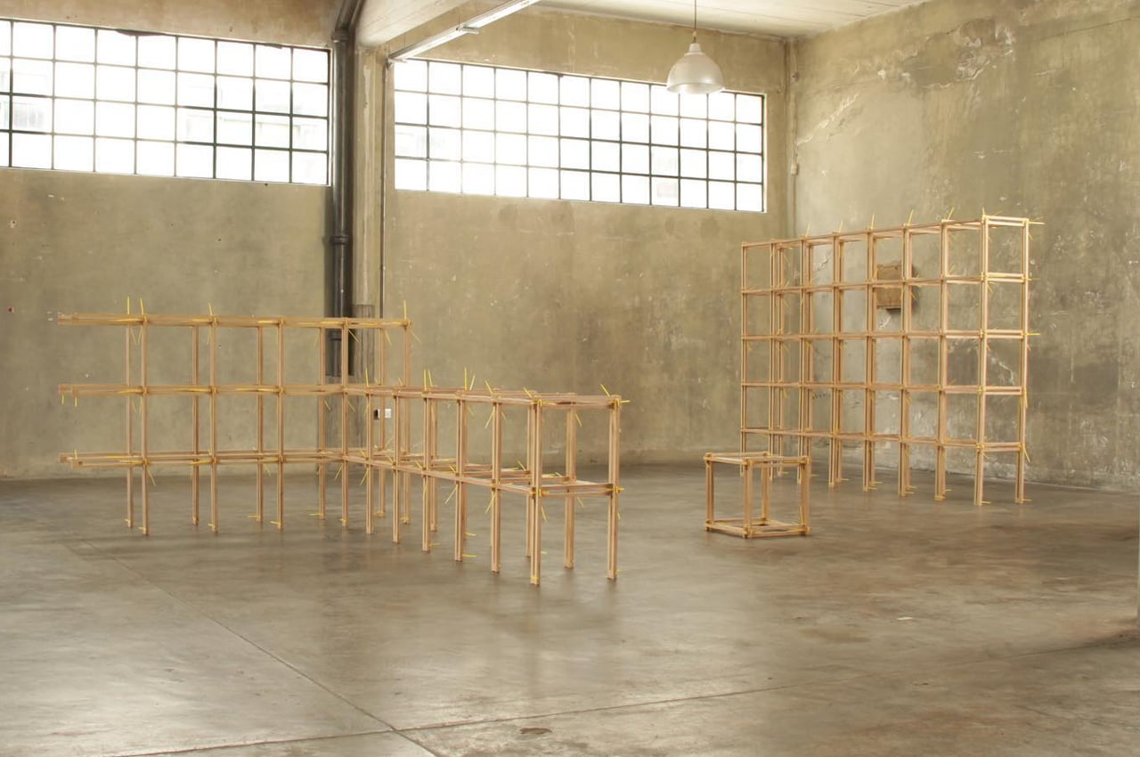
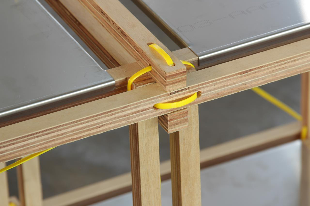
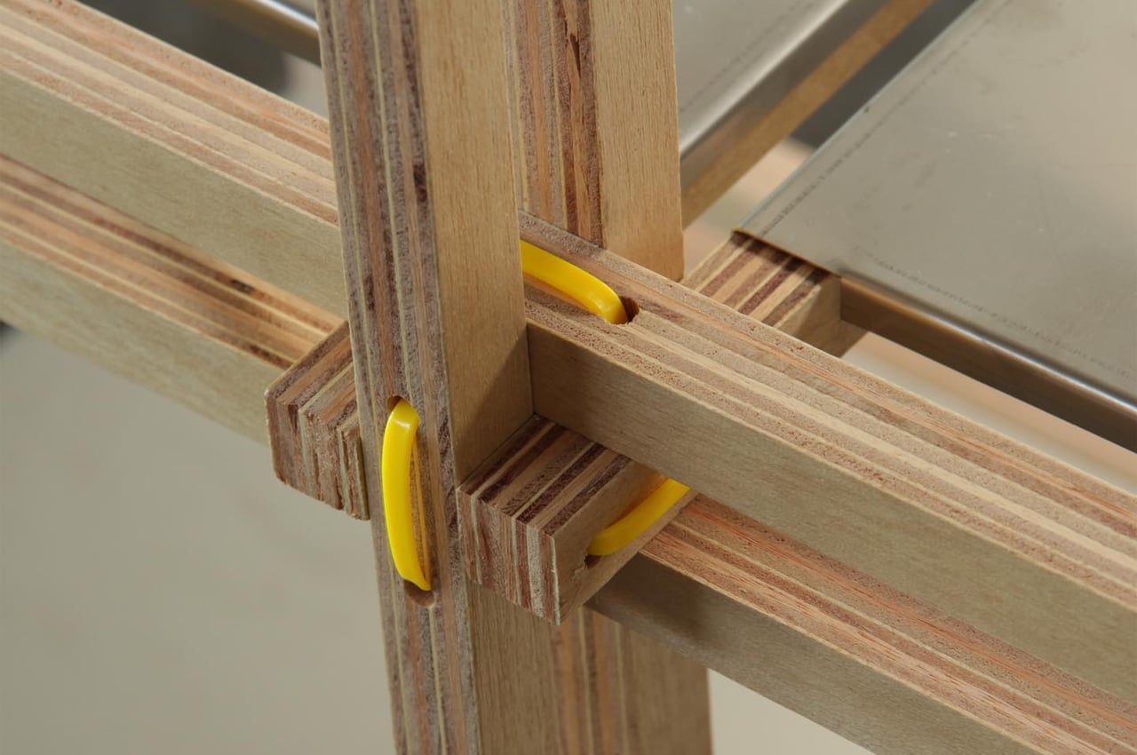
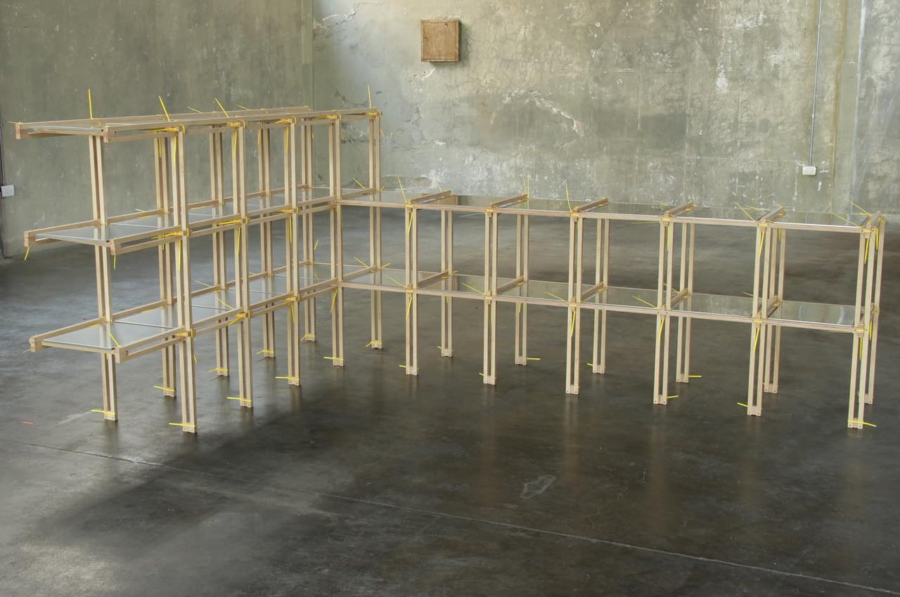
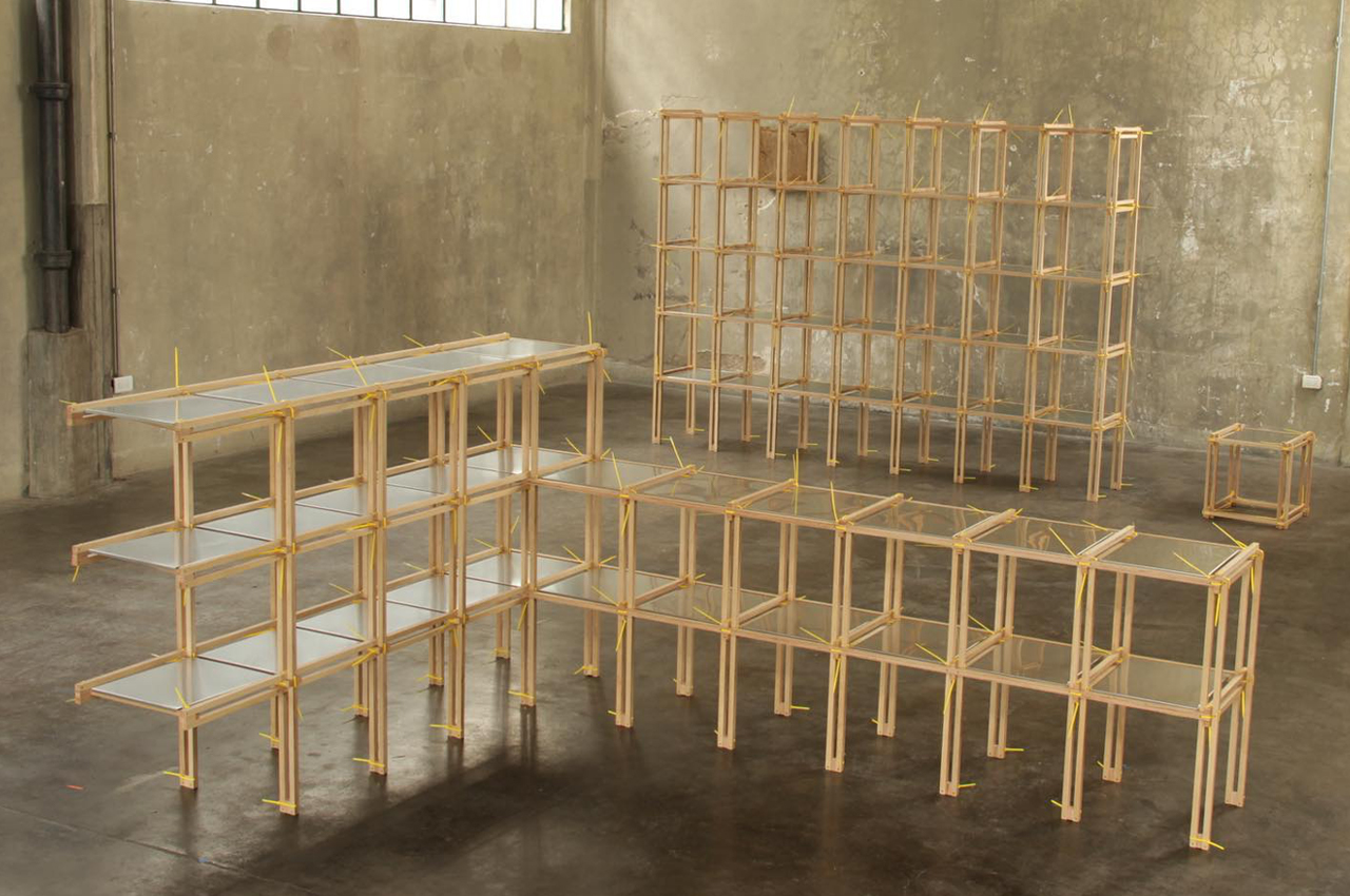
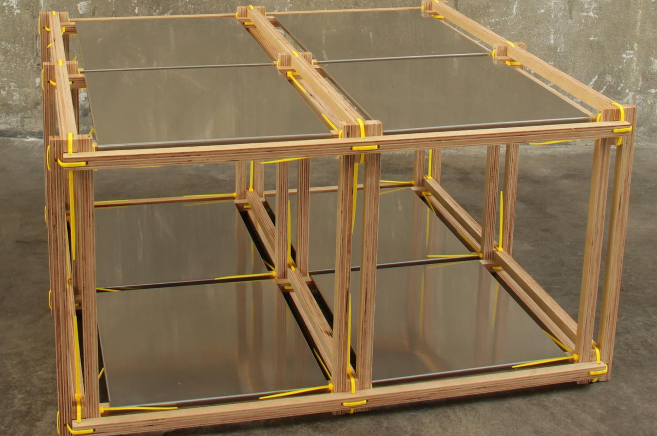
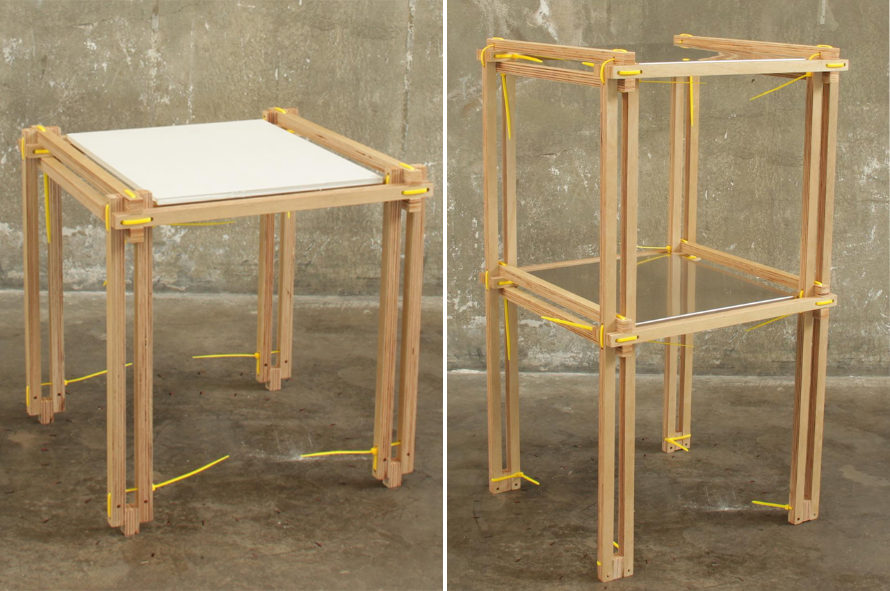
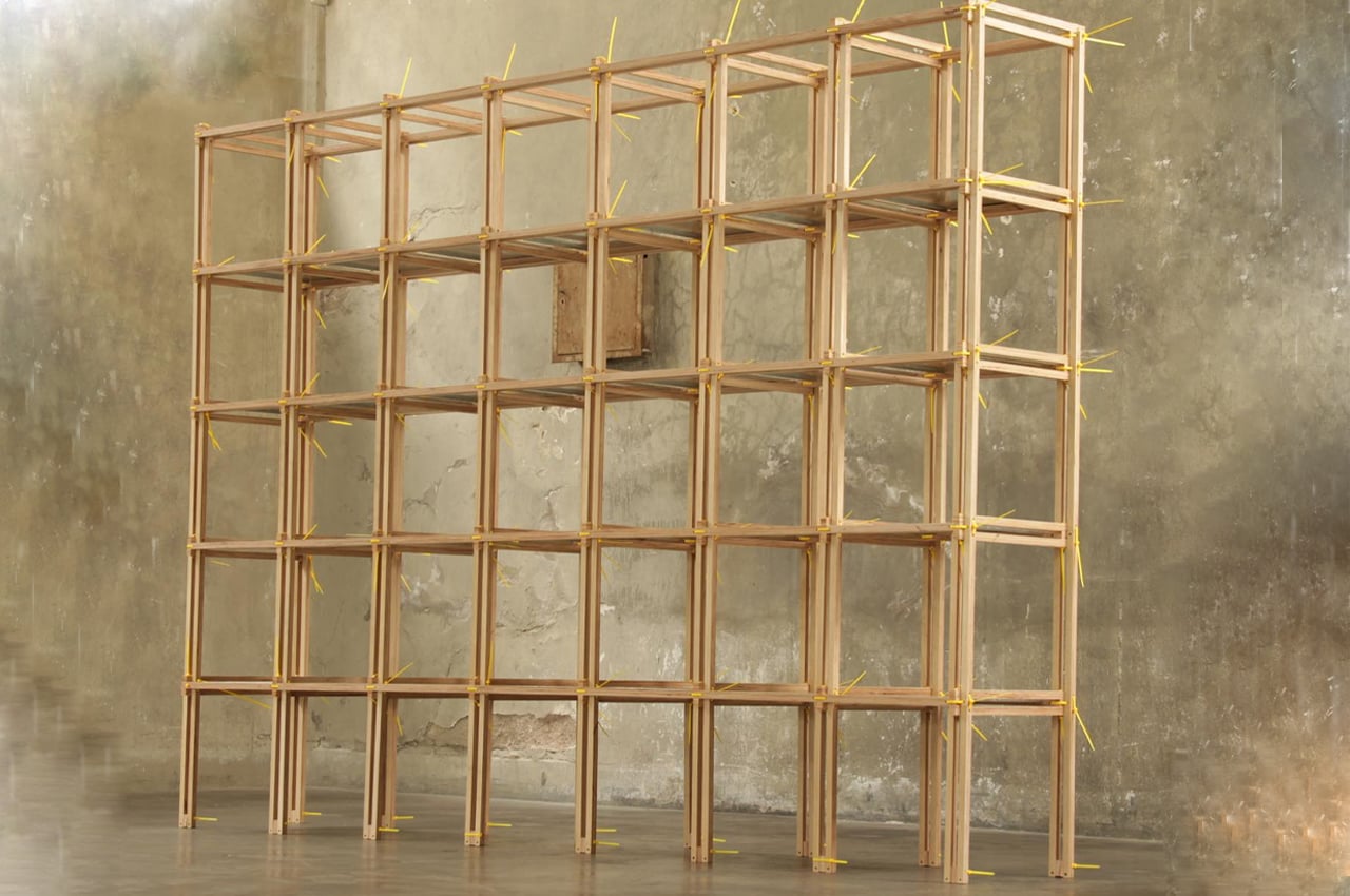
Listón is a modular shelving unit that uses a system of cable ties and wooden slats to form an endlessly re-configurable and sustainable furniture piece.

Downsizing never looked better. As we continue to declutter our home spaces and replace bulky appliances with multifunctional, modular furniture pieces, designers are getting creative with ways to get us there. Much of the inspiration behind the recent trend toward downsizing is credited to environmental reasons.

Designer: Guille Cameron Mac Lean

With this in mind, many designers are approaching new furniture and appliance designs with sustainability being the driving force. Adding his design to the mix, architect, and designer Guille Cameron Mac Lean developed Listón, a new type of furniture system that uses cable ties and wooden slats to configure modular storage units.

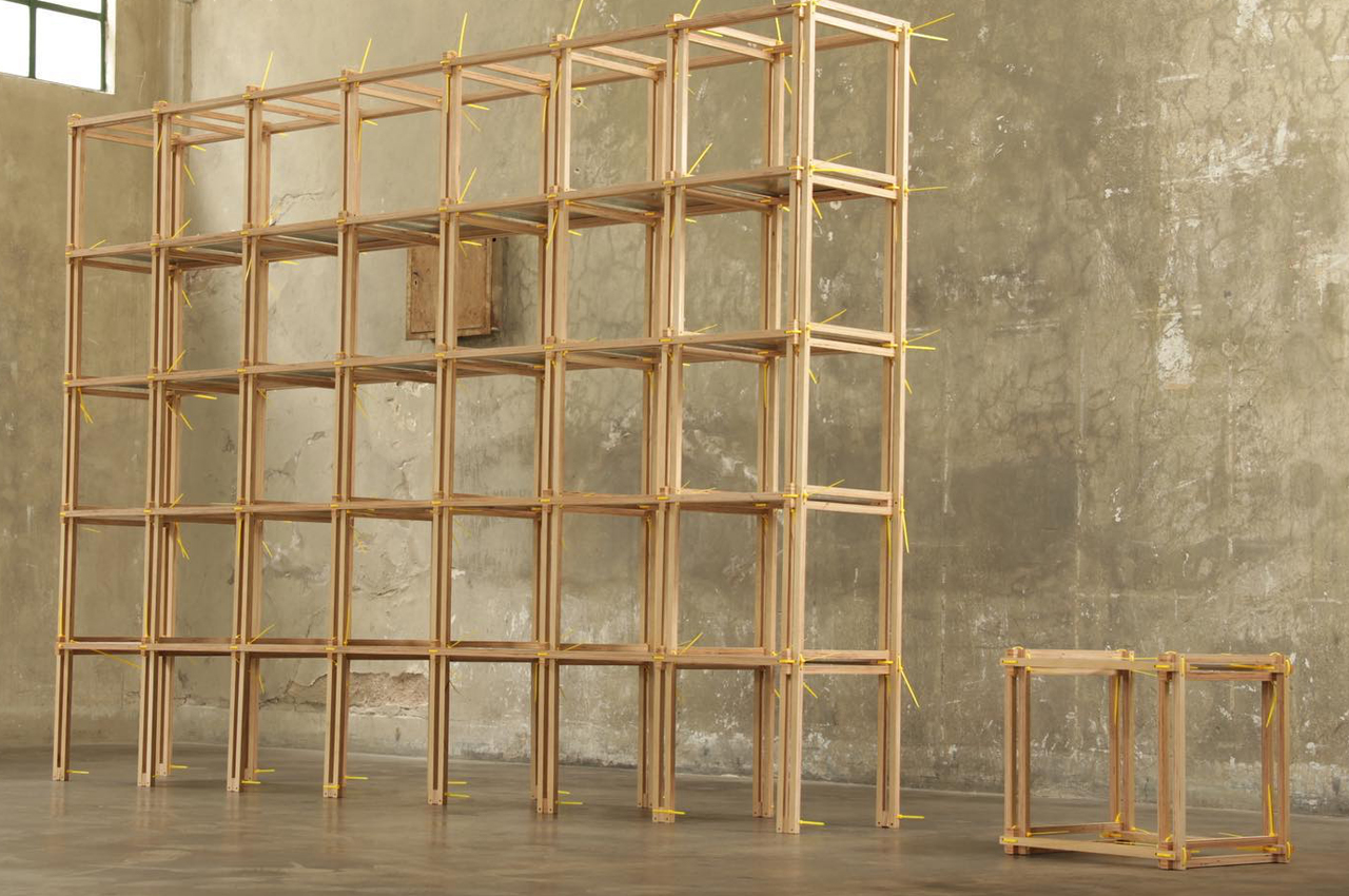
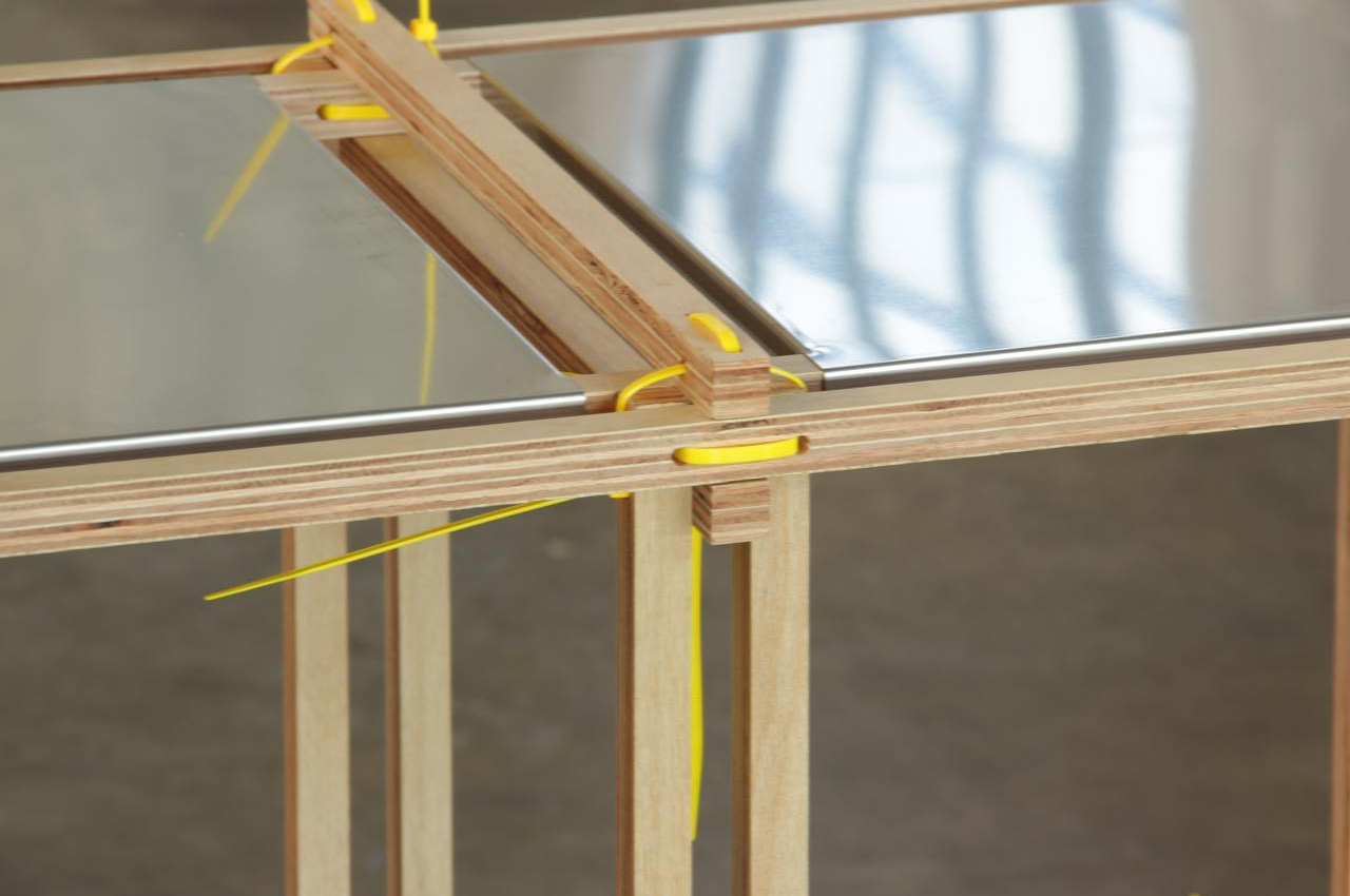
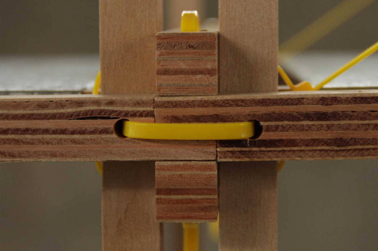
The cable tie system allows users to create infinite configurations of varying sizes and shapes for essentialist shelving units that will look good in any room. Replacing hardware and tools, the cable ties systems provide secure fastening for each module that comes with Listón.
The system of cable ties and wooden slats also significantly reduces the amount of packing goods needed to ship the furniture system by 18 times in comparison to other flatpack furniture. In designing Listón, Mac Lean hoped to grant users autonomy over the look, size, and configuration of home furniture pieces.
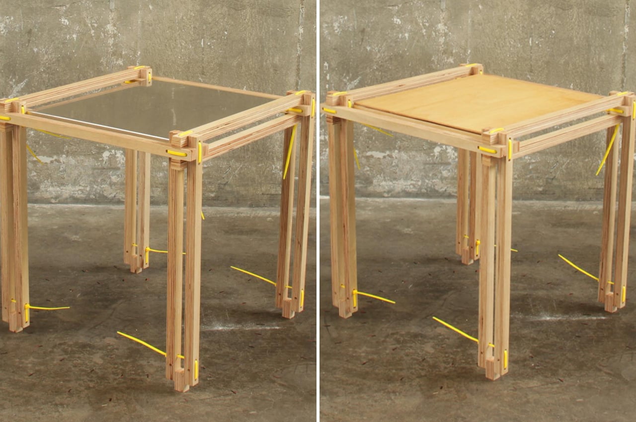
Endlessly adaptable and changeable, Listón differs from conventional furniture pieces in that when one segment breaks, the rest of the unit won’t have to be replaced. If wooden slates chip or if cable ties break, users can simply discard the broken segments and replace them with new wooden slates or cable ties. The wooden slates come in two lengths, one longer piece and a shorter one. When put together, the wooden slates form cubic shelving units that measure 40 x 40 x 40 cm.

The post This sustainable shelving unit is held together by a system of cable ties first appeared on Yanko Design.