Phone-sized mini PC lets you take your computer and your work anywhere

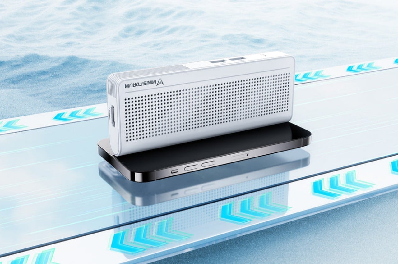
Our smartphones have become so powerful that, in theory, they have hardware equivalent to entry-level laptops from a few years back. But despite all that silicon muscle, they can’t really replace our everyday PCs mostly because of the operating system that’s used on most of these computers: Windows. Small, portable, and inconspicuous computers have always been a dream for both users and business owners, whether it’s for working on the go or setting up kiosks, security systems, or space-efficient workstations. This small brick tries to deliver exactly that, giving you the flexibility you need for any kind of computing in almost any context in a size that’s no larger than high-capacity power banks.

Designer: Minisforum
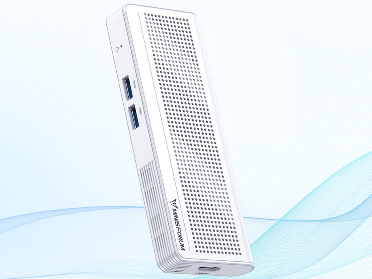
With the popularity of the Apple Mac Mini and, now, the Mac Studio, mini PCs have become more visible in the market. These desktop alternatives, however, are still meant to sit on a table or even on a shelf despite their small sizes. But while these small computers do offer plenty of power to support even some content creation or light gaming, that hardware also closes the door on many possible use cases that would have required them to be less tied down to a table.
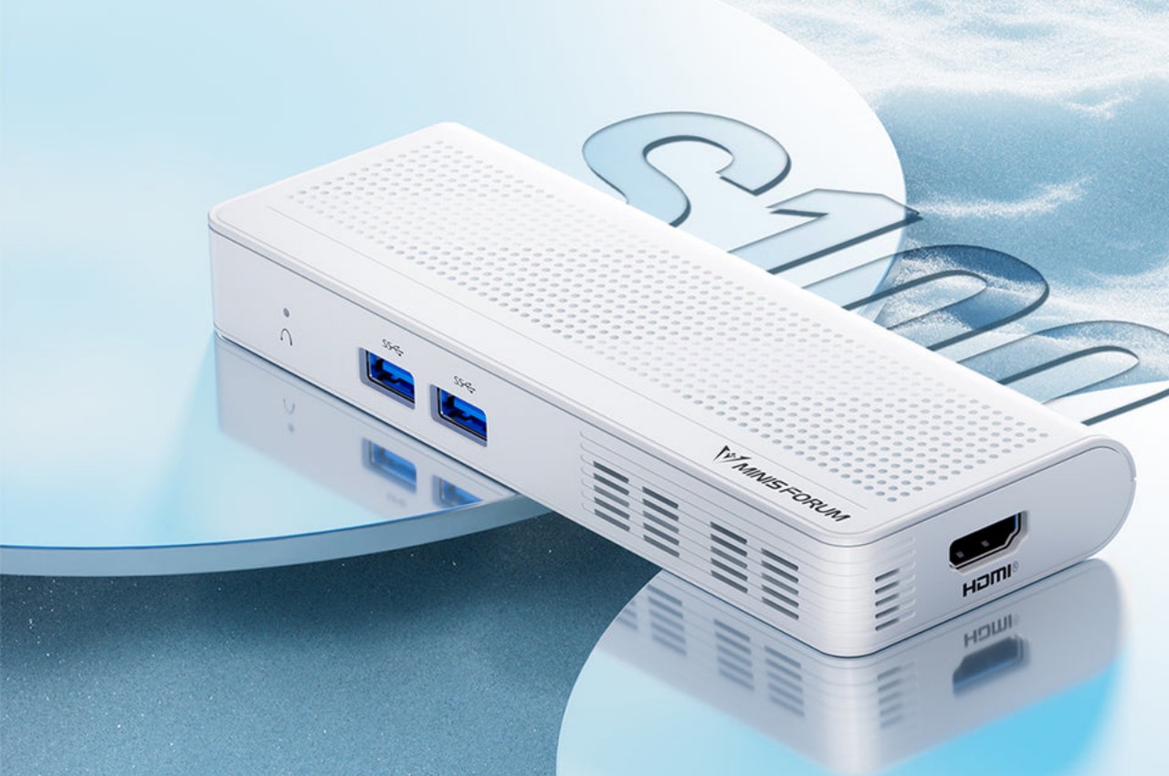
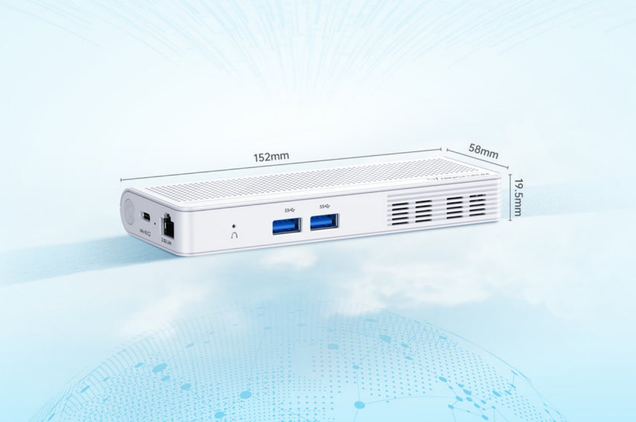
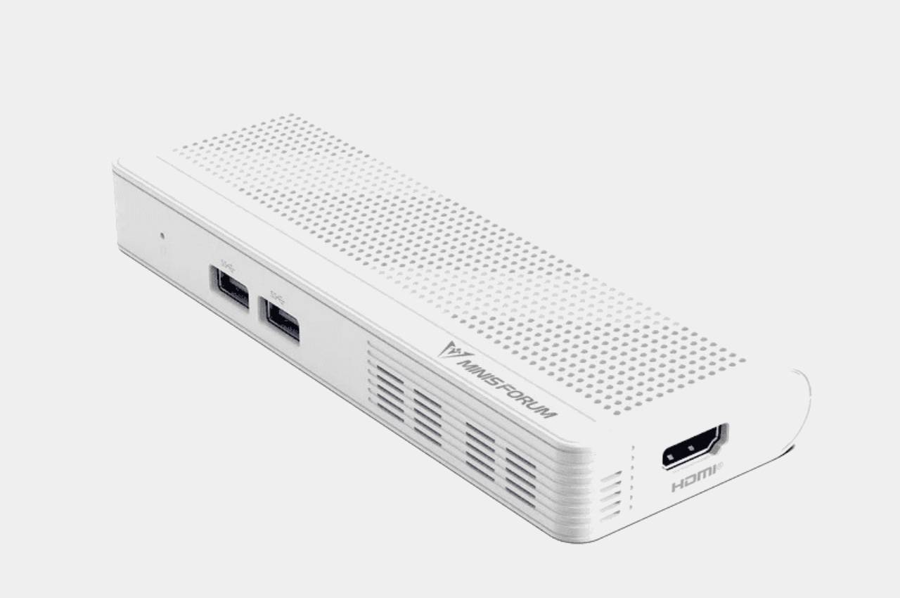
The Minisforum S100 is a small, sleek box that you might easily mistake for a power bank. Ironically, it doesn’t actually have its own battery but is a mini PC that you can bring along with you or install in the narrowest of spaces. Despite its small size, it actually boasts a complete set of standard connectivity options, including Wi-Fi 6, Bluetooth 6.2, 2.5 Gbps Ethernet, USB-A ports, HDMI, and 65W USB-C.
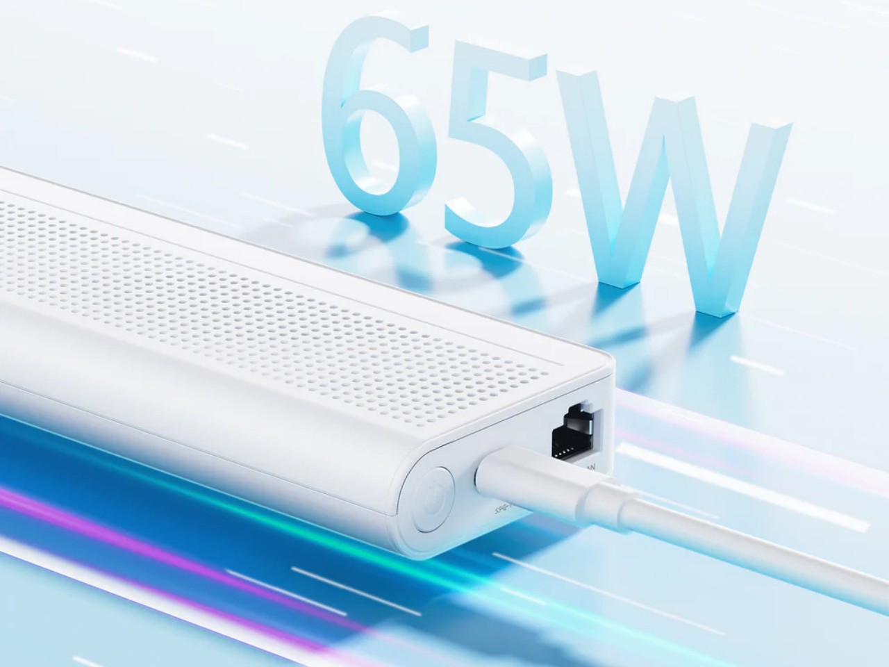
The latter two are what make this design so portable and flexible. On a typical desktop, you can connect it to a USB-C monitor that supports USB-C PowerDelivery so that you don’t even have to plug the S100 into an outlet. You can connect another monitor via HDMI to have a dual-screen setup for increased productivity. And when you’re done for the day, you can pick up the palm-sized mini PC and go, maybe even work or chill in a cafe by connecting an external display and a power bank. The Ethernet port also supports Power-over-Ethernet or PoE, so you can use the S100 as the brains behind a camera security system and not have it plugged in at all.
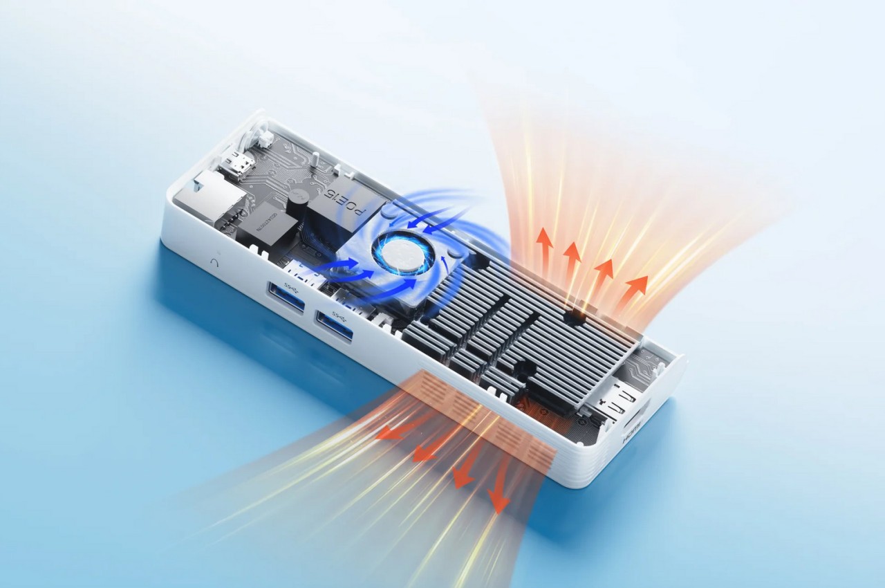
Despite the flexibility that the Minisforum S100 offers, its performance is hampered a bit by the quad-core Intel N100 processor that runs the show, definitely not the best among the chip maker’s “mobile” processors. Its lower-power operation, however, does allow the mini PC to sip rather than chug electricity and keep thermals equally low. You definitely won’t be running heavy applications, but for $189, a Windows 11 computer you can easily slip into your bag or even your pocket might actually be worth the price.
The post Phone-sized mini PC lets you take your computer and your work anywhere first appeared on Yanko Design.
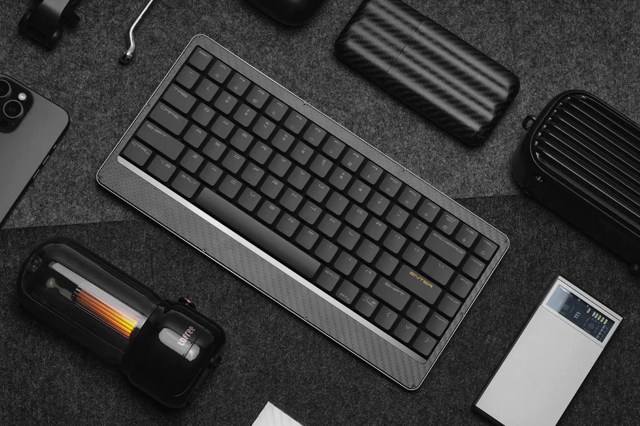
Lofree EDGE – The World’s Thinnest Mechanical Keyboard is just 16mm, less than two iPhones thick

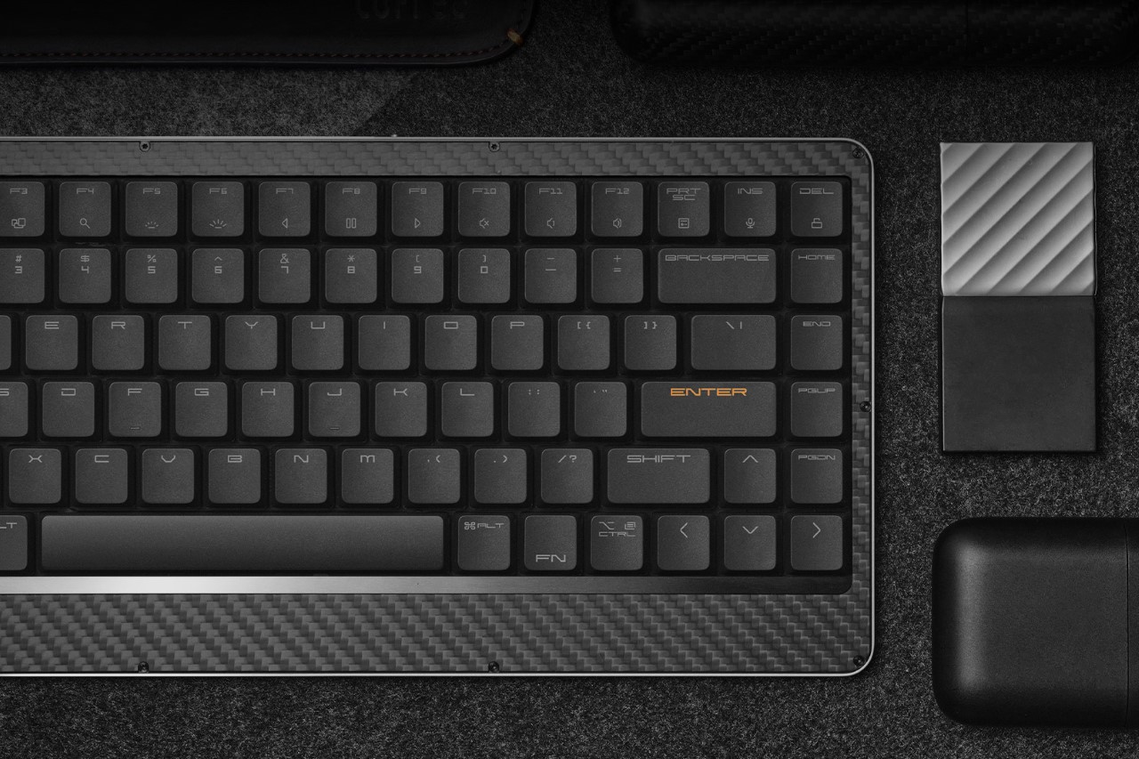
You don’t associate mechanical keyboards with sleek portability… and you don’t associate portable compact keyboards with great tactile feedback or mechanical travel. Lofree’s somehow managed to blur both those worlds into a keyboard that offers the best typing experience while weighing just a pound and being 0.6 inches (16.5mm) thick at its thickest point. Crafted from a combination of magnesium and carbon fiber, the Lofree EDGE reinvents the wheel. It uses unique aerospace-grade materials for their strength-to-weight ratio, redesigned keycaps that are thin but still feel ergonomic, and redefined Kailh mechanical switches that provide a great tactile feel that gives you the mechanical feedback of a much thicker keyboard, but in a highly portable, sleek form.

Designer: Lofree

Click Here to Buy Now: $129 $249 (48% off) Hurry, only limited units at a discounted price. Raised over $270,000.

Over the years, Lofree’s developed its brand reputation for designing wonderfully retropunk tech peripherals. Whether it’s the Touch mouse with PBT buttons, the Wavy Chips mouse that looks like Italian automotive design from the golden ages, or even its Foundation and Block wireless keyboards that reinvent classic designs from decades ago to give them a proper modern revival, the company’s always pushed the boundaries of visual aesthetics, striking a fine balance between classic and contemporary. It’s no wonder that they have, as a result, developed a viciously loyal fan base of design enthusiasts and tech nerds who coalesce around the company’s vision for making great-looking tech that performs remarkably too.

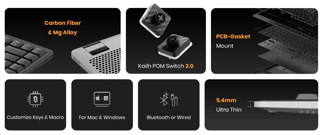
The EDGE is unlike anything Lofree’s ever made before, given that its design brief is distinctly different from the company’s previous approaches to industrial design. Lofree’s thinnest mechanical keyboard yet, the EDGE boasts an ultra-low profile, with a design that’s equal parts utilitarian and aesthetic. Every material is chosen carefully, and every design detail has meticulous thought behind it, resulting in a keyboard that’s just 485 grams (1.06 pounds) light and just 15mm at its thickest point – making it both thinner and lighter than the Corsair K100 Air, which previously held the title of being the thinnest mechanical keyboard. At its thinnest point, it’s a staggering 5.4mm, making it just marginally thicker than Apple’s newest M4 iPad Pro.

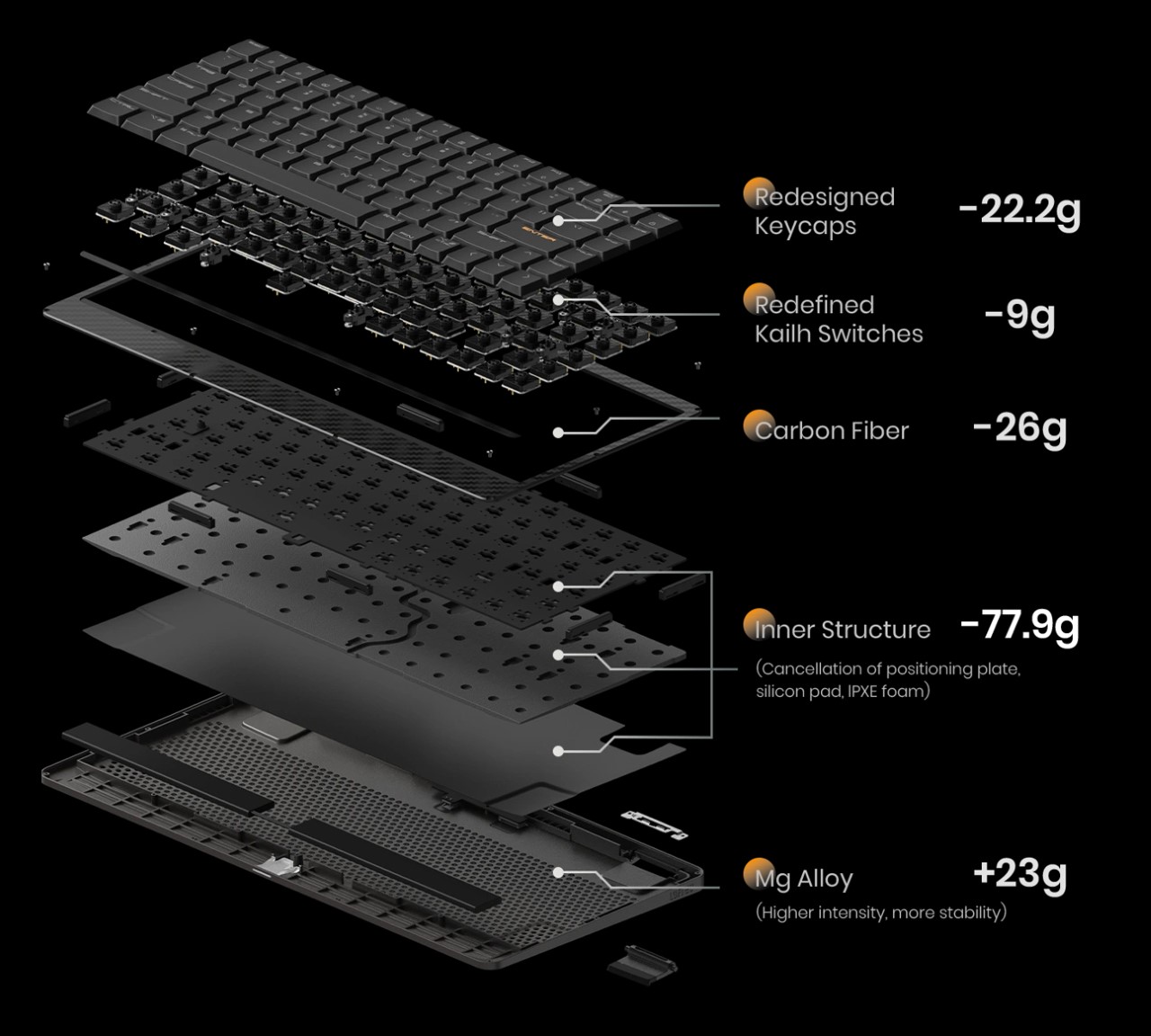
The title of the thinnest mechanical keyboard doesn’t come without some intense design and engineering, backed by solid R&D. Lofree basically designed the entire keyboard from the ground up, removing non-essential components, choosing materials like magnesium and carbon fiber for their strength and low-weight, and even using custom switches. The EDGE’s construction removes components like the positioning plate, silicone pad, and IPXE foam that you’d find in most keyboards, instead opting for a unique PCB gasket structure that holds the keyboard’s internals in place. The base of the keyboard is made from machined magnesium alloy, which then gets capped off with a 3K twill weave carbon fiber upper plate that not only gives the keyboard a solid upper surface but also gives it the distinct carbon fiber aesthetic that people know and love.

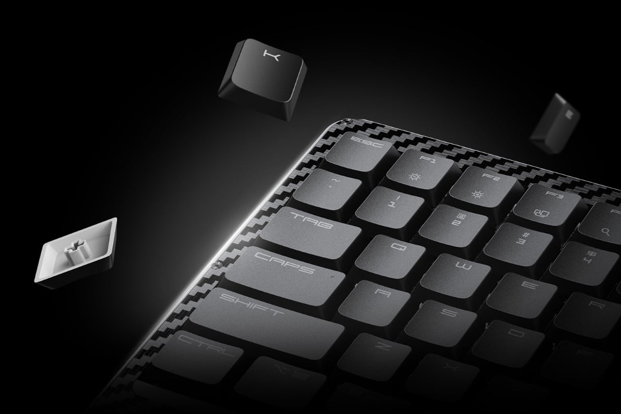
The keys themselves have a unique redesigned profile that’s a combination of thin yet ergonomic, and come made from grease-resistant PBT polymer. They come with a concave top, allowing for error-free typing, and have a specially formulated Kailh POM Switch 2.0 that’s just 9.8mm thick (your average mechanical keyboard switches are 18.5mm) – and even though it’s just half the size of a mechanical switch, it still boasts a healthy amount of travel so you feel like you’re using a mechanical keyboard and not one of those uncomfortable keyboards you’d find on slim laptops. The EDGE’s wedge design does, however, reinforce a sense of slimness, which means you can even carry your wireless keyboard with you in a laptop bag.

The EDGE works in both wired and wireless formats, and is compatible with Windows as well as Mac devices. In wired mode, the keyboard operates at a staggering 100Hz polling rate, practically making latency a thing of the past for gamers. The wireless mode helps keep desks clean, and reduces cable clutter, suitable for all other professions. The EDGE also comes with Lofree’s Configurator software, which lets you change the RGB backlight, remap keys, and set macros/shortcuts (the Configurator is only available for Windows, with a Mac version rolling out at the end of this year). A built-in 2000mAh battery offers 10 hours of wireless use with the backlight on, and a staggering 130 hours if you switch the backlight off. A USB-C port charges the keyboard in just under 3 hours.

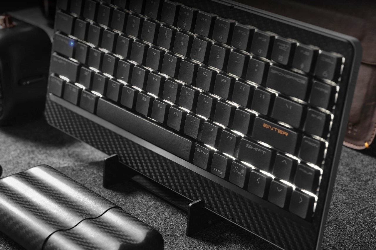
Lofree’s products don’t come without a design twist. While their previous keyboards and mice boasted quirky retropunk aesthetics that gave a distinct flair to your workplace, the EDGE comes with its own carbon fiber vertical stand that holds either the keyboard or your laptop when not in use. Each stand comes cleverly machined from the blank rectangle that gets cut out of the center of the EDGE’s carbon fiber upper plate, helping reduce waste and repurpose the material to create something functional. Each EDGE comes with the stand flat-packed, which can easily be assembled in under a minute, giving you a convenient place to dock your device when you’re done with it, so your table remains clean and clutter-free. The $129 EDGE also ships with a connecting cable, extra keycaps, and a keyboard sleeve that’s only available to people who back the keyboard on Kickstarter. The world’s slimmest mechanical keyboard ships globally starting July 2024.

Click Here to Buy Now: $129 $249 (48% off) Hurry, only limited units at a discounted price. Raised over $270,000.

The post Lofree EDGE – The World’s Thinnest Mechanical Keyboard is just 16mm, less than two iPhones thick first appeared on Yanko Design.

This Baroque Wireless Mouse concept is the most beautiful tech gadget I’ve ever seen

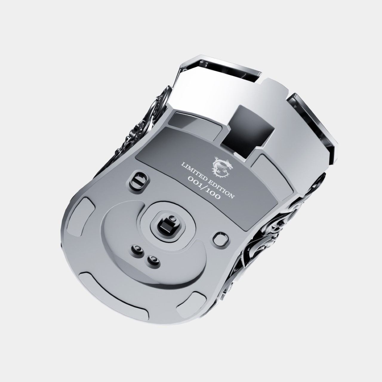
Forget transparent gadgets with their exposed circuitry, forget gamer gear with their flashy LEDs, this right here takes the prize for being the most gorgeous tech-aesthetic ever. Meet the Ornamental MSI Mouse, a wireless mouse concept from the mind of Eslam Mohammed. Crafted out of pure metal, the mouse eschews sleek surfaces for something a little out of the ordinary. Instead of a basic outer shell, the mouse sports an eye-catchingly intricate baroque-inspired metal outer casing. With ample cutouts that let you see through the details right into the mouse’s inner body, the shell is a combination of detail-heavy yet visually light. To balance the use of Baroque, the left and right buttons are left sleek and plain, creating a fusion that looks so good you’ll never want to lay your hands on another mouse in your life.

Designer: Eslam Mohammed

The Ornamental MSI Mouse blends two genres of classic aesthetics together into one gorgeous form. A very fresh reinterpretation of steampunk, this mouse is simultaneously old-school and new-age, with that ornamental chassis that encases wireless tracking tech that you’d expect from the computer peripherals of today.

The baroque shell itself looks to be either cast or machined out of metal (3D printing would be a little too expensive), and then capped with the other parts that fix right together. If the shell were to be made of aluminum, the mouse would still be incredibly light considering its all-metal construction. The hollow shell design promotes air-flow, which means you’ll never find yourself with sweaty palms… just be a little careful of resting your hand on the mouse too long or you’ll have the baroque imprints on your hand! This mouse clearly isn’t for intensive workplace usage.

Capping off the mouse’s design are all-metal left and right-click buttons, along with two shortcut buttons underneath the thumb on the side. The buttons are also accompanied by a gorgeous knurled scroll wheel that combines luxury with tactile. There’s nothing ‘cheap’ or plastic about the mouse’s design. The only real drawback is that Eslam’s concept is just that… a concept. Hopefully he’ll build a prototype soon. When he does, I’ll have my credit card ready!

The post This Baroque Wireless Mouse concept is the most beautiful tech gadget I’ve ever seen first appeared on Yanko Design.
Logitech G launches its tiniest wireless keyboard – The first with a 60% layout

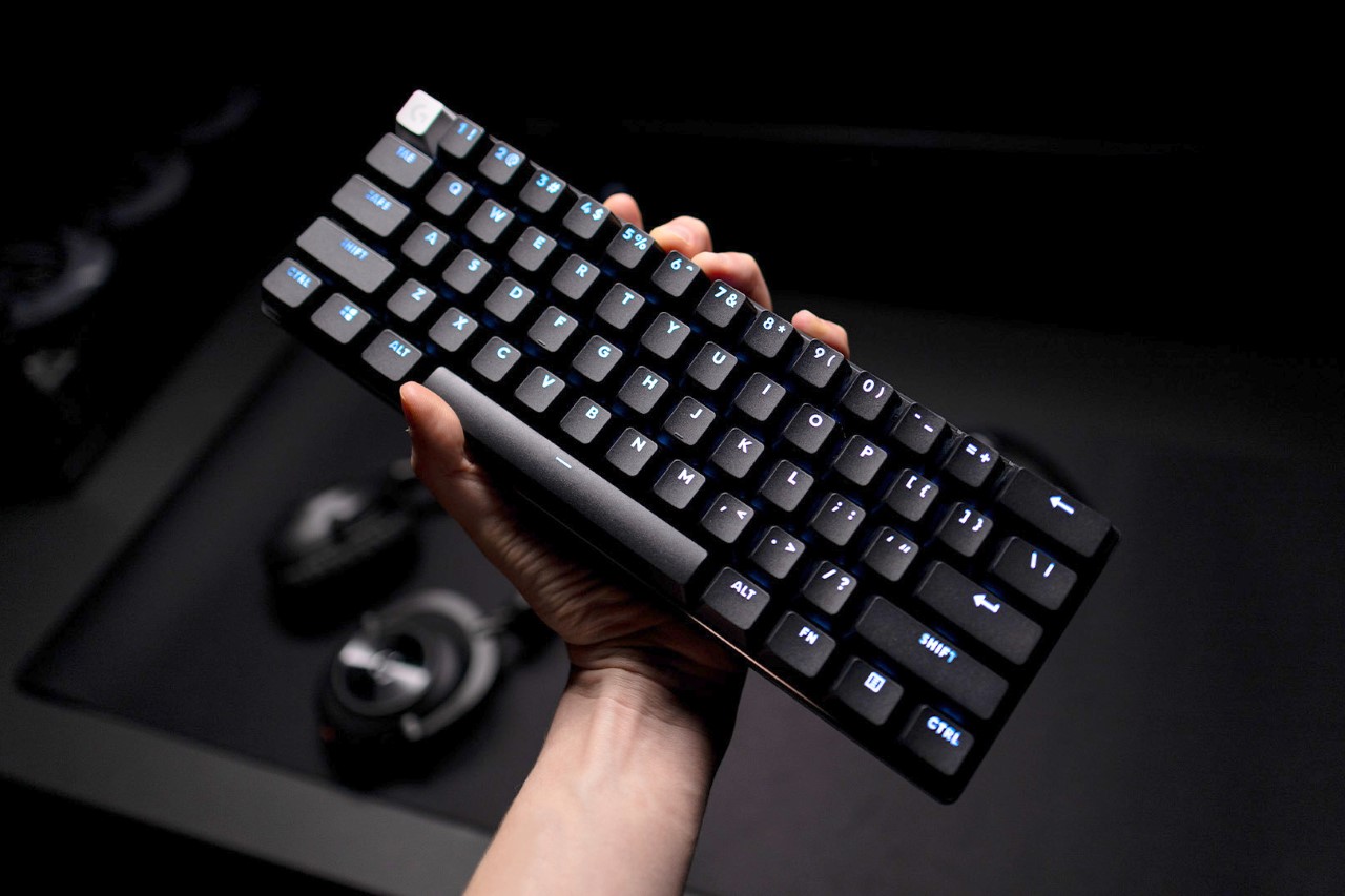
If you’re anywhere near a laptop, spend a second looking at the keyboard it contains. Chances are, the keyboard you’re looking at has a 65% layout, featuring the QWERTY keys, the number row above it, and function keys. Not all laptops have num-pads on the side (unless they’re 15-inch laptops or more), so what you’re left with is perhaps the most condensed keyboard layout ever. However, you CAN go smaller. Remove the function row from the top, and you’re now left with a bare-basics 60% keyboard layout. It gets the job done, it’s compact, and is ideal for portability – all of which are the Pro X 60’s most prized features. Debuted as Logitech’s first 60% wireless keyboard, the Pro X 60 Lightspeed is deviously tiny, but doesn’t trade size for functionality. It’s still got great mechanical travel at its heart, making the keyboard perfect for pretty much everyone, but ideal for gamers, who revere that mechanical feel.

Designer: Logitech

Click Here to Pre-Order Now

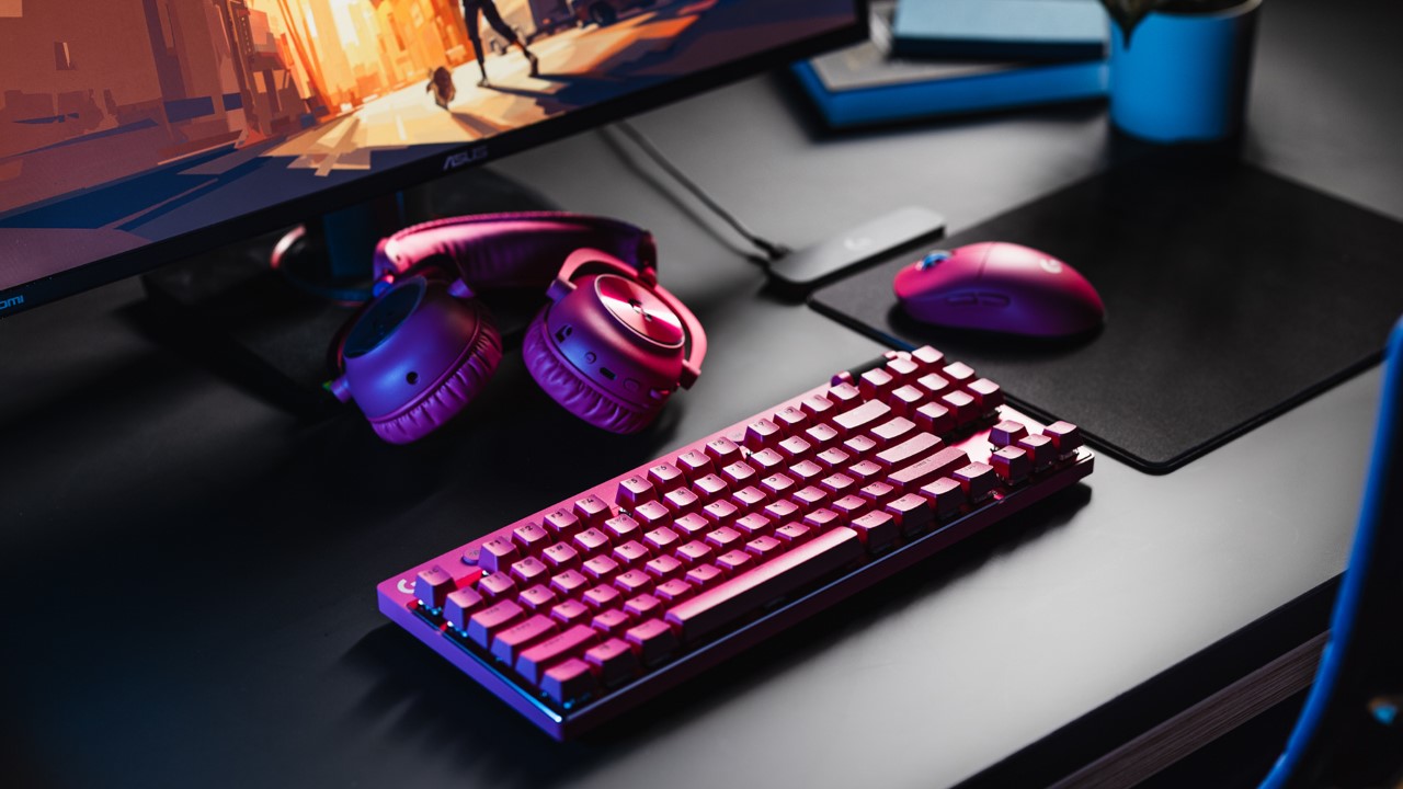
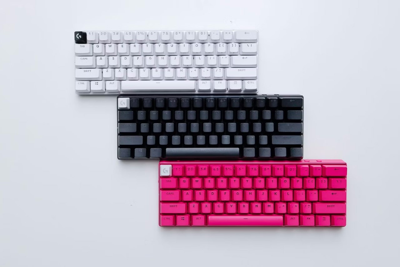
At a glance, the $179 Pro X 60 Lightspeed is a study in meticulous design and technological advancement. Offering a choice between tactile or linear GX optical switches, and available in three colors—black, white, or pink, the keyboard seeks to envelop gamers in a bespoke gaming experience. The keyboard’s compact size is a deliberate choice, offering ease of transportation without compromising on the essential features that gamers have come to expect from Logitech’s G Pro X series.

Unlike its predecessor, the G Pro X TKL Lightspeed, the Pro X 60 Lightspeed opts for optical switches over mechanical ones, offering a distinct feel with a 1.8mm actuation point and a travel distance of 4mm. This choice underscores Logitech’s pursuit of providing gamers with precision and responsiveness in a form factor that defies convention. The keyboard’s versatility extends to its connectivity options—wired via a USB-C cable, or wireless through Bluetooth or Logitech’s proprietary Lightspeed dongle, ensuring a seamless gaming experience with a 1000Hz polling rate.

Gamers can customize the keyboard and assign macro shortcuts, adjust lighting, and tweak audio effects to their liking, with each key capable of performing up to 15 different functions through Logitech’s G Hub software and the new Keycontrol tool. The inclusion of Lightsync RGB lighting, pre-set to a static blue to minimize distractions, further enhances the gaming atmosphere, allowing for a personalized color palette and lighting sequences to radiate through the keyboard’s dual-shot PBT keycaps.

Beyond its technical prowess, the Logitech G Pro X 60 Lightspeed is designed with quality-of-life improvements that cater to the gaming lifestyle. A strategically placed volume roller, a Game Mode switch that disables potentially distracting keys, and a carry case for easy transport all contribute to a gaming keyboard that understands the rhythm of competitive play and travel. For gamers for whom every second and every key press can make the difference between victory and defeat, the Pro X 60 Lightspeed is a mobile command center that bridges the gap between performance and portability. The Pro X 60 Lightspeed is available for preorder, with deliveries starting April 17th.

Click Here to Pre-Order Now

The post Logitech G launches its tiniest wireless keyboard – The first with a 60% layout first appeared on Yanko Design.

A Mouse That Enhances Your Gaming Experience Inspired By Star Wars

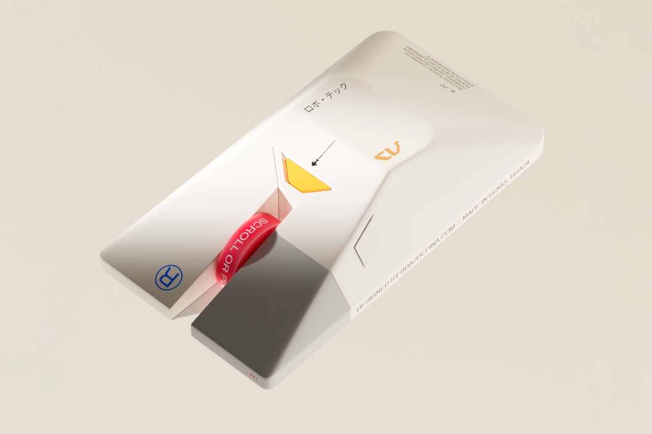
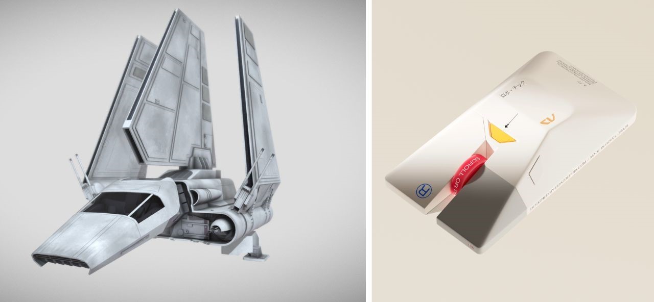
As a design website, we’ve had the distinction of covering practically every computer mouse there is. Regular mice, ergonomic mice, vertical mice, gaming mice, inflatable mice, even origami mice… so the BM1 doesn’t come as any massive surprise in terms of the visual design department. Modeled on the Lambda-class T-4A Shuttle from Star Wars, the mouse balances ergonomics with a rather inventive design that pays tribute to one of the greatest cinematic universes of all time.

Designer: Braz de Pina

Crafted by a visionary designer with a profound love for the Star Wars universe, the BM1 Mouse pays homage to one of the saga’s most iconic vessels – the Lambda-class T-4a shuttle. With its sleek contours and unmistakable resemblance to the Imperial Shuttle, this mouse beckons adventurers to embark on a journey through the stars, where every click and scroll resonates with the pulse of interstellar warfare.

For the legions of Star Wars aficionados and gamers alike, the BM1 Mouse offers an unparalleled experience, seamlessly blending the allure of the Galactic Empire with the thrill of virtual conquests. At first glance, the echoes of the Lambda-class shuttle resonate through the sleek contours of the mouse, with its central body mirroring the iconic vessel’s silhouette (if you exclude the wings).

The fusion of form and function reaches its peak with the mouse’s primary features – the left and right clicks, reminiscent of the cannons adorning the front of the Imperial Lambda. Each click resonates with the exhilaration of battle, offering gamers an immersive experience akin to piloting a starfighter through the vast expanse of space.

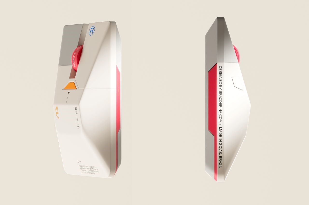
Beyond its striking resemblance to the Imperial Shuttle, the BM1 Mouse boasts a visual identity that exudes sophistication and ergonomic brilliance. Chamfered edges provide not only aesthetic appeal but also enhance grip and comfort during prolonged gaming sessions. The streamlined shape evokes a sense of speed and agility, reminiscent of the starships that dominate the Star Wars universe.

Not to be overlooked is the mouse’s scroller – a distinctive feature that commands attention with its futuristic design. Easy to spot and effortless to use, the scroller serves as a tool for navigation in the digital realm, guiding users through galaxies far and wide with precision and ease.

Moreover, the visual cues and font selection evoke a sense of futurism, drawing parallels to the technological marvels of the Star Wars universe. The color palette, a delicate fusion of greys, whites, and vibrant primary hues, further accentuates the mouse’s futuristic appeal, transporting users to a realm where technology and imagination converge.

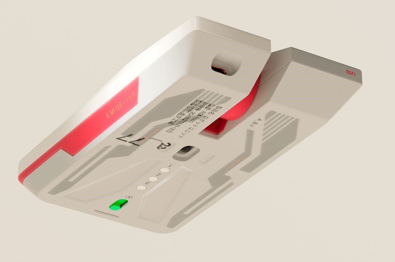
A closer look at the mouse’s underside reveals a flat base adorned with sleek depressions, reminiscent of the underbelly of a spaceship preparing for flight. This attention to detail not only enhances the mouse’s aesthetic appeal but also reinforces its identity as a vessel for digital exploration and conquest.

The post A Mouse That Enhances Your Gaming Experience Inspired By Star Wars first appeared on Yanko Design.

Keychron’s Redesigned NumPad Doubles Your Productivity With Additional Gaming and Macro Keys

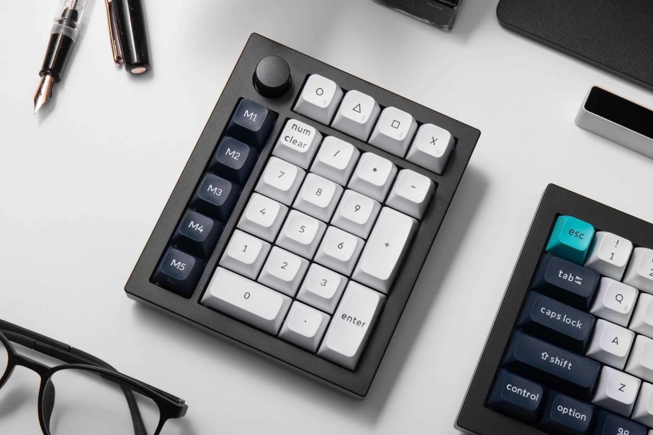
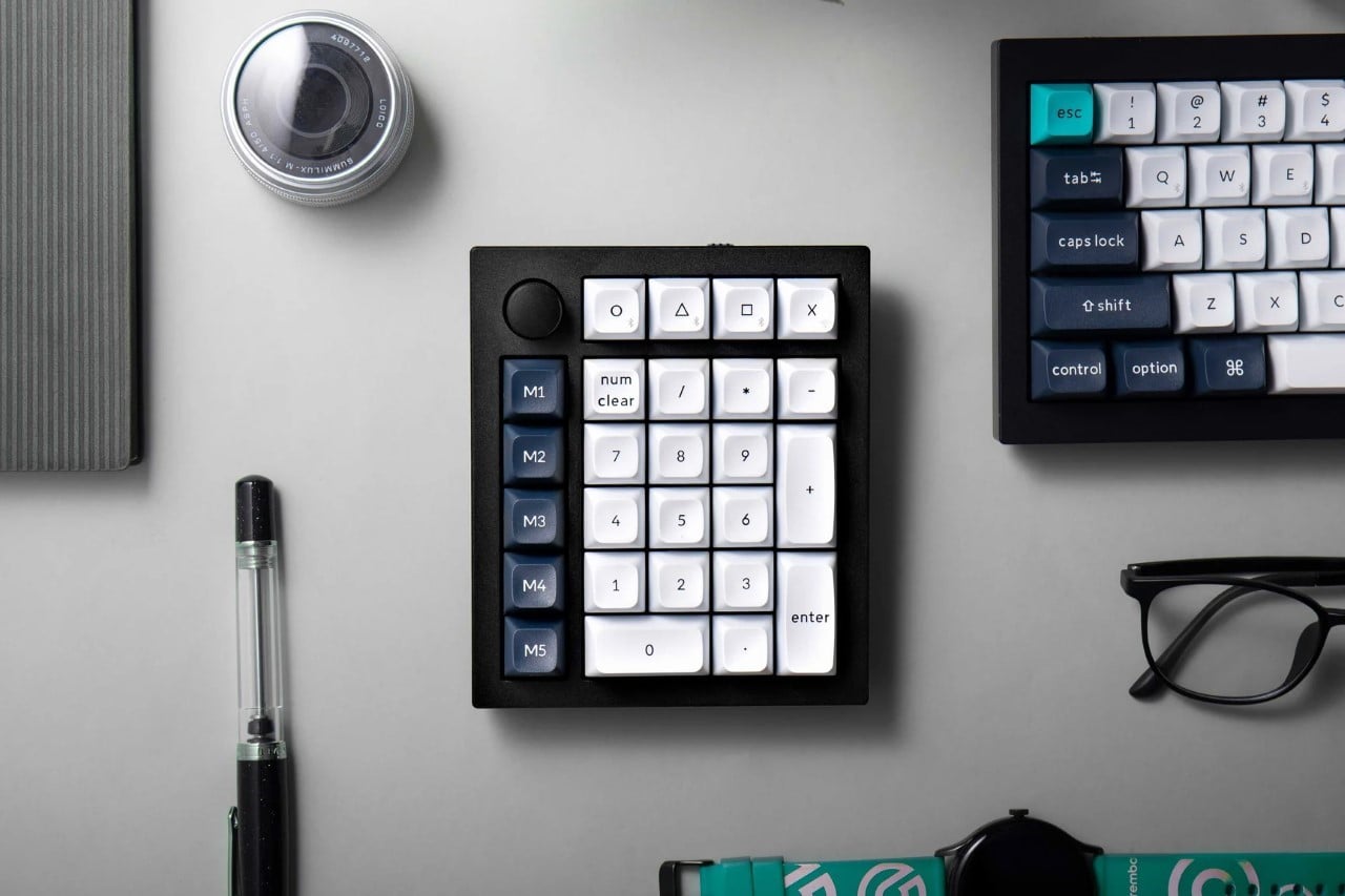
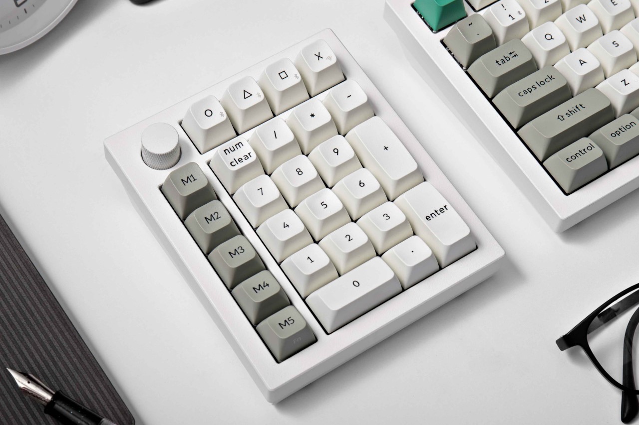
For designers and data enthusiasts, the number pad is a productivity powerhouse. It streamlines repetitive tasks, frees up valuable desk space, and keeps your workflow flowing. But what if your number pad could be more than just a utilitarian tool? Enter the Keychron Q0 Max, a fully customizable number pad that blends cutting-edge features with a familiar design. It might outwardly look like a numpad, but it’s a meticulously designed tool built to streamline workflows for both casual users and productivity powerhouses. Designed for content creators, programmers, or simply anyone who values efficiency, the Keychron Q0 Max wireless keypad offers a compelling combination of features and customization. Its compact size makes it a perfect space-saving solution for desks of all sizes, while its powerful functionality caters to users who demand more from their peripherals. With its attractive price tag and feature-rich design, the Q0 Max is a strong contender for the title of best productivity keypad in the market.

Designer: Keychron

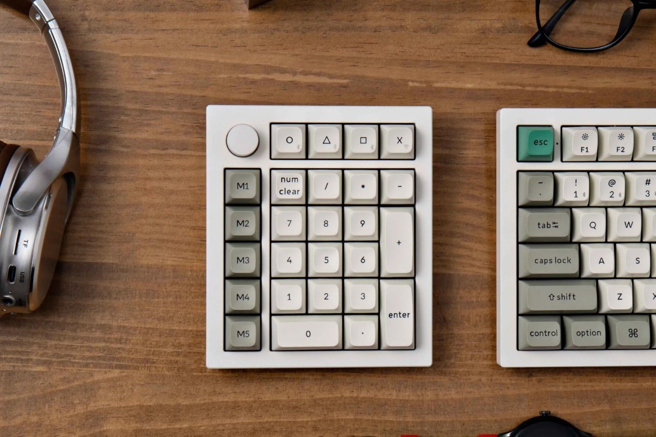
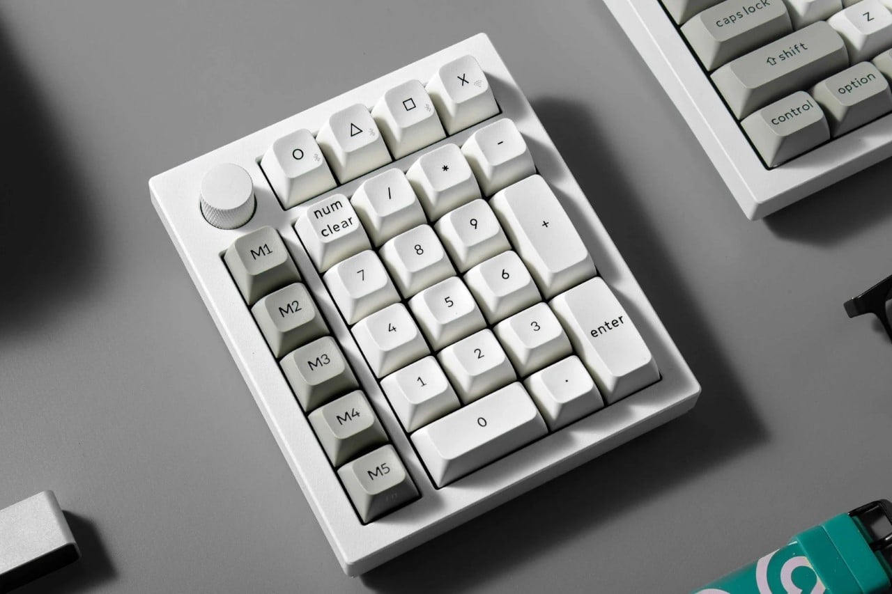
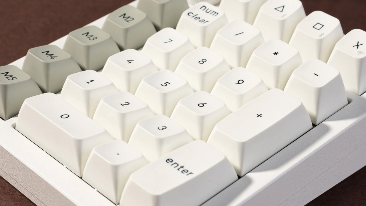
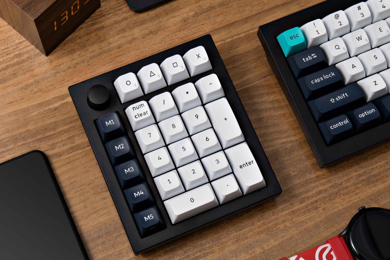
The Q0 Max builds upon the success of its predecessor, the Q0 Plus, by offering a more versatile layout. It retains the familiar numeric keypad but adds five dedicated macro keys on the left-hand side and a convenient rotary knob. These additional controls unlock a treasure trove of customization possibilities. Imagine assigning complex macros to single keypresses, streamlining repetitive tasks, playing games, or using the knob for media control or application switching. The Q0 Max empowers you to tailor your workflow for maximum efficiency.

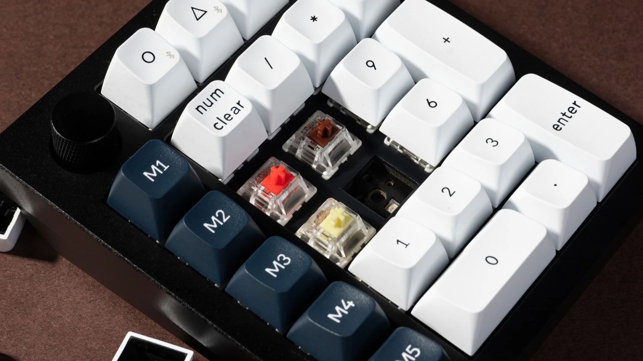
Hot-swappable switches allow you to personalize the typing experience to your exact preferences. Do you crave the satisfying tactility of the Jupiter Tea switches? Or perhaps the smooth glide of the Jupiter Red is more your style? Keychron offers a variety of options to suit every taste. Additionally, south-facing RGB lights enhance the visual appeal, bathing your workspace in a vibrant glow that complements your setup.

For users who crave even deeper control, the Q0 Max boasts compatibility with QMK/VIA software. You can remap any key and program those valuable macro keys to perform actions you use frequently. Imagine launching specific applications, inserting frequently used text snippets, or controlling multimedia playback – all with a single tap. Keychron has also made significant upgrades to the Q0 Max’s core components. Pre-installed switches now hail from the Gateron Jupiter series, renowned for their impressive durability. With a staggering 80 million keypress lifespan, these switches can handle even the most demanding typing marathons.

The Q0 Max comes dressed in two sleek color options: classic carbon black and crisp shell white. This allows you to seamlessly integrate the keypad into your existing setup, ensuring it complements your aesthetic preferences. The barebone kit, ideal for enthusiasts who already have their preferred switches and keycaps, starts at a budget-friendly $109. For those who prefer a complete package, the finished version with pre-installed Gateron Jupiter switches and high-quality PBT keycaps comes in at $119.

The post Keychron’s Redesigned NumPad Doubles Your Productivity With Additional Gaming and Macro Keys first appeared on Yanko Design.

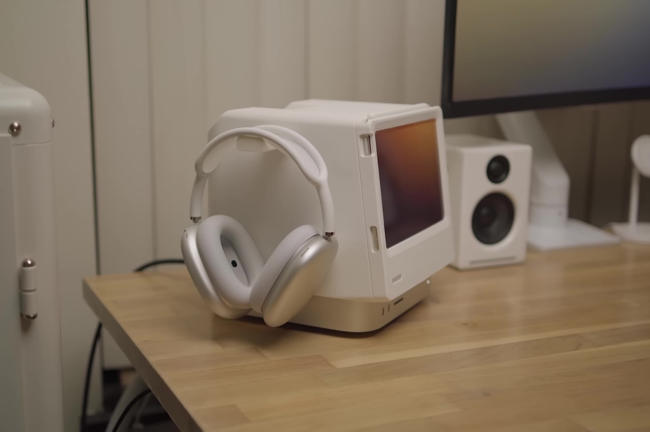
DIY Macintosh Studio is an ingenious dock for the iPad mini and Mac Studio

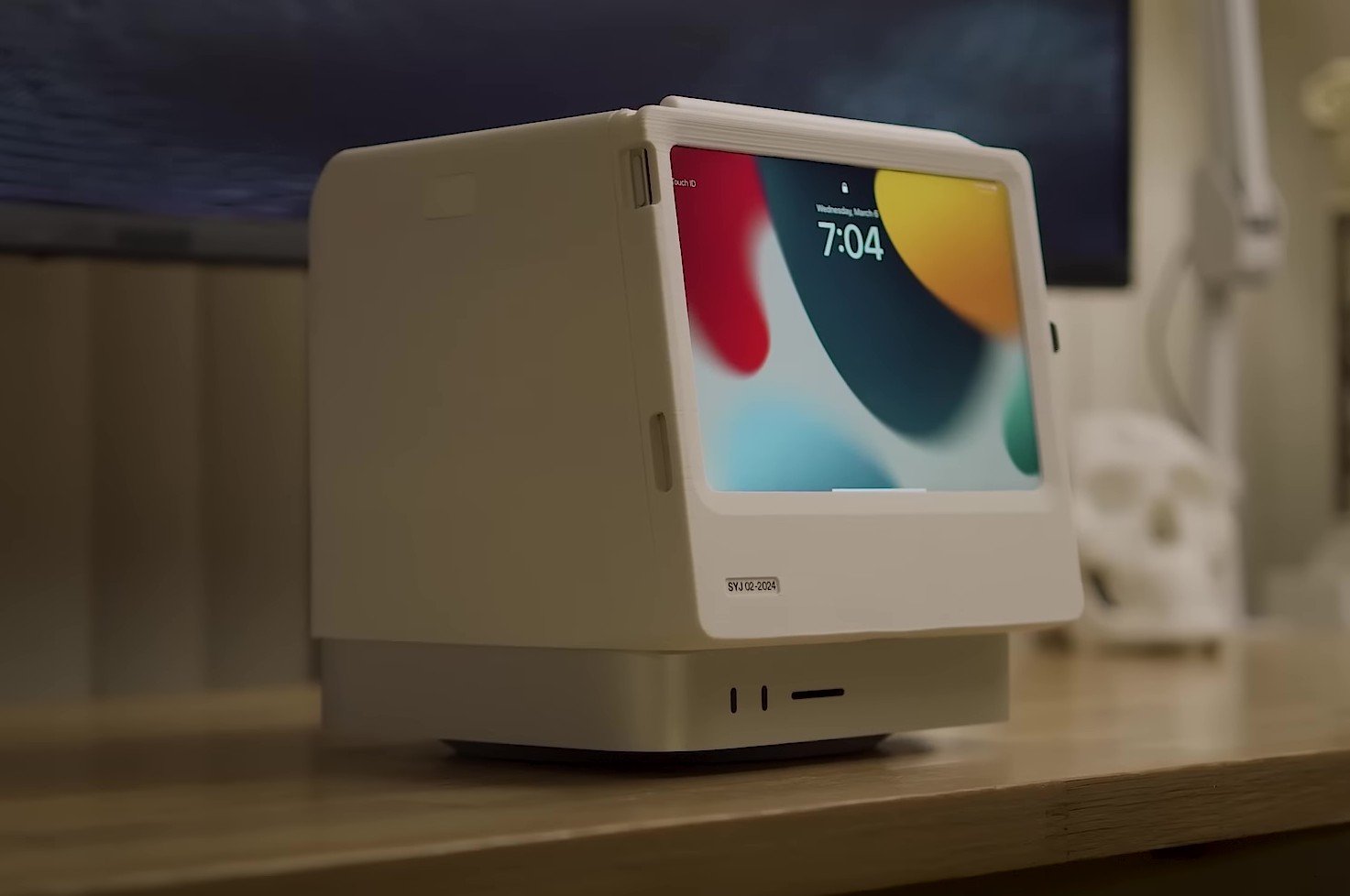
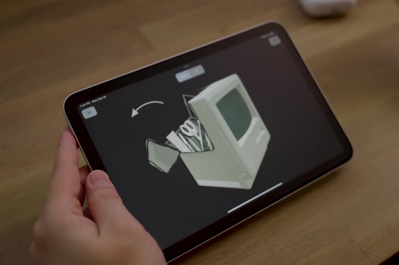
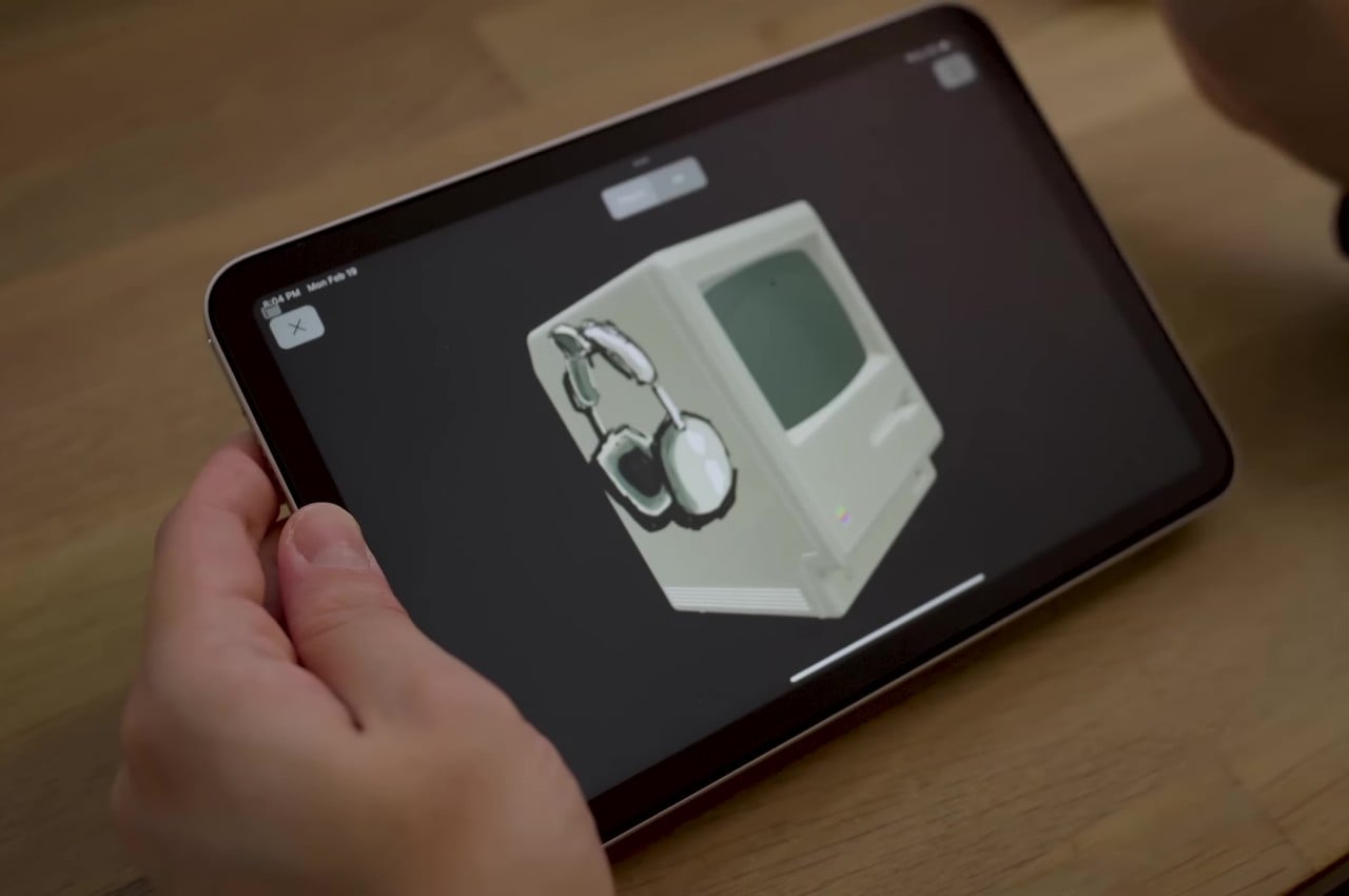
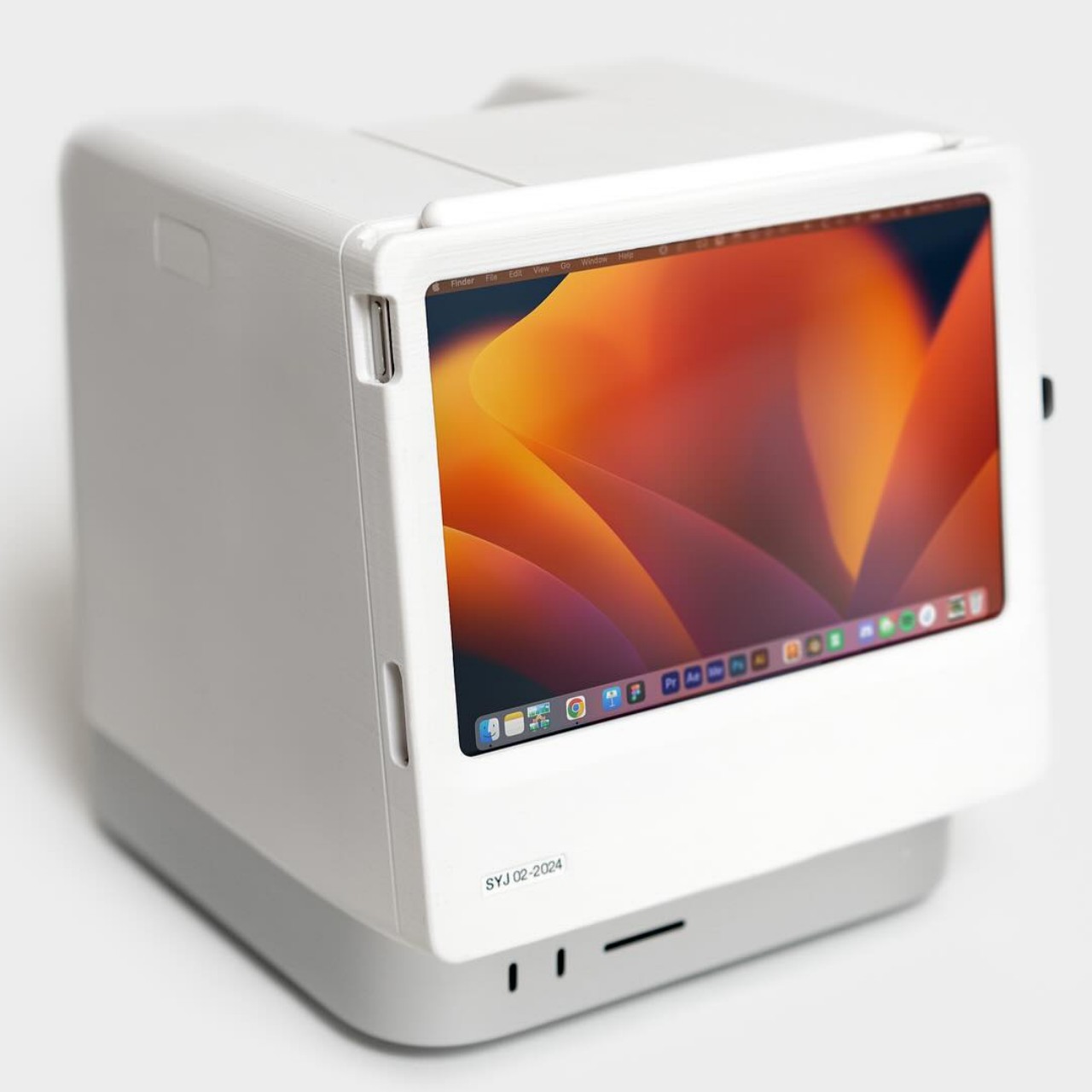
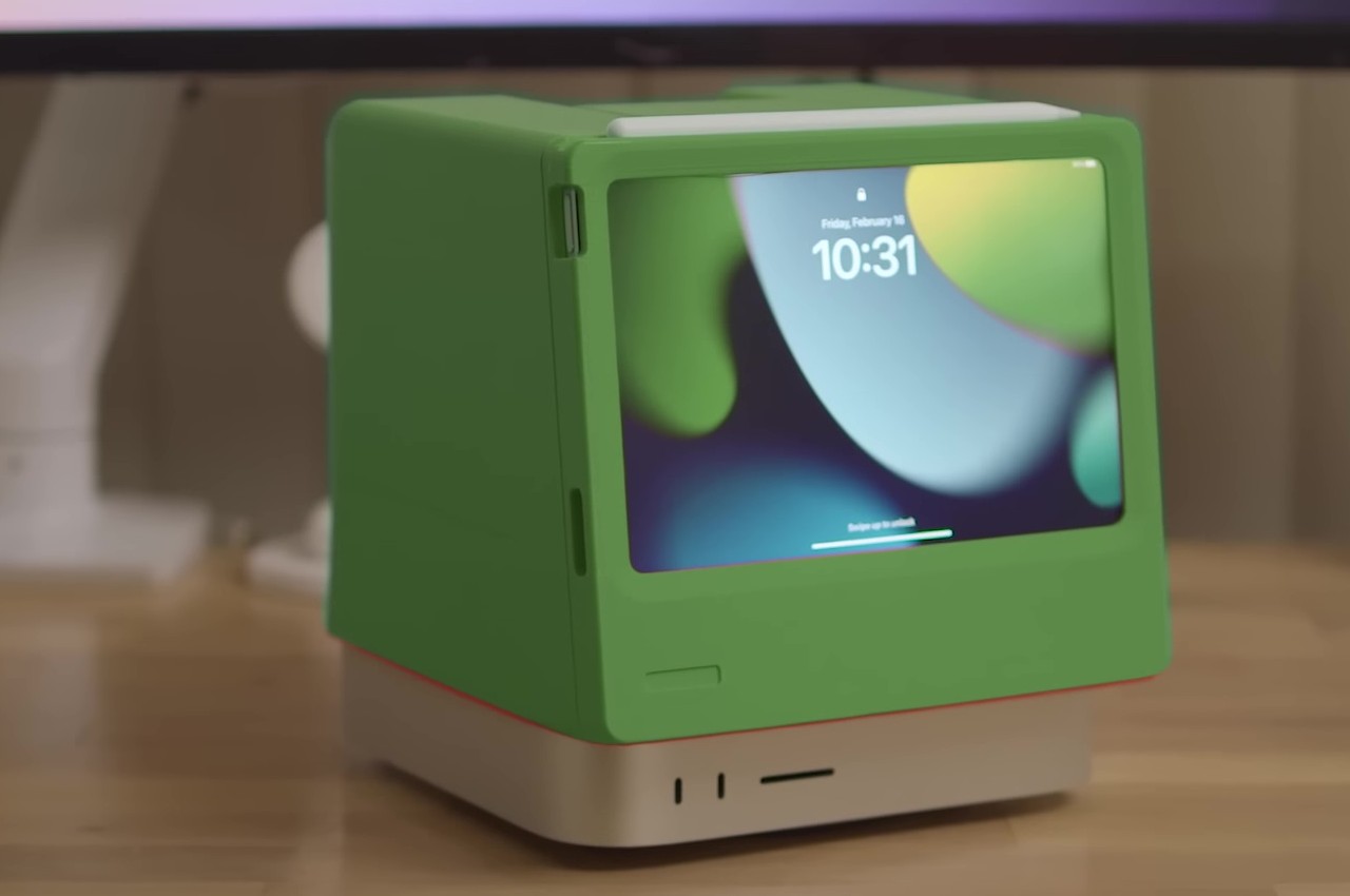
They say necessity is the mother of invention, so it’s probably not surprising that some of the best and sometimes even outrageous designs were born out of someone’s itch, as they call it. Take for example this rather interesting DIY project that gives a home for an iPad mini and hides the Mac Studio in plain sight. While there’s no shortage of products that address those needs separately, this creative solution manages to combine both in an inspired way, paying homage to the product that catapulted Apple to fame 40 years ago: the venerable original Macintosh. Of course, it isn’t just a superficial nostalgia trip, but one that also harnesses some of the best features of Apple’s product design today.

Designer: Scott Yu-Jan

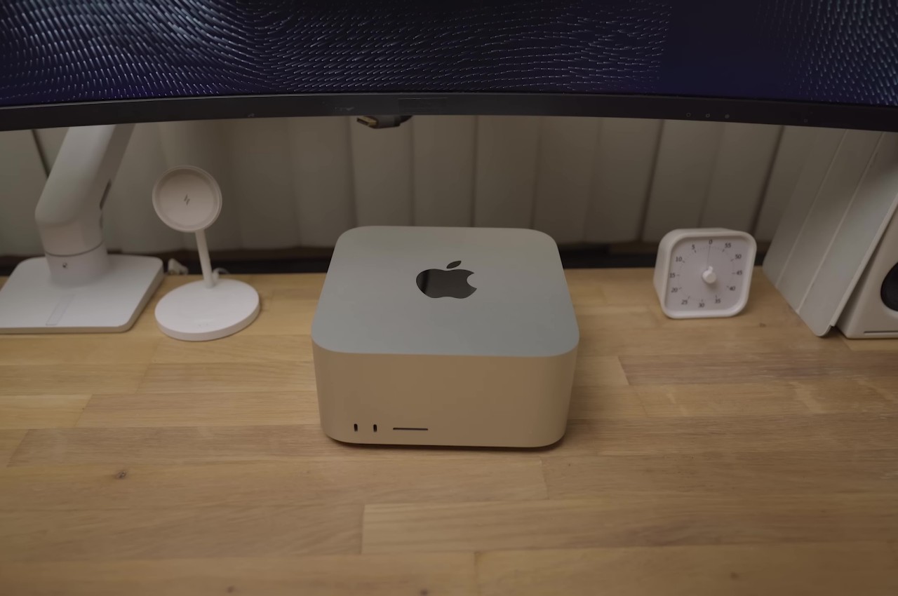
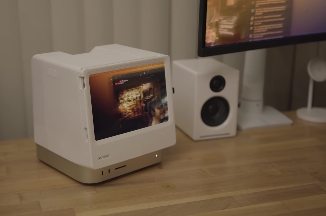
Although it’s patterned after the Mac mini, the powerful Mac Studio is exponentially taller, and its presence can’t be ignored when you place it under a monitor. On the other side of the fence sits the lightweight and compact iPad mini, which has gained a lot of features that almost make it suitable as a desktop device. These two products come from very different lines but share the same family spirit. Putting them together might sound superficial, but this 3D-printed modular case manages to pull it off so tastefully.

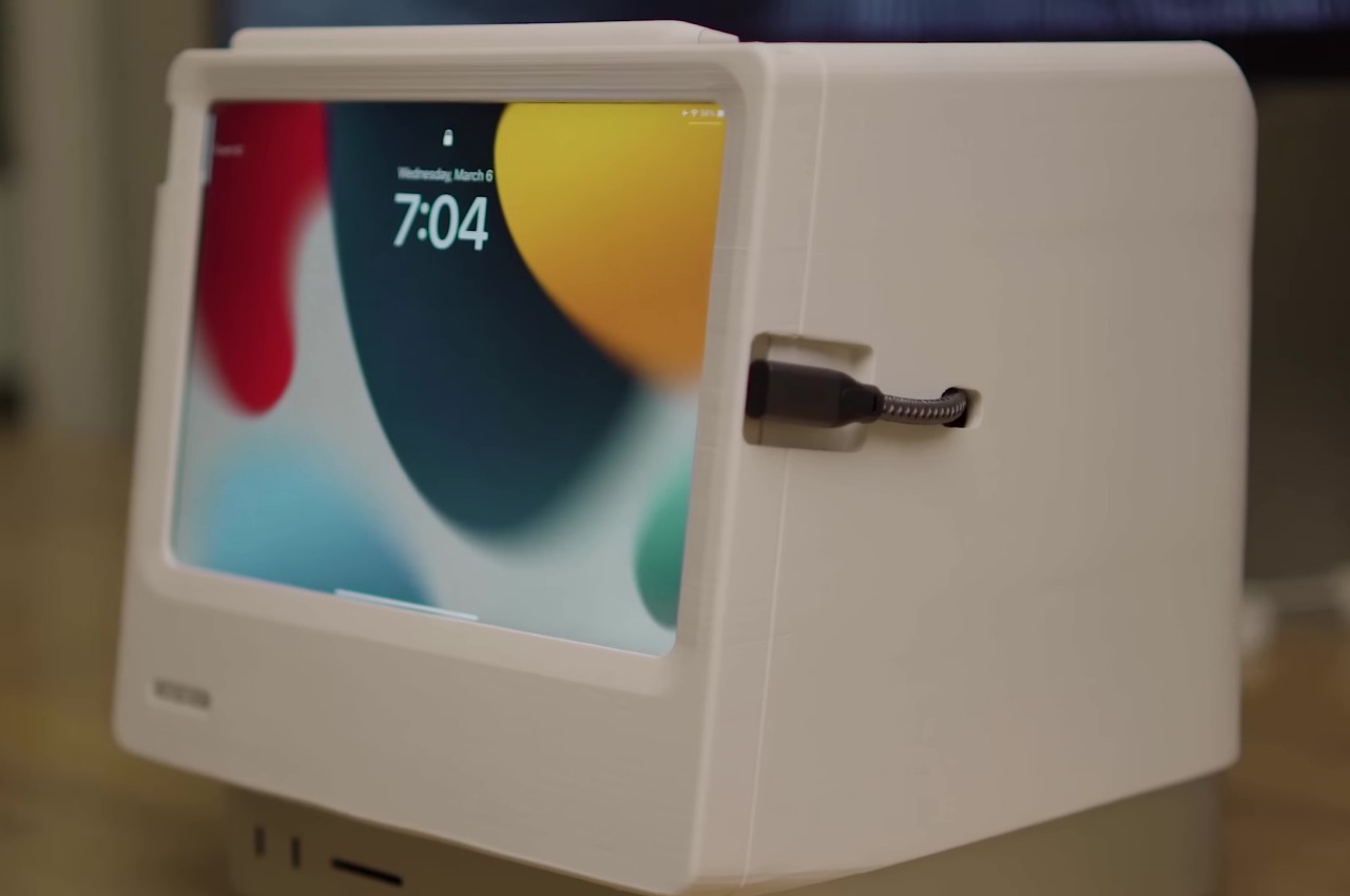
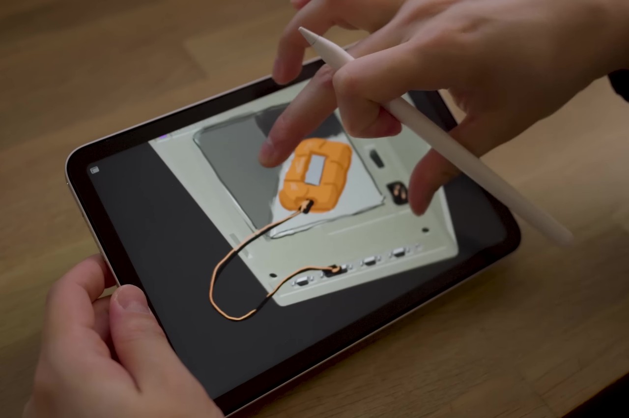
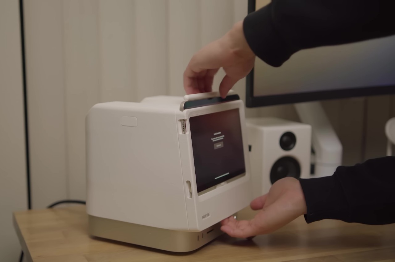
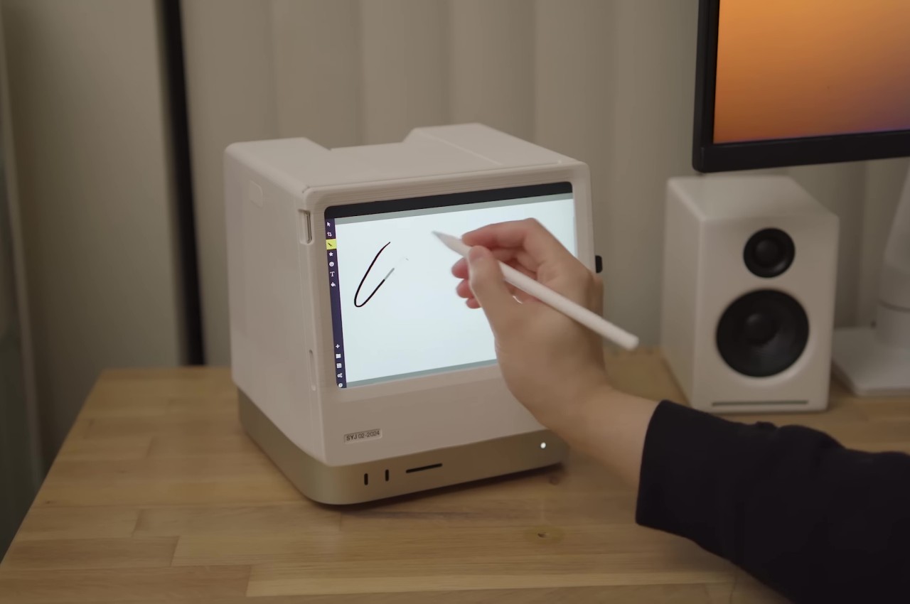
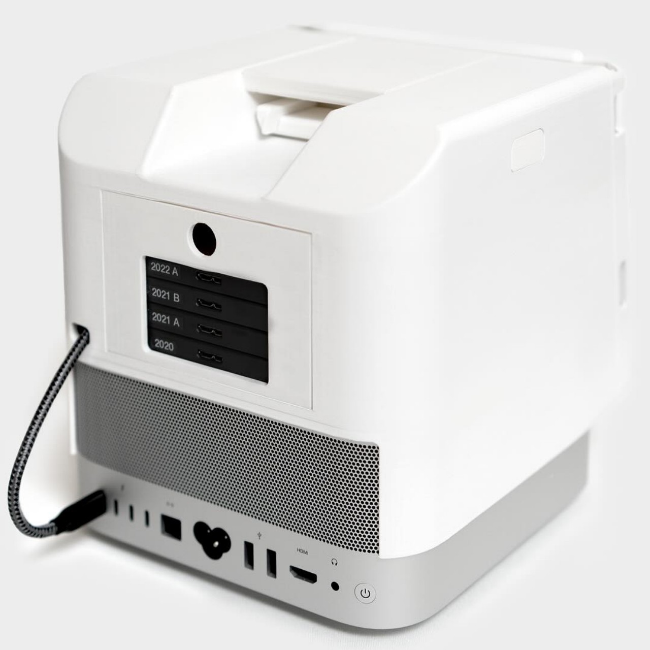
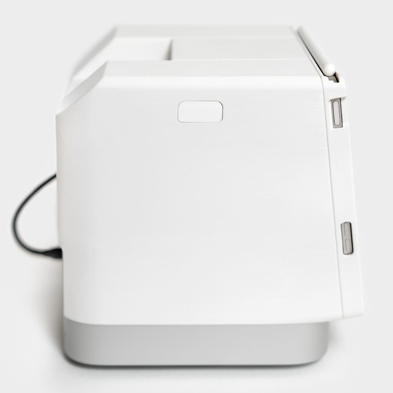
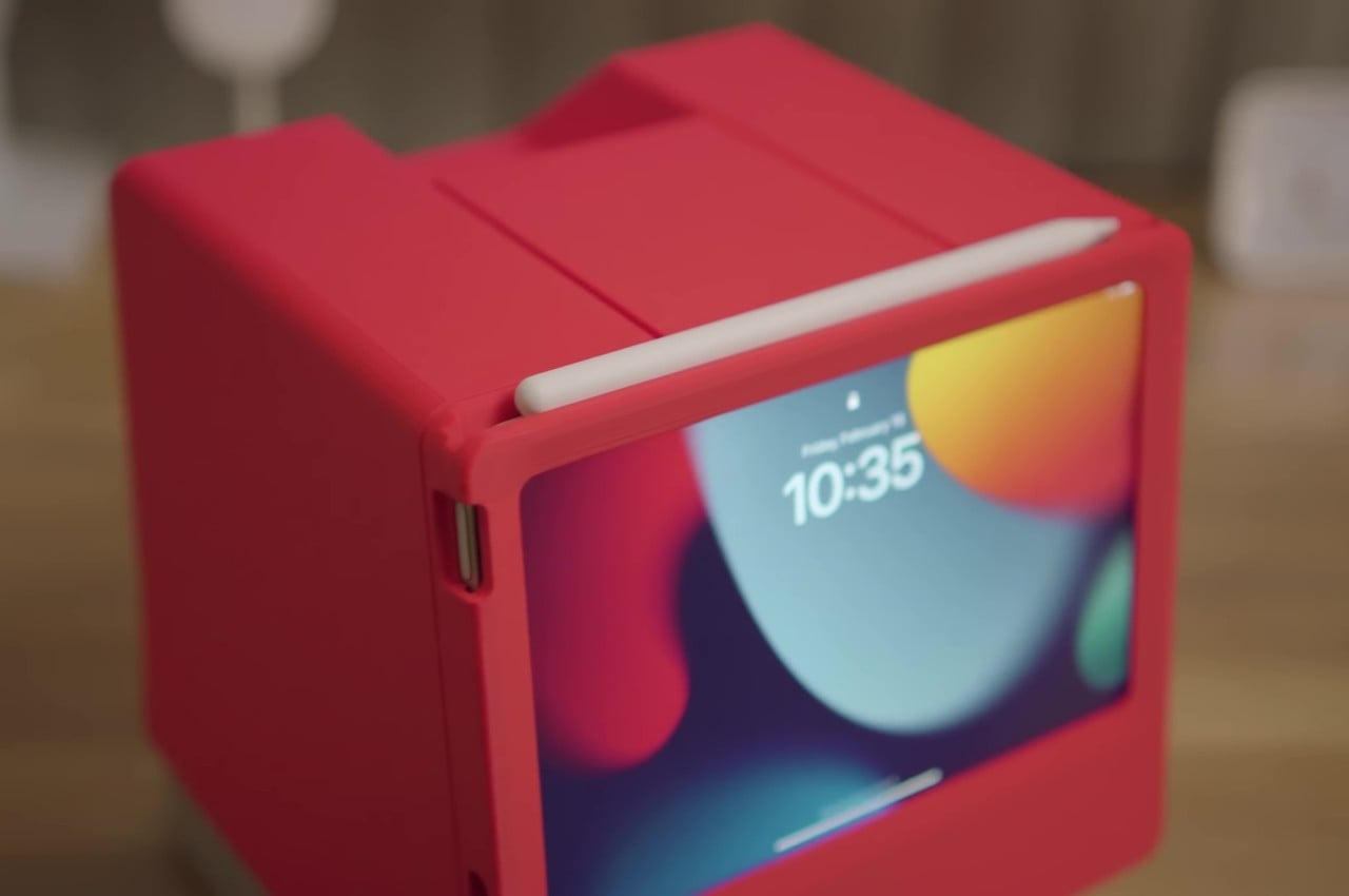
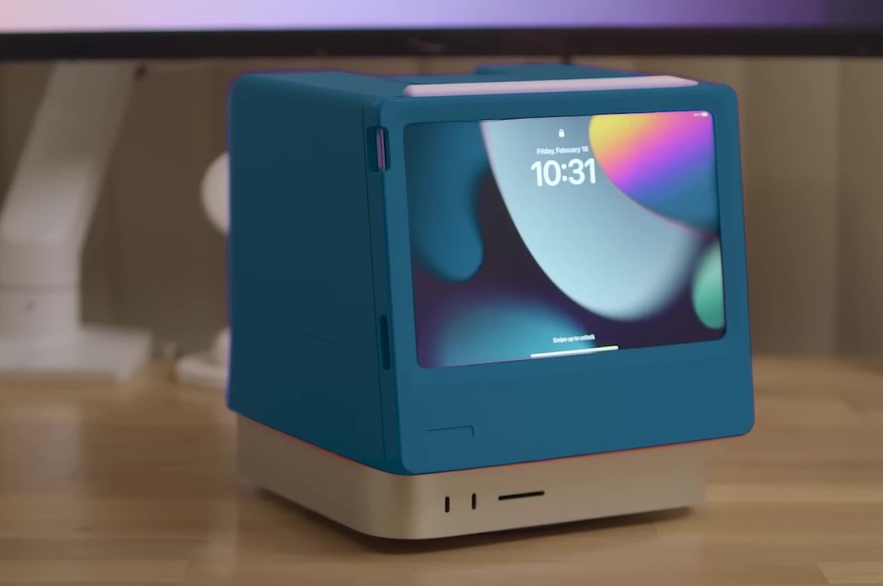
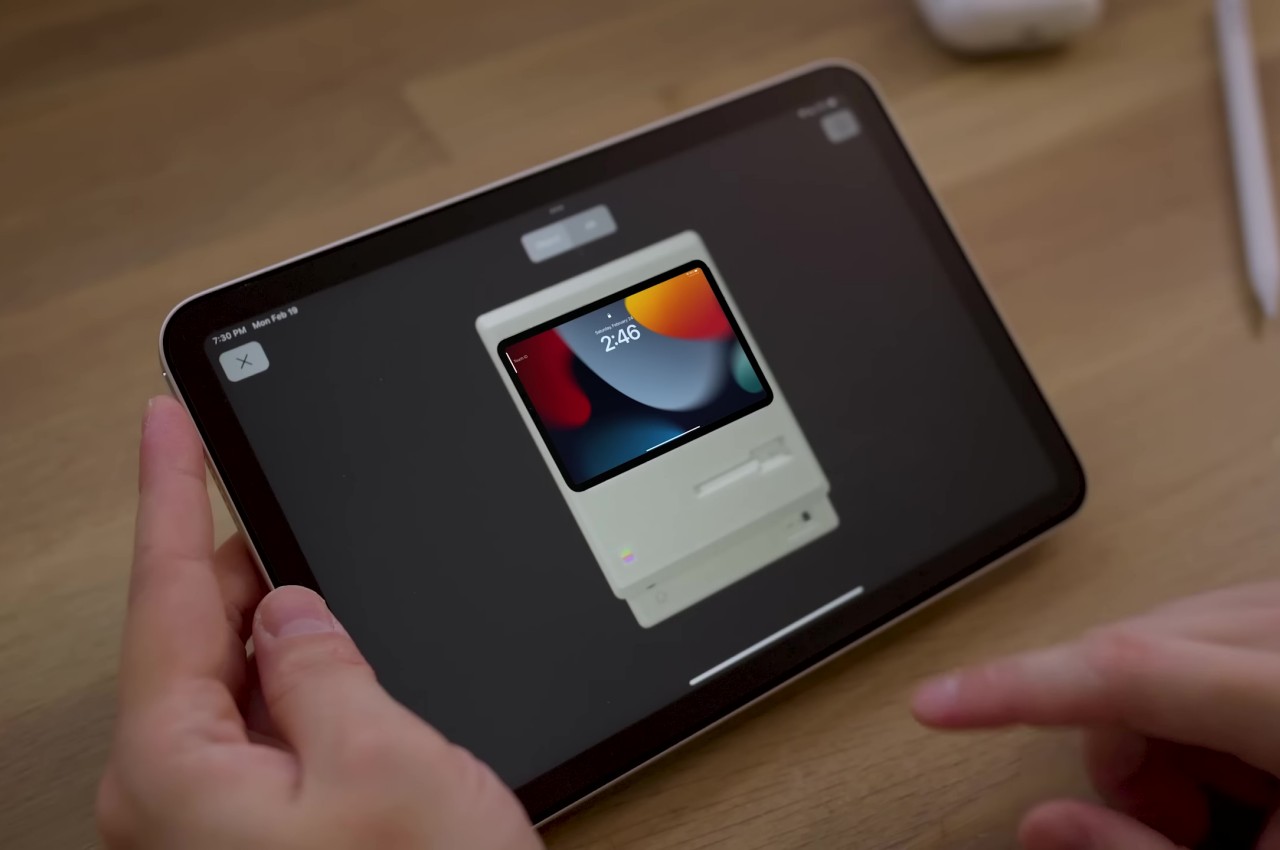
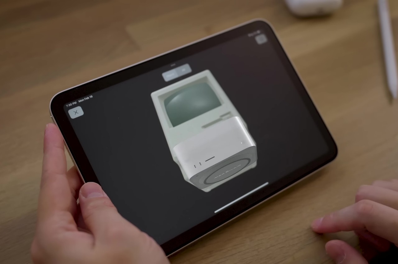
Dubbed the Macintosh Studio, the enclosure sits on top of and snugly hugs most of the Mac Studio, leaving only the ports near the bottom unrestricted. The front of the contraption has a slot for the iPad mini to slide in securely and connect to the Mac Mini via a single USB-C cable. This way, the iPad mini is always charged and ready to go when you need it, while also serving as a second screen for the Mac Studio thanks to Apple Sidecar. This gives both devices a customized home without removing anything from their functionality. You can even draw on the iPad quickly, though the position and angle of the screen won’t be ideal for working on art and designs.

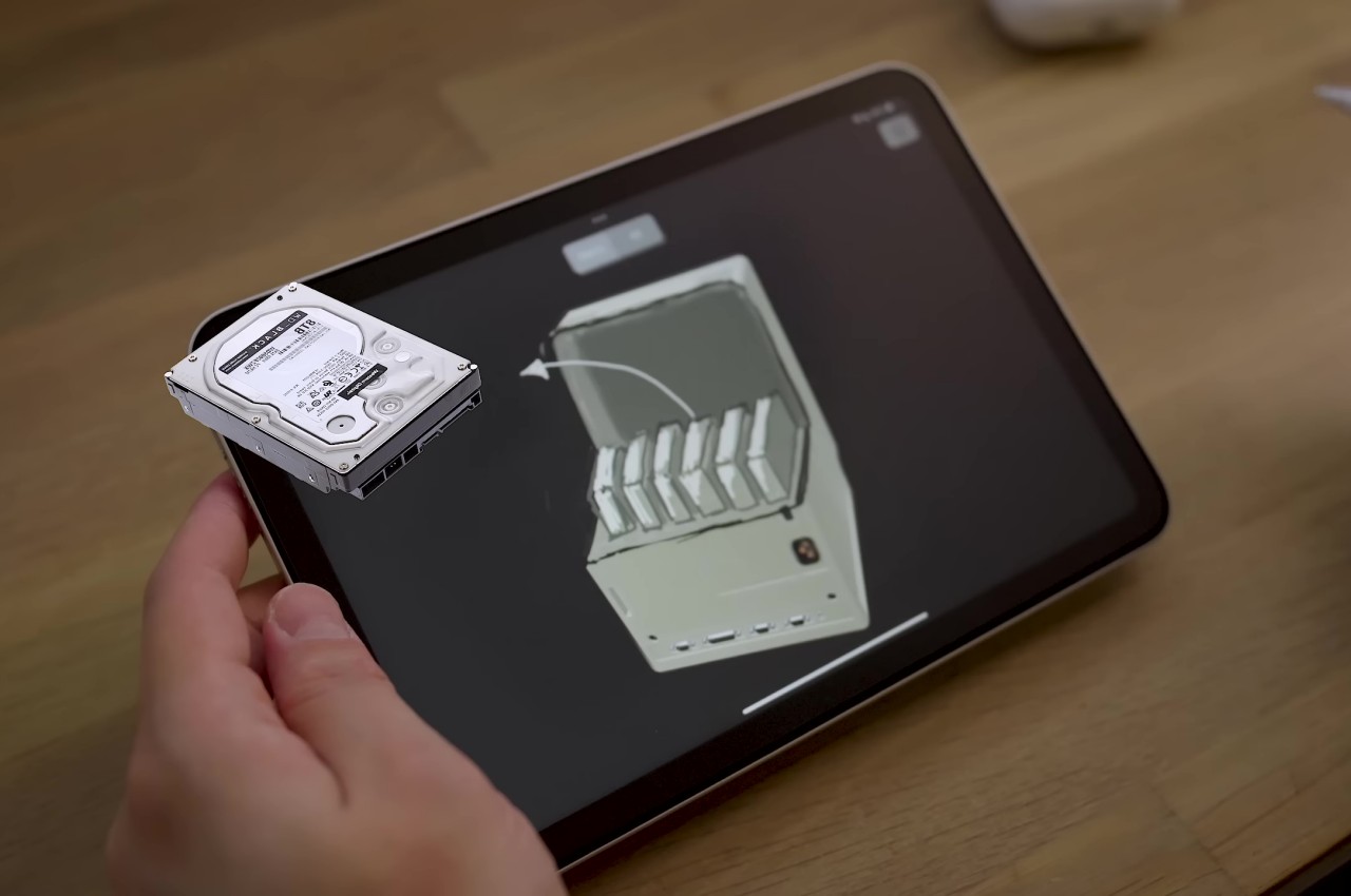
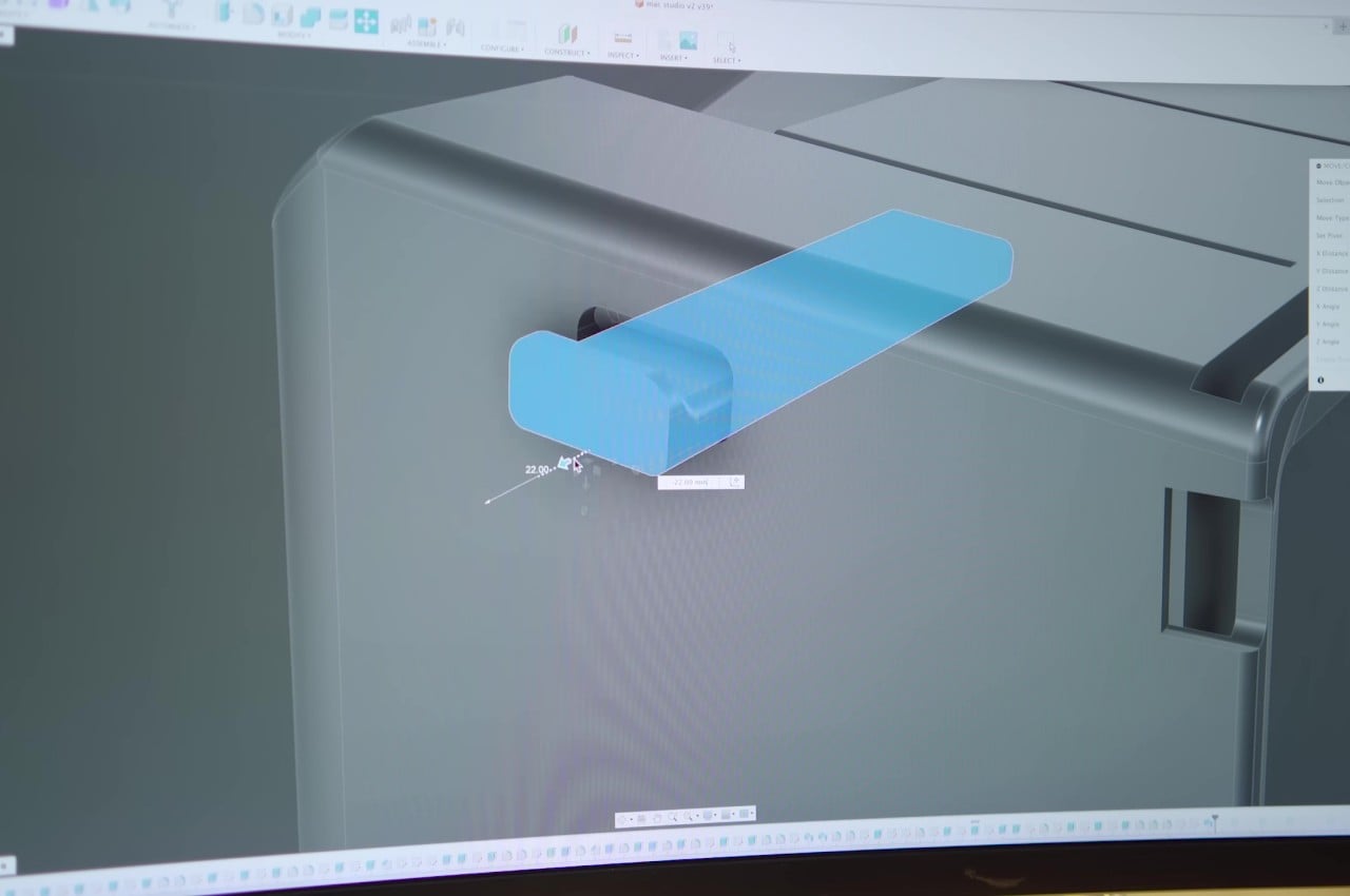
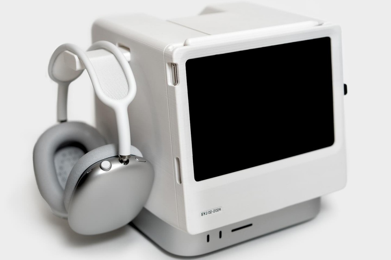
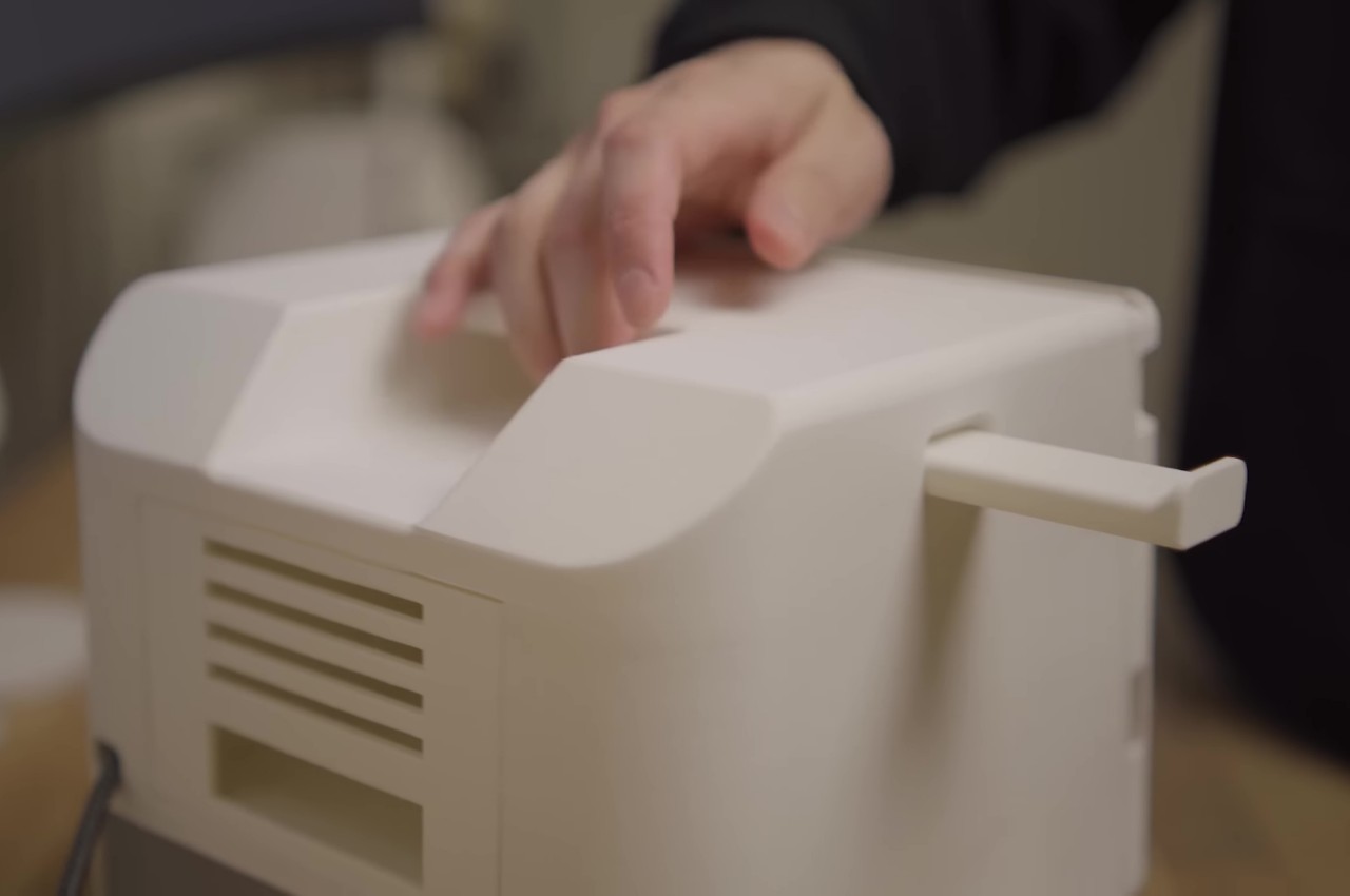
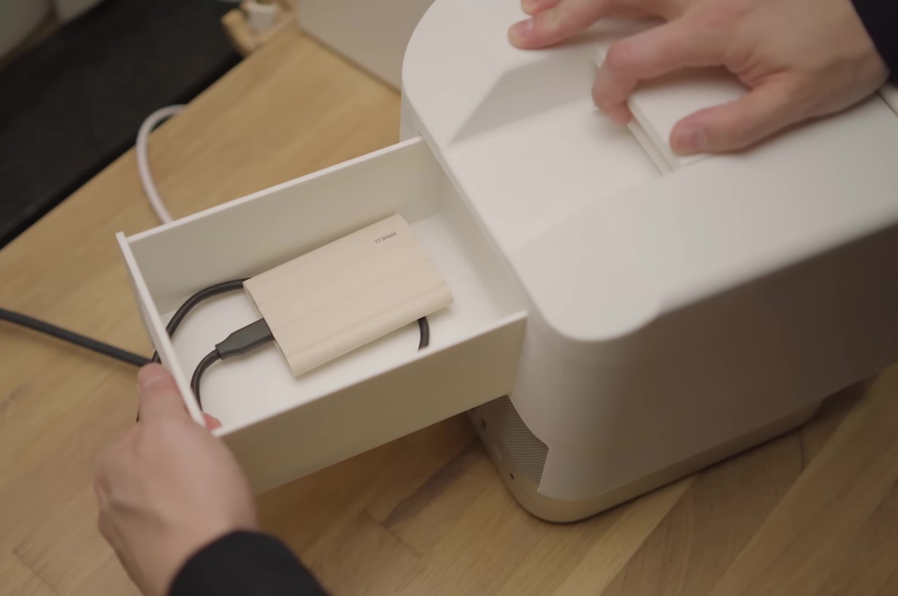
The Macintosh Studio design doesn’t just copy the original Macintosh’s form but manages to insert a few modern conveniences to take advantage of all the unused space at the back. There’s a retractable headphone hook at the top, for example, as well as interchangeable drawers for a single portable hard drive or a stack of SSDs. There are other possible designs, but these two, in particular, add value to the experience while still staying within reasonable limits.

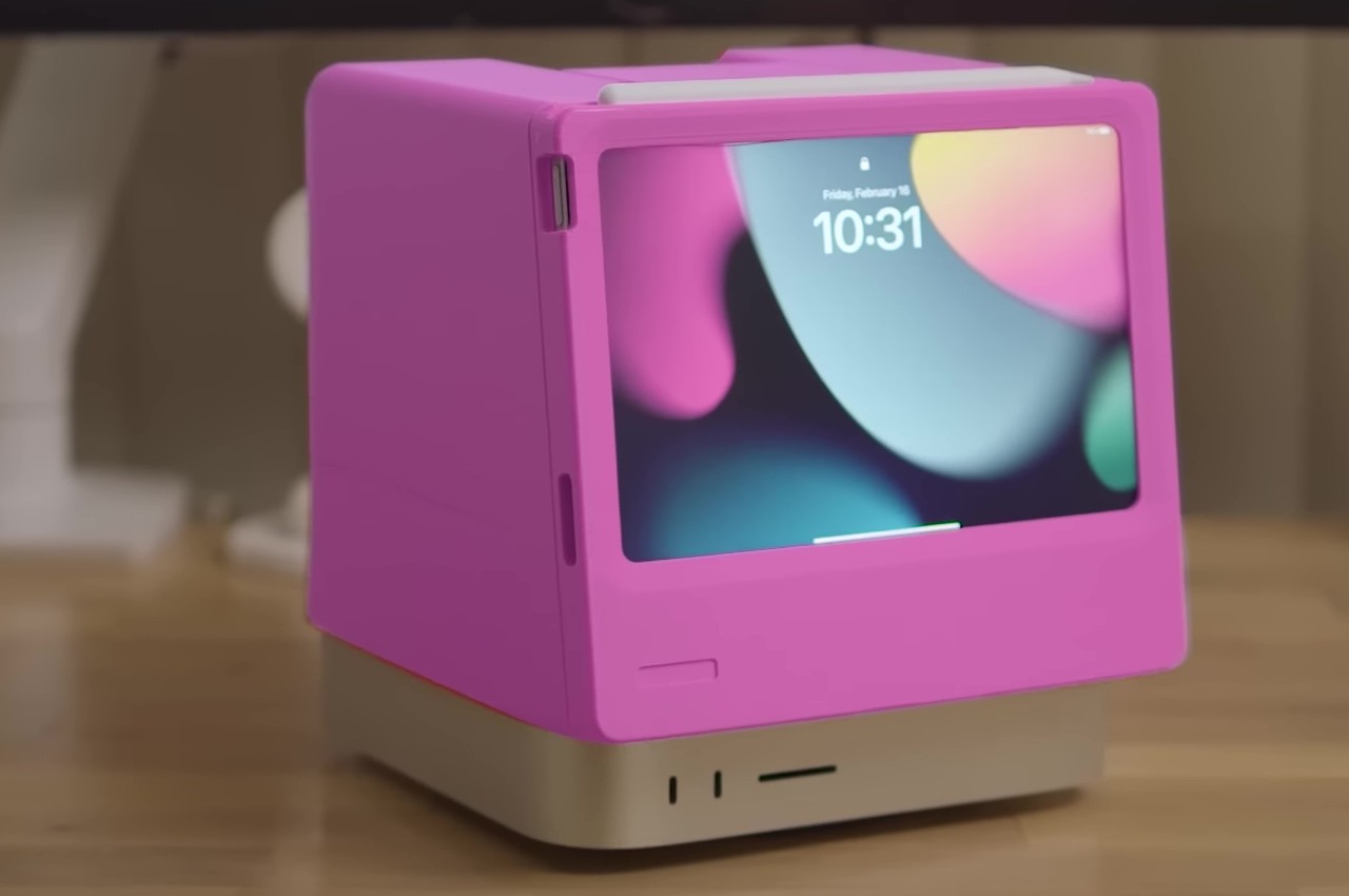
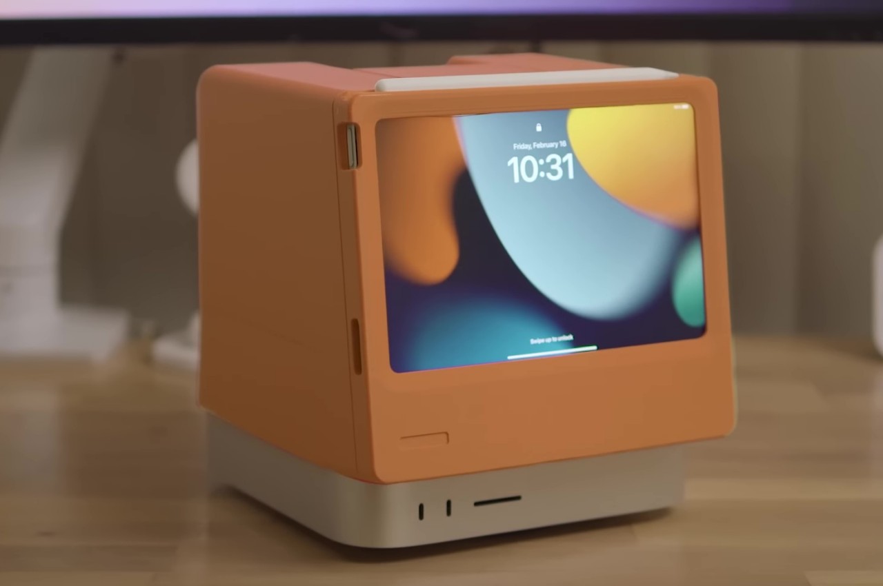
Given that it’s simply a 3D-printed enclosure, there’s plenty of flexibility when it comes to the color of the Macintosh Studio. A variety of hues could make it look like a hybrid of the Macintosh and the colorful iMacs, adding a bit of life to what is normally a plain and drab silver aesthetic. All in all, the design is quite ingenious in how it manages to solve two rather different problems while still preserving the individual values of each product.

The post DIY Macintosh Studio is an ingenious dock for the iPad mini and Mac Studio first appeared on Yanko Design.

Maximize Your Productivity with This Dual Touchscreen Display

Multiple portable displays boost productivity by enabling multitasking and reducing the need to switch between applications. With extra screens, you can have reference materials, email, and active projects open simultaneously, streamlining your workflow and saving valuable time. This setup is especially beneficial for professionals, students, and anyone needing to stay productive while on the go. It allows for a more efficient use of time and resources, making it easier to keep up with the demands of today’s fast-paced work environments. The market for portable displays isn’t as saturated as other tech sectors, primarily due to the niche demand and the technical challenges associated with creating lightweight, durable, and high-performance screens that can easily integrate with a range of devices. Creating a product that balances portability with screen quality, battery life, and ease of use requires significant innovation and investment. Among the options available, the FlipGo from JSAUX stands out as a compelling solution for several reasons. Let’s dig in and explore how it addresses the core needs of power users.

Designer: The JSAUX Team

Click Here to Buy Now: $379 $559 (32% off). Hurry, only 239/300 left! Raised over $917,000.

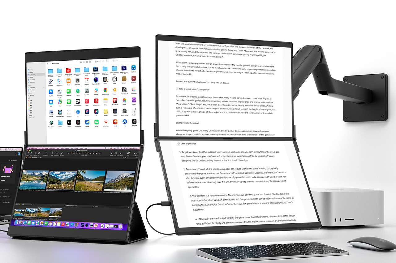
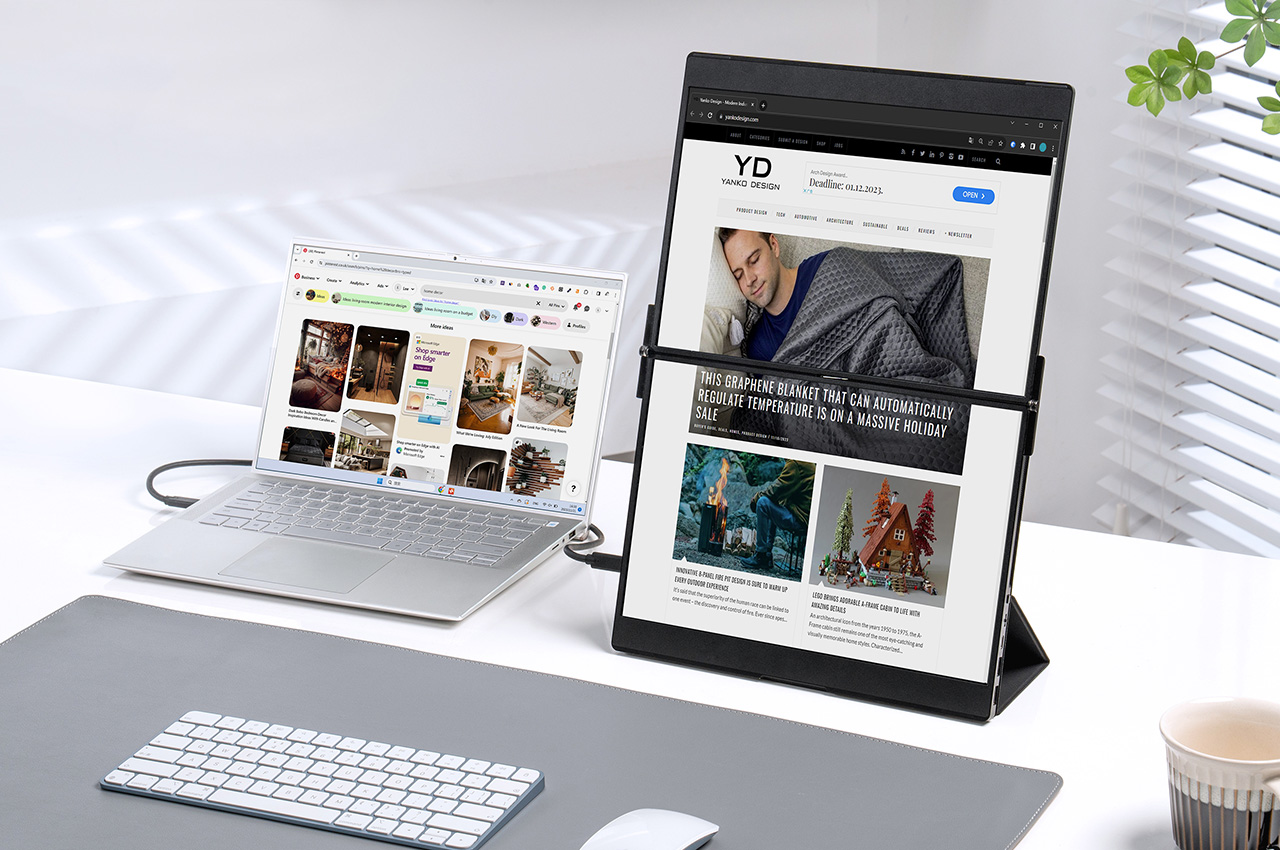
First, the essential feature of the FlipGo is its portability without sacrificing display quality. It’s slim, light, and easy to carry with laptops, tablets, and smartphones so that you can create a multi-screen workstation anywhere. The magnetic attachment system securely connects to the Snap Stand or monitor arms, making the setup intuitive. This design allows the portable display to easily integrate with laptops, tablets, and certain smartphones, offering a simple user experience. The package includes four sets of magnets in FlipGo. The monitor can be magnetized to a monitor arm with various magnetic mounts like the Snap VESA adapter. This makes FlipGo a clear choice when you need to position it anywhere.

You can also use the Flex Folio, which serves as a stand and a case. This origami-like accessory provides protection and supports the display when necessary. Regardless of a portable external display’s portability, it’s not worthwhile if the quality is subpar. This is particularly true when considering screen size and resolution. You can choose between two dimensions: 13.5 inches and 16 inches. Both provide ample screen space without feeling cramped. The 13.5-inch model weighs 1.1 kg, while the 16-inch model is slightly heavier at 1.6 kg, underscoring its portability.

Magnetic Design

However, this display isn’t just notable for its size and weight. It also offers remarkable quality. The smaller model has a 2.2K resolution (2256×1504), and the larger model boasts a 2.5K resolution (2560×1600). Both feature a 100% sRGB color gamut for vivid, crisp visuals. A standard 60Hz refresh rate further improves the display’s smoothness.

FlipGo arranges desktop displays vertically for a more focused, productive experience. Its square-like aspect ratio minimizes head movement. The ultra-narrow bezel connects the screens, offering an uninterrupted view. It simplifies tasks like writing papers or handling multiple sources. It also supports split-screen browsing, making it easy to manage various desktop windows. As a day trader, this setup is particularly beneficial. It allows the stock charts for technical analysis to be on top while the trading software is at the bottom.

FlipGo powers up directly from your laptop’s USB-C port, using a single cable to light up two screens for One to Duo or UltraView mode. When connected to an external power supply, it also charges the laptop. Although FlipGo has two separate displays, it can be a single screen to present content. You can switch between these displays with just a click. FlipGo ensures that neither your productivity nor your perspective is ever limited. FlipGo’s neatest feature is undoubtedly its touch and gesture support for macOS and Windows. Not only does it function as a typical touchscreen, but it also serves as a secondary touchpad for your MacBook, enhancing your productivity.

Regarding productivity, the built-in hub varies slightly between the Pro, Touch Screen, and Standard models. The Pro model includes a display switch button, two USB-C 3.2 ports for Mac and Windows, a Mini HDMI (HD), an OTG USB-A 2.0, an OTG USB-C 2.0, a menu jog dial, and a power button. The latter model, however, has two HD inputs but lacks the Display Switch Button.

The FlipGo comes in two sizes and two tiers: Pro and Standard. Each provides different features. The Pro tier has UltraView mode with a single cable for dual-screen use and supports DisplayLink. The Standard tier does not include Pro features but can be upgraded for touchscreen capabilities, turning your FlipGo into a portable tablet. Regardless of tier, all FlipGos offer the same visual quality, resolution, 400 nits of brightness, and color accuracy. The 13.5-inch model costs $379, and the 16-inch model is $479. Both models include a 12-month warranty, lifetime support, and international shipping from May 2024.

Click Here to Buy Now: $379 $559 (32% off). Hurry, only 239/300 left! Raised over $917,000.

The post Maximize Your Productivity with This Dual Touchscreen Display first appeared on Yanko Design.

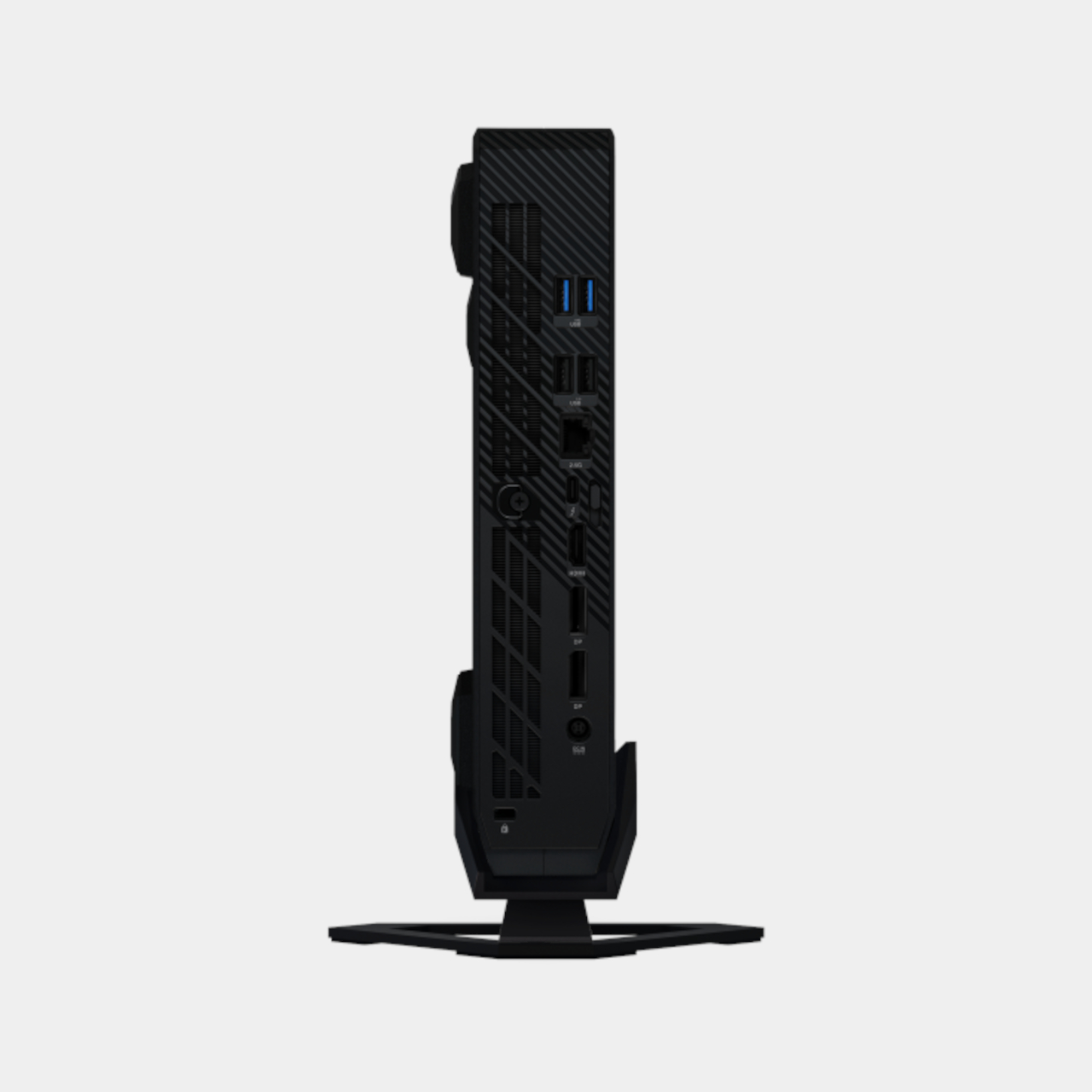
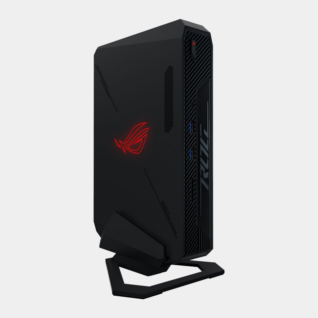
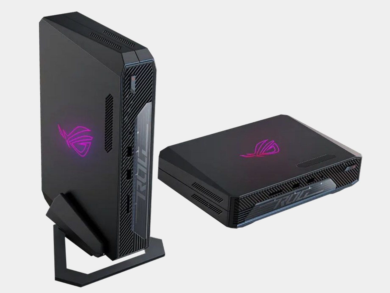
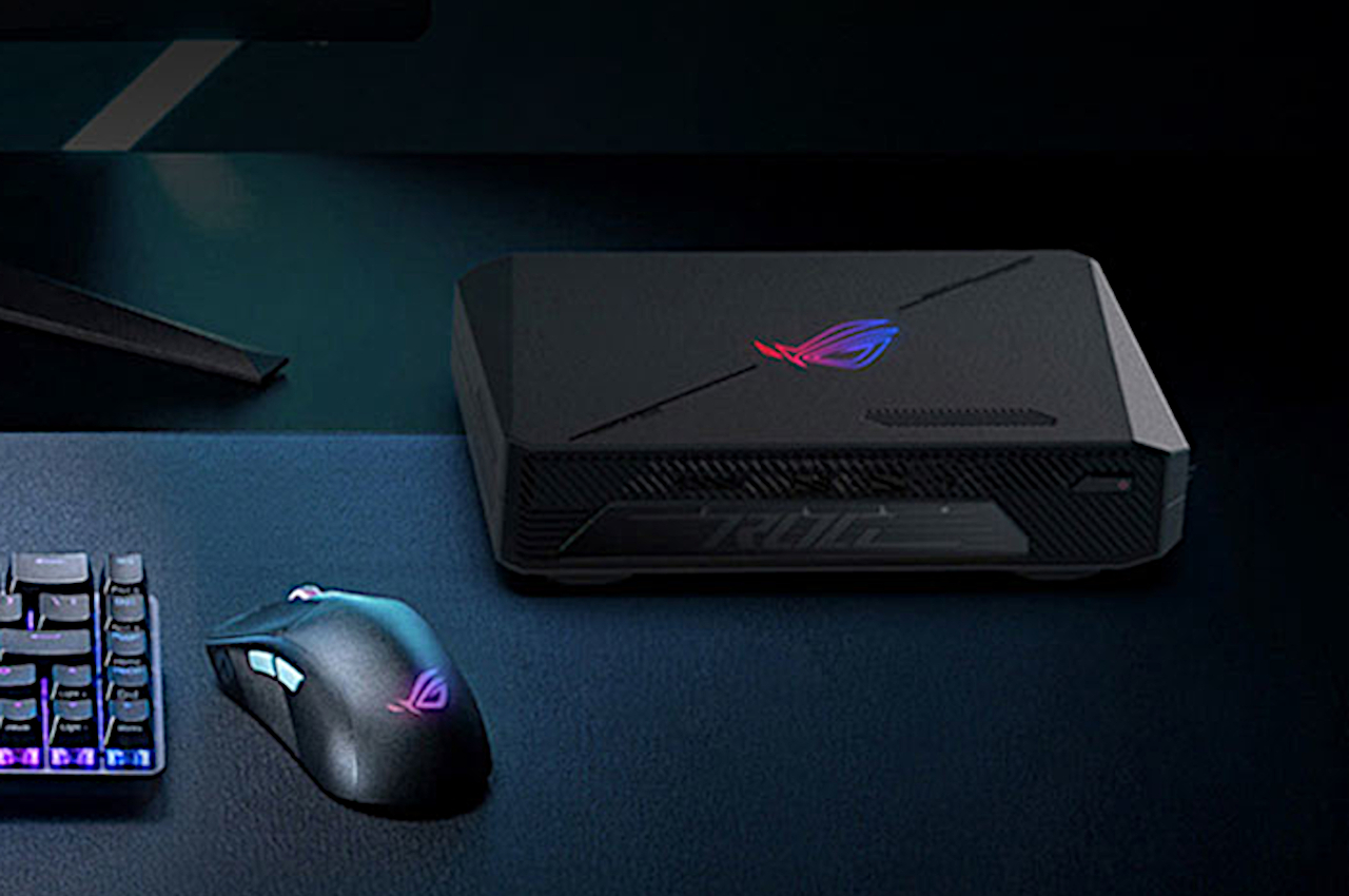
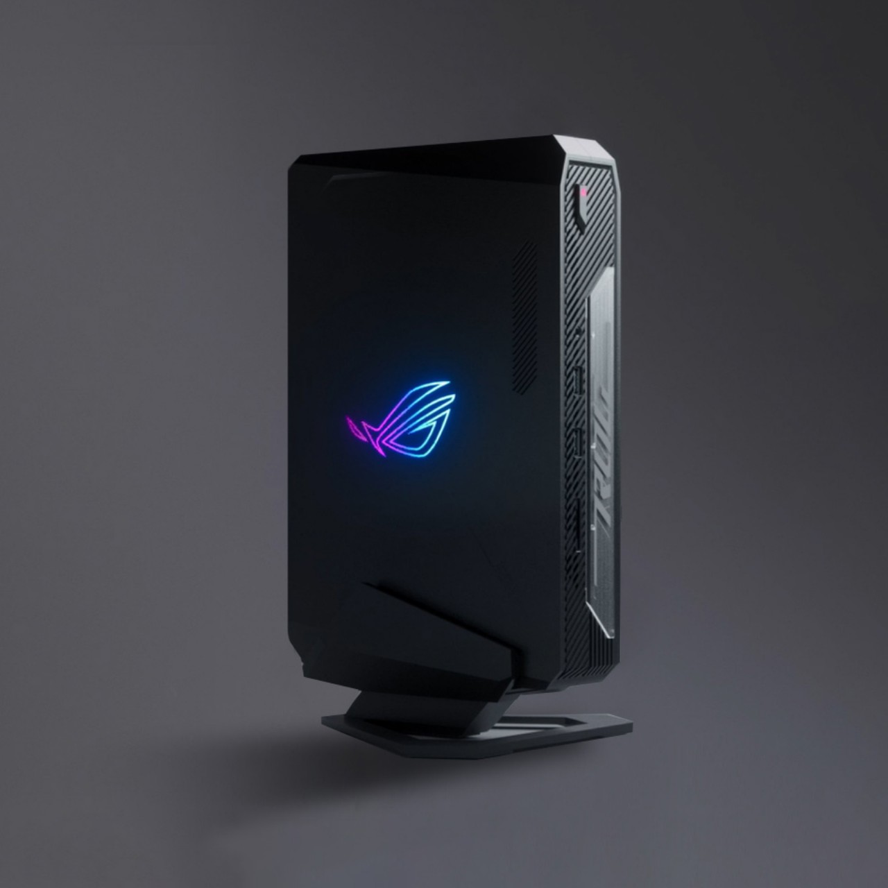
ASUS ROG NUC mini PC offers a small gaming box with a big catch

Handheld gaming PCs might be the buzzword in the industry, but they’re not the only small-form gaming-oriented computers around. In fact, it’s probably thanks to the relative success of the likes of the Steam Deck, Lenovo Legion GO, and ASUS ROG Ally that the formula for compact gaming computers has been tested and proven. It probably shouldn’t come as a surprise, then, that gaming desktops in mini PC form would be popping up more frequently, like this latest entry from ASUS’ ROG brand that carries in its compact body some pretty big specs, a big legacy, and, unfortunately, an equally big price tag.

Designer: ASUS ROG

Gamers, especially those on the PC side of the fence, might already be familiar with the Republic of Gamers brand, but “NUC” might sound alien to them. The name, which stands for “Next Unit of Computing,” actually came from Intel and was used for the chipmaker’s line of mini PCs. After a decade of existence, Intel decided the product line really bore no fruit, definitely not in terms of profit, and decided to shutter the hardware and license the name to ASUS. Thus, the ASUS ROG NUC is pretty much the merger of two DNAs, one from Intel’s somewhat proof-of-concept mini PCs and the other from ASUS’s gaming house.

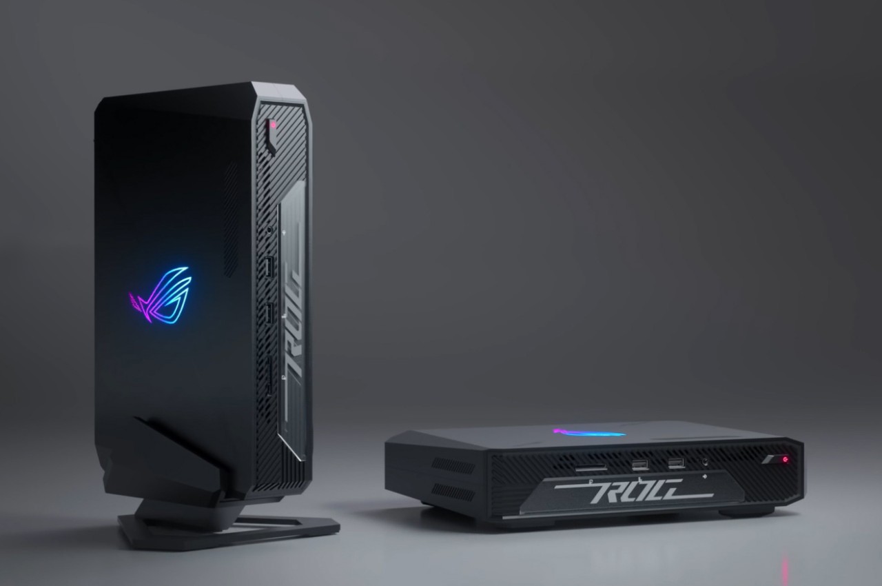
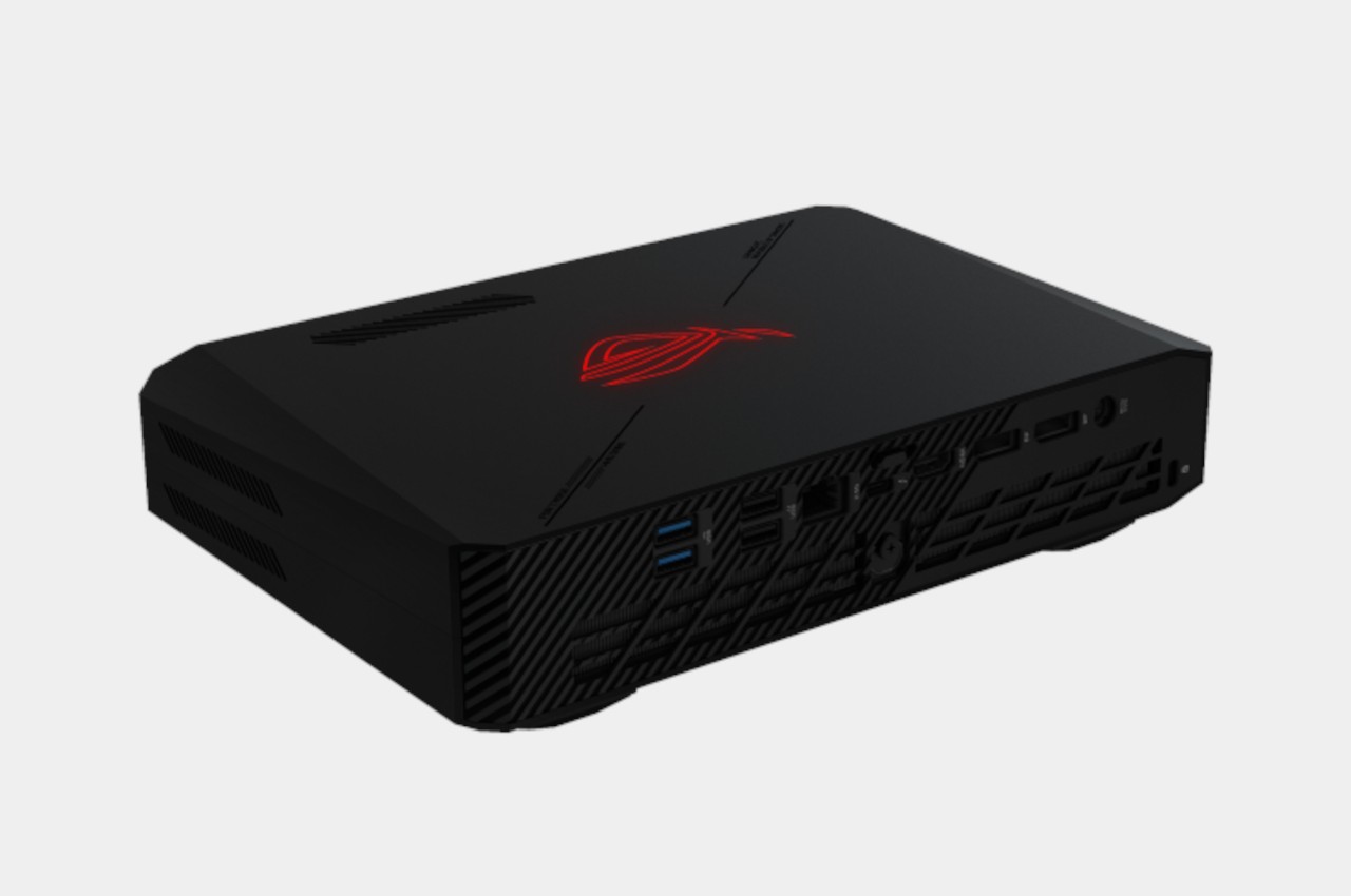
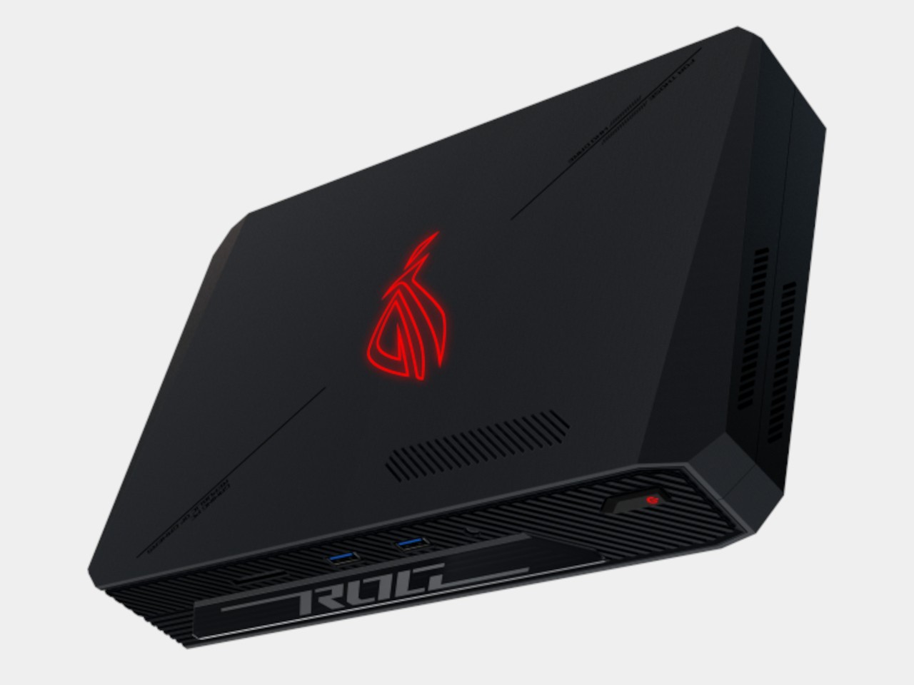
Unlike Intel’s NUCs, which were pretty much barebone general-purpose budget computers in a small box, the ROG NUC has the beating heart of a gaming laptop, just crammed in a small box that’s just around two inches thick. That includes an Intel Core Ultra processor, the kind that boasts upgraded AI chops, and an integrated NVIDIA RTX 4060 or 4070, depending on the configuration. There are plenty of ports for connection, as well as options for expanded storage that you can easily access thanks to its tool-less chassis.

While those might sound like juicy features for a gaming mini PC, the starting price of $1,629 makes it look less palatable, or $2,199 for the next step up in specs. For that price, you can already get a respectable gaming laptop with nearly the same or even better specs, and you won’t need to hook it up to a monitor, keyboard, and mouse. And unlike a desktop PC, you can’t upgrade anything other than memory and storage, so performance is pretty much a fixed value.

These raise the question of who the ASUS ROG NUC will be for, and the answer is quite a niche market. It will be for PC gamers who don’t exactly need mobility but do have limited desk space for a tower. It might even be for users who already have a more powerful gaming desktop and just need a secondary computer for their office. Either way, these scenarios make that high price tag even less appealing unless ASUS holds a sale immediately after launching the product.

The post ASUS ROG NUC mini PC offers a small gaming box with a big catch first appeared on Yanko Design.

Touchscreen iMac like the Microsoft Surface Studio hinted by Apple patent

Apple products have always been hailed by designers, and its computers have long been the tool of choice for many digital content creators, especially graphic artists. None of those computers, however, have ever sported a touchscreen, even one that supports the Apple Pencil, an irony that isn’t lost on many digital artists. This means they have to settle for external drawing tools or, for some more daring users, mods that combine MacBook internal with a drawing tablet. A Mac that can instantly be used as a digital canvas is definitely going to be an artist’s dream, and based on a patent that Apple has filed, that dream could still become a reality, and it already has the perfect design for that.

Designer: Apple

Apple M3 iMac

Apple might have plenty of reasons not to put touch screens on iMacs and MacBooks, but those reasons are starting to drop one by one. It might not want to muddle the lines that separate its Macs and iPads, for example, but you can already run touch-based iOS apps on Macs for years now. And it’s not like it’s lacking the technology to make it all possible, as proven by the highly successful iPad Pro and Apple Pencil.

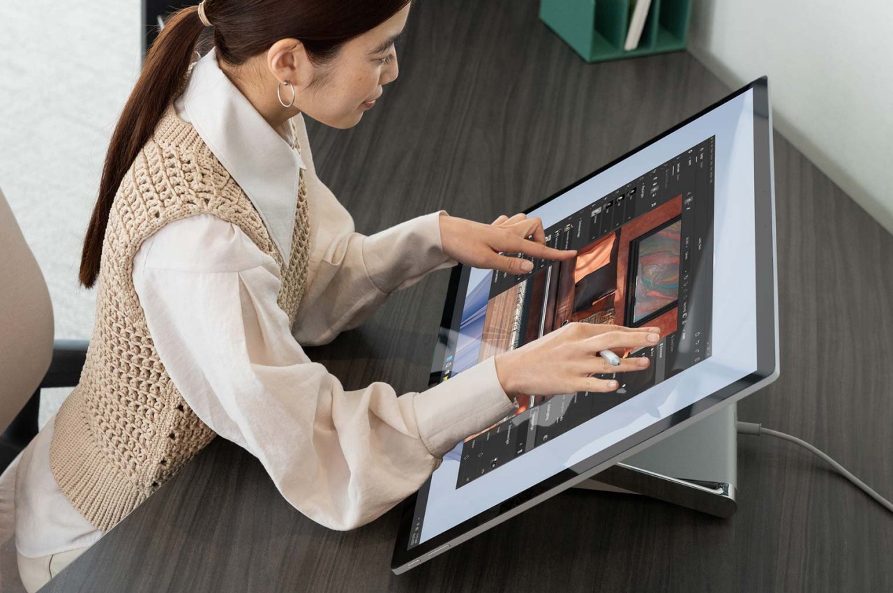
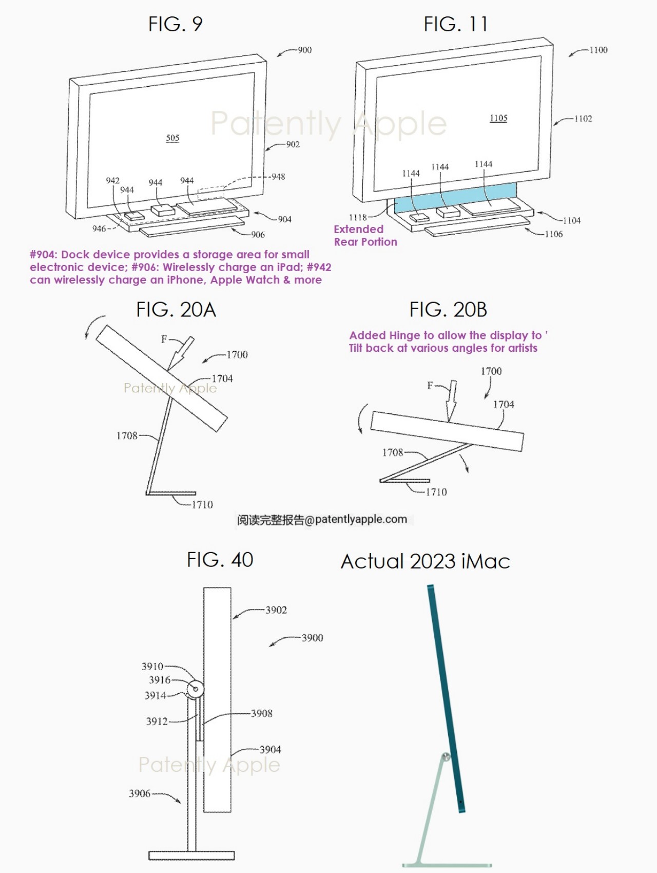
A patent unearthed by Patently Apple reveals that the company has indeed, been toying around with that idea, though it’s not exactly surprising given how many ideas tech companies patent all the time. Admittedly, the patent’s focus is less on the touch screen itself but more on the stand and hinge mechanism that would let you tilt and even pull the whole iMac down to the desk’s surface, making it more comfortable for artists to draw on. It’s an instant display tablet without having to buy an expensive Wacom or switch to a different technology from the one you might already be familiar with.
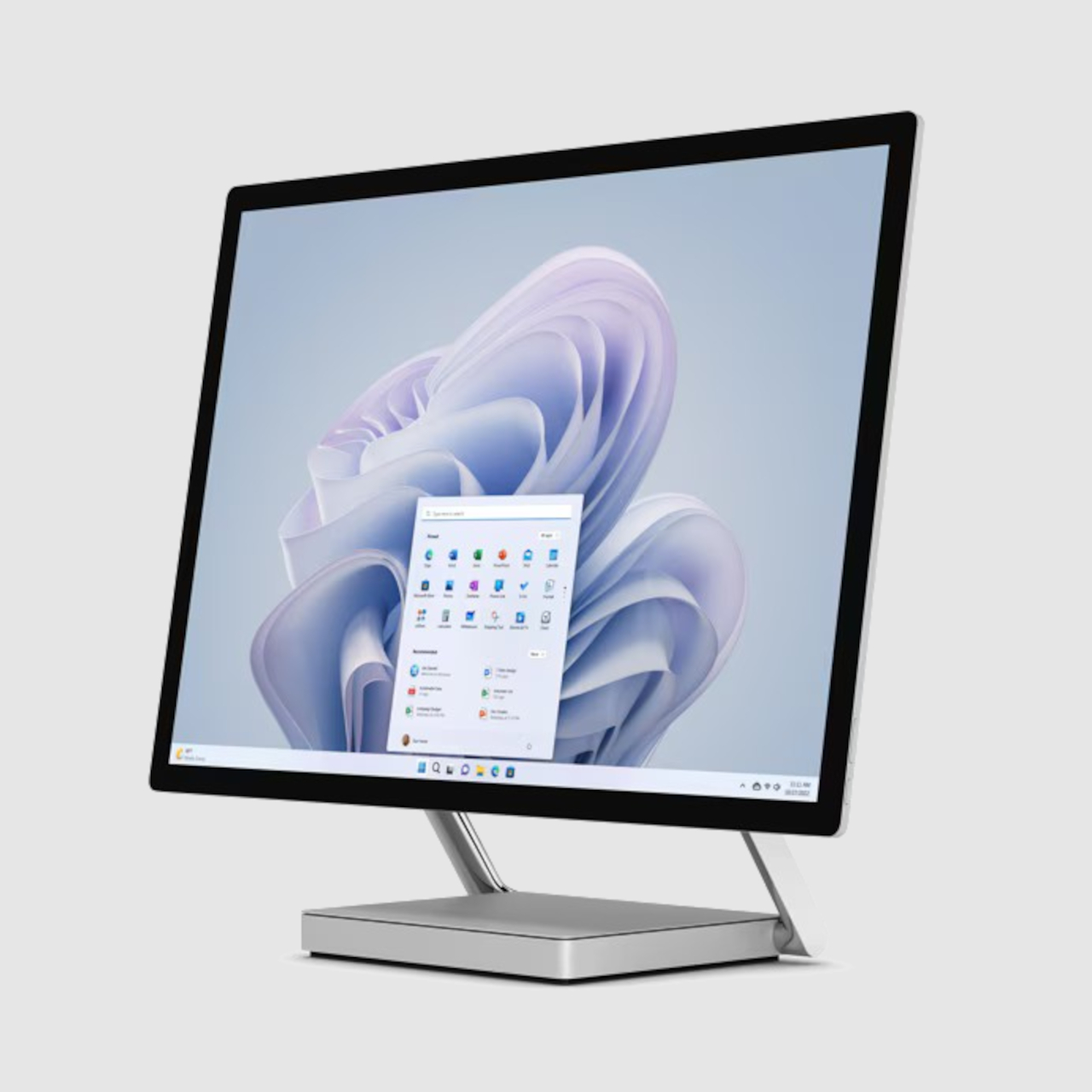
As weird as that idea might sound, it has actually already been done before and with surprising success. The Microsoft Surface Studio pictured at the top is one of the company’s unexpected hardware champions, quickly endearing itself to content creators. It is almost exactly what Apple’s patent describes, an all-in-one computer with a stand and hinge that lets you tilt and turn it whichever way you need to, and it comes with a touch screen, too!

Microsoft Surface Studio

It’s not hard to imagine how such a feature could be a game changer for artists on Macs, making their workflows more seamless. Of course, it’s far too premature to get excited over this patent, because tech companies also have a tendency not to implement even a fraction of the patents they hold. And given Microsoft already has an implementation of this design, it might still come down to a legal battle if Apple does decide to push through with a touchscreen iMac since it filed the patent years before the Surface Studio came out.

The post Touchscreen iMac like the Microsoft Surface Studio hinted by Apple patent first appeared on Yanko Design.