This ‘Trackpad For Your Mouth’ lets people with limited mobility use their tongues to control cursors

Putting the edge of computing at the tip of your tongue…

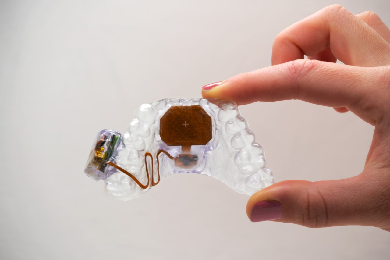
Meet MouthPad, it’s exactly what it sounds like. Designed by the folks at Augmental (a spin-off of the MIT Media Lab), the MouthPad is a Bluetooth-powered mouthpiece that lets anyone control electronic appliances with their tongue. A touch-sensitive panel sits against the roof of your mouth, allowing you to use your tongue as a finger of sorts to navigate interfaces. Tongue taps are registered as left clicks, while mouth gestures like pursing your lips (pouting duckface, for the Millennial and Gen Z readers) registers a right click. Through the MouthPad, individuals can now perform a variety of tasks with just their tongues. These tasks include sending emails, illuminating a room, enhancing photographs, and even engaging in video games. Additionally, Augmental guarantees that the mouthpiece’s sleek design will not impede speech, allowing users to communicate verbally with ease while wearing the device.

Designer: Augmental

Every year, nearly half a million people suffer a spinal injury globally. The effects of these can be as complex as losing all mobility from your neck down, leaving you with just your mouth to communicate as well as control devices. Up until now, devices like the QuadStick have been the standard, with a joystick that you bite down on and control with your mouth. The MouthPad offers a much more discreet and nuanced input method, turning your tongue into an 11th finger that can be used to move cursors and interact with interfaces. The tongue is a uniquely nimble and flexible organ. Touted as one of the strongest muscles in the body, the tongue’s muscular system is complex, allowing it to move in a variety of directions, and making it a perfect organ to control the MouthPad.

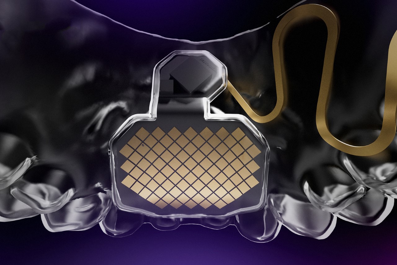
The MouthPad is an intraoral interface no sleeker than a pair of invisible braces. Designed to fit onto your palate, the MouthPad has a surface that responds to touch, letting you control it with your tongue in the same way you would use your finger on a trackpad. The electronics rest within a 3D-printed brace made from dental-grade resin, with a battery unit and SoC located on the side, sitting between your teeth and your inner cheek. All the electronics are enclosed within the resin, so they never interact with saliva.

The saliva, however, does present a unique challenge. If you’ve ever tried using your phone with wet fingers, you know that it’s close to impossible. The water interferes with the touch-input, registering all sorts of wrong inputs. The Augmental team, however, mentions that this ‘wet touchpad’ is smart enough to mitigate the effects of the saliva-coated tongue, using machine-learning to accurately register input.

Bespoke-designed for the wearer, the MouthPad fits snugly into the user’s mouth, with a design that feels comfortable enough to be worn for hours at an end. It doesn’t need any software to run, working quite like a Bluetooth mouse, and is compatible with all popular desktop and mobile platforms. The battery gives it 5+ hours of continuous use, and once done, the MouthPad can be kept back in its case which doubles as its charging station.
“As our lives become increasingly intertwined with technology, and the world expands from the physical to the digital, it’s more important than ever to ensure that everyone has equal access to control inputs and new interfaces,” says Tomás Vega, Co-Founder and engineer at Augmental. The company developed and tested prototype units on people with limited mobility and quadriplegia with great success and a fairly positive response, and are now looking to also extend the MouthPad’s use to ‘hands-busy’ scenarios such as surgeons, gamers, astronauts, lab technicians, and factory-line workers. The MouthPad is currently available to potential buyers in the US, who can sign up to be on the waitlist.


The post This ‘Trackpad For Your Mouth’ lets people with limited mobility use their tongues to control cursors first appeared on Yanko Design.

Walking aid for the elderly comes with a box for carrying their furry friends

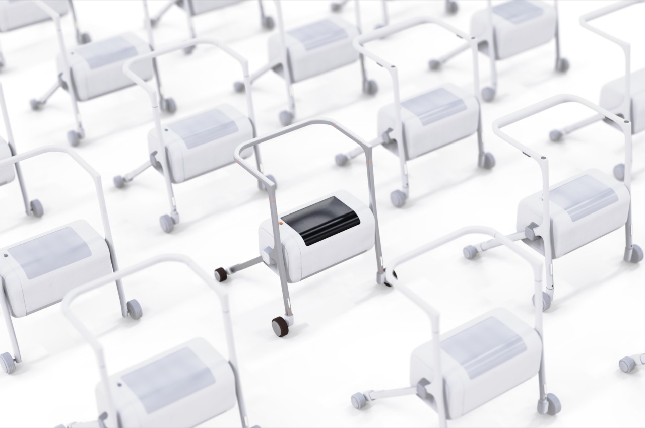
Humans seem to be wired to be social animals, and that is sometimes a difficult problem for certain people. Loneliness affects everyone, but the pain can become more acute for people who are more advanced in age and who find it hard to develop new relationships because of limits to their mobility. Pets have become a solution for some of the elderly folk, but that, too, comes with its own puzzles to solve. People advanced in age are often advised to still go outside as long as they are able to, but they are hesitant to leave their furry friends at home as well. Solving multiple related problems can be a daunting task, but this walker concept pulls it off in a way that is both simple and effective.

Designer: Feng Chang

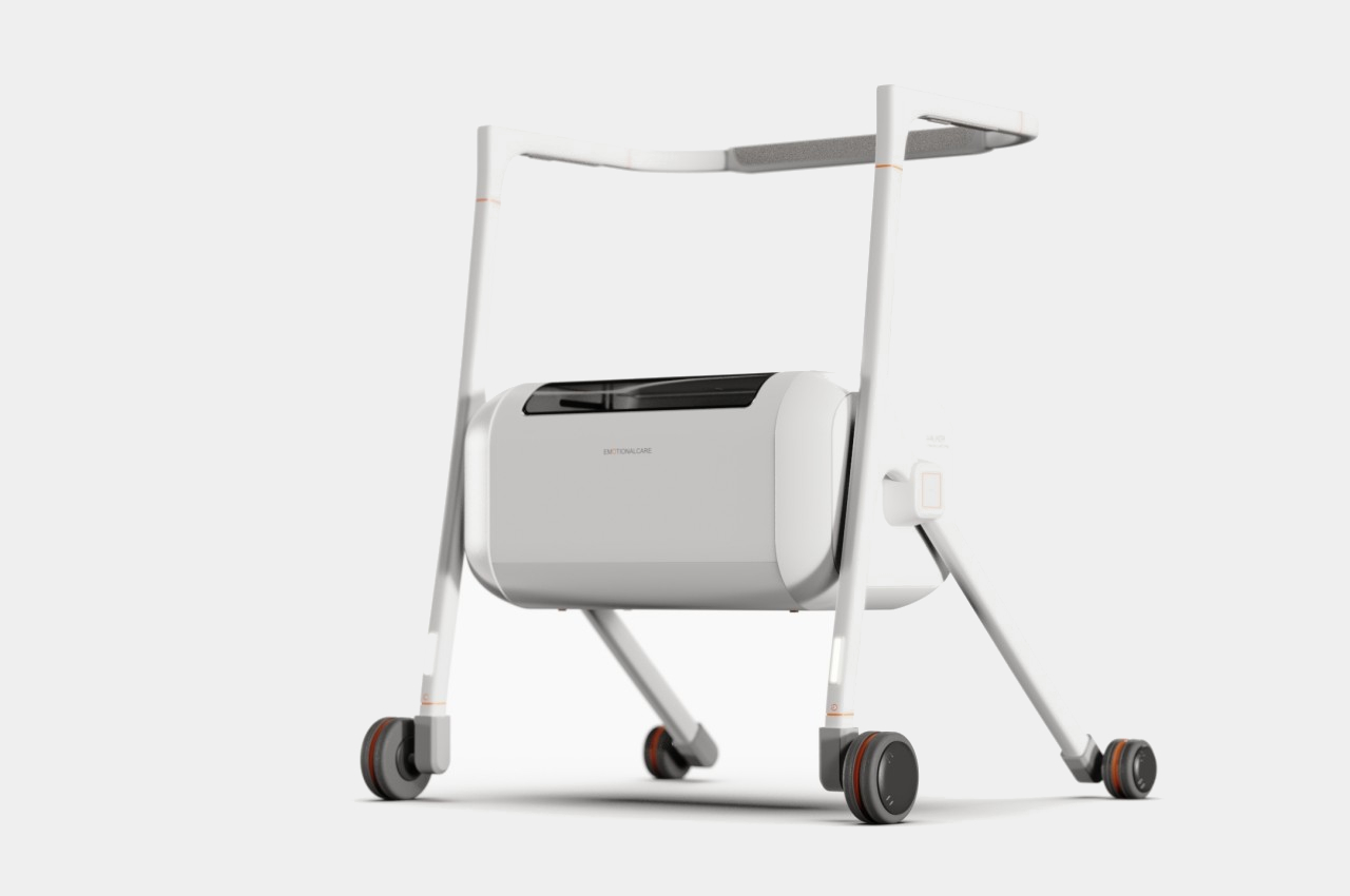
There are definitely plenty of walking aid designs, some even serving multiple functions. Some are just a step above crutches that you have to lift to move forward, while others come with wheels that increase mobility at the expense of some stability. Some come with small seats for the user, and others have baskets to hold their things. This particular walker concept combines some of these to present a more agile yet safe aid that has room for your pet when you go out.

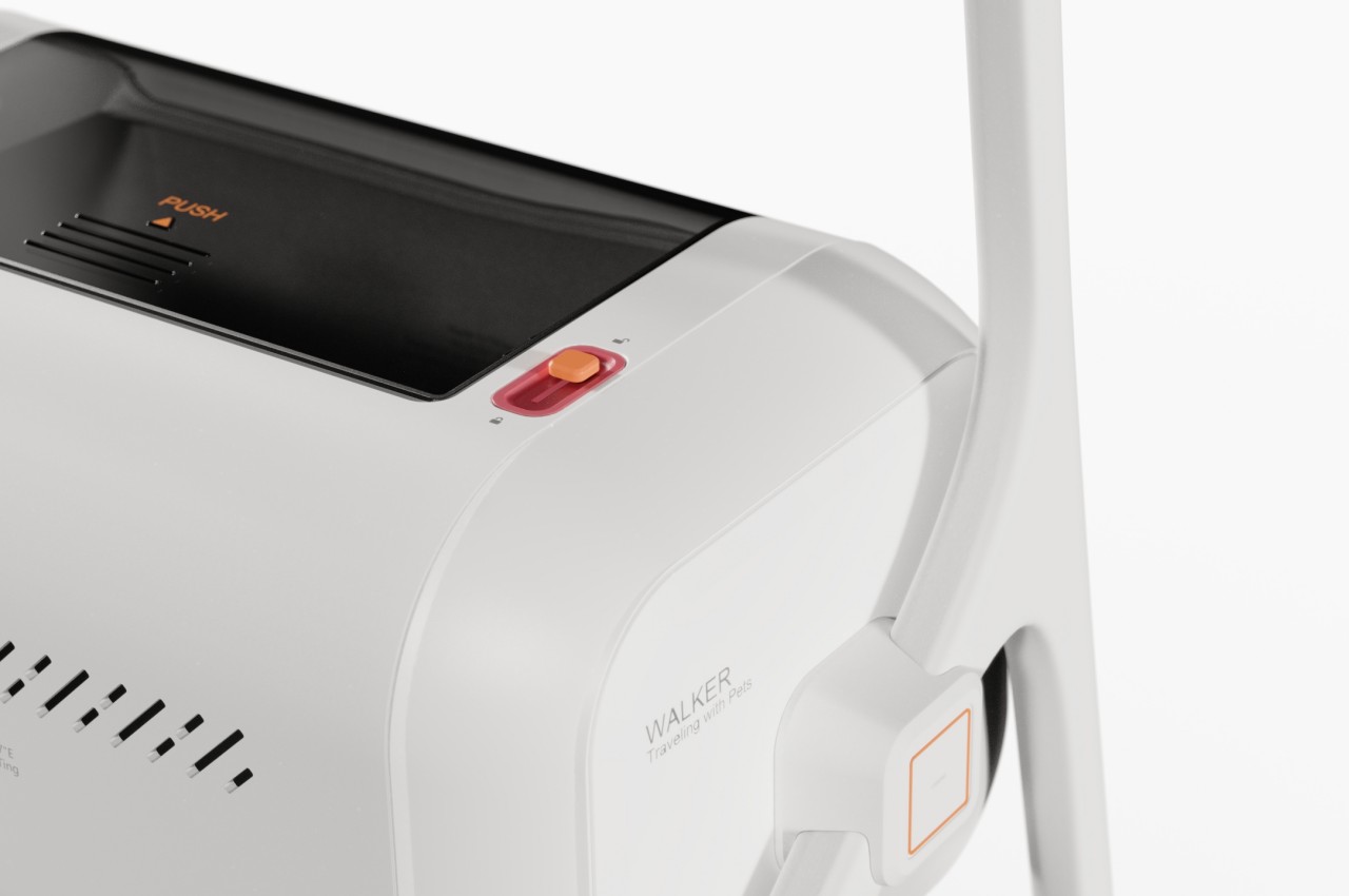
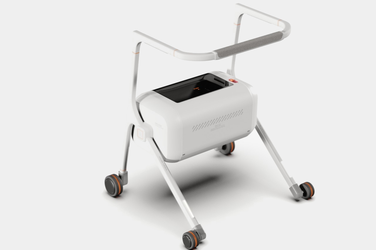
The most conspicuous part of this walker is the large box that serves as your pet’s mobile home. You can simply slide the door on top to let the little furry friend in or out, or you can keep it close so that they don’t jump out suddenly. Of course, there are vents that allow the pet to breathe easily while comfortably confined in there.

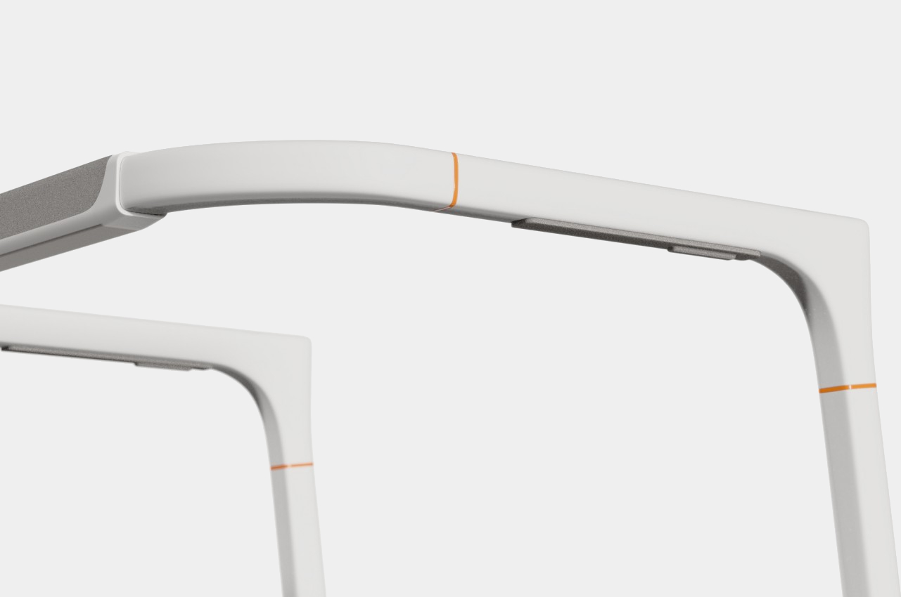
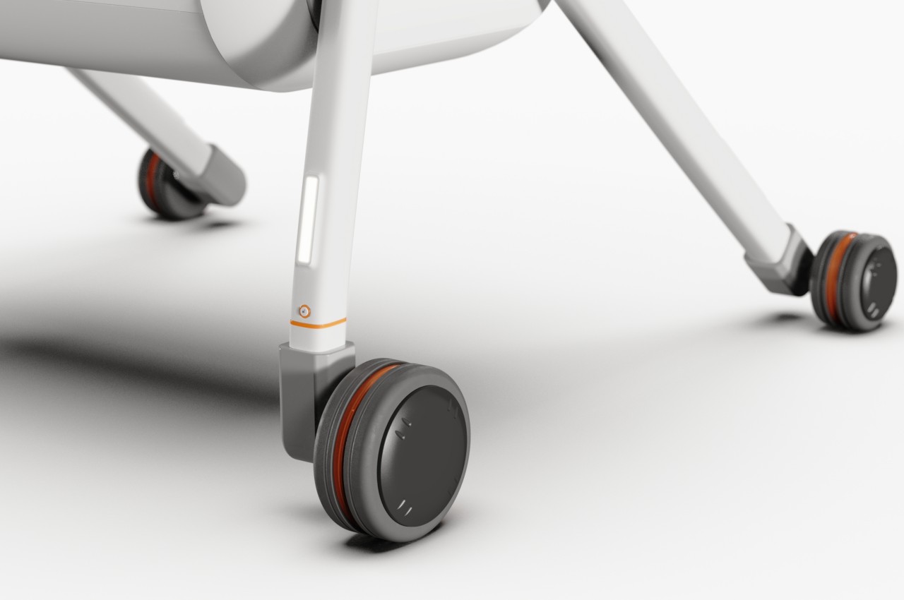
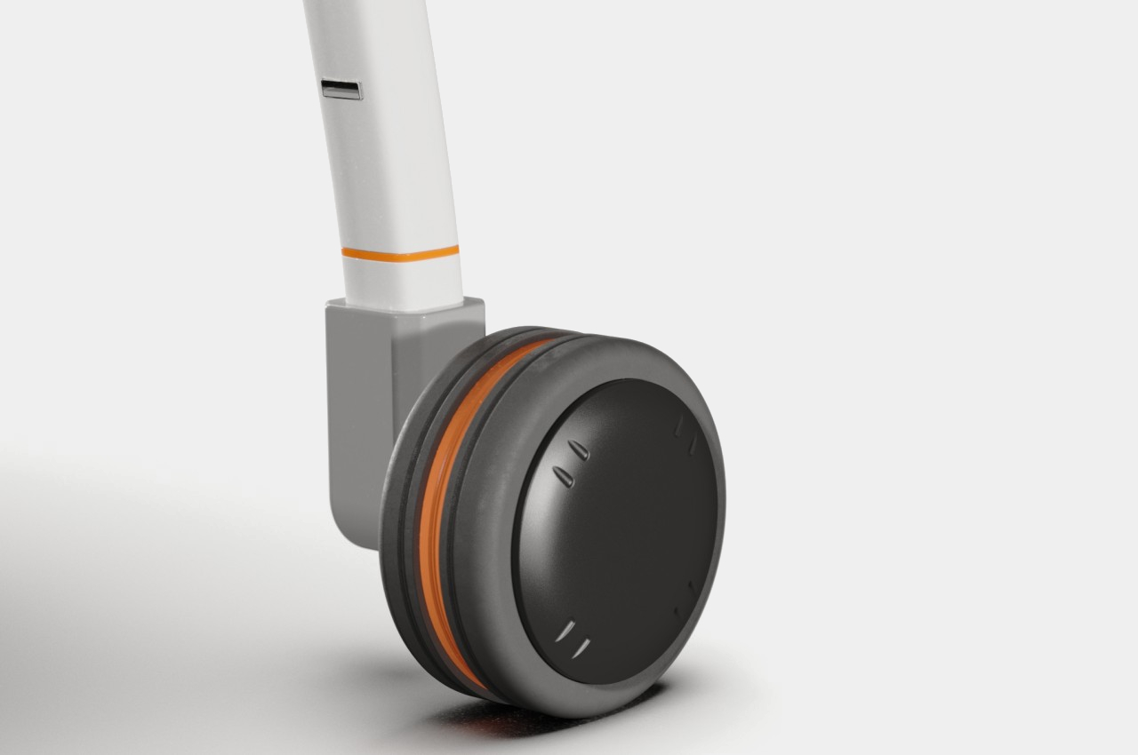
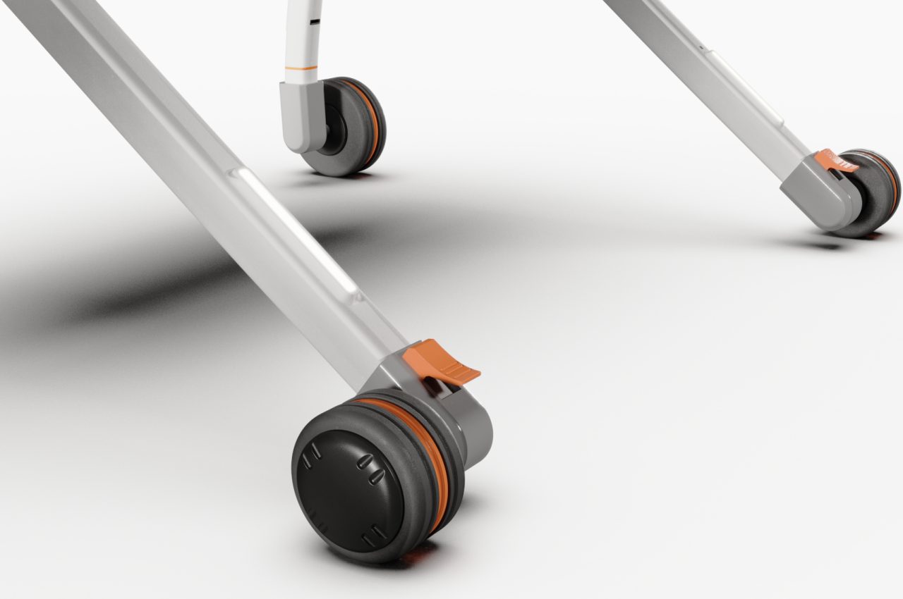
The walking aid itself has a few aspects that help it rise about common designs. The handle, for example, travels in almost all directions, giving the user the freedom to grip it any way they prefer. There’s a brake button underneath the handlebar that will prevent the user from falling over or sliding. The front wheels also have LED lights above them that can be recharged via a USB-C slot on the opposite side, offering additional safety, especially in darker areas.

This walking aid concept hits two birds with one well-designed stone to help make elderly lives a bit more enjoyable and meaningful. It offers a convenient way for them to bring their beloved pets with them for a walk while also providing mobility and safety for themselves. And while the walker is primarily designed for very old people, anyone with limited mobility and a small pet can still benefit from this idea, at least if it ever becomes a real product.

The post Walking aid for the elderly comes with a box for carrying their furry friends first appeared on Yanko Design.
This hearing aid’s sleek redesign turns the medical device into a fashion wearable

“Medical devices don’t need to feel like a burden. Glasses are cool, so why can’t hearing aids be too?”

The spectacles are a stellar example of a medically corrective device that’s successfully transitioned into being an object of haute fashion. The pandemic saw a similar treatment to N95 face masks too, but for the most part, medical devices aren’t designed to ‘look good’. They’re either designed to be invisible (like those invisible braces that keep popping up in Instagram’s ads), or have such a medical-forward design that they actually end up deterring people. Nobody likes showing off their asthma inhaler or nebulizer, and people would much rather prefer a stylish walking stick over a pair of crutches.

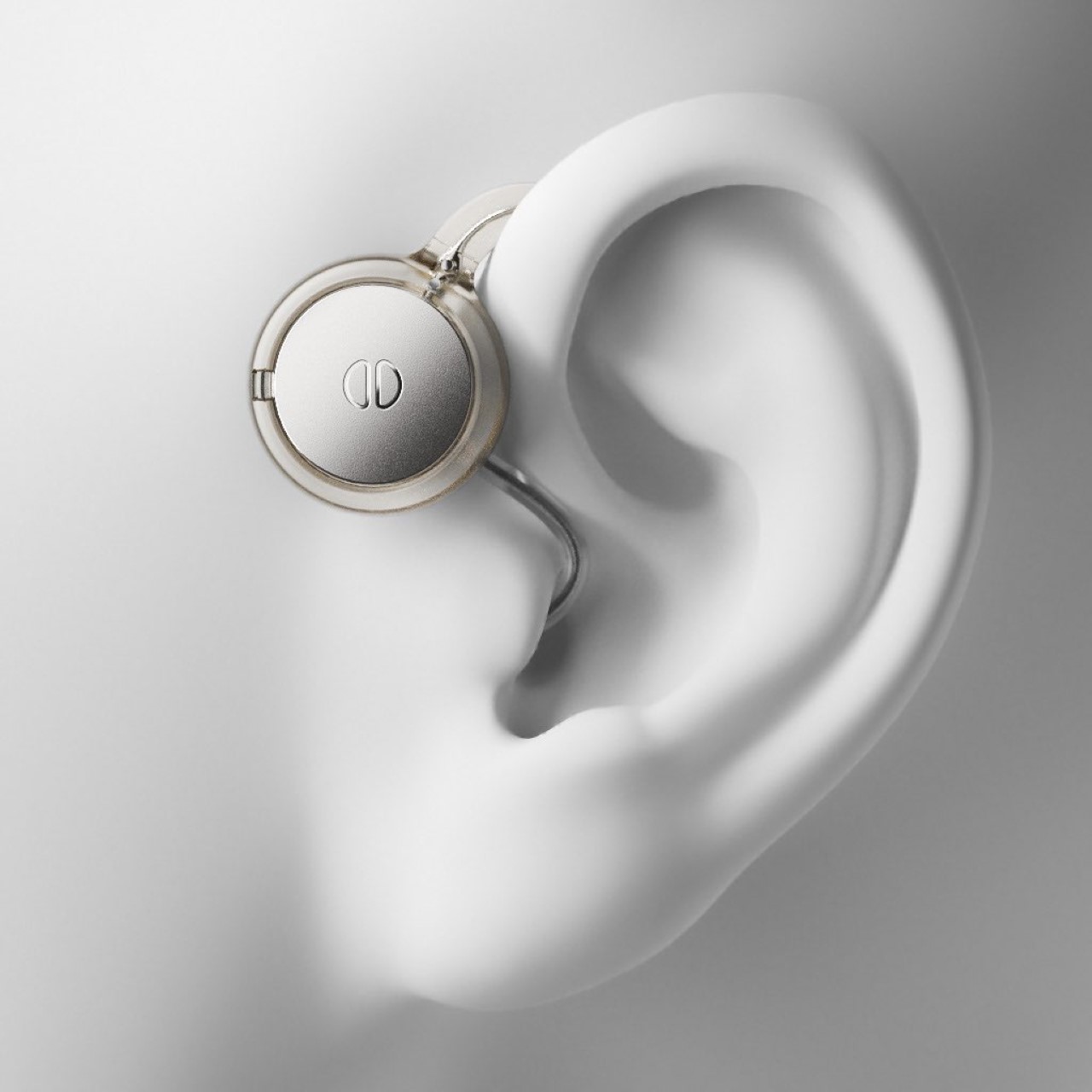
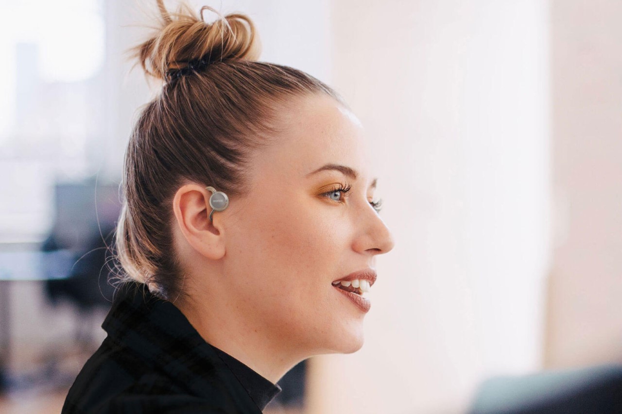
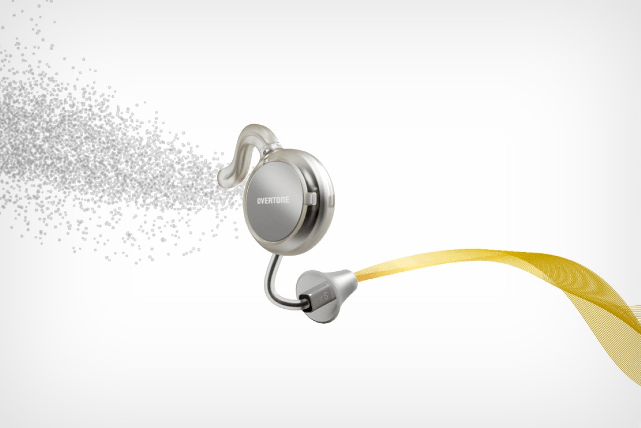
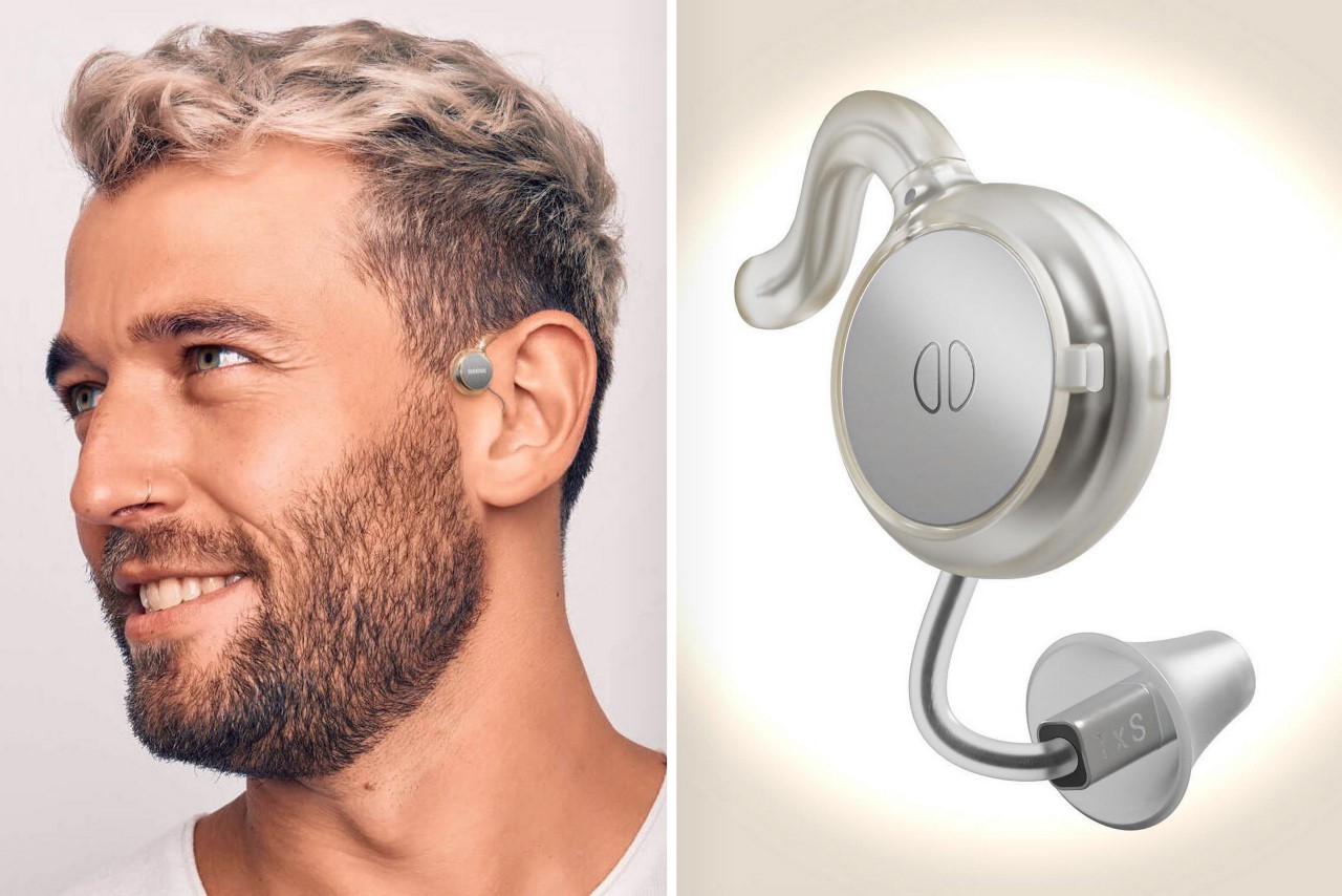
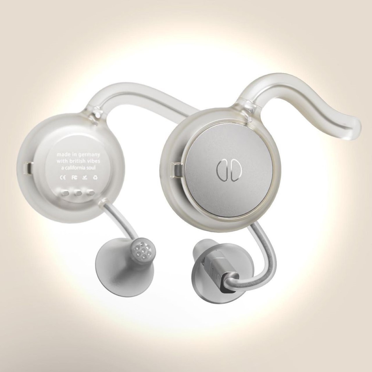
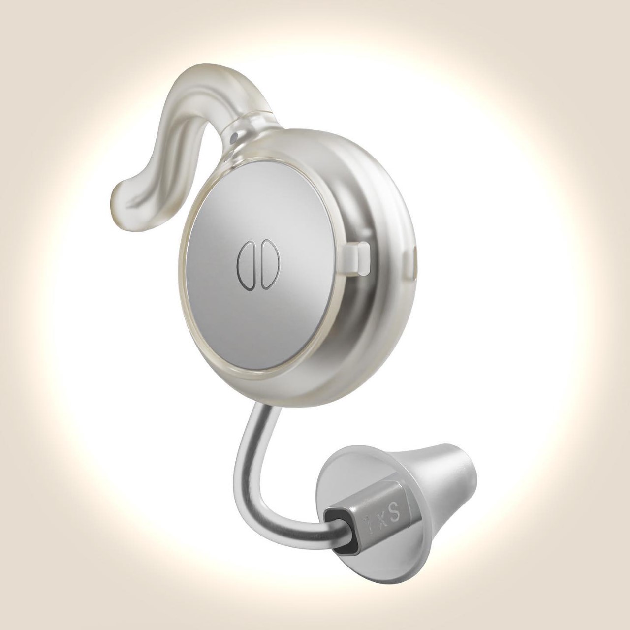
Hearing aids fall within that domain too, with most people agreeing that they have a design that can attract unwanted attention or sympathy, even though the people wearing them would just like to live a normal lifestyle. Designed to look modern rather than medical, the Overtone hearing aids are just about as stylish as high-fashion TWS earbuds. They sit comfortably around your ear, with a minimal design that features a small ear clip and a metallic disc that looks almost like a Neuralink implant.

Designers: Nick Morgan-Jones and Gray Dawdy (Overtone)

The Bluetooth-enabled hearing aids work to enhance your listening powers while being ‘unapologetically visible’. The individual earpieces hook to each ear, and pair with your smartphone to let you set up your hearing profile. Once configured, the Overtone earpieces let you clearly listen to sounds around you, while Bluetooth connectivity allows you to take calls or listen to music/watch videos through the earpieces themselves.

The Overtone was created by Berlin-based designers Nick Morgan-Jones and Gray Dawdy, who wanted to uplift hearing aids to a new fashion standard. “We’re building the hearing equivalent of designer eyewear,” said Morgan-Jones. To that very end, the Overtone has a design that feels minimal and universal. The transparent material and stainless steel details borrow directly from eyewear, while the overall design is made to augment your appearance by making you look like you’re from the future.

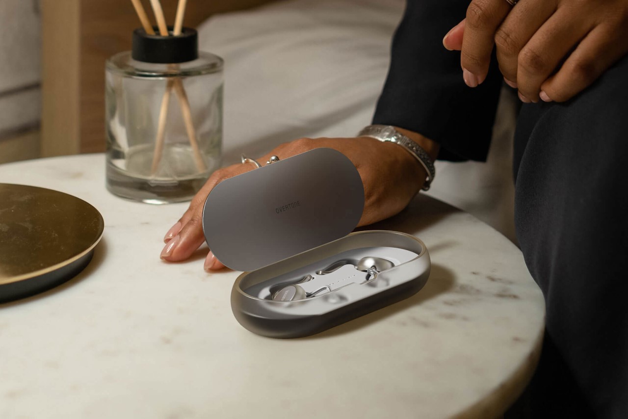
The Overtone is currently under development, with a waitlist open for people looking to buy their own pair of hearing wearables. The devices come with a 24-hr battery life on a full charge, and ship with a charging case that gives them an additional 36 hours of use.

The post This hearing aid’s sleek redesign turns the medical device into a fashion wearable first appeared on Yanko Design.
Self-wearing shoe concept automatically opens and closes thanks to a clever low-tech shape memory alloy spring

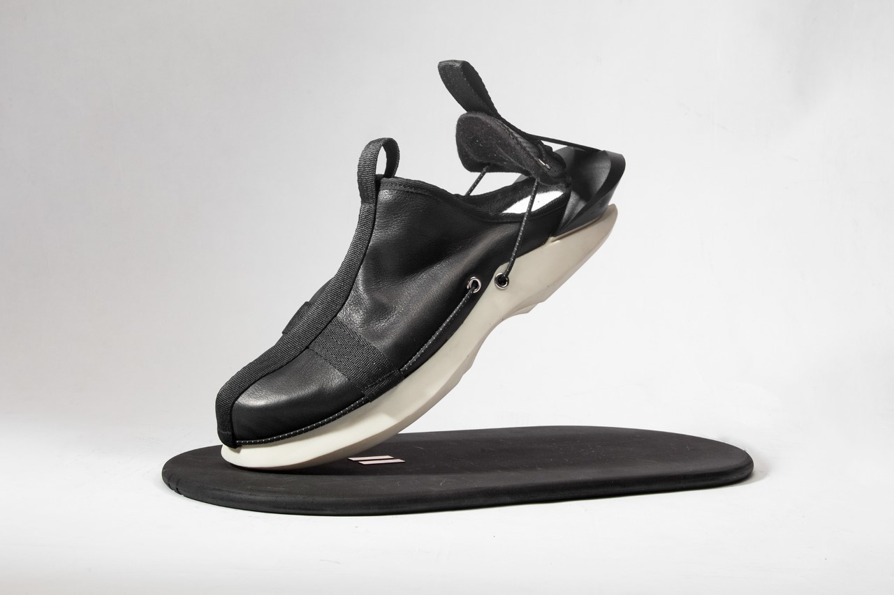
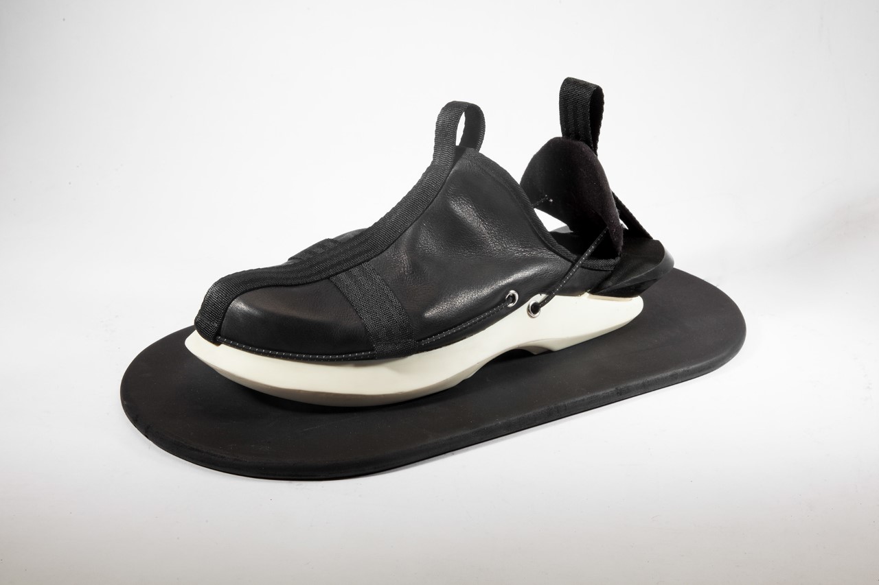
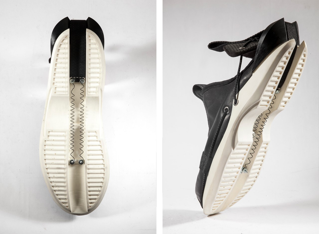
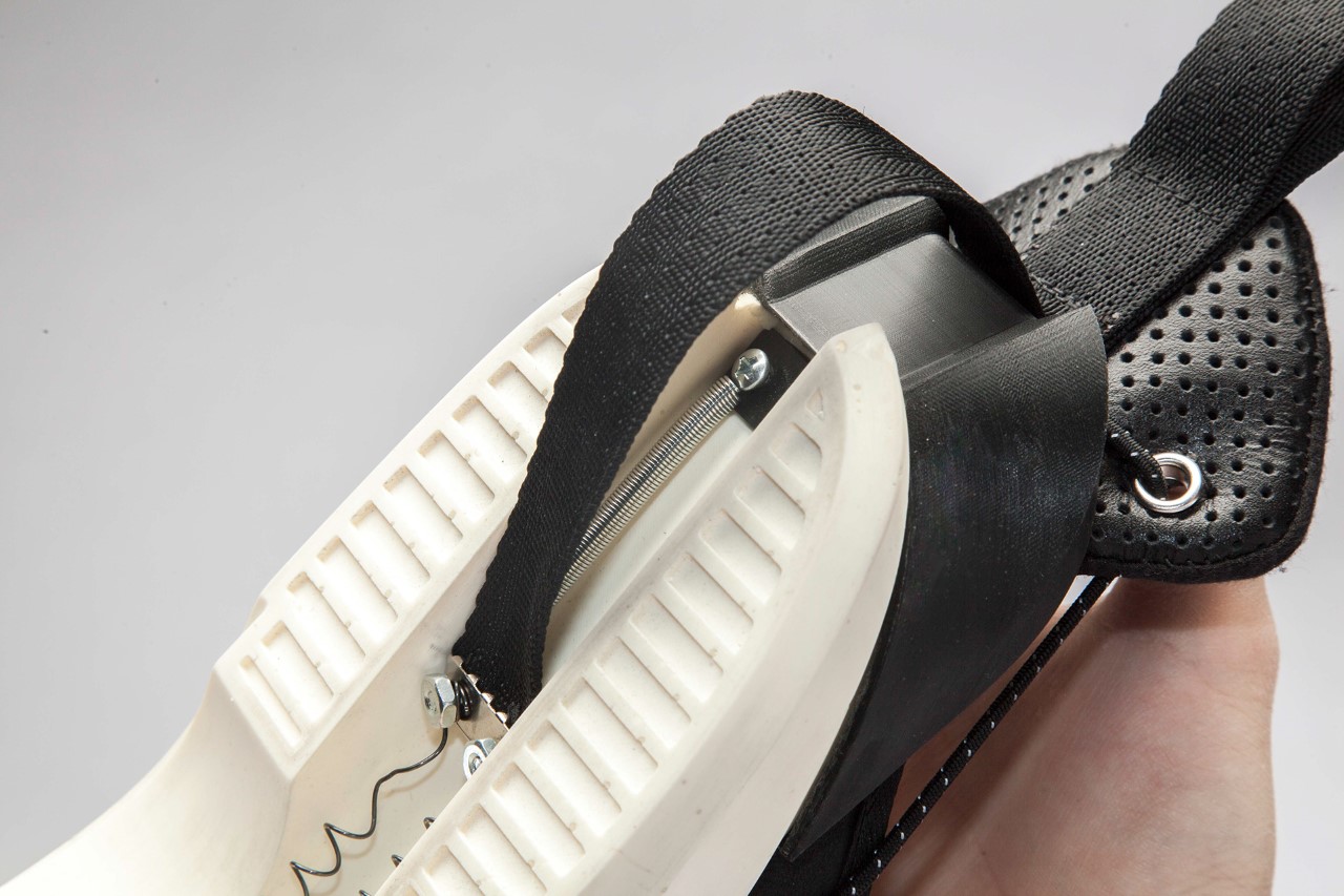
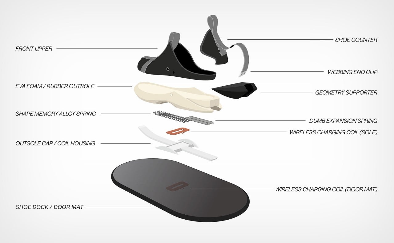
Designed to look like the spiritual lovechild of the Nike Adapt self-lacing shoes and the Nike GO FlyEase hands-free shoe, this proof-of-concept footwear design from Jeff Shen hides a Nitinol (Nickel-Titanium Alloy) spring in its outsole. Known for its shape-memory properties, the spring can be made to expand and contract, allowing the footwear to open or close around your foot! No laces, no hands, no problems!

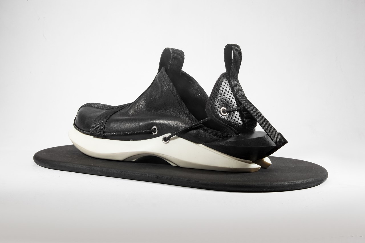
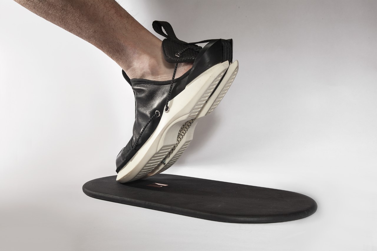
Unlike the Nike Adapt that comes with sensors, motors, and batteries, Shen’s shoes (titled ‘Heaven’s Door’) use a much more ingenious low-tech system that doesn’t require all those bells and whistles. The shoe’s simple lacing/unlacing mechanism relies on a wireless charging mat that helps heat the Nitinol spring, causing it to expand and the shoe to open. Slip your foot in and step off the mat and the Nitinol spring begins cooling and returning to its original shape, causing the shoe to constrict securely around your ankle.

Designer: Jeff Shen

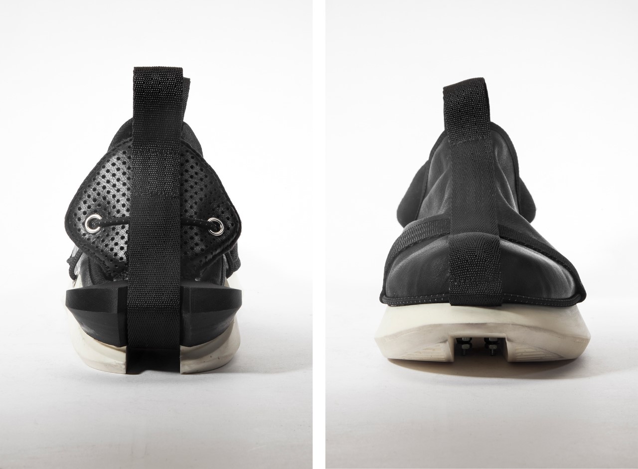
The Heaven’s Door has a unique design style that combines the close-toe design of a shoe with the open-ish ankle aesthetic of a slip-on sandal. The shoes have a leather body, punctuated by an elastic strap that runs along the side, connecting the rear flap to the main shoe. A rubber outsole hints at comfortable outdoor use in an urban environment, while hiding the springs away in a recessed channel running along the length of the shoe. Although remarkable in their automatic opening/closing abilities, the shoes don’t try to look futuristic – because they are not. Unlike the Nike Adapt that have an undeniable sci-fi backstory, the Heaven’s Door is simply a footwear concept with a clever idea driven by material science. It’s a seemingly normal-looking shoe with an incredible trick up its sleeve… or down its outsole.

For Shen, the shoe’s design required a lot of trial, error, and prototyping (you can read his entire case study on his portfolio website). Shen played with straight and coiled Nitinol elements, toyed with the sole’s design, the opening and closing mechanism, and even experimented with finding the right place to add the elastic band to prevent the shoe’s rear flap from deforming.

At the footwear’s heart is its simple low-tech opening and closing mechanism that relies on a wireless charging mat (keeping any and all tech out of the shoe itself to ensure a longer lifespan and the ability to be entirely resistant to water). The mat connects to a coil hidden in the shoe’s outsole, which then heats up to 70°C, causing the Nitinol spring to loosen and a set of expansion springs under the heel to pull on it, releasing the shoe’s rear flap backward almost like a drawbridge. This only lasts as long as the shoe is on the wireless mat. Step off it and the Nitinol cools back and begins assuming its original shape, pulling the rear flap shut.

What the Heaven’s Door shoe does is cleverly eliminate any need for tech components to be present in the shoe. This helps bring down the footwear’s price while still giving it its signature feature. It also means no chances of planned obsolescence, or parts accidentally failing. Even if things DO fail, the shoes can still be worn and removed manually, using the pull tab at the back of the footwear.

Ultimately, the shoe aims at appealing to everyone thanks to its clever, universal design… but just like with Nike’s GO FlyEase hands-free footwear, Shen designed his concept keeping the disabled in mind. Shen used the term “Enclothed Cognition” to describe most disability-focused fashion found in today’s world. “It refers to the systematic influence that clothes have on the wearer’s psychological processes”, Shen explained. “Not being able to put on shoes by oneself and constantly realizing the fact that they dress in a disabled look is devastating on the user experience and self-esteem.”

Aside from being a clever, accessible, truly hands-free, and low-tech self-wearing shoe, the Heaven’s Door footwear concept also destroys the notion that disabled fashion should look any different from regular fashion. The self-wearing shoes have a uniquely contemporary style that appeals to a broader populace. Or should I say popu-laceless!?

The post Self-wearing shoe concept automatically opens and closes thanks to a clever low-tech shape memory alloy spring first appeared on Yanko Design.
This strangely shaped cutting board was designed for people with limited mobility

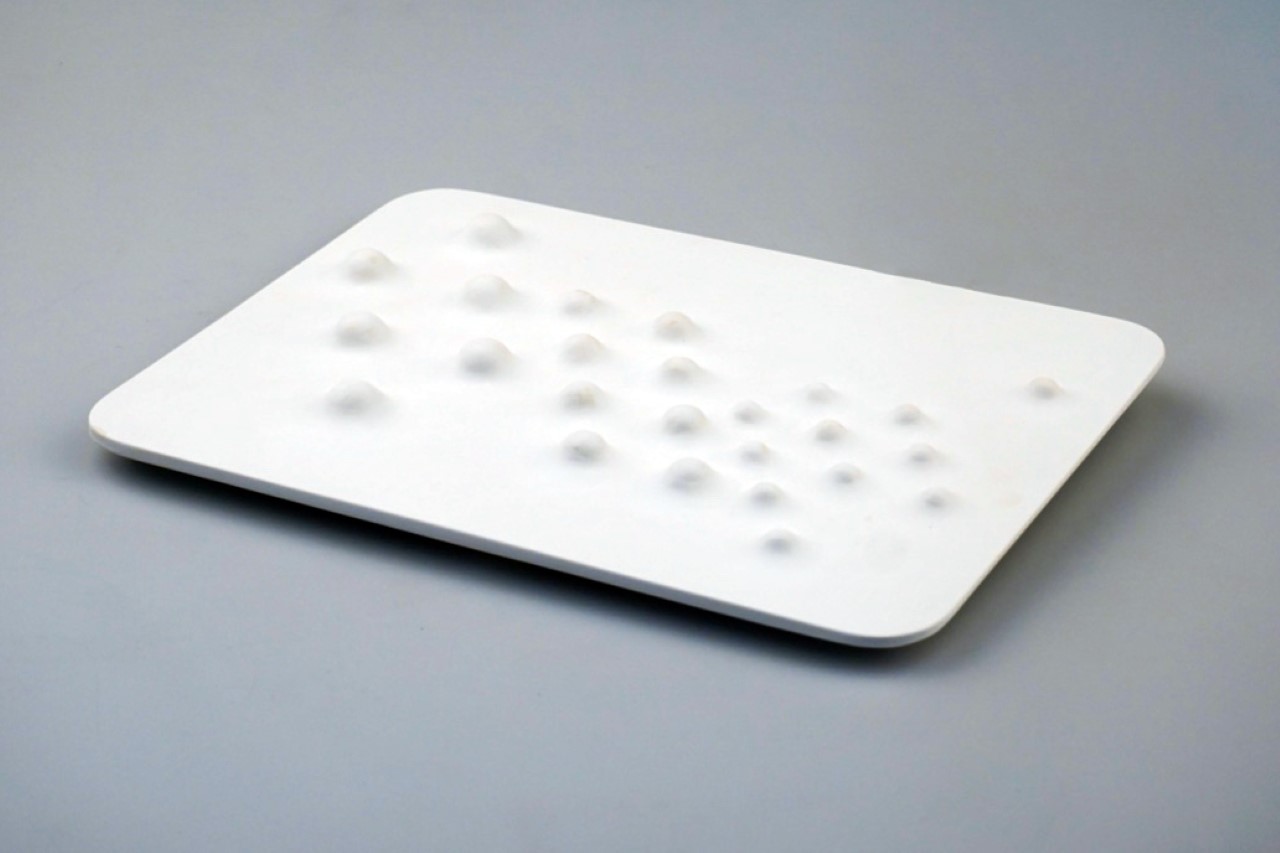
I always argue that good design shouldn’t be measured by how many people it’s benefitting, but rather by the nature of the problem posed to the people. Handicapped people and people with motor impairments make up just a small fraction of humanity, so products that help them overcome daily tasks are arguably and measurably better than products that help solve problems for the masses. The ‘Bulge Cutting Board’ is one such product, designed for people with limited hand mobility.

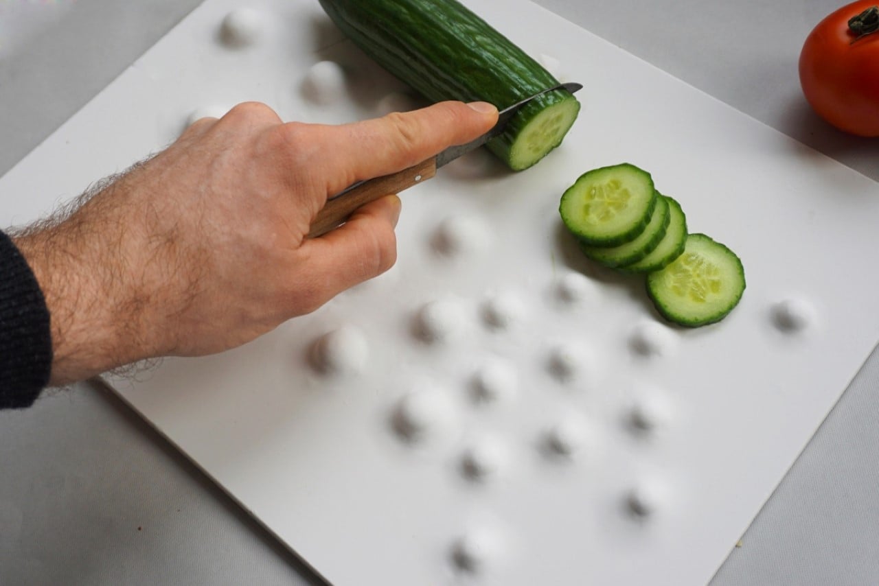
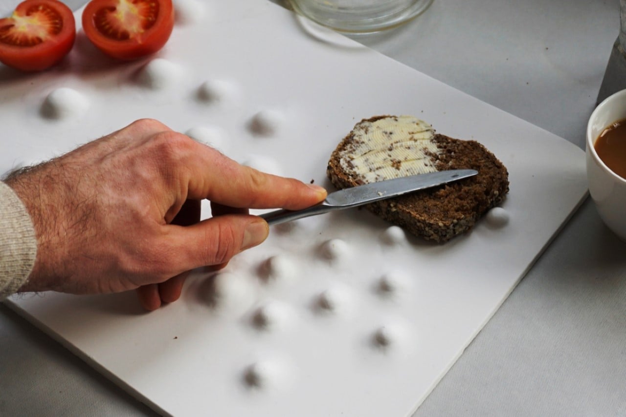
I’m sure you’ve never tried chopping vegetables with one hand, but there are a lot of people who have no other option. “People with motor impairments, such as the absence of a hand or their limited usability, are often dependent on aids that are more reminiscent of tools and are far from any aesthetics”, says Germany-based designer Jon Starck, who created the Bulge Cutting Board. Designed with a set of ‘hillocks’ that somewhat randomly cover the board’s surface, the Bulge Cutting Board enables single-handed chopping and cutting. The bulges help trap and stabilize food while you chop them, preventing them from rolling or shifting and enabling you to go through the experience with just one hand.

Designer: Jon Starck

“The elevations of different sizes and distances from each other allow fixing various foods for processing. They provide support when cutting, smearing and transporting”, says Starck.

Bulge is a rare example of a product that serves a smaller audience, but serves them well. The design isn’t ‘universal’, but caters to a universal need for a marginalized audience. Perfect for people with limited use of their hands, the Bulge Cutting Board gives them the control they need as they pursue an independent life! Pairs rather wonderfully with this ‘knife for the visually impaired‘!

The post This strangely shaped cutting board was designed for people with limited mobility first appeared on Yanko Design.
Textured buttons help the visually impaired understand what colored clothes they’re wearing

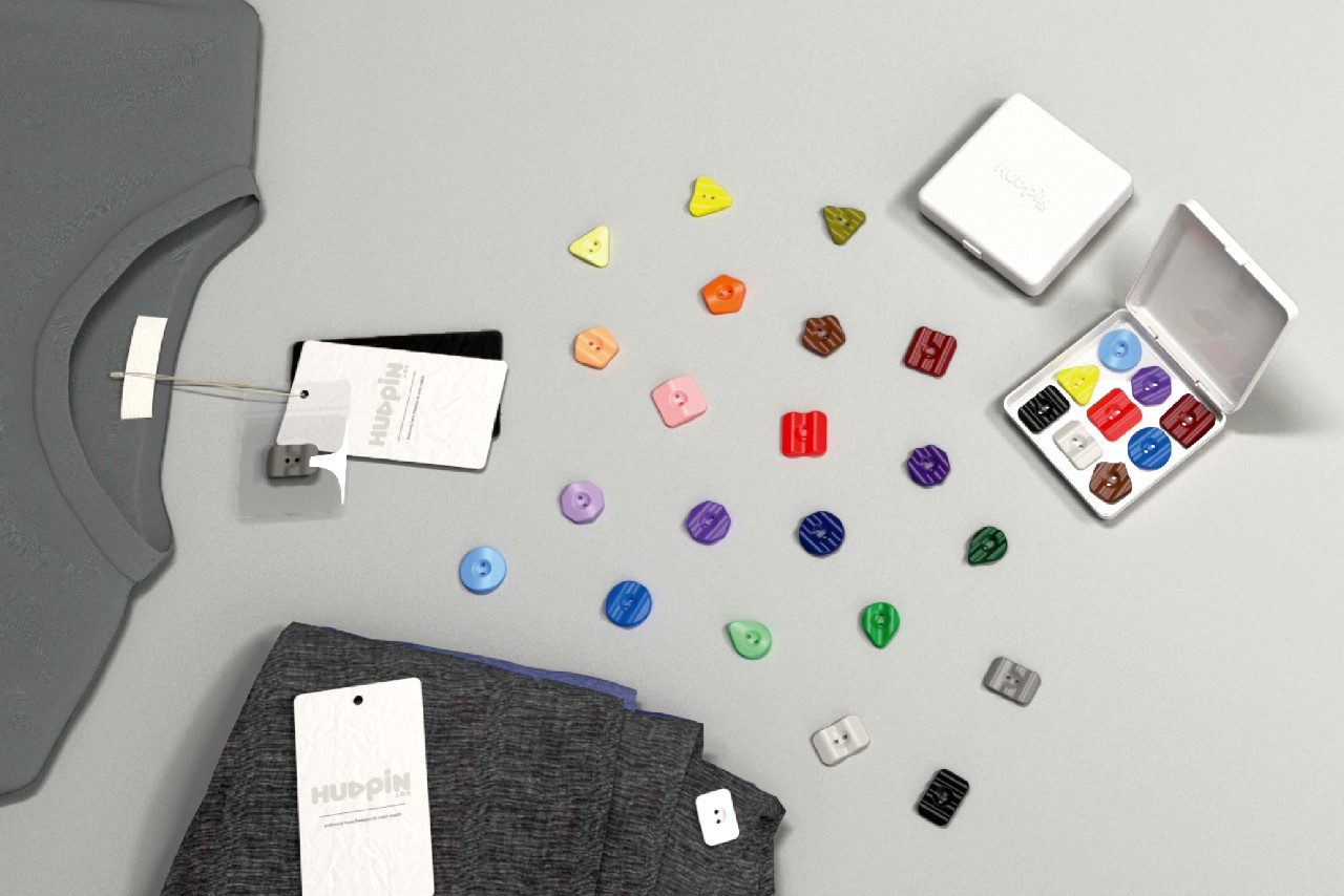
Just because you have a visual impairment doesn’t mean you can’t look good! These textured buttons allow the wearers to understand the colors of their clothes simply by touching them. With a little practice and guidance, they can then create color palettes and combinations that allow them to look good and highlight their fashion-forward personality!

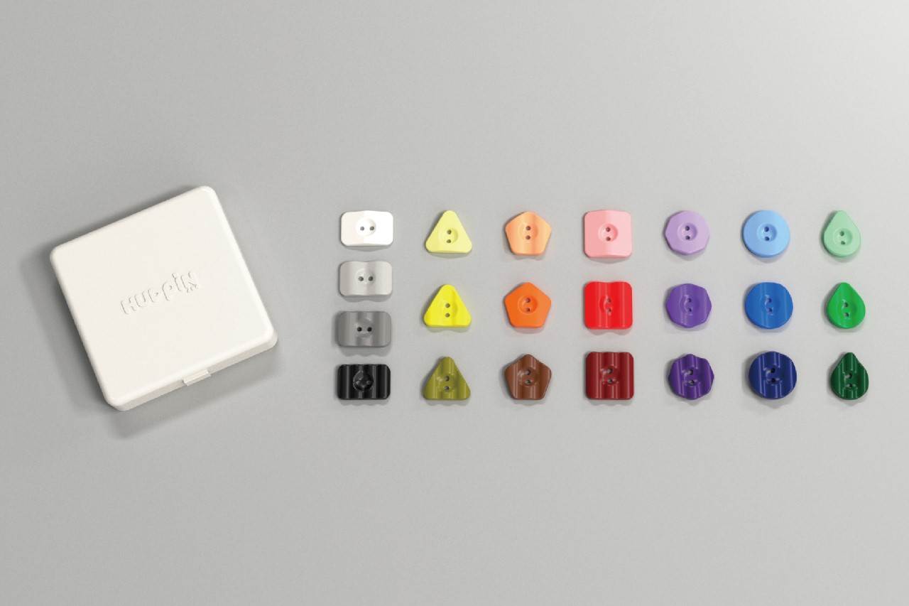
Dubbed the HUEPIN, these uniquely designed buttons help the wearer understand what color clothes they’re wearing. All they really have to do is attach/sew the right buttons to the clothes once they’ve been bought. Once the entire wardrobe’s cataloged and color-coordinated, wearers can easily ‘feel colors’ to help them choose their outfits efficiently and tastefully. The HUEPINs come with specific shapes to indicate colors, and have wavy textures to help the wearer understand how bright or faded the color is. Wearers can then create pairings of contrasting colors, monochromes, triads, or a wide variety of other styles. With a little practice and help, visually-impaired wearers can easily dress their best despite their impairments! Rather wonderful, isn’t it??

The HUEPIN is a winner of the iF Design Talent Award for the year 2022.

Designers: Ang Yong Jun, Huang YuChen, Lai LiWen, Chu Pin Yan

The post Textured buttons help the visually impaired understand what colored clothes they’re wearing first appeared on Yanko Design.

Foot-operated computer mouse design wins the Red Dot Award for its unique approach to accessibility

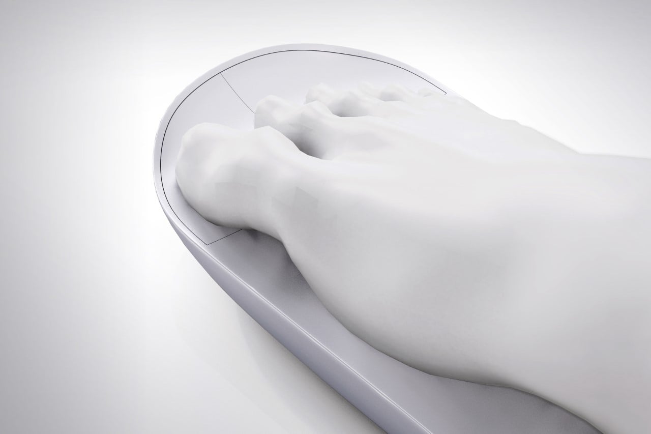
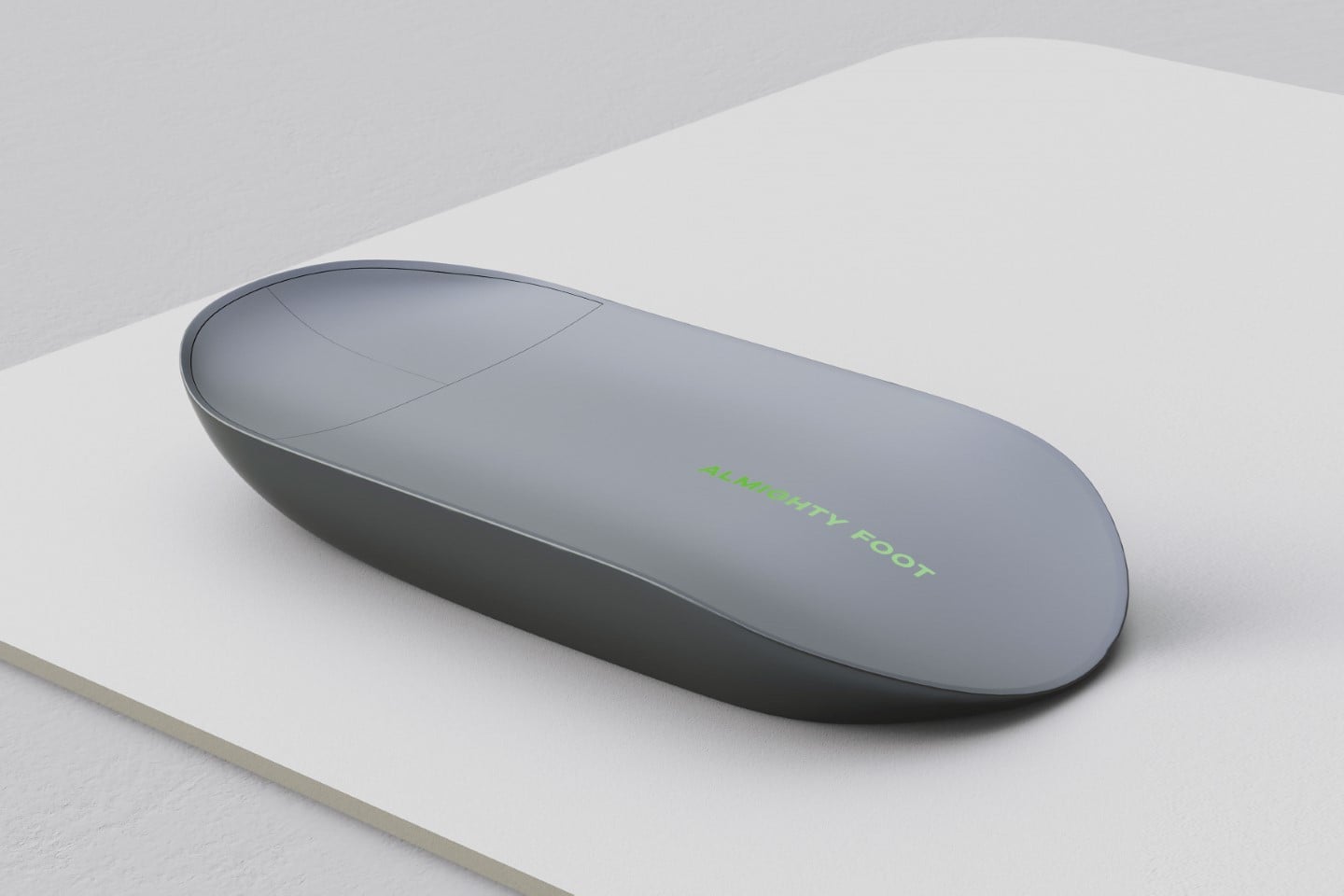
While accessibility controllers like the ones from Xbox only go so far, this concept mouse by Califor Design provides a better way for the disabled to control their laptop. The Foot Mouse is designed for people who are unable to use their hands due to disability or a neurological condition.

The Foot Mouse, as its name so aptly suggests, transfers control to the feet, allowing you to navigate and click by resting your foot on an ergonomically designed device. This mouse includes standard mouse functions like left and right buttons as well as a mouse scroll. The left and right keys are designed to be operated with the toes. The scrolling function is activated when the left and right buttons are simultaneously pressed and deactivated when one of the left or right keys is released. “The concave design of the mouse’s top surface is combined with human-machine engineering principles to ergonomically fit the complex curvature under the foot, ensuring a stable and comfortable user experience”, Califor Design told Yanko Design. “Foot Mouse is designed to fit feet of any width and size and to provide anti-fatigue support for extended periods of use.”

The Foot Mouse is a winner of the Red Dot Design Concept Award for the year 2022.

Designer: Califor Design

The post Foot-operated computer mouse design wins the Red Dot Award for its unique approach to accessibility first appeared on Yanko Design.
These special eyeglasses by a Japanese startup can cure myopia or nearsightedness

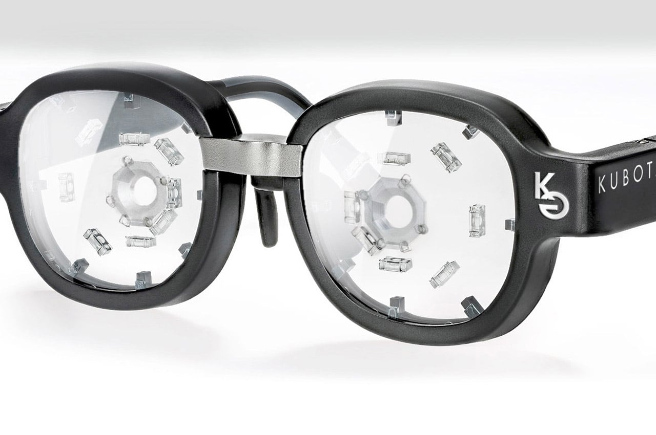
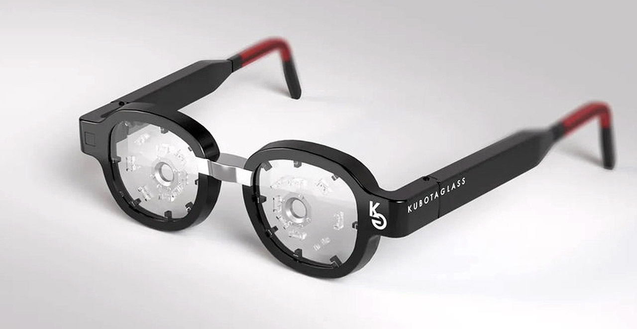
Myopia or nearsightedness is an extremely common vision condition that afflitcs a lot of people, including me. Essentially what this means is that we can focus on objects that are close, with ease, but struggle with items that are placed further away. These items seem blurred or unclear to us. This usually occurs when a person spends too much time focusing on nearby items, causing our eyeballs to actually change in shape over time, making it too long front-to-back. And with people spending most of their day interacting with screens, it isn’t a shocker how widespread this condition is. In fact, this common condition is growing so rapidly, that it is predicted that by 2050, half of the world’s population will be affected by it. This is where Japanese pharmaceutical startup Kubota decided to step in. They’ve designed special eyeglasses that can improve or even cure Myopia!

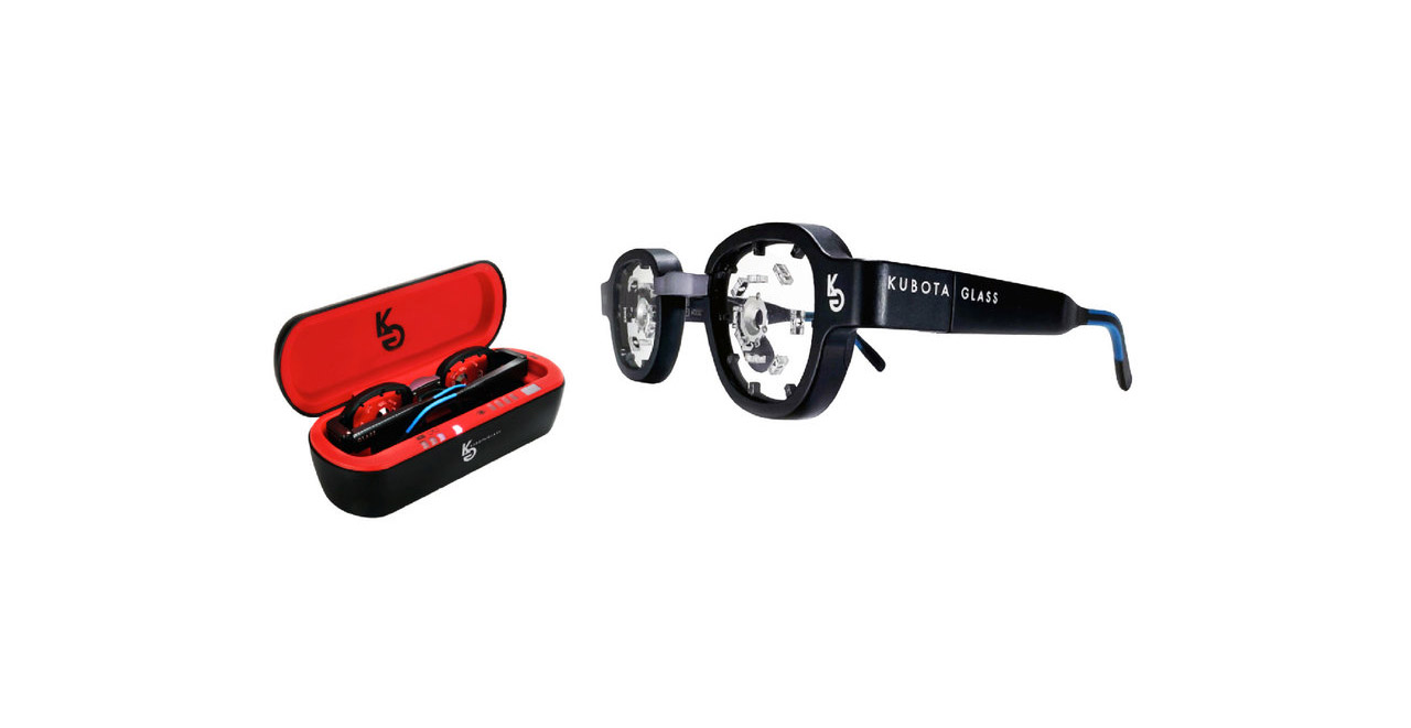
Designer: Kubota Glass

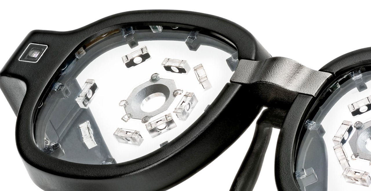
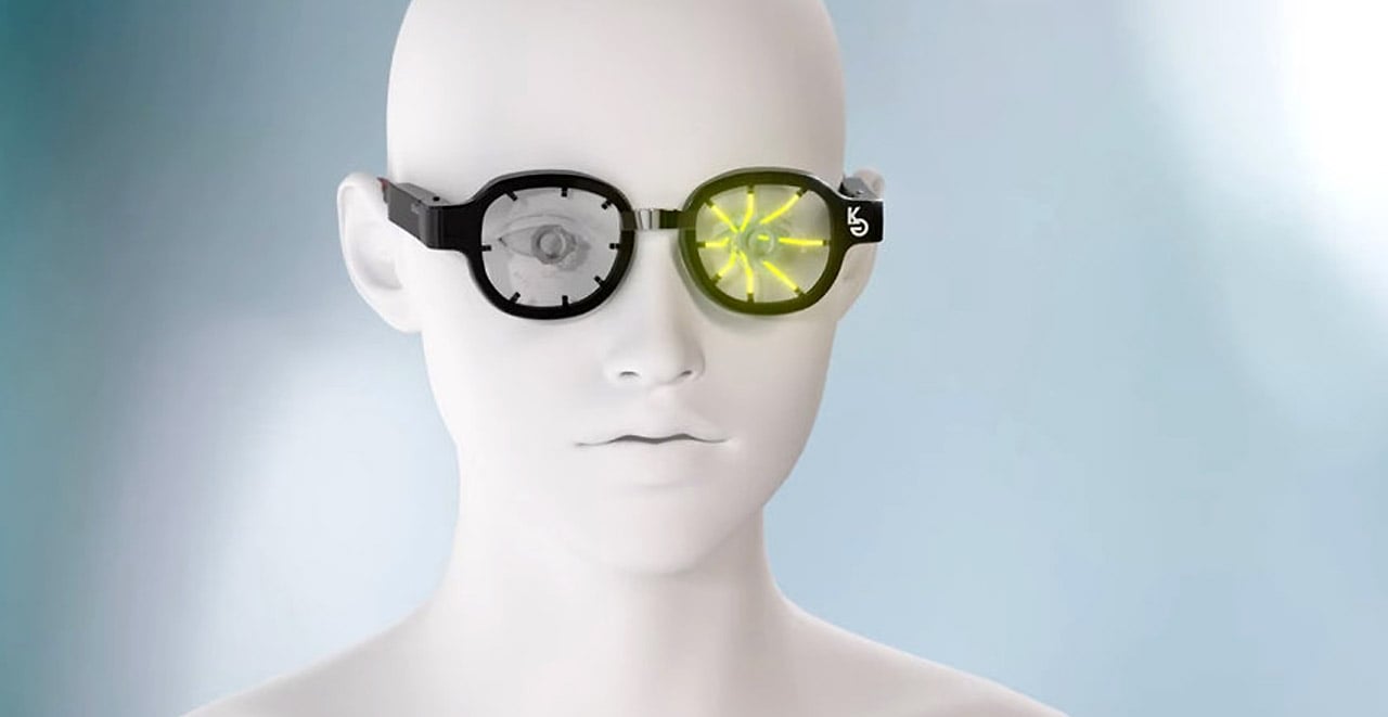
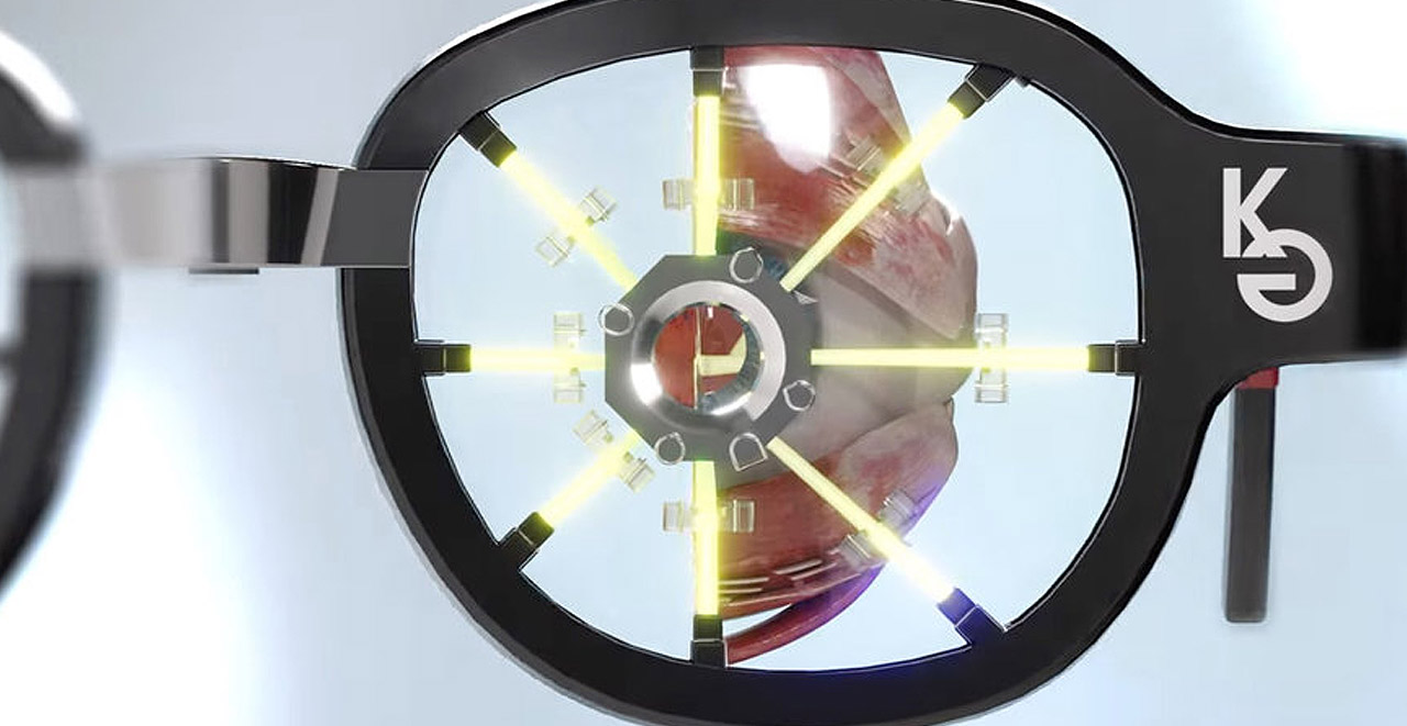
Kubota’s wearable design has been amped with an array of nano projectors, which project light at the wearer’s retina in a specific pattern, to cause blurring at short distances, in turn forcing them to look further away. This helps the eyeball to morph back into its original shape and allows one’s vision to return to normal. You’re supposed to wear the glasses for a couple of hours a day, usually when you’re simply relaxing or unwinding in the comfort of your home. With the help of AR tech, the glasses create, “an image environment that makes you feel as if you are looking far away even when you are at home.”

“Projection of a blurred image onto the peripheral part of the retina (myopic defocus stimulation) resulted in a reduction in the axial length of the eye (the length from the cornea to the retina) compared to the target eye — proof of concept has been confirmed.”, said Kubota, after conducting multiple tests in May and August 2020, using various devices.

At the moment only 20 pairs have been produced and gone on sale in Japan. Each eyeglass costs $5700 and comes with a 100% satisfaction guarantee – basically a complete refund if they don’t work. We can’t wait for the glasses to be launched globally, and witness how they could actually help people with Myopia…who knows maybe I could be one of the early bird shoppers!

The post These special eyeglasses by a Japanese startup can cure myopia or nearsightedness first appeared on Yanko Design.
Absolutely genius medical stretcher can transform into a wheelchair for patients with less serious injuries

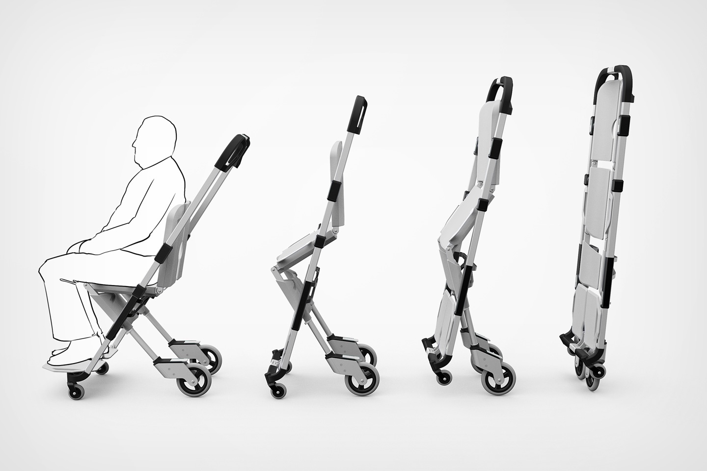
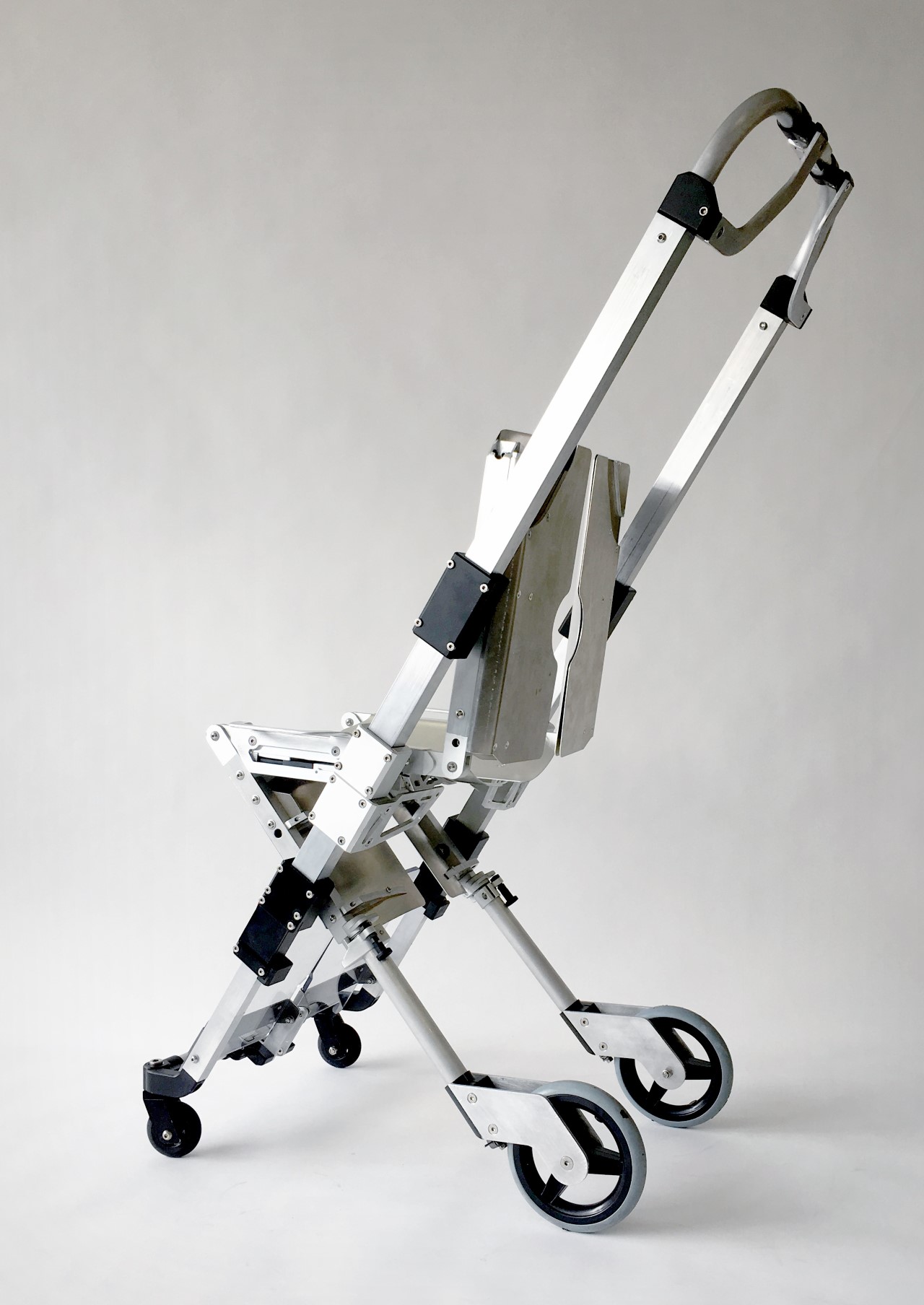
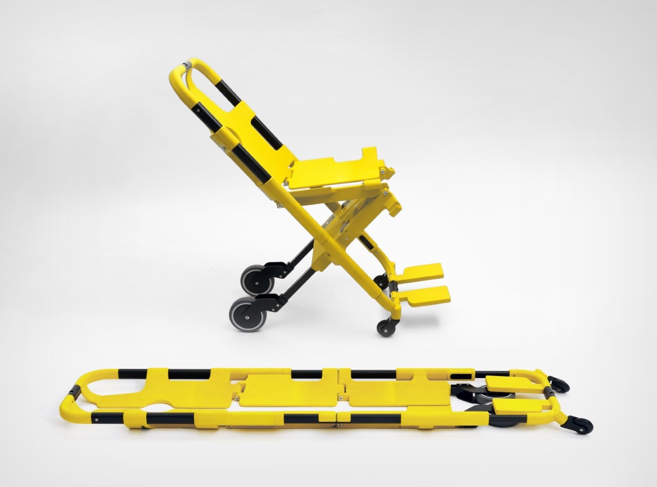
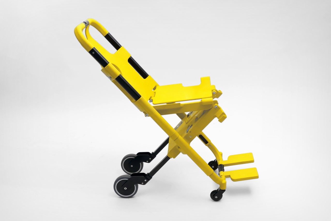
Although its name doesn’t quite do it complete justice, the Multi Scoop Pro is a rather novel shapeshifting stretcher that also turns into a wheelchair on command. Contrary to what its name may suggest, it isn’t an ice cream machine…

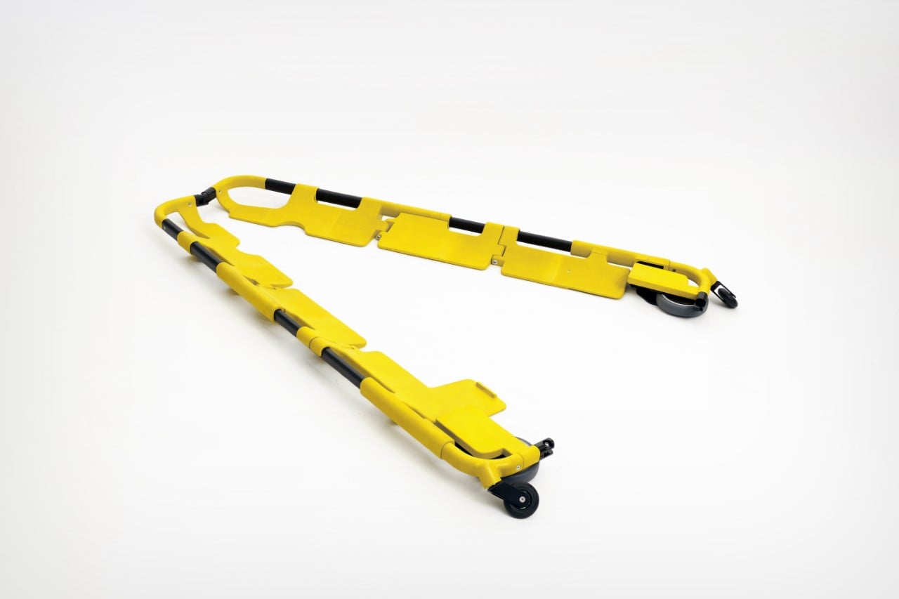
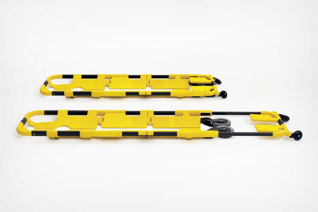
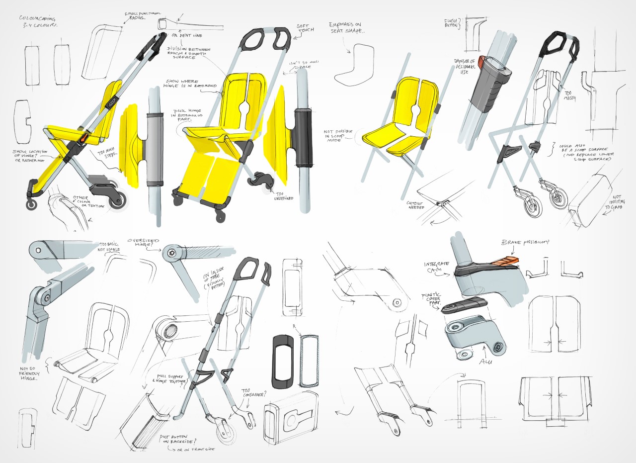
The idea for the Multi Scoop Pro comes from the folks at Studio Rotor, who wanted to create one single medical apparatus that could scoop patients up, function as a stretcher, and even double as a lightweight wheelchair when necessary. Designed for Retter Medical and further developed by IDP Amsterdam for manufacturing, the Multi Scoop Pro comes with a patented mechanism that allows it to split, fold, and lock into either stretcher or wheelchair positions. The Multi Scoop Pro also weighs a mere 10 kgs, giving it a significant advantage over the heavy electrically operated stretcher-lift systems built into ambulances that can weigh 5-6 times the amount.

Designers: Studio Rotor and IDP Amsterdam for Retter Medical

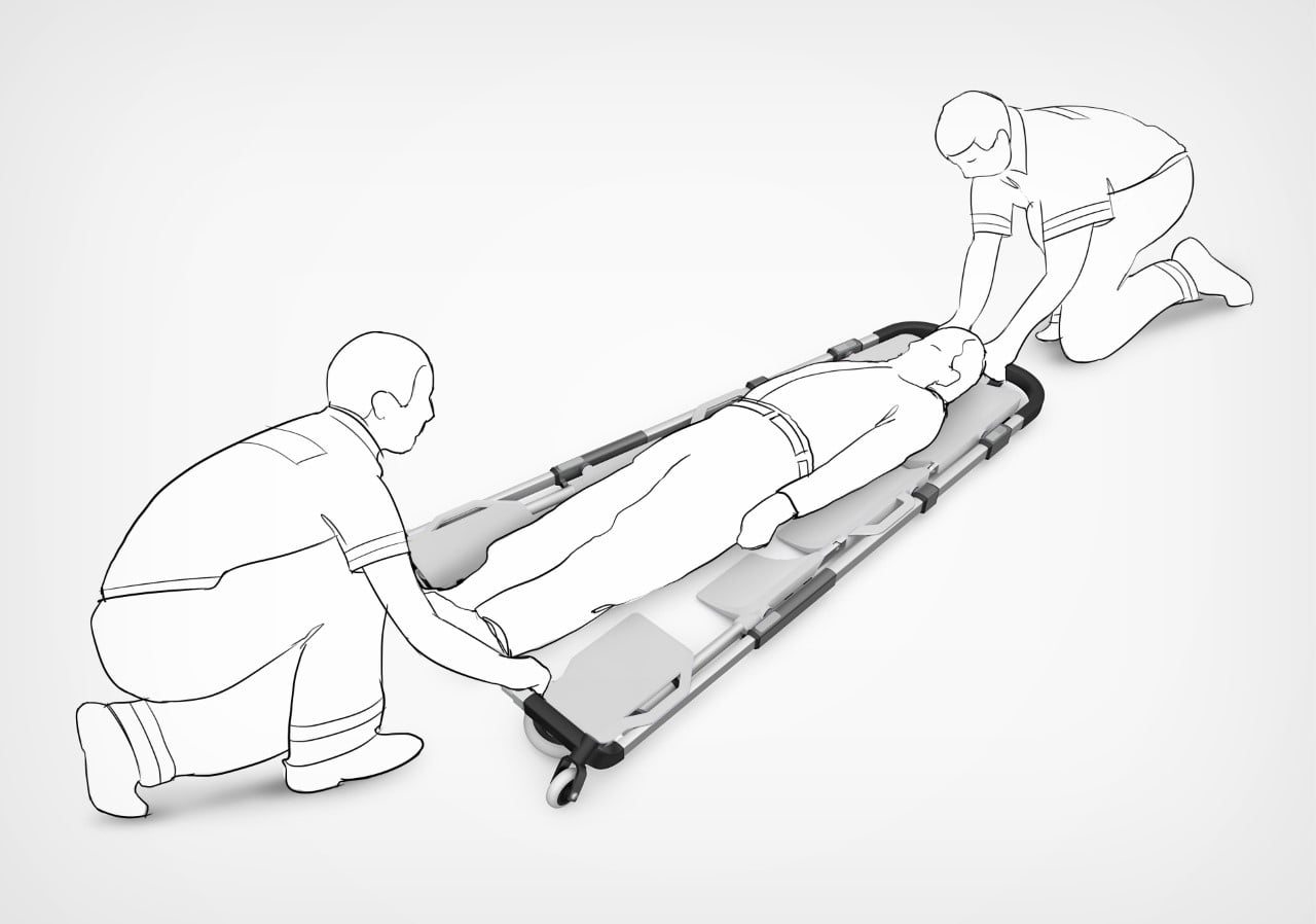
The Multi Scoop Pro gets its name from being able to scoop up patients instead of having them lifted and placed onto the stretcher. The stretcher splits open laterally, allowing it to be placed on either side of the patient on the ground. When the two halves are brought back together again, they scoop the patient onto the stretcher platform, which can then be lifted and transported to the nearest ambulance. For patients with less serious injuries, the Multi Scoop Pro can simply be folded into a wheelchair, allowing a single medic to transport them while they’re comfortably seated.

A prototype unit of the Multi Scoop Pro, co-developed with IDP Amsterdam

The idea for the Multi Scoop Pro started with a broad exploration of the work environment of ambulance personnel. Through research, it became clear that, at least in Amsterdam, most ambulances were gradually phasing out manual stretchers and replacing them with expensive, heavy electrical-powered stretchers that operate like massive car-jacks, using motorized mechanisms to fold flat upon arrival, and lift up after the patient’s been loaded onto the stretcher. The second fundamental problem with this arrangement (aside from cost and weight) was the fact that patients still needed to be lifted ONTO the stretcher. With its scooping design, the Multi Scoop Pro solves the latter problem. For the former, the design weighs a paltry 10 kilograms and costs a fraction of what an electrically operated stretcher would cost.

The fact that the stretcher transforms into a wheelchair is a much-appreciated added bonus. A stretcher isn’t required 100% of the time, especially when the patient is conscious, has just minor injuries, and doesn’t need to be laid down or restrained on a horizontal platform. The transformation takes mere seconds and can be locked into position so the wheelchair doesn’t come undone during transit.

The post Absolutely genius medical stretcher can transform into a wheelchair for patients with less serious injuries first appeared on Yanko Design.
Electric Guitar with Braille fretboard helps the visually impaired master a new instrument

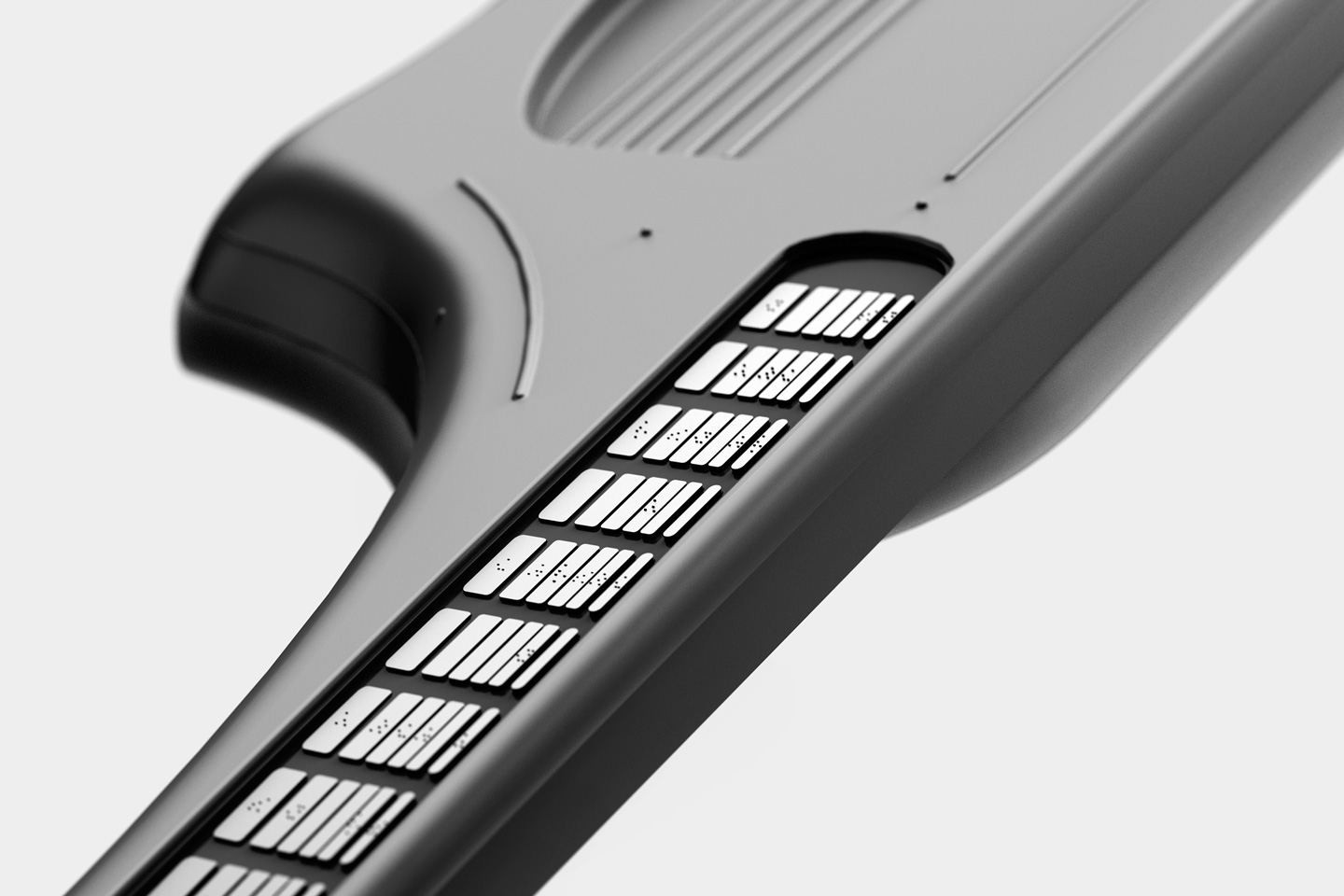
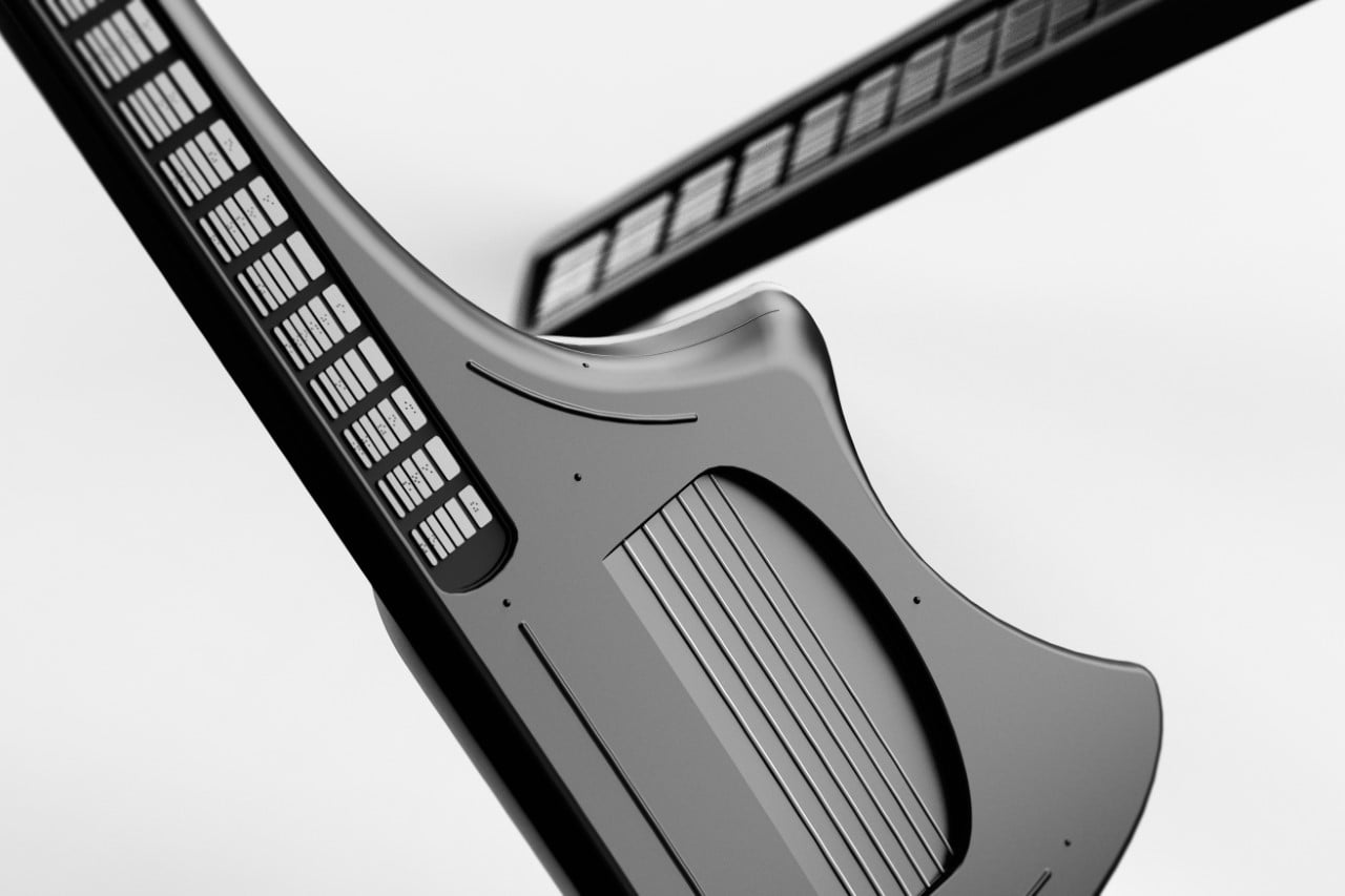
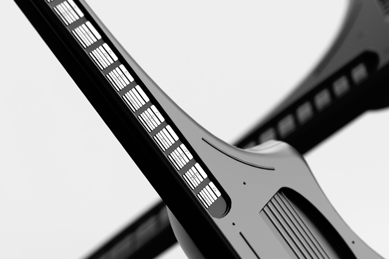
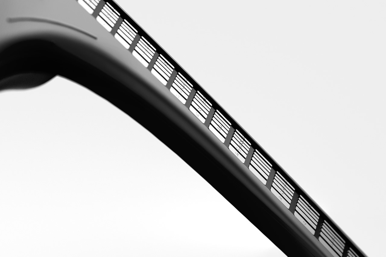
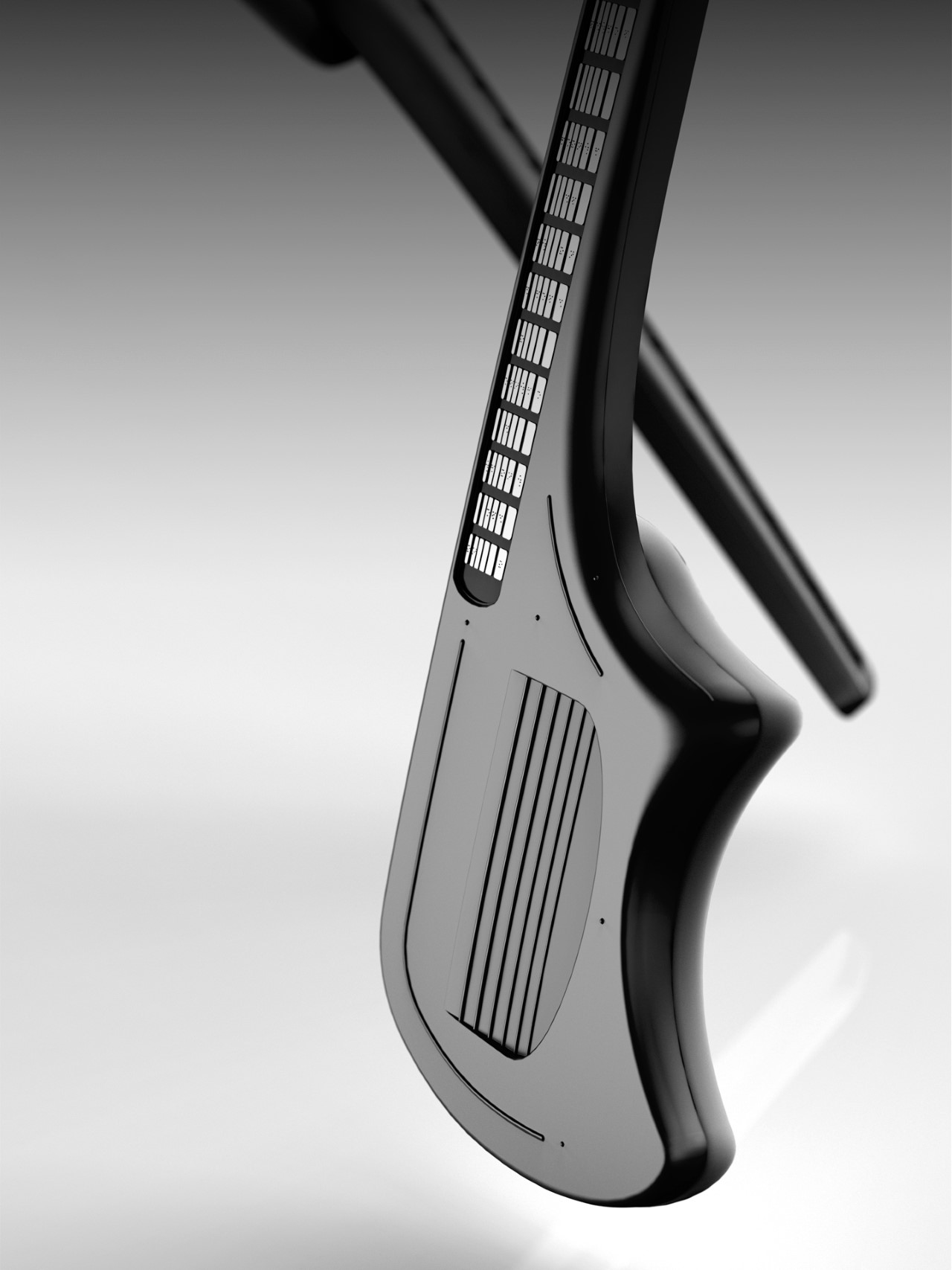
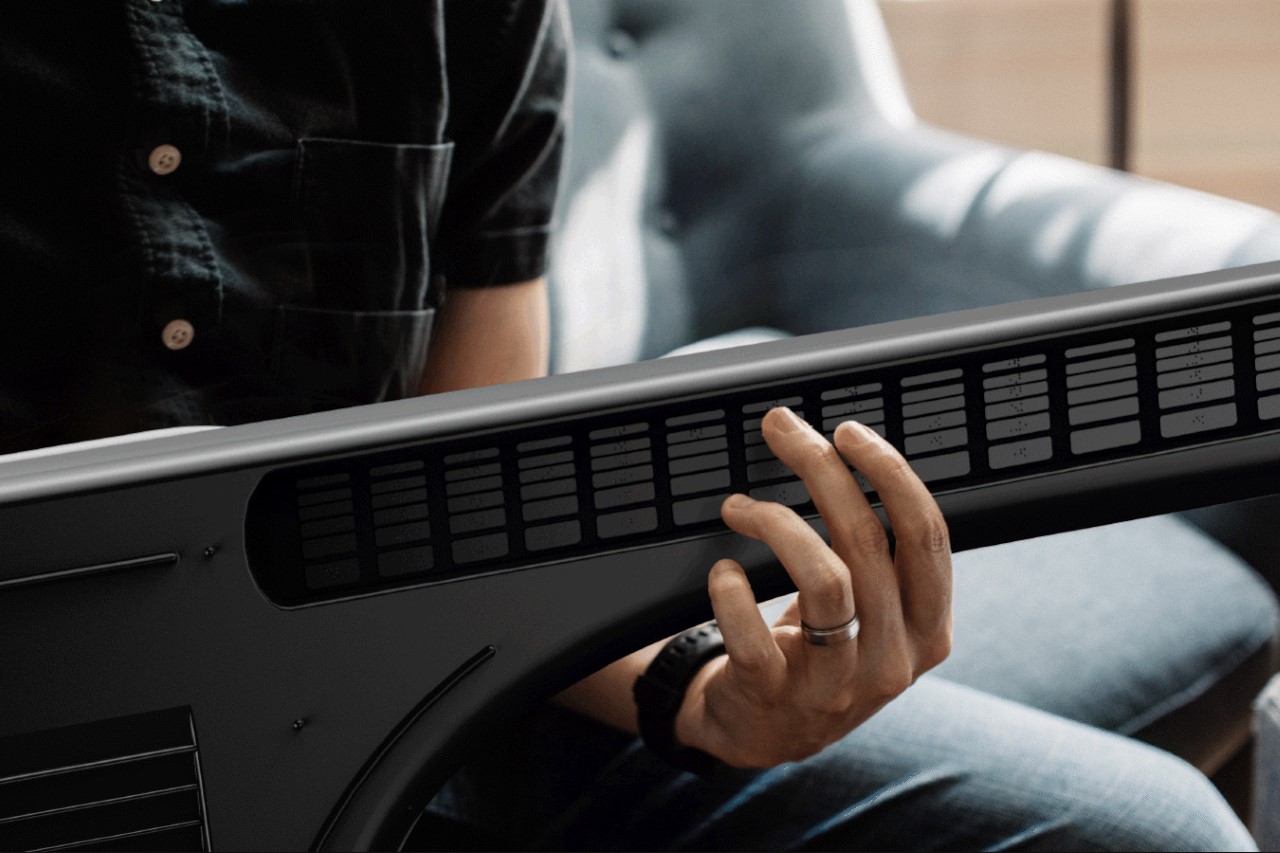
While simply color-coordinating or backlighting parts of an instrument may work for regular novices, it doesn’t translate to visually impaired users. Vitar hopes to solve that by covering its entire fretboard with Braille keys that can help blind and vision-impaired people navigate their way around a guitar. Vitar, however, isn’t a traditional electric guitar either – it’s a MIDI instrument styled like a guitar, which also unlocks an entire world of potential with electronic music.

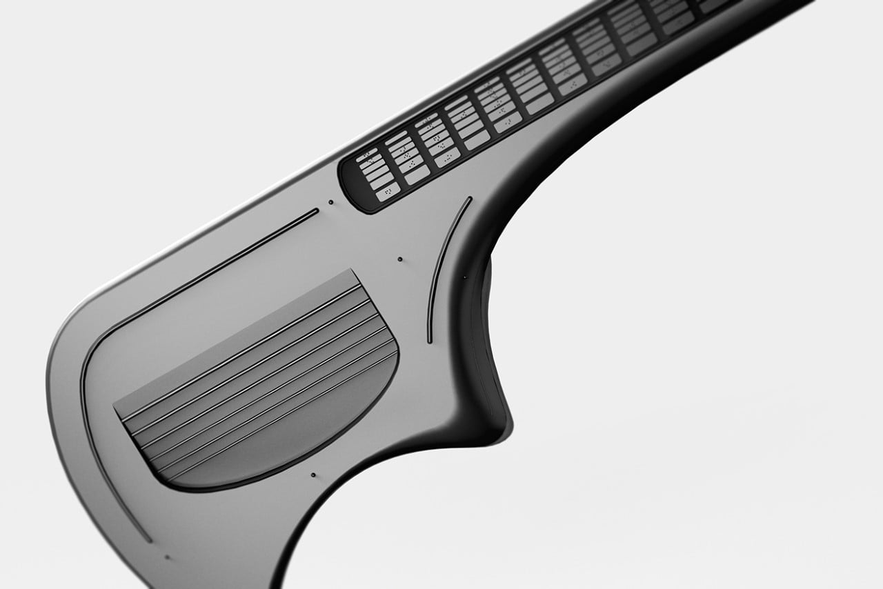
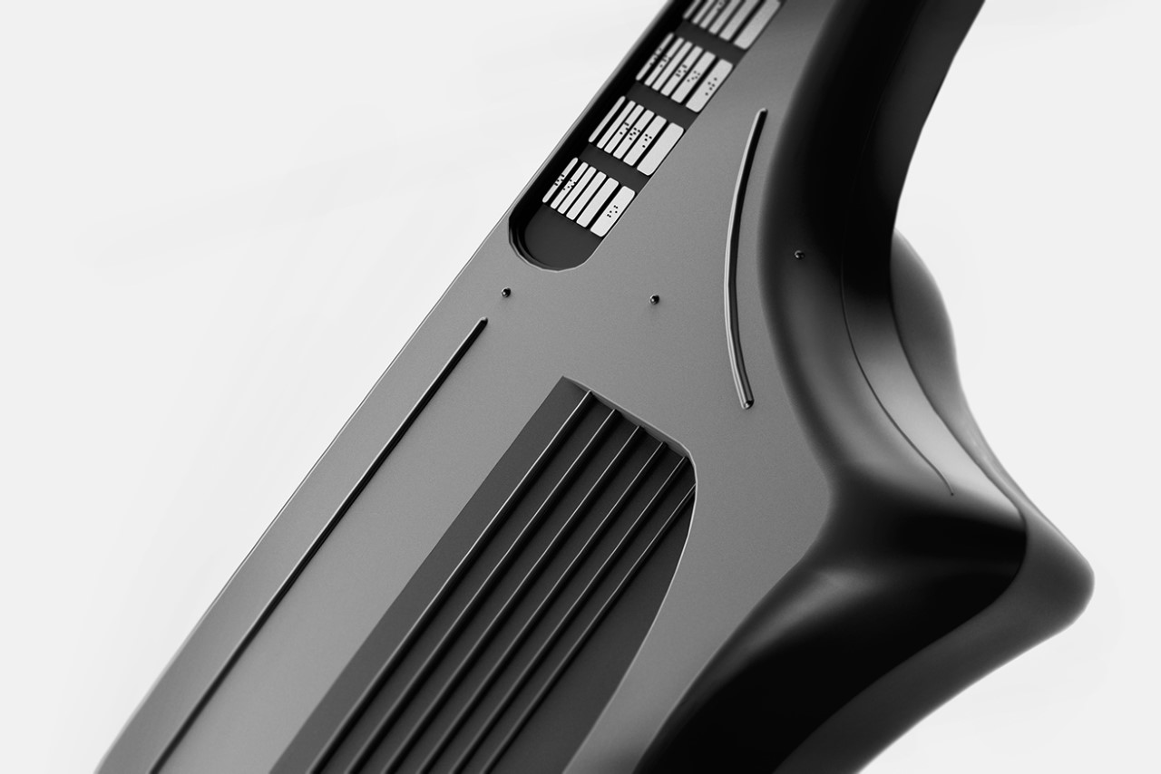
If the Vitar looks a little odd at first, it’s because it isn’t your average Spanish guitar. Designed to electronically send signals to a software (technically known as a Digital Audio Workstation), the Vitar comes with keys that you press with your left hand, indicating the notes you want the guitar to play. However, Vitar doesn’t quite stop right there. Each key located in the guitar’s fretboard comes with a Braille letter embossed on it, allowing even the visually impaired to work their way around the instrument. It’s a classic example of a tiny design detail that radically improves the product’s experience for all its users.

Designers: Eojin Roh, Seonjin Baek, Yujeong Shin

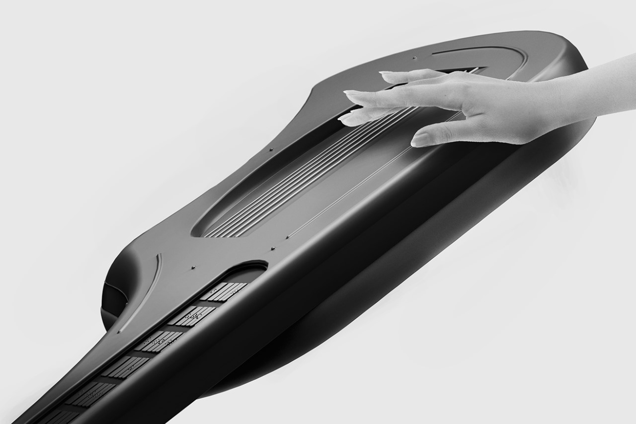
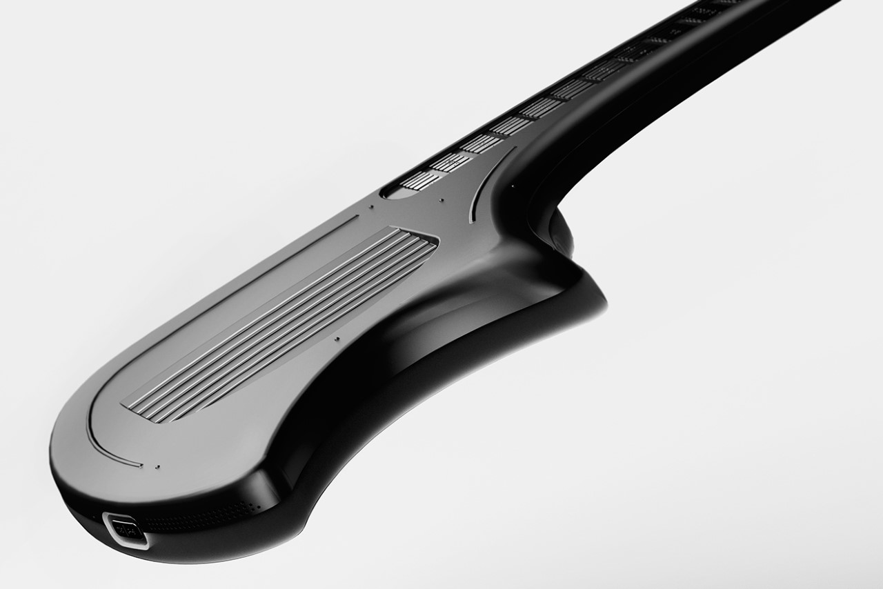
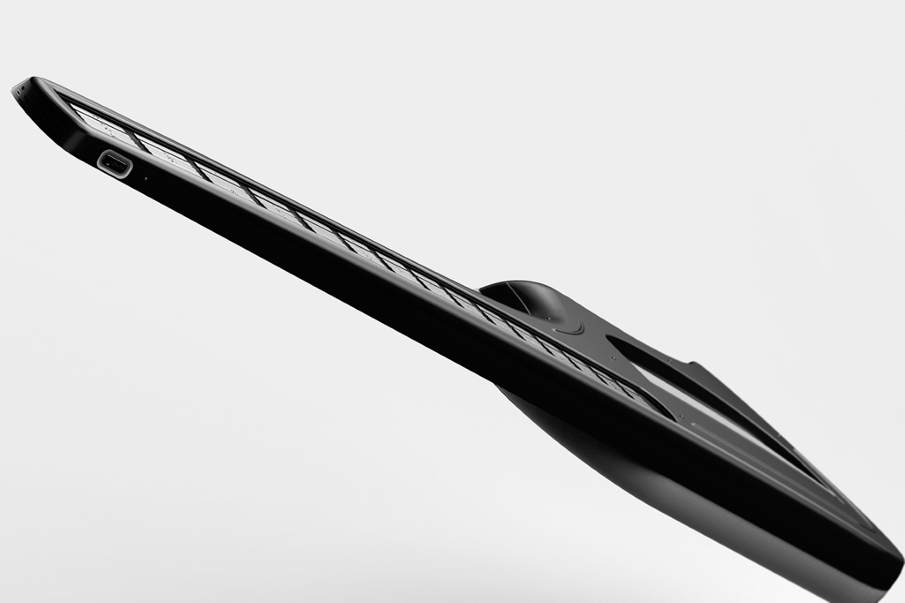
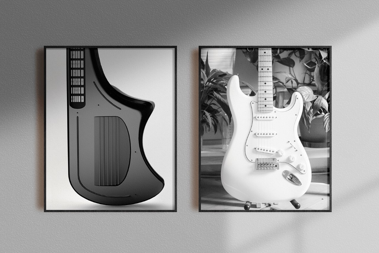
The fascinating part about the Vitar is its unconventional design. The way it was made has nothing to do with acoustics, but rather has everything to do with being intuitive and minimizing the learning curve. The Vitar’s body has an odd asymmetric shape that helps users instantly understand which way it’s supposed to be held (one could argue that it isn’t ambidextrous, although that might come across as pedantic). Strings sit in a recessed chamber on the main body, so the hand or guitar pick knows when to stop (while also giving you a place to conveniently rest your fingers). Guidelines across the main body help the hand navigate around the guitar in an instant, so you spend more time jamming and less time figuring out if you’re holding the instrument right.
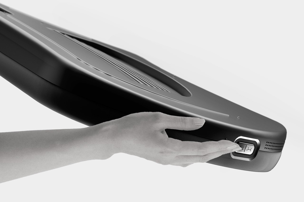
Buttons on the base of the electric guitar let you control its built-in speaker/amplifier.

Vitar’s most impressive feat, however, remains its Braille keys. One of the most difficult parts of the guitar learning experience is figuring out which fret triggers which note. Sure, a talented guitar can easily pick this up by ear and with repeated practice, but for a novice, it requires a lot of counting down the frets, examining the corresponding string, etc. Just by simply molding Braille letters onto the individual keys, the Vitar makes the process as easy as pressing a button… quite literally.

While the Vitar is targeted towards visually impaired students, even most regular users can benefit from the sheer muscle memory of their fingertips knowing which key is located where, and what button triggers what note. If it helps us regular folk pick up a bit of braille in the process too, that’s an overall win in my book!

This isn’t the first time we’ve seen uniquely designed and shaped electric guitars. Earlier this year, Ezra Feldman unveiled an unconventional ‘curved’ electric guitar that was designed to offer a much more ergonomic and strain-free experince.

The post Electric Guitar with Braille fretboard helps the visually impaired master a new instrument first appeared on Yanko Design.