Top 10 minimal furniture designs to add a bit of peace and calm to your home

A beautiful piece of furniture can complete a room. It can be the final piece that makes a space come full circle, building a comfortable and cohesive haven, rather than a random area. Furniture pieces make or break a home, they add on to the essence or soul of a home, hence one needs to be extremely picky while choosing a furniture design. The design should be a reflection of you, and what you want your home to be. When you place a piece of furniture in a room, it should instantly integrate with the space, creating a wholesome and organic environment. We’ve curated a collection of minimal furniture designs that we believe will do this! Each of these pieces is unique, well-crafted, and made with a whole lot of love, and the love really shines through in the fine detailing and workmanship. We hope you feel the love too!

1. The Drum Stool
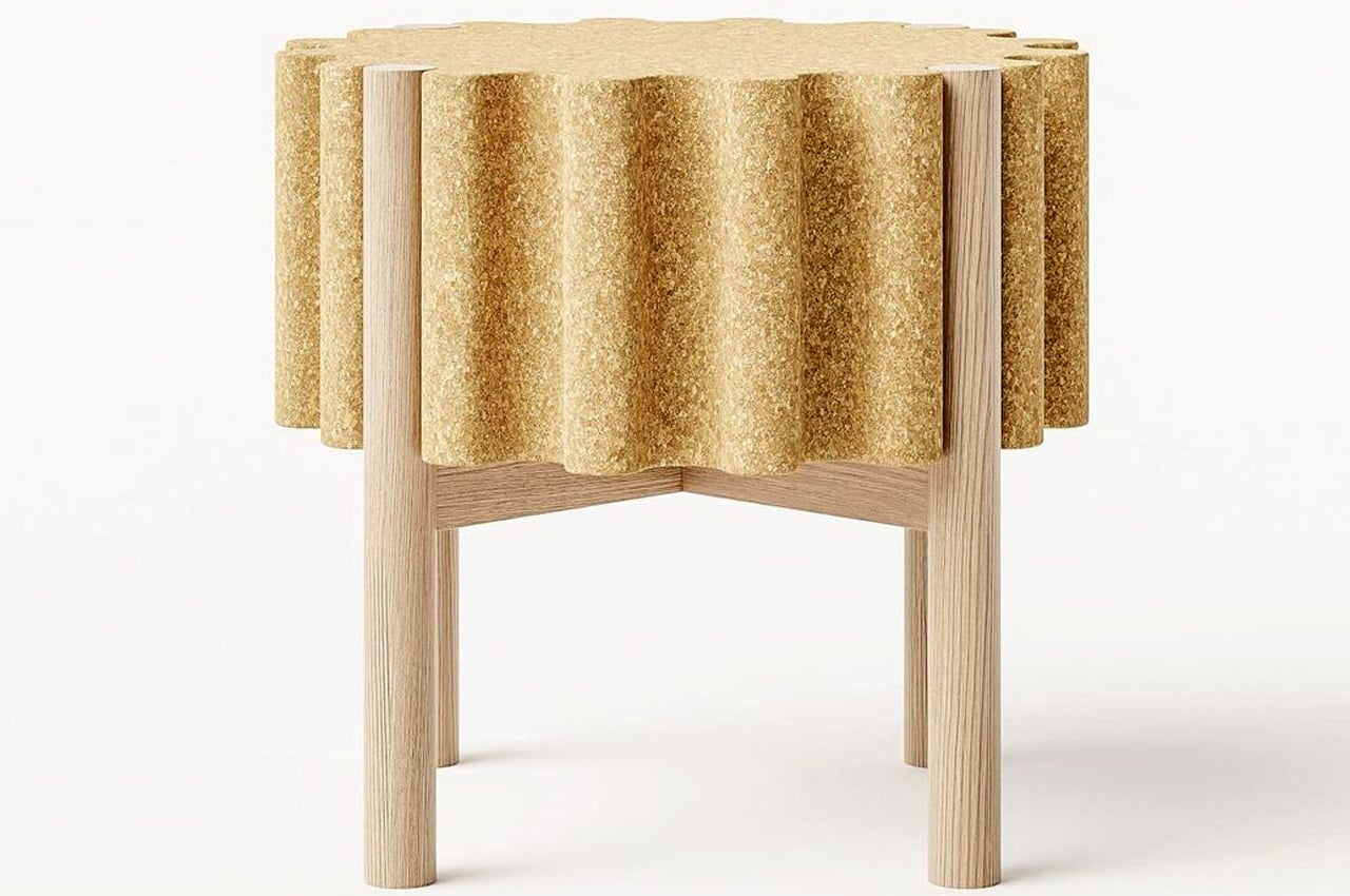
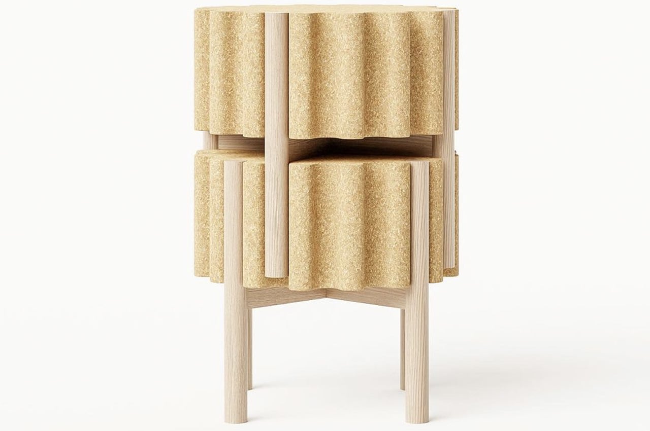
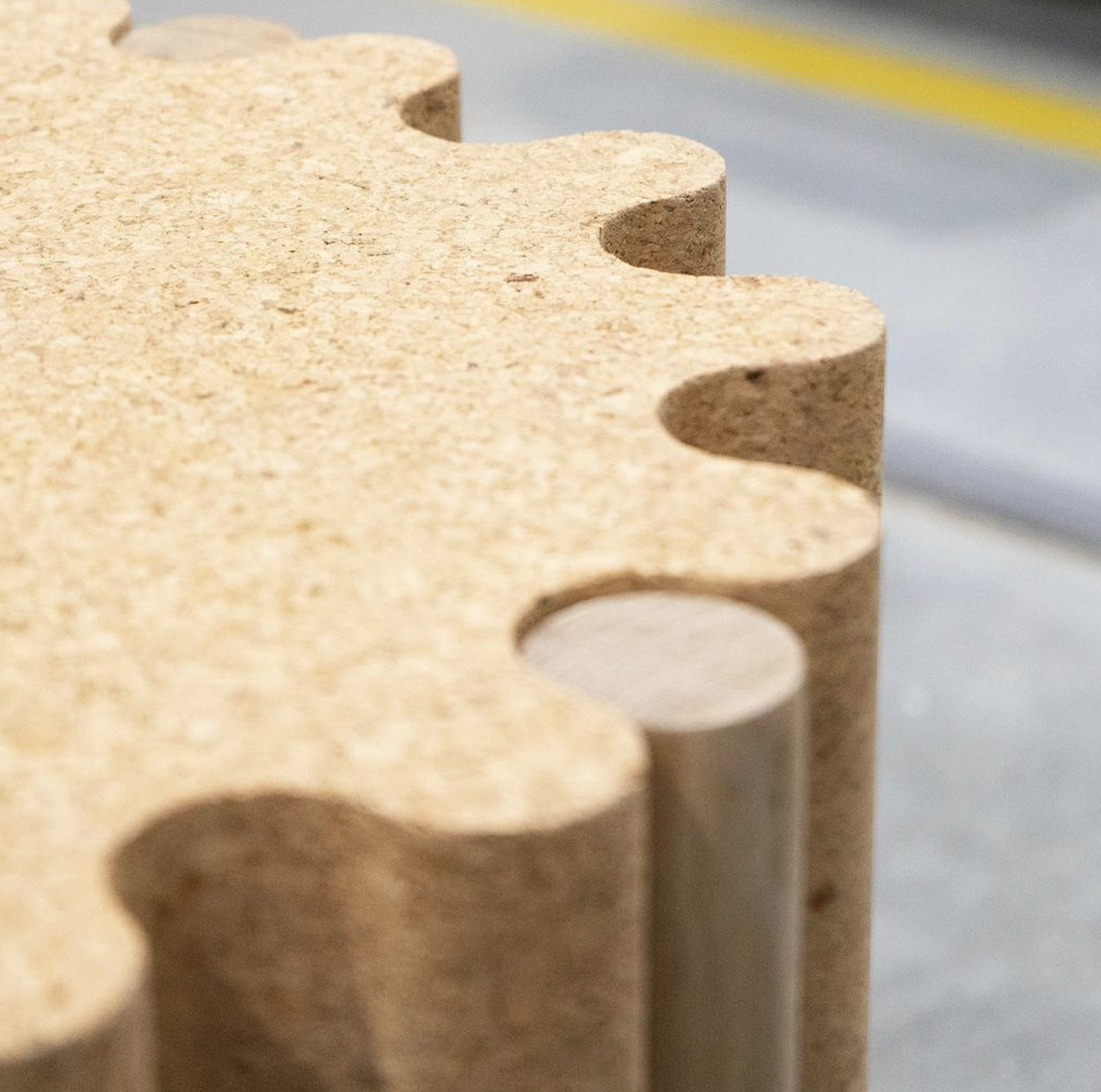
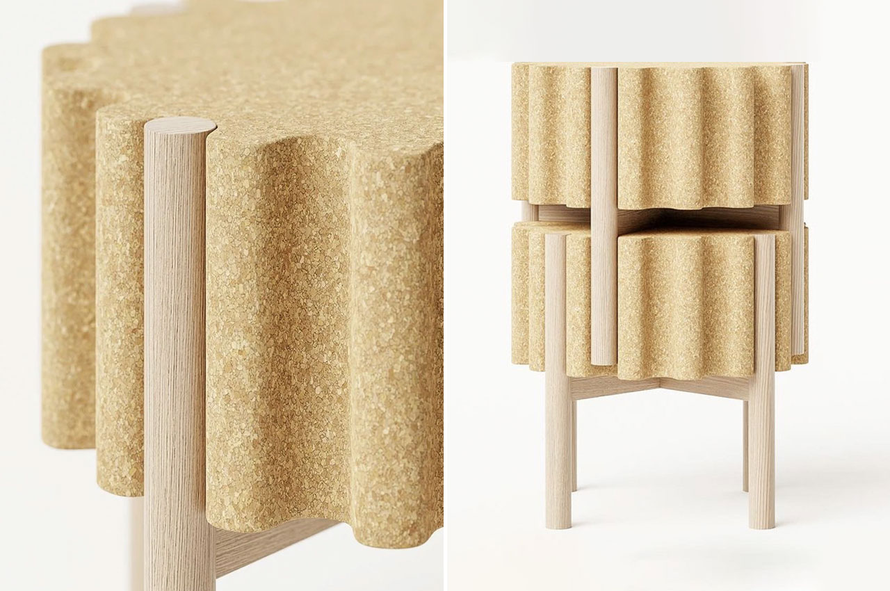
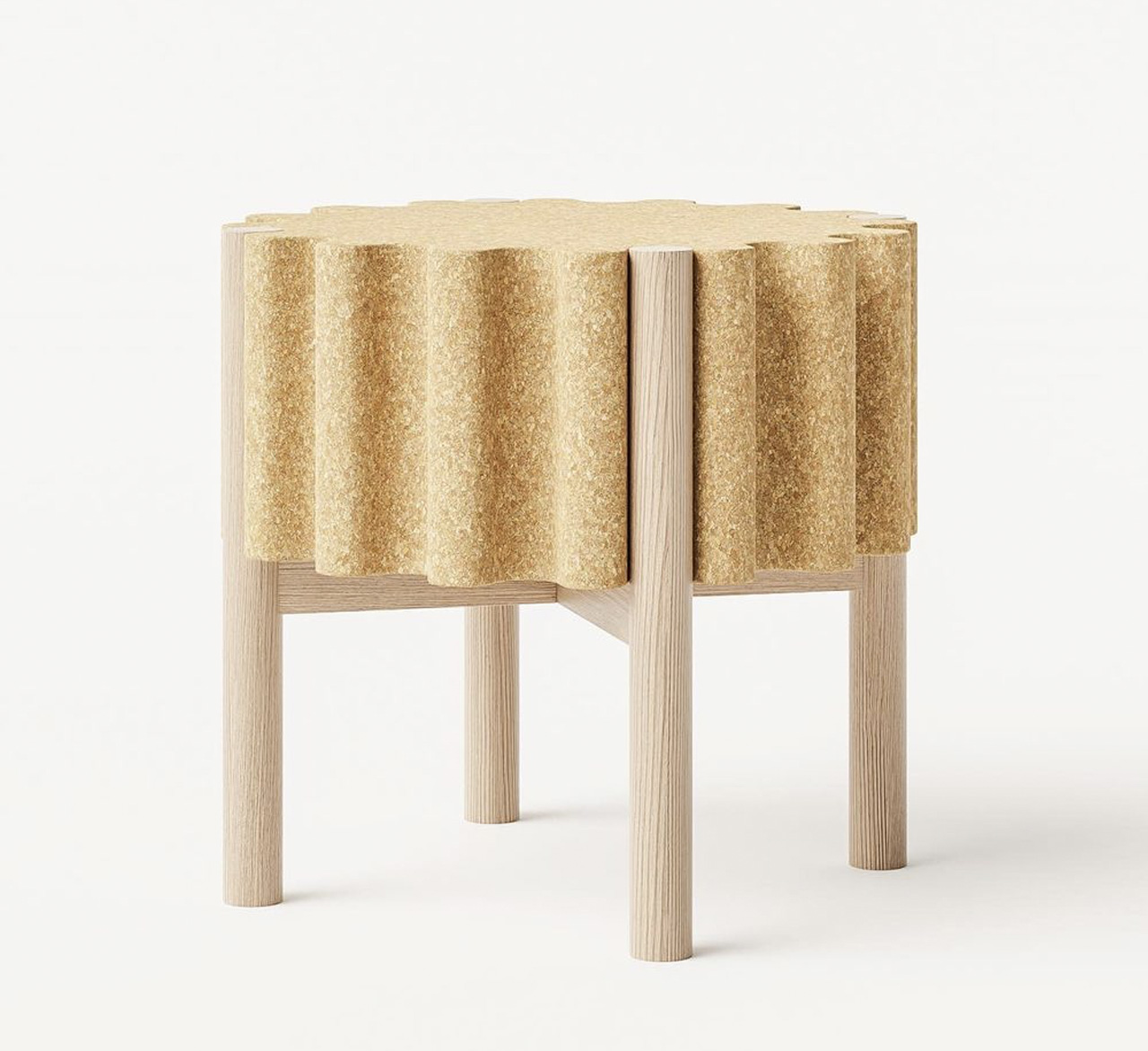
The Drum stool is minimal, elegant, stackable, and not to mention sustainable! At first glance, the Drum stool looks like a cute little wine cork to me. But when you dig deeper, you realize it has much more to offer than its adorable good looks.

Why is it noteworthy?

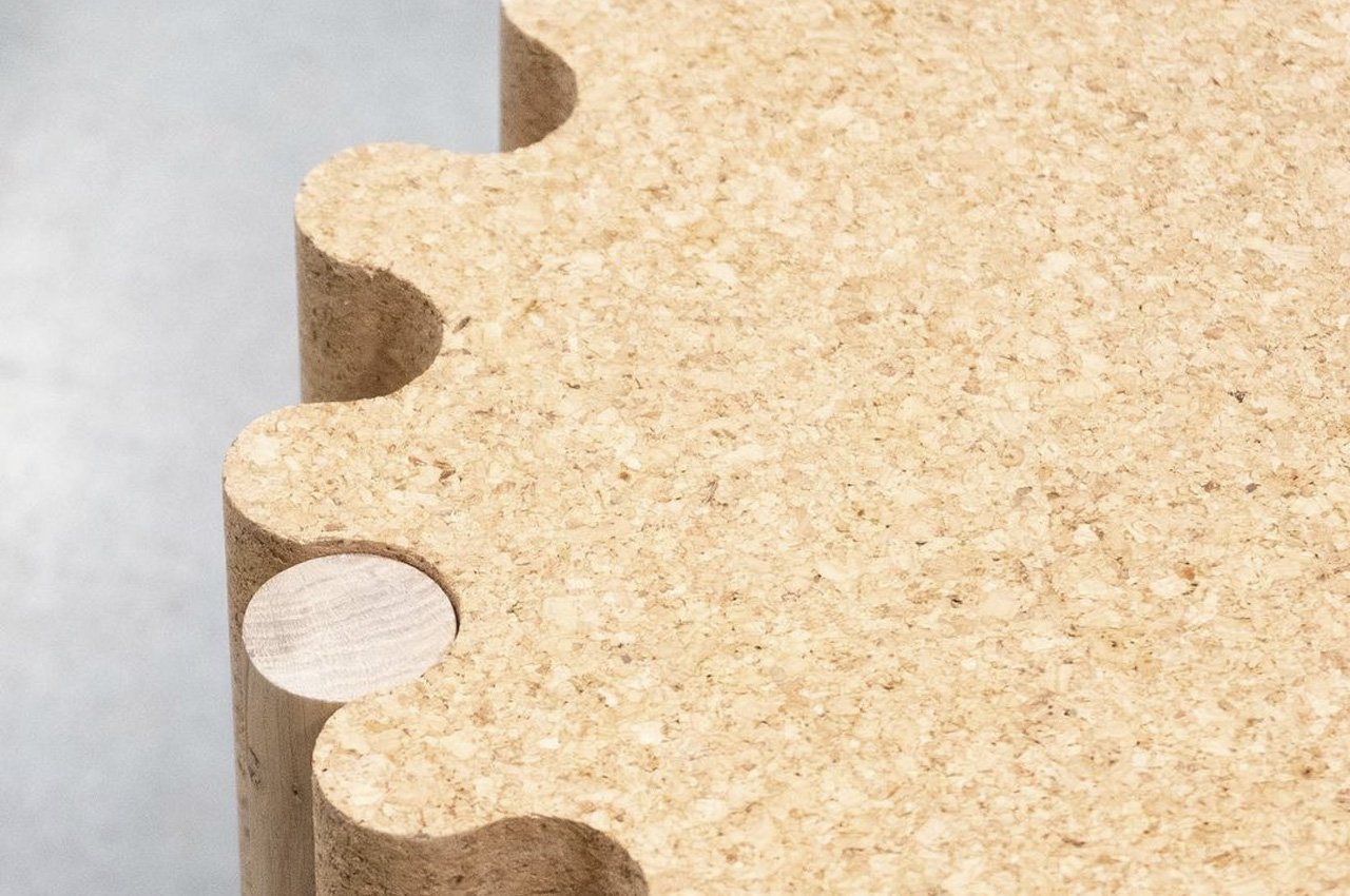
Teixeira picked materials such as cork and wood to build the stool, instantly rating it high on sustainability. Cork was used to create the seat, while wood was the material of choice for the legs.

What we like

The cork seat is comfortable and inviting and provides a grip while handling, so the stool is quite easy to move around and place in different positions

What we dislike

The wave pattern of the trimmed cork seat seems uncomfortable to sit on for long durations

2. Wormhole Coffee Table
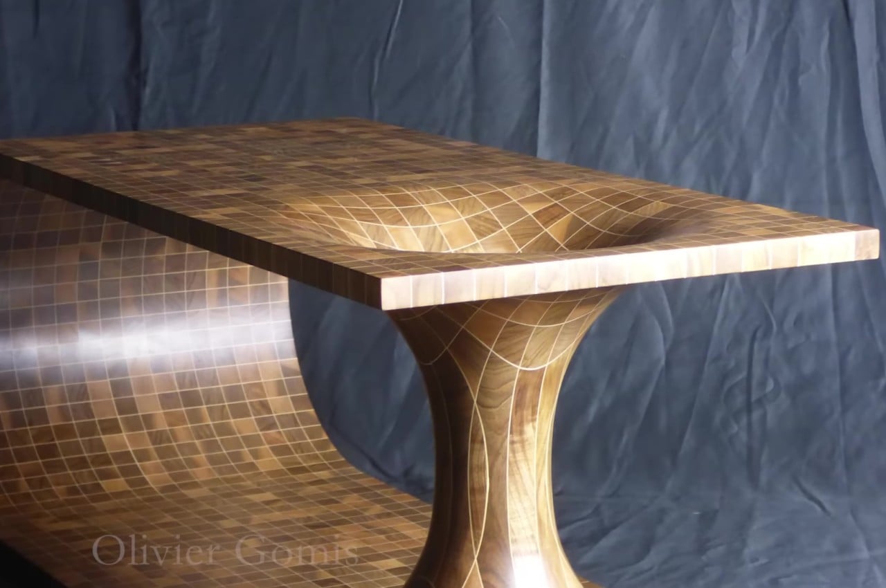
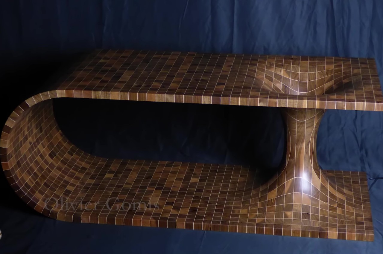
Wormholes can hypothetically connect two disparate points in spacetime via a tunnel. And they’re quite commonly found in science fiction! And this mind-blowing coffee table by Olivier Gomis attempts to convert the hypothetical wormhole into a physical manifestation.

Why is it noteworthy?

The shape of a table is already quite eye-catching on its own. It’s almost like a wooden plank that has been bent so that the two ends are on top of each other and then joined together by a double cone. These are then glued together with sheets of maple veneer in between, which give the appearance of those faint light lines that form the grid.

What we like

  • A lamp was installed in the center of the hole, giving the table an eerie appearance in the dark

What we dislike

  • The inward curving section provides a risk for products that could roll inside and get stuck like a marble or a coin

3. The Alada Desk
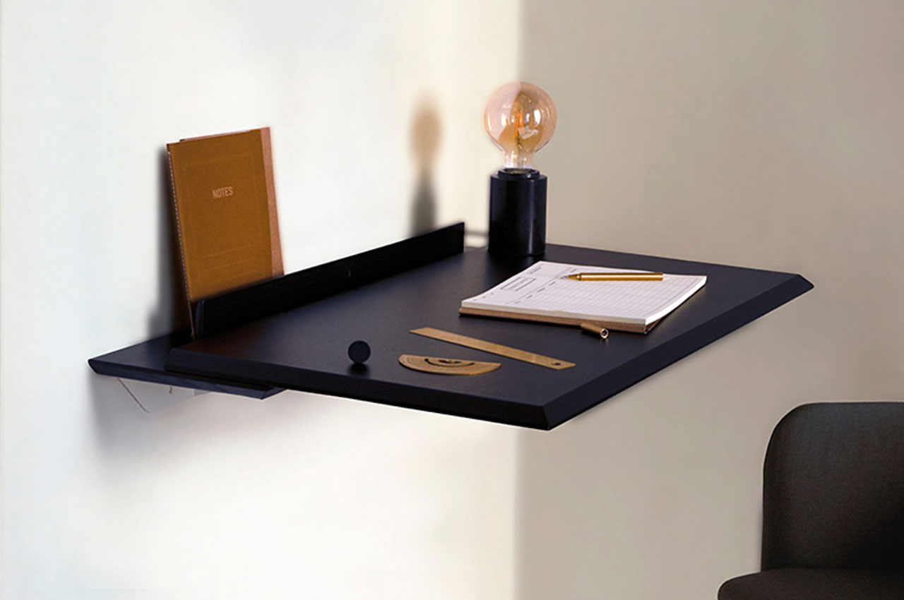
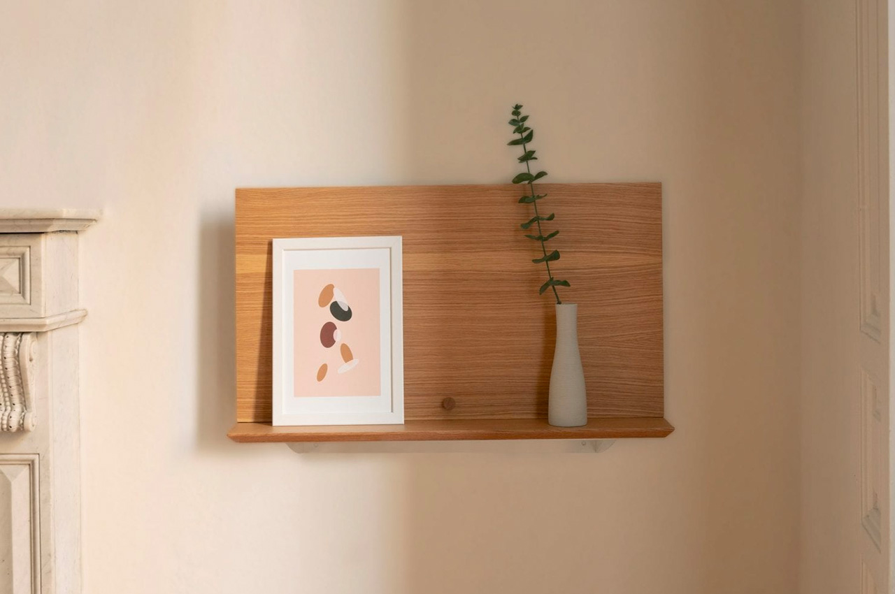
Designed by Daniel Garcia Sanchez for Woodendot, the Alada folding desk is a nifty space-saving desk that doubles up as a super cute decorative shelf. Within seconds you can transform the Alada desk into a display shelf that can hold your favorite souvenirs from picture frames to even potted little plants.

Why is it noteworthy?

Sanchez designed the Alada desk, as he witnessed an ever-growing need for smart and flexible desk designs for working at home. Since work from home is a pretty common norm nowadays, it’s important to have a transformative and space-saving workspace at home – one that can be neatly tucked away when your workday ends!

What we like

  • The multifunctional desk has also been equipped with hidden storage spaces when it is folded up, to provide neat hiding spots for your laptop and notebooks

What we dislike

  • Not suitable for people who need a larger and more elaborate working space

4. Kabinett
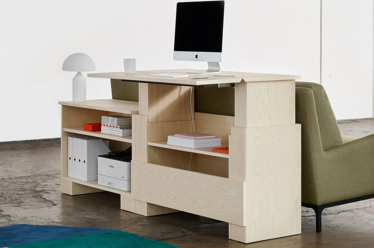
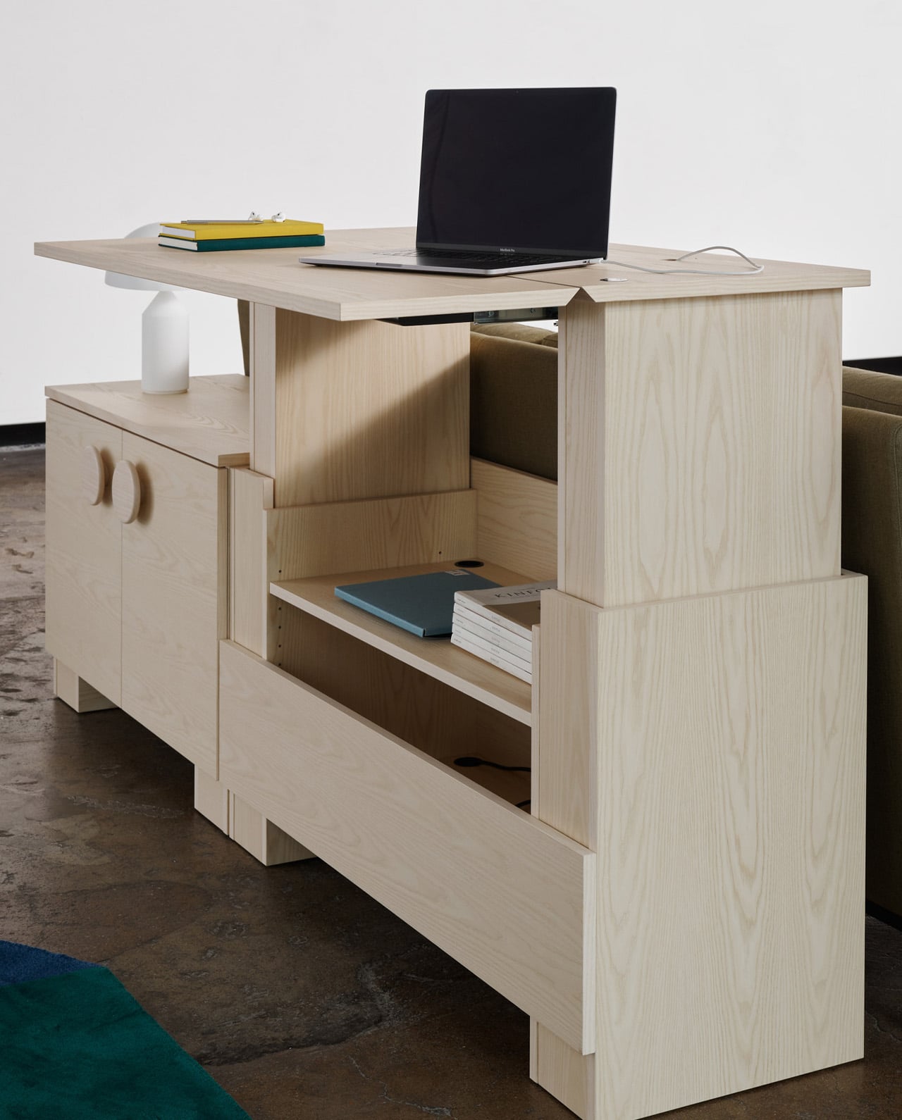
Conceptualized by Stockholm-based designer Alexander Lervik and manufactured by Finnish furniture manufacturer Adea, the Kabinett is a minimal and sturdy cabinet designed for modern home offices…that also doubles up as a work desk!

Why is it noteworthy?

Kabinett is a part of Adea’s Smartwork range, and it aims to function as an ergonomic set-up for home offices. While functioning as an efficient work table, Kabinett also serves as a rather stylish and elegant dresser.

What we like

  • Multifunctional + ergonomic design
  • Its minimal aesthetics are a plus point since this allows the furniture to seamlessly merge with all kinds of home offices

What we dislike

  • Bulky + space-consuming design, not ideal for small homes

5. The Fortune Chair
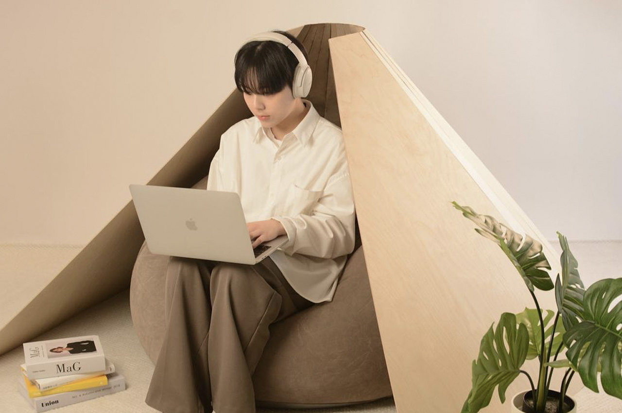
Designed by Hyeyoung Han and Hanyoung Lee, the Fortune Chair is really a mix between a bean bag, chair, and a pod, and it also happens to look like a fortune cookie.

Why is it noteworthy?

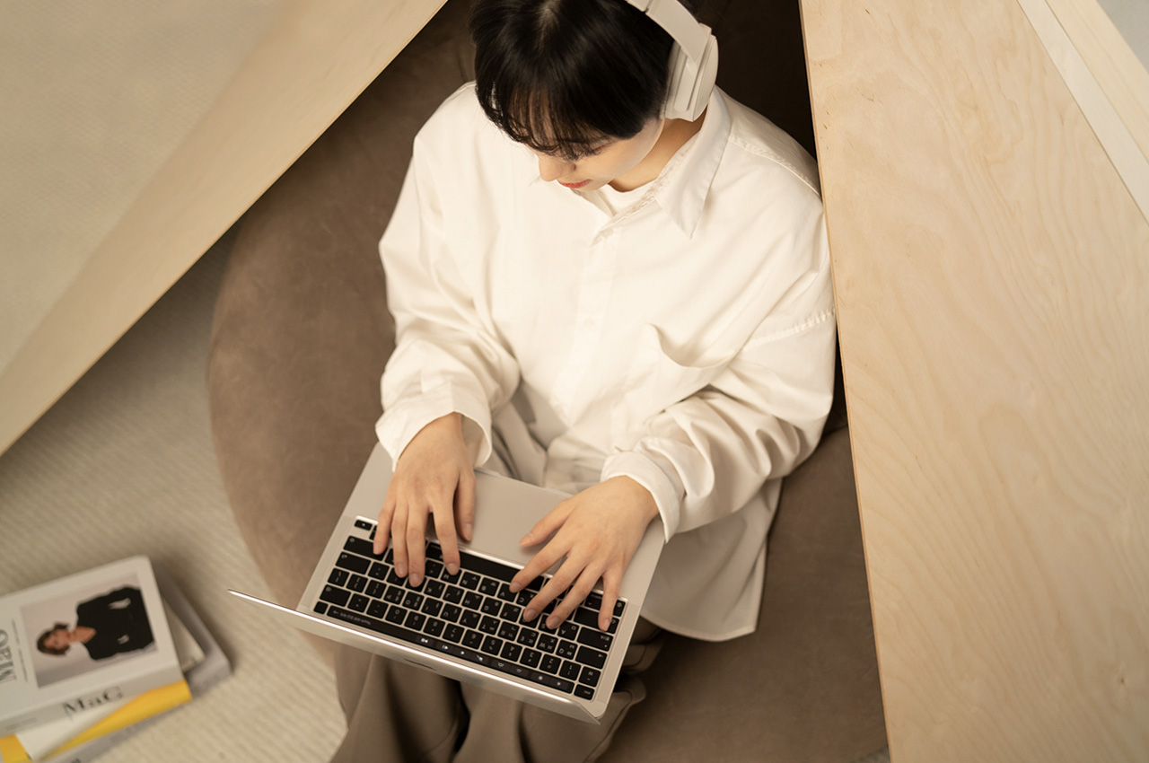
The chair includes a fortune cookie-inspired wooden outer wall, which functions as a covering frame that surrounds the user. This outer wall creates a cozy, comfortable, and private space for the user to sit in.

What we like

  • Irrespective if you’re working in a corporate office or at home, the Fortune Chair functions as a little oasis for you to work in peace, much like the office pods we find today in commercial offices

What we dislike

  • Given the inwards curving design, the chair may become uncomfortable as the user cannot change their position frequently

6. The Bündner Side Table
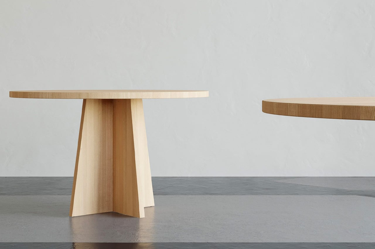
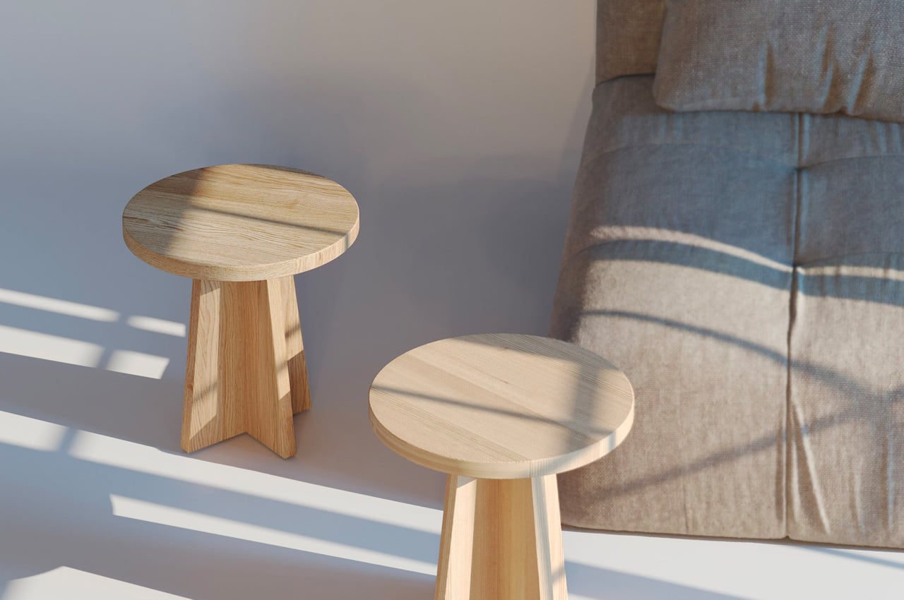
Designed by the Portuguese architecture and design studio Joana Vilaça Studio, the Bündner Side table is a solid wood table that is artfully inspired by the Swiss Alps lifestyle. It’s a rather interesting muse for a meager table, and not a very common one either.

Why is it noteworthy?

Joana drew inspiration from her own experience of living in Switzerland, where her studio is located. “Having lived for five years in the beautiful Graubünden canton of Switzerland, the collection is inspired by the art of living in the Swiss Alps,” she said.

What we like

  • The self-assembly design is ideal for residential or public interiors, where it can be utilized as a bedside, coffee, or side table

What we dislike

  • Would be great if there was a folding/space-saving version of it as well

7. Allieva
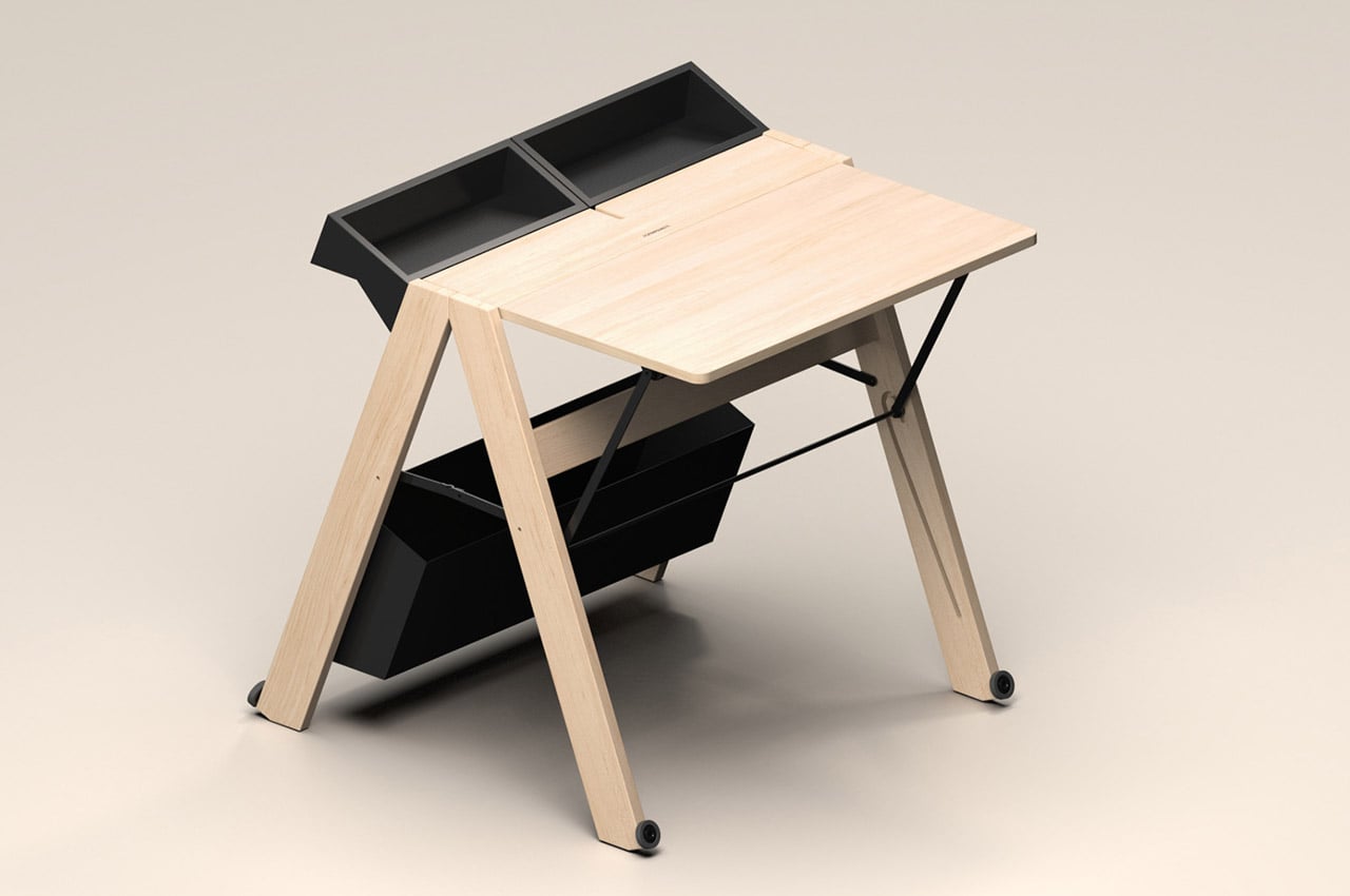
There’s always been a need for compact and functional workstations. But this necessity is further compounded by the growing trend of distance learning and working from home, especially after the pandemic. To address this problem, Whynot Design has introduced a unique and innovative solution called the Allieva. This foldable wooden workstation is designed for Foppapedretti, one of the most well-known Italian brands for baby products and wooden furniture since 1945.

Why is it noteworthy?

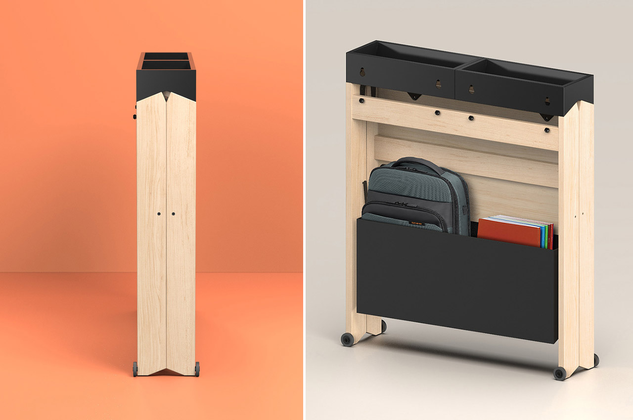
This sleek, foldable work desk is meant to fit in any space, making it perfect for small houses and dorm rooms. Despite compromising on size, Allieva is aesthetically pleasing. It takes up as little space as possible and measures only 7 inches deep when folded.

What we like

  • The workstation can be set up easily with a simple gesture
  • Comes with a large compartment at the base of the table that allows you to keep everything

What we dislike

  • The folding and unfolding mechanism could be considered tedious by users

8. The Spectrum Workstation Round ST160
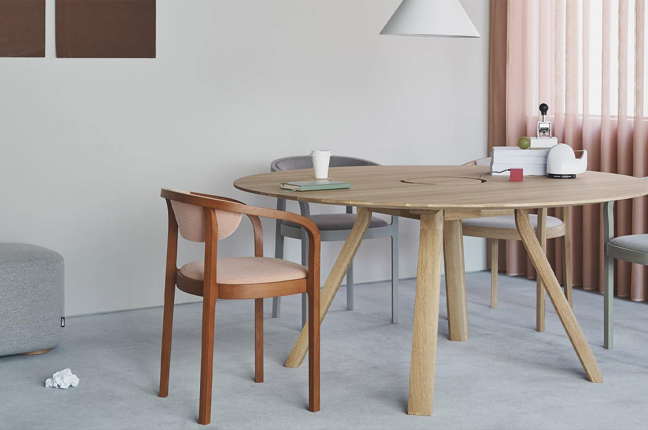
Studio Geckeler Michels designed the Spectrum Workstation Round ST160 for Karimoku New Standard. Karimoku New Standard is an offshoot of Karimoku. It was founded to easily combine the brand’s craftsmanship with design studios around the world. The studio designed the minimal workstation to bring a semblance of calm and tranquility to our hectic workspaces.

Why is it noteworthy?

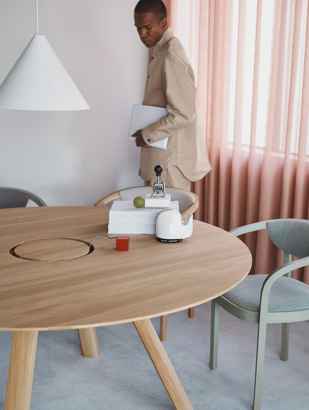
The station perfectly embodies Japanese craftsmanship and German design, in an attempt to merge stunning aesthetics with efficiency and functionality. It has been crafted from solid Japanese oak wood and is designed to support a flexible and dynamic style of working.

What we like

  • Works well for both home and corporate offices
  • The workstation can seat up to six people quite comfortably, so it’s also great to sit together and interact and collaborate

What we dislike

  • The circular shape brings a conference room table for collaborative work but takes away the privacy of a personal cabin

9. The Outside In
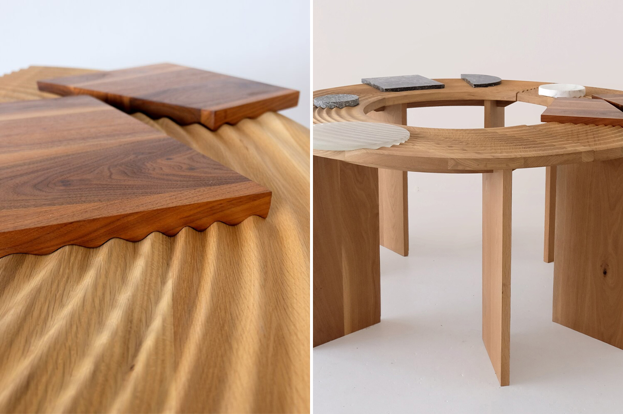
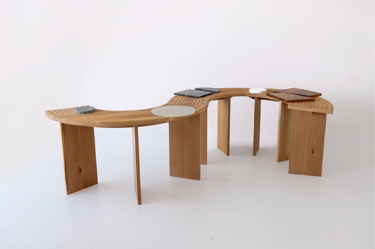
This multifunctional shape-shifting table is called the Outside In, and it integrates beautiful hand-carved grooves into its timber frames, which resemble the raked ruts of Japanese zen gardens.

Why is it noteworthy?

Japanese zen gardens have supplied ceaseless inspiration for designers. While the sheer meditative quality of zen gardens is enough to insight into some new ideas, the artful design of zen gardens rakes its own creative vision for designers. Melbourne-based furniture, lighting, and object design company Sabu Studio found its own creative vision by way of Japanese zen gardens when designing the minimalist Outside In table.

What we like

  • Features a sinuous timber surface that resembles the hand-raked grooves of a zen garden
  • Outside In is a crafty piece of furniture that would look right at home in hospitality common spaces or even event halls

What we dislike

  • Space-consuming & bulky design

10. Solar
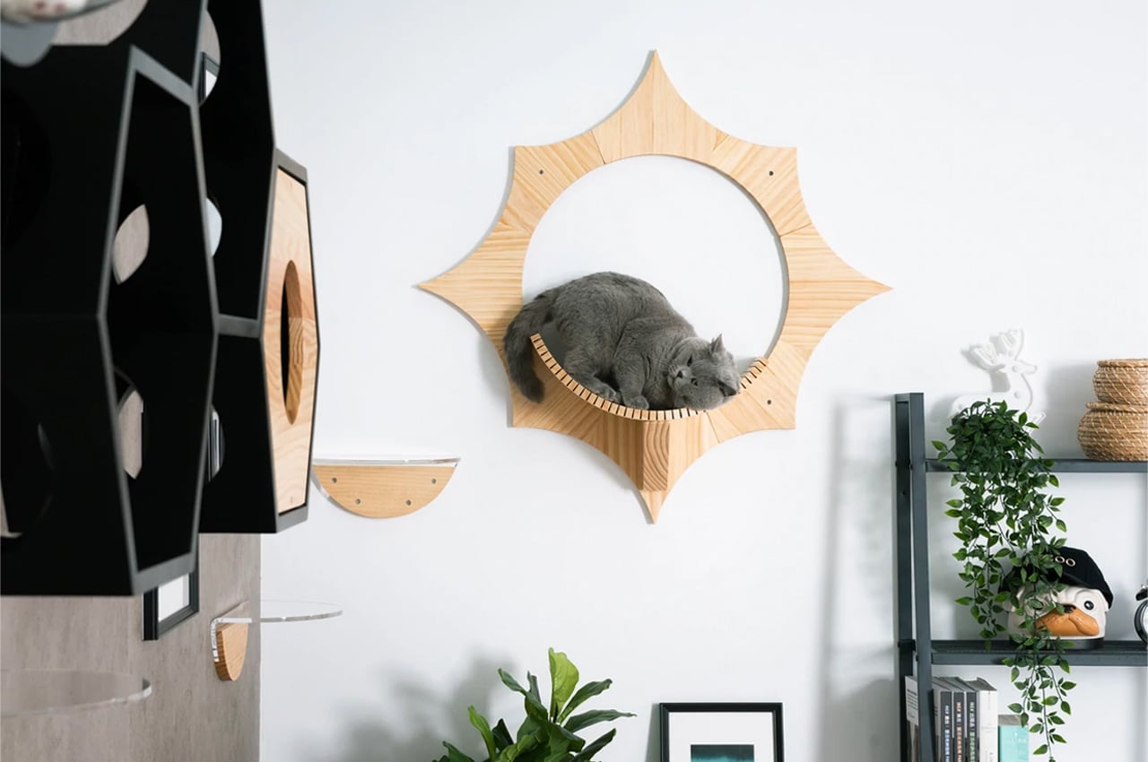
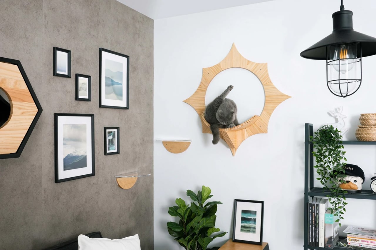
MyZoo, a cat goods company, designs modern cat furniture that caters to your cat’s every need, while not disrupting your interior design. Solar, one of their more recent designs, is a wall-mountable floating cat bed that mounts onto any vertical surface so cats rest midair in their own designated space.

Why is it noteworthy?

Shaped like the sun, Solar is a small, but sturdy floating cat bed that’s built from pinewood. In a similar fashion to their other pieces of cat furniture, MyZoo lined Solar with a slotted resting platform for safe jumping. Ideal for small spaces, Solar provides a resting spot and jumping platform for your cat and saves space in the meantime.

What we like

  • Solar doesn’t take up any ground space and easily mounts to any wall where there’s room
  • Easy to assemble

What we dislike

  • There’s no cushioning on the bed which would make it easier for the cat to lounge on

The post Top 10 minimal furniture designs to add a bit of peace and calm to your home first appeared on Yanko Design.
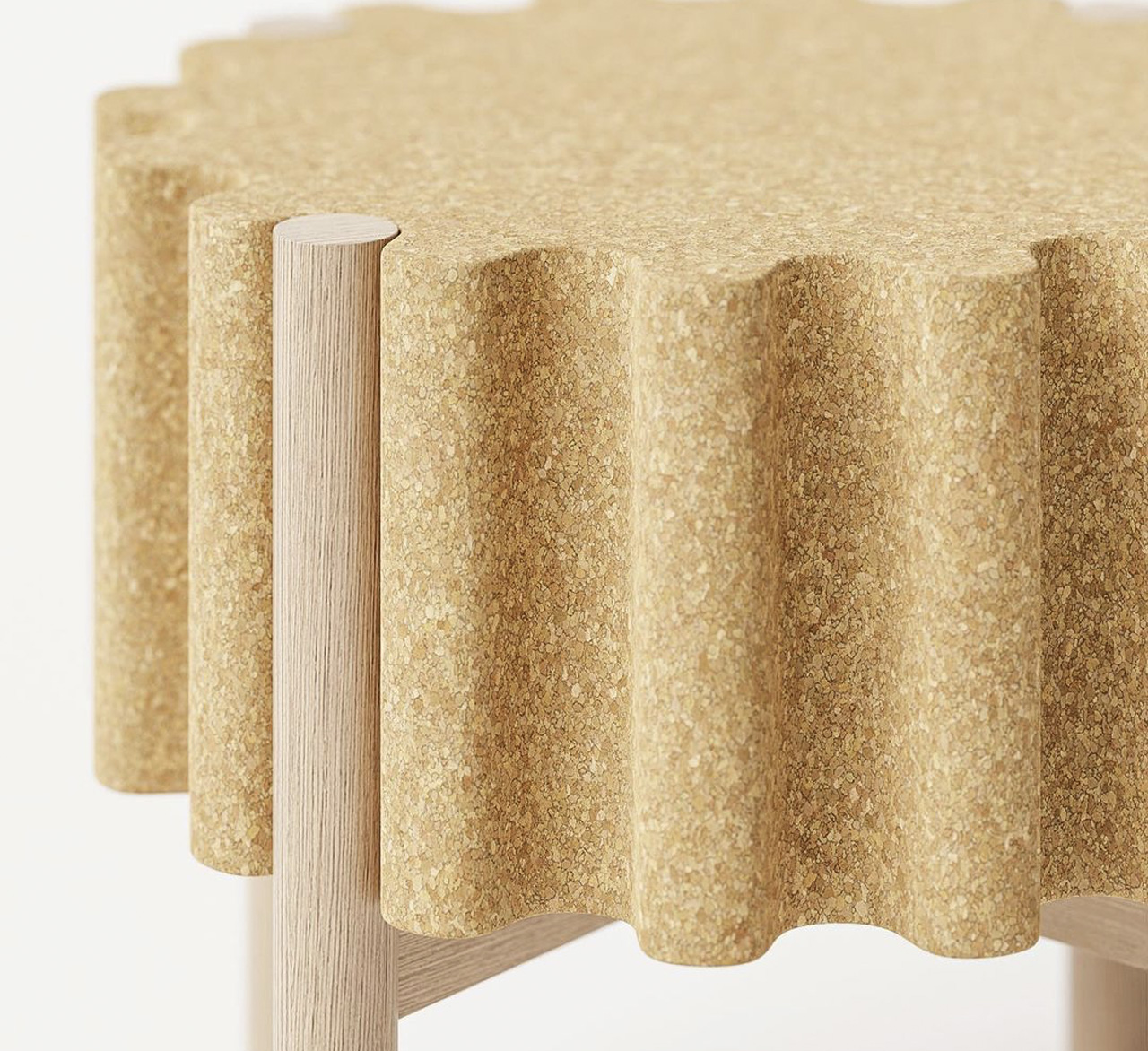
Minimal stackable stool features slim wooden legs that fit perfectly into grooves of the cork seat

I’m at a point in my life where I’m team stools over chairs, and I truly believe stools deserve to be given way more credit than they get. Stools are often overlooked, maybe because they occupy minimum space, and aren’t really overbearing. But these traits are what make stools so great in my opinion! I mean, they’re compact, and a great space-saving furniture option for our modern homes. They are also super portable. And, a stool design I recently came across, and would love to get my hands on is the Drum stool by Teixeira Design Studio.

Designer: Teixeira Design Studio

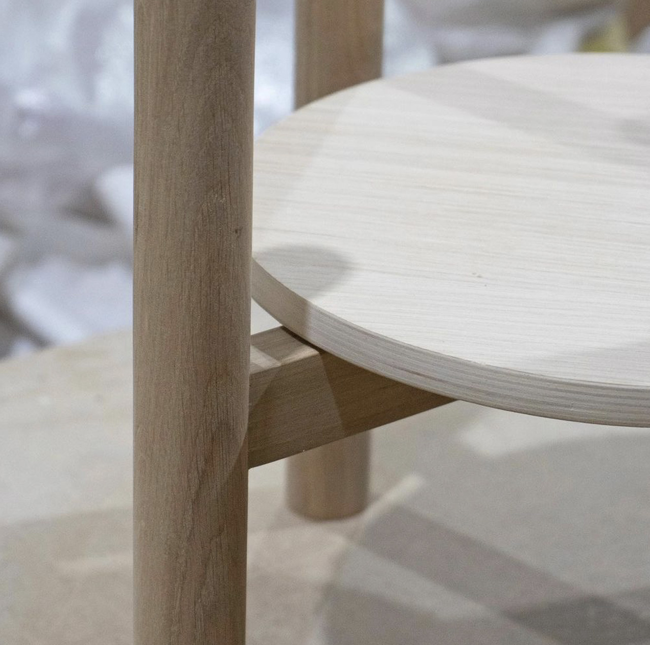
I’ve seen a lot of stool designs, and let’s be honest some of them do tend to get predictable. But the Drum stool is anything but predictable. The Drum stool is minimal, elegant, stackable, and not to mention sustainable! At first glance, the Drum stool looks like a cute little wine cork to me. But when you dig deeper, you realize it has much more to offer than its adorable good looks. Teixeira picked materials such as cork and wood to build the stool, instantly rating it high on sustainability. Cork was used to create the seat, while wood was the material of choice for the legs.

The cork seat features round trimmed surfaces, giving it a rather fun and playful shape. The trimmed seat is further supported by slim wooden legs that effortlessly blend with the seat, creating a furniture piece with a cohesive and harmonious personality. I love how the sleek legs deftly slide into the grooves on the cork seat! The cork seat is comfortable and inviting and provides a grip while handling, so the stool is quite easy to move around and place in different positions. As mentioned earlier, the Drum stool is stackable, which means you can stack up multiple drum stools one on top of the other, making them super easy to store away when not in use.

The Drum stool’s aesthetics are quite warm and minimal, allowing it to perfectly merge with the interiors of different living spaces. It’s the kind of versatile furniture piece that you can slyly slide into your living room, bedroom, or even your home office – it just fits right everywhere!

The post Minimal stackable stool features slim wooden legs that fit perfectly into grooves of the cork seat first appeared on Yanko Design.

This rustic + flexible stool is made using the leftover grain from beer

I’m at a point in my life where I’m team stools over chairs, and I truly believe stools deserve to be given way more credit than they get. Stools are often overlooked, maybe because they occupy minimum space, and aren’t really overbearing. But these traits are what make stools so great in my opinion! I mean, they’re compact, and a great space-saving furniture option for our modern homes. They are also super portable. And one such innovative stool design I recently came across is the Mask Stool by Mater.

Designer: Mater

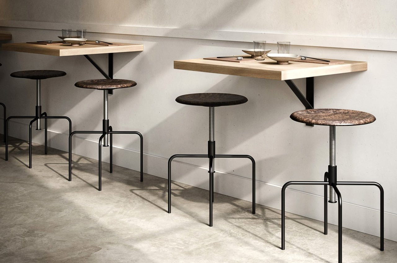
Design brand Mater designed the ‘Mask Stool’. Now, what makes the Mask stool so unique or special? It’s the fact, that it has been built using the spent grain from brewery Carlsberg’s beer production, at the Danish film festival 3 Days of Design. The stool was displayed as a part of the brand’s Circular Design Exhibition at the hotel Villa Copenhagen in Copenhagen. It was designed by Danish architect Eva Harlou.

The Mask Stool is built using a sustainable design technology that was developed by Mater. Mater developed this technology alongside the Danish Technological Institute and the University of Copenhagen. The technology merges and mixes fiber-based materials with plastic waste. The spent grain leftover from Carlsberg’s beer production process is called ‘mask’ in Danish. This leftover material was used to create the stool. The wet fiber-based material left behind from the production process is dried up and then merged with a granulate of plastic waste, to produce a mixture that can be molded and transformed into furniture.

“It’s not only challenging, but it’s also very interesting because now we know how to do this. Now we can use not only the spent grain but also coffee beans and wood chips. This production method is unlimited. We can scale it up and do collaborations with all kinds of different industries to take their waste and turn it into great design,” said Eva Harlou. Discovering and developing this material took a lot of trial and error, and time on the part of the designers. Once they achieved this new material and got it right, it opened up the portal to discover a whole bunch of new materials.

The post This rustic + flexible stool is made using the leftover grain from beer first appeared on Yanko Design.

Minimalist stool made from recycled aluminum boasts a carbon footprint lower than the European average

A lot of people have become more conscious about how the things that they consume are produced. A lot of brands and products have also jumped onto this bandwagon or hopefully, new lifestyle. Some of these are just cashing in on an eco-conscious society while some are pretty serious about really creating things that can be sustainable and at the same time, not giving up on the aesthetics and even adding affordability as a consideration. Furniture brand JOY Objects is one of those and their latest piece brings together “progressive design, small-scale production, and reasonable prices”.

Designer: Fredrik Paulsen

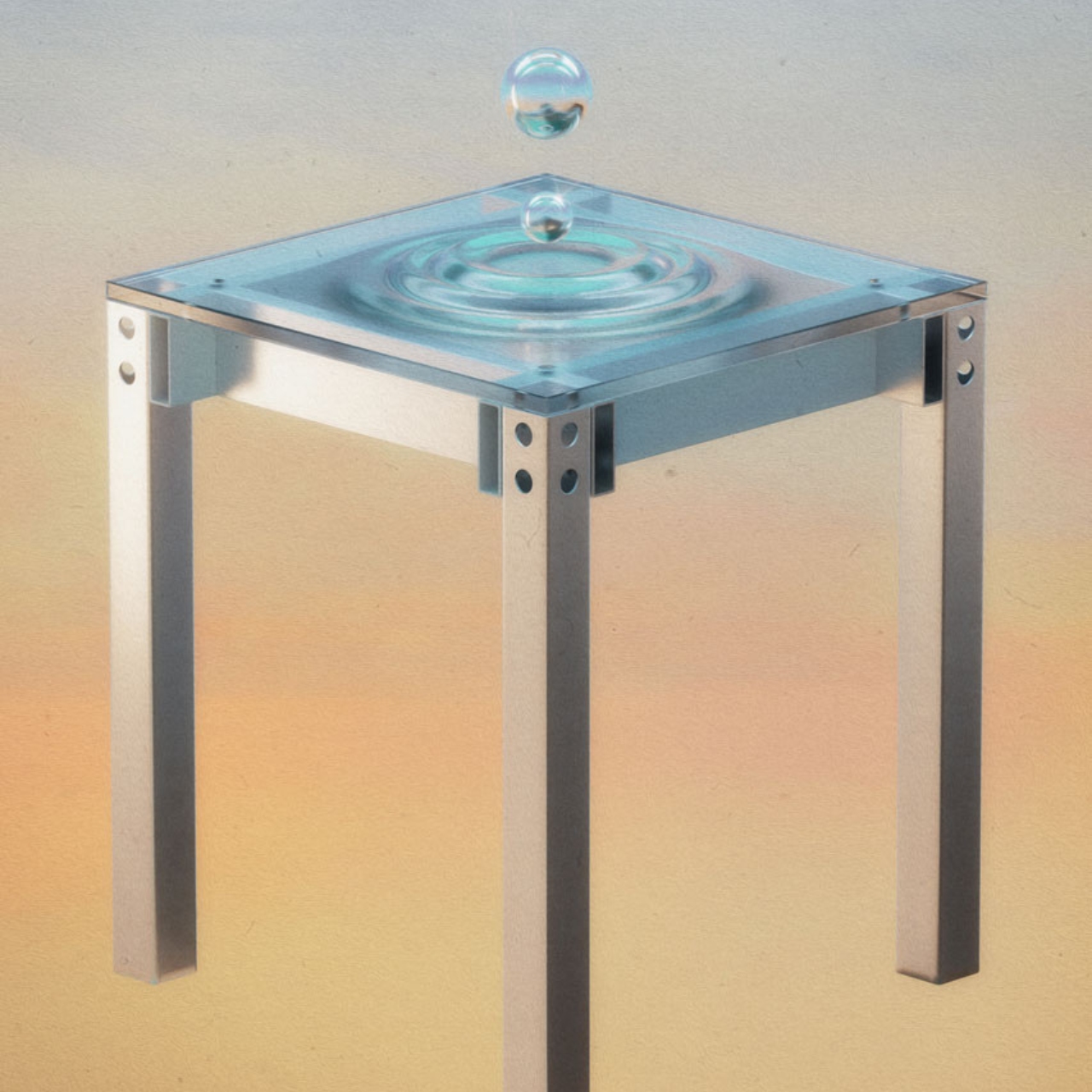
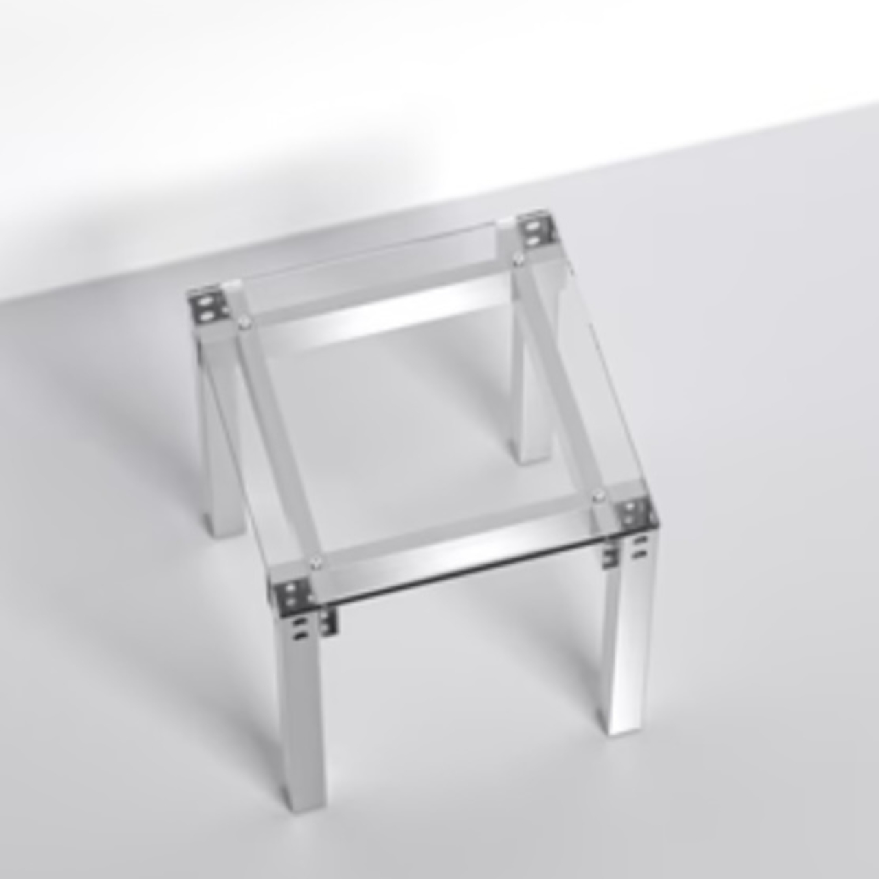
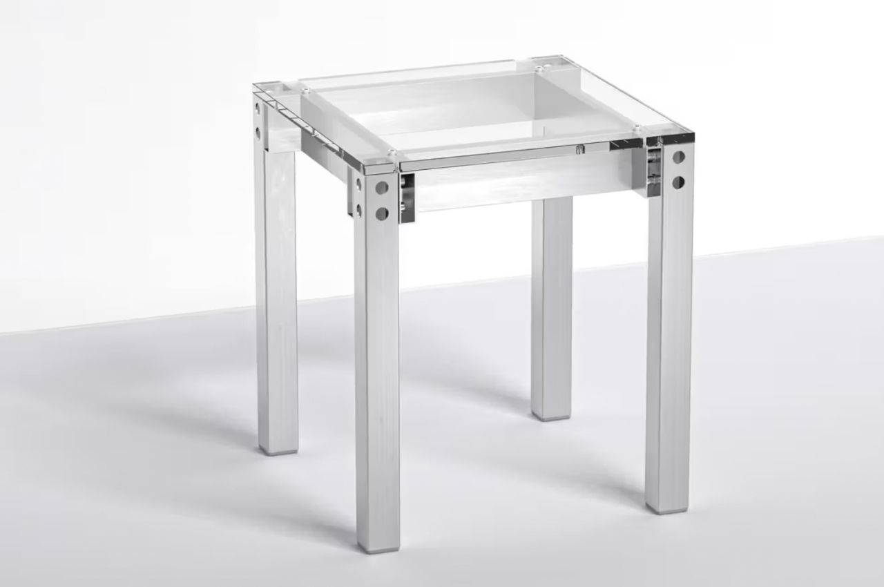
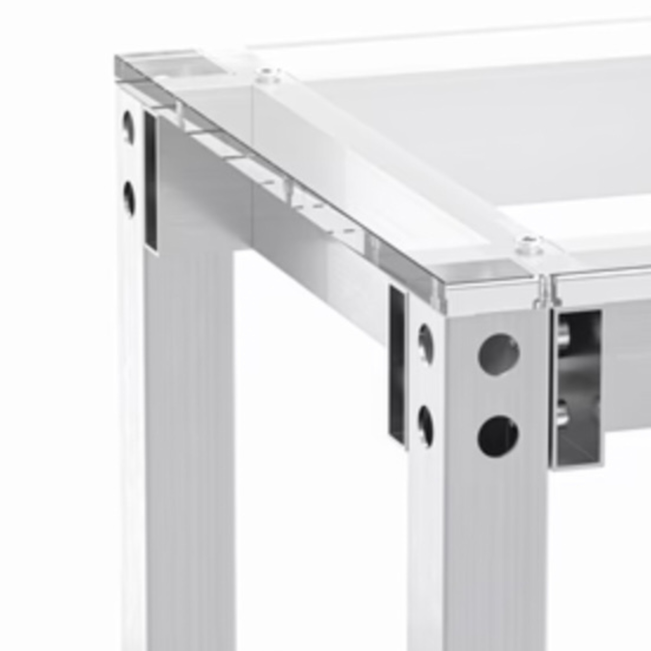
The JOY Stool One can be a side table, a chair, or whatever you need it to be. But what makes this minimalist piece of furniture stand out, so to speak, is that it is produced from recycled aluminum and can actually claim that it is produced with a lower carbon footprint. It is actually the first piece of furniture that is based on Hydro Extrusion’s Swedish EPD or Environment Product Declaration. Its carbon footprint is 3.58 kilo CO2 eq. per kilogram of aluminum produced. In case those numbers don’t mean anything to you, it is actually lower compared to the European average in the industry.

In terms of the design, it maintains the minimalist aesthetic we’ve come to expect from Swedish designers but also brings a bit of playfulness to its look. The Hydro Restore Innovate aluminum and recycled acrylic brings it a shiny but at the same time, peaceful and Zen vibe. Its simple square and transparent look means you can use it as a side table for your drinks or books. Whatever you place on it seems to become a bit cooler and instagrammable.

But of course, as stated in its name, it can also be used as a stool. It may look delicate but the aluminum should be sturdy enough to hold a human. I don’t know how comfortable you’ll be on it but at least you would also look picturesque. And the important thing about the JOY Stool One is that the makers mean it when they say they it is sustainable, from the materials to the manufacturing to the packaging. The price may be a bit steeper than other stools but it should be worth it.

The post Minimalist stool made from recycled aluminum boasts a carbon footprint lower than the European average first appeared on Yanko Design.
This rustic horse-riding saddle-inspired stool promotes great posture and strengthens your core

Stools are probably the most overlooked type of furniture there is. You will almost always find them, forgotten and barely used, in some corner of our homes. When truth be told, they’re much more functional and ergonomic than they are given credit for! They’re compact, and a great space-saving furniture option for our modern homes. They are also super portable! And designers are really unleashing their creativity when it comes to stools. And one such innovative, quirky, yet ergonomic stool design I recently came across is the ‘Pepe’ stool.

Designer: Raffaella Mangiarotti for Opinion Ciatti

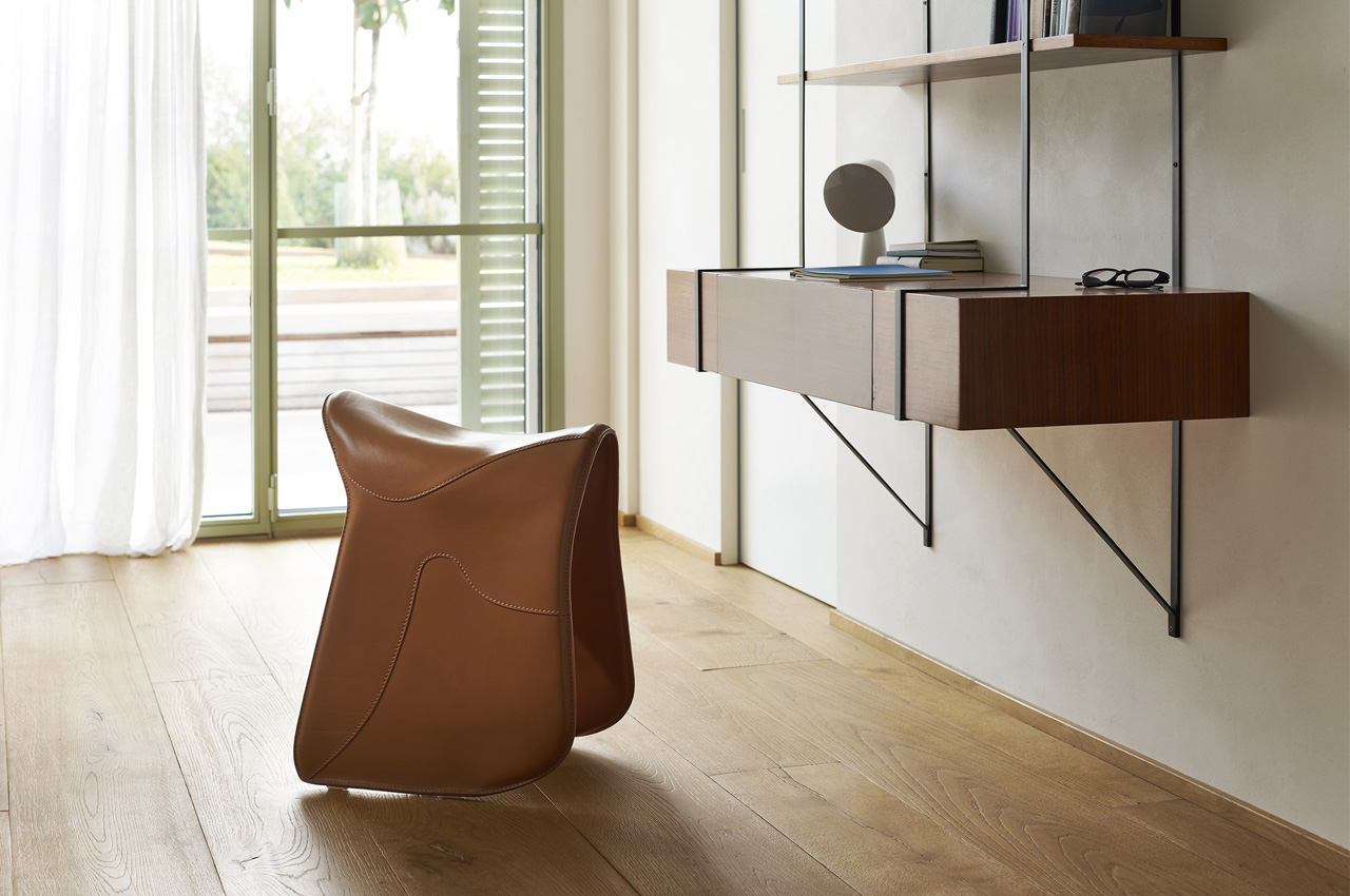
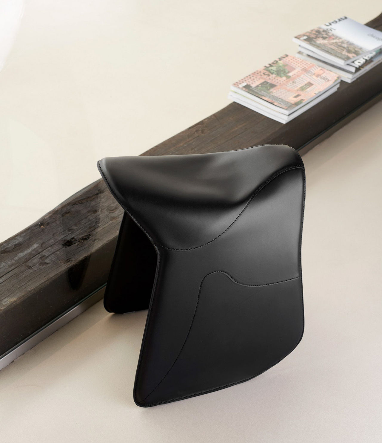
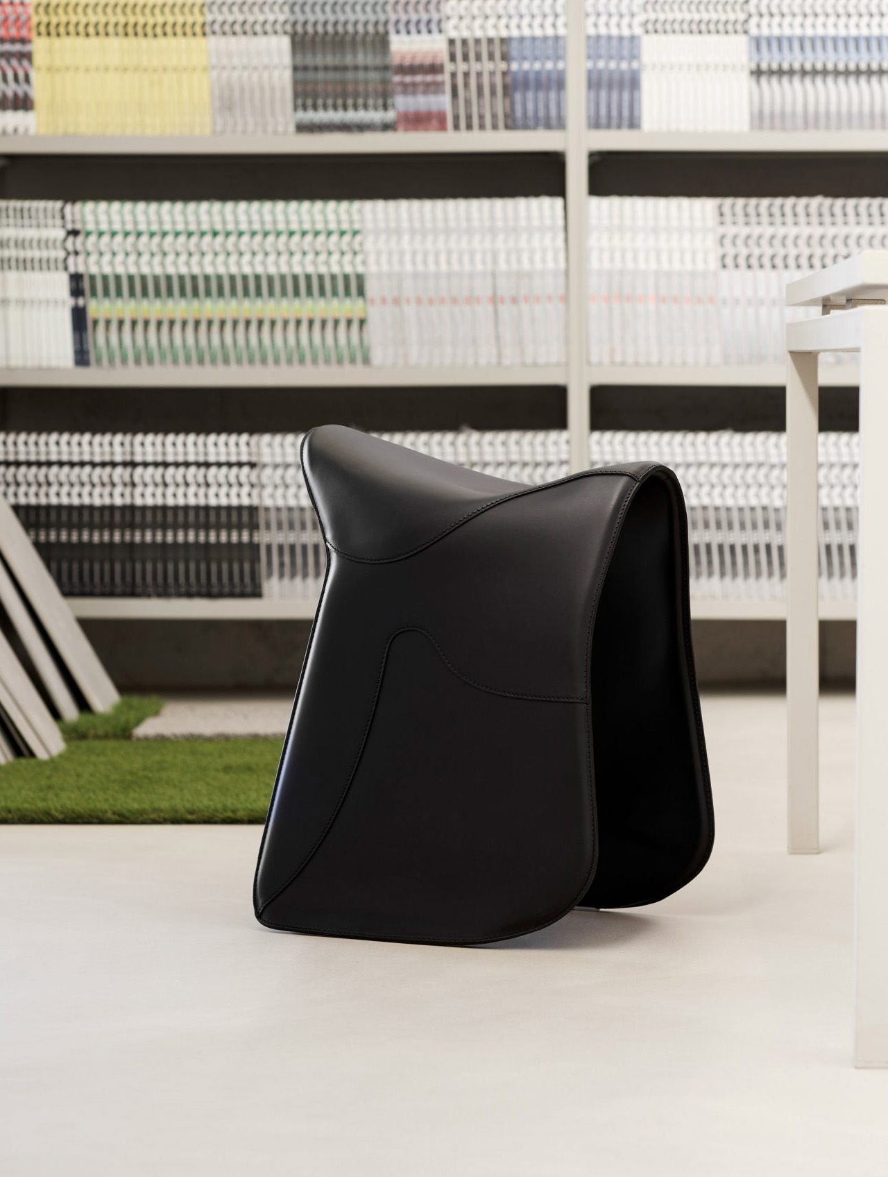
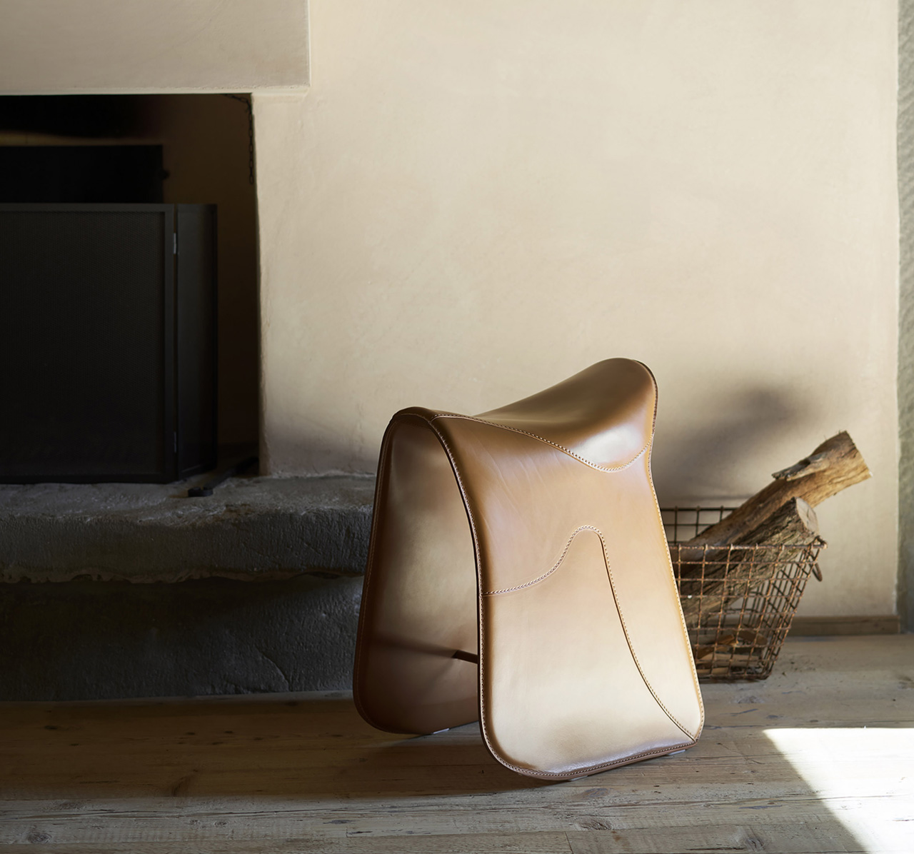
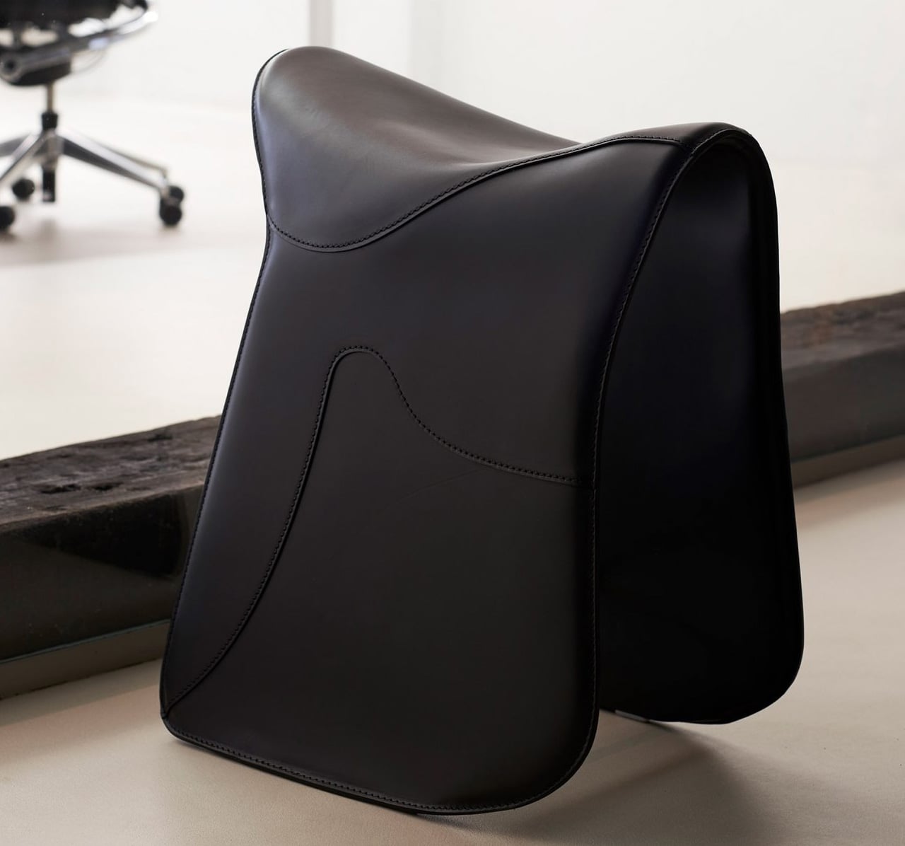
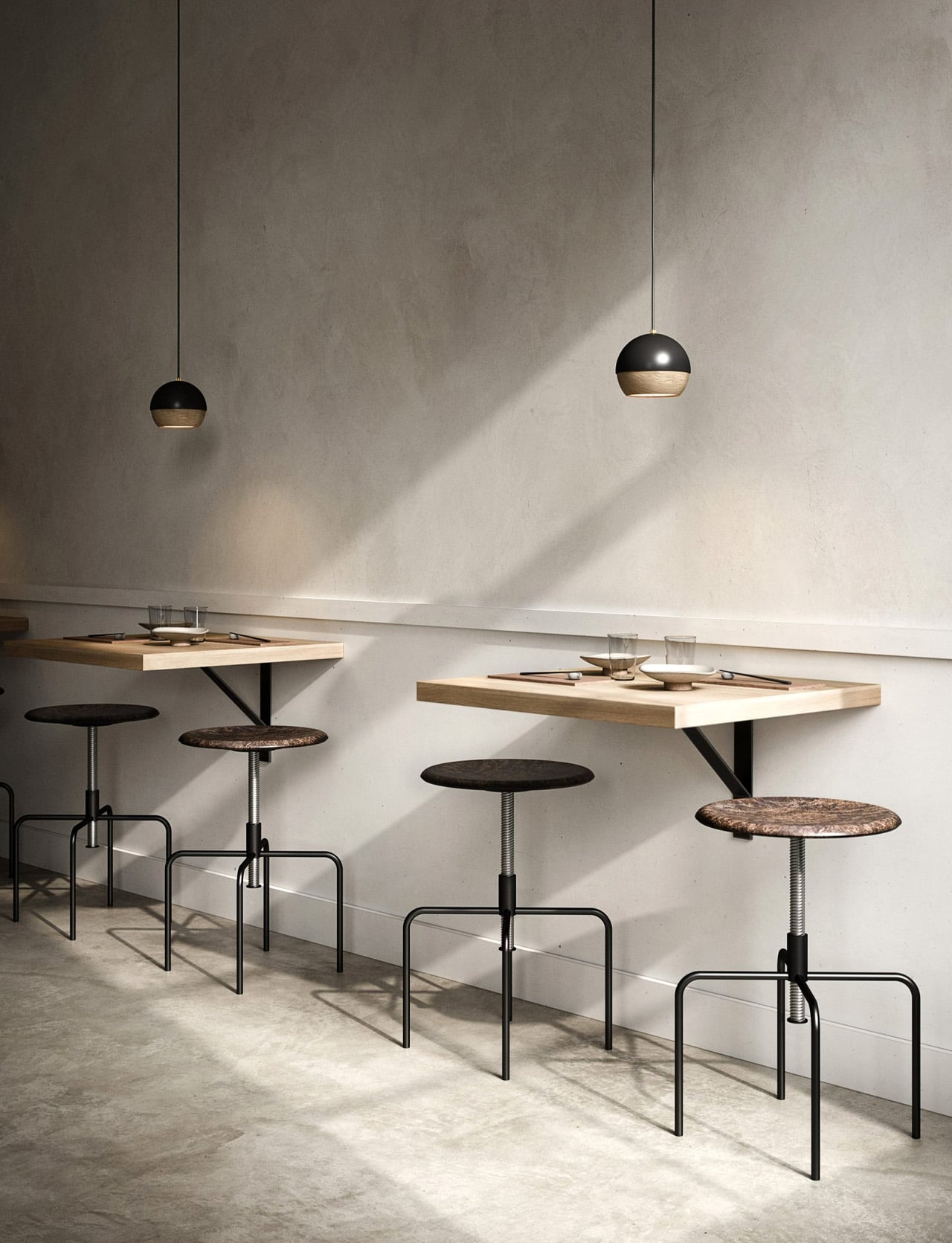
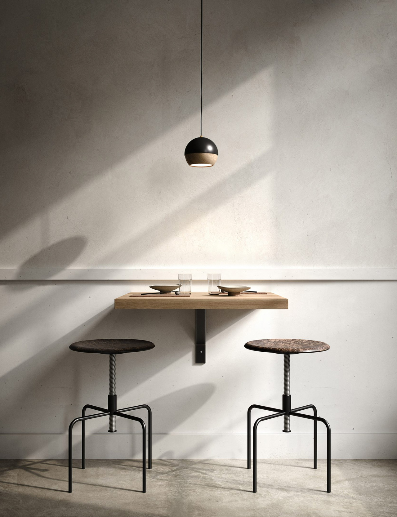
Designed by Raffaella Mangiarotti, the Pepe Stool is deeply inspired by a ‘horse-riding saddle’! Raffaella drew inferences from the saddle, especially its aesthetics and ergonomics to create the sturdy-looking Pepe Stool. He designed the stool for the Italian brand Opinion Ciatti. The Pepe stool is a rather playful and amusing twist on saddle stools. Saddle stools are popular for promoting good posture, and for helping users strengthen their core since they feature no back support, and enable you to tilt your pelvis forward.

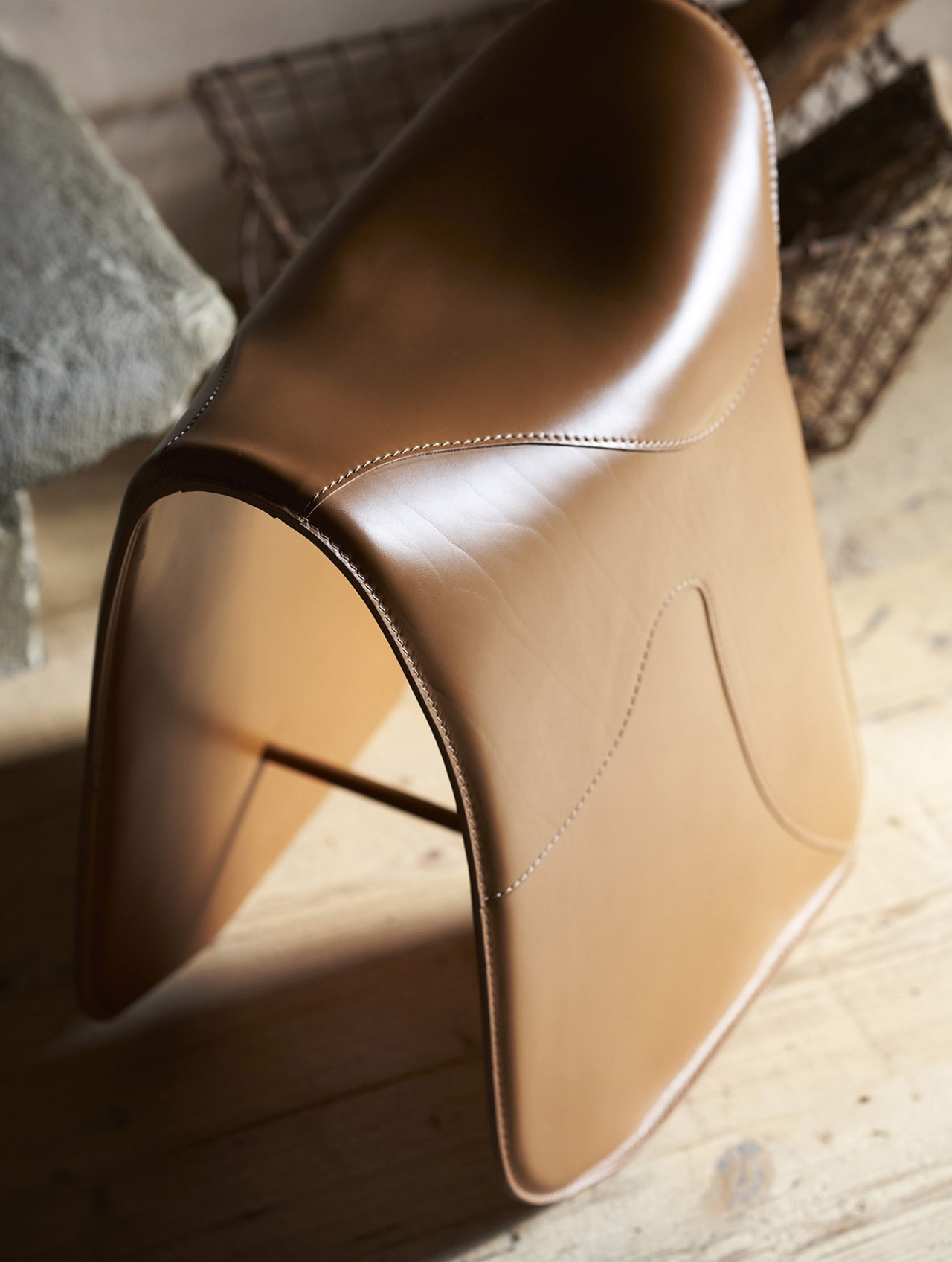
“Pepe is boundless expanses and infinite horizons. Pepe is the Argentine Pampas, a scent carried by the wind, an airy sky,” said Opinion Ciatti. Usually, saddle stools draw inspiration from bike seats, and mimic them quite accurately, however for the Pepe stool, Raffaella instead drew inspiration and incorporated references from the Wild West. The Pepe stool features hand-stitched leather upholstery that is tautly stretched over a curved and sturdy sled base. The result is a rustic and strong-looking stool that instantly brings to mind the image of a horse-riding saddle!

Pepe Stool has a bold and attention-grabbing personality, one that allows it to function as a stand-alone furniture piece, however, you can also pair it up with a desk, creating a workspace that is great for your posture! Pepe’s sculptural aesthetic makes it perfectly suited for both homes and workplaces, however, I do feel it would seem a little out of place in a corporate work environment. Pepe is available in options of black and natural leather. The leather is tanned using aniline dyes, allowing it to retain its impressive tactility.

The post This rustic horse-riding saddle-inspired stool promotes great posture and strengthens your core first appeared on Yanko Design.
Foldable stool and desk concept is a low-cost solution to school furniture problems

While most people recognize education as a basic human right, the painful truth is that, just like many other rights, it isn’t universally available everywhere. There is always a resource problem, from books to teachers to even rooms to hold classes in. While that last one might sound superficial compared to the lack of books, a good and comfortable environment can go a long way in improving children’s reception to lessons. In some cases, a permanent classroom isn’t even an option, so makeshift rooms are the only recourse. Of course, that still requires proper desks and chairs for use, but you don’t have to go overboard with these. While cheap plastic furniture sounds like the easiest solution, this design concept shows an alternative that isn’t only more sustainable but also more flexible when it comes to storage and portability as well.

Designer: Claudio Larcher

In areas with no fixed rooms designated as classrooms, being able to move around or clear out desks and chairs is just as important as having school furniture at all. Typical tables and chairs are single solid pieces that are difficult to move around, not to mention keeping them in storage. A good portion of time is wasted in setting and cleaning up such rooms, presuming they even have rooms or furniture. Even simple school furniture can be expensive, and cheap plastic options have hidden costs that actually make them more expensive in the long run.

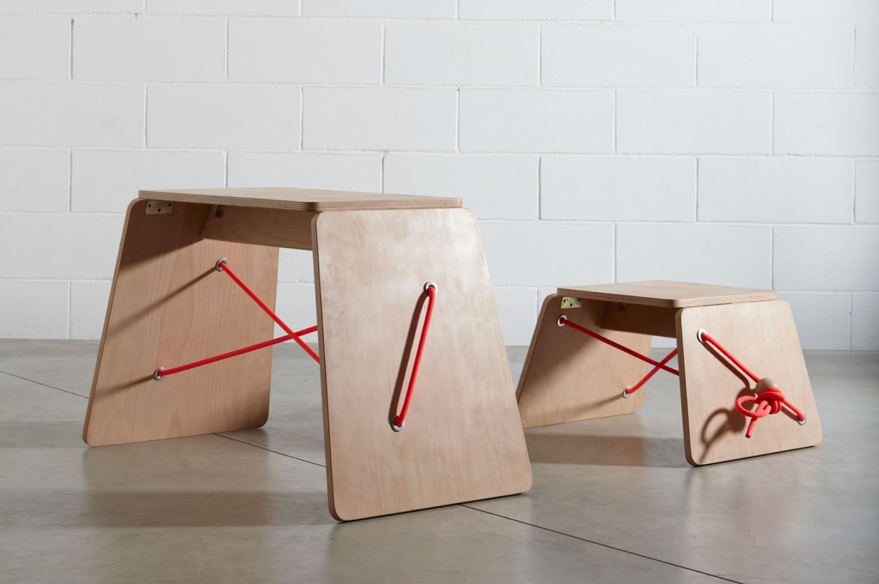
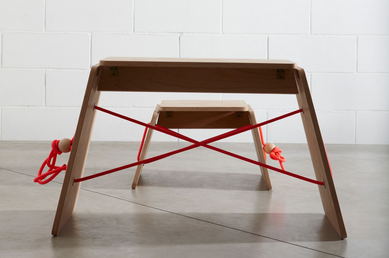
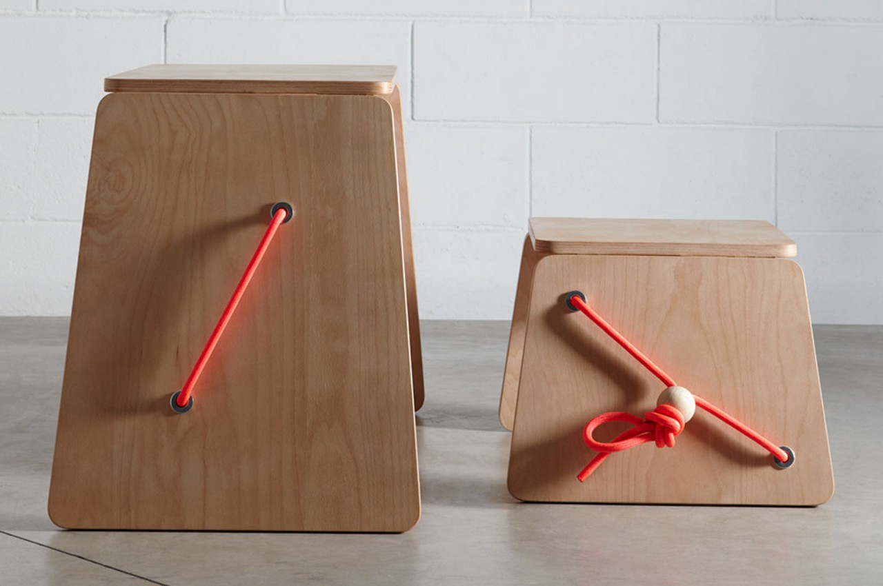
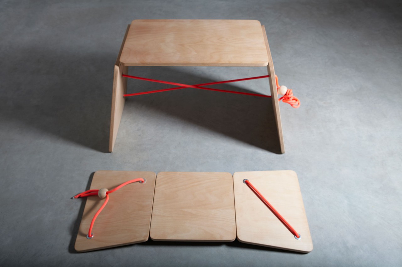
Paco y Paco is a design concept that tries to check all the right boxes for a low-cost school furniture solution that is also sustainable and, to some extent, fun. Both the desk and the stool share the same basic shape of wooden planks connected in a row. The basic idea is for these to fold into trapezoidal form, with the two sides serving as legs while the middle one is the actual tabletop or seat. When no longer in use, they can lay flat for easier carrying and storage until their next use.

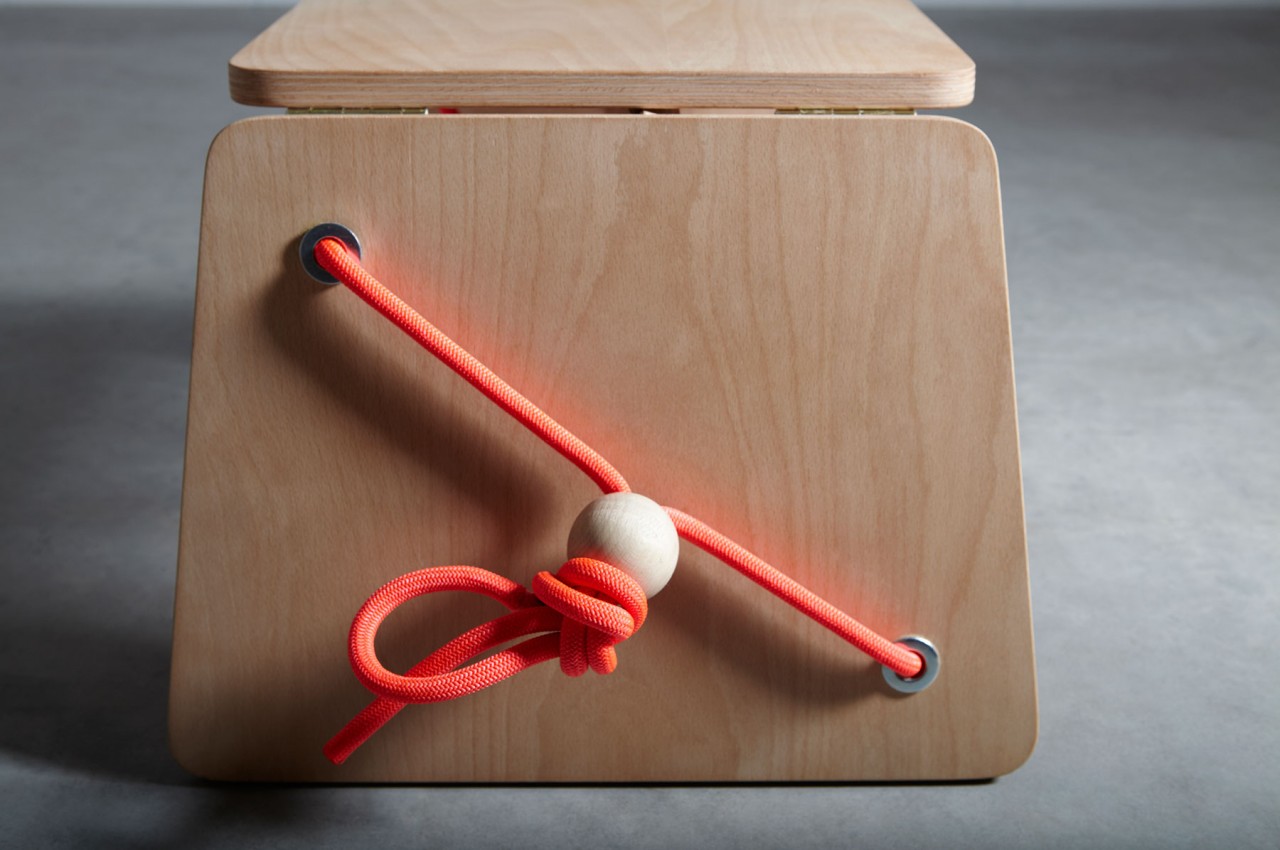
The design of the furniture is also quite interesting in how it uses ropes as the primary mechanism to fold or collapse the two. Many people, kids included, will be familiar with such cords used to loosen or tighten bags. A wooden ball acts as the stopper to keep the knot from slipping, while metal grommets keep the rope from fraying. With perhaps the exception of the rope, the entire desk and chair could be made from 100% sustainable materials that can be easily made or procured anywhere.

It’s probably arguable whether such a furniture design is going to be comfortable, but for schools or villages with meager budgets, it’s definitely better than nothing. Perhaps a bigger question is the stability of the design, especially the chair, given how a rope is probably the only thing that will keep it from collapsing beneath a child’s weight.

The post Foldable stool and desk concept is a low-cost solution to school furniture problems first appeared on Yanko Design.

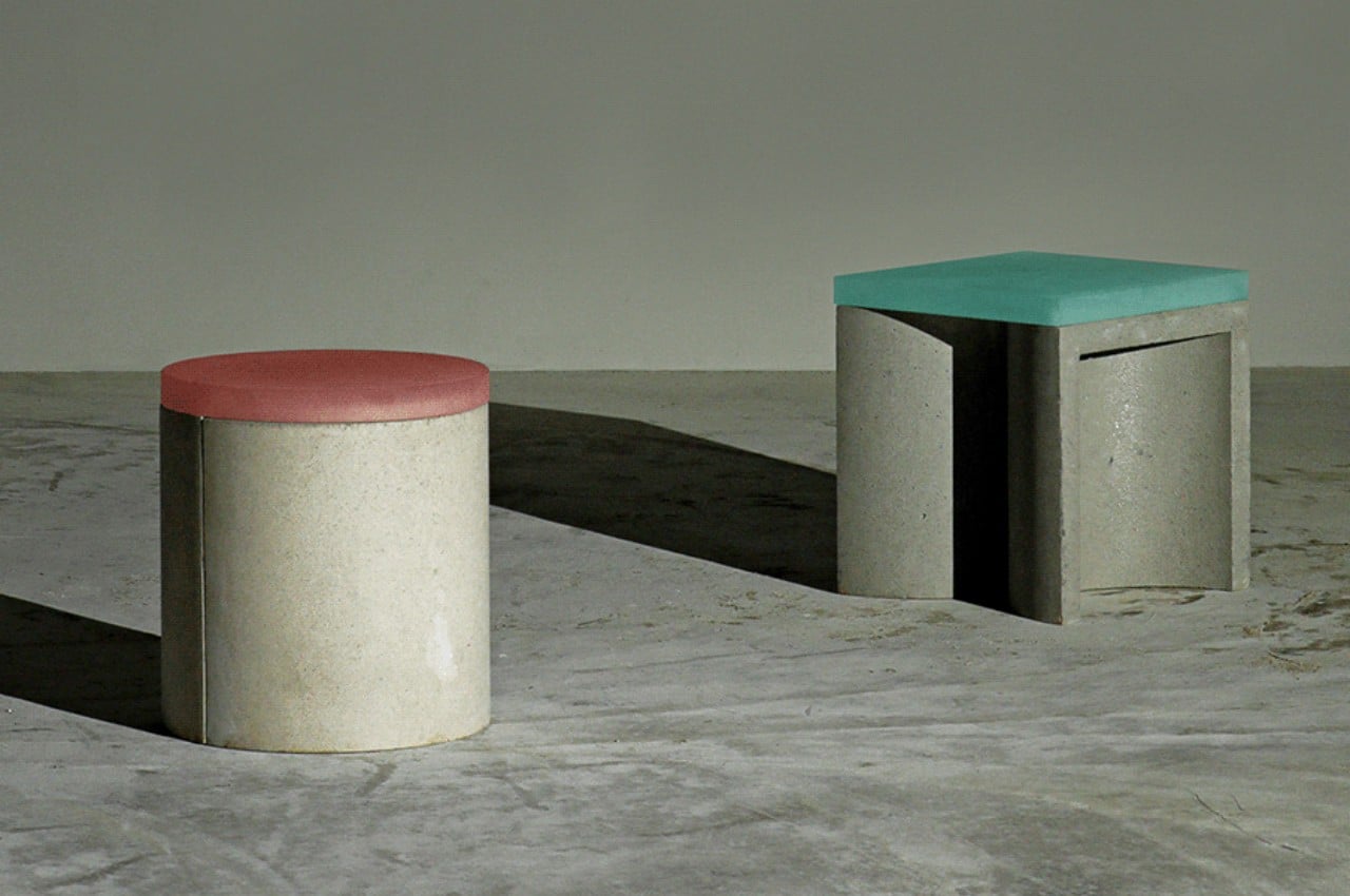
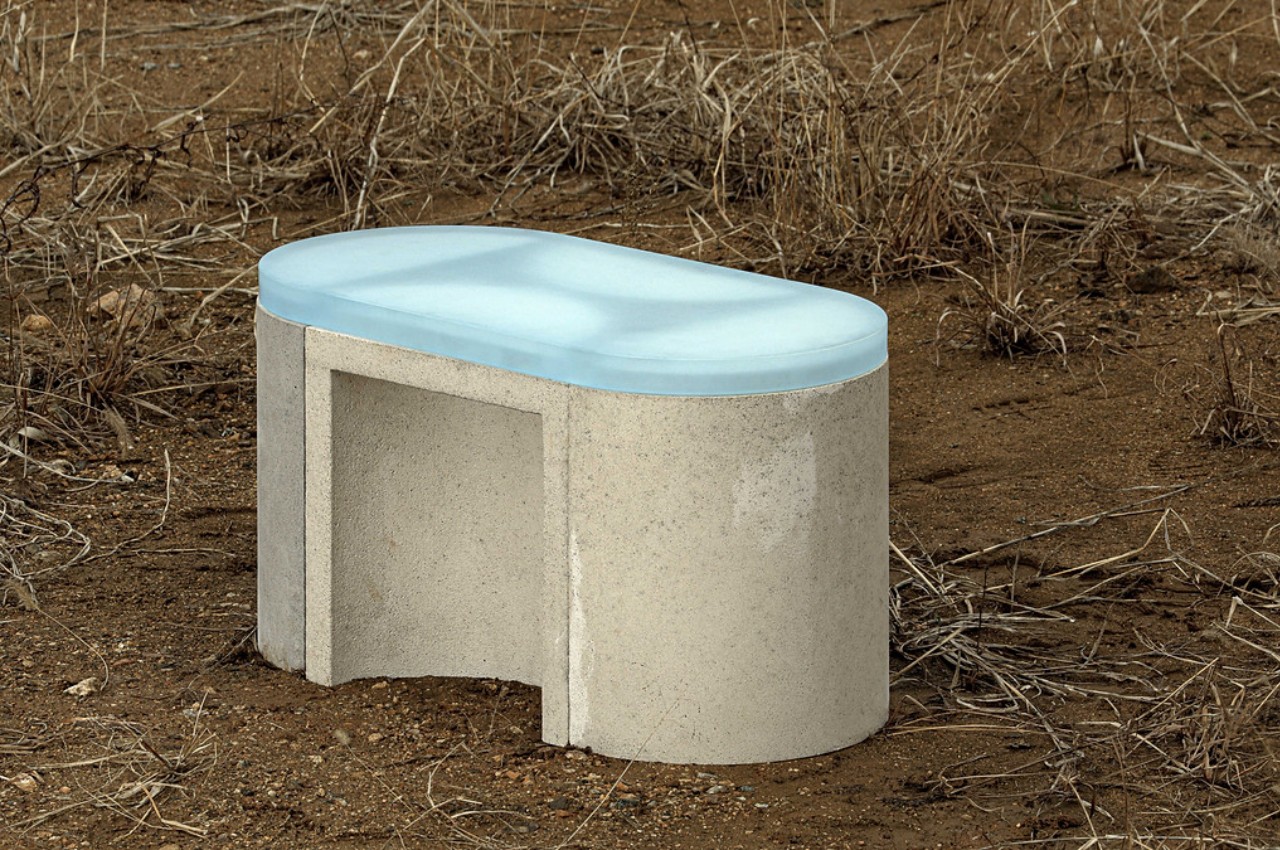
This modular concrete stool blends contrasting elements in a brutalist package

Concrete is not something you’d immediately associate with flexibility and comfort, especially as applied to chairs and tables. The material is great for making outdoor furniture that remains rooted in place until they’re damaged beyond use and repair. They often have fixed forms, too, considering they’re not the easiest things to move or change anyway. That, however, means lost opportunity in shattering expectations and pushing the envelope of what you can do with the material. Fortunately, not everyone is easily intimidated by concrete’s rough demeanor, and this modular stool system demonstrates what’s possible when you start playing around with shapes, colors, and materials.

Designers: one J, Jeongjin Ko, Jinsu Du, Keetae Kim (Superkomma)

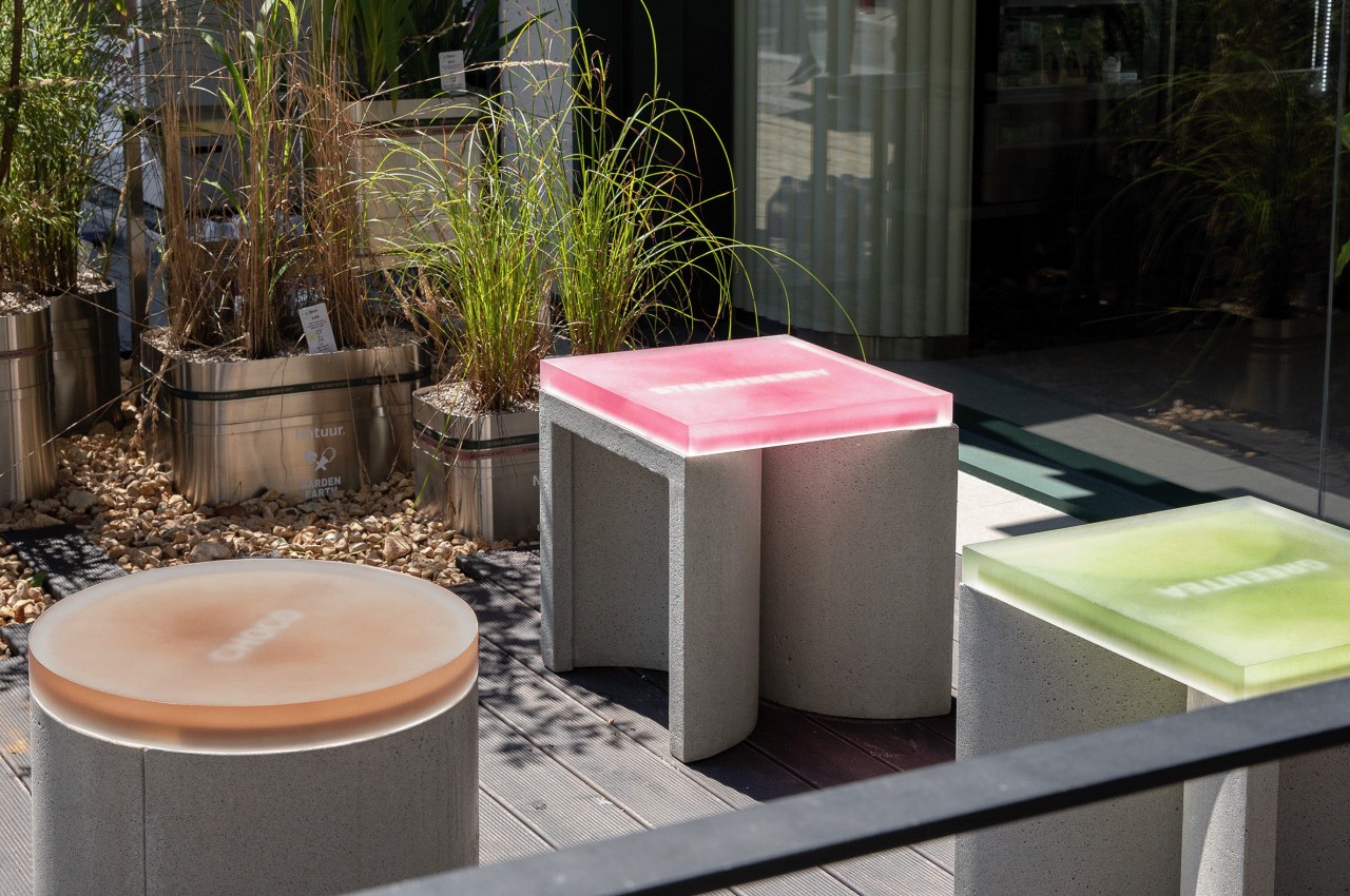
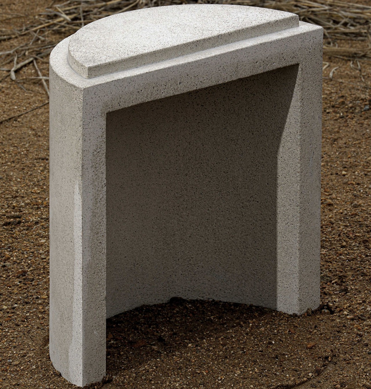
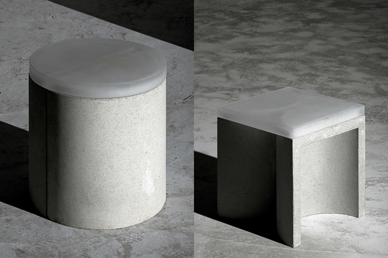
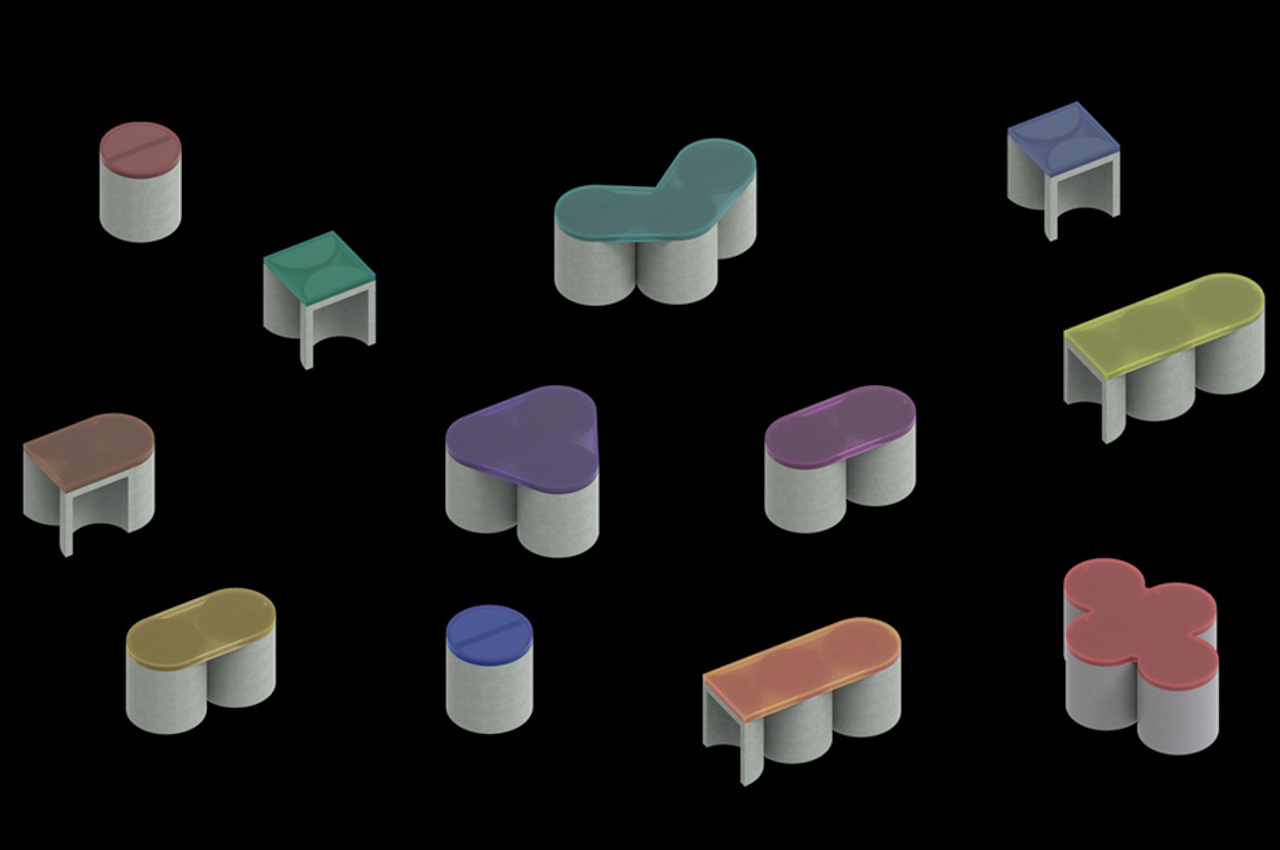
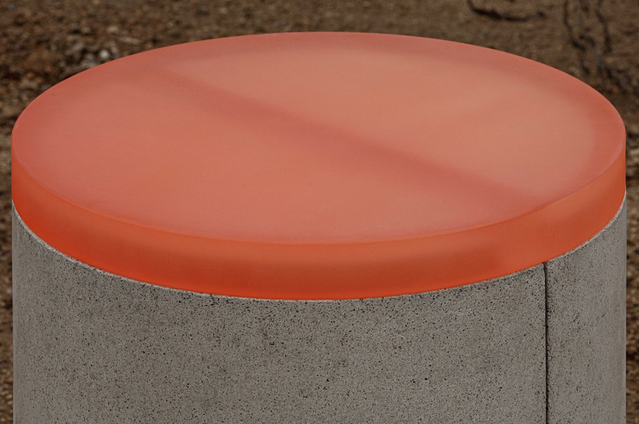
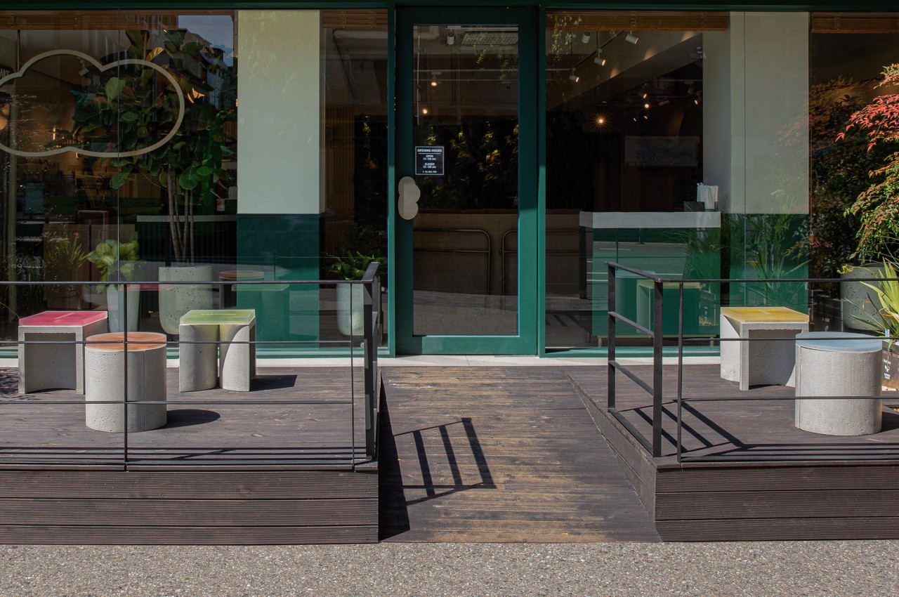
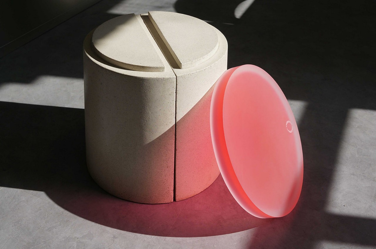
In its most basic configuration, the CONECTO stool looks like any ordinary cylindrical stool with a colorful top. That, however, is an illusion, given that the seemingly whole concrete base is actually two half cylinders joined at their flat side. You might take for granted how this “half shape” can be used in a modular fashion, but almost like LEGO, they can become the building blocks of larger stools that can accommodate more people at once.

Joining the two halves on their curved side allows a square “cover” to be put on top for a more traditional stool. Putting half a cylinder on one side extends it a bit for a more comfortable arrangement, but adding yet another half on the opposite side creates an oblong bench. If, on the other hand, you put three full cylinders together in a triangular formation, you can have a bench that can accommodate as many as three people.

1

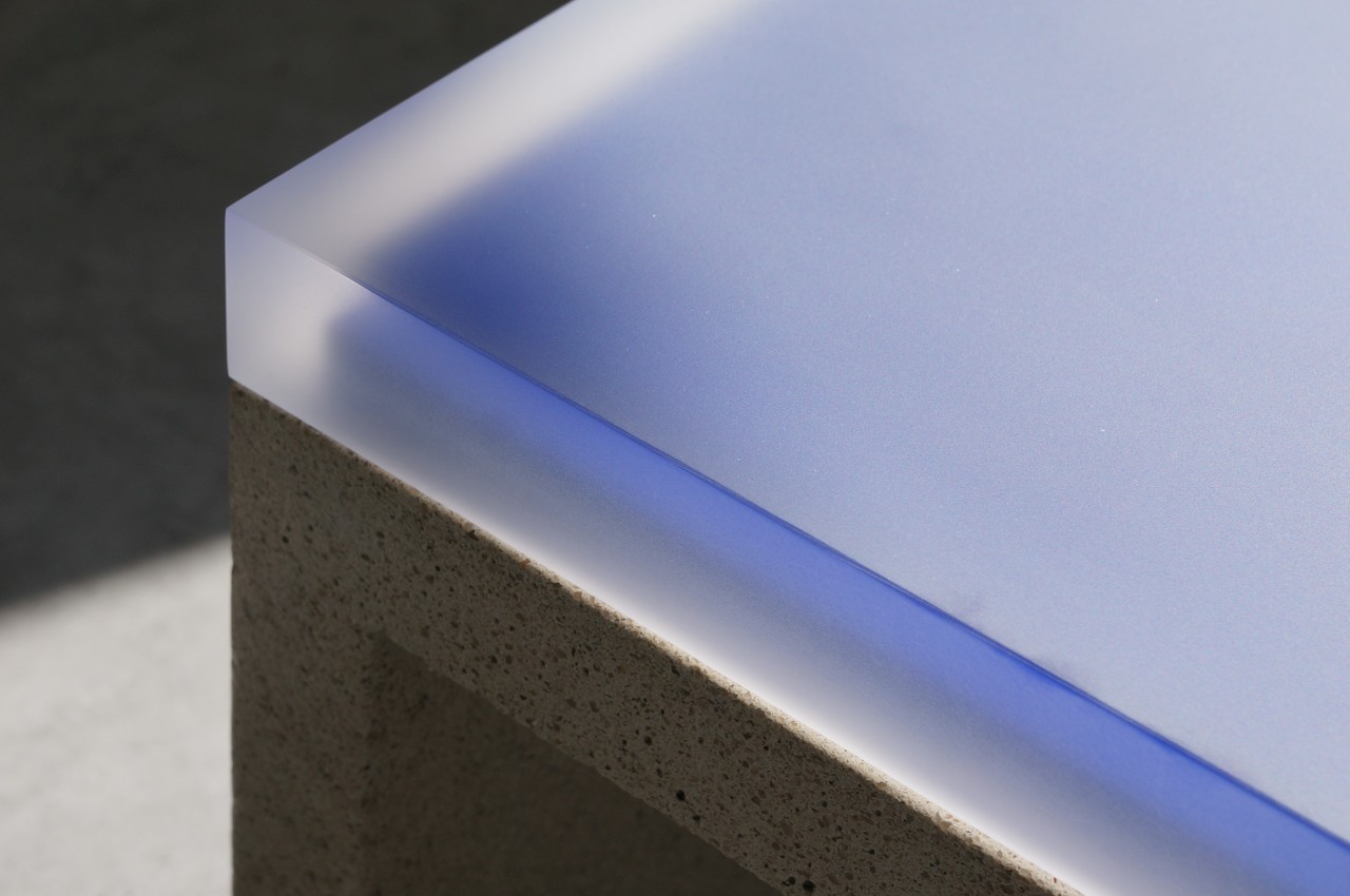
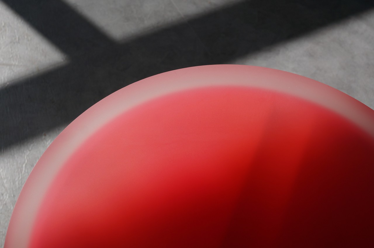
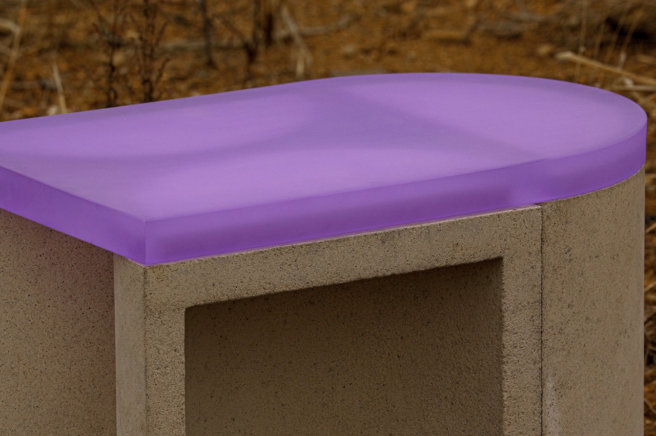
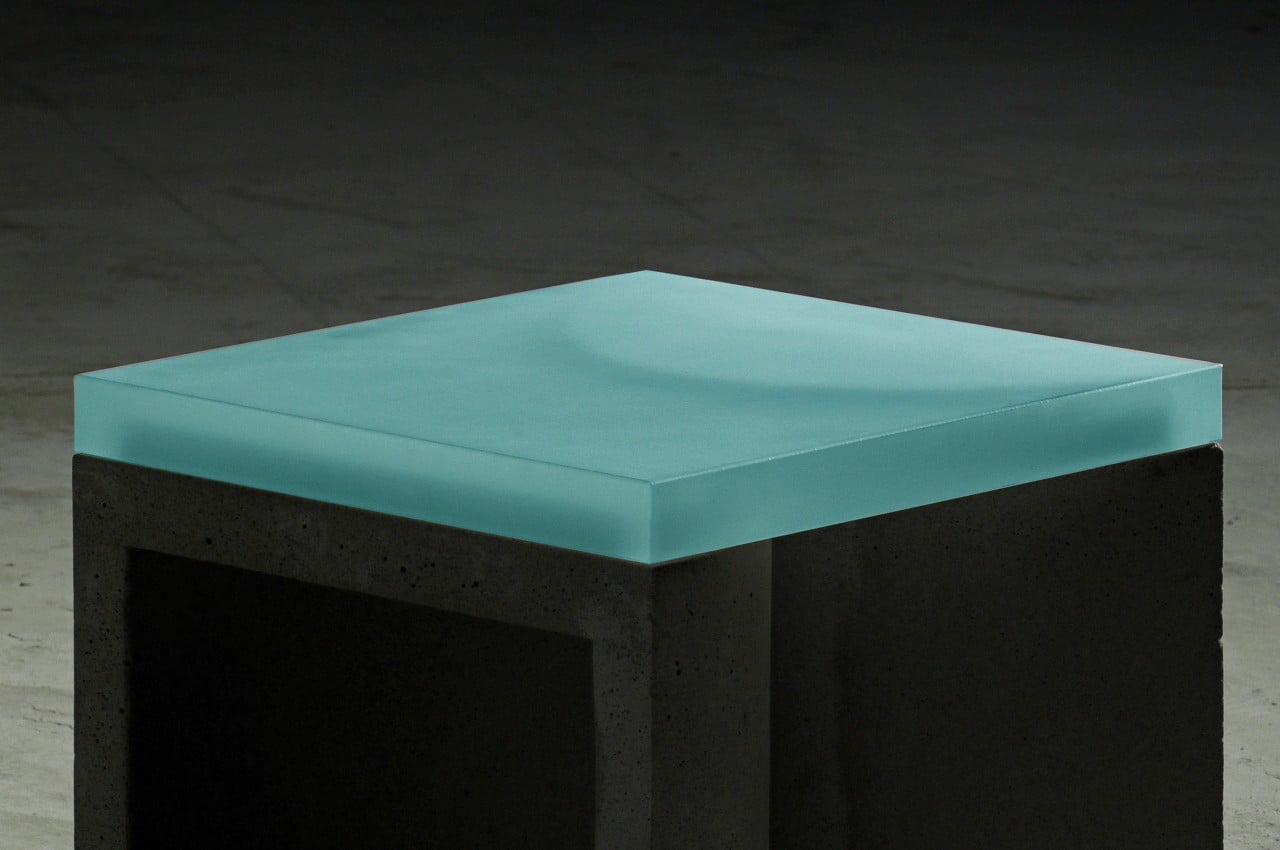
Part of the CONECTO’s modularity is thanks to the acrylic top that joins different pieces together. This material also provides a striking contrast to the concrete base, creating a visually interesting outdoor furniture design. Where concrete is cold, raw, and rough, the translucent acrylic top is softer, colorful, and alive. The stool, whether alone or with others, provides a mix of brutalism and minimalism that could attract people to look and even sit.

The concept for CONECTO’s design also has sustainability as its goal from the get-go, using high-strength UHPC concrete with no harmful compounds. It the future, it is planned to also make use of recycled waste materials, creating an ecosystem that is not only free in its flexibility but also free from negative effects on the environment.

The post This modular concrete stool blends contrasting elements in a brutalist package first appeared on Yanko Design.

Camber envisions chairs and benches made from a single sheet of metal

Furniture is so critical and so common in our lives that few of us probably give a second thought to how they’re made. As long as they serve their purpose and look good, tables, chairs, and other pieces of furniture might as well be made from alien material for most people. Unfortunately, the materials and processes used to make these essential products have started to chip away at the health of the planet for the sake of keeping humans comfortable. Designers have started to become more aware and conscientious of this problem, and they have started to put their creativity to work in solving it. In addition to using sustainable materials right from the start, another potential answer is to reduce the amount of waste that results from the manufacturing process, like a single sheet of metal that is then cut and bent to form a sharp-looking chair.

Designer: Paul Coenen

Even the simplest piece of furniture sometimes uses multiple parts. A table will be made of at least four legs attached to a tabletop, and those connections might require screws or other means to keep the table from falling apart with the slightest weight. With conventional furniture designs, these parts are often cut out or formed at different times from different materials, a process that often yields wastes bits and pieces that can no longer be used anywhere else.

Some furniture designs have become a bit smarter by attempting to utilize every inch of a single sheet of wood or metal, but those might still need extra parts to connect them together. A more efficient way would be to just use the whole sheet and nothing else, but it’s also more challenging to create visually appealing designs. You might think it’s a simple case of folding metal, for example, but making it usable while also looking good is actually harder than you might think.

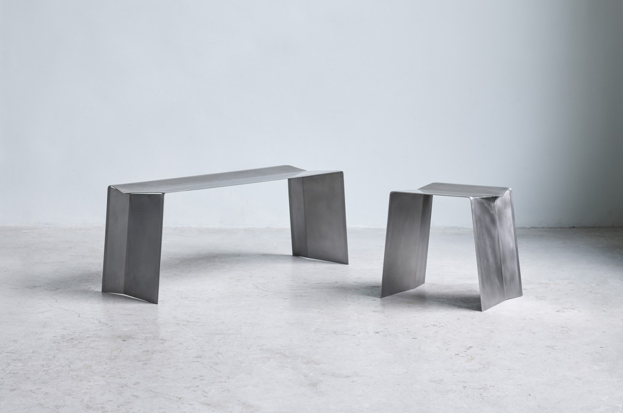
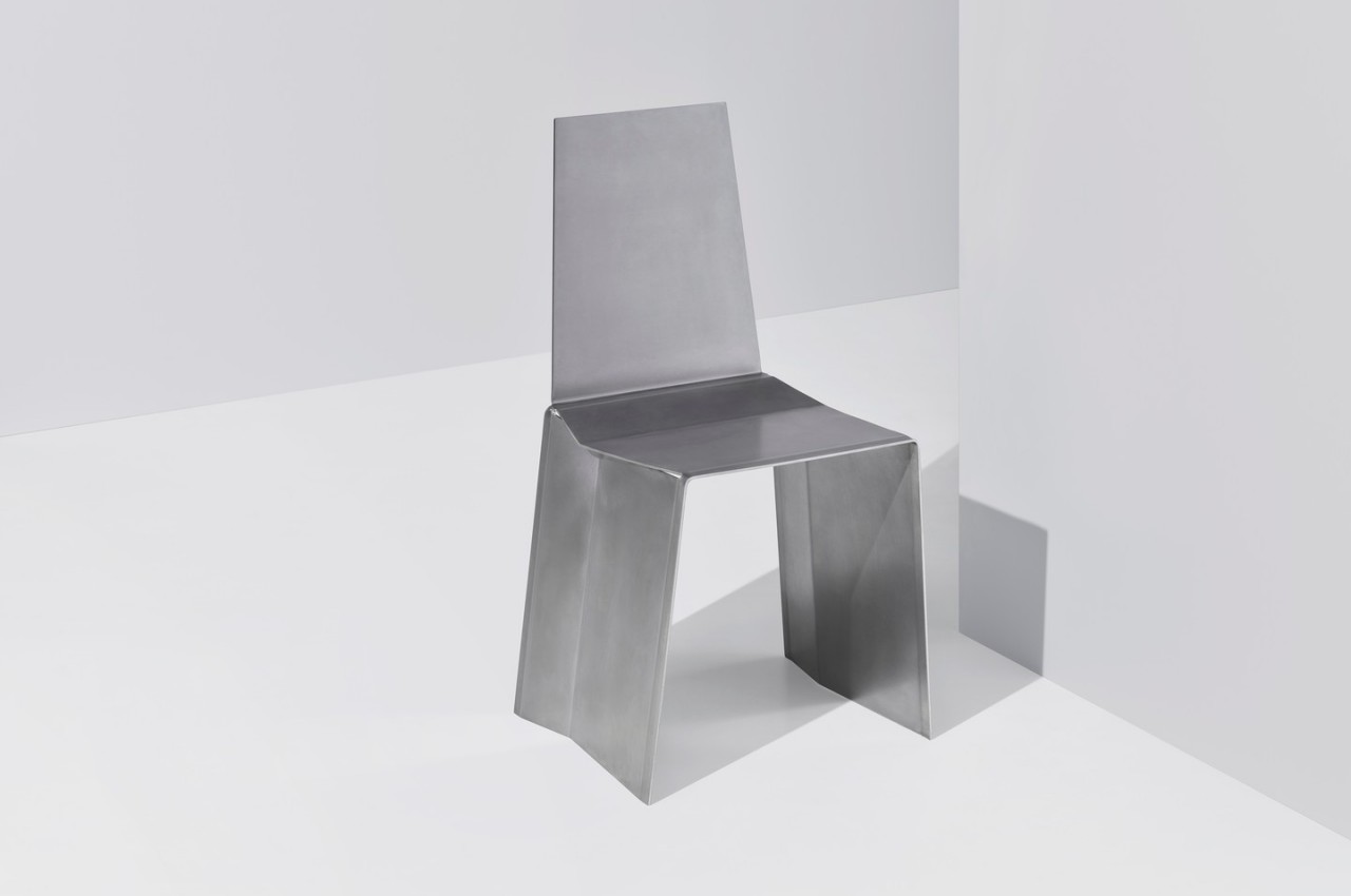
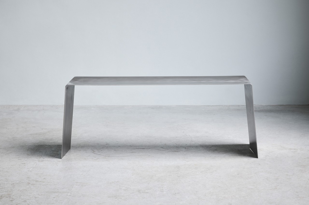
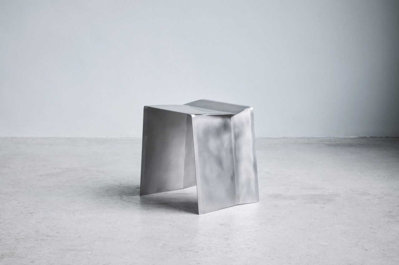
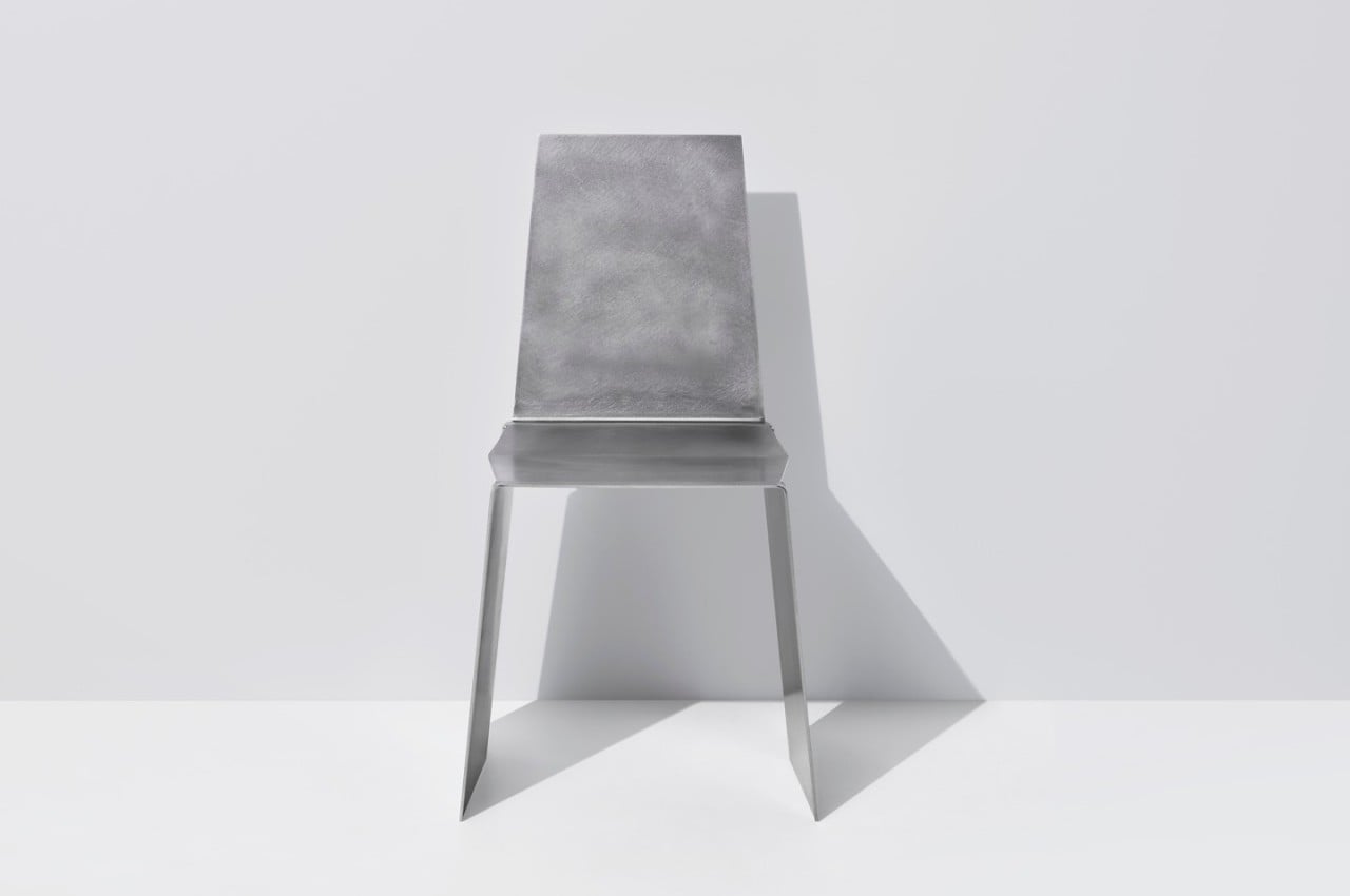
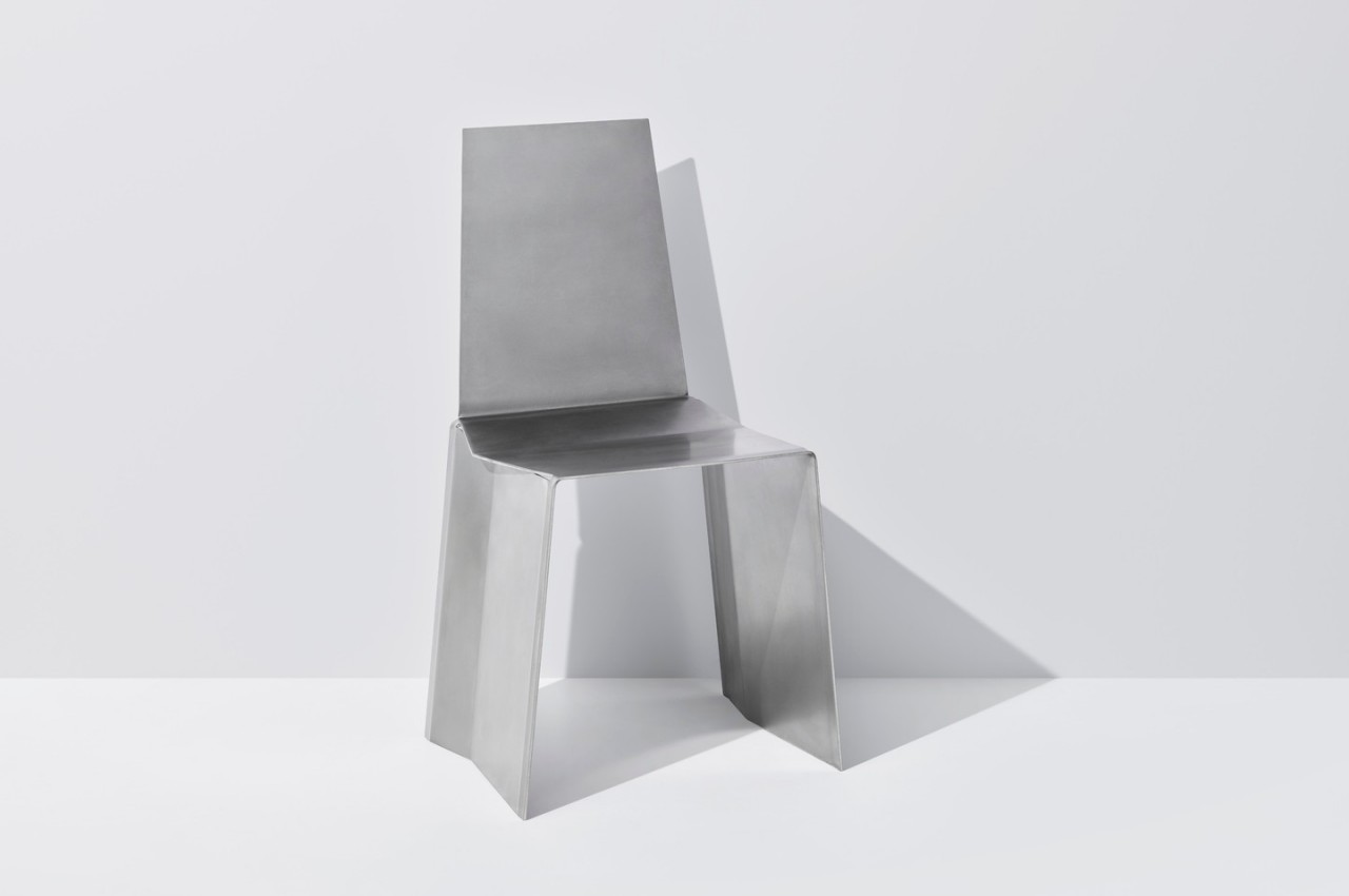
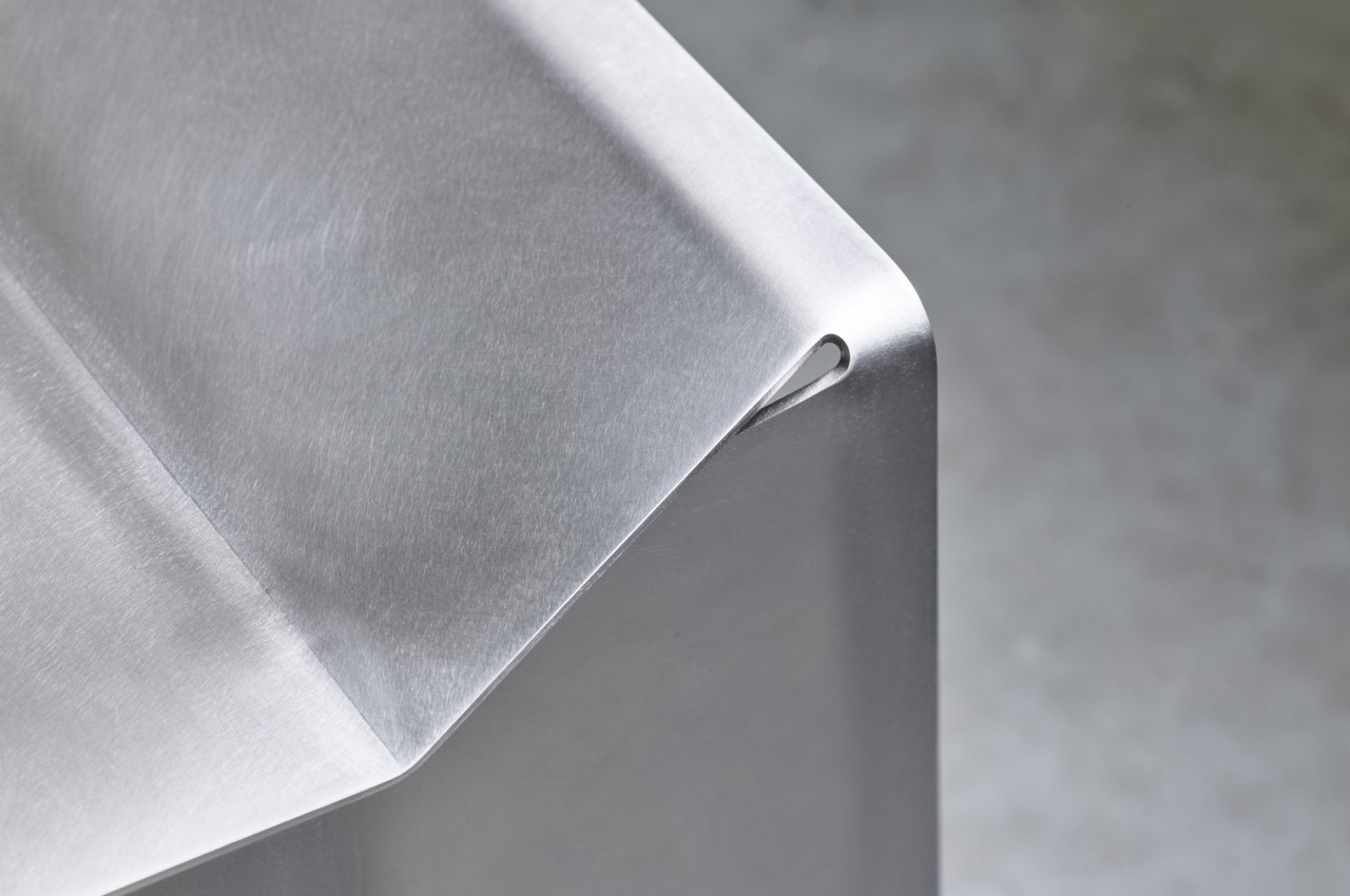
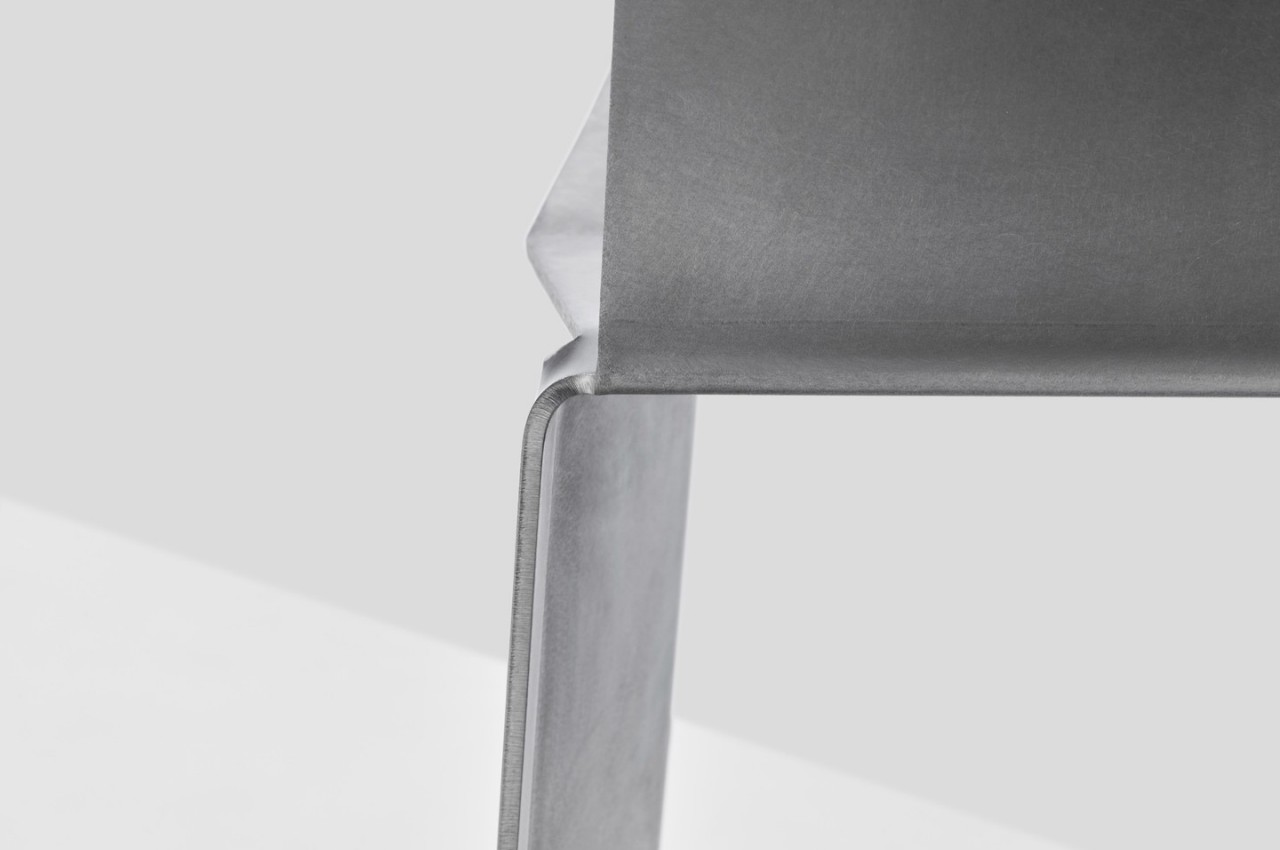
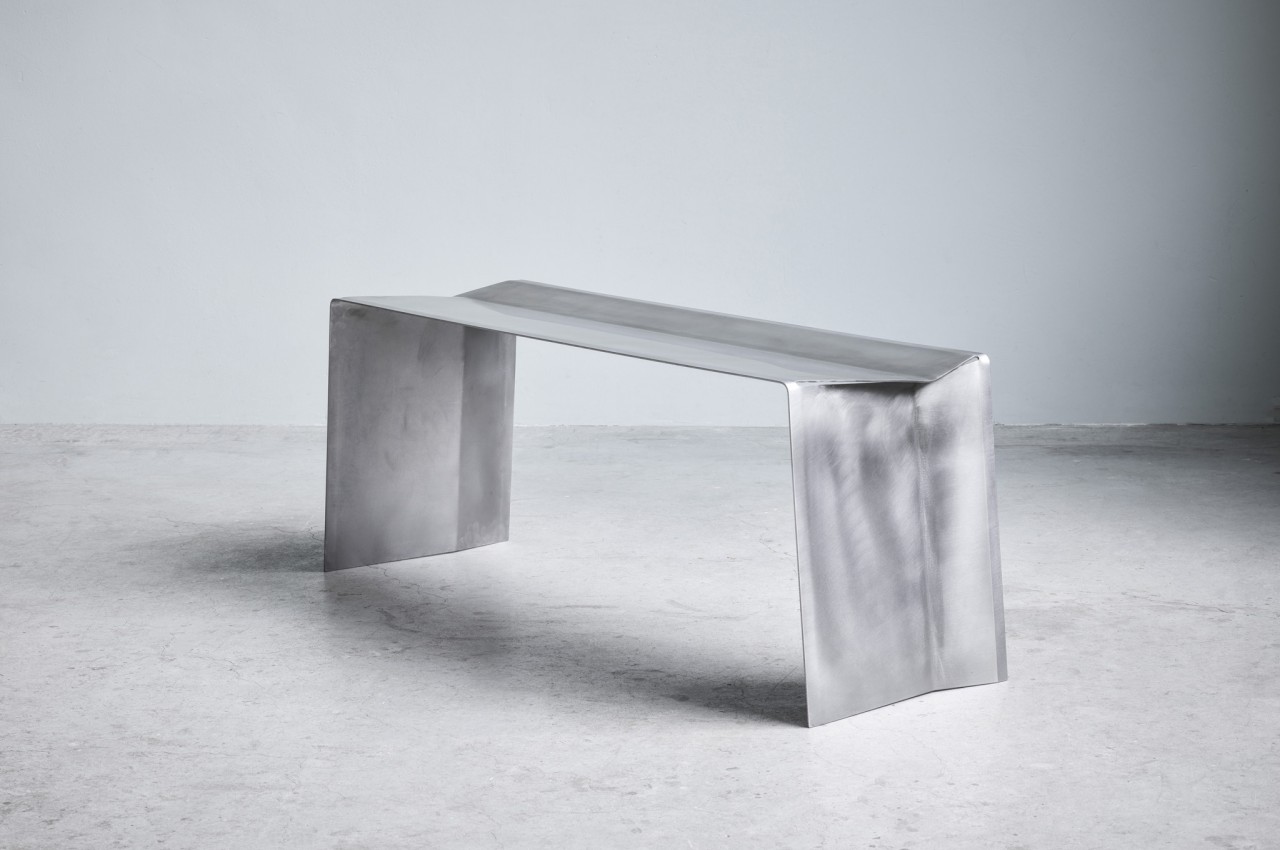
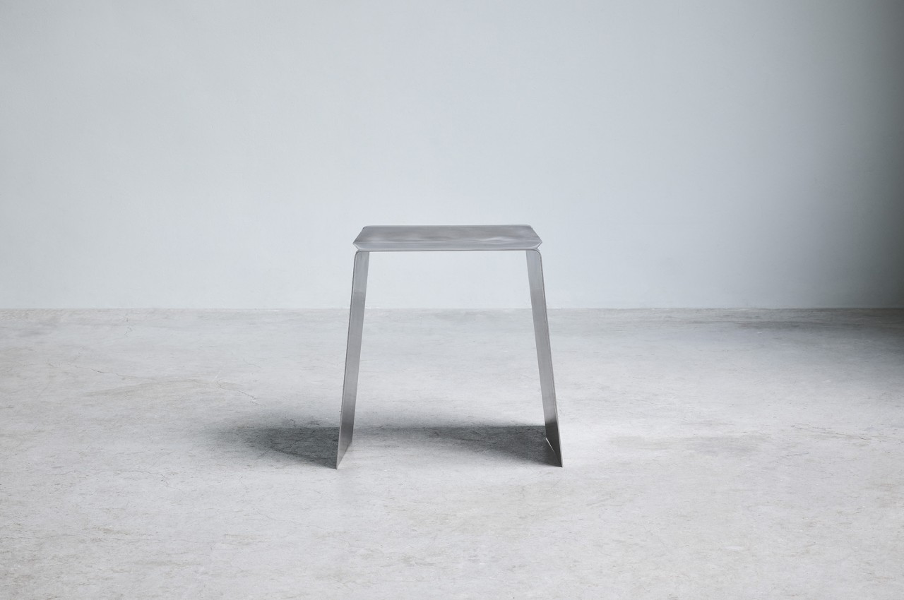
Camber is an attempt to check all those boxes by cutting and bending a single sheet of stainless steel to form seats you’d want to look at as much as sit on. Rather than simply bending two ends to form legs, the design actually involves making two angular cuts where the folds would happen before actually bending down the legs. This creates not only a more interesting design but also adds some stability to the bench or stool’s legs.

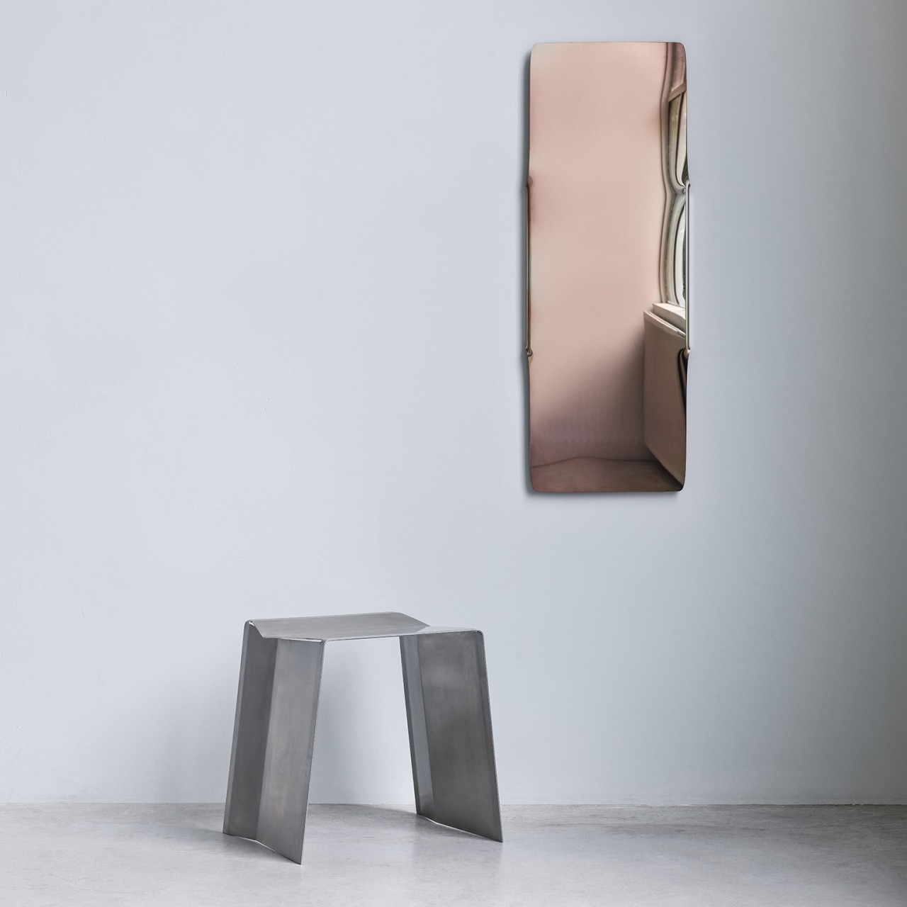
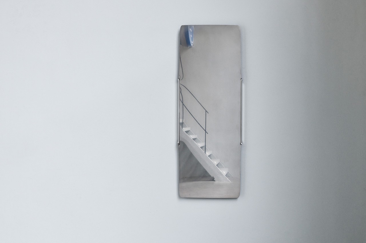
Sanding gives the seats a reflective yet matte surface, removing the need for any harmful coating. It’s an almost perfect complement to the designer’s SST mirror, which uses the same single-sheet principle, except that the surface is polished to the point that it becomes more reflecting. Stainless steel might not be the most environment-friendly metal, but its longevity ensures that these chairs and benches should last far longer than other types. Camber is simple, almost brutalist in its appearance, but its appeal goes beyond looks, offering a design that isn’t only efficient but also, in some odd way, charming in its own right.

The post Camber envisions chairs and benches made from a single sheet of metal first appeared on Yanko Design.
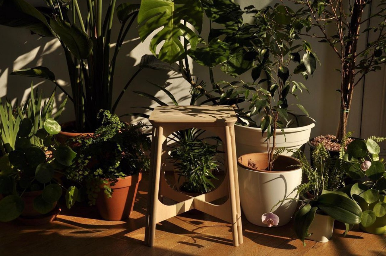
This wooden stool offers a sustainable replacement for a common household product

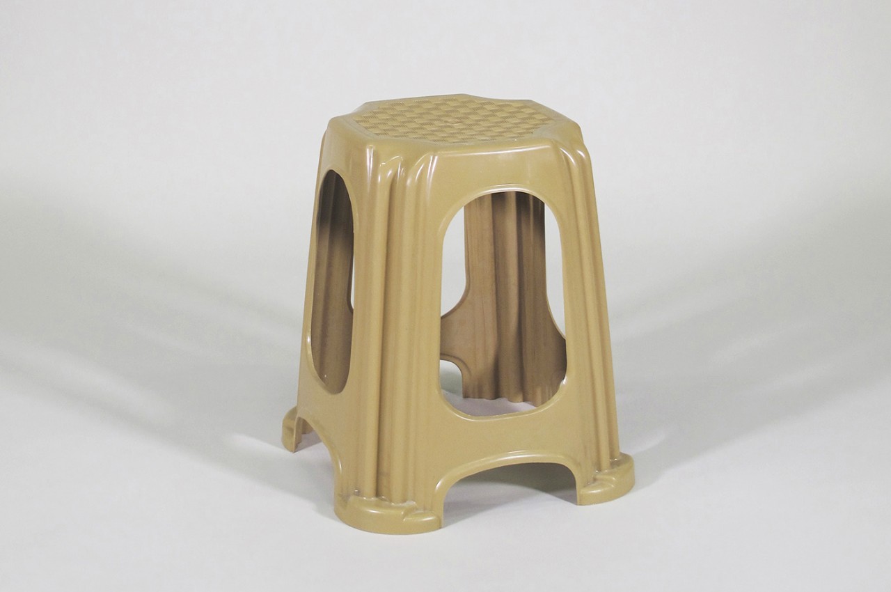
No matter what part of the world you’re in, you’d probably come across a plastic stool that is employed for different purposes around the house. Of course, it is primarily a seat, but sometimes it’s also used as a makeshift side table for holding tools while you work around the house. Some more daring people even use it as an ad hoc ladder, though that largely depends on the build and stability of the stool. No matter the purpose, this kind of stool has become so ubiquitous that it could be one of the most common uses of plastic in the market. Of course, such a stool doesn’t need to be made from plastic, and this design translates that into wood with some additional quirks that make it stand out.

Designer: Antoine Laboria

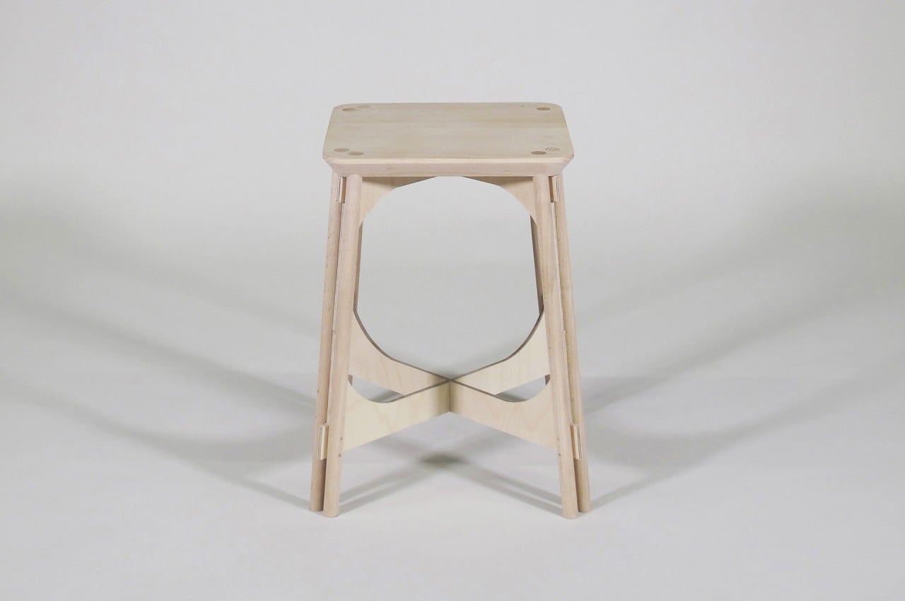
Wooden stools are easy enough to make, but one that has the durability of the common thermoformed plastic stool presents a few more challenges. It gets even more complicated if you try to recreate the unique and somewhat iconic form of the plastic original, a form that doesn’t translate cleanly to wood. Throw in some requirements about sustainability, and you’ve got quite the design puzzle.

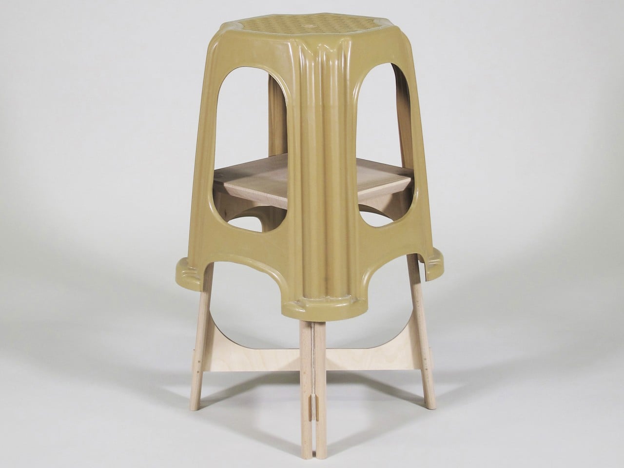
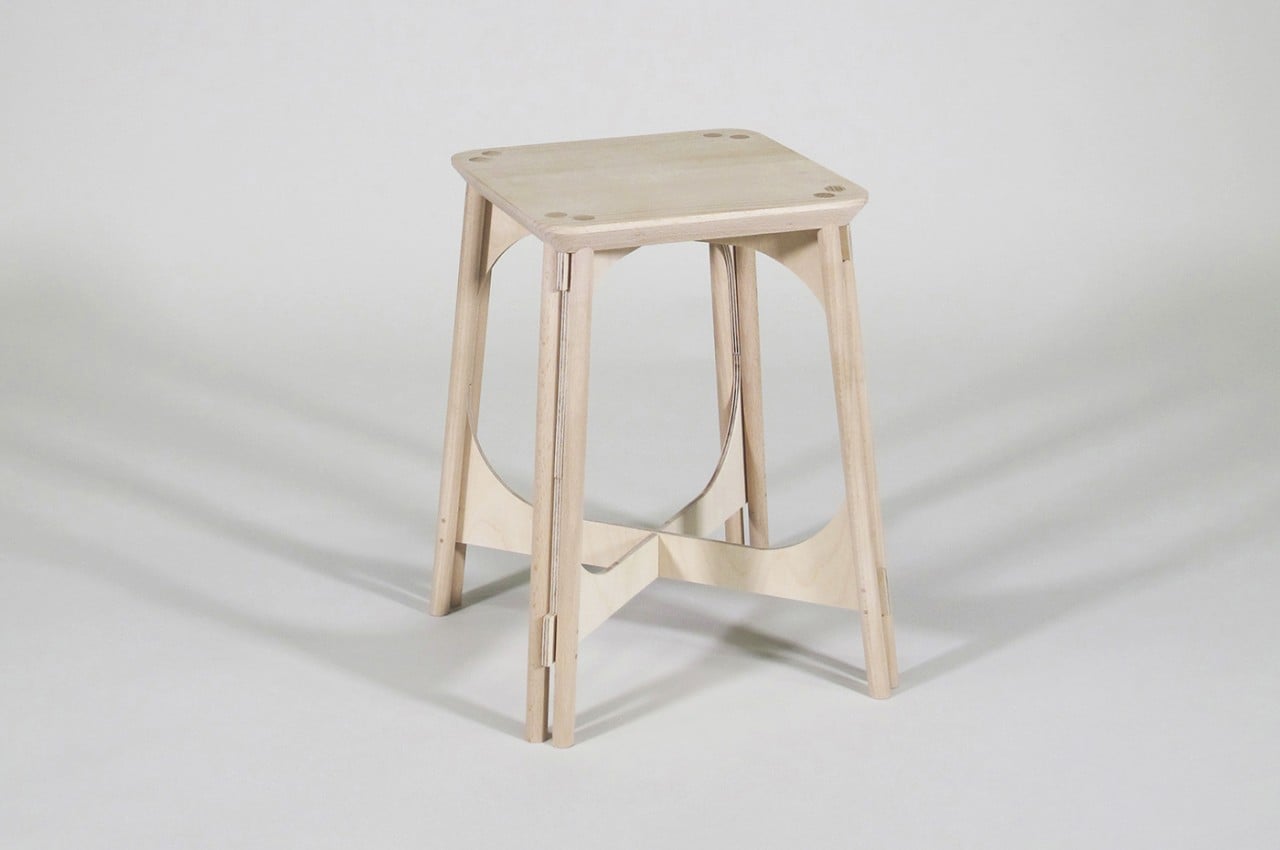
Thanks to thermoforming, plastic stools often have contours and curves that would be impossible to recreate on wood except through carving. That is definitely a possible solution to recreating the plastic stool faithfully, but it is also expensive and impractical, unlike these sundry pieces of furniture. The Plastic Translation Stool design tries to reinterpret the lines of the plastic stool instead, resulting in a form that is somewhat similar yet also unique, giving the wooden stool its own character.

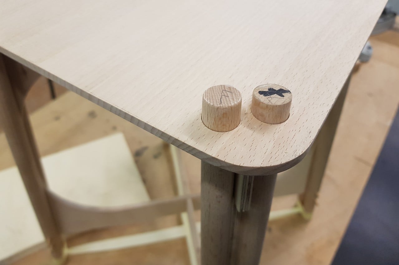
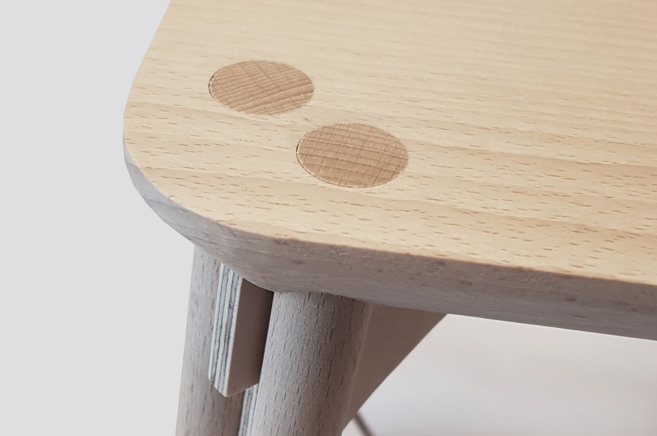
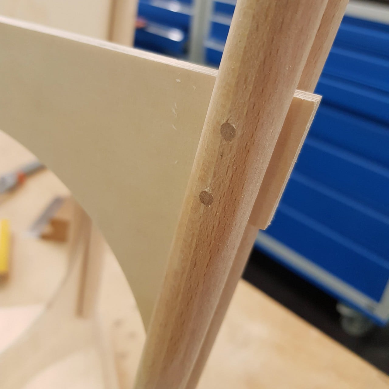
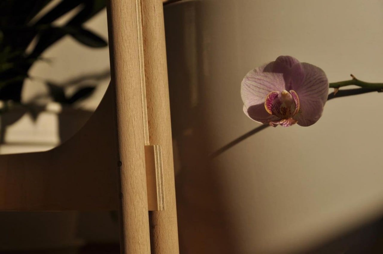
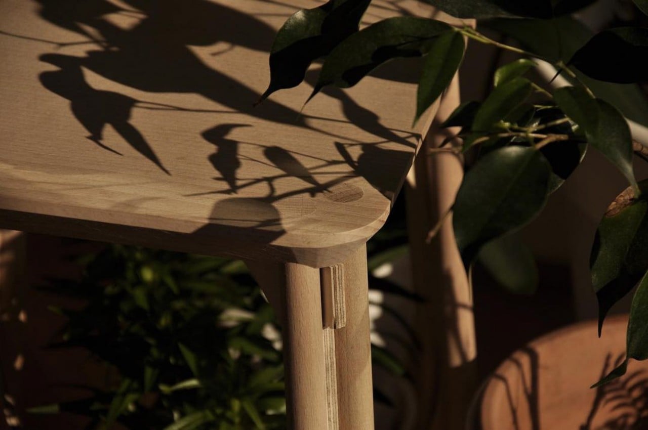
Those legs alone, however, won’t be enough to offer the same stability as the plastic counterpart, so an additional element had to be added. Birch plywood buttresses distribute some of the force evenly across the beechwood legs, which, in turn, hold the buttresses together. These interlocking parts provide not only architectural stability but also visual accents to what would otherwise be a plain-looking stool.

Unlike a thermoformed plastic stool that comes as a single piece, this wooden reinterpretation has to be assembled together. It doesn’t require screws or nails, though, making the assembly easier and the packaging simpler. It is, after all, supposed to be a more sustainable option to the plastic stool, and such an alternative would need to not only be made from sustainable materials but also be sustainable right to the very end.

The post This wooden stool offers a sustainable replacement for a common household product first appeared on Yanko Design.
Furniture inspired by the Samurai Warrior armor comes with a similar tough corset wrapped around it

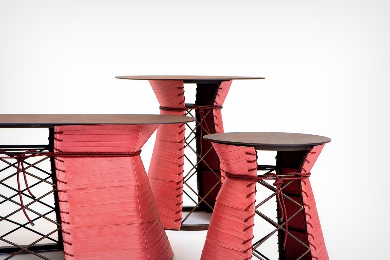
What do Samurai warriors and tables have in common? Not quite a lot, I’d imagine… but for Mingdu Design, the two shared a potential visual overlap, resulting in the Paper Warrior series of side tables and coffee tables.

Samurais pioneered a new type of armor, that looked deceptively like paper, but was, on the contrary, rather tough and resilient. This ‘paper armor’ was wrapped around their torso, creating a tough shield of sorts that could deflect attacks while being both flexible as well as lightweight for easier movement and increased agility. It’s one of the many reasons which set the samurais in a class of their own, and the Paper Warrior series pays homage to their uniquely functional bit of fashion!

Designer: Mingdu Design

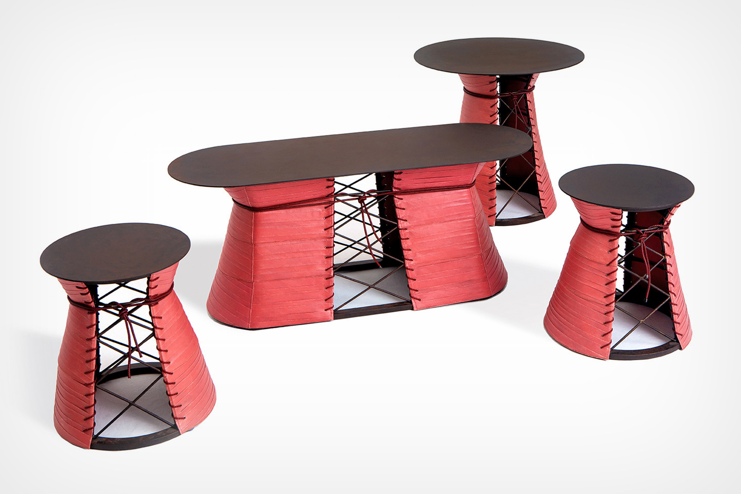
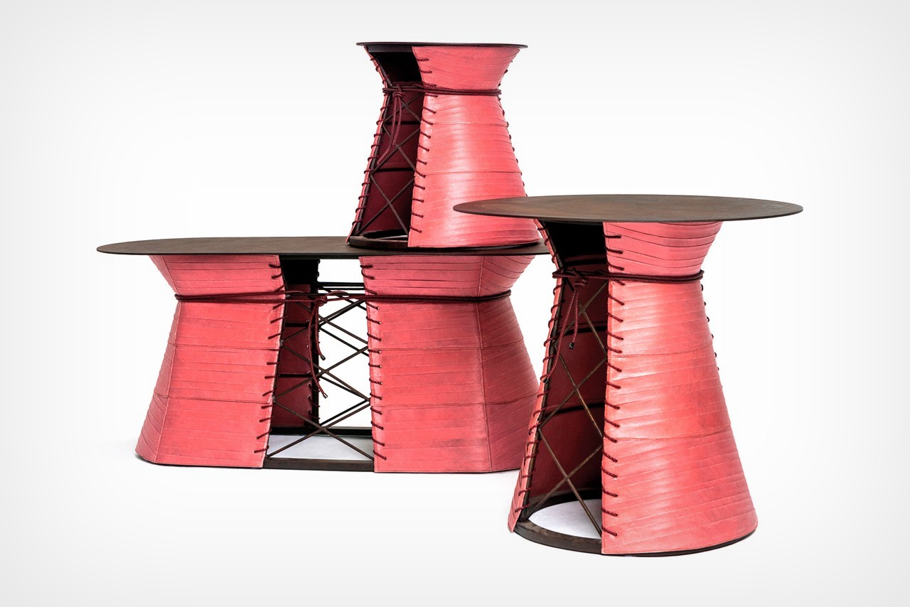
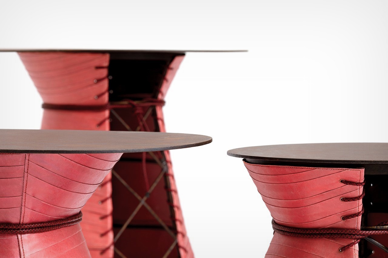
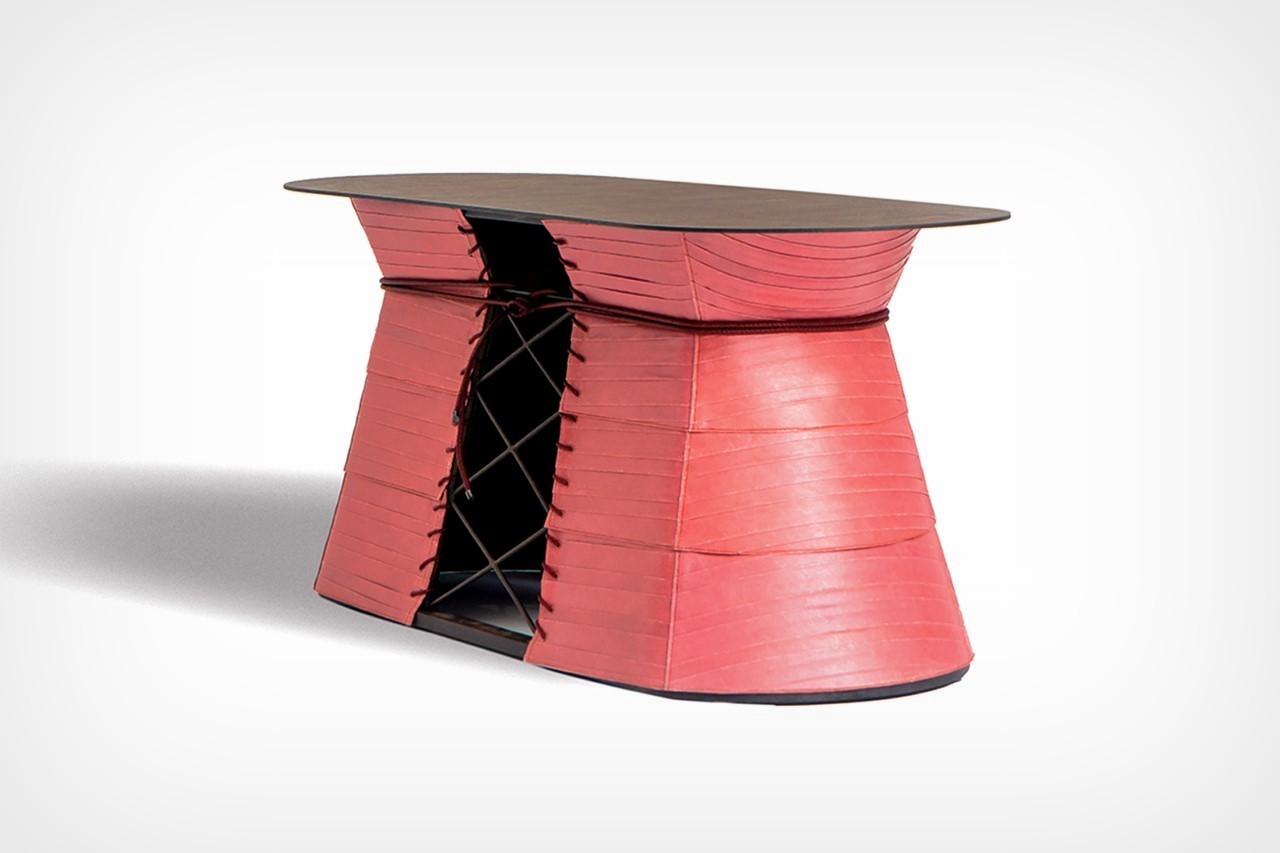
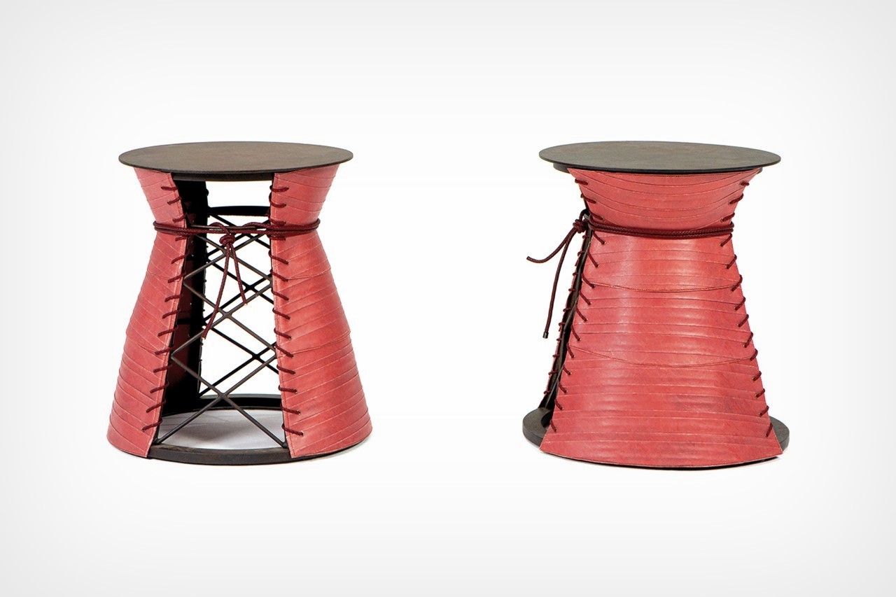
The tables, styled in longer pill-shaped variants as well as tall round side-tables, come with a distinct red fabric wrapped around their body. Rather than using the exact same kind of paper as the Samurais (which was made traditionally by specialized Japanese artisans), Mingdu Design opted for a similar but more readily available Tyvek paper by DuPont. Tyvek provides the right balance of toughness while shining just like the paper armor on a samurai would. It’s wrapped around the table the way an armor would be, and is cinched around the waist too!

The table’s underlying structure is made from wrought iron that’s been welded together. The iron has a distinct criss-cross pattern running around the middle, which the Tyvek clad conveniently exposes. This is a nod to the lace design found on the samurai armors!

“This series incorporates origami and weaving techniques and clothing design techniques for creation”, say designers Liang Chen and Yang Xueying of Mingdu Design. “We hope that in this semi-industrial and semi-handmade process, we can blur the boundaries between design and art, and put on exclusive armor for our samurai.”

The post Furniture inspired by the Samurai Warrior armor comes with a similar tough corset wrapped around it first appeared on Yanko Design.