This triple A-frame cottage uses a cantilevered design to reinterpret traditional cabin architecture!

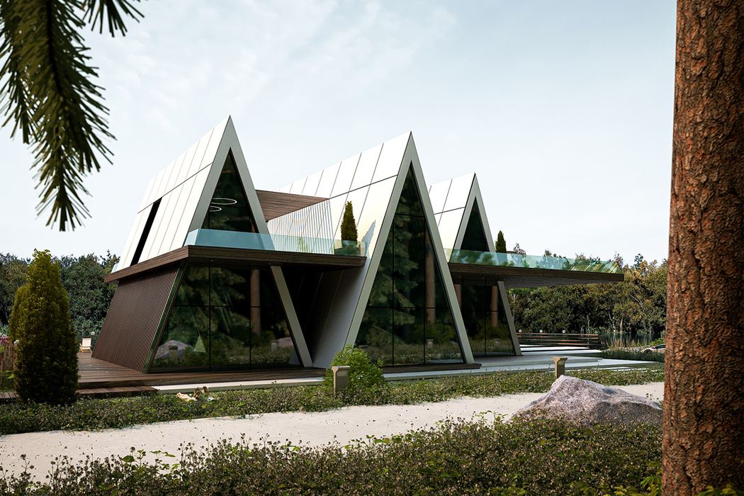
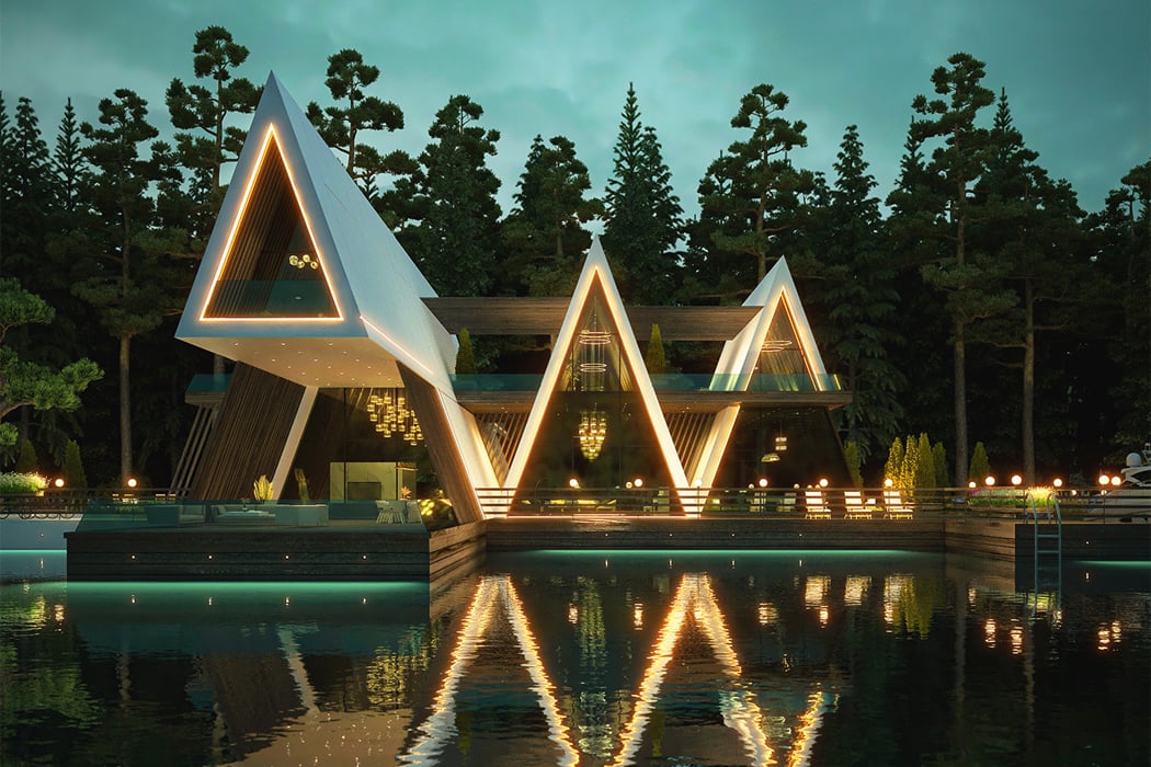
Nothing has felt more tempting this past year than scrolling through the many cabin designs that have kept our timelines busy. We’ve seen modular and mobile cabins, sustainable ones, cabin-inspired houseboats, even the traditional A-frame cabin has seeped into our daydreams. Reinterpreting the A-frame cabin through a contemporary perspective, designer Amin Moazzen conceptualized Cabin of Hope, a 3D visualization of a cantilevered triplex cabin designed to function as an escape from today’s world.

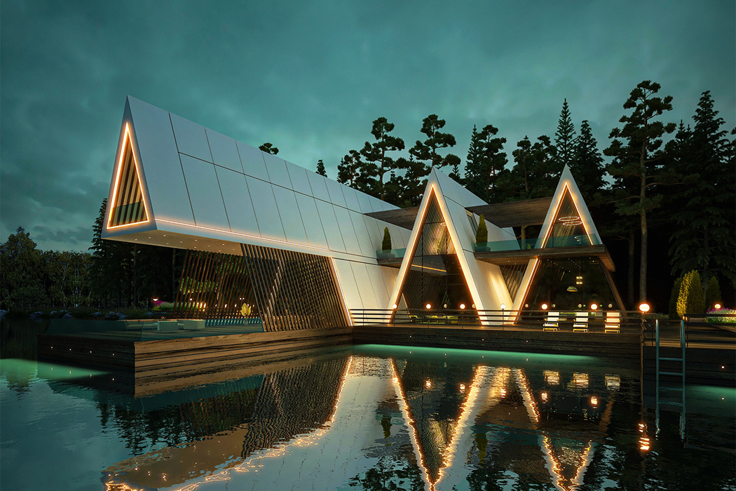
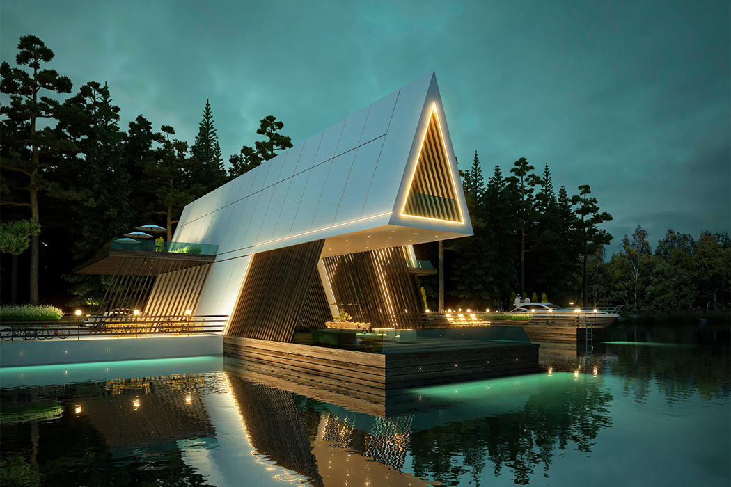
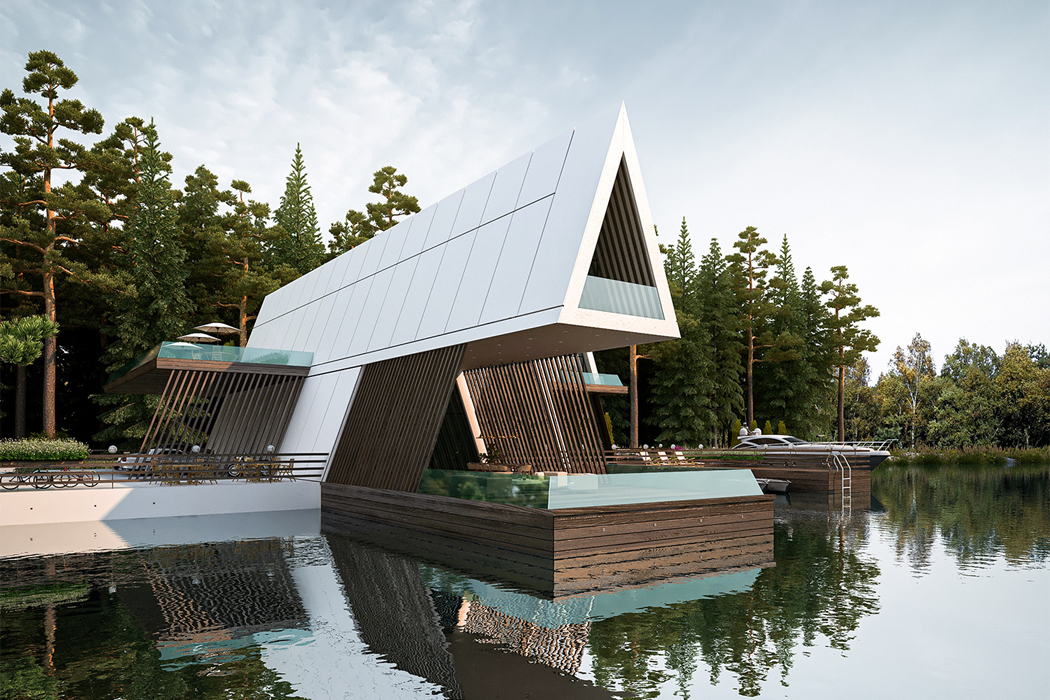
Moazzen’s Cabin of Hope fuses indoor and outdoor living with its main cantilevered A-frame structure that opens up to a veranda overlooking the nearby lake. Shaped like a zig-zag, all three A-frame structures that give rise to the Cabin of Hope are connected at the cabin’s wooden deck base and interwoven outdoor walkway. To achieve an air of contemporary design, Moazzen blended the traditional aspects of cabins like wooden foundations and exposed beams with more modern edges like LED window frames and optic white finishes that cool down the wood’s smokier accents. Dark wooden beams line the angled walls inside each A-frame cabin, further showcasing Moazzen’s commitment to bridging classic cottage elements with notes of contemporary escapism.

While the warm interior lights and bright exterior LEDs make Cabin of Hope shine and morph it into a lantern in the dark, the cabin triplex’s showcase is the cantilevered A-frame that protrudes out over the lake. Joined together by the cabin’s surrounding deck, the separate bi-level A-frame structures function as their own individual wings, the largest one pulling away and towards the lake’s horizon.

Designer: Amin Moazzen

Cabin of Hope’s cantilevered triplex structure reinterprets the traditional cabin through a contemporary perspective.

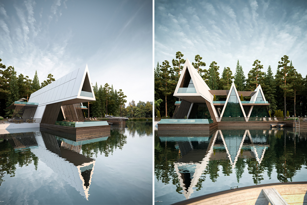
One of the three A-frame structures that give rise to Cabin of Hope overlooks the lake and functions as a veranda for guests.

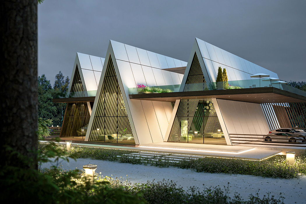
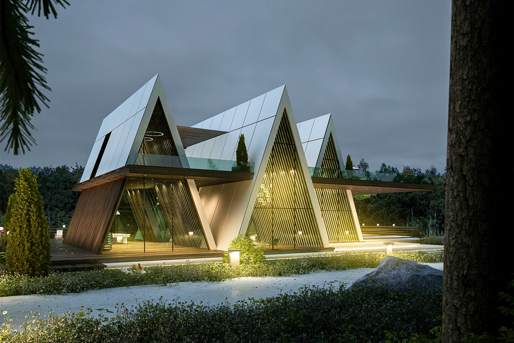
The other side of Cabin of Hope reveals all three A-frame cabins at ground level, situated atop the base wooden deck.

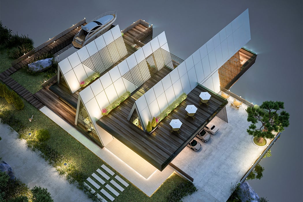
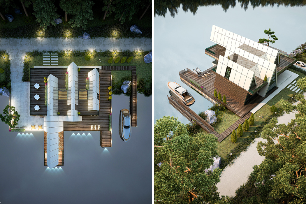
An aerial view shows the cabin’s top floor deck that works to connect all three wings of Cabin of Hope.

From above, Cabin of Hope appears as three separate long homes, but they’re all connected by an outdoor walkway.

Wooden beams enhance the cabin’s traditional aesthetic by cooling down their rustic appearance with optic white side paneling.

These lightning-fast SSDs were inspired by the sandy dunes of Jakku for the sci-fi fan in all of us!

The first time I saw Star Wars: Episode III – Revenge of the Sith, the year was 2005 and I was in fourth grade. Since then, the world of tech design has shifted, but Star Wars and other sci-fi realms have maintained the gaze of the tech world, inspiring some of the quirkiest and most clever tech accessories known today. While getting inspired by science-fiction is no rare encounter, it’s so prevalent because, if executed well, science-fiction is one of the few aesthetic categories that manage to reel people into entirely different and unfamiliar worlds.

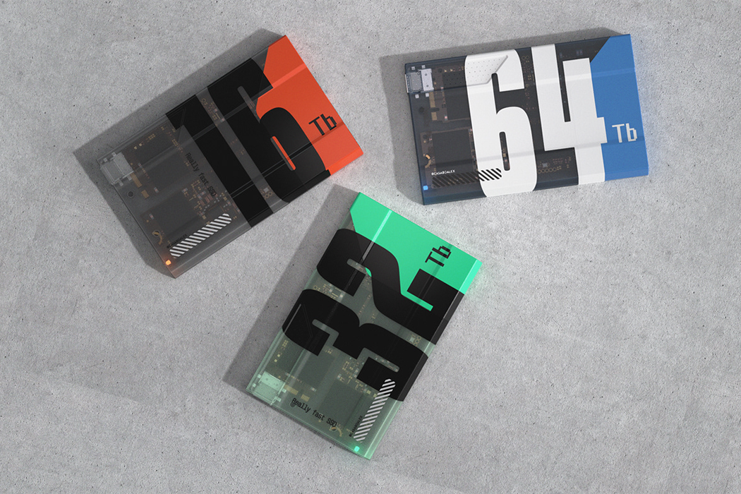
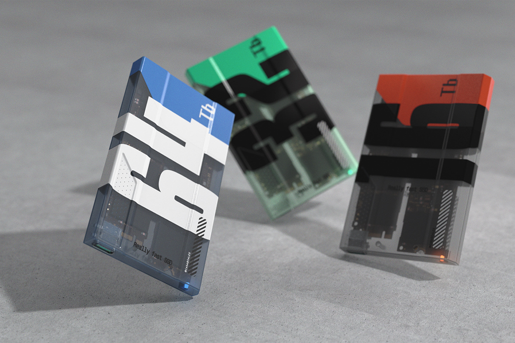
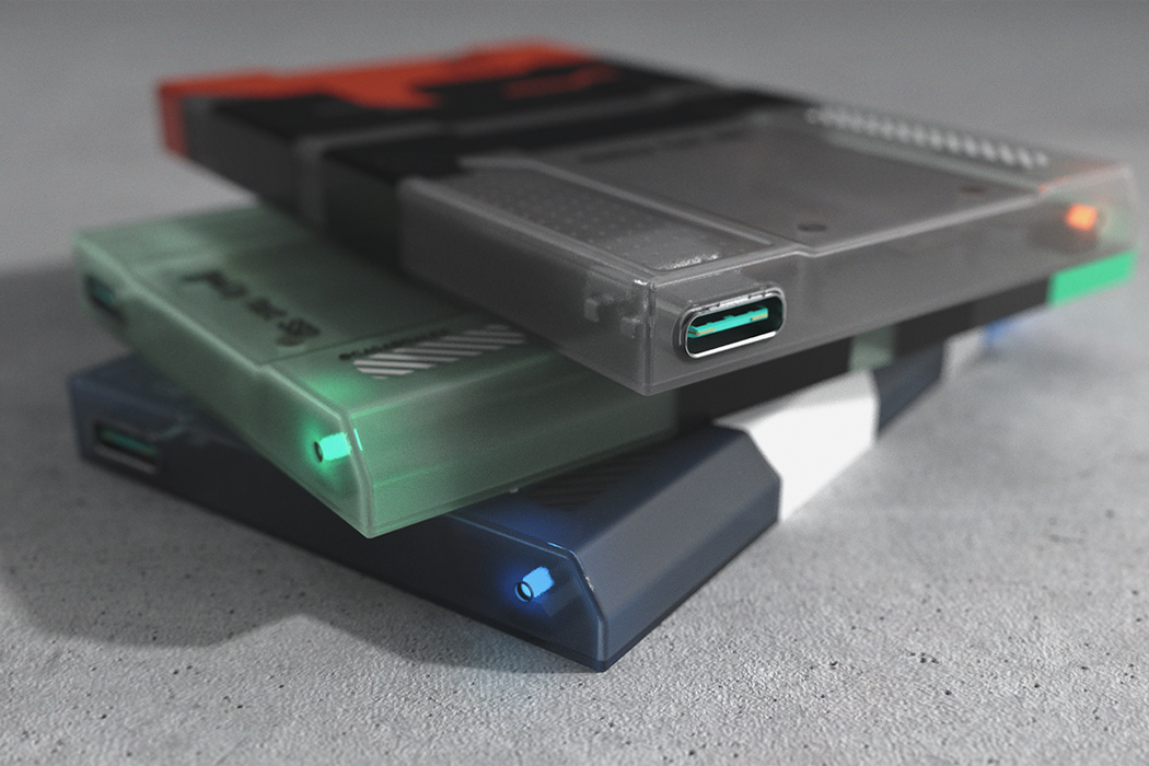
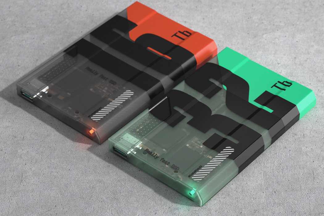
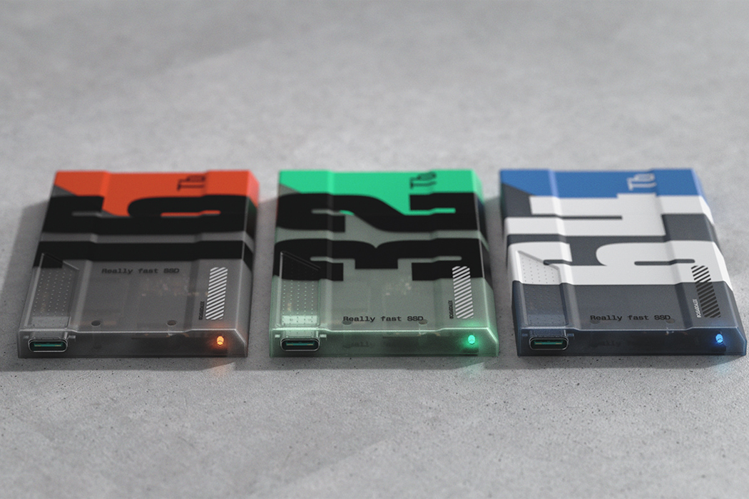
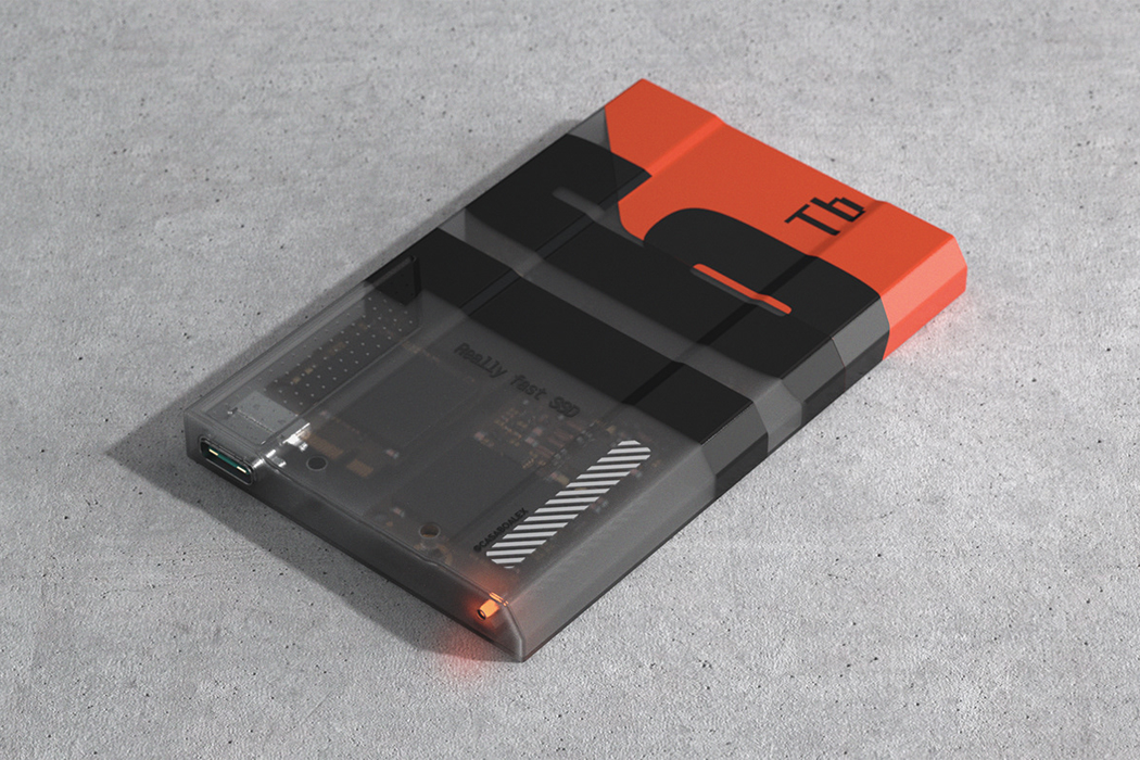
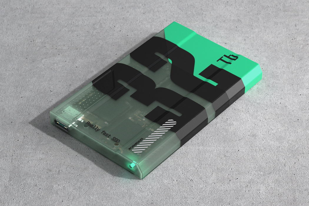
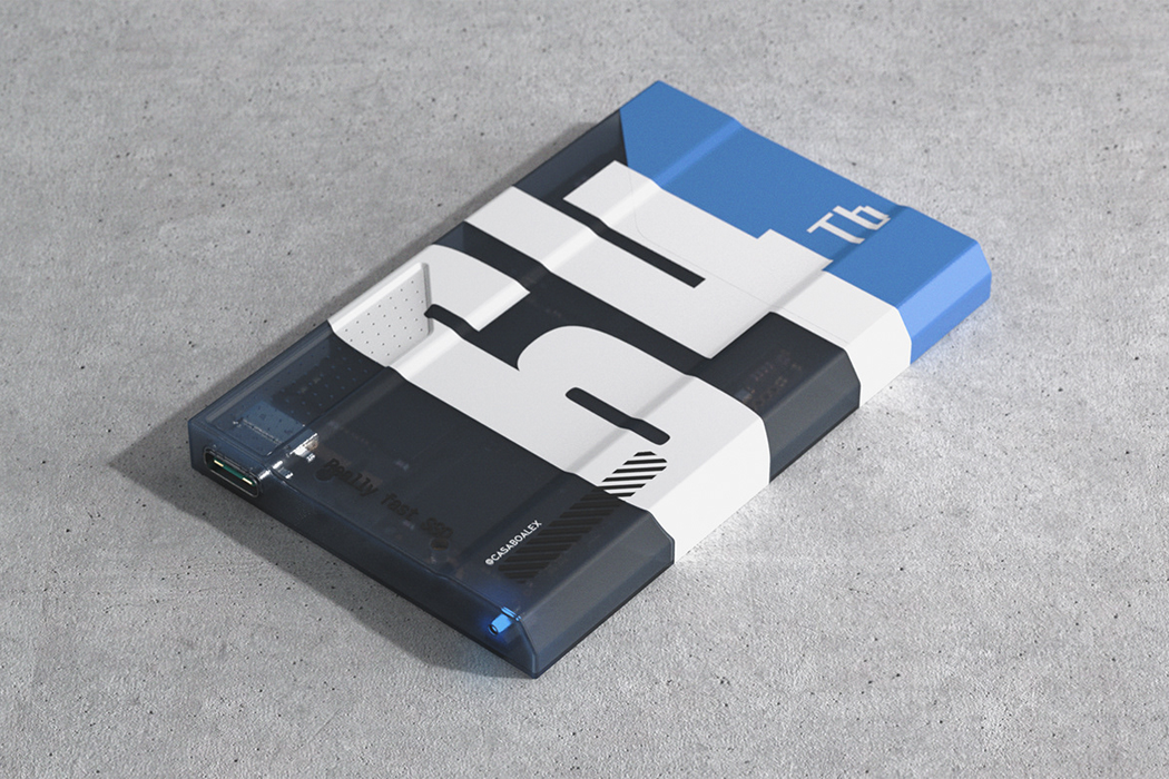
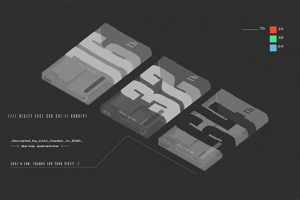
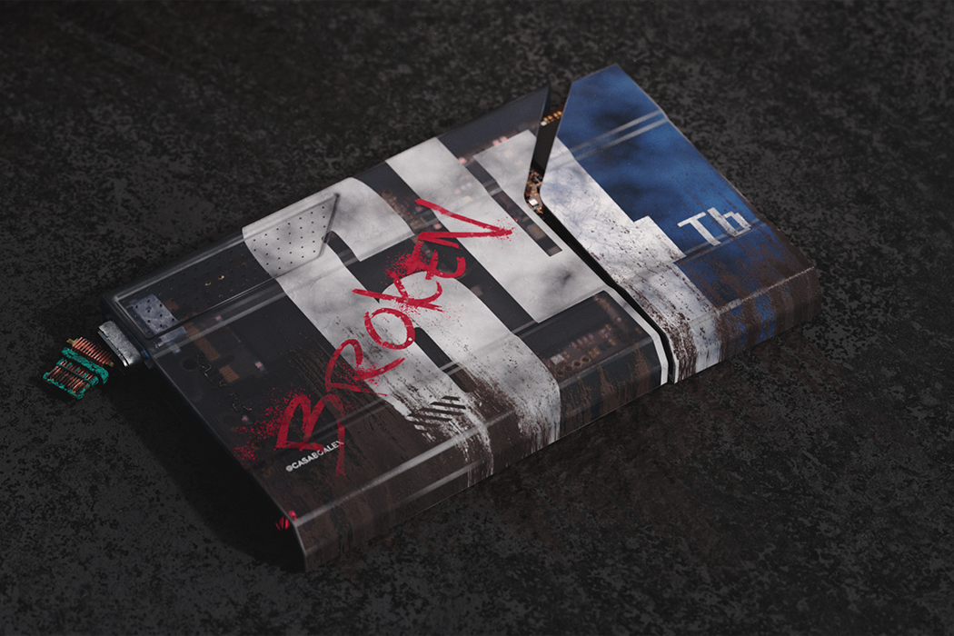
Sourcing his inspiration from sci-fi movies like Star Wars, Alex Casabò conceptualized in 3D, his own interpretation of what he calls, a “really fast sci-fi SSD,” bringing a traditional SSD and taking it to new heights, perhaps even new galaxies, with a distinct, rugged exterior and lightning-fast drive. Casabò’s SSD concept looks lived-in like it’s headed straight for Crait. SSDs, which rely on flash memory to keep things moving and storage processed, are known for their low read-access time and fast throughputs. Conversely, other storage devices like hard disks store a computer’s memory on mechanical hard drives and generally move a lot slower.

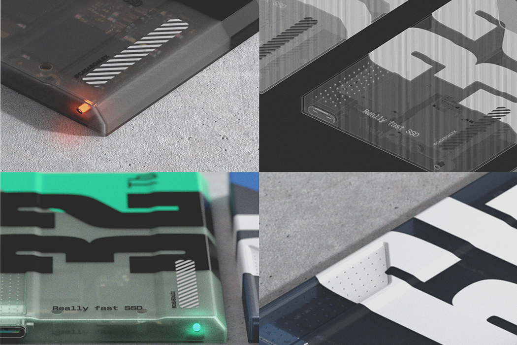
Opting for a more futuristic, cyberpunk aesthetic for his digital SSD conceptualization makes sense since faster speeds indicate technological advancements and go hand in hand with a future world that might look eerily familiar to sci-fi films we grew up watching. His SSD concepts come in three forms, 16 TB, 32 TB, or 64 TB, and come in orange, green, or blue. The translucent, rough-and-tough exterior for his SSD concepts resemble the technological hardware used by the dissidents who form the Rebel Alliance. The SSD’s interior components, the flash controller and flash memory chips, are also visible from the outside, which gives Casabò’s design a distinct look that only brings us closer to the sands of Jakku.

Designer: Alex Casabò

This Tesla Model M + Blade Runner mashup car hovers somewhere above Neo-futurism and lunarpunk!

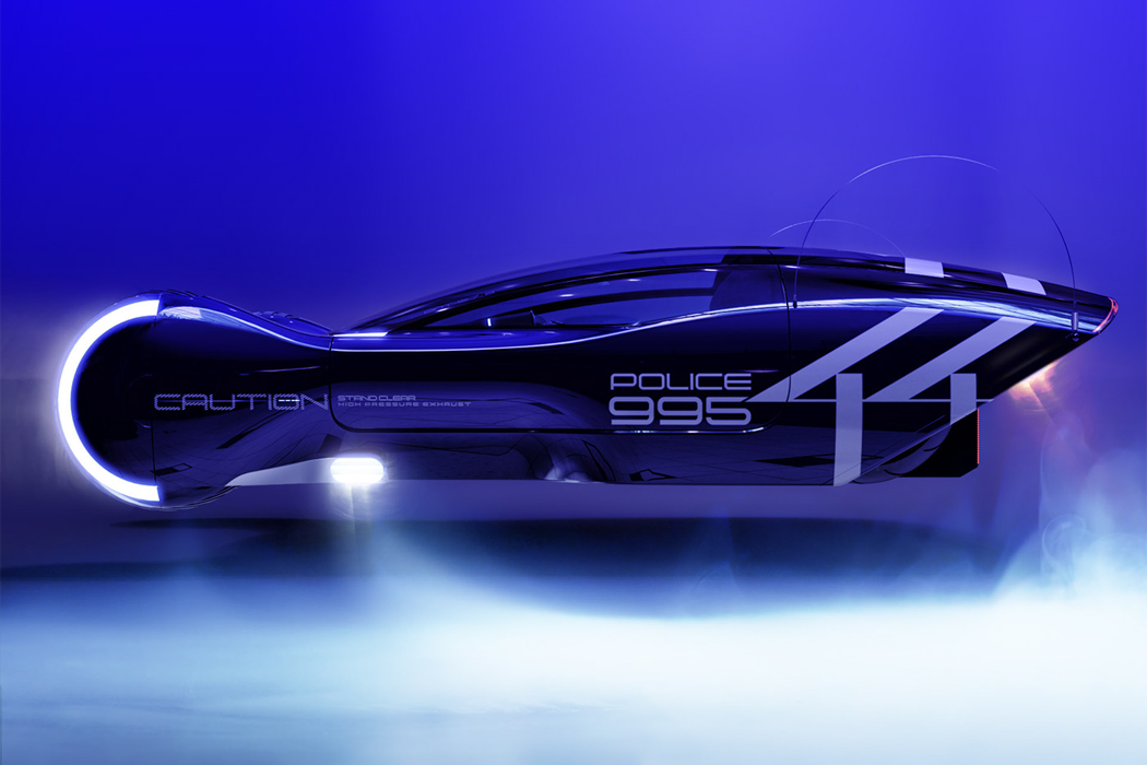
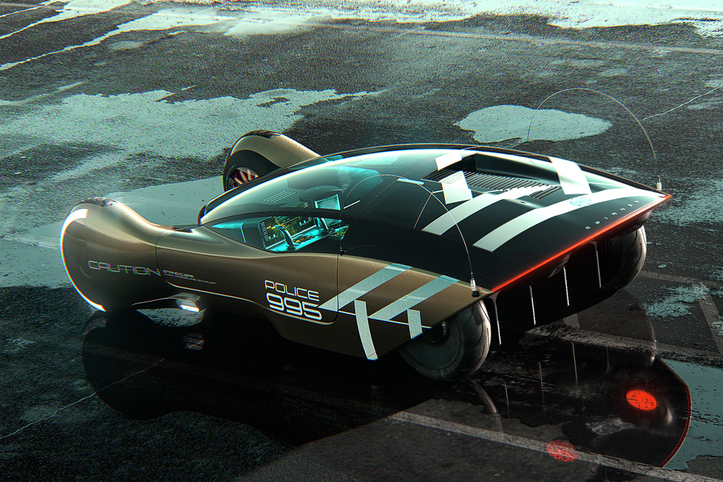
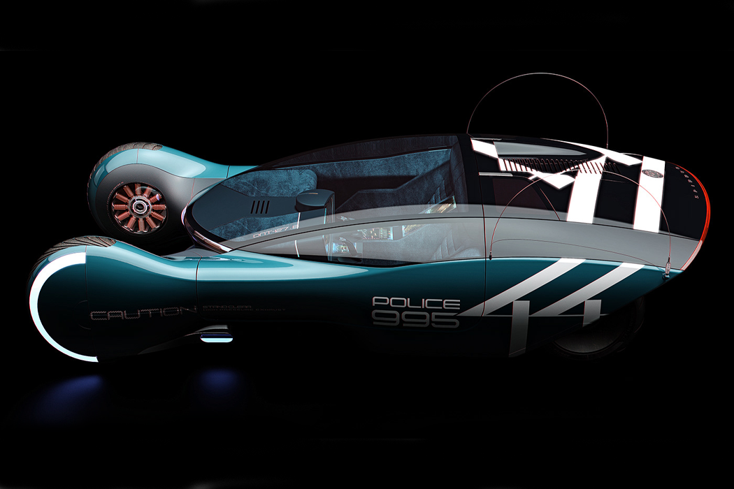
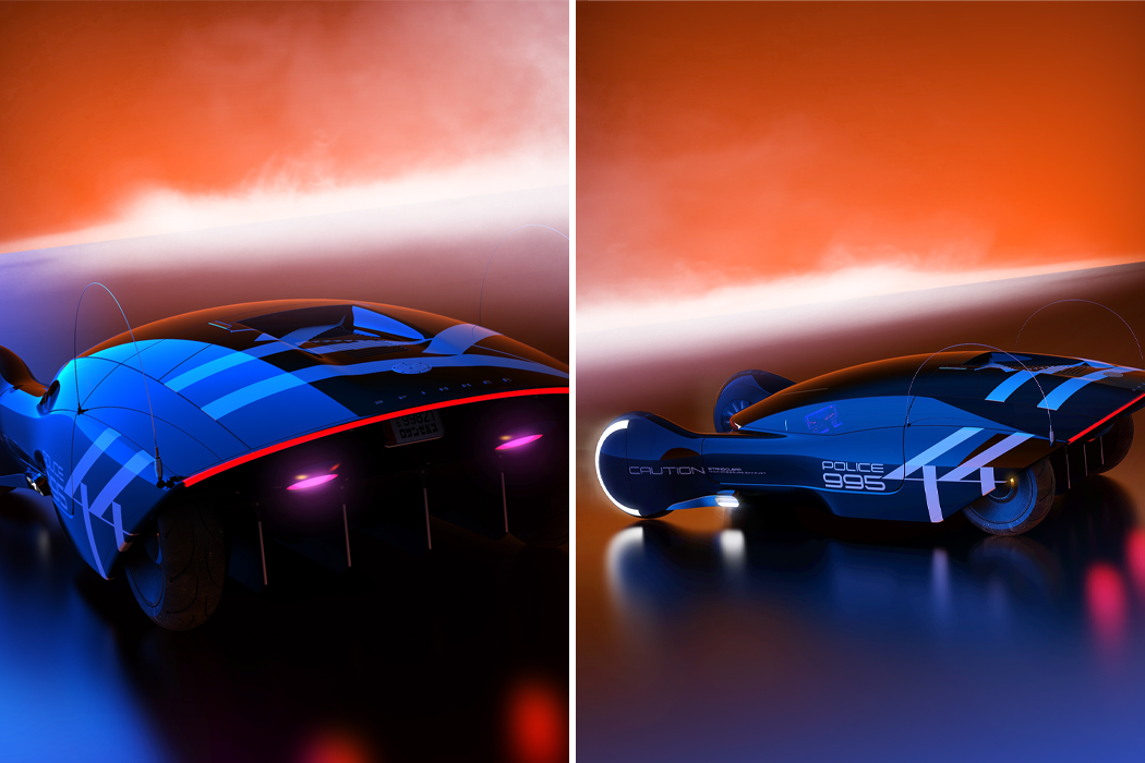
Imagining the cars of the future has captured our attention for years. I still remember drawing cars with wings in grade school because that’s about as far as my imagination would take me. Designer Dan Window looked to Blade Runner to fuel his imagination and created his Spinner 44 render, which both captures the enigmatic spirit of the film series’ Spinner and brings us to new futuristic landscapes.

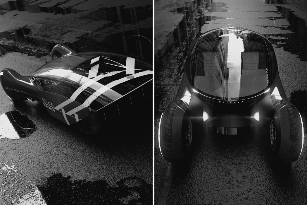
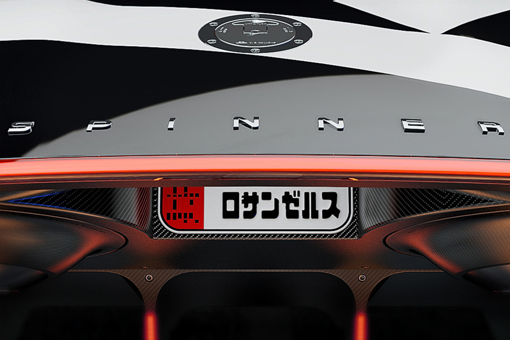
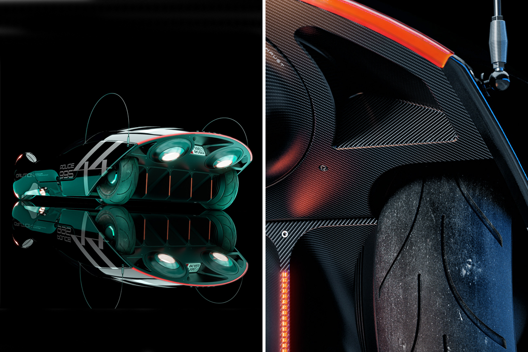
Spinner 44 might oscillate somewhere between Blade Runner’s flying car and a Tesla Model X, both cars of tomorrow in their own right. Operable as a ground-based or airborne vehicle, Spinner 44 appears as a two-seater with an additional back compartment in the trunk. Spinner 44’s dual front wheels are given a proper smoothing, which stretches over the whole car, giving an overall slick, leatherback look. The shape of Spinner 44 resembles the great black wasp, with the front wheels being the wasp’s mandibles and the angular, licked rear, the wasp’s stinger. Lunarpunk looks, like its mirror glaze finish and jet black coating, slide over the whole vehicle, for incognito night drives, into the chiaroscuro backdrop of the Blade Runner‘s City of Angels. Swapping brutalism for neo-futurism, Window’s Spinner 44 embraces the technology of today and tomorrow outside the car as well as inside. Wedged between the car’s two front seats, smart computers seem to run the whole show – I can’t imagine this car’s engine light ever getting turned off. From the rearview, Spinner 44’s additional internal combustion engines provide airlift and carry and jet propulsion for the vehicle.

Syd Mead, designer of the original Spinner, made famous by the Blade Runner film series, described his science-fiction automobile as an ‘aerodyne,’ which means a vehicle that pushes air downward in order to hover aboveground. Other creatives from the film series have said that the Spinner is propelled by three engines: conventional internal combustion, jet, and anti-gravity. Whatever the case might be, let’s see where these flying cars take us. Check out Dan Window’s Blade Runner-inspired render below!

Designer: Dan Window

Architectural design renders that give us a glimpse into the future of humanity: Part 2

As a fan of fictional writing, nothing excites me so much as to see a whole new world, unexplored and full of opportunities. That is exactly how I feel every time I see an architectural design posted by @inwardsound, an Italian 3D artist on Instagram who creates these surreal yet realistic views of our future, kind of like showing different versions of Earth in parallel universes where one twist in fate or act of man resulted in the new society that would be formed under their influence. The designer uses a mix of software, including Cinema4D and photoshop to achieve his vision. Just looking at the detailed effort that goes into each of these renders, it is easy to create a story of someone who lives in that space, which hopefully is COVID-free!

Living in cities, with homes that are so close by, we often know the person on the window opposite, they are practically our neighbors too! Habitat imagines a city where gravity is under control, so people reside on the land level and sky level (literally!) in this amazing view of what the world would be like if we run out of space in our cities. New York 2200 is here, and chances are, you will have a friendly neighbor above you as well!

When man overruns all the forest to create cities, how do they balance the green space? By creating a dedicated space on a higher plane to create a forest that gets plenty of sunlight and it thrives enough to sustain the urban population. Titles Urbs, this render brings to mind such a space, with the richest of the people getting the higher floor and most of the benefits of the environment. Altered Carbon vibes anyone?

Whether our future is in space or on another planet, one thing is for sure – we need greenery! Probably if we enforce that lesson earlier, the future won’t come to a moment where we have to leave the planet. Morbid musings aside, this giant space-ship in the render Space Settlements seems to maintain that healthy balance of nature and humans on it that brings hope that these humans won’t be the round-ish blobs Disney’s masterpiece Wall-E envisions.

The year is 2120 and the city is Tokyo. Anyone who has lived or traveled to Japan knows that it is one of the most organized city in terms of its directions and signage. The huge structure that houses various railway and bullet train lines that run through it every minute is the past of this futuristic Central Station that in the next 100 years should account for the VTOL’s, hoverboards and jet packs as well!

What do you do when you run out of horizontal space? You create a parallel plane to create housing for the remaining humans. Seems a tad bit difficult in terms of the logistics, but the design here named Myst has a charm of its own, like the water-filled city of Venice, where the old and the new come together and share a space while allowing nature to flourish around them.

The increasing sales of air purifiers around the world are proof that we recognize the impact of our actions and the increasing air pollution. But what do we do when the pollution level is so high, that the small scale home purifiers are not enough? We create the O2 Station! Imagine a central, large-scale purifier if you will who stands tall and is responsible for cleaning the toxic air around us, making the environment habitable for humans and plants alike!

What would happen if the circular alien space ship that landed in New York (in Avengers Endgame, of course, this is not a conspiracy reveal) never left? I could imagine it growing earthy vegetation over time and becoming a part of the city’s heritage just like this design titled E-C-C. Population growing at an unprecedented pace causing us to capture space in every form – be it vertical skyscrapers or circular structures – this is a reality we can see sooner rather than later.

Usually, we associate the colour red with vibrance and even violence but there is something about the use of red in this render that brings to mind the zen temples of Kyoto in their fierce autumn glory. The multi-level structures in a grid-like a pattern are random yet organized at the same time, giving the city its name, the Quiet City. Look at this for long and I can almost hear the bells tolling!

We know the importance of the earth’s rotation in our daily lives. Can you imagine living only in the night, with no daylight coming to your rescue? When humans live in space, we will try to replicate what we already know and that is what gives the Rotor City its unique shape. Built around a central axis, the city is built to rotate like Earth, retaining the balance we are familiar with and making the transition from Earth to space easier.

When the people in the 1900s imagined 2020, flying was a legitimate mode of transport and here I am in 2020, stuck in quarantine with no flight in sight. So maybe the future we are envisioning will be not a vastly different route but more of a nod in the right direction, creating that balance we seek. New Life is such a futuristic city, overrun by skyscrapers and plants alike, showing that the new modern must be more green than grey!

Love these design renders as much as we do? Check out more of them in the first part of this series!

3D Architectural Renders so beautiful, you want them in your travel bucket list for real!

Imagine sitting on a beach, crystal clear blue waters, no traffic, smog, or dirt for miles – this is the ideal getaway that Paul Milinski at Vaulter brings to life with his 3D architectural renders. Let’s admit it, in these times, we all are secretly hoping the world goes back to normal in a week (whether our previous normal is good for the environment is a different question altogether) so we can go out and roam the streets fearlessly, go get that beach vacation we always wanted and put the entire COVID chapter behind us! The current world stats present a grim reality, so while we stay cooped up at our home to save the planet, let’s have Paul’s work transport us into this alternate dimension – full of serene water bodies, realistic tropical landscape and where pastel colors add a pop of freshness to that space. Paul’s talent in creating these detailed renders is evident from the fact that the first reaction of readers on seeing this image is to ask – where is this place?! So, let’s sit back, relax, and imagine ourselves living it up at these locations.

Life on the Pier at the edge of the water, where the sand means water is full of soothing pastels as imagined by Paul Milinski. The scene rendered out by Paul shows serene waters, almost like an escape in Bali or a scenic island, free of crowds and COVID of course!

Date night gets a whole new twist with this render titled ‘Table for Two’. Quiet, secluded, and chatting over the moonlit and candlelit dinner tables, that place is zen come to life, with water lapping at your feet. The table for two is the way to connect yourself with your partner, your surroundings and enjoy being in the present.

Titled the Peninsula, this cable car/ ropeway seats your group and provides panoramic views of your surroundings, allowing you to hang out in style. Continuing the theme of pastels to execute his design, Paul’s design once again provides that fantastic escapism we all crave right now!

An architectural render created in collaboration with Charlotte Taylor, this Palm Springs Villa design is the vacation home you didn’t know you wanted!

This design titled the ‘Beach House’ is perfect for every water-baby! With a private pool and a beach at your disposal, this home is designed to heal you with water and sounds of water surrounding you, making the environment just right!

People love a day at the beach, but I personally love the beach on a moonlit night. Firstly the place is quieter, and there is a serenity in the inky blue waters reflecting the silver moonlight, allowing you to speak to yourself and hear what your mind has to say. For such deep reflections, the Moonlight Bay is the house I need.

Forget new year resolutions, we are all out making post-COVID resolutions. One such resolution is to treat myself with a guilt-free spa day! Now, none of the spa’s I know match up to this Spa Mountain design, but it sure promises to heal and rejuvenate you for life!

The Occulus House, named for the circular windows I presume, challenges the traditional window design and adds plenty of sunlight and spotlight in the house by using these circular cutouts. The result, a modern home creating a modern look without any of the old-school window-frames!

Brutalist architecture has long been a favorite of mine, and Paul’s design merges modern architecture with the brutalist style to create my ideal home. The raw-ness of the design is contrasted with the clarity of the blue waters to create a balanced and relaxing environment.

The Towel Chair showcased here is the result of Paul’s exceptional rendering skills and his design skills – creating a product that makes you want to sit on it while the ‘towel’ texture of the design keeps you dry and the furniture safe!

3D architectural renders versus real designs that will inspire you

3D rendered designs are everywhere – right from movies to real-life settings, we have reached a time where it is almost impossible to distinguish between render and the real image of a place. Take for example the image here – on asking, most people prefer the image on the right, which may surprise you to know is a 3D render and not an actual image of the Living Wall, present in a home in Belgravia created by Biotecture.

What sorcery is this you ask? Meet Adrian Lobo, popular on Instagram by his company handle @a3render, a 3D visualization powerhouse working from Mexico whose skills have given a new life to this private garden. Using a mix of SketchUp, V-Ray, Revit, 3ds Max and more, the team specializes in creating realistic 3D visualizations of any given space. Scroll through to see more work by this dynamic team that will leave you in awe!

Below is the real architectural design – The Living Wall created for a private garden in Belgravia by Biotecture.

And this is the 3D render visualization by A3 Render.

The render captures the beautiful pebbles laid at the base with a yellow light that gives a warm, inviting contrast with white light streaming in from those sliding windows. An added spotlight from the top illuminates the entire structure.

Impressed? So are we. Here is some more great work by the A3 Render’s team for you to ogle and get inspired by!

Project Tulum House interior focuses on muted interiors with metallic accents to give the room a highlight.

Project Houston Maeva utilizes a splash of neon pink to create a focal point in the room.

The designer visualizes a chair and its fabric with great attention to detail that wows us!

Tons of natural lighting lights up the render of this Project named Restaurant Hacienda Centro.

Our friendly neighborhood Starbucks could surely use this interesting, inviting piece to entice us along with that heady aroma of fresh coffee!

The team at A3 Render sure loves adding a splash of retro with neon lighting and we love it too as seen in their Project Chroma.

The Project Colorado Springs showcases a raw concrete structure nestled between the surrounding hills. I’m sure this house will have some spectacular views of the mountain and the valley.

Marble, in both dark and light shades dominate the Bocce Restaurant.

The Puebla’s Cabin is a perfect mix of modern and rustic getaway for those who want a break from the cityscapes.