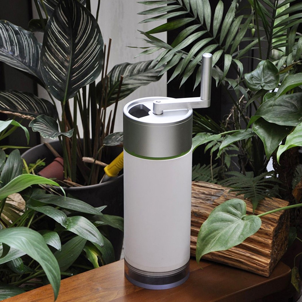
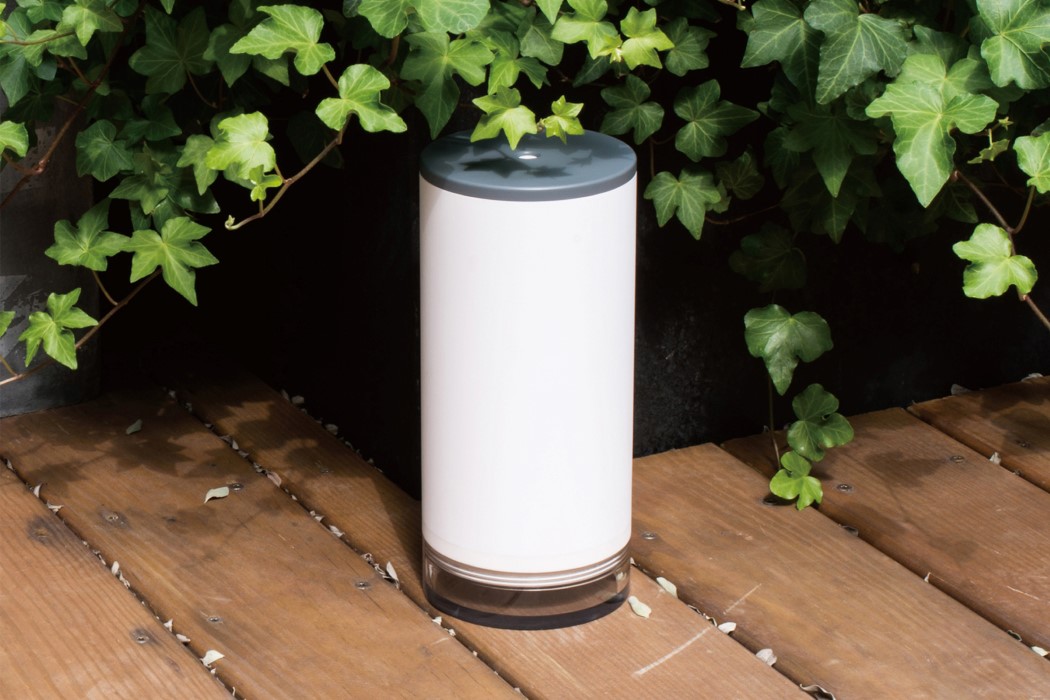
This handheld composting machine works just like a coffee-grinder, turning waste into nutrient-rich pulp!

No, this doesn’t mean your coffee-bean grinder can help you make compost!

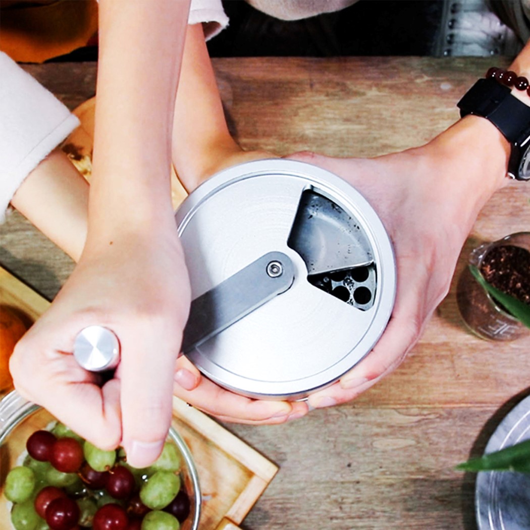
The ReGreen is a nifty little handheld device that’s designed to speed up the composting process by entire weeks. Working almost like a handheld version of your waste-disposal machine, the ReGreen lets you manually crush and pulverize your waste into smaller bits that are much easier to biodegrade.

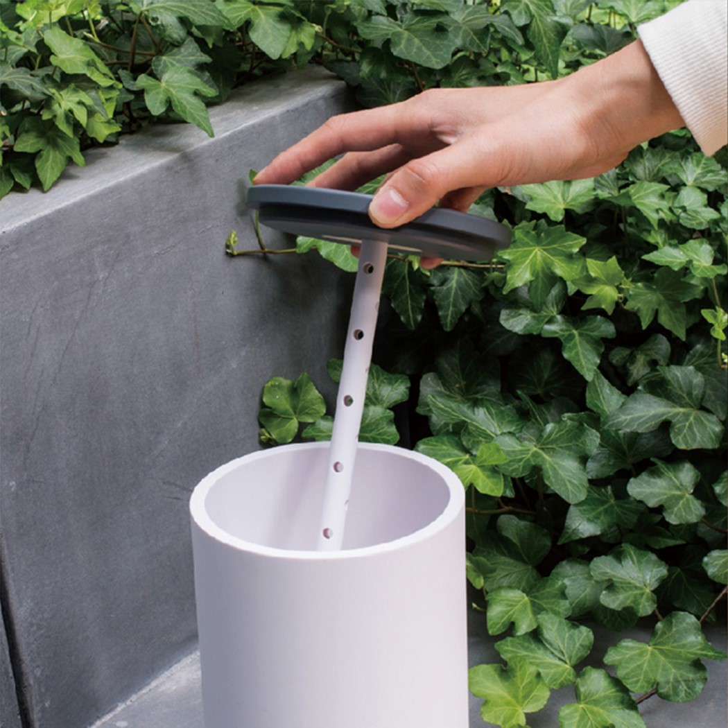
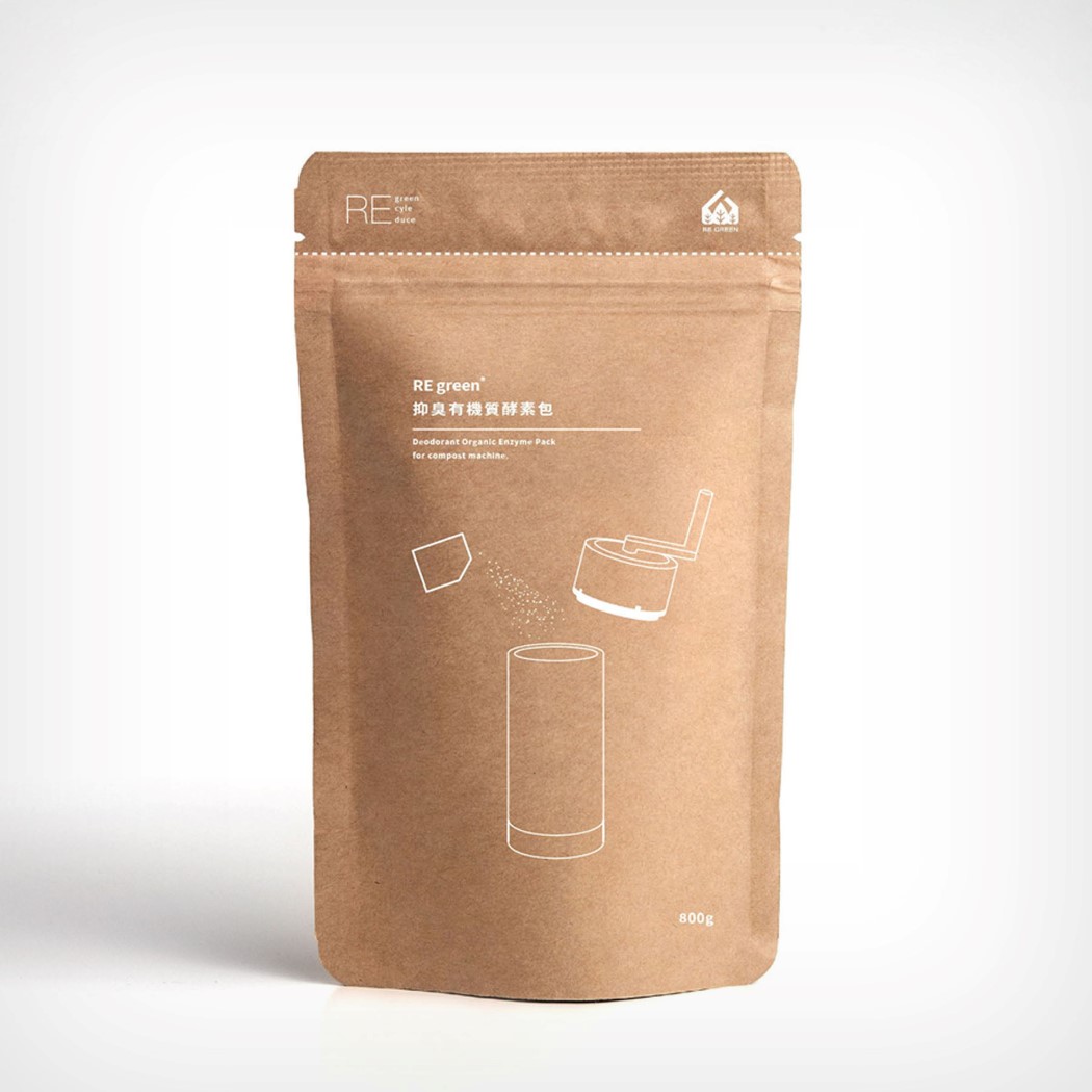
The grinder-shaped device is made entirely out of aluminum, allowing it to easily cut through waste while resisting rot/corrosion, and being easy to clean. Waste goes into the ReGreen through the opening on the top, and a rotating arm lets you gently and effectively pulverize the waste into manageable pieces, while water drips out of the base, drying out your compost. A sachet of enzymes are then introduced into the ReGreen before shutting the lid. The enzymes accelerate the composting process by giving the microorganisms the food they need to break down the organic waste into nutrient-rich dry-compost in a matter of weeks – as opposed to the months it usually takes for waste to turn into compost. Once a composting cycle is complete, the ReGreen can easily be rinsed under running water and cleaned with soap!

The ReGreen Tiny Compost Machine is a winner of the A’ Design Award for the year 2020.

Designer: Shihcheng Chen

Your 2021 Interior Design Lookbook – Winning Interior Projects from the A’ Design Award

I’m aware that the world spent all of last year locked indoors, but believe me, if these ‘indoors’ looked anything like the ones I’m about to show you, I could sit indoors forever! Here to break your ‘Indoor Fatigue’ are some absolutely refreshing Interior Designs from the A’ Design Award and Competition.

Interior Design forms just one of the various categories of the A’ Design Award and Competition, which spans the popular categories like Architecture, Lighting, and Consumer Electronics, as well as the obscure, lesser-known categories like Cybernetics, Prosumer Products, and Safety Apparel Design. The A’ Design Award’s ultimate goal is to be an umbrella that covers good design across all disciplines, which is why it has 100 different categories for submitting design projects, and 218 jury members (comprising academics, design professionals, and press members) from all around the world collectively judging the works. Winners of the A’ Design Award don’t just secure a trophy and a certificate, but receive an entire PR Campaign dedicated towards pushing their career, clout, and even their projects to newer heights. A’ Design Award’s winners and even its participants are included in its annual award book and business network, while additionally contributing to their country’s overall design ranking that paints a holistic picture of how design-centric and design-forward each country is.

Interior Design remains one of the most popular category at the A’ Design Awards, receiving entries by the thousands each year. Here are a few favorites that we wish we had enough money to afford!

Register to participate in the A’ Design Awards now! Hurry, with the final date just 3 weeks away… You still have time to grab yourself an A’ Design Award and make 2021 YOUR year!


01. 4000 Light Restaurant by Niandi Xu

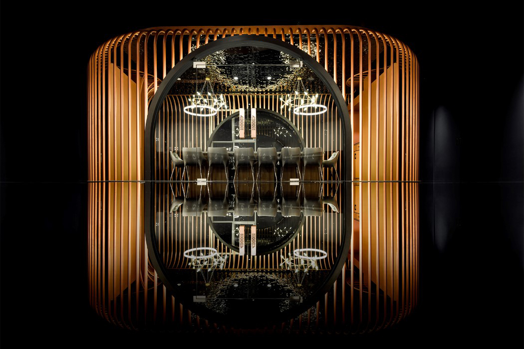
Lighting is perhaps one of the most important aspects of interior design, but it almost always plays a supportive role by illuminating the space. With the 4000 Light Restaurant, the lights define the space. Designed as a fashionable hot pot restaurant for young people, the restaurant cleverly uses lights as a design element, allowing it to define the curves of walls, ceilings, and the individual seating zones (image at the beginning of the article), and be the star element of the restaurant!


02. Guiyang Zhongshuge Bookstore by Xiang Li

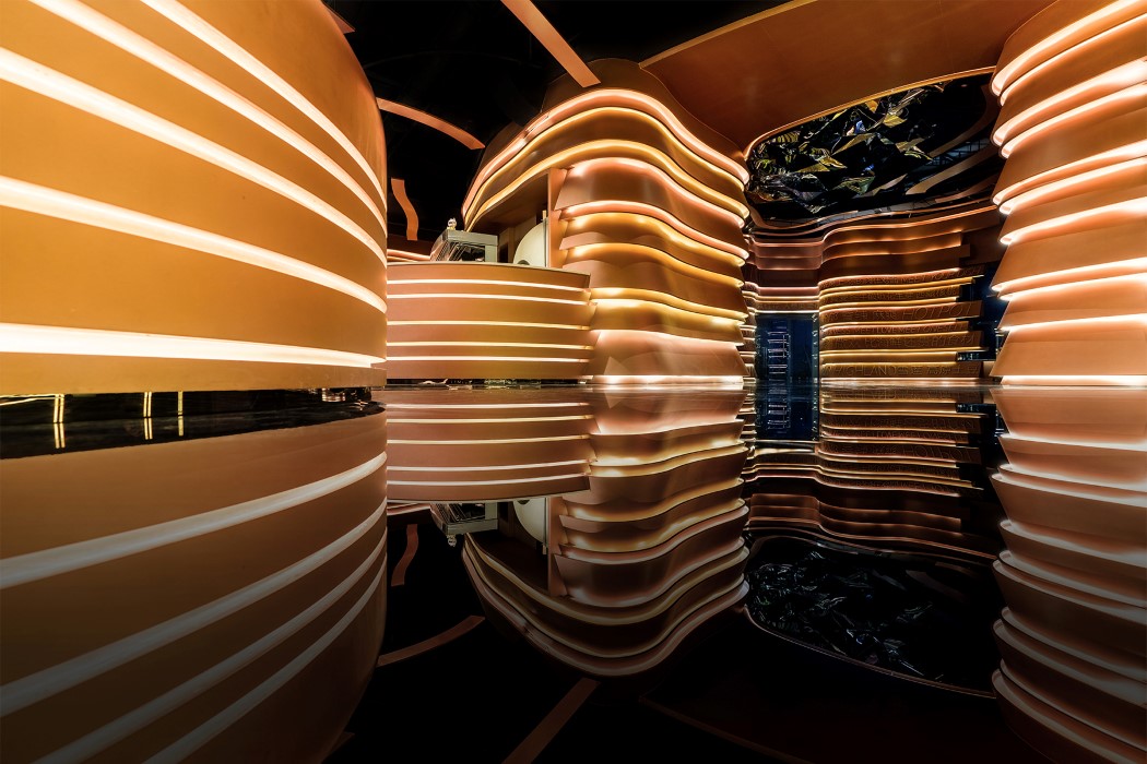
Inspired by the natural landscape of the Guizhou region in China, the Guiyang Zhongshuge tries to pay tribute to the area’s cave-like geography with perhaps one of the most appealing looking bookstores I’ve ever seen. The Guiyang Zhongshuge Bookstore makes the terms ‘living under a rock’ and ‘living in a cave’ sound rather appealing with its meandering tunnels that are lined with books from top to bottom. A mirror-finish floor helps complete the illusion by reflecting the semi-circular space to make it look like a fully circular underground tunnel… you know, the kind of underground tunnel a bookworm would enjoy!


03. Commercial Office Space by Shu Yuan Chang

By liberally using white to make the office look airy and spacious, and integrating greenery into the interiors, Shu Yuan Chang’s Commercial Office Space sets the gold standard for office spaces as well as WFH setups! The project, based out of Taipei city, aimed at renovating a rundown office space with a wild backyard. Through the renovation, not only was the backyard garden made into a quaint recreational space, but elements of greenery were brought indoors through the means of a living wall right in the office space, allowing you to work for hours while still feeling connected with the outdoors, and occasionally getting the whiff of fresh air thanks to the wall’s air-purifying ability.


04. Perception Cafe by Haejun Jung – Feelament

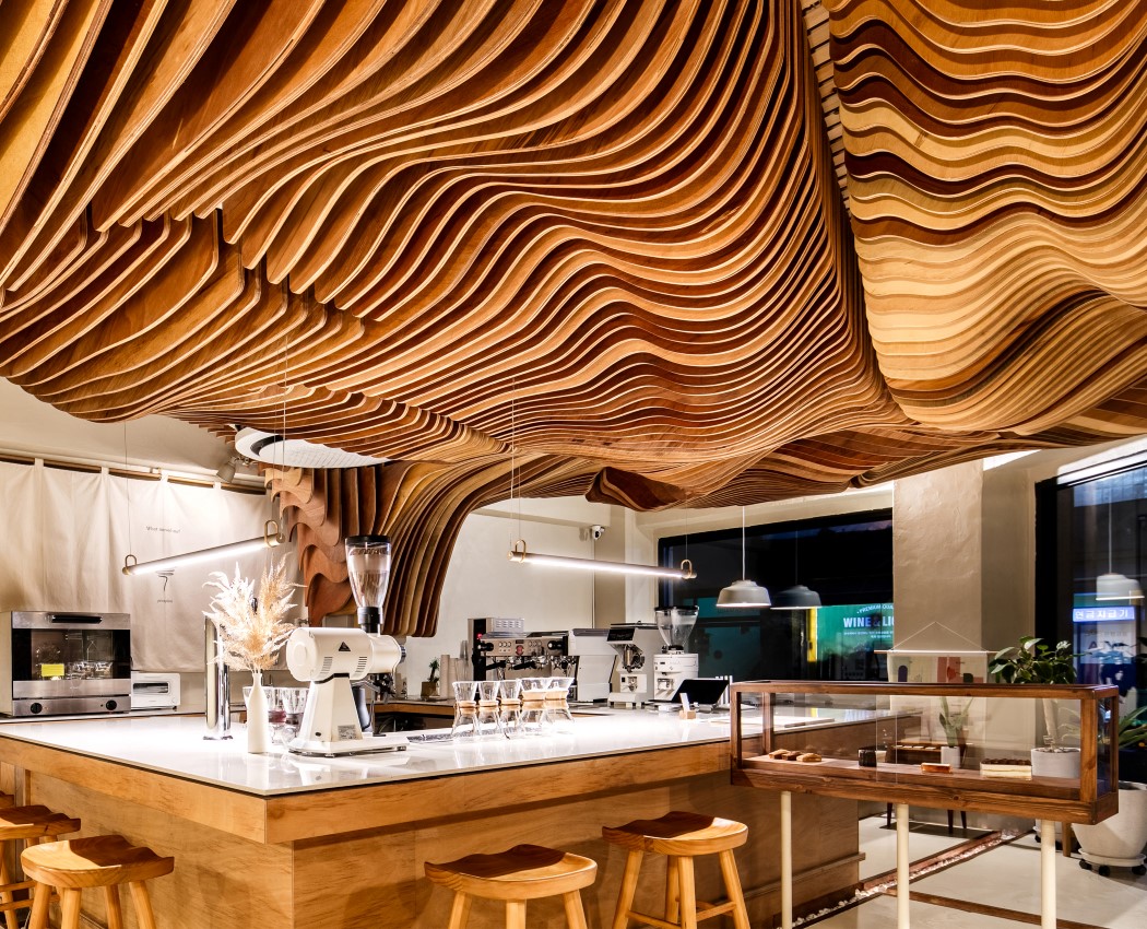
While the previous design made use of living walls, the Perception Cafe displays a living ceiling! Carefully shaped wooden elements help turn a boring flat ceiling into an incredibly detailed art installation that gives the room its signature depth. Dubbed by the designer as the “Shading tree”, this organically shaped ceiling extends all the way from the kitchen to the entrance, creating an ambiance that is second to none. “It gives an unusual spatial effect to people and also become a medium for people who want to be lost in thought with flavorous coffee”, says designer Haejun Jung.


05. Phuket VIP Mercury Studio Office by Songhuan Wu

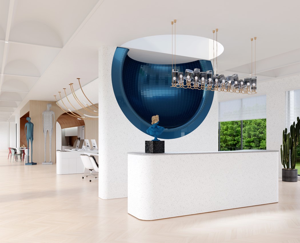
Inspired by the designer’s obsession with the cosmos and astronomy, the Mercury Studio in Phuket looks quite literally out of this world! Combining clean, modern, Bauhaus-esque details with postmodern elements, the Mercury Studio has a quirky appeal that’s undeniable. Combine that with the presence of hemispherical cosmos-inspired design flairs and you’ve got a studio that is just universally appealing!


06. Cozy White Residential by Yu-Chi Liu and Yi-Han Chen

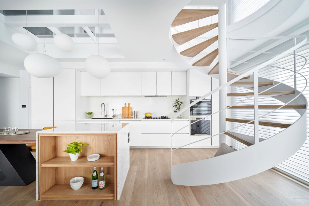
White interiors, a loft-inspired design, and a spiral staircase right in the living room. What more could you ask for?! The Cosy White Residential space uses 80% white paint for a sense of tranquility, interspersed with wooden elements that give the interiors a signature warm coziness. If I had to work from home, this is exactly the kind of home I’d love to work from!


07. Chongqing Zhongshuge Bookstore by Xiang Li

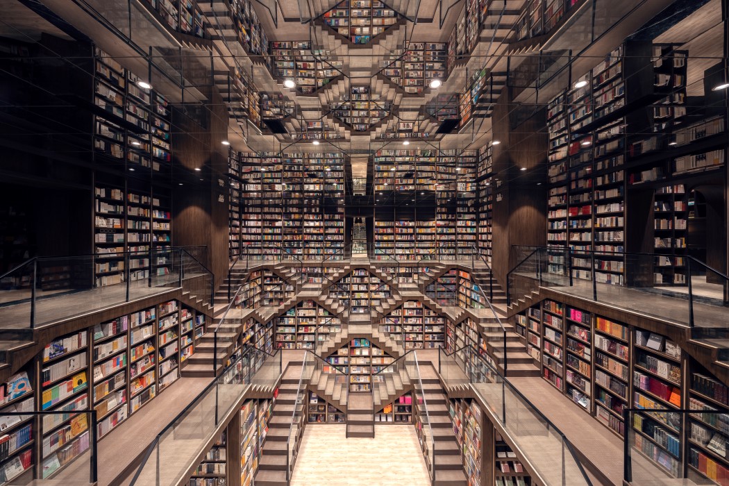
Yet another bookstore by Xiang Li, the Chongqing Zhongshuge Bookstore is inspired by a mountainous landscape. Creating what feels like an endless facade of books, the Chongqing Zhongshuge uses a stepwell-ish pattern of staircases along with endless walls of books as far as the eye can see. In fact, the ceiling uses a massive mirror to give the space a sense of infinity, allowing you to feel like you’re floating in an Escherian world of books!


08. Omakase Restaurant by Tianwen Sun

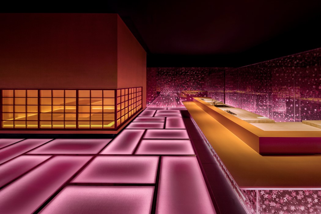
Inspired by the ephemeral nature of the Sakura cherry blossoms which disappear after the early-spring rain, the Omakase Restaurant hopes to keep that Sakura spirit immortal by preserving that moment in time. The walls and omakase counters are dotted with sakura patterns, while the floor has pink, edge-lit brick pattern, almost looking like the roads and pavement covered with sakura petals. What’s so lovely about the space is that it interprets nature through an artificial lens, using acrylic, metal, glass, and LEDs, retaining the appeal but in a more modern way.


09. Portugal Vineyards Retail Space by Ricardo Porto Ferreira

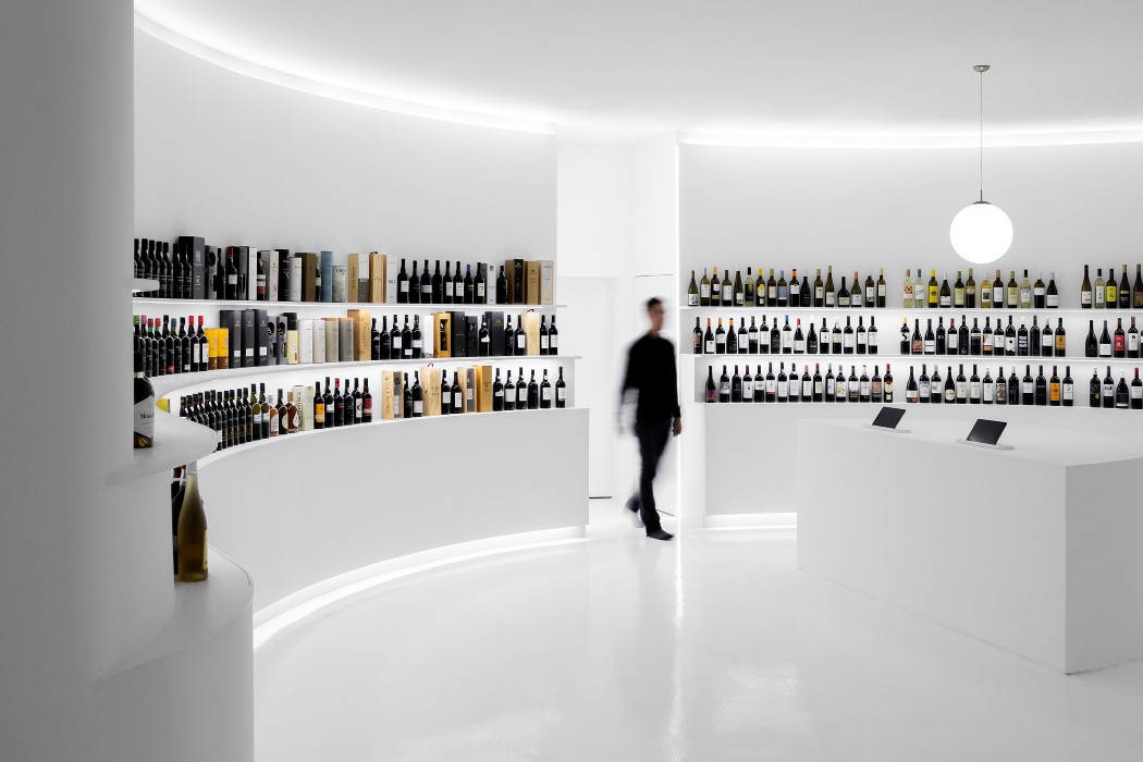
If Apple designed a wine shop with a genius bar (literally a bar!), this is what it would look like. The Portugal Vineyards Retail Space uses white walls to show off its reds and whites. The red and white wine bottles are placed on shelves built into the curved walls, almost taking you on a journey as you window-shop. For assistance, an island at the center of the space lets you consult an expert, know more about the wine, or make your purchase. There are tasting booths too, don’t worry!


10. Painted Skin Tattoo Shop by Yalan Zheng

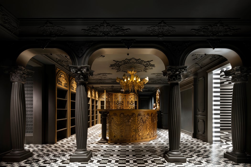
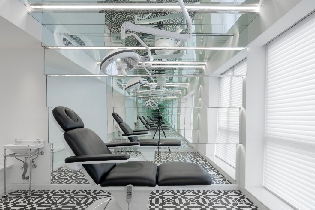
Perhaps one of the most expressive tattoo studios I’ve ever set my eyes on, the Painted Skin Tattoo Shop in Chengdu feels more like a museum than a tattoo studio! Its reception area is modeled on this incredibly detailed Baroque-in-black style, with the use of dark walls and pillars, and a gold chandelier and reception desk. The floor uses an intricate black and white tile system which also finds itself present in the tattoo booths. The tattoo booths are a stark contrast to the baroque reception desk. Designed to look more like a professional dentist setup (I guess the studio has a quirky appeal), the booths use mirrors, and an adjustable medical chair (with a light) to really take your eyes and mind on an unusual, unforgettable journey!


Register Here for the A’ Design Awards and Competition 2020-2021: Deadline 28th February 2021

Yanko Design recommends these award-winning lighting designs to brighten your spaces!

We’re kicking off 2021 with inspirational lighting designs to help ‘spark’ your imagination! Perhaps the most ‘lit’ amongst the A’ Design Award’s multiple categories, this list looks at winning designs from the past year, celebrating good design from the year gone by. The Italy-based A’ Design Awards and Competition have always tried to be more than an award, by creating a multi-disciplinary program that rewards designers while also creating an environment that helps designers grow their products as well as careers… And yes, you also win a shiny trophy.

We look at the top Lighting Designs from last year, creating a compilation of what A’ Design’s stellar 218-member international jury panel deemed worthy of winning the A’ Design Award. While we’re at it, do check out what Winning an Award does for your Design Career, and don’t forget to head down to the A’ Design Award and Competition page to register to submit your design entries for the Award. The last date of submission is February 28th, 2021 and the awards will be announced here on YD on April 15th!

Register to participate in the A’ Design Awards now! Hurry, with the final date just 3 weeks away… You still have time to grab yourself an A’ Design Award and make 2021 YOUR year!


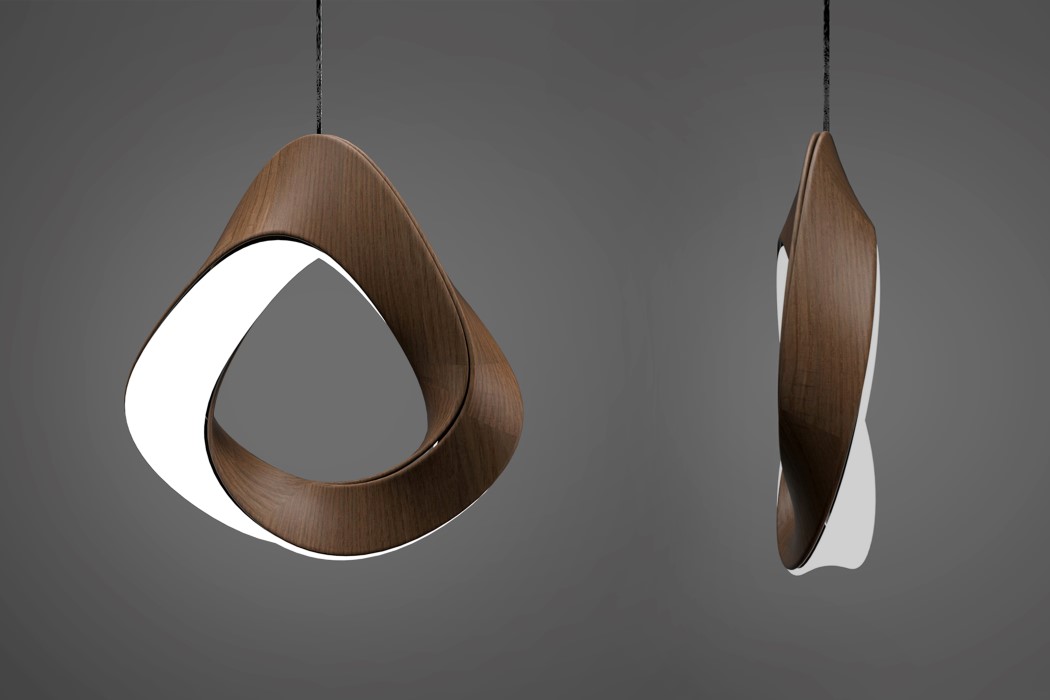
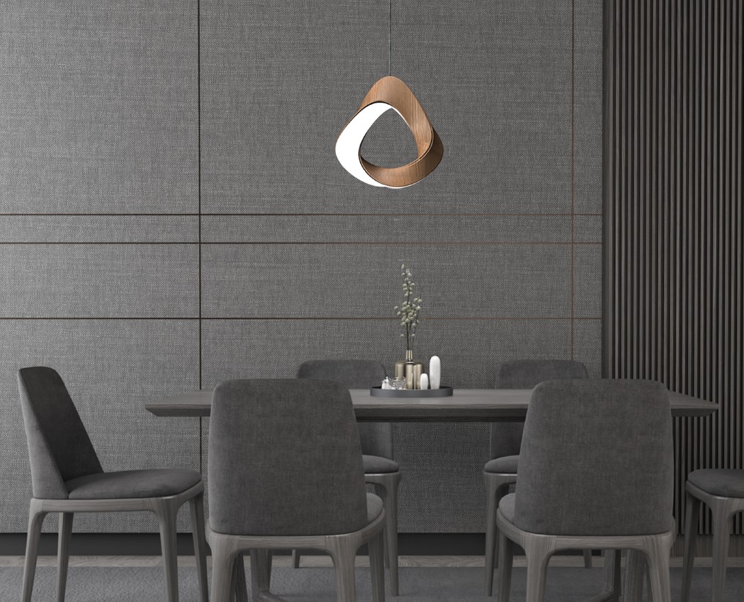
01. Mobius Lamp Lamp by Kejun Li, Zhang Jiahua and Nitesh Narappa Re

Inspired by the shape of the Mobius strip, this lamp transforms the 2D strip-design into a 3D form, creating a bending path of light that looks interesting while illuminating a larger area. While Mobius Strips are known to have a single, continuous surface, the Mobius Lamp sacrifices that detail in an effort to create something arguably more interesting. The 3D lamp has a single illuminating surface that twists around wooden veneers, creating something that looks impressive even when it’s switched off!


02. Pluto Lamp by Heitor Lobo Campos for Gantri

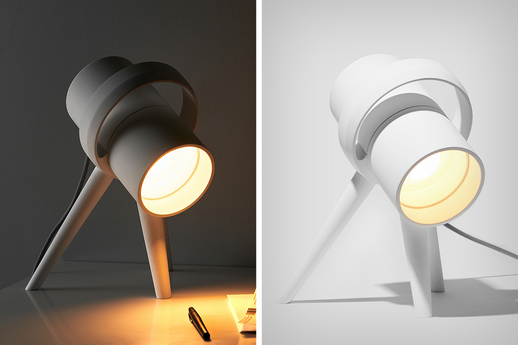
Pluto was inspired by telescopes, which use tripods and dynamic but stable forms… however, instead of having a lamp focusing upward and outward (like telescopes), Pluto shines downward, focusing on the earth in general, and your table, specifically. Designed by Heitor Lobo Campos for 3D-printing lighting company Gantri, Pluto’s form is simple and sensible. A cylindrical lamp rests on 3 legs, giving it a small, stable footprint, while a circular ring that extends around the top works as a handle, allowing you to lift the lamp to move it around, while also sort of making it look like a planet with rings around it. Maybe the lamp should have been called Saturn, eh?!


03. Mobius Pendant Lamp Pendant Lamp by Nhi Ton

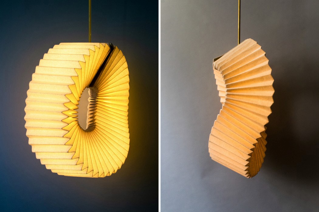
Your eyes aren’t deceiving you! This is an example of how a single source of inspiration can lead to two incredible (and award-winning) designs! This Mobius Lamp by Nhi Ton uses a pleated paper design to create a visually interesting light source. Unlike the previous Mobius lamp, this one isn’t a stiff, solid design. The paper construction means the lamp can be played with, twisted, pulled, compressed, and manipulated in all directions. Aside from looking visually exquisite, the lamp also introduces a tactile element, which means you don’t just appreciate the lamp with your eyes, you do so with your hands too!


04. Fragrance Lamp Lighting object by Georgiana Ghit

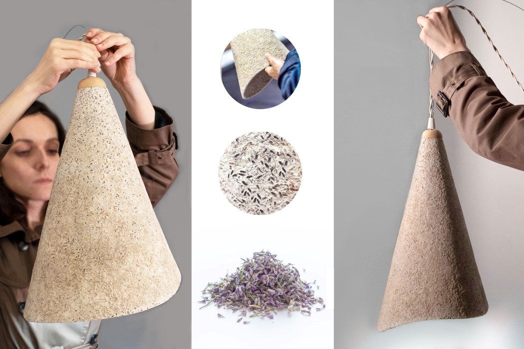
The Fragrance lamp too, is a multisensorial lamp that targets the visual, tactile, as well as the olfactory senses! Perhaps the first lamp I’ve heard of that also was designed to be smelled, the Fragrance Lamp’s shade uses a combination of dried lavender seeds, buds, and a wooden paste to create something that has the texture and consistency of papier-mache, with the aroma of natural essential oils. If dried and preserved correctly, the lamp will never lose its fragrance. Touch it for texture, smell it for perfume, and switch it on to illuminate spaces… the Fragrance Lamp does things not many lamps are capable of doing!


05. Frutta Lamp by Masashi Yamanaka and Kaori Osawa

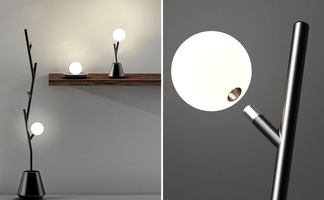
The name hints at the product’s source of inspiration! Designed to mimic the act of picking a fruit off a tree, the Frutta lamp is an orb-shaped lighting device with an ecosystem of lamp-stands that range from a floor-standing ‘tree’, to a tabletop ‘shrub’, to a fruit tray! The lamp can be mounted (and charged) on any of these stands, and the purpose of the stand is to really drive home the story behind the product while the interaction of ‘plucking’ the fruit reinforces this award-winning lamp’s powerful story!


06. Oplamp Table Lamp by Sapiens Design Studio

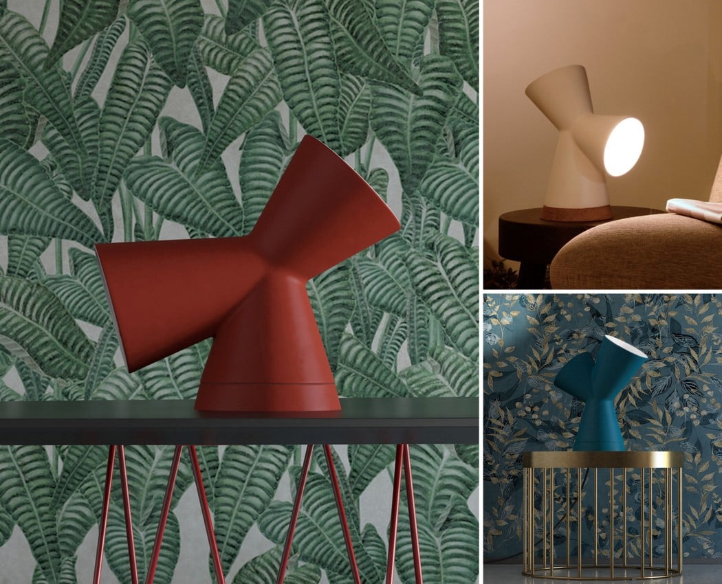
The Oplamp has three different avatars within the same body! Its strange shape (reminds me of the Wacom logo) features three intersecting hollow cones, with a lamp at the center. Place the Oplamp any way you want by resting it on any of the three surfaces and the remaining two cones point the light in different directions. The three differently shaped and angled cones allow the light to point in a variety of directions, depending on which cone you use as the base. It’s a clever little trick that allows the Oplamp to be an ambient light, an accent light, or even a table-lamp!


07. Poise Adjustable Table Lamp by Dabi Robert

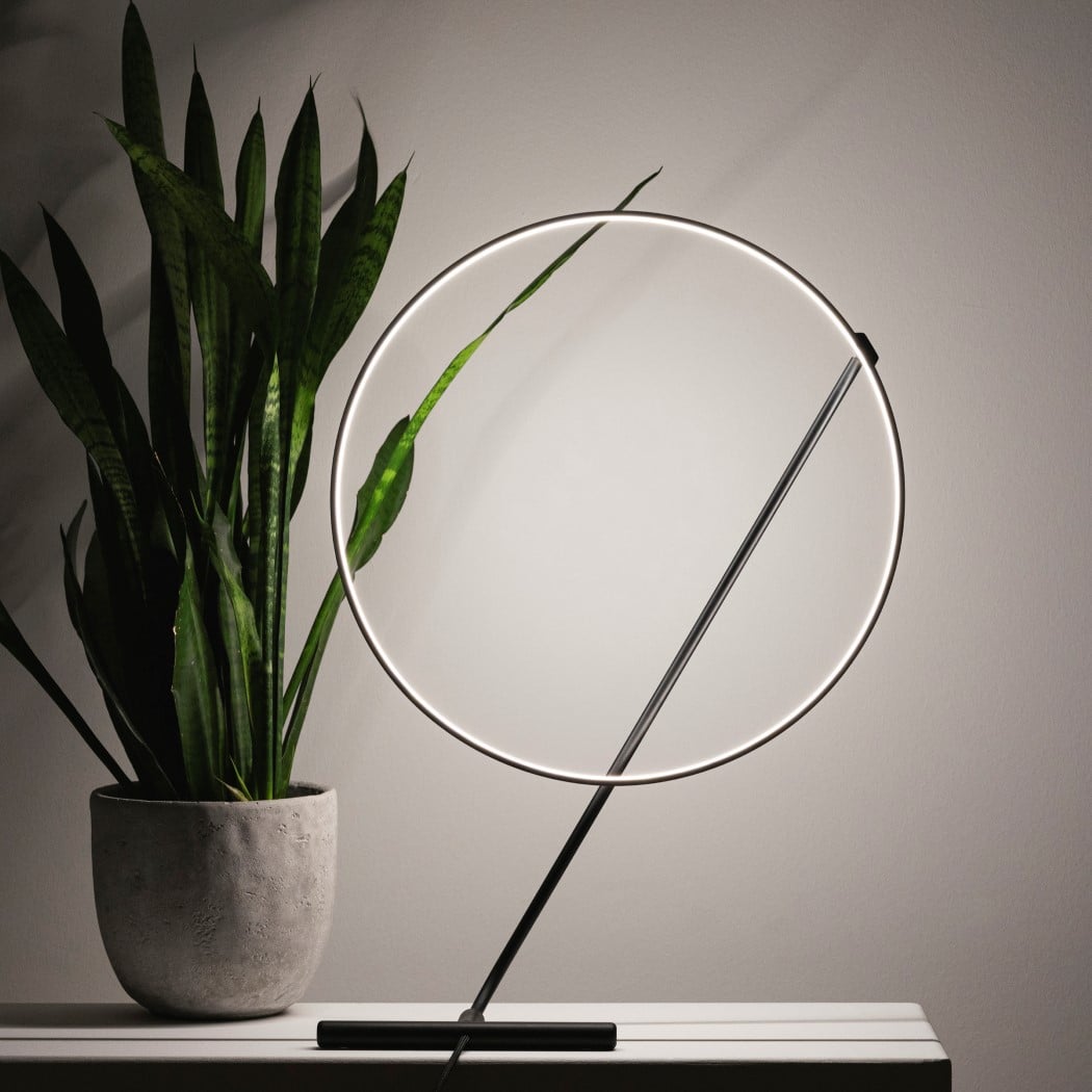
Minimal, contemporary, flexible – these three words perfectly capture the Poise lamp’s features and its inherent appeal. The adjustable table-lamp has a unique halo-shaped light mounted on a vertical channel that rests on the lamp’s base. With a total of 3 swivel joints at the top and the bottom of the vertical channel, the Poise can be rotated up to 320 degrees and be adjusted in multiple ways, creating a unique combination of geometric forms each time!


08. Wave Lamp by Mario Mazzer

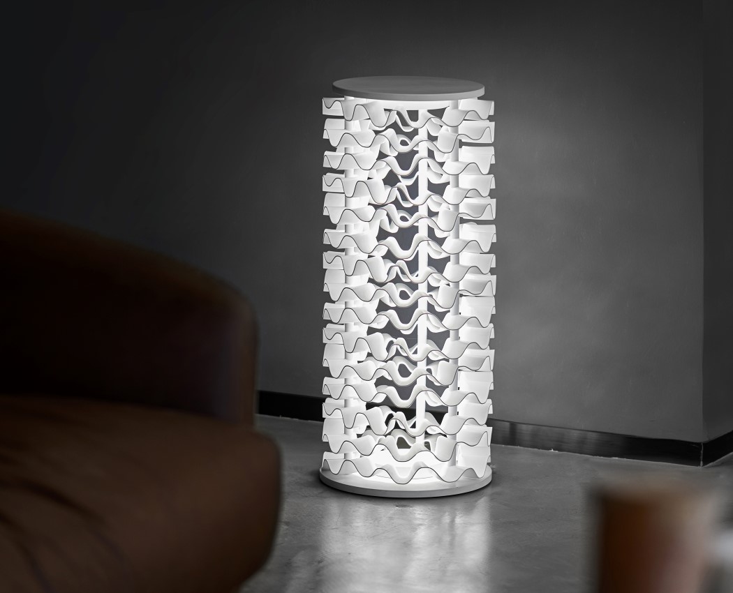
The Wave Lamp isn’t so much about the light itself as it is about how the light reacts to the lamp’s frilly surface. Created using multiple wavy plastic elements, the floor lamp has almost a coral chandelier quality to it. The lamp has a visual duality. When lit, the waves that reflect the light create a suggestive chiaroscuro effect giving the lamp a visual perception of depth which changes depending upon the viewing angle. The light beam sways thanks to the wavy rings of the lamp creating evocative shadows. When switched off, the lamp appears more dense and sculptural.


09. Dorian Architectural Lamp by Marcello Colli

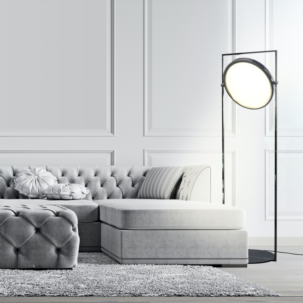
Designed with a dual purpose, the geometric Dorian Lamp comes with a slim metal frame that has an independently rotating disc within it. On one side of the disc is a mirror, while the other is a lamp. Marcello Colli calls the Dorian’s frame and use of geometry essentialist, not minimalist. It’s a way of understanding that every part of the lamp plays an essential role, be it the frame, which holds the main unit aloft, or the rotating disc, which serves as illumination when you need it to, and reflection when you want it to.


10. E Drum Kinetic Electronic Drums Show by Idan Herbet

Easily the most unusual entry in this design round-up, the E Drum also echoes the philosophy of multi-sensorial design. Can light be heard? Surely not, right? But what if I reframe the question… how much of the experience of a musical concert is JUST in the listening? Light plays an incredibly important role in bringing music concerts to life, which is why there’s a euphoria associated with seeing your favorite artist perform on a stage versus listening to them on Spotify. E Drum was created to give the audience an extraordinary experience they had never seen before. Every aspect of the drummer’s performance was re-engineered simply to make it more visual, more dramatic. From the 360° layout (which is designed in a way to make the drums at the back visible too), to the fact that each drum is ring-lit, the E Drum is an audiovisual treat. Moreover, when the drummer hits the beat, it sends a MIDI signal to the light around the drum, creating almost a Guitar Hero-ish experience in real life, where the light dances to the beat of the drums!


Register Here for the A’ Design Awards and Competition 2020-2021: Deadline 28th February 2021

These veggie-shaped sand toys help kids cultivate a love for nature… and vegetables!

Turn anything into a game and kids are sure to be more receptive to it! I mean, it’s easier to feed a child using the ‘Here comes the choo choo train’ trick instead of directly feeding them food, right?!

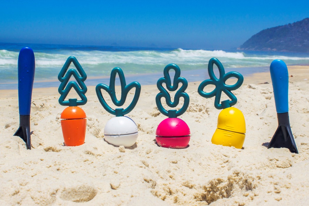
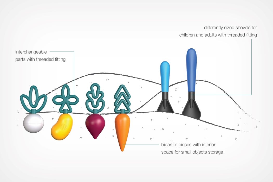
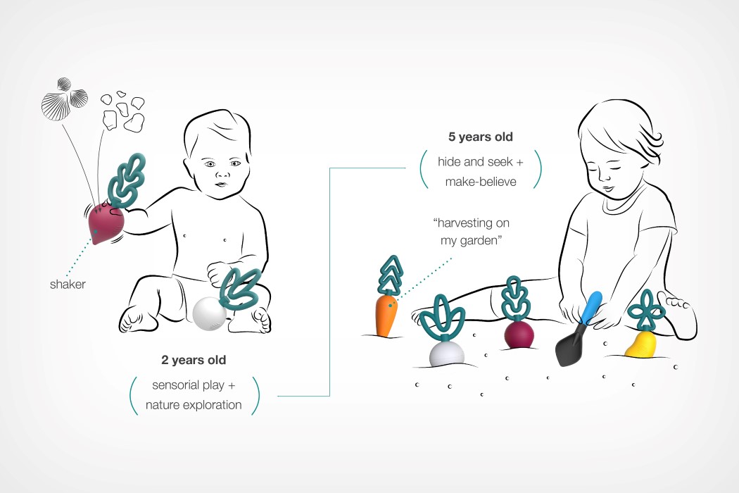
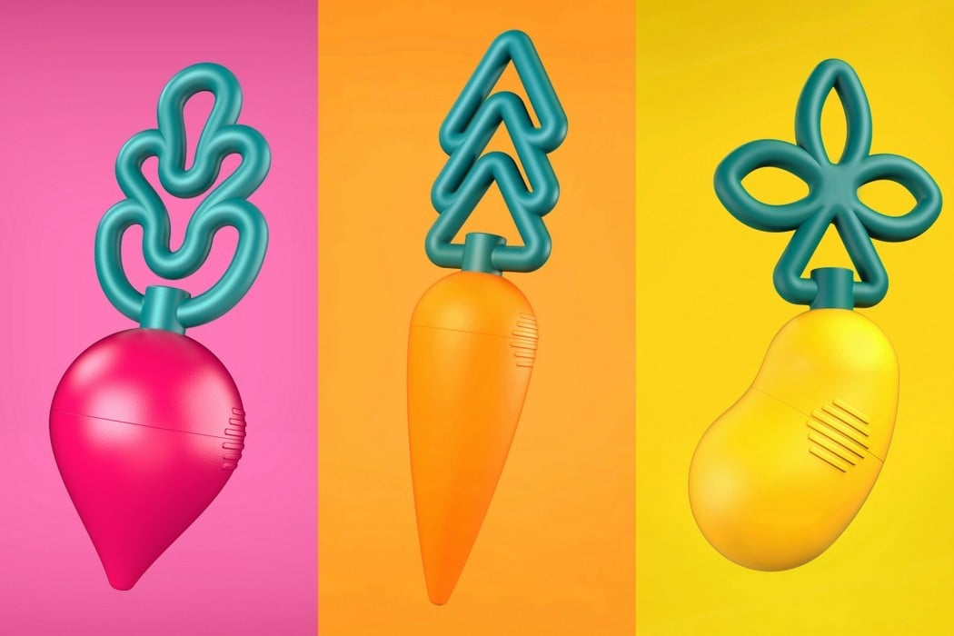
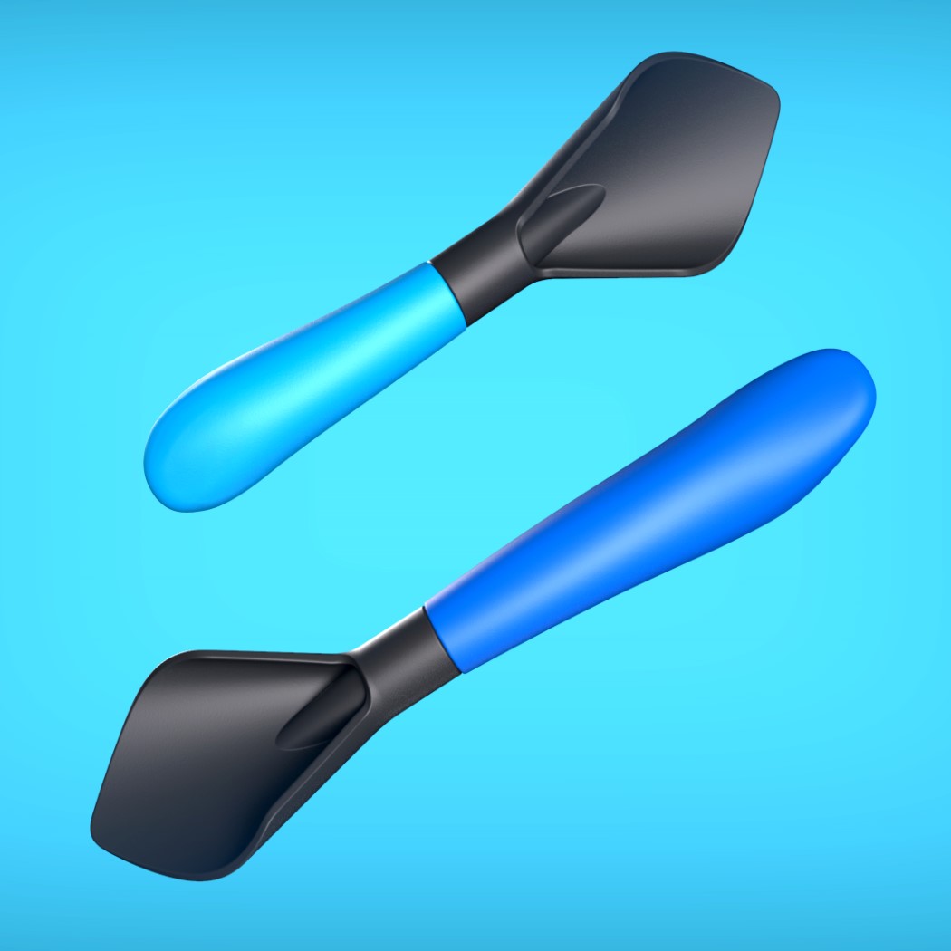
Tati Ferrucio’s Veggies Sand Toys take a similar route by turning vegetables into sand-toys. The toys are hollow so they can be filled with sand, and come with uniquely shaped leaves that act as handles for the child to hold. Paired with a neat digging tool, the Veggies Sand Toys enhance children’s curiosity for exploring nature and their ability to socialize with other kids and adults.

“The idea of this project came from observing the natural landscape in Rio de Janeiro (Brazil) and how families occupy and make use of the outdoor environment. I realize that Rio has many beautiful natural parks and beaches, but none of them were well equipped to promote outdoor play for children”, said Tati Ferrucio, the designer of the toy-set. The standard set has four toy vegetables (carrot, beet, onion, and potato) and two shovels (one kids-size, one adult-size) with three interchangeable heads and interchangeable foliage too. What’s even more clever is the fact that you can bury the toys into the sand, perfectly mimicking how carrots, beets, potatoes, and onions are grown under the ground too! The Veggies Sand Toys are designed to both entertain and educate at the same time… and if somehow kids can cultivate an appreciation for vegetables in the process, that’s just another massive win!

The Veggies Sand Toys are a winner of the A’ Design Award for the year 2020.

Designer: Tati Ferrucio

Here are the 3 countries leading the World Design Rankings in 2021

It’s been a pretty eventful year last year, but I’m glad we’re through with it and we’ve got a lot to look forward to, including this year’s A’ Design Award World Design Rankings. We enter into 2021 with last year’s rankings standing as they are (the charts will only be updated after the A’ Design Awards announce their results in April), but it’s important to look at the progress we’ve made in 2020. Standing firmly at the top of the World Design Rankings are China, USA, and Japan with a total of 3791 awards between them through the years.

The list, created by the A’ Design Awards and Competition organization aims at capturing the year on year design progress of each country. Featuring as many as 108 nations on the list, the World Design Rankings are an ever-changing, ever-evolving set of rankings that wholly encapsulate design progress through their awards program. With the 2020-2021 edition still accepting submissions, it’ll be interesting to see how the rankings change this year. If you want to see your country on the top (along with showcase your best work to the world) take a look at our article on what Design Awards can do for your Career.

We’ve meticulously compiled a few of the top awarded designs from the 3 leading countries that shone at the A’ Design Award. Scroll below to see our selection and if you do want to help your country rise higher up the design rankings, the A’ Design Awards are still accepting submissions till the 28th of February! Every entry you submit raises your country’s score (even more if it wins an award!).

Register Here for the A’ Design Awards and Competition 2019-2020: Deadline 28th February 2020

01. Cady Smart Cane by Harvard University (USA)

Introducing tech in a relevant way to the elderly, the Cady is a smart cane that helps correct gait, track activity, set goals, works as an SOS remote, and lets you contact physicians and therapists whenever needed. The tech lies entirely within Cady’s handle, which snaps onto a bespoke cane, made to the length of the person who needs it. It uses a series of subtle vibrations to help correct the walker’s gait, reducing chances of them falling and/or injuring themselves, while keeping tabs on the user’s movement, activity, allowing them to set personal goals as well as share data with their therapist or doctor. At the end of the day, the handle snaps right off the cane and docks into its own charging station so it can be used another day. There’s even a light built into the back to work as a visual alert.


02. Acorn Leisure Chair by Wei Jingye, Chen Yufan and Wang Ruilin (China)

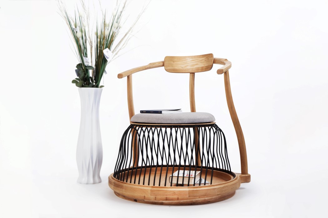
Designed to be a resting area both for you as well as your pet, the Acorn Leisure Chair turns the space underneath the seat into an enclosure for small animals. The chair’s organic curves come inspired from its namesake, the acorn, and its base heavy design provides the perfect resting space for your pet, while allowing you to easily (and comfortably) sit on top. The wooden parts of the chair are CNC-machined to perfection, while the wrought-iron pipes on the base give the chair its sturdiness, while allowing your pets to see your legs as they sit inside their safe-space, providing a unique connection between both occupants! Alternatively, you could use the space under the seat to store books and pillows too.


03. Relax Smartphone Stand by Kenji Fujii (Japan)

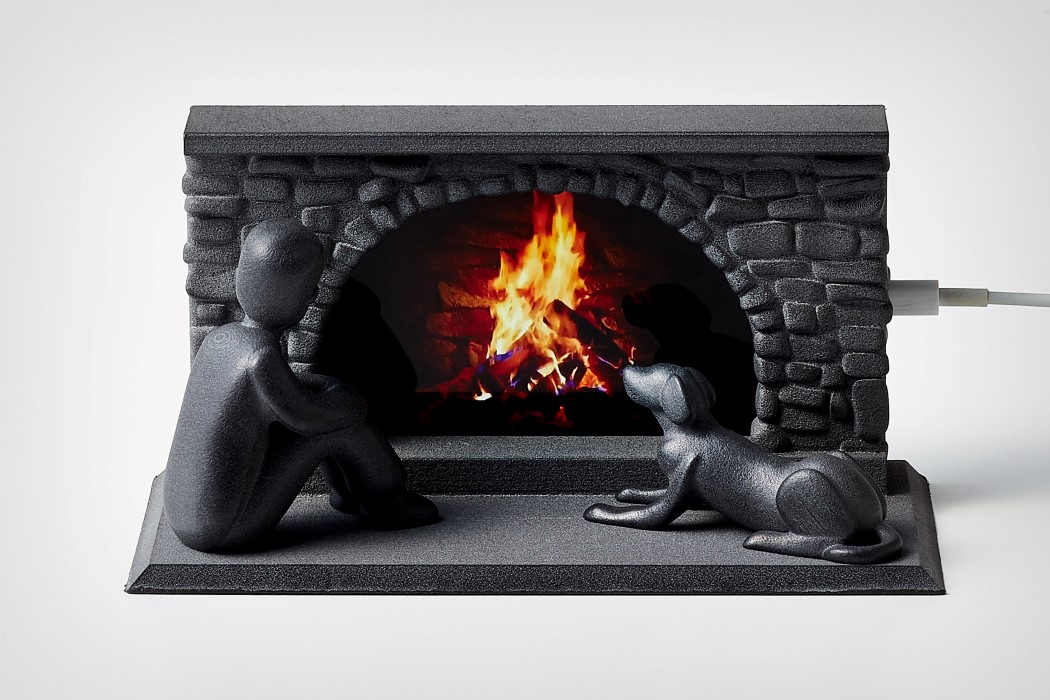
This clever little stand turns your phone into a virtual fireplace! Meet the Relax, a 3D-printed smartphone stand that lets you play a looped video of a burning fire while it charges. Designed to be more than just an average charging stand, the Relax helps you unwind too. Once you dock it in, you’re less likely to use your phone to aimlessly browse the internet or doomscroll. Besides, that quirky virtual fireplace should really help calm you down and achieve a little zen!


04. Pluto Lamp by Heitor Lobo Campos for Gantri (USA)

Pluto was inspired by telescopes, which use tripods and dynamic but stable forms… however, instead of having a lamp focusing upward and outward (like telescopes), Pluto shines downward, focusing on the earth in general, and your table, specifically. Designed by Heitor Lobo Campos for 3D-printing lighting company Gantri, Pluto’s form is simple and sensible. A cylindrical lamp rests on 3 legs, giving it a small, stable footprint, while a circular ring that extends around the top works as a handle, allowing you to lift the lamp to move it around, while also sort of making it look like a planet with rings around it. Maybe the lamp should have been called Saturn, eh?!


05. Airwood Multifunctional Wooden Drone by Uavi Technology (China)

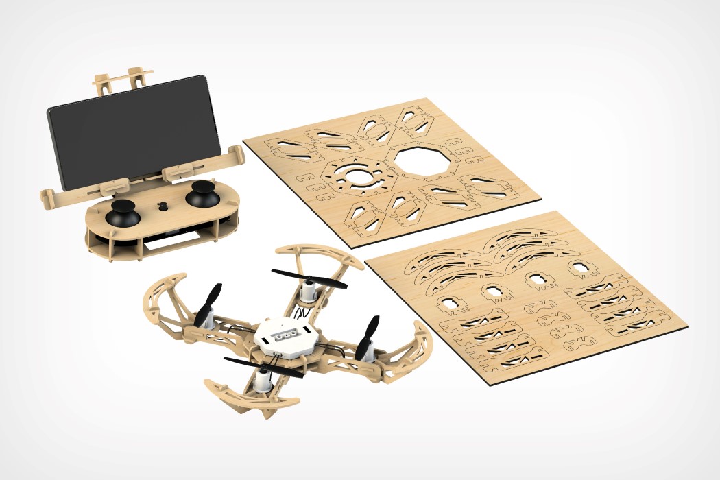
The Airwood puts a creative spin on drone tech that works brilliantly for a number of reasons. The drone ships flat-packed, with its body-parts laser cut out of pieces of plywood, allowing it to take much less space while shipping. Just put the wooden pieces and the tech elements together and you have a fully-functional quad-propeller drone with a remote that even lets you dock your smartphone! On the off chance that your drone’s wooden body sustains some damage, you can easily use its negative (from the original plywood sheet) as a template to craft new pieces, allowing you to fix and upgrade your drone on the fly. It’ll save you cash in the long run, and hey, you’ll even learn how to assemble drones in the process!


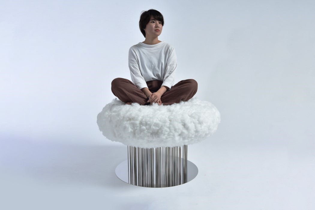
06. Cloud Chair by Shota Urasaki (Japan)

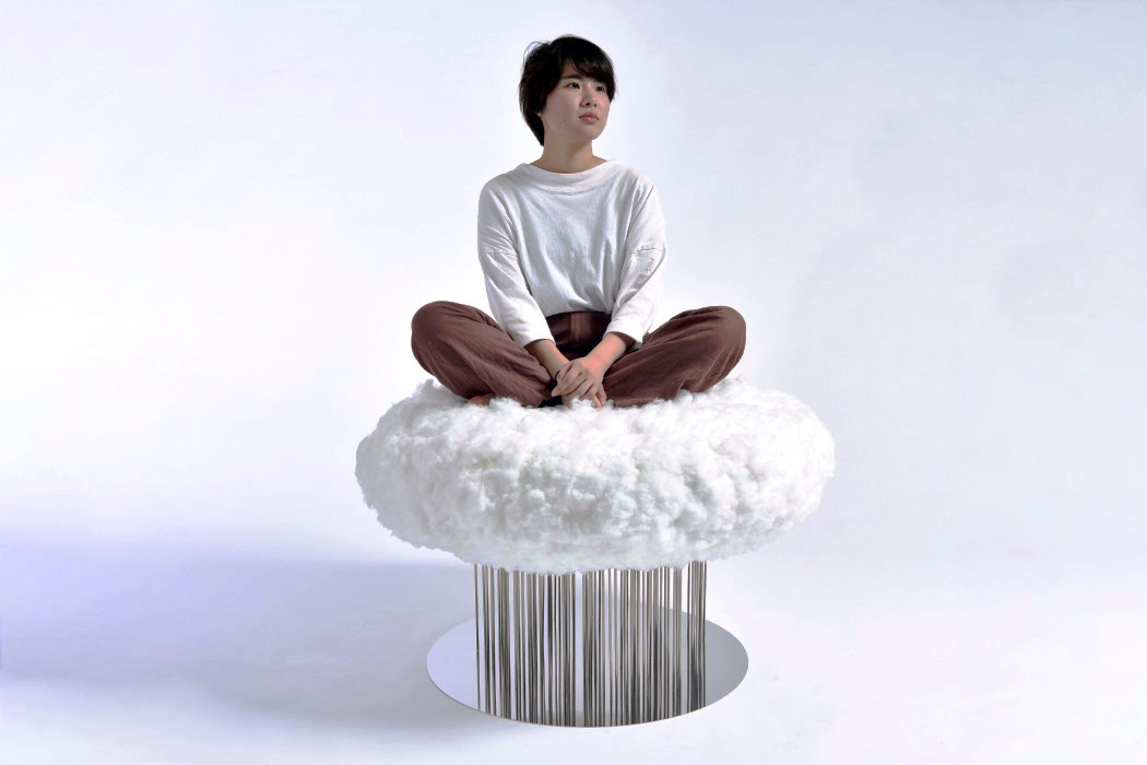
Capturing perhaps every child’s dream, the Cloud Chair gives you the feeling of sitting on a floating cloud. Unlike traditional chairs with 3-4 legs, the Cloud Chair is elevated using multiple metal rods, not only giving the cloud its perceived lightness and airy-ness, but also resembling steady drops of rain falling from the cloud’s underbelly. The inspiration for the chair came to Shota Urasaki after she saw a moving cloud raining over a distant coastline. Inspiration immediately struck and the Cloud Chair was born. The seat comes made from clusters of polyester fibers pierce-fitted into a block of polyurethane foam to give the visual as well as the tactile appeal of a puffy cloud. The seat rests on multiple stainless steel supports, with a mirror at its base to give the rain an illusion of continuity. Clever, eh??


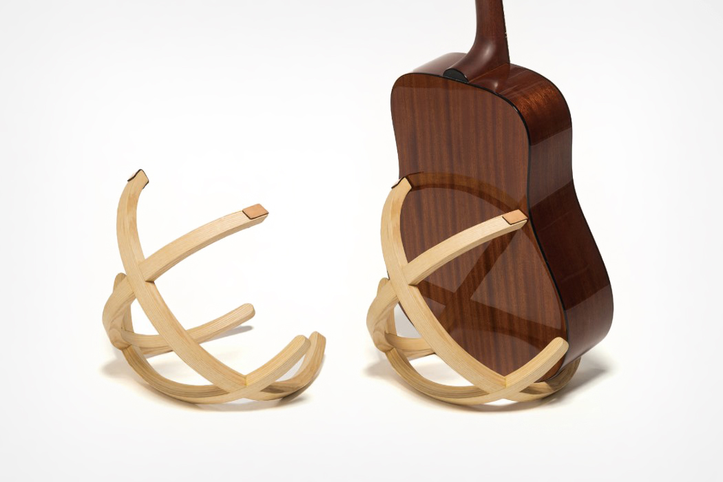
07. Arc Guitar Stand by Hung Yuan Chang (USA)

The Arc Guitar Stand has an incredible sculptural quality to it, which is unusual for a product that’s usually designed to be really functional. A guitar stand is usually quite an unassuming product that fundamentally exists as a background element to the guitar, which sits atop it. With the Arc, the stand has an aesthetic appeal that makes it look beautiful even when there isn’t a guitar resting on it. Besides, its design does a pretty good job of propping up the instrument too!


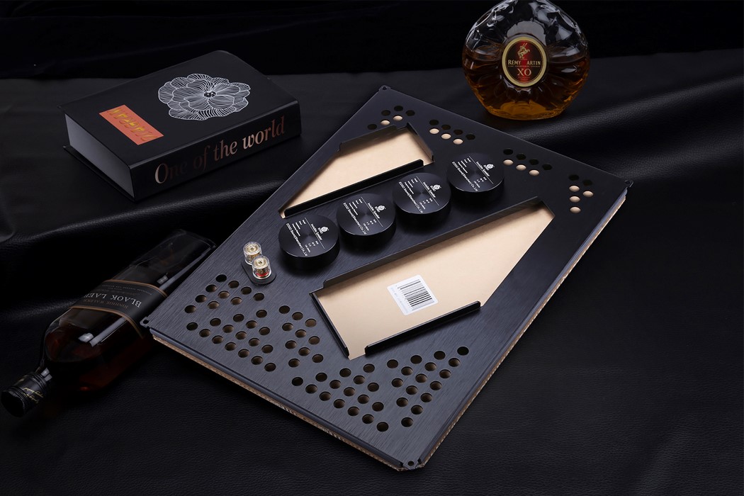
08. Invisible Speaker by Eogo Sound Shenzhen Co., Ltd (China)

Meet the Invisible Speaker, a loudspeaker that’s slim enough to fit right into your drywall. Measuring a mere 33mm in thickness, the Invisible Speaker uses aerospace-grade materials to achieve its slim profile, while relying on a clever honeycomb-inspired cabinet design and surface audio technology to produce balanced, full-range audio with minimal to no distortion in a 180° span, covering practically your entire room without even being visible!


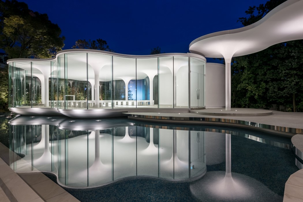
09. Cloud of Luster Wedding Chapel by Tetsuya Matsumoto (Japan)

This wedding chapel’s unusual amoeboid shape gives one the appearance of being inside a cloud… a fitting metaphor for people who literally feel like they’re on the top of the world when they get married! The Cloud of Luster’s white ceiling gives it a certain austerity that’s hard to ignore, and those gently descending pillars make the architecture look unconventionally light. Couple that with the fact that the entire chapel floats on a man-made pond and you get some dazzling reflections of the space on the water below. Truly a magical sight for people wanting to celebrate their magical moment, if you ask me!


Register Here for the A’ Design Awards and Competition 2019-2020: Deadline 28th February 2020

The Product Around Your Product: Winning Packaging Designs from A’ Design Award 2020

Your product’s packaging is arguably the first thing the consumer sees, as a part of the product experience. It forms the first ever interaction between product and consumer, and a successful interaction means a consumer will pick the product up off the aisle and add it to their cart. Bad packaging design can adversely affect a product’s success or its performance, while a well-packaged product allows it to stand out, prompting someone to pick it up and decide to purchase it. Packaging Design is more than just a box with artwork… it’s the product around the product, and deserves as much attention while designing as the item within it.

Packaging Design forms just one of the various categories of the A’ Design Award and Competition, which spans the popular categories like Architecture, Lighting, and Consumer Electronics, as well as the obscure, lesser-known categories like Cybernetics, Prosumer Products, and Safety Apparel Design. The A’ Design Award’s ultimate goal is to be an umbrella that covers good design across all disciplines, which is why it has 100 different categories for submitting design projects, and 218 jury members (comprising academics, design professionals, and press members) from all around the world collectively judging the works. Winners of the A’ Design Award don’t just secure a trophy and a certificate, but receive an entire PR Campaign dedicated towards pushing their career, clout, and even their projects to newer heights. A’ Design Award’s winners and even its participants are included in its annual award book and business network, while additionally contributing to their country’s overall design ranking that paints a holistic picture of how design-centric and design-forward each country is.

The A’ Design Award is currently accepting entries for the 2021 edition of the award program, so go ahead and give your work and career the push it deserves!

Here are some of our favorite Packaging Design winners from the A’ Design Award & Competition 2020. If you have a potential packaging design project that you think is worthy of an award, Click here to register & participate in the A’ Design Awards 2021. Last day to submit your work is the 28th of February!


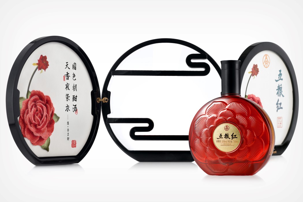
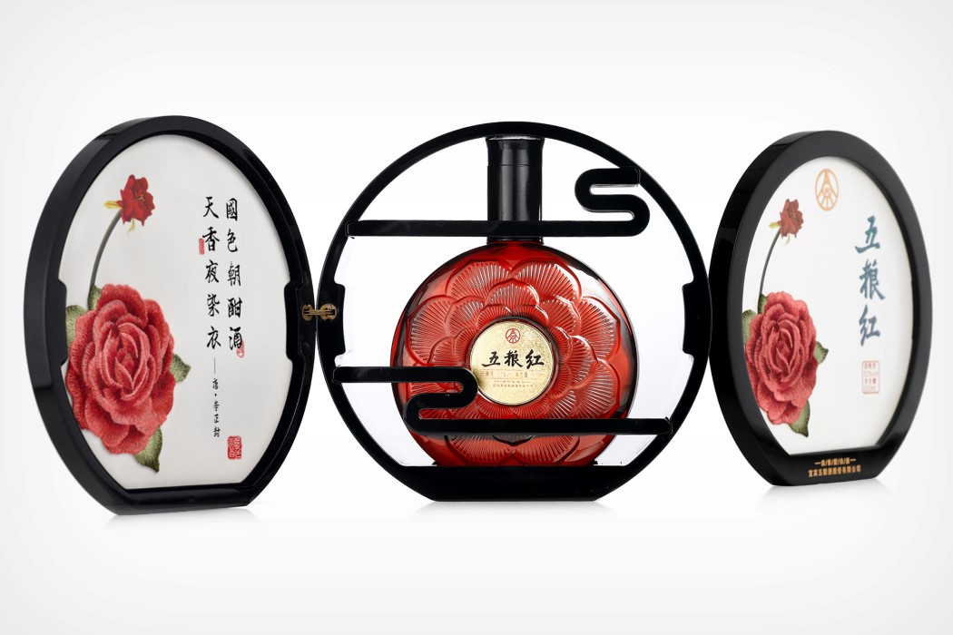
01. Wulianghong Liquor Packaging by Sisi Don


Inspired by the traditional ingredients and practices that come together to make the Wulianghong liquor experience, the bottle and packaging for this alcoholic beverage do a brilliant job of being not just aesthetic, but culturally relevant too. For starters, the bottle comes in this three-piece box, inspired by the screens often found in oriental architecture. Designed to not just encase the bottle, the box allows you to display it too, using two opening panels. The artwork on the box isn’t printed, but rather is embroidered, making it quite a collectible while also paying tribute to the national art-form of China. The bottle comes with a 3D design of a peony-flower too, the national flower of the country.


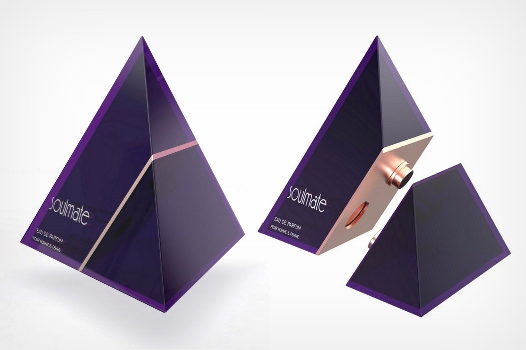
02. Soulmate Perfume Packaging by Himanshu Shekhar Soni


This two-part perfume comes as one single unit that splits into the two separate perfume bottles. Designed to be a gift you’d give to your significant other, the Soulmate Perfume comes with both him-and-her (or them-and-them) perfumes that you can use together. The two bottles come interlocked as a pyramid, and split apart into separate perfume-bottles (sort of like Britney Spears’ Fantasy fragrance) when you want to use them, reuniting into a single form once you’re done!


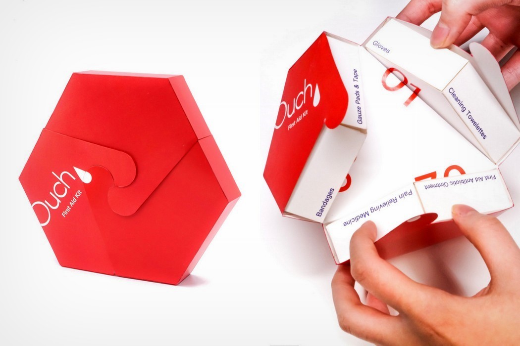
03. Ouch! First Aid Kit by Xiaofei Liu


This unique-looking first-aid kit comes with biodegradable packaging, and a novel hexagon-form that opens up to reveal the medical kit within. Open up the Ouch! kit and it cleverly segregates into 3 separate parts – bandages/gauze, medicines/ointments, and other eqipment like gloves, cleaning towelettes, etc. Open it up and you can instantly access the box you want to use immediately, instead of rummaging around through items. Each individual box even has pamphlets with instructions on how to use the contents inside!


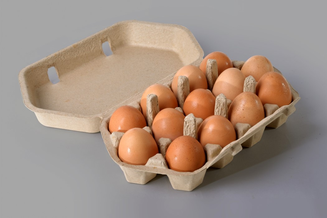
04. Bakers Dozen 13-Pack Egg Carton by Randy Ludacer


The Bakers Dozen egg carton is a wonderful play on an old-time practice, where bakers would often add a 13th loaf to the batch of 12 loaves to avoid being penalized for selling underweight bread. The Bakers Dozen egg carton reinterprets that with its 13-egg tray made from papier-mache. The tray’s form is 6-sided (sort of like an elongated hexagon), allowing them to not only store 13 eggs but also enabling them to be tessellated like a honeycomb so as to efficiently pack them together!


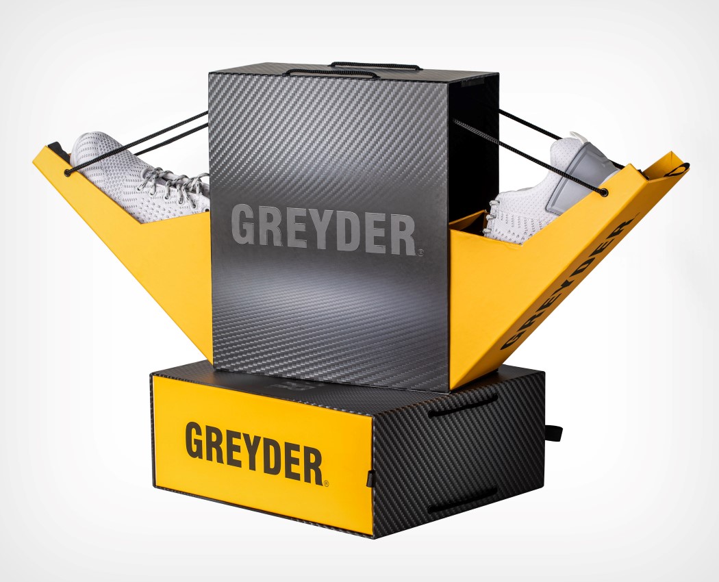
05. Greyder V Shoe Packaging Design by Musa Celik


The way the Greyder V shoes sit inside their box is influenced by how we walk. The shoes form a V-shape, emulating the way our feet are postured in between steps. The shoes rest on these inclined ramps that are suspended to the Greyder box using cords. To access the shoes, just pull out the ramps and they swivel out sort of like a drawbridge to reveal the sneakers within.


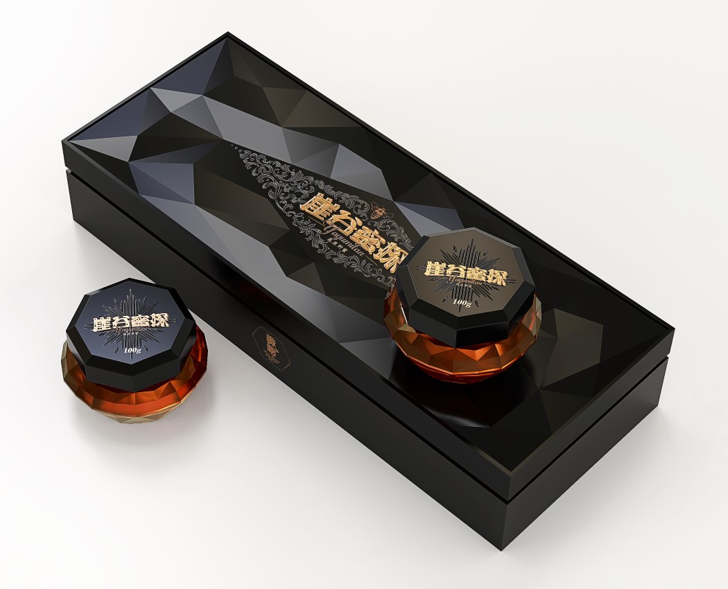
06. Yagumitan Honey Packaging Design by Jiabo Lu and Kun Luo


You’d be wrong to think that the Yagumitan Honey is just like any regular honey. It comes from a wild colony of bees found living on the cliffs of the rocky Yunnan mountains, far from civilization. The word “YAGUMITAN”, which means “the honey seeker in the valley”, is an ode to these bees, and the packaging reflects exactly how rare and precious the contents within are. The box comes with a faceted design, almost like an obsidian stone, while the bottles inside look like cut diamonds, holding within some of the scarcest wild honey in China.


07. Bonita Pour Femme Perfume Packaging Design by Vishal Vora


The objective of the Bonita perfume’s design was to represent fashion, class and tie to an object that was quintessentially feminine. Inspired by the hobo bag’s shape, the Bonita perfume comes with a crescent-shaped bottle, and a braided leather strap connecting its sides. The brown-tinted fragrance inside completes the illusion of it being a leather-made bag, and there’s even a leather tag hanging from the side for extra impact!


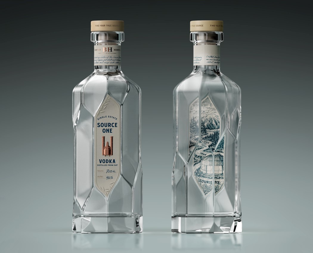
08. Source One Vodka Spirits and Alcohol by Aether NY, LLC


Source One’s bottle is interesting because it isn’t just faceted, it’s also a spiral (something you’ll probably notice after looking at it for the second or third time)! The bottle takes inspiration from greenhouse architectural elements and spiral staircases, creating something that is eye-catching and unusual to look at… not just architecturally, but even for a bottle of vodka!


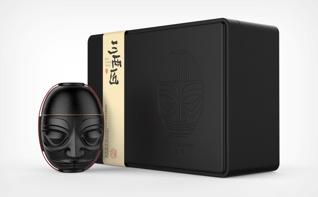
09. San Liang Jiang Beverage Packaging by Wen Liu and Xianwen Wu


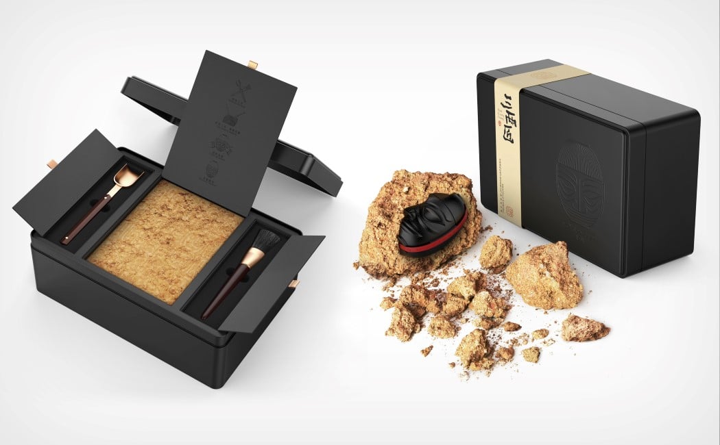
How do you show that your product is not just premium, but precious too? You could, like the Yagumitan honey, make the bottle/packaging faceted and gem-like, or you could do something as bizarre and beautiful as the packaging for San Liang Jiang. The San Liang Jiang beverage comes in a bottle the shape of an ancient relic, but that isn’t all. It comes in a box, packaged in a compressed clay-like brick. In order to retrieve this antique bottle, one must quite literally excavate it by using the tools provided to shovel-away at the outer layer, revealing the relic within. The process is interactive, and rewarding as you use tools to remove the dirt and dust and reveal the precious item underneath it! This would make for an incredible unboxing video!


10. 2019 National Card Collection Day Deck Playing Cards by Alexander Chin


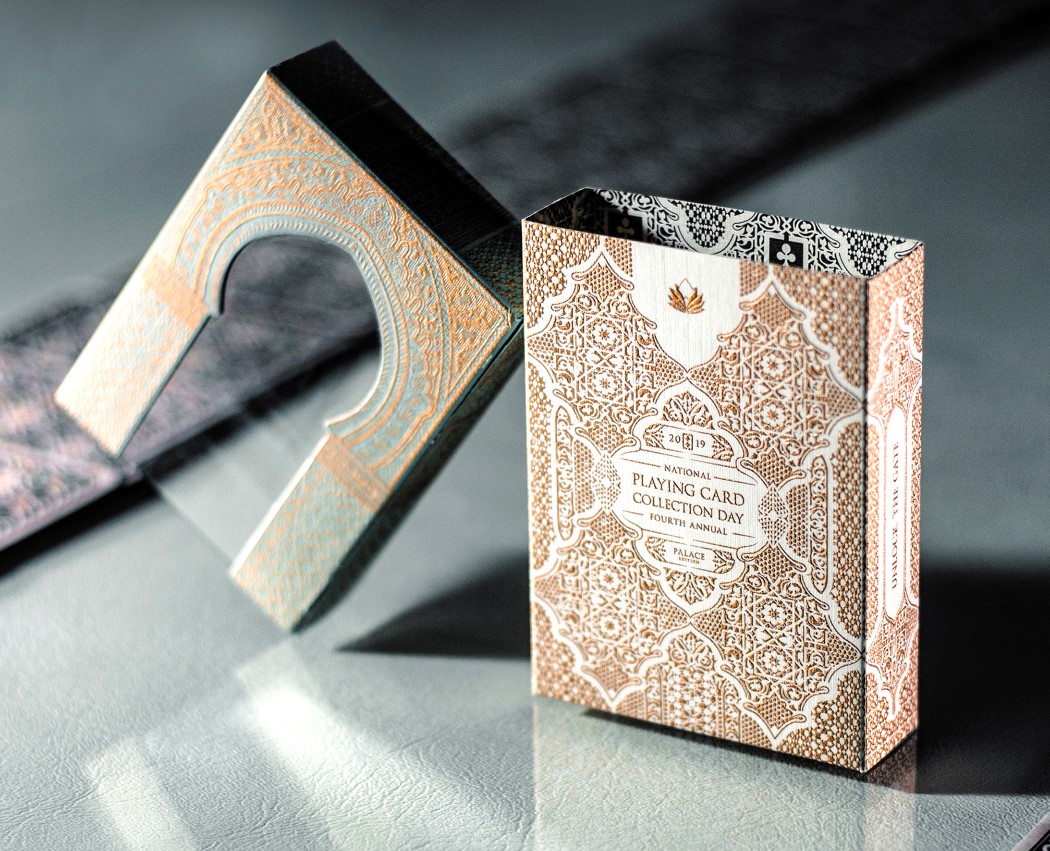
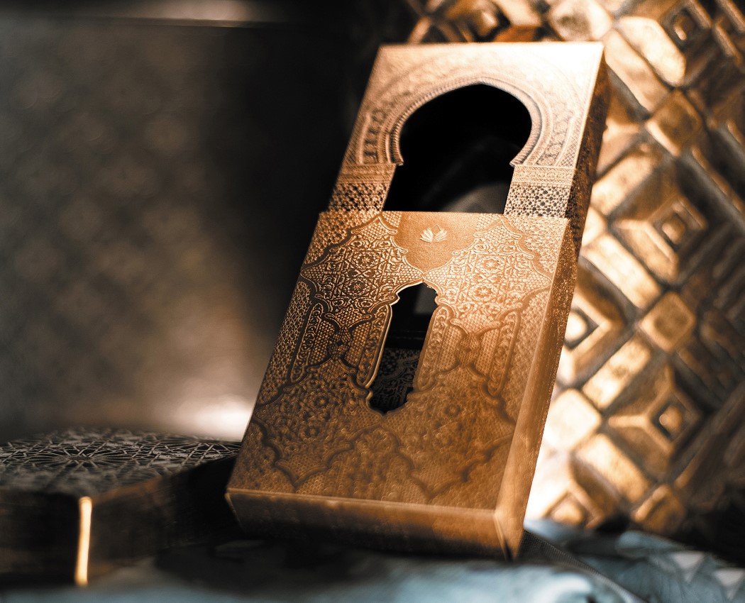
Inspired by the palaces of Morocco, the 2019 event design pays tribute to the iconic architecture of the region with traditionally decorated gates and exotic geometric patterns. The packaging is an interactive experience designed to mimic the exploration of a Moroccan palace. The experience rewards users with escalating stages based on their efforts in the journey. Lift up the gateway-inspired sleeve and stack multiple packs together and the gateways transform into an endless beautiful palace corridor!


Impressed? Inspired? Go ahead and grab a spot for your own designs at the A’ Design Award and Competition 2021! Click here to Register Now!

This cylinder-shaped drone helps keep an eye on extreme sports enthusiasts in the outdoors

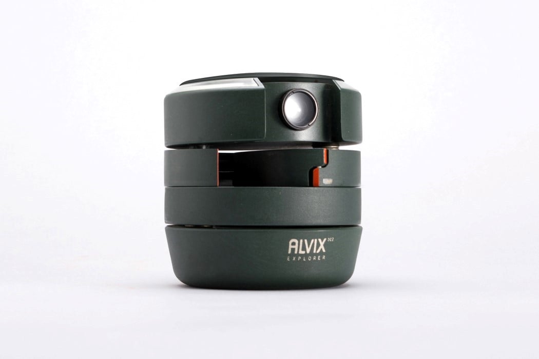
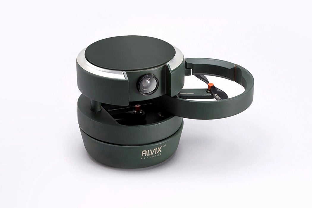
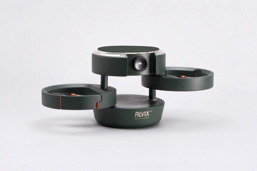
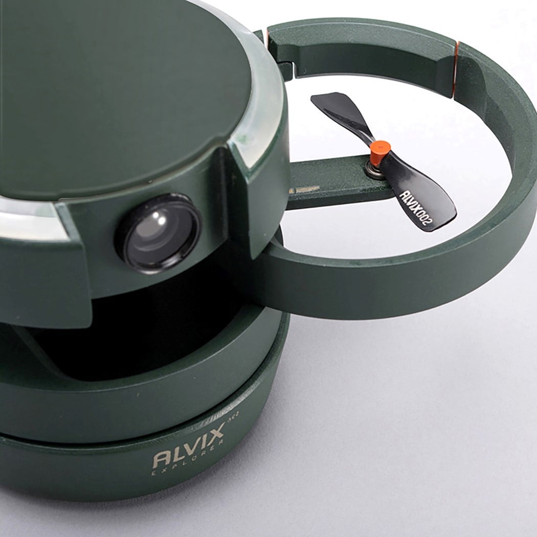
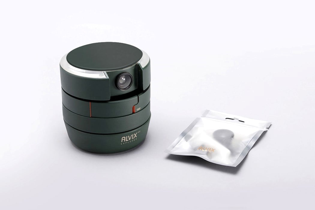
Just the same way a car designed for racing isn’t the same as a car designed to transport families, the Alvix Multifunctional Drone isn’t designed to look like your average hobby-drone. It comes in a compact cylindrical format, made for easy carrying, and opens out into a rugged drone capable of recording and monitoring extreme sports enthusiasts and players, who always carry heavy equipment and perform high-risk sporting activities alone.

Think of the Alvix drone as your spotter, but in the outdoors – keeping a watchful eye on you as you engage in extreme sports. Its cylindrical format makes it easy to carry, as well as gives it a protective covering, as the drone’s propellers have built-in circular guards around them. The drone comes with a wearable that helps it track the wearer at all times, keeping a watchful eye on them. If something untoward were to happen, the alarm system built into Alvix will beep and shine when it detects an emergency, saving time, and making the search & rescue mission more efficient.

The Alvix Multifunctional Drone is a winner of the A’ Design Award for the year 2020.

Designer: Yu-Ling Lien and Jia-Xin Liu

Gadget Roundup: Award-winning tech and products from the A’ Design Awards 2020

One of the A’ Design Awards’ standout features is just its vastly multidisciplinary nature. Conceived as the one award program to cover every single aspect of the design industry, the A’ Design Award looks at as many as 99 categories, spanning everything from Architecture to Interiors, Graphics, Packaging, Furniture, Film, Social Design, Medical Product Design, Transportation, Jewelry, and a category that’s truly close to our hearts… Consumer Technology.

Gadgets are perhaps an undeniable part of the ‘better human experience’. Whether it’s innovative features, or the lack of them, each product is designed to fulfill a certain need and achieve a certain end – which it believes is best for its user. It’s probably why technology and design are so interwoven into A’ Design’s approach. Currently in their 2020-21 edition, the awards are looking for the next generation of life-changing, life-bettering products, with as many as 218 Jury Members covering all of the award categories. Moreover, winners of the A’ Design Award don’t just win a trophy and a certificate, but receive an entire PR Campaign dedicated towards pushing their career, clout, and even their projects to newer heights. A’ Design Award’s winners and even its participants are included in its annual award book and business network, while additionally contributing to their country’s overall design ranking that paints a holistic picture of how design-centric and design-forward each country is… so if you’ve got a great idea for a product and all it needs is a bit of a push and some validation from some of the most accomplished professionals and educators in the design industry, head over to A’ Design Award’s website and submit your product for this year’s award! Don’t wait up, the regular deadline for the award is as soon as 30th September! Your design, your profession, and even your country could really use that bit of clout!

If you’ve got a great tech product that’s innovative and award-worthy, click here to register & participate in the A’ Design Award and Competition 2020. Hurry! The regular deadline ends on 30th September!
01. Millo One Blender by Millo Appliances

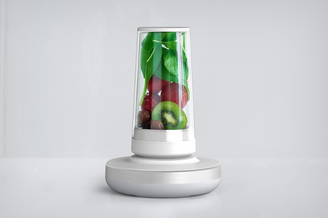
Practically defying the laws of physics, the Millo is perhaps the most futuristic blender I’ve seen. For starters, it’s sleek, and is dominated by aesthetic, flat surfaces, with absolutely no exposed mechanical parts. The blender is divided into two units. The base, a pristine, flat dock with no control panel or even a driving socket and its second part, the glass, a stylish Nutribullet-esque container that connects to the base using wireless technology. Just load your smoothie ingredients into the Millo, screw the top on, and rest it inverted on the base… and just like a phone starts charging the moment you rest it on a wireless-charging surface, the Millo begins whirring and blitzing all your ingredients into a fine smoothie. You can control the Millo’s intensity by sliding your finger around the rim of the base, as lights under the surface come to life, letting you see what power you’re running the blender at. When you’re done, lift the blender up and the blade magically stops spinning. It’s a sight to absolutely admire!
02. Alvix Multifunctional Drone by Yu-Ling Lien and Jia-Xin Liu

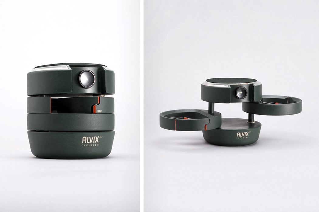
Just the same way a car designed for racing isn’t the same as a car designed for families, the Alvix Multifunctional Drone isn’t designed to look like your average hobby-drone. It comes in a compact cylindrical format, made for easy carrying, and opens out into a rugged drone capable of recording extreme sports players, who always carry heavy equipment and do high-risk activities alone. Think of the Alvix drone as your spotter, but in the outdoors – keeping a watchful eye on you as you engage in extreme sports. Its cylindrical format makes it easy to carry, as well as gives it a protective covering, as the drone’s propellers have built-in circular guards around them. Moreover, the alarm system equipped in Alvix will beep and shine when it detects the user in danger, saving time, and making the search & rescue mission more efficient.
03. Black Hole Speaker by Arvin Maleki and Ayda Mohseni

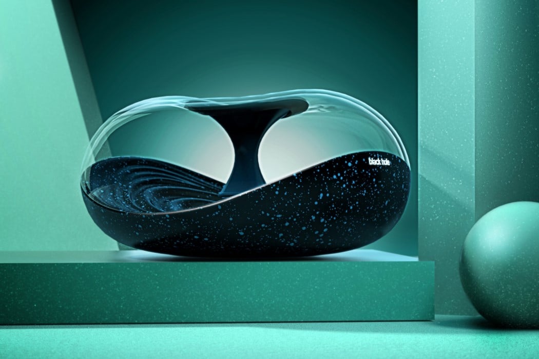
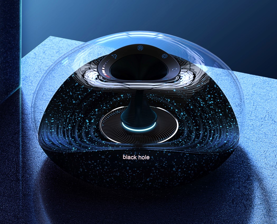
Behold the Black Hole Speaker… designed to attract your attention the way a black hole attracts all mass. Based on the design of the Harman Kardon Aura, with a few tweaks and changes to give it intergalactic appeal, the Black Hole sports a warped torus design, with a hyperbolic base, and quite literally a black hole at the very center of the torus. The Black Hole speaker comes with a speckled design on its black base that resembles stars being pulled into the void, along with a concentric ripple texture that is symbolic of a black hole’s ability to create ripples in time and space. It’s all incredibly symbolic! The speaker runs on Bluetooth (because there are no wires in outer space), and if you dare to approach it, there’s a control panel around its event horizon.
04. Pure Phone by Mudita

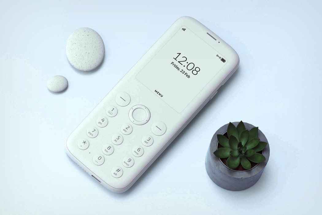
The Pure Phone is the very antithesis to the common smartphone. Unlike smartphones that LOOK sleek but are far from it, the Pure by Mudita adopts a simplicity that’s present everywhere, from the overall design to the UI, and the UX too. No touchscreens, no colorful displays, no inundating notifications and app icons… not even an internet browser. The Pure Phone comes with an ultralow SAR patented antenna. You can make and receive calls, send and receive text messages, listen to music, and enjoy a long battery life thanks to the Pure Phone’s elegant UI and e-ink display.
05. Poma Electric Toothbrush by Andrei Majewski

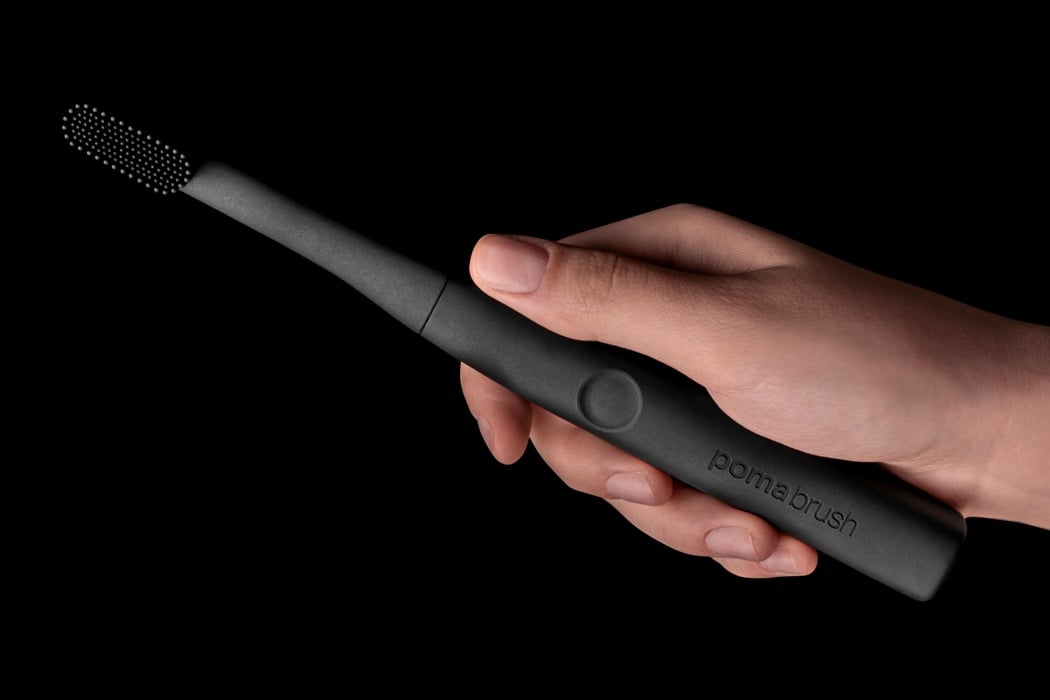
Ditching the notion that a toothbrush should come with a multicolored handle and color-coordinated bristles, the Pomabrush’s aesthetic is as clean and as pure as it could possibly be. The brush literally embodies the sleekness of Italian design, with a single color body and matte surfacing, silicone bristles, a comfortable grip, and a single recessed button to switch it on or off. IPx7 waterproofing means you can use the brush in the shower too, and those silicone bristles are designed to be non-porous and anti-bacterial too, making your brush safe enough to use for years. The Pomabrush comes with its own slim wireless charging case that sits beautifully on your bathroom countertop or slides right into your bag or backpack while traveling, so you can carry your brush with you and use it wherever you go, be it on the road, at an airport, in a hotel, or even at a sleepover. Plus it’s also lighter, smaller, infinitely classier, more delicate/efficient than most toothbrushes, and lasts years but needs charging only once every 4 months!
06. Wild Cook Food Smoker by Ladan Zadfar and Mohammad Farshad

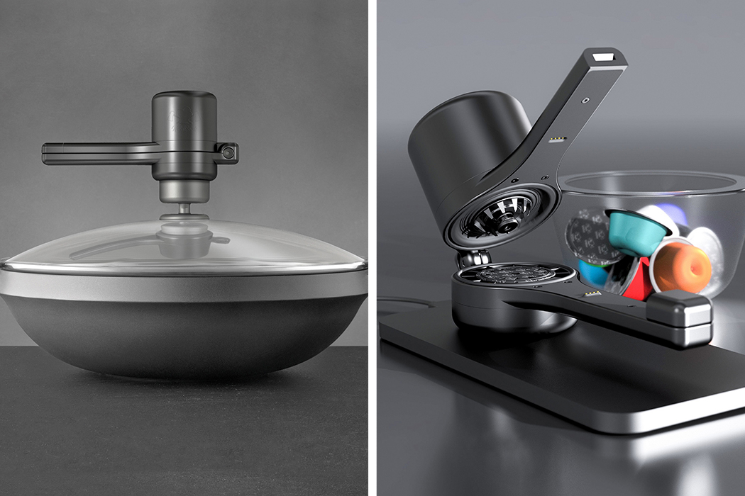
The Wild Cook may have a name that indicates a certain rustic-ness, but it is, in fact, a pretty sophisticated alternative to current ways of smoking one’s food. Traditional smoking methods involve the inelegant use of smoke-guns, exposed embers, and a pipe that goes from the nozzle of the gun to inside a particular utensil – in short, it’s sort of a utilitarian mess. The Wild Cook uses a concealed heating unit and ‘smoke-pods’ that come in a variety of flavors. Put the pod in, switch the smoker on, and it docks right into the top of the utensil’s lid. No pipes, no air-gaps. Just an elevated culinary game and some really interesting flavor-infused food!
07. Doodlight Bullet Journal Laser Projector by Mohamad Montazeri

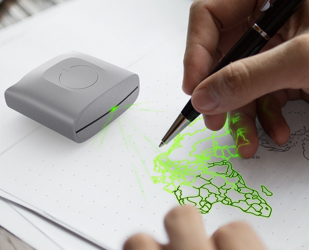
The Doodlight makes turning your digital doodles into physical ones really easy. Unlike notebook scanners that take your physical notes and digitize them on your phone, the Doodlight is a nifty laser projector that takes digital drawings and projects them onto your notebook to trace from. The Doodlight works via an app that allows you to compose your doodles before realizing them on paper. Ideal for people who want to trace fonts, want to learn how to draw, or need help with geometry, art, or anything related to drawing, tracing, and plotting!

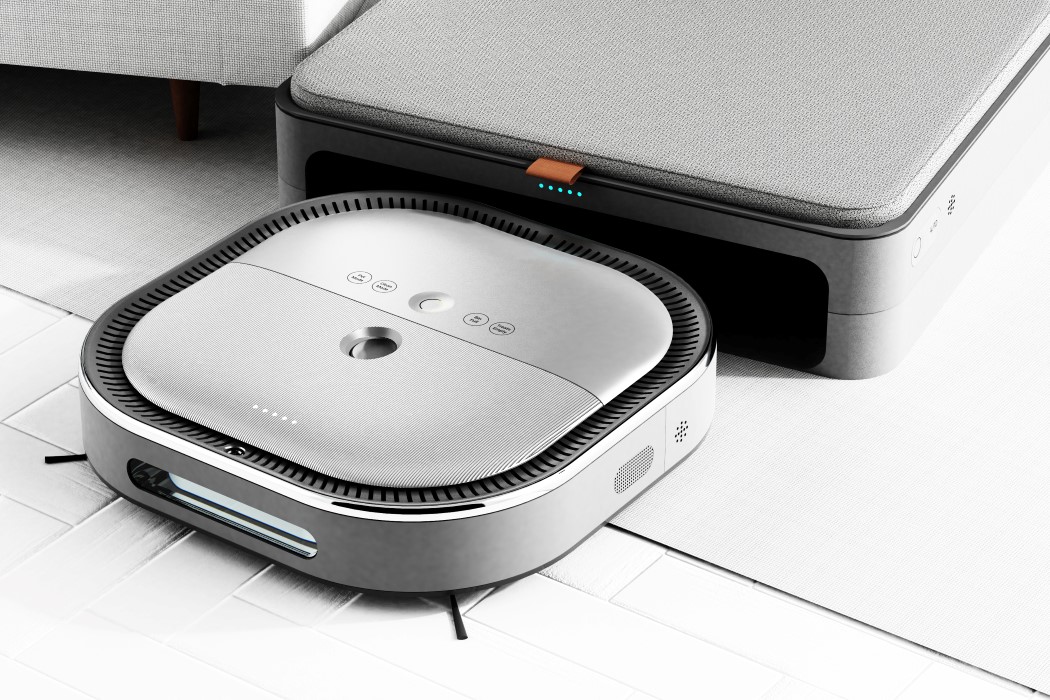
08. Puro Pet Care Robot by Taeuk Ham

I’m not entirely sure if my pet would appreciate living above a robot, but the Pure Pet Care Robot is a combination of a Roomba and a dog-bed! The vacuum-robot comes designed like any other, and has everything it needs to go about cleaning your house (and avoiding your pets). However, when it’s done, it automatically goes and docks itself in the Puro docking station, which comes with a comfortable bed on top for your cat or dog! It sounds like a winning space-saving combination, but I’d love to see if animals and robots do possess what it takes to coexist in the same area! Did I mention that the Puro docking station even comes with an air-purifying fan that keeps your pets cool and healthy? Because it certainly does!
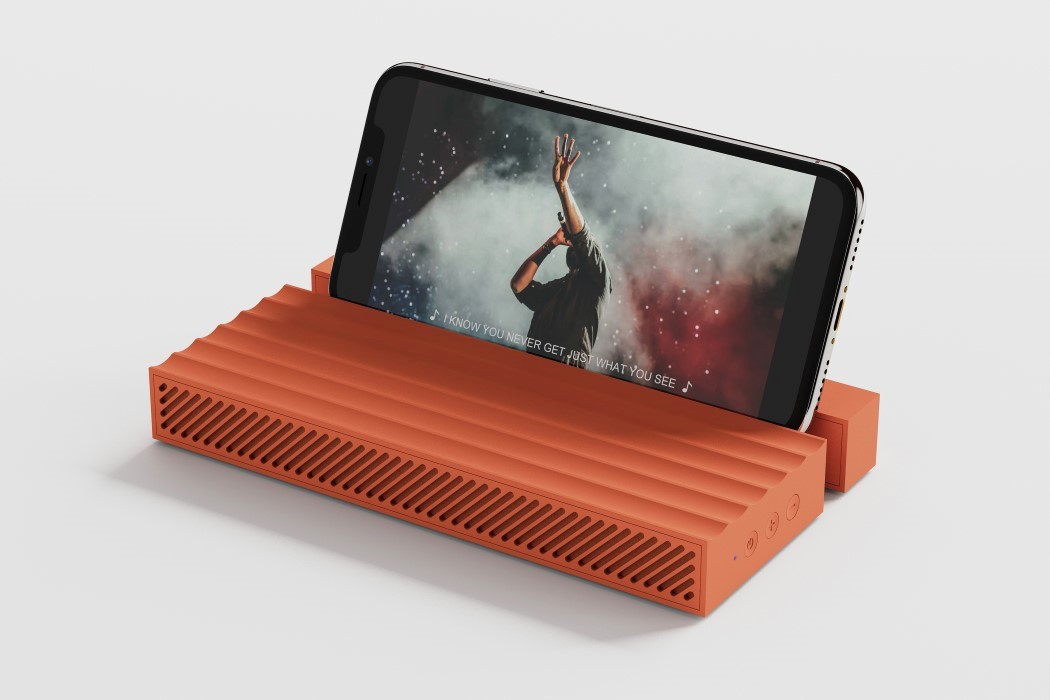
09. Waving Multifunctional Speaker by RuiWang Xiang

Is it a speaker? Is it a stand? Is it a stationery-mat? How about all three? The Waving Multifunctional Speaker is just a really cleverly designed product that works as a speaker, but also uses its form and surfaces to provide additional functions. For starters, it comes with a slide-out element at the back that lets you wedge your phone into the speaker in landscape or portrait. If that wasn’t enough, the speaker’s wavy textured surface makes it great for resting pens and miscellaneous stationery on. Pretty neat, if you ask me.
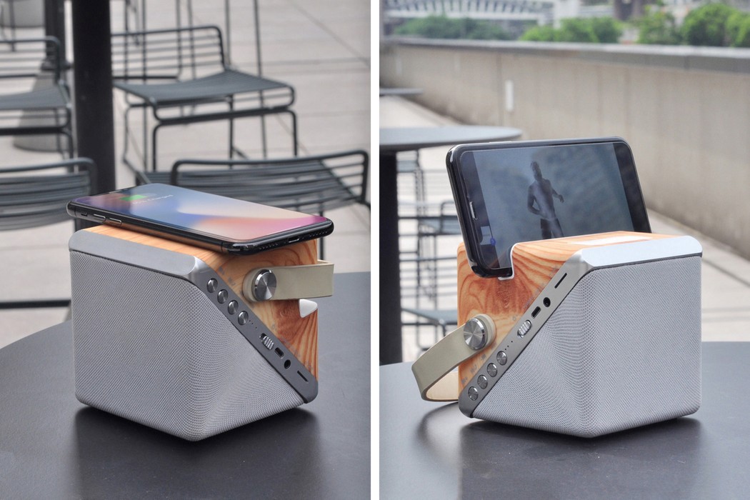
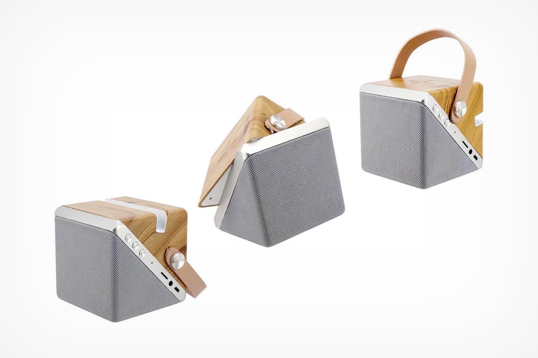
10. Twist Cube Wireless Charger + Speaker by Fai Leung

The Twist quite literally puts a twist on conventional smartphone accessories. Designed as a cube with a parting line running diagonally along the middle, the Twist swivels on its diagonal parting line to shapeshift between being a Bluetooth speaker with a dock, and a wireless charger. The swiveling mechanism gives it a unique interaction that serves as a definitive distinction between the two features of the Twist. Swivel it one way and you’re left with a flat upper surface, allowing you to simply rest your smartphone on it and get it charging. Swivel it the other way and you’re presented with a convenient angular dock that’s perfect for placing your phone in and watching an episode of Schitt’s Creek!

If you’ve got a great tech product that’s worthy of an award, click here to register & participate in the A’ Design Award and Competition 2020. Hurry! The regular deadline ends on 30th September!

The Cloud Chair makes you quite literally feel like you’re on top of the world!
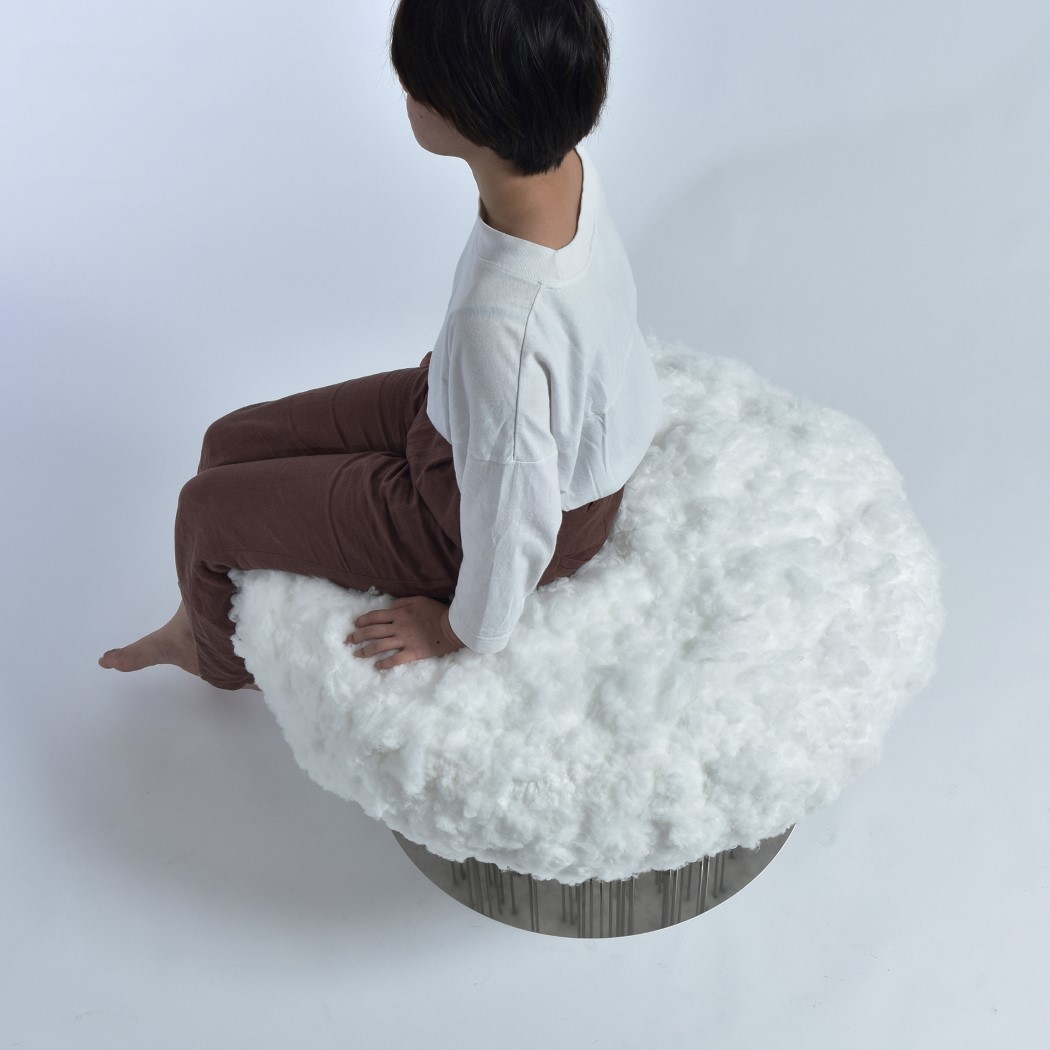
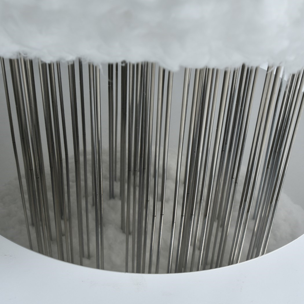
Surrealist-dream-come-true, the Cloud Chair is designed to visually and physically create the experience of sitting on a fluffy cumulus cloud. Unlike traditional chairs with 3-4 legs, the Cloud Chair is elevated using multiple metal rods, not only giving the cloud its perceived lightness and airy-ness, but also resembling steady drops of rain falling from the cloud’s underbelly. The inspiration for the chair came to Shota Urasaki after she saw a moving cloud raining over a distant coastline. Inspiration immediately struck and the Cloud Chair was born.

The visual puffy element of the Cloud Chair is made from tufts of polyester fiber, pierce-fitted into a polyurethane foam block to give it volume and its soft, comfortable seating experience. This floating piece of sky-fluff is then mounted on several stainless steel supports that look like long streams of rainfall, with a mirror at the bottom to give the rain an illusion of continuity. Clever, eh??

The Cloud Chair is a winner of the A’ Design Award for the year 2020.

Designer: Shota Urasaki

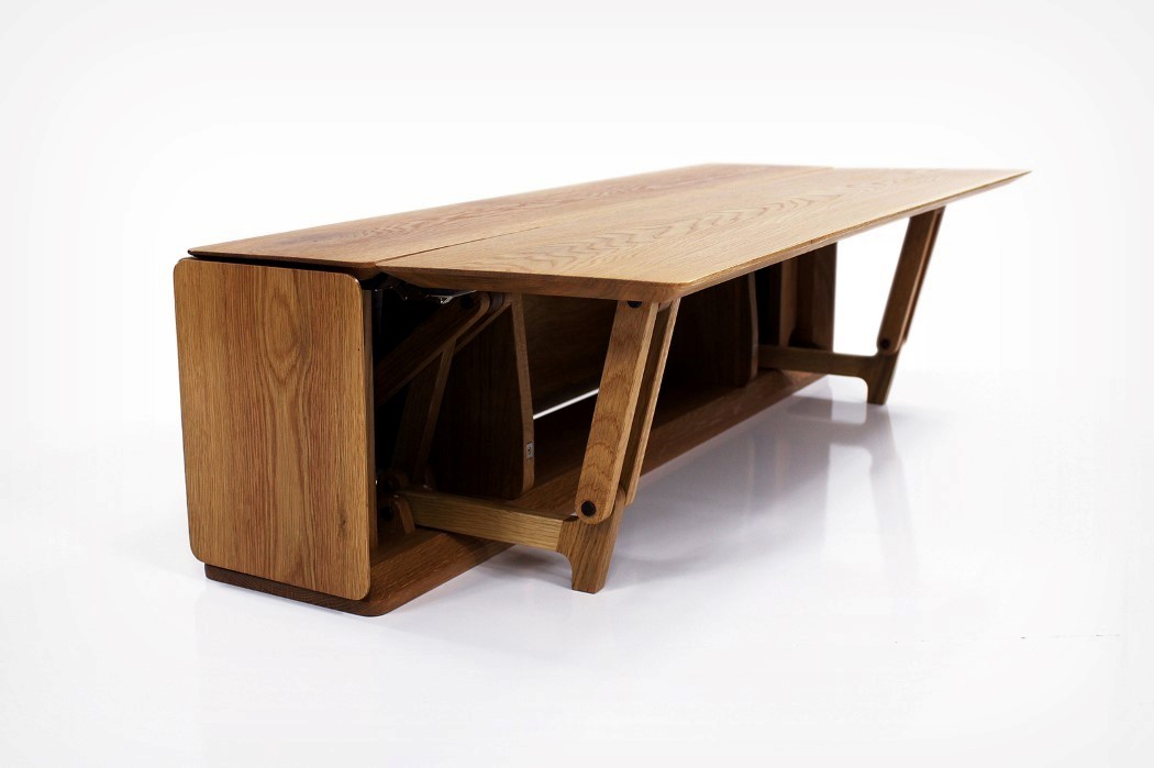
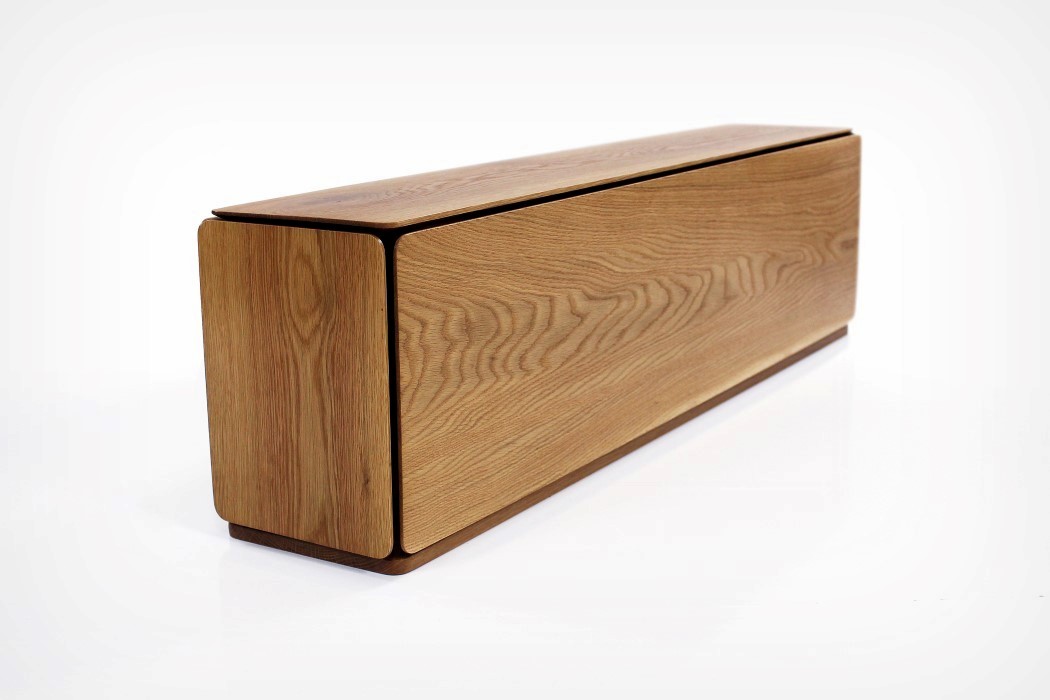
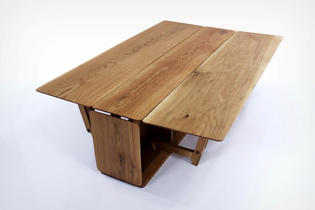
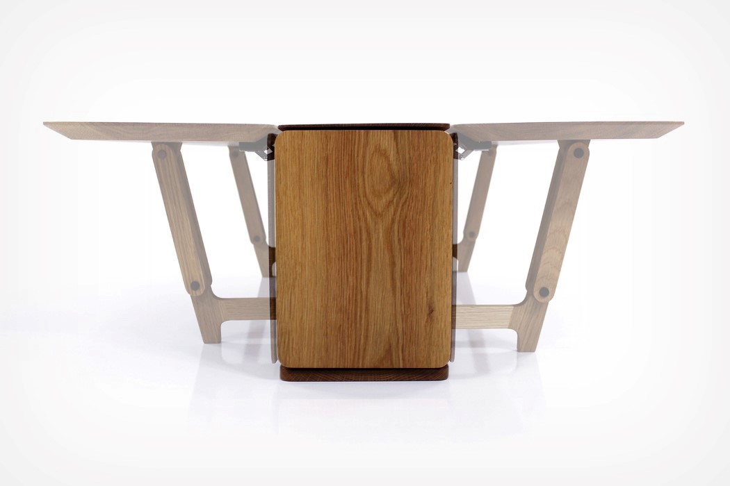
The Lido table’s hinged side-panels give it the ability to expand to 3 times its size

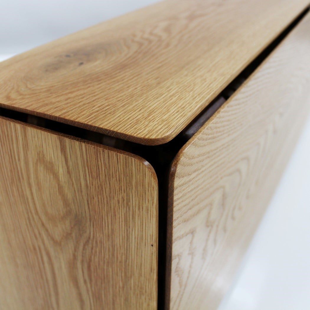
The Lido looks like any innocuous table or kitchen-island, but give it a few adjustments and you can increase its area threefold. Made from oak (although it could just as easily be made in any other type of wood), the Lido uses hinged side panels to expand in size whenever you’re expecting extra company. Just lift the panels up and a mechanism causes an extra pair of table-legs to pop out too, giving you a stable table (I’m a poet and I didn’t even know it). Perfect for smaller apartments, the Lido comes with a relatively low physical footprint, but gives you the ability to swiftly and easily expand when you have guests over.

The Lido Table is a winner of the A’ Design Award for the year 2020.

Designer: Nak Boong Kim