Medical Innovations from the A’ Design Award that will revolutionize human life and healthcare

It might sound borderline unbelievable, but some of the most life-changing innovations today actually began as ideas that were considered ridiculous back in the day. Medical history is FILLED with innovations that were initially rejected on the grounds of them seeming laughable, only to then become global standards – the washing of hands comes to mind, as it helped radically reduce maternal mortality. 19th-century Hungarian surgeon Ignaz Semmelweis was labeled as crazy for proposing that doctors wash their hands before and after surgery – today, it’s a norm not just for doctors, but for any and everyone! While I’m talking about crazy medical innovations, did you know the chainsaw was originally invented to help doctors deliver babies?? Yes, the same chainsaw you use to cut down trees! And cornflakes were originally invented as a medicine to reduce sexual drives in people, long before they became a staple breakfast item! The point is, innovation and inspiration (medical or not) can sometimes go overlooked or unregarded, although it’s best when rewarded!

‘Medical Devices and Medical Equipment Design’ forms just one of the various categories of the A’ Design Award and Competition, which spans the popular categories like Architecture, Lighting, and Consumer Electronics, as well as the obscure, lesser-known categories like Cybernetics, Prosumer Products, and Safety Apparel Design. The A’ Design Award’s ultimate goal is to be an umbrella that covers good design across all disciplines, which is why it has 100 different categories for submitting design projects, and 211 jury members (comprising academics, design professionals, and press members) from all around the world collectively judging the works. Winners of the A’ Design Award don’t just secure a trophy and a certificate but receive an entire PR Campaign dedicated towards pushing their career, clout, and even their projects to newer heights. A’ Design Award’s winners and even its participants are included in its annual award book and business network, while additionally contributing to their country’s overall design ranking that paints a holistic picture of how design-centric and design-forward each country is.

The A’ Design Award is currently accepting entries for the 2022 edition of the award program, so if you’ve even got an idea for a medical product (or any other category), now’s your time to shine and change the world!

Here are some of our favorite Medical Device and Equipment Design winners from the A’ Design Award & Competition across the years. If you have a potential medical device or equipment design that you think is worthy of an award, Click here to register & participate in the A’ Design Awards 2022. Hurry, the last date for application is the 28th of February 2022!
Dab ECG Holter Patch by Adam Miklosi

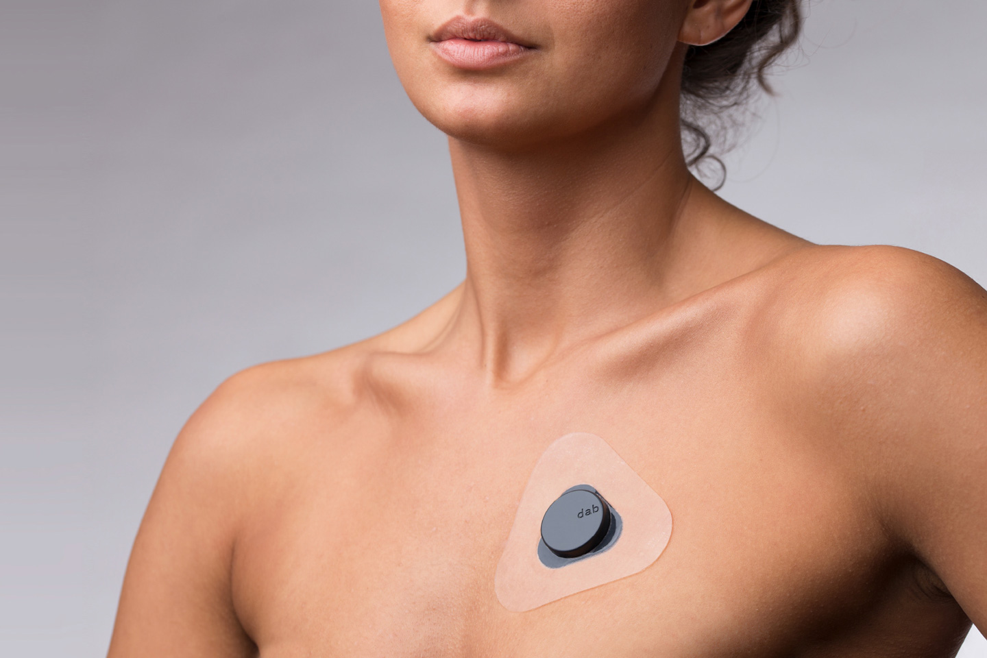
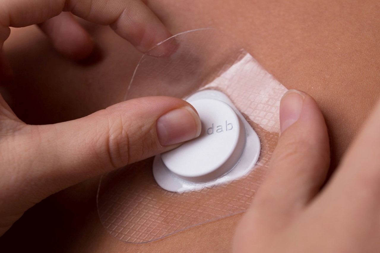
Literally, the size of a quarter, Adam Miklosi’s Dab is an unobtrusive Holter ECG/EKG that rests comfortably on your chest, constantly reading your heart’s movements. Designed to be minimal, non-invasive, and simple, the Dab tries to bridge the gap between medical appliances and wearables. Its tiny yet classy design sits on your chest via a gel patch, while the electrodes capture your heart activity. The Dab’s dry-electrodes allow it to be used and reused, while they constantly measure one’s heart activity (requiring periodic charging via their wireless charging hub), and keep logs of accurate readings, quietly sitting on your chest while you absolutely forget that they’re even there in the first place!
Gait Analysis Robot by Anri Sugihara

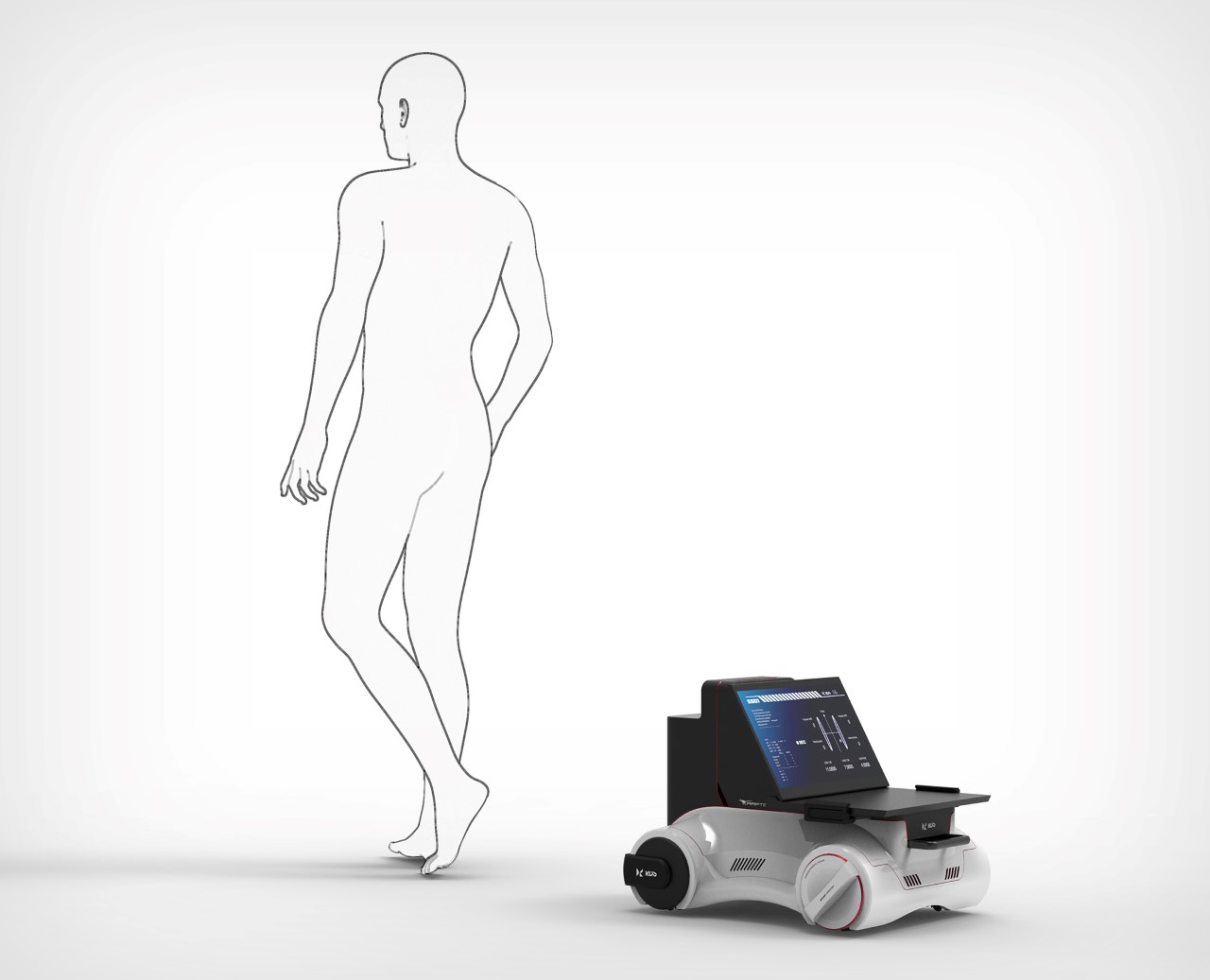
Here’s an idea that doctors in the 19th century would absolutely laugh at – did you know that your gait (the way you walk) could be studied to identify if you’re suffering from any diseases? It’s common knowledge that a person’s gait is so unique that they can literally be identified by them, but what this robot is attempting to do here is even more game-changing. Simply by studying and analyzing your walk, the robot can A. Detect diseases, both external and internal, and B. Track rehabilitation. It’s strange although if you think about it, maybe you subconsciously walk differently when you’ve bruised your arm or ribs, or when you’ve got a cough or an internal difficulty. The Gait Analysis robot could potentially help detect ailments and diseases using data gathered from just a 10-minute walk. Not only would it save time, it would also save a WHOLE lot of costs on expensive tests!
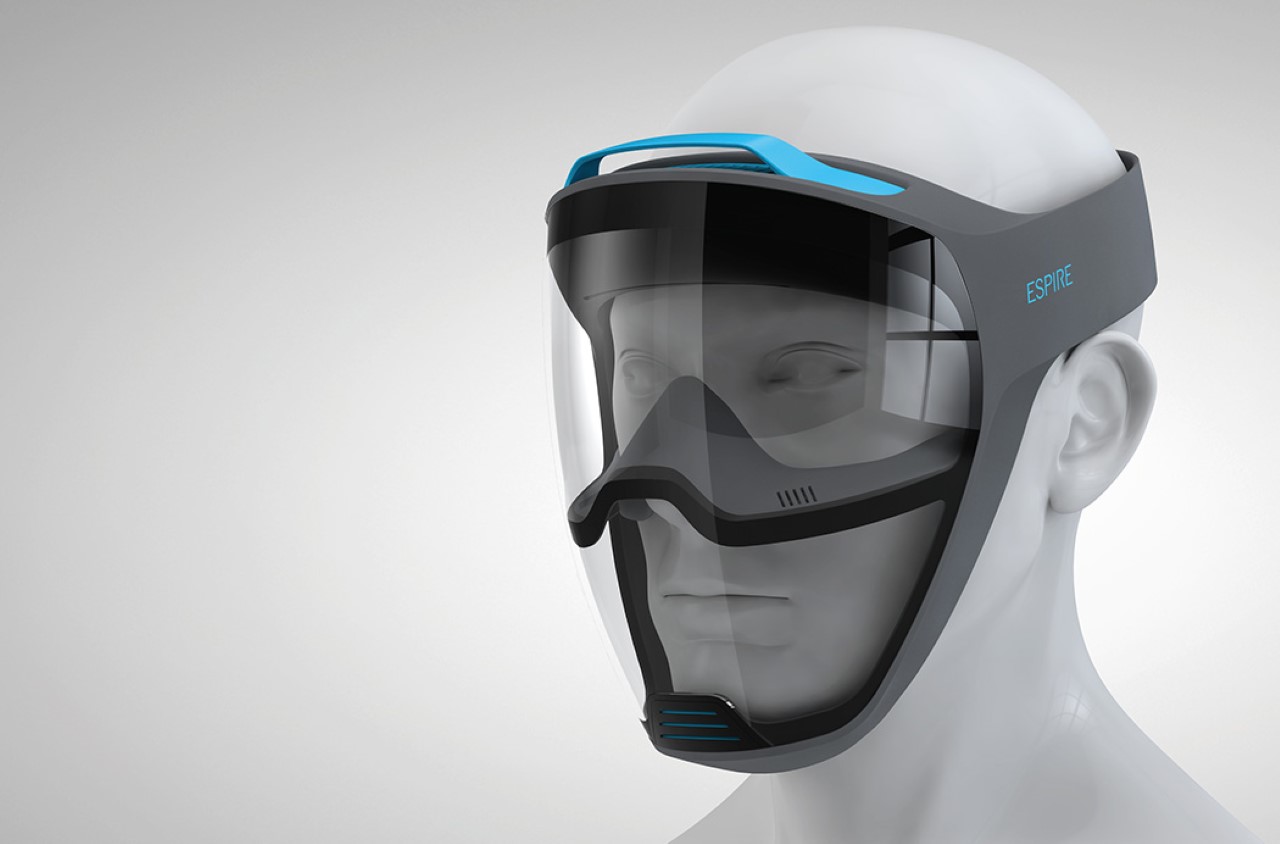
Espire Full Face Gas Mask by Carlos Schreib

As we enter what’s effectively our third year in this pandemic, let me be the first to say that if you wear spectacles just like I do, there’s nothing quite as annoying as an ill-fitted face mask leaking air and fogging up your glasses! The Espire Full Face Gas Mask is exactly what ALL face masks should look like. Not only does it purify the air going into your nose and mouth, it even guards your eyes against smoke, dust, and harmful chemicals. What’s more, it rather cleverly creates a barrier between the breathing zone and the viewing zone so you don’t have to worry about your visor fogging up with your breath!

Pimoji More Intuitive Pill Design by Jong Hun Choi

The concept behind the Pimoji tackles the two biggest problems of taking meds. Firstly, the ambiguity, given that almost all medicines look the same and their names are usually a complicated bunch of characters that often don’t convey anything, and secondly, the fact that the very act of taking medicines feels slightly daunting, and can often seem scary to most. The Pimoji’s solution to both those problems is simple, and between you and me, pretty innovative! Design each pill around an emoji-esque representation of the ailment they’re trying to cure. Heart meds are shaped like hearts, bone-strengthening meds are shaped like bones, toothache tablets are shaped like teeth, and the list goes on (let us know if you can correctly identify the tablet shapes!) The pills come in cute shapes that make it easy to know what medicine you’re taking, while somewhat making it feel like you’re eating fun-shaped candy, not medication!
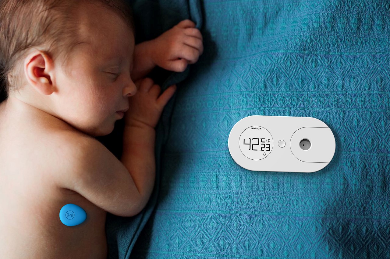
Zhiwen Wearable Thermometer by Wei Gu And Di Wu

The Zhiwen thermometer lets you constantly monitor the temperature of its wearer using wireless technology. Designed to be small enough to permanently sit on the skin without causing much discomfort, the thermometer beams its readings to a control unit that allows you to check the wearer’s temperature, as well as the thermometer’s overall battery. When the thermometer runs out of charge, just take it off and slide it into the charging hub located right within the control unit!
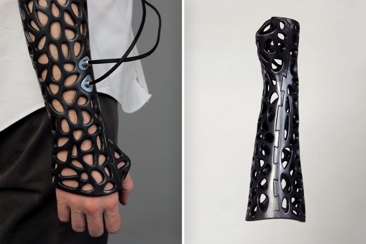
Osteoid Medical Cast by Deniz Karasahin

Presenting what is essentially the future of medical rehabilitation in a nutshell, the Osteoid Medical Cast is a significant upgrade over the plaster casts still used up to today. Instead of layering wet plastered gauze onto a broken limb, the Osteoid Medical Cast proposes a neat, bespoke 3D-printed cast that’s breathable, and designed exactly to its wearer’s specifications. Using a generatively designed Voronoi surface, the new cast uses less material while still providing a strong structure, and provides openings so the skin can breathe while more importantly, allowing the patient to itch their skin!
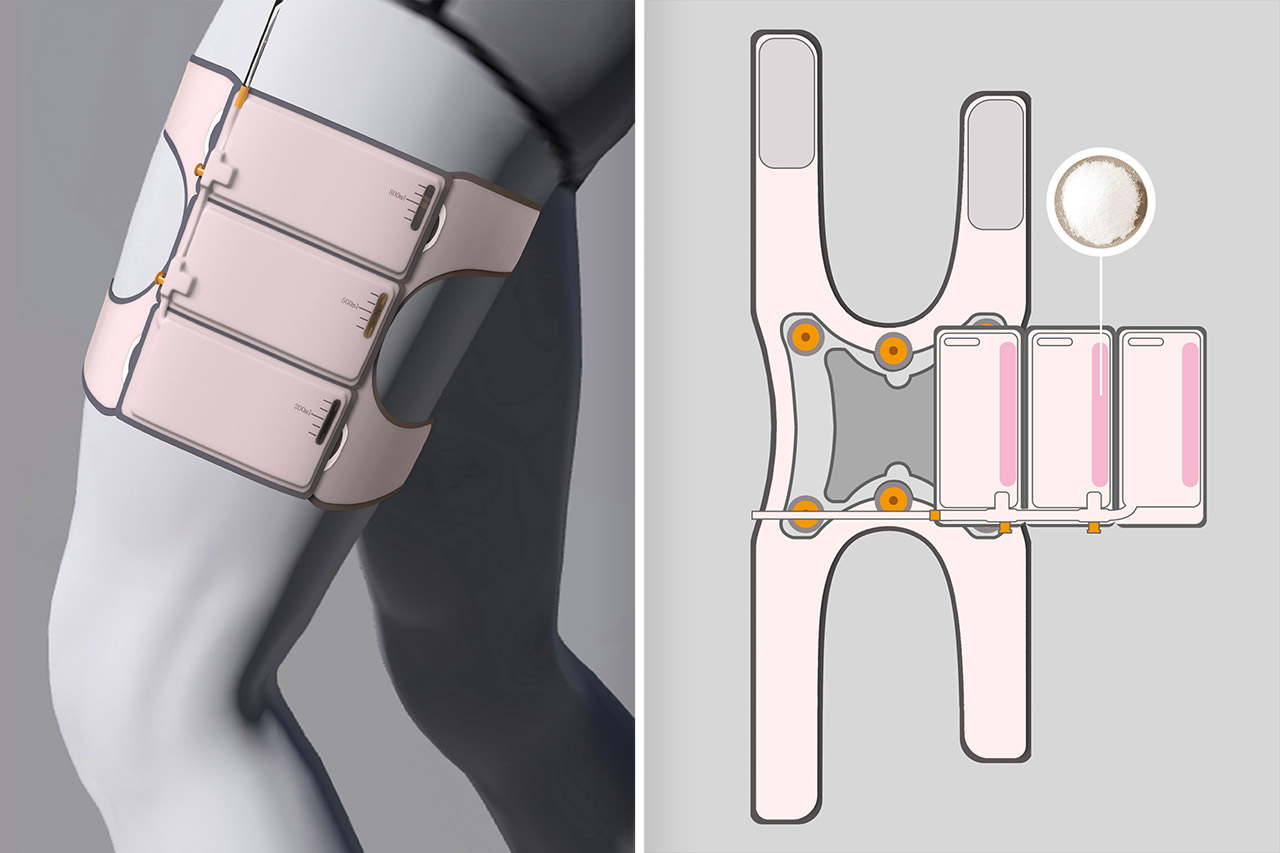
Convenient Urine Bag by Yanqing Lan

Offering a solution that’s comfortable, convenient, and most importantly modular, the Convenient Urine Bag by Yanqing Lan straps to the wearer’s thigh, allowing them to urinate wherever they are without discomfort or pressure. The 100ml bag sports a 3-part design, with 3 individual compartments that fill up as the wearer urinates. As and when each individual bag fills up, they can be unplugged and disposed of, so the wearer/patient isn’t carrying a large sack half-filled with bodily fluids wherever they go. Each individual bag is filled with a water-absorbing polymer that can quickly solidify the urine, thereby reducing the odor and stabilizing the urine stored to prevent any unforeseen or accidental spillage.
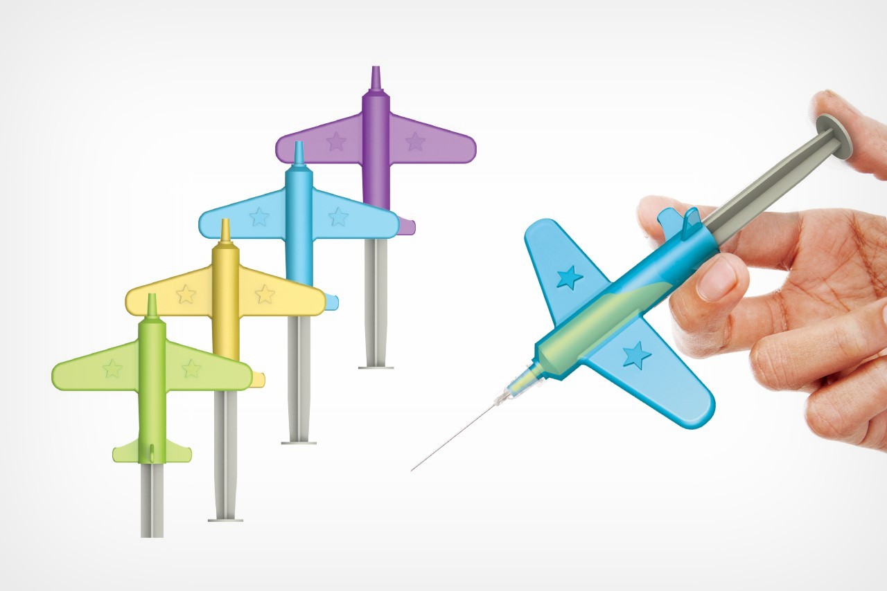
Brave Jet Syringe by Ilmo Ahn, Jisu Kim & Juyeon Baek & SeonwooPyo

Dispelling any fear around injections, the Brave Jet Syringe gamifies the vaccination process, turning the syringe jet into a plane, allowing kids to look at it as not a pointy, fearful, medical product, but a good-guy fighter jet that kills diseases! This novel approach attaches basically to any syringe body, making kids less afraid of needles and allowing doctors to administer life-saving vaccines and treatments.
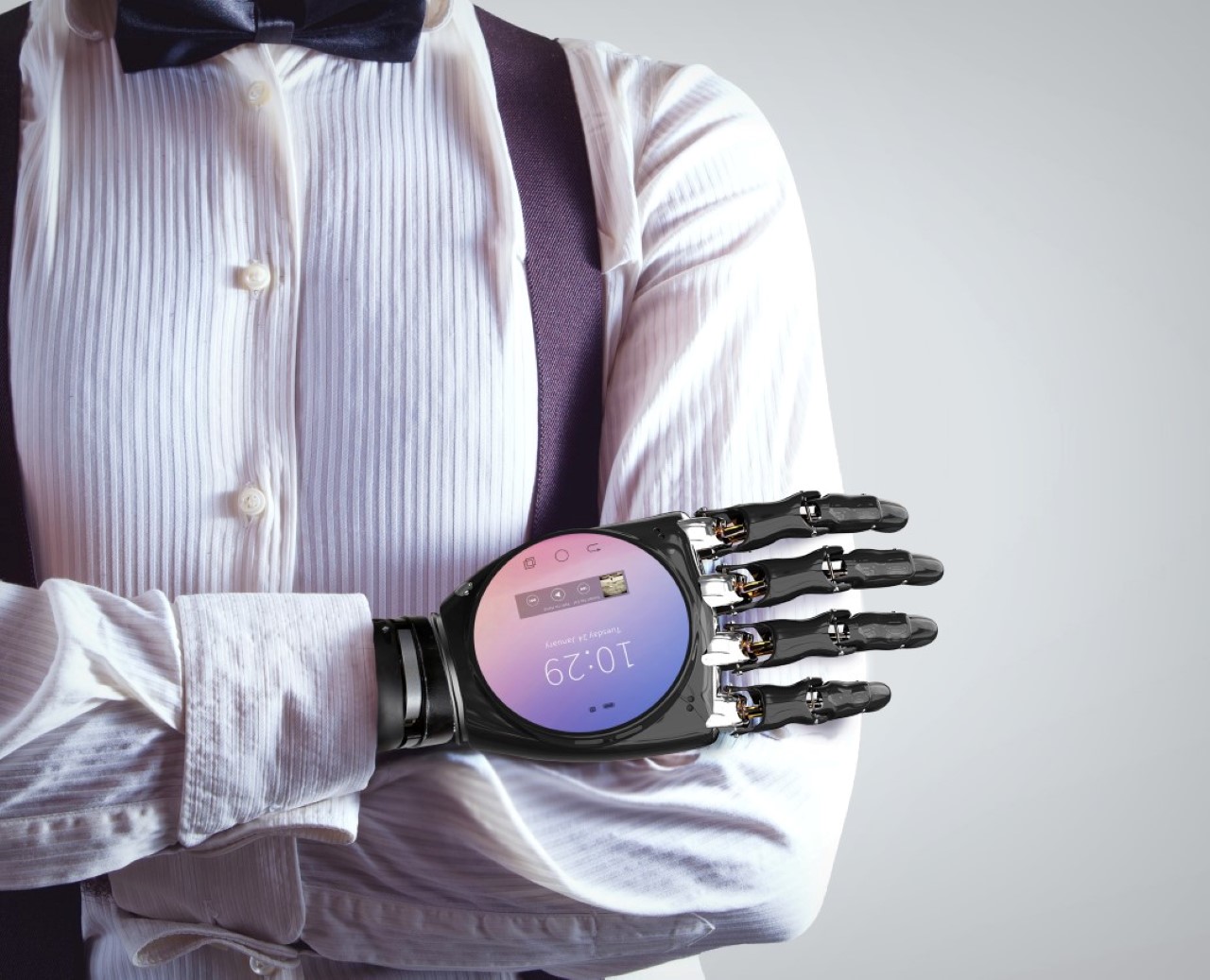
SPH Smart Prosthetic Hand by Young Jo In

The SPH, or Smart Prosthetic Hand is just practical from top to bottom. A mechanized prosthetic hand lets you go about your day to day tasks, while a smartphone is literally integrated into the back of your palm, letting you own and use a smartphone without worrying about having to occupy one hand holding one, forget/lose one, or accidentally drop one. Besides, it literally puts the power of the entire internet in your hands!

Click here to register & participate in the A’ Design Awards 2022. Hurry, the last date for application is the 28th of February 2022!

The post Medical Innovations from the A’ Design Award that will revolutionize human life and healthcare first appeared on Yanko Design.
This micro-mobility charging station features universal power adapters to minimize the hardware used in going electric!

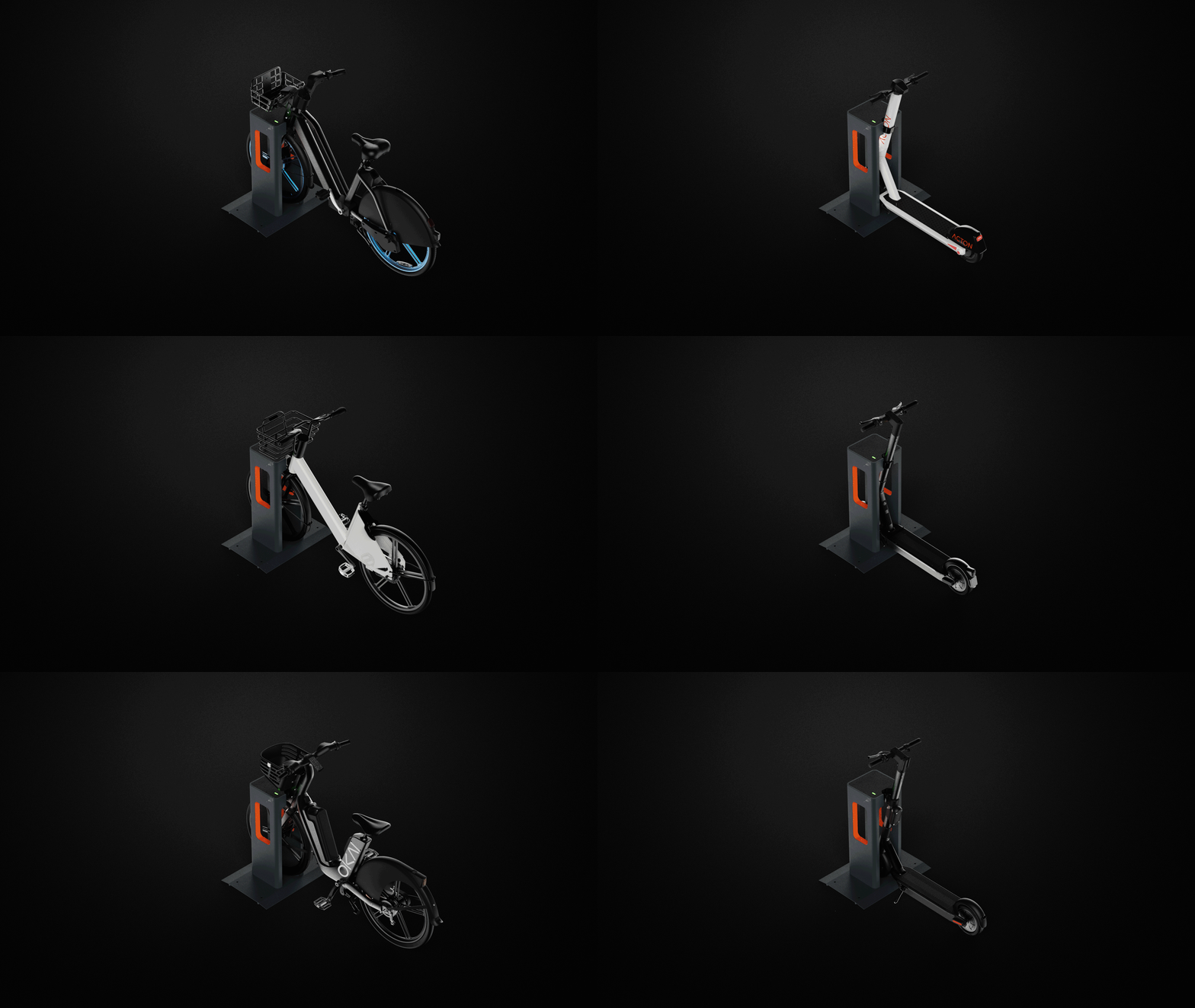
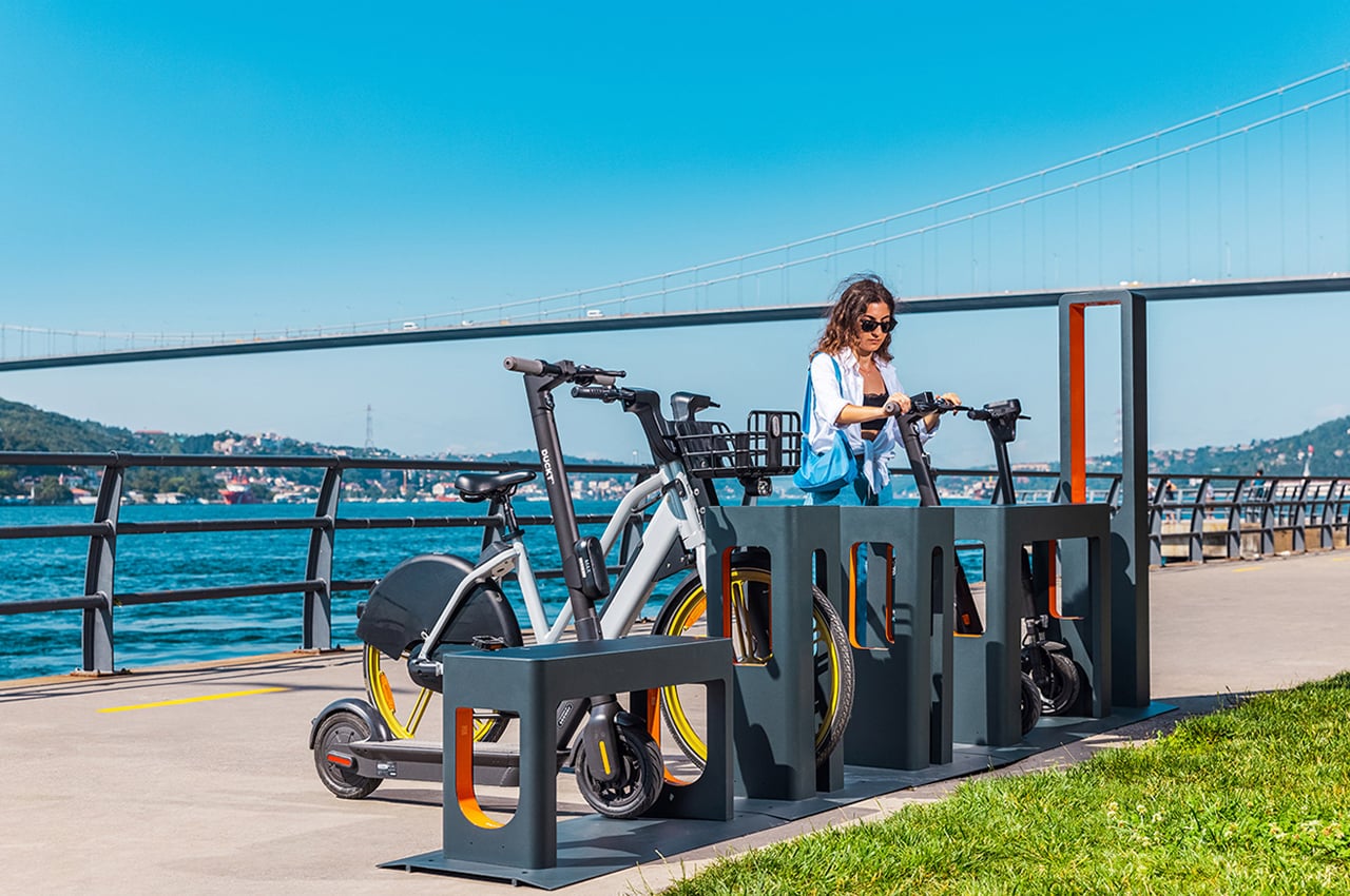
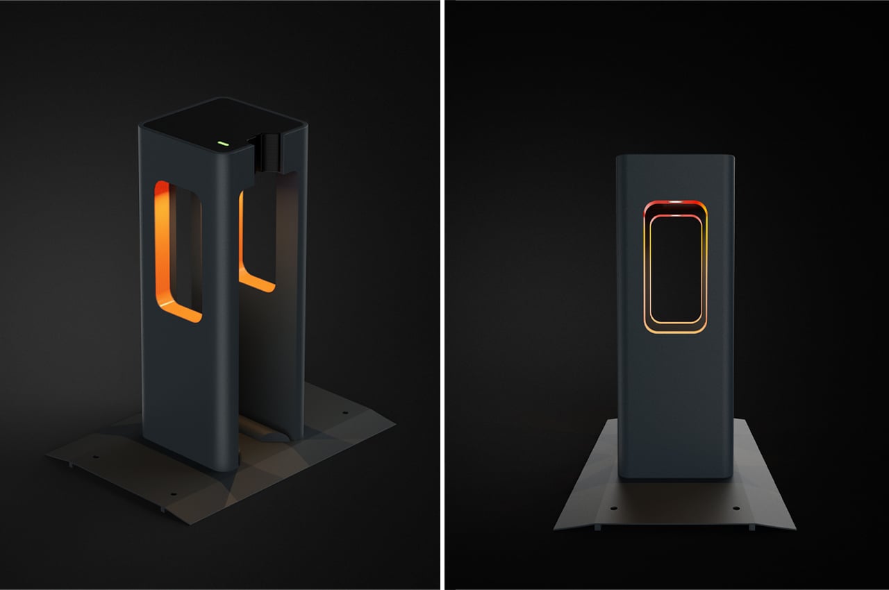
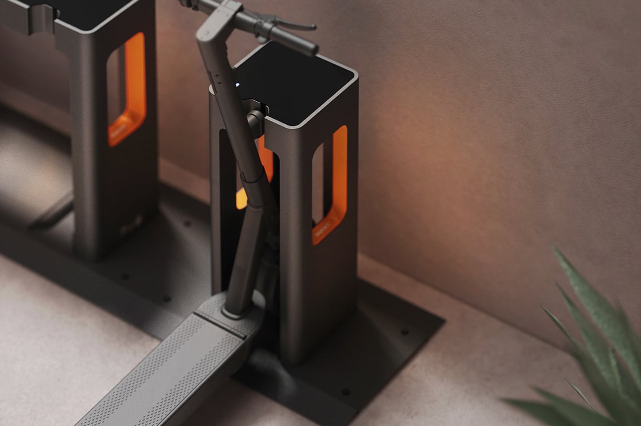
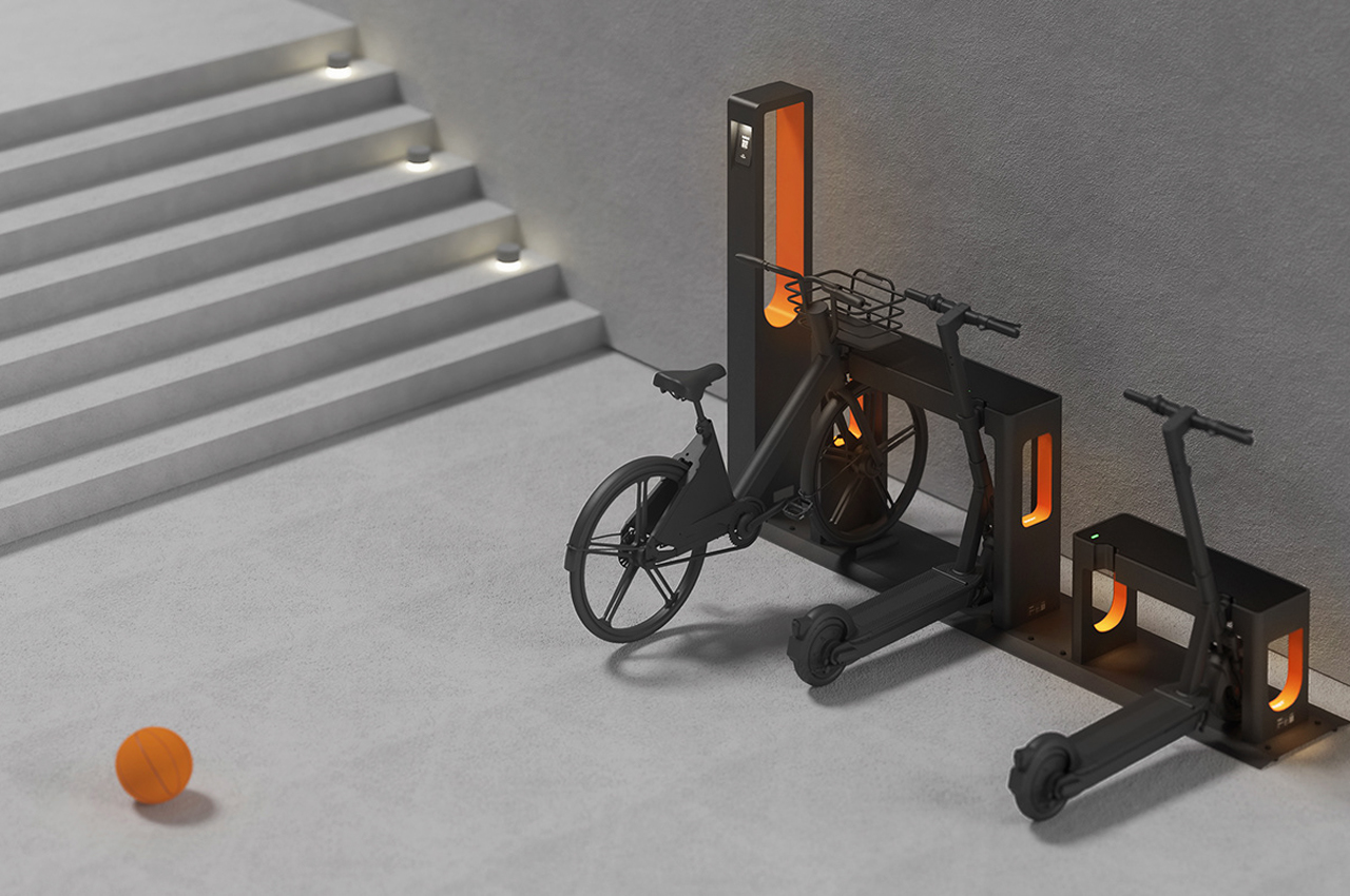
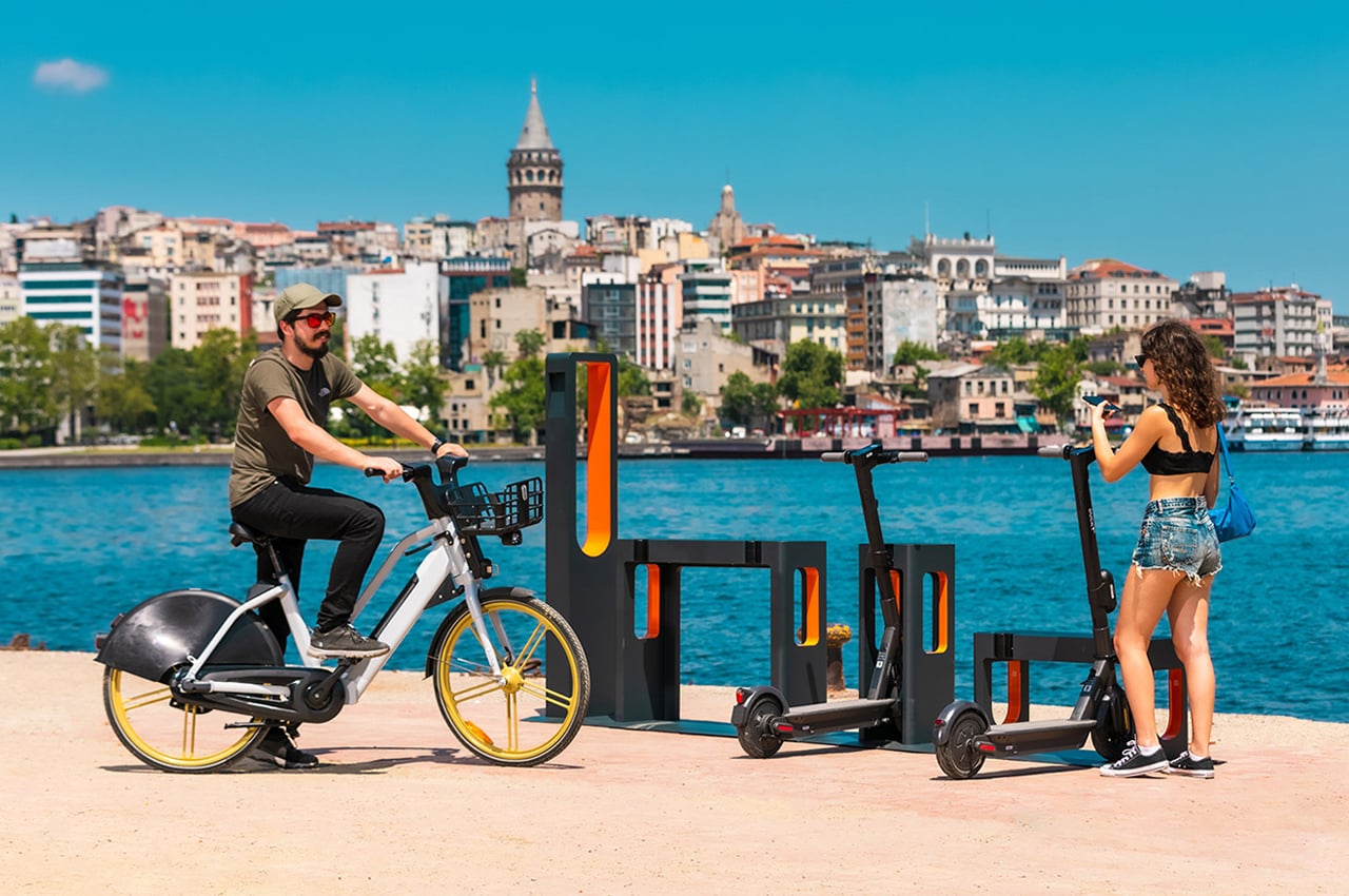
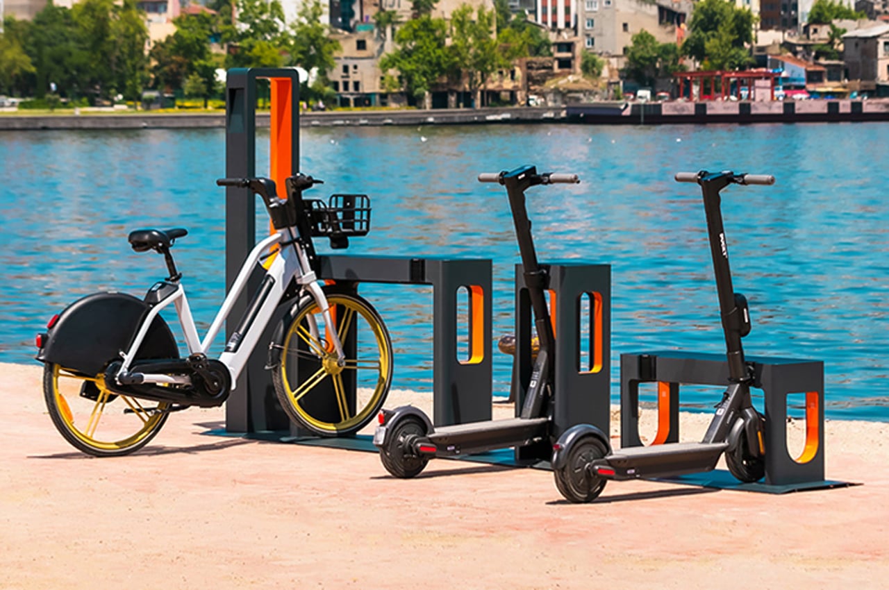
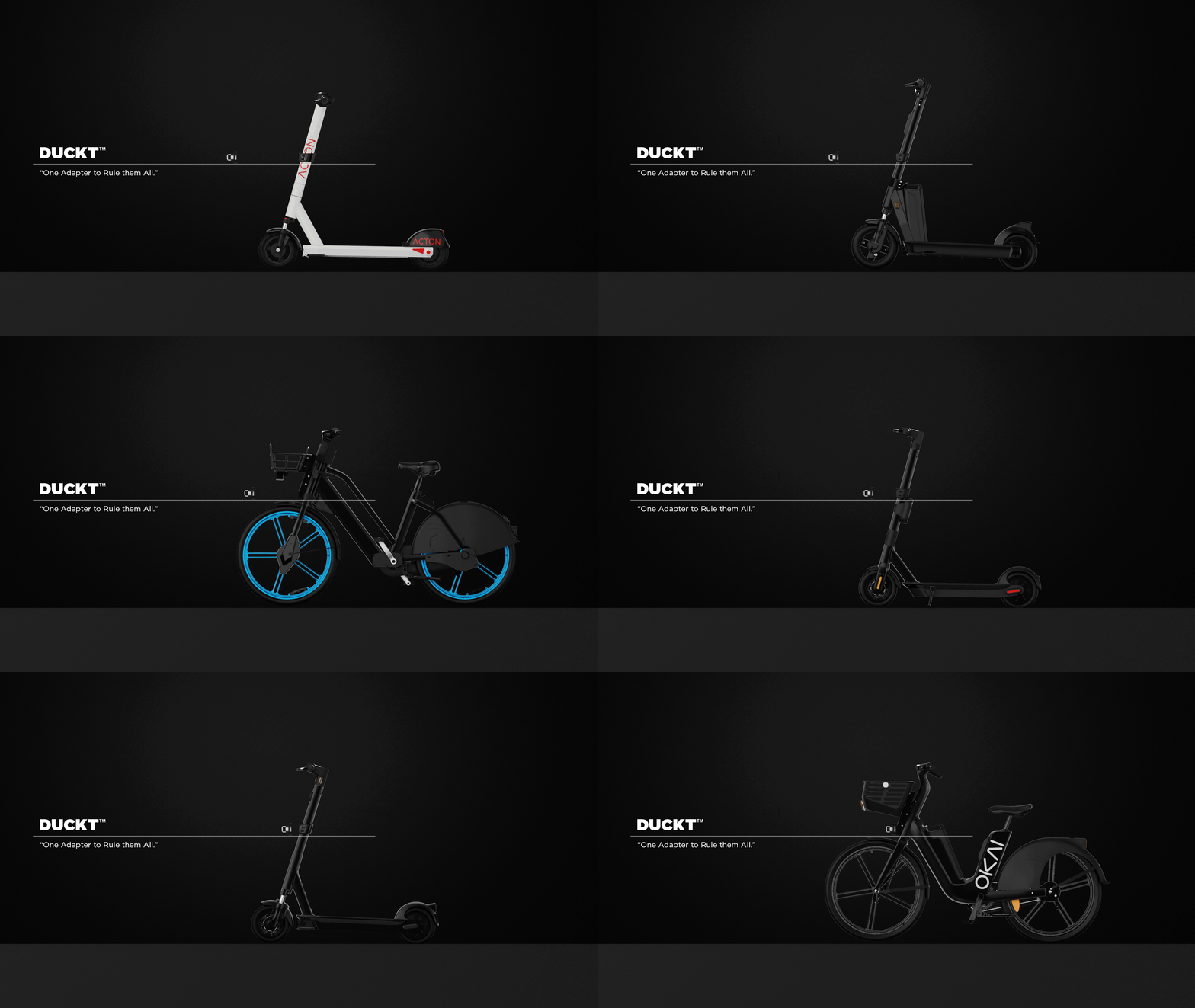
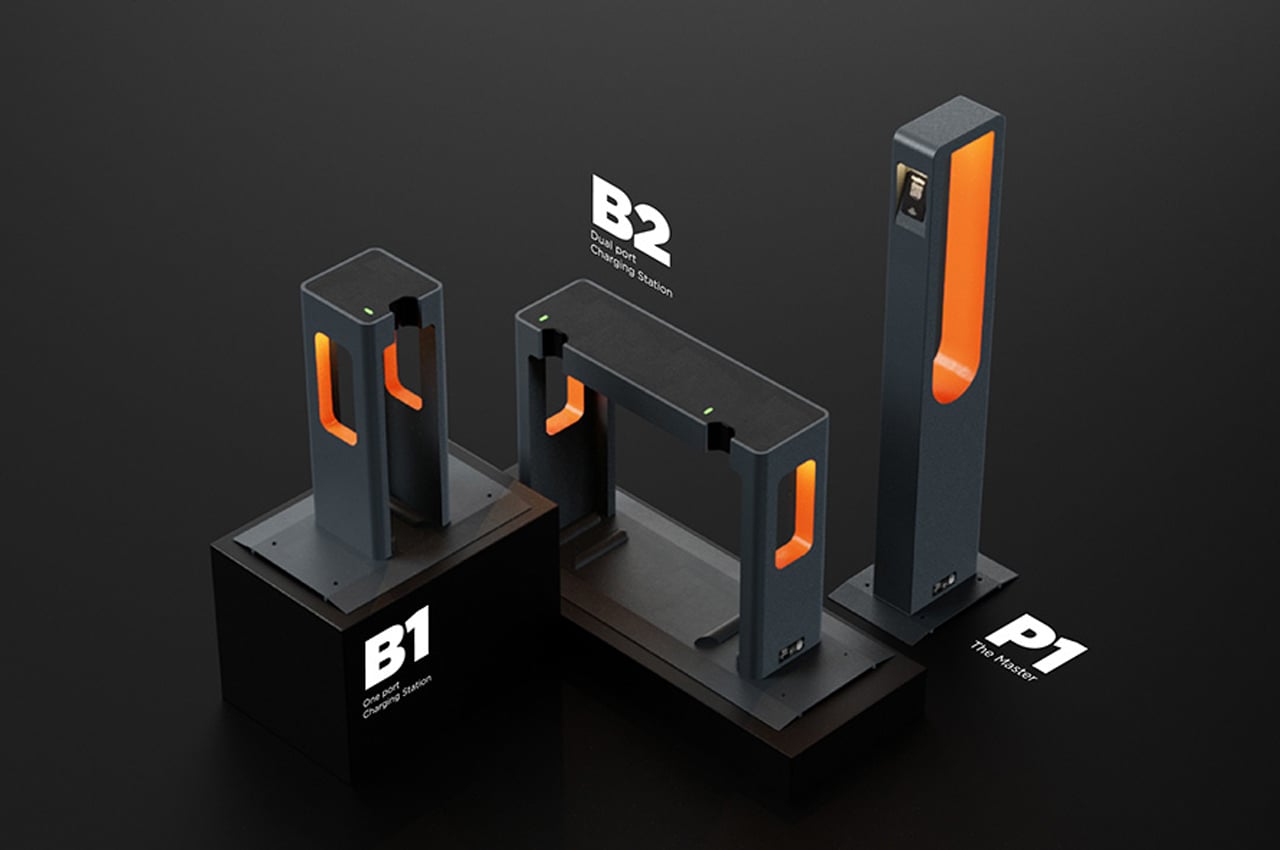
Duckt is a micro-mobility charging station that features a universal power adapter so every type of micro-mobility vehicle – from bikes to scooters can charge with ease!


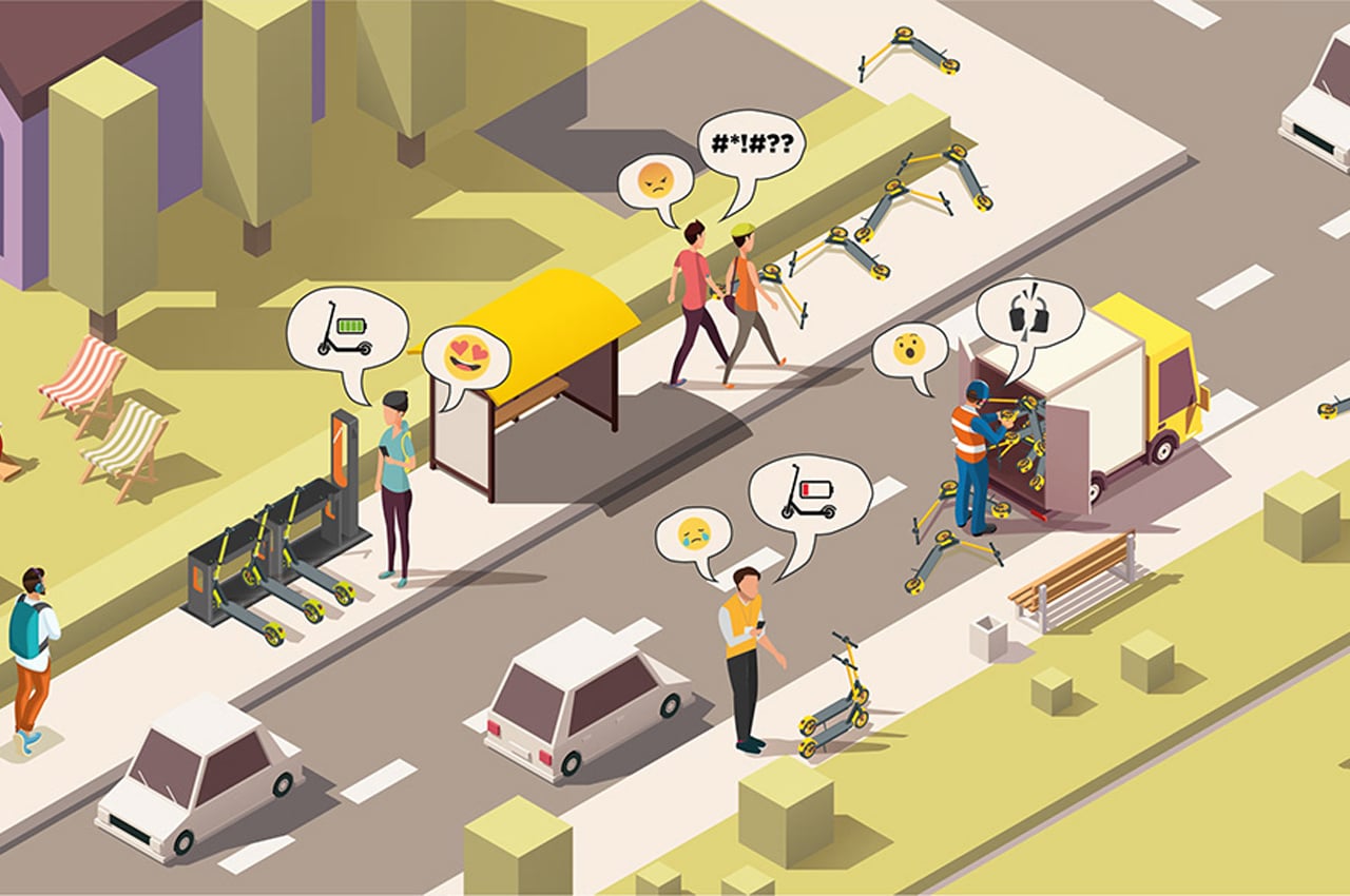
By now, we’re all familiar with micro-mobility vehicles, like e-bikes and e-scooters. They fill our city sidewalks and their charging stations are found on avenues every couple of blocks. While micro-mobility concepts are typically designed for convenience first and foremost, all of the different micro-mobility vehicles take different charges which complicate the entire transportation process.

Offering a solution, Duckt is a modern micro-mobility concept that weaves a universal charger into its design to streamline charging periods and bridge all of the different micro-mobility vehicles already out there.

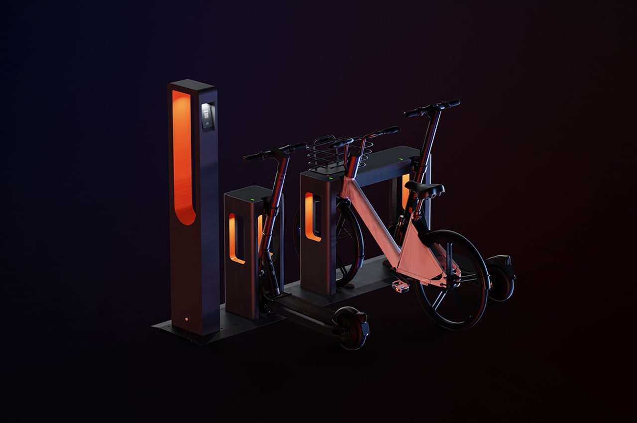
Inspired by the numerous configurations that can be created from perfect geometry, the team of designers, Alimşan Kablan, Emre Özsöz, and Pelin Özbalcı, positioned Duckt on power bases that form basic shapes. Chosen for their familiarity and clean design, the basic shape of the power station allows room for more than one type of vehicle to park.

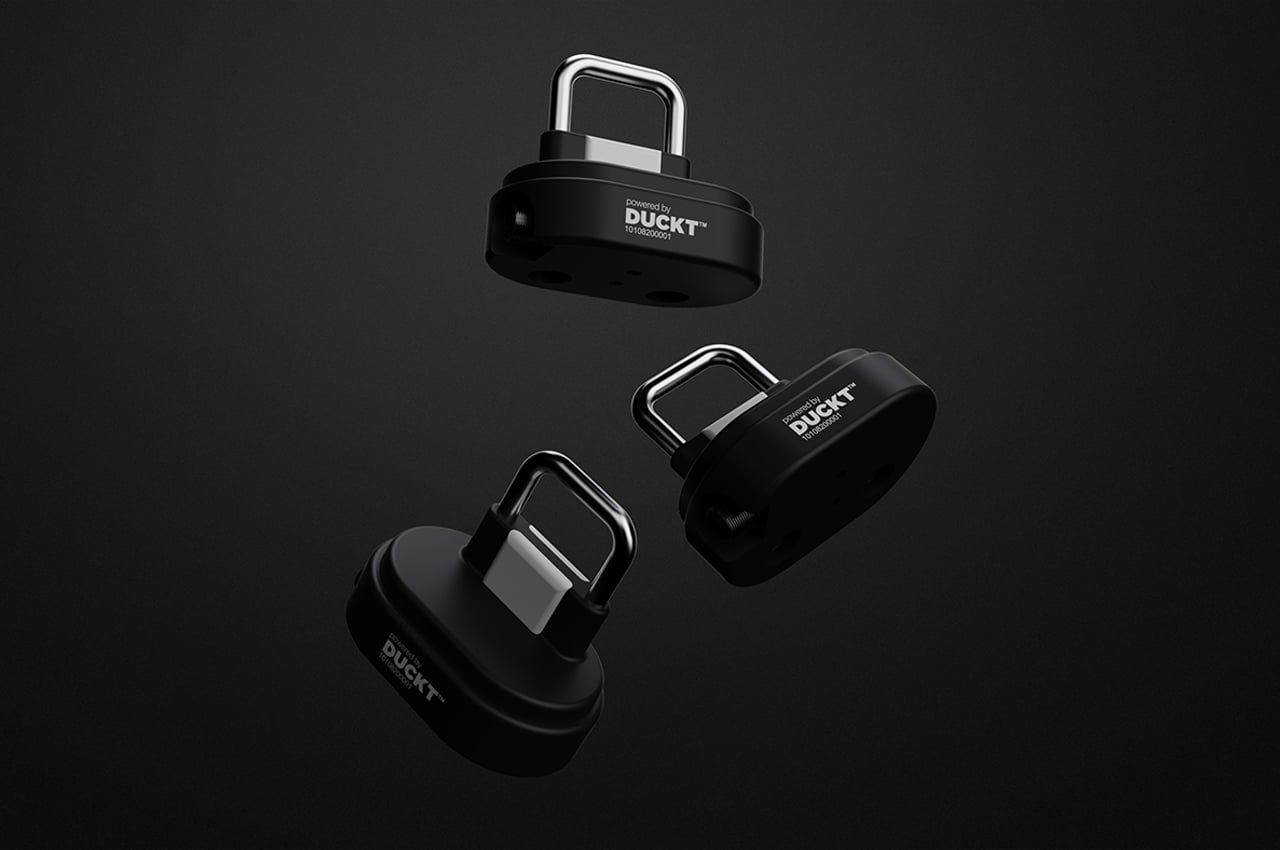
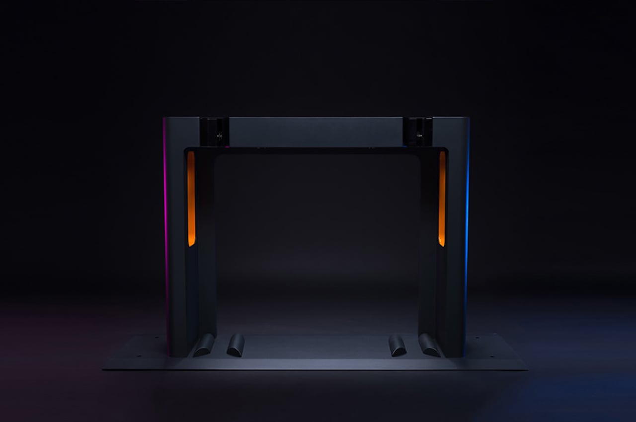
The universal aspect of the charging station comes through Duckt’s adapter that can attach to any micro-mobility vehicle to then connect to the power station for charging. Conceptualized in three different layouts, each power station comes with ports for micro-mobility vehicles to slide into.

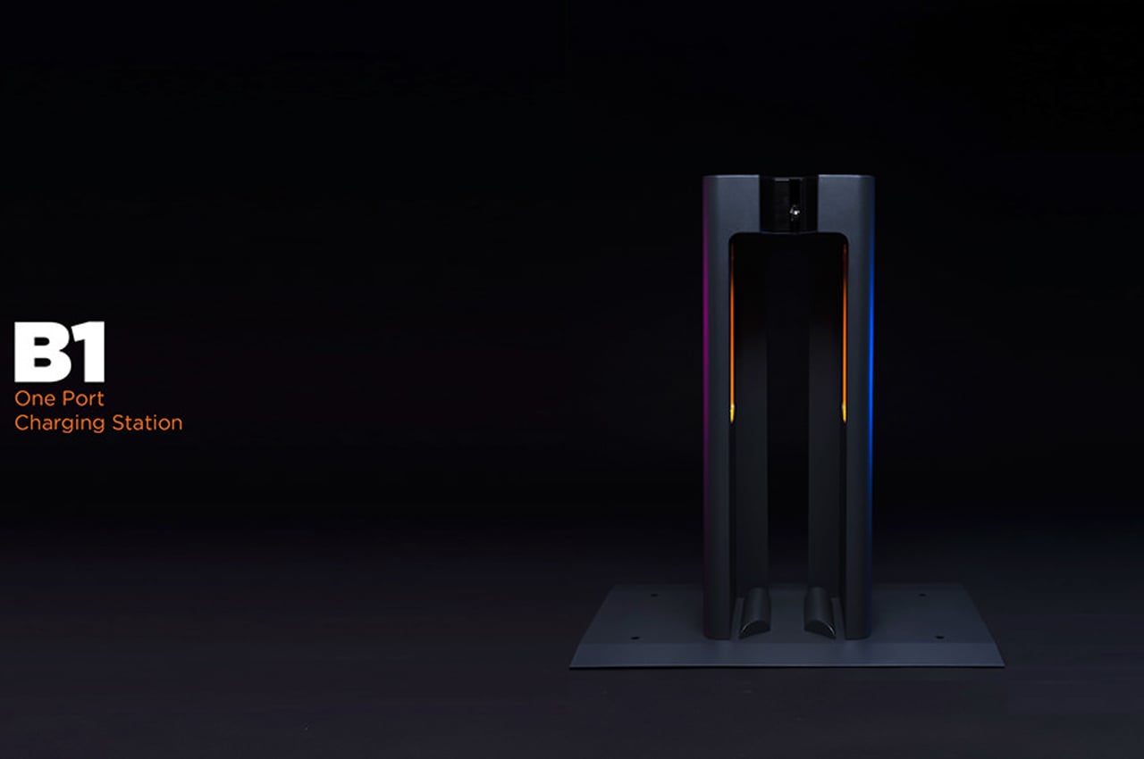
The first layout is Duckt’s simplest form, featuring a single dock for charging and a locking mechanism to ensure the vehicle receives all of the intended charges. The next layout, called B2, features a dual docking station for two vehicles in addition to the locking mechanism that’s built into every port.

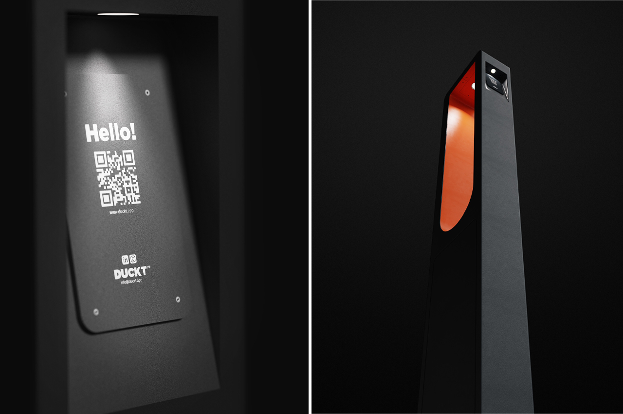
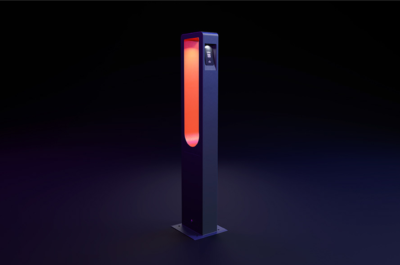
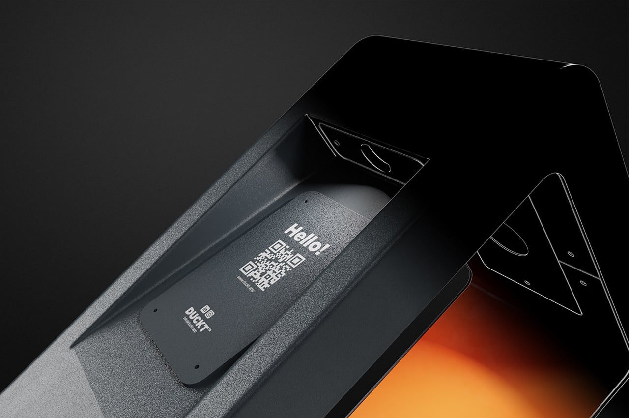
The master connector, P1 “is a bridge that enables these stations to open up to the internet.” The tall, rectangular power port comes with a QR code that users can scan to access the internet while charging their e-bike or e-scooter. Recognized by A’Design Awards and Red Dot, Duckt is a modern solution for a modern inconvenience.

Designers: Alimşan Kablan, Emre Özsöz, and Pelin Özbalcı

Duckt’s P1 station comes with embedded QR codes that access the internet. 

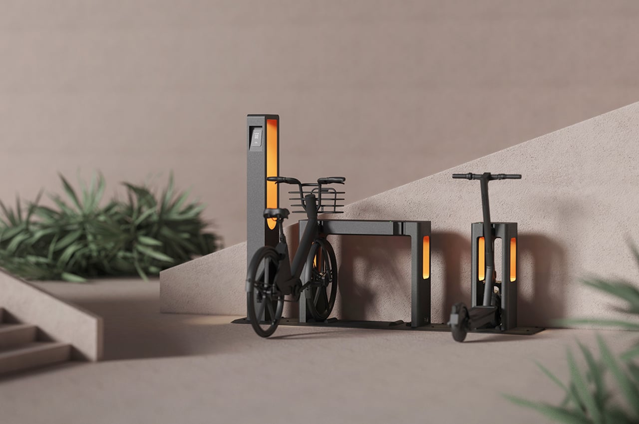
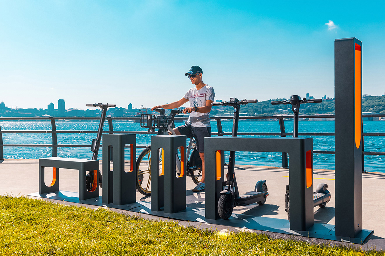
When put together, Duckt accommodates every type of micro-mobility vehicle.

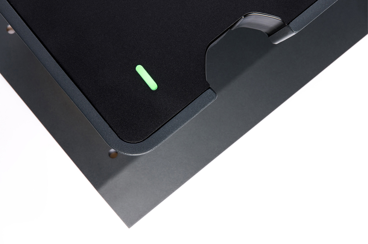
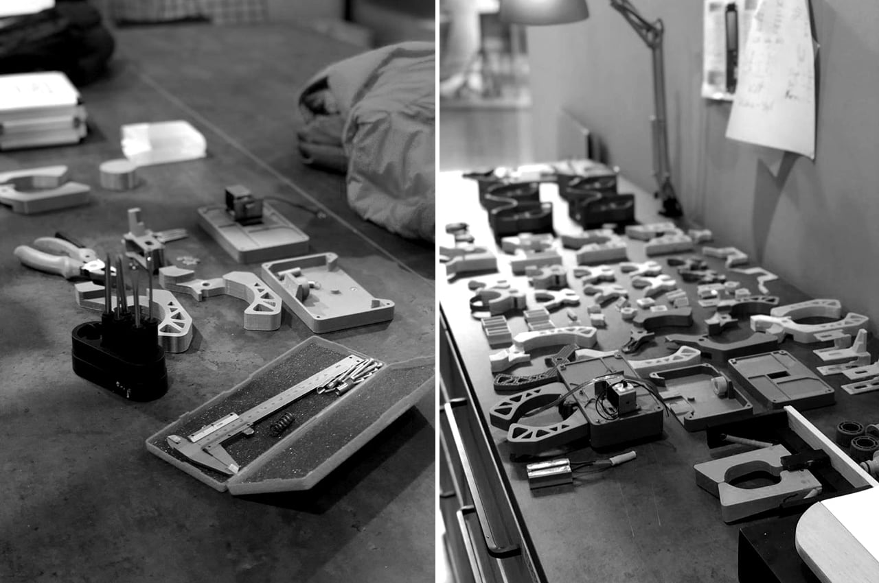
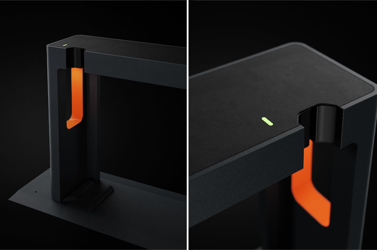
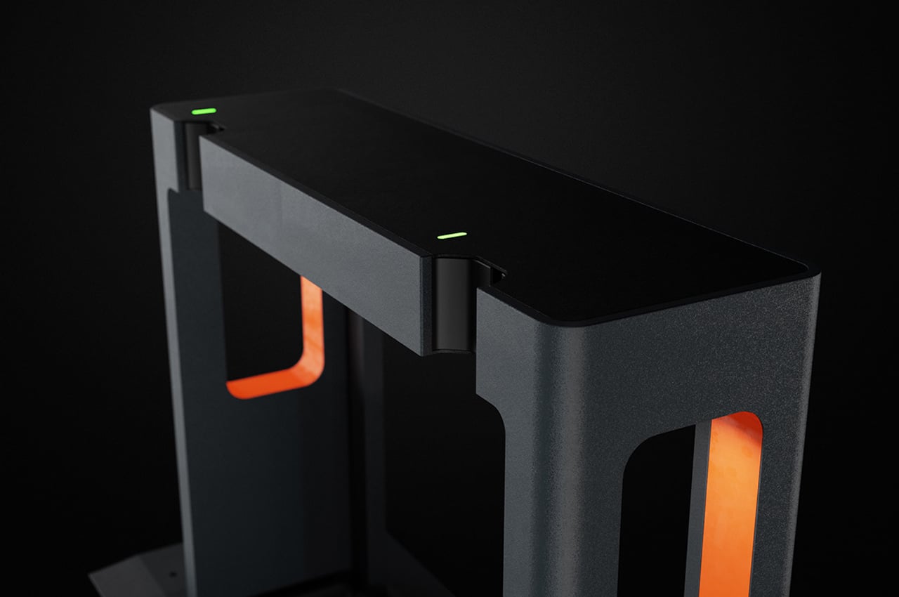
Each dock comes with a secure locking mechanism to ensure constant charging.

The “master connector,” P1 brings every component together.

The basic geometry of Duckt’s configuration allows room for more than one type of vehicle to park.

Integrated lighting makes Duckt visible even at night.

The post This micro-mobility charging station features universal power adapters to minimize the hardware used in going electric! first appeared on Yanko Design.
Your Lighting Design Lookbook: Award-winning Lighting Projects from A’ Design 2021

We’re here with inspirational lighting designs to help ‘spark’ your imagination! Perhaps the most ‘lit’ amongst the A’ Design Award’s multiple categories, this list looks at winning designs from the past year, celebrating good design from the year gone by. The Italy-based A’ Design Awards and Competition have always tried to be more than an award, by creating a multi-disciplinary program that rewards designers while also creating an environment that helps designers grow their products as well as careers… And yes, you also win a shiny trophy.

Lighting Design forms just one of the various categories of the A’ Design Award and Competition, which spans the popular categories like Architecture, Packaging, and Consumer Electronics, as well as the obscure, lesser-known categories like Cybernetics, Prosumer Products, and Safety Apparel Design. The A’ Design Award’s ultimate goal is to be an umbrella that covers good design across all disciplines, which is why it has 100 different categories for submitting design projects, and 211 jury members (comprising academics, design professionals, and press members) from all around the world collectively judging the works. Winners of the A’ Design Award don’t just secure a trophy and a certificate, but receive an entire PR Campaign dedicated towards pushing their career, clout, and even their projects to newer heights. A’ Design Award’s winners and even its participants are included in its annual award book and business network, while additionally contributing to their country’s overall design ranking that paints a holistic picture of how design-centric and design-forward each country is.
The A’ Design Award is currently accepting entries for the 2022 edition of the award program, so go ahead and give your work and career the push it deserves!

Here are some of our favorite Lighting Design winners from the A’ Design Award & Competition 2021. If you have a potential lighting design project that you think is worthy of an award, Click here to register & participate in the A’ Design Awards 2022.


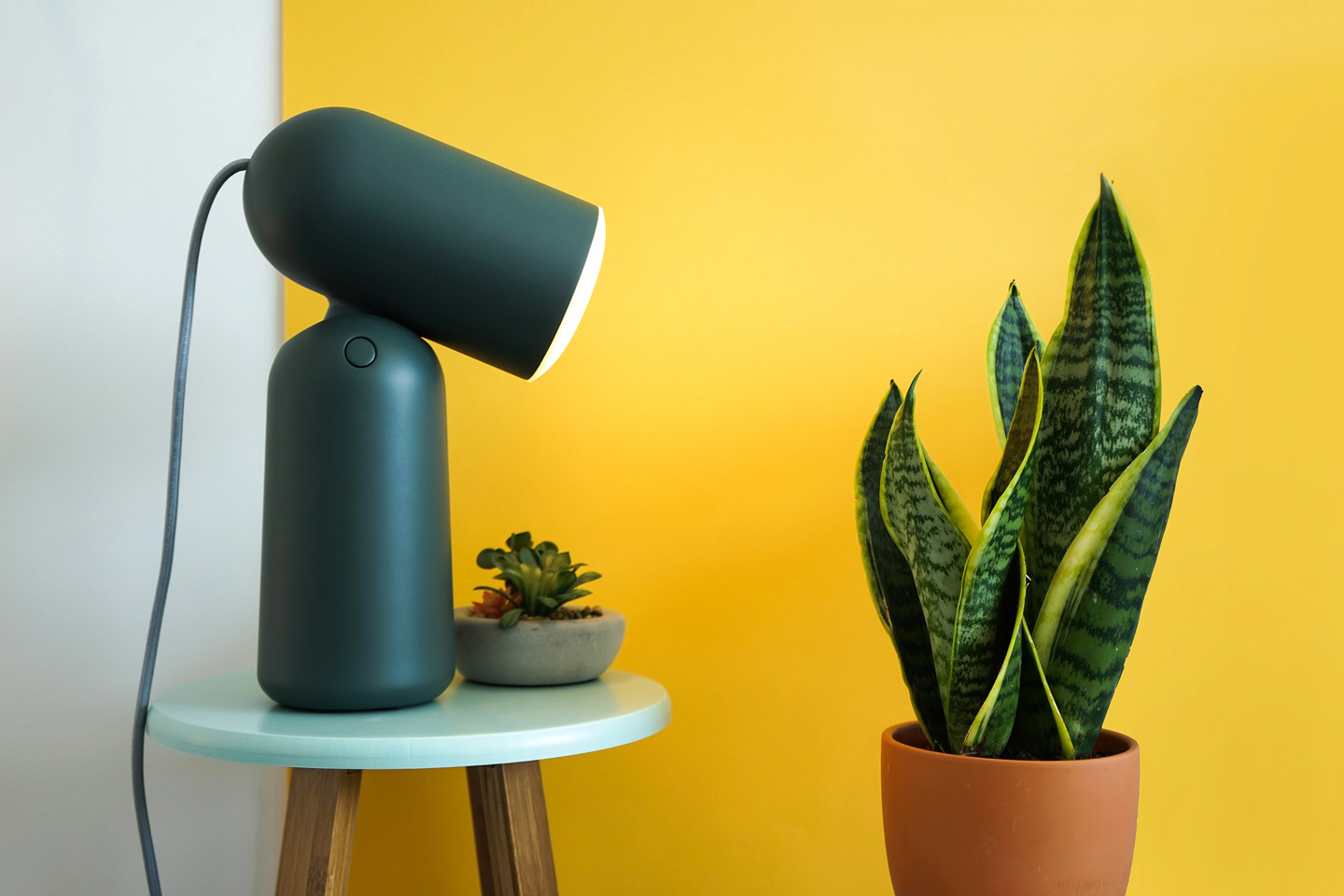
Buddy Table Light by Mona Sharma for Gantri

Modeled on the image of a friendly little ‘buddy’ that helps you by illuminating your workspace, the Buddy lamp sits obediently on your desk, with an adjustable ‘head’ that lets you ‘face’ the lamp anywhere. Designed by Mona Sharma for Gantri, the lamp is manufactured entirely using 3D printing techniques and Gantri’s proprietary Plant Polymers. The Buddy is “inspired by bold shapes and forms found in the Memphis design style, and the clean, minimal forms found in Scandinavian culture”, says Mona. “I wanted to create a companion for ‘thinking’ spaces, so quirky, playful cues in abstract photography and in nature gave it character.”

Translucence Pendant Light by Iestyn Davies


For context, Iestyn Davies is both a glassmaker and lighting designer… which explains the Translucence light’s origins, inspiration, and intricate design. The lamps are made entirely from scratch by hand using traditional hot glass techniques, which means each Translucence is completely bespoke and unique in its design. Davies wanted to create a lamp that had its roots in traditional techniques, instead of creating a form and slapping an LED bulb somewhere inside it. Instead, Translucence is a celebration of the relationship between light and refractive solids. The wavy design of the glass helps curve and guide the light, creating a shimmering halo that’s absolutely captivating and bordering on jewelry!

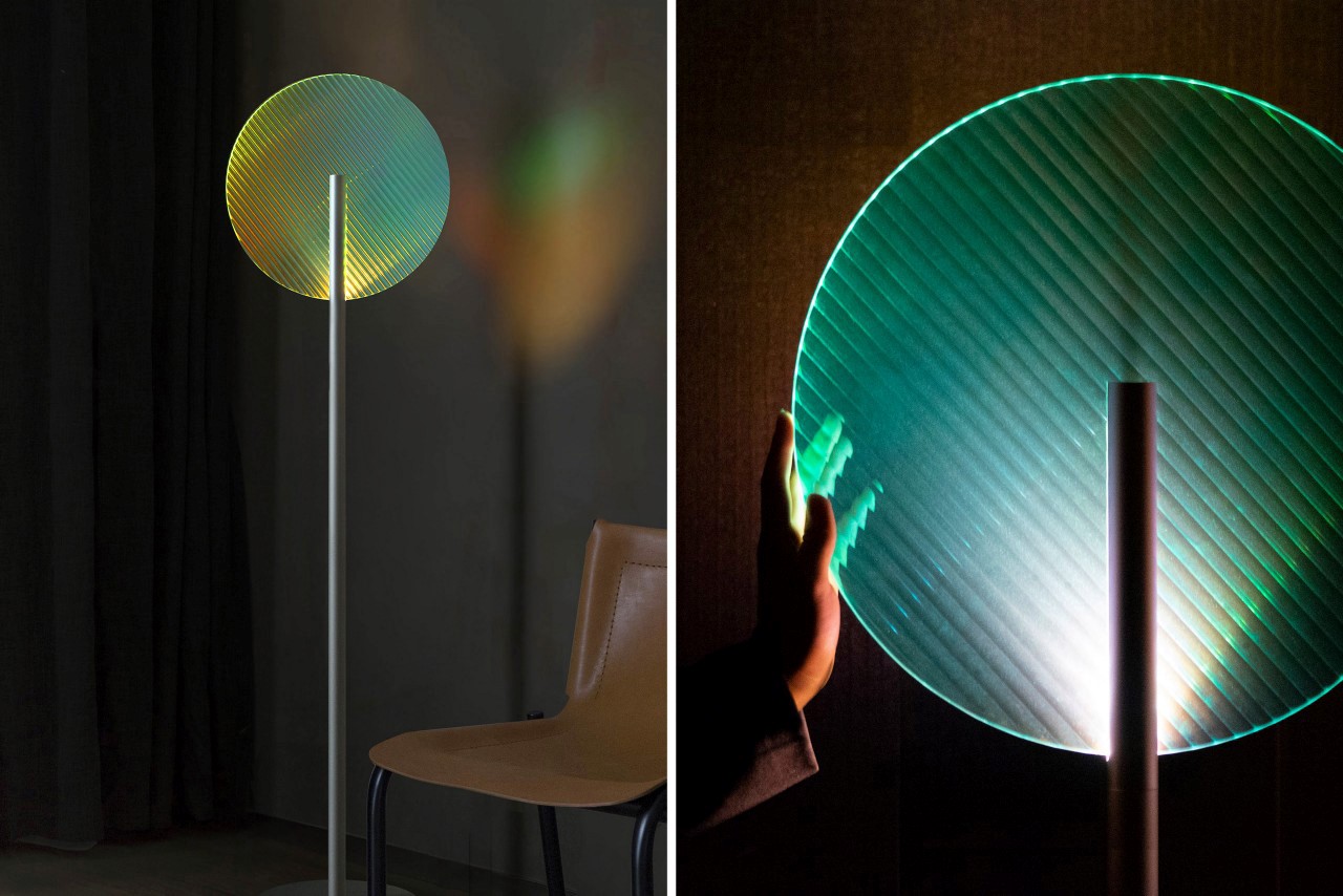
Linear Refraction Light by Ray Teng Pai

Yet another example of light and refractive solids, the Linear Refraction Floor Lamp uses a much more simplified design to achieve the same goal. The floor lamp literally consists of a vertical tube with a light source at its end, and a fluted glass sheet on the front of it, scattering light in different directions. The disc can be rotated by hand, and comes with a pearlescent coating that gives the light a shimmering rainbow effect too!

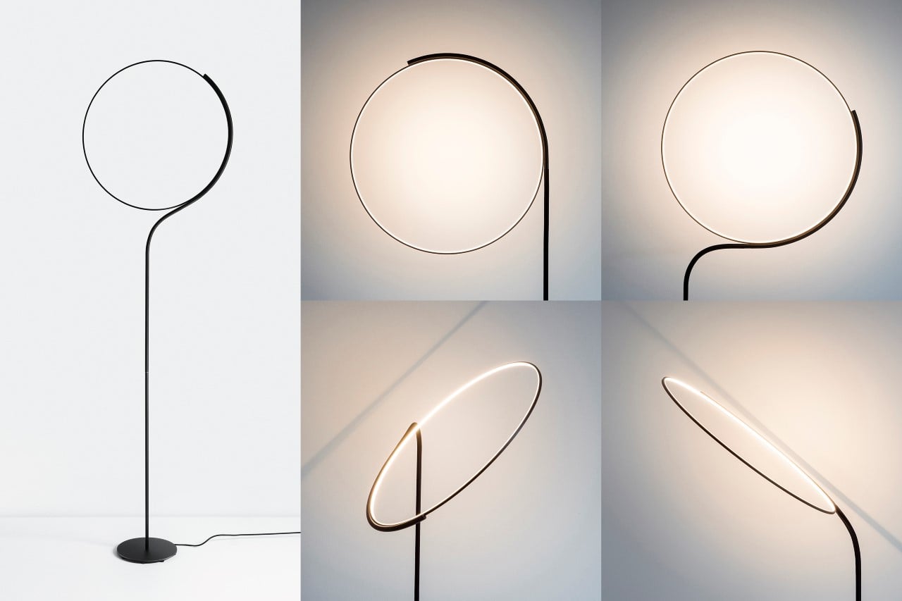
Cling Floor Lamp by Dabi Robert


“My lamp concepts involve a certain amount of interaction in order to modify the way light is perceived”, says designer Dabi Robert. “This should encourage curiosity and human interaction with the light source, instead of just putting it somewhere to rest. I strive for a deeper relationship to the interior product”, he adds when describing the Cling, a uniquely minimalist floor lamp that’s relatively invisible to the eye until you start engaging with it. The lamp comes with a halo-shaped light attached to a flexible gooseneck base, which bends and flexes when you adjust the light’s position. Almost looking like a gymnast or someone doing yoga, the lamp contorts in all directions, helping you not just adjust the lighting, but also create a different design each time!

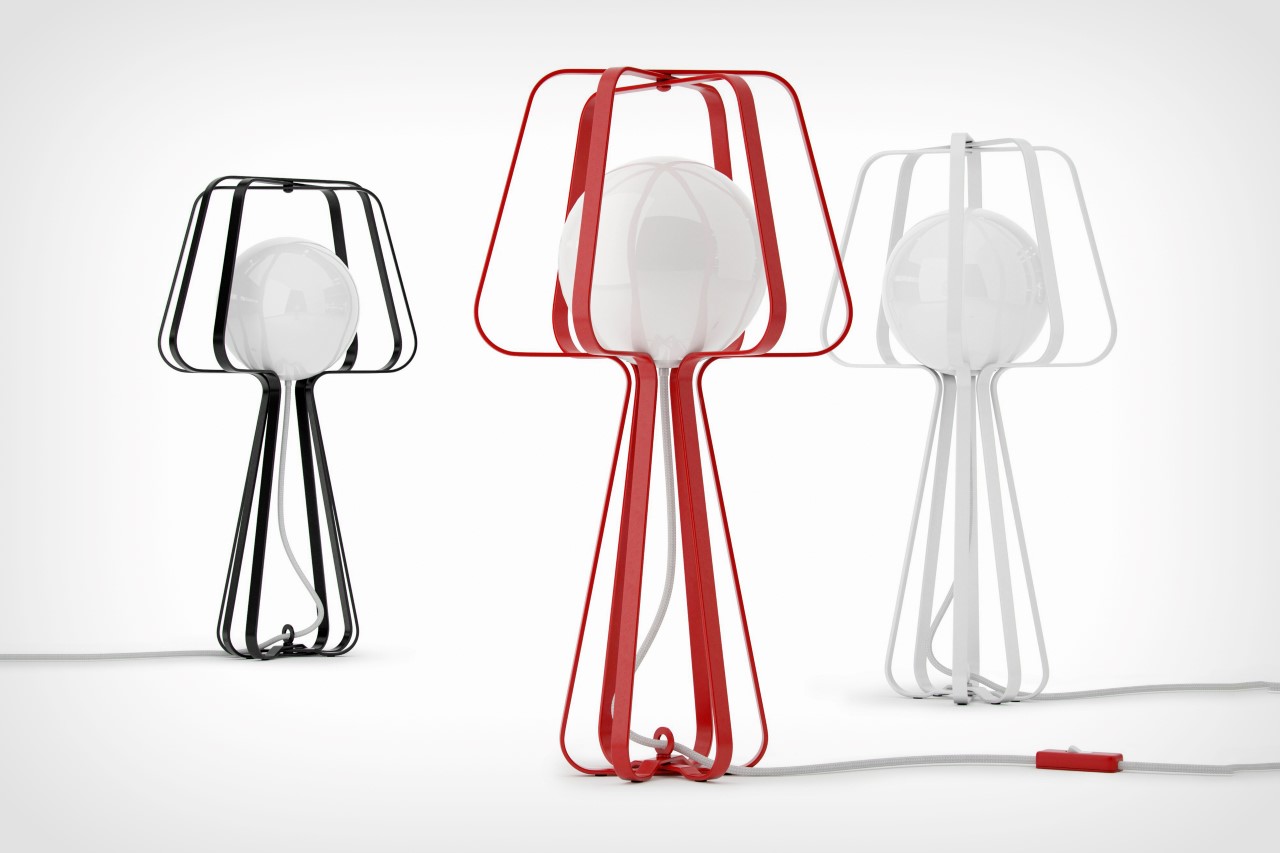
Silhouettes Lamp by Alexey Danilin


Created as a visual metaphor of a lamp, the Silhouettes Lamp by Alexey Danilin relies on the iconic shape of the lamp and shade to give his lighting design its character. Alexei says, “The main source of inspiration was the National Russian toy – Matryoshka, however, to be more precise, it was the principle of its design. It consists of one form, but of different scales. They can all create a common object.” The lamp uses a metal wire-like structure to create the impression of a lamp. The different metal silhouettes/outlines are pivoted around the center, allowing you to open the lamp out from a flat 2D design to a 3D form, with the actual lamp – an illuminated frosted glass orb – inside it.

Weed Lamp by Jinying Cheng


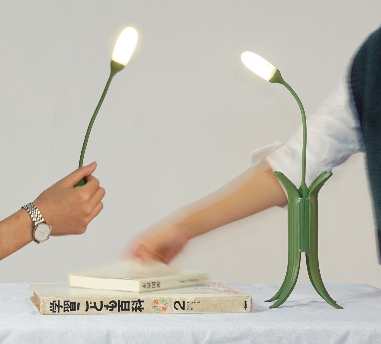
Designed to look like a fast-growing weed among a tuft of grass, the Weed Lamp by Jinying Cheng can actually be ‘uprooted’! The lamp itself comes with a detachable design that lets you lift the weed out of its grassy base and carry it around like a handheld torch. It’s perhaps the most quirky little lamps I’ve seen in a while with an unusual interaction, but I’m really taken by how fun it looks and feels!

Time Lamp Timing Light by Peng Ren


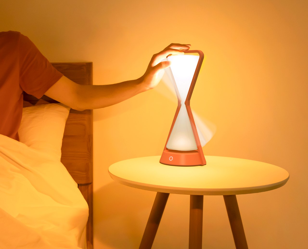
There’s something very intuitive and interactive about the way the Time Machine Table Lamp is designed. Made to look like an hourglass, the lamp features a freely rotating shade with a central pivot and LEDs on both ends. Switch the lamp on and the LEDs on the upper half of the hourglass illuminate. Over time, the upper half of the hourglass dims down and the lower half begins illuminating, almost as if light particles are passing through the central channel, like grains of sand would. The Time Machine Table Lamp was designed to help provide an ambient bedside aura of soft light, while allowing you to intuitively gauge time as it passes by. It takes around 60 minutes for the light to transfer from one half of the hourglass to the other, and a simple flip helps reset the entire procedure. It’s a fun-yet-useful way of timing your nightly activities before going to bed… perhaps reading a bedtime story, or sharing stories about your day before hitting the sack.

Be Water Lamp by Fernando Correa (Platinum Award Winner)


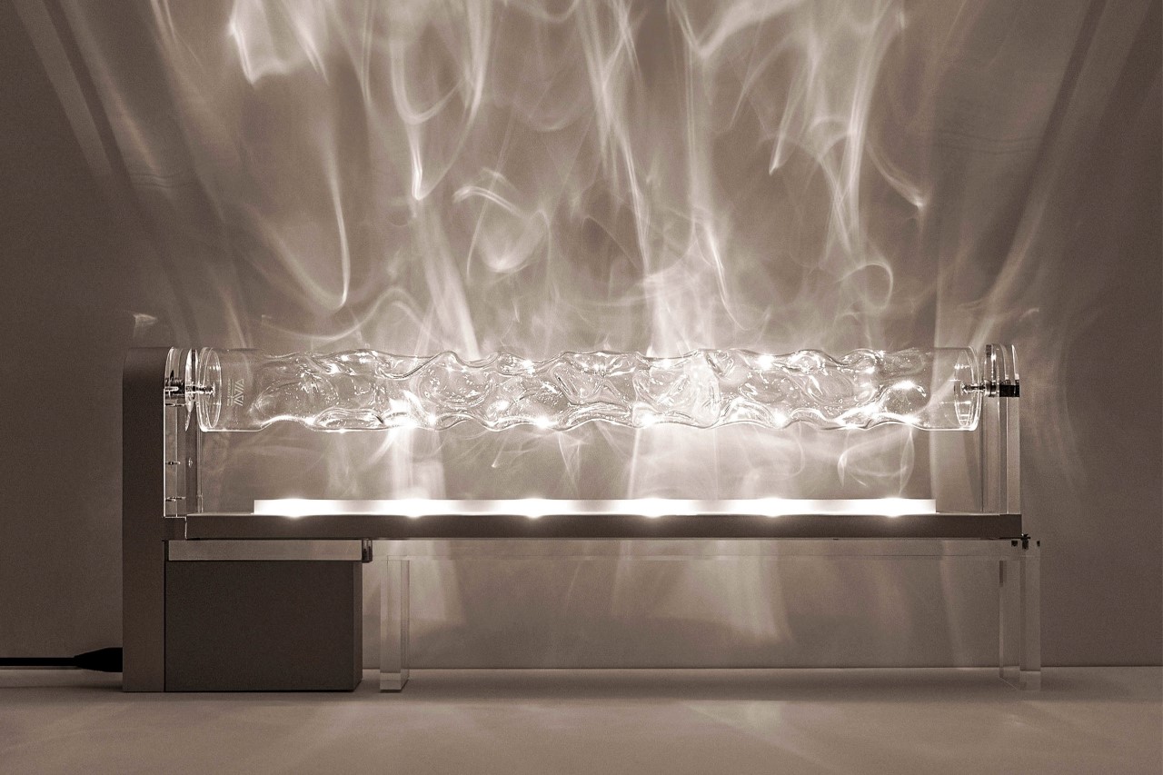
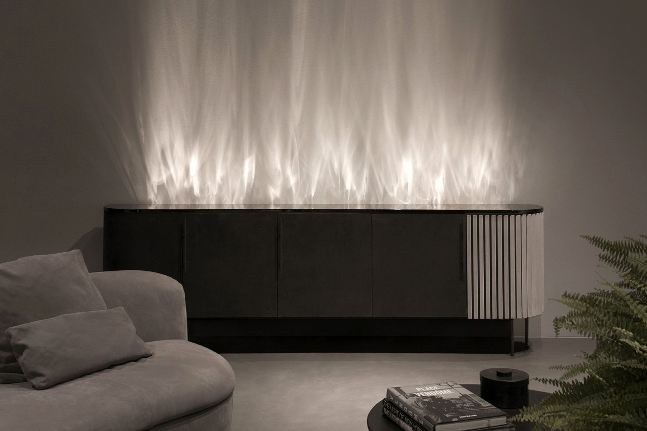
A winner of the coveted Platinum A’ Design Award, the Be Water lamp uses refraction to make light look like water! The lamp features a set of LEDs in a linear strip, right below a tube of warped glass. As the glass tube rotates, it creates wonderful patterns of light that when placed against or near a wall, mimic the effect of watching light bounce off a pool of water. The lamp exists in four chromatic variations – Be Water, Be Fire, Be Air, and Be Earth. The variations can be achieved simply by changing the color of the light to go from water to the tongues of fire, the Aurora Borealis visible in the air, and the billowing fields of purple lavender on Earth in Provence, France. I really wish there was a video of this lamp at work!

If you have a potential lighting design project that you think is worthy of an award, Click here to register & participate in the A’ Design Awards 2022.

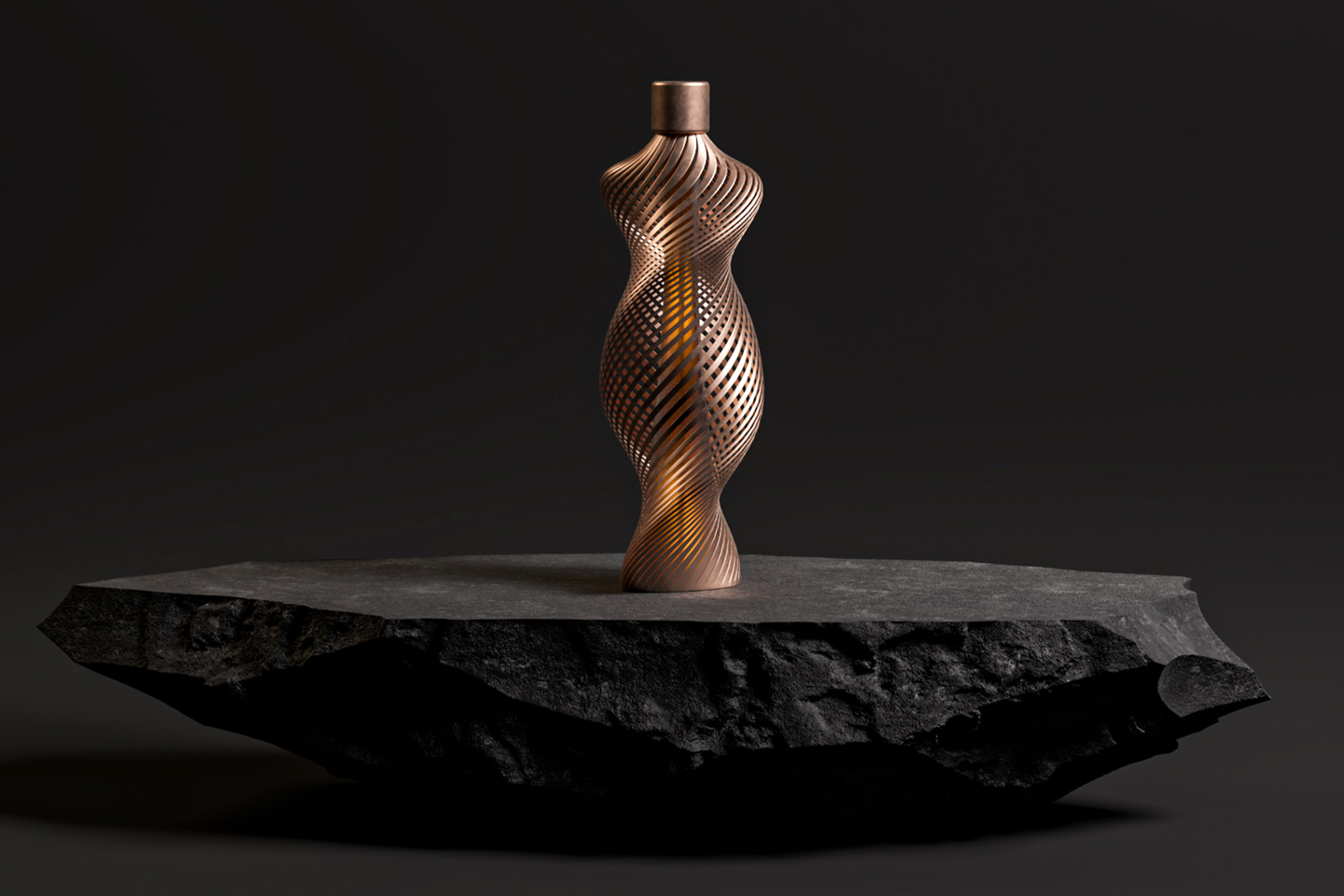
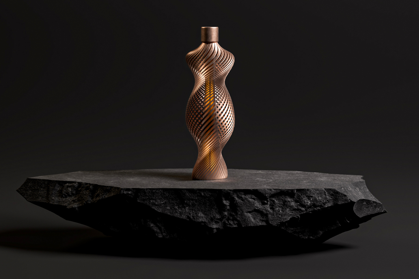
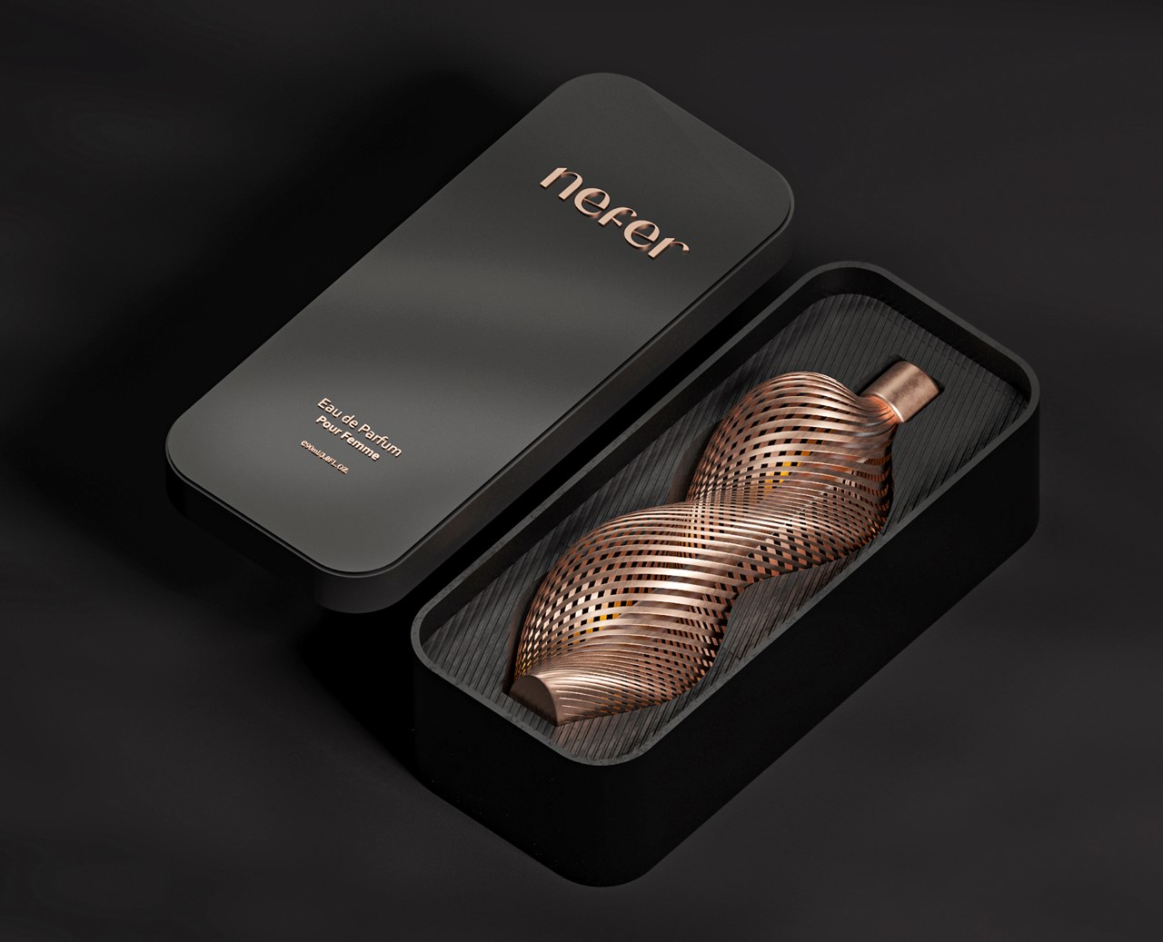
The Nefer perfume comes in a hauntingly beautiful skeletal bottle created through 3D printing

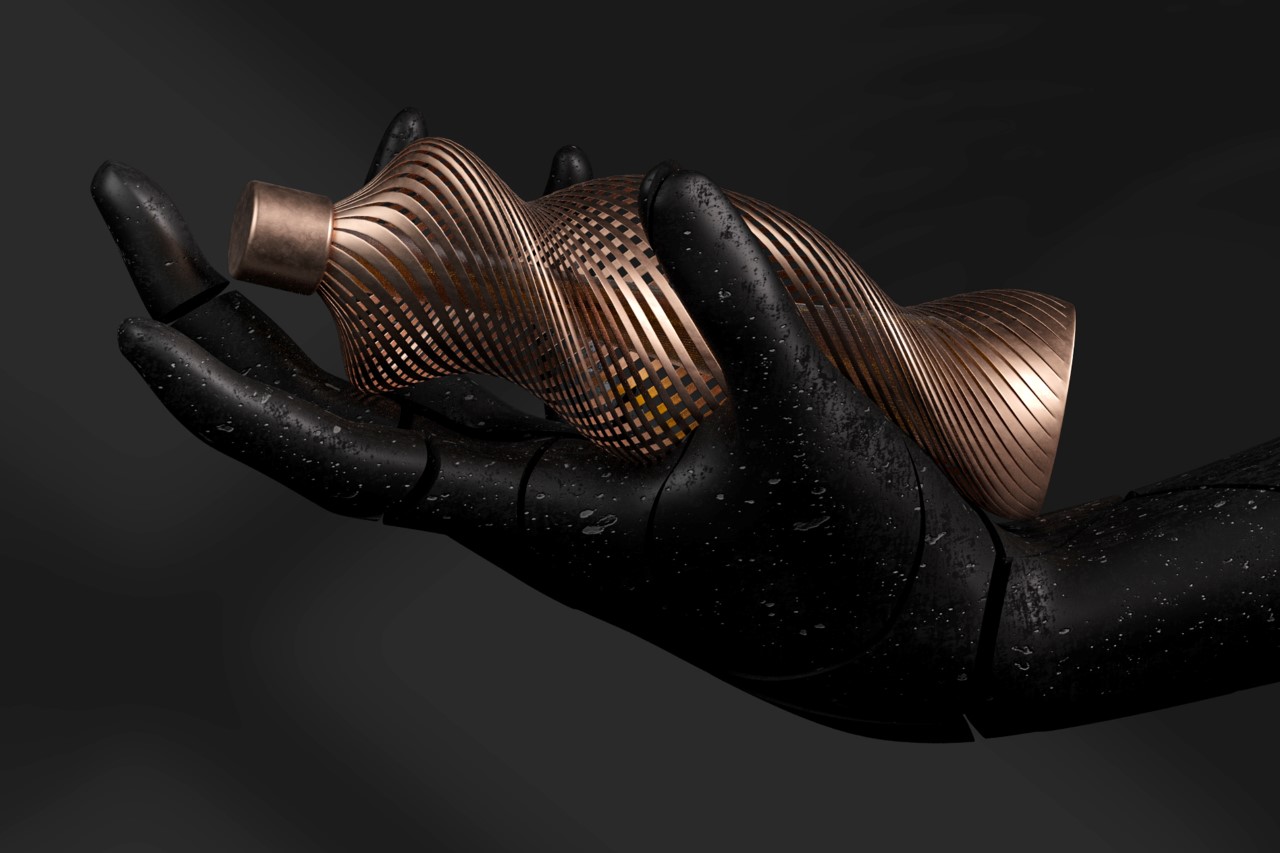
Getting its name from the Egyptian word for beauty, the Nefer perfume bottle embodies sheer elegance on the inside and out. The bottle’s design is derived from the curved lines of the female figure (possibly as an ode to the ancient Egyptian Queen Nefertiti), and comes with an organic skeletal design that could only be fabricated using 3D printing. In fact, Nefer’s design reminds me of Ross Lovegrove’s 3D printed line of fragrances, created in collaboration with Formula 1.

The bottle’s intricate design comes with a sculptural exterior and an interior that contains the liquid fragrance. Given that 3D printing isn’t a conventional form of mass manufacturing (and also removes various design constraints), it made sense for the Nefer to showcase a luxurious bottle design that used 3D printing in a bid to look eye-catching but also exclusively limited.

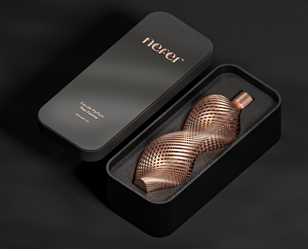
As large as the bottle may look visually, it holds a mere 90ml (3 fl.oz.) of liquid in its inner chamber. While under most circumstances I’d call that wasteful, the more fitting characteristic term here would be opulence.

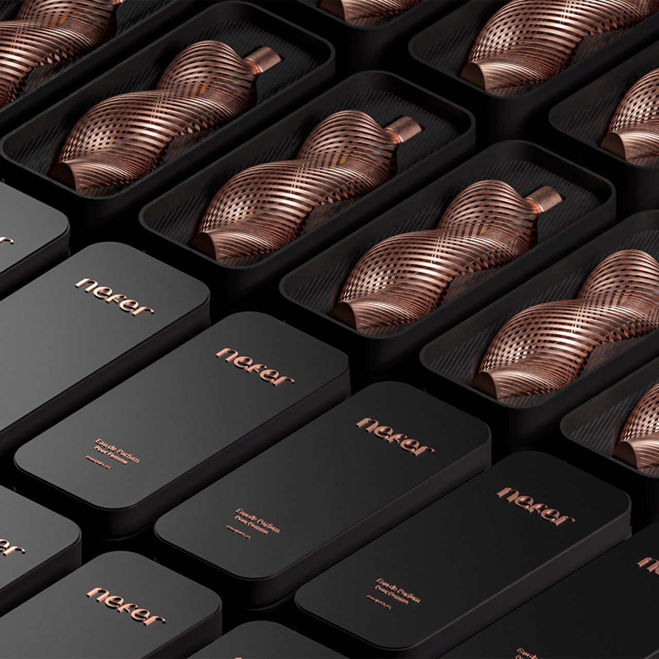
The Nefer perfume bottle comes in a decorative box that uses a combination of black and rose-gold to create an eye-catching visual contrast. Open the lid and it reveals the highly alluring bottle on the inside, set within a specially formed inner chamber with the bottle’s negative form, allowing the bottle to snugly fit inside it. Ultimately the bottle doesn’t come with any branding of its own, although designer Amr Ibrahim Mousa believes that the bottle’s iconic design is enough to serve as its visual branding.

The Nefer perfume bottle is a Silver Winner of the A’ Design Award for the year 2021.

Innovative Packaging Designs from the A’ Design Award that make the perfect first impression of a product

Your product’s packaging is arguably the first thing the consumer sees, as a part of the product experience. It forms the first ever interaction between product and consumer, and a successful interaction means a consumer will pick the product up off the aisle and add it to their cart. Bad packaging design can adversely affect a product’s success or its performance, while a well-packaged product allows it to stand out, prompting someone to pick it up and decide to purchase it. Packaging Design is more than just a box with artwork… it’s the product around the product, and deserves as much attention while designing as the item within it.

Packaging Design forms just one of the various categories of the A’ Design Award and Competition, which spans the popular categories like Architecture, Lighting, and Consumer Electronics, as well as the obscure, lesser-known categories like Cybernetics, Prosumer Products, and Safety Apparel Design. The A’ Design Award’s ultimate goal is to be an umbrella that covers good design across all disciplines, which is why it has 100 different categories for submitting design projects, and 211 jury members (comprising academics, design professionals, and press members) from all around the world collectively judging the works. Winners of the A’ Design Award don’t just secure a trophy and a certificate, but receive an entire PR Campaign dedicated towards pushing their career, clout, and even their projects to newer heights. A’ Design Award’s winners and even its participants are included in its annual award book and business network, while additionally contributing to their country’s overall design ranking that paints a holistic picture of how design-centric and design-forward each country is.
The A’ Design Award is currently accepting entries for the 2022 edition of the award program, so go ahead and give your work and career the push it deserves!

Here are some of our favorite Packaging Design winners from the A’ Design Award & Competition 2021. If you have a potential packaging design project that you think is worthy of an award, Click here to register & participate in the A’ Design Awards 2022. Hurry! The regular deadline ends on September 30th, 2021.

Nefer Perfume by Amr Ibrahim


Getting its name from the Egyptian word for beauty, the Nefer perfume bottle embodies sheer elegance on the inside and out. The bottle’s design is derived from the curved lines of the female figure, possibly as an ode to the ancient Egyptian Queen Nefertiti. It sports an incredibly intricate ornate exterior that could only be made through 3D printing, and while the exterior’s job is to captivate, a slim internal chamber holds the fragrant perfume within… like a beautiful soul within a beautiful body.

Zippo Constellation Packaging by Sunhwa Lee and Wenyuan Chen


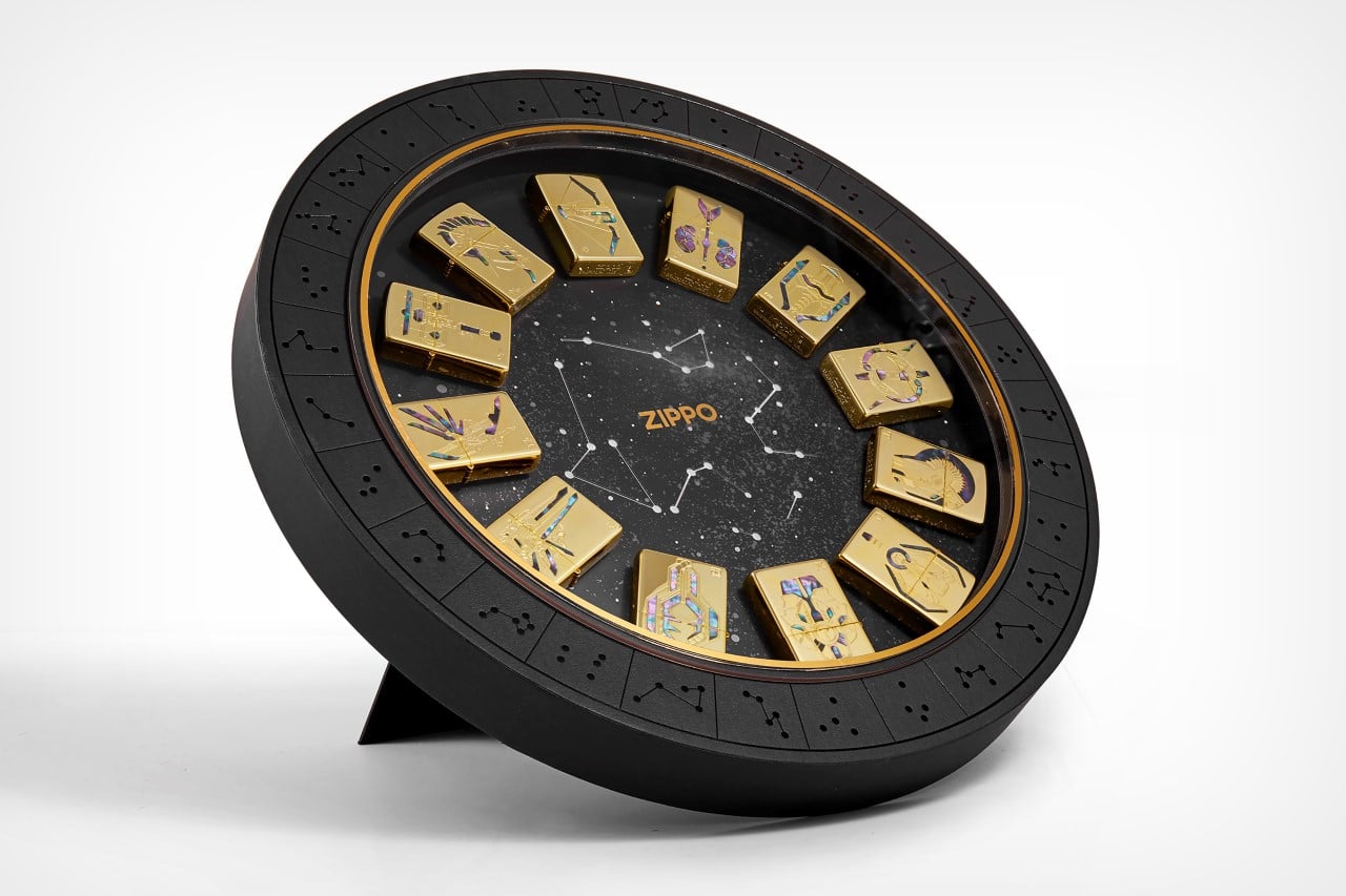
I’m not one to buy lighters at all, but the best way to get me to buy a whole bunch of them is to arrange them in a packaging as alluring as this! The Zippo Constellation Box Set by Sunhwa Lee and Wenyuan Chen is a complete collection of 12 Zippo limited edition lighters with artwork depicting the 12 zodiac signs (also known as sun signs). The overall circular package has almost a cosmic-calendar-meets-ancient-sundial vibe to it, and it even lights up from the inside, bringing the constellation artwork in the center to life. The packaging is aimed at being a box set, although the designers envisioned that people would want to display it as a collectible too – which is why the circular box comes with a pop-out stand at the back. The lighters dock into the packaging via magnets, and can be popped out whenever you want to use or admire them. Only 100 such box sets are ever going to be made.

Regeneration Flower Tea Packaging by JieLong Wu and Lu Yi


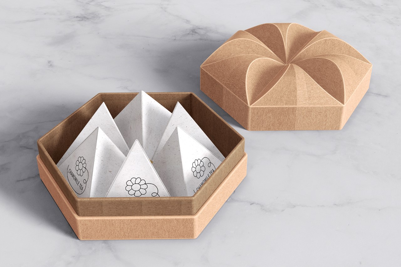
This rather alluring box of teabags actually has more to it than you’d expect. Sure, it’s incredibly pretty to look at, and comes with 6 pyramid-shaped teabags… although the packaging’s also designed in a way to make discarding your teabag easier. Each individual teabag comes enclosed in a tetrahedral handmade paper box, and once you’ve opened the box, taken the bag out, and brewed your tea, you can put the used teabag back inside its paper box and discard it anywhere. Aside from being biodegradable, the handmade paper actually has flower seeds embedded between the paper fibers, and when introduced into soil, uses the tea leaves as fertilizer to grow. In the end, your discarded teabag ends up decomposing and becoming fertilizer for a flowering plant!

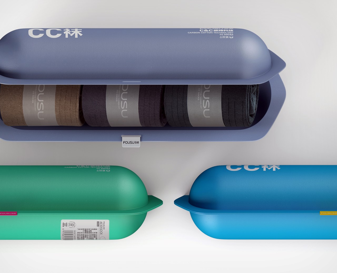
Fousu Sock Packing by GaoWei Xin


Modern anti-bacterial socks require modern-looking packaging! The Fousu socks come packaged in a rather sci-fi looking capsule made from recycled paper pulp. The pulp’s formed into the capsule shape using a set of molds (just like how an egg carton is made), although its overall design has a much better finish, which allows you to then print information onto the exterior. Designed to be discarded, each capsule comes with 3 pairs of rolled socks inside. I say discarded, but I’d probably just hold onto the box and use it to efficiently store my socks in the wardrobe!

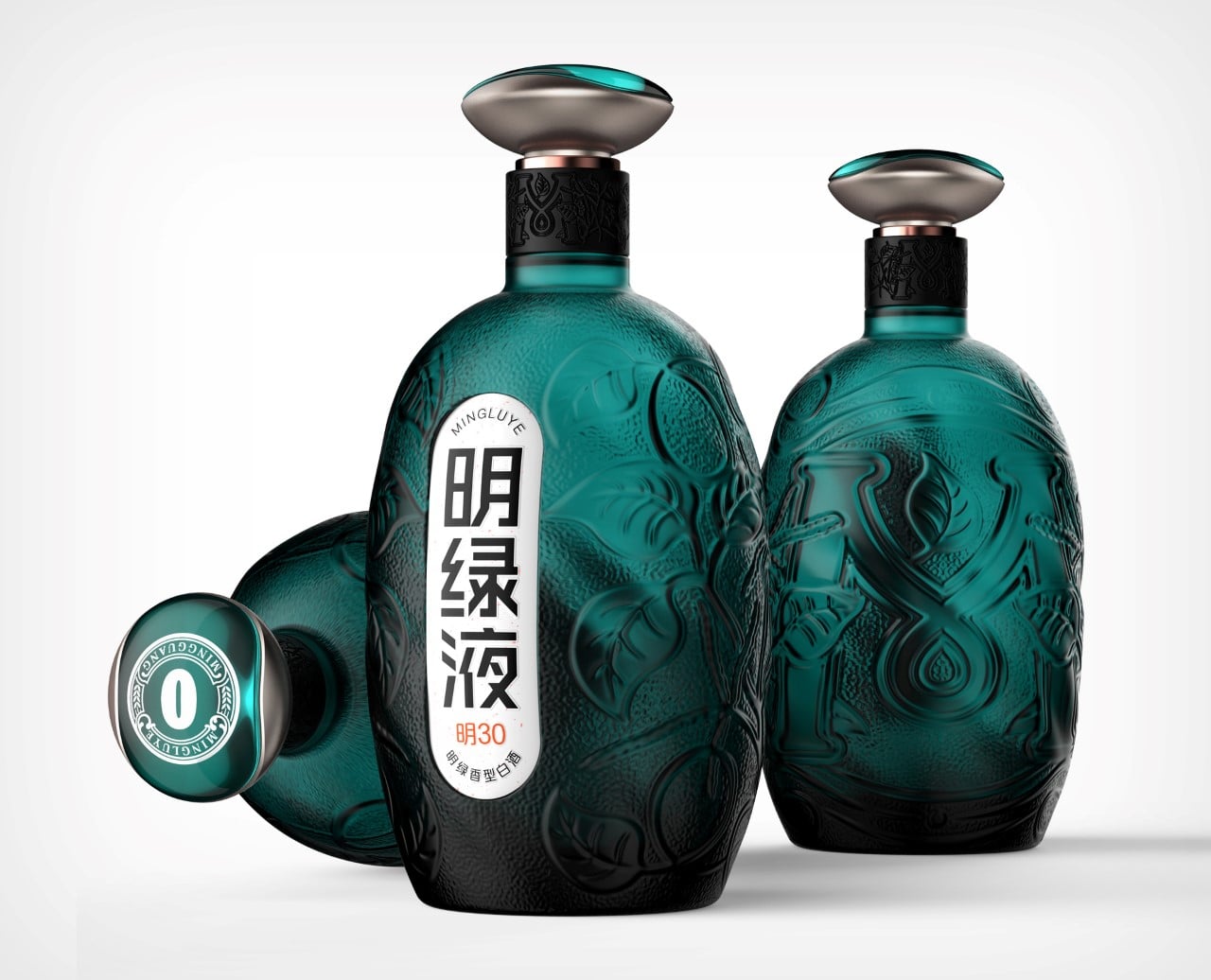
Mingluye Baijiu Packaging by Wen Liu, Bo Zheng and Weijie Kang


While the alcoholic baijiu is often prepared using fermented sorghum, rice, or even wheat, Mingluye uses fermented mung beans, giving the traditional spirit a distinct flavor and aroma. The Mingluye bottle celebrates its origin by actually resembling the mung bean. The bottle’s overall shape and color bear a close resemblance to the bean, while the label on the front takes after the white germ of the sprouted mung bean! It’s an incredibly beautiful-looking bottle, isn’t it?

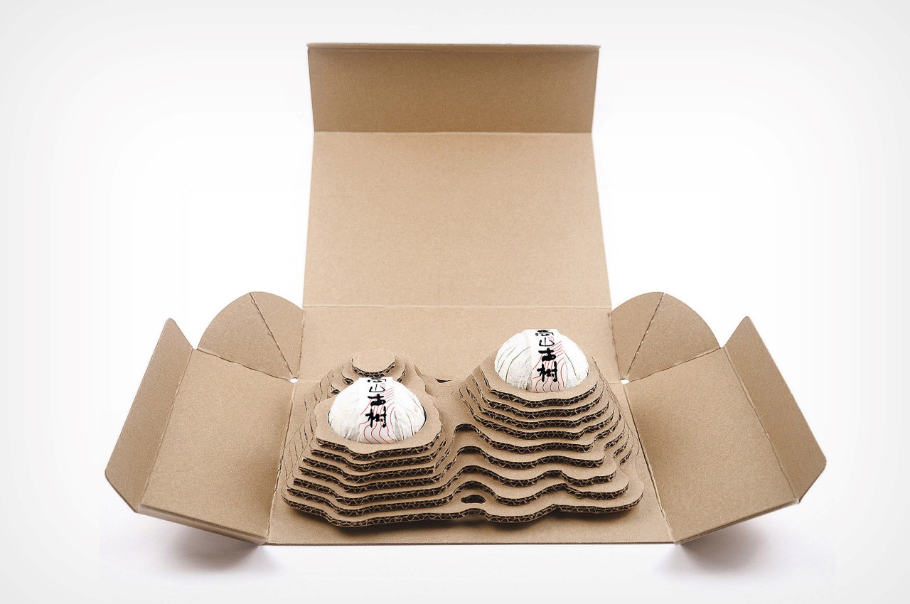
Alpine Ancient Trees Tea Packaging by Xiaobin Li, Xingguo Li and Shilin Huang


The Alpine Ancient Trees tea packaging pays respect to the hilly terrain on which tea plantations grow. The incredibly premium box set opens up to reveal two spherical packages of tea leaves nested inside mountains made out of corrugated paper. Once you take the spherical packages of tea out, the box can then be repurposed into a holder for tiny bonsai planters, giving it a new purpose and preventing it from going to waste.

Breathtaking Architecture designs from the 2021 A’ Design Award that’ll make your jaw drop

Goethe’s words “I call architecture frozen music” couldn’t ring more true for these 8 structural marvels. If architecture truly is frozen music, this article is a mixtape of 2020-21’s greatest hits.

A part of A’ Design Award and Competition‘s winner list, these buildings are awarded for the uniqueness of the project, social impacts, environment friendliness, energy utilization, and other project-specific criteria. Ranging from conceptual designs to residential units, to spas, offices, museums, and retail spaces, the A’ Design Award covers architecture in its entirety, aside from a wide roster of other categories. Not only does winning an A’ Design Award look great on an architect’s resume, but it also brings a lot of repute and focus to the work, uplifting its value!

Architecture remains the most popular category at the A’ Design Awards, receiving entries by the thousands each year. Here are a few favorites that we wish we had enough money to afford!

The A’ Design Award is currently accepting entries for the 2022 edition of the award program, so go ahead and give your work and career the push it deserves!

If you’re an architect or spatial designer looking to participate in the A’ Design Awards this year, click here to register. Hurry! The regular deadline ends on September 30th, 2021.


Living The Noom by Sanzpont Arquitectura

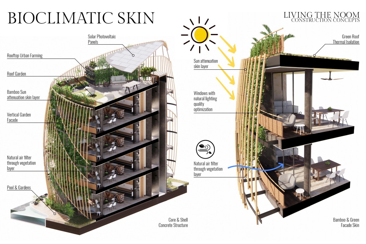
Designed by Mexico-based Sanzpont Arquitectura, ‘Living In The Noom’ puts you in the lap of nature and luxury. Its sanctuary-esque design focuses on three broad pillars – Wellness, Sustainability, and Flexibility. The community features multiple 4-storeyed houses with a uniquely alluring triangular shape, characterized by vertical bamboo channels and a vertical forest growing on the outer facade of the building. Along with giving Noom’s residents a stellar home to live in, the project even comes with amenities like greenery (70% of the project’s area is covered in nature – the buildings occupy just 30% of the overall space), as well as rejuvenation centers, meditation areas, parks, pools, workshop-centers for art, and even the organic garden for healthy eating. Finally, the structure culminates in a terrace on the fifth floor that has solar panels for harvesting energy, and an urban garden where the residents can grow their own food.

Flowers of Clouds Observation Tower by Vu Van Hai

Characterized by its rolling hills coated with pine trees, marigolds, and mimosa flowers, Da Lat is considered one of Vietnam’s most romantic cities. The Tower Flower, an observation tower molded into the shape of a flower in the early stages of blooming, sings an ode to those rolling hills of Da Lat with terrace gardens and biophilic design principles. Designed to be a coffee boutique bar as part of a larger resort complex, The Tower Flower’s spherical frame features facades that mimic flowers blooming with rich orange corten steel modules that form the structure’s large petals. Twisting throughout the building’s interior, a winding ramp emulates the flow and curve of a river to allow the surrounding landscape and interior garden to gradually appear to each guest and visitor. Inside the coffee boutique bar, visitors and residents can enjoy views of the surrounding landscape as well as the structure’s interior garden that pays tribute to the Lotus flower, the symbol for pure beauty in Buddhism.

Time Holiday Mobile Home by Chester Goh

Designed so that you can have a cabin in the woods, a house on the lake, or a property on the beach whenever you want, the Time Holiday is a mobile home that’s focused on what designer Chester Goh calls ‘futuristic sustainability… or basically architecture that’s nomadic, so you don’t need to build multiple homes. Saving on total costs and unnecessary construction waste, these modular pods/villas come prefabricated and do not require any foundation. They’re built to be stable, spacious, and structurally sound, and can easily be lifted up and shifted anywhere on the planet without any limitations to terrains and topography. “Wanting to wake up to the morning of serene blue sea, lush green grassland, or a majestic golden dessert in a modular pod that is closely connected to nature has been the driving inspiration to this project”, says designer Chester Goh.

Shenzhen Transsion Holdings Office by Aedas


The terms ‘natural’ and ‘boxy’ don’t often go together, except with buildings like the Shenzhen Transsion Holdings office, where they’re made to combine together in a nature-meets-architecture solution. The building’s rather template-ish skyscraper design is beautifully punctuated by greenery that creates a feeling of ‘openness’ within the confines of the architecture. These intermediate ‘open spaces’ create variety and interactions between the staff and offices, to demonstrate the corporate spirit of “co-operation and co-sharing” through symbolic architecture… I’d call it a rather literal interpretation of being in a ‘concrete jungle’!

Bayfront Pavilion by Thomas Schroepfer – AAL


The inspiration for the Bayfront Pavilion was the visually beautiful experience of walking under the foliage of lush trees in the tropics. This idea was translated into a design with a clear mathematical logic that was determined by extensive environmental simulations and structural optimizations, resulting in an artificial canopy that still felt natural as you walked underneath it. Light filtered through the canopy’s perforated design – a phenomenon the Japanese call Komorebi – and as the canopy cut out a major chunk of sunlight, the area underneath was naturally cooled by the shade. Located in Gardens by the Bay Singapore, the Bayfront Pavilion (also known as The Future of Us Pavilion) follows the tradition of architectural structures that evoke a dialogue with nature by blending an intricate form made of a perforated skin fluidly with the adjacent environments. For visitors, the building offers a climatically comfortable outdoor environment and a visual experience akin to walking under the foliage of lush tropical trees.

The Rossmore Residential Multi-Unit by Artur Nesterenko and Amr Samaha


A beautiful interpretation of art-deco architecture, the Rossmore residential building turns concrete into fabric with how it curves, almost like the curtains seen in theaters. The concrete pillars curve and pleat as they travel downwards, mimicking fabric curtains seen in grand halls built during the art-deco era. “The Rossmore is set to utilize high-performance concrete cladding panels with sculptural elements for the facades while being one of the first massive timber mid-high-rise apartment buildings in Los Angeles”, say the designers.

Nudibranch Hotel and Resort by SpActrum


Inspired by shellfish, the Nudibranch hotel comes with an instantly recognizable shell-like facade, and has ‘tentacles’ that stretch out in different directions, creating a piece of architecture that looks absolutely mesmerizing from any angle. Named after the nudibranch, a type of mollusk, the hotel stands as a wonderful example of nature-inspired design. The ‘shell’ of the hotel forms its main building, while the rest of its body surrounds the shell, forming lawns and pathways above the sandy coast of the beach. The tentacles (which aren’t visible in the above image) are actually covered pathways that connect the ground to restaurants and bars, and the spa and swimming pool to the main hotel itself.
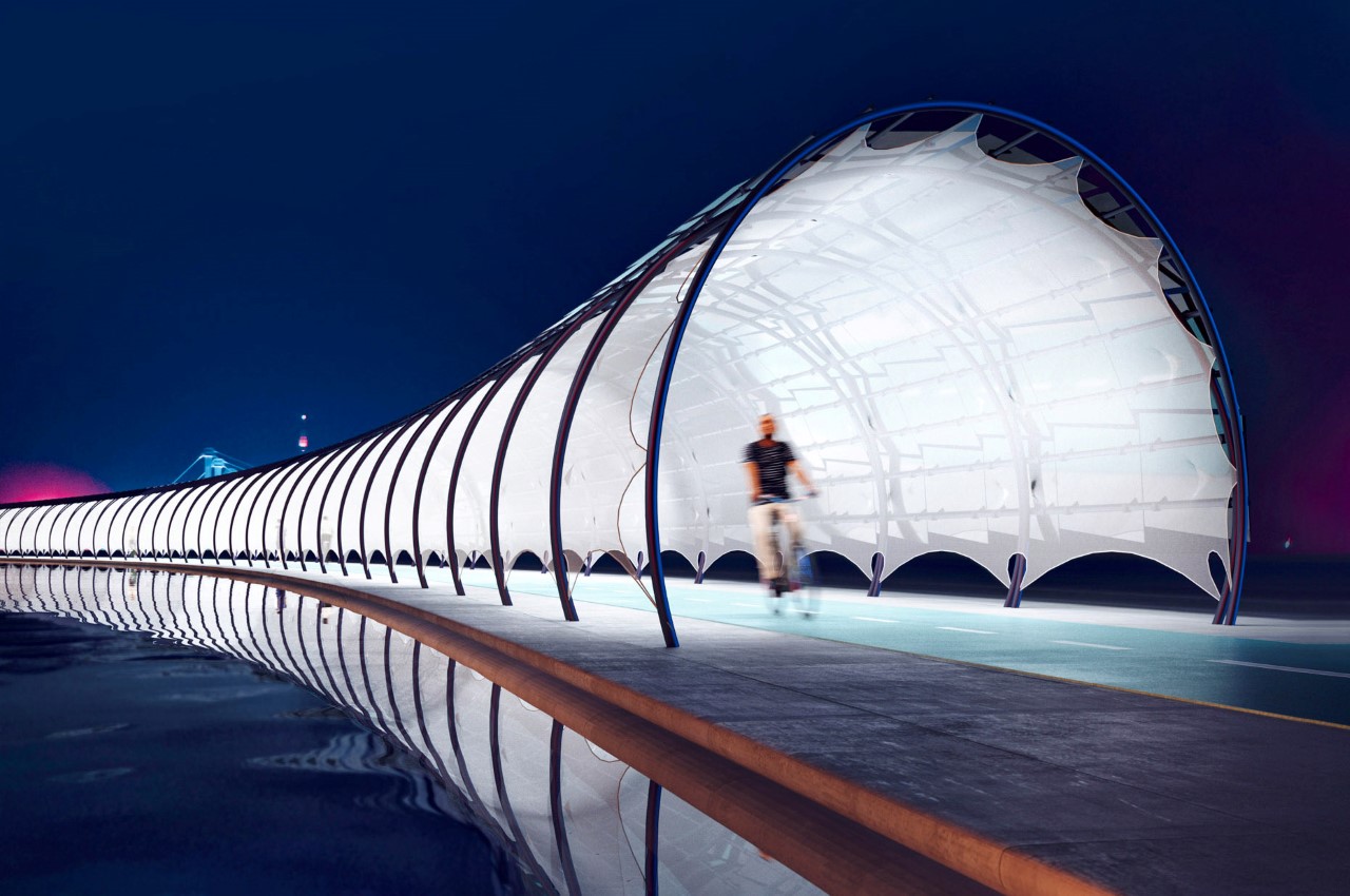
Solar Veloroute Photovoltaic Pathway by Peter Kuczia


Bike roads, also known as Veloroutes are steadily becoming city staples, even mainstays for commuters on foot or bike. With the demand for Veloroutes increasing, Kuczia created a Solar Veloroute that comprises a photovoltaic tunnel structure that serves as a solar canopy for cyclists and pedestrians as well as a public facility where commuters can enjoy lit pathways at night and charging stations for bicycles or smartphones. Solar Veloroute presents as a partly-enclosed, rounded archway constructed from overlaid non-reflective glass-glass solar panels, which are attached to round tube steel purlins. While the Solar Veloroute collects solar energy during the day for on-site charging stations and lighting, the surplus energy collected can be distributed and used for additional services. On the structure’s sustainably sourced power, Kuczia says, “Just one kilometer of [Solar Veloroute] could provide around 2,000 MWh of electricity and could power 750 households or provide electricity for more than 1,000 electric cars driving 11,000 km per year.”

If you’re an architect or spatial designer looking to participate in the A’ Design Awards this year, click here to register. Hurry! The regular deadline ends on September 30th, 2021.

This shellfish-inspired luxury hotel blends perfectly onto the coastline of this tropical beach

Inspired by shellfish, the Nudibranch hotel comes with an instantly recognizable shell-like facade and has ‘tentacles’ that stretch out in different directions, creating a piece of architecture that looks absolutely stunning from any angle.

The hotel gets its name from the Nudibranch, a species of soft-bodied gastropod mollusks known for shedding their shells after their larval stage. The animals are often known for their incredible design characterized by vibrant colors and hypnotic patterns (often an indication of an animal being toxic), and the hotel follows that trend too, with its grand design comprising a glass facade and lawn-covered public spaces.

The hotel’s glass ‘shell’ forms its most recognizable element. The two shells act as the hotel’s main buildings, with coastal views for each. The rest of the hotel’s ‘body’ surrounds these two shells, forming lawns and pathways above the sandy coast of the beach, guiding you to the hotel’s several amenities, from its restaurants and bars to the spa, swimming pools, and finally back to your room at the hotel. The animal-inspired building comes with signature tentacles too, that sort of form the entrances and exit roads, cutting through the wilderness to let you arrive at or check out of your destination.

The Nudibranch Hotel is a Gold Winner of the A’ Design Award for the year 2021.
Designer: SpActrum

This tiny pre-fab home can easily be relocated to any destination for that ultimate nomadic lifestyle

Designed so that you can have a cabin in the woods, a house on the lake, or a property on the beach whenever you want, the Time Holiday is a mobile home that’s focused on what designer Chester Goh calls ‘futuristic sustainability… or basically architecture that’s nomadic, so you don’t need to build multiple homes.

While the term ‘futuristic sustainability’ definitely sounds like jargon, the idea of a mobile home really makes sense from an ecological and economical standpoint. The mobile home belongs solely to you and isn’t bound by a location. It gives you the freedom to constantly relocate, finding a suitable spot to park yourself and live in, so you’re not stuck in expensive cities, compartmentalized in tiny overpriced rental apartments, or heavily affected by natural calamities affecting your neighborhood.

Saving on total costs and unnecessary construction waste, these modular pods/villas come prefabricated and do not require any foundation. They’re built to be stable, spacious, and structurally sound, and can easily be lifted up and shifted anywhere on the planet without any limitations to terrains and topography. “Wanting to wake up to the morning of serene blue sea, lush green grassland, or a majestic golden dessert in a modular pod that is closely connected to nature has been the driving inspiration to this project”, says designer Chester Goh

The outer structure is fabricated from a single curved sheet of fiberglass, designed to withstand various topographies and climates. The front and side, however, constitute full-frame floor-to-ceiling double-layer laminated glass panels that provide extravagant 360-degree unobstructed views of the outdoors, while helping insulate the interiors. The entire structure is designed to telescopically expand/contract, allowing the house to assume a compact form in transit, and extend outwards to create larger spaces and an extra guest room. There’s even access to a terrace on the top, because what’s the point of shifting your home to a scenic spot if you can’t really absorb the area’s beauty from the roof of your mobile home? Glass of sangria not included!

The Time Holiday Mobile Home is a Gold Winner of the A’ Design Award for the year 2021.

Designer: Chester Goh

Breathtaking residential building in Mexico comes with its own vertical forest and solar panels on its terrace

Living The Noom’s design is everything you want from a building – an unusually beautiful organic structure, covered with a lush tone of green brought about by the vertical forests running along its surface, and running almost entirely on renewable energy.

Designed by Mexico-based Sanzpont Arquitectura, ‘Living In The Noom’ puts you in the lap of nature and luxury. Its sanctuary-esque design focuses on three broad pillars – Wellness, Sustainability, and Flexibility. The community features multiple 4-storeyed houses with a uniquely alluring triangular shape, characterized by vertical bamboo channels and a vertical forest growing on the outer facade of the building. Finally, the structure culminates in a terrace on the fifth floor that has solar panels for harvesting energy, and an urban garden where the residents can grow their own food.

A winner of multiple architecture awards, the Noom project focuses on creating a community for people that focuses on their individual needs. This meant visualizing the entire project as something multi-faceted, rather than a building made of boxes that simply ‘contained’ their occupants. Aside from giving Noom’s residents a stellar home to live in, the project even comes with amenities like greenery (70% of the project’s area is covered in nature – the buildings occupy just 30% of the overall space), as well as rejuvenation centers, meditation areas, parks, pools, workshop-centers for art, and even the organic garden for healthy eating.

The project integrates bioclimatic and sustainable strategies such as rainwater harvesting, wastewater separation, wetland for greywater treatment, biodigesters, compost area, and more notably the vertical forest on the outside of each building, which aside from providing a touch of greenery, also filters/purifies the air coming through into the house, and helps reduce the temperature of homes – a phenomenon more commonly known as the Heat Island Effect.

The overall Noom community comprises 3 buildings of 5 stories each. The apartments on each floor are 120 and 60 square meters, having 1, 2, or 3 bedrooms. The unique layout allows each room to have access to ample indirect sunlight. The design of the house also promotes natural ventilation to renew the indoor air and ensure an optimal level of comfort. The architects at Sanzpont say that their unique layout helps reduce energy consumption (lights and air conditioning) by as much as 85%. For the rest, solar panels on the roof and a high-efficiency LED artificial lighting system helps power the buildings at night.

‘Living In The Noom’ is a Platinum Winner of the A’ Design Award for the year 2021.

Designers: Sanzpont Arquitectura and Pedrajo Mas Pedrajo Arquitectos

This massive luxurious superyacht concept comes with three hulls instead of one

It sort of looks like the Y-Wing Fighter from Star Wars, although designer Yeojin Jung says the superyacht’s split hull design is directly influenced by cantilevered architecture.

There are over 5,000 superyachts currently on this planet, however, none of them look as impactful as the Estrella. Designed by South Kore-based Yeojin Jung, Estrella hopes to break the mold of ‘boring’ practical superyacht design with something that’s a cross between feasible and outlandishly luxurious. Envisioned to look like the jewel of the seas, Estrella comes made for UHNWIs (or Ultra High Net Worth Individuals, as my sorry self just learnt), and sports a split-hull design that divides the yacht into the main component, and two floater components on either side, reminiscent of a seaplane.

The superyacht’s tri-swath design doesn’t make it more stable… if anything, separating the yacht over three interconnected hulls poses stability challenges. Jung, however, states that the yacht comes with separate stabilizers on the ship as well as on the individual side-hulls to counter any stability issues. This allows Estrella to make its aesthetic flex, with a yacht design that looks as beautiful from the front as well as from the top (where the superyacht’s Y-shape is more prominent). The split hull design also allows the yacht’s passengers and occupants to admire their view from multiple vantage points, getting a better experience of the sea, the marine life within it, and obviously the sky too!

The Estrella Superyacht is a winner of the A’ Design Award for the year 2021.

Designer: Yeojin (Chloe) Jung