The MNL MK-1 Analog Camera takes a page from Apple’s design book with its clean, sleek aesthetic

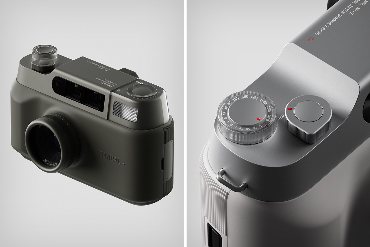
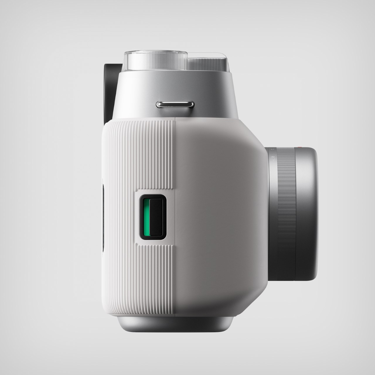
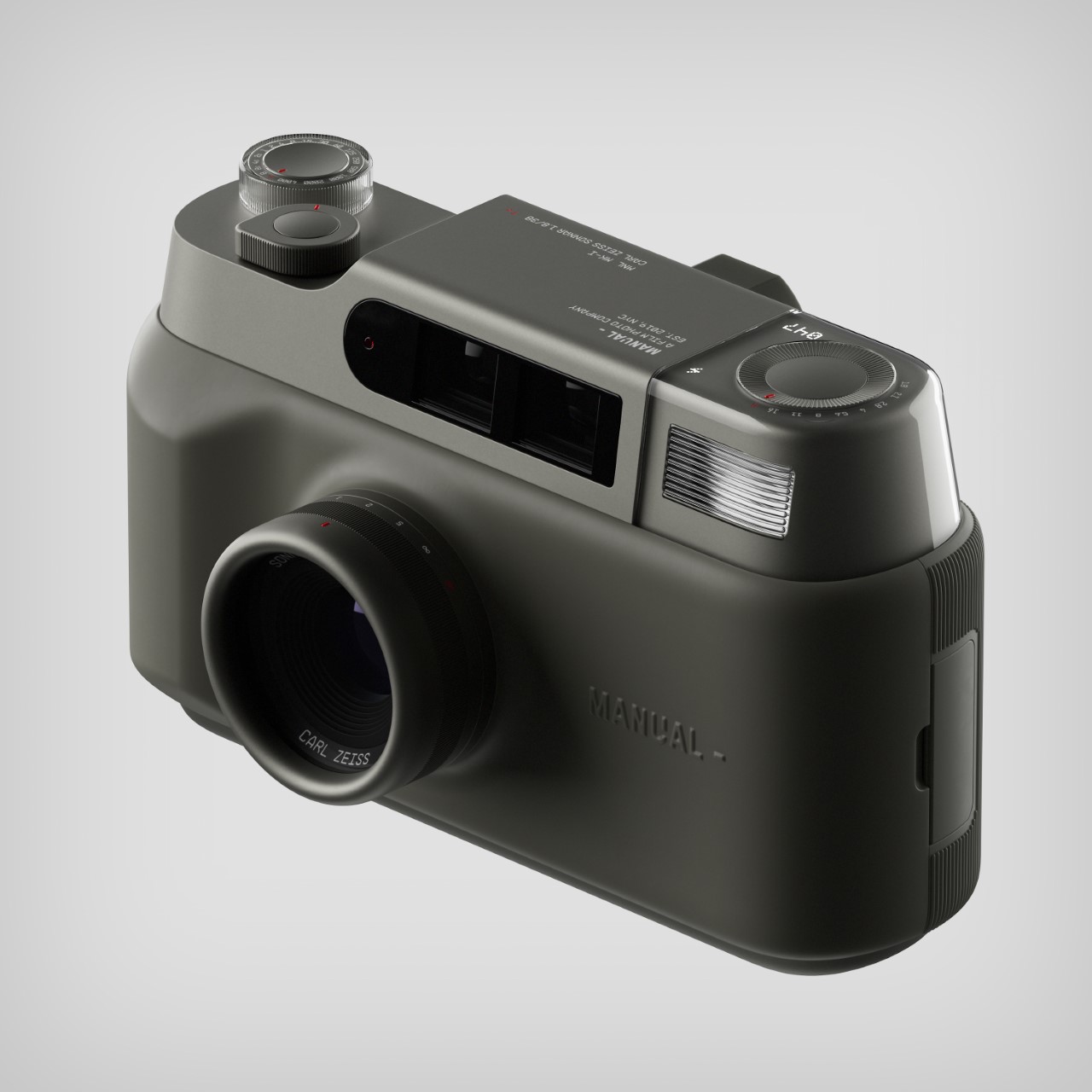
Anodized aluminum, check. Sleek forms, check. Minimalist aesthetic, check. The MNL MK-1 from Manual really looks like something Jony Ive would craft with his own hands, but in fact, the design comes from the folks at (acasso), a Seoul-based industrial design and engineering studio. The camera was designed for Manual NYC, a high-end camera company specializing in analogue photography. The MNL MK-1 is a premium film camera concept that incorporates anodized aluminum with ergonomic matte silicone, creating an aesthetic that’s both ergonomically comfortable, and futuristic/cutting-edge. The camera’s retrofuturistic approach also extends to the fact that even though it looks like a modern shooter, it runs on film.

Designer: (acasso) for Manual NYC
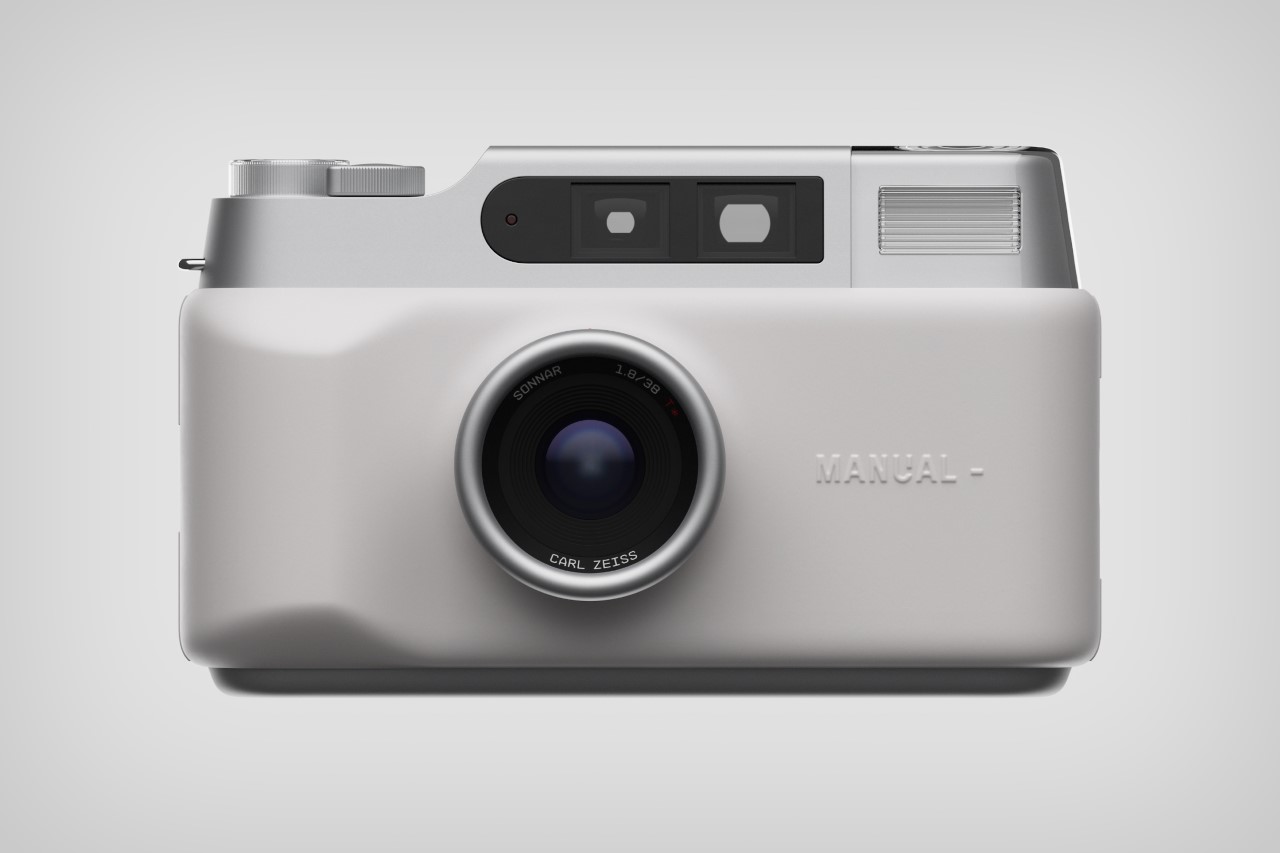
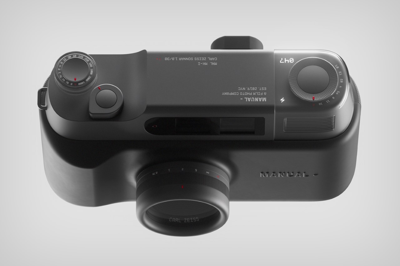
The MNL MK-I has an undeniably premium aesthetic, with its clean, almost Japanese Zen-inspired forms that direct the eye wonderfully to all of the camera’s details. The design ditches the textured black leather-inspired plastic grip for silicone – a choice that seems outwardly odd, but goes perfectly with the upper aluminum elements. This results in a jump from matte to metallic, creating an interplay of reflections and contrast that’s difficult to ignore. The camera’s front features a fixed Carl Zeiss lens, along with a viewfinder on top, a flash beside it, and a simple embossed Manual logo molded into the silicone.

(acasso)’s work with detailing feels incredibly inspired by Jony Ive’s own work for Leica, but in a way that really takes the minimalist style forward. The knobs, dials, and buttons on the MNL MK-I are just beautiful to look at and even more so to the touch. Subtle use of the color red helps the controls stand out wonderfully against their matte metal background, with the additional use of backlit displays on the top left, around the film rewind knob, for things like counting the number of images left, or knowing when the flash is toggled. It’s possible these displays aren’t built into metal, but instead, are placed under metallic plastic, which allows light to pass through.

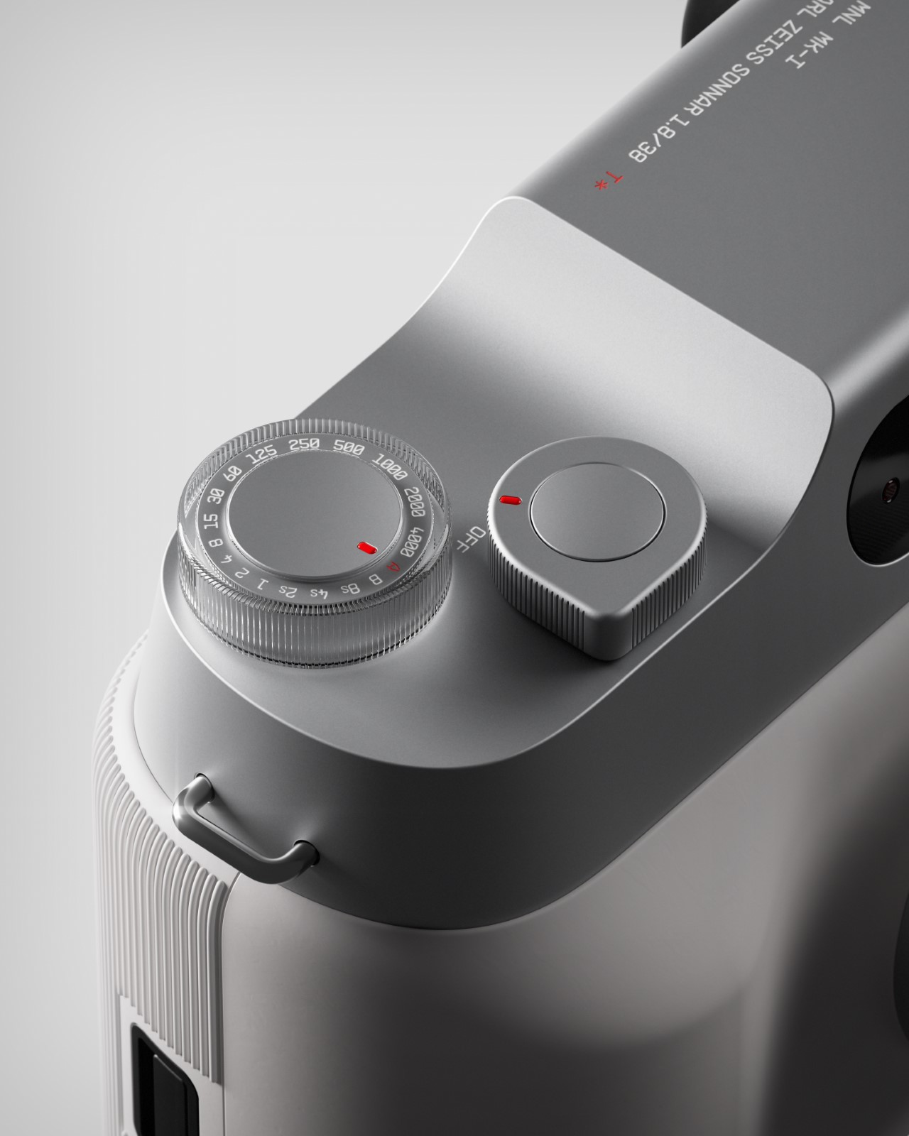
As simple as the camera looks, using it is designed to be just as easy. A knob on the top lets you control exposure, while the lens ring lets you adjust focus. A shutter button located above the on/off switch lets you take photos, which then get captured on the film reel. The rest is pretty self-explanatory for anyone born before 2000…
The post The MNL MK-1 Analog Camera takes a page from Apple’s design book with its clean, sleek aesthetic first appeared on Yanko Design.
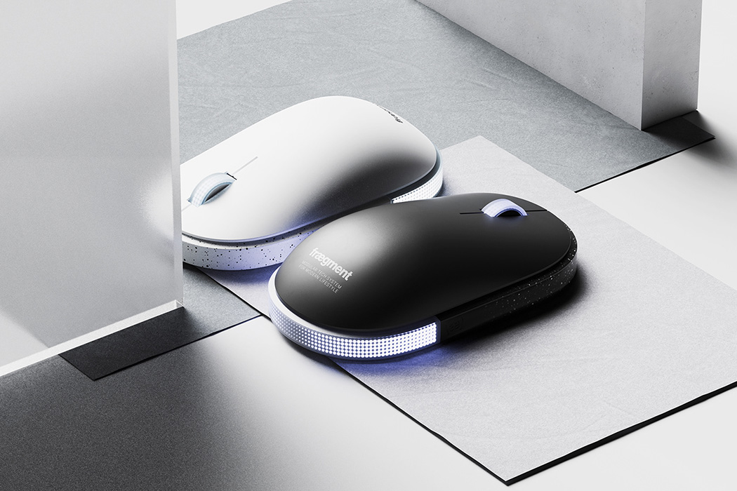
This millennium falcon inspired gaming mouse proves that minimal design can be badass


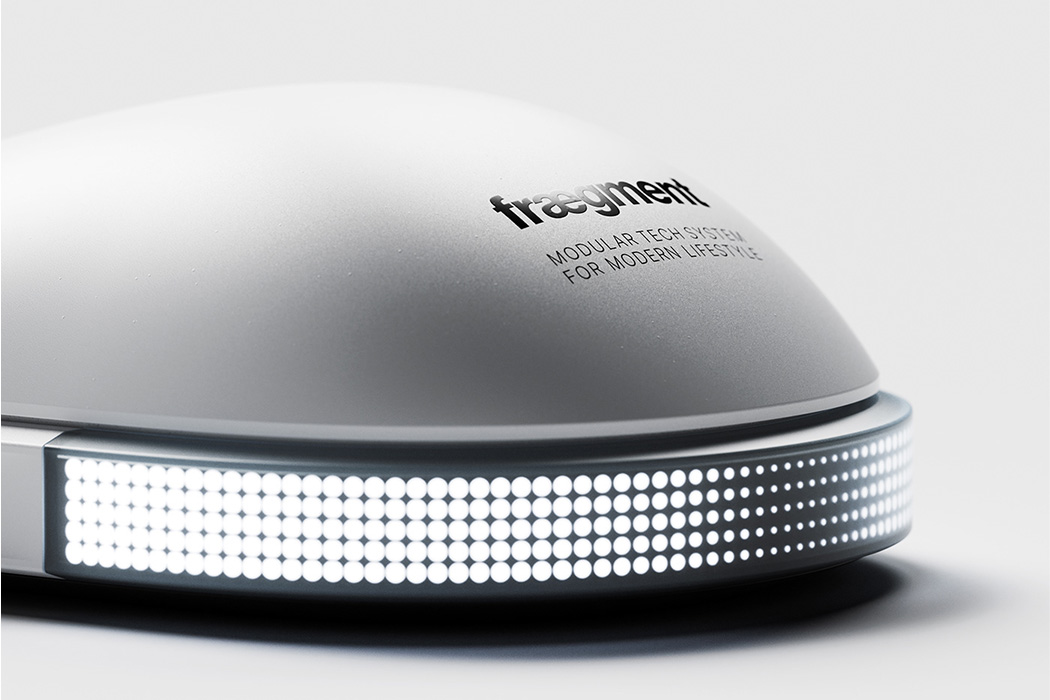
There’s no other ship in the history of science fiction that has a bigger following than the Millennium Falcon. Now we don’t have the luxury of laying our hands on it as Solo did by tricking Lando Calrissian in a card game, we have the luck to get our hands on Mouse-1, our sidekick as we step into the gaming realm with this LED enabled accessory on our side.

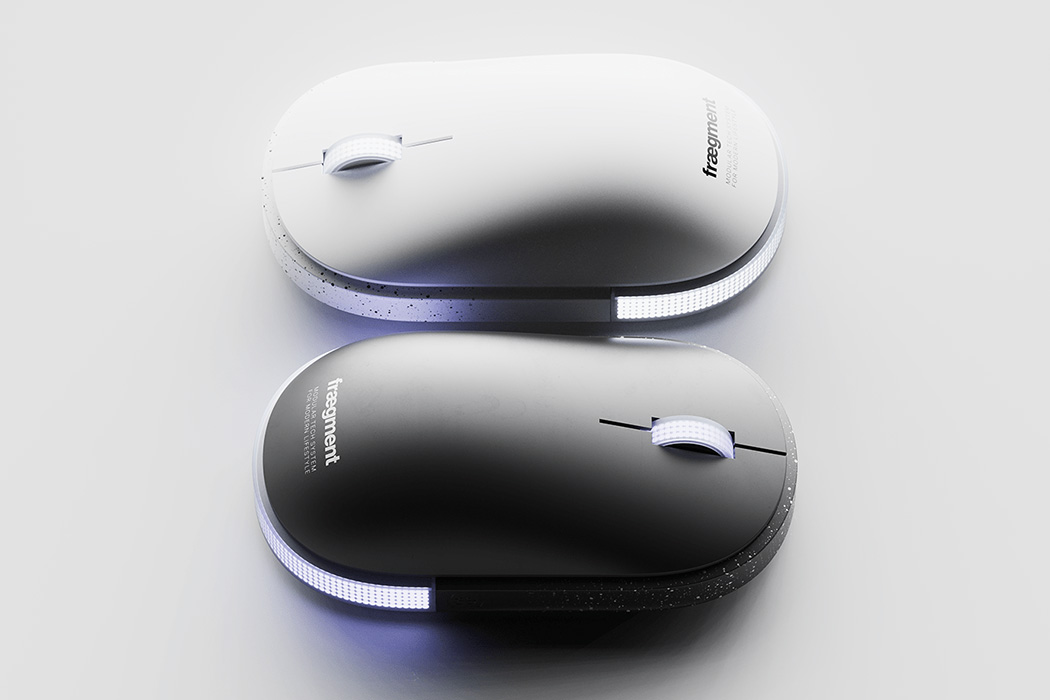
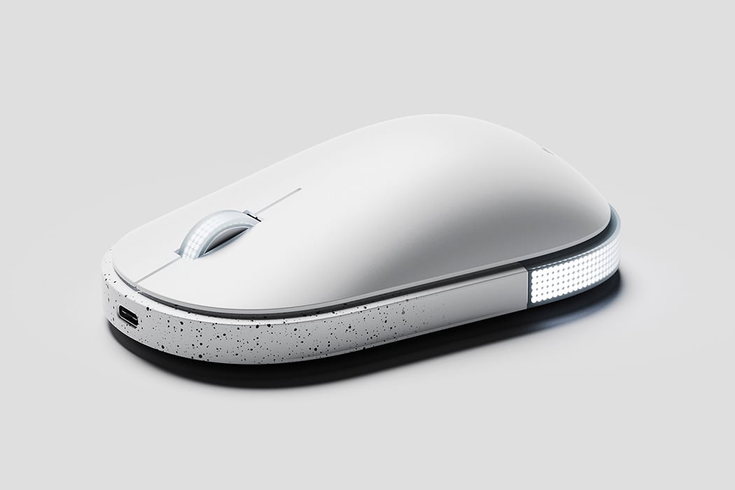
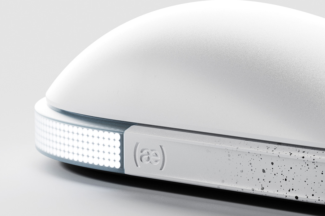
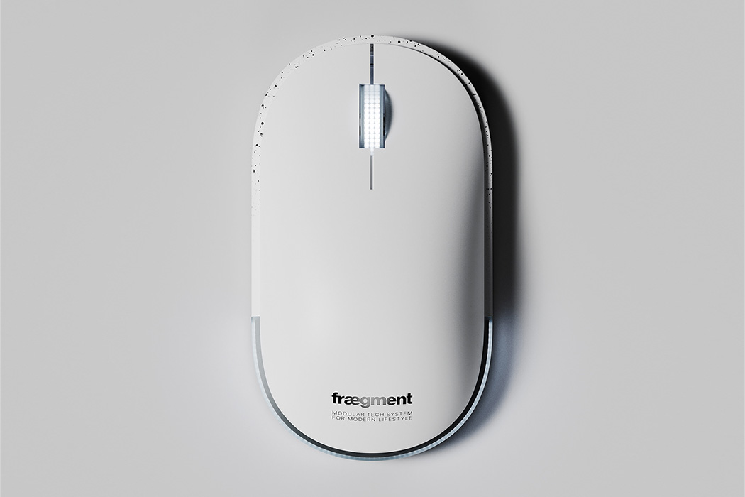
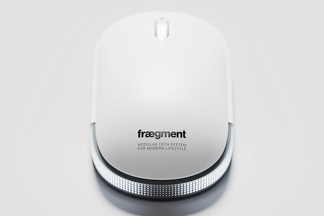
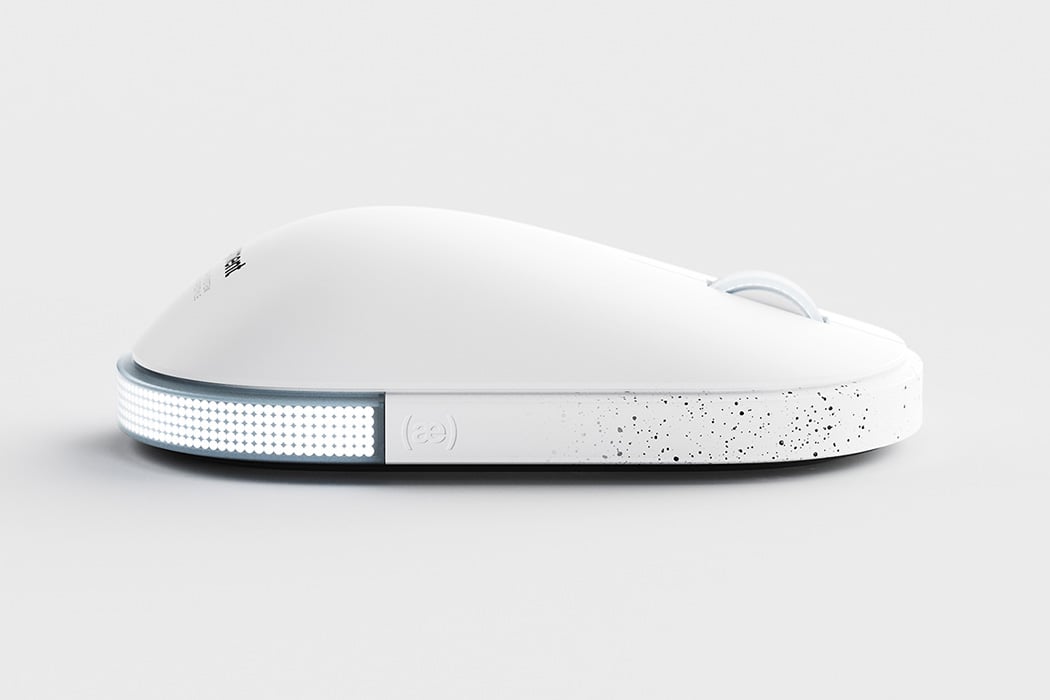
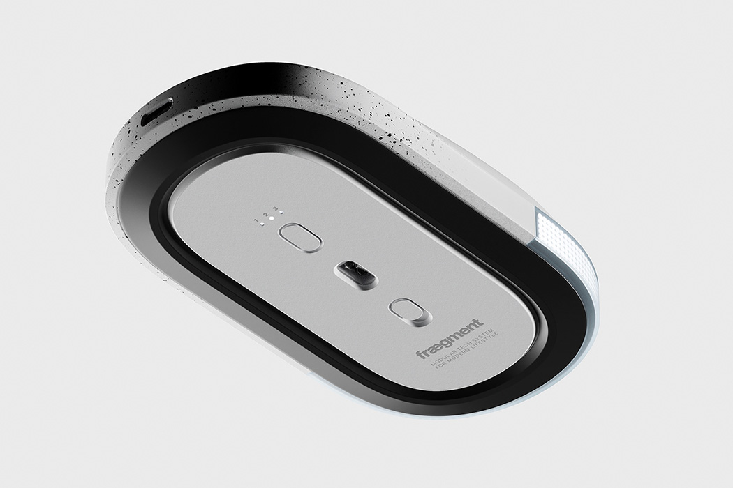
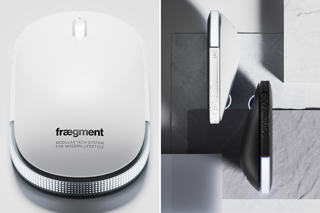
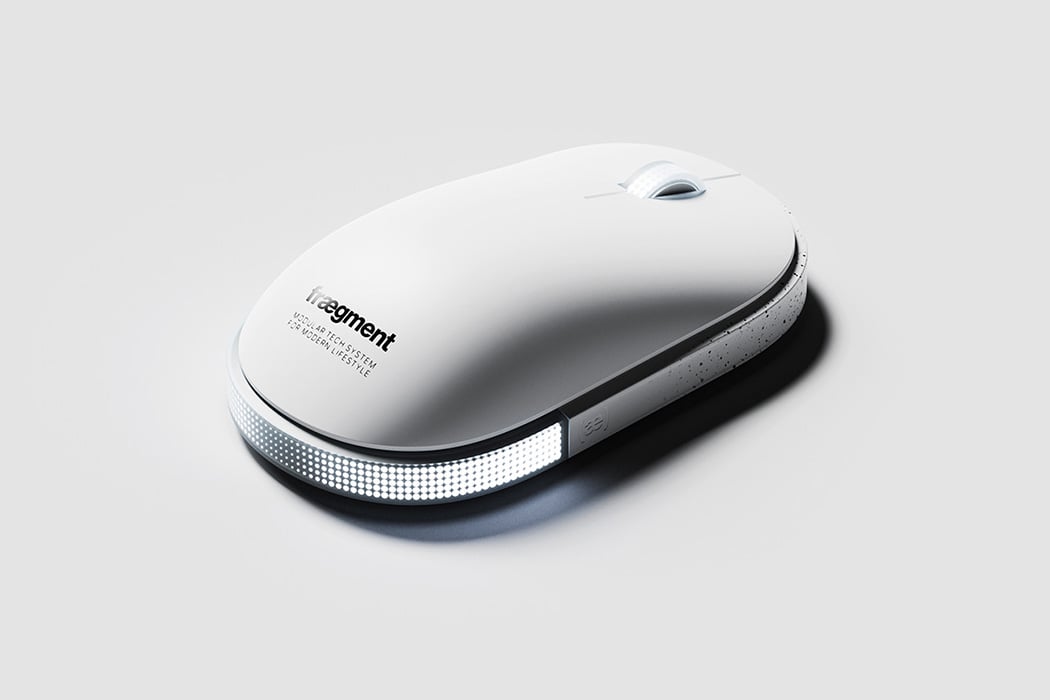
Meet the Mouse-1, a wireless gaming mouse that is futuristic yet hipster in one neat minimal package. The Mouse-1 was designed as an answer to the gamut of RGB-enabled gaming mouse designs that have flooded the market. Afterall, who says that minimalistic design cannot be badass! The designer, Jake Lee, was inspired by his love of sci-fi games as well as Air Jordans while designing this piece. As Jake explains, “The goal was to design a mouse that carries the gaming DNA in a more subtle and minimalist manner. There are so many gaming mice that scream rainbow RGB lighting with complex programmable buttons that contribute to their maximalist appearance. Mouse-1’s aesthetics is intentionally aimed at those who pursue a minimalist gaming setup.”

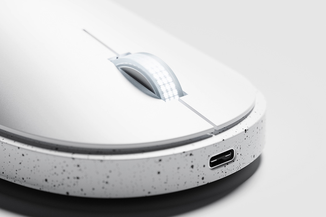
The devil is in the details and that adage remains for Mouse-1. The speckled white and black texture creates an interesting base on which the entire structure is based. White lights adorn 2 sides of the mouse, the back as well as the scroll wheel. But the real beauty is in the gradation of the lights. This was achieved by a translucent polycarbonate rear bumper that diffuses this halftone patterned LED light. If white is not your color, the light can be customized with various third-party lighting apps.

Apple’s iMac launch with its 7 color options has shaken up the tech world, and as the trendsetters, we know this pattern will be taken up by more retailers. Nonetheless, a classic piece like the Mouse-1 will never go out of style. Best of all, they have a black version that is perfect for a dark room setup – that’s more like mine!

Designer: Jake Lee of acasso for fraegment


Inspired by Italian supercars, this powerful body massager is crafted for after workout pain relief!

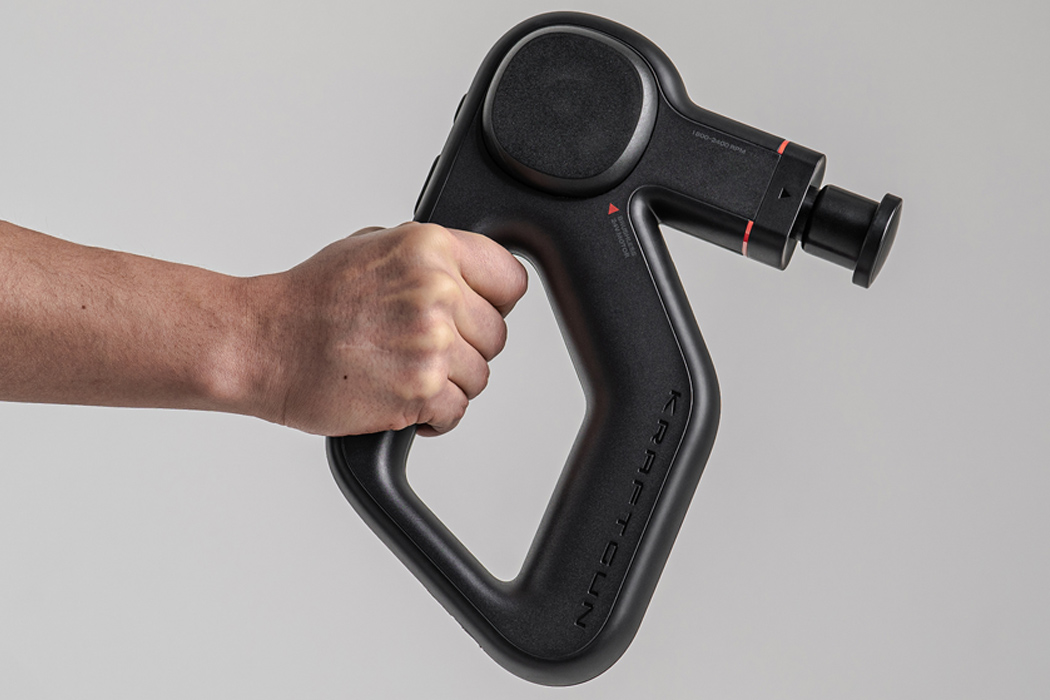
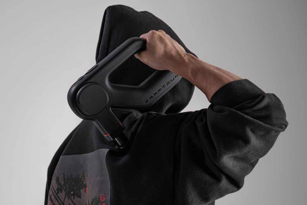
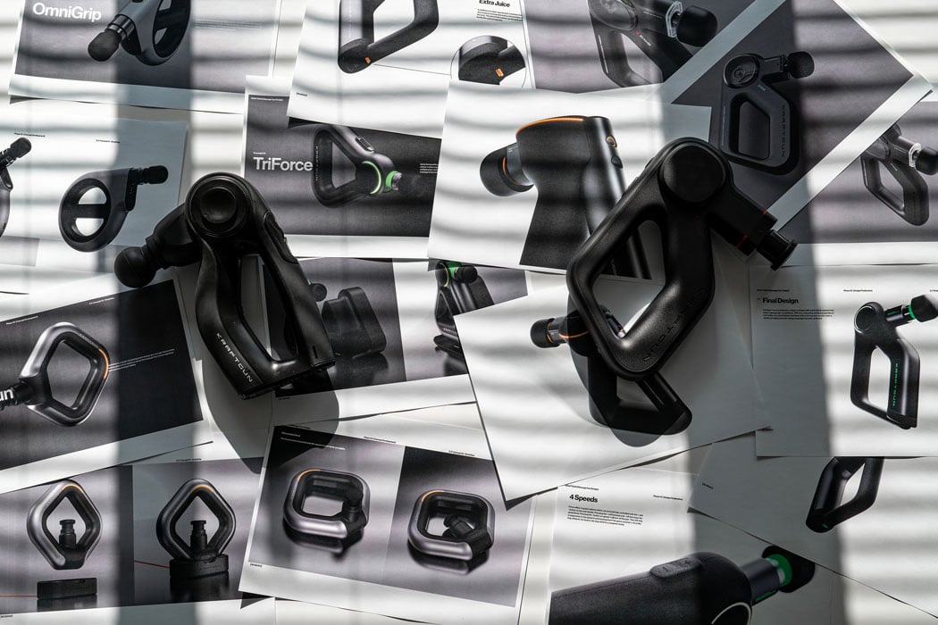
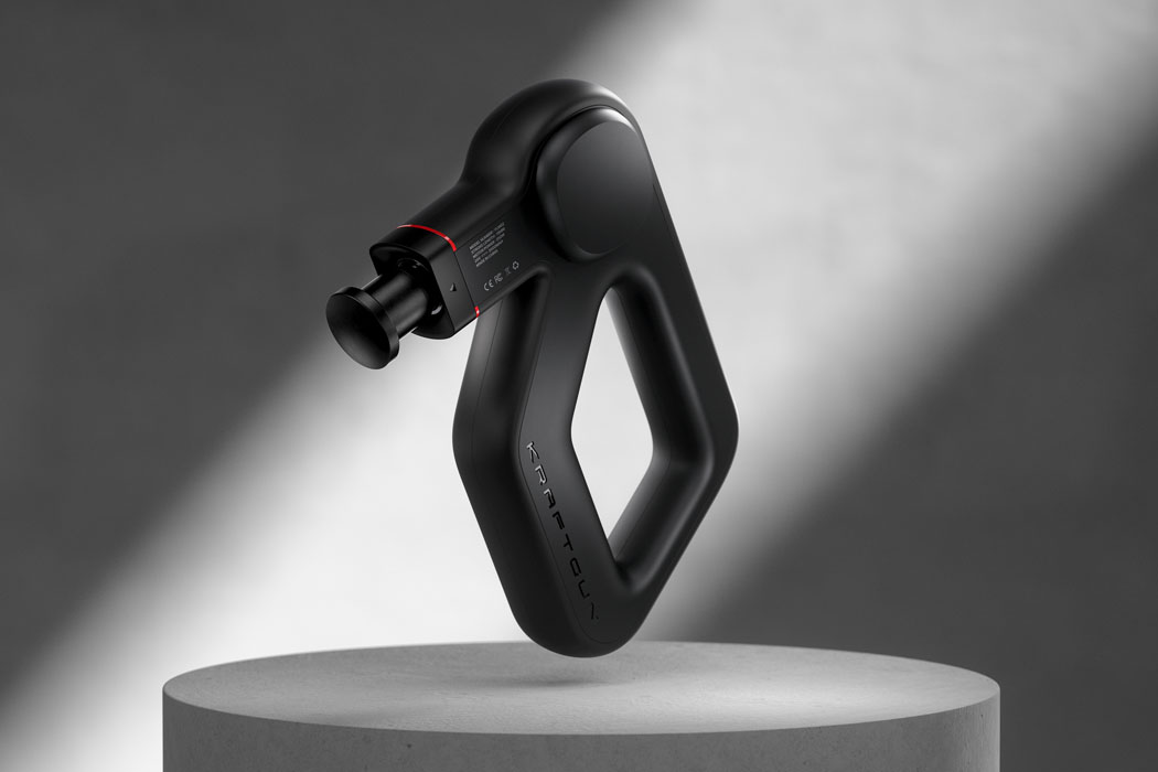
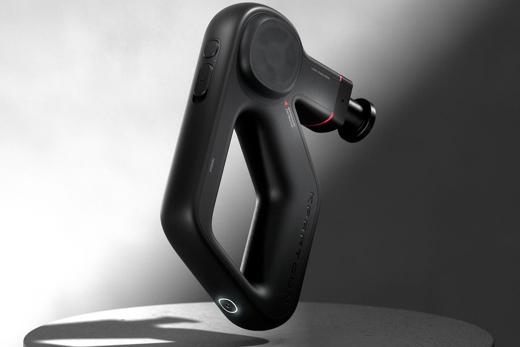
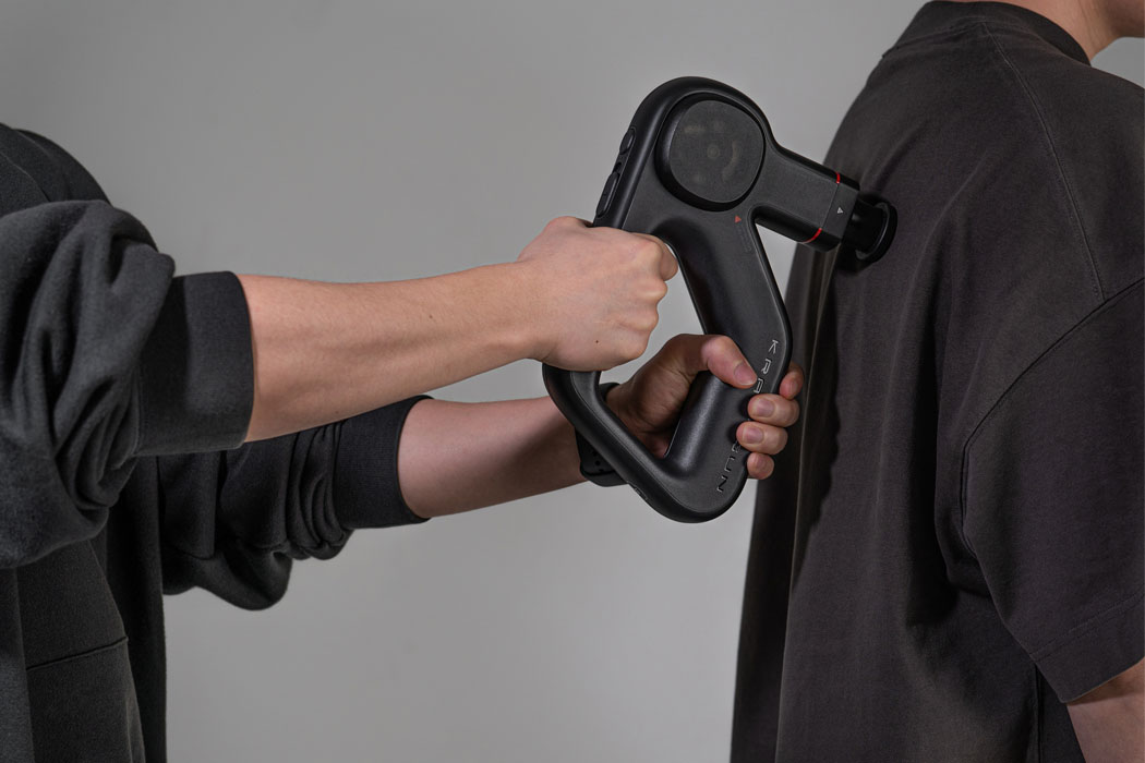
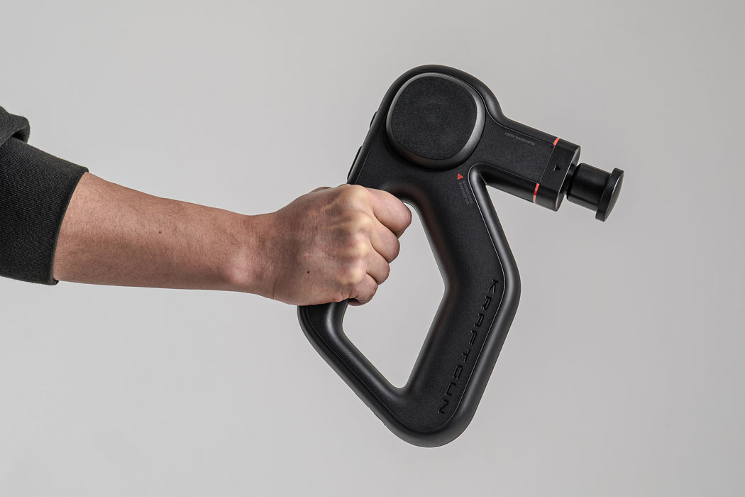
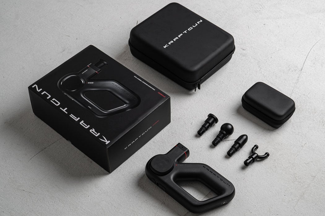
Riding on the success of the highly popular Kraftgun’s massage gun, the next iteration for a powerful massager is upon us. For their next winning massager, Kraftgun got in touch with acasso to muster up a deep tissue massager design that relieves the day’s stress out from the body while being pleasing to the eye. After spending a ton of time on the form and the performance of the resultant product, acasso managed to come up with the Force massage therapy gun that’s ultra-quiet for the amount of force it can produce!

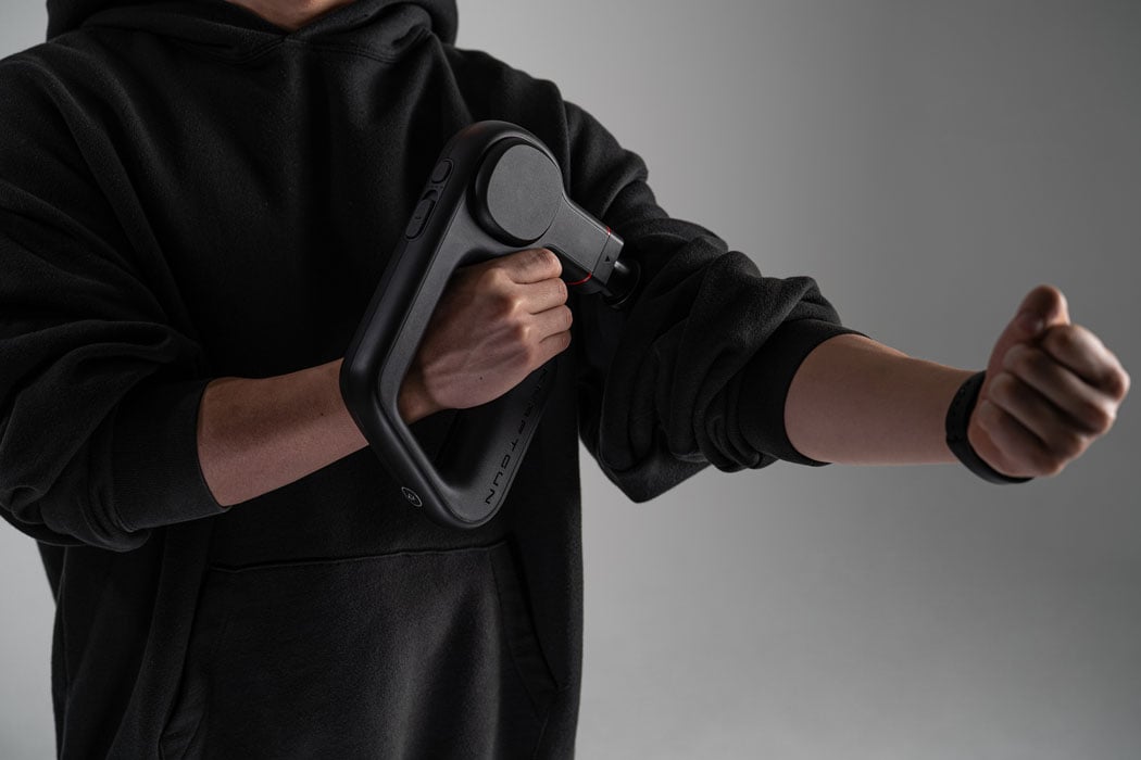
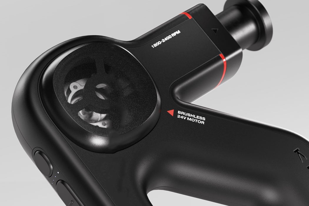
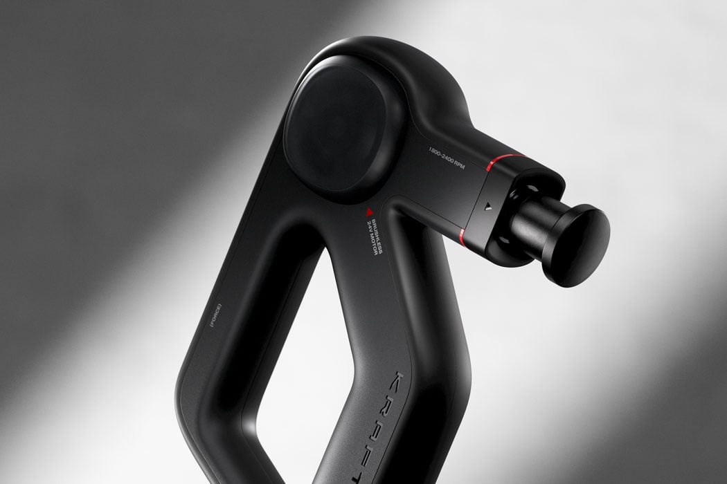
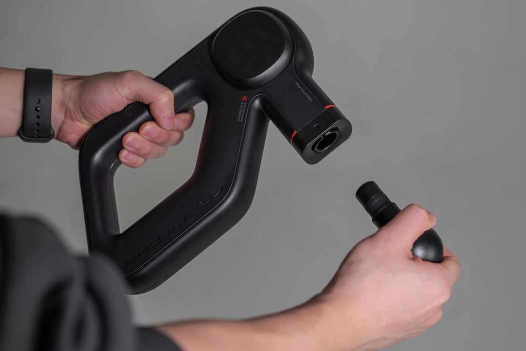
The name ‘Force’ was chosen to emphasize the massager’s high stall force and highlight the masculine character of the brand. The contoured ergonomic shape of the massager symbolizes the balance of “boldness and softness” – in a way extenuating the “chic masculinity” that men are surely going to associate with. So much thought has been put into the making of a presumably simple accessory right down to its functioning. The dark-tinted translucent cover for the powerful brushless 24V motor inside is inspired by the swanky transparent engine covers of the exotic Italian supercars.

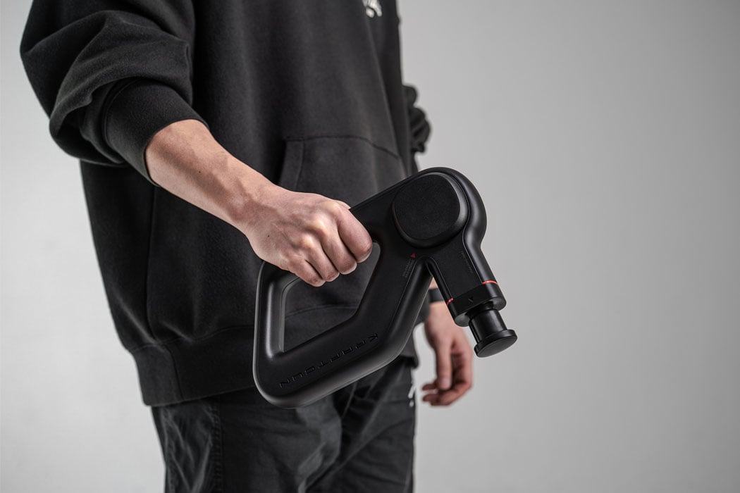
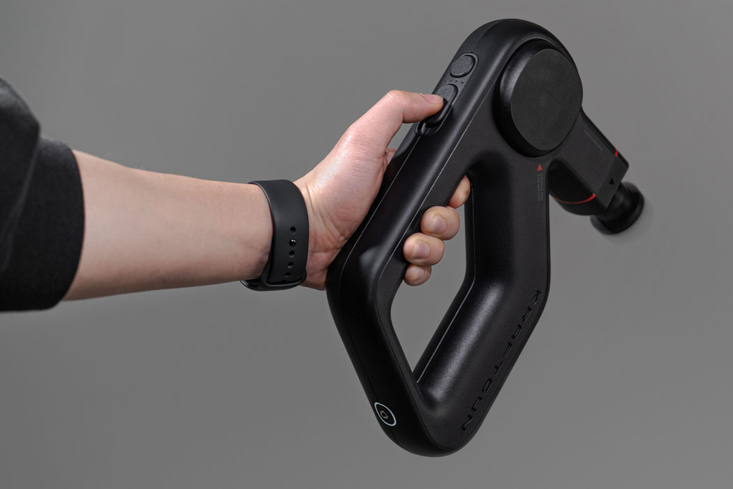
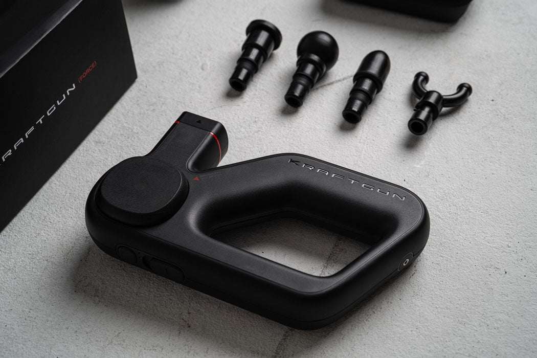
Force massage gun delivers the right amount of force to the muscles and deep tissues for unparalleled relief – that’s partly attributed to the ergonomic design which ensures one can massage hard to reach places when your buddy is not around to give a helping hand. The four attachments are tailored for particular muscles and body parts for a complete relaxing session right in your home. Overall a good noiseless product design that’s practical, and we can’t wait to get our hands on it for the most relaxing massage ever with minimal effort.

Designer: acasso for Kraftgun

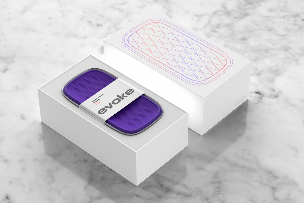
There’s something about the Evoke

evoke_speaker_1

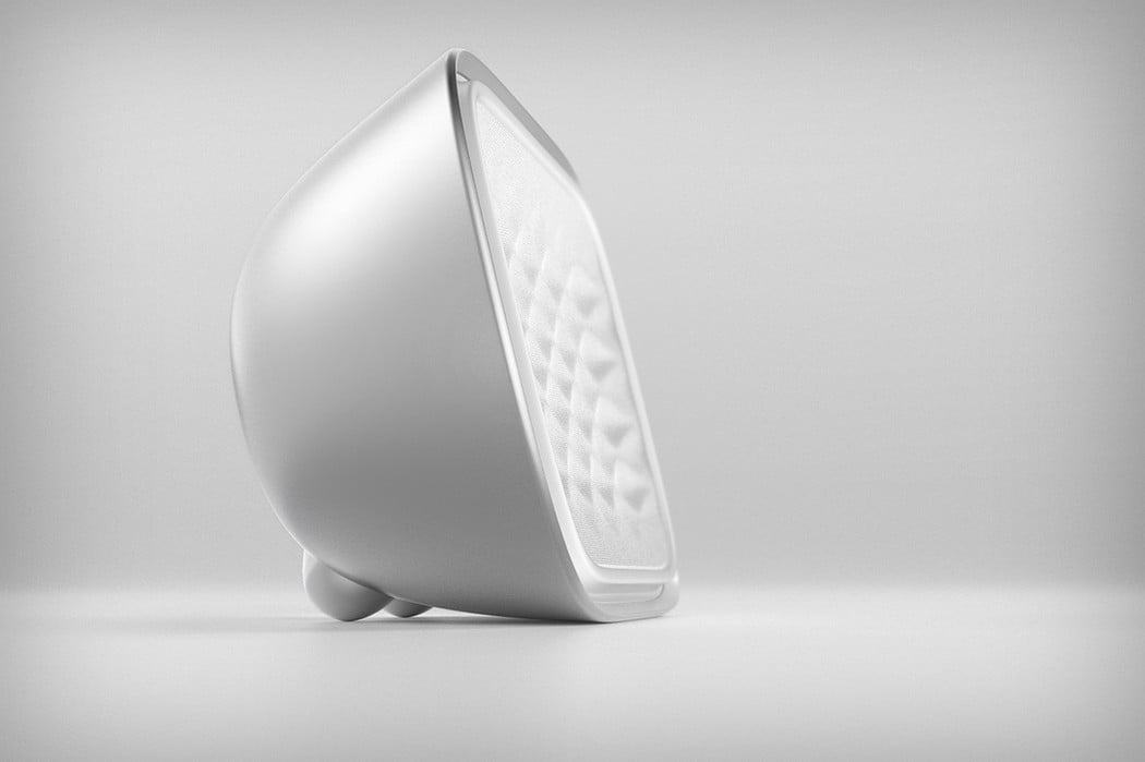
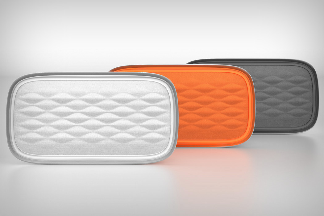
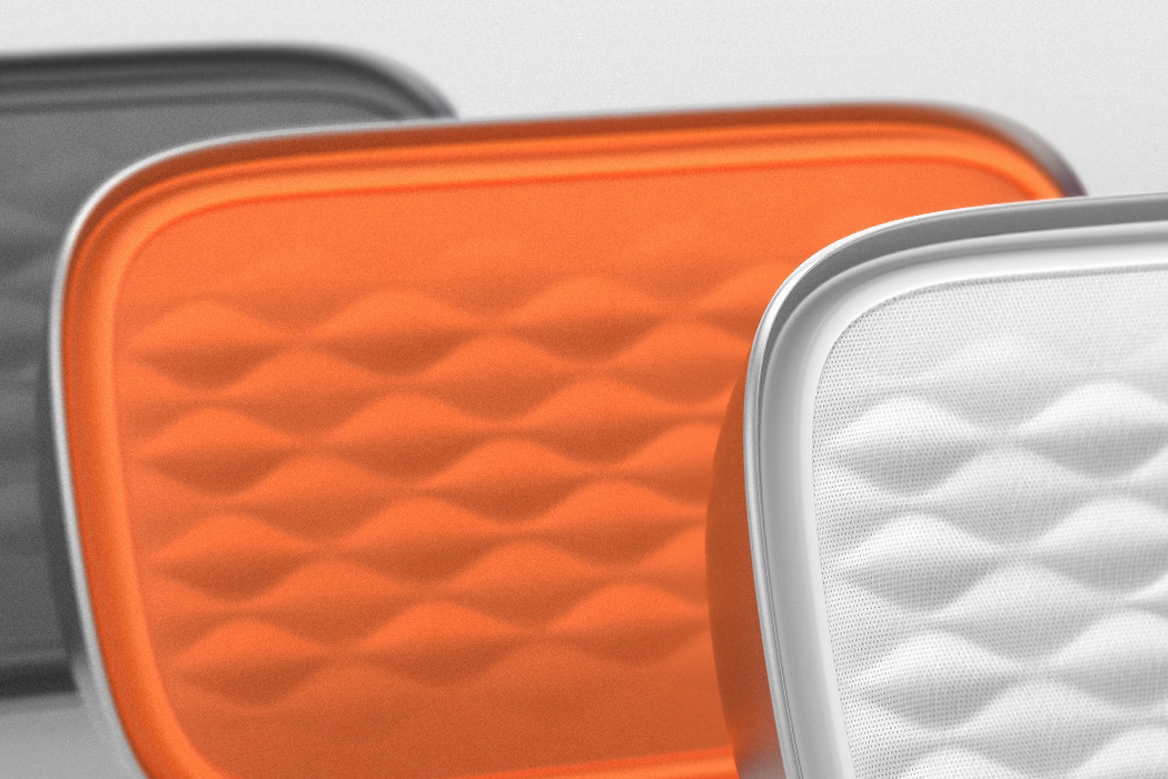
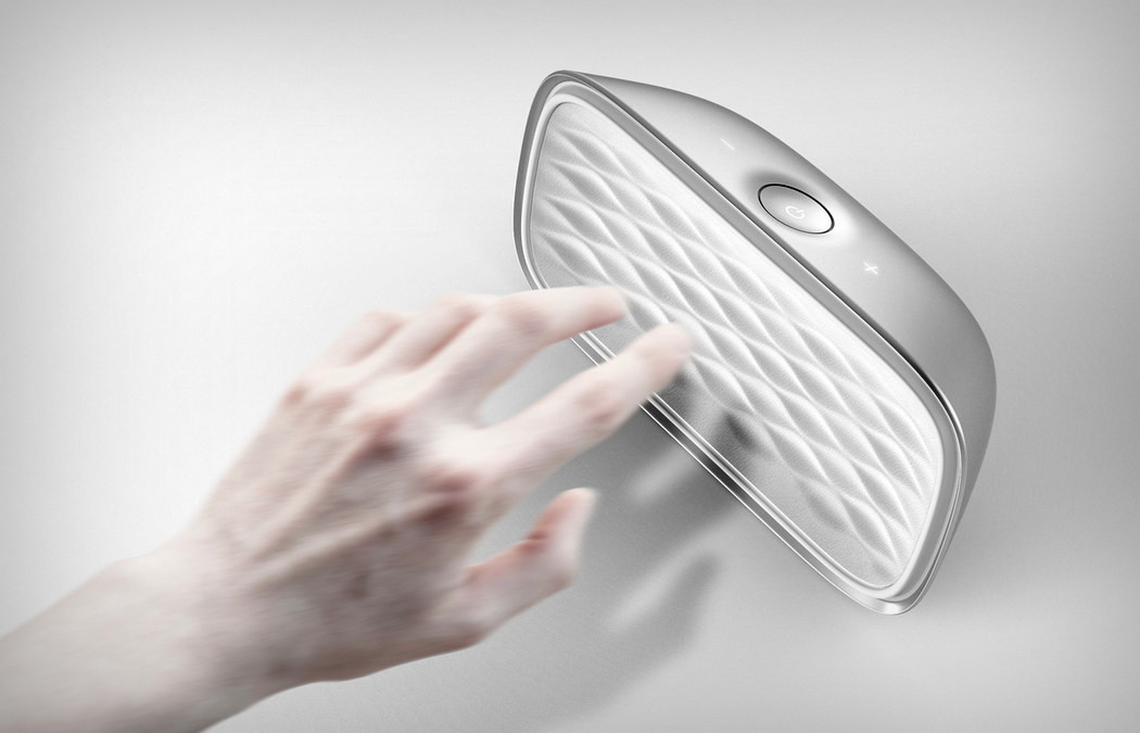
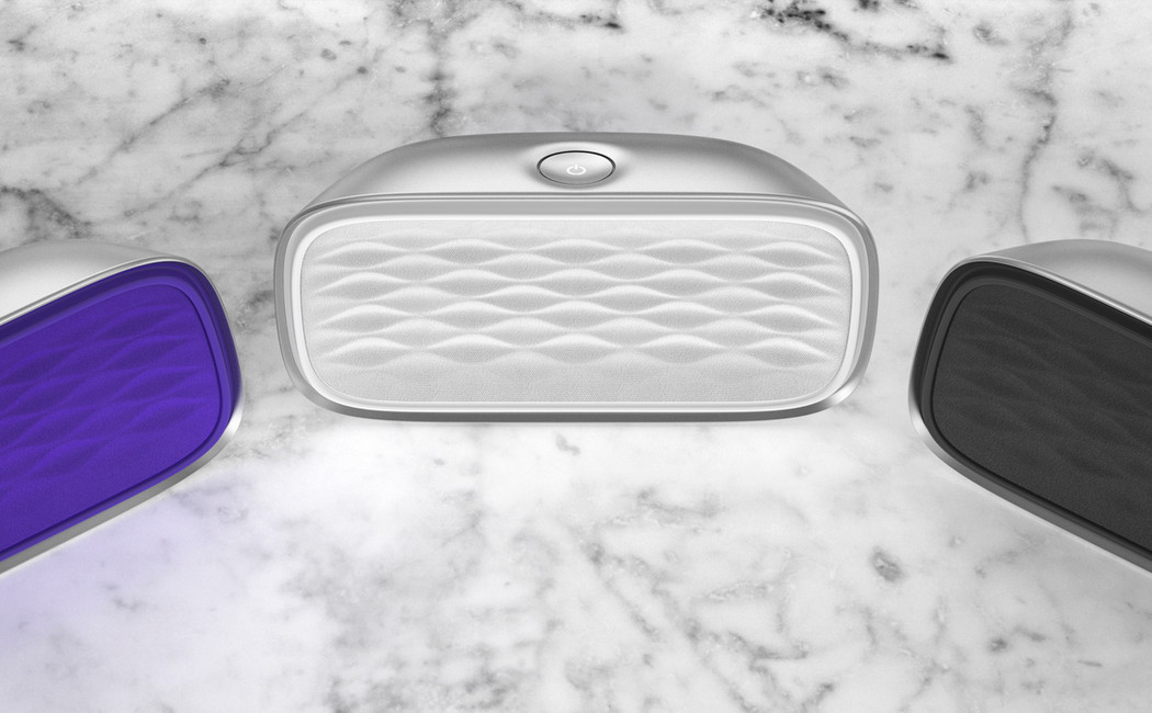
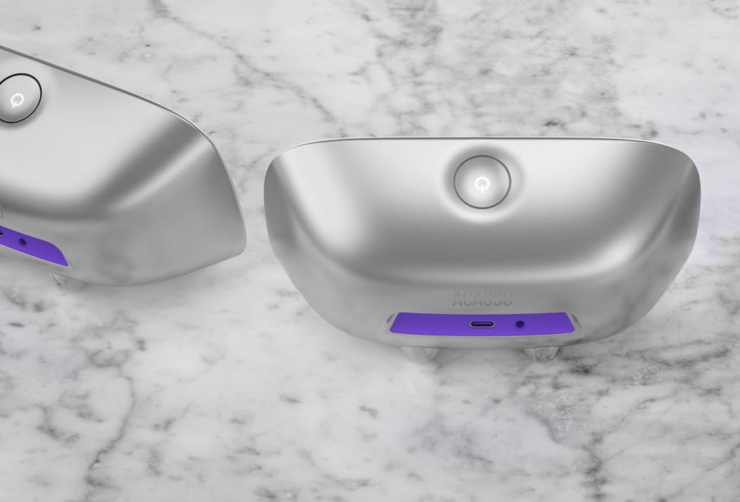
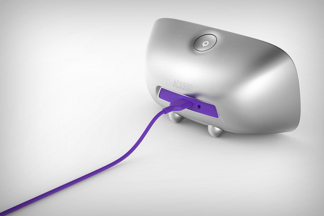
Let’s talk about the Evoke, one of the most pleasant looking wireless speakers I’ve seen in a while. The front grill has a beautiful pattern that reminds me of Jawbone’s Jambox. It’s almost become a symbol for portable audio, hasn’t it! The Evoke has a pillow-esque design machined out of aluminum. It gives the illusion of being soft and he anodized metal feels great to touch. While we’re on the subject of touch and everything tactile, Evoke’s product experience relies on hand proximity in an unusually beautiful way. The volume controls are capacitive and flush on the surface. You see them only when they light up, and they light up only when they sense your hand nearby. It’s quite a nifty feature to add, don’t you think! Makes sure the product’s design remains pure and becomes functional only when it needs to!

Designers: Jake (Jongha) Lee & A-LAB.

evoke_speaker_2

evoke_speaker_3

evoke_speaker_4

evoke_speaker_5

evoke_speaker_6

evoke_speaker_7

evoke_speaker_8

evoke_speaker_9