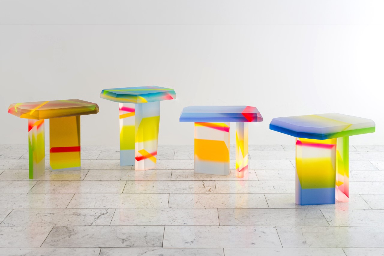
These Colorful Acrylic Furniture Pieces Are Like If Willy Wonka Met IKEA

Furniture so yummy-looking you’d want to lick them…

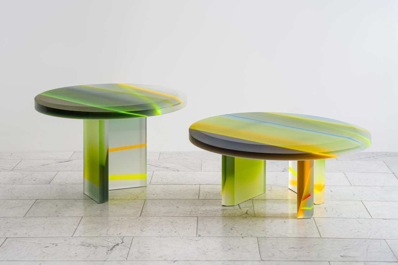
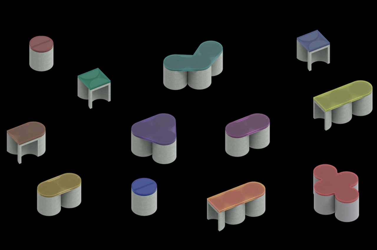
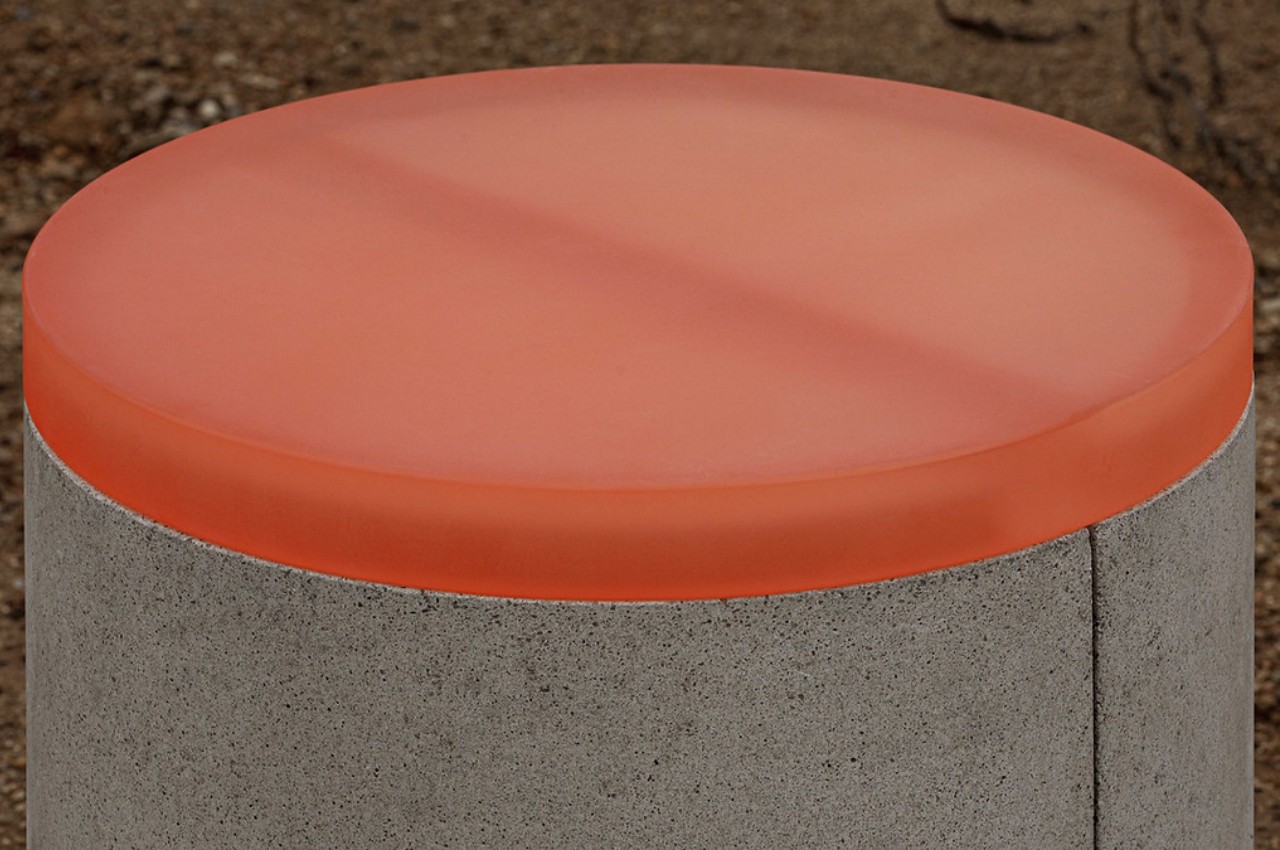
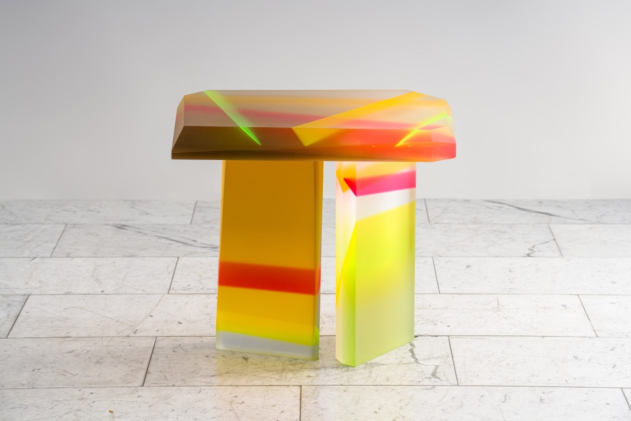
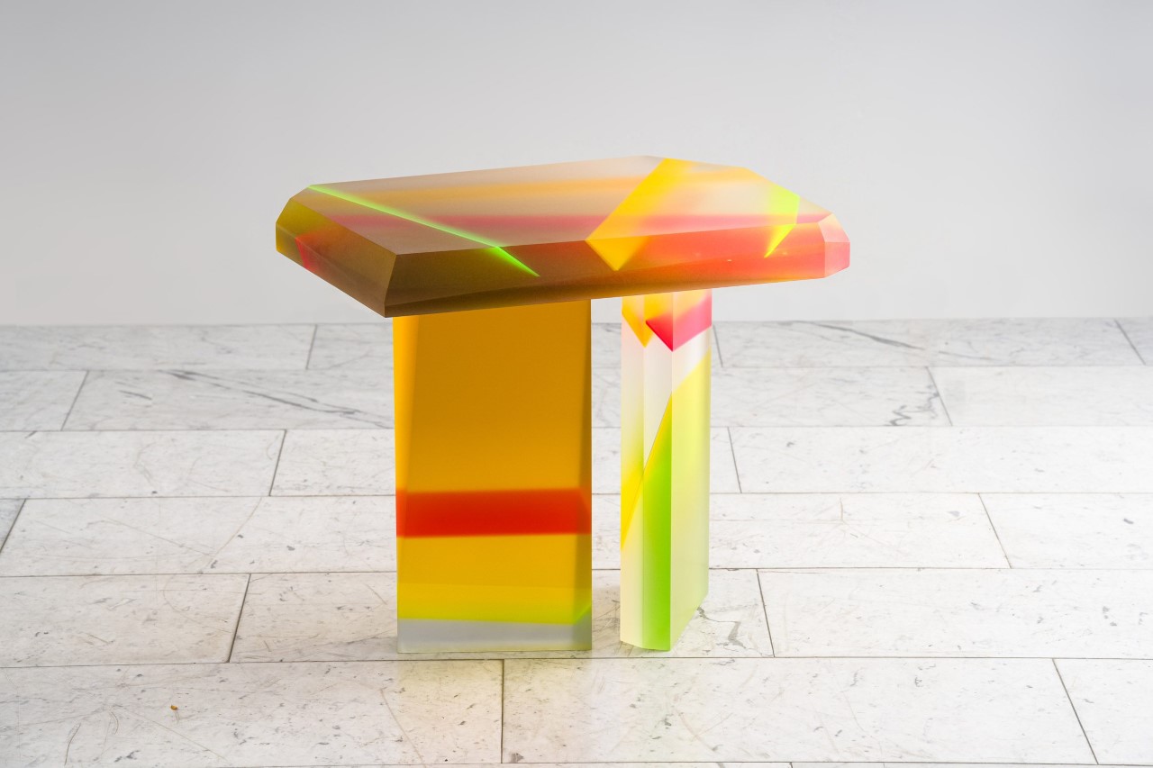
Meet Flare, a collection of furniture by Draga & Aurel designed to explore the theme of refraction. The furniture’s relatively blockish shape comes from the fact that it’s manufactured out of multicolored blocks of lucite (a patented version of acrylic resin known for its sheer glass-like transparency) that look practically like pieces of candy fused together to form functional decor pieces. The collection includes tables and decorative totem pieces, all of which are painstakingly crafted by hand, and are completely unique in their pattern and color composition. Much like wooden furniture are distinctly unique because of their woodgrain, Flare’s tables and totems have their distinct color-grains that make each unit individualistic. Unlike wood, however, these pieces have a kind of funky pop-futurism to them that’ll grab your attention and probably even cause you to salivate. I’d probably recommend against licking them.

Designer: Draga & Aurel
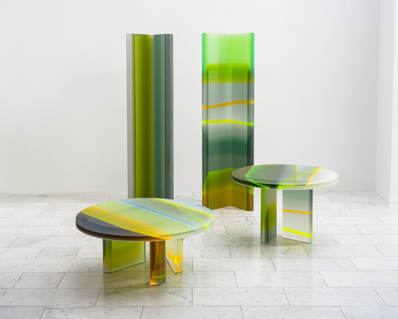
Draga & Autel’s collection boasts a range of coffee tables and a unique totem-style sculpture. Each piece is meticulously handcrafted from sheets of Lucite in various colors, shapes, and thicknesses. These sheets are layered and glued together to create the furniture’s bold, geometric forms, for instance, the use of bold geometric shapes creates a sense of dynamism and stability. The chunky shapes and vibrant hues reference minimalism, space-age design, and the captivating patterns of optical art.
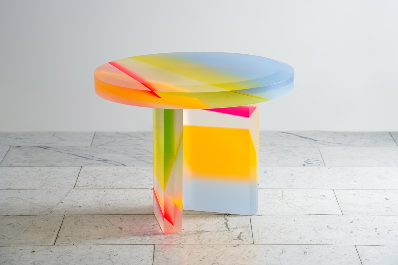
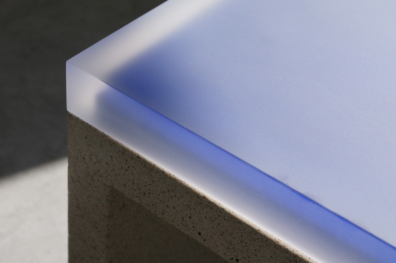
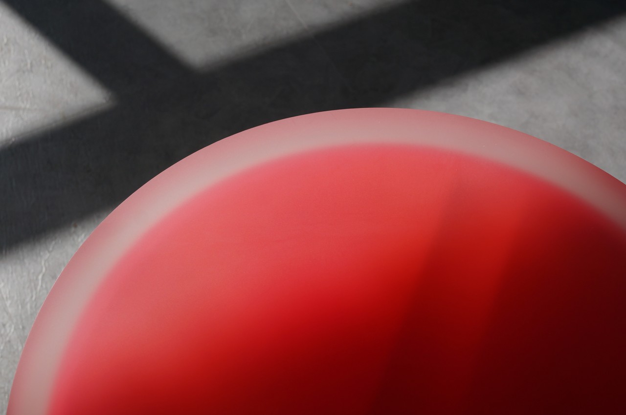
A defining characteristic of the Flare collection is its exploration of light refraction. The layered acrylic creates a kaleidoscope effect, with the colors shifting and transforming depending on the viewer’s position. This dynamic interplay of light adds a captivating element of intrigue to any space.
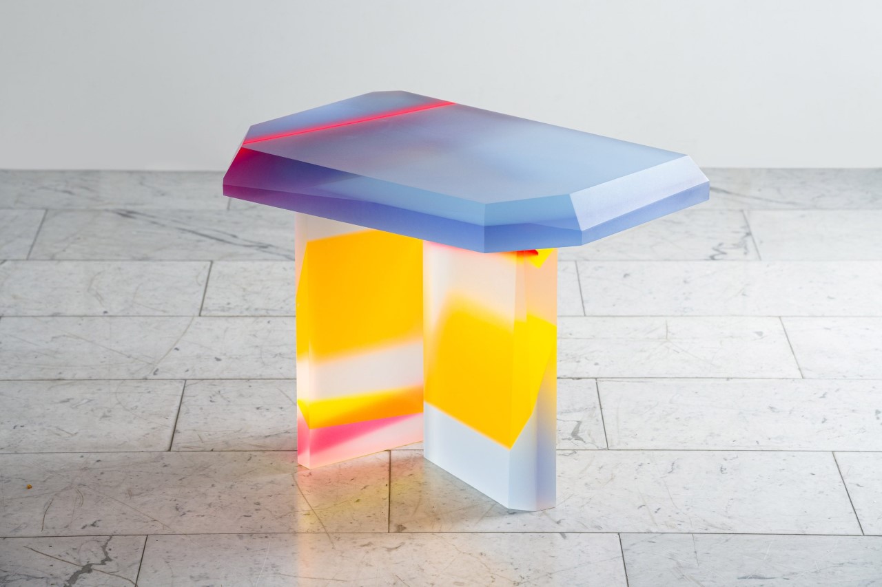
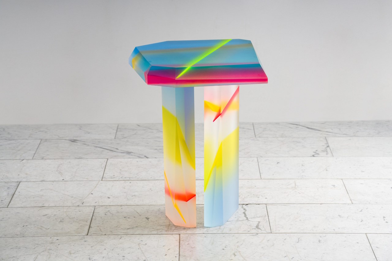
The meticulous craftsmanship is evident in each piece of the Flare collection. Lucite sheets are hand-selected and cut to precise specifications before being carefully layered and glued together. This attention to detail ensures that each piece is not only beautiful but also built to last.
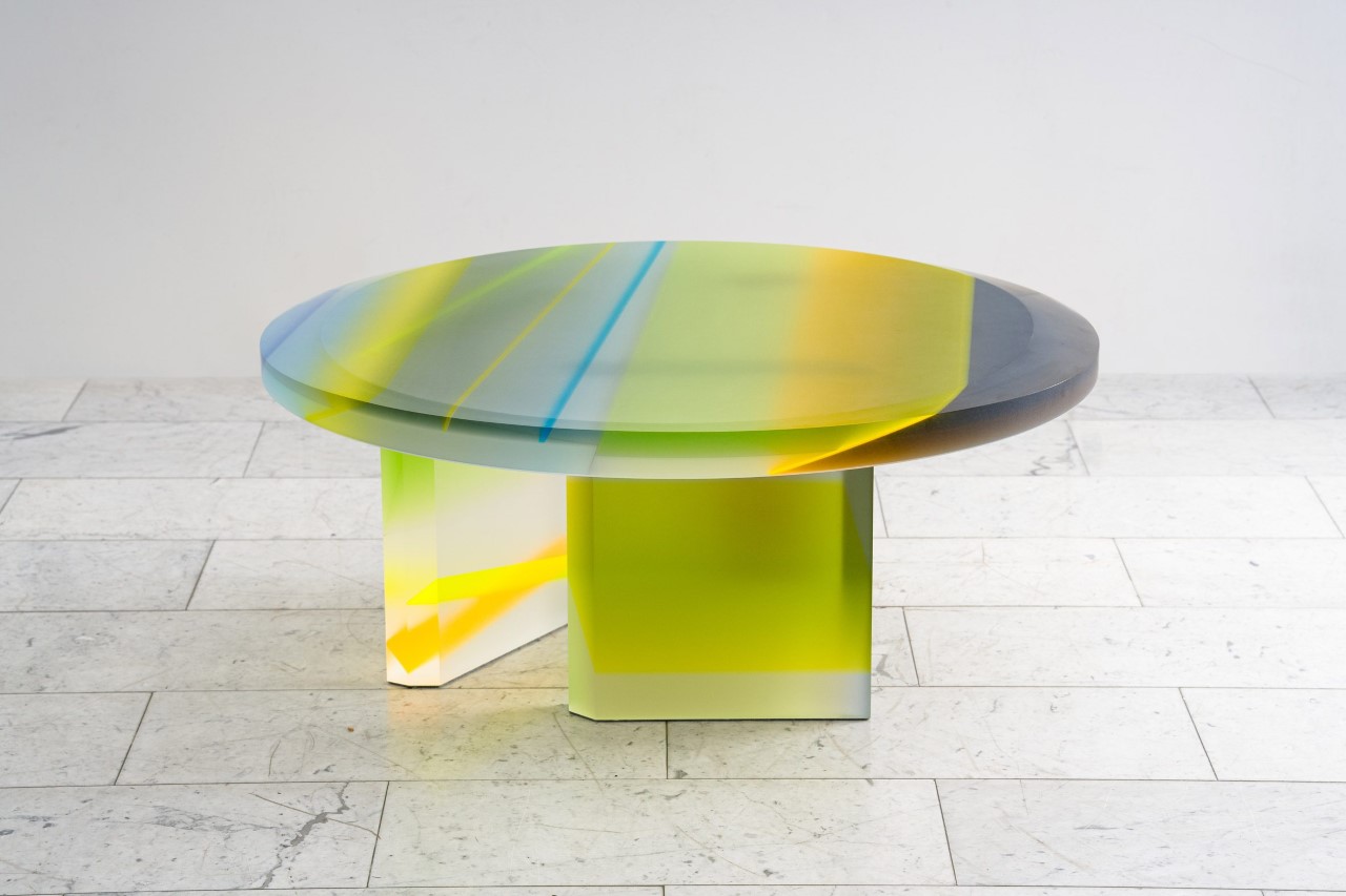
The Flare collection is a perfect example of how design can bridge the gap between art and function. The pieces are not only conversation starters but also provide practical surfaces for everyday use. Their only tragedy is the fact that they probably won’t go with most conventionally decorated homes. The Flare fits well in more quirky, minimalist houses dominated by pops of color and whimsy.
The post These Colorful Acrylic Furniture Pieces Are Like If Willy Wonka Met IKEA first appeared on Yanko Design.
Invisible shoehorn gives your back a break and blends into the background

We often take for granted how some of the most common tools are poorly designed until we have to deal with them, presuming we even have one around. Granted, not everyone might need a shoehorn to put on their footwear, but when you do, you might end up scrambling to look for one near your door. Worse, you might end up injuring your back because, while it’s designed to help slip your foot into your shoes, a shoehorn doesn’t take the rest of your body into account. Of course, that’s only true for your run-of-the-mill shoehorns that try to be cute and look like a small foot or something similar. A more thoughtful design would be willing to throw away those conventions and break stereotypes, like this rather striking shoehorn that doesn’t look like a shoehorn at all.

Designer: Kairi Eguchi  for Takeda Design Project

Click Here to Buy Now: $255 $299 (15% off and free worldwide shipping at checkout). Hurry, deal ends in 48 hours.

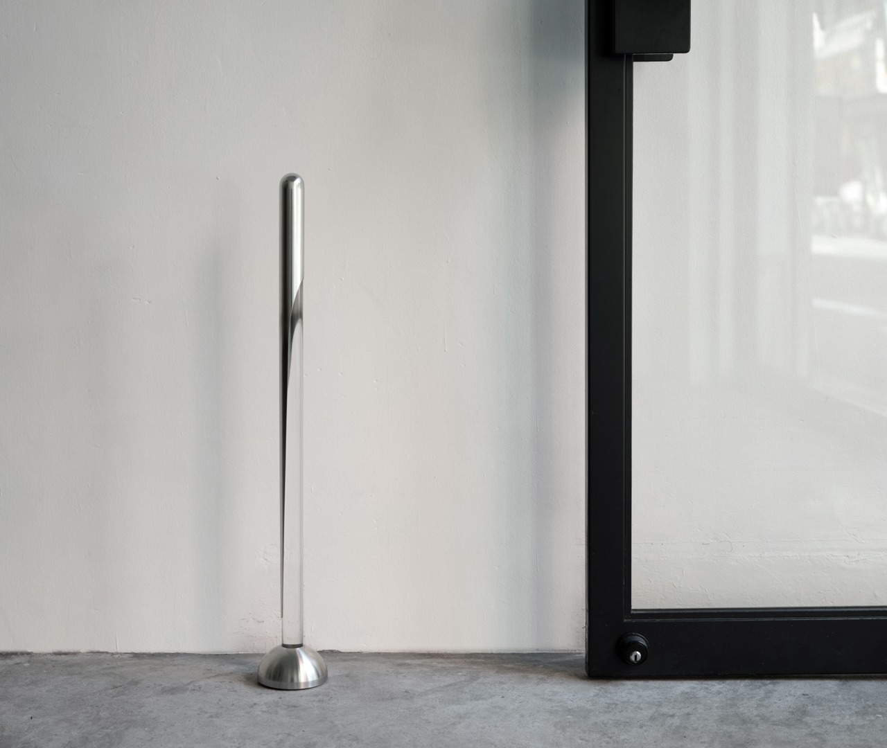
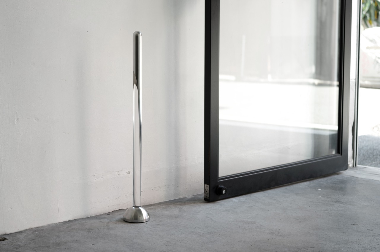
You definitely wouldn’t recognize this shoehorn if you came across it either near the door or near a shoe rack. Even if you look closely at it, it would simply appear as a half-silver, half-clear rod that stands like a decoration to accentuate your home. It does serve that purpose when it’s not in use, but this “disappearing” shoehorn is definitely one of the most well-designed household tools of its kind.

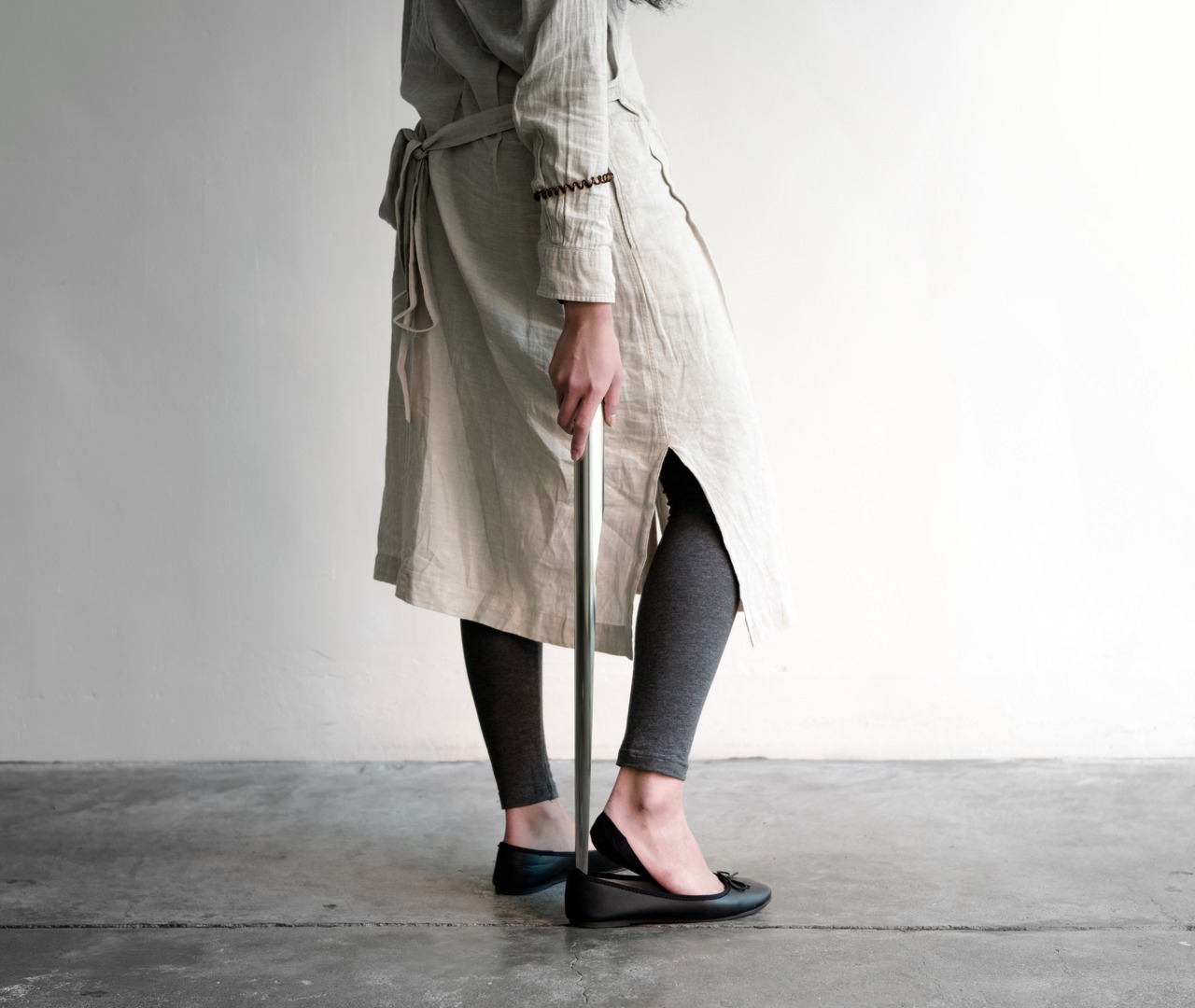
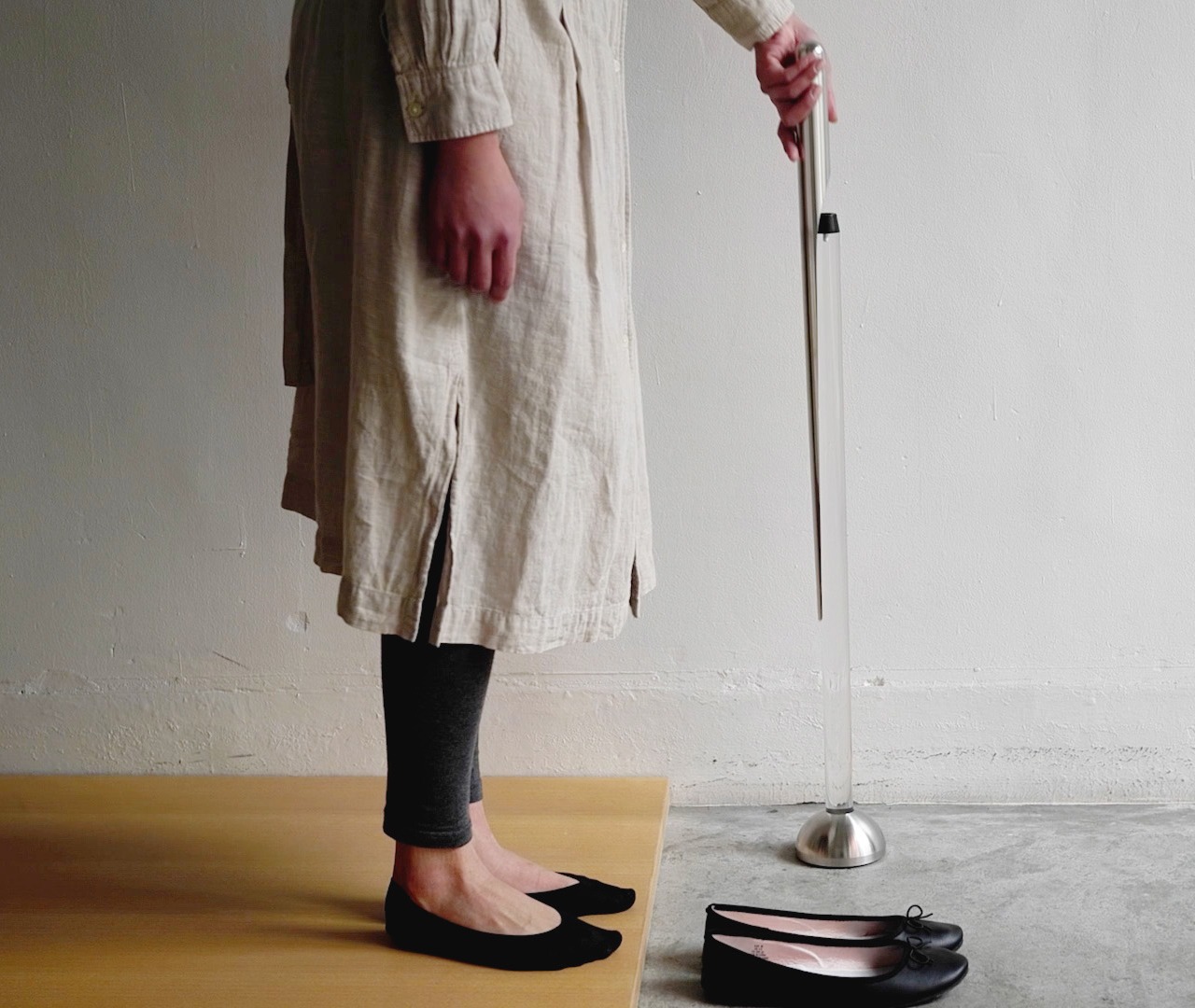
When you pull out the metal part of the rod from its stand, you get a smooth, polished shoehorn that stands 700mm (around 27in) tall, tapering from the cylindrical handle down to a thin curved tip. At this height, it’s trivial to slip the shoehorn between your foot and your shoe without having to bend down precariously. It would have been simple enough to make a long shoehorn and call it a day, but the ALIGN LINE shoehorn uses that ergonomic design to create something not only useful but also beautiful.

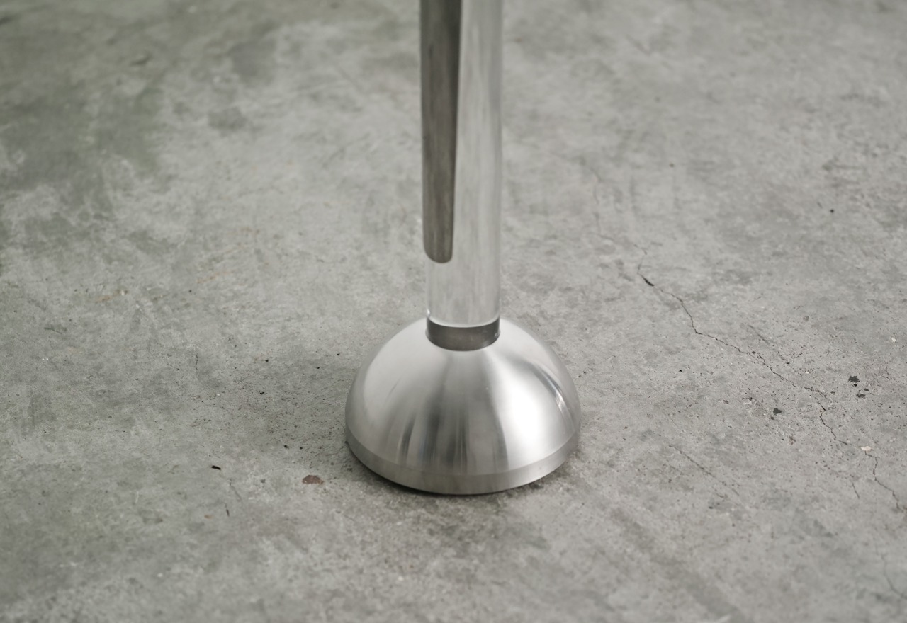
The actual shoehorn is literally only half of the whole product. The other half is a clear acrylic holder that mirrors the shoehorn in shape. The transparent material of the stand creates a distinctive contrast with the stainless steel shoehorn, making it appear as if it’s floating in mid-air. It also helps the design blend with its surroundings, matching with whatever theme or motif you might have going in your home. The dome base is also made from stainless steel and has a low center of gravity to provide stability to the structure. It sits well below the metal tip of the shoehorn, reinforcing that illusion of a piece of metal floating in your house.

The invisible shoehorn’s thoughtful design carries over to the meticulous attention paid to crafting this tool. The shoehorn is carefully finished to ensure a smooth surface that won’t snag and tear delicate socks or stockings when you use it. Small details like these may be almost invisible to the eye but have a big impact in making this steel and clear shoehorn not only an ergonomic tool but also a thing of beauty.

Click Here to Buy Now: $255 $299 (15% off and free worldwide shipping at checkout). Hurry, deal ends in 48 hours.

The post Invisible shoehorn gives your back a break and blends into the background first appeared on Yanko Design.
This sustainable lamp doesn’t use batteries to create its eclipse-like glow

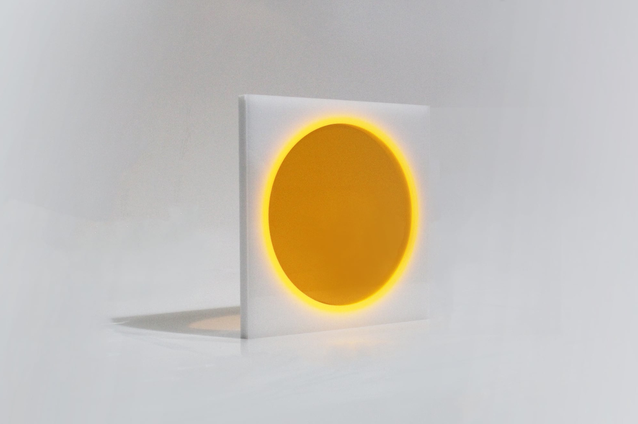
We have seen many kinds of lamps and lighting fixtures, some more decorative while others are mostly utilitarian in their design. What binds most of these lamps together is their need to be plugged in one way or another, whether it’s to directly tap into a power grid or to charge their internal batteries. Sooner or later, we will realize just how much we consume to light up our homes, especially when it comes to less practical uses like setting the mood or enhancing the atmosphere in a room. These types of lighting might be better off getting their power from alternative sources, and this rather intriguing sheet of acrylic does exactly that by “recycling” the light around it, turning it into energy to generate its own soft circular glow.

Designer: Yuichiro Morimoto

Of course, we’ve seen our fair share of “glow in the dark” products that store a bit of sunlight to give them an eerie appearance in the dark. It’s hardly usable as a lighting solution, though, since it can barely illuminate a small area for a long period of time. On the other hand, solar-powered devices are a bit more practical but also less attractive because of the panels that need to be included in the design.

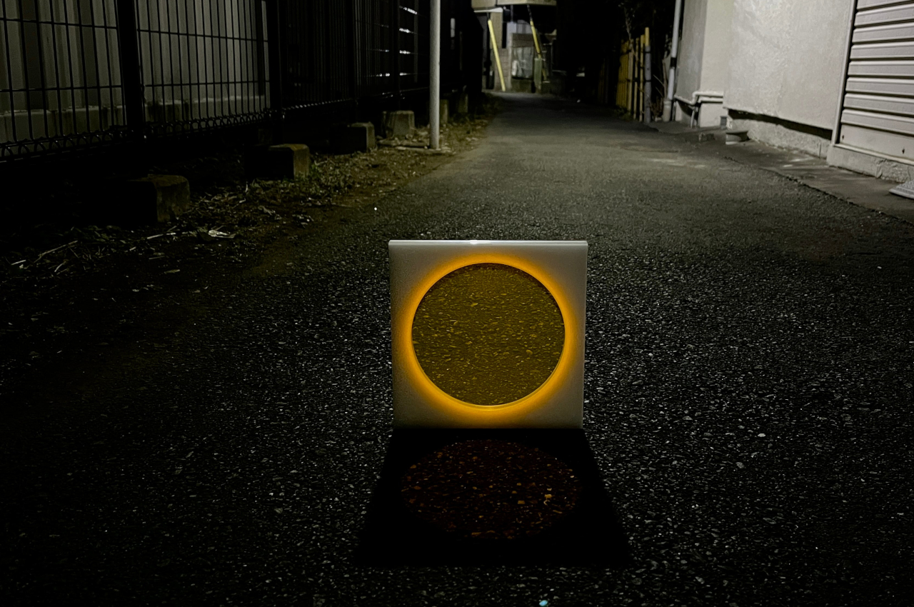
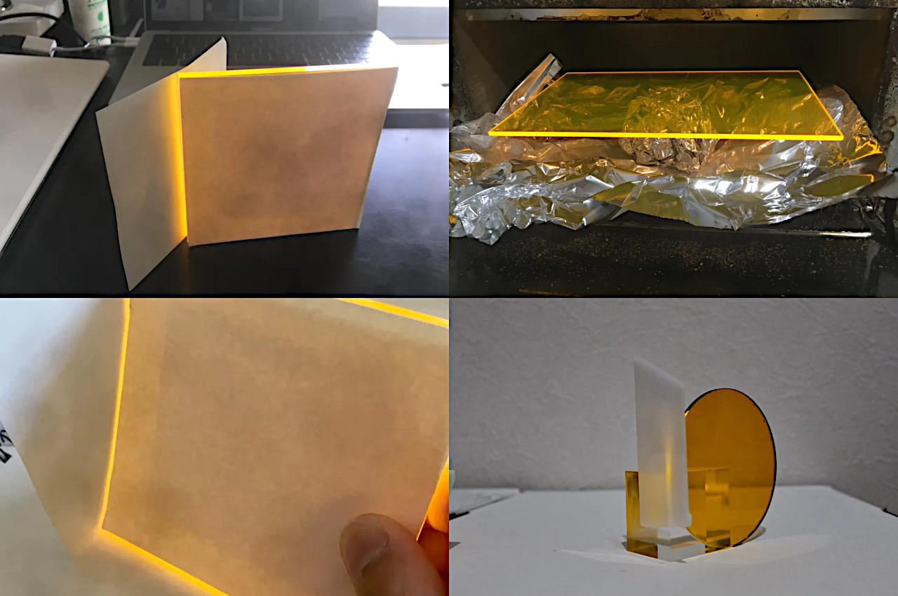
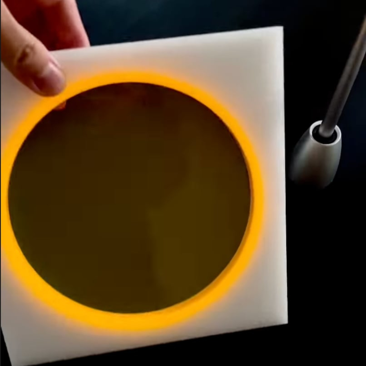
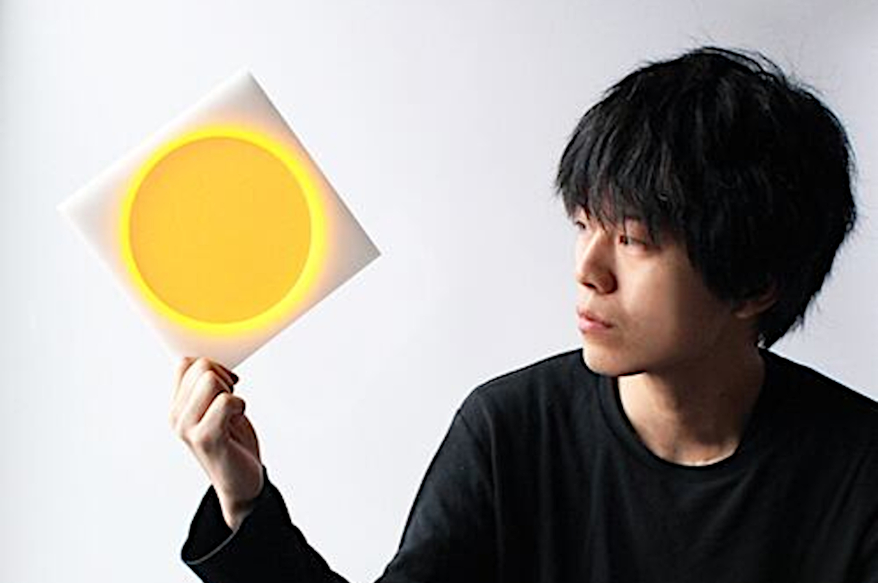
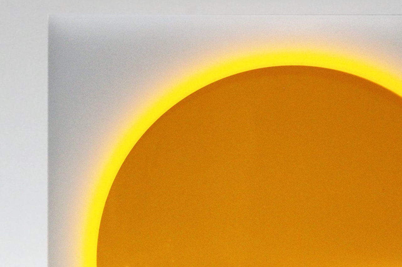
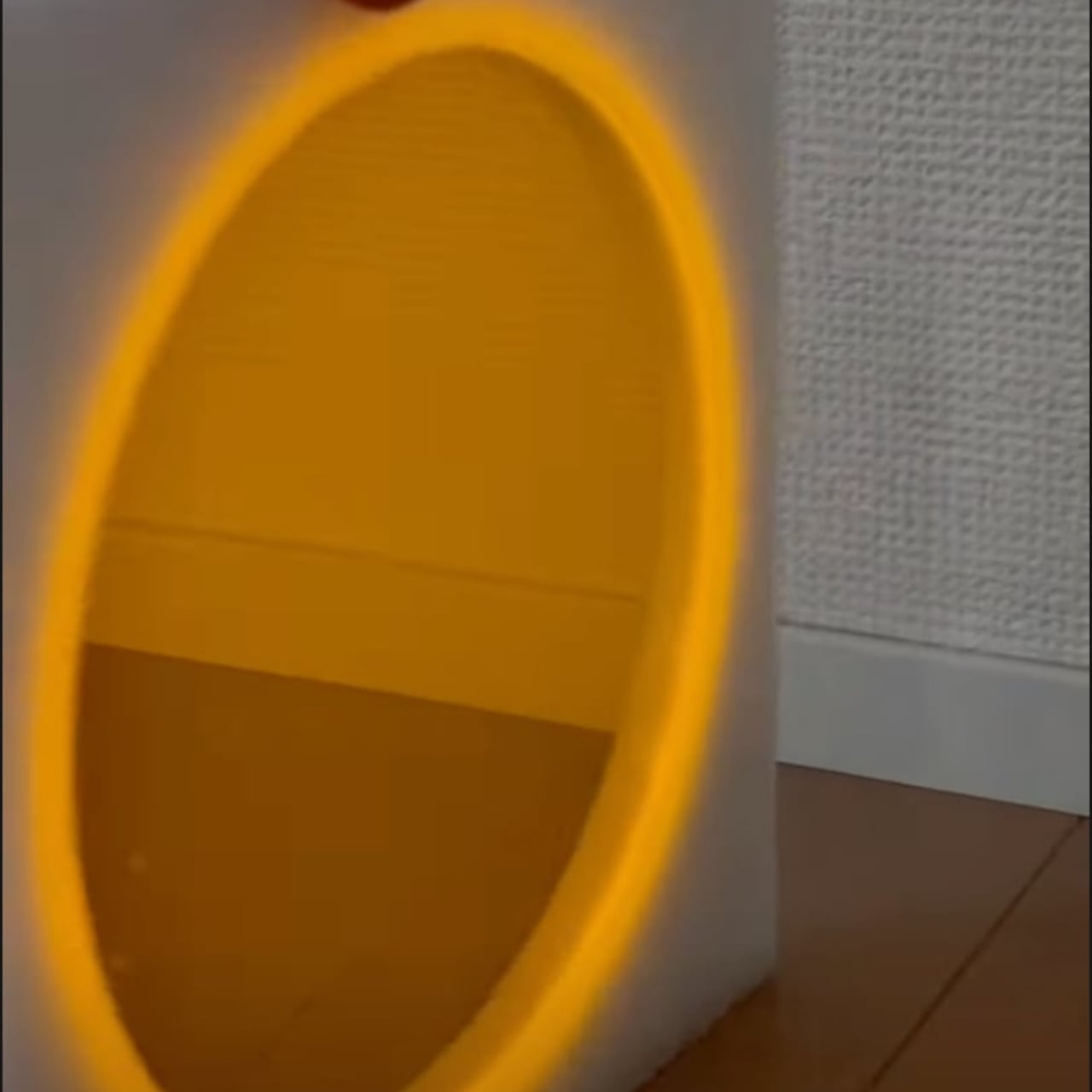
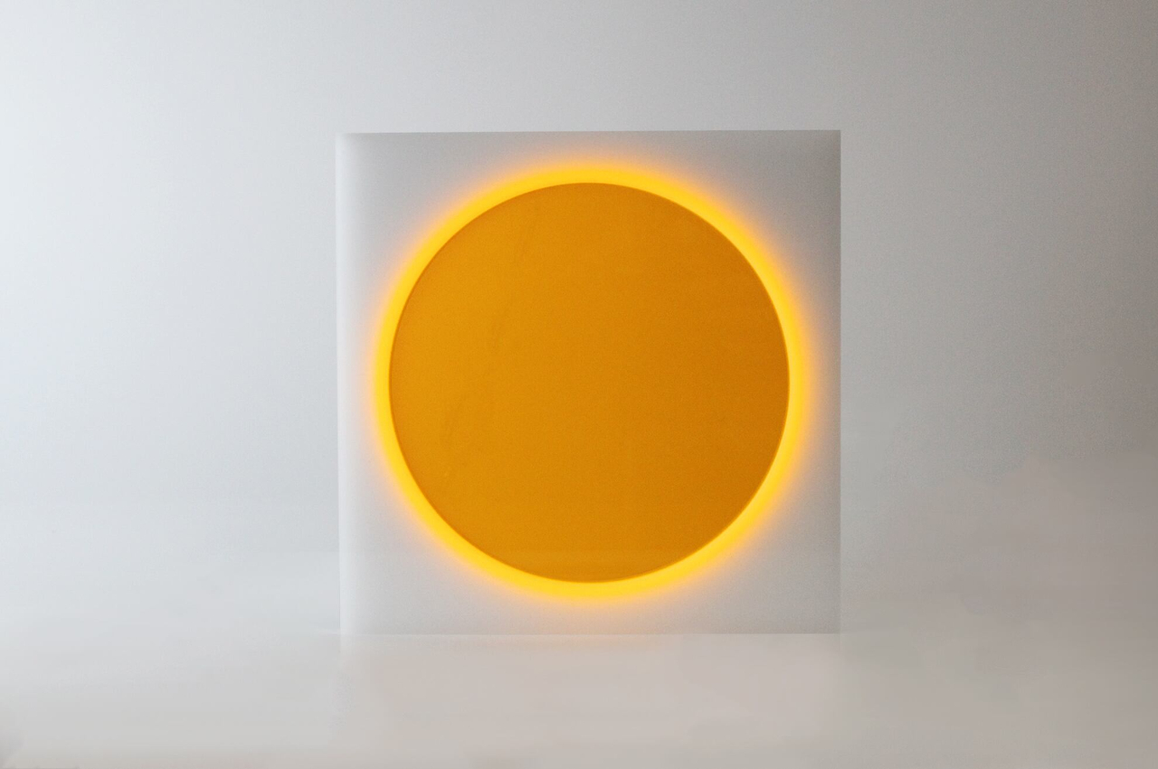
Nisshoku, which is the Japanese word for “eclipse,” utilizes a different technology to generate power using electricity. Light is collected using a specially-treated acrylic surface that acts as a condensing plate that gathers ambient light around it. Rather than convert light into electricity, which can’t be done with non-solar light anyway, the plate instead releases the light along the edges of a circular shape that is always exposed to the outside world, enabling it to accept any and all kinds of light in an area.

This material is then set in the middle of an opalescent acrylic square that covers the edges of the condensing plate. This creates the effect of diffusing the light at the edges, which looks like the corona of a full solar eclipse, hence its name. The end result is a warm yet eerie glow that easily draws one’s attention, all without using any electricity. And the way it glows is determined by how much light it is able to gather, so it will vary depending on the environment.

Of course, it isn’t going to be usable as a light source in the darkness because it does require light to be present to work. It is mostly decorative than practical, but at least you won’t be wasting any electric power just to make your room look a bit more appealing.

The post This sustainable lamp doesn’t use batteries to create its eclipse-like glow first appeared on Yanko Design.
This modular concrete stool blends contrasting elements in a brutalist package

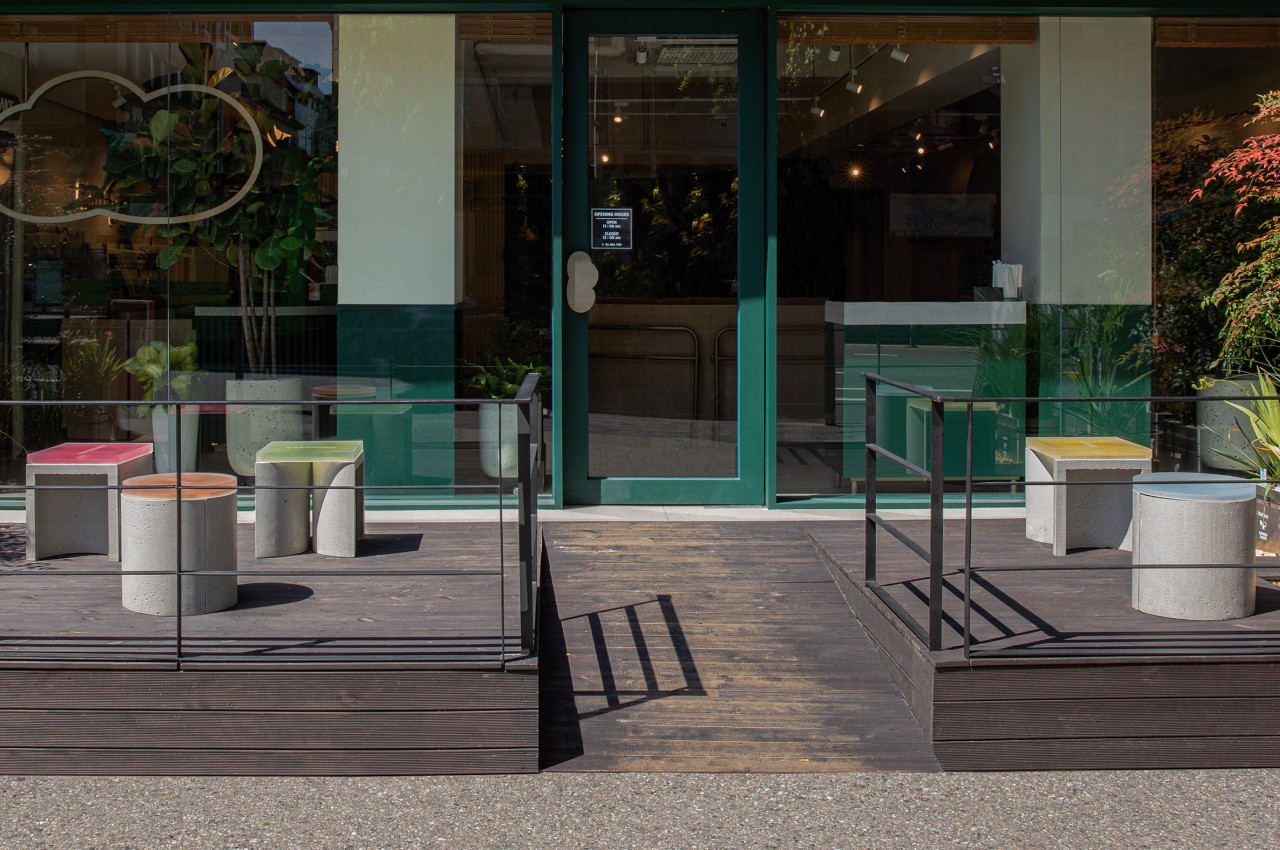
Concrete is not something you’d immediately associate with flexibility and comfort, especially as applied to chairs and tables. The material is great for making outdoor furniture that remains rooted in place until they’re damaged beyond use and repair. They often have fixed forms, too, considering they’re not the easiest things to move or change anyway. That, however, means lost opportunity in shattering expectations and pushing the envelope of what you can do with the material. Fortunately, not everyone is easily intimidated by concrete’s rough demeanor, and this modular stool system demonstrates what’s possible when you start playing around with shapes, colors, and materials.

Designers: one J, Jeongjin Ko, Jinsu Du, Keetae Kim (Superkomma)

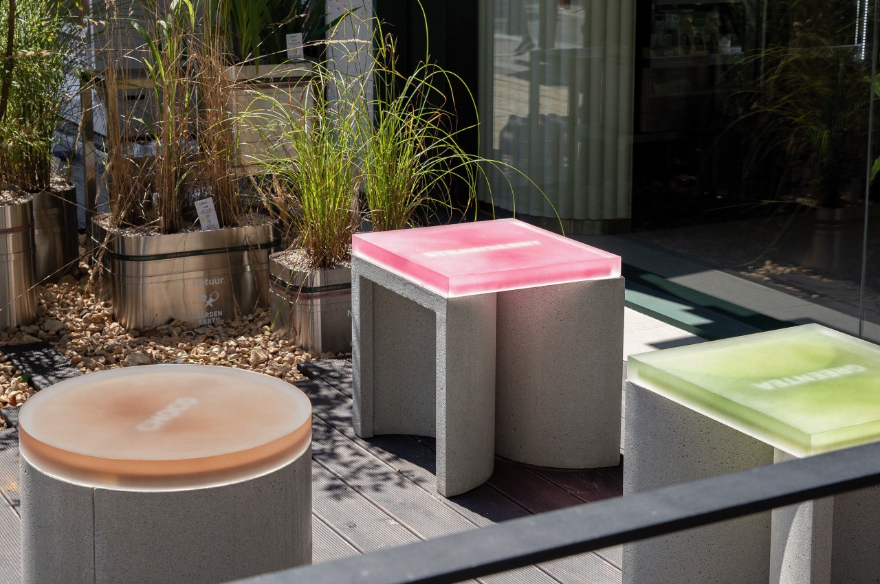
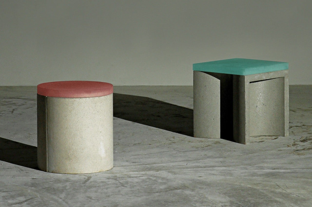
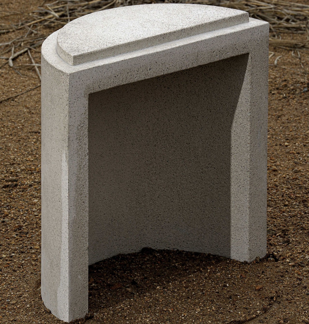
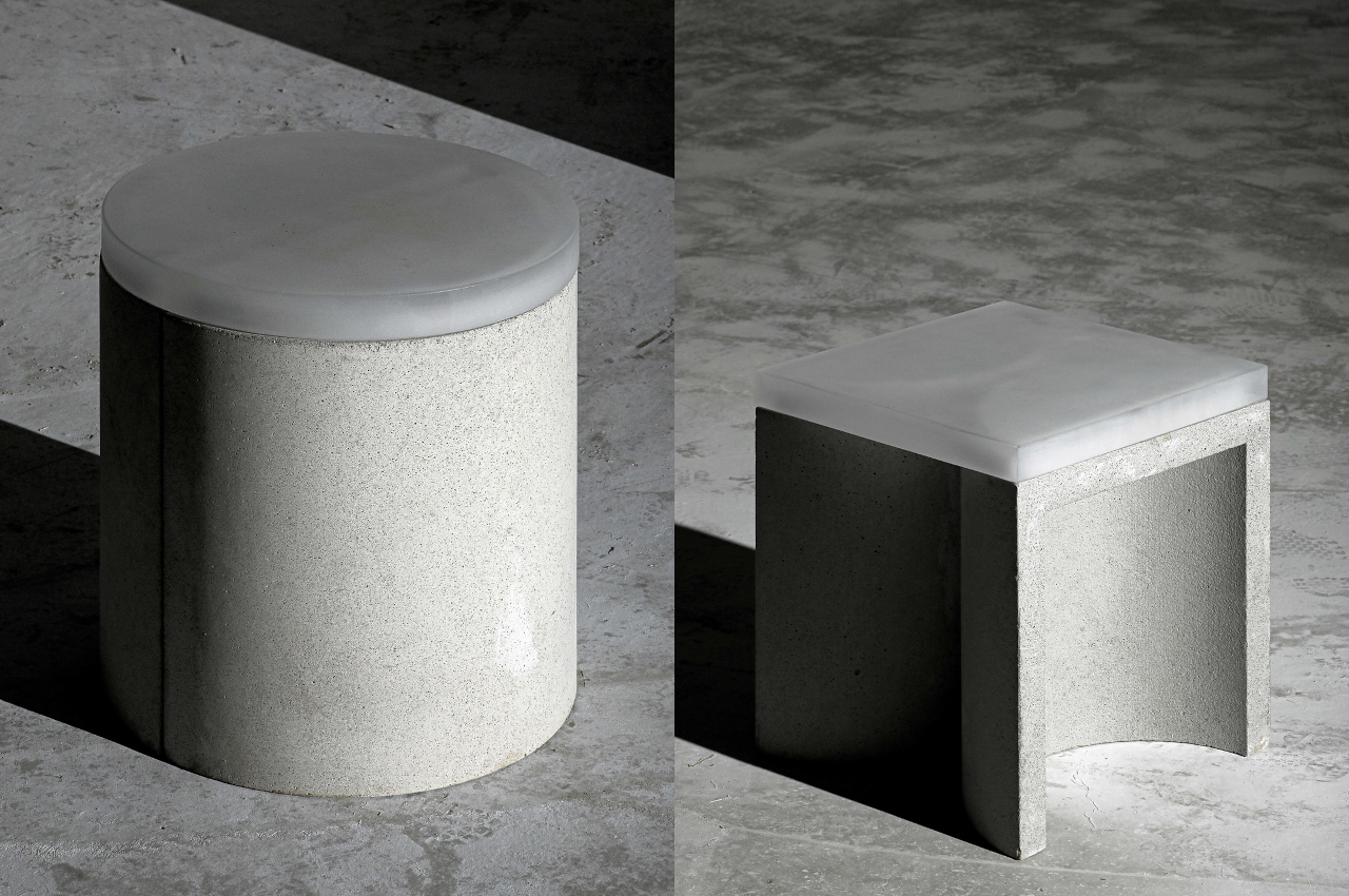
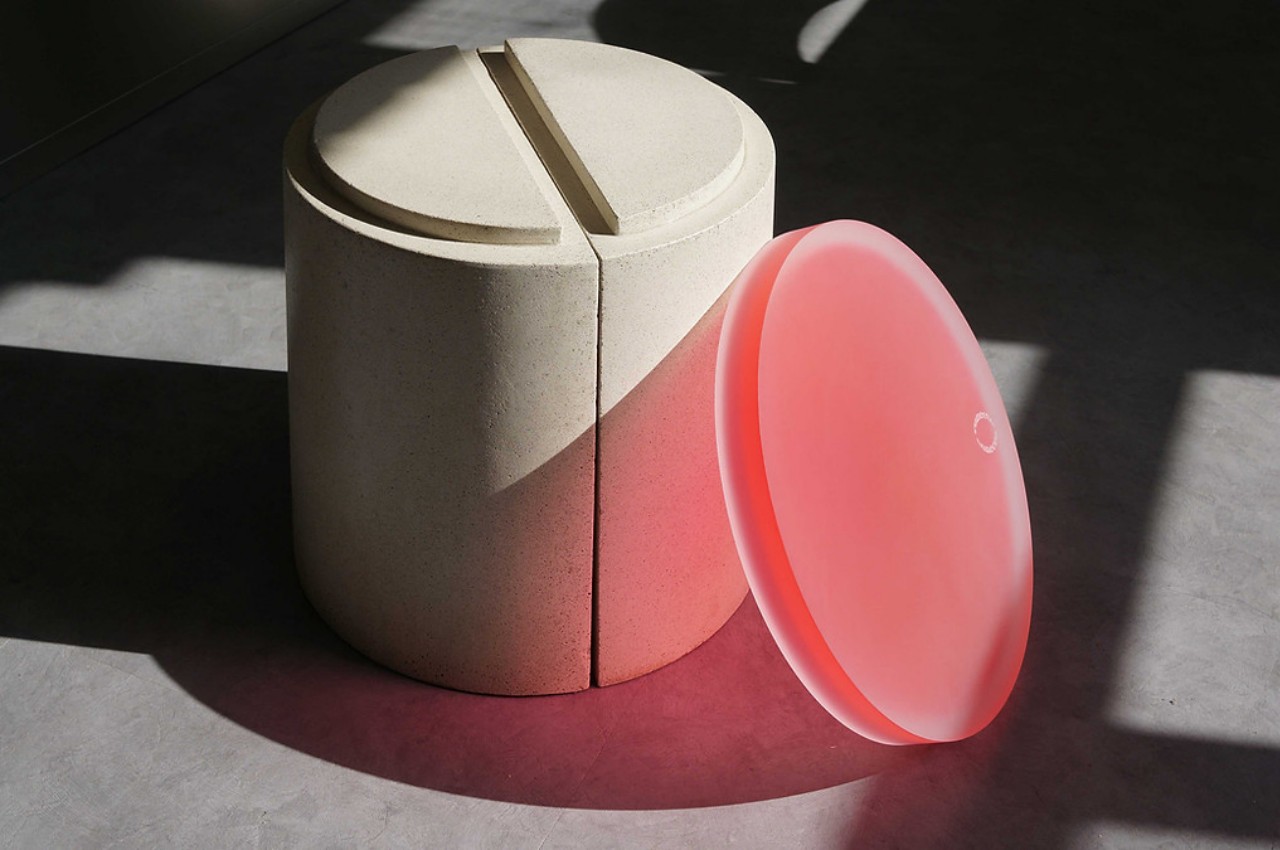
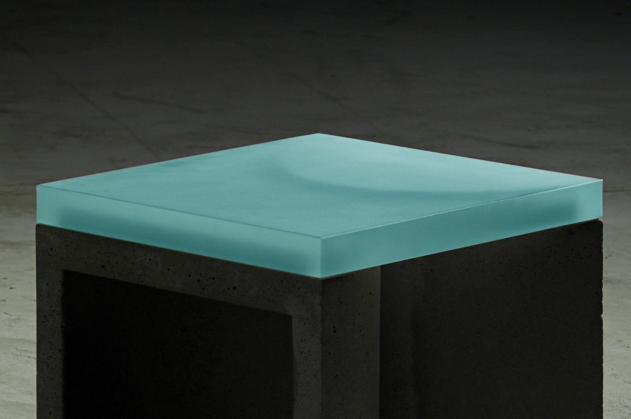
In its most basic configuration, the CONECTO stool looks like any ordinary cylindrical stool with a colorful top. That, however, is an illusion, given that the seemingly whole concrete base is actually two half cylinders joined at their flat side. You might take for granted how this “half shape” can be used in a modular fashion, but almost like LEGO, they can become the building blocks of larger stools that can accommodate more people at once.

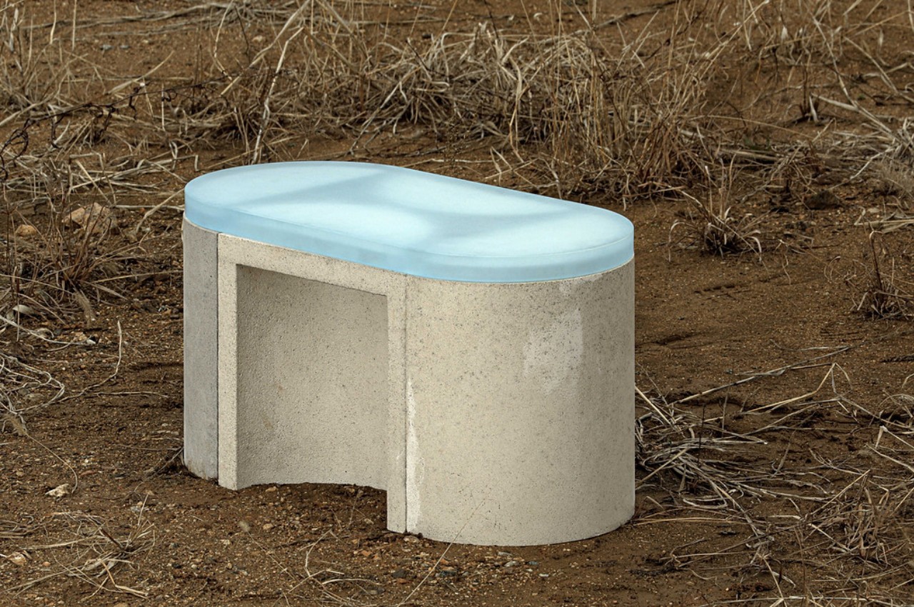
Joining the two halves on their curved side allows a square “cover” to be put on top for a more traditional stool. Putting half a cylinder on one side extends it a bit for a more comfortable arrangement, but adding yet another half on the opposite side creates an oblong bench. If, on the other hand, you put three full cylinders together in a triangular formation, you can have a bench that can accommodate as many as three people.

1

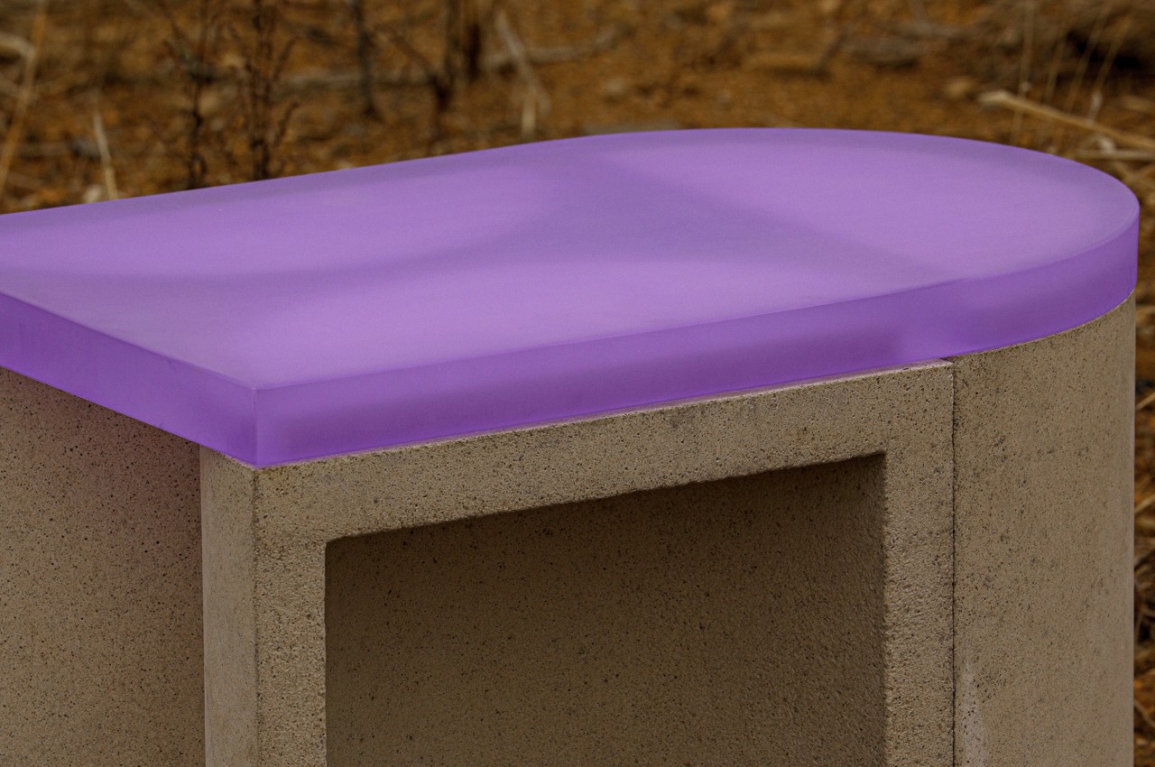
Part of the CONECTO’s modularity is thanks to the acrylic top that joins different pieces together. This material also provides a striking contrast to the concrete base, creating a visually interesting outdoor furniture design. Where concrete is cold, raw, and rough, the translucent acrylic top is softer, colorful, and alive. The stool, whether alone or with others, provides a mix of brutalism and minimalism that could attract people to look and even sit.

The concept for CONECTO’s design also has sustainability as its goal from the get-go, using high-strength UHPC concrete with no harmful compounds. It the future, it is planned to also make use of recycled waste materials, creating an ecosystem that is not only free in its flexibility but also free from negative effects on the environment.

The post This modular concrete stool blends contrasting elements in a brutalist package first appeared on Yanko Design.
Keep on reading while sipping your tea with this unique book-shaped bookmark

Bookmarks are great for those times you need to put a book aside for a while to do other things. There are even quite a few designs available for these, from simple cards to decorative fixtures or even multi-functional night lamps. But when you want to keep your book open just to reach for a drink or a snack, however, bookmarks can’t do squat. Especially if you actually want to keep on reading the open book. Fortunately, the solution doesn’t require sophisticated designs or complicated mechanics. All you need is some outside-the-box thinking and put a book on a book, just like this rather unconventional acrylic bookmark that, oddly enough, also looks like a book.

Designer: TENT

Click Here to Buy Now: $55 $65 (15% off at checkout). Hurry, sitewide Post-Cyber Monday sale ends in 24 hours!

There are admittedly a few bookmarks made from clear acrylic, but those run in the more common design of rectangular pieces meant to be inserted in between pages. There are some that are pretty much paperweights to hold a page down, but their design doesn’t really make that convenient or elegant. You might as well just put weights on every corner of the book to keep it open.

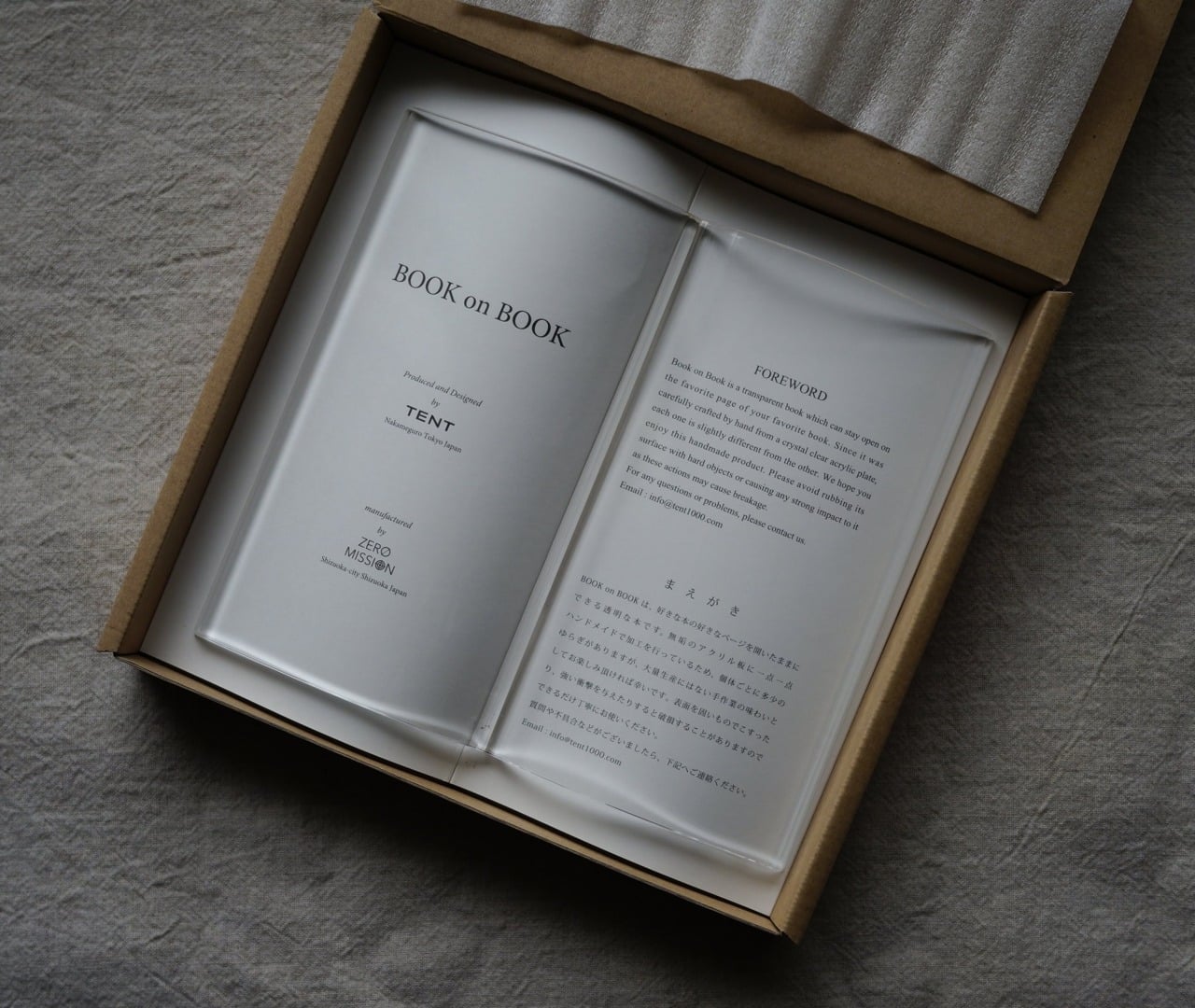
The moment you take a look at Book on Book, you know it’s not your average bookmark. It looks like more than just a regular book but an open book at that, a true page-turner if there ever was one. Sure, it won’t lay nicely flat on a desk if you place it there unused, but that’s definitely not what it was designed for anyway. This bookish bookmark is supposed to sit on your book and keep it open so that you can have your tea (or preferred drink) and keep on reading calmly.

The acrylic bookmark’s unique shape ensures that the book not only stays open but also in its natural curved form. It has enough weight at 220g to make that happen, but it doesn’t force the book to lie flat and damage its binding in the process. It’s the perfect way to keep the book open while you use both your hands for other things, like snacking, sewing, or cooking.

Of course, the “bookception’s” transparent body makes it possible to read the text underneath. Its size is perfect for covering a pocketbook from end to end, but it can be used for larger books as well. If it can cover the entire page, it can also protect the page from, say, oil smudges or crumbs. Now you have the perfect way to keep that cookbook open while you toil in the kitchen over a recipe.

There’s no denying that this open bookmark, despite its simple shape, is also a thing of beauty, like a mystical crystal tome that almost deserves to be enthroned on a shelf like any other book. You can definitely do that, but that would deny it its true purpose, a purpose that encourages you never to stop reading, even when your hands are busy with something else.

Click Here to Buy Now: $55 $65 (15% off at checkout). Hurry, sitewide Post-Cyber Monday sale ends in 24 hours!

The post Keep on reading while sipping your tea with this unique book-shaped bookmark first appeared on Yanko Design.
A Gallery of Clear Gadgets

The first time I had an electronic gadget that I could see inside of without cracking it open was the original iMac G3. With its semi-transparent colored backside, you could barely make out the electronic components inside, and even then, most of them were hidden beneath massive RF shielding. But it turns out that there have been many gadgets, computers, and electronics inside of clear shells over the years. The guys at Computer Love Records got me thinking about these see-through devices and found a clear Apple Newton, a clear Polaroid 660 instant camera, a clear GameBoy Color, among others.

Polaroid 660 Special Edition Camera

While my initial assumption was that these transparent versions were meant to keep prison inmates from hiding contraband inside of them, it turns out that it’s common to develop clear pre-production prototypes so that engineers and designers can see the placement of components inside. Beyond that, sometimes brands release special see-through versions of their products, as Sony did with its Crystal DualShock controllers. Scroll down to see the complete our gallery of transparent computers, gadgets, and electronic gear:

Apple Newton MessagePad 110 Prototype

See-Through Prison TV

Game Boy Color Launch Edition

Apple Mac Portable Prototype

Sony Crystal DualShock 4 Controller

Vintage 1980s Unisonic Phone

Apple Vintage eMate 300 Laptop Prototype

Sony PlayStation 2 Slim (SCPH-9000x) Prototype

This greenhouse-mimicking dome helps harvest rainwater and foster sapling-growth

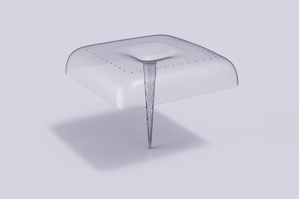
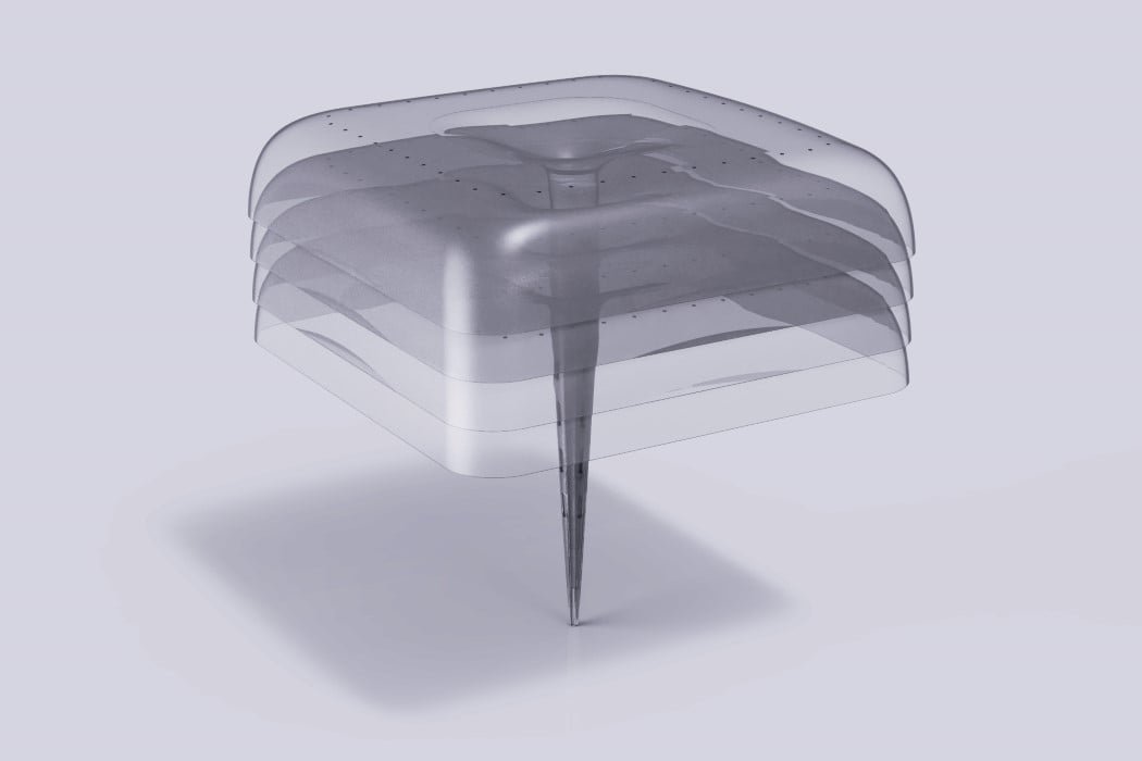
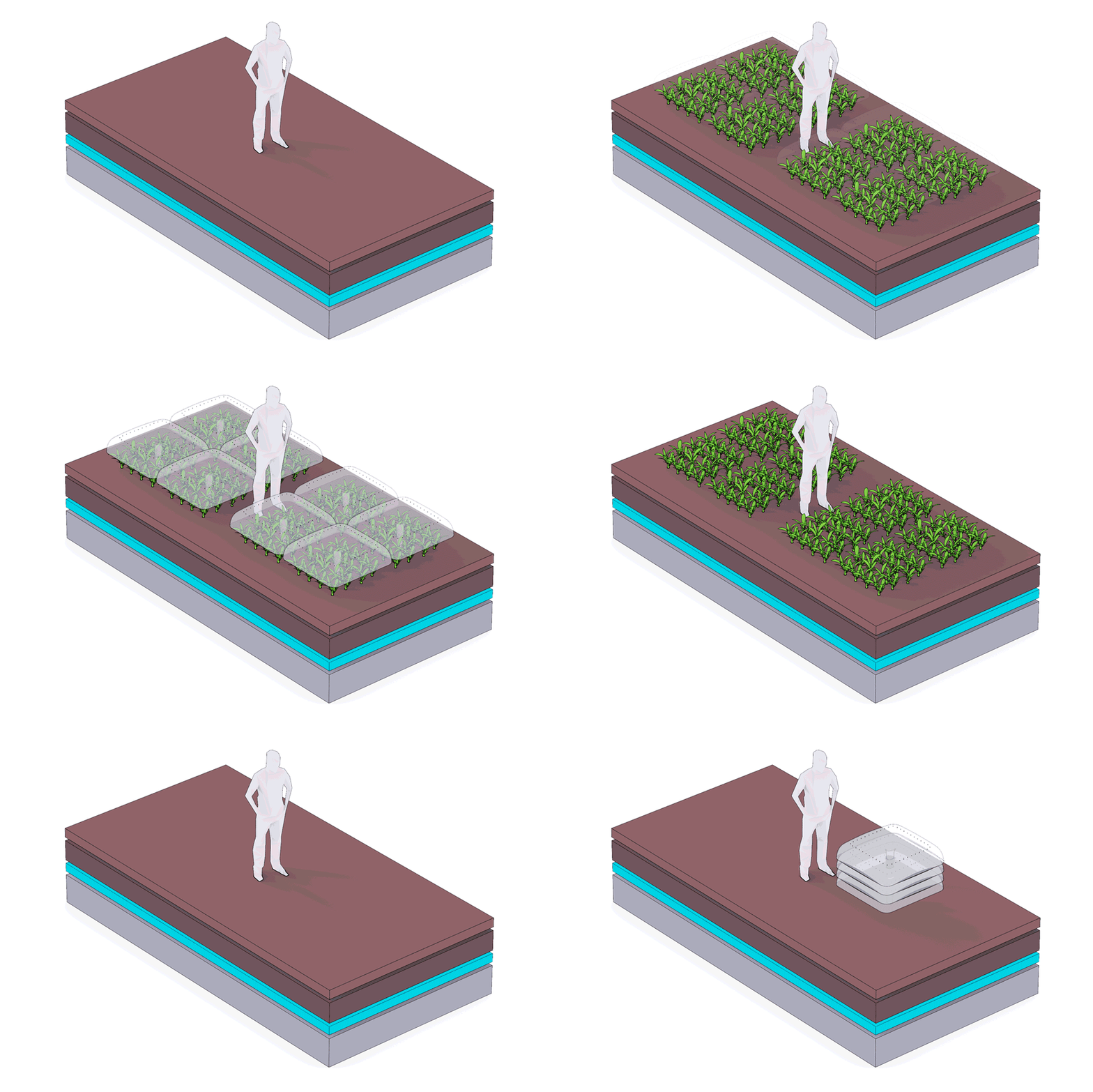
The Agrodome is environment friendly in more ways than you’d think. Sure, it creates a greenhouse-like environment for plants, enabling better growth, but it also comes made from recycled plastic waste! The Agrodome is made from PET sourced from recycled plastic bottles. The bottles are cleaned, pulverized, and remolded into these domes, which go on to help nurture plants by creating the perfect conditions required for plant-growth!

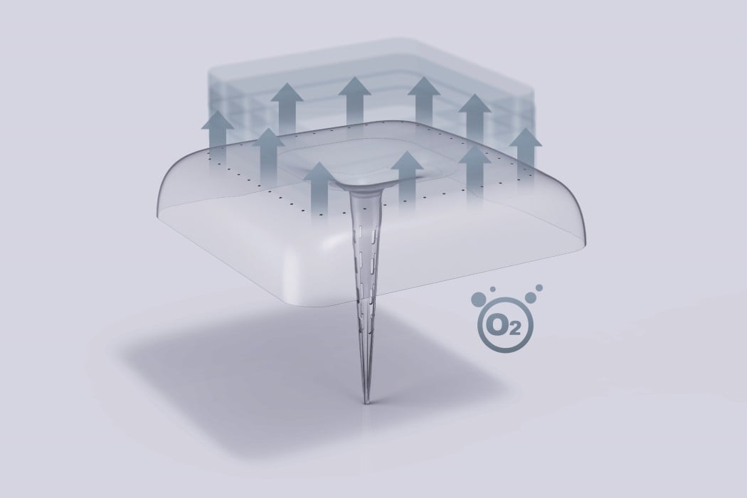
Outwardly, the dome looks a lot like a clear plastic umbrella. It comes with a dome that transforms inward into a long funnel-shaped structure. This structure is the Agrodome’s support system, and fits right into the soil, funneling water directly into the ground (whether it’s rainwater or artificially-controlled water). The rest of the dome helps mimic the effect of a greenhouse, trapping radiation from the sun to create a warmer environment on the inside, while perforations allow oxygen to vent out. The dome’s central support wedges right into the soil, and can be height-adjusted as the plant grows, creating the perfect outdoor environment for delicate saplings. This means saplings can be directly cultivated in the ground on-site, rather than being first germinated in a nursery before being transported and repotted. When the plants are all grown and self-sufficient, the Agrodomes neatly nest within each other, for easy transportation and storage!

Designer: NOS

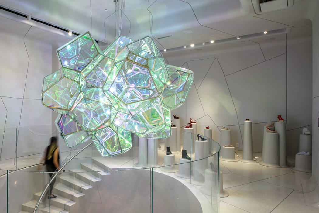
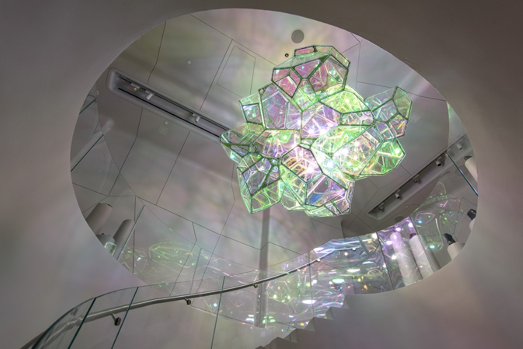
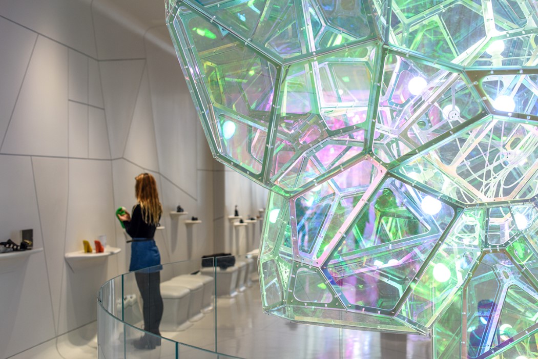
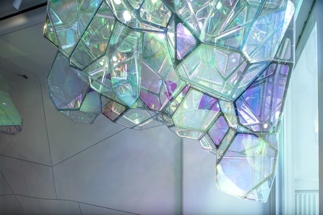
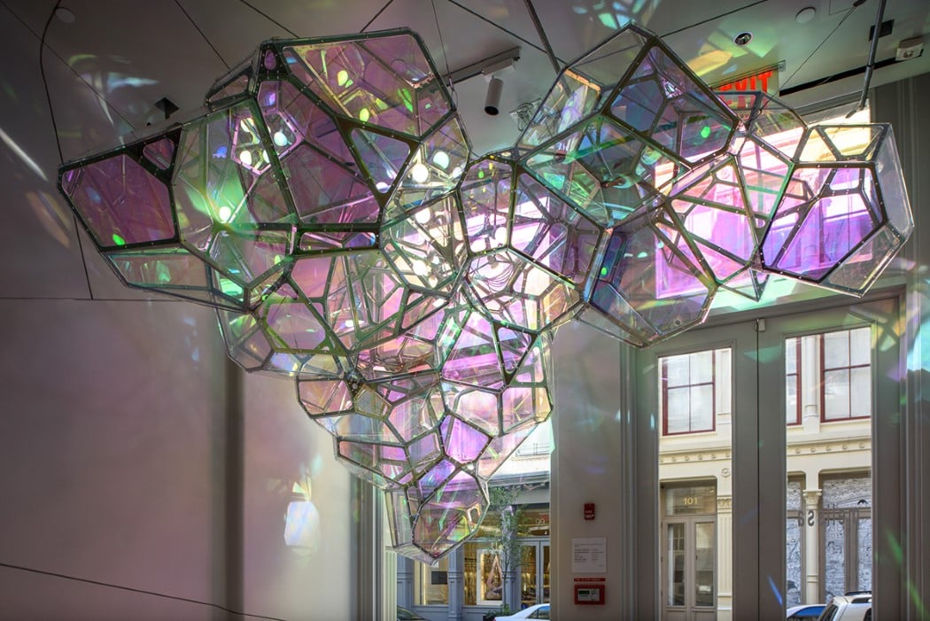
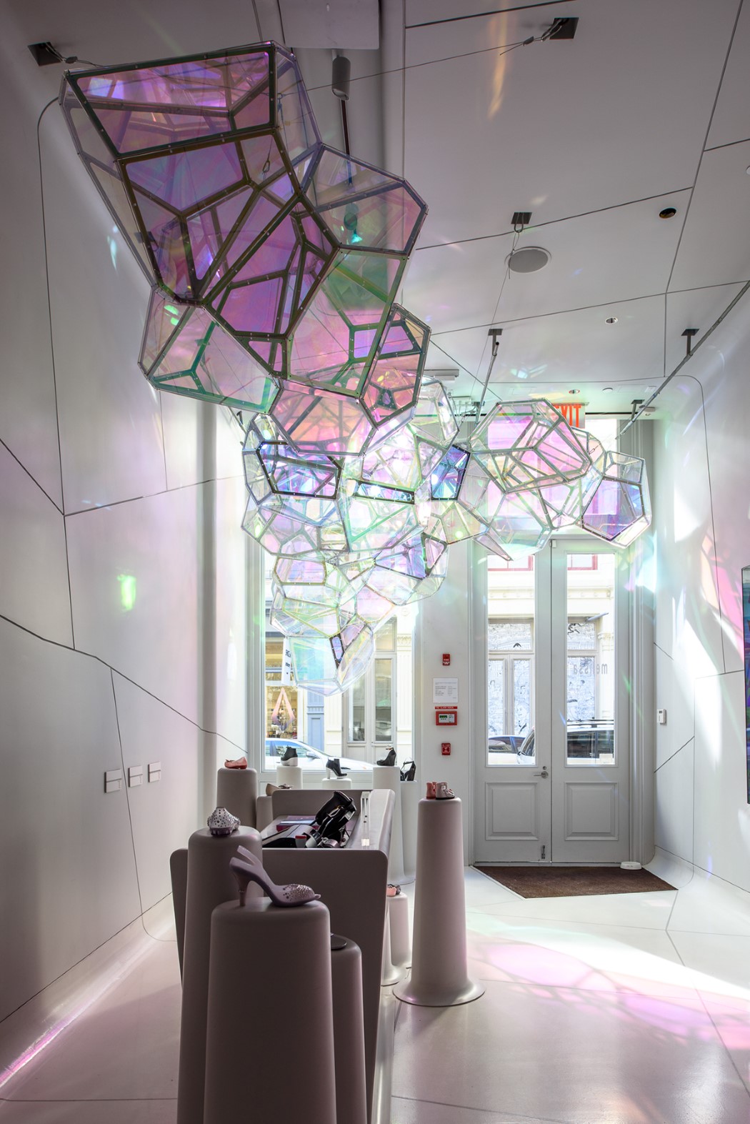
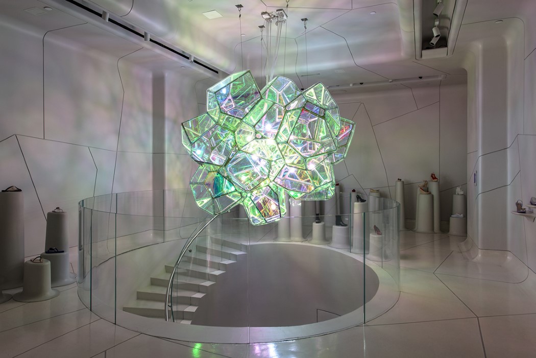
The Crystalline chandelier for Melissa’s NYC shoe store looks like a massive glowing geode

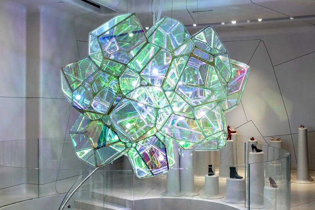
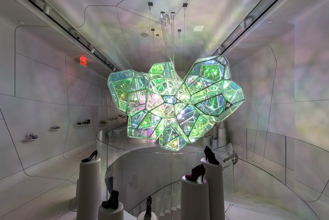
Don’t be surprised if you walk into Melissa’s flagship store in New York and you find yourself trying on less shoes and taking more pictures with the massive lighting structure hanging from the ceiling. Meet Crystalline, a lighting installation created by SOFTlab for the shoe brand’s New York outlet. Inspired by the Winter line of shoes, the lighting design looks almost like you’re inside a crystal cave, with geode formations around you.

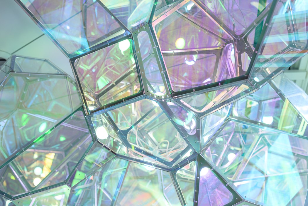
The installation hangs from the ceiling, with multiple bulbs sitting laid out in an asymmetric fashion. A thin metal frame provides the ideal framework for pearlescent acrylic panels to mounted on, making the structure look like a crystalline formation emitting a steady glow. 50 unique cells and over 400 pieces of custom cut aluminum help bring the lighting unit together, and the dichroic acrylic panels help allow the chandelier to change color as you change your viewing angle. It also casts a rainbow spectrum of colorful swatches across the store, truly making the retail experience ‘magical’!

Designer: SOFTlab for Melissa

Pac-Man Inspired Coasters: Drinka Drinka Drinka

Running around a maze with ghosts on your ass and gobbling dots all day works up quite the thirst. It’s important for a Pac-Man to keep hydrated. While Pac-Man Energy Drink is hard to come by these days, there are plenty of other thirst quenchers to choose from. Just be sure not to put it down directly on your coffee table or Ms. Pac-Man is gonna be pissed. What you need are some Pac-Man themed coasters.

The guys at SPSNOLA make these fun video game inspired coasters, also known as “Ghosters.” They come in two different versions – a colorful acrylic set that replicates the colors from the classic arcade game, and a solid hardwood version that looks a bit more substantial and classy. You can’t go wrong with either style.

Either 5-piece set will look great sitting on a table in your game room. The acrylic set sells for $24, while the hardwood set goes for $48. Just wakka wakka wakka your way over to Etsy to order your coasters now.

These Transparent Jigsaw Puzzles Are Clearly Insane

A 144-piece jigsaw puzzle doesn’t sound very difficult, does it? Now imagine that all of the pieces of the puzzle were transparent, then ask yourself the same question. Now that sounds like a challenge to me!

These see-through jigsaw puzzles are laser cut from clear acrylic, with each piece being virtually indistinguishable from the next. In addition to the fact that they all look the same, you get the added confusion of whatever the surface might be underneath the pieces messing with your perception. I’d recommend assembling this puzzle on a nice monochromatic background if you want any chance of it not driving you mad.

Etsy seller Little Flower Pot Shop is making these puzzles in four different sizes, ranging from a stupid simple 3×3  version up to a 12×12 version. They’re available for pre-order now, with prices ranging from $16.99 to $24.99, or you can get all four sizes for $69.99. They’re hoping to start shipping these out by late April.

[via Bored Panda]