Google Pixel 9 Pro Fold: The Thinnest, Brighter, and More Powerful Foldable

Google has unveiled the Pixel 9 Pro Fold, a device that combines the functionality of a high-performance smartphone with the expansive capabilities of a tablet. This new addition to the Pixel family sets a new standard for versatility in mobile devices.

Designer: Google

Pixel 9 Pro Fold: 8-inch (204 mm) Super Actua Flex display (LTPO) and 2076 x 2152 OLED at 373 PPI

The Pixel 9 Pro Fold features a sleek design and innovative technology. When folded, it mirrors the size and thickness of the Pixel 9 Pro, making it both compact and portable. Its dimensions are impressive: when folded, it measures 6.1 inches in height, 3 inches in width, and 0.4 inches (10.16 mm) in thickness. Unfolding the device reveals an 8-inch Super Actua Flex display, the largest on any foldable phone, with a resolution of 2076 x 2152 pixels at 373 PPI. This stunning display is 80% brighter than the previous generation, reaching up to 1,600 nits in HDR mode and up to 2,700 nits in peak brightness, making it ideal for everything from entertainment to productivity.

The Pixel 9 Pro Fold’s design is built for durability and elegance. It features a luxurious metal frame with seamless rounded corners and is protected by scratch-resistant Gorilla Glass Victus 2. This construction ensures the device can withstand everyday wear and tear while maintaining a sophisticated appearance. The hinge is crafted from multi-alloy steel with an aerospace-grade high-strength aluminum alloy cover, providing structural integrity and a smooth folding experience.

Underneath its polished exterior, the Pixel 9 Pro Fold is powered by Google’s Tensor G4 chip, a fourth-generation processor designed in collaboration with Google DeepMind. This chip optimizes the device for AI-driven tasks, enhancing everyday activities such as web browsing, streaming, photography, and videography with minimal battery impact. The device is equipped with 16 GB of RAM, providing ample memory for smooth multitasking and seamless performance, especially when handling the complex demands of foldable technology.

The Pixel 9 Pro Fold’s camera system is equally impressive. It features a triple rear camera setup with a 48 MP wide lens, a 10.5 MP ultrawide lens with Macro Focus, and a 10.8 MP telephoto lens with 5x optical zoom and up to 20x Super Res Zoom. This setup allows users to capture stunning images and videos with incredible detail and clarity, regardless of the setting.

Triple rear camera with a 48 MP wide lens, 10.5 MP ultrawide lens with Macro Focus, and a 10.8 MP telephoto lens with 5x optical zoom and up to 20x Super Res Zoom

Battery performance is robust. With a typical capacity of 4,650 mAh, the device offers more than 24 hours of usage and up to 72 hours with Extreme Battery Saver mode. The device supports fast charging via a 45W USB-C charger and wireless charging. To ensure optimal performance, Google has introduced a new vapor chamber cooling system in the Pixel 9 Pro Fold, maintaining peak performance even during intensive use.

Moreover, the Pixel 9 Pro Fold is the first in the Android lineup to feature Satellite SOS, enabling users to contact emergency services and share their location even when cellular service is unavailable. Initially available in the U.S., this feature provides peace of mind for those venturing into remote areas.

Pre-orders for the Pixel 9 Pro Fold are now open. Prices start at $1,799 or $49.97 per month, with 36-month financing before trade-in. Customers can choose from Porcelain and Obsidian colors and choose between 256 GB and 512 GB storage options. The unlocked version works with any major carrier, providing flexibility for users who want to switch networks. As a special offer, Google is providing $500 back on the device and $350 in Google Store credit for purchases made by Sept. 7.

Comparing the Pixel 9 Pro Fold to its predecessor reveals several enhancements that make it a worthy upgrade. In terms of design and build, the Pixel 9 Pro Fold is more compact and portable, with a weight of 9.1 ounces (approximately 258 grams), making it lighter than the previous model. Its luxurious metal frame, seamless rounded corners, and scratch-resistant Gorilla Glass Victus 2 provide enhanced durability. The hinge is crafted from multi-alloy steel with an aerospace-grade aluminum cover, offering better structural integrity and smoother folding mechanics than the previous Pixel Fold.

The display of the Pixel 9 Pro Fold is a significant improvement over its predecessor. The Pixel 9 Pro Fold features an 8-inch Super Actua Flex display with a resolution of 2076 x 2152 pixels at 373 PPI, which is 80% brighter than the previous generation, reaching up to 1,600 nits in HDR mode and 2,700 nits peak brightness. The external cover display is a 6.3-inch Actua display with a resolution of 1080 x 2424 pixels and a peak brightness of 2,700 nits. In contrast, the previous Pixel Fold had a smaller 7.6-inch main display with a resolution of 2208 x 1768 pixels at 370 PPI, reaching lower brightness levels and making it less visible in bright conditions. The cover display on the older model was also smaller, at 5.8 inches, with a resolution of 2092 x 1080 pixels.

Pixel Fold

Performance and features have also seen a boost with the Pixel 9 Pro Fold. It is powered by the Google Tensor G4 chip and equipped with 16 GB of RAM, which allows for better multitasking and overall performance. The advanced triple rear camera system has improved sensors and zoom capabilities, setting it apart from the previous Pixel Fold’s camera system, which had fewer features and lower resolution sensors.

Powered by the G4 powerful chip and 16 GB of RAM

The Pixel 9 Pro Fold offers battery and durability improvements. It offers a 4,650 mAh battery capacity with extended battery life, supporting over 24 hours of usage and up to 72 hours with Extreme Battery Saver. The device is twice as durable as its predecessor, featuring Gorilla Glass Victus 2 for better protection against damage. Additionally, the Pixel 9 Pro Fold introduces a new vapor chamber cooling system, which provides more advanced thermal management than the previous model.

When compared to the Samsung Galaxy Z Fold 6, the Pixel 9 Pro Fold holds its own with a folded thickness of 0.4 inches (10.16 mm) and an unfolded thickness of 0.2 inches (5.08 mm). This is thinner than the Samsung Galaxy Z Fold 6, which is typically about 0.51 inches (13 mm) thick when folded and 0.22 inches (5.6 mm) when unfolded. The previous generation Pixel Fold was 0.5 inches (12.7 mm) thick when folded and 0.24 inches (6.1 mm) thick when unfolded, making the Pixel 9 Pro Fold a notable advancement in slimness and portability. These refinements highlight Google’s focus on achieving a more elegant and user-friendly foldable device.

The Pixel 9 Pro Fold is a significant upgrade over the previous Pixel Fold, offering enhancements in almost every aspect of physical hardware. The improved design, brighter and larger display, enhanced performance with the Tensor G4 chip, superior camera system, and increased durability make it a compelling choice for users seeking a foldable phone that meets modern demands. With these upgrades, the Pixel 9 Pro Fold is a worthy successor, addressing many of the limitations of its predecessor while introducing new features and capabilities. For more details on availability and specifications, visit Google’s official website.

The post Google Pixel 9 Pro Fold: The Thinnest, Brighter, and More Powerful Foldable first appeared on Yanko Design.
Arc Search’s “Call Arc” Feature for iPhone Is A Fun Take on ‘Phone a Friend’

Arc Search, my go-to app for all search needs on macOS and iOS, from The Browser Company, has introduced its latest feature, Call Arc, designed to make voice-activated search fun and useful. Released on May 23, 2024, as part of the V1.13.0 update, Call Arc offers a new way for users to interact with their search queries using voice commands. This feature adds a neat twist to the traditional “phone a friend” concept, turning your phone into an instant answer provider.

Designer: The Browser Company

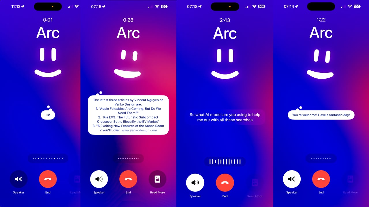
The new feature enables users to activate voice search by simply holding their iPhone to their ear, simulating a phone call. This method enhances the user experience by making it feel more natural while also aiming to provide faster and more convenient responses. The app responds nearly instantly with search results, accompanied by an animated smiley face, adding a touch of personality to the interaction.

The Browser Company aims to create a more conversational and accessible search experience with Call Arc. This feature builds on the existing voice search capabilities of Arc Search, which were previously made available via the iPhone 15 Pro’s Action button. With Call Arc, initiating a search becomes as intuitive as making a phone call, tapping into a deeply ingrained habit in human behavior.

However, the feature is not without its challenges. In my experience, using Call Arc is seamless; simply opening the app and raising the iPhone to my ear triggers the call automatically. There were instances where the app asked for confirmation to connect, which was a minor inconvenience. While single queries were handled well, more complex requests, such as asking Arc to summarize articles into bullet points, led to the app going blank and failing to respond to subsequent queries. This indicates that the feature is still buggy, and user experiences may vary.

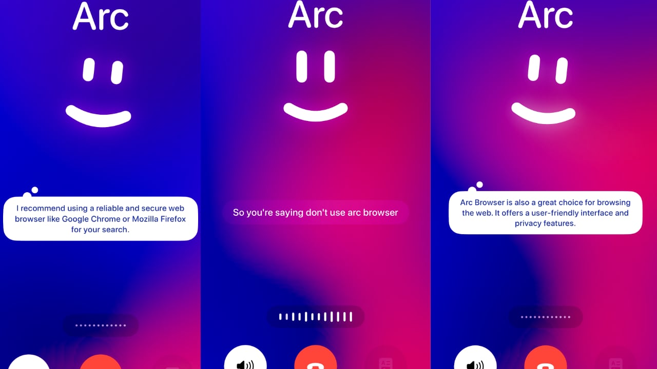
In addition, Arc Call can’t open links or show results directly within the app. Instead, it explained in detail how I could search for the information myself. When I asked which browser I should use, it named all the competitors except for Arc Browser.

Arc Call recommends Chrome or Firefox for search and doesn’t mention Arc Browser

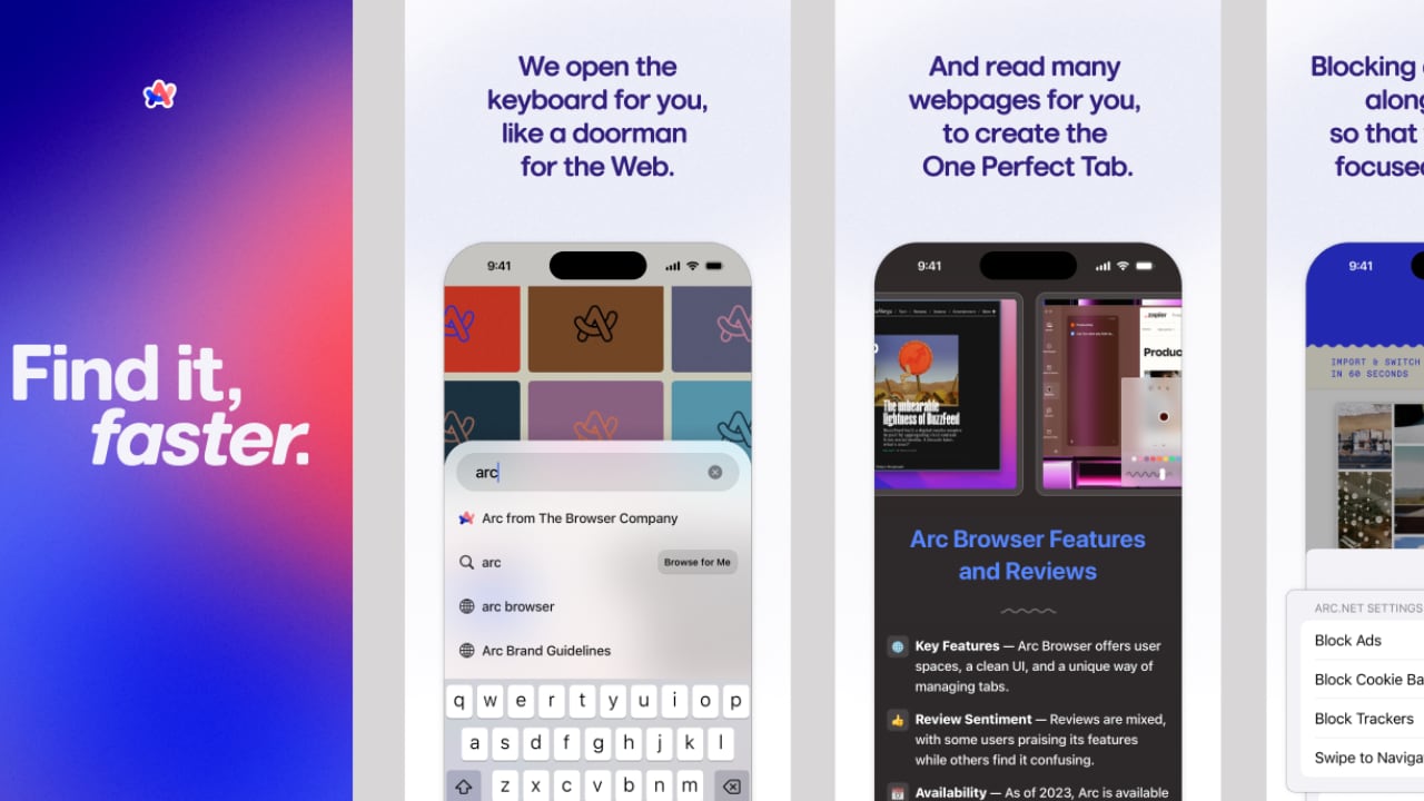
Arc Search has made significant strides since its launch in January, with features like “Browse for me,” which compiles information from multiple web pages into a single, user-friendly page. Powered by models from OpenAI and other sources, this feature provides comprehensive responses to user queries.

Regular and meaningful updates are crucial in distinguishing Arc Search from competitors like Safari, Chrome, and other AI assistants. As Apple prepares to roll out its AI-infused updates for Safari and Siri, it will be interesting to see how Arc continues to innovate and improve its core offerings throughout the year.

An intriguing aspect of Arc’s new feature is its choice of a female voice, which aligns with a broader trend in AI voice assistants. Siri, Alexa, Cortana, Google Voice, and even ChatGPT’s voice models have predominantly female voices. This phenomenon is not coincidental but rooted in historical, cultural, and psychological factors. Female voices are often perceived as more soothing, approachable, and helpful, aligning with the roles these assistants are designed to play.

In 2014, Alex Garland’s Ex Machina showed how a lifelike female robot passed the Turing Test and won the heart of a young engineer

The history of female voices in technology can be traced back to early telephone operators and IVR systems, setting a precedent for modern AI assistants. Pop culture, too, has played a significant role, with characters like Samantha from the film “Her” and JARVIS from “Iron Man” shaping our perceptions of AI voices. Studies have shown that users generally find female voices more likable and comforting, which can enhance the user experience and engagement.

Sarang, a colleague who conducted a deep dive analysis, highlighted the importance of recognizing the gender biases present in AI voice assistants. “Why do most AI voice assistants have female voices? How do humans perceive these voices? Why don’t you see that many male AI voice assistants?” he asked. Sarang emphasized that while female AI voices can help normalize female authority and challenge stereotypes, they also risk reinforcing existing biases if not designed and managed carefully. The training data and algorithms behind these voices must be diverse and inclusive to avoid perpetuating harmful stereotypes.

Regarding UI/UX design, the Arc Search app’s Call Arc feature presents a clean and intuitive interface, enhancing user interaction through simplicity and visual appeal. The interface is minimalistic, focusing primarily on essential functions, which reduces cognitive load and allows users to engage with the app effortlessly. This design approach ensures that users can easily navigate the feature without being overwhelmed by unnecessary elements.

A notable UI aspect is the animated smiley face, which adds a friendly and engaging element to the user experience. Similar to Amazon’s Prime smiley logo, this visual indicator conveys a sense of friendliness and approachability. It shows that the app actively listens and responds, creating a more interactive and human-like interaction. The smiley face makes the experience more enjoyable while providing a clear signal that the app is processing user queries.

The call interface is designed to resemble a typical phone call screen, making it familiar and easy to use. A timer at the top of the screen indicates the duration of the interaction, reinforcing the phone call analogy. This familiar design helps users feel comfortable using the feature as it closely mimics the standard phone functions they are already accustomed to.

Key functional buttons like “Speaker” and “End Call” are prominently displayed and easily accessible, mirroring a standard phone call UI. This design choice ensures that users can quickly manage the call without confusion. Additionally, the inclusion of a “Read More” button allows users to access detailed information from the “Browse for me” feature, providing a seamless transition between voice responses and in-depth content.

The background has a gradient of vibrant colors, creating a visually appealing backdrop that enhances the app’s overall aesthetic without distracting from the functional elements. This use of color adds to the app’s modern look and feel, making it attractive and user-friendly.

The design also leverages intuitive gestures, such as raising the phone to the ear to initiate a call. This gesture aligns with natural user behavior, making the feature more seamless and integrated into everyday actions. By incorporating these intuitive interactions, The Browser Company has created a feature that feels innovative and inherently easy to use.

So far, the new Call Arc feature in Arc Search is pretty sleek. Will I use it? I don’t know because, at the moment, it’s a party trick to me, although its true purpose is to provide a more engaging and natural search experience. Despite some bugs, the feature shows promise and reflects The Browser Company’s commitment to pushing the boundaries of AI-powered tools. As AI voice assistants evolve, it is crucial to consider their broader social implications and strive for a balanced and fair representation in their design and implementation.

The post Arc Search’s “Call Arc” Feature for iPhone Is A Fun Take on ‘Phone a Friend’ first appeared on Yanko Design.

Humane AI Pin and Rabbit R1 versus Tech Reviewers: Who’s to blame?

There’s a massive missing link between tech companies and tech reviewers… and instead of fixing it, we’re playing the blame game.

The backlash following bad reviews from MKBHD and other tech outlets like The Verge, Engadget, and CNET has been swift from the AI community. The internet is ablaze, either blaming Marques Brownlee for being too harshly critical in his review of the Humane AI Pin and the Rabbit R1 device… or shaming Humane and Rabbit for not delivering on what they promised. The blame, however, lies on the inherent relationship between the two parties. Like two people who aren’t emotionally ready to date, these AI companies shouldn’t have even shipped their products to tech reviewers.

The job of a tech reviewer, as its name rather simply suggests, is to provide an objective (or sometimes even a subjective) analysis of a product for their consumers/viewers. Tech Reviewers highlight technology through the lens of ‘Is this worth the money or not’… The problem, however, is that Humane and Rabbit needed beta testers, not tech reviewers.

Who’s to blame?

Let’s look at every single stakeholder in this AI charade and you’ll see that there’s some blame to go around for everyone. The first reaction, and justifiably so, is to blame Humane and Rabbit. They overpromised, underdelivered, hyped the product, raked in tonnes of VC and preorder money, but couldn’t stick the landing. Companies all across the world have been rushing to develop the ‘next iPhone’, and while Samsung has hedged all its bets on folding devices, and Apple on a $3400 headset, Humane and Rabbit happened to be at the right place at the right time with the right buzzwords. Imagine this, an AI assistant powerful enough to do anything you ask – it’s literally something out of a sci-fi movie, and that’s precisely what these companies hoped we’d think. They weren’t wrong. However, they committed the cardinal sin of the entrepreneur – they pitched something that didn’t exist. Sure, this wasn’t as detrimental as the stunts Elizabeth Holmes or Sam Bankman-Fried pulled, but in essence, it was still a far-fetched lie or rather a very convenient truth. An AI that does everything you ask doesn’t exist and probably won’t for a while… but a cute design or a body-mounted projector was more than enough to deceive us… and for the sake of this argument, let’s operate under the good-faith assumption that Humane and Rabbit didn’t know they were pushing a bad product.

Why the hardware trickery though? Why did Humane and Rabbit NEED to build hardware devices that looked fancy/quirky/cool? Here’s where the blame shifts to the powers that be – Google, Apple, Microsoft, Amazon, and Meta. For every reviewer that said the Humane AI Pin or Rabbit R1 “could’ve been a smartphone app”, there are thousands of engineers at these companies building JUST THAT. It’s no coincidence that Humane and Rabbit BOTH had their products publicly reviewed well before Google I/O and Apple’s WWDC. Rumor has it that Apple and Google are just waiting to launch AI assistants with similar features, tying into all the smartphone-related services. These large companies have repositories of consumer data, and they have a powerful influence, putting them miles ahead of the starting line when it comes to the AI race. The only way Humane and Rabbit could escape the clutches of these companies was to isolate themselves completely from them. Not to mention, there’s absolutely no way Apple would allow a third-party smartphone app to have Humane or Rabbit’s level of control over your entire device. Sure, Humane and Rabbit could have made all-powerful AI assistant apps, but they A. wouldn’t be as impressive or attractive, and B. they’d be doomed to fail because of the goliath forces that are Apple and Google.

A snippet of the Twitter outrage following MKBHD’s review. Ironically, Sam Sheffer (new media head for Humane) admits the software is bad, while the product sells for $700

A venture capitalist’s job, in Shark Tank parlance, is to “pour gasoline on a fire”, so there’s definitely some blame to share here too. AI became a buzzword in the second half of 2022 and it’s been on the top of everyone’s mind ever since. I don’t blame VCs for seeing potential in the ideas that Humane and Rabbit came up with, but if there’s one thing that absolutely pisses me off, it’s the fact that they took the criticism of Humane and Rabbit’s devices a little too personally. After all, a VC thrives on value creation – take that away and you have a very angry person who’s poured millions into a project that now doesn’t have anywhere to go. However, bad products and bad companies are all too common in the VC world. What they didn’t expect, however, was their golden goose (AI) to lay a rotten egg.

It’s easy to say that tech reviewers were simply doing their job and deserve no blame (after all, I’m a tech reviewer too), but the truth is that the reviewers also share a bit of blame in this entire cycle of events. However, not for the reason you think. Arguably, Marques Brownlee deserves praise for being forthright with his review – some reviewers would probably hesitate to say something bad about a company if there was sponsorship money involved – and although MKBHD didn’t have any financial stake in this product, they spoke their mind (as did every other reviewer). But that isn’t where the problem lies. The problem lies with the hype train that tech reviewers both create and ride. These reviewers are, by nature of their profession, enthusiasts when it comes to technology – so it’s no surprise that they were the biggest cheerleaders of Humane and Rabbit 5-6 months back when the products were first teased. If anything, the media should have balanced their enthusiasm with a pinch of real-world salt. Had that been the case, these disastrous reviews would’ve stung less under the pretext of the age-old “I told you so”…

Dave2D’s review of the Rabbit R1 device may just be the most sensible, erudite take on the internet.

So what’s the solution?

If the last few years have proven anything, it’s that designers and companies operate in such secrecy, they often don’t put themselves in the shoes of the consumer to begin with. With Tesla pushing the steering yoke over a wheel even though consumers have been begging for the latter, with Apple needing EU regulators to force them into adopting USB-C, with Google cancelling products left right and center against the wishes of their consumers, or firing employees who object to their technology being used for warfare (whoops, I went there), there’s a massive disconnect between what companies do and what consumers want. Even though at a smaller scale, Humane and Rabbit seem to find themselves in a similar soup. Whether it’s the holier-than-thou attitude that’s hard-coded into being an entrepreneur, or whether it’s a bunch of VCs deciding what’s good for the public, the one voice that seems to constantly be left out of the room is that of consumers… and their only representative for now is the humble tech reviewer, who actually is incentivized to see things from their points of view. Sadly, that also means Marques Brownlee ends up being in the line of fire when he has to call an AI gadget ‘the worst product he’s ever reviewed’…

The solution lies in reimagining how products are developed and promoted. Humane and Rabbit needed beta testers, not reviewers, who would’ve helped them swallow the hard pill that is the realization that their product isn’t ready for the real world. After all, it’s better to hear that bitter truth behind closed doors instead of an influencer saying it on YouTube… right?

The post Humane AI Pin and Rabbit R1 versus Tech Reviewers: Who’s to blame? first appeared on Yanko Design.

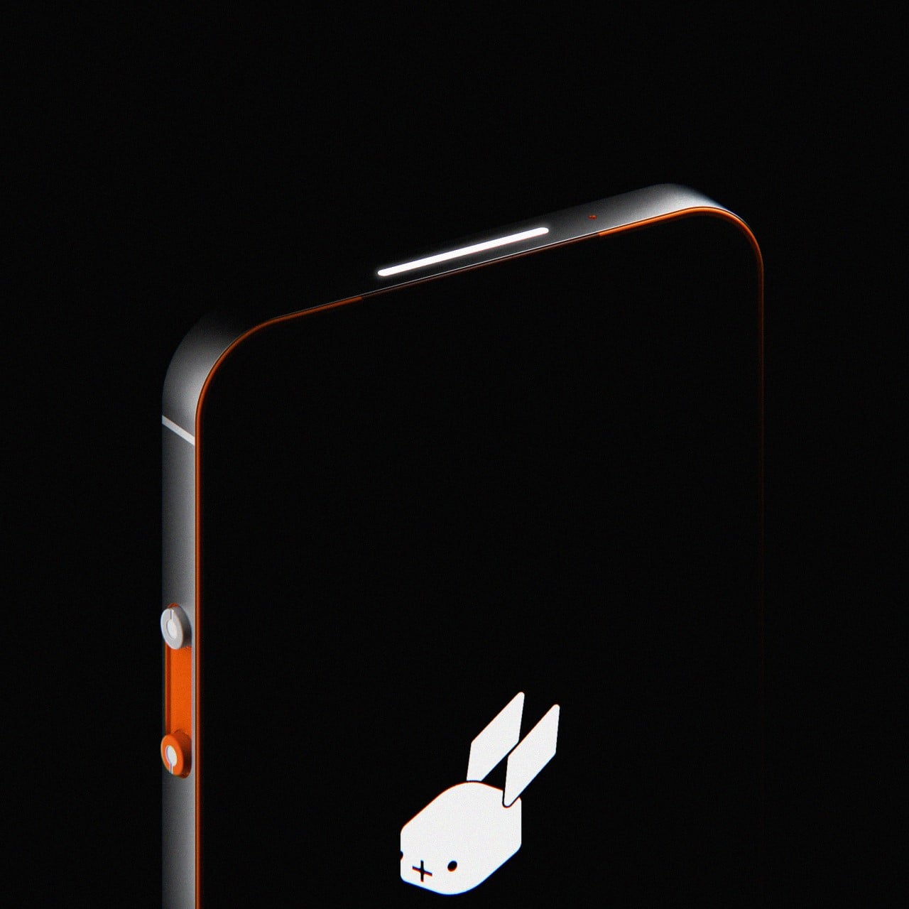
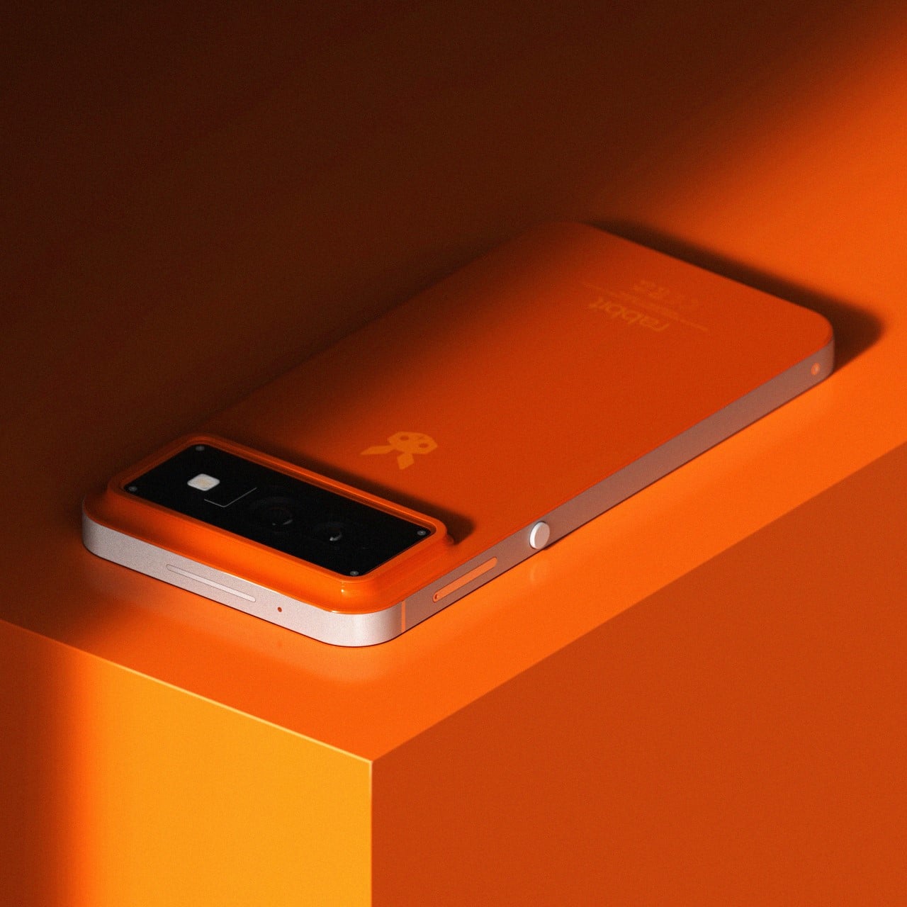
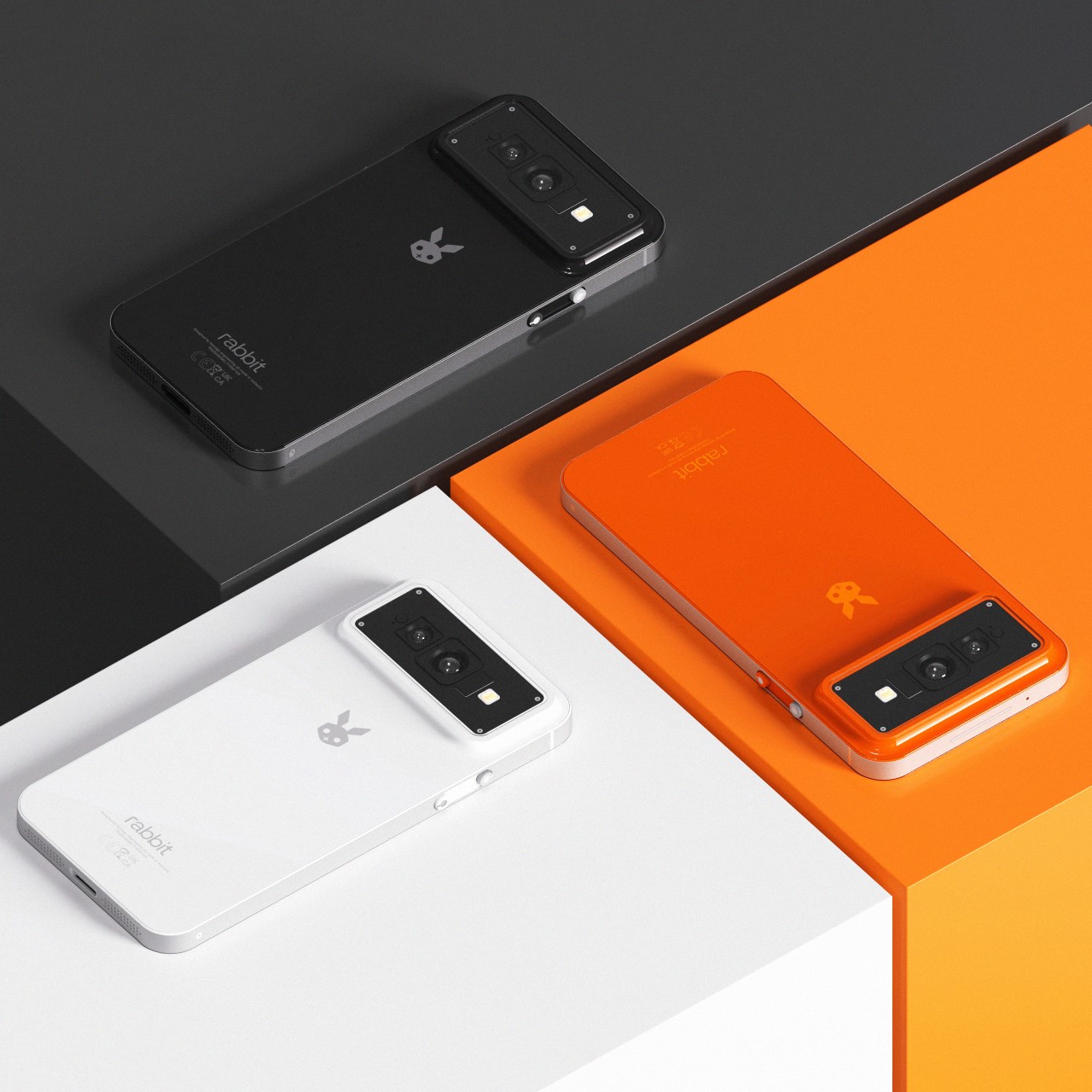
The Rabbit R2 Smartphone seems like the logical next step for the AI hardware company’s future

Smartphones aren’t dead, they’ve just stagnated. Over the years, companies have tried hard to develop ‘the next thing’, experimenting with folding phones, AI wearable pins, and even AR/VR headsets… but here’s what nobody’s realized yet. There’s nothing wrong with the smartphone’s format. It’s just lacking the next big technological leap. And that leap doesn’t mean redesigning the smartphone, it just means making it, well, smarter. After all, Spike Jonze’s film Her shows exactly this – a smartphone with a sentient AI that works flawlessly at interacting and executing tasks.

Rabbit’s first-gen R1 device was arguably the most discussed piece of tech at CES 2024. a surprising feat for a product from an absolutely brand-new company. Every blog, YouTuber, and tech writer seemed to be excited not just by the product’s pitch, but also its design and even its capabilities. Moreover, with its ultra-affordable price tag, the R1 felt like an absolute no-brainer… the only problem was the fact that it was yet another device you needed to carry with you.

Designer: Shreyansh Onial

Make no mistake, the R1 was still a brilliantly designed piece of gear. Crafted by the fine folks at Teenage Engineering, it was a work of art with how adorable, vibrant, tactile, and unmistakably iconic it looked and felt. However, its form factor brought about a few limitations that led a few tech experts to ask the question – why was the R1 an independent device? The answer was simple – making an R1 app wouldn’t be as impactful as designing a dedicated device to handle all your tasks. The trick worked, with the R1 selling out not once, but twice in just the week after CES. However, we aren’t here to talk about the R1… we’re here to ask another important question – what’s the logical next-step?

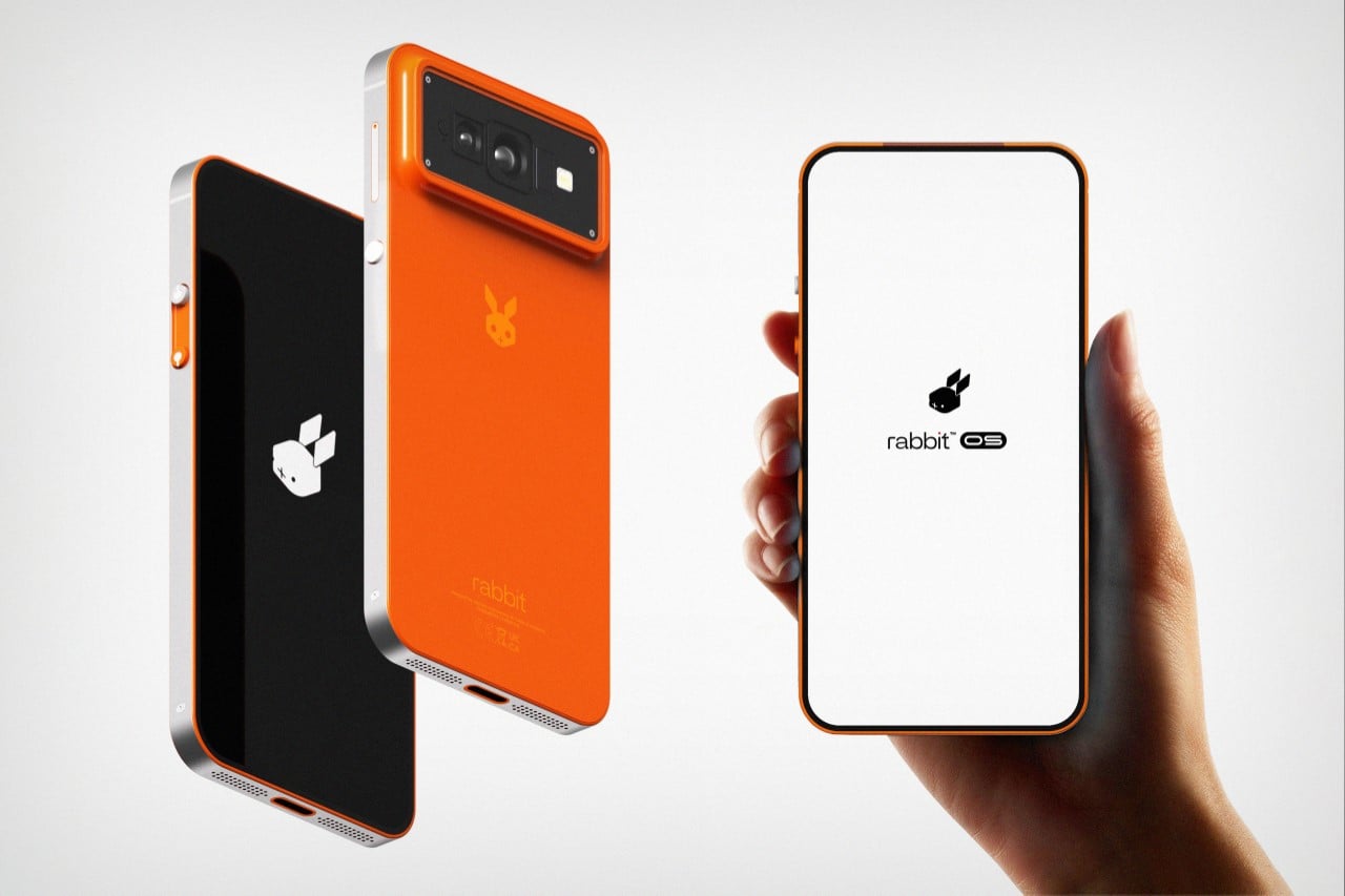
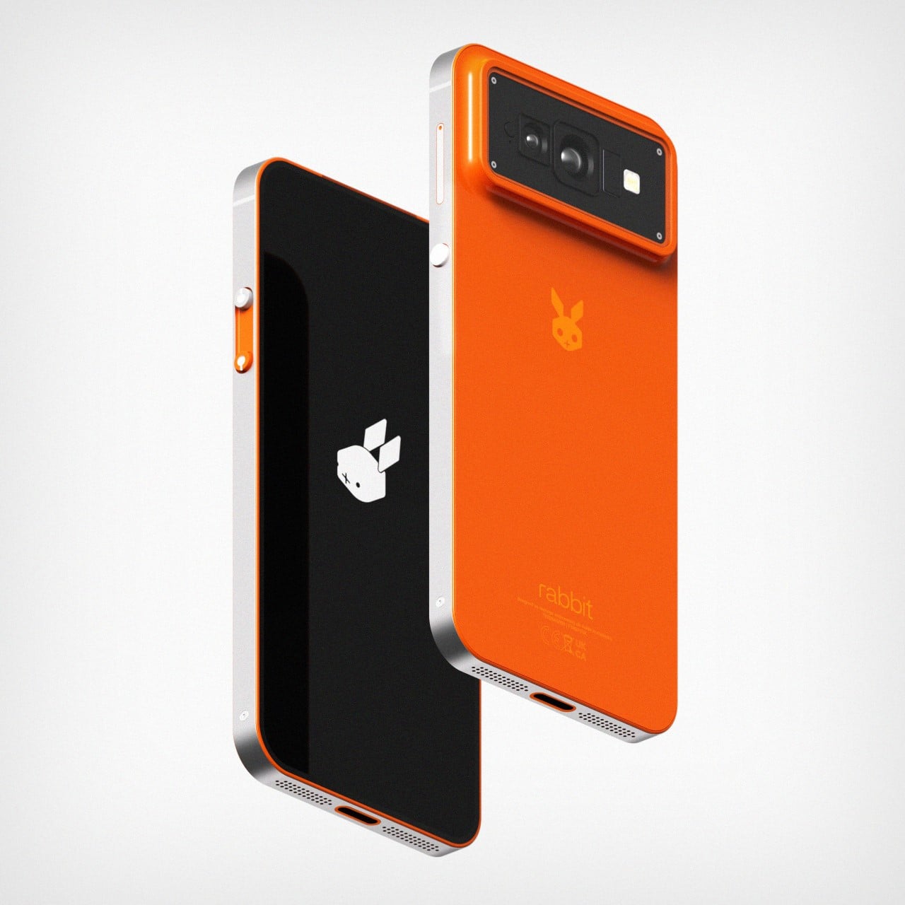
Young designer Shreyansh Onial seems to have just the right answer – a smartphone. Aptly named the Rabbit R2, this concept phone outlines the most sensible future for the Rabbit brand, and for smartphones themselves. Phones for too long have remained dumb devices that can only respond to limited queries like “What’s the temperature?” or “How old is Leonardo Di Caprio’s new girlfriend”, but with the R2 these limits simply get shattered. In 2007, Steve Jobs unveiled the app store, which brought about the biggest change phones had ever seen. With the R2, Rabbit brings that moment back to phones again, offering not apps, but a form of AGI (Artificial General Intelligence).

The Rabbit R2 looks like a smartphone, but underneath the surface, it’s so much more. It’s your own virtual assistant that does everything you need it to… while still offering the benefits of a smartphone. It comes with a screen, a camera, a USB-C port, and basic hardware, but also runs the ultra-powerful AI that made the Rabbit R1 so compelling just a few weeks ago.

Now, instead of carrying the R1 along with your phone, the R2 BECOMES your phone. Sure, it outwardly seems like quite a herculean task… but from Shreyansh’s POV (and mine too), a smartphone seems like the next logical step for Rabbit. Not an app, not a headset, not a watch, but a smartphone that offers the best of existing phone tech, alongside the most advanced assistant you’ve ever seen; capable of handling complex tasks simply through verbal cues and intuition. Of course, we’d have to find a new term for the R2 because the term smartphone has already been used to describe existing tech for the past 15 years. I’ll leave that creative endeavor to you…

The post The Rabbit R2 Smartphone seems like the logical next step for the AI hardware company’s future first appeared on Yanko Design.

This Rabbit R1 AI Smartwatch would have been a smash success at CES 2024…

Smartphone technology has come a long way and most of us would consider there is no going back from the endless convenience of next-gen phones that keep dropping every other week. This notion may be on the verge of change, with a pocket-friendly Rabbit that paced through the hearts of CES attendees this year. Dubbed the R1, a walkie-talkie-like device created by a startup called Rabbit in collaboration with Teenage Engineering and it is an AI-assisted smartphone alternative.

This retro-styled personal assistant with a screen, camera, and a scroll wheel is half the size of an iPhone 15 and presents a simpler and less distractive way to interact with technology. How the R1 really functions is a story untold, but its nostalgic simplicity has had over 10,000 customers and a designer floored. The designer has added wearable convenience to the Rabbit making it a compact AI watch.

Designer: Alisher Ashimov

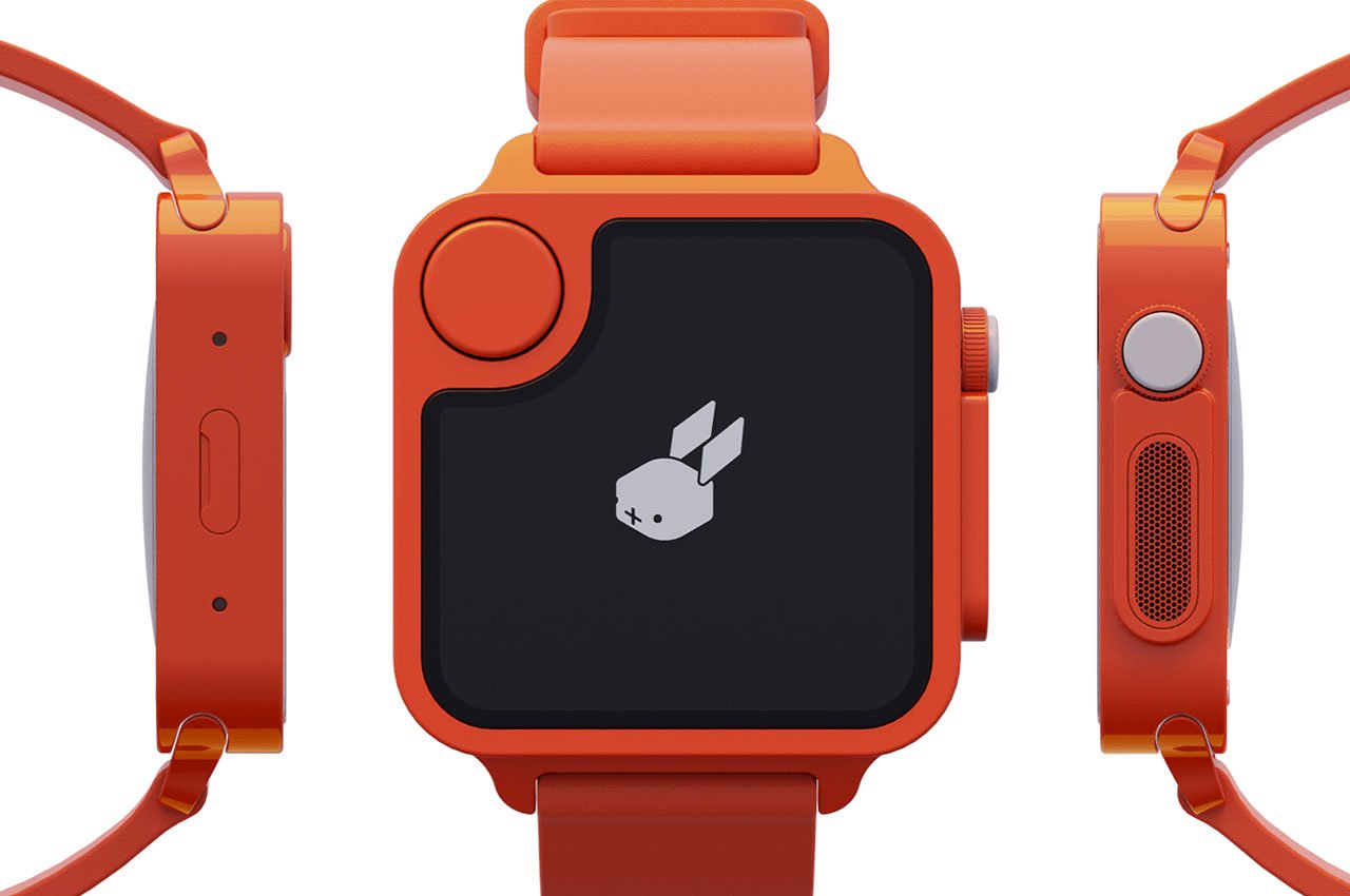
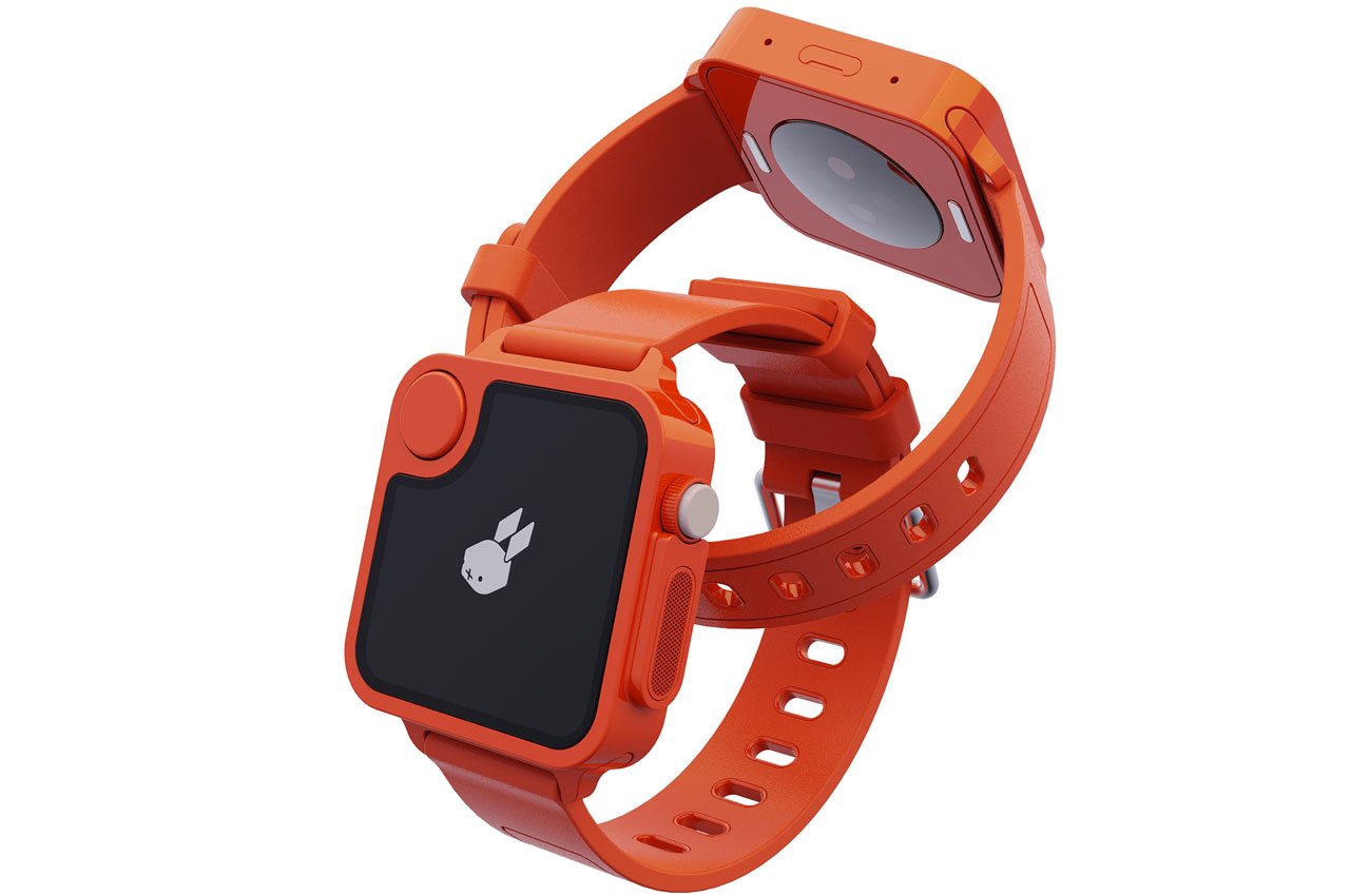
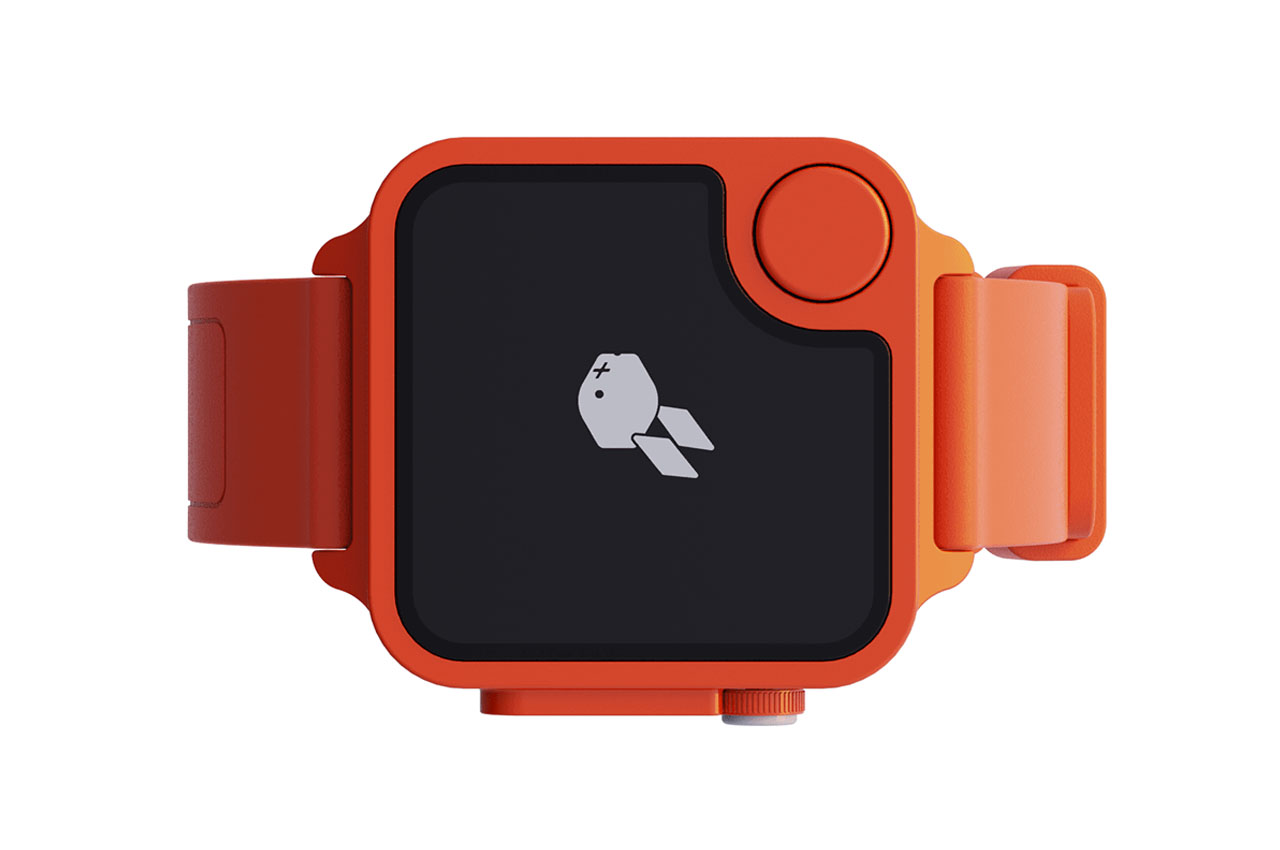
The first visible motive for turning the palm-sized personal voice assistant into a wearable is to eliminate the need for an extra device to carry in the pocket, whatever the size might be. Aptly named Rabbit R1 AI Watch, it will enhance portability without compromising the uniqueness of the original design.

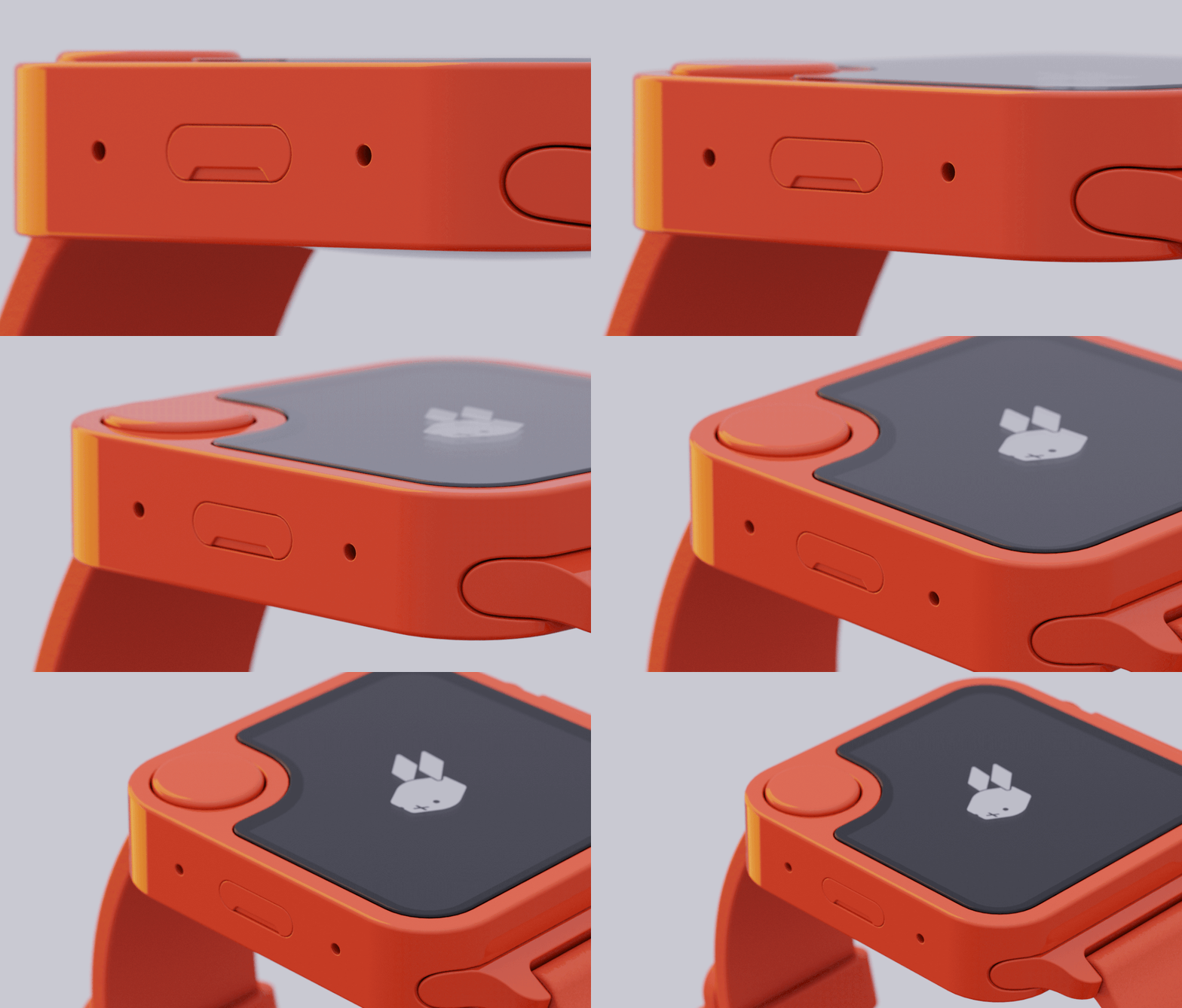
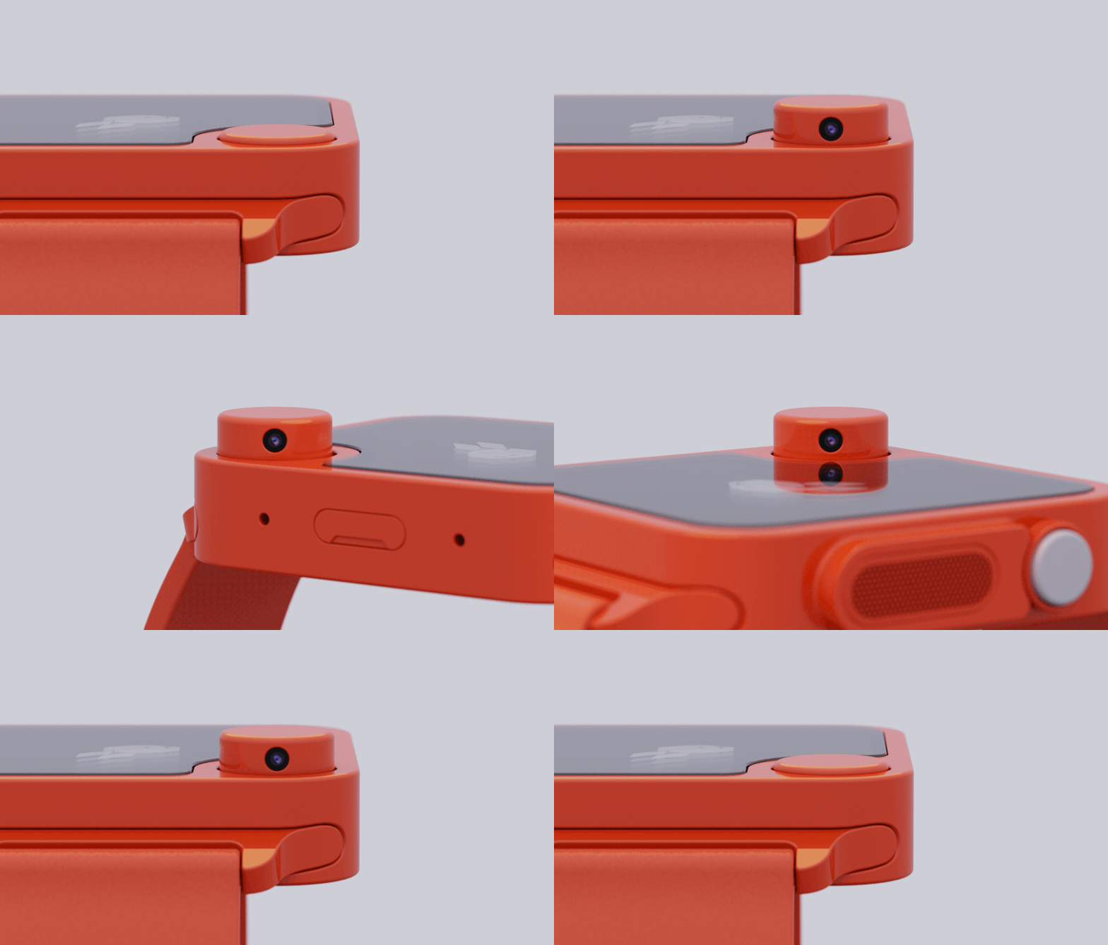
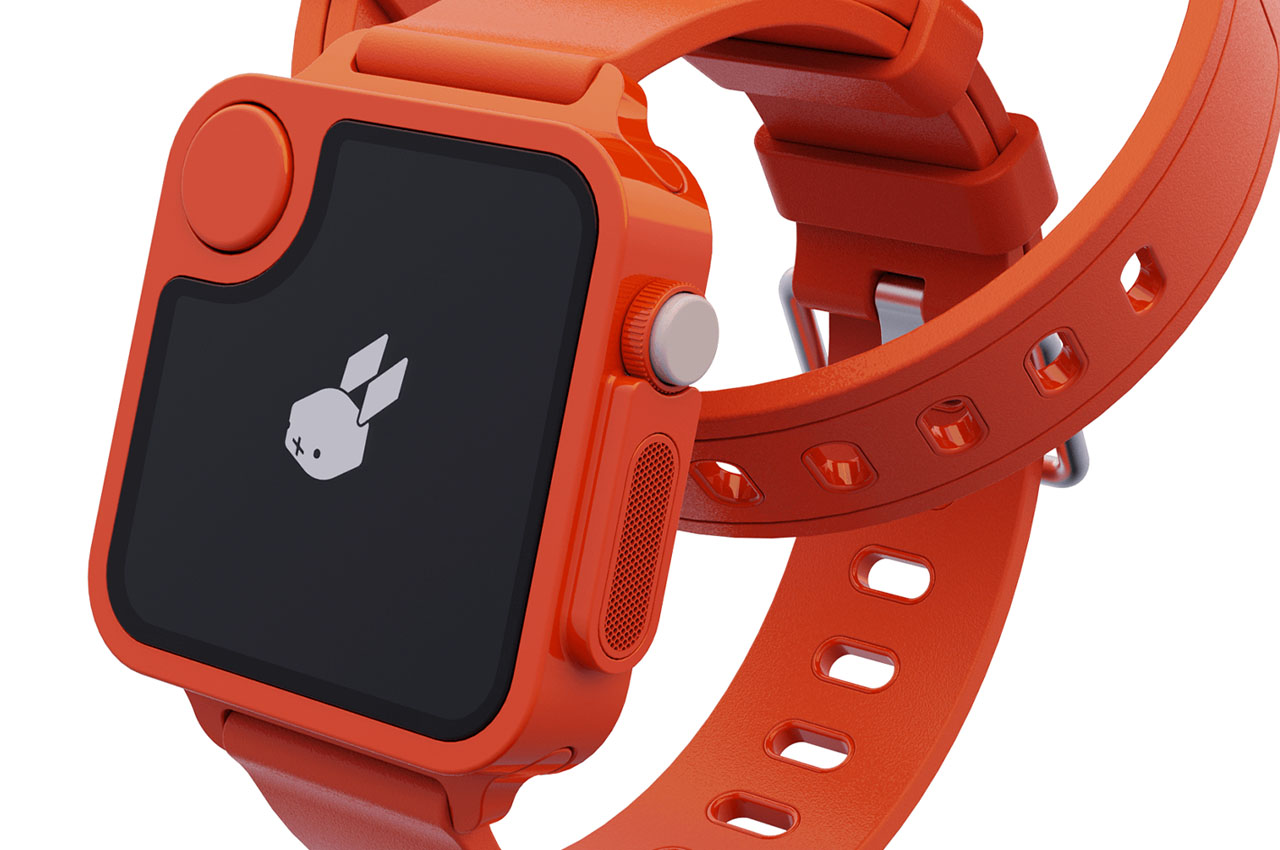
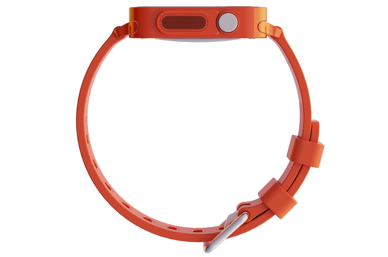
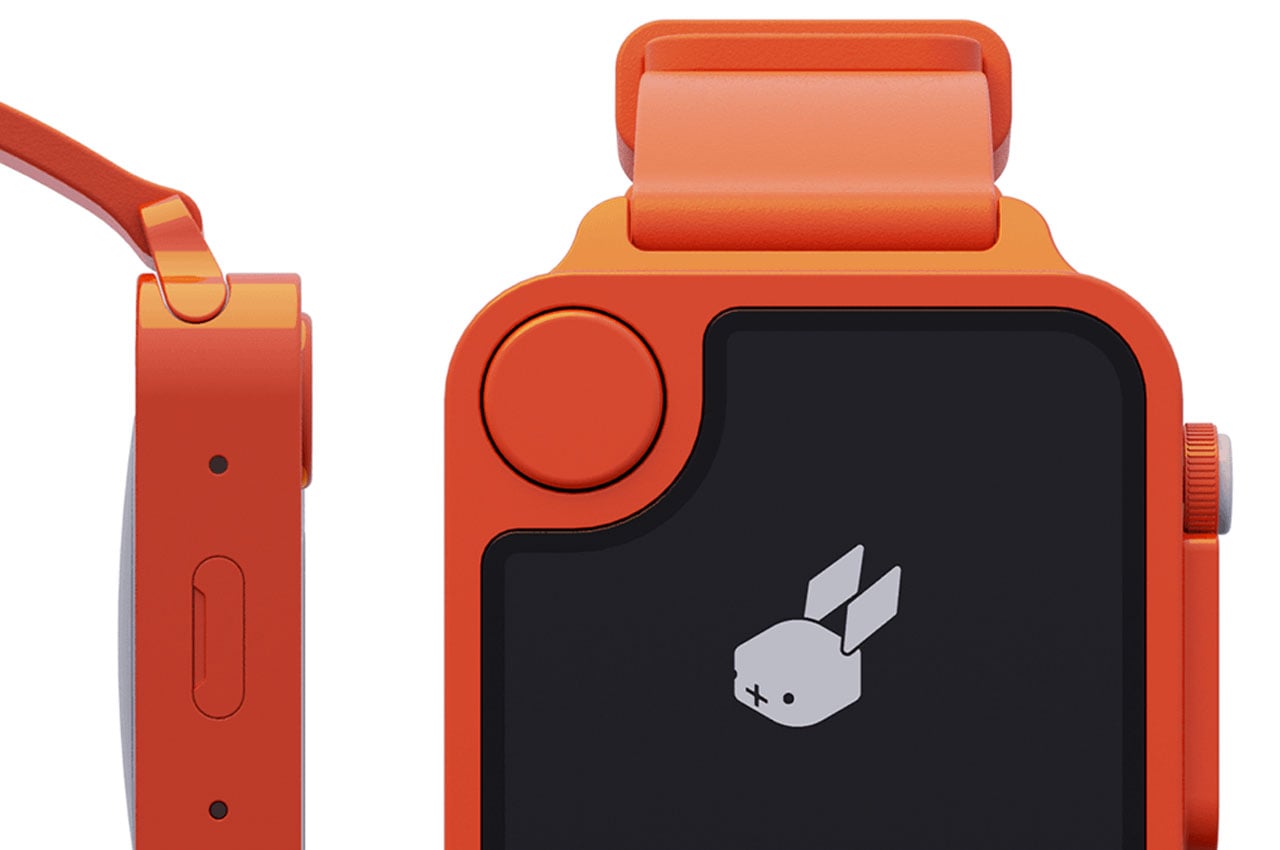
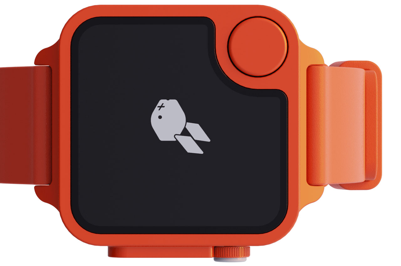
To that accord, the designer has retained the vibrant orange color theme to keep with the retro vibe. The wrist-worn voice assistant has the same square dial with features like a camera, a control wheel, speakers, microphones and the pioneering push-to-speak button included.

The redesigned wearable preserves a sim card slot to allow the watch to function independent of a smartphone, which is essentially the stand-out feature of the Rabbit R1 itself. The app-less handheld AI assistant takes us back to a time when using a phone was simple, and the idea of the watch keeps with that ideology.

It runs the Rabbit OS which allows it to conduct regular tasks like ordering Uber or checking out your grocery directly using the Rabbit’s proprietary Large Action Model (LAM) AI model. LAM is adaptable, which means it can learn and interact with new applications and actions you want it to learn. There is no word on the specifications of the AI Watch, but we presume when it is ready, it will be close to the 4 gigs of memory, 128GB storage, and 2.3GHz MediaTek processor that its inspiration Rabbit R1 features.

The post This Rabbit R1 AI Smartwatch would have been a smash success at CES 2024… first appeared on Yanko Design.

Rabbit r1, co-designed with Teenage Engineering, is a cute pocket AI assistant

Before the current craze of ChatGPT, image generators, and AI-powered services, the world was obsessed with personal assistants like Siri, Alexa, and Google Assistant. That fad has died down a bit, though mostly because these voice-controlled disembodied voices have become so common and so ubiquitous in many smart home devices these days. That said, most personal AI assistants can only be accessed either from a stationary device at home, such as a smart speaker or TV or from your smartphone, which means you can’t call on your digital friend when you’re outside and can’t pull your phone out. That’s the problem that the Rabbit r1 aims to solve by putting a smart, AI-powered personal assistant in a cute little gadget that feels like a Tamagotchi made for serious purposes.

Designers: Rabbit x Teenage Engineering

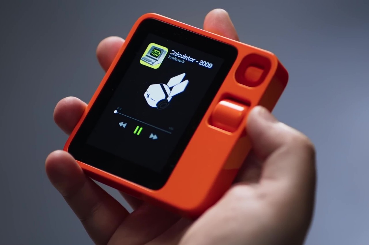
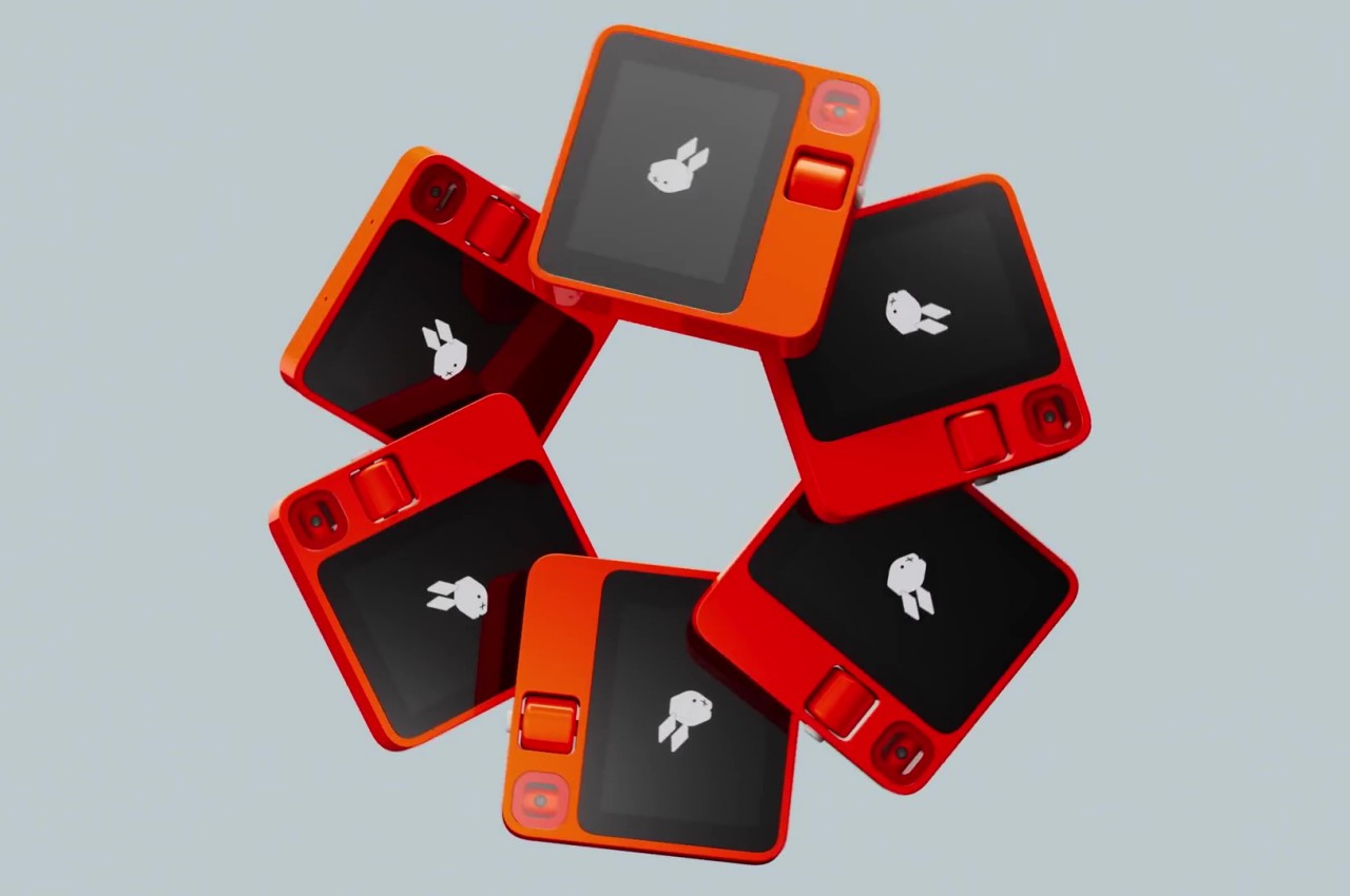
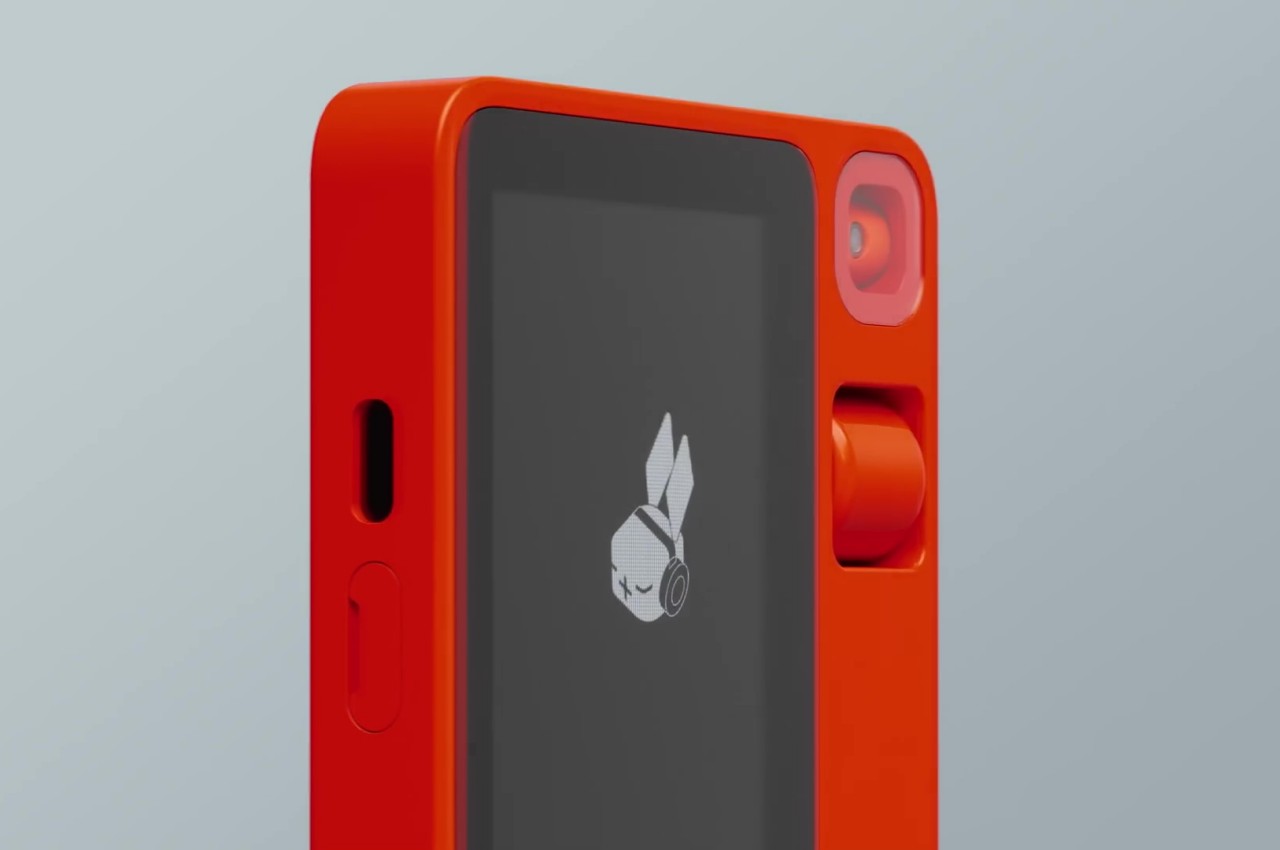
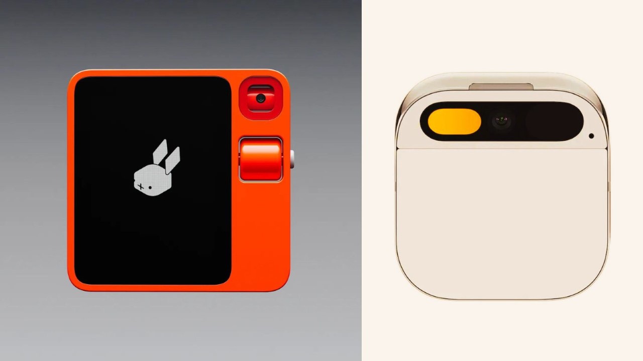
You wouldn’t immediately associate the Rabbit r1 with AI when you first see it. It initially looks like a simple toy with a pixelated rabbit that’s actually just a blocky head with long ears in a square orange device that fits in your hand nicely. That this rabbit head can show some expressions, blink, wink, or even wear headphones further cements its image as a toy, but it’s actually the face, or rather the head, of what may be the cutest AI assistant to grace the market.

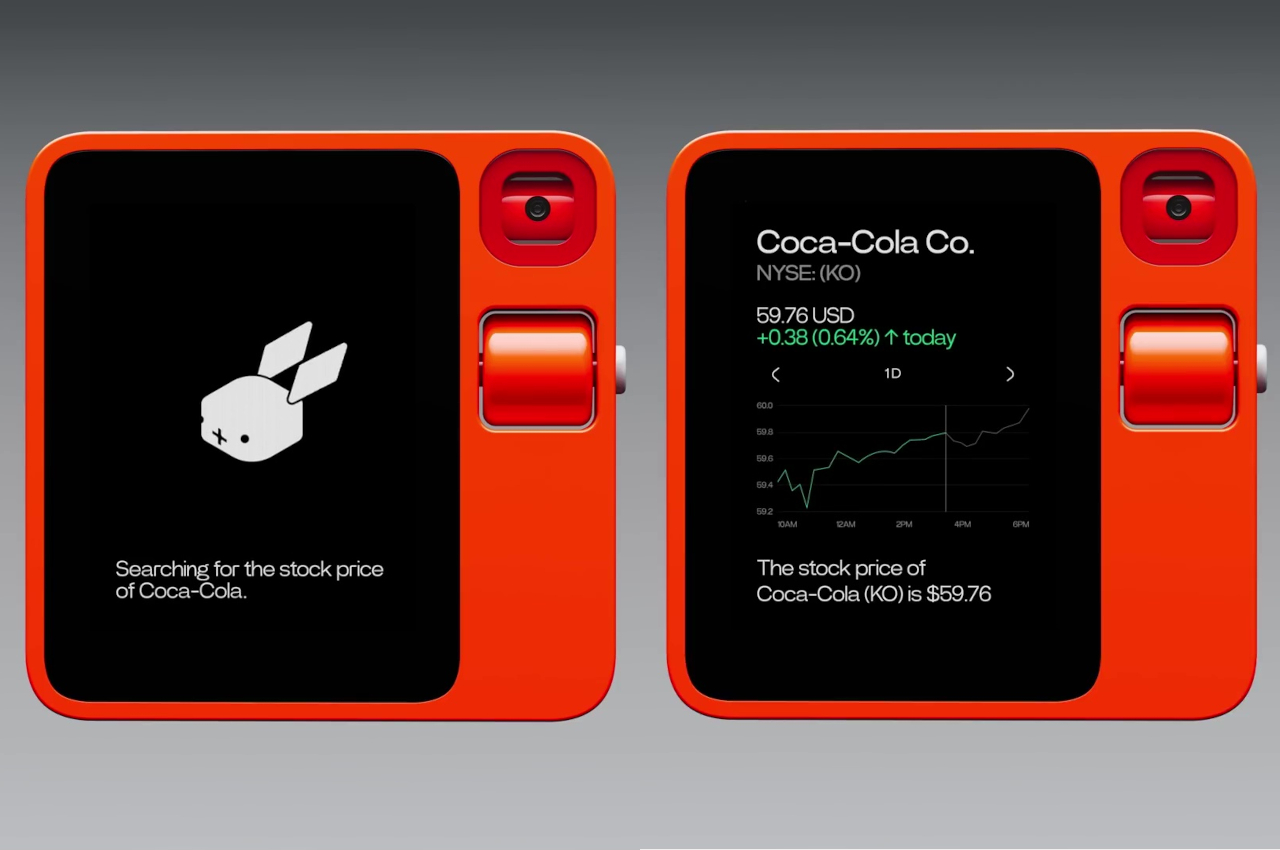
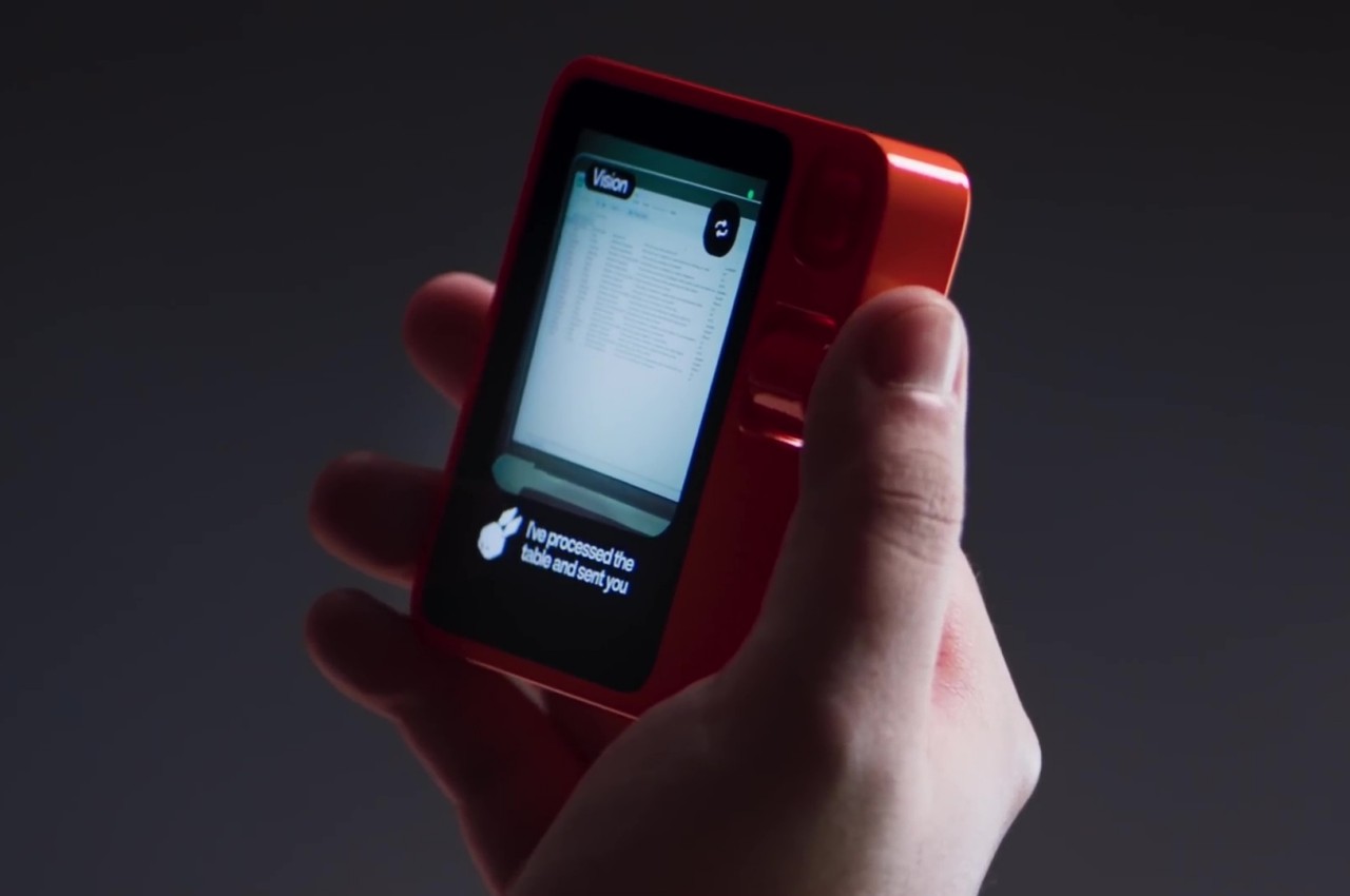
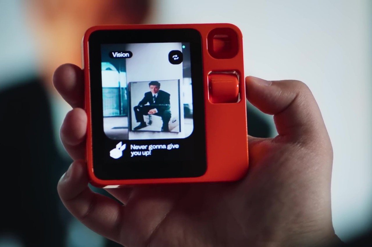
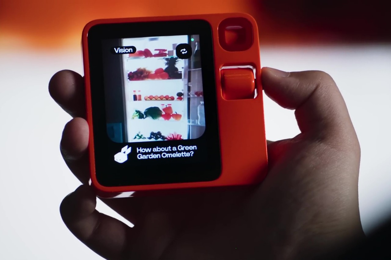
The Rabbit r1 is basically a dedicated AI-powered assistant, formally marketed as “your pocket companion,” that makes the usual AI features more accessible by divorcing them from your phone or home speaker. The idea is that you’d simply pull this less conspicuous (if not for its bright orange color) device out of your pocket or bag, push and hold down a button to talk to the rabbit, and then wait for its response both on the screen as well as via audio. Rabbit OS, as the software platform is being called, seems plenty capable and can answer almost any question, and the rotating camera even does image recognition so you can identify viral personalities or get a suggestion on what to cook based on what you have in your fridge.

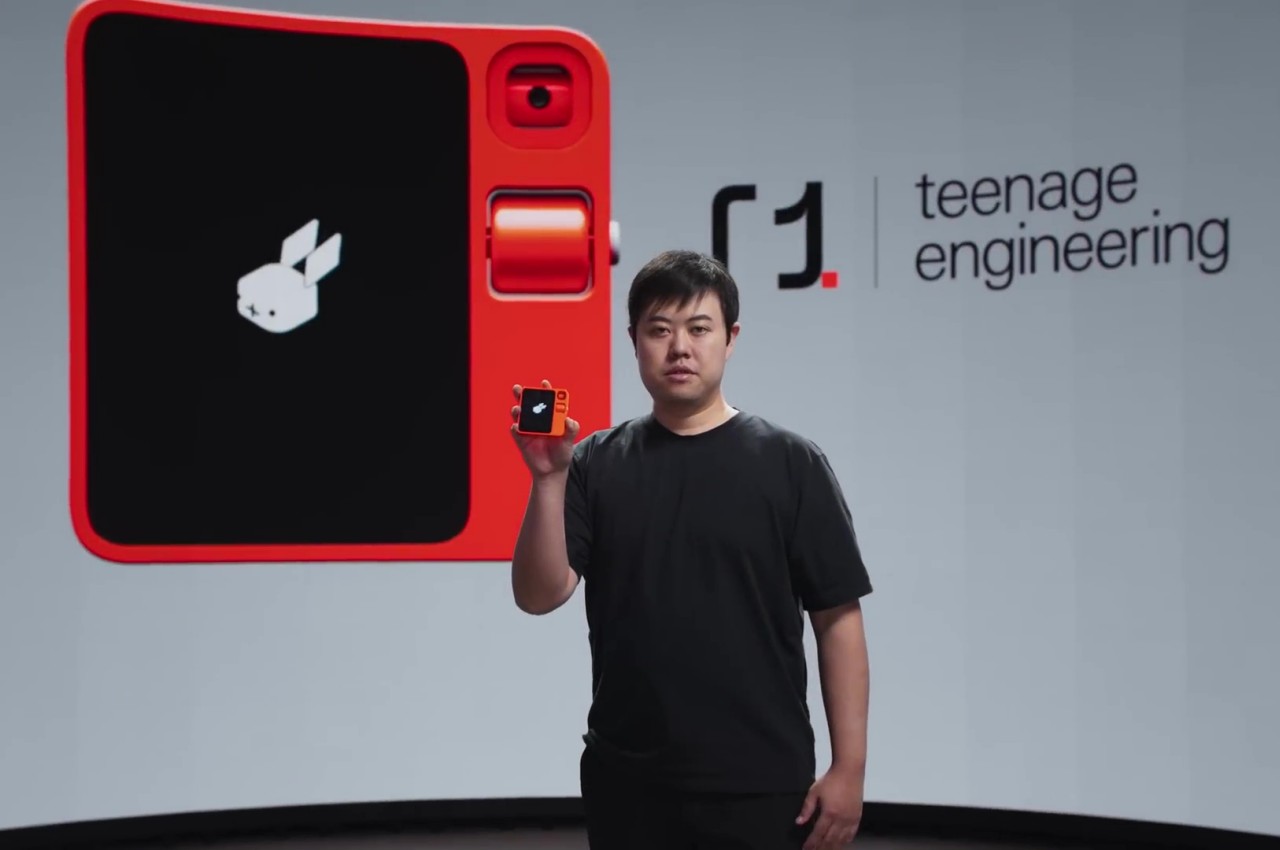
If the r1’s aesthetic looks familiar, then you might have recognized Teenage Engineering’s design DNA in it. The Swedish company is best known for its distinctive music-creation devices, and it is indeed the creative genius behind this pocket AI device’s equally distinctive design. Suffice it to say, you won’t be embarrassed to be seen in public using this device, especially in places where a smartphone would be even more impolite or impossible.

The Rabbit r1 is designed to be super simple to use, which is why it only has a single push button and an analog scroll wheel, though the screen is, of course, touch-enabled. In addition to the usual queries, Rabbit OS will also be able to connect with the same apps and services as typical AI assistants, though it’s still a work in progress. It seems that the concept and the design have resounded with many people and the initial batch of 10,000 pre-orders for this $199 sold out on the first day. Whether it will be able to deliver on its promise, we’ll have to wait for initial reviews to see, and hear.

The post Rabbit r1, co-designed with Teenage Engineering, is a cute pocket AI assistant first appeared on Yanko Design.
How Robots Are Expanding Their Fields of Work By Attaining Emotional Designs

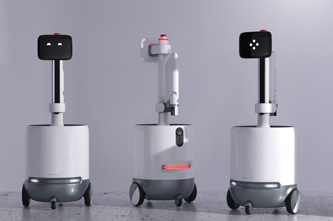
Robots have long captured our imaginations, from the helpful household robots of science fiction to the industrial machines that streamline manufacturing processes. However, the integration of robots into our daily lives has often been hampered by the challenges they face when navigating complex human environments. These limitations have confined their utility to controlled spaces in industries such as logistics and manufacturing. But now, a groundbreaking design concept known as “Turing” is poised to change the game, bringing a fresh perspective on robotic technology.

Designer: Cambridge Consultants (Tom ShirleyAnya Pivčuka)

1

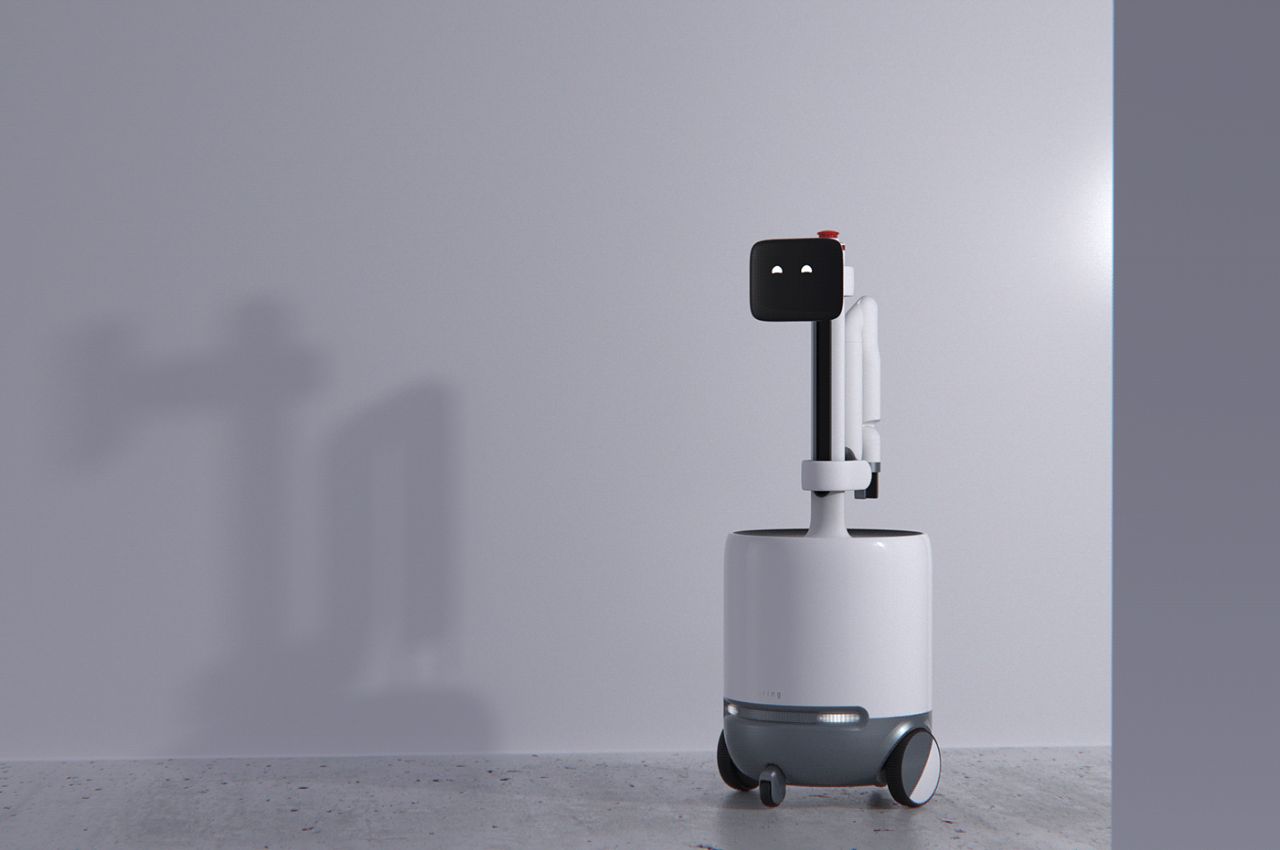
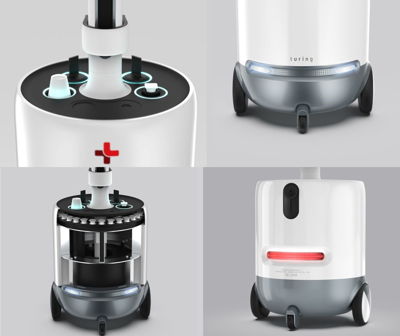
Turing is not just another robot; it’s a robotic platform with an emotional design at its core. It was developed by a team of multi-disciplinary experts, including designers, engineers, and researchers, to address a significant challenge in robotics: enabling robots to work in complex human environments while fostering collaboration between humans and machines. Turing’s approach seeks to unlock the untapped potential of human-robot interaction, one of the last remaining barriers to a future where robots become our everyday companions.

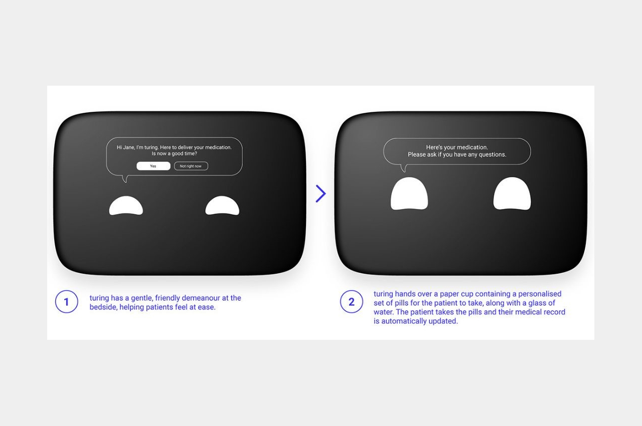
In the early stages of UX testing, the team behind Turing discovered that mimicking human emotion was a highly effective means of communicating the robot’s movements and intentions. They employed journey mapping to craft a coherent set of thoughts and emotions for the robot, resulting in a personality and behavior that users could relate to and engage with. By drawing inspiration from well-known characters in animation and film, they could identify the most appropriate personality for a given environment. This adaptability allows Turing to modify its behavior based on the specific context, ensuring it doesn’t seem out of place in various settings.

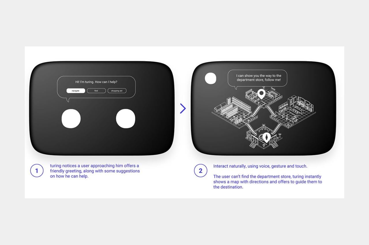
Turing is designed to work in collaboration with people, capable of navigating through crowded environments using body language, gestures, and emotional cues to communicate with our subconscious. This non-verbal, intuitive communication is significantly faster than traditional speech, enabling the sub-second reaction times necessary to avoid collisions in crowded areas. Moreover, Turing’s modular nature allows it to be adapted to a wide range of industries and customized to address diverse business needs.

1

The versatility of Turing makes it a game-changer in various industries:

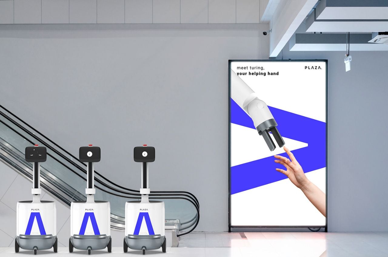
1. Retail: In retail, Turing can assist shoppers with tasks ranging from providing general information to guiding them through the store and even carrying their shopping bags. The emotional and charming personality it displays creates a memorable shopping experience that can be tailored to each venue’s ambiance.

2. Service Industry: Turing comes to the rescue of businesses in the service industry, such as bars and restaurants, which often struggle to recruit enough staff. It can efficiently take orders and deliver food and drinks to customers, enhancing their overall experience. Its adaptability ensures it can seamlessly blend into different restaurant environments, from casual to fine dining.

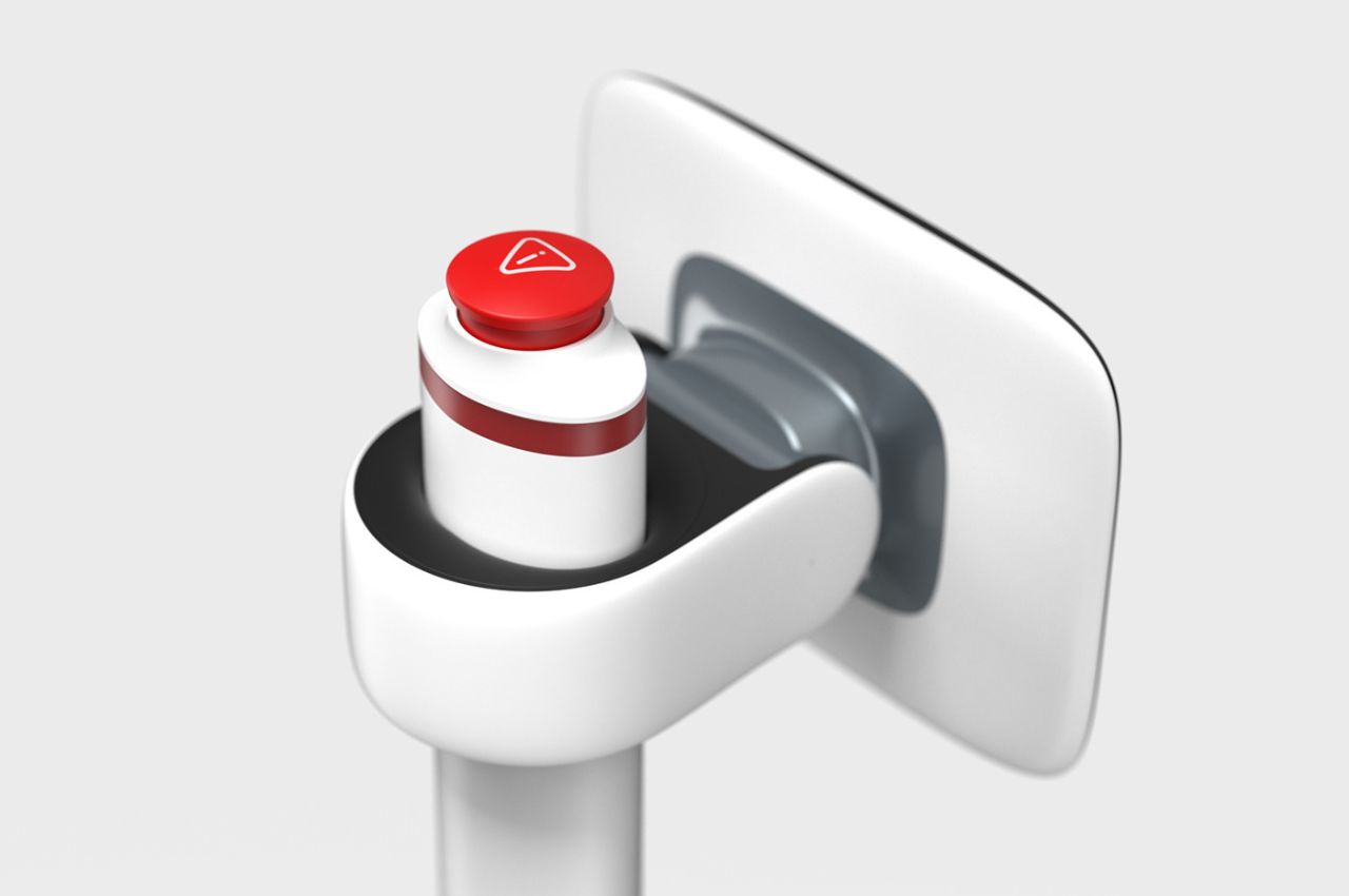
3. Medical Environments: Turing plays a crucial role in medical settings by reducing the burden on healthcare professionals. It can perform repetitive, time-consuming tasks, such as dispensing medication in low-risk hospital wards. This not only frees up staff to focus on patient care but also helps maintain consistent medication schedules. However, the acceptance of robots like Turing in healthcare settings may take time, as people need to build trust in the accuracy of the tasks performed.

Turing is a groundbreaking development in the world of robotics. By embracing emotional design and a highly adaptable, modular nature, it is pushing the boundaries of human-robot interaction and addressing the limitations that have confined robots to specific industries. With Turing, the future of robotics looks promising, as it promises to bring robots out of controlled environments and into our everyday lives, as social, collaborative, and empathetic companions.

The post How Robots Are Expanding Their Fields of Work By Attaining Emotional Designs first appeared on Yanko Design.

Introducing Your New Kitchen Buddy To Help And Accompany You Through Your Cooking Time

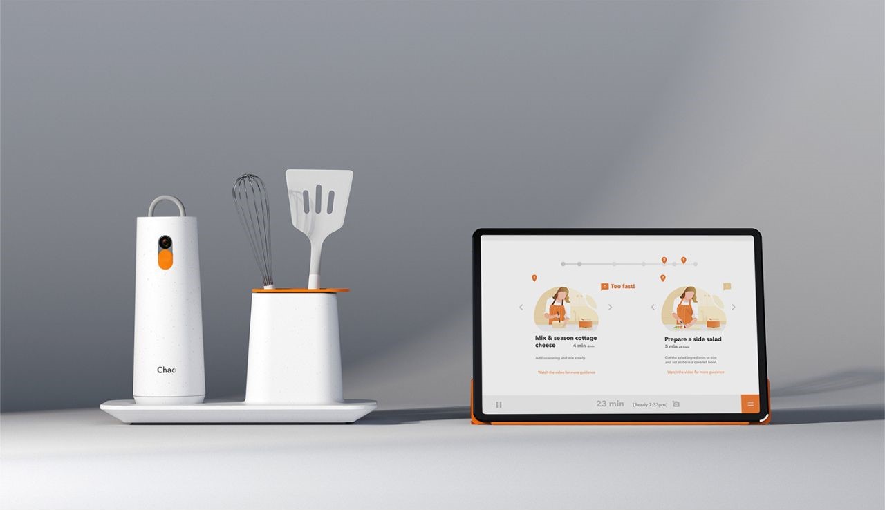
In the fast-paced world of today, where time is a precious commodity, the desire to cook wholesome meals at home often takes a backseat. Many millennials express the wish to cook more frequently, but their busy lifestyles and lack of culinary expertise frequently obstruct their path. The availability of pre-prepared convenience foods and the allure of dining out as a social experience often leaves little motivation to change one’s cooking habits. However, a revolutionary solution is on the horizon: Chao, an AI-powered social cooking platform designed to minimize the hassle of meal planning and eliminate the uncertainty of cooking, making the experience more accessible and enjoyable.

Designer: Tom Shirley (Cambridge Consultants)

Chao recognizes the struggle that many millennials face when attempting to embrace home cooking. The product acknowledges that the pain points of cooking commence long before one even steps foot in the kitchen. As someone who lived through the trials of university life, I can personally relate to this challenge. The lack of culinary instincts and the tedious, often boring nature of cooking made it difficult to muster the motivation to prepare meals at home, especially when you’re a student on a budget. Chao’s mission is to change this narrative.

Chao is not just another recipe app; it’s a comprehensive solution that redefines home cooking in the modern era. Here are some key features that make Chao unique:

1. Machine Vision:

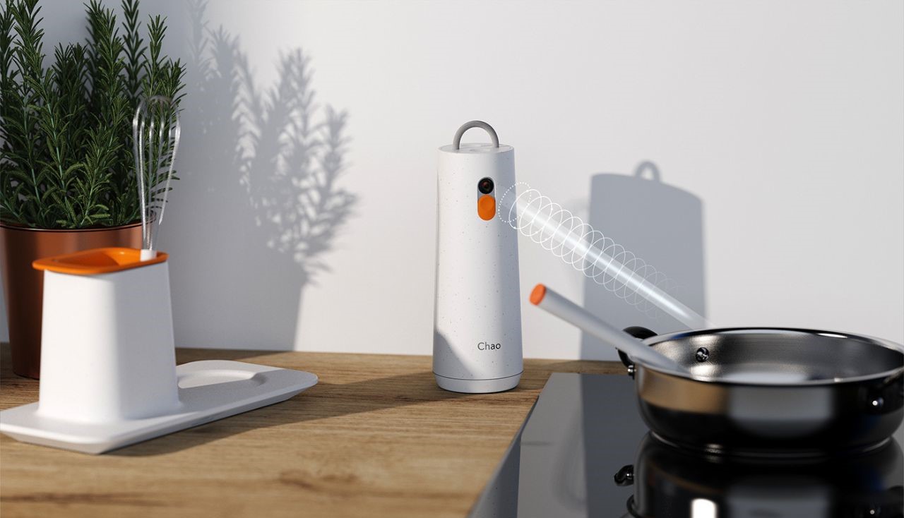
Chao employs intelligent machine vision to ensure the correct usage of all utensils, making it the perfect companion for novice cooks.

2. Social Collaboration:

Chao fosters user interaction, promoting social collaboration around a common goal – preparing and enjoying delicious meals together.

3. Remote Participation:

Chao breaks geographical boundaries, allowing users from all corners of the globe to actively participate in the creation of meals, thereby creating a global culinary community.

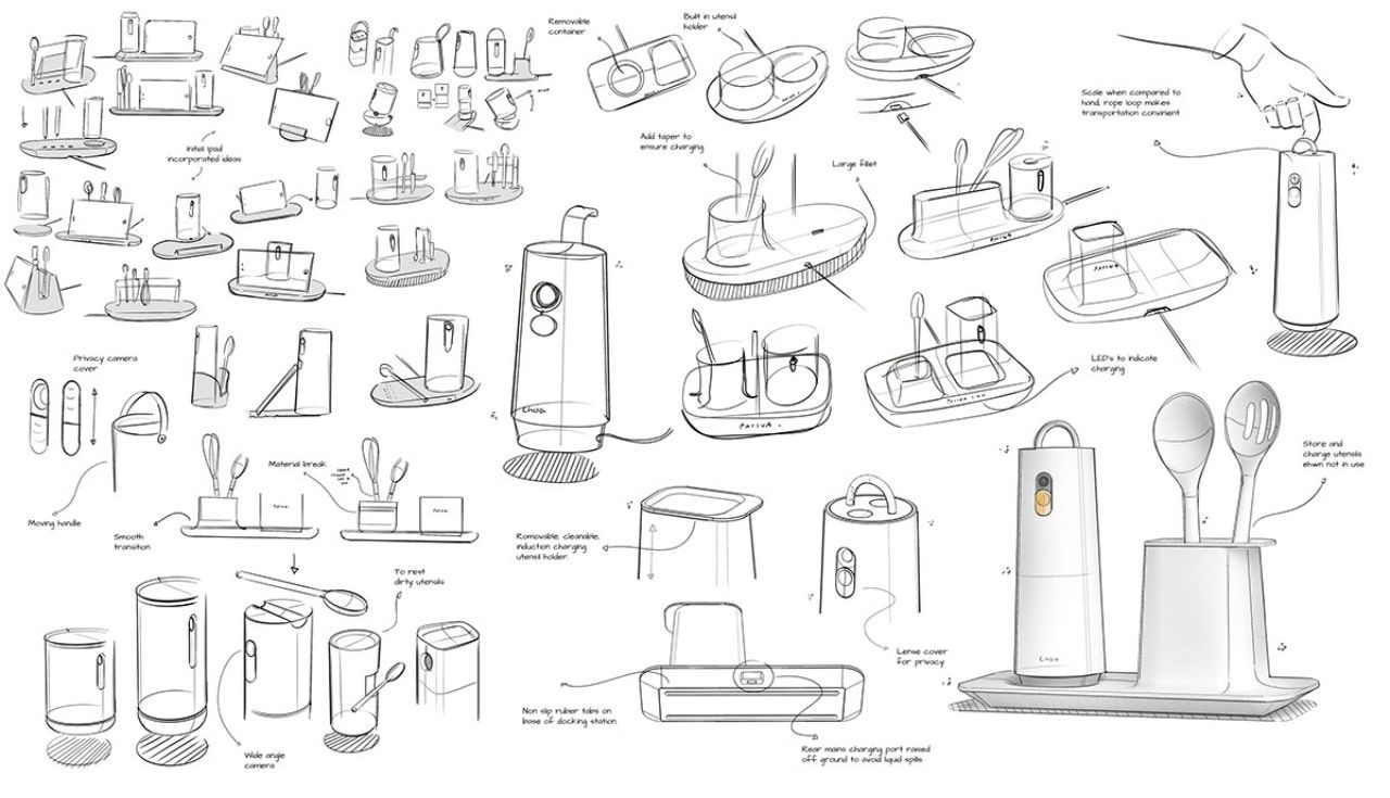
Chao has been meticulously designed to address the genuine concerns of its target users. The team behind this innovation took the time to understand and empathize with users, pinpointing and resolving key pain points to ensure that the final product seamlessly integrates into their daily lives. Co-creating the concept with users at various stages of development ensured that the user experience (UX) and feature set remained perfectly aligned with their needs and expectations.

How Chao Works

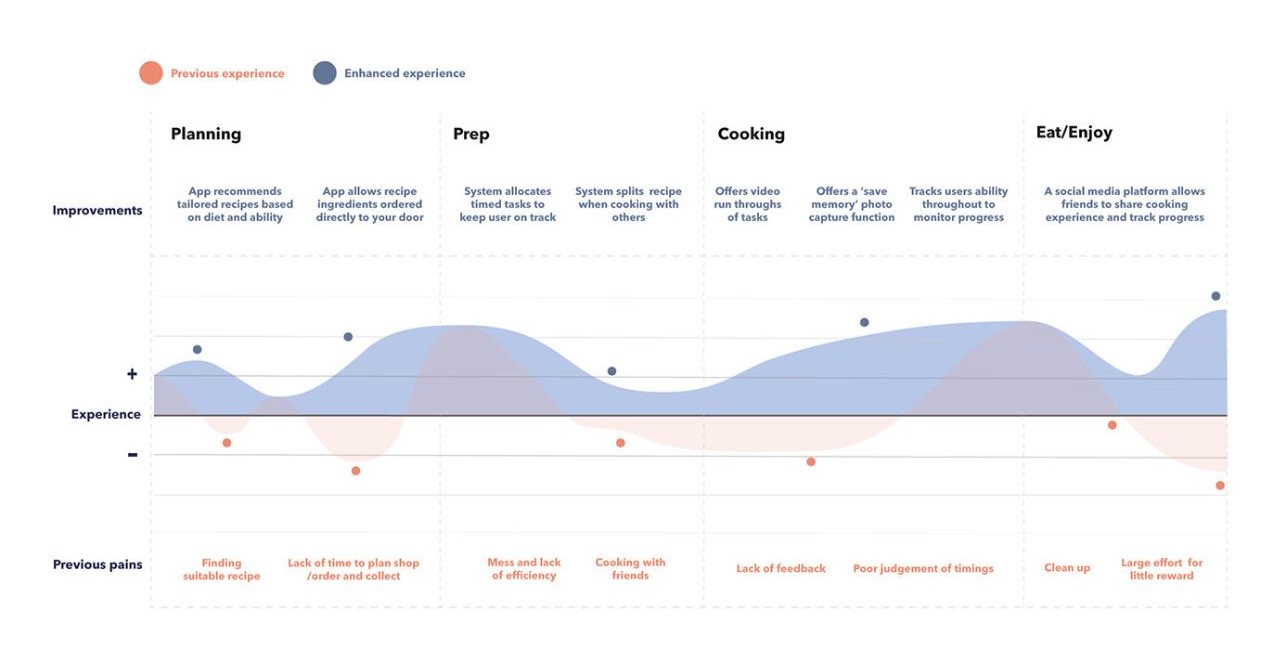
Chao simplifies the entire cooking process with a seamless user experience:

1. Planning: Chao recommends tailored recipes. Once a recipe is selected, the necessary ingredients are ordered and delivered right to your door, saving you the hassle of grocery shopping.

2. Prep: Chao divides the preparation into manageable tasks, whether for one person or a group, offering advice and time management tips.

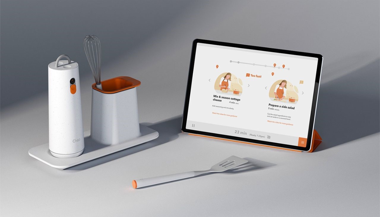
3. Cooking: The AI chef utilizes computer vision and various sensors to provide context-based advice, making it easy to tackle advanced cooking techniques in a fun and approachable way.

4. Eat & Enjoy: Chao helps capture and share meal times and dinner parties with friends and family, turning every meal into a memorable experience.

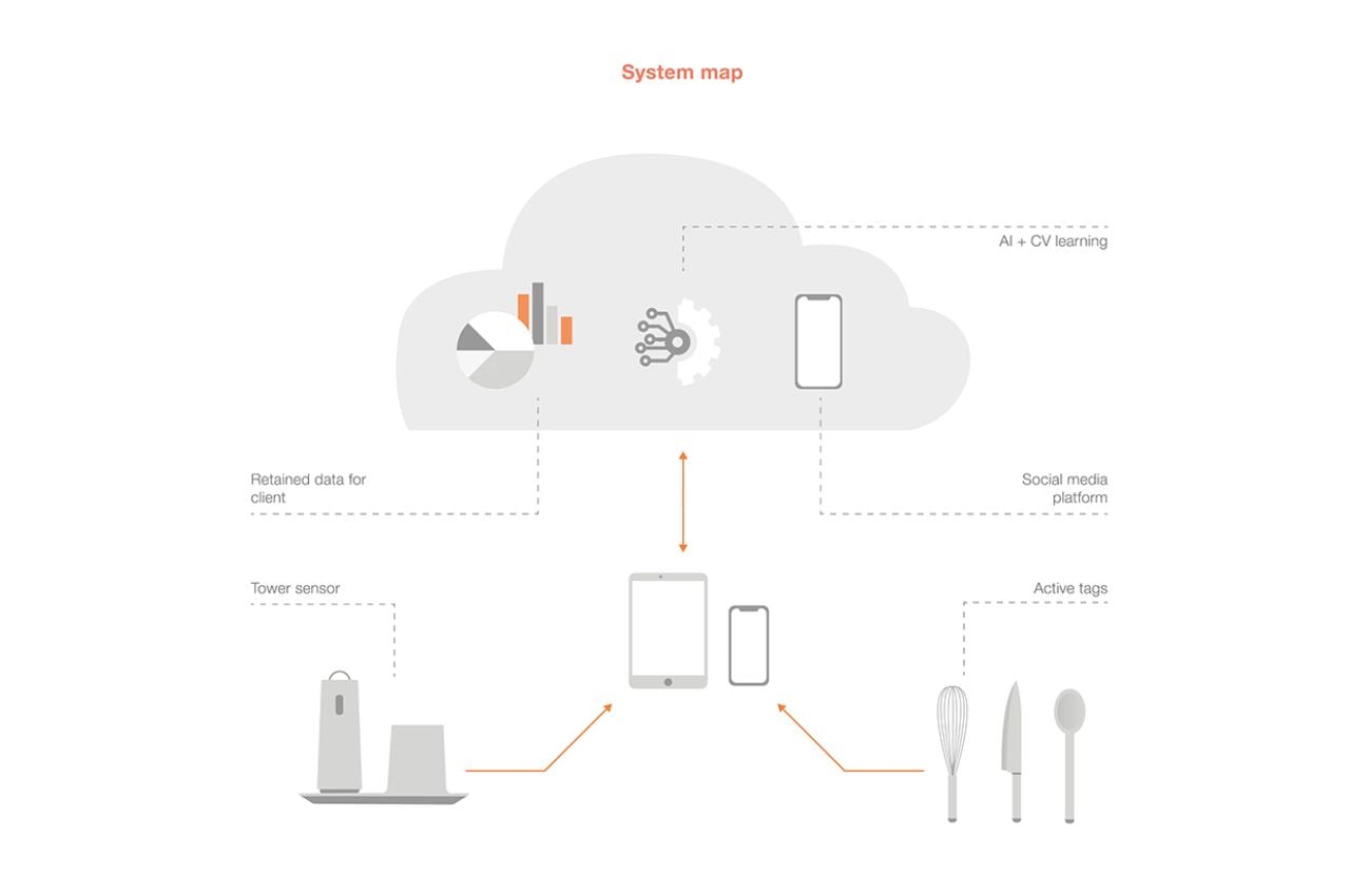
Chao guides users through the cooking process, sharing their progress and key statistics on a dedicated social media platform. With a deep understanding of user behavior, Chao provides easy-to-follow recipe steps along with tailored tips, thereby eliminating the uncertainty that often plagues home cooking.

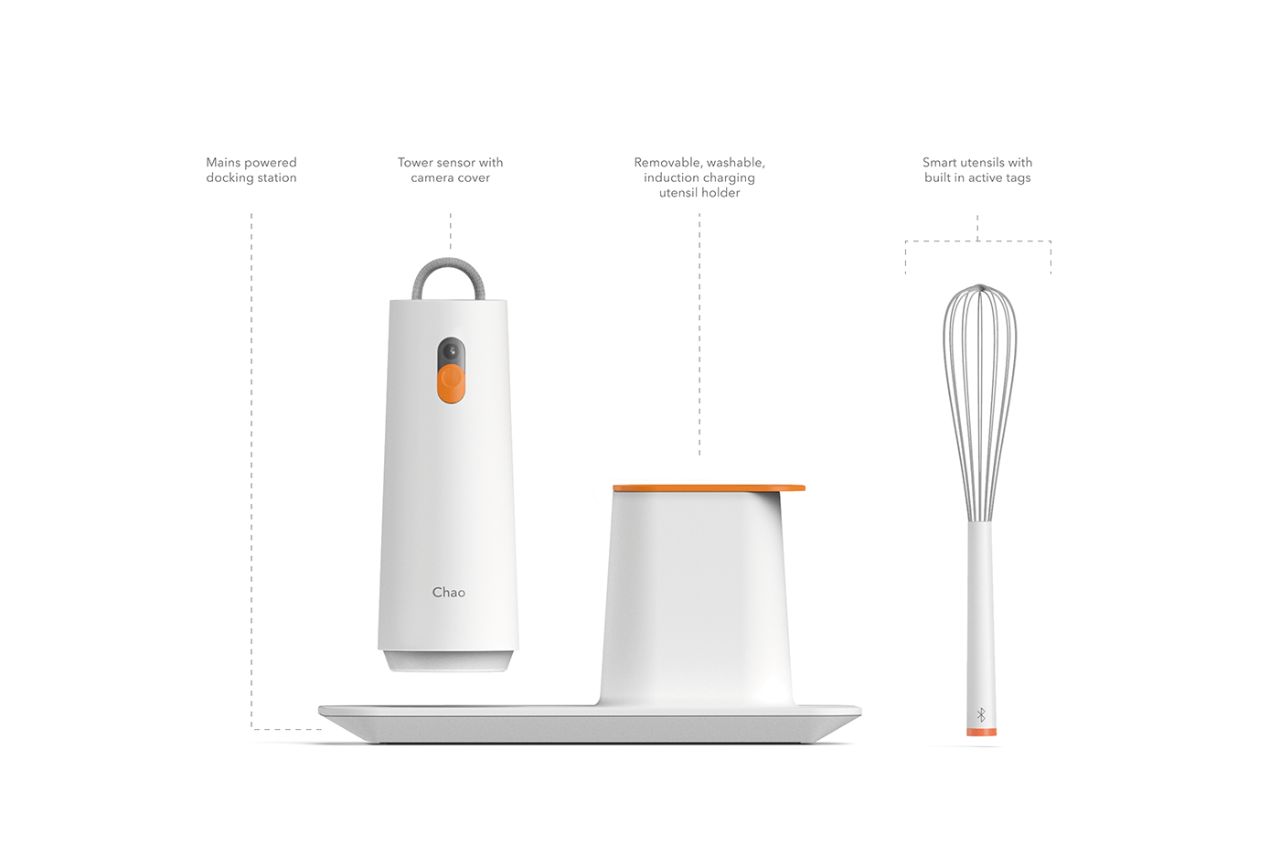
Chao seamlessly blends the physical and digital worlds of cooking. The charging dock also serves as a home for the physical components of the system, seamlessly fitting into the kitchen environment.

A collaborative approach played a pivotal role in bringing Chao to life. Designers worked hand-in-hand with software engineers, electronic experts, and culinary enthusiasts. They tackled technical challenges such as person identification through computer vision, constructing a robust cloud-based infrastructure, and tracking utensils, whether actively or passively tagged.

In conclusion, Chao represents a pivotal step towards redefining the way we cook at home. It empowers millennials and anyone with a desire to cook healthier, more delicious meals, providing a solution to the time and knowledge constraints that often get in the way. With its innovative features and user-centric design, Chao promises to make home cooking more accessible, enjoyable, and social. It’s a product that’s not just about food; it’s about creating experiences and memories around the dinner table.

The post Introducing Your New Kitchen Buddy To Help And Accompany You Through Your Cooking Time first appeared on Yanko Design.
Wearable AI pin could “weave seamlessly” into our lives

Wearable “smart” technology isn’t a new idea by any stretch of the imagination. Fitbit long predated the original Apple Watch, and we’ve basically been able to outsource or remotely control functions of our smart phones for… well, nearly as long as we’ve owned smart phones. But it’s inevitable that new advances in tech will generate excitement around new product concepts – and since AI is on everyone’s mind lately – hey, wouldn’t it be cool if you could carry an AI assistant around on your clothing rather than on your wrist?

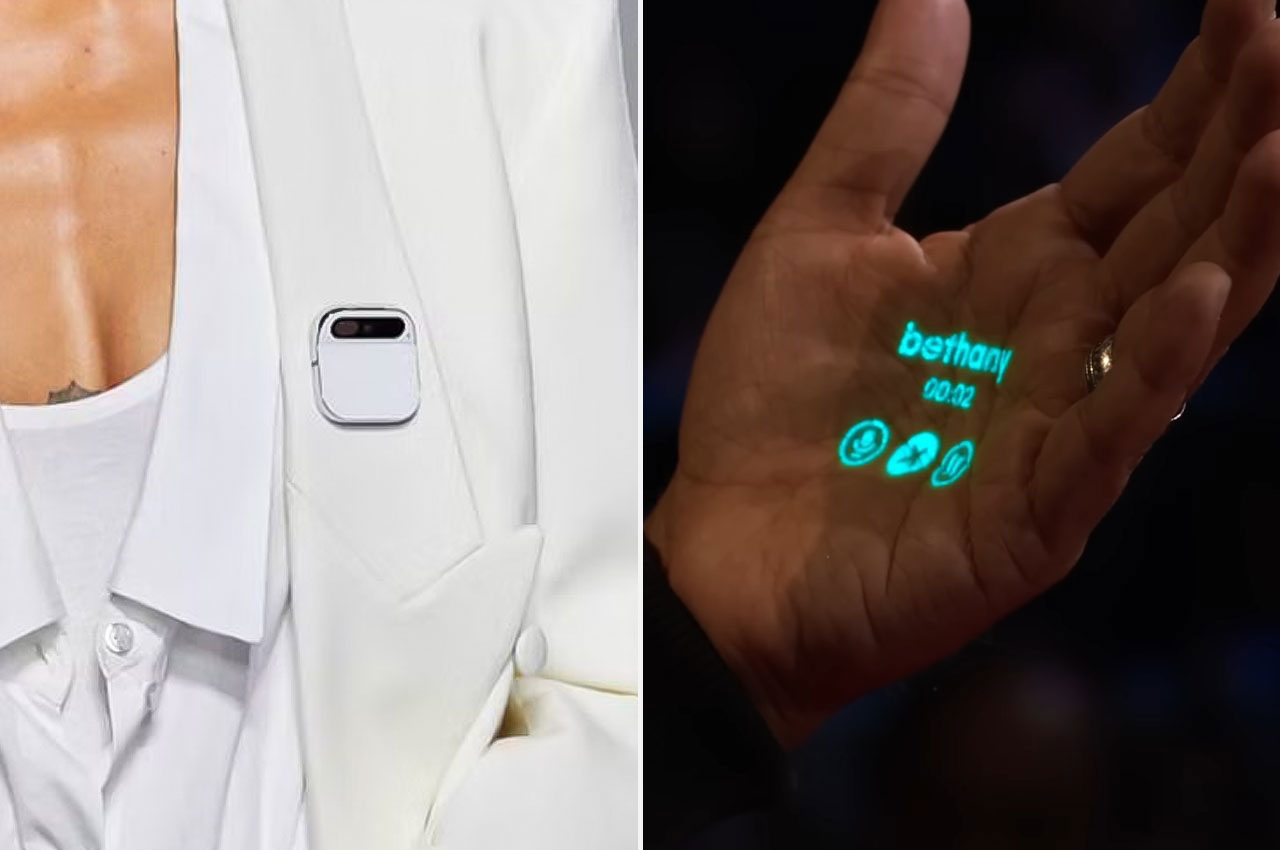
That’s the concept behind the Humane Ai Pin, which made a splash across the tech and fashion worlds last week when it landed at Coperni’s 2024 Spring Summer show on September 29 in accordance with Paris Fashion Week, where it was worn on the runway by several models – most notably, the famous Naomi Campbell.

Designer: Imran Chaudri and Stephanie Garcés (via Humane Ai)

Co-founded by accomplished ex-Apple design director Imran Chaudhri and ex-Apple engineering director Bethany Bongiorno, Humane Ai seems like it’s skirting away from direct competition against OpenAI, which is developing its own GPT-4-powered fitness wearable. This is because the Humane Ai Pin is meant to go anywhere but your wrist.

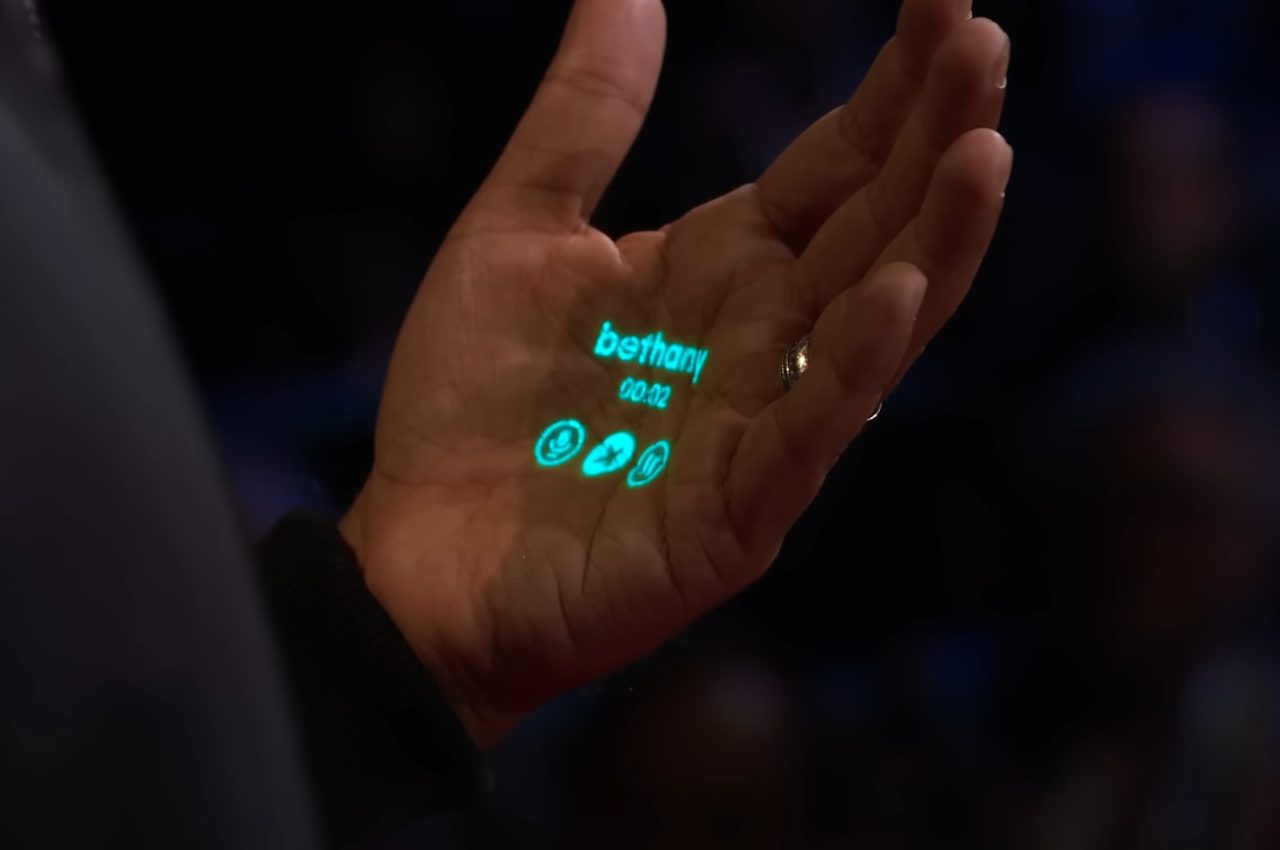
Instead, it functions as a high-tech lapel pin that’s a little bit bigger than a regular lapel pin – but thanks to its sleek and rounded design, it doesn’t even look out of place in today’s modern world. Not to mention, it’s purported to include a genuinely interesting feature that immediately leaps above everything else on the docket: a projection display that beams user interface elements and buttons onto your hands. You can see it in action during Chaudhri’s TED Talk in April 2023, titled “The disappearing computer — and a world where you can take AI everywhere“.

Alongside the Coperni reveal on September 29, Humane Ai put out its own press release where the company explained its vision for the pin, stating that “The Humane Ai Pin is the screenless, standalone device and software platform …designed to weave seamlessly into users’ day-to-day lives. The device is privacy-first, with aspects such as no wake word and therefore no ‘always on’ listening.”

Co-founders Imran Chaudhri and Bethany Bongiorno also weighed in about their inspirations for the project, saying, “We have been admirers of Arnaud and Sébastien at Coperni for some time and our shared passion for the union of design, creativity and technology is at the heart of this collaboration. Our relationship with technology is changing profoundly, becoming even more personal as our devices morph into extensions of our bodies, minds and hearts.”

It sounds like we’ll be seeing hands-on details about the Humane Ai Pin on November 9, when the full unveiling of the new wearable is slated to take place.

The post Wearable AI pin could “weave seamlessly” into our lives first appeared on Yanko Design.
Microsoft’s AI Powered Backpack Redefines Your Smart Companion On the Go

In a world where our trusty smartphones have evolved into pocket-sized powerhouses, it’s natural to wonder if our everyday backpacks could use a tech-savvy upgrade. Well, wonder no more, because Microsoft has just unveiled an ingenious wearable that promises to revolutionize the way we perceive and interact with our surroundings.

Designer: Microsoft

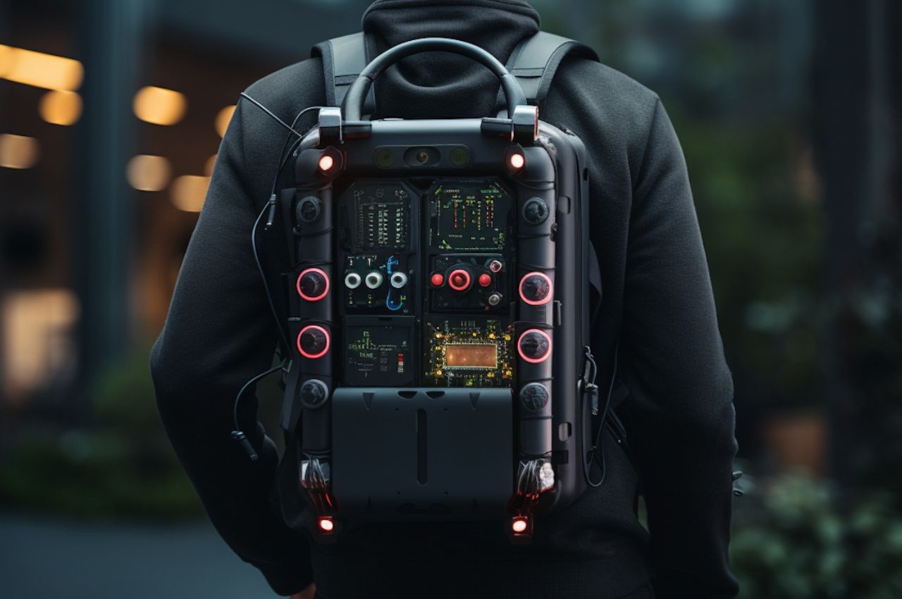
Imagine this: a smart backpack, not just any backpack, but one powered by the remarkable capabilities of artificial intelligence (AI). It’s not science fiction; it’s a reality that has recently received the green light from the US Patent and Trademark Office (USPTO). Let’s delve into the exciting world of this innovative invention and see what all the buzz is about.

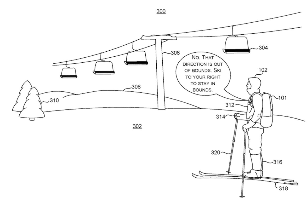
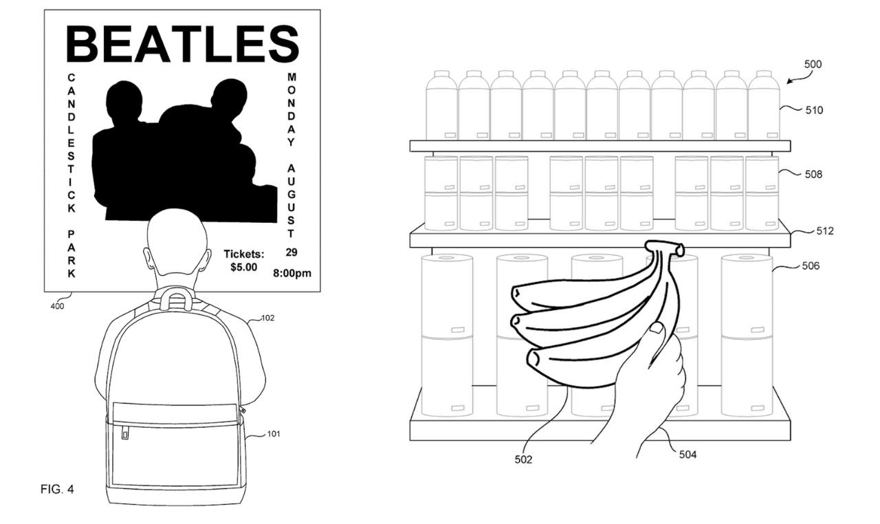
At its core, Microsoft’s smart backpack acts as your extra set of eyes. It’s equipped with the remarkable ability to identify objects in your immediate surroundings. Picture walking down a bustling street, and your backpack can provide you with real-time information about your environment – it’s like having your personal guide right there with you.


yanko design images to size – Microsoft_AI_backpack_03

Beyond object recognition, this intelligent companion can handle tasks for you. Need to set a reminder? Just ask your backpack. Want to add an event to your calendar? Your backpack is on it. It can even assist you in determining the price of an item at the grocery store. Think of it as your reliable sidekick, always ready to assist you on your adventures.

Thanks to its cloud connectivity, this smart backpack is a veritable treasure trove of information. It can fetch data from the internet in the blink of an eye, keeping you informed and up-to-date, no matter where you find yourself. Imagine having Google’s vast knowledge right at your disposal, all from the convenience of your backpack. The phrase “Are you stupid?” is on the verge of extinction! But of course, AI does not aid with common sense yet, right?!
Coming back, the magic doesn’t stop there. This backpack effortlessly syncs with your other tech gadgets, creating a harmonious tech ecosystem that simplifies your life. It’s like having all your devices working together seamlessly, sharing information and enhancing your daily experiences.

Beyond convenience, this backpack could be a game-changer for the visually impaired. With its built-in camera, microphone, speaker, network connection, processor, and storage space, it becomes an invaluable tool, offering crucial information and assistance in navigating the world.

While the potential applications of this smart backpack are vast, there’s a critical aspect that must not be overlooked: ergonomics. Designing the backpack to be ergonomic is key to making it a staple in our daily lives. Just think back to the early days of computing when computers were massive and cumbersome. Now we have lightweight laptops like the Microsoft Surface Laptop Go 2 and MacBook Air. Similarly, ensuring that this smart backpack is easy to carry and lightweight would make it accessible to people of all ages and strengths, much like a smartphone.

Furthermore, this innovative backpack could be a lifeline for the elderly, helping them navigate the modern tech world without feeling left out. Its intuitive design and AI-powered features could bridge the gap between generations and empower individuals to stay connected and informed.

While the release date and availability of this futuristic backpack remain a mystery, there’s no denying that it represents a significant leap forward in wearable technology. In a world where technology continues to reshape our lives, this AI-powered backpack could be the next big thing, seamlessly integrating digital intelligence into our daily experiences. So, stay tuned for updates, because the future of backpacks might just be smarter than we ever imagined, and it could change the way we all interact with the world around us.

The post Microsoft’s AI Powered Backpack Redefines Your Smart Companion On the Go first appeared on Yanko Design.