High-Flying Designs: The Tug-of-War Between Comfort and Profit in Airline Seating

Air travel has always been one of the crowning glories of human innovation, proving that mankind can conquer almost anything if they put their minds to it. Over the decades, the aviation industry has been pushing the envelope of speed, efficiency, and safety, but much of the evolution doesn’t happen only on the outside of airplanes. Interior design has also been changing at an even more rapid pace, and a more visible struggle can be seen beyond seat class boundaries. Comfort, luxury, cost-efficiency, and profitability have always been the goals of all airlines, but these sometimes conflict with each other, creating an almost never-ending tug-of-war between maximizing airline profits and ensuring passenger comfort. We take a deeper close into the design philosophies and elements that define airline seating and the effects they have on the economy, the planet, and of course, human comfort.

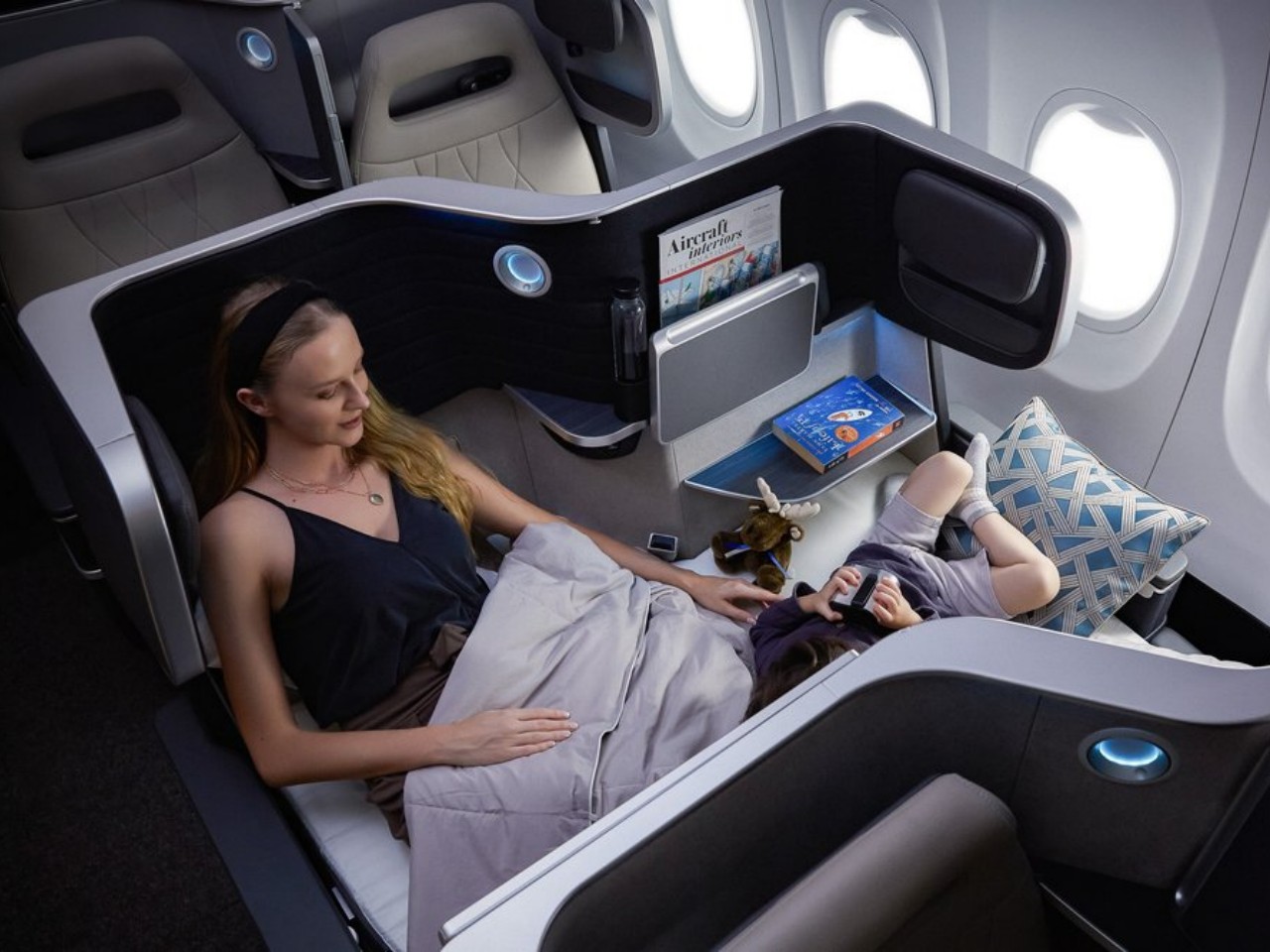
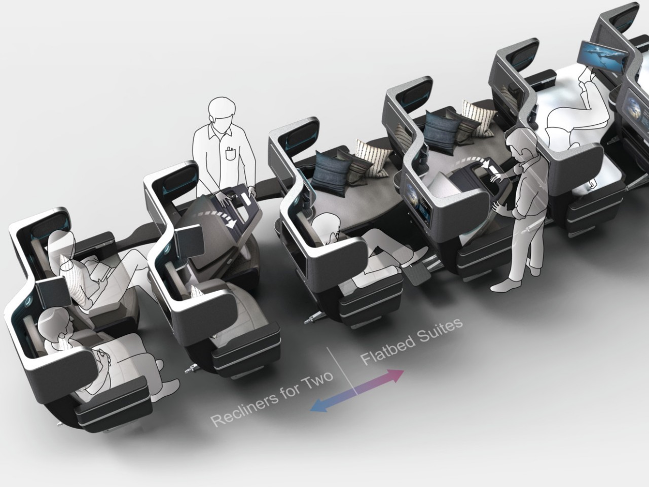
Designer: James Lee (Butterfly Seating)
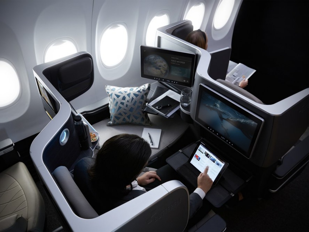
Minimalism vs. Luxury: A Deep Dive into Design Philosophies

Airline seat design has always fluctuated between two extremes, often exemplified by the division between economy and first-class sections. You have minimalism that focuses on efficiency and functionality on one end, and you have luxury that emphasizes premium experiences almost to the point of exclusivity on the other end. Of course, both philosophies are ideal to have in both seating classes to different degrees, but they also have different priorities that define the final seat design.
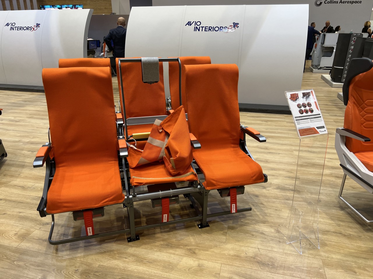
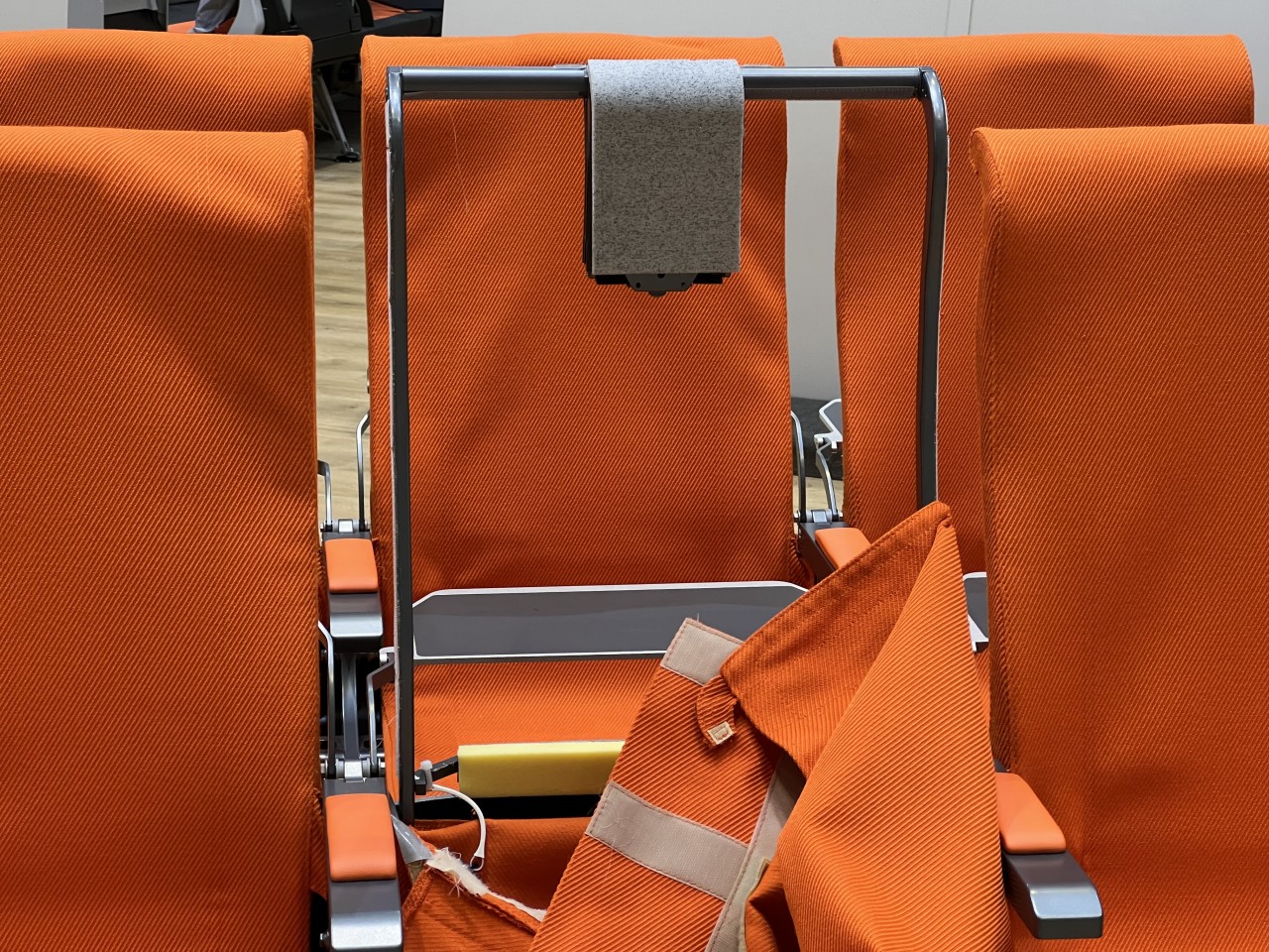
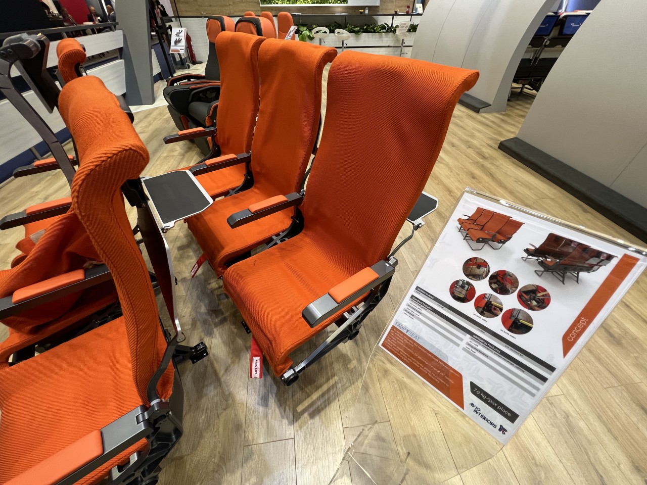
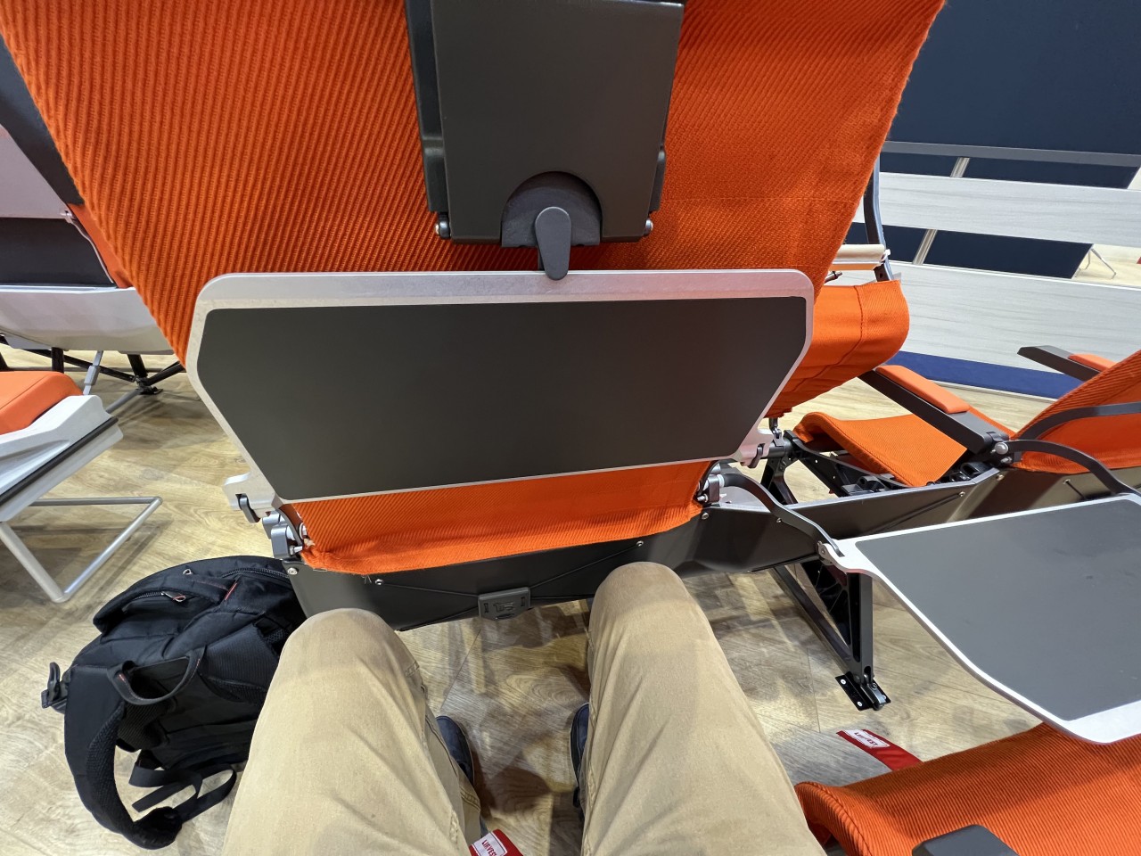
Designer: Aviointeriors (via Jason Rabinowitz)

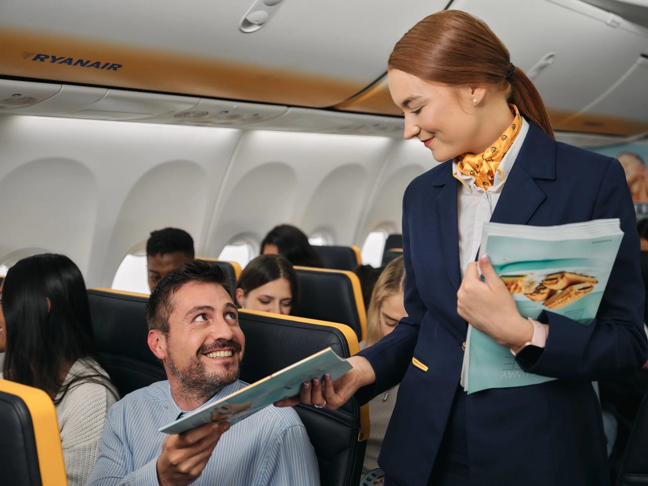
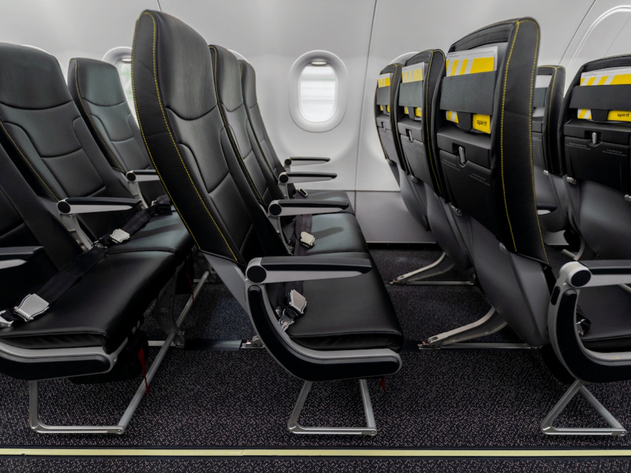
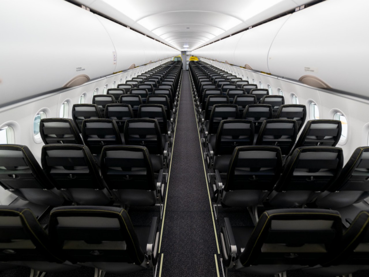
Minimalist seats, for example, prioritize space efficiency and cost-effectiveness in order to both lower ticket prices as well as increase profits. By minimizing the space occupied by seats, using more lightweight materials, and adopting streamlined designs that are easier to clean, airlines can minimize operation costs while also increasing ticket sales and, therefore, increasing Revenue per Available Seat Mile or RASM figures. This is mostly seen in economy class seats and budget airlines, of which the likes of Ryanair and Spirit Airlines are best known. Aviointeriors’ 7.5kg “FABRYSEAT” concept is an example of extreme minimalism, pretty much just a metal frame with a fabric covering and a small headrest.

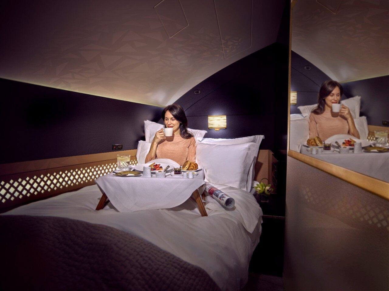
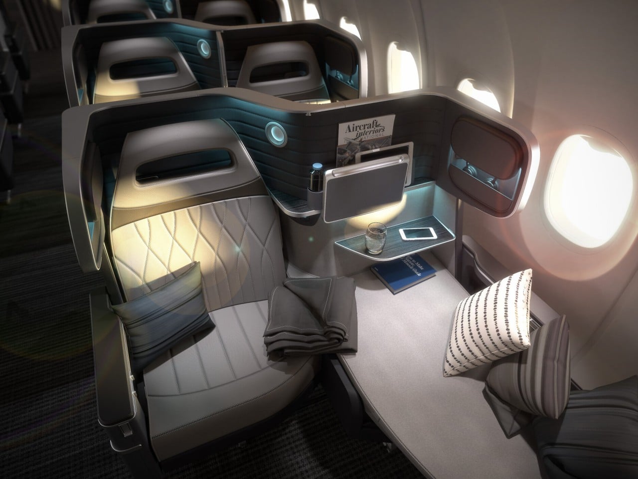
On the opposite end of the spectrum, luxury designs put comfort and convenience above all, even if it means increasing costs for both the company and the passenger. There is enough space to completely recline the seat into a bed and airlines offer extra amenities not available to other passengers. Given the price involved, these luxuries are only offered to business and first-class passengers, and Singapore Airlines and Etihad Airways are perhaps the most popular examples of such premium experiences.

Designer: Etihad Airways

Economic Impact of Different Seat Designs

Just like how airplanes themselves require a delicate balancing act to stay airborne, every aspect of seat design has an overall effect not just on passenger comfort but also on the airline economy in general. Two of the most important elements to be considered for seat configurations are the seat pitch and the seat width. Seat pitch, which refers to the space between one seat and the one in front of it, and the width of the seat not only affects passenger comfort but also how many passengers you can fit in the cabin.

You might think that having more seats and more passengers will always be beneficial for the airline, but that isn’t always the case. Cramped spaces are likely to also decrease customer satisfaction, leading to lower customer loyalty, and more seats and passengers will also weigh the plane down as well, requiring more fuel, interior modification, and, in the long run, higher operating costs. The duality between these two elements isn’t always clear-cut as well. For example, United Airlines has an Economy Plus that offers more legroom but at a higher price. This conundrum is at the heart of that tug-of-war that both airlines and even regulators face, balancing profit maximization and passenger satisfaction.
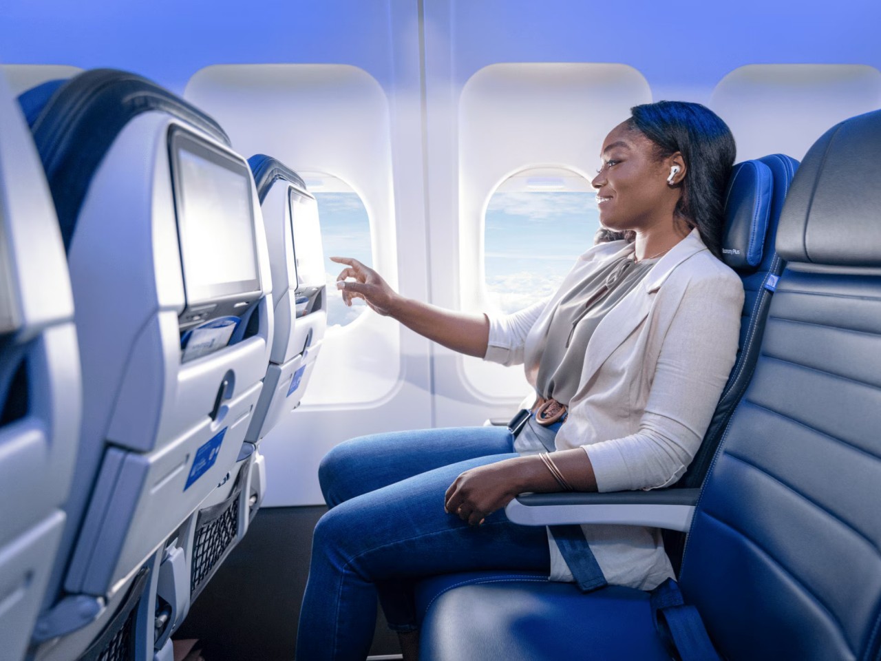
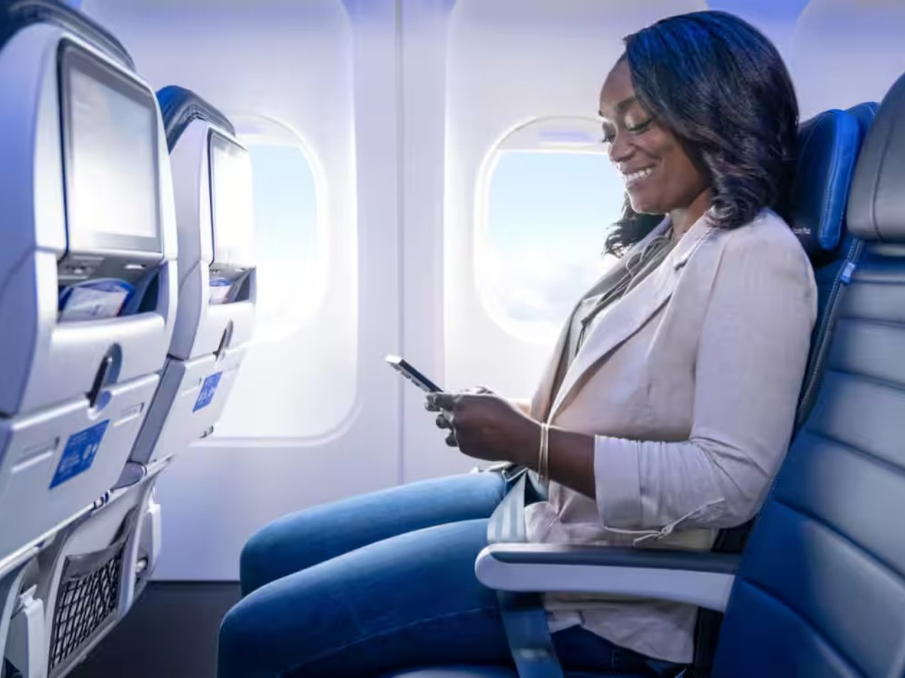
Designer: United Airlines

Ultra-Luxirious First-Class Seats vs. High-Density Economy Seats: A Few Case Studies

With dozens if not hundreds of airlines in operation around the world, there are just as many seat designs available that cover the spectrum between extreme minimalism and posh luxury. There are, however, a few that have stood out over the years, almost becoming representatives of these two design philosophies. Of course, business is more complicated than that, and most airlines have different sections or even aircraft that cater to different audiences and budgets.

On the luxurious side of flights, Etihad Airways is quite famous for its “The Residence,” offering a three-bedroom suite, a shower, and even a personal butler. Singapore Airlines’ Suite isn’t far behind with its full-length bed, 32-inch TV, and privacy sliding doors. Both airlines offer hotel-like amenities and luxuries available to those who can afford the rather steep price tag.
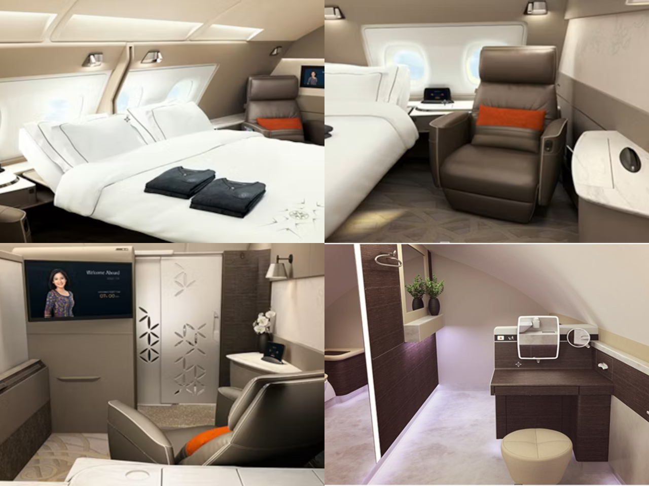
Designer: Singapore Airlines
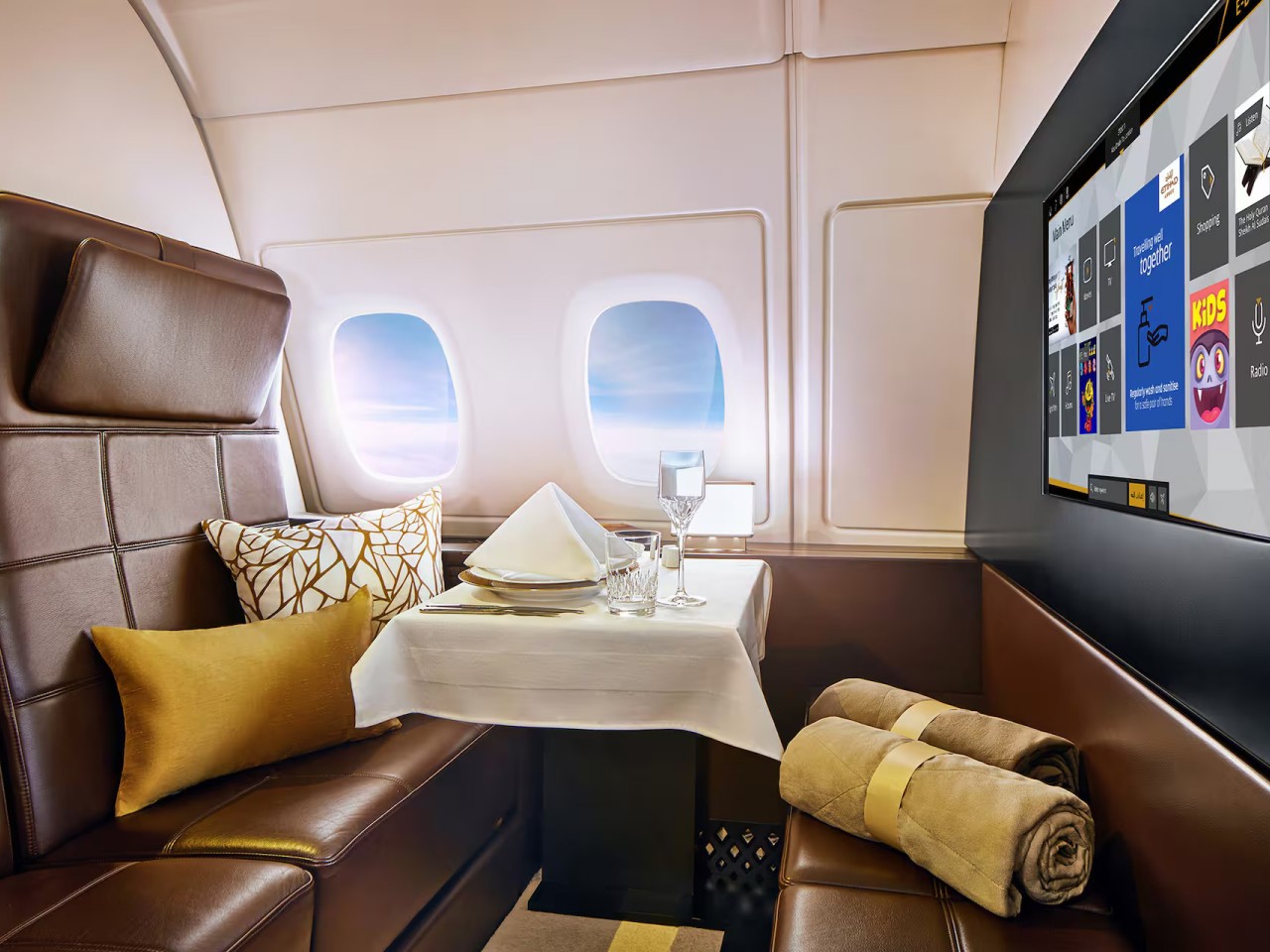
Designer: Etihad Airways

Conversely, Ryanair and Spirit are poster children for high-volume, low-cost economy seats, with seat pitches averaging 30 inches or lower. Most of the designs are minimalist and utilitarian, employing mass-produced materials to keep costs low and tickets affordable. It might sound uncomfortable, but these configurations are quite popular with budget travelers, especially frequent flyers who simply need to get from A to B without much fuss.
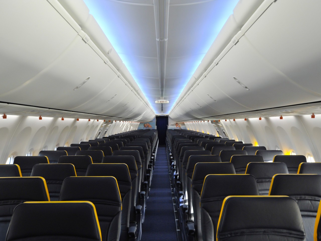
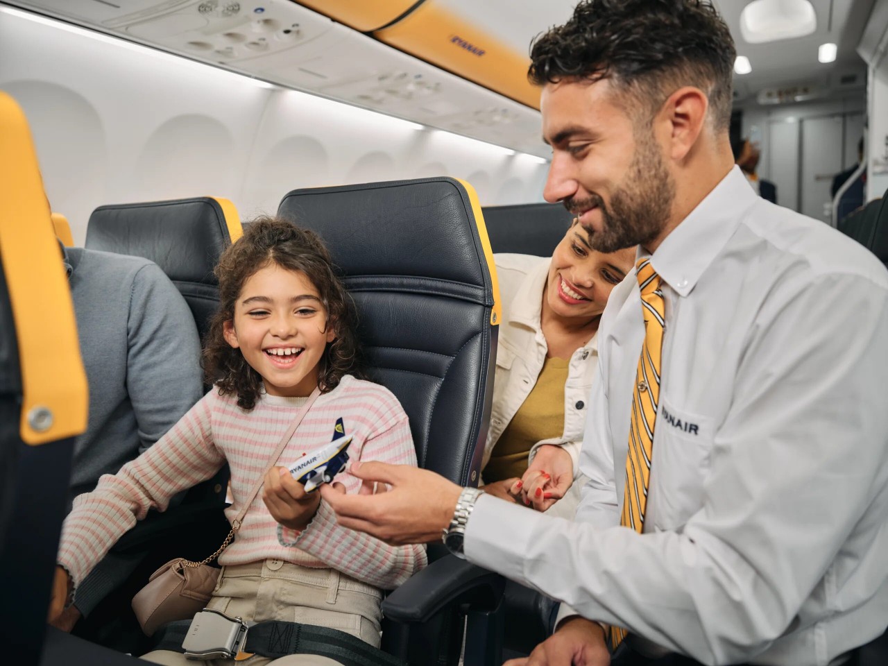
Designer: Ryanair
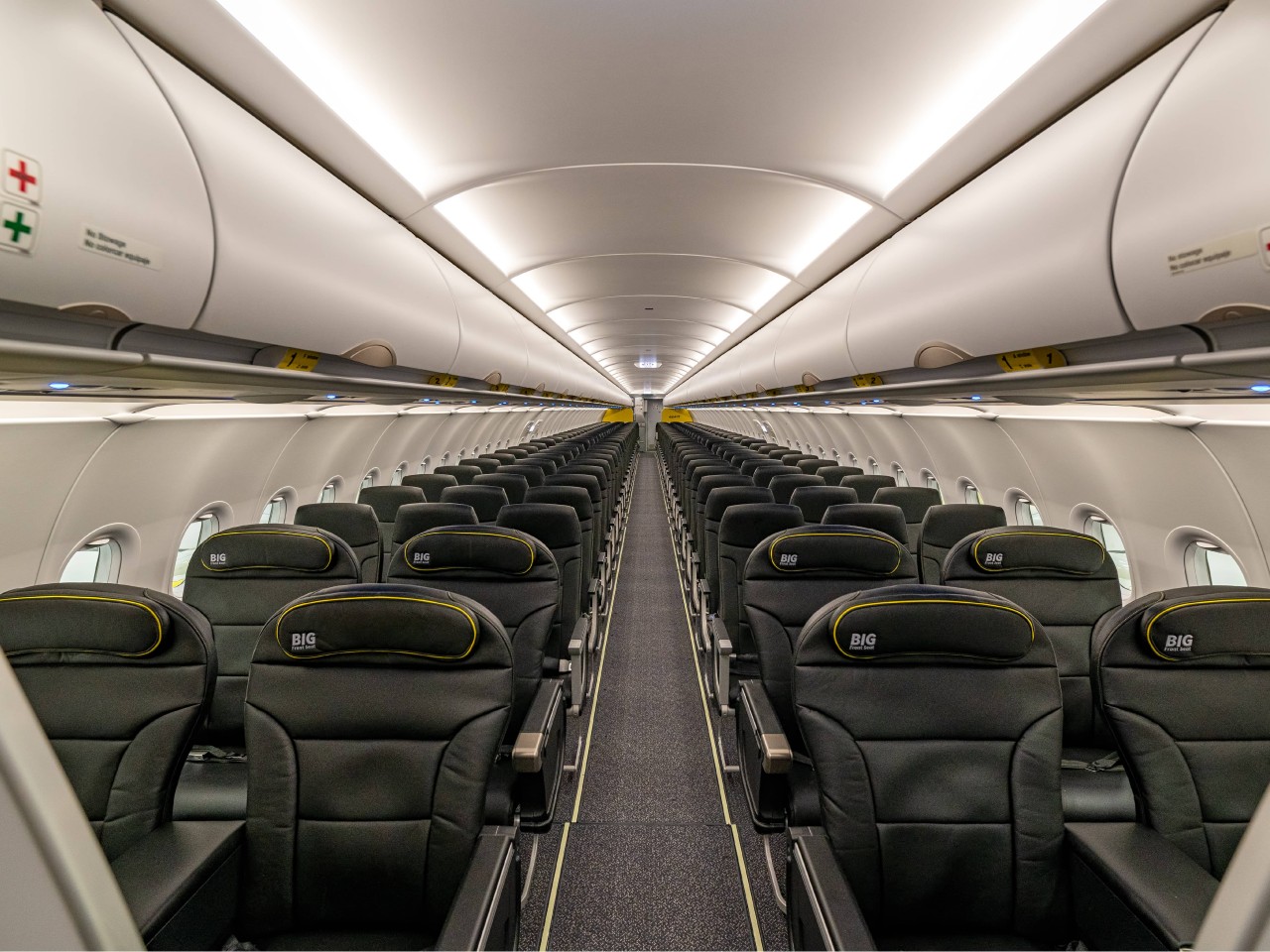
Designer: Spirit Airlines

Sustainability in the Air: Balancing Eco-Friendly Designs with Cost and Comfort

These days, it’s no longer enough to be cost-effective or luxurious. Sustainability has become a major consideration in airline seat design, and to some extent an added complication. Companies and designers now also have to consider using eco-friendly materials that won’t compromise comfort and cost, and that’s not always an easy feat even for normal product designs.

There are a few airlines that have started that arduous journey, like Air New Zealand’s use of plant-based leather alternatives, or Recaro’s SL3510 carbon fiber-reinforced plastic to make seats lighter. There are also other concepts that not only utilize lightweight materials but also apply simpler structures and mechanisms to reduce the number of parts needed. Lighter and recycled materials can help lower a plane’s overall carbon footprint, but these materials can sometimes also cost more, so airlines have to balance the pros and cons of these as well.
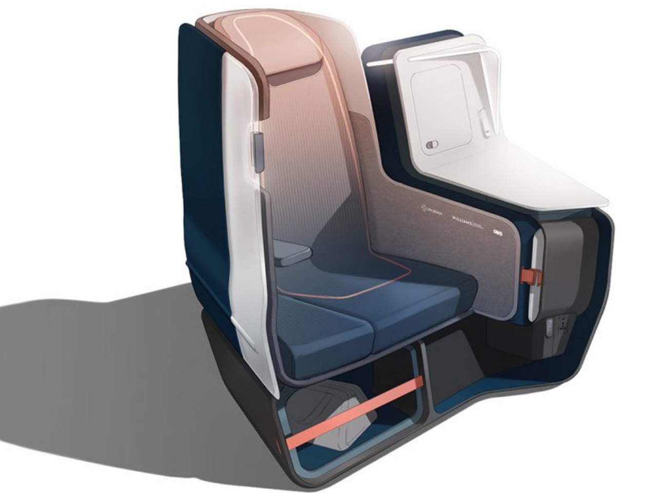
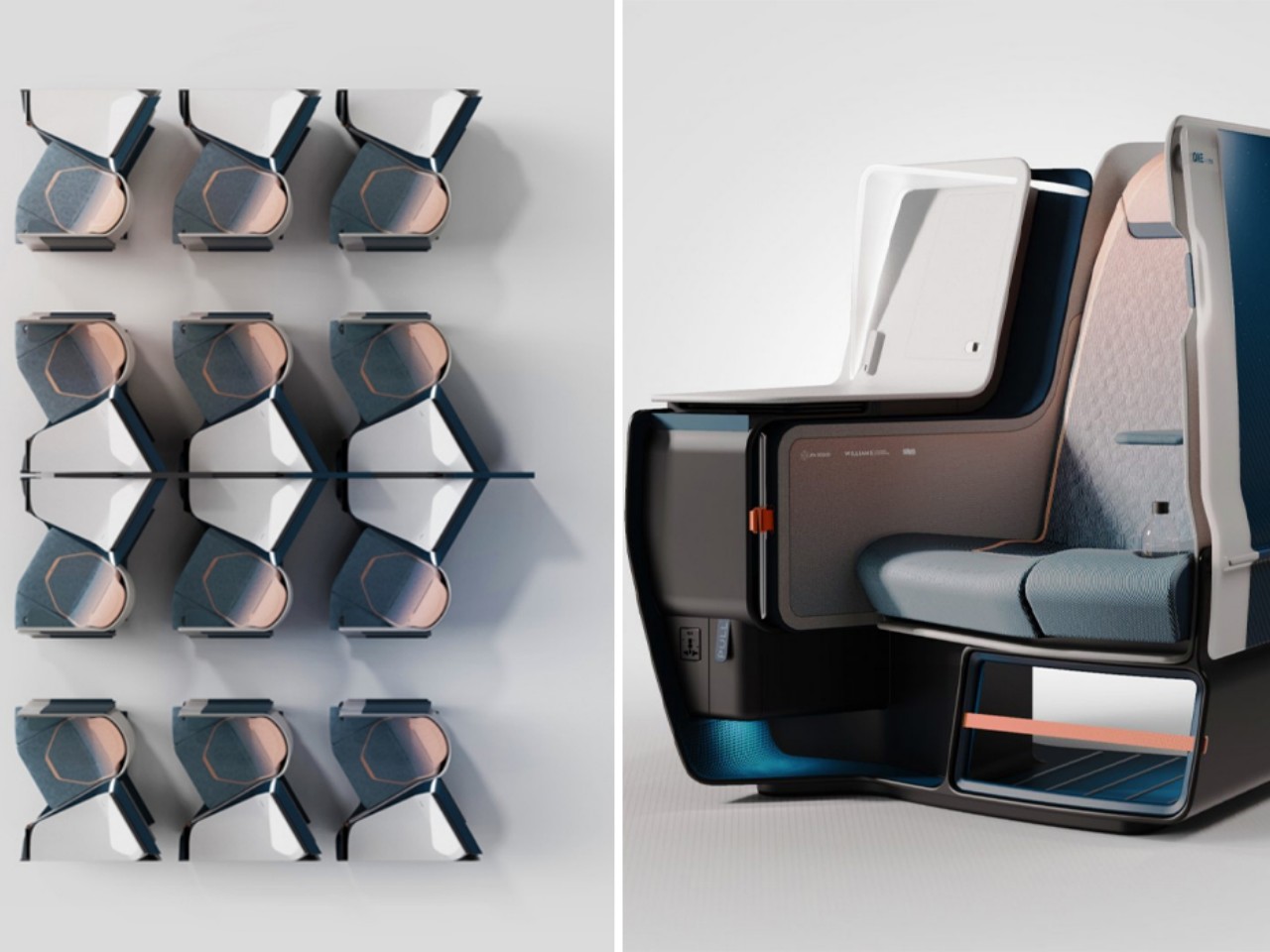
Designers: JPA Design x Williams Advanced Engineering x SWS Aircraft Certification

Successes and Failures: Lessons From Both Past and Future

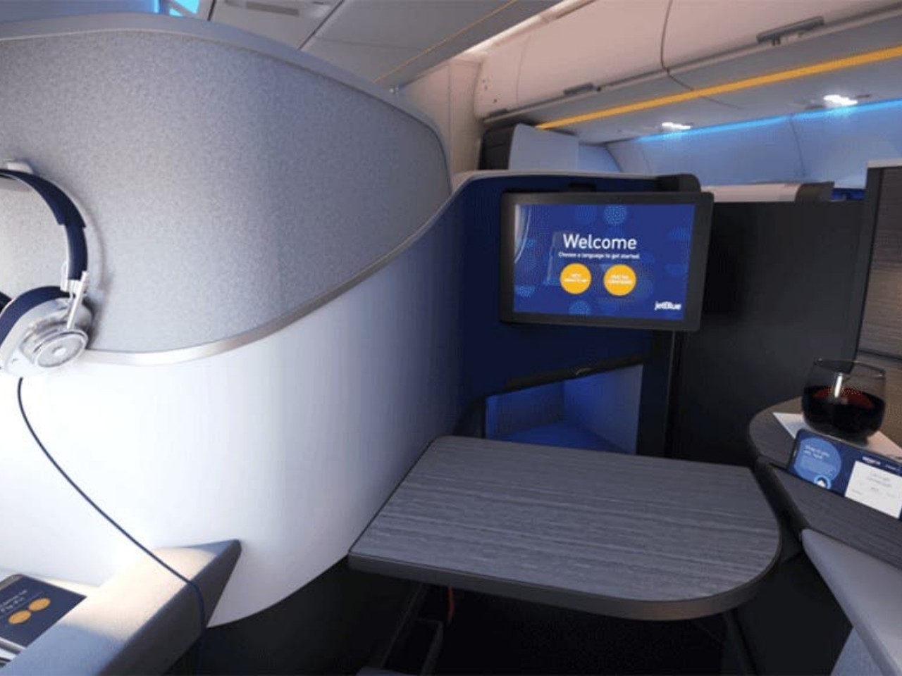
Aviation history is filled with stories of winners and losers, not just in flyer programs but also in seat designs. Some have become more notorious than others, while the rest served as lessons to be learned. JetBlue, for example, coined its own “Mint” business class, offering lie-flat seats and artisan dining to its transcontinental flights, a move that proved to be quite successful and popular with business travelers. In stark contrast, American Airlines’ decision in 2017 to reduce its seat pitch to below 30 inches was faced with much backlash that the company eventually backtracked.
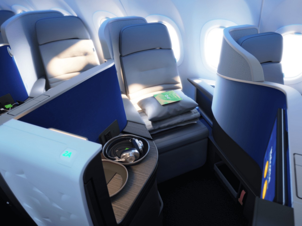
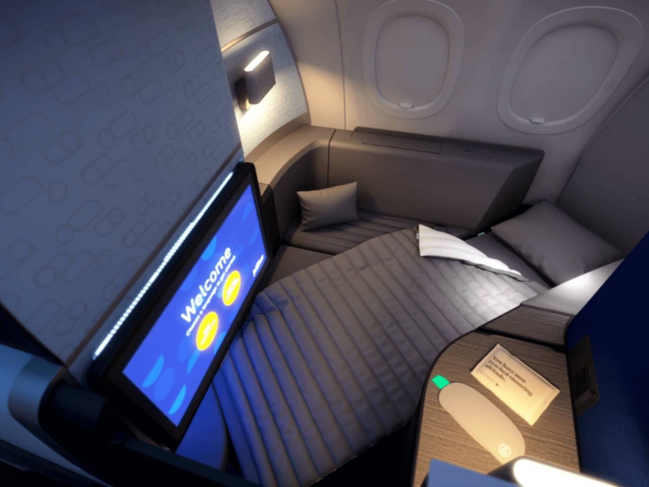
Designer: JetBlue

Even in the realm of concept designs, there are a few that seemed to be too far-fetched and uncomfortable that they were immediately met with ridicule and even contempt. While not everyone will oppose having more seats on a plane to accommodate more passengers, a few designs seemed to prioritize that over passenger comfort, feeling like they were more interested in helping airlines game more profit instead.

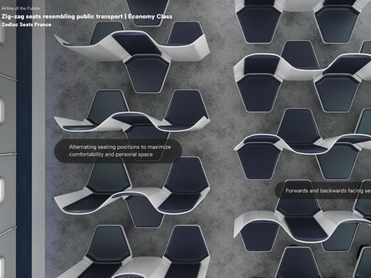
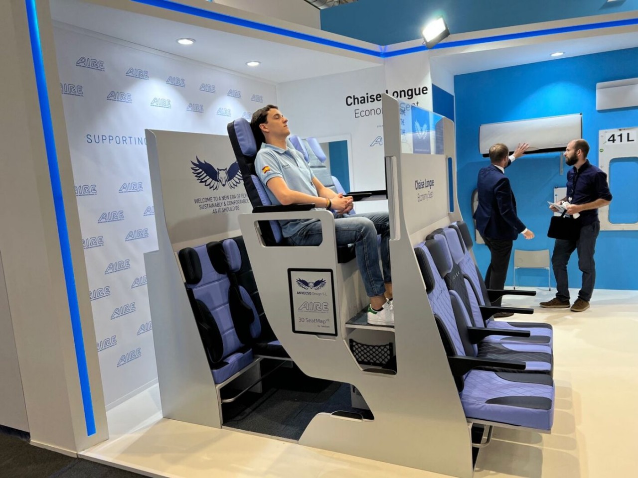
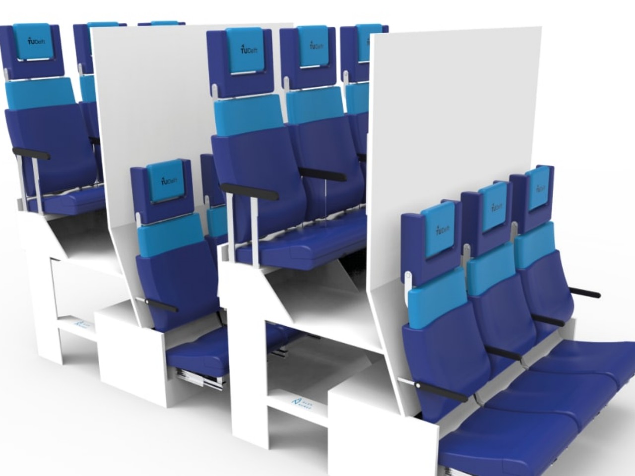
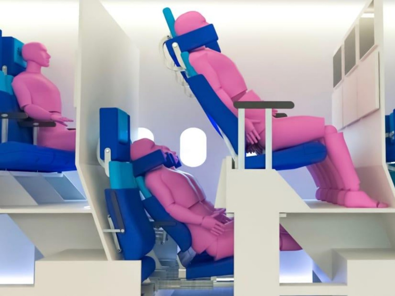
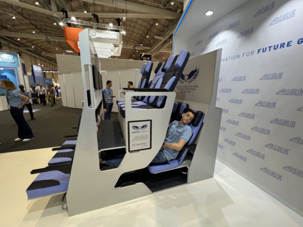
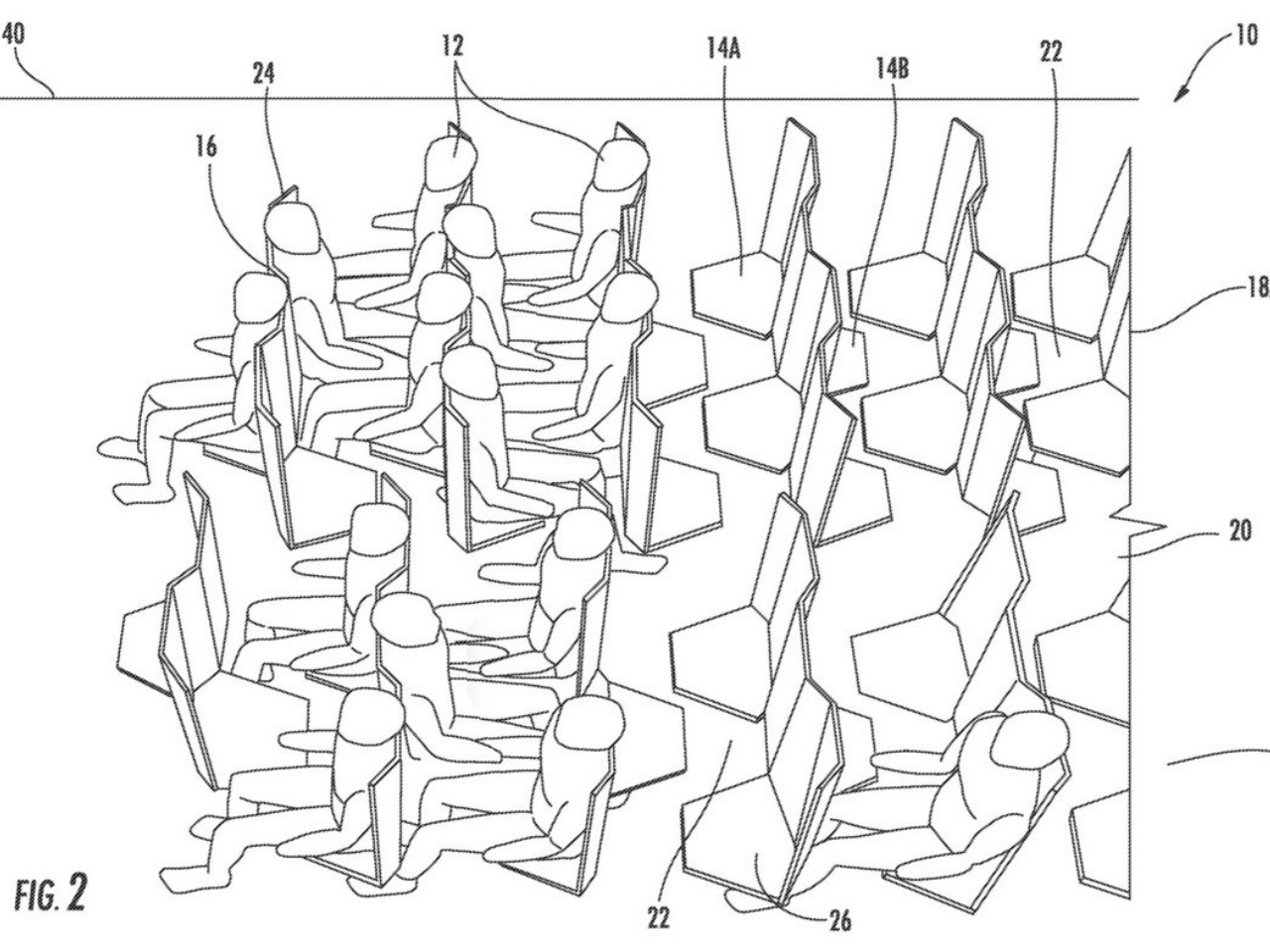
The Economy Class Cabin Hexagon concept, for example, made use of a zig-zagging layout that would make some passengers, some of whom might be complete strangers, awkwardly facing each other. The Chaise Longue design, on the other hand, implemented the “double-decker” idea that would theoretically give more legroom for people on the “lower” decks but also make them feel more cramped and almost claustrophobic. Neither concept has so far been implemented, but there are also plenty of examples out there that miss the mark, one way or another.
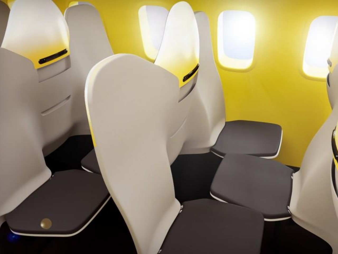
Designer: Zodiac Aerospace
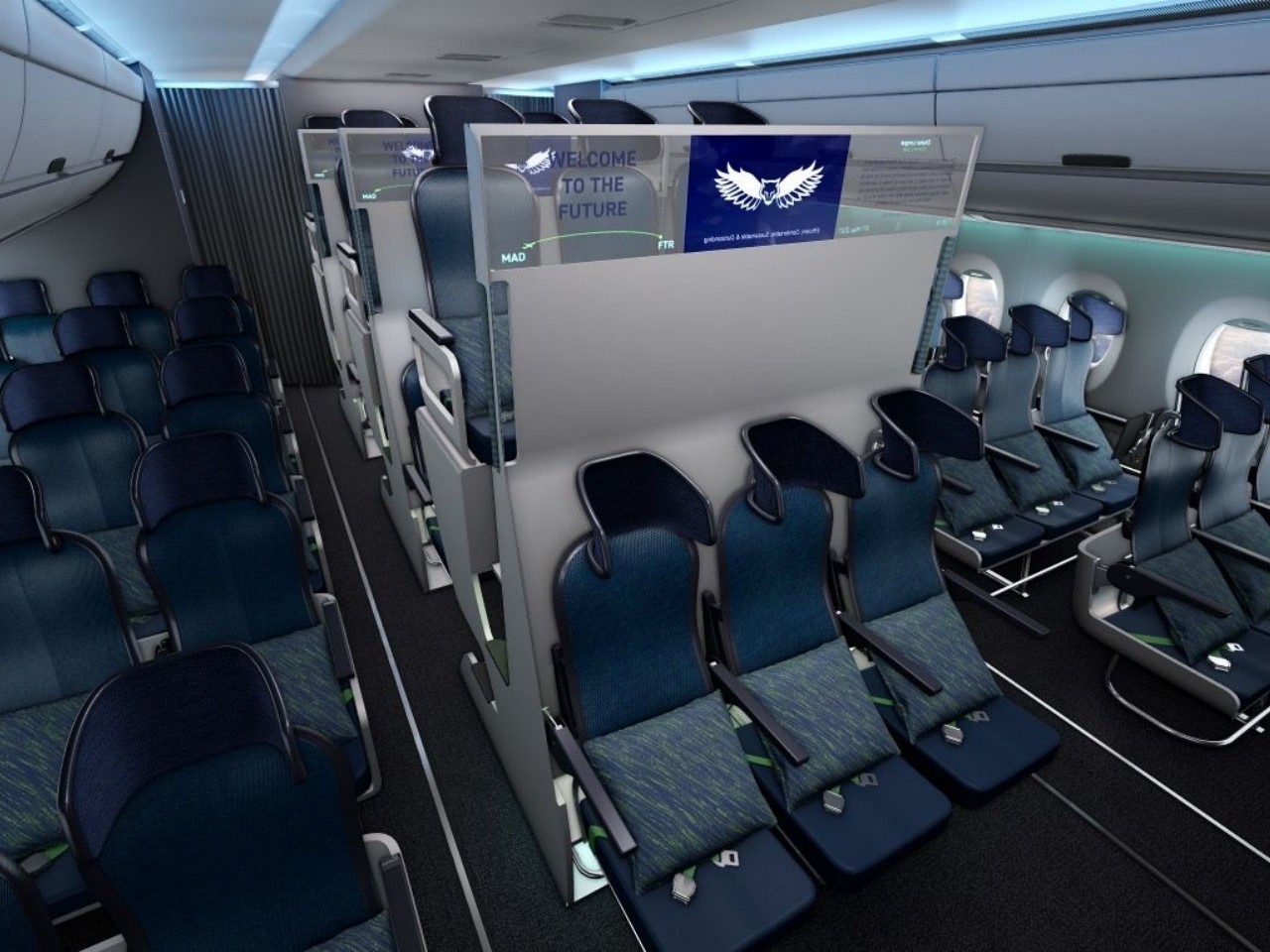
Designer: Chaise Longue

Final Thoughts

The design of airline seats is not a simple matter of choosing a form and a set of materials. There’s an ongoing tug-of-war between comfort and profit that also keeps changing over time. One generation might focus on comfort and luxury while succeeding generations might prioritize economy and efficiency. There’s also the matter of sustainability and eco-friendliness that is becoming just as important as these two factors. Airlines and designers must continually innovate and push the boundaries, looking not just for new materials but for better layouts and structures as well. Customers and regulators must also be vigilant that the interests of companies don’t overtake the experience of passengers. In the end, success in this domain hinges on understanding and anticipating passenger needs while crafting an economic model that sustains profitability amidst the ever-competitive skies.

The post High-Flying Designs: The Tug-of-War Between Comfort and Profit in Airline Seating first appeared on Yanko Design.
Transparent cockpits, VR headrests, etc. Here’s what flights could look like in the future, based on real patents

Over the course of 120 years, air travel has undergone a remarkable transformation.

Gone are the days of long flights with nothing to do except for stare outside the window as you eat your overpriced peanuts. Nowadays, passengers can enjoy perks like high-speed Wi-Fi, gourmet meals, and an endless selection of entertainment options. Yet, the quest for innovation continues. As shown by the latest patents from aerospace engineers, we can expect to see even more exciting developments in the near future. From VR-equipped seating, communal bathrooms, and robotic in-flight service carts, the airplanes of tomorrow promise to be even more incredible than ever before.

These rendered versions of actual patent files from airlines and aerospace companies paint a rather vivid picture of what the future of flight could be like, for pilots, crew, and even passengers. If the future is even half as exciting, we’re definitely in for a ride!

Designer: NeoMam Studios for HawaiianIslands.com

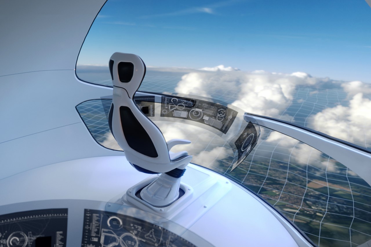
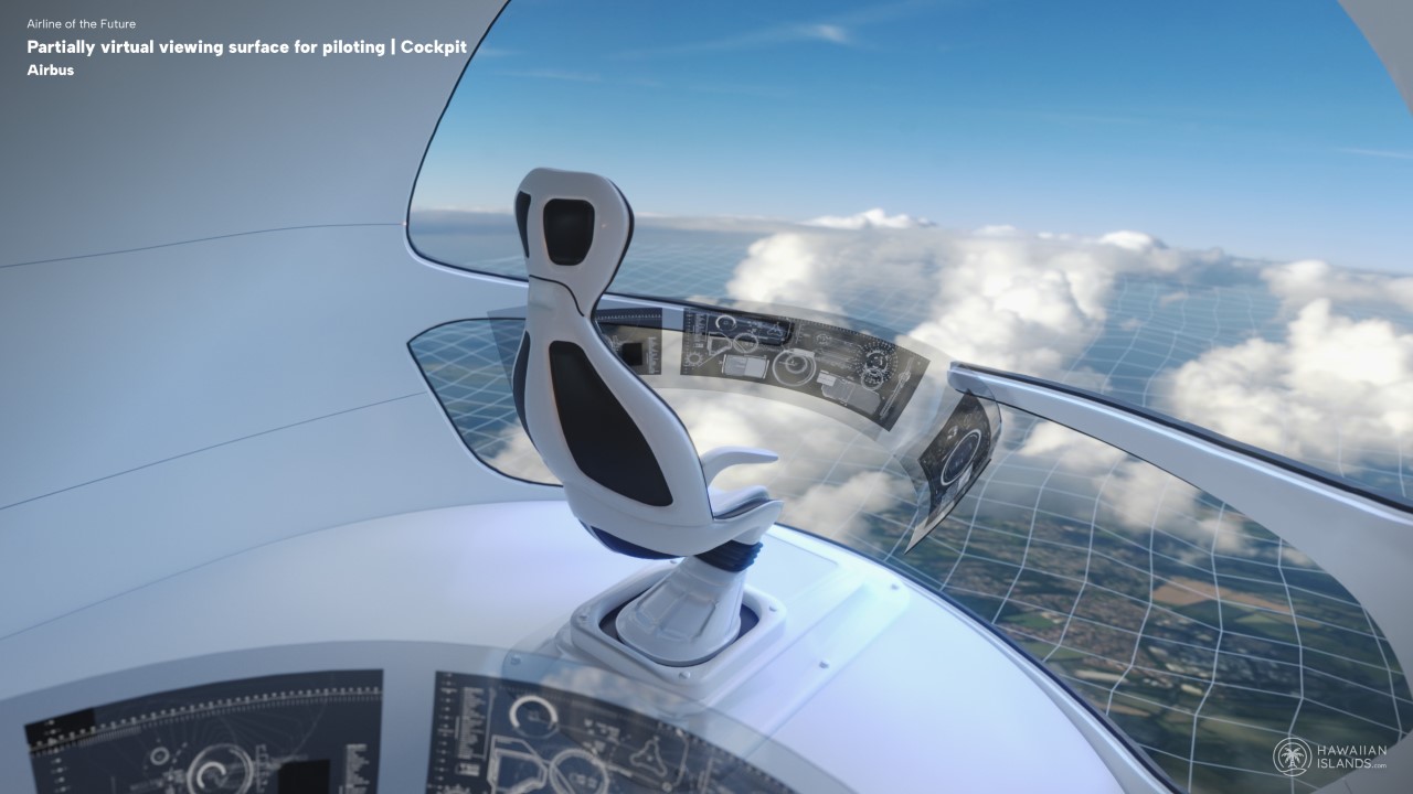
Virtual Cockpit by Airbus

Admittedly the flashiest patent file of the lot (not by a big margin, though), is this Virtual Cockpit by AirBus, which puts the pilot literally on cloud nine. With a panoramic glass facade on the front, and transparent OLED displays, this cockpit definitely feels a lot more interesting than the current kind we have. The various displays might offer a live video feed or 3D/augmented reality reconstruction of what’s outside; the 3D reconstruction could be loaded from a database and/or updated in real-time using live data. Can’t wait to try this one out in Flight Simulator…

First Class Interactive System by Airbus

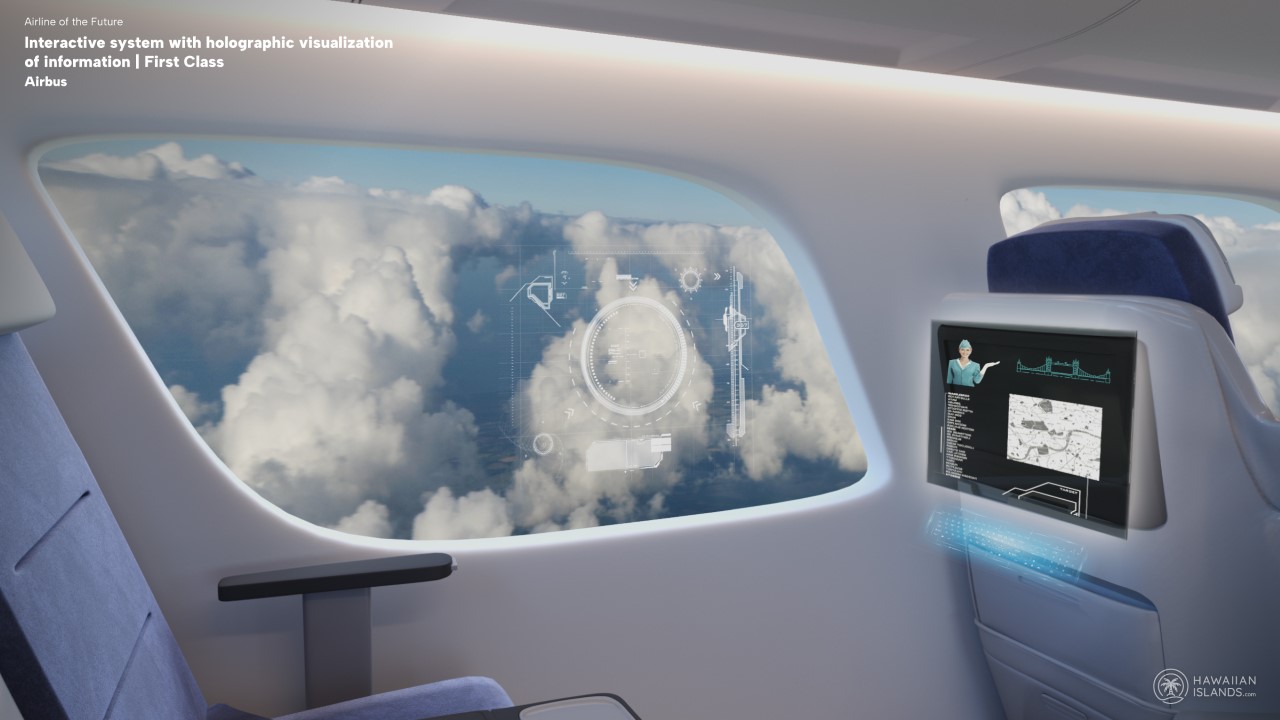
Airbus further extends this holographic technology to the passenger’s seat, with holographic infotainment systems on the front, and even on the window, letting you see your flight path against the stellar view of clouds. You might as well ditch your eye-mask at this point because there’s no way you’ll even want to sleep with this kind of information and technology at your fingertips. Author Will Self once lamented that we’ve lost our sense of awe at “being hurled by vast jet engines six miles high, then impelled down an Aeolian slalom into another time zone.” This patent by Airbus brings back that sense of awe.

Herringbone Seating by British Airways

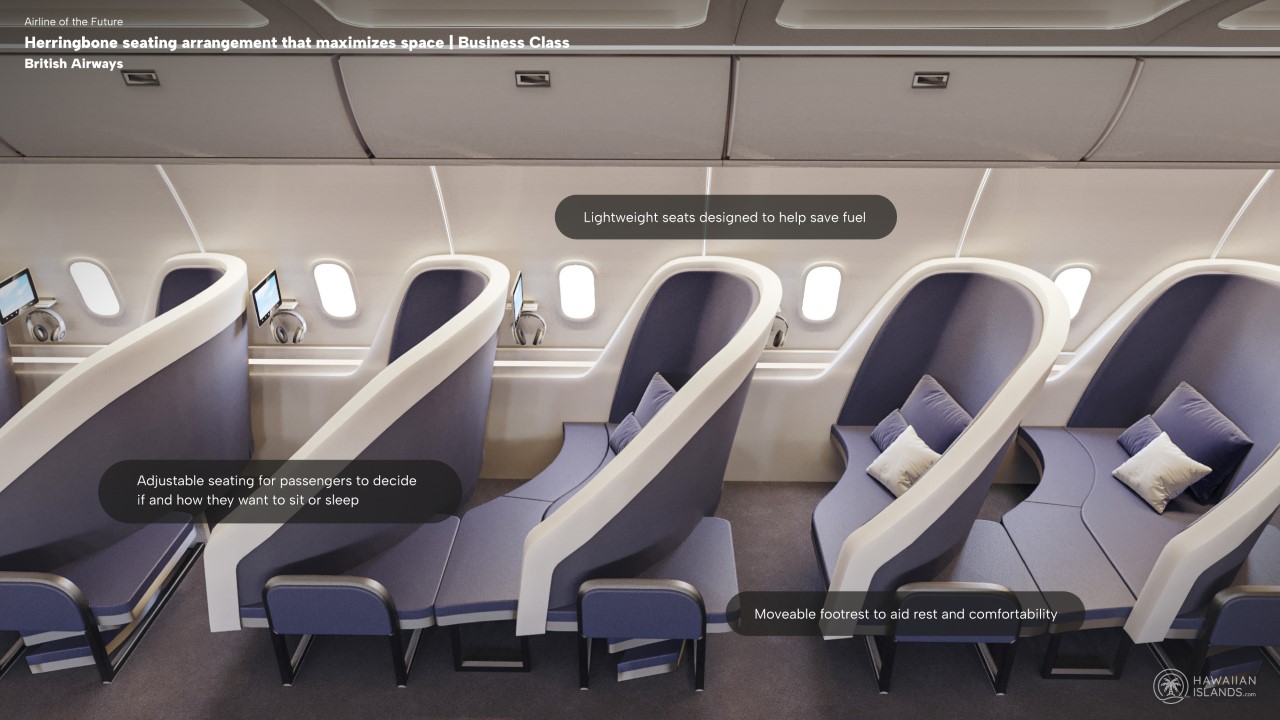
Business passengers tend to spend much of their time in the sky, which certainly calls for the need for a more comfortable riding experience for these premium customers. The sleek, herringbone formation of the seats optimizes space, providing ample room for business passengers to stretch out into the recess of the seat ahead. The seats are wide, rather than deep, and curve sideways like a chaise lounge to offer a way to recline and sleep without actually reclining the seat itself. Each seat is paired with a tail-shaped table of the same size, which offers enough space to store essential items underneath.

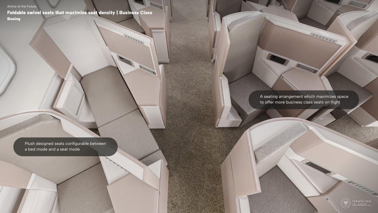
Foldable Swivel Seats by Boeing

While the previous patent focused on space and comfort, this one plays around with the idea of offering space in an optimized fashion. Instead of lining up seats back to back, the patent rendering shows seats placed at an angle, so as to offer more legroom by making you sit at an angle instead of straight. There isn’t much compromise in this format, thankfully, and instead of reclining, the seats slide forwards with the backrest collapsing downwards as a result to turn into a railway-style berth. It’s a privilege that Boeing only extends to its Business Class members, unfortunately…

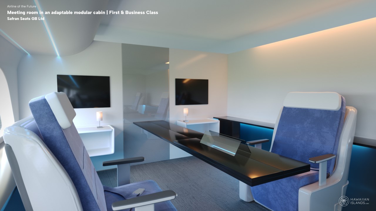
In-Flight Meeting Room by Safran Seats

This one is reserved for the business class by virtue of the fact that it’s quite literally meant for business! Designed by Safran Seats, this in-flight meeting room is modular, allowing different configurations and meeting safety requirements. In the air, the room serves as the perfect environment for a long, important business discussion. During take-off and landing, however, partition walls can be stored away and furniture such as tables can be moved from the aisle to allow for easy access. Each seat unit has the capability to accommodate one or more passengers, with the added convenience of being able to convert at least one seat into a comfortable bed.

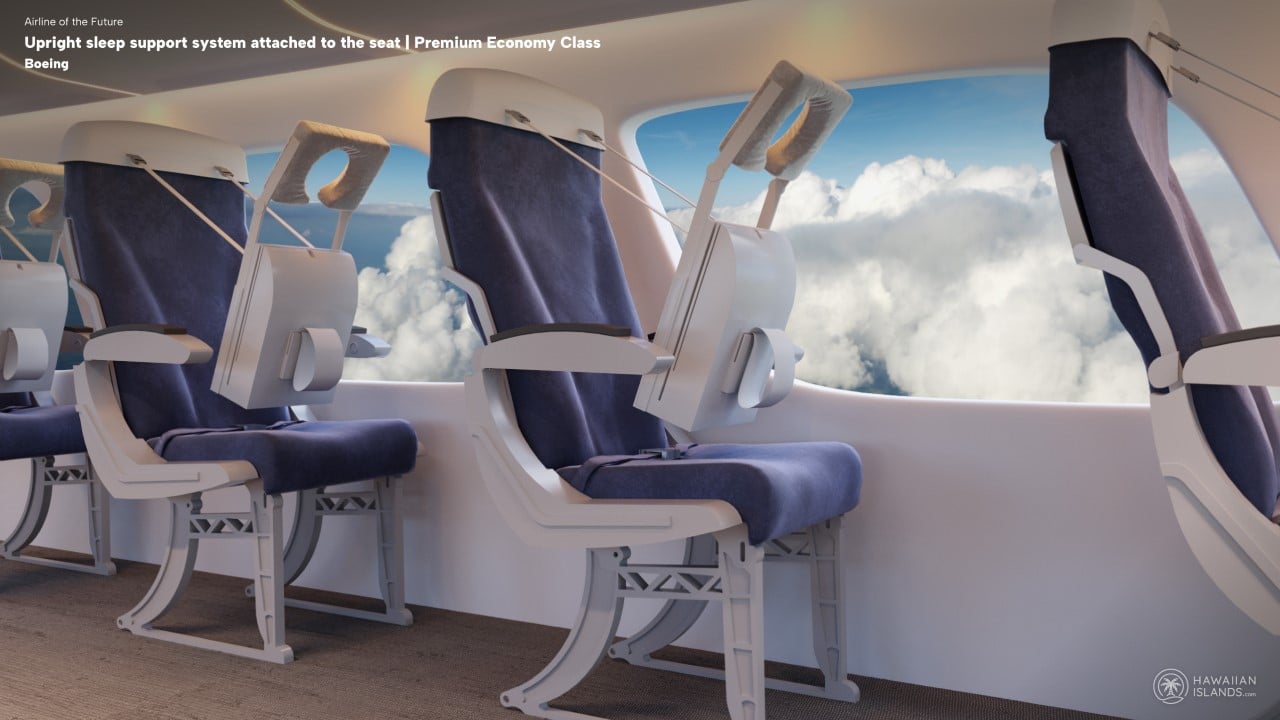
Upright Sleeping System by Boeing

Speaking of comfortable beds, this one from Boeing hopes to give you a better alternative to hunching over your table or collapsing on your co-passenger as you try to get through a red-eye flight. The upright sleeping system is a decidedly odd seat design that helps passengers lean forward and sleep comfortably. Sort of like emulating a massage chair, the seats come with a head pillow to rest your face in as you sleep, and a looped sleeve to rest your arms in so they don’t dangle aimlessly beside you. Doesn’t look great, admittedly, but it’s a lot better than collapsing out of your seat as you try to find a surface to lean against.

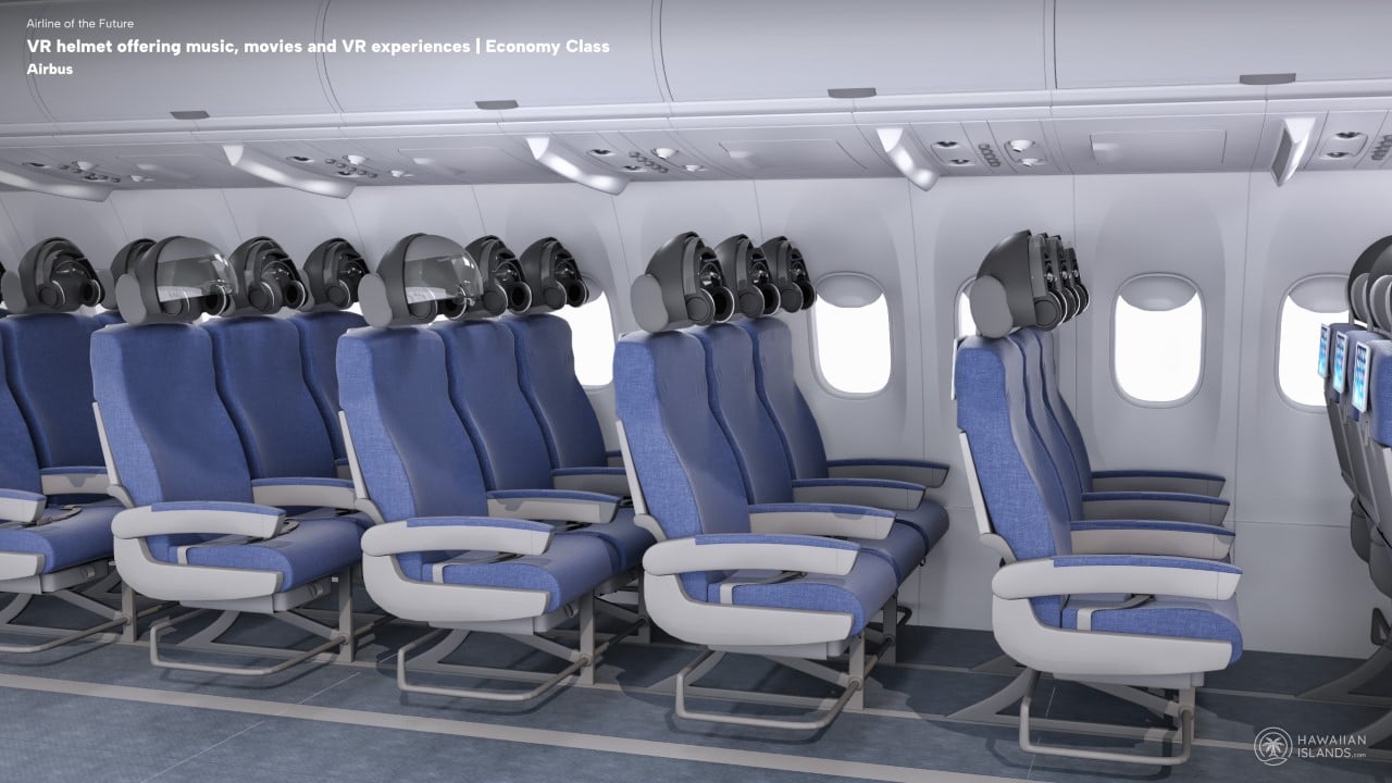
In-flight VR Helmets by Airbus

If the idea of a weird contraption to sleep against doesn’t inspire confidence in you, allow me to present a future truly worth being excited about. Detailed out by Airbus, this Economy Class seating arrangement doesn’t have an infotainment system – instead, it has a dedicated VR headset for each passenger, allowing you to truly immerse yourself in a new world as you fly over your existing world. The helmets offer movies, music, and other VR experiences while also allowing you to get some privacy if you want to just sleep in them. They’re even optimized to work as air conditioning units so you don’t have sweat rings on your forehead after 3 hours of binge-watching movies.

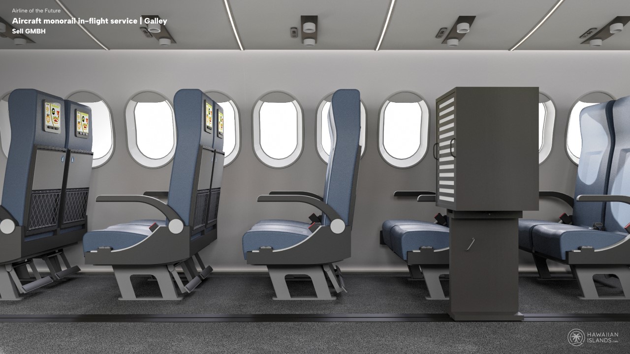
Monorail Food Cart by Sell GmbH

Ever found yourself on a flight that’s just taken off and you absolutely can’t wait for the refreshments trolley because you barely got to eat before the flight? To make matters worse, you’re seated in the middle of the plane, so it’s gonna take a while for the flight crew to get to you. In comes the Monorail Food Cart – a robotic cart that simply glides down the aisle to give you your food. Orders are placed electronically, ensuring the monopod has an efficient itinerary, serving everyone in good time instead of cruising down the aisle row after row and taking practically forever.

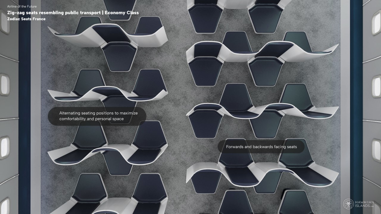
Zig-Zag Seating by Zodiac Seats France

I vaguely remember an airline suggesting a ‘standing section’ for passengers (it was Ryanair, I believe) to help cut costs. While that sounds like a disastrous idea, I don’t put it past airlines to think of new ways to make flying more ‘efficient’. In come the Zig-Zag seats from Zodiac Seats France. They aren’t as bad as Ryanair’s standing seats, but they do propose something weird – a bus-style seating arrangement with people facing each other to help efficiently pack more passengers into the same space. This new setup involves giving each passenger their own private space without having a co-passenger leaning against them. Everyone gets their dedicated space with leg-room, with a significant caveat of not a single seat having armrests. Sigh…

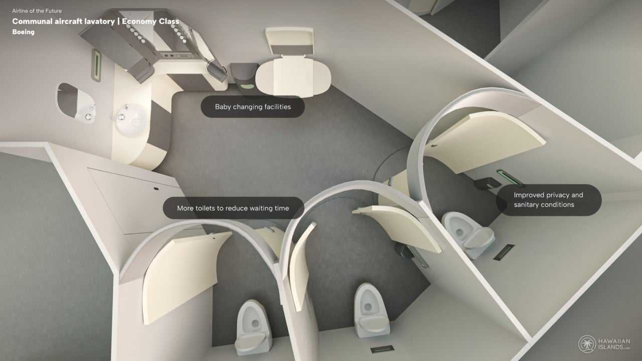
Communal Lavatory by Boeing

All good things come to an end, and ours ends in the lavatory (quite the metaphor, I say). This communal lavatory by Boeing presents a more natural toilet arrangement where multiple people can access the facilities without having to wait in line. The lavatory comes with one outer area for washing up, and three cubicles for deploying the goods. Boeing also apparently proposes a standing urinal, although I wouldn’t want to step into that lavatory after turbulence…

Image Credits: HawaiianIslands.com

The post Transparent cockpits, VR headrests, etc. Here’s what flights could look like in the future, based on real patents first appeared on Yanko Design.
Tocco Toscano and Singpore Airlines upcycle life vests to accessories

Who among us actually pays attention to the safety demonstration on flights, especially if you regularly fly on a plane? Most of us would probably just browse the in-flight magazine or do something else rather than listen to it for the nth time (even though of course we know how important this is). One thing I do wonder when looking at the flight attendants showing us how to use the vests and oxygen masks is where can I actually get one as a souvenir or a keepsake (don’t try taking one home though as it’s against regulations).

Designer: Tocco Toscano / Singapore Airlines

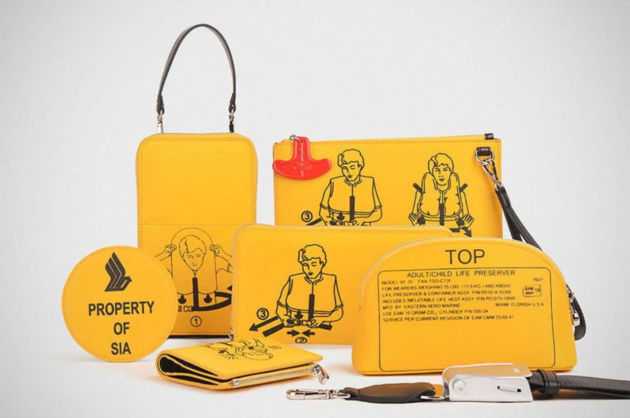
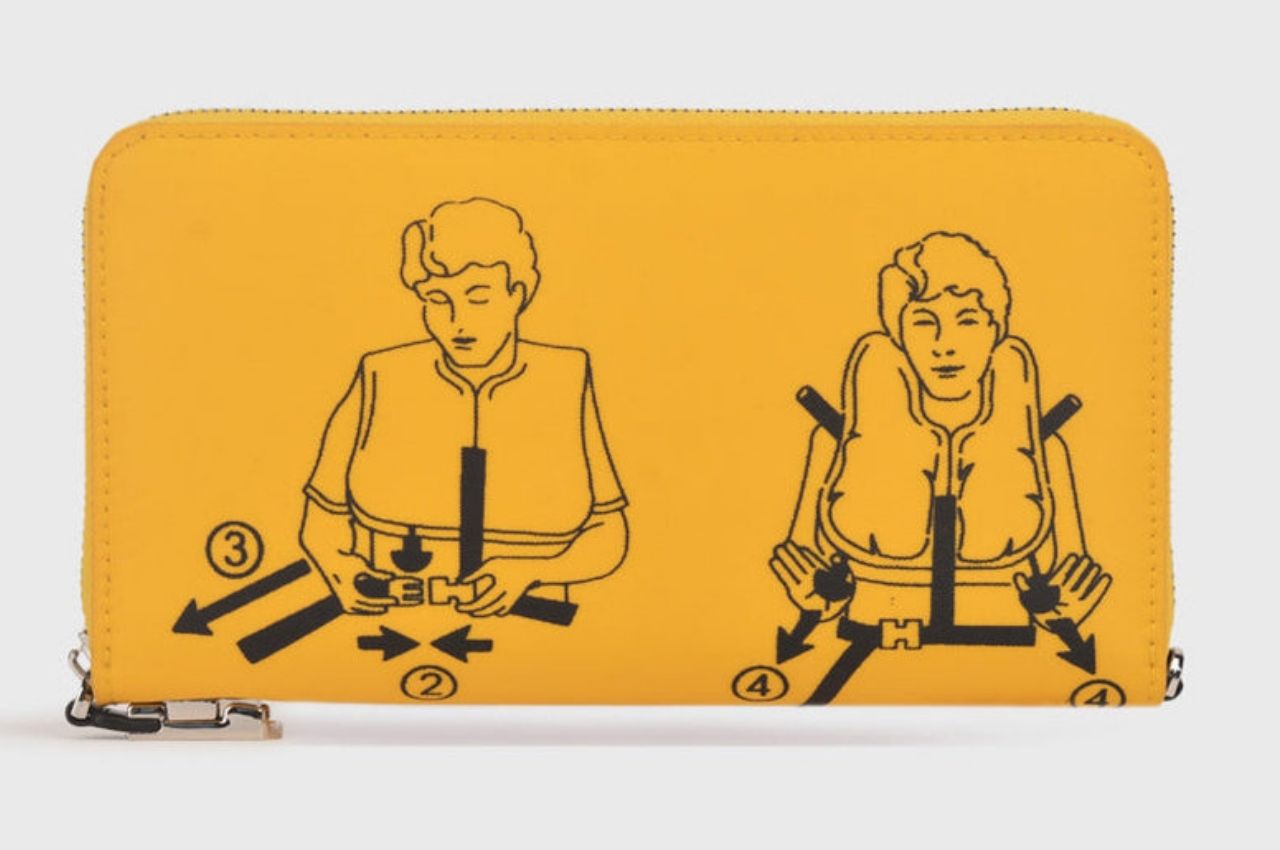
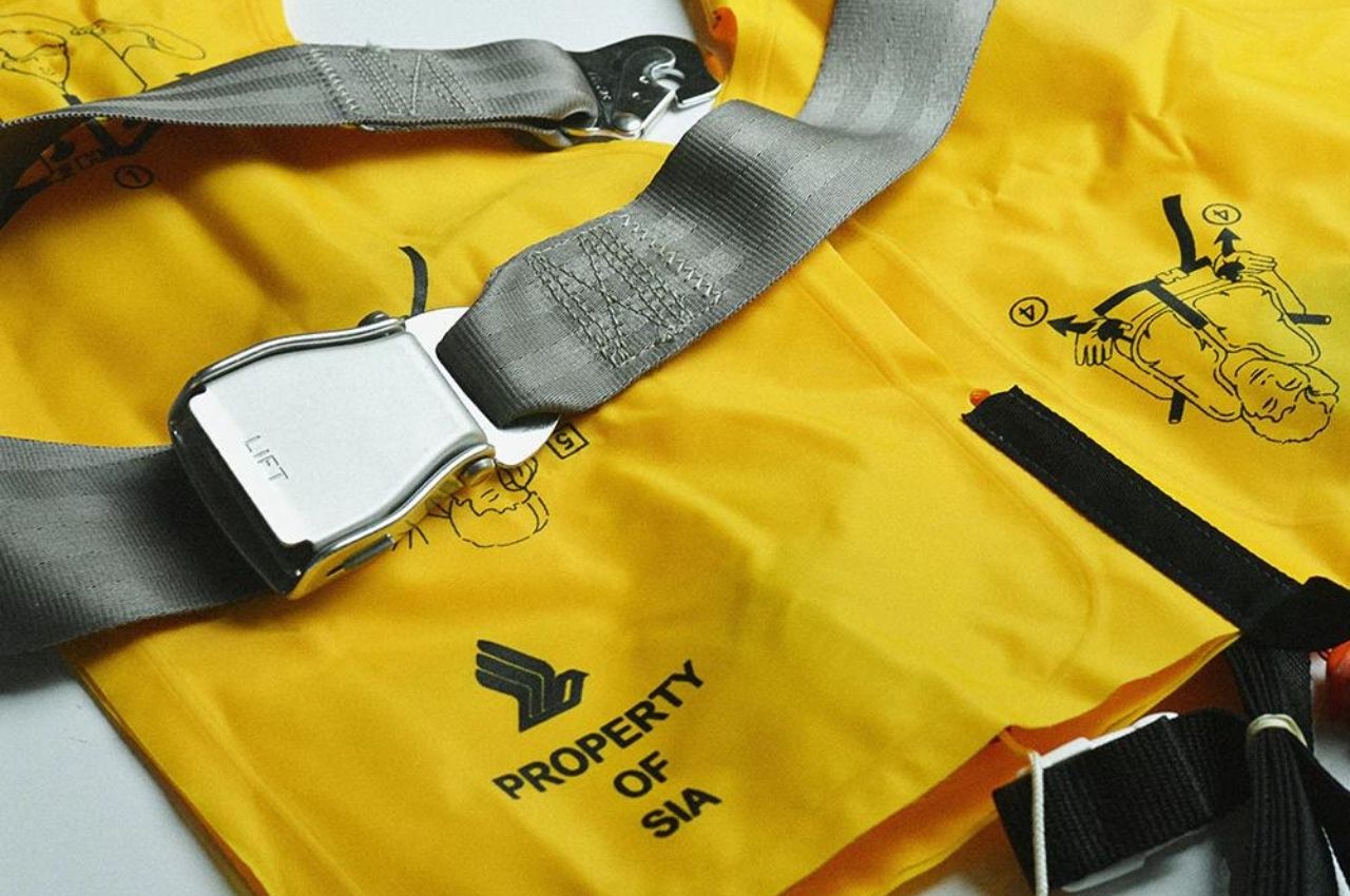
While you still won’t be able to get an exact replica of the actual airline life vests and seatbelts, you can now actually get some part of it through upcycled fashion items. Singapore Airlines partnered with local women’s handbag manufacturer Tocco Toscano to come up with a whole accessory line using the “expired” or decommissioned airline life vests. Instead of them just adding to this planet’s unrecycled trash, we will now see these life vests recycled into fashion and functional accessories.

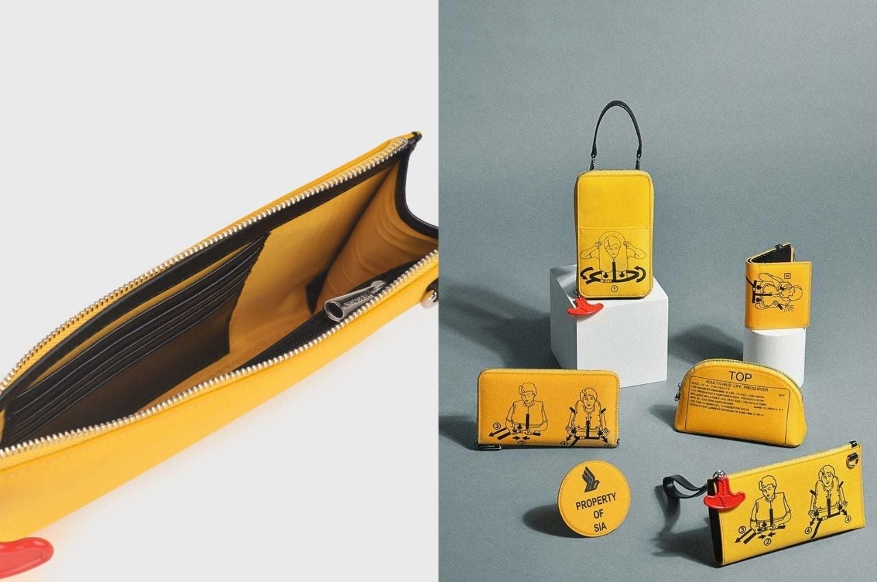
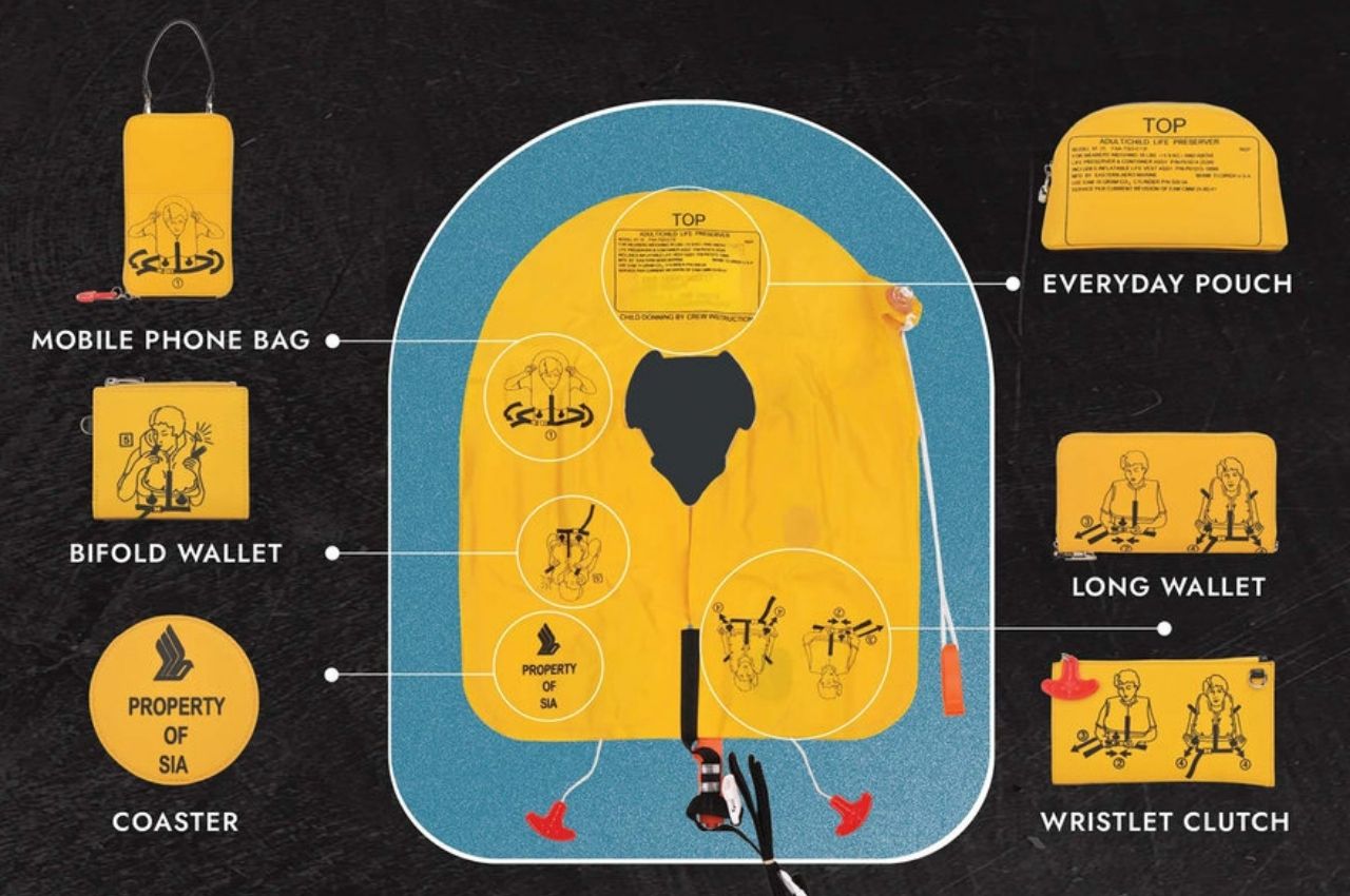
Each life vest is turned into six things that are pretty useful and functional. You’ll get a mobile phone bag, a coaster, a bifold wallet, an everyday pouch, a long wallet, and even a wristlet clutch. The seatbelts that are also now unused are also turned into bag straps that you can use not necessarily with these life vest accessories but for your other bags and pouches that may be in need of straps. We won’t be surprised if we’ll eventually see masks or even airplane seats eventually upcycled into something else.

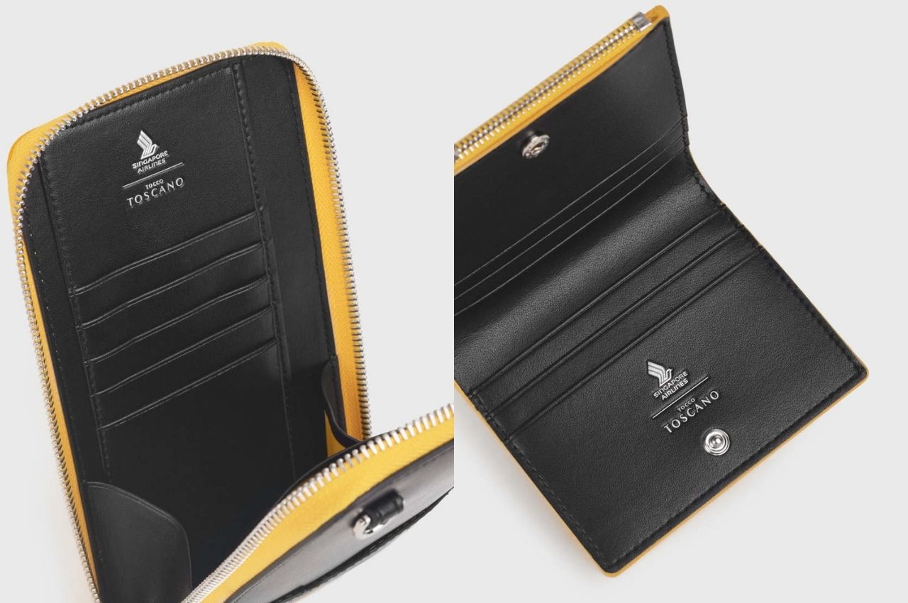
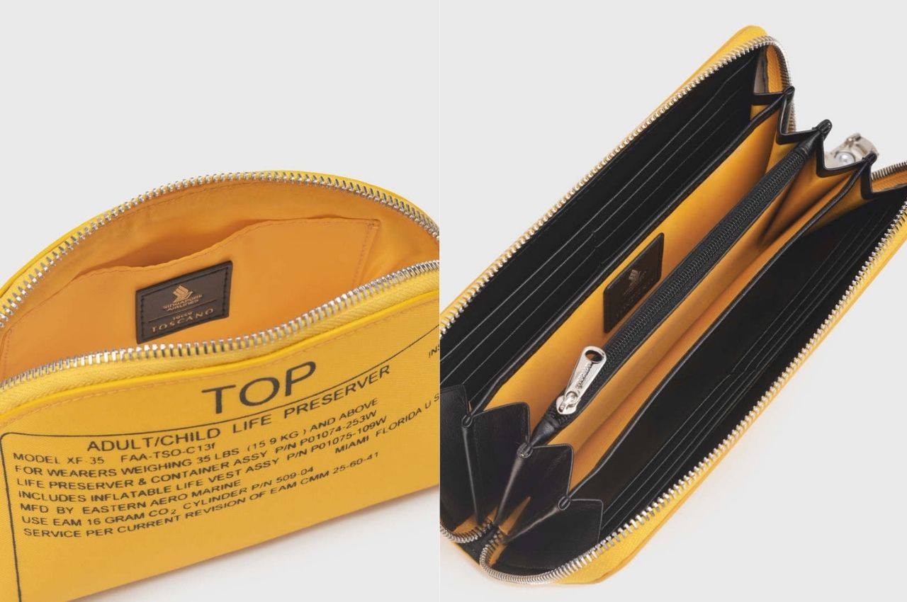
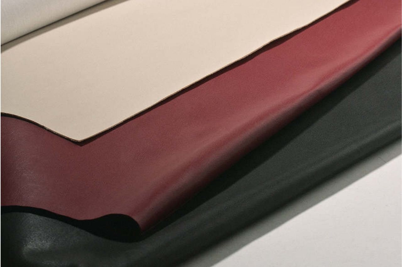
Each of these accessories is reinforced with apple weather and even that leather substitute is made from recycled materials from, you guessed it, apple waste. Interestingly enough, the vests are cut in a way that you still see the graphics, illustrations, and even instructions that you would see on the actual vest. It carries the usual Tocco Toscano branding elements and features alongside the Singapore Airlines logo. So if you’re a fan of either or both, this may be a collectible item for you.

There are different bundles available if you’d like to get all or some of these accessories but they’re also available individually. It would also be nice if you could buy some items in-flight. I’m not really a fan of the color yellow so this may not be in my to-buy list but since some of them are already sold out, there is a market for this. Looking forward to more upcycled and recycled airline materials.

The post Tocco Toscano and Singpore Airlines upcycle life vests to accessories first appeared on Yanko Design.
This hydraulic bus lifts its entire cabin upwards to let passengers directly enter their flight

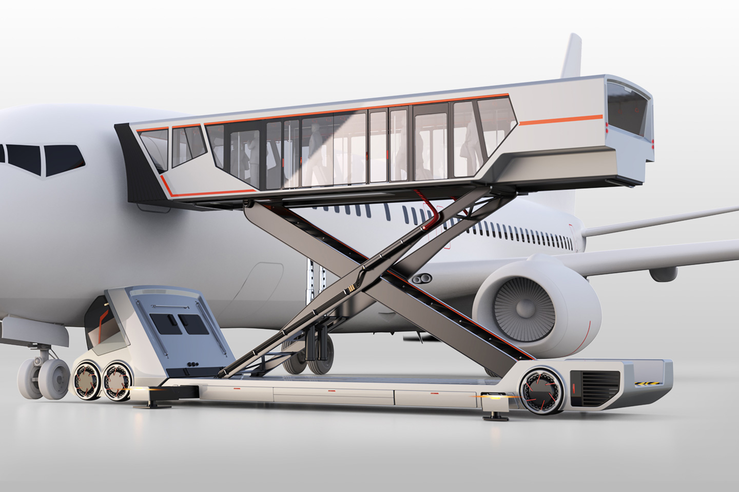
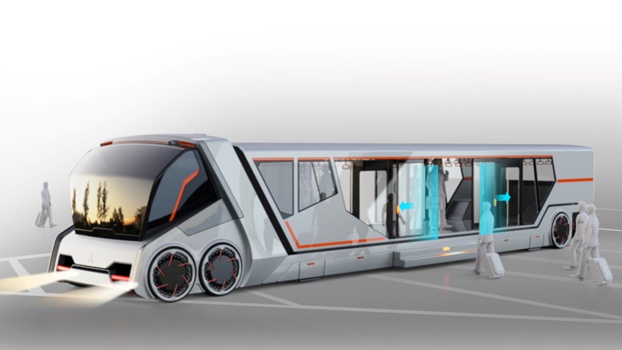
There are two things I dread about flights. A. having noisy kids on board, and B. not getting to use the skybridge, or that ramp that lets you directly enter the plane. Most budget airlines don’t offer the skybridge service, and as a result, you have to be ferried around in a bus to your flight, where you climb up the stairs to enter the cabin. It honestly isn’t the worst thing in the world, but I do think there’s a better way to have passengers board their flight. For the most part, the X-ferry Bus concept seems to be that solution.

Designer: Li Jiali

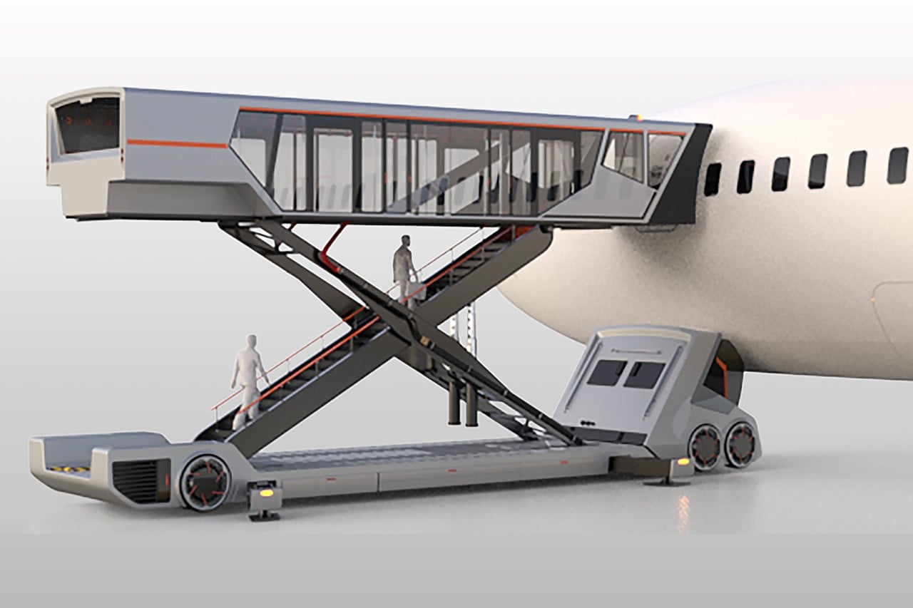
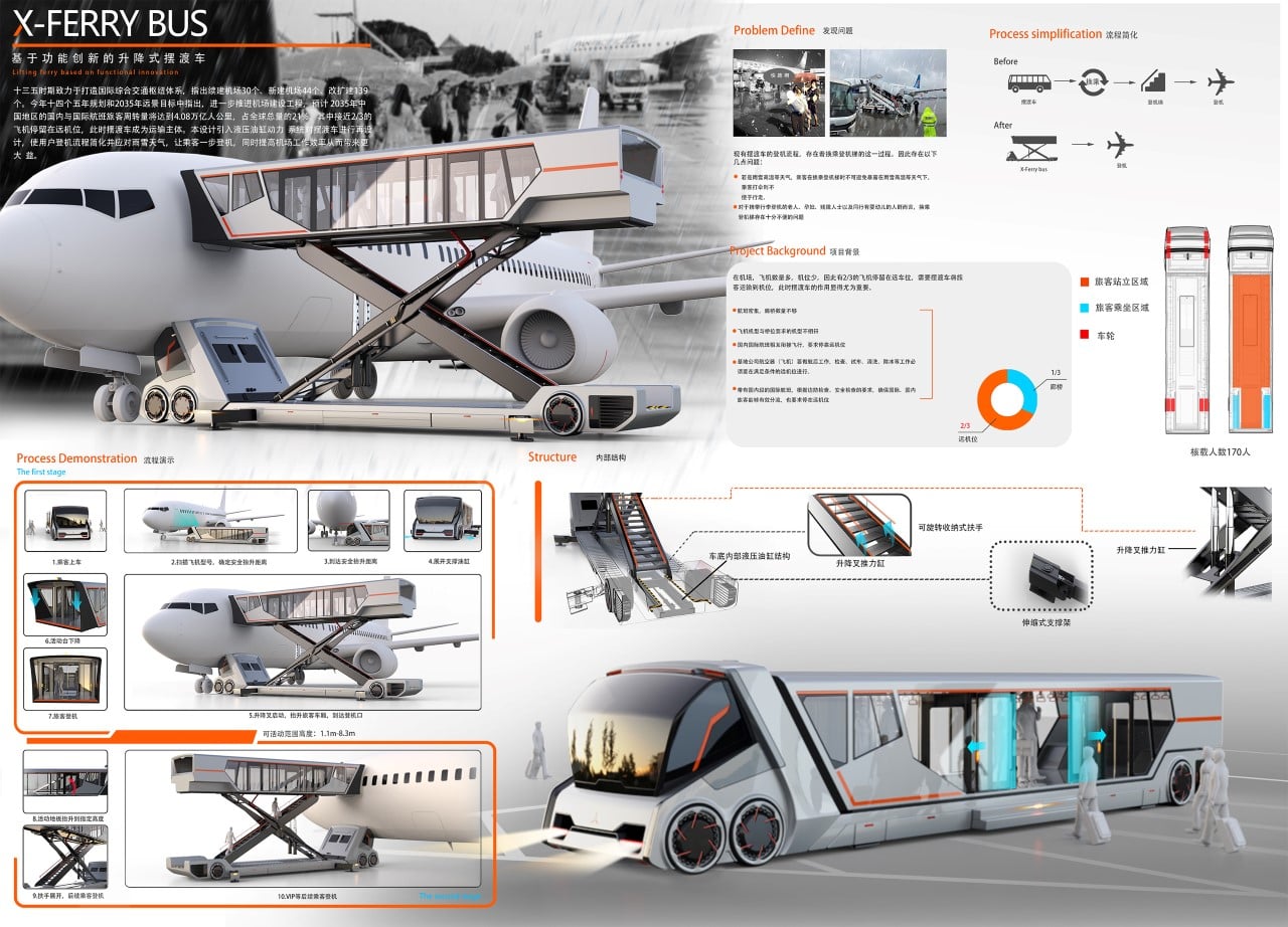
A Future Star Award-winner at the Goldreed Industrial Design Award, the X-ferry Bus is a clever hybrid between the ferry bus and the skybridge. It comes with an independent cabin that dislodges off the bus’ body (sort of like the loading area of a dump truck) and hydraulically lifts upwards. The cabin then aligns directly with the entrance of the airplane, and a door opens, allowing passengers from inside the bus to exit the bus and directly enter their flight. Pretty clever, no?

The X-ferry Bus has its own distinct advantages. For starters, it’s an incredibly convenient solution for passengers and airlines alike, providing a comfortable boarding process that isn’t filled with crowded lines, irate passengers, and long wait times. The X-ferry Bus proves to be even more useful in bad weather conditions since passengers don’t have to worry about getting caught in the rain or snow as they deboard the bus and rush up the stairs to enter the aircraft. Finally, passengers with disabilities have it easy too, since there aren’t any staircases to overcome either, making the X-ferry Bus an incredibly accessible solution!

The post This hydraulic bus lifts its entire cabin upwards to let passengers directly enter their flight first appeared on Yanko Design.
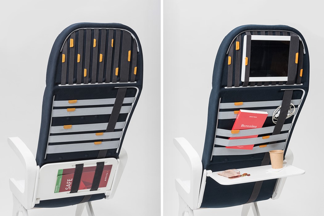
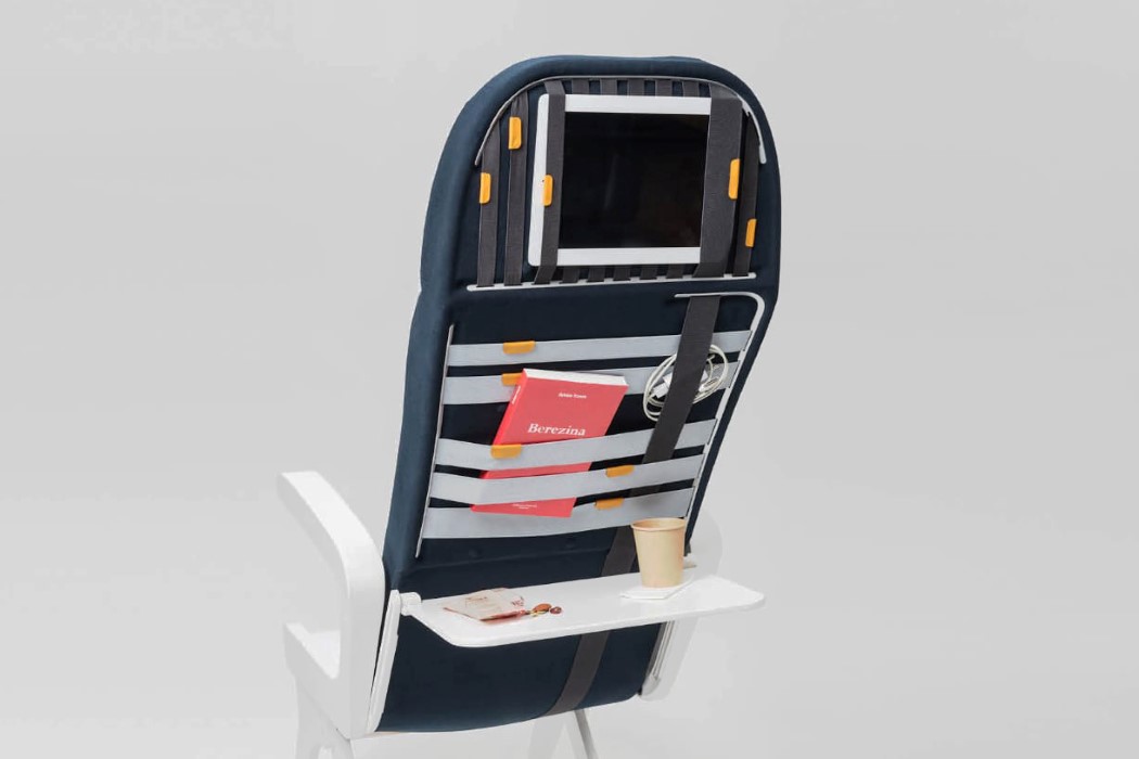
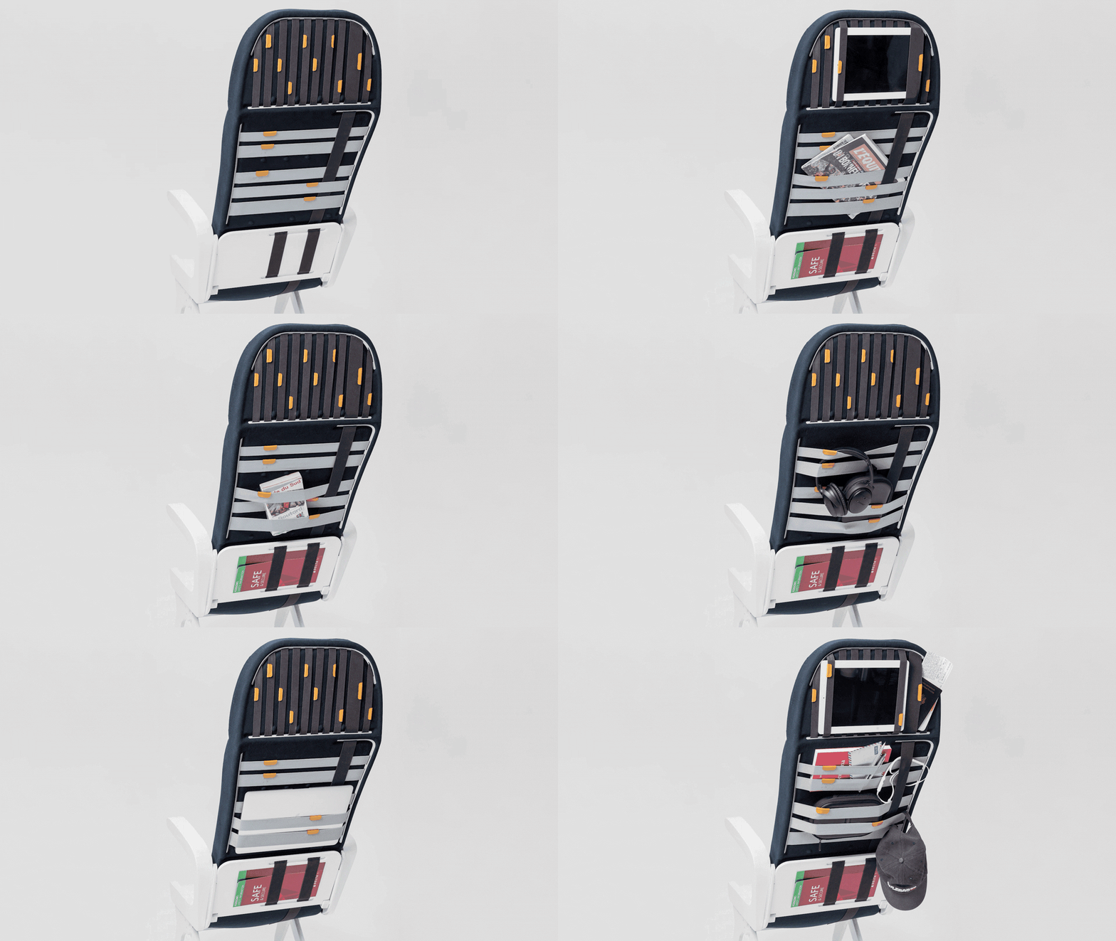
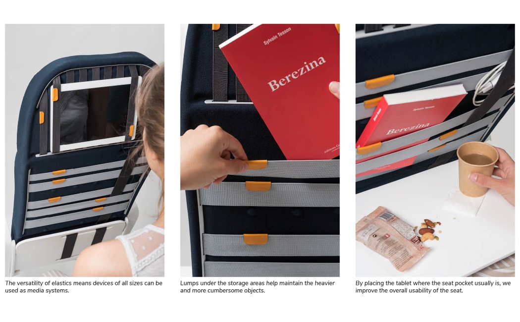
Innovative strap-system on the back of this airline seat makes it easy to store all your belongings

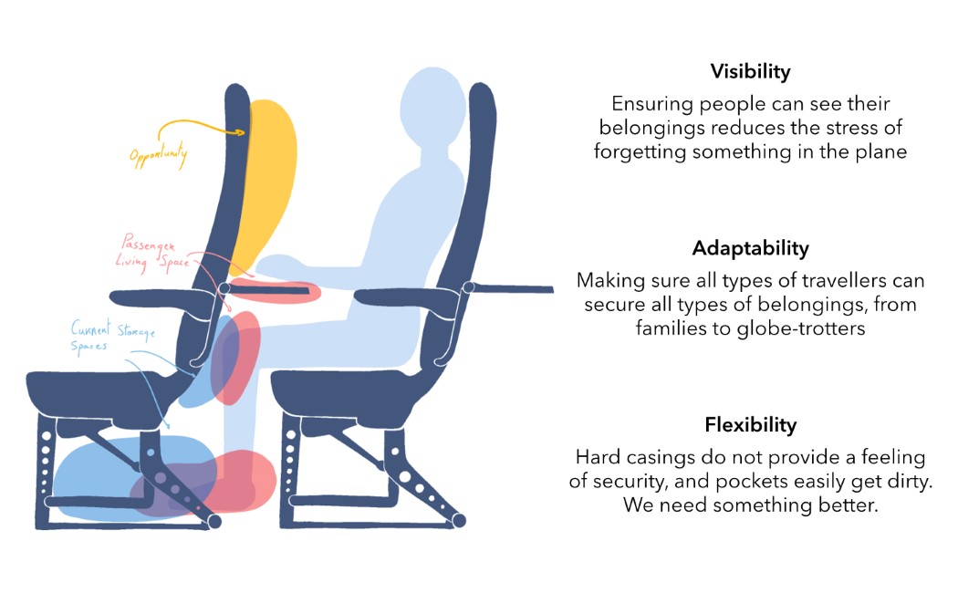
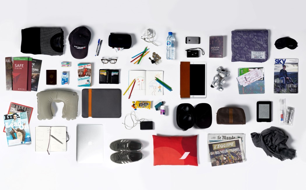
You could potentially spend anywhere from 3 to 20 hours on a single flight… which is why airline seats are designed to be less like furniture and more like a microliving space where you can either sleep, read, eat, or just admire the scenery from the window. The chairs recline, they come with dedicated fans, lights, a foldout table, and even a button to summon the flight staff, but they offer little when it comes to storing your regular belongings. Sure, there’s space right beneath the seat in front of you, but that isn’t always easy to access; and sure there’s a pouch near the foldout table, but it can barely store the security pamphlet, a magazine, and an air-sickness bag.

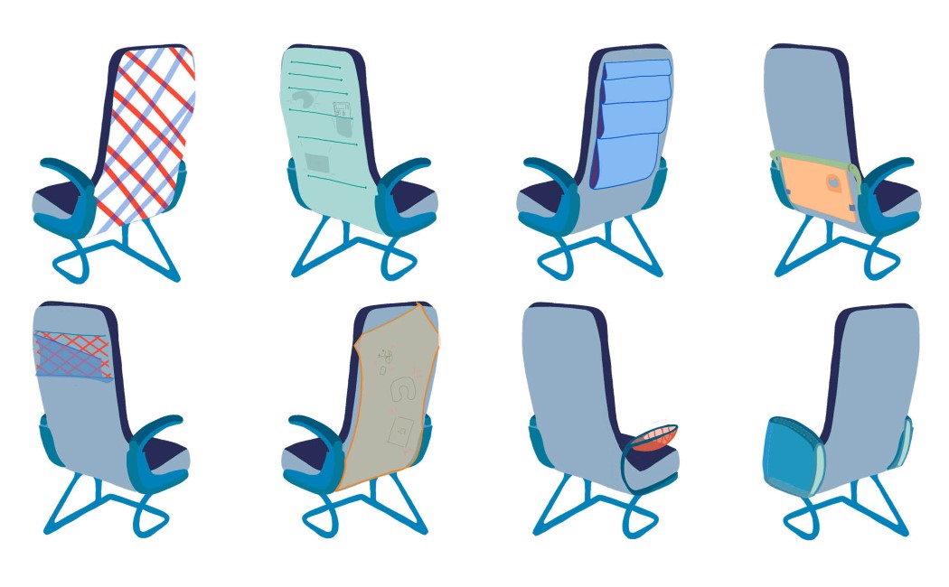
‘Strap’ is a system that relooks the way the back of the airline seat is laid out. Designed keeping that very microliving approach in mind, the back of the seat is transformed into a micro-closet using a web of elastic straps that criss-cross from top to bottom and left to right. These straps, which remain flat when not in use, are wonderful for tucking things into and latching things onto. You could potentially stash your bottle in them, dock your iPad in them, tuck your passport, boarding pass, book in the straps, and use them in a whole variety of ways to store things but allow them to be accessed easily. The Strap’s system is incredibly freeing, and offers you with the ability to use it exactly how you see fit. From storing your spectacles or neck-pillow, to even potentially using it to hang your headphones or your kid’s toy, the Strap system is quite literally limitless… and it doesn’t obstruct how the fold-out table works either!

Designers: Ulysse Van Duinen & Donatien Lenoir

Also Read: This Strap-based Laptop Sleeve lets you carry more than just a MacBook!

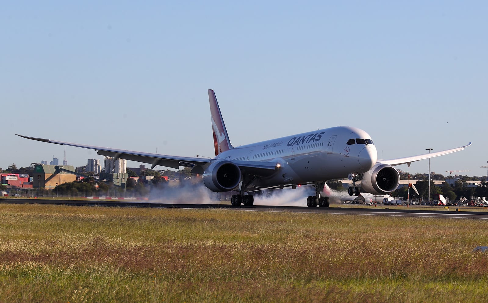
Qantas completes record 19-hour flight to test limits of air travel

Qantas just broke a record for air travel, and it may have helped science in the process. The Australian airline has completed the first non-stop commercial flight from New York City to Sydney as part of a project researching the effects of very lon...
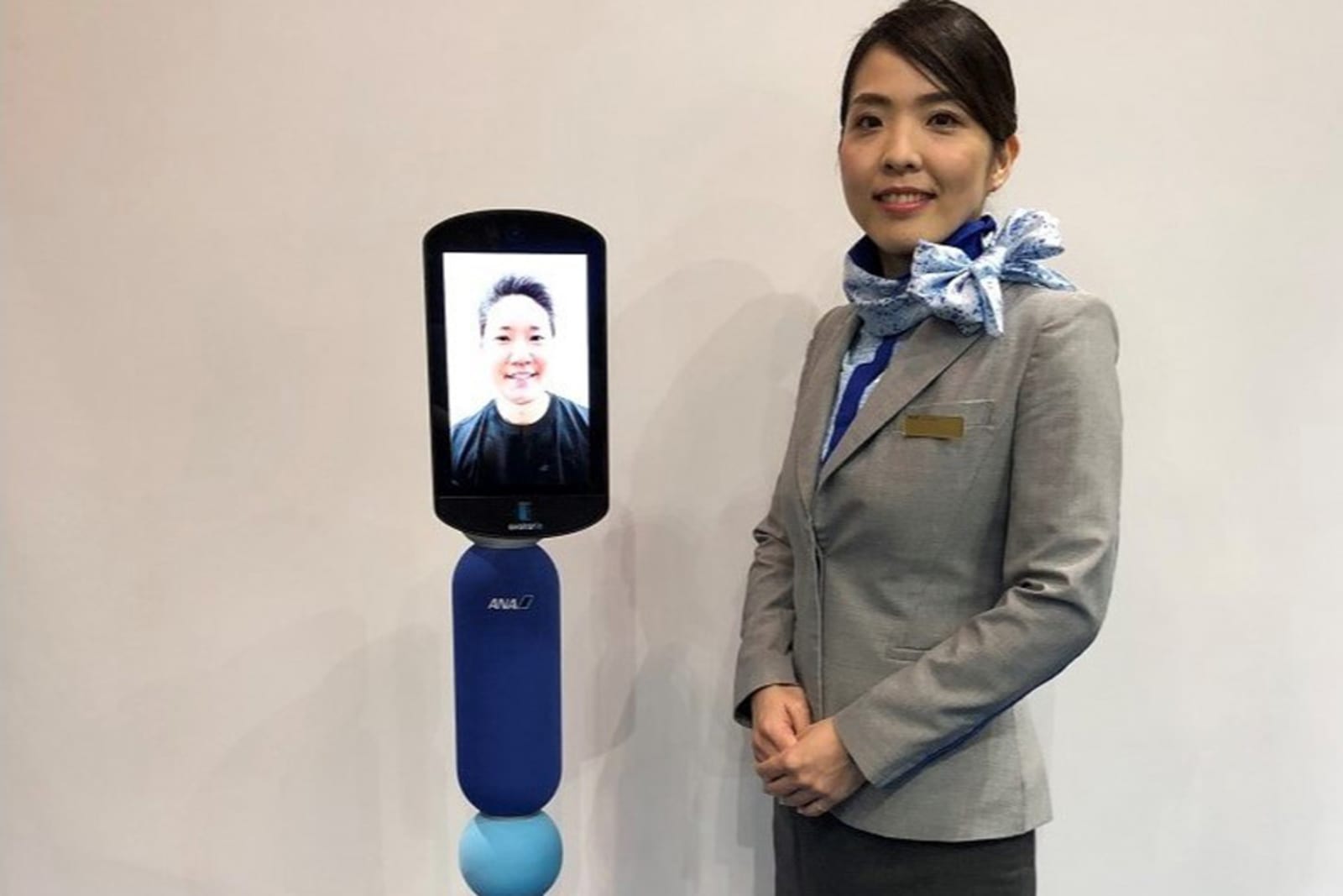
Japanese airline’s robots could let the elderly ‘travel’ from home

If your inability to travel prevents you from embarking on a dream vacation, a robot might one day stand in your place. Japan's All Nippon Airways has unveiled plans to deploy 1,000 "Newme" telepresence robots as surrogates for people whose health pr...