An iPhone 14 design with a solo powerful rear camera + more concepts to satisfy your love for all things Apple!

Since its foundation in 1976, Apple has been always been at the peak of modern innovation! And let’s take a moment to appreciate all the awesome products and inspiration Apple has provided us with. The groundbreaking tech giant never fails to surprise us, we always find ourselves biting our nails and squirming with curiosity, whenever Apple announces a new product launch! Their ingenious and mesmerizing designs and design philosophy have inspired and influenced designers all over the world, resulting in some pretty unique Apple concepts! These Apple-inspired designs are the best of the lot and a dream for every Apple lover. Although we’re pretty satisfied after Apple’s latest launches, we can’t help but just hope that Apple converts these into a reality soon as well!
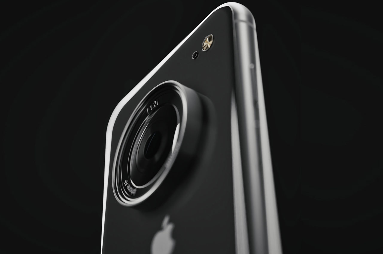
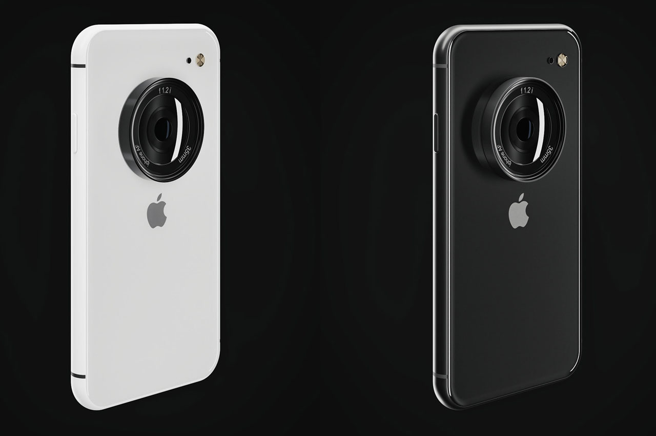
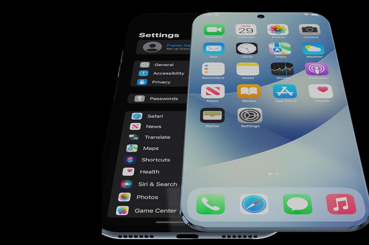
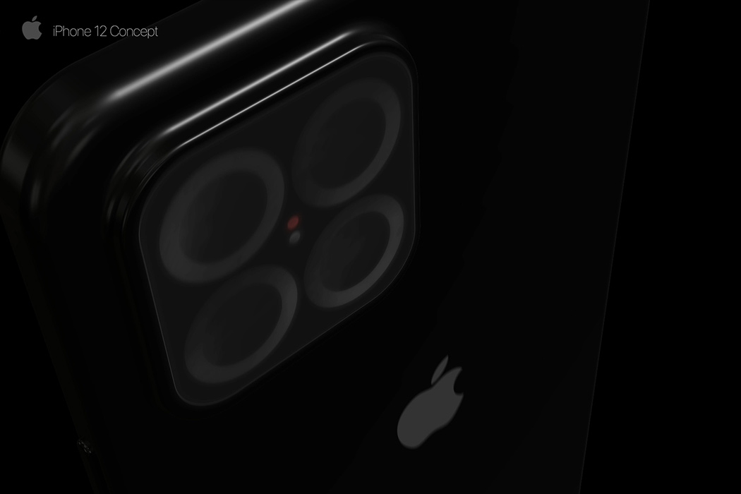
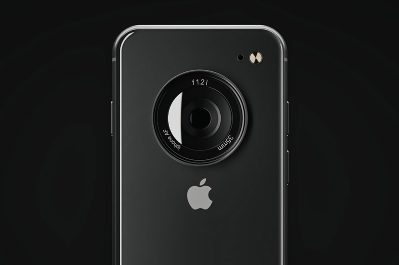
How the next exciting iPhone will look is anybody’s guess, for now, to be frank, but industrial designer Laci Lacko believes it could be a radical leap with its roots tracing back to the iPhone 7 series. That similar rounded side design lending it a thin feel in hand. Surprisingly, the designer doesn’t give us a peek into the front of the device, but going by the rumor mill, it should have minimal (as compared to iPhone 13) or no notch at all. What’s highlighted in this concept phone is the rear camera module. A big protruding single 35mm lens setup that has an f1.2 i aperture sensor promises the ultimate photography experience. Something comparable to a DSLR.
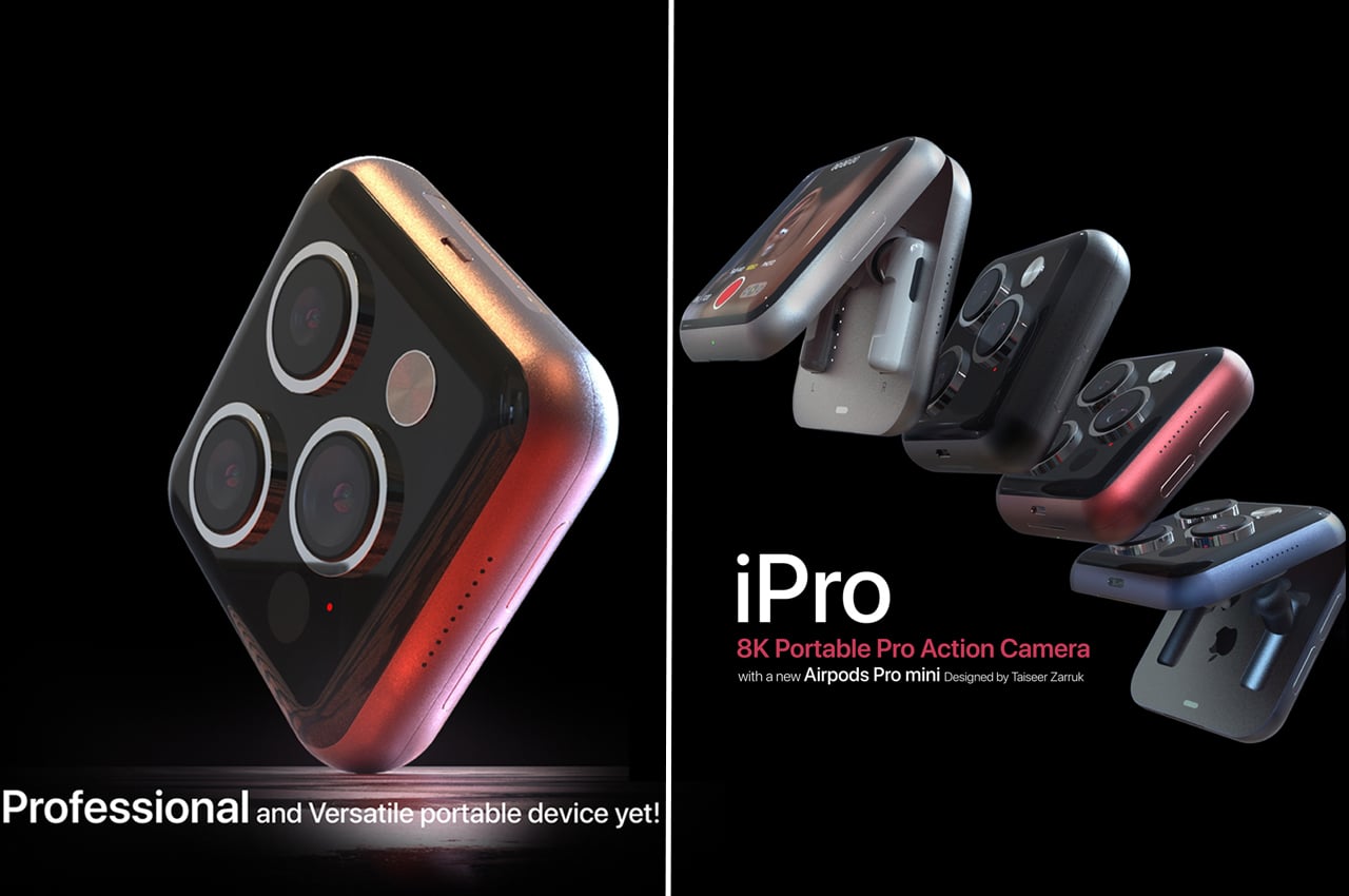
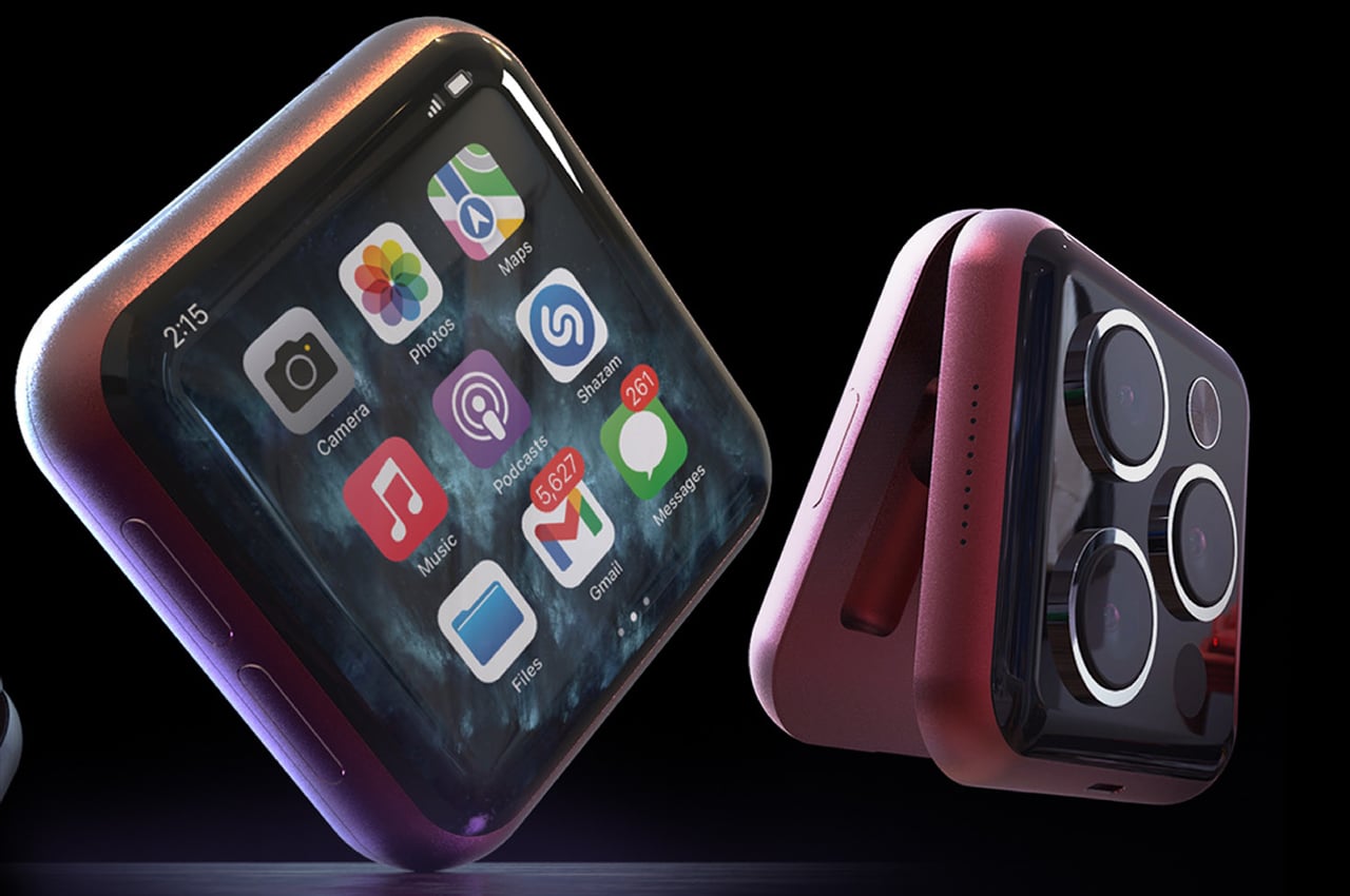
Considering Zarruk’s notion has some basis for an Apple product of the future with little impressions of a Samsung handset of today, we are left to discuss it to the detail as seen in images. The idea presents a flip iPhone with iPhone 13 Pro-esque triple camera module comprising an 8K capable pro-action camera. The flipping device has a curved touchscreen Retina display and the discussed camera module on the outside – split over the two halves separated by a durable hinge. The cute box-like design – when it’s folded – actually hides a pair of newly designed AirPods Pro mini in a cozy housing for each earbud.
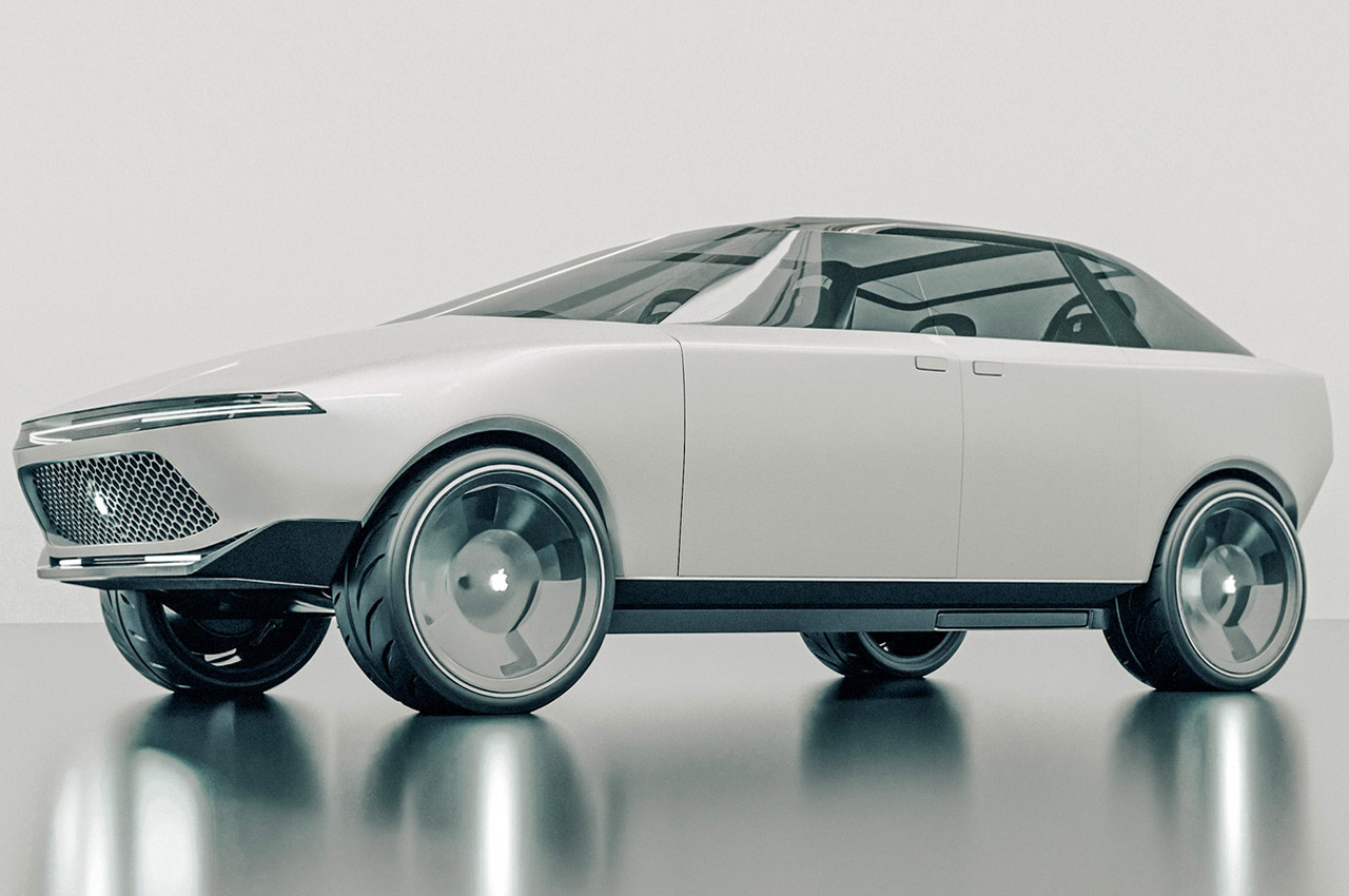
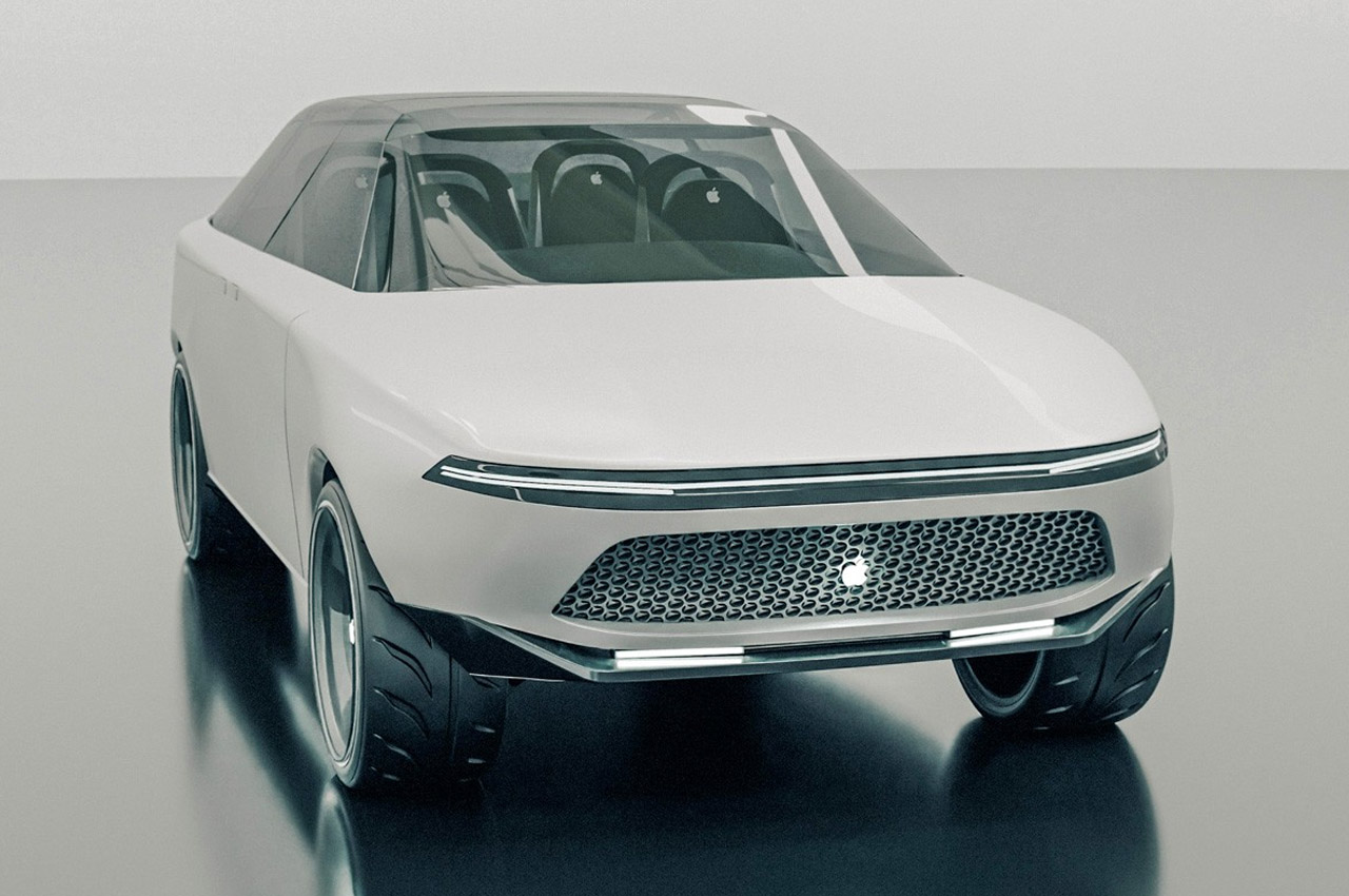
The concept renderings looking a tad inspired by the Cybertruck and Model 3 are quite detailed as they showcase the Apple Car in all its glory from the exterior as well as the interior. The pillarless design of the glass cover (with the sunroof and windshields) stems from the US10384519B1 patent that revolves around the philosophy of creating a vehicle sans the need to extend the chassis above the doors. The adaptive doors come courtesy of the patent US10384519B1. The interiors are also not left to chance as the large touch display extends across the dashboard thanks to the Patent US20200214148A1 inspiration.

Whispers in the air, and leaker Dylandkt say that the 2022 MacBook Air will be more similiar to the newly launched MacBook Pro models than we think. It’ll feature a thinner and sleeker design, a shiny white keyboard and bezels, MagSafe, multiple USB-C ports, and a 1080p camera. It will also be available in a variety of color options, similiar to the ones you have for the 24″ iMac. It may also feature a notch, and an impressive 60Hz Mini-LED display. This amazing render was created by @rendersbyian.
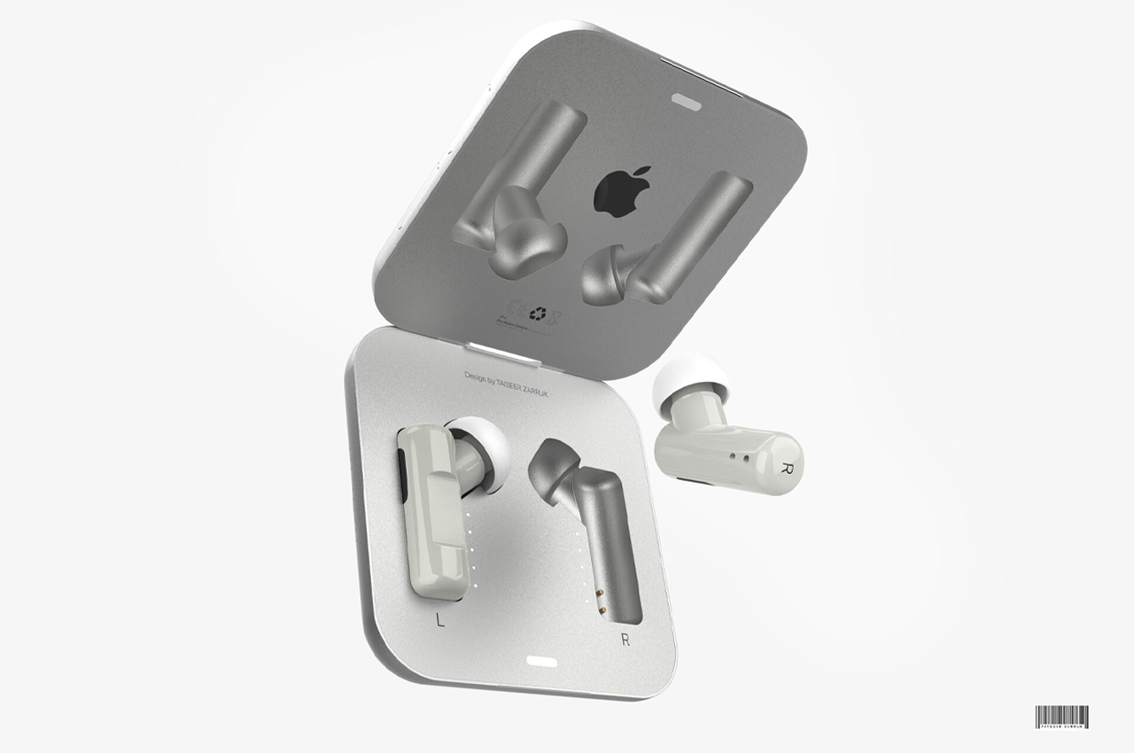
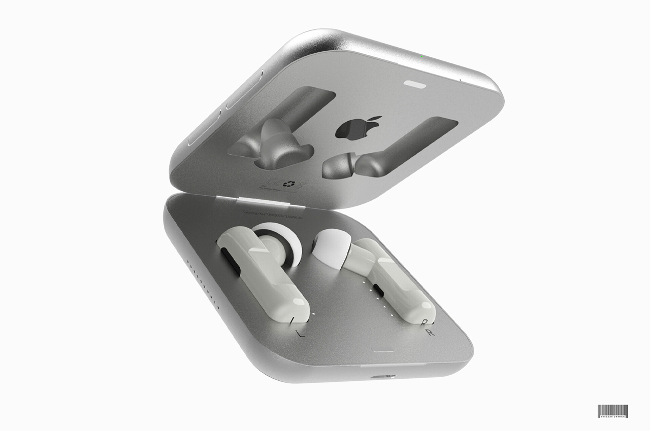
Inspired by the iconic design language of Apple, 3D artist, and graphic designer Zarruck Taiseer conceptualized a pair of AirPods Pro that scale down the current model to the size of a bean. From its charging case to its silicone earbud covers, everything about Taiseer’s mini AirPods Pro concept is sleek in stainless steel and Polly Pocket-sized. One problem this concept does fix about the current model of AirPods on the market is the bulkiness of its charging case. Taiseer’s mini AirPods Pro concept slims down the charging case to match the side of a half-finished stack of mini Post-Its.
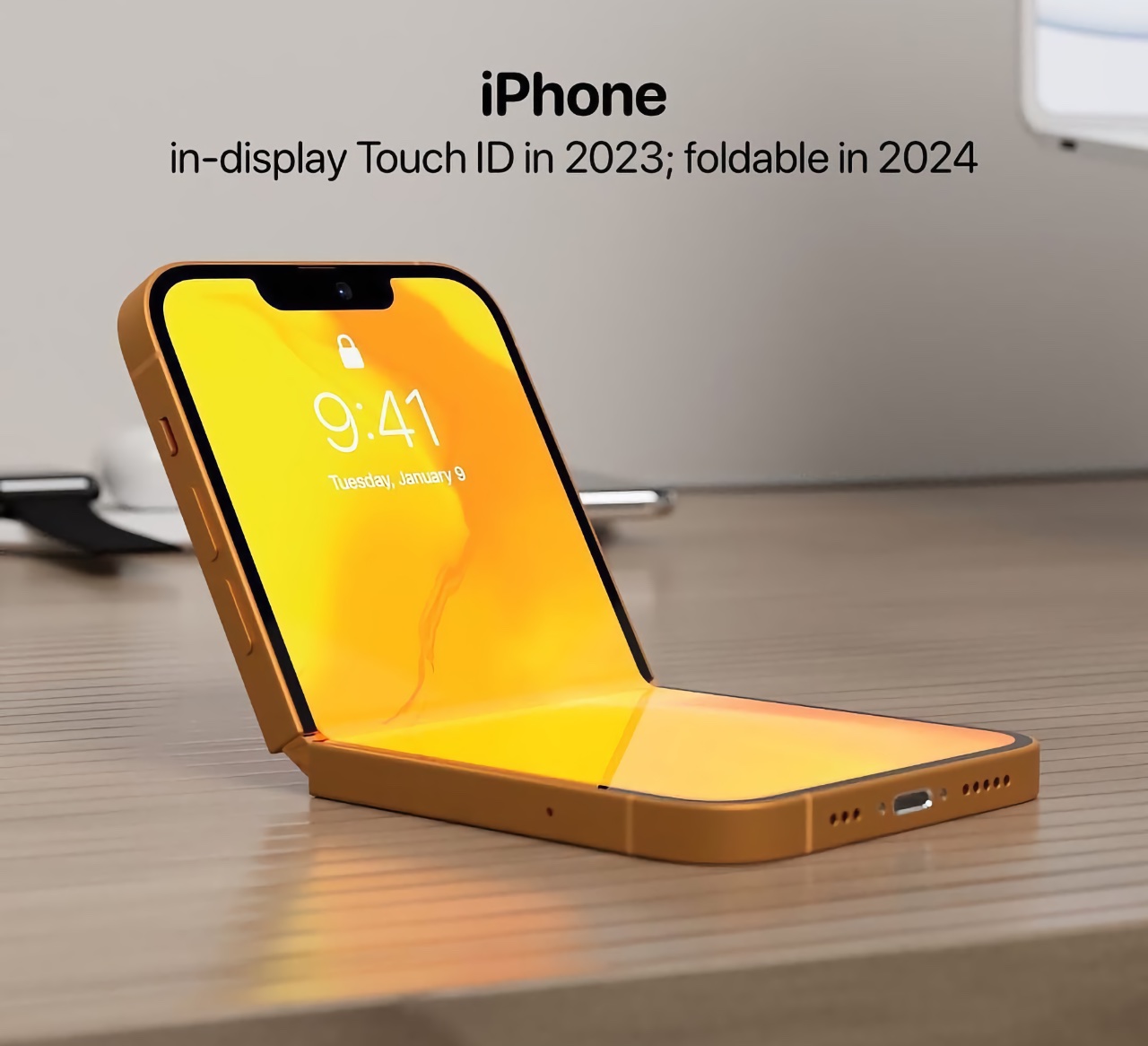
Analyst Ming-Chi Kuo predicts that Apple will introduce its first foldable iPhone in 2024! This render by @atuos_user showcases a bright yellow iPhone that folds perfectly in half, almost like a flip phone from the 90s. He also expects Apple to introduce the in-display Touch ID by 2023, so we can expect to see this feature in the 2024 foldable iPhone as well!
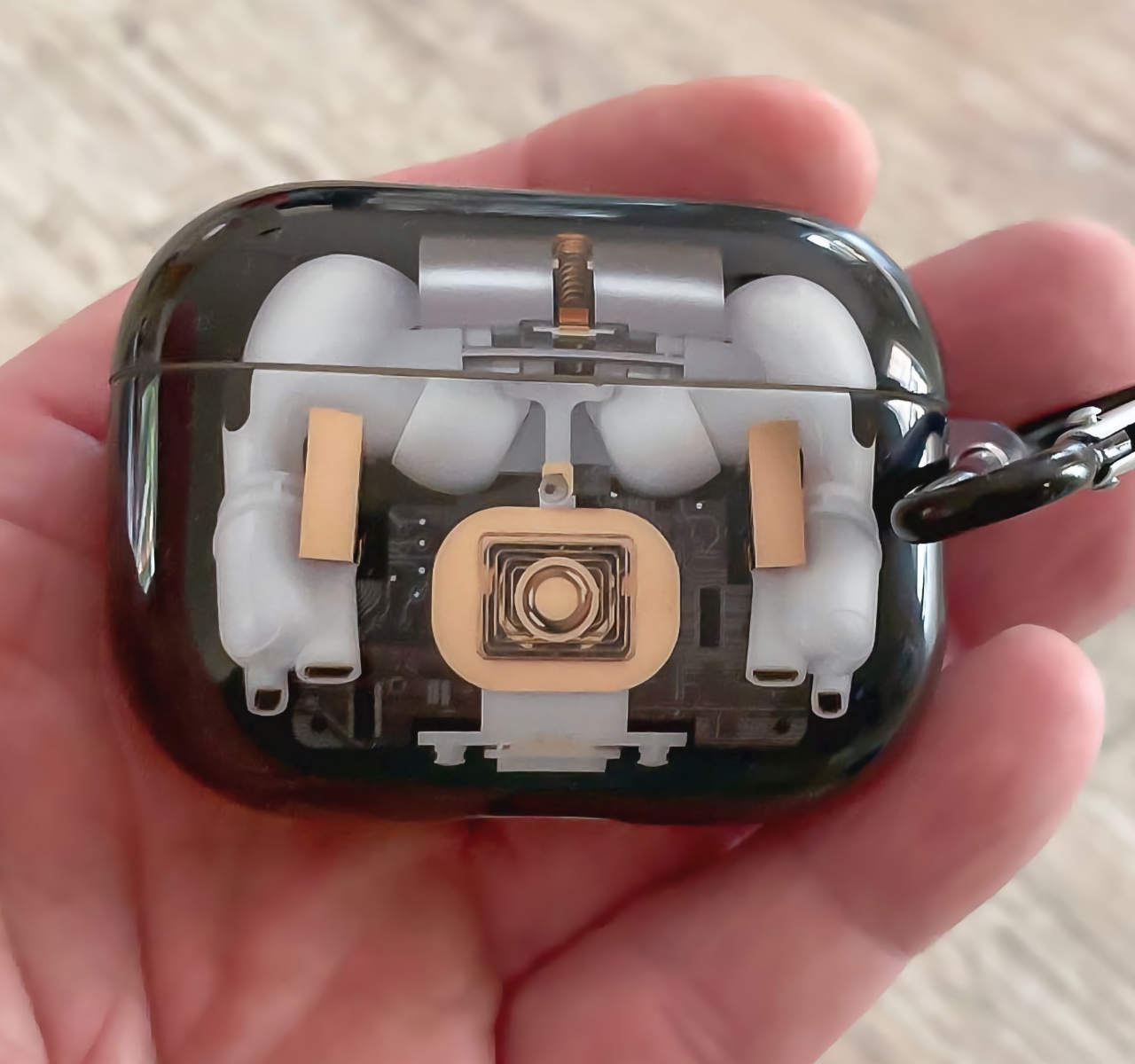
A transparent case for the Apple AirPods Pro? Sounds like a pretty tempting concept to me. This unique render by @appledsign features a transparent case with a black undertone, that allows you to admire your precious AirPods anytime anywhere. Could this be a potential upcoming product? I think so.
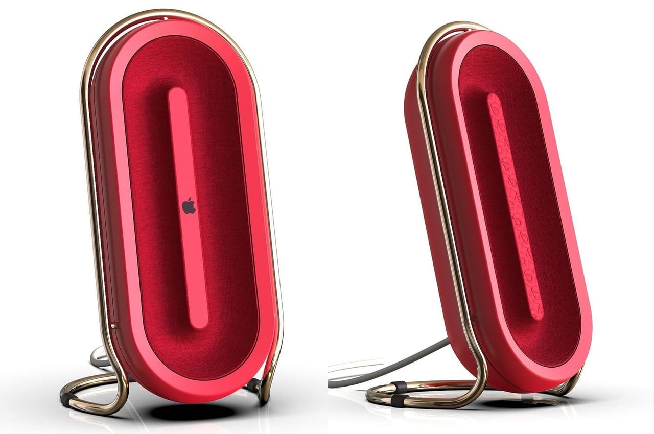
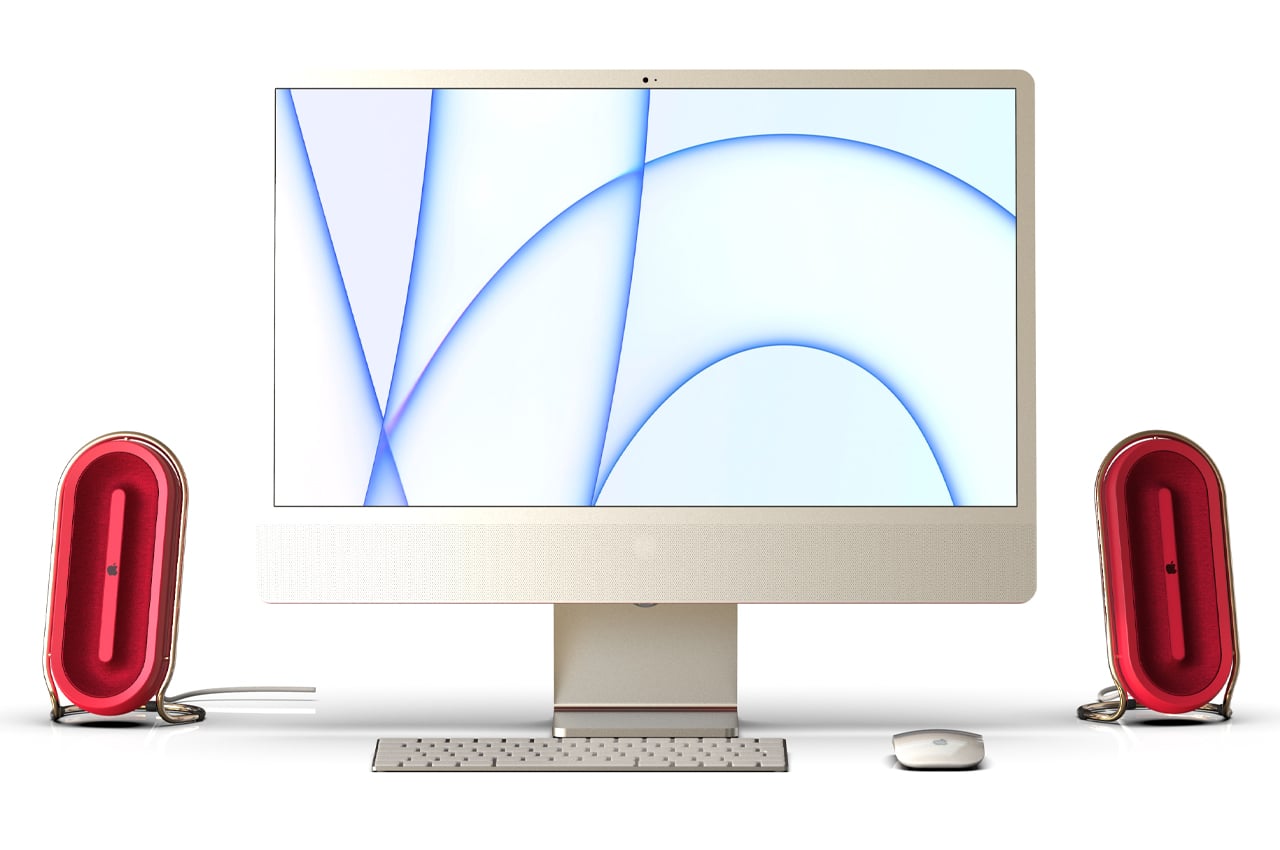
Deskpod was born out of a one-hour study of Apple design language, taking to the iconic brand’s most modern designs to create a sleek, yet bold speakers concept. The new iMac from Apple maintains the classic aluminum look that has graced the surfaces of most Apple Macbooks and iMacs for years. It’s the accessories from Apple that are typically the standout pieces, bringing out deep forest greens and royal blues to accentuate the fresh look of a bare aluminum Macbook surface. Waxman’s Deskpod takes that one step further and wraps the rich scarlet red speaker with a gold band that functions as the device’s cradle and stand.
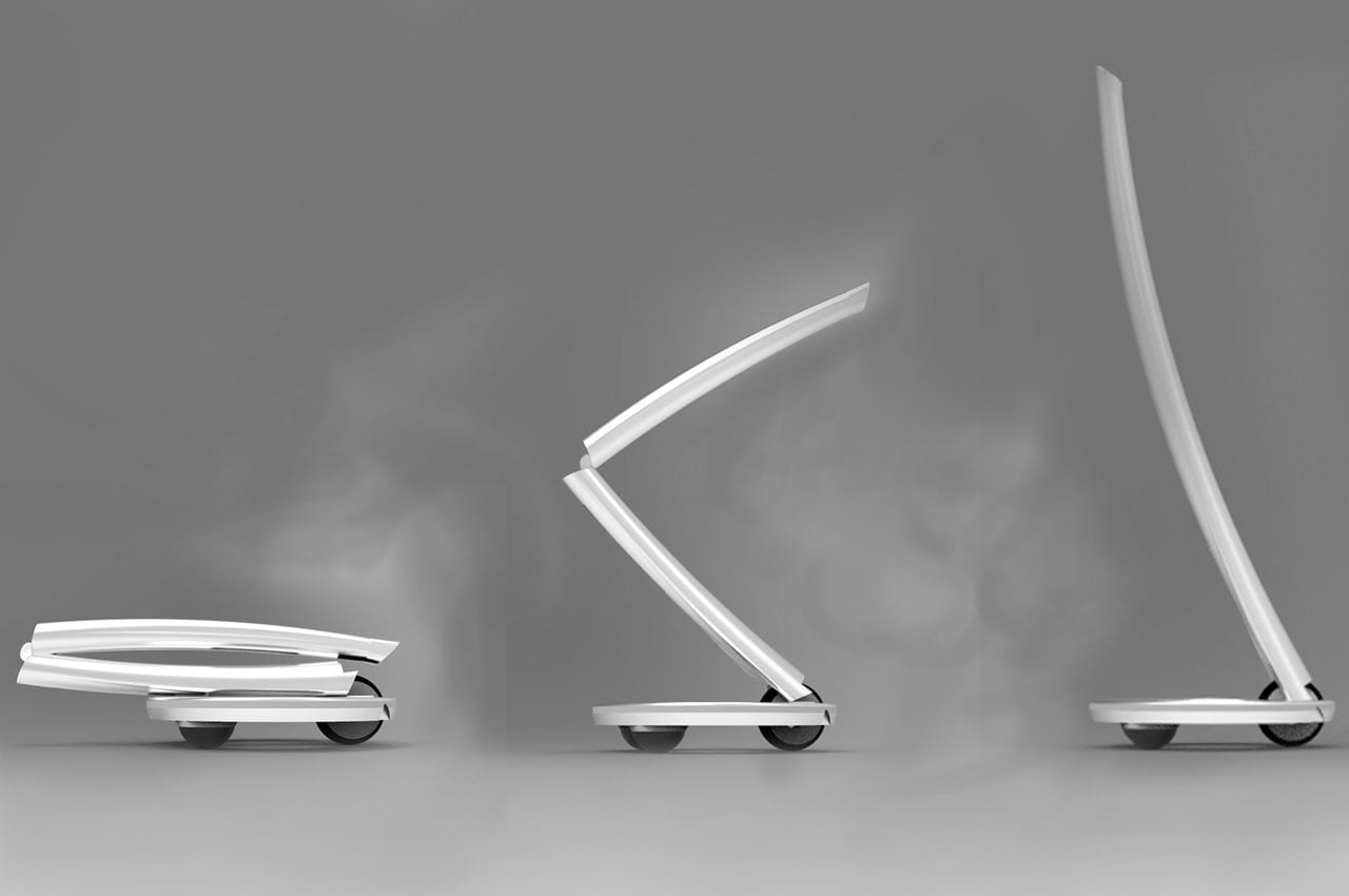

Called the Apple iLine, this concept comes in two versions – the Apple iLine and the Apple iLine mini which is smaller than your MacBook. The iLine normal version has a detachable pole that attaches to the footboard when you need to head to the grocery store in a jiffy. The iLine mini only has a footboard and three wheels. The future-proof commuter keeps up with Apple’s design philosophy, as the designer incorporates the Apple button shape on top of the pole to switch On/Off the personal commuter. This button also doubles as the user identification tool, as the user touches the middle of the touch screen controller to authenticate. The liner shape on the front and back has the backlight for nighttime commuting.
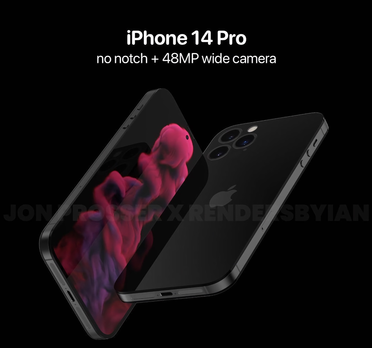
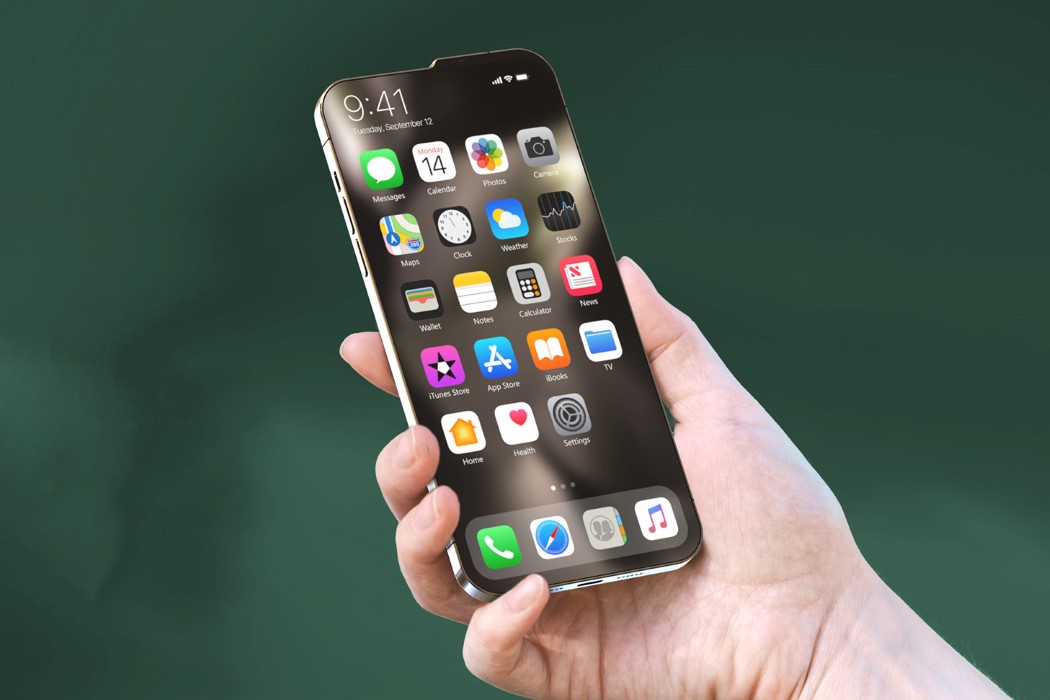
Analyst Ming-Chi Kuo predicts that the next year’s iPhone 14 Pro models will reportedly feature a hole-punch display, and a 48MP wide camera. Apple could go down the no notch route with this model. Although this is far from the final iPhone 14 Pro model, we do wonder if it could be a potential one.

The post An iPhone 14 design with a solo powerful rear camera + more concepts to satisfy your love for all things Apple! first appeared on Yanko Design.

Apple-inspired designs that go above and beyond your favorite Apple products!

Since its foundation in 1976, Apple has been always been at the peak of modern innovation! And let’s take a moment to appreciate all the awesome products and inspiration Apple has provided us with. The groundbreaking tech giant never fails to surprise us, we always find ourselves biting our nails and squirming with curiosity, whenever Apple announces a new product launch! Their ingenious and mesmerizing designs and design philosophy have inspired and influenced designers all over the world, resulting in some pretty unique Apple concepts! These Apple-inspired designs are the best of the lot and a dream for every Apple lover. Although we’re pretty satisfied after Apple’s latest launches, we can’t help but just hope that Apple converts these into a reality soon as well!

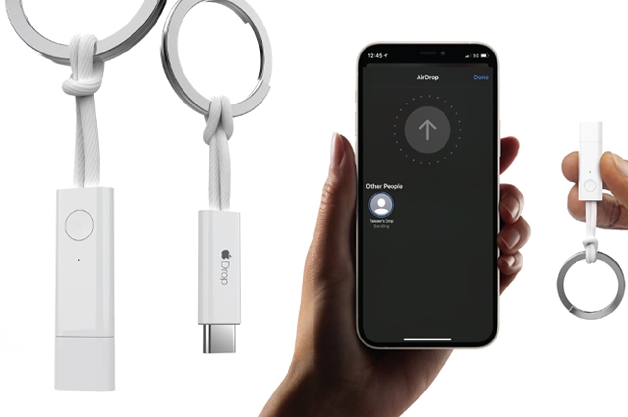
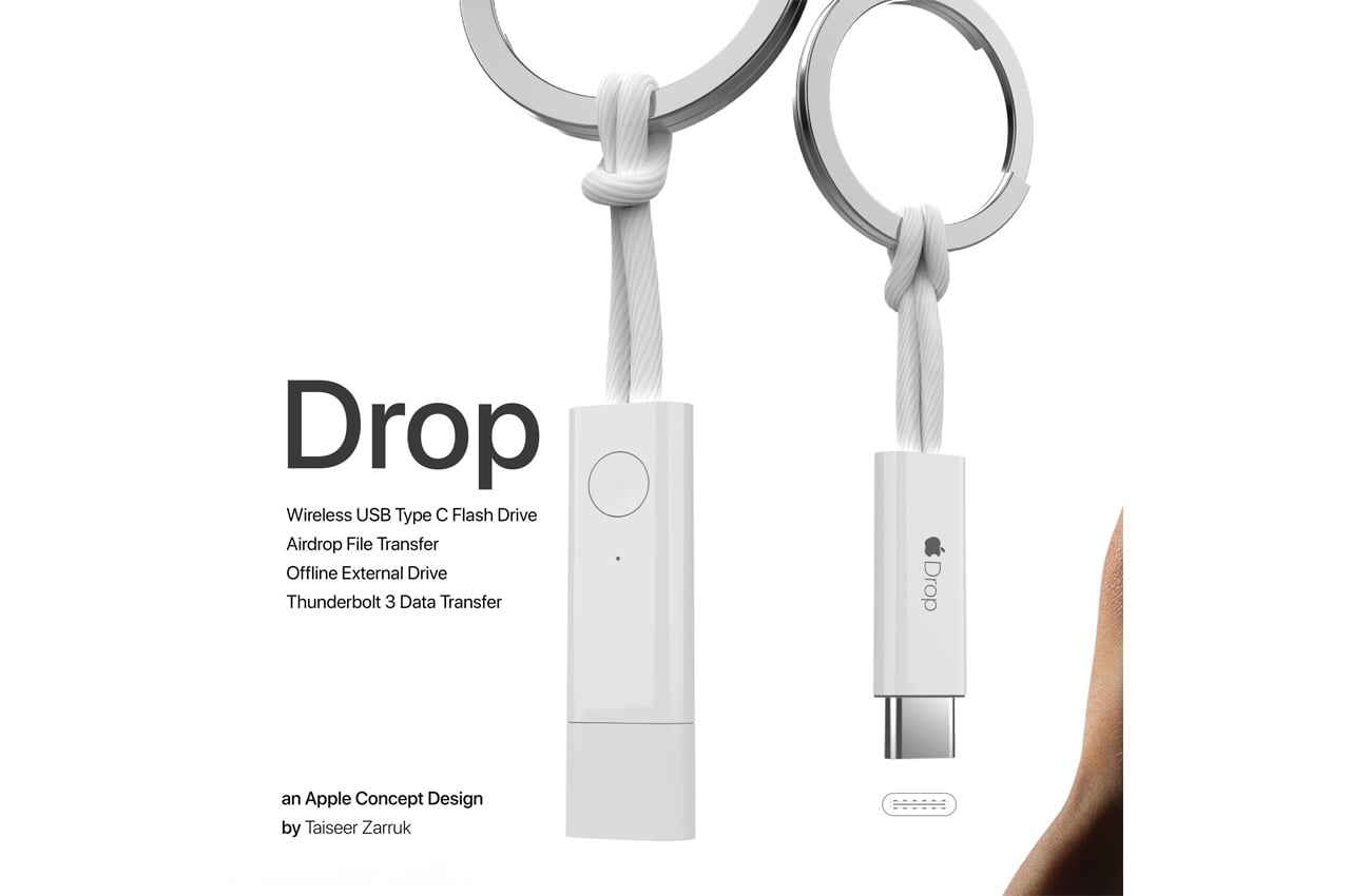
Taiseer created Drop to make file transferring and storage between Apple devices even easier. Drop operates as a wireless USB Type C and offline external flash drive and an AirDrop file transfer and Thunderbolt 3 data transfer device. Drop is a standalone Apple-inspired device that operates as a flash drive, storage device, and file transfer cable. Users can AirDrop files from their iPhones or MacBooks to Drop where the files can be stored or transferred to another, Apple or non-Apple, device. When users have a file they’d like to transfer to and store with Drop, they can AirDrop the file the same way they’d AirDrop media from one iPhone to another. With the file stored on Drop, the user can either keep it for safe storage or plug it into their MacBook’s USB Type C port to open the file on their laptops. Alternatively, users can store files offline using DropDrive, a feature that creates a folder on the user’s iPhone to store media files, where the files remain until Drop is brought back online.

Deskpod was born out of a one-hour study of Apple design language, taking to the iconic brand’s most modern designs to create a sleek, yet bold speakers concept. Stretching the speaker’s fabric around its curved frame, Waxman warped the fabric into a parabolic shape to maximize audio output. The unique design would pair nicely with most Apple products and bring a bold pop of color to every home office. Speaking on the design, Waxman describes, “The bold colors and simple geometry make the speakers pop off the background. The simplicity and high contrast of the speakers make them a bold addition to any space.”

Called the Apple iLine, it comes in two versions – the Apple iLine and the Apple iLine mini which is smaller than your MacBook. The iLine normal version has a detachable pole that attaches to the footboard when you need to head to the grocery store in a jiffy. The iLine mini only has a footboard and three wheels. The future-proof commuter keeps up with Apple’s design philosophy, as the designer incorporates the Apple button shape on top of the pole to switch On/Off the personal commuter. This button also doubles as the user identification tool, as the user touches the middle of the touch screen controller to authenticate. The liner shape on the front and back has the backlight for nighttime commuting.

Apple iPod Nano Circular Concept by Andrea Copellino

Apple iPod Nano Circular Concept by Andrea Copellino

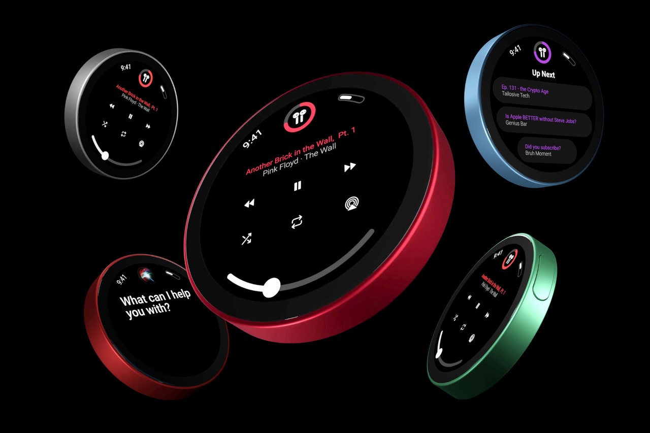
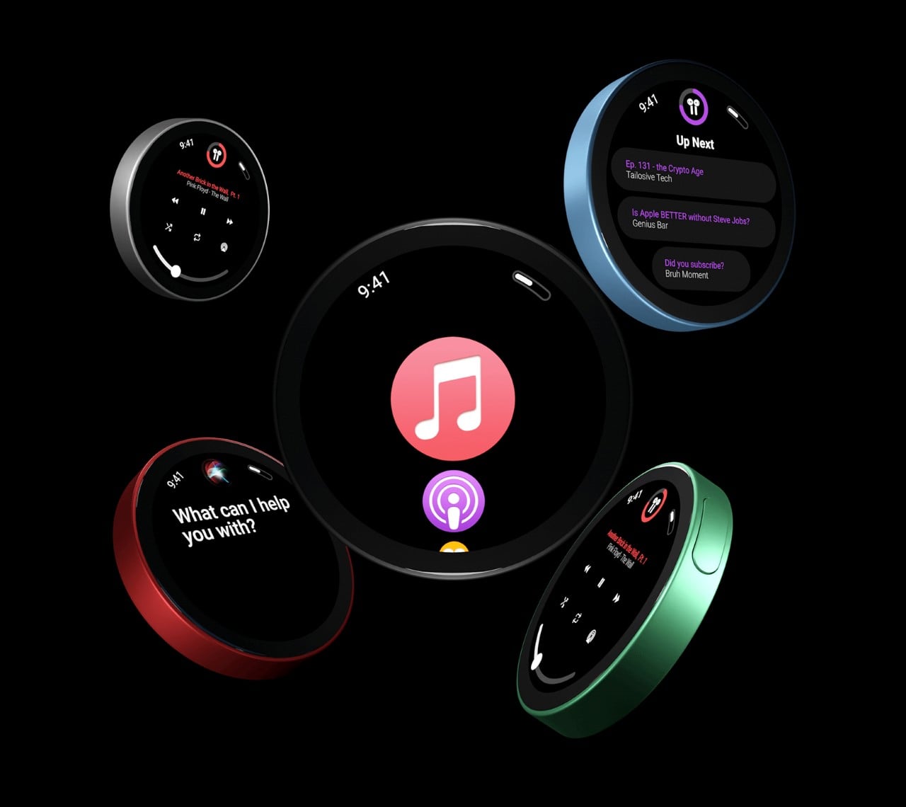
The new iPod Nano paves its own path forward with a fresh new design that’s instantly distinguishable from the iPhone. It sports a circular UI that Copellino designed from scratch too, borrowing elements from the Apple Watch. It also comes with a circular display that looks just marginally smaller than the one used on the HomePod Mini. What I really enjoy about the new iPod Nano is that it looks different but feels the same. Classic iPods came with round jog-wheels that established a circular interaction, and the new iPod Nano’s circular display just carries that forward. Its puck-like design is comfortable to hold and comes with a clip on the back that makes it easy to secure your music player around your pocket.

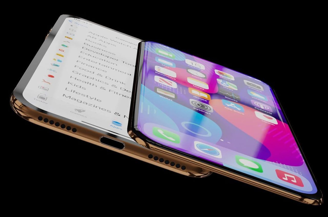
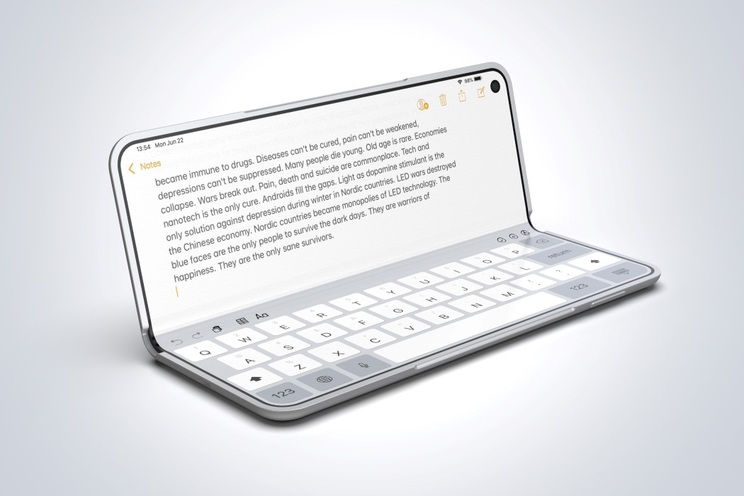
Taking the liberty to experiment with this design, ConceptsiPhone has created extreme renders of how the next-generation Apple phones should be. The insane renders of the iPhone 14 with a sliding concept are far and above what Apple would likely have in mind at this point. The biggest upgrade to the iPhone, many would trust, will be a folding form factor, which will be a stark difference to its image, and give fanboys a little more to consider as they weigh their options. In such a scenario, a Nokia-style sliding keyboard would make more sense than a book-like folding phone. If you are from the same school of assumptions; this new concept with a second slider screen will be a definite yes.

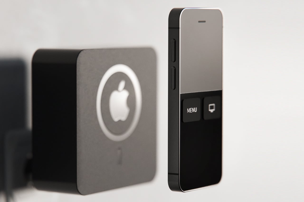
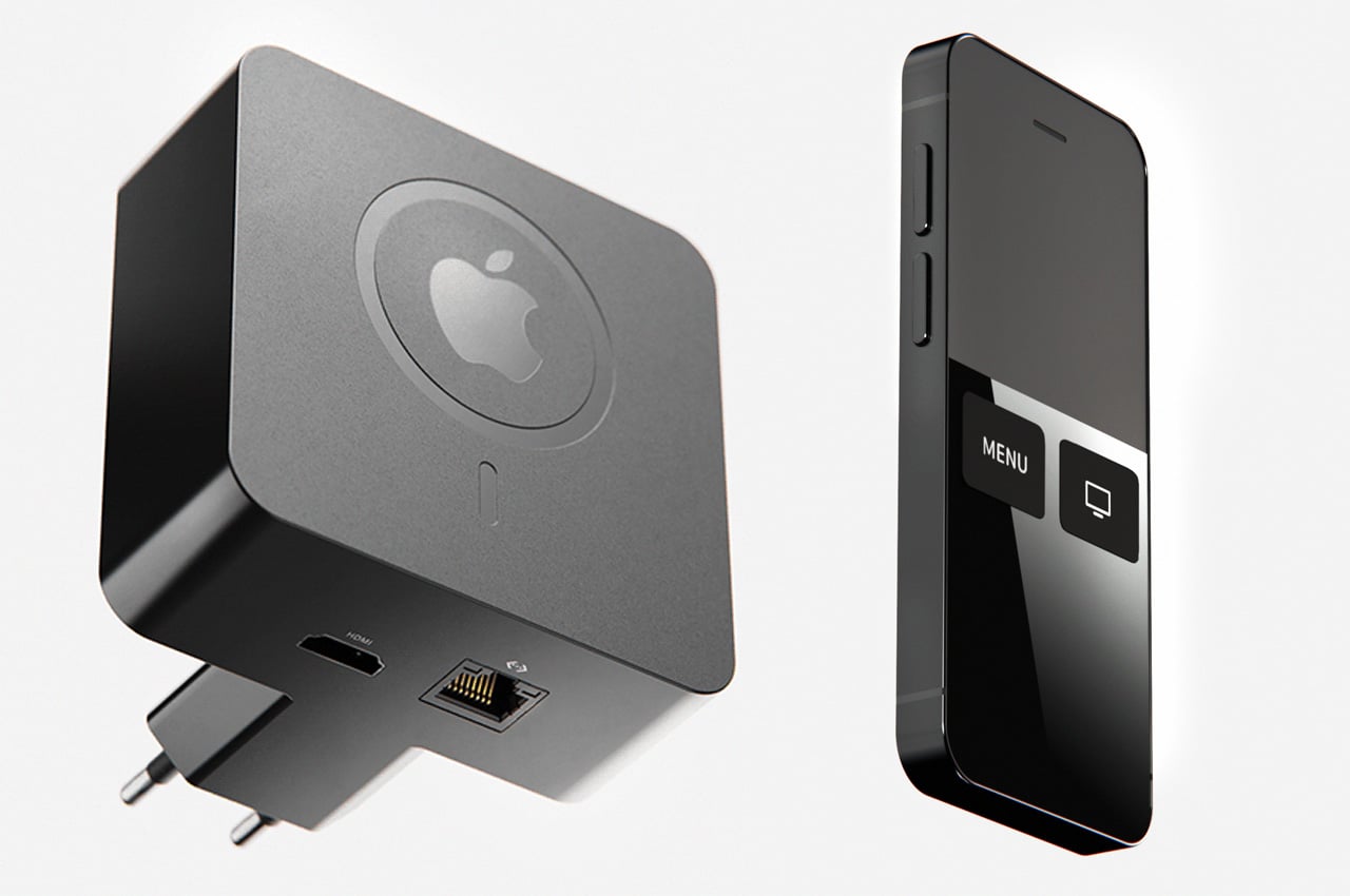
Designer, Iván Antón has come up with an Apple TV 2021 concept, which comes with a wall plug built-in. Now that’s full marks for the compact build, but the practicality is debatable until we have something like this to use. Taking nothing away from the vision, I’m impressed with the concept of Apple TV’s ability to interact with Siri without the need for a remote. Furthermore, the new concept also integrates the MagSafe charger into the Apple TV unit, so the compatible remote can now be charged conveniently by sticking it to the back of the set-top box. With a built-in wall plug, the Apple TV concept removes the need for a power cable, and thus the power cable slot from the bottom of the device has also vanished.

Apple iPhone 14 Jon Prosser Rendersbyian

Apple iPhone 14 Jon Prosser Rendersbyian

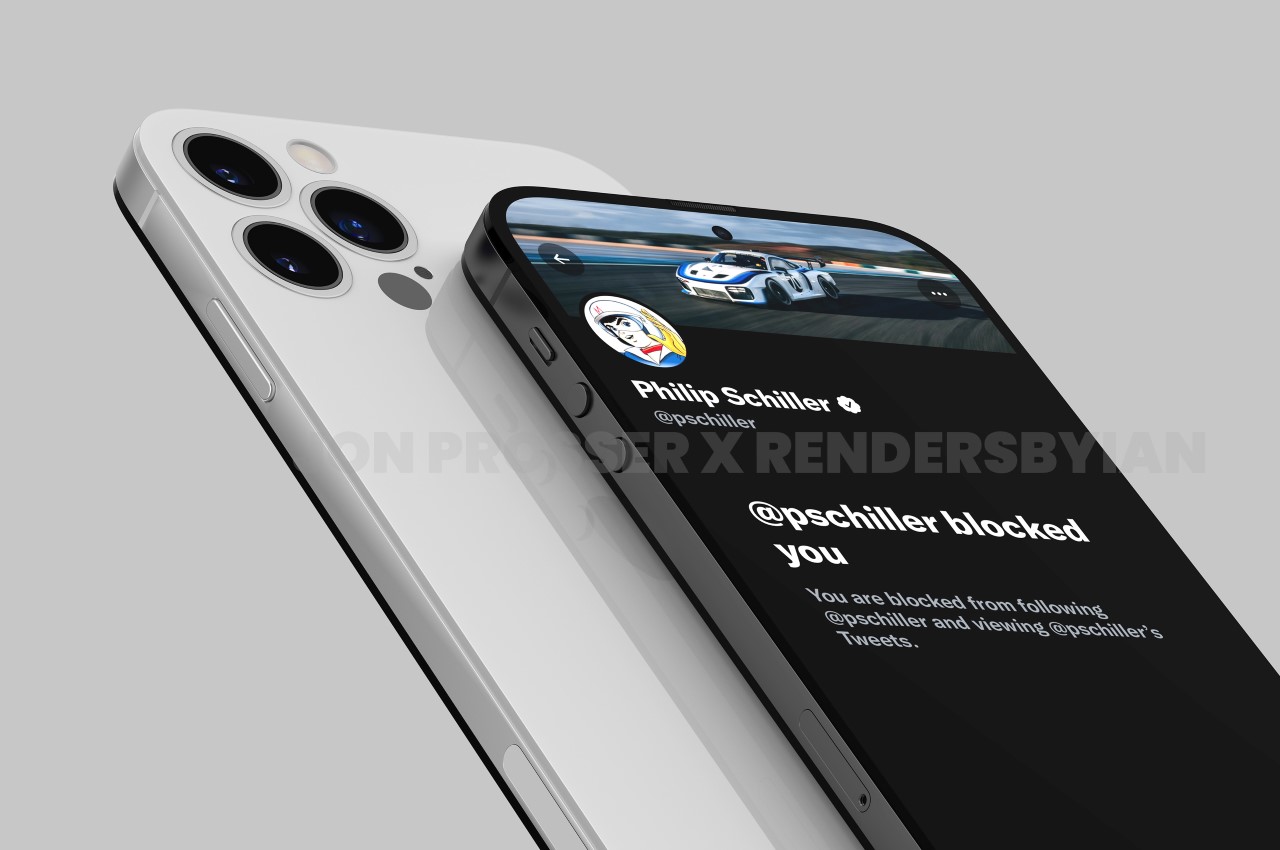
Prosser decided to drop a pretty big bombshell. His leak is of the iPhone 14, which isn’t due till 2022. Prosser says he’s been in touch with supply chain workers who have shared images of the new phone with him and has then used those images to create renders that fully do justice to the design. The design in question, celebrates the 10th anniversary of the popular iPhone 4, with a similar flat-edge design, a flat camera module underneath a glass back, and a metal rim running along the sides. A noteworthy upgrade, however, is the presence of 3 rear camera lenses, and the disappearance of the divisive notch, which has plagued the iPhone’s design for nearly 5 years if you count the notched iPhone 13 that drops next week.
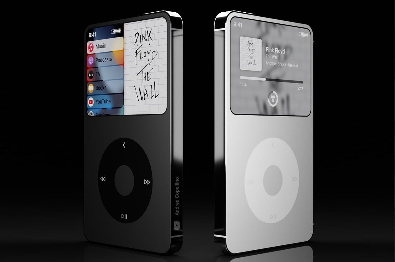
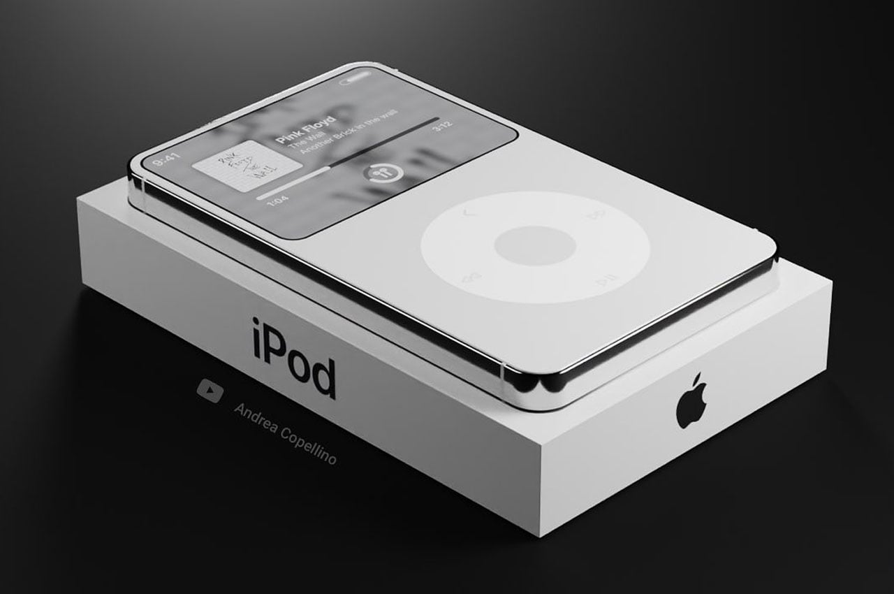
Designer Andrea Copellino gives us a reason to dream of a future Apple gadget that’ll revive the good old times when listening to favorite songs was such a liberating experience. This he does to celebrate the two decades of the iPod Classic this year. The cool concept is a spitting image of the iPhone 12 Pro unique design highlighted by the shimmering metal stainless steel body and the flat sides with contoured edges. Talk of the Apple’s MP3 player and how one could forget the haptic feedback of the click wheel – so, Andrea’s design brings back that element with an added touch of the Apple Remote for uniqueness. It’s so cool I want it right away.

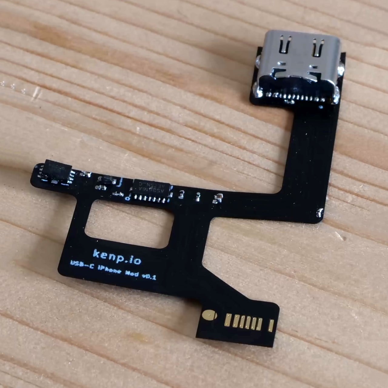
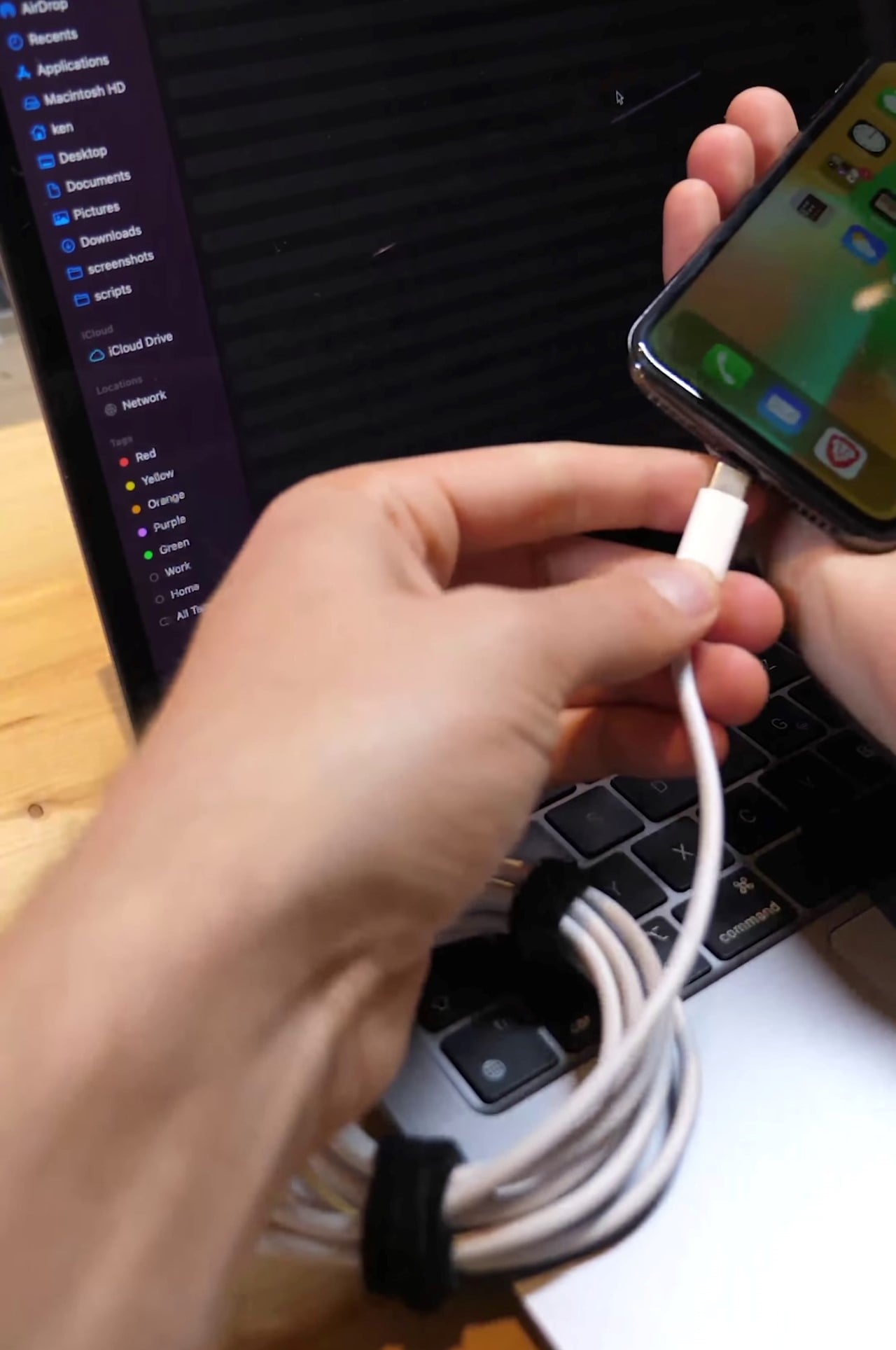
Meet the world’s only USB-C iPhone (that we know of), hacked together by Ken Pillonel, a master’s degree student in robotics at the Swiss Federal Institute of Technology. At the very heart of Ken’s solution is a redesigned PCB ribbon cable that fits inside the iPhone X, replacing the lightning charging PCB. Ken’s initial experiments from 5 months ago involved using a breadboard to work out the circuitry, before he actually fabricated a pretty professional-looking ribbon PCB that could actually fit inside the iPhone’s housing, sandwiching itself between the other components. The outer chassis of the iPhone had to be CNC machined too, to fit the new, wider port. Ken’s working on a much more in-depth video to showcase his final result and the process behind it, but he decided to give the world a taste of his prototype in a short YouTube snippet.

How the next exciting iPhone will look is anybody’s guess, for now, to be frank, but industrial designer Laci Lacko believes it could be a radical leap with its roots tracing back to the iPhone 7 series. That similar rounded side design lends it a thin feel in hand. Surprisingly, the designer doesn’t give us a peek into the front of the device, but going by the rumor mill, it should have minimal (as compared to iPhone 13) or no notch at all. What’s highlighted in this concept phone is the rear camera module. A big protruding single 35mm lens setup that has an f1.2 i aperture sensor promises the ultimate photography experience. Something comparable to a DSLR. The lens is so big, it almost feels like an add-on to the sleek body frame of the imagined iPhone.

Apple-inspired designs to fulfill your tech dreams as we countdown to the WWDC 2021!

Apple’s WWDC21 is just around the corner! The air is buzzing with excitement, as we eagerly await to hear what Apple may announce. As we find ourselves biting our nails, and squirming in anticipation of what Apple has in store for us, let’s take a moment to appreciate all the inspiration this groundbreaking tech giant has provided. Apple’s ingenious and mesmerizing designs and design philosophy have inspired and influenced designers all over the world, resulting in some pretty unique Apple concepts! And, we’ve put together some of the very best. Enjoy these innovative Apple-inspired designs, as you count down the days to the WWDC!

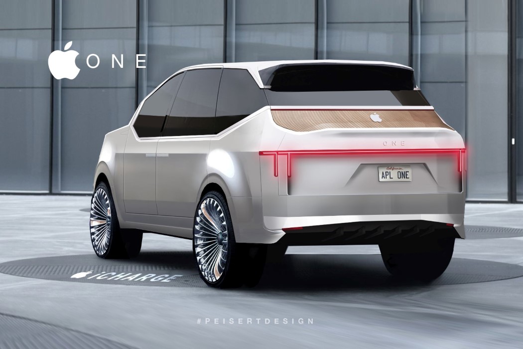
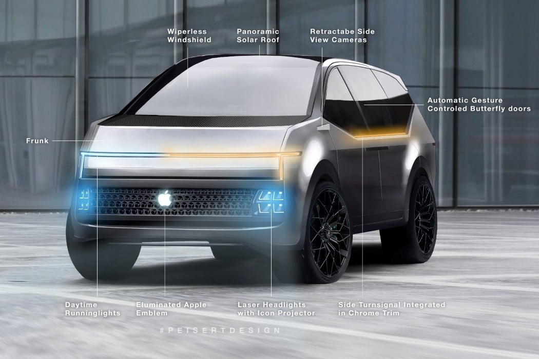
Peisert’s Concept One embodies all the good aspects of Apple (and a few unsavory ones) into a design that’s meant for the entire family. It’s a luxury car, but it isn’t a sedan. Instead, the Apple One is a one-for-all sort of SUV that accommodates 4 or more people pretty spaciously. Its proportions (and especially that headlight) feel slightly like a cross between the Tesla Cybertruck and the Rivian SUV. The design is mildly angular but doesn’t come with any edgy surfaces or straight lines. Instead, everything curves rather organically… a feature also seen in the continuous curves found on Apple products. Speaking of Apple products (and also of unsavory aspects), the Apple One sports that infamous cheesegrater grille on the front. One could argue that an electric SUV wouldn’t need a grille, but Peisert probably took a creative call with that one there.

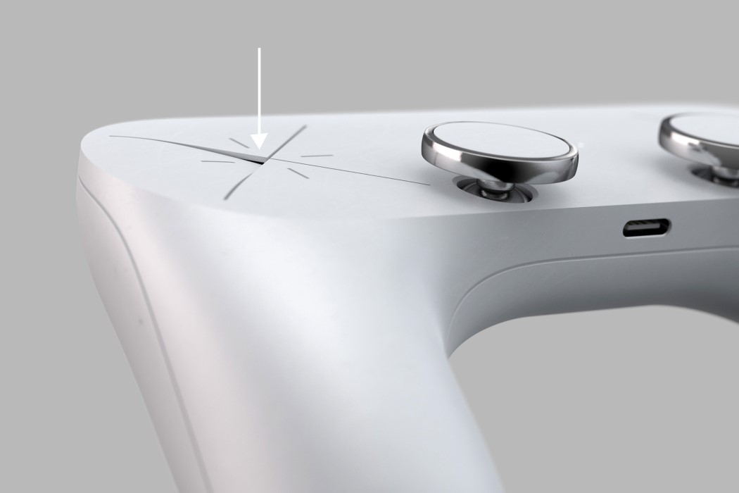
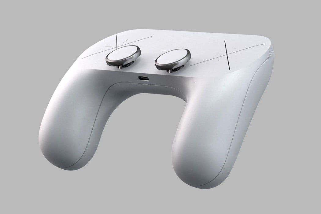
Sleek, with minimal details, and controls that are as baffling as the AppleTV Remote yet equally appealing. This may be Designer Hannes Geipel’s version of a Microsoft Surface Gaming Controller, but it definitely has a very strong Apple-esque vibe to it. The Surface Gaming Controller concept by Hannes Geipel boasts a brilliantly simple form. With absolutely no-frills, textures, accents, or color separation, the Surface Gaming Controller has a clean look to it that is a major contrast to Microsoft’s own Xbox controller. The Surface Gaming Controller comes with a soft, satin finish, and sports two rather slick-looking joypads with a metallic ring around them. The joypads lie perfectly in reach of your thumb, while two large X signs sit where you’d expect the D-pad and the XYAB buttons.

Inspired by living life on the edge and documenting travels along the way, the iCam Pro was conceptualized using top-grade technology fit for the adventure seeker who isn’t about to be held back by limiting camera setbacks. Equipped with Apple’s A12Z Bionic Chip, the concept of iCam Pro boasts lightning-fast feedback and the same power efficiency we’ve all come to expect from Apple. In addition to its ultra-fast microchip, the iCam Pro comes outfitted with LiDAR sensors, an advancement in camera technology that fills out Apple’s camera to take videography to another level. LiDAR sensors essentially use remote sensing to examine the Earth’s surface, and all of its nooks and crannies to deliver photos that are as close to the real thing as you can get from phone cameras. In a similar vein, a 12 MP ultra-wide sensor expands the camera’s view to deliver fuller photos, while the iCam Pro’s 22 MP wide camera captures crystal clear colors for more realistic documentation.

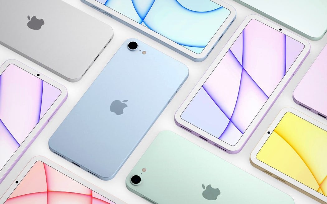
Apple announced that lossless audio was coming to Apple Music. With a new iPod, it’ll be like Apple going into the music-streaming war guns-a-blazing. Spotify’s slowly but surely dominated this space, and the new iPod could almost be Apple signaling that it’s taking the music domain pretty seriously. The iPod could drum up major interest the same way the Moto RAZR did – nostalgia is a powerful force. Moreover, the hardware would be no different from the iPhone 5 or the iPhone SE, given that the renders look pretty much exactly like those devices. Secondly, the new iPod has the ability to become Apple’s gateway device for a variety of iOS features (and probably even MagSafe, who knows). Kids could use it for listening to music, but could also potentially use the iMessage service on it. The iPod could leverage the power of Apple Arcade too, becoming a very affordable device that parents would buy for their kids in a heartbeat, tying them into the Apple ecosystem at an early age.

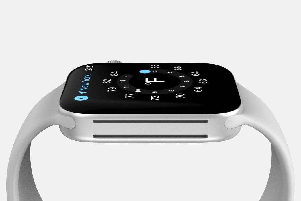
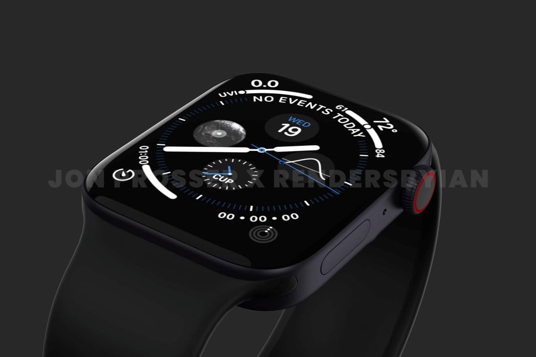
The rumor-mill of a new Apple Watch started back in 2020 when prominent Apple Analyst Ming-Chi Kuo hinted that a new design was in the works and could drop as soon as 2021. Now that we’re well into the year 2021, Prosser’s collaborated with Ian Zelbo to bring rumors and leaks to life in the form of pretty life-like renders. The renders are based on real images and CAD file screenshots supplied to Prosser by his network of sources. In order to protect the sources yet still share the designs with everyone, Prosser and Ian created these renders to show us exactly what they saw, and it seems like Apple is really beginning to streamline their design language. The ‘magical slab of glass’ analogy seemed to work really well for the iPad and its flat-edge design language finally carried onto the iPhone 12 last year and the iMac this year. According to the renders, the Apple Watch is getting a similar design upgrade with flat sides as opposed to the rounded ones, giving its screen a larger-than-life presence with minimal bezel interference.

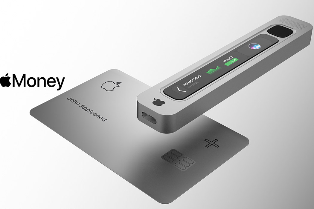
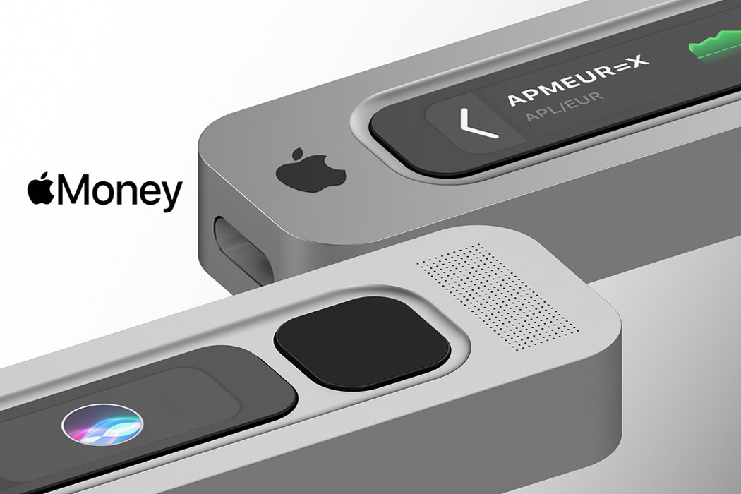
Creative director Antonio De Rosa gives our imagination wings with his ideation for Apple Money, the currency, and the electronic wallet that’ll make it all possible. The designer believes Apple Money will be available on the Apple Card+, scanned via the sleek gadget made out of aluminum, carrying the company’s signature design language. It’ll be connected to the Apple devices to create a mining ecosystem, one which is found in a decentralized family ecosystem. The device will be powered by the Apple Security Chip S2, capable of managing 27 assets and ERC20 tokens. Connected and approved devices will mine the digital money via a seamless app, keeping everything in the Apple ecosystem.

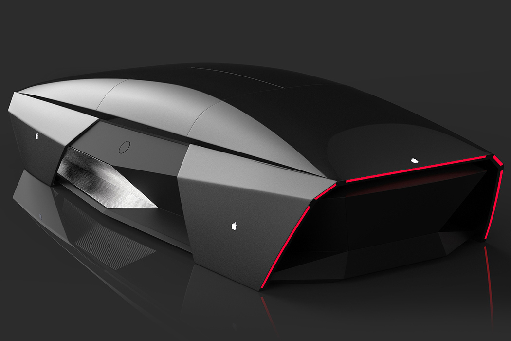
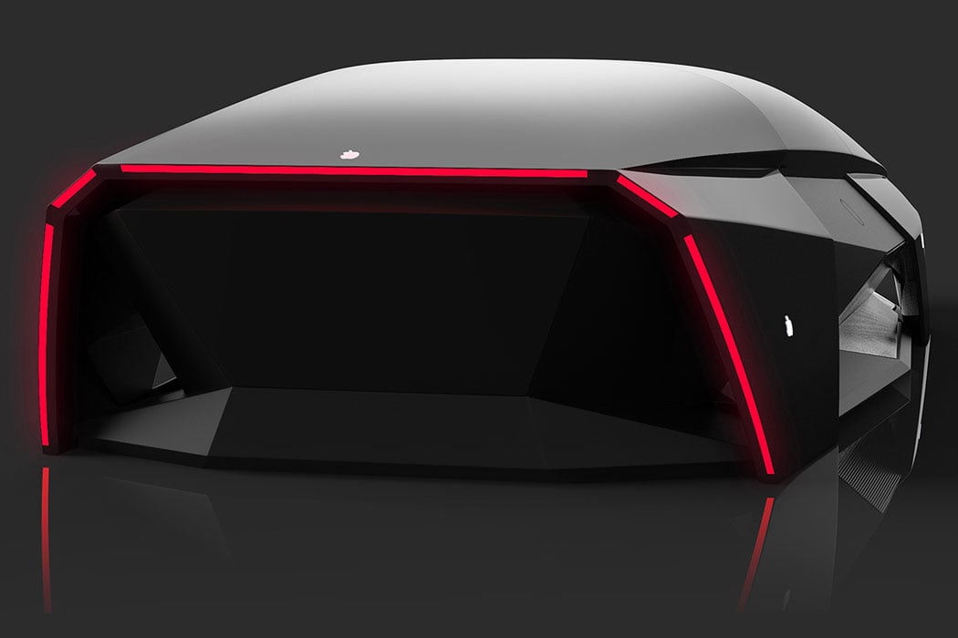
According to some sources, the Apple Car will not have any driver’s seat or even driving controls which could be a bummer for motorheads who love the feel of controlling their machine. What the Apple Car will look like is anybody’s guess but to give a close idea of what it may be like, Ali Cam’s Apple Car 2076 is a good reference point to take home some inspiration. Adopting Apple’s sharp design aesthetics, the car looks like a mouse shaped like a car at first glance, but then you realize it’s actually a minimal car concept. Loaded with advanced driving systems Ali envisions the blueprint far in the distant future – the year 2076 to be precise. The choice of year apparently is the 100the anniversary of Apple ever since it was founded by Steve Jobs, Steve Wozniak, and Ronald Wayne.

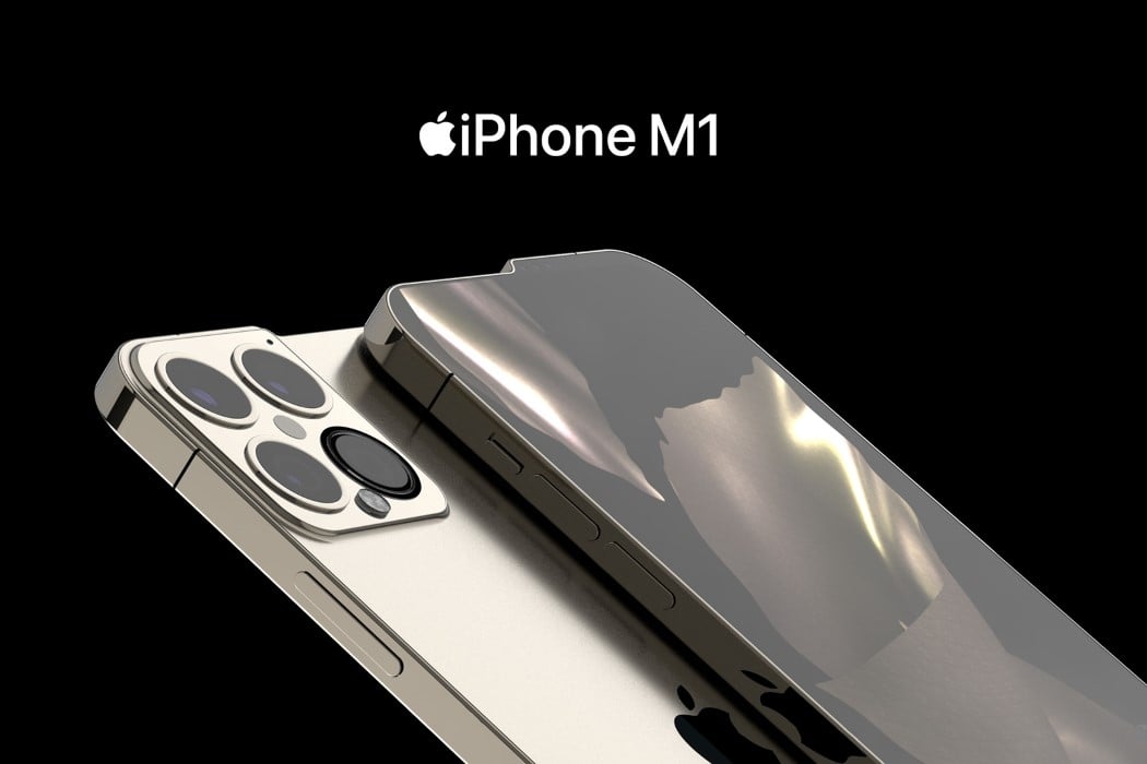
No matter how you cut it, the iPhone 13 looks unique – from the front, the back, and even the sides. The bump serves a practical purpose too. For once, the modern iPhone doesn’t have a notch. The iPhone 13 comes with a complete screen, as all the cameras and sensors that enable FaceID to sit on top, within that tiny 3-4 millimeter bump. Looking beyond it, however, the phone comes with speakers on the top as well as the bottom. The camera bump shifts slightly upward too, ensuring it’s perfectly aligned with the raised edge, thanks to the bump. Lastly, the conceptual phone flexes its muscles with its greatest feature yet, the Apple-made M1 chip.

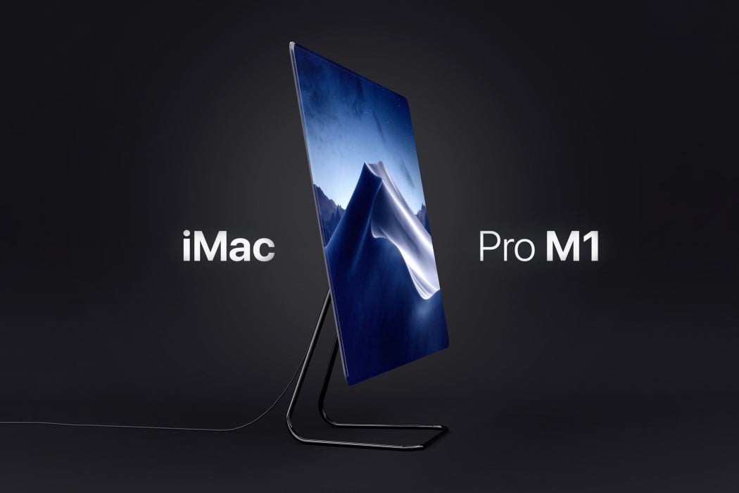
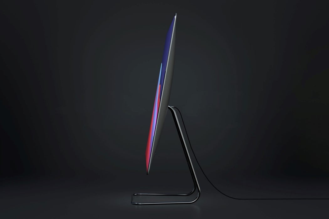
Instead of opting for a radical overhaul, Arlaud’s iMac Pro M1 concept takes the classic iMac Pro design and gives it minor yet significant visual upgrades. The conceptual all-in-one computer sports the crowd-favorite wedge-shaped profile with that slightly bulbed back. However, it absolutely gets rid of the bezels and chin on the front, sporting a gloriously infinite edge-to-edge display that’s an absolute pleasure to look at. Sure, the M1 may be the highlight of this computer, but that screen is the icing on the cake. If the M1 works behind the scenes to give you a great computing experience, that 100% screen on the front amplifies it, surrounding the user in Apple’s incredible, unmatchable UX.

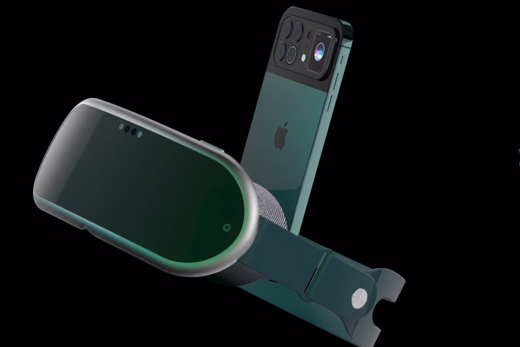
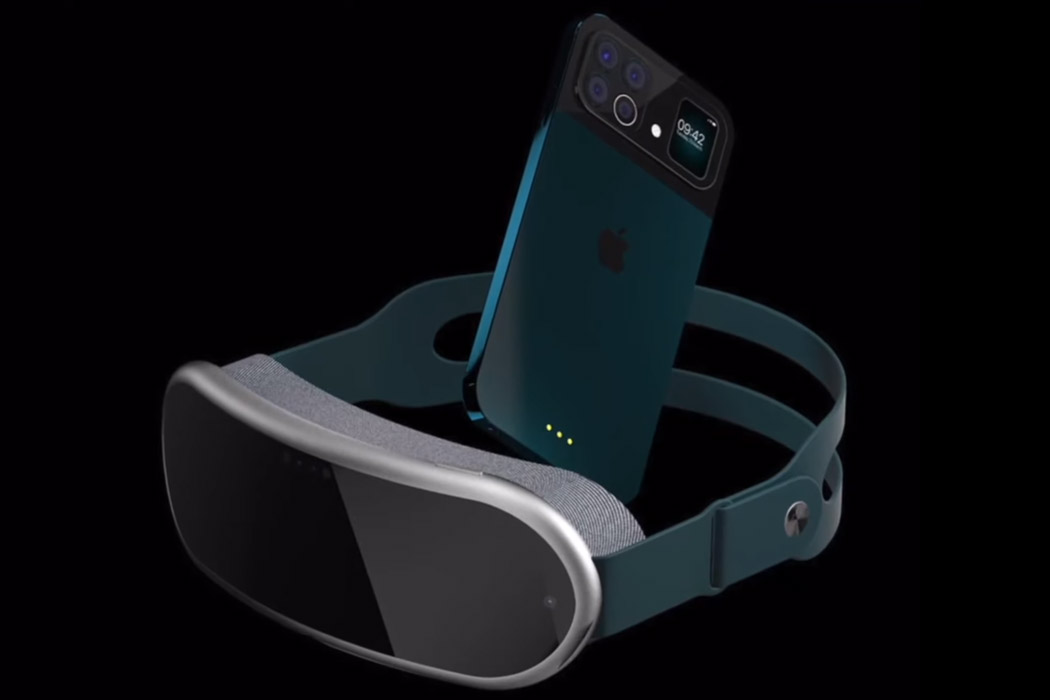
While iPhone 13 and the Apple VR headset cannot be launched in the same given timeframe – still it doesn’t deter imaginative designers from mustering up how the two products will look together. ConceptsiPhone has created a render of the two upcoming devices by Apple and mashed them together in a video dubbed iPhone 13 VR for creative writer’s delight. The VR headset is open to any imagination possible, and the folks over at ConceptsiPhone have taken that opportunity to show the world how the mixed reality headset will be like. It looks plush (after all it’s Apple) and is in sync with the design principles Apple has put in place for the headset – comfort and lightweight aesthetics. The strap looks reassuring as far as ergonomics go while the padding around the viewable area ensures utmost comfort.

Apple-inspired designs to fulfill every tech lovers dream: Part 3

The air is buzzing with the news that Apple is close to sealing a deal with Hyundai to manufacture an electric Apple automotive! Excitement is pulsing through the entire tech world, and we cant wait to see what Apple has in store for us. The groundbreaking company never fails to surprise us, we always find ourselves biting our nails and squirming with curiosity, whenever Apple announces a new product launch! Their ingenious and mesmerizing designs and design philosophy have inspired and influenced designers all over the world, resulting in some pretty unique Apple concepts! These Apple-inspired designs are the best of the lot and a dream for every Apple lover. We just hope Apple converts them into a reality soon!

pro_04

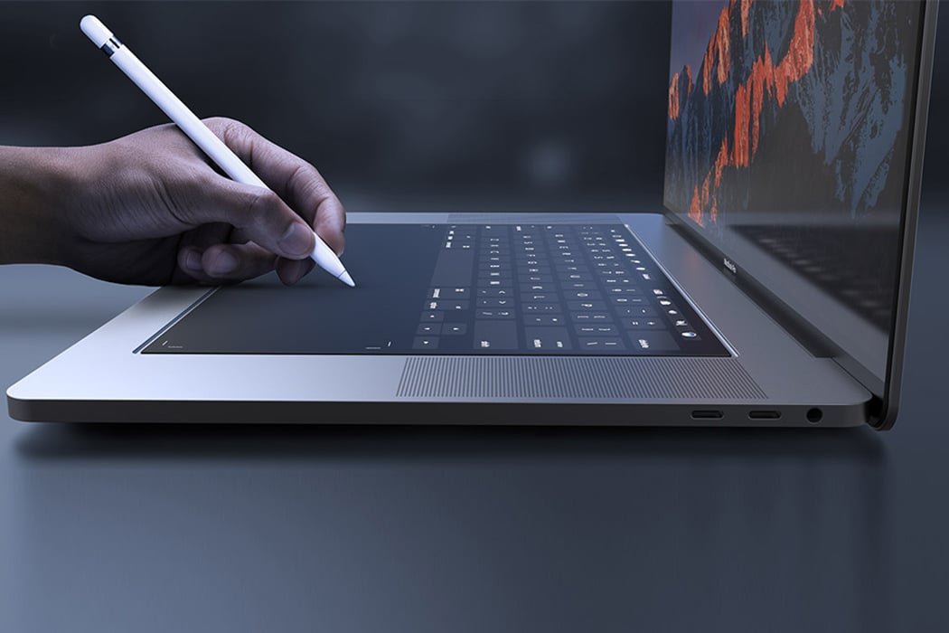
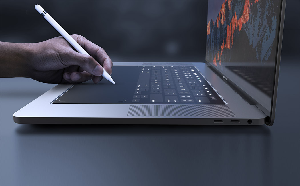
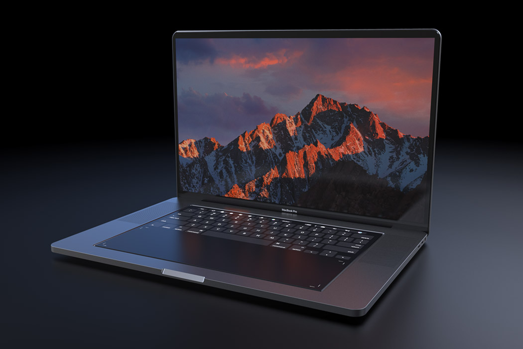
Designed with designers in mind, this MacBook Pro 2018 concept explores the integration of a full-size touchpad in place of the traditional keyboard. It relies on Apple’s own Taptic Engine system to give the user the feel of physical buttons or even emulate a scroll wheel or sliders. It retains the touch bar for shortcuts and function keys but the entire surface is touch-enabled! Better yet, now Apple Pencil is compatible with the new MacBook Pro, helping creative professionals in their workflow and allowing for new applications using the touchpad area. Now, software like Adobe Photoshop or Autodesk Sketchbook will be more powerful than ever!

aev_06

aev_00

aev_02

aev_99

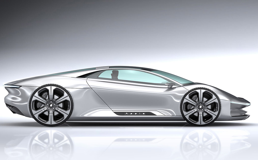
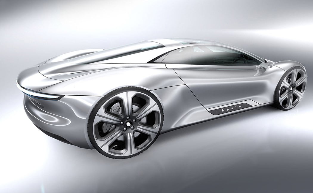
With the news of the Apple car giving all of us jitters, we decided to explore another Apple automotive concept! And dare I say, I like this Apple more than any post-Jobs release?! Despite being an exploration in automotive design and not tech gadgetry, its minimalism and purity look quintessentially Apple and it feels like something straight out of the brand’s heyday. Designed by Alexander Imnadze, little is known about the conceptual specs except that it’s electric (of course) but put our pre-order in! We think Jobs might just approve of this one. This automotive design looks as if Jaguar and Porsche had a love child but with a quintessential Apple touch!

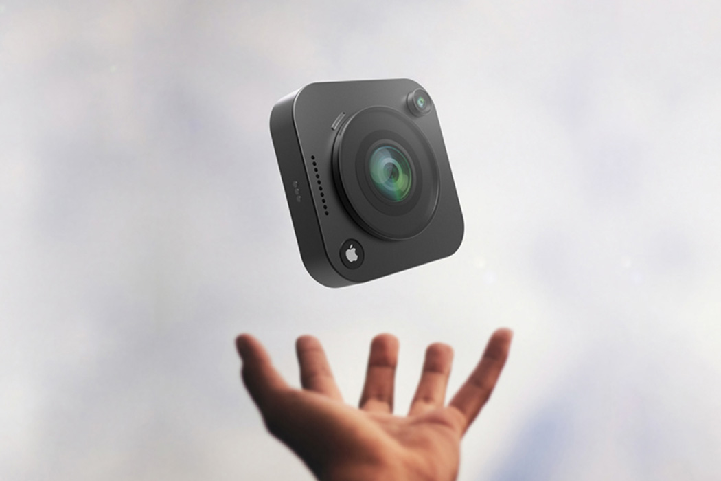
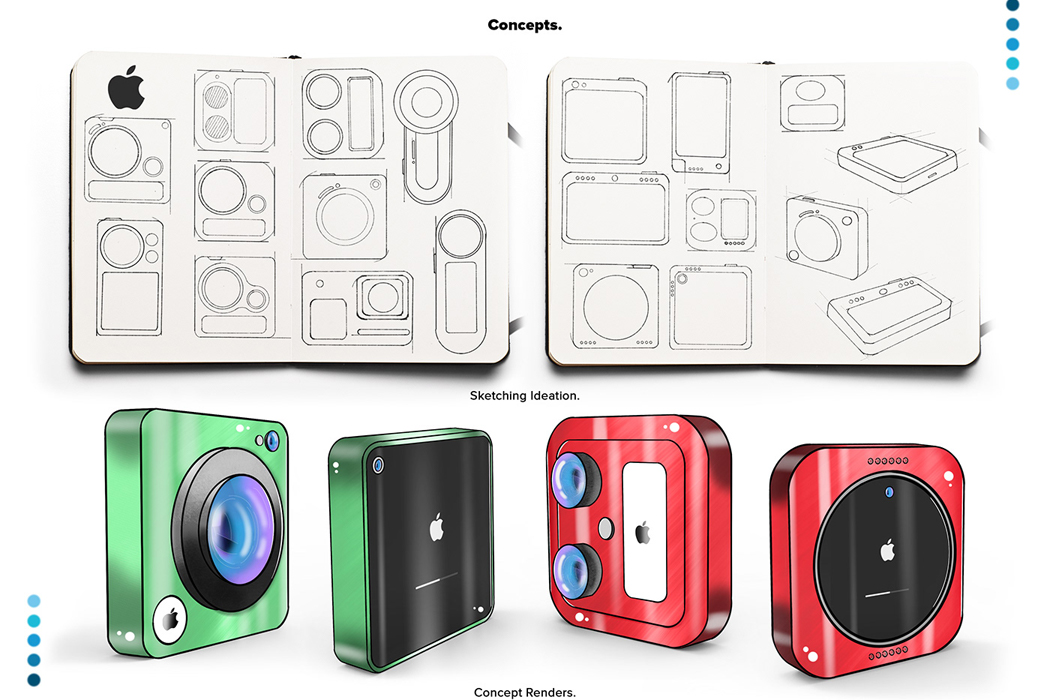
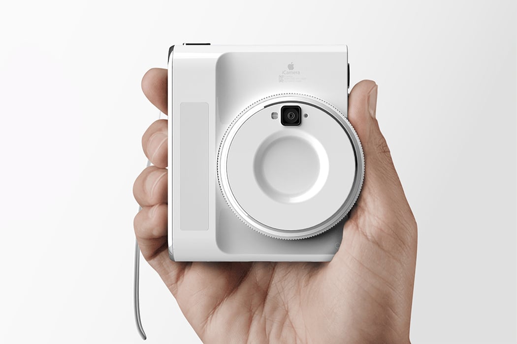
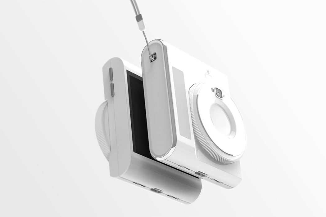
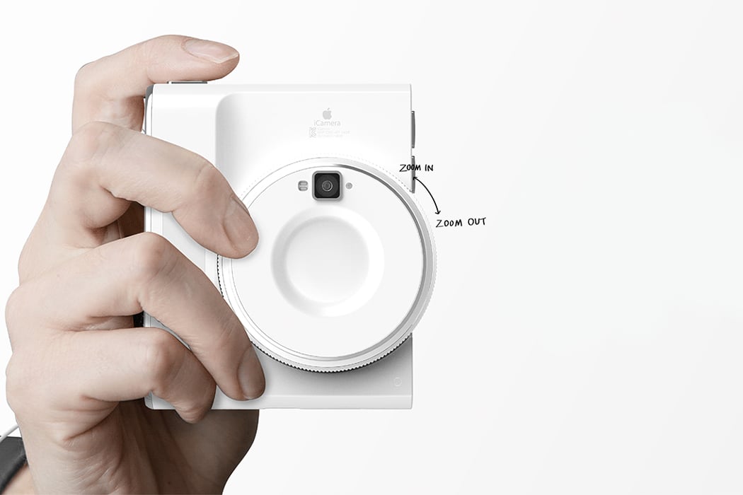
Ever wanted more than a phone camera but less than an advanced camera? This conceptual Apple-esque iCamera perfectly fits that gap! DSLR cameras can be daunting if you are just starting out but if you want to learn beyond the simple point-and-shoot then this camera is the perfect stepping stone into your visual art journey. The designer wanted to simplify the existing advanced cameras’ user experience by making the body more compact and lighter. The bulk of the lens is reduced but it still includes the revolving functionality to zoom. However, now you can do it comfortably with just a finger. It also aims to make transferring your files easier through cloud-based technologies – that one tedious task every photographer hates to do but has to do. So say goodbye to HD cards, setting up Bluetooth, and keeping a track of multiple accessories that one usually needs to transfer. It charges wirelessly and has a handy flash that attaches magnetically to the body!

macbook_x_3

macbook_x_1

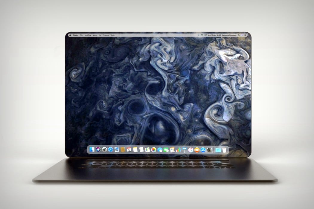
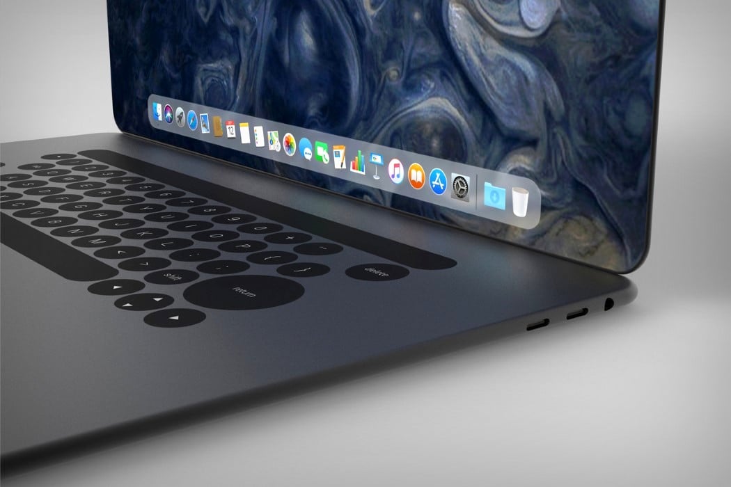
Ludovico’s MacBook redesign takes similar routes to the iPhone X and rather appropriately christens itself the MacBook X. Featuring a body that’s curved, rather than wedged, the MacBook X does a hat-tip to the iPhone and looks less susceptible to horrible denting given the lack of a sharp edge. It also explores a more expansive display that has those incredible curved edges and absolutely no bezels. The absence of a notch means there’s no webcam on the MacBook X, which does raise questions, but none too serious, considering this is purely conceptual. Look down at the bottom half and you’ll see the touch-bar is still there, sitting above what I can only say is a keyboard that feels much too different.

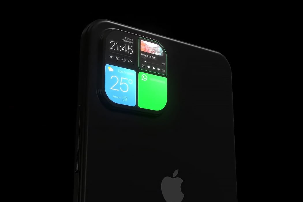
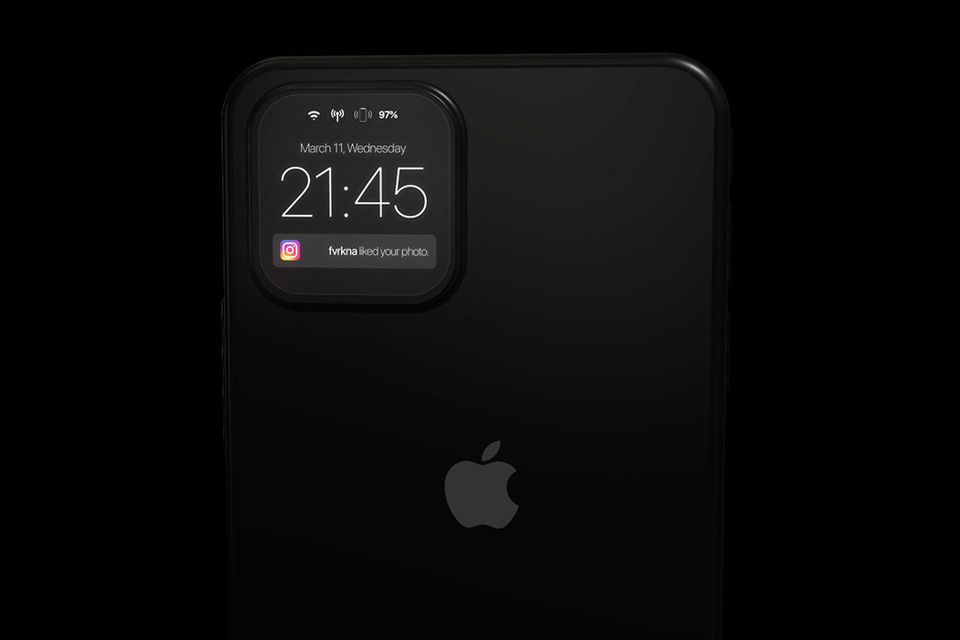
The iPhone 12 retains the dreaded notch that was established with the iPhone X – and while we look for changes in the screen of the phone, Furkan’s iPhone 13 concept makes us look at the camera notch in a whole new way and how! Firstly, the camera bump comes with 4 lenses now (maybe the macro lens is finally coming to the iPhone!) and doubles up as an instant notification panel. The UI of this notification panel borrows heavily from the well established and tested UI that the Apple Watch carries – showing everything from app notifications, widgets, and even your health statistics. We have seen conceptual tech showcasing a glass panel that doubles as a touchscreen, this would be the first commercial implementation of this technology, but one thing we know – if Apple actually does this, most of the newer models are soon to follow suit. The coolness factor of this design aside, the mini-display can help extend the battery life by reducing our dependency on the home screen to check our notifications.

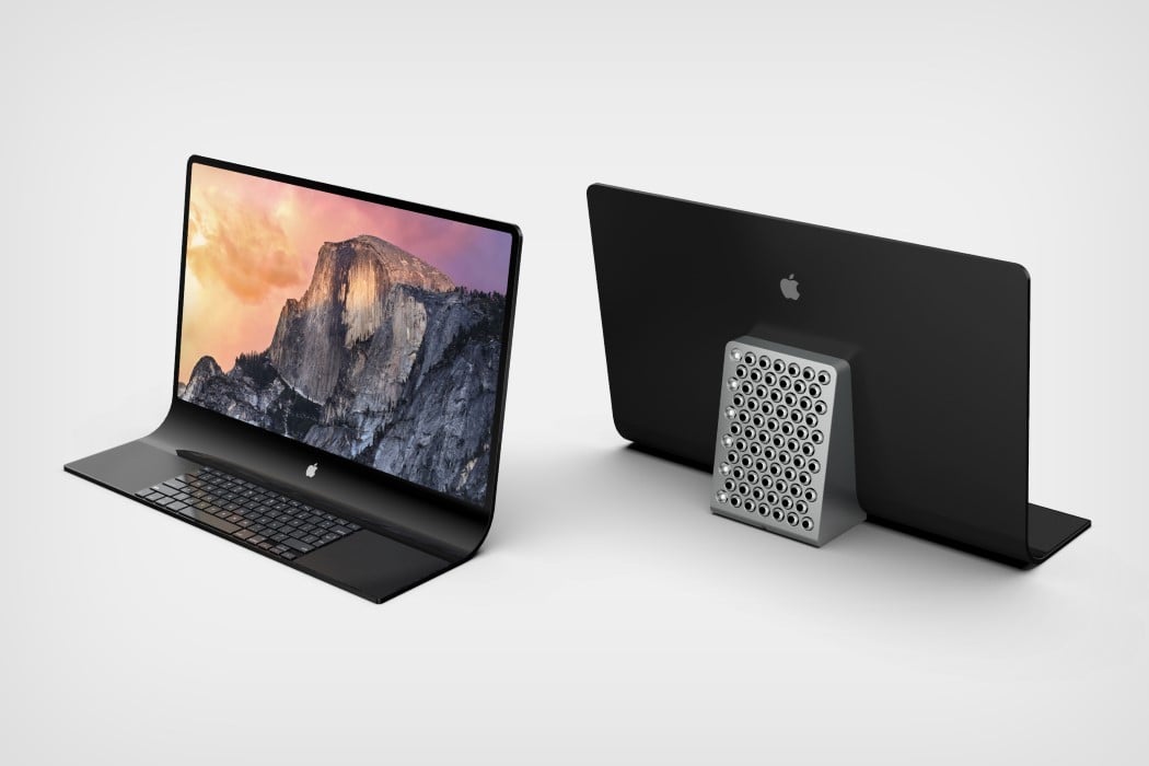
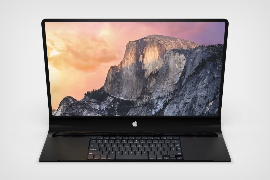
The concept visualized by our very own Sarang Sheth showcases an interesting monolithic take on the all-in-one Macintosh, featuring a slick unibody glass that transitions from screen to keyboard in one grand, singular motion. The screen literally folds downwards as soon as it hits the desk to provide a precipice for a keyboard as well as two track-pads that reside within the glass. All in all, the entire thing looks rather Dali-esque. This impressively thin form factor allows Apple to isolate the actual computer into a block at the back that helps prop the glass facade up. Complete with a smorgasbord of ports (and that cheesegrater CNC-machined grille that Jony designed exactly a year ago), the grille sits at a slight tilt too, allowing heat to travel outwards and upwards. The new take on the iMac Pro allows Apple to keep its all-in-one desktop computer looking incredibly slim without sacrificing on power and performance.

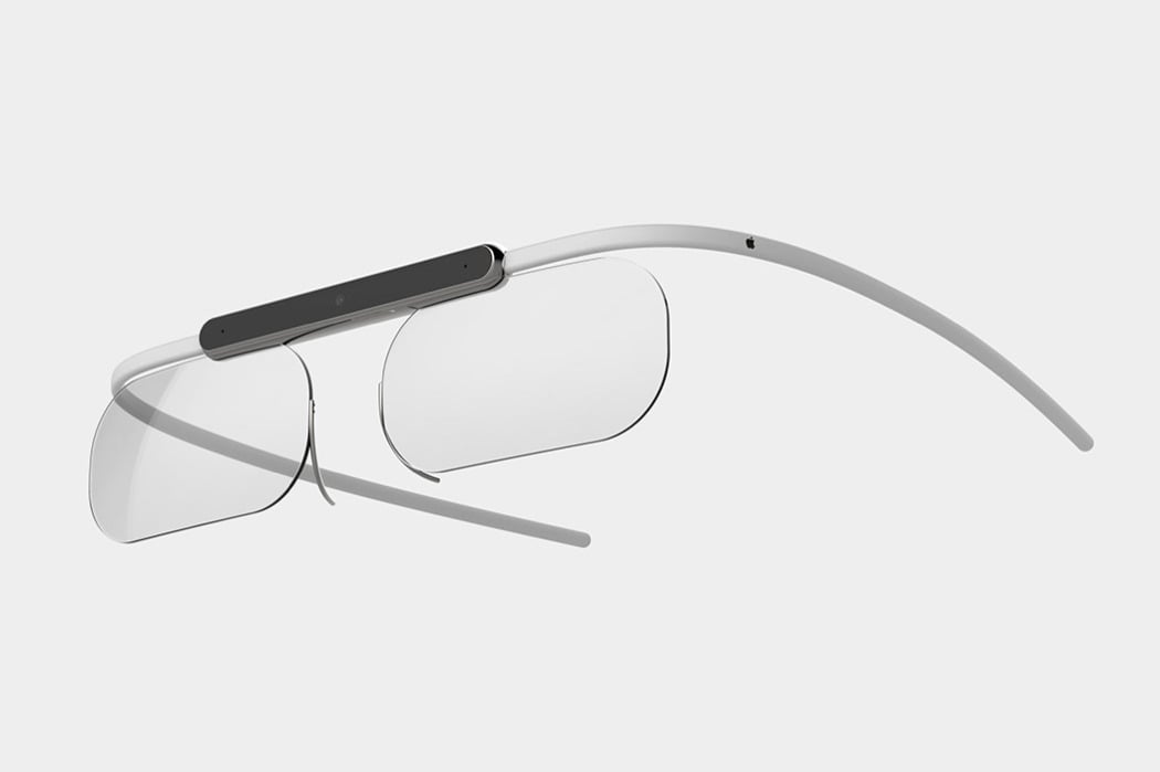
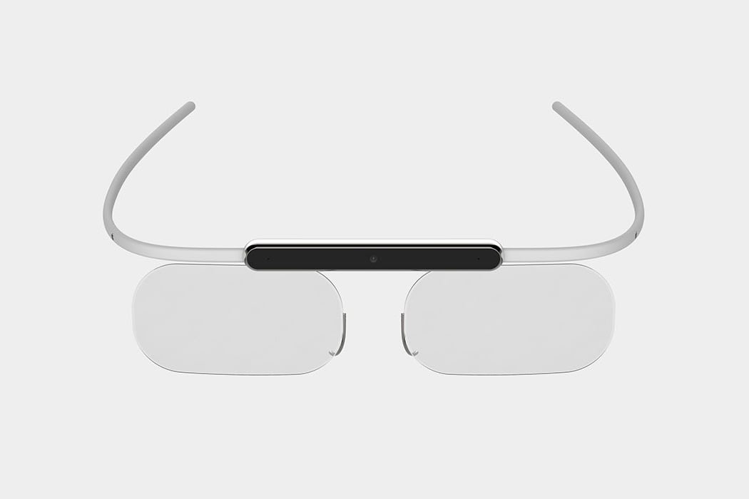
Introducing the conceptual augmented reality goggles that beautifully carry the iconic design language that we know and love. The challenge for this project was to create a revolutionary pair of spectacles where the elegant fusion of technology and style drives the design! We’ve seen Google attempt this in the past, but we believe that their downfall was that they lost the ‘glasses’ element, leading to a cyborg-esque aesthetic that wasn’t to everyone’s taste. This concept retains both of the lenses and the iconic form of a pair of glasses, to create an understated yet undeniably Apple-like product!

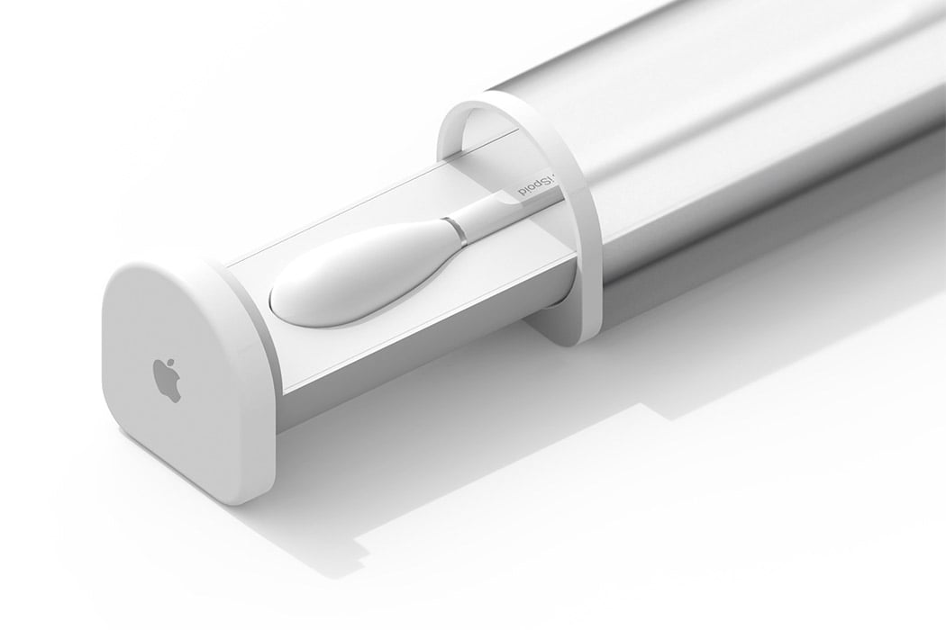
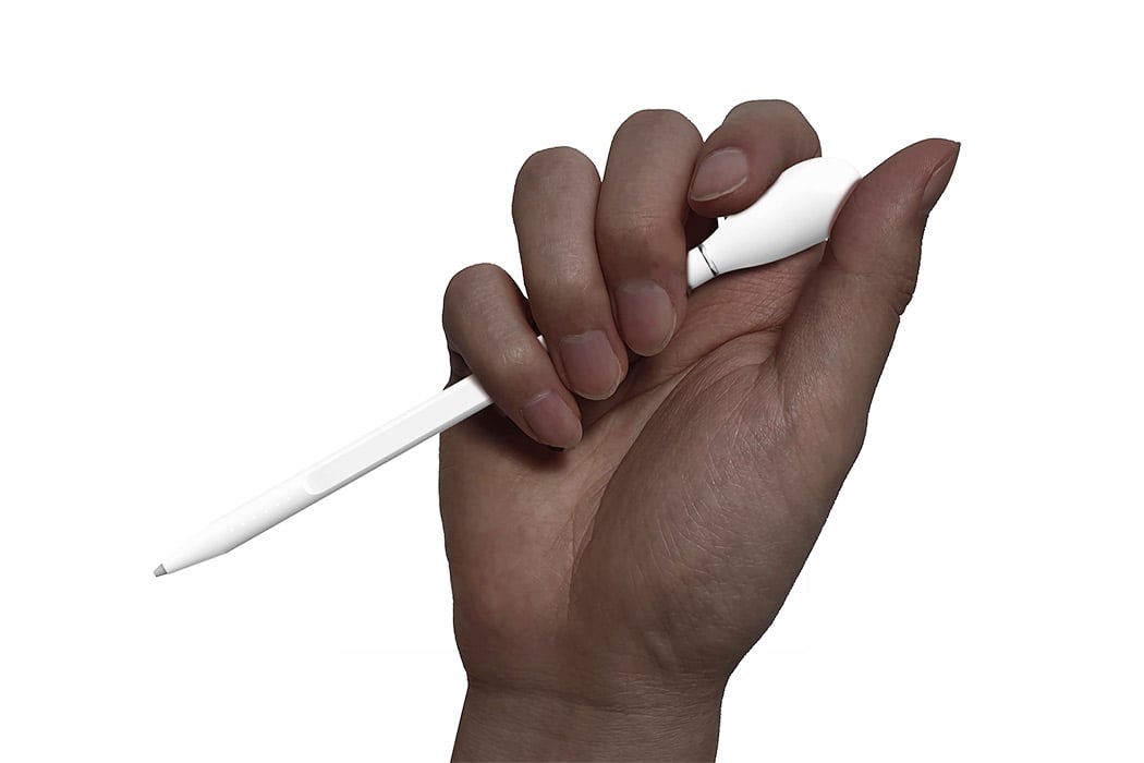
The iSpoid is a conceptual dropper that picks up data instead of colors and we are here for this! The motion of using a dropper to transfer colors was reinterpreted with the data delivery interface with an Apple pencil-like tool which has been christened as iSpoid for this concept project. The group of Korean designers who came up with this conceptual product wanted to make data transfer and data sharing between devices as easy and joyful without the stress of connecting via Bluetooth, hard drives, and the quest for finding the right device to AirDrop. The product development phase involved sketching, brainstorming about usability, and making the device itself as physically similar to a dropper as possible – if you observe the form, it’s a hybrid between the color dropper and the Apple Pencil. The action is instinctive with this device, you position the dropper on the file, press the bubble on top, and watch the 3 lights on the tip light up indicating the file has been picked. You then drop it on the desired device and the lights will dim down just like releasing color from a dropper, but here it is the data.

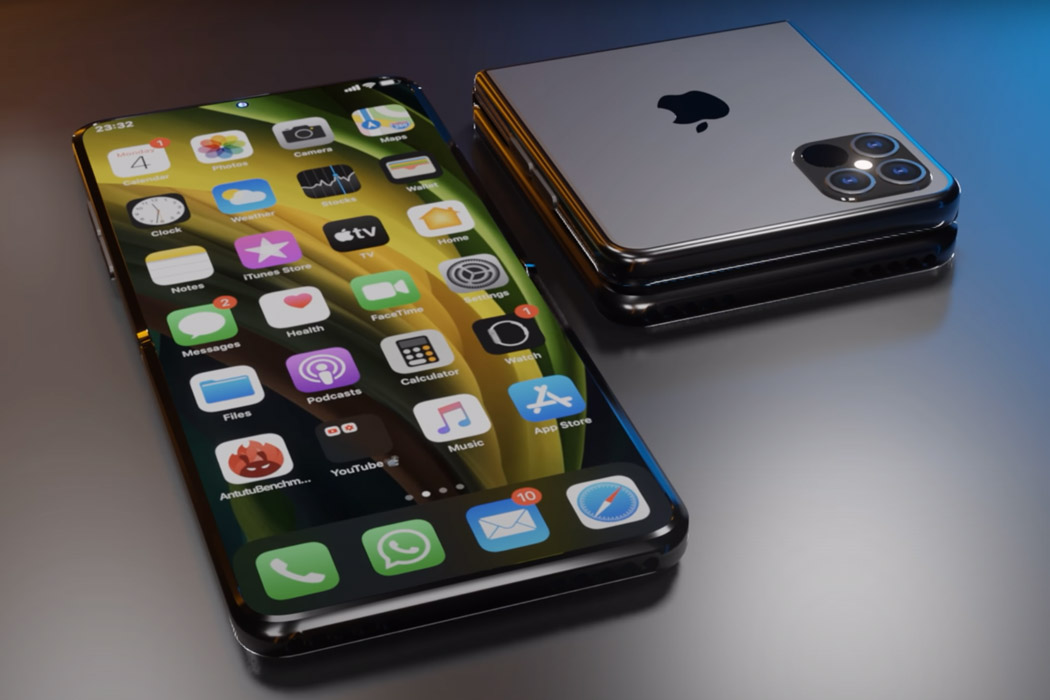
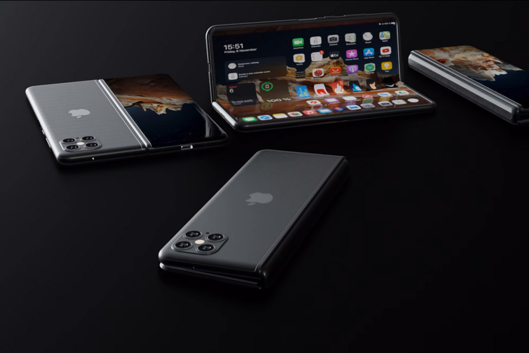
The Apple version of a folding phone could take design cues from the Galaxy Z Fold 2 if they decide to make it an all-out flagship-grade version, or go for a subtle Razr-like form factor if they desire to cater to a niche set of buyers. If we go by the patent filed by Apple, the display will have a crease-less foldable panel (like Galaxy Z Fold 2) and a folding mechanism similar to Motorola Razr – folding like a handy mirror. The early renders of the iPhone 13 are not exactly promising (for either of the versions) but we can count on Apple’s tendency to be thorough in its design testing and the result will be ready to shock and awe. Personally, I find the Moto Razr inspired fold a more unique design with the folded screen seemingly a throwback to the iPod Nano that was a part of their game-changing arsenal.

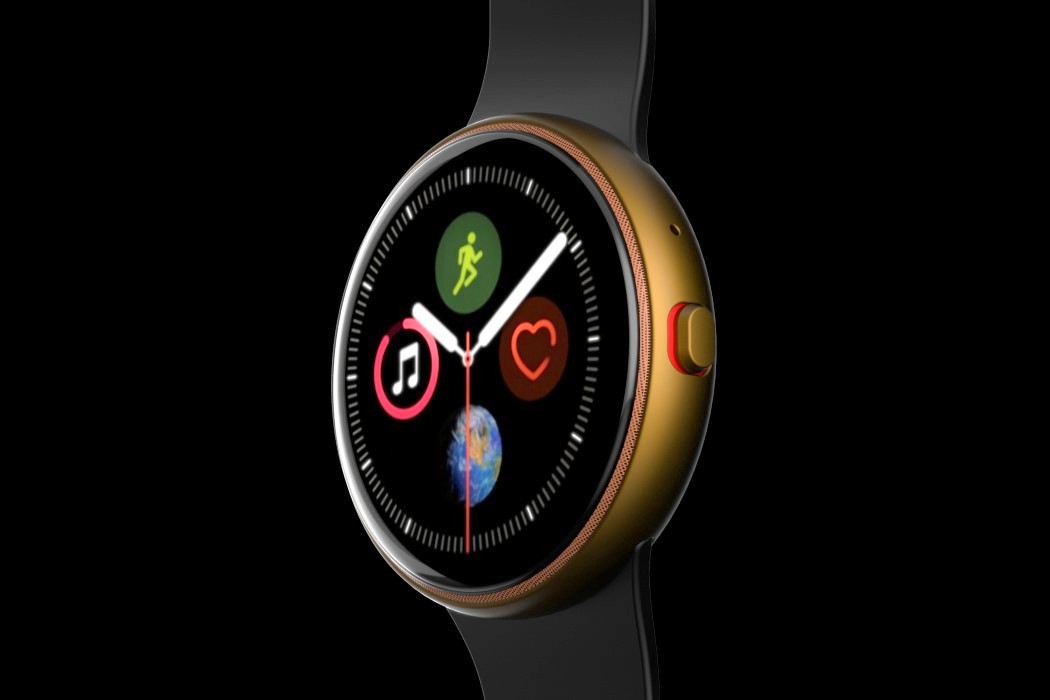
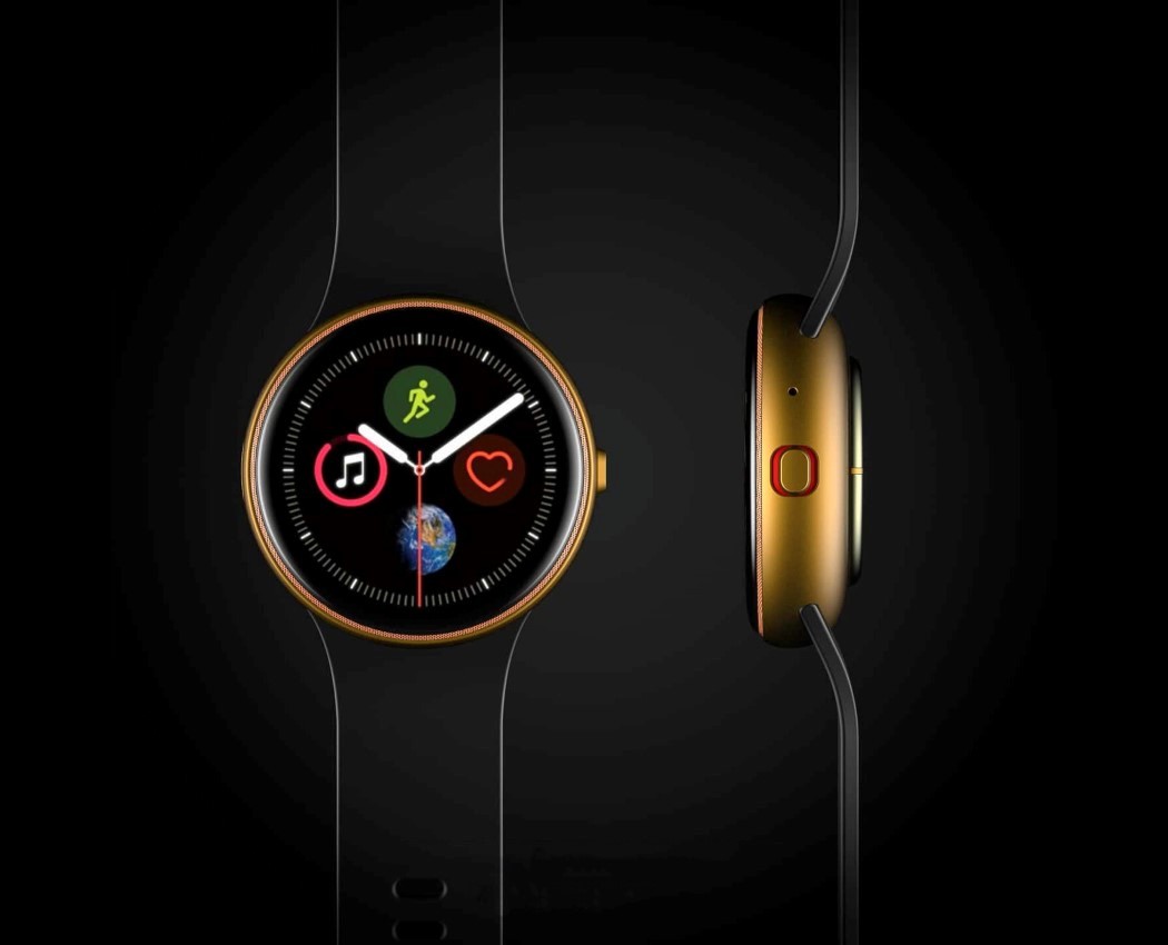
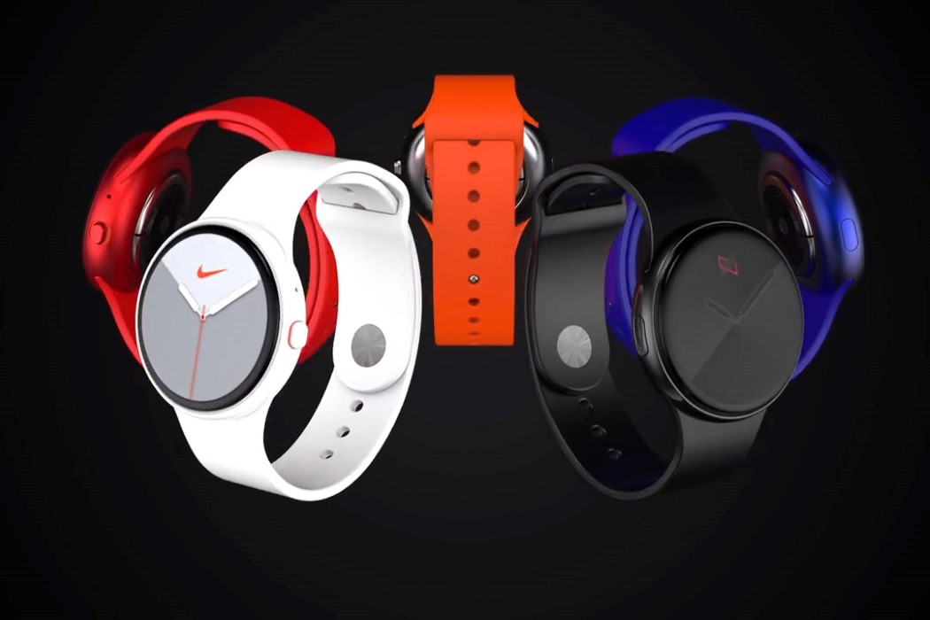
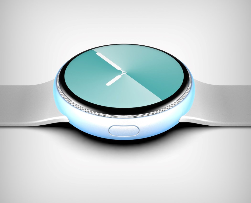
A concept creator by the name of Phone Industry’s envisioned a radically different, circular Apple Watch… because why not. It features a Samsung Galaxy-inspired circular body and dial, with a thin bezel around the edge, and a speaker grill at the very periphery of the dial. It also ditches the rotating crown for a more standard tactile button. I doubt you could watch Apple TV or a keynote on the circular screen (or even browse the internet effectively), but the Apple Watch has never been touted as an internet-browsing device on your wrist. Instead, the circular screen could enhance the Apple Watch’s existing services by making use of the circular UI to lay-out information in an effective way. Besides, that circular watch-face looks pretty stunning, don’t you think?!

For more such innovative and exciting Apple concepts, check out Part 1 and 2 of this post!

Apple-inspired designs to fulfill every tech lovers dream: Part 2

Apple is in the news again with a mysterious new rumor that they are launching a new product. While the company has already done an unprecedented number of product launches this year, experts wage a war – guessing the launch today can be anything from the MacBook Pro’s launching with their new M1 chip (fingers crossed it is this one) to the AirPods 3 making a reveal just in time for the Christmas shopping to hit its spree. Either way, whatever Apple reveals, they sure have the world excited with their ears perked up at the idea of seeing a new design. Speaking of the excitement for all things Apple, this post contains the best of Apple-inspired designs we have curated – showing designs that have the potential to shock, awe, and have us demanding Apple to convert these concepts to reality before next Christmas!
MacBook Pro 2018 concept

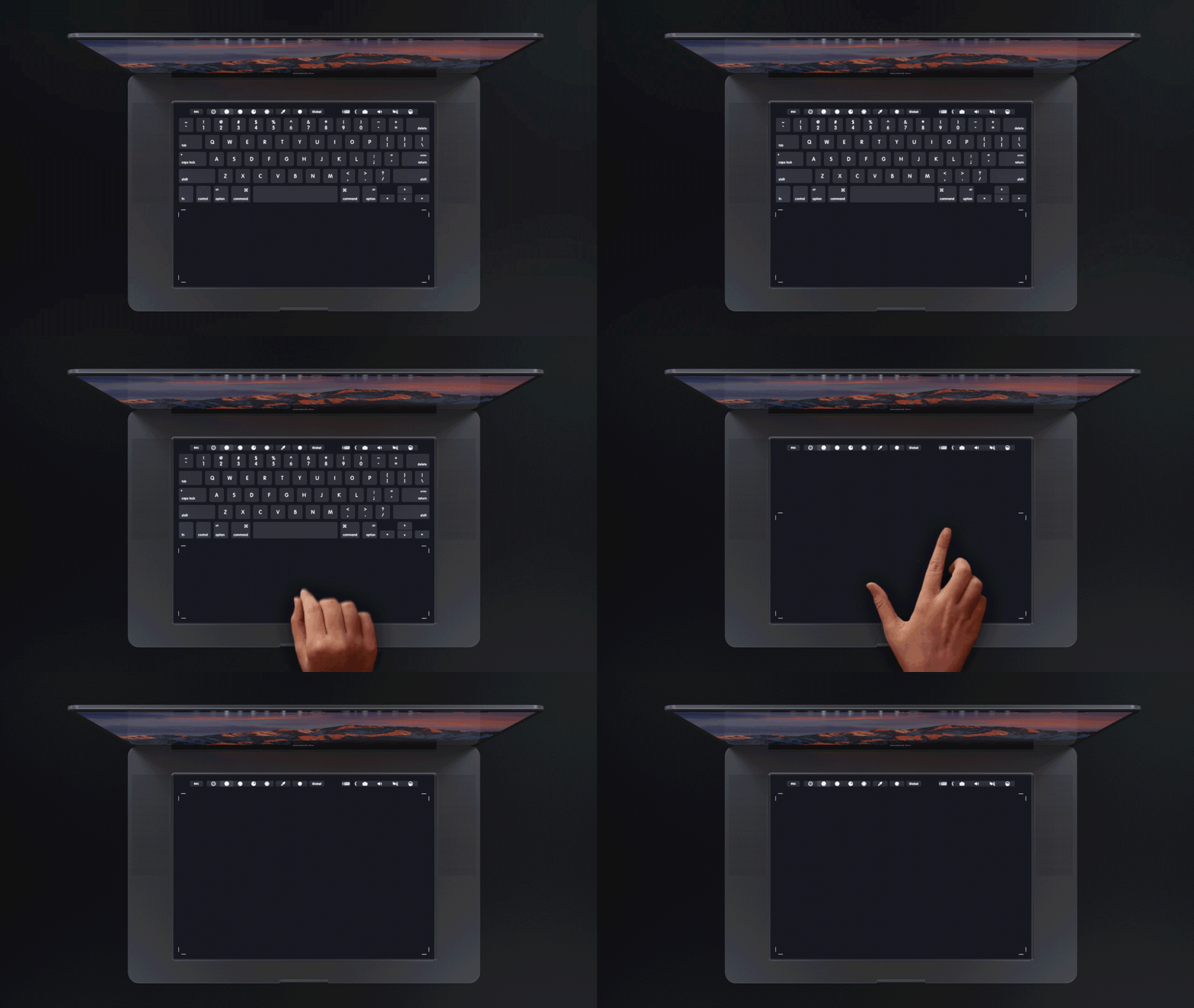
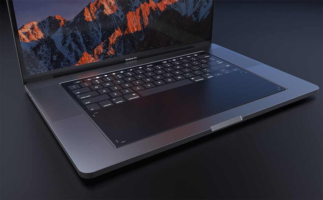
Designed with designers in mind, this MacBook Pro 2018 concept by Daniel Brunsteiner explores the integration of a full-size touchpad in place of the traditional keyboard. It relies on Apple’s own Taptic Engine system to give the user the feel of physical buttons or even emulate a scroll wheel or sliders. It retains the touch bar for shortcuts and function keys but the entire surface is touch-enabled! Better yet, now Apple Pencil is compatible with the new MacBook Pro, helping creative professionals in their workflow and allowing for new applications using the touchpad area.

The concept visualized by our very own Sarang Sheth showcases an interesting monolithic take on the all-in-one Macintosh, featuring a slick unibody glass that transitions from screen to keyboard in one grand, singular motion. The screen literally folds downwards as soon as it hits the desk to provide a precipice for a keyboard as well as two track-pads that reside within the glass. All in all, the entire thing looks rather Dali-esque. This impressively thin form factor allows Apple to isolate the actual computer into a block at the back that helps prop the glass facade up. Complete with a smorgasbord of ports (and that cheesegrater CNC-machined grille that Jony designed exactly a year ago), the grille sits at a slight tilt too, allowing heat to travel outwards and upwards. The new take on the iMac Pro allows Apple to keep its all-in-one desktop computer looking incredibly slim without sacrificing on power and performance.

Get those professional shots without having to study the manual and watch several YouTube videos, the iCamera by Cha Hee Lim aims at breaking down the complexity of advanced cameras to make people comfortable with the idea of shooting with a gadget that is not their phone. “It increases your ability and easily leads you to the world of cameras,” says the designer about the gap he wants to bridge with this concept design. The designer wanted to simplify the existing advanced cameras’ user experience by making the body more compact and lighter. The bulk of the lens is reduced but it still includes the revolving functionality to zoom. However, now you can do it comfortably with just a finger. 
The iPhone 12 retains the dreaded notch that was established with the iPhone X – and while we look for changes in the screen of the phone, Furkan’s iPhone 13 concept makes us look at the camera notch in a whole new way and how! Firstly, the camera bump comes with 4 lenses now (maybe the macro lens is finally coming to the iPhone!) and doubles up as an instant notification panel. The UI of this notification panel borrows heavily from the well established and tested UI that the Apple Watch carries – showing everything from app notifications, widgets, and even your health statistics. We have seen conceptual tech showcasing a glass panel that doubles as a touchscreen, this would be the first commercial implementation of this technology, but one thing we know – if Apple actually does this, most of the newer models are soon to follow suit. The coolness factor of this design aside, the mini-display can help extend the battery life by reducing our dependency on the home screen to check our notifications.

Ludovico’s MacBook redesign takes similar routes to the iPhone X and rather appropriately christens itself the MacBook X. Featuring a body that’s curved, rather than wedged, the MacBook X does a hat-tip to the iPhone and looks less susceptible to horrible denting given the lack of a sharp edge. It also explores a more expansive display that has those incredible curved edges and absolutely no bezels. The absence of a notch means there’s no webcam on the MacBook X, which does raise questions, but none too serious, considering this is purely conceptual. Look down at the bottom half and you’ll see the touch-bar is still there, sitting above what I can only say is a keyboard that feels much too different. Deviating from the regular square-keyed board, Campana’s MacBook concept takes on a circular key design, which I honestly have conflicting opinions about, but then again, conflicting opinions are all too common in the domain of consumer electronics… aren’t they?

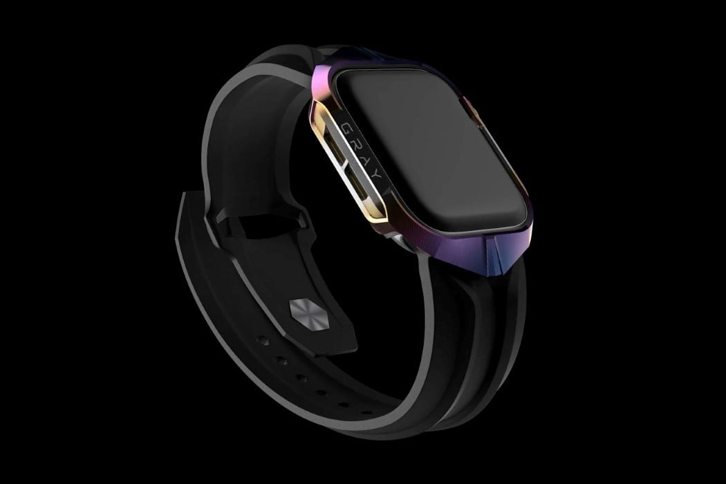
This mechanically-textured CNC-machined titanium case makes your Apple Watch look like (and possibly be as strong as) the Cybertruck. Designed by the guys at Gray Inc., the Cyber Watch skin gives the Apple Watch a certain sculptural quality that channels Tesla’s design aesthetic, opting for something more eclectic than Apple’s sleek aluminum styling. The Cyber Watch is equal parts rugged and modern, with an exterior that is as captivating as the watch’s UI and features themselves.

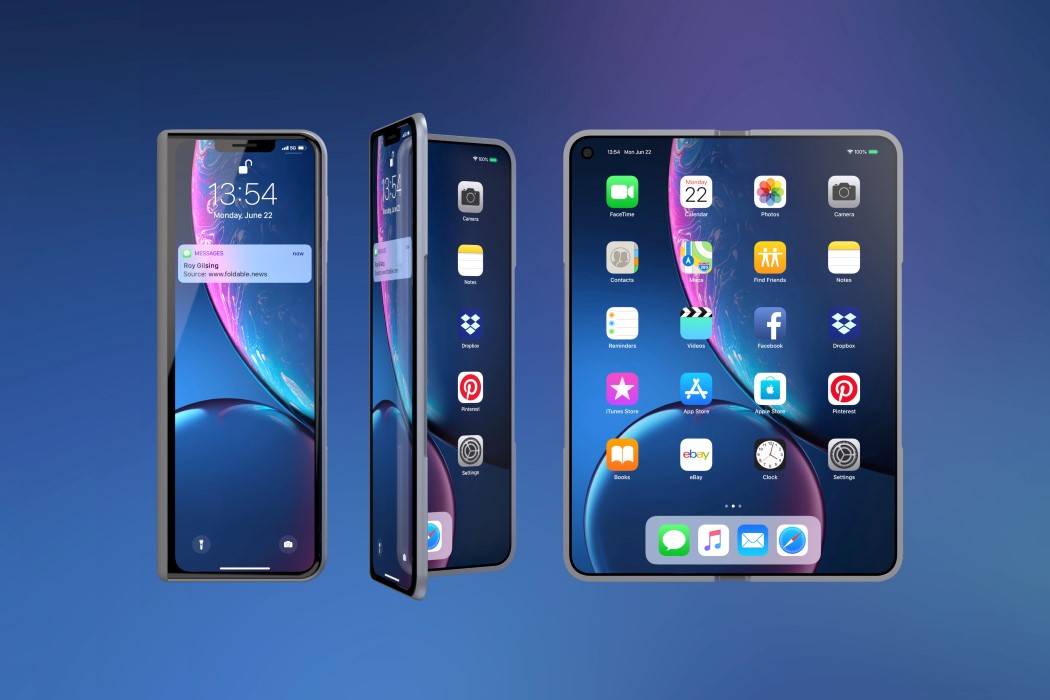
If you look at the iPhone X Fold’s OS by  Roy Gilsing Design, you see that it’s essentially an iPad Mini folded in half… a desirable #bendgate if you will. It features a secondary screen on the front that resembles the iPhone X (why it features the notch, I’ll never know), but its most unlikely yet apt inspiration comes from one of Apple’s most reliable products ever, the MacBook. The XFold features an inward screen as the MacBook does, and even comes with the same anodized aluminum finish. Look at the rim and you’ll even see a slight cutout on the frame to slide your thumb in and open the phone, just like the MacBook has.

What could the Series 6 possibly do to be different from (and better than) the Series 5? A concept creator by the name of Phone Industry’s envisioned a radically different, circular Apple Watch 6… because why not. It features a Samsung Galaxy-inspired circular body and dial, with a thin bezel around the edge, and a speaker grill at the very periphery of the dial. It also ditches the rotating crown for a more standard tactile button.
Traditionally iPhones have always been very compact and designed with one-handed use in mind. To that end, Samsung and LG have not constricted themselves and brought big-screen phones to the market that are tailored for multimedia consumption. That competitive push has forced Apple to increase the screen size gradually, as this year’s iPhone 12 Pro Max has a big 6.7-inch display. The Apple version of a folding phone could take design cues from the Galaxy Z Fold 2 if they decide to make it an all-out flagship-grade version, or go for a subtle Razr-like form factor if they desire to cater to a niche set of buyers. If we go by the patent filed by Apple, the conceptual iPhone 13 displayed here will have a crease-less foldable panel (like Galaxy Z Fold 2) and a folding mechanism similar to Motorola Razr – folding like a handy mirror. The early renders of the iPhone 13 are not exactly promising (for either of the versions) but we can count on Apple’s tendency to be thorough in its design testing and the result will be ready to shock and awe.
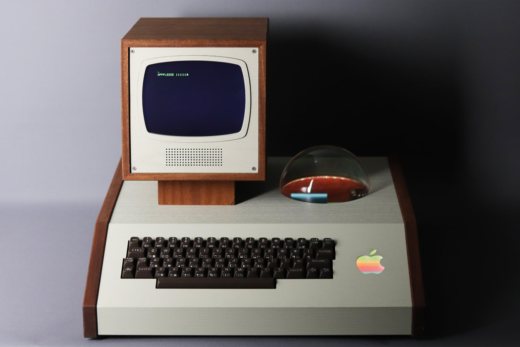
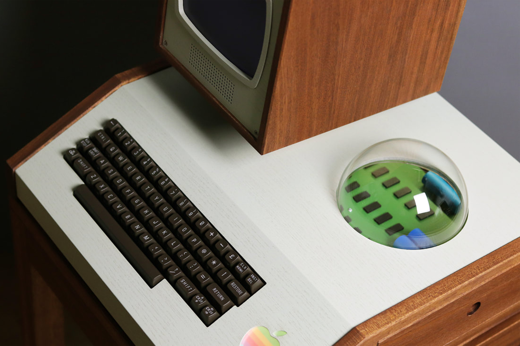
If you are a vintage curator of all things Apple, Aple is a bespoke, made-to-order, battery-operated display cabinet that encases original, ‘Woz-built,’ Apple motherboards from 1976 or later. Unlike Apple-I’s consumer products, Hultén’s display case comes equipped with a fully integrated keyboard and monitor protection framing that’s hand-constructed out of either black walnut or old growth teak wood. The wooden monitor housing perches above the display cabinet on an angled mount carved from the same wood as the rest of the case. On the display case’s right side, a pull out drawer reveals the motherboard’s circuitry. Mostly enclosed, Apple-I’s circuit board can be magnified by looking through the case’s plexiglass dome, resembling a crystal ball cut in half, which Love Hultén might have included to evoke 1970s era mysticism.

For more Apple-inspired innovations, check out the first part of this series!