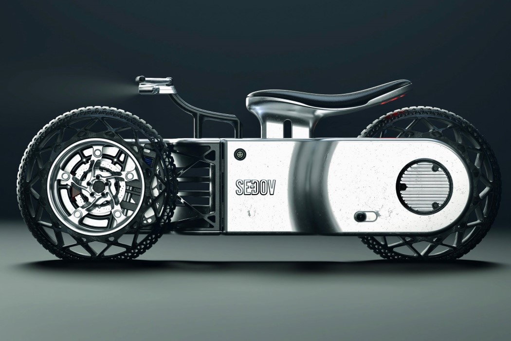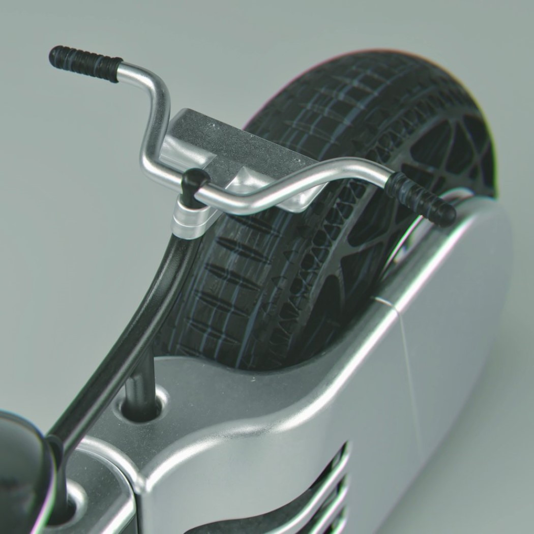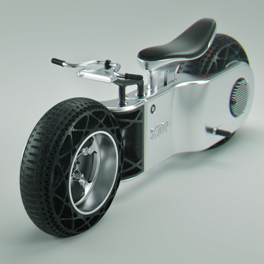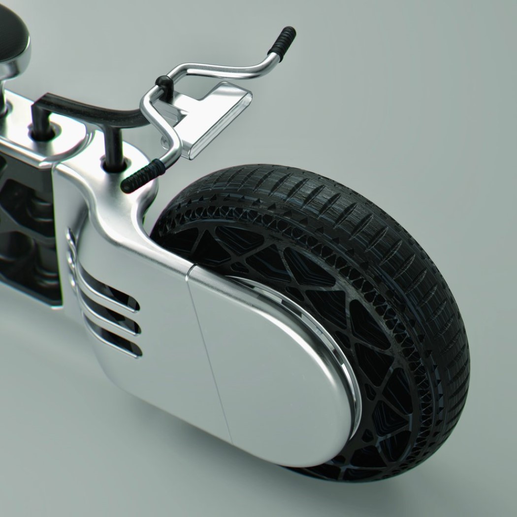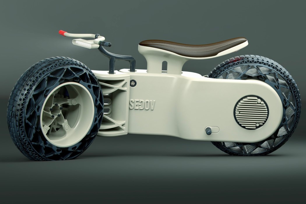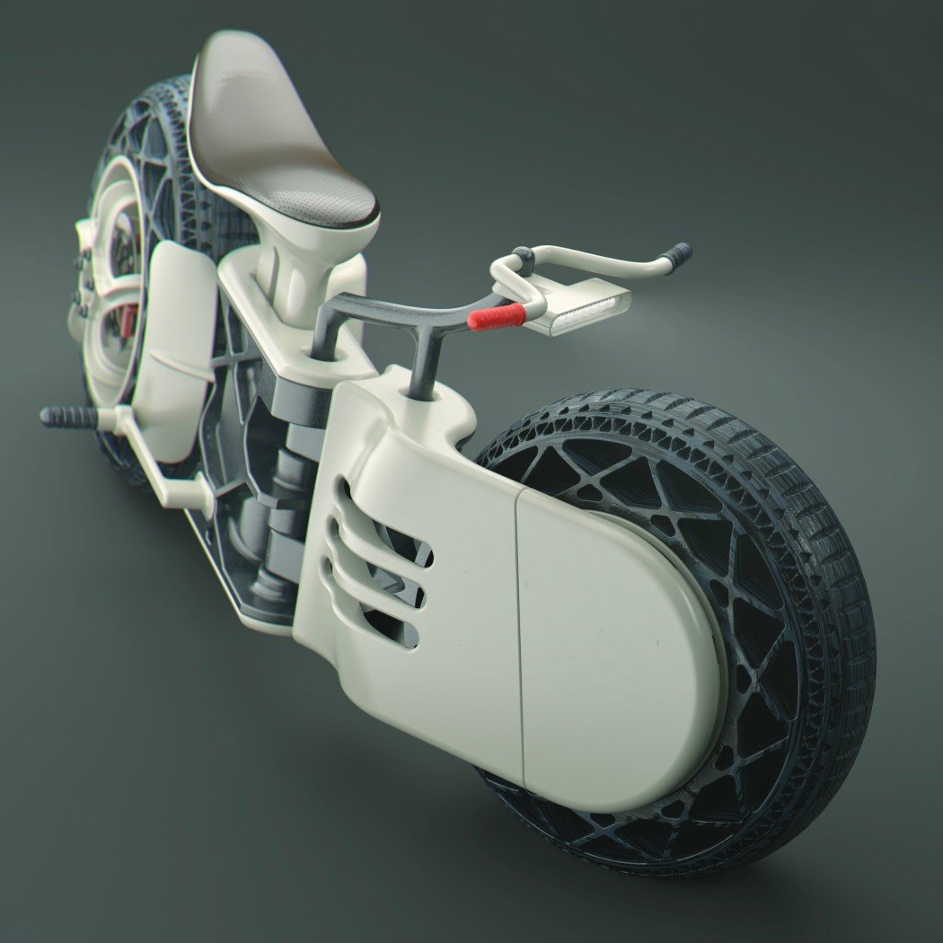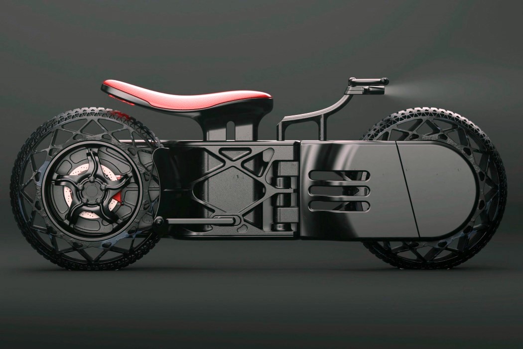
Call me a fan of Sedov’s redefined, simple motorbike aesthetic. His bikes may be purely conceptual, bordering on impracticality in the current scenario, but they sure are eye-catching. Sedov boldly uses straight lines and geometric shapes in his vehicles, deviating from the aerodynamic, organic designs most automobiles have. The result is a motorbike that has the essence, but changes presentation, much like a deconstructed dessert. Sedov also gives tires complete visual priority, often reducing the motorbike’s body to be as tall and as wide as the tires themselves, and even experimenting with airless tire designs. The B3, in that regard, is classic Sedov.
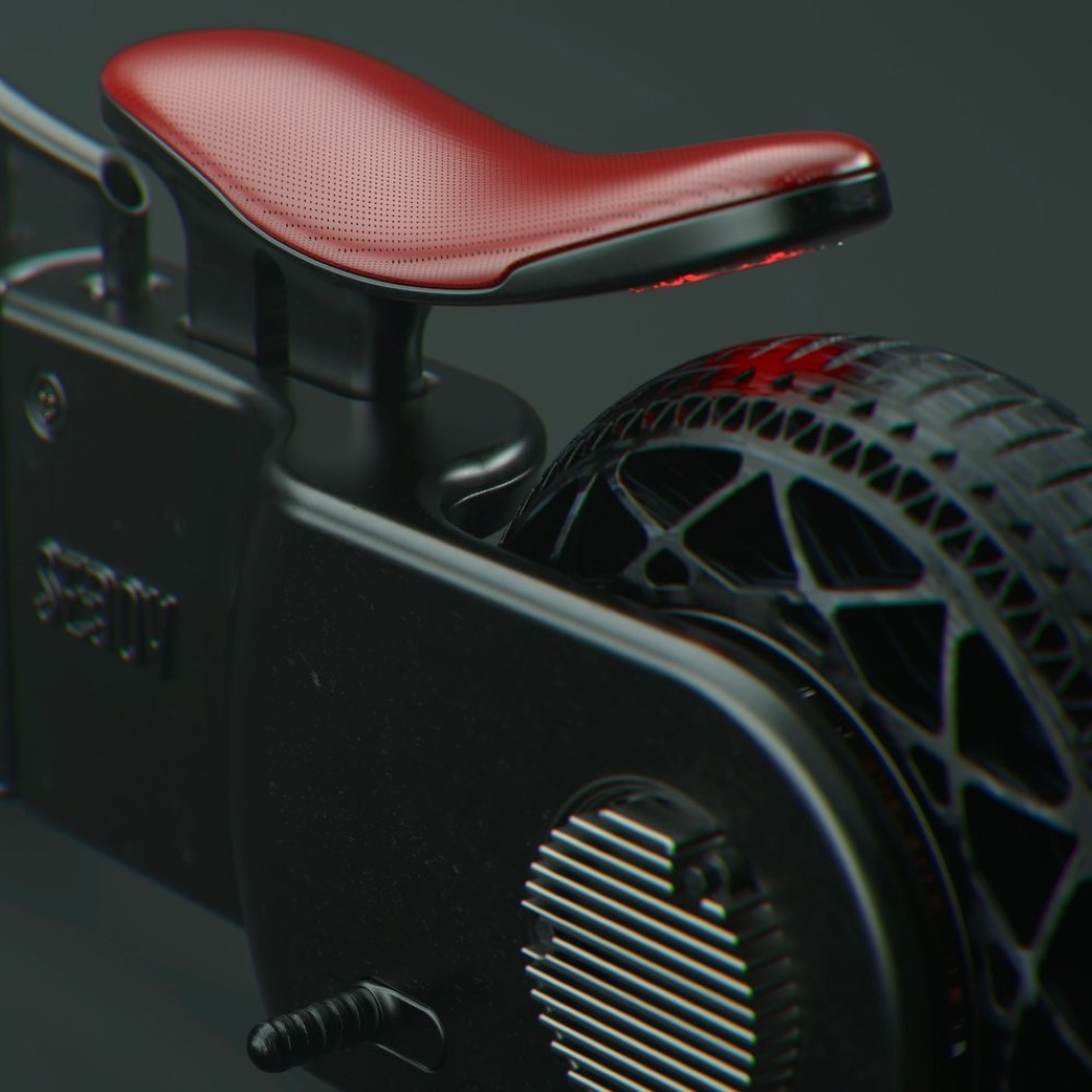
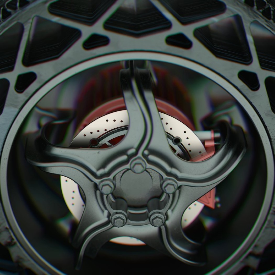
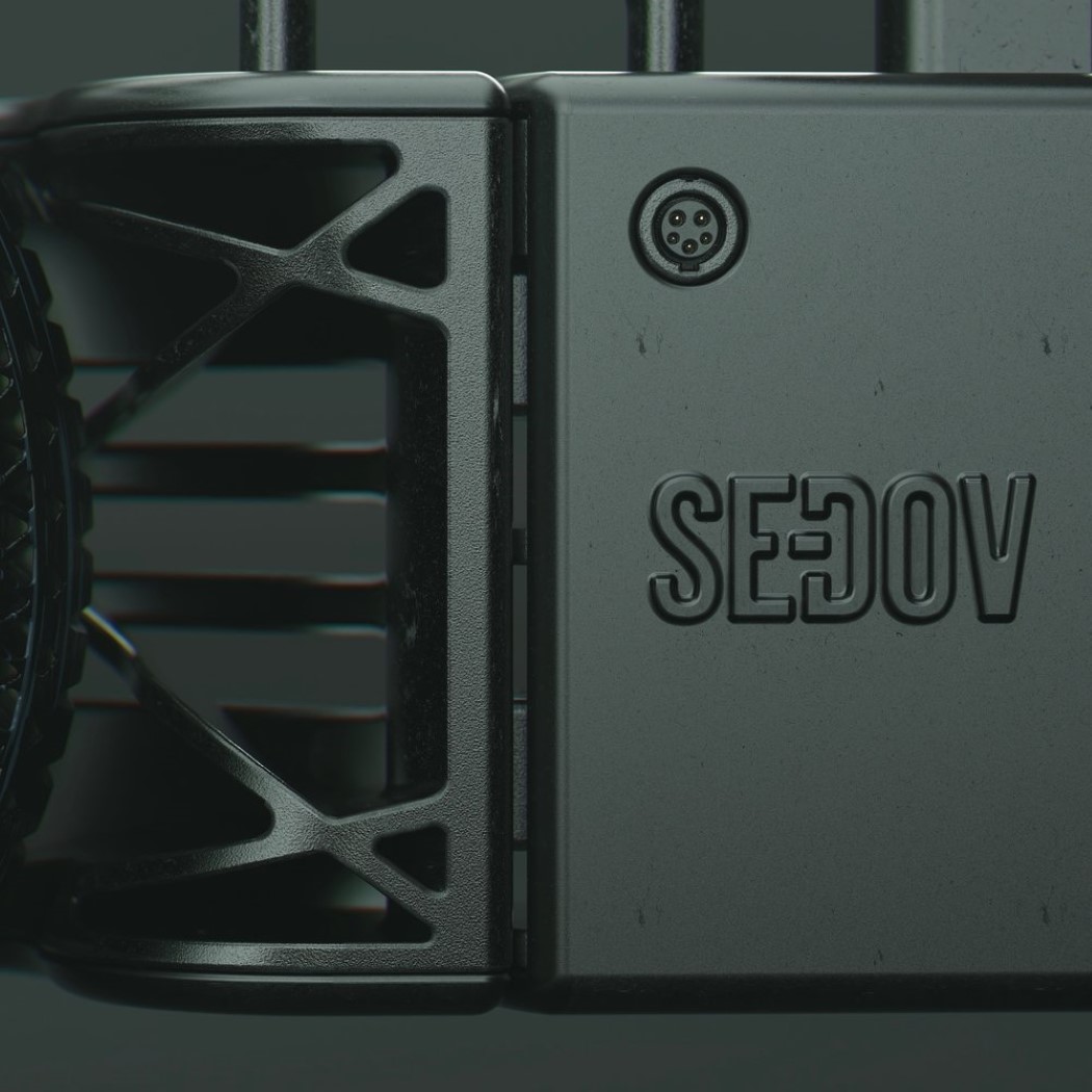
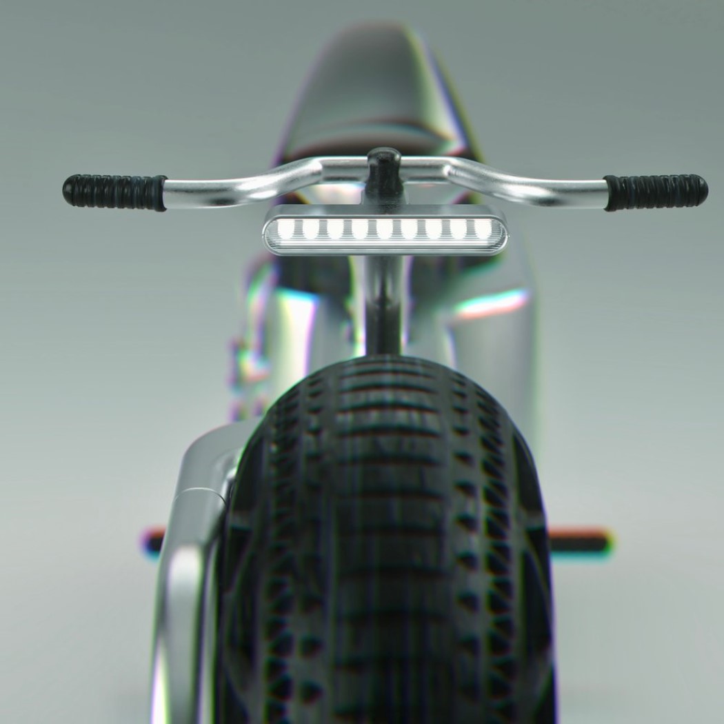
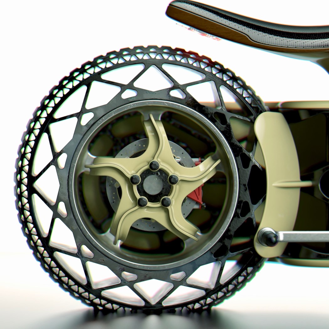
The B3, much like the B1 and B2 in Sedov’s ongoing series, follows the capsule-body silhouette. However, unlike the B1 and B2, the body is relatively smaller than the tires, and doesn’t leave any negative space in the center. The B3 also highlights Sedov’s obsession with triangles, not only using them to create a taillight pattern, but to also create the tires’ airless design. The different sized triangles would help keep the tire sturdy, but give it its bounce. The tires are connected to the bike using a novel single-sided fork design that alternates between the front and rear tires. Like all of Sedov’s B-series motorbikes, the B3 doesn’t have a dashboard either, and boasts of a gently curved leather seat, followed by relatively simple handlebars. There’s also a chance that the seat has a suspension at its base, hidden away in the motorbike’s slim, alluring body. I vote for a proof-of-concept!
Designer: Dennis Sedov
