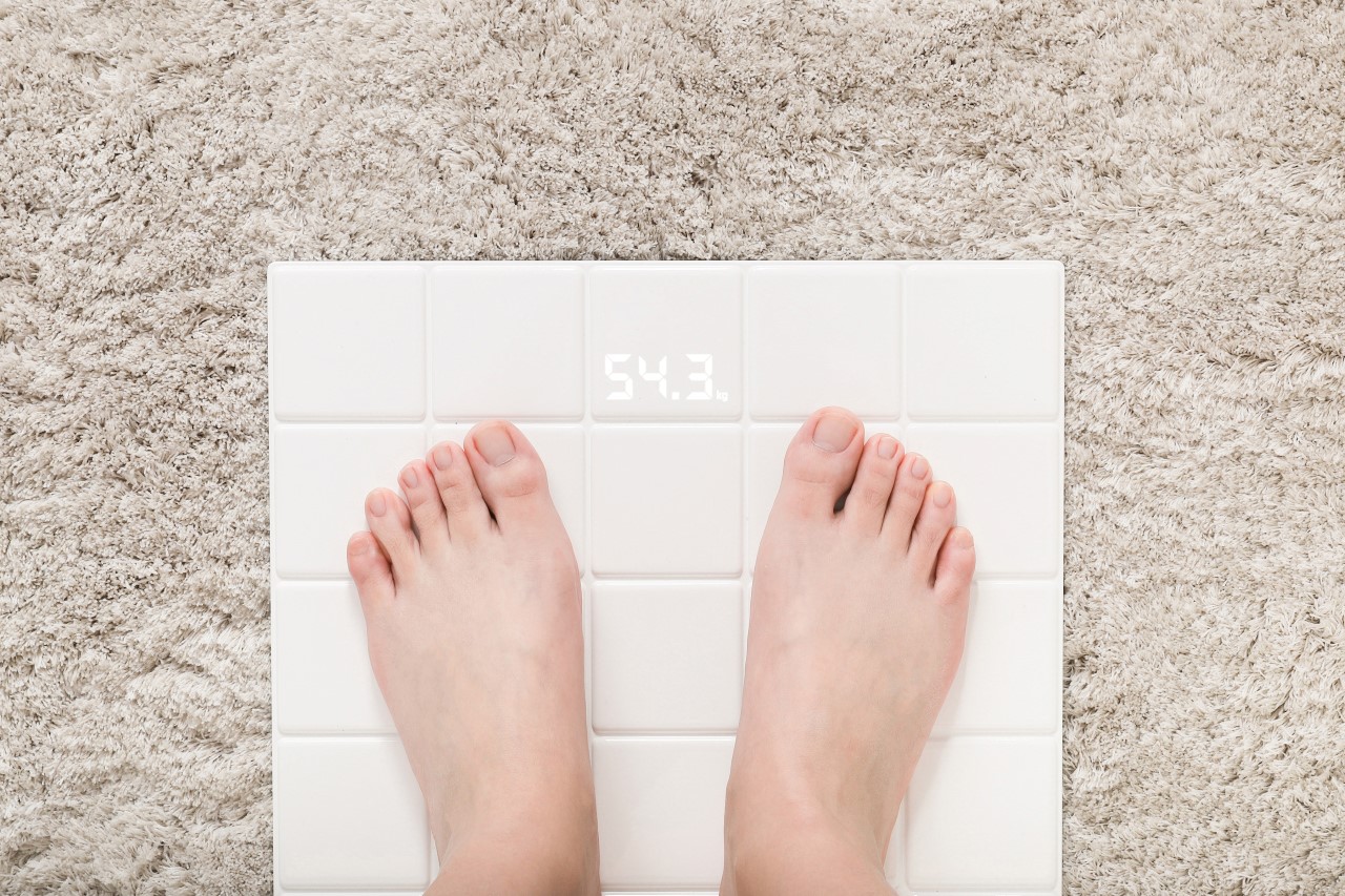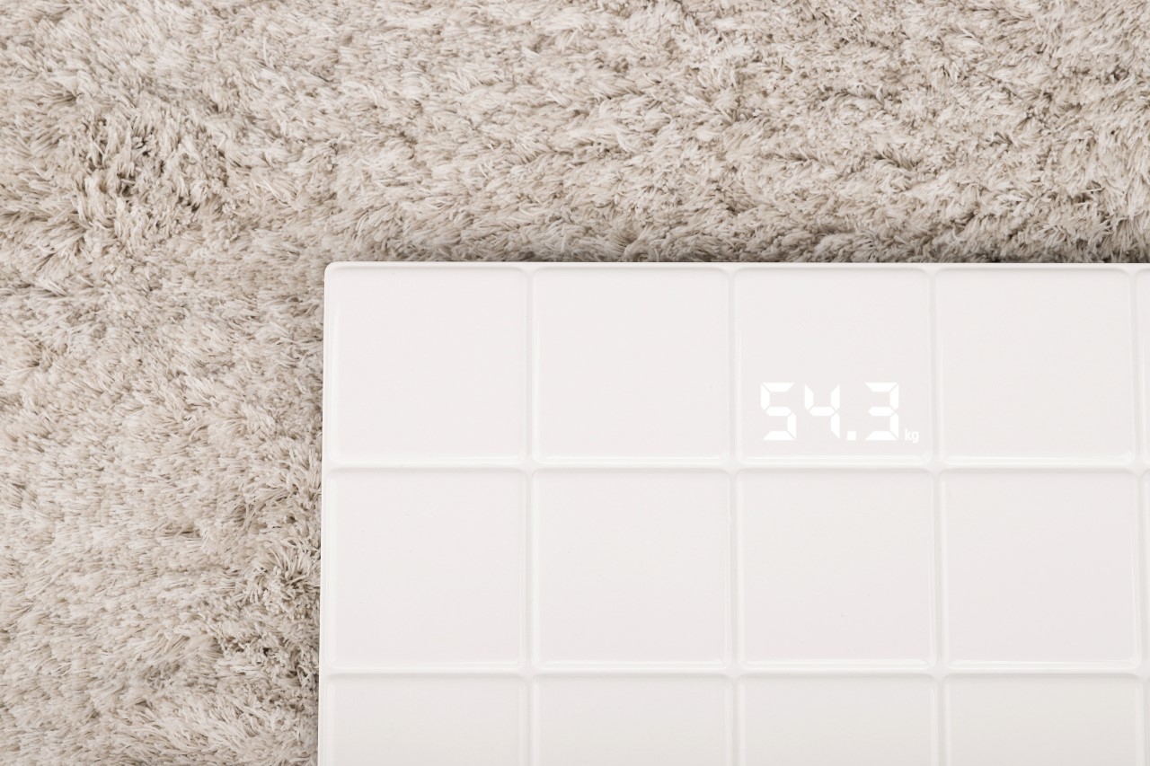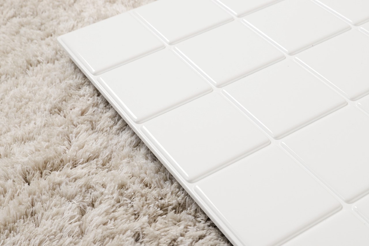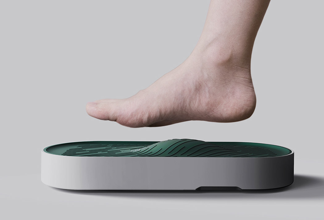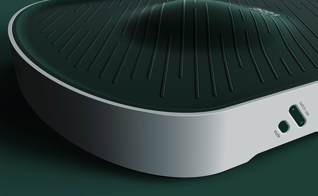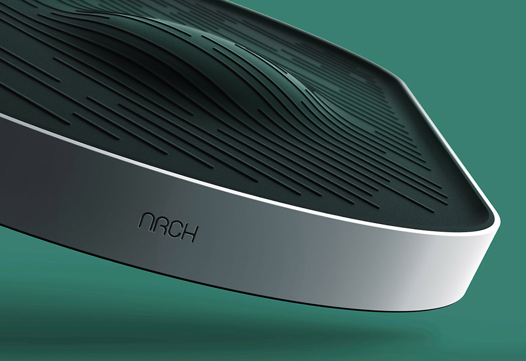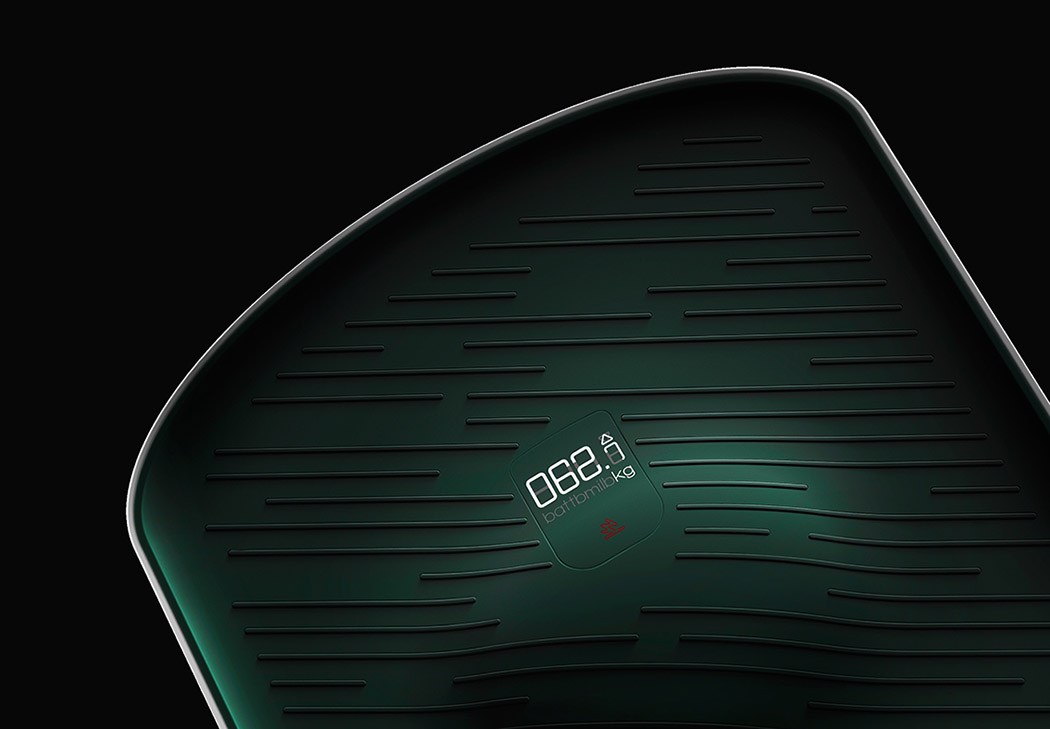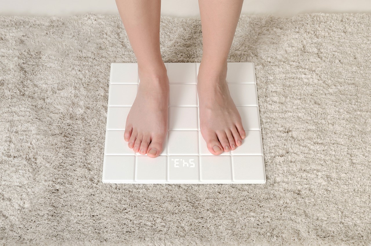
It takes a keen eye to be able to question the design of products we take for granted. Why are certain products like weighing scales designed the way they are? Given that they’re just literally a platform to stand on, why can’t they look more in tune with their surroundings? Designer Sije Chen found himself questioning that logic, which led to the design brief behind the Tiles Weight Scale. Simply put, the bathroom scale looks literally bathroom-inspired. With a glossy, tiled design, the product fits perfectly into the contemporary bathroom, looking more like functional decor than an appliance. Rather cool, no?
Designer: Sije Chen
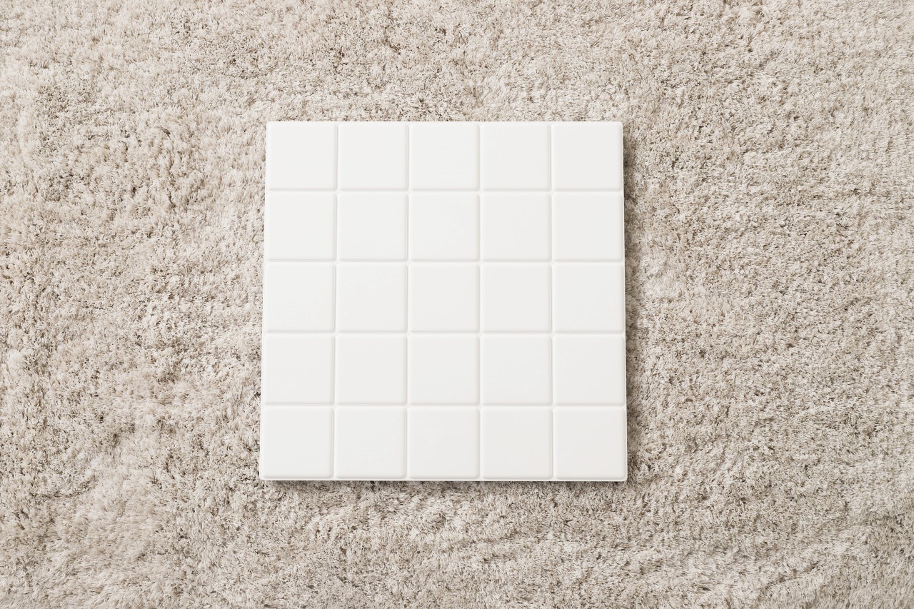
A finalist at the Spark Awards last year, the Tiles Weight Scale looks like a panel of your quintessential ceramic bathroom tiles. They aren’t made from ceramic, which means they aren’t slippery, and the white panel has an LED display that shines through the material, activating the moment you stand on it. That way, it serves its purpose wonderfully when it needs to, and blends right into the bathroom’s decor when not in use!
