Portable Smart Induction Cooktop concept lets you cook healthy meals anywhere

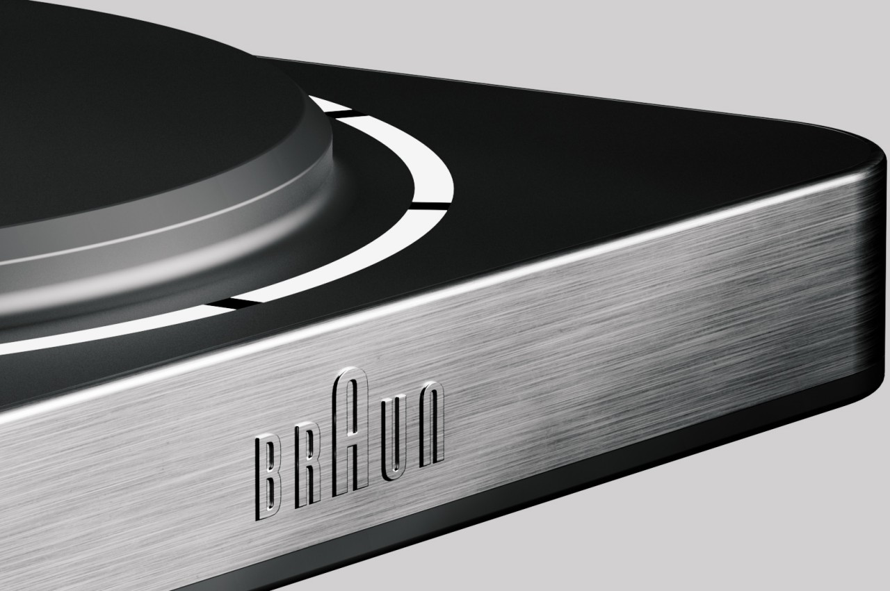
There are now several ways to get fresh and healthy meals delivered to you, but the best option is still to cook them yourself. You get to decide on the ingredients and the process, plus you can probably even save money in the long run. That said, cooking isn’t always easy or convenient, especially when you’re not at home or don’t even have access to a kitchen. Portable cooking equipment is slowly becoming an option, but many still fall short of providing convenience other than having a hot surface to cook on. This induction cooktop concept tries to address many of those shortcomings with features that help you cook smartly and safely while also borrowing the clean and minimalist aesthetic that the brand Braun is best known for.

Designer: Jenil Shah

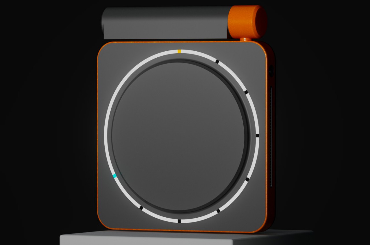
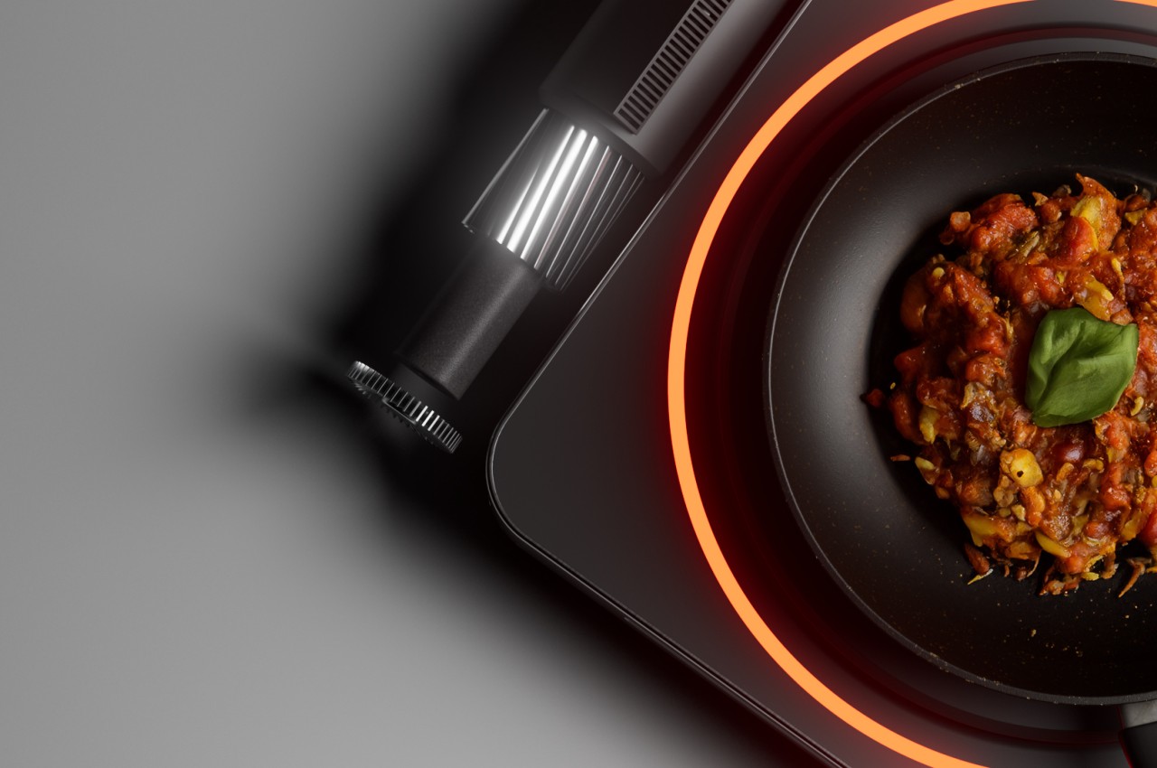
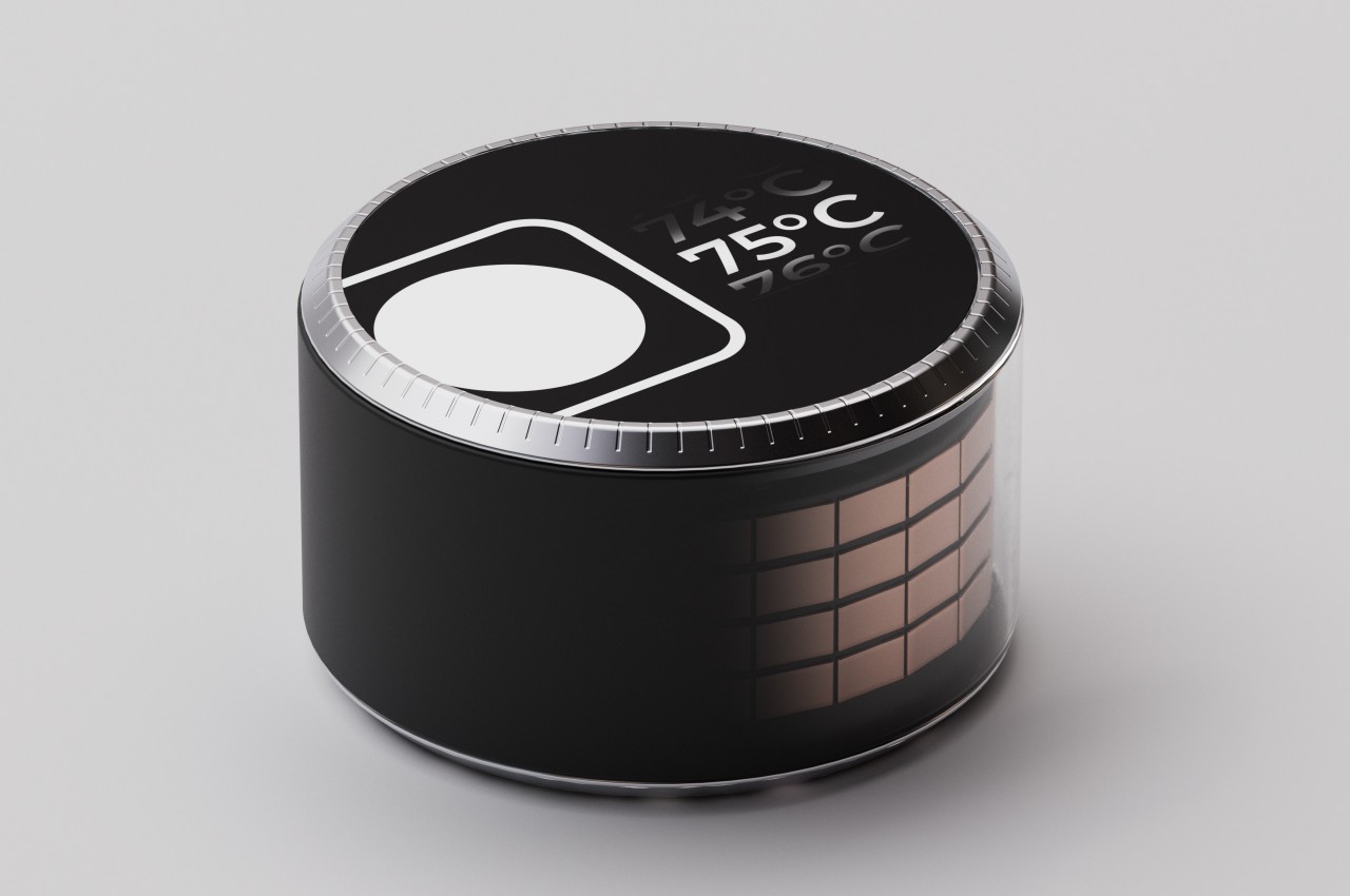
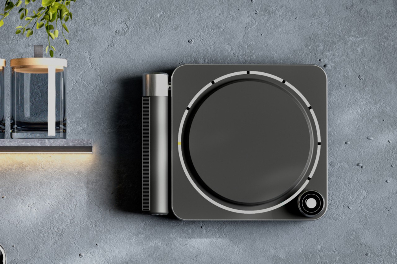
While it’s true that all you need to cook most food is a hot surface for pans and pots, that is really just the most basic cooking experience and definitely not the most convenient. There are other factors you have to consider while cooking, not least of which is the smoke that cooking produces. Keeping tabs on the food you’re cooking or even the ingredients you will be using is also part of the process, and the SY10 portable smart induction cooktop wants to make those parts as painless as possible.

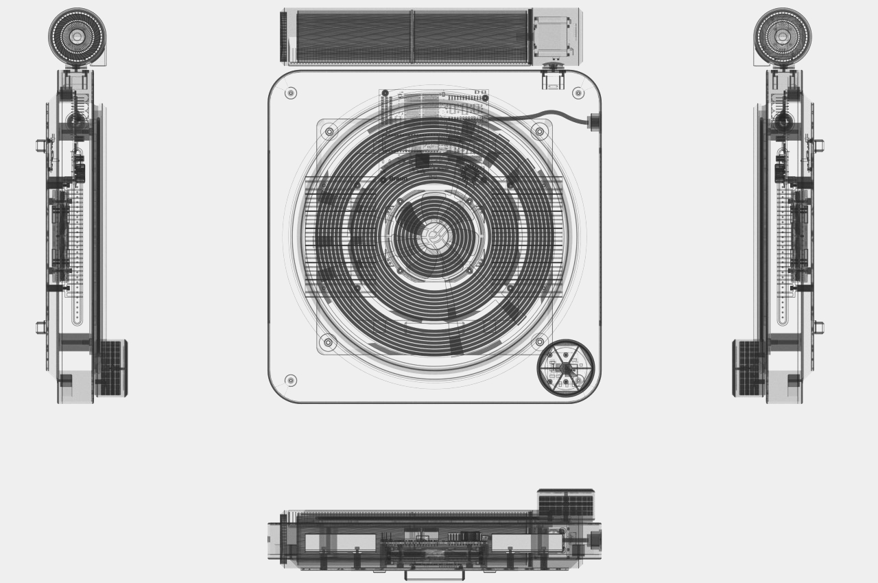
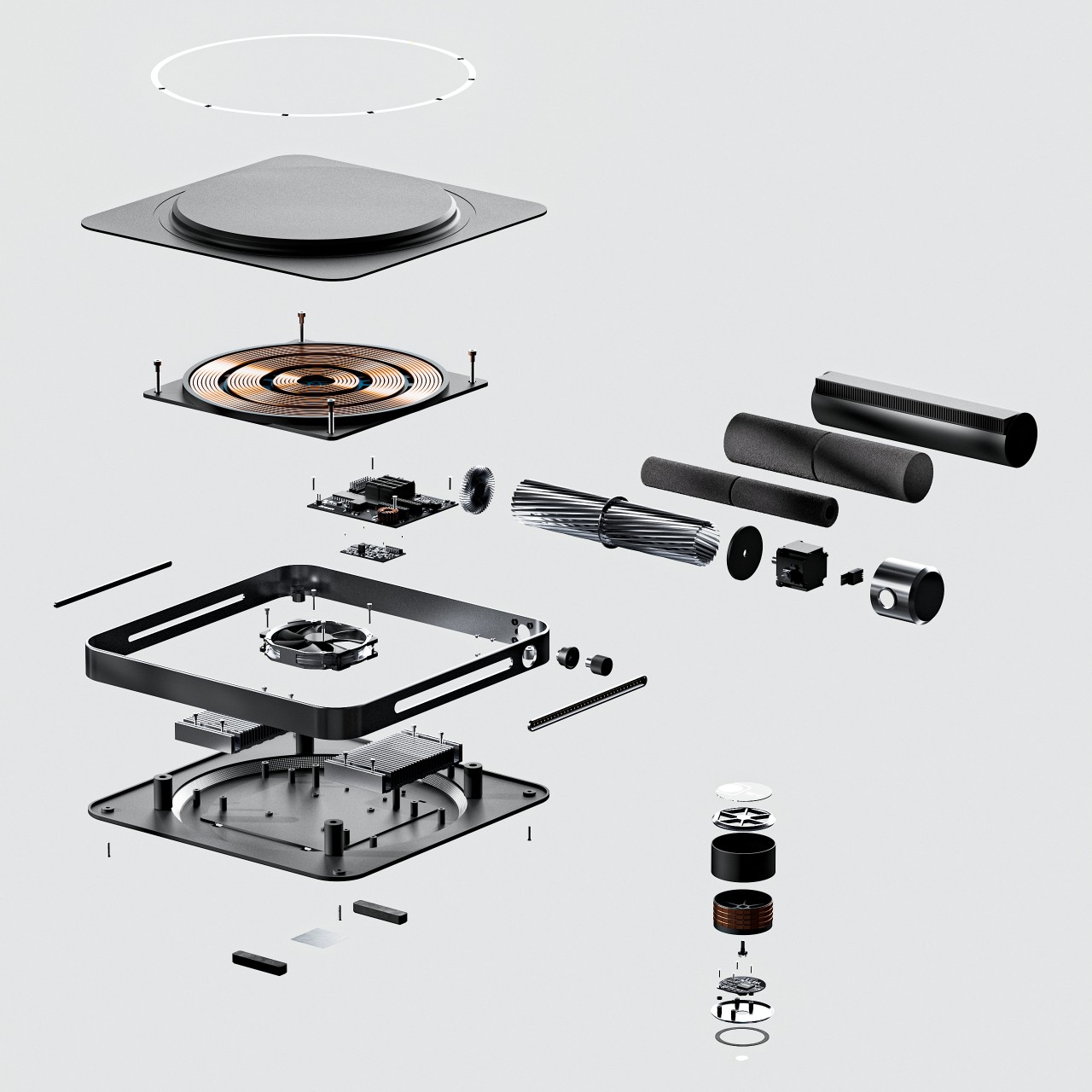
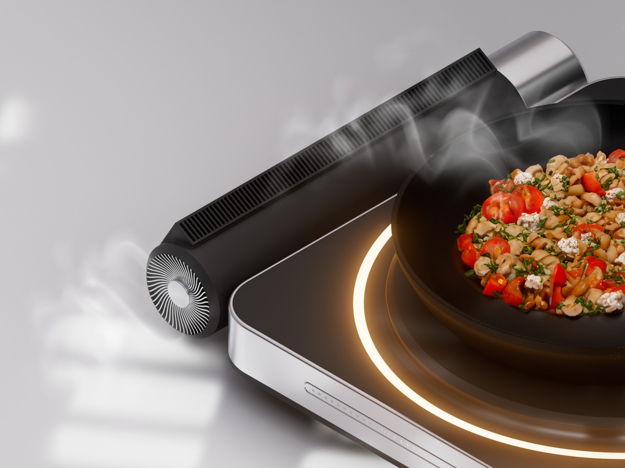
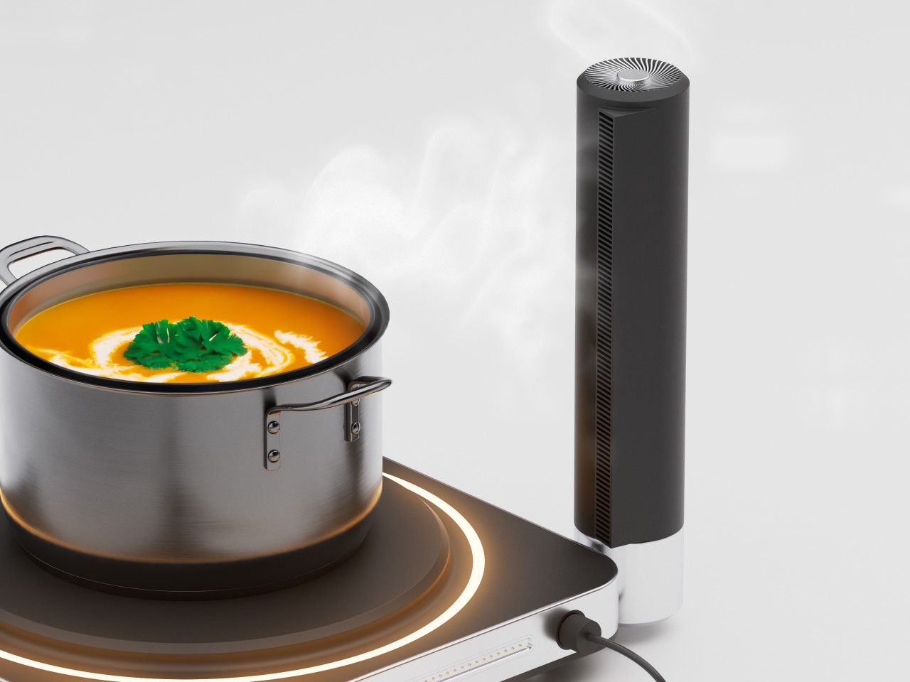
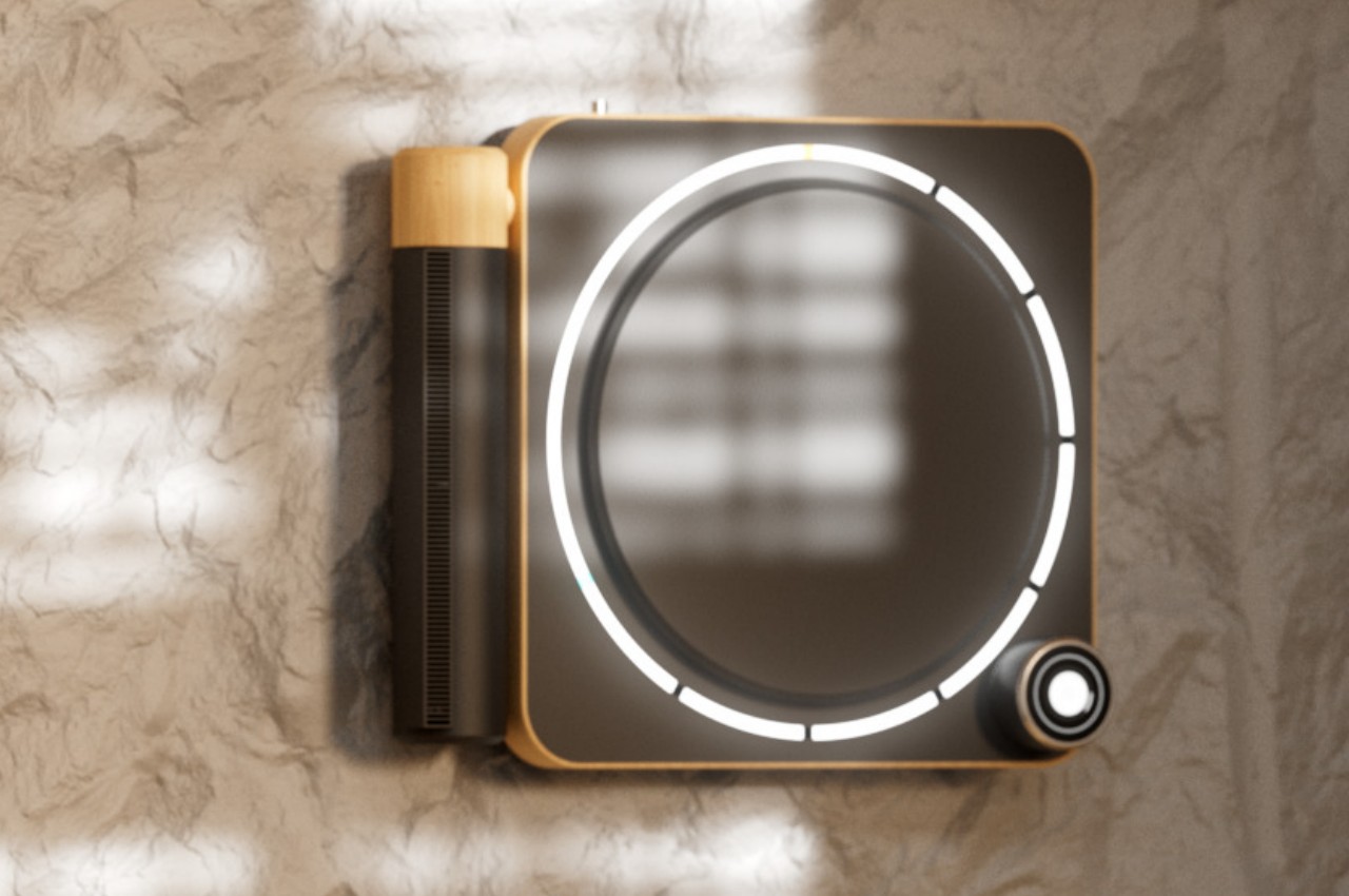
Somewhat ironically, the induction surface itself is the least exciting part of this design considering how the technology has more or less been perfected at this point. Instead, parts like the built-in Smart Air Filter offer a more interesting, especially since it’s almost invisible as part of the design. When you’re not in your kitchen, having access to a range hood with fans is almost impossible, and even at home those usually only suck up the smoke and nothing more. The SY10’s, however, uses carbon filters to remove not just harmful smoke but also odors, keeping indoor air clean without making too much noise. The filter lies horizontally right next to the cooktop, but if you have a taller pot or cookware, you can actually rotate the filter to make it stand, ensuring that no smoke escapes its fans.

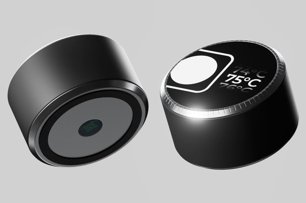
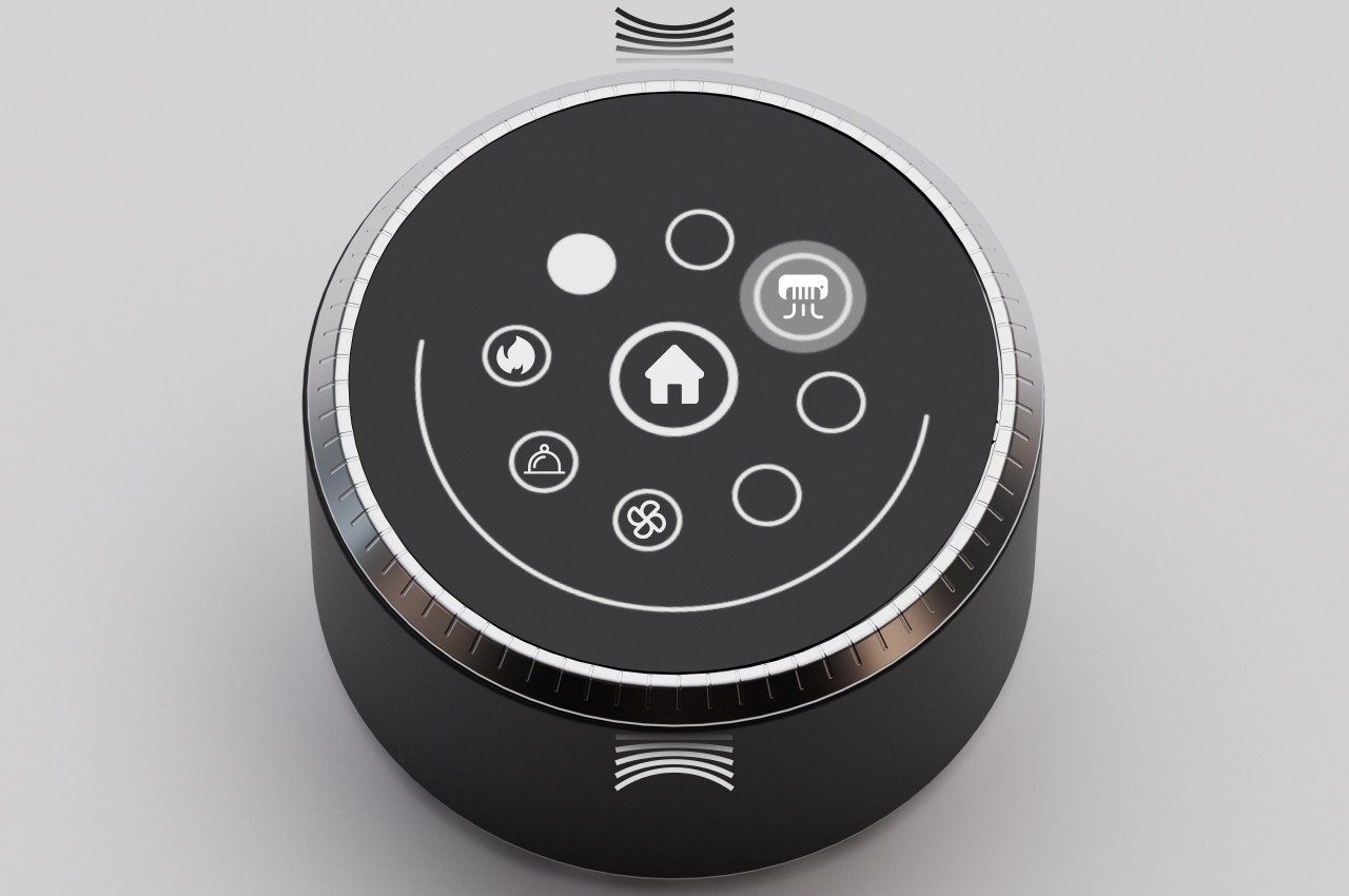
Most induction stovetops use touch-based interfaces to really capture that futuristic aesthetic, but it also makes them more confusing to handle and definitely less satisfying. The SY10’s Infinity Dial adds some good old-fashioned haptic feedback when you turn its ring, while a large circular display delivers instant information about the menus and functions you’re using. Amusingly, the dial requires you to squeeze its body to confirm an action rather than tapping that display, further emphasizing the physical dimension. Its more interesting feature, however, is a built-in camera and computer vision capabilities which allow it to look at a particular food or ingredient and determine whether it’s still good to use or if it’s going bad. And yes, that means you can actually detach the dial to use this function.

The SY10 design also includes a motherboard and other electronics to power its smart features, though its compact design might raise questions about the heat management that could affect those more sensitive parts. It does, however, need to be that compact in order to implement its portability, which would allow you to set up a small kitchen anywhere, whether indoors or outdoor, or even connect two such cooktops together. Those are important implementation details that need to be ironed out, but the concept remains an interesting one that could help take out some of the worries when cooking your meals away from home or even at home.

The post Portable Smart Induction Cooktop concept lets you cook healthy meals anywhere first appeared on Yanko Design.

The ‘PLAYPLAIN’ wireless speaker highlights the iconic minimalism of Braun and MUJI

Reminiscent of the clean design style popularized by stalwarts like Dieter Rams (Braun), Naoto Fukasawa (MUJI), and even with the new kid on the block, Teenage Engineering, the PLAYPLAIN speaker is a slick wireless audio device that adds a touch of Japandi minimalism to your space.

“Echoing Rams’ ten principles of good design, the PLAYPLAIN Concept Speaker is a harmonious blend of form and function, presenting a timeless aesthetic that seamlessly integrates into any living space,” says designer Jacek Janiczak. “Its clean lines, uncluttered surfaces, and subtle curves create an elegant silhouette, transcending trends and fads to achieve enduring visual appeal.”

Designer: Jacek Janiczak

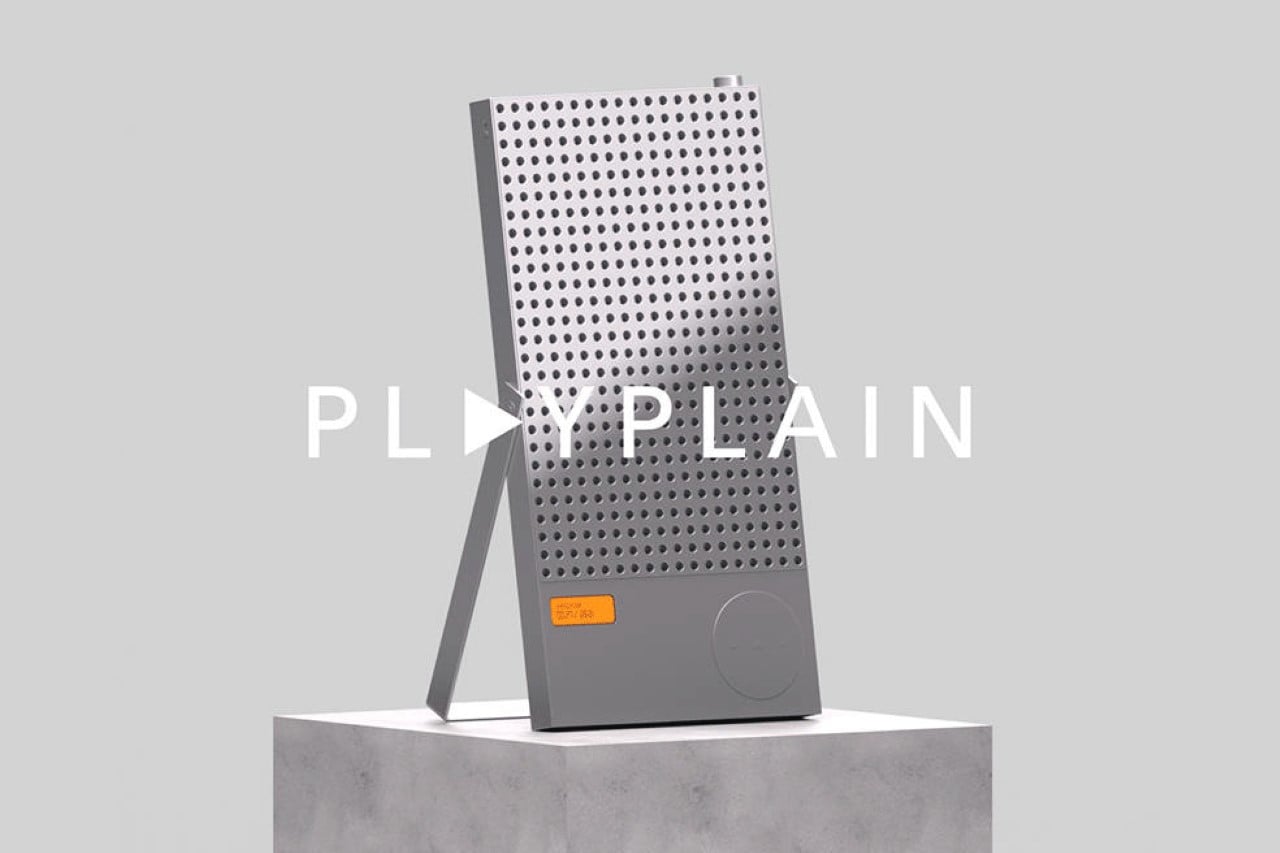
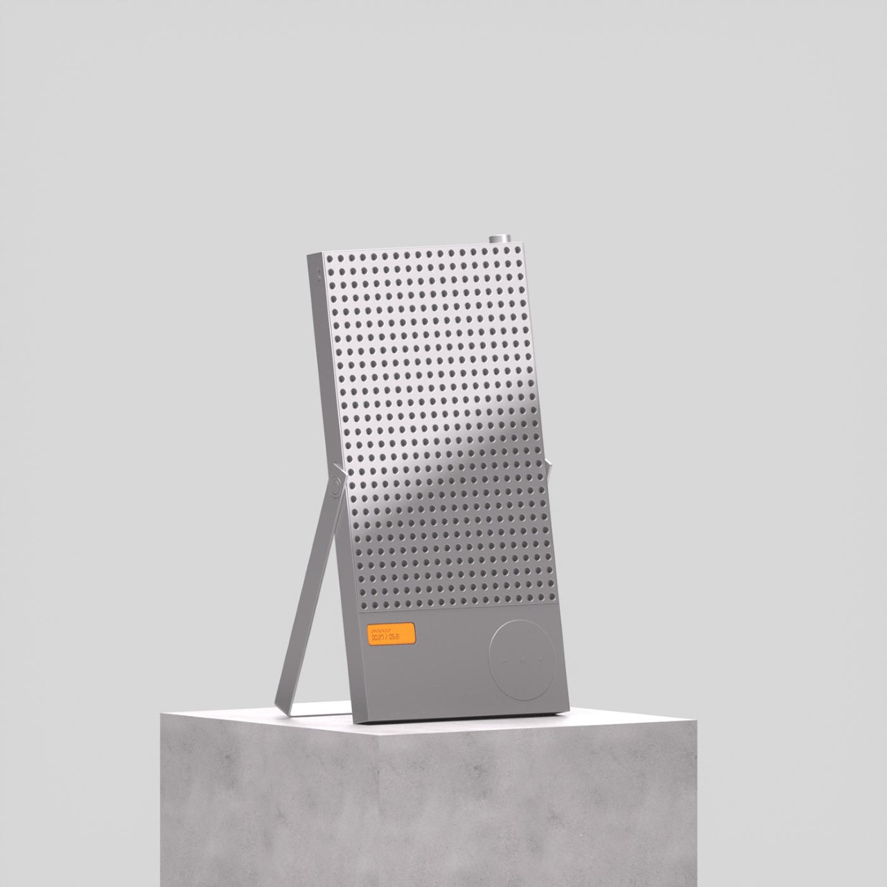
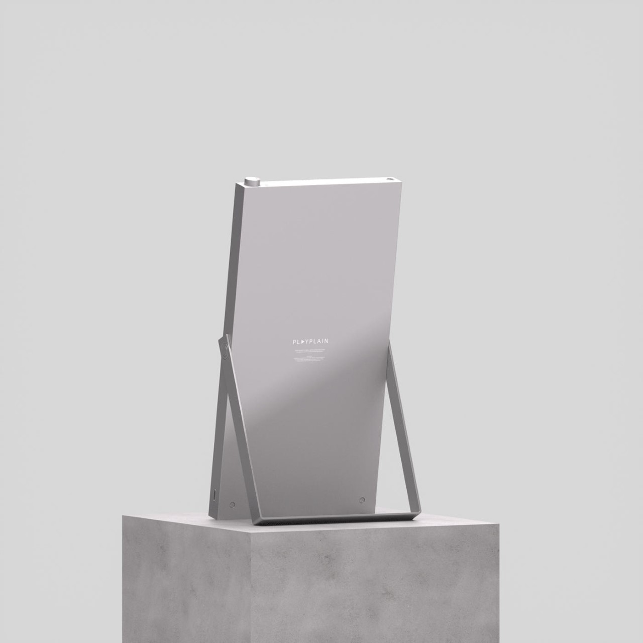
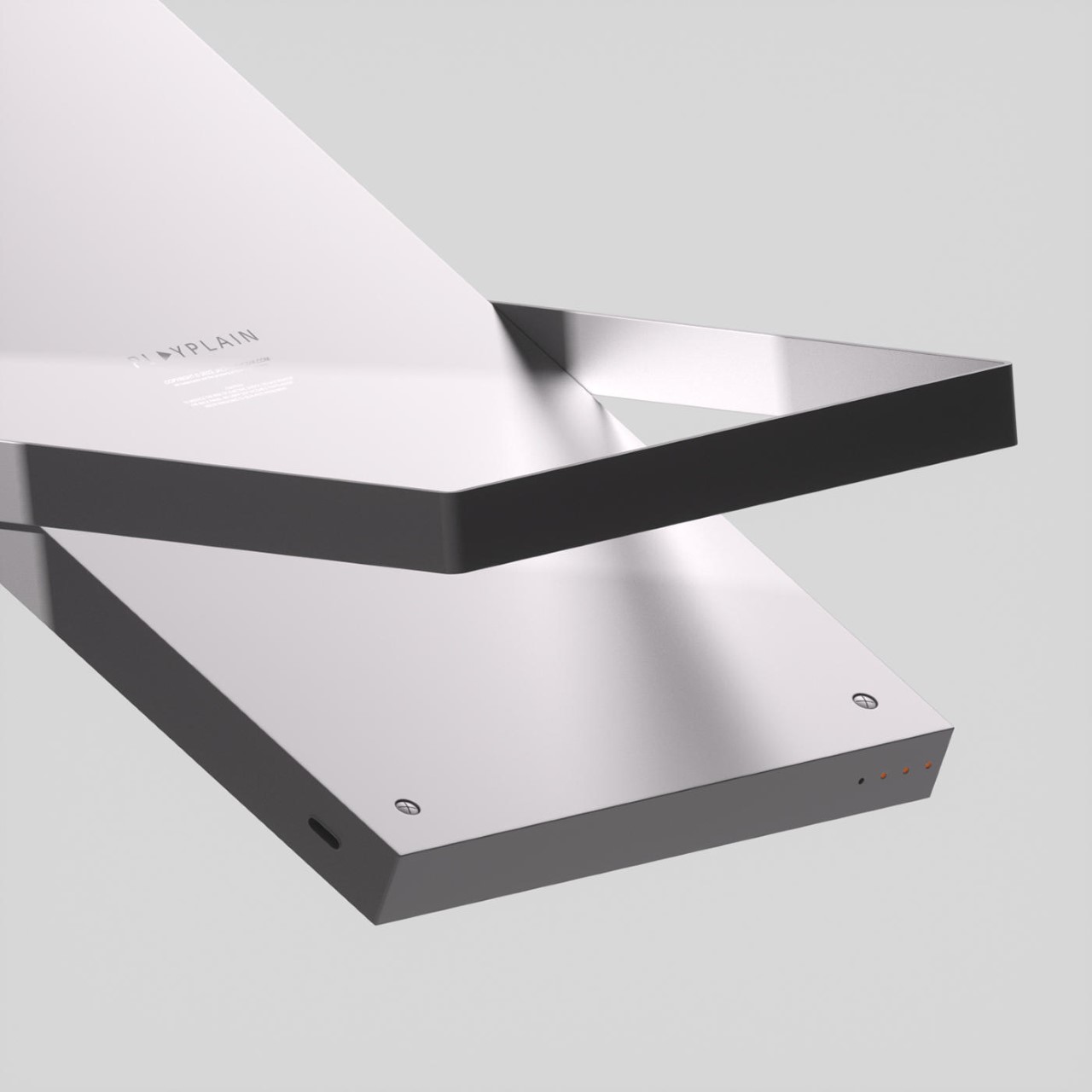
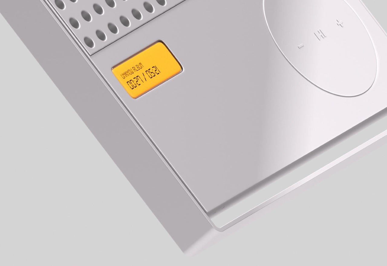
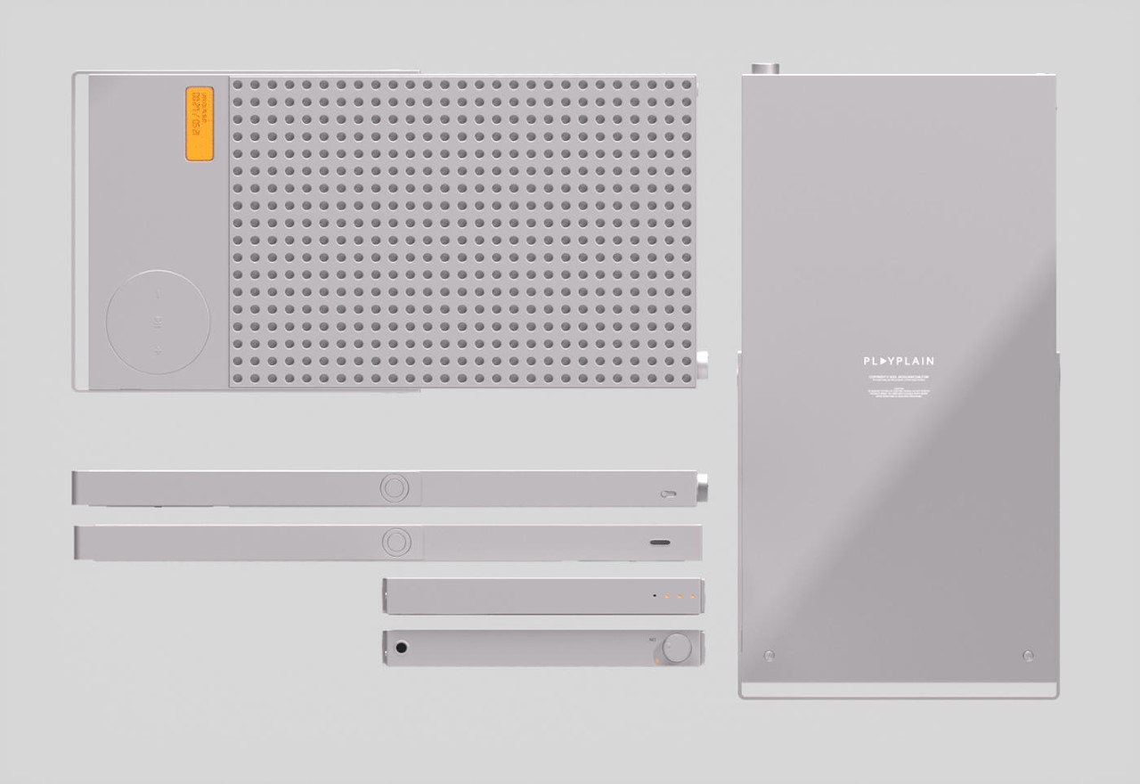
The PLAYPLAIN models itself on the Braun LE1 speaker from 1959 (which also inspired the iMac’s design in many ways) and the T3 pocket radio from 1958, combining the styles and formats to create something that’s truly a modern classic. The all-white slab sports a rather hypnotic grille design on the front, and sits on a fold-out leg that lets you tilt the speaker in any direction.

The entire speaker’s all-white design is punctuated by an orange backlit seven-segment LCD display that shows the song name as well as a progress counter. Right beside it is the PLAYPLAIN’s control panel, a circular control interface that’s a nod to the T3 radio as well as the iPod.

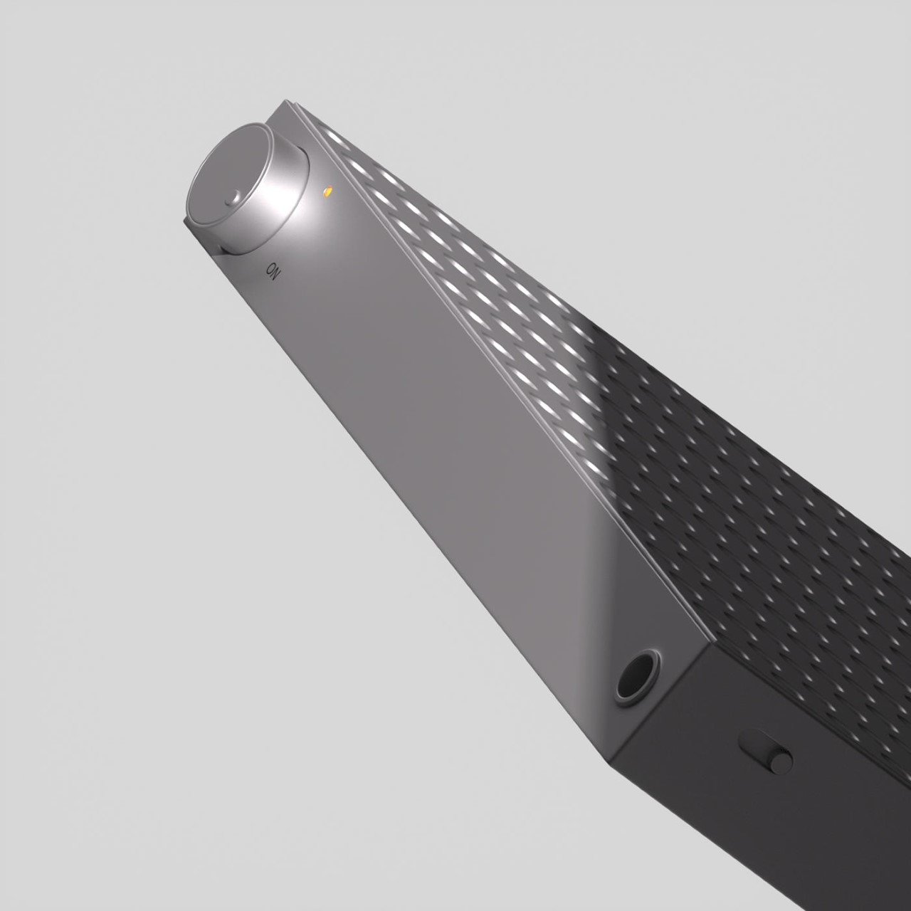
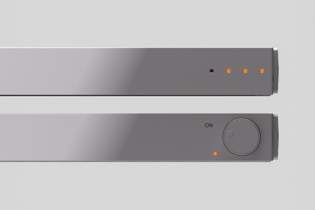
A rotary knob on the top serves as the PLAYPLAIN’s volume control as well as its on-off switch, while beside it is what I can only assume is a 1/4″ audio input, allowing you to turn the speaker into an amp for a musical instrument.

The speaker features an all-aluminum construction with a matte finish, referencing the design movement spearheaded by Apple. Its large-ish design feels comparable to a Mac Pro, and one would assume the two could make quite a pairing, given that Apple doesn’t manufacture its own ‘wireless speakers’ outside the HomePod.

Although conceptual, Jacek’s PLAYPLAIN speaker pays quite the homage to all of minimalist technology’s icons. It revives a minimalistic style that’s becoming somewhat dormant, that too in a wireless speaker format that rejects the tech world’s obsession with pod-shaped smart speakers and their fabric class. Even though it’s called PLAYPLAIN, there’s nothing quite plain about it. The speaker’s clean design almost gives it a touch of luxury, making it akin to a hi-fi speaker rather than something affordable or budget-friendly. Plus, its slim format almost instantly makes it instantly desirable!

The post The ‘PLAYPLAIN’ wireless speaker highlights the iconic minimalism of Braun and MUJI first appeared on Yanko Design.

Instant camera concept adds Braun minimalism to a fun photography tool

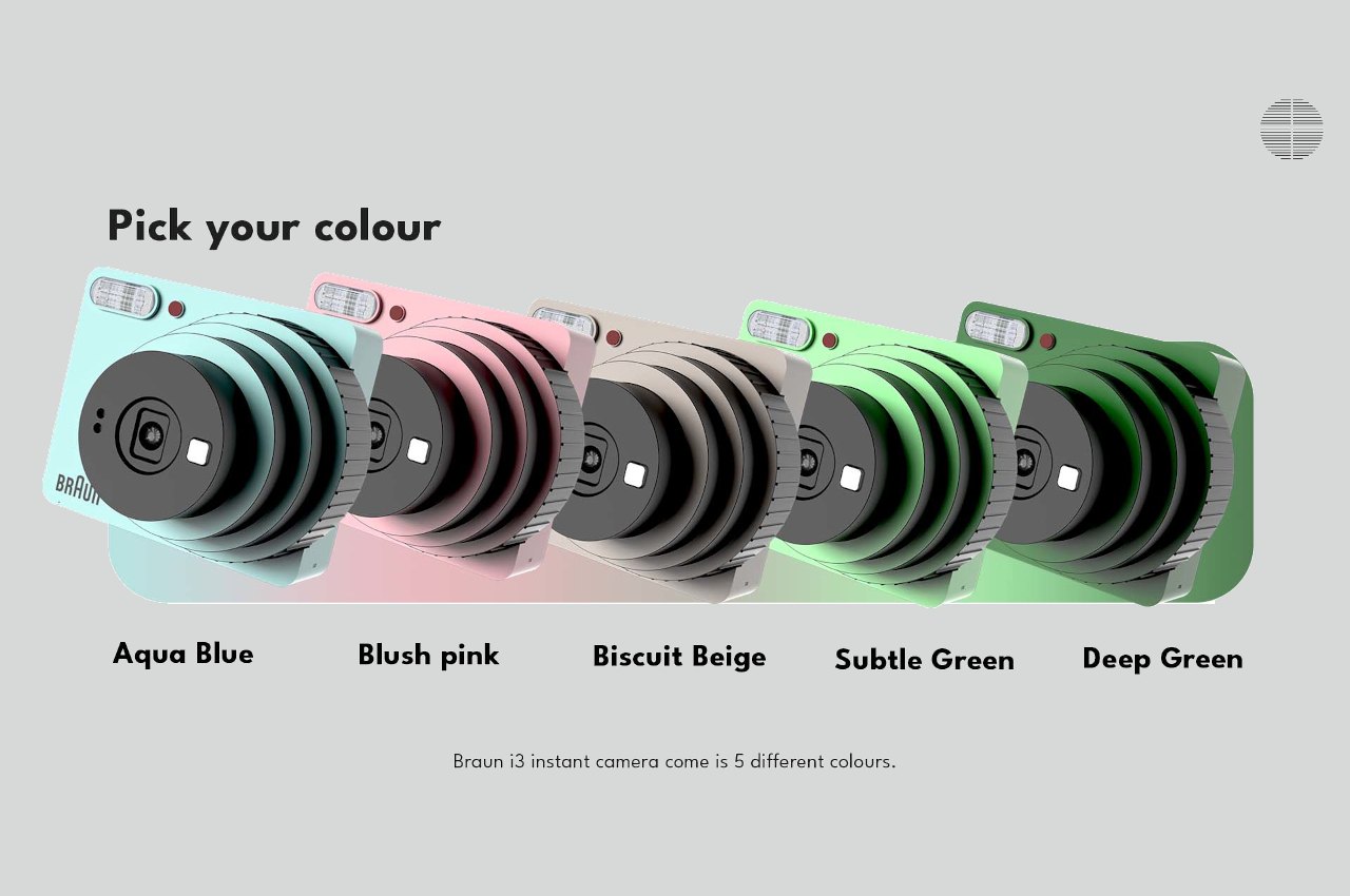
Although there seems to be a dip these days, instant cameras have become quite fashionable in the past few years. Inspired by the Polaroids of old, this new generation of cameras tries to marry the digital and analog worlds in a way that appeals to audiences of all ages. It offered the instant gratification of digital cameras while also paying homage to printed photos, tapping into the human tendency to collect limited edition items. Given the target demographic, many of these instant cameras take on designs that would be labeled as energetic and youthful, but that isn’t a rule set in stone. This instant camera design concept, for example, retains that lively spirit and mixes it with some minimalist aesthetics from an iconic consumer brand.

Designer: Arihant R Israni

Braun has become one of the most recognized brands in the consumer market, especially with its role in pushing German industrial design forward from the mid-50s onward. The company’s association with famed industrial designer Dieter Rams also helped cement that image, and the company’s products have long been hailed as examples of good design. That design language is marked by elements such as clean lines, geometric shapes, and minimalism, qualities that this instant camera concept tries to incorporate into its distinctive design.

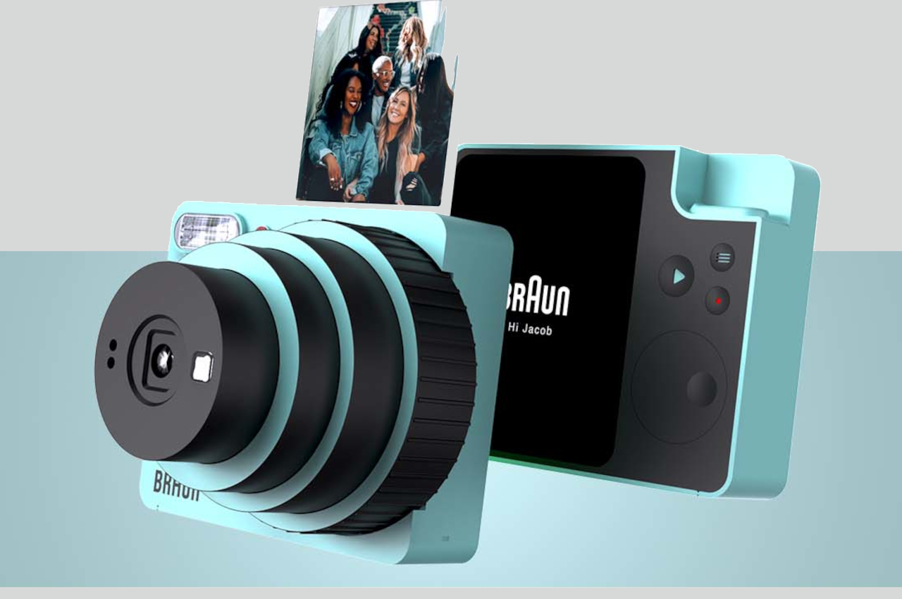
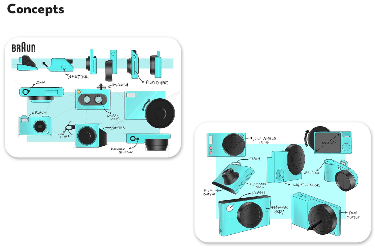
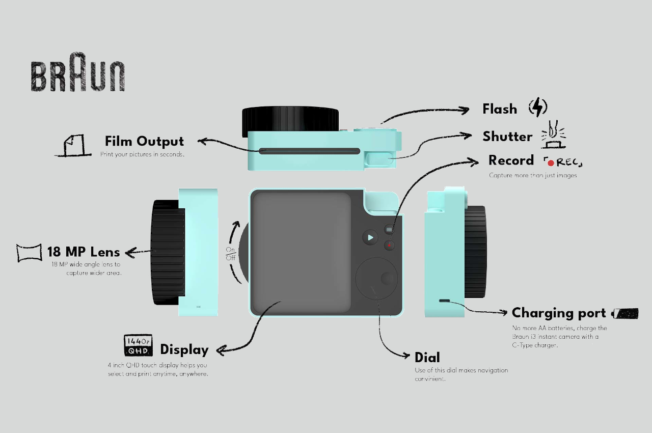
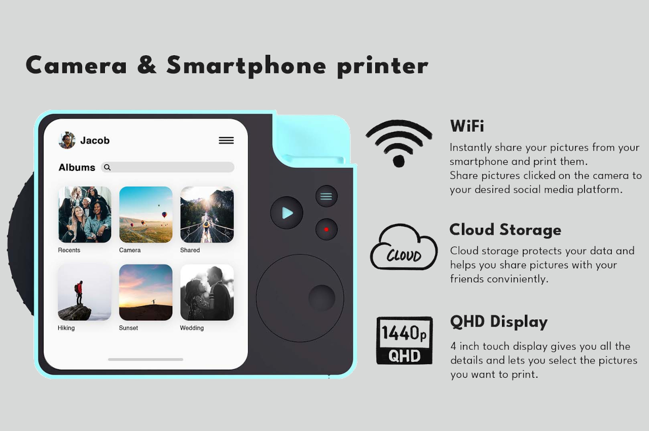
The Braun i3 Instant Camera concept is pretty much composed of simple geometric shapes, particularly circles and rectangles, though the latter comes with rounded corners to soften their appearance. The lens, which you can twist to turn on or off, is made up of concentric circles that expand or contract to zoom in and out, respectively. The main body, the 4-inch QHD display, and the shutter are the only rectangles that can be found on the camera’s surface. The rest of the interface, like the buttons and especially the dial, are all circles.

In terms of functionality, the Braun-inspired instant camera is like every other one of its kind, which is to say there are no corners cut. It would be able to take high-quality pictures and then print them out as desired or share them instantly on social media. There might be some doubtful specs, like a 4-inch screen with 1440p resolution, but others, like the 18MP sensor, are definitely within the realm of possibility. There is no mention of the type of “zero ink” technology to be used, but that will mostly depend on Braun licensing it from companies like Fujifilm.

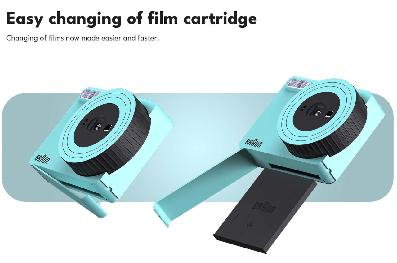
Technical details aside, what really makes this instant camera stand out is its unique appearance, a cross between a toy-like instant camera and a professional point-and-click shooter. The design demonstrates how Braun’s design language, built on the foundations of Dieter Rams’ principles, is not only timeless but also universal. It can be applied to a “grownup” product such as a shaver as well as to a joyful and engaging instant camera made for fun-loving shutterbugs.

The post Instant camera concept adds Braun minimalism to a fun photography tool first appeared on Yanko Design.

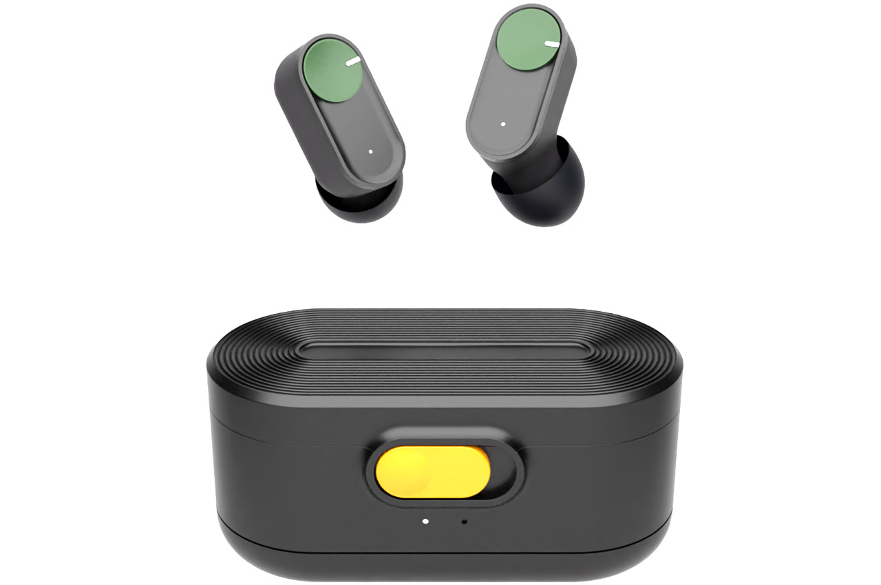
Braun wireless earbuds for audiophiles who value wearing comfort and style

Choosing a pair of good-sounding earbuds which have great comfort, ANC and styling are not easy when options are virtually limitless. Can a pair of Braun earbuds simplify that dilemma? A designer indeed thinks so with this interesting concept.

The wireless earbuds market is flooded with wireless earbuds, but only a few can really claim to be worth their weight in gold. After all, appealing to audio lovers’ tastes is not easy even though creating wireless earbuds seems like a run-of-the-mill task by the look of things. The likes of Sony WF-1000XM4, Bose QuietComfort, Apple AirPods Pro and now the Nothing ear (1) earbuds – all are great choices for ones who demand great sound isolation, crisp audio, comfort and style.

Designer: Ye Hongting (葉 泓廷)

Braun is known for its high-quality grooming products and innovative product design, so why not have a great pair of wireless earbuds too? Even though the German company would think twice before branching out into the highly competitive wireless earbuds space, the low barrier entry-level makes for a compelling case. This concept evokes that vision with a sublime design and the Braun DNA deep embedded in the roots.

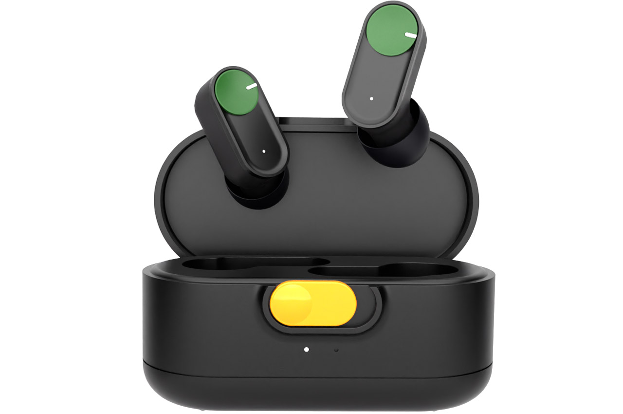
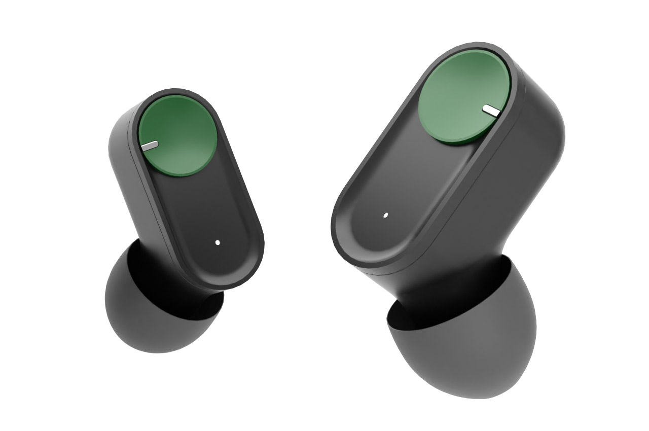
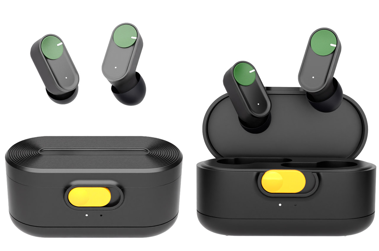
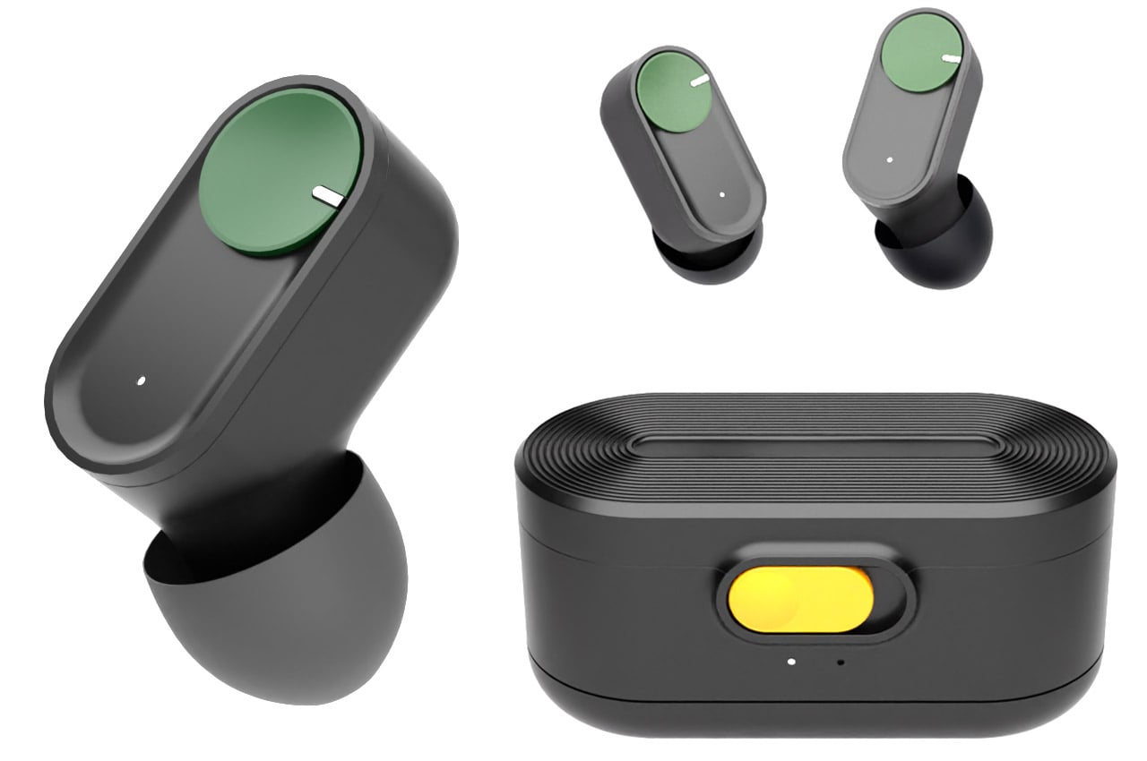
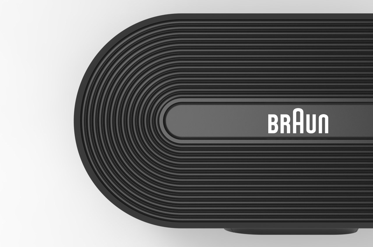
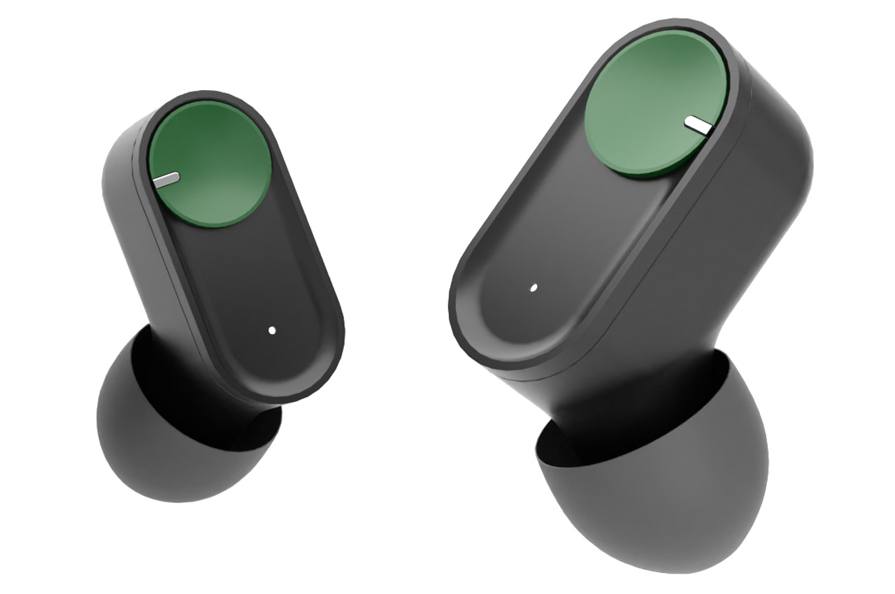
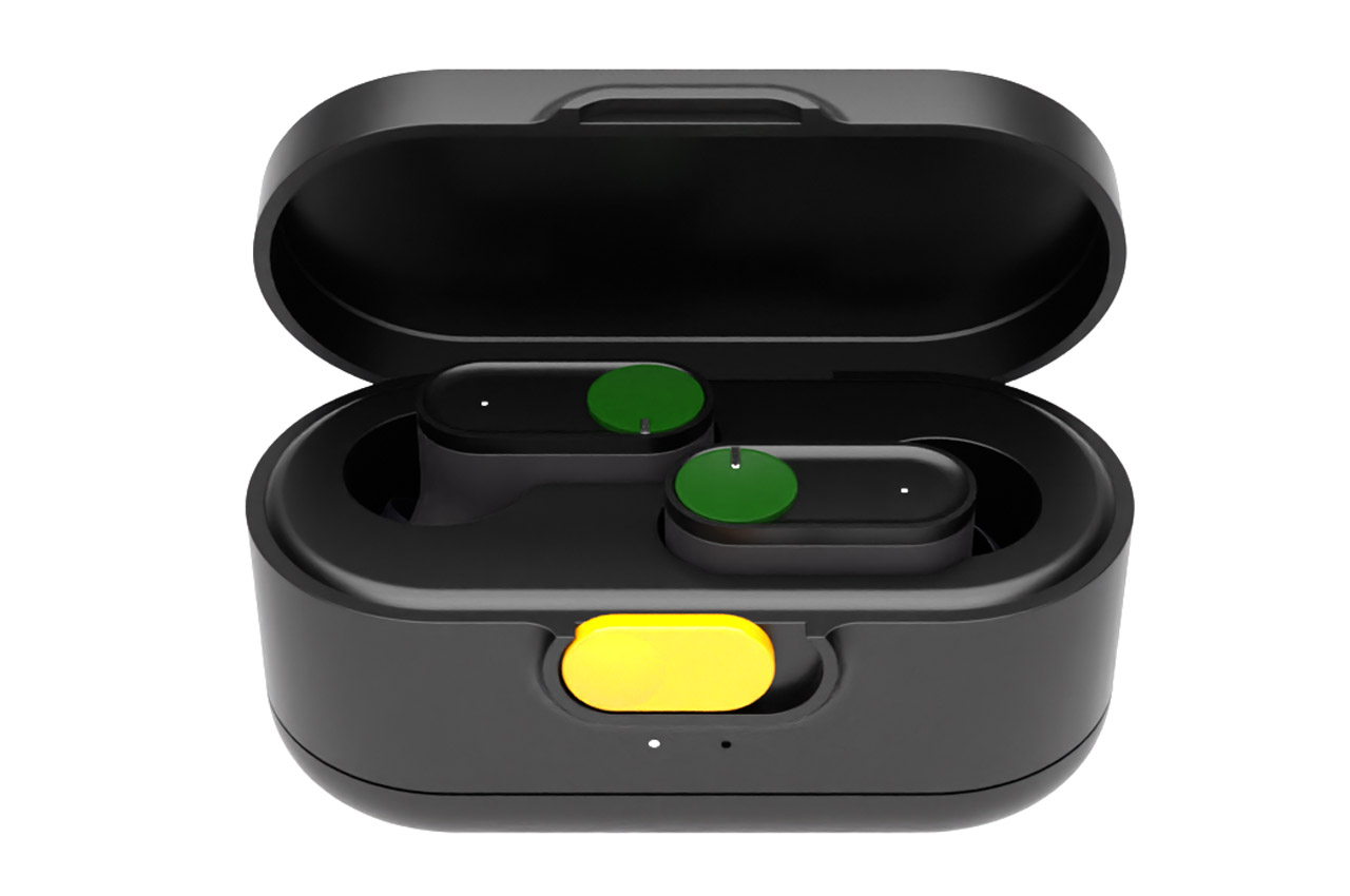
The earbuds have a rather unique and attractive form that doesn’t compromise on wearing comfort by any stretch of the imagination. Matte black or white-colored housing with the hint of Braun’s signature color green is the USP of the design. The silicone ear tips match the matte look, and the charging case carries the same theme. It’s all matte black with a yellow button on the front. Wait till you glance over the top of the earbuds which have the Braun’s well-known patterned shape.

Touch controls on the earbuds allow for a seamless audio listening experience – be it high fidelity music or engaging podcasts on the go. Active noise cancellation is also standard with three microphones in each earbud zoning out the world when needed. In the audio accessories space dominated by similar-looking designs, the Braun What if Earbud spices things up for demanding audiophiles.

The post Braun wireless earbuds for audiophiles who value wearing comfort and style first appeared on Yanko Design.

Braun mouse swivels on its tilted base for ergonomic right or left handed use

A highly ergonomic mouse design that is perfectly suited for any-handed use, thus making it ideal for professionals and gamers alike.

Most of the mouse are designed for right-handed users while the left-handed mouse is lesser in comparison. Still, left-handed users have some good choices to go for like Logitech G903, Razer Naga or Corsair M55 RGB. On the other end of the spectrum, ambidextrous mouse options including Logitech G Pro, SteelSeries Sensei Ten or Razer Viper have also claimed a good bite of the market. They are quite popular among left-handed users, and gamers too.

Designer: 葉 泓廷

Any mouse you choose, the setup is best tailored for either left-handed, right-handed – or slightly better configurations for particular-handed use, however, none of them can claim to be perfect for any kind of use-case-scenarios. This calls for a peripheral that boasts a smart design to make the switch from a predominately right-handed ergonomic use to the left-handed one in a jiffy.

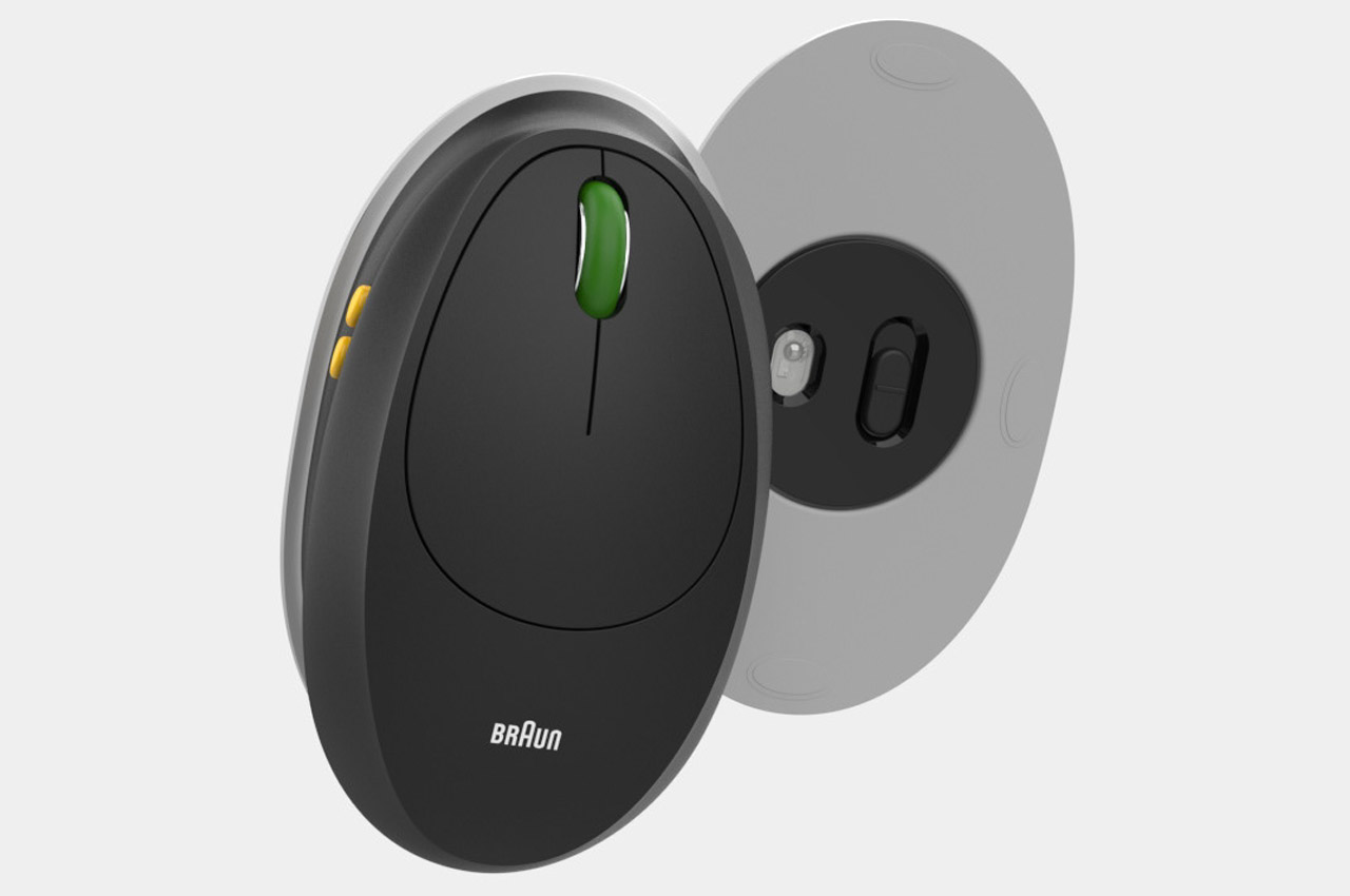
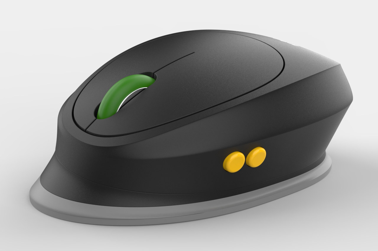
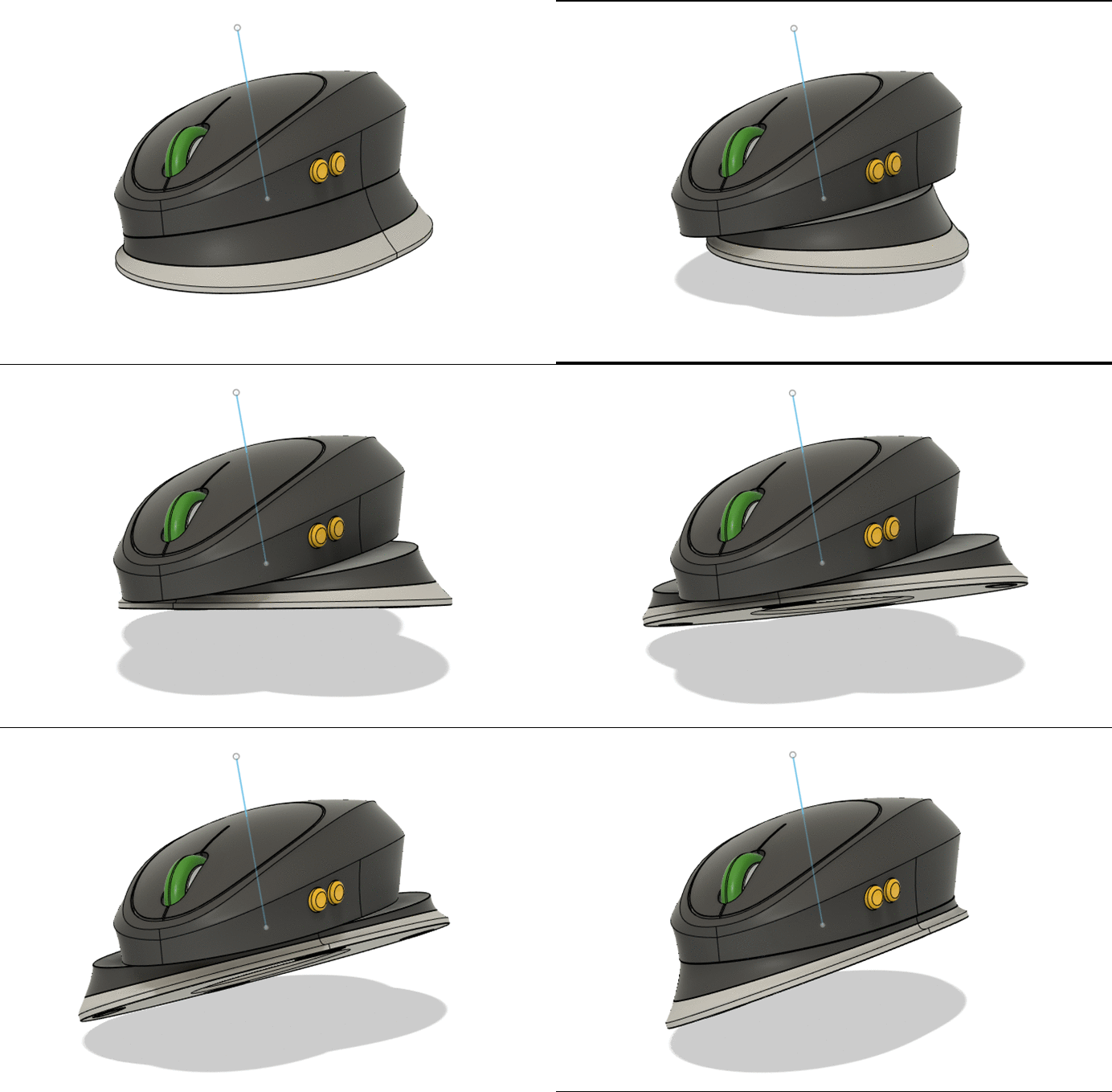
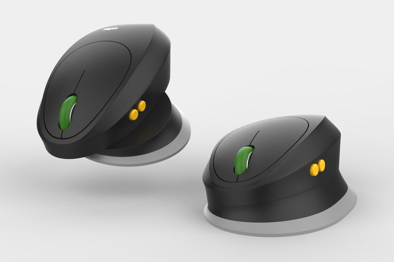
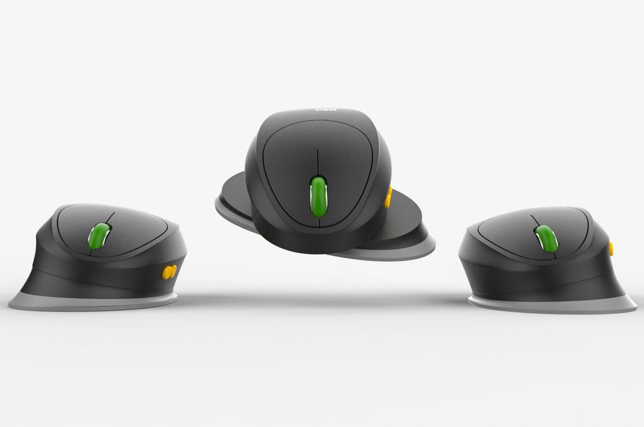
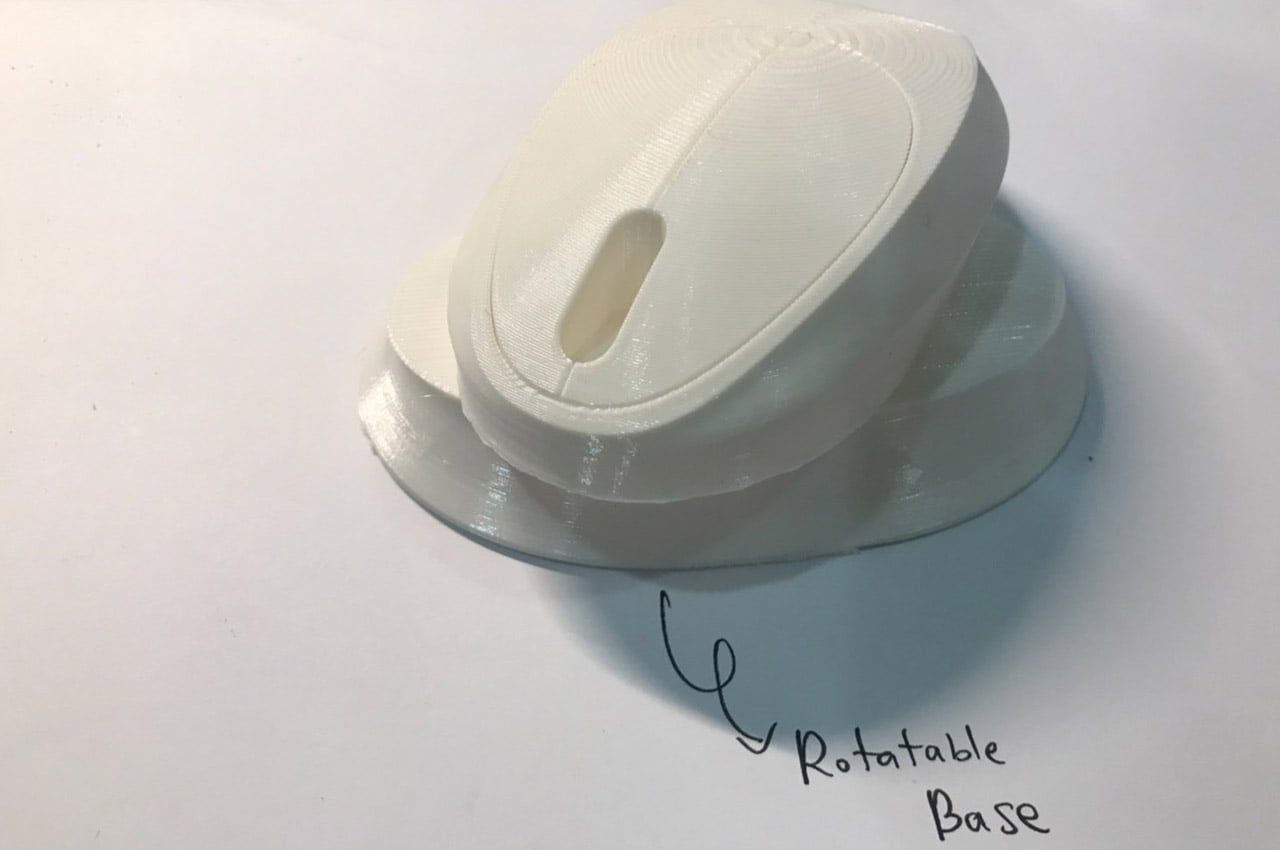
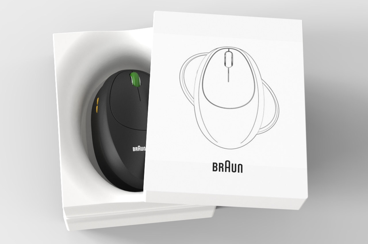
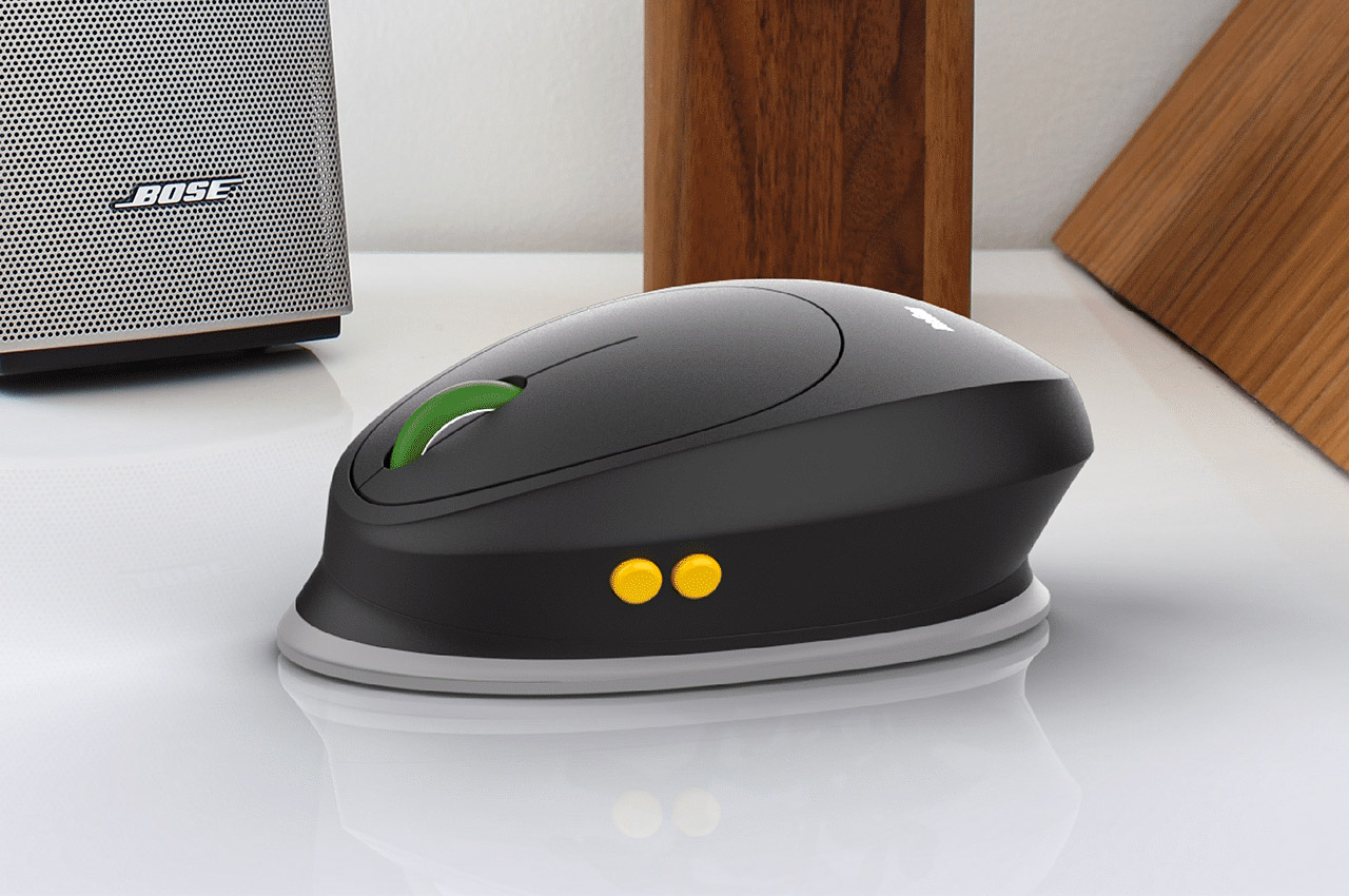
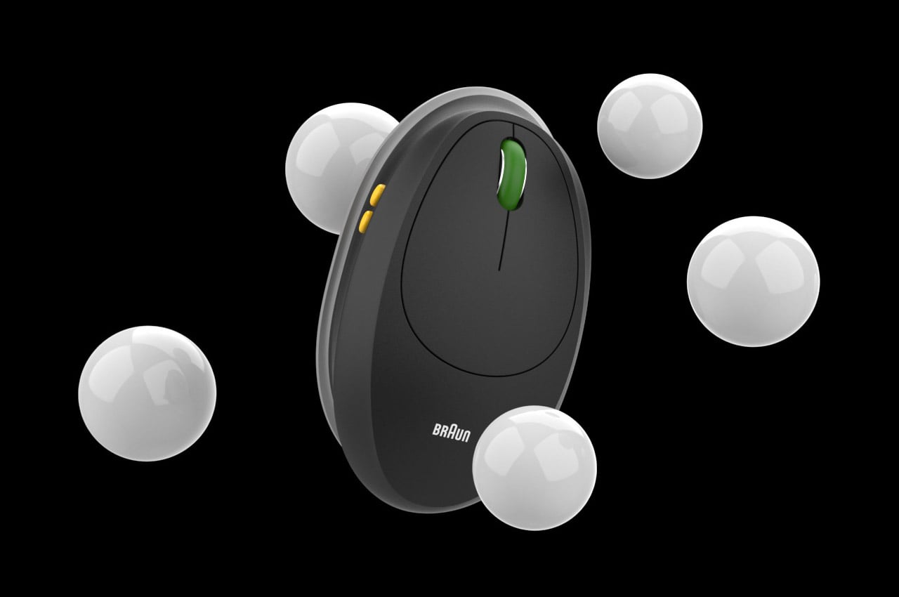
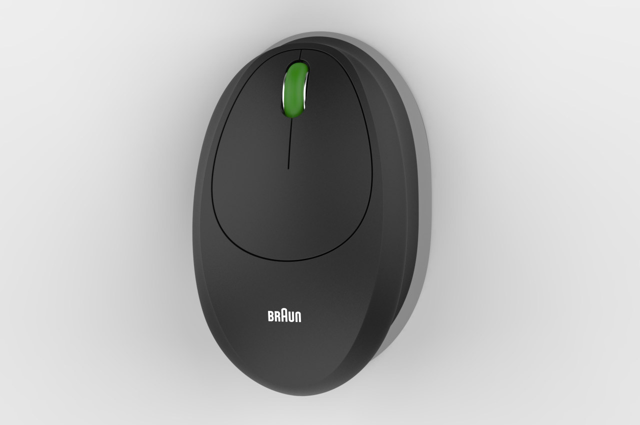
Meet the Braun Ergonomic Mouse designed for both left and right-handed use in equal capacity. Unlike an ambidextrous mouse, this one completely changes its tilt and base depending on the preferred hand. So, you could be playing Battlefield with your right-handed configuration, and shift to a left-handed setup if your left-handed sibling wants to use the accessory. Simple manipulation of the form provides an equally good ergonomic grip for both-handed configurations.

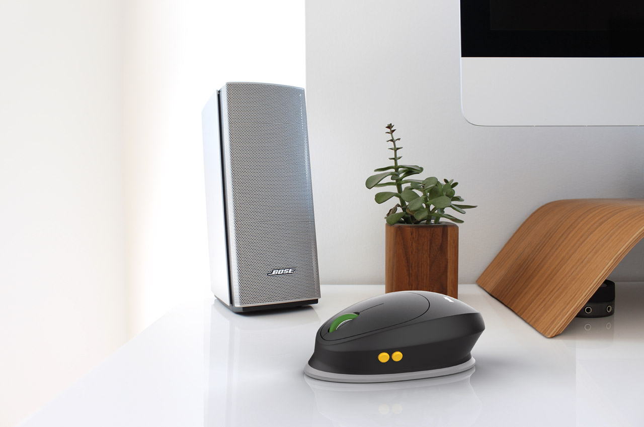
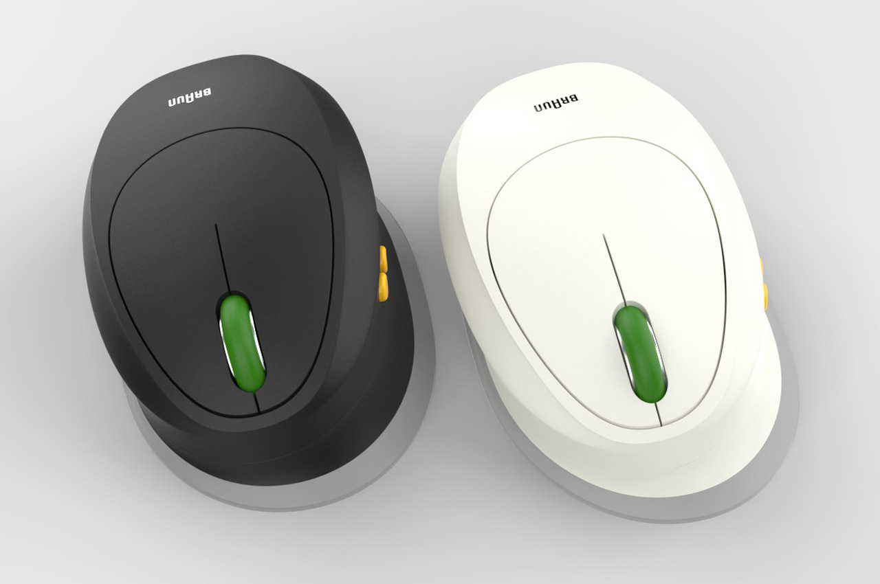
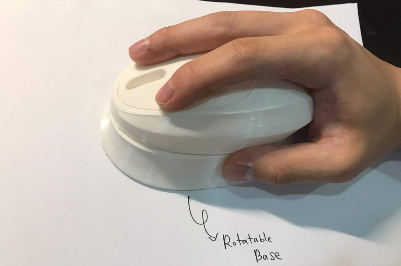
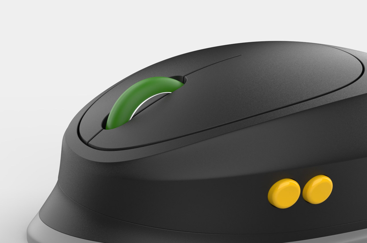
The clever design makes use of a tilted sloped base swiveling at the center. As the base rotates it shifts between the two modes. This allows for a seamless transition between the desired-handed modes without compromising even a little bit on the hand posture position. Like a couple of other off-beat Braun designs. This one too carries the black or white-dominated theme with the inclusion of signature Braun colors for the buttons and scroll mouse.

Carrying the Braun branding is a bit off-beat, but then, that’s what we come to expect from concept designs which sow the seed of imagination for future designs. The otherwise household appliance giant foraying into computer peripherals looks highly unlikely, but hey, it’s still in the blueprint and early prototype stage, right?

The post Braun mouse swivels on its tilted base for ergonomic right or left handed use first appeared on Yanko Design.

Braun “What if Phone” checks all the boxes for a likeable rugged design

Rugged phones are on the top of the list of people who are in professions that carry the risk of device damage, and thankfully, there are some good options on the market. So, how about having a newbie in this niche segment with a very measured design that could win hearts?

Smartphones of today are sleek gadgets with bezel-less screens and slim form factor to go with our stylish lifestyle. The evolution from a monochrome screen with thick bezels and a fat body into the current shape has been rather mind-boggling with the next big avenue being the folding and rollable phones. In this landscape, a designer imagines a smartphone by Braun, a company only known for its industrial product designs from the mid-20th century with chart-topping products including electric shavers and record players.

Designer: 葉 泓廷

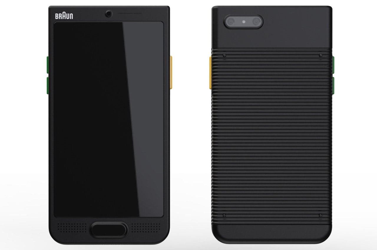
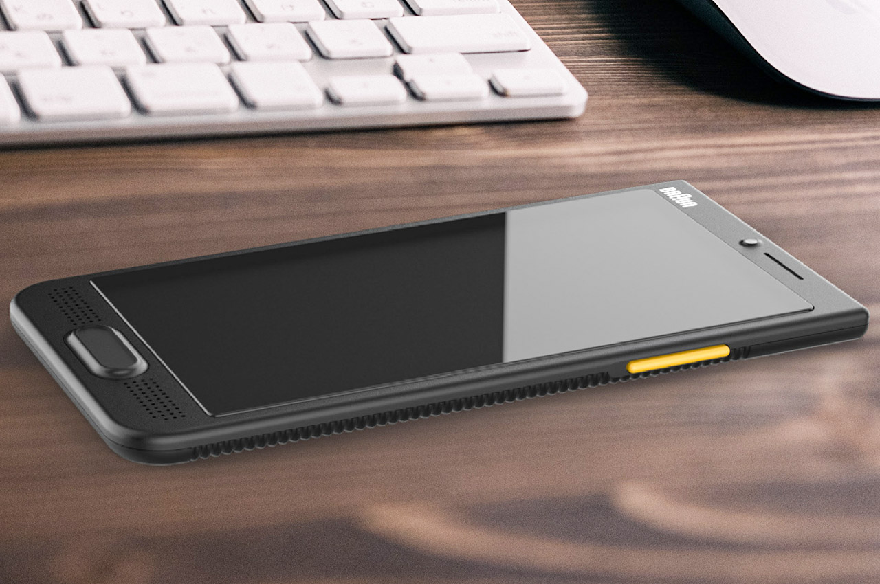
If ever Braun was to jump into the consumer electronics market with its own smartphone, then the device for sure is going to be rugged and built to last a lifetime. Taking a detour from their current product line looks highly improbable, but in the concept design world, anything is possible. I see the Braun What if Phone taking on the likes of Doogee, CAT, Blackview or Ulefone. The USP here is the more compact design in a very slim chassis. While all the other market-leading options for rugged phones look more like an armored vehicle, this one maintains its thin style quo.

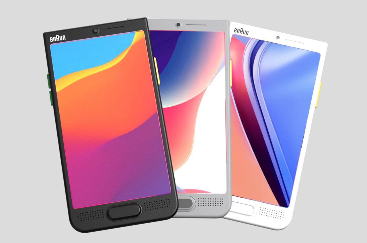
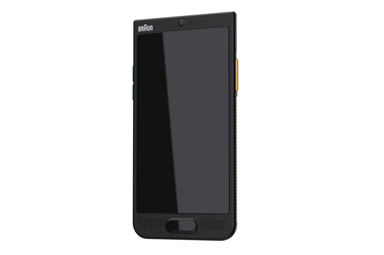
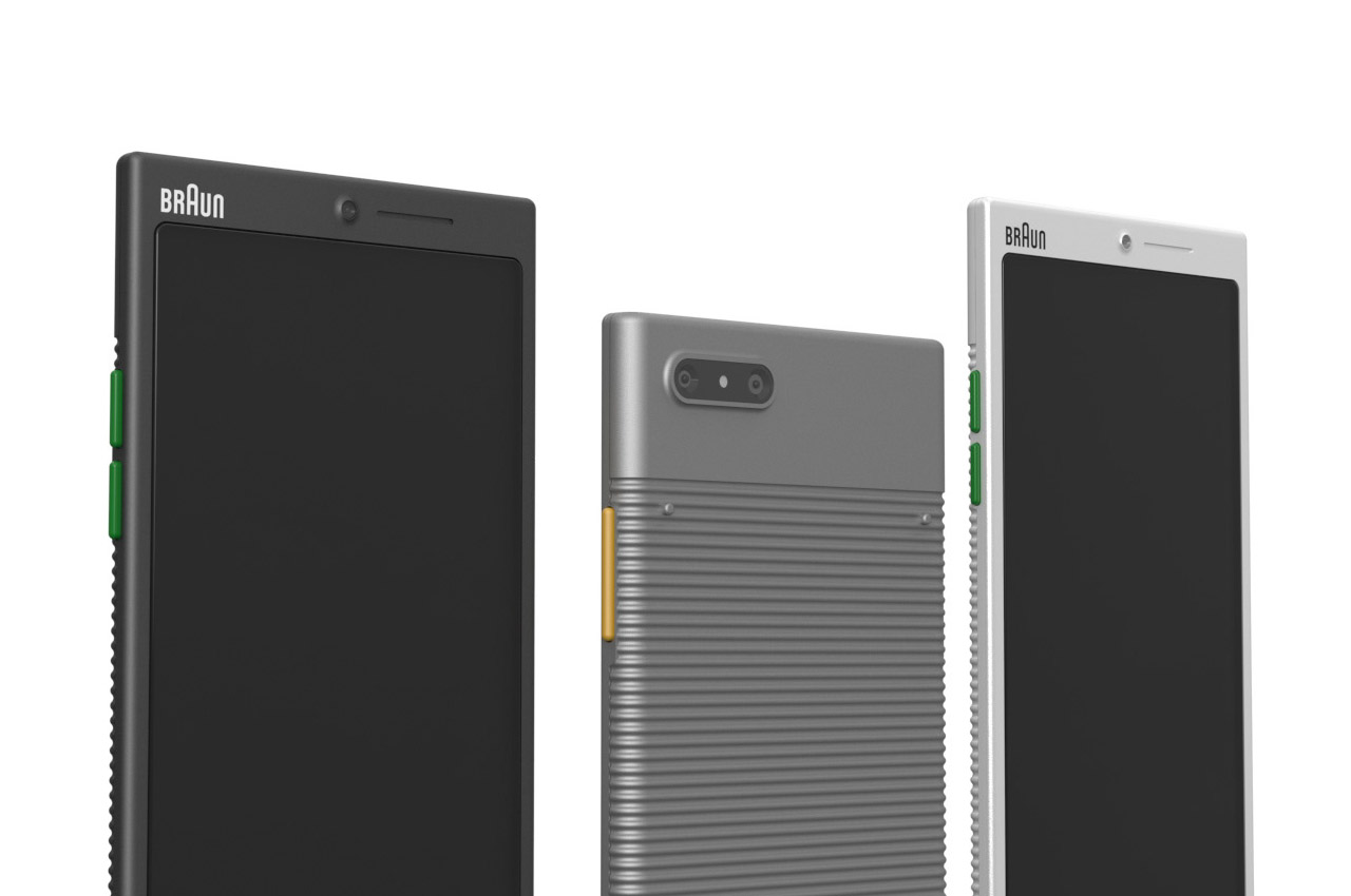
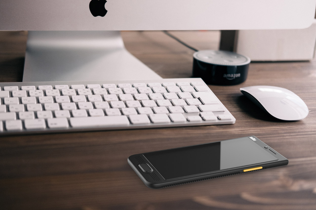
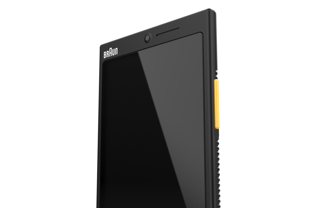
The thick bezels on the top and bottom of the screen are old school, and by common knowledge will only appeal to a certain niche section of the market. Although that doesn’t take away its persona as a minimalistic device, just like the iPhone SE. One unique feature that instantly caught my eye is the hybrid shape, wherein, the top has slightly edgy corners, and the bottom has the typical iPhone 13 contour.  The designer imagines the Braun phone to be draped in white, black and silver-colored hues.

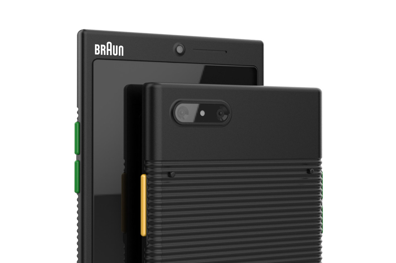
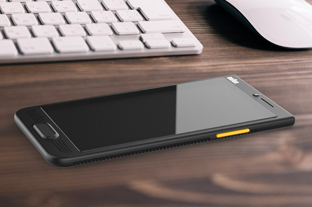
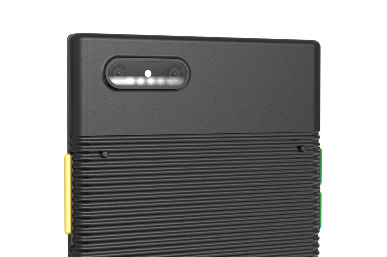
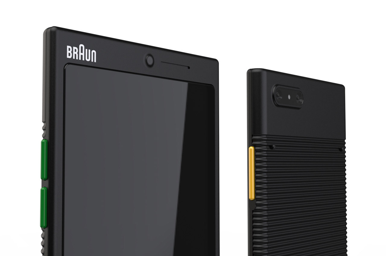
The speakers are positioned at the front bottom section alongside the fingerprint scanner which lies outside the screen area. The same goes with the selfie camera which is positioned at the top middle. Moving on to the rear, the industrial design takes precedence with the riveted back and that peculiar dual camera lens setup. This brings in a robust character both visually and functionally. On the sides, the yellow power button and the green volume rocker buttons on the other side add a bit of zing to the overall balanced design of this phone.

The post Braun “What if Phone” checks all the boxes for a likeable rugged design first appeared on Yanko Design.

Braun Series 9 Pro Foil Electric Shaver Review

Technology is meant to make our lives simpler, easier, and more convenient. That is true for the complex computers in our pockets to the mundane electrical products scattered around our homes. Electric shavers are probably some of the last things you’d consider to be technological innovations, but every new generation does try to add a little something new that tries to help us free up time for the more important things in life. Braun’s new Series 9 Pro electric shaver is one such example, and we give it a few tries to see if those incremental improvements do add up.
Aesthetics

As the name suggests, the Braun Series 9 Pro builds upon an older base model, one that was launched six years ago. The electric shaver company hasn’t exactly been sitting on its during that period but had released other incremental upgrades to the Series 9 foil shavers. The Braun Series 9 Pro may sound like the culmination of those improvements, but it’s easy enough to mistake it for its predecessors because of how they all look eerily similar.

Granted, electric shavers of this type tend to share the same basic design, and the Series 9 Pro is definitely not an outlier. Like many of its kind, its design is utilitarian rather than aesthetic, putting a heavier emphasis on handling and ergonomics rather than looks. Since a shaver is something you’ll hold for minutes on end, often a few times a week, comfort is definitely near the top of the list, with safety and performance being the greatest concern.

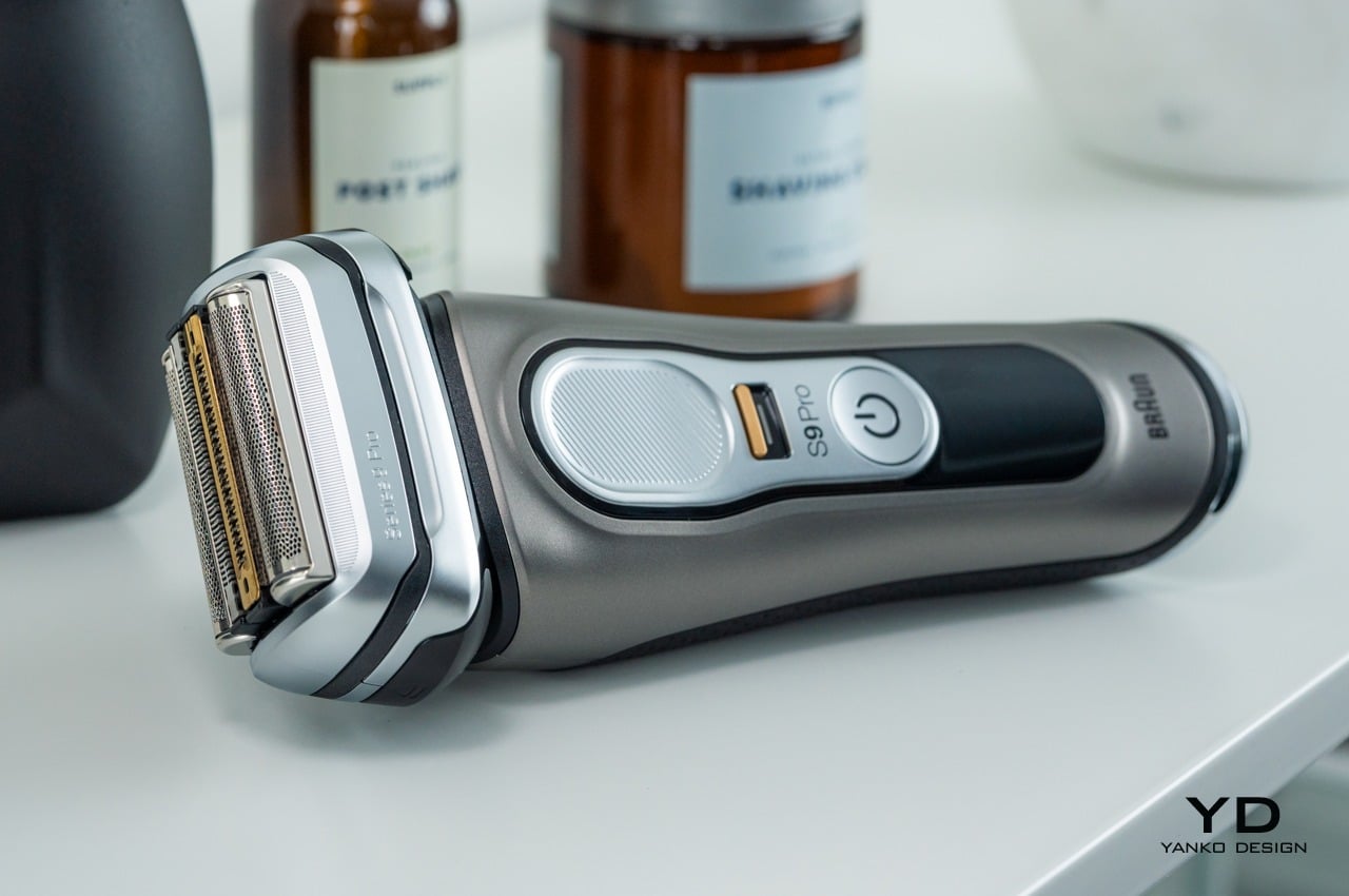
To that extent, it’s not really surprising that the majority of the Braun Series 9 Pro is made of plastic that’s painted to look like polished metal. Although definitely not environment-friendly nor sustainable, aluminum would have made the shaver too heavy. The plastic coating, however, is a fingerprint magnet, and you might lose a lot of time trying to make it look pristine after every use. Unlike the chrome finish on the front, the Series 9 Pro’s back is covered with a dimpled rubber material that is clearly more for ergonomics than looks.

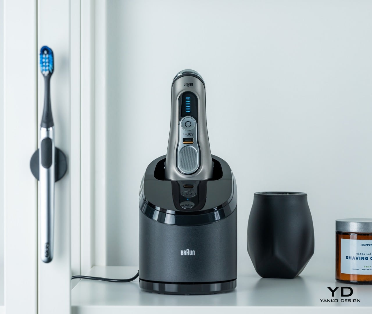
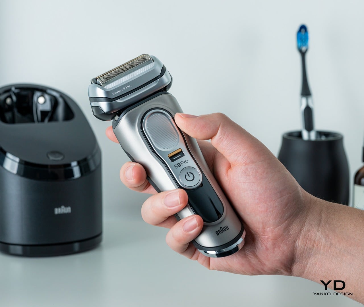
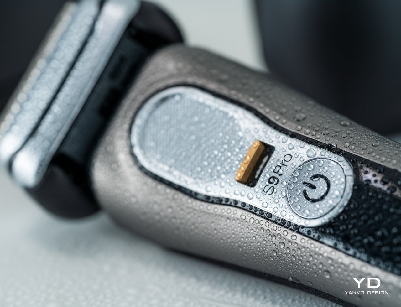
The electric shaver doesn’t have many design elements to distract the user from its intended purpose. Aside from the large shaver head, the only other part that really calls your attention is the textured thumb rest in the middle, with a “PrecisionLock” switch and the power button below it. There’s also an LED screen for the battery and travel lock indicators, but don’t expect a high-quality display. In fact, you might even notice a bit of backlight bleeding around the icons.

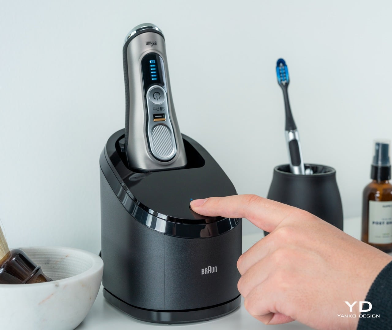
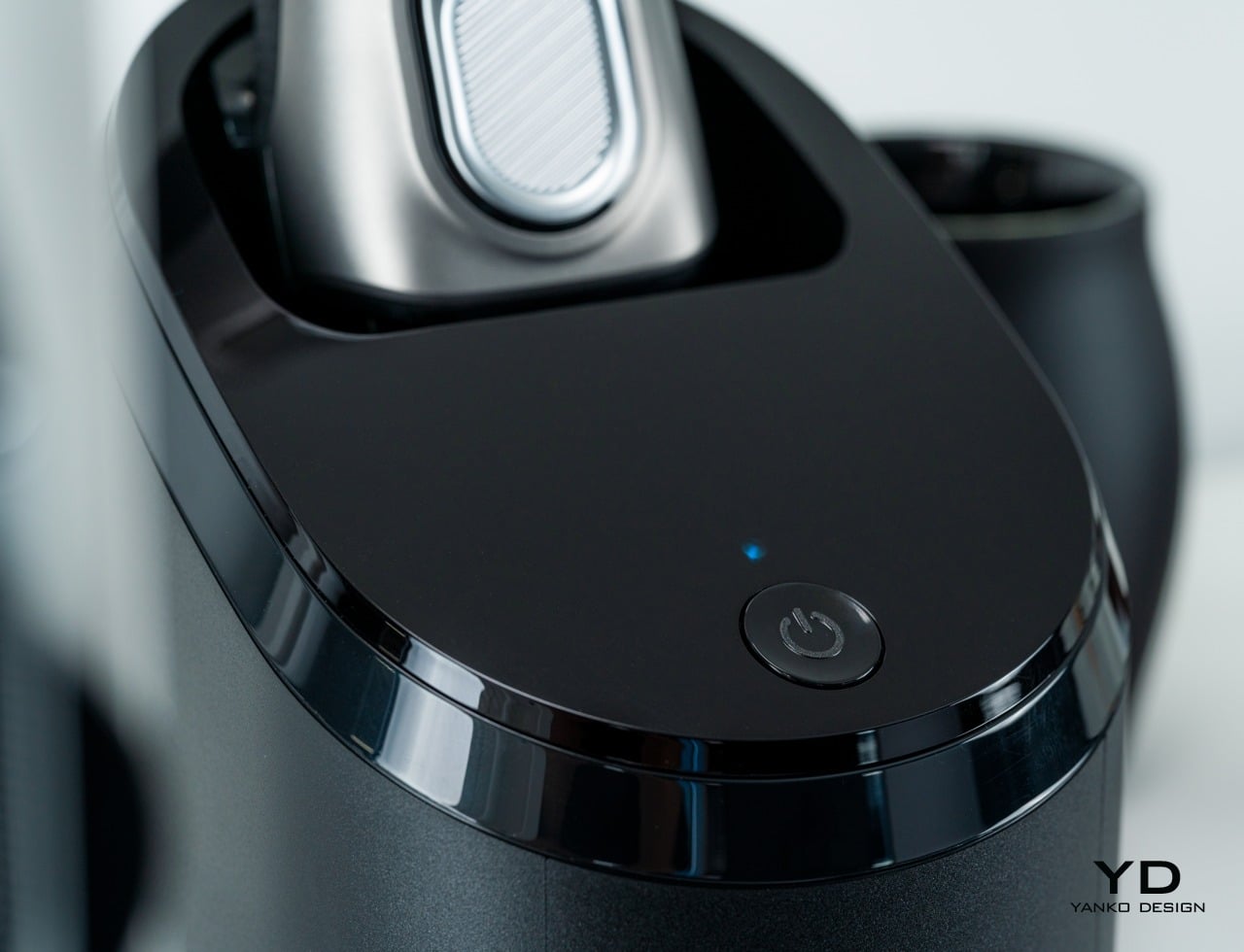
The Braun Series 9 Pro comes with a 5-in-1 SmartCare Center “dock” and, depending on the actual model, a PowerCase with a built-in battery. The latter makes this travel case less conducive for travel, making the mostly plastic case heavier than it looks. The SmartCare station follows the Series 9 Pro’s very basic design, with a single power button as its only user interface.
Ergonomics

As a product that’s meant to be held with one hand for slightly longer periods of time and multiple days a week, Braun designed its Series 9 shavers to be comfortable to use. The choice of lightweight plastic materials and the rubber cover on the back work towards that end, but they thankfully don’t cheapen the feel of the device. The Series 9 Pro feels solid and durable, designed to face the wear and tear of semi-daily use.

The contours of the electric shaver let most hands grasp the body firmly, but it’s the rubber back and the textured thumb rest that really gives you a grip on it. The lack of a cord dangling out of the shaver’s body definitely adds to its usability. In fact, you can’t even use it while it’s plugged in, so you have to be sure there’s enough charge remaining for your use.

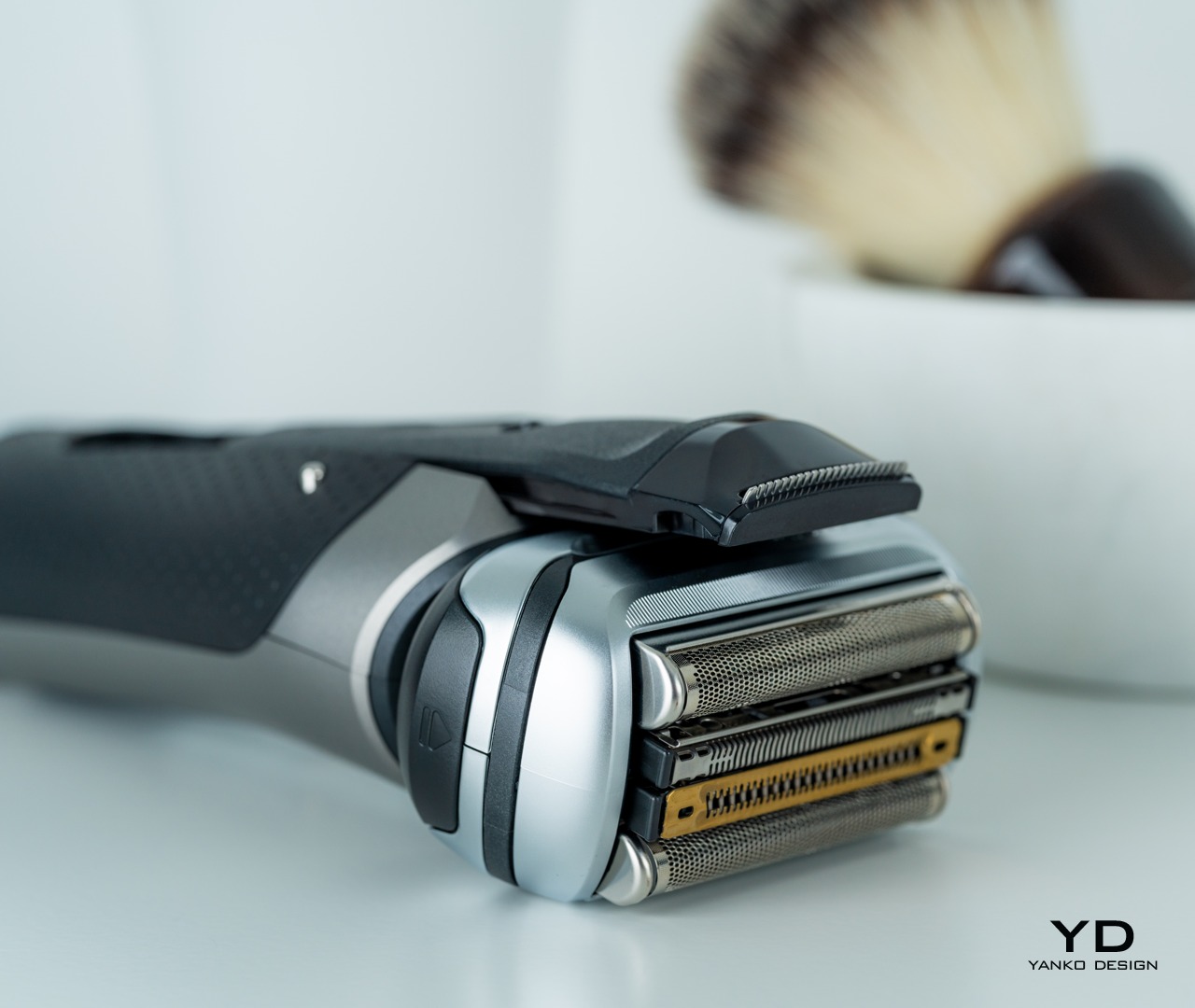
While the head can only move back and forth, the four cutting foils can each move independently, depending on the pressure applied and the surface they’re moving on. Together, this range of motions allows the Braun Series 9 Pro to smoothly move on almost any surface of your head, including your scalp. But in case you prefer having more direct control over the head’s movement, the PrecisionLock below the thumb rest can keep the head still while still letting the foils move on their own.

The Braun Series 9 Pro, just like its predecessors, is clearly designed for ease of use, but one particular part of it seems to stick out like a sore thumb, almost literally. The shaver hides a “precision trimmer” that slides out from its bottom that’s meant to be used for trimming beards. Unfortunately, its location makes it a bit awkward to use in its default position, forcing you to turn the shaver upside-down instead. It doesn’t work that well, either, so it might be the most underutilized part of the shaver anyway.
Sustainability

There is a growing trend among some consumer electronics manufacturers, including smartphone makers, where sustainability or at least eco-friendliness has become an advertising point. Although they can’t completely do away with some materials, they try to at least reduce their use, especially in packaging. Braun, unfortunately, isn’t there yet, and the Series 9 Pro definitely won’t score marks in this department.

The use of plastics and rubber might be understandable, at least given the limits of today’s materials, but the company could have still taken small steps towards reducing waste. One example is the charging cable, which uses Braun’s two-pronged connector. Given the aim of portability, it could have taken the opportunity to adopt USB-C since many people today have phones that charge over that standard. That said, it does have the advantage that you can use new accessories like the PowerCase with older Series 9 shaver models that use the same proprietary connector, saving you the expense and hassle of buying a new cord if you already have one.

Like traditional consumer electronics, Braun didn’t build its shavers with self-repair in mind. None of its shavers are easily repairable, and the only replaceable parts are the cassette holding the cutting elements and the head itself. Once broken or worn down, there is no room for repairs, and these have to be thrown out. Braun doesn’t have any guidance or system for recycling these parts either, which could have gone a long way in getting the company started in a more sustainable direction.

Performance

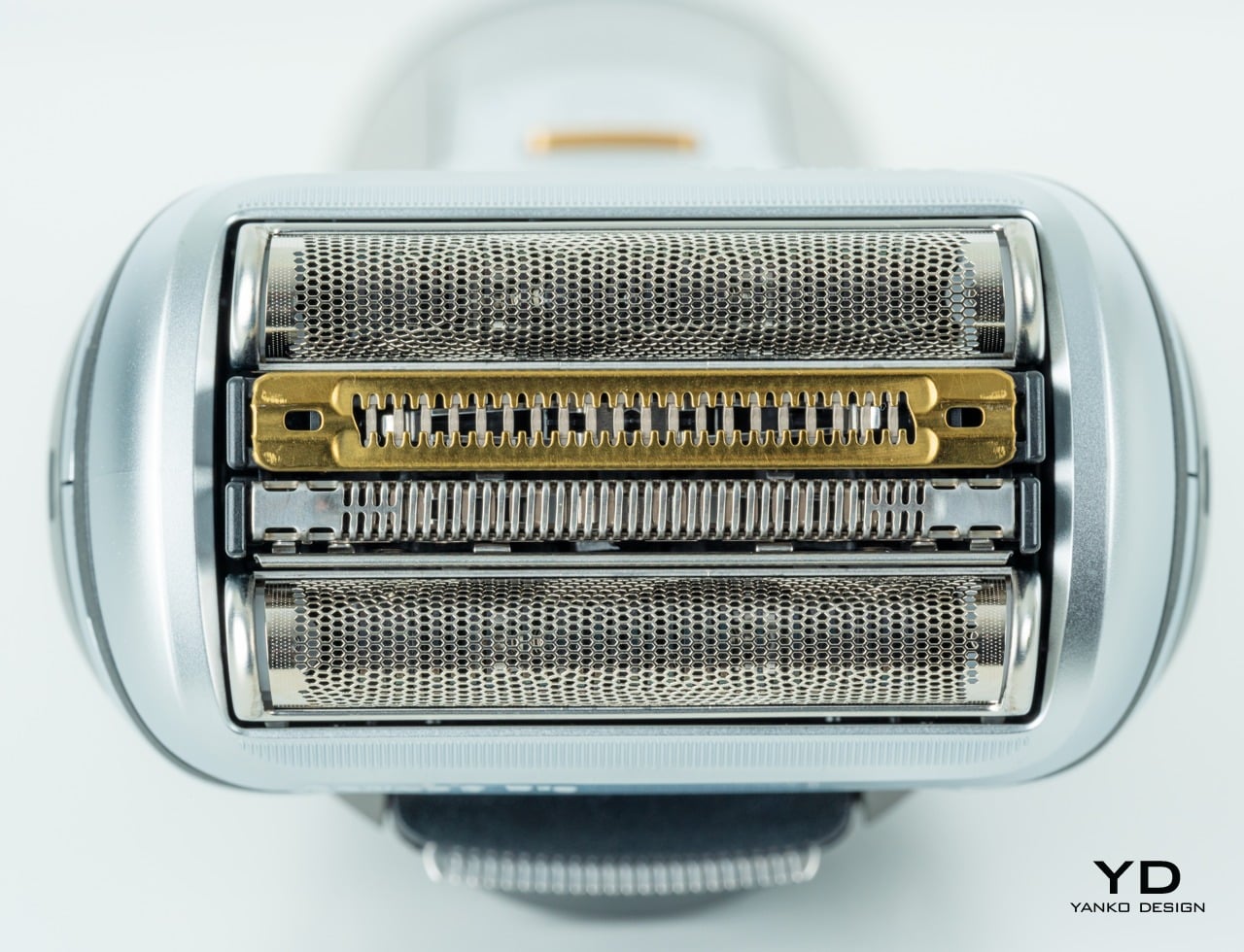
The Braun Series 9 Pro closely resembles the rest of its family in both design and function, but the biggest upgrade it got is one you can only see and feel after using it regularly for a while. Braun is advertising a new 4+1 Shaving Elements and a “ProLift Trimmer” that’s meant to catch long and hard-to-reach hairs, or at least that’s the theory. In practice, it gets close but not close enough.

The Series 9 Pro generally works well and gives a close shave, managing longer hairs that have grown for as long as seven days. It’s no magic wand that will make your facial hair disappear with one flick, though. You might have to do a few passes in areas like the neck. And despite the flexibility of motion, getting to those hairs under the nose can get a bit tricky, too.

Part of the Series 9 Pro’s trick is its powerful motors, but that increased power does come at some price. Although not unbearably loud, the shaver still produces enough audible noise to call attention to it or, worse, wake someone up. The shaver could also sometimes feel a bit rougher on your skin, though not enough to produce discomfort or irritation unless you have extremely sensitive skin. There’s a tendency, unfortunately, to have the occasional pinched skin or get a long hair snagged.

Braun advertises about 60 minutes of use with a full battery, and it’s pretty much on point in that estimate. Charging the shaver, on the other hand, takes a good 50 minutes to full. And that’s when the Series 9 Pro is plugged directly. The PowerCase almost doubles its battery life but naturally charges a lot slower. The SmartCare Center also charges the shaver, but only when it’s not cleaning it.

That “dock” is actually one of the biggest highlights of the Series 9 shavers and is what makes this particular family easy to use and maintain. Simply plopping the Series 9 Pro in its “cradle” and pressing the power button initiates not only a cleaning process but also a lubrication session. Of course, you can clean the shaver manually and might want to do a thorough cleaning from time to time, but this worry-free maintenance definitely takes some burden off owners’ shoulders.

Value

At $349.99, the Braun Series 9 Pro is one of the more expensive electric shaves in the market; there’s just no escaping that fact. It doesn’t have one killer feature that easily makes it stand out, but it’s the sum of its parts that can justify its price. Fortunately, there are also other aspects that help soften the blow, but it’s still a bitter pill to swallow in the end.

There is, for example, an option to buy one without the PowerCase, but that only saves you $20. Braun’s Series 9 accessories and parts are also mostly interchangeable and backward compatible, so you can at least stop worrying about your shaver being obsolete when the next Series 9 model appears. It definitely feels more like a long-term investment rather than a regular purchase, and hopefully, the shaver will last as long as you need it, at least until Braun launches the Series 10 in a few years.
Verdict

Electric shavers are almost a dime a dozen these days, but not many have been able to really deliver on the promise of a quick but close shave. Braun has been at it for years, especially with the Series 9, and the Series 9 Pro, in particular, tries to combine all those lessons learned into a single package. It definitely comes close but also comes up short in a few places as well.

Its powerful motor and new head design definitely get close and personal with longer hair, but you’ll still need more than just a few passes to weed out the more stubborn ones. Its power comes with a bit of roughness, but the real cost is in the literal price. Even Braun’s older Series 9 shavers could offer close to the same performance for less.

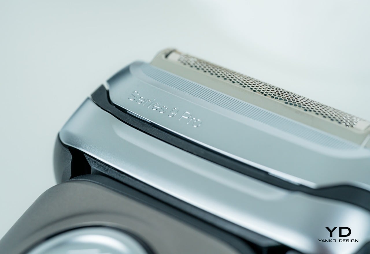
As far as product design goes, however, the Series 9 Pro doesn’t exactly offer anything innovative or exciting. Its use of light but durable plastic and grippy rubber is a standard among electric shavers, though it tries to add a bit of glamor with some silver coating, a few gold accents, and an ergonomic shape. It’s durable to boot, and its SmartCare Center dock helps make sure it will last longer, which is for the best since there’s very little in the Braun Series 9 Pro that’s built to last or be easily replaced and recycled.

The post Braun Series 9 Pro Foil Electric Shaver Review first appeared on Yanko Design.
Braun Motorbike exudes profound historic association + modern influence of brand’s greatest creations

Any kind of association between German consumer product giant Braun and superbikes seems like an odd proposition, but not in the concept design world. Automotive designer Víctor Groten Rico proves that right with his off-beat motorbike concept draped in the iconic consumer brand’s spicy flavor!
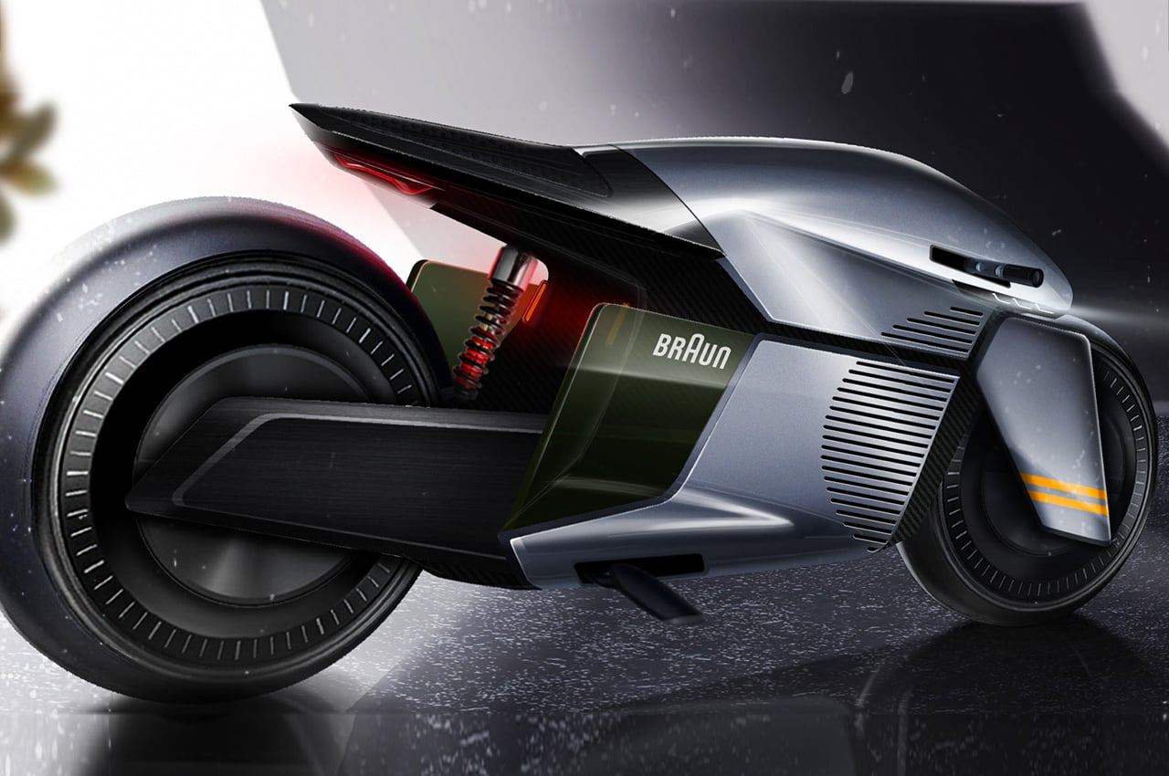
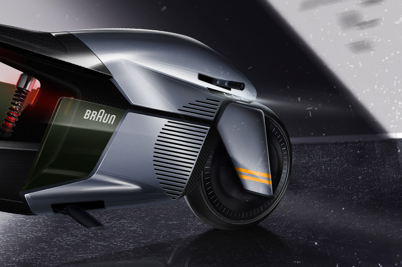
The futuristic-looking bike doesn’t just have the Braun namesake but also carries the brand’s century of design philosophy that’s brought eye candy, functional solutions to our needs. In fact, for the 100 glorious years of the brand, late iconic designer Virgil Abloh teamed up with Braun to create a reinterpretation of the 1965 Wandanlage hi-fi audio wall unit.

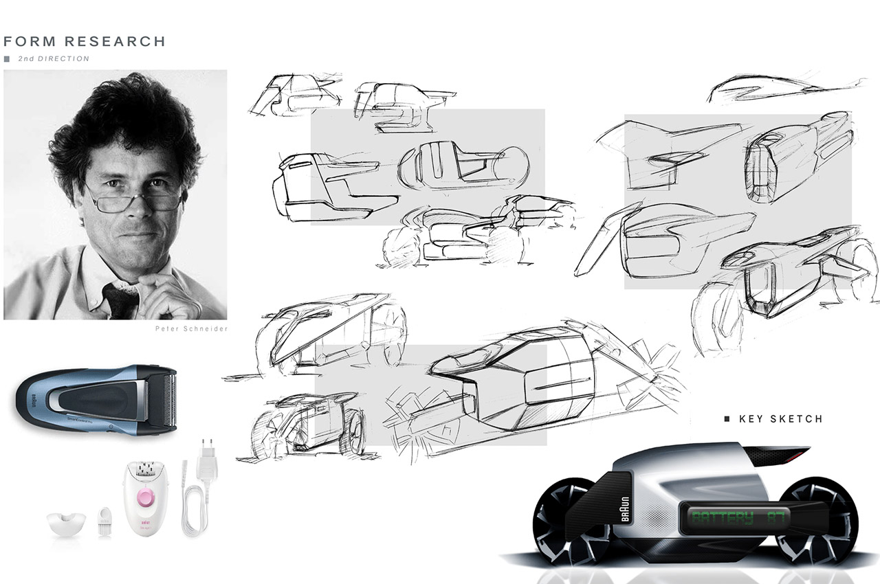
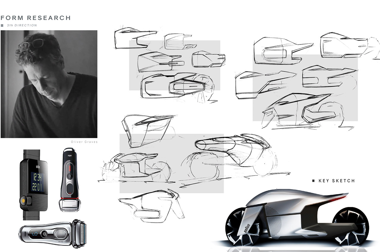
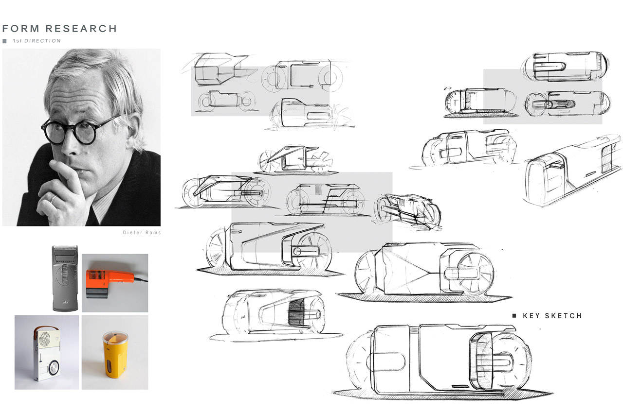
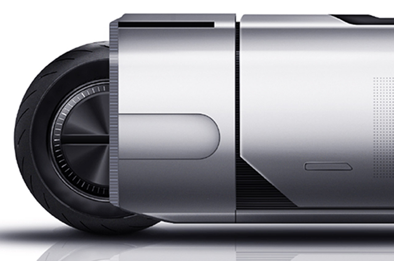
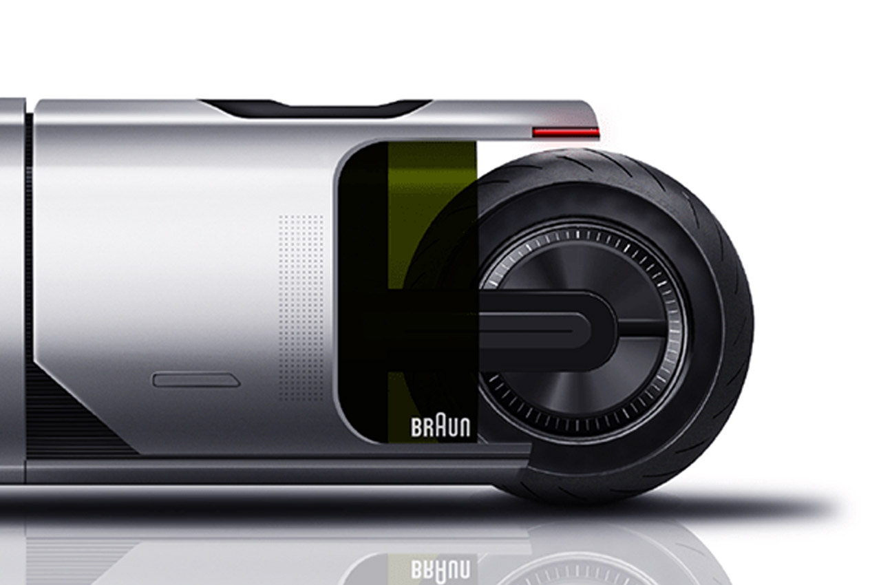
This sleek bike perhaps is also a tribute to the famous brand’s unperturbed legacy. Those smooth-flowing lines perfectly balanced out with the voluptuous contours, right from the front section to the rear remind me of the Series 9 Shaver and a hint of the Satin Hair 7 HD785 hairdryer is also apparent. The color scheme and the contours look adapted from the Sixtant SM31 Shaver from 1962. The initial sketches derive inspiration from the famous Dieter Rams designs that shaped the yesteryears in more ways than not, for example, the 1959 TP1 Record Player or the KF 20 coffee maker.

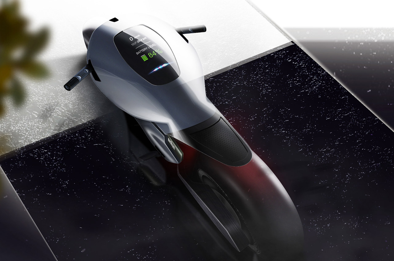
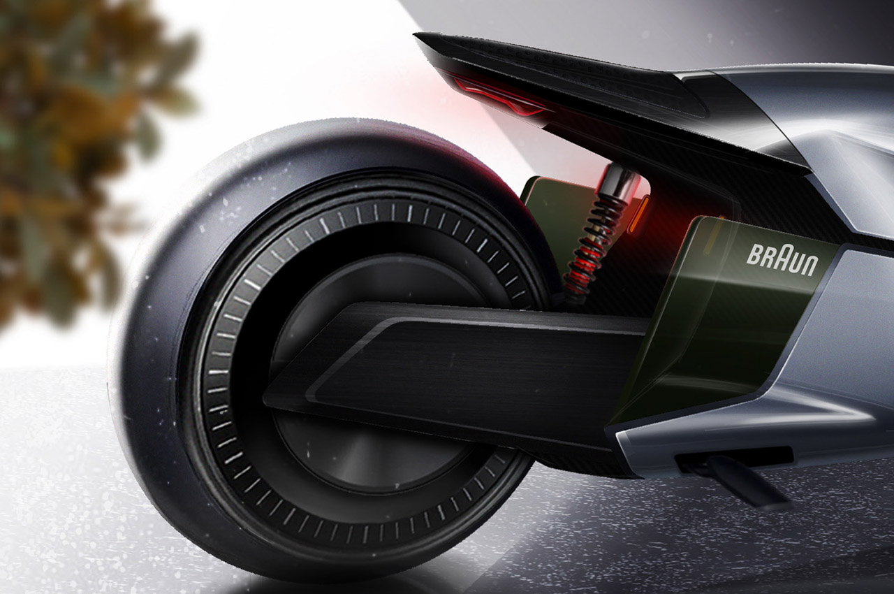
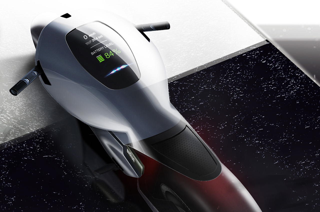
The body of the Braun Motorbike has two definitive sections when viewed from the side profile. Everything here is in unison, right from the integrated handlebars and seating to the swingarms and the big wheels. The ultra-futuristic heads-up-display sitting on the fat tank area is so intriguing, I want to take the bike for a spin right now. It displays important telemetry like the real-time speed, battery level and a unique spectrum right at the bottom. The Braun Motorbike concept has the hint of Tron bike influence too – after all Víctor portrays it as a ride for the dystopian world!

Designer: Víctor Groten Rico

The post Braun Motorbike exudes profound historic association + modern influence of brand’s greatest creations first appeared on Yanko Design.