Nintendo Museum to showcase 132 years of the company’s gaming history

At one point in most people’s lives, they have probably played with or interacted with a Nintendo gaming device. Now what device that is is of course depends on the generation but with more than a hundred years of experience in creating games, there are a lot of things to choose from. And if you’re a die-hard fan of their various games and consoles, then you’ll want to book a ticket to what will surely be the hottest thing in town in a couple of months.

Designer: Nintendo

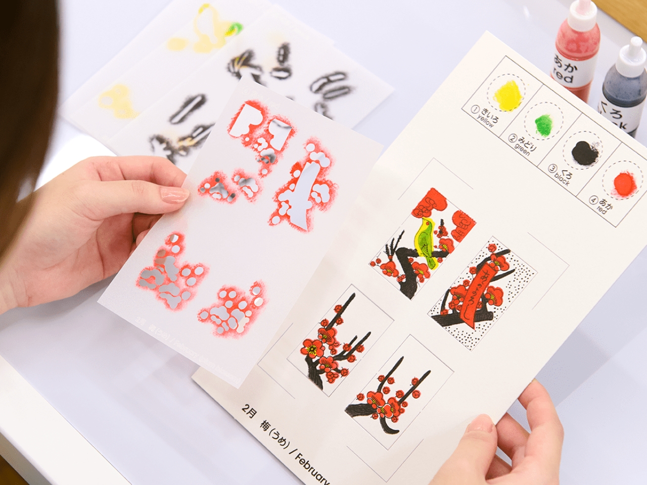
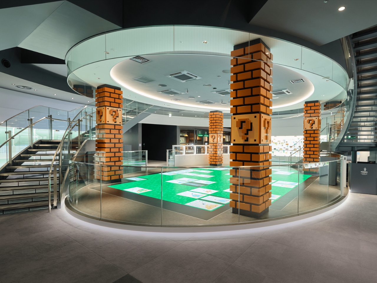
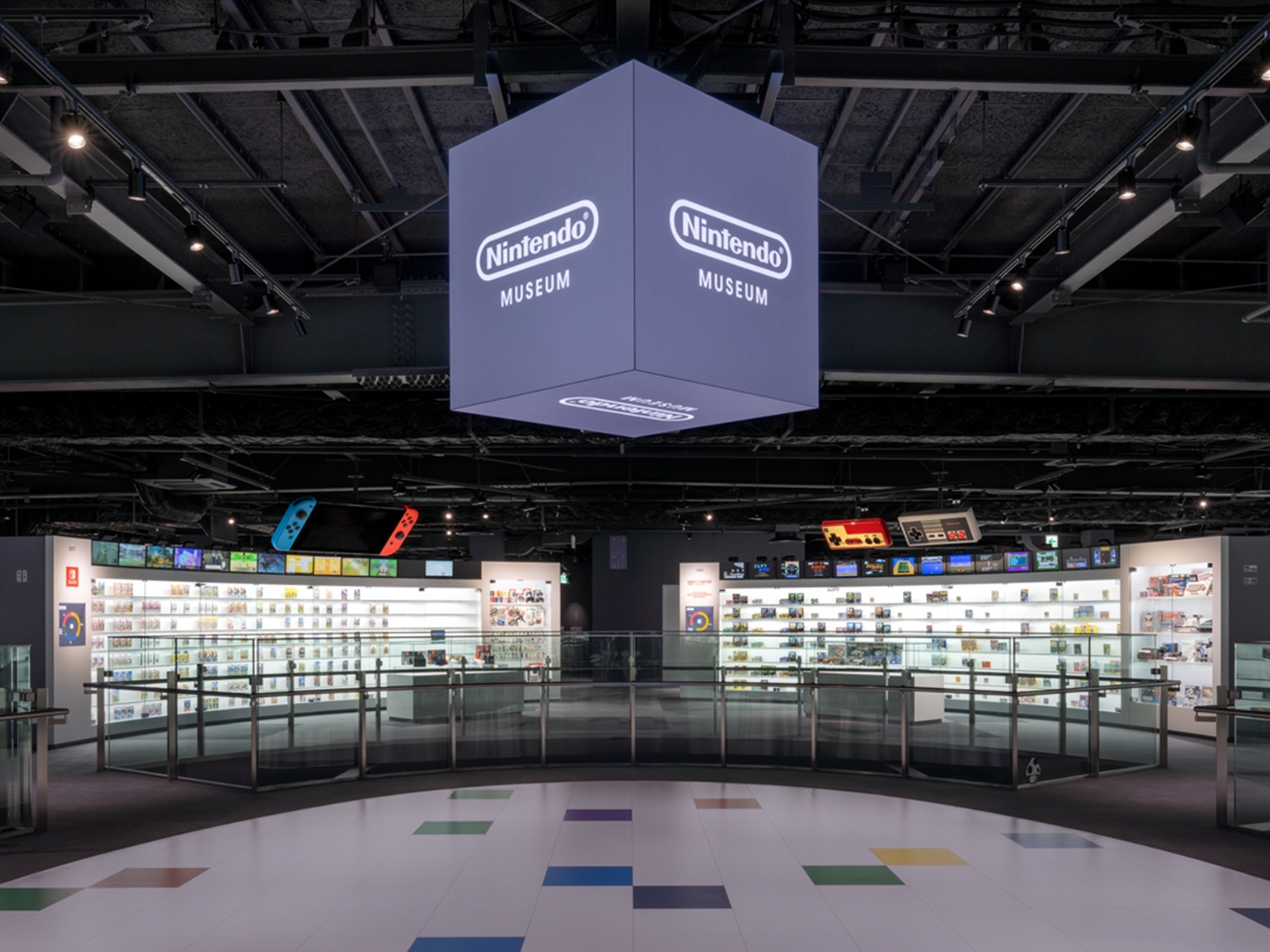
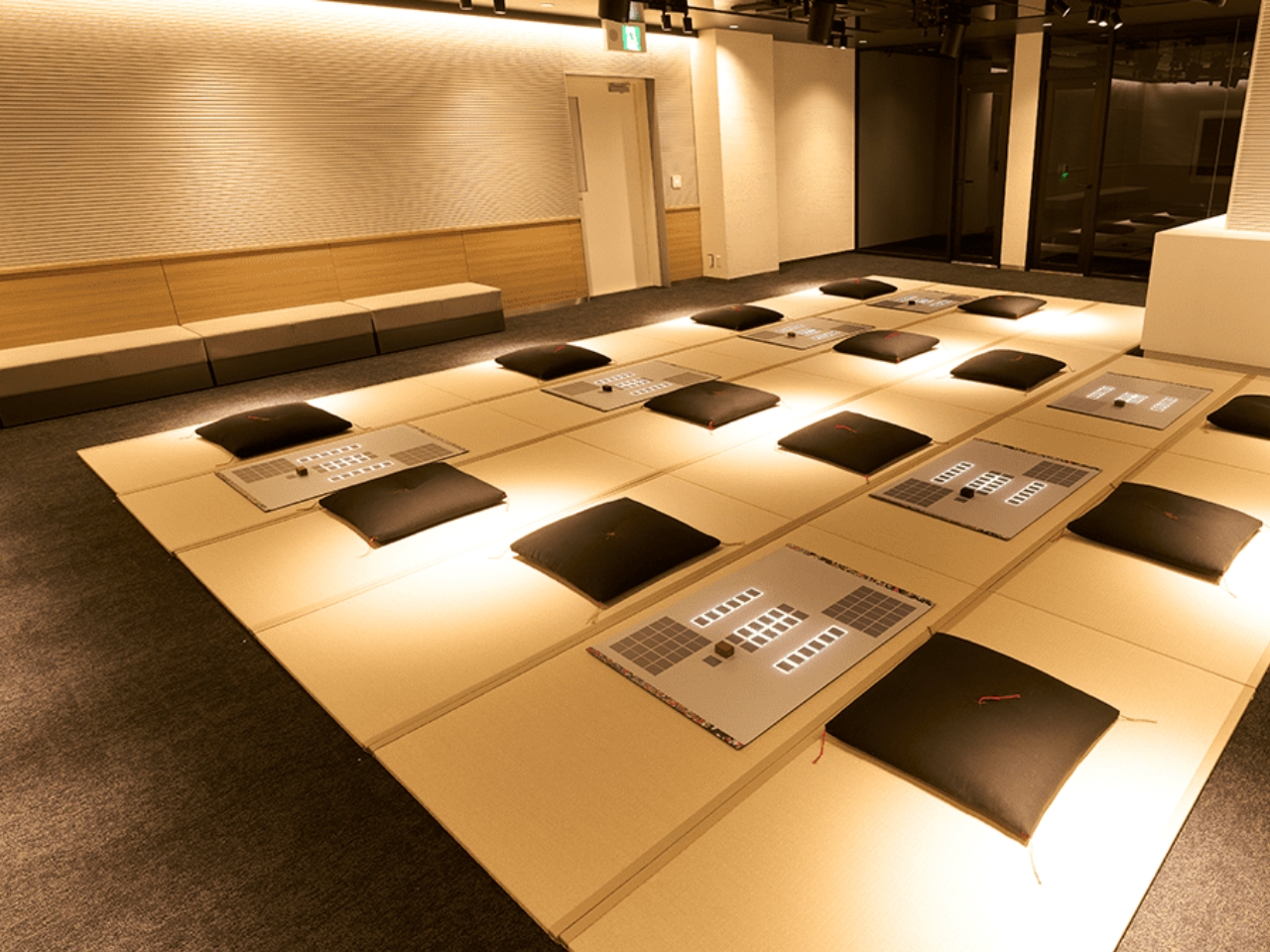
Yes, we are finally getting a Nintendo Museum opening this October and built on the very space where they started creating hanafuda playing cards in 1889. Because this company has gone through many evolutions since then, you can expect a fun and interactive history lesson spanning a century of family entertainment. There will be various exhibits as well as a cafe and of course, an extensive merchandise shop that will celebrate all kinds of games and technology. There will also be arts and crafts and workshops section where you can do things like create your own hanafuda cards.

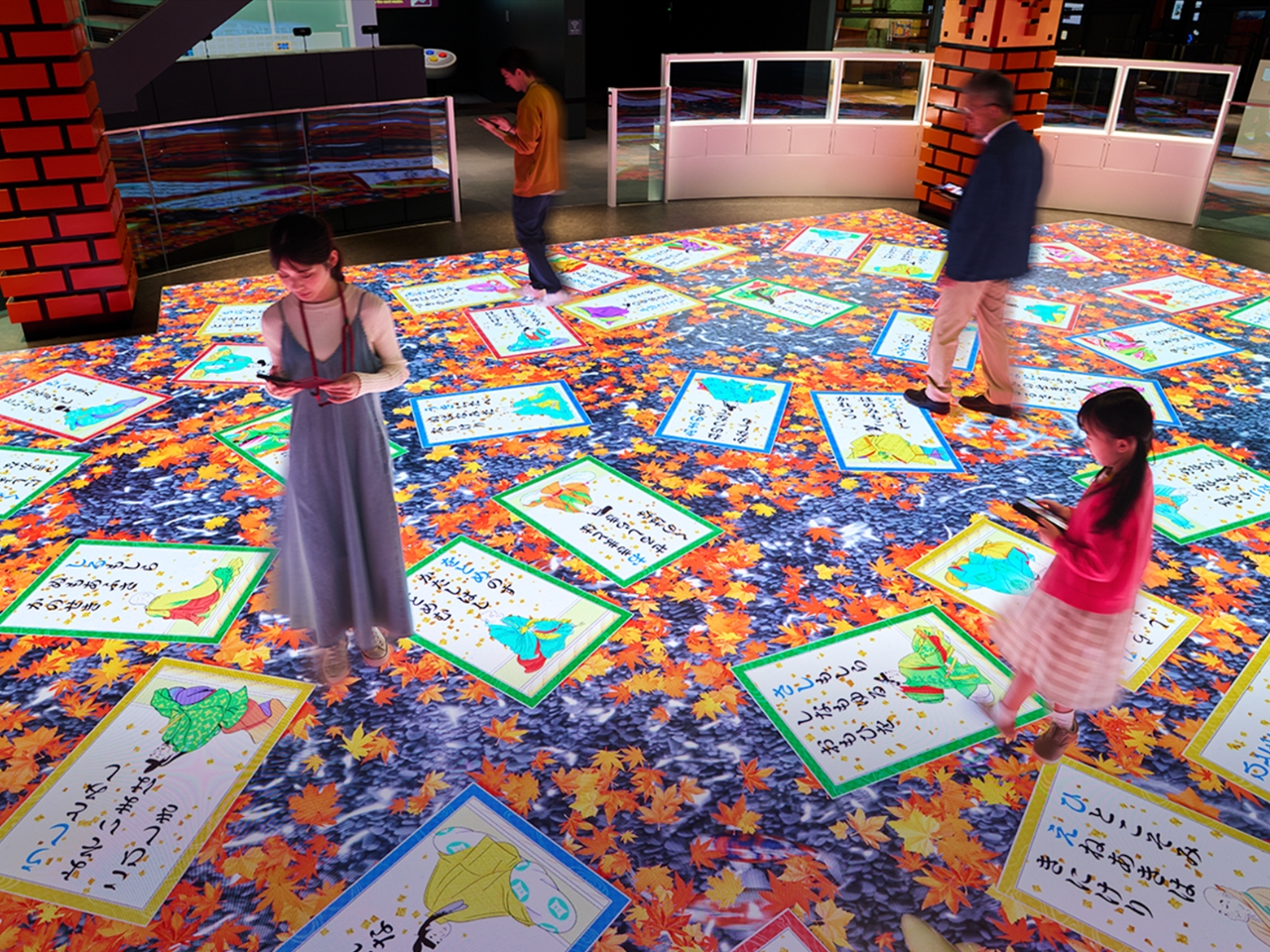
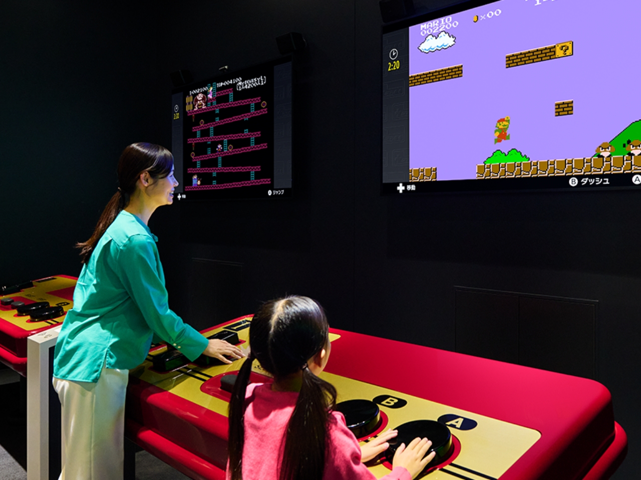
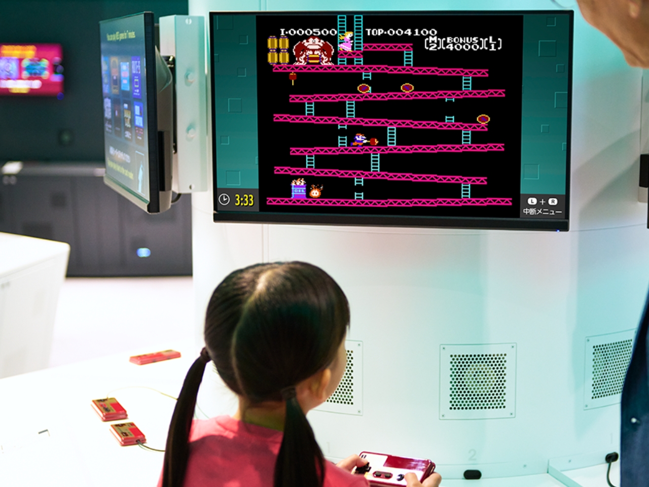
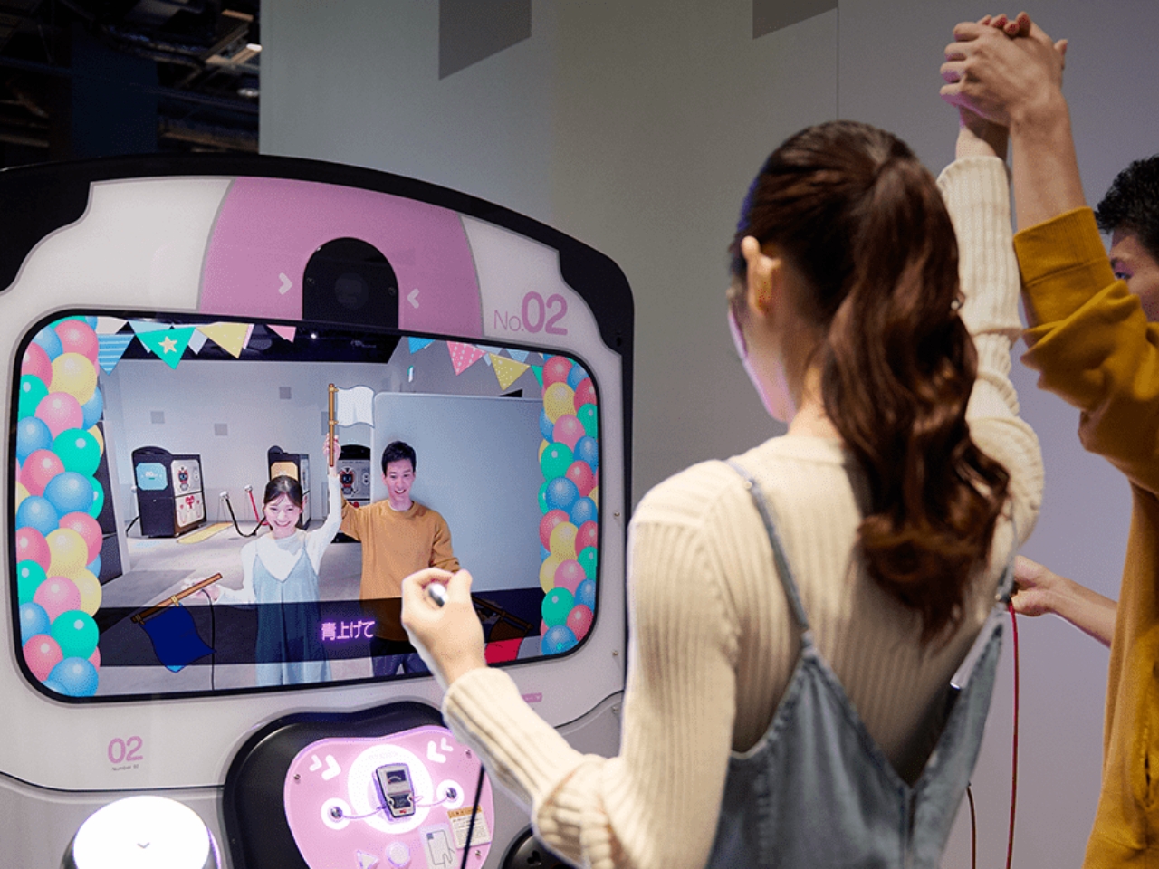
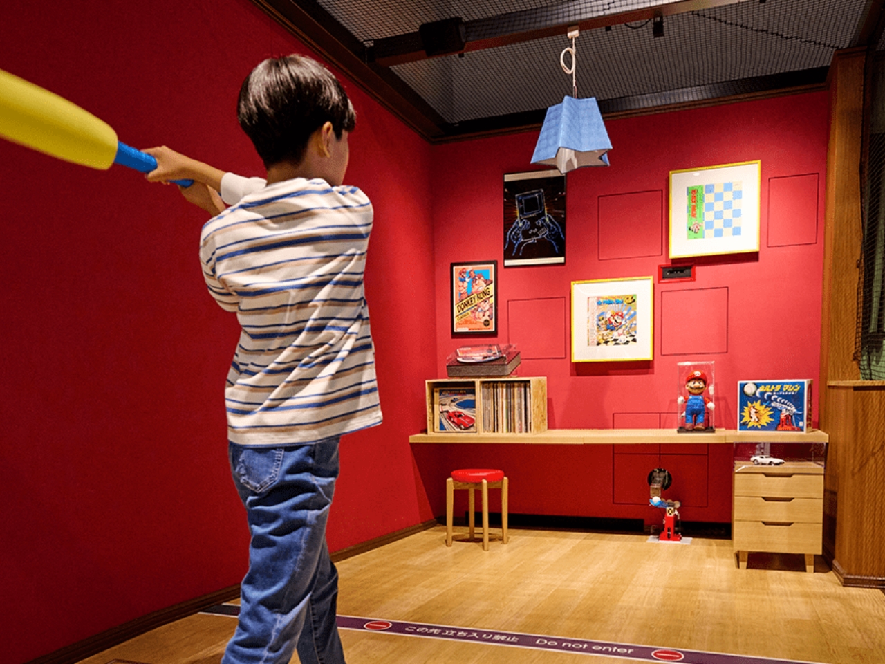
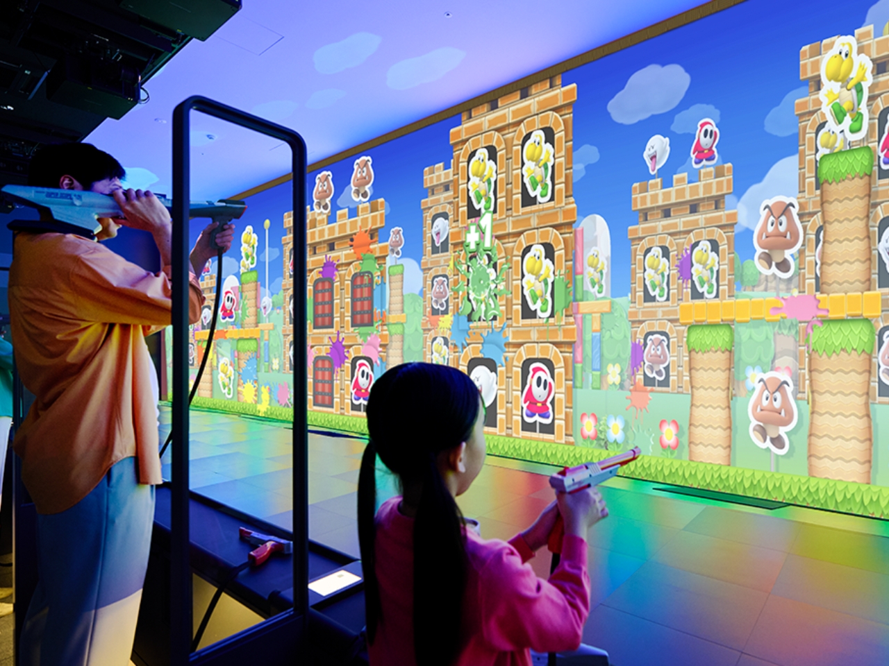
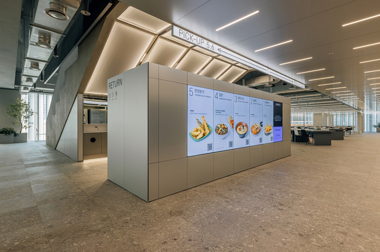
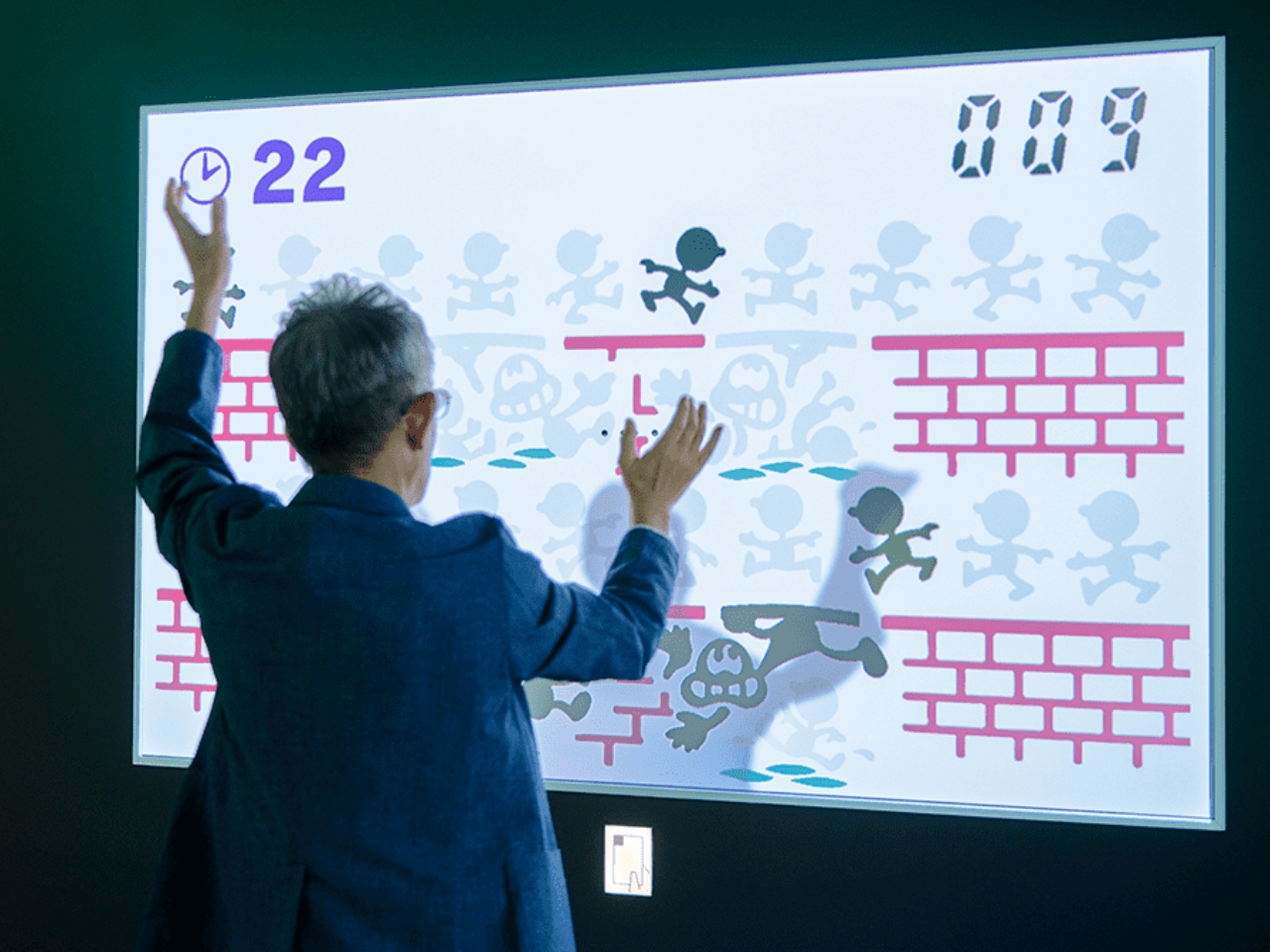
The first floor of the Exhibition Building 1 has eight interactive play experiences. Each visitor will get a card that contains ten digital coins to be able to try out the exhibits. They did not specify it but you will probably be able to top up the card if you want to try out everything. The Shigureden SP lets you explore Hyakunin Isshu poems using your smart device and viewing it on the giant screen. The Ultra Machine SP rooms lets you hit balls pitched by a machine and hit items in the room that will react. The Zapper & Scope SP gives you a shooting experience in the world of Mario while the Ultra Hand SP lets you grab balls rolling down lanes and dropping them in pipes. You can also play Nintendo games in areas like the Game & Watch SP, Nintendo Classics, and Big Controller with giant game consoles. There’s even a Love Tester SP where you can see if you and your loved one are compatible.

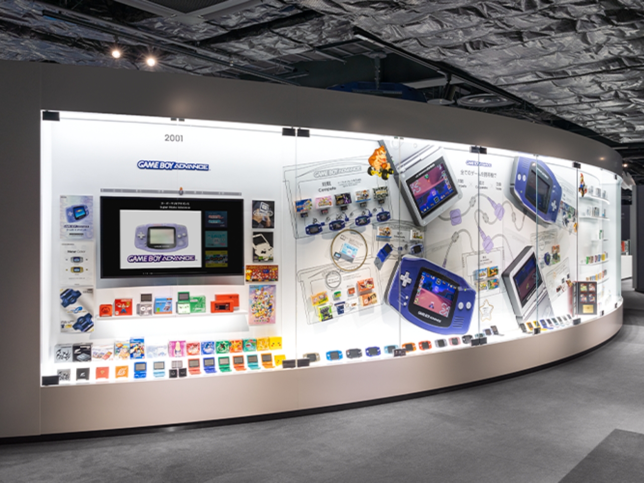
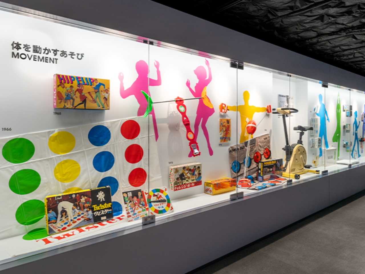
On the 2nd floor is the museum part where there are exhibits of everything that Nintendo has created throughout the years. This includes the era before they created gaming devices and it includes copying machines, baby strollers, and of course the hanafuda cards and various board games. But of course the highlight would be all the gaming consoles and games that have made them arguably the most popular entertainment company in the world. The Nintendo Museum opens in October but you can already buy your tickets, although if you’re familiar with Japan ticketing, you know that it’s via a randomly selected drawing.

The post Nintendo Museum to showcase 132 years of the company’s gaming history first appeared on Yanko Design.

Staggered Skyscraper In Tirana Is Made Up Of 13 Cube Volumes Making It A “Unique Vertical Village”

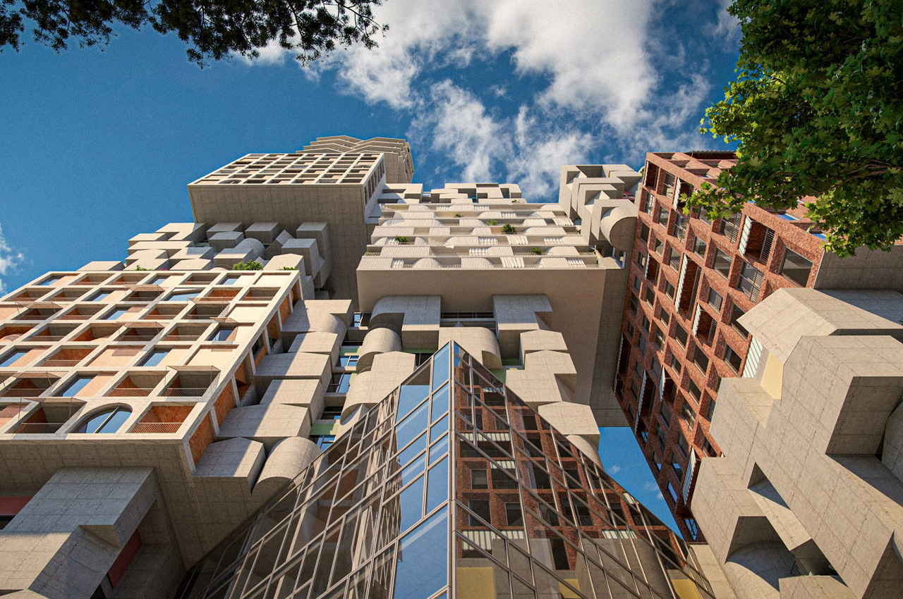
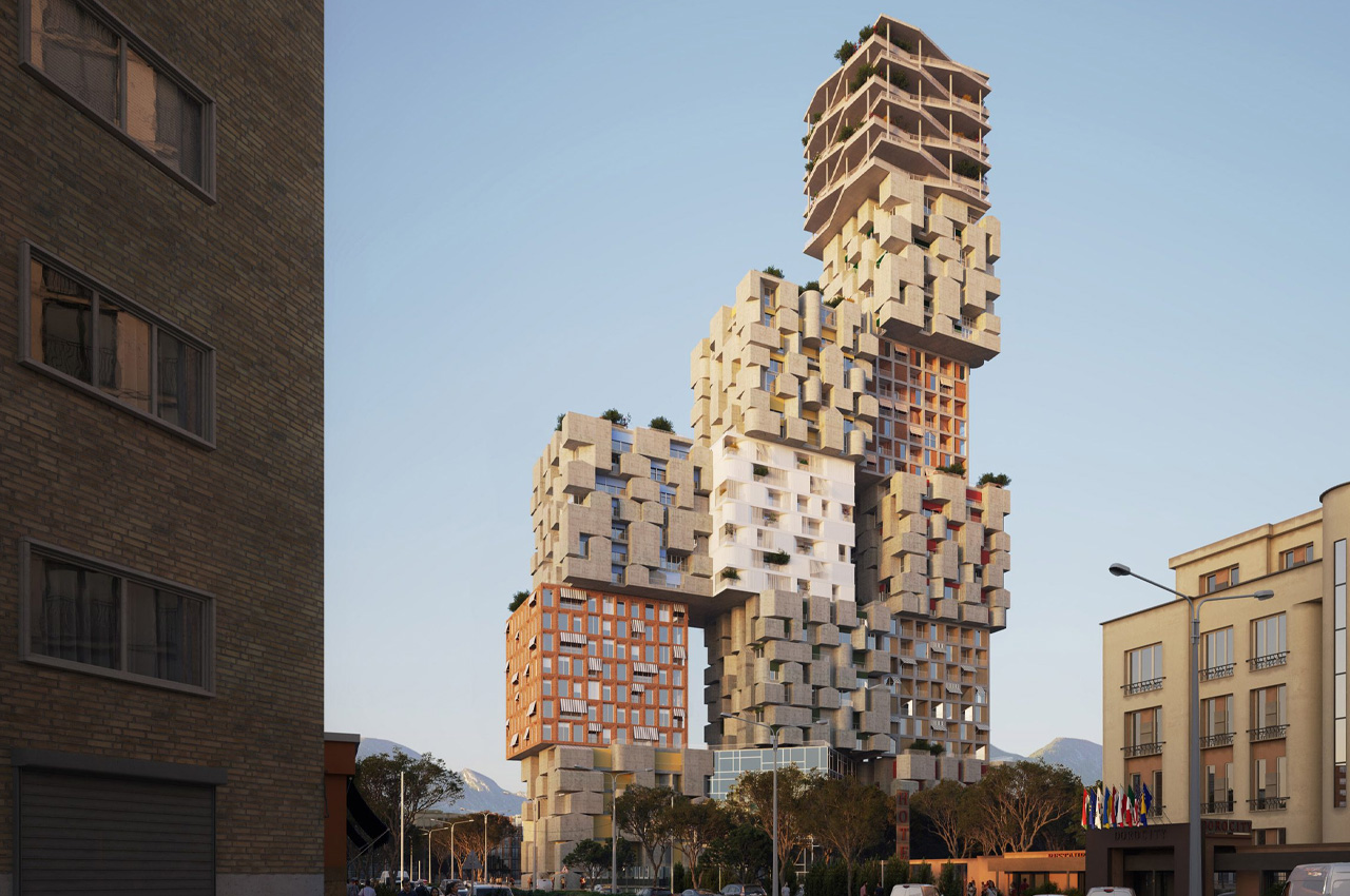
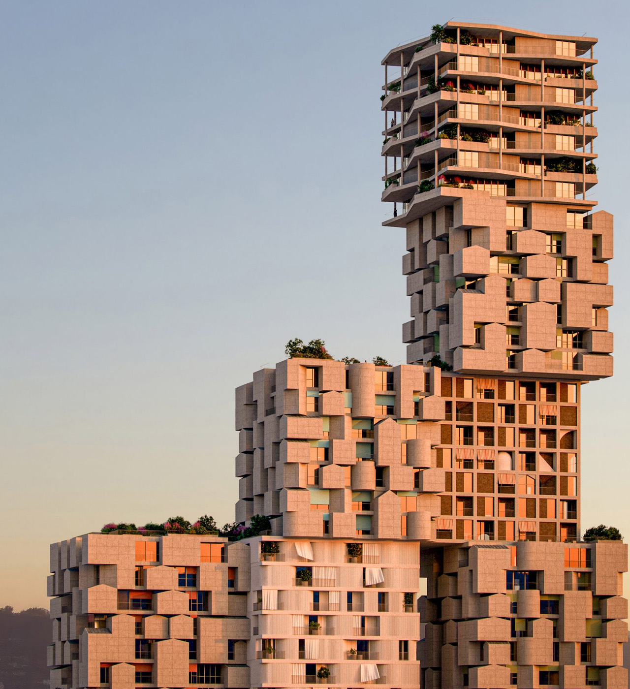
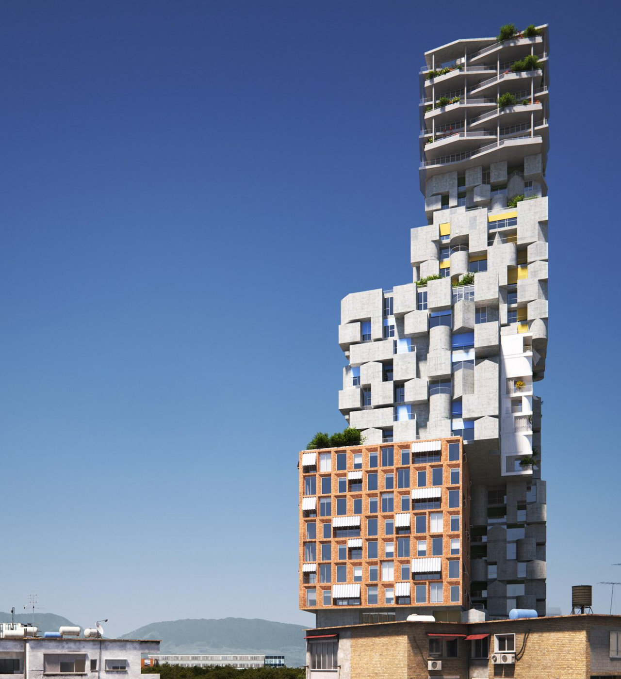
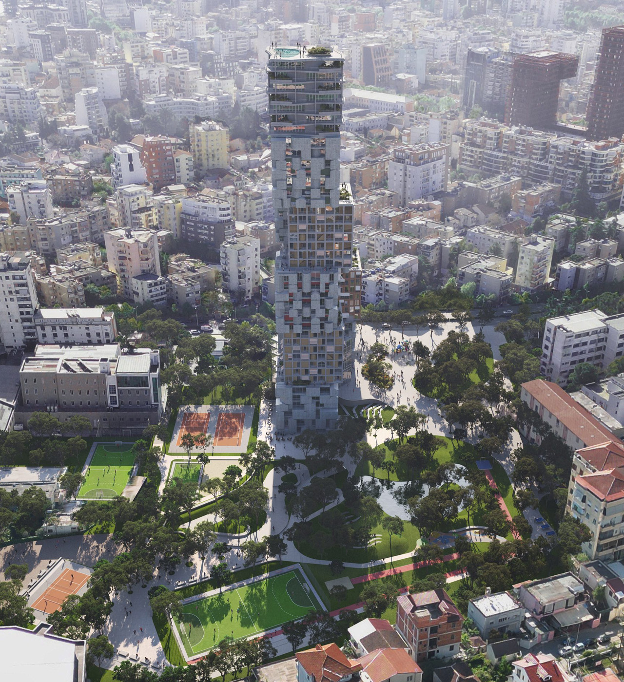
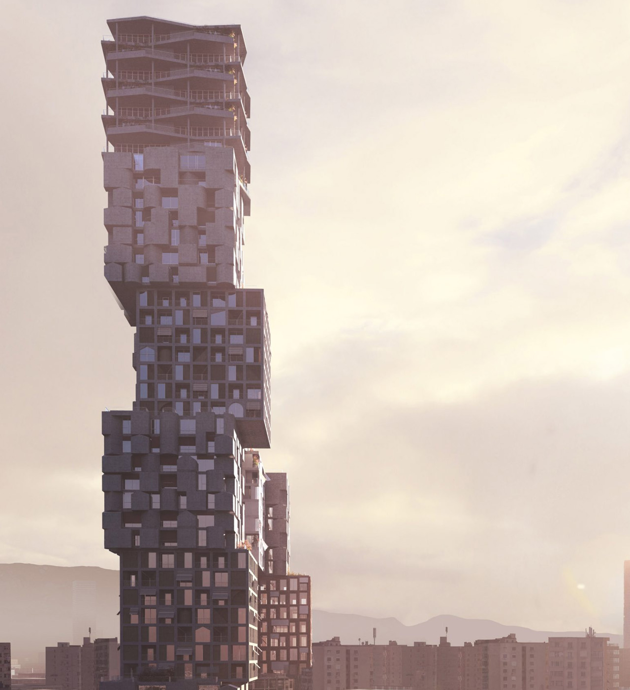
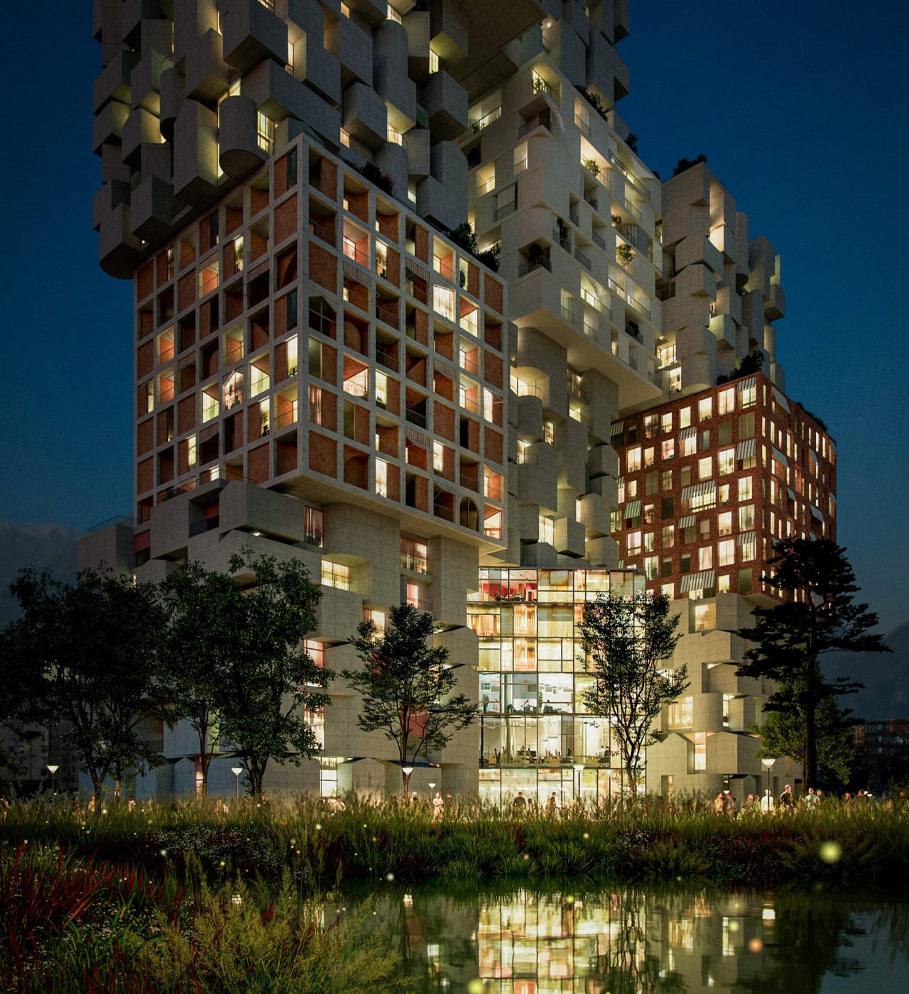
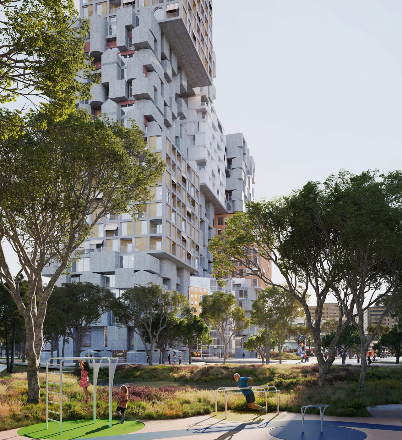
Designed by Portuguese studio OODA, this stunning and impressive skyscraper is made up of 13 staggered cube volumes and is intended to be the design for the Hora Vertikale residential development in Tirana. It is supposed to be unveiled in spring 2024 and is designed to be a 140-meter-tall building that will house apartments placed over a park amped with multiple public amenities.

Designer: OODA

Nestled in the Albanian capital Tirana, OODA designed the Hora Vertikale to engage with the local community and describes the towering structure as “a unique vertical village set amidst a large green city”. 13 cubes have been designed and created in seven variations, and each cube measures 22.5 meters by 22.4 meters and is seven stories tall, which is typically the height of buildings in Tirana.

The foundation or base of the building comprises three rows of three cubes, with a couple of them set apart and rotated a bit to create a narrow gap. Two side-by-side cubes sit on the top, followed by two singular ones that in turn form an expansive building that is six cubes tall. The cube at the top will be equipped with angular balconies that are supported by columns punctuating the perimeter. “Each cube embodies a unique concept related to art and is also inspired by the local vernacular,” said OODA.

What makes the building even more impressive, is that it will be made from locally sourced materials from Albanian, which will reduce its carbon footprint, and also provide support to local businesses.

“The result is a building that leaves a lasting impact on both city visitors and those who live there,” said the studio. “From a distance, the building presents distinct elevations and perceptions from different views around the city. Up close, the concept’s playful interplay reveals its secrets, and the compositions step back from the main road towards the park at the rear, creating the most adequate transition in terms of scale.”

This stunning building is set to be the latest high-profile skyscraper to be constructed in Tirana with a rather unique design that instantly grabs eyeballs.

The post Staggered Skyscraper In Tirana Is Made Up Of 13 Cube Volumes Making It A “Unique Vertical Village” first appeared on Yanko Design.

Tiny Forest In Seoul Is A Tiny Study/Relaxation Space Designed To Be A “Microcosm For Oneself”

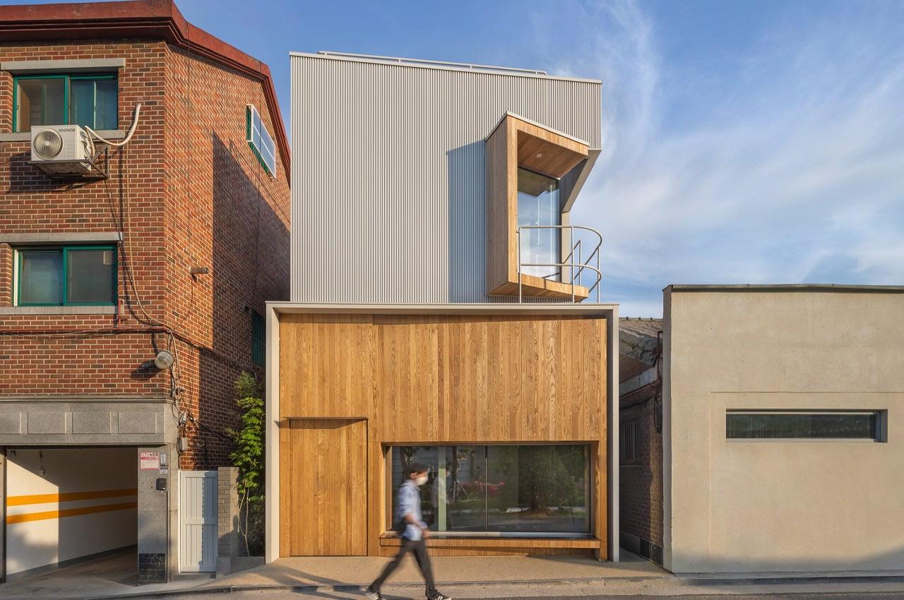
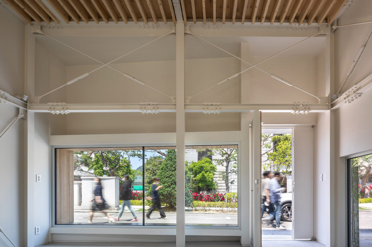
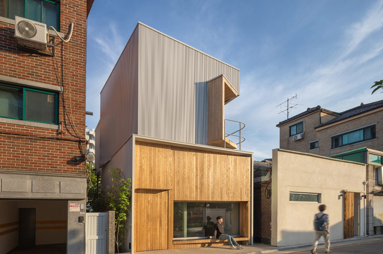
This flexible study space in Jongno-gu, Seoul is designed by YounghanChung Architects in an attempt to “eliminate unnecessary spaces as much as possible”. Dubbed Tiny Forest, the two-story building was built for a retired university lecturer, who wanted to have a separate space from her main home – a space that would function as a study, and as an intimate space to host and entertain guests. The space is inspired by a sarangbang which is found in traditional Korean homes, where usually the man of the house hosts guests or indulges in hobbies.

Designer: YounghanChung Architects

“Spaces as a hobby space or study have gradually loosened in the frame of housing, and lost the power of their original function,” said founder Younghan Chung. “However, the desire to escape from the house and experience a space like a microcosm for oneself is desperate for all of us living in modern times…[so] this building was intended to create a small private room,” he said.

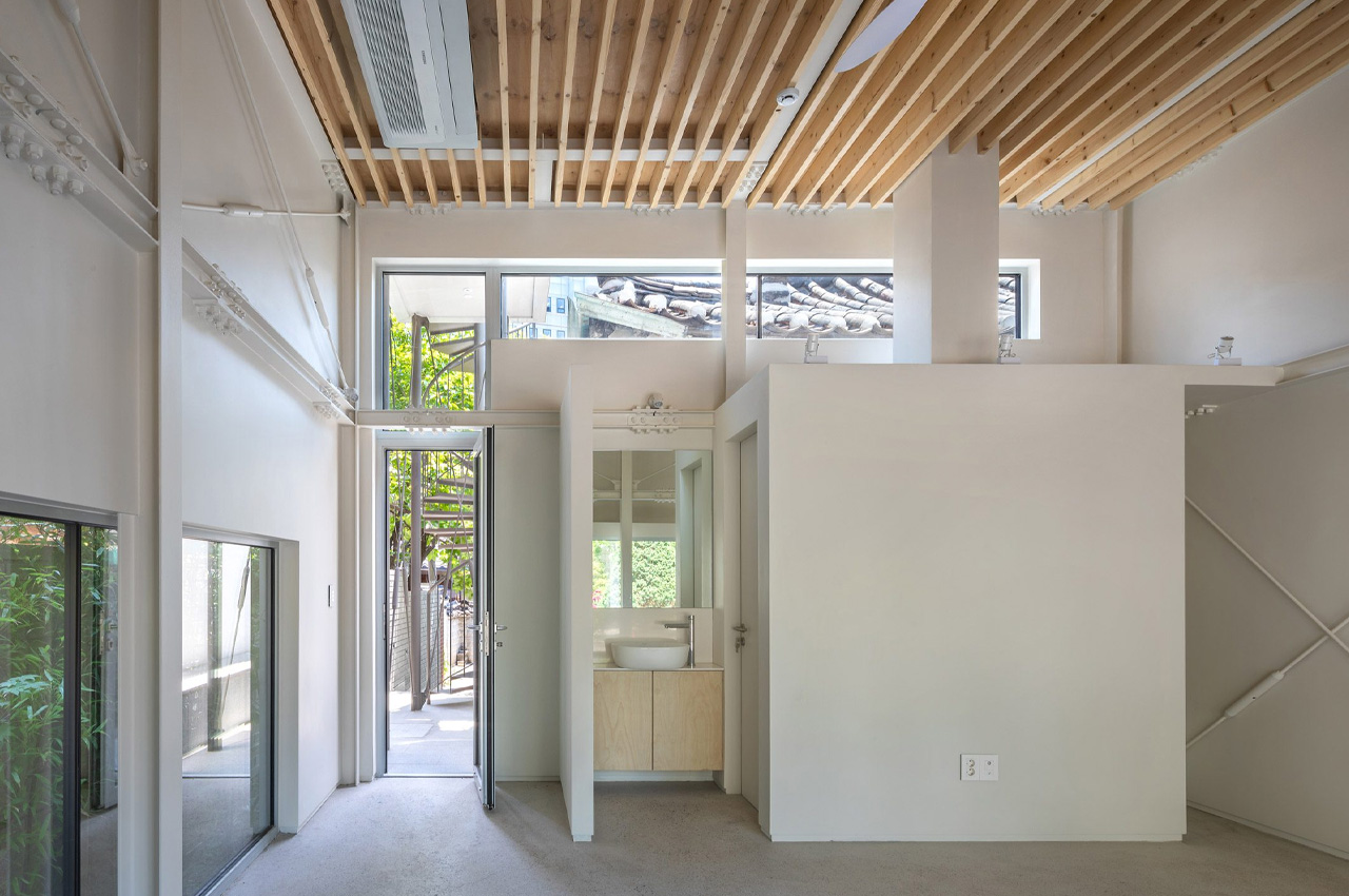
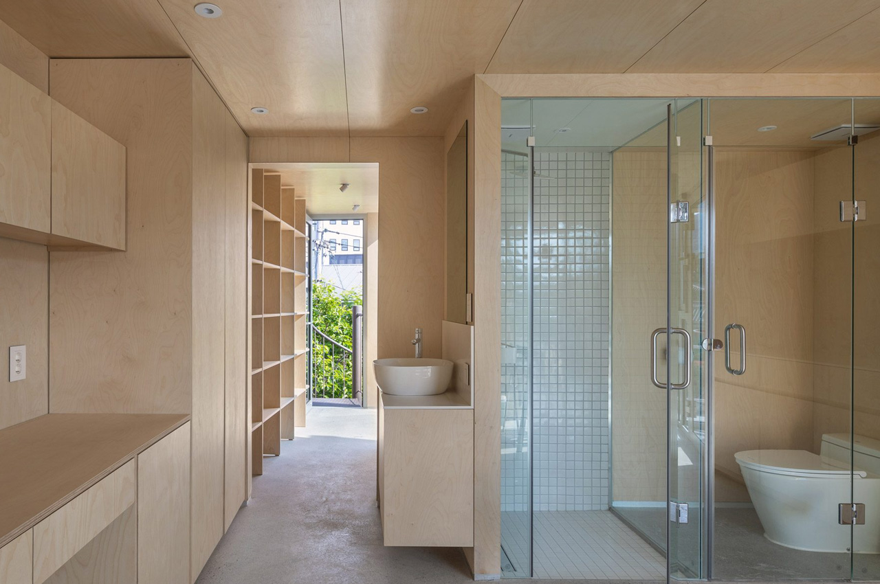
Tiny Forest was designed to be a dedicated study and relaxation space, a serene zone that is nestled away from the hustle and bustle of the main house. The building is made up of two stacked cubes, with the upper cube a little rotated, while both are supported by a steel frame, and clad in corrugated metal in the color white. The different floors of the space were designed as single and flexible spaces, each one amped with a bathroom and generous storage space. The spaces are defined by minimal fittings and fixings, creating a smooth and quaint area. “Conventional structural methods can trap the choreography of users with diverse ways of life within a strictly prescribed framework,” said Chung.

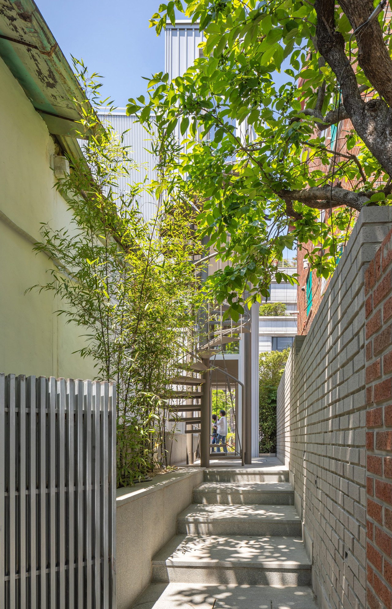
The ground floor features an exposed steel structure in the color white, as well as a massive shopfront-style window that provides views of the street, while also holding an external bench. The space above is wood-lined creating a warm and minimal ambiance, and is equipped with built-in desk space and bookshelves alongside one wall. An external spiral staircase connects both the two floors and is located at the rear of the building. While another staircase connects the western side of the upper level to a tranquil rooftop garden.

The post Tiny Forest In Seoul Is A Tiny Study/Relaxation Space Designed To Be A “Microcosm For Oneself” first appeared on Yanko Design.

Spiralling bookhouse in Shenzhen looks like an art sculpture & offers views of an idyllic riverside park

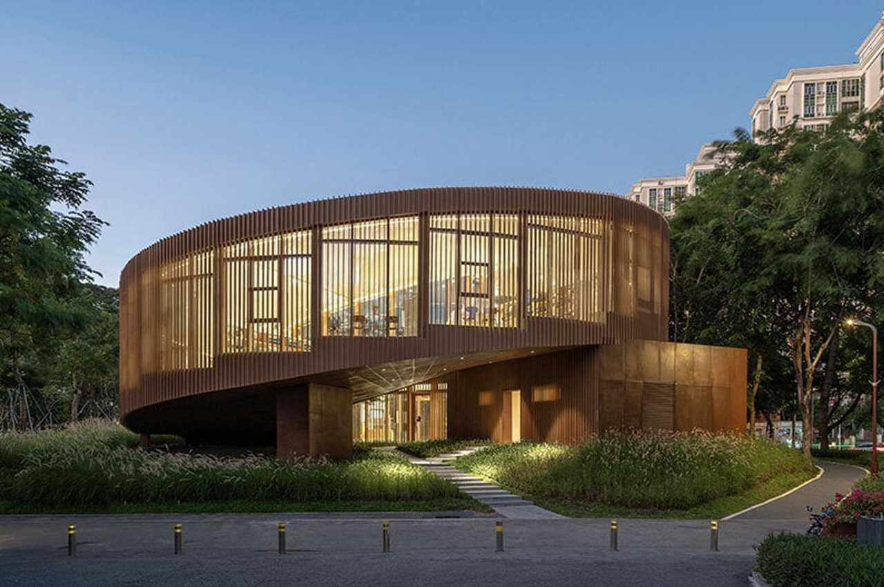
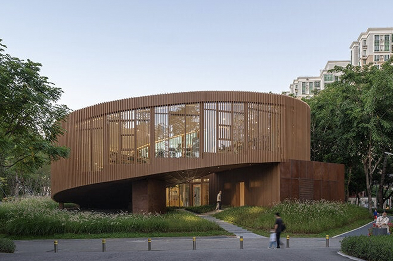
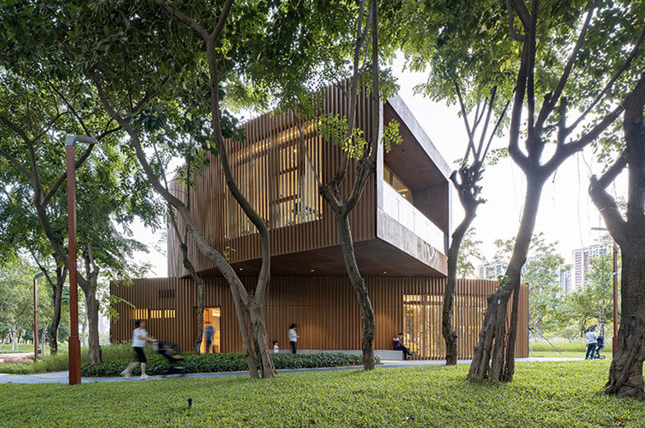
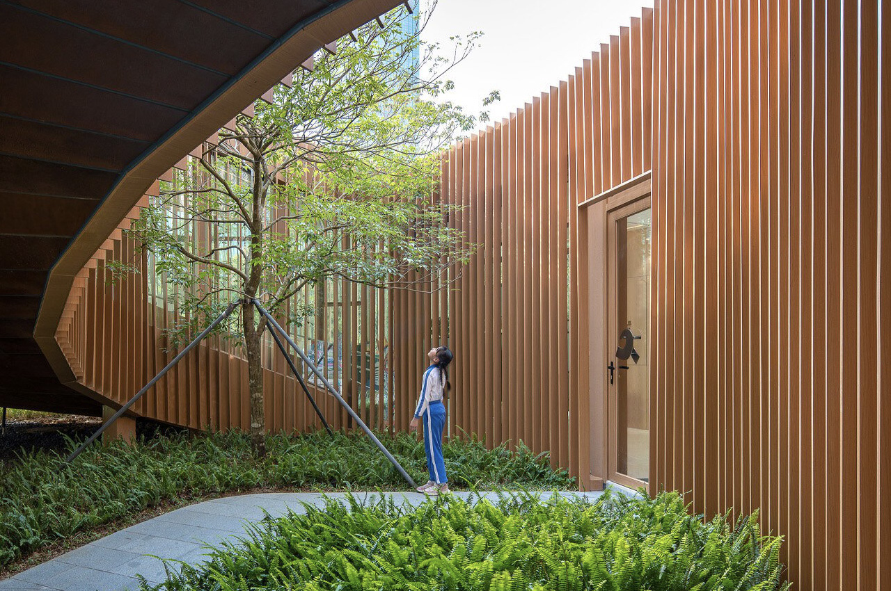
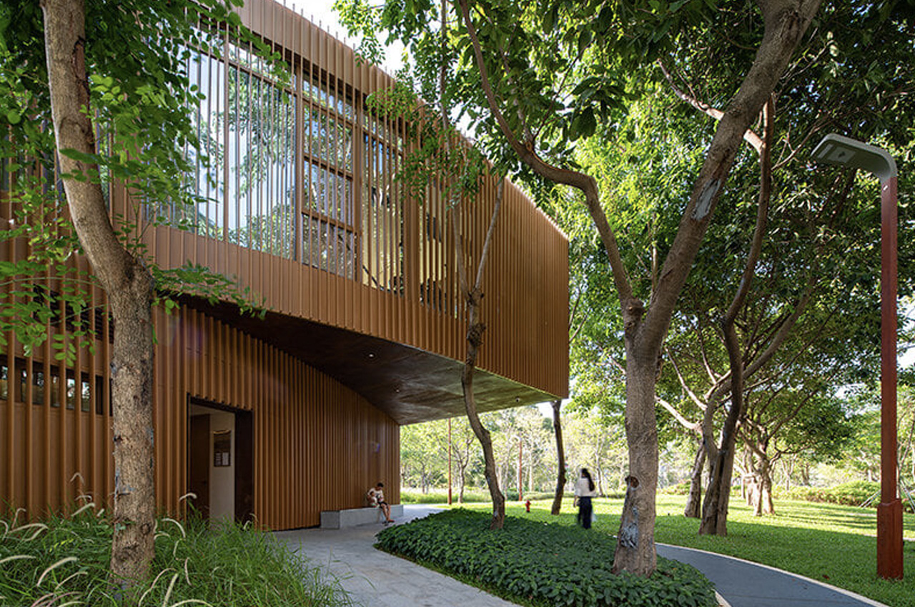
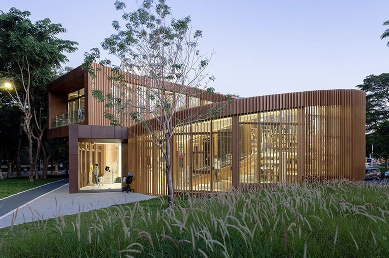
Designed by Atelier Xi, the Serpentine Bookhouse is an intriguingly designed public building, nestled among a canopy of lush trees, along Shenzhen’s Dasha River Ecological Corridor. The building includes a 300 sqm children’s reading room and a 24/7 public restroom that can be used by park visitors and residents. It is surrounded by a 13-kilometer scenic path of the riparian corridor to its west, a children’s park to its north, and residential communities on the east side.

Designer: Atelier XI

“Since its opening, it regularly holds art exhibitions and reading clubs, thus becoming one of the favorite spots for urban dwellers and especially family visitors to escape from the stresses of urban life and to commune with nature and fellow cultural communities,” said the studio.

The lead architect Chen XI was inspired by the traditions of the fishermen of the Dasha River while creating the visual design of the structure. He visualized a spiral conch concept, that rises, twirls, and wraps around like an art sculpture, and provides ample amount of space for plants to grow, and tourists to conduct activities. The twisting and rising quality of the building is what gave it the name ‘Serpentine Bookhouse’. Where the spiraling volume ends, you are met with an open balcony amped with views of the riverside park. The balcony functions as a common space for visitors to rest and relax at the same height as the treetops.

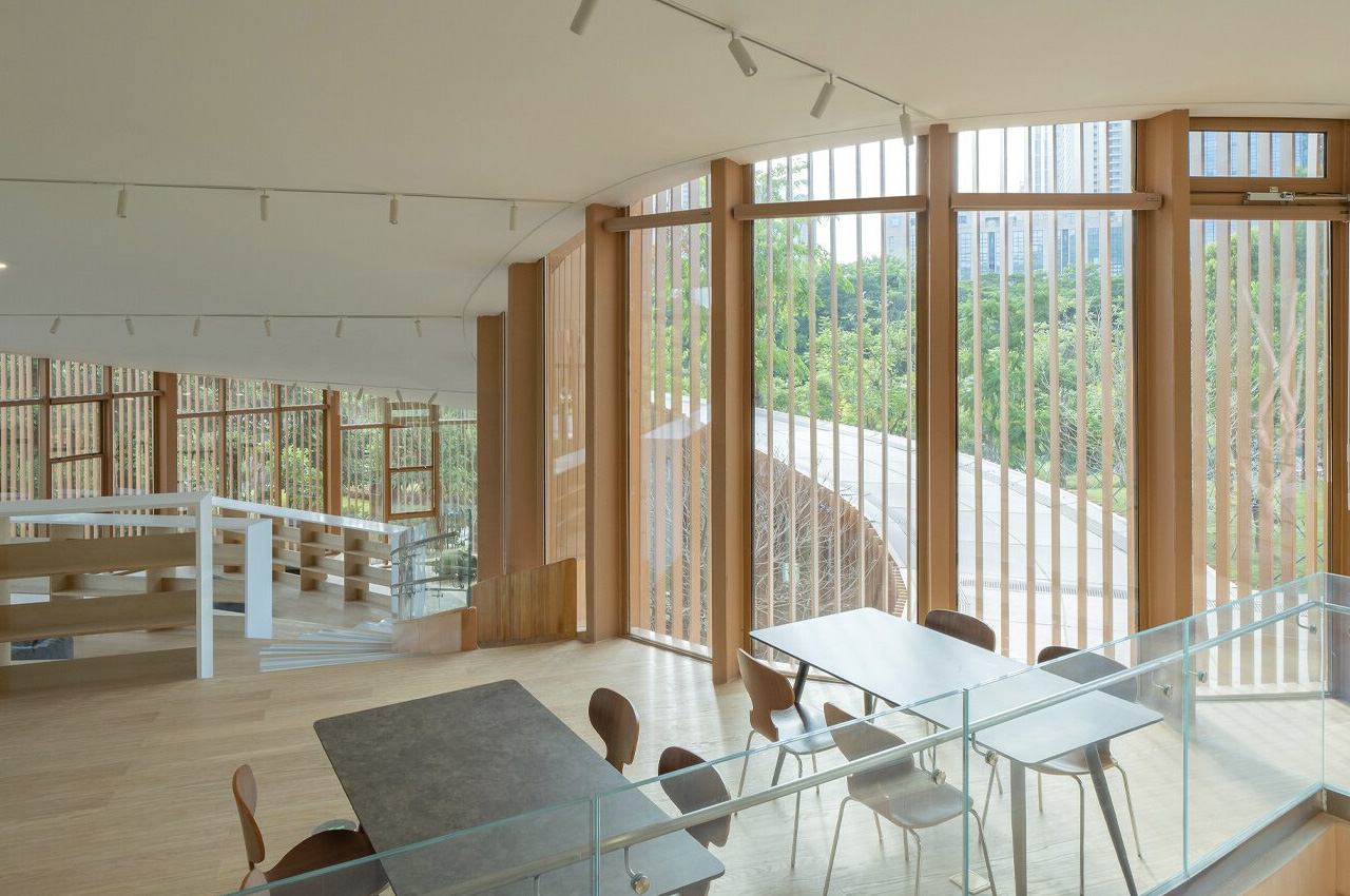
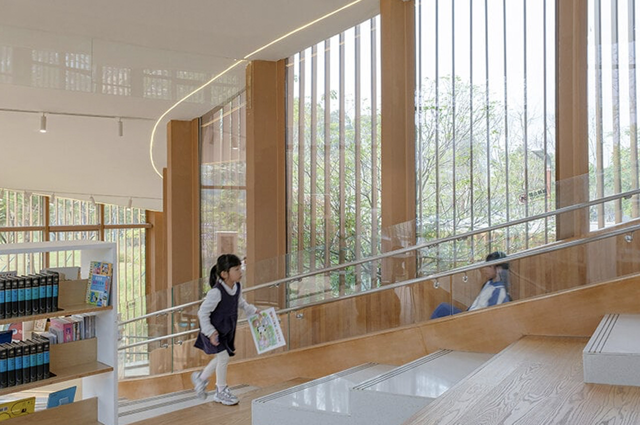
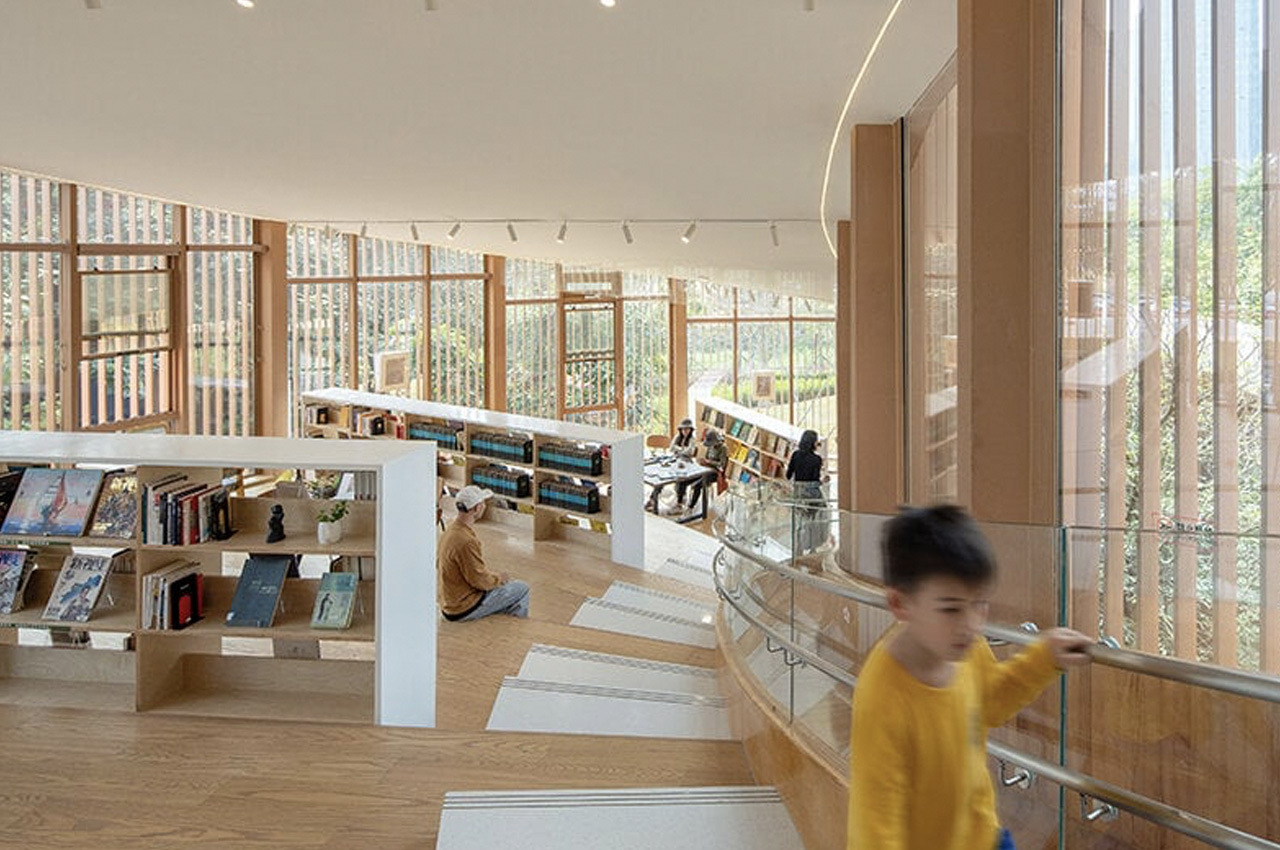
The interior of the building subtly mimics its exterior. The interior comprises of a series of stepped reading spaces that are positioned around trees in the atrium. The space is accentuated by floor-to-ceiling windows that provide stunning views of the park. “The stepped reading spaces with rich height differences provide an opportunity for children to explore and satisfy their natural curiosity and cultivate their interest in independent learning. The slide is open to children every day after school, which will add a fun and exciting dimension to the space,” said Atelier XI.

The building facade is equipped with continuous vertical grilles that serve as sunshade devices, to protect the space from the hot climate of Shenzhen. Operable windows and sliding doors have been installed to support natural ventilation and provide comfort during all seasons. The structural components of the building are prefabricated in a factory, and then assembled on-site, causing minimum disturbance to the park and the residents who live in the nearby community.

The post Spiralling bookhouse in Shenzhen looks like an art sculpture & offers views of an idyllic riverside park first appeared on Yanko Design.

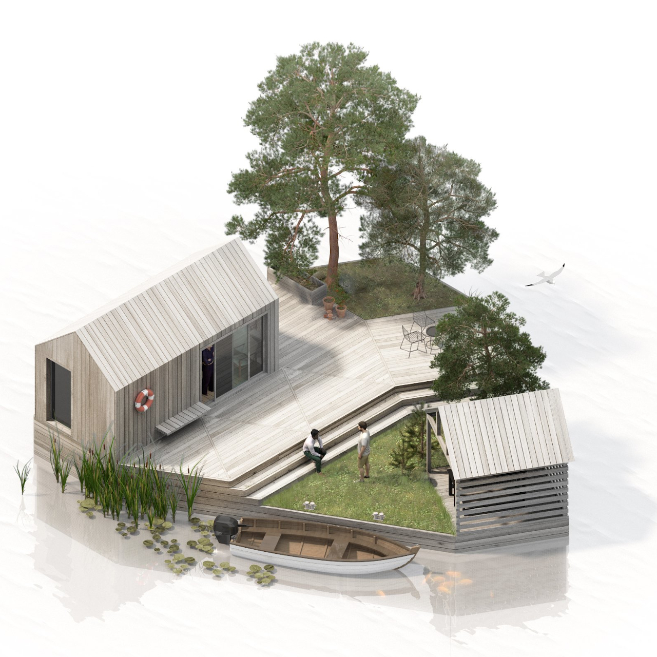
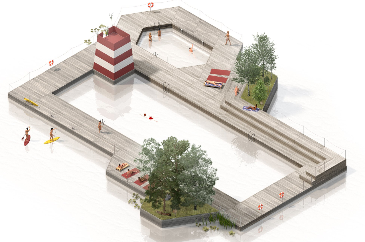
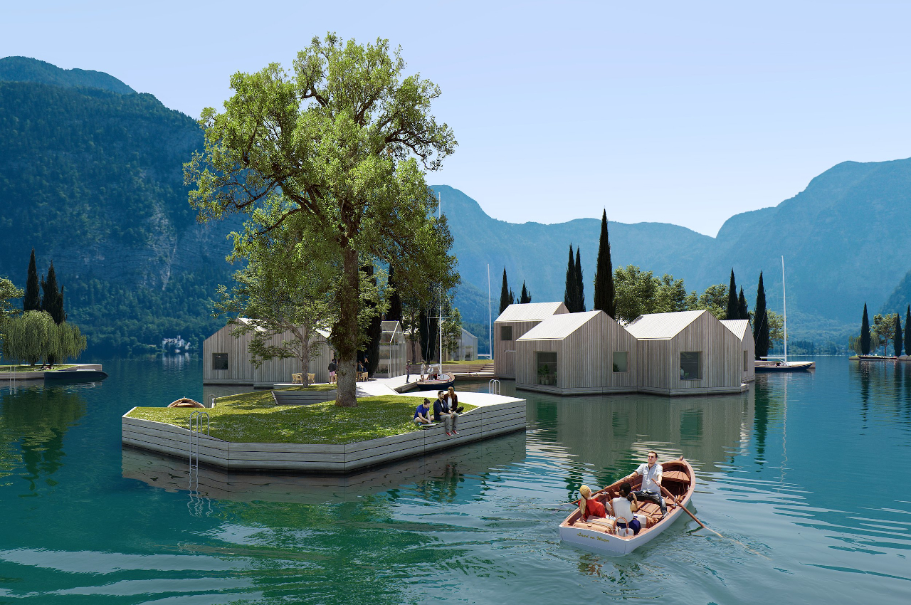
This modular housing concept floats on water and is made from recycled plastic

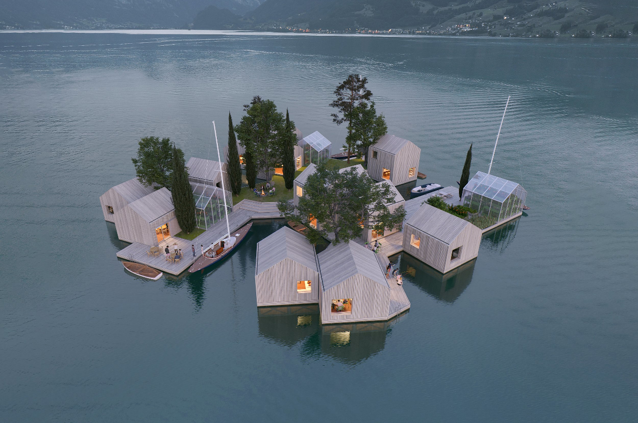
Some people are already fantasizing about setting up colonies on the Moon and Mars, but we have barely begun to understand and conquer our own seas and oceans. Granted, we might already be killing off these bodies of water because of your carelessness and neglect, but a large portion of the planet’s maritime territory remains unharnessed. Hopefully, however, we can be smarter about how we use this invaluable resource, especially when it comes to building homes below or on top of our waters. There have already been numerous ideas about how houses and even whole communities can be built to float on water, but this more sustainable concept not only respects the marine environment but even creates potential habitats for the creatures of the sea.

Designer: MAST

Although it will definitely require more thinking and resources, it would probably be easier if these new aquatic buildings were made using traditional materials and methods. Of course, that would also mean destroying the very environment that we’re building our new lives on. That’s nothing new as far as what we’ve been doing so far on the ground, but we already should know better by now. A new environment also means being able to start anew using the lessons we’ve learned over the past millennia, and this “Land on Water” vision is exactly that.

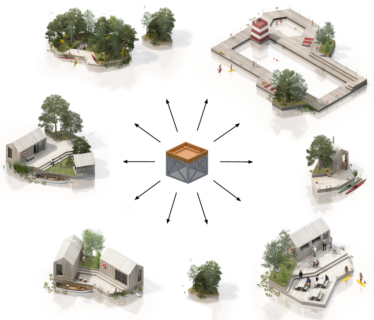
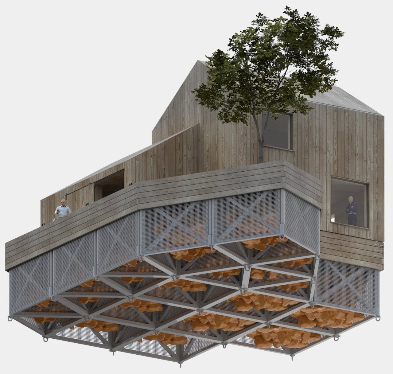
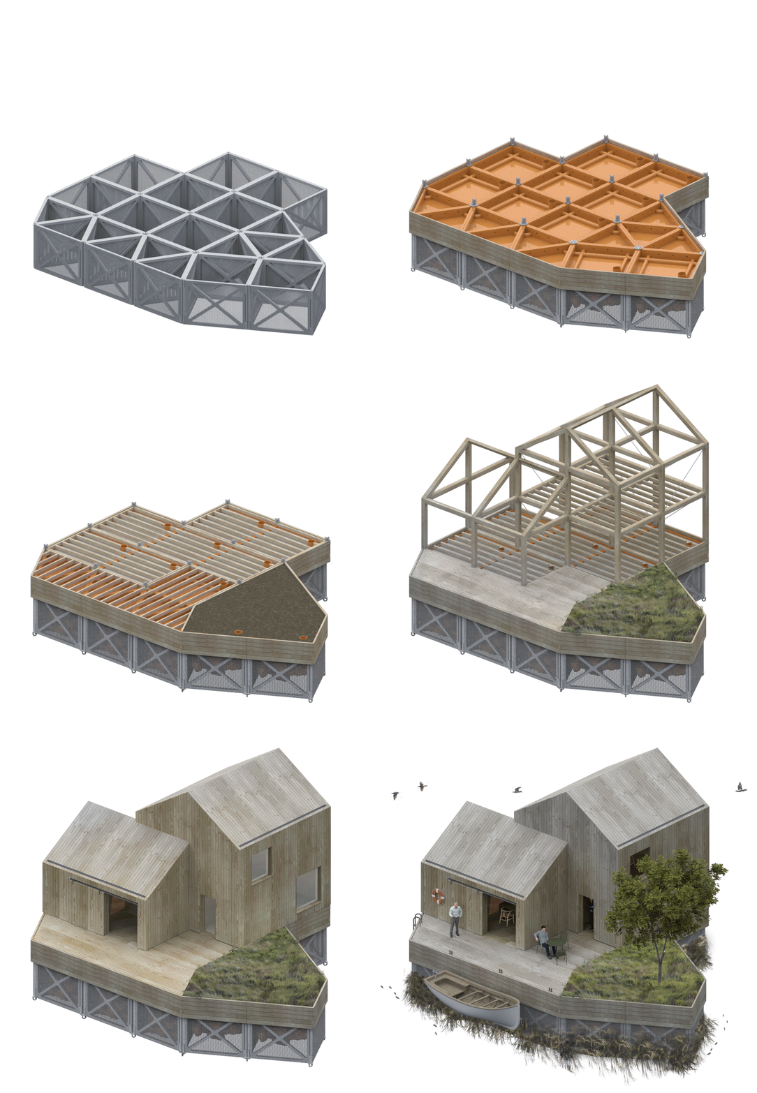
The literal foundations of this modular building system actually find their roots in ancient times. It inverts the typical gabion cage design, which is usually filled with rubble to create low-cost foundations and is instead filled with locally sourced, up-cycled floatation support to hold whatever structure is built on top. The flat-packed cages themselves are made from reinforced recycled plastic, making it easier to transport these sturdy modules and assemble them on location.

1

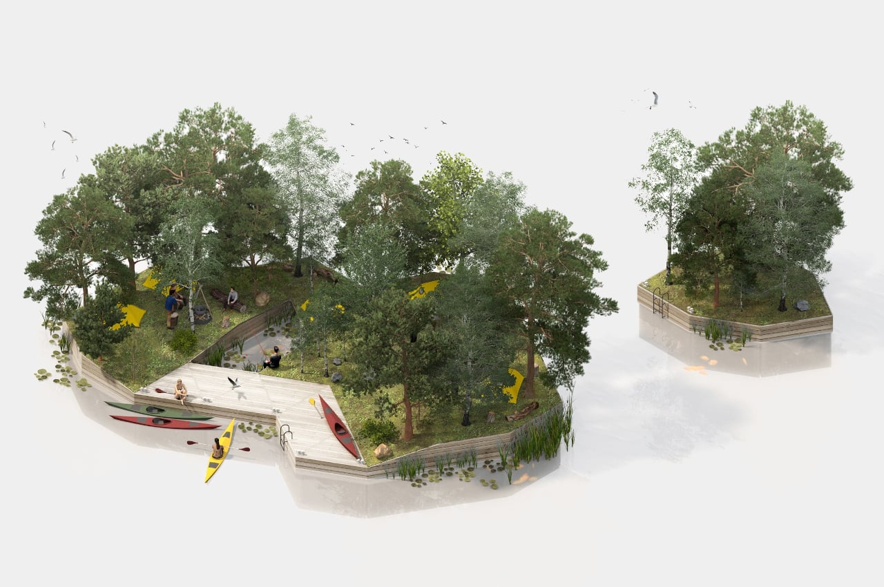
In addition to avoiding the toxic anti-fouling paints used on steel and concrete foundations, these modules can potentially become new habitats for fish and crustaceans, as well as anchor points for mollusks and seaweed. In other words, Land on Water won’t just be building homes for humans but also homes for marine life that could help support the human community above in turn.

The modular cages can be used to build anything from floating houses to campsites to even pools and saunas, as odd as that might sound for structures built to float on water. Land on Water can even become the blueprint for a new kind of dynamic, off-grid floating community of the future instead of the grand structures painted by some visionaries that still embrace the traditional and harmful practices that are killing off the planet. It might not be a scalable design for supporting large and heavy buildings, but that’s exactly the point of creating smaller, more agile structures that are also more respectful of the environment they’re built on.

The post This modular housing concept floats on water and is made from recycled plastic first appeared on Yanko Design.

This tactile building toy is a great way to enhance creativity for kids and adults alike

Kids’ familiarity with technology is a double-edged sword. On the one hand, they are able to easily learn and adapt to the tools and systems that make today’s world go round. On the other hand, they’re also more easily exposed to addictive behavior when using smartphones and tablets at the expense of learning some of the essential skills that would help them later on. As with anything in life, there needs to be some balance, especially at that early age, between digital and physical experiences. Physical and tactile toys can give learning a massive boost in more ways than one, and the Clixo Designer Pack building toy offers a novel way to accomplish that, with a pinch of sustainability thrown in the mix.

Designer: Assaf Eshet (Clixo)

When people hear “building toy,” most probably will think of the LEGO system. It is, by far, the most popular kind of toy that lets your imagination go wild, building anything from recreations of historical landmarks to robots. LEGO has also been used as the foundation for many scientific and technological learning systems for kids, but it’s definitely not the only kind of fun learning experience in town.

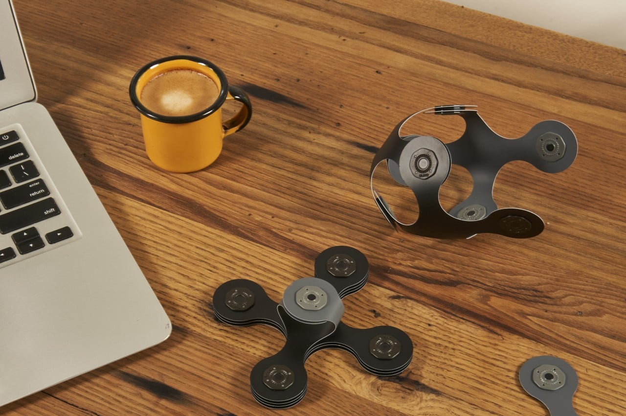
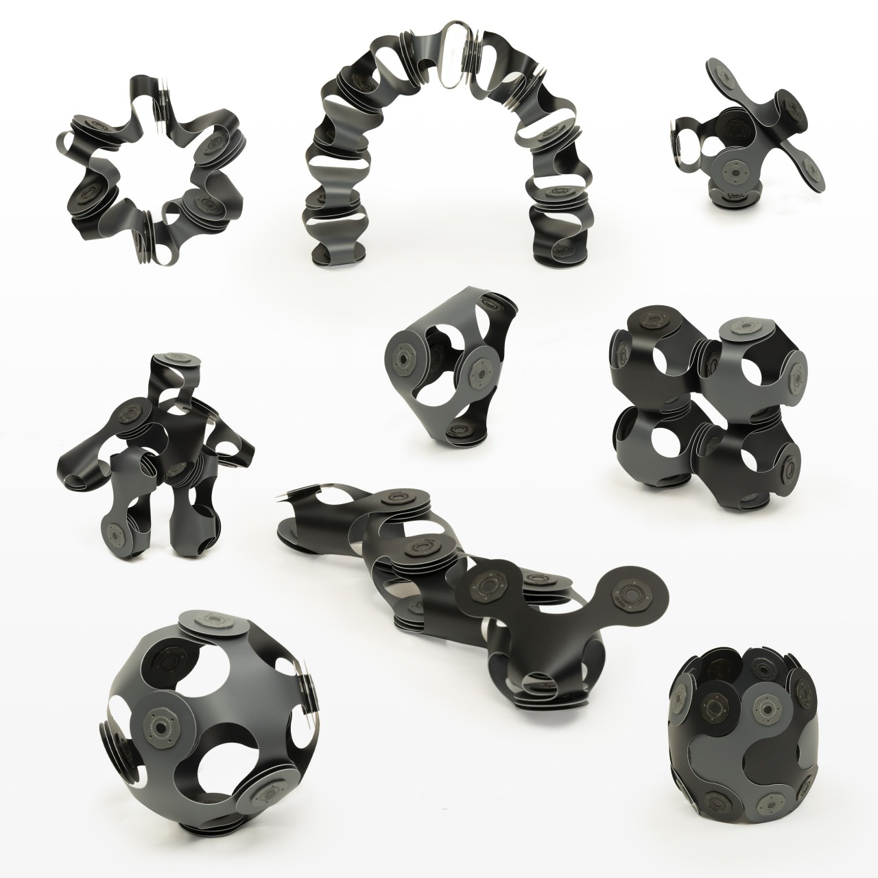
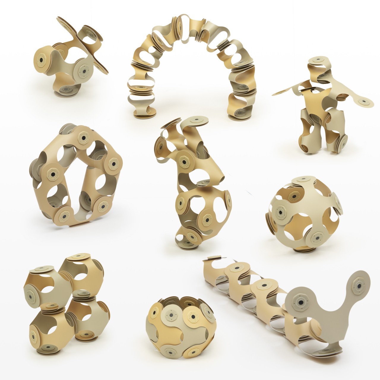
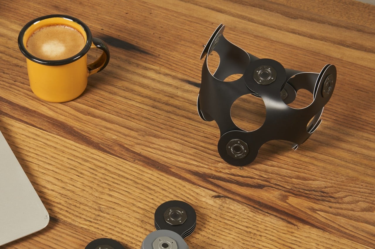
Clixo has made a new building toy system that offers more challenges to the mind with even more impressive results compared to stacking blocks together. Instead of just forcing a form to appear by combining rectangular blocks, this tactile toy requires a bit more outside-the-box thinking and creativity to create shapes that resemble objects, animals, and anything in between. Rather than starting with the end result in mind, the toy encourages some exploration and experimentation to create different kinds of shapes, even those that don’t have any counterparts in the real world.

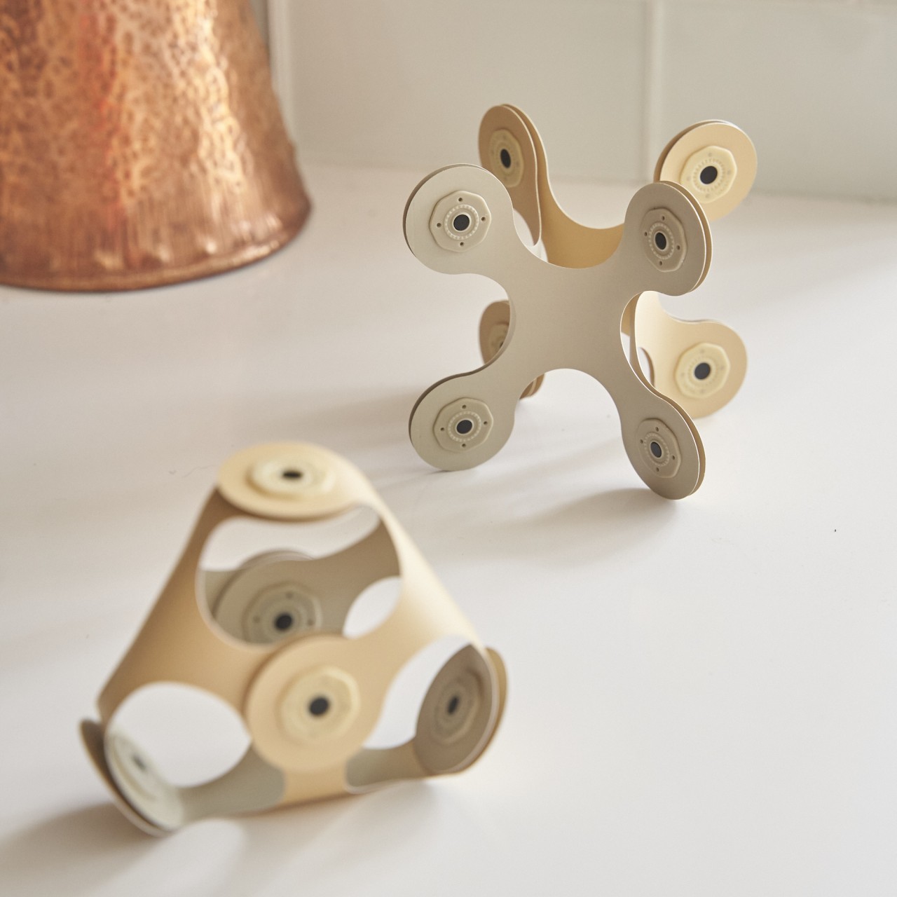
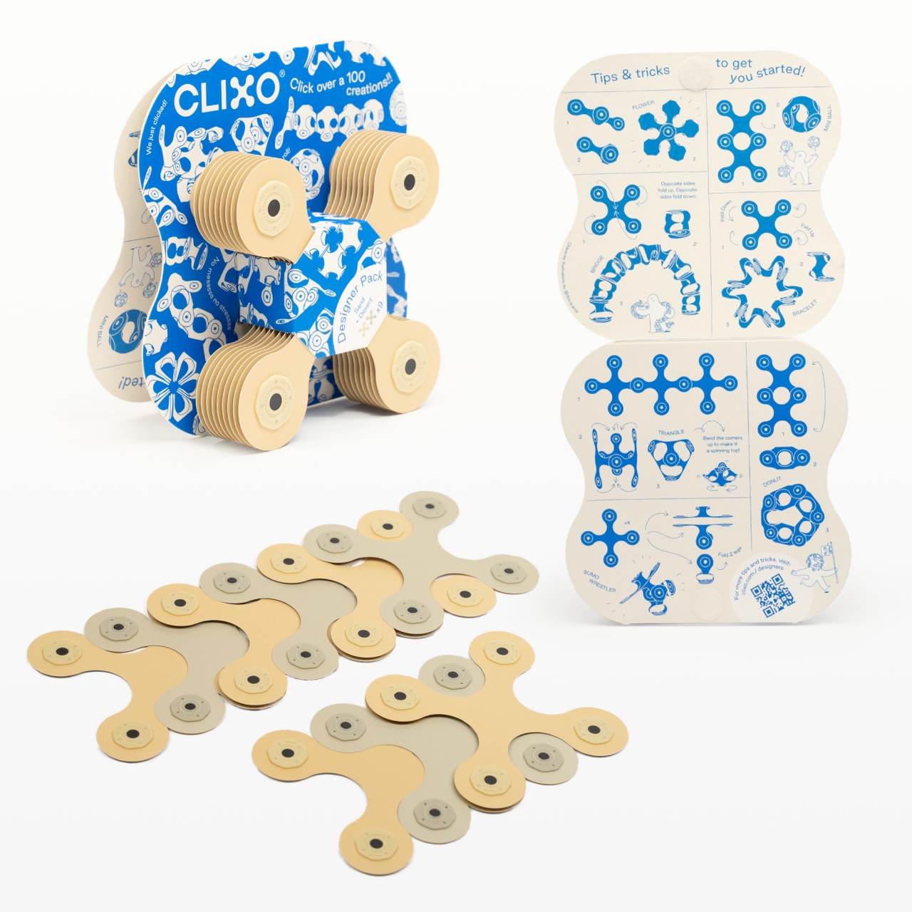
The secret to Clixo is the strong magnets at the ends of the X-shaped pieces that you can connect to other pieces whichever way you want. The pieces themselves are flexible, so they can be bent and curved to the desired shape. That also means they can be laid flat and stored away neatly when not in use or simply stacked up together to quickly clean up. Kids don’t have to force pieces together and are not at risk of getting their skin pinched in the process.

The new Designer Pack brings those learning and inspiring benefits to kids at heart and adults. Opting for more earthy and muted colors, this new version focus on trying to massage one’s brain into creating solutions. It’s the perfect way to take a break from current problems by giving your mind the freedom to explore. You might even find the solution to your work problem by creating some fantastic piece of art from Clixo.

Unlike the millions of mass-produced LEGO bricks, Clixo is made from recyclable and durable synthetic paper. Even the packaging is made from recycled bamboo and is sustainably manufactured. It’s the perfect introduction to sustainability for kids, showing how their long-lasting and fun new toy not only helps them learn but also helps protect their future.

The post This tactile building toy is a great way to enhance creativity for kids and adults alike first appeared on Yanko Design.

Naver 1784 demonstrates how robots can change the workplace landscape

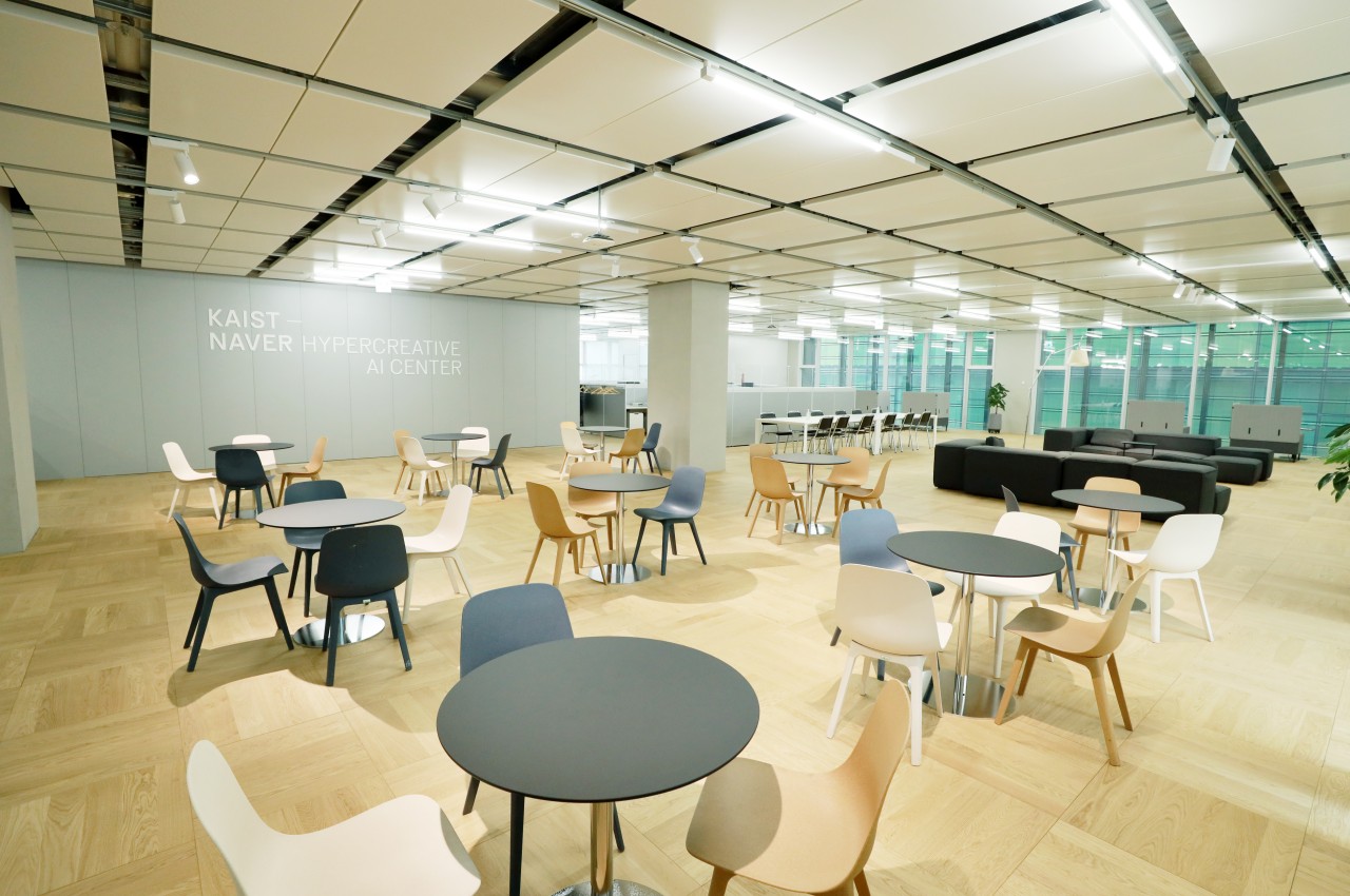
The idea of robots replacing human workers is both the stuff of science fiction and, in some industries, an unavoidable reality. Fiction and media love to create drama and tension when it comes to advancements in robotics and AI that seem to be trained to mimic even the most artistic aspects of human creativity. Reality, however, is far less dramatic, and robots have a long way to go in putting office workers out of employment. Instead, robotics can actually help improve the quality of life of people in workplaces, and Naver’s new 1784 “technology convergence” building tries to serve as the blueprint for this harmonious kind of human and robot interaction.

Designer: Naver x SAMOO Architects & Engineers
Robot Helpers, not Usurpers

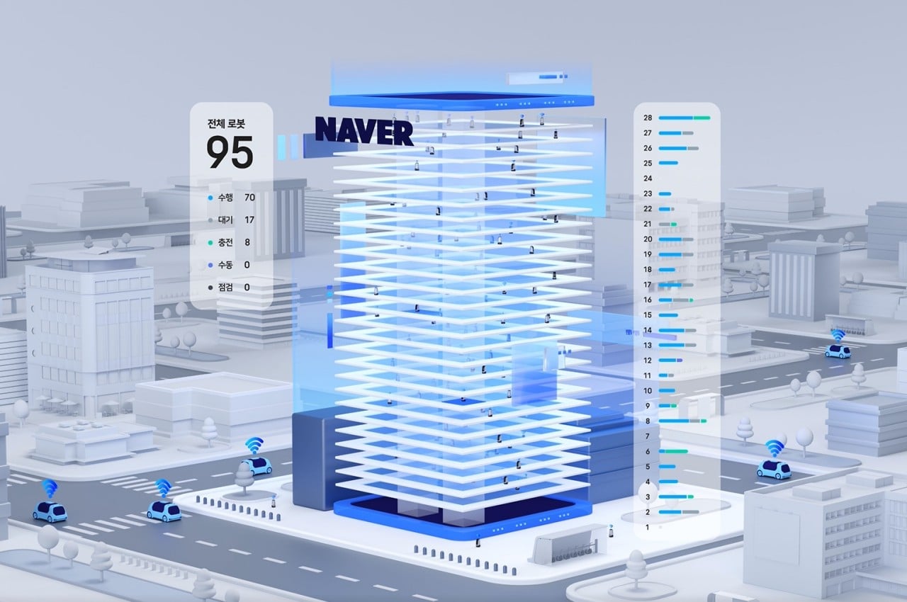
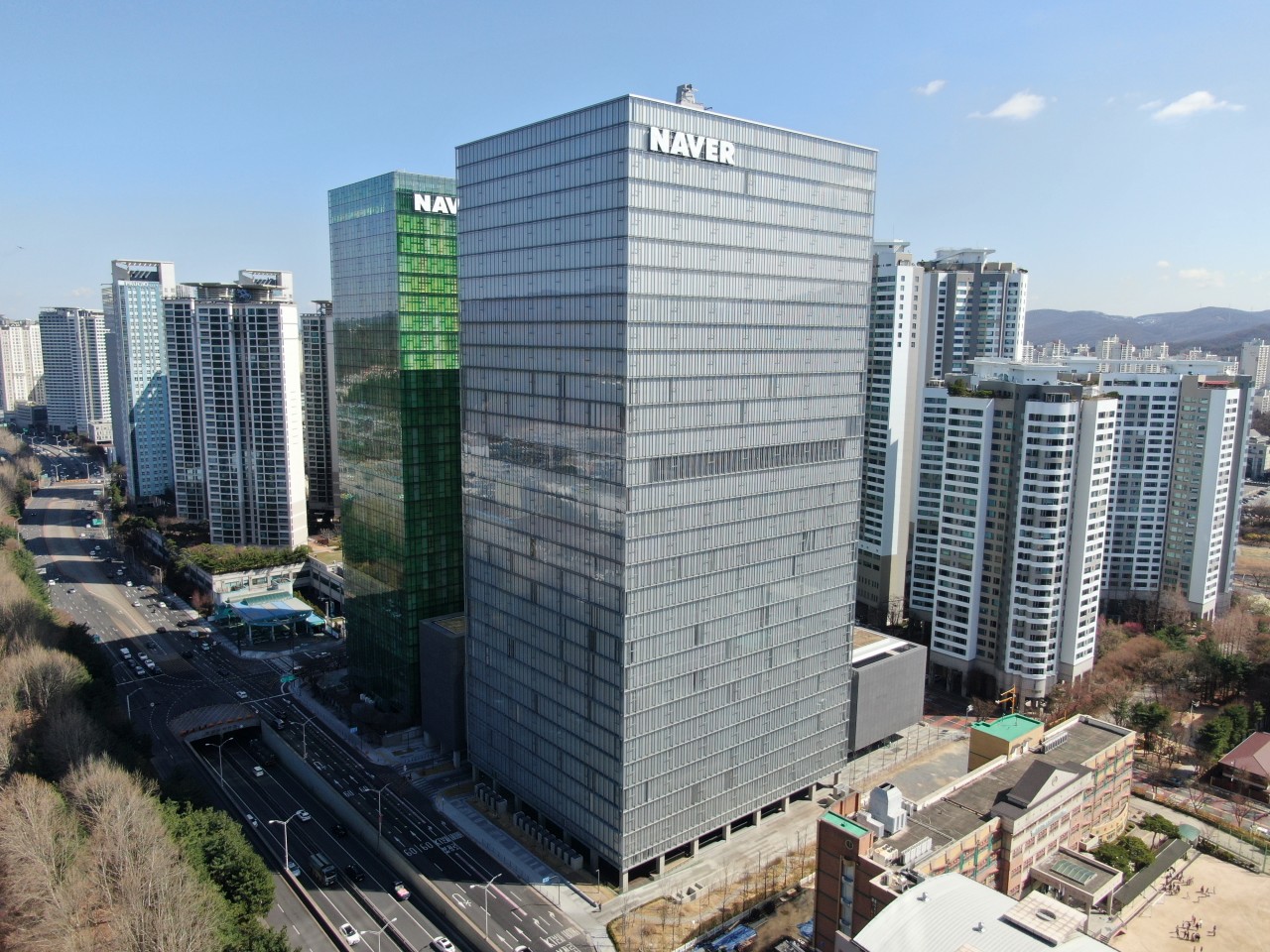
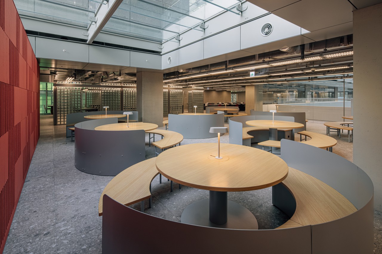
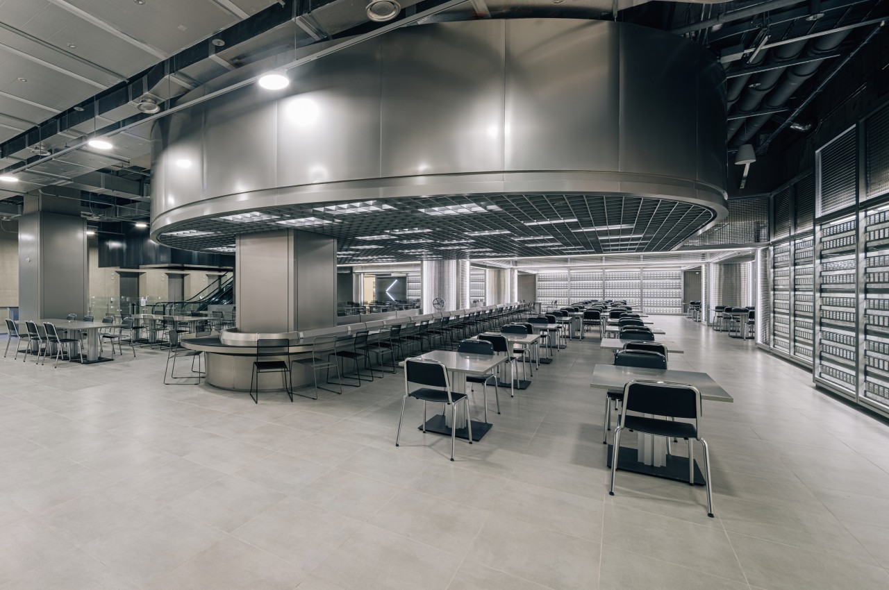
From the outside, Naver’s 1784 HQ looks like any other high-rise building. Located at 178-4 Jeongja-dong, where it partially gets its name, the online platform giant’s second and so far biggest HQ stands over a 165,000 sq. m. area and over 28 floors with eight underground floors. As they say, looks can be deceiving, and the 1784 is touted as the world’s first robot-friendly building while also being very human-friendly.
default

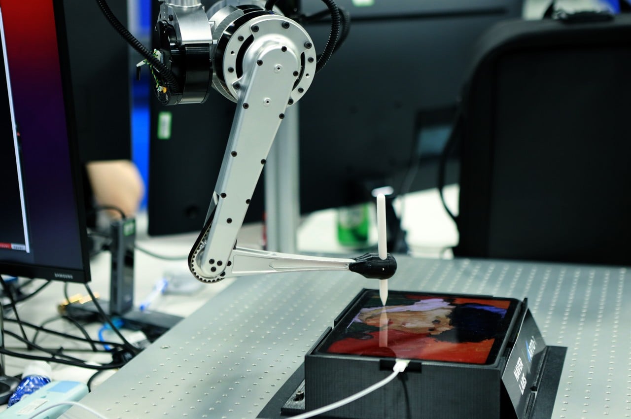
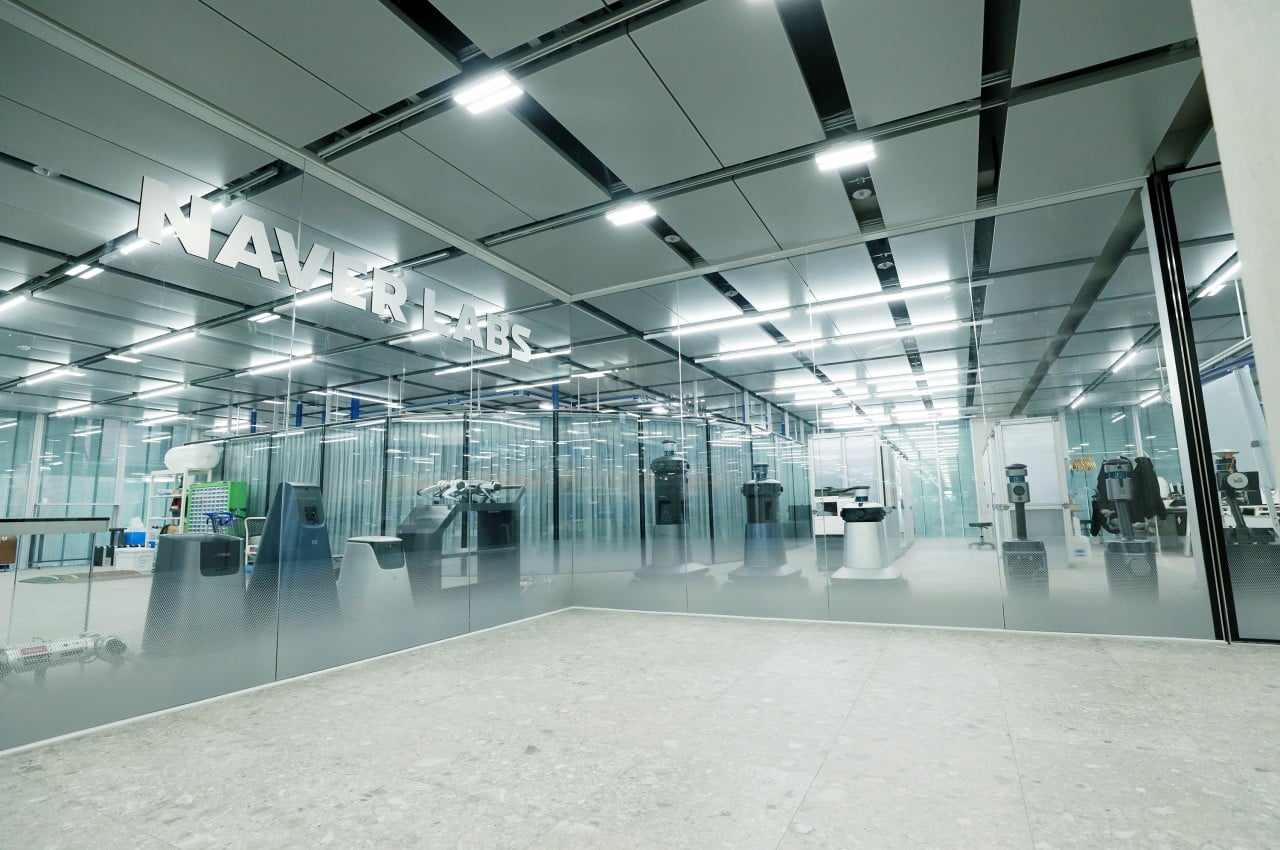
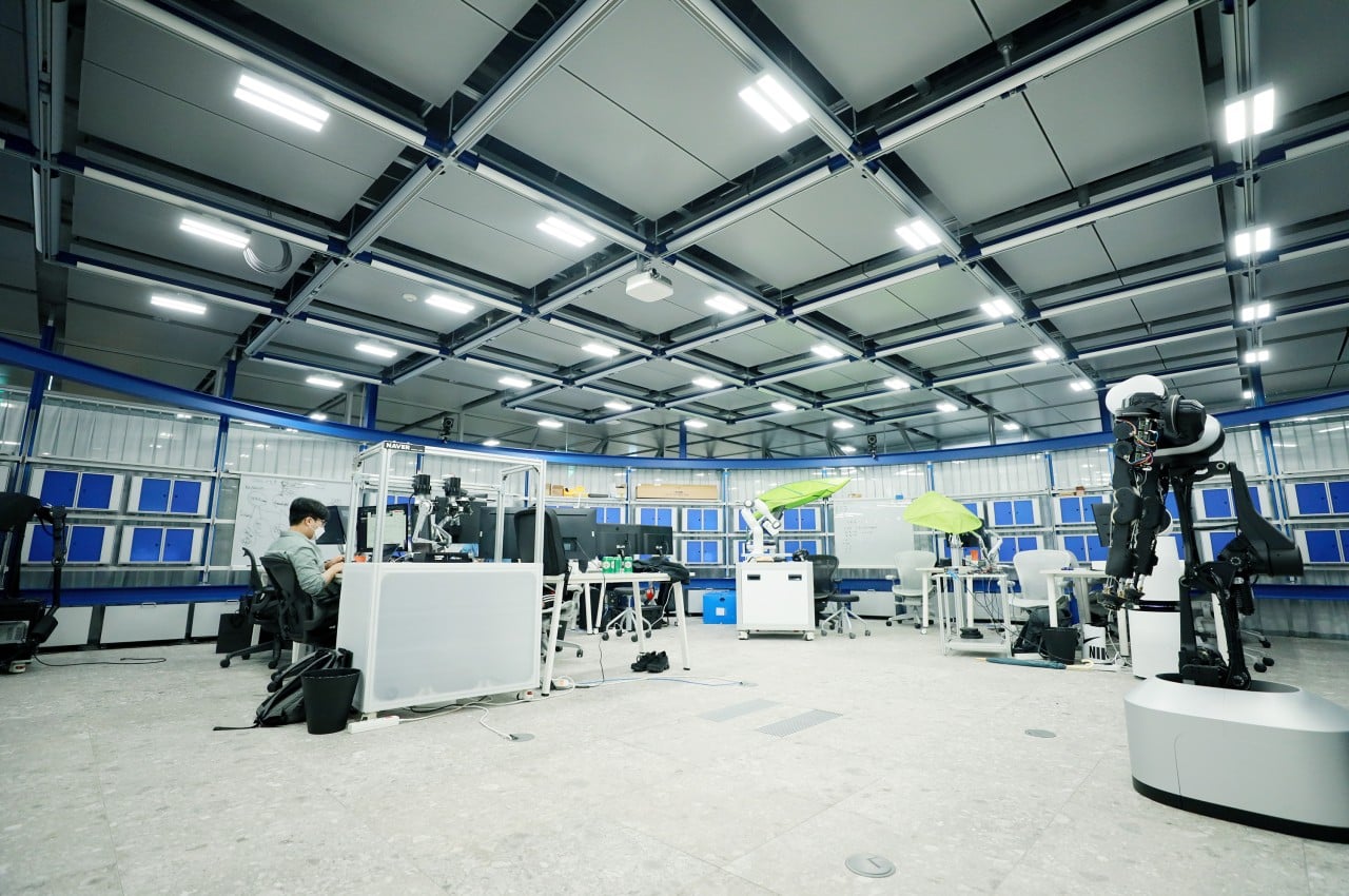
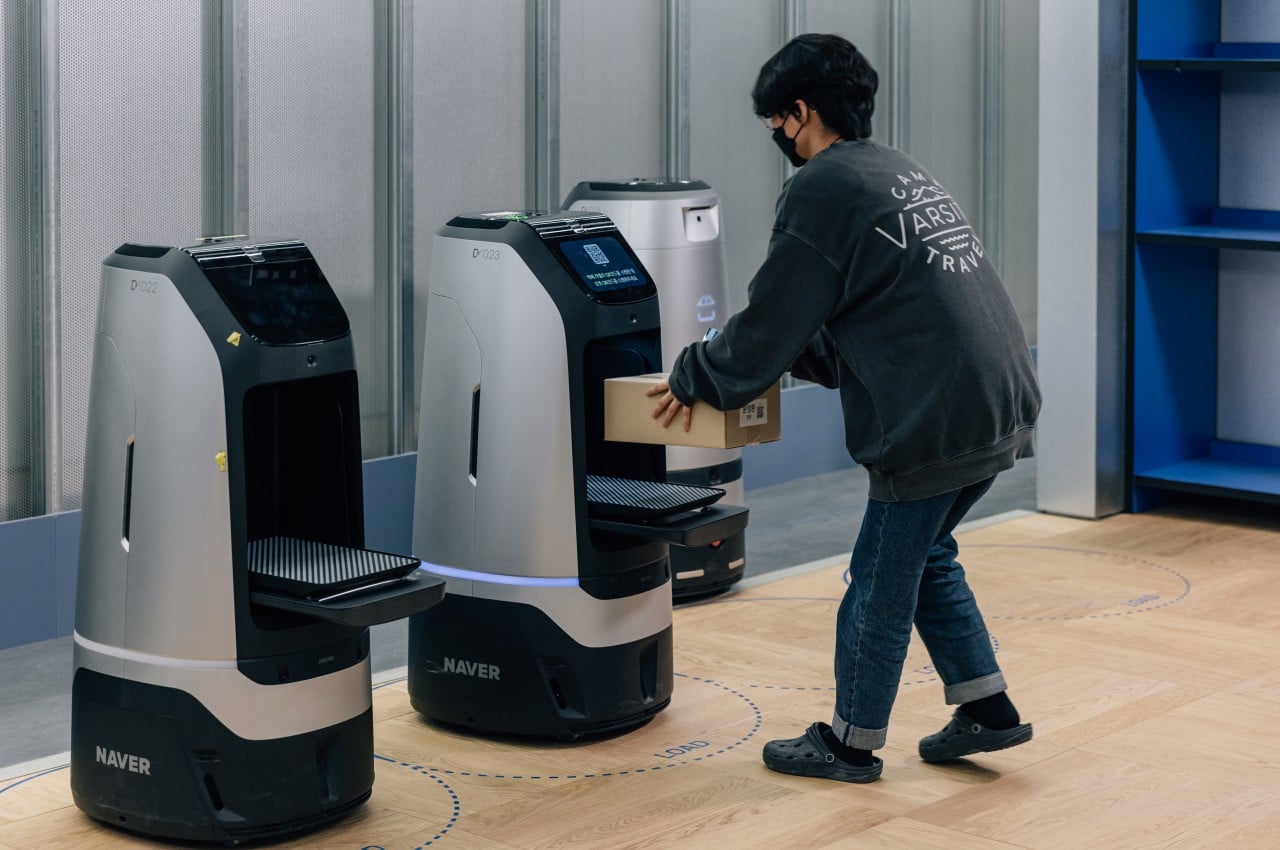
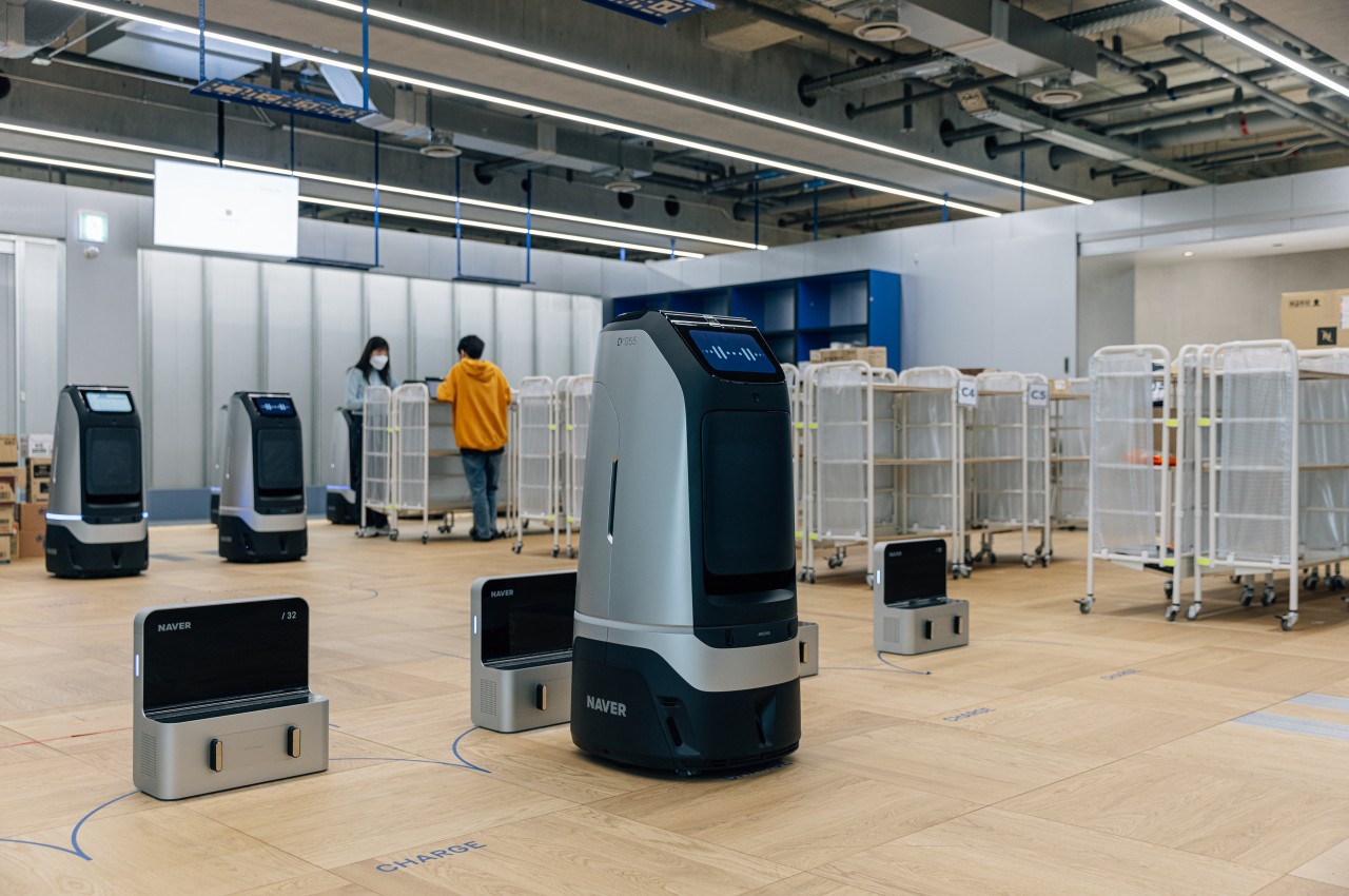
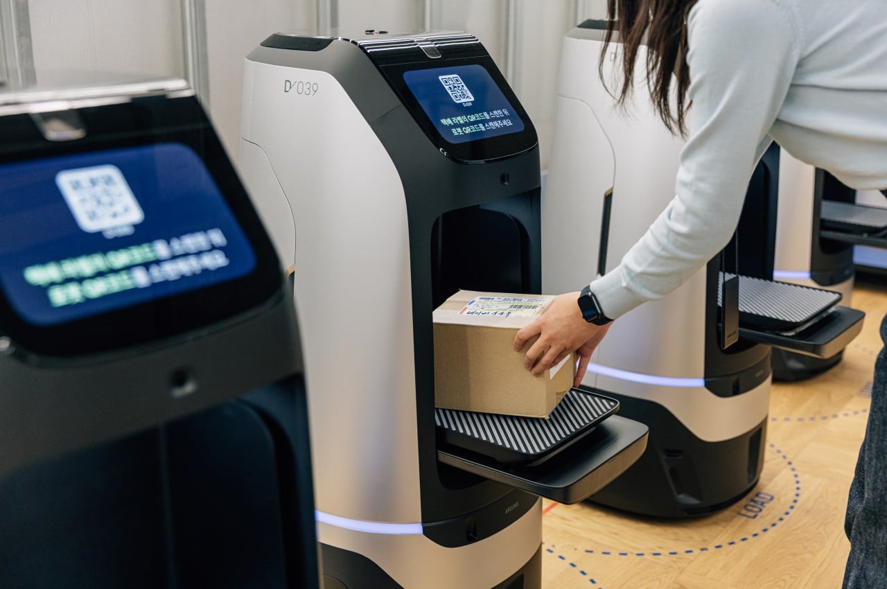
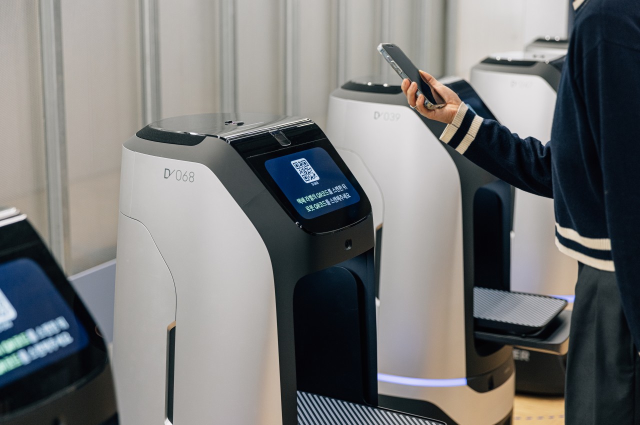
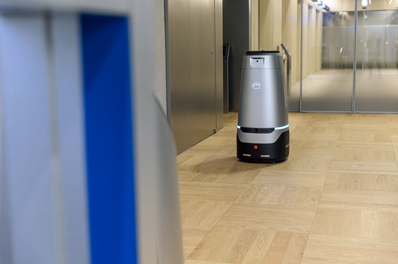
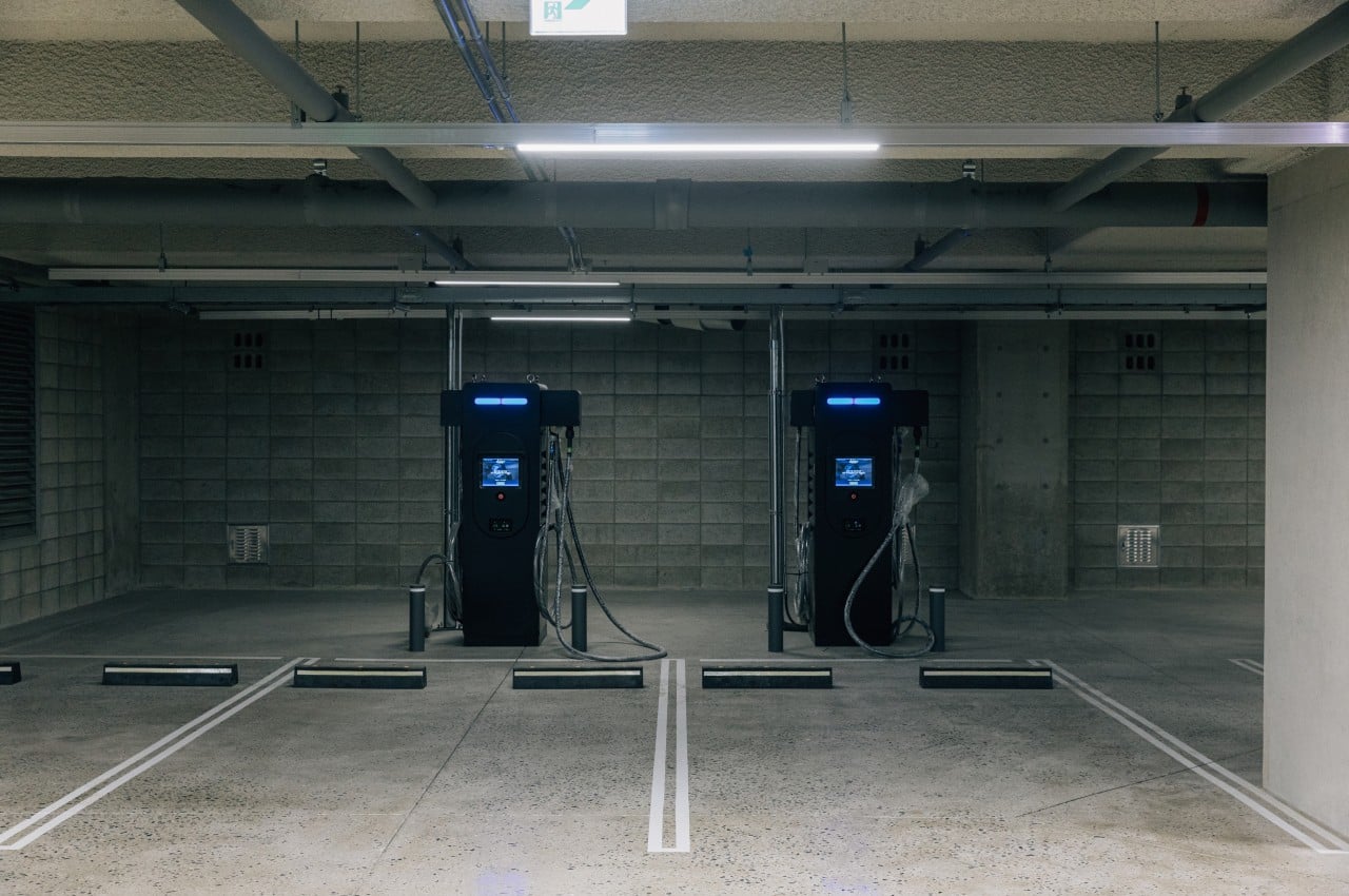
The building houses the company’s latest and greatest R&D on robotics, AI, and the cloud, while also serving as sort of the testbed and showcase of these very technologies. Alongside thousands of humans, the 1784 also has around 100 robots under its employ, primarily designed to deliver packages to people inside the building, at least for now. While that purpose may sound trivial, the technology and infrastructure built to support this function are quite novel and still unique.
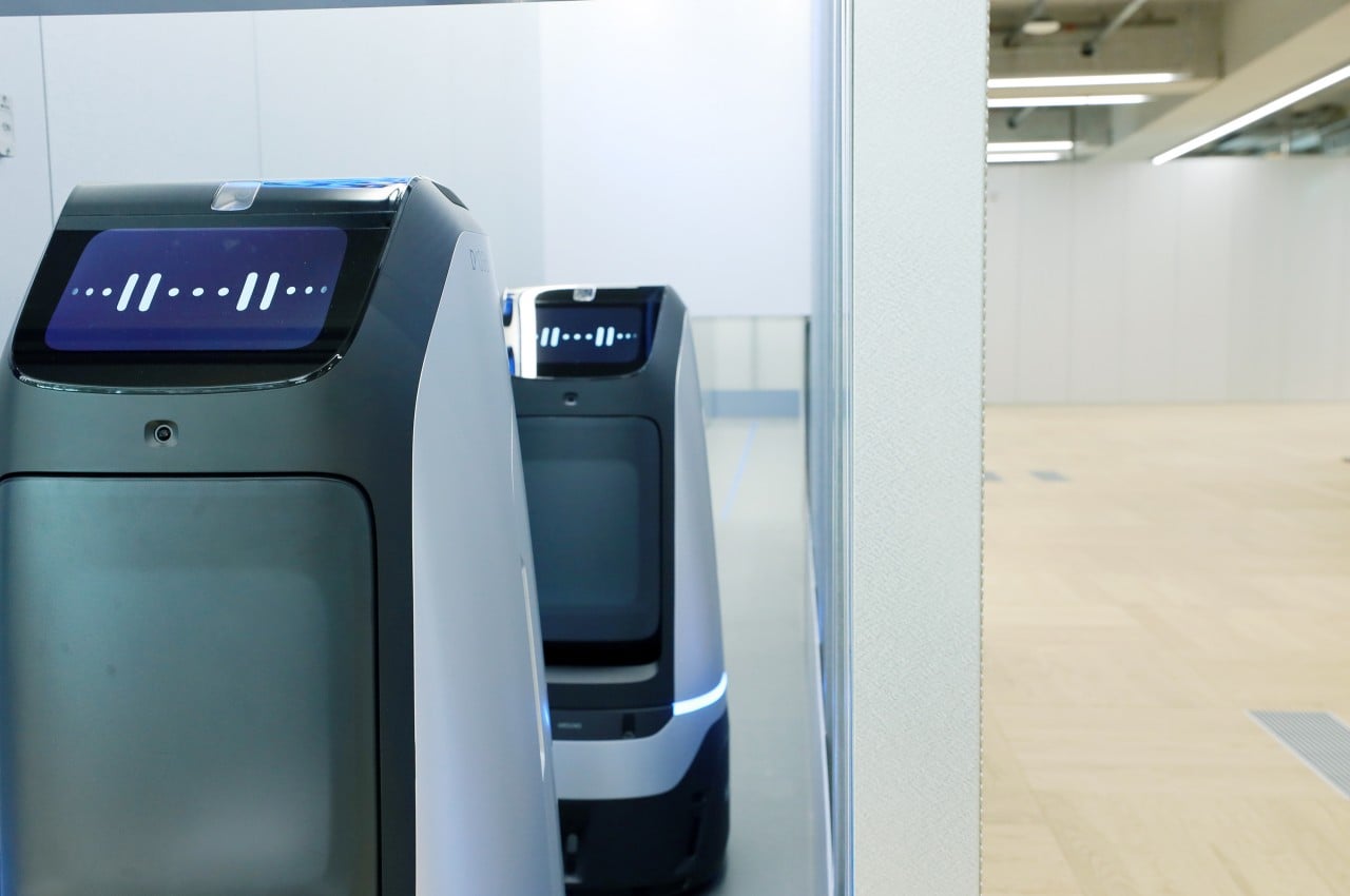
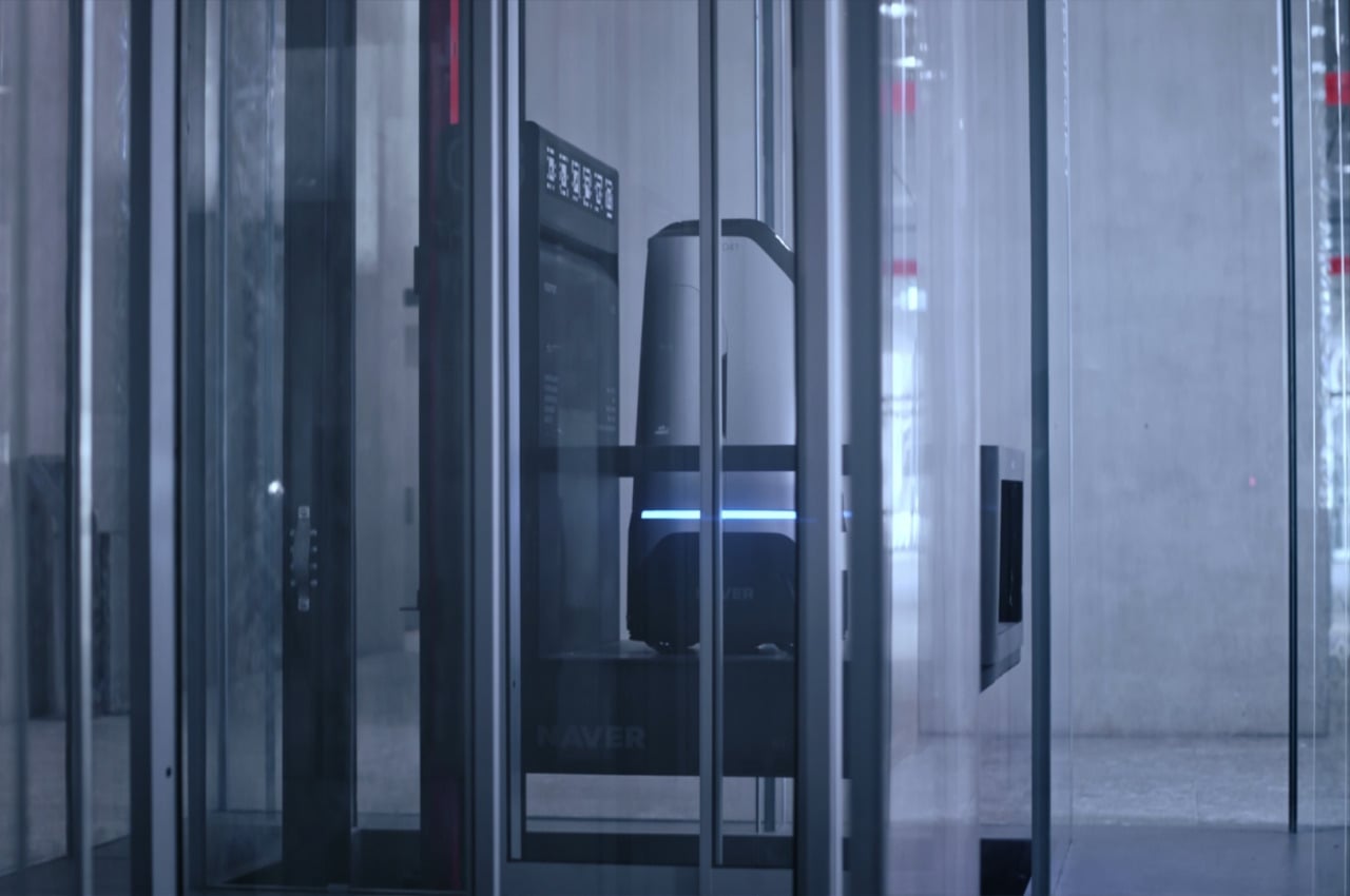
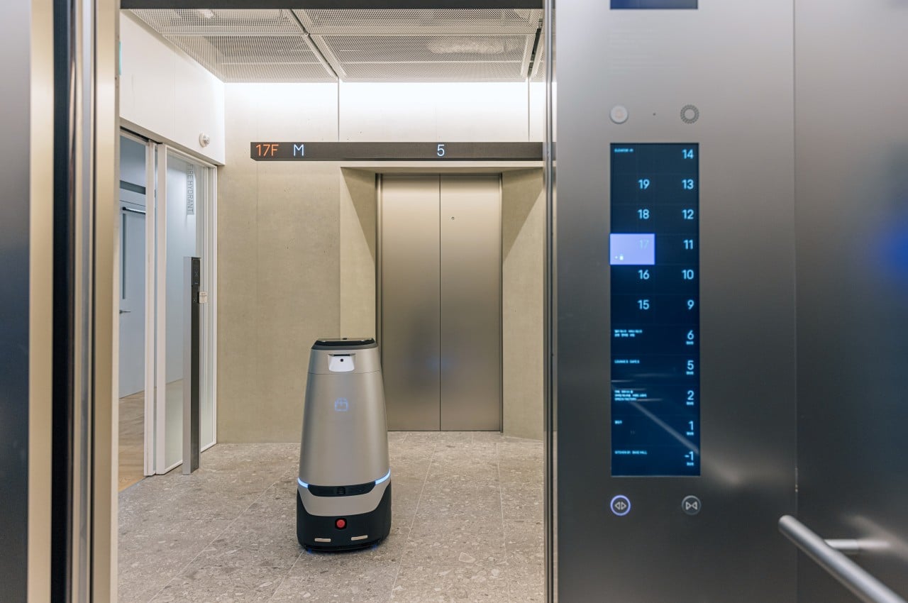
For example, the building houses what is perhaps the world’s first elevator built especially for robots, which means that the building’s architecture was designed with this in mind. And unlike the technology-loaded pizza or package delivery robots featured in the news, Naver’s little helpers are “brainless,” with a central control system named ARC (short for AI, Robot, Cloud) that is able to pinpoint the exact location of each robot and the path it needs to take inside the building.

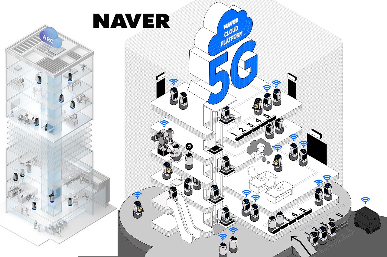
Rather than the cold overlords that our imaginations think them to be, these robots are designed and programmed to make life more convenient for humans inside the workplace. There are even character robots inspired by LINE’s mascots that try to study how the presence of more familiar places can help boost morale or offer emotional support for humans that may be a little stressed over work.
New Normal

The Naver 1784 building isn’t just a convergence of technology due to being robot-friendly, though that’s definitely the highlight of its existence. Almost everywhere you go, you’ll find new and old technologies at work to improve the lives of people working inside, especially in a world forever changed by the recent pandemic. The Rookie delivery robots, for example, tries to reduce the risk of contamination by minimizing human contact when handing over packages.
The building is also equipped with CLOVA FaceSign technology that can recognize faces even while wearing masks. This simplifies authentication without having to require employees to touch surfaces with IDs or tags. Meeting rooms also have built-in AI and voice recognition, so you no longer have to worry about separate recording devices that you may forget to turn on at the start of a meeting.
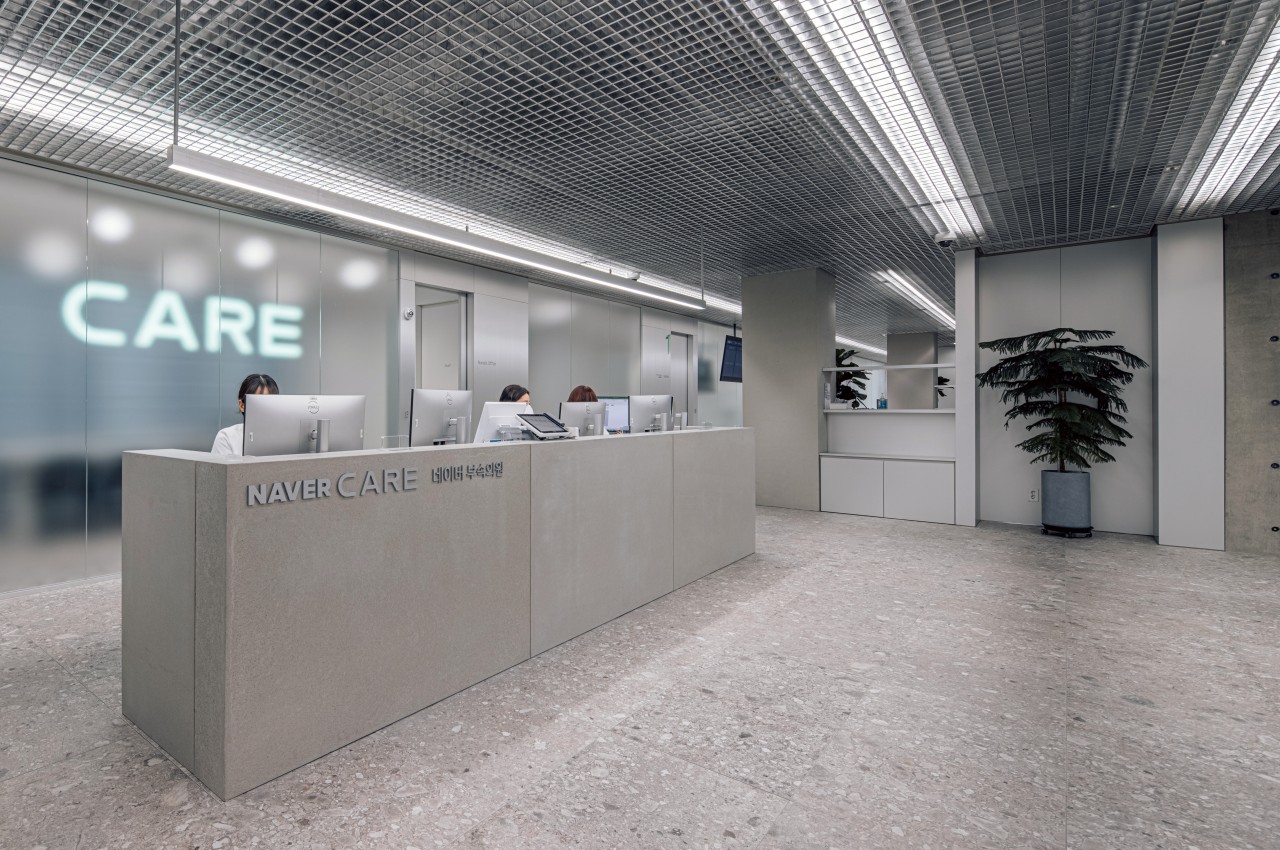
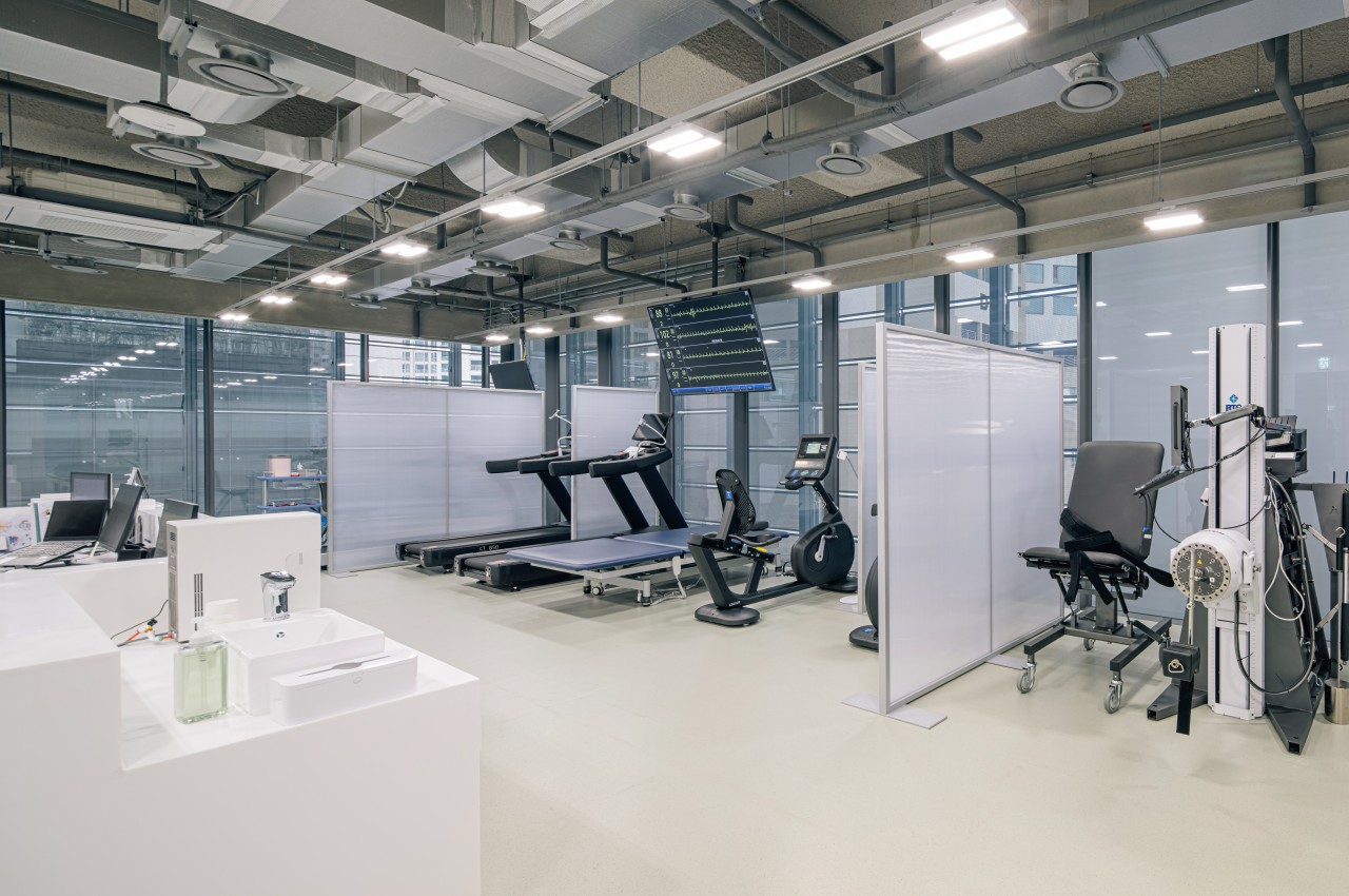
Although construction started back in 2016, Naver and SAMOO had the foresight to design an advanced HVAC system that would have a critical impact in a post-pandemic world. As with any closed space with a single air handling unit, the chances of circulating contaminated air go higher. The 1784 has an independent outdoor air handling unit on each floor to minimize that risk, promising a disease control system almost on the same level as hospitals.
Going Green

Naver’s newest building isn’t just forward-looking because of the advanced technologies operating inside but also because of its attention to sustainability. With a hi-tech office that uses plenty of robots and computers to run the place, you’d presume that it consumes more power and has a higher carbon emission. Normally that would be the case, but the 1784 also employs several technologies to reduce its negative impact on the environment that goes beyond using solar panels and recycling rainwater water.
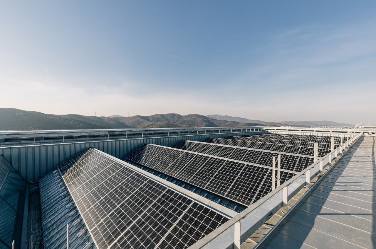
The building has a double skin wall, where a layer of glass windows is added to the outer wall. This creates a path for wind to flow and more effectively dissipate heat from sunlight. It is also the first high-rise building in the country to use radiant cooling, letting cold water flow through pipes inside floors and ceilings. All in all, these designs help cool the building without using more electricity.
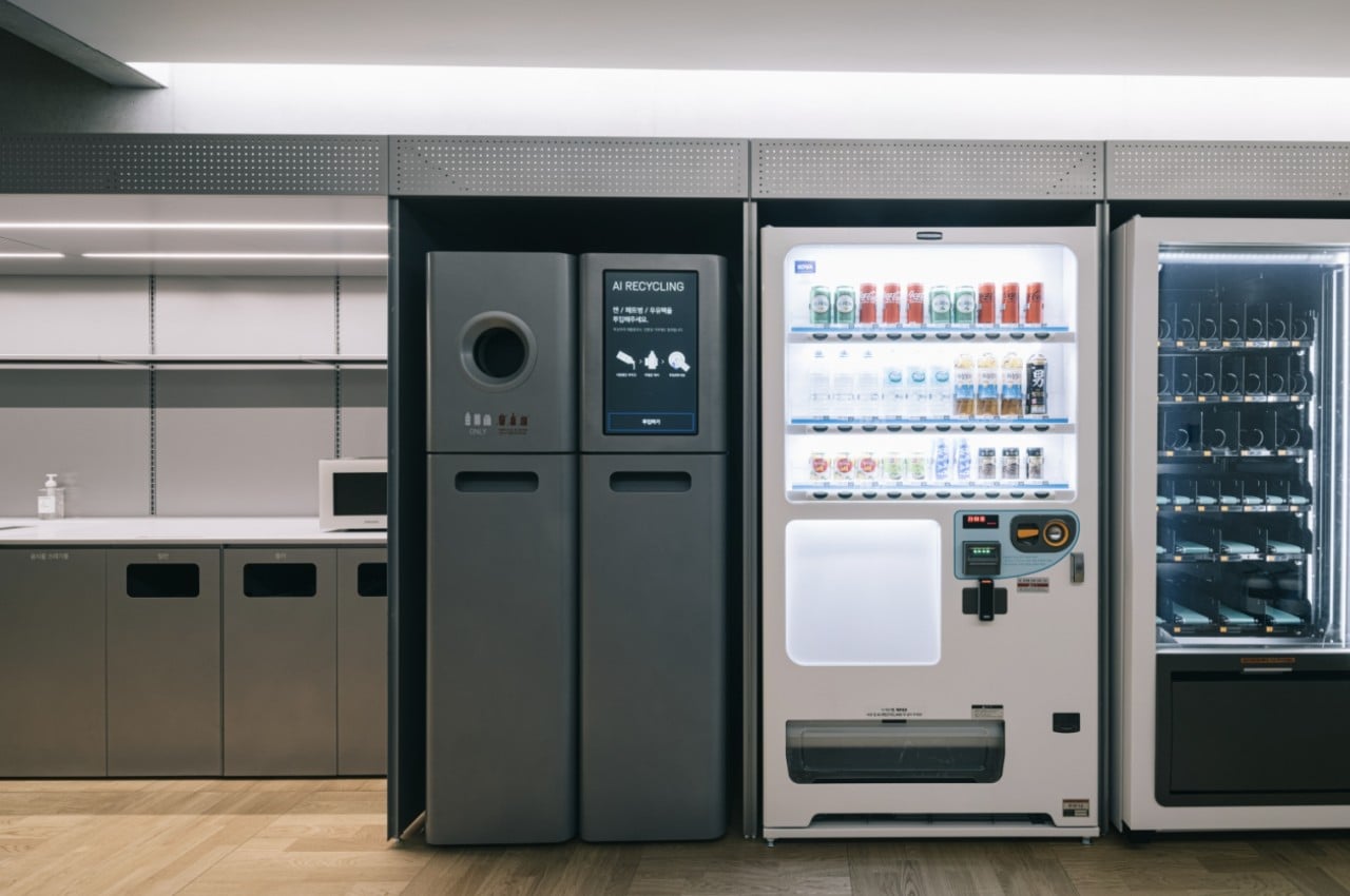
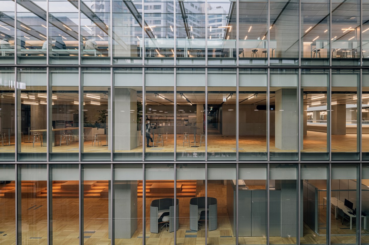
The COVID-19 pandemic has changed the face of work forever, making virtual meetings a staple in any business, big or small. At the same time, new sanitation practices are being implemented to avoid repeating the same mistakes of the pre-pandemic era. The Naver 1784 building takes these lessons to heart and uses a variety of technologies to create a conducive and healthy working environment. With robots, AI, and eco-friendly strategies, the building tries to show the way toward the human-centric, robot-friendly office of the future.
The post Naver 1784 demonstrates how robots can change the workplace landscape first appeared on Yanko Design.

The world’s skinniest skyscraper is at 111 West 57th Street

I am afraid of heights. Not deathly afraid but enough to not go and see some of the world-famous tourist attractions like the Empire State Building or the Burj Khalifa. Well, if ever I get to visit New York or Dubai. But I do get the appeal of why people would want to get to the top of these buildings and skyscrapers and mountains as getting a view of the entire city or the place where the high place is overlooking.

Designer: SHoP Architects

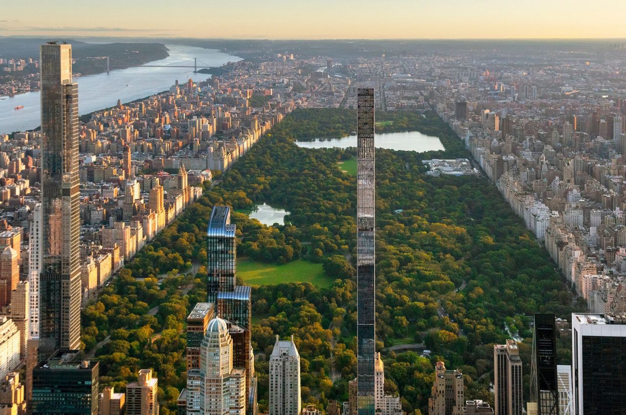
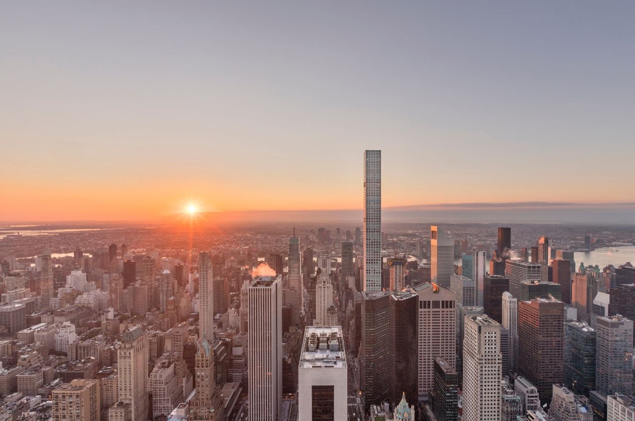
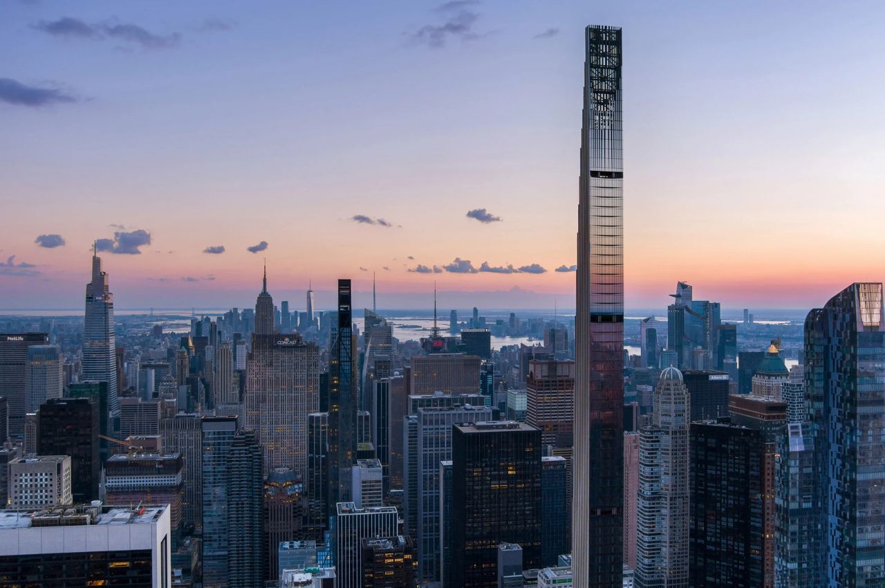
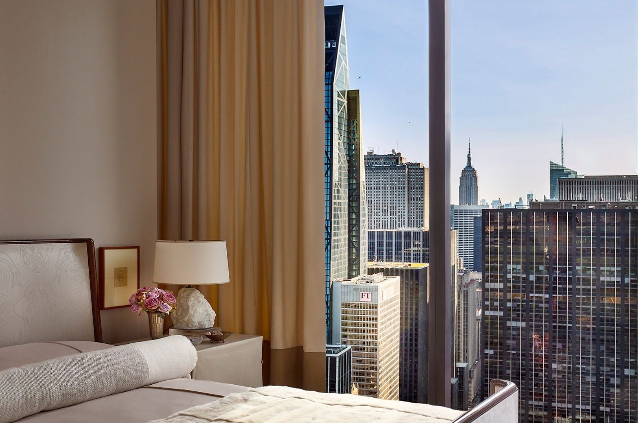
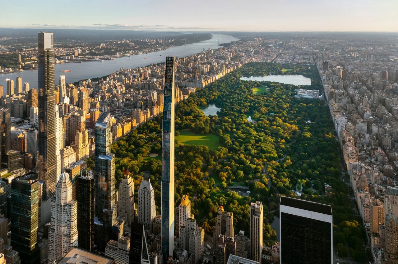
If you’re a fan of tall skyscrapers, New York City is one of the places to be. Just last week, a new landmark building has been officially opened and is now ready for people who can afford to move into it. The 111 West 57th Street is not just the second tallest in the Western Hemisphere (1,428 feet), it is also the world’s “skinniest” building with its 24:1 height-to-width ratio. So for people like me who are scared of heights, this being the skinniest will not help in allaying that fear.

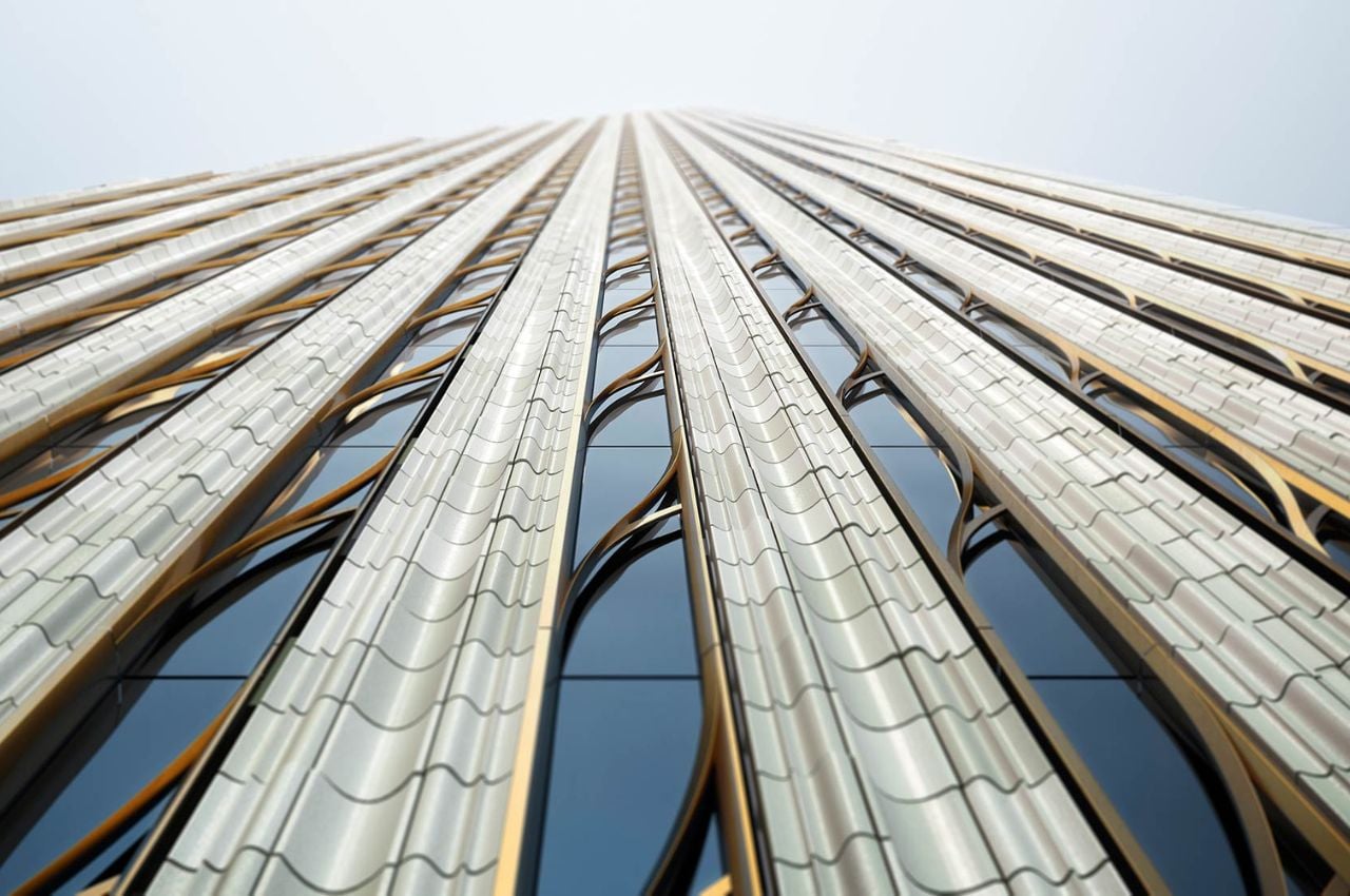
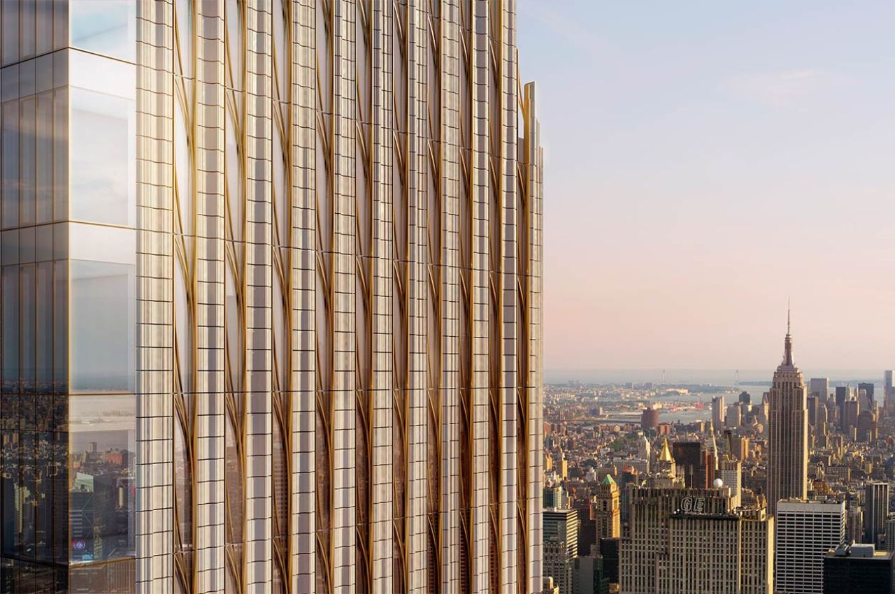
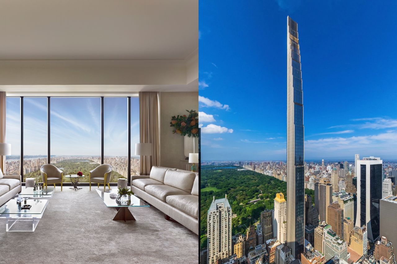
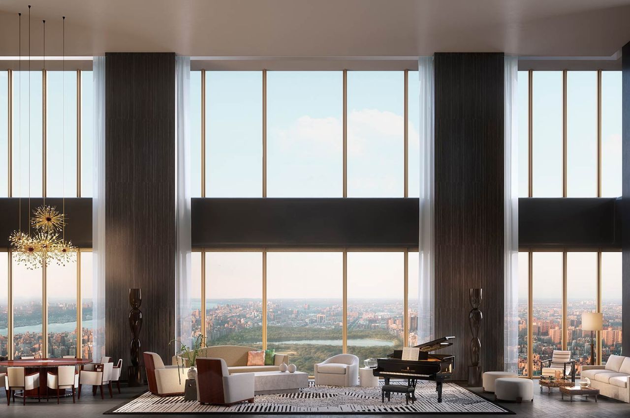
But of course, this tower, which is a residential skyscraper, is built with the “highest strength concrete” according to the designers, SHoP Architects. Just by looking at images of the building, you know that it’s a pretty expensive structure as the top tapers to a flat edge and it is highlighted by terracotta tiles with bronze accents on its facade facing the east and west directions. For the parts that are facing Central Park (north) and Lower Manhattan (south), you get glass curtain walls so you get a better view of the city’s skyline.

This building was actually announced back in 2013 but construction halted by 2017 due to financial difficulties from the developer. But now they’re ready for residents to move in. Since it’s a tall and narrow skyscraper, each floor will only have one residence for each floor. The adjacent landmarked Steinway building is also part of it so if you add the 14 there, there will only be a total of 60 residences for the entire 111 West 57th Street building.

It is aptly located in what is now considered Billionaire’s Row in Midtown Manhattan since probably only billionaires can afford to live in such a building. Even if I had a billion dollars, I probably would not actually live in the world’s second tallest skyscraper. But it would still be interesting to visit and see what the interiors actually look like since I really can’t imagine what it would be like to live there.

The post The world’s skinniest skyscraper is at 111 West 57th Street first appeared on Yanko Design.
EverBlocks: Giant LEGO-Style Bricks for Building Real Walls

Ever dreamed of living in a LEGO house? We all have. It’s one of the universal dreams that ties humanity together. And to help make that dream a reality, EverBlocks are giant modular LEGO-style building blocks that you can stack to construct interior walls in your home. Obviously, I’m about to become a landlord after turning my studio apartment into a four-bedroom. Quick question – how many beds can you fit into a 4′ x 6′ room?

Available in sixteen different colors (including translucent), EverBlocks can be used to construct solid decorative walls or room dividers, staggered patterns with holes you can see through, and even entire rooms with doors. Prices are around $990 for a basic 6′ x 7′ wall and go up from there. Ouch! Don’t tell my tenants, but they can expect a pretty drastic rent increase the moment they move all their stuff in and get comfortable.

Where were EverBlocks when I was a kid? Instead of building forts out of blankets and chairs, I could have been building actual forts, which would have undoubtedly proved much more capable of withstanding an attack from my angry older brother. That guy – he could give even the Big Bad Wolf a run for his money.

[via DudeIWantThat]

UK McDonald’s net-zero carbon restaurant tries to make the environment a bit healthier

You might have guilty feelings when chowing down on that hamburger, but one McDonald’s restaurant in the UK might at least let you feel good about staying green while you’re there.

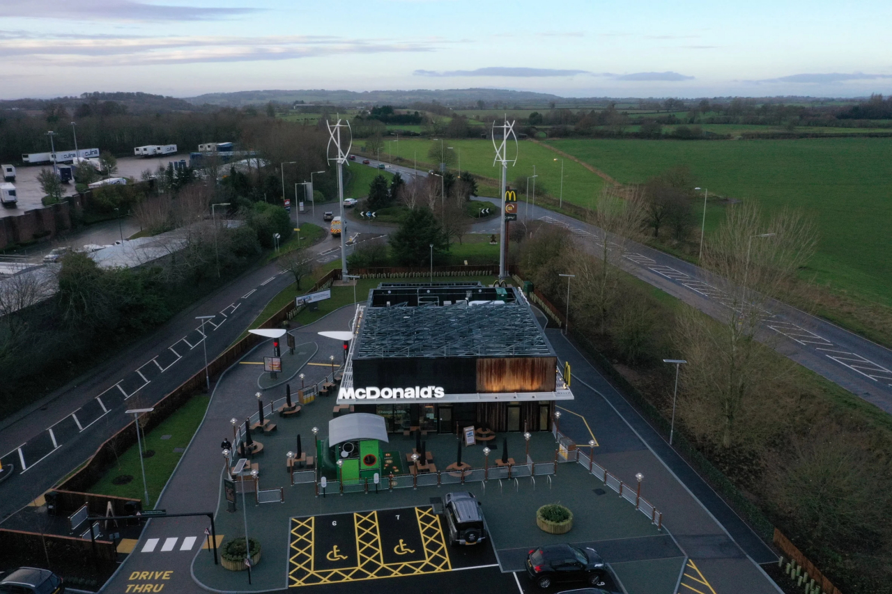
Fast-food and health are two words that never really got along well with one another, and it isn’t just about humans’ bodily health either. Sometimes worse than other restaurants because of their nature and their processes, fast-food chains have also become perilous to the health of the planet, particularly through their net carbon emissions. As one of the world’s biggest culprits, McDonald’s is trying to set an example and opened the first net-zero restaurant in the UK, though it still comes up short of being net-zero in the true sense of the word.

Designers: Scurr Architects and AEW Architects for McDonald’s

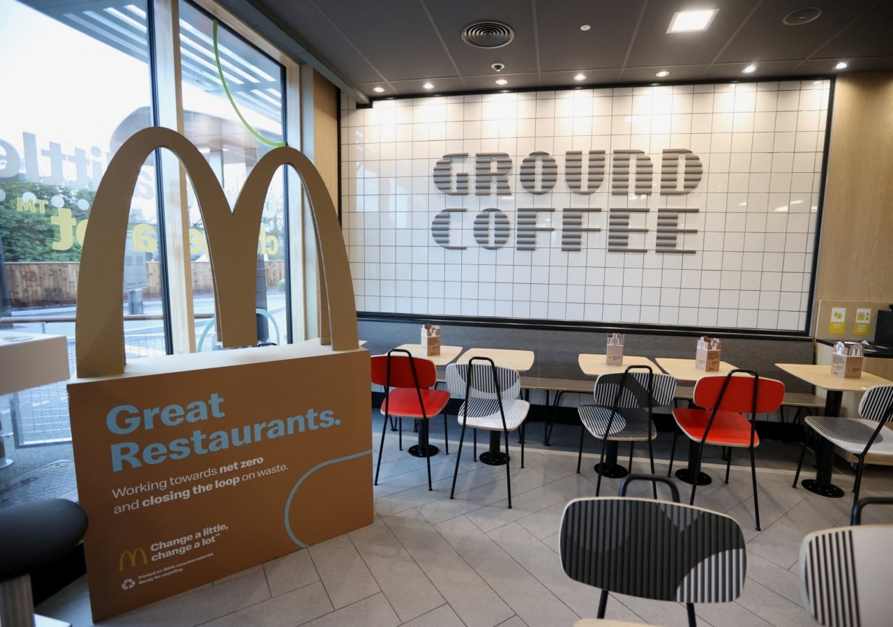
It’s no longer enough to just say that you’re using recycled materials for cups or utensils these days. Those are important first steps, of course, but not enough to earn you a “net-zero” badge for your building. For that, you’ll need to significantly reduce your carbon emissions in almost every aspect, including the construction, operation, and demolition of the establishment.

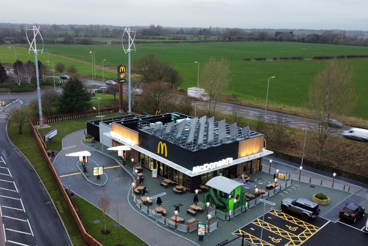
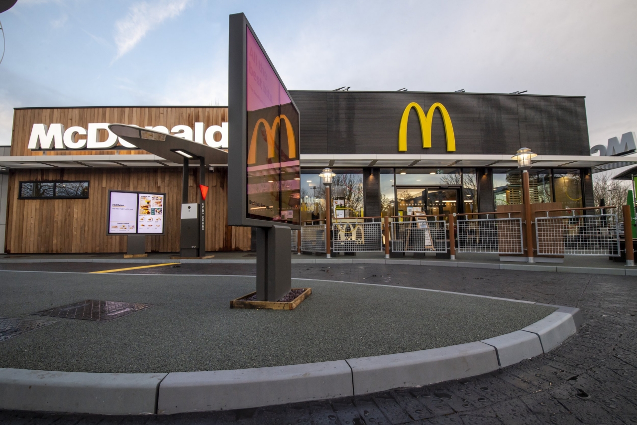
McDonald’s Market Drayton branch in the UK tries to check off a few of those boxes, particularly in the materials they used. Wall insulation is made from sheep’s wool, while parking lot kerbstones are each made from 182 recycled plastic bottles. Even the signage is made from McDonald’s own coffee beans as part of the company’s “circular waste solution.” All of these while retaining the same familiar design of McDonald’s restaurants around the world, or at least in the UK.

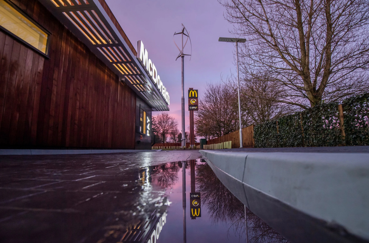
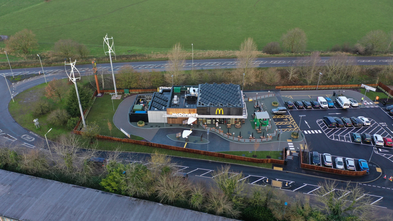
The day-to-day operations of the restaurant are also almost zero, with power being provided by two on-site wind turbines and 92 square meters (990 square feet) of solar panels. Strictly speaking, however, the restaurant can’t be considered truly net-zero because it doesn’t take into account consumption-based emissions, according to Dezeen.
It’s still an important step forward for the company as well as the UK’s net-zero carbon buildings thrust, especially considering how much foot traffic and how many customers a single McDonald’s branch gets on a single day. That said, it’s also just one in tens of thousands of McDonald’s locations around the world that still have to adopt the fast-food chain’s sustainable programs. It’s just the first step, of course, and McDonald’s plans to move forward in the years to come, including vegan, plant-based menus by 2025.
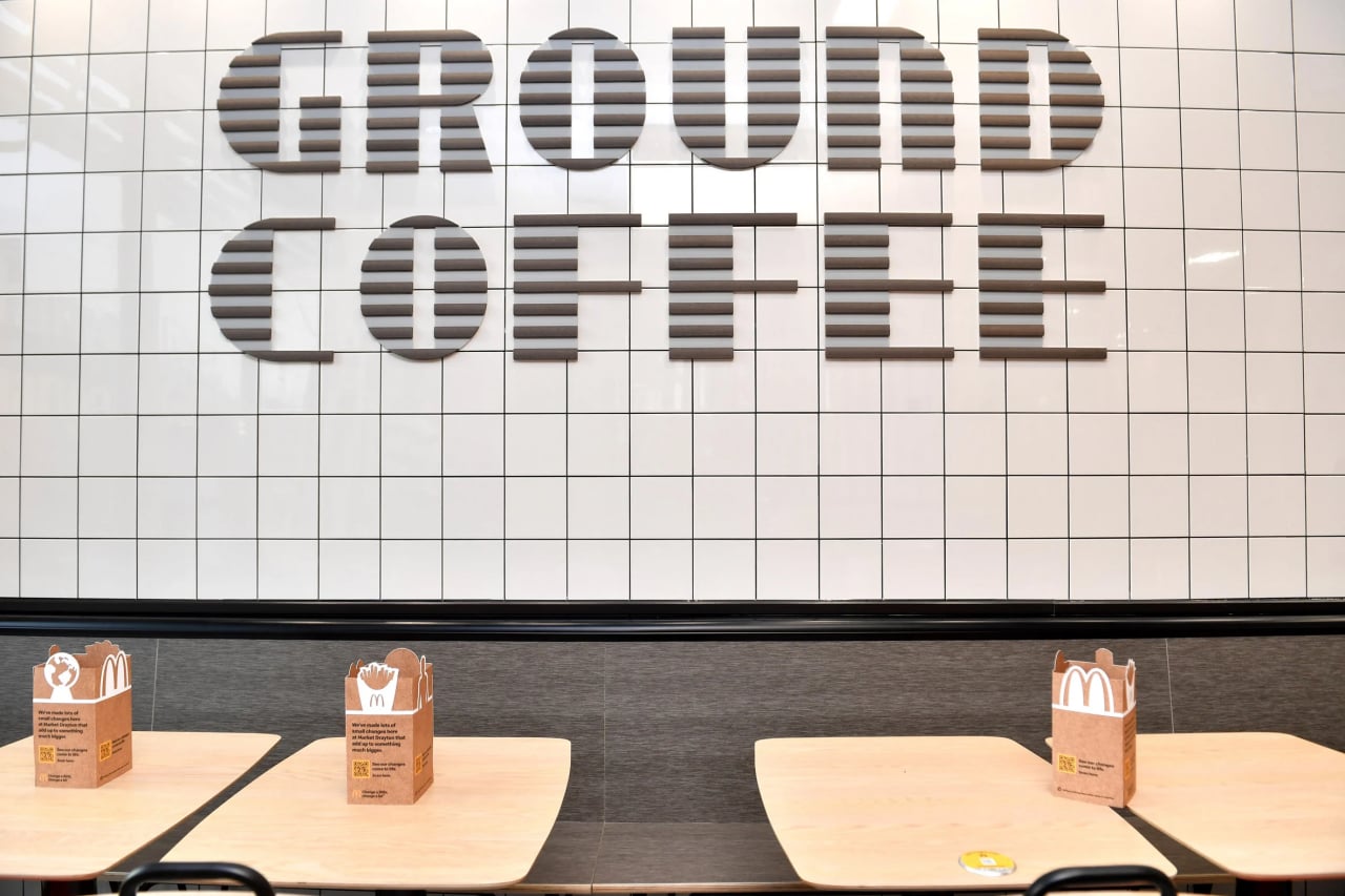
Photos courtesy of Anthony Devlin/PA.

The post UK McDonald’s net-zero carbon restaurant tries to make the environment a bit healthier first appeared on Yanko Design.