Small School In Sydney Respects Indigenous Culture & Won Best New Building In The World

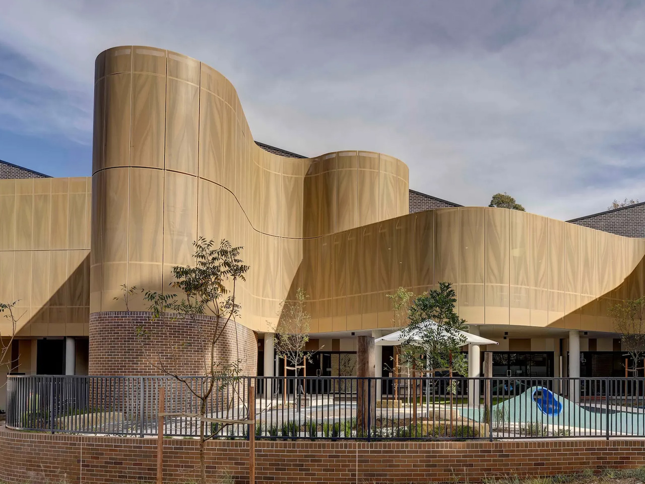
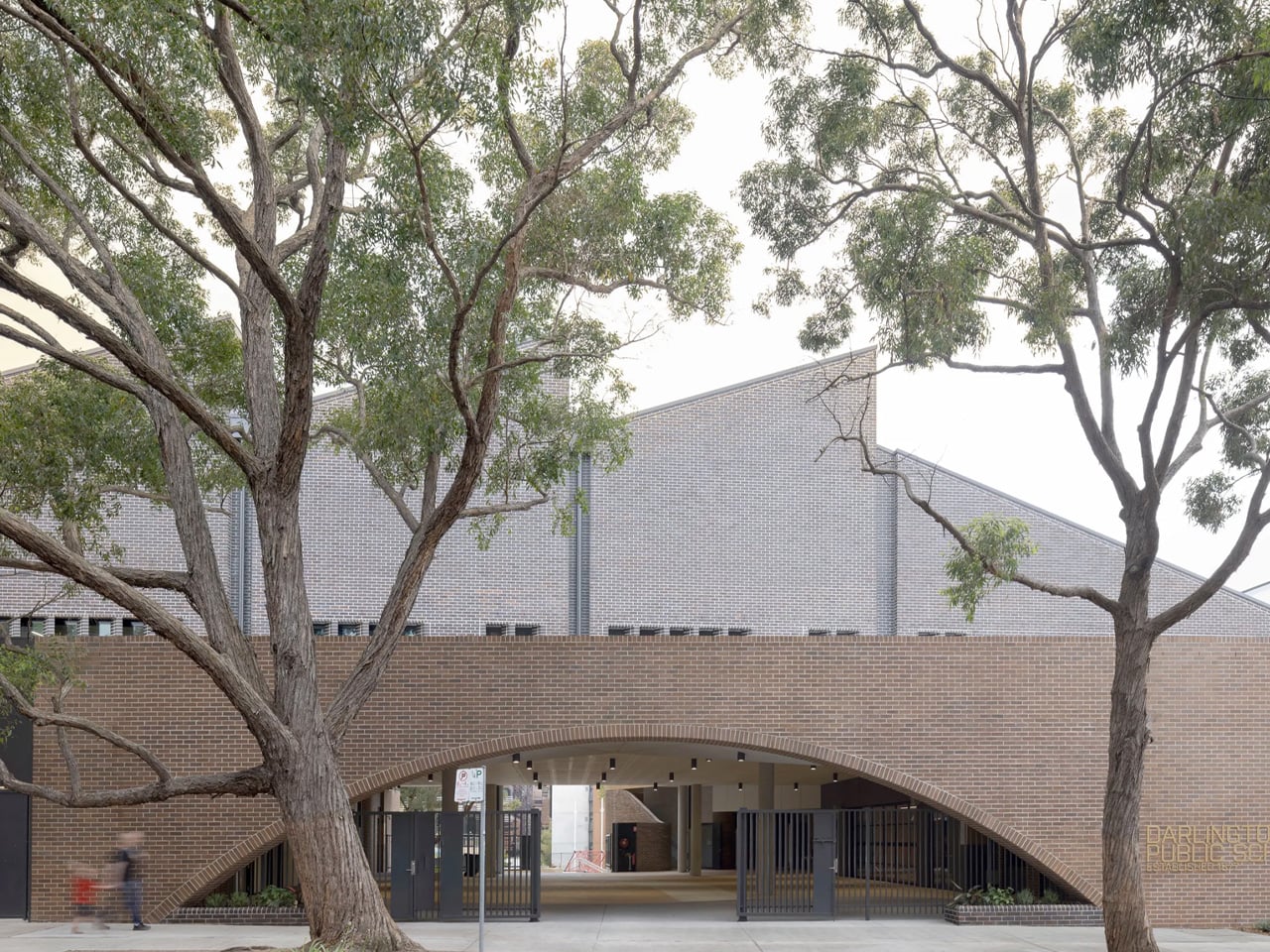
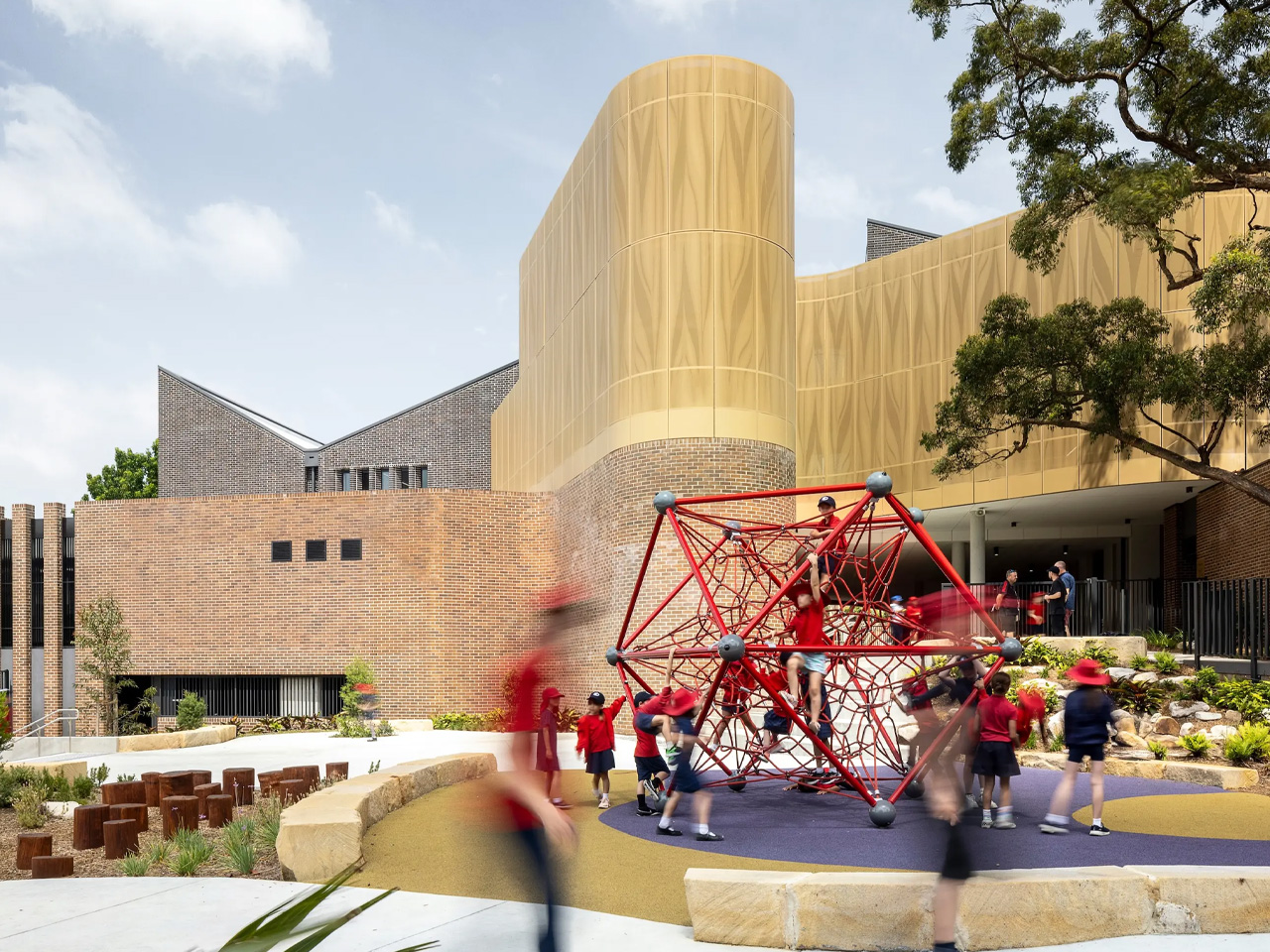
Designed by fjcstudio, Australia’s Darlington Public School won this year’s prestigious World Building of the Year Award. This was announced at the World Architecture (WAF) in Marina Bay Sands, Singapore. The school was appreciated for its sensitive and inclusive approach to early learning and education.

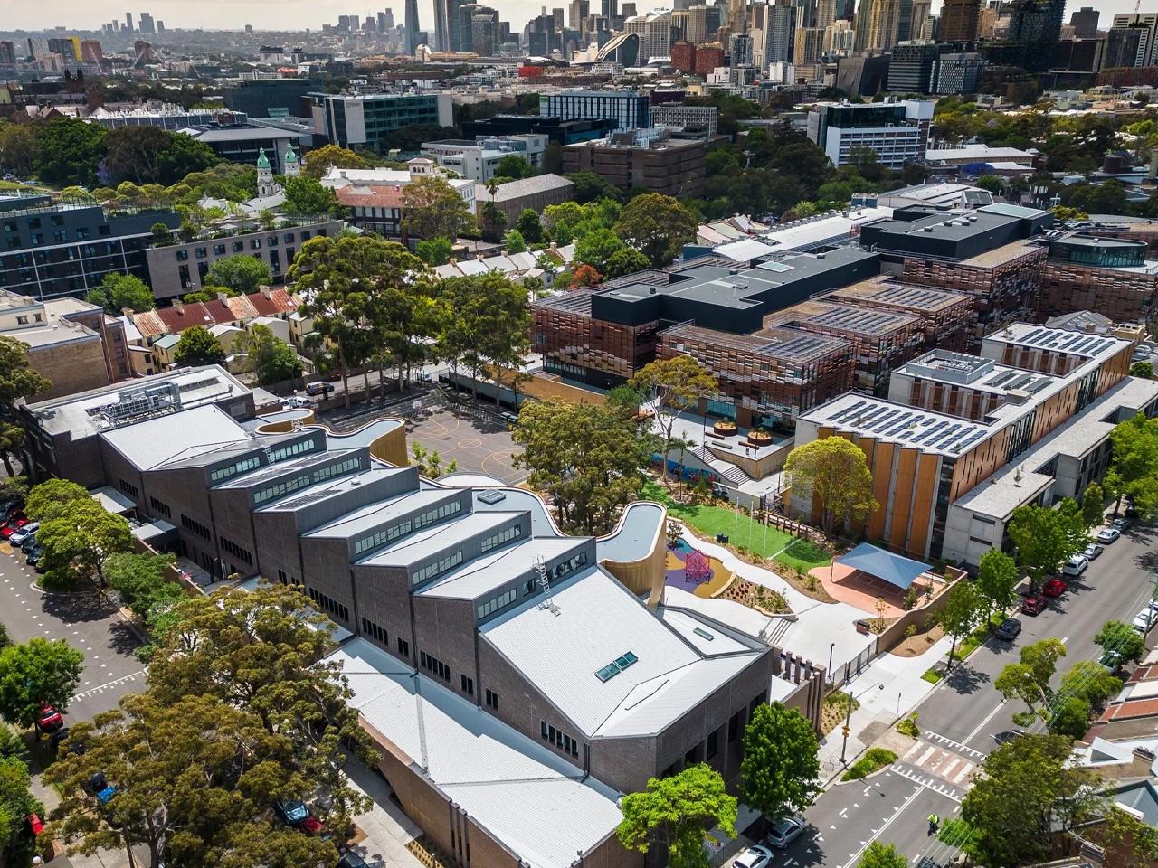
It is the second school to win the World Building of the Year Award in a row, and it is tucked away in an inner-city suburb of Sydney. An old 1970s school on the site was replaced to create the new and improved Darling Public School. The school maintains a strong connection to the local Aboriginal community, and the construction process was a collaborative approach and quite cost-effective.

Designer: fjcstudio

The school adopts the beautiful Indigenous culture by preserving and displaying an amazing collection of Aboriginal artworks around the school. It also includes a community garden with indigenous plants to help students learn indigenous cooking and culture. You can catch a look at the inner courtyard from the main entrance while curving metal screens offer privacy and protection to the outdoor learning and play areas. This creates a pleasant and lovely light. The structure is also equipped with passive elements like sawtooth roof angled to the sun, high-level glazing, and protective curved screens,

“The architect of the winning project explored and extended the formal program of the client, to include the views and experience of the local community and a variety of users,” said Paul Finch, Programme Director of the World Architecture Festival. “This generated a reading of the history of place, culture, and time. “The result of the project is poetic, a building in which topography and landscape, inside and outside, form and materials, flow seamlessly in an unexpectedly delightful way. It is also an inspirational proposition about the acknowledgment and reconciliation of historic difference – a pointer to brighter, better futures for all.”

The building will accommodate a preschool, kindergarten, and primary school. It will be able to accommodate more than 500 students, according to the school’s website. Since the building process included two stages, classes were conducted during construction.

The post Small School In Sydney Respects Indigenous Culture & Won Best New Building In The World first appeared on Yanko Design.

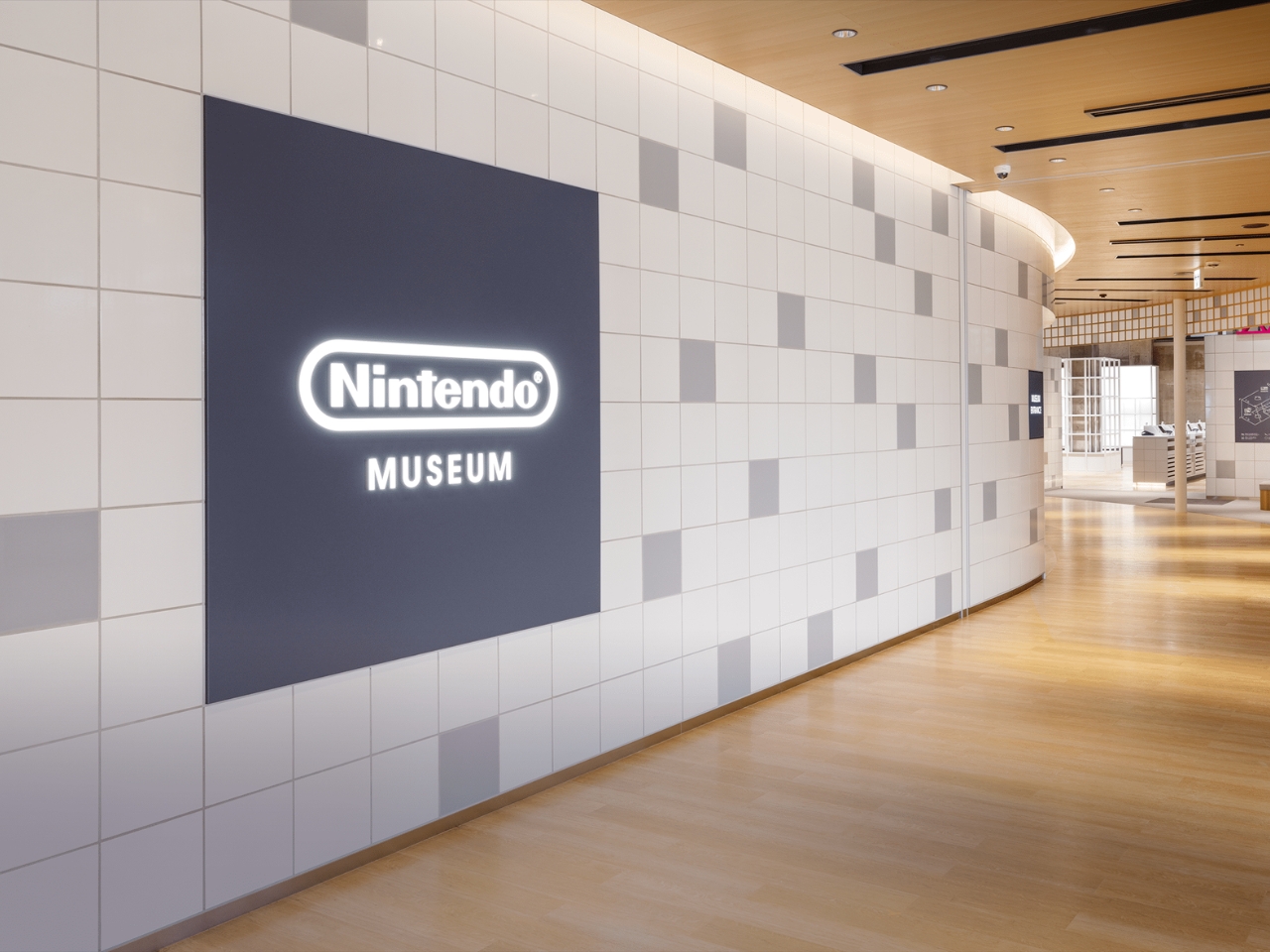
Nintendo Museum to showcase 132 years of the company’s gaming history

At one point in most people’s lives, they have probably played with or interacted with a Nintendo gaming device. Now what device that is is of course depends on the generation but with more than a hundred years of experience in creating games, there are a lot of things to choose from. And if you’re a die-hard fan of their various games and consoles, then you’ll want to book a ticket to what will surely be the hottest thing in town in a couple of months.

Designer: Nintendo

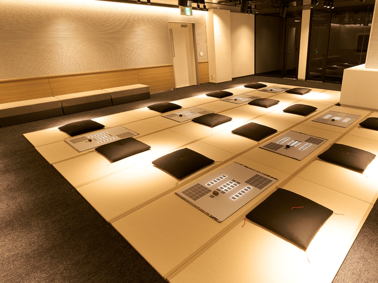
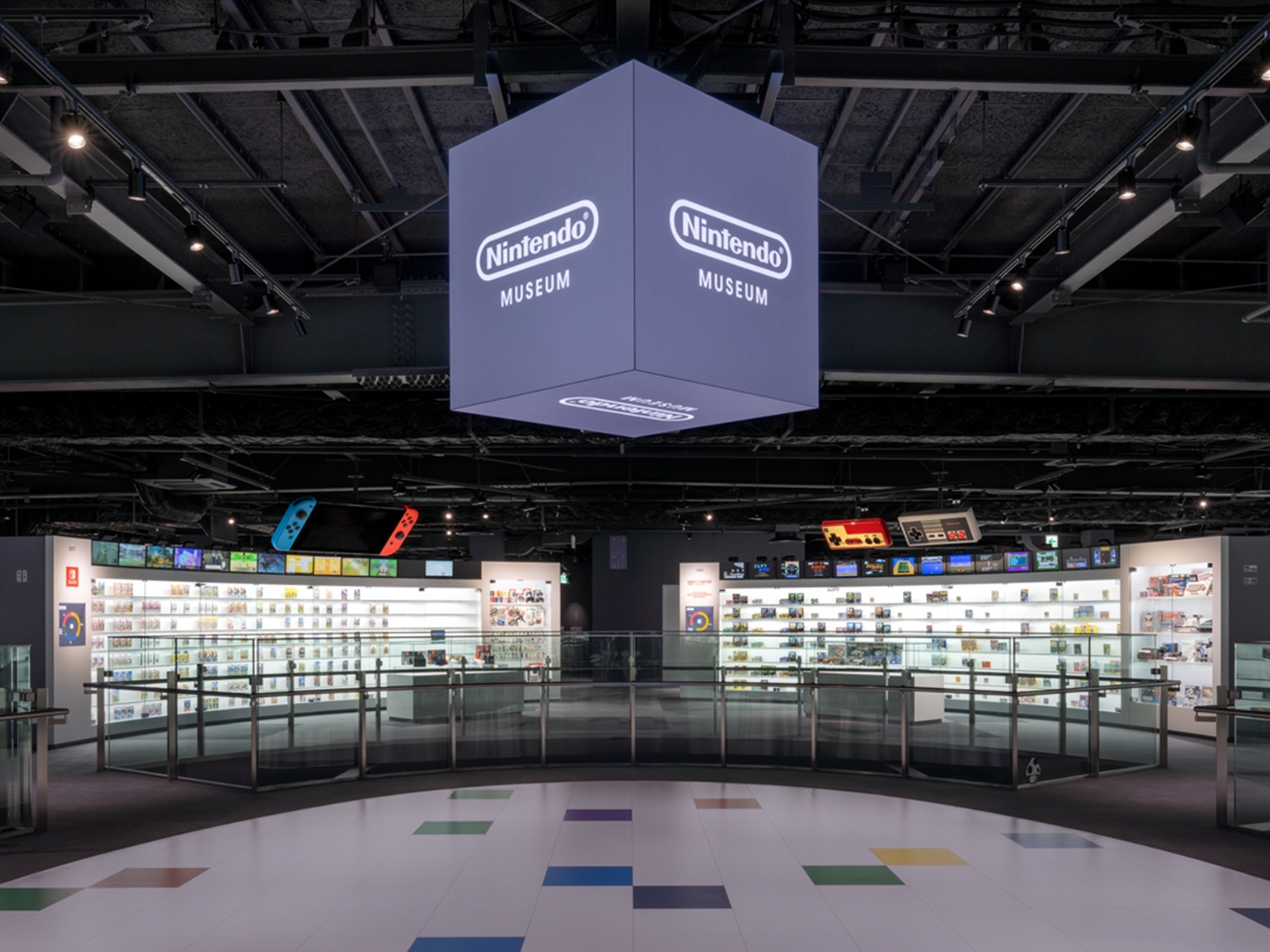
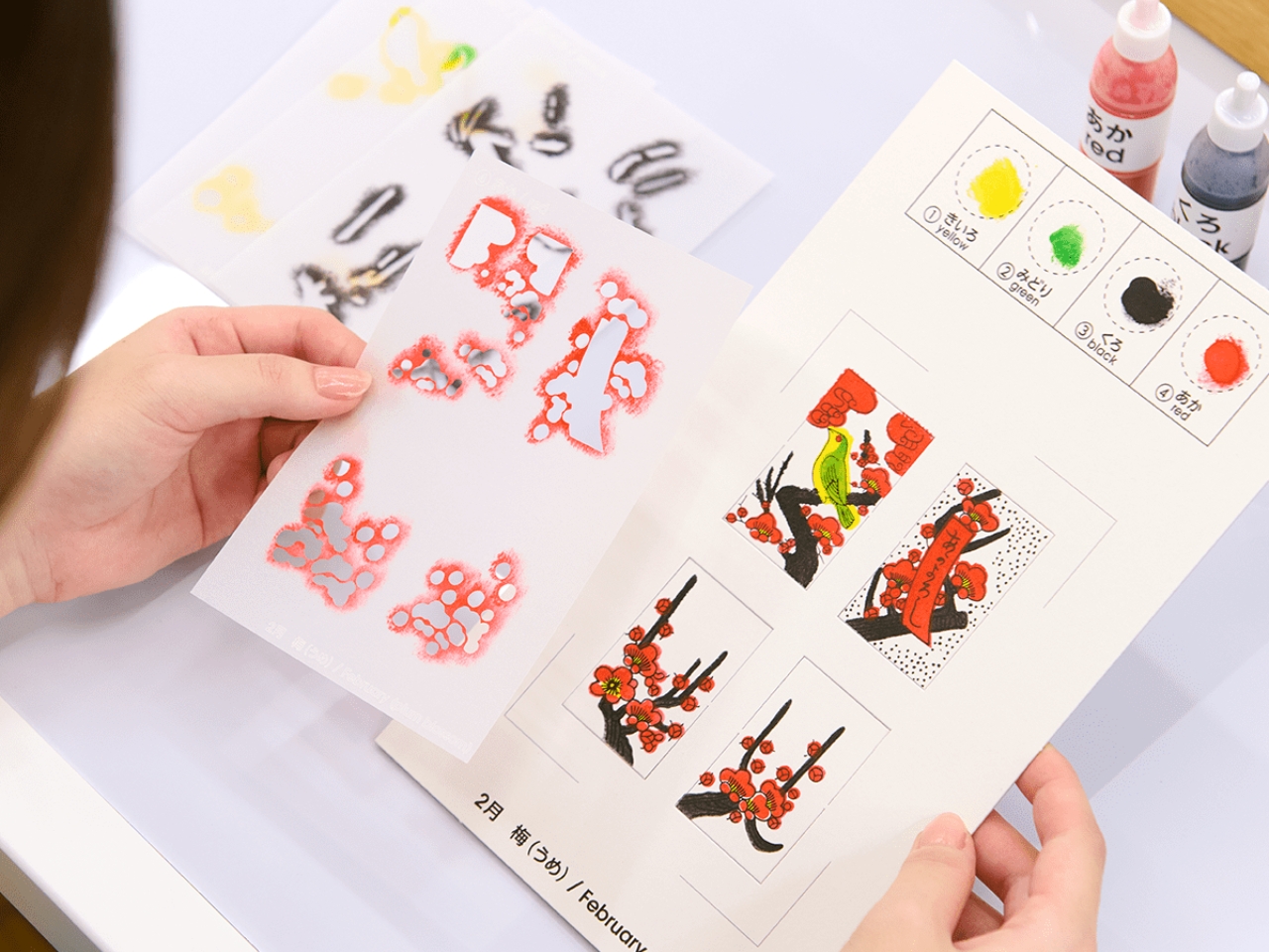
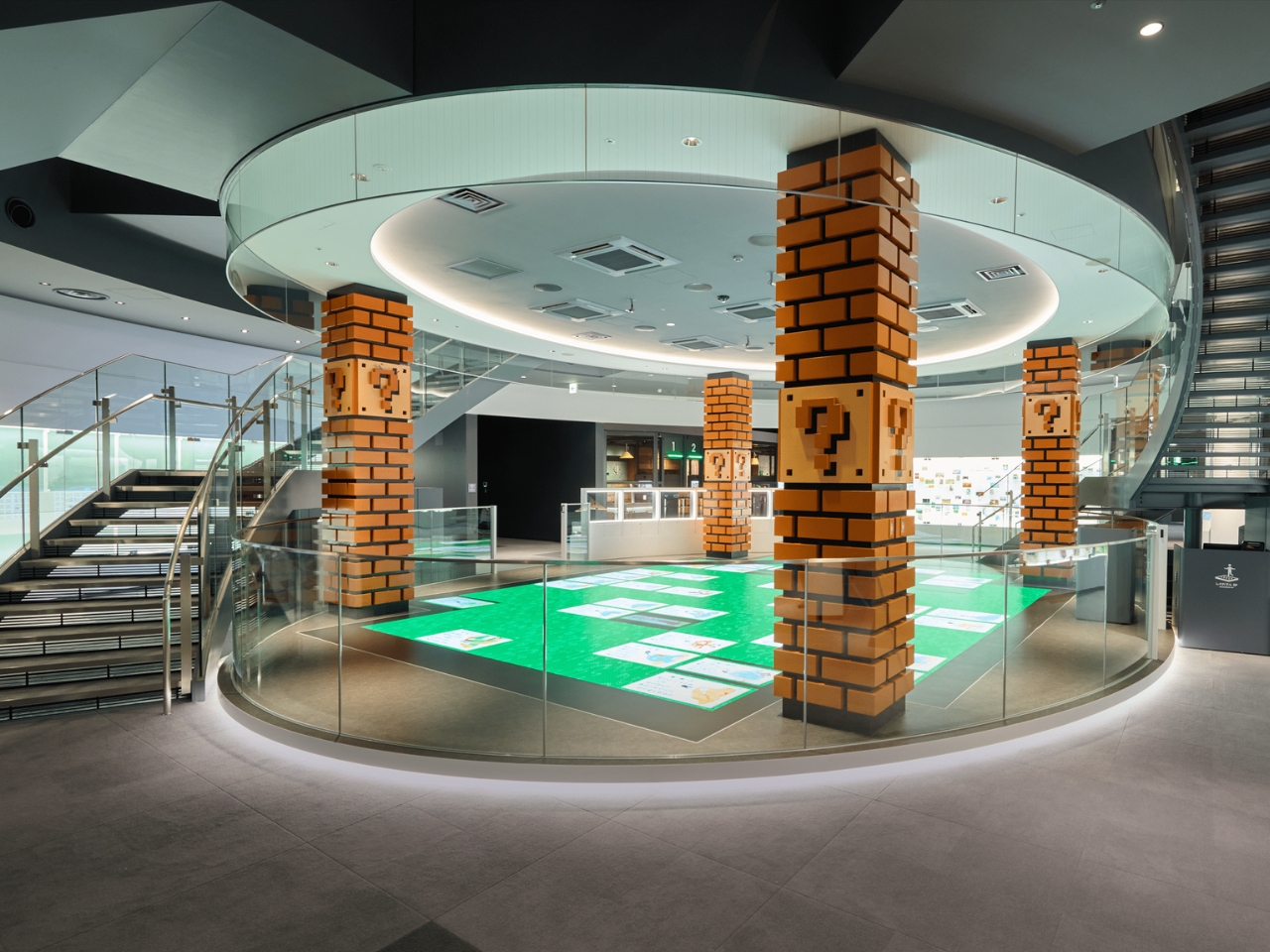
Yes, we are finally getting a Nintendo Museum opening this October and built on the very space where they started creating hanafuda playing cards in 1889. Because this company has gone through many evolutions since then, you can expect a fun and interactive history lesson spanning a century of family entertainment. There will be various exhibits as well as a cafe and of course, an extensive merchandise shop that will celebrate all kinds of games and technology. There will also be arts and crafts and workshops section where you can do things like create your own hanafuda cards.

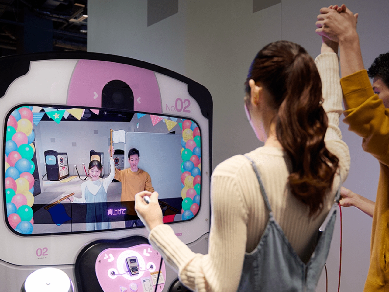
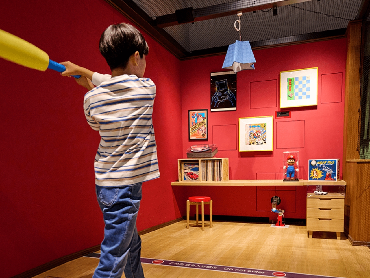
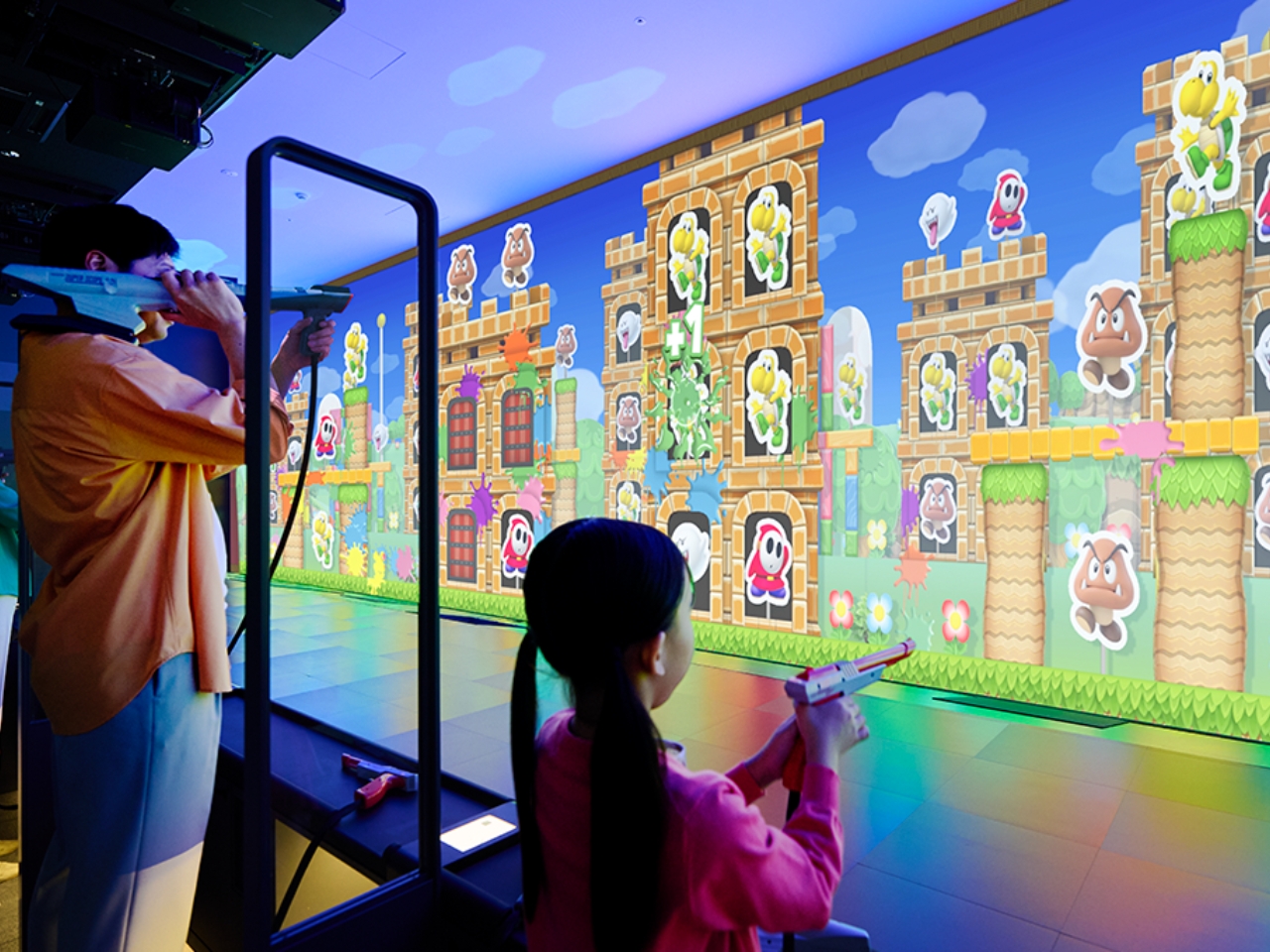
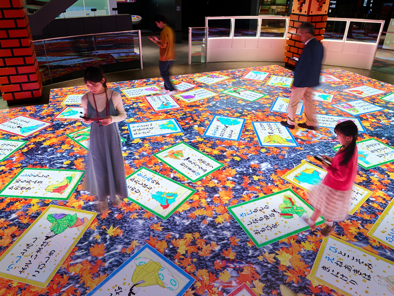
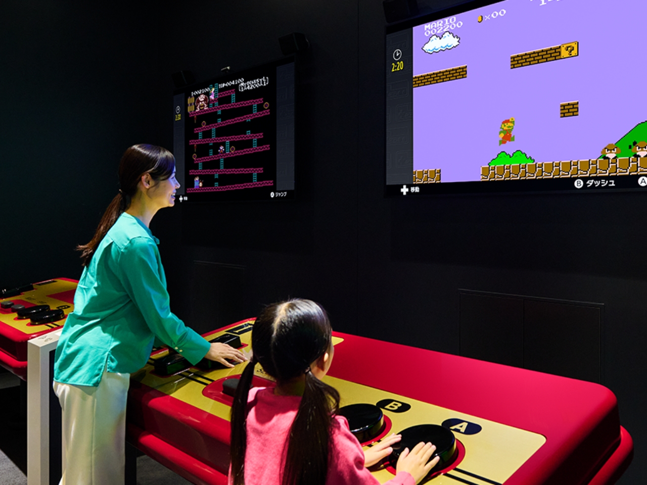
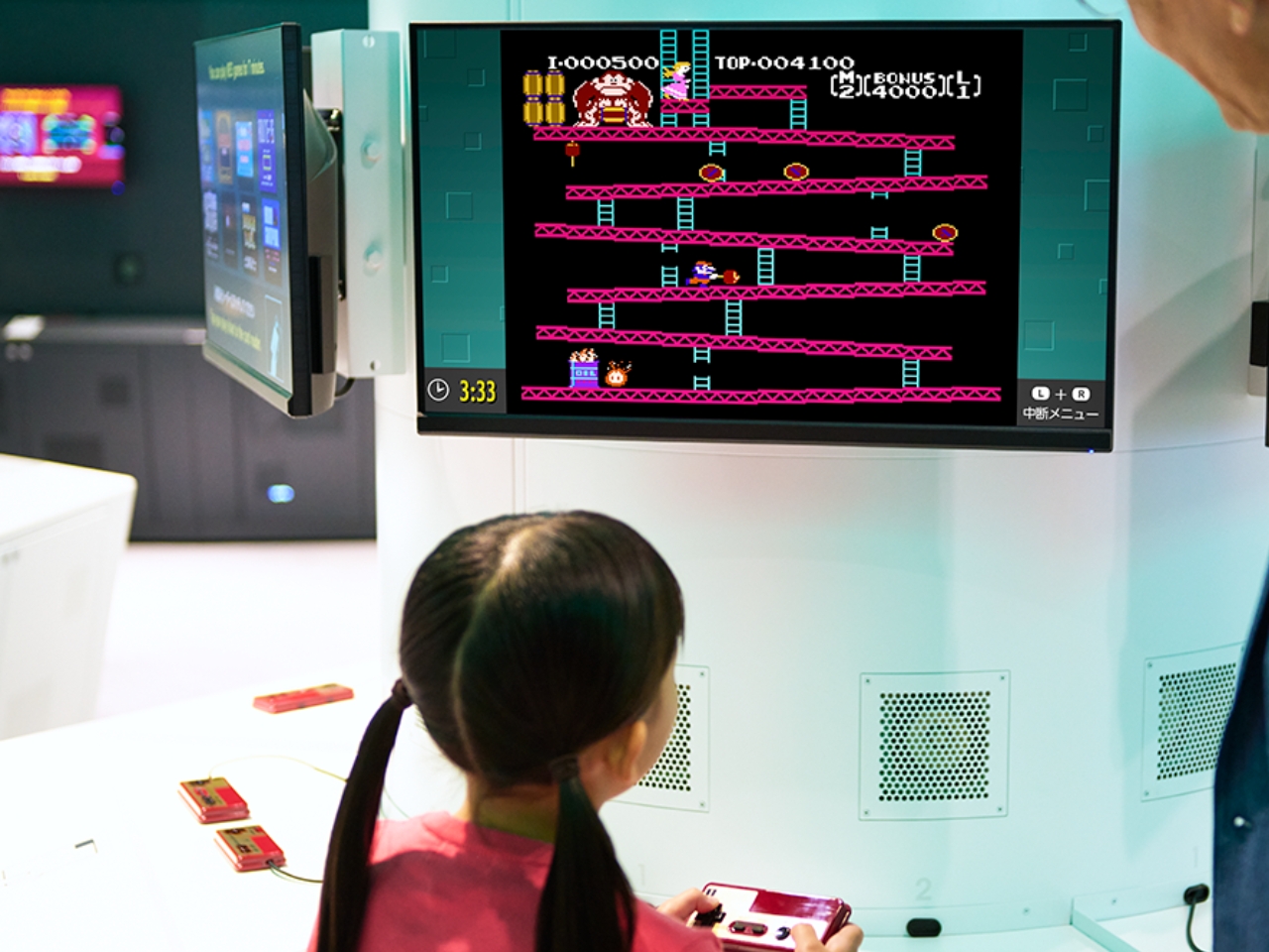
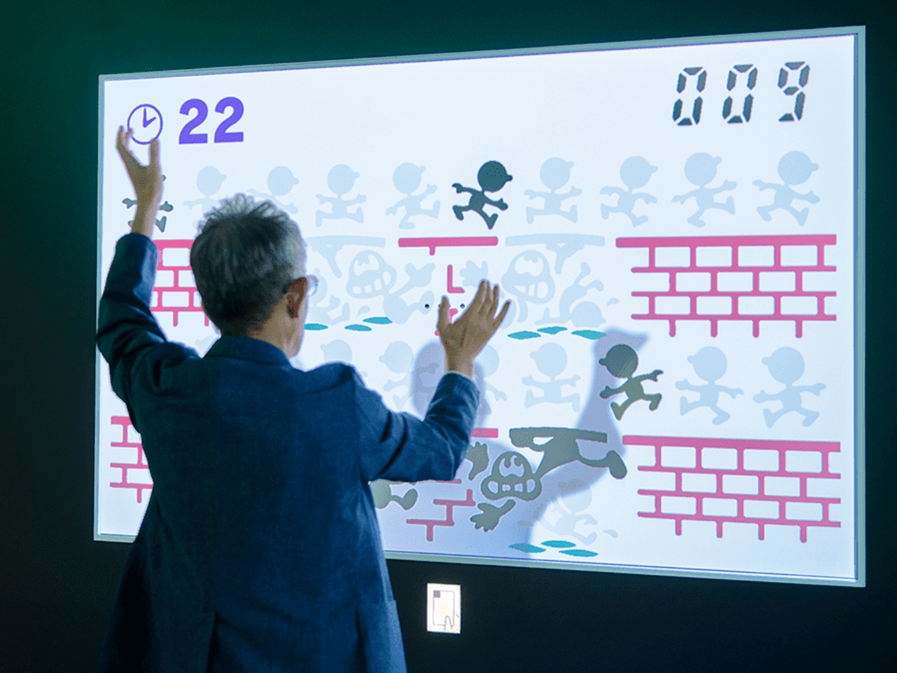
The first floor of the Exhibition Building 1 has eight interactive play experiences. Each visitor will get a card that contains ten digital coins to be able to try out the exhibits. They did not specify it but you will probably be able to top up the card if you want to try out everything. The Shigureden SP lets you explore Hyakunin Isshu poems using your smart device and viewing it on the giant screen. The Ultra Machine SP rooms lets you hit balls pitched by a machine and hit items in the room that will react. The Zapper & Scope SP gives you a shooting experience in the world of Mario while the Ultra Hand SP lets you grab balls rolling down lanes and dropping them in pipes. You can also play Nintendo games in areas like the Game & Watch SP, Nintendo Classics, and Big Controller with giant game consoles. There’s even a Love Tester SP where you can see if you and your loved one are compatible.

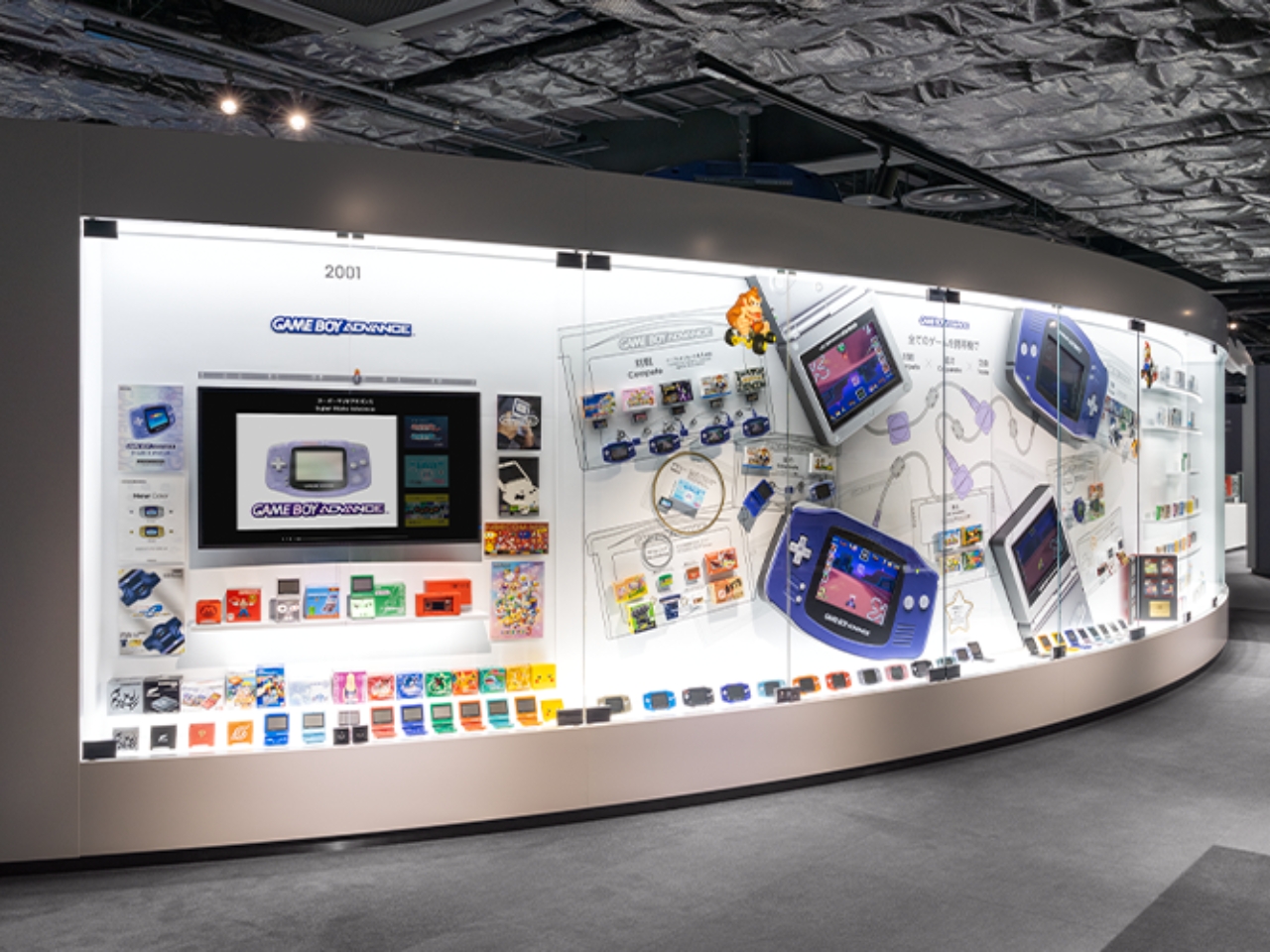
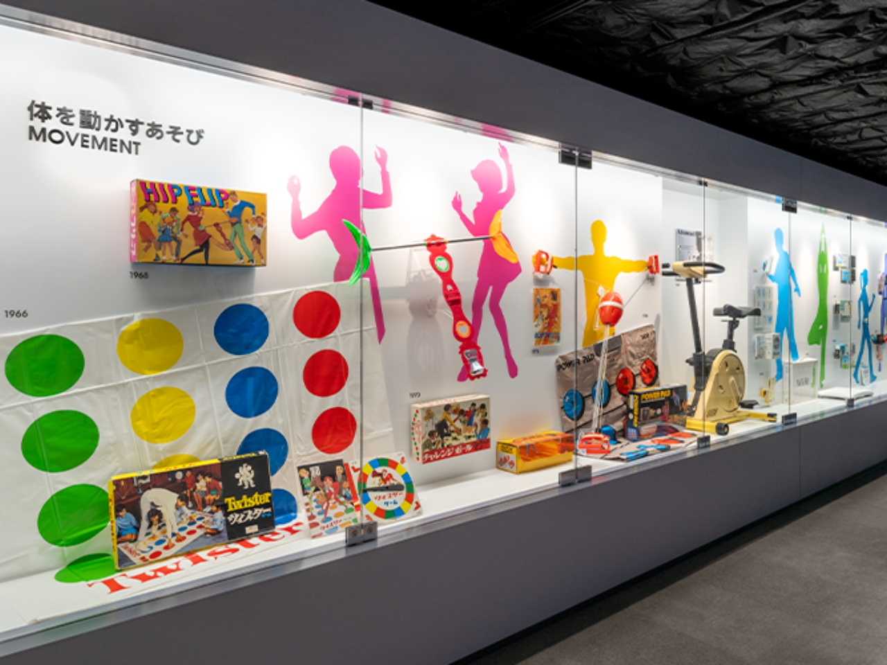
On the 2nd floor is the museum part where there are exhibits of everything that Nintendo has created throughout the years. This includes the era before they created gaming devices and it includes copying machines, baby strollers, and of course the hanafuda cards and various board games. But of course the highlight would be all the gaming consoles and games that have made them arguably the most popular entertainment company in the world. The Nintendo Museum opens in October but you can already buy your tickets, although if you’re familiar with Japan ticketing, you know that it’s via a randomly selected drawing.

The post Nintendo Museum to showcase 132 years of the company’s gaming history first appeared on Yanko Design.

What is Postmodern Architecture?

Postmodern architecture emerged as a significant architectural style of the late 20th century that blends classic and modern styles to create unconventional architectural designs. This style of architecture is eclectic and colorful and emerged in the late 1960s and early 1970s as a reaction against the belief that architecture could address societal issues. Architect Robert Venturi is the founding father of Postmodernism and his 1966 book, “Complexity and Contradiction in Architecture,” signaled the shift towards a new style and celebrated classicism, color, and pop-cultural references in the design of postmodern building design.

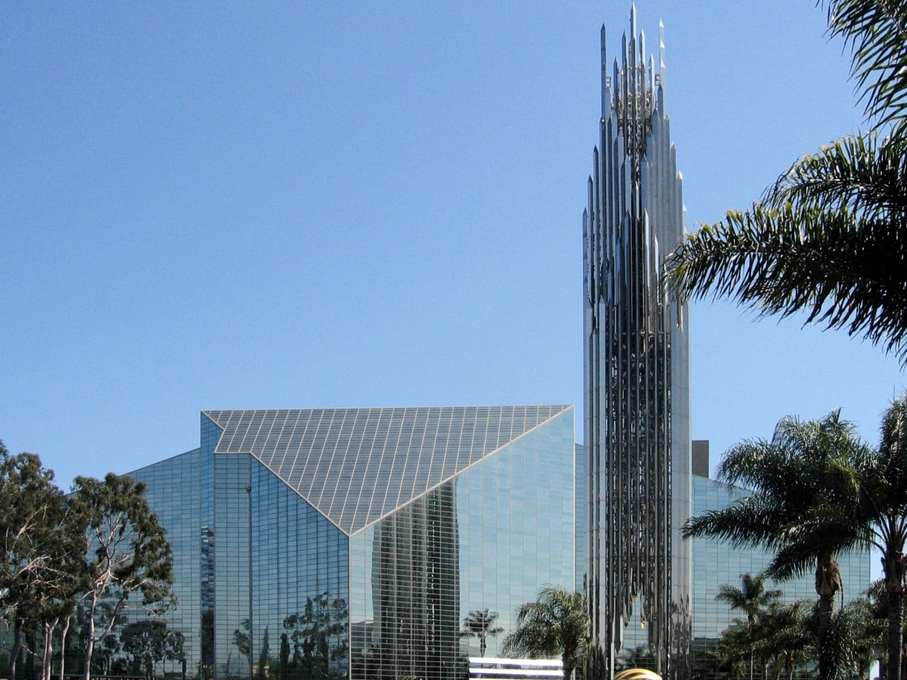
Designer: The Crystal Cathedral Philip Cortelyou Johnson
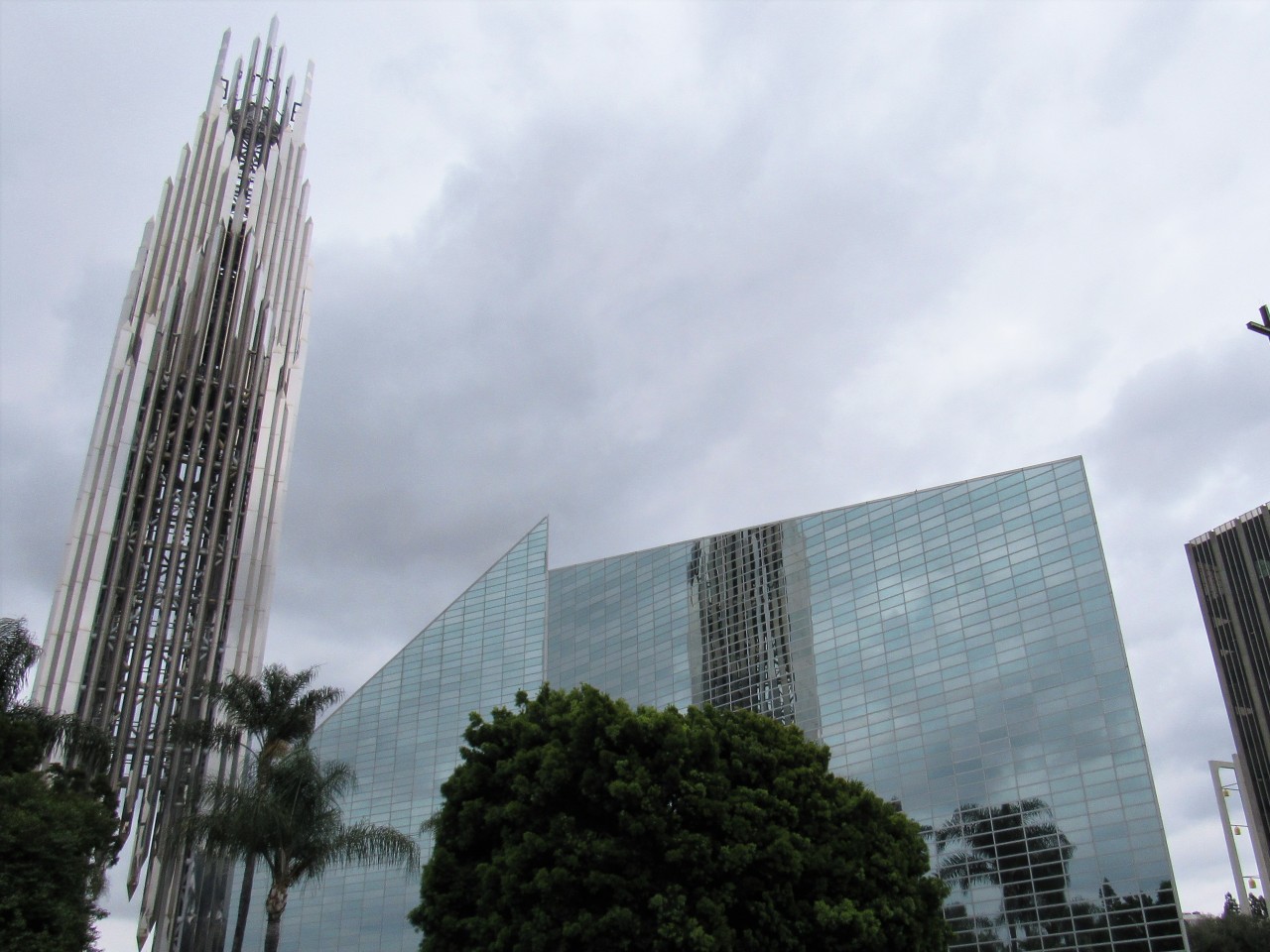
Some of the notable postmodern architects include Philip Johnson, Charles Moore, Terry Farrell, James Stirling, Helmut Jahn, Frank Gehry, and Michael Graves. In essence, postmodernism embodies fresh perspectives on architecture. To illustrate this, Robert Venturi famously countered Mies van der Rohe’s “Less is more” with “Less is a bore,” a telling anecdote that encapsulates the essence of this architectural style.

Key Features of Post-Modern Architecture Buildings

The primary difference between modern and postmodern buildings is that modern architecture introduces modern elements into the design while postmodern buildings infuse an element of uniqueness into the design. Another difference is that while modern architects rejected ornamentation, postmodern architects had an affinity towards classical architecture and integrated it with modern design elements to create a unique look.

• Postmodern architecture is driven by the desire to utilize architecture as a means of cultural expression. In contrast to rigid rules, Postmodernism encourages architects to embrace creativity and intricate designs and transform the building into an interesting composition.

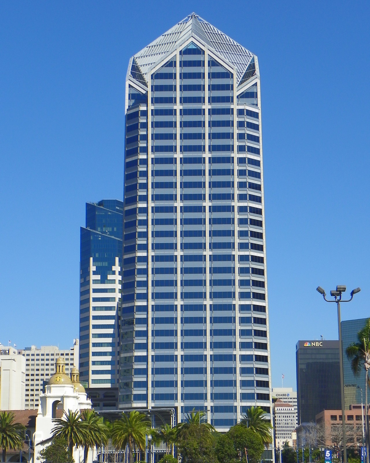
Image courtesy of: Nehrams2020

Designer: One American Plaza by Helmut Jahn

• Postmodern architecture is an Eclectic fusion of architectural styles that are borrowed from history and different eras. For instance, classical architectural features like arches and columns were mixed with materials like steel and glass.
• The postmodern buildings incorporate sculptural elements and forms over rigid and clean lines. Some of the postmodern buildings include curves and asymmetrical angles in an unusual combination of materials.
• These buildings embrace vibrant colors, including ceramic tiles and colored glass which were contrasted with natural hues of sandstone or marble. Some architects incorporated pastel shades and bright neon colors.
• There is a liberal utilization of classical ornamental motifs from historical architectural movements, often combined with unconventional design features.
• Postmodern buildings emphasize abstraction.
• These buildings are also marked by playfulness, whimsy, humor, and irony.
• Some building designs use unconventional forms that challenge the strict doctrines of Modernism.
• The use of trompe l’oeil techniques made flat surfaces look multidimensional and added an element of whimsy to the building design.

Top Ten Examples of Post-Modern Architecture

Some of the notable examples of postmodern architecture include:

1. Neue Staatsgalerie in Stuttgart, Germany
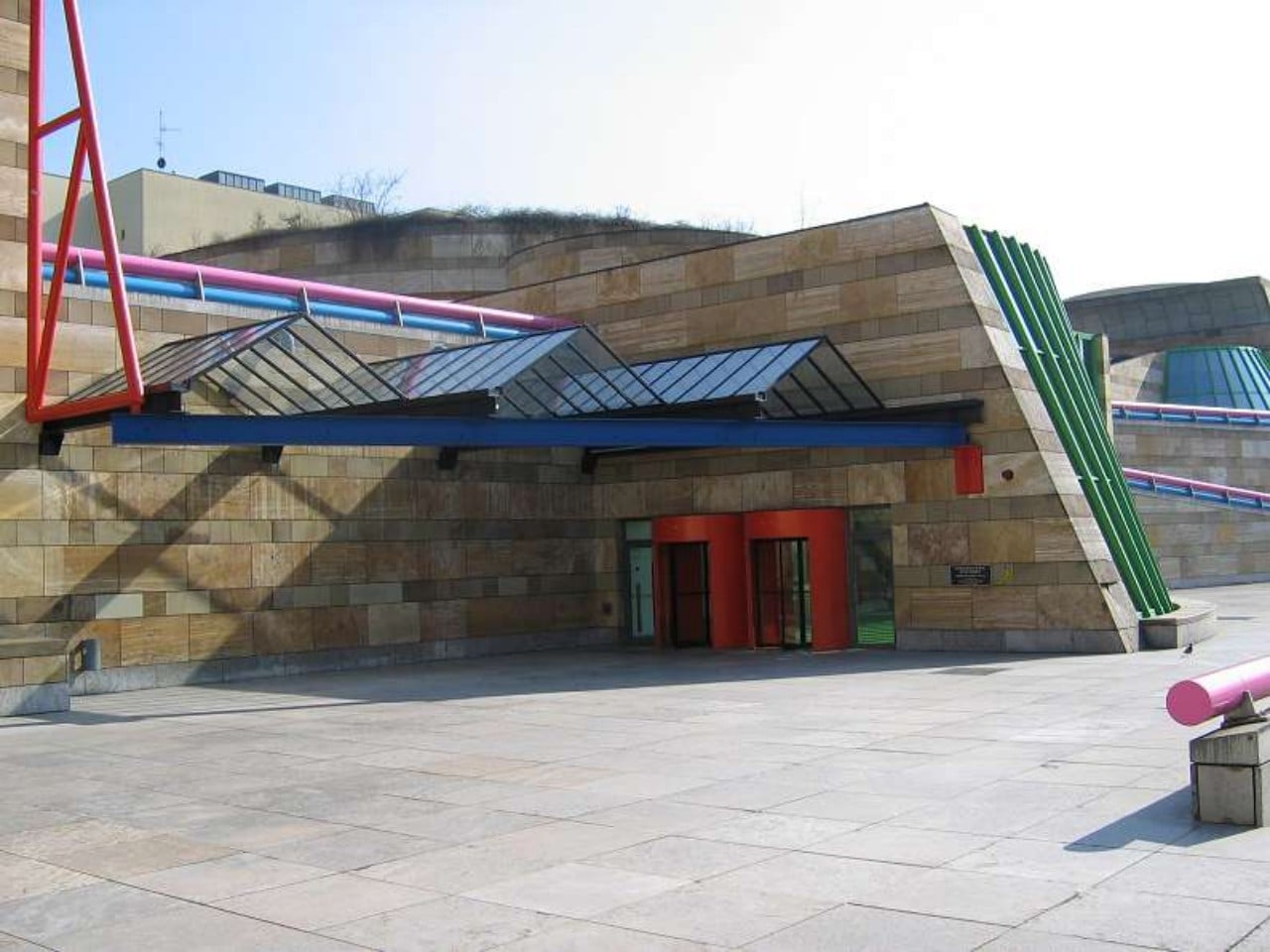
Designer: James Stirling

The Neue Staatsgalerie Museum in Stuttgart combines traditional and modern architecture, using vibrant colors and classical elements on a sloping site. Its entrance features a blue steel trellis, glass roof, and orange doors, leading to a green-floored space with curved steel components. The atrium features classical elements while the museum blends past and future architecture.

2. Team Disney Building, Orlando
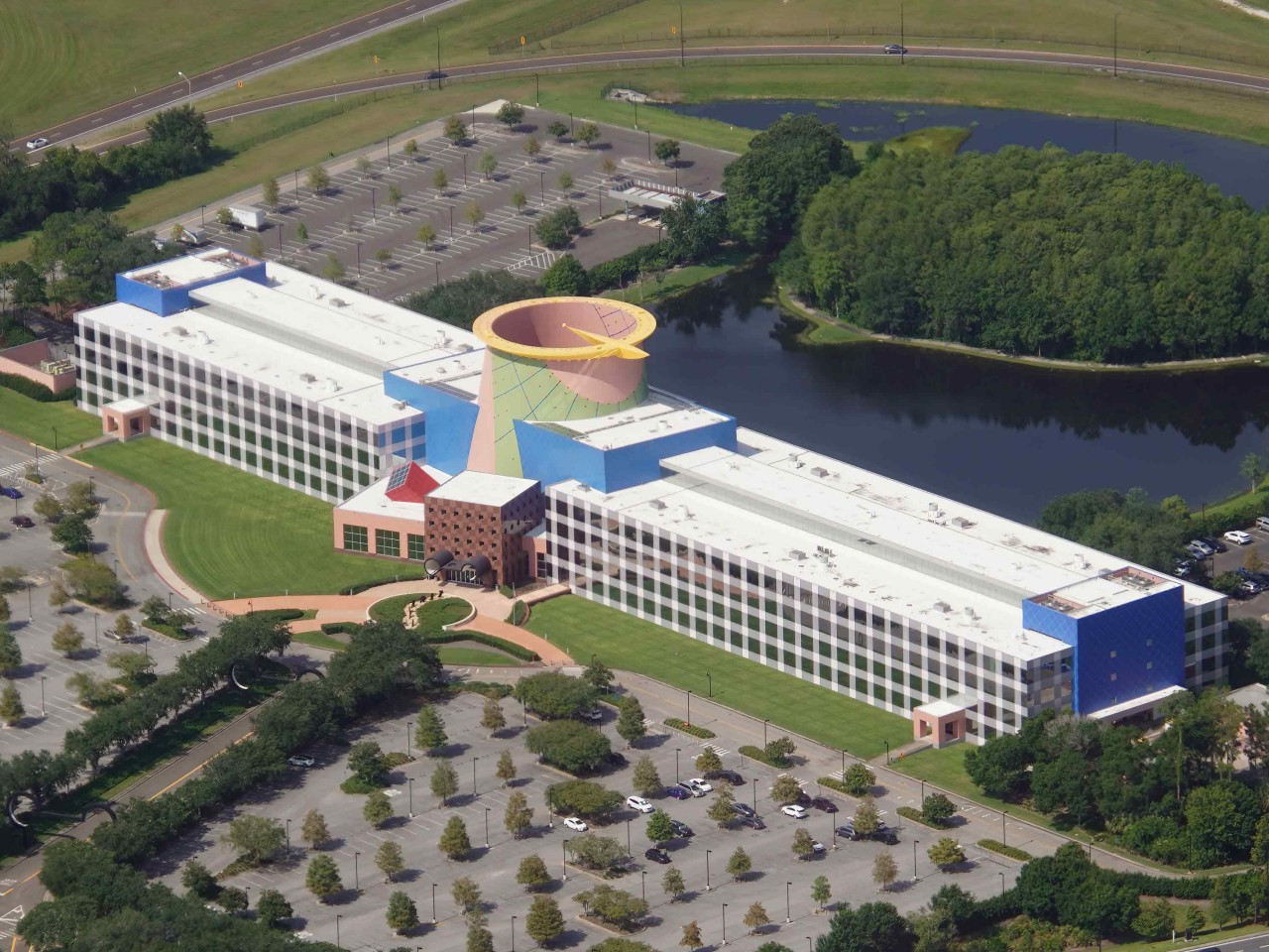
Designer: Arata Isozaki

Disney’s corporate office is a renowned example of postmodern architecture where its external façade blends geometry and colors, inspired by a wristwatch, with a central sundial surrounded by Tennessee River rock. Harmonized colors were used inside the building to create a tranquil working space that contrasts with its chaotic exterior to achieve a balance of conflict and calmness.

3. City of Wine Complex Marques De Riscal Hotel, Spain
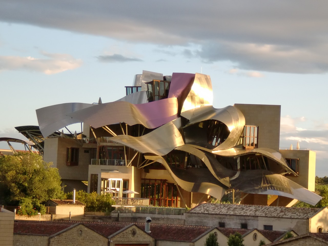
Designer: Frank Gehry

This building is a museum and luxurious hotel that is nestled amidst a lush vineyard and its seamless, wine-like appearance is achieved through the support of three super columns. Frank Gehry’s postmodernist approach pays homage to both 19th-century and contemporary architecture, incorporating free-flowing elements. The structure primarily comprises two distinct components where over twenty titanium canopies are suspended above large sandstone blocks that constitute the front facade, while a vibrant pink hue, reminiscent of wine, enlivens the surface when the sun shines, creating a vibrant atmosphere. The contrasting surfaces of the stone exterior and wooden windows foster a connection with the traditional surroundings.

4. Ting1 in Ornsköldsvik, Sweden
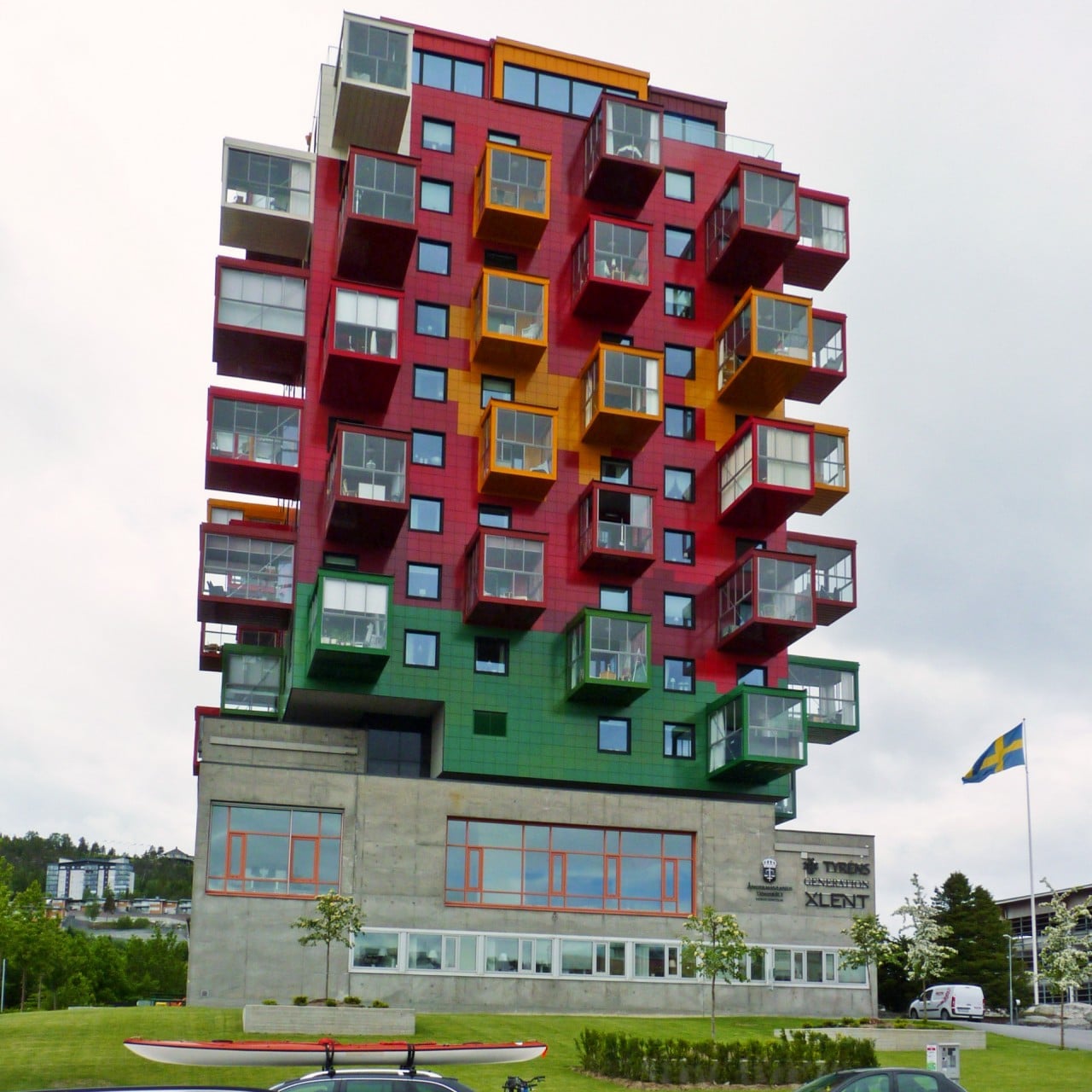
Designer: Gert Wingårdh

Ting1 is a residential project in Sweden that was constructed in 1961, using a concrete courthouse as its foundation, and the new design intentionally contrasts with the old concrete structure. Inspired by painter Bengt Lindstrom’s art, the building spans the width of the old courthouse’s courtyard and creates a connection between the two.

5. Groninger Museum, Netherlands
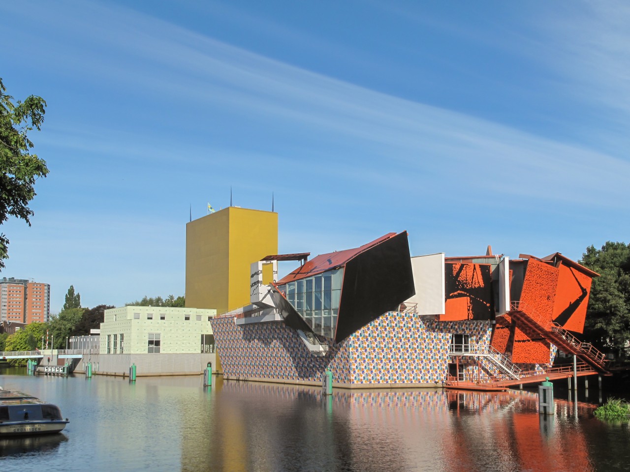
Designers: Philippe Starck, Alessandro Mendini, Coop Himmelb(l)au

This building houses collections from the 16th Century to Contemporary Art, featuring multiple levels for visitor enjoyment. It connects three exhibition halls with notches and recesses. The elevation displays abstract art, appearing random and chaotic, akin to an artist’s palette explosion with scattered shapes, embodying postmodern architectural traits. The structure is constructed with double-wall steel plates and hardened glass that barely touch, and some rooftop portions extend over the surrounding water, beckoning the entire city to the museum. Employing deconstructivism, the architects imbued the structure with emotions, making walls serve as ceilings, windows, or floors.

6. Piazza d’Italia, New Orleans
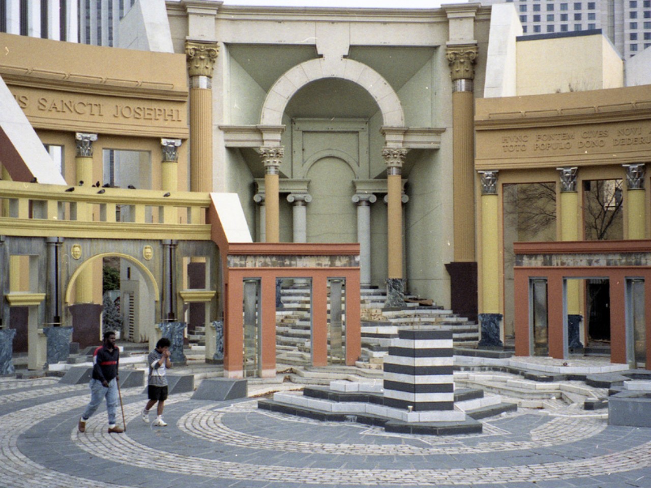
Designers: Charles Moore, Perez Architects

Piazza d’Italia in New Orleans was designed by Charles Moore and Perez Architects and embodies Moore’s belief in inclusive and site-specific architecture. Unlike modernists seeking a universal architectural language, this monument celebrates the city’s Italian influence with vivid classical elements. Initially controversial, it became a “Postmodern ruin” due to nearby project failures but was later restored and is now appreciated as a unique and enjoyable public space.

7. Portland Municipal Services Building, Oregon
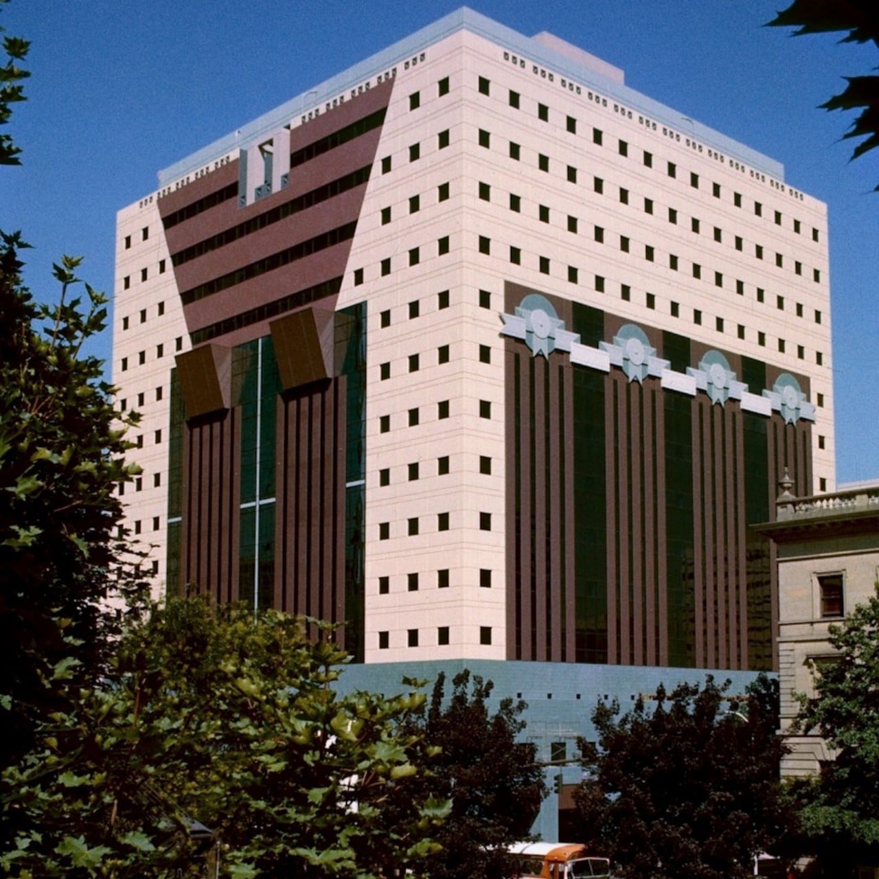
Designer: Michael Graves

The Portland Municipal Services Building is a prominent example of Postmodern architecture, designed by Michael Graves. The vibrant colors and playful geometric shapes on the facade distinguish it, deviating from universal design rules and adding a unique, recognizable element to the skyline. The triangular facade prioritizes enjoyment over adherence to “form follows function,” diverging from the building’s internal program or function. For Postmodernists, fun and distinctiveness take precedence.

8. M2 (Mazda) Building
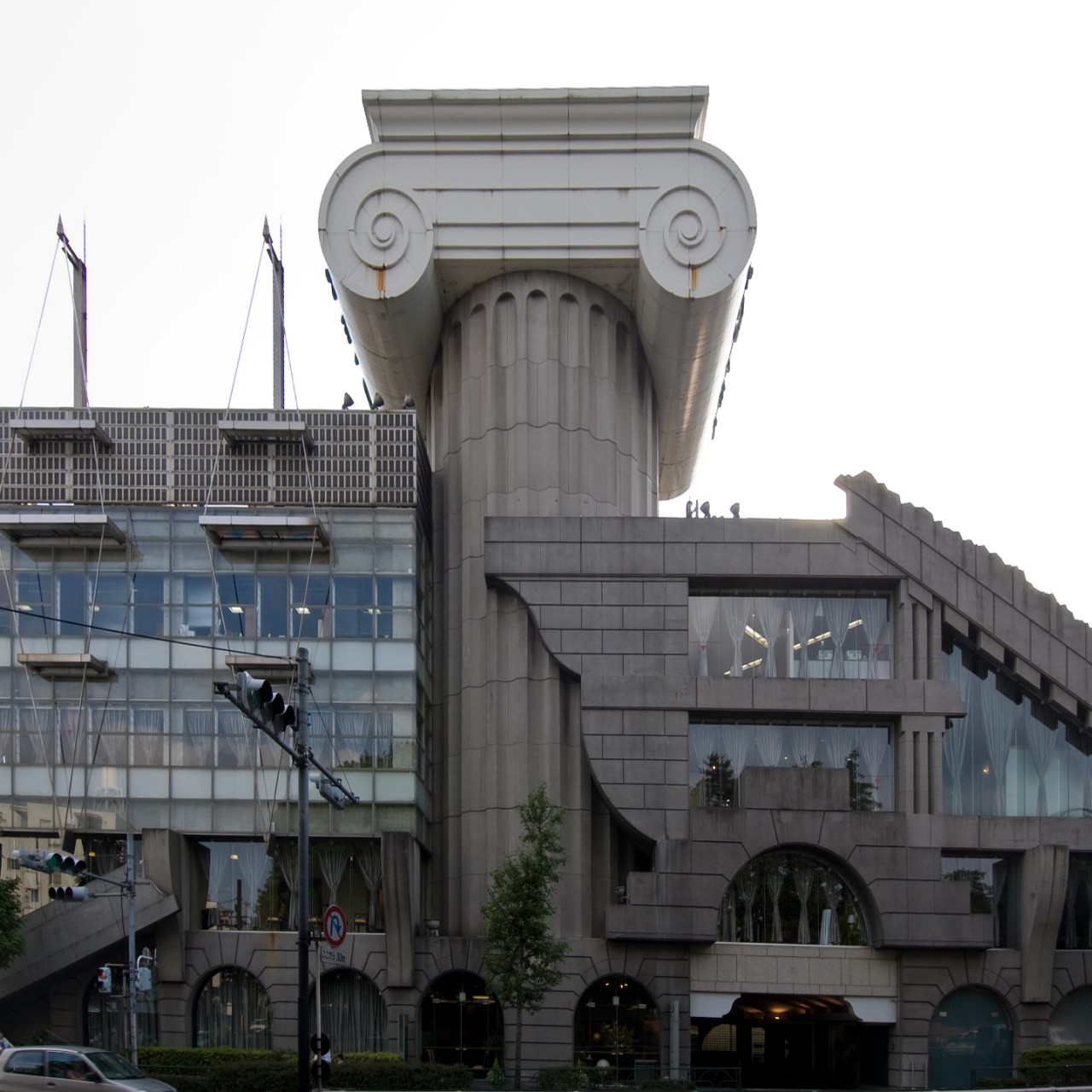
Designer: Kengo Kuma

Kengo Kuma, renowned for his distinct style, notably diverged from it with the M2 Building. Unlike his typical work, it exemplifies the collage style often associated with Postmodern architecture and serves as an iconic “duck.” Originally designed as a Mazda showroom in Tokyo, it has since been repurposed as a funeral hall.

9. The Guggenheim Museum, Spain

Designer: Frank Gehry

Frank Gehry, a prominent architect, is renowned for the iconic Guggenheim Museum in Bilbao. His designs represent a contemporary evolution of Postmodernism, giving rise to the Deconstructivist sub-movement. These designs break away from Modernism’s rationality by incorporating unconventional, non-rectilinear forms and shapes that seemingly deform the building’s exterior.

10. MI6 building, UK
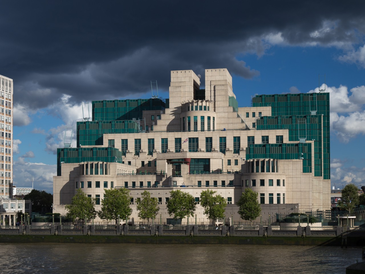
Designer: Terry Farrell

The SIS (MI6) building in London has served as the UK’s secret service headquarters since 1994. Designed by Terry Farrell in the late 1980s, the architecture draws inspiration from industrial structures like power stations and incorporates elements reminiscent of Aztec and Mayan temples. These contrasting influences harmoniously blend to create a distinct and unique structure.

Postmodernism thrived during the economic prosperity of the 1980s, extending into the 1990s, and leaving behind a collection of bold and unconventional architectural landmarks. Initially taking root in the United States, its impact spread globally to regions such as Europe, Japan, and Australia. Postmodernism continues to influence contemporary architecture to this day.

The post What is Postmodern Architecture? first appeared on Yanko Design.
Sustainable Skyscrapers Transform This Chinese City’s Landscape Using Urban Intercropping

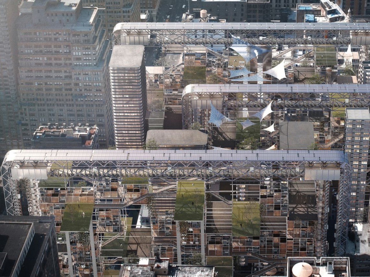
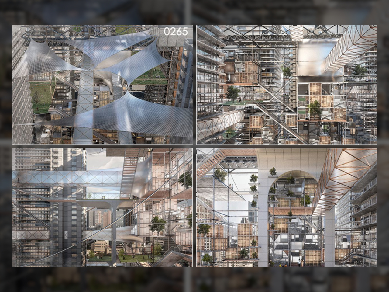
Lately, all we see around us are existing tall buildings and upcoming skyscrapers it’s surely a beautiful sight and enhances the skyline of the city and perhaps even benefits the economy, but it is imperative to also keep the sustainable approach in mind and the adverse effects of these skyscrapers on the society and its well being. The divide between urban centers, agricultural areas, and natural ecosystems is widening, leading to significant environmental, social, and logistical challenges. Urumqi, the political, economic, and cultural hub of Xinjiang in northwest China, epitomizes this conflict between urban development and agricultural ecological resources. To address these pressing issues, the innovative architectural design concept of “Urban Intercropping” has been proposed.

Designers: Penghao Zhao, Hanyu Sun, Sinuo Jia, Jingxuan Li, Songping Jing, Yibo Gao, YuJie Zeng, and An Jiang

Inspired by traditional agricultural intercropping systems, where different crops are grown together to optimize the use of resources, the Urban Intercropping concept integrates this planting pattern with urban spatial planning. By strategically inserting architectural structures into the “gaps” of the city, a new urban system is formed. The Urban Intercropping model shifts from a centralized to a decentralized urban development approach. Architectural slicing devices are introduced into underutilized spaces within the city, transforming them into productive and functional areas. This approach maximizes the use of space and resources, addressing the issues of urban sprawl and inefficient land use.

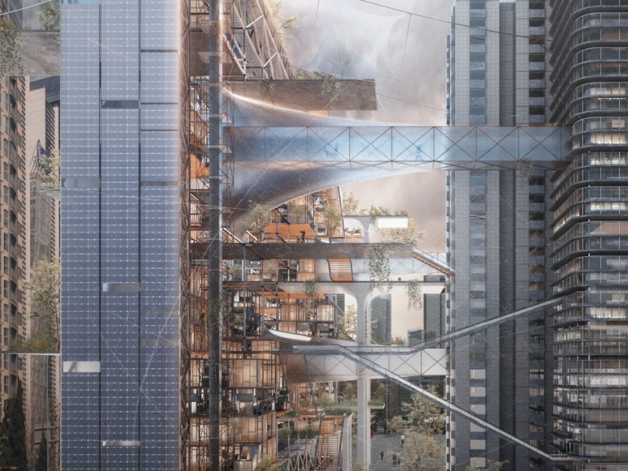
Central to this design is the concentration of agricultural industries in high-rise buildings using a vertical intercropping planting model. This model optimizes the use of space, light, and other resources, enabling high-density agricultural production within urban settings. These high-rise agricultural hubs are composed of mechanical devices, non-mechanical facilities, and movable living units, addressing urban housing shortages, traffic congestion, and the lack of green spaces. By enhancing urban efficiency and revitalizing intermediate urban areas, these structures create a dynamic and sustainable urban environment.

Urban Intercropping emphasizes the transformation of urban morphology by integrating skyscrapers and other tall structures into existing urban spaces. These buildings are designed to connect seamlessly with the underground transportation system, alleviating traffic congestion and improving urban mobility. The incorporation of these vertical elements redefines the city’s skyline and promotes a more efficient use of urban space.

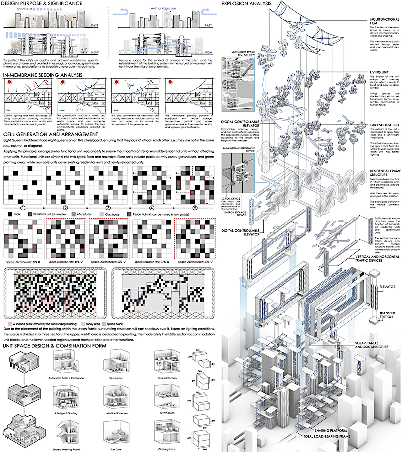
A key component of the Urban Intercropping concept is the construction of ecological corridors. These corridors are designed to preserve air quality and prevent dust storms by planting specific types of vegetation that stabilize sand and purify the air. Greenhouse membranes and platforms support these plants, creating green spaces that serve as habitats for wildlife and recreational areas for residents. These corridors also facilitate the migration of animals and provide healthy, green environments for pedestrians and transportation networks.

The design also focuses on the generation and arrangement of social unit spaces, drawing inspiration from the Eight Queens Problem. This mathematical problem involves placing eight queens on a chessboard so that no two queens threaten each other, ensuring optimal spatial efficiency. Similarly, in Urban Intercropping, functional units are arranged to allow for the smooth transfer of movable community units without disrupting other activities. This ensures flexibility and efficiency in urban spaces, accommodating changing needs and uses.

To maximize the effectiveness of Urban Intercropping, detailed structural components are optimized. Multifunctional membranes, vertical and horizontal transportation equipment, modular units, and greenhouse boxes are integrated to form an interconnected system. These components work together to enhance the overall design, making urban spaces more adaptable and resilient.

The architectural design concept of Urban Intercropping offers a revolutionary approach to urban planning and development. By bridging the gap between cities, agriculture, and nature, this concept provides sustainable solutions for modern urban challenges. Through innovative design and technological advancements, Urban Intercropping promotes ecological environmental protection and sustainable urban development, paving the way for a harmonious coexistence of urban and natural ecosystems.

The post Sustainable Skyscrapers Transform This Chinese City’s Landscape Using Urban Intercropping first appeared on Yanko Design.
This epic sky ring around Burj Khalifa is a sustainable gated community concept

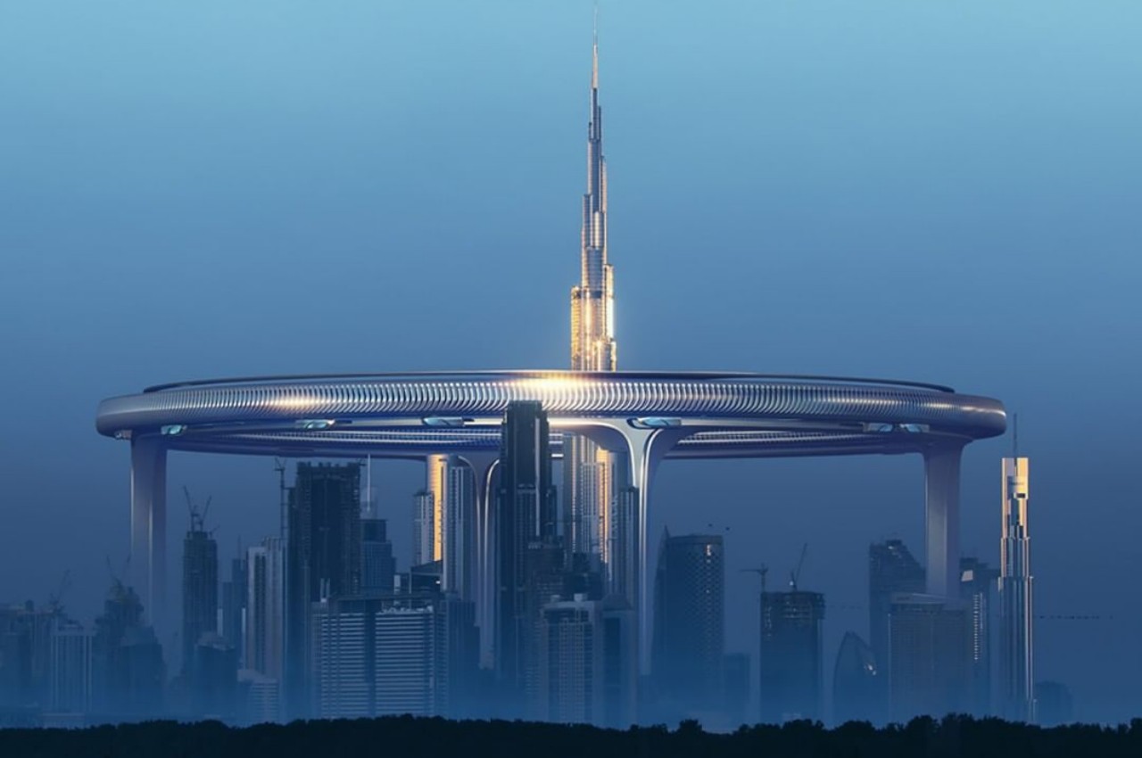
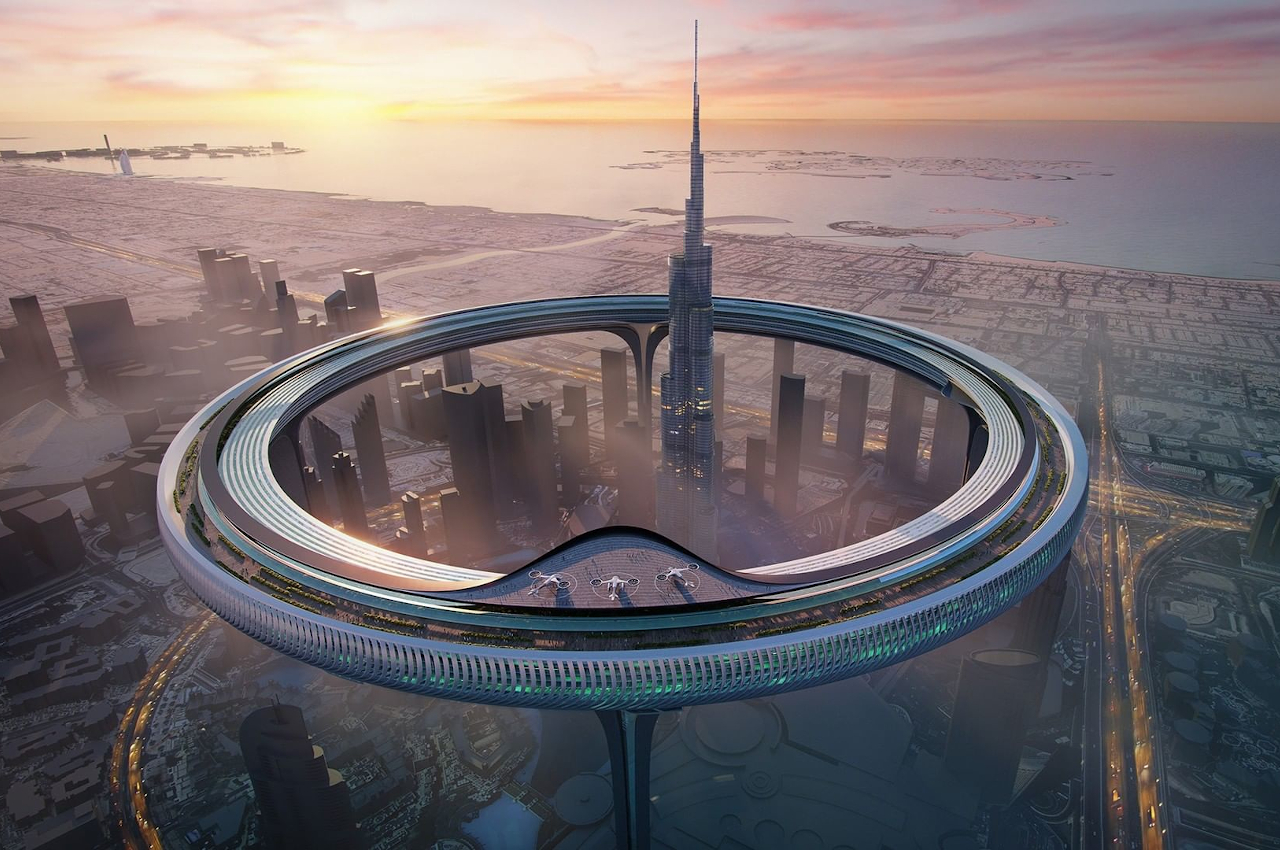
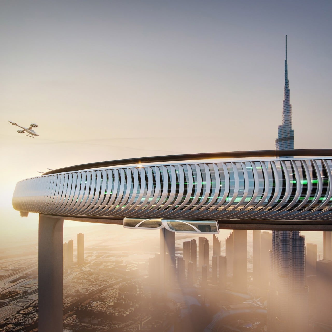
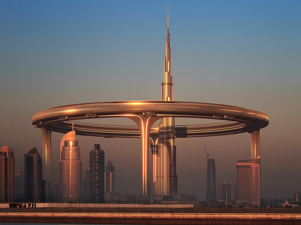
Land is becoming scarce, especially in metropolitan areas where every square meter can cost hundreds if not thousands of dollars. With nowhere else to go but up, people have been building taller architectures, whether for business or for residence, paving the way for the sun-blocking towers of dystopian science fiction. Before things get worse, however, some visionaries have started to design structures and systems that are almost unbelievable both in their majestic beauty as well as sustainability. One such ambitious proposal wants to encircle the Burj Khalifa, the world’s tallest skyscraper, with a massive ring high up in the sky that is intended to smash the conventional ideas of gated communities and apartments in a self-sustaining manner.

Designer: ZN|Era

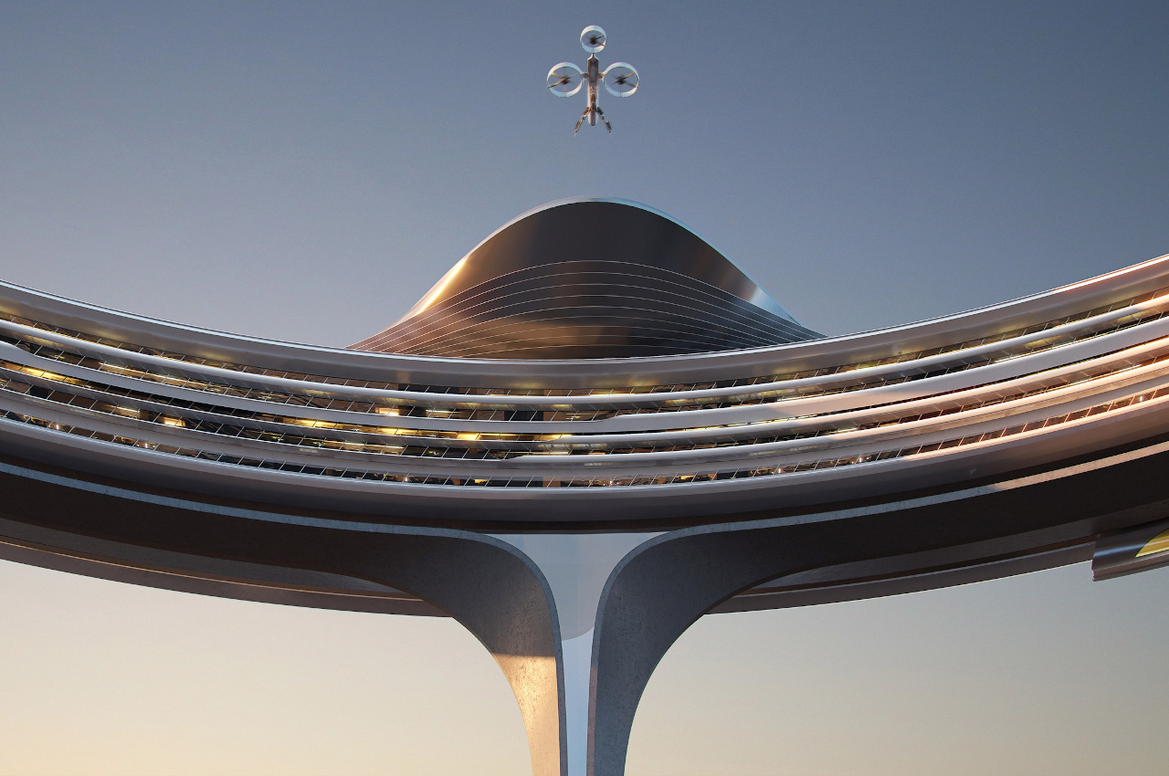
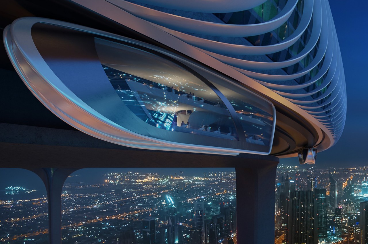
The Downtown Circle, as the project is called, stands atop five gigantic pillars like a majestic testament to human creativity and ambition. Although its 550-meter height pales in comparison to the Burj Khalifa’s towering presence, its encompassing size is enough to cover Downtown Dubai, hence its name. It’s a good thing that it’s really a ring rather than a closed circle; otherwise, it would permanently cover Dubai’s skies and give off a gloomy atmosphere rather than an awe-inspiring one.

Of course, it isn’t just sculptural art but is an artful vision of the future of human living. The ring is, unsurprisingly, designed to be a city, one that can sustain itself without descending to the land below. Instead of growing more buildings vertical, the structure uses horizontal space in the most efficient way, by going around a circle to have nearly double the occupancy.

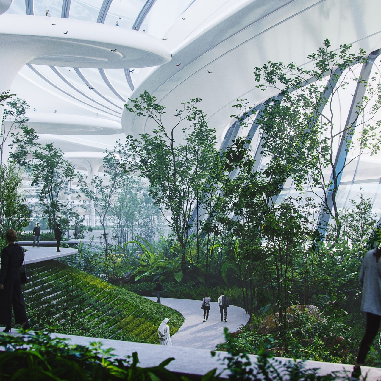
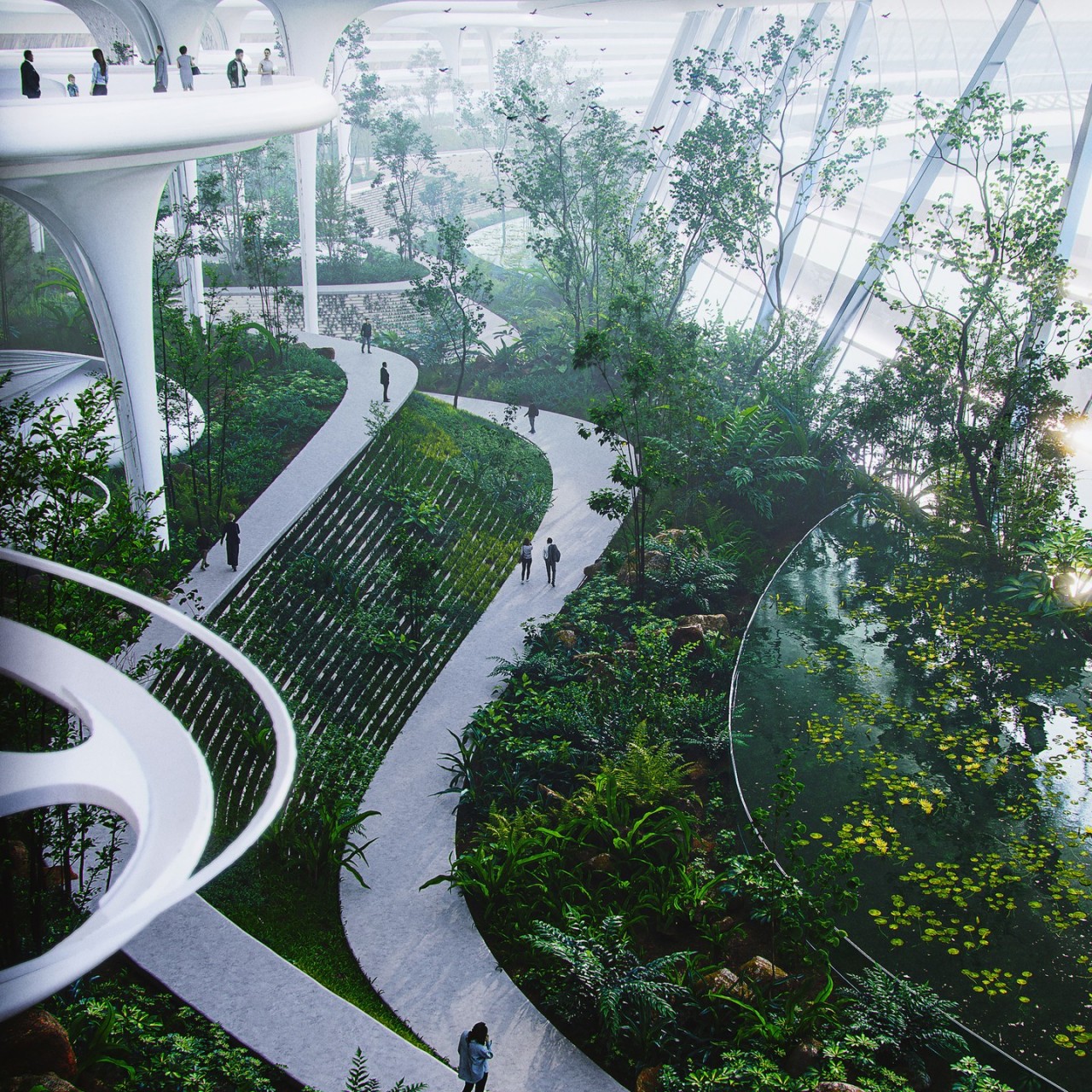
More than just the sheer magnitude of its size, what makes the project really ambitious is what happens inside. Like a true city, not only will there be residences for people to live in, but also public, commercial, and cultural spaces. Two rings make up the entire structure of the Downtown Circle, joined by a continuous green structure that connects the five levels inside. That green “belt” named Skypark isn’t simply a support structure but also a green ecosystem that is the key to the ring city’s self-sufficiency.

This literal and figurative central component will be the location of the circle’s ecological treasures, providing not only agriculture for human consumption but also systems for generating sustainable resources from rainwater and the sun. Recreating some of Earth’s ecosystems, like waterfalls and even swamps, the Skypark will be what keeps people and animals alive inside the circle.

Of course, it is a vision that is admittedly on the grand and unrealistic side of the scale as far as current technologies and infrastructures go. Building the Burj Khalifa is probably a piece of cake compared to a humongous ring that will impose its presence on the people below, probably striking both wonder and fear because of the risks if a single structural problem were to occur. Still, the idea of a self-sufficient and sustainable city is definitely the right way to go, and we can always dream big while we’re at it. And as far as big dreams go, the Downtown Circle is truly up there, pun intended.

The post This epic sky ring around Burj Khalifa is a sustainable gated community concept first appeared on Yanko Design.
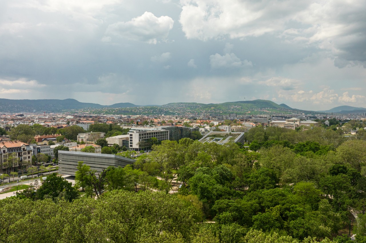
This beautiful Budapest museum has a roof that gently curves to meet the ground

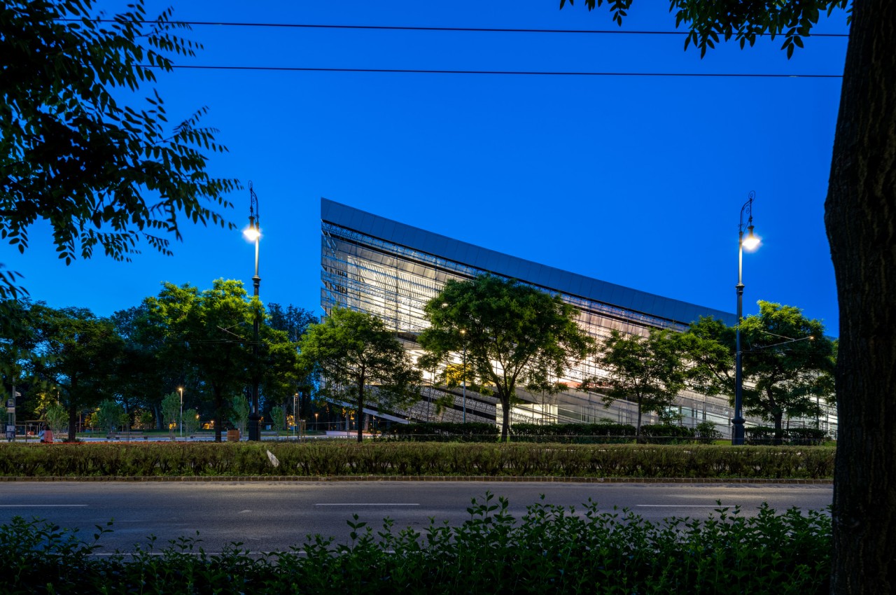
When talking about stunning architectural works, we often think of structures and buildings that stick out from the ground. This can be something as sprawling as a majestic palace or something as breathtaking as a thin skyscraper. After all, it’s a bit difficult to appreciate something that’s hidden underground. Of course, it’s not exactly impossible, especially if the entrance to that underground haven stands out in a very special way. One would presume that an underground structure wouldn’t need to have a grand entrance, but the new Museum of Ethnography in Budapest dares to be different, creating an awe-inspiring visage where the ground meets the sky, welcoming visitors to the treasures trove inside while also providing a completely new experience for people who just want to stroll along.

Designer: NAPUR Architect

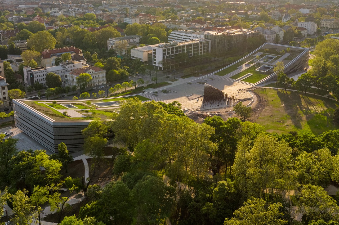
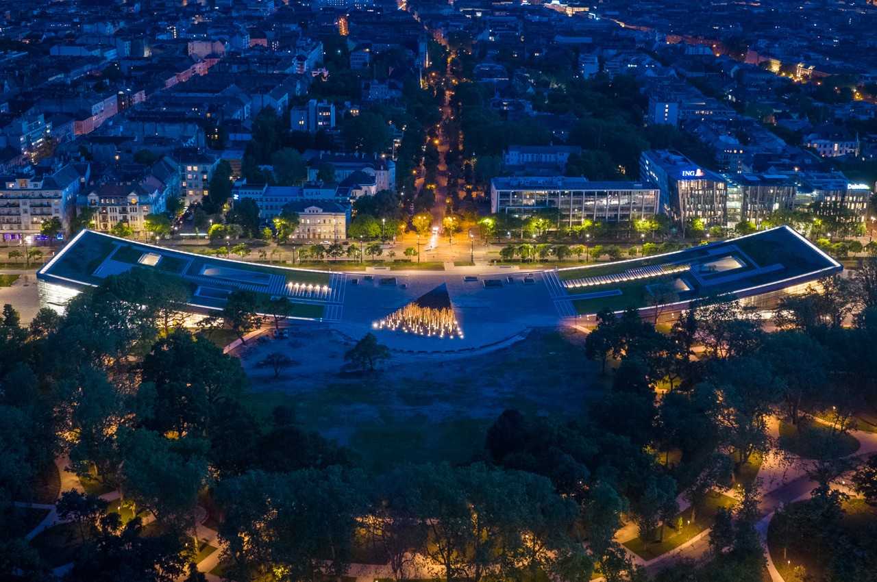
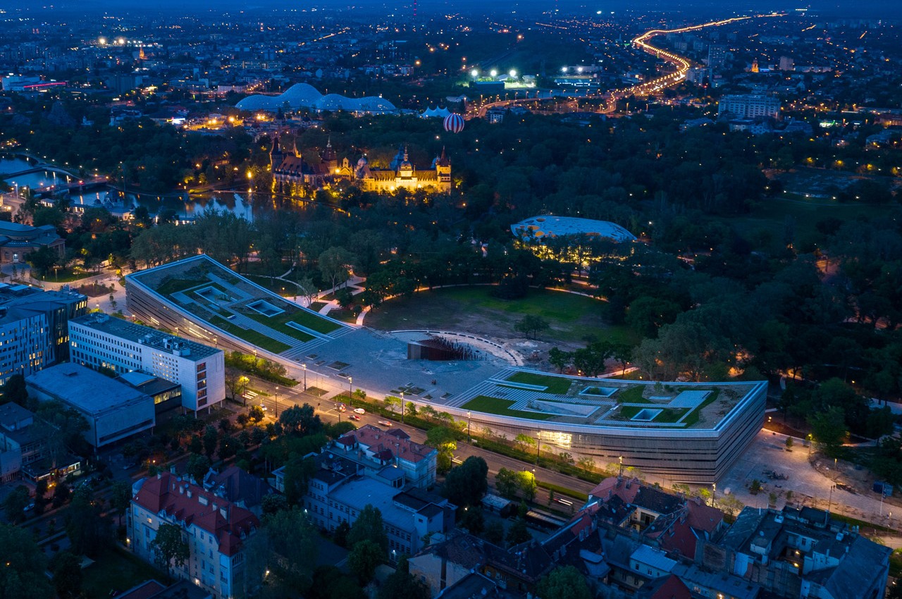
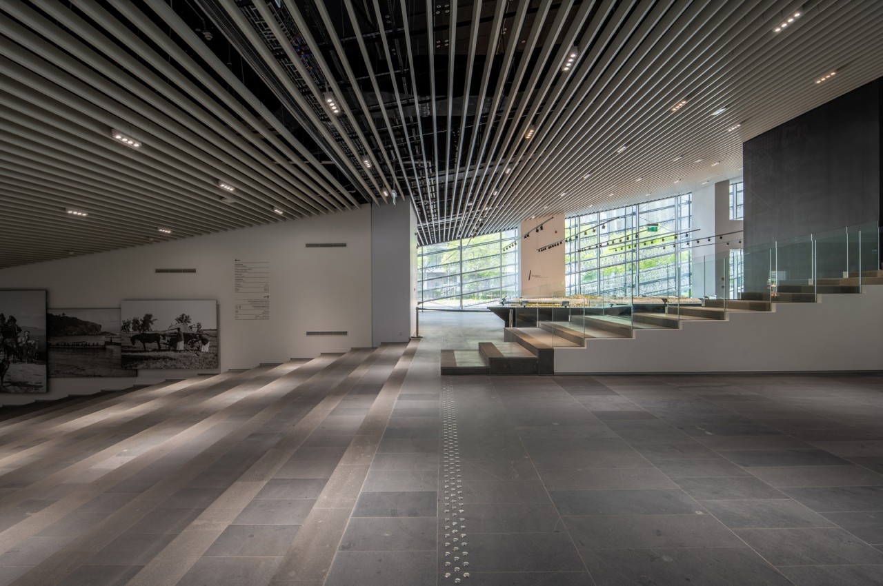
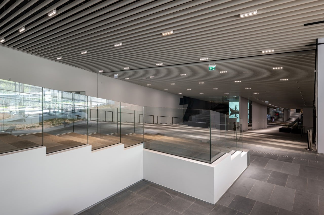
About sixty percent of the newly inaugurated Ethnography Museum is actually below ground level. This is where the main attraction of the venue is stored, of course, housing around 250,000 historical artifacts in a single facility for the first time in over a century. Rather than just having a simple structure to house the entrance to this underground museum, however, the winning design went the extra mile to create a structure that is itself a wonder to behold. More importantly, it also serves as a place for people to congregate and enjoy the fresh outdoor atmosphere, probably before or after filling their minds with knowledge of the past.

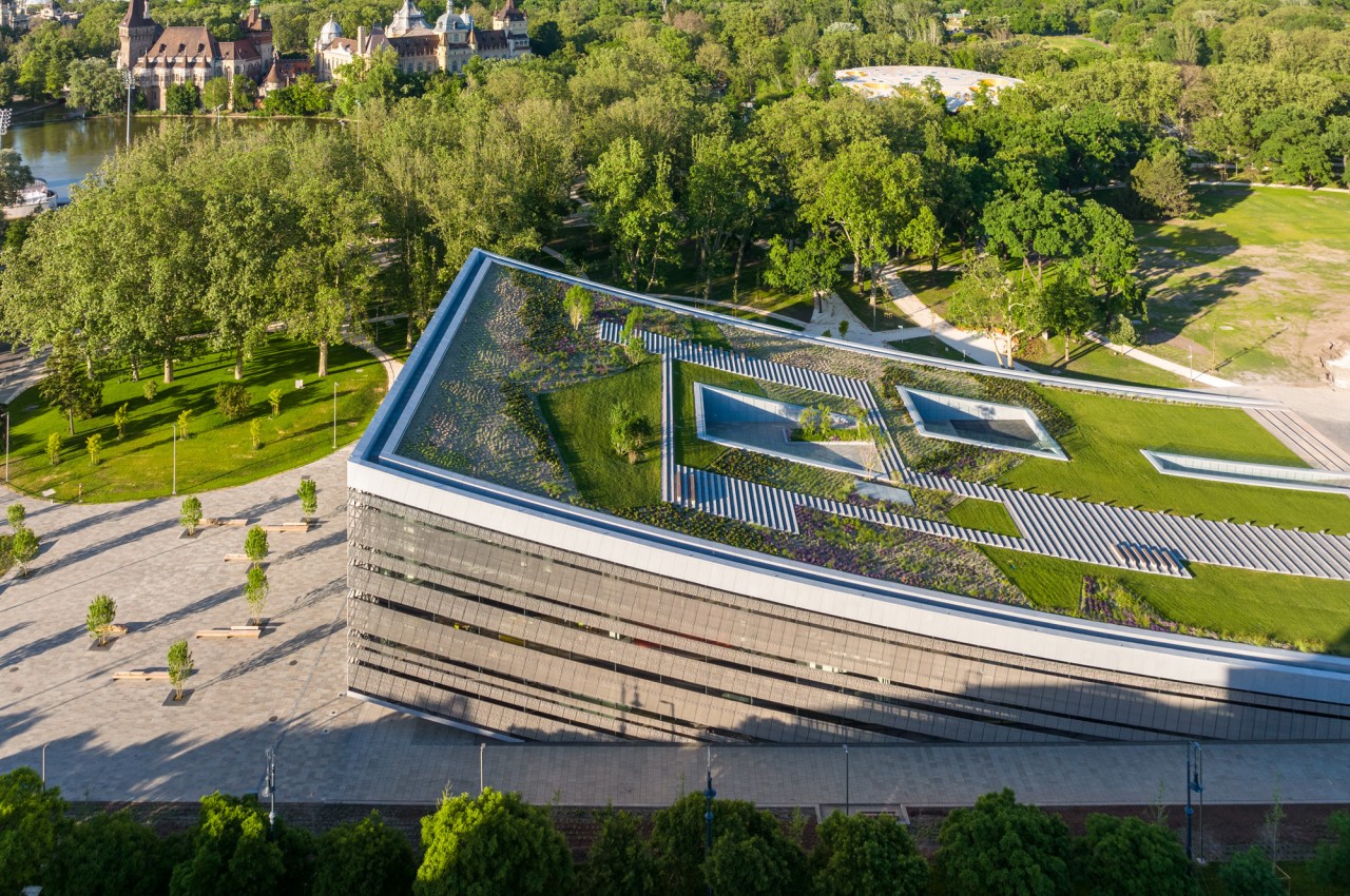
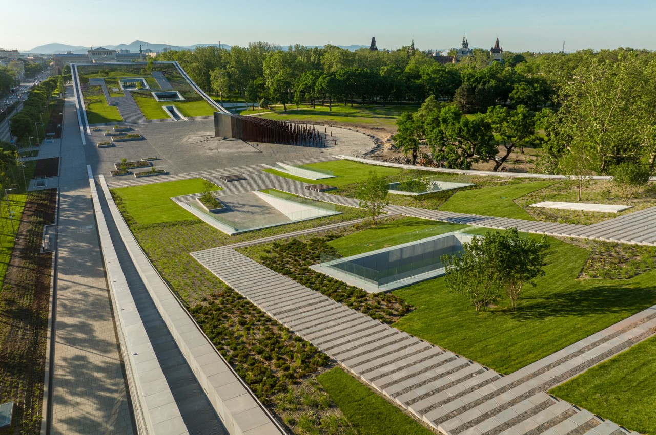
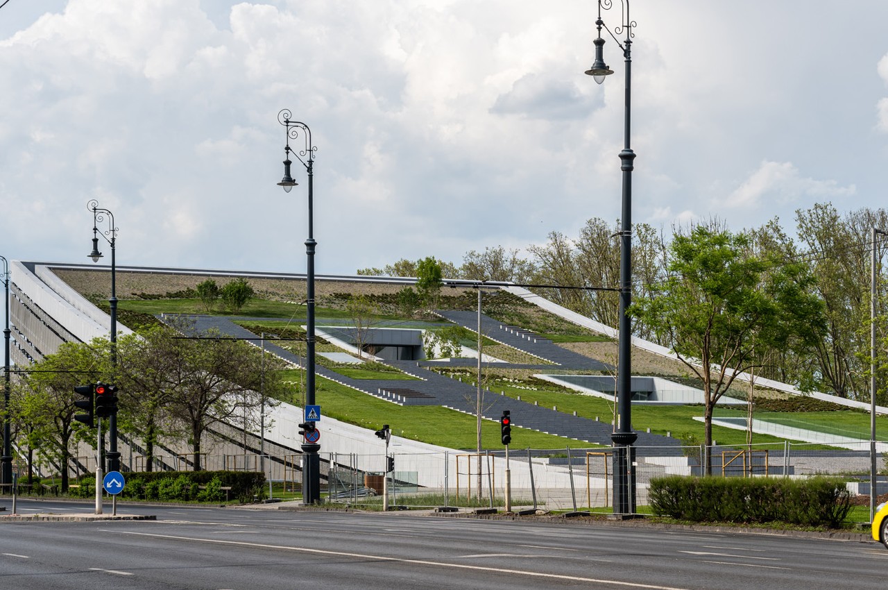
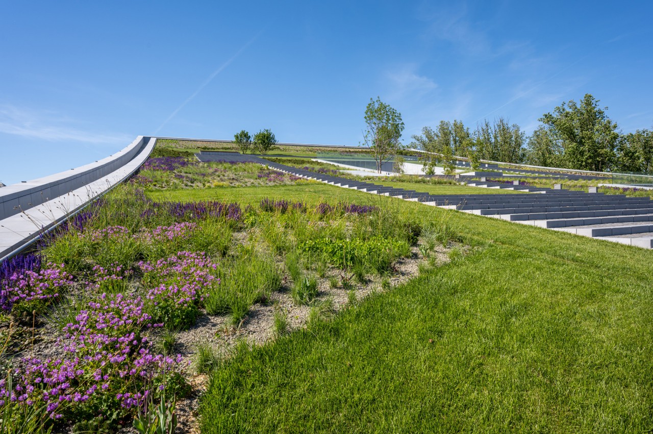
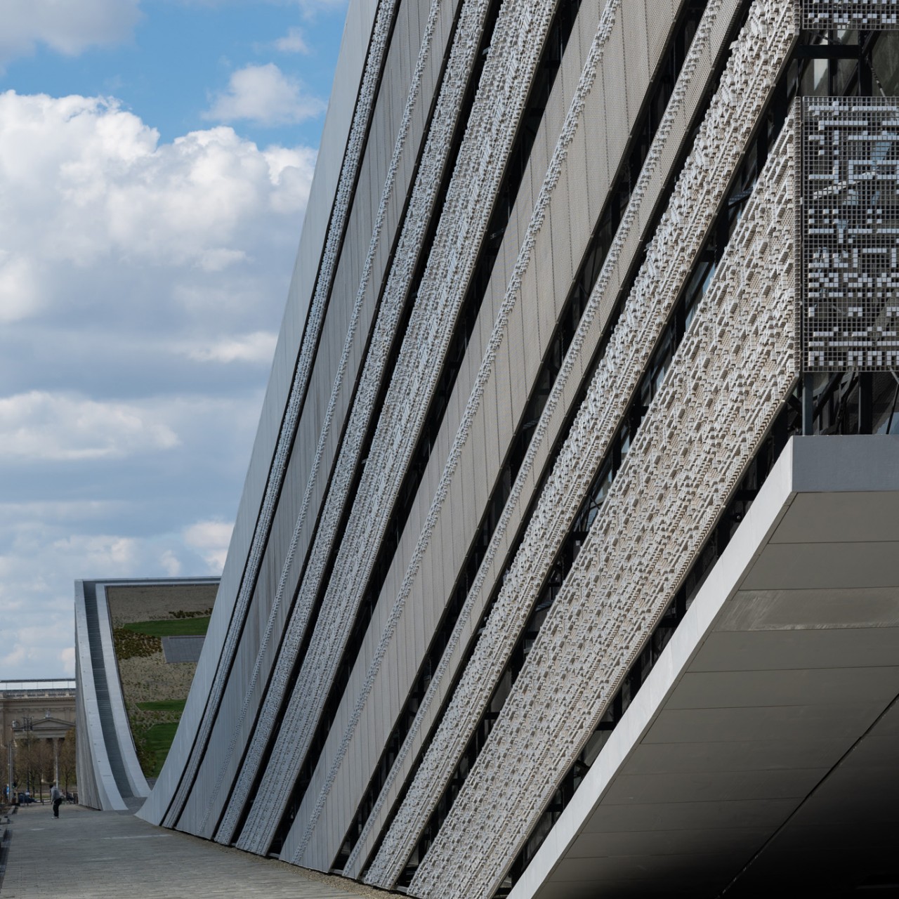
It’s not exactly easy to describe the shape of the museum’s above-the-ground floors. A skating rink might be an apt comparison, with a surface that curves downward in the middle to become level with the ground. Alternatively, you could also picture it as the building’s sides rising above the ground to reach the sky. Whichever way you try to think about it, the museum’s roof is both above ground as well as on the ground, creating an almost seamless connection with the park surrounding it.

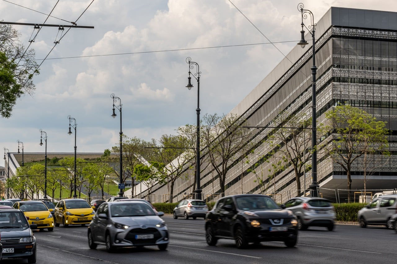
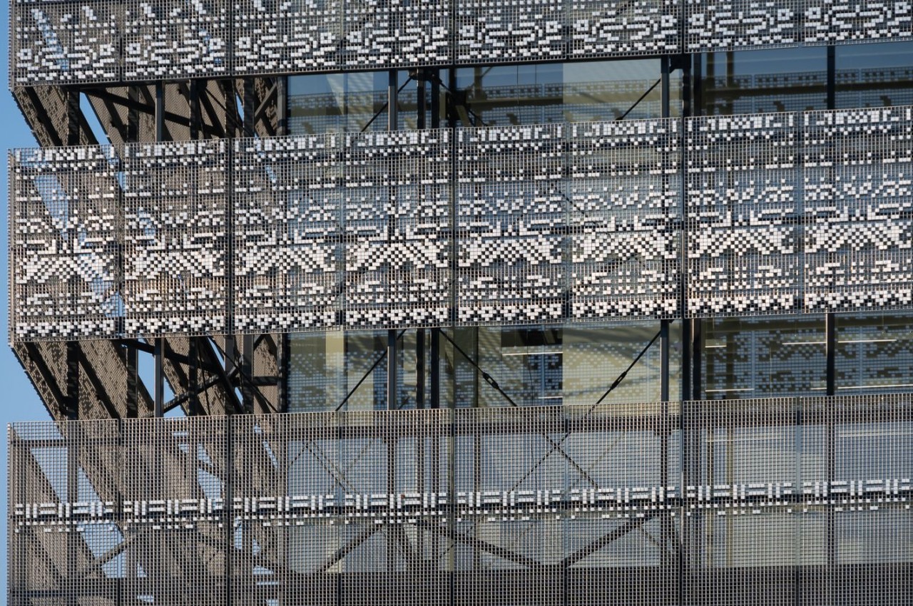
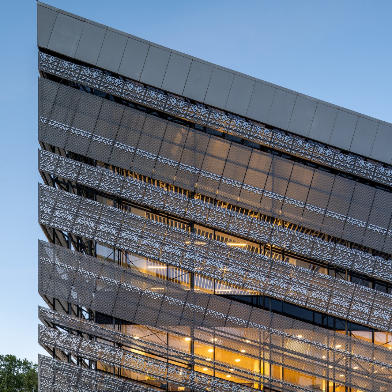
The grass-covered roof definitely feels like an extension of the green park and is a perfect venue for community and social activities. But while the structure of the building is its most eye-catching part, closer inspection will also reveal equally interesting details that are more closely related to the building’s purpose. A glass curtain wall surrounds the exposed part of the landscaped roof, and this wall holds metal grids that create a dot-matrix display based on ethnographic motifs from the museum’s collection.

Whether it’s the wealth of historical artifacts inside or the beauty of the structure outside, this new Hungarian museum is bound to be the center of attraction for the country. It is a design that tries to blend the past and the present in a non-obvious manner, creating spaces that encourage communication, interaction, and perhaps even a bit of reflection. Either way, it’s definitely a great way to invite people to take a break on the landscaped roof garden and to maybe take a peek inside Hungary’s collection of cultural treasures while you’re at it.

The post This beautiful Budapest museum has a roof that gently curves to meet the ground first appeared on Yanko Design.
Razer Singapore HQ resembles a giant Razer-branded gaming accessory

When you’re the world’s biggest brand when it comes to PC gaming peripherals, it definitely speaks in your favor when your building looks exactly like one as well.

Few tech companies pay attention to how their own office buildings can become gigantic advertisements for their brand and identity. Apple, of course, is at the forefront of that appreciation, especially with the newer “spaceship” Apple Park in Cupertino embodying the company’s aesthetic and design language inside and out. Others, like Google and Meta, do take care to provide a comfortable, safe, and productive environment inside but don’t have much to show on the outside. Gaming brand Razer is setting itself apart and has turned its newest building into an architectural representation of what it means to be Razer.

Designer: Razer

It’s easy enough to pick out Razer products from a lineup. Over the years, it has established a design language that has become unique to its brand, even ignoring the telltale three snakes logo. All Razer products, from PCs to accessories, carry a dominantly black motif with acid green lines for accents and highlights.

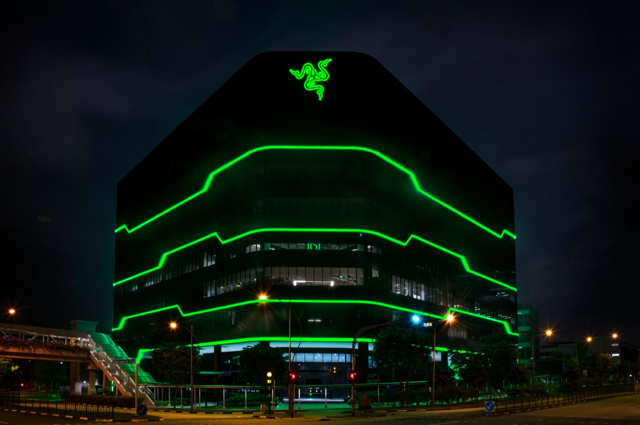
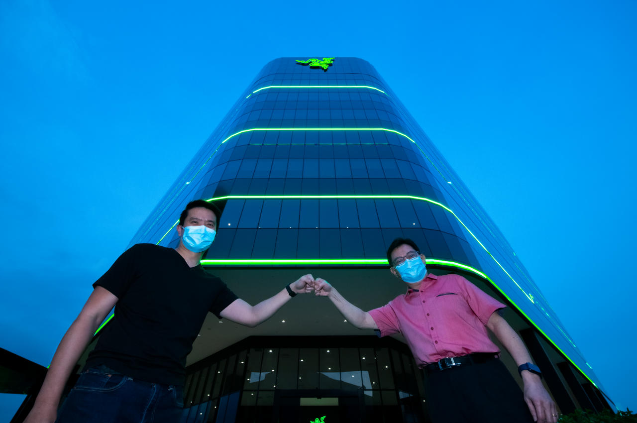
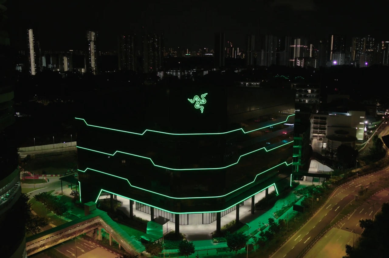
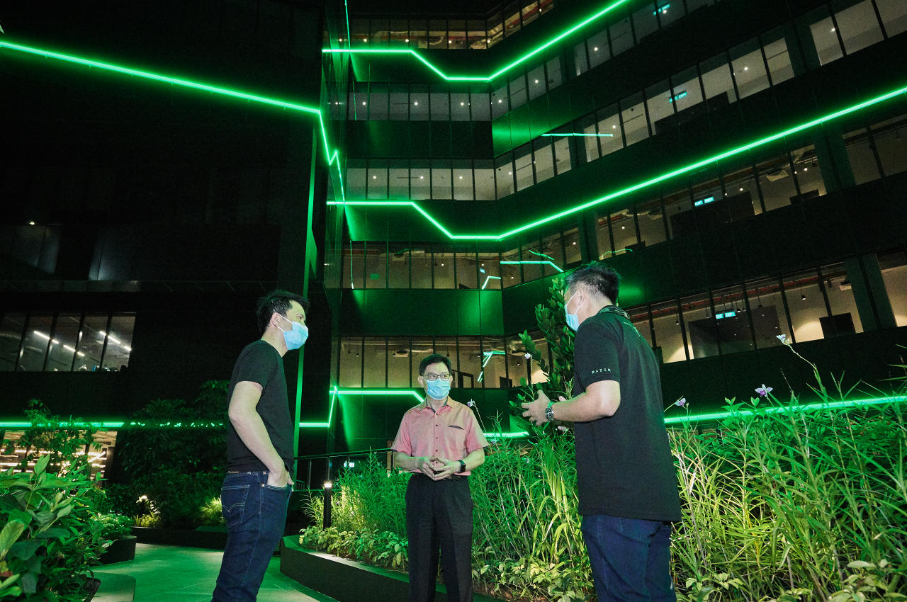
The company’s new Southeast Asian headquarters bears these same design cues, both on the outside as well as inside. Built on one-north, Singapore’s hub for tech and businesses, the Razer HQ’s tall, triangular shape is almost reminiscent of a PC hub for peripherals and accessories. That’s almost fitting given the building’s location as well as its purpose of being the company’s office hub for the region.

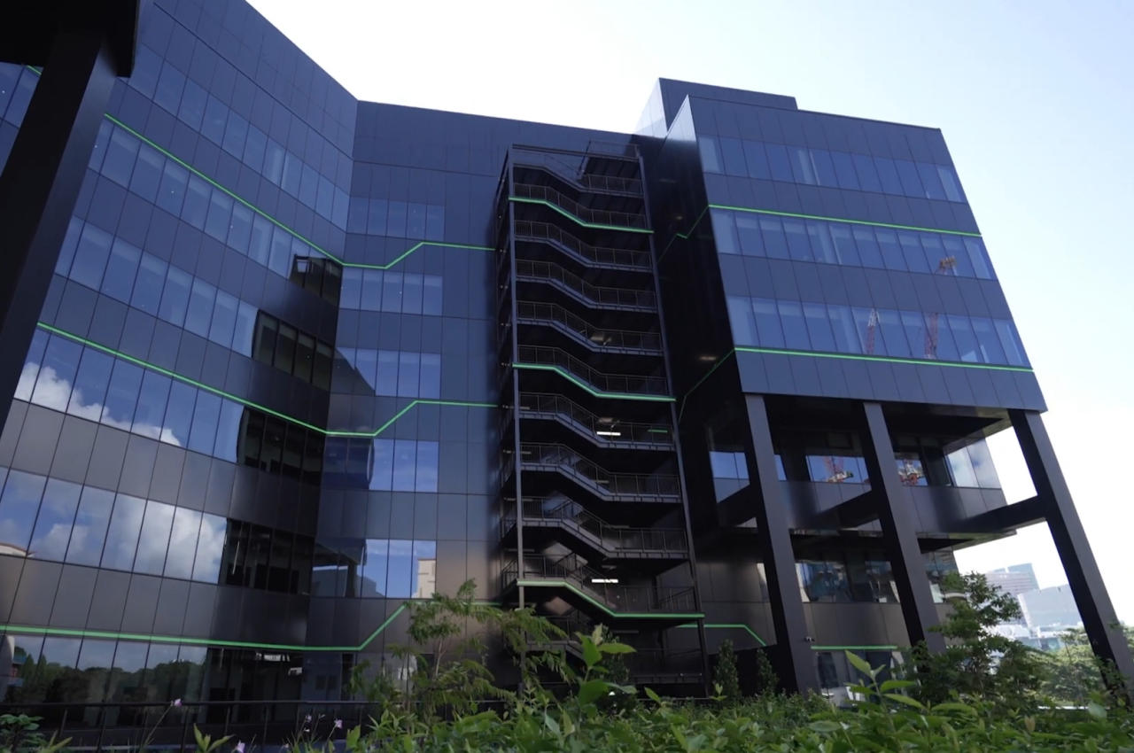
During the day, it’s harder to make out the building’s ties to Razer, with the green lines barely visible against the light reflected off the tinted glass windows covering the entire structure. Its informal shape still gives it a different and almost playful vibe in contrast to the other buildings around it. Of course, the large Razer logo dead center does mark it as the company’s territory, though not everyone will be familiar with the company’s core business.

It’s when the sun sets, and the external lights turn on that the building’s true nature is revealed. Those green lights that run across the building contrast sharply with the black facade, as well as the rest of the city lights and the night sky. In a single swoop, Razer not only established its presence in the area but also changed Singapore’s skyline in a way that’s totally Razer-like: bold, audacious, and attention-grabbing.

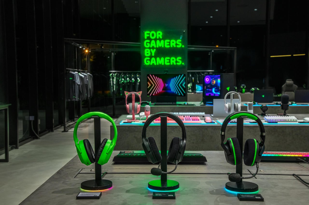
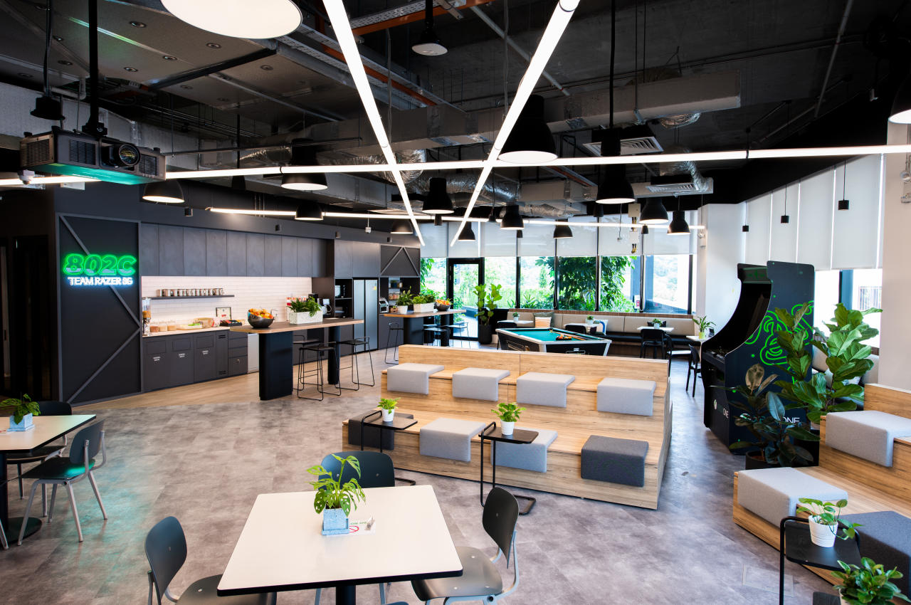
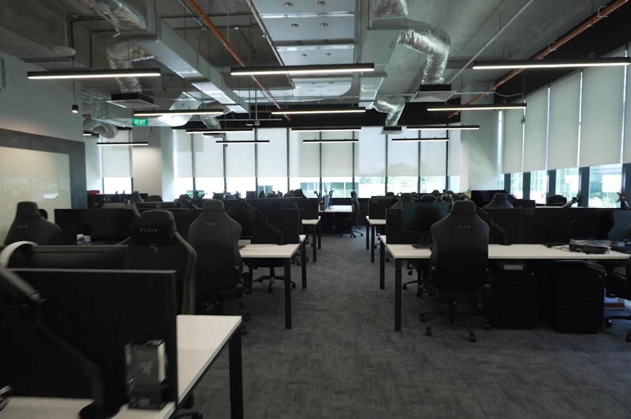
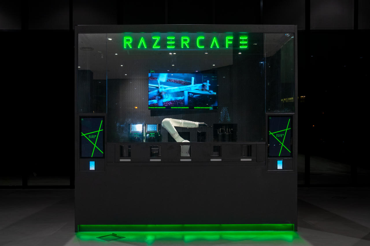
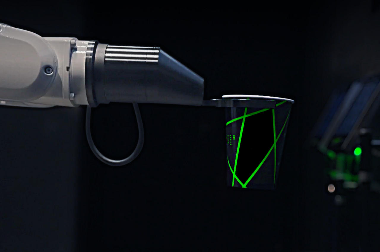
This motif continues indoors, but thankfully not in the actual office spaces. While visually interesting and exciting, a very dark space with only neon green lights would have been a terrible working environment, so it’s definitely reassuring that offices are properly lit and comfortable. The black and green theme does make its appearance in more commercial spaces, like a store and a cafe, complete with a robotic arm barista.

Razer’s new building isn’t exactly revolutionary in any way, especially when stripped of those highlights. It is, however, the combination of those little details that make the building special and help make Razer’s presence more felt and seen, especially to those unfamiliar with the brand. It’s the attention to those little details that sometimes seem insignificant that set companies apart, especially when they don’t shy from using their own building as a standing advertisement.

The post Razer Singapore HQ resembles a giant Razer-branded gaming accessory first appeared on Yanko Design.
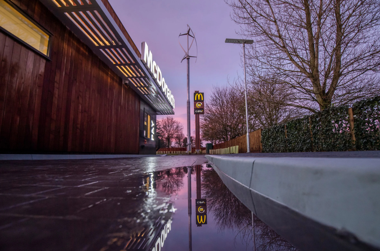
UK McDonald’s net-zero carbon restaurant tries to make the environment a bit healthier

You might have guilty feelings when chowing down on that hamburger, but one McDonald’s restaurant in the UK might at least let you feel good about staying green while you’re there.

Fast-food and health are two words that never really got along well with one another, and it isn’t just about humans’ bodily health either. Sometimes worse than other restaurants because of their nature and their processes, fast-food chains have also become perilous to the health of the planet, particularly through their net carbon emissions. As one of the world’s biggest culprits, McDonald’s is trying to set an example and opened the first net-zero restaurant in the UK, though it still comes up short of being net-zero in the true sense of the word.

Designers: Scurr Architects and AEW Architects for McDonald’s

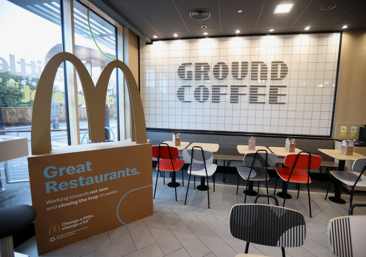
It’s no longer enough to just say that you’re using recycled materials for cups or utensils these days. Those are important first steps, of course, but not enough to earn you a “net-zero” badge for your building. For that, you’ll need to significantly reduce your carbon emissions in almost every aspect, including the construction, operation, and demolition of the establishment.

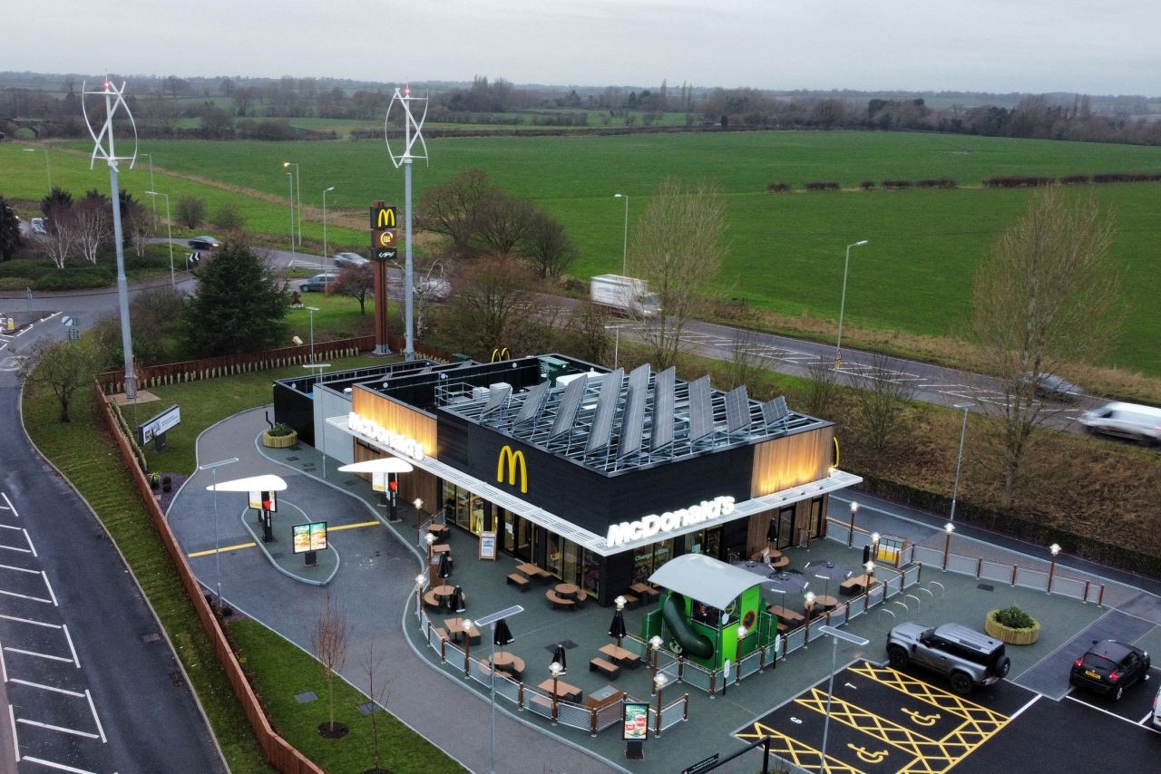
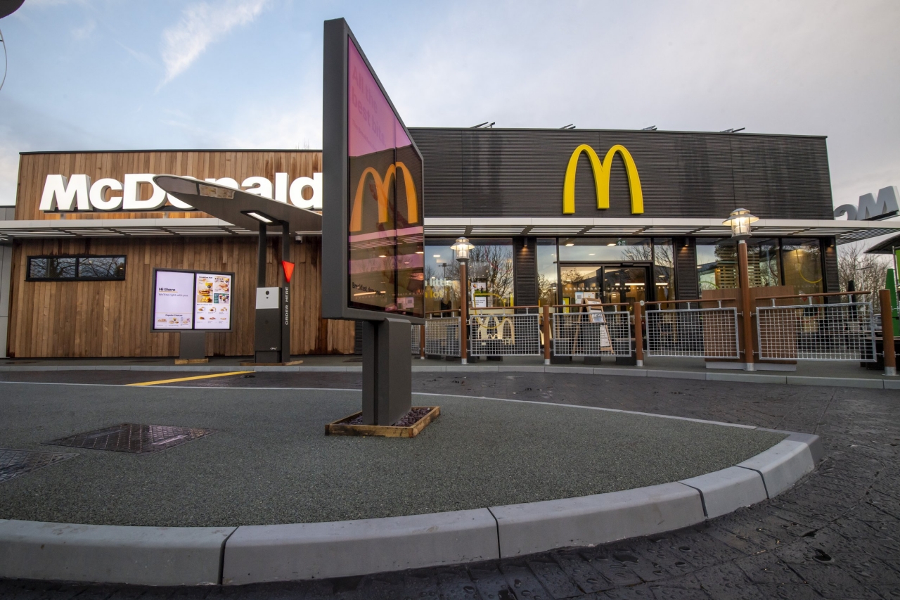
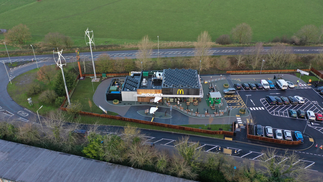
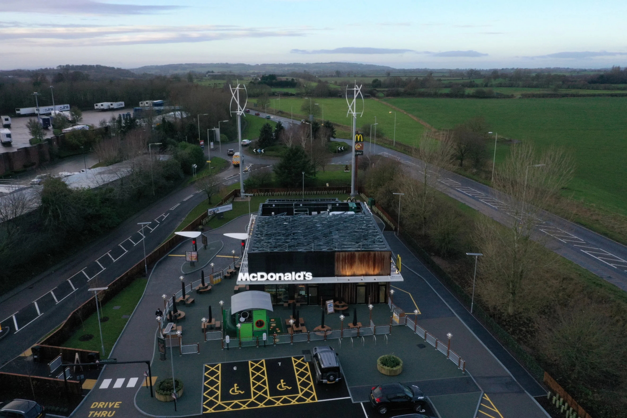
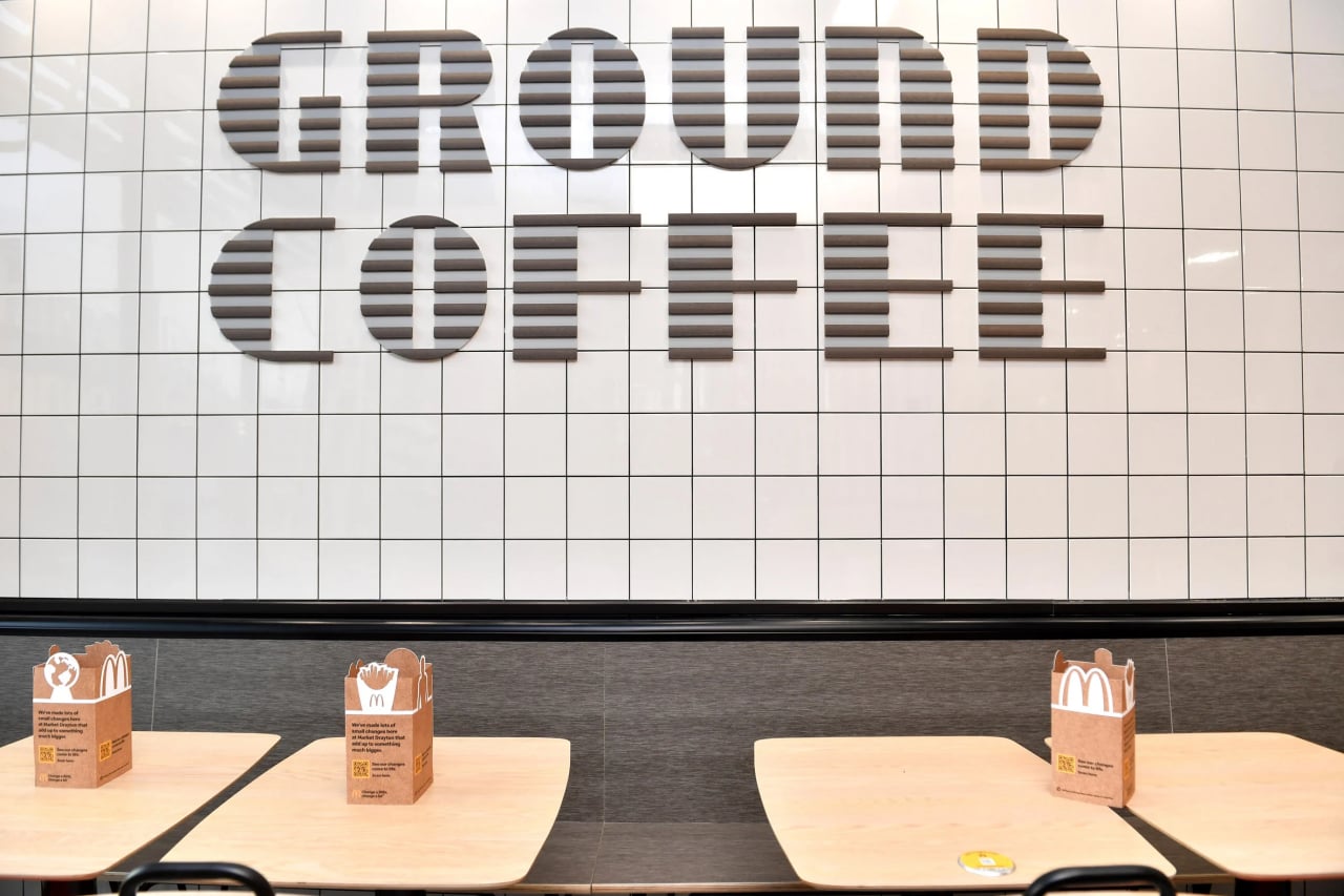
McDonald’s Market Drayton branch in the UK tries to check off a few of those boxes, particularly in the materials they used. Wall insulation is made from sheep’s wool, while parking lot kerbstones are each made from 182 recycled plastic bottles. Even the signage is made from McDonald’s own coffee beans as part of the company’s “circular waste solution.” All of these while retaining the same familiar design of McDonald’s restaurants around the world, or at least in the UK.

The day-to-day operations of the restaurant are also almost zero, with power being provided by two on-site wind turbines and 92 square meters (990 square feet) of solar panels. Strictly speaking, however, the restaurant can’t be considered truly net-zero because it doesn’t take into account consumption-based emissions, according to Dezeen.

It’s still an important step forward for the company as well as the UK’s net-zero carbon buildings thrust, especially considering how much foot traffic and how many customers a single McDonald’s branch gets on a single day. That said, it’s also just one in tens of thousands of McDonald’s locations around the world that still have to adopt the fast-food chain’s sustainable programs. It’s just the first step, of course, and McDonald’s plans to move forward in the years to come, including vegan, plant-based menus by 2025.

Photos courtesy of Anthony Devlin/PA.

The post UK McDonald’s net-zero carbon restaurant tries to make the environment a bit healthier first appeared on Yanko Design.
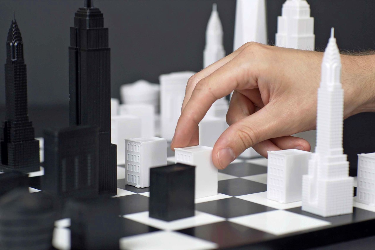
The Skyline Chess Set lets you play a game of chess with your favorite city’s iconic buildings!

Imagine the Harry Potter chess set… but with Muggle Architecture.

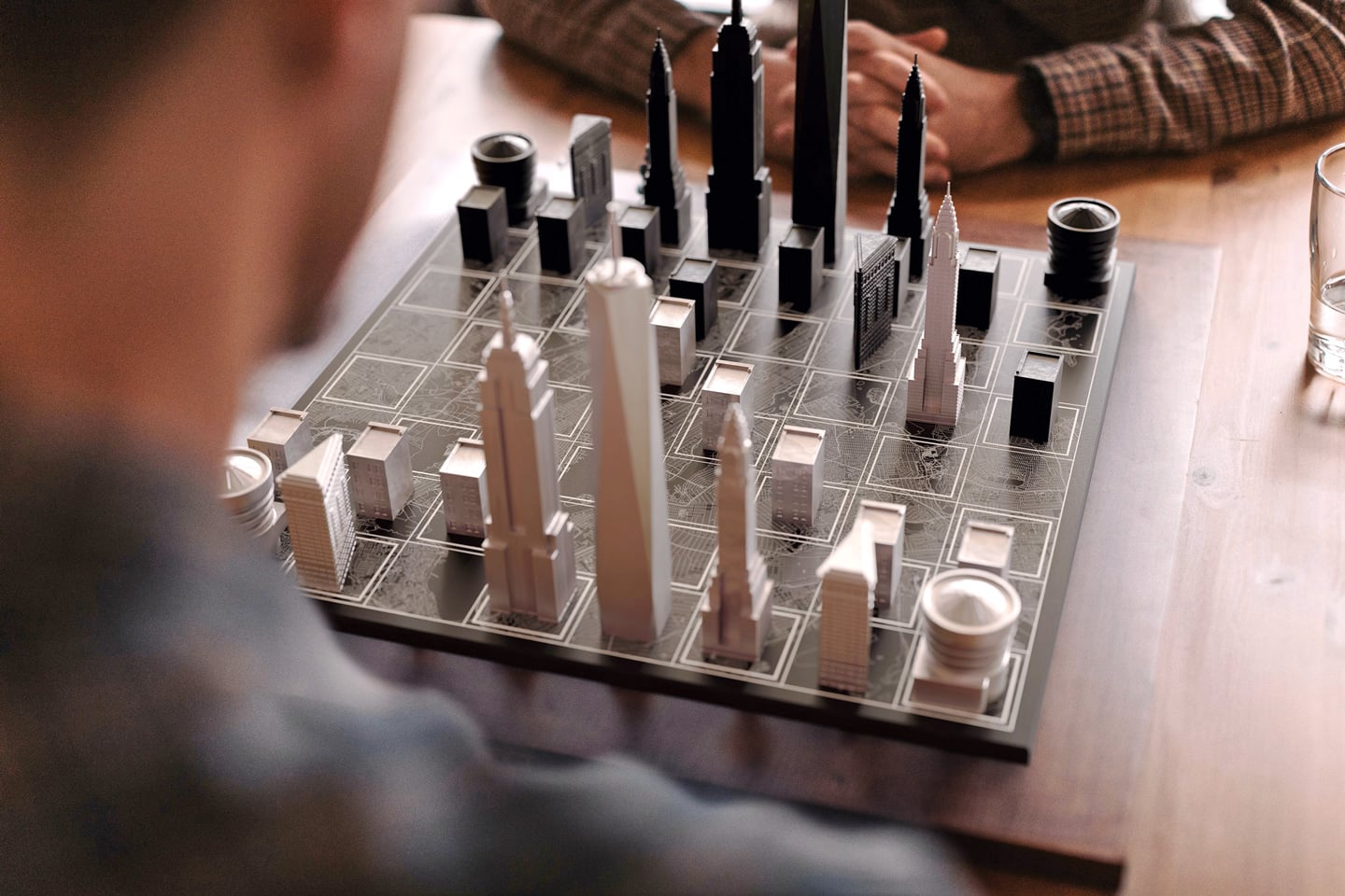
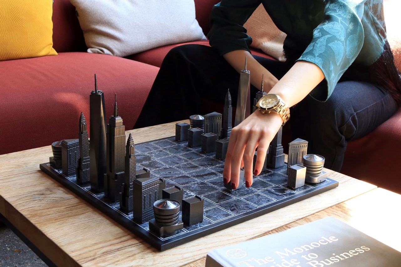
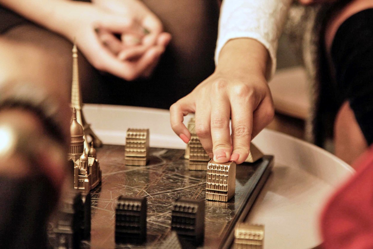
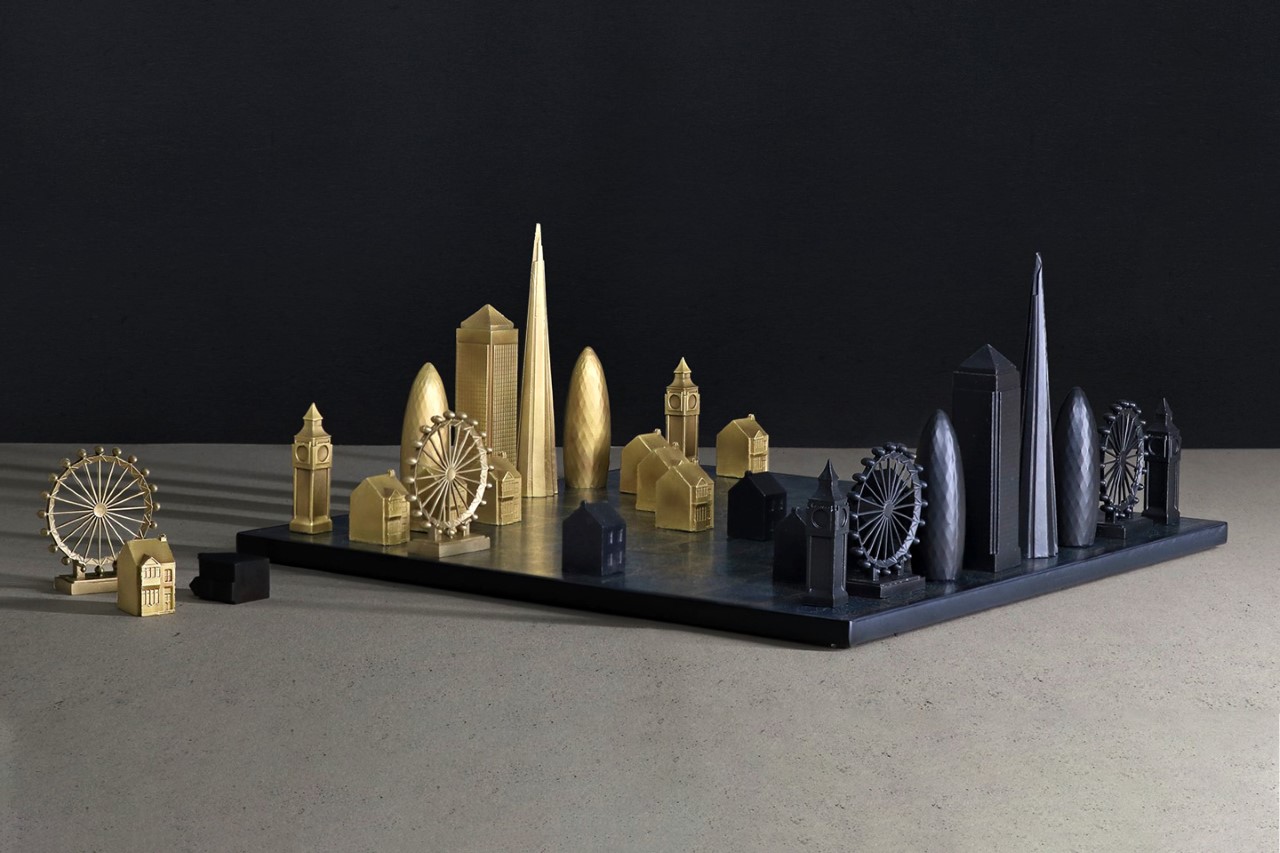
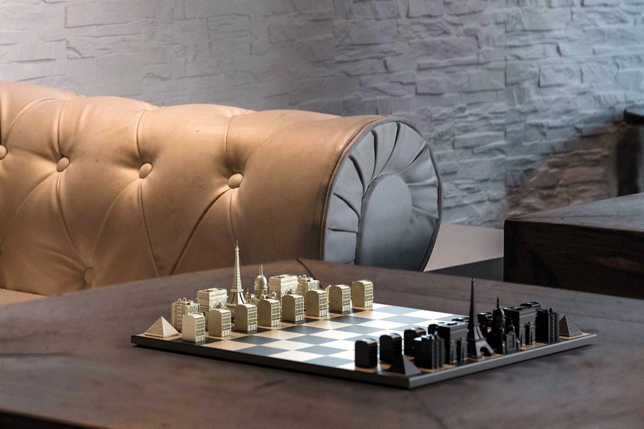
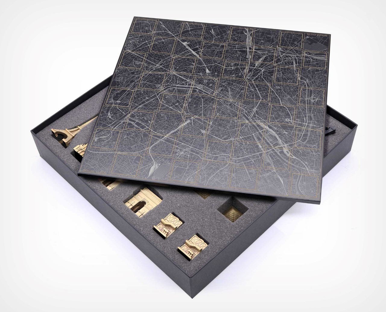
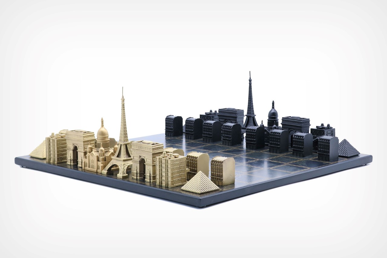
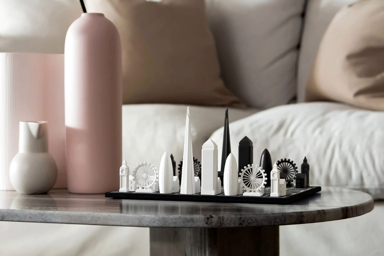
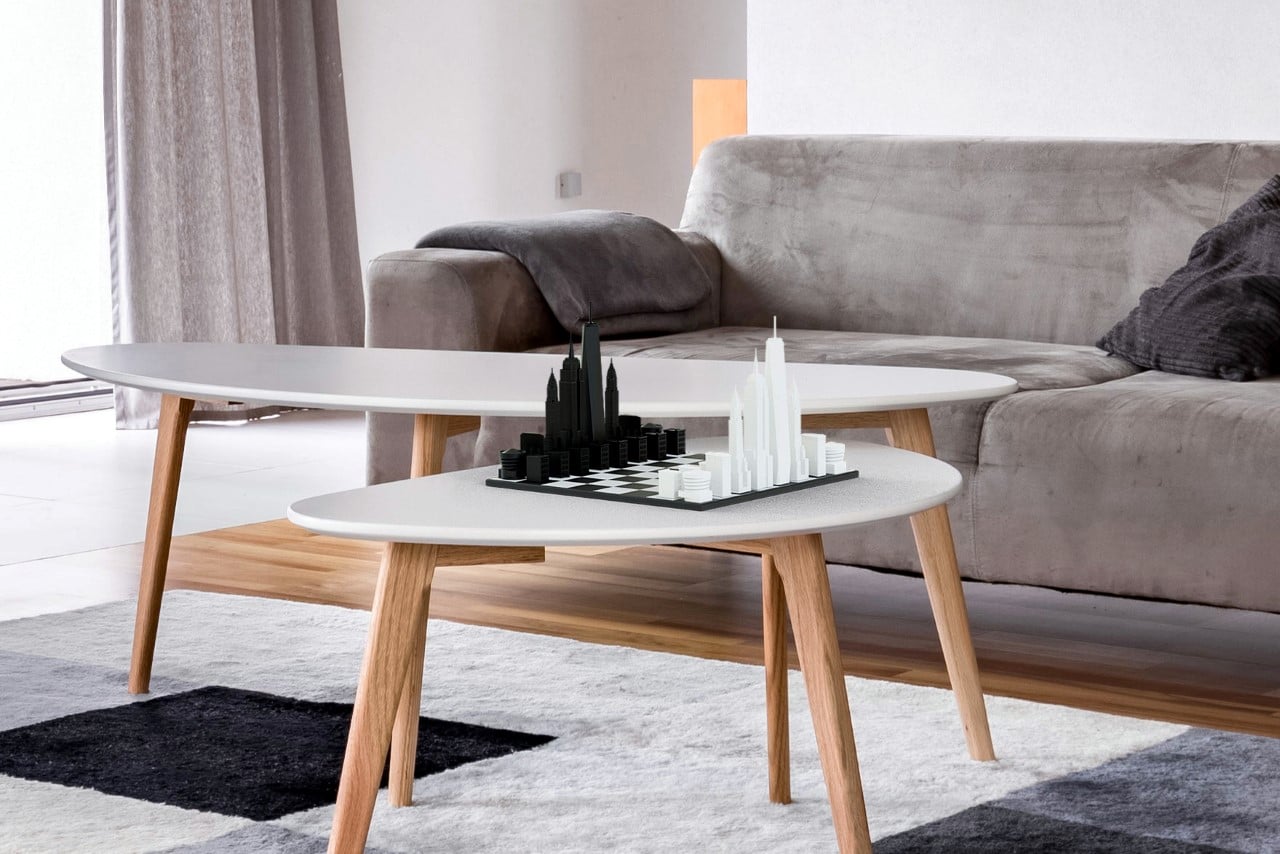
With 6 cities to choose from, scattered across North America, Europe, and Asia, the Skyline Chess set makes the game of chess a tad bit grander and classier than you’d expect. The board comes with its patent checkered design, but ditches the conventional army-inspired chess pieces for scaled-down replicas of iconic landmarks like the Burj, Eiffel, London Eye, and the Empire State Building.

Designer: Skyline Chess

Click Here to Buy Now

The chess set converts city skylines into chess players, with entire sets dedicated to the iconic buildings of New York, San Francisco, Chicago, London, Paris, and Dubai. Skyline Chess Sets let you play either as a singular city (with the board effectively being a visual representation of the city’s map) or battle it out between two cities, finally settling the debate of which one’s better – New York or London!

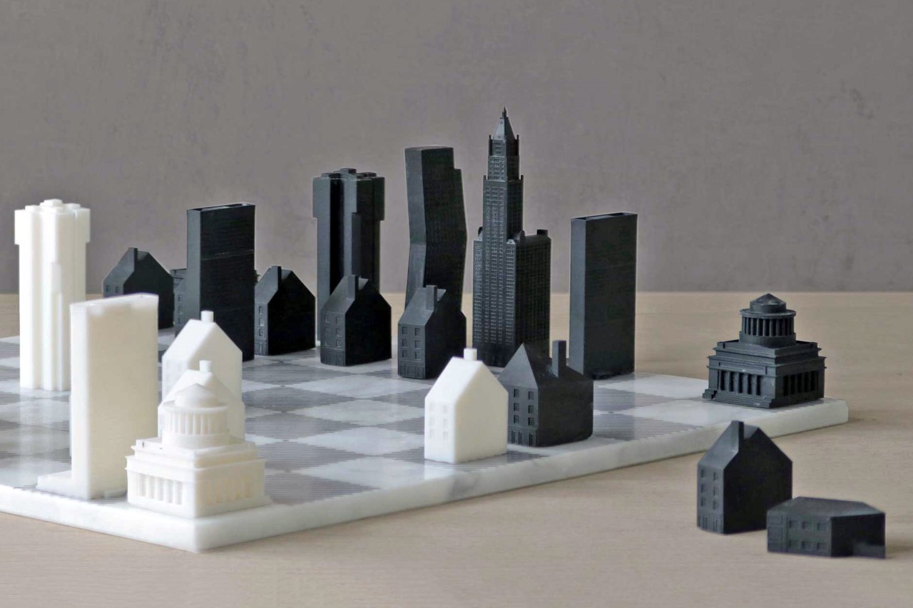
Each Skyline Chess Set comes in a variety of materials, featuring pieces made from acrylic, stainless steel, or even luxurious bronze, and the boards made out of card, wood, or marble. True-blue architecture enthusiasts can even grab brutalist editions of the game with die-cast resin pieces painted the signature concrete gray!

Combining the age-old popular strategy game with the undying beauty of architecture, the Skyline Chess Set’s appeal lies not just in the gameplay, but also in the fact that it makes a beautiful piece of tabletop decor. While the chess sets only come in 6 cities for now, the folks at Skyline Chess are actively expanding their collections with upcoming editions featuring Tokyo, LA, Hong Kong, and Shanghai!

Click Here to Buy Now

Click Here to Buy Now

The post The Skyline Chess Set lets you play a game of chess with your favorite city’s iconic buildings! first appeared on Yanko Design.
Researchers create bone-inspired 3D-printed building materials

You may not think of your bones as buildings, but researchers do. A team from Cornell University, Purdue University and Case Western Reserve University believes that by studying the internal structure of bones, they may be able to 3D-print stronger c...