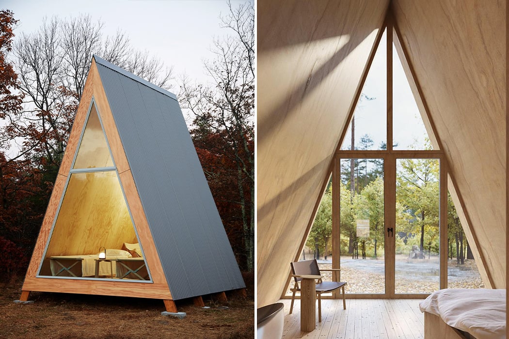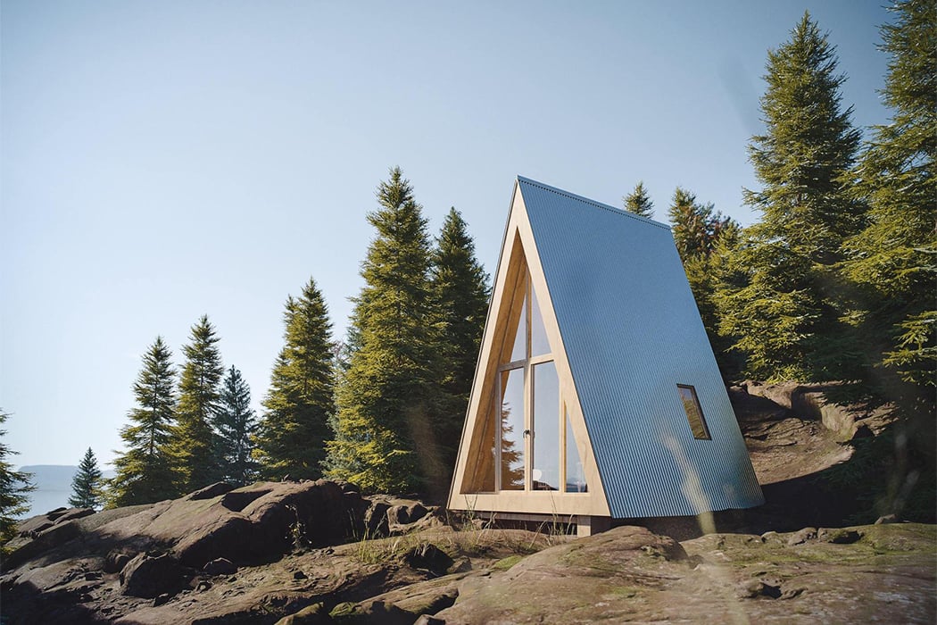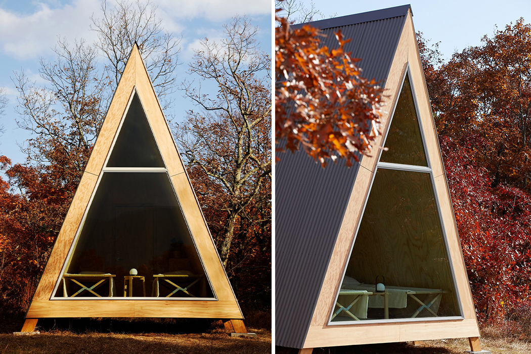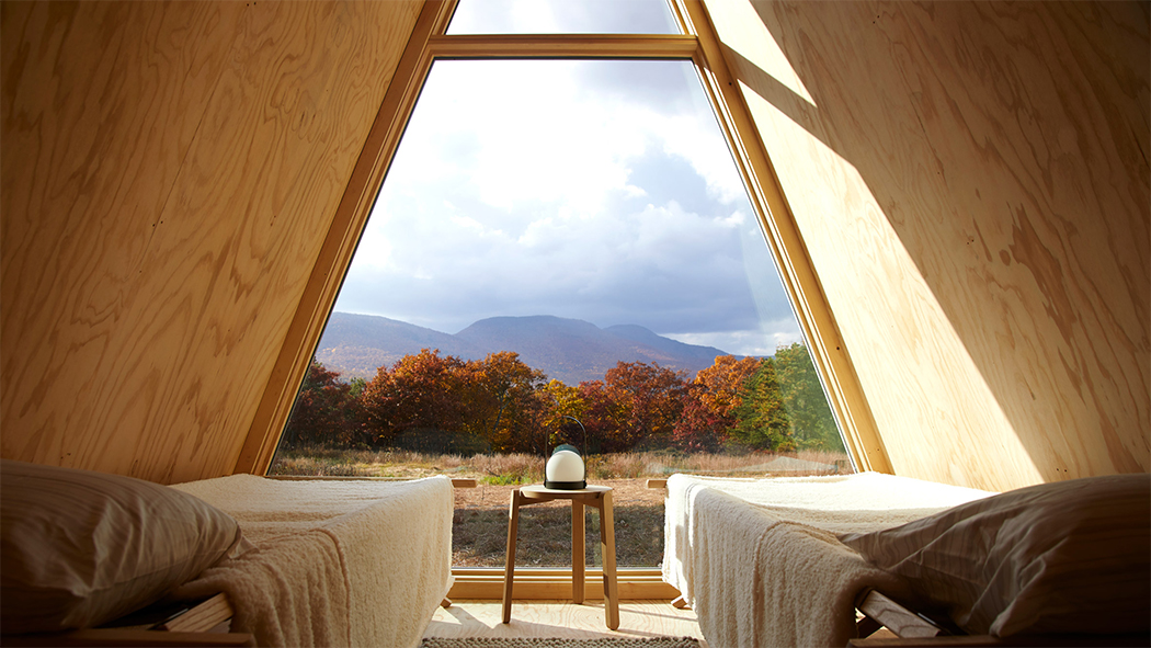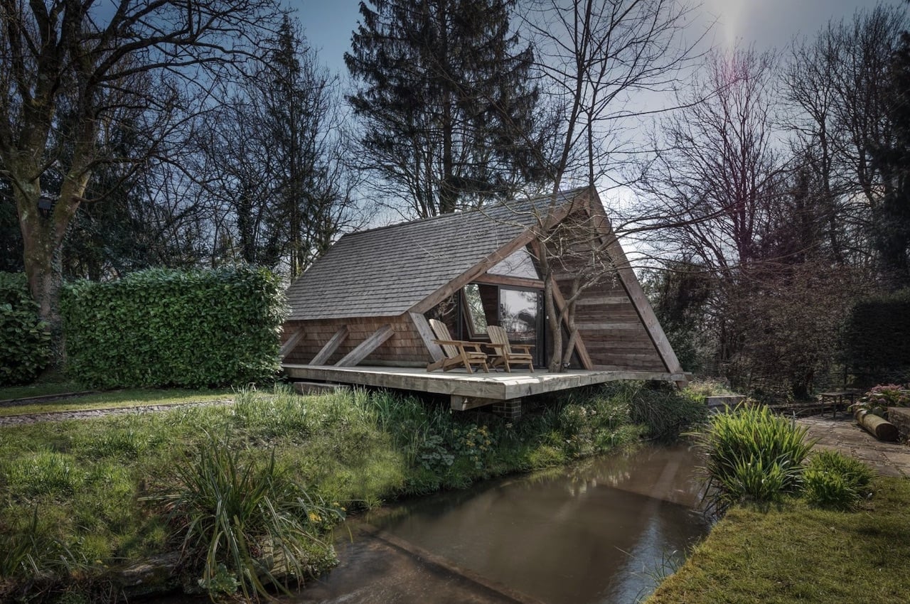
The Climber’s Cabin makes an impression with its sustainable and self-build design

The Climbers Cabin Designers

Cabin living has become attractive to many people. It’s now a popular way of living as it is more convenient now than ever.

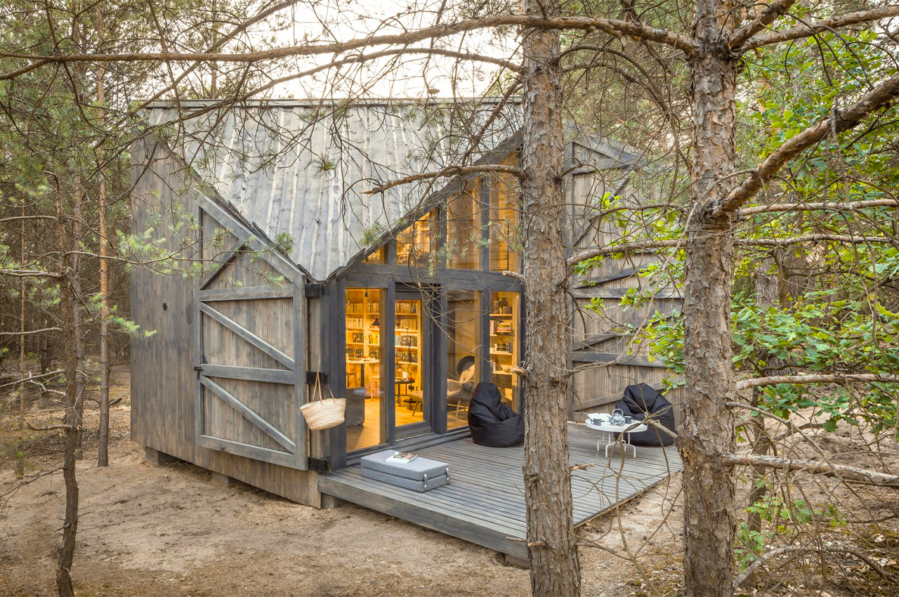
We have seen Several interesting units, but we believe more well-designed cabins will be introduced. The latest on our radar is The Climber’s Cabin by AR Design Studio. As described, its primary purpose is as a space for children and as a guest cabin for when you want to entertain friends and family.

Designer: AR Design Studio
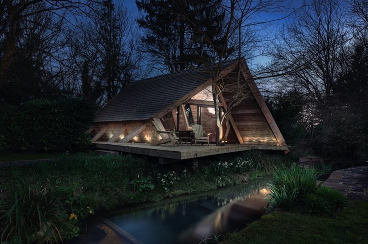
The Climbers Cabin

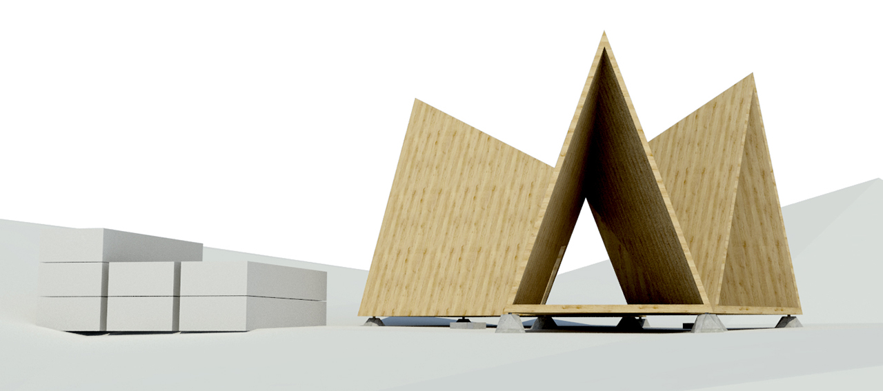
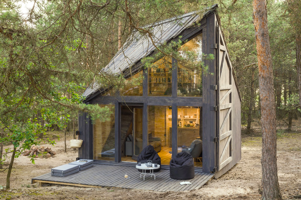
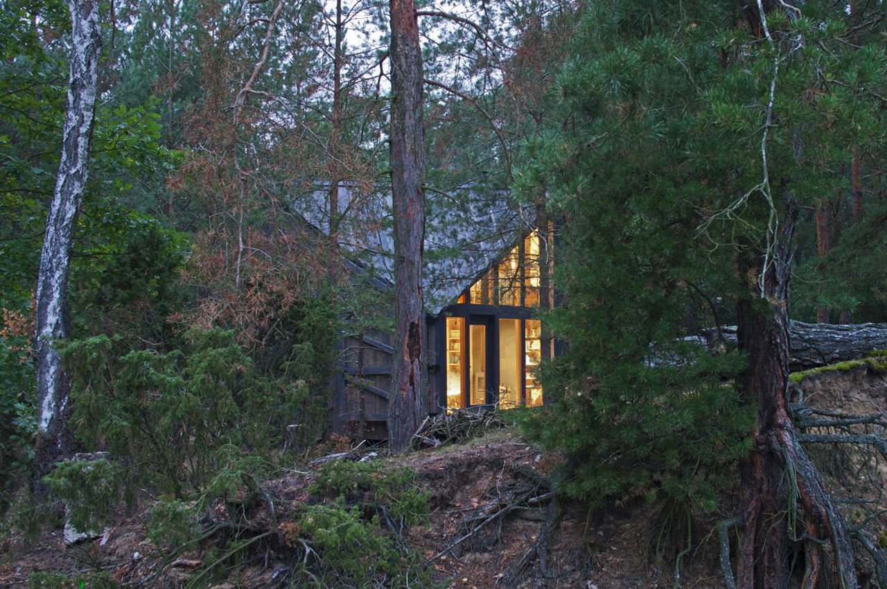
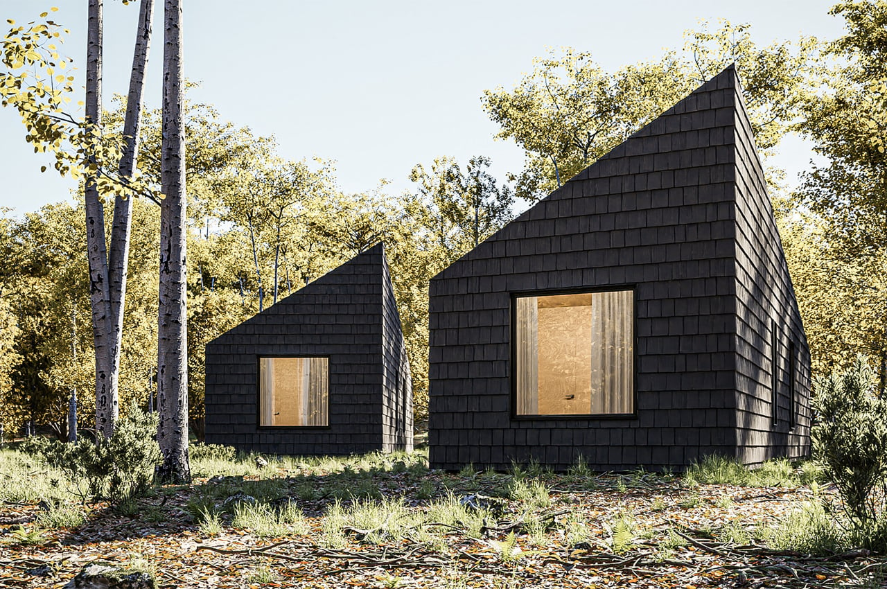
The Climber’s Cabin is situated near a stream and a woodland, adding to the adventure experience. The initial plan for the cabin was for it to function as an ancillary space for the client’s house. The idea was that the cabin would be built quickly without any complex construction methods.

Every step was supposed to be straightforward, so anyone could easily understand and follow. Construction should also be done using sustainable materials sourced locally. The project was actually born during those early months of lockdowns due to the pandemic.

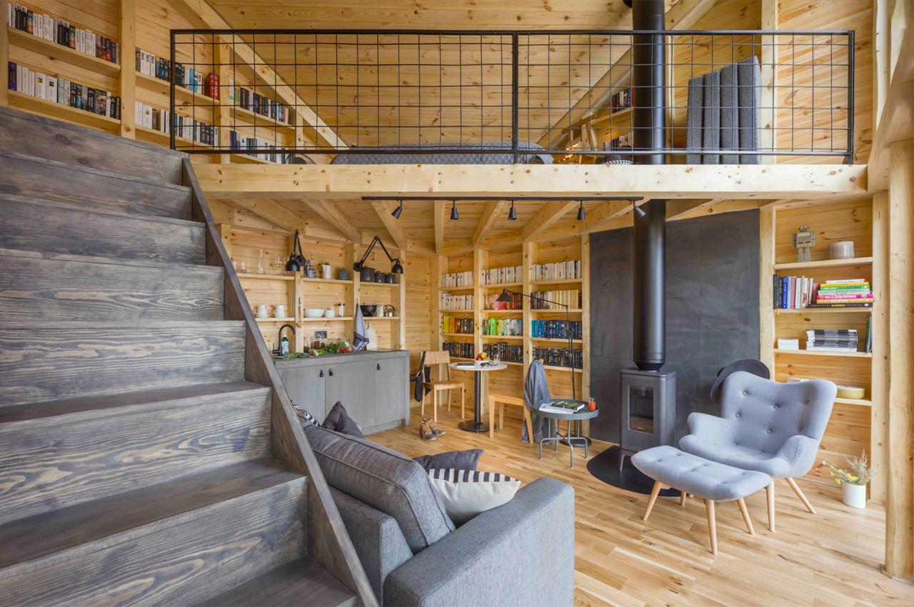
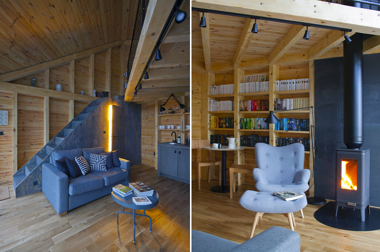
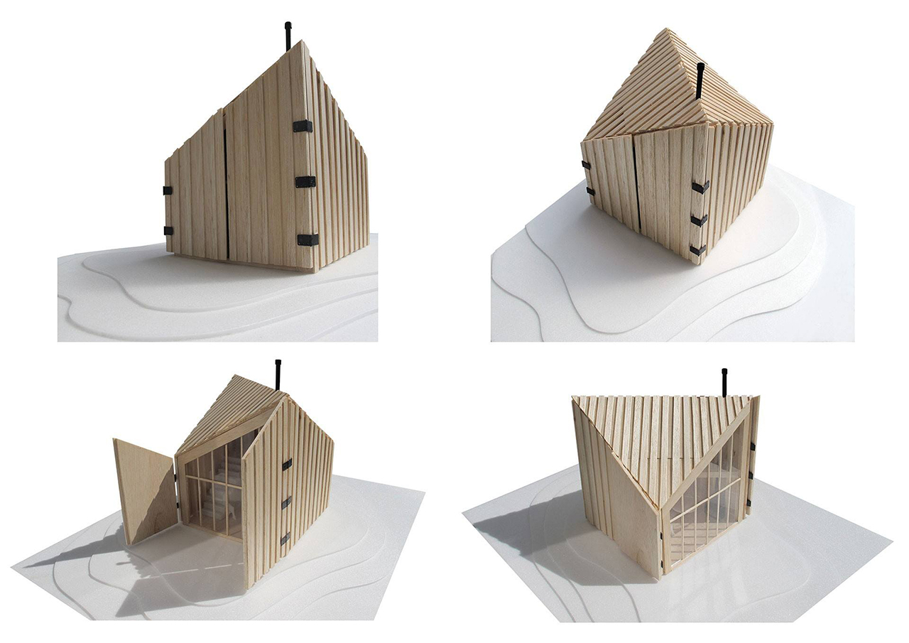
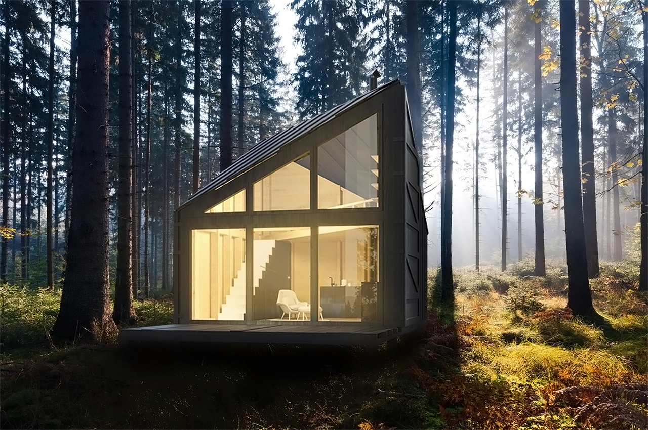
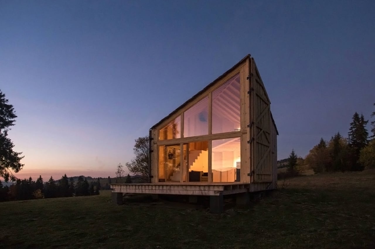
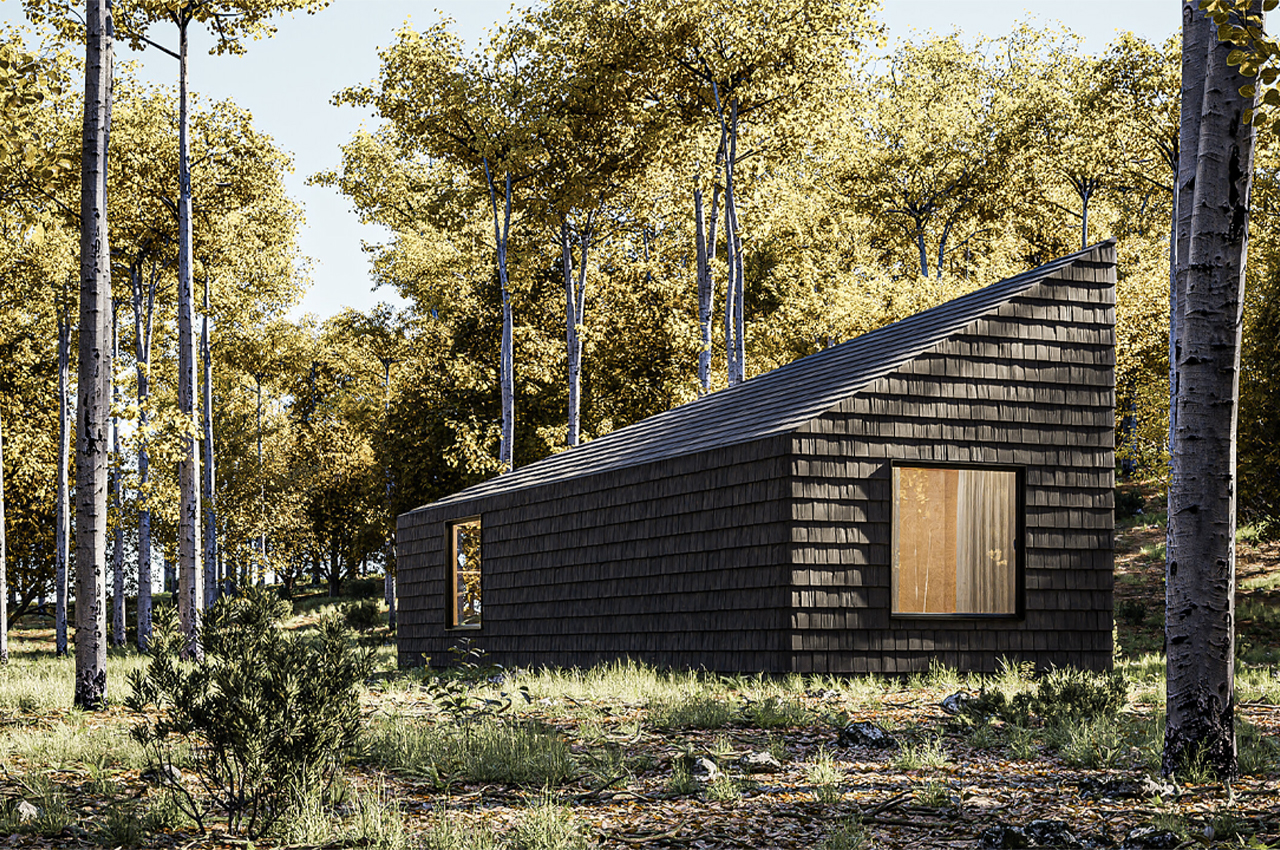
While the pandemic isn’t over yet, this design of The Climber’s Cabin can also be applied to other projects. The cabin is also 25sqm, but it can accommodate up to four people. What started as a 6×4 meter box has been maximized for a bigger floor area. In addition, the A-shaped roof was optimized to allow a mezzanine. This means additional space for guests to move around.
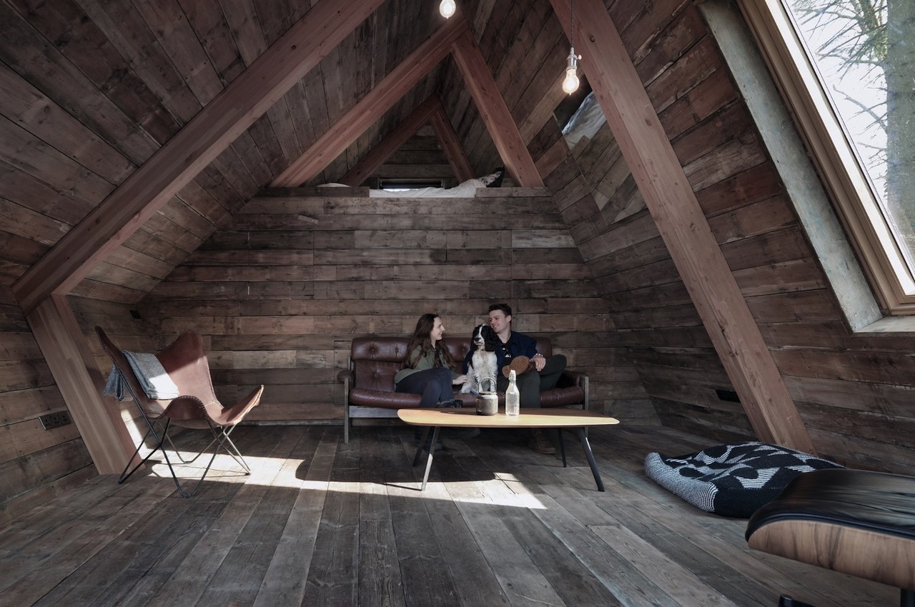
The Climbers Cabin Design

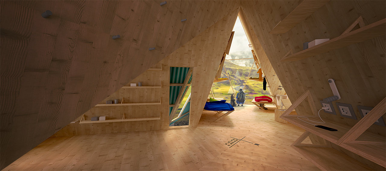
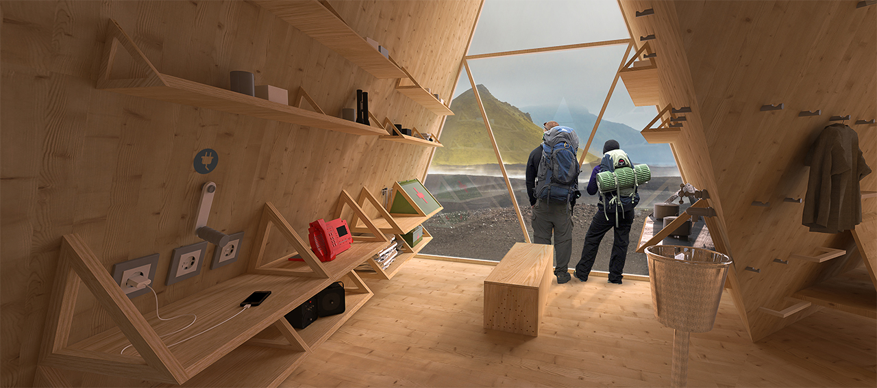
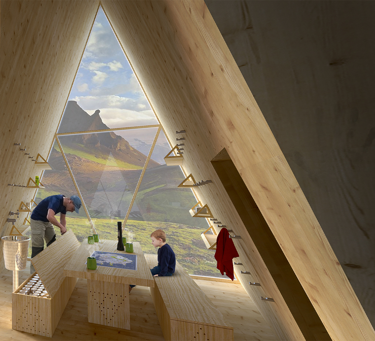
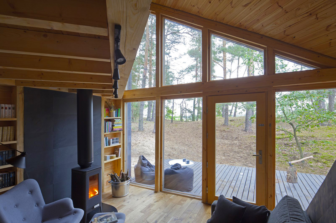
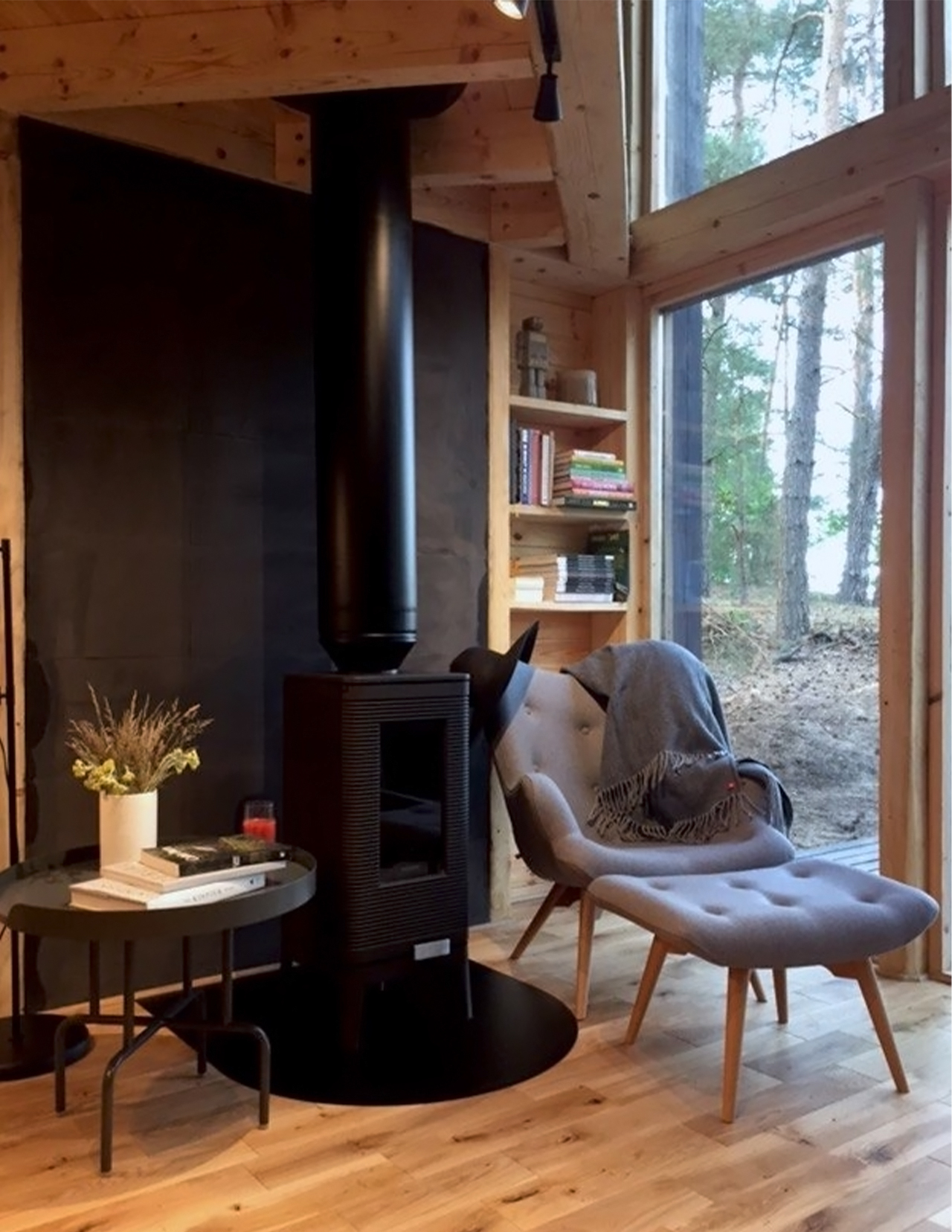
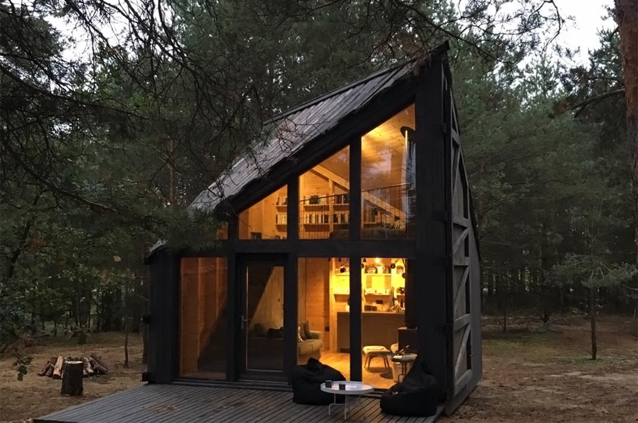
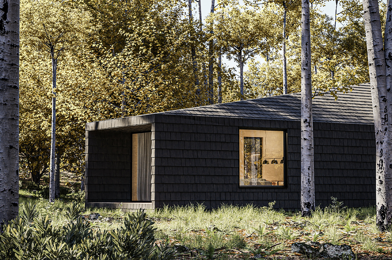
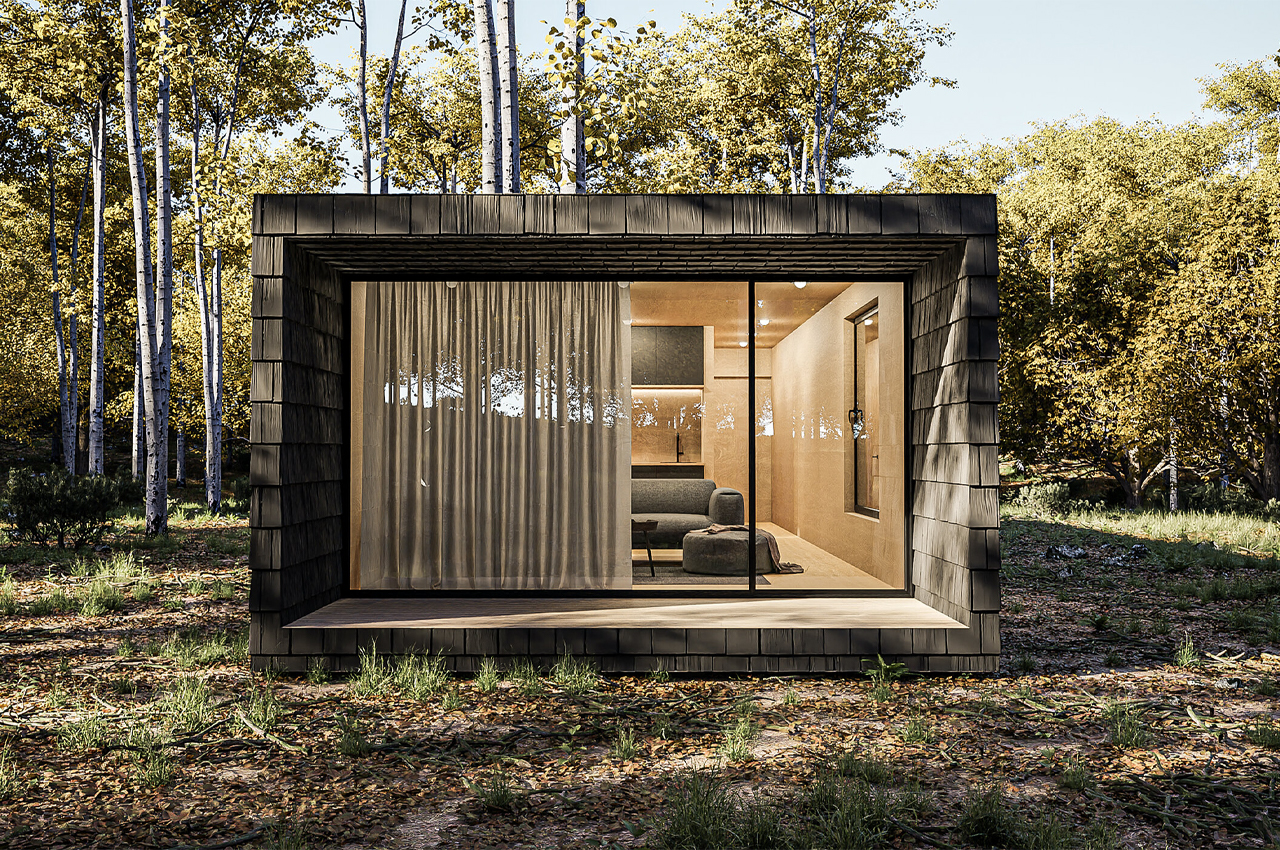
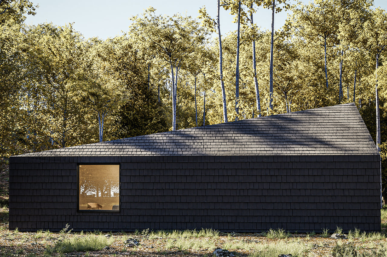
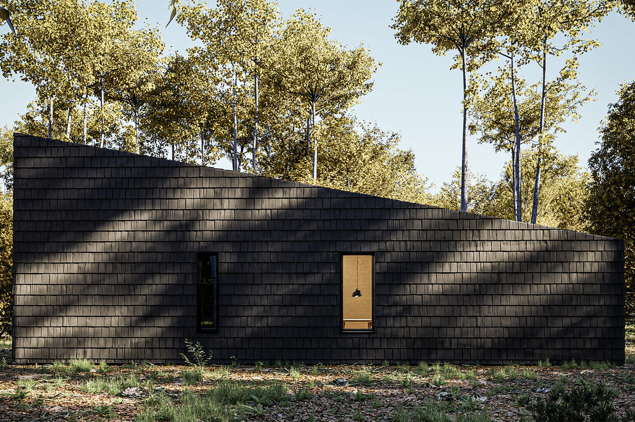
The cabin comes with a large picture window in front. At the back, there are smaller windows offering framed views. From the sleeping area, you have a nice view of the woodland. One side of the cabin is longer to make way for storage. One side now offered cover for the late evening sun. This side also now serves as a sheltered terrace. For warmer nights, there is a large terrace that can be used.

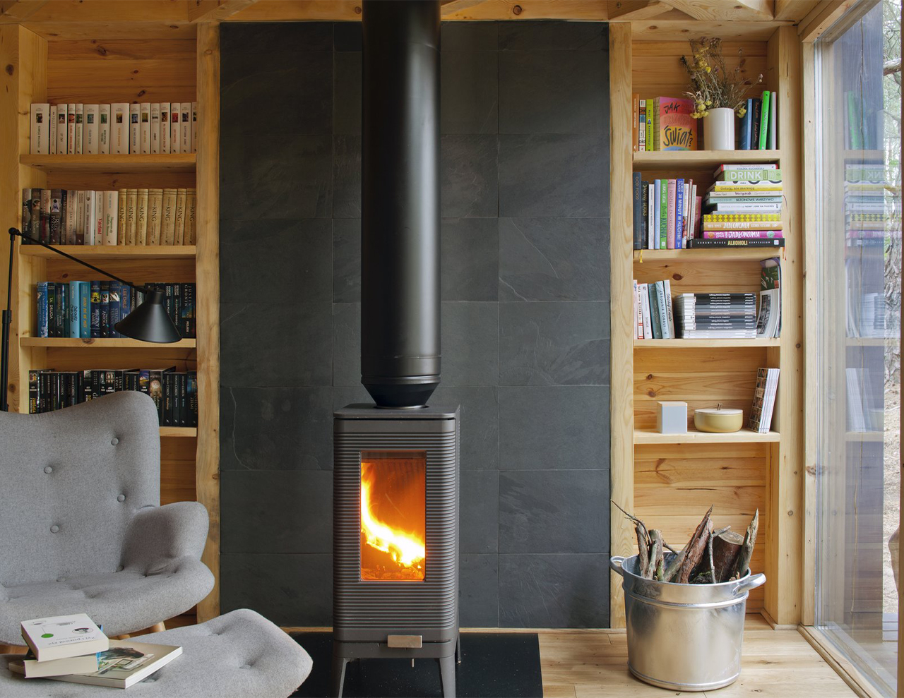
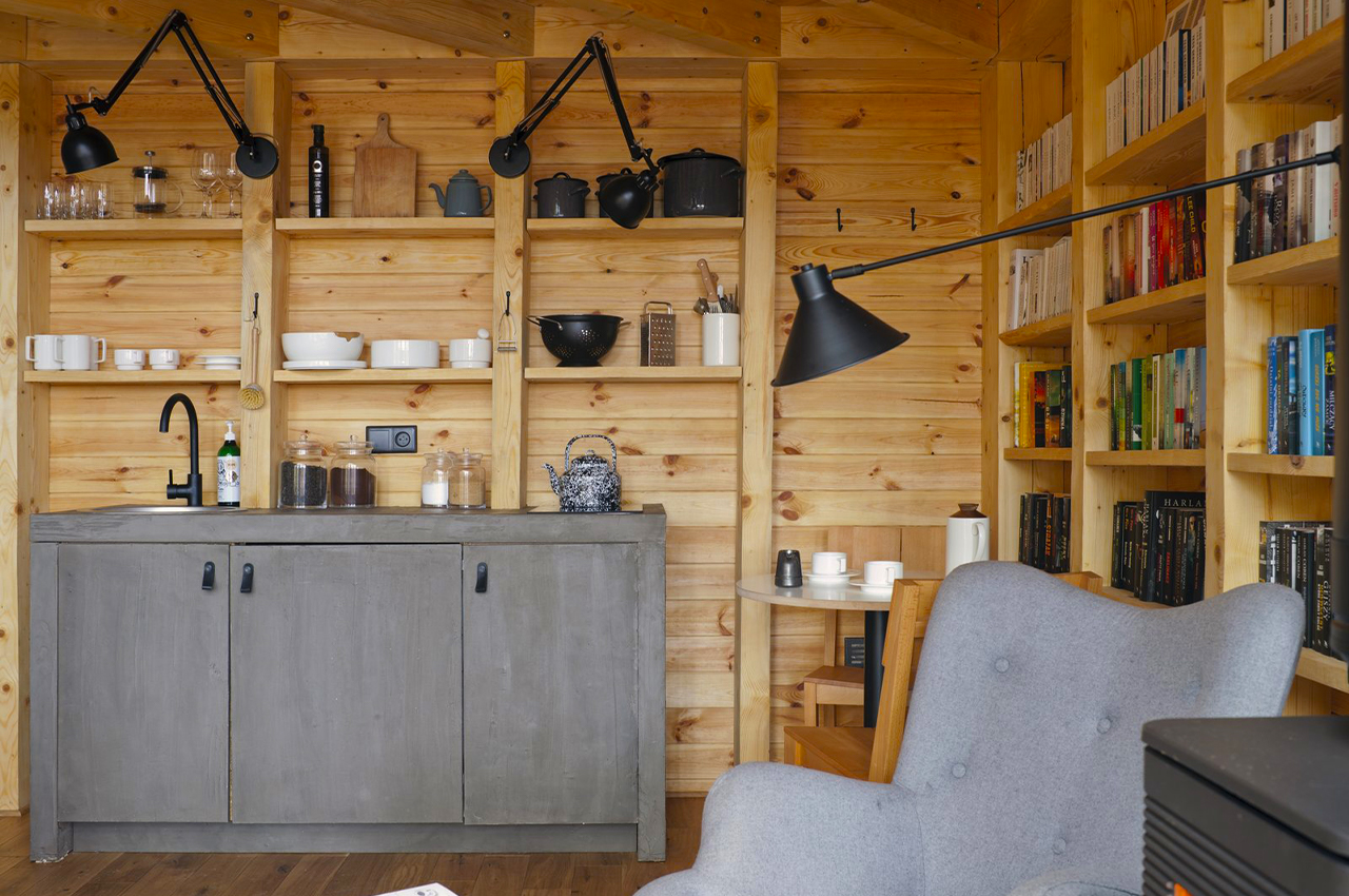
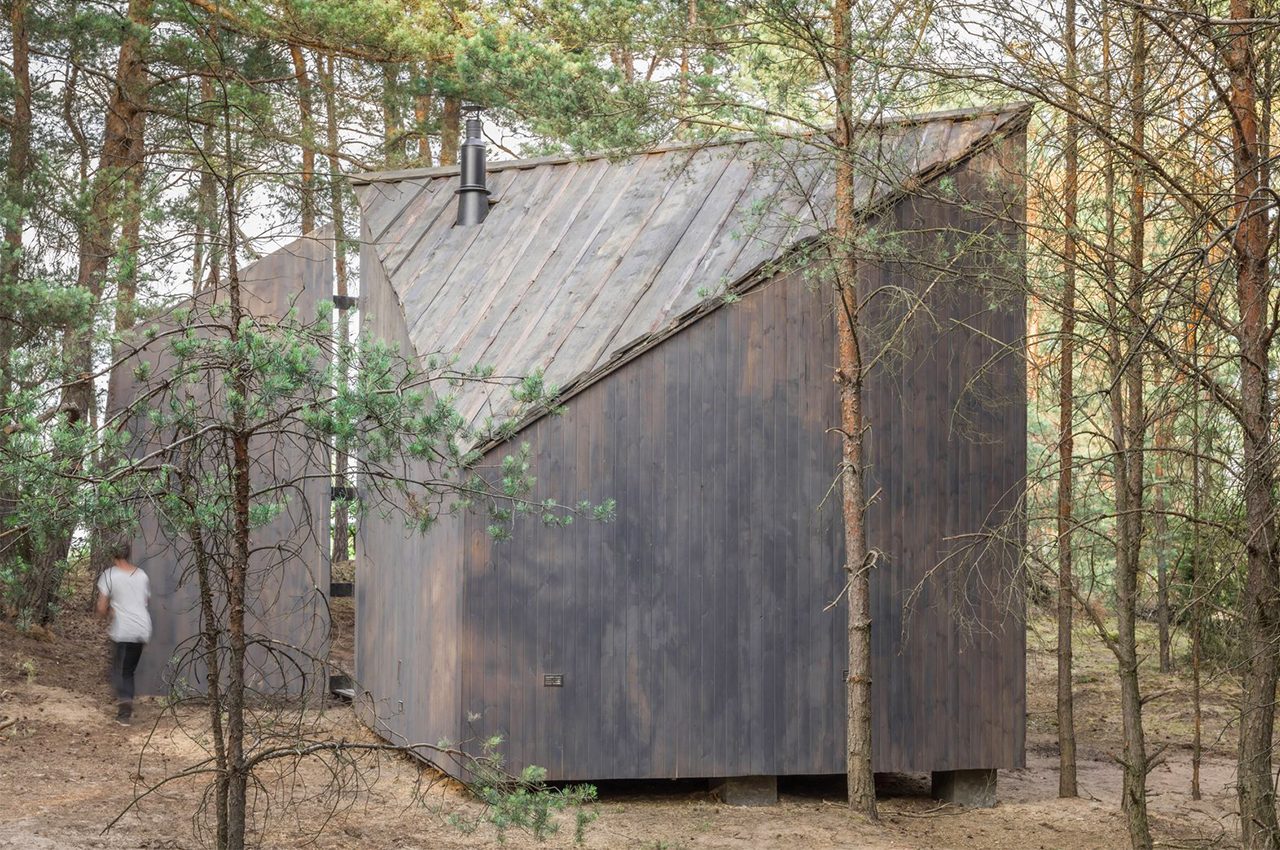
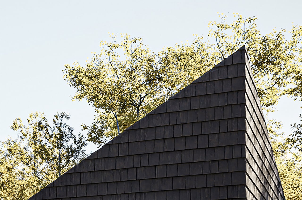
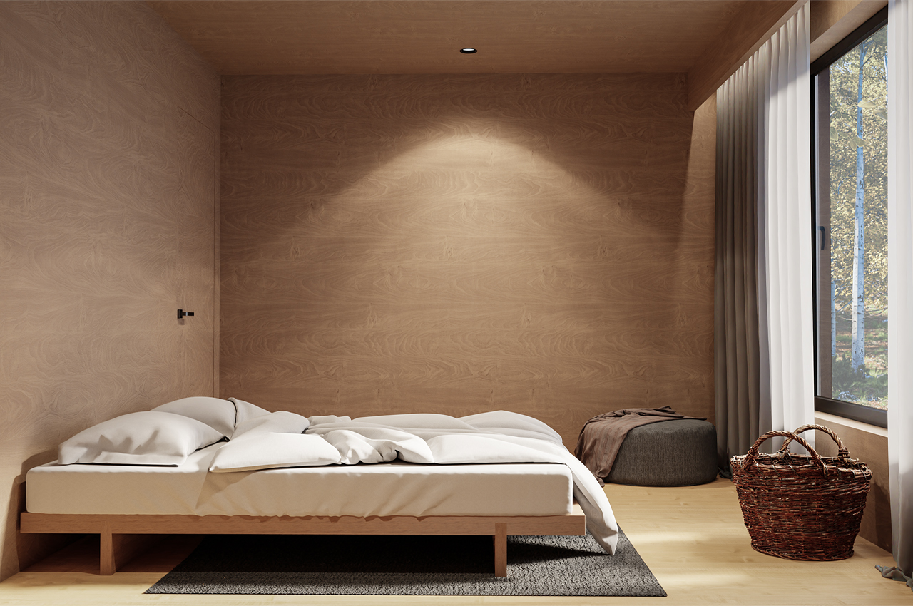
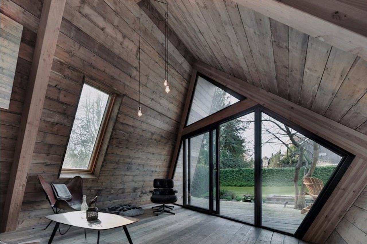
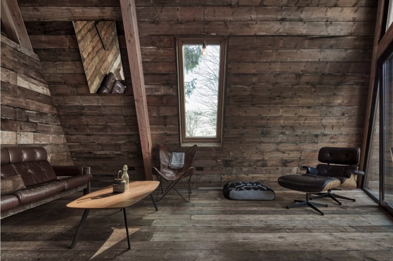
Inside The Climber’s Cabin, interior finishes are made of used and upcycled boards. Meanwhile, the exterior of the cabin is made of cedar shingles. There is a thick layer between the outside and the inside for insulation. This allows minimal heating during the colder season. This also means less consumption and better energy efficiency.
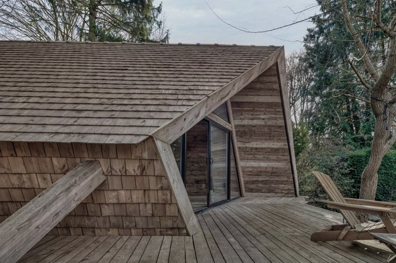
The Climbers Cabin Concept

The main construction of the cabin is placed around four pre-fabricated A-Frame trusses. The structure of this cabin may be likened to those of barns. Mainly, the cabin sits on top of brick piers and pad foundations.
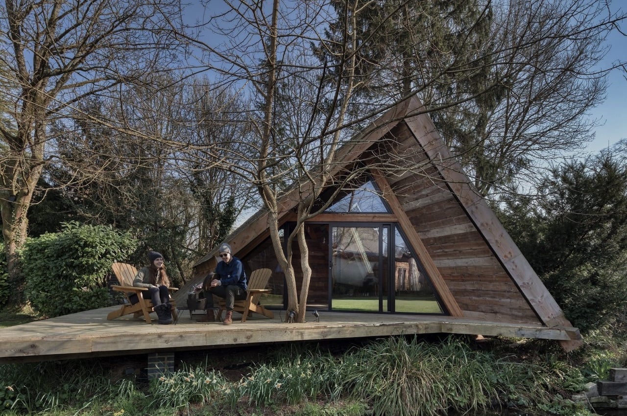
The Climbers Cabin Details

The cabin’s look matches the surroundings, but the tiny house stands out. It offers a warm and cozy feeling for the guests, offering a more natural environment that is safe, quiet, and sustainable. It’s something you can escape to at the end of each day. Now, who wouldn’t want to live in this little cabin?
The Climbers Cabin Interior

The Climbers Cabin Interior Design

The post The Climber’s Cabin makes an impression with its sustainable and self-build design first appeared on Yanko Design.
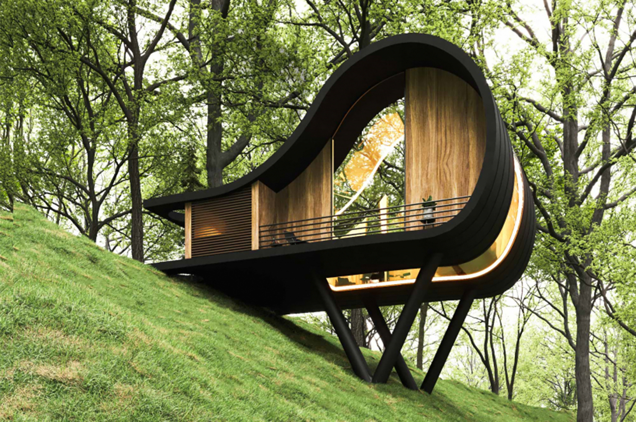
This cabin looks like a hobbit house that got a modern makeover!


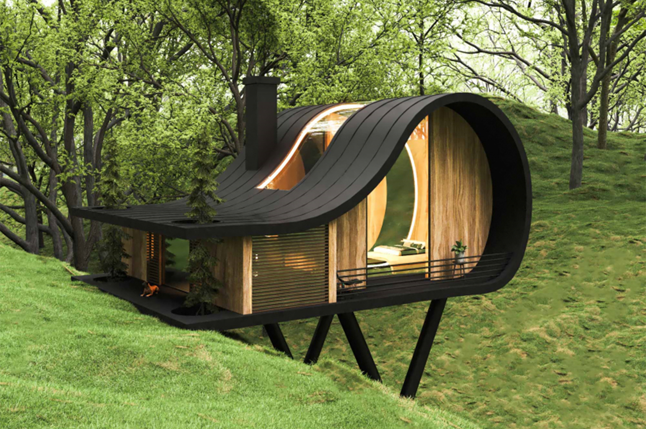
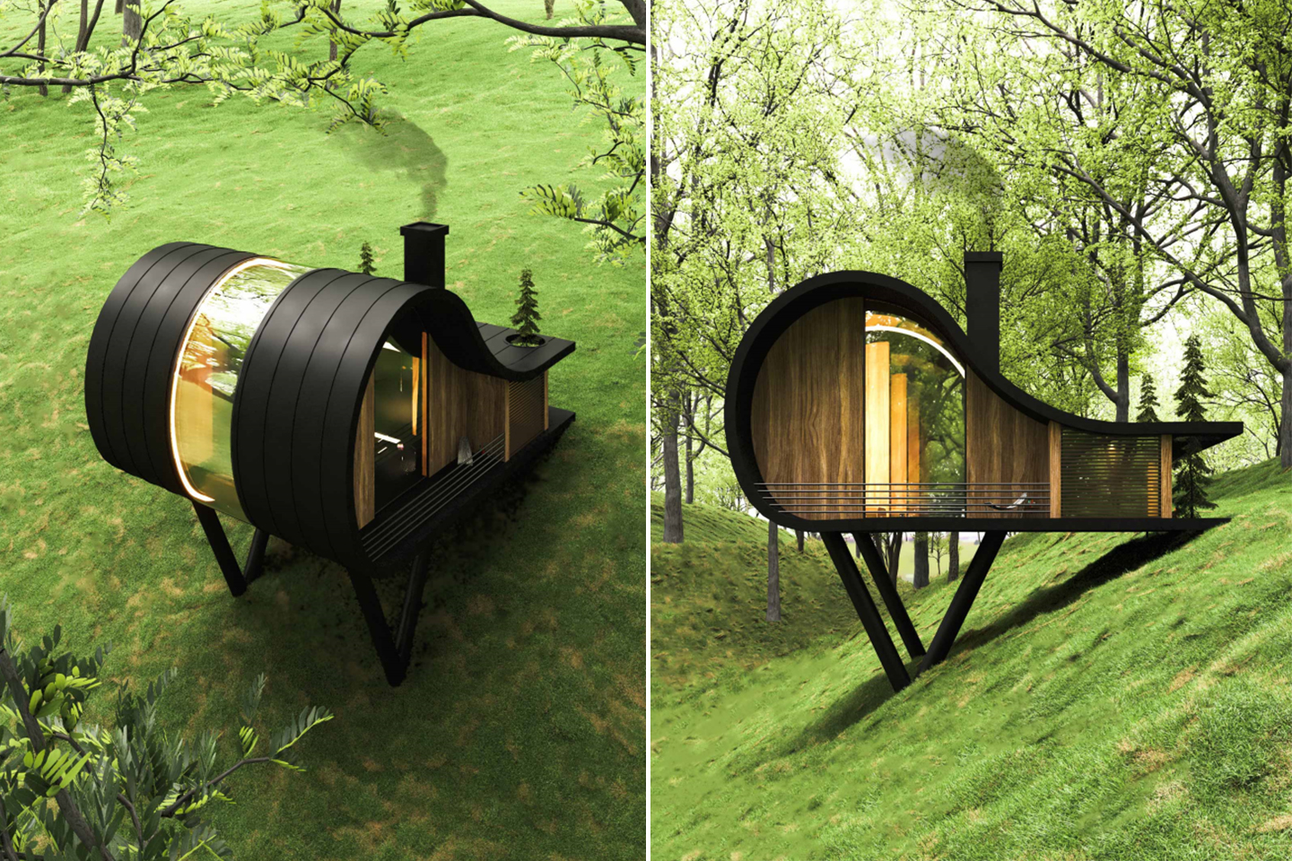
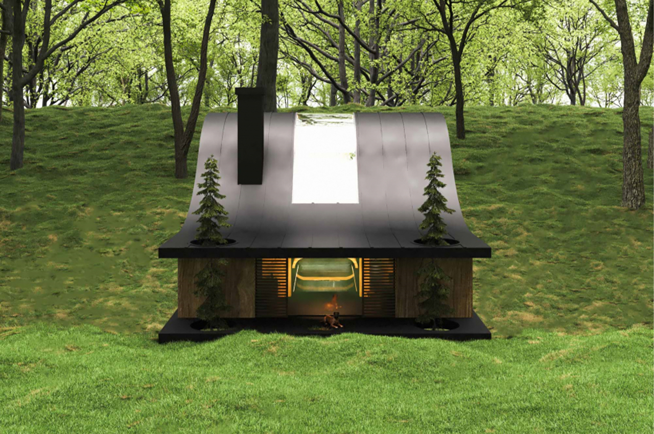
We have a special place in our heart for tiny homes and this one is definitely our first cabin love of 2022. The uniquely-shaped house is located on sloping land and gives major hobbit vibes but through the lens of modern architecture. The design consists of a surface that starts from the ground and extends and forms the shape and defines the interior space.

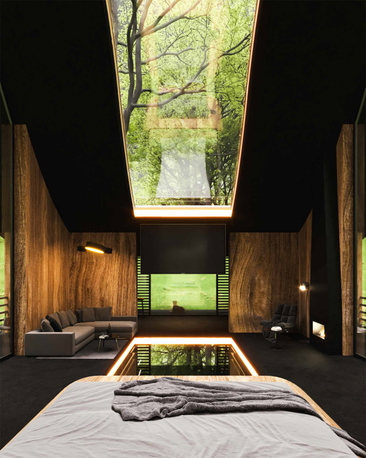
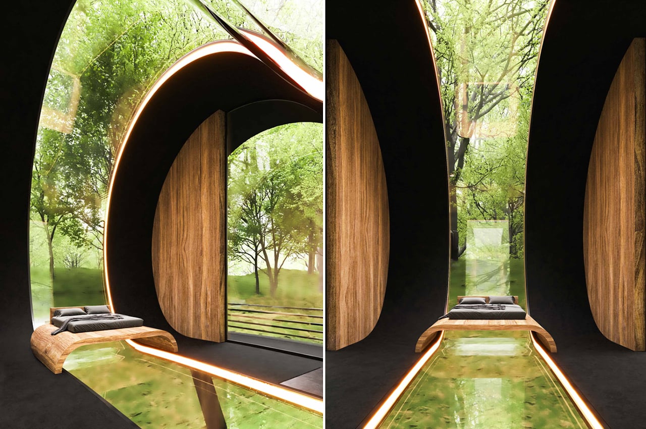
In the interior space, a glass strip starts from the floor and extends to the ceiling to maintain a visual connection to the entire space in fourth dimensions from the interior space. On both sides of the entrance, the two trees combine with the volume and define the entrance space giving it a harmonious, fluid aesthetic that connects the exterior, interior, and the surrounding landscape!

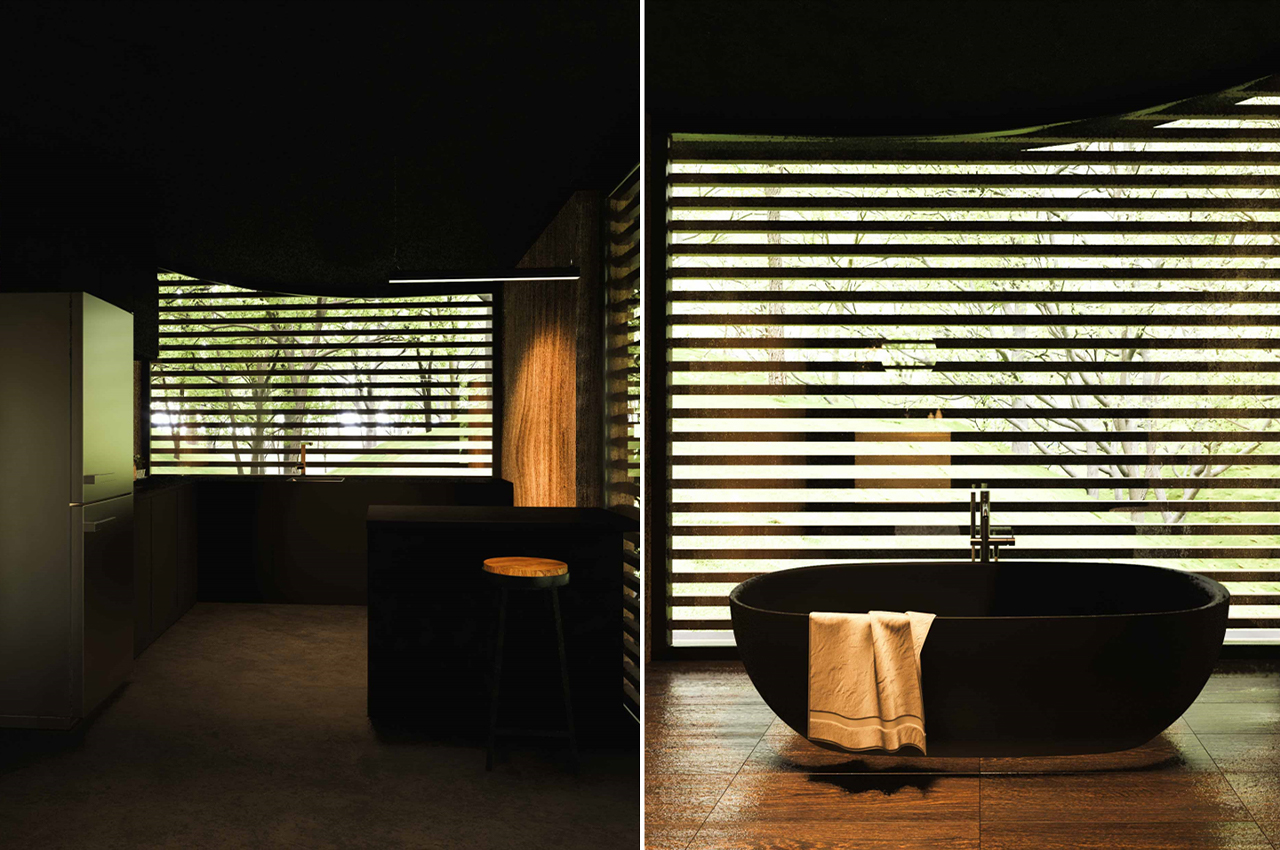
Being above ground helps facilitate more natural ventilation. The black and wooden combination is a stark contrast to the forest but still helps the cabin blend in because of its form. Unlike traditional cabins, the interior is luxurious, modern, and minimalistic – almost resembling a private spa retreat. The bedroom with the glass strip is our favorite part, it makes you feel like the structure is floating!

Designer: Milad Eshtiyaghi

The post This cabin looks like a hobbit house that got a modern makeover! first appeared on Yanko Design.
This oddly-shaped Finnish cabin was made with cross-laminated timber to withstand subarctic cold!

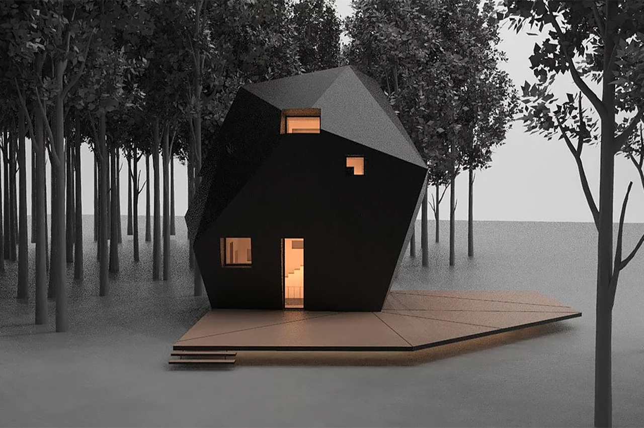
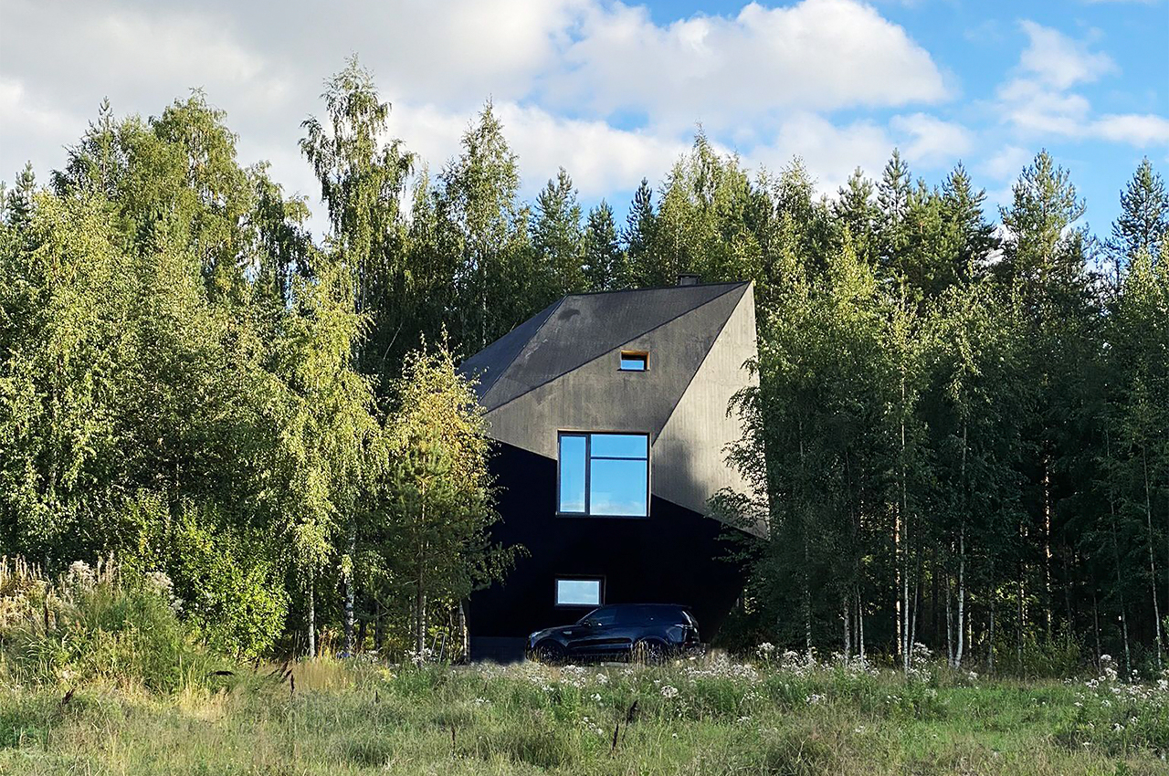
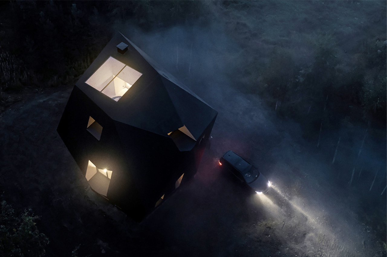
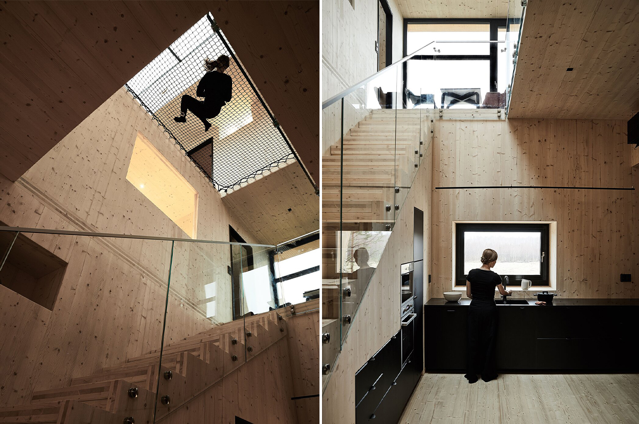
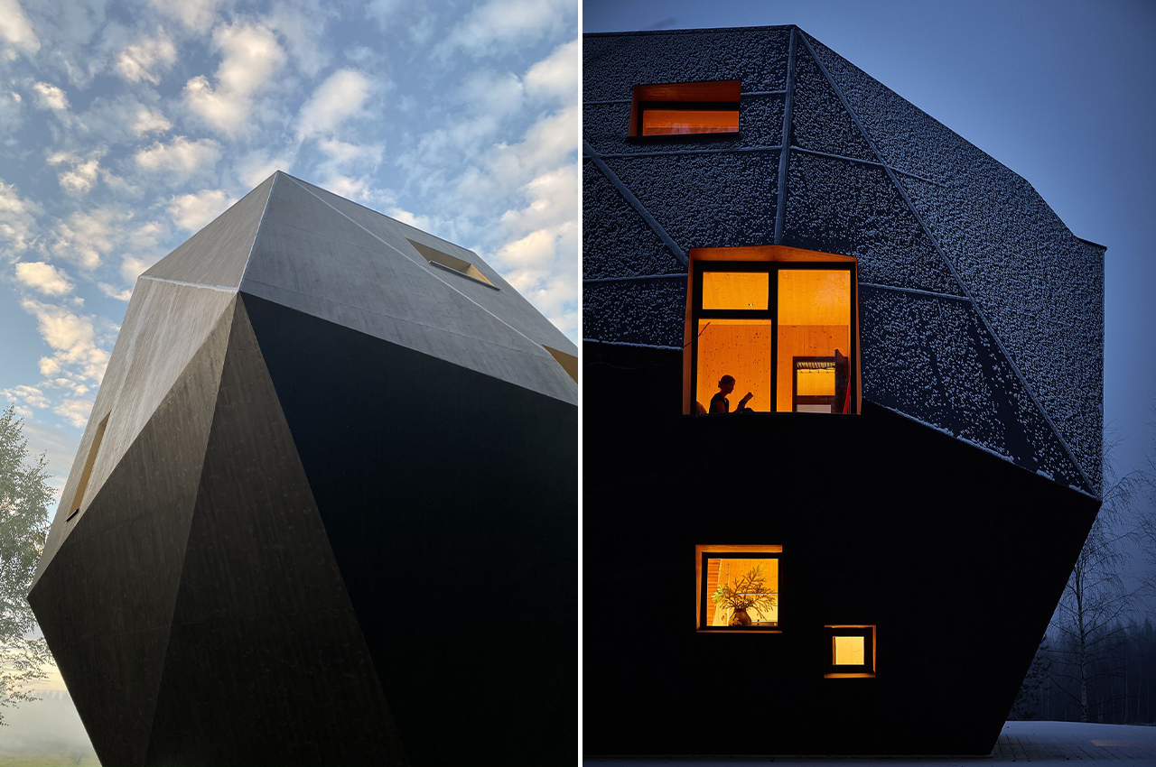
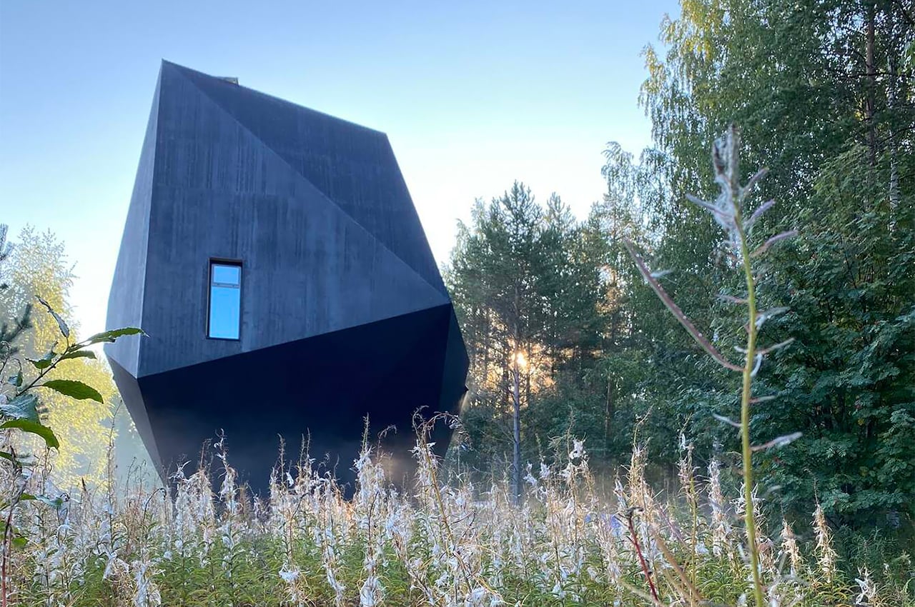
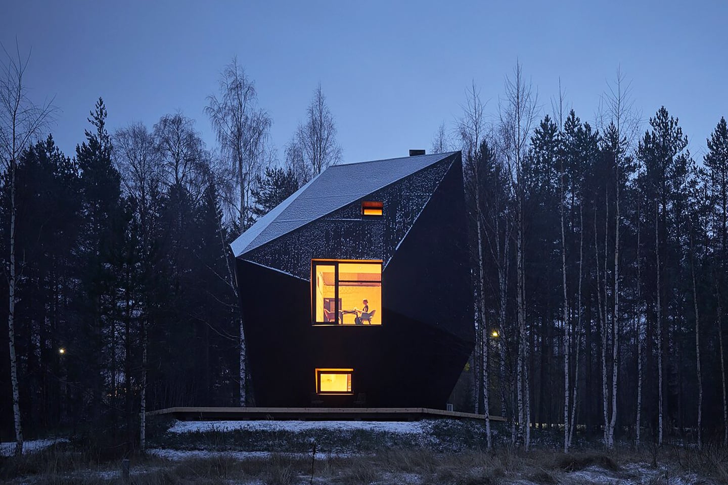
This cabin in the woods is an otherworldly, all-black, geometric structure built to provide cozy refuge even in harsh Finnish winters. It was designed for a California-based CEO who returned home to Finland with her family to be closer to her ancestral land so she could maintain it. The cabin is aptly named Meteorite based on its unique shape and is set in a clearing surrounded by spruce and birch trees. The cabin is made entirely from cross-laminated timber (CLT) which is a sustainable alternative to other construction materials.

The three-story home is built entirely from 272 prefabricated panels of cross-laminated, locally sourced timber—a sustainable material that lends itself to digital design methods and follows the Finnish tradition of timber construction. Air gaps of various sizes behind the facade keep the interior warm without conventional insulation, even during Finland’s freezing winters, and give the Meteorite its out-of-this-world shape.
Inspired by the Ice Age rock formations found throughout the region, the Meteorite is a faceted dwelling designed by Kivi and Tuuli Sotamaa, the brother-and-sister duo behind Ateljé Sotamaa. They designed the faceted structure as a guest house for the family, although during the pandemic it has served also as an office for, a recording studio, and an after-school playroom for children.
The Meteorite’s black-tinted exterior provides a stark contrast to the warm, all-wood interior. “Everything on the outside is designed to dramatically stage the inside,” says Kivi. “It’s a mysterious object, and you don’t quite know what is going on within.” Part of the mystique lies in the deceptive nature of its size—the interior spans only 807 square feet of floor space, yet its total volume is 10,594 cubic feet.
Its envelope contains no plastic or insulation; it’s simply two sheets of wood, and the air gap in between them helps to regulate indoor temperature even when the subarctic climate outside drops to single digits in winter. The “between space,” as Ulla describes it, also hides storage and the building’s technical systems, preserving the minimalist feel of the interior.

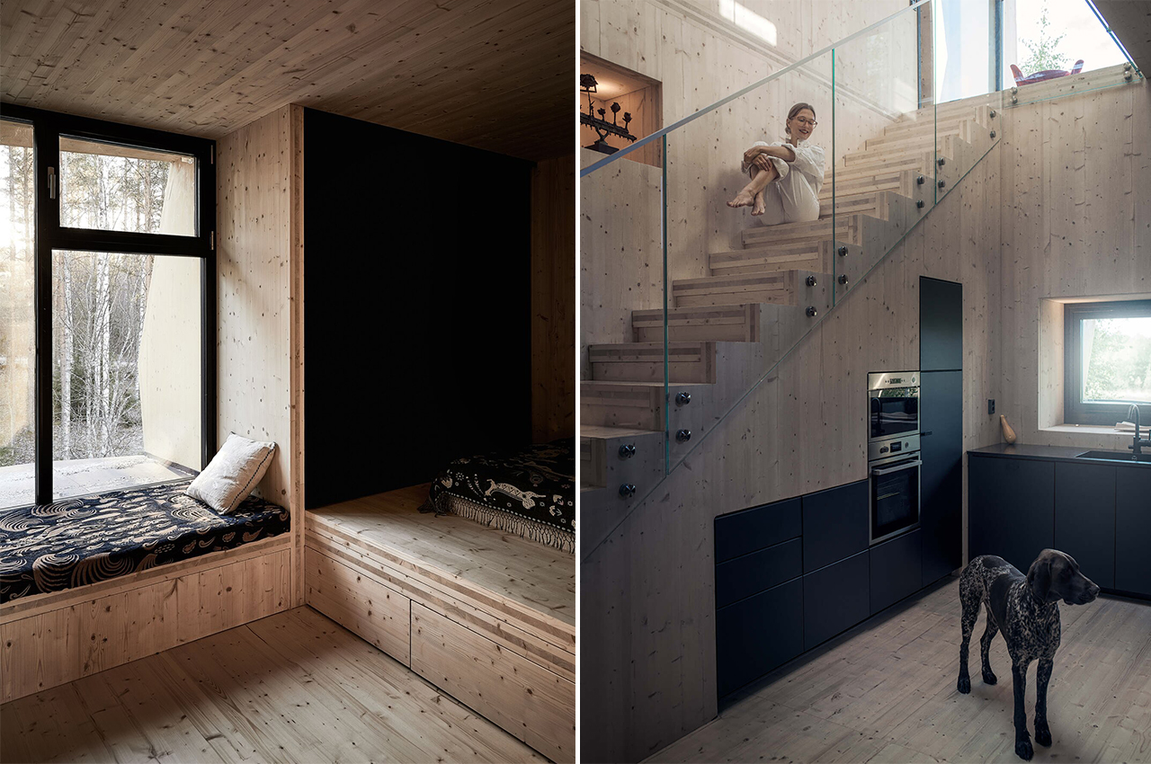
The Meteorite’s interior is clad in spruce from floor to ceiling, and all the furniture for the living areas were hand-selected works by Finnish designers that the couple picked out themselves. The dining area features a built-in corner sofa designed by Ateljé Sotamaa with slipcovers and pillows by Klaus Haapaniemi & Co – a local artistic brand with works inspired by traditional Finnish folklore.

The Meteorite was originally envisioned as a guesthouse, but with the pandemic keeping them at home, it now serves as a more permanent, multipurpose space for the family. The traditional separation of work and home has disappeared, and it’s beautiful that they are merged within this single building.

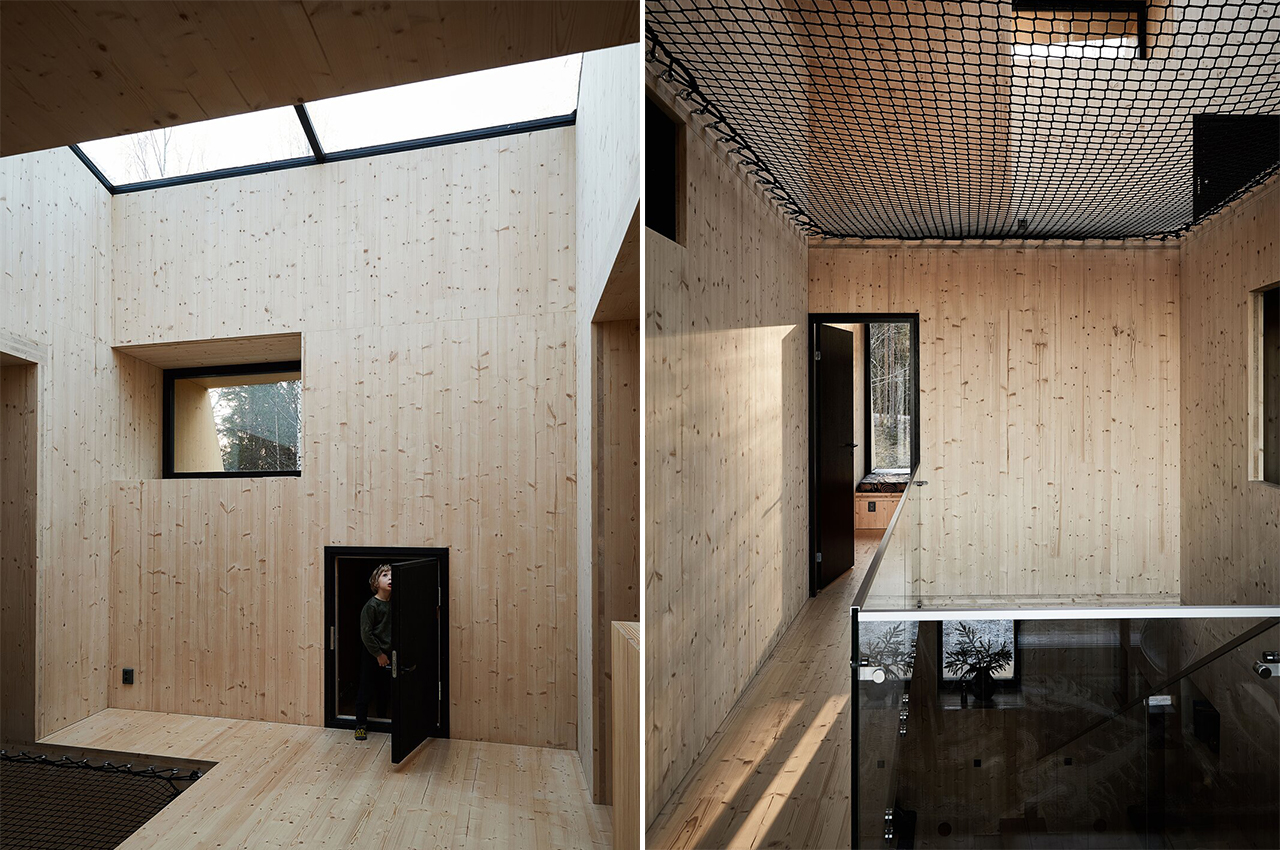
My favorite part of the home – and I’m sure also the kids’ – is the giant net on the top floor. It ties the home together visually while adding connectivity without having to be in the same space. It is also extremely well light thanks to the multiple windows and skylights that are placed on unconventional angles because of the unique shape of the cabin.

The warm wooden interior complements the black timber exterior very well. The cabin is a beautiful blend of Finnish and Scandinavian elements in the finer details as well as the overall aesthetic which is minimal and monochromatic. Meteorite is an elegant picture example of modern architecture and interior that has been woven together with local traditions, simplicity, and sustainability.

Designer: Ateljé Sotamaa

This prefab glamping cabin can be flat-packed to provide a cozy oasis when trekking in extreme weather!


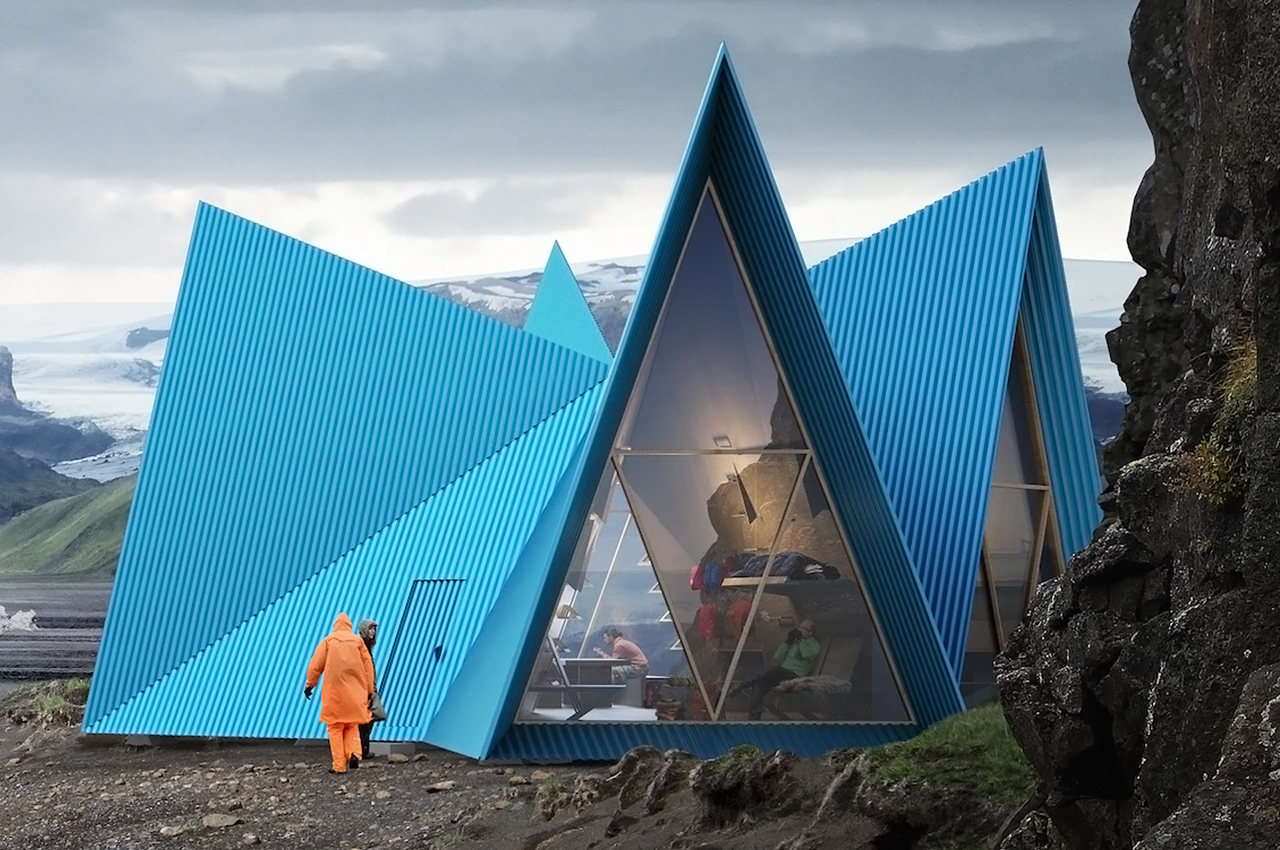
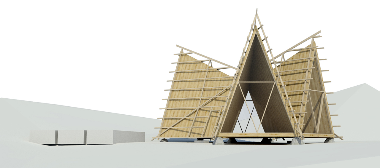
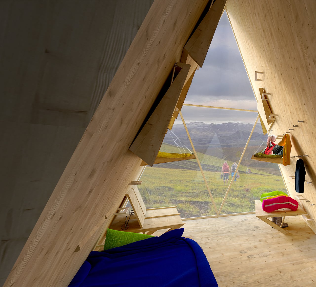
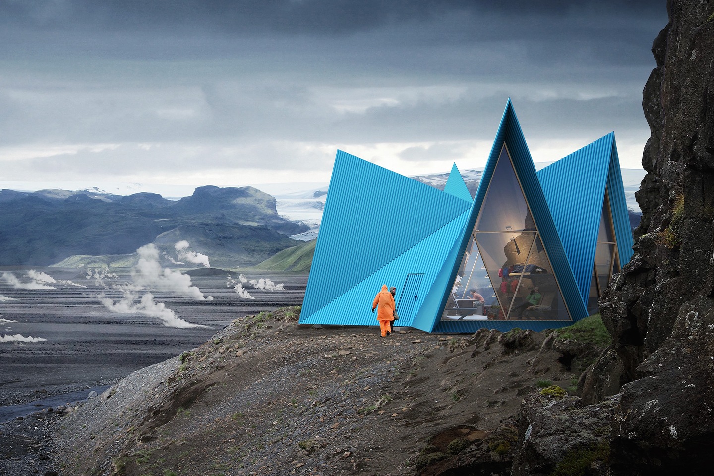
If you are ever lost while trekking in harsh weather in Iceland, then you should pray and hope to find refuge in a glamping oasis like the Skyli Trekking Cabin. Skyli means “shelter” in Icelandic and it can provide shelter to 15 mountaineers at a time. The angular structure features four gabled roofs and resembles a tent but is actually clas in a steel facade to protect you from the weather. The bright blue color makes it easily visible in the rugged landscape while also paying homage to the architecture of the country’s capital. The designers imagine all components being pre-fabricated so that they could be transported flat, winched underneath a helicopter, and constructed in situ – a process Utopia Arkitekter estimates would take between two and three days.

Swedish firm Utopia Arkitekter employed a team of innovative architects that worked with sustainable materials in their buildings. “Skýli is designed for pristine environments where sustainable development is of the highest importance. Materials need to be eco-conscious, while also resistant to extreme weather,” explained Mattias Litström, founder and creative director of Utopia Arkitekter.

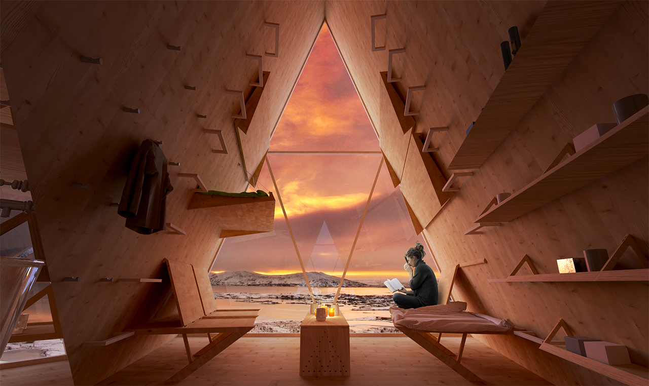
The interior is lined with cross-laminated timber and features enough fold-out beds for up to 15 people, water, power, and even emergency supplies. Beneath each peak, large triangular windows take advantage of the surrounding scenery. Its prefabricated design allows for materials to be easily transported by helicopter. Once they’re delivered, the assembly can be completed in as little as a couple of days.

These pitched roofs give the building a tent-like shape. The shape also resembles traditional Icelandic huts, whilst the bright blue is a nod to the colorful architecture of Reykjavík, the capital of Iceland. The Skýli trekking cabin features sharp pyramidal shapes, a strong, durable, and stable structure with several practical details. The triangular gables resemble a classic tent, the most basic shelter used by trekkers worldwide.

GreenCoat color-coated steel will be used in the roof because it is currently the most sustainable color-coated steel product on the market, using Swedish rapeseed oil in the coating instead of fossil-based oils. Since Skýli will be built in the mountains or in harsh, cold-weather environments, choosing materials for extreme weather is another important factor. Here, GreenCoat® steel products fulfill the highest demands.

They deliver extreme durability, resistance to corrosion, and long color retention. Furthermore, they provide building specifiers with a significantly lighter material compared to alternative solutions and have a low-temperature elongation to guarantee a clean look without buckling or deformation, for years to come.

In the gap between the steel exterior and the wooden internal walls, the designers have included a space for visitors to wring out wet or muddy clothes, as well as room for a composting toilet. Rainwater running down the sloping roof could be collected in self-draining tanks in the outer shell, providing the cabin with water that could be used for washing, or purified for cooking and drinking.

Solar panels and a battery offer enough power to charge devices and light the interior in good weather. A hand-crank generator would provide a backup on darker days, but would also double as an emergency beacon if occupants needed to call for help. In the case of an emergency, the cabin would be kitted out with basic medical supplies and a stash of food rations, stored under the benches in the dining area.

Both the inner shell and the furniture – designed to fold flat for ease of transportation – would be made from cross-laminated timber (CLT), a high-strength engineered wood. Combined with the lightweight steel shell, it would make the cabin easy to maneuver into position. The CLT and steel would also provide insulation, along with the triple-glazed windows.

A series of plinths would lift the structure off the ground, providing it with a flat and stable base, whilst minimising its impact on the natural terrain. The brilliant blue Skýli color of the roof, which will be made from GreenCoat® color coated steel, from SSAB, represents the Nordic light and ensures that Skýli is visible in the Nordic landscape. It will make the cabin easy to find, while at the same time creating a strong symbol for shelter and safety.

Designer: Utopia Arkitekter

This tiny cabin in the woods is every book lover’s dream!

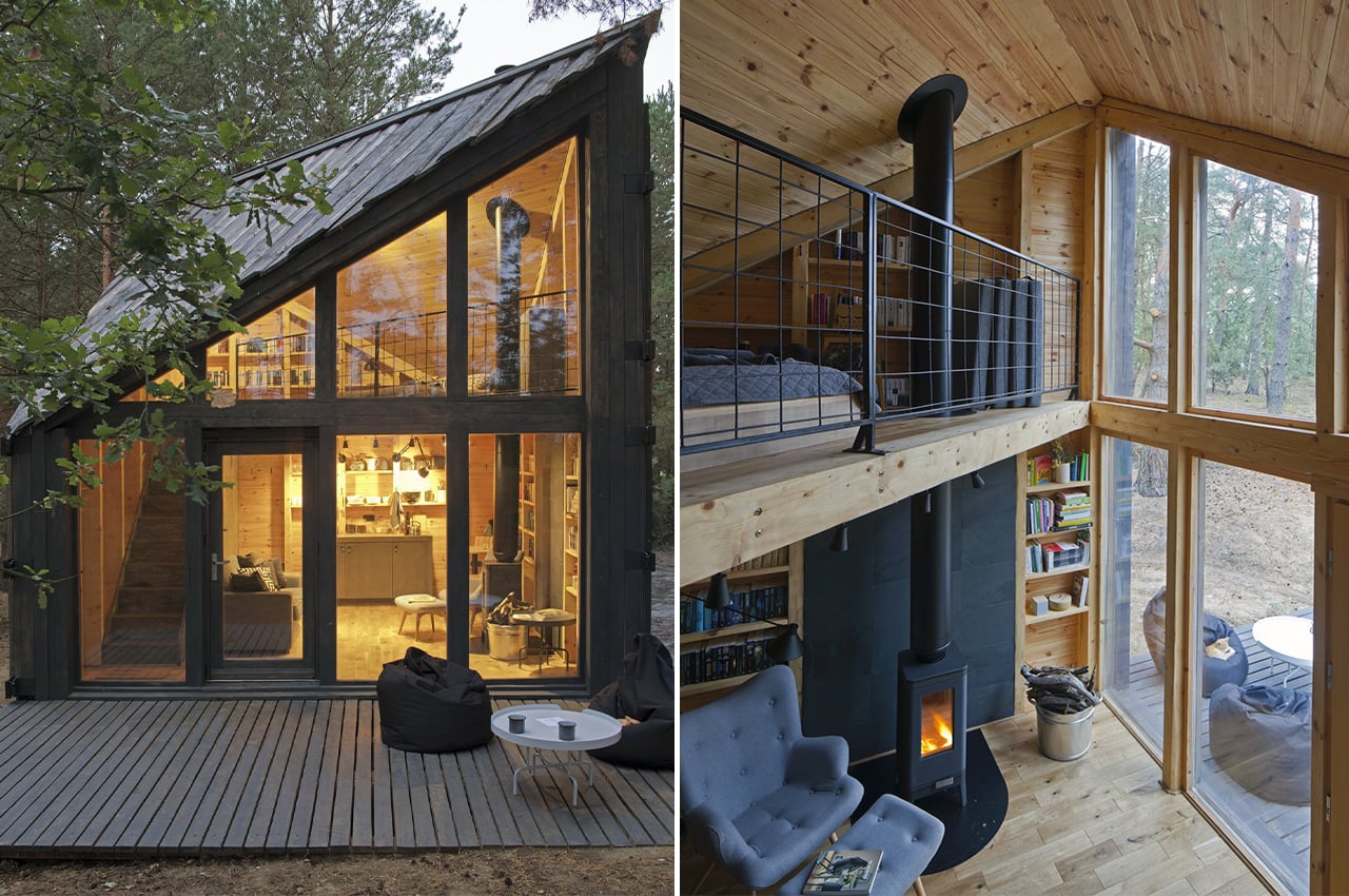
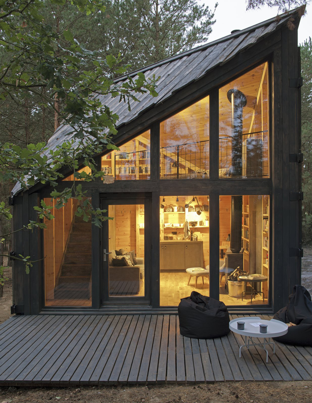
Libraries are one of my happy places so this cabin is straight out of my dream – a cozy personal library blended with a forest getaway! The Bookworm cabin is made for bibliophiles who want to enjoy the peace and quiet of nature while devouring stories by a fireplace. Designed by Polish duo Bartłomiej Kraciukand and Marta Puchalska-Kraciuk, this cabin is all about immersing yourself in your books and the woods which was their personal motive too!

The angular 377-square-foot cabin is built on a wooded plot near the town of Mazovia which is just 31 miles outside Warsaw. The design and aesthetic were inspired by the surrounding lush forest and sand dunes.

Puchalska-Kraciuk is an architect who specializes in interior design with the firm Moszczyńska Puchalska in Warsaw and adapted the cabin’s concept from colleagues at POLE Architekci.

“I just loved staring at this landscape—but how long can you do that for? Maybe longer if you are indoors facing a big window, sitting on a comfy chair. Still, how long can you endure this? That’s when the idea to fill it with books came in. That way one can sit, stare, and have a reason for it—the reason being reading a book,” says Kraciuk.

She modified the original concept from POLE Architekci to transform it into a book lover’s dream escape. “We made minor changes to the colors, window arrangement, and some interior design, and the house was ready,” adds Kraciuk.

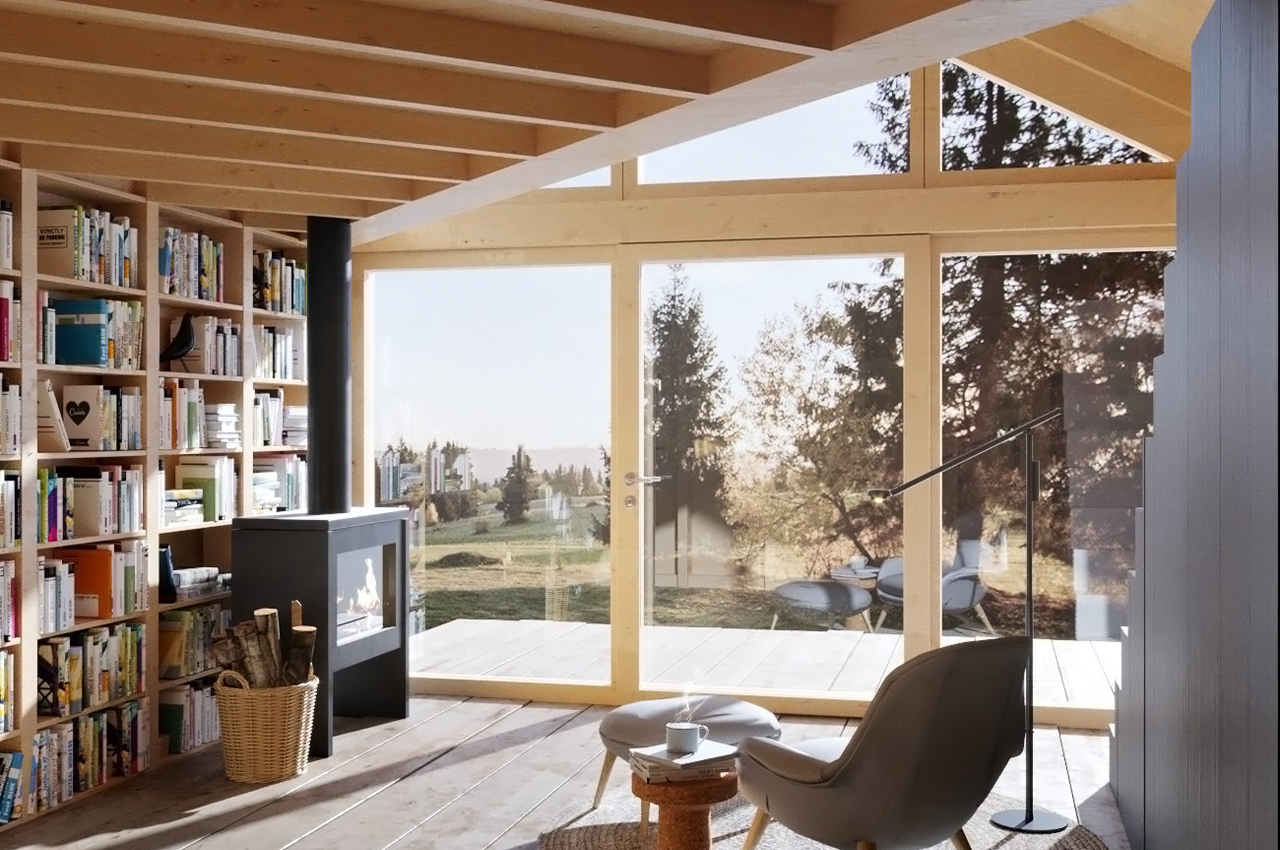
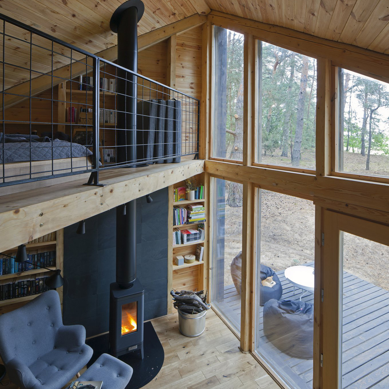
The fireplace, plush seating, and wooden interiors enhance the coziness and warmth – literally. It’s modern, minimal and keeps the focus on your reading list or the scenic outdoors thanks to its sweeping glass windows.

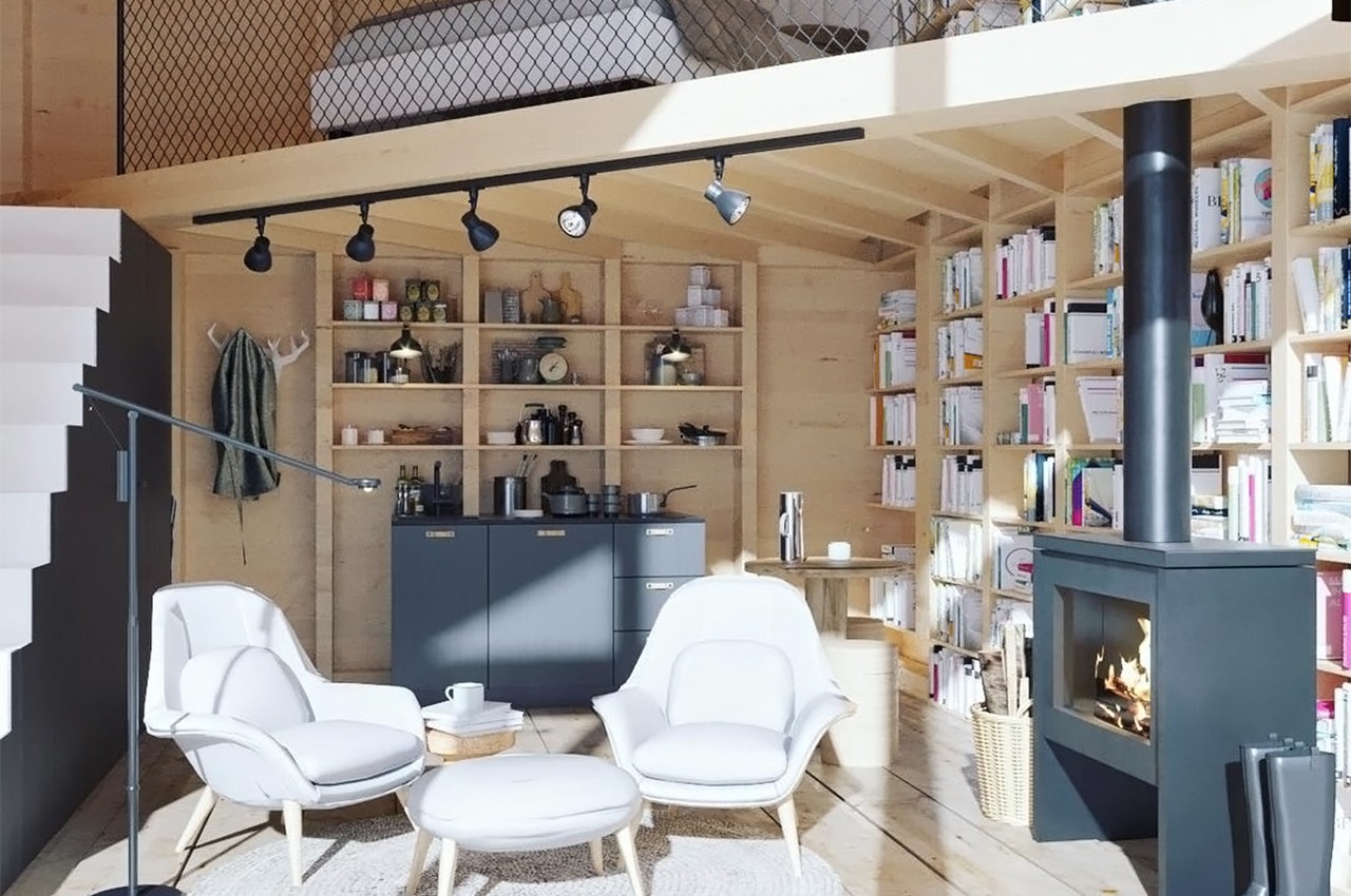
The Bookworm cabin has two levels – 269 square feet on the first floor and a 108-square-foot upper level which has is a sleeping loft. The compact structure uses space wisely, it has a full bathroom underneath the stairs, shelves filled with hundreds of books that line the interior, and a kitchenette that stands against the far wall. The dream is to take all my unread books and stay for half a year…minimum!

Designer: Bartłomiej Kraciukand and Marta Puchalska-Kraciuk

This off-grid cabin is a solar-powered, uses locally sourced timber and features a triangular roofline!

Inspired by the local area’s shingled roofs and facades, Thorpe clad Canton House’s trio of cabins, from top to bottom in blackened, locally sourced timber.

Hotels are designed to immerse us in unfamiliar worlds. Bringing us to tropical coastlines and jagged cliff sides, hotels are meant to enhance the local area’s best-known features. Marc Thorpe, architect, and designer extraordinaire, recently unveiled his design for Canton House, a cluster of off-grid cabin hotels in the forest of Romania’s Carpathian Mountains that are built from locally harvested timber and inspired by the surrounding area’s vernacular architecture.

In Romania, rural towers and spires of religious centers are often defined by their fully-shingled wooden construction. Inspired by the local area’s shingled roofs and facades, Thorpe clad Canton House’s trio of cabins, from top to bottom in blackened, locally sourced timber, wrapping the exterior facades in uniform wooden shingles. The triangular roof stems from Canton House’s rectangular front facade.

From the front, Canton House appears as a simple, rectangular cabin framed with wooden shingles. Whereas from the side, a triangular roof gives Canton House some height and a dramatic facade. Uniform in design, the Canton House comes outfitted with a kitchenette, bathroom, bedroom, utility closet, and storage rooms finished in plywood. Evoking the spire’s reach for the high heavens, Thorpe built each cabin with an elongated triangular roof that gradually pitches upward from the cabin’s rectangular side facade. Marc Thorpe describes the cabin’s triangular profile, “The cabins are grounded into the terrain with their low horizontal profile to pronounce themselves with a sharp, vertical, [and] triangulated roofline.”

The sharp vertically pitched roof contrasts nicely with the rough and rugged terrain of the Carpathian Mountains. Careful not to disrupt the area’s wooded landscape and to maintain the cabin’s initial off-grid aspirations, Marc Thorpe equipped each cabin hotel with a solar kit and roof to ensure the cabin has plenty of renewable energy available for power. Each solar kit comes with a 1800W solar generator to provide backup power for the four 100W 12V mono solar panels that line the cabins’ roofs. Inside, guests enjoy a minimal interior that’s lined and finished in plywood. Built as supplementary retreats for guests of the area’s main hotel, Tara Luanei, Canton House offers a respite in nature that’s unique to the Carpathian Mountains.

Designer: Marc Thorpe Design

This wooden cabin comes in a flat-pack DIY kit so you can assemble your own tiny holiday home!


Cabin-design company Den has launched a flat-packed, kit-of-parts for a steeply pitched cabin, known as an A-frame, that can be assembled in just a few days.

The 115-square-foot (10.68-square-metre) Den Cabin Kit has slanted wooden walls with a large triangular window. It is designed to be an ideal guest house, yoga studio or study.

Prefabricated in New York, the kit has pre-drilled holes and includes everything from the wooden structural parts that lock together, to bolts and even door hardware – details Den said make the project stand out from other flat-packed structures.

“Under the hood – or roof, ha – we have components that are cut with CNC precision, a design that slots together intuitively, and a kit so complete even the door hardware is included so you won’t need to make any trips to the hardware store,” the New York-based team told Dezeen.

“The cabin bolts and screws together and all the holes are pre-drilled making for fast assembly.”

Den Cabin Kit is designed to be built with minimal equipment including a ratchet set, a power drill, a ladder, step ladder and a staple gun. Flat-packed materials arrive stacked according to the order in which they are needed during the build, as part of an ambition to make construction as easy as possible.

“If you don’t have any construction experience you can certainly make up for it with tenacity, and a few friends to help you with the job,” Den explained.”Building something even as easy as this still requires some hutzpah mind you,” the company added. “You need to be comfortable on a ladder a story off the ground to set the ridge cap and screw in the roofing panels, and you and your friends (or team) need to be careful with the large windows while setting them in place.”

Den suggests novice builders employ a contractor to bolster the structure if it is being built on a sloped site, or in an area with harsher weather, and also to help set foundations – which it likens to the same basic requirements as a shed. The cabin is intended to touch the ground lightly so it can be disassembled and rebuilt elsewhere, and constructed without nails for the same reason.

Despite its light touch, the team said the cabin is still robust and well-insulated in harsh weather conditions. “Even though it’s ‘semi-permanent’ in this regard it’s no less a building and can withstand the harshest elements, with four-season compatibility,” it explained.

Owners can choose from three types of exterior cladding: either black Forest and silver Alpine metal or cedar shingles. They can also add a propane heater provided by Den.

Designer: Den

These volcanic stone cabins merge with the pre-existing trees to minimize the home’s footprint!

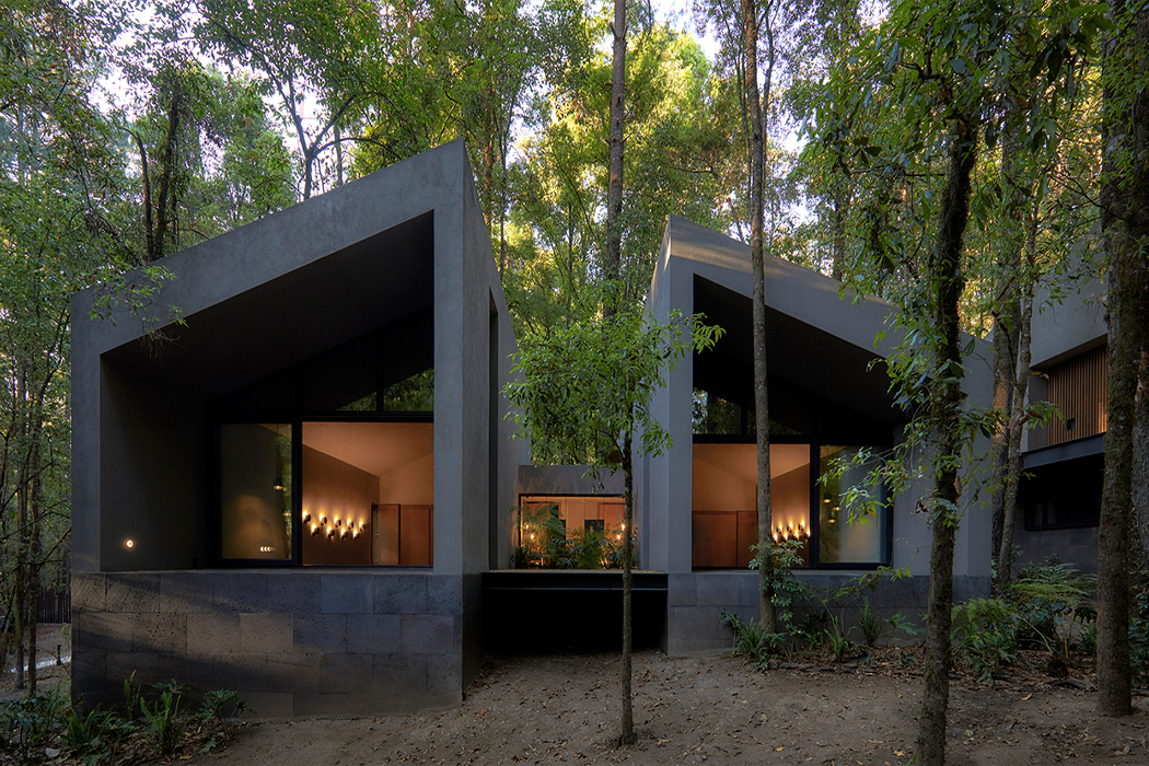
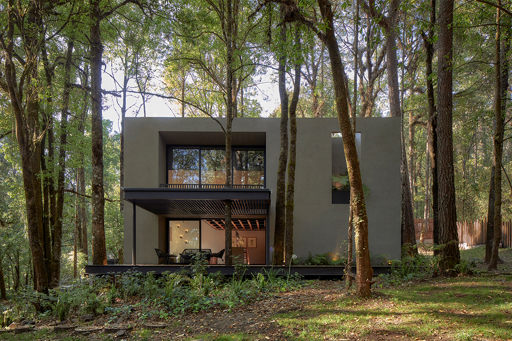
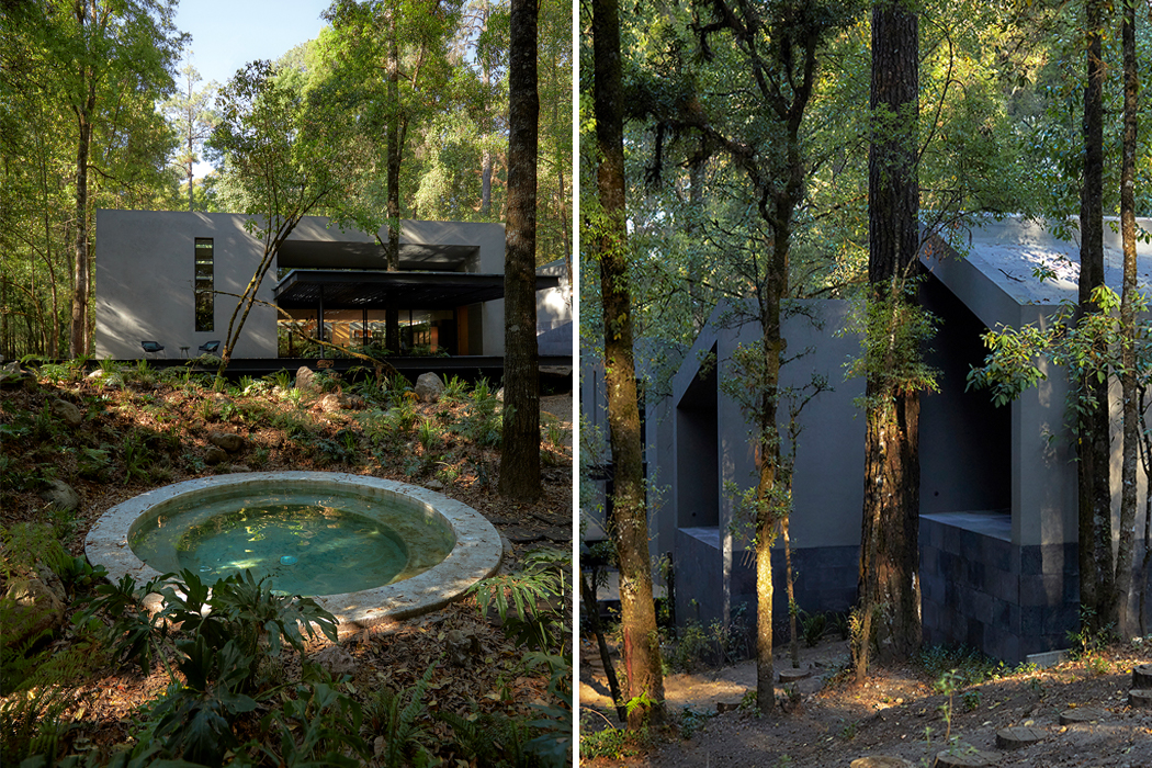
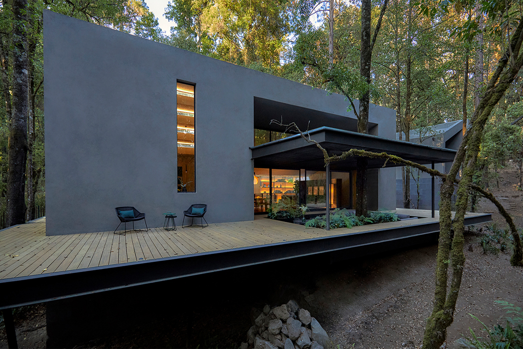
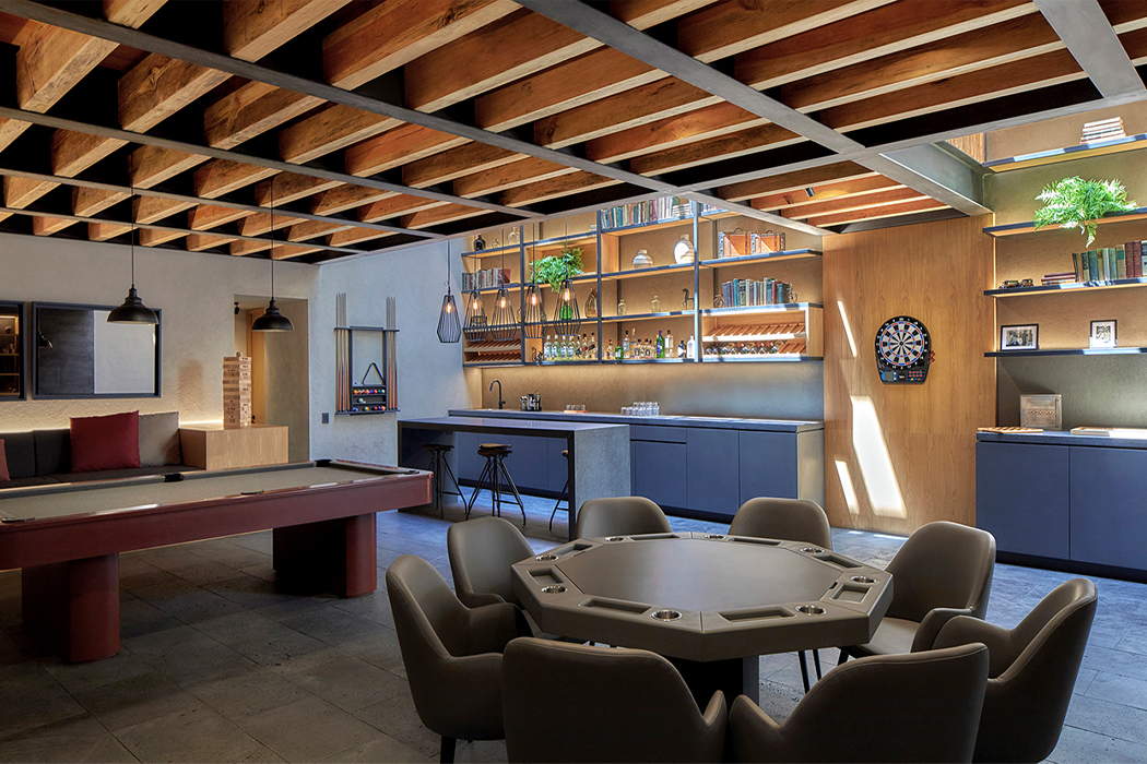
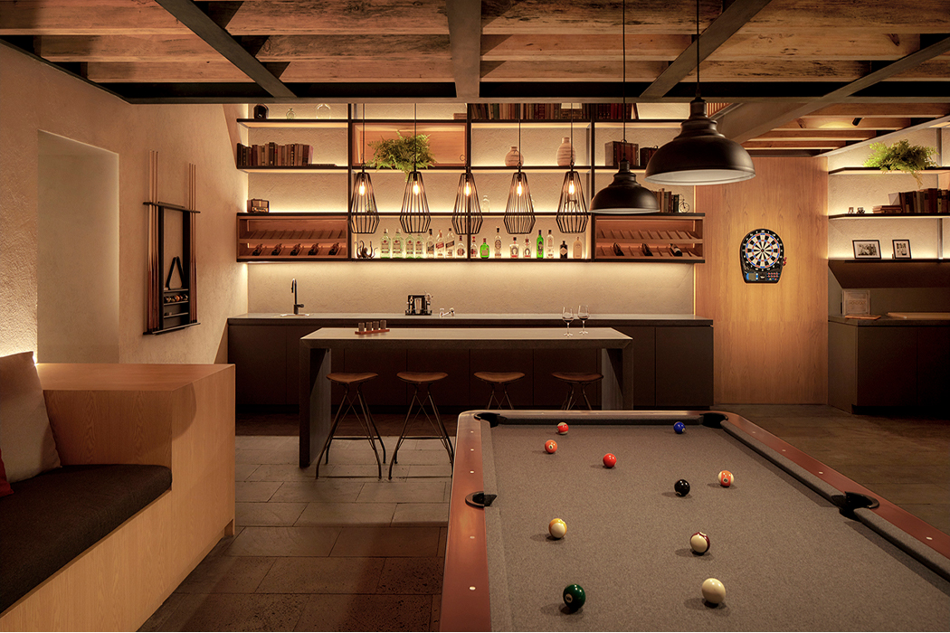
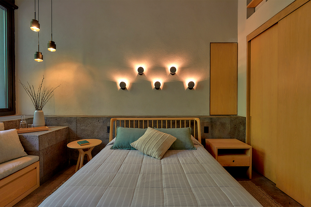
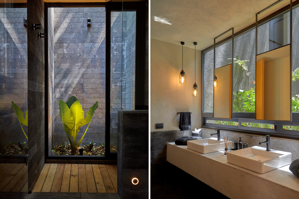
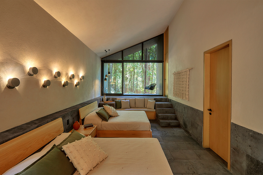
In response to the world’s climate crisis, architects have been designing homes and cabins that leave a small footprint on the area where it’s built. Tiny mobile homes that don’t require an in-ground foundation have surged in popularity, as well as homes with an architectural layout that weaves the building’s frame through the natural paths created by the area’s pre-existing vegetation and trees. Inspired by the forest’s natural canopy and crisscrossing natural sunlight, Mexico City’s architecture studio Weber Arquitectos built a holiday cabin from volcanic stone that integrates the land’s trees into the cabin’s living spaces.

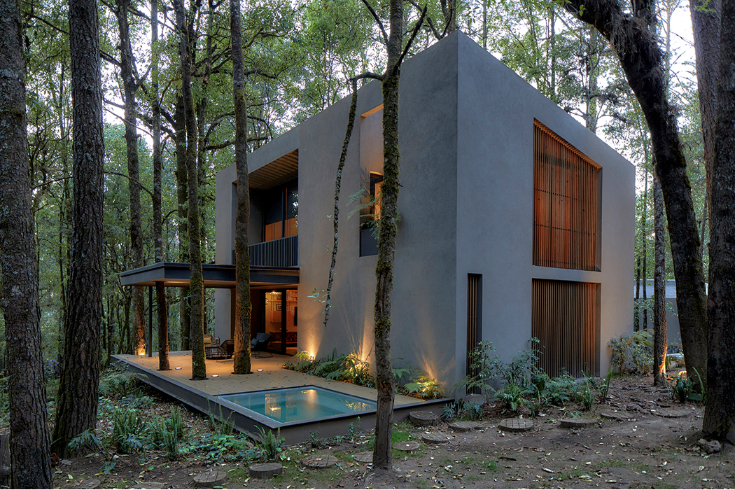
Comprising a total of 5,000 m2 of forested land, Rancho San Simón makes up a cluster of five cabins located deep in the forests of Mexico’s Valle de Bravo, a coastal town popularized as a weekend getaway. Drawn and built to cause as little disruption to the pre-existing landscape as possible, the five cabins of Rancho San Simón weave between the forest’s scattered trees and actually incorporate their trunks and canopies into Rancho San Simón’s layout. Stationed beneath the trees’ cavernous canopies overhead, the builders of Rancho San Simón punctuated the cabins’ patios and terraces with tree trunks, offering the illusion that the cabins somehow emerged from the ground below.

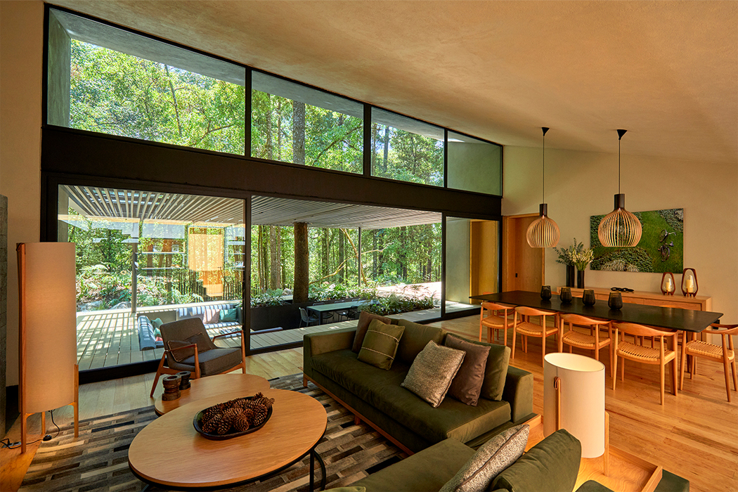
The cabins’ semi-outdoor pitched roofs tilt with the forest’s sloped terrain and create deep terraces with high roofs that morph them into forest caverns. Oriented in a way that provides viewpoints for every window, each cabin of Rancho San Simón comes with its own terrace that merges with the trees. The expansive windows rise from the cabin’s floor to its high ceilings, formed from geometric angles and framed with treated wood lattices that strain the natural sunlight pouring in from outside.

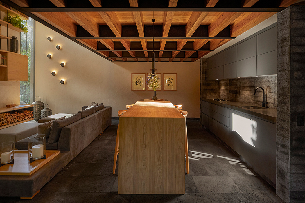
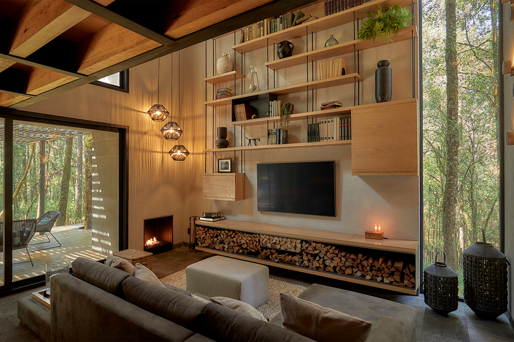
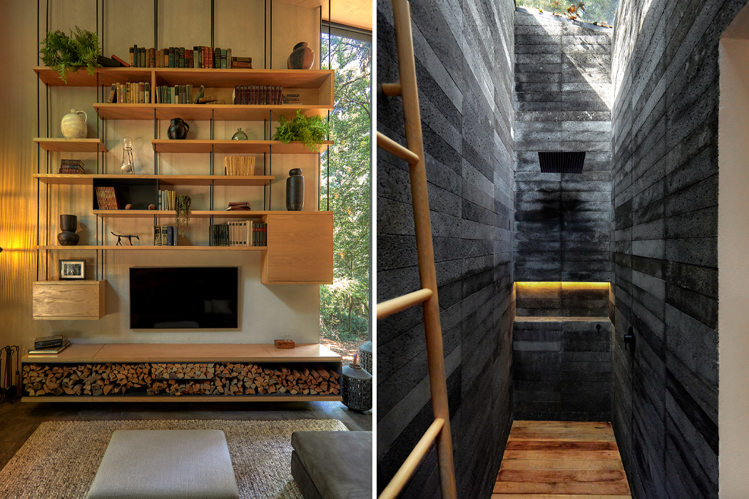
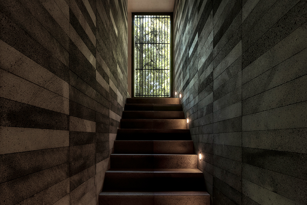
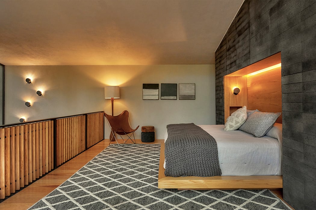
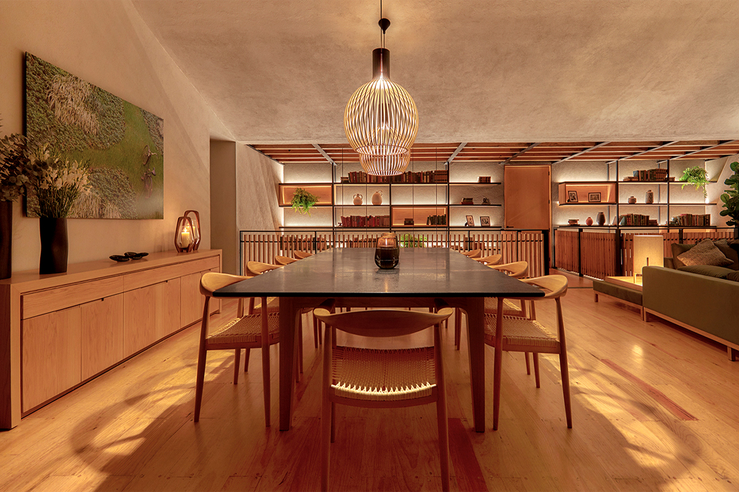
Primarily constructed from volcanic stone, Rancho San Simón carries an internal structure derived from local pine trees that warms up the cabin’s grey exterior with hearty wooden beams and pillars. Inside and out, Rancho San Simón exudes warmth with a white oak interior and presents as a wooded haven in the dark of the forest.

Designer: Weber Arquitectos

Fully integrated into Valle de Bravo’s forests, Rancho San Simón follows a layout that weaves between the trees to not disrupt the pre-existing landscape.

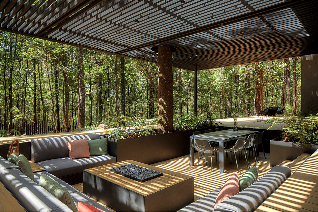
The patios of Rancho San Simón merge with the trees, allowing their trunks to bloom through the patio’s floor.

Inside, warm wooden beams fortify the different levels of Rancho San Simón.

Fireplaces and white oak walls also help to warm up Rancho San Simón’s interior.

Warm wood accents glow alongside the building’s volcanic stone structure.

Pitched roofs tilt with the forest’s terrain.

The cabin’s patio levels the buildings against the sloped forest landscape.

Latticed wooden overhangs create crisscrossed displays of natural sunlight.

Skylights pour sunlight from the home’s ceiling, drenching each cabin in natural light.

Downstairs, the darker interior design elements solidify Rancho San Simón as a cavern in the deep forest.

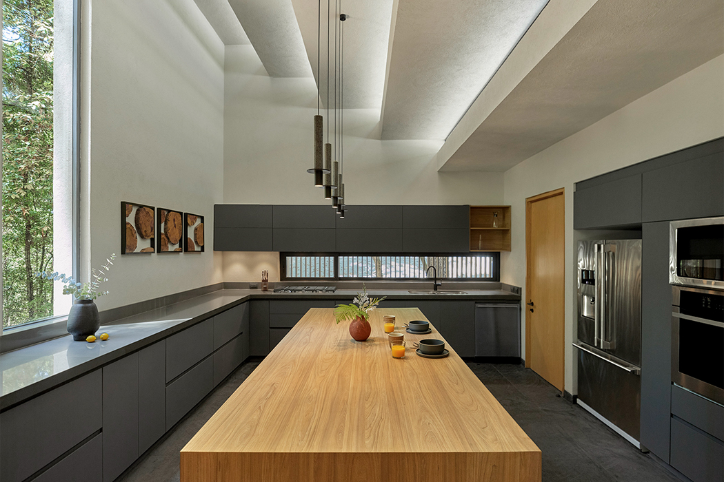
Muted white walls brighten interior living spaces like the kitchen, using natural resources like sunlight to open up the room.

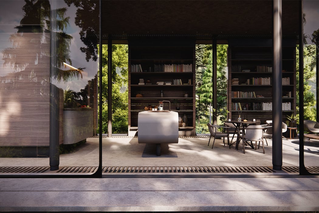
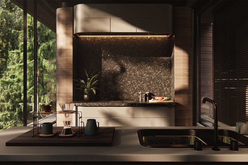
This minivan-inspired cabin features a round roof and an open-air interior to allow increased interaction with the environment!

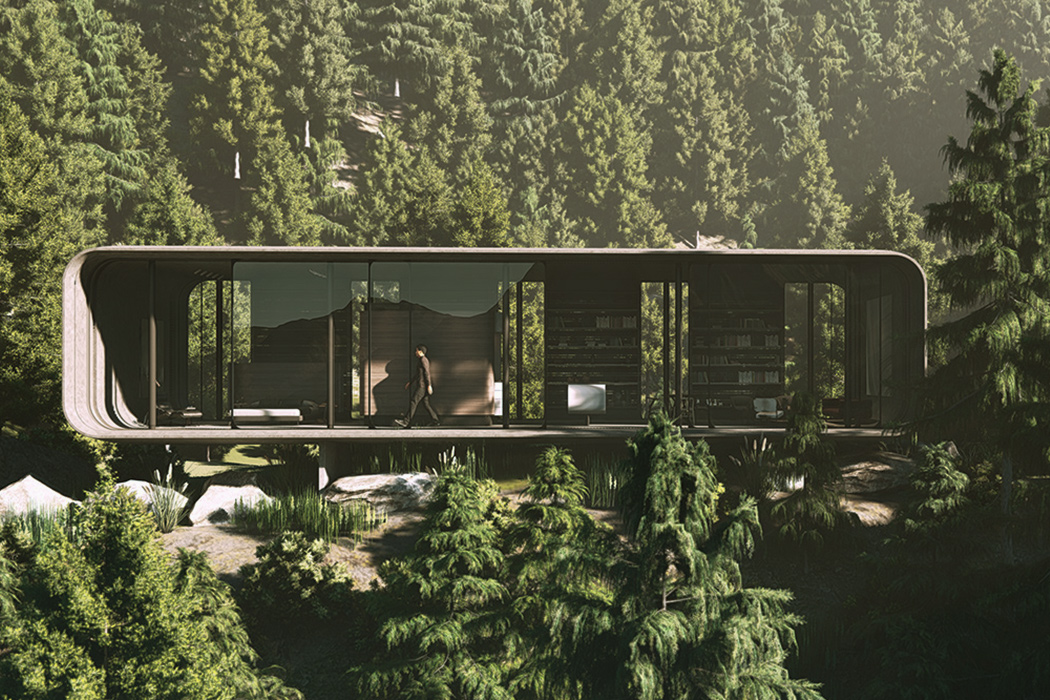
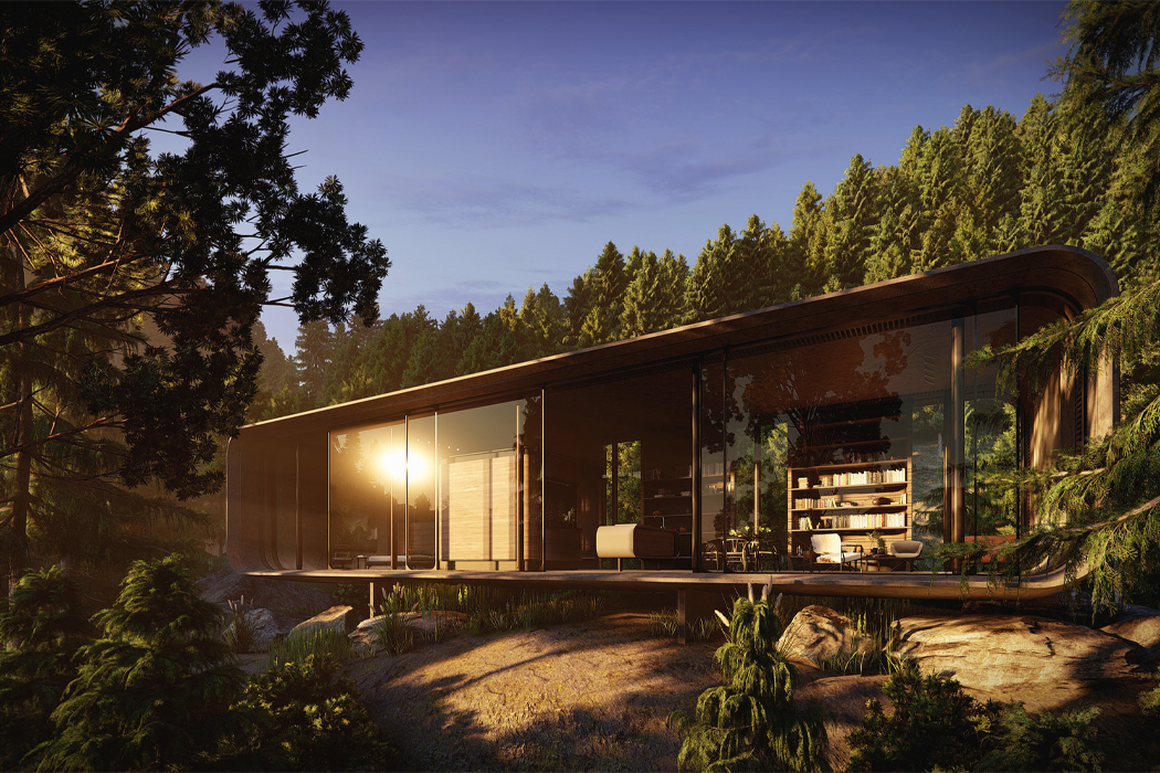
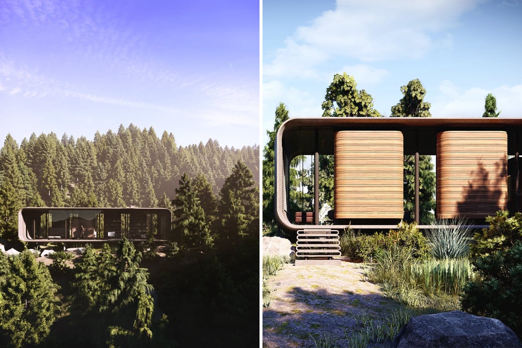
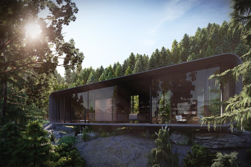
Imminent Studio and Grafito Design Studio have teamed up to create Dwelling Pod or D-Pod for short, a mono-volume residence inspired by the shape and form of a minivan and the functionality of modernism. While D-Pod hovers somewhere above the architectural category of ‘cabin,’ its design and aesthetic follow today’s trend of prefabricated ‘cabins in the woods.’

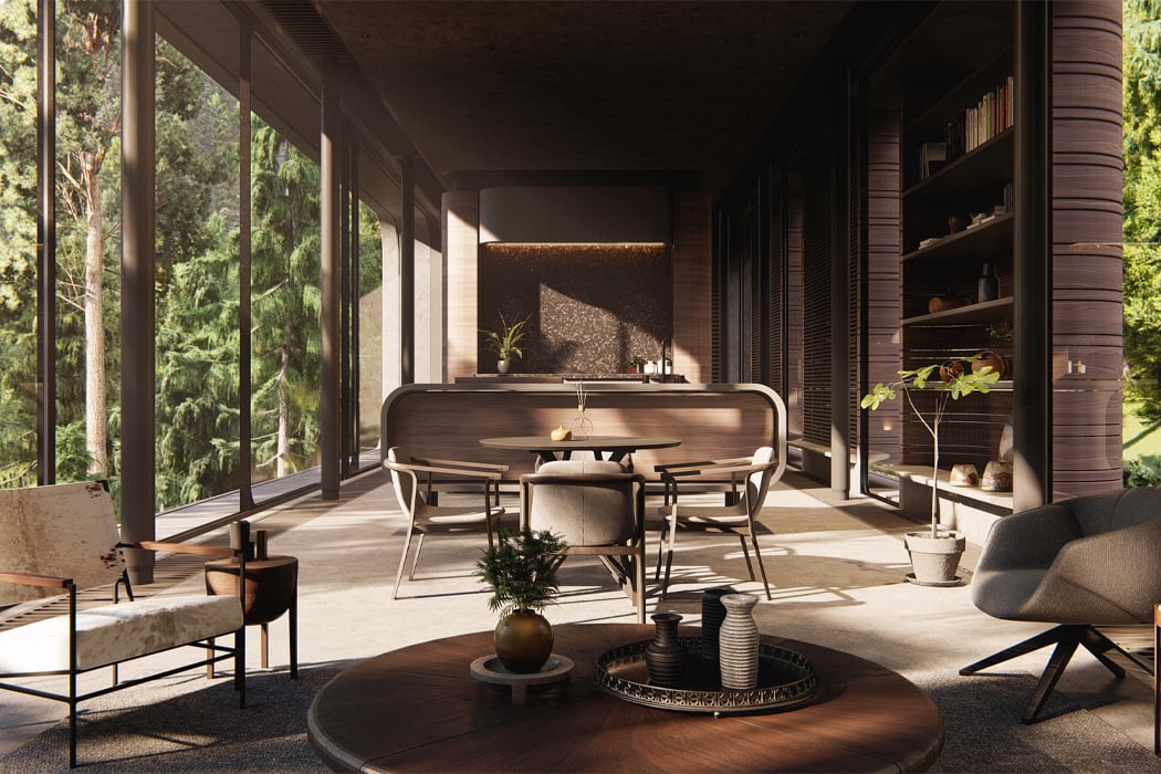
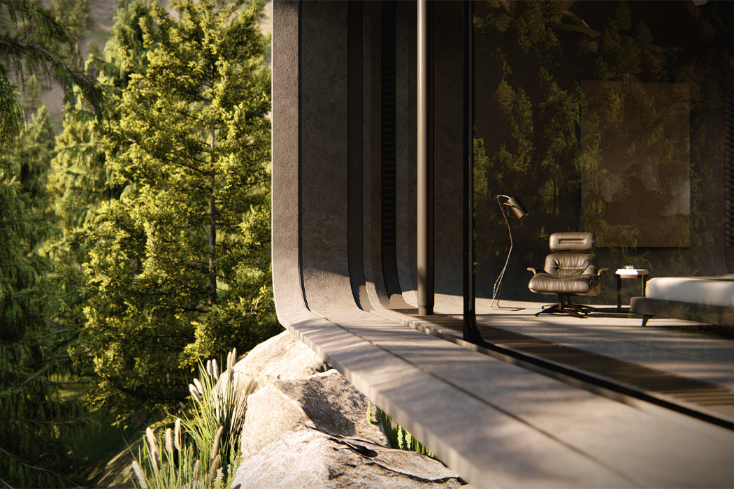
Constructed from concrete, glass, and metallic material, D-Pod is “based on the concept of lightness,” as Grafito Design Studio puts it, “where the separation of the ground is sought and lifted; its internal functional modules also use this concept of being ‘separated’ from the floor and ceiling.” In fact, D-Pod’s mono-volume nature makes it so that walls or dividers are unnecessary. Aiming to create an interior of spatial fluidity, the ‘rooms’ inside D-Pod flow into one another without the added impediment of walls or physical boundaries.

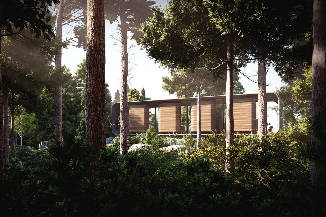
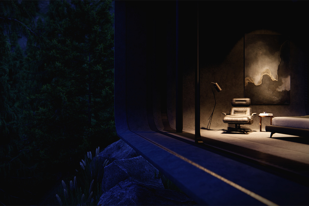
With transparent, floor-to-ceiling walls enclosing the entirety of D-Pod, the dwelling’s interior expands the visual space, dissolving D-Pod’s only walls into the environment that surrounds it. Conceptualized in the middle of a dense forest and mounted on top of a solid rock formation, D-Pod’s spatial fluidity, transparent walls, and air of modernism allow the structure to blend right into its surroundings.

Based on the form and shape of automobiles, D-Pod’s curved edges and mono-volume frame were inspired by the structure of minivans. While the rounded corners provide D-Pod with a distinguishable and appealing frame, its flat surfaces, roof, and floor fill D-Pod out with functionality and stability. Measuring 170m2, D-Pod currently stands as a concept, but everything from the pod’s inside to its outside has been planned for future developments.

Designers: Imminent Studio and Grafito Design Studio

With transparent, floor-to-ceiling walls, D-Pod blends right into its surroundings.

Glass panels can slide open and close to either entirely open up D-Pod to the outside or enclose it with transparent walls.

Inside, the lack of walls and dividers give D-Pod a mono-volume feel, similar to that found in a minivan.

With a wooden roof and transparent walls, D-pod is discreet in nature.

D-Pod is made of concrete, glass, and metal.

Come night, D-Pod shines like a lantern.