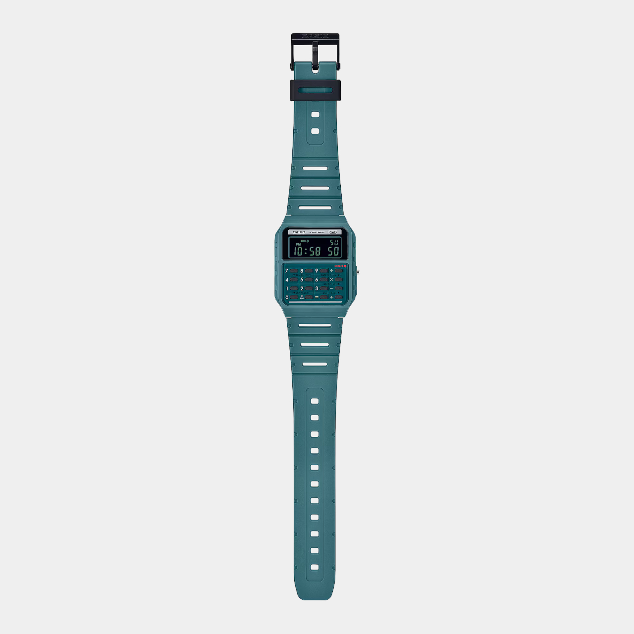
Casio calculator watch pays homage to the world’s first pocket calculator

It’s almost too easy to take for granted the conveniences we enjoy today thanks to modern devices like computers and calculators. Calculators might be a common sight these days, even on smartphones as a pre-installed app, but there was actually a time when these counting machines were only found in offices. Their bulky designs and expensive components limited their availability to businesses that could afford them, forcing other people to depend on manual calculations.

The first generation of personal calculators, large as they may be by today’s standards, truly revolutionized this industry, making it easier for professionals, students, and practically anybody to make complicated calculations in just seconds. To recognize one of these trailblazers, Casio just released a new version of its odd calculator watch, taking its design cues from its own Casio Mini pocket calculator from the 70s.

Designer: Casio
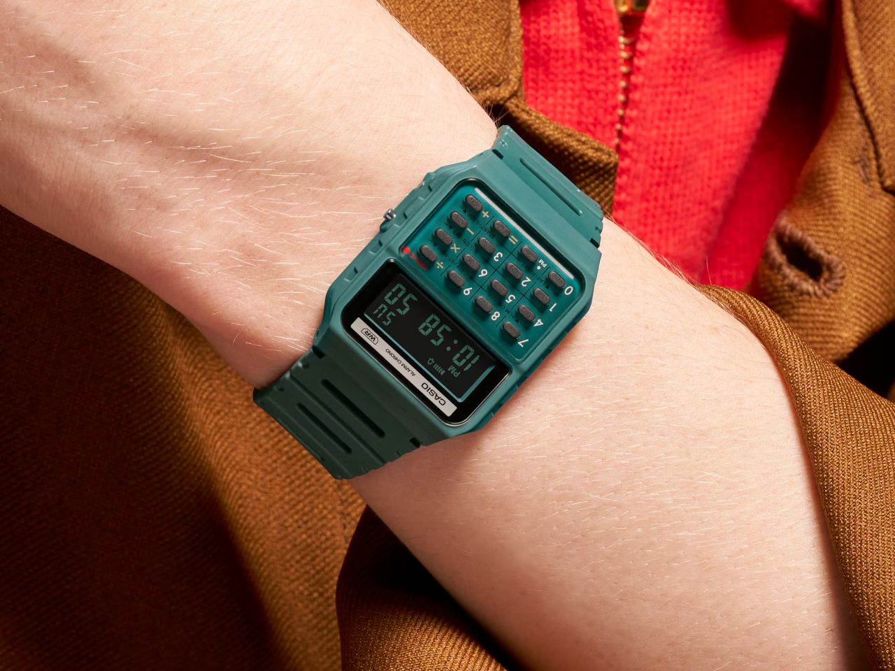
Wristwatches that cram tiny calculator keys in a small space aren’t exactly new. Whether they’re actually practical or convenient is hardly a concern, as they give watch lovers and Casio fans something to cherish. Especially in an age where everyone can use their phones for the same purpose, these timepieces become designs that combine nostalgia and novelty in one package.

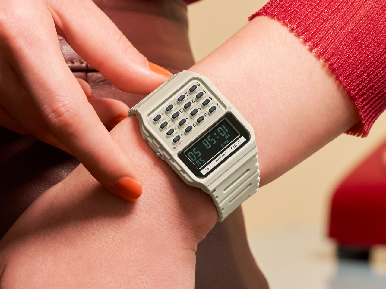
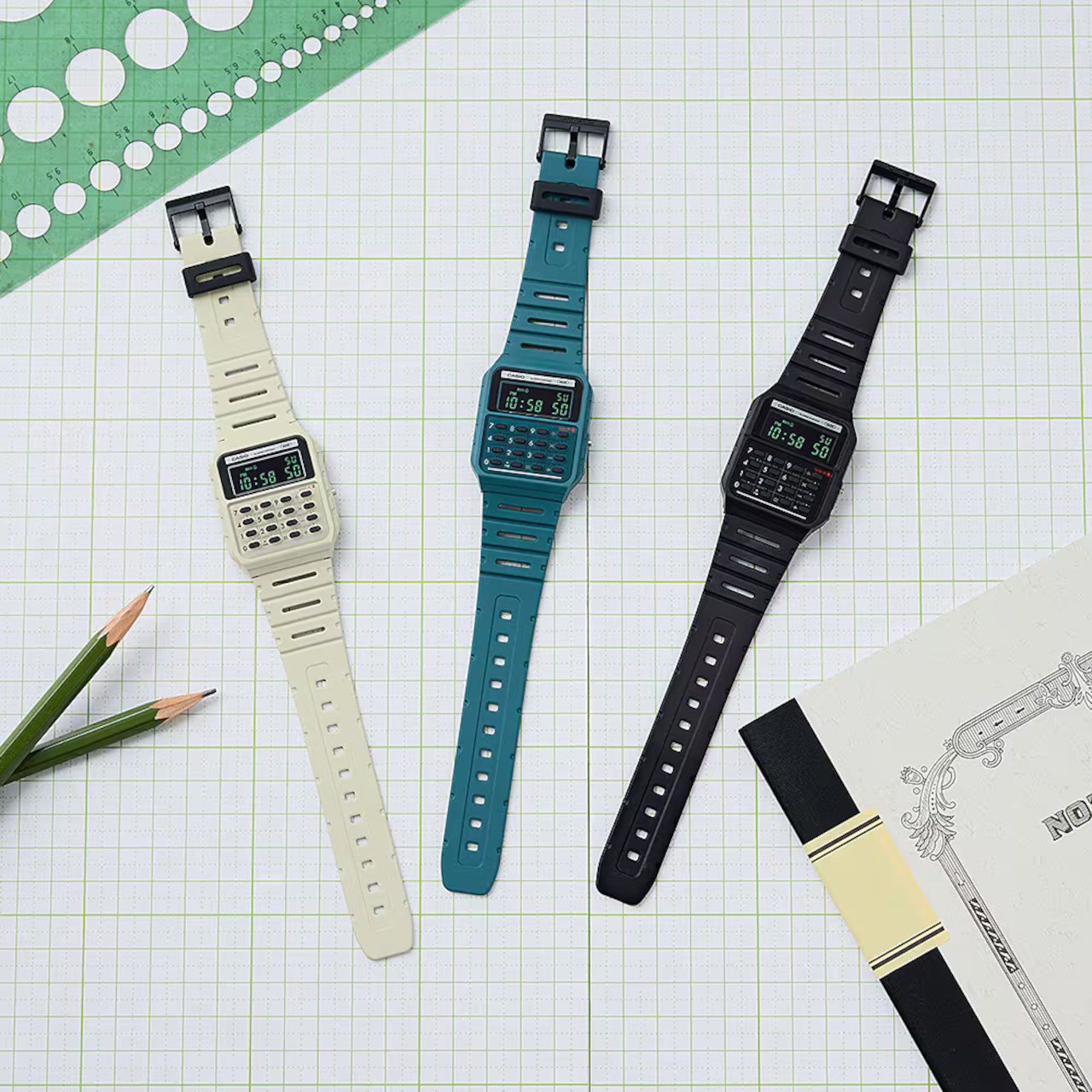
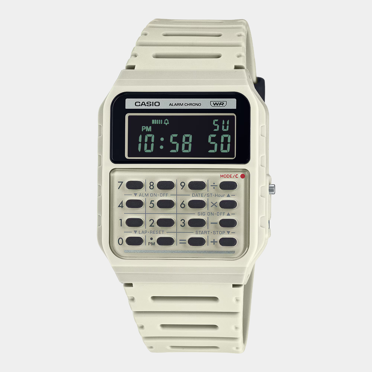
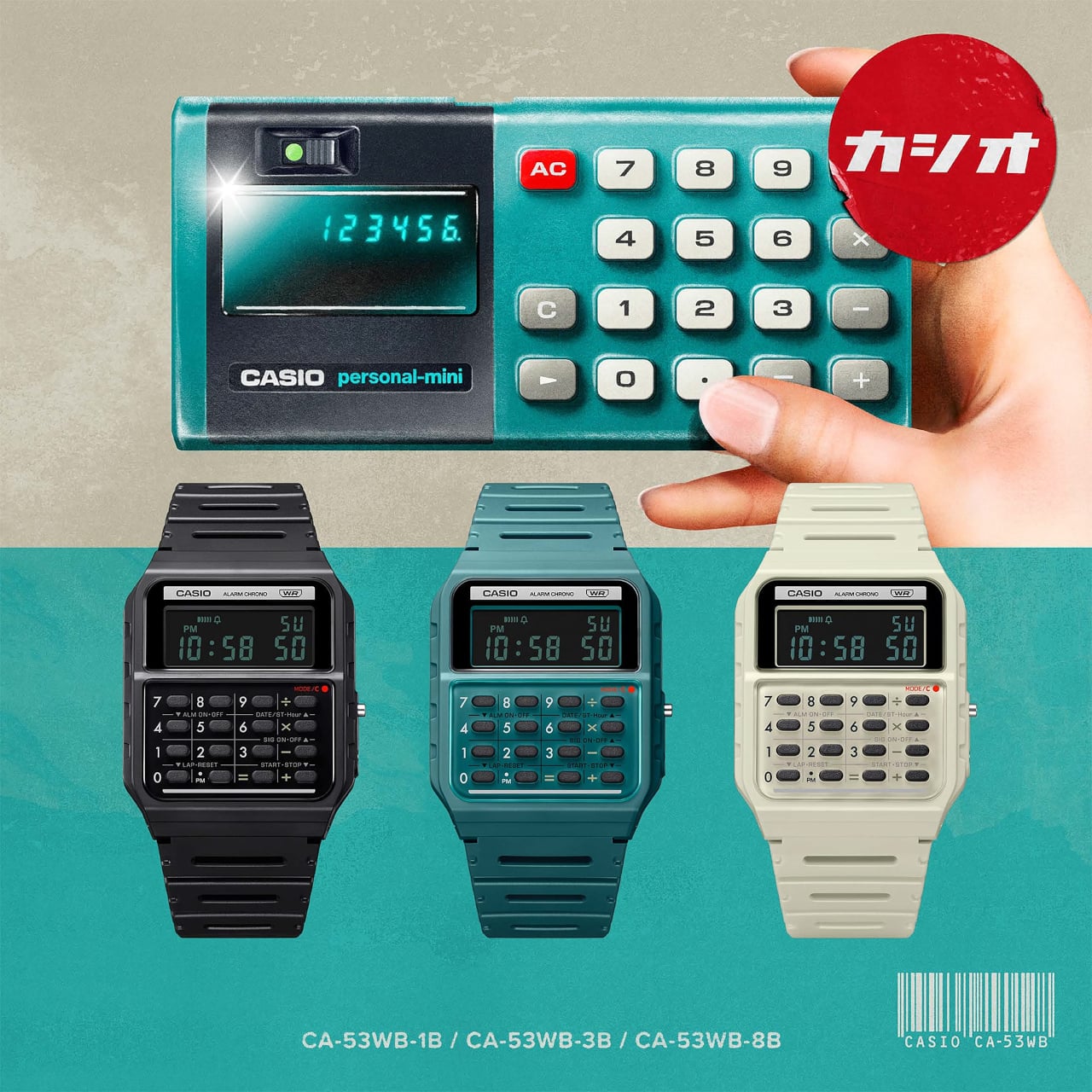
The new arrivals to this set don’t actually add new functionality, which would ruin the charm of this device, but tweak the design a bit for an even more retro look. The Casio CA-53WB watches specifically adopt the design elements of the Casio Mini from 1972, starting with the three color options available back in 1972: ivory, black, and blue-green. Unlike the other Casio calculator watches, these three use green text on a negative LCD, just like those old-school displays.

There are also more subtle design cues that might be more familiar to those who remember the original calculators. The number buttons, for example, are separated by grid lines, and the mode indicator uses a red color to emulate the power indicator of the old calculator.

In terms of functionality, the Casio CA-53WB is exactly like the other models, supporting up to eight digits for calculations and providing features like a stopwatch and an alarm. One modern improvement in the design is the use of bio-based resin for the watch band, reducing the product’s environmental impact. This blast from the past calculator watch costs $36, a few bucks more than the regular Casio calculator watches.

The post Casio calculator watch pays homage to the world’s first pocket calculator first appeared on Yanko Design.

Casio calculator watch pays homage to the world’s first pocket calculator

It’s almost too easy to take for granted the conveniences we enjoy today thanks to modern devices like computers and calculators. Calculators might be a common sight these days, even on smartphones as a pre-installed app, but there was actually a time when these counting machines were only found in offices. Their bulky designs and expensive components limited their availability to businesses that could afford them, forcing other people to depend on manual calculations.

The first generation of personal calculators, large as they may be by today’s standards, truly revolutionized this industry, making it easier for professionals, students, and practically anybody to make complicated calculations in just seconds. To recognize one of these trailblazers, Casio just released a new version of its odd calculator watch, taking its design cues from its own Casio Mini pocket calculator from the 70s.

Designer: Casio
Wristwatches that cram tiny calculator keys in a small space aren’t exactly new. Whether they’re actually practical or convenient is hardly a concern, as they give watch lovers and Casio fans something to cherish. Especially in an age where everyone can use their phones for the same purpose, these timepieces become designs that combine nostalgia and novelty in one package.
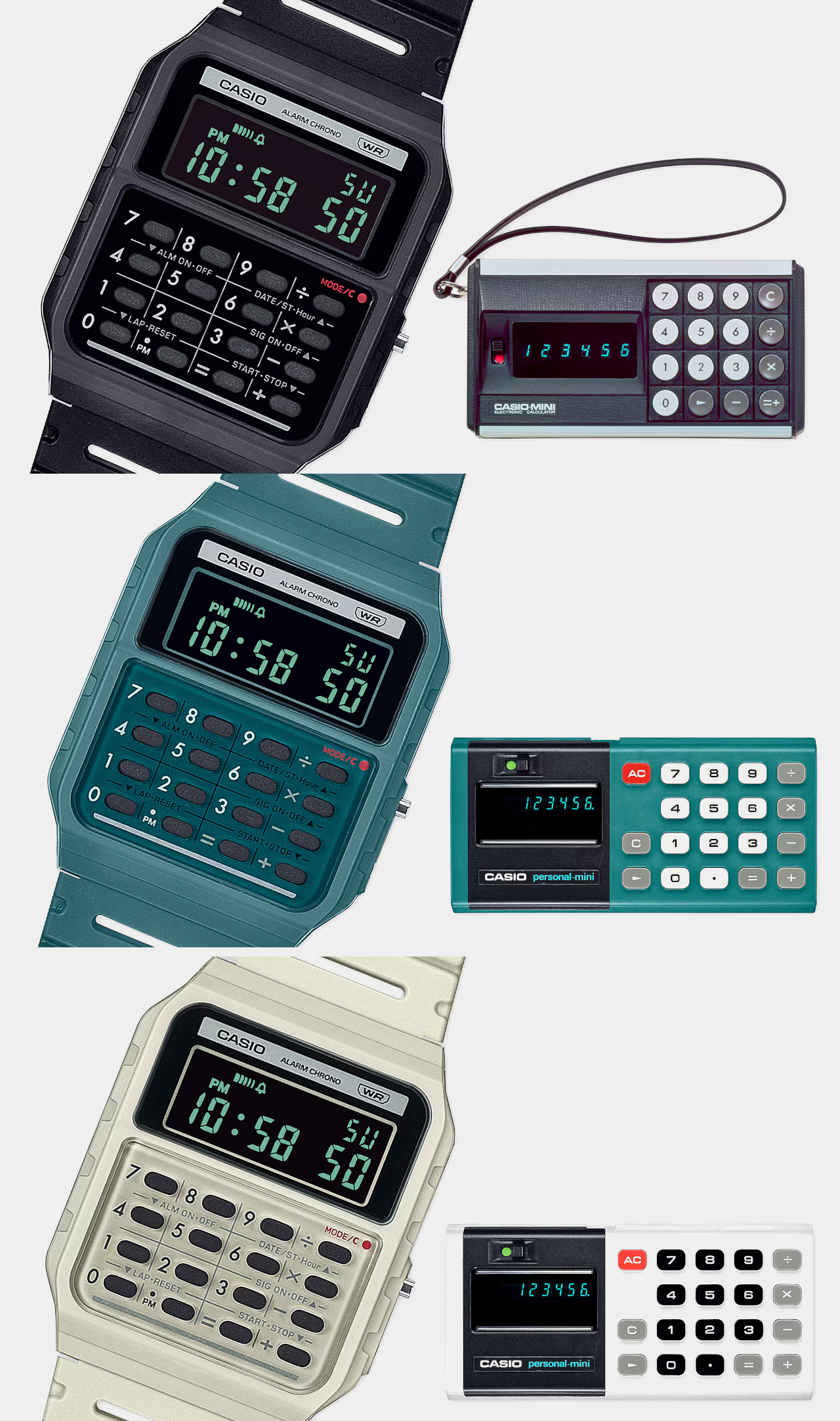
The new arrivals to this set don’t actually add new functionality, which would ruin the charm of this device, but tweak the design a bit for an even more retro look. The Casio CA-53WB watches specifically adopt the design elements of the Casio Mini from 1972, starting with the three color options available back in 1972: ivory, black, and blue-green. Unlike the other Casio calculator watches, these three use green text on a negative LCD, just like those old-school displays.
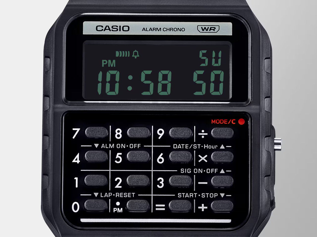
There are also more subtle design cues that might be more familiar to those who remember the original calculators. The number buttons, for example, are separated by grid lines, and the mode indicator uses a red color to emulate the power indicator of the old calculator.

In terms of functionality, the Casio CA-53WB is exactly like the other models, supporting up to eight digits for calculations and providing features like a stopwatch and an alarm. One modern improvement in the design is the use of bio-based resin for the watch band, reducing the product’s environmental impact. This blast from the past calculator watch costs $36, a few bucks more than the regular Casio calculator watches.
The post Casio calculator watch pays homage to the world’s first pocket calculator first appeared on Yanko Design.
Nature-inspired toy-like calculator tries to get kids more interested in math

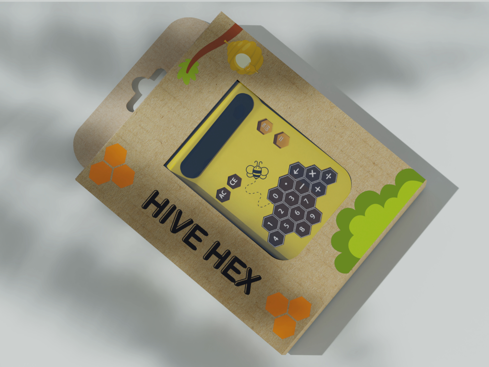
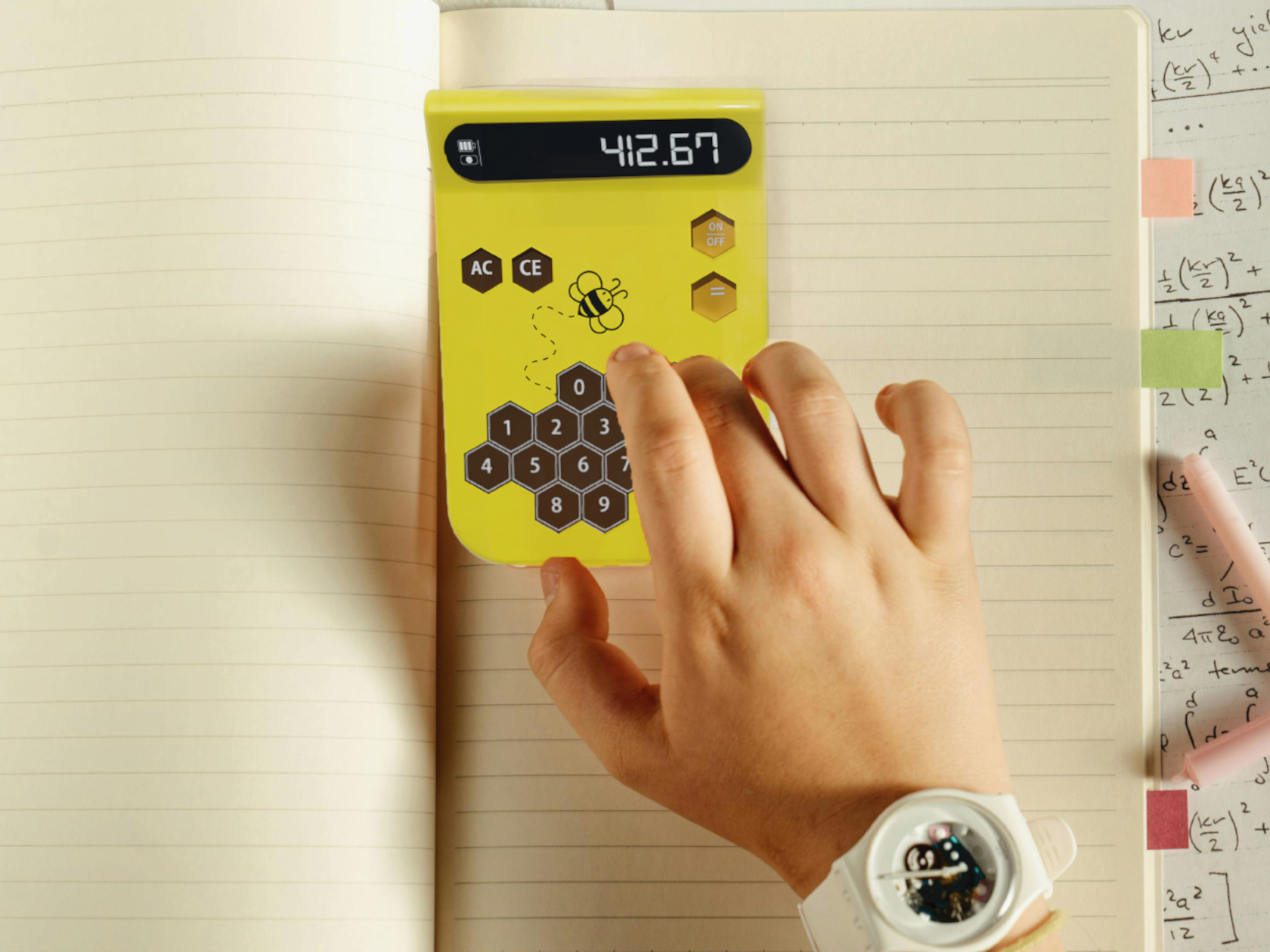
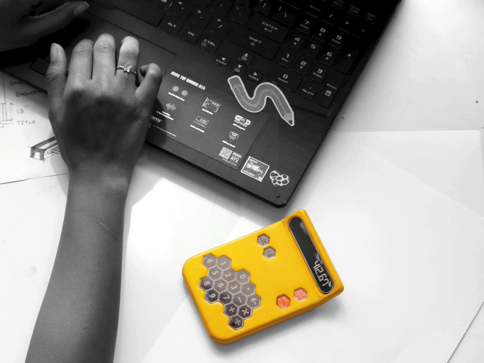
With plenty of phones and tablets around, kids are becoming more and more tech-savvy every generation. That, however, doesn’t always mean they are getting smarter or more skilled in other aspects of learning as well, particularly sciences and math that are more closely related to tech. There are plenty of apps that try to teach the basics, including reading and writing, but younger kids also need to develop their sense of touch, which requires more tactile experiences while learning. This calculator tries to pique children’s curiosity and engage not just their minds but also their senses, and it takes inspiration from one of nature’s hardest workers: bees and their geometric honeycombs.

Designer: Mohit Joshi

Calculator designs are not uncommon, but the vast majority of them utilize simple shapes like squares, circles, or even rounded squares, sometimes known as “squircles.” Not surprising, as these tools are designed for adults who value efficiency and performance primarily with aesthetics coming second only. The opposite is true for kids, however, whose short attention spans require designs that are captivating and intriguing, and keeping the design still functional is the challenge.

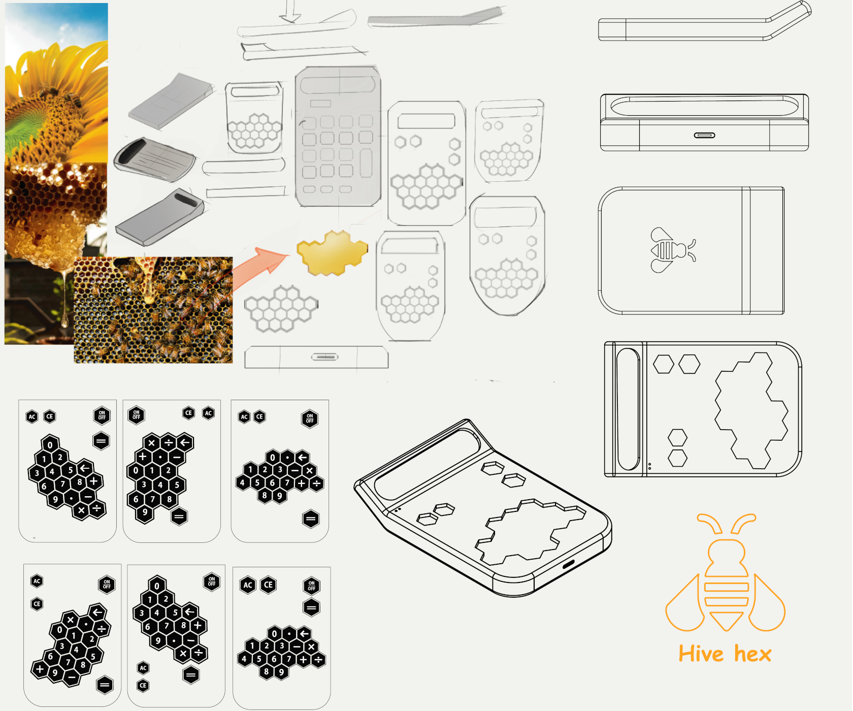
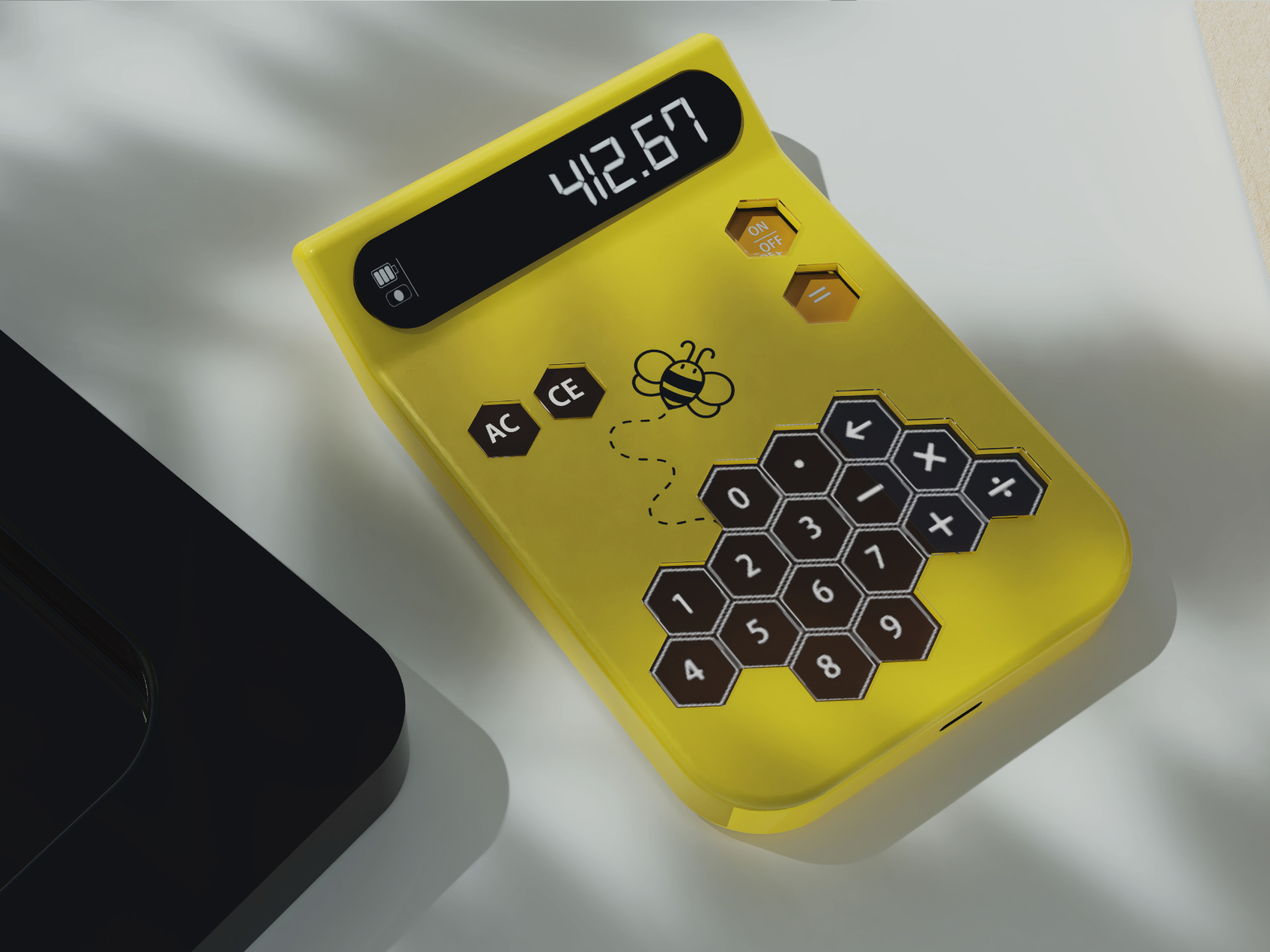
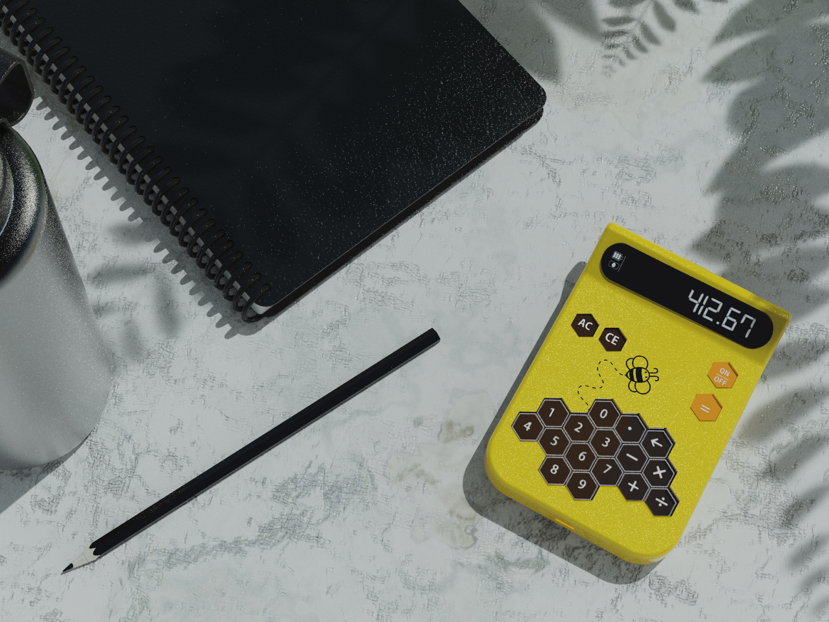
Some consider the hexagon to be the perfect shape because it isn’t flat like a square, can fit together better than circles, and is more space-efficient than triangles. Nature has a perfect example of this geometric shape in action as can be seen in beehives, particularly the honeycomb structures they form. While the real thing can be dangerous to children, bees are sometimes portrayed in fun and funny ways, especially given how hard they work and how well they guard their honey.

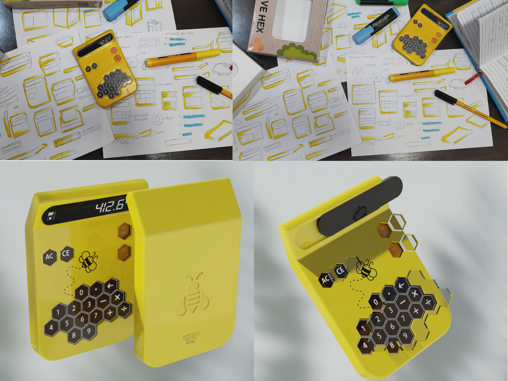
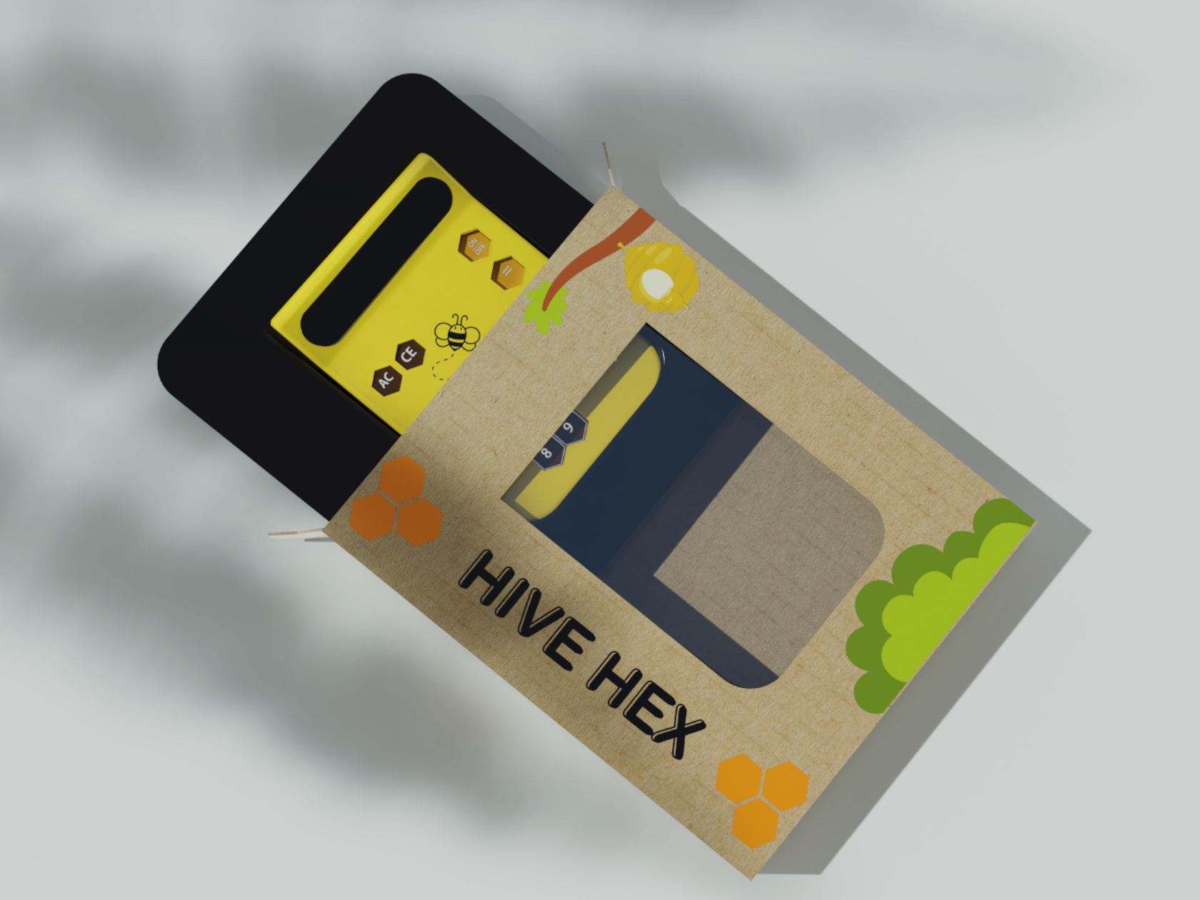
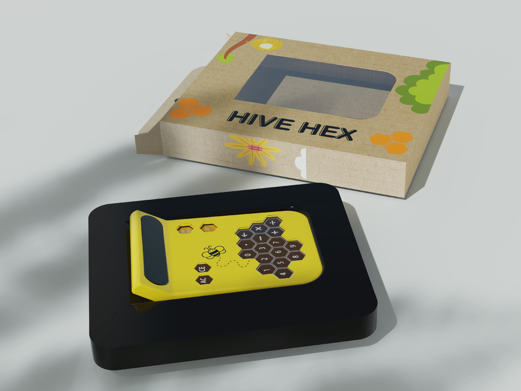
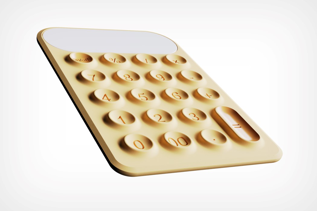
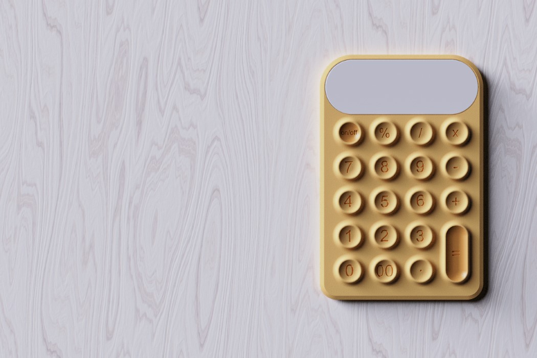
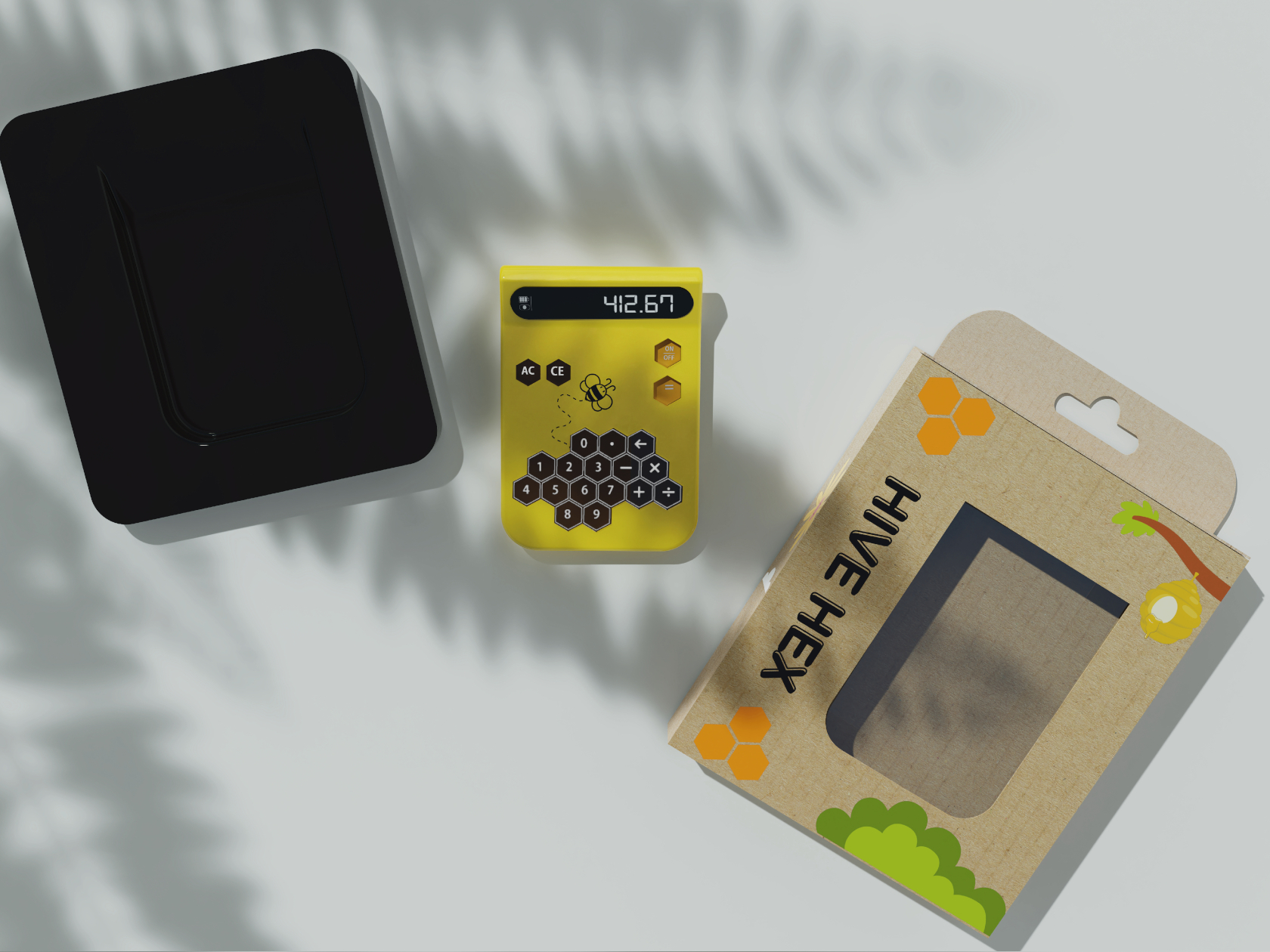
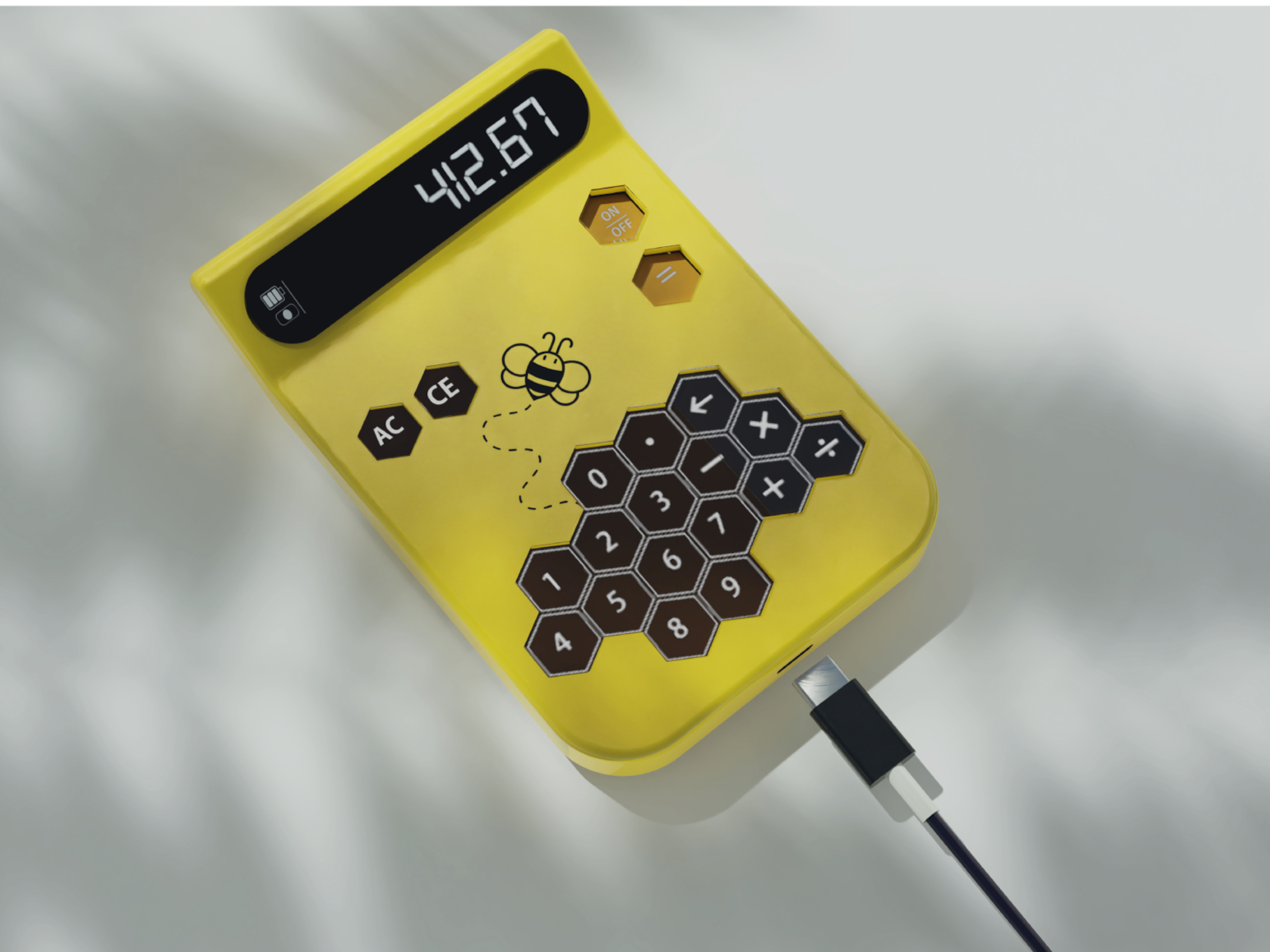
Hive Hex combines this shape and inspiration into a device that should be more interesting to use than even the sleekest and most minimalist calculator. The yellow color alone is eye-catching enough, but the puzzle-like hexagonal keys give a sense of whimsy and playfulness with their unbalanced composition, unlike the symmetrical arrangement of calculator buttons. That said, the non-standard layout of keys could prove to be confusing when the child “graduates” to grownup tools.

This toy-like yet functional calculator is a great example of how a bit of creative design can significantly change how a product appeals to different groups of people. Of course, some adults might criticize the use of calculators in the early stages of math education, but the calculator does more than just help kids solve number problems. The Hive Hex Toy Calculator could help give children a more lasting impression of how math doesn’t have to be boring or even scary, a positive attitude that they could carry with them throughout the rest of their lives.

The post Nature-inspired toy-like calculator tries to get kids more interested in math first appeared on Yanko Design.
Apple was right about the iPad Calculator App… After 14 years, the iPad Calculator is Game-Changing

After over a decade, the iPad finally got a calculator app. Let’s just get one thing straight – Apple just made the calculator glamorous.

Steve Jobs debuted the iPad back in January 2010, that’s a whopping 14 and a half years ago… and mysteriously enough, the iPad never shipped with an Apple-branded calculator app. Whenever pressed on the issue, Apple spokespeople always had the same answer – they didn’t want to release a calculator app just for the sake of it. They wanted to get it right by designing the best-ever calculator app for the iPad. Up until yesterday, all that felt like deflection, that Apple didn’t quite care about calculators on the iPad (after all, it was an entertainment and visual productivity device). Today, however, Apple is vindicating itself after over a decade of judgment. The new iPad Calculator app debuted at WWDC and it’s INCREDIBLE.

The new Calculator app for the iPad comes with a familiar interface, but uses the iPad’s larger screen to its advantage, delivering more oomph thanks to larger real estate. It has a history feature and built-in unit conversions, but if you have an Apple Pencil lying around, the Calculator experience gets MUCH more interesting.

Pair the Calculator with the Pencil and you get what Apple calls Math Notes, a more interactive, personal experience that takes your hand-written notes and graphs and turns them into computable datasets. Write an equation and the calculator understands your handwriting and solves the equation for you. Draw geometry, label the parts, and add a ‘=’ sign and the app intuitively understands what you want to calculate, giving you the answer. It’s like the self-answering Horcrux book from Harry Potter and the Chamber Of Secrets but on steroids. The app understands what you’re drawing/writing and how you’re doing so too. It mimics your handwriting to deliver answers (so when you write 2+2=, it adds ‘4’ to the end in a similar writing style). You can change parts of your calculations and the answers update in real-time. You can turn equations into graphs, change variables, and watch the graph change in real-time too.

This brilliant reinterpretation of the calculator comes thanks to Apple’s integration of the calculator’s features in its Notes app. It’s nothing like anything we’ve seen before. In fact, we’ve seen ChatGPT and Google Bard (or Gemini) fail in this exact area, with their inability to understand graphs or photos of equations, resulting in hilariously wrong answers. The iPad calculator app sidesteps all that by giving you the ability to intuitively take notes and compute calculations using the Pencil. You don’t need to upload an image from a text book, just draw stuff out instead. Now whether the Math Notes will be able to do all this correctly is something entirely different. It could end up making the same mistakes as GPT and Google, or create unique errors that will only be made evident once the Calculator and Math Notes features roll out with iOS 18 this fall. For one, I can definitely say that math teachers are NOT going to be happy about all of this!

The post Apple was right about the iPad Calculator App… After 14 years, the iPad Calculator is Game-Changing first appeared on Yanko Design.
AI-powered calculator concept can solve even handwritten math problems

Like it or not, and some definitely don’t, the things that AI and neural networks can accomplish these days are nothing short of mind-blowing. Never mind the rather dated speech recognition that has now become all too common, AI has now become famous and notorious for being able to analyze just about anything and generate something from those data points, whether they’re images, novels, or even the chicken scratch that is our handwriting. Turning human scribbles into digital text that computers can process has long been one of the Holy Grails of computing, but being able to make sense of those scribbles is a different story. AI has come to a point where it can not only understand but even solve handwritten equations, and that’s a capability that this smart calculator is harnessing to ease the pain of cross-checking math problems, almost like magic.

Designer: Divyansh Tripathi

It’s relatively easy for computers and even phones these days to recognize handwriting and turn it into their digital equivalent, but AI goes the extra mile by understanding those words and, in this case, numbers and symbols. Math solvers, just like AI text generators, are somewhat controversial because of their potential for abuse, but the technology itself is quite impressive and, just like any other tool, could also be put to good use.

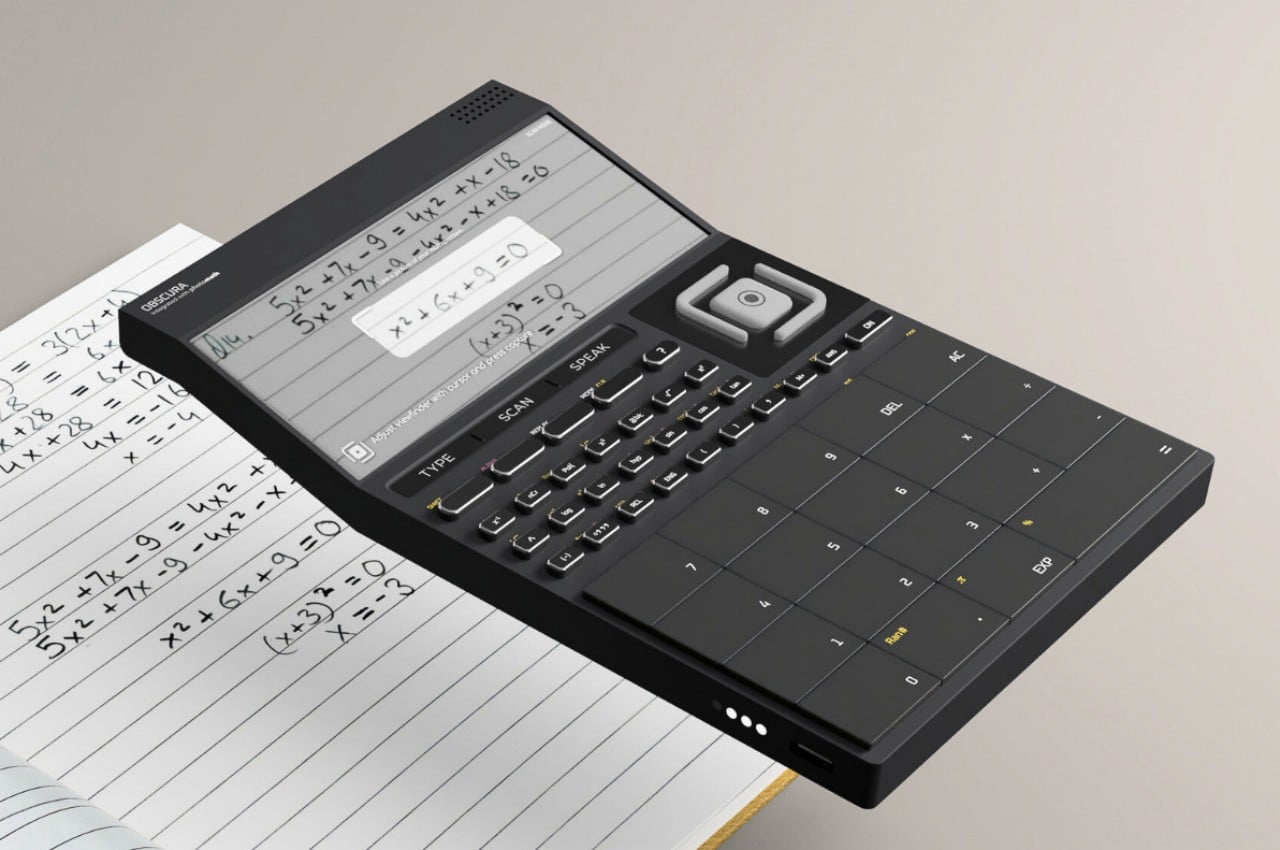
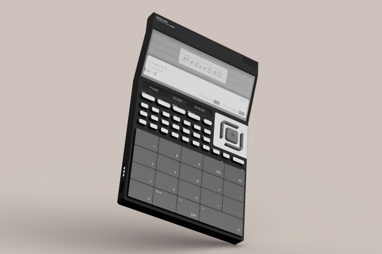
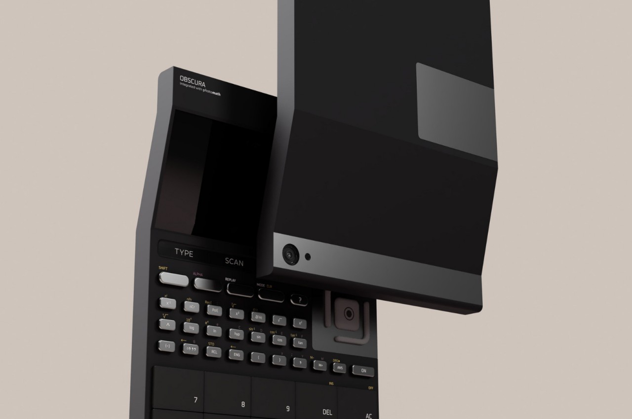
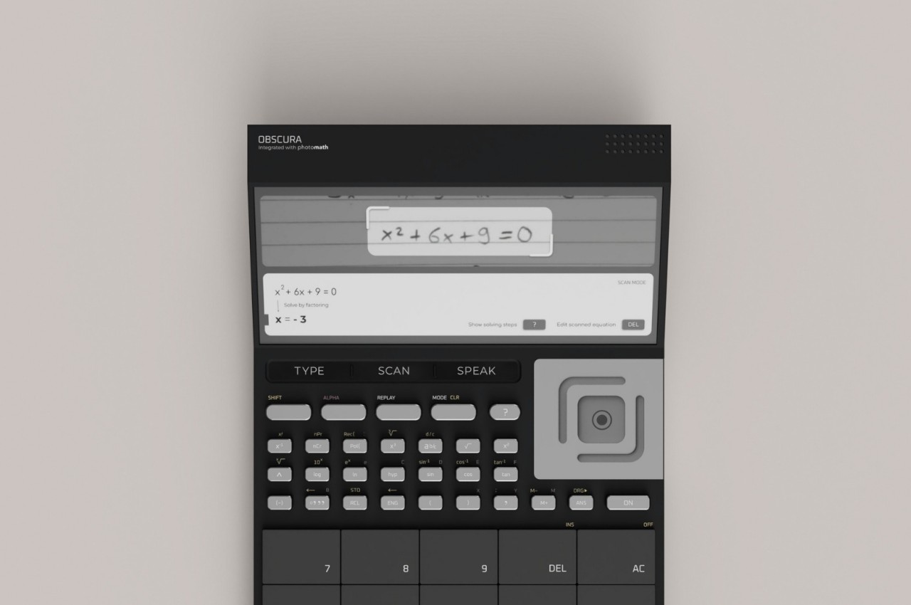
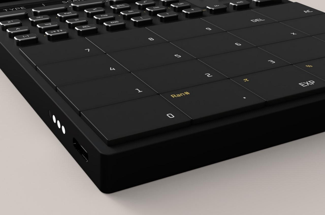
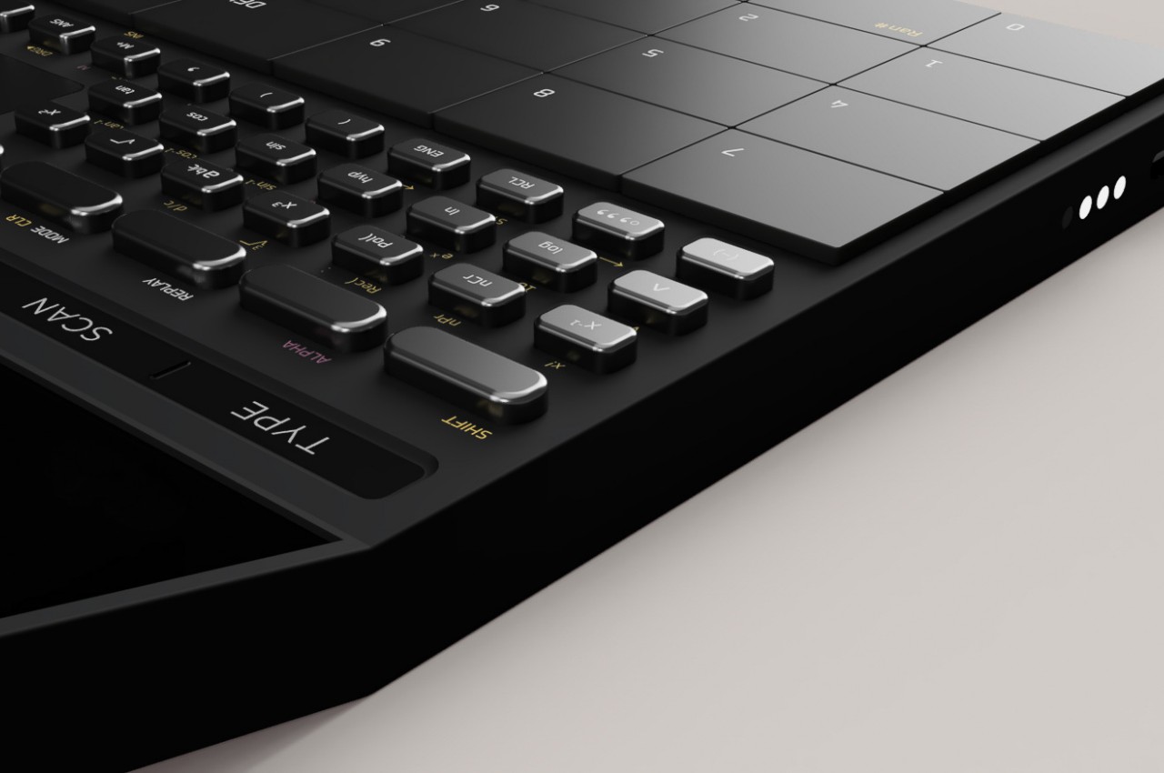
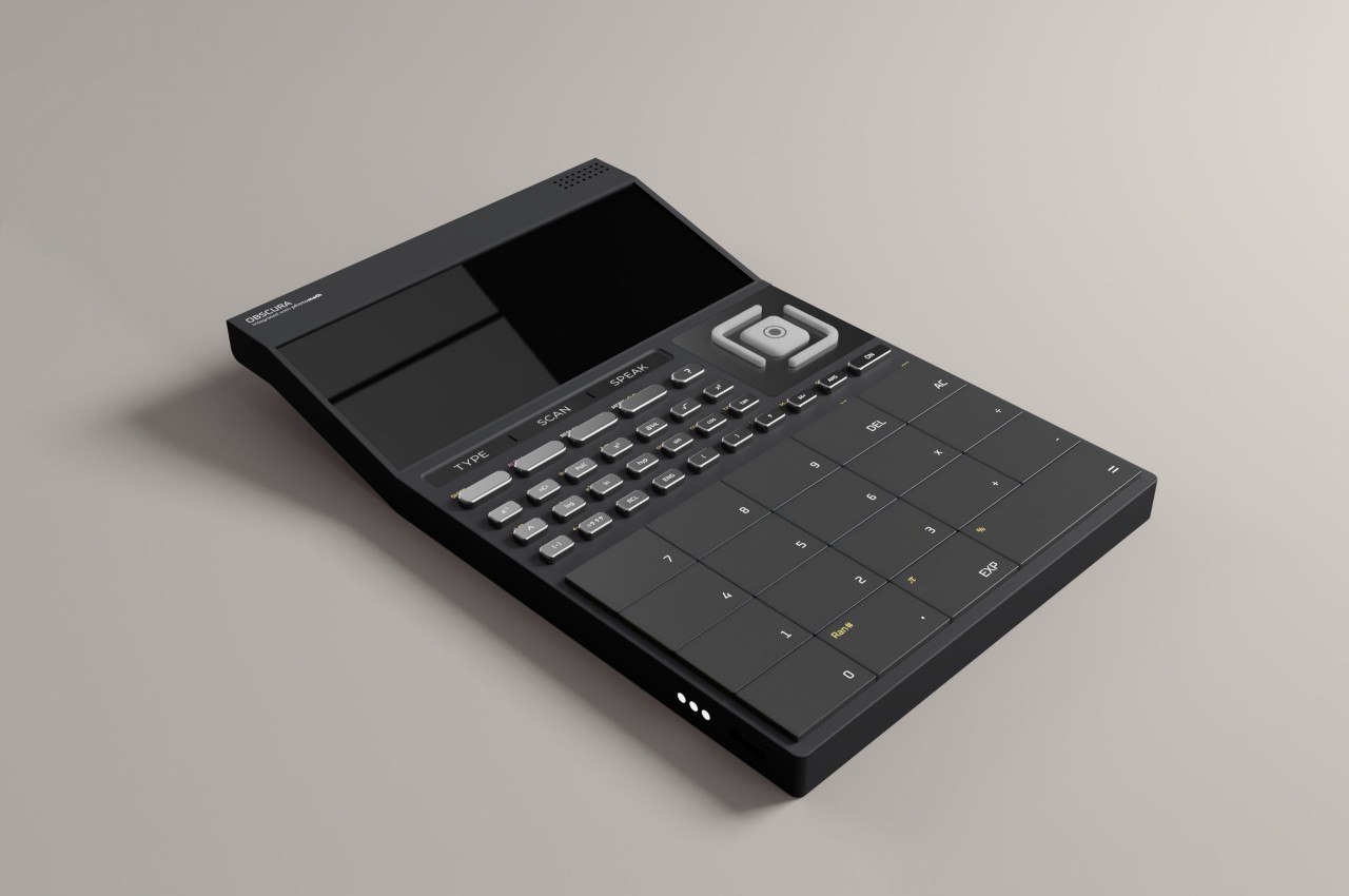
That’s the potential that the OBSCURA smart calculator concept is trying to harness, offering an all-in-one problem-solving device for any and all numerical problems. Unlike your typical advanced calculator, this one comes with a camera so that you can take pictures of a handwritten formula and run it through a solver such as Photomath, Microsoft Maths Solver, Socratic, and others. It doesn’t stop at “seeing” formulas and problems, however. It also has a built-in mic so you can verbally ask it about the problem.

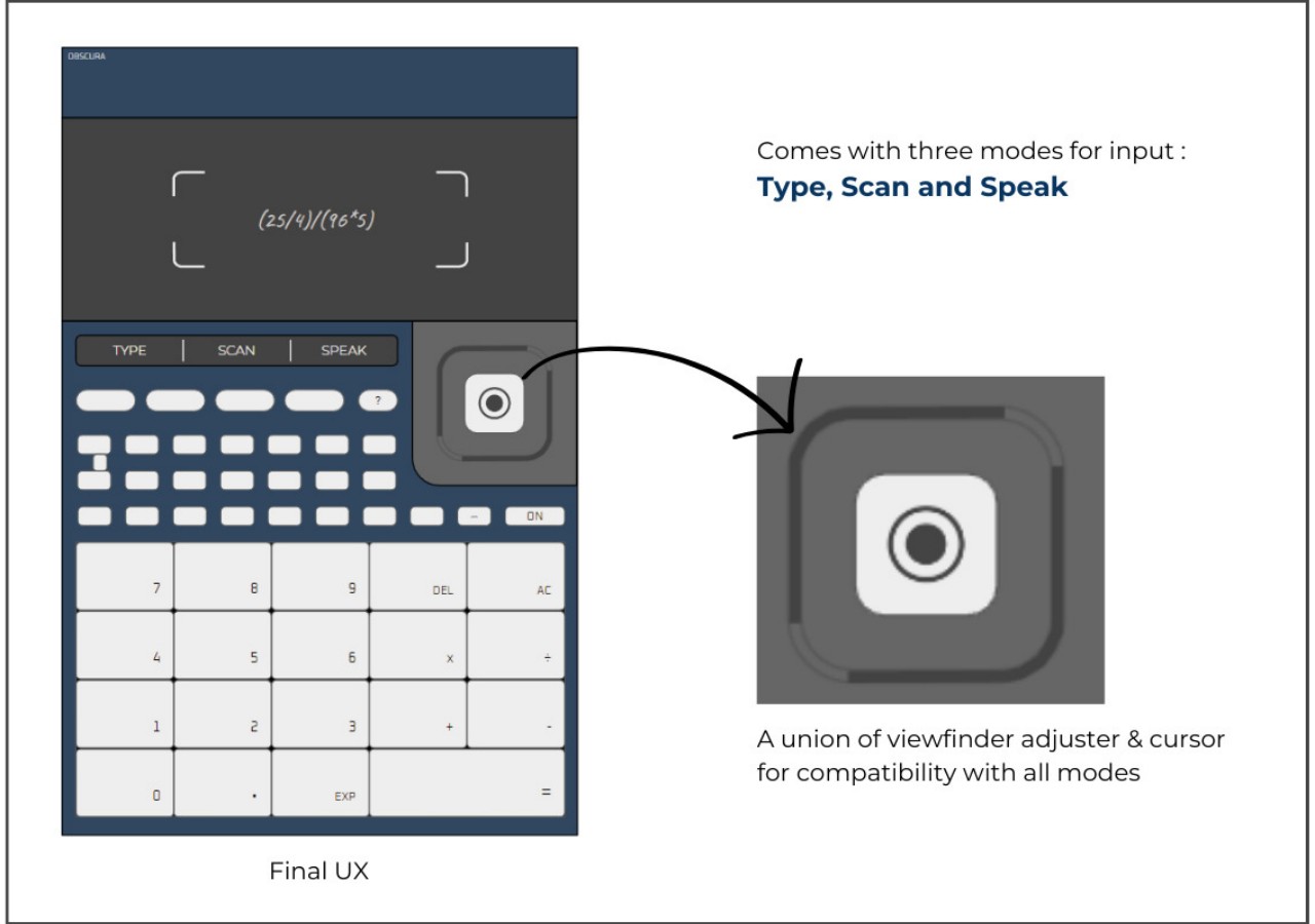
Of course, you can also just type out the numbers like with any regular scientific calculator. In terms of the device’s interface, what sets this calculator apart is a touch control that lets you adjust the viewfinder or move the cursor around on the display. In all other aspects, it’s pretty much like any other powerful calculator, just that it has AI running inside.

Of course, that raises the question of the purpose of such a device, especially when smartphones have access to the same hardware and AI services. A smartphone, however, also has plenty of distractions that can drag you away from the work at hand, especially if that work happens to involve disagreeable numbers. Obscura, at least, offers to do some of the rote work, especially with cross-checking solutions, but it’s still up to the user to be responsible with such great power in their hands.

The post AI-powered calculator concept can solve even handwritten math problems first appeared on Yanko Design.

This minimalist calculator concept can also hold your pens when not in use

Calculators are probably one of the most utilitarian, single-purpose tools on our desks. Few have probably thought about changing their design, seeing these advanced counting machines as something as clinical and unemotional as the numbers they process. Their designs are not that easy to change either because they need to follow standard conventions, like the arrangement of buttons and the location of the display. That also means they are long overdue for some novel design thinking, and this particular concept tries to make the calculator useful, whether you’re using it or not.

Designer: Jaewan Park

There are many single-purpose tools on our desks, but the calculator is probably the one that gathers dust the most. Unless you’re job actually involves crunching numbers, of course. Most of the time, it just sits in the open or inside a drawer, where those dust particles could enter gaps in the buttons that could, in turn, damage the delicate parts inside.

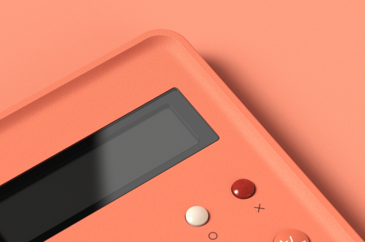
The FLIP calculator changes the design formula in three important ways. The most evident is its minimalist that manages to exude a pinch of personality. Its predominant peach color makes it stand out without being too gaudy. The candy-like shape of the buttons also makes you want to pick them out and put them in your mouth.

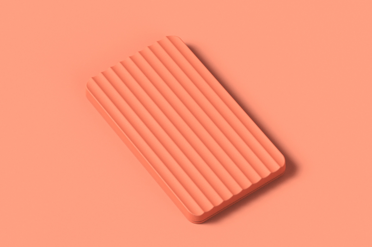
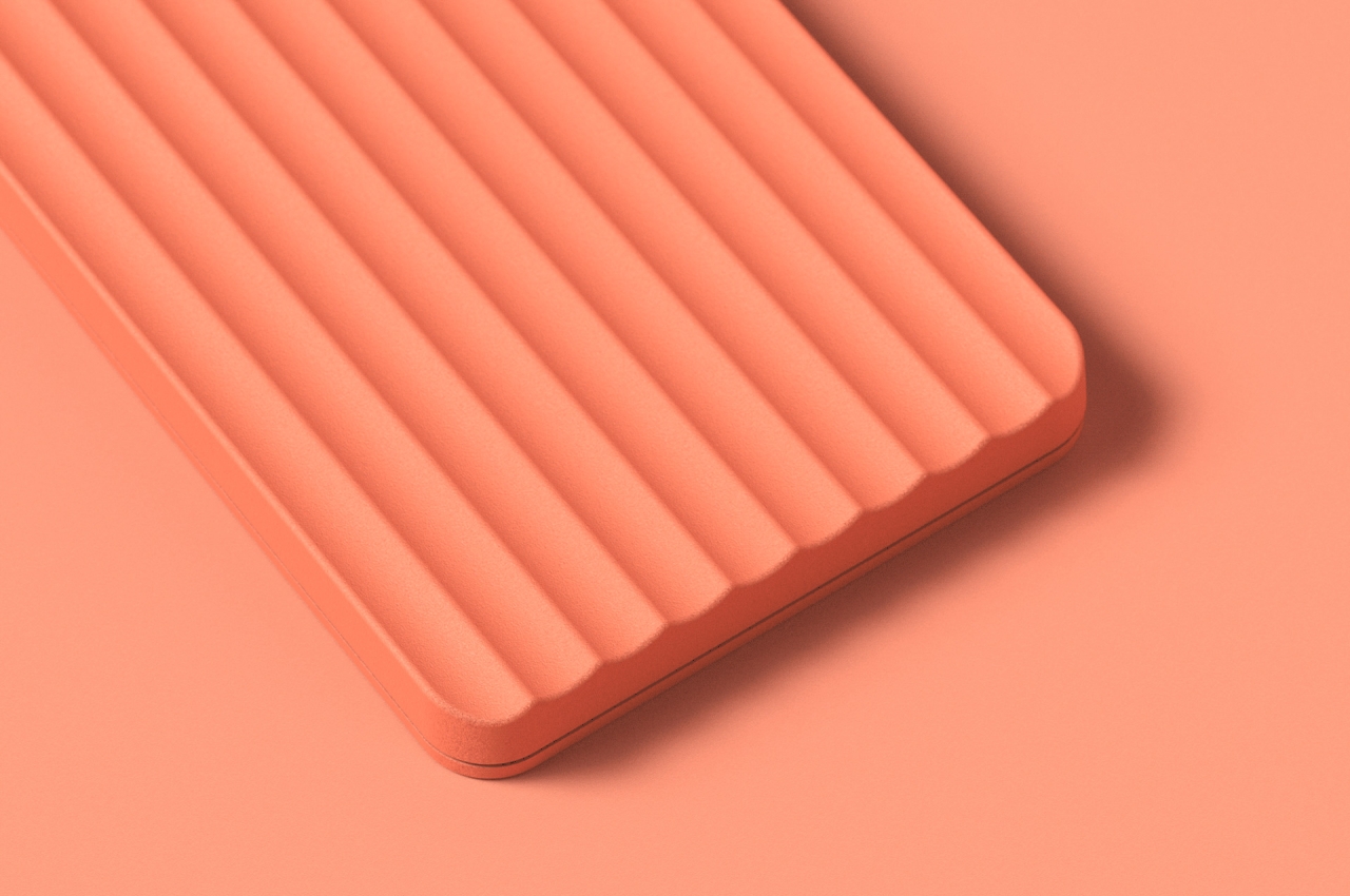
The calculator is also designed to be flipped over when not in use without actually breaking its minimalist appeal. The edges around the top of the calculator are actually raised to prevent the entry of dust and small particles when it is laid down on its face. The ridges on the bottom provide an interesting visual pattern that almost hides the nature of the calculator underneath.

These ridges also serve another function, as a potential holding area for pens, pencils, or even other trinkets. Most pens will fit nicely in the grooves, and the raised edges make it easy to pick up pins, clips, and other smaller items.

A simple change in design transforms a calculator into a dual-purpose object. It helps save up on desk space because a single item can do two things without taking up twice the area. It doesn’t even require some fundamental change to how the calculator works or adding of some complex mechanism. It just needed a few tweaks here and there to make an everyday object look more interesting and more useful at the same time.

The post This minimalist calculator concept can also hold your pens when not in use first appeared on Yanko Design.
This minimalist calculator concept makes number-crunching feel less stressful

People are advised to clear their desks of things that give them stress, but that isn’t always possible, especially with everyday tools like calculators. It is, however, possible to choose tools that try to reduce the level of stress, at least with their designs. That’s why minimalist office products have become quite popular because they immediately convey a sense of calm through their simple and clean designs. That’s part of the idea behind this concept design for one of the most stressful work tools in existence, the calculator.

Designer: Joseph Donohue

Most of the computations that you can do in your head are often simple and small, from change to dates to ages. The times when you do need to pull out a calculator are the times when you might be sweating over larger figures, often those related to money or logistics. Of all the objects you’ll find on a desk or in drawers, the calculator is perhaps the last thing you’d associate with calmness, and their traditional designs don’t exactly help improve that image.

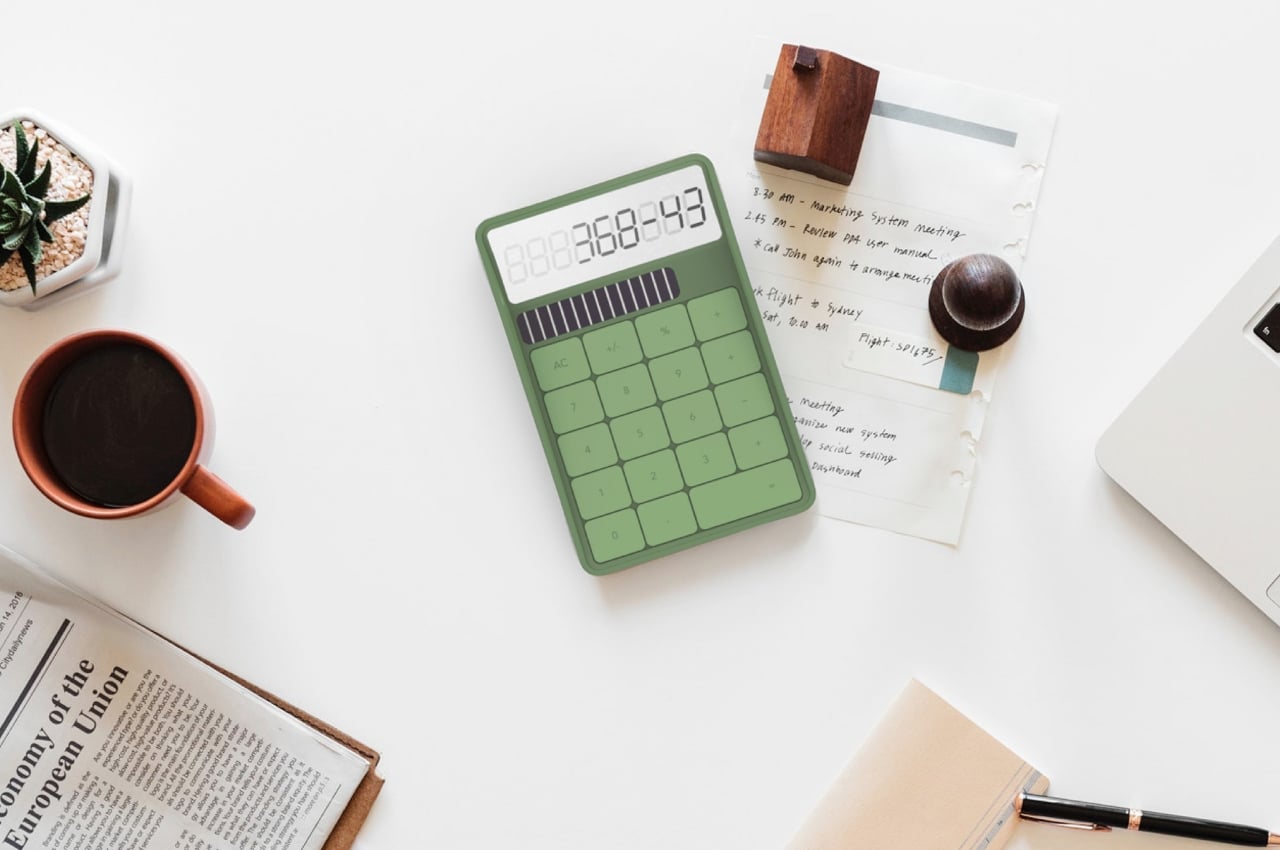
Although some have gotten lighter and more colorful, the basic design of calculators has remained the same throughout the decades. They are purely functional and utilitarian, leaving little room for any other design or expression. That’s the challenge that this concept design tried to face, cleaning up the calculator while still giving it a bit of personality.

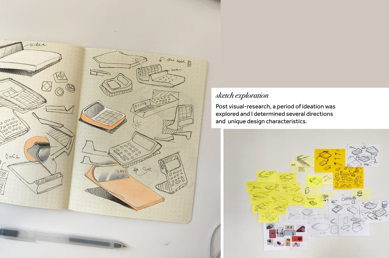
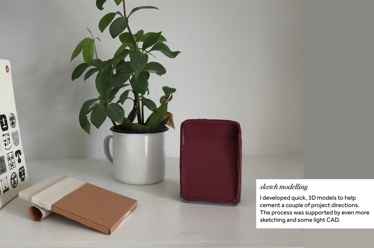
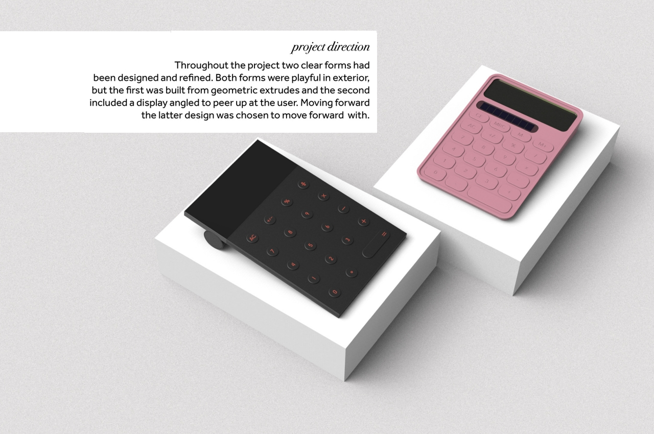
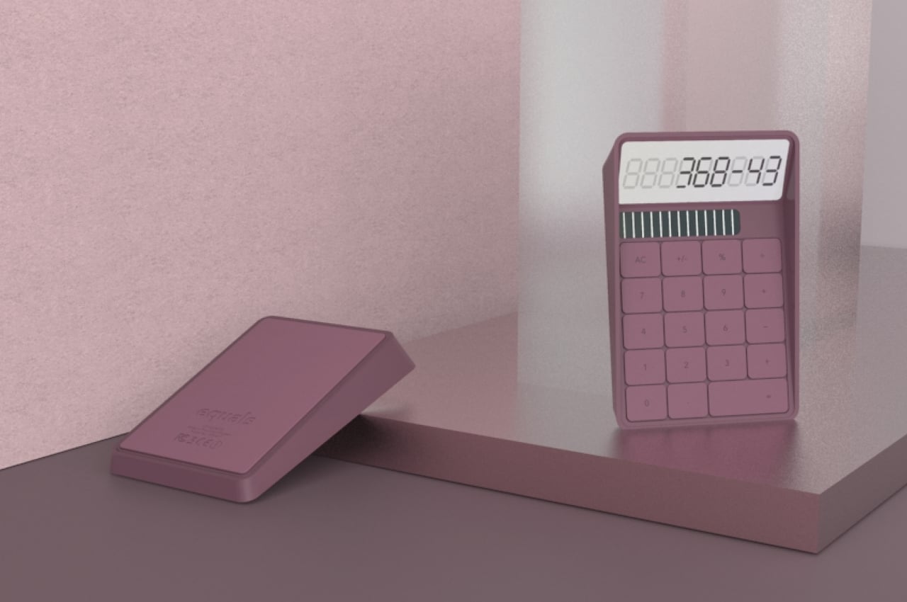
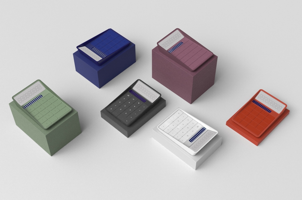
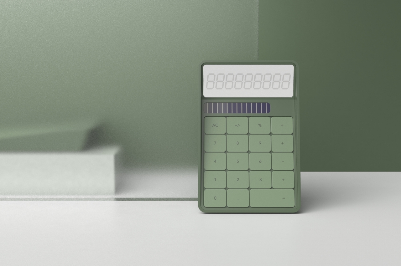
The initial ideas for this “Equals Calculator” concept played around with different shapes that expressed boldness and playfulness without going overboard. Personality was conveyed not through quirky designs or outlandish colors but through simple forms and somewhat muted hues. It results in a design that is both familiar yet, at the same time, a bit unlike what we’ve become accustomed to, forcing us to pause for a bit and breathe.

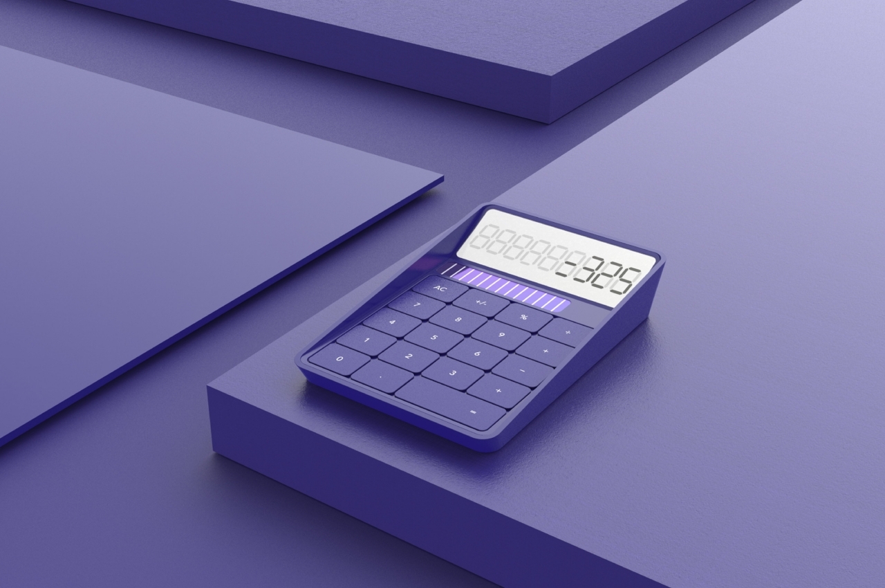
The final design that was chosen for this concept revolved around the idea of “peeking,” where an angled displays peers up to the user, making the digits easily viewable without having to tilt your head down. The form of the calculator resembles a tray with inclined sides, almost as if it’s inviting you to dip your fingers inside.

Instead of typical rounded buttons separated by wide spaces, this minimal calculator utilizes squarish ones that have very narrow gaps between them. There are still some spatial boundaries between buttons, but it creates a surface that looks almost unbroken and whole. The concept doesn’t change any of the functions of the calculator but instead creates a different atmosphere every time you look at and use what is normally considered a rather cold and calculating tool.

The post This minimalist calculator concept makes number-crunching feel less stressful first appeared on Yanko Design.
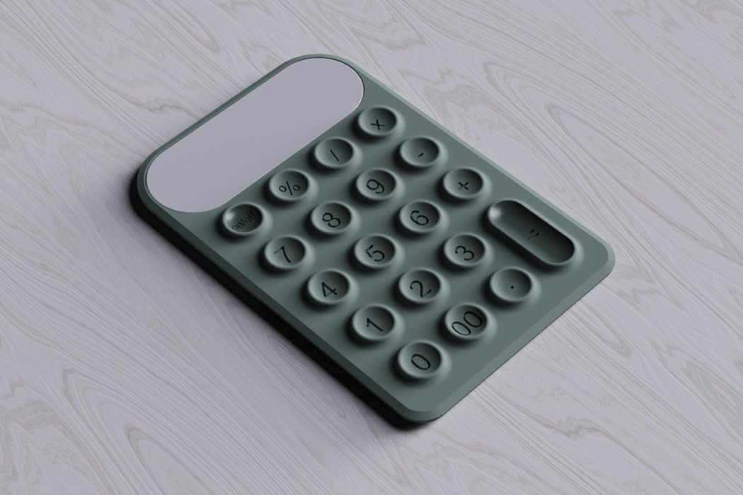
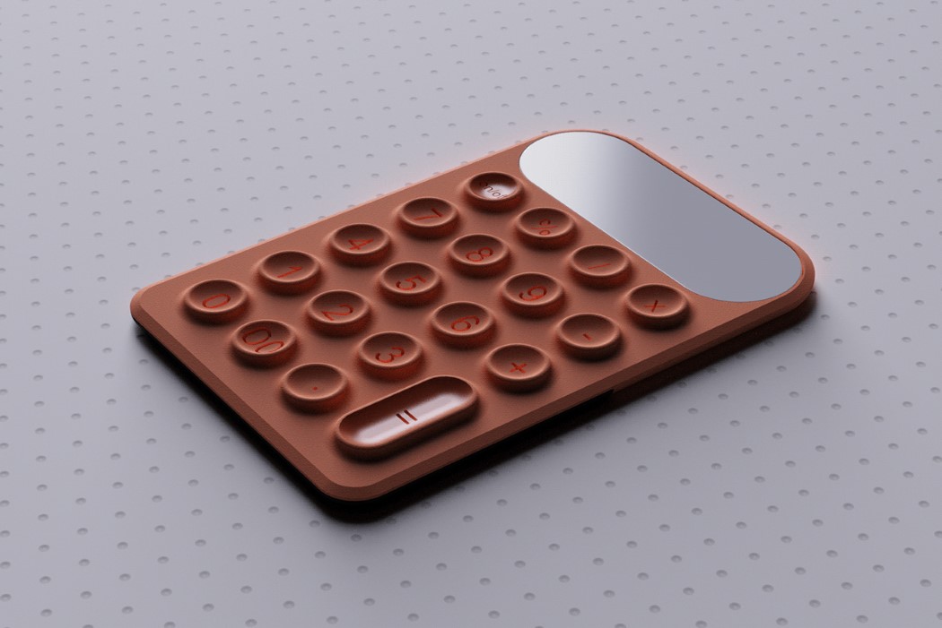
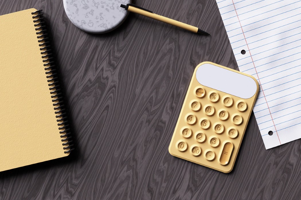
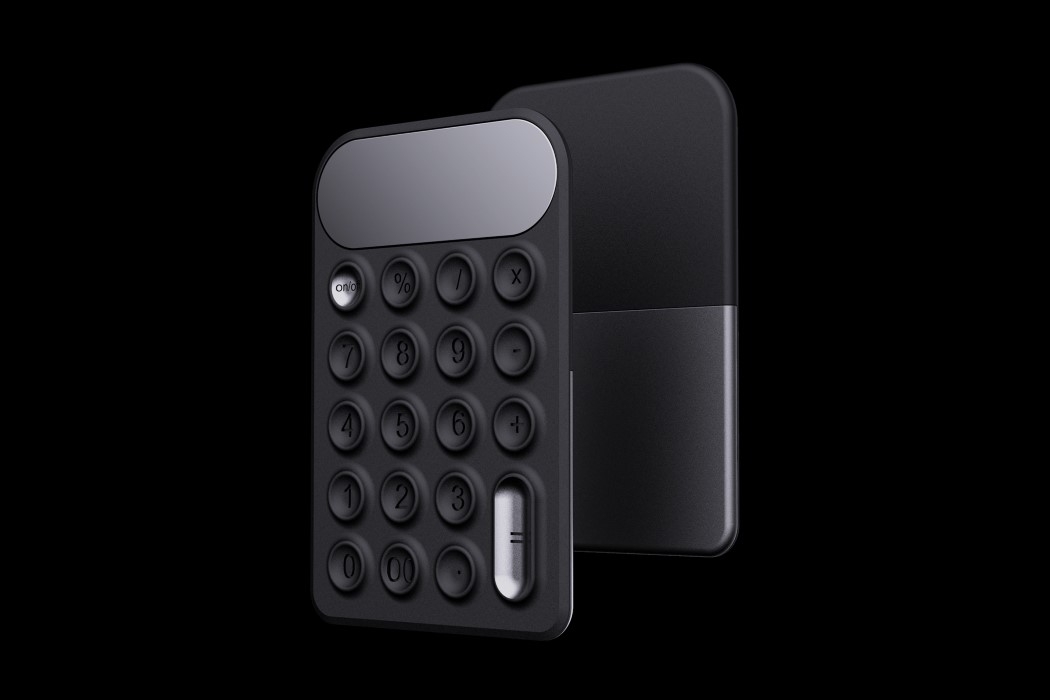
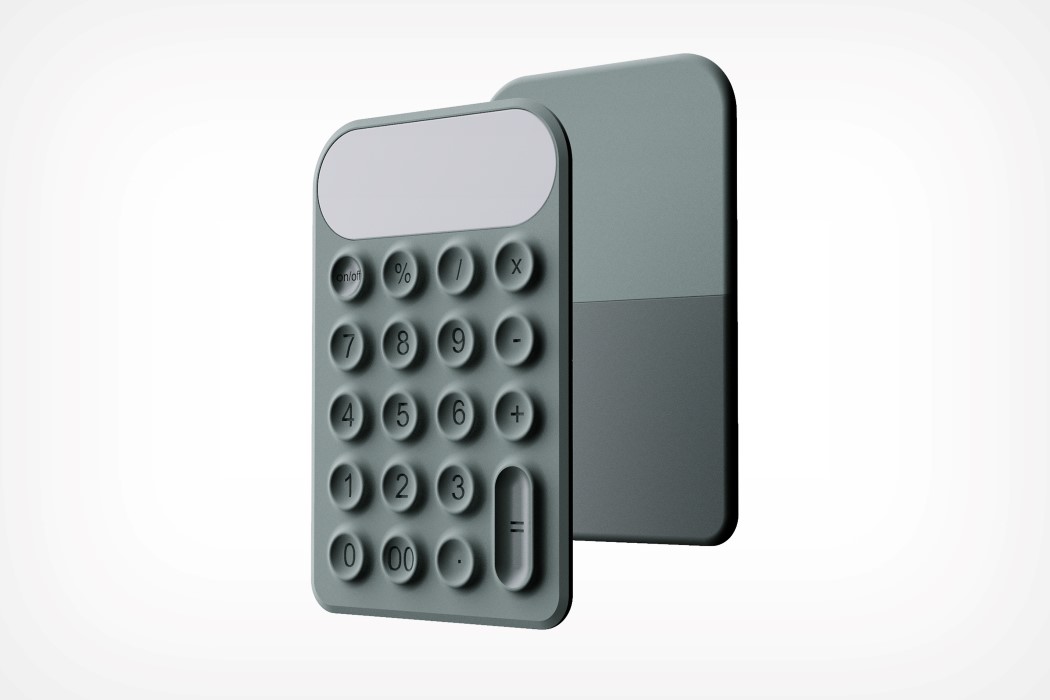
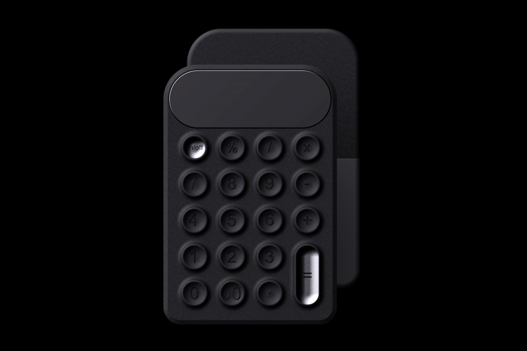
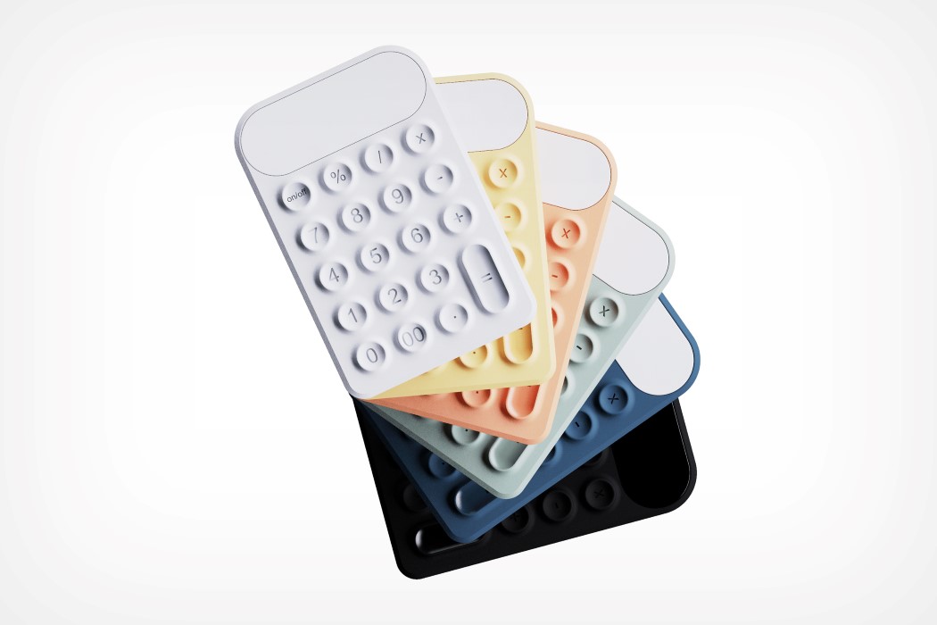
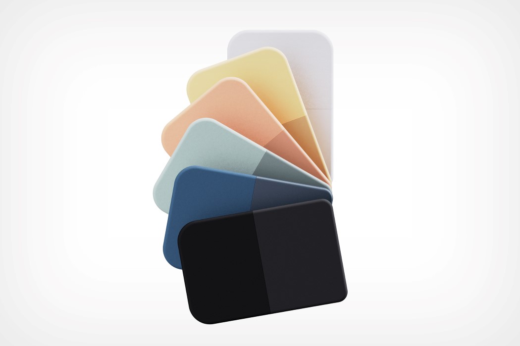
Quirky tactile calculator is inspired by the suction cups on an Octopus’ tentacles!

Isn’t it a weird coincidence that the octopus’s suction cups are actually what give its tentacles incredible grip underwater… and when that same detail is carried forward to the design of a button, it increases the button’s tactile ability? A suction cup helps hold onto things in water, but it also provides the perfect concave surface for your fingertip, resulting in a uniquely enjoyable UX.
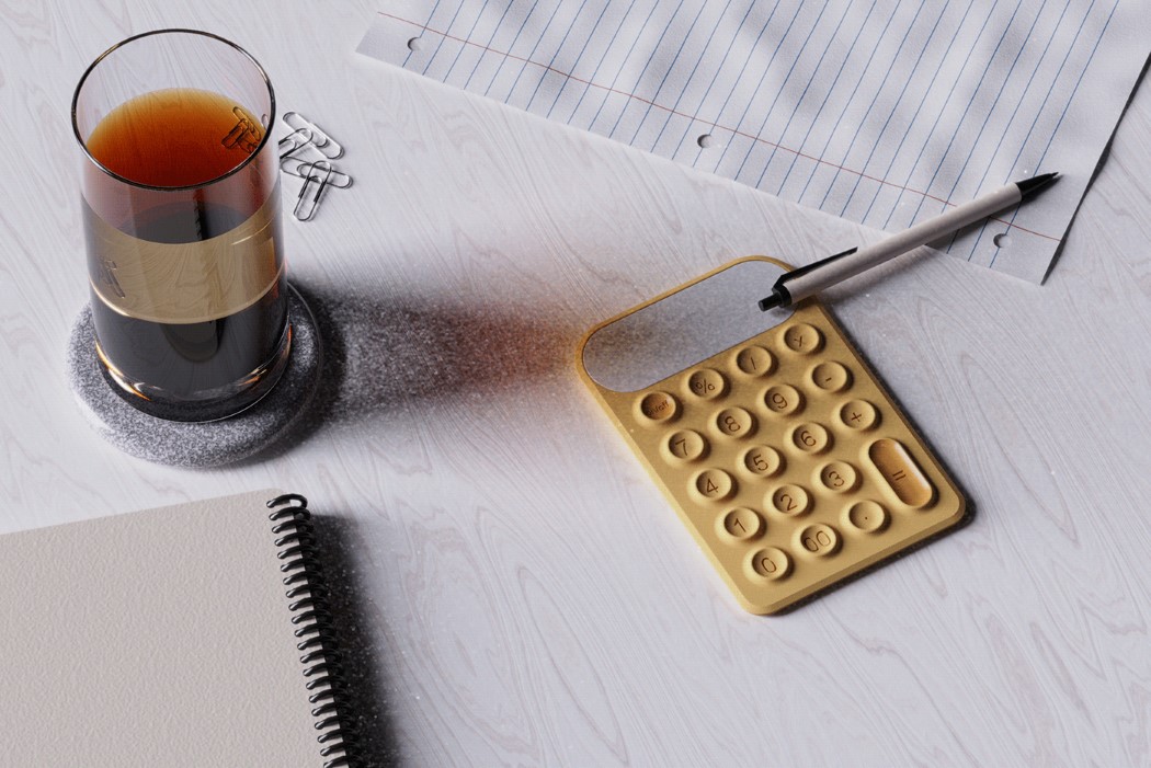
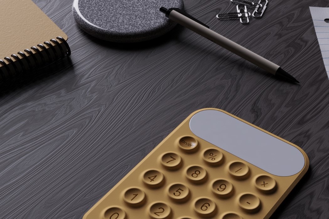
The Calctopus (no need trying to decode the name there) was created as a Render Weekly challenge on Instagram. Inspired by the cups on the base of the octopus’ tentacles, the Calctopus uses a similar texture on its keyboard layout. Its curved form, matte finish, and pastel hues make it rather comfortable to look at, and those concave keys are an absolute pleasure to press as your fingertips intuitively find their way around the layout, landing on the right key every time… almost echoing the tactile joy of the Olivetti Divisumma 18 calculator from the early 70s!

Designer: Francesco Brunetti

The MINUS calculator explores extreme minimalism without sacrificing functionality

How much can you take away from something before you’ve taken away too much? The MINUS Calculator is a great example of a no-frills design that’s so incredibly simplistic, it seems like a monolithic slab of plastic, but it’s a sleek, minimal-yet-fully-functional calculator.

Making a product better isn’t always an additive process, it’s sometimes also subtractive. The MINUS calculator doesn’t come with buttons, color-coded keys, or even a screen for that matter. Everything manifests within the slick, monotone block that is the MINUS. The numbers are bas-relief molded into the calculator’s front panel, and a powerful LED screen shines through the panel’s translucent plastic. The only break in the calculator’s surface is in the top left corner, where the “=” button sits. The MINUS calculator also comes with a battery gauge built into its side, and a proprietary magnetic contact-pin charging port at its base that lets you snap the charger to it whenever it’s low on juice.

Designer: Telekes Design

Texas Instruments makes it harder to run programs on its calculators

Texas Instruments’ graphing calculators have a reputation as hobbyist devices given their program support, but they just lost some of their appeal. Cemetech has learned (via Linus Tech Tips) that Texas Instruments is pulling support for assembly- and...