Game Boy-inspired Nintendo Switch Console Features Unique Tiny Swappable Joy-Cons

This Nintendo Switch redesign gives the epic console a major blast from the past. From the mind of Carota Design, the concept comes with a Game Boy vertical form factor, but still retains the essence of what gave the Nintendo Switch cult status – swappable Joy-Cons. The Nintendo ‘Switoo’, as Carota Design calls it, comes with two swappable controller modules (very similar to PhoneBloks or Google’s Project Ara) that can be replaced/interchanged, allowing you to build a control layout of your choice. The D-Pad and Action buttons can be ditched for a steering wheel and pedals while playing racing games, or create your own combination of control modules depending on the sort of interface you crave. The console itself comes with what I can only describe as a very contemporary tech device, with the use of slick machined metal parts along with a transparent housing on the back that hat-tips the current transparent design trend seen on a lot of popular tech devices.

Designer: Carota Design

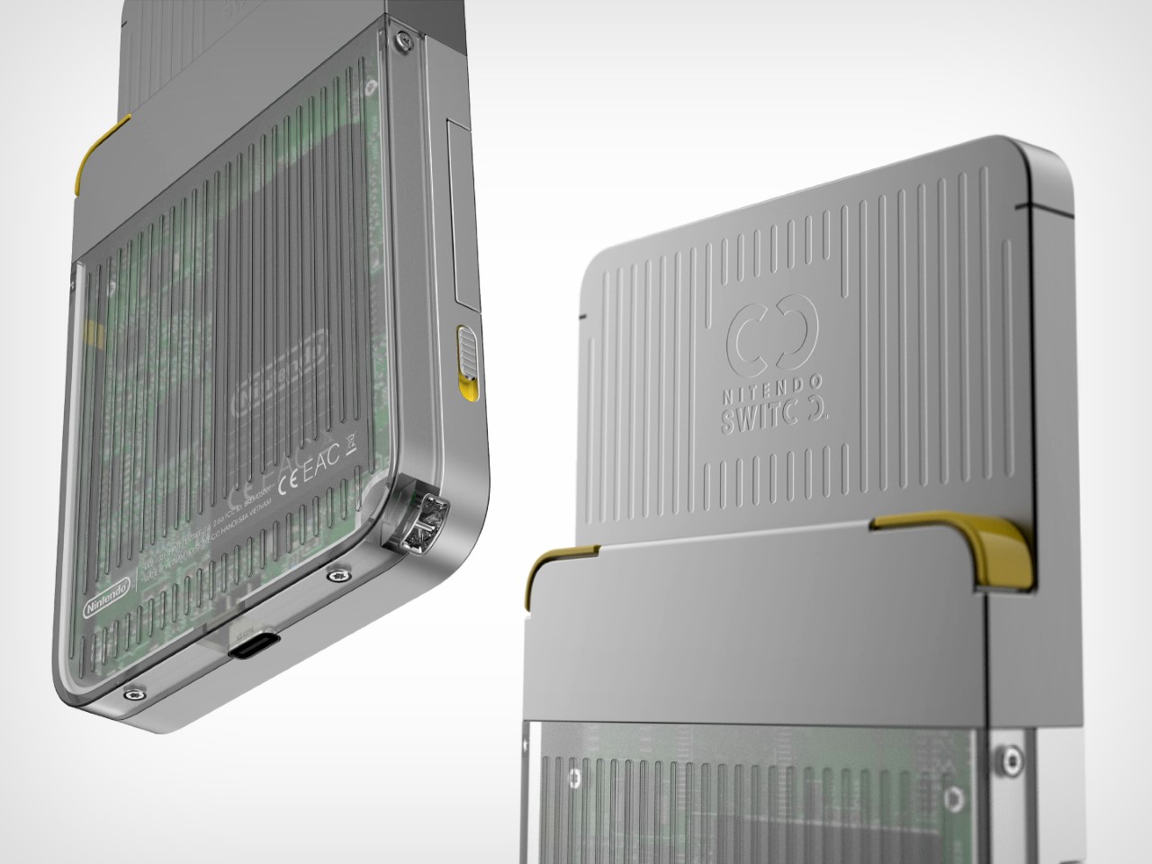
The Switoo gets its name from an abstract visual representation of the two modular controls on the sides of the console. The logo also shows how the modules slide in and out, locking into place when you want to play a game, and docking out when you want to swap controls depending on the next game you’re looking to play. Aside from these interchangeable modules, the Switoo has two triggers on the back, accessible with your index fingers while gaming.
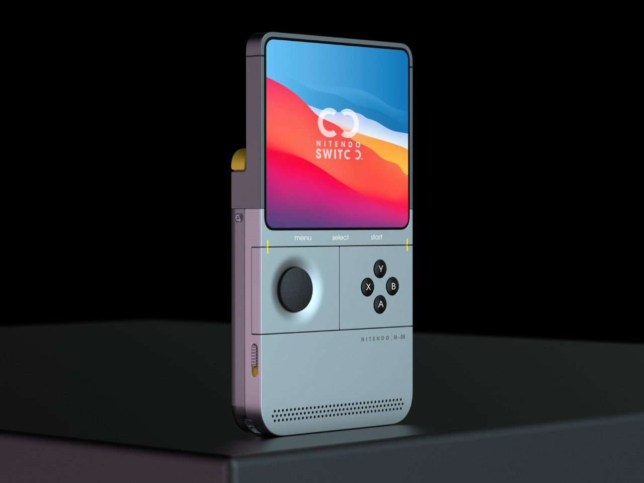
The Switoo features a fairly ergonomic design, thanks to the fact that it has a thicker base. The side profile shows a stepped design, resulting in a screen area that’s fairly slimmer than the overall device, giving you a perfect stepped ledge to place those two trigger buttons. The front features a pretty clean almost edge-to-edge square display (presumably touch-sensitive), under which lie the swappable control mods. A front-facing speaker at the bottom fires audio towards the user as they game, quite similar to the front-facing speaker grills on the original Switch.
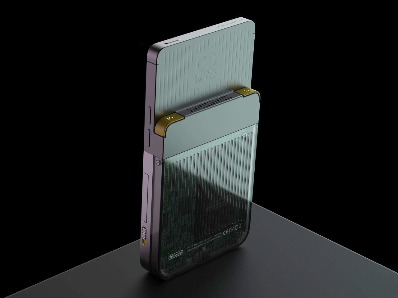
The controllers are the highlight of the Switoo’s unique design. Available in a variety of styles, they slide right into the sides of the console, snapping in to connect, just like Joy-Cons. A yellow guide helps you make sure you’re sliding the controllers in the right way, and switches on the side help lock the controllers in place so they don’t fall out accidentally during a rather enthusiastic gaming session. It’s safe to speculate that these controllers work only by being plugged in, and not wirelessly, like the Joy-Cons. Since they’re this tiny (and are individual controls like the D-Pad being its own module, and the action buttons having their own separate module), one can assume there’s no wireless chip or even a battery inside the controllers. Instead, pogo-pins help connect the controllers to the main console.
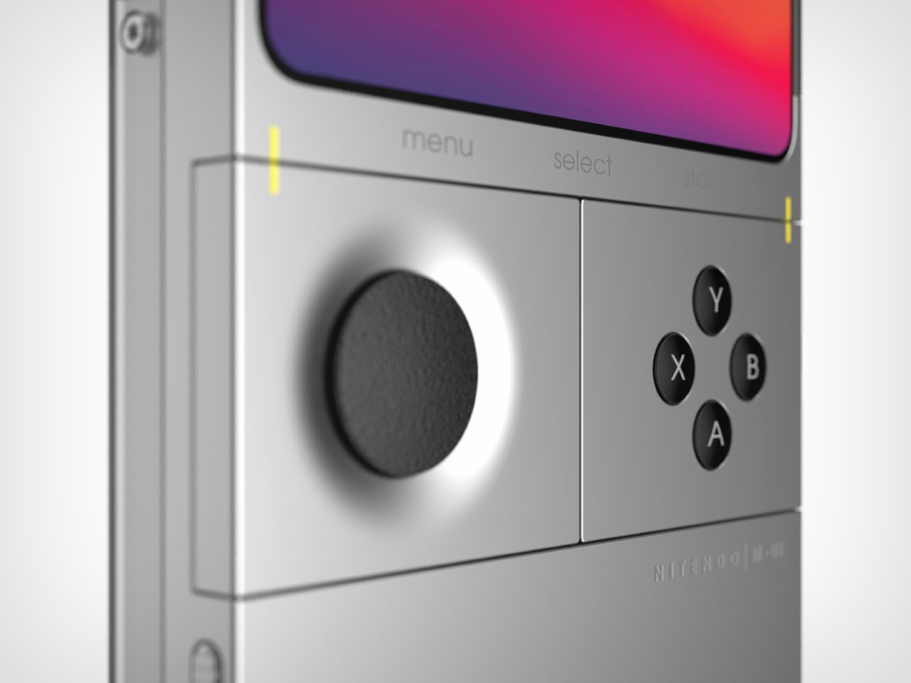
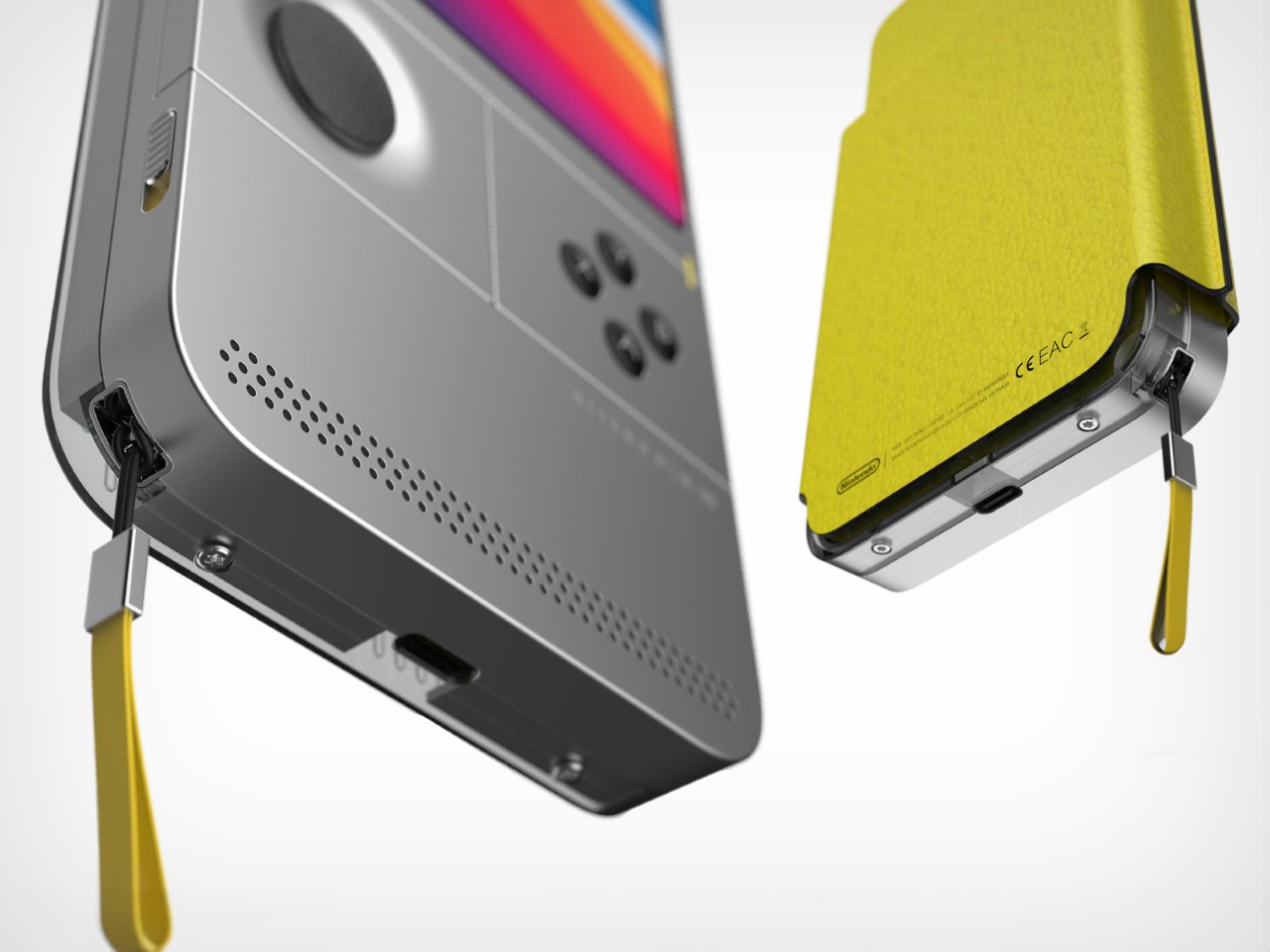
The square screen, Game Boy-inspired format, and modern design make the Switoo a unique successor to the Switch. One wouldn’t really call it a Switch 2 or a 2nd-gen version of the Switch console, but it definitely feels like a nice spin-off, marrying existing classic design formats with the unique appeal of Nintendo’s Switch console. There’s an understated simplicity to the Switoo’s design that you immediately appreciate. The sleek metal body, USB-C charging, minimal detailing, and transparent caseback, all make the Switoo look pretty modern. The only problem is the fact that this is a fan-made concept and not something I can throw my money at!

The post Game Boy-inspired Nintendo Switch Console Features Unique Tiny Swappable Joy-Cons first appeared on Yanko Design.
This Electric Delivery Scooter’s base-mounted batteries can be automatically changed by robots

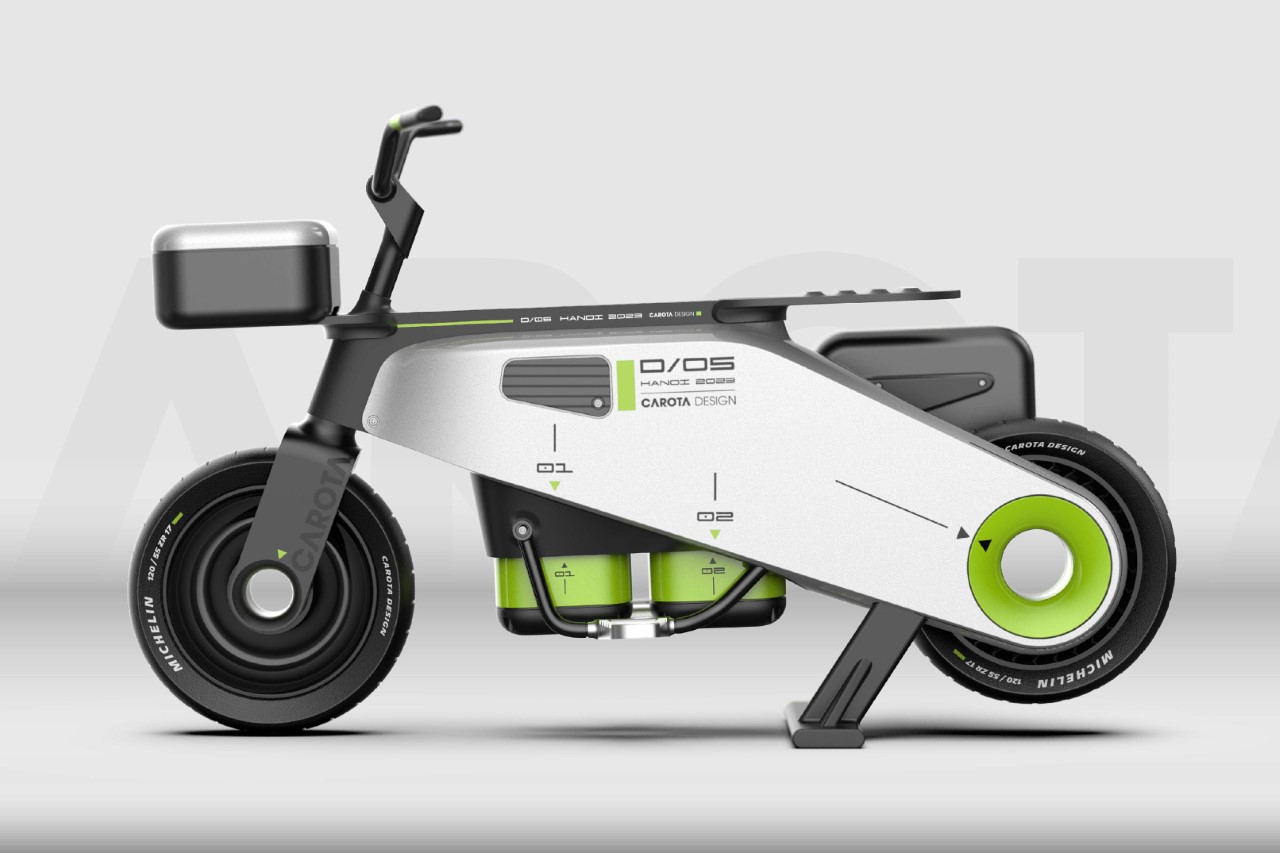
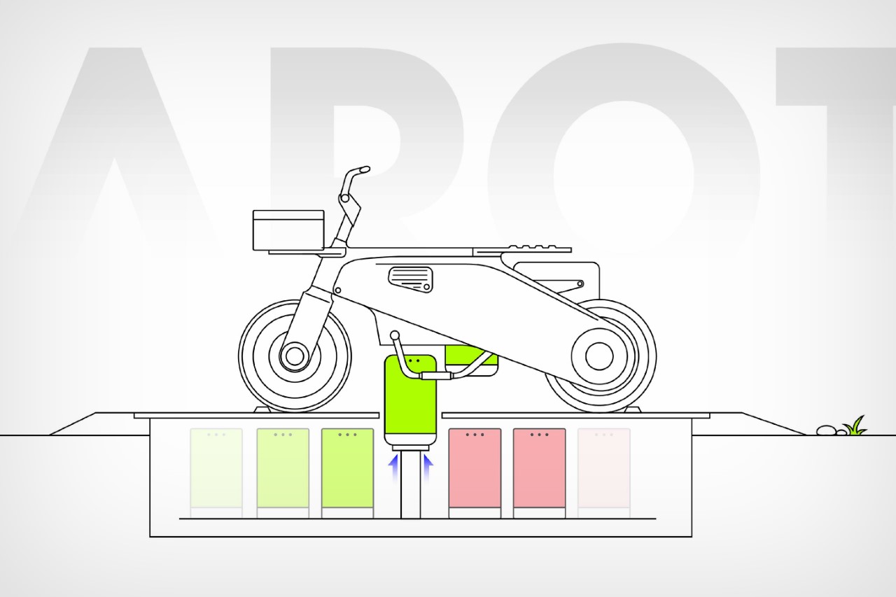
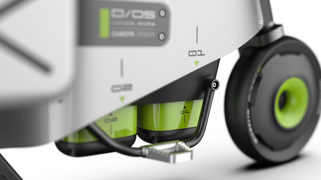
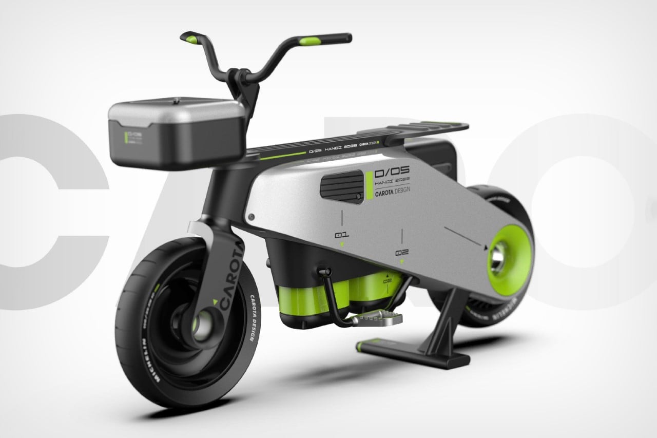
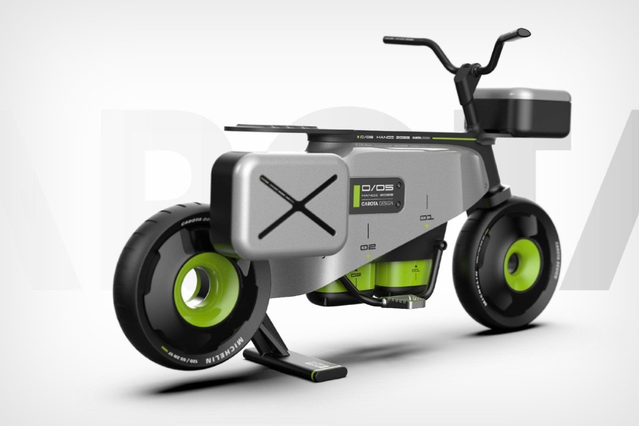
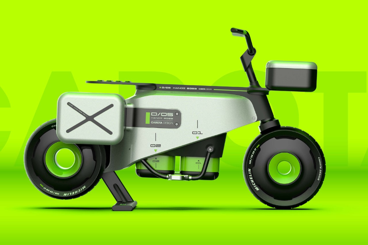
Electric vehicles are increasingly becoming preferred over gas-driven vehicles, but that doesn’t take away from the fact that EVs still have two psychological barriers they need to overcome – range anxiety, and long charging periods. Even with supercharging networks, you still need to wait multiple minutes to boost your batteries as compared to a gas station where you’ve filled your tank in probably under a minute. Electric cars and bikes are still working around trying to find a more tenable solution, but Hanoi-based Carota Design has a clever alternative. The D05 Electric Delivery Scooter concept comes with batteries located in the bottom, but what’s interesting is that they’re only detachable from the bottom too (you can’t lift them out through the top). As a result, the D05 also comes with a unique servicing platform that automatically detaches and replaces battery packs. All you need to do is drive onto the platform and park your electric scooter and an automated setup in the platform takes over the rest, detaching your old battery and inputting a new one, quite like a factory line. The process takes under a minute, is much safer than having humans remove and replace batteries, and is virtually theft and tamper-proof too, since you’d have to tip the entire scooter over onto its side if you wanted to manually take the battery out yourself. Sure, it’s just a concept for the time-being, but even on paper, it completely checks out.

Designer: Carota Design

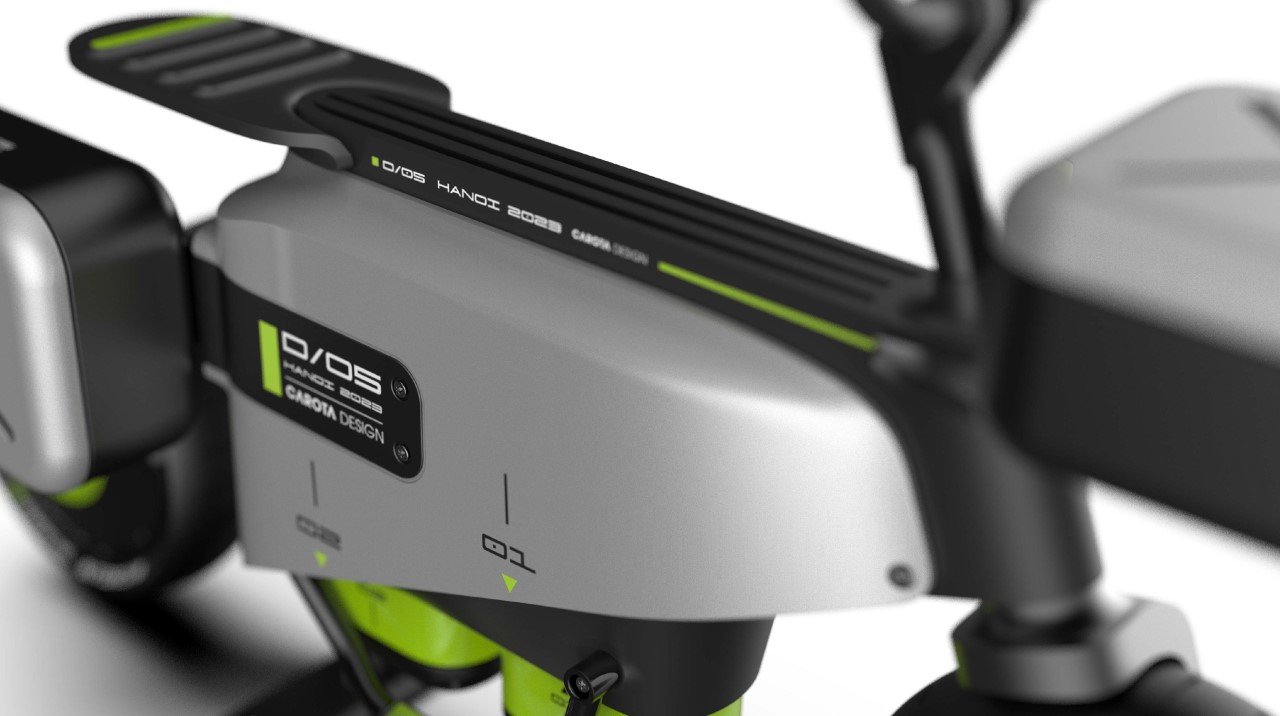
The e-scooter has a rather utilitarian design, given its function. Made for last-mile commutes for deliveries, the scooter adopts a blockish form factor, highlighting its inner components and the two storage areas (one on the front, and one on the side). The D05 seats just one, has a low-hanging form factor that’s made further stable by the base-mounted heavy Li-ion batteries, and even though it’s fairly utilitarian, comes with a rather slick design featuring an interplay between silver and black parts, a clever use of lime green giving the e-scooter a splash of color, and hubless wheels that contribute to the D05’s future-forward design.

The battery-changing platform is pretty simple schematically, but does require a fair bit of technical expertise. The scooter needs to be parked perfectly on the platform for the arm to extend outwards, grab the old battery, disengage it, and replace it with a new battery. It’s rather similar to Tesla’s self-plugging charging snake from nearly a decade ago (2015 to be precise) but doesn’t require to be that calibrated. The battery modules move upwards and downwards, and one single platform can store as many as 7 battery packs (as per the schematic shown above), or even more if you detail it further. The process takes roughly a minute, quite like changing batteries on a TV remote, and once your new batteries are in, the scooter is ready to go.

That being said, having a replaceable battery system, no matter how convenient, does have its concerns. For starters, you need to produce MANY more batteries than EVs, since your battery network will have to account for availability, shortages, etc. That itself is a strain on the environment, but more so, the consumer faces a unique problem too – you don’t know whether the new, charged battery being put in your EV has 100% battery health. The freshly charged battery being added to your e-scooter at the charging platform could be 5-10 years old and therefore offer less range than a brand-new one. Moreover, older batteries could offer vulnerabilities, making the overall system slightly unsafe if they’re not monitored and taken out of circulation. In the broader scheme of things, having a charging network makes more sense because you can simply plug your e-scooter into any power outlet to be on the safe side instead of swapping out your batteries. Hopefully, EV companies could design a hybrid system of charging and battery replacement, making the adoption of EVs much smoother. Older batteries could eventually be recycled too, reducing strain on the environment in the longer run.

The post This Electric Delivery Scooter’s base-mounted batteries can be automatically changed by robots first appeared on Yanko Design.
This minimalist electric dirt bike switches things with a hollow ‘fuel tank’ and a large battery

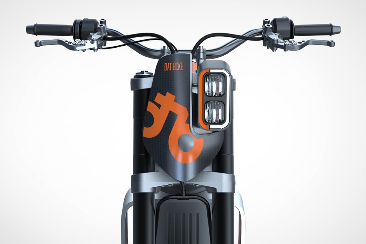
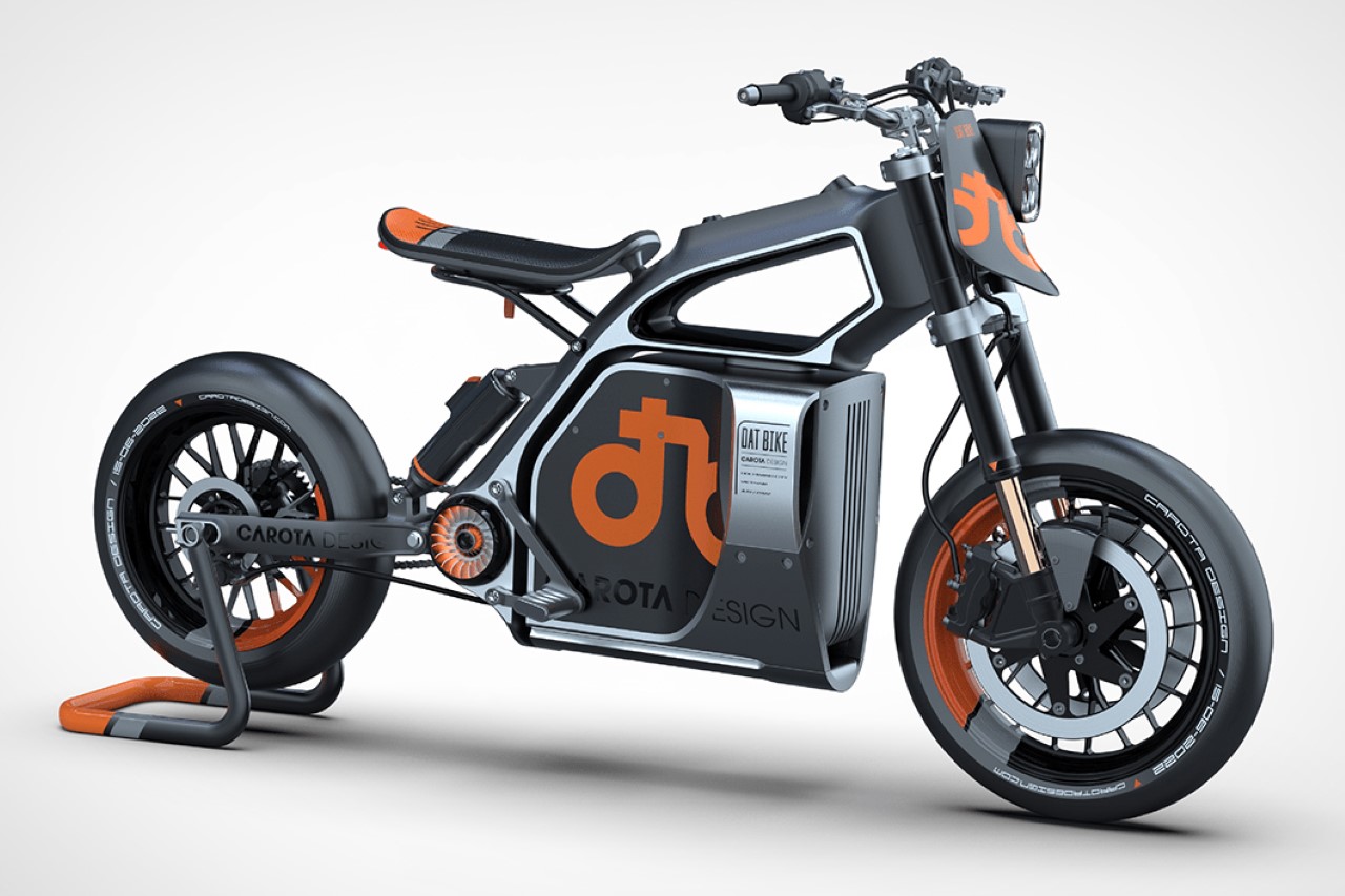
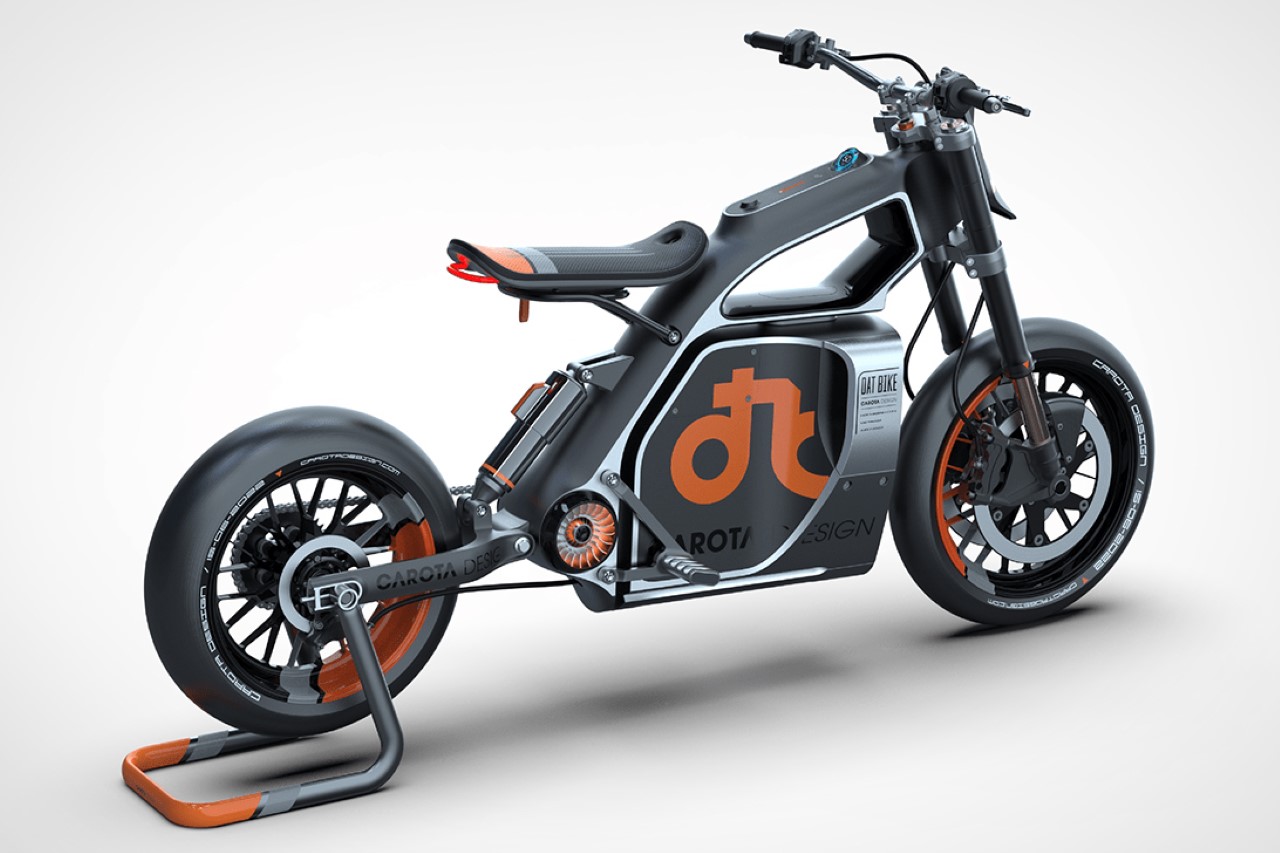
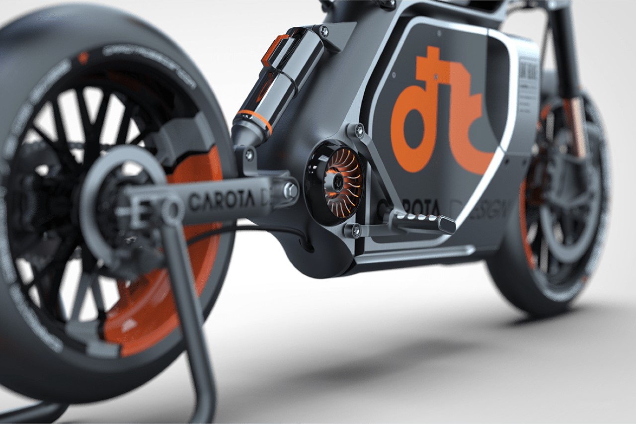
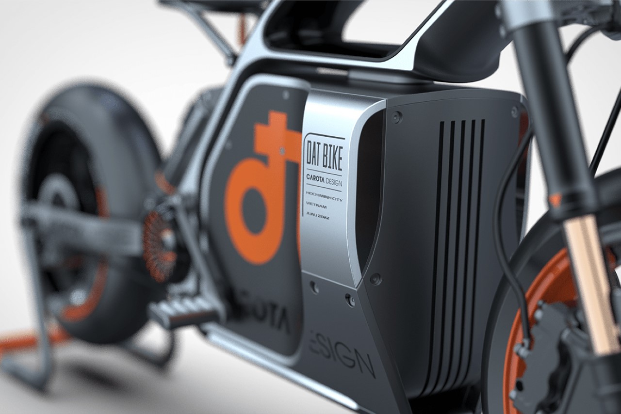
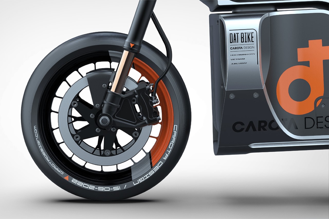
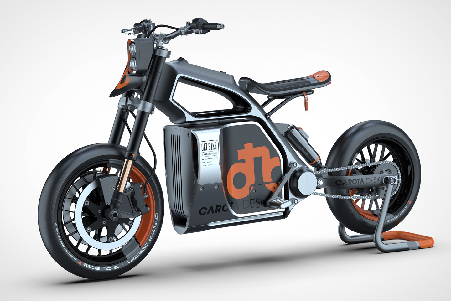
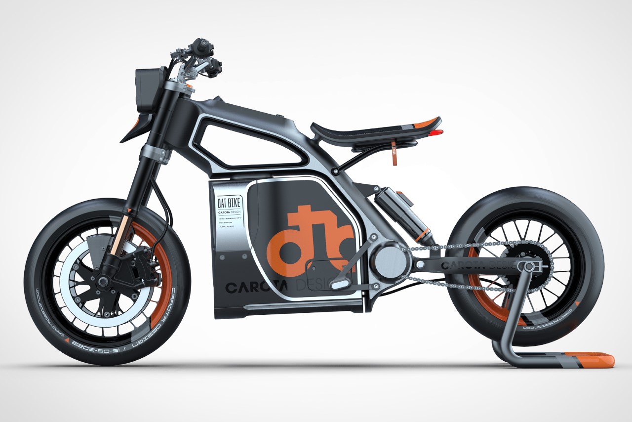
Created by Vietnam-based Carota Design, the DATbike is a conceptual dirt bike that explores a dynamic new aesthetic that challenges the status quo. It starts with an incredibly lean frame that’s bare-basics for the most part, barring the heavy battery at the base, and finally, adds a flourish with that beautiful hollow ‘fuel tank’ that makes for an INCREDIBLY interesting silhouette!

Designer: Carota Design

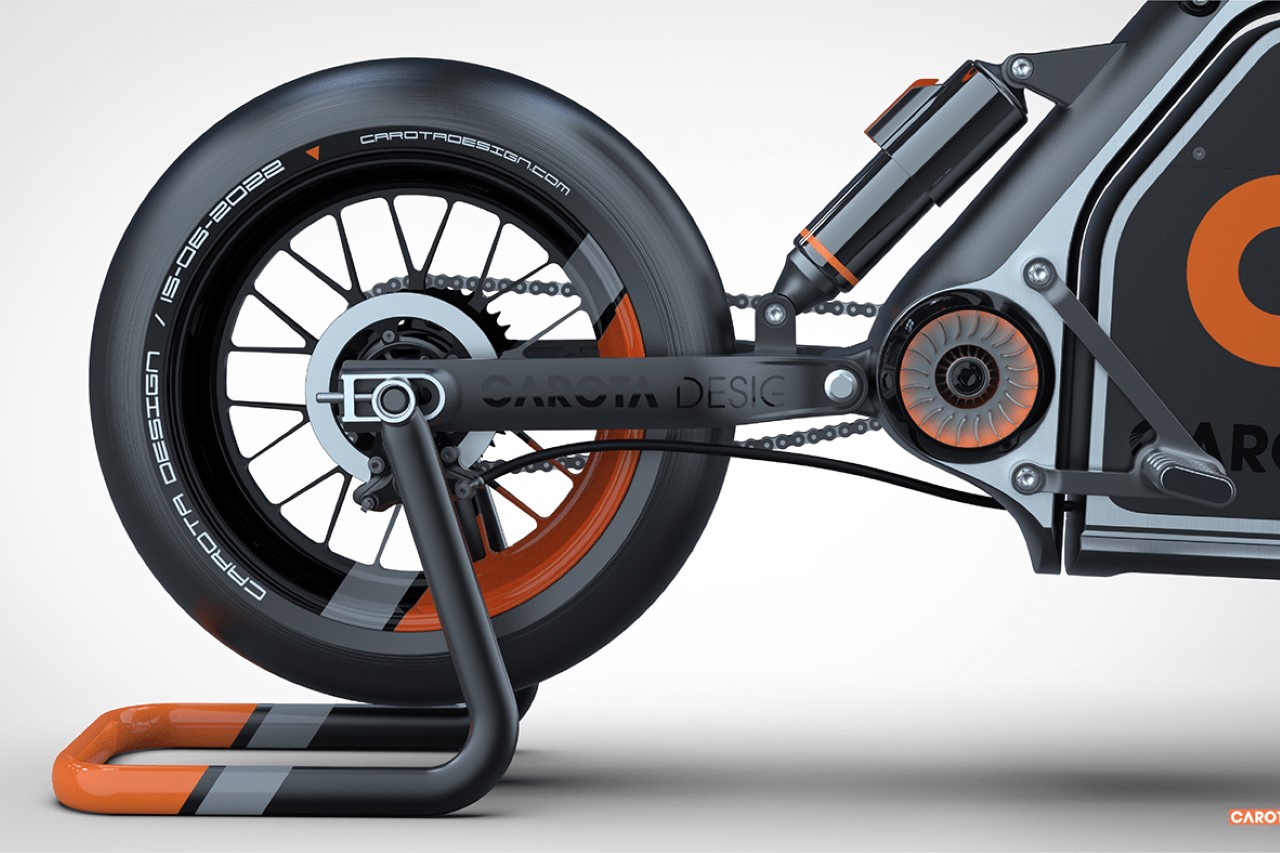
An interesting visual experiment by the Ho Chi Minh-based designer, the DATbike looks lean while still sporting a rather base-heavy design. It comes with a simple yet edgy aesthetic, accentuated further by the use of matte and satin finishes, and the grey and orange colorway.

The bike’s lean frame informs the rest of its design. It comes with a slim seat, a linear dashboard that sits on the top pillar of the bike, and even a slim pair of headlights, laid out vertically.

The side view gives you everything you need to see. A mono shock suspension on the rear, twin forks on the front, Carota’s branding along the base, and a bike with a frame that’s built for mischief. The wheels don’t have treads on them, which makes me wonder if the DATbike is more of a track racer than an off-road beast, but the rest of the bike’s ‘lean mean terrain machine’ aesthetic says otherwise.

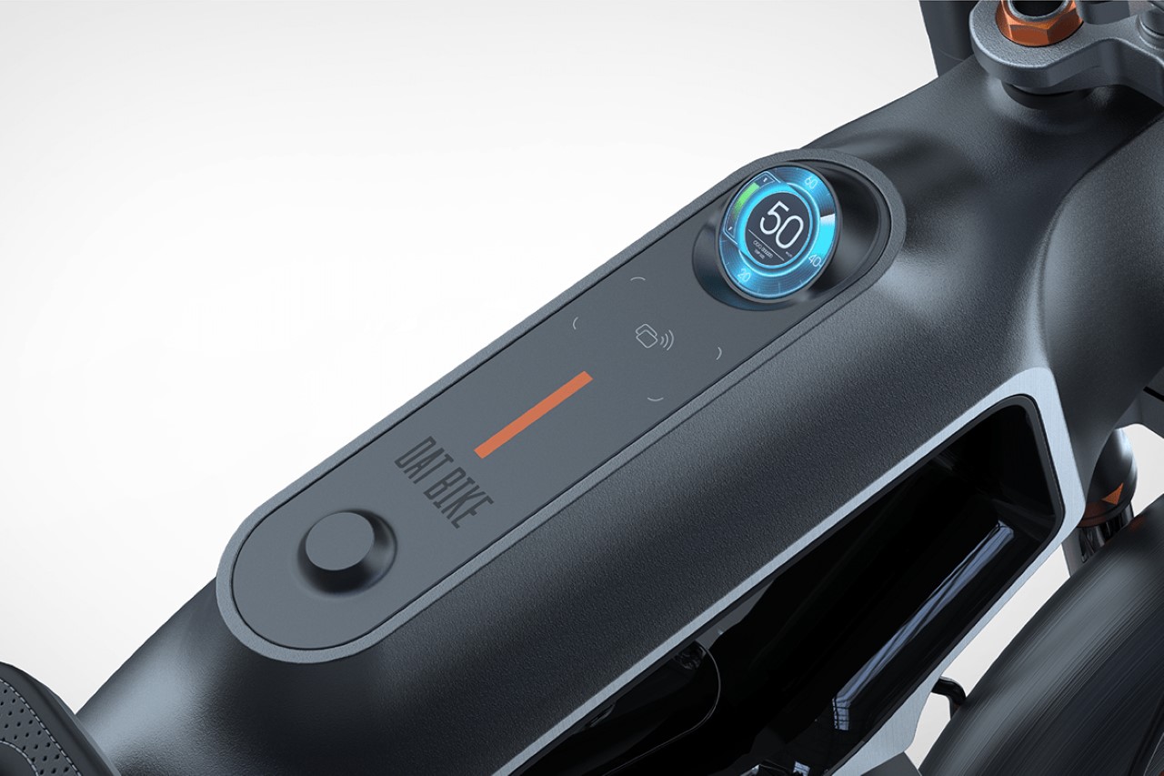
A closer look reveals the e-bike’s minimalist touch-sensitive dashboard, with a tiny circular screen that gives you all the information you need to know, and what looks like an NFC zone just below to connect your phone to your e-bike.

The post This minimalist electric dirt bike switches things with a hollow ‘fuel tank’ and a large battery first appeared on Yanko Design.
Stunning Devialet Butterfly speaker concept comes with an elegant design and dual-firing audio chambers

A successor to the Phantom, this fan-made concept takes Devialet’s unique design language to new heights.

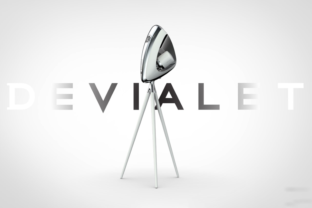
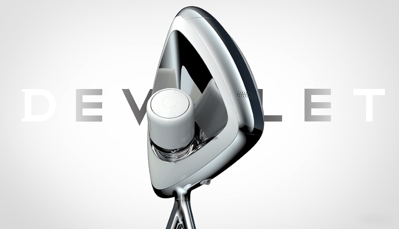
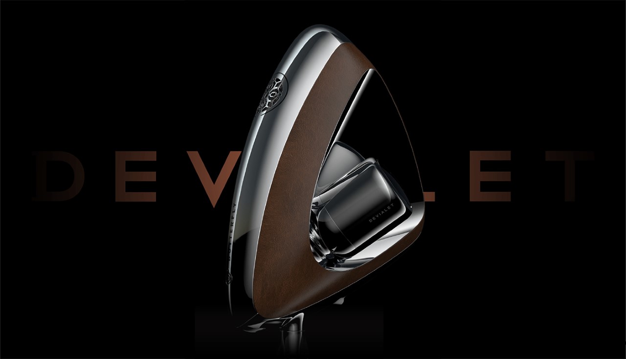
I’ll be honest, it’s been nearly a decade since Devialet unveiled the Phantom and it’s still the most beautiful speaker out there (it also still remains on my bucket list, even with its $2k price tag). However, seems like the Phantom has some competition, at least in the looks department) from the Devialet Butterfly, a fan-made concept from the mind of Carota Design. The butterfly boasts of a design that seems like a beautiful intersection between nature-inspired design and luxury design. The speaker has a soft triangular side profile, and sports audio chambers on each side. Just like the Phantom, the Butterfly has the iconic detailed speaker grille on the front, and mounts on the signature Devialet tripod for a (literally) elevated sonic experience.

Designer: Carota Design

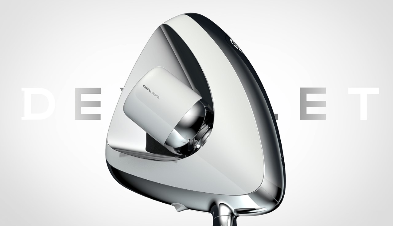
A visual exercise in recreating Devialet’s product language, Carota’s Butterfly speaker is all about looking elegant. The speaker sports the same CMF choices as Devialet’s previous speakers, with an interplay between white and chrome, and is even designed around the same architecture as the Phantom, with reverberating radiators on the left and the right, while a full-range speaker sits on the front, right behind Devialet’s signature grille.

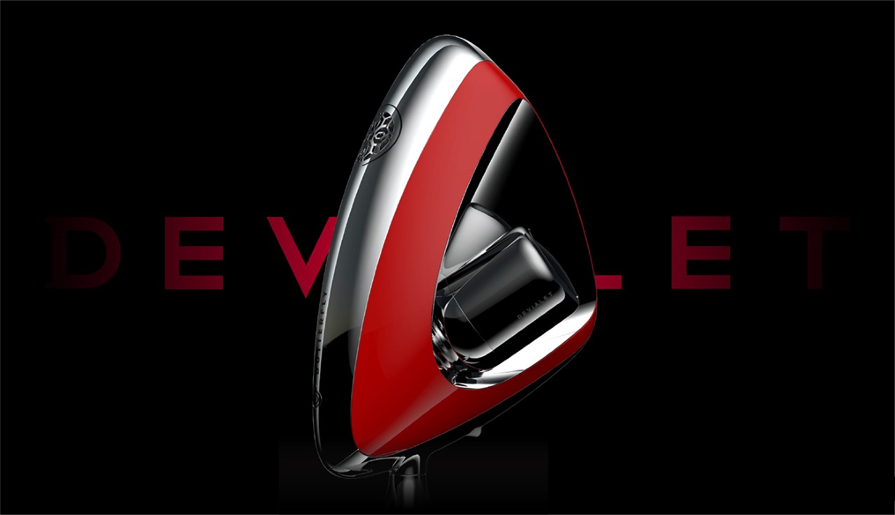
Unlike the Phantom, however, the Butterfly is a delicately designed speaker that can only be mounted on a tripod. The lack of a flat base means the Butterfly can’t quite be kept on tabletops, although the slender legs of the tripod definitely help maintain the illusion of a butterfly with delicate legs. Carota Design also rendered the beauty in red and leather-trimmed finishes, although I’d really like to see one in all black!

The post Stunning Devialet Butterfly speaker concept comes with an elegant design and dual-firing audio chambers first appeared on Yanko Design.
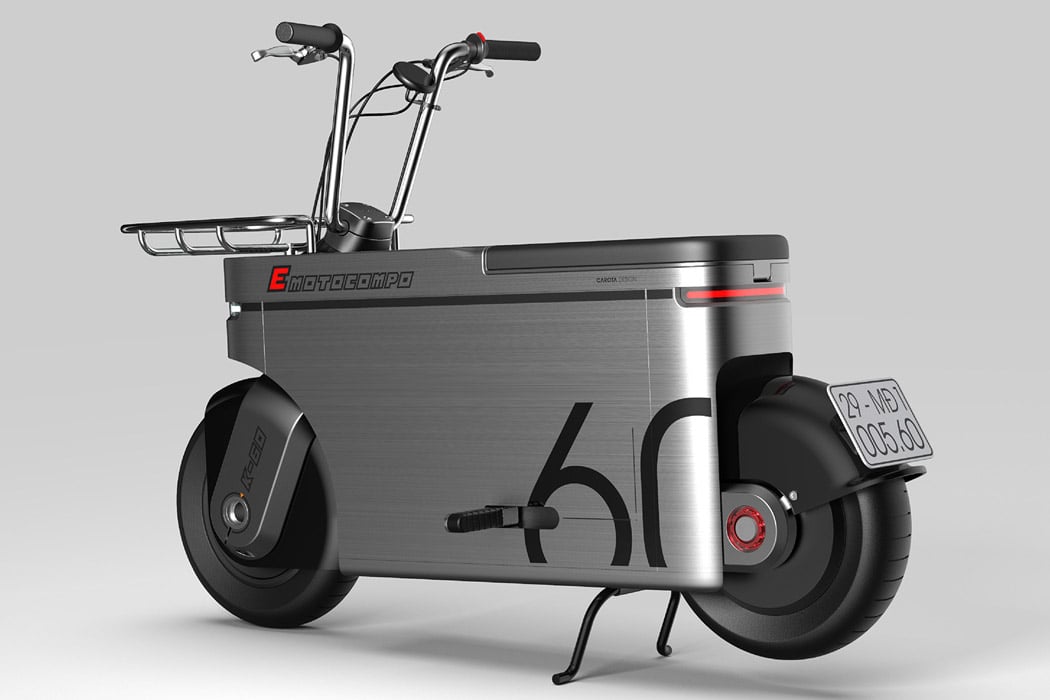
This ultra-boxy electric moped bike is designed for shopping, groceries and a day out in the city!

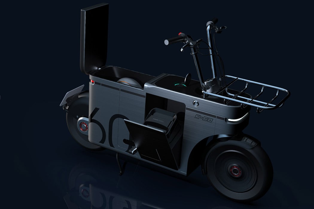
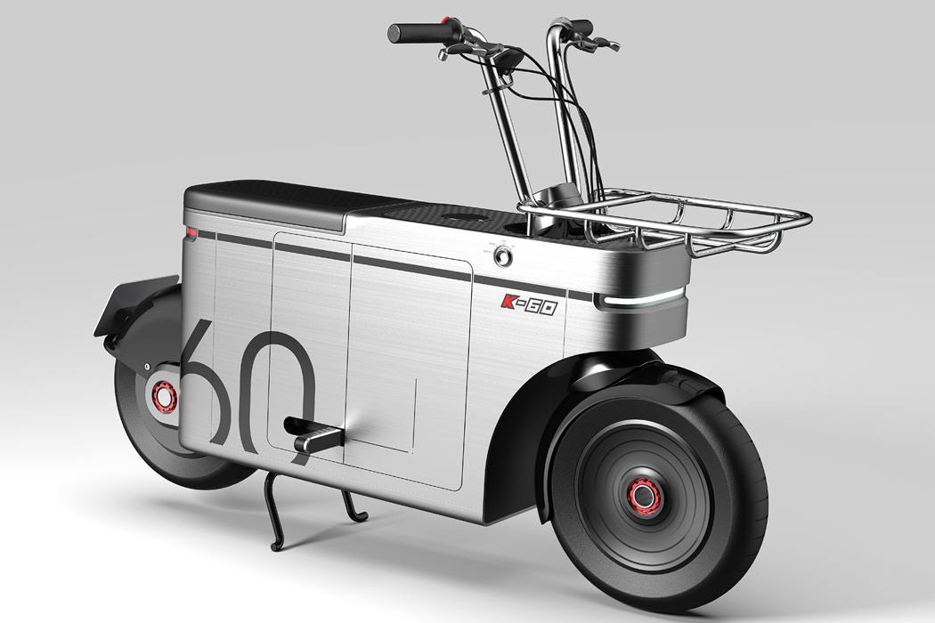
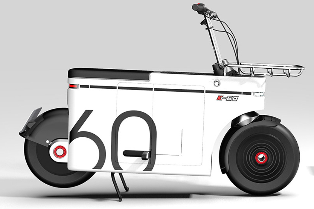
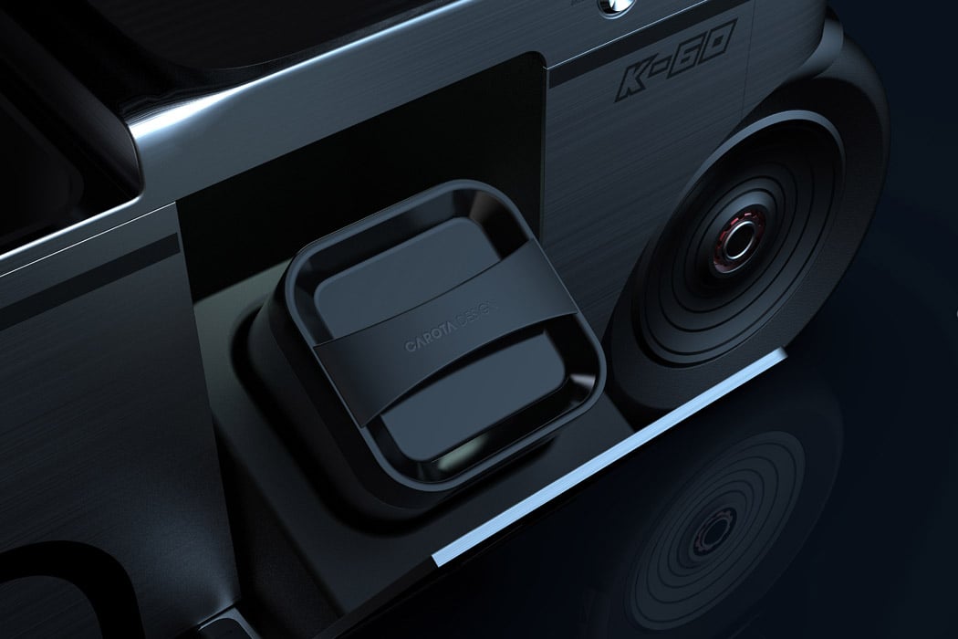
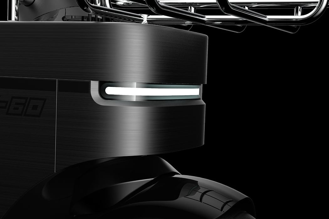
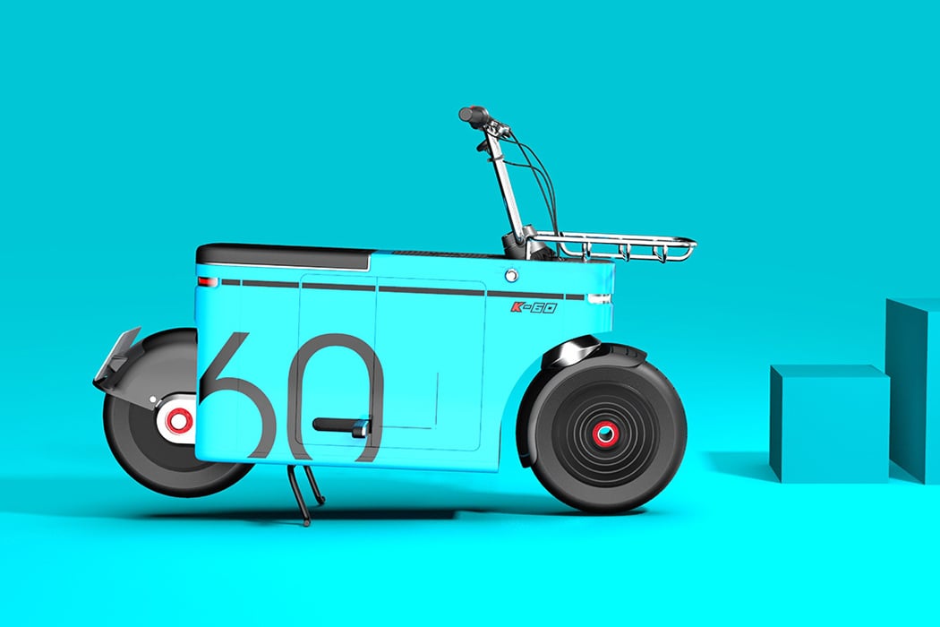
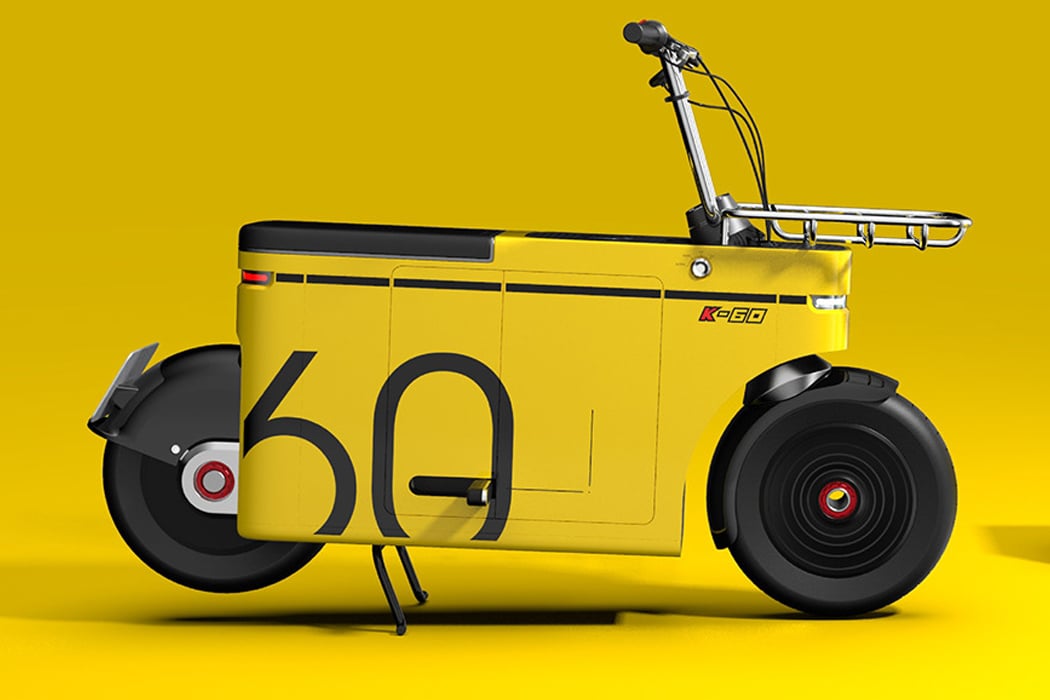
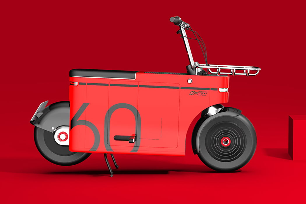
Electric bikes are the way to go in the future, and already the metamorphosis is happening as we transition from fuel-powered vehicles to clean electric ones. Carota Design has demonstrated in the past how an electric bike of the future could look like, and now the design studio leaves us with another refreshing EV blueprint worth the attention. Christened the E-motocompo, the electric commuter is built for short city rides seeing the extent of traffic congestion that’s not going to unclog anytime soon.
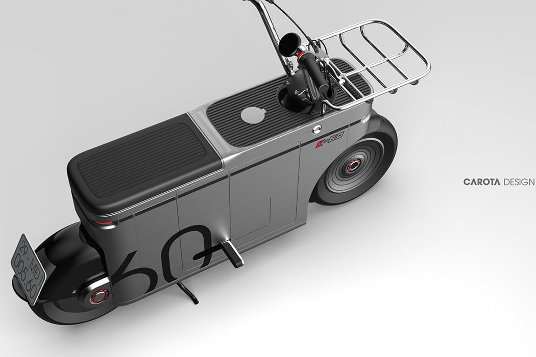
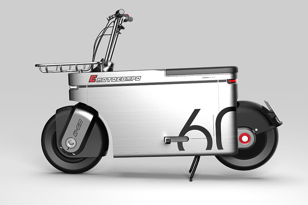
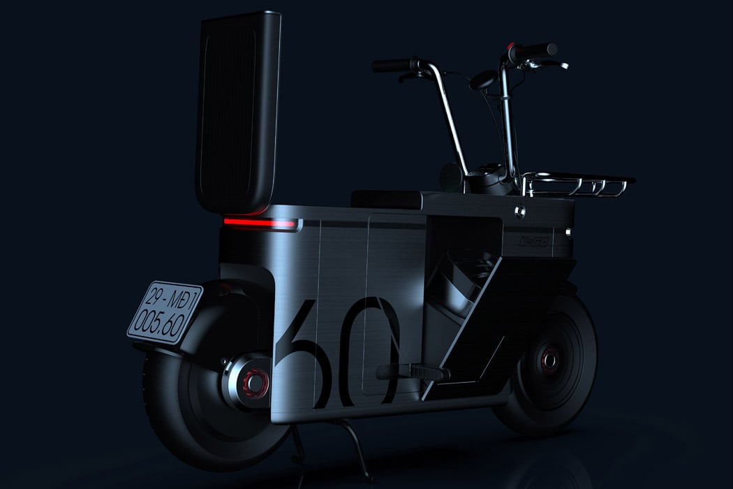
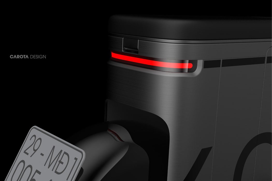
The electric bike looks a bit unique with its rectangular-shaped body frame, but the idea here I guess is to reduce the body mass from the sides for high maneuverability in tight spaces. In fact, it is so rectangular in shape, to be practical for demanding urban commuters it needs to have a hint of muscular contrast. High seating position (it could have been designed a bit better) and the handlebars indicate strict city ride aesthetics with a grocery carrier on the front. E-motocompo is a single rider moped bike with space on the rear to store things like your helmet or other stuff.

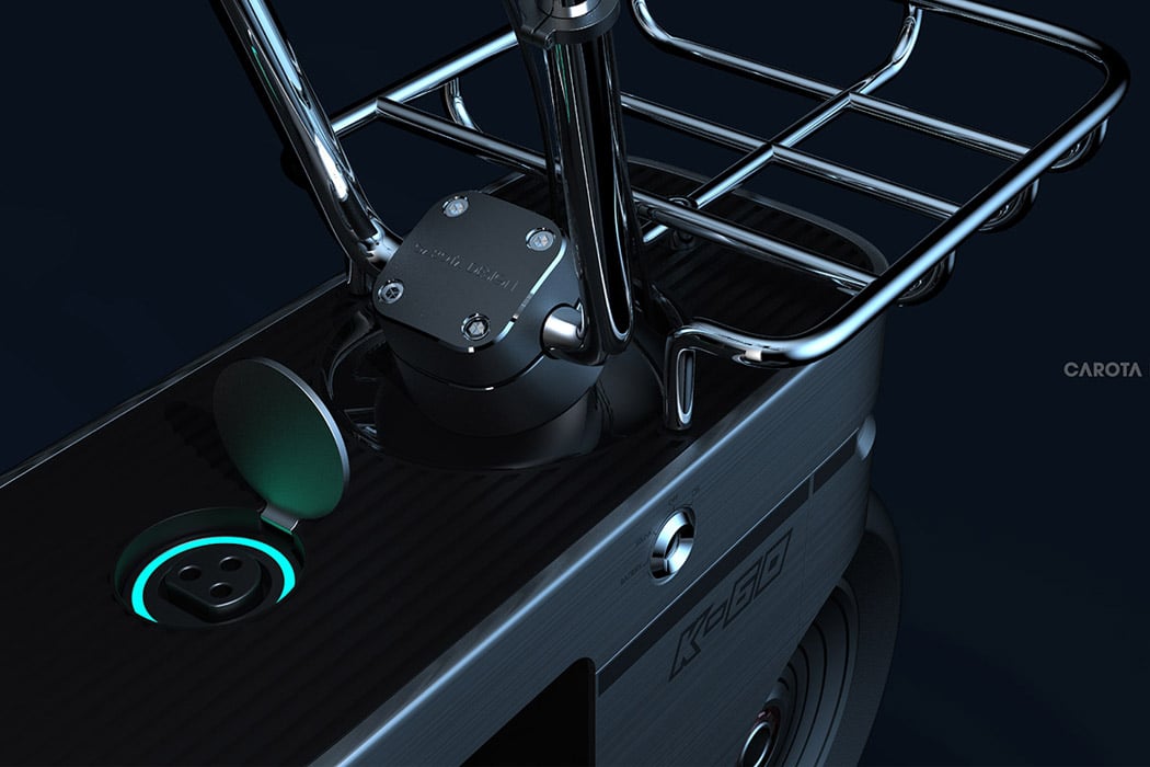
When it comes to charging up the ride, simply plug in the EV charging point on the top of where the bike tank usually is. While this ride needs a slight makeover, things are looking promising, as far as seeing one on the roads (that’s similar to Carota design’s iteration) in the near future goes.

Designer: Carota Design


This BMW Motorrad e-scooter concept is all about clean aesthetics and clean energy

Carota Design’s interpretation of a BMW e-scooter captures the soul of the Motorrad range, but with a design that’s on the lighter side of Motorrad’s form-heavy design-language spectrum. Designed to look almost like the successor to BMW’s Concept Link from 2017, the e-scooter uses a similar CMF, but with leaner, lighter, and narrower forms. The matte-finish metal panels look distinctly like something from BMW’s playbook, while those orange accents around the windscreen give the e-scooter the pop of color it needs.

The e-scooter’s front comes with paneling that conceals the rider’s legs, pretty emblematic of scooter designs, while motor and battery seem to reside in the space in front of the rear wheel. Carota’s design features a cantilever seat that cuts down on the boot-storage, but provides a loop on the left to secure your helmet in place. The seat naturally transforms into the e-scooter’s taillight, which forms a razor-thin arc that’s visible from the back as well as the sides. The headlights, on the other hand, are present in the form of edge-lit details on the front. Given the conceptual nature of this two-wheeler, it’s sort of difficult to make guesstimates regarding what the e-scooter’s performance would be like, but if it’s anything like the Concept Link, you’re looking at a sufficiently advanced, fully-electric two-wheeler… probably with a reverse gear too!

Designer: Carota Design

After the MotoRAZR 2019, the Revolve concept hopes to revive the Motorola Aura

I’m here to make the case for weird, capsule-shaped smartphones because I’m frankly tired of how exhaustingly similar smartphones of today look like… especially the mid-range ones who’s only USP seems to be a moderate price tag. Here’s a phone that Carota Design created just on a whim based on a very whacky Motorola Aura phone that debuted nearly 12 years ago. The Aura sported a circular screen, a revolving front, and a strange camera cutout at the back. The conceptual Motorola Revolve follows pretty much the same format, but ditches the circular screen and keyboard for two rather oddly shaped (but definitely feasible) flexible OLED touchscreen displays.

Its iconic whacky shape is perhaps what I feel the mid-range smartphone market needs. The Revolve is clearly not a flagship. You couldn’t possibly browse the internet effectively on it or watch a Netflix movie on a screen with such massively rounded corners. You could, however, craft a budget UI that uses and respects the capsule-shaped screen well, just like how smartwatches with circular screens have a bespoke UI. You could use this UI to provide basic features like video calling, Facebook browsing, messaging, and a pretty capable voice assistant, while essentially offering it as one of the most radically different budget-phones on the market. It wouldn’t require any over-engineering either, like those expensive folding smartphones. Besides, a leather finish on the back and a dual rear-camera setup makes the Motorola Revolve concept hella interesting, from all angles!

Designer: Carota Design

Carota’s Classic E-bike is a minimal interpretation of a cruiser, with a V-twin power train

It may be an e-scooter but it surely doesn’t look like it. Carota’s Classic E-bike is an experiment in form, bringing a lean design to a series of bikes that are not known for their lean-ness. Look at the e-bike in its side view and you notice its similarities to a low-riding cruiser. The curved fuel-tank, the seat’s proximity to the rear-wheel, and an elongated silhouette, all take on a Harley Davidson-esque appearance that’s often synonymous with a loud engine that makes its presence felt… but that’s where the Classic E-bike chooses to be different. It opts for a more silent electric drivetrain, a V-twin that sits right below the seat, powered by a battery that resides within the fuel-tank form factor. Carota’s Classic E-bike comes with the demeanor of a cruiser showcased with simplified, minimalist appeal. Rather than a muscular frame, the E-bike boasts of a leaner design that connects the elements together in a way that’s fitting for a quiet, eco-friendly energy-efficient sibling to the bold, brash, muscular Harley Davidson. “Think about it as an alternate future where the V-twin power train never really took off. It would replace a bike in your daily commute in the city or simply to impress your friends at a Sunday brunch gathering”, say the team at Carota.

Designer: Carota Design

I could get used to these self-lacing Nike sneakers!

carota_design_nike_sneakers_1

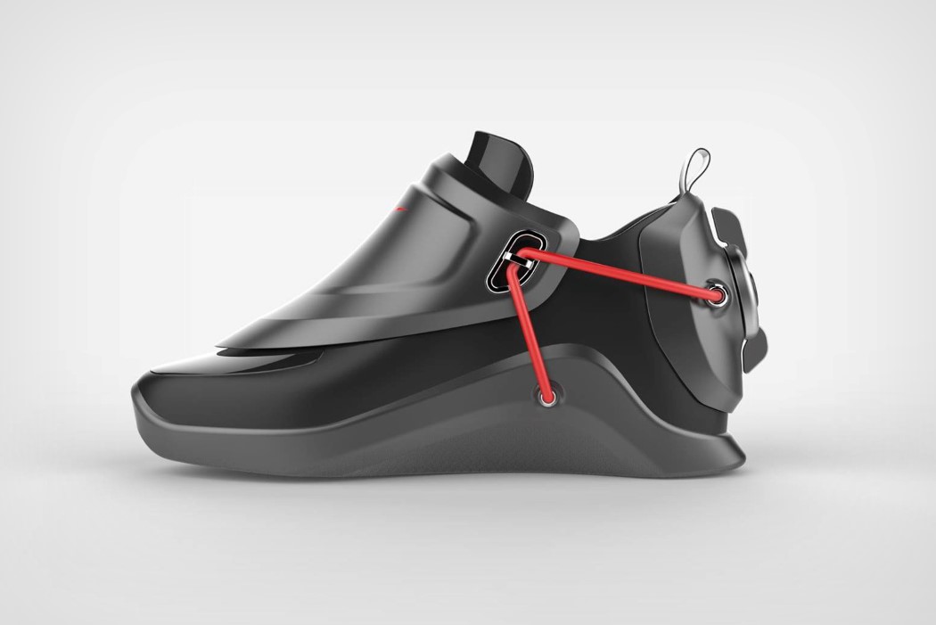
Aside from the convenience brought about by technological advancements, Nike’s HyperAdapt self-lacing shoes aren’t… different. They look exactly like any other regular sneakers, and sort of hide the fact that there’s an incredible amount of innovation in them.

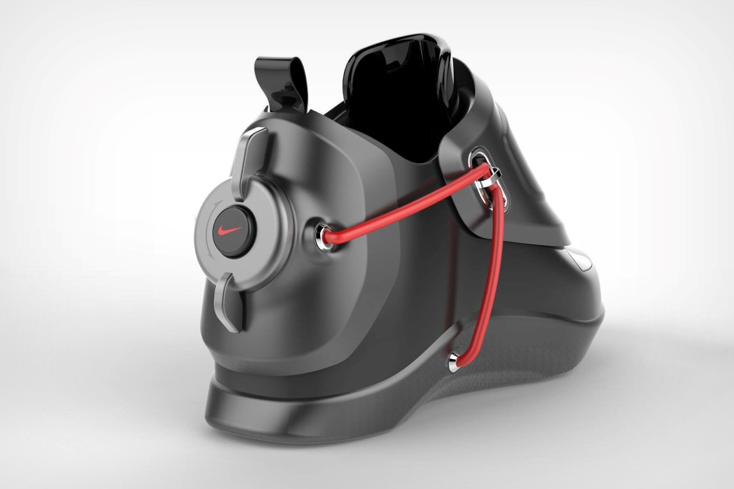
Carota Design’s Nike self-lacing sneaker concepts literally look like they’re from the future. With hard-shell components and gloss/matte finish contrasts, they don’t look or feel like traditional shoes at all, aside from the familiar silhouette, which definitely is a good thing. Designed to highlight the futuristic aspect of shoes that secure themselves, the conceptual sneakers come with a red lace that stands well against the black sneakers. The laces travel from the outsole to the front, and then to the heel, where they connect to a motor that’s triggered by a button. Tap against the button and the motor tightens the laces up, securing the shoe in place. Tap a second time and the laces loosen, allowing you to slip your shoe out! A textbook ‘shut up and take my money’ product!

Designer: Carota Design

carota_design_nike_sneakers_2

carota_design_nike_sneakers_3

Biomimicry meets drone-design

giant_hornet_drone_1

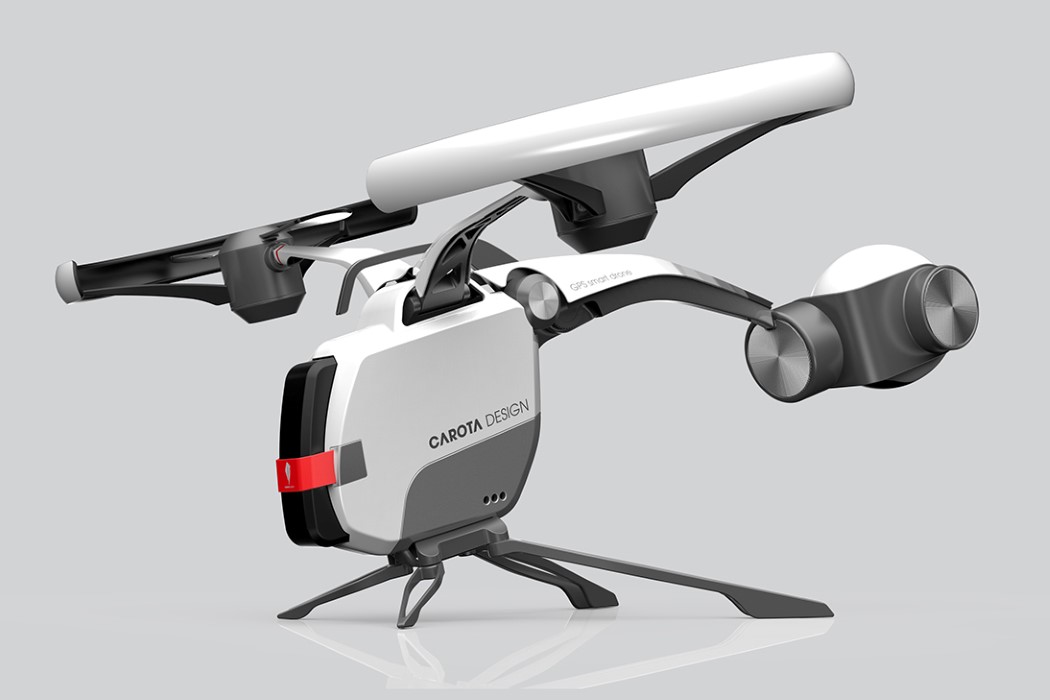
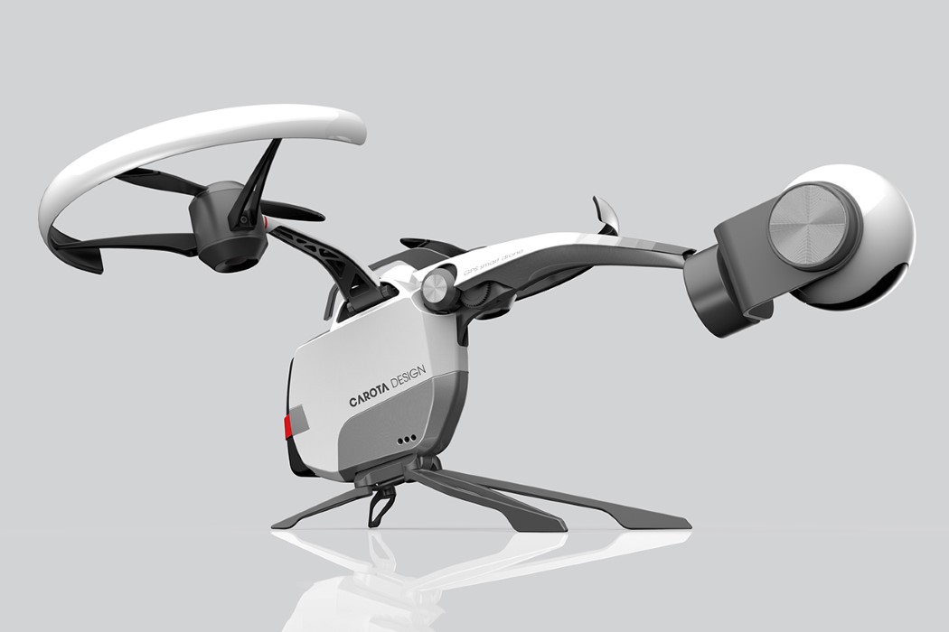
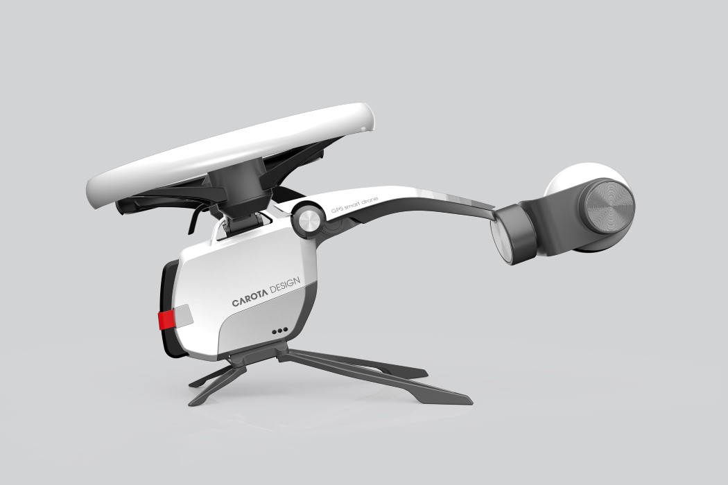
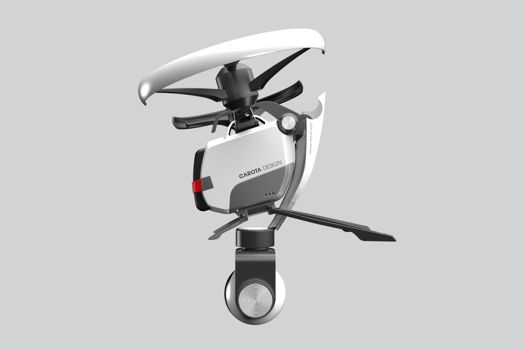
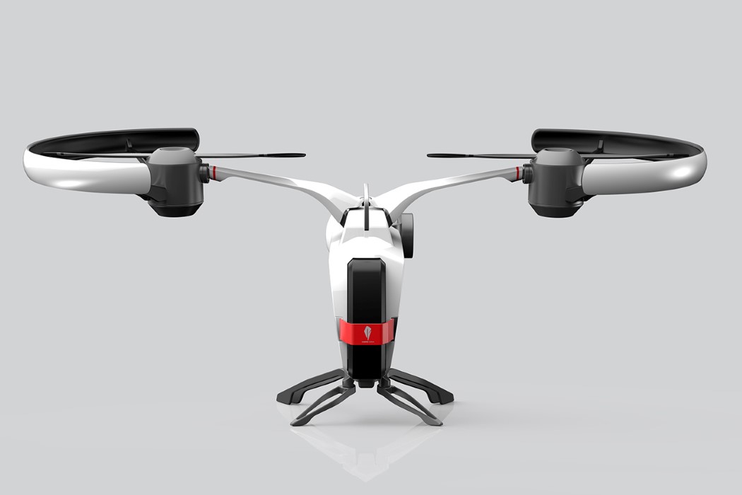
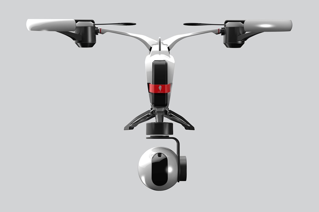
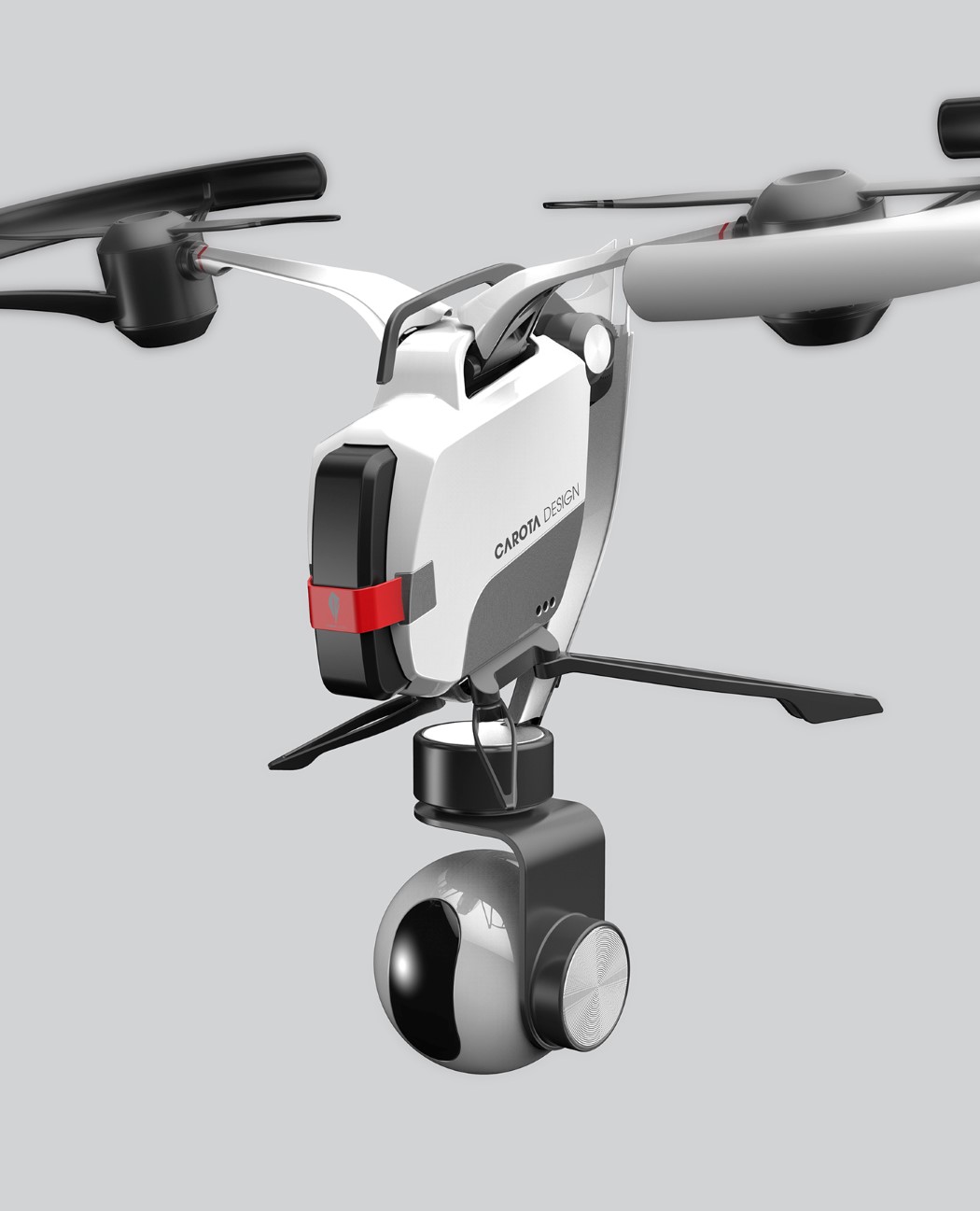
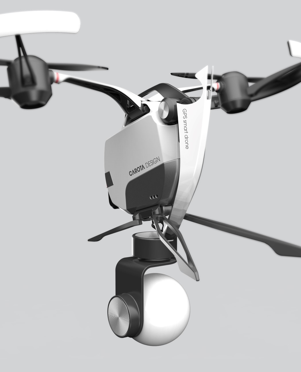
Engineering dictates that the easiest and most obvious layout for drone propellers is in a square format with four propellers. Nature, however, sticks to the basic layout of two wings across all its flying creatures. From birds to insects to the occasional reptile and mammal, nature’s always bestowed a bilaterally symmetric, dual wing setup… so Carota’s drone puts faith in that setup that’s developed over millions of years of evolution. Carota’s Hornet drone sports two propellers on either side and a movable arm at the base which houses a camera module as well as a gimbal. The movable arm along with the dual-propeller layout give it the appearance of a hornet with its wings and positionable stinger. While conceptual, the Hornet drone does make one think whether four propellers are entirely necessary. Yes, they make lift-off easier, but it isn’t impossible to have a drone with two powerful propellers giving you vertical takeoff and landing. The propellers as well as the camera come with foldable arms, allowing the drone to be folded down to a compact package when not in use. I say this looks much more convenient! After all, nature can’t be entirely wrong, can it?!

Designer: Carota Design

giant_hornet_drone_2

giant_hornet_drone_3

giant_hornet_drone_4

giant_hornet_drone_5

giant_hornet_drone_6

giant_hornet_drone_7

giant_hornet_drone_8