ASUS Zenbook S 14 Ceraluminum Laptop Review: Elegance You Can Feel, Power You Can Touch

PROS:


  • Gorgeous Ceraluminum design with a unique tactile experience

  • Ultra-thin and lightweight chassis for effortless portability

  • Lush and vibrant 14-inch 3K 120Hz OLED display

  • Impressive performance, including light gaming

CONS:


  • Port selection is a bit constrained

  • RAM is integrated into System-on-Chip


RATINGS:

AESTHETICS
ERGONOMICS
PERFORMANCE
SUSTAINABILITY / REPAIRABILITY
VALUE FOR MONEY

EDITOR'S QUOTE:

Packing incredible performance in a compact and beautiful design, the ASUS Zenbook S 14 redefines what ultraportable laptops are capable of and demonstrates how to deliver a design that you can feel.
award-icon

For the longest time, Apple MacBooks have set themselves apart from the rest of the laptop crowd with their stylish designs, while laptop manufacturers preferred to focus on the performance and technical aspects of their products. Consumer tastes have shifted, however, and brands have started their search for thinner and lighter designs, though they always get stumped by the laws of physics and the limits of technologies and materials. Always in Search of Incredible, ASUS decided to look to other places for inspiration, both from other industries and Mother Nature herself. The result is a new “meta-material” Ceraluminum, which debuted on the ASUS Zenbook S 14, a rather striking laptop that promises the best of all worlds. Naturally, we couldn’t resist getting our hands on it and taking it for a test run to see whether its beauty runs deep.

Designer: ASUS

Aesthetics

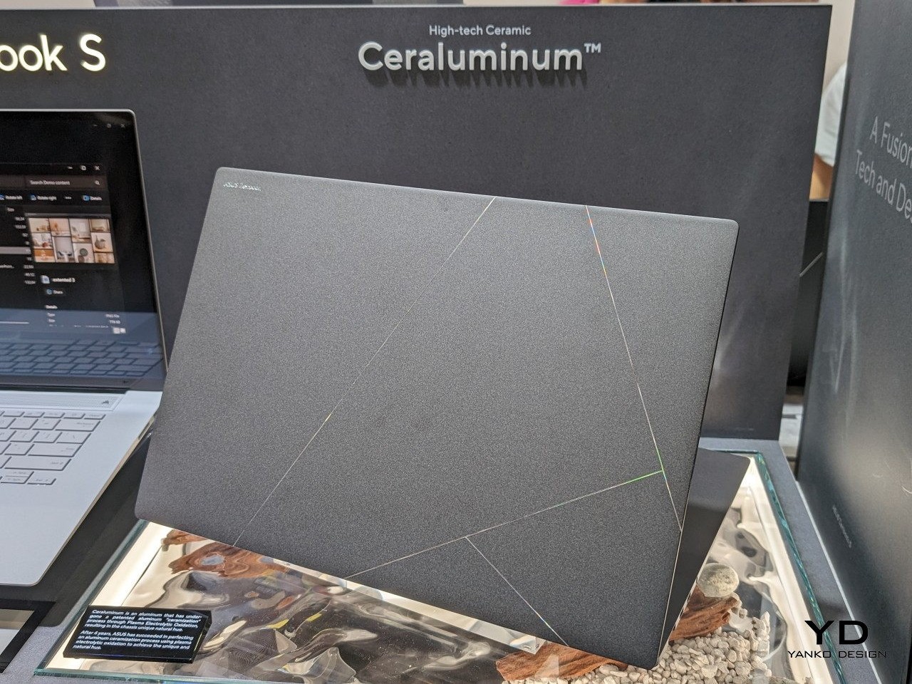
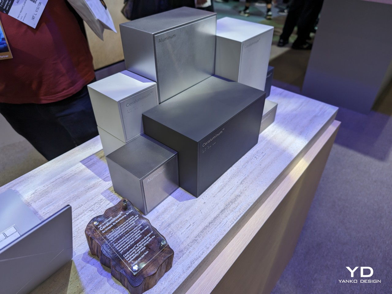
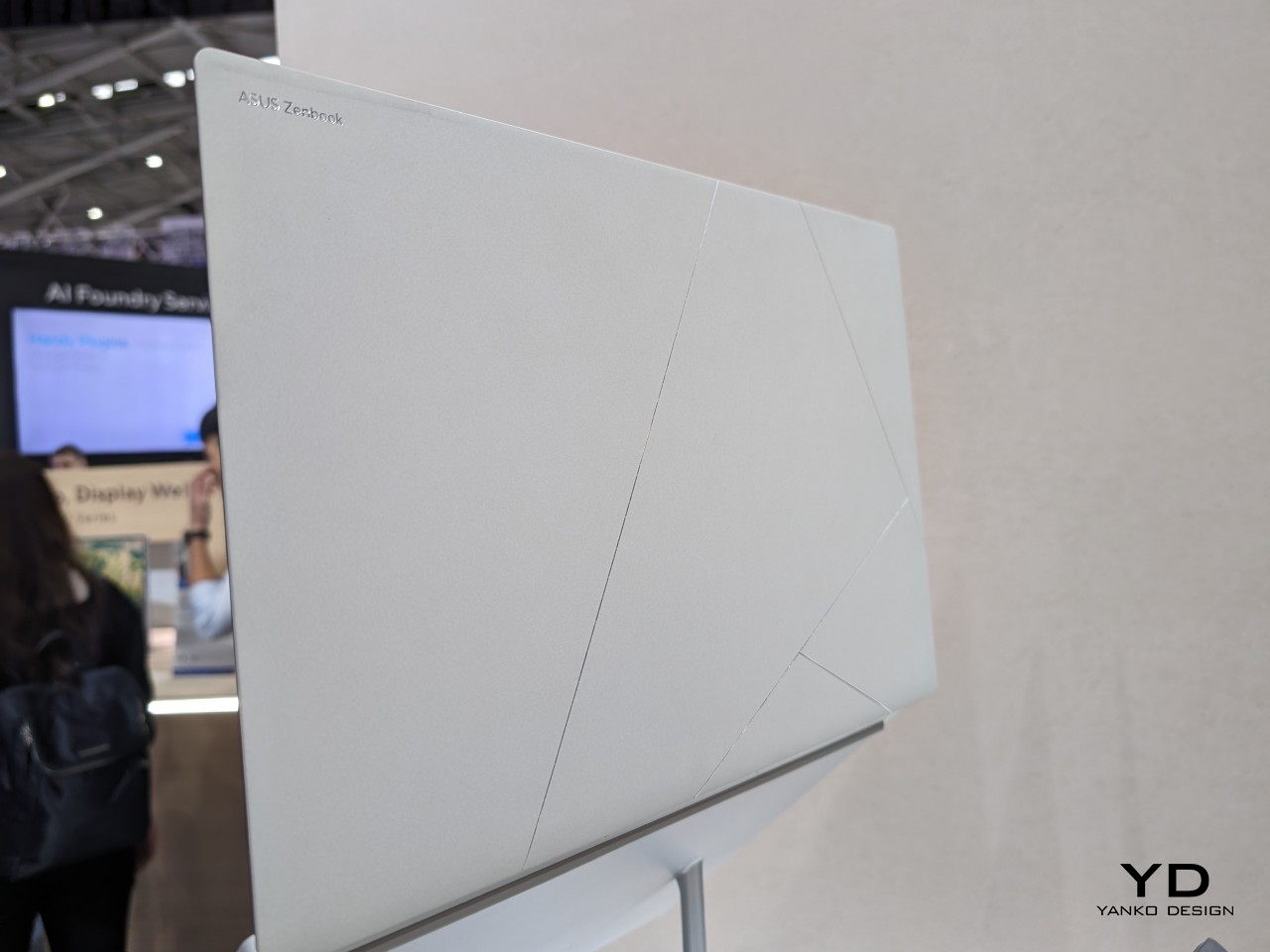
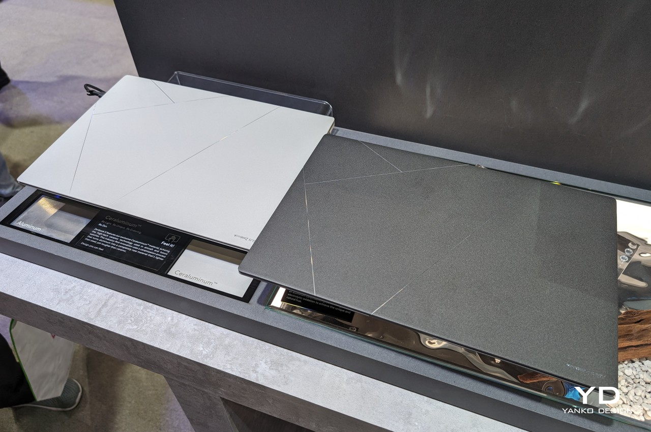
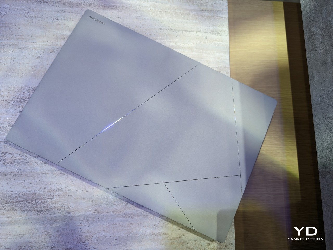
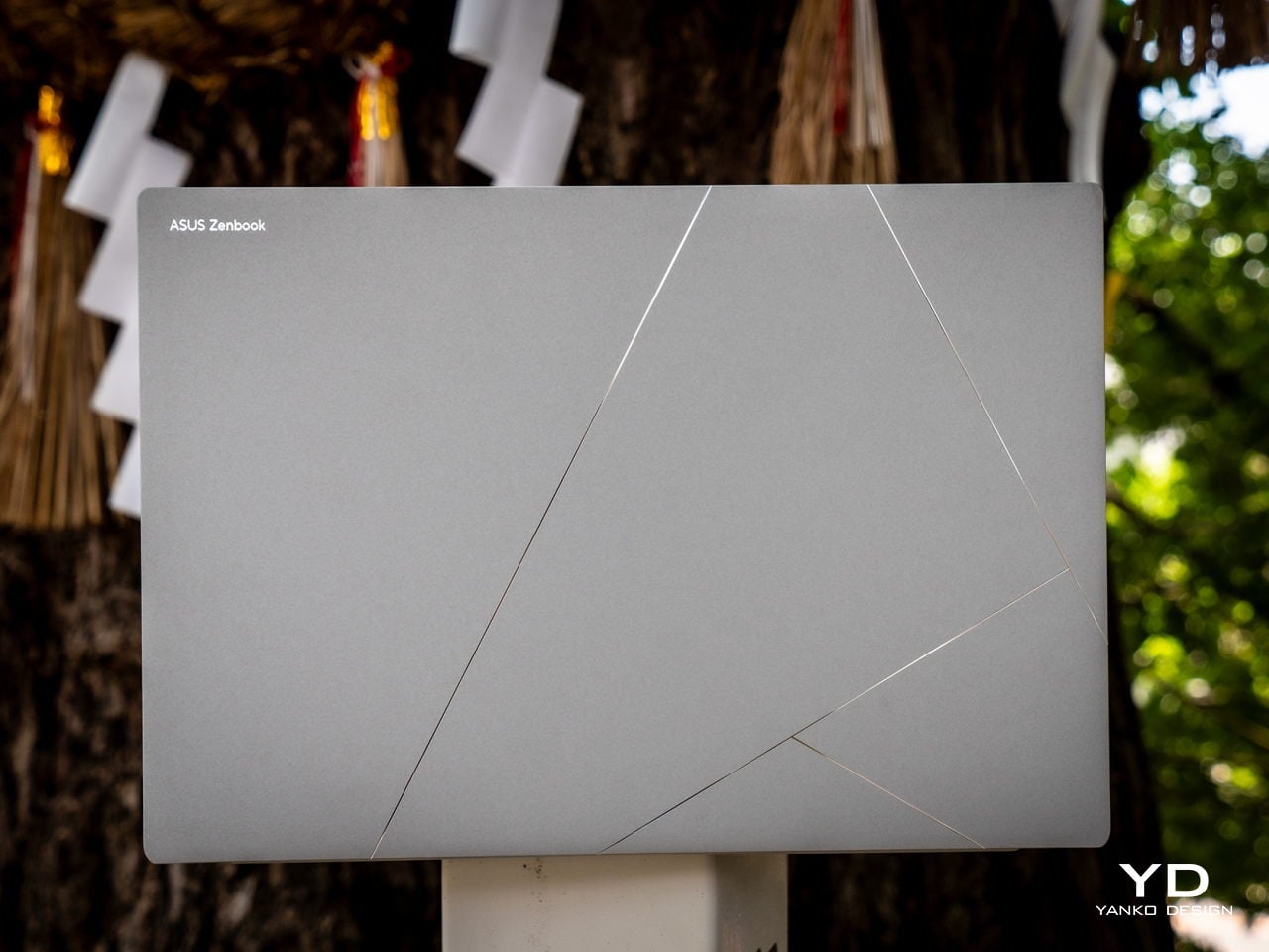
Laptop lids are often made from metal like aluminum or plastic, both of which offer different strengths but also weaknesses. Lately, titanium has become the hot new material for electronics because of its durable and lightweight properties, but it is far from the end-all and be-all of metallic products. Taking a page from the aerospace and luxury watch industries, ASUS developed a new oxidation or “ceramization” to produce a sort of hybrid or meta-material, if you would, that combines not only the lightness of aluminum and the hardness of ceramic but also creates a new visual and tactile experience never before seen on a laptop.
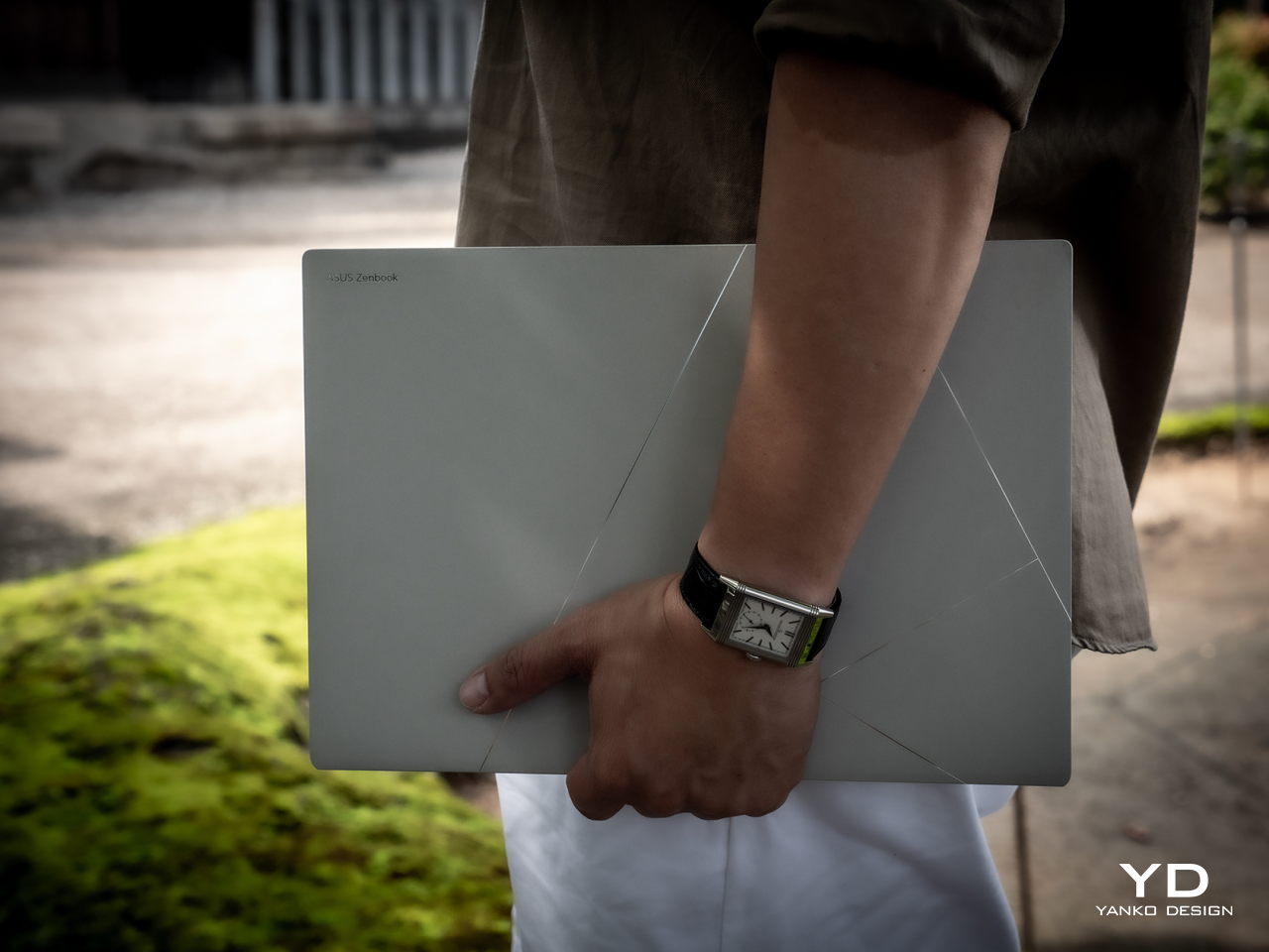
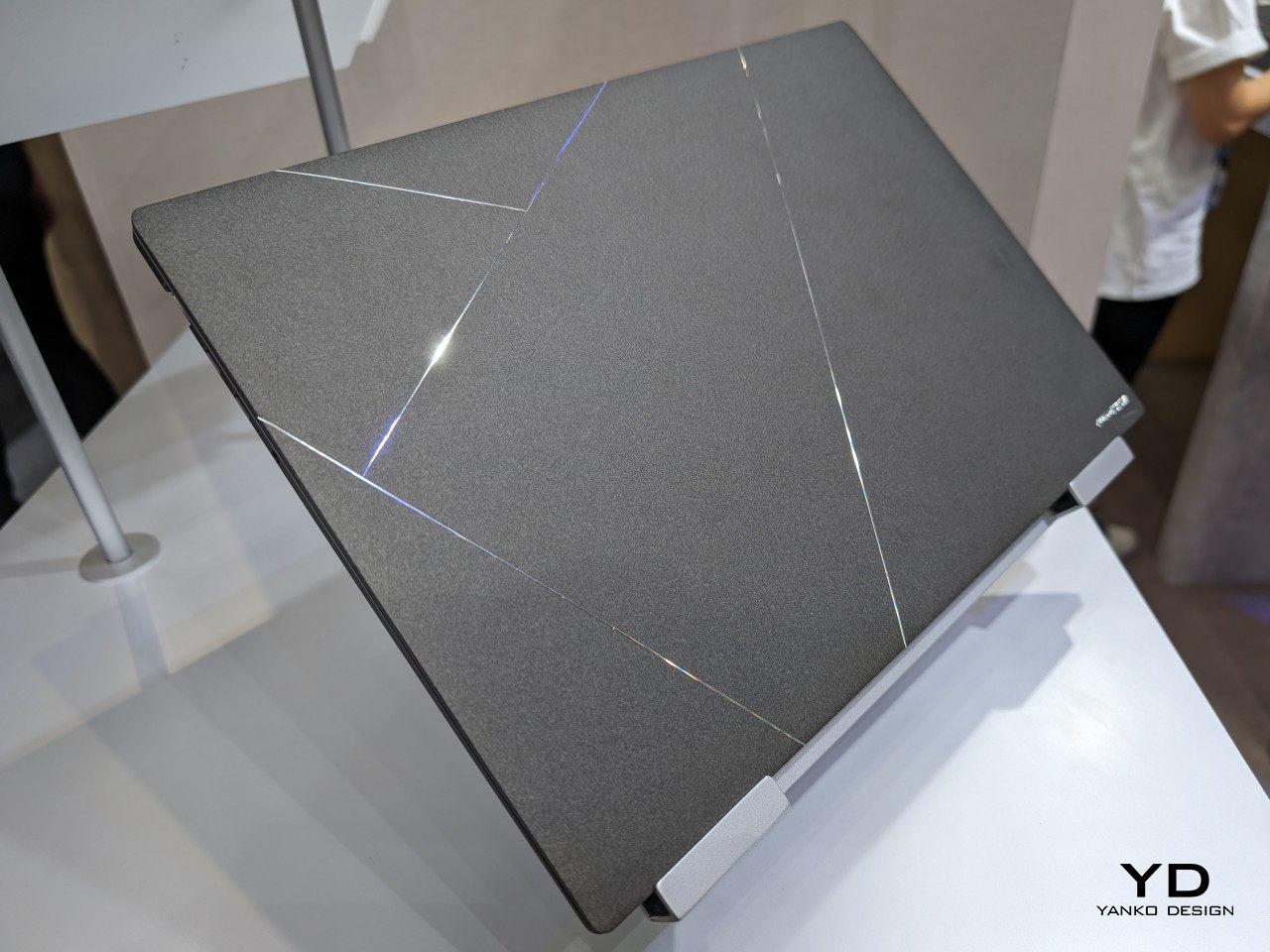
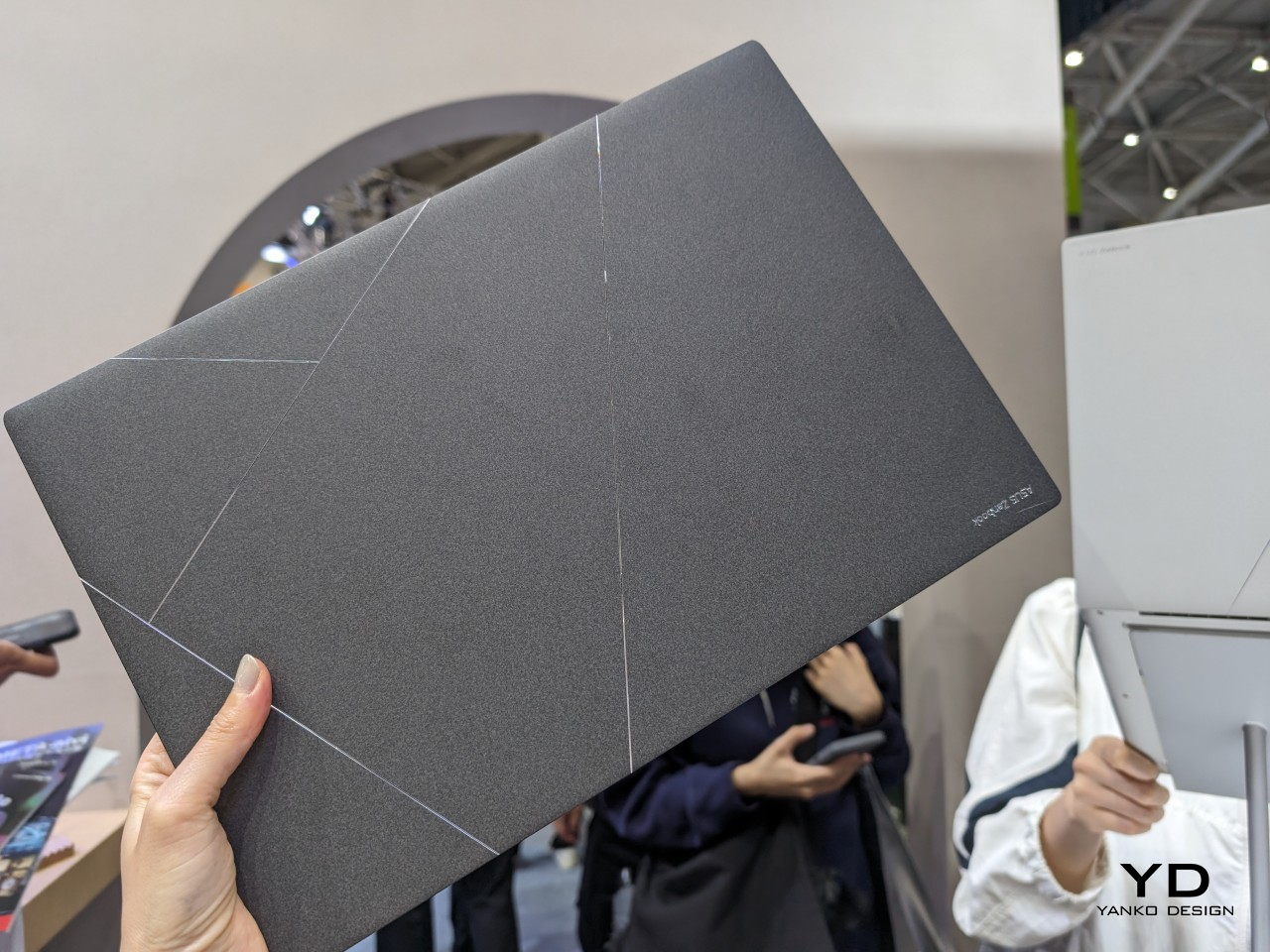
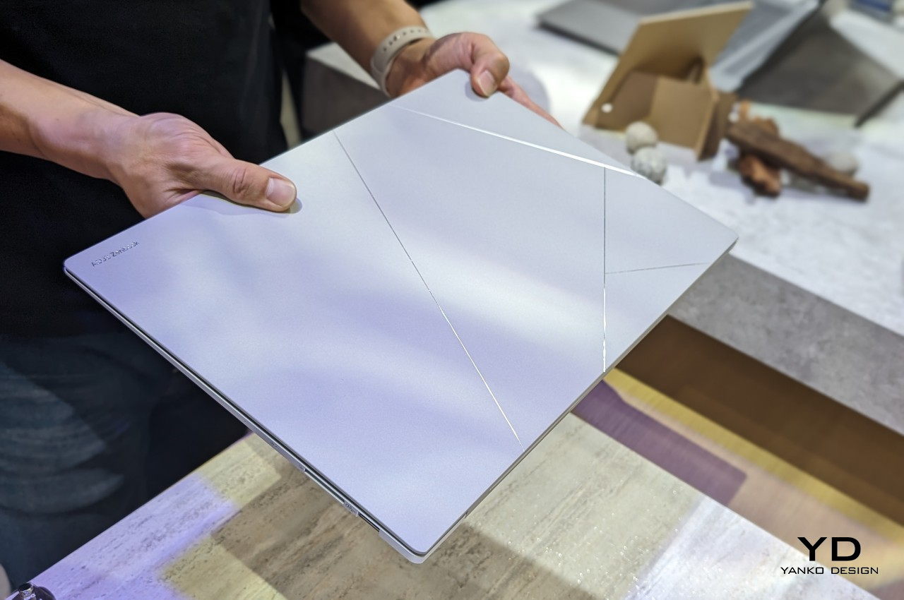
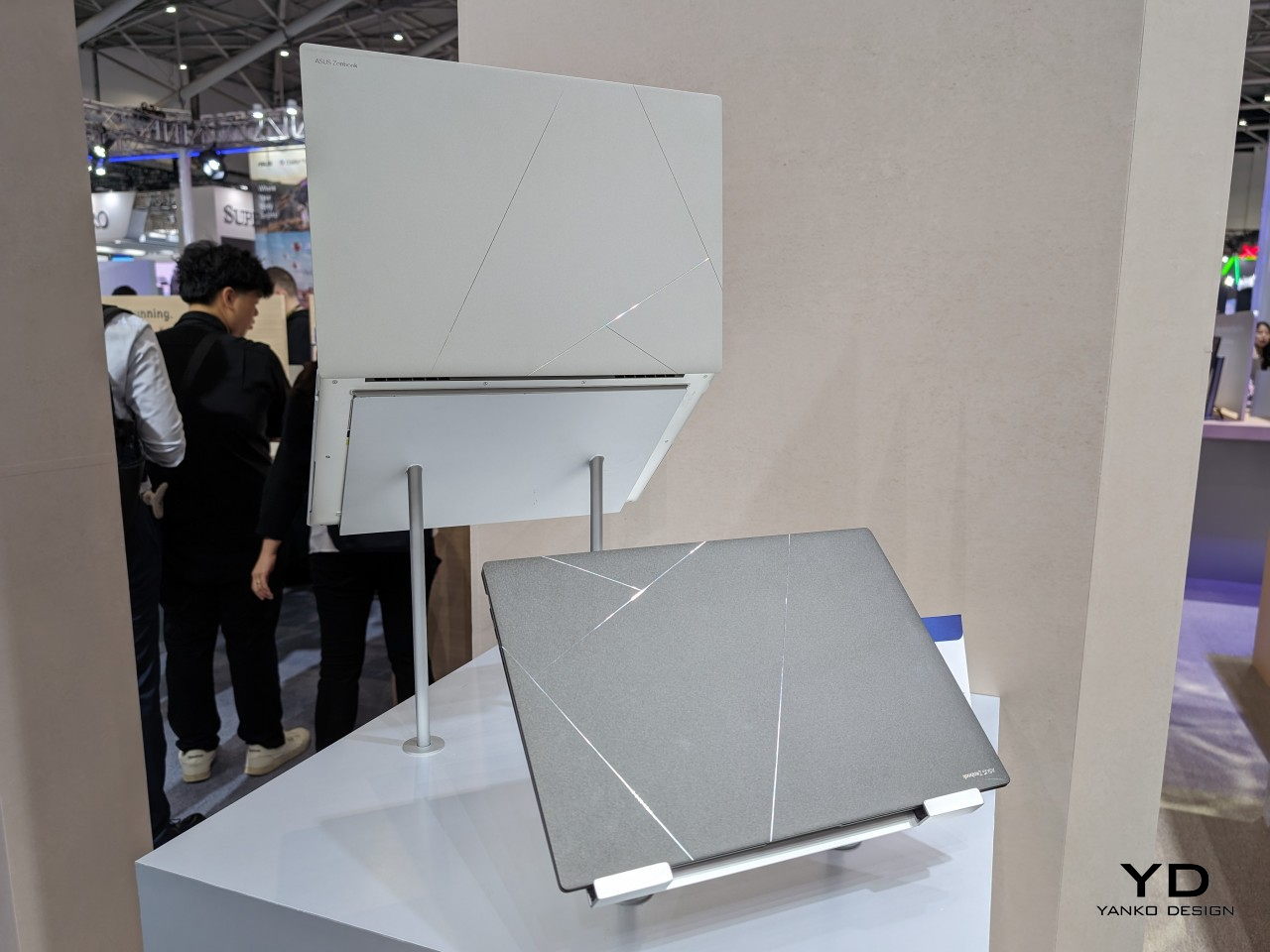
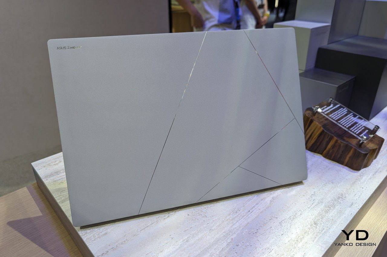
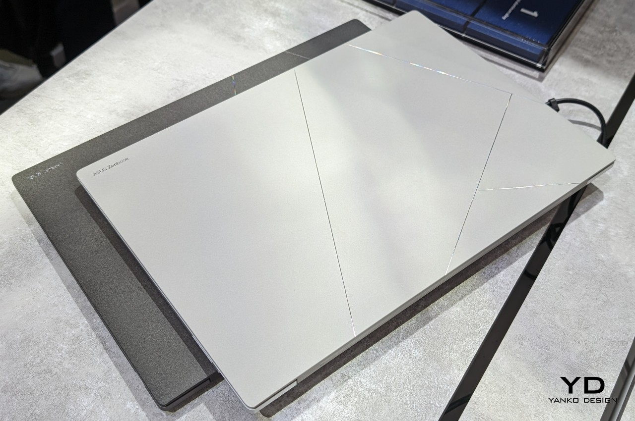
“Ceraluminum” is the marketing term for what ASUS previously called Plasma Ceramic Aluminum, and our very own Vincent Nguyen describes the material in better detail. The end result is a laptop cover that looks nothing less than a piece of art, especially with the lines that cross its surface to create geometric patterns. Not only is the laptop great to look at, but it also feels great to touch. There’s a certain degree of roughness to its surface, almost like paper. Considering its paper-light weight and thinness, it almost feels like you’re simply carrying a stack of white or gray paper.

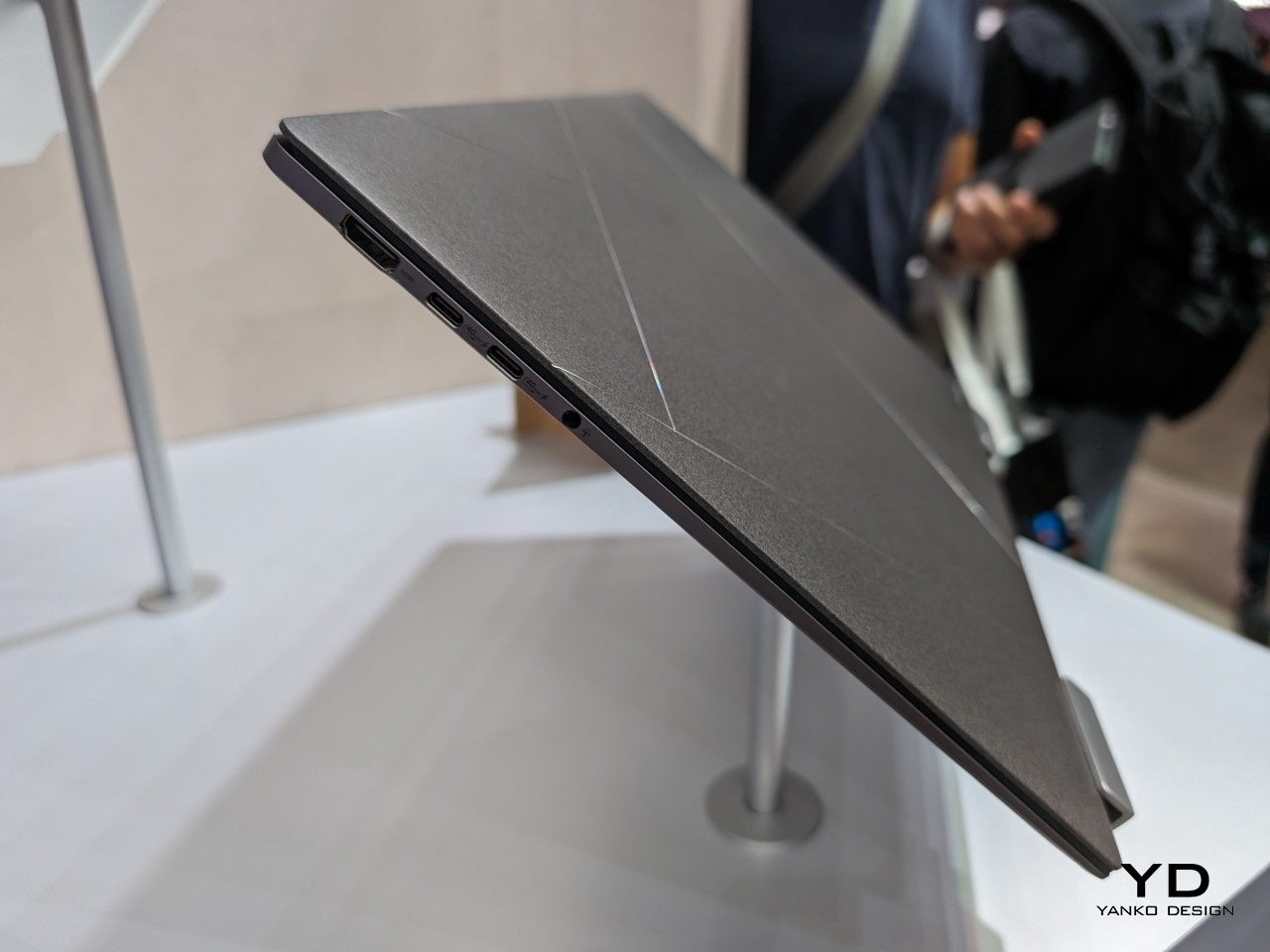
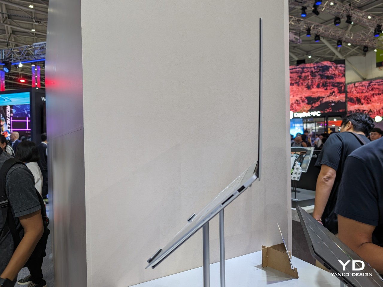
And yes, the ASUS Zenbook S 14 is unbelievably thin and lightweight, only 1.1cm (0.47 inches) thin and 1.2 kg (2.65 lbs) light. It gives the laptop a rather striking profile that grabs attention from any angle. And with its tactile design and lightweight body, you might find yourself wanting to carry the laptop in your arms often, truly a design that you can feel.

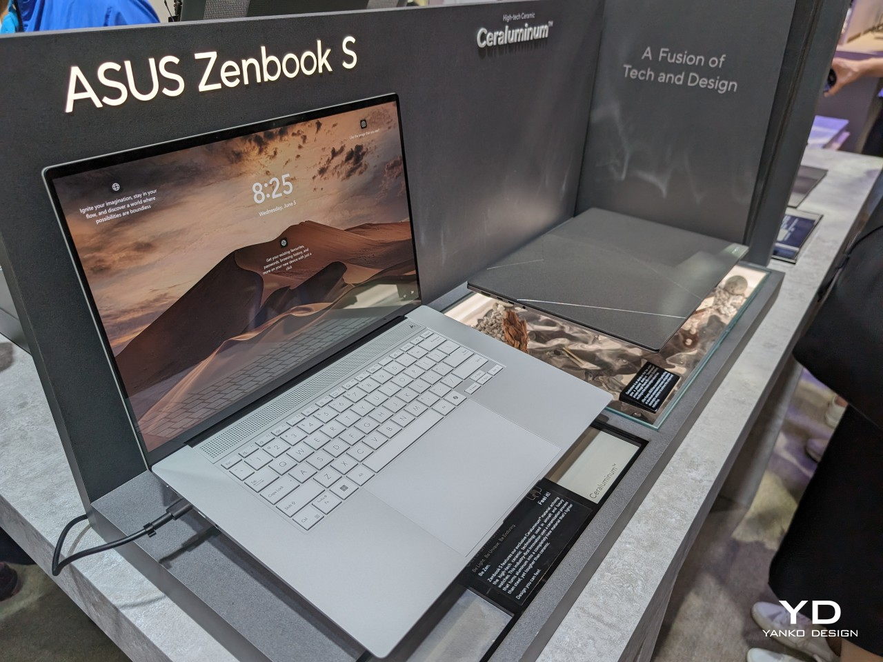
Fortunately, the laptop’s beauty doesn’t disappear when you lift up the lid. The very thin bezels almost disappear completely, giving way to the bright and colorful ASUS Lumina OLED display. The clean and modest design of the keyboard and the touchpad pad perfectly complement the minimalism of the laptop’s lids. Even the rather unique ventilation grid lying between the keyboard and the display hinge brings functional aesthetics into the picture. No matter which way you look at and hold the Zenbook S 14, you are greeted by a strikingly elegant display that you touch with your eyes as well as with your fingers.

Ergonomics

With such a thin and light design, there is really no argument about the portability of this laptop. You can easily carry it anywhere by hand or slip it inside a bag, and use it anywhere as well, including on your laptop. This makes the Zenbook S 14 ideal for people who find themselves always on the move, sometimes even at a moment’s notice. Best of all, they aren’t losing out on power and performance, as we’ll see later, so there are almost no downsides to its design.

That said, if you’re a bit picky about your typing experience, you might have some issues with the ASUS Zenbook S 14’s keyboard. With a profile as thin as this, it shouldn’t come as a surprise that the keyboard actually has a bit of a shallow travel distance, just around 1.1mm. Mind you, that’s not exactly a deal breaker and we found it to still be quite comfortable and enjoyable to type on. In fact, considering that same thin profile, it’s a miracle that this keyboard could actually feel this good. Again, your mileage might vary, but keyboard connoisseurs might want to take note of this detail.
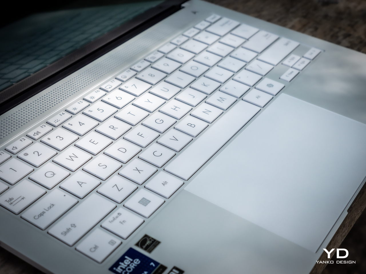
Another minor matter that may or may not ruin your experience is the very bright keyboard backlight. Although adjustable, even its dimmest setting might feel a little blinding to more sensitive eyes, especially in a dark room. On the bright side (no pun intended), the light and the keys are also very visible even in bright surroundings. Again, not a huge flaw but something you’ll want to consider based on your personal preferences.

Performance

You might be wondering what the catch is since thin laptops have traditionally been underpowered to the point of being unusable for anything but the most basic computing tasks. There are a small number of gotchas, indeed, but not in the ways you might expect and definitely not damning enough to ruin mar the Zenbook S 14’s prestige. In fact, it’s pretty mind-blowing that this ultra-thin laptop is able to perform this well, offering a no-compromise mobile computing experience.
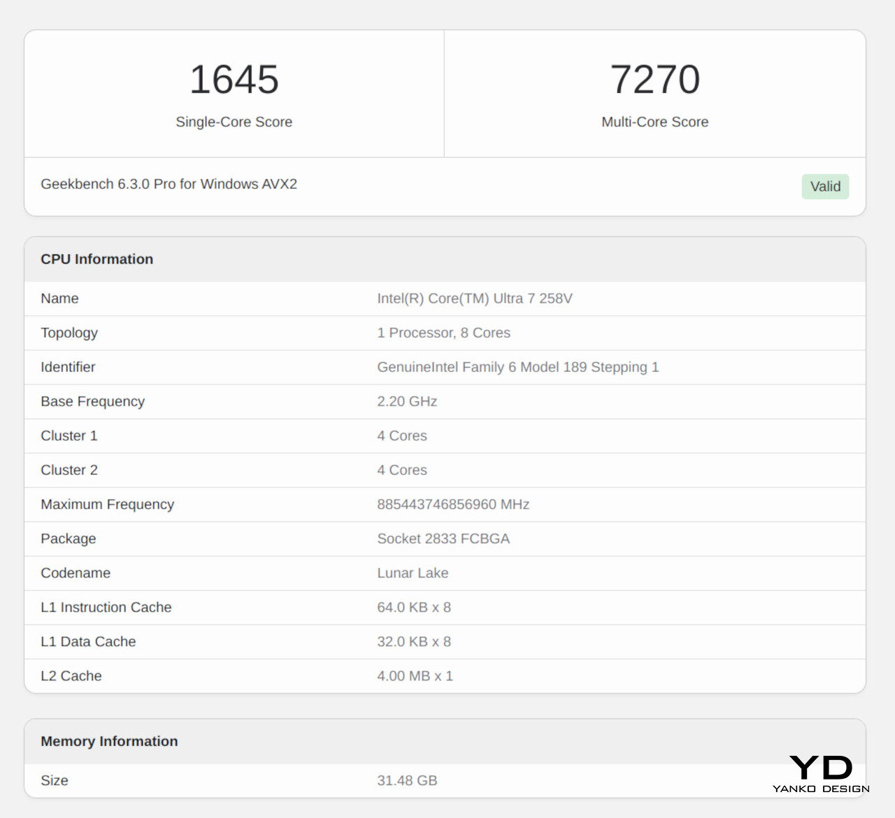
Part of that is thanks to the new Intel Lunar Lake processor, specifically the Core Ultra 7 258V. It uses a system-on-chip design that integrates a CPU, a dedicated NPU (Neural Processing Unit), an Intel Arc Xe GPU, and 32GB of RAM. Yes, that memory is built into the processor, which does have an important implication we’ll get to later. Regardless, this compact silicon design is what allowed Intel and ASUS to maximize internal space, allowing them to cram more or bigger components, like a 72Wh battery.
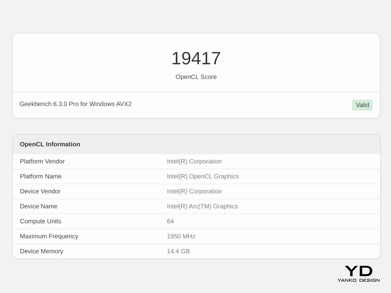
The Zenbook S 14’s raw benchmark performance is nothing short of impressive, easily matching other 28W laptops. Considering ultra-thin 14-inch laptops often operate at a much lower 15W TDP to avoid overheating, this is quite a remarkable feat. Perhaps the most telling achievement is how this slim laptop can deftly handle gaming loads with medium graphics settings instead of the typical low settings. Although it’s not marketed as a content creation or gaming laptop, it can definitely fit the bill with some performance tweaking and adjustments.

What’s a bit more interesting, however, is how the laptop’s performance seems to lean more towards unplugged use. Of course, this is perhaps one of the most important considerations for a laptop, since wouldn’t want to have it always plugged in, defeating the purpose of its portability. Long story short, the Zenbook S 14 seems to perform best when on battery, providing a good balance of power and efficiency to meet any computing need anywhere, anytime. And with mixed use, you can get a little under 20 hours of battery life on a single charge. That’s well under ASUS’s advertised 27 hours of non-stop video playback, but the realistic numbers are still quite good.
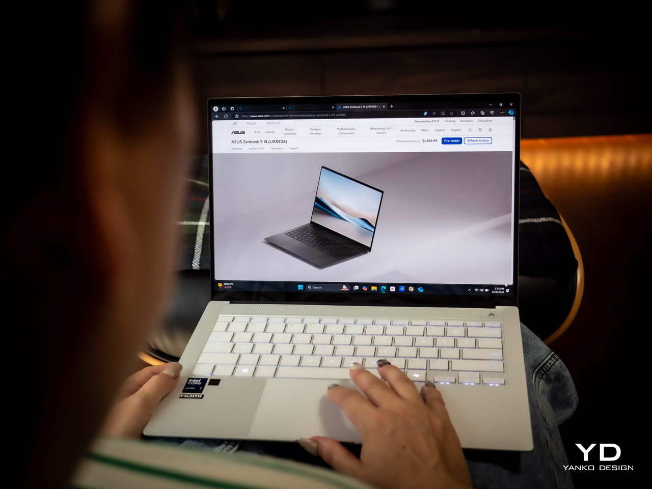
This makes the ASUS Zenbook S 14 a great all-around laptop, and that includes multimedia and, as mentioned, even games. The 14-inch 3K OLED screen is just breathtaking with its brightness and colors, and being part of the ASUS Lumina line, it is also PANTONE-validated, making it an excellent tool for creators, and the monitor’s 120Hz is actually a must-have for gamers. Four high-quality speakers give a punchy treatment to videos and music, making this laptop a multimedia powerhouse despite its modest and business-minded looks.
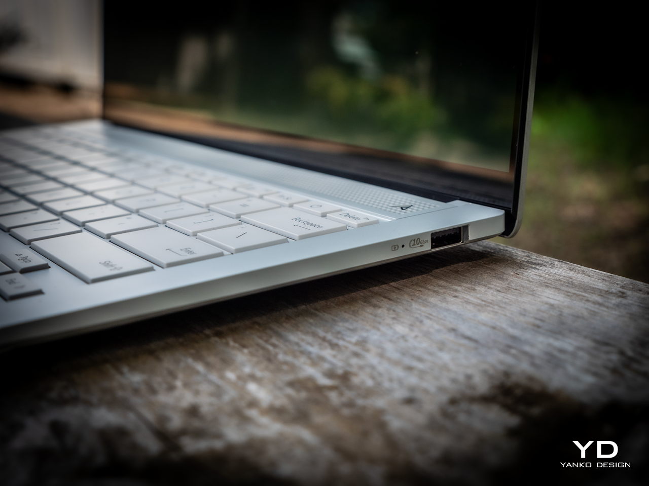
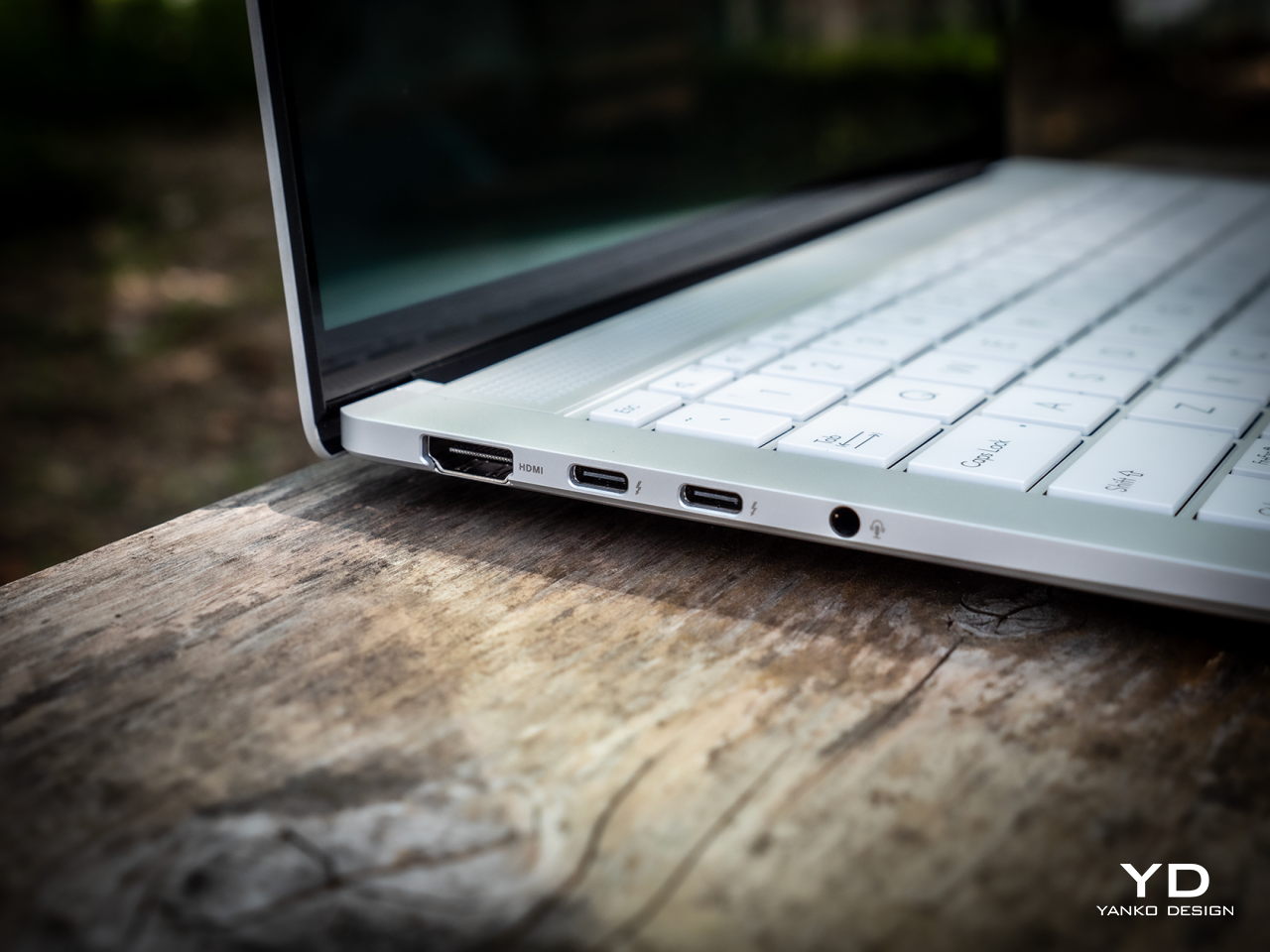
One area where the Zenbook S 14 might come up short for some people is the number of ports available. Remember that time when Apple got chided for replacing all the ports on MacBook Pros with just four C-Type Thunderbolt 4 ports? It’s not as bad here, but there will definitely be some who will find the selection far too modest. There are only two of those USB-C Thunderbolt 4 ports, both of which can be used for charging, data, and video out. There’s also one full-sized USB 3.2 Gen 2 Type-A port, one HDMI 2.1 port, and a headphone/mic combo jack. That’s pretty much it. There isn’t even an SD card reader, which will probably disappoint photographers. Both USB-C ports are located on the same side, which forces you to have the charger and dongles competing for space. The lack of other ports might not be that big of a problem when you dock the laptop at home or in the office, but if your office tends to change locations, you’ll have to bring a hub with you as well.

Sustainability

ASUS has been working hard to step up to the challenge of making the world a greener place for future generations, and its most ambitious attempt yet can be seen in its most ambitious material design as well. Ceraluminum isn’t just a fancy new material with a beautiful aesthetic and satisfying texture; it is also a more sustainable alternative to the usual metal anodizing techniques used by manufacturers. Instead of corrosive acids that release harmful toxins into the air, ASUS’ ceramization process uses water and super-high voltage electricity to produce an even better oxide layer, creating this blend of lightweight durability your fingers will love.
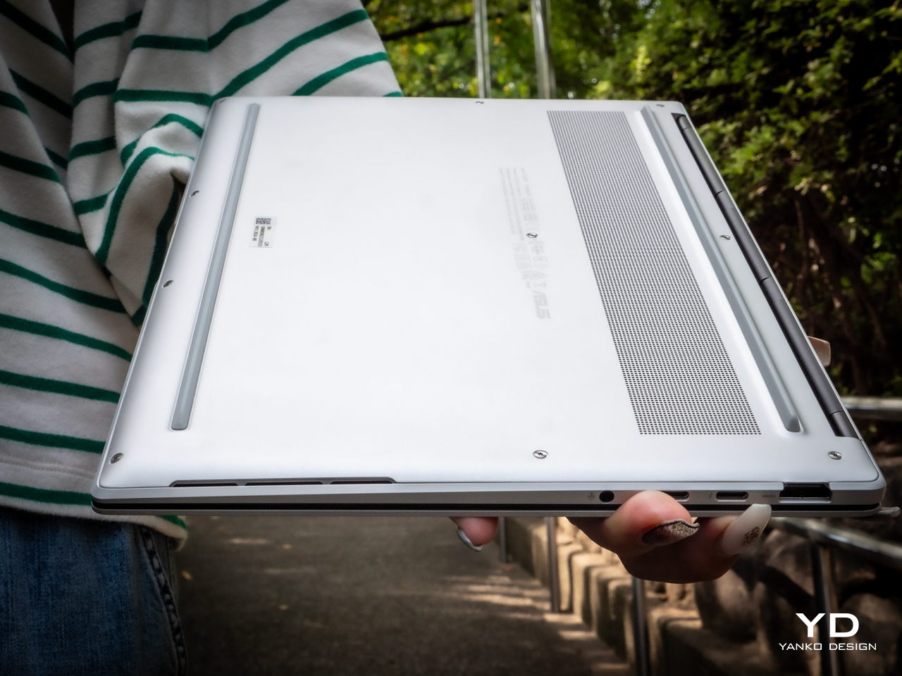
The ASUS Zenbook S 14 is also made to last, thanks to that Ceraluminum material that’s not only scratch-resistant but also smudge-resistant. And despite its luxurious aesthetic, this laptop actually boasts military-grade MIL-STD-810H compliance, ensuring that it can survive accidental bumps, high-frequency vibrations, and extreme temperatures. One aspect that takes a point from its longevity is the fact that you can only upgrade the M.2 NVMe SSD, and only up to 1TB capacity. The 32GB of RAM is, as mentioned, fixed and soldered. Yes, that might be enough for most use cases, but only today. Who knows how demanding apps and services will be just a few years from now.

Value

Most people marvel at ultra-thin laptops but pass them over because those slim profiles barely have enough power to meet their needs. Finding the right balance between portability, power, and price is like a hunting game, but you don’t need to go any further than what ASUS is now offering on the table. With a beautiful 14-inch screen, only 1.1cm thick, and weighing only 2.65 lbs, the ASUS Zenbook S 14 delivers a versatile machine that doesn’t compromise on performance, at least not in significant ways.
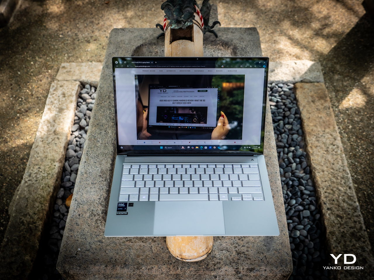
Best of all, it’s an absolute beauty to behold and to hold! Ceraluminum might sound like a buzzword, but its aesthetic value and tactile experience are the real deal. The $1,499.99 price tag for the 32GB RAM model is indeed nothing to scoff at either, but when you realize all the value that you’re getting, it’s almost a steal.

Verdict

We have finally reached a point where laptops no longer need to be hulking blocks of metal just to catch up with their desktop counterparts. While they still lose out on raw performance and customization, today’s laptops can be slimmer than ever and, more importantly, offer a design experience that desktop towers can only dream of. Of course, it takes no small amount of creative thinking, bold decision-making, and the courage to go beyond the boundaries of convention to create an amazing experience that will satiate consumer’s thirst for better-designed products. ASUS has definitely proven that it isn’t averse to taking that big leap, and the Zenbook S 14 is a shining testament to that daring spirit to create designs that you can see and feel.

The post ASUS Zenbook S 14 Ceraluminum Laptop Review: Elegance You Can Feel, Power You Can Touch first appeared on Yanko Design.

‘Is it cardboard?”: Ceramic art blurs line between perception and reality

One of the most popular reality game shows on Netflix is “Is It Cake?” where the contestants have to recreate common objects and then trick the judges into guessing if it’s cake or not. It’s fun seeing all of these ordinary, every day things recreated as cakes and it’s also a good reminder that not everything is as it seems. This art experiment by Jacques Monneraud is of the same idea as the game show but this time it uses something even more ordinary and turns it into an extraordinary collection.

Designer: Jacques Monneraud

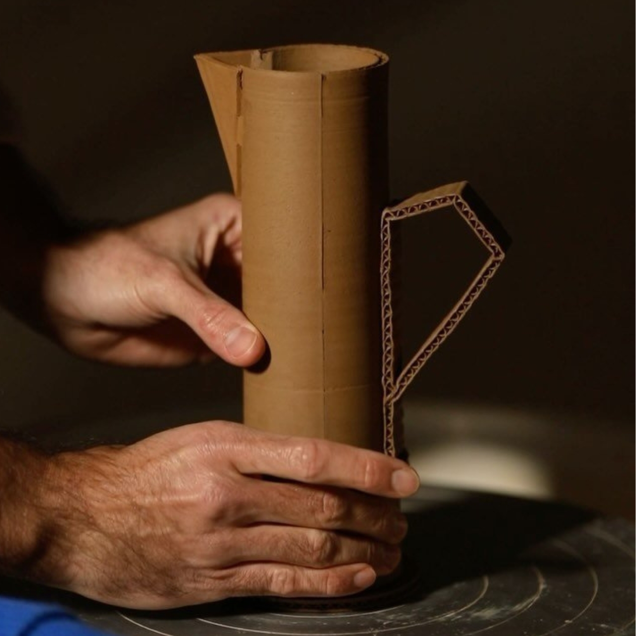
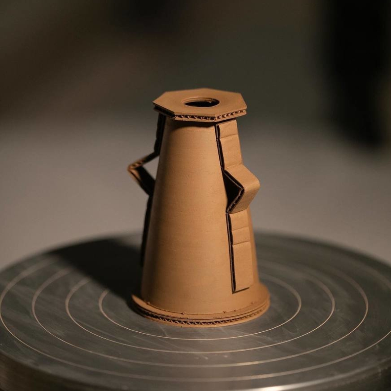
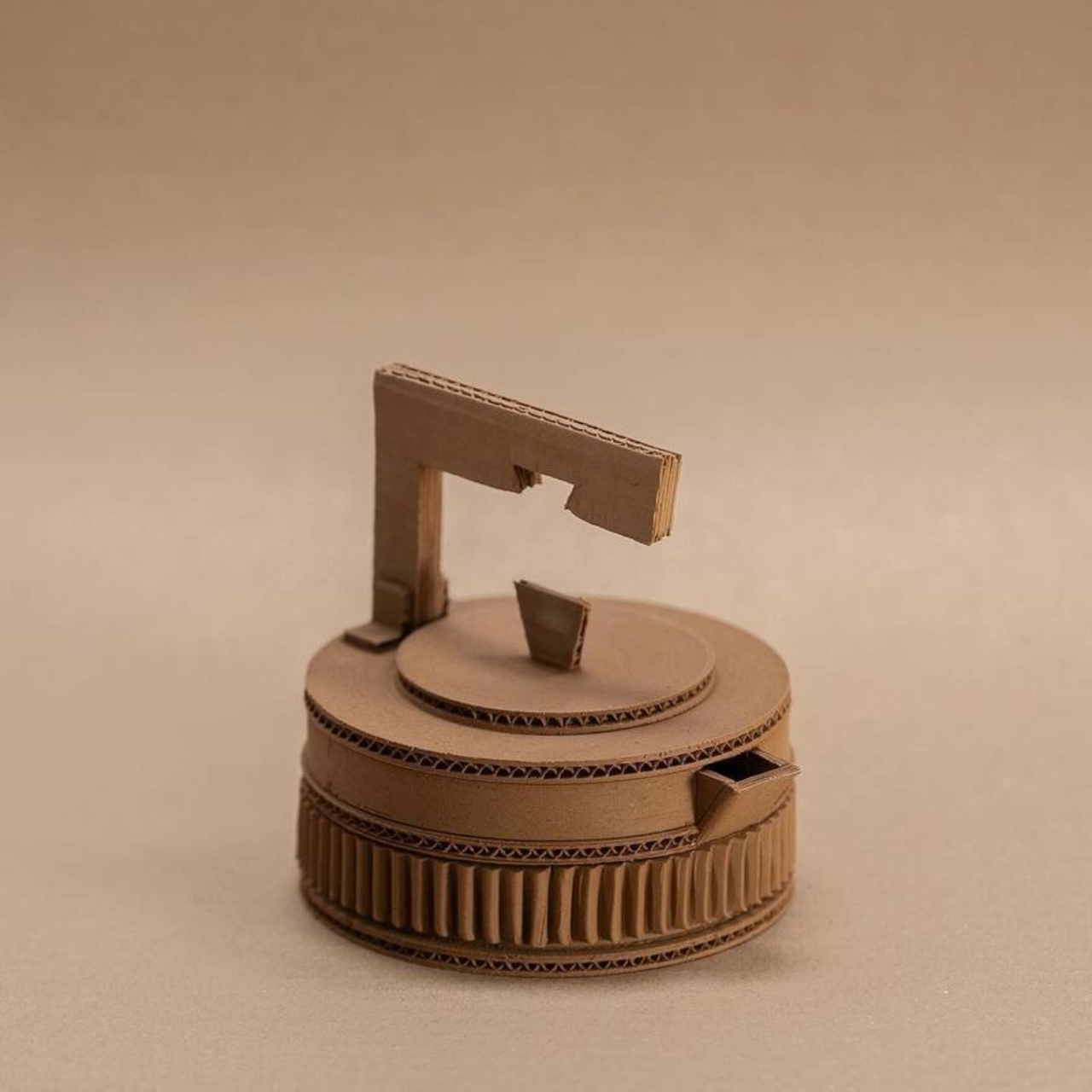
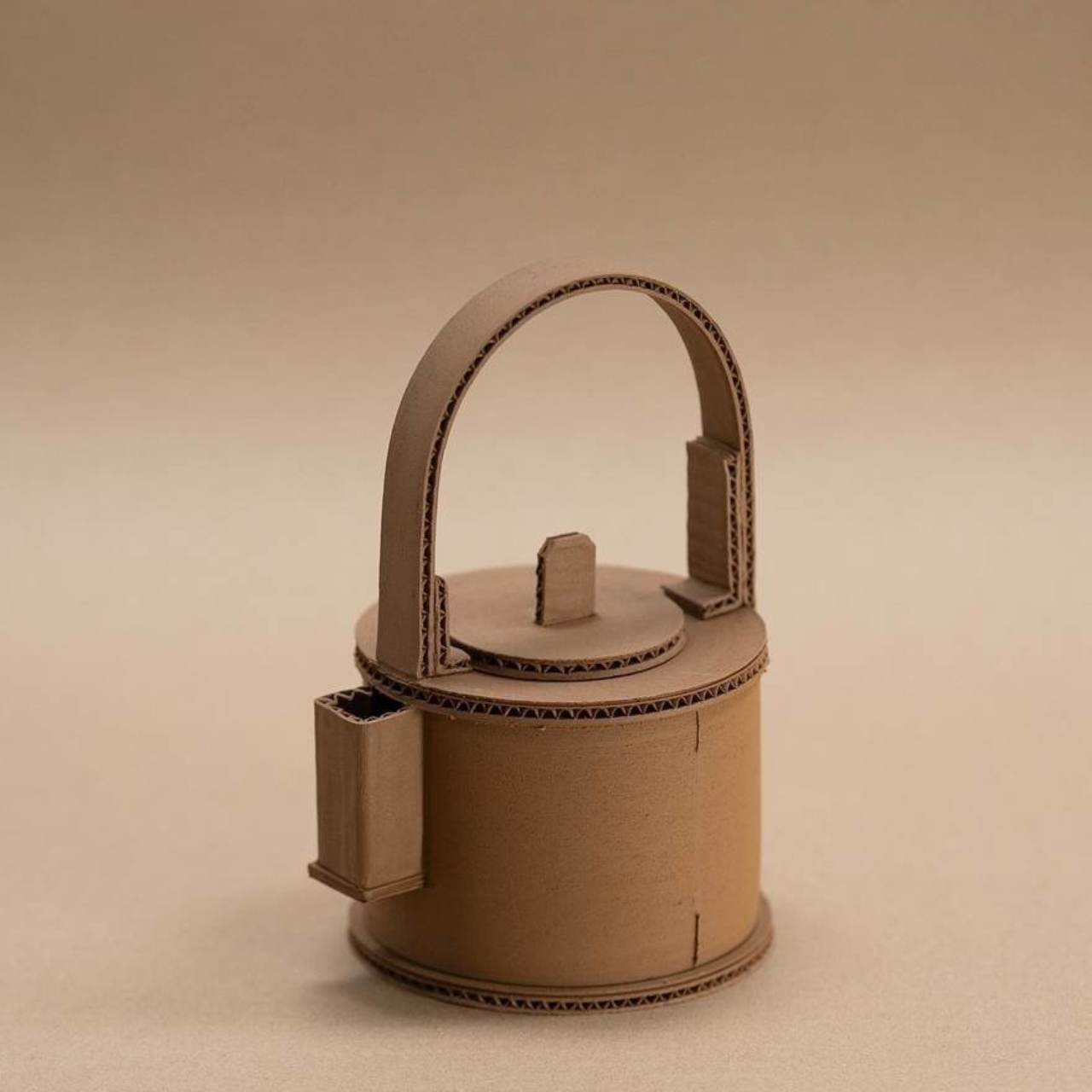
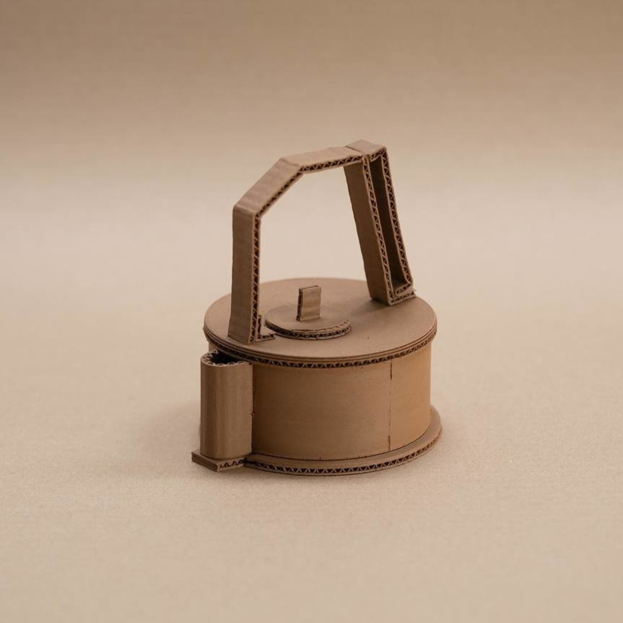
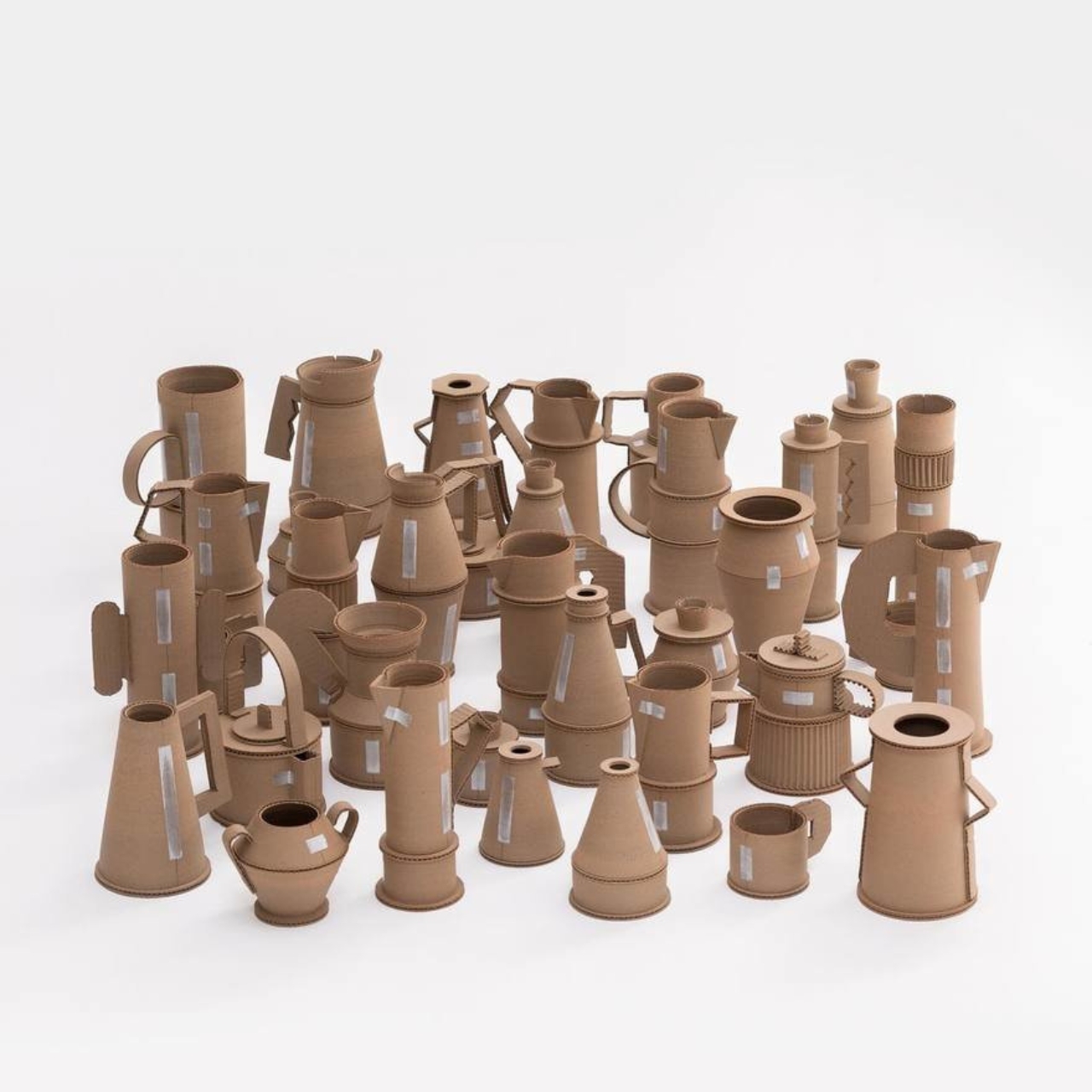
The Cardboard collection recreates some common household items like pitchers and vaes into ceramic art. What makes this different from others though is that the they were made from clay but made to look like cardboard. It is basically a statement of “mockery of overproduction and overconsumption” but it is also something that people can actually use if they need something unique on their dining tables and living rooms.

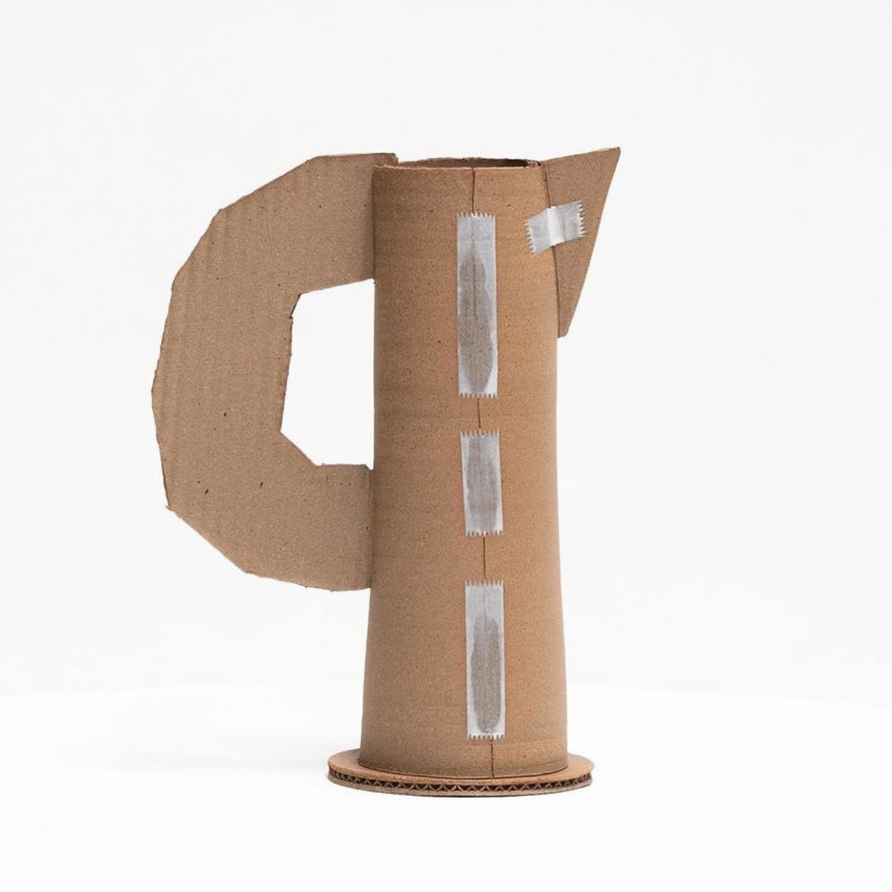
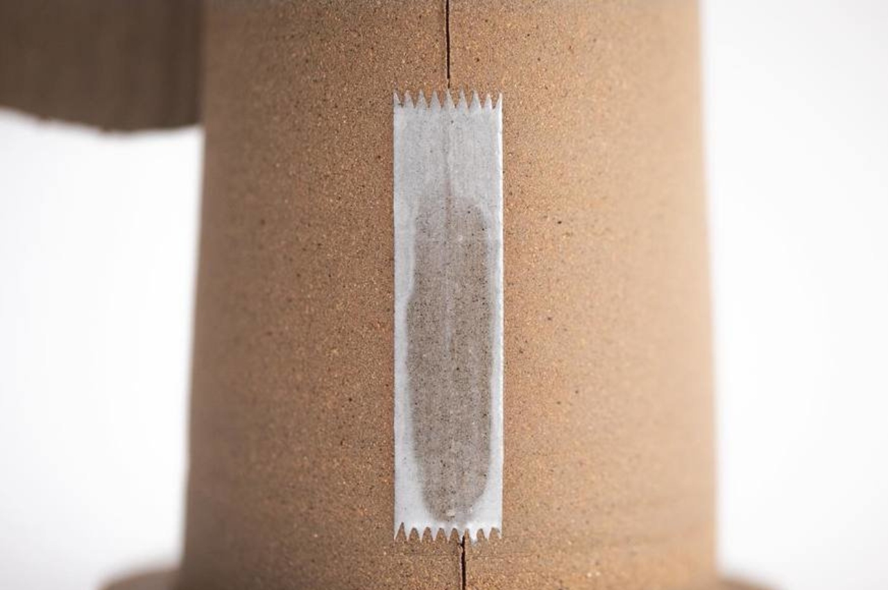
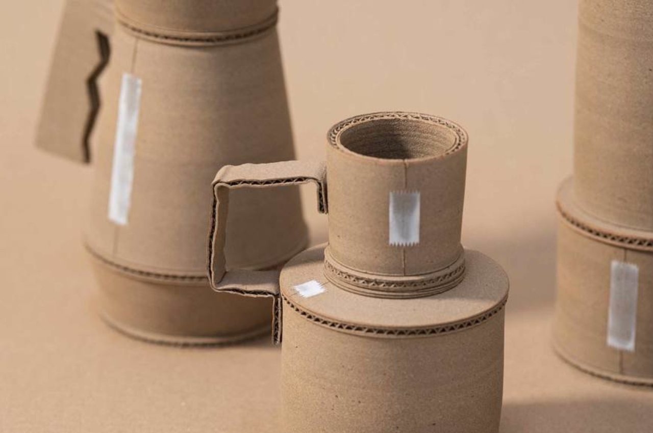
The designer wanted to maintain the texture and visual characteristics of cardboard while at the same time retaining the ceramic properties of the items. The basic idea of the design is to make it look simple enough, like three pieces of cardboard + two pieces of tape makes a pitcher. He had to blend three distinct stonewares for the main body while the tape-like item was crafted from glaze.

If I just saw a photo of these items without knowing the context, I really would have been fooled that they were made from cardboard. Monneraud wants viewers to actually think about how perception and reality can be inextricably linked and is more complex than just the surface. While cardboard is normally a disposable object, the designer believes his work can actually last for more than 3,000 years.

The post ‘Is it cardboard?”: Ceramic art blurs line between perception and reality first appeared on Yanko Design.

ASUS Ceraluminum brings beautiful ceramic and durable aluminum laptops

Gone are the days when laptops were seen just as technical equipment needed to get work done. Just like with smartphones, they have also become part of our modern lifestyles and a reflection of our own selves. What all these mean is that people are now more conscious of the design of the laptops they purchase, not just the specs or the brand. Yes, there are still many that look like tanks with rainbow lighting accents, but even some more powerful notebooks now have sleeker and more refined aesthetics as well. To keep up with more discerning consumers, ASUS has engineered a new kind of material for the outer lid of their newest and most premium laptop that combines the lightness of ceramic with the durability of aluminum into an elegant surface that just screams “luxury.”

Designer: ASUS

Laptop lids are often made of either plastic or metal because of their resilience and durability. Of the two, metal, which usually means aluminum, is considered more premium but also tends to be heavier and sometimes uncomfortable due to how cold it is to the touch. In contrast, ceramic is equally premium yet almost the opposite of metal: lightweight, warm to the touch, and sadly also fragile.

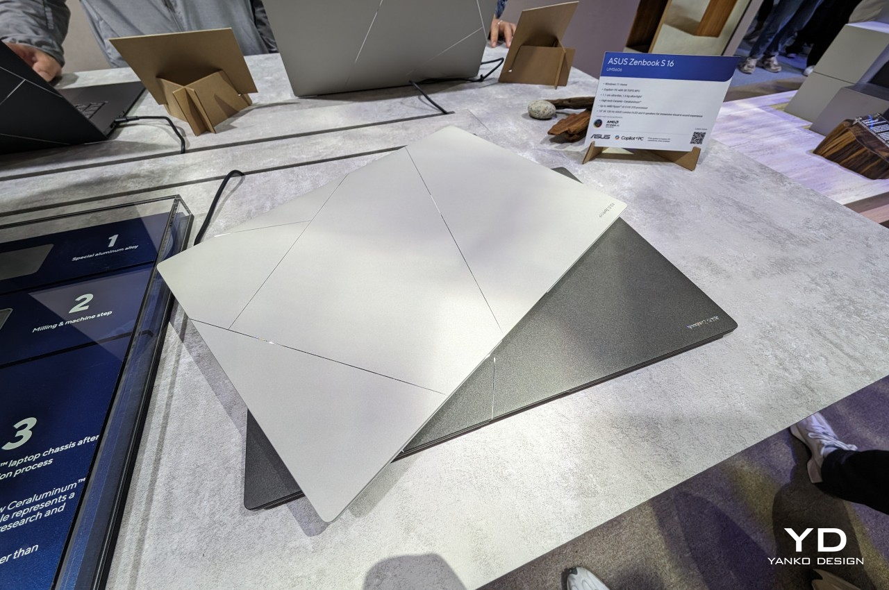
ASUS has aimed to bring the best of these worlds together and has created the portmanteau “Ceraluminum” to mark the success of their years of research and experimentation. In reality, it is actually aluminum but treated in a special process, which it unsurprisingly calls “ceramization,” which gives it the properties of ceramic. This “hi-tech” new material boasts being lighter than steel yet also more durable than actual ceramic. More importantly, the material focuses as much on the tactile experience as on the aesthetics. Like ceramic, Ceraluminum is not only cool to the touch but also gives the fingers a better grip on the laptop’s lid.

Ceraluminum is still a novel material and it might not be ready for truly mass production just yet. For its maiden voyage, ASUS has chosen its new Zenbook S 16 to be the first to benefit from this amalgamation of two of the most premium materials known in the industry. It’s a perfect match as well, given how incredibly thin and lightweight the laptop is. It looks premium and definitely feels premium, a fitting exhibit for Ceraluminum’s equally premium properties.

In addition to its elegant material, the ASUS Zenbook S 16 also brings nature-inspired colors to match. Zumaia Gray takes inspiration from flysch cliffs in Spain, while Scandinavian White mimics the warm light of the sun on snowy mountains. Even this color is a product of sophisticated materials research, modifying the molecular structure of copper and oxygen atoms to give off a different color while using the same aluminum oxide material as other colors. The ASUS Zenbook S 16 is, in the final analysis, an exhibit of the brand’s innovation in creating new materials meant to delight not just the eyes but also your fingers and elevate your laptop experience.

The post ASUS Ceraluminum brings beautiful ceramic and durable aluminum laptops first appeared on Yanko Design.

Reimagined clay water filter uses white ceramic for a better design (and taste)

Brazil apparently has one of the most effective (and affordable!) water filtration systems in the world. You can find clay water filters in almost every home and markets and they are actually created by local craftsmen. There are some challenges to this though as it is not always aesthetically pleasing and some people say there is a certain aftertaste to the water that goes through this system. There is even sometimes a problem about mold as well. Now a reinterpretation of the clay water filters may have solved some of those issues.

Designer: Estúdio Biologique

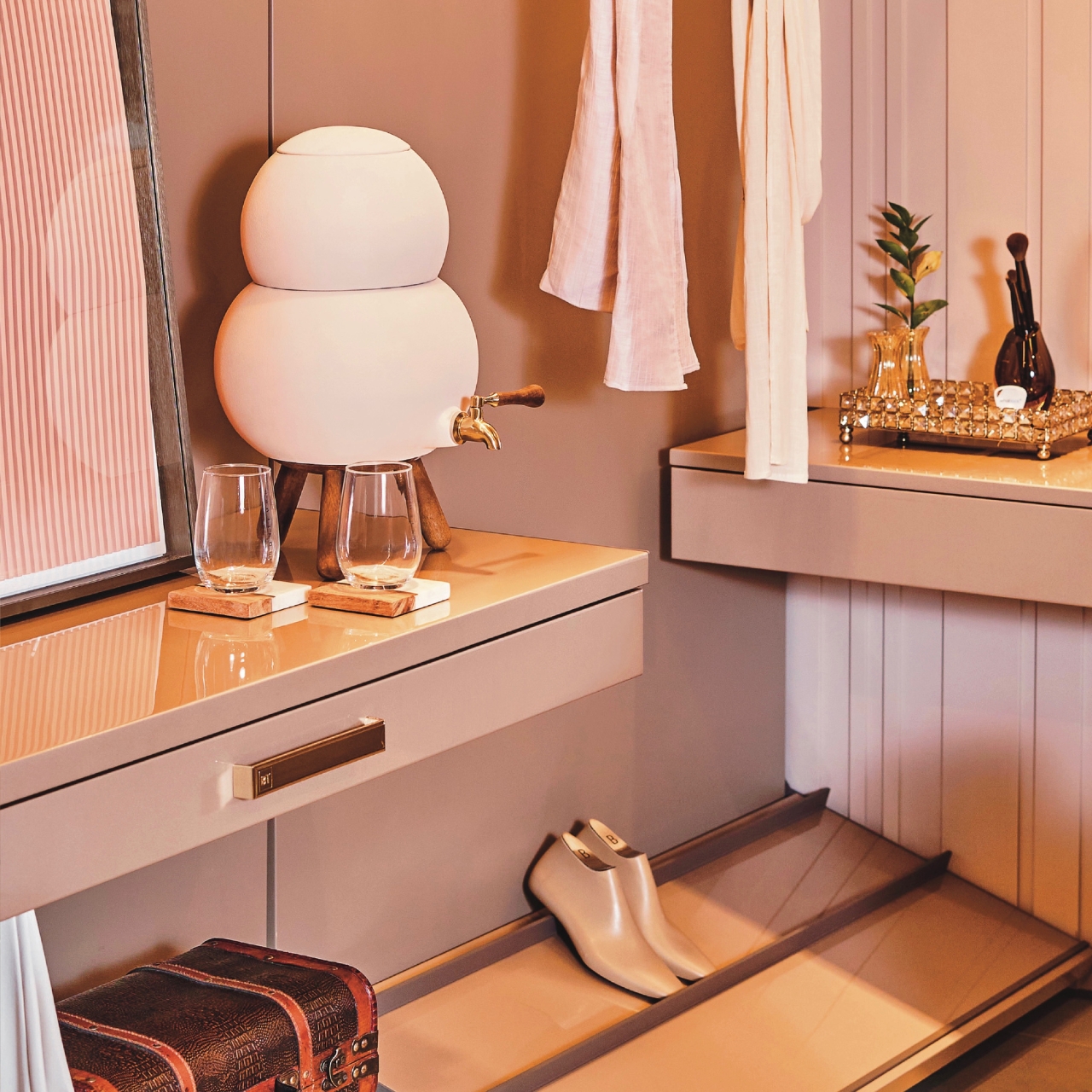
A Brazil-based design studio has come up with the Biologique water filter which still uses the same filter system. However, it uses white ceramic so that the water should taste about the same but of course it is filtered. It also doesn’t leave any mold but is also easy to clean, which was also a problem with the traditional filter. The important thing though is that it is able to bring clean, drinking water with the simple filtration system that doesn’t require any complicated installation or instructions.

For those that are concerned with the aesthetics of the water filter, then this is also where Biologique shines. It has a simple, minimalistic design that still keeps the original idea of the clay water filter but brings a more modern feel to it. It has two round parts on top of each other, a wooden stand, and a faucet that looks like those you find in draft beer machines. It comes in different colors: terracotta, rosé, green, brown, off white, black, gray, and capuccino.

The Biologique water filter comes in 9.0L and a petit version in 4.5L so you have two options depending on your space and the drinking water capacity of the people you live with. Of course it is more expensive than the traditional clay water filters that you’ll find in the usual Brazilian households. That’s the price you have to pay to have something prettier and better designed. Estúdio Biologique says their products are done by hand and on a small scale, so that’s also one of the reasons for the price point.

The post Reimagined clay water filter uses white ceramic for a better design (and taste) first appeared on Yanko Design.
Ceramic-inspired keyboard brings a splatter of Italian design to your desk

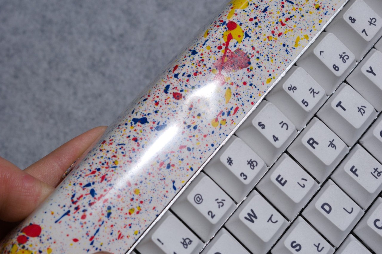
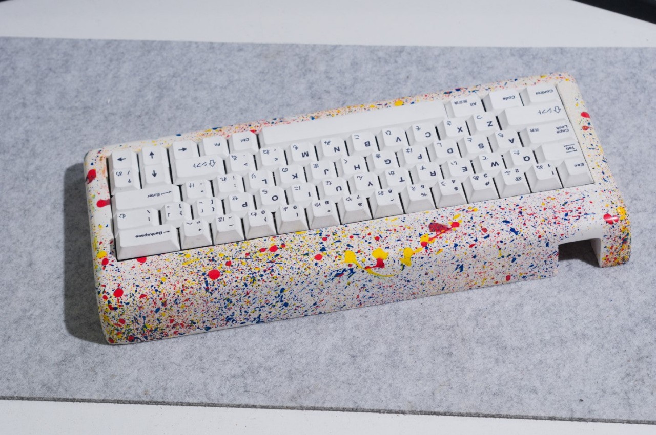
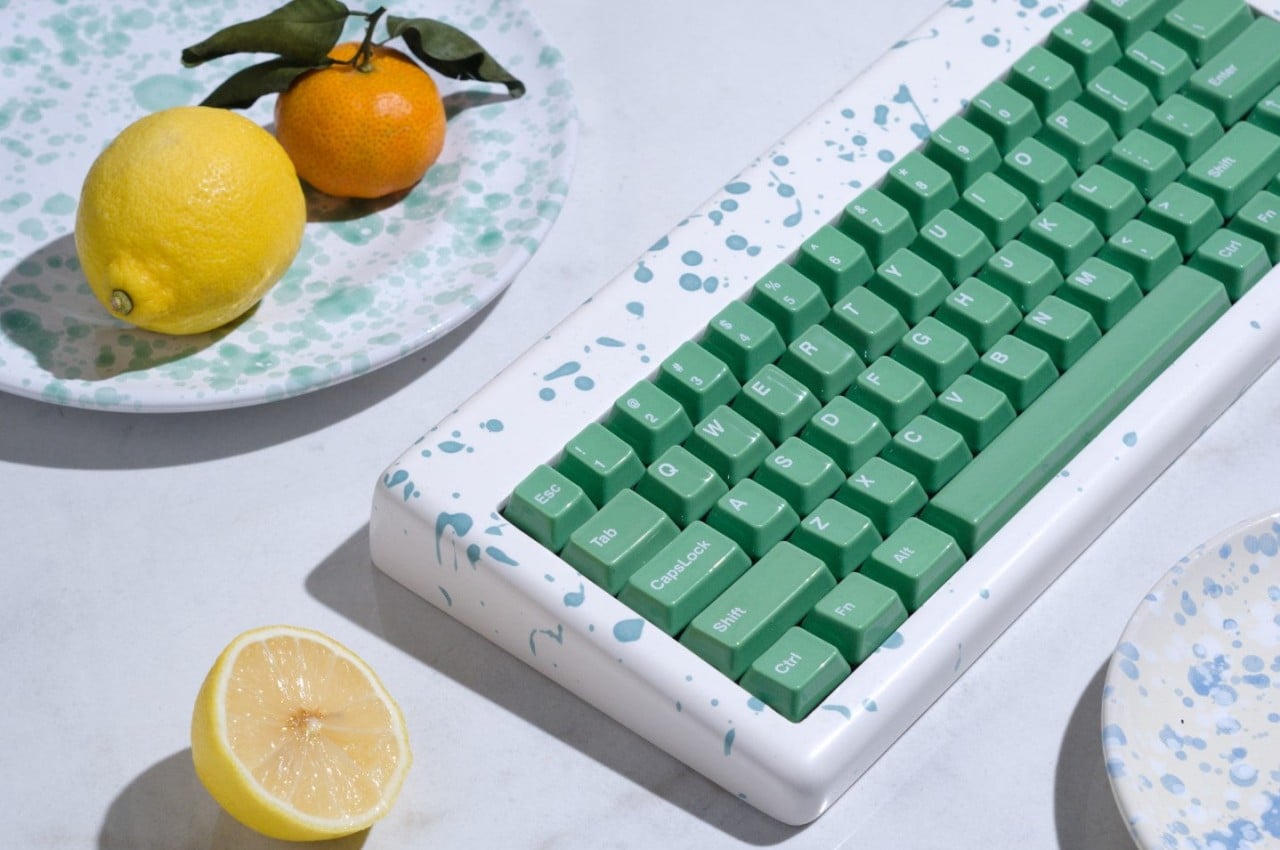
Computer keyboards are often regarded as purely utilitarian products. Aside from the RGB lighting that gaming-focused keyboards have, the majority of the designs tend to lean towards black or white color schemes, with a few colorful exceptions here and there. These input devices are rarely considered works of art, or even anything related to art. Of course, there is a very small number that doesn’t fit inside this box, putting as much attention to aesthetics as is paid to performance and ergonomics. This rather peculiar keyboard design, for example, splatters a variety of colors on the case, recreating an artistic style used by Italian artisans to create their rather unique and artistic ceramic.

Designer: Brazen Studio

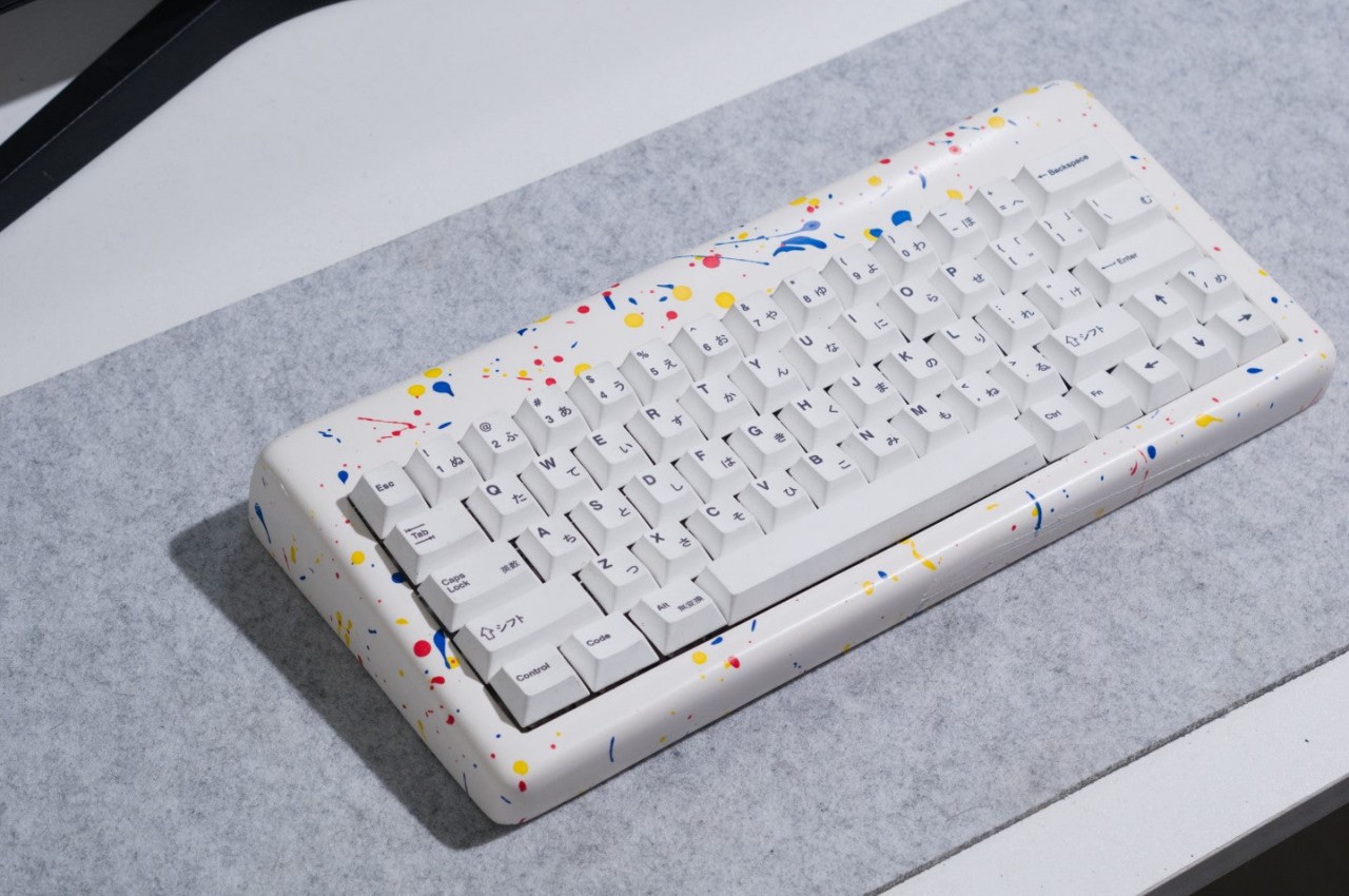
Some people might have preconceived notions of what ceramic products look like, either completely brown like clay jars or pure white with elaborate patterns painted on their glossy surfaces. Italy, however, has another and rather unique variation to that design, employing a technique called “schizatto,” which literally means splatter, to glaze and decorate their ceramics. The end result is, as the name suggests, a splattering of paint drops with random shapes and volume, giving the design a unique and whimsical character.

That’s the kind of unconventional appearance that the Mason60 keyboard cases deliver, adding not just visual interest but also an element of fun to your computer use. Each keyboard case is individually hand-crafted using this artistic technique, making every single one an exclusive limited edition product of sorts. And since no two splatters will ever be the same, each case carries its own personality, reflecting not just physics but the artist’s “brush” during the time of its creation as well.

The Mason60 Schizzato series doesn’t stop at just mimicking the appearance of those artisan ceramics. Made from gypsum resin composite, the cases give keyboards a heft that’s not unlike those very same ceramic products. The material is also polished to give it a glossy finish that one might even mistake for real marble. In other words, the Mason60 will really make your keyboard look and feel like an authentic Italian ceramic product, or at least something that definitely looks artistic from any angle.

It’s too easy to take for granted how a simple change to the keyboard’s appearance could affect your use of the computer. Yes, it won’t directly affect your typing experience, at least depending on the kind of keys and switches you will be pairing with these cases, but it will affect your mental state at the very least. If you spend a lot of time in front of the computer, having something beautiful and interesting always in your sight could definitely help perk up your mood and stimulate your brain. Plus, it never hurts to have something so novel and unique as a conversation starter and maybe even a source of envy among your friends.

The post Ceramic-inspired keyboard brings a splatter of Italian design to your desk first appeared on Yanko Design.
Non-electric humidifier also serves as charming desk or shelf decoration

The quality of air that we have around us doesn’t simply depend on the lack of pollutants or harmful substances. The amount of humidity can also be a determining factor in the comfort and health of the people living inside the space. Fortunately, we can also control this aspect of our environment, at least when we need to increase the humidity in a room. There are plenty of humidifiers in the market today, but almost all of them have one thing in common. They rely on electricity to work, which isn’t a sustainable way of living. Fortunately, there are a growing number of such tools that are adopting more natural methods, and this mini humidifier, in particular, accomplishes that while also acting as an eye-catching piece of decoration for your home.

Designer: Barbora Adamonyte-Kei

Low humidity has been a problem since the beginning of human civilization, and our ancient ancestors had ways of dealing with that, even when there was no electricity or machines to do it for them. The most common method that is becoming popular again is saturating clay structures with water in order to give the evaporation process a helpful nudge. Of course, not everyone might want to put large clay pots or barrels in the middle of their house, but sometimes just a little can already get the job done.

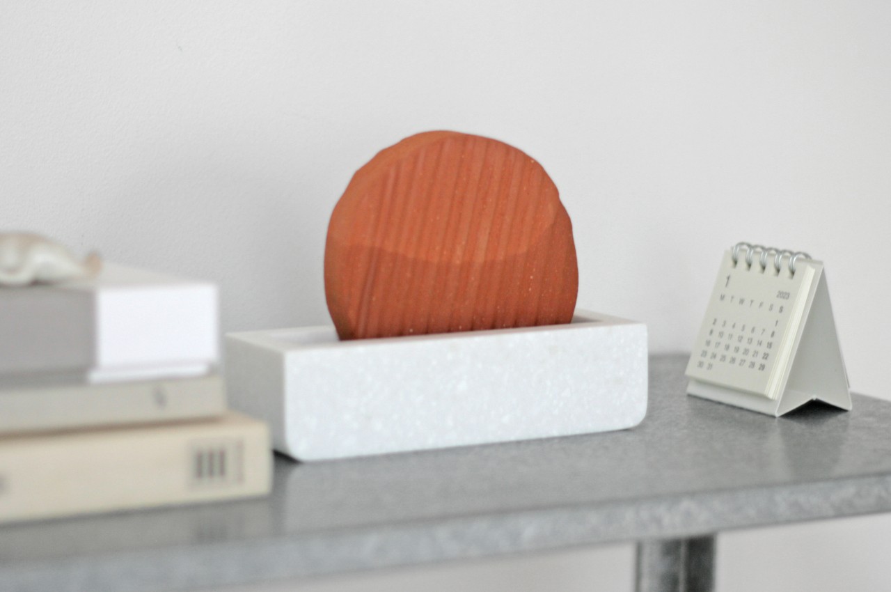
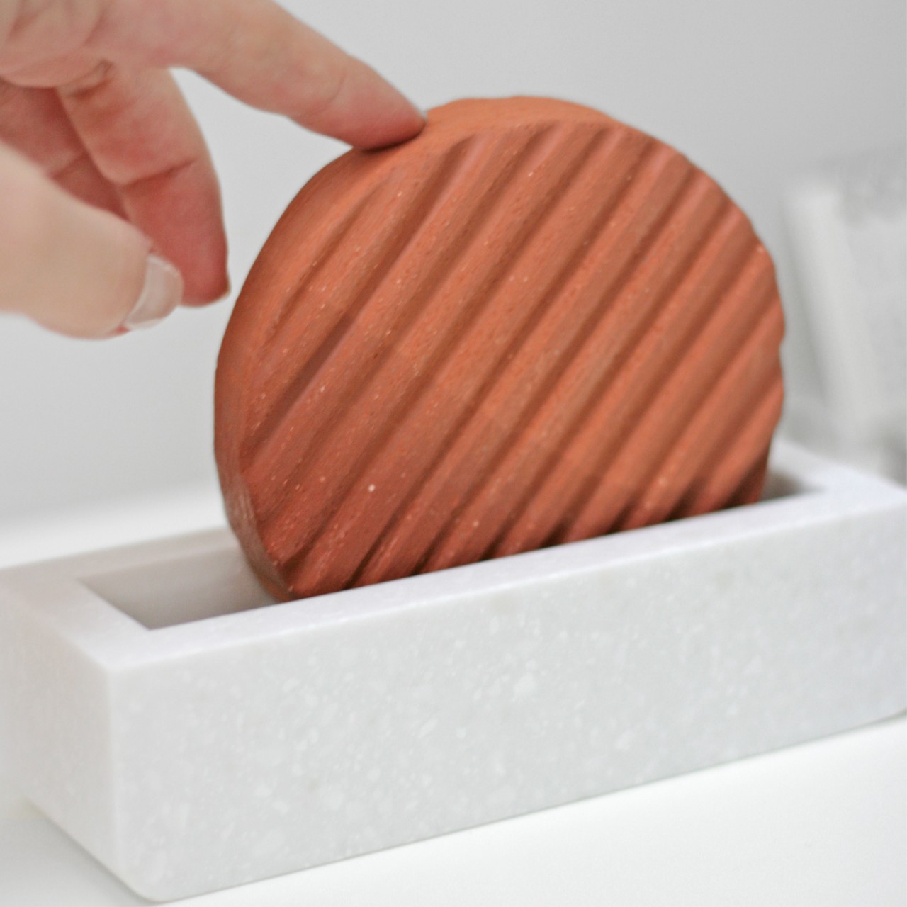
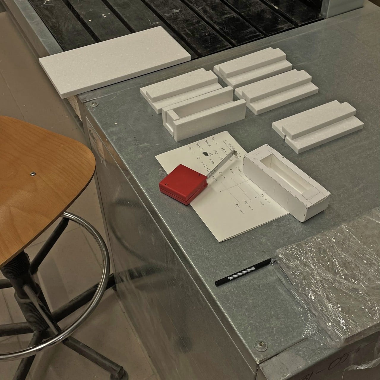
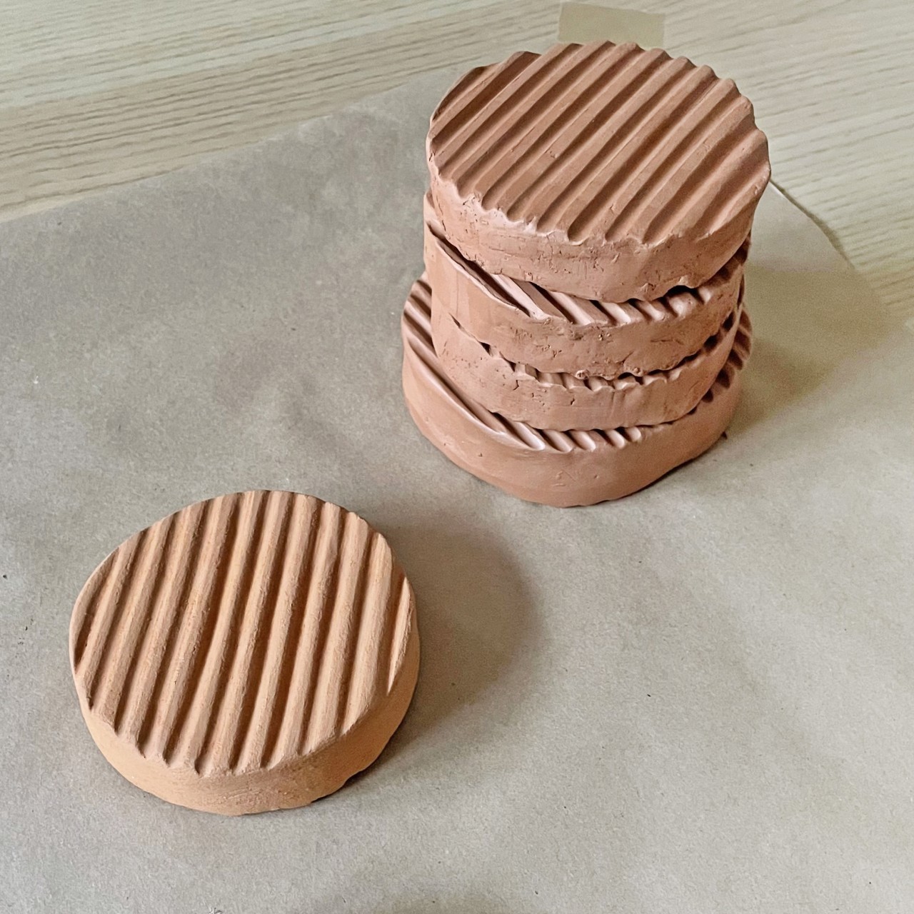
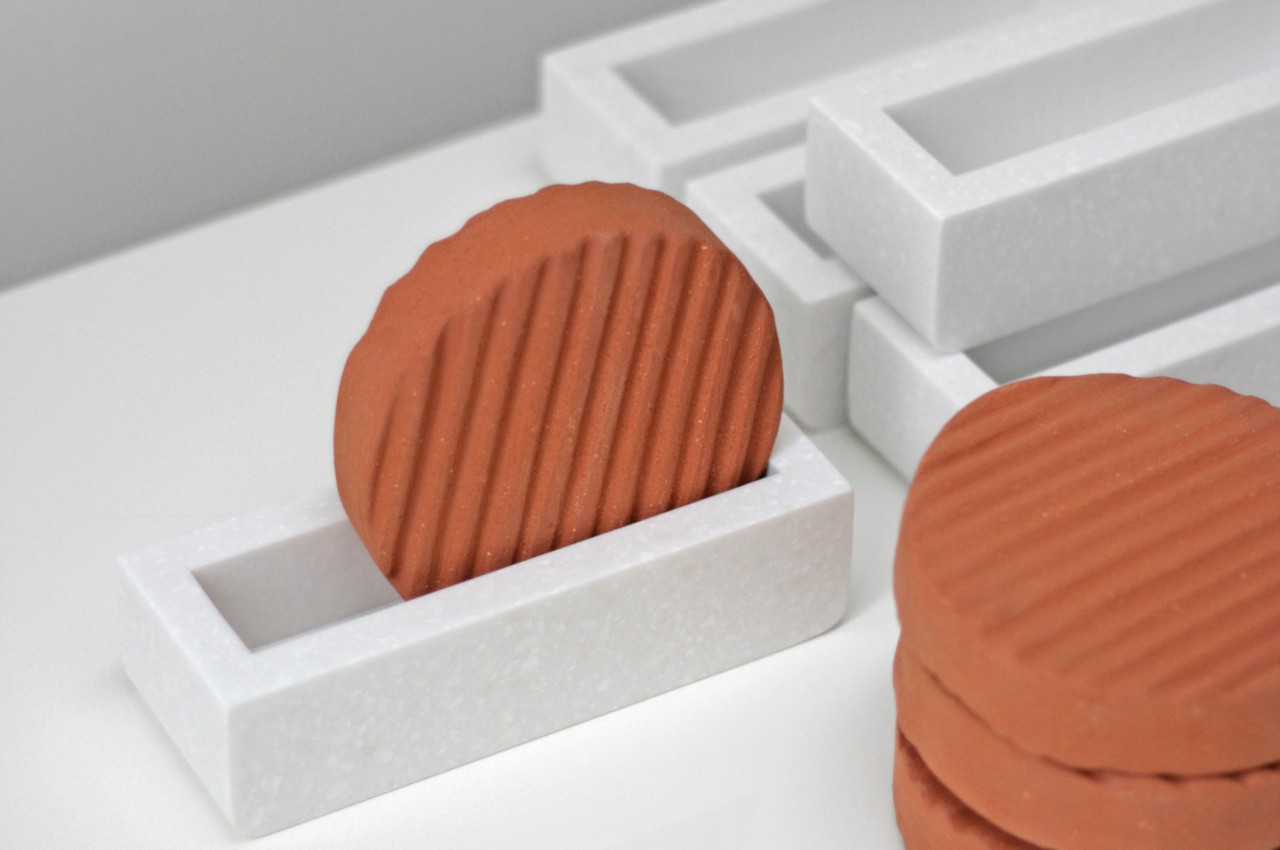
KUMO is a beautiful humidifier that works using that same principle but in an almost bite-sized chunk that actually serves three purposes in a single design. It is composed of two parts, both made from natural, sustainable materials. One is a miniature stone bath with a narrow basin where you put the stoneware disc in. That unglazed stoneware disc is the “clay” part of the humidifier, and it’s shaped like a wavy cucumber slice that makes the whole composition look like you’re dipping a healthy cucumber snack.

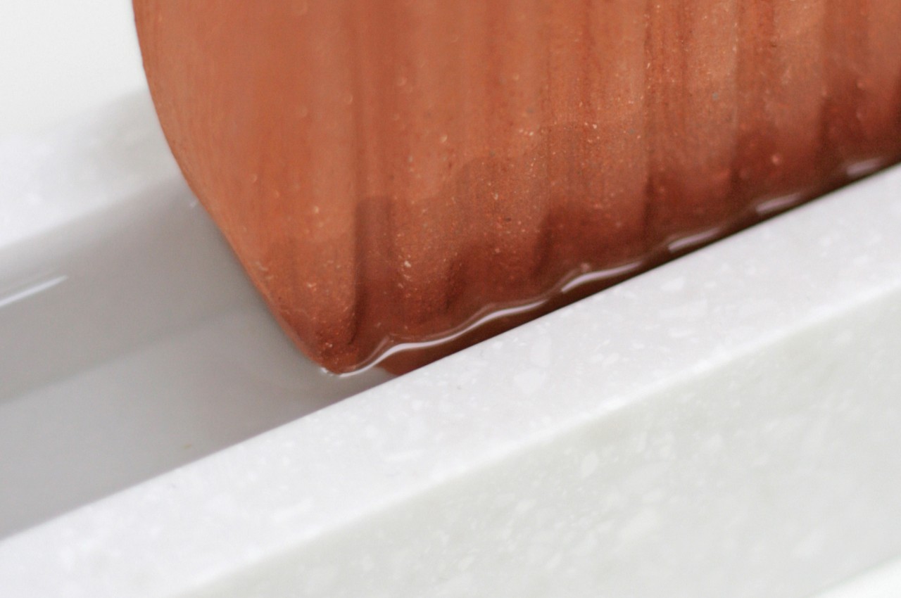
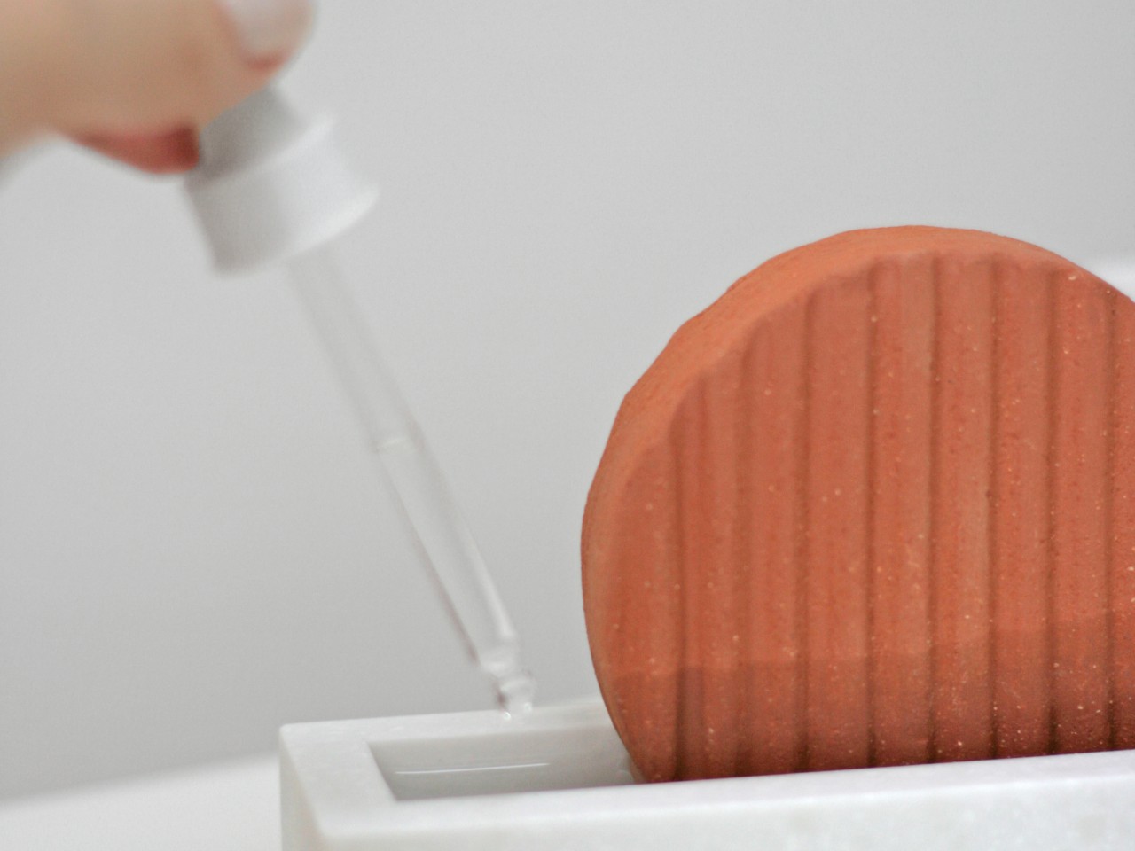
All you really need to do is to add some water to the bath and then put the disc in, which will stand still thanks to its close fit. It will absorb the water, which then evaporates more easily into the surrounding air to increase the humidity. Refill the water once it’s all used up, and that’s pretty much all there is to it. You can also opt to add a few drops of essential oil to increase the fragrance in the room, making the humidifier also act as a natural diffuser.

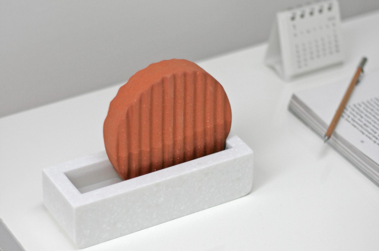
And, of course, it also looks great while doing its job. The pleasant combination of shapes and the contrast of colors make it an interesting visual piece, whether it’s on your desk or on a shelf. It’s definitely something you’d want to show off, unlike run-of-the-mill electric humidifiers that are just plastic containers puffing out vapor. Sustainable, multifunctional, and beautiful, KUMO puts a unique twist on the concept of a humidifier, showing that the ancients might have had the right idea all along.

The post Non-electric humidifier also serves as charming desk or shelf decoration first appeared on Yanko Design.
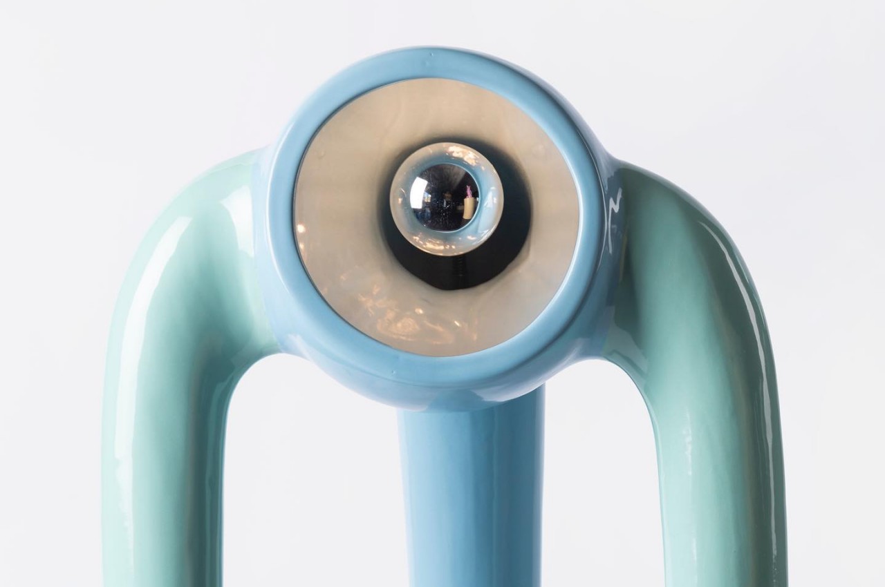
These alien-looking floor lamps are both cute and creepy

There’s no better conversation starter than lamps that look like they’re out to get you and embrace you.

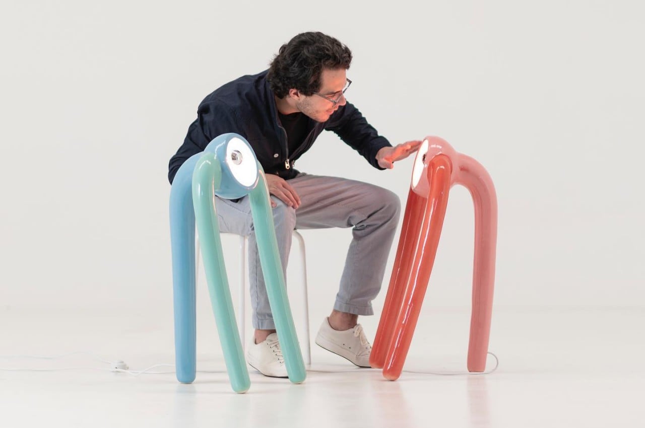
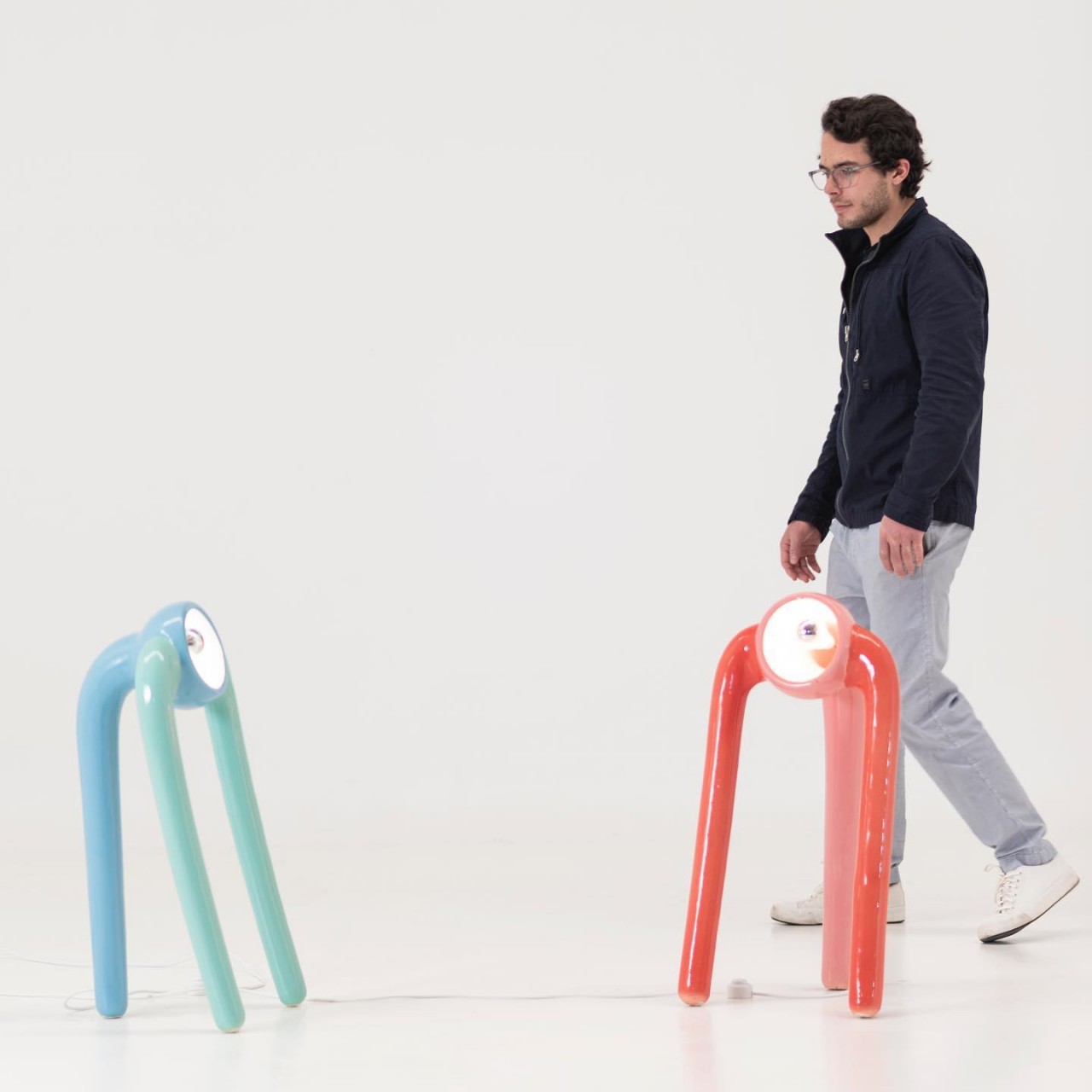
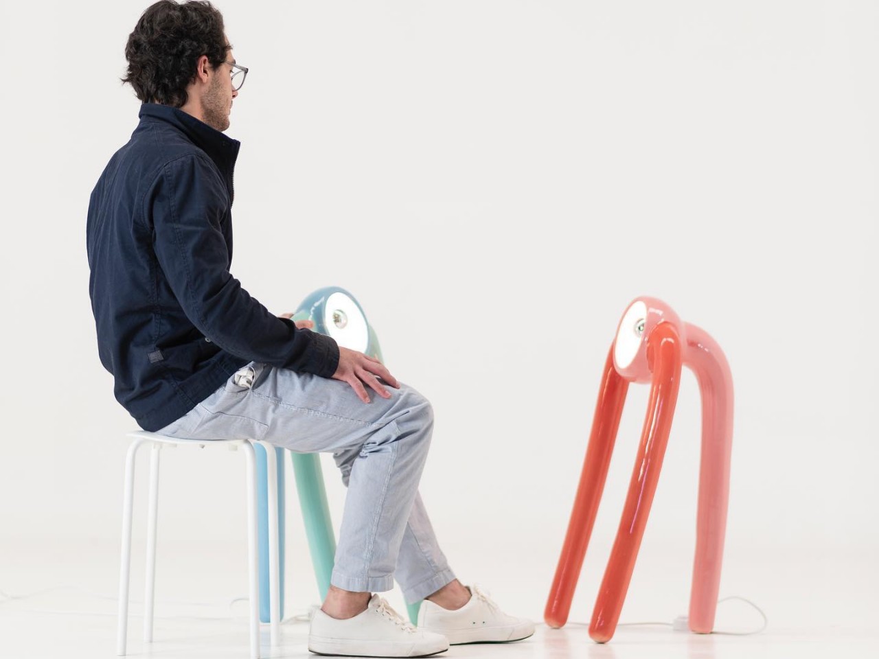
Most lamps are purely functional fixtures, especially at home, where they are used to provide adequate lighting to a space. Some lamps, like chandeliers and pendant lamps, are also decorative pieces that accentuate a room. There is, however, also a class of lamps that are more for show than function, serving a purpose beyond illumination. Sure, they can probably still light up a room to set a mood, but they can be forgiven if they don’t. “The Pink Robots Won” definitely falls under the category of decorative lighting that may or may not brighten up a room sufficiently, but these lamps will definitely get people talking and maybe even gushing because of their eclectic forms that inspire both awe and unease in equal measures.

Designer: Marcelo Suro

Nothing sparks the imagination more than an object that is both unnerving and adorable at the same time. Not everyone would describe E.T. as “cute,” but most find the creature interesting because of that well-balanced contrast. These self-standing ceramic floor lamps also evoke the same emotions, leaving viewers confused about whether they’re appalled or attracted to their alien forms.

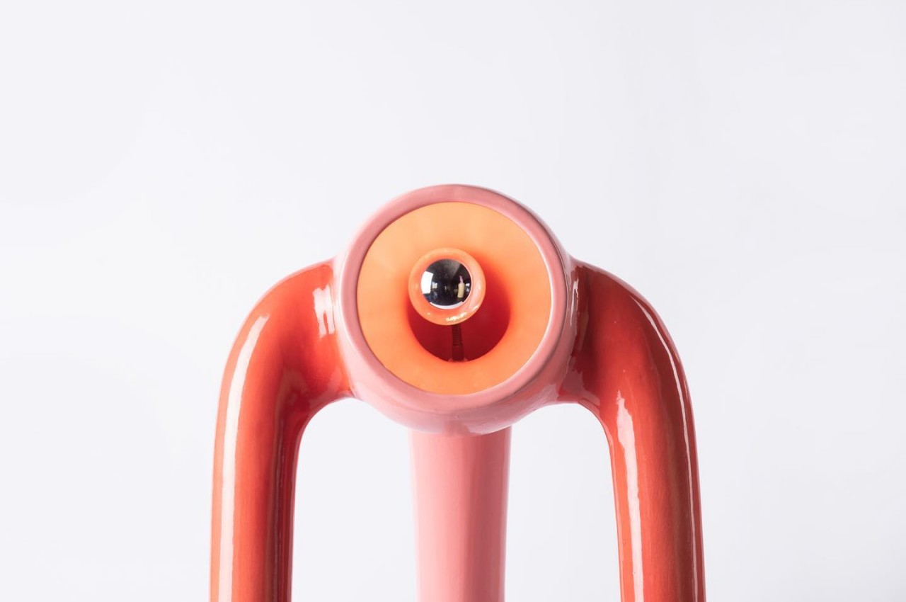
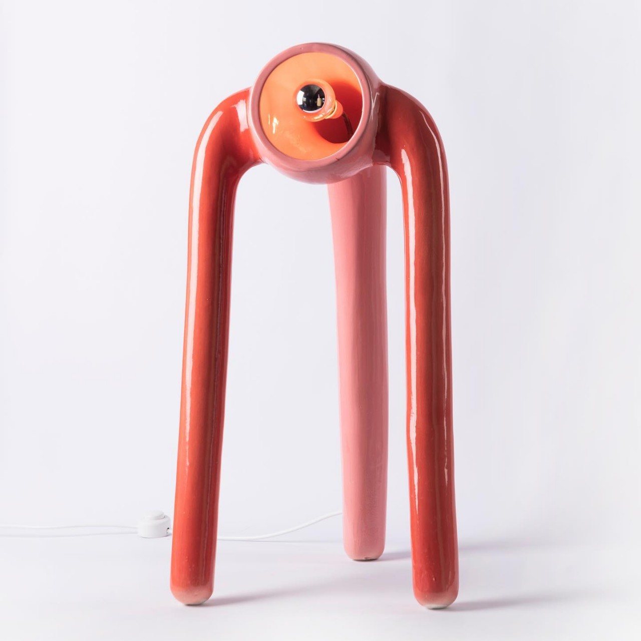
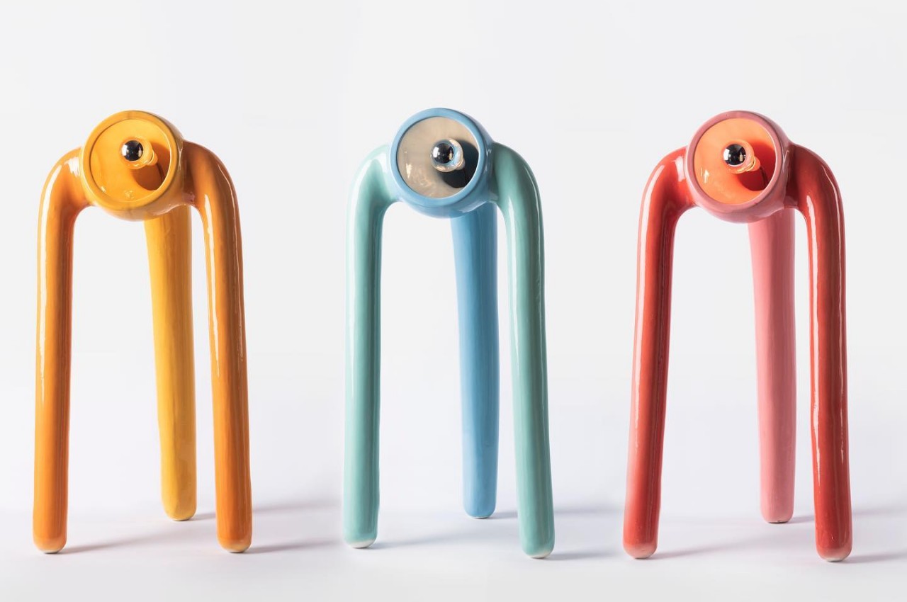
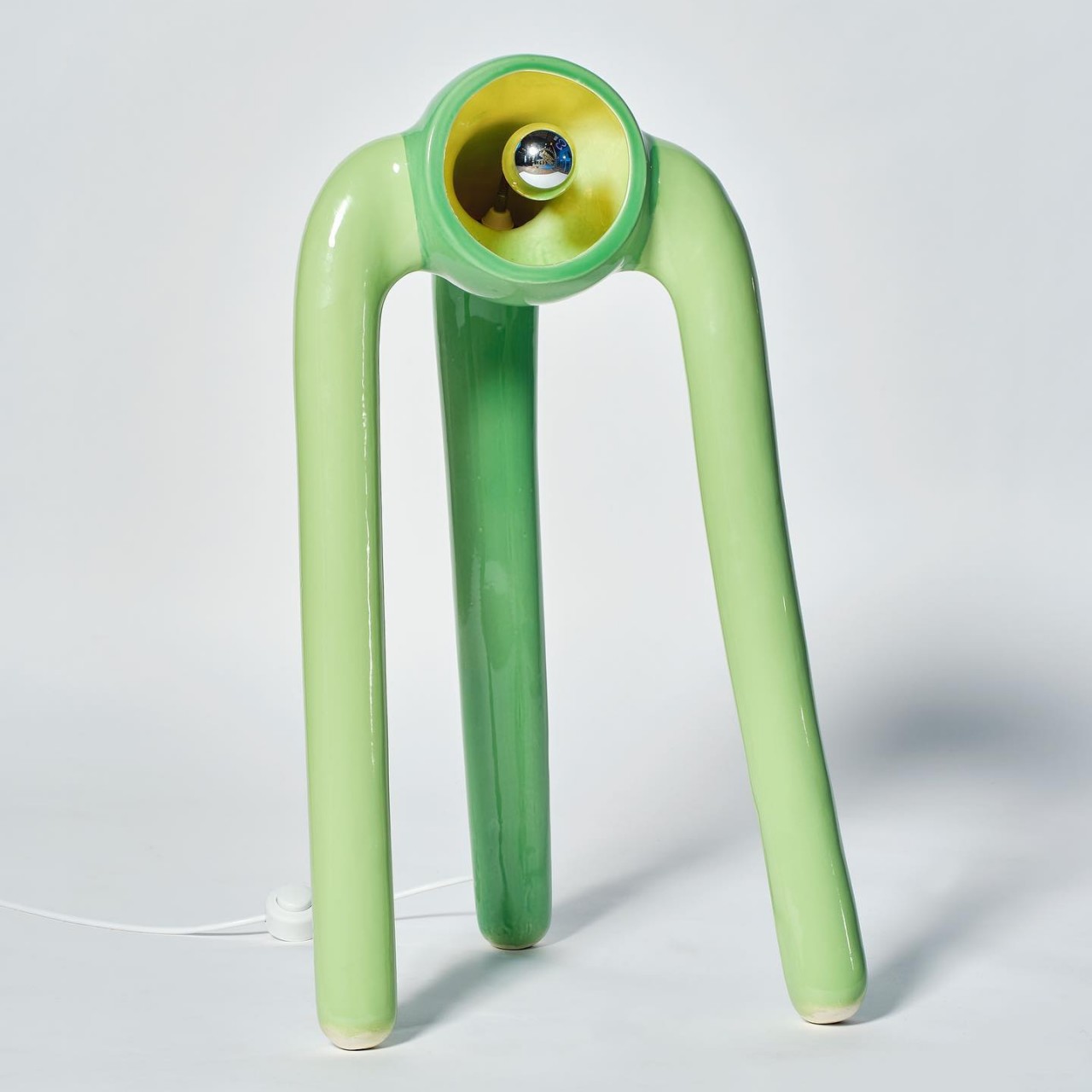
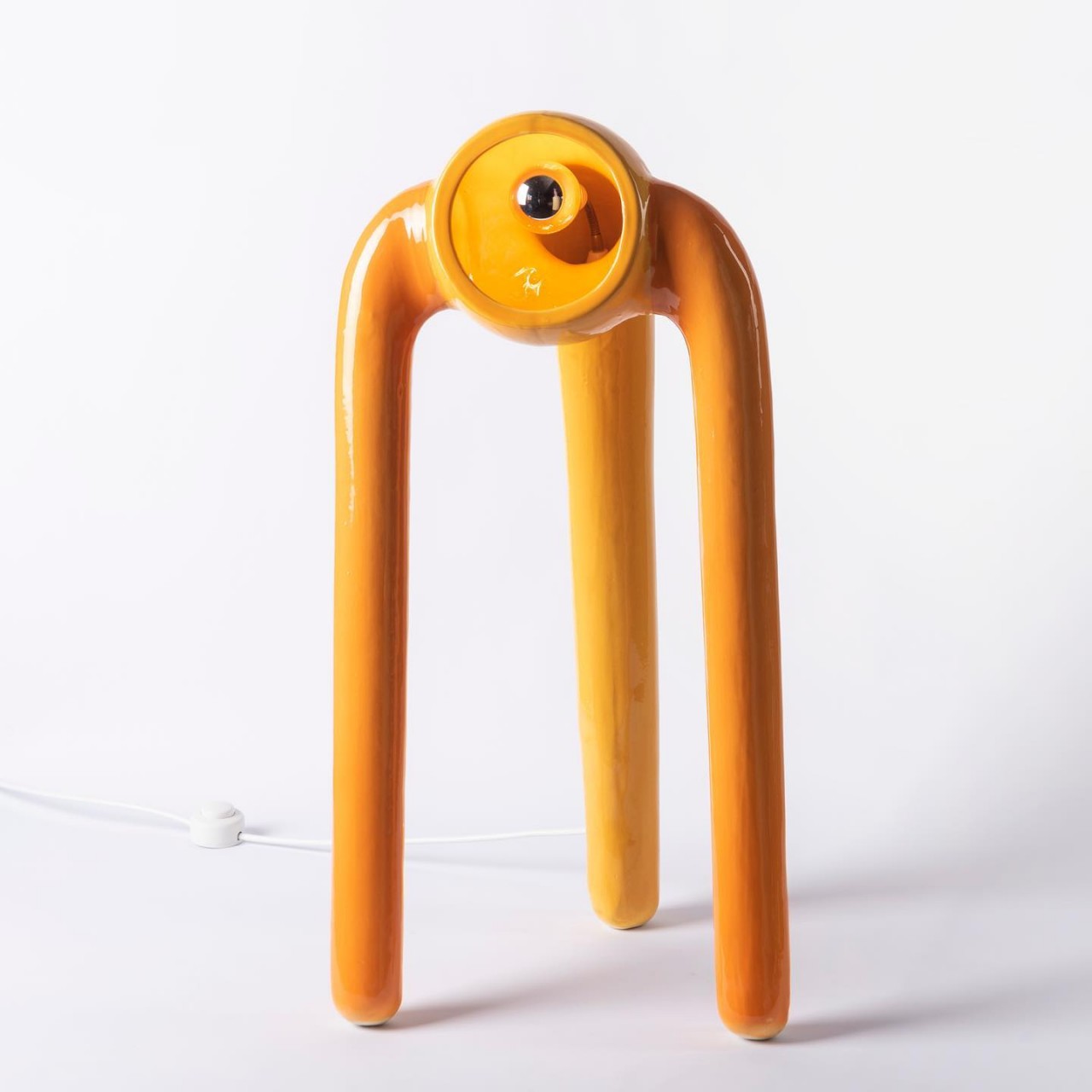
On the one hand, the lamps look like they are single eyes with three tentacles dangling down, probably reminding some pen and paper gamers of the monster known as the Beholder. On the other hand, they also look like alien creatures standing precariously on three legs, with a curious eye on the lookout for people passing by. Either interpretation gives The Pink Robots Won a life of its own, so far removed from typical floor lamps that simply stand still.

The lamps are also an exercise in ceramic techniques, particularly in creating uneven shapes that are still balanced enough so that they don’t simply topple over or break. There’s almost an element of dynamism in the design of the creatures, creating further ambiguity in the viewer’s mind. Is the single-eyed alien simply leaning back, or is it about to topple backward? The confusion sparks the imagination, perhaps pushing people to create a mini-narrative in their heads about the eyeball with legs and its misadventures among humans.

The Pink Robots Won is full of contrasting elements, including the choice of materials and colors. Ceramic is naturally seen as a very fragile material, and the mere thought of these lamps falling over will probably send owners flying to their rescue. At the same time, however, the choice of pastel colors gives it a more playful character, reinforcing that image of a cute otherworldly creature coming out to play.

These ceramic floor lamps will definitely liven up a room, even though their upward angled lights create ambiance more than illumination. They creatively try to create the semblance of a living creature, even if an unnatural one, through a static piece of appliance. Compared to most lamps, it definitely has character and charm, though don’t be surprised if you find yourself looking over your shoulder often as if someone or something is watching your every move.

The post These alien-looking floor lamps are both cute and creepy first appeared on Yanko Design.
Huawei GT3 Pro brings classic luxury designs to smartwatches

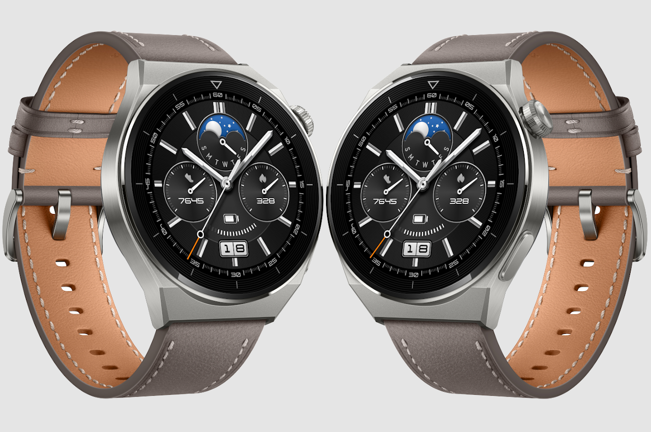
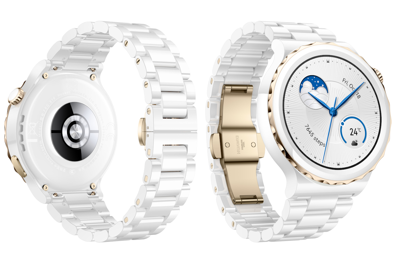
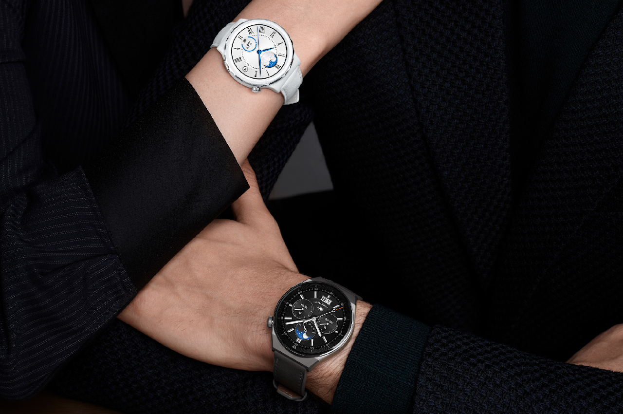
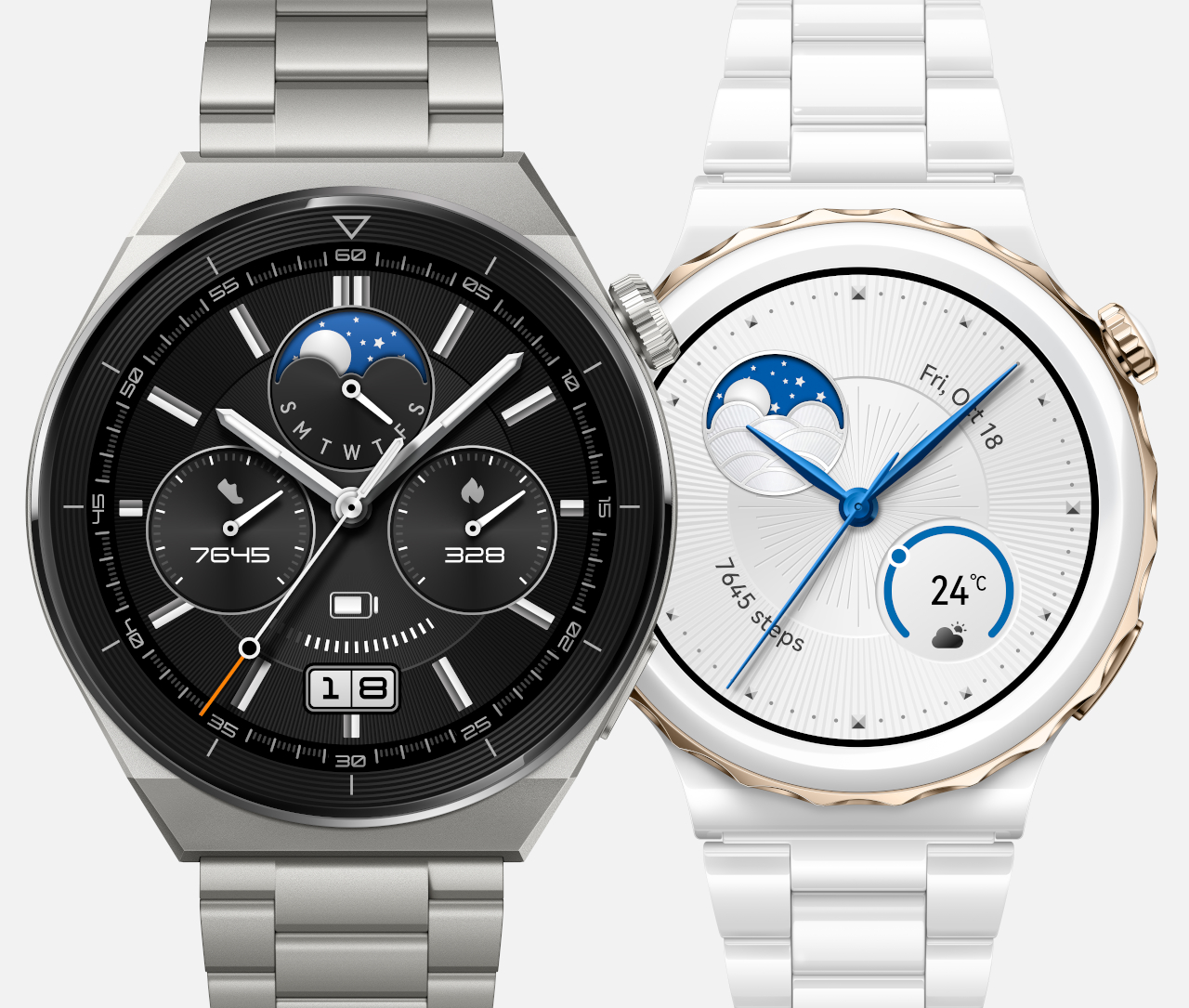
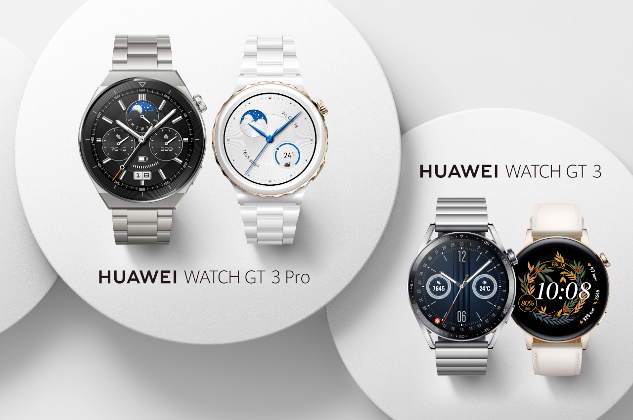
If Google is going for a modern, futuristic motif with their recently announced Pixel Watch, Huawei is going for the complete opposite with their latest flagship smartwatch, the Huawei WATCH GT3 Pro. Huawei realized that people who are used to wearing watches on their wrists are more likely to adopt smartwatches if they look more like their beloved timepieces, so they designed the new GT 3 Pro series to please traditional watch lovers. Taking inspiration from classic watch design with a round watch face and crown, the new Huawei wearables come in two distinctive styles, one made of titanium and the other formed from ceramic, and both look gorgeous, especially on your wrist.

Designer: Huawei

The 46mm Titanium edition is the larger of the two, measuring 46.6mm x 46.6mm x 10.9mm and weighs approximately 54 grams without a strap. That size isn’t just for show, though, since it packs a large 1.43 inch AMOLED display, with a spacious 466×466 326 PPI screen housed in a titanium case with sapphire glass on tap. Despite the mostly Titanium body, it has a ceramic rear that went through 60 processes to transform zirconia ceramic powder into this elegant finished form. The Huawei GT3 Pro Titanium model also borrows a classic rotating crown from traditional watches, offering an easy-to-use control to zoom in and out or scroll through the user interface.

In comparison, the Ceramic edition comes with a smaller 43mm body at 42.9mm x 42.9mm x 10.5mm and weighs approximately 50 grams without a strap. Despite the smaller body, it still features a 1.32 AMOLED display with 466×466 pixel resolution and a higher 352 PPI. It is the first all-ceramic smartwatch, with both the body and rear using the premium material. Like the Titanium edition, however, the screen is protected by tough sapphire glass.

The luxurious design of Huawei’s latest smartwatches goes beyond just their bodies. The series offers a range of watch faces, including exclusive watch faces designed by IED students, giving the digital surfaces more familiar classic faces. There is also a new day-and-night watch face feature that dynamically changes the watch face according to the time of sunrise and sunset, something traditional watches can only dream of. The straps are also made from premium material, depending on which edition you grab. The Titanium edition has thee three different strap options available, including black fluoroelastomer, grey leather strap, and titanium bracelet. In contrast, the Ceramic edition only has two variants, one with a gold bezel ring and a ceramic strap, and the other with a silver bezel ring and a leather strap.

Of course, the Huawei GT3 Pro is more than just a nod to classic timepieces and is a smartwatch at its very core. It is equipped with an upgraded TruSeen 5.0+ with improved heart rate monitoring, which includes an ECG function on both models, though availability and activation will differ by country. Huawei also upped its water-resistance with the GT3 Pro, allowing users to free dive up to 30 meters deep while wearing it, even in saltwater. Huawei continues to build on the successes of its inaugural smartwatch, offering an impressive battery life with the new GT line of smartwatches: 14 days for the titanium edition and seven days for the ceramic edition with regular usage.

Just like with analog and digital watches, each wearer prefers a different style and design for their trusty timepiece. Leaning more towards traditional aesthetics, the Huawei GT3 Pro delivers a timeless design while offering the modern trappings of today’s technology. Elegant, powerful, and enduring, the company’s latest wearables exhibit the smartwatch world’s best style and performance, just like the GT sports cars they are named after.

The post Huawei GT3 Pro brings classic luxury designs to smartwatches first appeared on Yanko Design.
OPPO Find X5 Pro Review

Smartphones are cool tech gadgets, but that doesn’t mean they can’t be breathtakingly beautiful as well.

It has been a long time since smartphones crossed the line between geeky devices to everyday must-haves. They have gone past being something that only grownups used for serious work to become a reflection of one’s lifestyle. Along with those changes in objectives, smartphones have also changed a lot in their designs over the years. Few, however, managed to successfully strike a balance between form and function, uniformity and identity. That’s part of why the OPPO Find X5 Pro piqued our interest because of its particular attention to design, earning the top spot in our Best of MWC 2022 awards list. That said, we take it for a good spin to see if it’s more than just a pretty face and if it offers enough to make it stand out from a market dominated by giants like Apple and Samsung.

Designer: OPPO

Aesthetics

Unless you’re a smartphone aficionado, smartphone designs probably won’t speak to you. Although they have shed their polycarbonate shells of the past, most smartphones today are plagued by large warts on their backs known as camera bumps. Many phone makers seem to have just given up and have, instead, decided to actually highlight those large structures in sometimes obnoxious ways. They dominate the visual center of the phone’s design, but in some cases, they look and feel almost simply slapped on rather than being an integral part of the device.

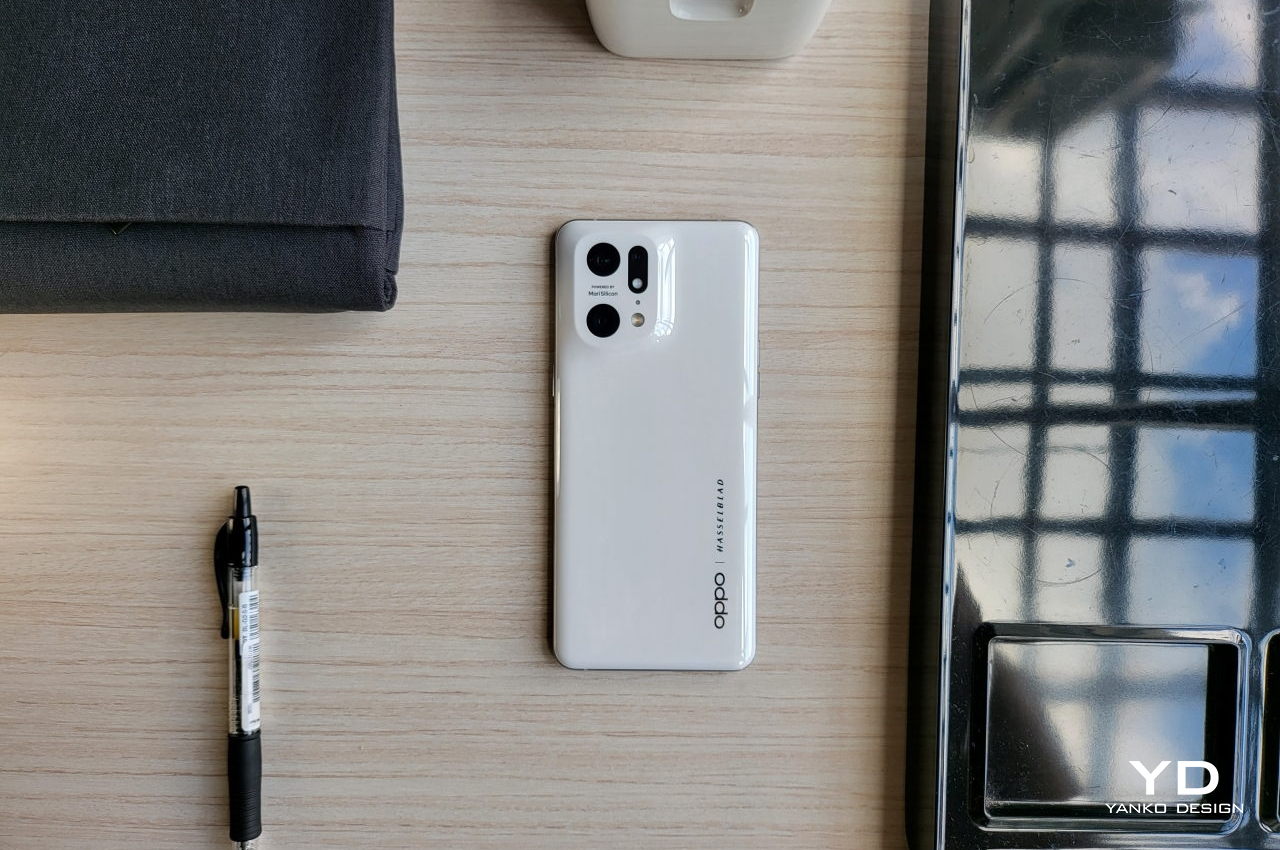
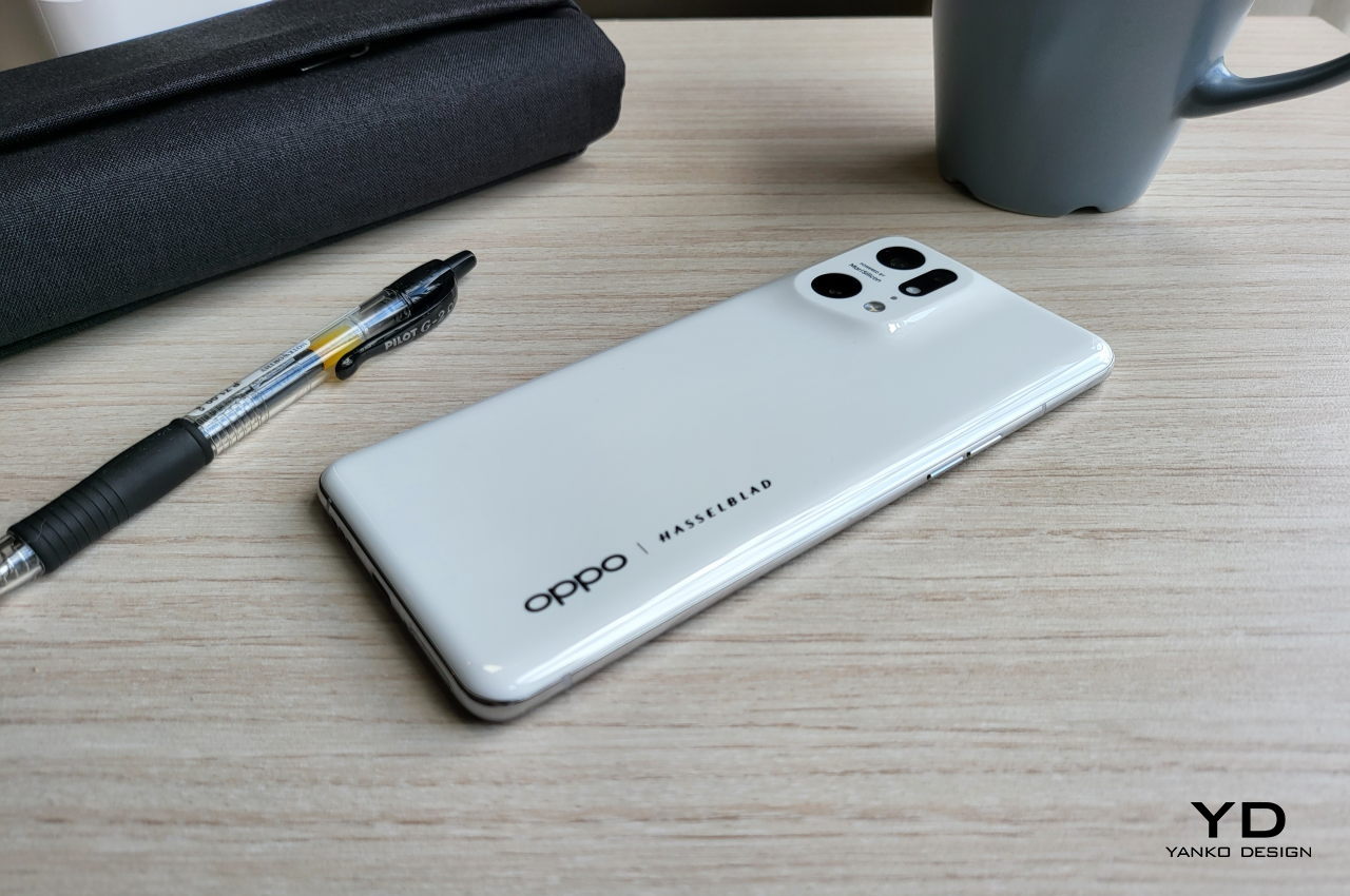
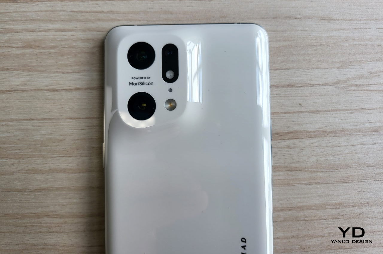
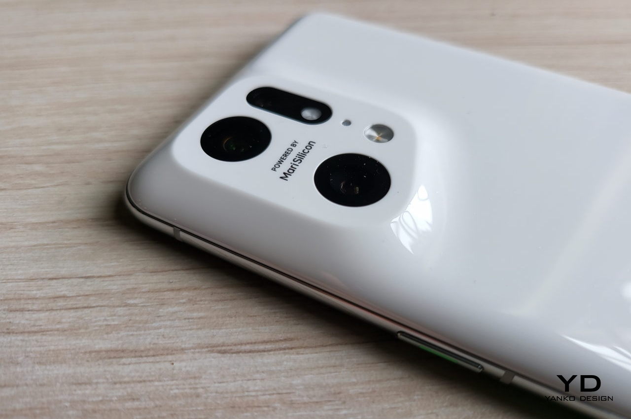
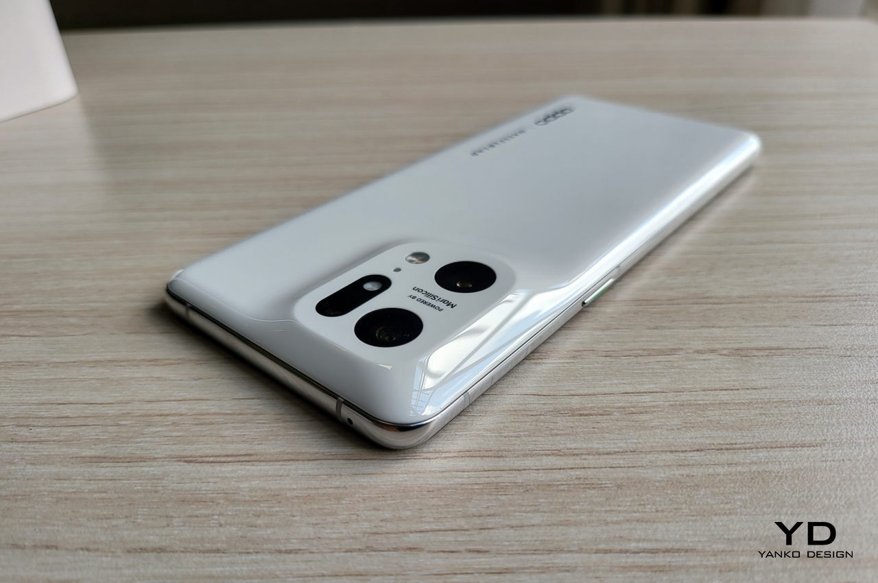
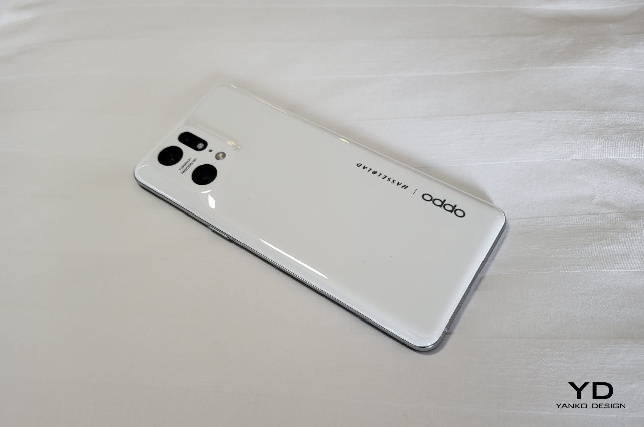
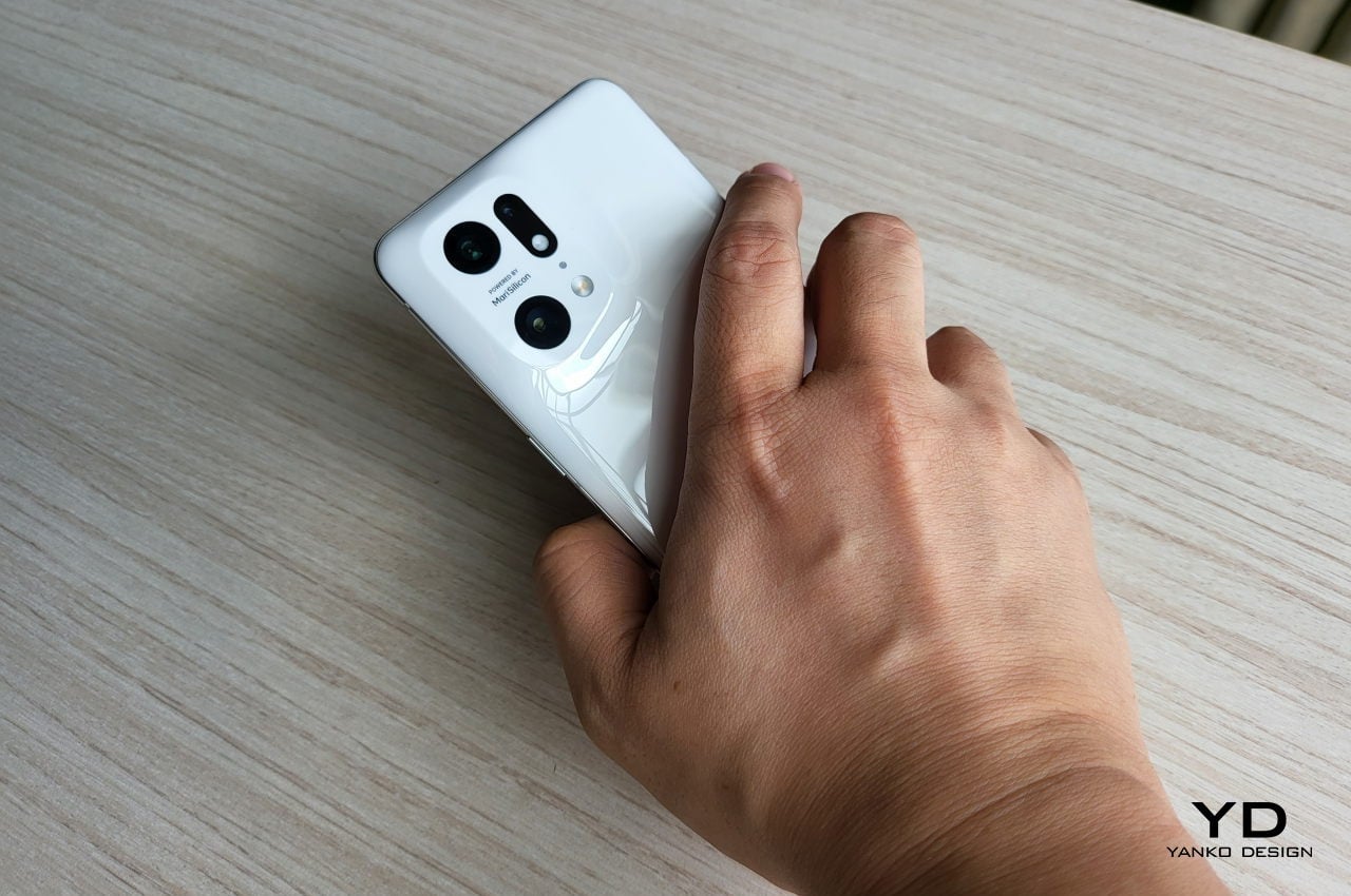
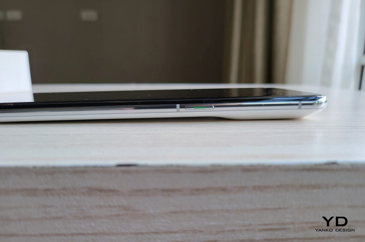
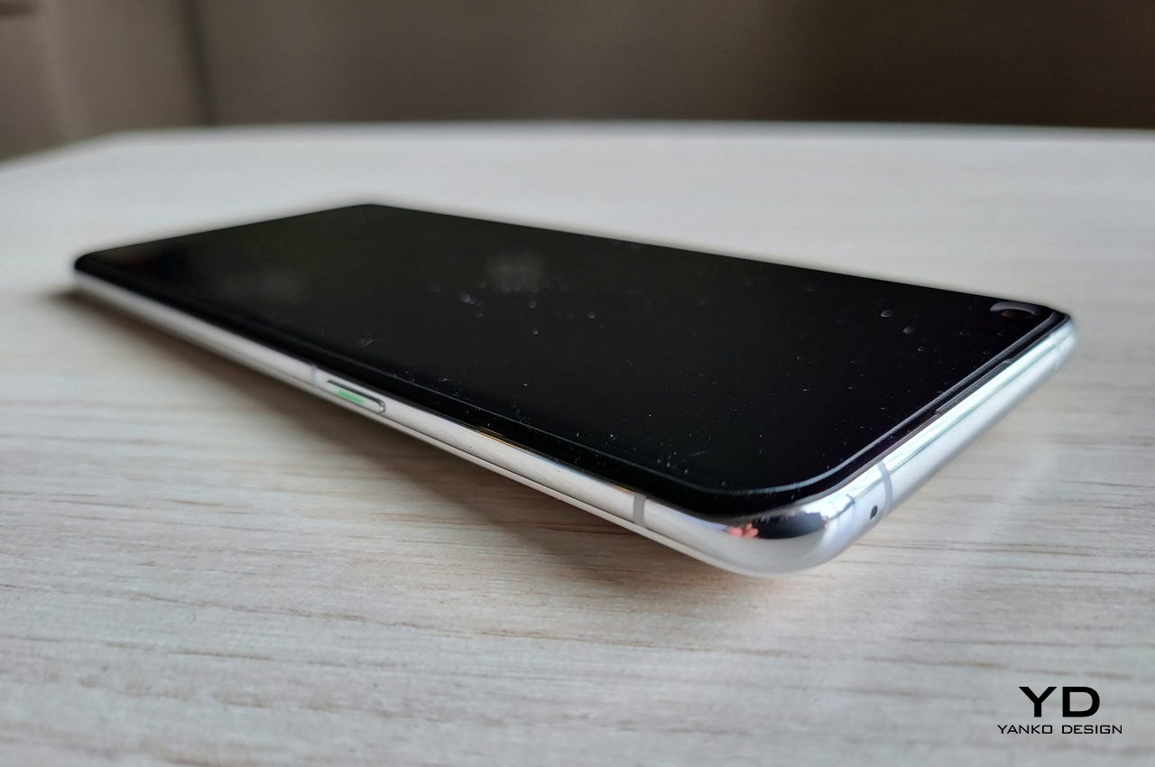
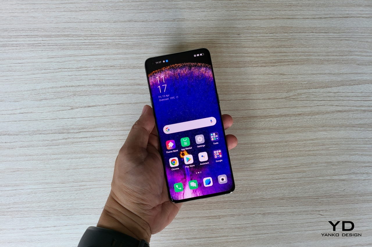
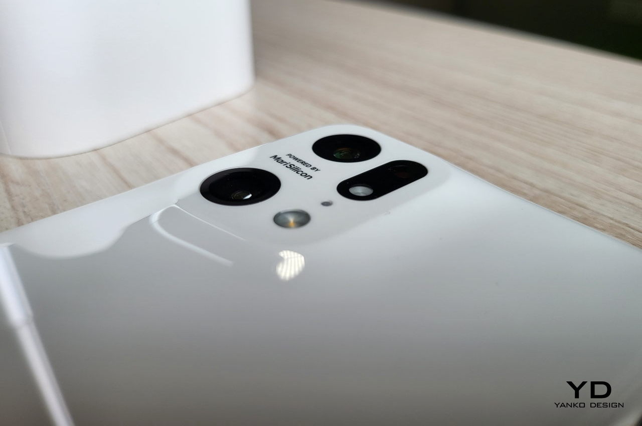
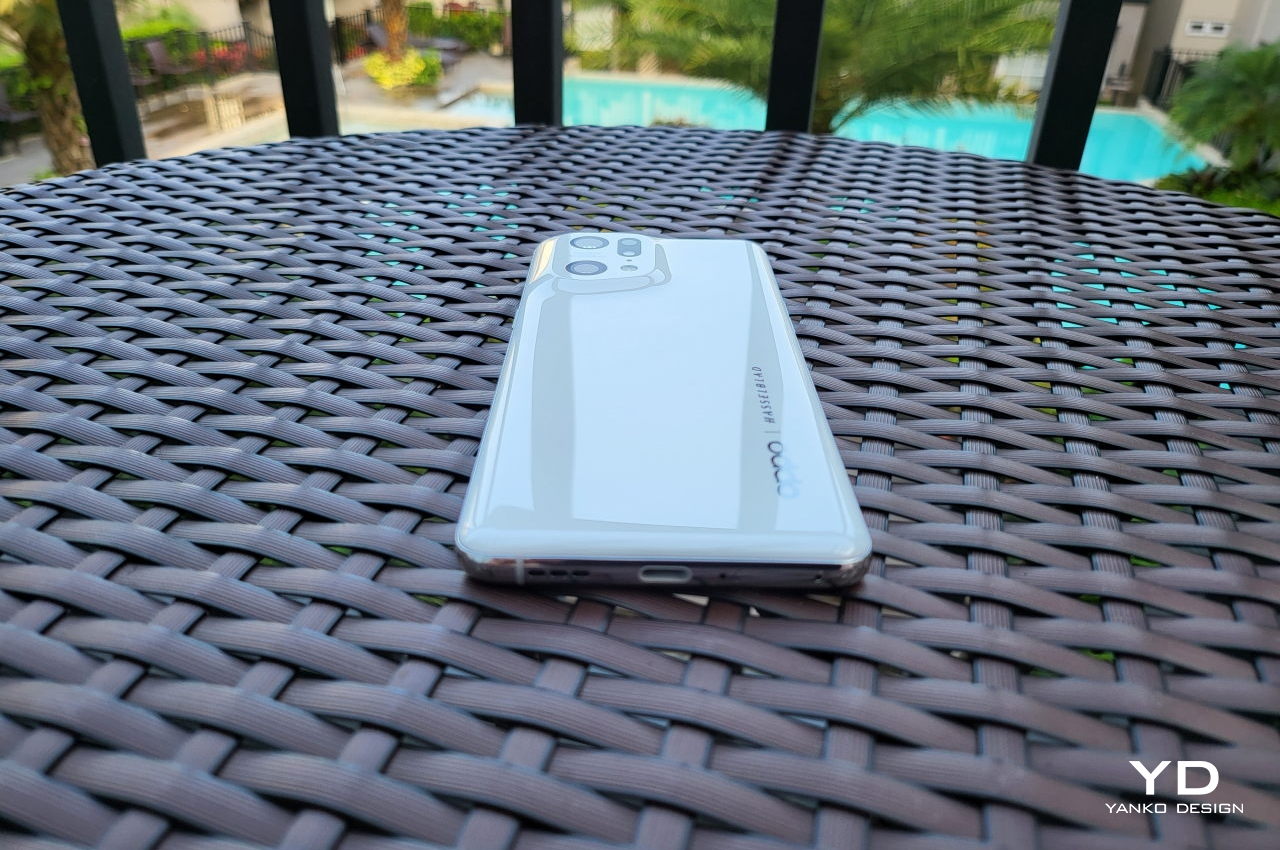
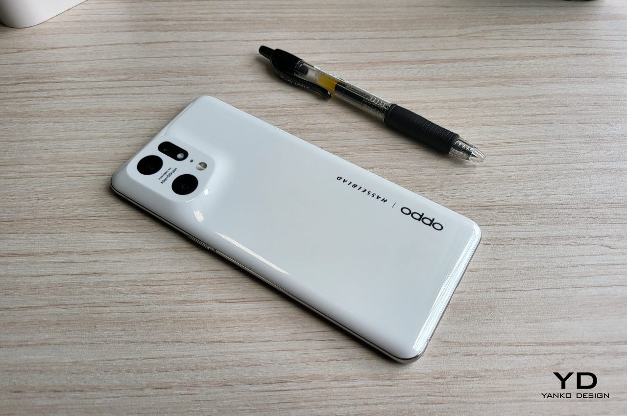
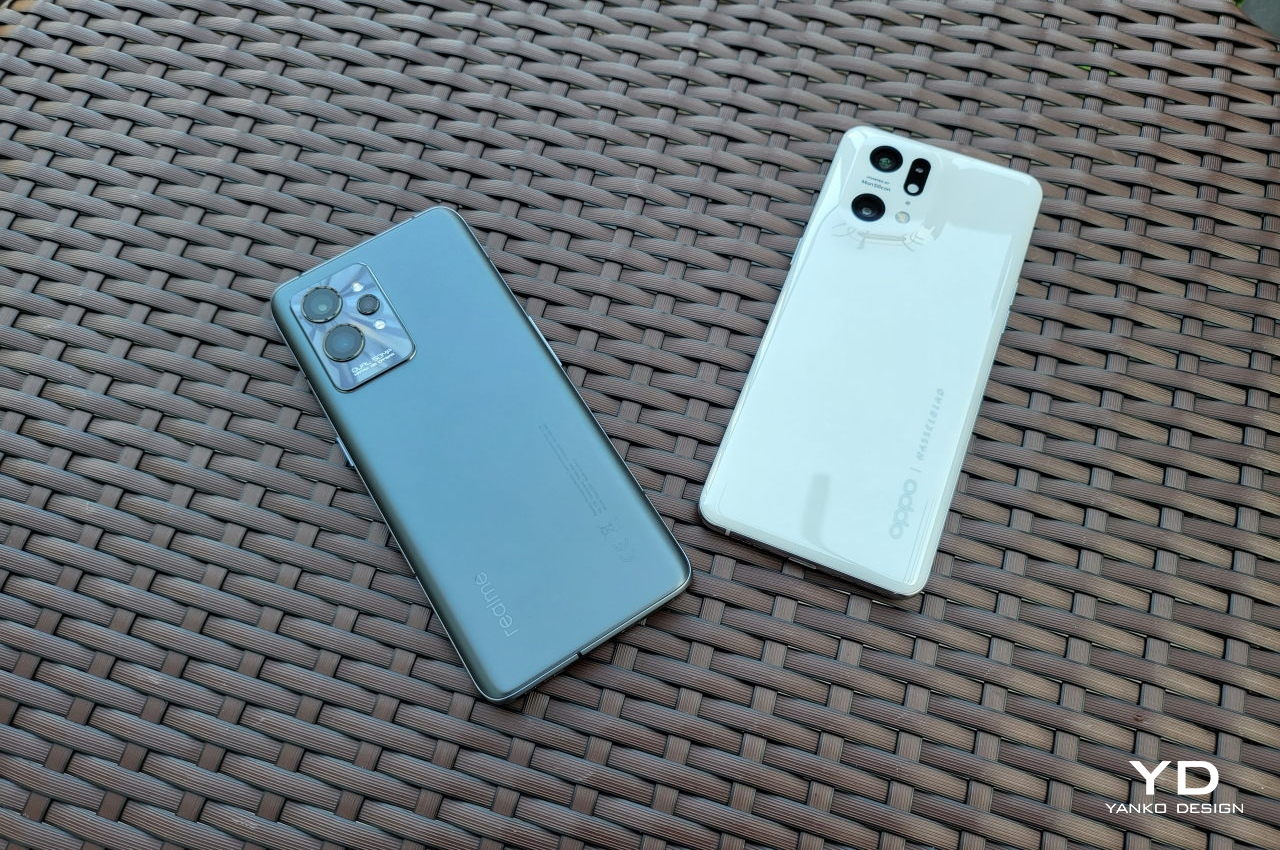
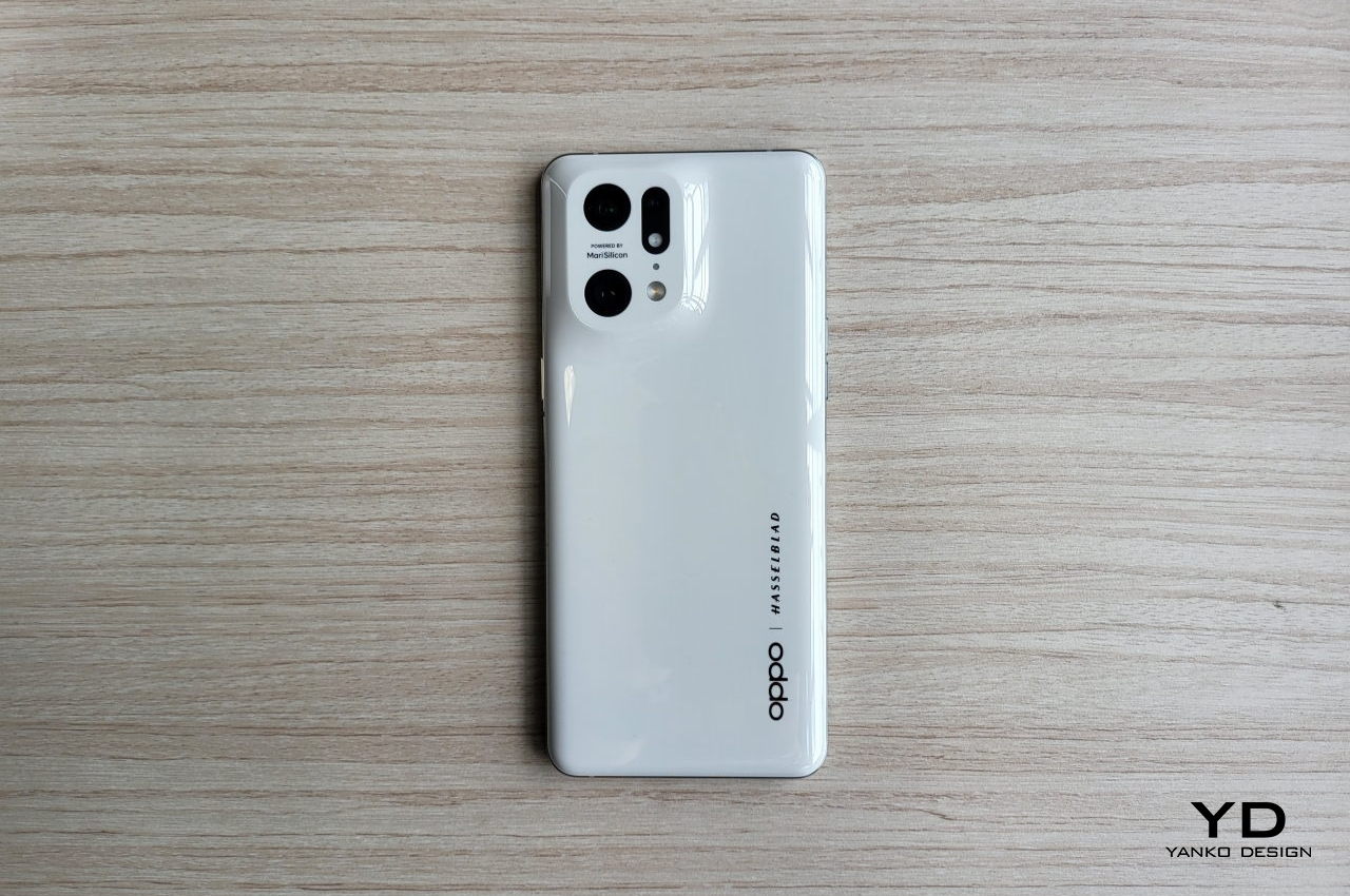
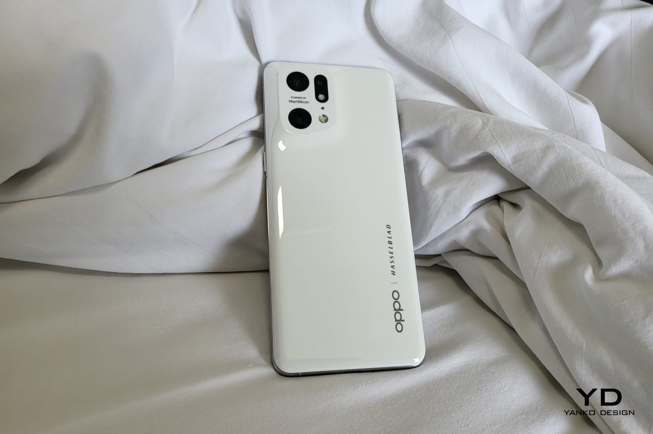
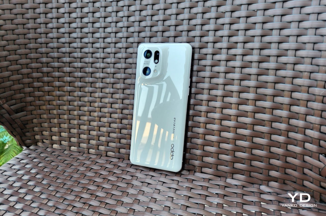
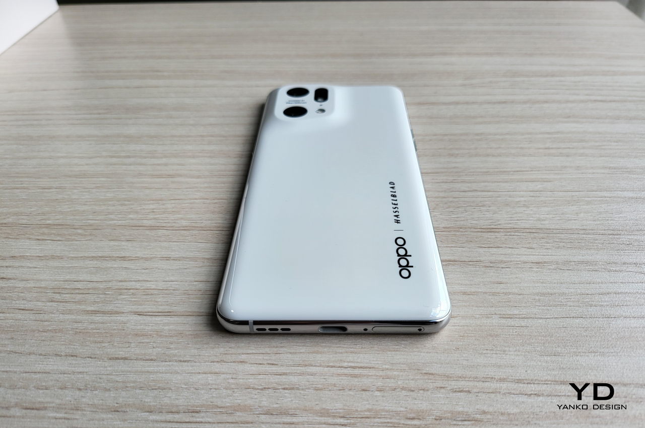
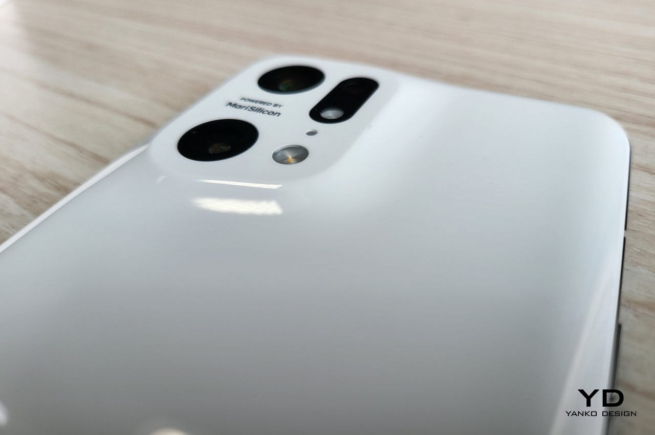
The OPPO Find X5 Pro’s design distances itself from that crowd in two notable ways. The most important is also the most obvious, the fact that it doesn’t have a camera bump in the traditional sense. Yes, there is still a raised area to house the inevitably big camera hardware, but it is seamlessly integrated into the body of the phone. Rather than a separate bump made of metal, the Find X5 Pro’s array gently rises out of the phone’s back, more like a dune on the soft sands of the desert.

Even the cameras themselves lie flush against the flat surface of that mound. If it weren’t for the black rings around the lenses, it would almost look like they’re actually part of the back cover. This creates a visual continuity that’s often taken for granted in designs, especially in smartphones. There is nothing that forcibly calls attention to itself, generating a more pleasing aesthetic that lets the eyes gently flow over the phone’s back.

The OPPO Find X5 Pro also stands out as one of the very few to use ceramic in a regular, mass-produced edition of a phone, though it is only used on this “Pro” variant. Given how hard it is to work with the material, most manufacturers only apply ceramic on the back of more expensive limited editions. Ceramic is notoriously difficult to shape into specific forms, like the one that this phone has, so it’s a testament to OPPO’s skills that it is able to make it available to a wider audience at a more accessible price tag.

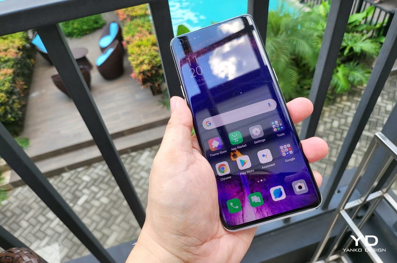
The decision to use ceramic instead of typical glass goes hand in hand with its “futuristic” fluid design. Ceramic feels warmer in the hands, as opposed to cold glass, but also dissipates heat better. It also has a bit more grip even when compared to matte glass, making it less likely to slip from your hand. It has almost the perfect texture to complement the Find X5 Pro’s smooth form, generating a sense of calmness when holding and looking at the phone. Overall, the OPPO Find X5 Pro’s design feels more “human” than any other phone out there, offering a product that almost stands out like an oasis amidst the chaotic world we live in today.

Ergonomics

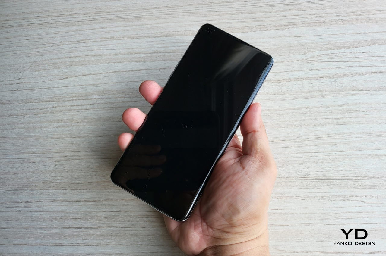
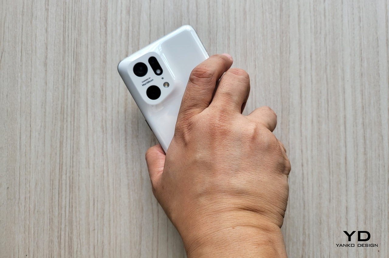
As a tool, it’s not enough for the OPPO Find X5 Pro to be good to look at. It also needs to be good to hold and use, especially for something that stays in the hand most of the time. Fortunately, the phone does meet ergonomic standards, though probably less perfectly than its visual design. It’s comfortable to hold and settles into your hand securely, but it could prove to be a bit tiring after long periods of use.

The ceramic back is smooth but not slippery, especially compared to AG frosted or matte glass. There’s almost a slight stickiness to it even, though not exactly in a gross kind of way. Along with its natural warmth, the material makes the Find X5 Pro a joy to hold. And depending on how you hold the phone, you might even find yourself unconsciously brushing your index finger against the soft curves of the camera bump, almost like a fidget toy.

The phone, however, is also slightly heavier than most of its peers. It’s not uncomfortably hefty, mind, and you’ll only realize that fact when you try holding other phones as well. It might not matter much, but if you’re the type who tends to hold your phone for long periods of time, you might find your hand, wrist, or arm tiring more easily with the phone.

Unfortunately, the Find X5 Pro can’t escape being a fingerprint magnet, especially with the black finish where smudges are more visible. It takes a simple wipe to banish those marks, though, but sticklers for tidiness might want to grab the white one instead. Fortunately, that doesn’t get easily smudged and embodies the purity and serenity of the phone’s design even better.

Performance

We’re not going to bog you down with specs and numbers, mostly because the OPPO Find X5 Pro is a powerful machine that can stand head-to-head with the best that the smartphone market has to offer this year so far. It comes with the latest Snapdragon 8 Gen 1 processor and up to 12GB of RAM, but there’s no support for storage expansion, so you’ll have to make an upfront choice of what configuration you need when you buy it. There are a few standout details worth mentioning, though, that really make the phone shine.

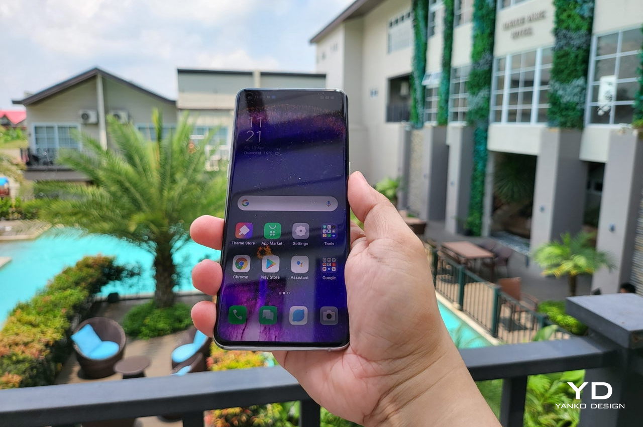
The 6.7-inch 2K screen, for example, is bright and vibrant even under the sun. It boasts 1 billion colors, which will really make your photos pop, which goes perfectly well with its cameras. Designers and artists will appreciate how accurate the colors are, which is critical when trying to take photos and videos for reference.

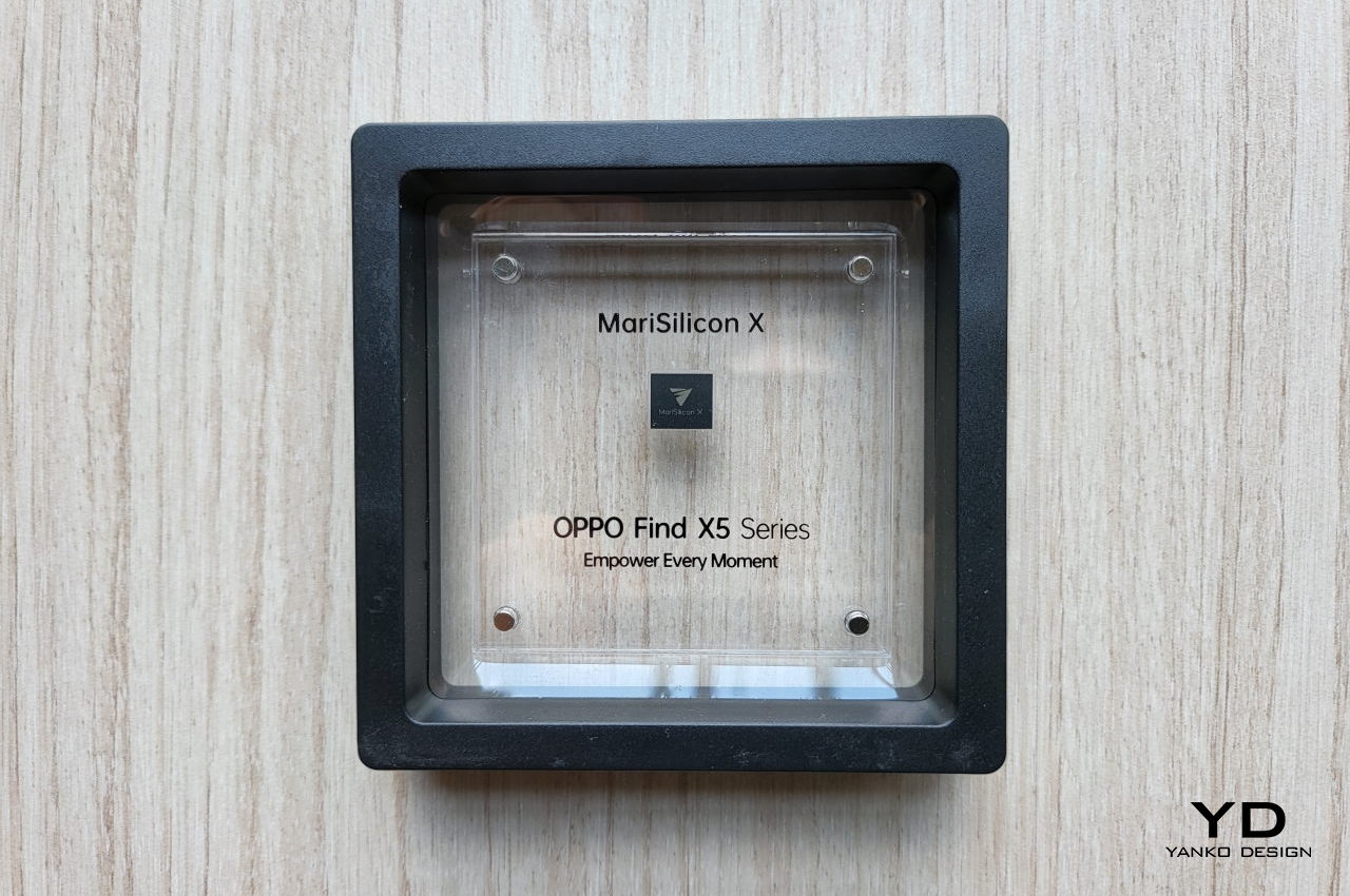
In terms of specs, the Find X5 Pro’s crowning glory is really its camera system. On paper, the 50MP main camera might not sound like much, even if it has optical image stabilization. But thanks to the company’s new MariSilicon X chip, which was designed in-house, the images that its cameras produce look too good to be true. Fortunately, they really are.

Photos come out crisp and detailed, no matter the lighting condition. Of course, Night Mode has special tricks to make the scene look perfect, but nighttime photos, with just enough lighting, still look sharp even without that special mode. There’s no loss of detail when switching to ultra-wide because it has a similar 50MP sensor as the main camera. The 13MP telephoto camera, unfortunately, tells a slightly different story. With only 2x optical zoom, you might actually feel it’s not worth the loss in quality and stick to the main camera anyway.

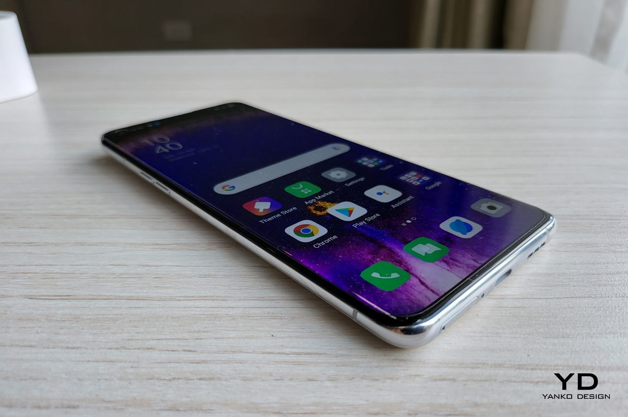
In terms of software, the OPPO Find X5 Pro already runs the latest Android 12 with the company’s ColorOS 12.1 on top. It tries to stick as close to the vanilla Android experience, just with a few embellishments on top. Of course, there are also some major features you won’t find in Google’s version of Android, mostly around themes and customization. There are also your usual pre-installed apps, some of which can be uninstalled, thankfully. One, in particular, is quite interesting in how it meshes well with the overall theme of the phone. The new O Relax app uses a variety of sounds, including those associated with bustling cities, to create a relaxing audio space. Together with its design and ceramic material, this makes the OPPO Find X5 Pro one of the most calming phones on the market.

Sustainability

The Find X5 Pro scores high on most of our marks, but this is one area where the phone is sadly just like any other. Although the smartphone market is slowly taking steps towards more sustainable practices and materials, the Find X5 Pro doesn’t exhibit those efforts just yet. Just like many phones before it, it is a beautiful and high-performance phone that wasn’t designed to be easily repaired and recycled.

Admittedly, ceramic is a more sustainable material compared to plastic, but its costs will mean that repairs and replacements will be much higher as well. The phone is also sealed shut, making repairs more difficult. OPPO, of course, has its authorized service centers, but there is also a new trend these days where the likes of Apple, Google, and Samsung are opening their doors to third-party service providers. Other companies have yet to catch up to these, especially smaller brands that might not have the margins to afford that kind of business strategy.

To its credit, OPPO tries in its own small ways to at least prolong the life of its phones and delay their inevitable fate in garbage dumps. In particular, its battery health engine tries to preserve lithium-ion batteries for as long as it can, even going as far as “healing” them over time. It’s not a perfect solution, but it’s still a step in the right direction.

Value

As a high-end phone, the OPPO Find X Pro is nearly perfect. It has powerful hardware that cuts through your daily tasks like a hot knife through butter. Its cameras are among some of the best we’ve seen in the market, proving the wisdom of the company’s investments in its own imaging processor. It has snappy and useful software that truly offers added value, though we could do without most of the bloatware.

In terms of product design, the phone scores even higher. Its seamless and fluid design is a strong statement against current design trends in the market. With its choice of ceramic and the new O Relax app, OPPO boldly embraced a theme that guided its overall design, offering an oasis of calm in your hands in the middle of chaotic times. As with its design, the Find X5 Pro looks and feels like a more holistic product than yet another phone with a laundry list of must-have features.

The one catch to its overall value is its availability. At $1,300, it is on the more expensive end of the price range, but the real problem will be availability. OPPO’s phones aren’t present in all markets, and the Find X5 Pro is even less so. But for those who do have a chance to get one, it’s almost a steal.

Verdict

Almost all smartphones, especially those from Samsung and Apple, talk heavily about the design process that goes into making their latest models. Few can actually claim to deliver something that will tickle the aesthetic taste buds of those with design inclinations. Although it’s not completely new, the design language that OPPO perfected in the Find X5 Pro this year definitely stands a chance in that area. It has won many awards, in fact, including our Best of MWC 2022.

It isn’t just a pretty face, though. Unlike most of its peers and rivals, the OPPO Find X5 Pro actually has a story to tell and a message to get across. Its seamless design, its choice of materials, and even its software all point to a single theme, one that puts design thinking and attention to detail on a pedestal. In effect, the Find X5 Pro has graduated from being just another premium phone or even just a product. It has become a lifestyle choice.

The post OPPO Find X5 Pro Review first appeared on Yanko Design.
HMM Mugr has an earthbound design that gives your lips a taste of heaven

This finely crafted mug makes earth and wood meet in a symphony of texture designed to be a treat to your fingers as well as your sensitive lips.

When it comes to beverages, a lot of attention is naturally poured on the quality of the drink, its texture, its temperature, and even its viscosity. Those qualities, of course, will make or break a drink, no matter what you drink it from. Our lips, however, first come into contact with the surface of a glass, cup, or mug, and that first impression could set the mood for the entire experience. That’s the kind of first engagement that this beautiful minimalist mug tries to perfect in a design that is seemingly full of contrasts blended in an almost divine way.

Designer: HMM Project

Click Here to Buy Now: $60

Our lips are one of the most sensitive parts of our bodies, almost on the same level as our fingertips. Anyone who has accidentally taken a sip of a hot beverage will attest to that discomfort, even before the liquid hits the tongue. It’s a bit surprising, then, that many drinkware doesn’t seem to pay special attention to the quality of the rim of the glass or cup. As long as they don’t cut into the person’s lips, they’re considered to be fine.

The HMM Mugr, in contrast, gives the lips their due. To be fair, it didn’t single out how the lips touch the mouth of the mug, but the soft texture that greets the person’s mouth is a product of the mug’s design. Made of quality Japanese ceramic, the body of the mug is warm to the touch and soft to the lips, creating the perfect atmosphere for a relaxing drink even before you take the first sip.

You wouldn’t actually know that the Mugr is made of that fine material just by looking at it. The mug may try to take your drinking experience to new heights, but its humble appearance is almost literally down to earth. The glaze makes the body of the mug look like it’s made from cast iron, a material that is often viewed as cold, which nicely contrasts with ceramic’s natural warmth.
The wooden handle is another point of contrast. The fine walnut’s lighter tone and random grains are juxtaposed against the uniform appearance of the mug’s cast iron finish. Its textured surface also gives a better grip compared to the smoothness of the ceramic body.

Earth meets wood, and earth meets heaven in a yin yang of contrasting elements that balance each other gracefully. The HMM Mugr isn’t just a drinking vessel, nor is it just a pretty mug. With its minimalist design, smart choice of materials and finishes, and acute attention to detail, the mug tries to elevate your drinking experience, creating a sense of harmony and balance in every sip — a perfect way to enjoy a relaxing drink after a long day.

Click Here to Buy Now: $60

The post HMM Mugr has an earthbound design that gives your lips a taste of heaven first appeared on Yanko Design.