Biomorphic handles on these ceramic mugs add a touch of nature and quirk to lifestyle design

Jessica Thompson-Lee, a ceramic artist and educator originally from Kansas City, MO, now thriving in Brooklyn, New York, is transforming the way we think about ceramics. Her work is an exploration of the dynamic relationship between form and function, with each piece inviting a tactile journey as much as a visual one. Thompson-Lee’s creations don’t just sit on a shelf, they beckon you to touch, to hold, and to explore their intricate, biomorphic designs.

Designer: Jessica Thompson-Lee
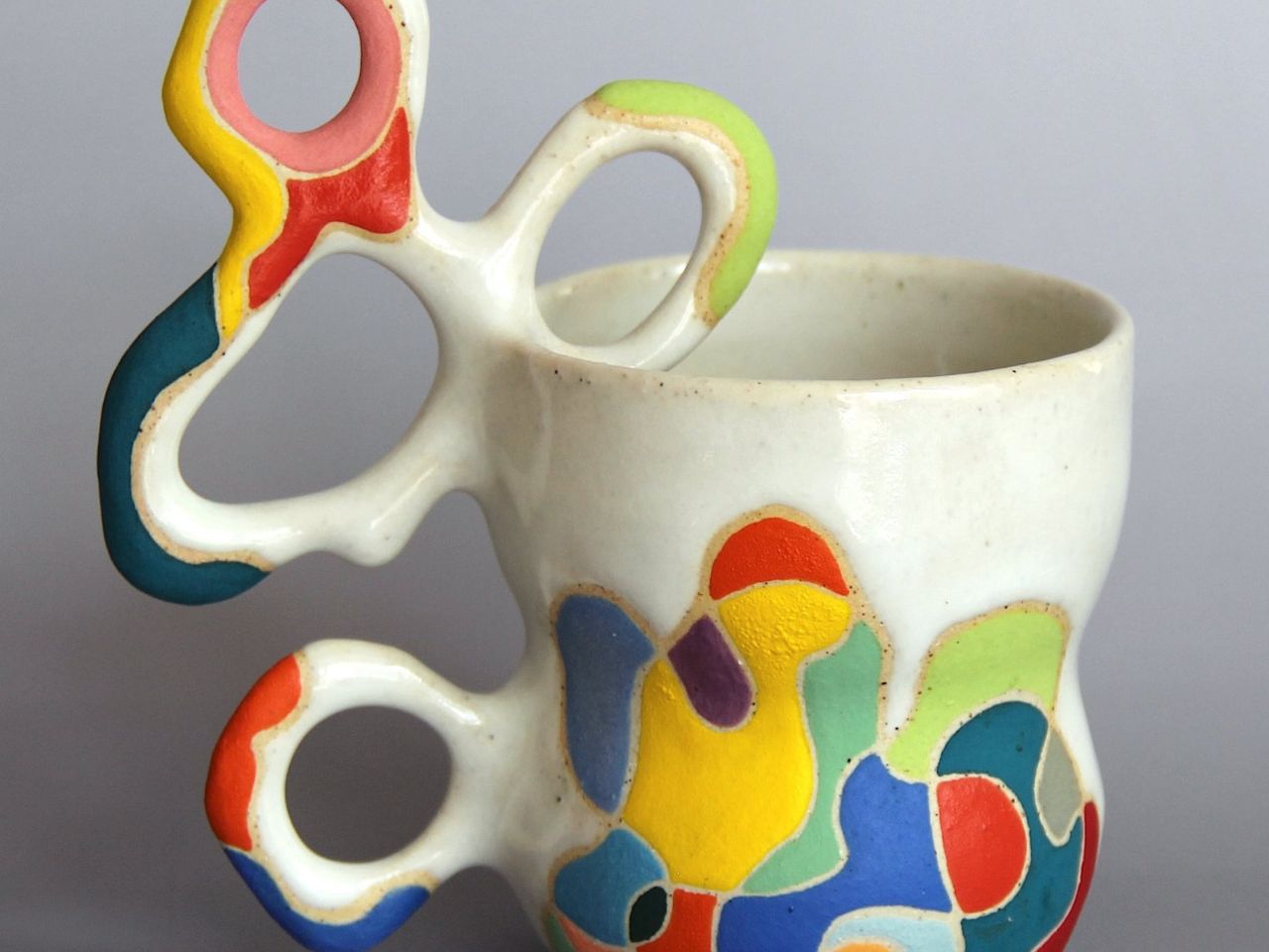
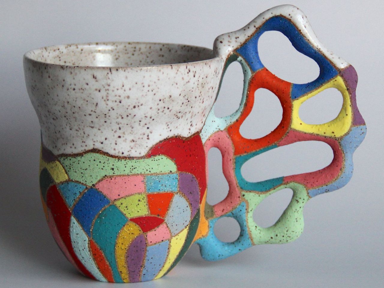
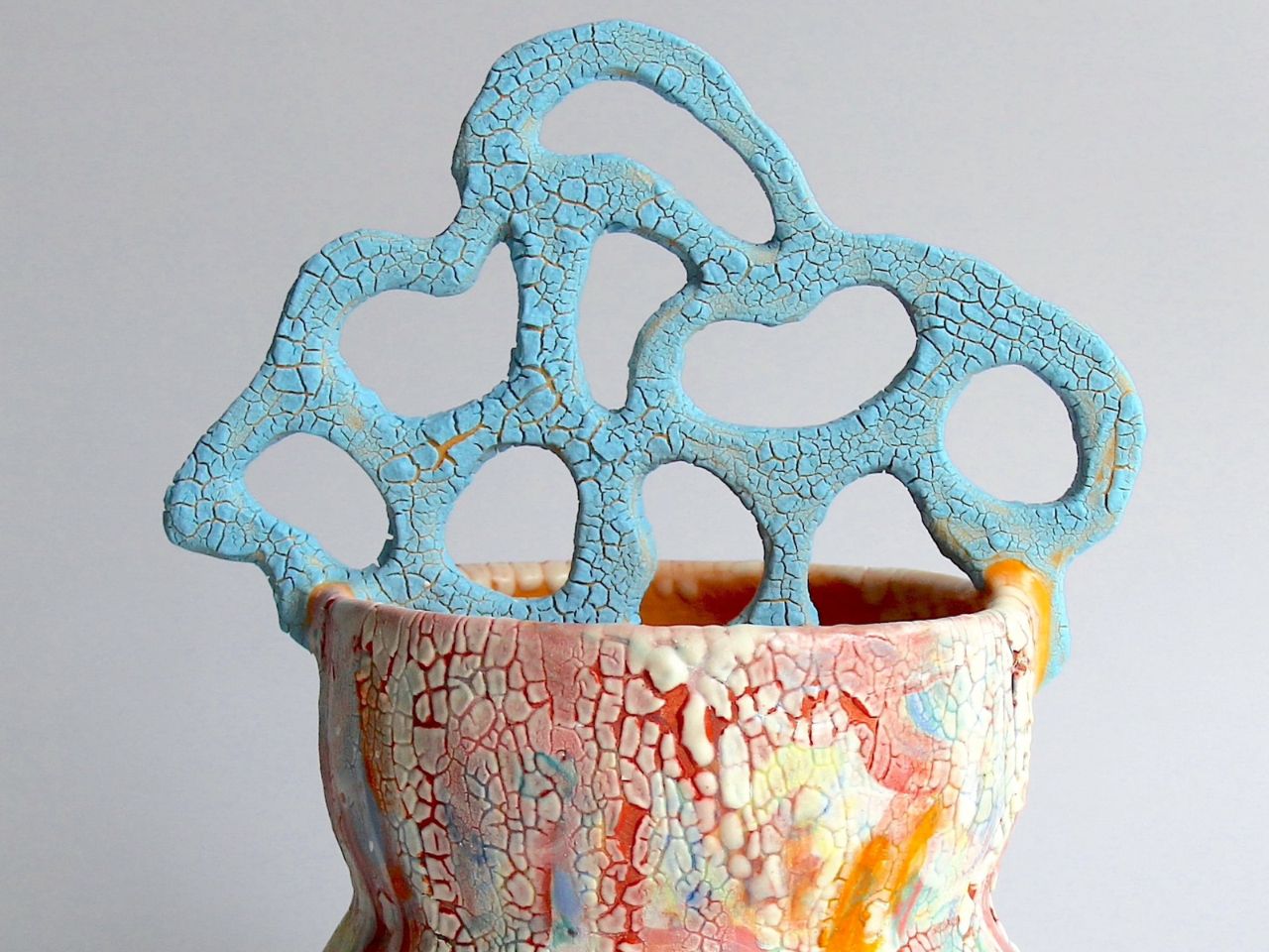
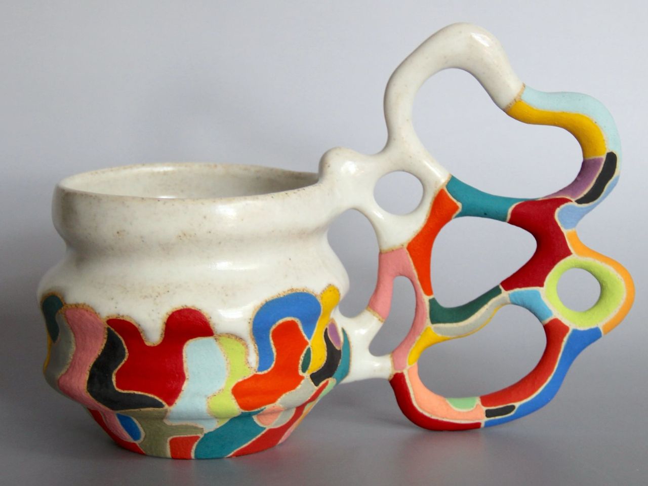
Inspired by the organic beauty of coral reefs, cellular structures, and the delicate networks of mycelium, her pieces are alive with movement. Handles on her mugs, for instance, aren’t mere attachments, they stretch and sprawl like living extensions of the vessel itself, creating web-like patterns that challenge the very idea of how a mug should be held. Each curve and twist invites you to find new, playful ways of interacting with the object, transforming the simple act of holding a mug into an engaging sensory experience.
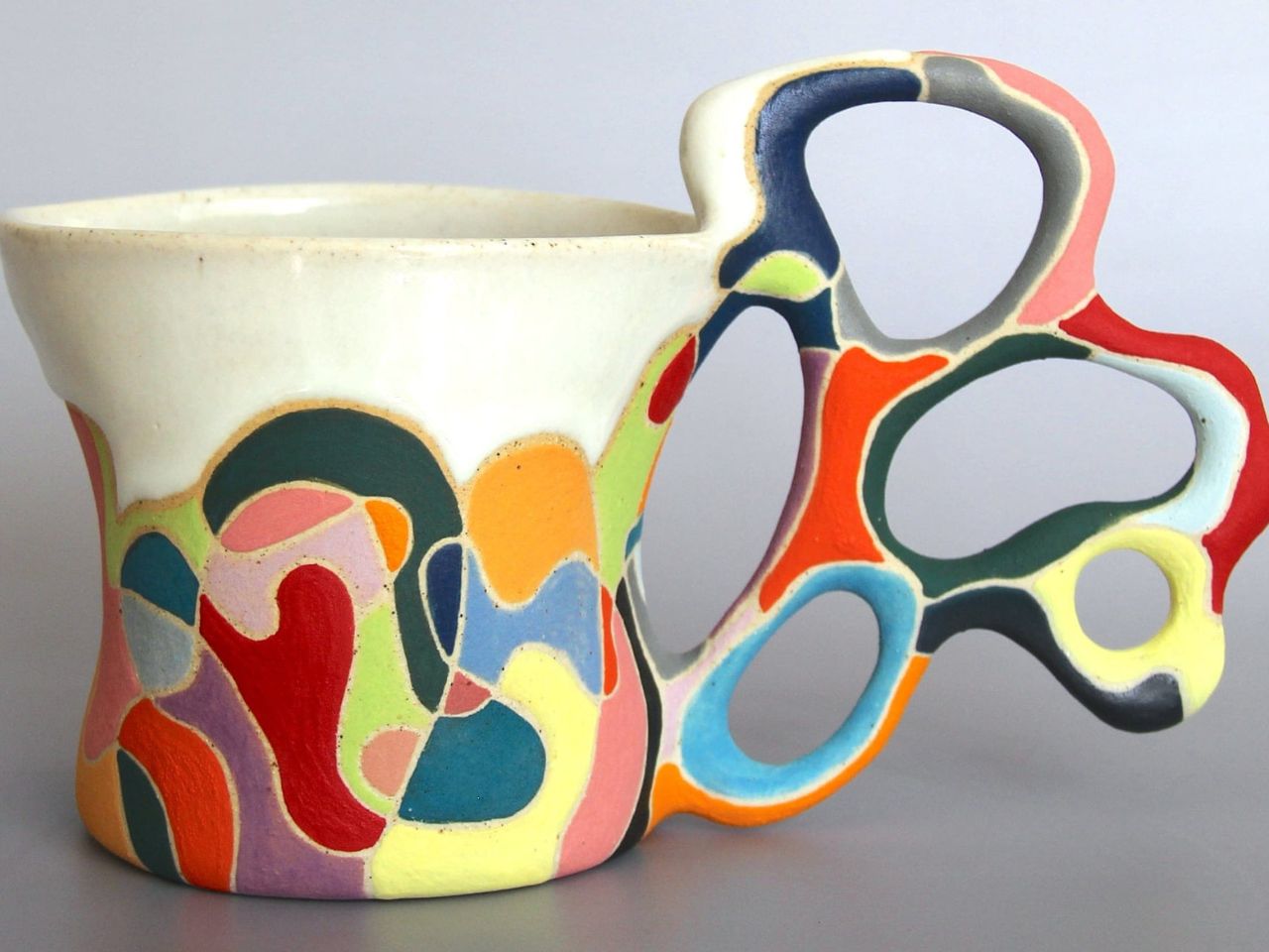
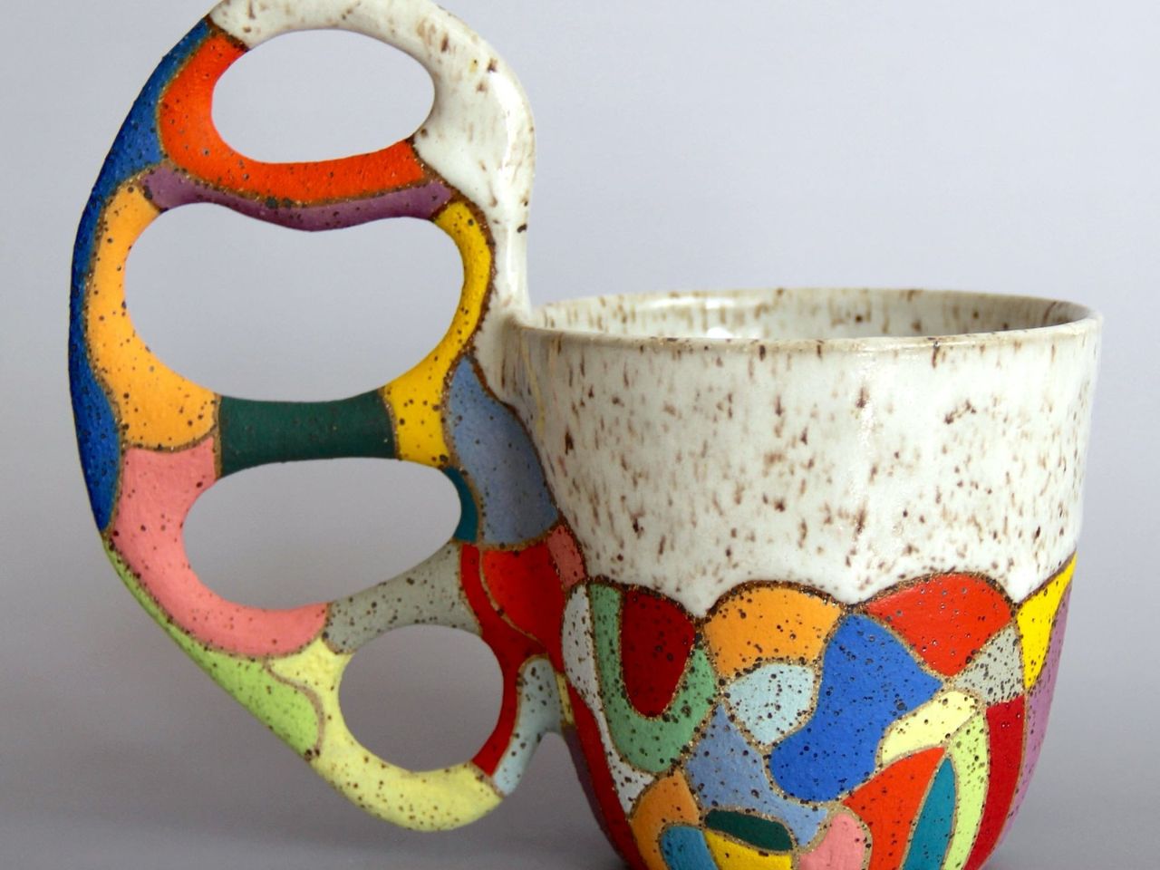
However, as beautiful as these designs are, one might wonder about their ergonomics. How comfortable is it to actually put your fingers through those differently shaped holes, and what kind of grip can one get? The intricate designs may offer visual allure, but they could pose a challenge when it comes to practical use. The unconventional placement of the handles might make it difficult to get a secure hold, raising concerns about the balance between art and utility. The delicate structure, while visually striking, might make one hesitant to use the mug for its intended purpose, fearing that it could break. But, you would never know until you actually hold one, it might just surprise you with great comfort. Either way, the piece can definitely add value to your space with its charm.

The magic of Thompson-Lee’s work doesn’t just lie in the finished product but in the journey of its creation. In her Brooklyn studio, she begins each piece with what she calls “sketching with clay,” an approach that’s as spontaneous as it is deliberate. With a squeeze bottle filled with liquid clay, she lets her hands guide the design onto a plaster slab, embracing the unpredictable nature of the process. This element of surprise and fluidity infuses her work with joyful spontaneity, making each piece as unique as the moment it was born.
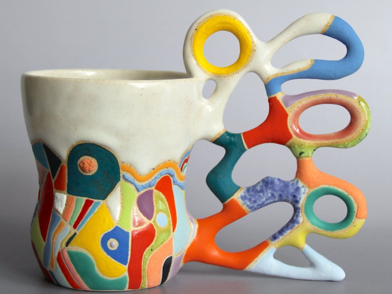
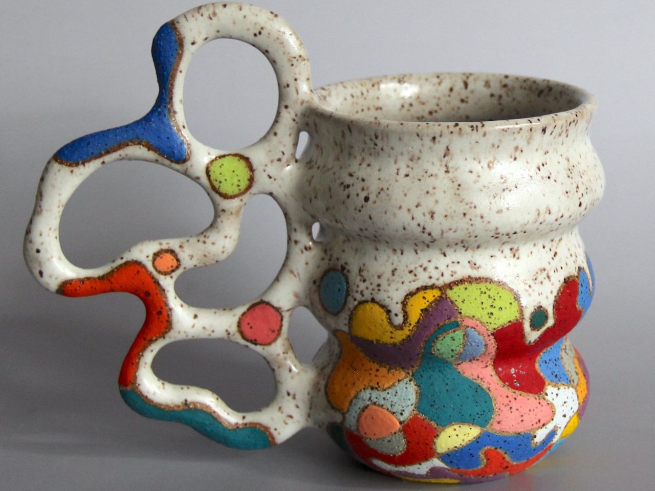
Once the vessel takes shape on the wheel, Thompson-Lee shifts to the meticulous hand-building phase. With an exacto knife, she carves handles from thick slabs of clay, carefully refining the form until it’s just right. After smoothing the edges with a damp sponge, the handle is attached to the mug, which then undergoes its first firing. But the journey doesn’t end there. Layers of intricate patterns and vibrant glazes are added post-firing, transforming the piece into a vivid, abstract work of art.

Thompson-Lee’s creative exploration doesn’t stop at mugs and vases. She’s pushing her biomorphic designs into new territories, with plans for jars, lamps, and even small furniture. Committed to sustainability, she’s also experimenting with recycled paper pulp as a medium. Her unique, tactile creations are available on Etsy, where each piece offers an adventure waiting to be discovered.
The post Biomorphic handles on these ceramic mugs add a touch of nature and quirk to lifestyle design first appeared on Yanko Design.
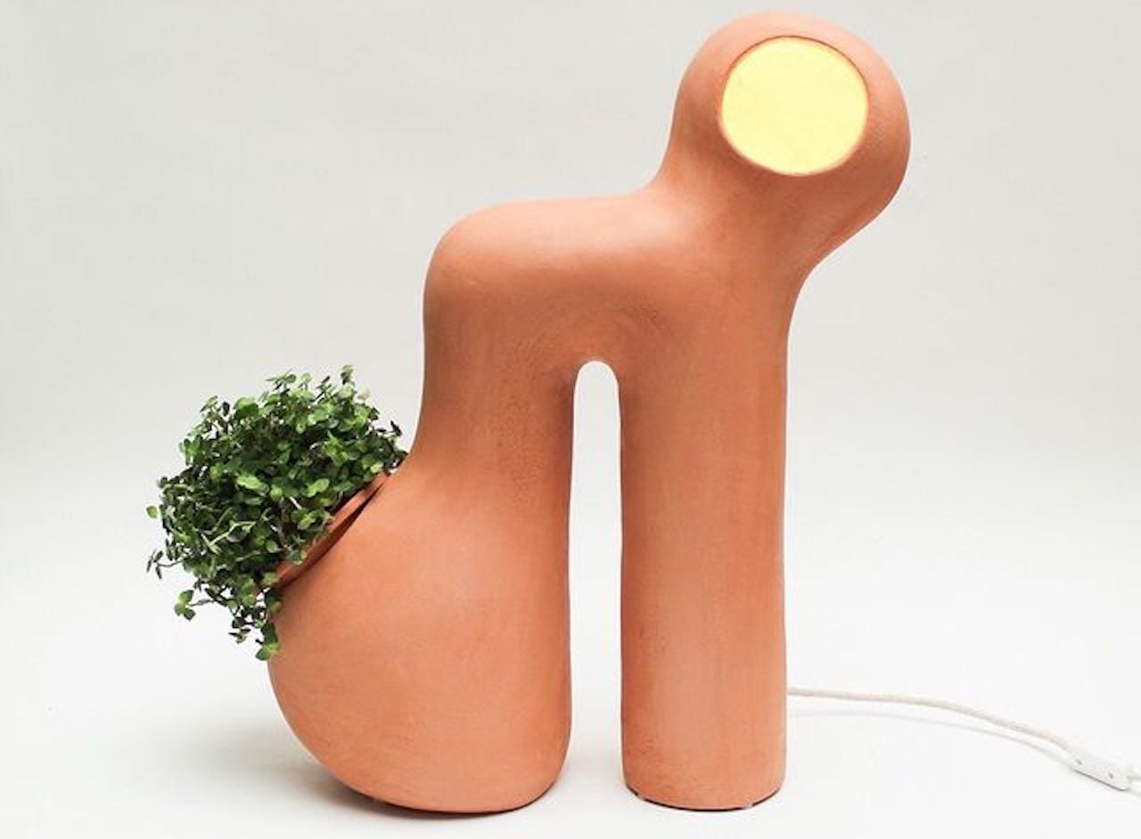
Elisa Uberti’s ceramic handcrafted lamps are beautiful pieces of art

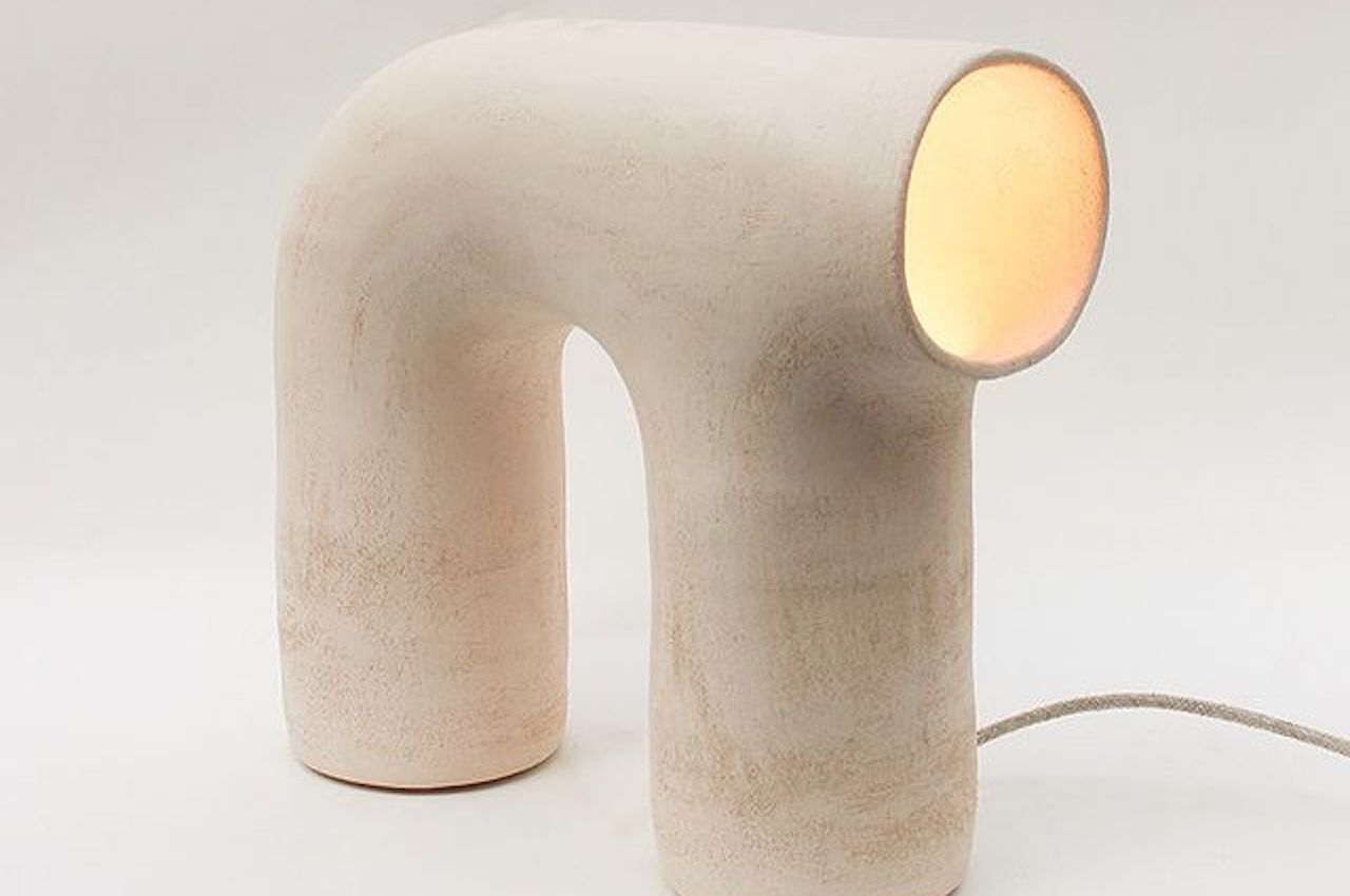
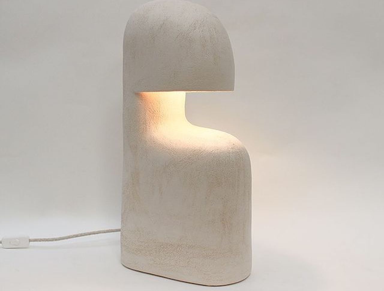
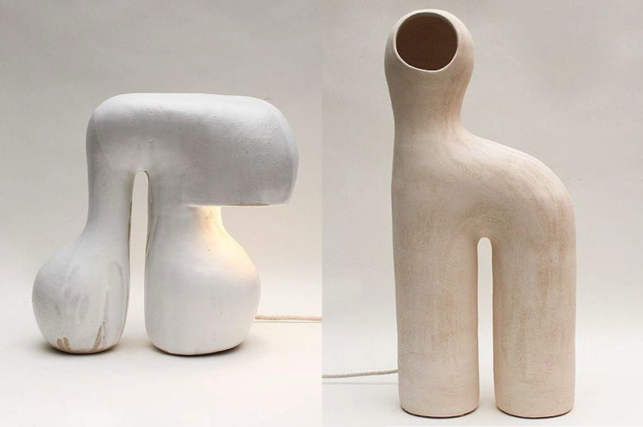
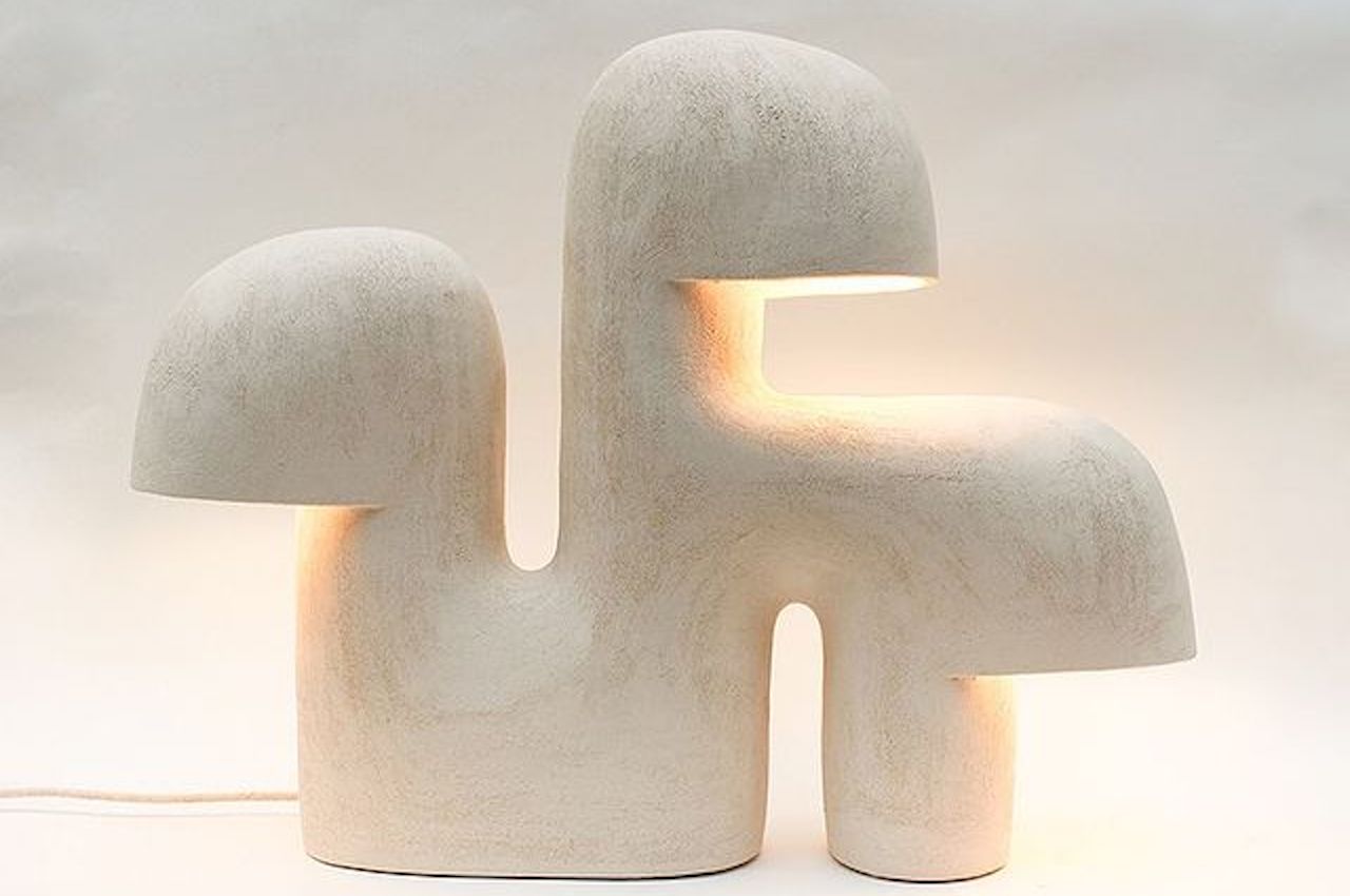
Elisa Uberti Édifice Horizon Cocon

Elisa Uberti is an artist known for her ceramic works. This ceramist knows art and design, which is very evident in her products.

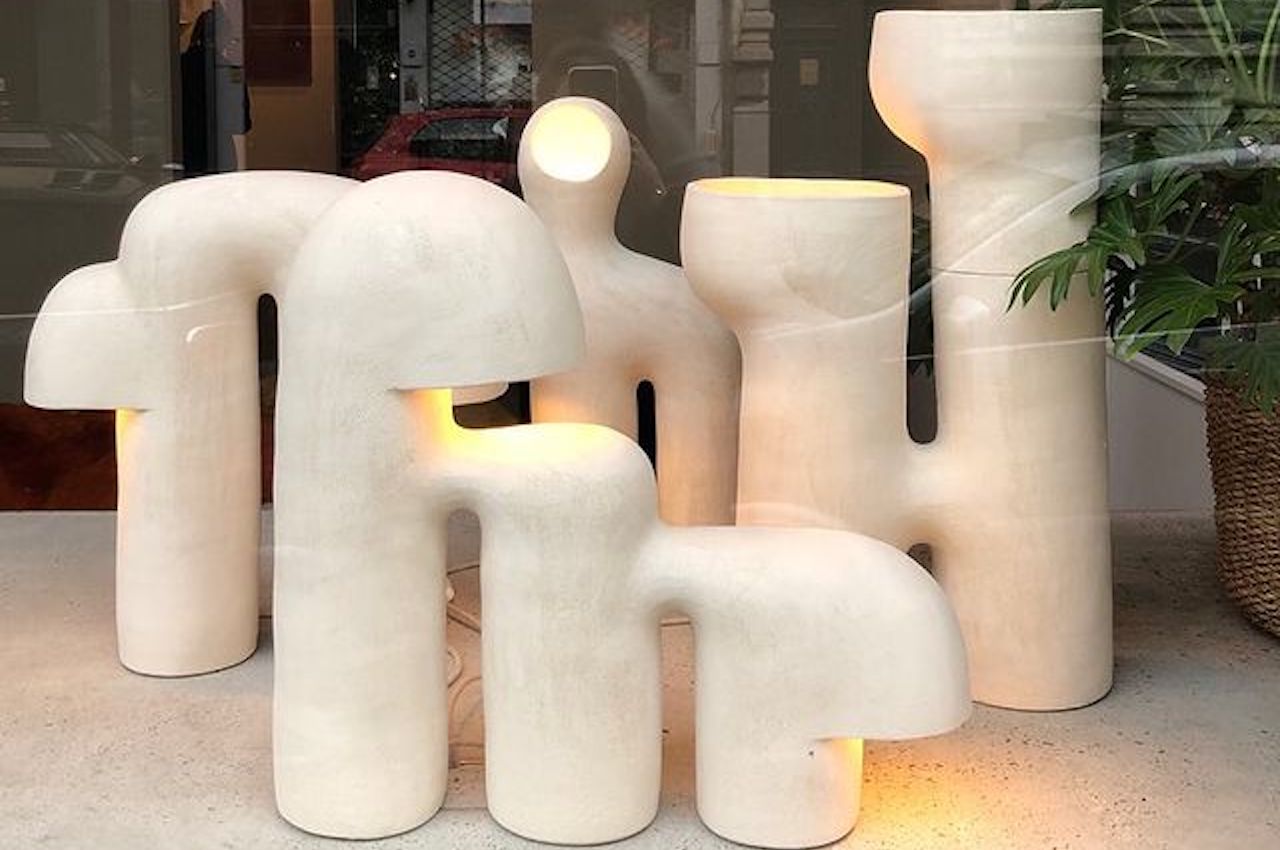
Uberti has released a vast collection of stoneware lamps. Every item is handcrafted, so that makes every piece special. The lamps don’t really light up the whole room but provide just enough illumination for objects on your table or the surroundings. The designer has a passion for timeless objects and refined subjects, so she maintains the art of handcraft.

Designer: Elisa Uberti

Elisa Uberti Cocon # 6

Elisa Uberti Arche # 3 A

The designer’s stoneware lamps are stunning with their curves and shapes that are products of spontaneous gestures. Such are balanced with technical constraints so you can see the creativity of the lamps. The beauty of ceramics is something that has attracted people since the beginning of civilization. It’s not a lost art, but artists and creatives must consciously keep the craft. This craftsmanship is there to stay, but there is a call to keep the art alive.

Elisa Uberti Edifice # 41

Elisa Uberti

In this day and age, when 3D printing is becoming more common and more affordable, handcrafted items may soon become rare. But, of course, those of us in the design world will not let that happen. That is why we support the efforts of artists like Elisa Uberti.

Elisa Uberti’s primary material is stoneware. It’s her favorite, enabling her to design and create unique lamps and sculptures. Without light, her lamps can stand alone as interesting sculptures that can drive conversations.

Elisa Uberti Horizon 4 Sidelamp

All the shapes and curves are comforting as they respond to manual gestures. Every lamp is unique and appears a challenge to recreate. Her inspirations vary from nature to space to architecture and even nomadism. Uberti’s art speaks poetry. Every piece is based on organic and multiple inspirations, so you can see the lamps appear natural and really handmade.

Here are some samples of Elisa Uberti’s art. She has designed dozens of ceramic lamps already. We hope more artists will be inspired by her passion, skills, and advocacies. She blends design and art in every work. It’s pronounced in her work that modernity and tradition can co-exist. As long as you have a constant drive for art, creativity, and life.

Elisa Uberti Edifice # 43

The artist refers to emotional shapes, including architecture, caves, refuges, and mini shelters. They can also be “protective dwellings for microorganisms”. Let’s take a look at some of her creations.

Elisa Uberti Baume 1

This is Baume #1. It is a handmade minimalistic white stoneware product that stands 50cm. The ceramist has described that she made it by hand with coiling techniques in her workshop in Roubaix, France. It’s created without using templates or molds and then baked in a ceramic oven. The res of her ceramic lamps are handcrafted and made with the same material and process. Some lamps have been painted though, to add more life and fun to the collection.

Elisa Uberti Edifice # 36

Elisa Uberti Arche # 3

Elisa Uberti Ceramics

The post Elisa Uberti’s ceramic handcrafted lamps are beautiful pieces of art first appeared on Yanko Design.
OPPO Find X5 Pro design story starts with nature and looks to the future

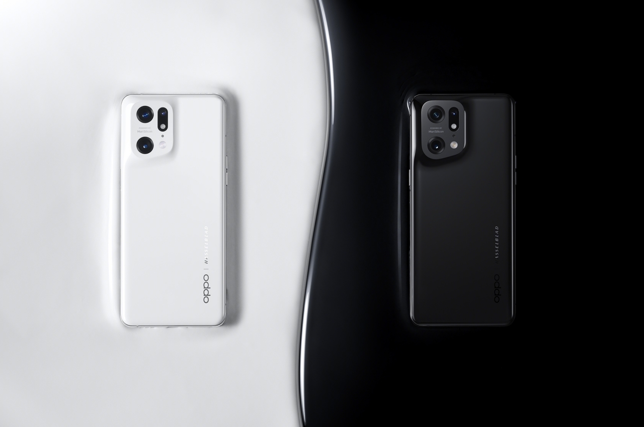
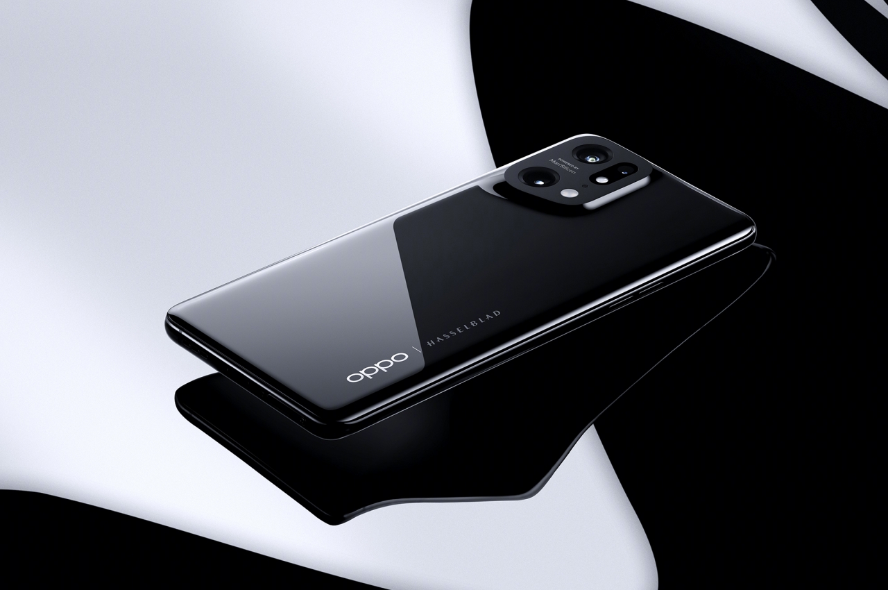
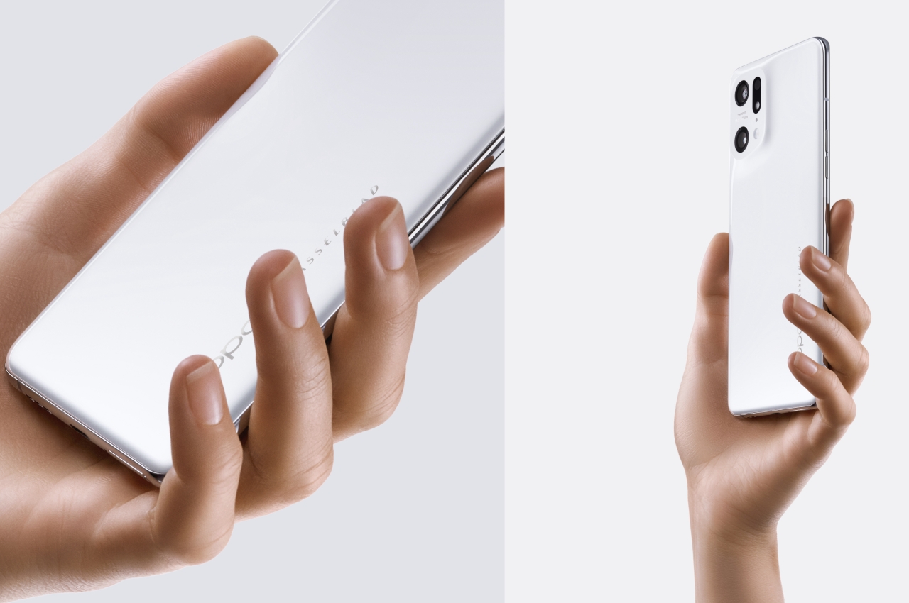
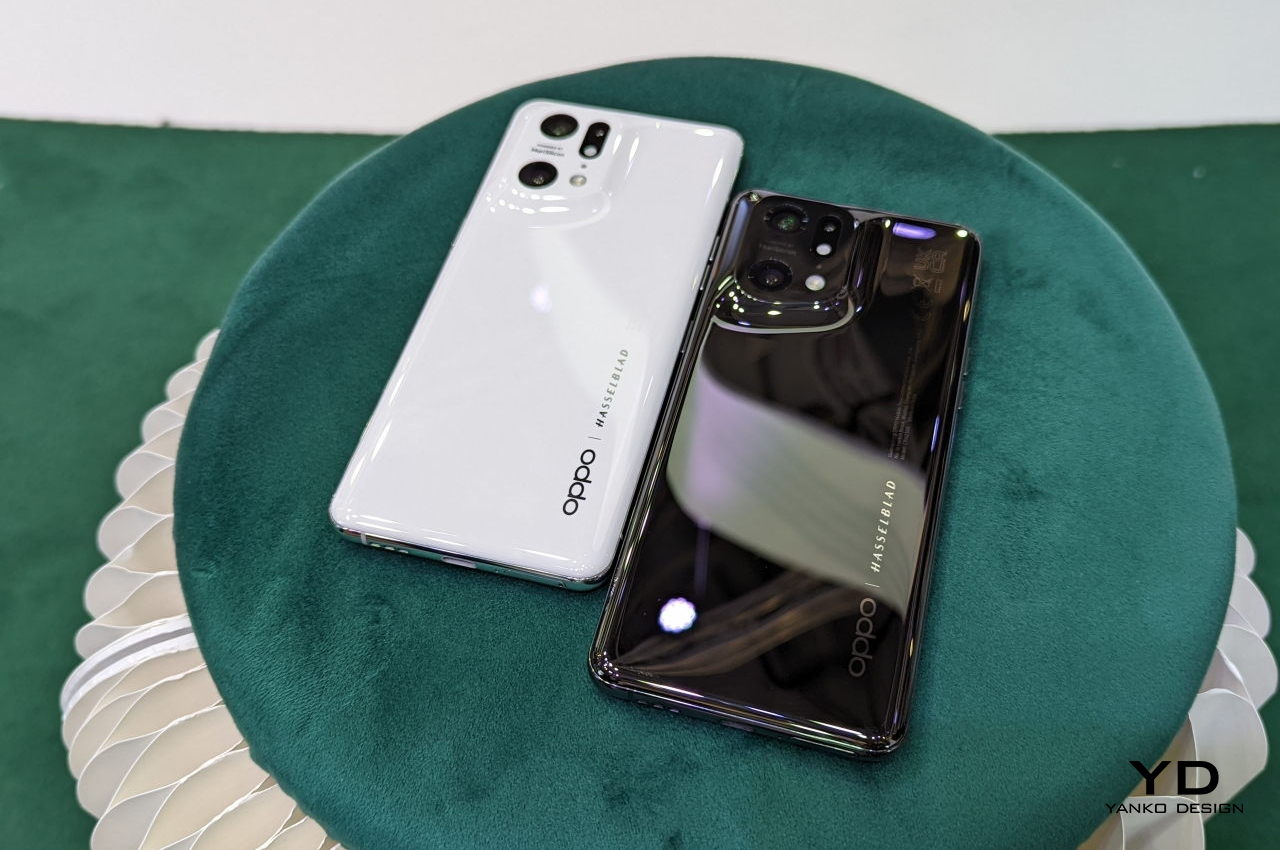
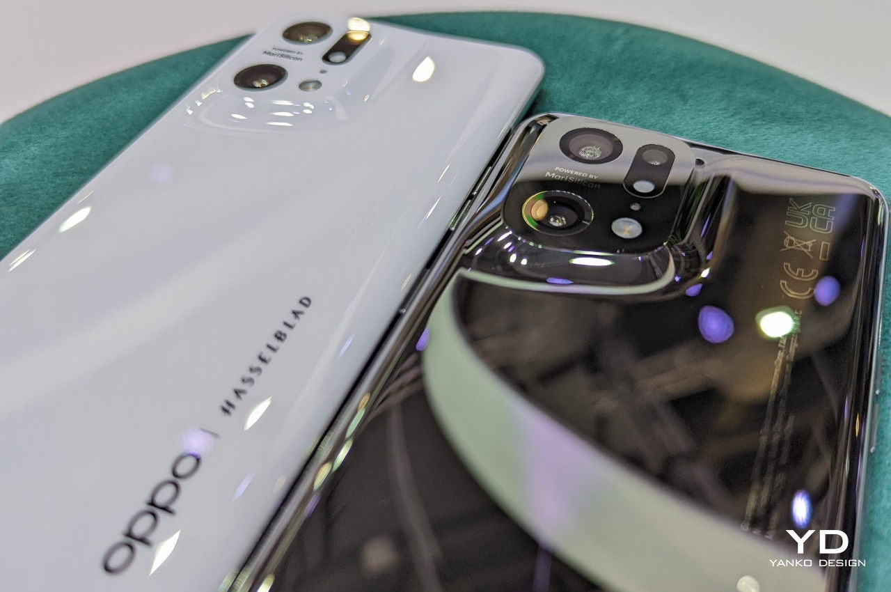
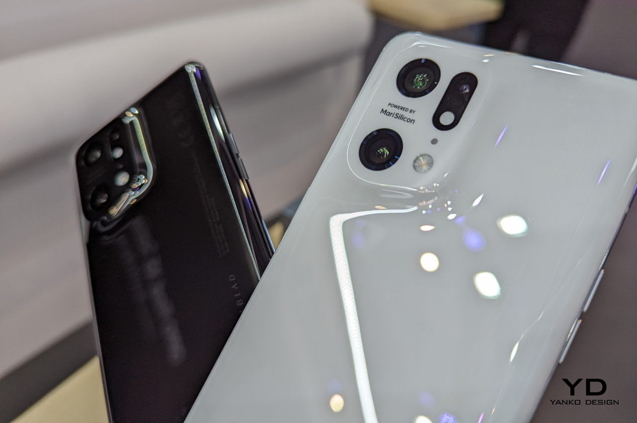
The OPPO Find X5 Pro is easily one of the most beautiful phones we’ve seen in recent years. It immediately stands out from the crowd in a way that is both pleasing and thought-provoking. It’s not a one-time thing either, having started with the Find X3 Pro last year. Given the company’s investment in this design, it hopefully won’t be the last time we’ll see this exquisite design either. Like many good product designs, however, OPPO didn’t just stumble on this winning look, nor was its journey as smooth as the curves on the phone’s back. Unsurprisingly, the company is only too happy to narrate its journey, and like many journeys, it starts at the womb of Mother Nature.

Designer: OPPO

Natural Curves

While we see and use a lot of straight lines in everyday objects, those are actually a man-made convention. The famed Catalan architect Antoni Gaudi was quoted to have said that “there are no straight lines in nature.” Everything that looks or feels natural to our senses brains actually have an element of imperfection or curve to them, and that’s the kind of natural design that OPPO aimed for.

Almost all smartphones have camera bumps these days or at least individual lenses that sit on top of the phone’s back. No matter the design or arrangement, they all have one thing in common. They are both visually and structurally distinct from the rest of the phone’s back, often delineated by a metal ring or a plastic surface. While not exactly straight, these still create sharp edges, seams, and lines that look and feel unnatural.

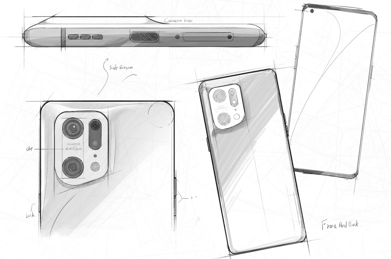
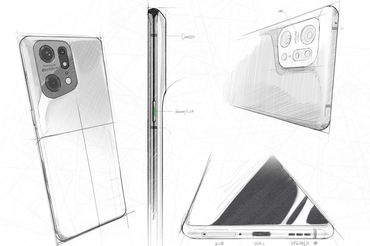
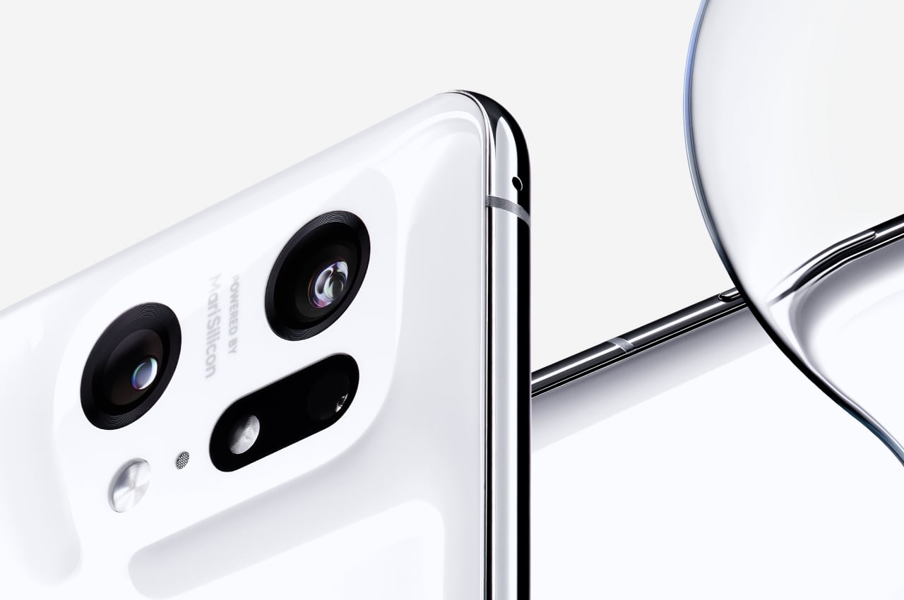
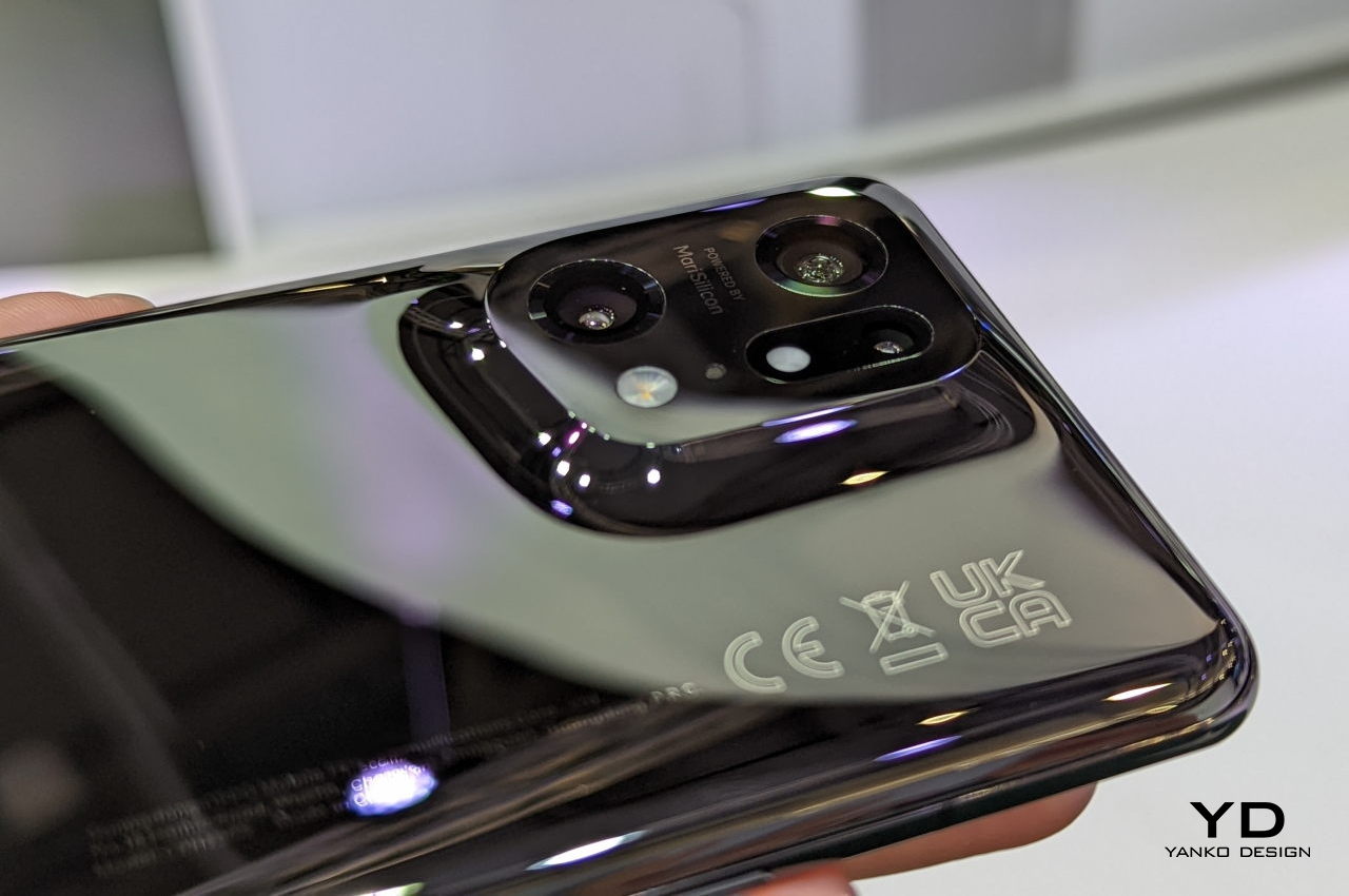
To capture the familiar and comforting feeling of nature, OPPO decided to opt for using natural-looking curves to raise the camera bump from the rest of the phone’s surface. The company calls the final result a volcano-shaped bump, but the flat surface on top is more reminiscent of a gently rising plateau. Either way, the effect is a unique camera design that is seamlessly integrated into the phone’s structure, a beautiful structure that actually caused OPPO more headaches at the start.

Tough Act

OPPO could have simply left it at that, ending up with something no different from the OPPO Find X3 Pro last year, just with a softer curvature. Looking good, however, was only half the equation, and the company wanted the phone to also feel good in people’s hands. Nature’s curves already provided visual relief, but the company now had to turn to technology to give the same feeling of comfort to the owner’s skin.

For this trick, OPPO decided to use ceramic instead of the glass material it is familiar with. Designers and manufacturers already know how terribly difficult it is to work with ceramic. Fortunately, we have come to a point where throwing enough time, money, and brains can yield advantageous results in addressing those pain points.

Again, OPPO is only too happy to dazzle you with the tales of trials and tribulations that it endured during this journey, from developing a new CNC machining process specifically for this design and material to a new four-axis polishing machine that uses micron-level diamond powder. Fortunately for people, they only need to hold a Find X5 Pro in their hands to appreciate the end results. They will feel the comfortably warm texture of ceramic without having to worry too much about fingerprints and smudges. They will also be more confident in the knowledge that their phone’s back has more chances of surviving a fall unbroken.

The Devil’s in the Details

The OPPO Find X5 Pro’s design story didn’t end there. There’s also the tale of how the camera lenses had to be positioned with painstaking precision so that they won’t extrude out of the housing, but also not too low to be effective at their job. It’s a minute detail that you will never know about unless someone (OPPO) tells you about it, precisely because the cameras blend almost seamlessly with the rest of the phone’s body.

Paying excruciating to details, even when those details will mostly be lost on most consumers, is a trait that is traditionally attributed to Apple, one of the best tech companies when it comes to product design acumen. Other phone brands like Samsung have also started talking more about these small details, sometimes to an exasperating degree. Others, on the other hand, force you to actually see and feel those small details to the point that the phone becomes a jumbled mess of discordant elements and design languages.

In contrast, OPPO aimed to hide those details and only talk about them as a side story of its journey. This left the Find X5 Pro with a minimalist and unified form that feels almost like a calm sound of silence in the midst of loud and obnoxious phone designs. Hopefully, the company’s future flagships will retain this nature-inspired DNA, and its futuristic manufacturing processes will become the future of its design lineage, especially since no one else seems to be keen on making the same odyssey.

The post OPPO Find X5 Pro design story starts with nature and looks to the future first appeared on Yanko Design.
This collection of hexagonal bricks inspired by beehives is shaped for infinite expandability

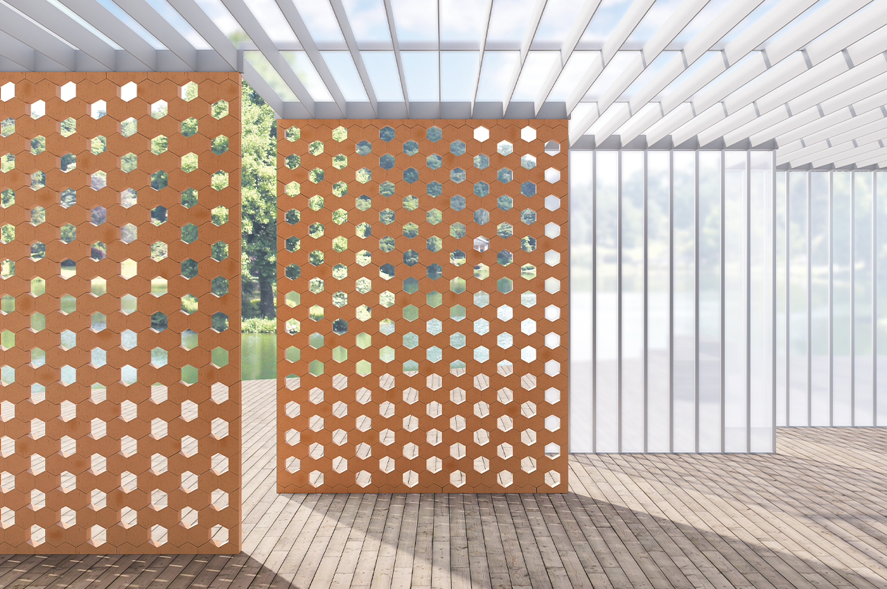
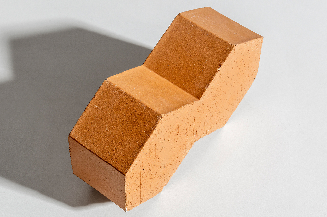
Hives is a collection of hexagonal, terracotta bricks that can be laid together to form endless configurations for interior furnishings and architectural structures.

Mutina is a collaborative ceramics company devoted to bringing top designers to the world of ceramics to bring their visions to life. Inspired by the endless range of textures and colors accessible to ceramicists, Mutina’s catalog of terracotta ceramics is constantly pushing the envelope for exciting and innovative new designs.

Designer: Mutina x Konstantin Grcic

Recently, the Italian brand commissioned Konstantin Grcic to develop a new line of terracotta bricks that challenges the fixed nature of brick-building. Inspired by the complex structure of beehives, Grcic’s line of terracotta bricks, aptly called Hives, can create seemingly endless configurations.

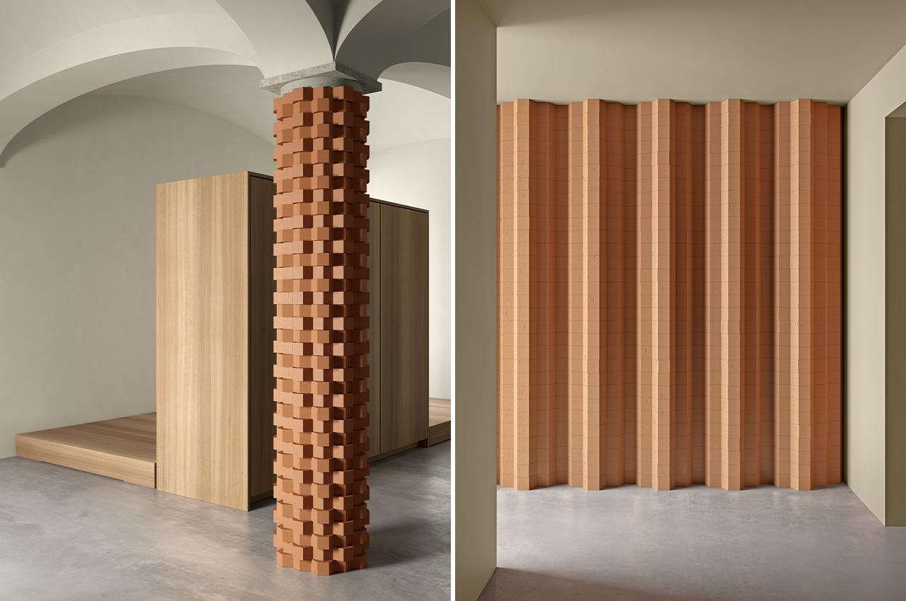
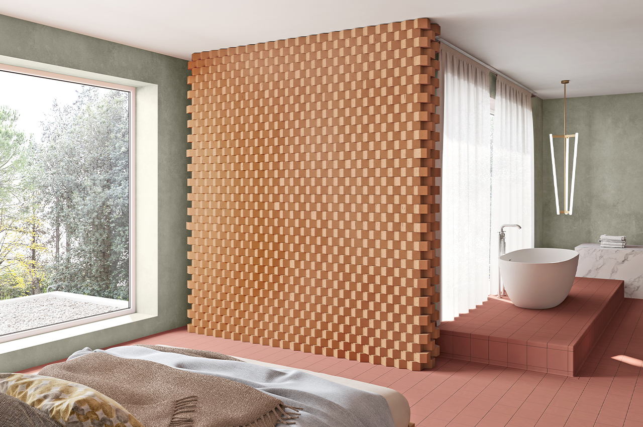
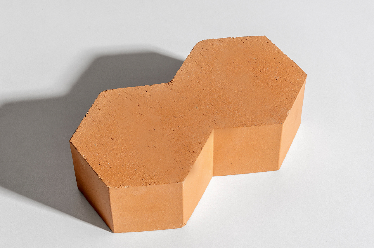
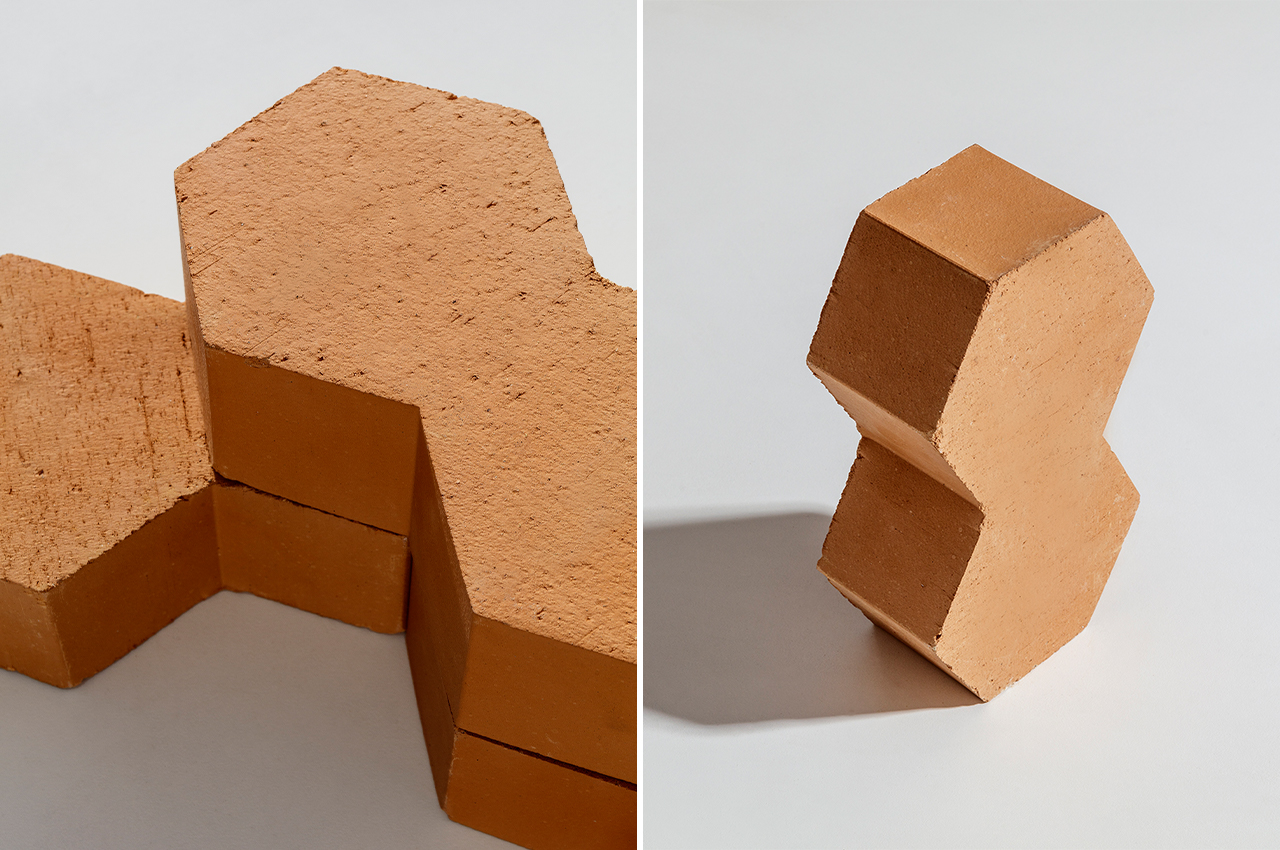
Described as a hexagonal brick, each brick that comprises the Hives collection could also be described as two hexagonal bricks merged together, giving the brick its three-dimensional appeal. Through this dynamic shaping, Grcic managed to design a brick that could build geometric partitions just as well as cylindrical columns.

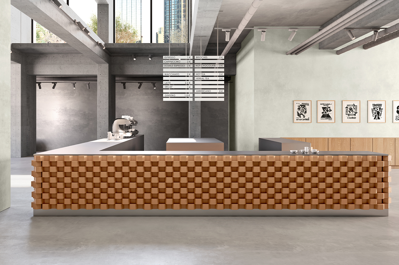
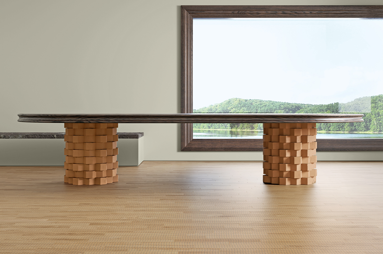
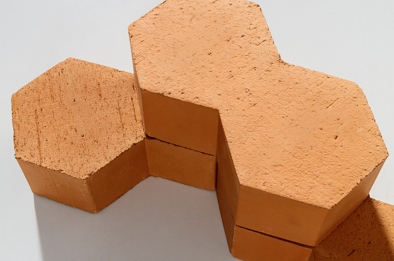
If laid vertically, the bricks form a semi-open structure with open cavities formed by the bricks’ harsh angles. When laid flat, the bricks can either be placed in a staggered or flush formation, producing more lively, undulating facades for structures like columns and table counters.

Available in the size 13×22, 5x7cm, the Hives brick is fully functional and versatile to build walls, architectural structures, and interior furnishings. Realized in terracotta, each Hives brick maintains impressive thermal and acoustics capacities, as well as durable tactile properties that are warmed by the brick’s soothing, orange glow. Produced using an artisanal technique called extrusion, each Hives brick is unique and organic in structure.

The post This collection of hexagonal bricks inspired by beehives is shaped for infinite expandability first appeared on Yanko Design.
CNC-milled porcelain vases fit together like a three-dimensional puzzle

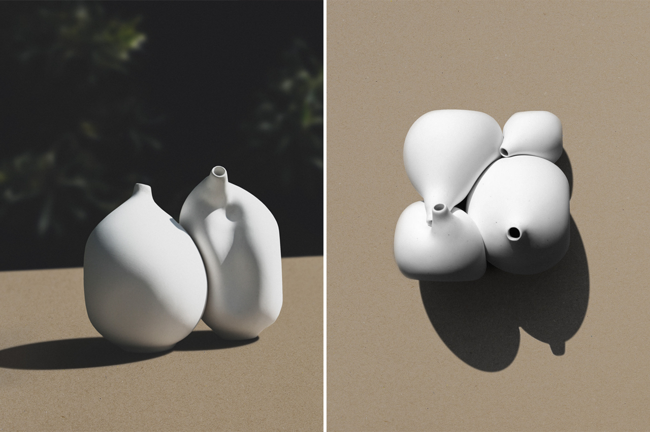
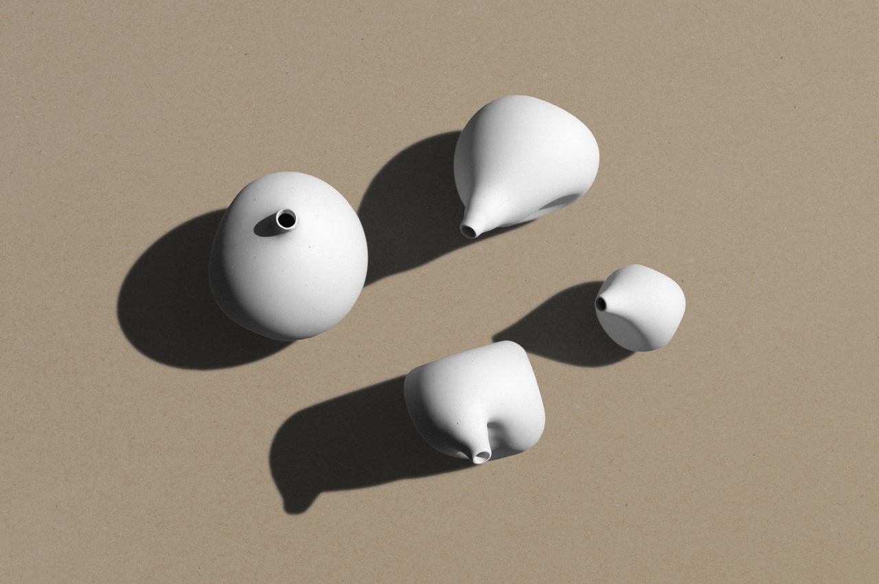
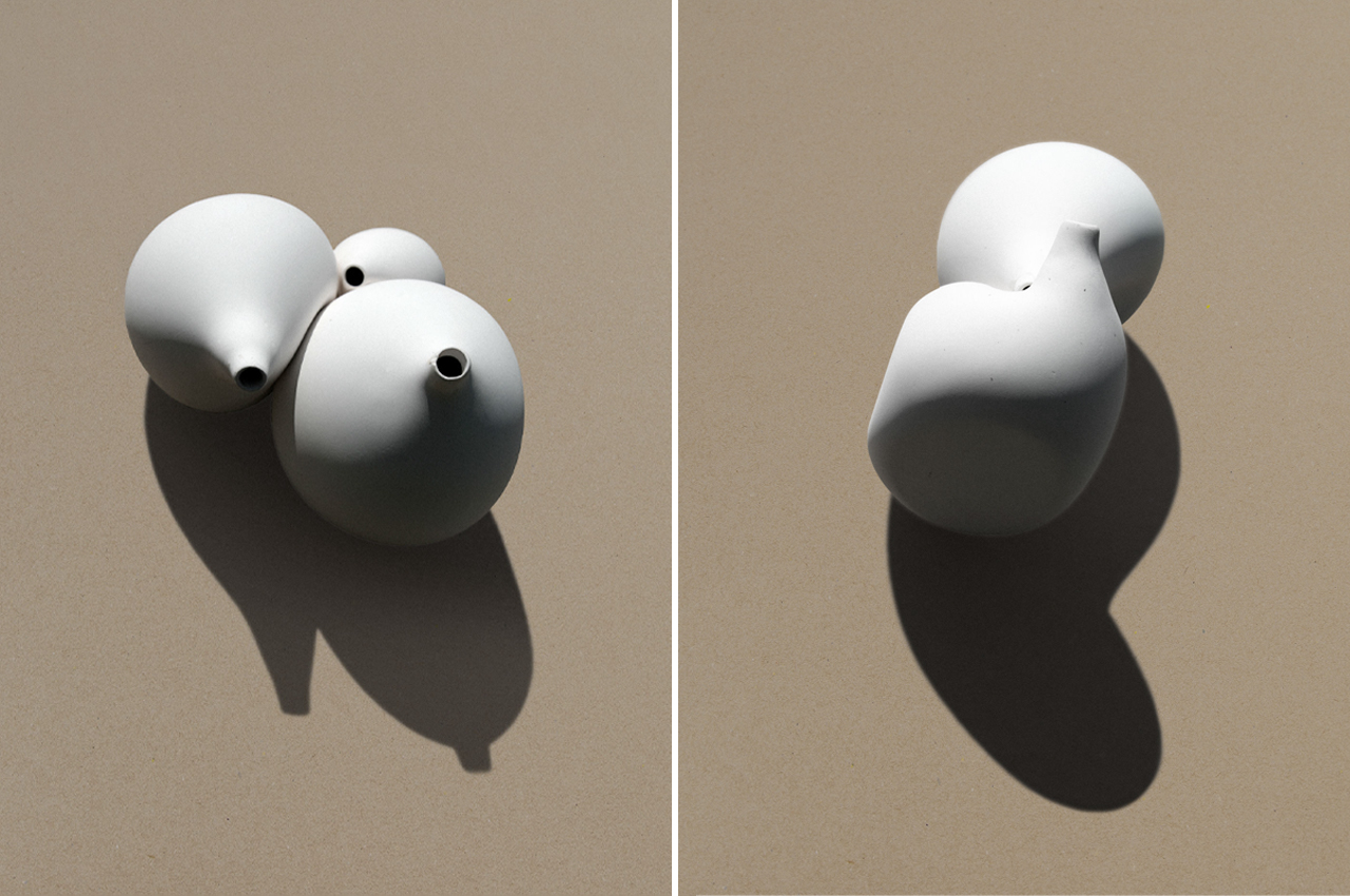
Ceramic Bodies is a collection of four porcelain vases that fit together like a three-dimensional puzzle.

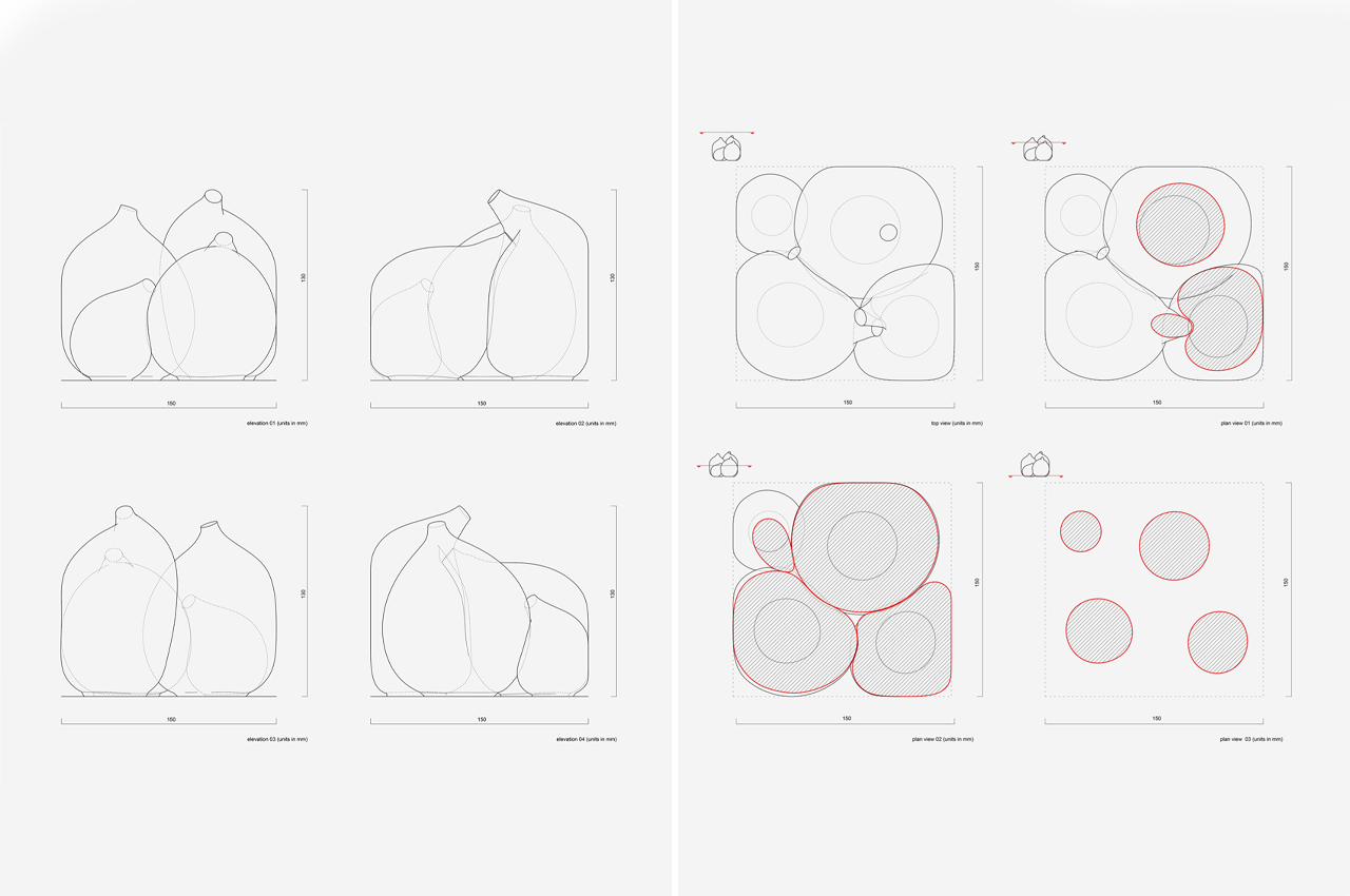
Designer Jörg Hugo studied architecture before opening his own design studio. Calling it Studio Jörg Hugo, his work largely explores “the relationship between materiality, form, and space,” as he describes on his personal website. Relying on either digital or analog design methods and production techniques, Hugo creates timeless pieces that completely reinterpret how we interact with space and material. One of his most recent projects, Ceramic Bodies, comprises a collection of four porcelain vases that almost appear to melt into each other like a three-dimensional puzzle.

Designer: Jörg Hugo

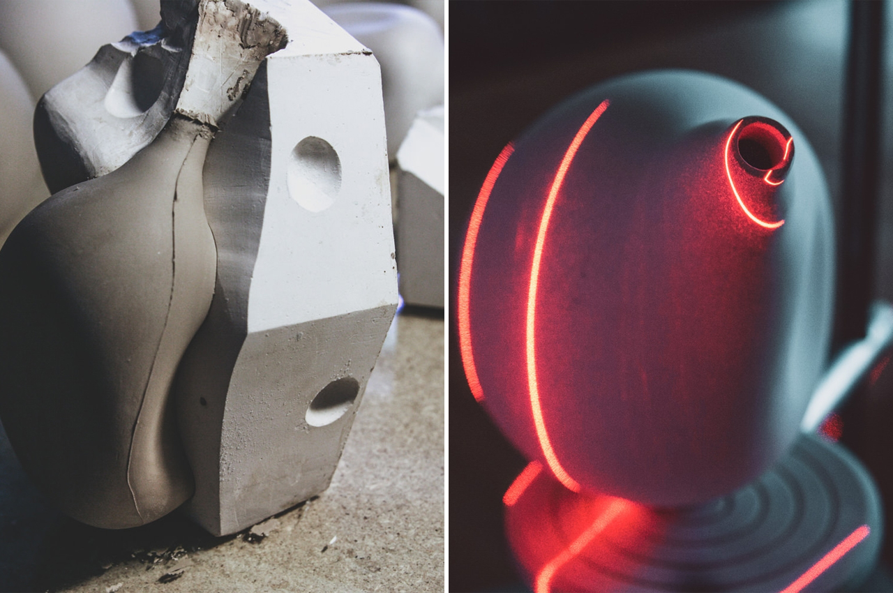
Each vase that’s included in Ceramic Bodies is deformed by design. Dotted with imprints and depressions, the deformed shape of each vase is a type of stabilizing technique called geometric optimization, which finds the most suitable configuration for an object to minimize its overall structural mass and energy. Fitting together like twin pieces, the plaster molds for each vase were CNC-milled from gypsum blocks to ensure accurate sizing and streamline the production process.

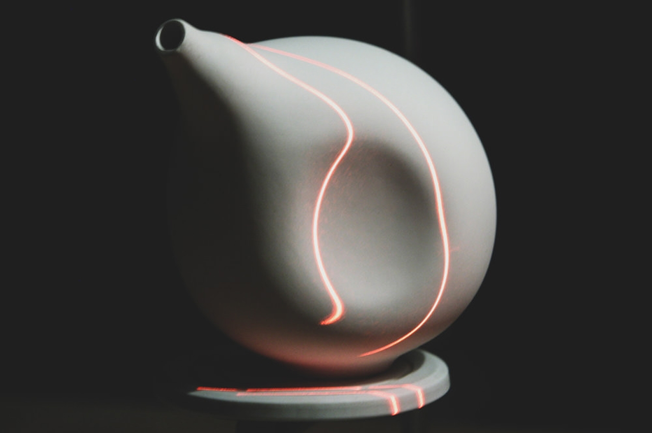
Before production, “All porcelain bodies were 3D-scanned, re-topologized and modified,” Hugo explains, “making it possible to change scale, adapt shrinking factors and optimize the stability of each porcelain body in a short period of time.” In order to ensure the vases were stabilized when they came together, Hugo altered the outer surface when necessary. While handcrafted ceramics is a timeless art, through Ceramic Bodies, Hugo found a digital way to save time while making art that looks handcrafted.

Starting with gypsum blocks, Hugo reconfigured the outer surface of each vase so that they would fit into one another. 

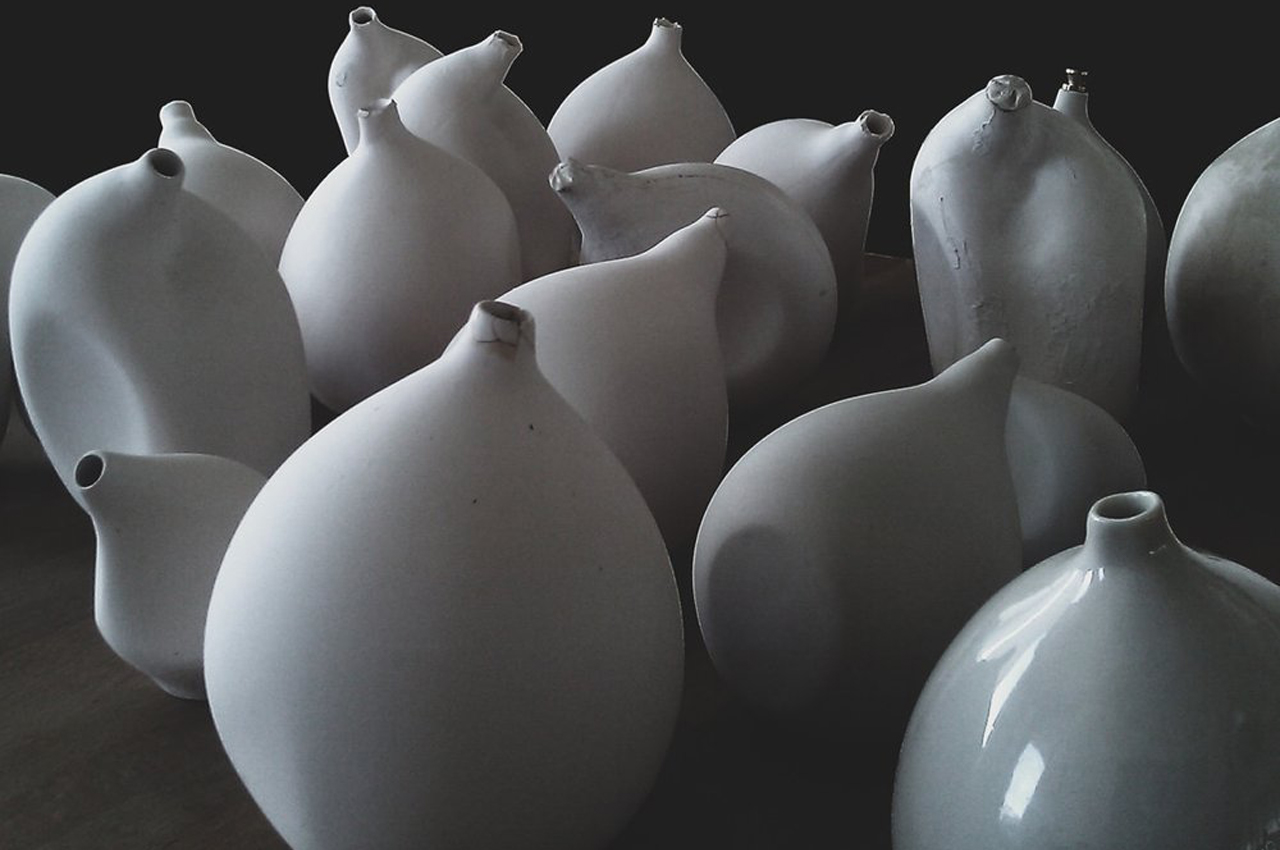
Hugo carefully shaped each vase so that they could form one unit. 

The vases could stand alone as an art piece or work as individual vases for flowers. 

The post CNC-milled porcelain vases fit together like a three-dimensional puzzle first appeared on Yanko Design.
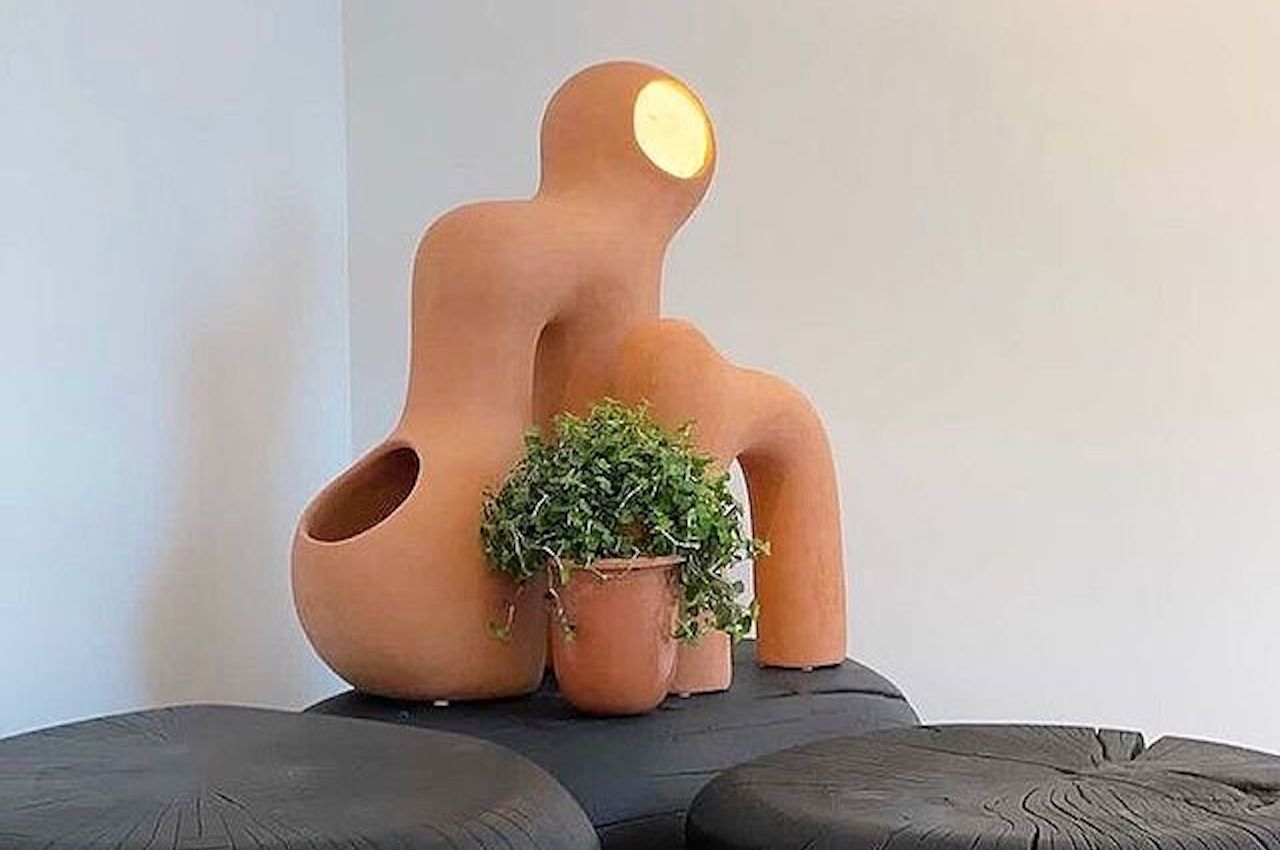
This stackable planter keeps your window clutter free and your plants healthy!

Ever since the pandemic started, we have been spending extended periods of time at home just quarantining and working. If you have a pet, it isn’t too bad but for others, it has become a time to shine as a plant parent! Having plants at home adds a little refreshing green to your space, can help purify the air and also give you something to care for that makes you feel good. But if you are a first-timer who has a small space and has only ever had succulents, then ToThem was designed for you – a planter that can take care of itself without crowding your windowsill.

ToThem is a modular vase system designed as a solution for organizing and taking care of multiple different plants in small spaces like city apartments. While optimizing space it was also essential for the designers to keep the form of the planter playful so they gave each part a unique shape that organically blends with the others. ToThem also has its own manual irrigation system that allows the water to reach the plants on all the levels at the same time. It also integrates a draining water reuse system. A smart planter that doesn’t use any tech to be smart, just good design.
The structure of the planter includes four juxtaposed vases of different shapes and dimensions designed keeping different plants in mind – aromatic plants (mint), Hedera Helix, Succulents (Aloe Vera) and flowers (Spathiphyllum). These plants were chosen for the positive properties they give to the interior environment and the inhabitant’s health (something we absolutely need in 2020). The warm, earthy tones complement the greens and transform any corner into a cozy one!

Designer: Camila Saulino and Alibek Atahanov

This Japanese kettle’s detailed design will leave you wondering “real or render?”

Japanese culture has so many little practices that exude a sense of calm. My most favorite thing (besides enjoying a soulful bowl of ramen which I think is a form of meditation) is enjoying a warm cup of tea. There is nothing that can soothe you like a freshly brewed cup of tea and during these complex times I am definitely seeing an increase in the number of cups on my table so I started looking for a kettle and I came across the Seramikku.

When I saw it, I fell in love with the design of the kettle – it was a perfect balance of archetypal Japanese forms and minimalistic modern details. Its shape and texture are inspired by ‘Uwade kyusu’ which is one of the more traditional Japanese teapots known for their distinctive, almost floating, handles that hover on top of the lid. The designer has envisioned the Seramikku to be made from ceramic and iron with an electric heating base. Sadly, it is not for sale because it is concept design which a part of a Render Weekly challenge – yes, I had to look at it thrice because the detailing was so realistic that I wanted to believe I had stumbled upon my future favorite teapot.

I am going to go and brew myself a cup of Jasmine tea to recover from being in love with a design and then heartbroken by the lifelike render.

Designer: Shail Iyer

The bones of grass-fed cows were used to create this sustainable collection of tableware!

The restaurant Blue Hill at Stone Barns, in Tarrytown, New York follows a very unique and intriguing philosophy. Its food is wholly nose-to-tail, this means they believe in utilizing all parts of the animal and are dedicated to culminating creative methods for eating the entire animal. No waste, nothing left behind. Since they were paying so much attention to food, the way it’s grown and utilized, ceramist Gregg F Moore decided to create a line of tableware that was in tune with their philosophy! Moore collaborated with Dan Barber, the chef and co-owner of Blue Hill, and together they conceived their brainchild, which is grass-fed bone china. What does that mean? It’s basically china or ceramic created from the bones of grass-fed cows, the very cows Barber raises on his farms and uses for meat and dairy.

Designer: Gregg F Moore and Dan Barber

Moore’s tableware collection consists of a bowl, plate, and a cup. Translucent and glazed, with a sleek white structure, the vessels instantly catch your attention! The Blue Hill cows consume grass, instead of following the typical grain-based farm diet. Since they devour grass, they move and roam freely in search of greener pastures. This ensures that their bones are much stronger as compared to the cows found on other conventional farms, leading to stronger, creamier and more durable ceramics.

The bones from the restaurant are fired in a glass kiln, via a process called calcination they transform from a living tissue into calcium phosphate. Moore then mixes this with water and converts it into a sludge.

The sludge is dried and pulverized into a powder that is bone ash, and combined with more water, china stone and kaolin.
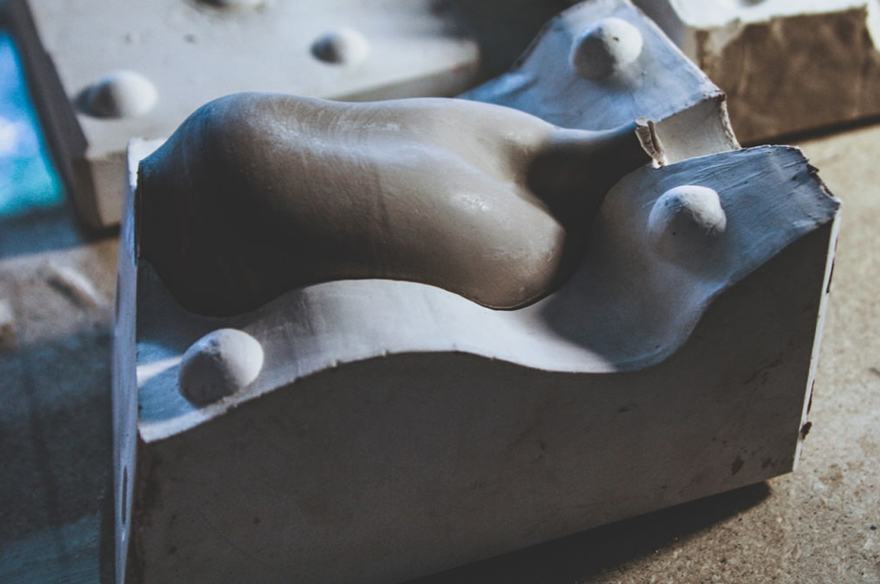
The mixture is cast into a mold and allowed to rest for a couple of seconds. It is then inserted into an oxidized electric kiln creating beautiful paper-thin pieces with an organic form.
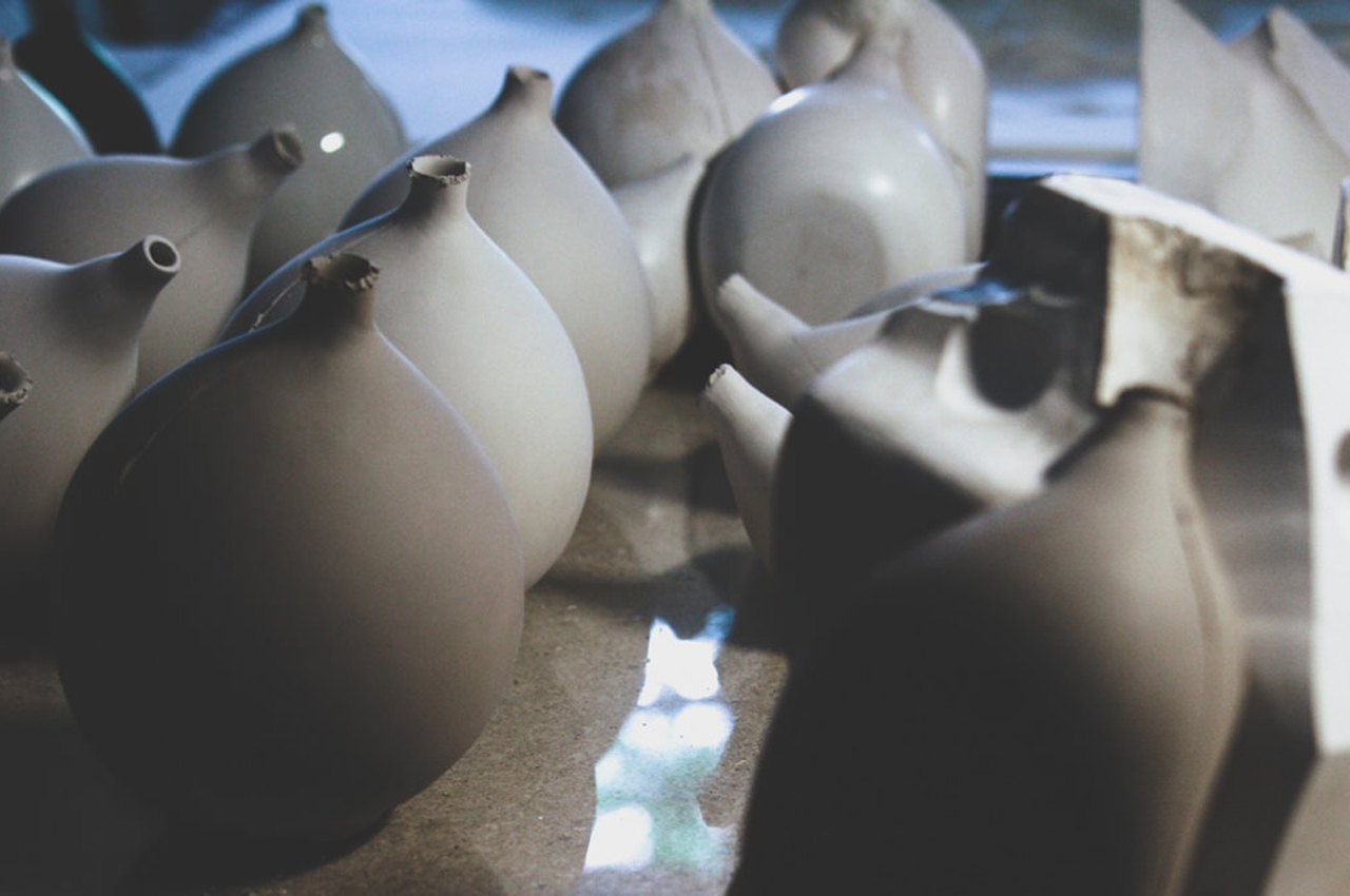
The tableware is in line with the whole-animal philosophy followed by Blue Hill, promoting food sustainability and maintaining a connection to where food comes from.

Parametric ceramics that ditch the potter’s wheel for algorithms

I’d make some wise remark about spinning wheels versus spinning hard-disks, but it would probably require a fair bit of explanation. Parametric design is a term often used in industrial design and architecture to describe computer-aided design where algorithms become a part of the design process, and is a relatively new concept to ceramics and pottery (although to be true, it is gaining popularity). Jimmy Jian and Jack Liu’s use of parametric modeling in ceramics results in some stunning pieces that combine the natural appeal of glazed pottery with the sharp edges brought about by the parametric design process. Created as a series of homeware, Jian and Liu’s Parametric Ceramics are tradition and modernity brought together. The slip-casted ceramic pieces come with beautifully edgy textures that one would never get off a potter’s wheel. These textures are, however, softened slightly with a thick coat of glazed hues that make each ceramic piece vibrant and absolutely inviting!

Designers: Jimmy Jian & Jack Liu.

These vases are arguably more attractive than the flowers they’re meant for

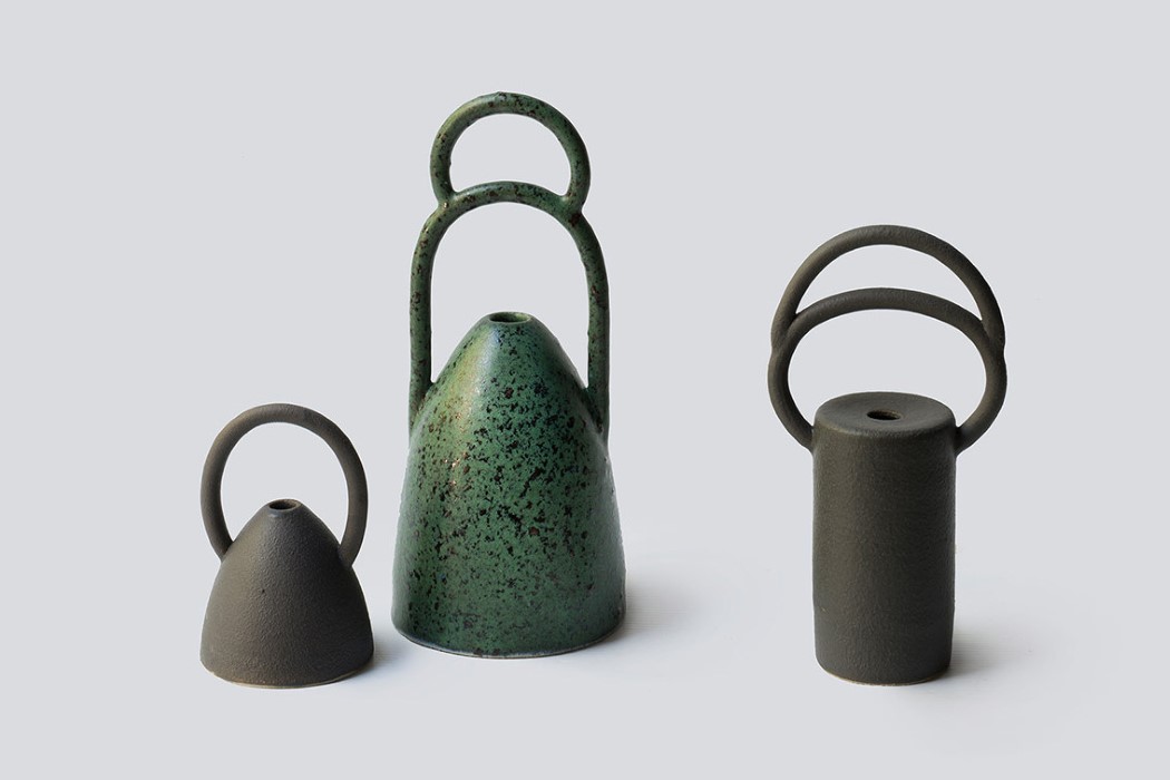
symbol_vases_1

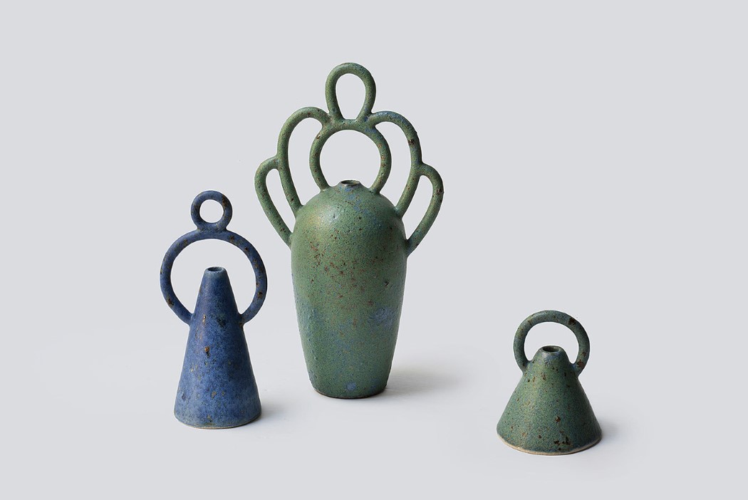
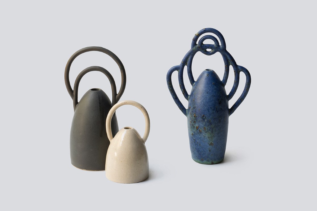
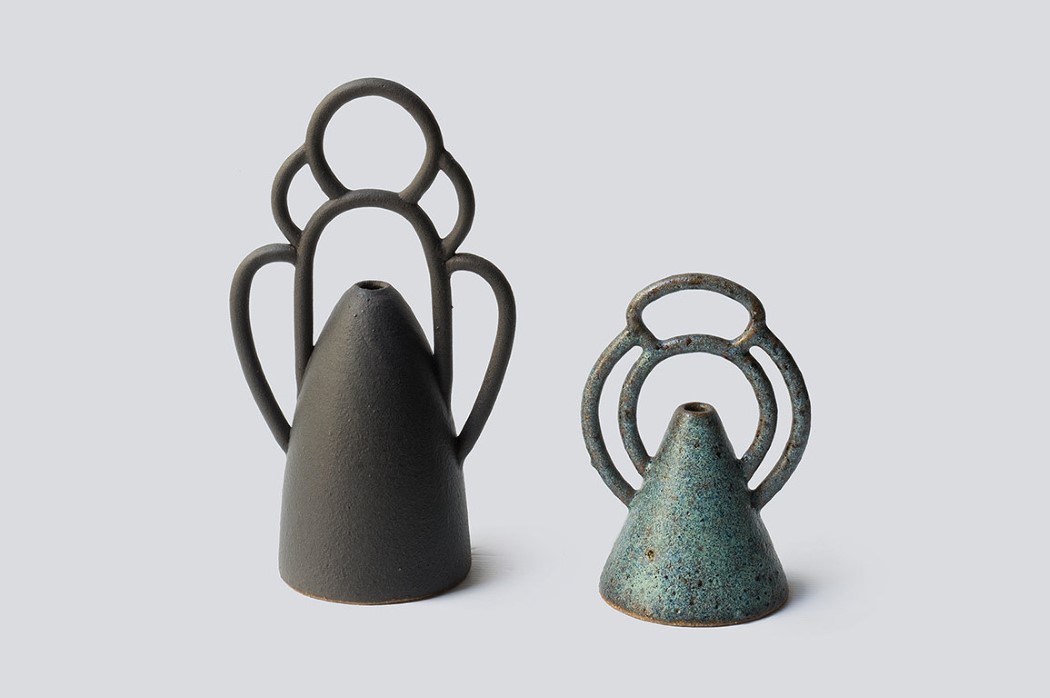
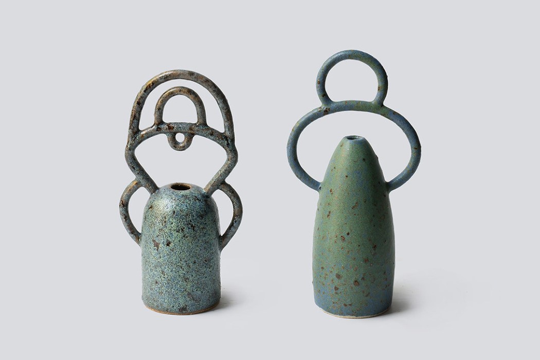
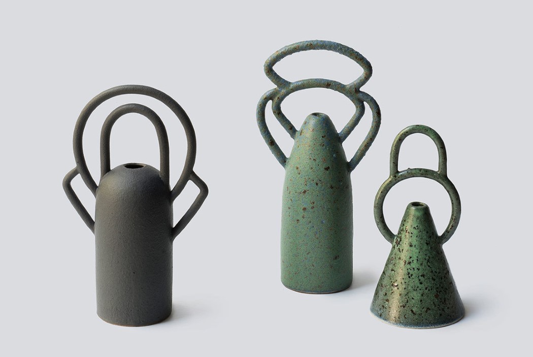
With its simplified shape that acts as a neutral base to the signature flair that is the vase handle, the Symbol bud vases by Nicolette Johnson are quite literally a symbol of beauty. The handles act as decorative halos to the flowers and buds that you place in the vase, and they come in a variety of designs, from simple circles and ellipses to much more complex, elegant shapes.

The vases come with distressed, grunge-ish finishes too, that don’t really subtract from the beauty but rather add to it, making them look and feel like precious antiques.

First designed in 2016 (and still being continues as an ongoing project), the vases began as a simple form with a cone-shaped body and a singular, round handle, evolving later with new vessel shapes and more intricately detailed handles.

Designer: Nicolette Johnson Ceramics

symbol_vases_2

symbol_vases_3

symbol_vases_4

symbol_vases_5

symbol_vases_6