The world’s first Sea-Air Integrated Drone blazes a new path towards oceanic sustainability and carbon neutrality

The Sea-Air Integrated Drone is the first drone of its kind to be able to fly in the air and swim underwater to perform various and complex tasks, leading a new path toward sustainable ocean economies and carbon neutrality.

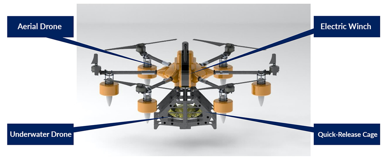
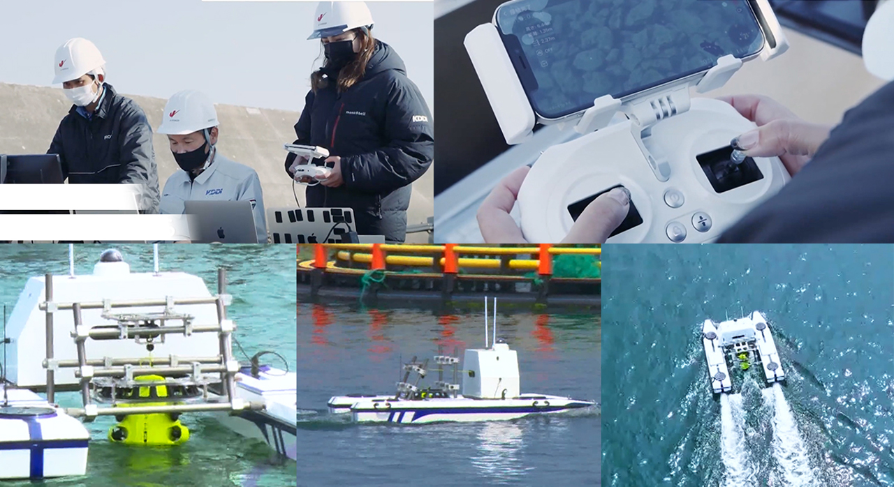
Underwater robotics firm QYSEA recently teamed up with Japanese telecommunications operator KDDI to develop the world’s first sea-air integrated, remote-control-operated drone, which was constructed by the commercial drone manufacturer PRODRONE. The Sea-Air Integrated Drone was first unveiled during a flight showcase at the Hakkeijima Sea Paradise in Yokohama. With sights set on modernizing “offshore and marine operations with its intelligent capabilities, high working efficiency, and minimized manpower required,” the drone will be the first of its kind to fly in the air and swim underwater.

Designers: QYSEA, KDDI, and PRODRONE

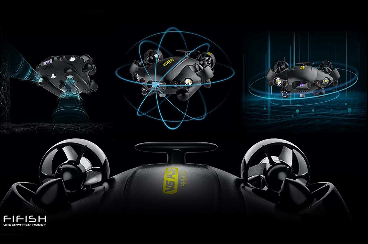
Known for an impressive catalog of underwater robotics and marine technology, QYSEA implemented the use of their industrial-class FIFISH PRO V6 PLUS ROV into the build of the heavy-duty aerial drone. Six years prior to its conception, KDDI first began “[combining] advanced mobile communication networks with drone technologies that would deliver extended flying distances and lengths.” Since then, KDDI and QYSEA have worked together to develop seamless drone operations between air and sea.

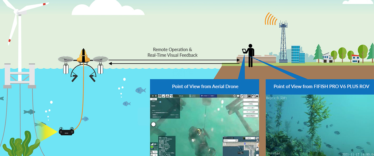
Defined by KDDI’s long-range mobile communication technology, operators can control the drone via remote from long distance ranges, whether the drone has submerged underwater or taken flight. Once the drone has landed in its designated location, the FIFISH ROV detaches and deploys to get to work, allowing the operator to remotely control the drone with the ROV from a safe distance. Describing the drone’s remote-controlled operations, the team at QYSEA notes,

“Without the need to leave their onshore working location, the operator can deliver inspections with real-time visual feedback and operate through underwater environments with a variety of sampling, measurement, and manipulation tools, as well as be able to live-stream operations for multi-person collaborations.”

In addition to the variety of operations the drone can manage, the Sea-Air Integrated Drone has shown its competency across additional marine-based industries. In offshore wind power plants, the drone can perform complex maintenance tasks.

In the world of aquaculture, the Sea-Air Integrated Drone can fly out to monitor livestock and crops, in addition to regular maintenance tasks. With further information to be released in early 2022, the Sea-Air Integrated Drone is sure to lead a new path toward the development of a sustainable ocean economy and the global goal of carbon neutrality.

The post The world’s first Sea-Air Integrated Drone blazes a new path towards oceanic sustainability and carbon neutrality first appeared on Yanko Design.

Black + Decker’s latest Kitchen Appliance is like a Keurig for cocktails


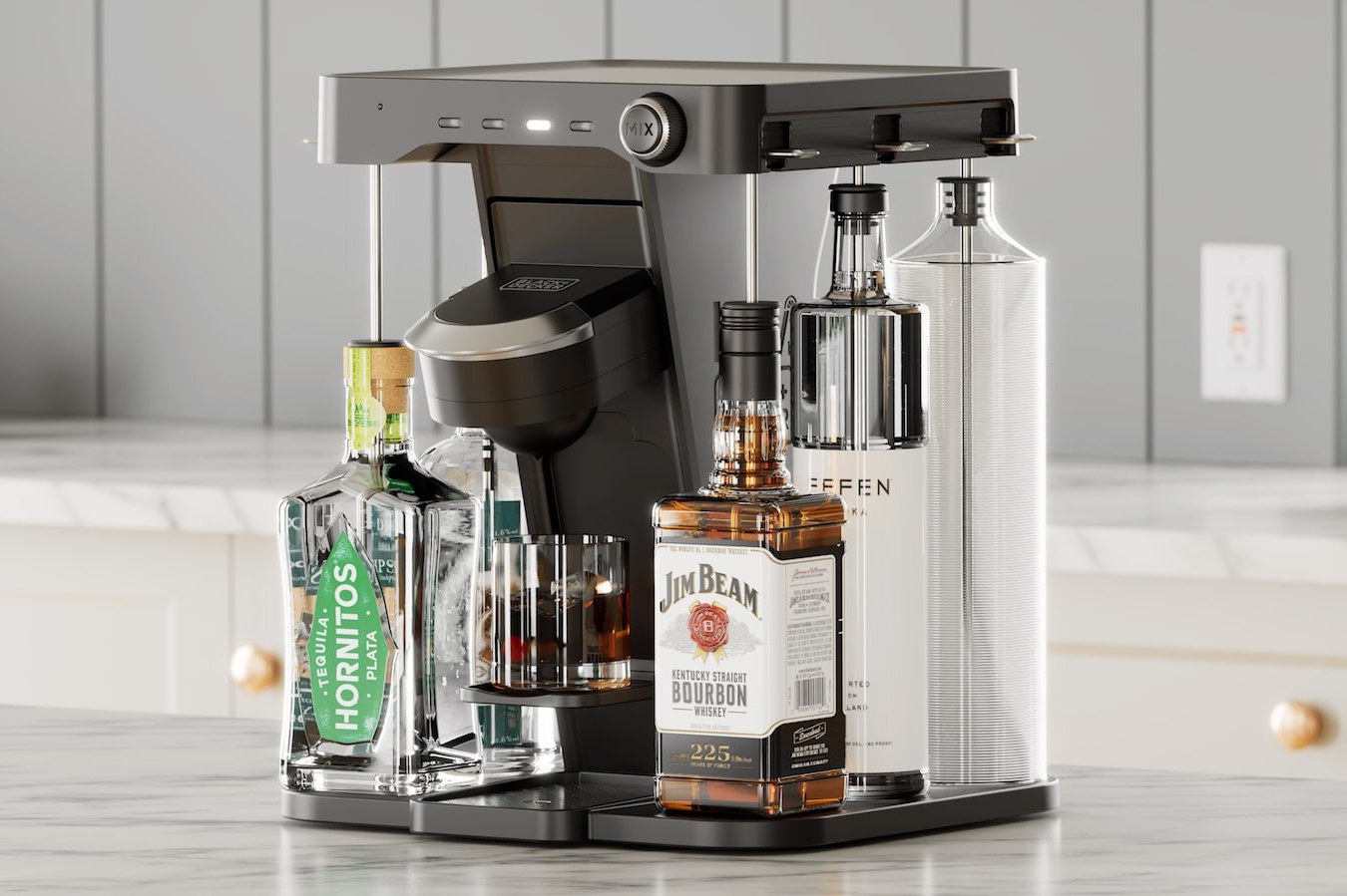
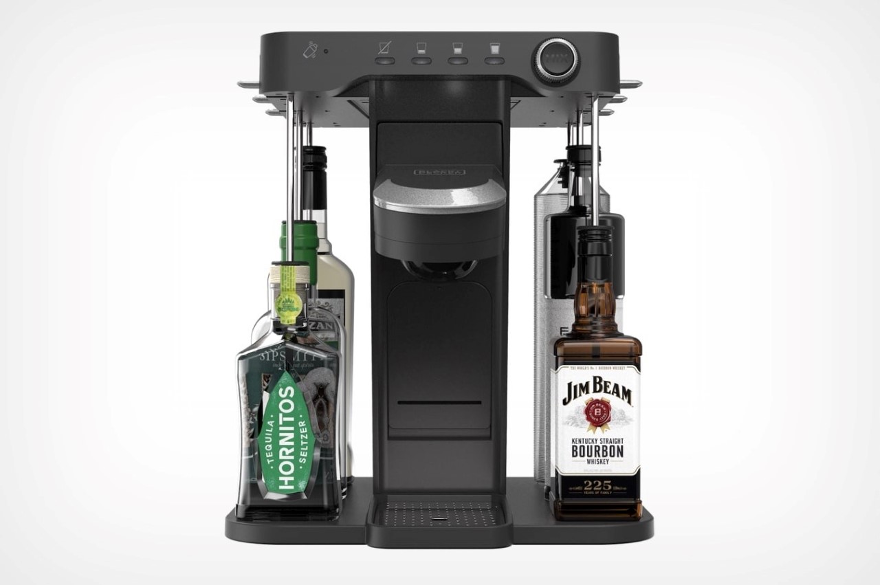
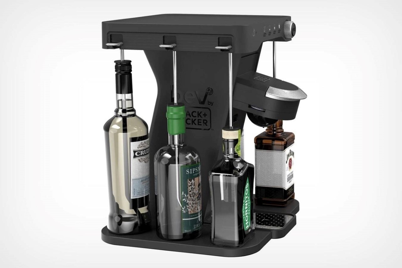
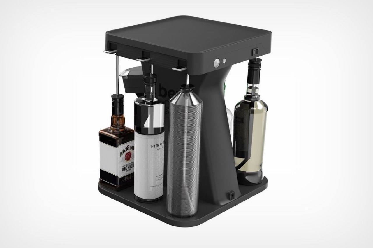
Unveiled at CES 2022, the $300 Black + Decker Bev is an automatic bartender that whips up the tastiest cocktails and mocktails for you on the spot. It occupies about the same space as a Keurig, and strangely enough, comes immediately after Keurig announced it was terminating its own $300 cocktail maker project. What the Black + Decker Bev offers is pretty much in the same ball-park when it comes to functionality. The kitchen countertop appliance sports a 6-bottle layout that lets you easily load 5 750ml alcohol bottles of your choice along with a sixth spot for Bev’s water chamber. Stainless steel straws descend into each bottle, allowing Bev to conveniently (and accurately) suck up precisely calibrated portions of alcohol to conjure up cocktails. No more mounting bottles upside down like other cocktail makers/dispensers.

To create different cocktails, Bev works on a disposable pod system quite similar to Keurig and Nespresso. Created in partnership with Bartesian, Black + Decker plans on releasing as many as 40 different beverage pods with pre-mixed juices, bitters, and syrups that just need to be popped into the appliance. Once a pod is loaded, you can select how intense you want your cocktail, and Bev does the rest, mixing the ingredients together and dispensing your final cocktail directly into a glass. The entire process takes all of 30 seconds, and yes, Bev even comes with a mocktail setting for people who don’t drink.

The product’s slated to be available in May, and Black + Decker’s mentioned that it doesn’t come with Bluetooth or a smartphone app. It does, however, sport a ‘Party Mode’ that uses LEDs under the bottles to create a pretty nifty ambiance!

Desigenr: Black + Decker

The post Black + Decker’s latest Kitchen Appliance is like a Keurig for cocktails first appeared on Yanko Design.

The Best of CES 2022 – Product Designs that Wow

Here are some of the best consumer electronics we can look forward to this year or dream about in the near future.

The annual Consumer Electronics Show or CES has always been a time for companies to show off their latest and greatest consumer tech ideas and products. More often than not, it also acts as a barometer for the trends and directions that will eventually drive and affect people’s lives in the months to come, from mobile devices to AI to robots to, unsurprisingly, the metaverse. These products and concepts aren’t just pulled from thin air, of course, and they also showcase the thinking and work that goes into their design. Not all products are made equal, though, and some designs easily rise above others. Here are some of the picks this year showcasing some of the best product designs from CES 2022.

Samsung Freestyle
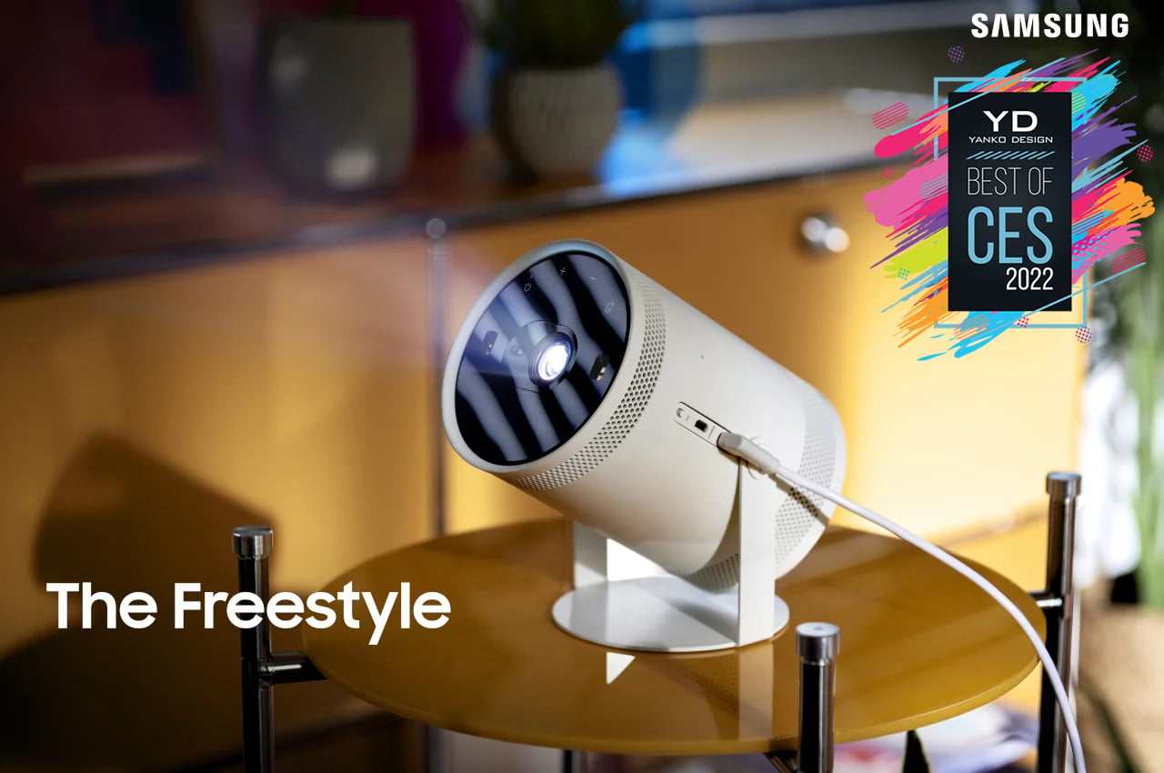
Smart projectors are almost a dime a dozen these days, even if they cost nearly four-digit figures. They come in all shapes and sizes, but Samsung’s latest entry into that market throws all design conventions out the window. It’s small, portable, multi-talented, and quirky. And it will be trying to put Samsung’s own smart TVs out of business.
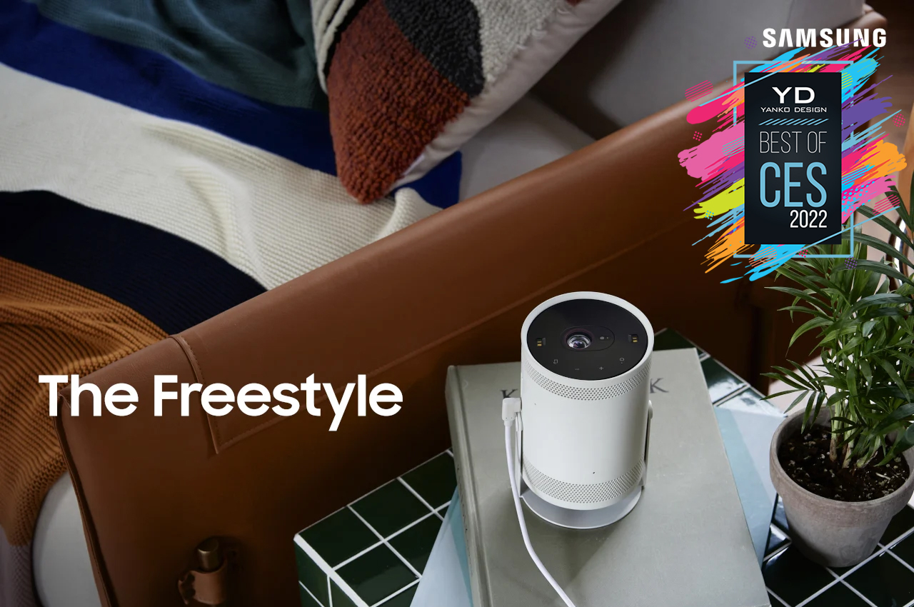
The Samsung Freestyle is part smart project and part smart speaker, with a little bit of ambient lighting on the side. Designed for Gen Z and millennials, it cylindrical device offers almost everything you need for a video binge, including Samsung’s smart TV software. It won’t outclass larger projectors when it comes to brightness, but you’d be hard-pressed to find one that’s as portable as this. All you need is a dark room, a flat surface, and a power bank, and you’re good to go.

Designer: Samsung

(Samsung C-Labs) Prinker
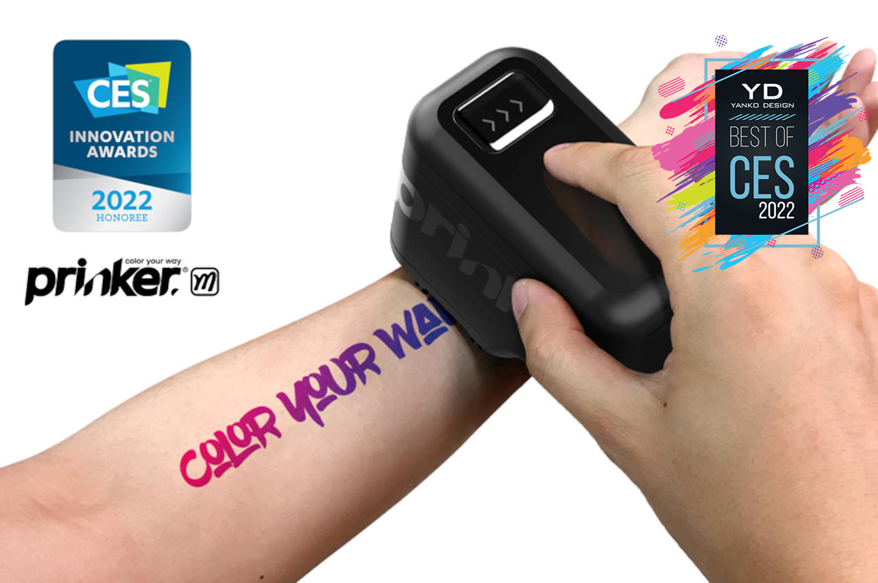
Although tattoos are historically serious business, they have acquired a certain element of whimsy in the modern age. Temporary tattoos and stickers try to offer a brief glimpse into that experience but come with their own sets of problems and limitations. More importantly, they aren’t fun, which is what Prinker is trying to solve.


Born from Samsung’s C-Lab skunkworks program, the new Prinker M makes printing temporary tattoos almost magical. You can select a design from the mobile app or create your own, slide the handheld printer over your skin, and voila! Instant water-proof temporary tattoo. The sign of great product design is that you don’t have to think about how something works, and the Prinker definitely pulls that off pretty well.

Designer: Samsung C-Lab

OneLife X
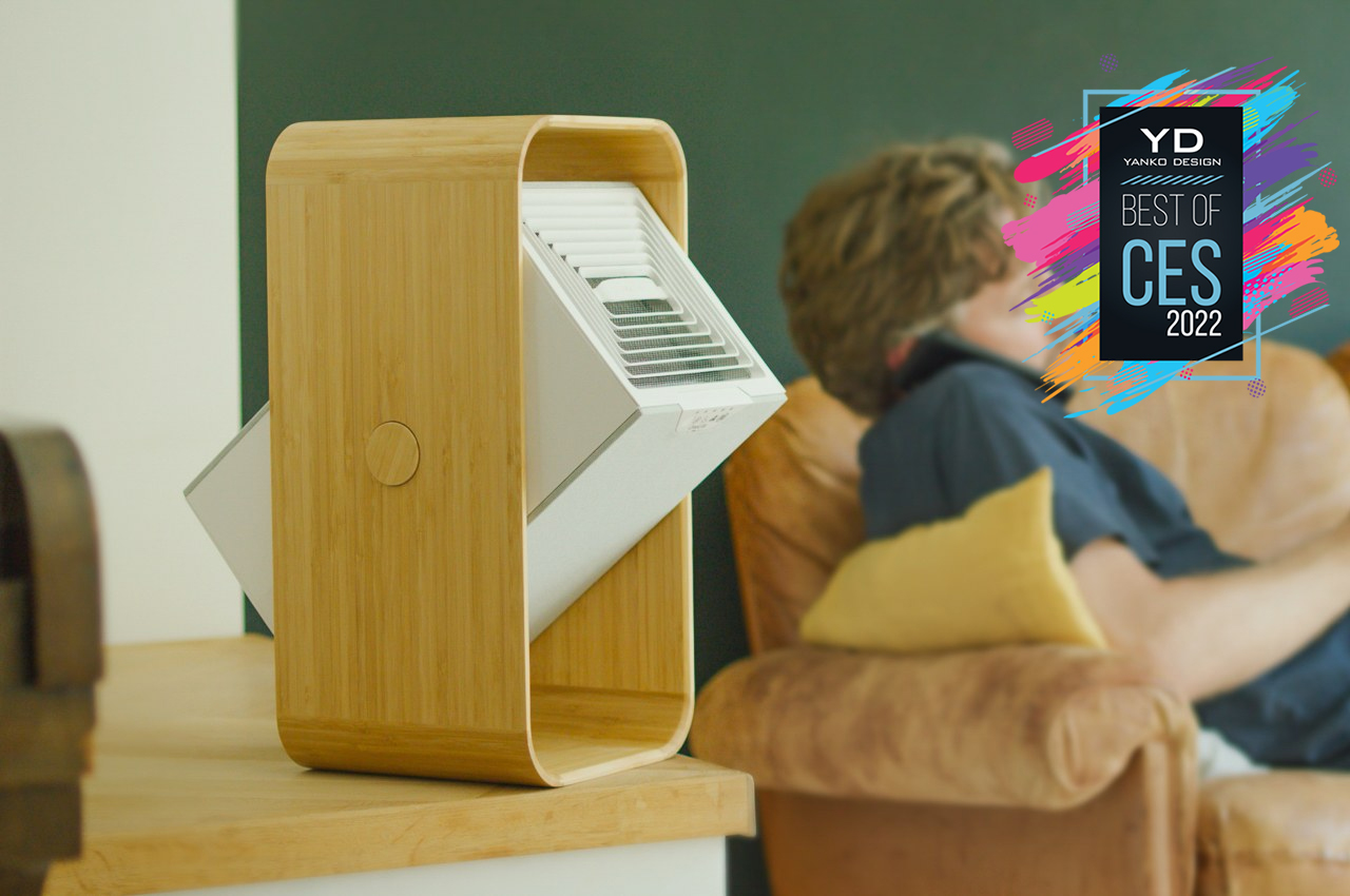
The COVID-19 pandemic has made people more concerned about the air they breathe, even at home. Although they don’t exactly kill the dreaded virus, air purifiers that help reduce the risks of getting sick have surged in popularity in the past two years. The OneLife X sounds like your typical air purifier if you simply read its features, but one glance at it, and you know it’s special.
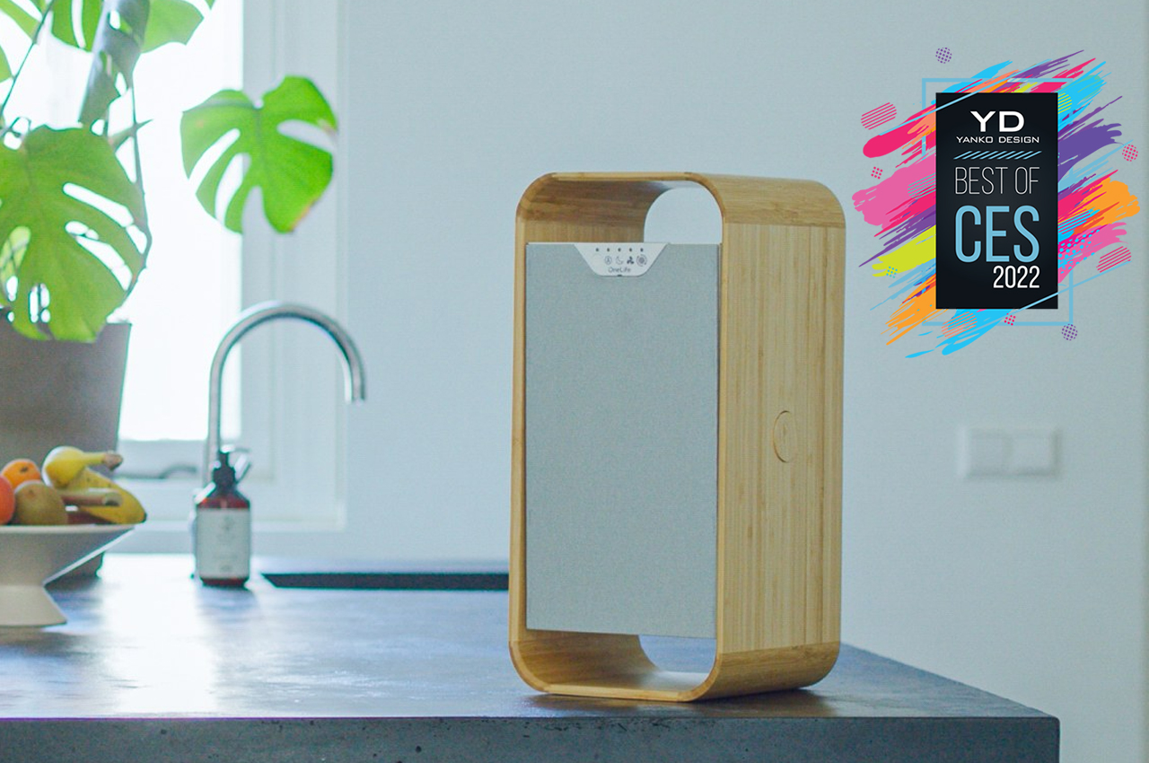
Aside from its use of advanced technologies like a laser plasma field to detect and purify the air, the OneLife X stands out from the crowd by being more sustainable. The filter, for example, is reusable and can easily be washed under the tap or even inside a dishwasher. The wooden outer body is also a big plus and looks handsome to boot!

Designer: OneLife

Labrador Retriever
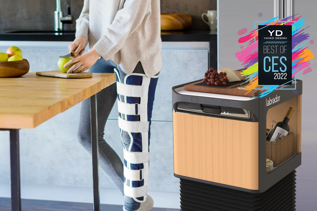
Robots are going to be part of our lives, whether we like it or not. These machines and AI might not completely take over our jobs just yet, but they are making their way even into our homes. Most home robots, however, are either toys or vacuum cleaners, but Labrador Systems designed a new robot that is a bit more homely. And despite its name, it doesn’t resemble a dog or Boston Dynamics’ Spot, for that matter.


This shelf on wheels can bring you your medicine or carry your laundry for you, all without you having to push or pull it to submission. Although everyone can benefit from this smart roving storage, the Labrador Retriever and Caddie are primarily designed for those with more limited physical capabilities. They also won’t look out of place standing with your minimalist furniture for those times when you don’t need it at your side.

Designer: Labrador Systems

Baracoda BCool
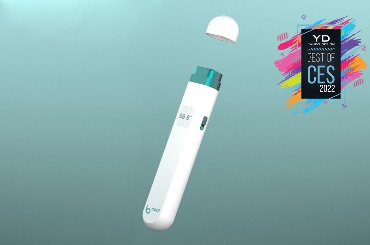
Medical and health-related gadgets have been popping up left and right as more people become concerned and conscious about their physical well-being. That, unfortunately, also means a rise in the use of plastics and other environment-unfriendly materials that are used to make these products. Digital thermometers have become one of the most common gadgets in this category, and Baracoda is launching one that keeps an eye on the environment as much as your temperature.
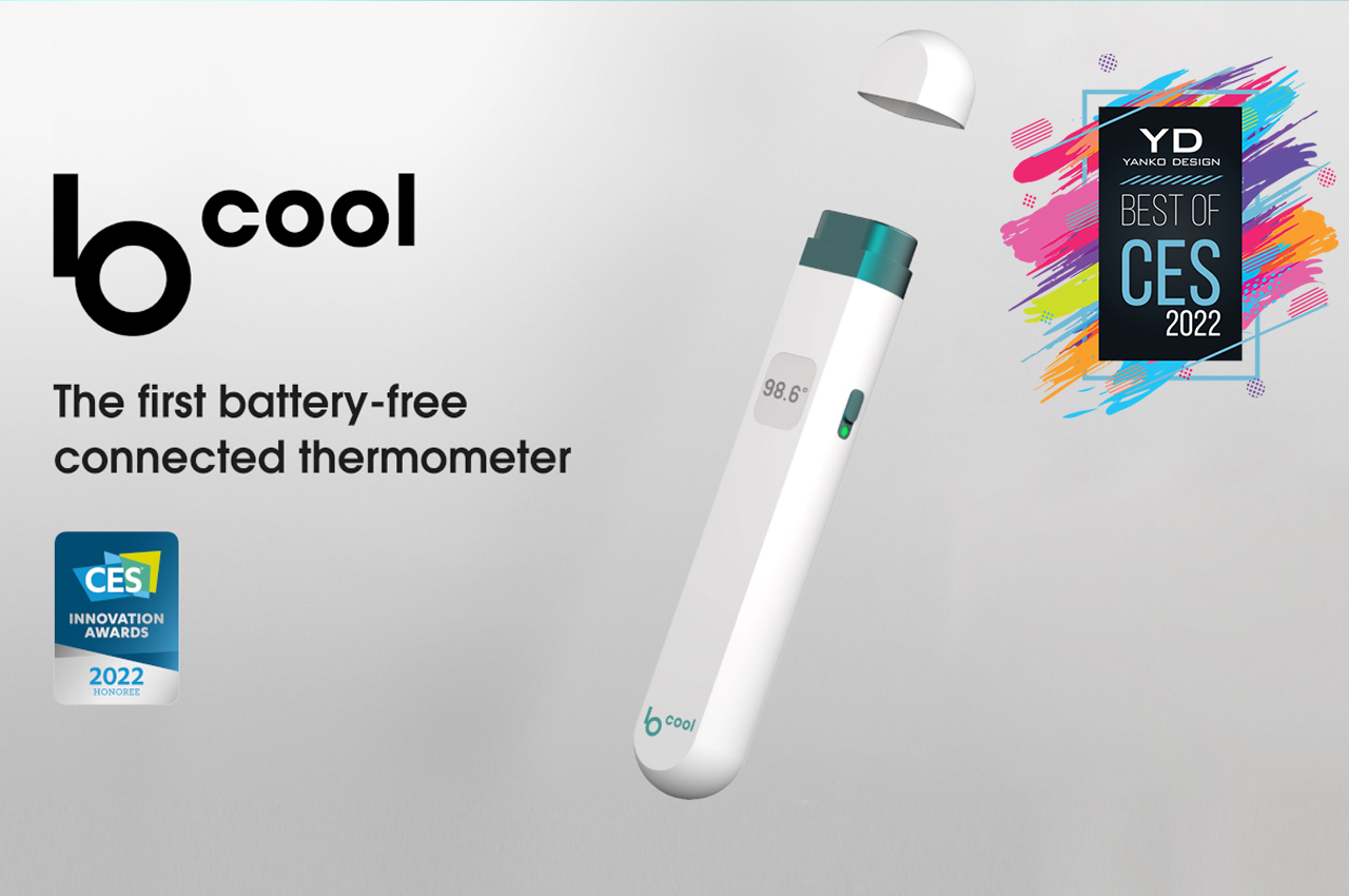
The BCool thermometer eschews batteries that almost all digital thermometers use, relying instead on kinetic energy to power the tool. Give it a few shakes, and then hold it near but not on your forehead to get a reading. No skin contact is required, making it also safe to use between different people. The device probably still uses non-recyclable or non-biodegradable materials, but it’s still a positive step forward towards making common tools like these more sustainable.

Designer: Baracoda

Albert 2 Pro Foot Scanner
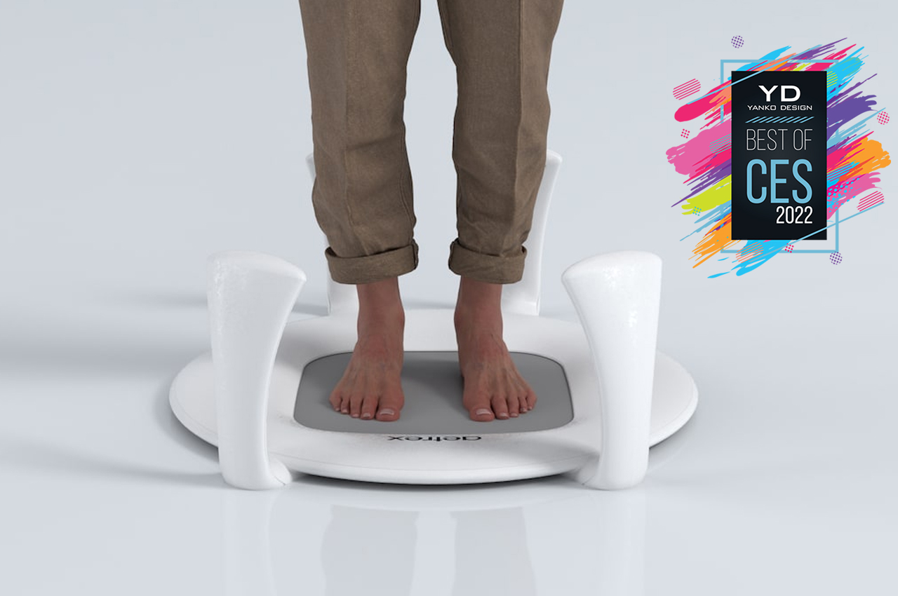
The ongoing pandemic has changed a lot of things in our lives, from the way we work to the way we buy things. Stores have also implemented their own systems to minimize health risks, but those don’t always work for all retail products. Footwear is particularly tricky to get right, especially without first-hand (or foot) in-person fitting. That’s where Aetrex comes in with an almost futuristic way to get your foot size and shape.
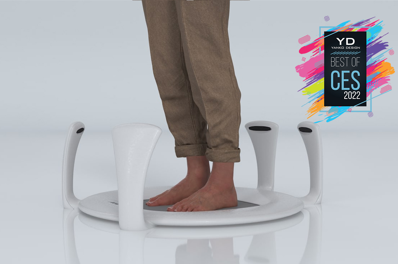
The Aetrex Albert 2 Pro looks almost like a sci-fi prop, one that you step on to potentially teleport you somewhere. In reality, it’s a 3D scanner that makes it almost trivial to find the right shoe or orthotics to fit your feet. Adding to the futuristic feel is voice control, ensuring that only your feet make contact with the scanner and never your hands.

Designer: Aetrex

Anssil Mattress
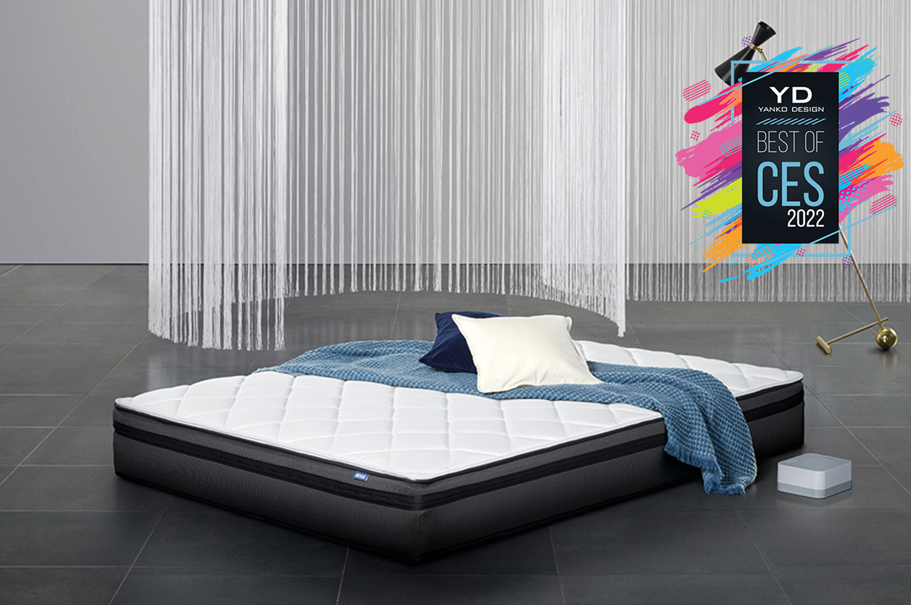
Given its name, you’d expect that everything at CES will be about electronics. Technology, however, doesn’t always involve processors, circuits, and electricity. Sometimes, the most impressive consumer tech products are those that don’t even have those, applying instead smart materials, innovative manufacturing, and, of course, good product design.


The Anssil Mattress is one example of that, using specially woven “3D” strings to replace the use of springs. The mattress does have some external electronics in the form of a cushion control that can increase or decrease the tension of those threads to soften or harden the mattress. It’s definitely an interesting and impressive demonstration of ingenious product design that doesn’t rely on hi-tech electronics and AI to function.

Designer: Anssil

Roborock Auto-Empty Dock
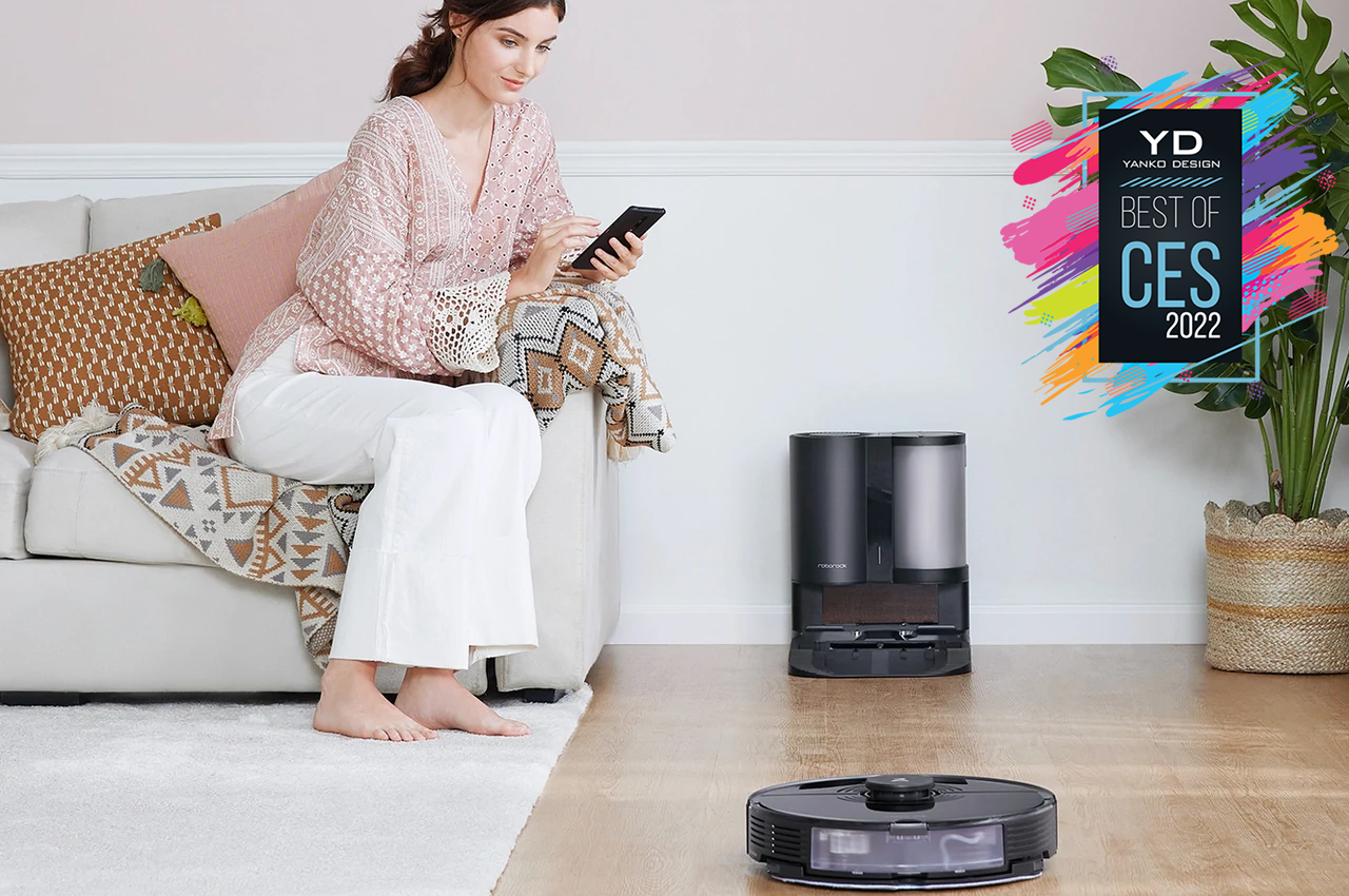
Robot vacuum cleaners no longer look like oddities today, and many of them are starting to look or sound similar in design and features. That includes how you often have to manually clean out the robot’s dust bin, potentially exposing you to harmful particles. A veteran in this market, Roborock has finally figured out how to minimize how often you’ll have to empty out the bin.
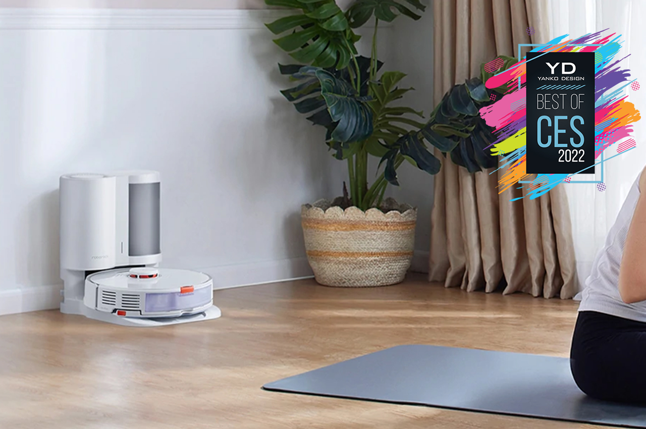
Roborock’s Auto Empty Dock system sucks the dust, dirt, and other unwanted things that the vacuum cleaner accumulated in its bin and transfers them into a bigger bin. That bin will eventually need to be taken out, but the 3.0L bag automatically seals itself when you’re about to do that. As an extra feature, that dock also acts as an air purifier for your room.

Designer: Roborock

LG PuriCare 360 Air Purifier

While the OneLife X definitely takes the crown when it comes to sustainability, there are times and instances where you might need a more powerful solution to protect your family’s health indoors. There are plenty of solutions available from big brands, but LG’s latest goes the extra mile by also minding the pets that live with you. And it does so in a form that doesn’t take up too much space in the room.

The new LG PuriCare 360 air purifier combines some of the company’s best features in this category. Pet Mode, for example, pulls in even strands of fur and hair that could cause allergies or breathing problems. It also has AI that detects which part of the room has the most air contamination and automatically rotates to face the problem head-on.

Designer: LG

XGIMI Aura
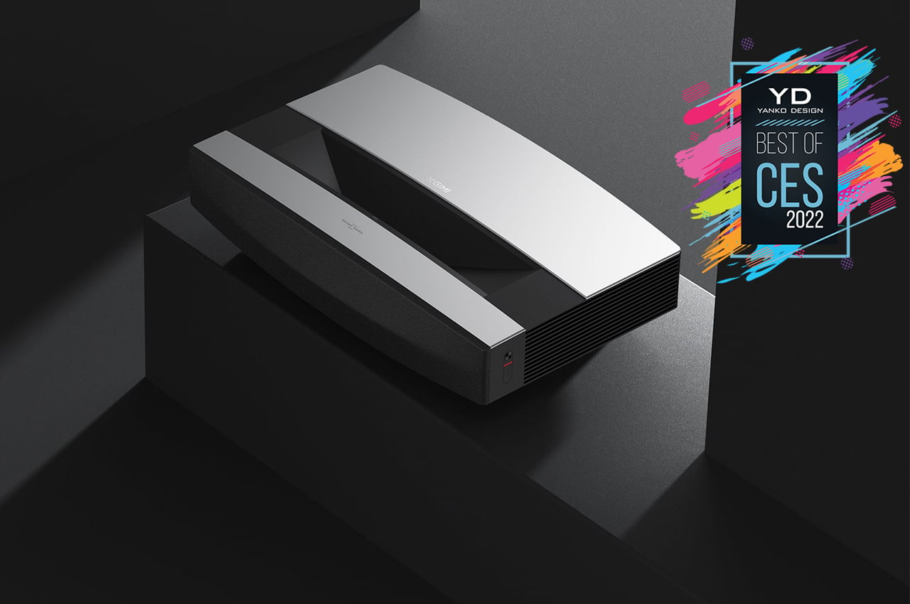
The Samsung Freestyle might be cute and portable, but when it comes to a serious cinematic experience, it might fall short of a few desirable specs. It stops at 1080p Full HD content, for one, and really requires you to have a dark place to watch in. If you want the full shebang, XGIMI’s new Aura 4K Ultra Short Throw Laser Projector will do nicely.
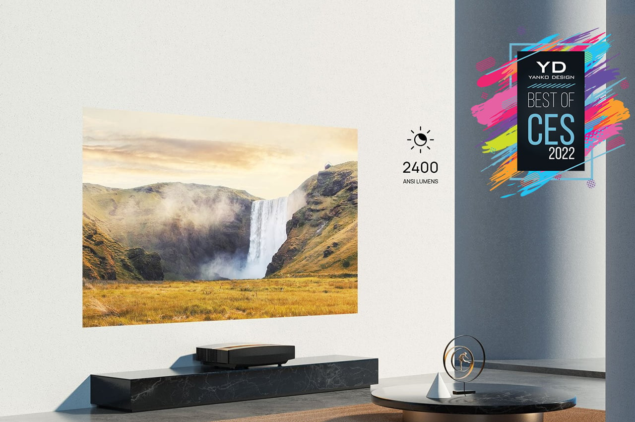
Yes, it’s quite the behemoth of a project, so you’ll probably want to keep it in a single place. Its sleek exterior and slightly curved top do give it a bit of charm and won’t mar the pristine interior design you’ve chosen. More importantly, its close range means you won’t have to set it up in the middle of the room when you need to use it.

Designer: XGIMI

Honorable Concepts

Not all the impressive things on the CES 2022 showroom floor made the cut, especially those that lean more towards the conceptual side of the fence. Here are some “honorable mentions” of designs we do wish would become a reality sooner rather than later.

Razer Project Sophia
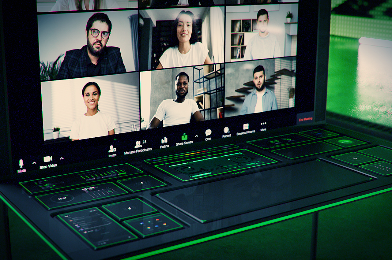
Razer’s idea for a modular desk will save many creatives and workers not just time but also space and money. A single desk that can be reconfigured at a moment’s notice to fit your needs sounds like a fantasy waiting to happen. That it looks like the dashboard of some futuristic ship or console scores bonus points for design and tech geeks.

Designer: Razer

Movano Ring
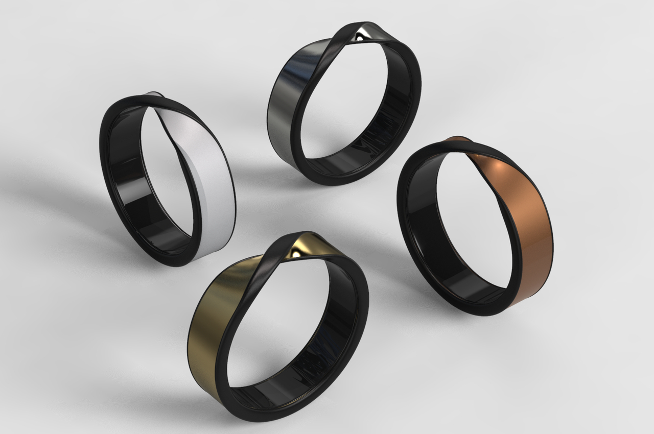
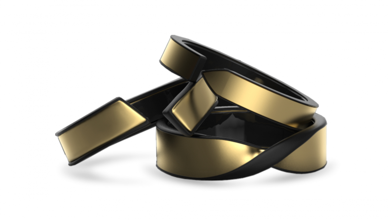
Smart rings aren’t completely new, but they have yet to become the stylish and discreet accessories that their non-smart counterparts have been for centuries. Movano’s design, aimed at women, certainly makes it look like a luxury item, but it is serious business in keeping tabs on the wearer’s health. It will definitely be interesting when Movano finds a solution that will allow that same ring to monitor not just your typical biometrics but also your blood sugar level without having to draw your blood.

Designer: Movano

Dell Concept Luna
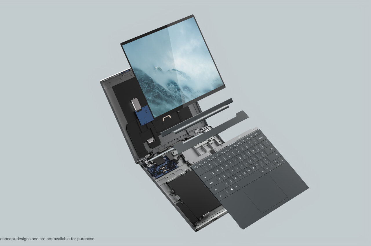
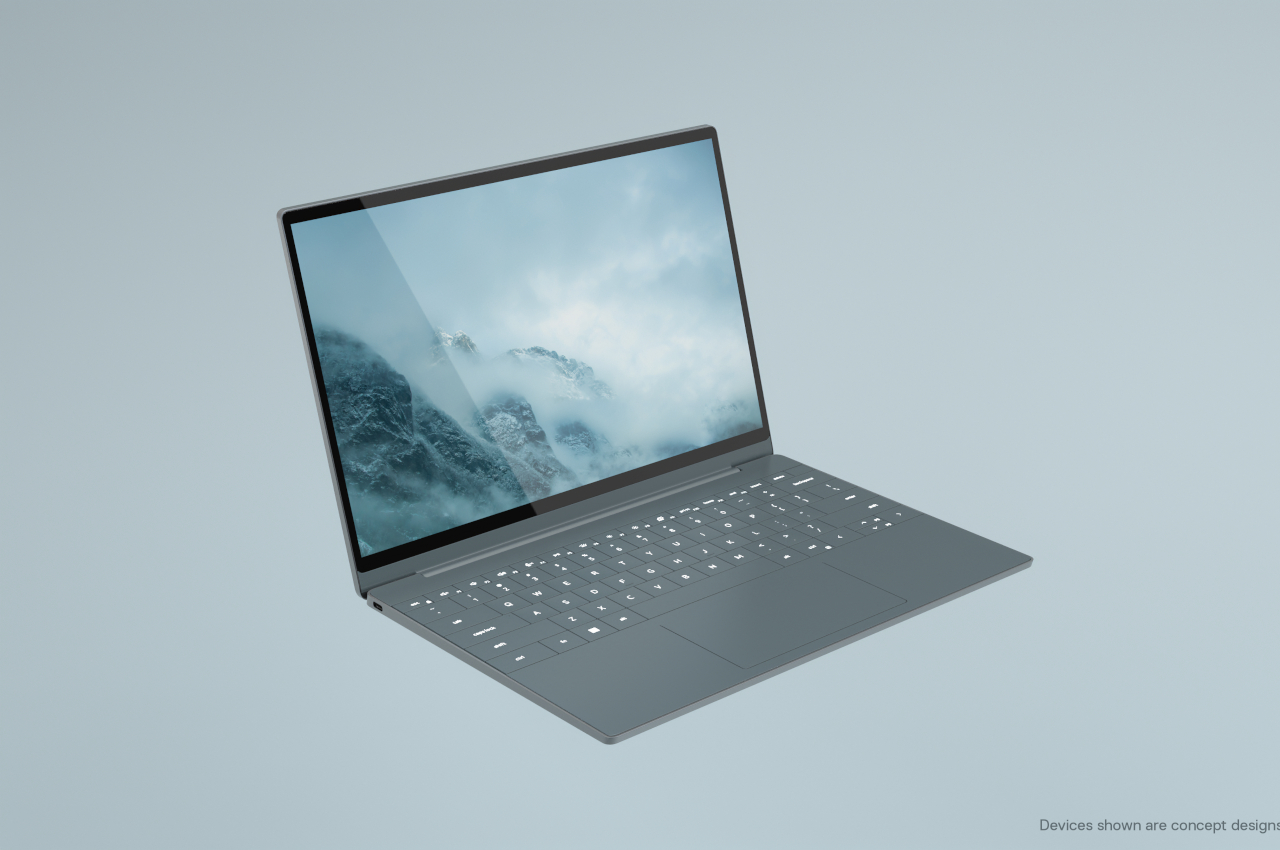
CES 2022 is unsurprisingly flooded with new laptops, but even ASUS’ take on the foldable laptop pales in comparison to Dell’s bold concept. A sustainable and repairable laptop probably goes against all business sense for a PC maker, but the long-term benefits to the environment probably make it the most important gamble Dell could ever take. It doesn’t have to happen all at once, though, and any step forward could still benefit the planet and consumers in the long run.

Designer: Dell

BMW iX Flow Concept


Forget flying cars, at least for a while. BMW’s iX Flow envisions a future where a vehicle can be more than just a status symbol but also a fashion statement. Of course, E-ink technology will still have to catch up, but it’s only a matter of time before we see a full-color version of this intriguing idea.

Designer: BMW

The post The Best of CES 2022 – Product Designs that Wow first appeared on Yanko Design.

These “invisible headphones” sit on your desktop and beam sound directly (and only) to your ears


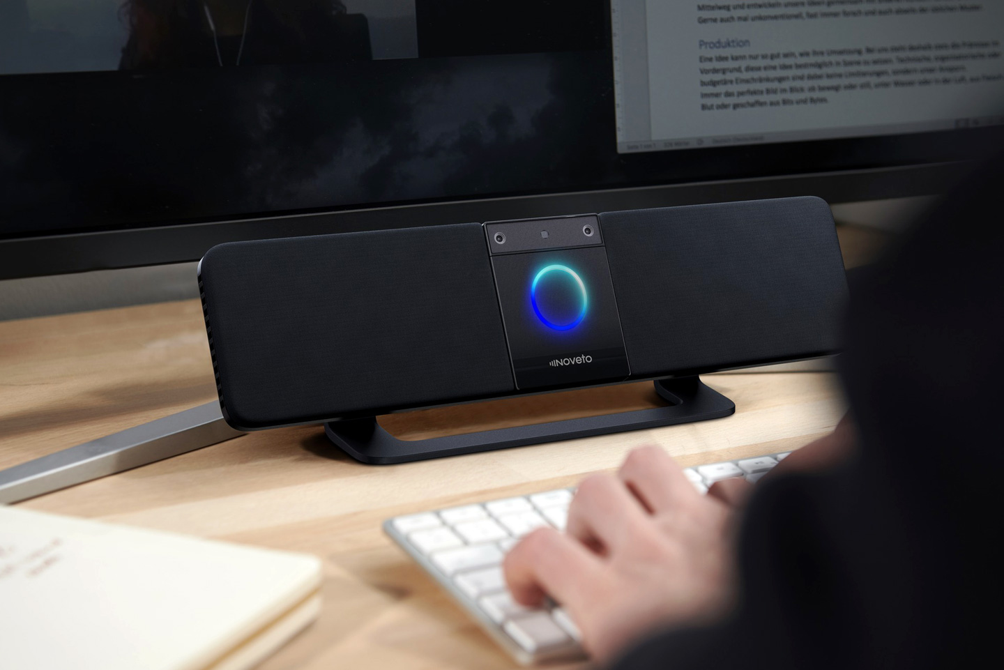
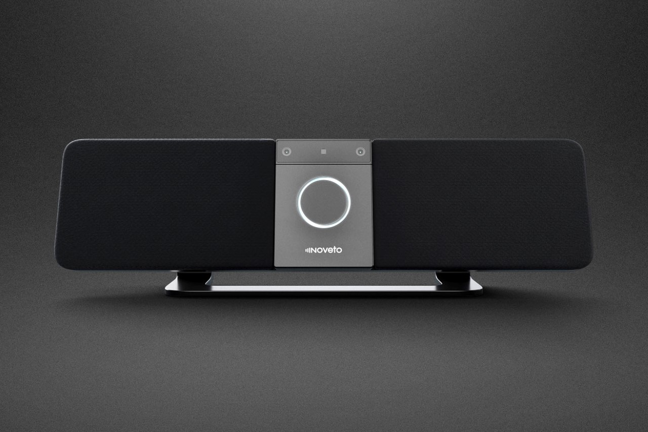
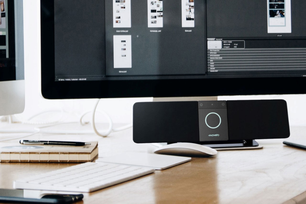
Private audio, but without placing headphones/earphones against your ears – that’s the claim the Noveto N1 makes. Think back to the time when you had your headphones on at home and someone rang the doorbell or called out your name, and you had no idea because, well, you had headphones on. Unveiled at CES 2022, the N1’s technology aims at circumventing that problem, although its underlying tech is capable of doing a lot more. If you were lured into this article by the words “invisible headphones”, let’s cover that bit first.

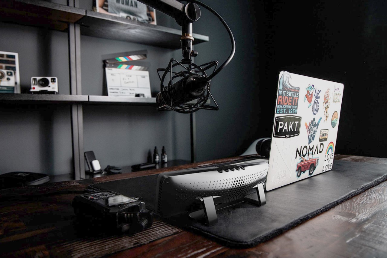
Purely technically speaking, headphones are just small speakers that sit near your ear, only allowing YOU to hear the audio. They ‘physically’ block outside sound (or sometimes even cancel it using inverse frequencies), so you can hear this audio better. What the Noveto N1 does is different. Rather than pressing speakers against each ear, the N1 sits on your desk and ‘beams’ audio towards your ear just like a regular Bluetooth speaker… but what it also does is make sure the audio doesn’t go anywhere beyond your ear. It doesn’t travel sideways to someone sitting beside you, doesn’t travel behind your ear either to your partner standing right behind you. It just travels exactly to both your ears, creating ‘invisible pockets of sound’, or invisible headphones. Someone standing 3 feet away from you can barely hear what you’re listening to; but you can hear everything else, including your doorbell, your phone, or a family member yelling to let you know lunch is ready. The N1 is a speaker system, but a private one… and that’s a pretty remarkable technological feat.

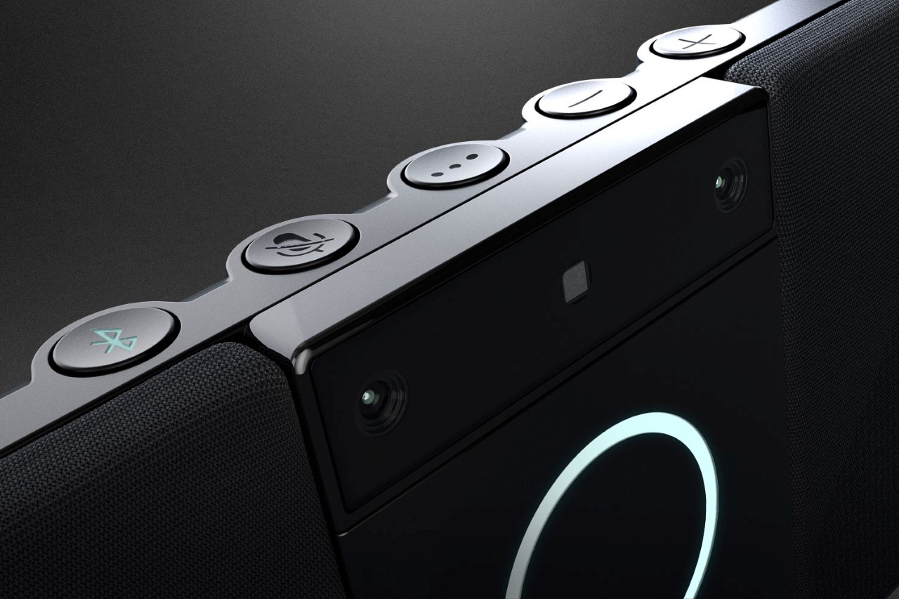
If you’re a bit of an audio junkie like I am (or even if you’re not), what the N1 really nails is ‘acoustic attenuation’. Now that’s a fancy term for making audio soft, but here’s what it means – The N1 can project sound waves at a certain amplitude or loudness, but it can also decide how loud the audio remains over a certain distance. By doing this, it can make the sound waves traveling to your ear loud, but make them soft the minute they cross your ear. Mounted on the top of the N1 are two cameras that track your face, locating the placement of your ears. It doesn’t matter if you have long hair, a thick beard, glasses, or even a face mask… the device can beam audio to your ears in real-time. This is vastly different from a set of headphones, because you’re not really wearing any headphones on your head, and you can still hear the world around you… and it’s vastly different from a speaker because A. It provides a private audio experience and B. It still delivers stereo sound, ensuring the left and right audio channels reach your left and right ears.

Does it really mean that people around you can’t listen to your audio? Well, it’s difficult to say, but at certain volumes, you can practically ensure complete privacy. For example, if you’re listening to a TED Talk at a regular volume, chances are nobody around you will hear a single thing. However, if you’re blasting Adele’s latest chart-topper at max volume, people around you may be able to get a general sense that there’s music being heard, but with not much clarity. Noveto claims the N1 can reduce audio by up to 90% for someone who’s located just 1 meter (3.3 feet) away from the listener. Frankly, headphones work the same way too, as audio can sometimes leak out of them during playback. Especially if they’re what are called ‘open back headphones’.

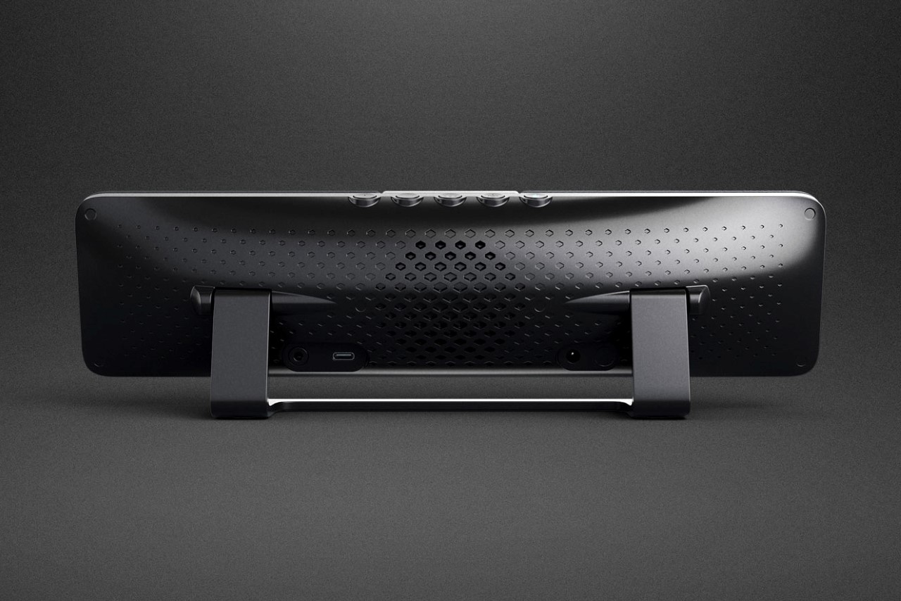
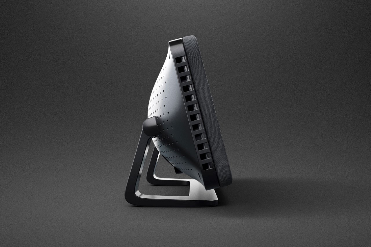
The secret sauce lies in a bunch of clever hardware and software integrations. The Noveto N1 uses a proprietary array of transducers that are capable of this acoustic attenuation, along with a facial tracking camera module, and a powerful chip that does the heavy-lifting, allowing the sound to move with your head as you move around. The technology is incredibly new, and has tonnes of applications, from allowing you to listen to the TV or play a game without disturbing others, you could even video-conference privately, without having headphones resting against your head or worrying about your AirPods batteries dying out. The N1 could be used in cars too, or even at museums/art galleries, playing specific sounds near exhibits just for the people standing in front of it. There’s even potential for it to be used in airports or railway stations, providing announcements and updates just to specific seating areas or passengers.

This isn’t Noveto’s first rodeo, however. The company debuted the Soundbeamer 1.0 on Kickstarter last year, with units shipping to backers practically any day now. While the Soundbeamer 1.0 was just a primer on what the technology is capable of, Noveto’s perfected the art of headphone-building with the N1, which now comes with built-in Alexa and AirPlay for a smarter, more useful experience, and a nifty little LED ring around the front that brings all your N1 and Alexa interactions to life. Noveto also mentions that the N1 has built-in face ID, although whether it just detects faces or can recognize different people and control functionality accordingly is still unclear. Ideally, you don’t want your kids or partner snooping in on your confidential work meetings, right?! The N1 was just announced at CES 2022 and as of writing this, Noveto hasn’t really provided any information on its release date or price yet… but if history is any indication, it probably won’t come cheap, given that the Soundbeamer 1.0 went for roughly $800 on Kickstarter.

Designer: Noveto Systems Ltd.

The post These “invisible headphones” sit on your desktop and beam sound directly (and only) to your ears first appeared on Yanko Design.

This minimalist wooden board offers a interior-friendly way to control your home with Alexa


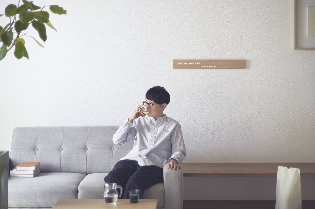
The last thing you probably expected is for a beautiful piece of wood to be your control dashboard for your smart home.

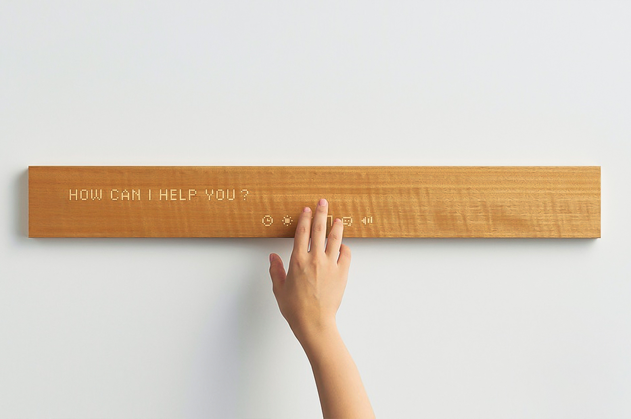
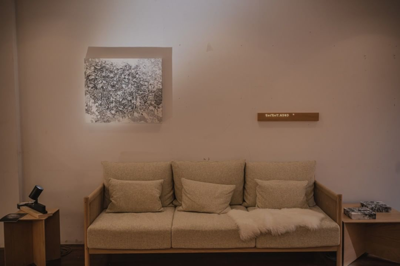
The Internet of Things has slowly but surely invaded our homes in the guise of smart lighting, dynamic photo frames, and, of course, smart speakers. While many of these are designed to look stylish and handsome, most of them carry an aesthetic that often clashes with minimalist rooms or decor. Smart speakers are perhaps the biggest culprits in this regard, but a Japanese company has found a solution that lets you put Alexa-powered smart speakers out of sight.

Designer: mui Lab

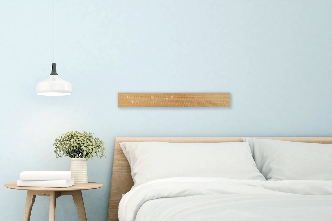
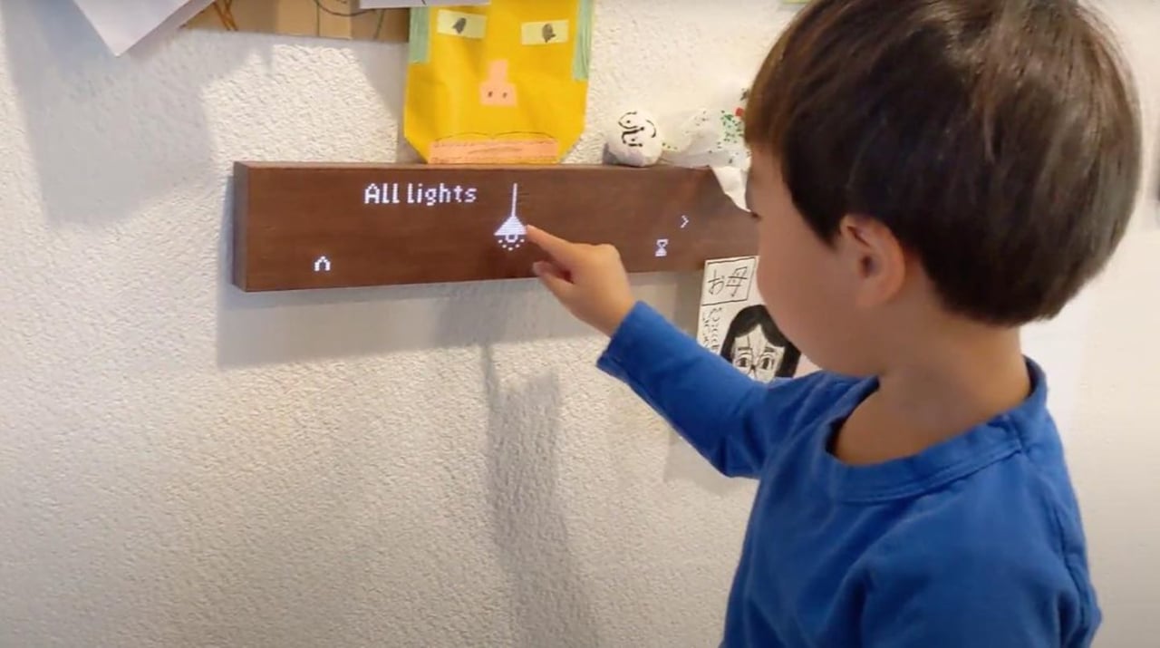
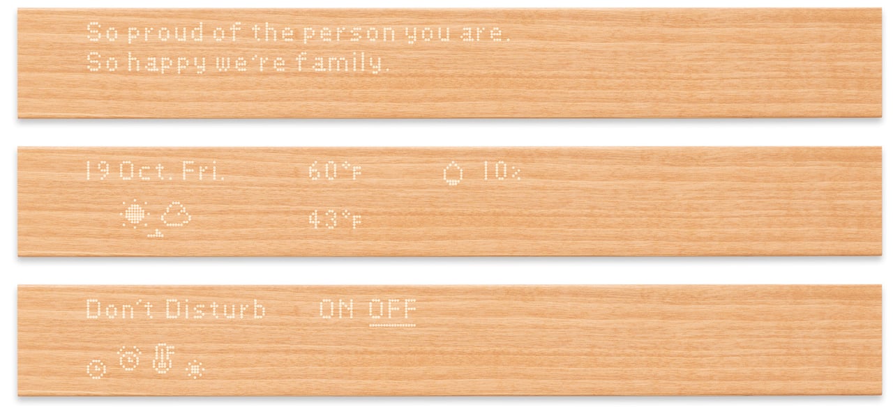
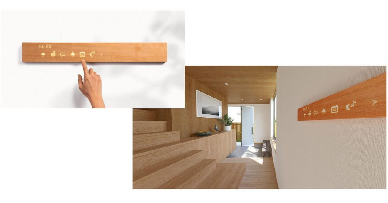
mui looks like an unassuming block of wood, but it’s actually just as talented as a smart speaker. Actually, it can do more than what most voice-only speakers can, like the Amazon Echo, because it has a touch panel on its front surface. Unlike a busy and overwhelming touch screen, however, the mui board presents visual feedback as monochromatic icons and text in a dot-matrix style that matches the board’s minimalist aesthetic.

More than just being a novel way to present a smart home hub, mui offers an equally unique approach to mixing nature and technology. Rather than the usual cold elements of a tablet, a phone, or even a smart speaker, the wooden board adds a warm and almost human touch to interact with devices and appliances. Its designers want to evoke joy and calm, feelings that should be associated with the home in the first place.

Despite its minimalist appearance, the mui is by no means minimal in features. In addition to its own mobile app, mui Lab is introducing a new “calm” interface that turns the board into a visual interface for connected Amazon Alexa speakers. That’s in addition to the original mui Platform’s compatibility with the new Matter smart home platform.


Inspired by Taoist philosophy, the mui board offers a refreshing spin on how we interact with our smart homes, basically by doing or showing almost nothing. It’s not going to appeal to people who prefer seeing everything in one go, but this design will definitely go well with rooms and furniture that try to hide the tech behind soothing organic materials.

The post This minimalist wooden board offers a interior-friendly way to control your home with Alexa first appeared on Yanko Design.

ASUS Zenbook 17’s single screen design revives the foldable laptop fantasy in a big way


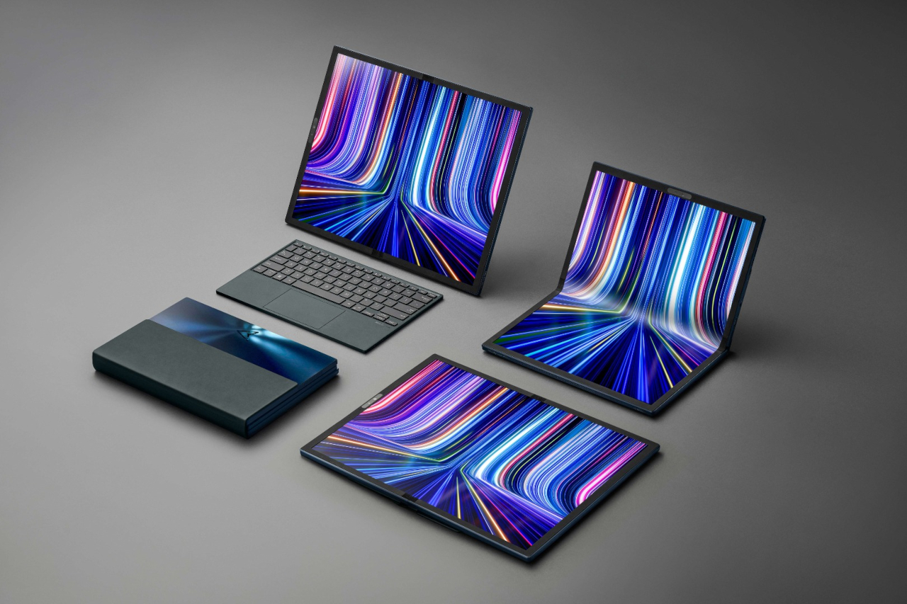
Foldable devices are the big thing in mobile these days, but the concept isn’t limited to smartphones and tablets only. There have been a few that envisioned laptops that are all screens that can then unfold to become an even bigger screen. That idea, however, hasn’t completely caught on in the PC world, but ASUS is taking another whack at it with a foldable laptop that’s big both in size as well as ambition.

Designer: ASUS

ASUS is hardly the first company to try and sell a foldable laptop, and this is hardly its first attempt at a non-conventional laptop form. Lenovo beat it to the punch with the ThinkPad X1 Fold in 2020, albeit in a smaller 13.3-inch unfolded size. ASUS also presented its Project Precog concept back in 2018, but that had two screens more like the Microsoft Surface Neo that never came to be.

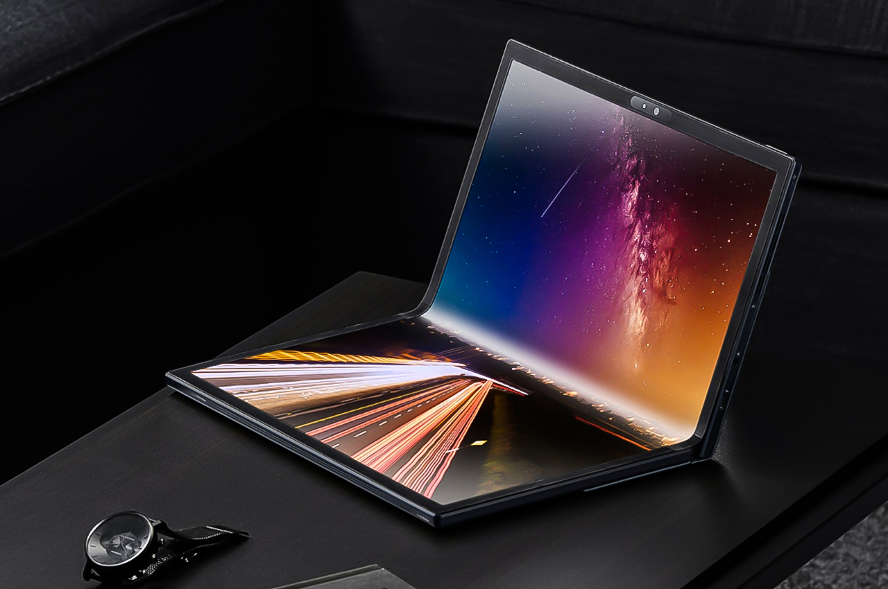
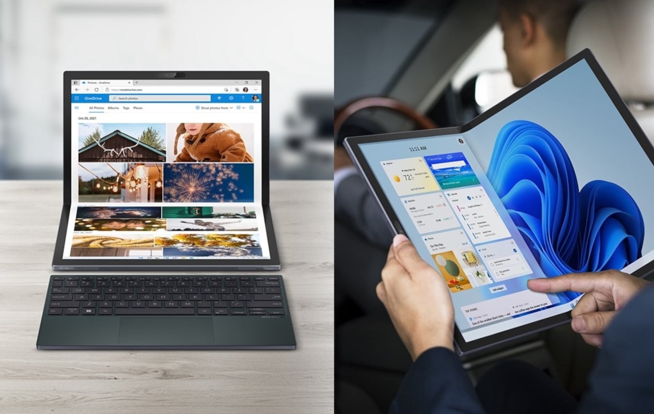
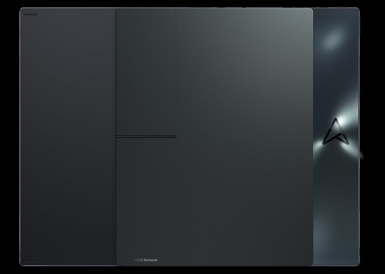
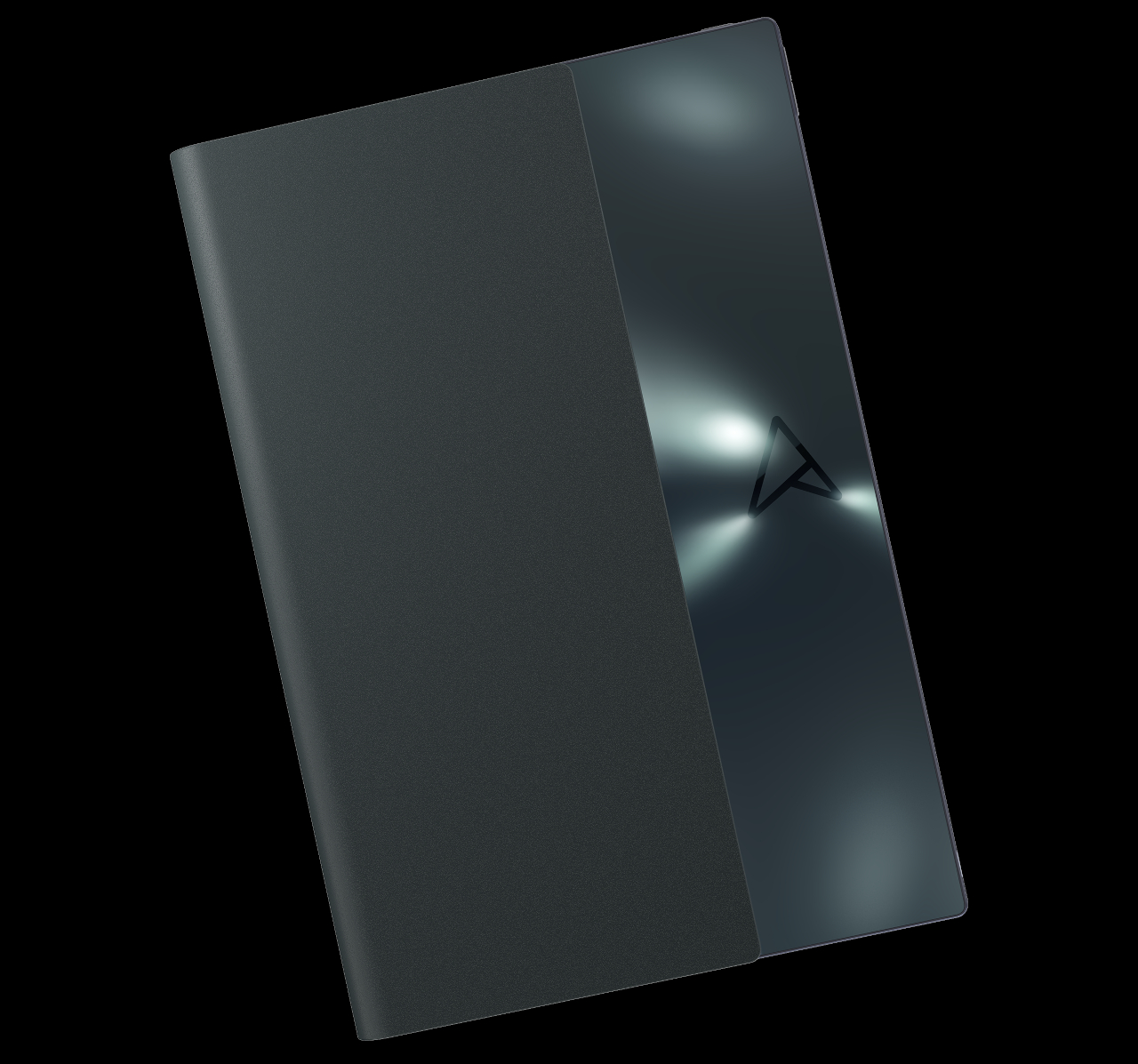
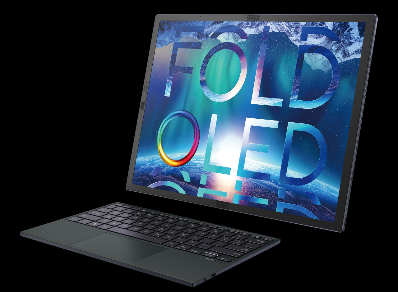
The ASUS Zenbook 17 Fold OLED is not only a mouthful but also big. When unfolded, it becomes a rather sizeable 17.3-inch monitor. When folded, you get the equivalent of two 12.5-inch screens, almost like a regular 13-inch laptop. ASUS went out of its way to give the device a premium finish, like a magnesium alloy body, a built-in faux leather kickstand, and an almost prismatic black logo on dark blue glass, but there’s no escaping the fact that it’s a chunky slab of metal and fragile flexible glass. That, in turn, will have consequences for ergonomics as well as the reliability of this foldable laptop.

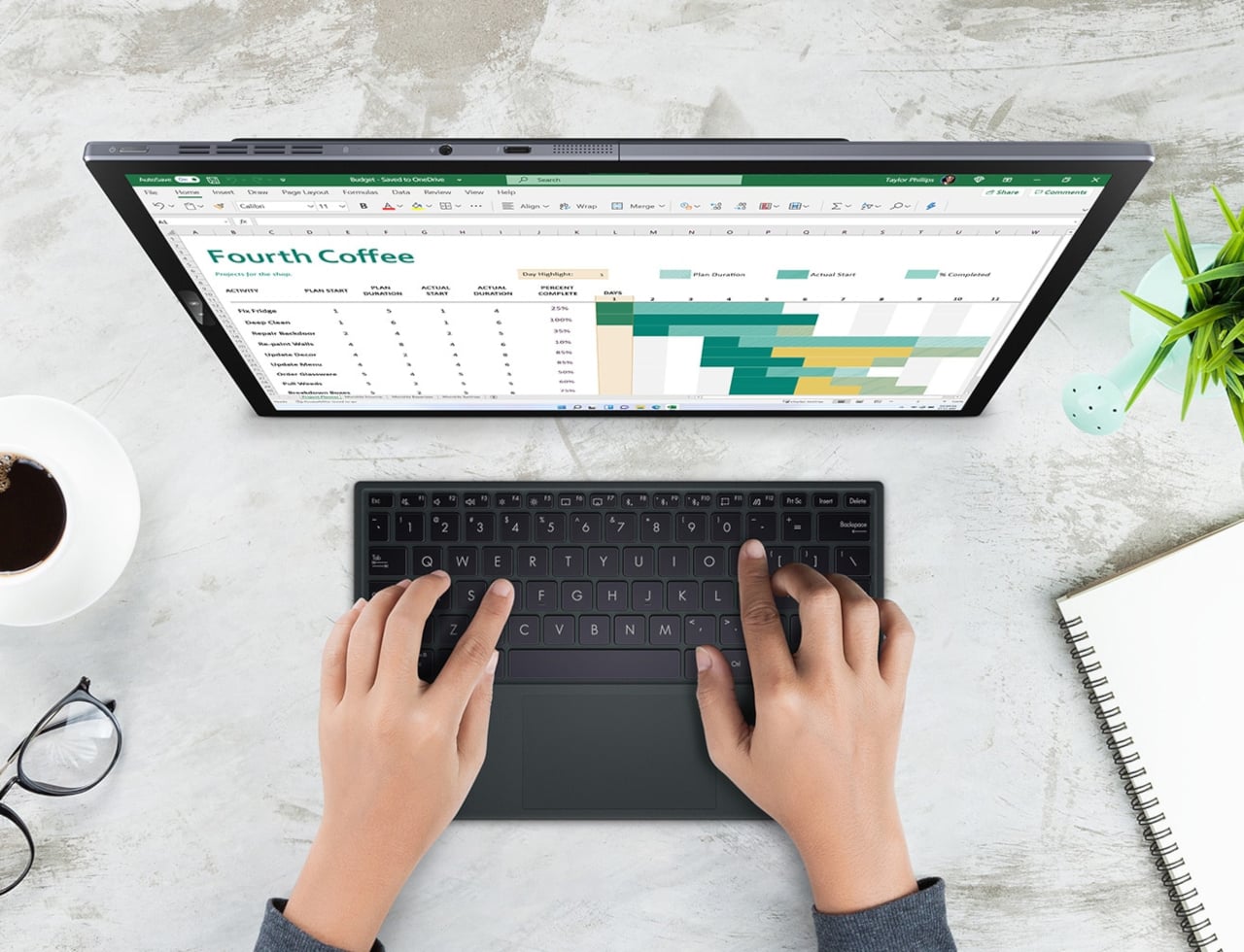
The use cases that ASUS presents for the Zenbook 17 Fold are almost endless. You can use it as a large all-in-one PC, or you can use it as a laptop, either with the on-screen virtual keyboard or a Bluetooth keyboard that’s specially designed to sit on the lower half of the screen. You can use it like a book, with the screen barely folded in two, or as a tablet lying flat on a table. Unfortunately, ASUS wasn’t able to follow Samsung’s lead in getting support for a stylus.

These scenarios, however, rely heavily on the software that will be running on the ASUS Zenbook 17 Fold OLED, namely, Microsoft Windows 11. That operating system, however, has proven not to be that friendly to tablets, and perhaps even less so to tablets that fold into laptops. ASUS doesn’t seem to be too worried that software will be the albatross around this futuristic device’s neck and will reportedly make it available in the next quarter.

The post ASUS Zenbook 17’s single screen design revives the foldable laptop fantasy in a big way first appeared on Yanko Design.

Dell envisions a sustainable laptop, allowing you to replace parts, creating a design you could grow old with


Dell is checking all the right boxes for a laptop that is not only environment-friendly but also potentially immortal.

Laptops revolutionized the computing industry by making personal computing more portable, but it also came at the expense of some flexibility and sustainability. Unlike towering desktops, not everything inside a laptop can be easily upgraded, much less replaced when broken. Many laptops makers probably prefer that status quo, but Dell is boldly pushing an idea that could mean it will eventually sell fewer laptops.

Designer: Dell

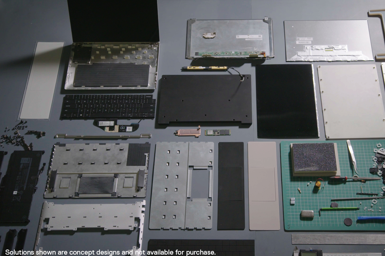
Today, you can upgrade or replace a laptop’s memory and storage, but that’s pretty much it. You can’t upgrade the processor, add a graphics unit, or even easily replace the keyboard after years of wear and tear. That’s not even considering the materials and processes used in manufacturing these devices, which involve a lot of plastics and a lot of components that eventually end up being a lot of waste.

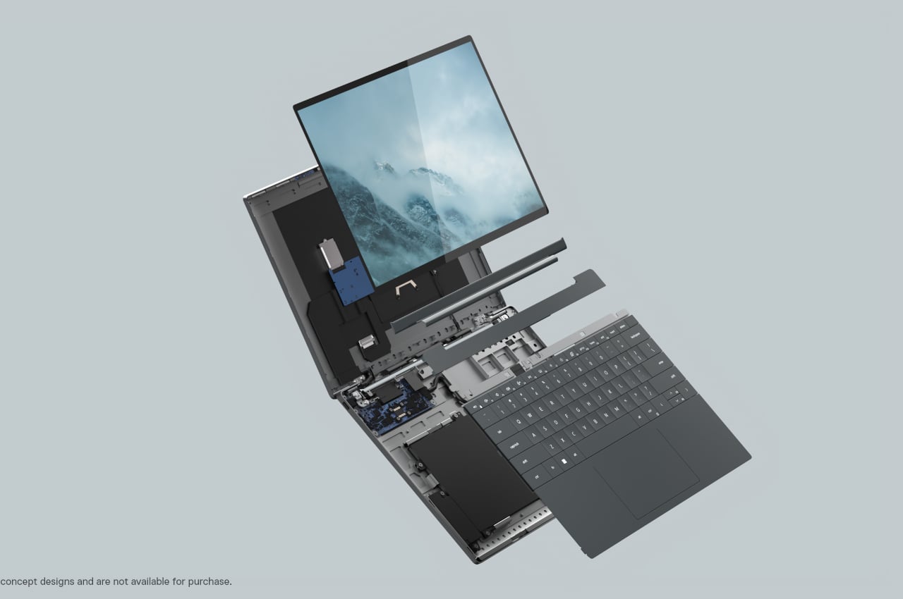
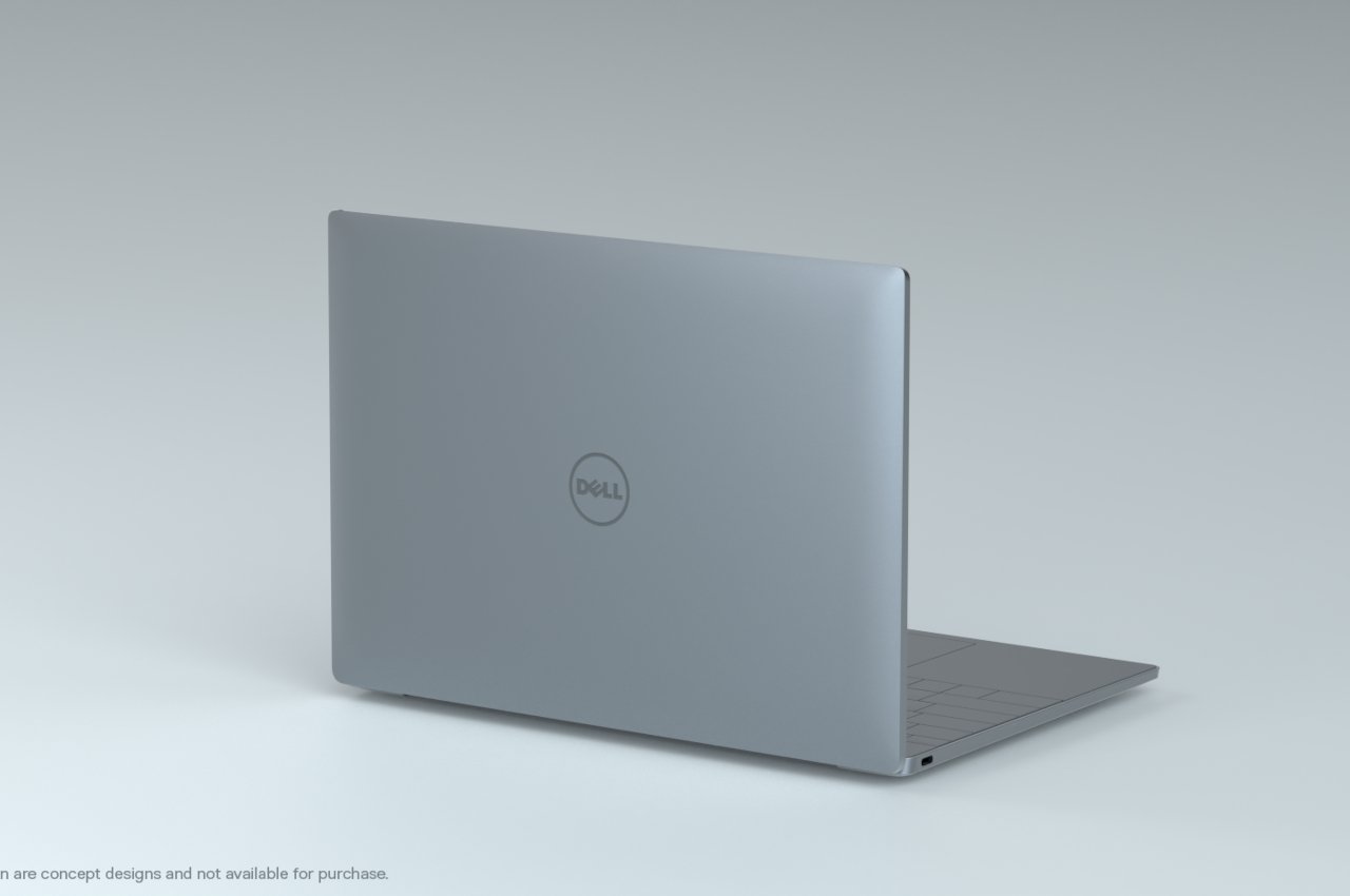
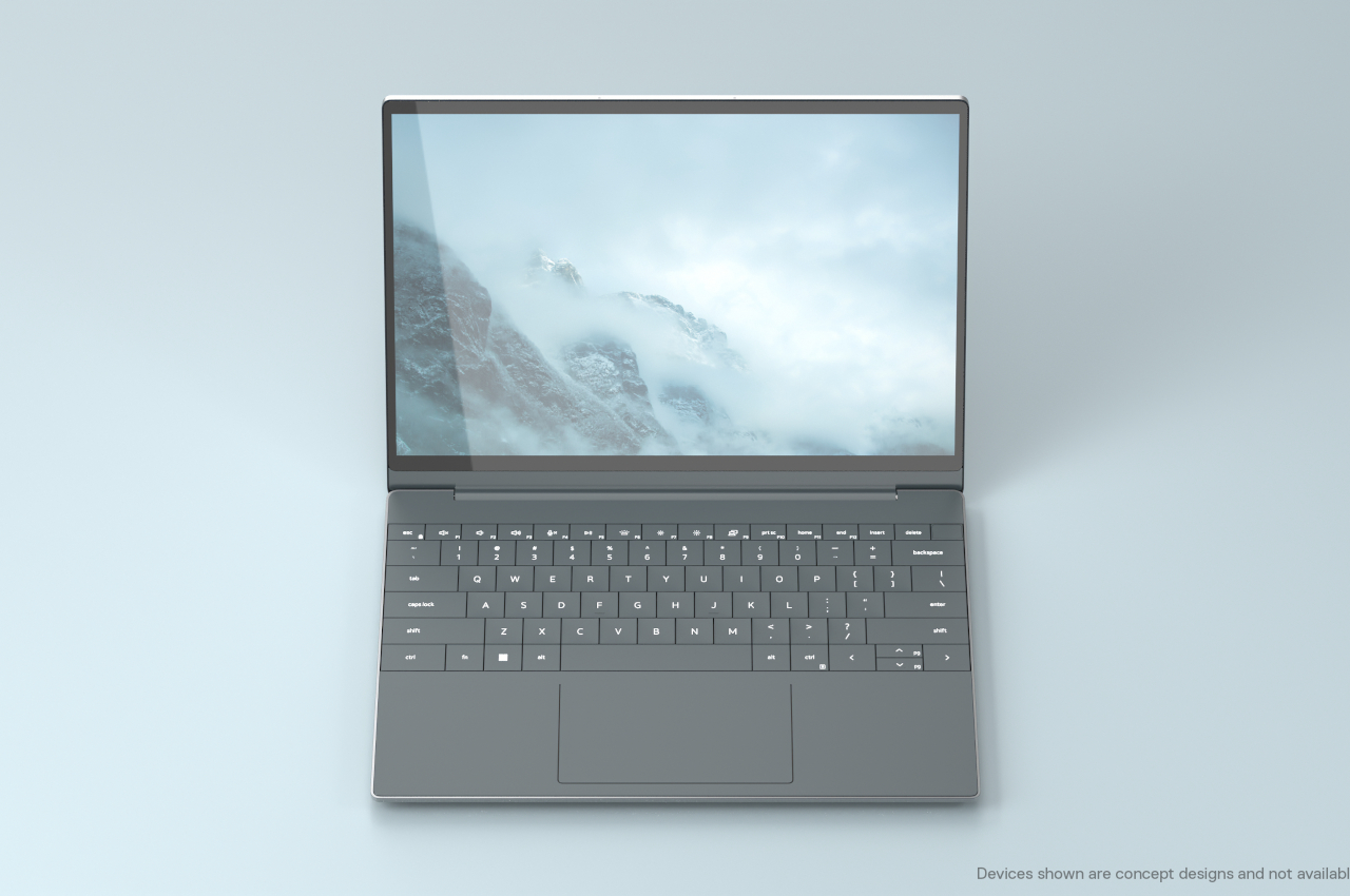
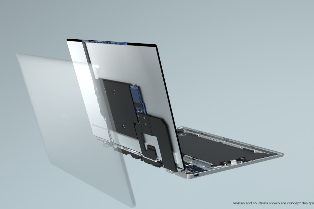
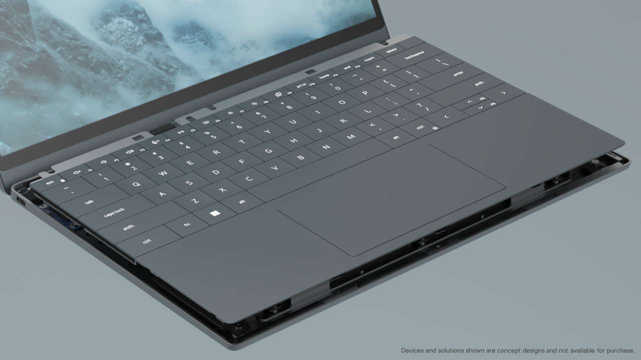
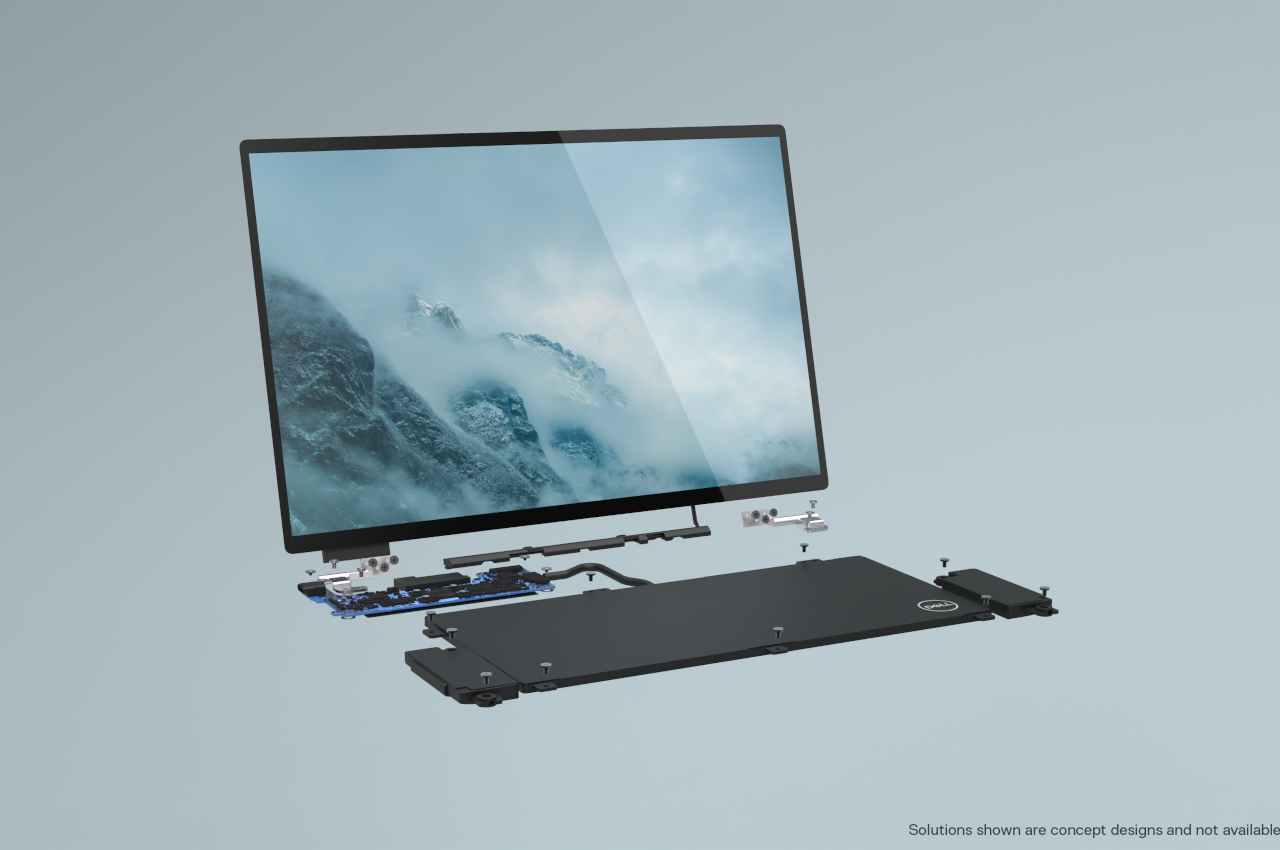
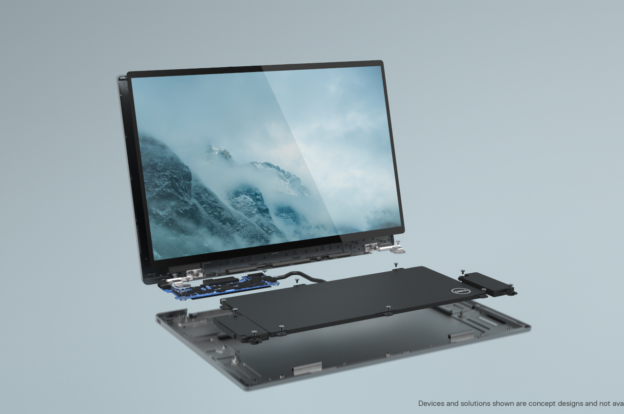
Dell’s Concept Luna laptop throws all of that out the window, envisioning a portable computer that would appeal to almost everyone, from the expert PC modder to the environment-conscious consumer. The company is trying to apply multiple strategies across the pipeline to not only reduce the laptop’s carbon footprint but, ultimately, also make it as long-lasting as any desktop that can get repaired or upgraded bit by bit.

The ideas that Dell has are quite interesting. In addition to using more recyclable materials, like flax fiber instead of plastic laminate, the company is also looking into shrinking the size or number of components like the motherboard to reduce the amount of energy used to manufacture them. Smarter placement of those components can also lead to better passive heat dissipation, removing the need for plastic fans inside.

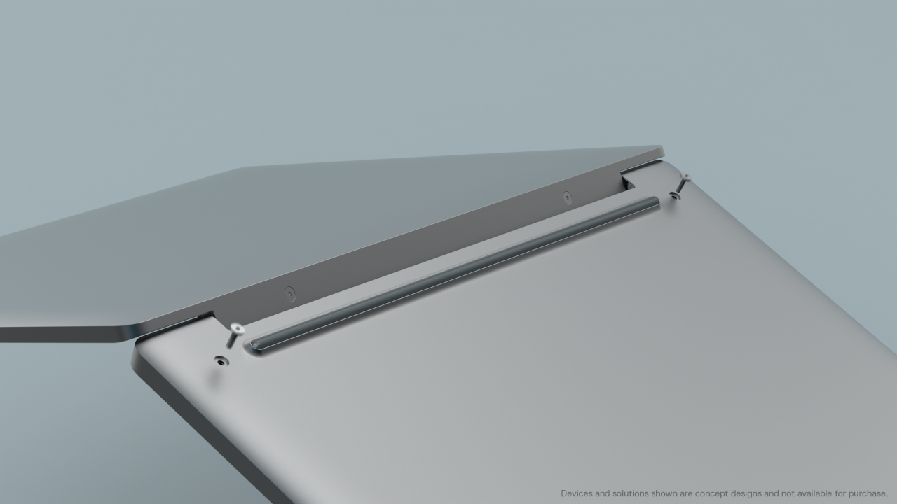
Then there’s also the element of repairability, which is made easier by having only four screws to access internal components and using no adhesives. Components can be removed easily and replaced, or perhaps even upgraded with a newer part. All in all, the Concept Luna represents the holy grail of sustainable computers and is probably years away from becoming a reality.

Dell admits that the concept only touches on what is possible, not what is feasible or, more importantly, profitable. A sustainable laptop would ultimately mean people will buy fewer new laptops if they could just upgrade or replace parts of the laptop they already own. Of course, Dell could build a business around selling parts or services, but that might still be less profitable than the status quo that isn’t doing our environment any favors.

The post Dell envisions a sustainable laptop, allowing you to replace parts, creating a design you could grow old with first appeared on Yanko Design.

Wearable health monitoring gets stylish with these rings that can potentially watch your glucose

If smartwatches and fitness bands aren’t your thing, then something more discreet like this smart ring could still keep you on top of your health.

Although fitness trackers have been around for years, recent events have caused a surge not only in interest but also in sales. The arrival of smartwatches also made it easier for people to keep tabs on their bodies, and the Apple Watch’s plethora of health monitoring features have become the gold standard for these wearables. Not everyone, however, is willing to part with their favorite timepiece, and wearing a rugged-looking fitness band might clash with their preferred fashion style. Fortunately, there are companies already putting a ring on health, and Movano might have the most stylish one to rule them all.

Designer: Movano

Admittedly, there aren’t that many players in this smart ring market, at least the ones that are intended to keep track of health rather than giving wearers some techno-magical powers to control devices. The most notable of this bunch is perhaps Oura, but its style and size definitely don’t appeal to everyone. That’s where the Movano Ring comes in, offering an alternative that specifically caters to women that prefer something less conspicuous and even fashionable.

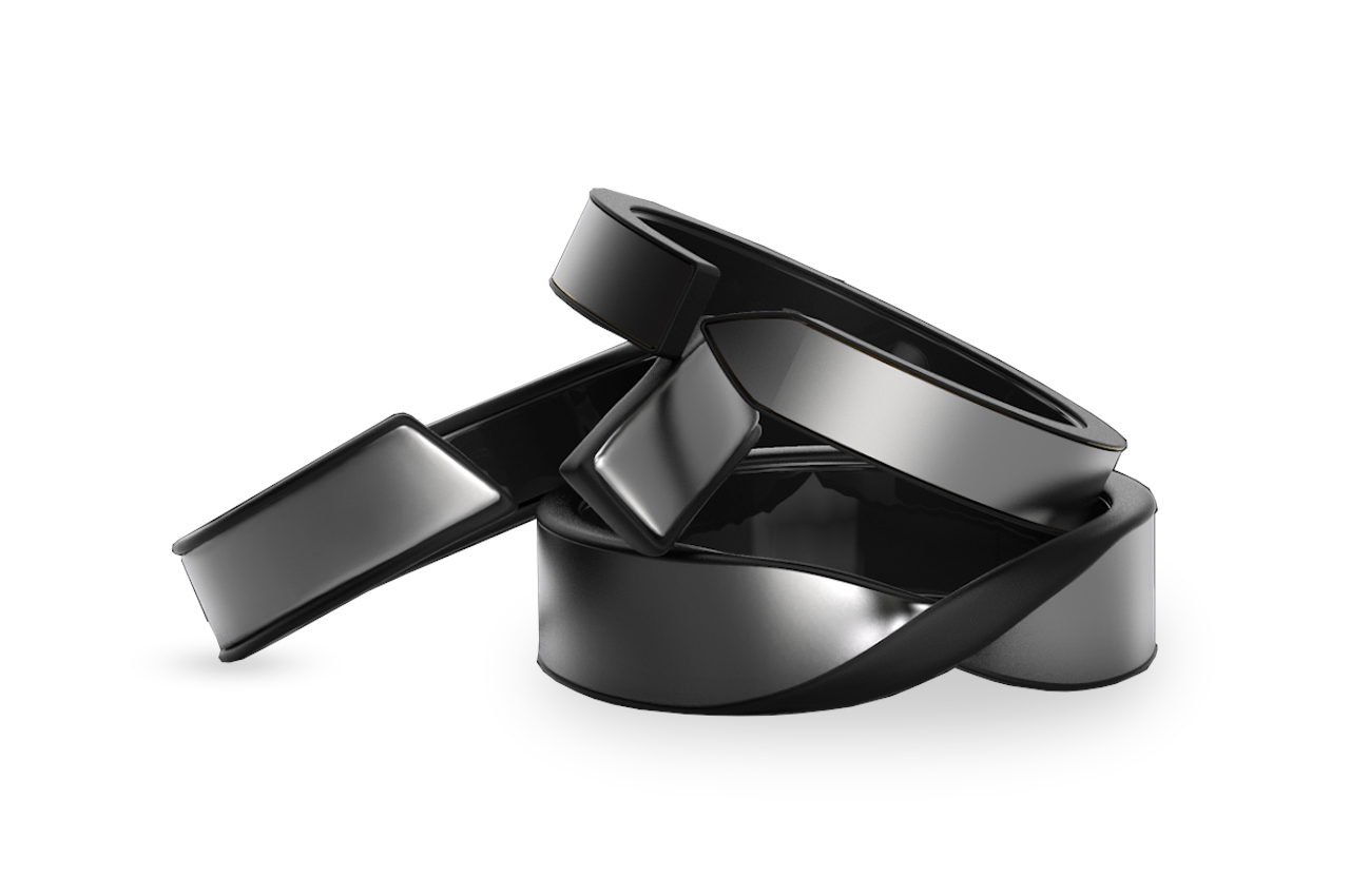
It’s easy to mistake the Movano Ring as a fashion accessory rather than a health tracker, coming in Gold, Silver, Copper, and Black colors. The open-loop or twisted design gives it more personality while also ensuring that it can adjust to any finger size. More importantly, you won’t see the bare electronics underneath, unlike on the Oura, at least if product renders are to be believed.


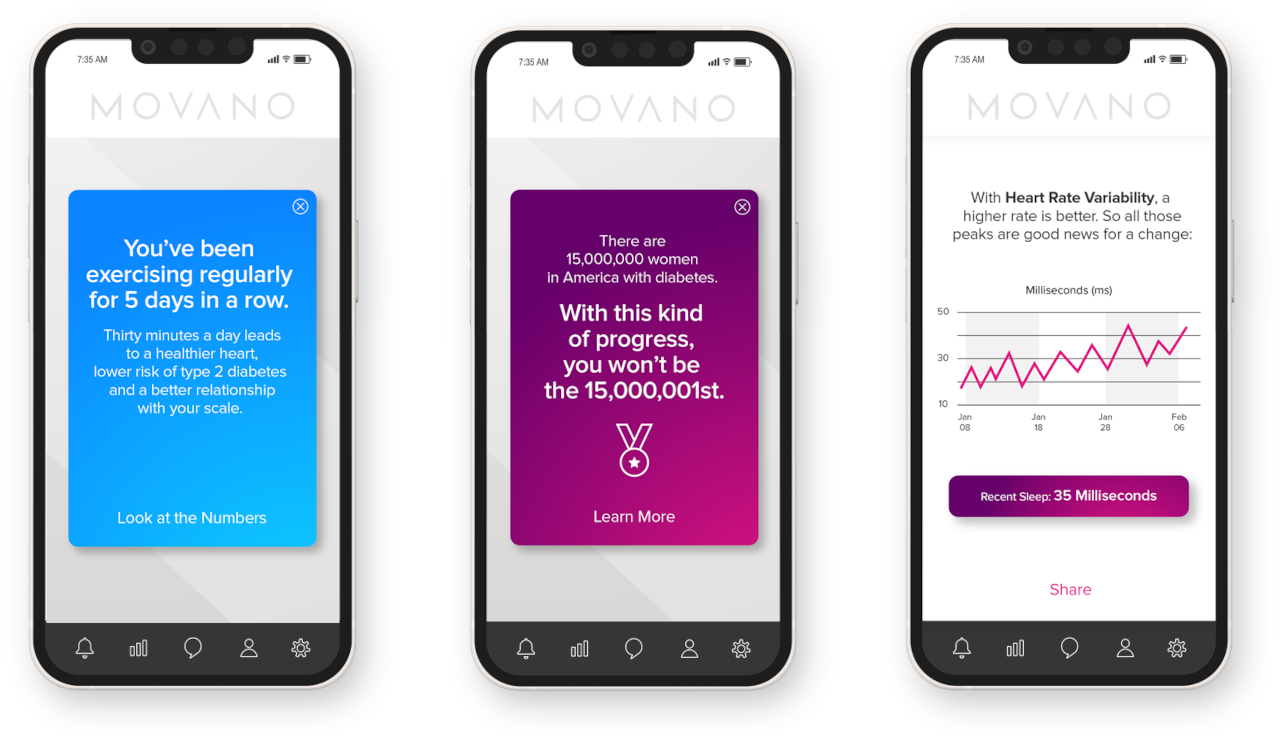
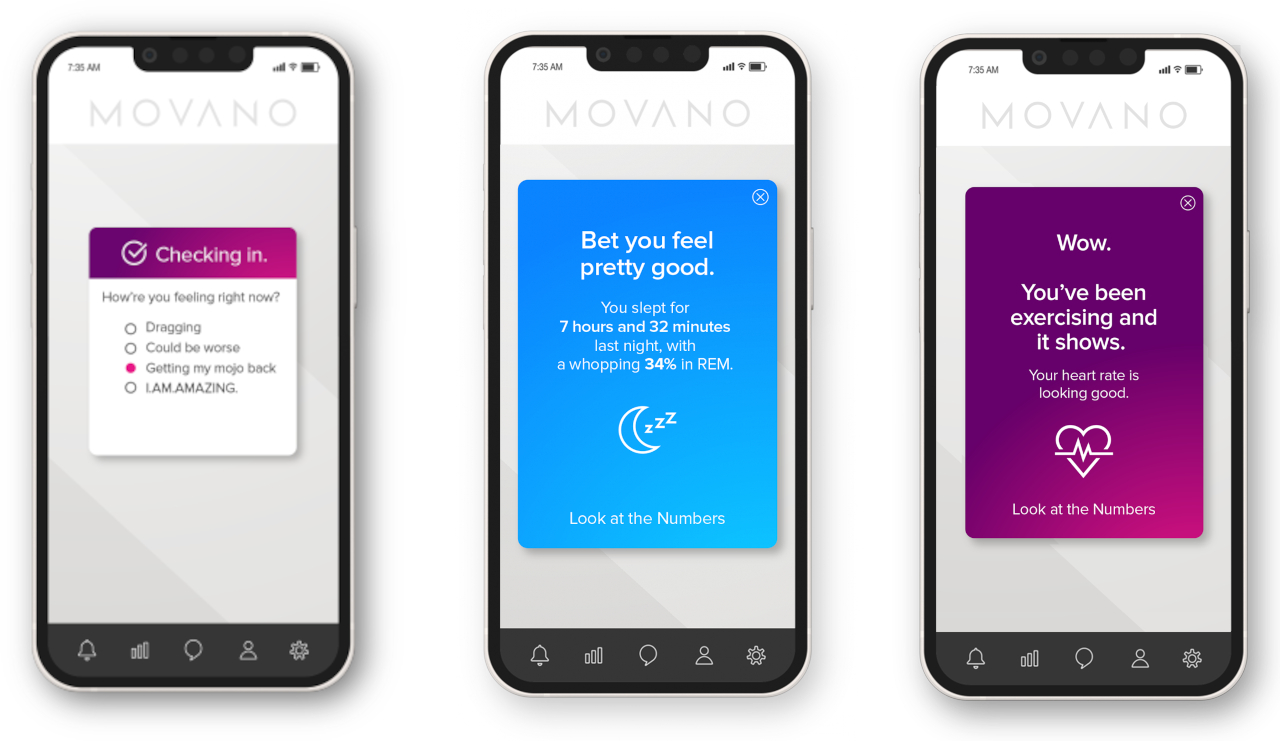
Movano’s wearable isn’t just a pretty face, though, and it promises the staple features you’d find on larger wearables. That includes measuring heart rate and heart rate variability, sleep, respiration, temperature, blood oxygen levels, steps, and calories. It correlates this data and transforms them into information and advice that most people will be able to understand, rather than having to rely on charts and graphs to try and make sense of all the figures.

The one thing holding back the Movano Ring is its availability, which might not happen until later this year. That does give it enough time to get FDA approval for some of the features that require regulatory clearance first. Even while preparing its first product, the young startup is already settings its sights high, putting resources into R&D for non-invasive glucose monitoring and cuffless blood pressure measuring, which could quickly put it ahead of the competition.

The post Wearable health monitoring gets stylish with these rings that can potentially watch your glucose first appeared on Yanko Design.

This retro-inspired battery case turns the back of your phone into an LED light show


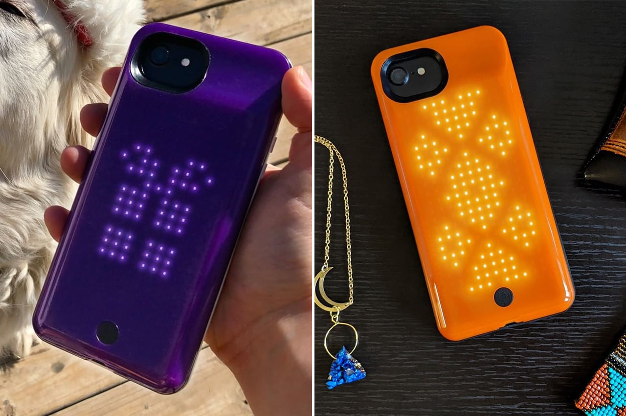
People put cases on their phones for protection, extra battery life, or self-expression, so why not have all three in one and turn your phone’s rear into a dynamic light show.

Phone cases are admittedly a bit of a controversial topic among smartphone aficionados. Phones are already designed to be as durable and as beautiful as their manufacturers want them, and some people consider it a heresy to mar a phone’s natural beauty with a case, especially those bulky ones. Others, however, want extra protection for their expensive investments or have found certain cases that appeal to their eyes. The latter group, however, sometimes has a hard time choosing between protection, battery, or beauty, and so STARcase designed something that makes that choice moot.

Designer: STARcase

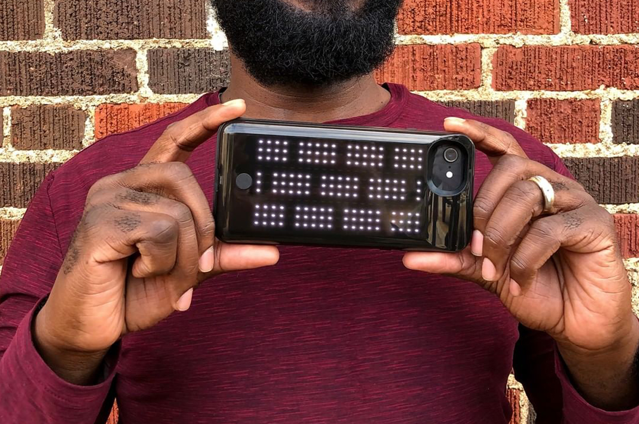
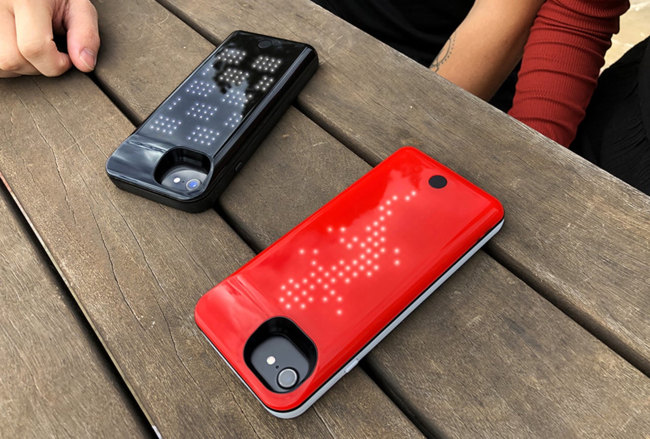
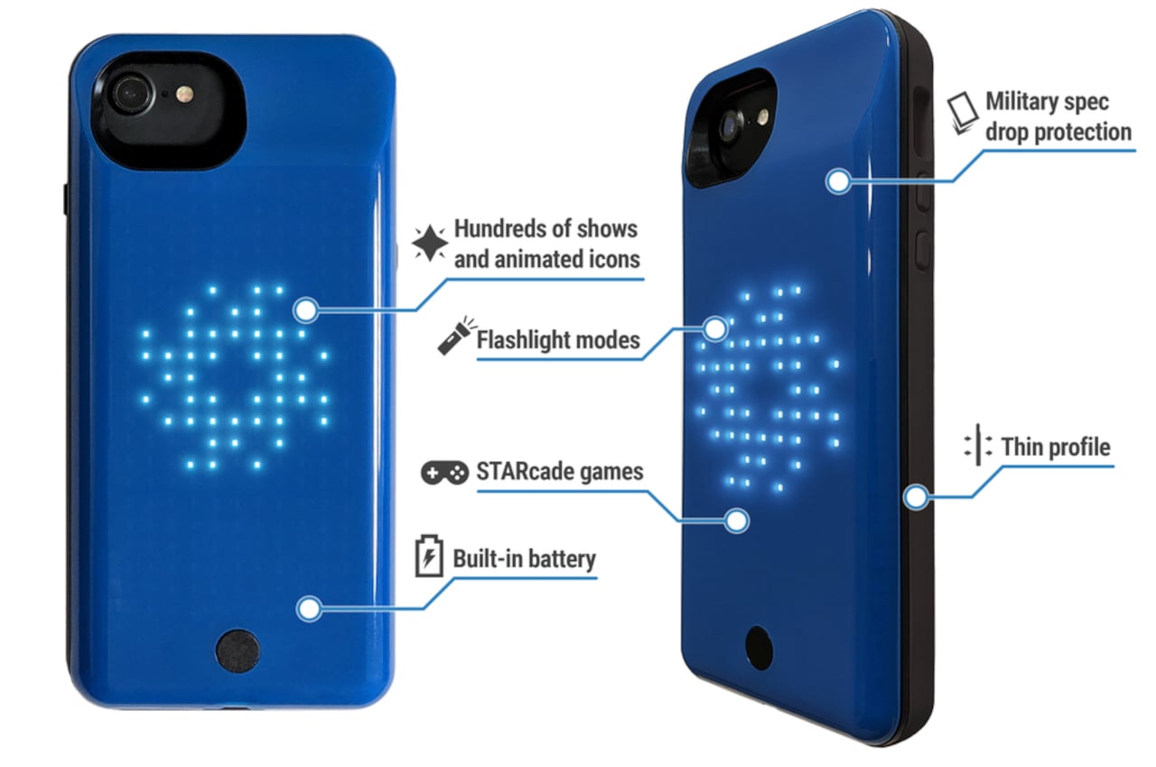
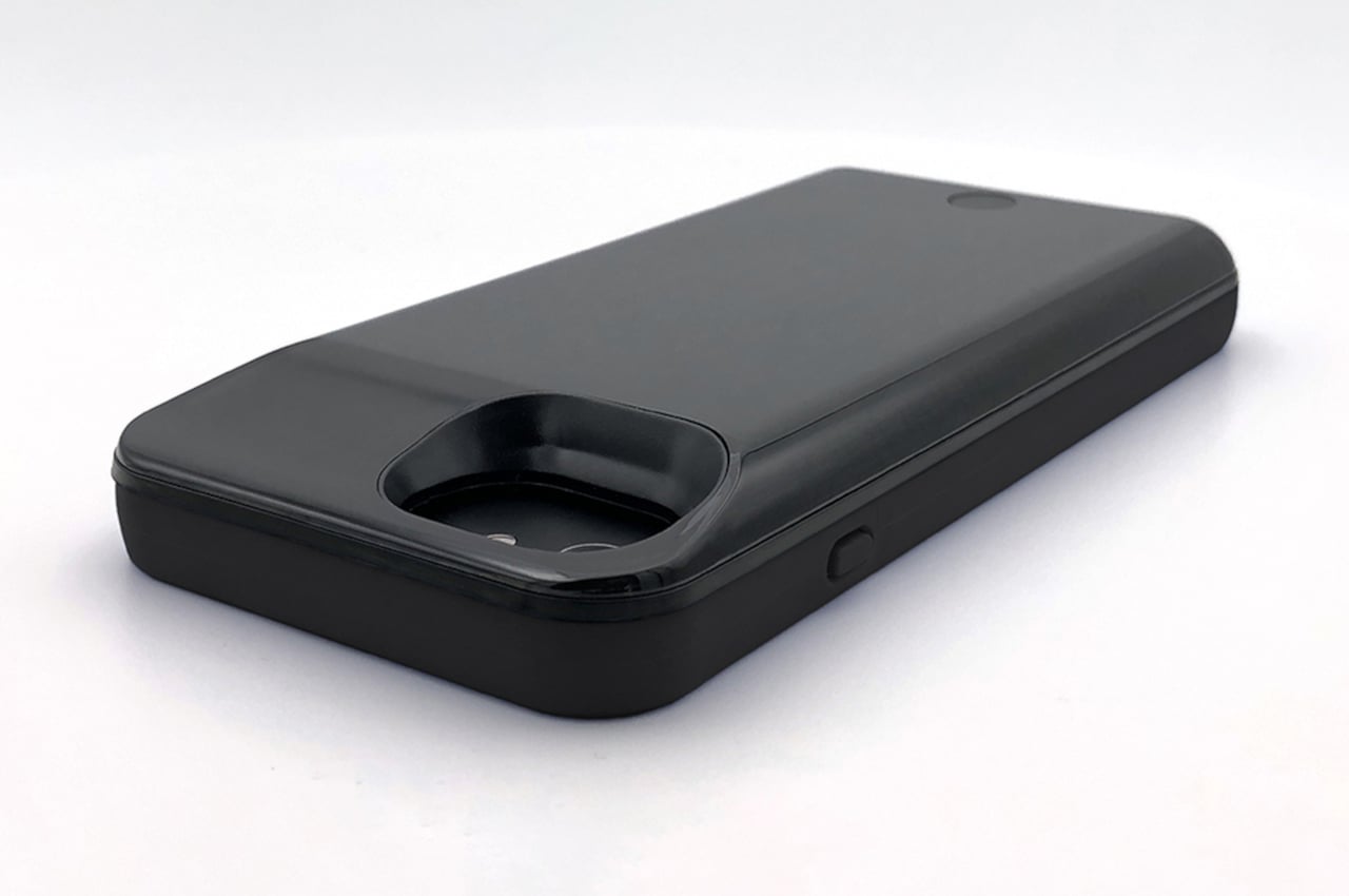
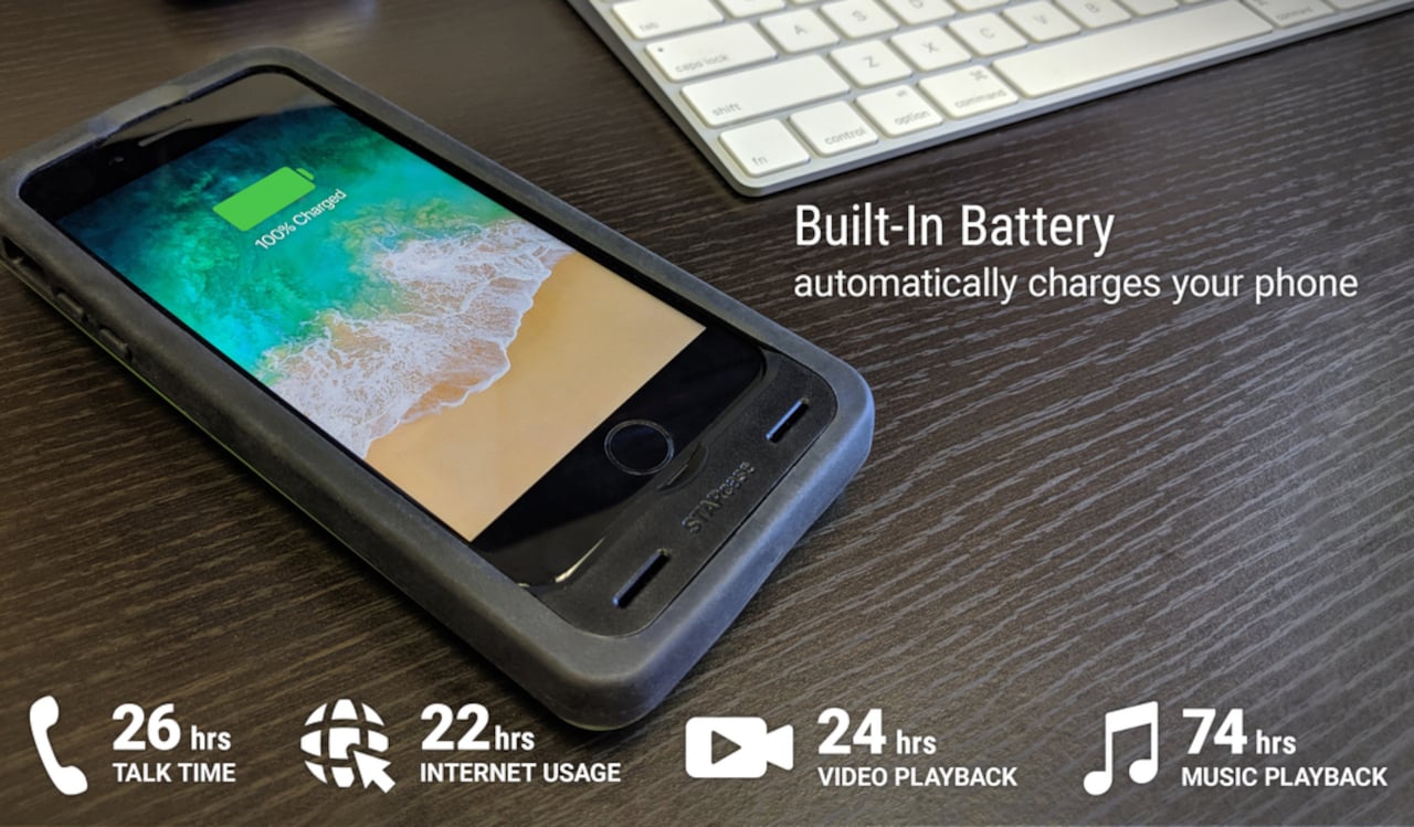
To put it simply, STARcase is a rugged battery phone case that has an array of LED lights on its back. Each of these features on its own might not be so revolutionary, but having them in one place is an interesting proposition. What makes this particular incarnation of that idea really special, however, is how that LED matrix can be functional as well as aesthetic.

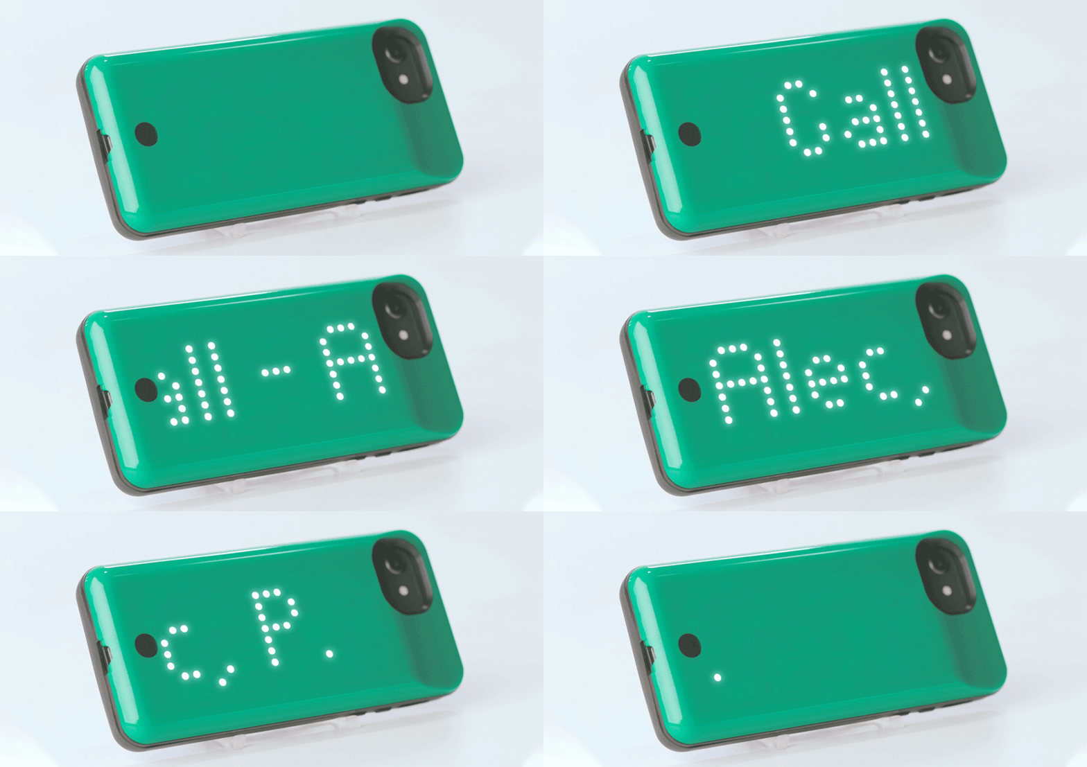
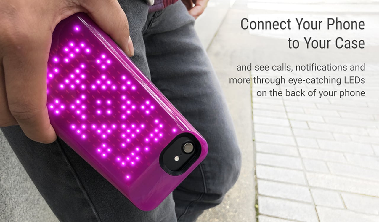
Sure, you can pick a variety of “low-res” animations and icons to display on the phone’s back, but that’s really just the tip of the iceberg. The LED panel can also be used to display notifications, either using an app’s icon or even as old-school scrolling text. STARcase’s creators say you can even play some games on the phone’s back using the dedicated button at the bottom.

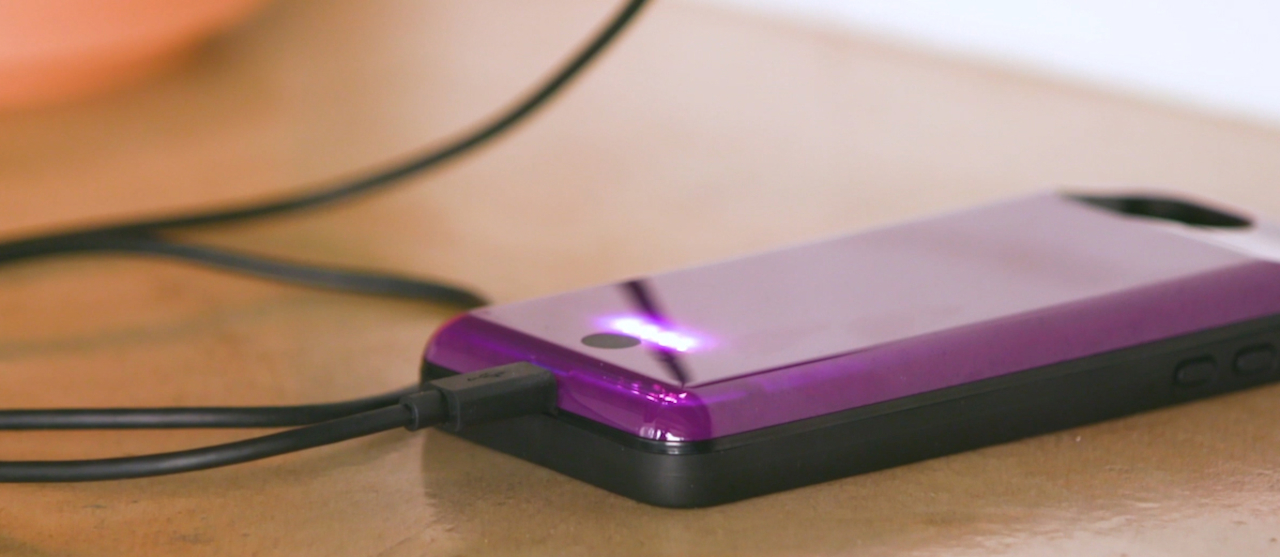
The STARcase also has the trappings of a typical battery case, including ruggedness (MIL STD 810G-516.6 spec even) and a 2,500 mAh battery that you can charge together with the phone. You can also set at what battery percentage the phone starts drawing from the case or, alternatively, manually turn charging on and off from the mobile app. That mobile app is the gateway to all of the STARcase features, which pretty much qualifies this as a smart case, unlike your typical battery case.

The freedom of artistic expression and whimsical fun that STARcase offers do come with a price. Although described as “slim,” there is obviously a significant addition to the height and thickness of the phone when wearing this customizable armor. At the moment, STARcase is on pre-order and is compatible only with iPhones, but the Pixel 6 and even the Galaxy S22 are promised to have their turn soon.

The post This retro-inspired battery case turns the back of your phone into an LED light show first appeared on Yanko Design.
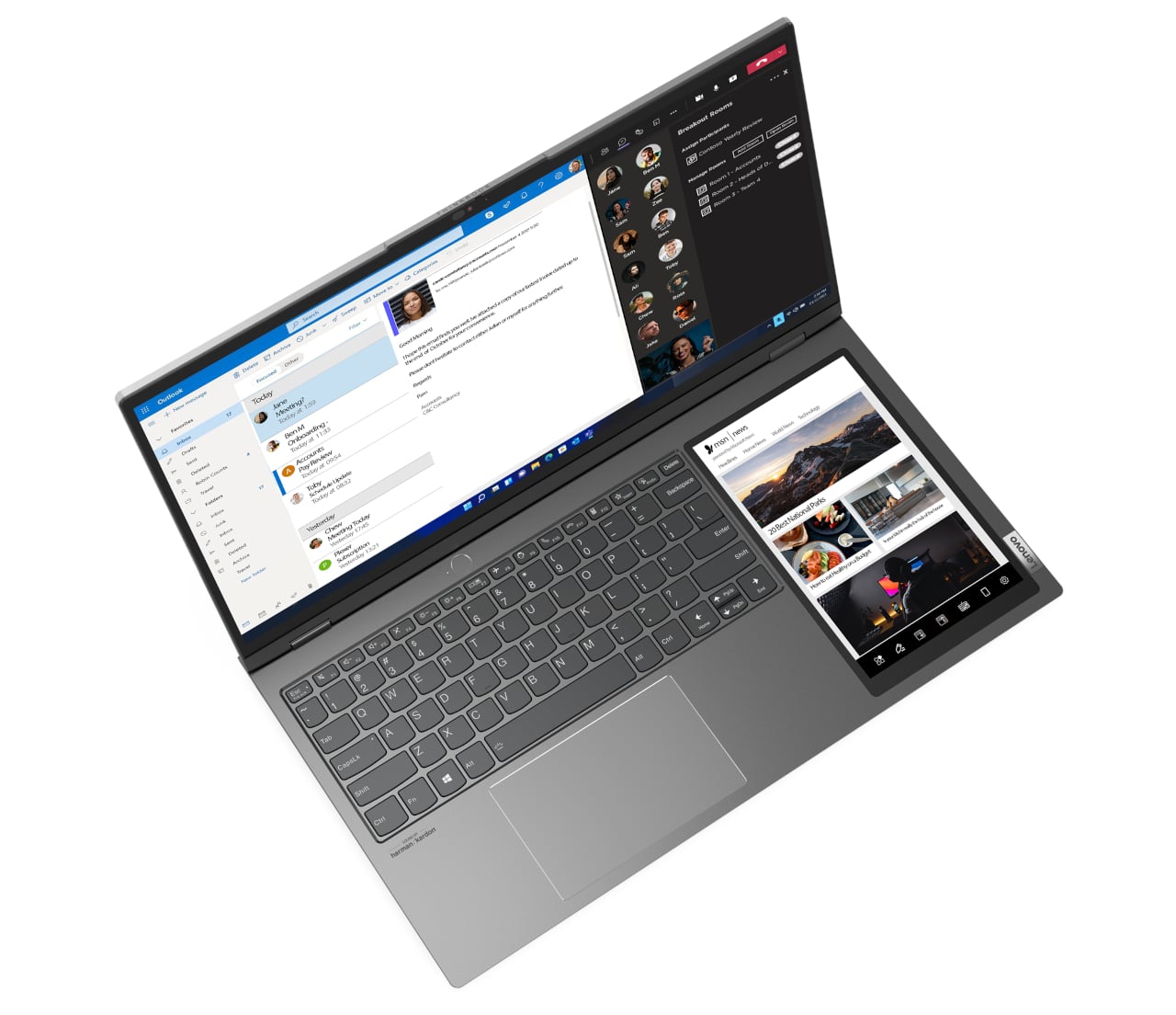
Lenovo’s latest laptop comes with a secondary screen to keep you productive + creative in the strangest way

Lenovo seems to be a big believer in the “two screens are better than one” adage, and it is putting that into practice in an unconventional yet surprisingly attractive way.

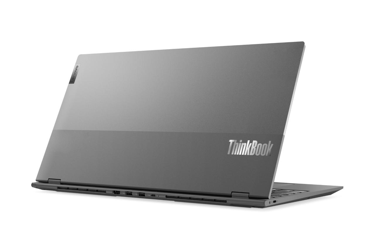
CES is always a time for companies to show off their latest gadgets and trinkets, which also includes new laptops to pique your curiosity until they become available for purchase. Design-wise, many laptops have started to look too much alike, differentiated only by color and branding. Lenovo’s new ThinkBook Plus seems to be part of the same flock on the outside, but flipping it open reveals an almost magical trick that’s promising to level up your work, or at least your artwork.

Designer: Lenovo

This isn’t the first time Lenovo actually went off the beaten path to offer a new take on mobile productivity. Aside from launching the world’s first foldable laptop, it also created a new line of notebooks with two screens. The first two ThinkBook Plus models put a second screen, actually an e-ink display, on the back of the laptop. This third-gen laptop does away with that but manages to still cram in a second display inside.

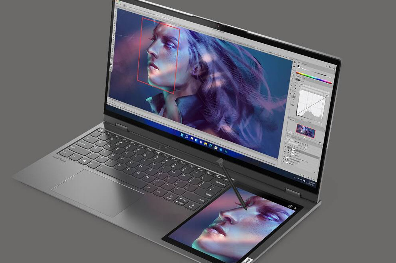
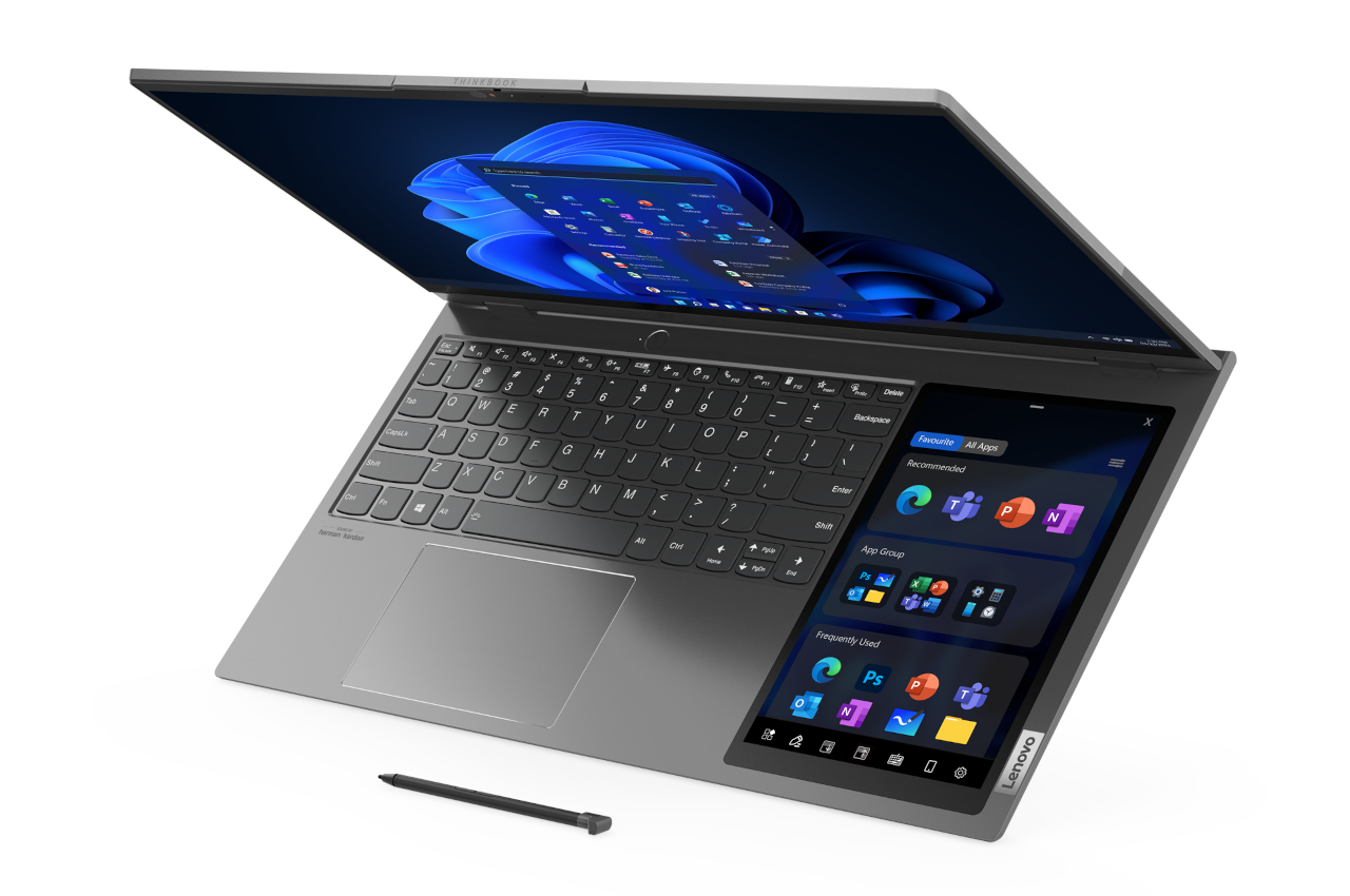
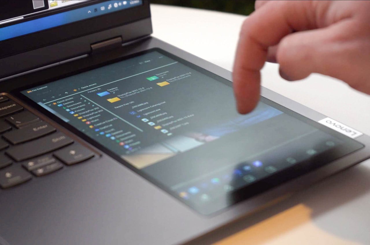
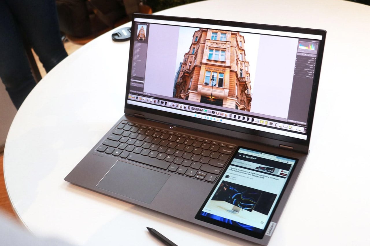
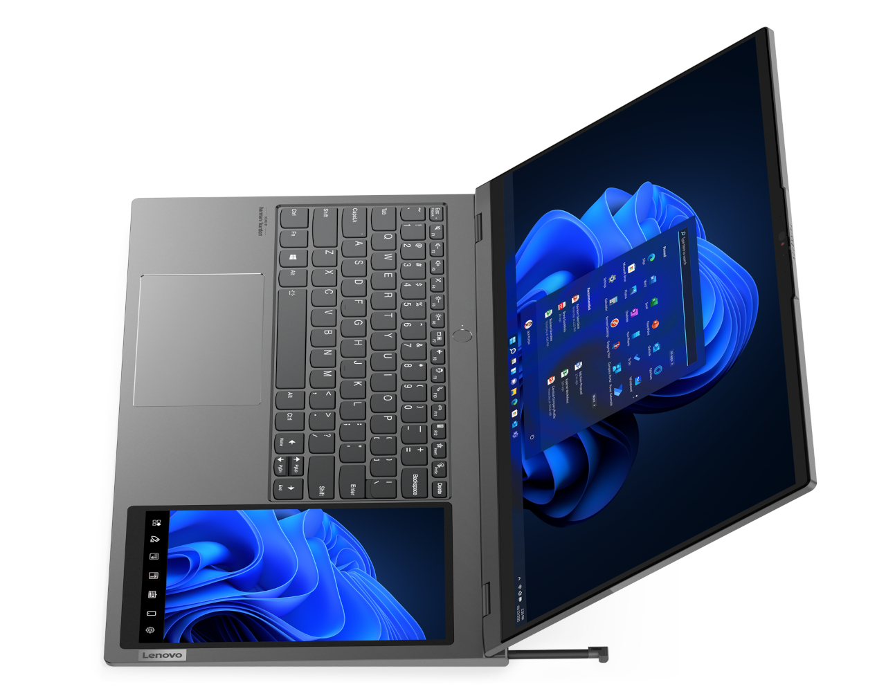
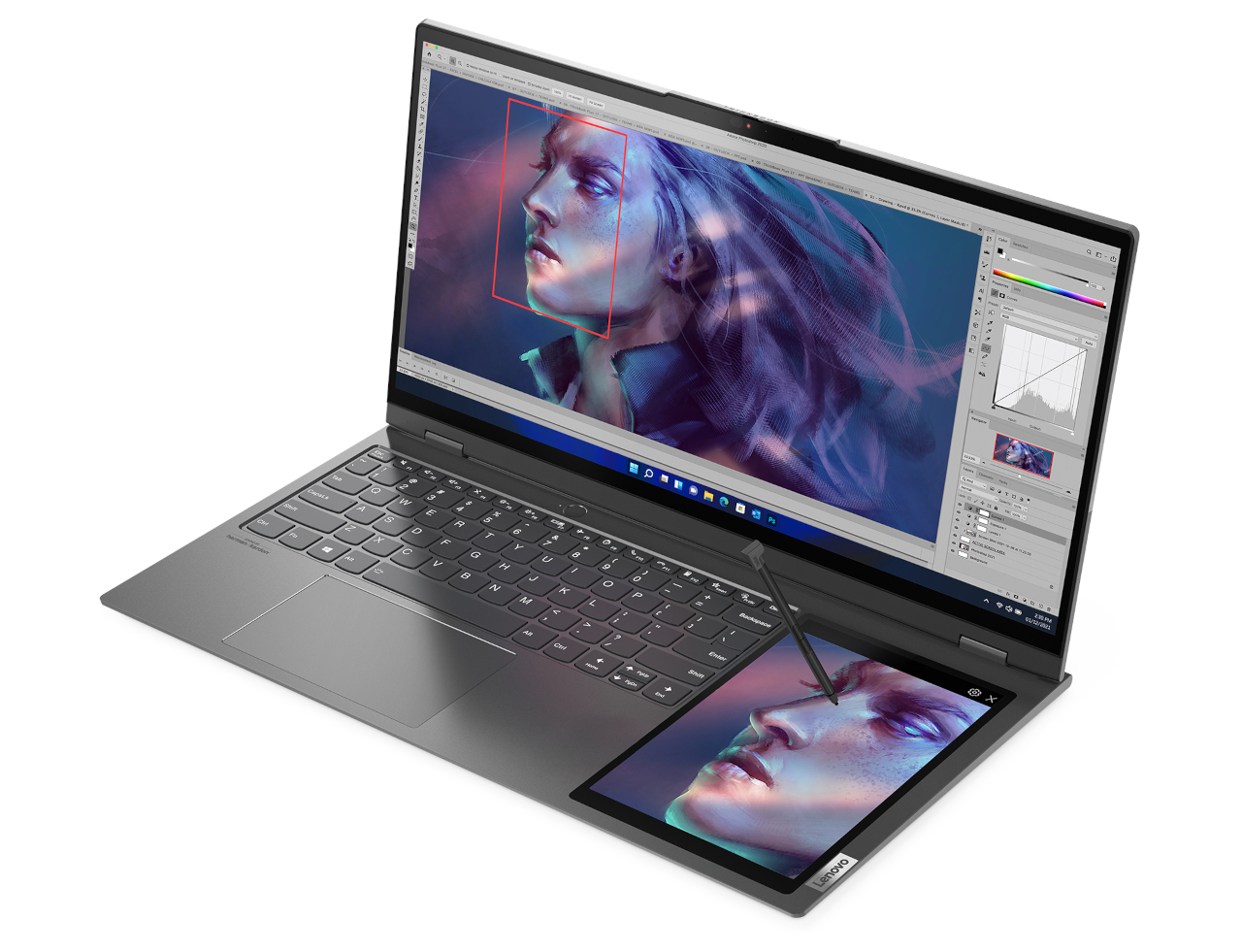
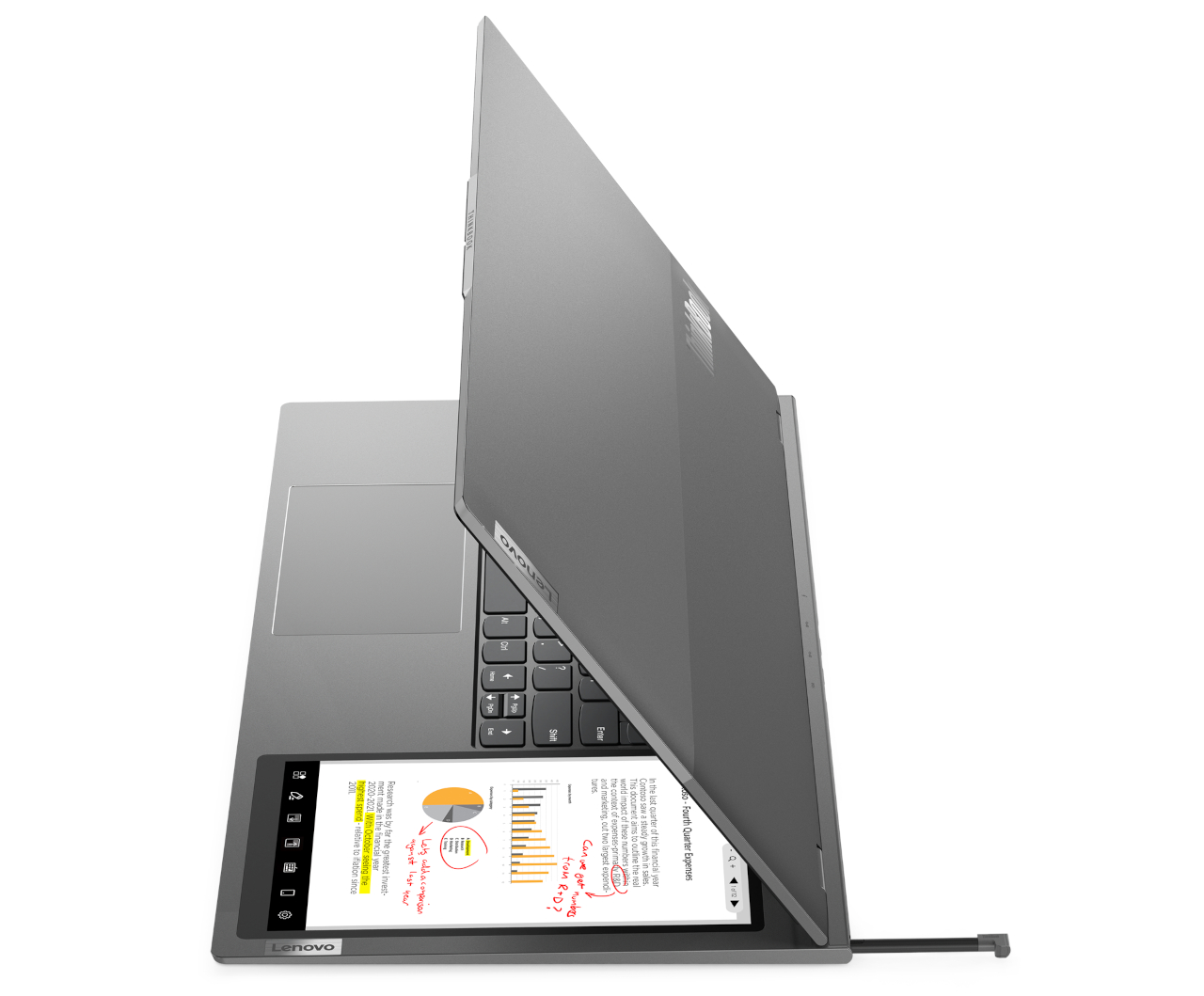
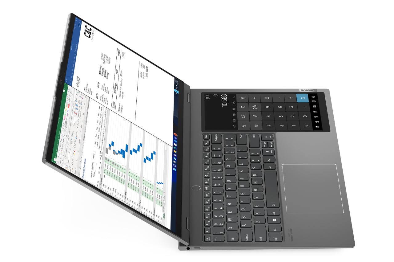
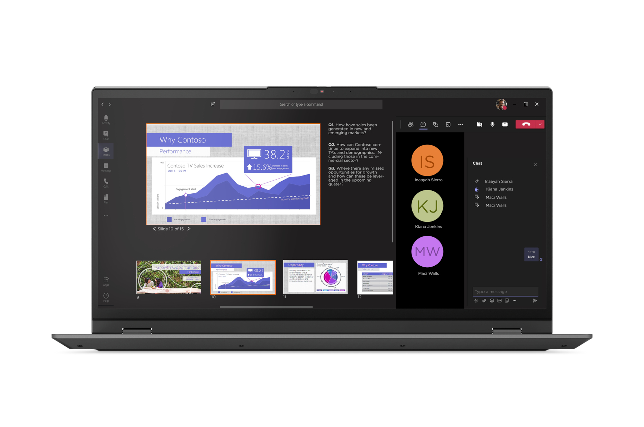
Opening the Lenovo ThinkBook Gen 3 immediately reveals its special feature, an 8-inch screen off to the right side of the keyboard. It’s a multi-functional screen that acts as more than just an extension of the large 17.3-inch main display. It is actually more like an extension of the keyboard that just so happens to be dynamic and completely digital.

It can be a sub-screen that apps can use to display controls like buttons and sliders, freeing the main screen for content. It can also be used like a Wacom tablet with the integrated stylus, or a handy notepad on the side for jotting down meeting notes. It can even mirror your smartphone screen, specifically Motorola phones that support the ill-named “Ready For” feature, giving you a tablet that’s always within reach. And, yes, you can also use it as a calculator in lieu of the usual numpad.

While the idea behind this unorthodox design is really appealing, the implementation does come with a few drawbacks. With a 17.3-inch screen, a thickness of 0.7 inches, and a weight of 4.4 lbs, the ThinkBook Gen 3 isn’t exactly the most portable laptop around. The placement of that second screen is also biased towards right-handed people, and there doesn’t seem to be an option for those with the opposite dexterity.

The $1,399 price tag will also be a tad hard to swallow, but you are at least getting what you pay for in terms of hardware and features. One might even argue you are getting more because of that second screen. Admittedly, it will not appeal to everyone, but the Lenovo ThinkBook Gen 3 is unusual and quirky enough to at least get people thinking and talking about it.
The post Lenovo’s latest laptop comes with a secondary screen to keep you productive + creative in the strangest way first appeared on Yanko Design.