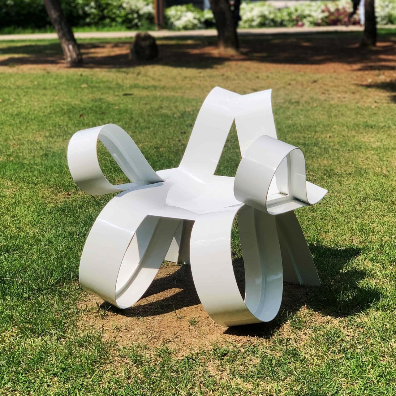
Heart-shaped chair brings organic lines into a functional chair

When it comes to choosing a chair for my apartment (and I’ve had several over the years), I will almost always choose one that is comfortable enough to sit in for a long period of time. That’s because I do a lot of sitting, whether for work or my down time. So I end up with a bean bag or a couch type of chair for my reading, watching, and working comfort. But of course there are a lot of well-designed chairs that can look at home in a museum or are really well thought of, even if they don’t seem to be the most comfortable place to sit in.

Designer: Woocheol Shin

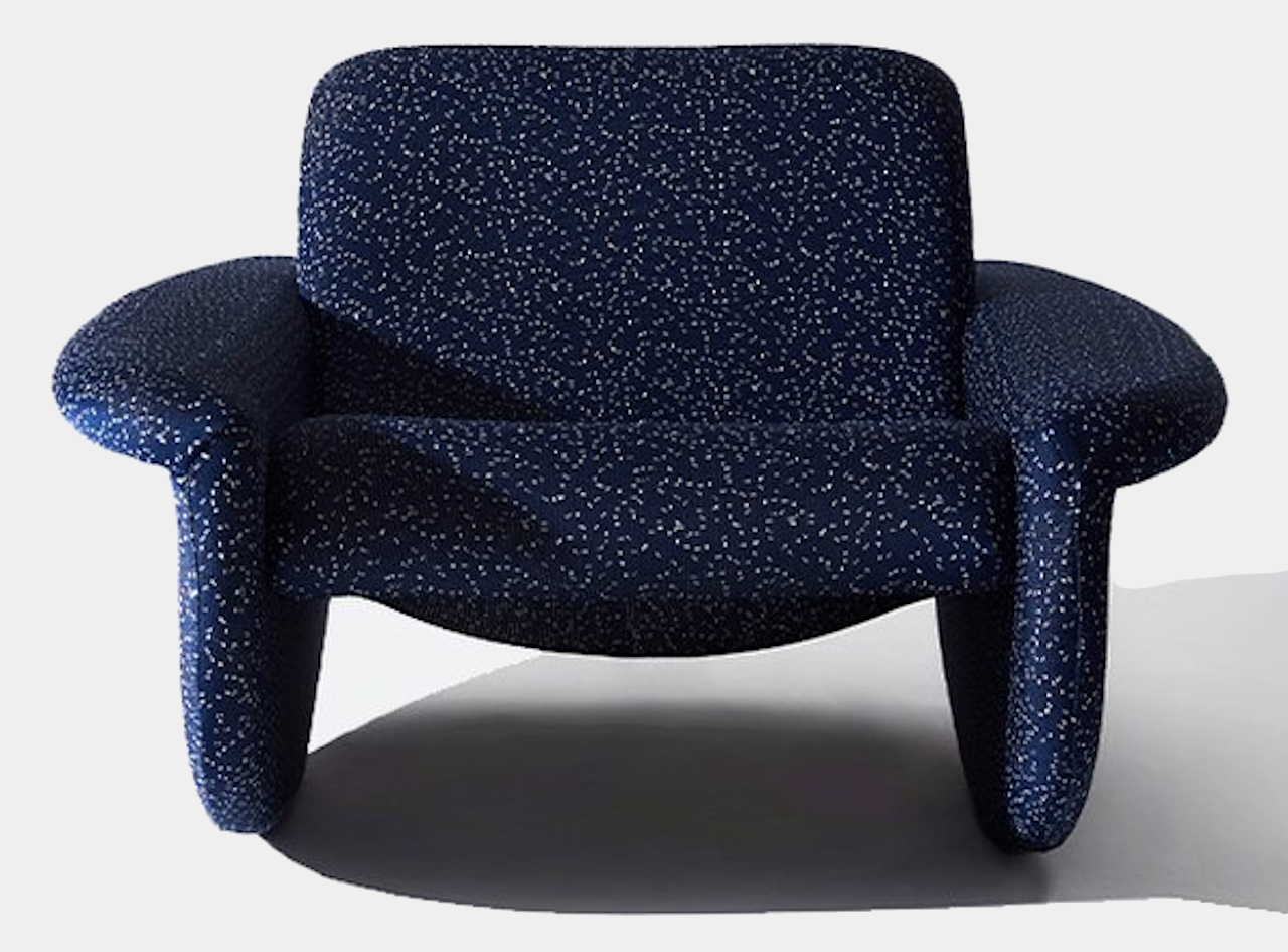
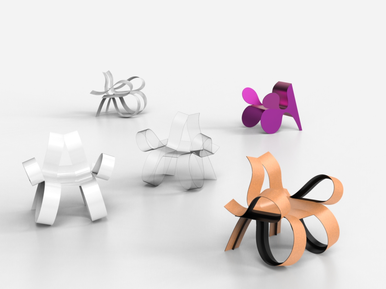
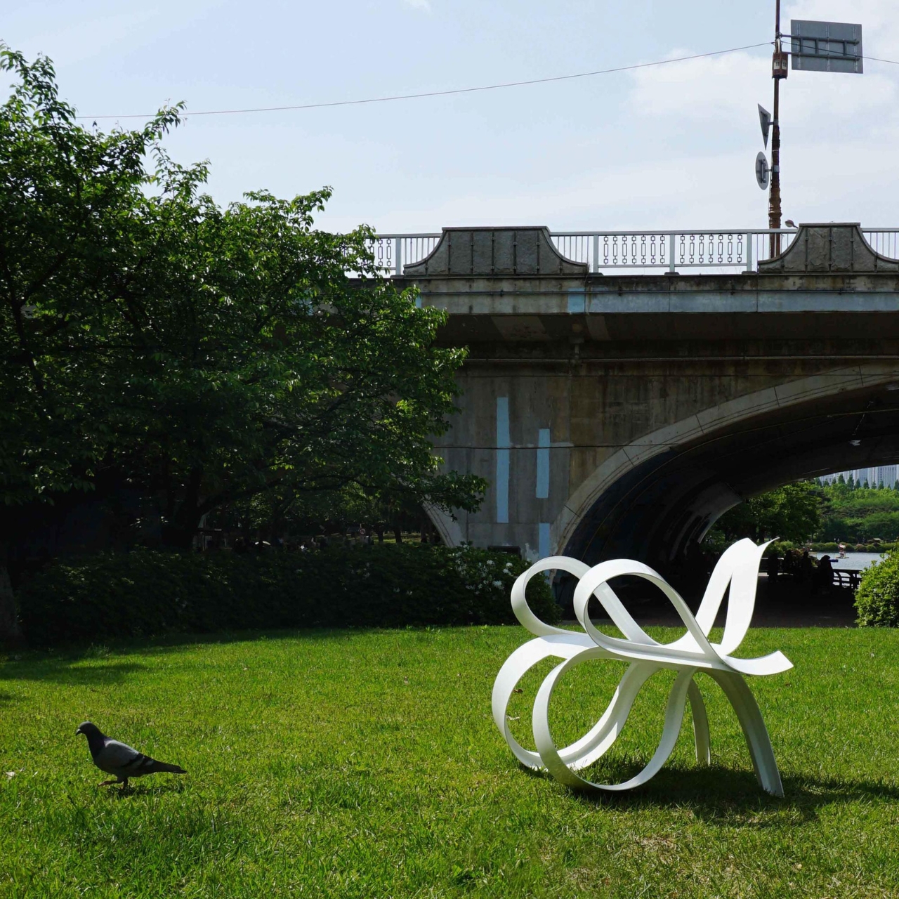
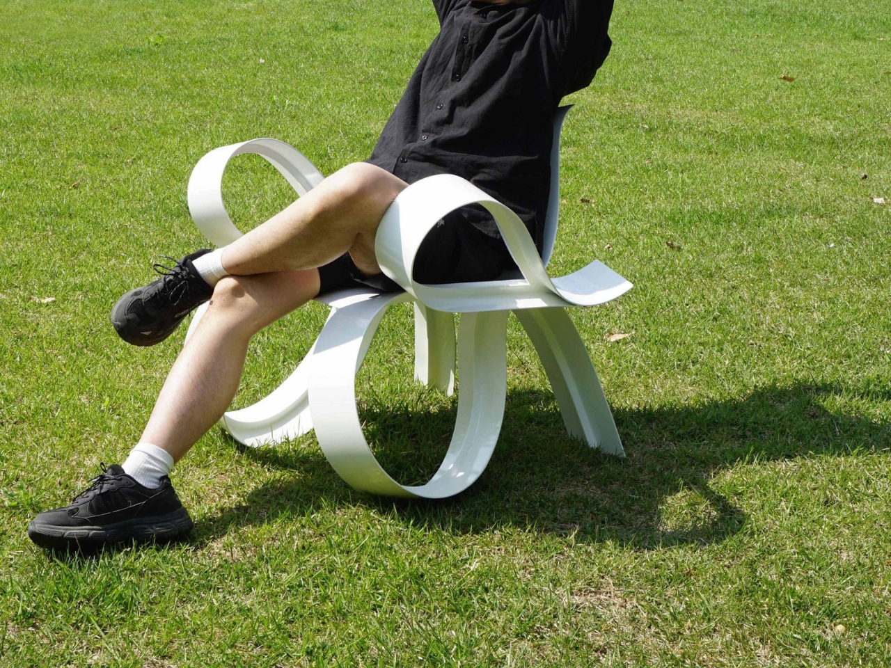
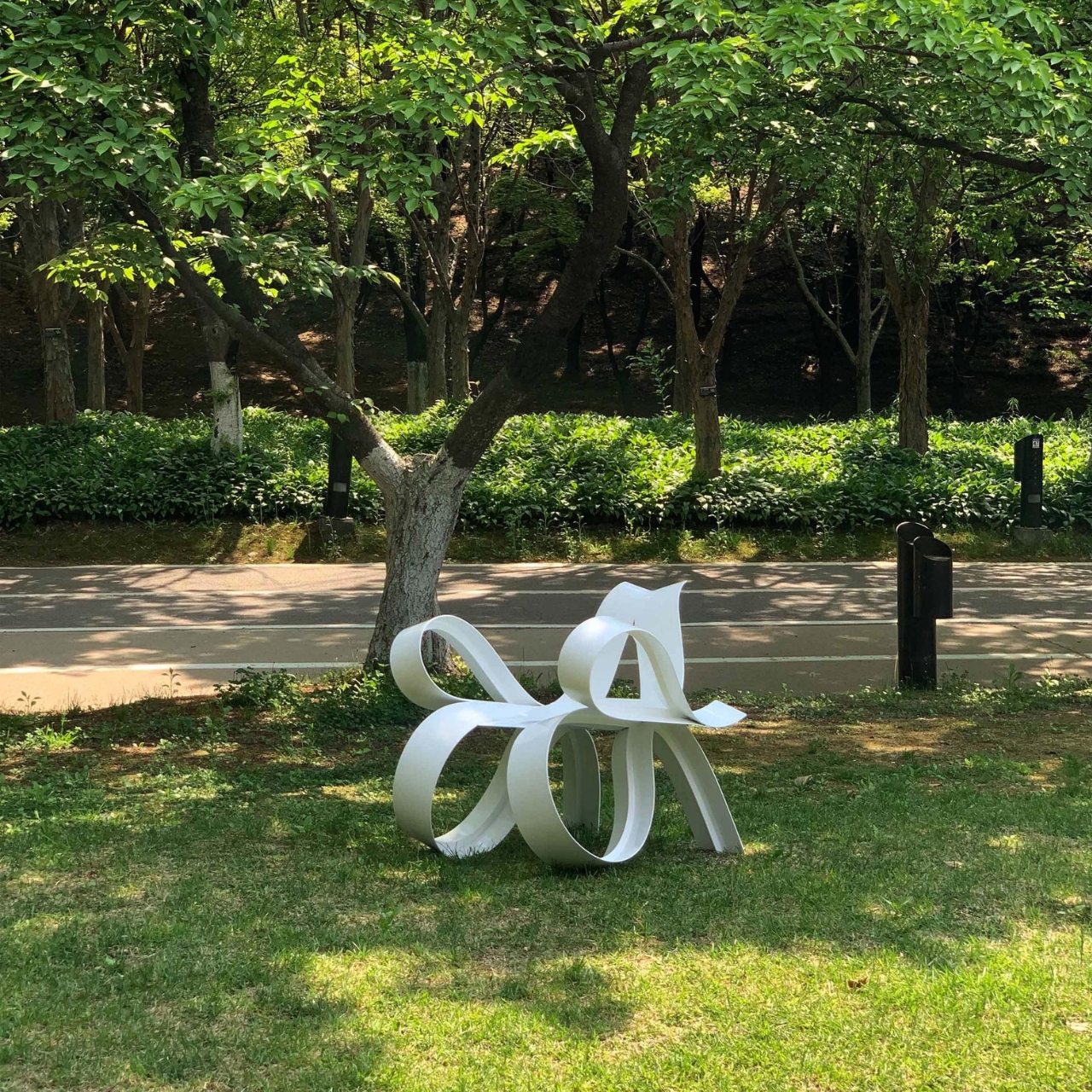
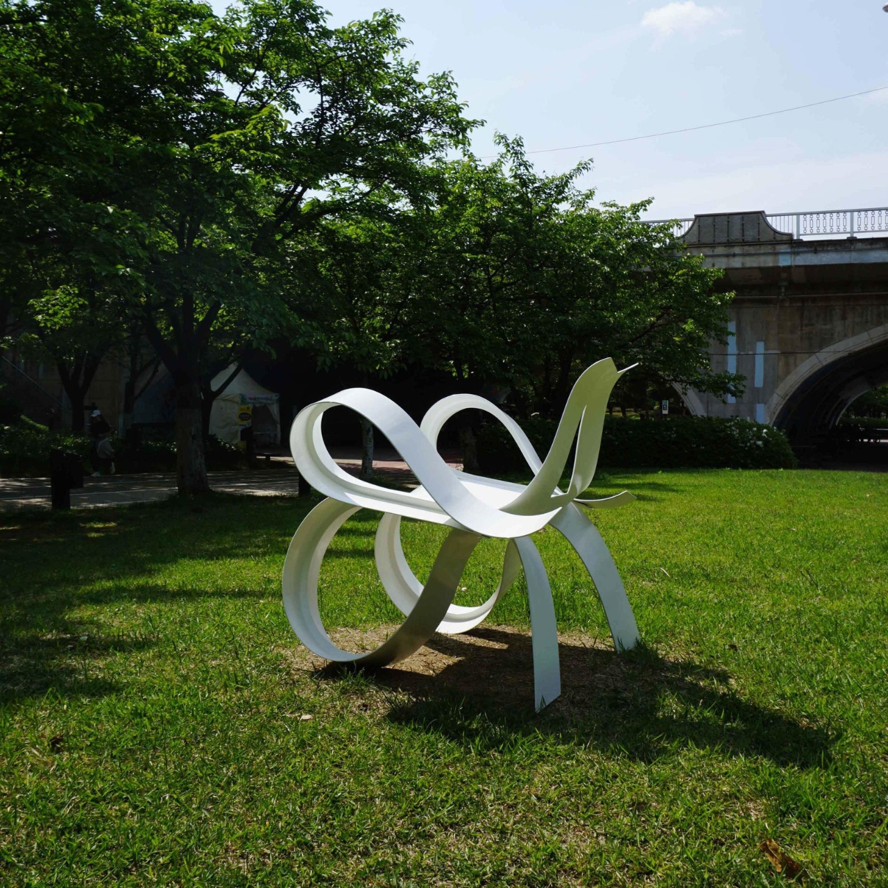
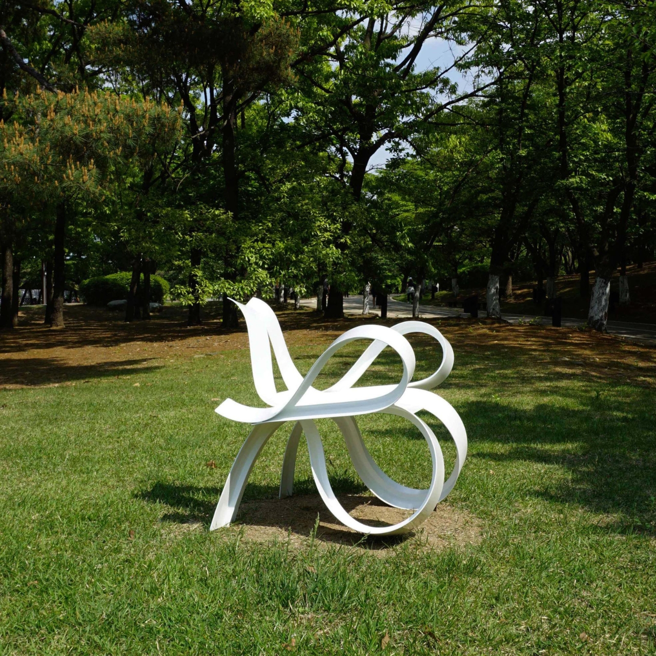
The Heart Chair seems to be one of those kinds of chairs, although it probably looks a bit comfortable and homey as well the way it’s designed. Its name comes from the inspiration for the design as it has a heart-shaped silhouette (the art kind of heart and not the biological). It actually extends beyond the usual vertical and horizontal lines, “subtly breaking its implicit harmony”.

Although the flowing, organic lines makes it look more like an art piece than an actual chair, they designed it in a way that a human body is draped over the lines. They envisioned these organic lines blending into the straight-line spaces, achieving “optimal synchronization. Supposedly, you get less tension by sitting on this compared to the usual rigid chairs you can find in public spaces.

Chairs that are both functional and aesthetic are always a plus point in my book. Now if I can sit on it for hours without hurting my back, legs, or other parts of my anatomy, then it is even more of a winner and is something I’d want to add to my space.

The post Heart-shaped chair brings organic lines into a functional chair first appeared on Yanko Design.

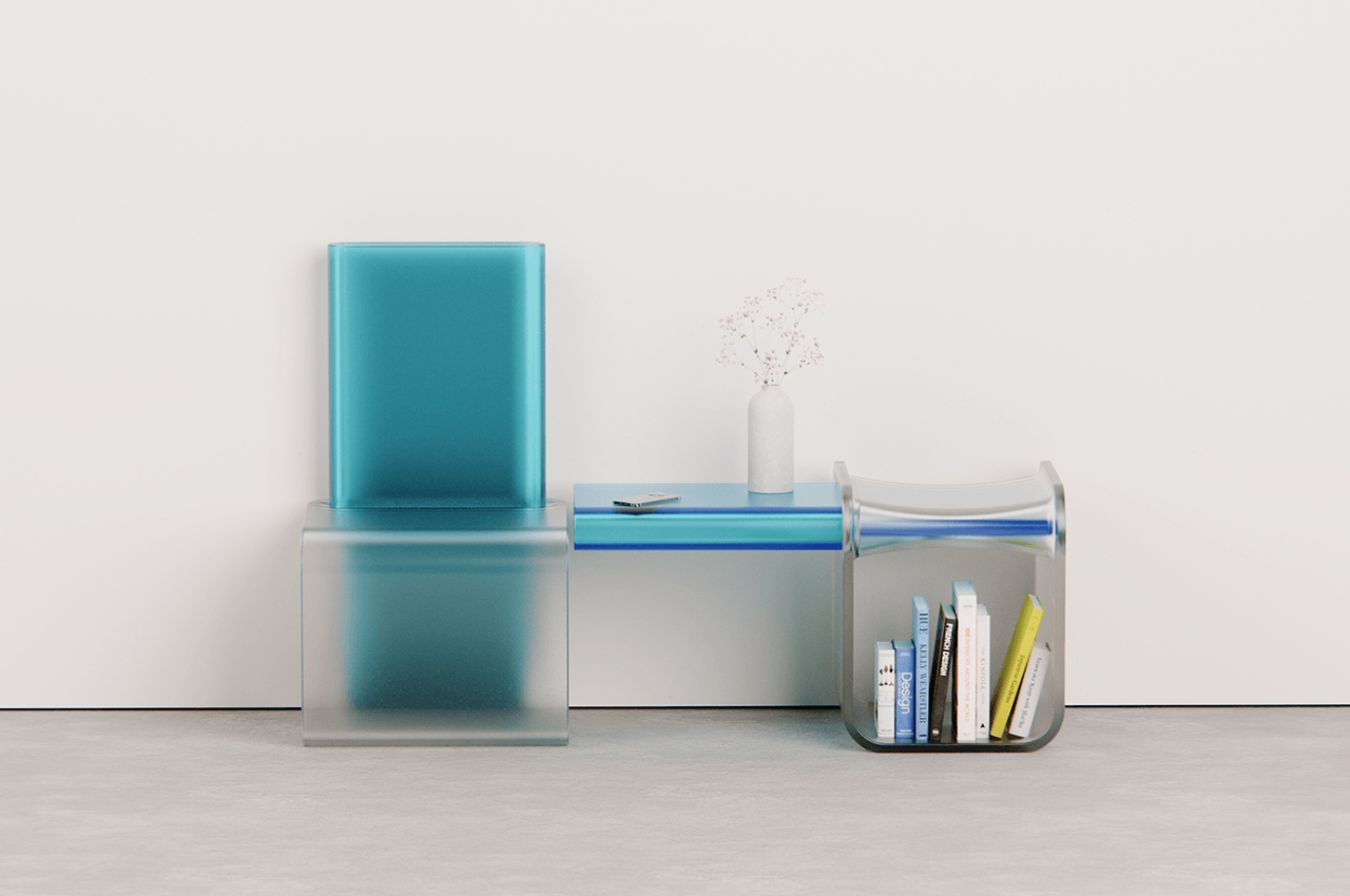
Polycarbonate plastic chair can be turned into side table

People have different tastes when it comes to furniture, even something as functional as chairs. There are those that look for comfort while there are those that just want something they can sit on when working. There are people who look for highly aesthetic chairs that can fit into their space while there are those that like to look for more experimental kind of chairs.

Designer Name: Liam de la Beyodere

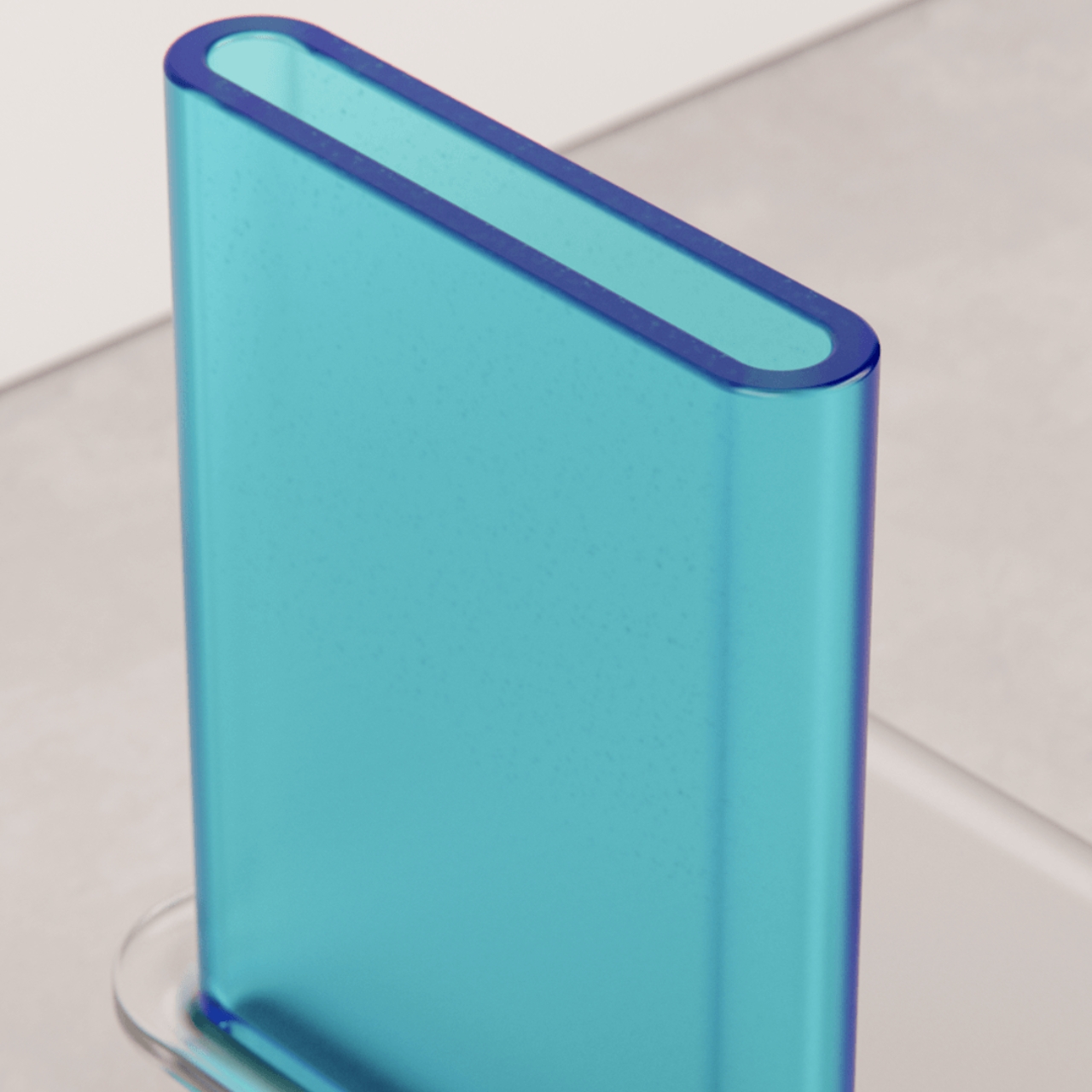
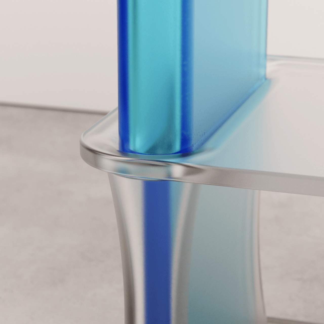
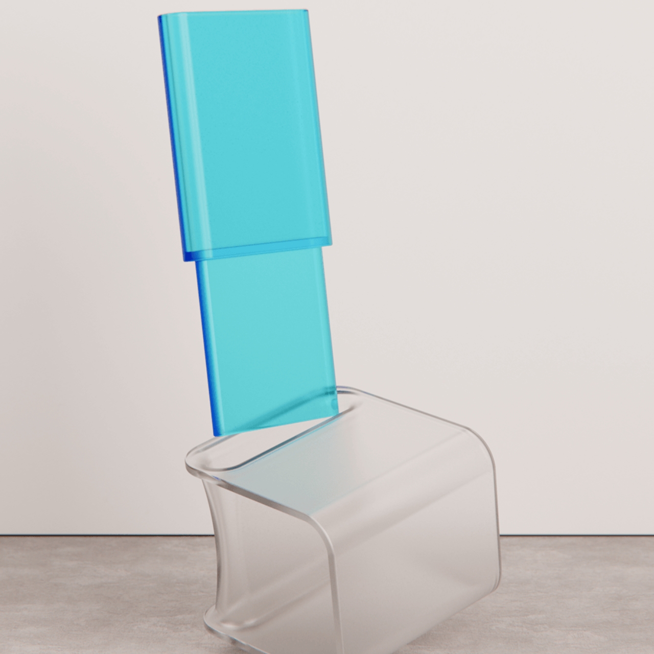
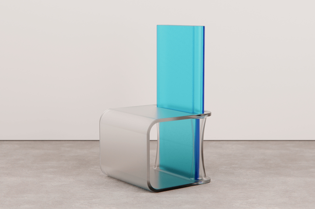
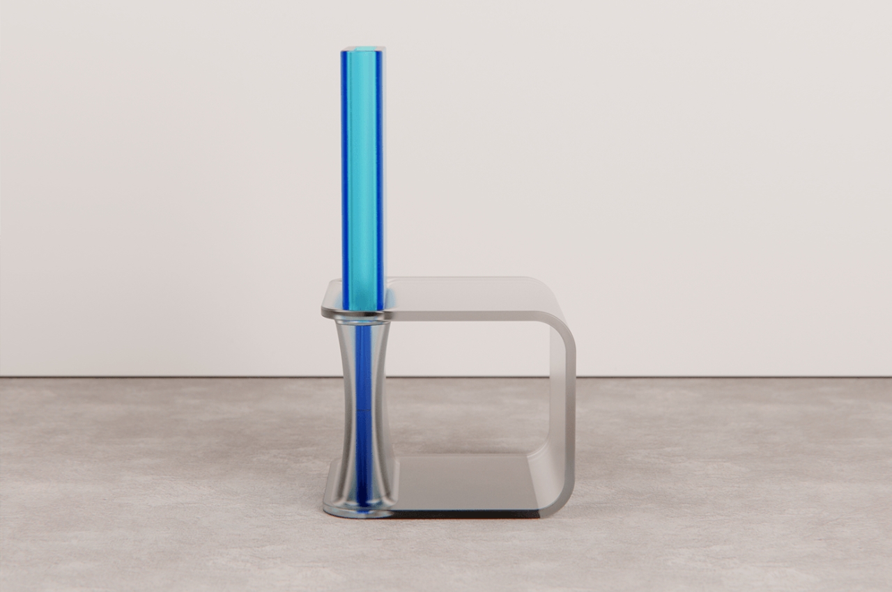
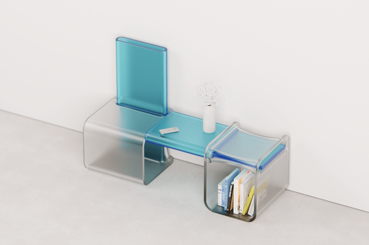
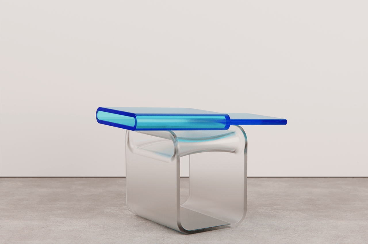
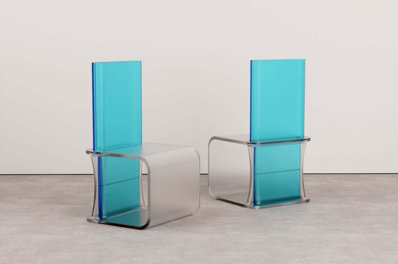
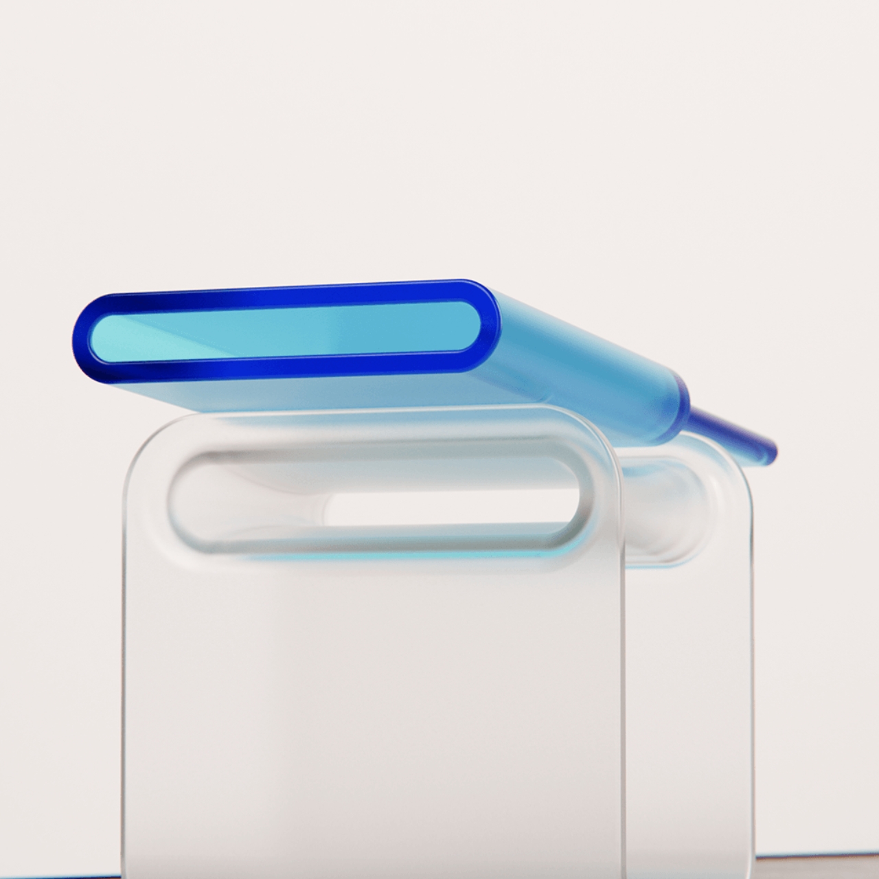
If you’re the last kind of person, this chair concept might be right up your alley. The Push Fit Chair uses frosted injection-moulded polycarbonate plastic for its parts. When you push them together and assemble it, you get a chair that sports a crystal-clear aesthetic. The idea is for light and colors to flow through the chair and lets it cast different patterns and shapes on nearby surfaces.

You can also remove the backrest part of the chair if you want to just have a stool type of furniture. You can also put the backrest on the side so you get a side table along with your chair. There is also space under where you can store items like books and knick knacks. If you put the full chair with the chair/side table together, then you have a more complete set.

Chairs made from polycarbonate plastic may not seem the most comfortable but based on the renders, you get something really pleasing to the eyes. And of course, we love multi-functional and modular things here, so that’s another bonus fro the Push Fit Chair.

The post Polycarbonate plastic chair can be turned into side table first appeared on Yanko Design.

Why most chairs are outdated and Secretlab’s take on a good design for modern ergonomics

The rise of remote work has drastically changed our workspaces. The boundaries between work and play have blurred, and modern hybrid workers switch seamlessly from spreadsheets to gaming to Netflix—all from the same setup. Yet, when you think of an ergonomic chair, a mesh design like Herman Miller’s Aeron probably comes to mind. These chairs developed in the 1970s have become synonymous with corporate offices worldwide. However, is it time for us to consider other options?

Designer: Vincent Sin, Head of Industrial Design

Click Here to Know More.

Historical Context and Evolution of Ergonomic Chairs

The journey of ergonomic design began in the 1970s with chairs like the Herman Miller Aeron, which quickly became the gold standard for office seating.

Everyday workers rarely gave much thought to their sitting habits. Their typical workday meant long hours at the desk with minimal movement. Conversations about sitting often focused on achieving the perfect posture.

The rise of the tech industry and the shift to remote work blurred the lines between work and leisure. As work environments evolved, the need for more dynamic seating became clear. A good chair shouldn’t just do one thing — they must support everything from long hours of sitting to more relaxed, casual postures, no matter what you’re doing at the desk.

One company is leading this shift forward, recognizing the need for modern ergonomic solutions that meet the diverse needs of today.

The Evolution of Ergonomic Seating

Secretlab was founded in 2014 by Ian Ang and Alaric Choo, both avid gamers and StarCraft II professionals. Their journey began out of personal necessity— they needed chairs that could support their extensive practice sessions, often lasting up to 16 hours a day. Existing market options fell short of providing the required comfort and durability. This gap inspired them to design their own solution, leading to the creation of a new standard in seating.

The success of these designs among professional gamers brought Secretlab into the spotlight, but the company’s dedication to ergonomic science and high-quality materials also quickly expanded their user base beyond just the gaming community.

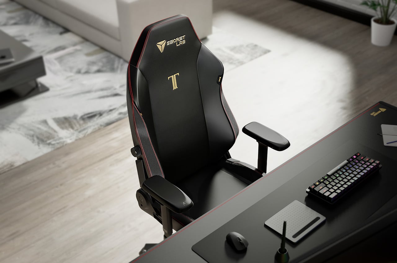
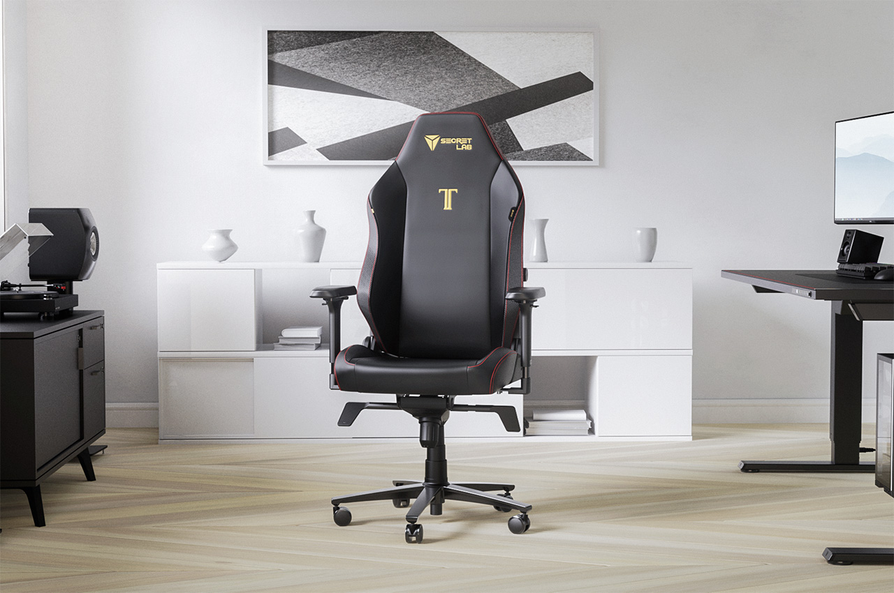
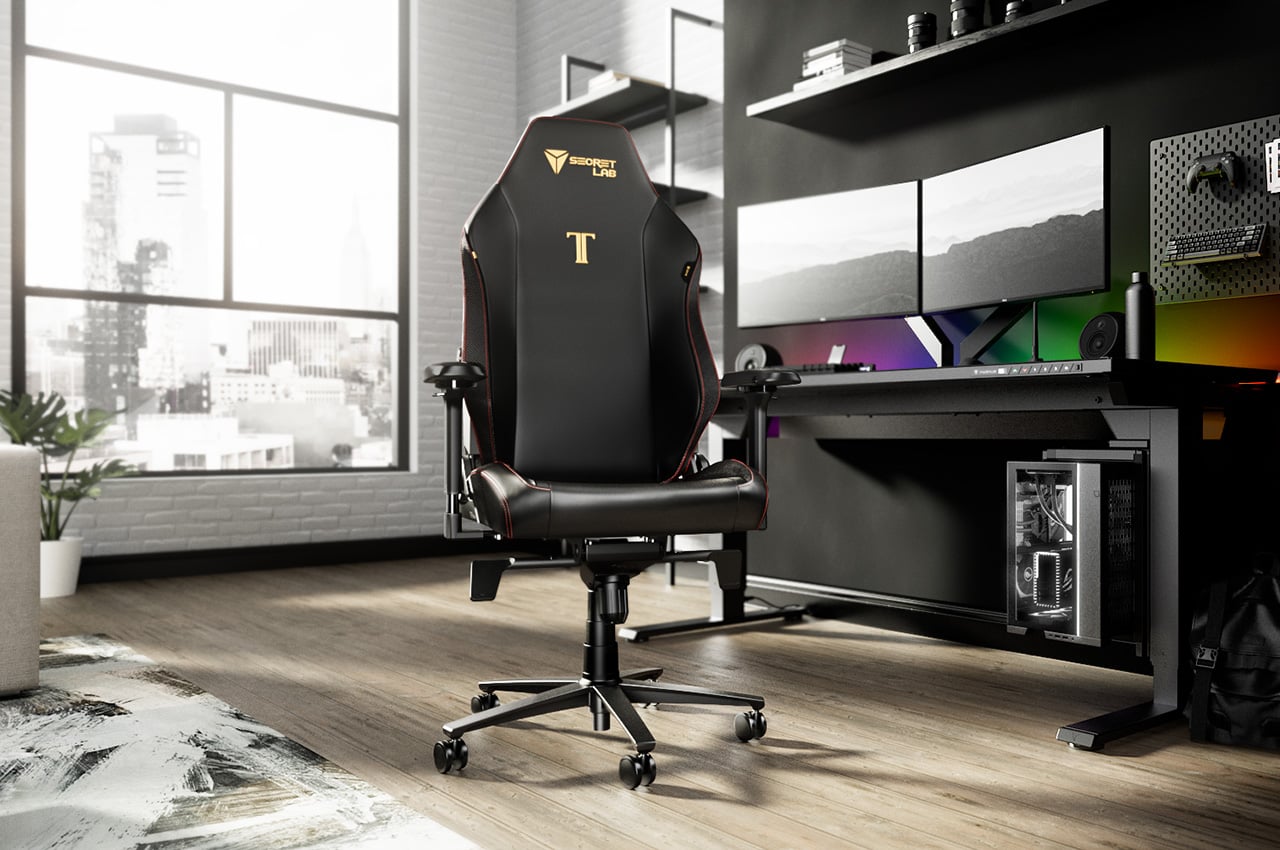
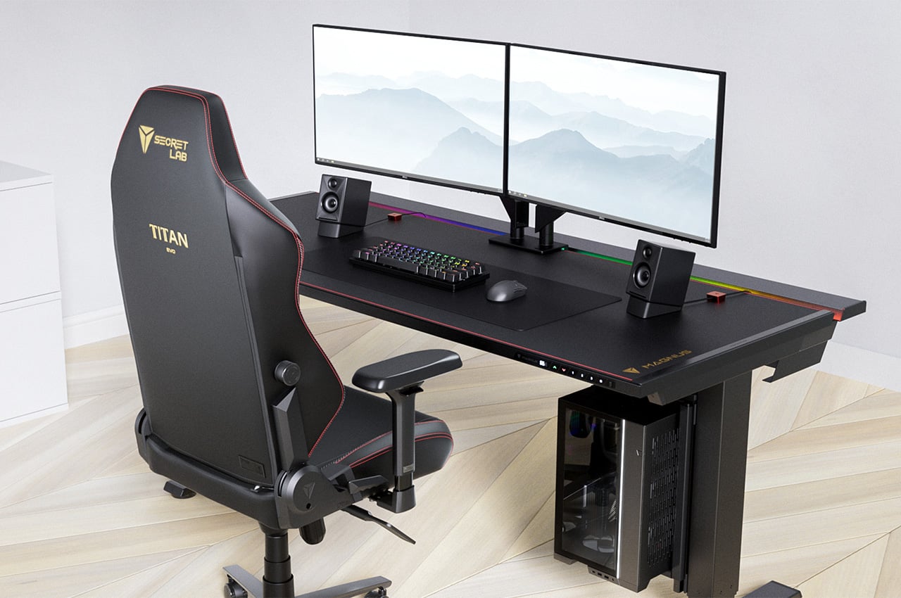
Today, Secretlab chairs are trusted by over 3 million users worldwide, reflecting their commitment to excellence. Despite its roots in designing chairs for esports players, the flagship chair, the Secretlab TITAN Evo, is making significant inroads into spaces traditionally dominated by mesh office chairs. From global esports stages to home offices and corporate boardrooms, it is fast becoming a top pick for anyone needing an ergonomic chair that can support long hours of sitting.

The appeal of the Secretlab TITAN Evo extends to a diverse range of users, including some of the most distinguished figures in various fields. Academy Award-winning composer Hans Zimmer, is among its users, having scored his iconic scores in movies like “Dune” and “Top Gun: Maverick” in the comfort of a Secretlab TITAN Evo chair in his studio. Similarly, World No. 1 chess grandmaster Magnus Carlsen has also adopted the Secretlab TITAN Evo, further highlighting its versatility and appeal.

The Secretlab Difference

What sets these chairs apart in a crowded market? While the Secretlab TITAN Evo might resemble other gaming chairs at first glance, a deeper inspection reveals significant differences. Every design choice is informed by extensive real-world data on how people actually sit. This commitment to evidence-based design is bolstered by collaborations with leading ergonomic experts and regular consultations with an independent Ergonomics Advisory Board to refine their products.

Central to their philosophy is the understanding that the human body is not meant to remain in a single, static posture for prolonged periods. Conversely, traditional ergonomic chairs often emphasize one “optimal” posture, which can lead to muscle and soft tissue strain over time.

Dr. Stuart McGill, professor emeritus at the University of Waterloo and a foremost authority on back pain, underscores this point. “Tissue loads must be migrated from tissue to tissue to minimize the risk of any single tissue accumulating microtrauma. This is accomplished by changing posture,” he explains.

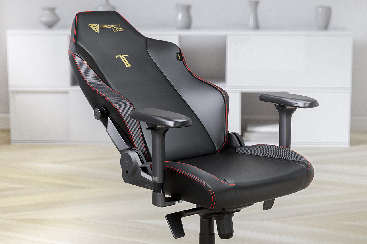
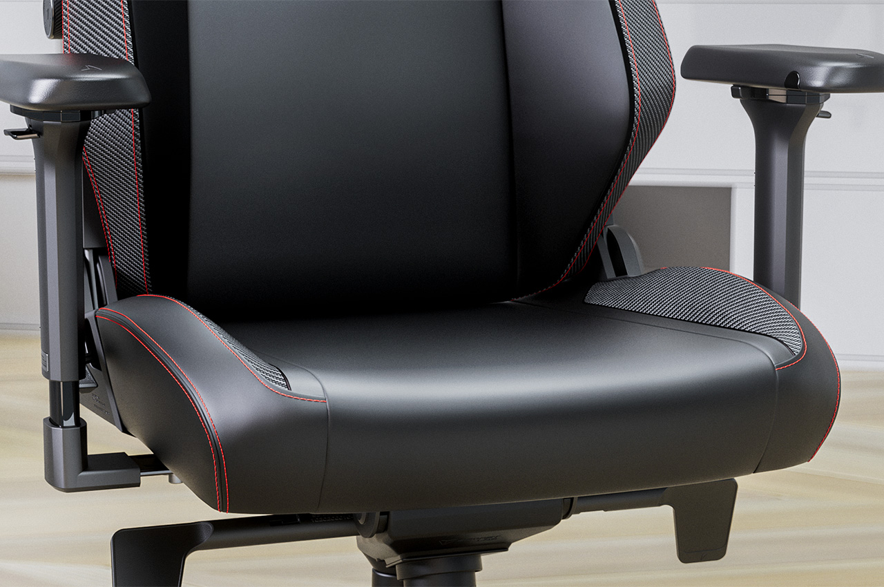
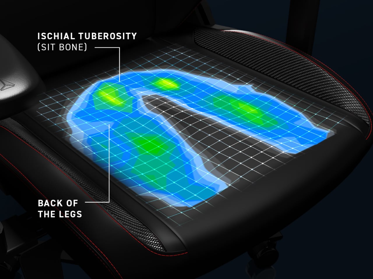
Its proprietary pebble seat base exemplifies this philosophy. It features gently sloping sides that guide users towards the center for balanced pressure distribution while still allowing freedom to sit in various positions—whether leaning to one side or sitting cross-legged.

In comparison, most gaming chairs adopt a far more restrictive bucket seat design inspired by racing seats. These designs work well in race cars to help drivers remain snug and secure in their seats when racing at 220 mph, but they have no place in ergonomic chairs, says Secretlab.

Instead, they prioritize flexibility, allowing users to transition between different tasks and postures effortlessly.

Settling the Debate: Mesh vs. Foam in Chair Design

The choice of upholstery materials plays a critical role in chair comfort and support. While mesh is favored for its breathability, foam offers substantial support, particularly for extended use.

Research from the University of California, Berkeley, found no significant differences between foam and mesh in terms of comfort, pain, and fatigue. However, participants reported finding foam chairs more supportive over long hours, with better pressure distribution.

That said, not all foam is created equal. Secretlab engineered their own patent-pending cold-cure foam to provide uniform weight distribution and consistent density. They cured their foam at lower temperatures, resulting in a medium-firm texture that resists sagging and reduces strain on the back. By ensuring even pressure distribution, it enhances long-term comfort, making it a strong contender against traditional mesh.

Mesh chairs, on the other hand, excel in breathability, keeping users cool during long periods of sitting. The choice between foam and mesh ultimately depends on individual preferences and specific needs, but both materials have their distinct advantages.

A New Type of Computer Chair

Recognizing the shift in workplace habits accelerated by the pandemic, Secretlab leads the way in adaptable furniture design. Their chairs support various activities, from video calls to streaming, by prioritizing movement and versatility.
This approach meets the needs of today’s workers and paves the way for future ergonomic innovations, ensuring comfort and productivity in a world where work and play often overlap.

Click Here to Know More.

The post Why most chairs are outdated and Secretlab’s take on a good design for modern ergonomics first appeared on Yanko Design.

COSMOS Chair: An Experience that Unveils a Multiverse of Emotions and Intricacies

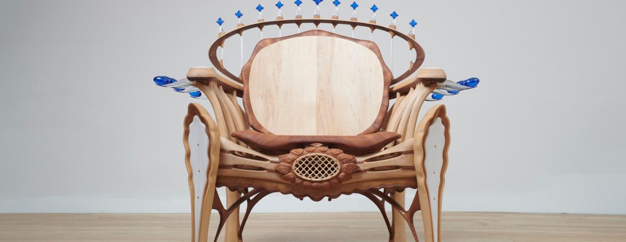
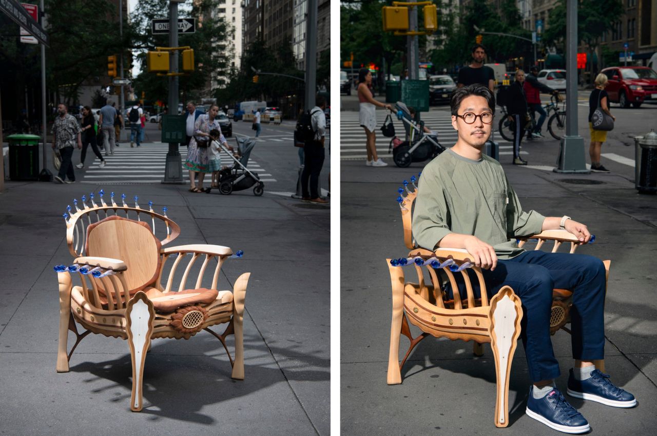
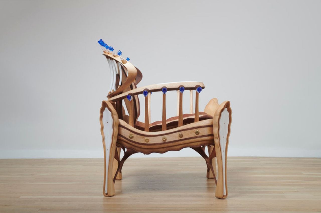
In a world brimming with innovation and creativity, there are certain designs that transcend their physical form and touch the very essence of our being. Such is the case with the awe-inspiring COSMOS chair, a masterpiece that elegantly intertwines human emotion with the boundless complexity of the universe. Crafted by the visionary mind of Brooklyn-based designer Peter Minsoub Sim, this chair is more than just a piece of furniture—it is an intricate tapestry that beckons us to explore the vast realms of human cognition and connect with the universe on an unparalleled level.

Designer: Peter Minsoub Sim

The very first glance at the COSMOS chair triggers a sense of grandeur, as if gazing upon a throne that commands not just a room, but an entire universe. This imagery is not by chance, for the chair’s design is an embodiment of the intricate nature of the cosmos. While the initial impression might be regal, the deeper layers of the design reflect the meticulous intention to encapsulate the universe within a tangible object.

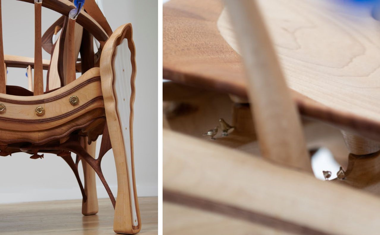
Comprising over 400 distinct parts, the COSMOS chair brings together a harmonious blend of styles from various eras, fusing digital precision with the artistry of human hands. The amalgamation of cast brass, 3D-printed components, and delicate glass elements highlights the chair’s commitment to pushing the boundaries of craftsmanship. This synthesis of modern technology and traditional artistry is a testament to the evolving relationship between the human mind and the tools at its disposal.

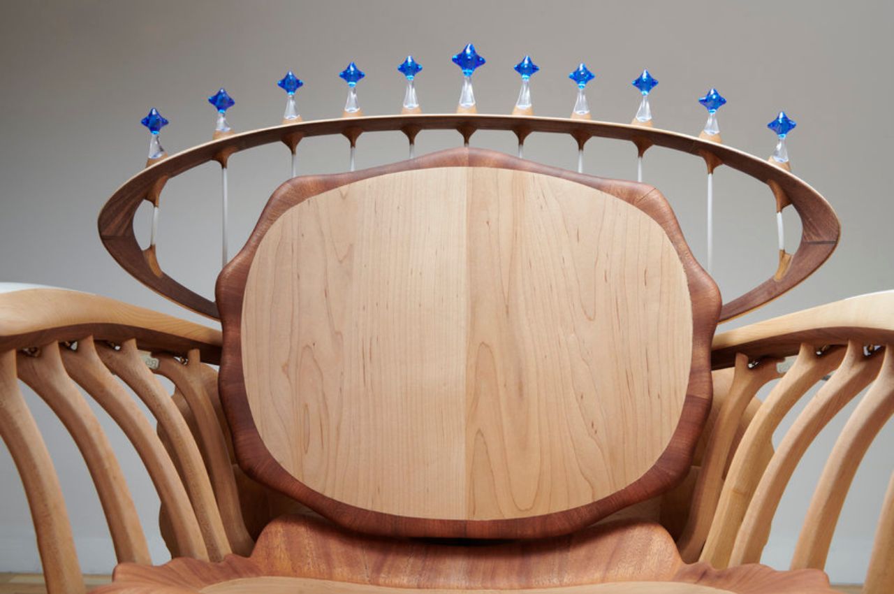
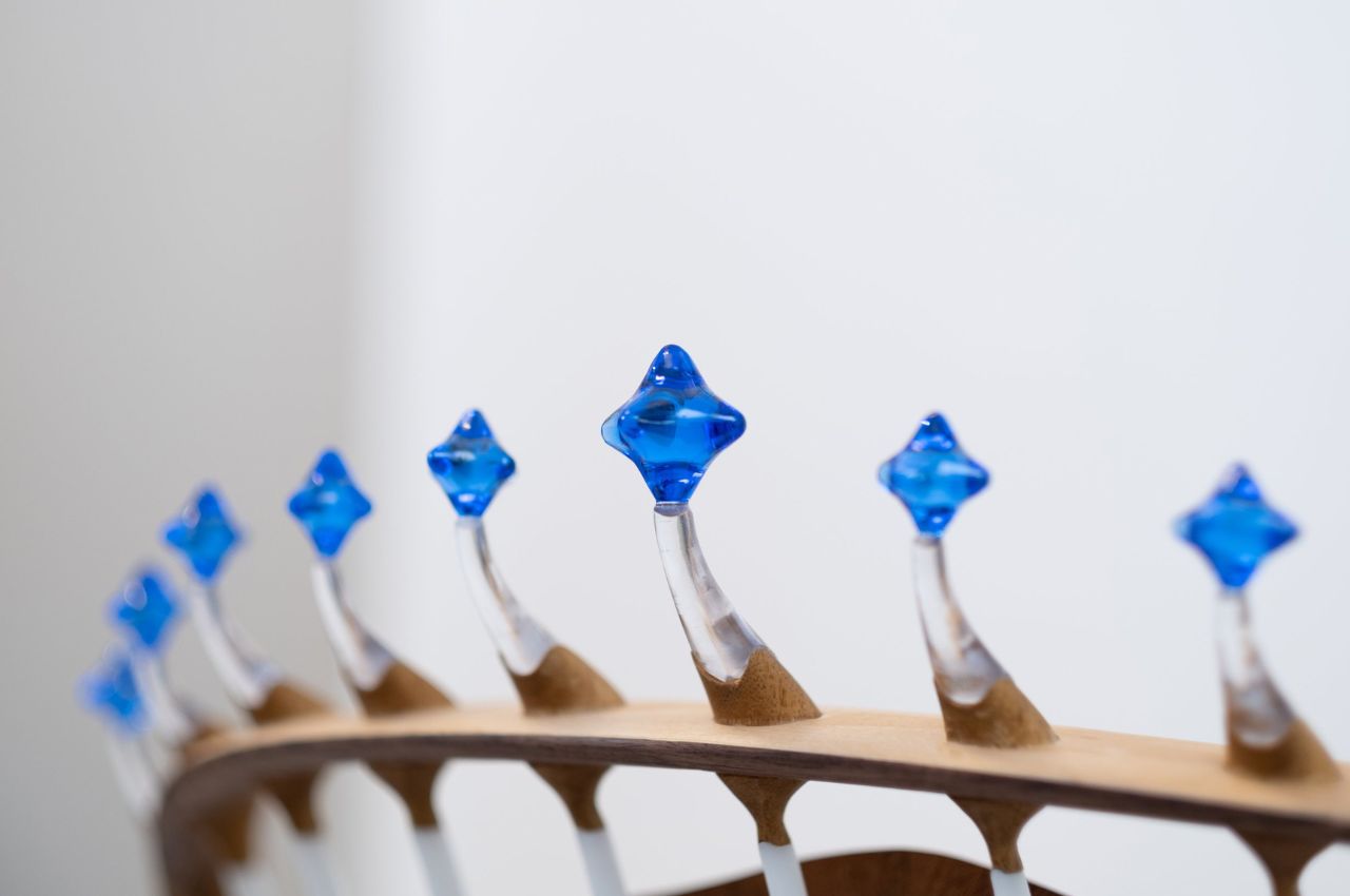
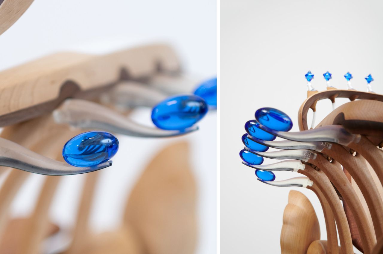
COSMOS chair is not just a physical creation; it is a reflection of the intricate interplay between objects and human emotions. The chair draws inspiration from the elements of nature—the sun, the earth, trees, clouds, waves, water droplets, birds, and fish. These elements form the essence of the chair’s design, with a hand-carved sunflower serving as a focal point and cobalt blue glass stars encircling the sun in a celestial halo.

Yet, it’s not just these non-human elements that define the chair’s identity. The chair itself becomes a representation of human presence, both in the space it occupies and in the hands that meticulously shaped it. This harmonious blend of the natural and the human creates an emotional resonance that transcends words and communicates directly with our senses.

COSMOS doesn’t just speak, it communicates in a language that bypasses the confines of vocabulary. The curves, textures, materials, and hues of the chair are the vocabulary of this intricate dialect. Through these visual elements, the chair invites us to contemplate the interconnectedness of the universe and the remarkable symphony of harmony that exists within it. This isn’t merely a fantasy; it’s a profound homage to the physical world we inhabit.

Yet, COSMOS isn’t just a work of art; it’s a functional chair that invites us to experience its intricate beauty firsthand. One can sit within its embrace and be enveloped by the serene forests, expansive oceans, and limitless skies it encapsulates. The brass birds, meticulously positioned, evoke a sense of both scale and significance, reminding us of our place within the grand tapestry of existence.

As we find ourselves seated in the embrace of the COSMOS chair, we are transported to a realm of wonder and curiosity. The chair serves as a vessel for moments of contemplation and introspection, reminding us of the hidden treasures waiting to be discovered within our universe. This design masterpiece encourages us to foster these moments of connection and appreciation, much like the little brass birds that perch, converse, and shine, patiently waiting for us to uncover and cherish their presence.

In spaces both ornate and minimalistic, traditional and modern, COSMOS finds its place as a testament to the cosmic threads that bind us all. A chair, yes, but more so an emblem of the profound relationship between humans, objects, and the universe they inhabit. COSMOS chair is a masterpiece that bridges time, space, and design, igniting a spark of curiosity and wonder in all who encounter it.

The COSMOS chair isn’t confined by traditional categorizations. It defies simple definitions, gracefully dancing between the realms of functional furniture and captivating art. Its ability to evoke emotions and stimulate profound contemplation sets it apart as a beacon of creativity and innovation in the design world. It’s not just a chair; it’s a journey—a journey through the intricacies of the universe and the depths of our own imagination.

The post COSMOS Chair: An Experience that Unveils a Multiverse of Emotions and Intricacies first appeared on Yanko Design.

Top 10 chair designs that are the culmination of ergonomics, style, and comfort

We often underestimate the importance of a great chair! When in reality we really shouldn’t. We spend the majority of our day sitting on chairs, whether we’re working in our home office, enjoying a meal, or simply sitting and reading a book for leisure! Hence, this piece of furniture needs to be not only comfortable but ergonomic, and aesthetic as well. And we’ve curated a collection of chair designs that meet all these criteria!  From an adorable pet-friendly armchair to a boat-shaped lounge air – these innovative chair designs are not only a boon to your back, and help you maintain a healthy posture, but are also super comfy to sink into, and will perfectly match the interiors of your modern homes. Enjoy!

1. ‘Sharing Joy’
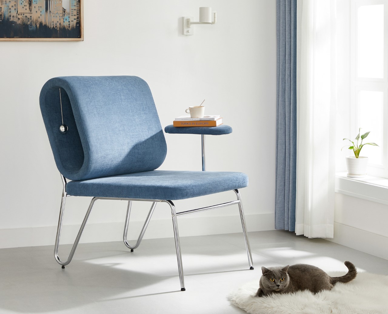
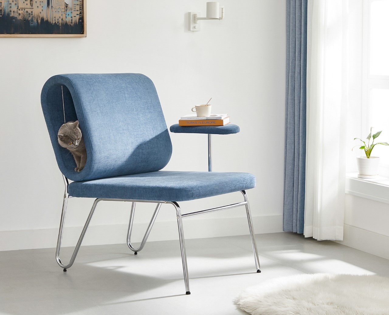
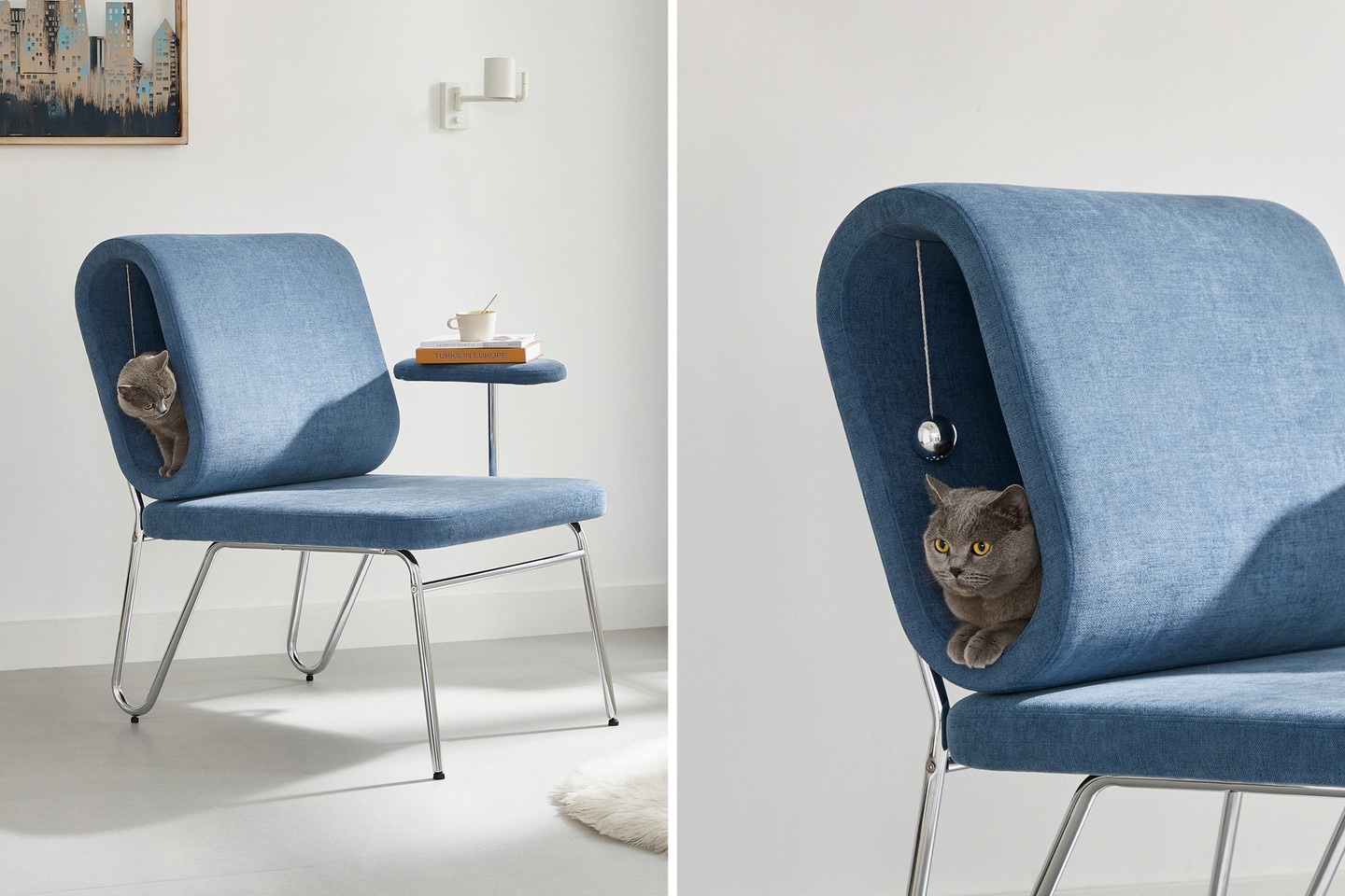
Rather aptly titled ‘Sharing Joy’, this award-winning chair comes with a side table for humans to place their books and cups of tea/coffee on, and a crawl space for cats to casually lounge in (complete with a suspended toy for them to play with).

Why is it noteworthy?

What I personally love about Sharing Joy is that it subscribes to a broader vision of what lounging is and who can ‘lounge’. Designed for humans and cats to cozy up in, the chair comes with a hollow, oblong backrest that’s perfectly sized for an adult cat (or a tiny dog) to crawl into and laze around in. Moreover, the idea of having the human and pet lounging together against each other sounds like absolute perfection. 10/10 will give you the happiness hormones.

What we like

  • The chair sports a minimalist aesthetic that fits in most contemporary homes

What we dislike

  • No complaints!

2. Hug

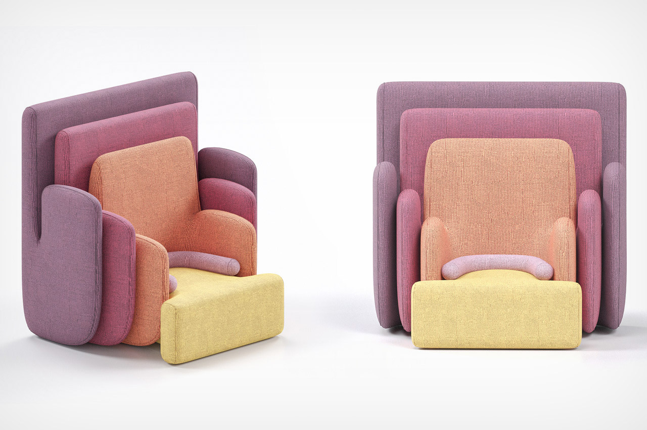
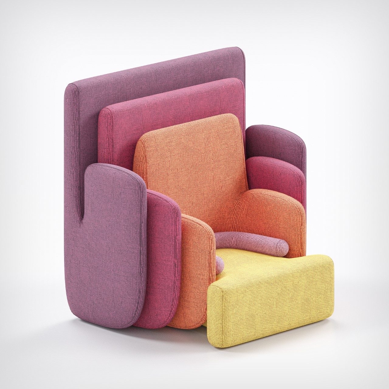
Aptly titled ‘Hug’ for the way the elements hug each other, the Hug Armchair is pleasing to look at, inviting with its warm design and eye-catching colors, and comfortable, thanks to an all-cushion construction that you practically sink right into.

Why is it noteworthy?

The chair is (at least visually) made from 5 parts, with a rainbow-esque color palette to help separate them while giving the chair a unique theme. Starting off with a seat and gradually moving over to the large backrest which envelopes the entire chair, the Hug looks like a set of nesting kitchen containers or spoons (the ones from Joseph Joseph, no less)

What we like

  • The chair’s overarching personality envelops you in a hug when you sit on it
  • The Hug Armchair acts as a unique conversation piece for an interior

What we dislike

  • No complaints!

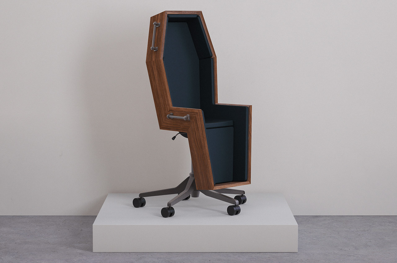
3. Coffin Office Chair

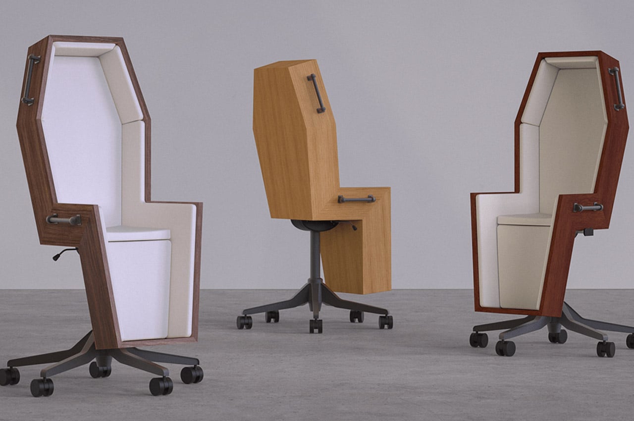
Are you someone who absolutely despises your dead-end corporate job, well then, we may have found the chair for you! Shaped like a coffin, this wooden chair recently took the internet by storm. A Twitter user shared it on September 7th, and everyone who’s downright fed up with their jobs completely resonated with it.

Why is it noteworthy?

The conceptual coffin chair perfectly represents all the dreaded emotions employees feel throughout the entirety of their workday. It reflects the feeling of doom one experiences, as they have to sit through another pointless meeting that could have been an email.

What we like

  • Inspired by Rene Magritte’s painting titled The Balcony (1950)
  • Perfectly captures the feeling of having a dead-end job

What we dislike

  • It’s a concept!
  • There’s no cozy cushioning to get comfy in

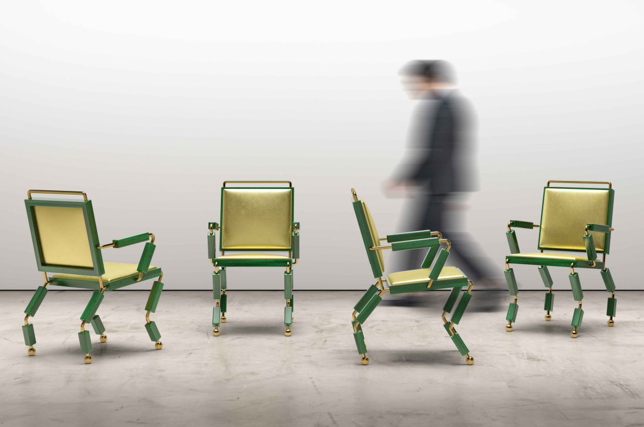
4. Mantis
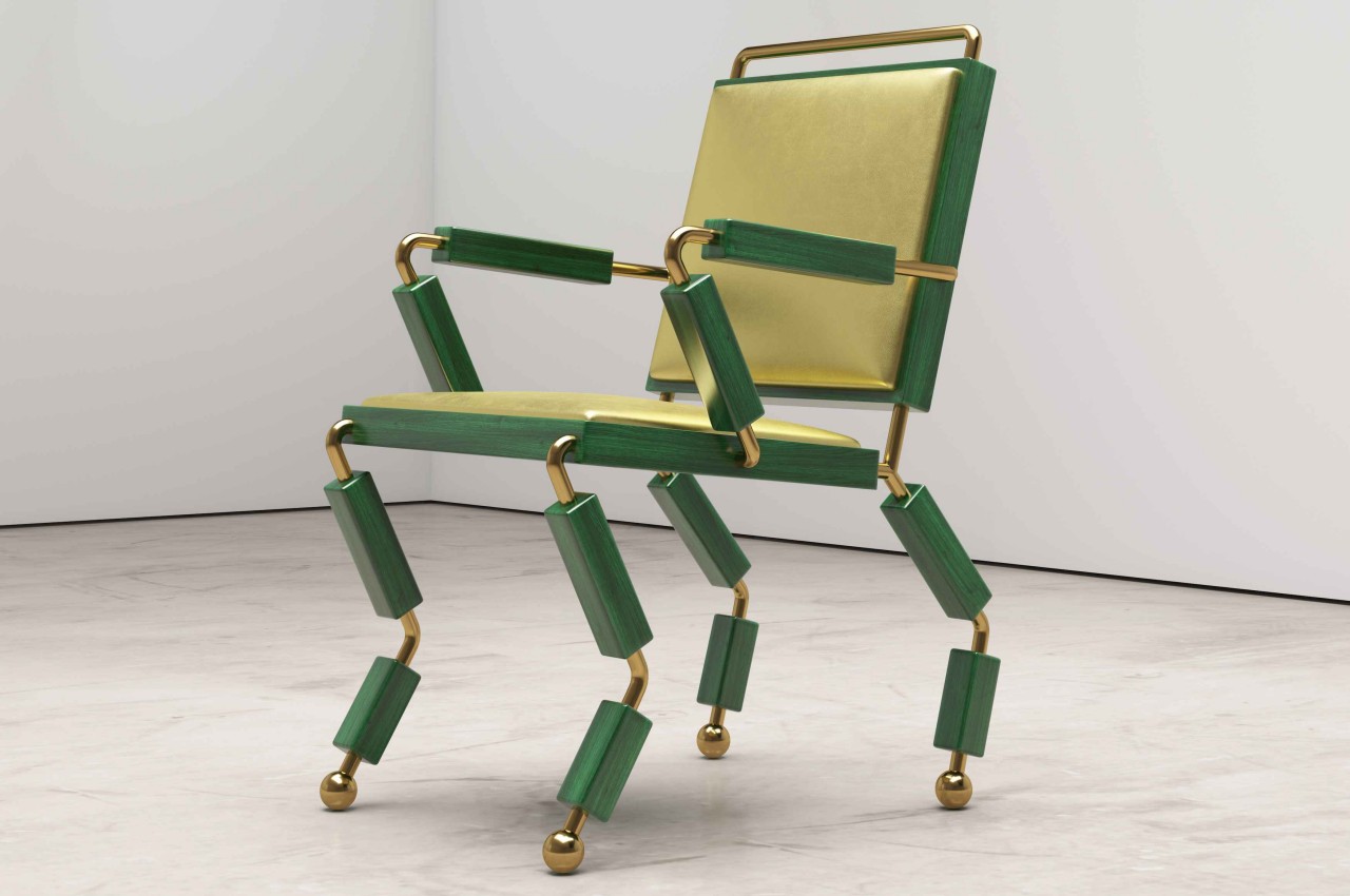
Chairs, just like tables, are supposed to convey a sense of stability and confidence that they won’t topple over or come crashing down when you sit on them. That’s why in most cases, the legs of chairs are designed to be wide, sturdy, and whole, with feet that are almost always flat. This dining chair design throws all those conventions outside the window and almost evokes the opposite emotions. At the same time, it also appears to challenge the viewer to have a little bit more confidence in going beyond what the eyes see.

Why is it noteworthy?

The dining chair is called “Mantis,” most likely because of how its segmented legs and arms resemble those of the insect. One variant even shares the same green and yellow motif. Perhaps another association between the chair and the insect is how the piece of furniture leans back rather than standing straight, almost like how a mantis’ body is in a perpetual state of leaning forward.

What we like

  • The mirror-polished brass contrasts nicely with the green chair and gives it a bit more personality
  • Color-matching leather offers some physical comfort to what looks like an uneasy chair

What we dislike

  • The legs end in soft spheres rather than sharp feet, though it might make one worry that the chair will slide all over the place

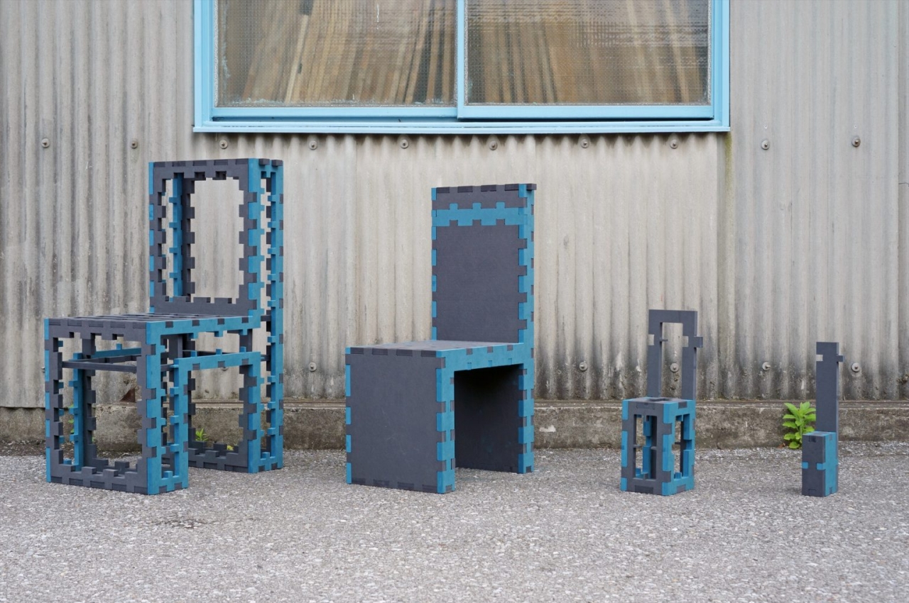
5. The TWINS-MDF
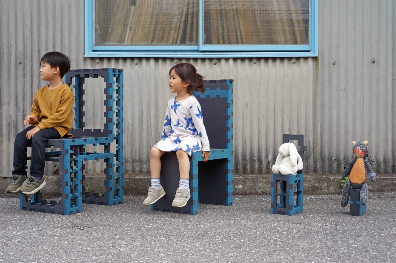
The TWINS-MDF is a modern twist on the first TWINS chair set by the designer launched 18 years ago. The original was a pair of metal and wooden chairs that fit into each other like a glove.

Why is it noteworthy?

This new version uses Medium Density Fiberboard instead (hence “MDF”) and expands the family into a set of four chairs. Technically, only two are really usable by humans, but the other two chairs are perfect for a kid’s imaginary tea party for plushies.

What we like

  • This kind of design is critical in helping reduce not just material waste but also the overall energy footprint during production
  • The chairs look distinctive, with an almost playful flair to an industrial motif

What we dislike

  • The chairs are more decorative than functional

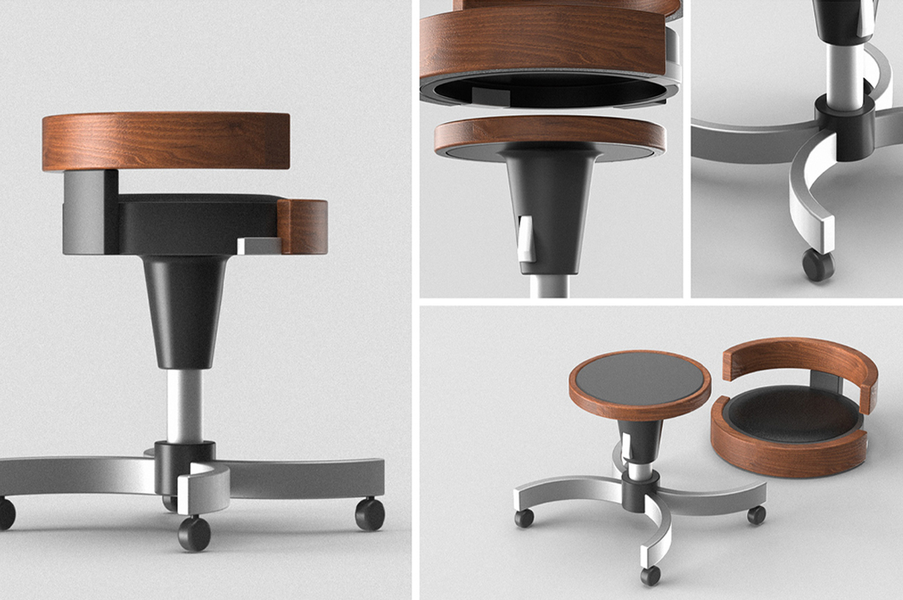
6. D-Tach
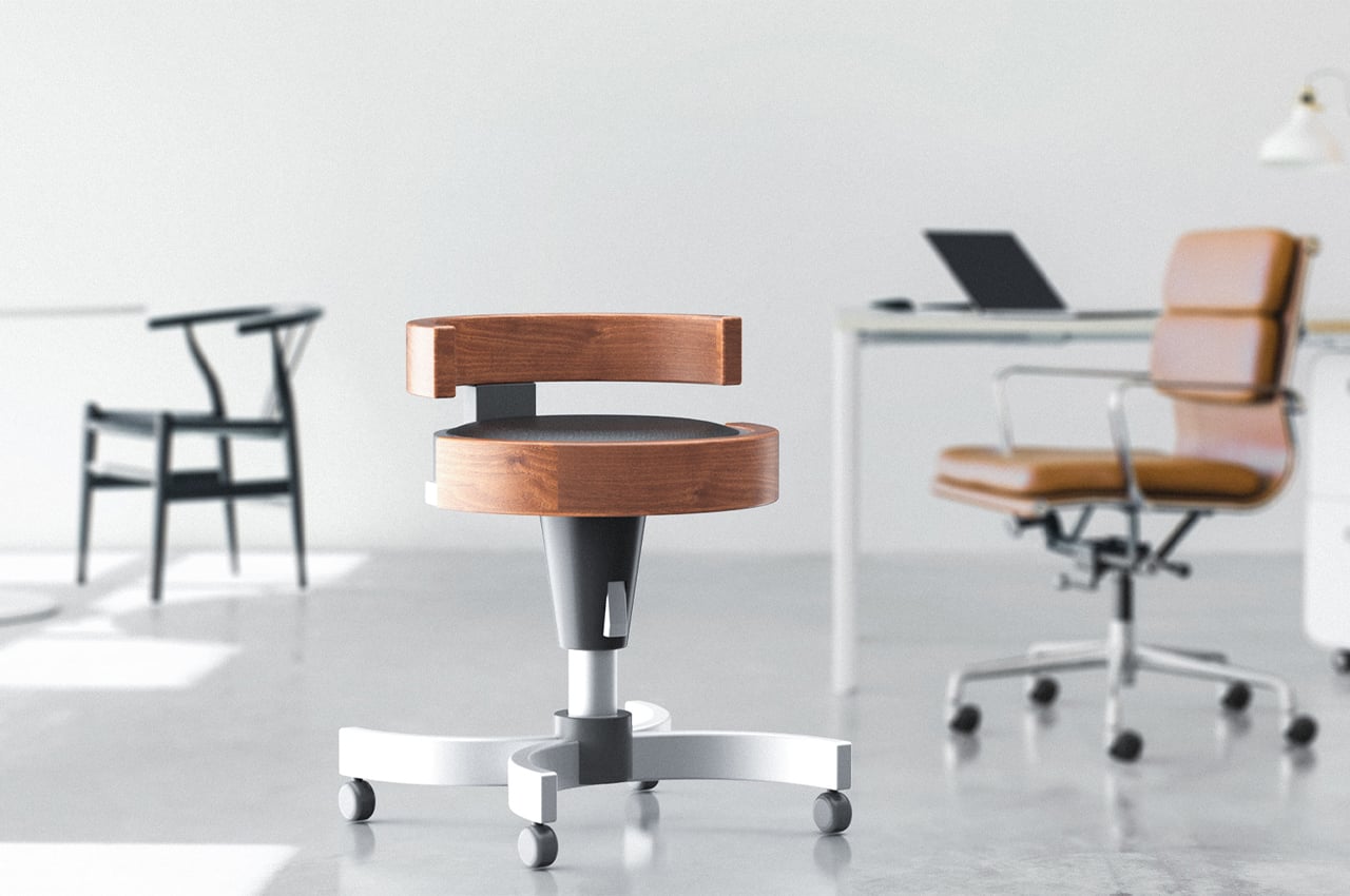
D-Tach is a versatile stool that transforms into a small workspace designed to accommodate today’s mobile work culture. With each day, our world seems to become more and more mobile. Mobile offices, working from home, and freelance careers are increasing in popularity as we move away from corporate offices. With work culture making such a big shift towards mobile lifestyles, our home offices and furniture should reflect that.

Why is it noteworthy?

Industrial design student Andrew Chang decided to create a chair that fits the bill. D-Tach is a modular stool design that functions as a traditional office chair, only to disassemble into parts that provide a small working space on the go.

What we like

  • Transforms into a small workspace
  • Fits into most modern offices

What we dislike

  • We’re unsure how comfortable would the small workspace be to actually work in

7. Canoa
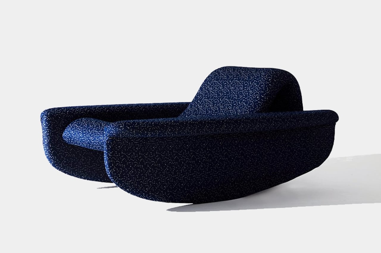
There are things and elements in nature that immediately make us comfortable and at ease, even just by thinking about them. A blowing breeze, the gentle pitter-patter of rain, and the rocking motion of waves are just some of the most popular examples that are easily replicated inside houses these days. Controlled fans can make you feel like a breeze is flowing through your room, while meditation music often includes sounds of rain or rivers. Recreating waves might be a bit harder, but a properly designed rocking chair could actually fit the bill. This lounge chair does, in fact, try to deliver that soothing experience, but its ties to the sea go beyond its rocking motion.

Why is it noteworthy?

From the front, the chair looks pretty normal, albeit a little low and short. Walk around it just a bit, however, reveals its true form, one that is quite unique even among rocking chairs. The chair’s name clearly spells out its form and function. Canoa is Portuguese for “canoe,” and its resemblance to the water vessel is clear, even if it requires stretching the imagination a bit.

What we like

  • The curved bottom of the chair resembles the hull of a boat, and its elongated body further reinforces that imagery

What we dislike

  • No complaints!

8. The P-LOGIC chair

The P-LOGIC chair is a product concept that wants to combine “functionality, aesthetics, ergonomics, and sustainability”, four aspects that when put together can be the perfect kind of furniture.

Why is it noteworthy?

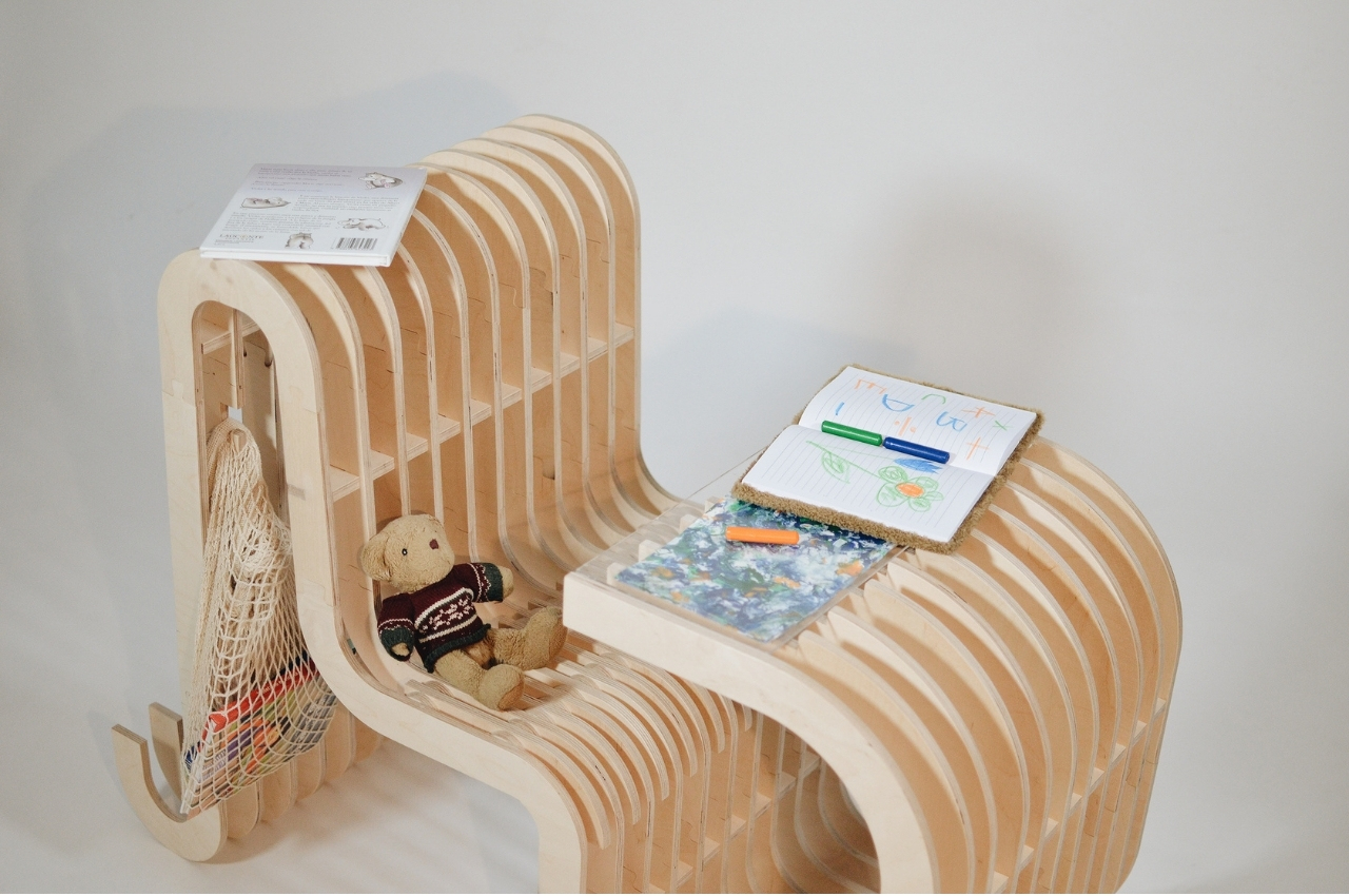
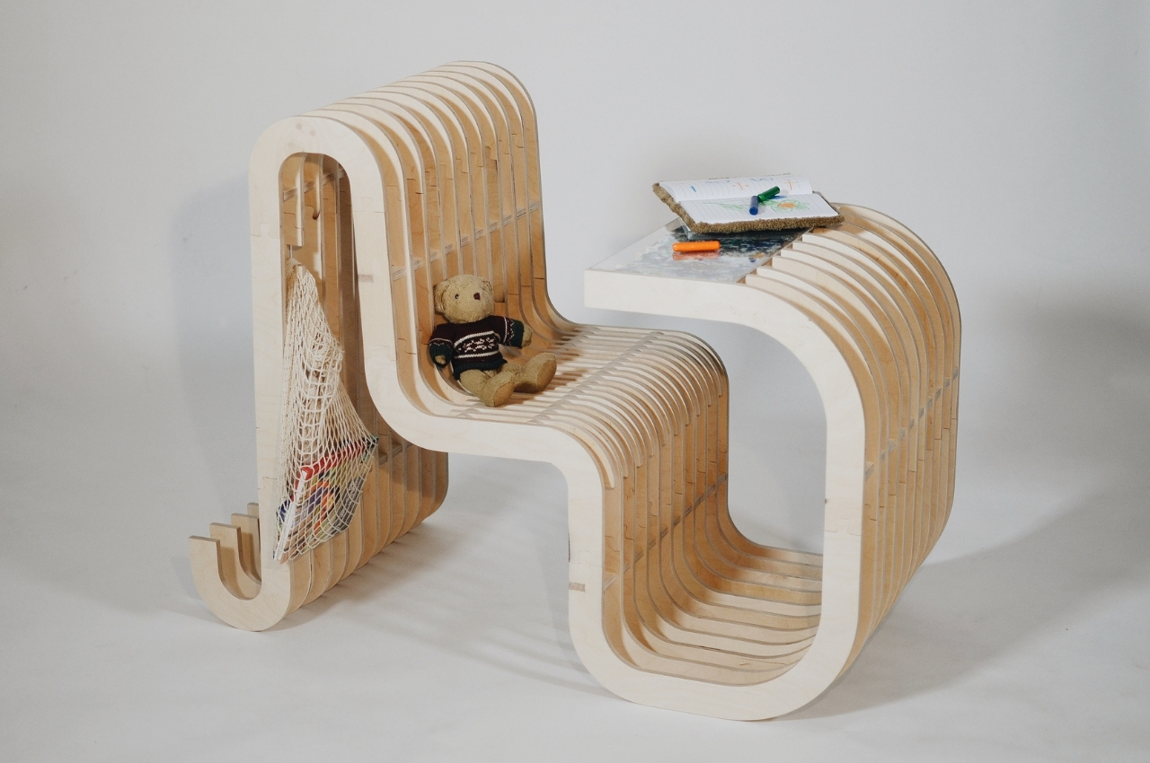
The chair is actually also a desk and is shaped uniquely with waves and curves that are not just for design purposes but can also be functional. The back of the chair, the space underneath, and the slits in between can be used to store toys, books, and other stuff that the child may need to be near them as they study, play, or rest.

What we like

  • Made from sustainable materials
  • Sports an eco-friendly design

What we dislike

  • No complaints!

9. The Nodding Chair

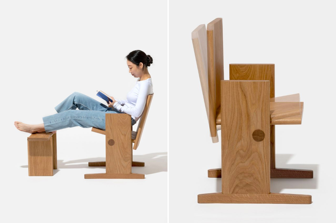
As someone who loves to read, and read for long periods of time, I know that wooden chairs are the least comfortable ones to sit on while finishing a good book. And I’ve also tried to read while on a regular rocking chair and that made me dizzy since the constant big movements are a bit too much for my poor eyes. But staying put in a chair can still be uncomfortable and you need some type of motion while you’re reading. This product concept seems to be the perfect one for bookworms like me.

Why is it noteworthy?

While rocking chairs are good for relaxation, they’re not always good for floors and if you’re like me, for our eyes and peace of mind. The designer thought of a new way to have a chair that can be comfortable and still let your body have its range of natural motion while reading, resting, or even writing (if you’re used to that). The Nodding Chair can be tilted forward and backward, letting you make smaller movements that won’t make you too nauseous.

What we like

  • Creates less pressure on the floor so you won’t get marks and scratches
  • Allows the chair to move with you as you occasionally change positions while reading

What we dislike

  • The seat itself doesn’t seem to be that comfortable as it’s just plain wood and there’s no cushion

10. The Cardboard Chair Process Book
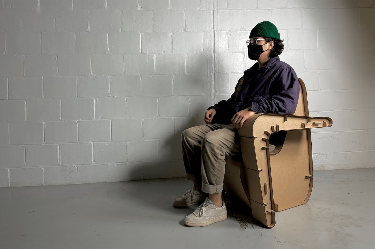
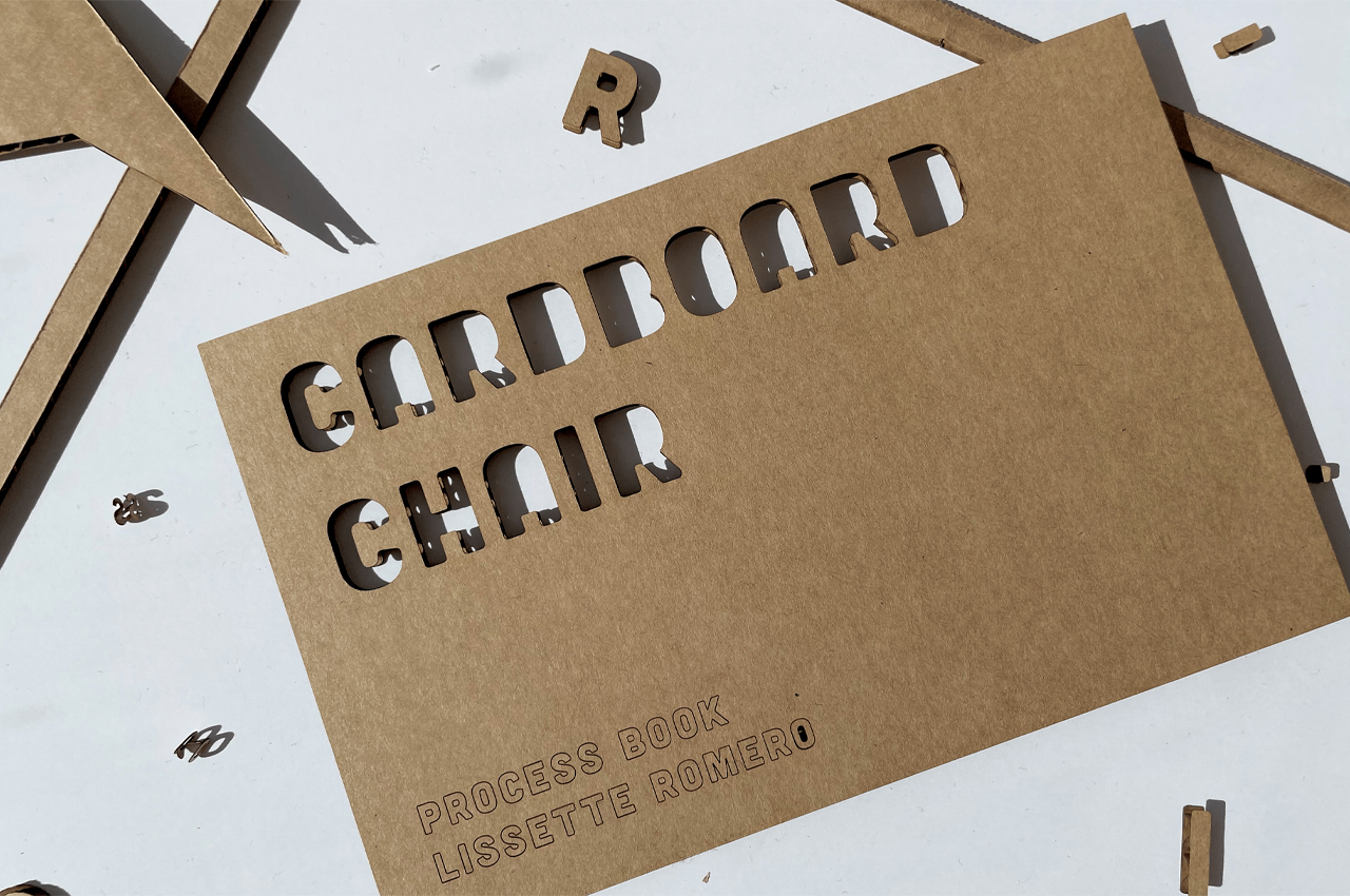
Goldilocks was right–the comfort of a chair depends on many different factors. Everything from a chair’s frame to its upholstery and everything in between comes into play. At the end of the day, a chair’s comfort depends on what we use it for–a plush loveseat might be the perfect spot to nestle up in and watch a rom-com, but it’s not the spot for working on our laptops. It’s just not the vibe! Lissette Romero unlocked the vibe with a new design concept called the Cardboard Chair Process Book that constructs bespoke chairs from cardboard using a set of criteria collected from client interviews and anthropometric measurements.

Why is it noteworthy?

Built from 5 4’x4’ sheets of single-ply corrugated cardboard, the custom chairs require no hardware, fasteners, or adhesives for construction or assembly. Before settling on the chair’s overall structure and ergonomics, Romero imagines conducting client interviews to determine each chair’s main function according to the sitter’s needs. For instance, a client looking for a lounge chair to play video games will end up with a very different chair design from a client who’s looking for a desk chair to use for studying.

What we like

  • The chair is to be tailored to [the client’s] body measurements, personal aesthetic, and tasks that they will be performing while seated
  • Built from sustainable materials

What we dislike

  • No complaints!

The post Top 10 chair designs that are the culmination of ergonomics, style, and comfort first appeared on Yanko Design.
Cross Chair and Stool will have you always saying X marks MY spot

Demeter Fogarasi Cross Chair and Stool 6

An accent chair provides extra seating for reading or quiet time in the home or office areas with more available space. Interior designers may use such a chair to create an attractive focal point in a room that may look dull without it. This furniture piece can also be a place for conversations, but those don’t flow naturally, so you need quirky elements that can make you think or go ‘wow’ to begin and easily create such a mood. It would help if you had something like a chair that makes you stop and think before you sit.

Designer: Demeter Fogarasi

Demeter Fogarasi Cross Chair and Stool 3

Finding the perfect accent chair can be a little challenging. Even with all the options available in furniture stores today, there aren’t many unique and appealing pieces that would catch your guest’s attention. There are a few like those from designer Demeter Fogarasi who thinks furniture can be like “jewels assigning life to spaces,” and can build an atmosphere for people to interact and discuss. His previous work, the Pinsofa, made an impression with striking looks like a giant pincushion, and the Cross Chair and Stool can do that as well, offering life to a corner.

Demeter Fogarasi Cross Chair and Stool 5

Like the other pieces in the collection, the Cross Chair and Stool series blurs the line between functionality and art. It stirs creative imagination and pleasant emotions by using scale manipulation to make the design amusing and playful. The new pair of seats shows a larger-than-life version of a cross (x) which can make you have fun with it—like a shrinking Alice in Wonderland.

Demeter Fogarasi Cross Chair and Stool

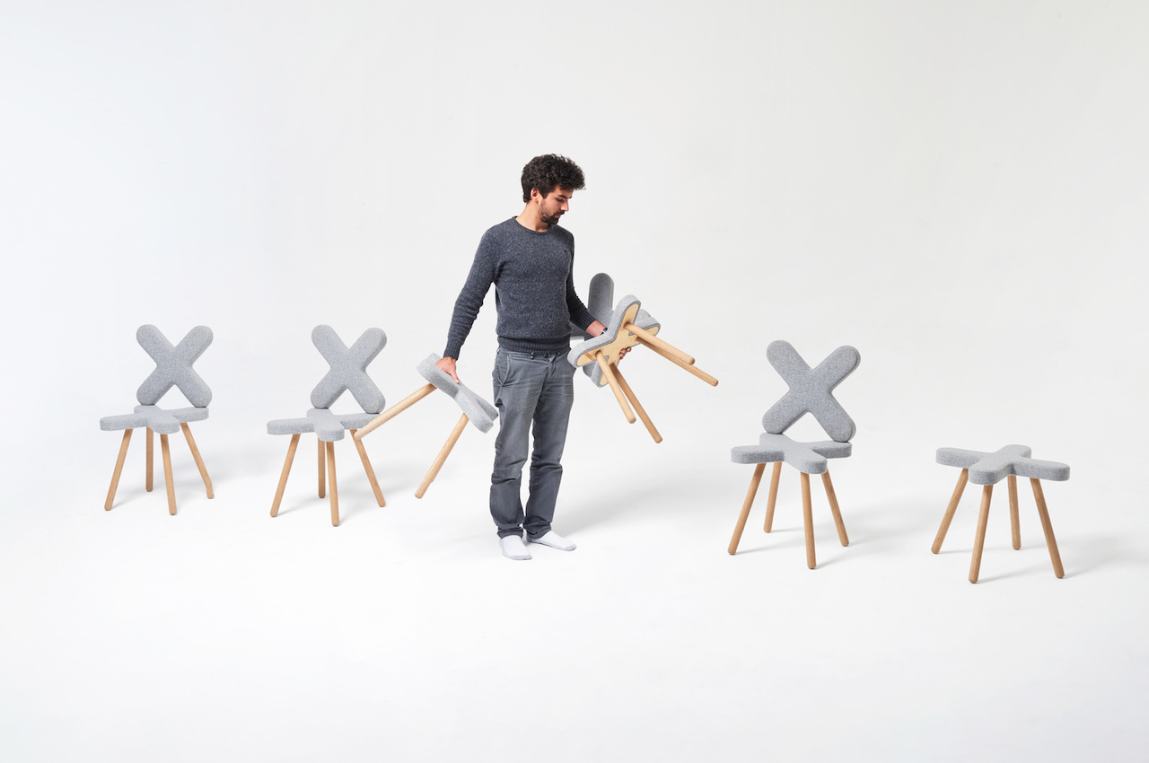
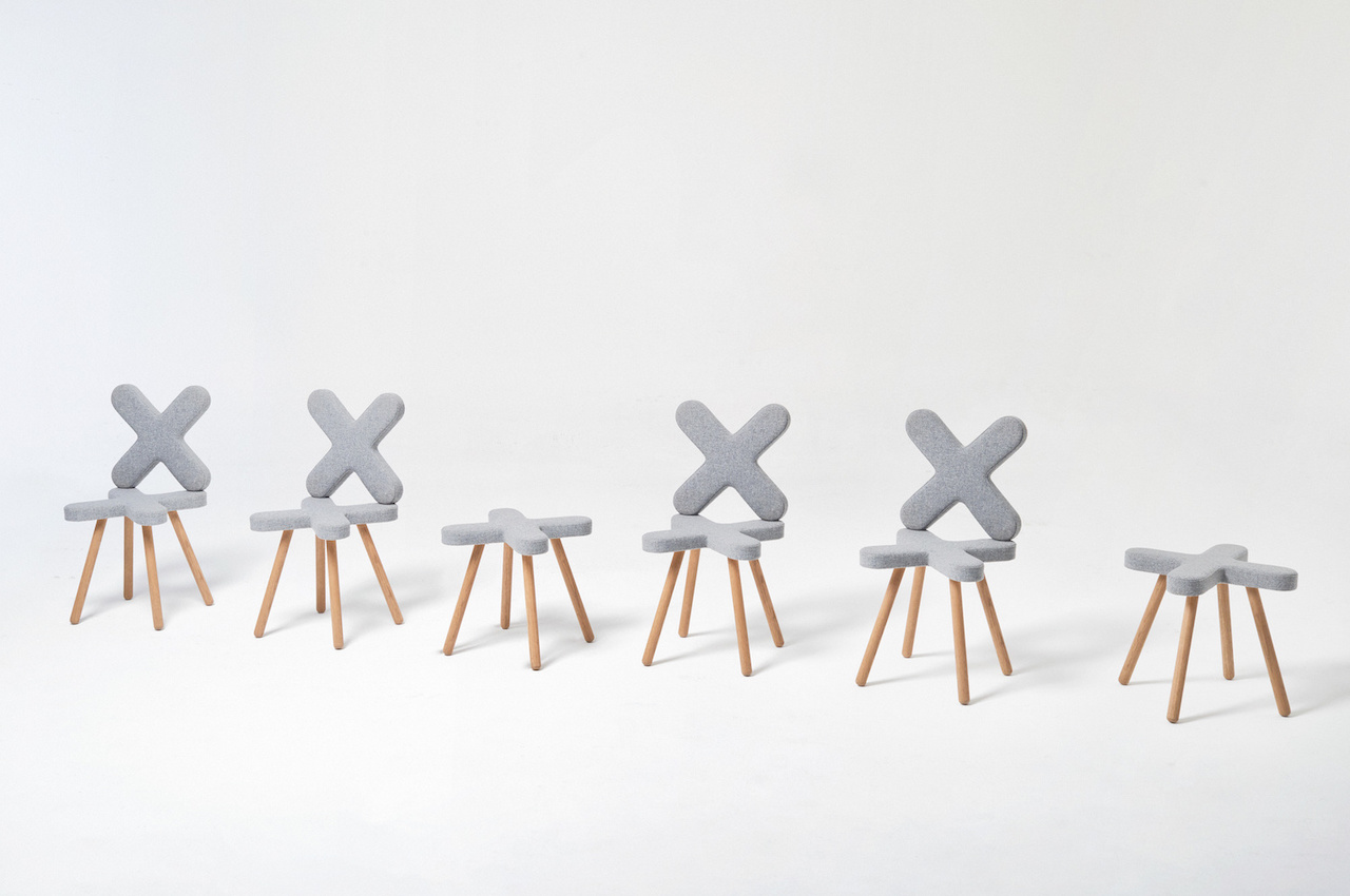
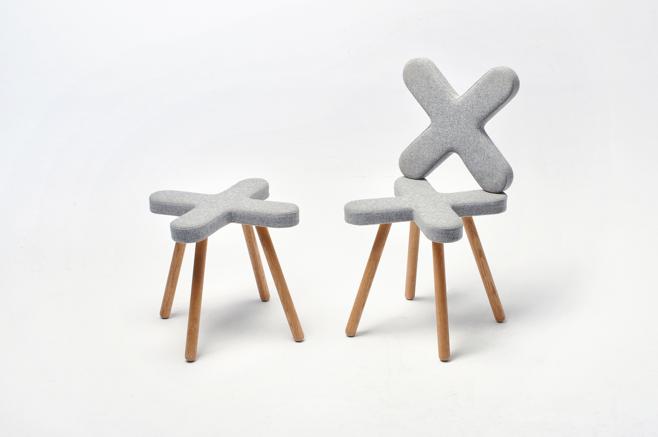
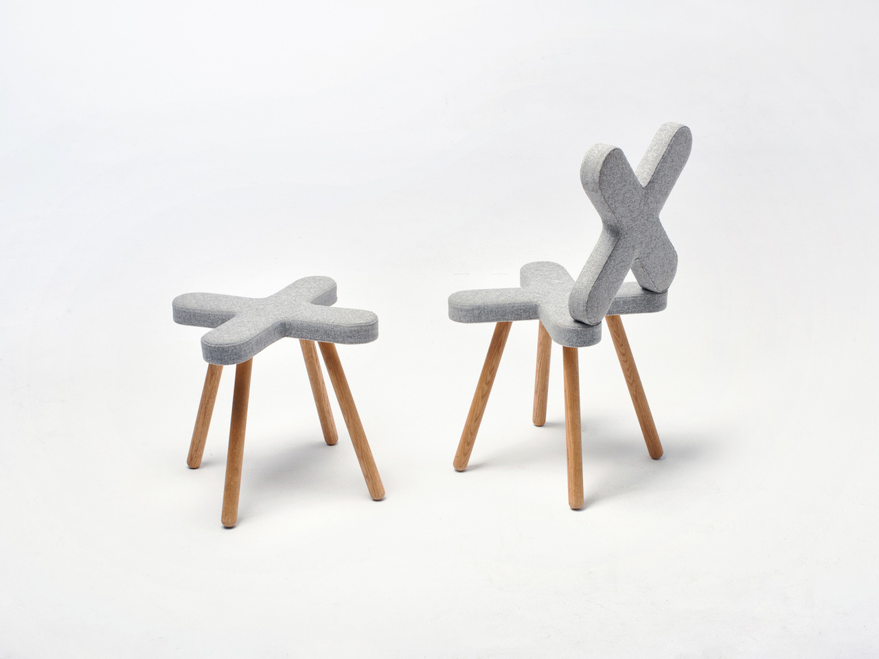
The chair and the stool use an X-shaped seat as their base, with cushioning covered in gray wool fabric. The only difference is that the chair also has an X-shaped backrest while the stool is made up of a single “X” only for the seat. Adding support to the seats and keeping them elevated above the ground are four slanted oak legs positioned underneath each point of the X. The wood material offers a neutral tone and warmth to the design, adding a solid structure and a clean look. The sight of the chair and stool will make you ask what spot the X marks.

The fabric-upholstered Cross Chair and Stool appear cozy and comfortable because of the foam padding. The modern form allows anyone to enjoy being imaginative as the simple yet quirky look will have you guessing what would look great with either piece. We’re thinking of a donut pillow to complete a makeshift furniture tic-tac-toe game. The Cross Collection series may be the missing piece in the equation—the equation of a visually pleasing room.

Demeter Fogarasi Cross Chair and Stool 2

The post Cross Chair and Stool will have you always saying X marks MY spot first appeared on Yanko Design.
Zero Chair produces almost zero waste with a single aluminum sheet

Franck Magne Zero Chair Design

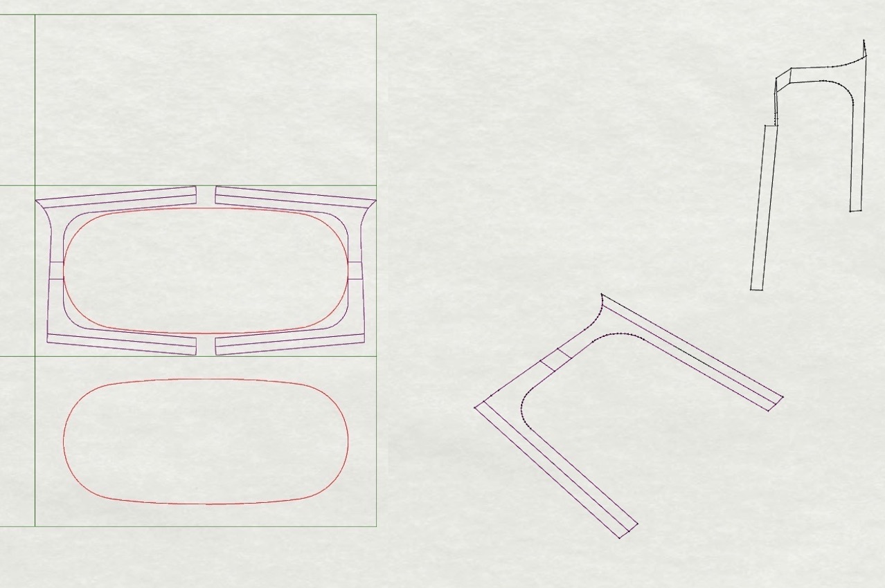
For creatives, designing something will often inspire another project to start as soon as possible. Designs inspired by other designs always exist, and that is what happened with this new chair introduced by industrial designer Franck Magné after working on the layout of the Soleil & Papilles restaurant in Paris. He was doing the layout when he also started to imagine the tables and chairs that could be used. He was thinking of dining furniture pieces that could be produced locally for an important reason: budgetary constraints. Such a concern is essential in designing because you can’t just quickly produce and multiply money, mainly if it’s already limited and you have an output to deliver. Good thing the designer is smart and resourceful enough to optimize the design in hopes that material waste can be reduced. Zero waste is not precisely the goal, but the creation of the Zero Chair can help achieve that state someday.

Designer: Franck Magné

Franck Magne Zero Chair Details

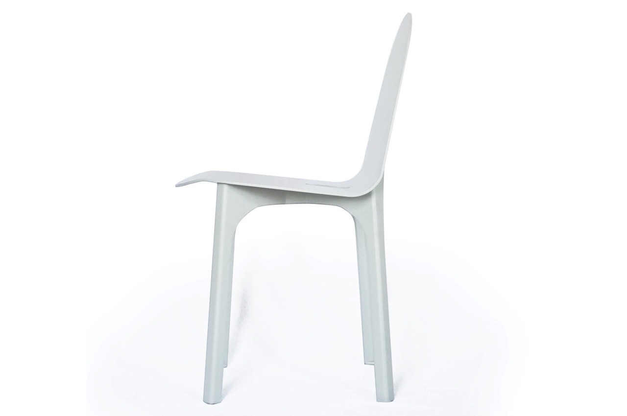
The Zero Chair can be easily laid out on a standard aluminum sheet as some nine chairs can be made and laid out on a single sheet of aluminum material that is already characterized as recyclable. In addition, this aluminum is said to reproduce almost no offcuts, which is a good thing for those constantly checking the sustainability of a product. The Zero Chair has now been added to the designer’s Objets Publics collection which is a brand of furniture for public spaces, in partnership with SAG France.

Franck Magne Zero Chair Details

Franck Magné has been working on a small budget for the restaurant when he thought of this design. Zero Chair could pertain to zero waste, but it’s not really the case because there will still be waste but only very minimal. The designer said he wanted to create chairs that would minimize scrap and that’s what he successfully did. There are still offcuts produced, but those too can be recycled for whatever use as per the industrial designer.

Franck Magne Zero Chair Designer Illustration

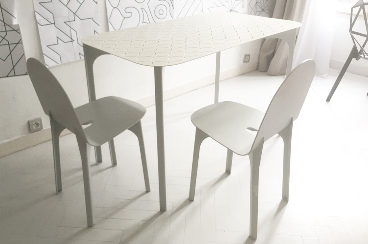
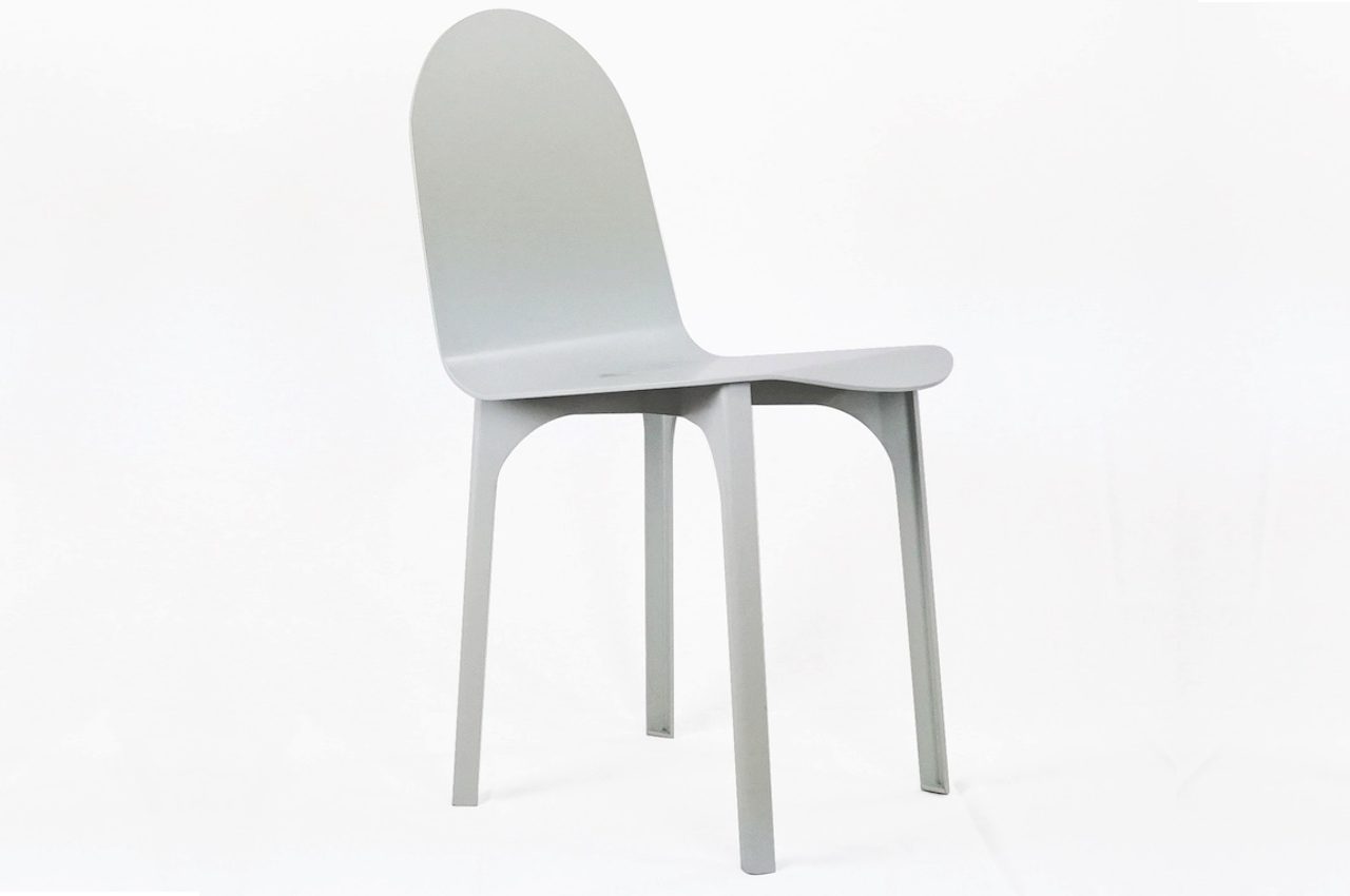
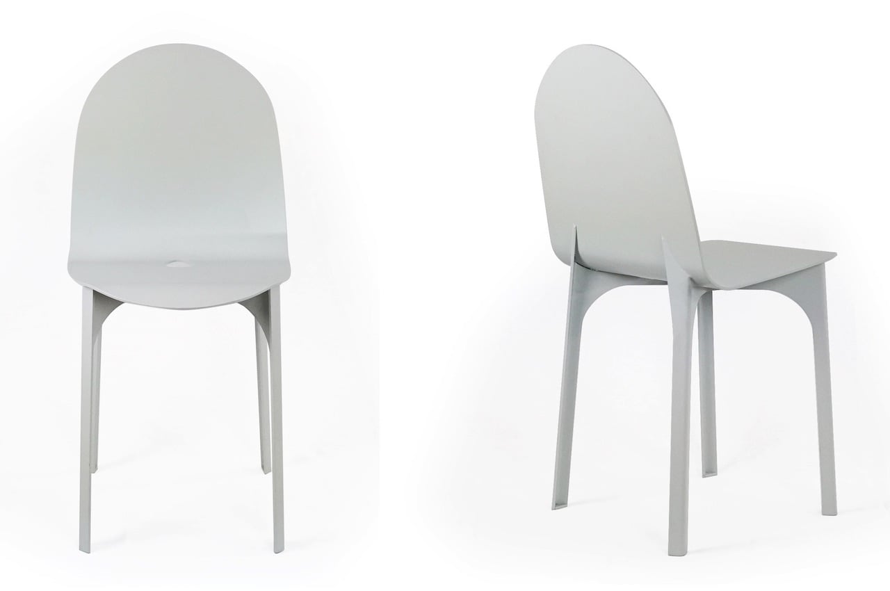
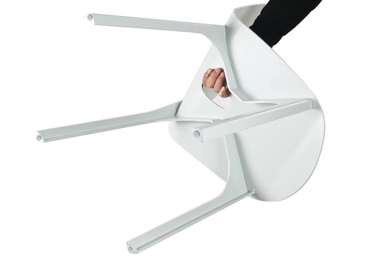
The legs are assembled in a criss-cross fashion for better support and angle, while the backrest portion shows a curved shape that is also smoother and safer for young kids. Another exciting feature of the Zero Chair is a drain hole in the seat that works as a handle when you want to move or transport the chair. The Zero Chair can be used both outdoors and indoors, so every dining experience can be safe and comfortable. Of course, you can’t say this is just another mass-produced chair, but it offers many advantages like affordability, portability, and even sustainability.

Franck Magne Zero Chair Features

The Zero Chair is also available in different colors that can match the interior of any room, restaurant, or establishment. We can imagine all colors installed inside a room, which will be pleasing to the eyes. It looks like an ordinary dining chair, but its real beauty lies in its innovation, eco-friendliness, and genius design that produces less waste.

Franck Magne Zero Chair

The post Zero Chair produces almost zero waste with a single aluminum sheet first appeared on Yanko Design.
The Lightning Chair looks like it’s ready to charge you up anytime

Lightning Chair Mauricio Coelho 4

Lightning-themed designs only remind me of one thing: The Flash. The lightning bolt has become an iconic symbol that is widely used in different industries. For mobile consumers, it pertains to battery charging that shows the phone is getting juiced up.

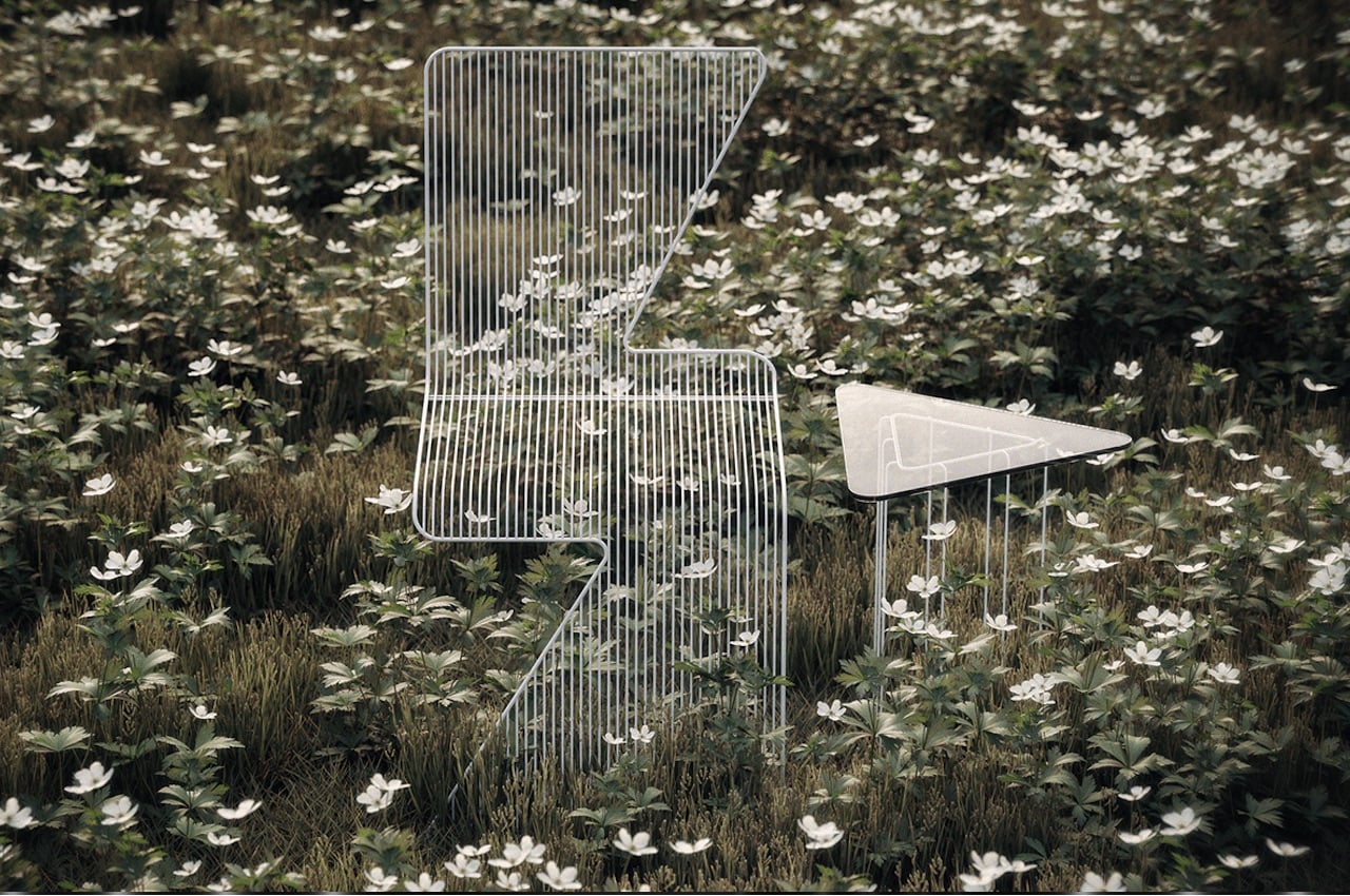
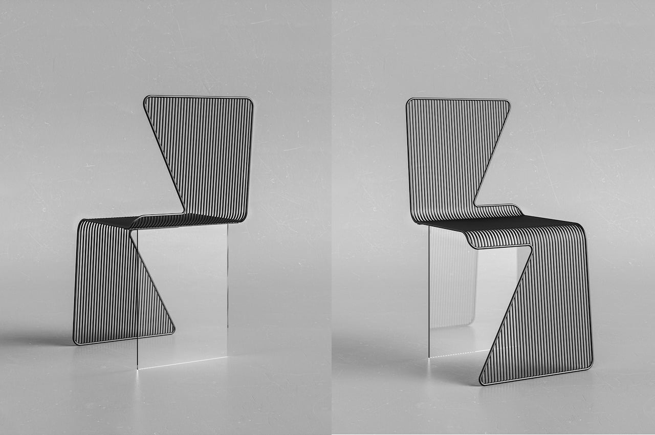
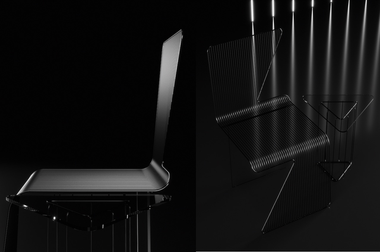
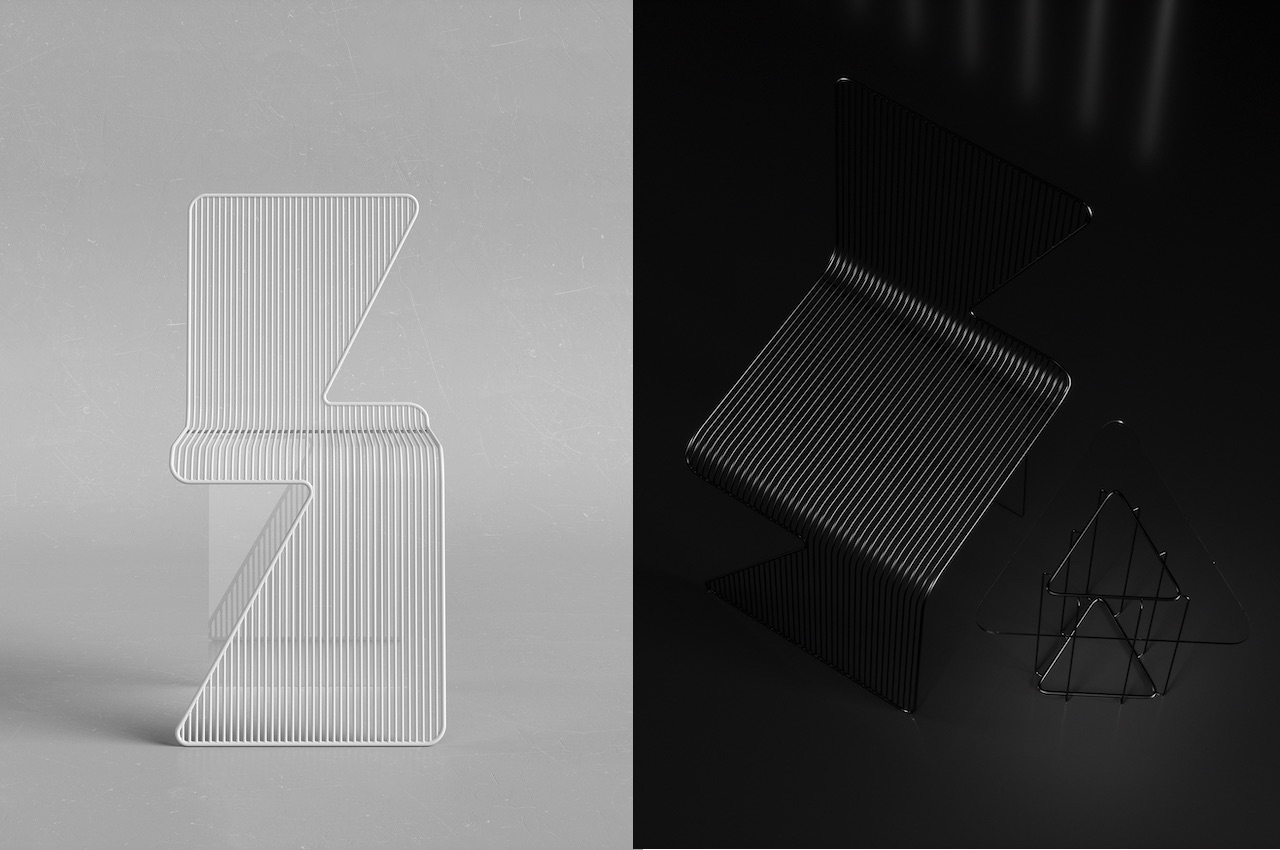
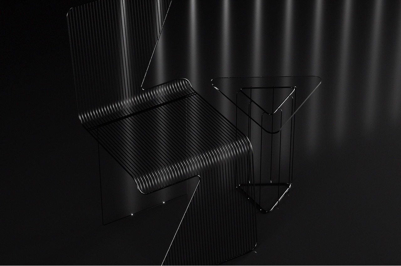
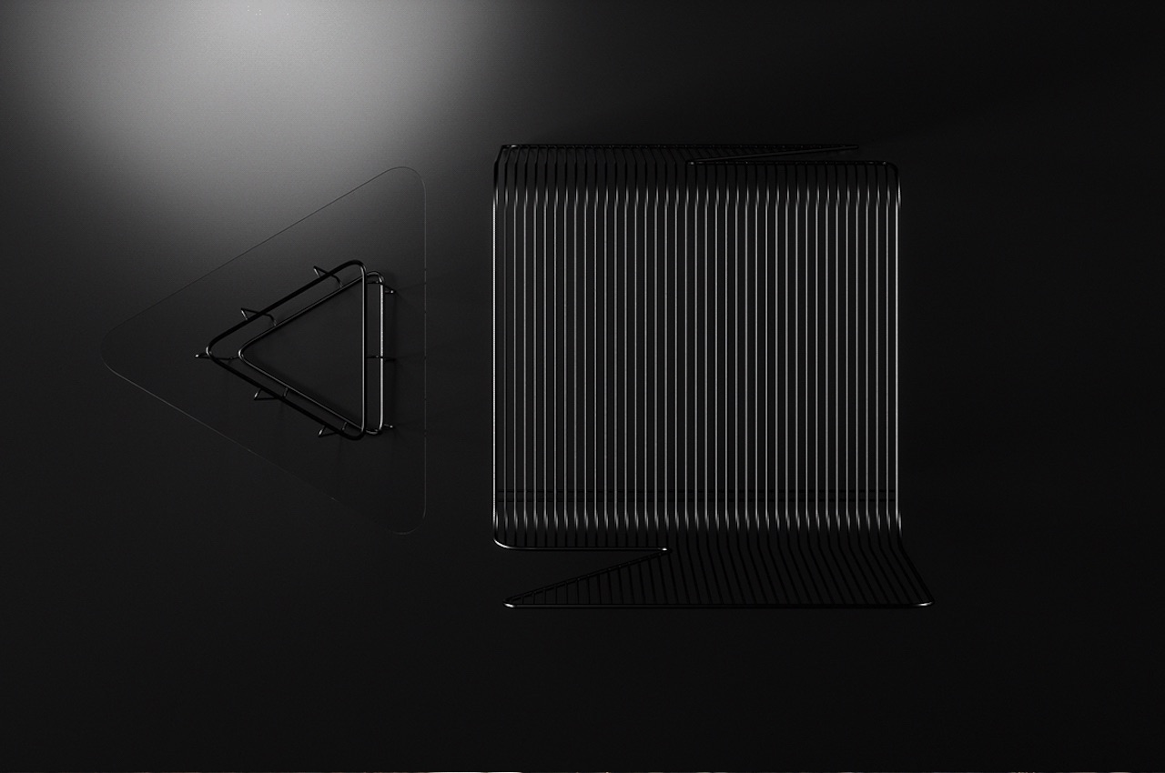
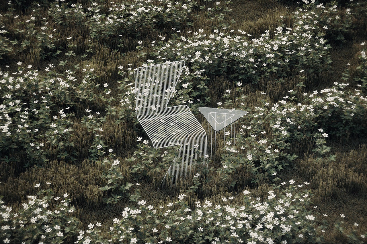
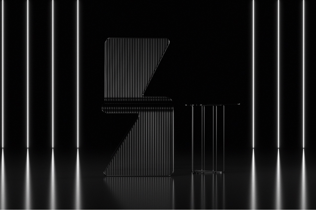
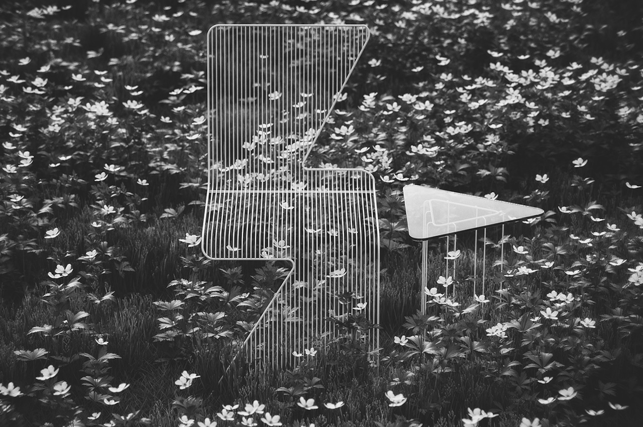
The Lightning Chair definitely looks like a lightning bolt from different angles. Thanks to the slanted backrest and legs, it’s shaped like a stylized S. Only two materials have been used to finish the product. The main seat and backrest are made of stainless steel wire, while the rear leg support is made of transparent polycarbonate.

Designer: Mauricio Coelho

LIGHTNING CHAIR MAURICIO COELHO

Lightning Chair Mauricio Coelho Design

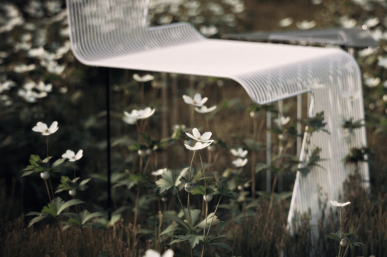
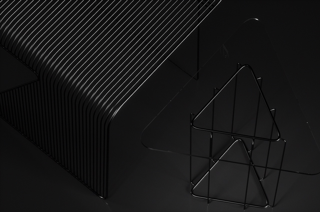
The clear plastic makes the chair appear as if floating. The wires are fashioned into stripes, resulting in a sturdier seat, back rest, and front support. There are two color options available: black and white. We can imagine a silver version, but that may look shinier.

Although the design isn’t exactly simple, the black and white versions give a certain minimalist feel. The conceptual design of the chair can be dizzying when you look from some angles. This means it can be a great conversation starter as it can capture anyone’s attention.

Concept Lightning Chair Mauricio Coelho Design

White Lightning Chair Mauricio Coelho

The Lightning Chair appears fragile, but it’s not. The transparent rear leg support is durable and can carry standard weight. We’re assuming it’s polycarbonate plastic because it is usually used in chairs like the iconic Louis Ghost chair. As we previously mentioned, Maurício Coelho’s creations often involve experiments with different materials, compositions, and forms. The Lightning Chair shows a bit of frailty with the thin wires, but it’s durable.

The chair design is only a concept, but we like its presentation. We can already imagine it selling fast and being copied for a lower price. Of course, we don’t want replicas proliferating the market, but the ingenious design makes it a popular target.

Lightning Chair Mauricio Coelho Details

Black Lightning Chair Mauricio Coelho

The Lightning Chair is not the only design introduced by Maurício Coelho. Last month, we featured the Chaise Espinhal (Spinal Chaise) as a unique-looking chaise lounge. The spine-inspired chair was shown off with wooden cylinders aligned to create the lounge chair portion. The cylinders are laid onto a sheet metal base for support. In some ways, this is similar to the Lightning Chair with the uniformly aligned cylinders but with the new design using wires. And just like the Spinal Chaise, Coelho’s new design shows some sort of dynamism. Look at the chair from different angles, and you will see various forms and shapes.

Lightning Chair Mauricio Coelho 2

Lightning Chair Mauricio Coelho 3

Lightning Chair Mauricio Coelho 5

Lightning Chair Mauricio Coelho 1

The post The Lightning Chair looks like it’s ready to charge you up anytime first appeared on Yanko Design.
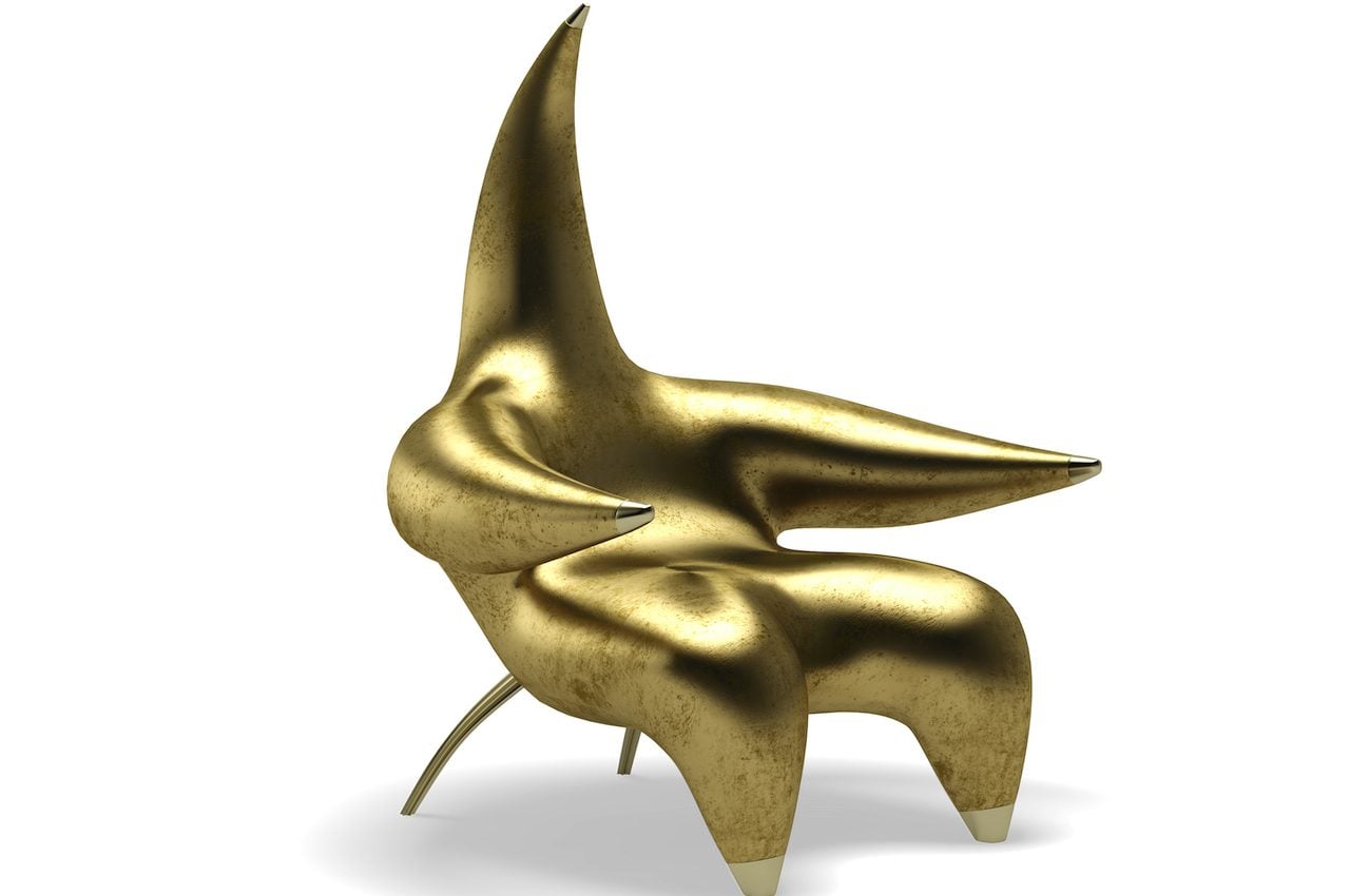
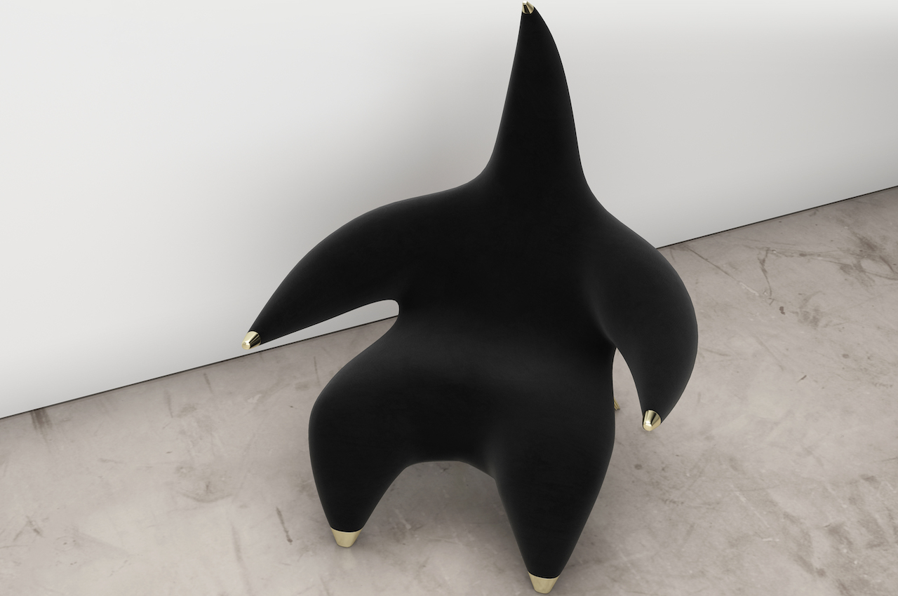
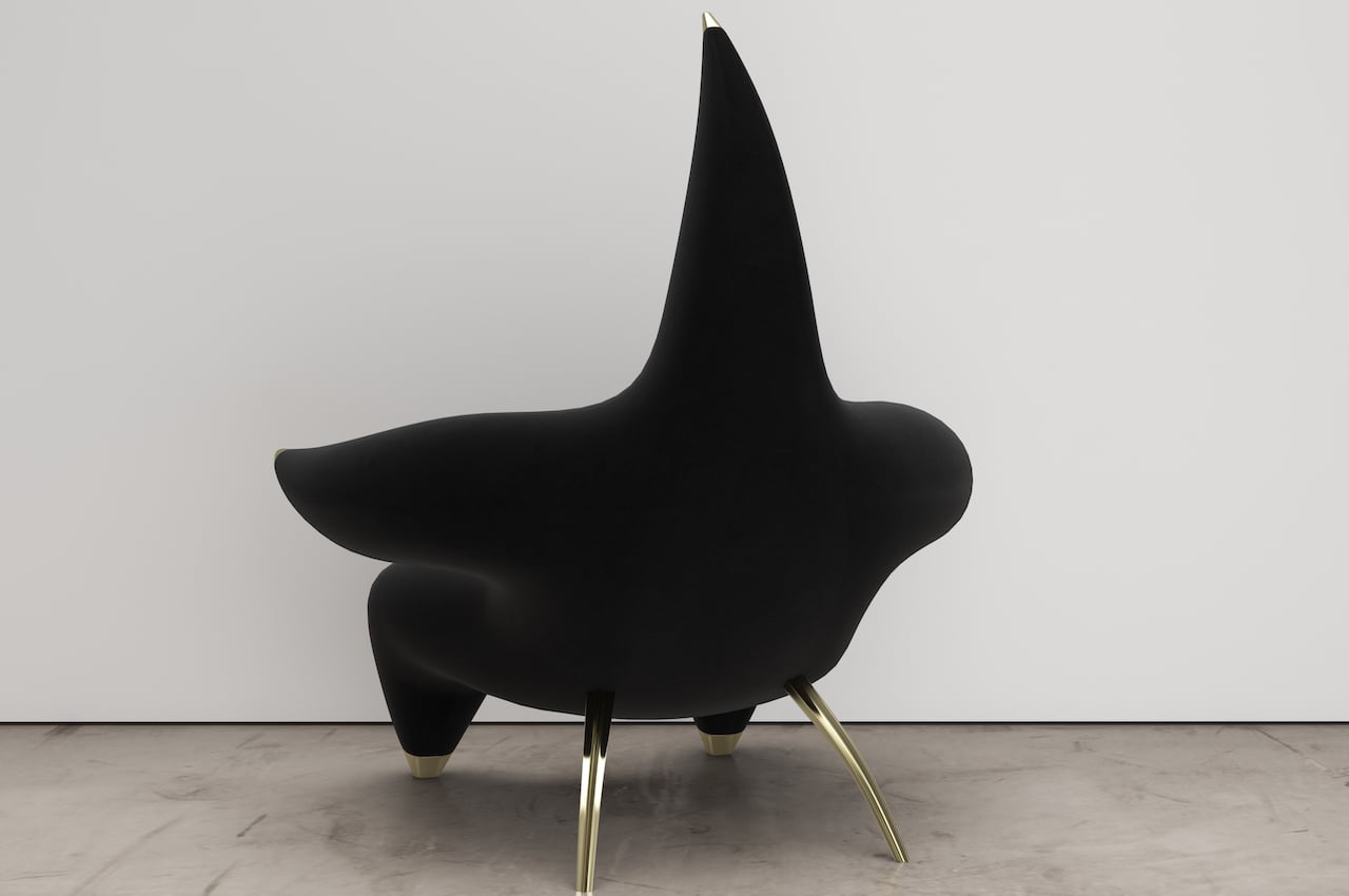
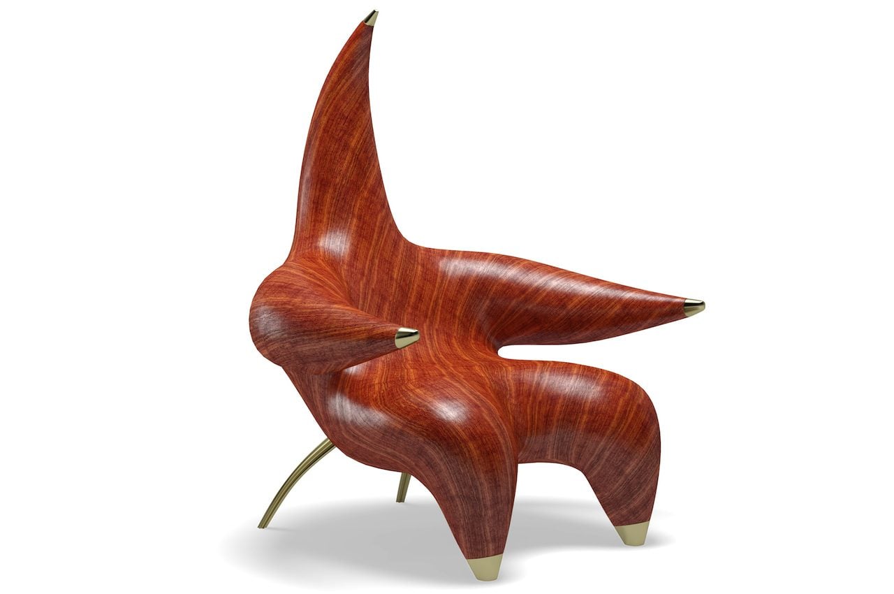
Star Lounger Chair wants to give you a warm embrace and a comfortable seat

Troy Smith Studio Star Lounger Details

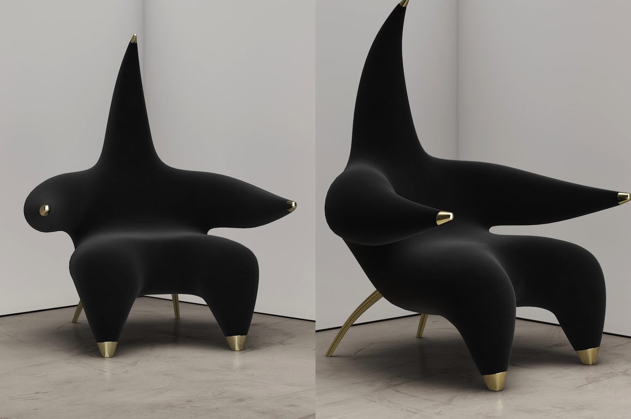
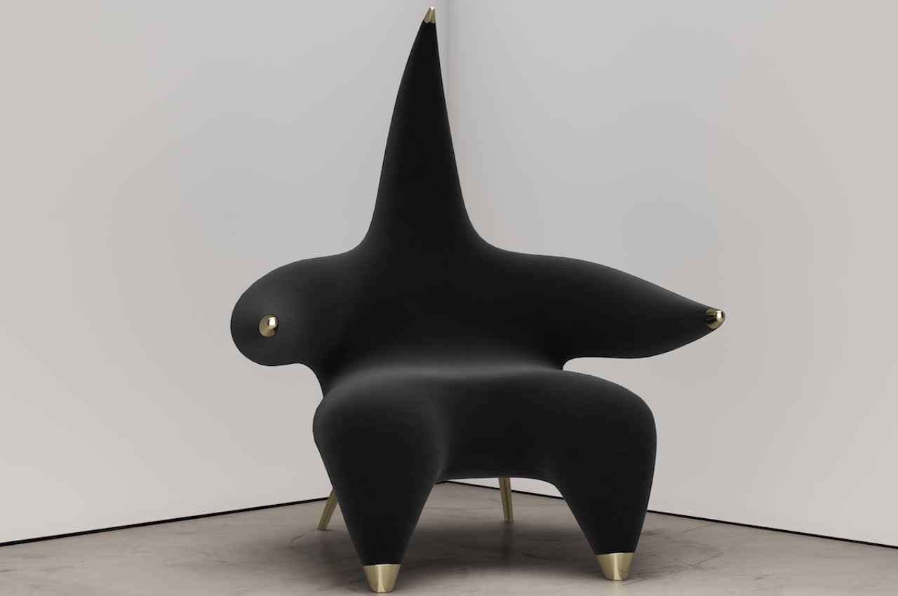
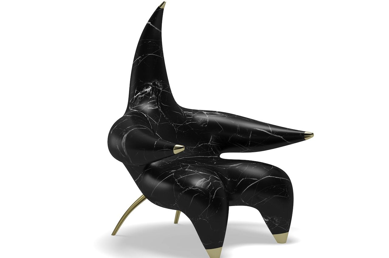
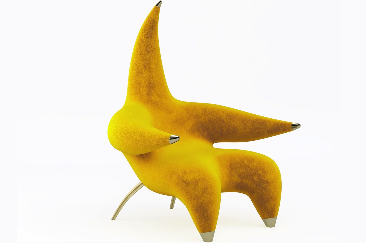
The Star Lounger looks like something that wants to give you a warm hug. The star-shaped chair will probably remind you of Patrick Star from the Spongebob cartoon series. The lounge chair appears comfortable enough to put you in a cozy embrace.

On its own, the Star Lounger can stand as an art piece or a decor. It’s like a sculpture you want to show off, serving an important function. It’s a chair that can be perfect for lobbies and rooms where you want to chill and relax.
Designer: Troy Smith

Troy Smith Studio Star Lounger Chair

Troy Smith Studio Star Lounger Chair Marble

The Start Lounger is a star alright but can shine brighter wherever you decide to place it. Each piece is crafted from the best materials like stretch velvet fabric and brass caps. The end result is a luxurious lounge chair that is plush and comes with premium finishes.

The upholstered lounge chair is beautiful with its craftsmanship, design, and art. Designer Troy Smith took inspiration from a star and decided to use stretch velvet to achieve an elegant and beautiful furniture piece. As a result, the Star Lounger delivers meticulous craftsmanship that is hard to come by these days.

This conceptual piece of furniture is unique. The brass and stretch velvet combination delivers a feeling of luxury while still being comfortable. The Canadian designer has spent time being creative and researching and planning to design and create the chair. It breaks the mold for a lounger chair and even goes beyond the desire to produce a sculptural work of art.

Troy Smith Studio Star Lounger Chair Gold

Troy Smith Studio Star Lounger Chair Black Stretch Velvet

The Star Lounger definitely combines beautiful form and function. There isn’t much innovation, but the design alone will make you stop and stare and even sit on the lounge chair. It has a bit of humor as it appears wanting to want you to sit on the chair and be embraced. It’s actually more of a giant starfish that wants to hug you or wants you to sit on his lap.

Troy Smith Studio Star Lounger Design

Troy Smith Studio Star Lounger Wood

This Star Lounger is handmade by skilled artisans. It features a sturdy hardwood interior frame, high-density foam, brass, and velvet—so you can say it’s a bit eclectic. The upholstery is solid, so we are guaranteed of a well-made furniture piece. This chair stands out with the detailed finishes, including the cast brass legs and caps.

Troy Smith usually delivers a hands-on approach starting with design and then production. This intimacy with every creation makes every piece like the Star Lounger very special. We think it is because it doesn’t just serve as a regular lounge chair. Instead, it makes you smile and gives you comfort whenever you need it.

Troy Smith Studio Star Lounger Chair Yellow

The post Star Lounger Chair wants to give you a warm embrace and a comfortable seat first appeared on Yanko Design.