Empowering Children with a Watch That Guides Habit Formation and Joyful Growth

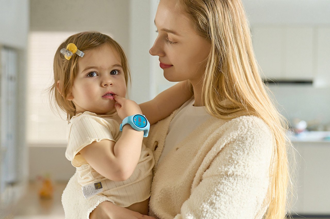
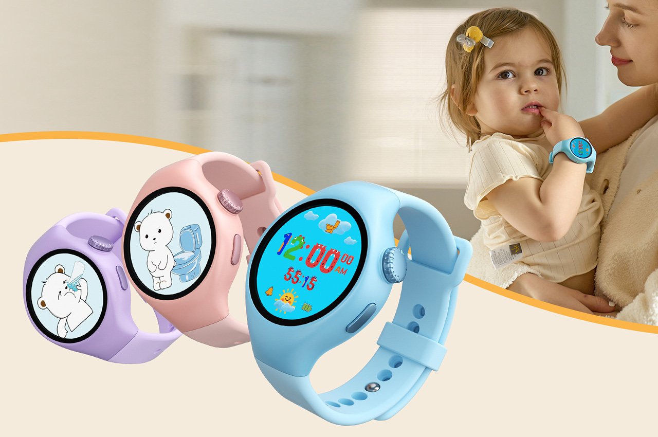
As a parent, managing your children’s daily routines can be daunting. The NehNehBaby Training Watch simplifies this with practical features that do more than just tell time. It uses timed alarms, gentle vibrations, and engaging screen animations to remind your child of essential activities like eating, using the potty, brushing teeth, and playing. The potty alerts are particularly helpful, encouraging independence and confidence in bathroom habits. Additional reminders for drinking water and exercising promote healthy physical habits. These features integrate seamlessly into daily life, bringing structure to the chaos of growing children’s schedules and supporting their exploration and growth with fun, effective reminders.

Designer: NehNehBaby

Click Here to Buy Now: $29.99 $39.99 (25% off).

The NehNehBaby training watch guides your child’s day, gently ushering them through essential routines—from mealtime and potty breaks to tooth brushing and cherished periods of reading and play. This guiding presence is what transforms the NehNehBaby training watch from a simple tool into a treasure within the parenting toolkit, as it smoothly orchestrates the daily routines, ensuring smoother days filled with less friction and more harmony.

The Training Watch integrates timed alarms, vibrations, and screen animation reminders to help children develop regular lifestyle habits, covering critical daily activities such as potty, drinking water, brushing teeth, bathing, studying, and exercising.

The importance of this tool becomes even more apparent for parents of children aged 2 to 8. This period is akin to the prime planting season in a garden, where the seeds of healthy routines are sown, destined to grow into lifelong habits. These early years are when habits around healthy eating, staying active, getting sufficient rest, and engaging in regular learning activities take root, setting the stage for a lifetime of well-being.

The training watch ingeniously incorporates the principles of habit formation, as detailed in James Clear’s influential work, “Atomic Habits.” The watch brings to life Clear’s habit cue formula—’I will [BEHAVIOR] at [TIME] in [LOCATION]’—through engaging animations and musical cues that signal when and where specific tasks should be performed. This makes the habit-forming process enjoyable for children and solidifies the association of certain activities with specific times and places, embedding these routines deeply within their daily lives. Moreover, the watch is equipped with timed reminders, skillfully encouraging children to independently recognize and respond to these cues, fostering a growing sense of autonomy.

The watch’s reminder function helps children remember and execute daily tasks, reducing the mental load of parental supervision.

Habit Cultivation

Time Management and Self-Monitoring

The watch’s task completion log represents another strategic application of Clear’s insights, transforming the tracking of habits into an interactive and rewarding experience for children. This feature allows kids to mark off their completed tasks visually, paving the way for parental recognition and rewards. Such positive reinforcement not only celebrates their accomplishments but also motivates continued adherence to their routines, solidifying the desired behaviors and making the cultivation of these habits a natural and integral part of their day.

As children become accustomed to the rhythm introduced by the training watch, the device’s role evolves, with a significant focus shifting towards teaching time management and self-monitoring skills—abilities that are increasingly vital in today’s fast-paced and often overwhelming world. While task management is an integral part of this stage, the focus is on empowering children to approach their days confidently, significantly reducing stress and allowing them the freedom and space to fully embrace the joys of childhood. The ability to keep up with tasks through delightful animations that accompany task reminders engages children. Taking a potty break or brushing their teeth without constant adult supervision cultivates a sense of independence in children, lightening their mental load and creating ample room for play, creativity, and relaxation.

The watch’s design acknowledges the unique ways children perceive and interact with time. They often become fully immersed in the moment or rush through tasks that are less appealing. With its musical or vibrational alerts, the watch’s timer feature bridges the gap between a child’s relaxed pace and the adult world’s need for timeliness. By establishing clear end times for activities, the watch transforms potential daily challenges, like toothbrushing or getting ready for school, into smooth, enjoyable routines that teach the importance of time management without the pressure of feeling rushed.

Additionally, the watch introduces the “Breath Sync” feature, a thoughtful addition designed to help children relax and manage stress. This feature provides guided breathing exercises through charming animations, such as easy-to-follow text cues or a friendly bear demonstrating deep breathing techniques. This focus on relaxation is particularly beneficial, helping children wind down and find calm amidst their active days.

Physically, the watch has a 1.09-inch screen and a comfortable, hypoallergenic silicone strap. It features a power button, which also serves as a “return to home screen” button, and a “Fun button” that announces the time with a short press. A double tap on the “Fun button” brings up the settings. The watch charges through a magnetic charger port, avoiding the need for exposed charging holes.

Click Here to Buy Now: $29.99 $39.99 (25% off).

The post Empowering Children with a Watch That Guides Habit Formation and Joyful Growth first appeared on Yanko Design.
Mixed Reality Magnifying Glass for Kids Shows the World in a Different Light

When people talk about augmented or mixed reality, they most likely imagine strapping bulky visors to their heads and blocking their eyes. Although that is definitely the primary way to experience an immersive fusion of the physical and the digital, mixed reality actually goes beyond living in virtual worlds or seeing apps floating in front of you. You could, for example, point your smartphone somewhere in the real world and see a glimpse of digital information through that small window. Limited as that experience might sound, it can actually open up a whole new world to discover, especially if it allows children to learn more about the world they live in, giving them access to flora and fauna that they would have never encountered in the wild.

Designer: Junwoo Lim

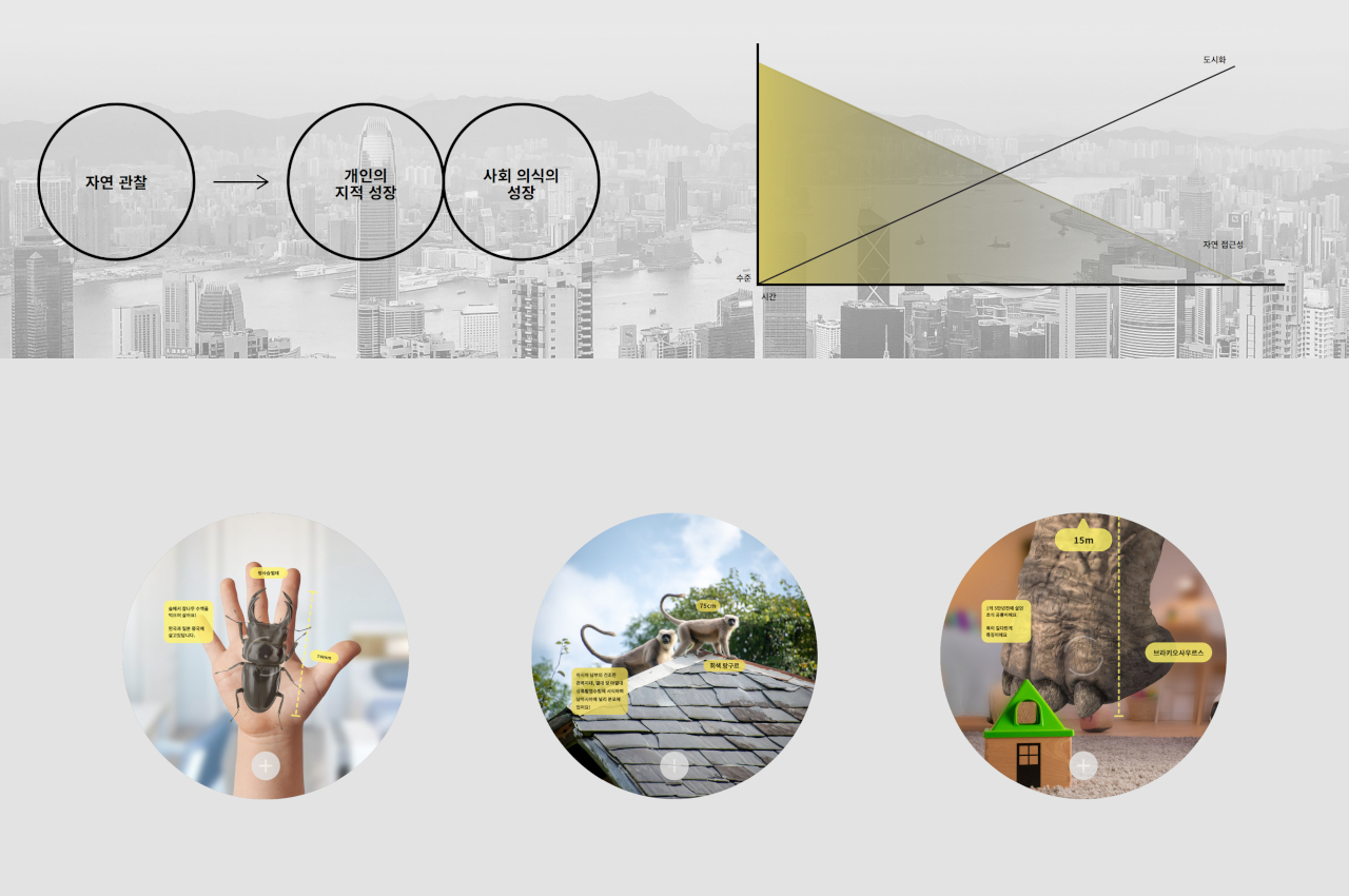
To a child’s eyes, the world is both magical and mysterious, and that’s just for the things they can actually see. Our planet has a lot more treasures and oddities than they could possibly imagine, but most of them are out of reach due to urban development and safety considerations. At most, kids can learn about them through books, videos, and other flat media that, while informative, lack the proper context that young minds need to truly appreciate the scale of these earthbound creatures.

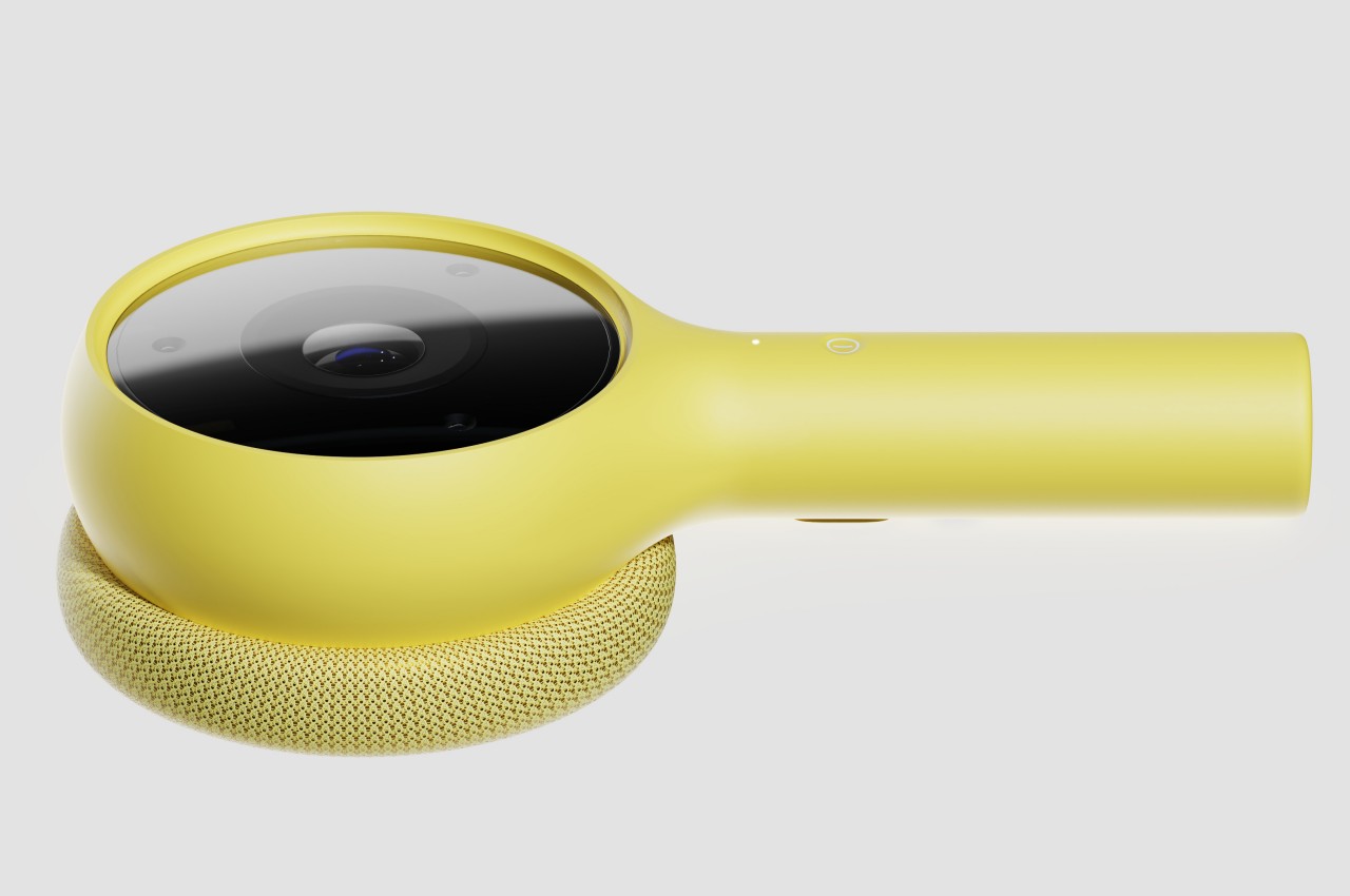
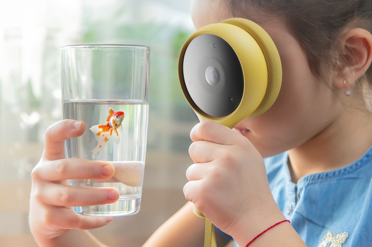
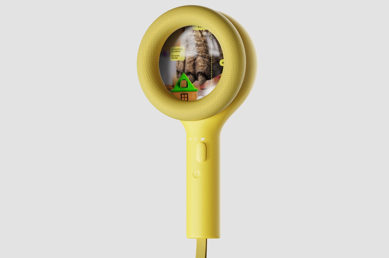
Mono is a mixed reality device concept that unlocks that world and allows kids to not only learn but also enjoy discovering these nuggets of knowledge in a way that doesn’t take them away from their current environment. Using mixed reality technologies, the gadget overlays virtual creatures like insects and animals on top of real-world objects, making them look like they’re actually there on the roof or in your hand. This allows kids to see them in their proper scale, observe their natural movement, or even see them interact with each other, all while still having access to additional text information layered on top of this view.

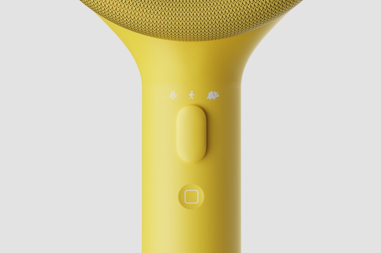
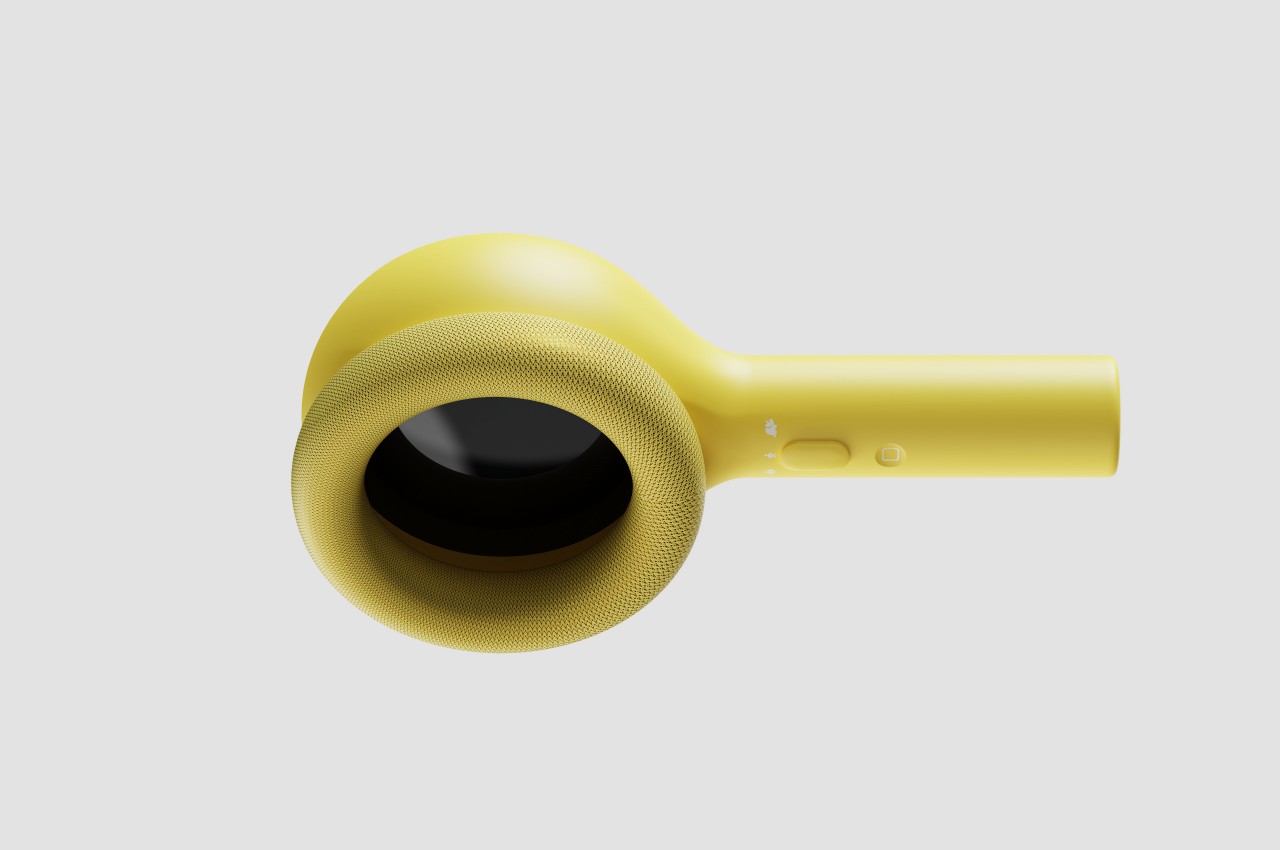
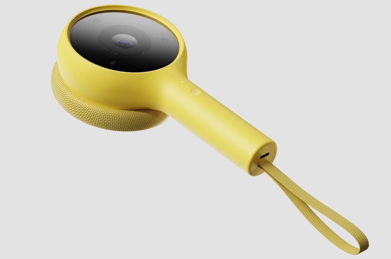
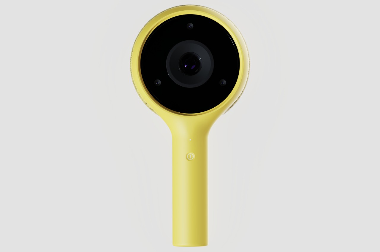
The device comes in a design that looks like a toy magnifying glass, an object that has long been associated with exploration and discovery. Instead of a transparent lens, it has a camera on one side and a screen on the other. Theoretically, the user can put the screen close to their eye the same way they would use a real magnifying glass, though that raises questions about the safety of that method. The controls for the device are simple enough for a child to understand, including a single button for power and a slider for zooming in and out to understand the scale of the creature being observed.

The Mono concept design tries to fill in an educational need for kids to learn more about the world in a safe and engaging environment, but without weighing down their heads with headsets. It demonstrates how mixed reality can be more than just an entertainment medium or a productivity tool for adults, but something that kids can also benefit from. A magnifying glass design definitely carries that exploration vibe, though it’s questionable whether it’s an appropriate one given how kids are likely to put the screen right in front of their eyes.

The post Mixed Reality Magnifying Glass for Kids Shows the World in a Different Light first appeared on Yanko Design.

Spectacular Ideas for Children’s Wardrobes

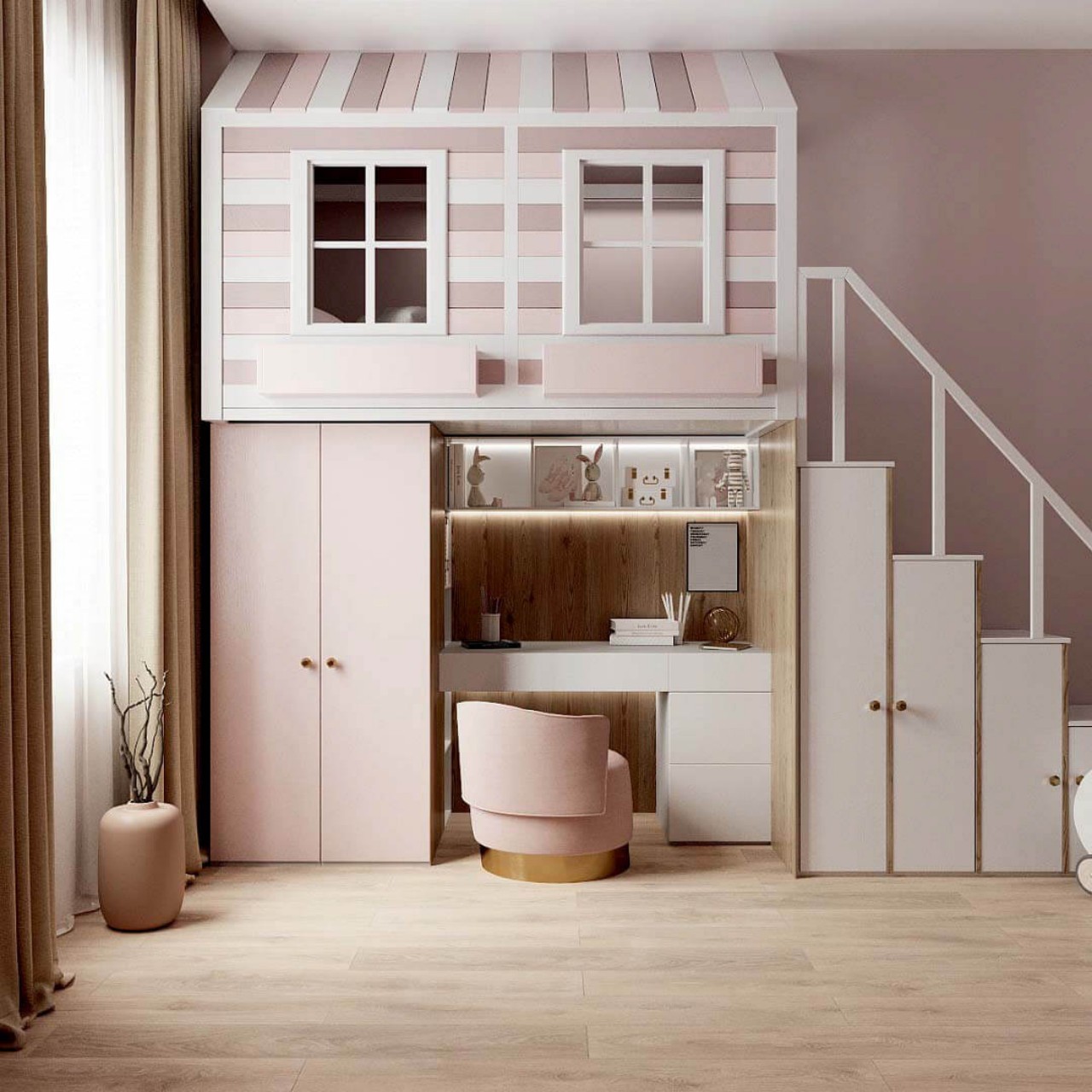
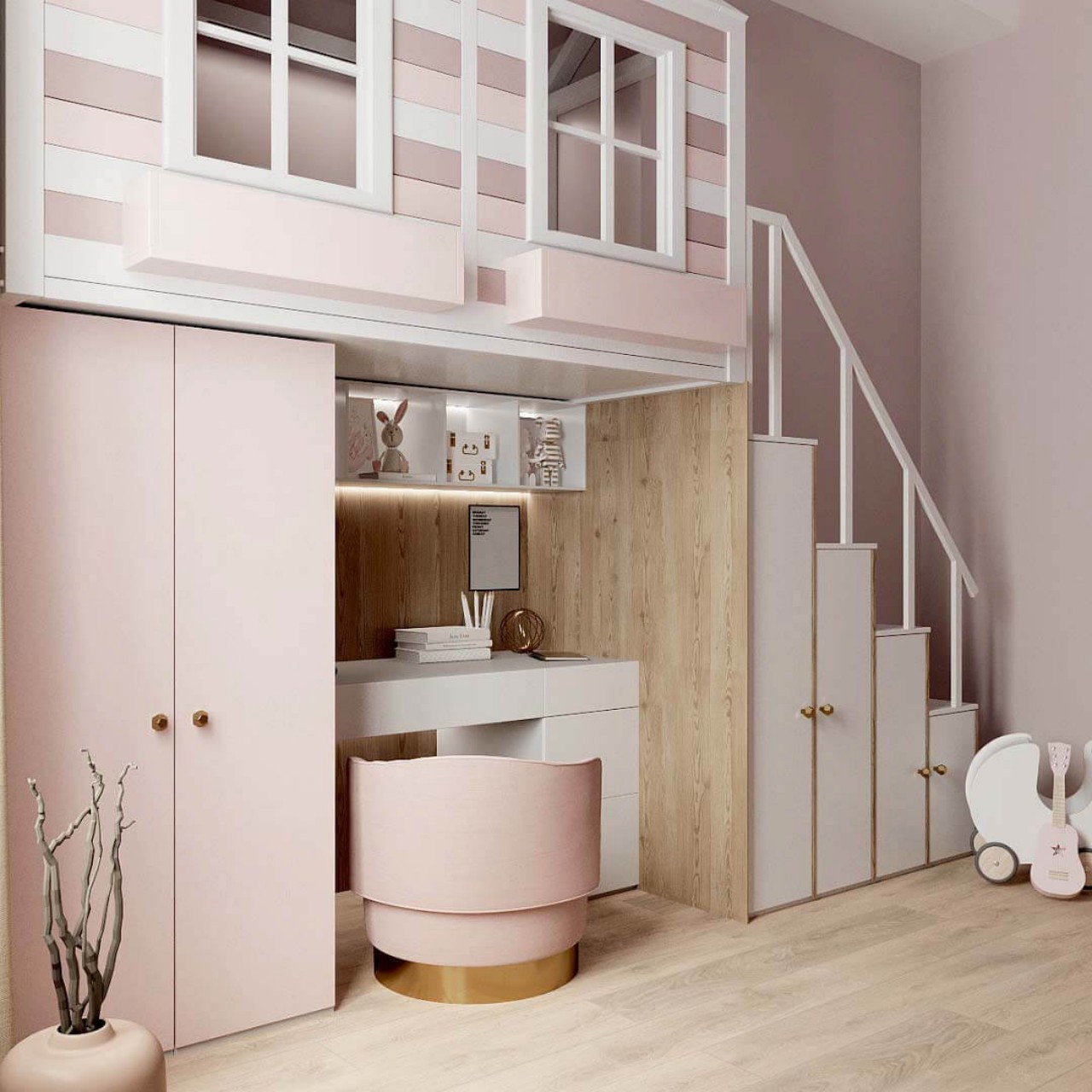
The children’s wardrobe should not only be highly functional but also spark the creativity and imagination of the kids. So, break away from using single colors and experiment with various design themes as well as low-contrast and high-contrast color combinations. Plus, making space for neatly storing clothes, toys, and books can be fun, especially in a themed space where the bedroom decor can reflect your child’s tastes, interests, and personality. Here are some stunning ideas that will give you some food for thought and allow you to go wild and creative with your imagination.

Designer: Elena Likhacheva

1. Cool Tones

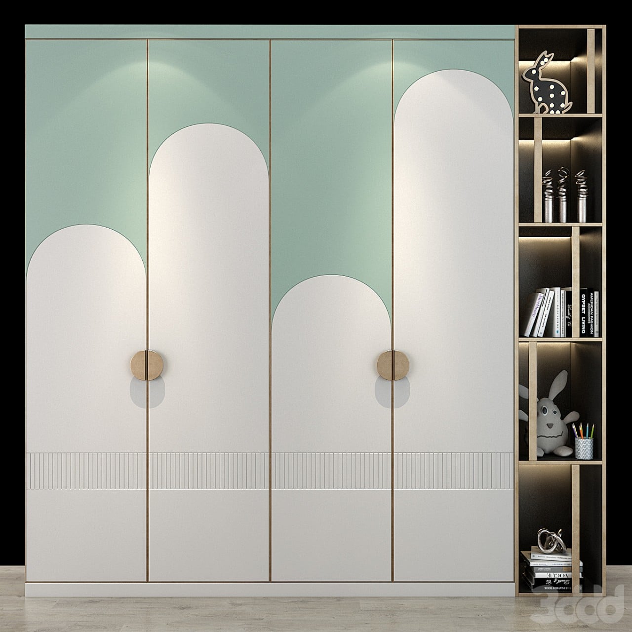
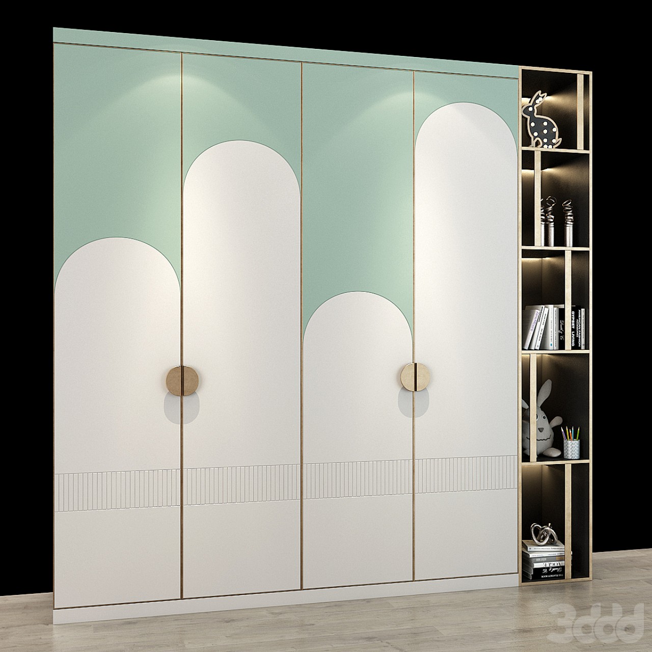
The wardrobe is designed with cool blue and white tones to create a restful space. Each wardrobe panel is demarcated with different heights of white arches. Note that the lighter shade of blue makes the space appear much bigger.

Designer: alanbuchana

2. Wardrobe cum Window Seat

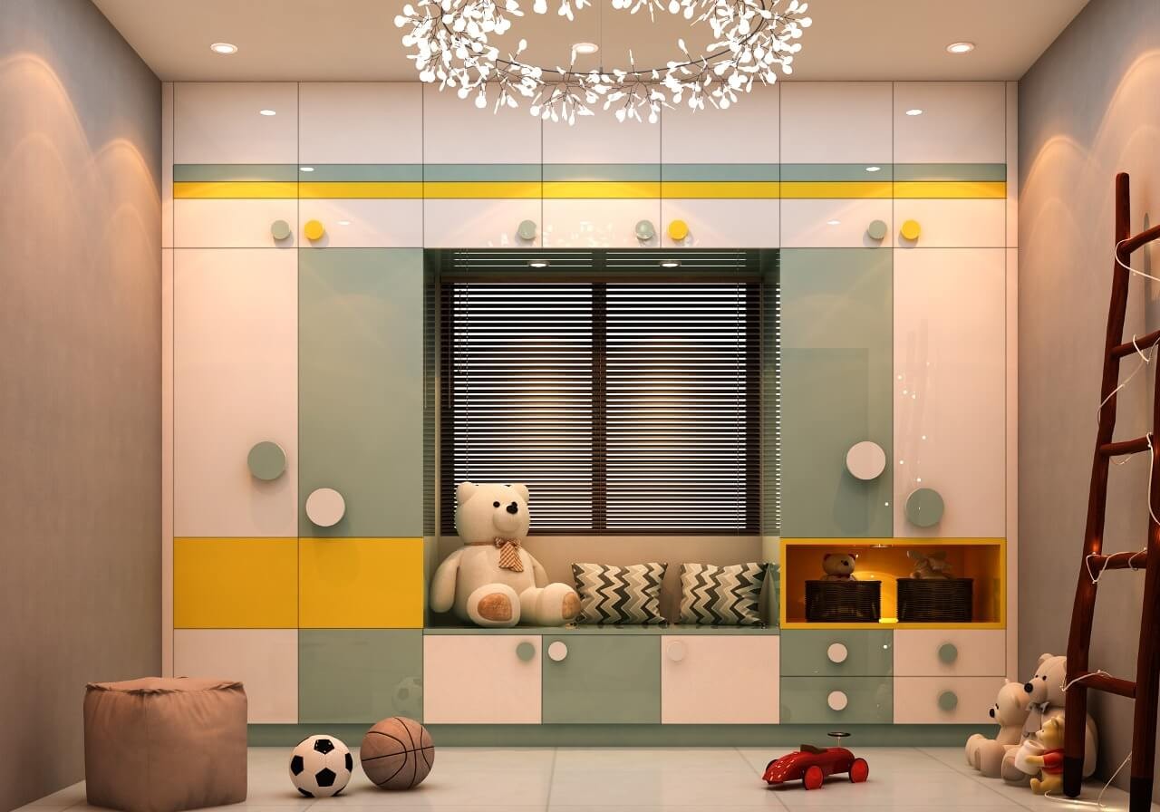
The floor-to-ceiling wardrobe encloses a window seat and optimizes vertical space. It houses a window seat that provides extra seating under cabinet storage and brings in natural light. Hues of sage green, mustard yellow, and white are smartly used to demarcate different sections of the wardrobe.

Designer: Carafina

3. Curved Silhouettes

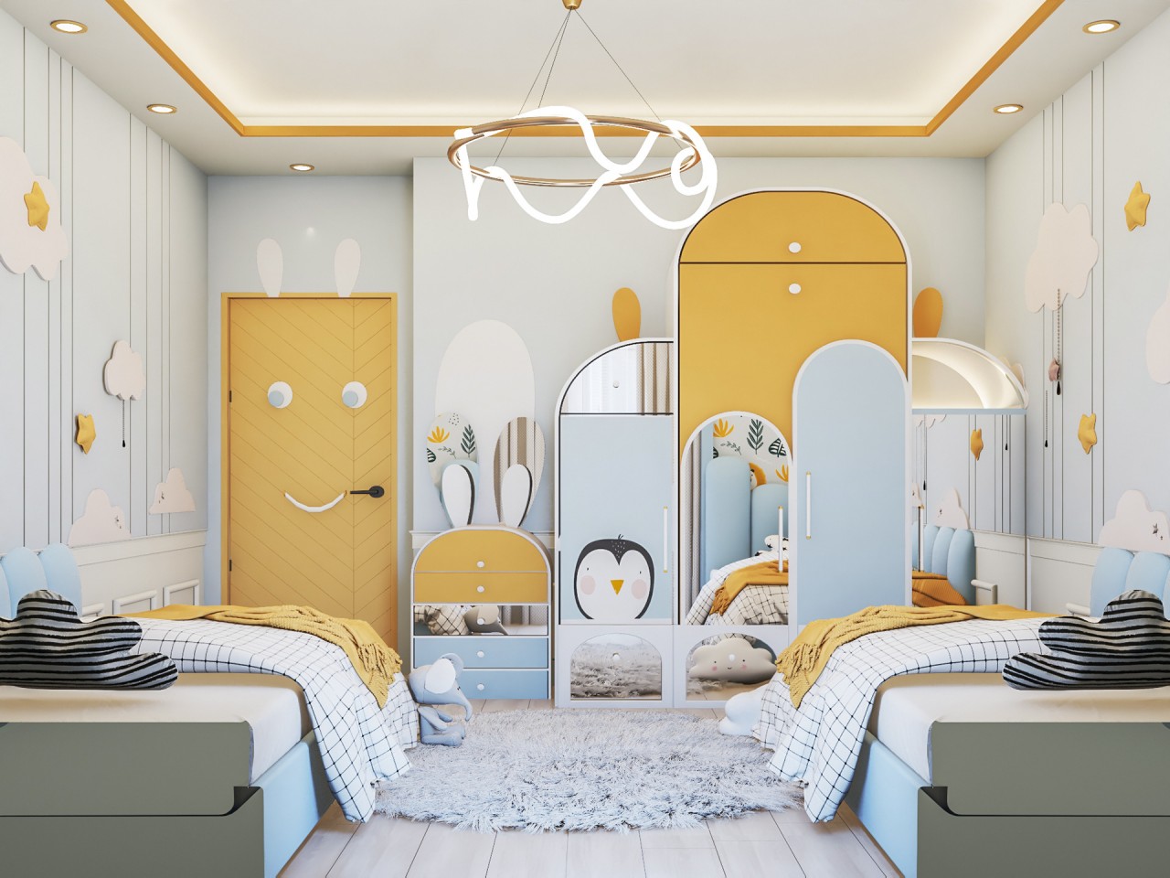
Rounded edges introduce softness, while reflective mirror surfaces on the cabinets add quirkiness to this bedroom. Children are usually fascinated by some animals and see them as a source of inspiration. A fusion of pastel hues creates a fun element. A penguin on the wardrobe shutter and rabbit-shaped ears behind the drawer unit form an interesting design feature. Just see how the combination of opaque and reflective surfaces forms a beautiful contrast of color and materials and creates the illusion of a larger space.

Designer: Shiima Ibrahim

4. Under Cabinet Lighting

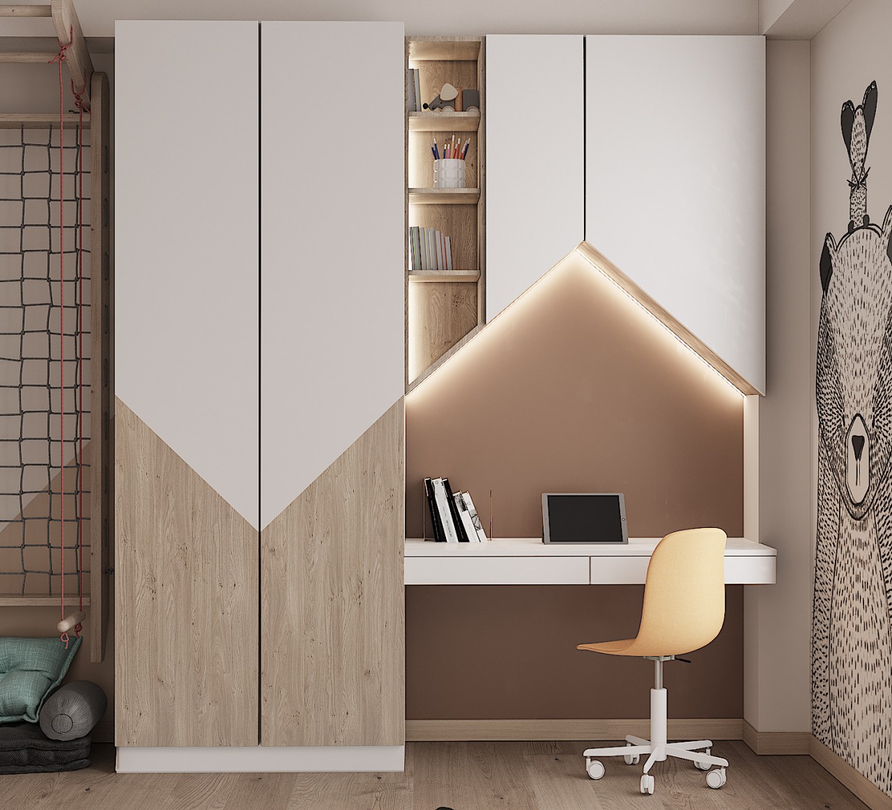
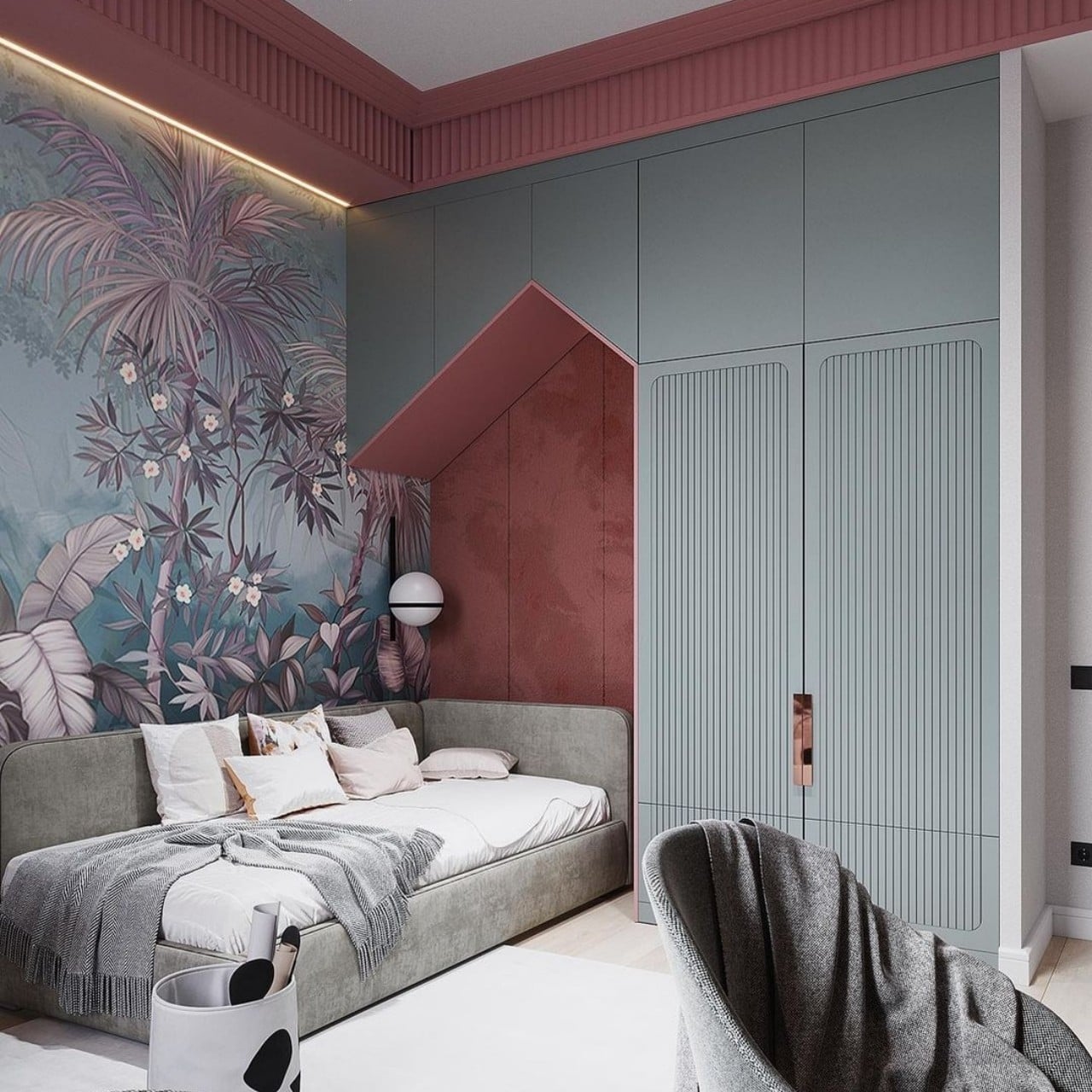
Compact yet functional, just see how the triangular form of the soft board has provision for under cabinet lighting and provides adequate task lighting for studying. In addition, the profile of the overhead cabinet moves a step further onto the wardrobe in the form of an inverted triangle in woody tones to smartly complete the look.

Designer: Shushan Vardanyan

5. Cozy Nook

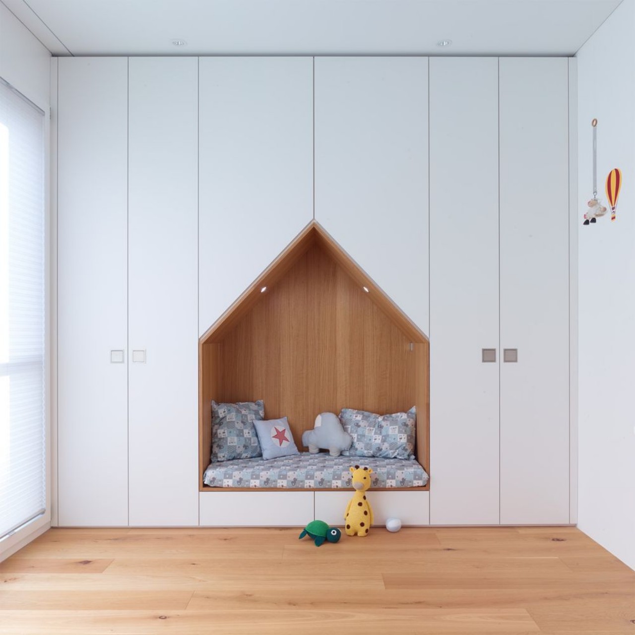
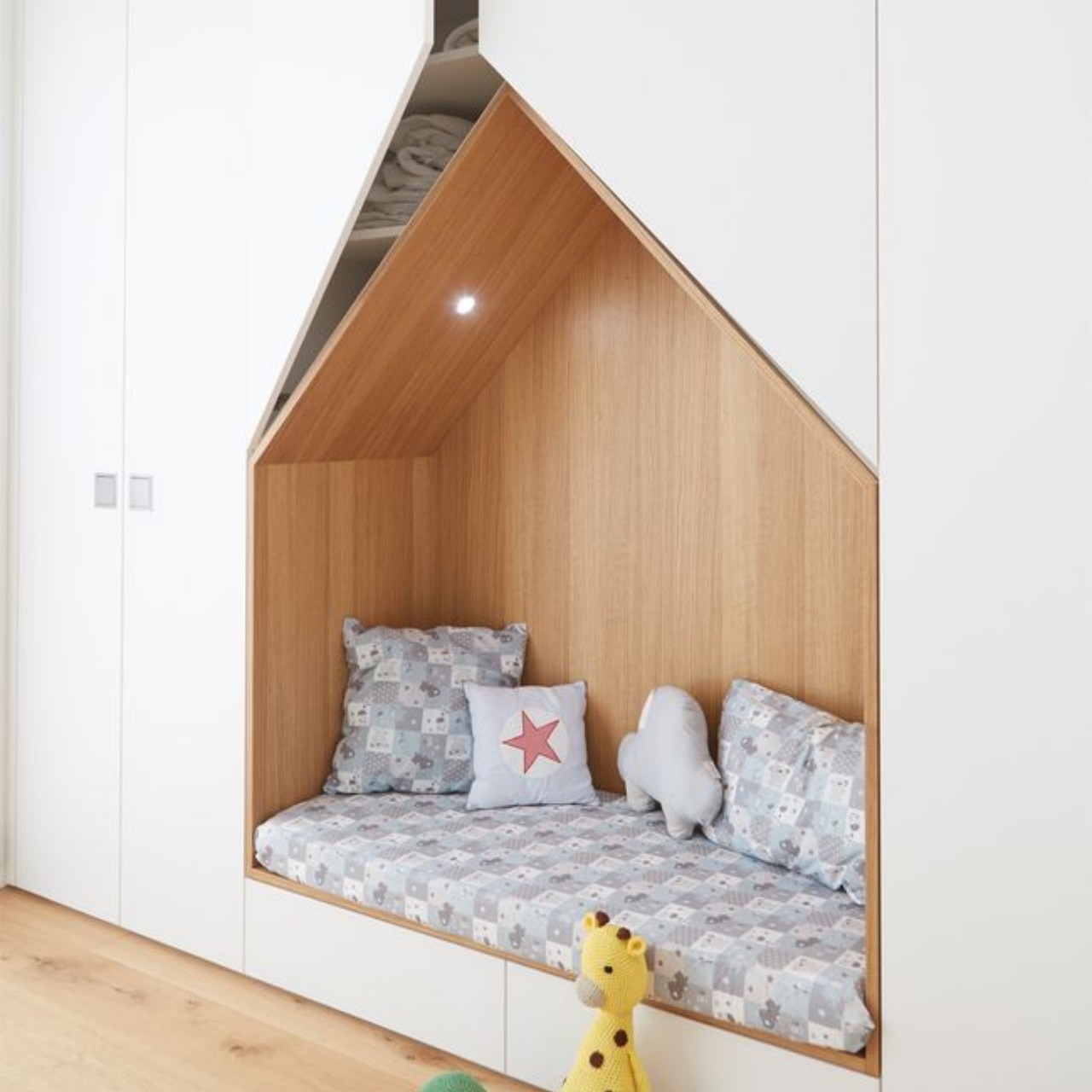
Ideal for cozy seating, this custom-made hut-shaped seating nook adds depth and dimension to an all-white wardrobe. The wooden flooring and seating nook infuse warmth into the space.

Designer: Alpnach Cabinets

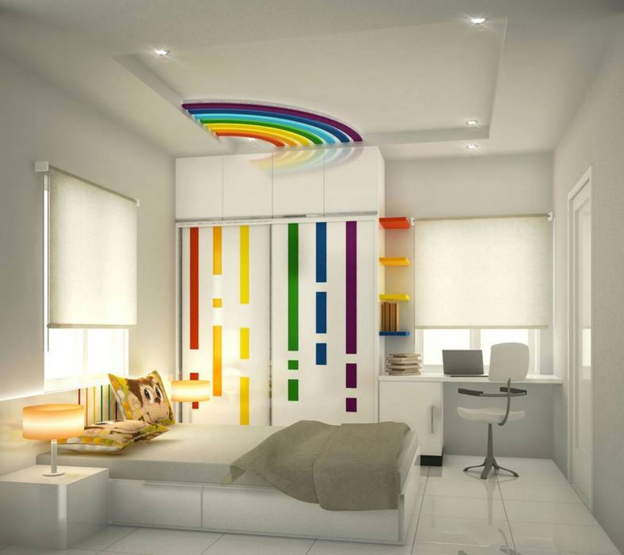
6. Rainbow Cheer

Just see how the rainbow colors add cheer and work as a strong design element in the form of vertical stripes on the wardrobe shutters. In addition, a semi-circular rainbow design is integrated into the ceiling to accentuate its look, while colorful corner shelves add life to the surrounding decor.

Designer: Interrio Concepts Studio

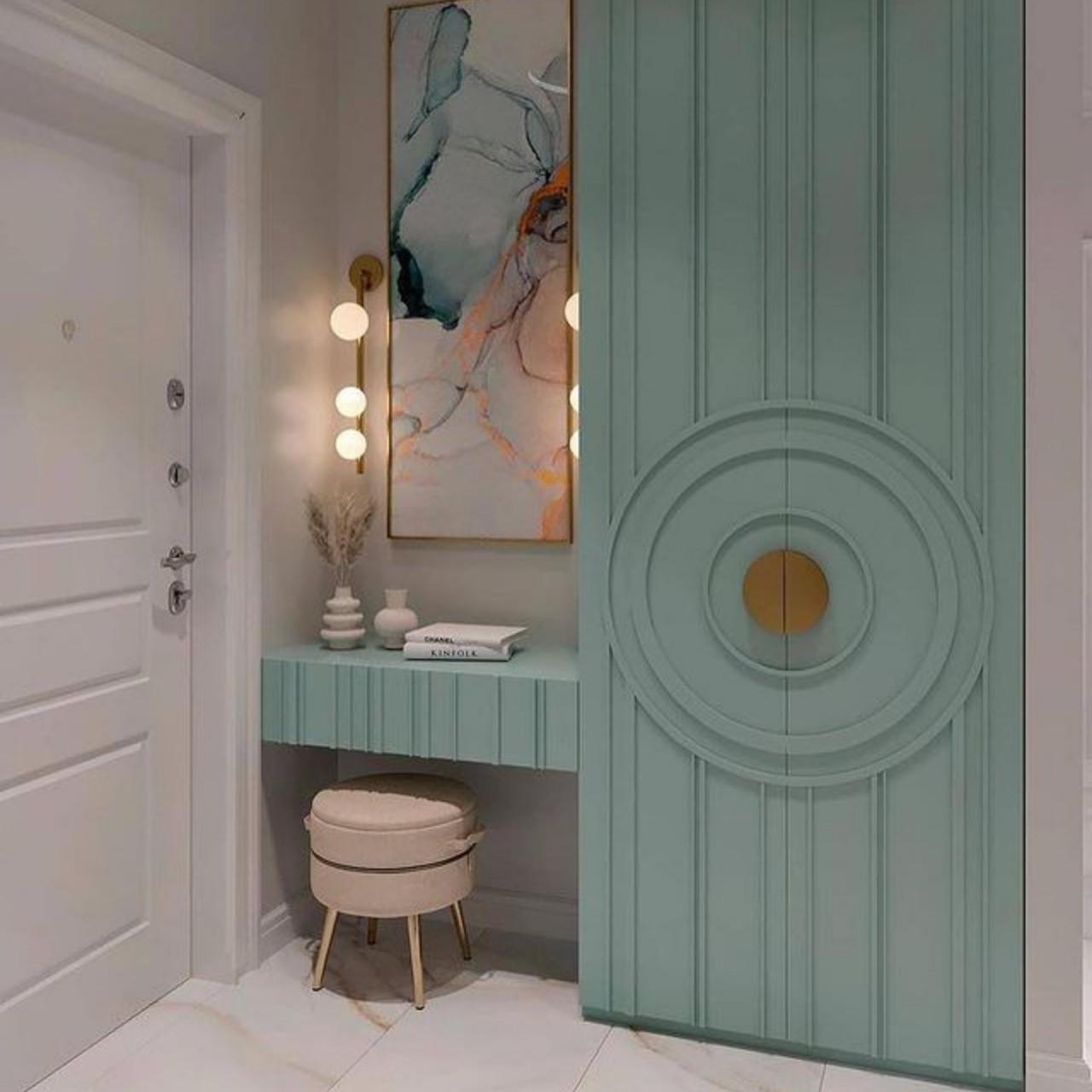
7. Ripples

Evocative of water ripples, a circular knob is surrounded by concentric rings, forming a prominent design feature on this blue-hued floor-to-ceiling wardrobe. It extends further to become a floating study unit and makes excellent use of the corner of this room. This design typically does not break the continuity of the wardrobe and makes multi-functional use of the corner space. It contrasts beautifully with the grey and white tone of the room.

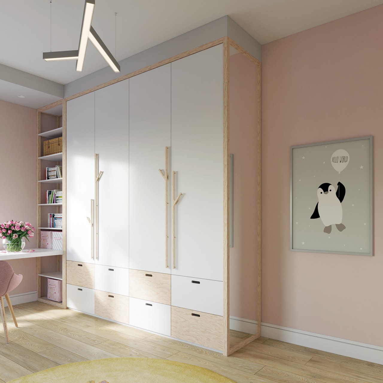
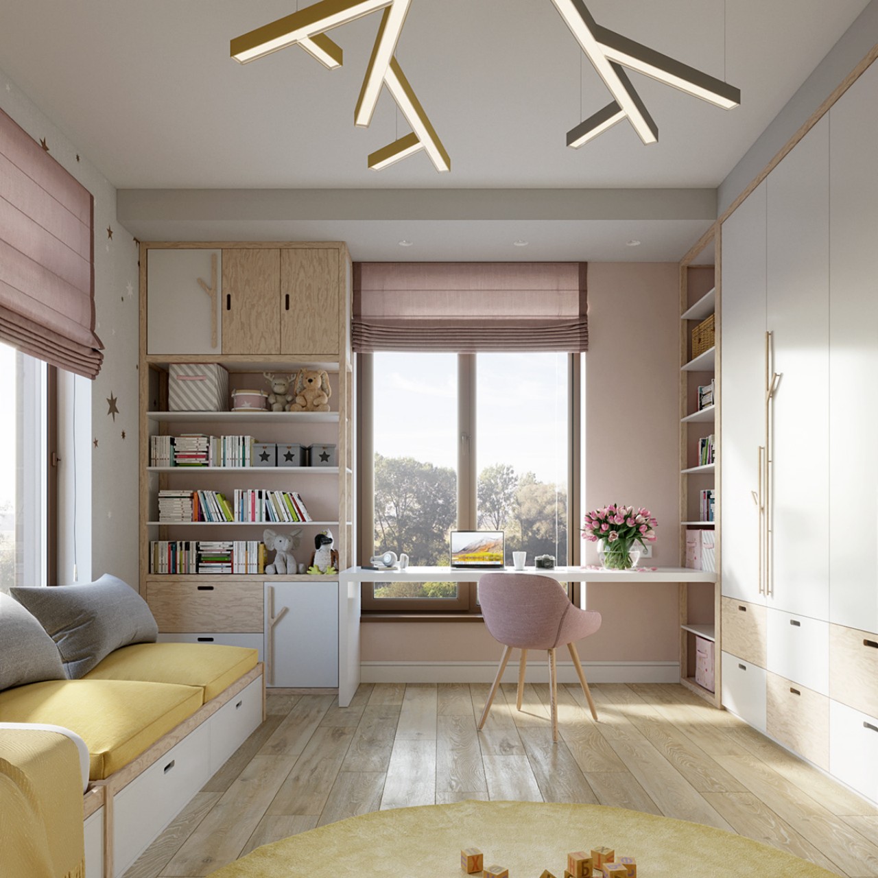
8. Branches

The branch shape handles of the wardrobe infuse a forest vibe into the décor of this children’s room. Here the idea has moved a step further into the ceiling light fixture. The white and peach color palette brings a snowy wintery feel into the décor.

Designer: Ekaterina Domracheva

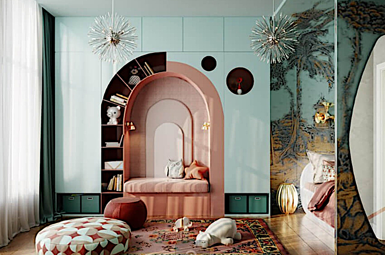
9. Pastel-hued Wardrobe

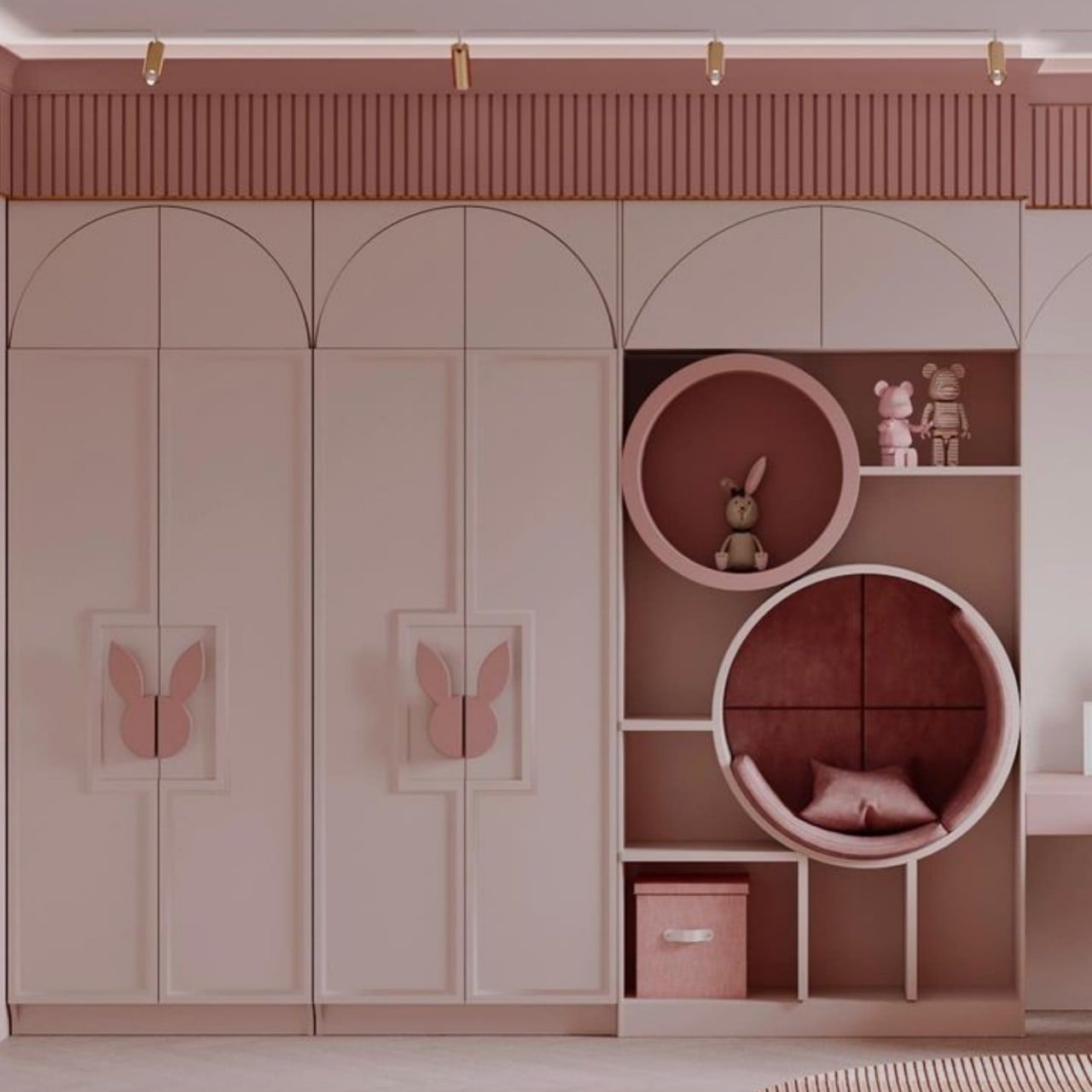
Every child loves colors! Bring in a good dose of color with a fusion of pink and blue hues of this children’s wardrobe, making it a perfect gender-neutral place. A niche is created within the center of the wardrobe that transforms into a sitting nook and imparts a neat, clutter-free look. The seating nook is surrounded by a curling display of open shelves for books and toy storage that is in perfect flow and rhythm. The open sections at the base of the wardrobe make provision for keeping storage boxes.

Designer: The Art Group by Daria Vasilkova

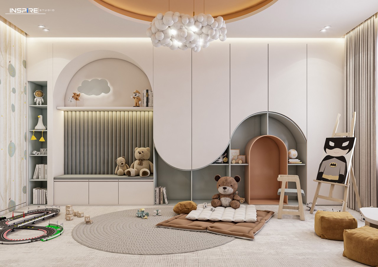
10. Wave Pattern

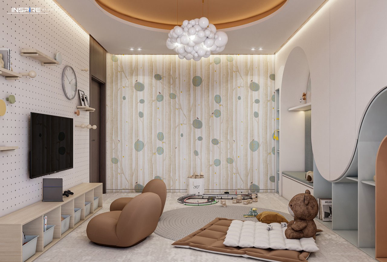
Featuring a myriad of shapes and forms, this sweet and sophisticated children’s bedroom includes curved surfaces that integrate the seating nook, built-in shelves, and closed cabinets into a single entity. The combination of peach, white, and grey creates a soothing color palette that infuses a calm and peaceful vibe into the space. The room is a haven of fun and play with plenty of open floor space.

Designers: Ebrahim Gamal, Basant Alaa

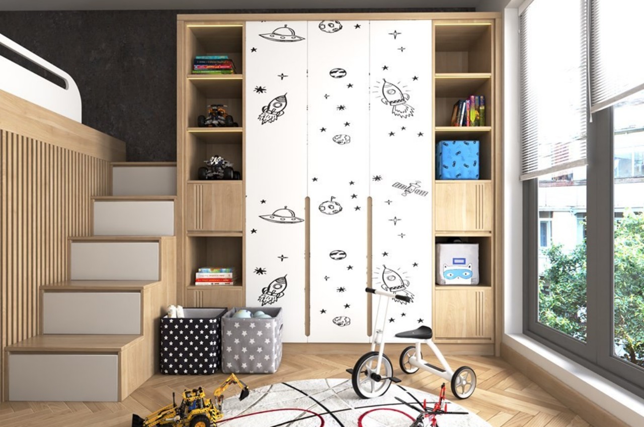
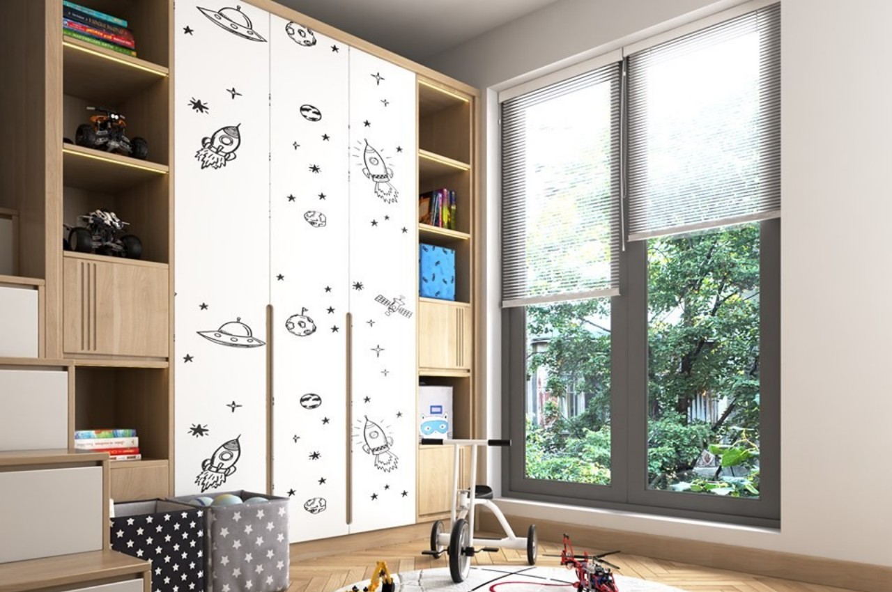
11. Space-Inspired Decor

The wardrobe shutters are inspired by rockets, satellites, and UFOs and are a perfect theme for aspiring astronauts, while a lego theme is introduced for the side wardrobes. Different sections of the wardrobe are perfect for tucking away toys, books, accessories, and clothes.

12. Wardrobe cum Study Unit

This well-designed study cum wardrobe in pastel hues is perfect for housing books, clothes, stationary, toys, and other knick-knacks. A fusion of closed and open storage with provision for adequate lighting creates an interesting design feature.

Designer: Mamka

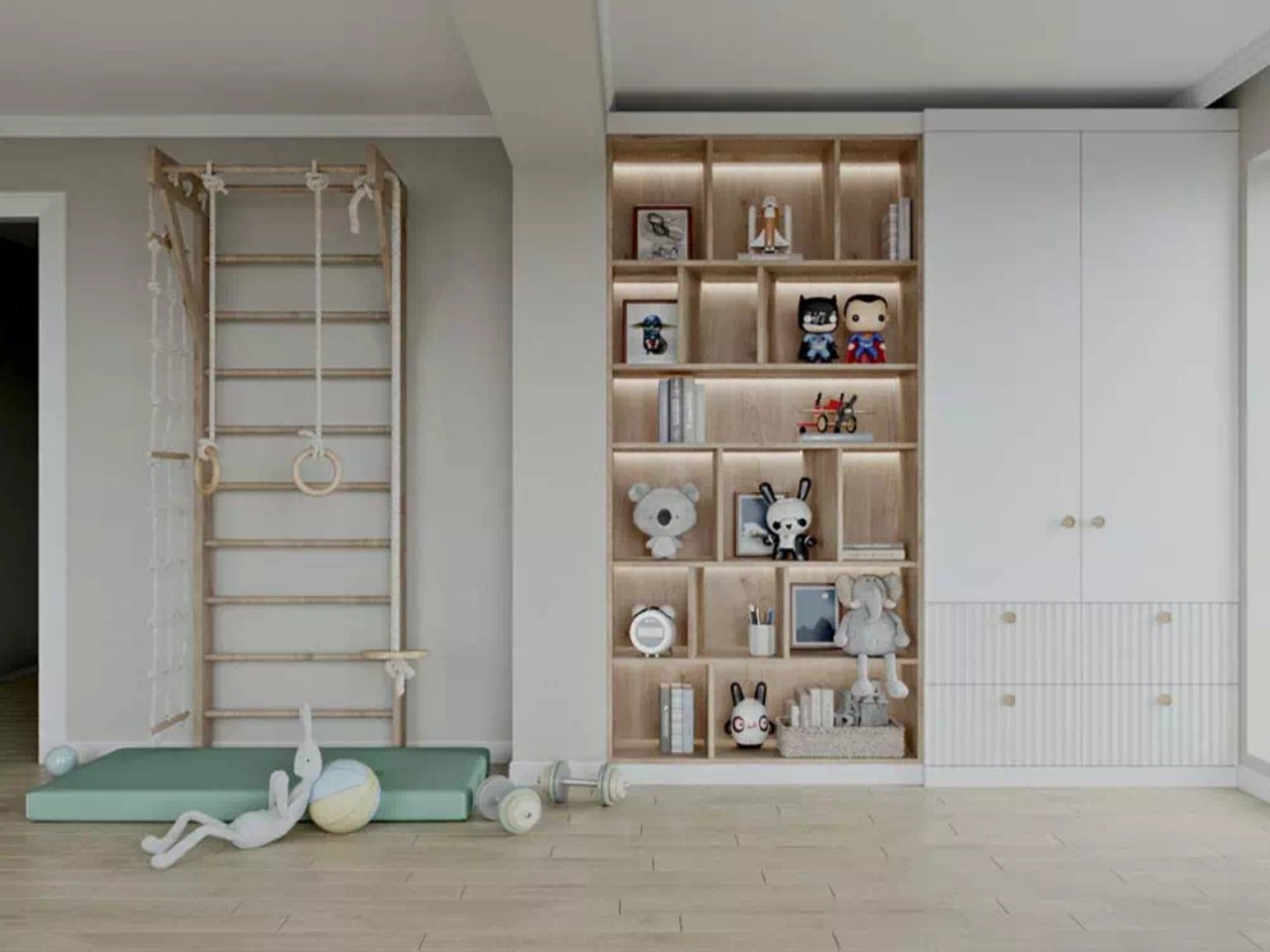
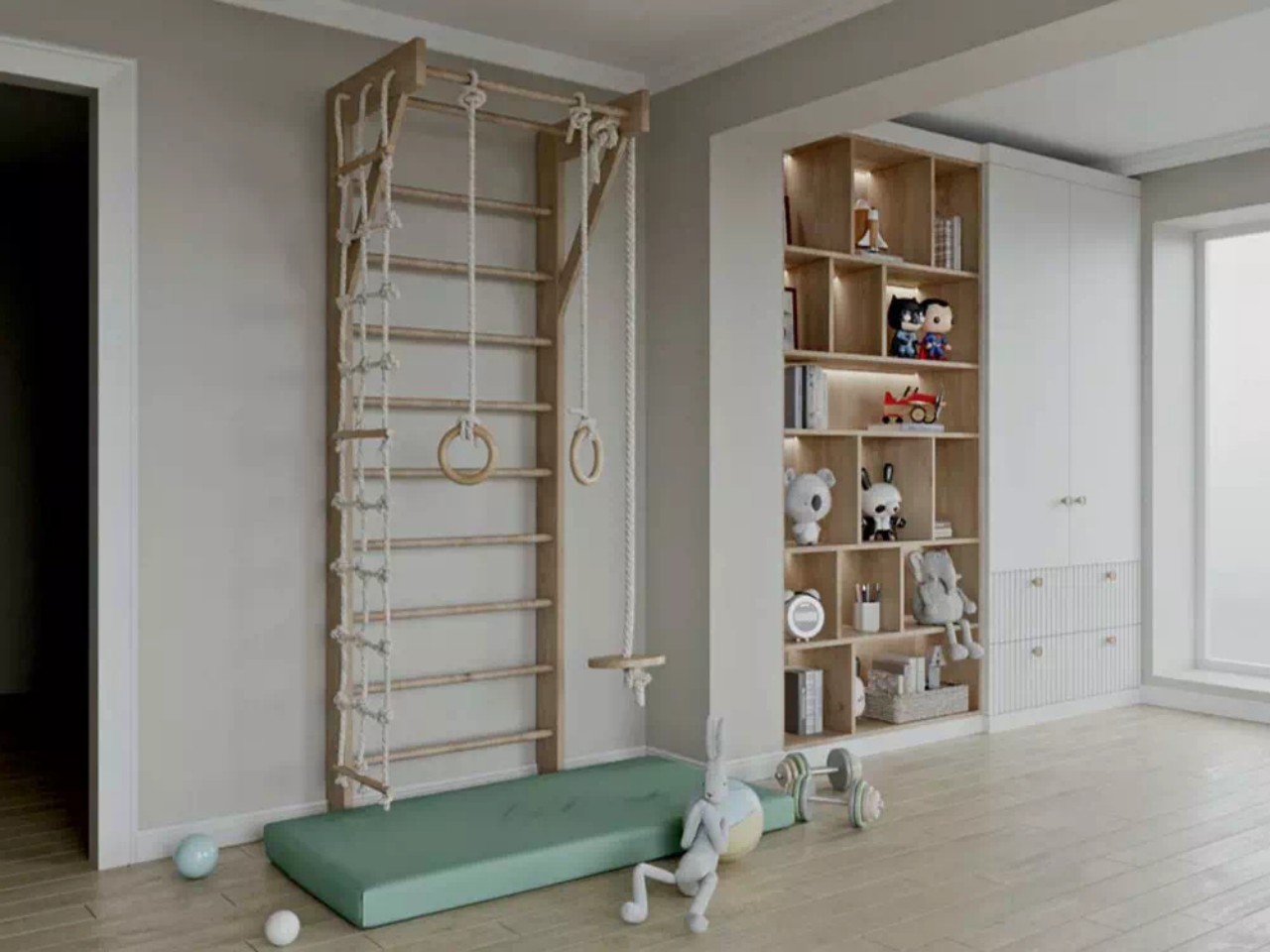
13. Cubes

Cube-shaped open shelves combine with an all-white wardrobe and storage boxes to create an efficient storage solution. The white cabinet shutters are wonderfully contrasted with woody tones and hues of deep grey behind the TV unit.

Designer: Mamka

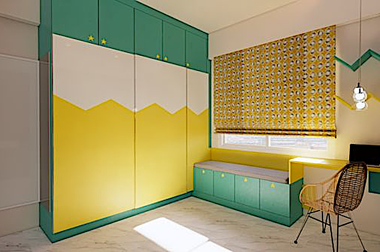
14. Bright Hues

In this, hues of green, white, and yellow are used to create an interesting layered pattern. Note that laminate finishes are easy to clean and maintain.

Designer: Bonito Designs

15. Color Blocking

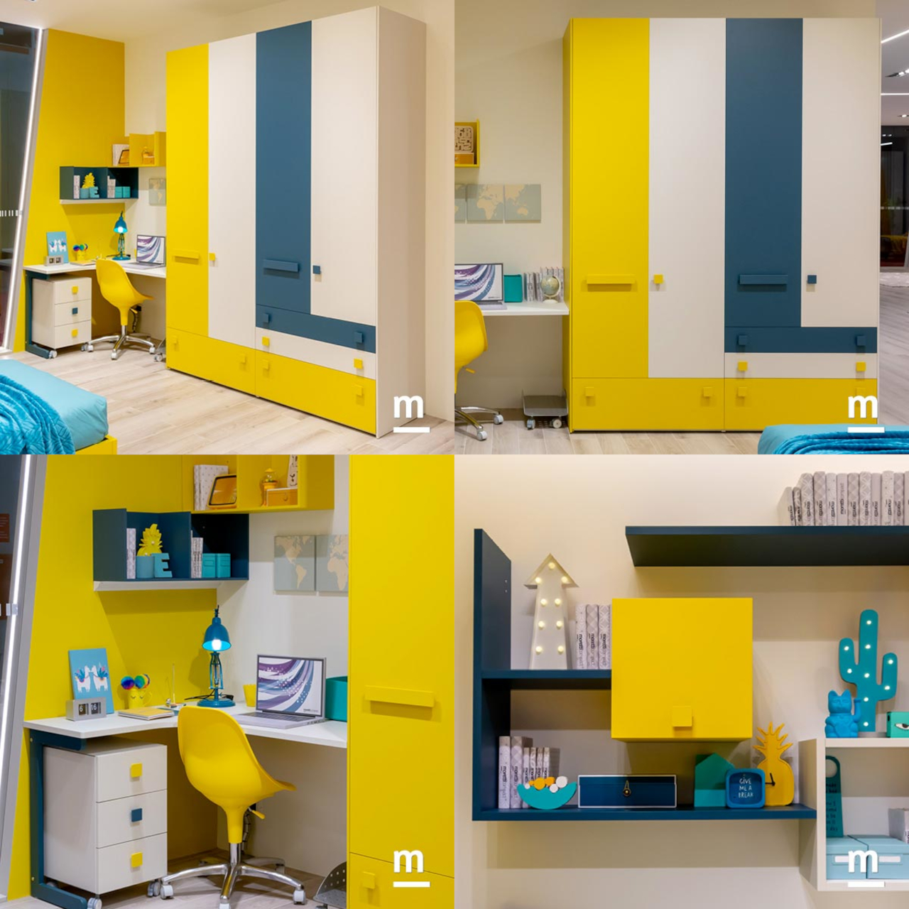
Color blocking is a method of using two or more solid colors to create a bold look that stimulates the creative side of children. An exciting contrast of warm yellow and cool blue hues demarcates different wardrobe surfaces and brilliantly introduces color into a neutral-hued space. The low drawers offer practical storage and are easily accessible by the kids.

Designer: Moretti Compact

16. Calm Color Palette

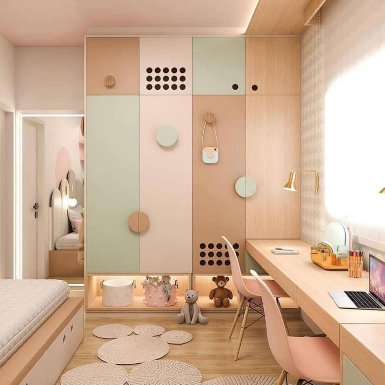
Introduce an unusual combination of multiple colors within a single space. A fusion of earthy colors in muted tones combines with warm lighting, creating a restful space that does not look overwhelming.

17. Geometric Shapes

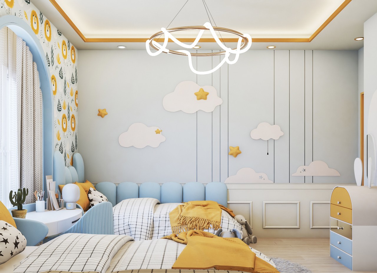
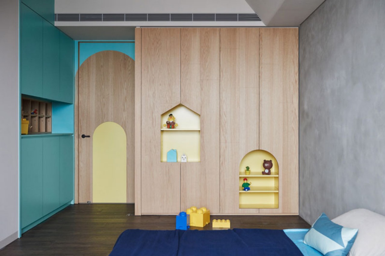
The arched design on the door and geometric-shaped cut-outs in the wardrobe shutters create a playful look in the children’s bedroom. The best part about a children’s bedroom is that it can easily handle contrasting colors and geometric shapes.

Designer: HAO Design

18. Sophisticated Color Scheme

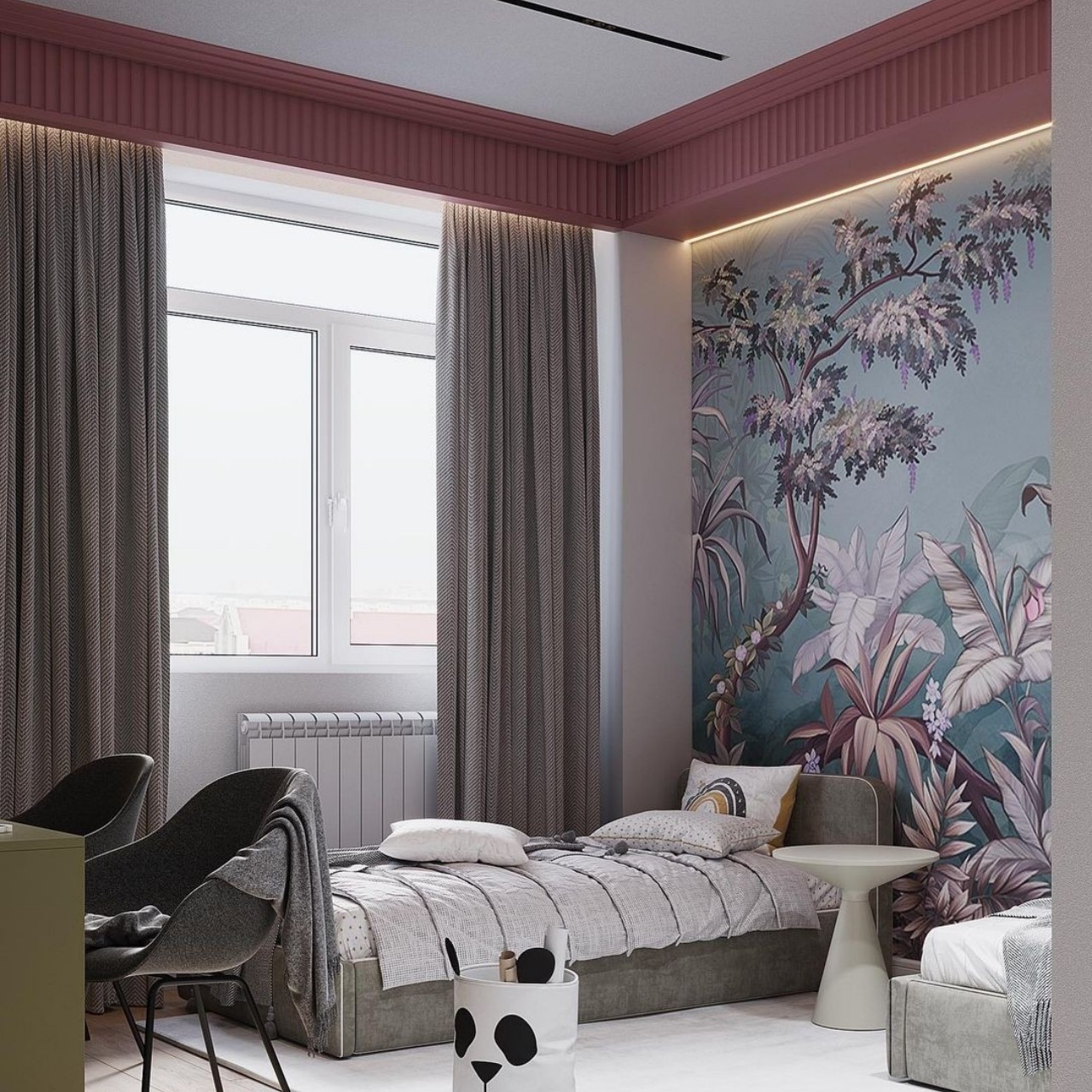
This sophisticated bedroom incorporates grey and burgundy colors that blend with similar-hued wallpaper and a biophilic theme that brings nature indoors. All the design elements come together to create a well-coordinated color scheme.

Designer: Asia Design

19. Bubbly Pink

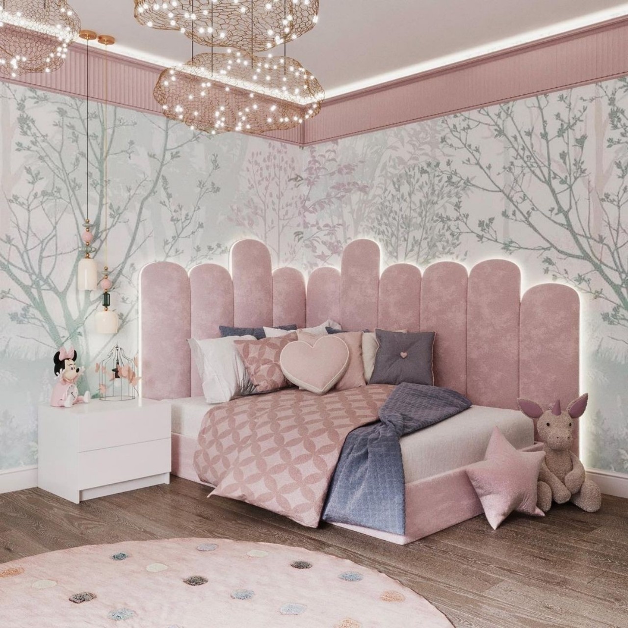
This girl’s bedroom has a magical and dreamy aesthetic achieved with a light and airy palette of pinks that prevents the wardrobes from looking bulky. Nature-inspired wallpaper accents the arched wall behind the seating and functions as an interactive backdrop within the bedroom. The décor exhibits a beautiful combination of modern and classical elements.

Designer: Daniel Design Studio

20. A Round Reading Nook

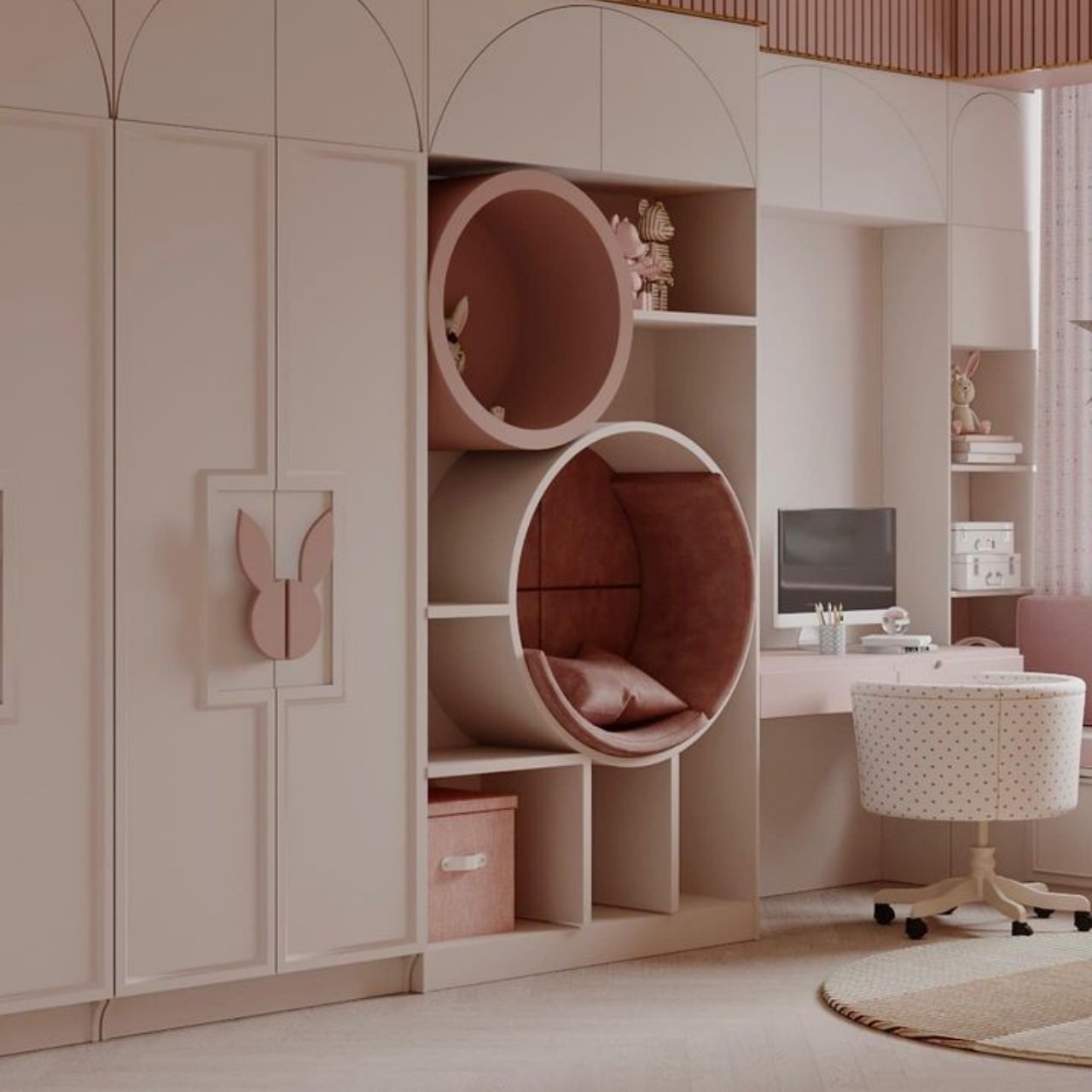
Reading is a wonderful habit, and the child’s room should be designed to encourage it! Give a private space to your little one to escape into a fantasy land while reading a book. Don’t miss the functional bunny rabbit-shaped wardrobe handles that add a fairy-tale vibe to the space.

Designer: Daniel Design Studio

So let your creative juices flow and add a playful flair to the wardrobes of your kid’s bedroom. A well-designed space looks great and is important for your child’s overall development.

The post Spectacular Ideas for Children’s Wardrobes first appeared on Yanko Design.
This doodle interactive wall creates fun times for kids and adults as well

I’m not a parent myself but with a lot of my friends having their progeny, I am aware of the challenges of raising kids, especially during the pandemic and even in this digital age. Some common problems include kids stuck on their gadgets, not having enough interaction with other kids, etc. Oh, and those that are not in front of their screens are constantly writing or drawing on anything except paper, which more often than not is the walls of their house. What if all of these things can be solved with one device?

Designer: Hyungwoo Lee

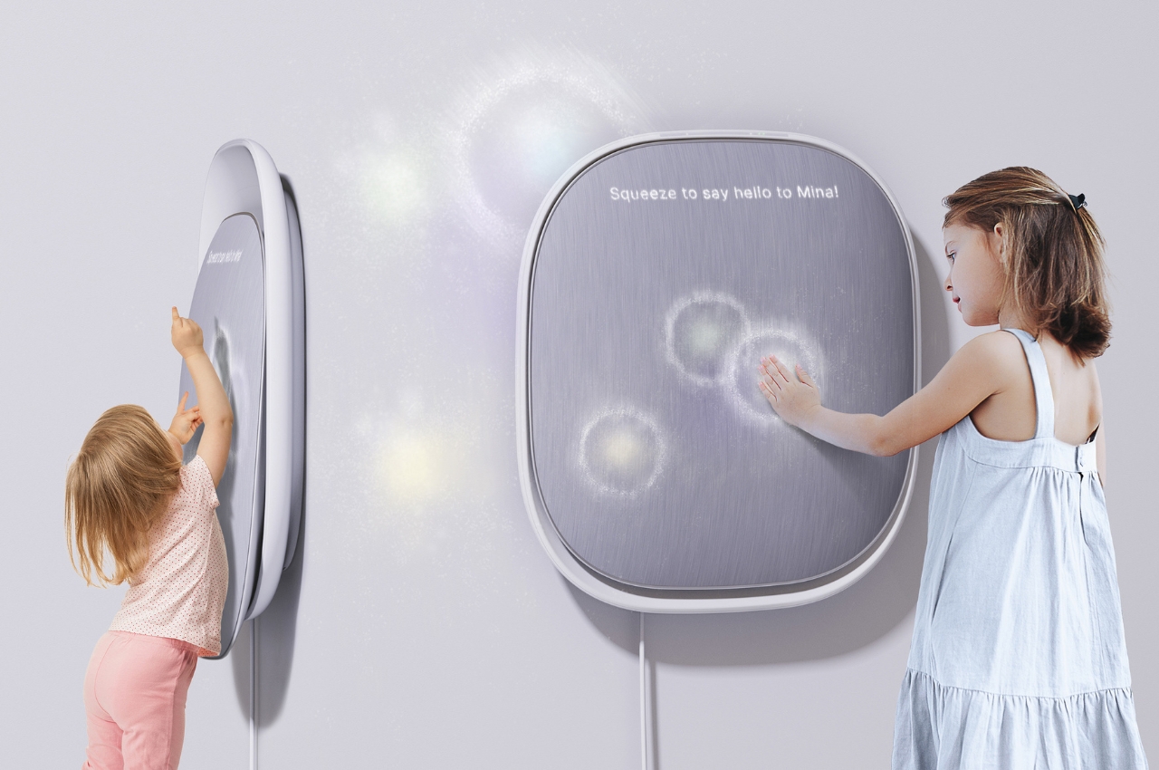
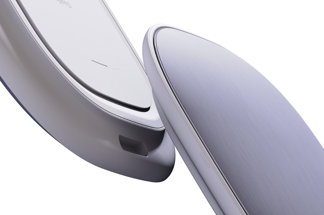
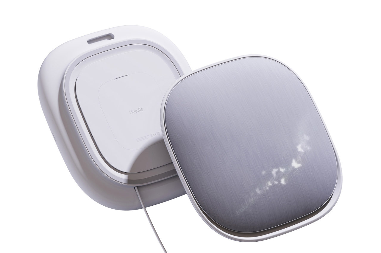
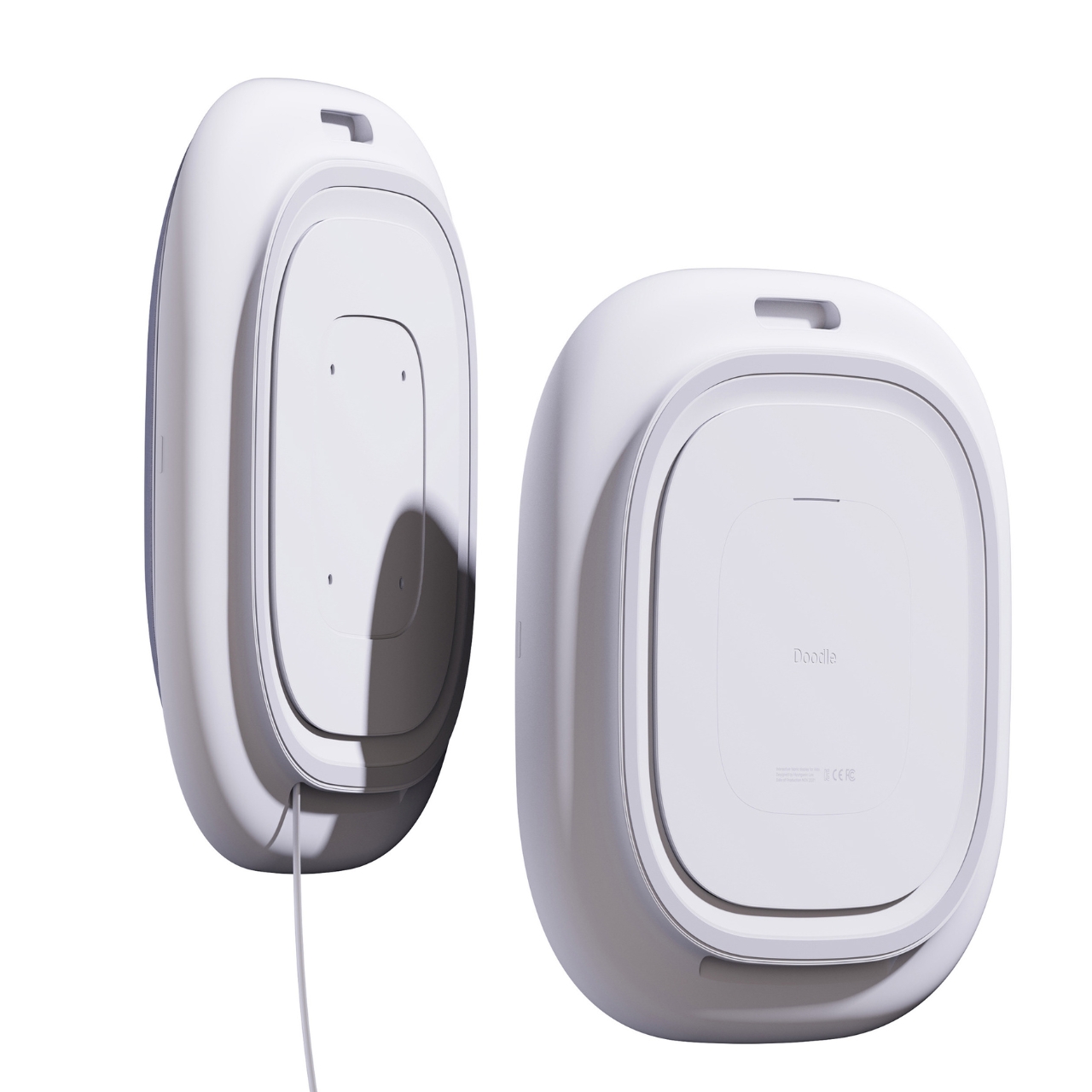
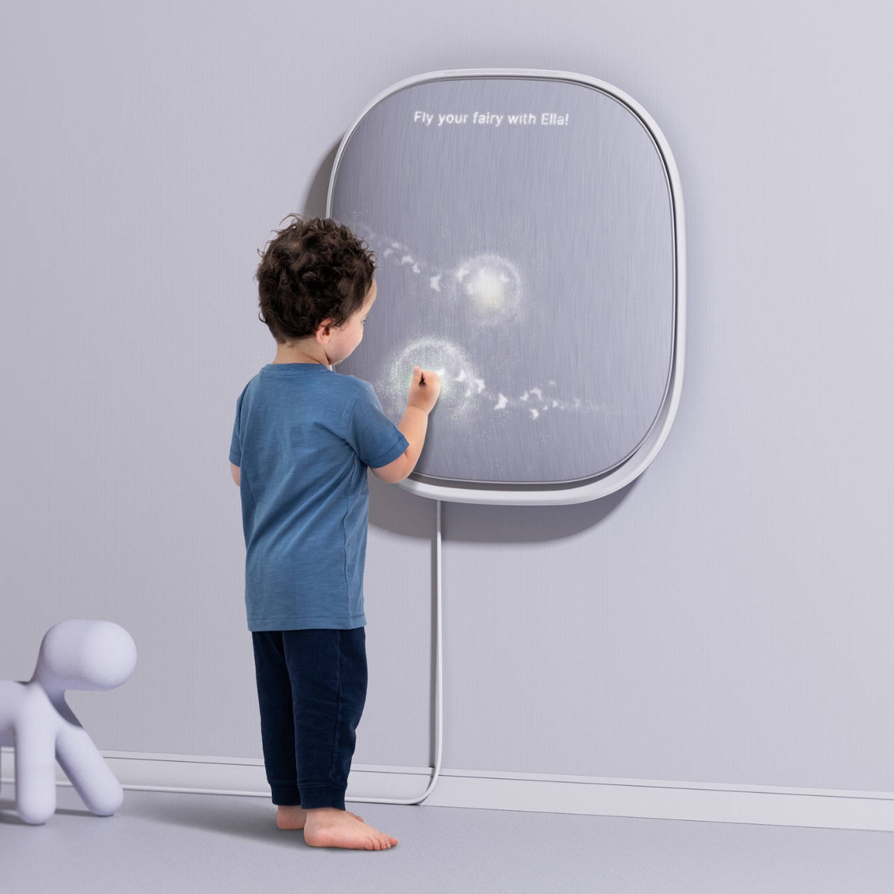
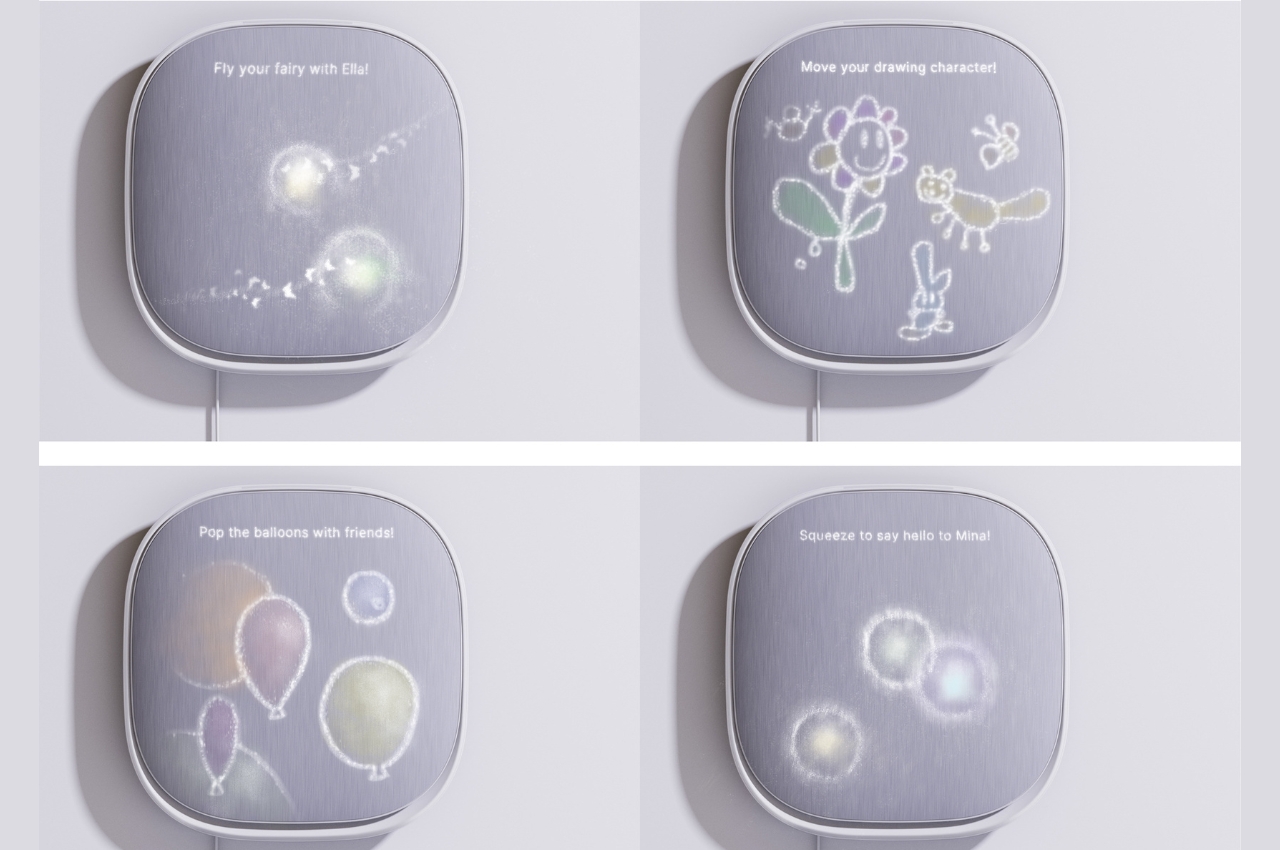
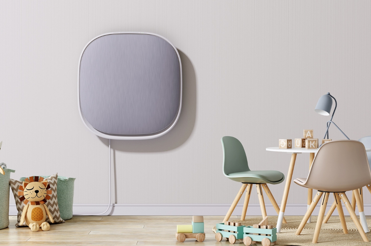
This concept for a product called Doodle aims to solve some of these pain points faced by parents when raising young kids. The design and the idea for the device is of course inspired by all the doodles on the wall that young parents have most likely experienced. The device looks like a smart speaker except it is huge and is mounted on the wall. This way, instead of writing and drawing on the wall, they can interact with the fabric surface of the device and enjoy some of the interactive activities included in the concept.

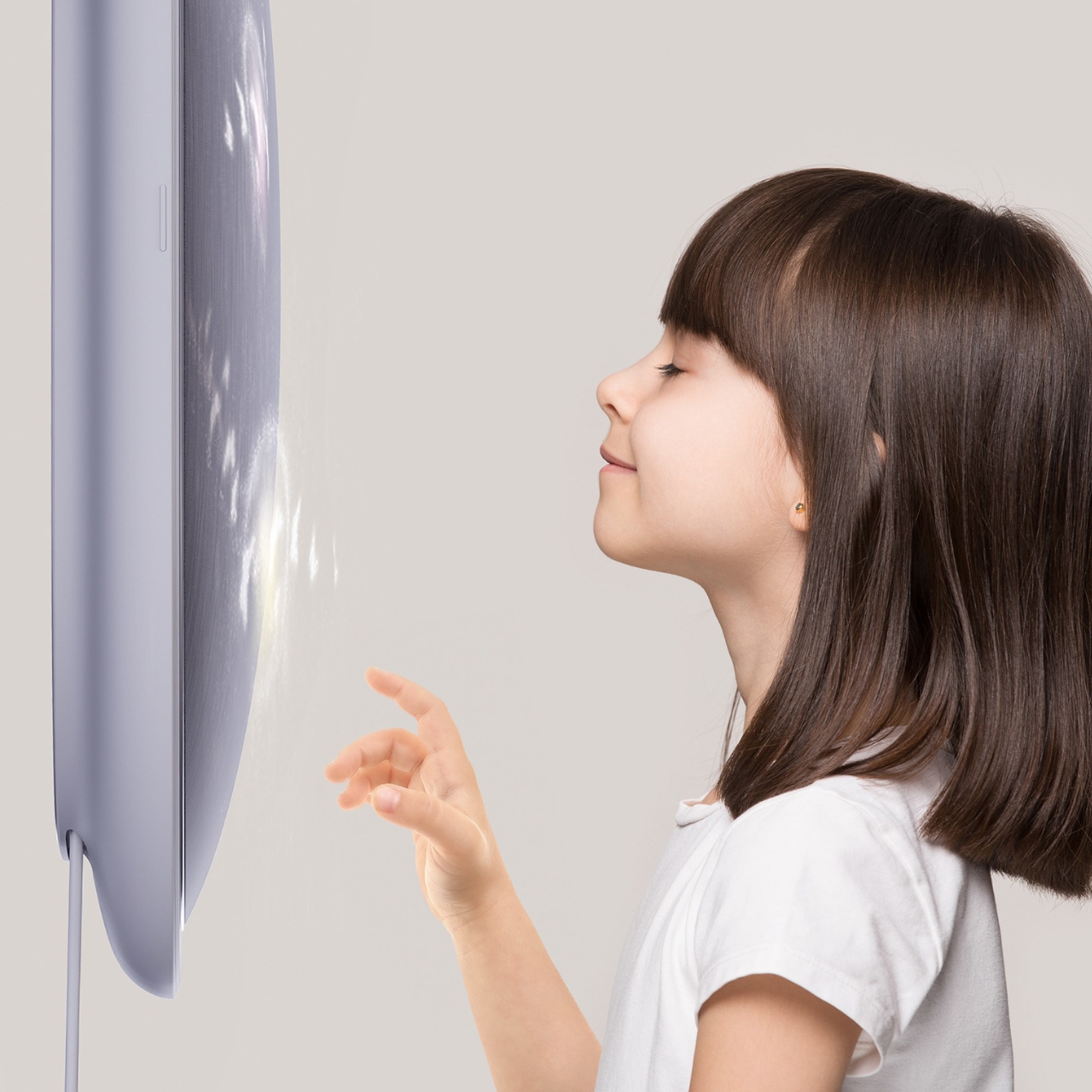
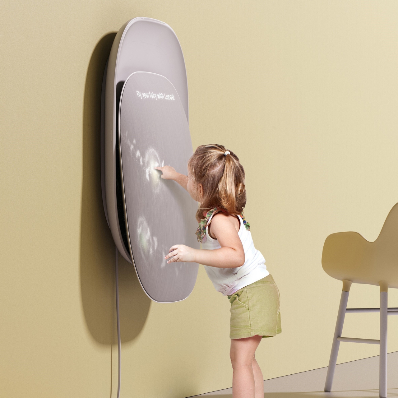
The soft fabric display lets kids have a tactile interaction with the “screen” while they draw, write, touch, and interact with other kids who are also using the same device. There are LED lights under the surface so that it follows the fingers of the kid doodling on the Doodle. There are also times when they can press and squeeze the surface depending on the activity they want to do, like pop the balloons or squeeze to say hello or let their drawings “fly”.

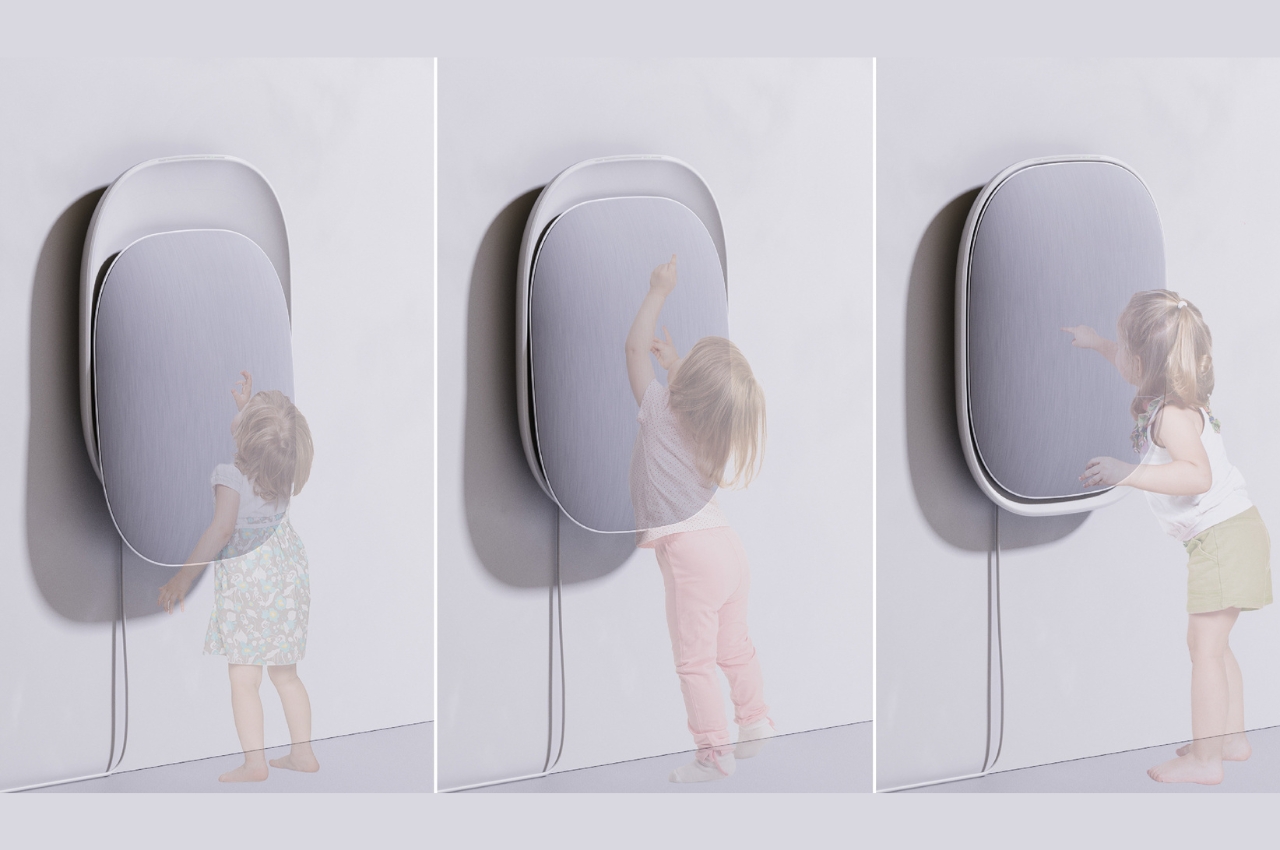
The concept also takes into consideration that kids grow tall fast. It has a height recognition sensor that will adjust depending on the height of the kid that’s using the device. It’s a pretty interesting concept for a device for children and the design is simple enough to blend into your wall. The design will be enhanced by the doodles and artwork that the young ones will create. Having something like this can help take them away from screens for a little while and also interact with other users as well.

The post This doodle interactive wall creates fun times for kids and adults as well first appeared on Yanko Design.
MIKU Kids Phone Concept strips the phone down to basic functions

MIKU Kids Phone

Keep kids away from gadgets as much as possible. That is what many people are saying, but as a parent, I can say some devices are very much helpful. Of course, gadget time must be controlled and parents should ensure the privacy and security of their children. There are plenty of ways to keep kids safe like choosing apps that protect and using smart gadgets–all while keeping them entertained.

There is now a trend to reduce features and functions to just the basics. This is so people won’t be distracted or make things easy for them. The Miku Kids Phone is an ideal solution for families who always want to be connected, giving the parents peace of mind.

Design: Anna Petritsch

MIKU Kids Phone Concept Details

MIKU Kids Phone Product Concept

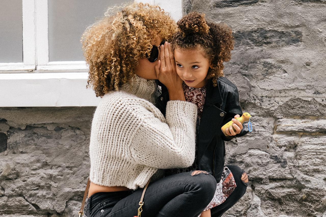
The phone for kids introduces young children to digital communication. It doesn’t have a screen but can keep the kids reachable whenever they are not with you. It comes with AI (artificial intelligence) so the phone can grow with the children. It allows new voice-based features to be unlocked as the kids grow.

MIKU Kids Phone Where to Buy

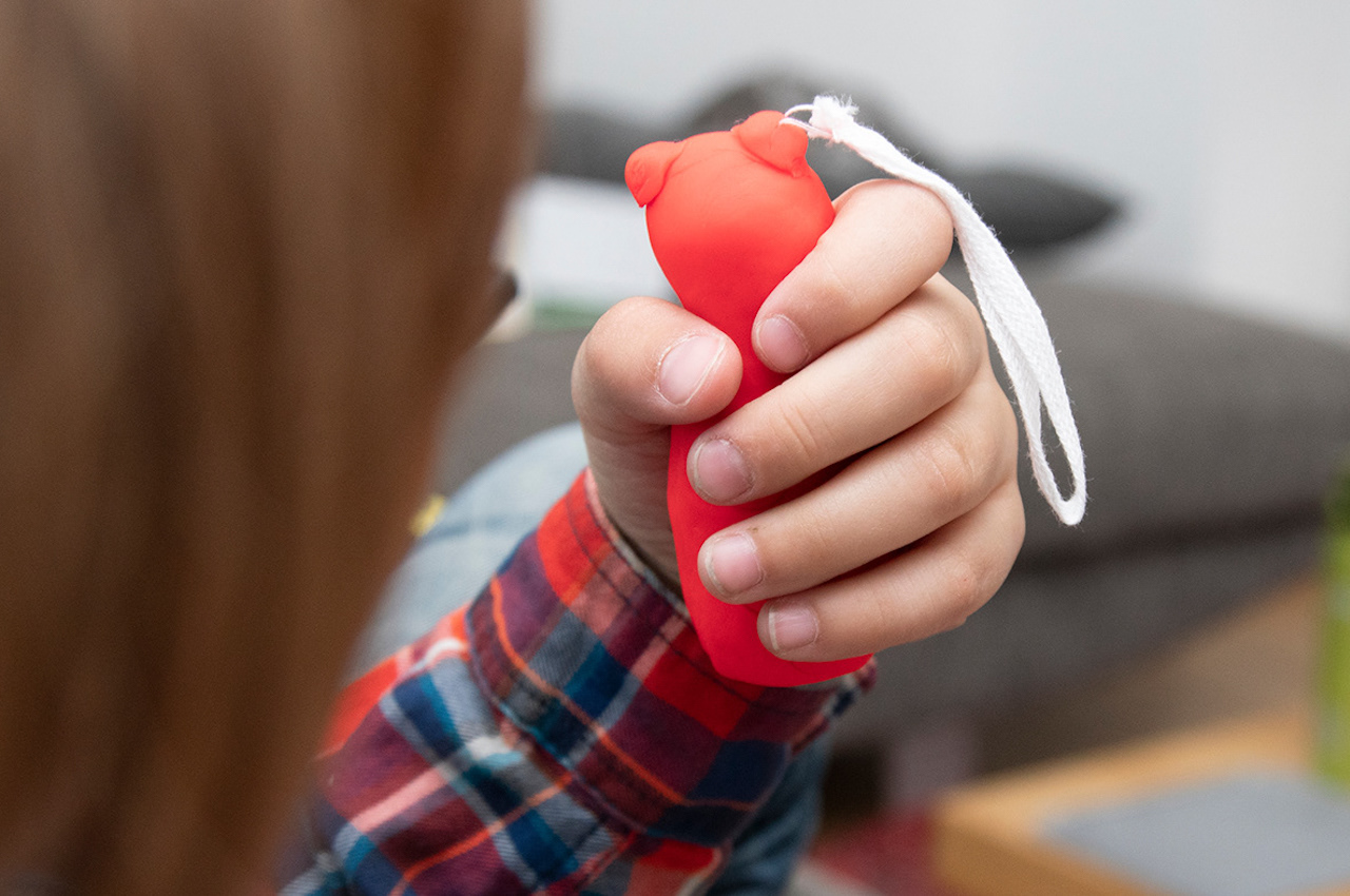
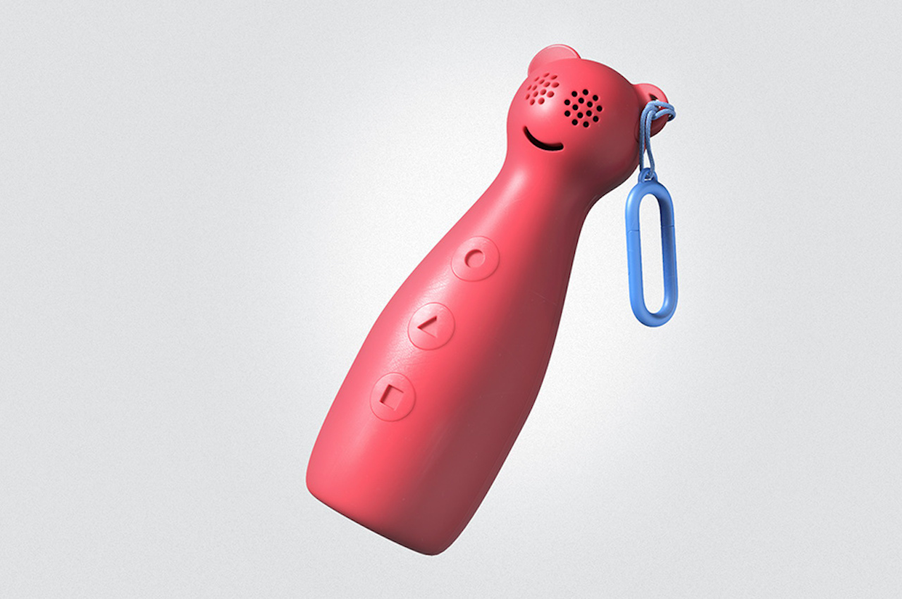
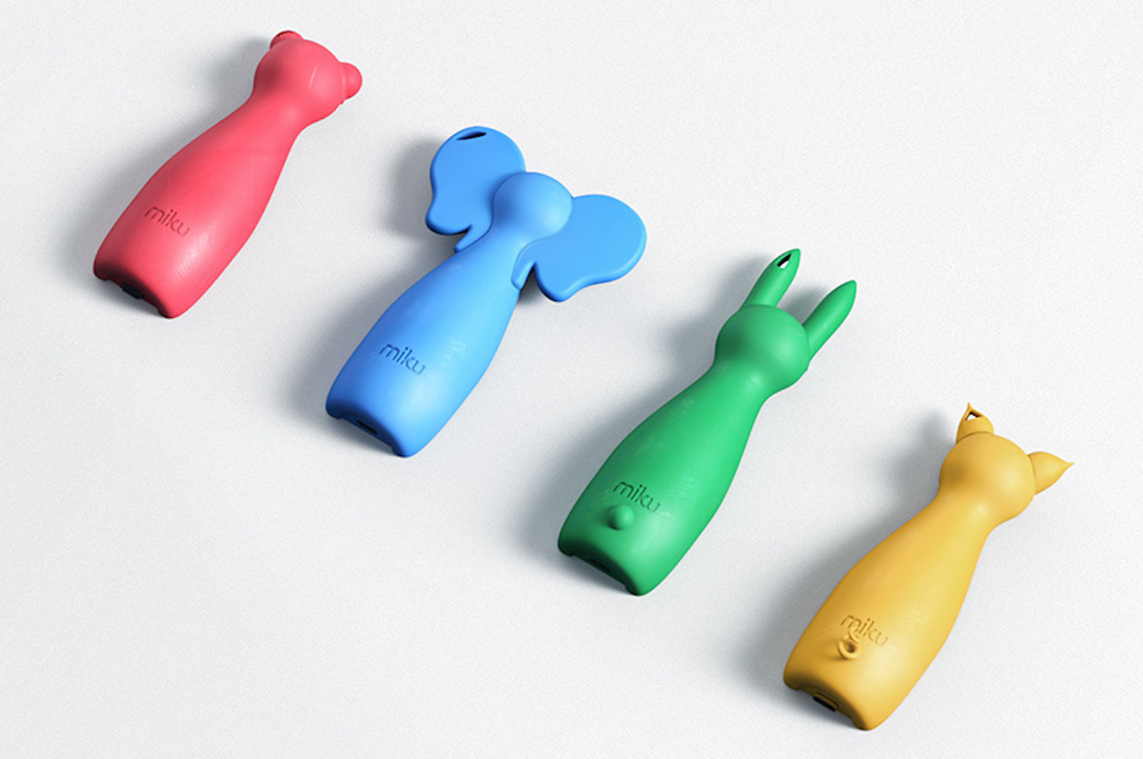
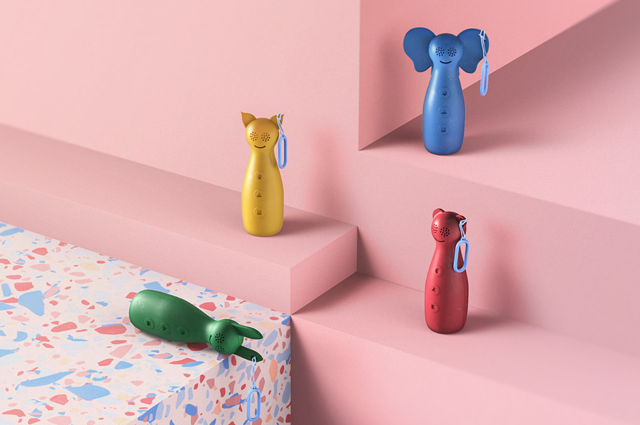
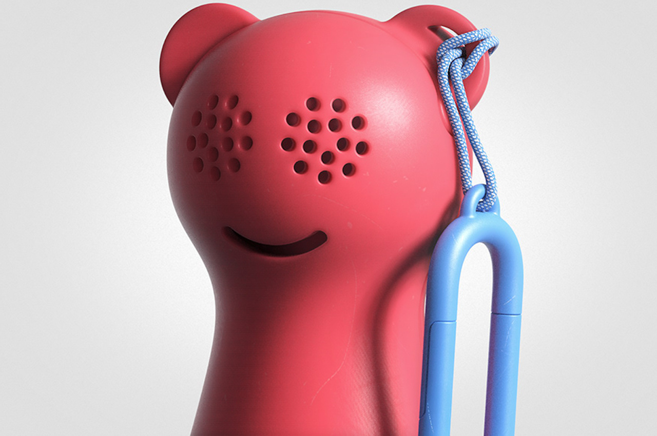
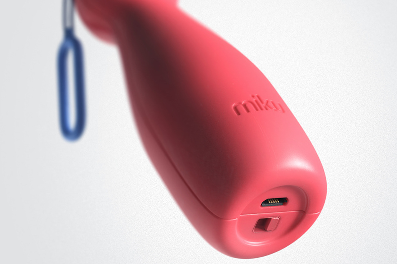
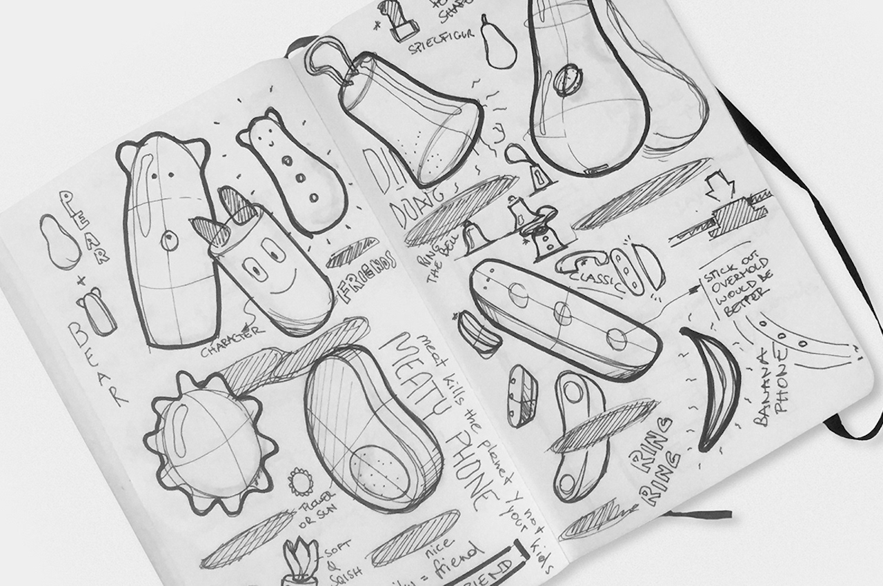
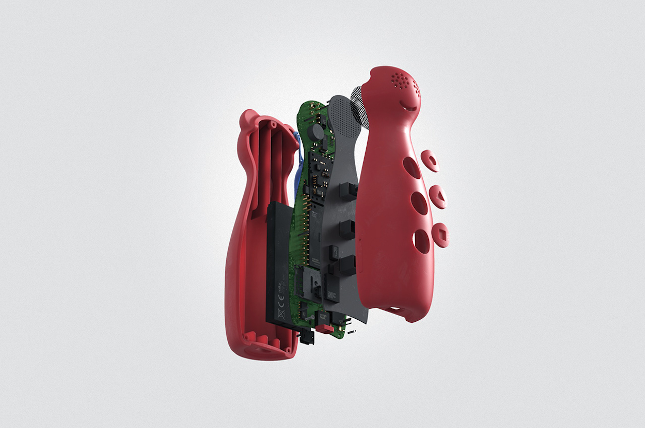
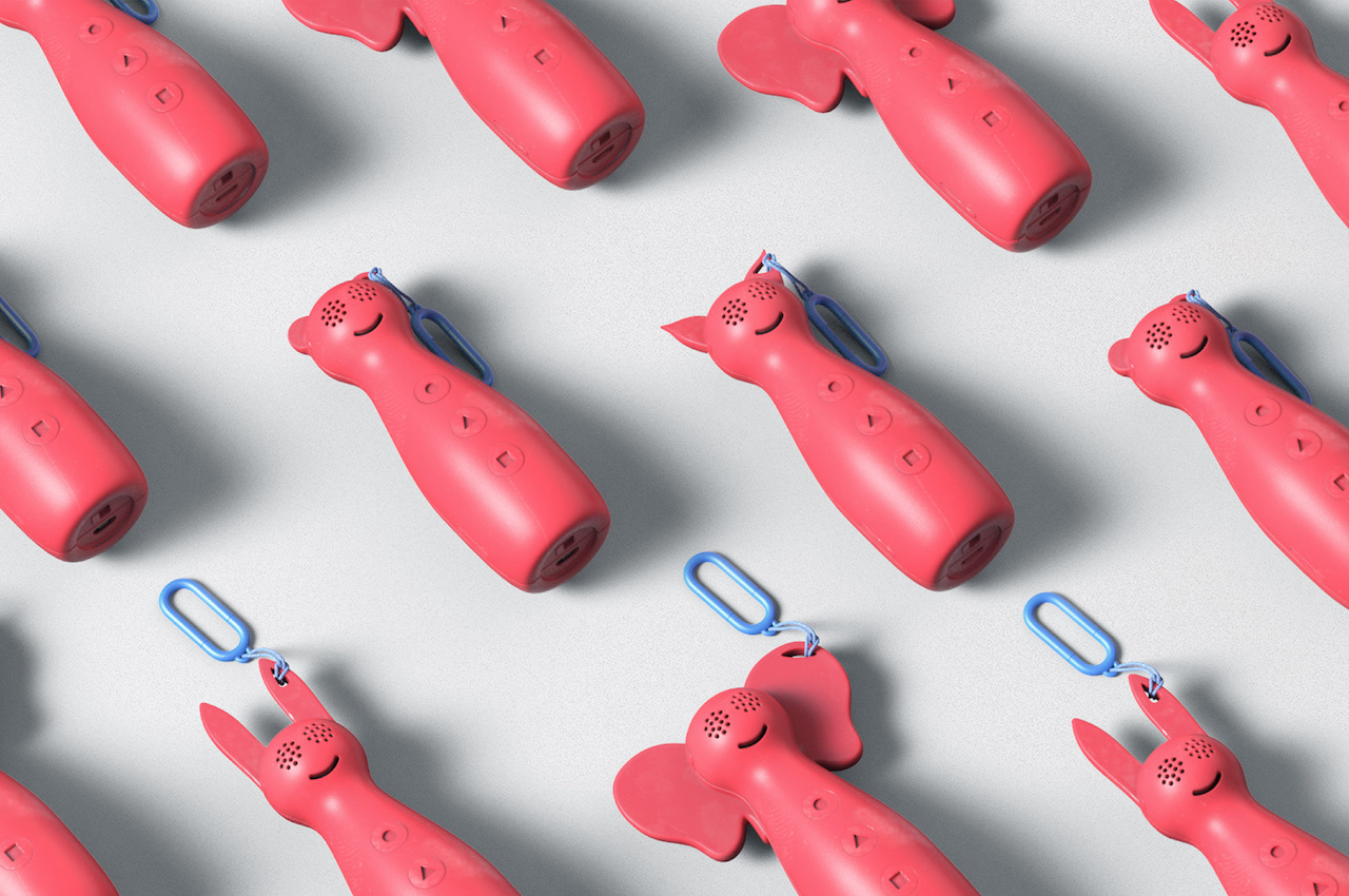
The Miku is programmable so the whole family can enjoy connecting. You can probably liken it to a walkie-talkie for the kids, but it is smarter with AI this time. The kids phone is available in different colors and looks like a bowling pin with animal ears. It can be a bear (red), elephant (blue), dog (green), or a cat (yellow). On one ear is a handle that looks like a carabiner so you can hang the phone anywhere. The eyes serve as the ear speakers, and the smiling mouth could be the mic.

MIKU Kids Phone Concept Features

MIKU Kids Phone Features

MIKU Kids Phone for the Children

There are three buttons on the body: a circle, a triangle, and a square. You can set the buttons to quickly call whoever in the family—Mommy, Daddy, or Grandparents. We see a USB port and a toggle switch underneath the Miku Kids Phone. The size of the kiddie phone is just right to fit a child’s hand.

MIKU Kids Phone Details

We have seen similar kids’ phones before, like the Novus 3-in-1 Modular Phone and the Relay Smartphone. We’re fans of gadgets for children having little kids of our own. As a parent, I prefer devices and tools that are simple to use and navigate. Less screen time is challenging to achieve, but parents should be more conscious about their kids’ habits. This Miku Phone will be helpful as it only offers the basics.

Concept MIKU Kids Phone

MIKU Kids Phone Design

MIKU Kids Phone Concept Design

Concept MIKU Kids Phone Design

MIKU Kids Phone Concept

The post MIKU Kids Phone Concept strips the phone down to basic functions first appeared on Yanko Design.
The Cuddly Playground is a large public art where children are free to explore

The Cuddly Playground BUDCUD and Iza Rutkowska

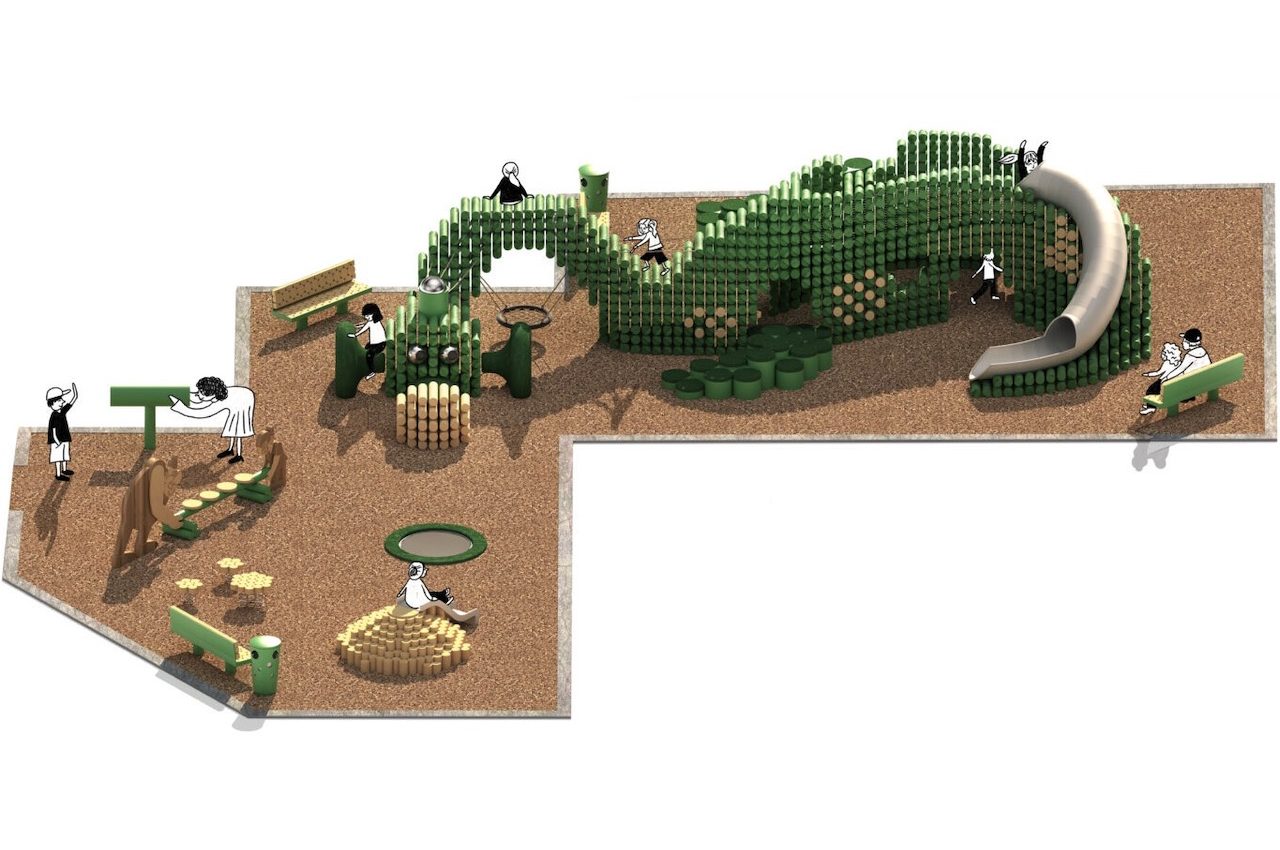
The Cuddly Playground is a place where kids can go wild. Of course, you can say it’s just another playground for the children, but this one is different. The concept alone is entertaining as it tells the story of Kayko and Kokosh with Cuddly the dragon. This public space is inspired by the animated series created by a resident of Sopot, Poland, who has become famous for his comic book series.

BUDCUD teamed up with Iza Rutkowska to make the playground concept a reality. The project is of a playground and public space that can be considered as public art. It takes advantage of creative spatial forms and practical design that deliver a playful narrative.

Designers: BUDCUD + Iza Rutkowska

The Cuddly Playground BUDCUD and Iza Rutkowska 15


The Cuddly Playground BUDCUD and Iza Rutkowska

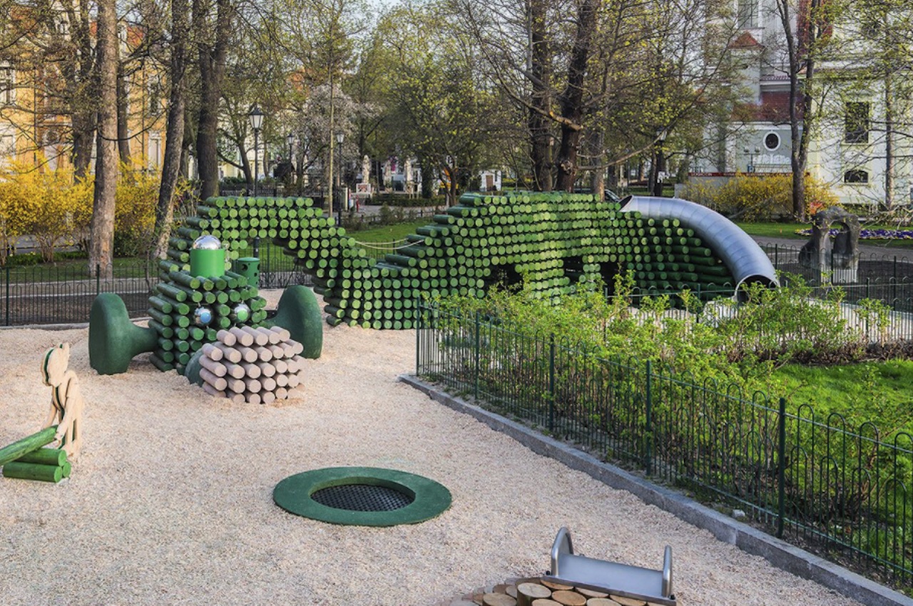
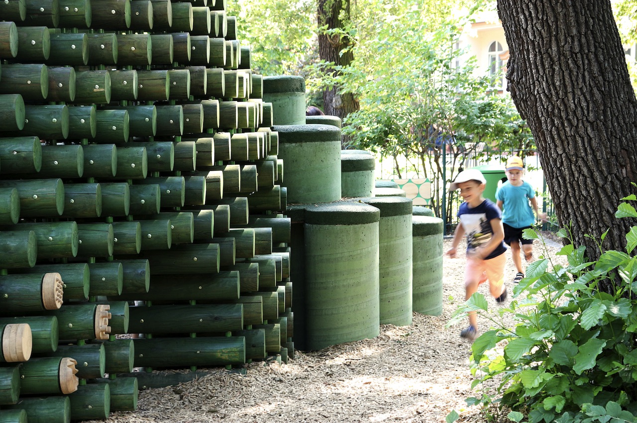
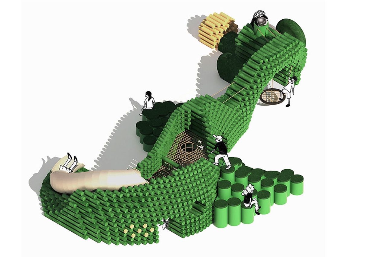
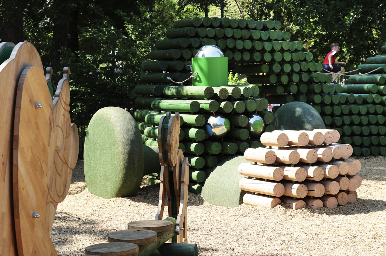
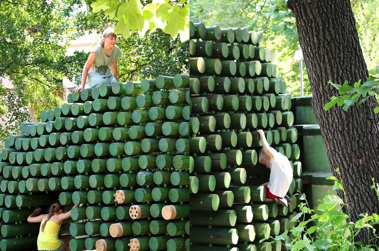
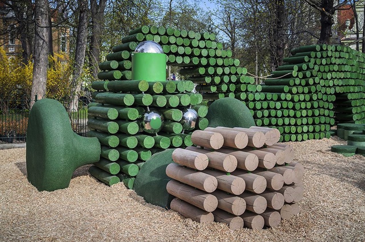
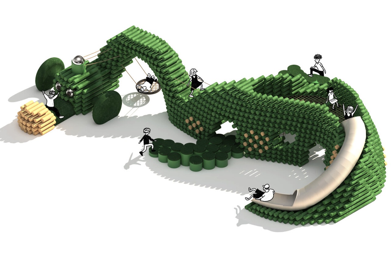
The designers’ inspiration for the playground was the Mirmiłowo village, where the characters Kajko and Kokosz live. It features green wooden beams shaped like a silhouette of Cuddly the dragon. The Cuddly Playground features different zones where children can play and develop their psychomotor skills. The whole place is meant for the development and enjoyment of the children and even the adults who will be looking after them.

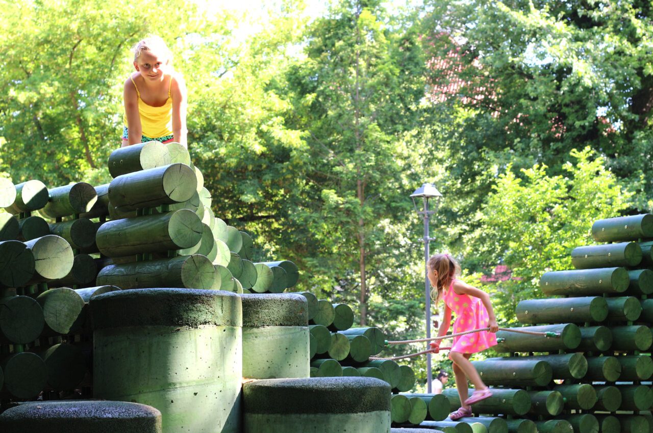
The Cuddly Playground is an exciting space for children who like outdoor adventures. Its total floor space is 274sqm, large enough for many children to enjoy the playground. If you’re familiar with the animated series, you will notice a lot of elements like the Slavic warriors at the entrance. There is the Mirmiłowo area where they can jump on the trampoline or swing on wooden platforms. Climb up the hill made of stumps and go down the slide. There are rubber EPDM surfaces on different areas in the playground for kids’ safety.

The Cuddly Playground BUDCUD and Iza Rutkowska

The Cuddly appears to be a large sculpture that you can play and interact with. The playground is meant to be explored by the bid kids and adults. Feel free to do anything like climb, slide, drum, jump, and swing. You’ll never run out of activities to do—the only limit is your imagination.

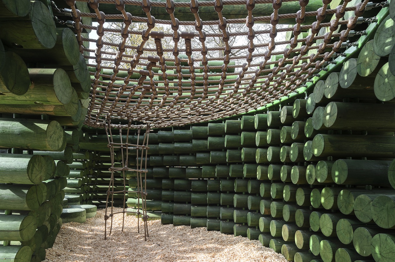
BUDCUD has described the Cuddlly as a sensory stimulation toy. It offers different kinds of experiences and learning, allowing kids to learn color composition and haptic experiences in other areas. Inside the belly of the creature is a cave that can be accessed through the tail. There is a net platform where the children can rest and lounge once they’re tired of playing.

The Cuddly Playground BUDCUD and Iza Rutkowska

The Cuddly Playground BUDCUD and Iza Rutkowska

The Cuddly Playground BUDCUD and Iza Rutkowska

The designers made sure the playground is environment-friendly with sustainable materials and elements. Even the rubbers surfaces are “green” as they are made of fine wood chips. Everything about the Cuddly Playground allows kids to exercise their creative cooperation skills and practice imagination.

The Cuddly Playground BUDCUD and Iza Rutkowska

The Cuddly Playground BUDCUD and Iza Rutkowska

The Cuddly Playground BUDCUD and Iza Rutkowska

The Cuddly Playground BUDCUD and Iza Rutkowska

The Cuddly Playground BUDCUD and Iza Rutkowska

The Cuddly Playground BUDCUD and Iza Rutkowska

The post The Cuddly Playground is a large public art where children are free to explore first appeared on Yanko Design.
Hot Wheels Car Rolling Suitcase Is Road Trip Ready

Because why not get your child actually excited to pack and tote their luggage around on vacation, MaxToy teamed up with Mattel to create this officially licensed Hot Wheels Night Shifter rolling suitcase (affiliate link). The case features a hard shell in the form of a Hot Wheels car, complete with wheels, exposed engine, and – what are those coming out the back – jet engines?

The suitcase also has a durable aluminum frame, retractable handle, and 3-wheel rollers so kids can push or pull the bag with ease, even over curbs or up stairs. That’s a good thing, too, because I’m not pulling my children’s luggage for them. They didn’t even offer to chip in to help pay for this vacation!

Honestly, I kind of want one for myself. Sure, it’s children’s sized, but I pack light for vacation anyways. I usually just bring enough underwear for ten days and buy any other clothes I need when I get where I’m going. What can I say? I’m a carefree spirit. Hey, can I borrow a clean shirt?

[via DudeIWantThat]

Yoto Mini Player can be your kids’ darling companion for every adventure

Kids shouldn’t be given screens whenever they have tantrums. Meltdowns are a parent’s nightmare so to avoid such, more often than not, most parents just bring out their phones or tablets to play videos for the kids to watch. Perhaps you have promised yourself you’d never let your baby use a gadget before he’s two but like many parents we know, you’ve already given into the temptation which can very well be a convenience for some adults.

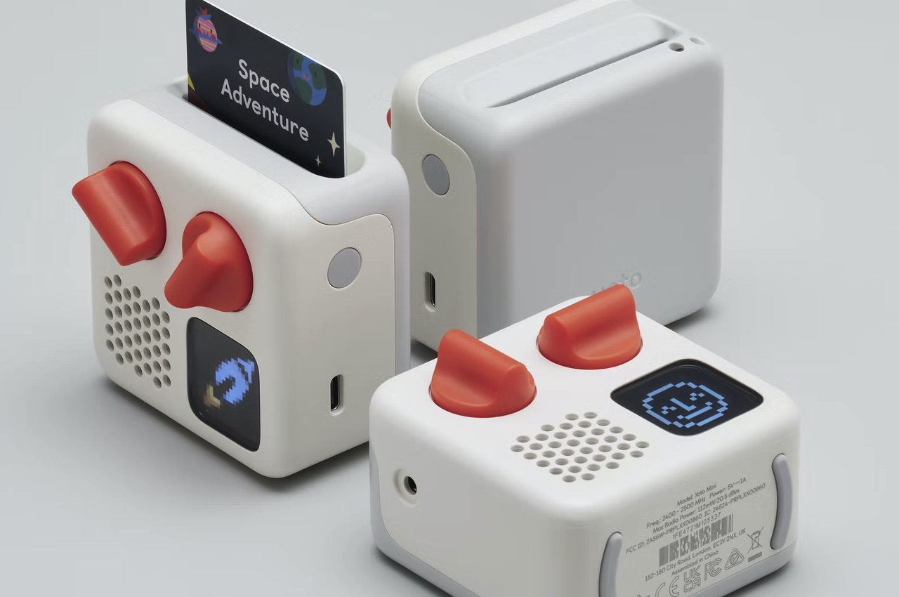
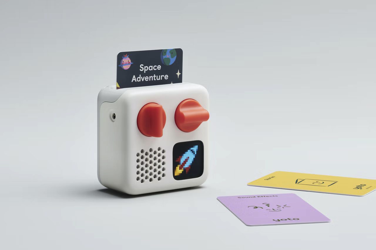
For a change, why not do something different. Instead of screen time, set a music time where the children can be on their own to just listen to music. Kids are visual but they can also be looking for sensory activities. The Yoto Mini is a small audio player that gives kids the experience of having something like a CD player from your youth. This device offers audio playback of kid-friendly tunes to entertain the youngsters.

Designer: Pentagram

Yoto Mini Design

Sure, there’s Spotify and YouTube but before the world gets really modernized and taken over by robots and computers, let’s allow the children experience regular things like we used to. The Yoto Mini is a little companion for your little one that will be useful, especially during long trips or boring hours. It looks like a toy but it packs a powerful audio experience the children can appreciate.

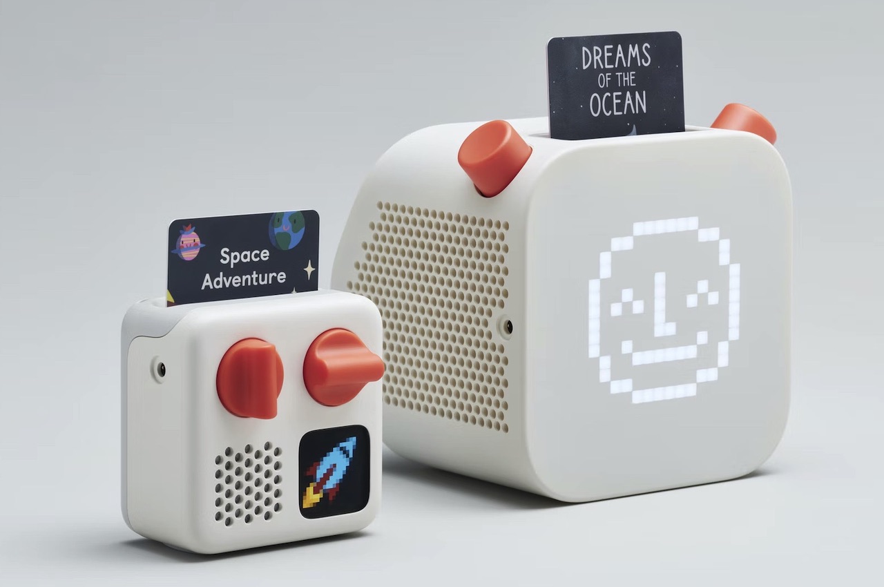
The Yoto Mini is a follow-up to the Yoto Player introduced by Pentagram. The latter is a design studio that offers more personalized service as the company owners are also the designers themselves. Pentagram has worked on the Yoto Play to be smaller and more affordable. The device also uses the Yoto platform that is now more accessible by a wider audience, specifically, the kids.

Yoto Mini Player Packaging

Yoto Mini Yoto Player Price

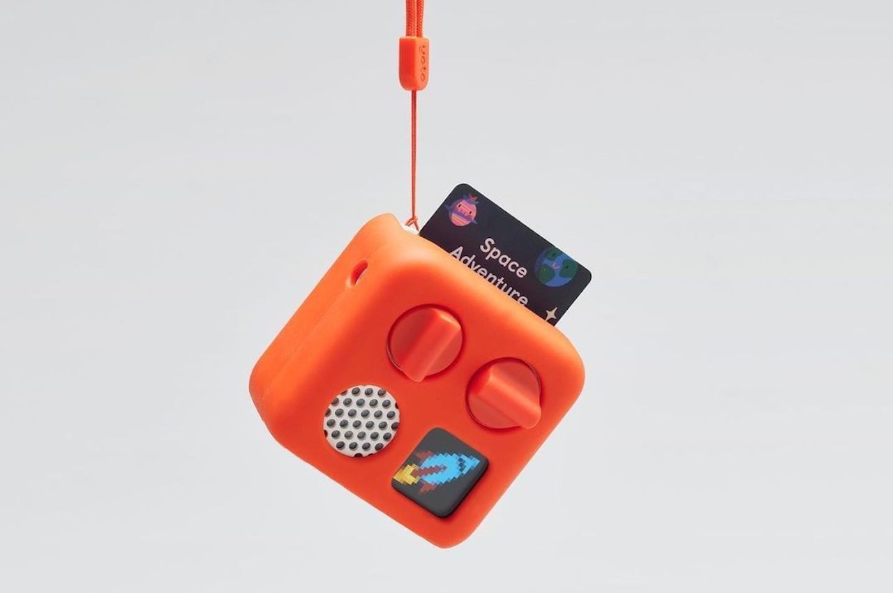
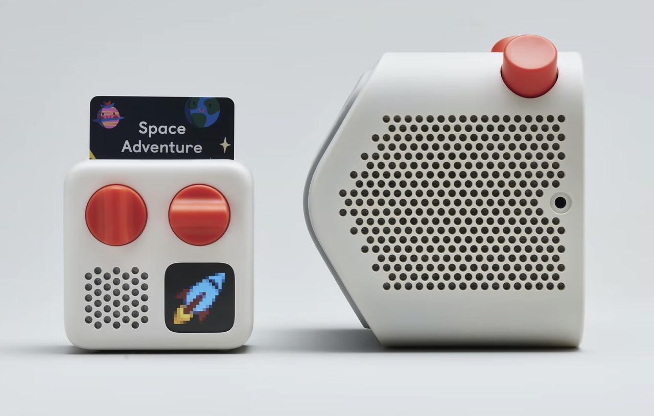
This Yoto Mini appears to be the same shape and color as an older iPhone charger—the square one. It can be protected by a colored silicone jacket with a lanyard so the kids can bring them anywhere. With the cover, the Yoto Mini is protected, safe, and made more portable as it is easier to carry.

Yoto Mini Features

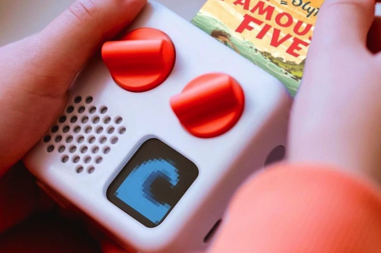
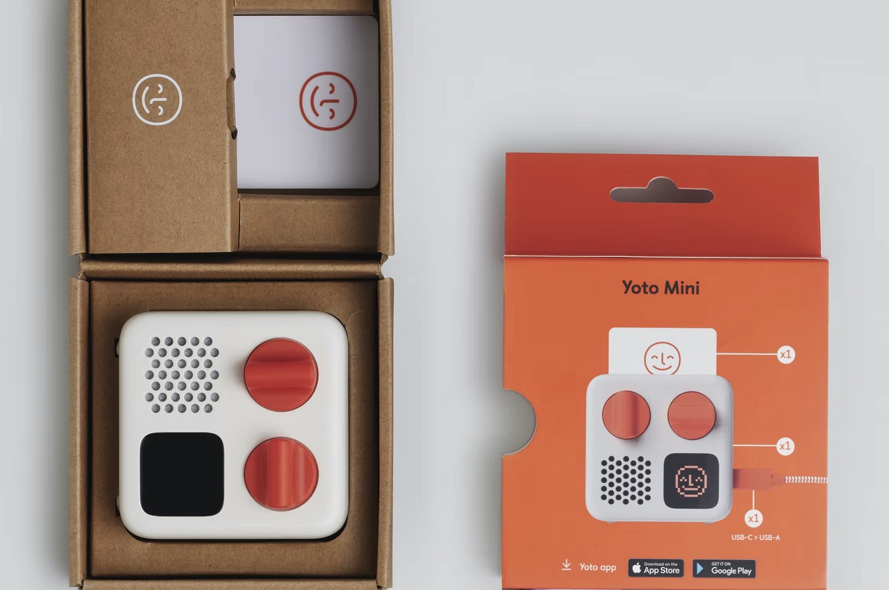
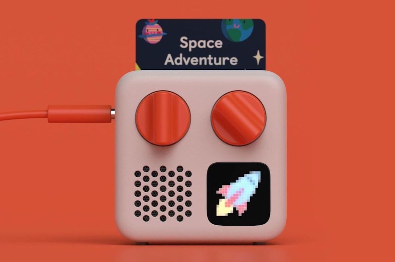
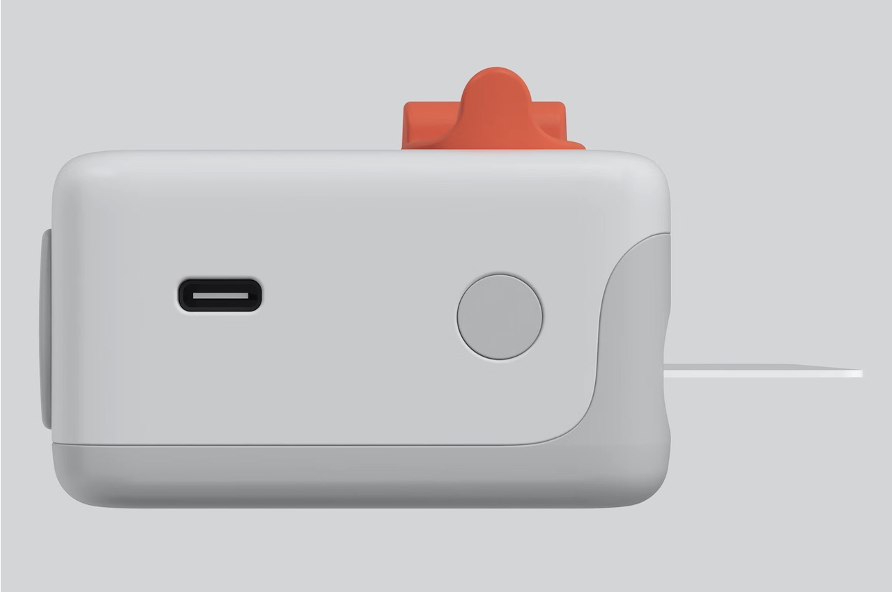
In front, there are two kid-friendly knobs, speaker holes, plus a small round screen called a pixel display that shows the time and icons. It offers Bluetooth connectivity, USB-C, and a clock. This one doesn’t take voice commands as there are no mics or a camera. It’s purely an audio player so you are guaranteed less distraction.

Yoto Mini

No ads will be served so there really is no unnecessary airtime. Kids will simply hear songs or audiobooks that are age-appropriate. The children can also use the Yoto Mini to meditate, relax, learn, or get to sleep. Just insert a card of your choice to listen to as there are plenty of choices. The icons on the pixel display will change.  You can choose the track from an album by turning on the right knob. The left button changes the volume level.

Yoto Mini Player

If we had the Walkman and the CD players from decades ago, your kids have the Yoto Mini. They can also listen to the Yoto Daily podcast where they can learn new facts, hear jokes, and play games. Just press on the right knob to change the settings.

Yoto Mini Yoto Player

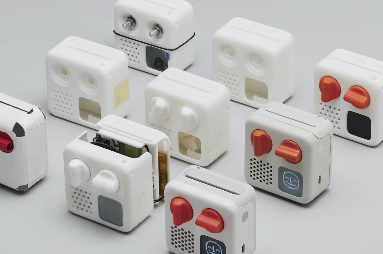
Yoto Mini Concept Design Parts

Yoto Mini Player Design

Yoto Mini Concept Design

The post Yoto Mini Player can be your kids’ darling companion for every adventure first appeared on Yanko Design.
This modular climbing wall system for kids is designed to adapt to your child’s growing needs!

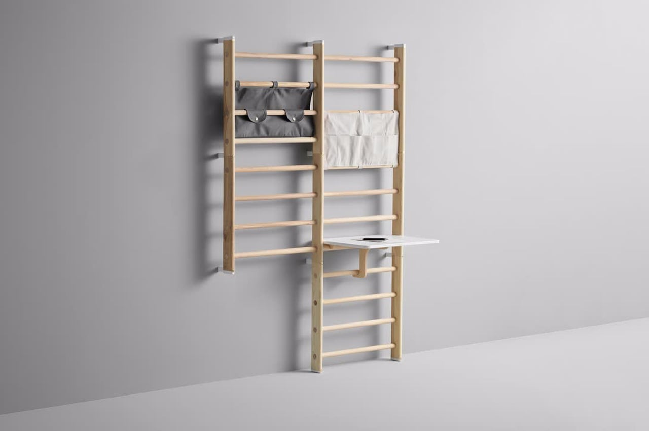
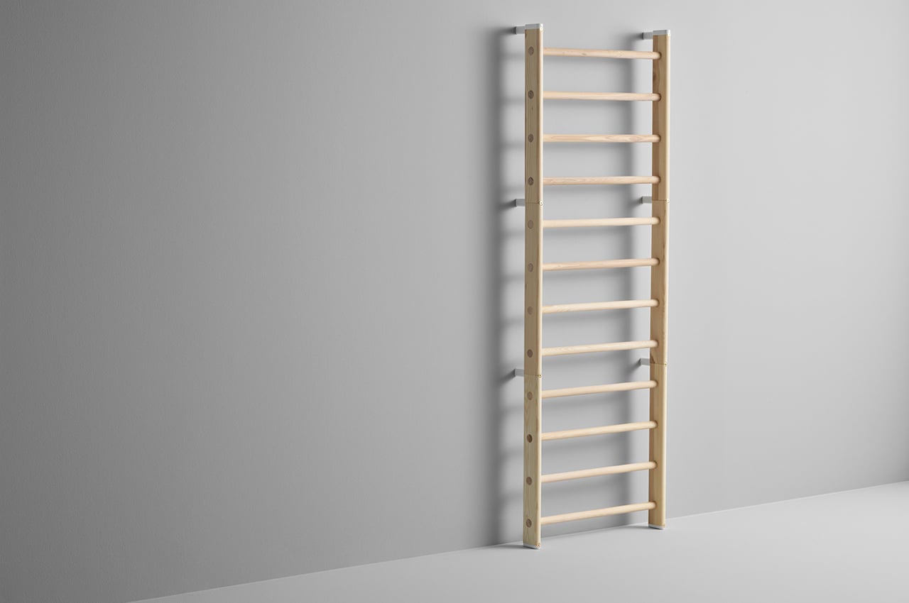
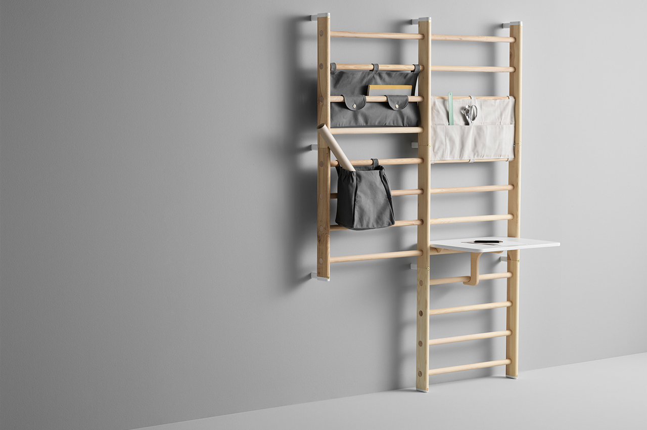
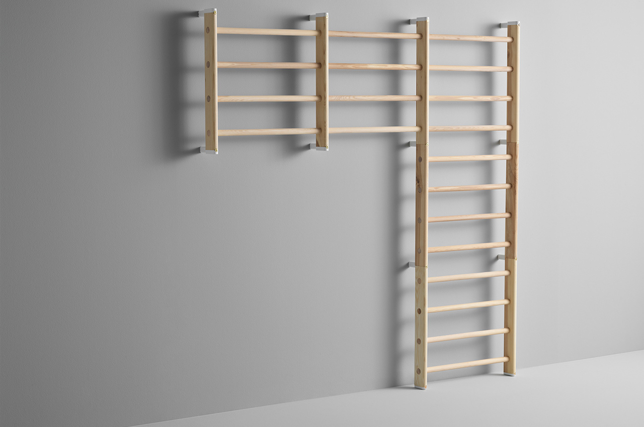
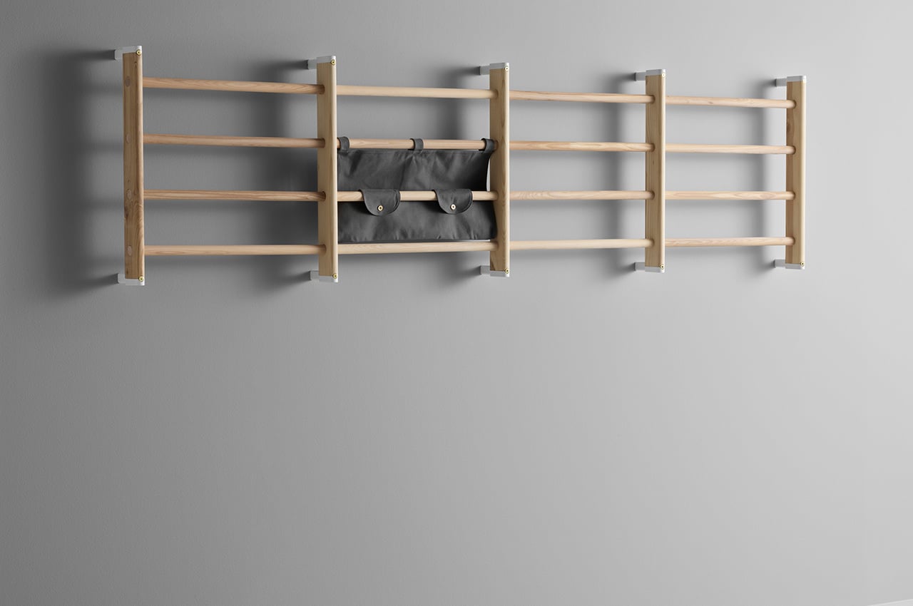
Endeløs is a modular wall climbing system designed to evolve with your children’s growing needs and hobbies, transforming from a single ladder into a multi-unit storage system.

Kids will find a way to make a jungle gym out of any living room. Entertainment systems transform into boats and couch cushions turn into hopping rocks because the floor is lava. No matter the space, kids will turn it into their very own play place. Inspired by the endless imagination of their own kids, Norway-based KAOS, children and parent-focused goods and furniture brand, created a modular wall system for children to turn into their own climbing wall called Endeløs.

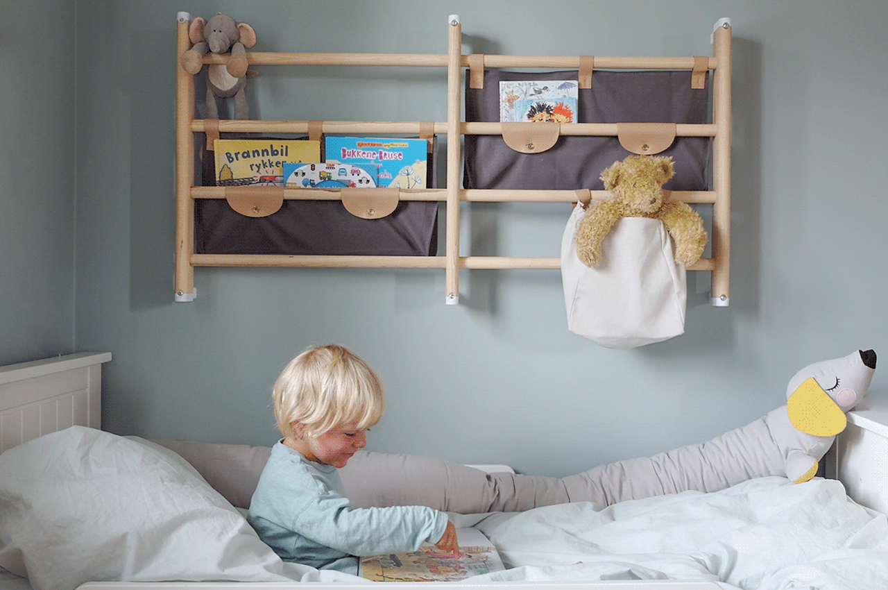
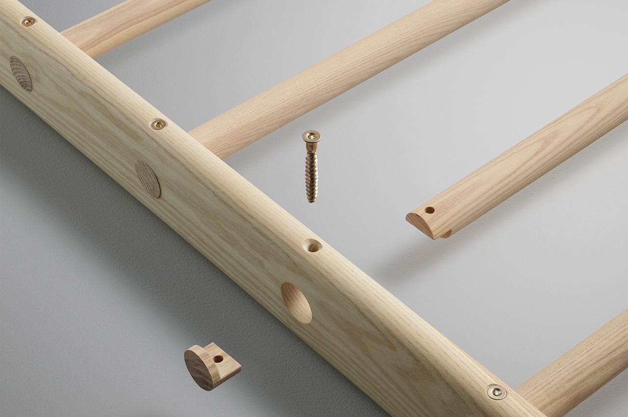
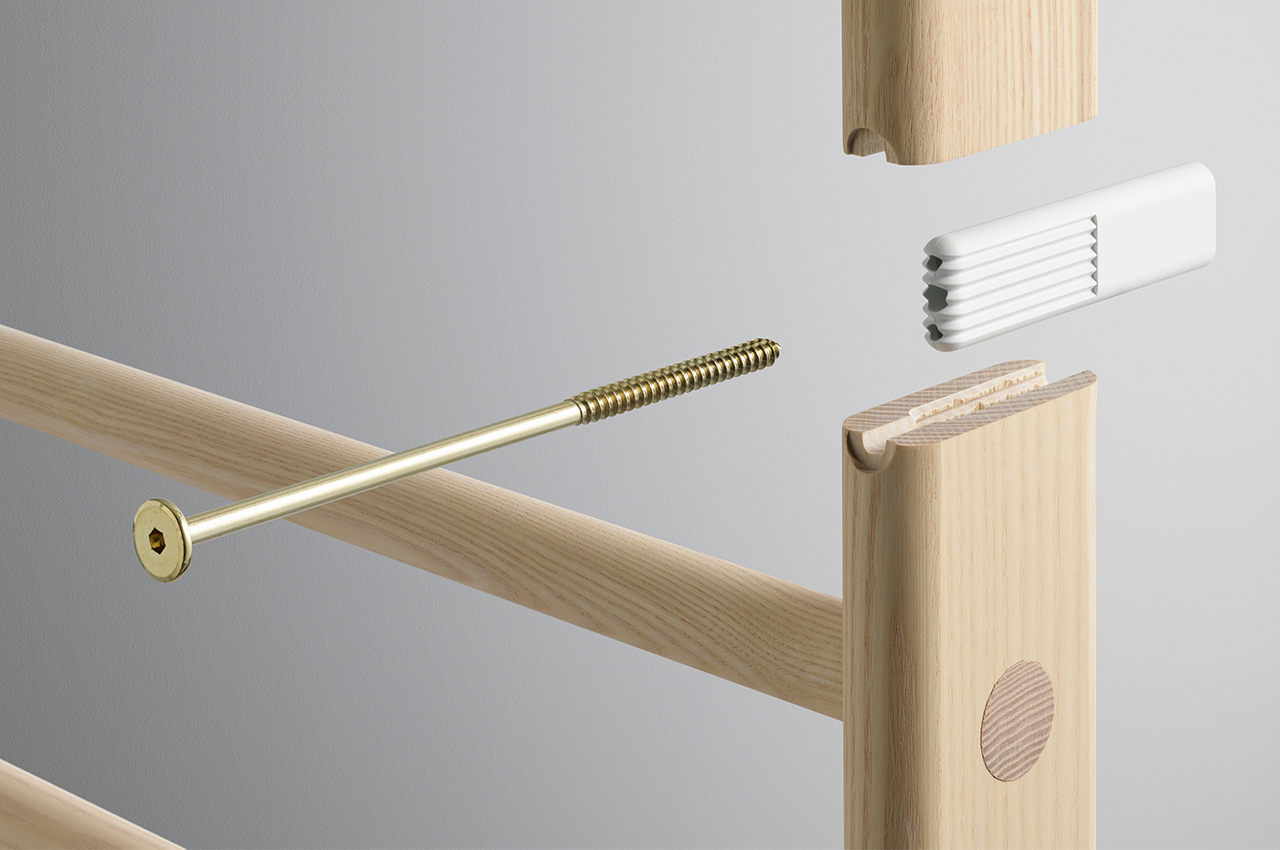
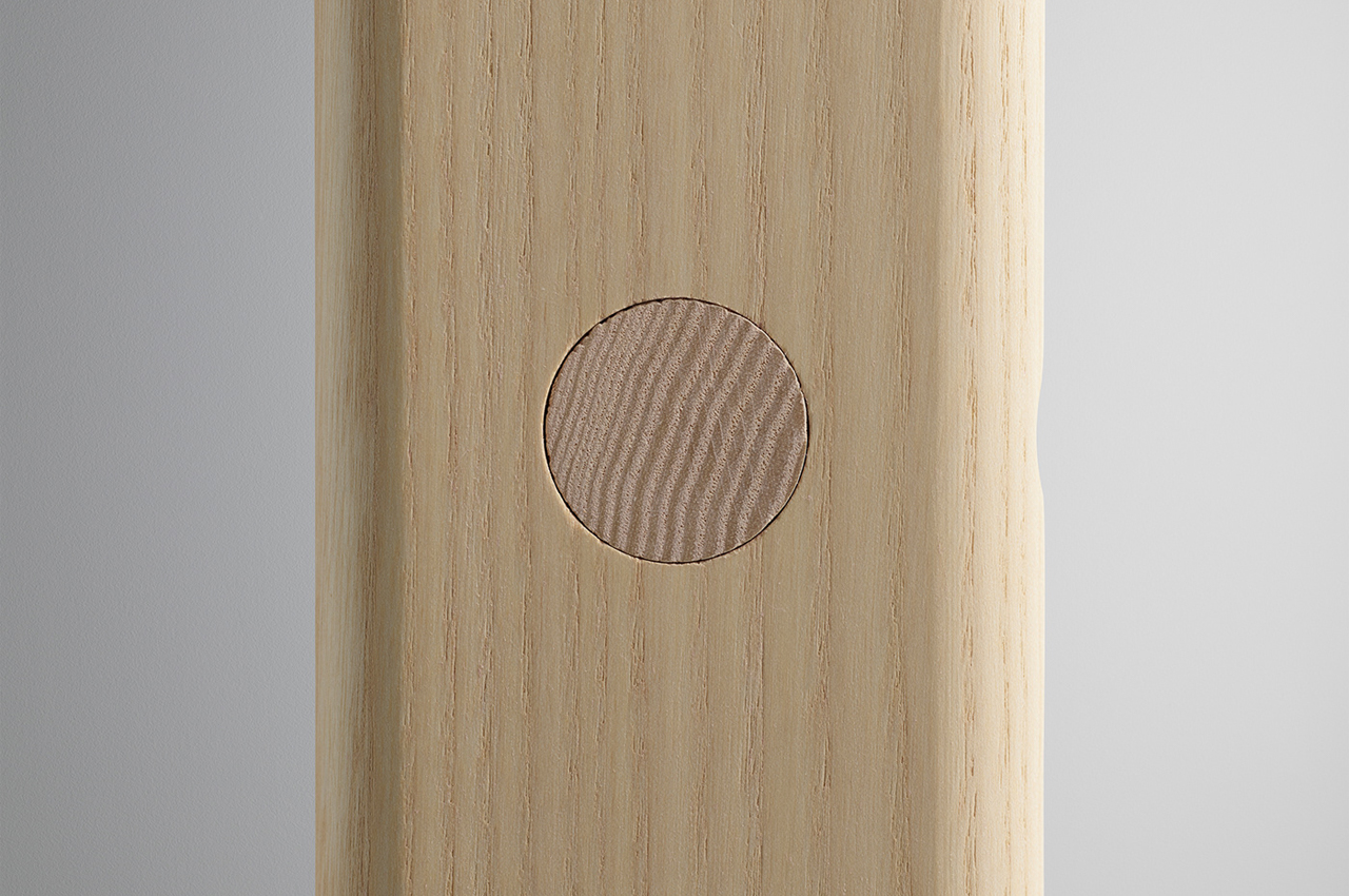
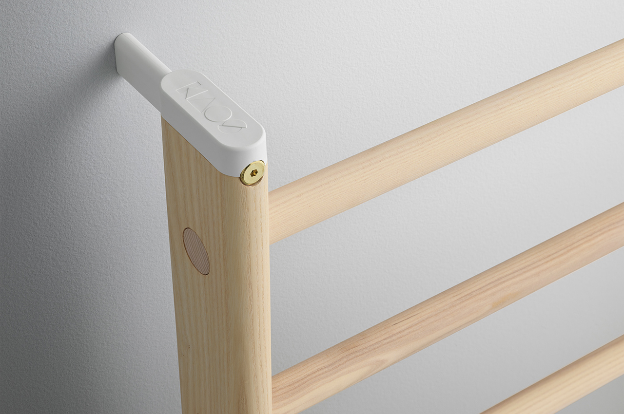
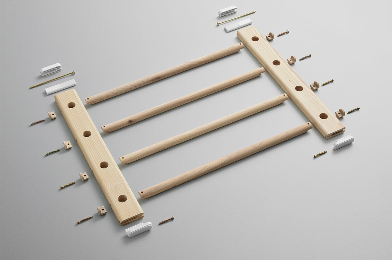
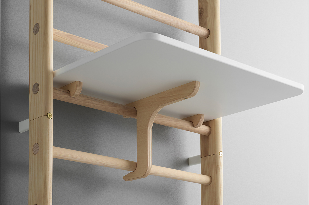
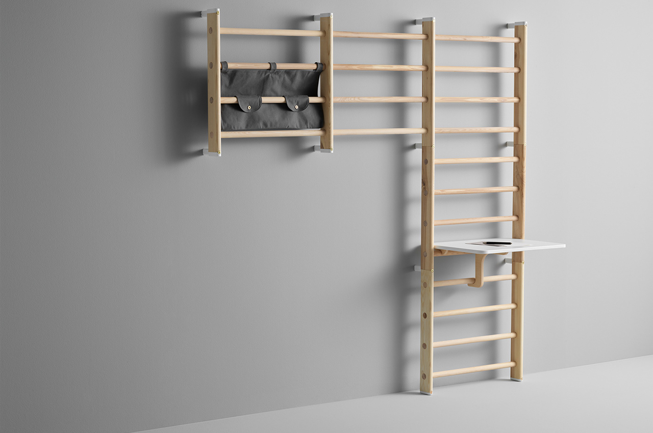
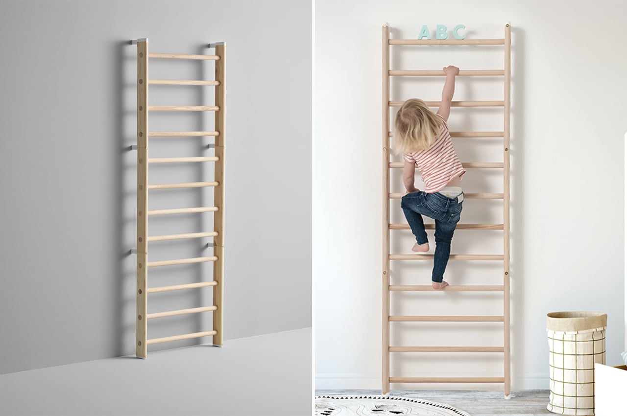
Composed of modular wooden ladders of varying lengths as well as supplementary canvas bookshelves and toy bags, Endeløs is a versatile piece of furniture that evolves with your children’s needs. Consolidated in a flat pack, Endeløs is built from ash wood coated with white pigmented oil, gold brass hardware, and white glass fiber brackets, to ensure easy setup with few materials required for assembly.

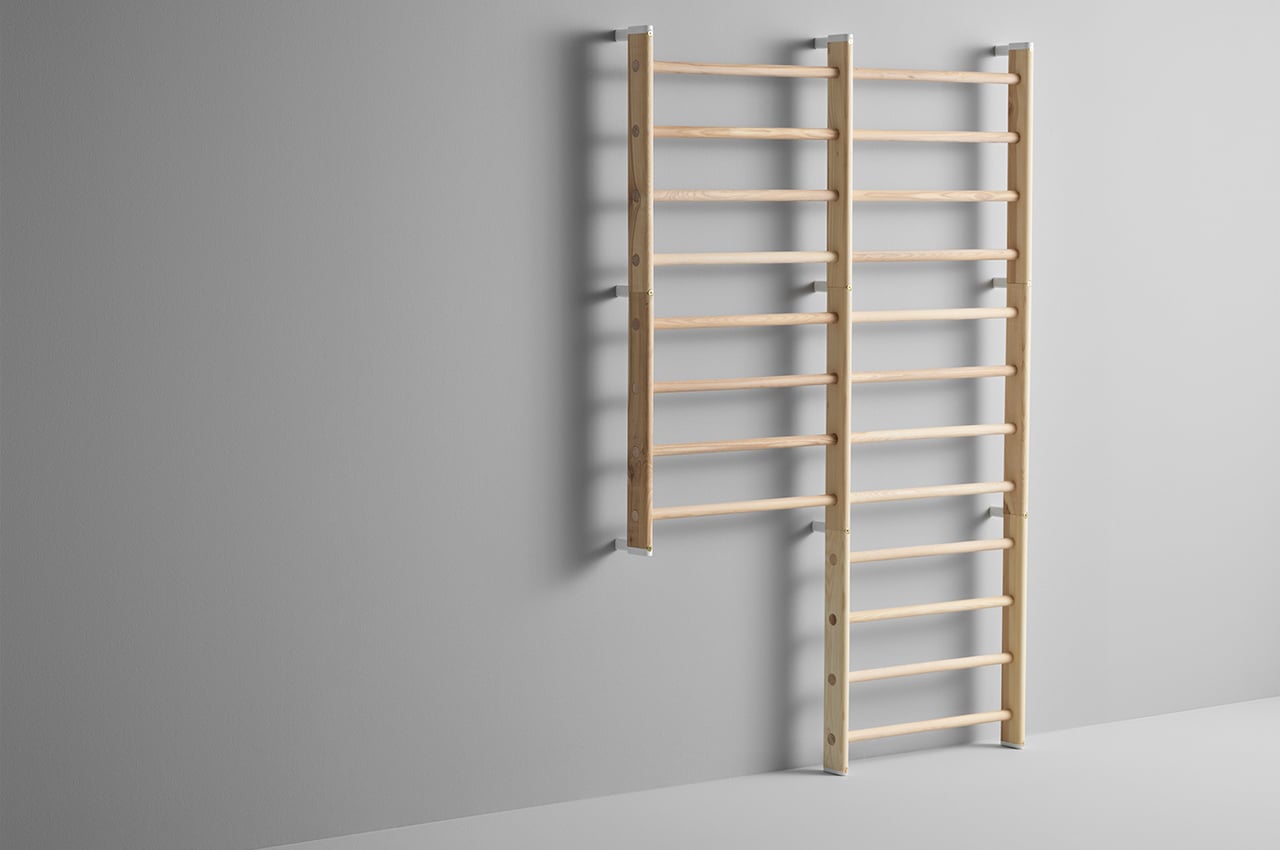
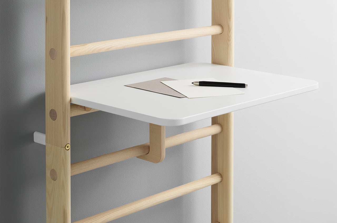
When your children are just old enough for climbing (+/- 2 years), Endeløs can mount as a single ladder to any one of your walls. Then, as your children grow, additional ladders can attach to preexisting ladders to enhance the climbing experience and challenge your kid’s physical movement for healthy play. Finally, the canvas bookshelves and toy bags can lock into any step on the ladder system to create a storage space either for your child or the whole family to use depending on the wall ladder’s location.
While traditional climbing walls age out once your kid matures past them, Endeløs is designed to grow alongside your kid’s evolving interests and hobbies. Once the climbing period reaches its final peak, Endeløs functions as another piece of furniture where the whole family can store keepsakes and hang photographs.
Designers: KAOS x Permafrost

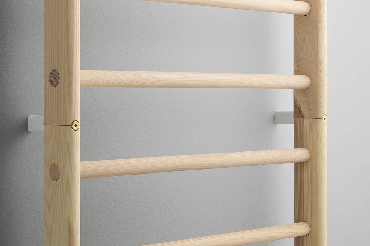
Built from ash wood dipped in white pigmented oil, Endeløs uses gold brass hardware and white glass fiber brackets to hold the whole system together. 

Delivered as a flat-pack, Endeløs can be assembled easily from home. 

Bookshelves and modular desk spaces mature the climbing play system into a working storage space. 

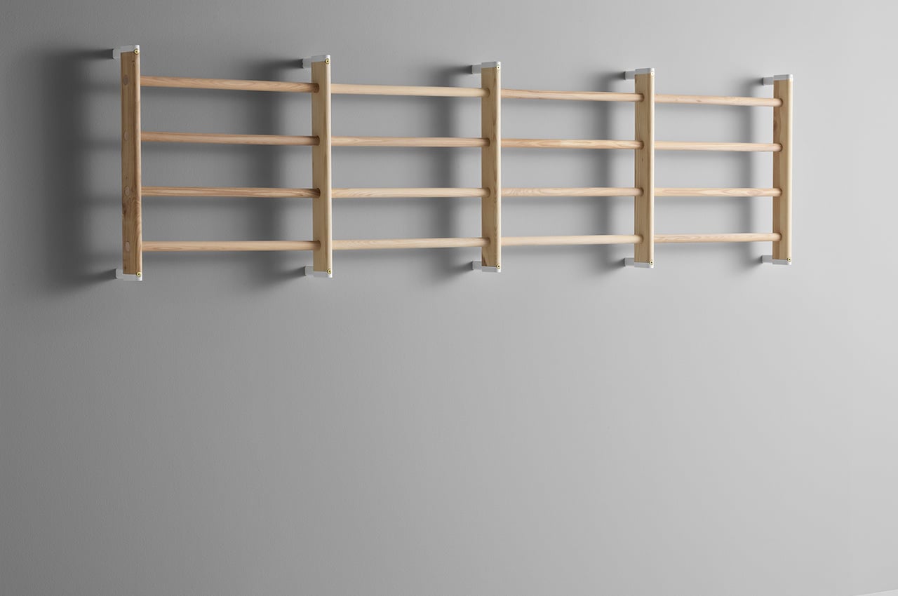
Additional ladders can mount alongside each other to create a more dynamic climbing experience. 

As your child grows older, the ladder system can function as its own piece of furniture with an evolved function. 
These 3D printed needle covers were designed to put children at ease during vaccinations!

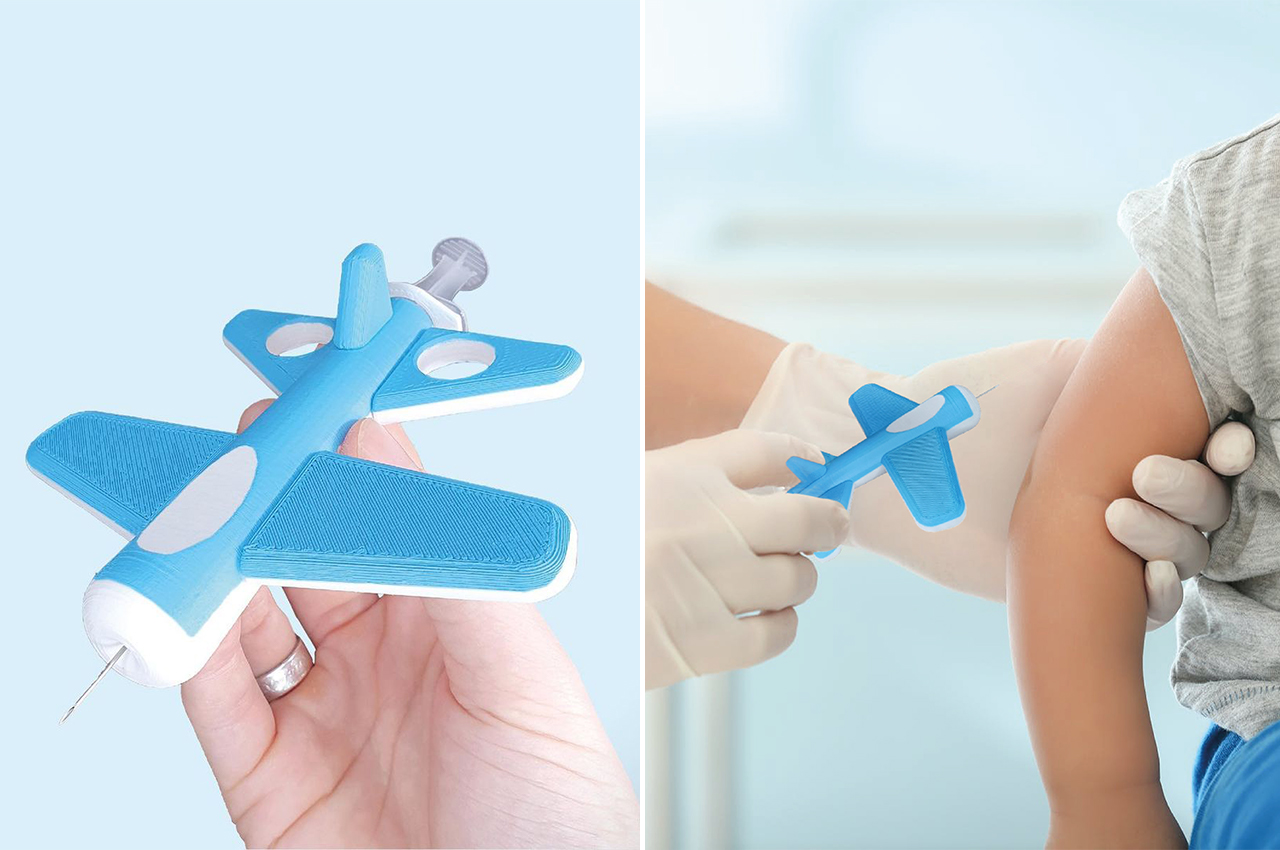
Needles can be scary and I am saying that as an adult, so I can only imagine the fear children must feel. Post the pandemic, there is no choice but to face the fear of needles if you want to stay safe. To make it easier for children to conquer their fears, designer James Dickson created playful needle covers that can help make the entire process of getting vaccinations less daunting.
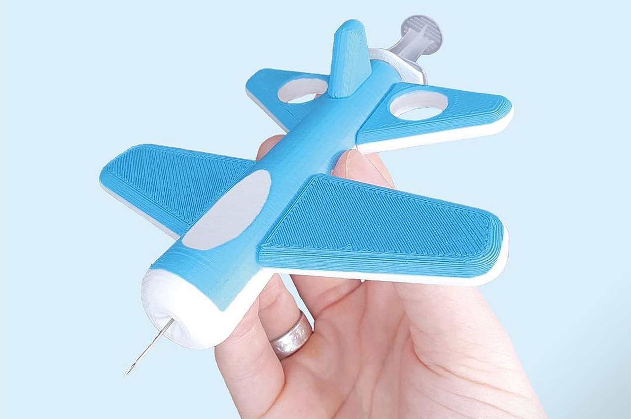
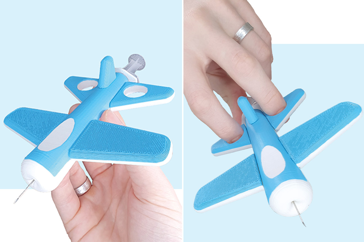
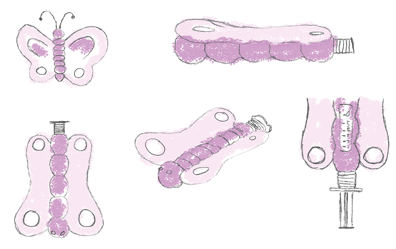
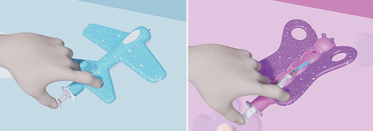
The children’s needle covers aim to reduce the fear of vaccination by hiding the needle within a form that a child is familiar with. Playful forms such as a plane or butterfly are universal, simple, and engaging for children. The medical professional can simply slide the cover over the needle and proceed with the vaccination. This is not just something that is meant for use during the pandemic but can be a continued use to administer medication through needles whenever required. This could brighten the day for many children who are patients in hospitals and have to stay for a while or even generally for those in the pediatric ward. Needle covers like these make the experience and atmosphere a little less dreary in all clinics and hospitals.

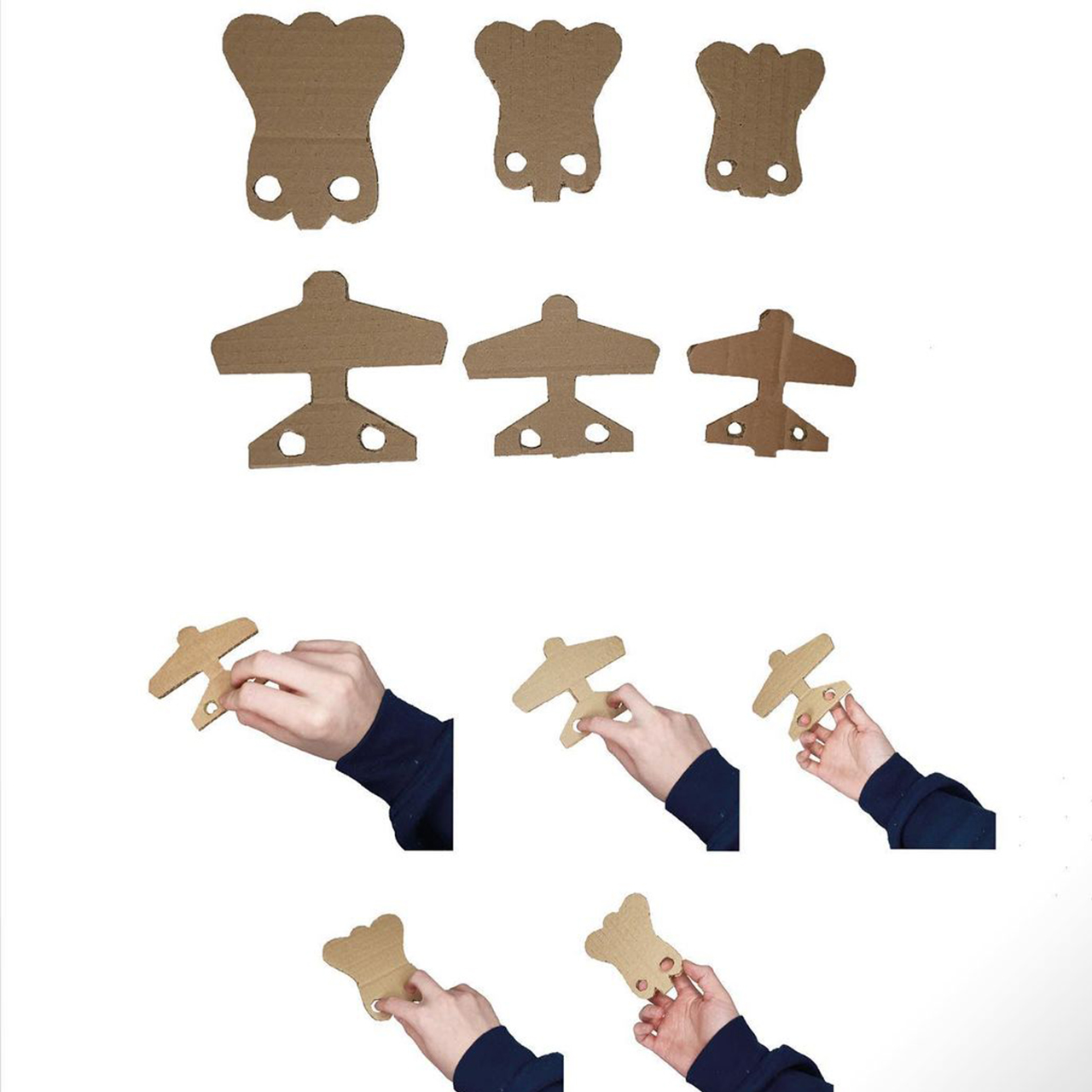
“For the prototyping of the Children’s Needle Covers, I opted for 3D printing with spray paint applied to give the desired color. This is not a final product but a prototype to show the intended form, function, and aesthetics of the Needle Covers,” says Dickson. He started with hand sketches, then moved onto creating small cardboard prototypes, followed by digital 3D modelling. After the CAD was finalized the design was 3D printed and spray painted. Medical professionals can even offer the cover to the child to take back home as a memento and after safely disposing the syringe. I vote for Dickson to create Avengers-themed needle covers next!

Designer: James Dickson

needle3

needle1

needle2